Embed Size (px)
Citation preview

Presented to the Interdisciplinary Studies Program:
Applied Information Management and the Graduate School of the University of Oregon in partial fulfillment of the requirement for the degree of Master of Science CAPSTONE REPORT University of Oregon Applied Information Management Program 722 SW Second Avenue Suite 230 Portland, OR 97204 (800) 824-2714
Quantitative Data Graphics: Best Practices of Designing Tables and Graphs for Use in Not-for-Profit Evaluation Reports
Ruta Stabina Freelance Information and Graphics Designer
June 2005

Stabina –
ii
Approved by
_________________________________
Dr. Linda F. Ettinger
Academic Director, AIM Program

Stabina –
iii
Abstract
for
Quantitative Data Graphics: Best Practices of Designing Tables and Graphs
for Use in Not-for-Profit Evaluation Reports
Graphical presentation of quantitative data greatly improves information
perception, absorption, and retention. This literature review study analyzed 16
sources published between 1990 and 2005, addressing the three most frequently
used quantitative business data presentation types: tables, graphs, and charts
(Tufte, 2001) and graphics design. Results are presented in four tables, providing a
set of factors for consideration by not-for-profit organization program managers
when creating quantitative graphical data visualizations for use in program
evaluation reports.
Stabina –
iv
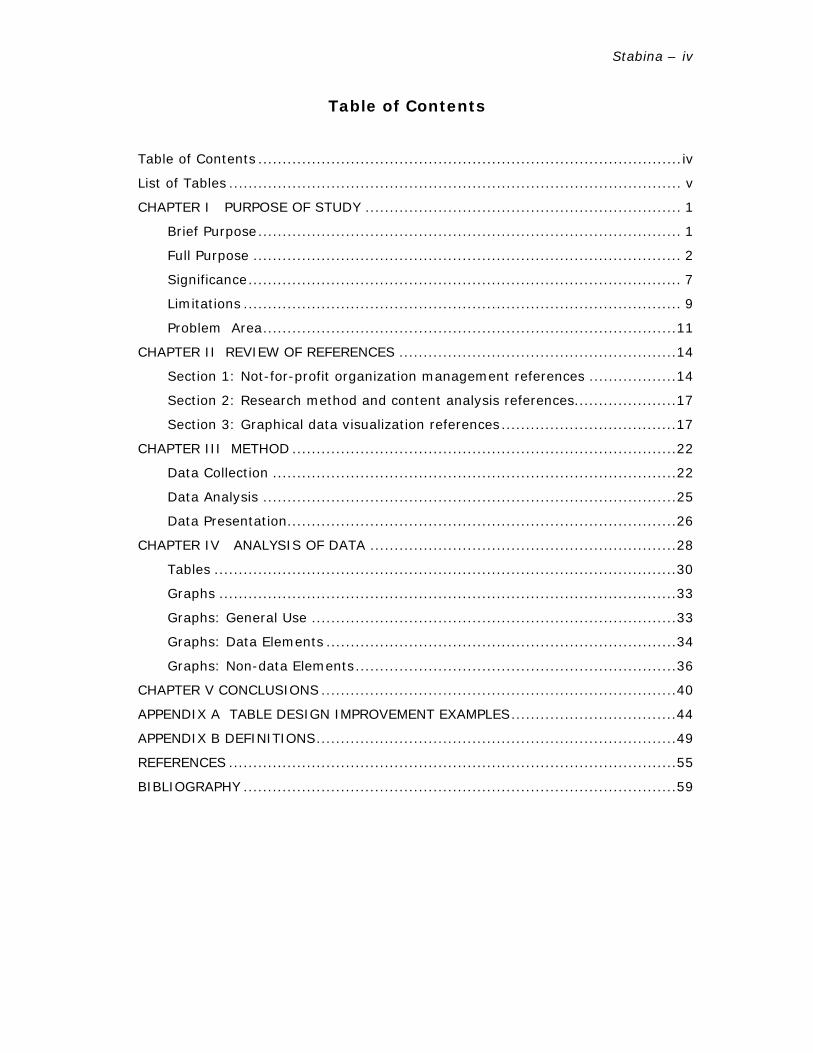
Table of Contents
Table of Contents .......................................................................................iv
List of Tables ............................................................................................. v
CHAPTER I PURPOSE OF STUDY ................................................................. 1
Brief Purpose....................................................................................... 1
Full Purpose ........................................................................................ 2
Significance......................................................................................... 7
Limitations .......................................................................................... 9
Problem Area.....................................................................................11
CHAPTER II REVIEW OF REFERENCES .........................................................14
Section 1: Not-for-profit organization management references ..................14
Section 2: Research method and content analysis references.....................17
Section 3: Graphical data visualization references....................................17
CHAPTER III METHOD ...............................................................................22
Data Collection ...................................................................................22
Data Analysis .....................................................................................25
Data Presentation................................................................................26
CHAPTER IV ANALYSIS OF DATA ...............................................................28
Tables ...............................................................................................30
Graphs ..............................................................................................33
Graphs: General Use ...........................................................................33
Graphs: Data Elements ........................................................................34
Graphs: Non-data Elements..................................................................36
CHAPTER V CONCLUSIONS .........................................................................40
APPENDIX A TABLE DESIGN IMPROVEMENT EXAMPLES..................................44
APPENDIX B DEFINITIONS..........................................................................49
REFERENCES ............................................................................................55
BIBLIOGRAPHY .........................................................................................59

Stabina –
v
List of Tables
Table 1: Factors to Consider Regarding the Use of Tables ...................................32
Table 2: Factors to Consider Regarding General Use of Graphs ............................34
Table 3: Factors to Consider Regarding the Use of Graphs — Data Elements..........36
Table 4: Factors to Consider Regarding the Use of Graphs — Non-data Elements ...38

Stabina –
vi
List of Figures
Figure A1: Initial Table Design ........................................................................44
Figure A2: Table Design Improvements — Option 1 ...........................................45
Figure A3: Table Design Improvements — Option 2 ...........................................46
Figure A4: Table Design Improvements — Option 3 ...........................................47
Figure A5: Table Design Improvements — Option 4 ...........................................48

Stabina –
1
CHAPTER I
PURPOSE OF STUDY
Brief Purpose
The purpose of this study is to provide program managers of educational not-
for-profit organizations (Werther & Berman, 2001) with a set of factors to consider
regarding the graphical display of quantitative data (Tufte, 2001), for use in program
evaluation reports (McNamara, 1999; O'Neill, 2002). This study is intended to assist
program managers who lack graphic design training to make educated choices
concerning the application of graphical display for reporting program evaluation data.
One of the responsibilities of not-for-profit organization program managers
(Administration for Children and Families, 2005) is to provide stakeholders (Werther
& Berman, 2001) with program evaluation reports in order to fulfill accountability
requirements (Dees, Emerson & Economy, 2001; McNamara, 2003). Stakeholders
must be able to perceive information and draw conclusions upon activities which may
impact the future of the program (Brinckerhoff, 2000; The Program Manager's Guide
to Evaluation, 2005). According to Werther & Berman (2001), the most important
components of program evaluation reports are quantitative information reflecting
program outcomes and financial analyses.
Tufte (2001) states that "Using graphics in displaying quantitative data is
often the most effective way to describe, explore, and summarize a set of numbers.”
The most widely used types of graphical quantitative data display are tables, charts,
and graphs (Harris, 1999; Zelazny, 1996). Creation of graphical display of

Stabina –
2
quantitative data involves not only understanding data, but also identifying the most
suitable methods of display (Few, 2004; Tufte, 1997).
This study is designed as a literature review (Leedy & Ormrod, 2001) in which
literature is collected, assessed, and organized for further evaluation. Twenty chosen
resources published between 1987 and 2005 are analyzed using conceptual content
analysis method (Palmquist, et al., 2005) in order to address (1) types of graphical
display methods of quantitative data (Few, 2004; Bounford, 2000) and (2) program
evaluation and accountability practices of educational not-for-profit organizations
(Dees, Emerson & Economy, 2001).
The results of the content analysis are compiled into four distinct lists of
terms and phrases addressing such graphical display types as (1) tables, (2) bar
graphs, (3) line graphs, (4) pie graphs, and their elements. Then these four lists are
framed into a set of factors for consideration for use by not-for-profit program
managers on application of graphical data display methods (Few, 2004; Bounford,
2000) in presenting financial and program outcome evaluation data (The Program
Manager's Guide to Evaluation, 2005; Seubert, ND).
Full Purpose
The purpose of this study is to develop a set of factors for consideration for
use of graphical data display methods in presenting quantitative data (Tufte, 2001,
Bigwood & Spore, 2003) in not-for-profit organization program reports (McNamara,
1999; O'Neill, 2002). The study is designed as a literature review (Leedy & Ormrod,
2001) and aligns information pertaining to (1) types of quantitative data graphical
display methods and (2) practices of educational not-for-profit organizational
accountability and program evaluation reporting.

Stabina –
3
The research is conducted by analyzing selected sources published between
1990 and 2005, addressing the fields of graphics design and public sector
management (Werther, Berman, 2001; Brinckerhoff, 2000). The data related to the
two main topics are identified using conceptual content analysis methodology
(Palmquist, et al., 2005). The outcome, a set of factors for consideration, is designed
to aid program managers in choosing the most suitable data visualization methods in
their effort to increase effectiveness of the program accountability documentation.
The factors are presented in a concise, clearly documented fashion, in order to
alleviate the efforts of canvassing volumes of graphics design literature in the search
of suitable and easily applicable visualization solutions.
The literature for this study is collected by searching library resources,
electronic databases, and the World Wide Web. Literature sources are determined to
be suitable for the study based on the following relevance criteria: (1) the source
addresses the topics of types and methods of quantitative data display, (2) the
source evaluates data visualization methods in the context of their applicability in
displaying of various types of quantitative data, (3) the source covers the topics of
management, accountability, evaluation practices and strategies of not-for-profit
organizations, (4) the source has been quoted and/or referenced in a number of
publications covering the subject matters directly related to the research topic.
During the initial search process to identify the appropriate literature for this
study, the obtained sources are categorized by their relevancy to the research topic,
publication date, and credibility record. The research focuses on the literature
sources addressing two key areas: (1) graphics design principles and (2)
organizational aspects of not-for-profit company management. The graphics design
related literature is focused on three types of graphical presentation of quantitative
data: (1) tables, (2) graphs, and (3) charts, as well as their attributes. These are the

Stabina –
4
most commonly used types of business data display and are designed to graphically
represent specific data sets (Bigwood & Spore, 2003; Few, 2004, Tufte, 2001).
Once collected, the chosen material is reviewed and analyzed using the data
analysis strategy known as conceptual analysis (Palmquist et al., 2005), in the
search for patterns, consistencies, and internal trends. This approach to data
analysis is selected as most appropriate for this study because it enables the
researcher to establish presence and frequency of occurrence of selected terms and
concepts in a chosen body of literature (Palmquist et al., 2005).
This research is designed to assist program managers who do not have
graphics design training in choosing graphical methods that are the most suitable for
displaying certain types of data. The study provides program managers with a set of
factors for consideration containing specific data visualization techniques that can be
applied in order to communicate the program evaluation information effectively. The
main task of not-for-profit organization program managers when gathering data and
preparing program evaluation reports is to provide stakeholders with systematic,
objective, and verifiable information concerning program activities, outcomes, and
financial analysis (McNamara, 1999; O'Neill, 2002; Werther & Berman, 2001).
Information presented in program evaluation reports must demonstrate to
stakeholders that the program goals are achieved and the resources are spent in
accordance with contractual agreements, particularly if the reports are prepared for
submission to program funders (O'Neill, 2002; Werther & Berman, 2001). In an
environment where competition for funding is growing, in order to secure future
support, it is crucial to present stakeholders with measurable program evaluation
results focusing on beneficial outcomes (O'Neill, 2002).

Stabina –
5
Horton (1991) states that the contextual and visual quality of documents
impact the way they are perceived. The most effective way to communicate findings
containing quantitative information is to display the data graphically (Tufte, 2001).
Graphical representation of data serves as a tool to make the information easier to
process and comprehend (Few, 2004; Horton, 1991; Tufte, 2001). According to
Horton (1991), well-designed graphics help to structure data and enable the readers
to grasp and process information more quickly and efficiently which leads to
increased information retention and improved decision making.
Graphical data display methods have been successfully used for centuries to
visualize data (Few, 2004, Tufte, 1997). Tufte (2001) explains the meaning of data
graphics in the following statement:
… graphics are instruments for reasoning about quantitative information.
Often the most effective way to describe, explore, and summarize a set of
numbers — even a very large set — is to look at pictures of those numbers.
Tables, graphs, and charts today are the most widely used types of graphical
representation of quantitative data (Few, 2004; Harris, 1999; Zelazny, 1996). Tables
are designed to display numbers in a methodical fashion and are effective for the
purposes of structuring and presenting concentrated written material, and a series of
small data sets (Bigwood & Spore, 2003; Tufte, 2001). Data are arranged in table
format, categorized, and displayed in textual and numerical form, which allows for
fast overview and discrimination (Bounford, 2000; Few, 2004). Graphs and charts
present quantitative information in the form of visual objects and are intended to
represent patterns and communicate a specific message (Bigwood & Spore, 2003;
Few, 2004). Few (2004) states that the data presented in the form of objects help
the readers to perceive information by distinguishing various shapes of data and its
Stabina –
6
aspects, and: "The data patterns revealed by graphs enable readers to detect
numerous points of interest from a single collection of information."
Introduction of software applications designed to graphically represent data
has made visualization possible to those who have access to such software and have
mastered the available visualization techniques. But in order to produce quality data
graphics it is not enough to be merely a skillful software user (Bounford, 2000; Few,
2004; Zelazny, 1996). The knowledge of the data visualization principles and ability
to distinguish the most suitable data display methods are essential in creating
informative and visually appealing graphics (Few, 2004; Tufte, 2001), no matter
what tools are employed in the process (Horton, 1991). The importance of design
simplicity and the role that it plays in data visualization is also widely recognized and
discussed by such authors as Few (2004), Horton (1999) and Tufte (1990, 1997,
2001). In his book The Visual Display of Quantitative Information (2001), Tufte
emphasizes the issue in the following statement:
Furthermore, of all methods for analyzing and communicating statistical
information, well-designed data graphics are usually the simplest and at the
same time the most powerful (p.9)
Few (2004) reinforces this point of view by stating:
The purpose of quantitative tables and graphs in business communication is
to reveal important information effectively. That's it. Not to entertain, not to
indulge in self-expression, not to make numbers interesting through flash-
and-dazzle that you would otherwise deem boring. (p.10)

Stabina –
7
Significance
Building mutually beneficial relationships with stakeholders is the key to
success in operating a not-for-profit organization (McNamara, 1999; O'Neill, 2002;
Werther & Berman, 2001). According to Werther & Berman (2001, p.142)
stakeholders expect to be presented with evidence of program implementation
results, which makes outcome based evaluation and accountability the cornerstones
of professionally managed not-for-profit organizations. With accountability being a
mandatory element of not-for-profit program management (O'Neill, 2002; Werther &
Berman, 2001), program evaluation reports play a vital role in ensuring that
information reflecting program outcomes reaches the audience and communicates
the intended message (Horton & Horton, 1999). The program evaluation information
delivery methods, including graphical presentation of data, must be chosen in order
to present results to stakeholders in a comprehensive manner that promotes
perception and positively influences decision making (Brinckerhoff, 2000; The
Program Manager's Guide to Evaluation, 2005).
The evaluation process is a fundamental part of any program lifecycle and is
essential in attaining high quality performance standards (McNamara, 2003; The
Program Manager's Guide to Evaluation, 2005). Accountability and program
evaluation reporting are vital components of not-for-profit organizational activity,
and are crucial in forming successful working relationships with stakeholders and
fulfilling their accountability requirements (Dees, Emerson & Economy, 2001; O'Neill,
2002; McNamara, 2003). Stakeholders, depending on the individual organization and
its structure, expect a certain level and frequency of outcome reporting from
program managers (Brinckerhoff, 2000; O'Neill, 2002; The Program Manager's Guide
to Evaluation, 2005). Program evaluations are designed to provide stakeholders with
information regarding implementation of program components, cost-benefit analysis,

Stabina –
8
short and long-term results, as well as planning and budgeting efforts in order to
make objective assessments concerning the program execution process
(Brinckerhoff, 2000; McNamara, 1999; Werther, Berman, 2001).
The issues of accountability and program evaluation reporting are especially
significant when viewed from the standpoint of the funder requirements
(Brinckerhoff, 2000). According to Brinckerhoff (2000), a large number of
organizations are competing for the same funds. The funders are willing to invest in
causes that are able to demonstrate significant and measurable impact, and produce
the most considerable change (Brinckerhoff, 2000; O'Neill, 2002). Under these
circumstances, in order to secure funding, it is essential that not-for-profit
organizations demonstrate the program impact and positive outcomes by presenting
evaluation data in a clear and comprehensive manner (O'Neill, 2002; Seubert, ND).
This set of factors addresses these needs in the following ways: (1)
underscore the importance of specific data visualization techniques, including tables,
graphs, and charts, in presenting program evaluation results and show how these
techniques can positively influence the evaluation outcomes; (2) help program
managers identify the most suitable graphical data display methods and to
encourage them to employ these methods when creating program evaluation
reports, while advising that poorly designed graphics may distort information and
damage data integrity (Davis, 1999; Few, 2004); and (3) reassure program
managers who do not have graphics design training that it is possible to create
highly effective data visualization graphics using the most commonly used design
tools and techniques (Bounford, 2000; Few, 2004; Tufte, 2001; Zelazny, 1996).

Stabina –
9
Limitations
The literature collected for this study represents instruction and research
materials published between 1990 and 2005. This time frame was chosen due to the
following considerations: (1) although the basic approaches to graphical display of
quantitative data have remained unchanged for decades (Few, 2004, Tufte, 1997),
there have been significant developments in the study of human perception that led
to new discoveries and re-examination of the best information presentation methods
(Craig, 2000; Few, 2004;); and (2) in the past decade the not-for-profit sector has
gone through significant transformations resulting from changes in economic,
political, technological, and other environments (Brinckerhoff, 2000). As a result,
accountability and program outcome evaluation have become mandatory elements of
program planning and execution (Brinckerhoff, 2000; O'Neill, 2002; Seubert, ND).
Based on these trends, the review of literature concerning not-for-profit
organizations excludes material published before 1998.
The graphics design related literature is focused on three types of graphical
presentation of quantitative data: (1) tables, (2) graphs, and (3) charts, as well as
their attributes. These are the most commonly used types of business data display
and are designed to graphically represent specific data sets (Bigwood & Spore, 2003;
Few, 2004, Tufte, 2001).
Analysis of the collected sources reveals lack of universal definitions of graphs
and charts, two fundamental graphical data display types, and confirms that these
two terms are used interchangeably throughout literature. For the purposes of this
study a coding rule is created that makes it possible during the analysis of literature
to code occurrences of the graphical data presentation concepts into two main
categories: (1) tables and (2) graphs. In order to achieve this, concepts of graphs

Stabina –
10
and charts are grouped into a single category named graphs. Note: Information
about pie graphs is taken from sources that promote or tolerate usage of pie graphs,
thus reflecting views of a small fraction of selected authors; the information can be
classified as incomplete.
Skillfully planned and designed data graphics improve the chances of
information being perceived and processed more efficiently (Few, 2004; Horton,
1991, Tufte, 2001). At the same time, well designed graphics alone cannot serve as
a guarantee of successful data presentation (Bigwood & Spore, 2003; cite). Data
graphics must be designed based on the thorough knowledge of the audience, its
needs, expectations, and requirements (Bigwood & Spore, 2003; Puett, 2000), only
then can the information reach the intended audience, communicate the message,
and facilitate the building of favorable relationships (O'Neill, 2002; Seubert, ND).
While not part of the primary focus of this study, in order to cover these aspects, the
not-for-profit related sources are focused on such topics as: (1) development of
mutually beneficial relationships with stakeholders through fulfilling contractual
accountability requirements; (2) program outcome evaluation reporting practices;
and (3) components and structure of program evaluation reports.
This research is not designed to address the data rendering software tools
used in creation of data graphics. Rather, it addresses the general understanding of
quantitative data graphical presentation methods. For the purpose of this study it is
assumed that similar data visualization results can be achieved by means of a variety
of data visualization tools such as Microsoft Excel, PowerPoint, Word, Visio, and other
specialized design software. Thus the literature chosen for this study does not
include software tutorials and publications intended to help readers in developing
specific software user skills.
Stabina –
11
This research does not provide not-for-profit organization program managers
with recommendations on how to form relationships with stakeholders, how to plan
and conduct program outcome evaluations, how to develop policies concerning
project evaluation report submission standards and practices, and how to collect the
data and prepare content for the program evaluation reports. According to Few
(2004) and Horton (1999), while graphical display of program evaluation data can
help to communicate the message and increase its impact, it can not make up for
inadequately developed document content.
Problem Area
Not-for-profit organizations play a unique role in society. As such, they have
become virtually irreplaceable, and often fill niches that do not receive adequate
attention from government and for-profit sectors (Berry, 2003; Werther & Berman,
2001). Werther & Berman (2001) describe the not-for-profit sector in this manner:
Organizations in the third sector often pursue educational, health, cultural,
religious, artistic, political, charitable, philanthropic, or other social goals.
They seek to serve the public at large or the public good of a narrowly defined
membership. Their aims often support the noblest features of society (p.3).
According to Berry (2003) the number of not-for-profit organizations in the United
States has tripled in the past 25 years. As of 2003 there are more than 900,000 not-
for-profit organizations registered with the Internal Revenue Service (Berry, 2003).
Berry & Arons (2003) state that:

Stabina –
12
The growth of nonprofits did not just happen because funds were available
and needs became more evident. This growth reflects an intellectual ferment
about the substance of domestic policy and the process by which it is made
(p.10).
In the past several decades, a number of significant changes occurred in not-
for-profit organization status, with two of the most important changes being (1)
development of market-based tactics in structuring and managing not-for-profit
organizations and (2) a move from a needs-based to outcomes-based approach to
funding (Dees, Emerson & Economy, 2001). Under these circumstances not-for-profit
program managers are faced with the need to conduct program outcome evaluation
using more business-oriented strategies (O'Neill, 2002; Werther & Berman, 2001).
Such an approach requires program managers to keep stakeholders informed about
the program implementation results by delivering detailed evaluation and
accountability reports, including both program outcome and financial information
(McNamara, 1999; O'Neill, 2002; Werther & Berman, 2001). Effective information
delivery methods, now more than ever, are one of the key elements of program
management success (McNamara, 1999; O'Neill, 2002; The Program Manager's
Guide to Evaluation, 2005).
Graphical presentation of information, if used skillfully, tends to deliver
certain types of information more successfully, and especially applies to the graphical
presentation of quantitative data (Few, 2004; Tufte, 1997). Tufte (2001) says that
"Graphics reveal data", and states further that "Data graphics should draw the
viewer's attention to the sense and substance of the data…" (p.91). He continues
with the idea that "… much of the world these days is observed and assessed
quantitatively — and well-designed graphics are far more effective than words in
showing such observations" (p.87).
Stabina –
13
The field of data visualization has been evolving and developing rapidly, with
new tools, techniques, and methods emerging continuously (Few, 2004).
Technological advancement has contributed to production of much higher quality
data graphics, but it has not provided users with the basic understanding of graphical
display types and design principles (Bounford, 2000; Few, 2004). Few (2004)
supports this notion by stating:
Something produced with a computer, however, acquires an air of
authenticity and quality that it doesn't necessarily deserve. In our excitement
to produce what we could only make before with great effort, many of us
have lost sight of the real purpose of quantitative displays — to provide the
reader with important, meaningful, and useful insight. To communicate
quantitative information effectively first requires an understanding of the
numbers, then the ability to display their message for accurate and efficient
interpretation by the reader (p.9)
An assumption underlying this paper is that an understanding of graphical
data display principles can help not-for-profit organization program managers to
present program evaluation data by supporting the outcomes with accurately chosen
data graphics types. This not only makes the information easier to communicate and
perceive, but also ensures preservation of data integrity and avoids
misrepresentation (Few, 2004; Horton, 1991; Tufte, 1997, 2001).

Stabina –
14
CHAPTER II
REVIEW OF REFERENCES
This chapter provides a review of primary references that were instrumental
in building the study framework and conducting the research. The references are
presented in three sections: (1) resources addressing organizational issues of not-
for-profit organizations, (2) resources presenting methodology used in conducting
the study, (3) resources examining graphical data presentation.
Each reference annotation provides a brief content overview and a description
of why the source was selected and how it is relevant to the study.
Section 1: Not-for-profit organization management references
Dees, J. G., Emerson, J. & Economy, P. (2001). Enterprising nonprofits: a toolkit
for social entrepreneurs. New York, NY: John Wiley and Sons, Inc.
This book focuses on how the changing socio-economical environment
impacts third sector management by creating the necessity to employ more
business-oriented methods to operate a successful not-for-profit organization and to
secure funding. The authors offer practical advice on how to apply core business
concepts to managing not-for-profit organizations, including identification and
mobilization of resources, planning, financial management and accountability, risk
management, customer relations, and other components.
This book examines the entrepreneurial aspects of not-for-profit organization
management, it is recommended as a suggested reading by a number of not-for-
profit resource centers, and is referenced in public sector-related literature. The book
provides support for the study by validating the notion that in order to succeed and

Stabina –
15
be competitive, not-for-profit organizations have to employ entrepreneurial
management approaches and be aware of the existing societal, economical, and
political trends and tendencies. This information was instrumental in defining the
significance of the study.
McNamara, C. (1999). Basic guide to program evaluation. Free Management
Library. Retrieved April 4, 2005 from
http://www.mapnp.org/library/evaluatn/fnl_eval.htm
This article discusses the processes, methods, and benefits of program
evaluation planning and execution, and also addresses key considerations,
characteristics, and practical applications of program evaluation. The author reviews
different types of program evaluation and analyzes information collection, analysis,
and interpretation methods. This resource was key to structuring the study, framing
the topic, and identifying the research audience.
This article was selected because it offers insight into program evaluation
practices and provides a broad range of information on evaluation structure,
requirements, procedures, and analysis. This publication serves as a theoretical
support to numerous not-for-profit and for-profit texts examining the subject of
program evaluation.
McNamara, C. (1999). Basic guide to outcomes-based evaluation for nonprofit
organizations with very limited resources. Free Management Library.
Retrieved April 4, 2005 from
http://www.mapnp.org/library/evaluatn/outcomes.htm
This article reviews outcome-based program evaluation process and explains
the reasons why and how not-for-profit organizations benefit by choosing this

Stabina –
16
particular approach to program evaluation. The author explains how, in the
environment of intensifying competition for funding, outcome-based evaluation is
becoming the preferred and often required method of program accountability. The
reader is guided through logical steps of outcome-based evaluation planning and
execution, with an emphasis on the importance of a methodical approach to program
evaluation data gathering and analysis.
This article was selected because it offers a systematic in-depth description of
outcome-based program evaluation and, in combination with Basic guide to program
evaluation (McNamara, 1999), provides a perspective necessary to frame the
research topic and develop the Full Purpose of this study. The author is cited and
referenced in a majority of identified not-for-profit related sources, which adds to the
credibility of the source.
Werther, B. W., & Berman, E. M. (2001). Third sector management: the art of
managing nonprofit organizations. Washington, DC: Georgetown University
Press.
This book presents a detailed analysis of all basic elements of not-for-profit
sector management. The authors discuss the importance of a strategic approach to
not-for-profit management by identifying company vision, mission, strategy, and
program execution as key elements to long-term organizational success. Special
attention is paid to the issues of fundraising, its effectiveness and direct dependency
on organizational positioning and performance record.
This text serves as a key source for framing the research topic. It proved to
be especially valuable in narrowing down the research audience by providing an
insight into program management component and formation of relationships with
program funders and other stakeholders. William Werther and Evan Berman are

Stabina –
17
award-winning authors of numerous publications, as well as acclaimed practitioners
and scholars in the fields of not-for-profit management, human resources
management, and public administration.
Section 2: Research method and content analysis references
Leedy, P. D. & Ormrod, J. A. (2001). Practical research: planning and design.
Upper Saddle River, NJ: Prentice-Hall, Inc.
This textbook provides comprehensive guidance on basic research
methodology. The topic of literature review presented in chapter four was used
extensively in choosing the most appropriate research method.
Palmquist, M. et al. (2005). Content Analysis. Writing@CSU. Colorado State
University Department of English. Retrieved April 10, 2005 from
http://writing.colostate.edu/references/research/content
This source provides fundamental information and practical advice on how to
plan and conduct content analysis. This web site was chosen to be the primary
resource used for developing and conducting content analysis for this research,
because it thoroughly describes conceptual analysis and offers an integral eight-step
method designed to break down and structure the coding process.
Section 3: Graphical data visualization references
Bigwood, S. & Spore, M. (2003). Presenting numbers, tables, and charts. New
York, NY: Oxford University Press Inc.
This manual-style book offers a concentrated overview on how to graphically
present information, and focuses specifically on organization and display of

Stabina –
18
quantitative data. In a very concise manner, using simple yet very effective
illustrations, the authors examine each type of data graphics and explain their
purpose, functionality, and basic design principles.
This book was chosen because it provides well-organized information that can
be easily located, and serves as a reference and data source for the research. This
text was identified as one of the recommended data visualization resources on the
website of the world-famous author Edward Tufte. Sally Bigwood and Melissa Spore
are UK-based information design, corporate planning, and instructional design
specialists with over twenty years of experience in these fields.
Bounford, T. (2000). Digital diagrams: effective design and presentation of
statistical information. New York, NY: Watson-Guptill Publications.
Although this book largely covers development of skills necessary to create
visually attractive and effective graphics, Chapters 1 and 2 are solely dedicated to
types of statistical data display and practical application of tables and graphs. This
text explores in great detail data graphics attributes, design elements, and their
usage, including use of color and visual effects.
Some graphical data presentation solutions offered in this book are entirely
opposite from those expressed by the widely acclaimed author Edward Tufte and his
supporters. Nevertheless, due to its extensive coverage of the topic and broad
variety of offered graphical elements and design approaches, this text was chosen as
a solid base for performing data gathering and content analysis.
Few, S. (2004). Show me the numbers: designing tables and graphs to enlighten.
Oakland, CA: Analytic Press.

Stabina –
19
This book is designed to introduce readers to practical data visualization
methods for everyday business needs. The author presents hundreds of graphic
examples and, in order to prove the point that effective data presentation can be
achieved using commonly available tools, stresses that all graphics for this text are
created using Microsoft Excel.
This text was chosen to be one of the primary data collection sources due to
its extensive coverage of the topic and its logically organized approach to data
presentation in business environment. Being a follower of Tufte's ideas, the author
not only explores data visualization techniques, but also pays special attention to
examining humans perception of and its influence on information comprehension and
retention.
Harris, R. L. (1999). Information graphics: a comprehensive illustrated reference:
visual tools for analyzing, managing, and communicating. New York, NY:
Oxford University Press.
Among all the literature sources collected for this study, this encyclopedia-
style textbook offers the most extensive compilation of qualitative and quantitative
graphical data presentation methods, addressing a majority of data display types.
The text consists of over 4000 graphics illustrations accompanied by detailed
explanations.
This text serves solely as a resource for data collection and analysis in this
paper.
Horton, W. (1991). Illustrating computer documentation: the art of presenting
information graphically on paper and online. New York, NY: John Wiley &
Sons, Inc.

Stabina –
20
This book is designed to provide documentation specialists with a set of tools
necessary to graphically communicate difficult technical information in a clear and
comprehensible manner. The author addresses a broad spectrum of topics including
psychology of visual perception, color theory, information visualization techniques,
illustration, and document layout.
Although the text touches only briefly on the topic of table and graph design
using it mostly to illustrate the greater information visualization ideas, the content
proved to be very useful in the framing of the study. The text is well-cited and its
bibliography offers a broad range of additional resources.
Tufte, E. (1990). Envisioning Information. Cheshire, CT: Graphics Press.
In this book the author, who is famed for his contributions to the field of
contemporary information design (Few, 2004), discusses universal information
design principles and offers complex data presentation strategies. The author's views
and ideas are cited in a majority of graphic design-related literature gathered for this
study. This text was used to frame the research topic and define the significance of
the study.
Edward Tufte is the author of some of the most highly acclaimed
contemporary publications on information design and his teachings resonate in
publications of numerous authors world-wide. This book was selected because it
skillfully balances information design theory and practice.
Tufte, E. (2001). Visual display of quantitative information. Cheshire, CT: Graphics
Press.
This work offers a thorough analysis of fundamental quantitative information
visualization principles. The award-winning author exemplifies the meaning of data

Stabina –
21
graphics and demonstrates that graphical form is the best mechanism to convey
quantitative information. He reviews contemporary and century-old graphical
traditions and emphasizes the role of graphics in conveying information.
This book serves as a solid theoretical base for this study supporting the
important role of visual communications addressed in the Full Purpose and
Significance sections of this research paper, and is a source for data collection and
analysis.
Zelazny, G. (1996). Say it with charts: the executive's guide to visual
communication. Burr Ridge, IL: Irwin Professional Publishing.
This text focuses specifically on design and use of graphs as means of
quantitative data communication, and takes a broad look at graph design principles
and elements. Gene Zelazny, the Director of Visual Communications for McKinsey &
Company and a regular lecturer at the top business schools in the United States and
Europe, offers expert advice on the topics of information delivery and visual
communications methods. The author guides the reader through all stages of graph
creation starting with concept ideas and ending with lessons on graphical element
creation using software applications.
This book was selected for the study because it offers practical design
recommendations and addresses individual graph design elements in great detail,
thus providing the study with essential research material. This text serves primarily
as a source for data collection and analysis.
Stabina –
22
CHAPTER III
METHOD
The research method selected for use in this study was literature review.
Literature review enables the researcher to collect, evaluate, analyze, and organize
literature in order to conduct the study (Leedy & Ormrod, 2001). A qualitative
approach was found to be the most suitable for this study because it allowed for the
collection of data and analysis of the phenomena form a particular perspective.
Leedy & Ormrod (2001) emphasize that unlike quantitative study that is designed to
present measurable variables and confirm or disconfirm the theory, qualitative study
describes and presents the observations from the author's point of view.
Data Collection
The literature search for this study was conducted in several steps. Initially it
was necessary to determine the presence of literature sources essential to planning
and conducting the research on the chosen topic. Early investigative Internet
searches identified the existence of literature in such categories as graphical data
presentation methods and not-for-profit management. After availability of such
material was determined, a more thorough literature search was conducted in the
category of graphical data presentation. The search was directed towards finding
sources addressing visualization of quantitative data, and specifically focusing on
such types of business data visualization as tables, charts, and graphs. The not-for-
profit related literature category was secondary to this study, and the search was
aimed at finding sources covering general aspects of managerial, accountability, and
program evaluation issues.

Stabina –
23
The search for graphics design literature was limited to include publications
ranging from 1990 through 2005, and was aimed at identifying sources covering the
following topics:
♦ Types of quantitative data
♦ Definitions and attributes of tables, graphs, and charts
♦ Methods of graphical data presentation
♦ Advantages of visualizing data
♦ Human perception of graphical vs. verbal information
♦ General rules on selecting adequate data presentation methods
♦ Principles of designing effective documentation and presentations
During the preliminary search it was determined that highly regarded graphic
and information design literature sources were available in book format and these
sources were acquired through Multnomah County Library and from the researcher's
personal collection, totaling 12 texts.
Further search was conducted to identify articles, conference proceedings,
and instructional materials to supplement the texts. The search of the following
databases was conducted using the UO Library online information system resources:
♦ Academic Search Premier
♦ Article First
♦ ECO: Academic Collections Online

Stabina –
24
♦ JSTOR: Electronic Journal Archive
The database search yielded 5 articles that were classified as supplementary to the
already collected texts.
Finally, Google (www.google.com) and Profusion (www.profusion.com) search
engines were used to identify additional sources available on the Internet. The key
search terms included the following:
♦ "Data presentation" + graphics +graphs +tables
♦ "Business data" + graphs +charts
♦ Design + graphs +charts +tables
♦ "Quantitative data" +visualization
♦ "Information graphics" + presentation
♦ "Data graphics" + display + visualization
♦ "Corporate reporting"
This search produced 35 web sites addressing content applicable to the
research study. Overall the search process of the University of Oregon Library online
data bases and the Internet revealed that the resources acquired through these
searches were secondary in relevance to the information presented in the textbooks.
Authors of these textbooks were cited, referenced, and quoted in the majority of the
acquired online literature sources. Additionally several acquired articles were written
by the same book authors. As a result it was decided that the primary literature
sources for this study are textbooks supplemented by 13 selected articles.

Stabina –
25
Data Analysis
The collected literature was examined using a content analysis strategy. The
particular strategy selected was conceptual analysis, as presented by Palmquist et al.
(2005) on the Colorado State University Writing Center website. This strategy was
chosen because it provided the researcher with the tools to analyze the sources by
recording the frequency and occurrence of certain concepts, both of explicit and
implicit nature, in search for internal trends and patterns (Palmquist et al., 2005).
According to Palmquist et al. (2005) "In conceptual analysis, a concept is chosen for
examination, and the analysis involves quantifying and tallying its presence." The
data analysis was performed following the eight-step approach described by
Palmquist et al. (2005).
In order to perform coding, the graphics design texts were first classified into
categories addressing the three most frequently used quantitative business data
presentation types: (1) tables, (2) graphs, and (3) charts (Bigwood & Spore, 2003;
Few, 2004, Tufte, 2001). These design elements were formulated as a set of fixed
concepts and the texts were coded for the existence of these categories.
In order to conduct content analysis, a set of rules was developed to establish
the levels of generalization, as explained by Palmquist et al. (2005). Special
attention was paid to "… whether concepts are to be coded exactly as they appear,
or if they can be recoded as the same even when they appear in different forms"
(Palmquist et al., 2005). The determination was based on the definitions and usage
of the chosen concepts in selected texts.
While there was no debate as to the definition of table, the concepts of graph
and chart were used throughout the literature interchangeably, and there were
conflicting definitions concerning the origins and the actual meanings of these terms.
Stabina –
26
Several sources noted a level of confusion in the usage of these terms in the
literature. For example, the same graphical data visualizations in some sources were
defined as charts (Bigwood & Spore, 2003; Horton, 1991; Zelazny, 1996), and in
others referred to as graphs (Few, 2004; Harris, 1999; Bounford, 2000). Tufte
(2001, 1997, 1990) mostly referred to all graphical representation simply as data
graphics.
For the purposes of this study, following the definition given by Few (2004)
stating that "Tables and graphs are two members of a larger family of display
methods known as charts", it was assumed that (1) tables and (2) graphs are two
major quantitative data display categories. Analysis was performed by coding
concepts into these two categories, where concepts of graphs and charts, including
their elements, were consolidated into a single category called graphs.
These coding rules enabled the researcher to systematically analyze the texts
for occurrence of these chosen concepts and disregard others as irrelevant. This
approach provided flexibility, while maintaining integrity of the data and focusing on
the purpose of the study (Palmquist et al., 2005). The coding of the texts was
performed manually by recording the occurrence of select concepts following the
established rules discussed above.
Data Presentation
The data analysis results drawn form the literature review of 16 selected
sources are presented in a form of a set of factors for consideration organized into a
series of tables. Tables include: Table 1: Factors to Consider Regarding the Use of
Tables to Present Graphical Data; Table 2: Factors to Consider Regarding the Use of
Graphs to Present Graphical Data; Table 3: Factors to Consider Regarding the Use of

Stabina –
27
Graphs — Data Elements; Table 4: Factors to Consider Regarding the Use of Graphs
— Non-data Elements. Tables are designed to present findings in the field of
quantitative data visualization. Factors presented in these tables provide not-for-
profit organization program managers with practical information concerning general
graphical data presentation types, principles, elements, and methods in visualizing
quantitative program evaluation data.
The factors are intended to assist not-for-profit organization program
managers in developing a basic understanding of graphical data presentation
methods and address the needs of not-for-profit program managers in their efforts
to design effective documentation. Documents presented in well organized and a
graphically cohesive manner are not only visually attractive but, most importantly,
communicate the information more successfully (Few, 2004, Tufte, 1990, 2001).
Understanding these issues is essential in preparing program outcome and
evaluation reports to stakeholders as a part of specifically established not-for-profit
accountability requirements (Dees, Emerson & Economy, 2001; McNamara, 2003;
Werther & Berman, 2001).

Stabina –
28
CHAPTER IV
ANALYSIS OF DATA
This chapter introduces the results of conceptual content analysis of 16
selected literature sources on the subjects of graphical data visualization methods
and graphics design. The list of references forming the data analysis set follows:
1. Bigwood, S. & Spore, M. (2003). Presenting numbers, tables, and
charts. New York, NY: Oxford University Press Inc.
2. Bounford, T. (2000). Digital diagrams: effective design and
presentation of statistical information. New York, NY: Watson-Guptill
Publications.
3. Few, S. (2004). Show me the numbers: designing tables and graphs to
enlighten. Oakland, CA: Analytic Press.
4. Few, S. (2005). Data visualization: grid lines in graphs are rarely
useful. DM Review magazine. Retrieved March 28, 2005, from
http://www.dmreview.com/article_sub.cfm?articleId=1018118
5. Few, S. (2004, July). The information cannot speak for itself.
Intelligent Enterprise. Retrieved March 30, 2005, from
http://www.intelligententerprise.com/showArticle.jhtml?articleID=49
400920
6. Few, S. (2004, September). Enie, meenie, minie, moe: selecting the
right graph for your message. Intelligent Enterprise. Retrieved March
30, 2005, from
http://www.intelligententerprise.com/showArticle.jhtml?articleID=46
800517
7. Few, S. (2004, October). Elegance through simplicity. Intelligent
Enterprise. Retrieved March 30, 2005, from
http://www.intelligententerprise.com/showArticle.jhtml?articleID=49
400920

Stabina –
29
8. Harris, R. L. (1999). Information graphics: a comprehensive illustrated
reference: visual tools for analyzing, managing, and communicating.
New York, NY: Oxford University Press.
9. Horton, W. (1991). Illustrating computer documentation: the art of
presenting information graphically on paper and online. New York,
NY: John Wiley & Sons, Inc.
10. Horton, W. & Horton, K. (1999). Picture-perfect proposals: putting
visual literacy to work. Association of Proposal Management
Professionals. Retrieved March 29, 2005 from
http://www.apmp.org/docs/fall99/19pictureperfect.pdf
11. Klass, G. (2002). Presenting data: tabular and graphical display of
social indicators. Illinois State University. Retrieved April 2, 2005,
from http://lilt.ilstu.edu/gmklass/pos138/datadisplay/
12. Parker, R. (2003). Looking good in print, fifth edition. Scottsdale, AZ:
Paraglyph Press, Inc.
13. Style guide for business and technical communication. (2000). Salt
Lake City, UT: Franklin Covey Co.
14. Tufte, E. (1990). Envisioning Information. Cheshire, CT: Graphics
Press.
15. Tufte, E. (2001). Visual display of quantitative information. Cheshire,
CT: Graphics Press.
16. Zelazny, G. (1996). Say it with charts: the executive's guide to visual
communication. Burr Ridge, IL: Irwin Professional Publishing.
The references are subjected to conceptual analysis (Palmquist, et al., 2005)
and coded using two main data graphics categories: (1) tables and (2) graphs.
Several sub-categories are used relative to the graph category in order to perform
more in-depth data analysis. The sub-categories include: (1) bar graphs, (2) line
graphs, and (3) pie graphs. Analysis of each category is followed by a table

Stabina –
30
presenting a concentrated version of data analysis results. The goal of this coding
process is to identify pervading perspectives in the field of graphical data
presentation and to demonstrate a variety of approaches used to produce high
quality information graphics.
Results of the conceptual analysis are presented in a series of tables,
organized for convenient reference, designed to provide not-for-profit organization
program managers with a set of factors for consideration when choosing graphical
visualization methods to display program outcome evaluation data.
Few (2001) states that "Words, graphics, and tables are different mechanisms
with but a single purpose — the presentation of information". Graphics should
communicate information in the most efficient and simplest way possible,
determined by the data presentation goals and the audience (Horton & Horton,
1999).
All graphical display elements can be divided into two categories: (1) data
elements — those that communicate the actual information (numbers, bars, lines,
wedges, etc.) and (2) non-data elements — those that do not communicate
information but rather play a supporting role (axis, grid, legends, colors, fills, etc.)
(Few, 2004).
Tables
Tables are one of the oldest methods employed to classify, organize, and
present quantitative and qualitative information (Tufte, 2001), and have been used
for these purposes for over five thousand years (Horton, 1991). One purpose of the
table is to display quantitative data by showing "…simple relationships between
quantitative values and the categorical subdivisions to which these values are

Stabina –
31
related, so that the values can be individually located and related" (Few, 2004).
Tables support presentation of large amount of data in a compact space, allowing
viewers to quickly scan large volumes of data. Tables also promote comparison and
improve information absorption (Horton, 1991). Some basic concepts of table design are:
♦ Relationships displayed in tables are divided into two categories: (1)
quantitative-to-categorical, designed to look up one quantitative value at
a time, and (2) quantitative-to-quantitative, designed to show
relationships between values (Few, 4004, p.47)
♦ Tables can be designed as (1) unidirectional, where categories appear
only in rows or in columns, but not in both directions, and (2)
bidirectional (Few, 2004, p.52), also called multidirectional, where there
is more than one set of categories (Harris, 1999, p.389).
♦ Table gridlines, whose purpose is to separate data categories, are
considered distracting and unnecessary by most authors, and should be
used with caution. Majority hold the opinion that the white spaces
between the rows and columns create a natural grid and do not create
visual clutter. Light shading is claimed to be an effective substitute for
gridlines and is more effective at delineating rows and columns (Few,
2004), although a small number of sources support the use of gridlines
as a suitable delineation method.
♦ All text in tables should be arranged horizontally. Column headings
should be repeated at the beginning of each new group and, in cases
when tables run across pages, at the beginning of each new page (Few,
2004, p,154). Text alignment in numerical tables must be consistent in
order to present data clearly (Bigwood & Spore, 2003).

Stabina –
32
Table 1: Factors to Consider Regarding the Use of Tables
Factors to Consider Graphical Data Presentation Concepts Reference
Number
To list exact values. 1, 2, 3, 4, 9, 12, 13
To provide precise information and ease of reference. 3, 4, 9, 12, 14
To compare numbers in the same and different categories. 3, 4, 9,
Purpose of Tables – or When to use a Table
To simplify data presentation. 3, 9
Use a unidirectional information arrangement method to display single set of values.
3, 4
Use a bidirectional (multidirectional) information method to display multiple sets of values.
3, 4
Split large and complicated tables into few smaller tables. 2, 3, 9
Align numbers and text consistently. 2, 3, 4
Arrange data in a specific order i.e. alphabetical, chronological, etc., depending on the presentation goal.
1, 8, 9, 13
Data Arrangement and Organization Principles
Place tables immediately after the text they are designed to illustrate.
1, 3, 9, 15
Repeat column headings at the beginning of each new group and at each new page.
3
Arrange all text and headings in tables only horizontally. 1, 3, 11
Arrange heading text vertically or on an angle to accommodate long names.
2
Mute or omit gridlines as they create clutter and distract from the actual data.
1, 3, 4, 8, 9, 12, 14
Use gridlines to delineate rows and columns. 2, 13
Use white spaces to delineate rows and columns. 1, 3, 12, 14
Design Principles
Use very light shading to delineate rows and columns. 1, 2, 3, 8

Stabina –
33
Graphs
Graphs translate data into visual objects and are powerful tools of
communicating quantitative information (Few, 2004, p.162). Graphs should be used
when it is difficult to present pattern, trend, or relationship information in a verbal or
table form (Bigwood & Spore, 2003). In order to communicate information
effectively, these visual objects "must be prominent, accurate, and clear" (Few,
2004).
Graphs: General Use
The three most commonly used types of graphs are bar, line, and pie graphs
(Bigwood & Spore, 2003; Few, 2004; Tufte, 2001).
♦ Bar graphs represent information in the form of columns or bars that are
arranged vertically or horizontally, and are designed to present visual
data relationships between two or more sets of values (Bigwood & Spore,
2003);
♦ Line graphs represent information in the form of lines, and excel at
visualizing how values change over time, display continuity, flow, and
value fluctuations (Few, 2004);
♦ Pie graphs are designed to visualize proportions, but their usage and
effectiveness has been greatly criticized in the past few decades (Klass,
2002). Pie graphs are still popular due to their pleasing appearance
(Bigwood & Spore, 2003), but the overwhelming majority of sources
agree that this is the least effective data presentation method. One of the
most famous quotes often used in graphics design literature belongs to

Stabina –
34
Edward Tufte (2001, p.178): "… the only worse design than a pie chart is
several of them…" and continues " Given their low data-density and
failure to order numbers along a visual dimension, pie charts should
never be used."
Table 2: Factors to Consider Regarding General Use of Graphs
Factors Graphical Data Presentation Concepts Reference Number
To show trends, relationships, and exact values. 1, 3, 10, 11, 12, 13, 15, 16
To substitute for text or tables to present data more effectively. 1, 2, 3, 10, 11, 12, 15, 16
To tell a story. 1, 3, 14, 15,
To present quantitative data in an attractive manner. 1, 2, 10, 12, 13
Purpose of Graphs – or When to Use a Graph
Place graphs immediately after the text they illustrate. 1, 3, 10, 11
Bar Graphs To display changes over time, comparisons, deviations, parts of the whole, rankings, time series.
1, 2, 3, 6, 8, 9, 11, 12, 13, 15, 16
Line Graphs To display changes over time, comparisons, deviations, frequency distributions, time series trends.
1, 2, 3, 6, 7, 8, 9, 12, 13, 15
To display part of the whole or proportions. 1, 2, 3, 5, 6, 8, 11, 12, 13, 15, 16
Avoid use of pie graphs due to their ineffectiveness. 1, 3, 5, 6, 8, 11, 12, 13, 15, 16
Pie Graphs
Use pie graphs to effectively display parts of the whole or proportions.
2, 8
Graphs: Data Elements
The main consideration when designing graphical data presentation is to
follow the basic principles of quantitative communication: "clarity, consistence, and

Stabina –
35
efficiency … and … telling the truth about the data" (Tufte, 2001). Disobeying these
principles, accidentally or purposely, may lead to creation of graphics that distort
information and mislead the viewer (Few, 2004). The majority of sources reviewed in
this study share the perspective that the most important task in creating successful
graphical data visualizations is to choose appropriate data elements (bars, lines,
slices, points, values), and present them using general data organization principles.
Basic data display elements and principles for data organization using graphs
include:
♦ Bar graphs display information effectively when values to be presented in
bars differ significantly; an appropriate bar orientation is chosen
(horizontal or vertical); balanced data proximity (distance between bars
and width of bars) is maintained; and an appropriate order of data is
applied (Bigwood & Spore, 2003; Few, 2004);
♦ Line graphs display information clearly when there a sufficient number of
values is present (three or more data points); a restricted number of
data sets is used (five or fewer) in order to avoid the "spaghetti effect";
and lines are distinguished by the means of color or pattern coding
(Parker, 2003; Tufte, 2001);
♦ Pie graphs display information successfully when there is a limited
number of data sets (five, six, or fewer); slices are arranged by size
(bigger to smaller); and a total value of every graph is clearly indicated
(Bounford, 2000; Harris, 1999).

Stabina –
36
Table 3: Factors to Consider Regarding the Use of Graphs — Data Elements
Factors Graphical Data Presentation Concept Reference Number
Use bars when quantities differ significantly. 1, 3, 11, 13
Order bars by value (size) not alphabetically or otherwise. 1, 3, 8, 10, 11
Use horizontal bars when data label text is long. 1, 3, 13, 15, 16
Bar Graphs
Bars must have equal width and should not overlap. 1, 3
Use 3 or more data points to illustrate the pattern. 1, 3
Limit number of lines to 5 or fewer. If more limes are necessary split the graph into several smaller graphs.
1, 3, 11, 16
Distinguish lines by color or patterns. Take into account that the differences may diminish with reproduction.
3, 9, 11, 13, 16
Line Graphs
Do not layer line graphs. 1, 3, 9, 13, 16
Limit number of slices to 5-6 or fewer. 1, 12, 13, 16
Arrange slices from large to small. 1, 12, 13, 16
Indicate total value. 1, 8, 9, 13, 16
Pie Graphs
Never compare two or more pie charts side to side. 1, 3, 11, 12, 15
Graphs: Non-data Elements
This subcategory addresses graph design elements used in presenting data.
Edward Tufte, who is famous for coining such widely used terms as "chartjunk",
"data ink", and "non-data ink" characterizing the overuse of non-data elements,
states:
Stabina –
37
The interior decoration of graphics generates a lot of ink that does not tell the
viewer anything new. The purpose of the decoration varies — to make the
graphic appear more scientific and precise, to enliven the display, to give the
designer an opportunity to exercise artistic skills. Regardless of the cause, it
is all non-data-ink or redundant data-ink, and it is often chartjunk (Tufte,
2001, p.107).
The majority of the authors reviewed in this study agree that if not
approached with caution, these helpful non-data elements can easily turn into the
infamous "chartjunk." The following are several overarching principles that have to
be considered when planning and designing graphs:
♦ Such elements as axis and grids serve as supporting structures and "…
rather than encoding data [they] define the space in which the data is
displayed. … As such, they should be visually muted to the point where
they are just visible enough to do their job, no longer competing with
data for attention. " (Few, 2004)
♦ Special attention must be paid to the negative effects of three-
dimensional (3-D) data presentation methods that became widely spread
and popular with the availability of data visualization software (Few,
2004; Tufte, 2001). The majority of the authors agree that three
dimensional data presentation must be avoided at all costs. Klass (2002)
states: "The primary causes of extraneous lines in charting graphics
today are the 3-D option offered by conventional spreadsheet charting
software. These 3-D options serve no useful purpose; they add only ink
to the chart, and more often than not make it more difficult to estimate
the values."

Stabina –
38
♦ Fills and patterns have to be chosen carefully as they also, if not applied
carefully, can cause distractions or even data misrepresentations
(Bigwood & Spore, 2003). Use of these various elements (stripes,
weaves, checkers, dots, etc.) create an illusion of shimmer, the so called
fabric effect (Tufte, 2001) [Tufte also describes this as the "moiré"
effect]. Edward Tufte states: "This moiré vibration, probably the most
common form of graphical clutter, is inevitably bad art and bad data
graphics. The noise clouds the flow of information and contaminates the
entire graphic. It has no place in data graphical design."
♦ Proper data labeling plays a crucial role in graphical data presentation,
and aspects such as close proximity to the graphical data element,
horizontal text orientation, use of succinct language are essential in
presenting information accurately (Bigwood & Spore, 2003). Appropriate
use of legends must also be considered. A majority of authors hold to the
opinion that legends should be used only in cases when data label text is
too long to fit next to the graphical element, or to eliminate repetition
due to the grouping of data subdivisions. They also agree that if used,
the legends must be located as close to the graphic as possible "…the
closer the legend is to the data values, the easier it is to read the graph"
(Few, 2004).
Table 4: Factors to Consider Regarding the Use of Graphs — Non-data Elements
Factors Graphical Data Presentation Concepts Reference Number
Include 4-6 numbers on the axis to avoid overcrowding. 1, 3, 9, 11 Axis
Axis elements are secondary — mute or in some cases omit. 1, 3, 7, 15
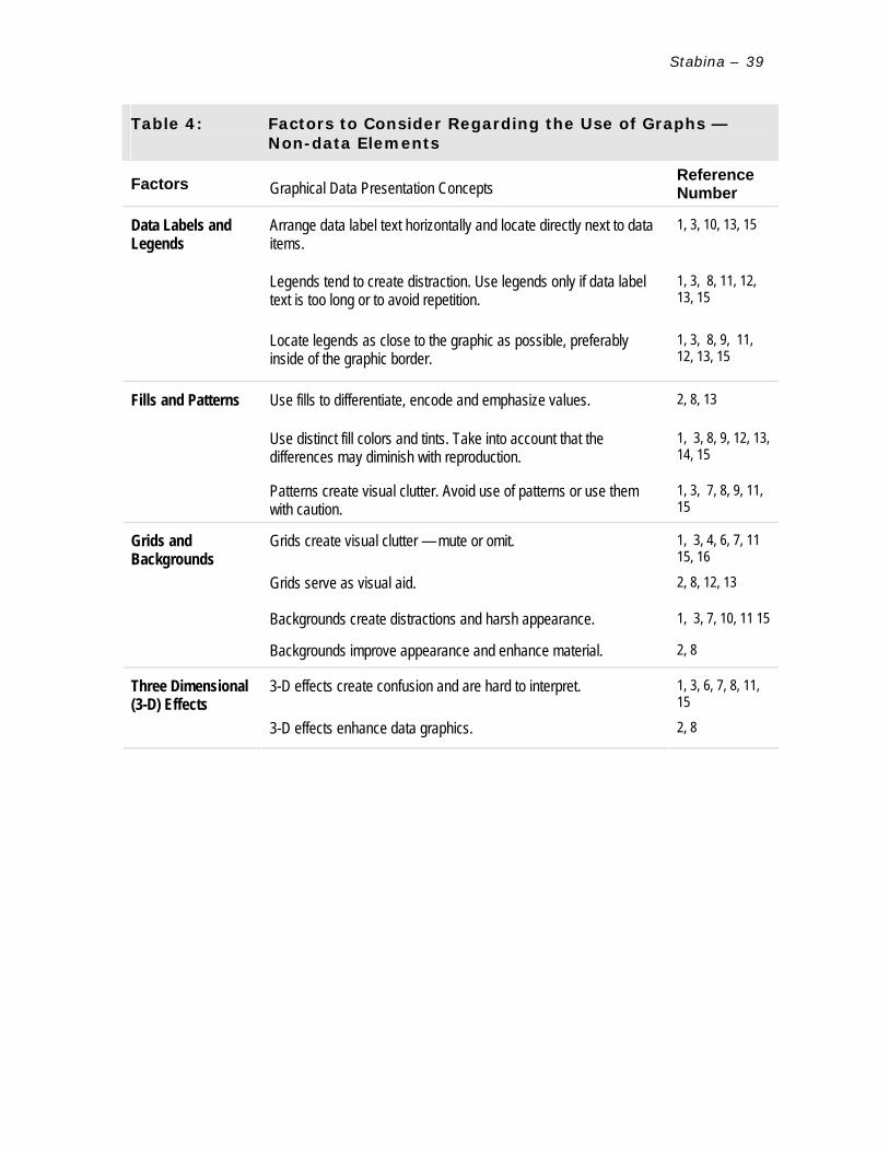
Stabina –
39
Table 4: Factors to Consider Regarding the Use of Graphs — Non-data Elements
Factors Graphical Data Presentation Concepts Reference Number
Arrange data label text horizontally and locate directly next to data items.
1, 3, 10, 13, 15
Legends tend to create distraction. Use legends only if data label text is too long or to avoid repetition.
1, 3, 8, 11, 12, 13, 15
Data Labels and Legends
Locate legends as close to the graphic as possible, preferably inside of the graphic border.
1, 3, 8, 9, 11, 12, 13, 15
Use fills to differentiate, encode and emphasize values. 2, 8, 13
Use distinct fill colors and tints. Take into account that the differences may diminish with reproduction.
1, 3, 8, 9, 12, 13, 14, 15
Fills and Patterns
Patterns create visual clutter. Avoid use of patterns or use them with caution.
1, 3, 7, 8, 9, 11, 15
Grids create visual clutter — mute or omit. 1, 3, 4, 6, 7, 11 15, 16
Grids serve as visual aid. 2, 8, 12, 13
Backgrounds create distractions and harsh appearance. 1, 3, 7, 10, 11 15
Grids and Backgrounds
Backgrounds improve appearance and enhance material. 2, 8
3-D effects create confusion and are hard to interpret. 1, 3, 6, 7, 8, 11, 15
Three Dimensional (3-D) Effects
3-D effects enhance data graphics. 2, 8

Stabina –
40
CHAPTER V
CONCLUSIONS
This study is intended to present not-for-profit organization program
managers with a set of factors for consideration for use in creation of graphical
visualizations of quantitative program evaluation data. The study addresses the two
most often used types of graphical data presentation: (1) tables and (2) graphs, and
related elements and design principles (Bigwood & Spore, 2003; Few, 2004, Tufte,
2001).
The outcome of this study consists of four tables presenting a selected
number of graphical data visualization concepts, discovered during data analysis.
Sixteen references published between 1990 to 2005, covering topics directly related
to graphics design, were chosen as a foundation for this literature review study
(Leedy, Ormrod, 2001). Data was collected and analyzed using the conceptual
content analysis method (Palmquist et al., 2005).
Information offered in these four tables is intended to familiarize not-for-
profit organization program managers with the basic quantitative data visualization
concepts. This knowledge is necessary to portray program evaluation data accurately
and comprehensibly. The concepts are organized to ensure easy reference and are
listed by the frequency of occurrence in the selected literature.
According to Werther & Berman (2001), in order to secure a stable position in
the contemporary business environment and effectively compete for funding, not-for
profit organizations are increasingly adopting market-based management
approaches. As a result, in similar fashion to for-profit companies, not-for-profits are
required to fulfill specific contractual obligations and comply with stakeholder

Stabina –
41
reporting policies through the regular delivery of measurable program evaluation
data (O'Neill, 2002; Werther & Berman, 2001).
In order to effectively present program evaluation data, it is essential that the
content of the reports is well-written and the information is thoroughly prepared and
verified (McNamara, 1999; O'Neill, 2002; Werther & Berman, 2001). At the same
time, all authors agree that inadequate graphical data visualizations most often
result from the lack of understanding of data presentation principles. The conclusion
is that even the most skillfully created graphics will fail to communicate a poorly
framed message (Bigwood & Spore, 2003; Few, 2004; Tufte, 2001).
Rapid advancement in the field of graphical data visualization software offers
seemingly endless information presentation options but it by no means guarantees
creation of quality data graphics (Bounford, 2000; Few, 2004; Tufte, 2001; Zelazny,
1996). The authors agree that elaborate visual effects offered by software
applications and employed by users who do not have understanding of basic data
visualization principles, result in poor data graphics that, while looking visually
attractive, may fail to communicate the message and may distort the content. Few
(2004) states:
… many of us … suddenly became Rembrandts of the X and Y axes, or so we
thought. Like kids in a toy store, we went wild over the available colors and
cool effects, thrilled with the new means for techno-artistic expression.
Through the magic of computers, the creation of tables and graphs became
easy – perhaps too easy.

Stabina –
42
Edward Tufte, whose writings provided rich material used to frame the
research question and to collect and analyze information visualization-related data
presented in this study, insists that the most important principle in designing data
graphics is to be responsible and preserve data integrity, not to demonstrate
designer's artistic originality. According to Tufte (1990) the mission of data graphics
is to make the viewers pay attention and think about the information, not the design.
His opinions are supported and by majority of the authors who's works were selected
for this study.
One of the most important findings of this research is the existence of a clear
differentiation between graphical data and non-data elements. It is important to
realize that in order to design successful data graphics, the emphasis must be placed
on data elements (Tufte, 2001). Although there is a minor disagreement among
authors on the topic of full elimination of non-data elements, all authors agree that
non-data elements serve a secondary role and should not distract the viewer from
perceiving the actual information. A majority of the sources reviewed for this study
share an opinion that such secondary elements as busy patterns, three-dimensional
effects, imposing fills, grids, backgrounds, and other non-data components should be
used with utmost caution or preferably not at all.
On the topic of data graphics design methods, the most valuable information
was presented by Stephen Few in his widely acclaimed book "Show me the numbers"
(2004) as well as series of on-line articles. In comparison with Tufte's work which
offers more theoretical and scientific approach to data graphic design, Few provides
insights into practical and business applications of information visualization theory.
The main conclusion drawn from this literature review is that simplicity and
putting emphasis on data elements, as opposed to non-data elements, is the key to

Stabina –
43
delivering graphics that stand for data integrity and respect for the viewer. Few
(2004) reminds managers that "the real purpose of quantitative displays [is] to
provide our readers with important, meaningful, and actionable insight – in other
words, to communicate the data simply and clearly", only then the skills of choosing
the right graphical solution will produce positive results.

Stabina –
44
APPENDIX A
TABLE DESIGN IMPROVEMENT EXAMPLES
Initial table design This table is designed using:
♦ Black, point 1 weight gridlines and 1,5 point line for the outer border;
♦ 35% gray header shading, and boldfaced header, side and last row text;
♦ Centered alignment for text and data.
Results — poor information perception: ♦ Visually heavy appearance, gridlines and header row attract main
attention. Grid lines are supportive elements and should not dominate the
table;
♦ Text on dark background is poorly legible;
♦ Excessive use of boldface text creates unnecessary emphasis;
♦ Centered alignment distracts from perceiving and comparing data.
Month Program 1 Program 2 Program 3 Program 4
January 20,000 15,000 10,000 50,000
February 15,000 13,000 25,000 15,000
March 10,000 25,000 75,000 30,000
April 30,000 10,000 30,000 25,000
May 25,000 50,000 18,000 10,000
June 75,000 20,000 20,000 30,000
July 13,000 18,000 50,000 75,000
August 20,000 25,000 25,000 13,000
September 50,000 30,000 10,000 15,000
October 18,000 15,000 75,000 25,000
November 50,000 75,000 30,000 50,000
December 25,000 10,000 13,000 18,000
Total 351,000 306,000 381,000 356,000 Figure A1: Initial Table Design

Stabina –
45
Table design improvements — Option 1 This table is designed using:
♦ 25% gray, point 1 weight vertical gridlines;
♦ 10% gray header shading, and boldface header and last row text;
♦ Left alignment for row header and categories, right alignment for columns,
including values and data labels.
Results — improved information perception: ♦ Removing some gridlines (horizontal or vertical) and using lighter line
colors create fewer distractions and allow for better information
perception;
♦ Use of lighter header shading improves legibility;
♦ Left alignment of row categories helps with legibility, and right alignment
of values and their labels creates consistency;
♦ Removing some boldface text effects brings out the data.
Figure A2: Table Design Improvements — Option 1
Month Program 1 Program 2 Program 3 Program 4 January 20,000 15,000 10,000 50,000 February 15,000 13,000 25,000 15,000 March 10,000 25,000 75,000 30,000 April 30,000 10,000 30,000 25,000 May 25,000 50,000 18,000 10,000 June 75,000 20,000 20,000 30,000 July 13,000 18,000 50,000 75,000 August 20,000 25,000 25,000 13,000 September 50,000 30,000 10,000 15,000 October 18,000 15,000 75,000 25,000 November 50,000 75,000 30,000 50,000 December 25,000 10,000 13,000 18,000
Total 351,000 306,000 381,000 356,000

Stabina –
46
Table Design Improvements — Option 2 This table is designed using:
♦ 5% gray horizontal row shading;
♦ 10% gray header shading;;
♦ Boldfaced text to emphasize categories and total values.
Results — improved information perception: ♦ Light shading (horizontal or vertical) can be used to separate values and
acts as effective delineator. Shading should be used only when large
amounts of data are presented.
♦ Boldfaced text emphasizes categories and values, but should be used
cautiously as it may distract from perceiving the actual data.
Month Program 1 Program 2 Program 3 Program 4 January 20,000 15,000 10,000 50,000 February 15,000 13,000 25,000 15,000 March 10,000 25,000 75,000 30,000 April 30,000 10,000 30,000 25,000 May 25,000 50,000 18,000 10,000 June 75,000 20,000 20,000 30,000 July 13,000 18,000 50,000 75,000 August 20,000 25,000 25,000 13,000 September 50,000 30,000 10,000 15,000 October 18,000 15,000 75,000 25,000 November 50,000 75,000 30,000 50,000 December 25,000 10,000 13,000 18,000 Total 351,000 306,000 381,000 356,000 Figure A3: Table Design Improvements — Option 2

Stabina –
47
Table Design Improvements — Option 3 This table is designed using:
♦ 25% gray horizontal rules below header and above final row;
♦ Boldfaced text to emphasize categories and total values.
Results — improved information perception: ♦ Removing all grid (horizontal or vertical) brings out the data. White spaces
between rows and columns serve as natural grid;
♦ Removing all shading helps to emphasize data;
♦ Boldfaced text emphasizes categories and values, but should be used
cautiously as it may distract from perceiving the actual data.
Figure A4: Table Design Improvements — Option 3
Month Program 1 Program 2 Program 3 Program 4
January 20,000 15,000 10,000 50,000 February 15,000 13,000 25,000 15,000 March 10,000 25,000 75,000 30,000 April 30,000 10,000 30,000 25,000 May 25,000 50,000 18,000 10,000 June 75,000 20,000 20,000 30,000 July 13,000 18,000 50,000 75,000 August 20,000 25,000 25,000 13,000 September 50,000 30,000 10,000 15,000 October 18,000 15,000 75,000 25,000 November 50,000 75,000 30,000 50,000 December 25,000 10,000 13,000 18,000
Total 351,000 306,000 381,000 356,000

Stabina –
48
Table Design Improvements — Option 4 This table is designed using:
♦ 25% gray horizontal rules below header and above final row;
♦ 5% gray shading to emphasize a specific data set;
Results — improved information perception: ♦ Removing all grid (horizontal or vertical) brings out the data. White spaces
between rows and columns serve as natural grid;
♦ Applying light shading is helpful in bringing attention to specific data sets;
♦ Removing boldfaced text can be helpful if the goal is to emphasize a
specific data set.
Figure A5: Table Design Improvements — Option 4
Month Program 1 Program 2 Program 3 Program 4
January 20,000 15,000 10,000 50,000 February 15,000 13,000 25,000 15,000 March 10,000 25,000 75,000 30,000 April 30,000 10,000 30,000 25,000 May 25,000 50,000 18,000 10,000 June 75,000 20,000 20,000 30,000 July 13,000 18,000 50,000 75,000 August 20,000 25,000 25,000 13,000 September 50,000 30,000 10,000 15,000 October 18,000 15,000 75,000 25,000 November 50,000 75,000 30,000 50,000 December 25,000 10,000 13,000 18,000
Total 351,000 306,000 381,000 356,000
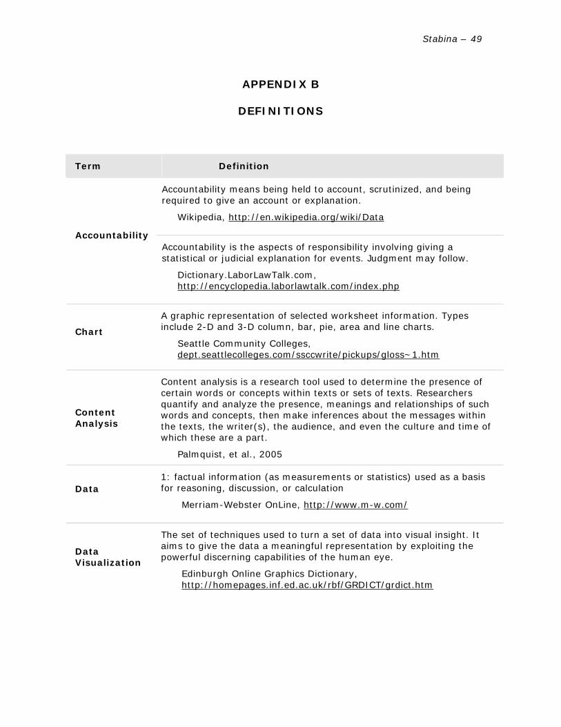
Stabina –
49
APPENDIX B
DEFINITIONS
Term Definition
Accountability means being held to account, scrutinized, and being required to give an account or explanation.
Wikipedia, http://en.wikipedia.org/wiki/Data
Accountability Accountability is the aspects of responsibility involving giving a
statistical or judicial explanation for events. Judgment may follow.
Dictionary.LaborLawTalk.com, http://encyclopedia.laborlawtalk.com/index.php
Chart
A graphic representation of selected worksheet information. Types include 2-D and 3-D column, bar, pie, area and line charts.
Seattle Community Colleges, dept.seattlecolleges.com/ssccwrite/pickups/gloss~1.htm
Content Analysis
Content analysis is a research tool used to determine the presence of certain words or concepts within texts or sets of texts. Researchers quantify and analyze the presence, meanings and relationships of such words and concepts, then make inferences about the messages within the texts, the writer(s), the audience, and even the culture and time of which these are a part.
Palmquist, et al., 2005
Data
1: factual information (as measurements or statistics) used as a basis for reasoning, discussion, or calculation
Merriam-Webster OnLine, http://www.m-w.com/
Data Visualization
The set of techniques used to turn a set of data into visual insight. It aims to give the data a meaningful representation by exploiting the powerful discerning capabilities of the human eye.
Edinburgh Online Graphics Dictionary, http://homepages.inf.ed.ac.uk/rbf/GRDICT/grdict.htm

Stabina –
50
Term Definition
Data vs. Information
Meaning of data and information
Data on its own has no meaning, only when interpreted by some kind of data processing system does it take on meaning and become information. People or computers can find patterns in data to perceive information, and information can be used to enhance knowledge. Since knowledge is prerequisite to wisdom, we always want more data and information. But, as modern societies verge on information overload, we especially need better ways to find patterns.
Wikipedia, http://en.wikipedia.org/wiki/Data
Data Visualization
The method or end result of transforming numeric and textual information into a graphic format. Visualizations are used to explore large quantities of data holistically in order to understand trends or principles.
McGraw-Hill, Higher Education Online Learning Center, Fundamentals of Graphics Communication Glossary, http://highered.mcgraw-hill.com/sites/0072322098/student_view0/glossary_i.html
Data, Quantitative
Information presented in numerical form.
The Measurement Excellence and Training Resource Information Center http://www.measurementexperts.org/instrument/term_pocket_terms.asp
Evaluation report involves collecting information about a program or some aspect of a program to make necessary decisions about the program. Program evaluation may include a variety of evaluations: needs assessments, cost/benefit analysis, effectiveness, efficiency, formative, summative, goal-based, process, outcomes, etc.
Carter McNamara, Free Management Library, 1999
http://www.mapnp.org/library/evaluatn/fnl_eval.htm Evaluation report
The systematic collection of information about the activities, characteristics, and outcomes of programs to make judgments about the program, improve program effectiveness, and/or inform decisions about future program development.
CDC, http://www.cdc.gov/tobacco/evaluation_manual/glossary.html
Funder
A person or organization, which provides grants for non-profit organizations.
The National Results Council, http://www.nationalresultscouncil.org/glossary.htm

Stabina –
51
Term Definition
A graph is a visual representation of data that displays the relationship among variables, usually cast along x and y axes. Graphs are especially useful in showing the broader trends in the data.
North Carolina State University, www.ncsu.edu/labwrite/res/res-glossary.html
Graph 1: the collection of all points whose coordinates satisfy a given relation
(as a function) 2: a diagram (as a series of one or more points, lines, line segments, curves, or areas) that represents the variation of a variable in comparison with that of one or more other variables
Merriam-Webster OnLine, http://www.m-w.com/
Any communication or representation of knowledge such as facts, data, or opinions, in any medium or form, including textual, numerical, graphic, cartographic, narrative, or audio-visual forms.
The Open Group, www.opengroup.org/togaf/p4/glossary/glossary.htm Information
Information is the result of processing, manipulating and organizing data in a way that adds to the knowledge of the person receiving it.
Oracle FAQ, www.orafaq.com/glossary/faqglosi.htm
Literature Review
The review describes theoretical perspectives and previous research findings related to the problem at hand. Its function is to "look again" (re + view) at what others have done in areas that are similar, though not necessarily identical, to one's own area of investigation.
Leedy & Ormrod, 2001
Method
A structured organization of tasks, estimates, and guidelines that provide a systematic approach or discipline.
University Information Services (UIS), Georgetown University, www.georgetown.edu/uis/ia/dw/GLOSSARY0816.html
Not-for-profit Organization
An entity with the following characteristics that distinguish it from a business enterprise: (a) contributions of significant amounts of resources from providers who do not expect proportionate return, (b) operating purposes other than to provide goods or services at a profit, and (c) absence of ownership interests like those of business enterprises.
PSU Foundation Services, http://foundation.pdx.edu/fs/glossary.jsp

Stabina –
52
Term Definition
Non-profit means not conducted or maintained for the purpose of making a profit. Instead, it operates to serve a public good. Any net earnings by a non-profit organization are used by the organization for the purposes of which it was established.
Community Services Council Virtual Resource Center, http://envision.ca/templates/profile.asp?ID=56
A non-profit organization (often called "non-profit org" or simply "non-profit" or "not-for-profit") can be seen as an organization that doesn't have a goal to make a profit. It may be entirely funded by voluntary donations.
Wikipedia, http://en.wikipedia.org/wiki/Non_profit
Outcome
A description of the intended result, effect, or consequence that will occur from carrying out a program or activity.
Balanced Scorecard Institute, http://www.balancedscorecard.org/basics/definitions.html
Program
A program (in management) has at least two senses:
1. A collection of projects that are directed toward a common goal, e.g., the NASA space program
2. A broad framework of goals to be achieved, serving as a basis to define and plan specific projects, e.g. the EU's SAPARD program
Wikipedia, http://en.wikipedia.org/wiki/Program_%28management%29
Program Evaluation
Evaluation is the systematic application of scientific methods to assess the design, implementation, improvement or outcomes of a program.
Rossi, P.H., et al (2003). Evaluation: A systematic approach (7th edition). Newbury Park, CA: Sage Publications, Inc.
Program Manager
The individual responsible for overseeing and controlling a function, component, project, etc., and may include research leaders, scientists, engineers, project officers, administrative officers and other individuals. Sometimes a person in this role is referred to as a PM.
Knowledge Net, 2005, http://www.knownet.hhs.gov/
Report
A narrative, statistical, graphic, or other account of operations, conditions, or plans that is recorded on any medium for submission by one person, office, or organization to another.
Unites States Environmental Protection Agency, http://www.epa.gov/records/gloss/gloss07.htm
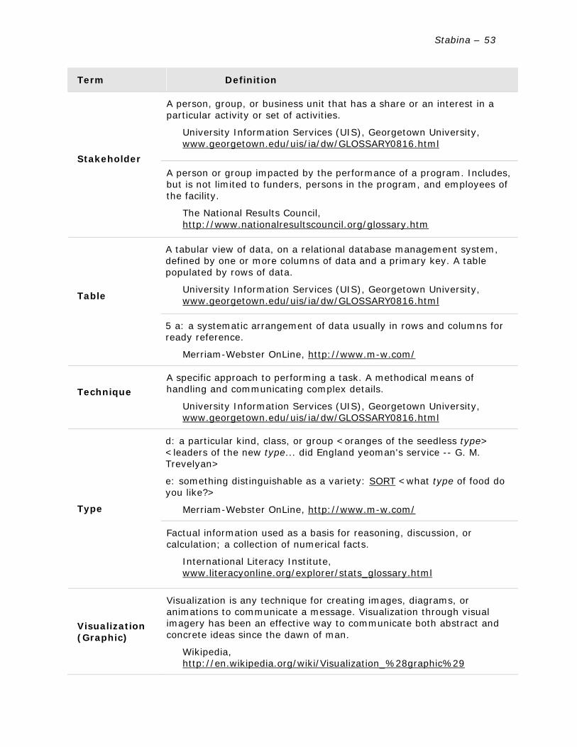
Stabina –
53
Term Definition
A person, group, or business unit that has a share or an interest in a particular activity or set of activities.
University Information Services (UIS), Georgetown University, www.georgetown.edu/uis/ia/dw/GLOSSARY0816.html
Stakeholder A person or group impacted by the performance of a program. Includes,
but is not limited to funders, persons in the program, and employees of the facility.
The National Results Council, http://www.nationalresultscouncil.org/glossary.htm
A tabular view of data, on a relational database management system, defined by one or more columns of data and a primary key. A table populated by rows of data.
University Information Services (UIS), Georgetown University, www.georgetown.edu/uis/ia/dw/GLOSSARY0816.html Table
5 a: a systematic arrangement of data usually in rows and columns for ready reference.
Merriam-Webster OnLine, http://www.m-w.com/
Technique
A specific approach to performing a task. A methodical means of handling and communicating complex details.
University Information Services (UIS), Georgetown University, www.georgetown.edu/uis/ia/dw/GLOSSARY0816.html
d: a particular kind, class, or group <oranges of the seedless type> <leaders of the new type... did England yeoman's service -- G. M. Trevelyan>
e: something distinguishable as a variety: SORT <what type of food do you like?>
Merriam-Webster OnLine, http://www.m-w.com/ Type
Factual information used as a basis for reasoning, discussion, or calculation; a collection of numerical facts.
International Literacy Institute, www.literacyonline.org/explorer/stats_glossary.html
Visualization (Graphic)
Visualization is any technique for creating images, diagrams, or animations to communicate a message. Visualization through visual imagery has been an effective way to communicate both abstract and concrete ideas since the dawn of man.
Wikipedia, http://en.wikipedia.org/wiki/Visualization_%28graphic%29

Stabina –
54
Term Definition
Visualization (Information)
As a subject in computer science, information visualization is the use of interactive, sensory representations, typically visual, of abstract data to reinforce cognition.
Information visualization is a complex research area. It builds on theory in information design, computer graphics, human-computer interaction and cognitive science.
Wikipedia, http://en.wikipedia.org/wiki/Information_visualization

Stabina –
55
REFERENCES
Berry, J. (2003, November 30). The Lobbying Law Is More Charitable Than They
Think: Clarifying the Guidelines for Non-Profit Lobbying. The Washington Post,
p.B01
Berry J. & Arons, D. (2003). A Voice for Nonprofits. Washington, DC: Brookings
Institution Press.
Bigwood, S. & Spore, M. (2003). Presenting numbers, tables, and charts. New York,
NY: Oxford University Press Inc.
Bounford, T. (2000). Digital diagrams: effective design and presentation of statistical
information. New York, NY: Watson-Guptill Publications.
Brinckerhoff, P. C. (2000). Mission-based management: leading your not-for-profit in
the 21st century. New York, NY: John Wiley and Sons, Inc.
Craig, M. (2000). Thinking visually: Business application of 14 core diagrams.
London, WC2R 00B: Wellington House.
Davis, A. (1999). Bad Graphs, Good Lessons. Presenting Visual Information
Responsibly, SIGGRAPH Conference website. Retrieved March 28, 2005, from
http://www.siggraph.org/publications/newsletter/v33n3/contributions/davis.
html
Dees, J. G., Emerson, J. & Economy, P. (2001). Enterprising nonprofits: a toolkit for
social entrepreneur. New York, NY: John Wiley and Sons, Inc.
Few, S. (2004). Show me the numbers: designing tables and graphs to enlighten.
Oakland, CA: Analytic Press.

Stabina –
56
Few, S. (2004, August). Common Mistakes in Data Presentation. Intelligent
Enterprise. Retrieved May 2, 2005, from
http://www.intelligententerprise.com/showArticle.jhtml?articleID=26100530
Harris, R. L. (1999). Information graphics: a comprehensive illustrated reference:
visual tools for analyzing, managing, and communicating. New York, NY:
Oxford University Press.
Horton, W. (1991). Illustrating computer documentation: the art of presenting
information graphically on paper and online. New York, NY: John Wiley &
Sons, Inc.
Horton, W. & Horton, K. (1999). Picture-perfect proposals: putting visual literacy to
work. Association of Proposal Management Professionals. Retrieved March 29,
2005 from http://www.apmp.org/docs/fall99/19pictureperfect.pdf
Leedy, P. D. & Ormrod, J. A. (2001). Practical research: planning and design. Upper
Saddle River, NJ: Prentice-Hall, Inc.
McNamara, C. (1999). Basic guide to program evaluation. Free Management Library.
Retrieved April 4, 2005 from
http://www.mapnp.org/library/evaluatn/fnl_eval.htm
McNamara, C. (1999). Basic guide to outcomes-based evaluation for nonprofit
organizations with very limited resources. Free Management Library.
Retrieved April 4, 2005 from
http://www.mapnp.org/library/evaluatn/outcomes.htm

Stabina –
57
McNamara, C. (2003). Overview of non-profit program planning. Ohio Literacy
Resource Center. Retrieved April 3, 2005 from
http://literacy.kent.edu/Oasis/grants/overviewprogplan.html
O'Neill, E. (2002, September, 4). Non-Profit Hotline: Program evaluation.
BusinessNorth. Retrieved April 6, 2005 from
http://www.businessnorth.com/nonprofithotline.asp?RID=534
Palmquist, Mike, et al. (2005). Content Analysis. Writing@CSU. Colorado State
University Department of English. Retrieved April 10, 2005 from
http://writing.colostate.edu/references/research/content/
Parker, R. (2003). Looking good in print, fifth edition. Scottsdale, AZ: Paraglyph
Press, Inc.
Puett, R. (2000). Program Evaluation 101. National Violence Against Women
Prevention Research Center. Retrieved April 5, 2005 from:
http://www.vawprevention.org/research/programeval.shtml
Seubert, D. (nd). Evaluations & performance measurement. Advantage Consulting
Services. Retrieved April 4, 2005 from
http://advantageconsulting.tripod.com/id14.html
The Program Manager's Guide to Evaluation (2005). Administration for Children and
Families. Retrieved April 2, 2005 from
http://www.acf.hhs.gov/programs/opre/other_resrch/pm_guide_eval/reports/
pmguide/pmguide_toc.html
Tufte, E. (1990). Envisioning Information. Cheshire, CT: Graphics Press.

Stabina –
58
Tufte, E. (1997). Visual explanations: images and quantities, evidence and narrative.
Cheshire, CT: Graphics Press.
Tufte, E. (2001). Visual display of quantitative information. Cheshire, CT: Graphics
Press.
Webopedia. (2002). The #1 online encyclopedia dedicated to computer technology.
Retrieved March 25, 2002 from http://www.webopedia.com
Werther, B. W., & Berman, E. M. (2001). Third sector management: the art of
managing nonprofit organizations. Washington, DC: Georgetown University
Press.
W.K. Kellogg evaluation handbook (1998).W.K. Kellogg Foundation.
http://www.wkkf.org/ Publications/evalhdbk/default.htm
Zelazny, G. (1996). Say it with charts: the executive's guide to visual
communication. Burr Ridge, IL: Irwin Professional Publishing.

Stabina –
59
BIBLIOGRAPHY
Brath, R. & Peters, M. (2005). Information Visualization for Business – Past & Future.
DM Review magazine. Retrieved March 28, 2005, from
http://www.dmreview.com/article_sub.cfm?articleId=1016489
Few, S. (2004, September). Data Presentation: Tapping the Power of Visual
Perception. Intelligent Enterprise. Retrieved March 30, 2005, from
http://www.intelligententerprise.com/showArticle.jhtml?articleID=31400009
Few, S. (2004, October). Elegance through simplicity. Intelligent Enterprise.
Retrieved March 30, 2005, from
http://www.intelligententerprise.com/showArticle.jhtml?articleID=49400920
Few, S. (2004, September). Enie, meenie, minie, moe: selecting the right graph for
your message. Intelligent Enterprise. Retrieved March 30, 2005, from
http://www.intelligententerprise.com/showArticle.jhtml?articleID=46800517
Few, S. (2004, July). The information cannot speak for itself. Intelligent Enterprise.
Retrieved March 30, 2005, from
http://www.intelligententerprise.com/showArticle.jhtml?articleID=49400920
Few, S. (2005). Data visualization: grid lines in graphs are rarely useful. DM Review
magazine. Retrieved March 28, 2005, from
http://www.dmreview.com/article_sub.cfm?articleId=1018118
Gershon, N. (2000). Knowing What We Don’t Know; How to Visualize an Imperfect
World. Presenting Visual Information Responsibly, SIGGRAPH Conference
website. Retrieved March 28, 2005, from

Stabina –
60
http://www.siggraph.org/publications/newsletter/v33n3/contributions/gersho
n2.html
Horton, W. & Horton, K. (1999). Picture-Perfect Proposals: Putting Visual Literacy to
Work. Association of Proposal Management Professionals. Retrieved April 2,
2005, from http://www.apmp.org/PubsAPMP.asp.
Klass, G. (2002). Presenting data: tabular and graphical display of social indicators.
Illinois State University. Retrieved April 2, 2005, from
http://lilt.ilstu.edu/gmklass/pos138/datadisplay/
Measuring outcomes (2001, May). Research highlights from the nonprofit sector
research fund. Aspen Institute. Retrieved April 2, 2005, from
www.nonprofitresearch.org/usr_doc/NSRF_MAY_SNAP2.pdf
Style guide for business and technical communication. (2000). Salt Lake City, UT:
Franklin Covey Co.


![IT331 Network Development Capstone Project [Onsite]thespringergroup.yolasite.com/resources/IT331_Appendix_A.pdf · Network Development Capstone Project Appendix A—Capstone Project](https://img.pdfslide.us/doc/110x75/5aa073e07f8b9a62178e2123/it331-network-development-capstone-project-onsite-development-capstone-project.jpg)