Embed Size (px)
DESCRIPTION
Elaboración de mapas con el software libre QGis y diseño de cartografía
Citation preview
QGIS Map Design
Anita Graser
Gretchen N. Peterson
Credits & Copyright
QGIS Map Design
by Anita Graser and Gretchen N. Peterson
Published by Locate Press LLC
Copyright © 2016 Locate Press LLCISBN: 978-0989421751All rights reserved.
Direct permission requests to [email protected] or mail:Locate Press LLC, PO Box 671897, Chugiak, AK, USA, 99567-1897
Editor Gary ShermanCover Design Julie SpringerInterior Design Based on Memoir-LATEXdocument classPublisher Website http://locatepress.comBook Website http://locatepress.com/qmd
No part of this work may be reproduced or transmitted in any form or by any means, electronicor mechanical, including photocopying, recording, or by any information storage or retrievalsystem, without the prior written permission of the copyright owner and the publisher.

Contents
Contents 5Foreword 7
1 Layer Styling 91 Mapping Economies Using GDP Choropleths or Scaled Symbols 111.1 Introduction to Classed Choropleth Maps . . . . . . . . . . . . . . . . . . . . . . 111.2 Exploring the Dataset . . . . . . . . . . . . . . . . . . . . . . . . . . . . . . . . . 111.3 Setting Up a Classed Choropleth Map . . . . . . . . . . . . . . . . . . . . . . . . 121.4 Scaled Circle Symbols . . . . . . . . . . . . . . . . . . . . . . . . . . . . . . . . . 13
5

Foreword
QGIS has come a long way in its fourteen years of life. From humble beginnings as a mere dataviewer, it now provides a vast array of GIS functionality, tool integration, extensible plugins,and—cartographic capability.
Slighted in years past for its inability to make a "pretty" map, QGIS now boasts a heftycomplement of features that move it to the forefront. In this book, Anita and Gretchen haveput together an impressive set of recipes that will help you not only learn new techniques, butreally bump up the quality of your maps.
The recipes in the book are tailored for use with the QGIS Long Term Release (LTR), version2.14. You’ll also need a basic familiarity with QGIS, as the authors jump right in to thecartographic waters.
I know you’ll learn a lot from the techniques presented within, and be able to adapt and evolvethem to get the most out of your mapping projects.
I hope you enjoy the book!
Founder of QGIS / Publisher at Locate Press LLC

Part 1
Layer Styling
1. Mapping Economies Using GDP Choroplethsor Scaled Symbols
In this recipe, we create a classed choroplethmap illustrating the per capita gross domesticproduct (GDP) of the countries of the world.
To reproduce this map in QGIS, open thechoropleth_gdp.qgs project.
1.1 Introduction to ClassedChoropleth Maps
Choropleths are a type of thematic map in whichareas are shaded or patterned in proportion toa numerical attribute representing a rate or ra-tio, such as population density or per capitaincome. Never use choropleths for raw dataor counts, such as country population or totalGDP. Converting raw data and counts to rates,such as population per area unit or GDP percapita, is necessary, otherwise, all your mapwould show is that, on average, bigger coun-tries have more inhabitants and a higher GPDthan smaller countries.
A general rule of thumb is to stick to three toseven classes for classed choropleth maps. Inthis recipe, we use five classes to categorize thecountries.
1.2 Exploring the Dataset
For this map, we load the:
ne_10m_admin_0_countries.shp
shapefile into QGIS.
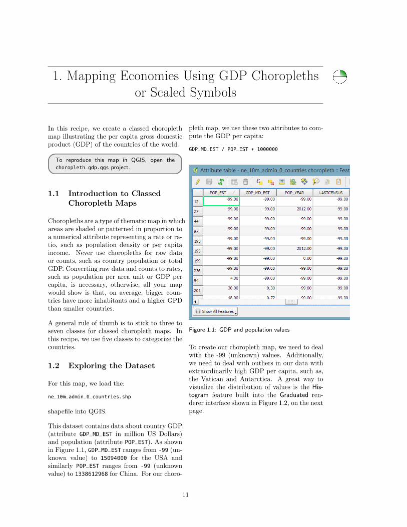
This dataset contains data about country GDP(attribute GDP_MD_EST in million US Dollars)and population (attribute POP_EST). As shownin Figure 1.1, GDP_MD_EST ranges from -99 (un-known value) to 15094000 for the USA andsimilarly POP_EST ranges from -99 (unknownvalue) to 1338612968 for China. For our choro-
pleth map, we use these two attributes to com-pute the GDP per capita:
GDP_MD_EST / POP_EST * 1000000
Figure 1.1: GDP and population values
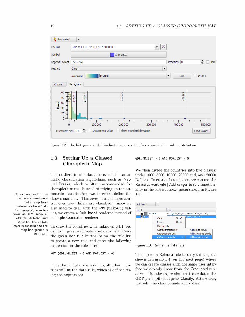
To create our choropleth map, we need to dealwith the -99 (unknown) values. Additionally,we need to deal with outliers in our data withextraordinarily high GDP per capita, such as,the Vatican and Antarctica. A great way tovisualize the distribution of values is the His-togram feature built into the Graduated ren-derer interface shown in Figure 1.2, on the nextpage.
11
12 1.3. SETTING UP A CLASSED CHOROPLETH MAP
Figure 1.2: The histogram in the Graduated renderer interface visualizes the value distribution
1.3 Setting Up a ClassedChoropleth Map
The outliers in our data throw off the auto-matic classification algorithms, such as Nat-ural Breaks, which is often recommended forchoropleth maps. Instead of relying on the au-tomatic classification, we therefore define theclasses manually. This gives us much more con-trol over how things are classified. Since wealso need to deal with the -99 (unkown) val-ues, we create a Rule-based renderer instead ofa simple Graduated renderer.
To draw the countries with unknown GDP percapita in gray, we create a no data rule. Pressthe green Add rule button below the rule listto create a new rule and enter the followingexpression in the rule filter:
NOT (GDP_MD_EST > 0 AND POP_EST > 0)
Once the no data rule is set up, all other coun-tries will fit the data rule, which is defined us-ing the expression:
GDP_MD_EST > 0 AND POP_EST > 0
We then divide the countries into five classes:under 1000, 5000, 10000, 20000 and, over 20000Dollars. To create these classes, we can use theRefine current rule | Add ranges to rule function-ality in the rule’s context menu shown in Figure1.3.The colors used in this
recipe are based on acolor ramp from
Petersons’s book “GISCartography”, from top
down: #a63e75, #eaa28a,#f9cd90, #c4ef6d, and#56a617. The nodata
color is #8d8d8d and themap background is
#163041).
Figure 1.3: Refine the data rule
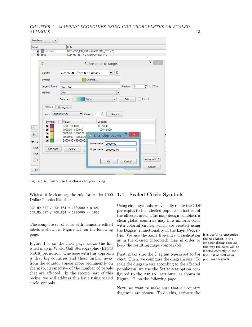
This opens a Refine a rule to ranges dialog (asshown in Figure 1.4, on the next page) wherewe can create classes with the same user inter-face we already know from the Graduated ren-derer. Use the expression that calculates theGDP per capita and press Classify. Afterwards,just edit the class bounds and colors.
CHAPTER 1. MAPPING ECONOMIES USING GDP CHOROPLETHS OR SCALEDSYMBOLS 13
Figure 1.4: Customize the classes to your liking
With a little cleaning, the rule for “under 1000Dollars” looks like this:
GDP_MD_EST / POP_EST * 1000000 > 0 AND
GDP_MD_EST / POP_EST * 1000000 <= 1000
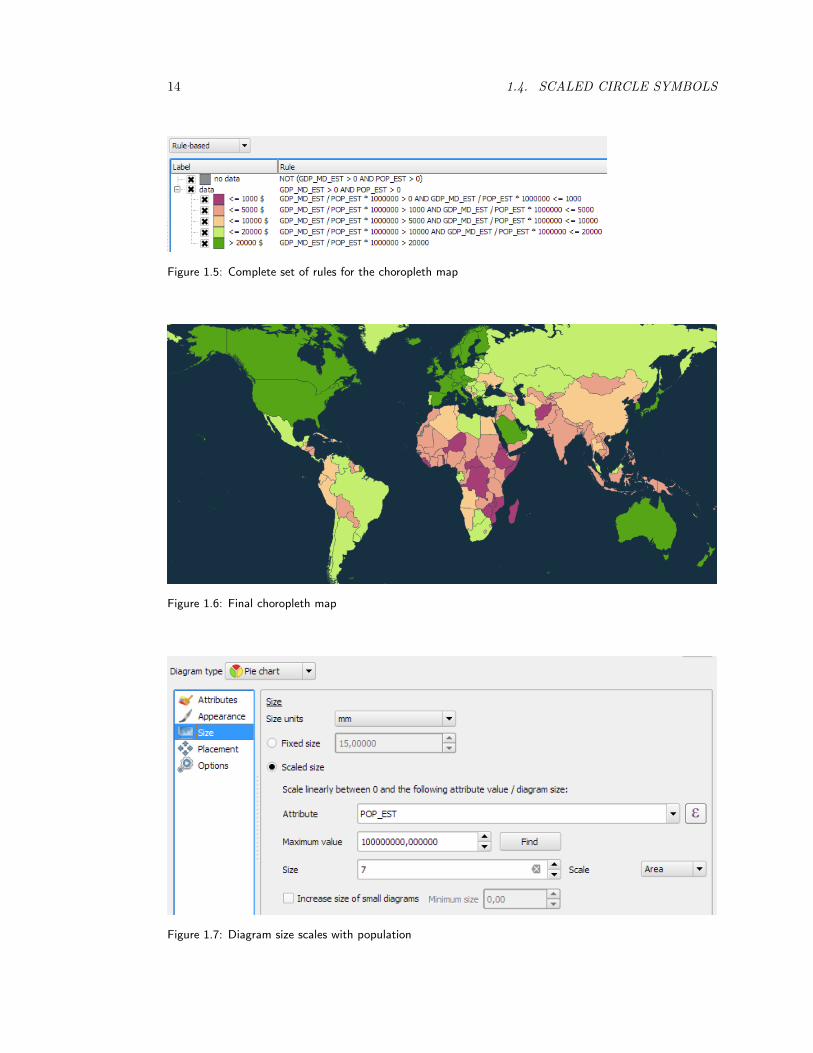
The complete set of rules with manually editedlabels is shown in Figure 1.5, on the followingpage. It is useful to customize
the rule labels in therenderer dialog becausethis way the rules will belabeled correctly in thelayer list as well as inprint map legends.
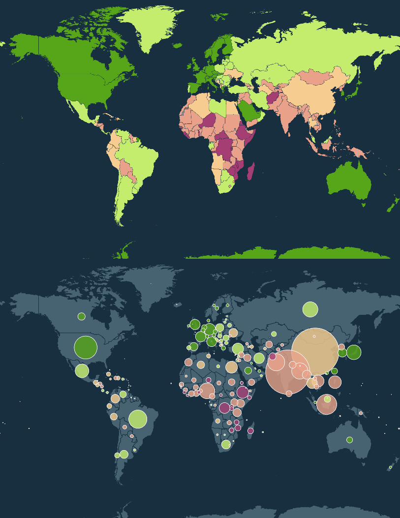
Figure 1.6, on the next page shows the fin-ished map in World Gall Stereographic (EPSG54016) projection. One issue with this approachis that big countries and those further awayfrom the equator appear more prominently onthe map, irrespective of the number of peoplethat are affected. In the second part of thisrecipe, we will address this issue using scaledcircle symbols.
1.4 Scaled Circle Symbols
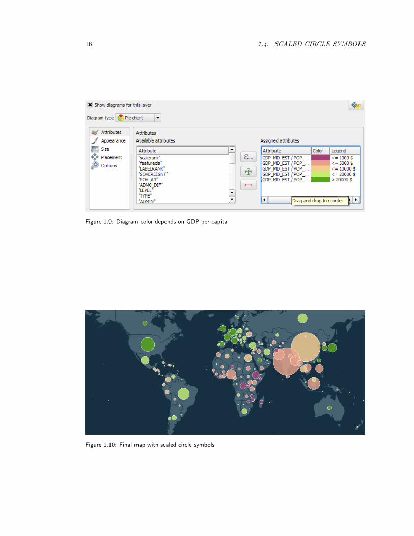
Using circle symbols, we visually relate the GDPper capita to the affected population instead ofthe affected area. This map design combines aclean global countries map in a uniform colorwith colorful circles, which are created usingthe Diagrams functionality in the Layer Proper-ties. We use the same five-entry classificationas in the classed choropleth map in order tokeep the resulting maps comparable.
First, make sure the Diagram type is set to Piechart. Then, we configure the diagram size. Toscale the diagram size according to the affectedpopulation, we use the Scaled size option con-figured to the POP_EST attribute, as shown inFigure 1.7, on the following page.
Next, we want to make sure that all countrydiagrams are shown. To do this, activate the
14 1.4. SCALED CIRCLE SYMBOLS
Figure 1.5: Complete set of rules for the choropleth map
Figure 1.6: Final choropleth map
Figure 1.7: Diagram size scales with population
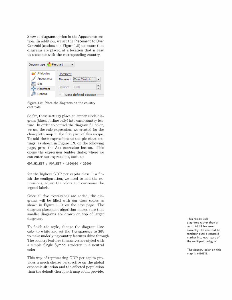
Show all diagrams option in the Appearance sec-tion. In addition, we set the Placement to OverCentroid (as shown in Figure 1.8) to ensure thatdiagrams are placed at a location that is easyto associate with the corresponding country.
Figure 1.8: Place the diagrams on the countrycentroids
So far, these settings place an empty circle dia-gram (black outline only) into each country fea-ture. In order to control the diagram fill color,we use the rule expressions we created for thechoropleth map in the first part of this recipe.To add these expressions to the pie chart set-tings, as shown in Figure 1.9, on the followingpage, press the Add expression button. Thisopens the expression builder dialog where wecan enter our expressions, such as:
GDP_MD_EST / POP_EST * 1000000 > 20000
for the highest GDP per capita class. To fin-ish the configuration, we need to add the ex-pressions, adjust the colors and customize thelegend labels.
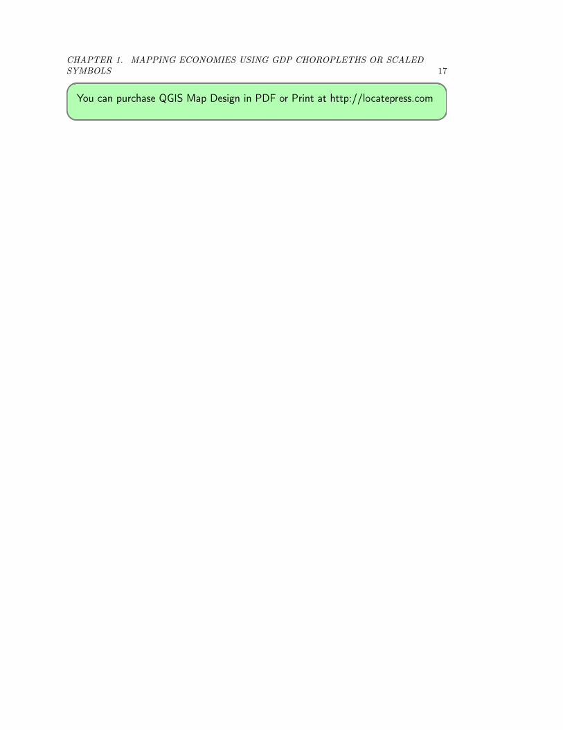
Once all five expressions are added, the dia-grams will be filled with our class colors asshown in Figure 1.10, on the next page. Thediagram placement algorithm makes sure thatsmaller diagrams are drawn on top of largerdiagrams. This recipe uses
diagrams rather than acentroid fill becausecurrently the centroid fillrenderer puts a centroidmarker into each part ofthe multipart polygon.
To finish the style, change the diagram Linecolor to white and set the Transparency to 20%to make underlying country features shine through.The country features themselves are styled witha simple Single Symbol renderer in a neutralcolor. The country color on this
map is #486373.This way of representing GDP per capita pro-vides a much clearer perspective on the globaleconomic situation and the affected populationthan the default choropleth map could provide.
16 1.4. SCALED CIRCLE SYMBOLS
Figure 1.9: Diagram color depends on GDP per capita
Figure 1.10: Final map with scaled circle symbols
CHAPTER 1. MAPPING ECONOMIES USING GDP CHOROPLETHS OR SCALEDSYMBOLS 17
You can purchase QGIS Map Design in PDF or Print at http://locatepress.com

Books from Locate Press
The PyQGIS Programmer’s Guide - Extending QGISjust got easier! This book is your fast track to getting started withPyQGIS. After a brief introduction to Python, you’ll learn how to un-derstand the QGIS Application Programmer Interface (API), writescripts, and build a plugin. The book is designed to allow you to workthrough the examples as you go along. At the end of each chapteryou’ll find a set of exercises you can do to enhance your learningexperience.The PyQGIS Programmer’s Guide is compatible with the version 2.0API released with QGIS 2.x. All code samples and data are freelyavailable from the book’s website. Get started learning PyQGIStoday!
Geospatial Power Tools - Everyone loves power tools. TheGDAL and OGR utilities are the power tools of the GIS world, andbest of all, they’re free.The utilities include tools for examining, converting, transforming,building and analysing data. This book is a collection of the GDALand OGR documentation, but also includes substantial new contentdesigned to help guide you in using the utilities to solve your currentdata problems.Inside you’ll find a quick reference for looking up the right syntax andexample usage quickly. The book is divided into three parts: Work-flows and examples, GDAL raster utilities, and OGR vector utilities.Once you get a taste of the power the GDAL/OGR suite provides,you’ll wonder how you ever got along without them. This book willget you on the fast track to becoming more efficient in yourGIS data processing efforts.
Books from Locate Press
The Geospatial Desktop provides a foundational level ofknowledge for understanding GIS and the open source desktop map-ping applications that are available for use, for free, today.Learn about vector and raster data, how to convert data, interact-ing with spatial databases, creating new map data, geoprocessing,scripting, and more.Special sections include focused learning on the Quantum GIS andGRASS GIS software platforms as well as an introduction to otherpackages.The Geospatial Desktop is written by the founder of the QuantumGIS project, so you can rest assured that you will be led by one ofthe most knowledgeable authors on the subject.
The Quantum GIS Training Manual - Get the jump-start you need to learn this incredibly popular free desktop mappingand GIS toolset. Comprehensive and structured, your introductionbegins with a quick download of example data, making it easy foryou to work your way through the concepts and practical exercises,complete with answers and examples.Ideal for classroom instruction and self-guided learning, included areall the materials needed to run a five day course on Quantum GIS,PostgreSQL and PostGIS. Content is structured for novice, interme-diate and advanced users alike. Seasoned Quantum GIS users willalso find tips and new techniques to apply to every mapping project.Windows, Mac OS X, or Linux? It’s your choice, this book worksfor all.Works with QGIS 1.8
Be sure to visit http://locatepress.com for information on new andupcoming titles.