Embed Size (px)
Citation preview

Putting it to use: dissemination and
utilization of routinely collected data by
ICAP in Kenya
Presented by:
Duncan Chege, PhD
Director - Monitoring, Evaluation and Research
Kelvin Ndede, MSc
Senior M&E Officer - Continuous Quality Improvement
Thursday, September 15, 2016
Strategic Information Unit Webinar
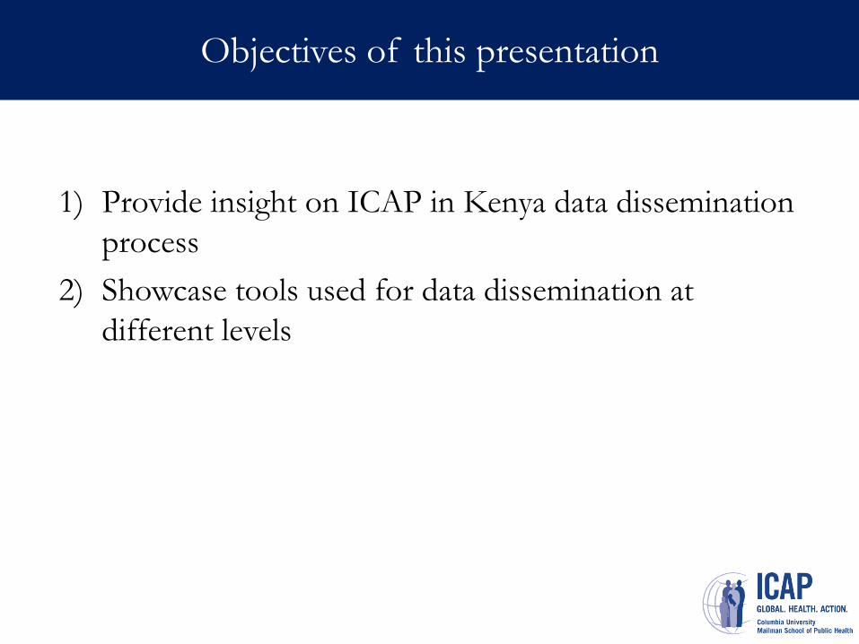
Objectives of this presentation
1) Provide insight on ICAP in Kenya data dissemination
process
2) Showcase tools used for data dissemination at
different levels
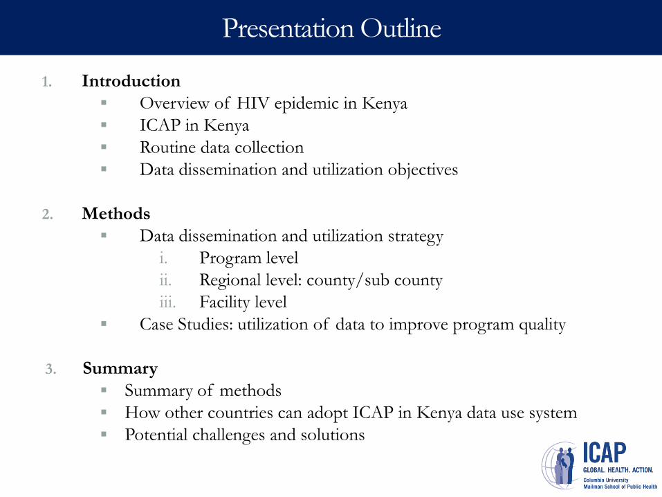
Presentation Outline
1. Introduction
Overview of HIV epidemic in Kenya
ICAP in Kenya
Routine data collection
Data dissemination and utilization objectives
2. Methods
Data dissemination and utilization strategy
i. Program level
ii. Regional level: county/sub county
iii. Facility level
Case Studies: utilization of data to improve program quality
3. Summary
Summary of methods
How other countries can adopt ICAP in Kenya data use system
Potential challenges and solutions

I. Introduction ICAP in Kenya
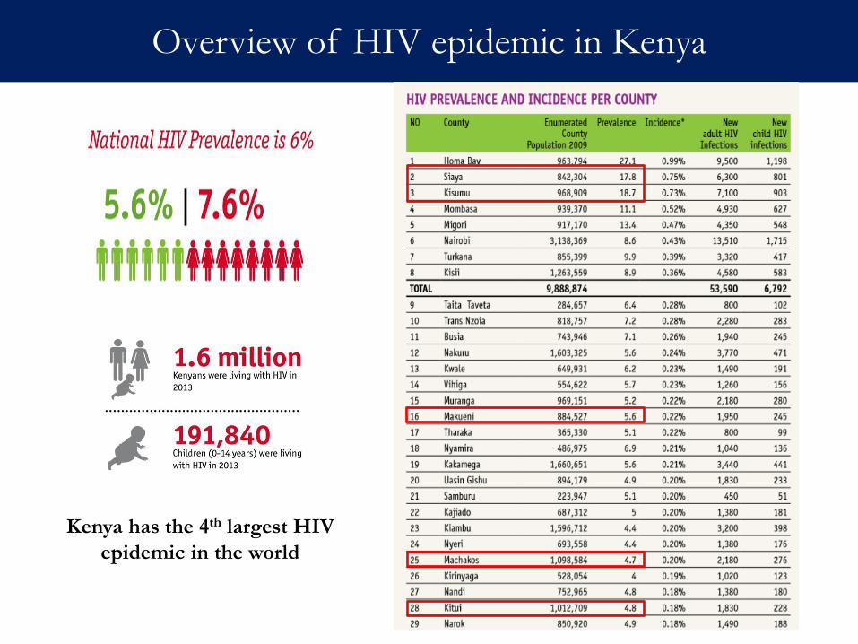
Overview of HIV epidemic in Kenya
Kenya has the 4th largest HIV
epidemic in the world
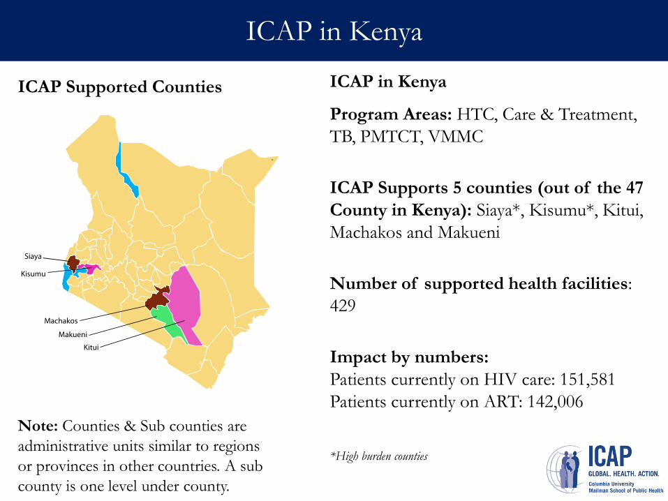
ICAP in Kenya
ICAP in Kenya
Program Areas: HTC, Care & Treatment,
TB, PMTCT, VMMC
ICAP Supports 5 counties (out of the 47
County in Kenya): Siaya*, Kisumu*, Kitui,
Machakos and Makueni
Number of supported health facilities:
429
Impact by numbers:
Patients currently on HIV care: 151,581
Patients currently on ART: 142,006
*High burden counties
ICAP Supported Counties
Note: Counties & Sub counties are
administrative units similar to regions
or provinces in other countries. A sub
county is one level under county.
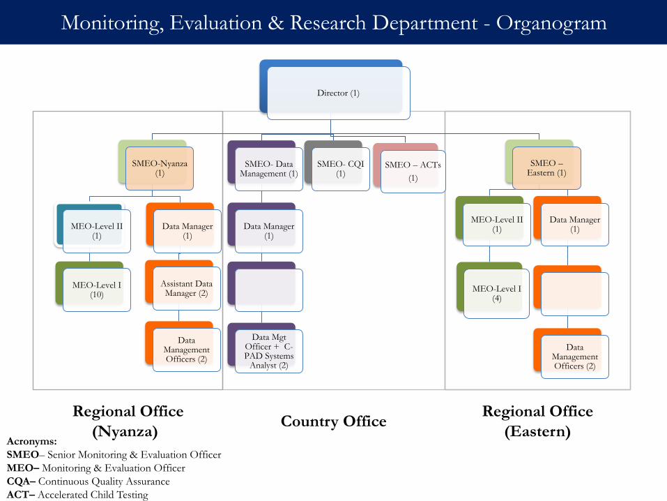
Country Office
Regional Office
(Nyanza))
Regional Office
(Eastern)
Monitoring, Evaluation & Research Department - Organogram
Director (1)
SMEO-Nyanza (1)
MEO-Level II (1)
MEO-Level I (10)
Data Manager (1)
Assistant Data Manager (2)
Data Management Officers (2)
SMEO- Data Management (1)
Data Manager (1)
Data Mgt Officer + C-PAD Systems
Analyst (2)
SMEO- CQI (1)
SMEO – ACTs
(1)
SMEO –Eastern (1)
MEO-Level II (1)
MEO-Level I (4)
Data Manager (1)
Data Management Officers (2)
Acronyms:
SMEO– Senior Monitoring & Evaluation Officer
MEO– Monitoring & Evaluation Officer
CQA– Continuous Quality Assurance
ACT– Accelerated Child Testing
Routine data collection
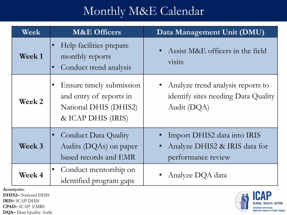
Monthly M&E Calendar
Week M&E Officers Data Management Unit (DMU)
Week 1
• Help facilities prepare
monthly reports
• Conduct trend analysis
• Assist M&E officers in the field
visits
Week 2
• Ensure timely submission
and entry of reports in
National DHIS (DHIS2)
& ICAP DHIS (IRIS)
• Analyze trend analysis reports to
identify sites needing Data Quality
Audit (DQA)
Week 3
• Conduct Data Quality
Audits (DQAs) on paper
based records and EMR
• Import DHIS2 data into IRIS
• Analyze DHIS2 & IRIS data for
performance review
Week 4 • Conduct mentorship on
identified program gaps • Analyze DQA data
Acronyms:
DHIS2– National DHIS
IRIS– ICAP DHIS
CPAD– ICAP EMRS
DQA– Data Quality Audit
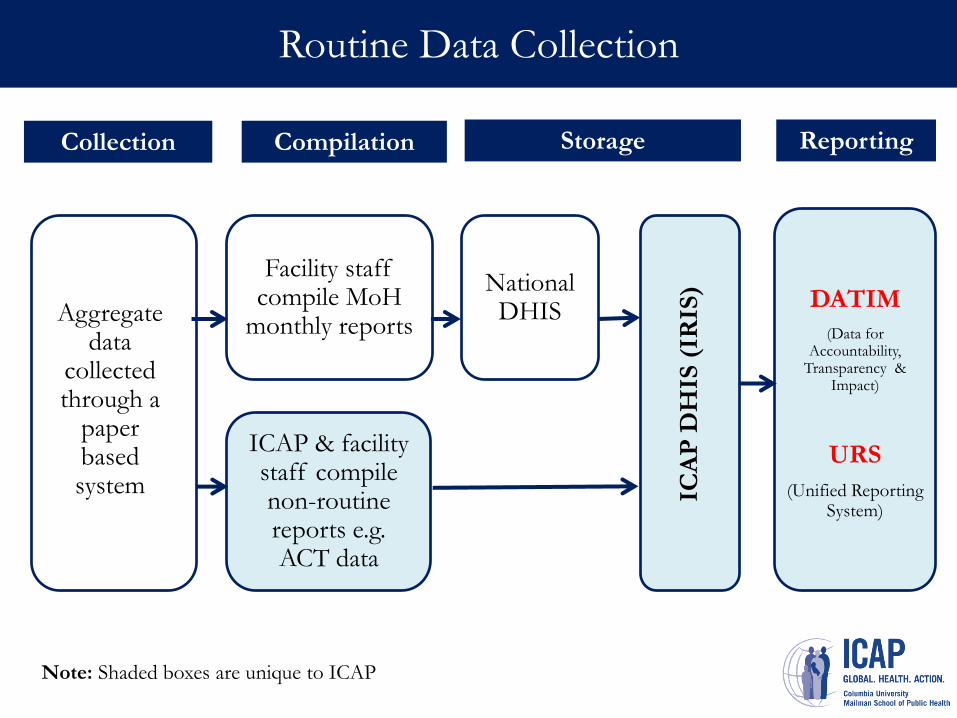
Routine Data Collection
Facility staff compile MoH
monthly reports
National DHIS
DATIM
(Data for Accountability,
Transparency & Impact)
URS
(Unified Reporting System)
Collection Compilation Storage Reporting
ICAP & facility staff compile non-routine reports e.g. ACT data
ICA
P D
HIS
(IR
IS)
Aggregate data
collected through a
paper based system
Note: Shaded boxes are unique to ICAP
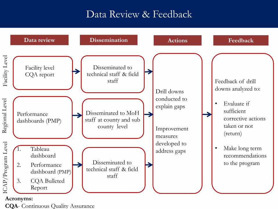
Data Review & Feedback
Facility level CQA report
Performance dashboards (PMP)
Disseminated to technical staff & field
staff
Disseminated to technical staff & field
staff
Feedback of drill
downs analyzed to:
• Evaluate if
sufficient
corrective actions
taken or not
(return)
• Make long term
recommendations
to the program
Data review Dissemination Actions Feedback
Drill downs
conducted to
explain gaps
Improvement
measures
developed to
address gaps
Disseminated to MoH staff at county and sub
county level
1. Tableau dashboard
2. Performance dashboard (PMP)
3. CQA Bulleted Report
Acronyms:
CQA- Continuous Quality Assurance
Fac
ility
Lev
el
Reg
ion
al L
evel
IC
AP
/P
rogra
m L
evel
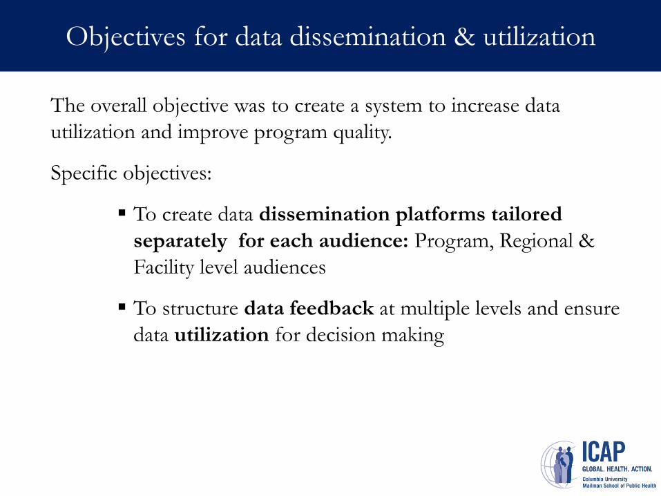
Objectives for data dissemination & utilization
The overall objective was to create a system to increase data
utilization and improve program quality.
Specific objectives:
To create data dissemination platforms tailored
separately for each audience: Program, Regional &
Facility level audiences
To structure data feedback at multiple levels and ensure
data utilization for decision making
II. Methods Data Dissemination & Utilization Strategy
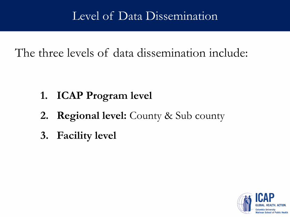
Level of Data Dissemination
The three levels of data dissemination include:
1. ICAP Program level
2. Regional level: County & Sub county
3. Facility level
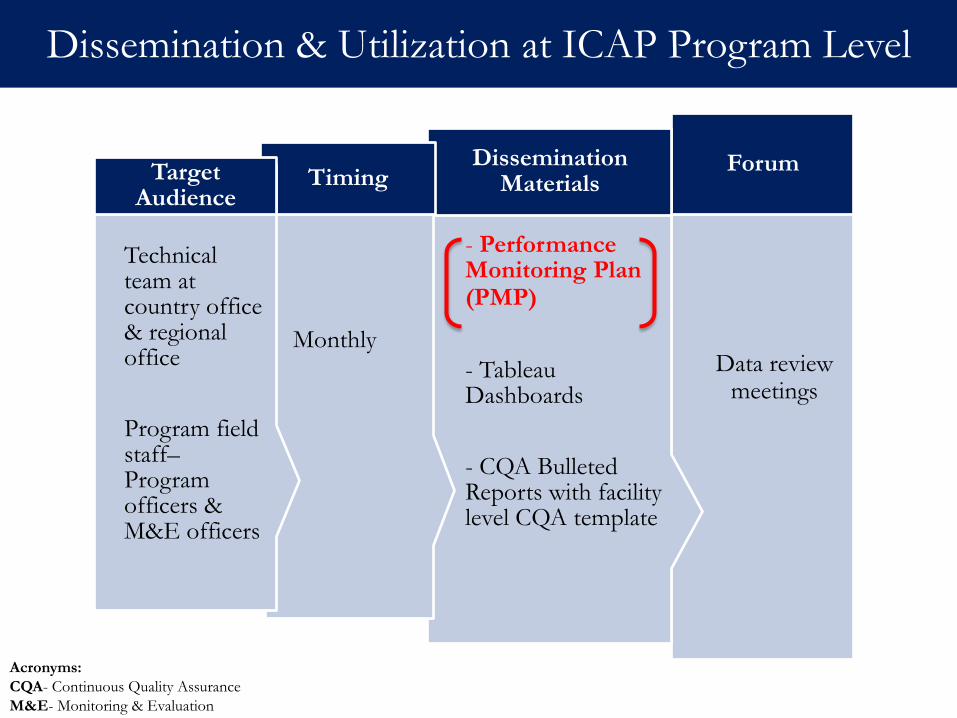
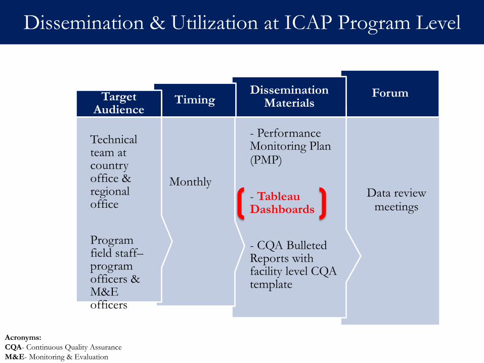
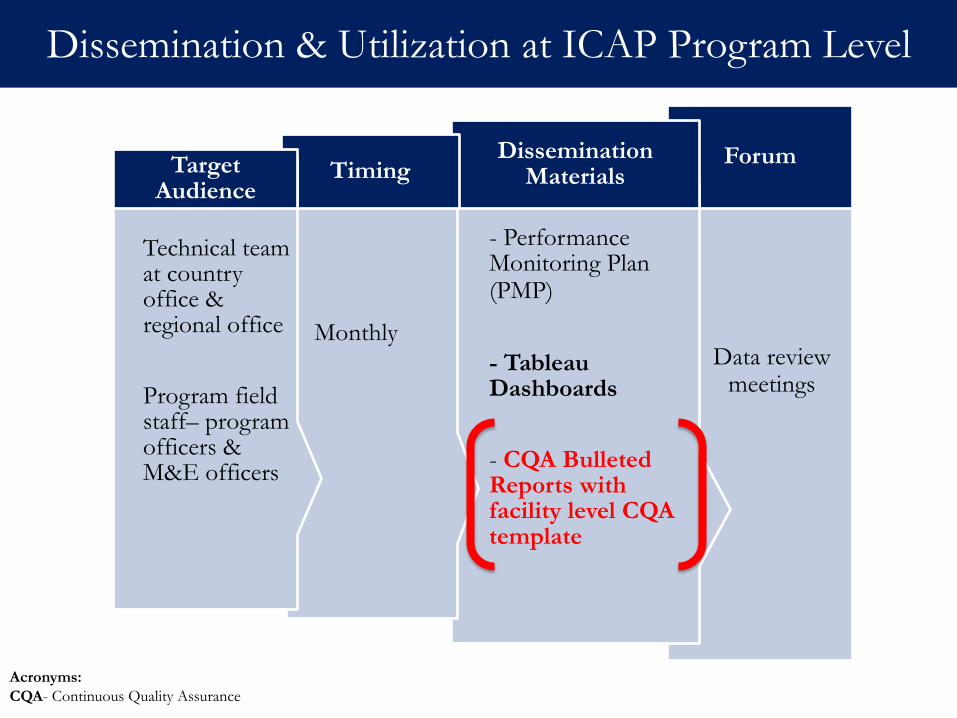
ICAP Program Level
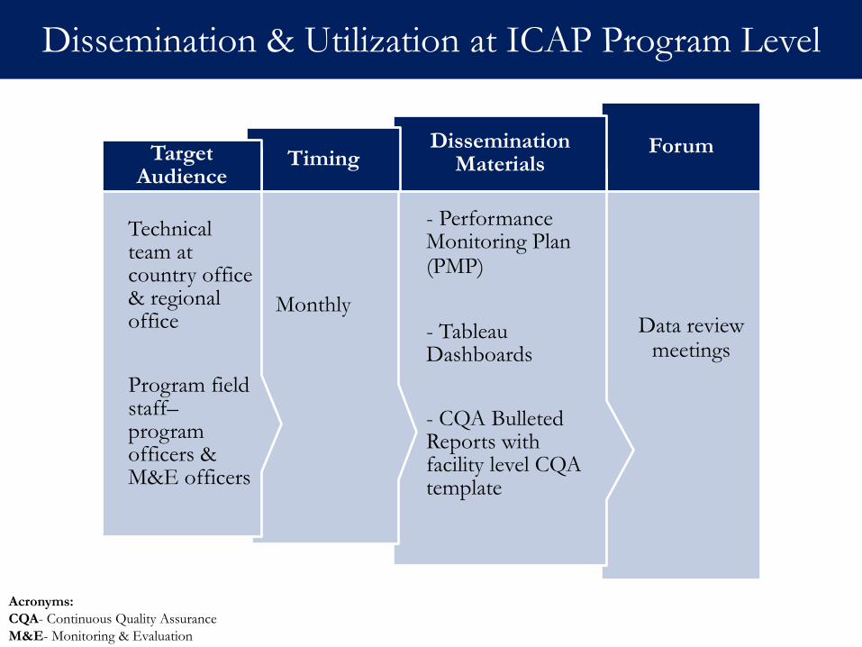
Data review meetings
Forum
- Performance Monitoring Plan (PMP)
- Tableau Dashboards
- CQA Bulleted Reports with facility level CQA template
Dissemination Materials
Monthly
Timing Technical
Technical team at country office & regional office
Program field staff– program officers & M&E officers
Target Audience
Dissemination & Utilization at ICAP Program Level
Acronyms:
CQA- Continuous Quality Assurance
M&E- Monitoring & Evaluation
Data review meetings
Forum
- Performance Monitoring Plan (PMP)
- Tableau Dashboards
- CQA Bulleted Reports with facility level CQA template
Dissemination Materials
Monthly
Timing Technical
Technical team at country office & regional office
Program field staff– Program officers & M&E officers
Target Audience
Dissemination & Utilization at ICAP Program Level
Acronyms:
CQA- Continuous Quality Assurance
M&E- Monitoring & Evaluation
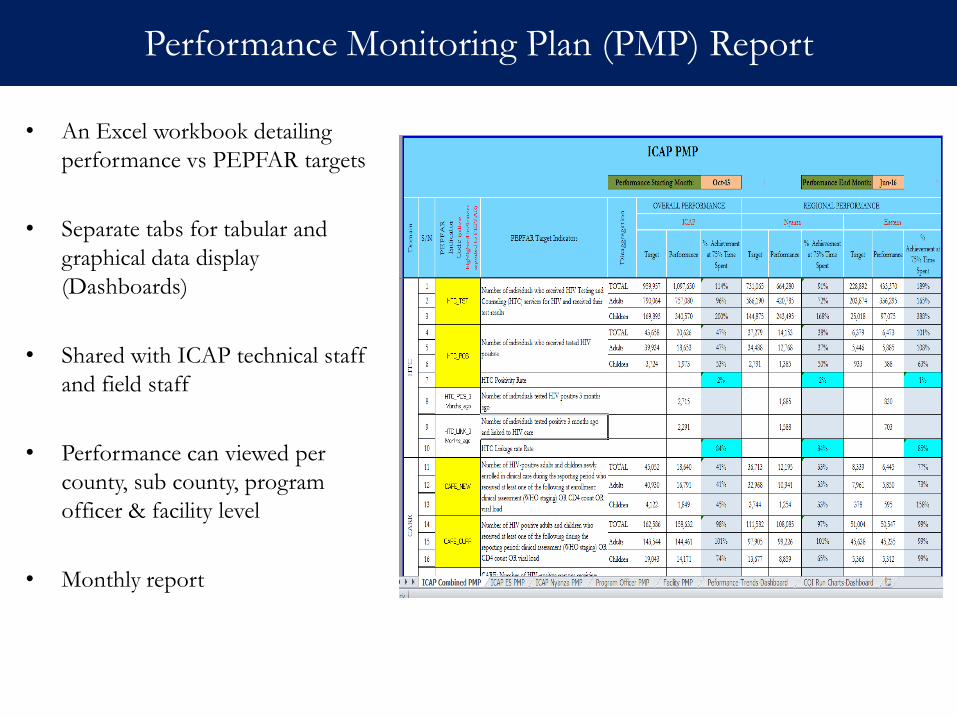
• An Excel workbook detailing
performance vs PEPFAR targets
• Separate tabs for tabular and
graphical data display
(Dashboards)
• Shared with ICAP technical staff
and field staff
• Performance can viewed per
county, sub county, program
officer & facility level
• Monthly report
Performance Monitoring Plan (PMP) Report
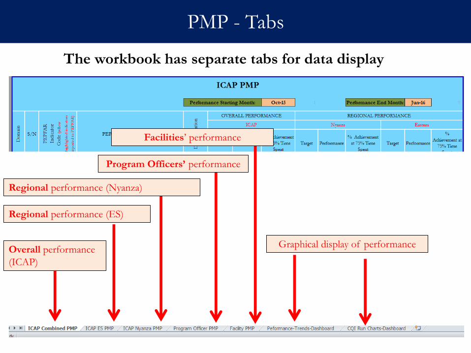
PMP - Tabs
Overall performance
(ICAP)
Graphical display of performance
Regional performance (ES)
Regional performance (Nyanza)
Program Officers’ performance
Facilities’ performance
The workbook has separate tabs for data display
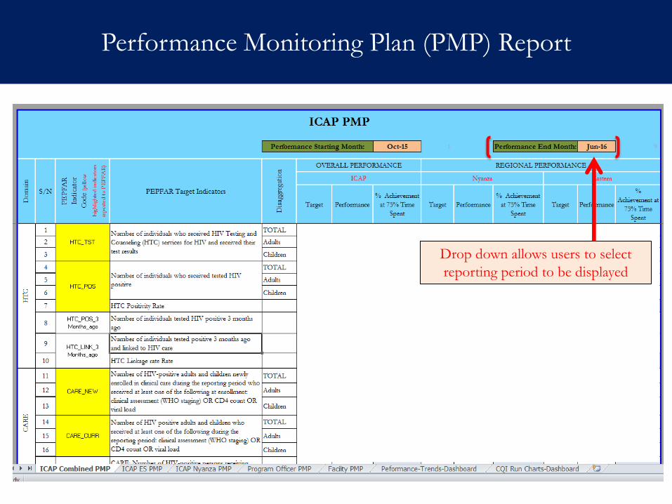
Performance Monitoring Plan (PMP) Report
Drop down allows users to select
reporting period to be displayed
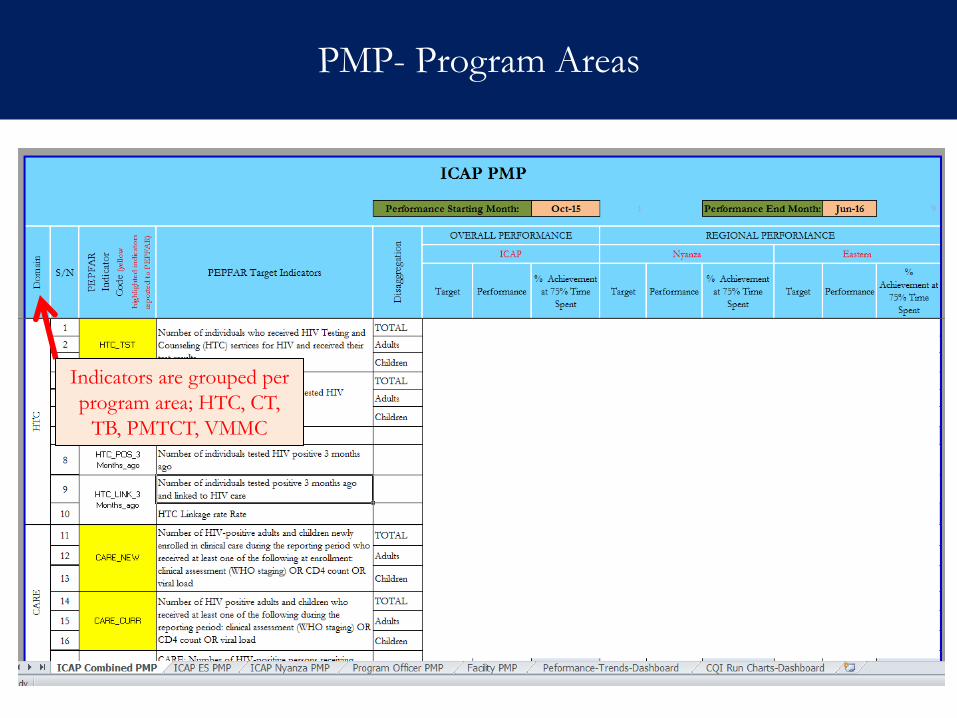
PMP- Program Areas
Indicators are grouped per
program area; HTC, CT,
TB, PMTCT, VMMC
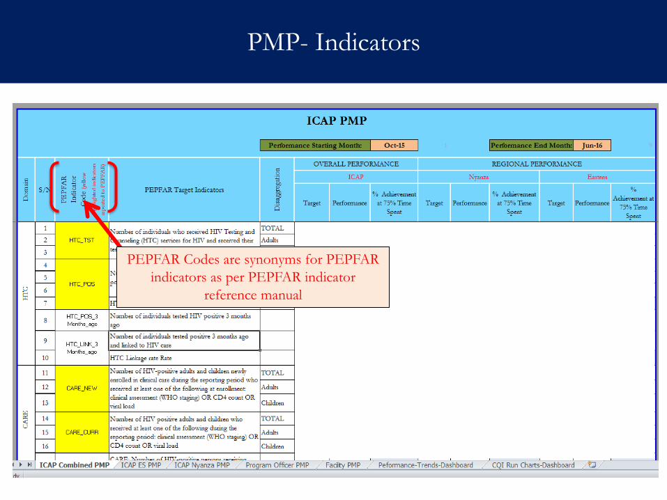
PMP- Indicators
PEPFAR Codes are synonyms for PEPFAR
indicators as per PEPFAR indicator
reference manual
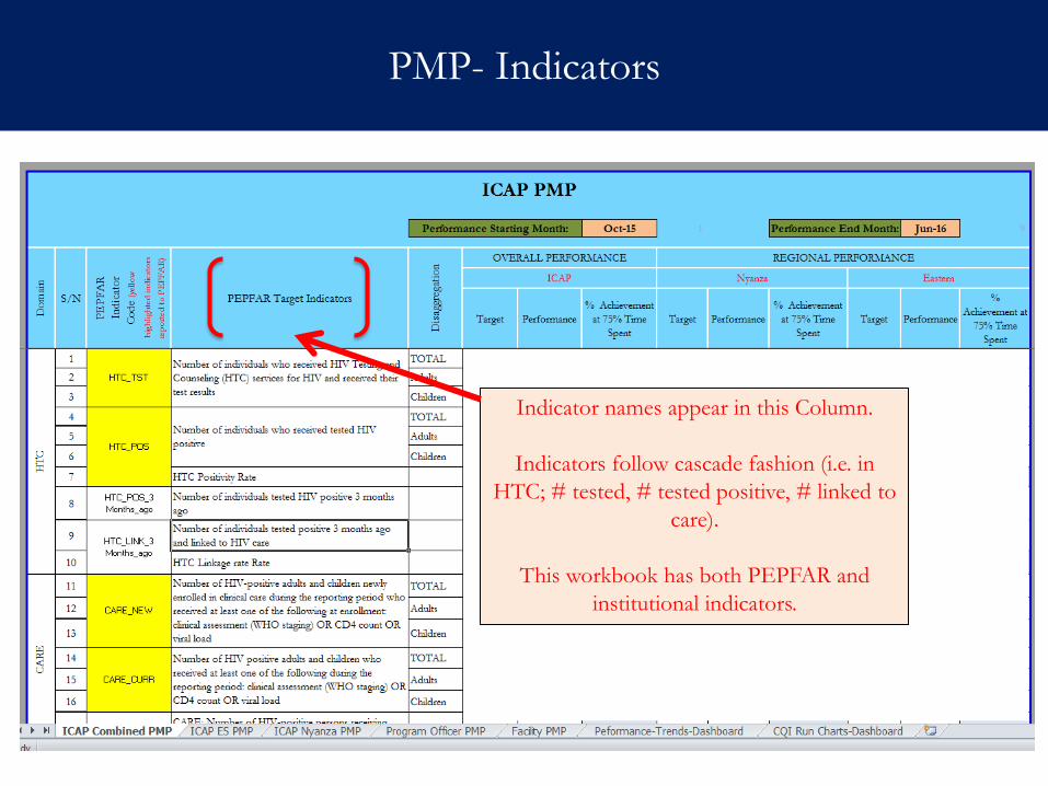
PMP- Indicators
Indicator names appear in this Column.
Indicators follow cascade fashion (i.e. in
HTC; # tested, # tested positive, # linked to
care).
This workbook has both PEPFAR and
institutional indicators.
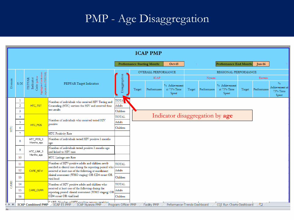
PMP - Age Disaggregation
Indicator disaggregation by age
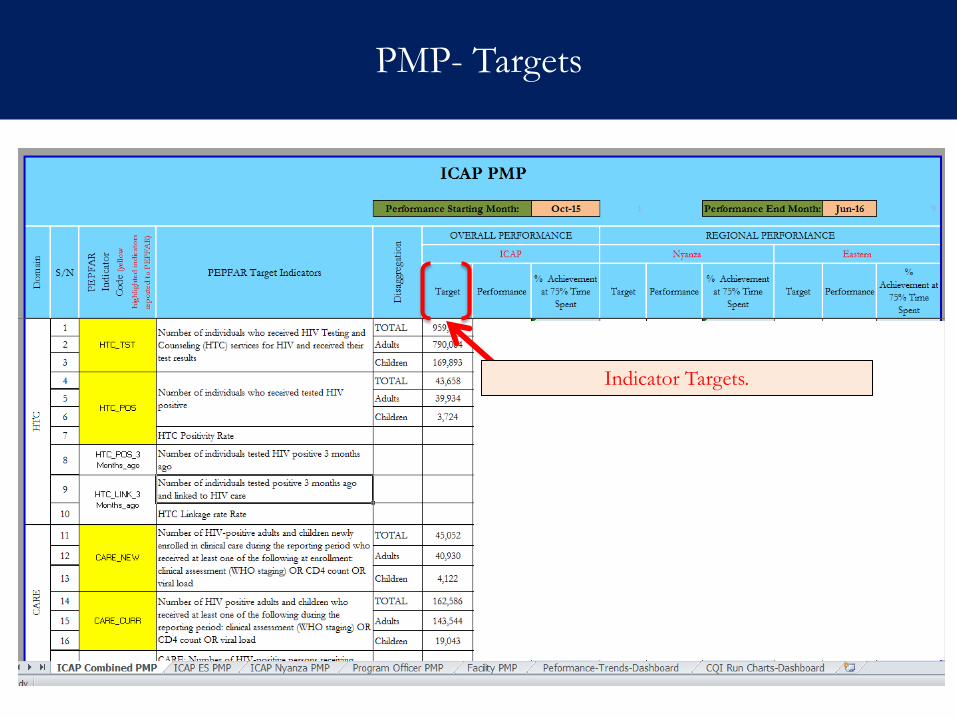
PMP- Targets
Indicator Targets.
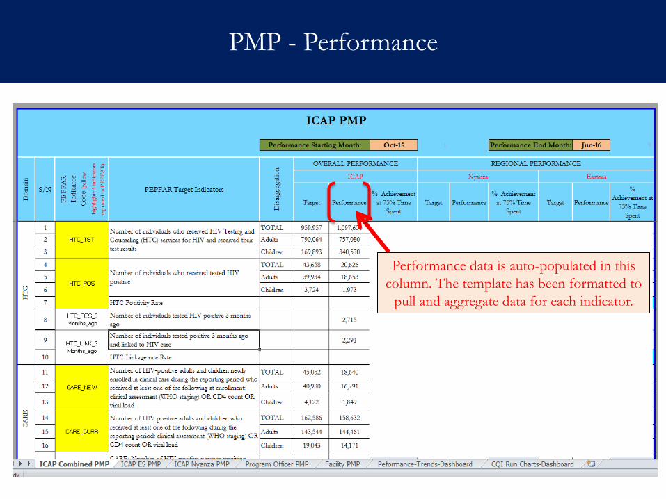
PMP - Performance
Performance data is auto-populated in this
column. The template has been formatted to
pull and aggregate data for each indicator.
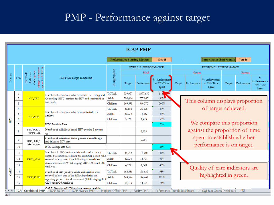
PMP - Performance against target
This column displays proportion
of target achieved.
We compare this proportion
against the proportion of time
spent to establish whether
performance is on target.
Quality of care indicators are
highlighted in green.
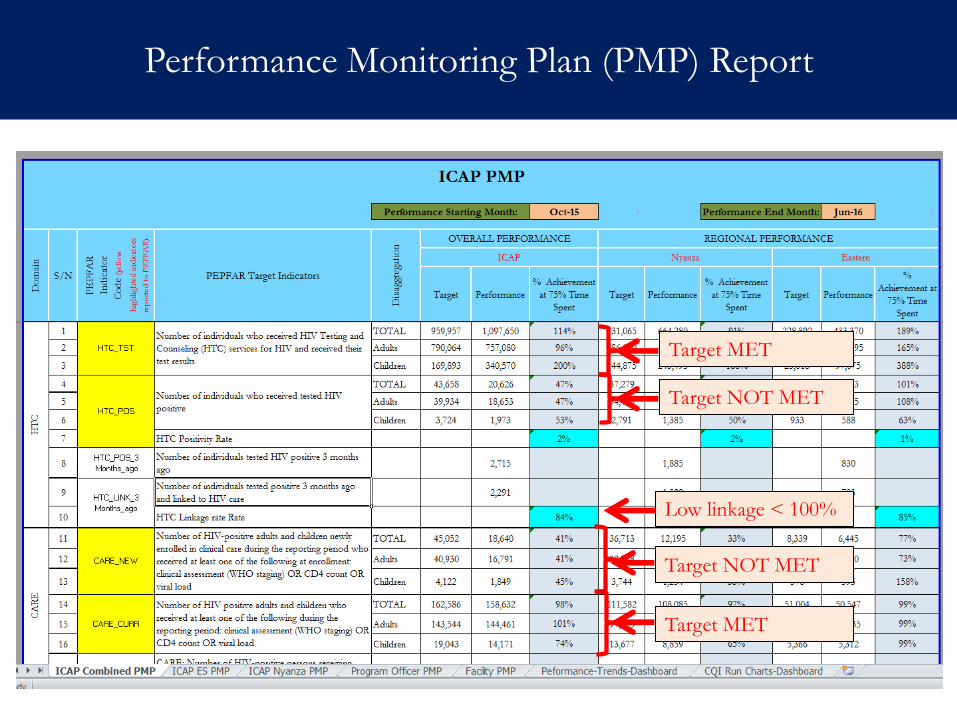
Performance Monitoring Plan (PMP) Report
Target MET
Target NOT MET
Target NOT MET
Target MET
Low linkage < 100%
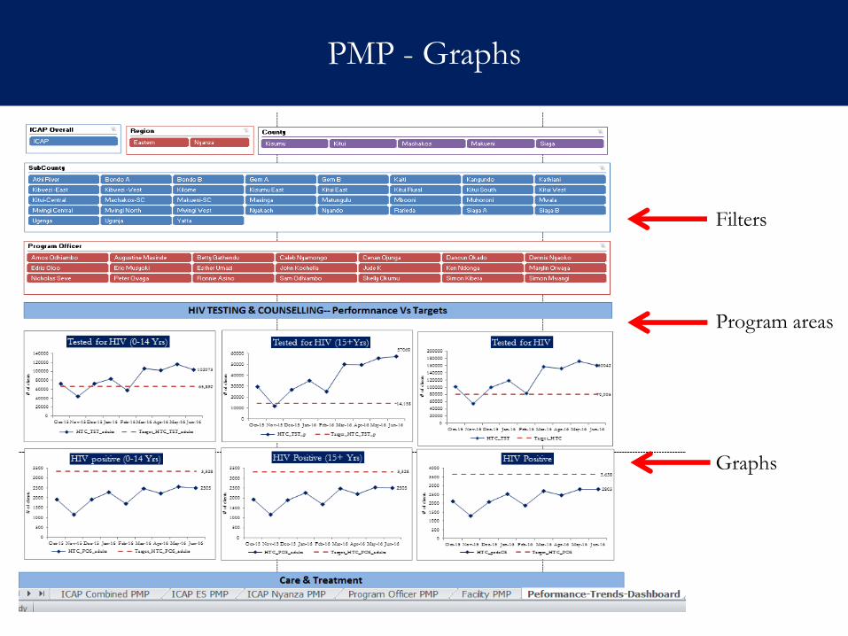
PMP - Graphs
Filters
Graphs
Program areas
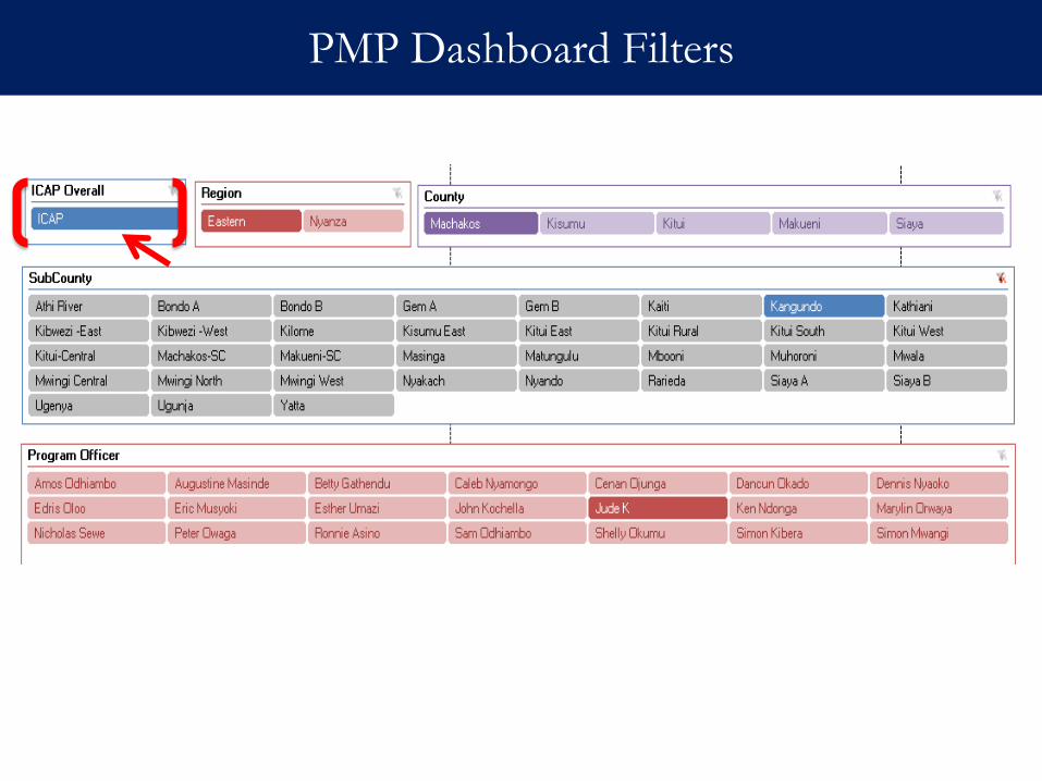
PMP Dashboard Filters
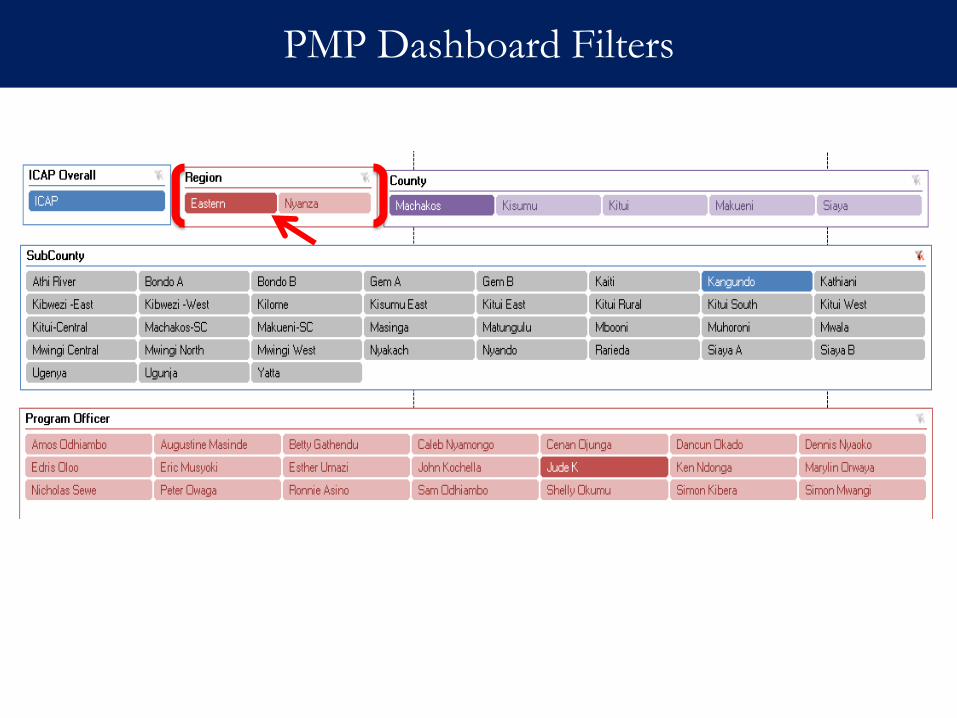
PMP Dashboard Filters
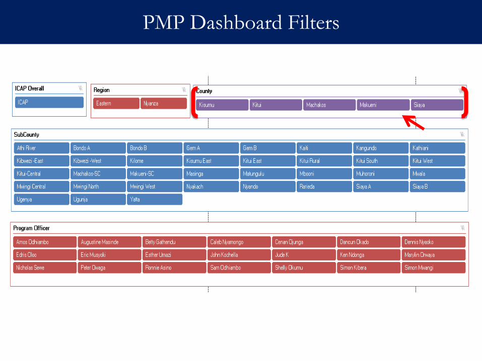
PMP Dashboard Filters
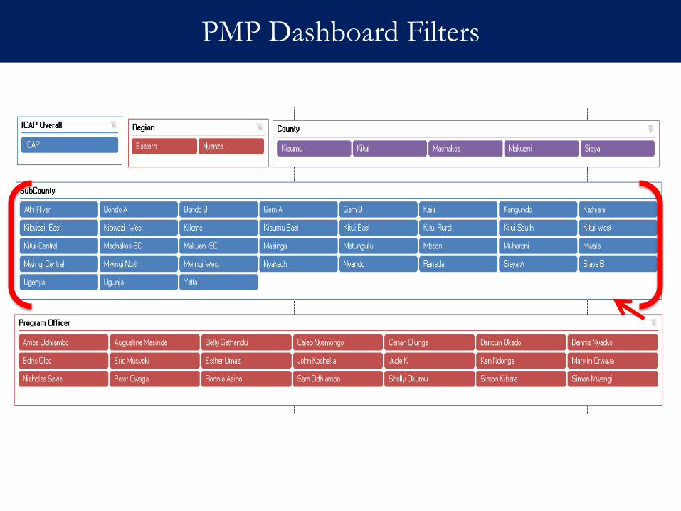
PMP Dashboard Filters
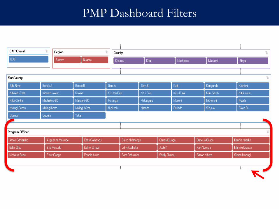
PMP Dashboard Filters
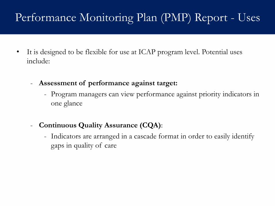
Performance Monitoring Plan (PMP) Report - Uses
• It is designed to be flexible for use at ICAP program level. Potential uses
include:
- Assessment of performance against target:
- Program managers can view performance against priority indicators in
one glance
- Continuous Quality Assurance (CQA):
- Indicators are arranged in a cascade format in order to easily identify
gaps in quality of care
Data review meetings
Forum
- Performance Monitoring Plan (PMP)
- Tableau Dashboards
- CQA Bulleted Reports with facility level CQA template
Dissemination Materials
Monthly
Timing Technical
Technical team at country office & regional office
Program field staff– program officers & M&E officers
Target Audience
Dissemination & Utilization at ICAP Program Level
Acronyms:
CQA- Continuous Quality Assurance
M&E- Monitoring & Evaluation
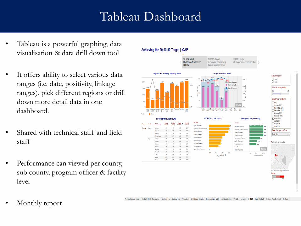
Tableau Dashboard
• Tableau is a powerful graphing, data
visualisation & data drill down tool
• It offers ability to select various data
ranges (i.e. date, positivity, linkage
ranges), pick different regions or drill
down more detail data in one
dashboard.
• Shared with technical staff and field
staff
• Performance can viewed per county,
sub county, program officer & facility
level
• Monthly report
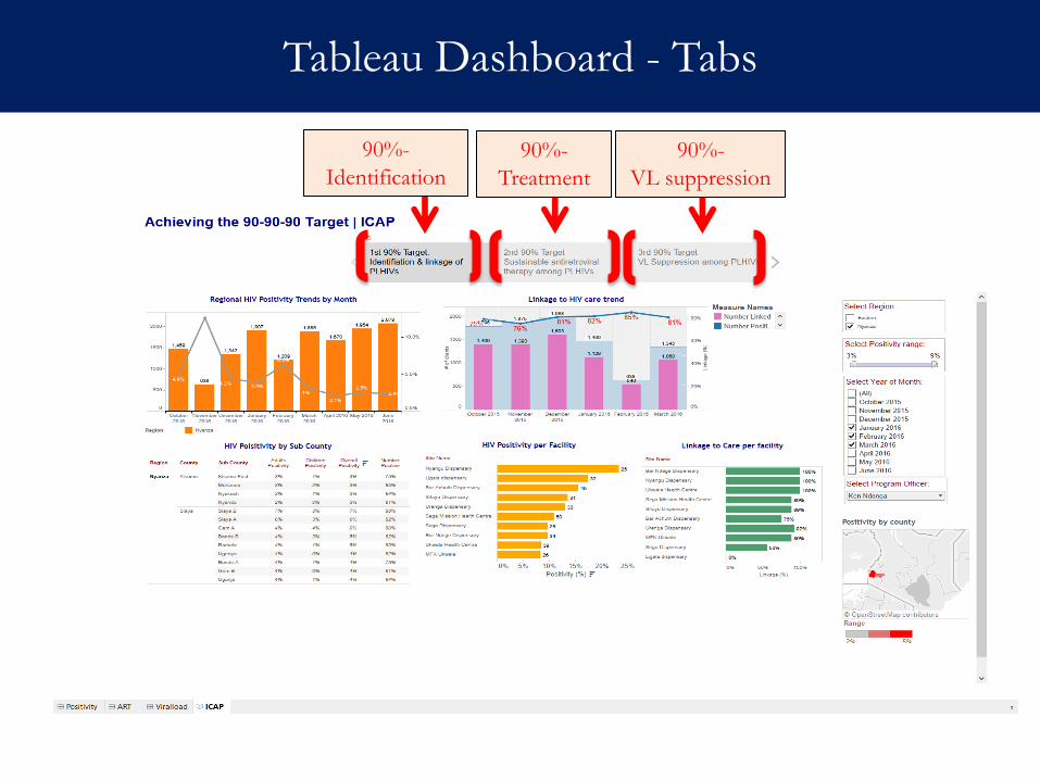
Tableau Dashboard - Tabs
90%-
Identification
90%-
Treatment
90%-
VL suppression
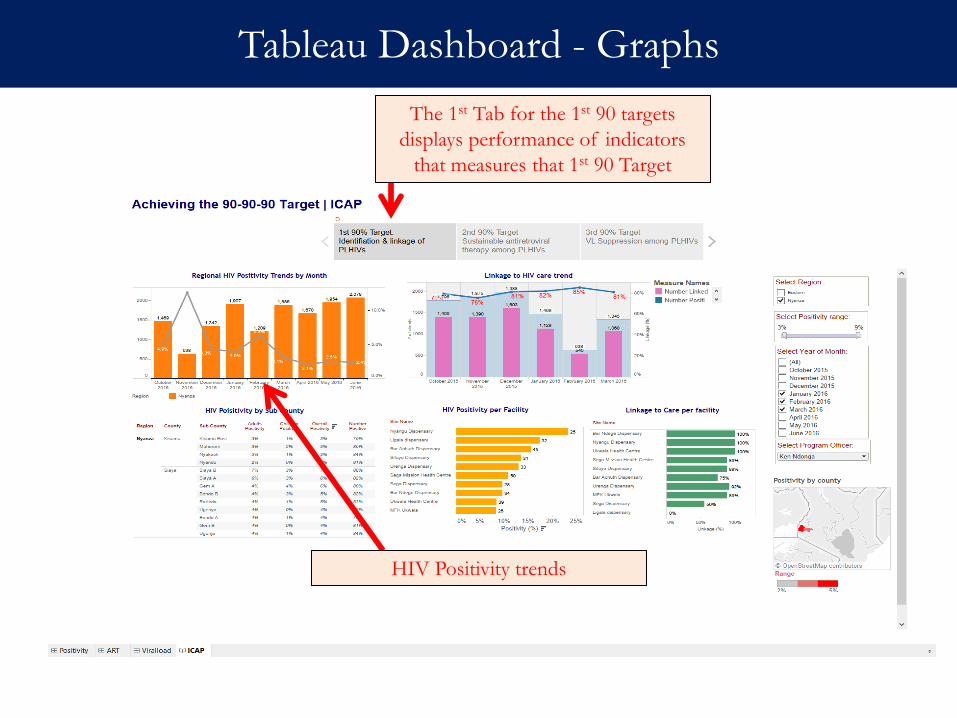
Tableau Dashboard - Graphs
The 1st Tab for the 1st 90 targets
displays performance of indicators
that measures that 1st 90 Target
HIV Positivity trends
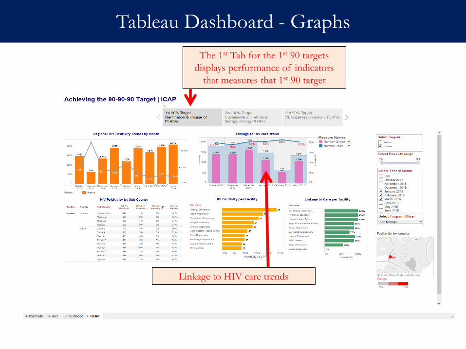
Tableau Dashboard - Graphs
The 1st Tab for the 1st 90 targets
displays performance of indicators
that measures that 1st 90 target
Linkage to HIV care trends
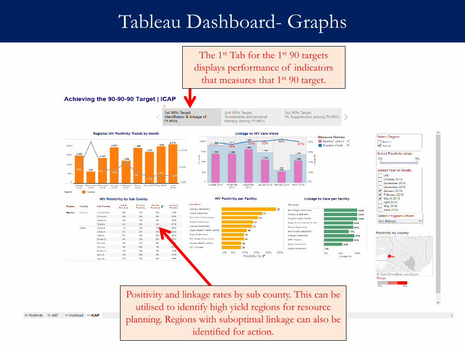
Tableau Dashboard- Graphs
The 1st Tab for the 1st 90 targets
displays performance of indicators
that measures that 1st 90 target.
Positivity and linkage rates by sub county. This can be
utilised to identify high yield regions for resource
planning. Regions with suboptimal linkage can also be
identified for action.
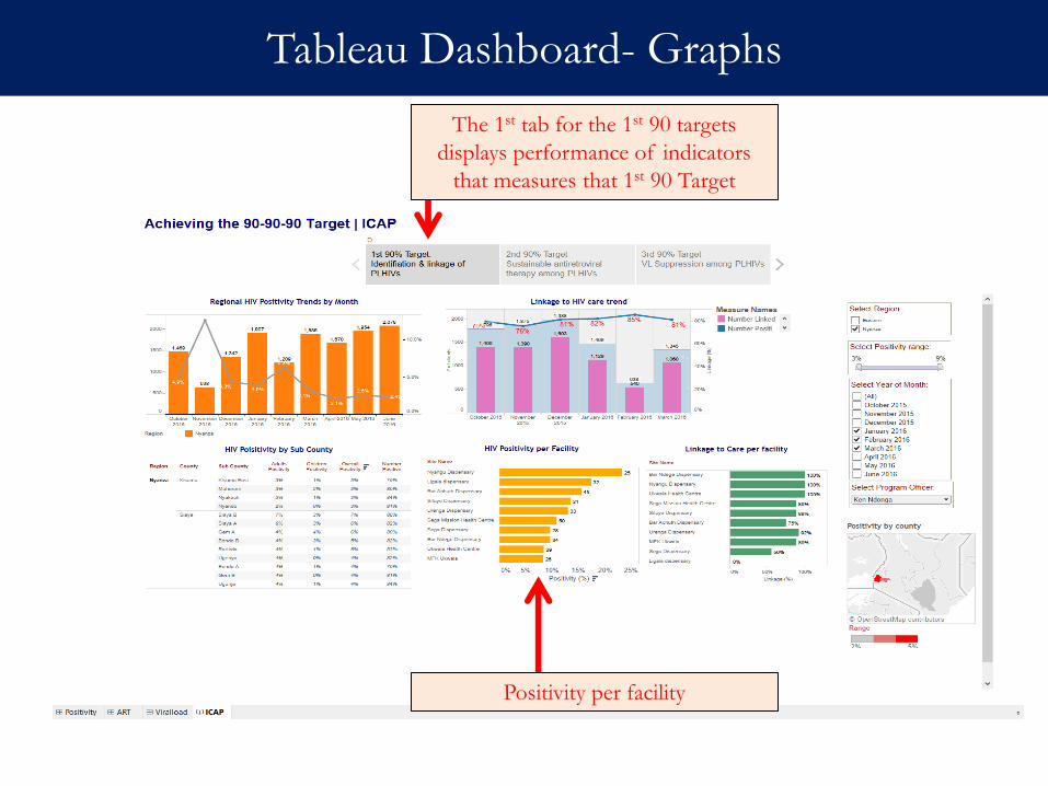
Tableau Dashboard- Graphs
The 1st tab for the 1st 90 targets
displays performance of indicators
that measures that 1st 90 Target
Positivity per facility
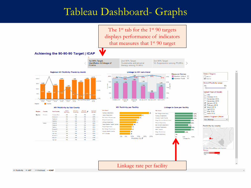
Tableau Dashboard- Graphs
The 1st tab for the 1st 90 targets
displays performance of indicators
that measures that 1st 90 target
Linkage rate per facility
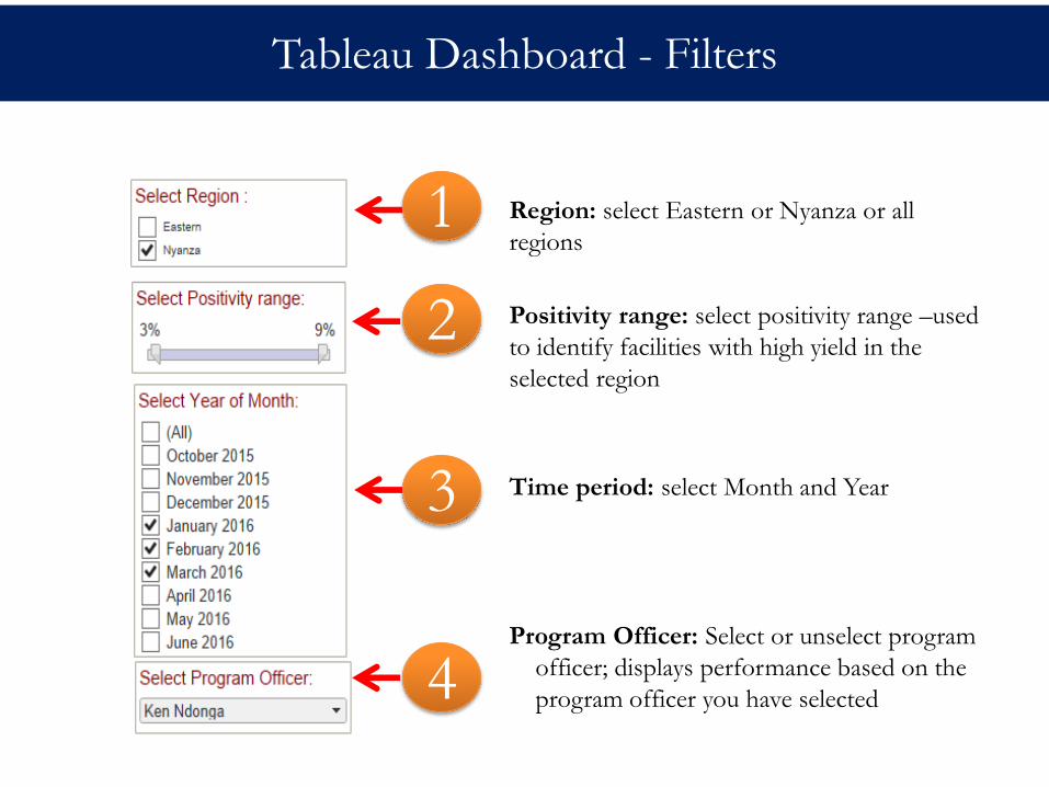
Tableau Dashboard - Filters
2
1
3
4
Region: select Eastern or Nyanza or all
regions
Positivity range: select positivity range –used
to identify facilities with high yield in the
selected region
Time period: select Month and Year
Program Officer: Select or unselect program
officer; displays performance based on the
program officer you have selected
Tableau Dashboards - Uses
• It is designed to be flexible for use at ICAP program level by technical
team at country and regional levels. Potential use include:
- Continuous Quality Assurance (CQA): The template can help
identify regions/program officers that are not meeting quality
standards
- Tableau is more superior visualisation tool than Excel in that
- It is highly interactive and provides functionality like drill downs
- It is able to display data from multiple sources in one dashboard
- It is also able to create map views using geographical fields
Data review meetings
Forum
- Performance Monitoring Plan (PMP)
- Tableau Dashboards
- CQA Bulleted Reports with facility level CQA template
Dissemination Materials
Monthly
Timing Technical
Technical team at country office & regional office
Program field staff– program officers & M&E officers
Target Audience
Dissemination & Utilization at ICAP Program Level
Acronyms:
CQA- Continuous Quality Assurance
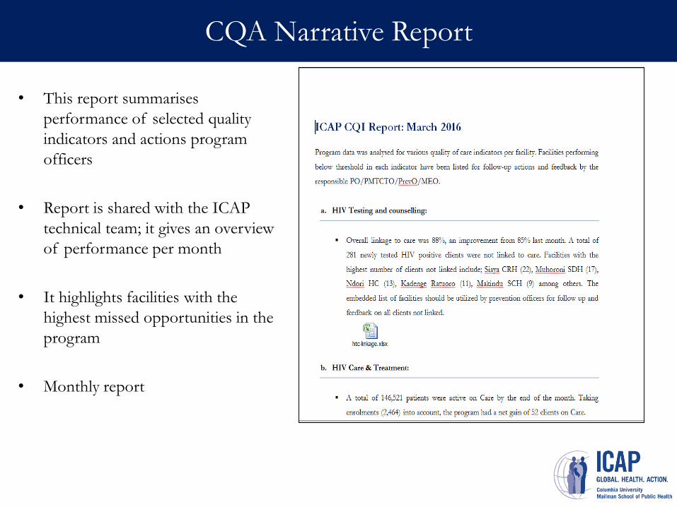
CQA Narrative Report
• This report summarises
performance of selected quality
indicators and actions program
officers
• Report is shared with the ICAP
technical team; it gives an overview
of performance per month
• It highlights facilities with the
highest missed opportunities in the
program
• Monthly report
-
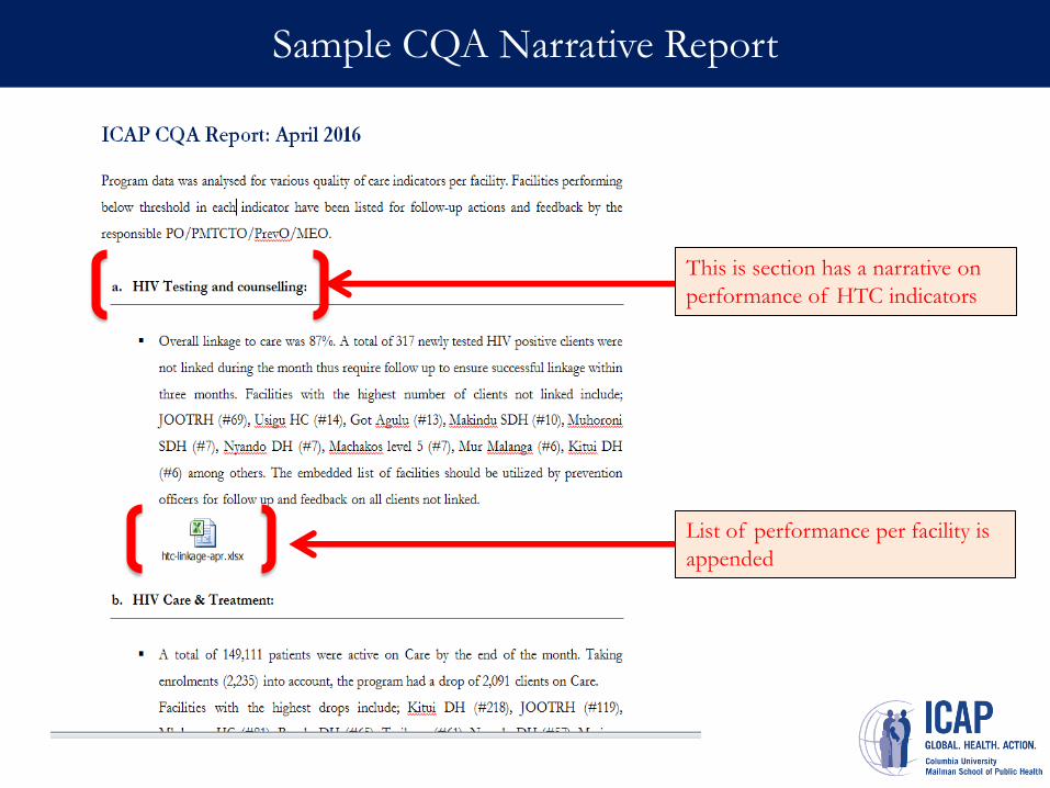
Sample CQA Narrative Report
This is section has a narrative on
performance of HTC indicators
List of performance per facility is
appended
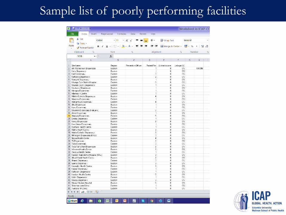
Sample list of poorly performing facilities
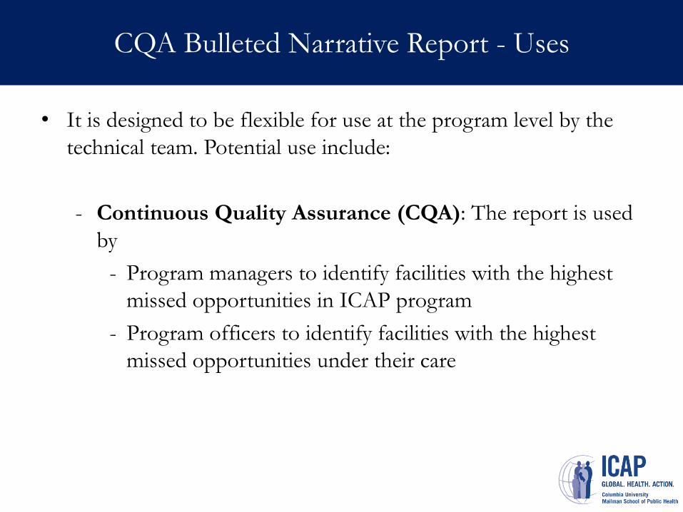
CQA Bulleted Narrative Report - Uses
• It is designed to be flexible for use at the program level by the
technical team. Potential use include:
- Continuous Quality Assurance (CQA): The report is used
by
- Program managers to identify facilities with the highest
missed opportunities in ICAP program
- Program officers to identify facilities with the highest
missed opportunities under their care
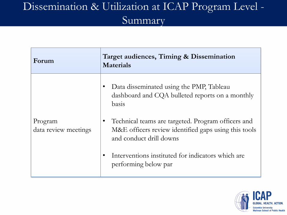
Dissemination & Utilization at ICAP Program Level -
Summary
Forum Target audiences, Timing & Dissemination
Materials
Program
data review meetings
• Data disseminated using the PMP, Tableau
dashboard and CQA bulleted reports on a monthly
basis
• Technical teams are targeted. Program officers and
M&E officers review identified gaps using this tools
and conduct drill downs
• Interventions instituted for indicators which are
performing below par

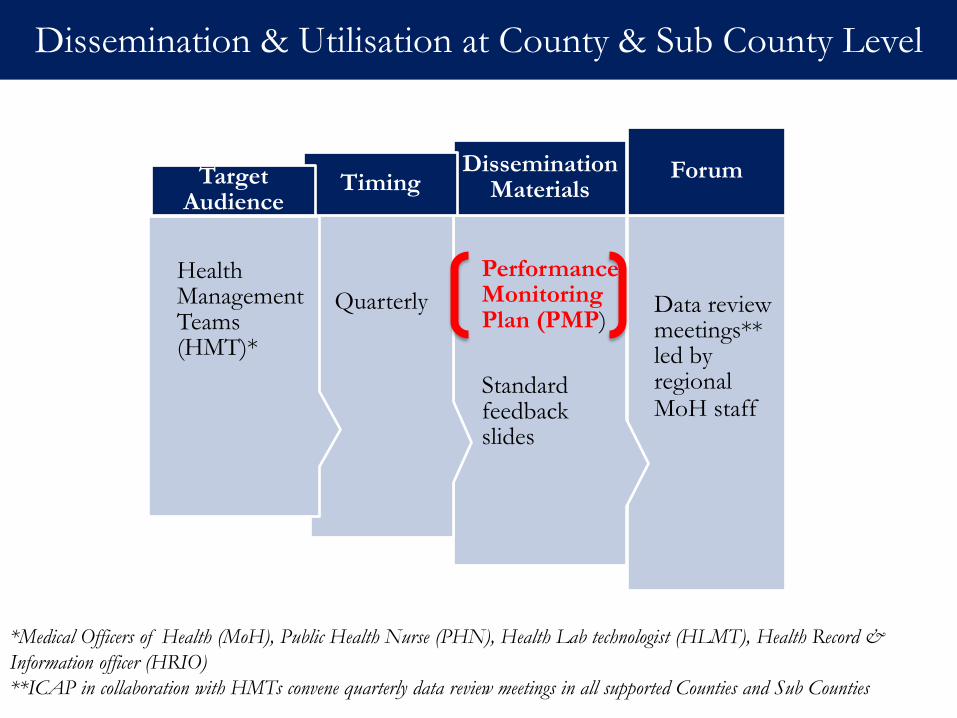
Regional Level: County & Sub County
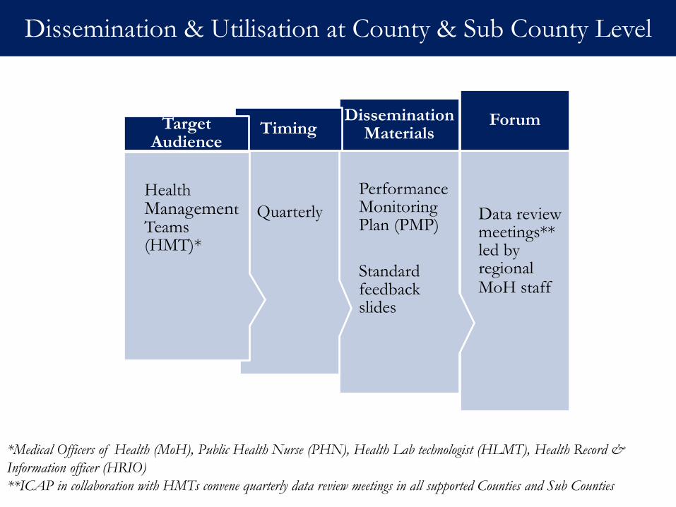
Data review meetings** led by regional MoH staff
Forum
Performance Monitoring Plan (PMP)
Standard feedback slides
Dissemination Materials
Quarterly
Timing
Health Management Teams (HMT)*
Target Audience
Dissemination & Utilisation at County & Sub County Level
*Medical Officers of Health (MoH), Public Health Nurse (PHN), Health Lab technologist (HLMT), Health Record &
Information officer (HRIO)
**ICAP in collaboration with HMTs convene quarterly data review meetings in all supported Counties and Sub Counties
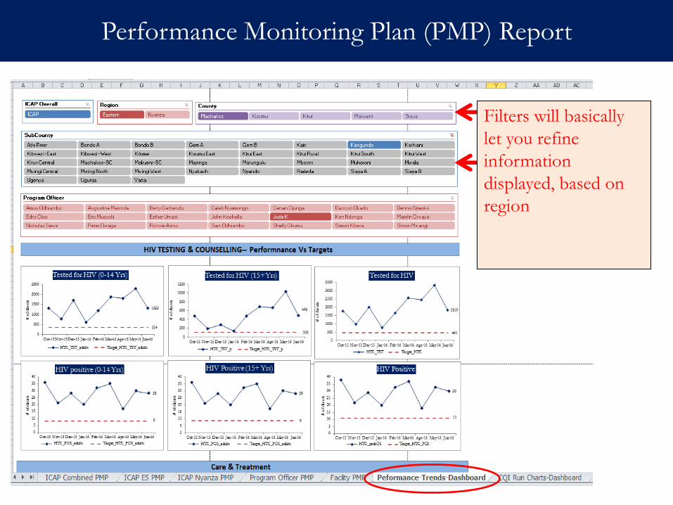
Performance Monitoring Plan (PMP) Report
Filters will basically
let you refine
information
displayed, based on
region
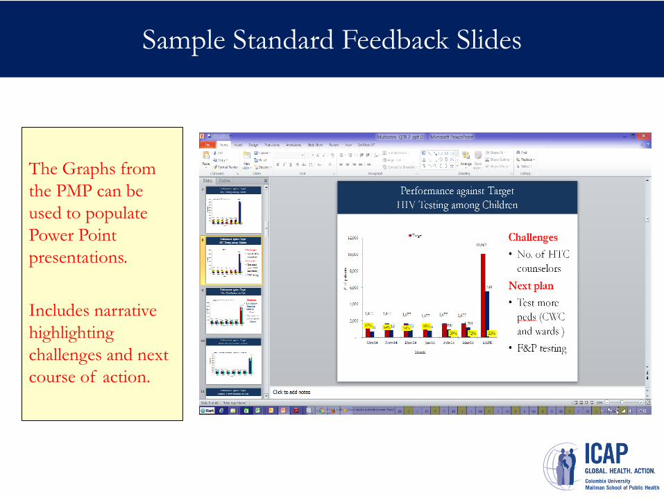
Sample Standard Feedback Slides
The Graphs from
the PMP can be
used to populate
Power Point
presentations.
Includes narrative
highlighting
challenges and next
course of action.
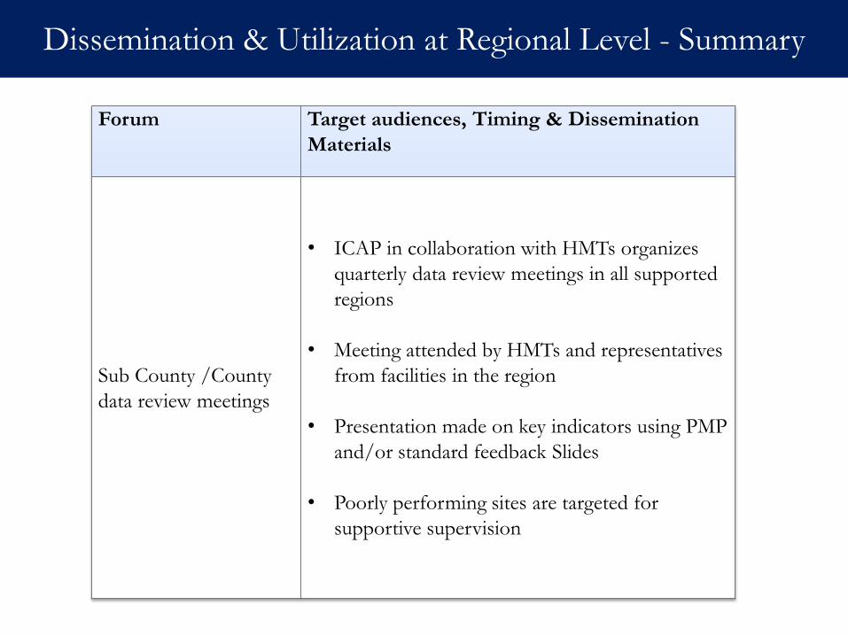
Dissemination & Utilization at Regional Level - Summary
Forum Target audiences, Timing & Dissemination
Materials
Sub County /County
data review meetings
• ICAP in collaboration with HMTs organizes
quarterly data review meetings in all supported
regions
• Meeting attended by HMTs and representatives
from facilities in the region
• Presentation made on key indicators using PMP
and/or standard feedback Slides
• Poorly performing sites are targeted for
supportive supervision
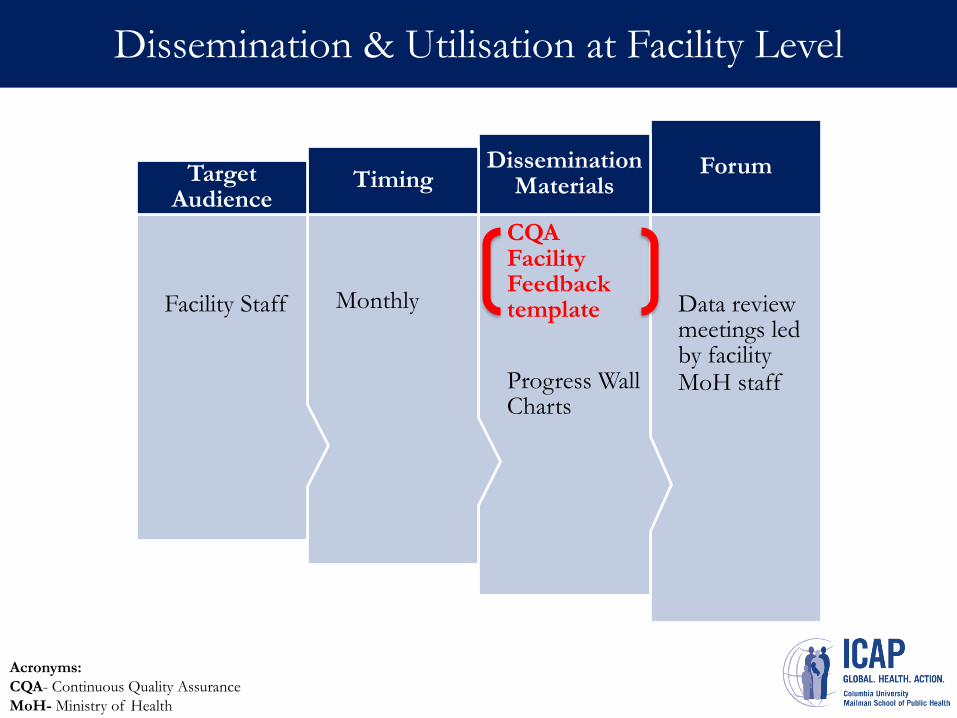
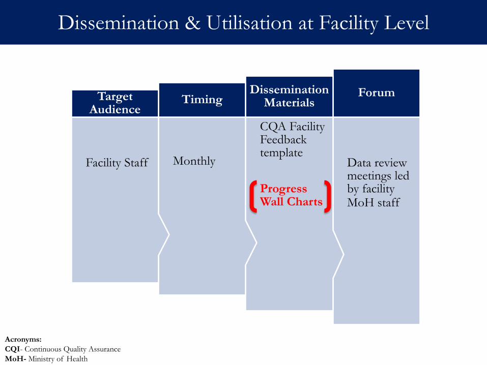
Facility Level
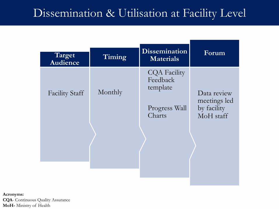
Data review meetings led by facility MoH staff
Forum
CQA Facility Feedback template
Progress Wall Charts
Dissemination Materials
Monthly
Timing
Facility Staff
Target Audience
Dissemination & Utilisation at Facility Level
Acronyms:
CQA- Continuous Quality Assurance
MoH- Ministry of Health
Data review meetings led by facility MoH staff
Forum
CQA Facility Feedback template
Progress Wall Charts
Dissemination Materials
Monthly
Timing
Facility Staff
Target Audience
Dissemination & Utilisation at Facility Level
Acronyms:
CQA- Continuous Quality Assurance
MoH- Ministry of Health
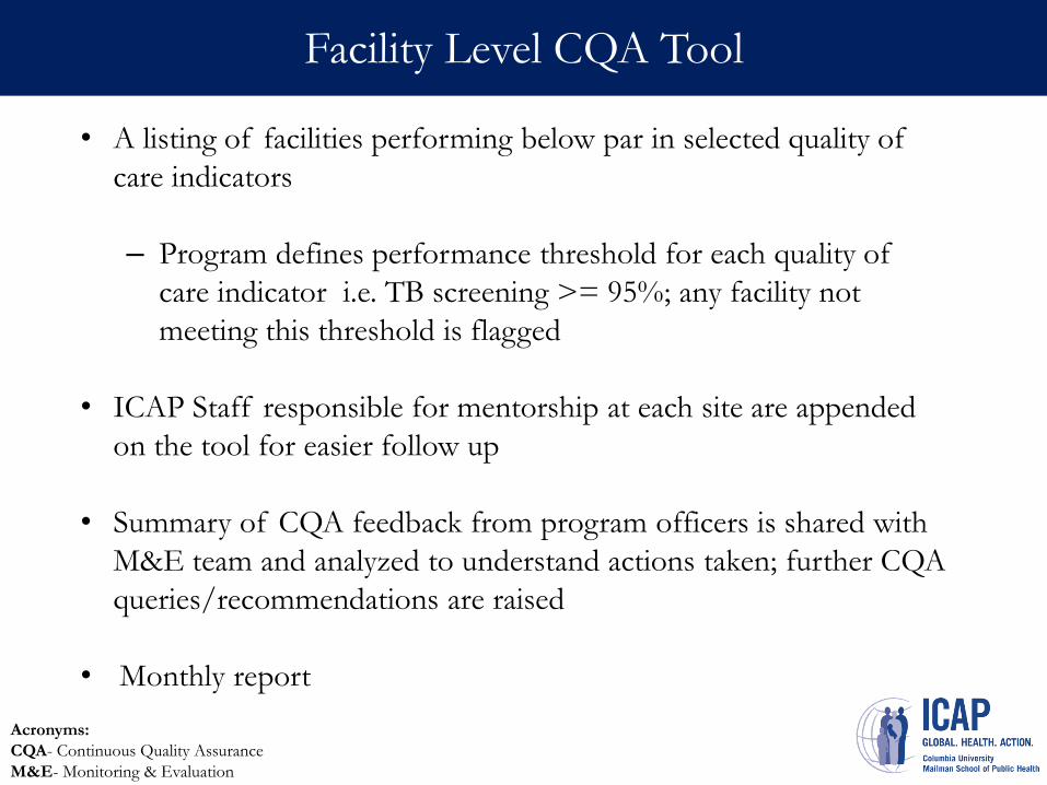
Facility Level CQA Tool
• A listing of facilities performing below par in selected quality of
care indicators
– Program defines performance threshold for each quality of
care indicator i.e. TB screening >= 95%; any facility not
meeting this threshold is flagged
• ICAP Staff responsible for mentorship at each site are appended
on the tool for easier follow up
• Summary of CQA feedback from program officers is shared with
M&E team and analyzed to understand actions taken; further CQA
queries/recommendations are raised
• Monthly report
Acronyms:
CQA- Continuous Quality Assurance
M&E- Monitoring & Evaluation
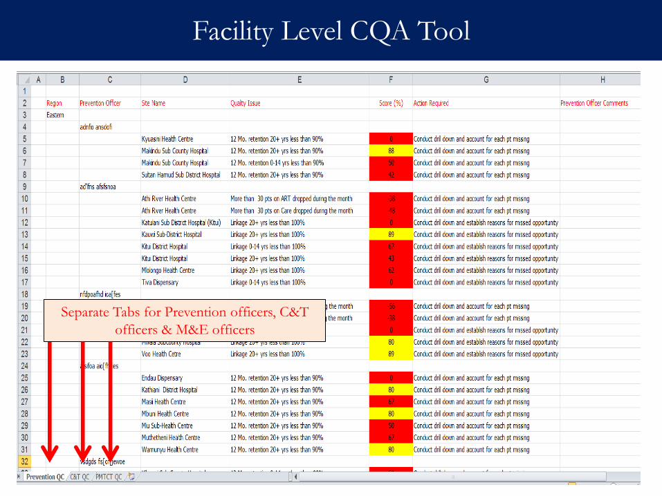
Facility Level CQA Tool
Separate Tabs for Prevention officers, C&T
officers & M&E officers
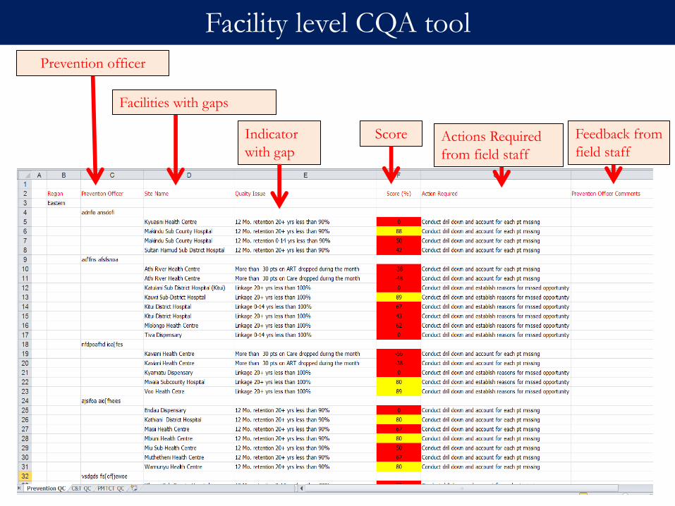
Prevention officer
Facilities with gaps
Indicator
with gap
Score Actions Required
from field staff
Feedback from
field staff
Facility level CQA tool
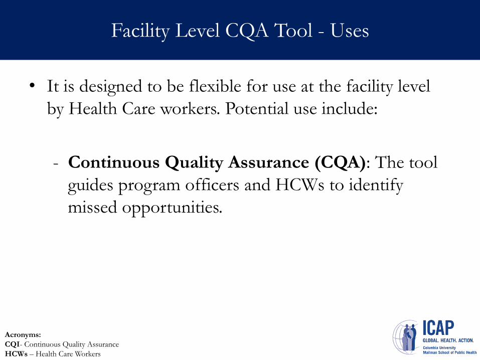
CQI Bulleted Narrative Report-Uses
• It is designed to be flexible for use at the facility level
by Health Care workers. Potential use include:
- Continuous Quality Assurance (CQA): The tool
guides program officers and HCWs to identify
missed opportunities.
Facility Level CQA Tool - Uses
Acronyms:
CQI- Continuous Quality Assurance
HCWs – Health Care Workers
Data review meetings led by facility MoH staff
Forum
CQA Facility Feedback template
Progress Wall Charts
Dissemination Materials
Monthly
Timing
Facility Staff
Target Audience
Dissemination & Utilisation at Facility Level
Acronyms:
CQI- Continuous Quality Assurance
MoH- Ministry of Health
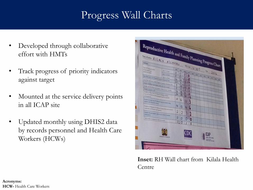
Progress Wall Charts
• Developed through collaborative
effort with HMTs
• Track progress of priority indicators
against target
• Mounted at the service delivery points
in all ICAP site
• Updated monthly using DHIS2 data
by records personnel and Health Care
Workers (HCWs)
Inset: RH Wall chart from Kilala Health
Centre
Acronyms:
HCW- Health Care Workers
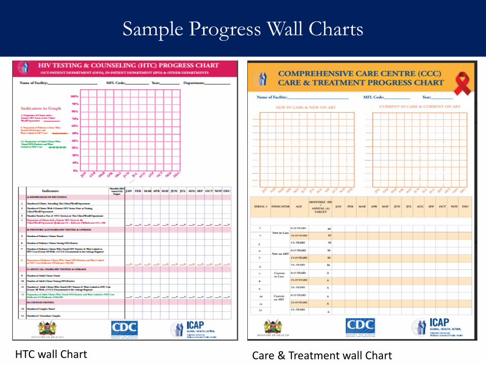
Sample Progress Wall Charts
HTC wall Chart Care & Treatment wall Chart
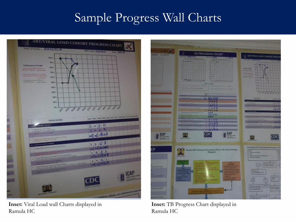
Sample Progress Wall Charts
Inset: Viral Load wall Charts displayed in
Ramula HC
Inset: TB Progress Chart displayed in
Ramula HC
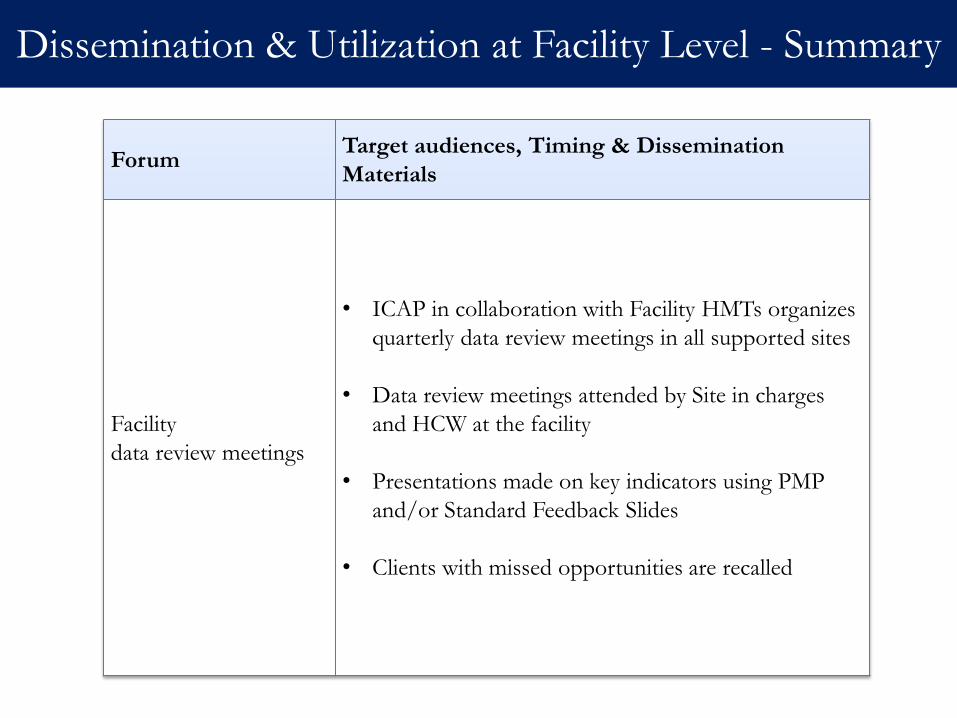
Dissemination & Utilization at Facility Level - Summary
Forum Target audiences, Timing & Dissemination
Materials
Facility
data review meetings
• ICAP in collaboration with Facility HMTs organizes
quarterly data review meetings in all supported sites
• Data review meetings attended by Site in charges
and HCW at the facility
• Presentations made on key indicators using PMP
and/or Standard Feedback Slides
• Clients with missed opportunities are recalled

Case studies:
how utilization of aggregate data resulted in
improvement of program quality
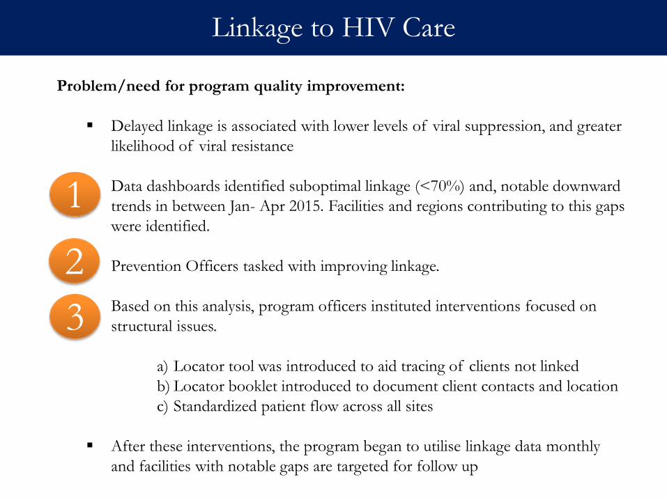
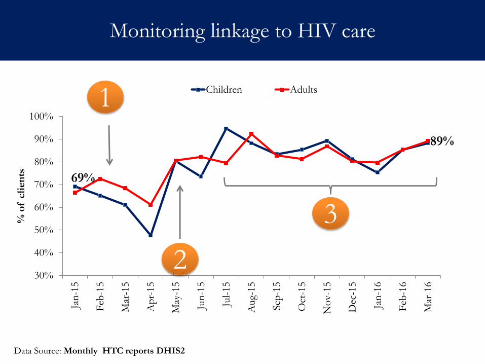
Problem/need for program quality improvement:
Delayed linkage is associated with lower levels of viral suppression, and greater
likelihood of viral resistance
Data dashboards identified suboptimal linkage (<70%) and, notable downward
trends in between Jan- Apr 2015. Facilities and regions contributing to this gaps
were identified.
Prevention Officers tasked with improving linkage.
Based on this analysis, program officers instituted interventions focused on
structural issues.
a) Locator tool was introduced to aid tracing of clients not linked
b) Locator booklet introduced to document client contacts and location
c) Standardized patient flow across all sites
After these interventions, the program began to utilise linkage data monthly
and facilities with notable gaps are targeted for follow up
Linkage to HIV Care
1
2
3
69%
89%
30%
40%
50%
60%
70%
80%
90%
100%
Jan
-15
Feb
-15
Mar
-15
Ap
r-15
May
-15
Jun
-15
Jul-
15
Aug-
15
Sep
-15
Oct
-15
No
v-1
5
Dec
-15
Jan
-16
Feb
-16
Mar
-16
% o
f cli
en
ts
Children Adults
Monitoring linkage to HIV care
Data Source: Monthly HTC reports DHIS2
1
2
3
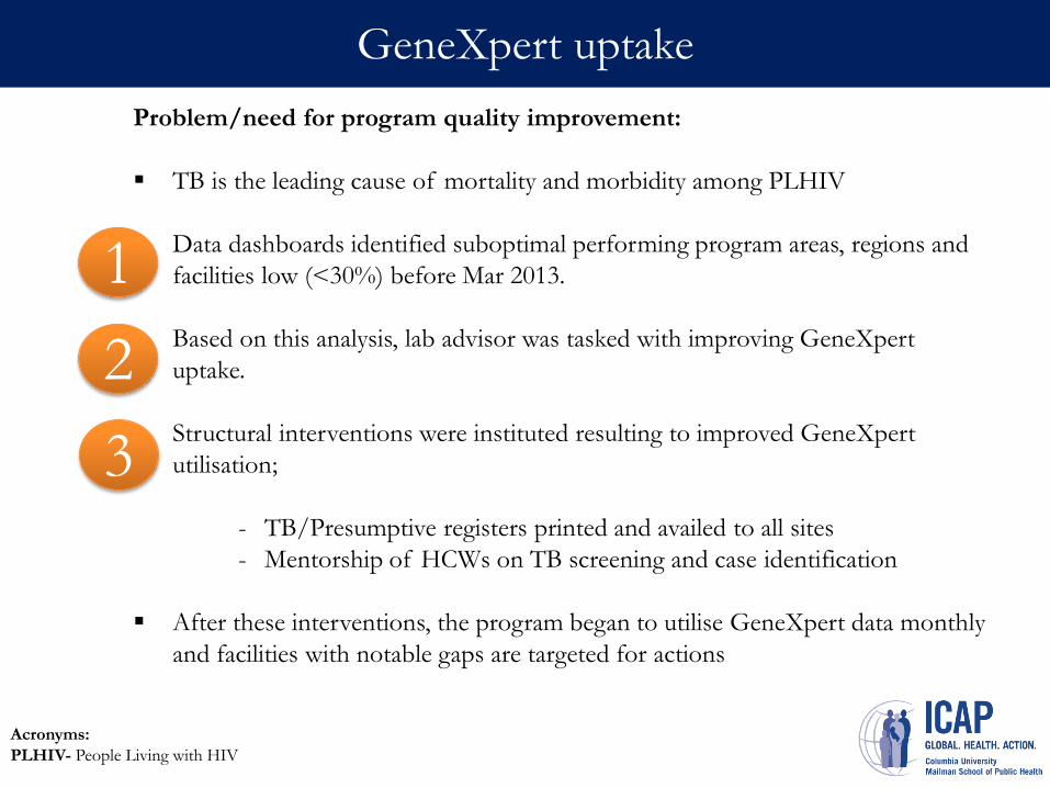
Problem/need for program quality improvement:
TB is the leading cause of mortality and morbidity among PLHIV
Data dashboards identified suboptimal performing program areas, regions and
facilities low (<30%) before Mar 2013.
Based on this analysis, lab advisor was tasked with improving GeneXpert
uptake.
Structural interventions were instituted resulting to improved GeneXpert
utilisation;
- TB/Presumptive registers printed and availed to all sites
- Mentorship of HCWs on TB screening and case identification
After these interventions, the program began to utilise GeneXpert data monthly
and facilities with notable gaps are targeted for actions Program began to
review this data monthly. Facilities with
GeneXpert uptake
Acronyms:
PLHIV- People Living with HIV
1
2
3
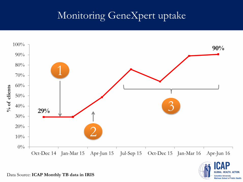
Monitoring GeneXpert uptake
Data Source: ICAP Monthly TB data in IRIS
29%
90%
0%
10%
20%
30%
40%
50%
60%
70%
80%
90%
100%
Oct-Dec 14 Jan-Mar 15 Apr-Jun 15 Jul-Sep 15 Oct-Dec 15 Jan-Mar 16 Apr-Jun 16
% o
f cli
en
ts
1
2
3
III. Summary
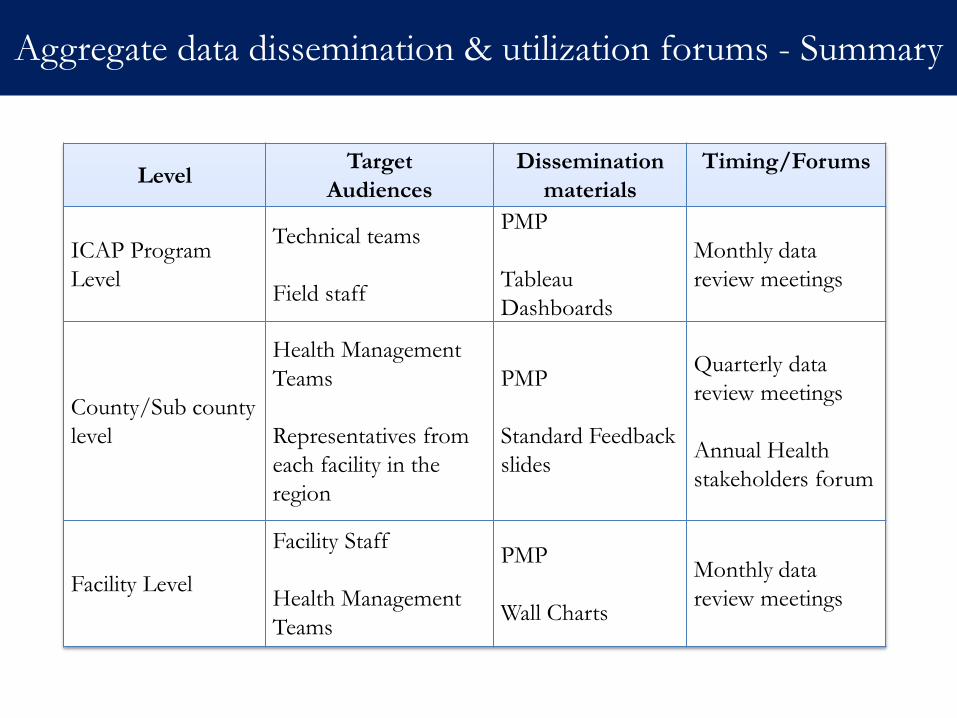
Aggregate data dissemination & utilization forums - Summary
Level Target
Audiences
Dissemination
materials
Timing/Forums
ICAP Program
Level
Technical teams
Field staff
PMP
Tableau
Dashboards
Monthly data
review meetings
County/Sub county
level
Health Management
Teams
Representatives from
each facility in the
region
PMP
Standard Feedback
slides
Quarterly data
review meetings
Annual Health
stakeholders forum
Facility Level
Facility Staff
Health Management
Teams
PMP
Wall Charts
Monthly data
review meetings
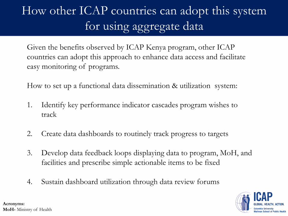
How other ICAP countries can adopt this system
for using aggregate data
Given the benefits observed by ICAP Kenya program, other ICAP
countries can adopt this approach to enhance data access and facilitate
easy monitoring of programs.
How to set up a functional data dissemination & utilization system:
1. Identify key performance indicator cascades program wishes to
track
2. Create data dashboards to routinely track progress to targets
3. Develop data feedback loops displaying data to program, MoH, and
facilities and prescribe simple actionable items to be fixed
4. Sustain dashboard utilization through data review forums
Acronyms:
MoH- Ministry of Health
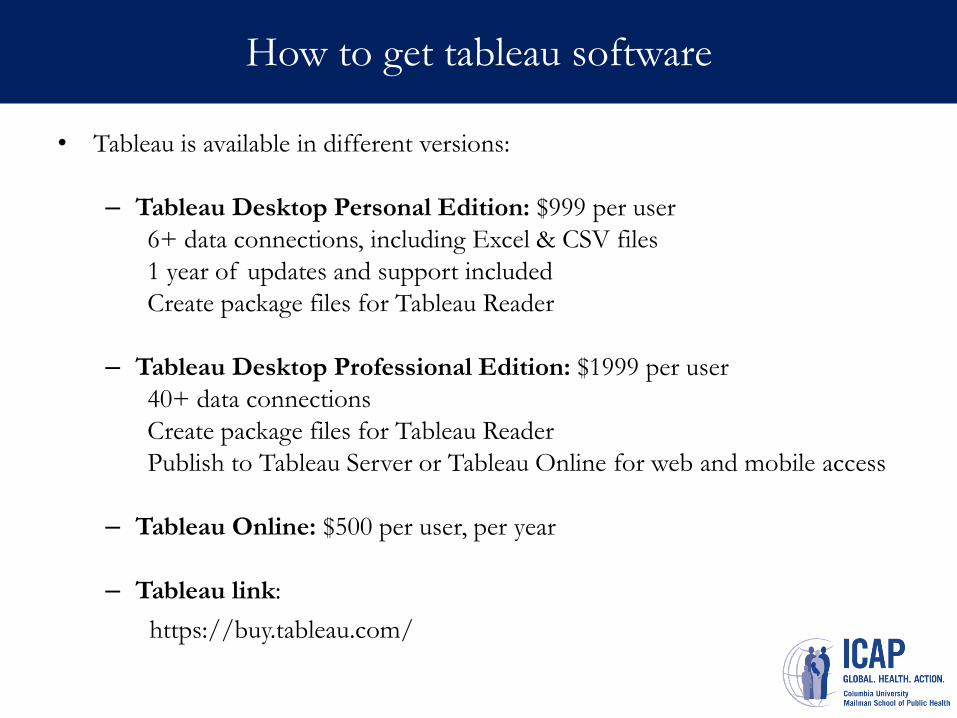
How to get tableau software
• Tableau is available in different versions:
– Tableau Desktop Personal Edition: $999 per user
6+ data connections, including Excel & CSV files
1 year of updates and support included
Create package files for Tableau Reader
– Tableau Desktop Professional Edition: $1999 per user
40+ data connections
Create package files for Tableau Reader
Publish to Tableau Server or Tableau Online for web and mobile access
– Tableau Online: $500 per user, per year
– Tableau link:
https://buy.tableau.com/
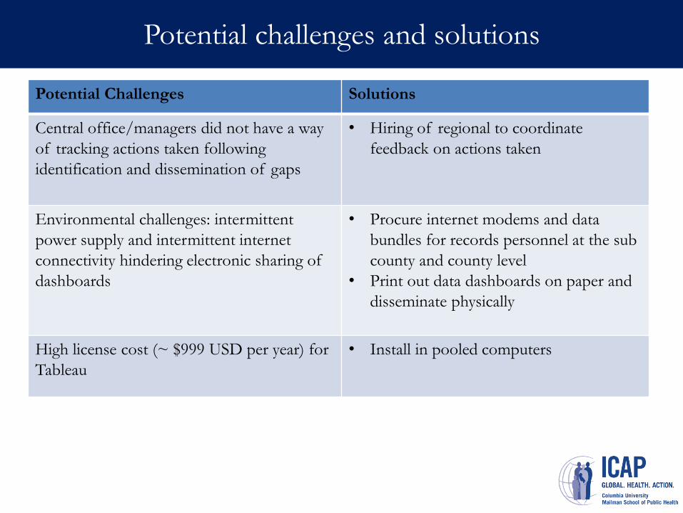
Potential challenges and solutions
Potential Challenges Solutions
Central office/managers did not have a way
of tracking actions taken following
identification and dissemination of gaps
• Hiring of regional to coordinate
feedback on actions taken
Environmental challenges: intermittent
power supply and intermittent internet
connectivity hindering electronic sharing of
dashboards
• Procure internet modems and data
bundles for records personnel at the sub
county and county level
• Print out data dashboards on paper and
disseminate physically
High license cost (~ $999 USD per year) for
Tableau
• Install in pooled computers

Thank you!
For more information contact
Kelvin Ndede
Email: [email protected]
Tel: + 254 720 261 263
Dr. Duncan Chege
Email: [email protected]
Tel: + 254 710 801 862