Embed Size (px)
Citation preview

Published September 2021
Brand guidelines
Page 2
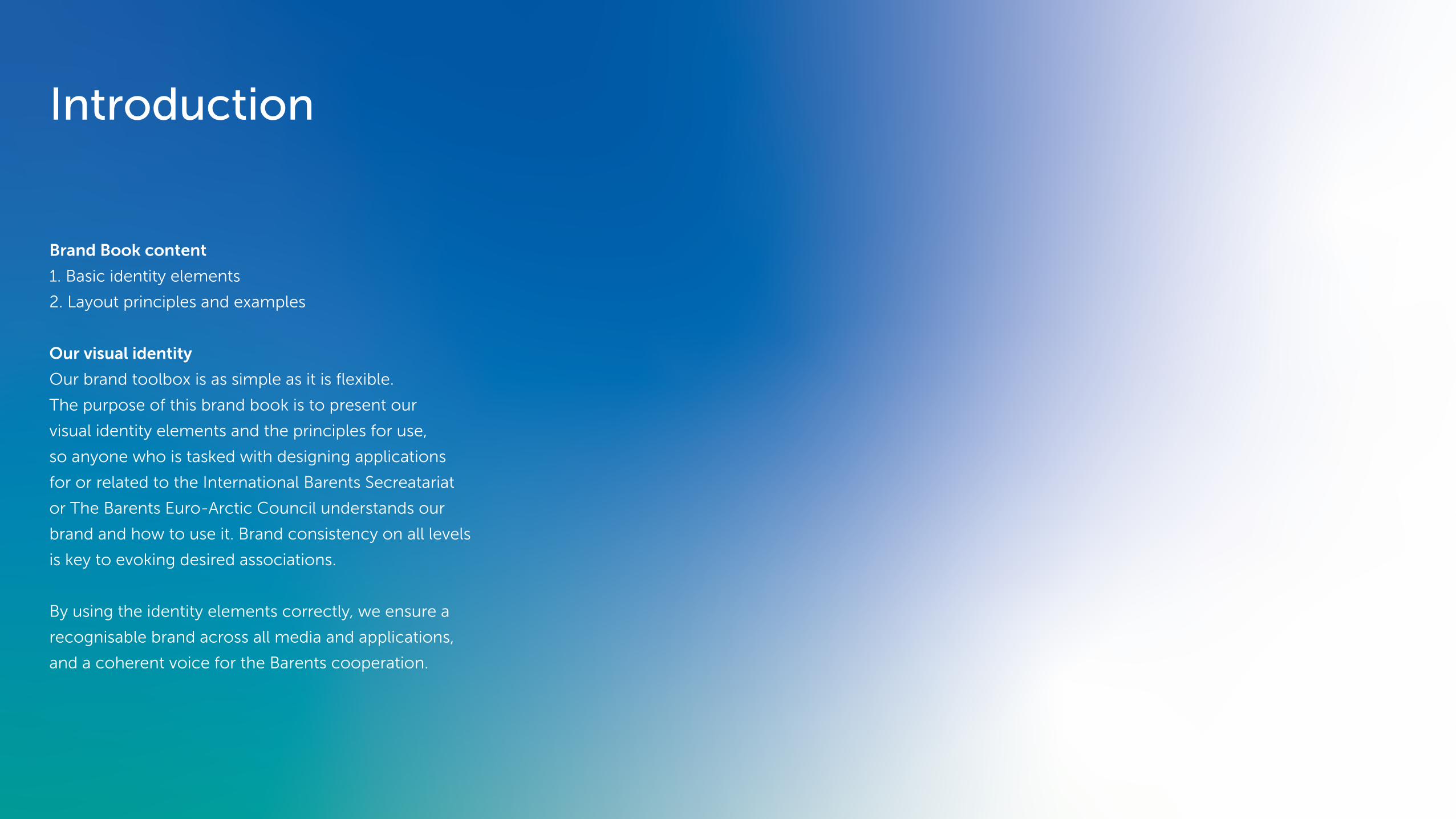
Introduction
Brand Book content
1. Basic identity elements
2. Layout principles and examples
Our visual identity
Our brand toolbox is as simple as it is flexible.
The purpose of this brand book is to present our
visual identity elements and the principles for use,
so anyone who is tasked with designing applications
for or related to the International Barents Secreatariat
or The Barents Euro-Arctic Council understands our
brand and how to use it. Brand consistency on all levels
is key to evoking desired associations.
By using the identity elements correctly, we ensure a
recognisable brand across all media and applications,
and a coherent voice for the Barents cooperation.

Page 3
1.0 Basic identity elements
1.1 Logos
1.4 Color gradients
1.3 Color pallette1.2 Typography
1.5 Photography
Museo SansABCDEFGHIJKLMNOPQRSTUVWXYZÆØÅ1234567890
Lyon TextABCDEFGHIJKLMNOPQRSTUVWXYZÆØÅ1234567890

Page 4
A complex yet versatile sender identity
The visualisazion of the Northern Lights featured in
the logo is a shared identity asset between both the
IBS and BEAC. BEAC is the most outgoing brand of
the two, and the similarity safeguards brand recognition
and strategically sound synergies between organization
and cooperative work.
In order to ensure readability and comprehensive
application our logos are rooted in a rigid design-grid.
The grid also takes into account the visual representation
of the ambulatory Chairmanships, and facilitates an
overall sender identity with kinship to the logo.
By following the guidelines, we ensure uniform
use of our trademarks.
Assets
IBS-Logos.zip
BEAC-Logos.zip
1.1 Logo
Page 5
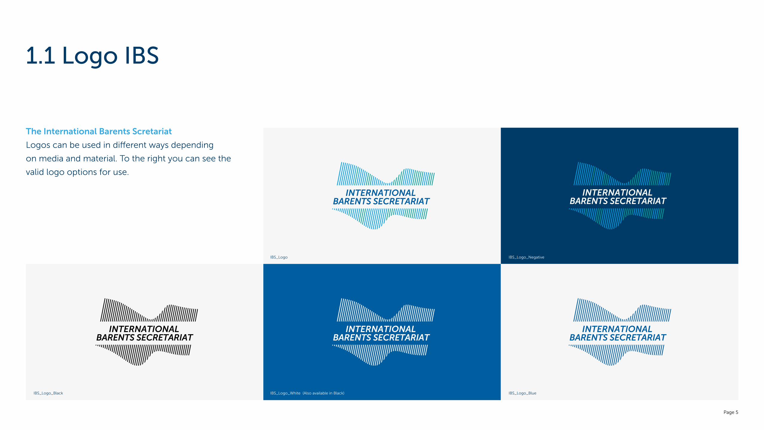
1.1 Logo IBS
The International Barents Scretariat
Logos can be used in different ways depending
on media and material. To the right you can see the
valid logo options for use.
IBS_Logo
IBS_Logo_White (Also available in Black)IBS_Logo_Black
IBS_Logo_Negative
IBS_Logo_Blue

Page 6
1.1 Logo BEAC
The Barents Euro-Arctic Council
Logos can be used in different ways depending
on media and material. To the right you can see the
valid logo options for use.
BEAC_Logo
BEAC_Logo_White
BEAC_Logo_Negative
BEAC_Logo_BlueBEAC_Logo_Black

Page 7
Structuring the complete sender identity
Our logos are rooted in a design-grid with carefully
adapted balance, alignment and space between
typography and icon. The system safeguards readability
and good reproduction on various surfaces.
However, most often the BEAC logo is accompanied
by visuals for the current BEAC Chairmanship and/or
Regional Council. Historically, independent graphics,
logos and elements have been developed for each
chairmanship. Over time, this unfortunately helps to
dilute the brand and the overall message.
By using a predefined structure for the sender, we can
safeguard a holistic expression while at the same time
make room for creative content and expressions for
each Chairmanship and Council.
1.1 Sender identity

8
THE BARENTS EURO ARCTIC COUNCIL
Norwegian Chairmanship of The Barents Euro-Arctic Council
2021 – 2023 2021 – 2023
Barents Regional Council Västerbotten, Sweden
X
X
X
X
X
X
X
X
X
X
X
X
X
X
X
X
X
X
X
X
X
X X X X X X X X X X X X X X X X X X X X X X X X XX X X X X
X X
1.1 Sender identity, structure
Comments 1.1.1 1.1.2
A template is made, fascilitating easy updates when a new presidency takes over (1.1.1).
See Section 2 in the Brand Book for complimentary guides on how to apply the sender structure.
Municipal Creast and other visuals (1.1.2) is preferred left out in this context.

Page 9
1.2 Typography
Readability and focus
Our profile fonts, Museo Sans and Lyon Text, are
distinctive and have character. They complement
each other well, and build identity by prescense.
Museo Sans is also easy to read and works well with
our formal approach. Furthermore, the variety of
weights provide flexibility. Lyon is a classic font that
communicates quality, emotion and history and
has good readability for longer text.
Museo Sans is used in our logos.
Assets
fontshop.com
fonts.adobe.com
commercialtype.com
AbcAbcdefghijklmnopqestuvwxyzæøå 0123456789
Abcdefghijklmnopqestuvwxyzæøå 0123456789
Abcdefghijklmnopqestuvwxyzæøå 0123456789
Abcdefghijklmnopqestuvwxyzæøå 0123456789
Abcdefghijklmnopqestuvwxyzæøå 0123456789
AbcAbcdefghijklmnopqestuvwxyzæøå 0123456789
Abcdefghijklmnopqestuvwxyzæøå 0123456789
Abcdefghijklmnopqestuvwxyzæøå 0123456789
Abcdefghijklmnopqestuvwxyzæøå 0123456789
Abcdefghijklmnopqestuvwxyzæøå 0123456789
Brand Font, Museo Sans Supporting Font, Lyon Text

Page 10
Primary Colours
Our colours are inspired by the arctic diversity and
the cold, clear region where we live and thrive.
Our primary colours are variations of blue and green.
These are the colours most used in our identity.
They appear in our logo, and are used for text as well
as graphic elements and iconography. The white
colour adds an important sense of purity and space
to the overall visual expression.
Secondary colours
To supplement our colour palette for e.g. highlighting
information, graphs and charts we have defined a few
supplementing Secondary colours. These should be
used as an addition to our primary colours.
294 CP
C: 100
M: 70
Y: 20
K: 35
R: 0
G: 59
B: 104
#454547
Dark Blue
2935 CP
C: 100
M: 50
Y: 0
K: 15
R: 0
G: 94
B: 161
#1d7188
Blue
Process Cyan
C: 100
M: 0
Y: 0
K: 0
R: 0
G: 159
B: 227
#009fe3
Light Blue
C: 0
M: 0
Y: 0
K: 0
R: 255
G: 255
B: 255
#ffffff
7716 CP
C: 80
M: 10
Y: 45
K: 0
R: 0
G: 161
B: 154
#00a19a
322 CP
C: 100
M: 30
Y: 45
K: 20
R: 0
G: 108
B: 119
#006c77
323 CP
C: 80
M: 40
Y: 50
K: 45
R: 0
G: 76
B: 84
#004c54
178 CP
C: 0
M: 70
Y: 60
K: 0
R: 237
G: 106
B: 91
#ed6a5b
134 CP
C: 0
M: 15
Y: 60
K: 0
R: 255
G: 219
B: 124
#ffdb7C
Light Green Green Dark Green Red YellowWhite
Pantone referenceFor print and press
CMYKFor digital printing
RGBFor use on screen
HEXFor use on web
Secondary colours
1.3 Brand Colours
Primary Colours

Page 11
Gradients emphasizing the visual identity
By combining our primary colours in gradients we
can easily create distinct backgrounds and a key identity
element in our basic branding. Theese gradients
work just as well in full colour as when faded to white.
Create space and readability for content by adjusting
bespoke backgrounds.
In order to tailor visuals to specific content or themes,
or just to add visual flair, gradients can be made of all
our colurs in various combinations. However, basic and
generic branding should preferably appear in a blue and/
or green colour combination with reference to the logo.
Assets
Barents-Gradients.ai
1.4 Colour gradients
Full colour backgroundsFaded backgrounds

Page 12
1.4 Colour gradient examples
Blue tones Green tones One colour to white. Primary + secondary colours

Page 13
The power of photography
Photos play an integral role in conveying our identity,
our work and our success stories. Photography adds
emotion and can enhance our claims and objectives.
Our specific needs for photos are varied. The overall
feeling however, shall be down-to-earth, and with a
documentary approach. We aim to portray real people
as often as possible and preferably in a relevant context
to the setting in wich they are used.
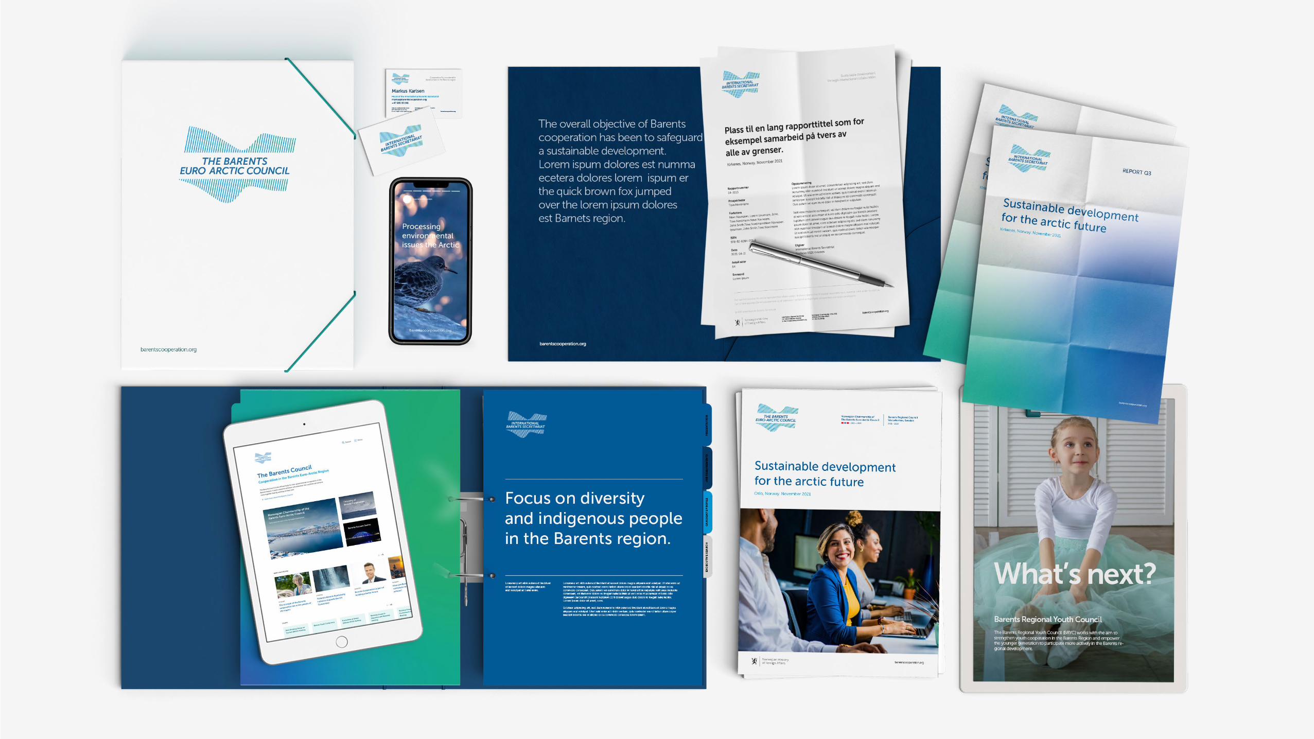
See Chapter 3 for photography assets.
1.5 Photography
Photo Roman KhoroshilovPhoto Alexander Stepanenko
Page 14
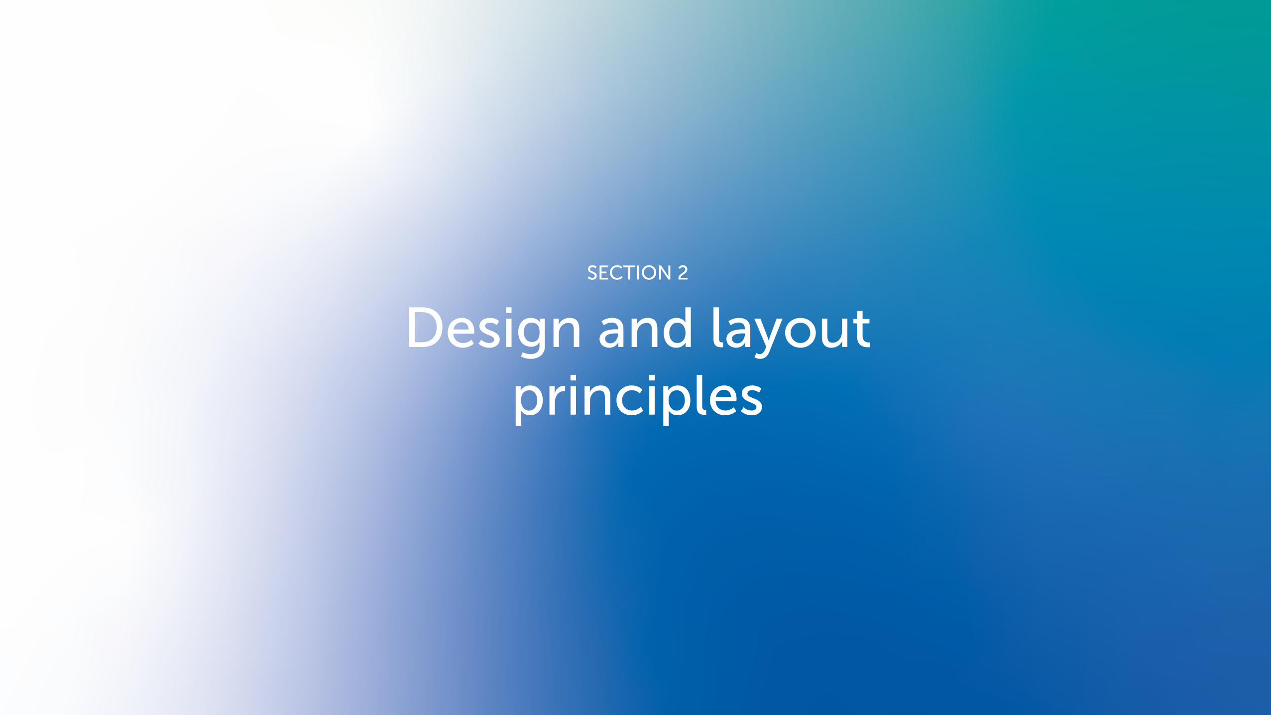
SECTION 2
Design and layoutprinciples

Page 15
Flexibility and versatility is key
A 12/6 or 6/6 grid with pre-defined placeholders
constitute a solid and recognisable foundation for
applying content. This easy-to-use design principle
should form the basis for material across all media
and formats.
2.1 Layout
CONTENT
SENDER
SENDER

Page 16
Example 1.2 The typographic hierarchy and established sender structure
carries identity, and fascilitate flexible and focused layout.
Excample 1.3 Visually, there is room to choose different expressions,
be it photos or illustrations. The framing creates a whole.
Visual and creative leeway
barentscooperation.org
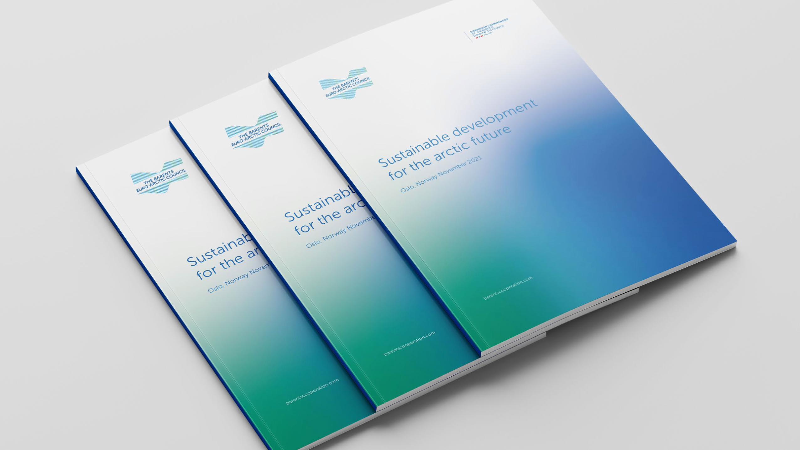
Sustainable developmentfor the arctic futureNarvik, Norway November 2021
barentscooperation.org
Sustainable developmentfor the arctic futureNarvik, Norway November 2021
Example 1.1 The grid creates focused content., and can form the basis for
everything from letterheads to e.g frontpages for reports etc.
barentscooperation.org
Sustainable development through international collaboration
International Barents SecretariatNO-9900 Kirkenes, NorwayE-mail: [email protected]
Norwegian Chairmanship 2019-2021Ministry of Foreign Aff airsP.O. Box 8114 Dep

Page 17

Page 18

Page 19

Page 20
Photo Roman KhoroshilovPhoto Alexander Stepanenko
2.2.2
barentscooperation.org
Empoweringthe nextgeneration.FOCUS YOUTH
The Barents Regional Youth Councilworks actively with the aim to strengthenyouth cooperation in the Barents Region.
barentscooperation.org
FOCUS YOUTH
The Barents Regional Youth Councilworks actively with the aim to strengthenyouth cooperation in the Barents Region.
Empoweringthe nextgeneration.
barentscooperation.org
Example 2.1 The grid allows for extensive use of images in combination
with focused typography..
Example 2.2 The end result constitutes a contemporary look and feel
with a formal and clear expression and focus.

Page 21

Page 22
Photo Roman KhoroshilovPhoto Alexander StepanenkoExample 3.1 Clean layout can emphasize our core identity elements.
Basic marketing material can successfully use predefined colour gradients.
Example 3.2 Adjust bespoke gradients to fit into the desired format.
Visual and creative leeway
barentscooperation.org
REPORT Q3
barentscooperation.org
REPORT Q3
Sustainable developmentfor the arctic futureKirkenes, Norway. November 2021
Page 23

Page 24

Page 25
Example 4.2 Reports and frontpages.
Focus on structure, information value and controlled visuality.
Excample 4.3 Marketing material.
Focus on core branding with logo and colour gradients.
barentscooperation.org
Sustainable developmentfor the arctic futureOslo, Norway. November 2021
barentscooperation.org
Sustainable development through international collaboration
International Barents SecretariatNO-9900 Kirkenes, NorwayE-mail: [email protected]
Norwegian Chairmanship 2019-2021Ministry of Foreign Aff airsP.O. Box 8114 Dep
Example 4.1 Formal documents
Focus on structure and readability.
Cooperation for a sustainabledevelopment in the Barents region
barentscooperation.org
Page 26

Page 27
Summary of priorities and achievementsfor the Norwegian Chairmanship
Oslo, November 2021
This is the Barents cooperation
SECTION 1
Descriptive and elaborate title that can easily be placed on two lines
The Barents cooperation
barents-council.org
The Barents cooperation lorem ipsum dolor sit amet, Lorem ipsum dolor sit amet, consecte.
Volunteering ipsum dolor sit amet, consectetuer adipiscing elit,sed diam nonummy nibh euismod tincidunt ut laoreet
New and updated maps aliquam erat volutpat. Ut wisi enim ad minim veniam, quis nostrud exerci tation ullamcorper.
Crossing borders and cultures with our joint working groups and projects in sports, music and art.
The Barents cooperation
The Barents cooperationLorem ipsum dolor sit amet, Lorem ipsum dolor sit amet, consecte
In Luleå last year operationLorem ipsum dolor loremsensit amet, Lorem ipsum dolor sit amet, consecte
The movie Barents ipsum dolor loremsensit amet, Lorem ipsum dolor sit amet, consecte
The Barents Regional Youth Council (BRYC) works with the aim to strengthen youth cooperation in the Barents Region and empower the younger generation to participateactively in the regional development.
Next meetingJune 21th 2023, Luleå
Registration open at barents-council.org
Barents Youth
The Barents cooperation
In depth: The Barents Freeway
Preparing a common regional transport plan for the Barents region.
Photo Roman KhoroshilovPhoto Alexander StepanenkoExample 5.4 Great flexibility and many opportunities for good
layout within the framework.
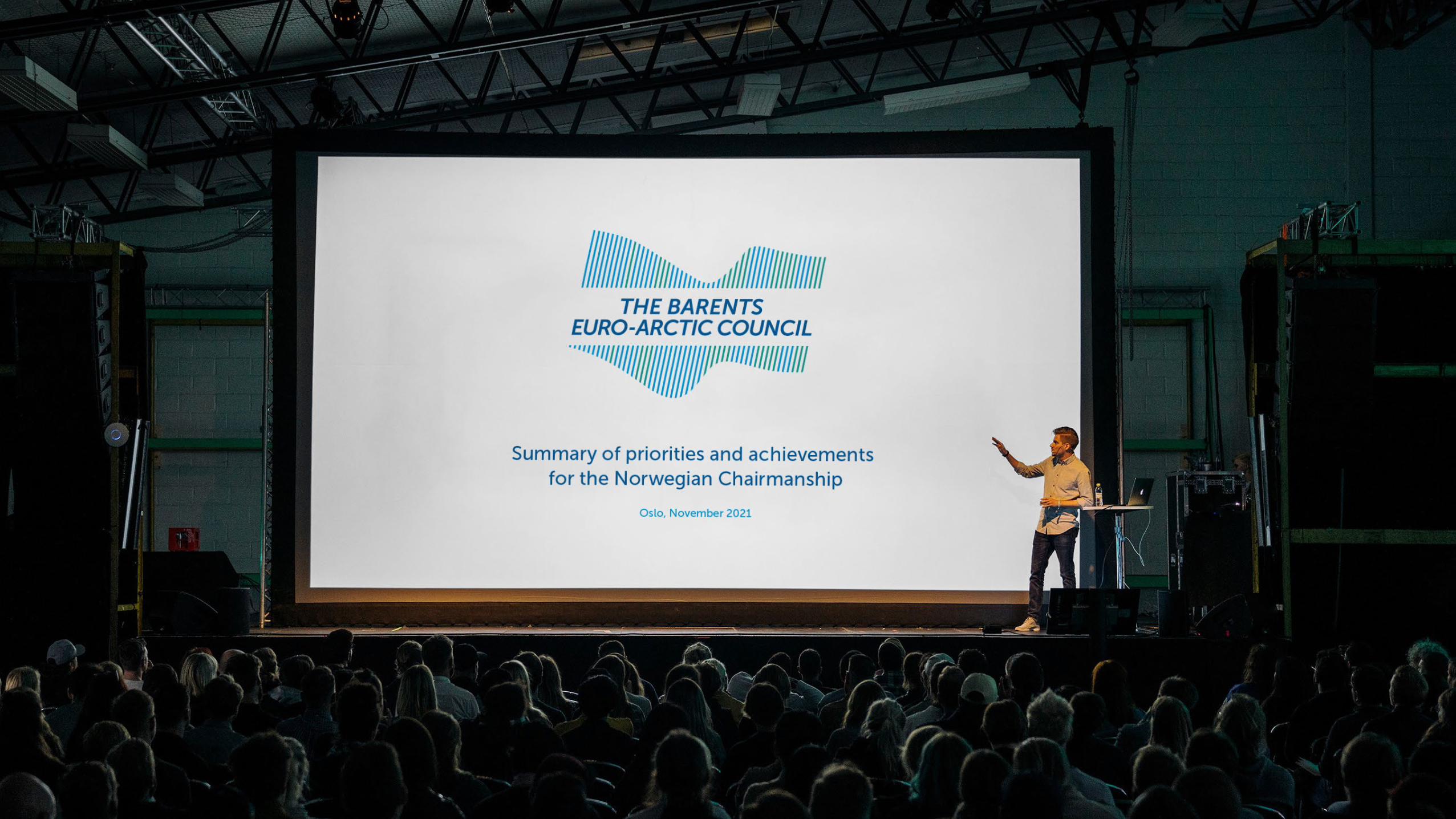
Example 5.1 Presentations should be made easy to use and easy to read.
Avoid too much graphics and use photos wisely in combination with logo.
Example 5.5 Varied layout allows for highlighting messages in
both text and images
Example 5.2 Use clear and legible distinctions between the different topics
in your presentation
Example 5.6 There is always room for good photos and video content.
The Lyon text option can also be used for more thematic content.
Example 5.3 Reserve the surfaces for content. Repetition of logo on each
individual slide is not a must. Be vigilant, use well-adapted language.
Page 28

Page 29
Versatility
Logos can be used in different ways depending
on media and material. In addition to standard
printing the logo can also be used as an
embossed, hot-foiled or engraved element.
The logo can succesfully appear in our pre-defined
mono-colour versions when used on merchandise
and/or demanding print surfaces.
2.2 Logo application

30
Page 31
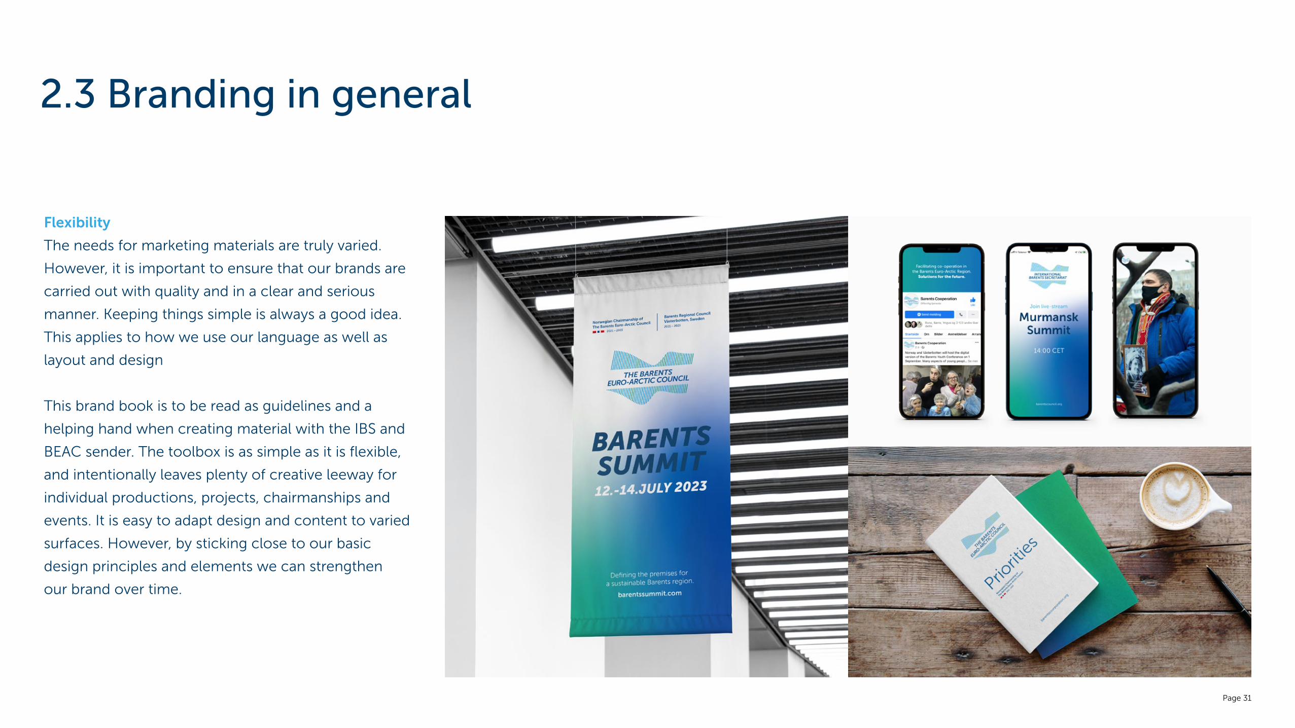
Flexibility
The needs for marketing materials are truly varied.
However, it is important to ensure that our brands are
carried out with quality and in a clear and serious
manner. Keeping things simple is always a good idea.
This applies to how we use our language as well as
layout and design
This brand book is to be read as guidelines and a
helping hand when creating material with the IBS and
BEAC sender. The toolbox is as simple as it is flexible,
and intentionally leaves plenty of creative leeway for
individual productions, projects, chairmanships and
events. It is easy to adapt design and content to varied
surfaces. However, by sticking close to our basic
design principles and elements we can strengthen
our brand over time.
2.3 Branding in general
Page 32
www.barents-council.org
Cooperation in theBarents Euro-Arctic Region