Embed Size (px)
Citation preview

1
Project Report: MyUCSC Redesign Human-Computer Interaction, Winter 2008
Jake Hercules ([email protected])
Emily Lovell ([email protected]) Carlen Young ([email protected])
1. Introduction
1.1. Background Several years ago, UCSC migrated from an older web portal model to the current MyUCSC web interface with the intention of streamlining record management and centralizing resources. However, we feel that the MyUCSC model does not adequately address these needs – a sentiment echoed by many members of our peer groups. Our intention is to produce an easier-to-use, more efficient version of the MyUCSC model.
1.2. Expected Types of Users The main target audience for our system is the undergraduate student body at UCSC, although we acknowledge professors and graduate students as a secondary audience who might also benefit from this undertaking. It is expected that users of our system be familiar (and comfortable) with e-mail access and navigating the internet.
1.3. Contexts of Use MyUCSC is a website accessible from any computer with internet access. Students will usually log into the website from computers in on-campus labs or from their own personal computers at home. Students will log into the website whenever they need to manage any aspect of their education at MyUCSC. Additionally, we hope that adding customizability will encourage students to utilize the interface for personal interests as well.
1.4. What the System Will Be Used For The redesigned MyUCSC web interface will serve as a virtual hub for undergraduates; a single centralized location on the internet where they may participate in the following core activities:
• manage loan/bill payments • check e-mail (through CruzMail) • access class resources (through WebCT) • request transcripts • view grades and evaluations • find local movie times, weather, and news • enroll in courses • consult and add events to a personal calendar (integrated
seamlessly with each student’s individual class schedule and the university-wide academic calendar)
Of course, students may also use the system to locate a variety of university-related resources (which will be reorganized into a more

2
sensible hierarchy). Hopefully, students may also customize the appearance of their MyUCSC web portal by applying various “skins”, styles, and/or color schemes.
1.5. Constraints The biggest limiting factor on our project implementation was most certainly time. Given the compact nature of the quarter system, we have had less than eight weeks to gather an adequate amount of user input, design a prototype, and continue to evolve our prototype in response to continued user involvement in the design process. The second major constraint that we faced was not having the administrative power to access or modify the current system framework and gauge user response on a university-wide scale.
2. Requirement Gathering 2.1. Competitive Analysis
The current MyUCSC web interface was developed with Oracle’s PeopleSoft Enterprise “Campus Solutions” suite of software. This particular systems solution is marketed as focusing on three fundamentals: adaptability, insight, and innovation. It is possible that other universities have more thoroughly developed their web portals through use of the same software suite, but the MyUCSC interface certainly does not live up to the expectations of being adaptable, insightful, and innovative. The current page layout is satisfactory at first glance, but has a couple of underlying problems. The fact that the webpage utilizes frames makes it very difficult for users with non-standard screen resolution to view the entire page. The frame structure of the website also makes it very difficult to print frame contents (such as when viewing a bill from the registrar). Additionally, the long list of links in the left-hand window pane (upon login) is not structured in an intuitively hierarchical manner. The arrangement of these menus and links can make it very difficult (and inefficient) to find specific information. Upon close inspection, it is apparent that many menu items are in fact redundant and, consequently, a waste of both screen space and user attention. Users are also logged out automatically after only 20 minutes of inactivity, which can make multi-step processes such as requesting transcripts or adding/dropping classes a very frustrating experience. Further limitations of the current system are that it does not interface with WebCT or with CruzMail, both of which are very heavily used student resources. While MyUCSC initially appears to be a central student resource, it lacks direct links to either of these critical campus services. While not a dire necessity, the MyUCSC interface does not have many options for customization. The few existing options for personalizing one’s student web portal are hard to navigate to, limited in scope, and confusing to apply.

3
Despite its shortcomings, the MyUCSC interface has improved upon the old student portal in a few ways. Previously, student social security numbers were used to log in to campus services online, and personal security has been improved by migrating to a system of student ID numbers. Additionally, the process of enrolling in classes via MyUCSC is certainly an improvement over the previous “Teleslug” system where students were required to enroll via touch-tone telephone or through a cryptic text-only website.
2.2. Data Gathering Method In order to capture the users’ input, this study utilized two main methods of data collection: observation and surveys. The surveys were used to gain general understanding of how people relate to the web interface as well as to test the popularity of some suggestions presupposed by the developers. The observation method was used to create personas, scenarios, and use cases. The survey used was a 14-item survey (see Appendix A) with two different ordinal likert scales. One scale was a scale from 0-4 representing never to very often, respectively, in regards to use. The other was a scale from 1-4 representing strongly agree to strongly disagree, respectively, in regards to statements about the web interface (i.e “I am satisfied with the MyUCSC website.) The scores were then analyzed with descriptive statistics. The observations were made using a screen capture program while the user went through common tasks, along with a few tasks drawn at random. The participant went through these common tasks and worked around any barriers that came up, i.e. not knowing where a specific resource was on the website. There were clearly labeled stops in the outline of the process that would prevent the user from displaying any personal data. The participants were selected using a convenience sample to represent students of various majors at the University of California, Santa Cruz. The participants also had varied levels of experience with the current MyUCSC interface. The actual scores for majors and user interface were not explicitly collected, but were implicitly linked in the methodology of the convince sample itself. There were 14 participants who participated in the survey and 2 in the observation of task analysis. Results of the survey may also be found in Appendix A.
3. Requirement Analysis 3.1. Personas
• Juan is an undergraduate at the University of California, Santa Cruz. He is a junior anthropology major who has just transferred to UCSC. Juan is very computer savvy and will intermittingly go between different keyboard setups when typing (qwerty, and dvorak for faster typing). Speed and efficiency are important to him. Juan is periodically

4
in classes with information on posted on WebCT, i.e. class PowerPoint slides or paper requirements. Juan set up his CruzMail to automatically forward his e-mail to another address, but sometimes accesses the CruzMail website for convince. Other than CruzMail and WebCT, Juan only uses MyUCSC to deal with grades once a quarter. Key goal for Juan is: fast networking to minimize the overlap time for a message sent to CruzMail to be redirected to his other e-mail address. Organization and efficiency are important as well as a personal pet peeve.
• Liz is an undergraduate at the University of California Santa Cruz. She is a senior creative writing major who has been at UCSC for her full four years. She is comfortable with computers, but likes them to be simple and organized. She mostly uses WebCT and CruzMail. Many of her classes have assignments posted on WebCT. Furthermore, WebCT is utilized as a place to drop off small assignments, e.g. small reading evaluations or questions, and as a place where grades are posted. CruzMail has been adopted as her primary e-mail and she checks it regularly to stay in connection with family back at home. Liz uses the MyUCSC website commonly to check up on grades, requirements for graduation, finances, student loans, and to sign up for and drop classes. Key goals for Liz are: fast uploading and downloading to supplement her slow internet at home. Appealing aesthetics are a personal pet peeve.
• Marco is a graduate student at the University of California Santa Cruz. He is a second year graduate student doing research with pedagogical theory. Marco uses MyUCSC for signing up for classes and CruzMail to keep in contact with colleagues. Marco often sends large files electronically and requires a secure connection, specifically, to keep participant data confidential. Marco has never heard of WebCT, yet does use eRes (electronic resources) sometimes. Key goals for Marco are: fast and secure networking, with the ability to send gigabyte e-mails without CruzMail freezing.
3.2. Scenarios • CruzMail Scenario: Juan is going to check his e-mail via the CruzMail
web client. Juan goes to the my.ucsc.edu website and logs in. First, Juan enters his student ID and password and then presses enter. Juan selects the CruzMail link on the upper right hand corner of the MyUCSC site. This opens up a new window. Juan logs in to the CruzMail account by entering his student ID and password again and pressing enter. His e-mail opens up, showing Juan his inbox.
• WebCT Scenario: Liz is going to download the latest set of class slides for a health psychology class. Liz goes to MyUCSC site by typing my.ucsc.edu into her web address bar. Then, Liz enters her student ID and password and presses enter. This opens up the

5
MyUCSC site. Liz then clicks in the search dialog box in the upper right-hand corner, types in “webct” and hits “go.” This leads to a list of available options. Liz picks the second option “WebCT website.” This opens up another screen that has a button in the center of the page that says, “Log in to MyWebCT.” She selects this button and is brought to a screen prompting her to enter her information. She enters her student ID and password, and then presses enter. WebCT opens and she selects health psychology from a list of classes. She then clicks on “course content and related materials” followed by “course materials,” and finally selects the appropriate link to slides, right clicks, and selects “Save Target As…”
• Inter-Library Loan: Juan is going to check the status of a hypothetical inter-library loan. He starts by going to MyUCSC. He is prompted to fill in his student ID and password. He fills in both and presses enter. He then selects the “Campus Facilities & Orgs” link and selects “Science & Engineering Library.” This opens up a new window of many different links. Juan selects the home link at the top right corner. This opens up the library home page. He then selects the “My Library Account” link. (It is important to note that this link is right above “My ILL Requests” whereby ILL stands for Inter library loan). Juan is prompted as to where or not he wants the page to display secure and non-secure items. He selects “yes.” Then, he presses the “back” button, to return to the library home page. Juan then selects the “My ILL Requests” button and is prompted to enter his library barcode. Juan then pulls out his student ID card and copies his library barcode into the field. Juan enters the site.
3.3. Use Cases The following use case scenario is reflective of the type of changes that will take place with the updated system. It is important to note that the trade off for the extra step is that the first four steps will not have to be repeated for WebCT, Library Access, Resources or any other access. Use Case: CruzMail (current) Primary Actor: Student Goal: Logging into Cruzmail using current system
1. Primary Actor goes to cruzmail.ucsc.edu 2. Primary Actor performs the following in arbitrary order 2.1 Primary Actor types in login name 2.2 Primary Actor types in password 3. Primary Actor confirms the information by pressing “Login”
4. System authenticates the Primary Actor 4.1 Exception: System informs Primary actor “incorrect password or account name” 4.2 System denies access to Primary Actor 5. System shows acceptance by redirecting Primary Actor to his/her

6
e-mail inbox. Use Case: CruzMail (proposed) Primary Actor: Student Goal: Log into CruzMail using proposed organization
1. Primary Actor goes to my.ucsc.edu 2. Primary Actor performs the following in arbitrary order 2.1 Primary Actor types in login name and ID number 2.2 Primary Actor types in password 3. Primary Actor confirms the information by pressing “Sign In” 4. System authenticates the Primary Actor 4.1 Exception: System informs Primary actor “incorrect password or account name” 4.2 System denies access to Primary Actor 5. System shows acceptance by redirecting Primary Actor to MyUCSC homepage 6. Primary Actor chooses the CruzMail tab 7. Primary Actor is redirected to e-mail inbox
3.4. Requirement Summary 3.4.1. Functional
• MyUCSC must automatically log out a student until 30 minutes of inactivity have passed. (Reason: The current 20-minute permitted period of inactivity is not long enough to coordinate class numbers for enrollment or locate information and payment needed to request transcripts.) High priority.
• MyUCSC must interface seamlessly with both WebCT and CruzMail. (Reason: MyUCSC, WebCT, and CruzMail are all services frequently accessed by students, so they should be available from one central location.) High priority.
• The system must integrate and support a customized calendar, which automatically includes relevant academic deadlines/dates as well as each student’s personal schedule of classes as well as supporting the addition of custom events. (Reason: Students could save time and confusion if they were to have one central calendar to consult.) Medium priority.
• Menus and lists must be rearranged and simplified under a new organizational scheme of tabs and pull-down menus. (Reason: Reduce redundancy, improve aesthetic qualities, and improve upon ease-of-use.) High priority.
• The MyUCSC website must be laid out in such a way that makes effective use of color and white space. (Reason: Current layout feels claustrophobic and overwhelming, while appropriate use of color and white space can help draw user’s attention to important page aspects.) Medium Priority.

7
3.4.2. Non-Functional • The system must be accessible by users with variable screen
resolutions, and must be able to adjust to browser window resizing. (Reason: All users must be able to access the same information, regardless of what kind of monitor they are using to view the webpage.) High priority.
• Students must be able to find information more efficiently and with fewer mouse-clicks. (Reason: It is a frustrating waste of time to spend ten minutes trying to do a simple task such as check course grades.) High priority.
• The system must allow customizability in the form of adding/removing/rearranging modules and choosing between visual themes. (Reason: These features will enhance the student’s experience and encourage them to fully take advantage of all MyUCSC features.) Medium priority.
• The system must be intuitive and easy to learn. (Reason: If the system is difficult to understand and not supplemented with adequate support, the user will become frustrated and cease to use the system.) High priority.
• MyUCSC must include a means of user feedback. This could be in the form of a forum or a “wish list” that would provide a means of ongoing communication between user and developer in order to facilitate continual improvement. (Reason: Continuing to involve users after implementation allows for the system to evolve and adapt to changing user needs). Low priority.
4. Hierarchical Task Diagram A hierarchical task diagram (see Appendix B) shows a broad overview of the steps a user may go through when navigating our interface. All possible paths a user may take in the context of the “Options” tab are included.
5. System Storyboard A broad storyboard, featuring screen shots for each key view of our system, may be found in Appendix C.
6. Hierarchical List of Functions An exhaustive hierarchical list of links within our interface may be found in Appendix D. This list is based on tab-style organization.
7. Heuristic Evaluation The first pass of the heuristic evaluation (see Appendix E) brought forth several areas to address. There were minor problems with synthesizability, because the homepage button did not change color to notify the user they were on the homepage, as the tabs did. Also, the links and tabs were in need of descriptions to assist the user in selecting the correct option. Finally, a help section was needed to assist the user when something went wrong, or to help the user navigate the interface more efficiently.
8
The second pass (also included in Appendix E) revealed a critical problem when using computers with non-standard screen resolutions. Some of the links were being truncated. The addition of descriptions and help documentation could still be improved. Additionally, offering different color palettes would be advantageous to increasing customizability and flexibility.
8. Revision The first set of revisions to our prototype took place after our heuristic evaluation. The heuristic evaluation showed a need for adjustments to enhance the synthesizability of the website as well as add a help section. In order to fulfill the problem of synthesizability, the “MyUCSC Home” button was updated to be yellow when selected, much like the tabs. Then, a help button was added in the upper right-hand corner next to the search bar. This was set to parallel the accepted mental model for website (via slides) in order to maintain generality. The next step taken was to create a page of descriptions for each tab’s respective links. It was discovered in the heuristic evaluation that many of the links had somewhat ambiguous names. In order to prevent user error, a set of page descriptions carefully explained each link’s uses. Finally, the code was reworked in order to accommodate a wider range of screen resolution variance.
9. User Testing 9.1. Method
The participants were asked to find the following links and express how they felt as they went through the process: - Summer Session - Tuition Information - Metro Schedules - Grades and Evaluations - Change Password The researcher then followed up with the participants to see if they had any further information they wanted to share. (e.g. The participants were able to explain what changes they would like to see, where things were confusing and what they liked.) Finally the participants were asked if they had any questions and the researcher did their best to answer said questions.
9.2. Users Participants were gathered using a convenience sample of students at the University of California Santa Cruz, familiar with the current MyUCSC website, and non-student /students who have never before come in contact with the current system.
9.3. Testing Setup Users were set up with the system on laptop in front of them. They were then asked to follow a protocol of finding a series of links. Each participant was asked to find links in a different order. There were three researchers, and each implemented a slightly different user environment.

9
Although this could affect the user’s experience of the system, it was important to diversify the experiences, even with a small sample, and capture as much data as possible.
9.4. Results The participants mostly noted small, detailed changes they would like to see, while citing the ease of use and efficiency of the system. Both new and old users of the MyUCSC web interface expressed this. (Itemized lists of issues are presented below). There was only one exception: a major functional issue relating to the ability for the site to be viewed from different computers. Overall, the users were satisfied with the revised system. The most common suggestion was regarding predictability of links. Clarity here needed to be addressed to assist the users. The second most common suggestion was consistency. Two of the link sections under each tab had bold separators further explaining each section’s links. Participants suggested that all tabs have these bold explanatory subheadings. Lastly, the participants wanted to have the University of California logo appear cleaner and crisper, along with general control over the color palette for the system.
Itemized List of Results: 1. Predictability issue a. The corresponding descriptions pages for each tab were misinterpreted as links by several participants. Feedback was received to make the headers above each description a link as well as those on the sides.
b. The bold subject separators within the link column were commonly misinterpreted as links. 2. Aesthetics a. That the site was too “masculine.” User wanted more control and the ability to beautify the working environment. b. Width of tabs should line up with the width of the page content. c. Participants liked the simplistic design. d. Cleaner and more professional logos. 3. Organization a. The site was rated as being very well organized by all participants. b. There were no problems finding links. c. There was one suggestion that the resources section of links be redesigned so one doesn’t have to scroll. 4. Technical Problem a. On some screen sizes links were being cut off.
10. Final Version After the user evaluations, we revised to obtain our final prototype. With this step, many important aesthetic changes were made. First, in order to assist consistency, the color scheme was adjusted to match the current UCSC

10
system. Because many different pages load within our framework, it was necessary that our system use the same colors in order to achieve seamless integration with each page (and reduce user confusion). Then, we updated the UCSC logo. The logo in our first and second prototypes was adapted from the original MyUCSC site page; however, it became clear from our participants that this logo did not portray the professionalism and “clean cut” look that a university web portal should have. This logo was replaced with one that better integrates the school colors as well as professional appeal. Next, was a revision of the tabs. The tabs for the first two prototypes were functional but not aesthetically pleasing. In order to maximize clarity and create a calm atmosphere for the user, the corners were rounded and shading added for the selected tab. Finally, the tabs were expanded to spread over more of the page layout width in order to address complains of visual misalignment.
11. Extensions • Color schemes, or “themes”. This would be a setting that the user could
change in order to personalize the appearance of his/her student portal. There would be several complementary color palette options available to choose from. This is an example of using color as a visual design element.
• Single login name and password (automatically logging user into CruzMail, WebCT, and MyUCSC services simultaneously). This would reduce confusion when logging into our new interface, and would enable the prototype to be put into use.
• Fully functional calendar integration. Right now, our interface home page features a dummy calendar to convey our intentions. Ideally, this calendar would automatically be filled with the user’s class schedule as well as major academic calendar dates (such as campus holidays and registration deadlines). The user would also be able to add personal engagements and meetings of his/her own to this calendar.
• Fully functional CruzMail integration. At present, our interface home page displays a dummy view of a user’s CruzMail inbox. If linked properly to the CruzMail service, this could update to represent the most recent messages in the user’s inbox in real-time.
• Fully functional add-on widget library. Movie times, news headlines, and local weather are a few examples of such widgets (all of which appear on our home page in dummy form).
• More obvious differentiation between non-functional headings and menu item links. This was a common point of confusion in our user evaluations. Users frequently tried to click on the bold text in the left menu pane of each tab, expecting the headings to be links themselves. It was unclear, until mousing over the menu items, which text items were clickable and which were merely organizational headings. This is an area in which changes might dramatically improve ease of use.
11
12. Resources
• Sharp, H., Rogers, Y., & Preece, J. (2007). Interaction design: beyond human-computer interaction (2nd ed.). Chichester; Hoboken, NJ: Wiley.
• Jakob, N. (1994). Heuristic evaluation. In Usability inspection methods (pp. 25-62): John Wiley & Sons, Inc.

A-1
Appendix A: User Survey and Results

A-2
Question Number User 1a 1b 1c 2 3 4 5 6 7a 7b 7c 7d 7e 1 1 1 0 1 1 3 2 3 4 3 3 4 2 2 2 0 4 2 2 2 3 3 3 2 0 4 0 3 1 0 0 0 4 4 4 3 5 0 0 0 0 4 0 0 0 2 4 2 4 2 4 2 2 0 0 5 2 0 0 3 2 3 3 3 4 4 0 0 0 6 1 0 0 2 1 2 4 2 4 4 0 0 0 7 2 2 4 2 1 2 4 3 4 4 4 4 4 8 2 0 0 2 3 2 4 2 4 3 0 0 0 9 1 0 0 2 3 1 3 2 4 3 0 0 0 10 3 0 0 2 3 1 4 1 4 1 0 0 0 11 2 1 2 2 3 3 4 3 4 0 4 2 2 12 1 2 0 3 2 3 3 2 1 0 0 0 2 Avg. 1.5 0.5 0.83 1.92 2.42 2.33 3.5 2.42 3.75 2.17 1.08 1.17 0.83 Users 1, 2, 8, 9, 11, 12 were undergraduate students. Users 4, 5, 6, 7, 10 were graduate students. User 3 was a professor.

B-1
Appendix B: Hierarchical Task Diagram
Due to our project’s complexity, we have simplified most of the functionality. We have, however, fully implemented the “Options” tab task diagram.

C-1
Appendix C: Storyboard Splash Page
This is a potential log-in page for the new layout. The current MyUCSC system uses a very crowded webpage filled with links that are already available after logging in, offering meaningless redundancy. This one has been created to facilitate the combination of MyUCSC and WebCT / CruzMail into one portal system. Ideally, each student would use the same login, student ID number, and password to access all of these UCSC services.

C-2
Home Page
Like the current system, once a user logs in, he/she is presented with a page that does not have any expanded menus, with a plethora of links and resources available – the content of which is customizable. Our ideal home page would function much like iGoogle or a Facebook profile; a number of modules would be available, each with different functionality that could be added and removed at will. Three modules would be of utmost importance, and are a major part of the new design. A mini-CruzMail module would notify users when they have new mail, as well as provide direct links to writing new email. An Announcements module conveys important information from the school to the student. Third, a Calendar module combines both the student’s weekly schedule and the school’s Academic Calendar.

C-3
Academics Tab
A student’s primary use of MyUCSC is for his/her academic needs, such as signing up for classes and checking academic career progress. Therefore, all links toward these goals are put in the first tab in the menu. This tab’s menu allows students to control all aspects of their academic history and academic future, from enrolling in their first class to applying for graduation. Like all other tabs, before a user makes a menu selection, he/she is presented with a page featuring short descriptions for all the links in the menu.

C-4
Money Tab
The issue of money is a very important one for students; grants, bills, aid, and more must all be at the student’s fingertips. Rather than distributing similar links around to multiple submenus, we combine all finance links in one place, meaning that no link will go unseen, and no functionality will be lost. The links are categorized: Accounts and Billing, which contains links relevant to all students, and Financial Aid + Loans, just as important, but affects a smaller portion of the population.

C-5
Resources Tab
A large number of links from the old interface appear here in order to provide information to students. The problem was that these secondary resources were mixed among the other, more frequently used links. In our implementation, all of the resources are made available in one location. In addition, in gathering all the related links for this tab, it was easy to eliminate links whose functions were redundant, or at least very similar. This means that the new interface maintains the functionality of the existing interface but uses a smaller set of options.

C-6
CruzMail Tab
Clicking on the CruzMail tab loads the web-based CruzMail, but retains a MyUCSC tabbed menu above. In the prototype, one must be logged in to CruzMail prior to clicking the CruzMail tab, or else the CruzMail login page may take over the window.
C-7
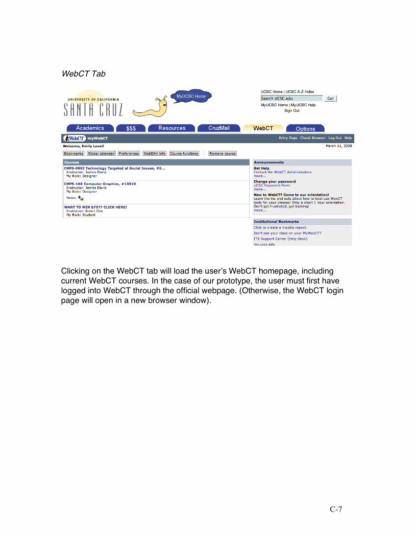
WebCT Tab
Clicking on the WebCT tab will load the user’s WebCT homepage, including current WebCT courses. In the case of our prototype, the user must first have logged into WebCT through the official webpage. (Otherwise, the WebCT login page will open in a new browser window).

C-8
Options Tab
Here is where all user-specific links are located. These include all user information, contact information, and passwords. When the customizable modules are implemented, this is also where all options relating to module selection and various other customizations (such as various site “skins” for the interface) will be controlled from.

D-1
Appendix D: Hierarchical List of Functions Academics
Class Enrollment Schedule of Classes UCSC General Catalog Summer Session Undergraduate Advising Student Advising Summary Academic Programs Apply to Graduation Grades + Evaluations Unofficial Transcript Degree Progress Report Transfer Credit Report View Test Scores
$$$ Accounts and Billing
New Student Info Account Summary Billing Statements Unbilled Activity Direct Deposit Payment Calculator Tuition Information
Financial Aid + Loans Financial Aid Forms My Financial Aid FAFSA Office of Financial Aid NSLDS Student Access
Resources
Maps & Transportation Directions to Campus Interactive Campus Map Common Campus Destinations A-to-Z Campus Locations Parking/TAPS Shuttle Schedules Metro Bus Schedules Bicycling Rideshare Programs
Academics The UCSC General Catalog The Navigator Student Policies and Conduct Academic Success Workshops Learning Support Services Academic Excellent Program Transfer and Re-Entry Students Summer Session
Departments Arts Engineering Humanities Physical and Bio Sciences Social Sciences
Campus Life Residential Colleges McHenry and Science Libraries Bay Tree Bookstore Student Union Assembly Student Organizations Student Media Cafes and Restaurants Dining Halls Health Center Wellness Center OPERS Arboretum Graduate Student Association Grad Commons
Offices Office of the Registrar Undergraduate Advising Center Disability Resource Center Housing Services
CruzMail No Options
WebCT No Options

D-2
Options My Personalizations Change Password Emergency Contact Info My Contact Info Directory Restrictions

E-1
Appendix E: Heuristic Evaluation Passes
Pass One:

E-2
Pass Two:

F-1
Appendix F: User Evaluations User Evaluation 1
The participant was a 5th year college student at the University of California Santa Cruz. She has experienced several changes to MyUCSC during her UCSC career. She was also one of the participants in the original data gathering regarding the current MyUCSC page. At the moment of evaluation she was tired. To note: Although this did affect the speed of navigation and understanding of the website, the overall disposition proved to be beneficial as normal mental corrections were expressed physically as the curser more accurately displayed the thought process.
Upon opening the site she started clicking and scrolling around at first. She said that this was helping her establish and understanding of how the website worked. I gave her the first prompt to find the “Summer Session” link. She first traced along the tabs along the top and selected the correct choice of “Academics.” Then she started to scroll down the list of explanations for the links and tried to press on the bold letters (these were not links though). After a while she said “It would be nice if these were links,” and continued to find the actual link along the left side. This opened up the link into a new browser tab. This “confused her” at first.
The next task was to find the “Tuition Information Link.” She immediately jumped to the “$$$” tab and selected it. Then she took about 30 second to trace through the tab descriptions in the center of the screen. Upon finding the correct description she went to the corresponding link on the left side of the web site. She happily said “what next.” It seemed as though she felt like she was getting the hang of it.
The third question was to find “Metro Schedules.” She traced along the tabs along the top and chose the correct tab “Resources.” This page did not have the link descriptions in the middle of the page. She went over to the left and looked until finding the correct tab.
The forth question was to find “Grades & Evaluations.” She went directly to the “Academics” tab. Here she quickly found the correct link as well in almost no time.
Changing the password was very similar to the “Grades & Evaluations” link. There was a direct two shot experience without very much time set aside to think.
Upon being asked to expound upon her experience and the design she addressed the following:
1. The descriptions should also be links. 2. The site was very clean and simple. 3. The side set of links should have collapsible headers to make it take up
less space (Referring to the references page and concluding that the rest should as well for consistency.)
4. She opened up her myYahoo page in order to show me what she wanted for the homepage. (This page was almost exactly what we were

F-2
developing for the current homepage.) She elaborated and explained that she wanted to have color control and lots of options for the homepage (e.g. horoscopes)
5. Said that the current model was too “masculine” for her and that she wanted a site that was beautiful, clean and had options to make it feel more “feminine” (Note: the yahoo site she referenced was a lavender and purple color scheme).
User Evaluation 2 Participant was a recent graduate of Stanford University, and had access to
(but never once used) a similar type of interface. When he first entered the website, he commented that the homepage wasn't aligned correctly - that the widgets were all offset to the right of where they should be, and did not fit on the screen.
The first task was to find the “Summer School” link. He immediately clicked on the Academics tab, and then on the Summer Session link.
Next, he was asked to find “Tuition Information” and he clicked immediately on the $$$ tab. However, at this point, he tried to click on the bold heading text "Accounts and Billing", thinking that it would be a link. After he realized that it was not linked to anything, he immediately located and clicked on the "Tuition Info" link below.
To locate the next requested link, “Metro Schedules”, he clicked on the Resources tab and then directly on the link for "Metro Bus Schedules". Finally, when asked to locate “Grades and Evaluations”, he navigated quickly to the Academics tab and then straight to the appropriate link. He was able to complete every objective by clicking the fewest amount of tabs/links necessary. When asked for general comments, his suggestions were as follows:
1. Did not like that length of tabs does not line up with width of web page content. The site was very clean and simple.
2. Did not like that the menus on each tab have words cut off on the right side (as well as border). Suggested widening menu or abbreviating menu items.
3. Liked that links were sorted under bold headings. Thought that there should be at least two headings to sort links under Academics tab in order to carry this feature throughout the interface.
4. Was confused about whether or not bold headings were links. Suggested slight indentation of all links below each heading (or underlining links below each heading) in order to distinguish their function without having to mouse-over them.
5. Was impressed by how little time it took for him to locate the target information, despite not currently being a student.

F-3
User Evaluation 3 Participant was a fourth year senior at the University of California Santa Cruz.
They had no prior knowledge of the project, but were familiar with the current system. Current System:
The first task was to find the “Summer School” link and this was a very difficult task on the current MyUCSC. She scanned the available, un-opened menus and had no idea where such a link would exist. Comments such as an exasperated, "Hmm... wow..," and trailing questions like, "What?," were frequent throughout. After two guesses as to which menu header the link would be under, the user eventually resorted to clicking randomly on other menus, finally locating it in 4 clicks total.
The next task was to find the “Metro Bus Schedules.” This was fairly easy. Subject located the correct header, then the appropriate submenu.
The next task was to “Change Password.” Again, this task was performed with minimal effort. (There was not too much searching)
The next task was to find "Tuition Info" link: The hardest question. Subject admitted she became confused when unable to find the link even when looking in what she called "Places that make sense".
The final task was to locate “grades.” Subject was able to find the link quickly - most likely as this is a much more frequently-accessed function, and that factor allowed it to be easily found. New System: For all same questions on the new interface, users were able to locate every link in just one click - their first assumption as to the location of each desired link was always correct. Overall feedback was generally positive. "Cool work" and "That was much easier to use" were among those comments.
User Evaluation 4
Participant was a graduating student from the Fashion Institute of Design and Merchandising. This was her first time with either system. The set up was just to look over the new system but curiosity at the end of the session brought up the current browser. This will be discussed, respectively, at the end.
Upon first introduction she remarked that she was surprised that we had done so much work. I responded, “Try to pay attention to how you react to things and mention what works or doesn’t work.”
The first task was to locate the link “Summer School.” This was completed with ease as she went straight to the “Academics” tab and then tried to click on the description section. After this didn’t work she clicked on the link.
The next task was to “Change password.” Again she went directly to the appropriate tab “Options” and then to the correct link.
We then moved along to locate the “Grades & Evaluations” link. She directly found the link in two fairly quick clicks.

F-4
The next task was the “Metro City Bus” link. She took a little longer than before and selected resources. Then she scrolled up and down a few times and picked the link.
After the tasks were completed I asked how she felt about the system and if there was any additional comments.
Her comments: 1. The description section should also work as a link. 2. The “Academics” and “Options” tabs should include the same style as with
the bold headings that the “Resources” tab has. 3. That the “Resources” tab be designed not to have to scroll down. Possibly
with the use of a cascading system. 4. That the logos used should be cleaner. (She was referring to the UCSC
logo.) 5. That there should be options for color.
At the end of the session I asked if she had any questions. Her one question was what the current system was like. She played around in the current system and concluded that we had “completely transformed it for the better.” She also expressed surprise that our website looked so ugly. Coming from an art institution, she felt that the site should be much softer and more aesthetically pleasing.
User Evaluation 5 The participant was a returning participant from the original evaluation of the
current system. He is a student at the University of California Santa Cruz. His first impression of the site was a good impression. He expressed “wow.” This seemed to carry as he continued to go through the tasks outlined below. During a similar study, a few months ago, this participant spent approximately one half hour trying to complete simple tasks such as the ones displayed this time. To the participants’ great delight, as expressed verbally, this evaluation process took much less time. The participant is an avid computer user and had no problems with identifying the specified links within two clicks each. (“Summer School,” “Grades & Evaluations,” Change password, “Tuition Information,” and he Metro City Bus schedule.)
After the quick and almost unresponsive walk through the participant was asked to discuss what they liked and didn’t like.
1. First and foremost was an appreciation of the organization. Especially, the addition of WebCT.
2. He suggested that the logo and general upper left hand corner be made to look more professional. (Clean cut)
I think that due to the degree of difference between his last experience and this one it was hard to come up with criticism. Overall he was expecting another half hour experience, yet walked away in only a few minutes calming “nothing else to say.” He seemed pleased and asked if the new system would be implemented school wide. I responded that we would do our best to provide these options to all the students.