Embed Size (px)
DESCRIPTION
This is the final portfolio for all of my design projects using Adobe and Microsoft programs for my Visual Media class during the Winter semester of 2015 here at BYU-Idaho.
Citation preview

Portfolio
Daniel Hardisty
Description
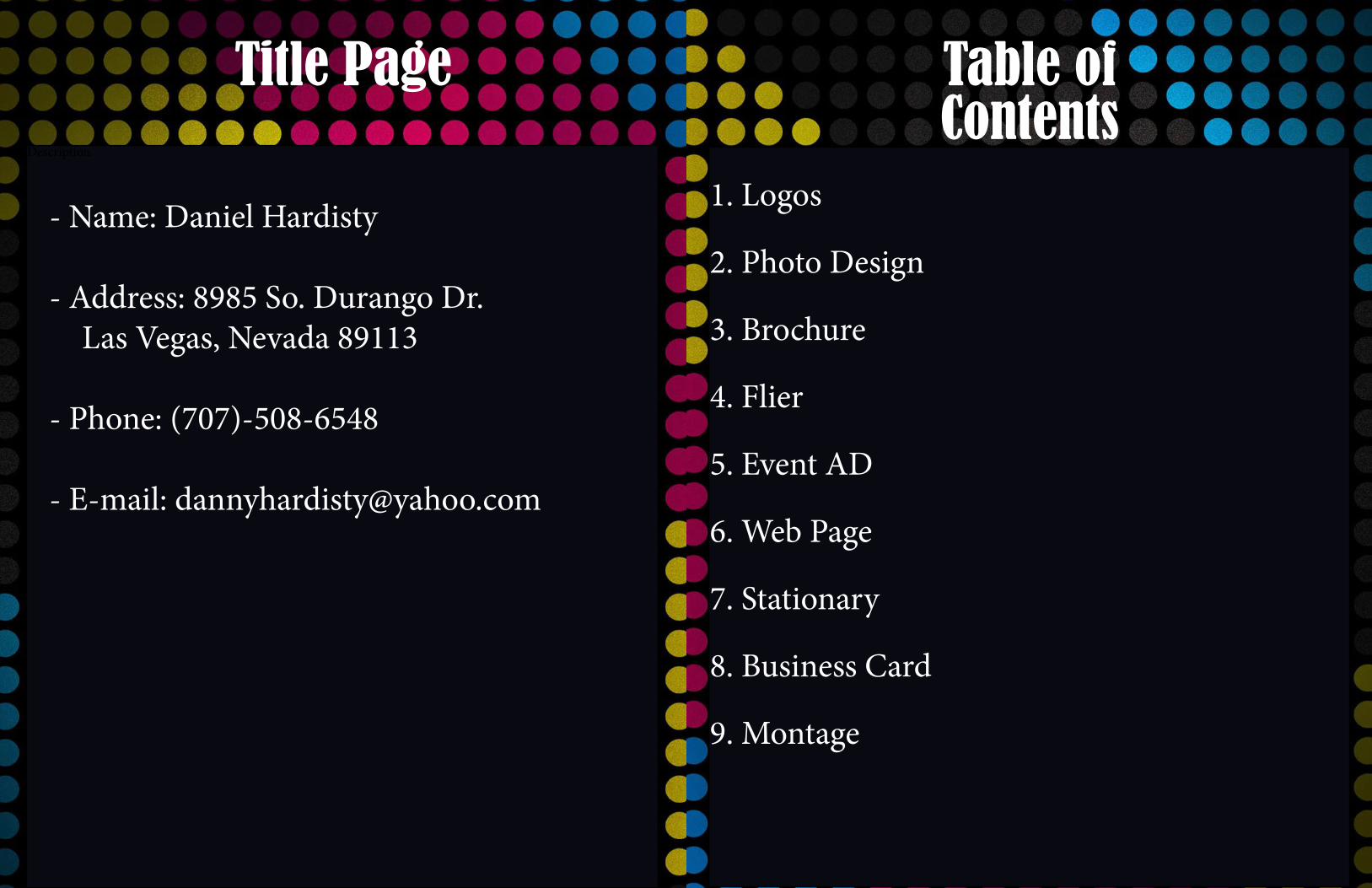
Title Page Table of Contents
- Name: Daniel Hardisty
- Address: 8985 So. Durango Dr. Las Vegas, Nevada 89113
- Phone: (707)-508-6548
- E-mail: [email protected]
1. Logos
2. Photo Design
3. Brochure
4. Flier
5. Event AD
6. Web Page
7. Stationary
8. Business Card
9. Montage
Description
Logos Revv Longboards
PRevvLongboards
RevvLongboards
RE
vv
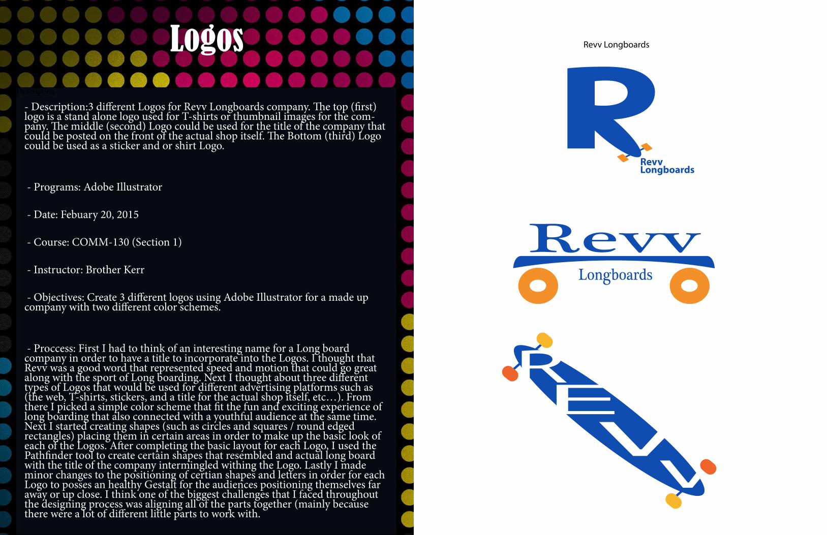
- Description:3 different Logos for Revv Longboards company. The top (first) logo is a stand alone logo used for T-shirts or thumbnail images for the com-pany. The middle (second) Logo could be used for the title of the company that could be posted on the front of the actual shop itself. The Bottom (third) Logo could be used as a sticker and or shirt Logo.
- Programs: Adobe Illustrator
- Date: Febuary 20, 2015
- Course: COMM-130 (Section 1)
- Instructor: Brother Kerr
- Objectives: Create 3 different logos using Adobe Illustrator for a made up company with two different color schemes.
- Proccess: First I had to think of an interesting name for a Long board company in order to have a title to incorporate into the Logos. I thought that Revv was a good word that represented speed and motion that could go great along with the sport of Long boarding. Next I thought about three different types of Logos that would be used for different advertising platforms such as (the web, T-shirts, stickers, and a title for the actual shop itself, etc…). From there I picked a simple color scheme that fit the fun and exciting experience of long boarding that also connected with a youthful audience at the same time. Next I started creating shapes (such as circles and squares / round edged rectangles) placing them in certain areas in order to make up the basic look of each of the Logos. After completing the basic layout for each Logo, I used the Pathfinder tool to create certain shapes that resembled and actual long board with the title of the company intermingled withing the Logo. Lastly I made minor changes to the positioning of certian shapes and letters in order for each Logo to posses an healthy Gestalt for the audiences positioning themselves far away or up close. I think one of the biggest challenges that I faced throughout the designing process was aligning all of the parts together (mainly because there were a lot of different little parts to work with.
Description
Photo Design
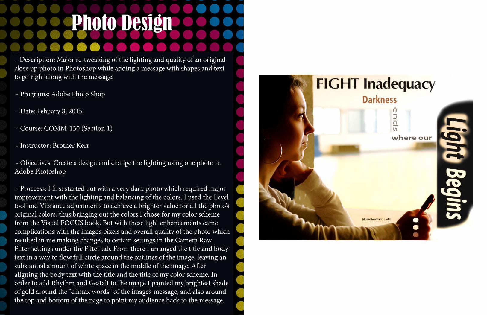
- Description: Major re-tweaking of the lighting and quality of an original close up photo in Photoshop while adding a message with shapes and text to go right along with the message.
- Programs: Adobe Photo Shop
- Date: Febuary 8, 2015
- Course: COMM-130 (Section 1)
- Instructor: Brother Kerr
- Objectives: Create a design and change the lighting using one photo in Adobe Photoshop
- Proccess: I first started out with a very dark photo which required major improvement with the lighting and balancing of the colors. I used the Level tool and Vibrance adjustments to achieve a brighter value for all the photo’s original colors, thus bringing out the colors I chose for my color scheme from the Visual FOCUS book. But with these light enhancements came complications with the image’s pixels and overall quality of the photo which resulted in me making changes to certain settings in the Camera Raw Filter settings under the Filter tab. From there I arranged the title and body text in a way to flow full circle around the outlines of the image, leaving an substantial amount of white space in the middle of the image. After aligning the body text with the title and the title of my color scheme. In order to add Rhythm and Gestalt to the image I painted my brightest shade of gold around the “climax words” of the image’s message, and also around the top and bottom of the page to point my audience back to the message.
Description
Brochure
RR
Records
Rev
olu
tion
RR
Take Your MusicToThe
Next
LeveL
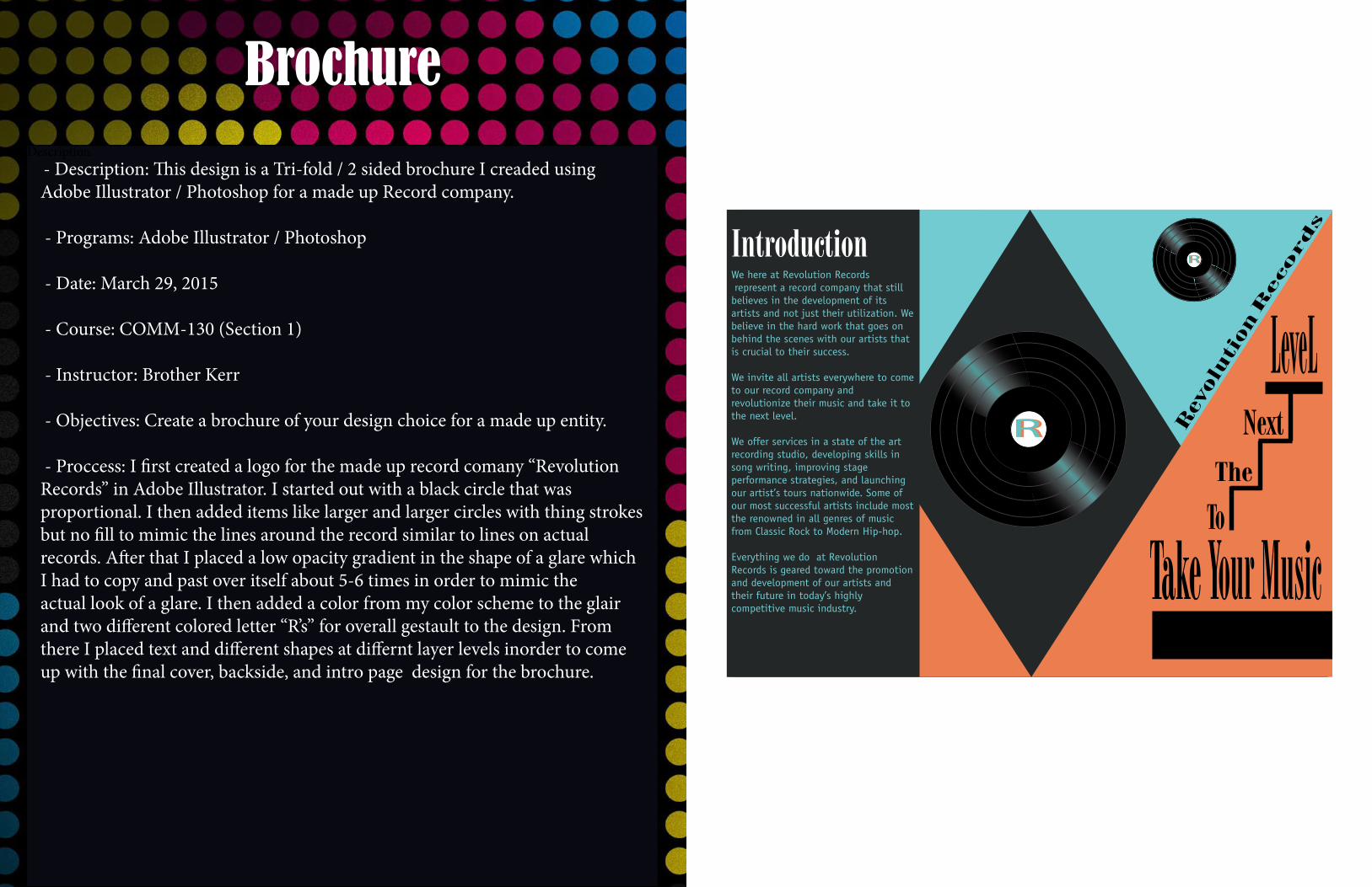
IntroductionWe here at Revolution Records represent a record company that still believes in the development of its artists and not just their utilization. We believe in the hard work that goes on behind the scenes with our artists that is crucial to their success.
We invite all artists everywhere to come to our record company and revolutionize their music and take it to the next level.
We offer services in a state of the art recording studio, developing skills in song writing, improving stage performance strategies, and launching our artist’s tours nationwide. Some of our most successful artists include most the renowned in all genres of music from Classic Rock to Modern Hip-hop.
Everything we do at Revolution Records is geared toward the promotion and development of our artists and their future in today’s highly competitive music industry.
- Description: This design is a Tri-fold / 2 sided brochure I creaded using Adobe Illustrator / Photoshop for a made up Record company.
- Programs: Adobe Illustrator / Photoshop
- Date: March 29, 2015
- Course: COMM-130 (Section 1)
- Instructor: Brother Kerr
- Objectives: Create a brochure of your design choice for a made up entity.
- Proccess: I first created a logo for the made up record comany “Revolution Records” in Adobe Illustrator. I started out with a black circle that was proportional. I then added items like larger and larger circles with thing strokes but no fill to mimic the lines around the record similar to lines on actual records. After that I placed a low opacity gradient in the shape of a glare which I had to copy and past over itself about 5-6 times in order to mimic the actual look of a glare. I then added a color from my color scheme to the glair and two different colored letter “R’s” for overall gestault to the design. From there I placed text and different shapes at differnt layer levels inorder to come up with the final cover, backside, and intro page design for the brochure.
Description
Flier
Vouant Communications is devoted to helping tomorrow’s leaders gain essential leadership skills in the workplace. During this dynamic three-day semiwnar, attendees will meet with top executivves of Vouant Communications to discuss breakthrough leadership techniques, while cultivating attributes of leadership that will market to any employer.
During this dynamic three-day seminar, attendees will meet with top executives of Vouant Communications to discuss breakthrough leadership techniques, while cultivating attributes of leadership that will market to any employer.
Registration and more information available at www.vouantcomm.com/leaders
Graduate
Leadership ConferenceDo you want to have the
competitive edge in business?
Come and lean how at Vouant Communicationsannual Graduate Leadership Conference
Lincoln Convention Center October 21
8am-5pm
Space is limited
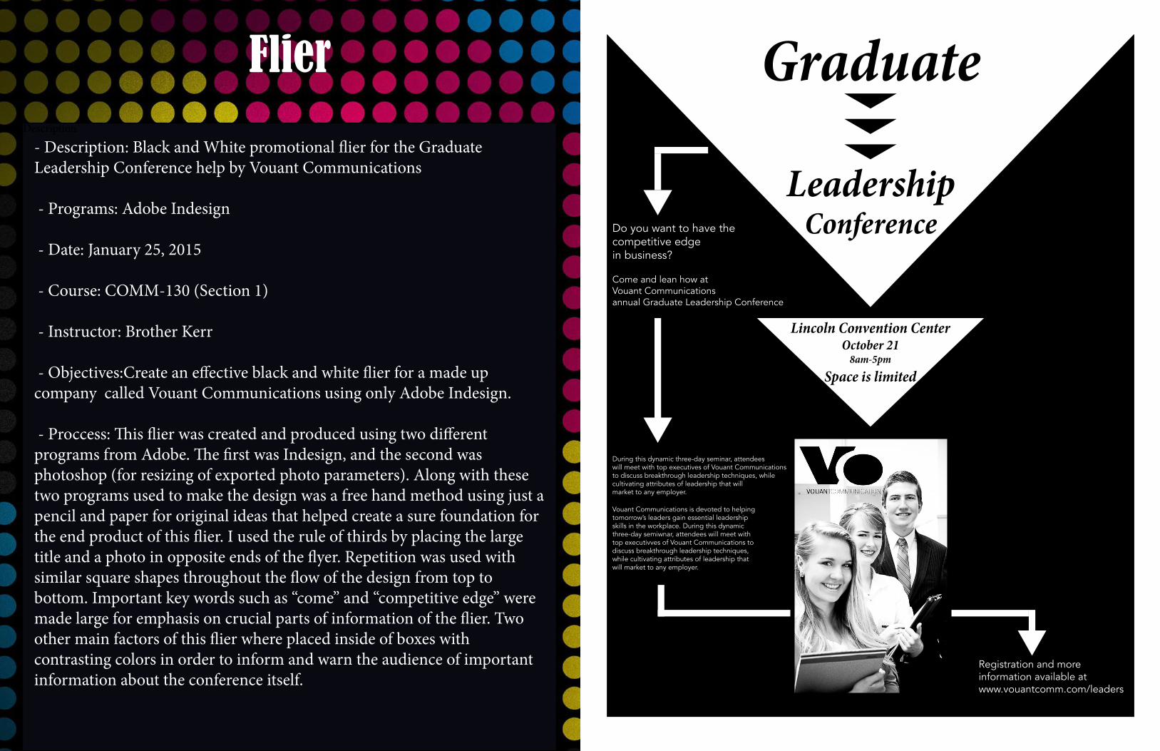
- Description: Black and White promotional flier for the Graduate Leadership Conference help by Vouant Communications
- Programs: Adobe Indesign
- Date: January 25, 2015
- Course: COMM-130 (Section 1)
- Instructor: Brother Kerr
- Objectives:Create an effective black and white flier for a made up company called Vouant Communications using only Adobe Indesign.
- Proccess: This flier was created and produced using two different programs from Adobe. The first was Indesign, and the second was photoshop (for resizing of exported photo parameters). Along with these two programs used to make the design was a free hand method using just a pencil and paper for original ideas that helped create a sure foundation for the end product of this flier. I used the rule of thirds by placing the large title and a photo in opposite ends of the flyer. Repetition was used with similar square shapes throughout the flow of the design from top to bottom. Important key words such as “come” and “competitive edge” were made large for emphasis on crucial parts of information of the flier. Two other main factors of this flier where placed inside of boxes with contrasting colors in order to inform and warn the audience of important information about the conference itself.
Description
Event AD
WWII Air Show
All proceeds will go to Veterans of WWII wide and their retirement funds.
Travis Air Force Base Saturday March 7 1pm
“Events like these make us veterans feel like we can fly again, just like we did before.” Bernard Hemmings WWII Navy Pilot
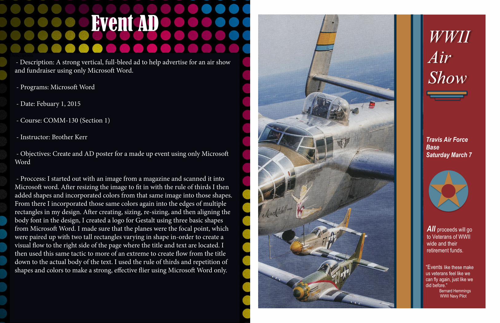
- Description: A strong vertical, full-bleed ad to help advertise for an air show and fundraiser using only Microsoft Word.
- Programs: Microsoft Word
- Date: Febuary 1, 2015
- Course: COMM-130 (Section 1)
- Instructor: Brother Kerr
- Objectives: Create and AD poster for a made up event using only Microsoft Word
- Proccess: I started out with an image from a magazine and scanned it into Microsoft word. After resizing the image to fit in with the rule of thirds I then added shapes and incorporated colors from that same image into those shapes. From there I incorporated those same colors again into the edges of multiple rectangles in my design. After creating, sizing, re-sizing, and then aligning the body font in the design, I created a logo for Gestalt using three basic shapes from Microsoft Word. I made sure that the planes were the focal point, which were paired up with two tall rectangles varying in shape in-order to create a visual flow to the right side of the page where the title and text are located. I then used this same tactic to more of an extreme to create flow from the title down to the actual body of the text. I used the rule of thirds and repetition of shapes and colors to make a strong, effective flier using Microsoft Word only.
Description
Web Page
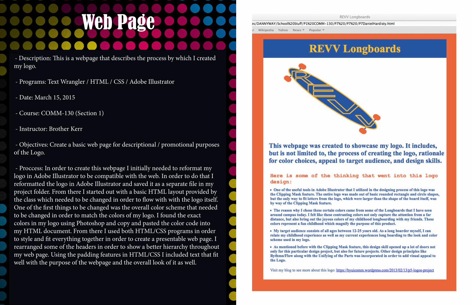
- Description: This is a webpage that describes the process by which I created my logo.
- Programs: Text Wrangler / HTML / CSS / Adobe Illustrator
- Date: March 15, 2015
- Course: COMM-130 (Section 1)
- Instructor: Brother Kerr
- Objectives: Create a basic web page for descriptional / promotional purposes of the Logo.
- Proccess: In order to create this webpage I initially needed to reformat my logo in Adobe Illustrator to be compatible with the web. In order to do that I reformatted the logo in Adobe Illustrator and saved it as a separate file in my project folder. From there I started out with a basic HTML layout provided by the class which needed to be changed in order to flow with with the logo itself. One of the first things to be changed was the overall color scheme that needed to be changed in order to match the colors of my logo. I found the exact colors in my logo using Photoshop and copy and pasted the color code into my HTML document. From there I used both HTML/CSS programs in order to style and fit everything together in order to create a presentable web page. I rearranged some of the headers in order to show a better hierarchy throughout my web page. Using the padding features in HTML/CSS I included text that fit well with the purpose of the webpage and the overall look of it as well.
Description
Stationary
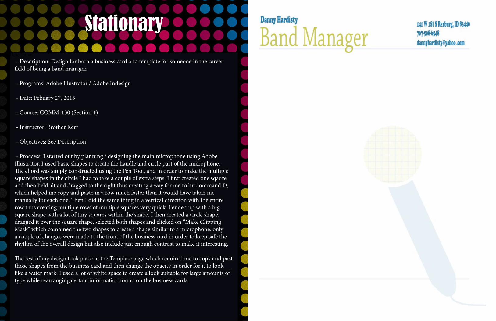
- Description: Design for both a business card and template for someone in the career field of being a band manager.
- Programs: Adobe Illustrator / Adobe Indesign
- Date: Febuary 27, 2015
- Course: COMM-130 (Section 1)
- Instructor: Brother Kerr
- Objectives: See Description
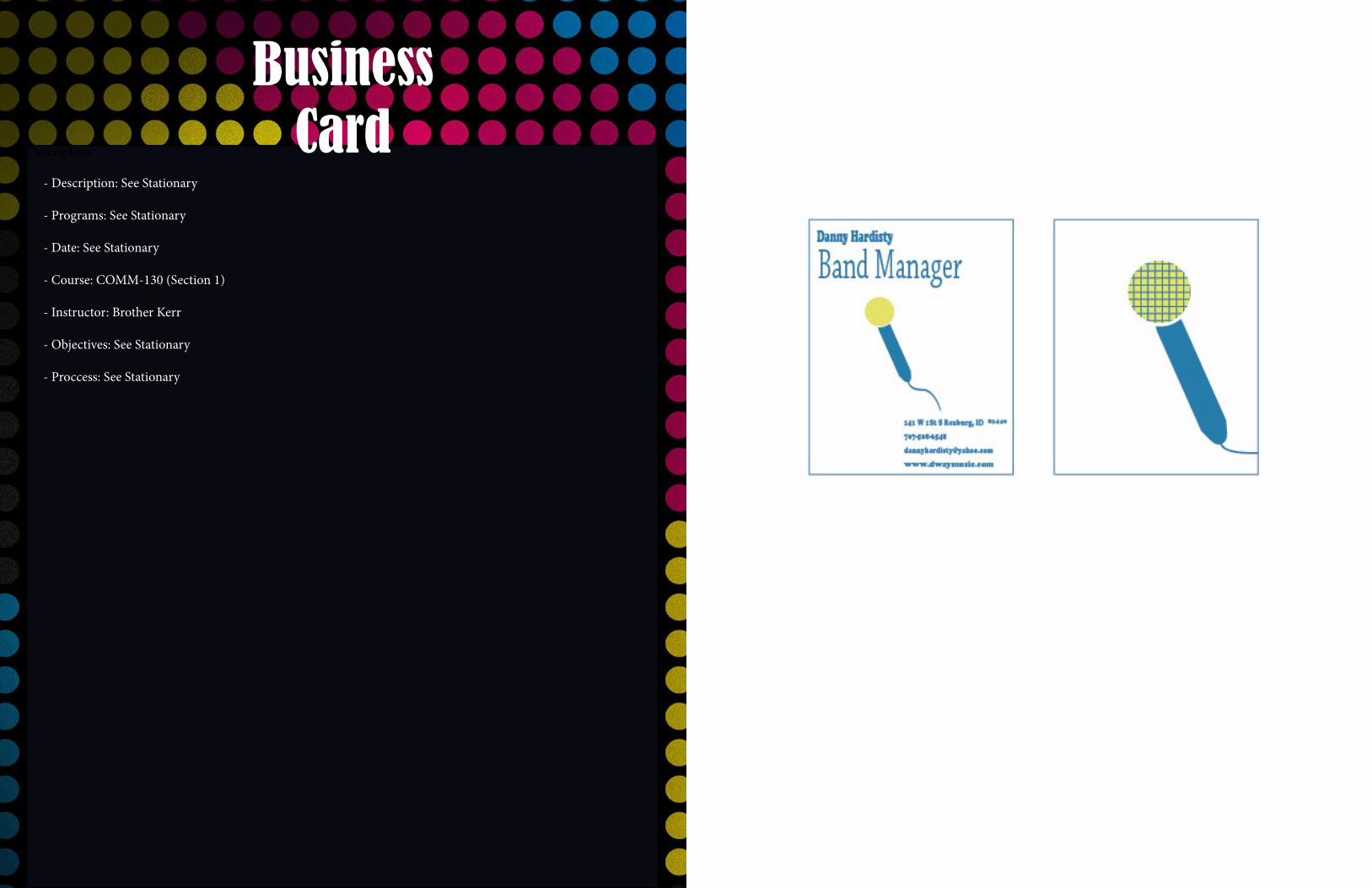
- Proccess: I started out by planning / designing the main microphone using Adobe Illustrator. I used basic shapes to create the handle and circle part of the microphone. The chord was simply constructed using the Pen Tool, and in order to make the multiple square shapes in the circle I had to take a couple of extra steps. I first created one sqaure and then held alt and dragged to the right thus creating a way for me to hit command D, which helped me copy and paste in a row much faster than it would have taken me manually for each one. Then I did the same thing in a vertical direction with the entire row thus creating multiple rows of multiple squares very quick. I ended up with a big square shape with a lot of tiny squares within the shape. I then created a circle shape, dragged it over the square shape, selected both shapes and clicked on “Make Clipping Mask” which combined the two shapes to create a shape similar to a microphone. only a couple of changes were made to the front of the business card in order to keep safe the rhythm of the overall design but also include just enough contrast to make it interesting.
The rest of my design took place in the Template page which required me to copy and past those shapes from the business card and then change the opacity in order for it to look like a water mark. I used a lot of white space to create a look suitable for large amounts of type while rearranging certain information found on the business cards.
Description
BusinessCard
- Description: See Stationary
- Programs: See Stationary
- Date: See Stationary
- Course: COMM-130 (Section 1)
- Instructor: Brother Kerr
- Objectives: See Stationary
- Proccess: See Stationary
Description
Montage
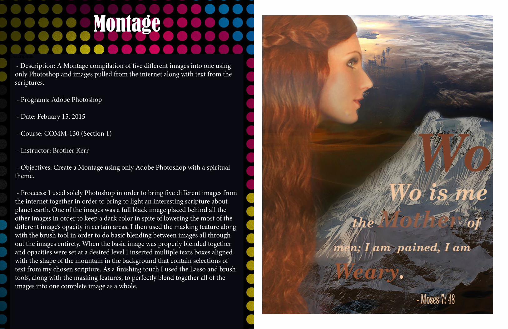
- Description: A Montage compilation of five different images into one using only Photoshop and images pulled from the internet along with text from the scriptures.
- Programs: Adobe Photoshop
- Date: Febuary 15, 2015
- Course: COMM-130 (Section 1)
- Instructor: Brother Kerr
- Objectives: Create a Montage using only Adobe Photoshop with a spiritual theme.
- Proccess: I used solely Photoshop in order to bring five different images from the internet together in order to bring to light an interesting scripture about planet earth. One of the images was a full black image placed behind all the other images in order to keep a dark color in spite of lowering the most of the different image’s opacity in certain areas. I then used the masking feature along with the brush tool in order to do basic blending between images all through out the images entirety. When the basic image was properly blended together and opacities were set at a desired level I inserted multiple texts boxes aligned with the shape of the mountain in the background that contain selections of text from my chosen scripture. As a finishing touch I used the Lasso and brush tools, along with the masking features, to perfectly blend together all of the images into one complete image as a whole.