Embed Size (px)
Citation preview

PROCEEDINGS OF THE 13TH
WINONA COMPUTER SCIENCE
UNDERGRADUATE RESEARCH SYMPOSIUM May 1, 2013 Winona, MN
Sponsored by the Department of Computer Science at
Winona State University

Table of Contents
Title Author Page
Building a Security System Using a Raspberry Pi Nathan Clay 1
Mobile Table Controlled Theater Lighting Dan Fredell 6
Optimizing the Mobile User Interface for Nathan Guggenberger 12 Predicting Lung Cancer Treatment Outcomes
Teaching Game Mechanics in Casual Games Jared Hagen 21 Without Tutorials
3-D Password Secure Authentication with Brandon Tran 25 Biometric Device
1
Building a Security System Using a Raspberry Pi
Nathan Clay
Winona State University
Computer Science Department
Winona, MN 55987, United States
Abstract— Linux hobbyists and computer programmers have
become infatuated with the new Raspberry Pi and the versatility of
uses the device has. A security system was created with the use of a
Raspberry Pi to demonstrate that the device can act as an efficient
and capable replacement to low-end market security systems. The
Raspberry Pi was fitted with a webcam and wireless adapter in order
to set up a server with a video feed that could detect motion, alert the
owner, and take snapshots that are then uploaded to an Internet cloud
service.
Keywords—Raspyberry pi; home security; linux; python
I. INTRODUCTION
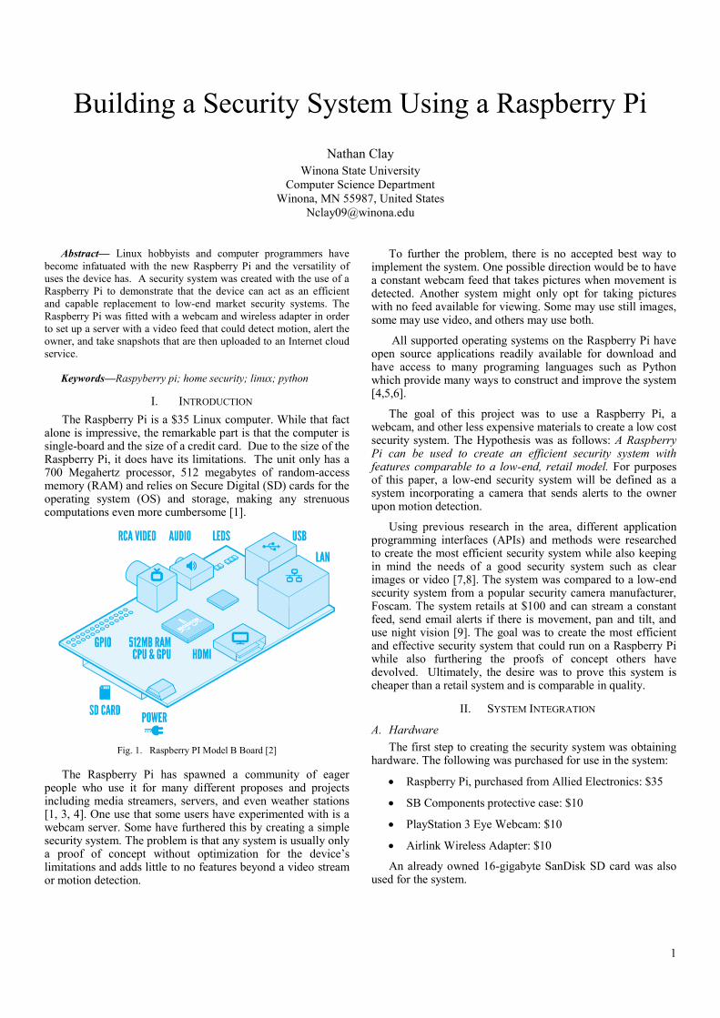
The Raspberry Pi is a $35 Linux computer. While that fact alone is impressive, the remarkable part is that the computer is single-board and the size of a credit card. Due to the size of the Raspberry Pi, it does have its limitations. The unit only has a 700 Megahertz processor, 512 megabytes of random-access memory (RAM) and relies on Secure Digital (SD) cards for the operating system (OS) and storage, making any strenuous computations even more cumbersome [1].
Fig. 1. Raspberry PI Model B Board [2]
The Raspberry Pi has spawned a community of eager people who use it for many different proposes and projects including media streamers, servers, and even weather stations [1, 3, 4]. One use that some users have experimented with is a webcam server. Some have furthered this by creating a simple security system. The problem is that any system is usually only a proof of concept without optimization for the device’s limitations and adds little to no features beyond a video stream or motion detection.
To further the problem, there is no accepted best way to implement the system. One possible direction would be to have a constant webcam feed that takes pictures when movement is detected. Another system might only opt for taking pictures with no feed available for viewing. Some may use still images, some may use video, and others may use both.
All supported operating systems on the Raspberry Pi have open source applications readily available for download and have access to many programing languages such as Python which provide many ways to construct and improve the system [4,5,6].
The goal of this project was to use a Raspberry Pi, a webcam, and other less expensive materials to create a low cost security system. The Hypothesis was as follows: A Raspberry Pi can be used to create an efficient security system with features comparable to a low-end, retail model. For purposes of this paper, a low-end security system will be defined as a system incorporating a camera that sends alerts to the owner upon motion detection.
Using previous research in the area, different application programming interfaces (APIs) and methods were researched to create the most efficient security system while also keeping in mind the needs of a good security system such as clear images or video [7,8]. The system was compared to a low-end security system from a popular security camera manufacturer, Foscam. The system retails at $100 and can stream a constant feed, send email alerts if there is movement, pan and tilt, and use night vision [9]. The goal was to create the most efficient and effective security system that could run on a Raspberry Pi while also furthering the proofs of concept others have devolved. Ultimately, the desire was to prove this system is cheaper than a retail system and is comparable in quality.
II. SYSTEM INTEGRATION
A. Hardware
The first step to creating the security system was obtaining hardware. The following was purchased for use in the system:
Raspberry Pi, purchased from Allied Electronics: $35
SB Components protective case: $10
PlayStation 3 Eye Webcam: $10
Airlink Wireless Adapter: $10
An already owned 16-gigabyte SanDisk SD card was also used for the system.

2
Fig. 2. PlayStation 3 Eye [10]
B. Raspbian
The operating system installed on the SD card for use on the Raspberry Pi is Raspbian “wheezy”. This operating system is a variation of Debian (a well established and favored version of Linux) optimized to run on the Raspberry Pi. Raspbian comes pre-supported with a graphical interface and has a substantial amount of documentation and manuals online. This is a benefit for any consumers who want to use a Raspberry Pi but have limited background in computing [4].
The greatest advantage to using Raspbian is the thousands of programs there are to use on it. Most software can be easily downloaded in the form of a deb software package. This makes installing software as easy as using a simple command in the Raspbian command line [4]. Other software, programs, and scripts can be downloaded from repositories from anywhere on the Internet. Finally, Raspbian also comes with support for many different programing and scripting languages. One of the main languages it fully supports is Python, which is a language that is widely used in practice today for many different uses and purposes. Python is a dynamic language but is often used for scripting because the code is short and clean [6].
Setting up Raspbian for use on the Raspberry Pi was a straightforward task. There are many programs available on the Windows and Mac operating systems with easy to understand graphical interfaces that burn a Raspbian image to an SD card. After using one, all that was needed was inserting the SD card into the Pi, booting it up and following the easy to use “raspi-config” to adjust settings [1,4].
The most difficult task for setting up the Raspbian OS was configuring the Internet settings. Obtaining wired Internet on the device is achieved by simply plugging in an Ethernet cable, but using wireless Internet is a more tedious task. A wireless adapter listed as Raspbian compatible was purchased, then specific configuration files had to be accessed and edited to add wireless capability. Furthermore, for use in this project, a static IP address was needed in order for the device to consistently have the same address. This meant editing the configuration files further [4].
C. Motion
One of the programs Raspbian has built-in access to is the open source program, Motion. The application can be used to easily set up a webcam feed and can detect when a significant portion of the pixels in the video have been changed in order to detect motion. [11].
After the operating system was in full working order and had wireless access to the Internet, Motion could be installed by entering a command. Once downloaded, the configuration file for Motion was edited to suite the needs of the project. At first, the video feed had a very low frame rate and experienced some unpredicted behavior such as frequent freezing of the application. Throughout every stage of the project, returning to and editing the Motion configuration file became necessary in order to improve the integrity and speed of the security system. The file was also used to edit how many pictures should be saved and whether a video should be saved and in what format [11].
Ultimately, the configuration file was edited so that system could save up to a maximum of 50 images per second, though the frame rate usually ended up being less. These images were then saved to a directory located on the Raspberry Pi. Additionally, the images where compiled into a MOV video file that was saved in the same directory.
D. Scripts
To further the capabilities of the system, the next step was to create scripts in Python that can alert the owner via email when motion is detected and also save images or video to a cloud service. Initially, a script was written in Python that used a python client called G-Data [6]. This script was designed to upload the files to Google Drive and alert the owner’s email. This script functioned sporadically and suffered from a major security hole because the script requires the use of a Google login and password unencrypted in the file.
To combat these issues, a Script was written to use Dropbox and a useful open-source Bash script called Dropbox Uploader [12]. While first running the Bash script, it prompts the user to navigate to Dropbox’s website and follow a few instructions to get an application key for the script so that it can sync with the owner’s Dropbox account. This means no username or password data is saved anywhere on the device which makes the script more secure.
Next, with some help from [6,13], a Python script was created that calls functions from the Dropbox Uploader script in order to detect if files are found in the Motion directory, upload the files to Dropbox, and then delete the files from the directory on the device. The last step is important so files do not build up in the SD card’s limited storage. Finally, Cron, a time-based job scheduler in Unix, was used to set up the Raspberry Pi to run the script every minute.
One drawback to this implementation is that there is no means of notifying the owner when the files are added. To combat this issue, the online service If This Then That (IFTTT) was used. This service uses “recipes” in order to “Put the Internet to work for you” [14]. The recipe that was created for use on the security system was to send an email anytime the RSS feed for the owner’s Dropbox was updated. In other words, once a file is added to Dropbox, an email is also sent

3
out alerting the owner that motion was detected and that files were added to their Dropbox account. This fix is far from perfect though, because the way it is set up means that an email is received for every file that is uploaded to the Dropbox. This could mean an owner potentially receiving hundreds of emails within a short timeframe.
Fig. 3. Main componens of security system
E. User Interface
The final step for the design of the system was to create a Java program with a UI that could be executed on a computer on the same network as the Raspberry Pi in order to send commands for the Raspberry Pi to execute. The frontend of the program is a simple UI written in Java with a JPanel window and three JButton buttons labeled: “Reboot Pi”, “Restart Feed” and “Power Down Pi”.
The backend of the program reacts anytime one of the buttons is pressed in order to send the associated command via SSH to the Raspberry Pi. In order to do this, the open source Java API, SSHJ, was used [15]. One major downfall of using this UI is that it has a potential security hole in the code. In sending a command via SSH, the username and password of the Raspberry Pi must be sent with it in plain text.
For purposes of this system, the UI only worked on the local network. But in practice, port forwarding could be used on a wireless router and the UI could be adjusted so that it could be used outside the local network.
Fig. 4. Java user interface
III. SYSTEM CONFIGURATIONS
Once Motion was installed and running, cloud storage integration was complete, and a UI was created, it was finally time to test the system. The goal for system testing was to compare and contrast different ways of setting up the system in order to determine which way best works for the Raspberry Pi’s limited processing power. In this instance, the system was
tested on a relatively slow Internet connection, 5 megabit per second (Mbps). This created an issue of the device consuming bandwidth on the network.
In testing of the system, three different common configuration settings where used: having a constant high frame rate stream, having no stream available, and having a low frame rate stream that increases frame rate upon motion detection. Each setting was tested for a 48-hour period.
The first configuration setting tested on the system was a constant video feed. The advantage to this method is that checking the stream at anytime will give you a clear indication of what’s going on. The downfall is that this takes up a significant portion of bandwidth and often made it so that other devices on the network had trouble having a fast and reliable Internet connection. Furthermore, there were frequent drops of service completely when Motion’s server crashed.
The second setting was to opt for no stream at all and to solely rely on Dropbox to save any captured motion and on IFTTT to send an email alert. The major advantage to this method is that very little bandwidth is used. The only time any bandwidth was used was when motion was detected and files are uploaded to Dropbox, but even then the bandwidth was negligible. Because no server is running, it is impossible to experience server crashes. Having no stream offers many drawbacks, though. For starters, without the video feed, the system is very limited in its capabilities especially if a user wishes to view what is on the camera when there is not first motion detected. Another major disadvantage is that if Motion, the Raspberry Pi, or the Internet crash there would be no way of knowing. This is a major problem because if no files are being uploaded to the Dropbox it is imposable to know if this is due to a nonexistence of motion or if one of the system’s components crashed.
The final and best method that was tested was to have the stream only display one frame per second until motion is detected in which case the stream increases its frame rate. This method did experience some bandwidth hogging but not nearly as much as having a constant high frame rate feed. A couple server crashes happened but these only occurred when other high bandwidth operations began on the local network. There is a disadvantage to using his technique. When viewing the stream, a user could potentially be missing activity that is not tripping off Motion’s detection, but this is a rare occurrence.
TABLE I. COMPARISON OF DIFFERENT SYSTEM CONFIGURATIONS
4
It should be noted that all of these methods experienced improved bandwidth when the motion configuration file was edited so that fewer image files were saved when motion was detected. Also, each method occasionally reported that motion was detected when there wasn’t real motion. This was usually caused from rapid light changes in the room.
IV. DISCUSSION
When determining whether or not a security system on a Raspberry Pi can be comparable to a low-end market model such as [9], three categories must be considered: efficiency, price, and practicality.
A. Efficiency
As seen in the results section, testing was done to compare and contrast different system configurations. We will be assuming that Motion is configured to the best setting tested: having a stream of only one frame per second that increases when motion is detected. This configuration does sacrifice some efficiency for features due to the fact that there is moderate use of bandwidth and occasional server crashes. The server crashes can be problematic, though, as the only way to restart the system is to be on the same local network. Though, as stated before, this problem could be avoided by adding port forwarding to a wireless router. Bandwidth issues and crashes can be mostly attributed to slow Internet, and it’s not unreasonable to assume that faster Internet would lessen the likelihood of crashes.
The Python script didn’t seem to suffer from any efficiency errors and always ran as expected. The only minor issue with it is that it sends files in non-sequential order. Luckily, to view them in order, all that has to be done is to organize the files in alphabetical order in the Dropbox account.
As for the UI, there are no efficiency issues to report. The only time the application did not behave as expected is if there was a loss of Internet connection or if for some reason the Raspberry Pi was unconnected or unplugged. Otherwise, the UI did all tasks it was required to.
B. Price
The total price of the system created was $65. Many potential users won’t need a protective case and may already own an SD card or webcam. The price of the system could vary for different instances and people depending on what they already have and what their needs are. But, even when all components are purchased, the price should always come under the $100 Foscam retail system.
C. Practicality
The final and arguably most important point to consider is the practicality of the system. If files and tutorials were provided to potential users, setting up the system would be a modest task and would only require about an hour of time. The real question is whether or not the system could be implemented as an actual security system. With a fast Internet connection, the answer is yes. The system provides enough functionality and customization to suite the needs of any consumer looking for a low-end system.
But another question must be asked: why use a Raspberry Pi and not just get a low-end market system? Admittedly, the Raspberry Pi system might not be for everyone. If someone is
looking for a system that only requires plugging it in, then a low-end system, such as the Foscam, is the right choice. The Foscam also provides pan and tilt and night vision, features that many users may be looking for. Though, others may instead opt for the Raspberry Pi for a cheaper price, Dropbox integration, and its ability to be customized. In the end, the Raspberry Pi security system isn’t a complete replacement for a low-end market system but does offer a cheaper price point and features that the market system does not provide.
D. Future Work
While the system in its current form functions quite well, that does not mean that there isn’t more to be done. For starters, a better notification system could be put in place so that users do not get multiple emails for only one period of time that motion was detected.
Improvements could be made to the UI as well. The program should be edited so that the password is either encrypted or hidden to increase the security of the interface. Additionally, some features could be added to expand the use of the UI. For example, commands that could keep a stream running but turn on and off motion detection would be a huge plus for users that want to move in front of their own cameras without getting pictures taken of them.
Finally, some additional hardware could be added onto the system to integrate some new features. For example, a more advanced camera could be used that provides night vision and higher quality video. Moreover, a solar panel could be added and a waterproof case to try outdoors streams. Finally, the Raspberry Pi could be integrated with a microcontroller, such as an Arduino, in order to implement panning and tilting.
V. CONCLUSION
The Raspberry Pi has only been out for a little more than a year but has already spawned a legacy for the many uses the device can serve. By using a Raspberry Pi and the open source program, Motion, a server was set up with a video feed that can detect motion and save images and videos of the captured motion. To increase the system’s functionality, a Python script was created that uploads the images and videos to the Internet cloud service, Dropbox. Finally, a user interface was created in Java so that simple commands can be sent to the device from another computer on the network.
The system was tested with different configuration settings and despite some minor problems, the security system could be implemented in practice. What the Raspberry Pi system lacks in comparison to a market system, it makes up for in customizability and price point. Overall, the Raspberry Pi security system is a strong contender against low-end market systems.
VI. ACKNOWLEDGMENT
I would like to thank Dr. Mingrui Zhang for advising this project.
REFERENCES
[1] The Raspberry Pi Foundation. Raspberry Pi. http://www.raspberrypi.org. 1 Feb. 2013.
[2] http://www.raspberrypi.org/wp-content/uploads/2011/07/RaspiModelB.png
5
[3] Powers, Shawn. “The Open-Source Classroom: Your First Bite of Raspberry Pi.” Linux Journal. 224 (2012). Print.
[4] The Raspberry Pi Foundation. Raspbian. http://www.raspbian.org. 1 Feb. 2013.
[5] Sawyer, Miranda. “Everyone wants a slice of Raspberry Pi.” The Guardian 3 Nov 2012. Print.
[6] Python Software Foundation. Python. http://www.python.org. 1 Feb. 2013.
[7] How To: Raspberry Pi Web Cam Server. Ping Bin. http://pingbin.com/2012/12/raspberry-pi-web-cam-server-motion/. 10 April 2013.
[8] Creating a motion-detecting security cam with a Raspberry Pi – Part 1. Through the Interface. http://through-the-interface.typepad.com/through_the_interface/2012/08/creating-a-motion-detecting-security-cam-with-a-raspberry-pi-part-1.html. 10 April 2013.
[9] ShenZhen Foscam Intelligent Technology Limited. Foscam. http://www.foscam.com. 1 Feb. 2013.
[10] http://www.slipperybrick.com/wp-content/uploads/2007/09/sony-playstation-eye-release.jpg
[11] Motion. http://www.lavrsen.dk/foswiki/bin/view/Motion/WebHome. 24 Feb. 2013.
[12] Fabrizi, Andrea. “BASH Dropbox Uploader”. andreafabrizi.it. http://www.andreafabrizi.it/?dropbox_uploader. 2 April. 2013.
[13] “Simple Home Security with Raspberry Pi and DropBox”. Mogshade. http://mogshade.wordpress.com/2012/12/23/simple-home-security-with-raspberry-pi-and-dropbox. 2 April. 2013.
[14] If This Then That. IFTTT. https://ifttt.com. 2 April. 2013.
[15] SSHJ. Schmizz. http://schmizz.net/sshj/. 2 April 2013.
6
Mobile Tablet Controlled Theatre Lighting
Dan Fredell
Computer Science Department, Winona State University
Winona, Minnesota, USA
Abstract-Currently in theatres, there is a stationary light board
that controls all of the lights. Having the ability to control theatrical
lights from anywhere in the theatre is very useful. This paper
describes the development of an Android application for theatrical
light control. Computer software has been developed to integrate
different devices. It uses the ArtNet network protocol to send DMX
lighting information over an Ethernet network.
Keywords—Mobile application, raspbery pi, light control.
I. INTRODUCTION
The goal of this project was to design and develop a mobile application to control theatre lights. This setup allows the lighting designer the mobility and freedom to design anywhere in the theatre or world.
Sokratis Kartakis created a home automation system that was controlled via a tablet. He used third party hardware, Middleware, to interface his network to the smart lights. This hardware allowed his project to be more dynamic because Middleware would broadcast messages to the entire network when something changed [1].
DMX is the lighting protocol developed by USITT (United States Institute for Theatre Technology), so that all the theatre networks speak the same language. Up until modern programming, theatres were all trying to run a production off thirty thousand dollar lighting consoles, which were just big computers. It is nice to be moving lighting control to a more affordable and adaptable platform [2]. This paper proposes that tablet devices can replace these big computers for the use of controlling theatre lights.
The main advantage of this application is to allow the lighting designer the freedom to design from anywhere in the theatre, instead of being stuck in one spot in the theatre. This application has the capability of running on any device that has Android OS installed.
This study looks into the benefits of the use of a tablet
device to control theatre lights.
II. METHODS
A. Network Design
DMX512 is a standard for digital communication that is commonly used to control stage lighting and effects [3]. DMX or DMX512 was a standard created by USITT for a common lighting communication protocol. Before USITT standardized DMX, each company had their own communication protocol between the light board and the dimmers. DMX is a little different than other digital communication protocols because it is a balanced signal. This means that if there is any interference
in the wire or transmission process the signal noise will most likely be ignored [3].
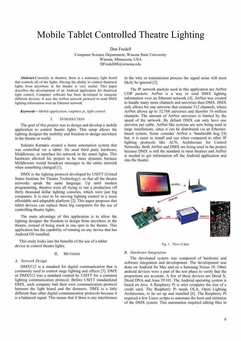
The IP network packets used in this application are ArtNet UDP packets. ArtNet is a way to send DMX lighting information over an Ethernet network [4]. ArtNet was created to handle many more channels and universes then DMX. DMX only allows for one universe that contains 512 channels, where ArtNet allows up to 32,768 universes and therefor 16 million channels. The amount of ArtNet universes is limited by the speed of the network. By default DMX can only have one universe per cable. ArtNet like systems are now being used in large installations, since it can be distributed via an Ethernet-based system. Some consider ArtNet a ‘bandwidth hog.’[4] but, it is easer to install and use when compared to other IP lighting protocols like ACN, Architecture for Control Networks. Both ArtNet and DMX are being used in the project because DMX is still the standard in most theatres and ArtNet is needed to get information off the Android application and into the theatre.
Fig. 1. Flow of data
B. Hardware Integration
The developed system was composed of hardware and software integration and development. The development was done on Android for Mac and on a Samsung Nexus 10. Other android devices were a part of the test phase to verify that the proportions are accurate. A few of these devices are Droid X, Droid DNA and Asus TF101. The Android operating system is based on Java. A Raspberry Pi is mini computer the size of a credit card. The Raspberry Pi needs OLA, Open Lighting Architecture, to be set up and installed [6]. The Raspberry Pi required a few Linux scripts to automate the boot and initiation of the DMX system. This automation required editing files in
7
folder /etc/init.d. The functional requirements include an intuitive user interface, and the ability to control lights with less then a 250ms delay.
Data is input into an Android tablet, transmitted via a wireless router, which is then converted and send the data via Ethernet to a Raspberry Pi. The Pi then sent out a signal via USB, which is converted to DMX for the theatre dimmers to receive and use. Figure 1 shows this data flow.
Android operating system was chosen because of the availability of devices and the dynamic architecture. The Android operating system was designed from the ground up to be a comprehensive open source platform for mobile devices [7]. The computer science industry is headed towards open source software. One big example is our transition away from Flash and eagerness for HTML5.
The wireless connection between the Nexus 10 and Linksys WRT54G is the only security in this system. If an attacker breaks through the WPA2 security or plugs right into the router they could have control over the lighting system.
A Raspberry Pi was chosen for its low power consumption, solid-state storage, portability, and price. The company ENTTEC sells a product called ODE, which performs the same function as the Raspberry Pi and Open DMX USB combo. The route taken here is a cheaper and more versatile route then using ENTTEC’s ODE. Also with OLA on the Pi is more flexible. Raspberry Pi model B, the one with an Ethernet port, costs 35 USD.
The USB to DMX512 device used is Open USB DMX by ENTTEC. It is an off the shelf, open source, open hardware, device that sells for 50 USD. The Pi and USB DMX combination cost 85 USD compared to ENTEC’s ODE that runs 275 USD. This version of USB to DMX is in the un-smart classification of converters. The smart converters are able to generate the DMX signal on their own where this device will only repeat directly one-to-one what the USB sends it. OLA allows for variable DMX speed; for this project 44 Hz was used. OLA recommends a range between 30 and 44 Hz.
C. Environment
The theatre dimmers used in this study were Strand Lighting CD80. There are 180 dimmers installed in the Winona State University Performing Arts Center theatre where this study took place. Many lighting dimmers and fixtures allowed for a comprehensive study location.
Fig. 2. Traditional light board.
D. Useability
The system’s usability is mainly determined by how long it will take to do predetermined tasks. These tasks will be to change the level of a channel, create, edit, and delete cues. After this process, the participant will take a survey about the experience of designing on a tablet compared to what they were used to on the stationary light board see Appendix 1. The primary audience was undergraduate theatre students that have had a background in designing lights on a stationary light board. The students surveyed were comfortable with a stationary light board. The most common one to them is the ETC Expression 24/45, as shown in Figure 2.
E. User Interface Research
This development project requires an Android tablet, Raspberry Pi, and a USB to DMX adaptor. Software has been developed for the Android tablet to control theatre lights. The user interface is composed of sliders that represent different channels in the theatre, to adjust the other functions of the lights, as shown in Figure 3. Synthe FX creates a product called Luminaire that is designed for the iPad and is able to control DMX, Figure 4 shows its main page. The user interface for the Android tablet borrows a few user interface design features from the Luminaire.
Fig. 3. AuroraDMX user interface
Fig. 4. Synthe FX’s Luminaire [8]
The user feedback, from the prototype method of development, allowed for a more user-oriented application. The users surveyed during the prototyping phase were
8
undergraduate students, some with a theatre lighting background and some without. The user intuitively knew how to change the value of a channel. On the other hand they struggled on how to scroll to the next page. Once the user was shown how to scroll to the next page they understood why it was designed that way. The user tried to change an existing cue by pressing and holding a cue. After that user session a long press action was added to the cue to allow the user to do simple cue changes. These changes include edit the fade times, delete the current cue, and insert a cue. The user was also very impressed with the program and wished it were done and available to them.
During the second user session the biggest complaint was the patch view. This view was then removed. The server used in this research was OLA, Open Lighting Architecture. OLA supports patching channels to dimmers so it was redundant allowing the user to do this in AuroraDMX.
F. Software Development
Software prototyping is the development approach used for this program. It required a few example programs that the user was able to try and provide feedback. With the waterfall method the user has very little input on the development process. This product is suppose to be intuitive and easy to use so prototyping development is a much better option then waterfall.
1) Open Lighting Architecture (OLA) Work on this project started by setting up the RaspberryPi
with OLA and the USB to DMX hardware by ENTTEC, as shown in Figure 1. OLA is an application for Linux Mac and Windows that takes a variety of lighting protocols in and will translate and out put to other lighting protocols. Among this list of supported protocols there is DMX and ArtNet the two used in this project. After OLA was installed and running it needed to be configured.
Configuring OLA required changing one configuration file as well as some easy web interface work. The preference file for the Open DMX USB device had to be changed to point to where the device was plugged into. Changing the configuration file allowed OLA to output to DMX. In the web interface located at localhost:9090 a universe need to be added by clicking Add Universe. This prompted me to create a connection between the digital world and physical one. The input was ArtNet and the output was DMX via Open DMX. In the web UI of OLA the DMX monitor tab was very helpful during debugging of my program.
One useful feature that OLA has is displaying the channel levels on the RaspberryPi’s display. On boot, the RaspberryPi was setup to executes the command ‘ola_dmxmonitor’, which displays the current channel levels, as shown in Figure 5. This was scripted by adding it to the /etc/rc.local file. This file is executed as a final step in the boot process.
Fig. 5. Terminal display of the DMX values
2) AuroraDMX Development started by hardcoding the whole UI. This
allowed for easier debugging and development. The first challenge was to get a vertical scroll bar. A common use for the scroll bar is volume changing. By default on Jellybean, it looks like a black line with a blue dot on it, as shown in Figure 6. Once the scroll bar was vertical, the user called for more noticeable level. This required a special seek bar class to change its width. The user is also allowed to change the color of the scroll bars. Users get to choose from some basic colors: White, Dark Red, Gold, Forest Green, Dark Turquoise, and Dark Violet.
Fig. 6. Default scroll bar
Once the UI was looking the way the user liked, it was time to make it dynamic. Up until now the UI was hardcoded in XML, the language Android uses to create its UI. AuroraDMX needs to be dynamic allowing the user to change the amount of channels on the fly. This was implemented via an ArrayList of channel objects. Each channel object contains and displays: channel number, level, scroll bar, and the bump button. The bump button is a button at the bottom of every channel that set the channel to 100%. One design decision that was made was to make the channel range one to one hundred percent, instead of the DMX values of one to 256.
Android allows for dynamic font sizes. Android has 6 different font units available: px, in, mm, pt, dp, and sp. Using px (pixel) is not recommended because it does not scale on different screen sizes or dpi, dots per inch or pixel density. AuroraDMX uses tp (points) to define the values used in the channel column object. Points are based on the physical size of the screen. One point is 1/72 of an inch on the screen. The use of points for font size was decided when AuroraDMX was exported to four different devices with different screen sizes and screen resolutions. Devices used were: Nexus 10, Droid DNA, Droid X, and Transformer TF101.
Android OS is based on threading. The original way the cue fading was implemented was to create a separate thread for each channel that is fading. This caused 52 threads to be started

9
if 50 channels needed to change. The extra two came from fading the color of the cue button. This way of fading turned out to be fatal, the device would lockup during the fade. These threads were created on the UI thread. The next logical step would be to not run the fade on the UI thread, except Android OS does not support updating the UI from a separate thread that is not a child of the UI thread. The solution was to create just two threads one for the fade up and one for the fade down. In these threads it calls an increment level method in the cue object as well as handling the color changing of the cue button. This now requires a little more setup because each channel has to calculate how much it is going to change with each increment call. The benefit of this new way is that the thread is still called on the UI thread and there is only two threads instead of n+2.
The class UML diagram was created by ObjectAid UML Explorer and is pictured in Figure 7. As described later the java ArtNet source code is borrowed from Karsten Schmidt. The MainActivity is the driving class for this application. Storage is used to read and write to the file system. The Load and Save buttons use this method. SettingsActivity was modified from an example from Google. The editCueMenu is a popup window that allows the user to change the properties of a cue. While the CueSorter sorts the cues numerically after a cue is inserted, the CueObject is an abstract object that is used to store one cue. There are multiple CueObjects in the alCues ArrayList. The same idea is for the ColumnObj too. The VerticalSeekBar extends the default seekBar with a few modifications, like making it vertical, expanding it, and changing the color or it.
Fig. 7. Software design in class UML diagram
Setting up the ArtNet protocol was straightforward. PostSpectacular Ltd. and Karsten Schmidt have a whole ArtNet framework setup, which is free to download and use. It was designed to be a server and a client. Written in java so it was
very easy to import and adjust to the needs of AuroraDMX. PostSpectacular Ltd. has the source code posted online with the GNU General Public License. The IP address and datagram socket has to be stored in the main method because it will be reused with each packet.
The decision to store the save file in a user reachable location was made to allow the user to backup their show. The user could find the file on their SD card. It is a human readable file so if they need to they can modify it as well, Figure 8.
Fig. 8. Data stored in a system configuration file.
III. RESULTS
The results are based on a few different tasks that the user was required to perform. Those tasks included: changing the level of a channel, creating a cue, deleting a cue, adding more channels, and changing the color of the seek bars. The users were very excited to try out the app. They have made the planned walkthrough useless. Each user was handed the survey (Appendix I) and the app. He/ She often started by intuitively changing the levels and adding cues. Once they experimented with that for a while they then took the survey. If the surveyee got to a question that they did not know they often went looking for it and often found the option they missed. Half the users were able to find the cue edit menu on their own. The survey operator then shows the user that AuroraDMX allows for a long press on the cue button.
A. Feedback Questions
Listed below is a description of the questions on the
feedback form and what was expected of the user.
1) Changing the level of a channel
This required the user to drag their finger on one of the
channel scroll bars. The bar will follow their finger as well as
the percentage at the top of the bar will change.
2) Scrolling to more channels
This required the user to view more then the 20 channels
visible on the screen upon boot. The idea of designing this was
for the user to swipe their finger along the top where no faders
were.
3) Adding more channels
This required the user to open the settings view and change
the number of channels. One user tried going to the last
channel and looking for an add button.
4) Adding a Cue
This required the user to click the Add Cue button. Once
they clicked this button another cue would appear and the
current levels were recorded.
5) Deleting a cue
This required the user to long press a previously recorded
cue and click delete in the popup window.

10
6) Change the fade time of a Cue
This required the user to long press a previously recorded
cue. Change the fade time in the text box and click save.
7) Saving a project
This required the user to click the save button in the top
bar.
8) Loading a project
This required the user to click the load button in the top
bar.
B. Survey
The survey was done with five senior lighting designers from Winona State University. Results are summarized in Table 1. It is on a one to five rating scale. On the left side of the table it shows the question asked in the survey (Appendix I). The center column shows the difference between the highest and lowest answer. Then the last column shows the mean of the results from the survey. The bolded items in the left section are the section headers describing what aspect of the question the users is to focus on.
TABLE II. AVERAGE OF THE SURVEY RESULTS
Feedback Question Std. Dev. Mean
Overall ease of use 1 4.8
Overall layout 1 4.6
Intuitive
Changing the level of a channel 1 4.6
Scrolling to more channels 1 4.2
Adding more channels 1 4.6
Adding a Cue 1 4.6
Deleting a Cue 1 4.75
Change the fade time of a Cue 1 4.8
Saving a project 2 4.4
Loading a project 4 3.6
AuroraDMX vs light board
Changing the level of a channel 2 4.2
Scrolling to more channels 2 4
Adding more channels 1 4.6
Adding a Cue 1 4.6
Deleting a Cue 2 4.25
Change the fade time of a Cue 2 4.2
Saving a project 1 4.6
Loading a project 4 4
Color Scheme
Color of the channel level 1 4.5
Texture of the background 4 3.8
Color of the background 4 3.8
Color of a fading cue 2 4.4
At the end of the survey there is a section for comments. The users gave both constructive criticism and positive feedback. The users would like to see the ability to change the cue number, have a button at the end of the channel to add more. One user wanted the ability to compile all of the lighting paper work together in this one app. She wanted to have a magic sheet, a patch sheet, and a channel hookup all linked and viewable from this application.
The users also had some positive things to say about this application. They said it looks very professional, better then any other basic board, and it is easier to understand then the big board. All the users survived loved the application and wanted it for themselves.
IV. SUMMARY
The current lighting system it is too big and bulky for the designer to move around the theatre space. With a tablet light board this would allow the designer to see the stage from multiple perspectives. The application designed in this project has the capability of running the entire theatre from a single Android based device. It uses the ArtNet UDP to send data to be converted into the theatre standard of DMX.
The prototype method proved to be very useful in the development process and created a more user-centered application. According to the results of the survey the users find the layout and over all experience very satisfying. All of the results from the survey were over 70% positive.
REFERENCES
[1] Sokratis Kartakis, Margherita Antona, and Constantine Stephanidis. 2011. Control smart homes easily with simple touch. In Proceedings of the 2011 international ACM workshop on Ubiquitous meta user interfaces (Ubi-MUI '11). ACM, New York, NY, USA, 1-6. DOI=10.1145/2072652.2072654 http://doi.acm.org.wsuproxy.mnpals.net/10.1145/2072652.2072654
[2] Sannerud, Peggy (2013) Winona State University, Department of Theatre and Dance professor.
[3] Cadena, R. (2006). Automated lighting: the art and science of moving light in theatre, live performance, broadcast, and entertainment. Amsterdam: Focal Press.
[4] Shelley, S. (2009). A practical guide to stage lighting. 2nd ed. Amsterdam: Focal Press/Elsevier.
[5] ArtNet. (Dec 19, 2009) Retrieved from http://www.opendmx.net/index.php/Artnet
[6] Nomis52 (Nov 11 2012) OLA Raspberry Pi. Retrieved Jan 27, 2013, from http://www.opendmx.net/index.php/OLA_Raspberry_Pi
[7] Gargenta, M. (2011). Learning Android. Beijing: O'Reilly.
[8] Synthe FX, LLC Retrieved Mar 7, 2013 from http://synthe-fx.com/products/luminairipad
[9] Hein W. (2013). Pi Are Squared: Exploring the Raspberry Pi through real-world projects. Linux Pro Magazine, 146, 45-49

11
APPENDIX I
Aurora DMX Feedback Form
Please rate the items listed below from your first experience with Aurora DMX.
1 being the worst or hardest and 5 being the best or easiest.
Overall ease of use 1 2 3 4 5
Overall layout 1 2 3 4 5
How Intuitive were these activities
Changing the level of a channel 1 2 3 4 5
Scrolling to more channels 1 2 3 4 5
Adding more channels 1 2 3 4 5
Adding a Cue 1 2 3 4 5
Deleting a Cue 1 2 3 4 5
Change the fade time of a Cue 1 2 3 4 5
Saving a project 1 2 3 4 5
Loading a project 1 2 3 4 5
How much better were these activities on the tablet compared to a full sized light board
Changing the level of a channel 1 2 3 4 5
Scrolling to more channels 1 2 3 4 5
Adding more channels 1 2 3 4 5
Adding a Cue 1 2 3 4 5
Deleting a Cue 1 2 3 4 5
Change the fade time of a Cue 1 2 3 4 5
Saving a project 1 2 3 4 5
Loading a project 1 2 3 4 5
Color Scheme
Color of the channel level 1 2 3 4 5
Texture of the background 1 2 3 4 5
Color of the background 1 2 3 4 5
Color of a fading cue 1 2 3 4 5
What colors would work better?
For any other comments, use below or the back.
12
Optimizing The Mobile User Interface for Predicting
Lung Cancer Treatment Outcomes
Nathan Guggenberger
Computer Science Department
Winona State University
Winona, Minnesota, USA
Abstract—The current Lung Cancer Outcomes Prediction Tool
web application has an interface designed with a mouse and tactile
keyboard in mind. There have been previous studies on this web
application to improve the statistical model, and also decreasing
clinician interaction with the application. As the interface still needed
an overhaul, a site redesign was completed to update the site to be
more accessible on mobile device environments. In order to assess
the usability of the Lung Cancer Outcomes Prediction Tool, a
baseline has been defined. A total of nine participants were surveyed
when assessing the usability of the Lung Cancer Outcomes Prediction
Tool. Assessment was done on the Apple iPad, and after a total of 4
test scenarios each and a survey completed, the results showed that
the web application is accessible and will be usable in practical use
after slight improvements.
Keywords—User interface,lung cancer treatment,mobile
application, statistics.
I. INTRODUCTION
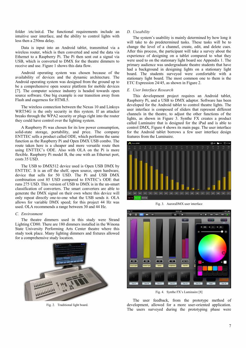
Why keep the old practices when new options are available? Previously, the LCOPT used a standard desktop user interface for the web application. The tool is normally accessed from tablets and smartphones, which do have more demanding principles than a desktop computer. These principles are: a smaller screen size, a touch interface, and accessibility. Each needs to be more of a focal point in the redesigning of the interface. The tool has previously been ported to mobile devices to utilize the smaller screen size and limited wireless data transfer speeds [1]. But, in actuality, this is still not the ideal interface for practical use. Topics to be covered in the paper include research design, user interface design, usability study, and results analysis.
Fig. 1. Windows 8 [2]
Looking at current software being released now, one can see these more demanding principals in use. Taking Windows 8 as an example, the similarities can be discussed. The new operating system underwent a complete redesign that has a focal point on a touch interface. Fig. 1 shows what the generic home screen looks like for Windows 8. As one can see, it consists of large blocks, called Live Tiles, that when clicked bring the user to that respective page. These large buttons make it easy for the user to successfully click on the button and also give the user a small bit of information on what is inside. The minimalist feel of the interface is also something that we would like to include in the redesign of the LCOPT as it is clean but also provides information.
Previous studies on the web application have included creating a model based user interface design. This showed that by using a model based interface for inputs, the accessibility of the software was increased as doctors and clinicians were required to input only the necessary information for each patient. This design approach required fewer entries for each interface and also a reduction of total interfaces. [3] Recently, the LCOPT has been augmented with new statistical models. The models were used to calculate a patient’s survivability probability. The statistical models are run in the R programming language, and after integrated with Java and web programming technologies, patient information is available right in the web app.
A more recent study took the Lung Cancer Prediction Tool and redesigned the interface for Android mobile phones. [4] This research analyzed relevant aspects to mobile device interfaces and developed a model-based interface. The apps interface usability study results showed that user perception of the app and its features were functional and could be adapted for practical use. Improvements in aesthetics were suggested by less technologically savvy participants. Participants also suggested common touch screen gestures, like swiping and voice command input. The findings were taken into account when developing a newer interface for tablet devices.
In the redesign of the Lung Cancer Prediction Tool, we want to optimize for touch, but still have the roll back capabilities of a standard desktop.
Optimizing the Lung Cancer Treatment Outcome’s user interface design for mobile devices will allow the users to achieve their goal easier, and more efficiently.

13
II. SYSTEM INTEGRATION
Table 1, (full table is appendix I) shows the software pieces and devices used for designing, testing, and implementing the Lung Cancer Outcomes Prediction Tool. In addition to what is shown in the table, JSP, Java, R, HTML and CSS are the main languages used.
TABLE I. USED SOFTWARE& DEVICES
Software Name Version / Release
Mac OS X 10.7.4
Apple iOS 6.0.2
Eclipse Java EE IDE 4.2.0
TextMate 2 2.0-alpha.9387
Apache Tomcat 6.0.36
WampServer 2.2
Google Chrome 25.0
Apple iPad 1st Gen
Samsung Galaxy Tab 2 10.1
For this web application, Tomcat and WampServer are the basis for supporting the system. Tomcat hosts the web aspect and WampServer hosts the database of patient information. JSP is what the majority of the pages are written in because they interact with Java to load the respective forms and receive data. R then interacts with Java to build the patient probability graph and table, which are displayed after creating a new patient or querying an existing patient. CSS is used to create a visually pleasing interface.
The preexisting LCOPT web application is used as a server. The User Interfaces screens are used to capture a user's input, such as: query Existing Patient Information or create a New Patient; and also give information about the System Info, Help, and Useful Links. Common input components are Text Field Entry, Menu/List Select, and Radio Buttons. These can take types such as: Numeric, Text, or Alpha numeric.
Fig. 2 shows a draft mockup of the homepage on the left and a mockup of the new patient on the right. The main feature of the homepage is the four large buttons leading to the main subpages. The links are to: a New Patient form, Existing Patient, Help, and Links. These links are dynamic and adapt to the orientation of the device and what device it is used on. The bottom section of the home page consists of a section for quick information the user may need right away when accessing the application.
On the right of Fig. 2, we can see another draft mockup of the New Patient form page. At the very top we have two buttons and a title. The back button brings you to the previous page, and the Home button brings you back to the homepage. Below that is a short information section for any info that the
user may need. The rest of this page is the form for the patient info. The age field is a number field, so the keyboard pops up with the number keys already active. The Gender and Smoker fields are radio buttons. Cell Type and Stage are dropdowns with the information included. After all information has been filled out, the next button in the bottom right corner leads the user to the next page.
Fig. 2. Draft Mockup of Home and New Patient Pages
TABLE II. COMMON LCOPT INPUTS
Input Input Type UI Component
Age Numeric Text Field
Gender Text Radio Buttons
Stage Alpha Numeric Select
Cell Type Text Select
Grade Text Radio Buttons
Smoking History Text Radio Buttons
Treatments Text Select
Weight Loss Numeric Text Field
Family History Text Text Area
Table 2 summarizes what are the most common input types and the corresponding user interface components are in the LCOPT. The main UI components are Text Field, Radio Buttons, Select (List/Menus)’s and Text Area. These correspond to numeric, text, and alpha numeric input types.
A. Software Development
To achieve this, we conducted background research on best practices and design for touch interfaces. Each page was given a design mockup to get the general idea of the flow of the system. The web application then went into the development stage. We generally followed the waterfall process model, which can be seen in Fig. 3. I felt this model best suits the project and timeline involved as development is by only one developer. Completing each step at a time was beneficial.

14
Fig. 3. Waterfall Model
Minor testing was completed on each page at its completion. Then, after the entire implementation was complete, final testing was completed on the application as a whole. Once a working prototype version of the web app was complete, a usability study was conducted on the new application. An adaptation of a preexisting usability survey and questionnaire was used. The study was conducted on the new design and how well it facilitates users inputs as well as how easy it was to use. Fig. 4 shows the difference between the new and old interfaces. The left screenshot shows an actual screenshot of the working new home page. The left screenshot is the previous version of the LCOPT. The results were gathered, and reported in the analyses section. Similar to the mockup, the actual web app contains big blocks making it easier for successful button clicks.
Fig. 4. Home Screen Comparison
Fig. 5. Home Page
III. USER INTERFACE FOR MOBILE DEVICES
A. Design Details
The homepage, Fig. 5, of the web application’s principles are the large blocks. They are designed using an unordered list (UL) user interface component. This list contains links (implemented with href hyperlink tags) to the corresponding pages. Using the background-image tag in CSS it places the image to create the blocks.
Fig. 6. Screenshot of New Patient Page
Fig. 6 shows the new patient page. This page utilizes the most user interface components of all the pages in the web app. The components to capture input are: Input Text Field (Age),

15
Radio Buttons (Gender, Smoking History, and Grade), and List (Menu/Select) are used to capture cancer stage, cell type, treatments, and symptoms. The radio buttons are wrapped in label tags and are given on “onclick” function. This is needed to make the label clickable on devices as well as computers.
<label onclick=""><input type="radio" name="gender"
value="1" />Male</label>
This code snippet above is for the “Male” gender radio button. The label tag and onclick function is coded into the java file used to populate the forms. This makes it so all buttons have a similar style and can be batch styled with CSS. Adding the label tag increases the clickable region to buttons, giving the user better probability for a successful click.
Next, when the user selects the patient’s stage from the select option, it opens up a subwindow with the options that the clinician can select. Once selected, the window collapses to remove clutter.
Fig. 7. Cropped Screenshot of Existing Patient Paget
Another page with some elements that are beneficial is on the existing patient query page. Fig. 7 shows this page. It is very simple with a beneficial aspect. As all ID’s are numbers, instead of the input field being a text box, it has been changed to be a number input. This makes it so when a user on a mobile tablet device clicks on the text field, the number keypad automatically gets enabled, which requires the user to have less clicks.
Also, on every page there is a static footer, this gives information about the web app and links to Mayo Clinic and Winona State University.
B. Usability Study
The usability study has the participants perform multiple commonly performed tasks. The complete test outlines can be seen in Appendix III. The tasks are performed using an Apple iPad with the standard Safari Internet browser. The test plan has three main tasks: query the details of a patient, update a patient’s info, and create new patient details.
Scenario 1 – participants were asked to create a new patient from the information provided and review the patient’s survival probability results.
Scenario 2 - participants were asked to query an existing patient’s ID number and review the patient’s survival probability results.
Scenario 3 - participants were asked to query an existing patient’s ID number and modify the patient’s Stage and then review the patient’s new survival probability results.
Other tasks included navigating the web application and accessing external websites via the links pages. The results of the usability study are shown in the next section.
IV. RESULTS AND ANALYSIS
This usability study used a total of 10 Winona State University students. Two of the students mentioned a history in the medical field or are in the process of getting their medical related degree. While 10 students participated in the study, they were not required to answer every question, so some outcomes do not encompass the entire population of usability study participants.
The results of the usability study conducted are discussed below:
Fig. 8. Survey Result of Scenario 1.
As it can be observed from the pie chart (Fig. 8), everyone who participated in the survey was able to complete it, with majority not needing additional help. The majority of the participants who need help, they needed help with returning to the home screen, as stated in step 4 of the usability guide.
Fig. 9. Survery Results of Scenario 2.
As it can be observed from the pie chart (Fig.9), This task ended with very promising results. All but one participant completed it without any help. Participants noted the liking of the larger “Next” button, which aided in a successful button click.
Successful 67%
Successful w/
Help 33%
Successfull w/ Help 11%
Successful 89%

16
Fig. 10. Survery Results of Scenario 3.
As it can be observed from the pie chart (Fig. 10), majority of task 3 participants were able to complete this without help. 33% need guidance to complete the task. Of the 33% who needed guidance, it usually was getting into the patient information area from the graph of patient probability.
Based on the results show above, we can conclude that usability participants were able to complete all the tasks. This is important to understand because we can tell that the design does facilitate the users inputs and navigation. Scenario #1 and Scenario #3 show less successful, but similar results. A third of the participants struggled with various parts on this step. Namely, it was the ability to intuitively return to the home page, as well as filling out the patient info. I realize now I should have split that first scenario up into two. This would help determine the struggles independently.
Scenario #2 was almost successful for all users, except for one. Based on this, not much needs to be changed in the prototype version on this page. Users appreciated the larger “Next” button, and have suggested the implementation on it in other pages.
Scenario #3 was generally successful, but still needs improvements based on the results of the usability study. This is in regards to finding patient information on the graph screen. A few users also struggled with successful button clicks here too. They were able to get it on the second attempt, but one attempt is ideal.
Based on suggestions and feedback from the usability participants, there are a few improvements that need to be made. The first, and most commonly suggested improvement was the ability to return to previous screen, namely, the home page. While the main title heading brings you back there, it is not intuitive enough for all users just to know. Another suggestion was to improve radio button click feedback. While increasing the clickable area was beneficial, it was still difficult
to see whether the click was successful. The final improvement is the submit button size. Users suggested using a similar button to the existing patient page form.
V. CONCLUSION
Even after reading literature done on a similar subject, as well as closely related areas, it was still apparent improvement on the Lung Cancer Prediction Outcome Tool was needed. Taking cues from new applications dealing with comparable issues, this web app now accommodates varying screen sizes and a touch interface with rollback keyboard ability.
The results of the usability study show that the web application will be accessible and usable in practical use after slight improvements. These improvements are the instinctive ability in returning to the home page, and ease of button click and feedback. Other suggestions that came up during the study were the security of the site by only allowing access by authorized users or clinicians with a passcode to use the application and more color.
REFERENCES
[1] Gegg-Harrison Timothy, Zhang Mingrui, Meng Nan, Sun Zhifu, Yang Ping, "Porting a cancer treatment prediction to a mobile device", Proceedings IEEE Eng Med Biol Soc. 2009:6218-21. PMID: 19965083
[2] Microsoft, “The Start screen is all you.” New Look, 2013. http://windows.microsoft.com/en-us/windows-8/new-look 24 Feb 2013
[3] Zhang, Mingrui, Olson, Scott, Francioni, Joan M., Gegg-Harrison, Tim, Meng, Nan, Sun, Zhifu and Yang, Ping. "Integrating R Models with Web Technologies.." Paper present
[4] Wright, Suzette M. "Model-Driven User Interface Design For Predicting Cancer Treatment Outcomes." Thesis. University of the West Indies, Mona Campus, 2012. Print.
[5] Connors, Adam and Sullivan, Bryan. "Mobile Web Application Best Practices." Mobile Web Application Best Practices. Ed. The World Wide Web Consortium (W3C), 14 Dec. 2010. Web. 05 Feb. 2013.
[6] Luca Chittaro. 2011. Designing visual user interfaces for mobile applications. In Proceedings of the 3rd ACM SIGCHI symposium on Engineering interactive computing systems (EICS '11). ACM, New York, NY, USA, 331-332. DOI=10.1145/1996461.1996550 http://doi.acm.org/10.1145/1996461.1996550
[7] Ricardo Mendoza-González, Francisco J. Álvarez Rodríguez, Jaime Muñoz Arteaga, and Alfredo Mendoza-González. 2012. Guidelines for designing graphical user interfaces of mobile e-health communities. In Proceedings of the 13th International Conference on Interacción Persona-Ordenador (INTERACCION '12). ACM, New York, NY, USA, , Article 3 , 4 pages. DOI=10.1145/2379636.2379639 http://doi.acm.org/10.1145/2379636.2379639
[8] Zhang, Mingrui, Y. Liu, Y. Jiang, Z. Sun and P. Yang, 2011, "Model Based User Interface Design for Predicting Lung Cancer Treatment Outcomes", The 33rd Annual International Conference of the IEEE Engineering in Medicine and Biology Society, Boston, MA.ed at the meeting of the HEALTHINF, 2009.
Successful
67%
Successful w/
Help
33%

17
APPENDIX I
TABLE III. USED SOFTWARE & DEVICES
Software Name
Version/
Release
Company/
Organization Uses
Windows 7 Enterprise 64-bit, SP1 Microsoft Corp. Host local site and files and has Eclipse installed as the editor.
Mac OS X 10.7.4 Apple Inc. Editing preliminary CSS
Apple iOS 6.0.2 Apple Inc. The OS that the Apple mobile devices run
Eclipse Java EE IDE 4.2.0 The Eclipse Foundation The main editor for java and jsp files.
TextMate 2 2.0-alpha.9387 MicroMates Ltd. The editor used on mac for HTML and CSS
Apache Tomcat 6.0.36 Apache Software Foundation
Hosts the site on a local computer and is the server
WampServer 2.2 Alter Way Database host
Google Chrome 25.0 Google Inc. Desktop Browser for WebApp
Apple iPad 1st Gen Apple Inc. Connects to the host wirelessly to run WebApp
Samsung Galaxy Tab 2 10.1 Samsung Connects to the host wirelessly to run WebApp

18
APPENDIX II
Lung Cancer Survivability Prediction Tool Mobile User Interface Questionnaire
Dear Participants, thank you for your participation in the survey of the Lung Cancer Prediction Tool Mobile User
Interface (UI) developed in partial fulfillment of my Senior Research Project for the Computer Science department
of Winona State University. I am conducting this research to determine the usability of the UI developed to allow
clinicians to access the LCPT through a tablet device and access patient’s information while making their rounds
.
By taking the time to fill out this brief survey, you can help improve the quality of the UI. This survey is voluntary and
for academic research purposes only. All responses will remain confidential. This researcher will honor your privacy
and security; in addition, you may at any time withdraw from participating in this survey.
Please rate each of the items below by placing an X in the appropriate box using the following rating scale:
1 = strongly disagree; 2 = disagree; 3 = neutral; 4 = agree; 5 = strongly agree
Please rank every statement.
Choose one of the following options for each question
1 2 3 4 5
1. In relation to other software I have used, I found the user interface of the Lung
Cancer Survivability Prediction Tool (LCSPT), designed for mobile devices to
be very easy to use.
2. The menu items were well organized and functions easy to find.
3. The user interface is useable without reference manual or help.
4. The user interface is user friendly.
5. The interface allows users to correct errors.
6. Incorrect use of keys/commands does not cause program to abort.
7. The user interface provides a facility for updating information stored in the
patient database.
8. The user interface facilitates queries concerning patients and their treatment
protocols.
9. User can exit from any screen.
10. I immediately understood the function of each menu item, the buttons and
other elements were well organized and easy to find.
11. The data presented on the screen was easy to read and the screens have the
right amount of information.
12. I found navigating around the Lung Cancer Survivability Prediction Tool
(LCSPT) mobile device screens to be easy and intuitive.
13. The colors and typography (headings, titles, lettering) used throughout the site
are appealing.
14. Information is layered effectively on different screens and is easy to read.
15. The use of screen elements such as pop-ups, scrolling lists and menu options
is intuitive.
16. I can effectively and efficiently complete tasks using this user interface
17. The information (such as online help, on-screen messages, and other
documentation) provided with this user interface is clear
18. This GUI has all the functions and capabilities I expect it to have and is
attractive.
19. Overall, I am satisfied with how easy it is to use the user interface.

19
Your recommendation – Please check one.
This would be valuable user interface and would be useful in the medical field.
This is beneficial user interface, but I have some serious reservations. (Please describe problems and indicate if you
want to look at other programs like this).
This user interface will not allow the user to retrieve the required results and should not be adopted.
Comments:

20
APPENDIX III
Scenario I
1. From the main menu, select the New Patient option.
2. Enter the patient information and click the submit button.
i) Age: 75
ii) Gender: Male
iii) Smoking History: Former Smoker
iv) Cell Type: Squamous Cell Carcinoma
v) Stage: Stage IIA
vi) Grade: Moderate
vii) Treatment: Radiation
(1) SUBMIT
viii) Resection: No
ix) Recurrence: No
(1) SUBMIT
3. Note the patient ID assigned and review new survival probability results.
4. Return to Home Page
Scenario II
1) From the main menu, select the Existing Patient option.
2) Enter the patient ID and click the submit button.
i) ID: 2
3) Review survival probability results.
Scenario III
1. From the main menu, select the Existing Patient option.
2. Enter the patient ID and click the submit button.
i) ID: 5
3. Review patient information retrieved.
4. Change the patients Stage to another(any) option.
5. Submit changes.
Scenario IV
1. From the main menu, select the List option.
2. Continue to the “Lung Cancer Alliance”

21
Teaching Game Mechanics in Casual Games
Without Tutorials
Jared Hagen
Department of Computer Science
Winona State University
Winona, MN, United States
Abstract—Many games rely on the use of tutorials to teach
players the mechanics of the game. For simple games, such as
mobile or web games, tutorials could be replaced with design
decision that help the player teach themselves. In this paper, design
decisions are discussed to help a player learn a game without the use
of a tutorial. These decisions can be applied to many types of games.
A game was developed using these design decisions and a survey was
run to test their effectiveness.
Keywords—Games, Video Games, Game Mechanics, Tutorials,
Learning
I. INTRODUCTION
Video games have become huge part of modern culture. Services like the Google’s Play store and Apple’s App Store are host to thousands of games. With so many games available it’s important for a game to be understandable and enjoyable [1]. Many of these games included tutorials on how to play to achieve this goal. However early games such as Pac-Man (1980), Tetris (1984), and Super Mario Brothers (1985) didn’t include any kind of tutorial [2]. These games instead relied on design to teach the player. Game developers in the 80’s were able to teach people how to play their game without tutorials. Why, 30 years later, when we have more available resources to teach the player, are tutorials commonplace? This begs the question: Are tutorials in games really necessary?
One of the things that well designed games do is to teach us in a fun way without making us aware we are learning. In [3], the author asks the following question: how do good game designers manage to get new players to learn long, complex, and difficult games? The author in [3] then responds with the following answer: “The answer that is interesting is this: the designers of many good games have hit on profoundly good methods of getting people to learn and to enjoy learning. Furthermore, it turns out that these methods are similar in many respects to cutting-edge principles being discovered in research on human learning.” Tutorials can take away from this learning experience in games. However, many of today’s commercial games require a way to teach the player. These games are too complex for a regular player to learn on their own. Many of the major games on video game consoles such as the Playstation 3, Xbox 360, and the Wii U fall into this category. Tutorials in these types of games are common but often necessary. They are executed in such a way that often doesn’t take away from the overall experience.
There is a subset of games in today’s market that doesn’t fall under this category. Mobile gaming and social gaming are growing markets in today’s industry. These games are often very simple and consist of not much more than a tap or swipe of a finger or a click of the mouse. That is a huge difference from the controllers of modern console games, which can consist of around 10 buttons, 2 joysticks and a D-Pad. However, too often these simple games riddled with tutorials. In [2], the author shows that tutorials in simple games do not show significant increase in player engagement. So, could we get rid of the need for tutorials all together with proper designs in these games, and still increase player engagement? Could allowing the player to learn the game for themselves, result in a more rewarding experience?
The remainder of this paper will discuss the design of a mobile game and design decision that can be applied to mobile games to reduce or negate the need for tutorials in mobile games.
II. HYPOTHESIS
Can proper use of aesthetics and gameplay design forgo the need for tutorials in games? My hypothesis:
Players who are introduced to aesthetics learn the gameplay mechanics better than players who are introduced to the game with a tutorial.
Fig. 1. Example Gameplay Screen
22
III. METHODS
My survey compares different versions of the same game. While some players are introduced to the game through tutorials, others are taught the game through use of aesthetics and gameplay design decisions. There is a control version of the game, which does not use any aesthetic or design decisions to aid the player in learning the mechanics of the game.
A. Mechanics
In the game the player is shown a 4x4 grid populated with different color icons. The player must touch the icons to clear them from the screen. See Fig. 1 for an example. Some types of icons require more touches than others. There is one type of icon that the player should not touch. If touched, the player loses the game. The player then needs to clear the screen of icons before a set time runs out. After the player clears the screen, the 4x4 grid is be populated with a new set of icons.
Depending on which version of the game is being played, different icons were used. Fig. 2 is an image of the icons used in the original version of the game. Fig. 3 is an image of the icons used in the control version of the game. In both versions the grey icon is used as placeholder that the player cannot interact with.
Fig. 2. Original Version Icons.
Fig. 3. Control Version Icons.
B. The Game Development
The game being surveyed is developed for the Android platform. It is built using a game development framework called LibGDX which is written in the Java programming language. The game is developed in Java programming environment. The Android Development Tools version of Eclipse was used as a development environment.
Fig. 4. Class Diagram
The LibGDX framework provides most of the “boilerplate” code necessary to get the game up and running. Boilerplate code is the code necessary to get the most basic functionality working and allowed me to focus on design and development of mechanics. Fig. 4 shows a class diagram of the game. In this diagram the major LibGDX classes used are labeled in green.
The use of abstraction was a large part of the development of the game. Many of the game objects had much of the same functionality with minor alterations based on their type, such as the number of touches required to clear an icon from the screen. The shared code in these classes is placed in an abstract class and then extended by more specified classes. In Fig. 4 you can see an example of this in the Icon, TieredIcon, and XIcon classes. This abstraction simplified, and sped up development greatly.
There were no major roadblocks in the development of the game. After the game mechanics were developed, most of the time was spent fine-tuning the timing of the game. Lack of development time played the biggest role in hindering development; because of this some features had to be left out.
C. Versions of Game
Two different versions of the same game were used in the testing. These versions are also subdivided into a version with a tutorial and a version without a tutorial. Fig. 5 shows the tutorials used in each version of the game.
Fig. 5. Tutorial Screens.
The original version of the game uses aesthetics and design that provide hints at the gameplay, for example, image association. The player is introduced to some game art in the main menu so it is not completely new to them in game. They are introduced to one color at a time. The first level only introduces one green icon. Green icons are placed in the game menus next to buttons that advance the player through the menu. They are made up of three tiers. These tiers rotate independently and once all tiers line, the player has ran out of time and lost. Fig. 2 clearly shows these tiers. At this point of the game the player has no other options than to touch the green colored icon. Another way to teach a mechanic is to force players into situations where they have no other options but to do the thing you want them to do.
After a few levels of only green icons the player is introduced to a red “X” icon. The red “X” icon in this instance stops the player’s advance to the next level by causing the player to lose the game and have to start over. The red icon in the shape of an “X” indicates to the player not to touch it. The

23
red “X” icon is placed in the game menu next to back buttons that return players to the previous screen. It is located next to the quit button. This helps associate the icon with moving backwards or lack of progress. The player is then introduced to the other colored tiered icons that require more touches.
The other colored tiered icons we designed to look the same as the green tiered icons. This was to teach the player that the other colored icons were okay to touch. Also, when the other colored icons are touched they change color. For example, when a yellow icon is touched, it turns green. These factors aid in teaching the player that these icons need to be touched more than once. Fig. 2 shows the other colors and the required number of touches.
The control version of the game does not use aesthetic hints to attempt to teach the player. In this version of the game, the green icons are replaced with blue icons and the red icons are replaced with white icons. Other icons used in this version are shown in Fig. 3. These icons, which are not used in menus, will not be introduced to the player out of gameplay. When designing this version of the game, I wanted to be sure that the aesthetics were not in any indirect way teaching the player how to play. I also made sure that the aesthetics were neutral and weren’t in anyway tricking the player; this way this version can be used as a sort of control.
D. Testing of the Game
I tested the effectiveness of the design choices by allowing 10 people to play each version of the game. I then compared their scores and had them complete a survey. Players played the game on a 10 inch Android tablet. Each player played the game three times on one version of the game. Those three scores served as a measure on how well they understood the game. The survey also assisted in this measurement, by asking players about their previous experience level with games, their enjoyment of the game, and asking a few questions about the rules of the game.
Fig. 6. Average Player Scores.
IV. RESULTS
The results of the testing were unexpected and ended up proving the hypothesis wrong. However during the testing a few other unexpected things were learned.
A. Average Player Scores
The average player scores were the main way of measuring the efficiency of the design for player learning. The two versions of the game that contain the tutorials resulted in higher player scores in all three play tests. Fig. 6 is graph comparing player scores across all four versions of the game. Each bar represents a one play-test for one version of the game. The blue bar indicates the first play. The red bar is the second play-test. The green bar is the third and final play-test.
B. Player Skill
Previous player experience did have much of an effect on how a player performed. I believe this is due to the nature of the game. The game is very easy and as such the lack of correspondence between player skill and player performance is not surprising. The average player skill across all four versions of the game was fairly even. Each version ranged from 3 to 3.5 in average player skill.
Though player skill did not have much effect on player performance, while testing it became evident that other factors did. Players who used both hands to touch the screen rather than just one scored much higher overall. The highest score of players who player with both hands were near double those who used just one hand.
C. Player Understanding
Players who played the tutorial version of the game had a better understanding of the rules of the game. The thing that most players did not pick up on in the non-tutorial version of the regular game was how to tell when time was going to run out. Even some of the players who read the tutorial didn’t understand that when all three tiers lined up, time was up. The control version of the game did not have a means to tell how much time was remaining.
The element of which icons to touch and not touch was clearly evident to those who played the tutorial versions of the game. Most players who played the non-tutorial version had picked up on the rules of the game by the third play through. You can clearly see by the jumps in scores (Fig. 6) from play test to play test in these versions, that player understanding went up dramatically each play test. By the third play though scores were similar to that of the tutorial versions.
D. Player Enjoyment
Almost all players said that they enjoyed the game. The few players who gave the game less than a five on the one-to-five scale were playing the control version of the game. One thing that I think may have skewed this was the fact that players new that I had made the game and new that I would be reviewing the survey.
V. DISCUSSION
While the results of the test were not what were hoped for, they still showed that the use of aesthetics were somewhat effective in teaching the mechanic of the game. Simply because the regular version scores were higher than that of the control version, which indicate that the aesthetics and design decision being made were somewhat effective. The non-tutorial regular version of the game performed nearly as well as the tutorial version of the control version. This leads to belief that the design of the game is headed in the right direction, but
0
50
100
150
200
250
Control - No
Tutorial
Regular - No
Tutorial
Control -
Tutorial
Regular -
Tutorial
Sco
re
Version
Average Player Scores
Play Test 1 Play Test 2 Play Test 3

24
there may be more to be done to get the game to the desired level of performance. One thing that could possibly be added to the game is a pre-menu or in menu preview of the gameplay. Similar to that of an arcade machine playing video of gameplay before a player enters a quarter.
If this survey were to be carried out again, there are a few things that should probably be addressed. A game with different gameplay mechanics with fewer play tests for each player may result in a better test. Also, slips of the fingers or lag spikes reduced some of the average player scores significantly; a game that does not time the player may be better suited for this type of test. Also more versions of the game could be implemented to introduce one design decisions at a time. Surveys could then be used to measure the most effective way to teach a player without the use of a tutorial. Also having a neutral party run the survey for the game may provide better results.
While the results weren’t as good as had been hoped for many of the design decisions about could easily be introduced into casual games. One of the easiest and likely most effective design decisions would be for developers to introduce elements of the game in non-gameplay situations. This familiarizes the player with the game object before interaction. Hinting at the game objects use or actions compounds this effect.
VI. CONCLUSIONS
The survey supported the idea that aesthetics were helping teach the player the mechanics; however tutorials still proved
more effective. Further studies could be used to determine which factors provide the most insight into the mechanics of a game. While I don’t expect games to quit using tutorials in the near future, I do believe that the practices used in the design of this game can benefit all games even those that still decide that a tutorial is still the best way to teach the player.
REFERENCES
[9] Paul Suddaby. The Many Ways to Show the Player How It’s Done With In-Game Tutorials. http://gamedev.tutsplus.com/tutorials/game-design/the-many-ways-to-show-the-player-how-its-done-with-in-game-tutorials/. August 31, 2012. Accessed January 25, 2013.
[10] Erik Andersen, Eleanor O’Rourke, Yun-En Liu, Rich Snider, Jeff Lowdermilk, DavidTruong, Seth Cooper, and Zoran Popovi´c. The impact of tutorials on games of varyingcomplexity. In Proceedings of the 2012 annual conference on Human factors in computing systems, CHI ’12, 2012. To appear. K. Elissa, “Title of paper if known,” unpublished.
[11] J. P. Gee. Learning by design: Games as learning machines. Interactive Educational Multimedia, 8:15–23, April 2004.
[12] E. Andersen, Y.-E. Liu, R. Snider, R. Szeto, and Z. Popovic. Placing a value on aesthetics in online casual games. In CHI ’11: Proceedings of the SIGCHI conference on Human factors in computing systems, New York, NY, USA, 2011. ACM.
[13] Quintans. Game UI By Example: A Crash Course In The Good And The Bad. http://gamedev.tutsplus.com/tutorials/aesthetics/game-ui-by-example-a-crash-course-in-the-good-and-bad/. January 22, 2013. Accessed January 25, 2013
25
3-D Password Secure Authentication
with Biometric Device
Brandon Tran
Computer Science Department
Winona State University
Abstract—To be safely authenticated, we present a 3-D virtual
environment where the user navigates and interacts with various
objects. The sequence of actions and interactions toward the objects
inside the 3-D environment constructs the user’s 3-D password. The
3-D password can be define by combining most existing
authentication schemes such as textual passwords, graphical
passwords, and various types of biometrics into a 3-D virtual
environment.
Keywords—Virtual environment; Software design.
I. INTRODUCTION
Today, we are provided with major password methods to protect our identity, such as textual passwords, biometric scanning, etc. Textual passwords follows an encryption algorithm that lets the users create their password by Texts while Biometric scanning scan our “natural” signature to prove our validity. People tend to stick with a simple textual password so they will not easily forget. For example, passwords consist of user’s birthday date, query keyboard, numbers or his/her pet name. These passwords are not hard to crack [1, 3].
To enhance system’s security, biometric schemes have been proposed, they include fingerprints, palm prints, hand geometry, face recognition, voice recognition, iris recognition and retina recognition. Each biometric recognition scheme has its advantages and disadvantages based on several factors such as consistency, uniqueness, and acceptability. One of the main drawbacks of applying biometrics is its intrusiveness upon a user’s personal characteristic. Moreover, retina biometrical recognition schemes require the user to willingly subject their eyes to a low-intensity infrared light [1, 4].
The 3-D password is a multifactor authentication combines graphical schemes, textual password scheme with biometric device into a single 3-D virtual environment [1]. This 3-D virtual environment contains several objects or items with which the user can interact. The type of interaction varies from one item to another. The 3-D password is constructed by observing the actions and interactions of the user and by observing the sequences of such actions. It is the user’s choice to select which type of authentication scheme such as textual password or biometric, will be part of their3-D password.
I have create a program in java that utilize the textual, graphical and interconnect it with biometric device U which is an U finger print reader to describe the 3-D password scheme.
II. SCHEME
The new scheme should not be either recall based or recognition based only. Instead, the scheme should be a combination of recall-, recognition-, biometrics-, and token-based authentication schemes.
Recall based is the retrieval of information from memory without a cue. There is a question, and you must search your memory for the answer. For example, you have to describe the person you saw to a sketch artist. This is an exercise in recall. The artist may try to help your recollection by asking questions, but ultimately you have to find the information yourself. Recognition is a response to a sensory cue. When you see something, you compare it to information stored in your memory, and if you find a match, you "recognize" it. For instance, a police lineup is a classic exercise in recognition. You look at several people, and compare each to the person you saw commit the crime.
Users ought to have the freedom to select whether the 3-D password will be solely recall-, biometrics-, recognition-, or token-based, or a combination of two schemes or more. This freedom of selection is necessary because users are different and they have different requirements. Therefore, to ensure high user acceptability, the user’s freedom of selection is important.
The new scheme should provide secrets that are not easy to write down on paper. Moreover, the scheme secrets should be difficult to share with others and secret keys are easy to remember and very difficult for intruder to guess.
A. Expected Functionalities
The user can decide his/her own authentication schemes. If he's comfortable with Recall and Recognition methods then he can choose the 3d authentication just used above.
The authentication can be improved since the unauthorized persons will not interact with the same object as a legitimate user would. We can also include a timer to timeout the login for that user after 4 tries.
The 3D environment can change according to user’s request. So it would be difficult to crack using regular

26
techniques. Since all the algorithms follow steps to authenticate, the 3D password has no fixed number of steps. Hence to calculate all those possibilities and decipher them is not easy.
B. Requirements
The system requirements should be met before the study
process. A computer will use a database to store the data
including the location and/or fingerprint data. A biometric
device, e.g. finger print scanner Digital Persona U, is to scan
user finger print. It is designed by a company named Digital
Persona. It has multiple features that could help in this study,
such as its ability to save data into a template and reload the
template whenever we need. It also protects the data by
masking the template with the key that proprietary to Digital
Persona. So programmers still get the ability to call on the
template and compare the data, but cannot see what is behind
it.
Fig. 1. U are U is looking for the fingerprint when a shadow is detected.
III. DESIGN OF VIRUAL ENVIRONMENT
A. Authentication
The user enters the virtual environment and types something on a computer located at position (x1, y1, z1). He/she then enters a room that has a fingerprint recognition device placed at (x2, y2, z3) and scans his/her fingerprint. Then, the user can go to the virtual space, sit down at the assigned spot, and enter the textual password sequence. The program stores the sequence of action of the user towards object in the virtual reality to construct the user password. Once the user enters the virtual environment, he/she will see a pop up appear at a computer screen located in the virtual environment (x1, y1, z1).
Fig. 2. Login form.
After the user successfully logs in, user’s fingerprint needs to be scanned. I have installed firmware to use the finger print
device as a plug-in. To integrate the Fingerprint device into the virtual reality, I further developed programs using java JMonkey Engine. Once the print has been scanned, the device search through each template using the digital engine, which decode the encoding to get the data, and if it finds a matching template then the program give the user access.
Fig. 3. State Diagram showing the each step in the 3D password sequence
B. Guideline
The design of the 3D virtual environments affects the
usability, effectiveness, and accessibility of 3D password. The
first step in building a 3D password system is to design a 3D
environment that reflects the administration needs and the
security requirements.
The prospective 3D virtual environment should reflect what people are used to see in real life. Objects used in virtual environments should be relatively similar in size to real objects (sized to scale). Possible actions and interactions toward virtual objects should reflect real life situations. The target should have a 3D virtual environment that users can interact [2].
Every virtual object or item in the 3D virtual environment is different from any other virtual object. The uniqueness comes from the fact that every virtual object has its own attributes such as position. Thus, the prospective interaction with one object is not equal to the interaction with another object. However, having similar objects such as 20 computers in one place might confuse the user. Therefore, the design of the 3D virtual environment should consider that every object should be distinguishable from other objects. Similarly, in designing a 3D virtual environment, it should be easy for users to navigate through and to distinguish between objects. The distinguishing factor increases the user’s recognition of objects. Therefore, it improves the system usability.
The response type of an object reflects what kind of interactions it receives. For simplicity, we can consider requesting a textual password or a fingerprint as an object response type. Selecting the right object response types and the number of objects affects the probable password space of a 3D password.

27
It is essential to take the type of computer system needs protected into account. The 3D virtual environment should consider what systems would be protected by a 3D password. The number of objects and the types of objects that have been used in the 3D virtual environment should reflect the importance of the protected system.
C. Use Case Example
Let us consider a 3D virtual environment space of size X×Y×Z. The objects are distributed in the 3D virtual environment with unique (x, y, z) coordinates. We assume that the user can navigate into the 3D virtual environment and interact with the objects using any input device including mouse, key board, fingerprint scanner, iris scanner, stylus, card reader and microphone. We consider the sequence of those actions and interactions using the input devices as elements in user’s 3D password
For example, consider a user who navigates through the 3D virtual environment that consists of an office and a meeting room. Further assume that the user is in an office and turns around to the door at location (10, 24, 91) and opens it and then closes the door. The user finds a computer at (4, 34, 18), types in “MYTIME.” Then, he walks to the meeting room, picks up a pen at (10, 24, 80) and draws a dot on a paper at (1, 18, 30). The dot is recorded as dot (x, y) in relative to the paper space, that is (330, 130). The user then presses the login button. The initial representation of user actions in the 3Dvirtual environment can be recorded as follows:
(10, 24, 91) Action = Open the office door; (10, 24, 91) Action = Close the office door; (4, 34, 18) Action = Typing, “M”; (4, 34, 18) Action = Typing, “Y”; (4, 34, 18) Action = Typing, “T”; (4, 34, 18) Action = Typing, “I”; (4, 34, 18) Action = Typing, “M”; (4, 34, 18) Action = Typing, “E”;
D. DETAIL IMPLEMENATATION
Fig. 4. Create and add textures to the model.
Figure 4 illustrates what a user can do with a 3D blender. A user can create model and add it to the existing model to create a mesh, which later can be imported into program using JMonkey to create more variety types of the reality. The 3D blender modeling software is used to create a 3D model of the virtual environment. The texture get put together, including create a new mesh to make a solid object in blender so to make sure the interaction between 2 solid objects obsolete. A mesh is a sculpture of a model that is being created in blenders.
The mess.xml will get exported out of the blender, and import it in JMonkey Java engine; JMonkey is a 3D gaming engine used to create games in 3-D.
Fig. 5. Sniplet of the code that put the Mess.xml/scene
The code is Figure 5 is used to create a new program state by calling the bulletAppState method. The bulletAppState method is a method that adds the physical properties to the model, making collision detection easier to identify. Then I loaded the model to the scene by using assetRegisterLocator, which register the model in the zip file by extends the ZipLocator class.
The same process applied to how to place the fingerprint model in the virtual system. The U are U fingerprint reader uses the Software Development Kit (SDK) provided by Digital personal, packages of complied classes, which allows the device to work accordingly to the system. Such as the scanPrint method, which only takes in the new scan of the image and save it to the print buffer, then called the processTemplate to actually identify the print in the template database.
Fig. 6. Compare 2 blobs
While this can be a great way to process the fingerprints in the templates database, the problem arises from the fact the device is limited to only 200 templates. Therefore, I cannot optimize the storing of the data. To fix this problem, I had redesigned the ScanPrint method to take in the print image in the print buffer, and save it to the external database, in this case
bulletAppState=newBulletAppState();stateManager.attach(bulletAppState);bulletAppState.getPhysicsSpace().enableDebug(assetManager);//Were-usetheflybycameraforrotation,whilepositioningishandledbyphysicsviewPort.setBackgroundColor(newColorRGBA(0.7f,0.8f,1f,1f));flyCam.setMoveSpeed(100);setUpKeys();setUpLight();//Weloadthescenefromthezipfileandadjustitssize.assetManager.registerLocator("town.zip",ZipLocator.class);sceneModel=assetManager.loadModel("main.scene");sceneModel.setLocalScale(2f);//Wesetupcollisiondetectionforthescenebycreatinga//compoundcollisionshapeandastaticRigidBodyControlwithmasszero.CollisionShapesceneShape=CollisionShapeFactory.createMeshShape((Node)sceneModel);landscape=newRigidBodyControl(sceneShape,0);sceneModel.addControl(landscape);
private static void showContent(Connection conn) throws Exception
{
Statement stmt = conn.createStatement();
ResultSet rset = stmt.executeQuery("select id,name,blob_column from
mytable");
while (rset.next()) {
System.out.print (rset.getString(1));
System.out.print (" | " + rset.getString(2) + " | ");
System.out.print (new String(rset.getBytes(3)));
System.out.println("");
}
rset.close();
stmt.close();
}

28
MYSQL, as a Blob image. Blob is a data type in the MYSQL database that usually associates with files and images. It then calls the processTemplate that was designed to search the print in the external database rather than in the template database. To compare the image to an existing one in the database, I encode the two BLOBs into Base64 and do the string comparison on those encoded strings.
I’ve implemented the login form (Fig. 7) with password. The user ID is compared to entries in database, if matched, the user is allowed to enter the 3D world.
Fig. 7. Sniplet of how a login form is created and connect to database
E. Observation
I had surveyed 20 people on their user experiences in using the system. There are three questions asked.
How do you login? (with no instruction). The point of this question was to make sure that the program is user friendly.
After the user register to the database, and authenticate login to the system, the second question is asked as “What are yours general opinions about the authentication process? And, are all the steps necessary to the scheme?”
Can you think of a means to break the program?
Nineteen people said they would happy to use the new scheme due to the various reasons. For example, one of the testers states that he really likes this scheme because his job as an accountant requires him to keep many different user accounts. If the server would implement the this system, they do not have to deal with the situations where customer does not
have their credit card on hand and still wants to know about their financial status. Another tester debates that only the fingerprint is necessary, there’s no need for extra stuffs because user is only interested in the object in front of them not the system itself, and the system takes long time to authenticate.
According to the survey I collected, the scheme does create a unique password and assign it to that person. But the prototype that I’ve implemented was maybe a little bit of complicated for others to use.
IV. CONCLUSION.
The 3D password is a multi-factor authentication scheme that combines the various authentication schemes into a single 3D virtual environment. The virtual environment can contain location existing authentication scheme or even any upcoming authentication scheme or even any upcoming authentication schemes by adding it as a response to actions performed on an object. Therefore the resulting password space becomes very large compared to any existing authentication schemes. The design of the 3D virtual environment t the selection of objects inside the environment and the object's type reflect the resulted password space. It is the task of the system administrator to design the environment and to select the appropriate object that reflects the protected system requirements. Designing a simple and easy to use 3D virtual environment is a factor that leads to a higher user acceptability of a 3D password system. The choice of what authentication scheme will be part of user's 3D password reflects the user's preferences and requirements.
V. ACKNOWLEDGMENT
Professor Mingrui Zhang for his guidance throughout the research. Kris Johnson and Cory Cambern’s contributions on Security Analysis, and those have tested the program and wished to remain anonymous.
REFERENCES
[1] Max-Emanuel Maurer, Rainer Waxenberger, and Doris Hausen. 2012. BroAuth: evaluating different levels of visual feedback for 3D gesture-based authentication. In Proceedings of the International Working Conference on Advanced Visual Interfaces (AVI '12), Genny Tortora, Stefano Levialdi, and Maurizio Tucci (Eds.). ACM, New York, NY, USA, 737-740.
[2] Sara Drago, Anton Bogdanovych, Massimo Ancona, Simeon Simoff, Helmut Berger, and Carles Sierra. 2007. From graphs to Euclidean virtual worlds: visualization of 3D electronic institutions. In Proceedings of the thirtieth Australasian conference on Computer science - Volume 62 (ACSC '07), Gillian Dobbie (Ed.), Vol. 62. Australian Computer Society, Inc., Darlinghurst, Australia, Australia, 25-33.
[3] W. Zhao, R. Chellappa, P. J. Phillips, and A. Rosenfeld. 2003. Face recognition: A literature survey. ACM Comput. Surv. 35, 4 (December 2003), 399-458.
[4] A. S. Yeole. 2011. Proposal for novel 3D password for providing authentication in critical web applications. In Proceedings of the International Conference & Workshop on Emerging Trends in Technology (ICWET '11). ACM, New York, NY, USA, 663-666. DOI=10.1145/1980022.1980165
[5] BBC news, Cash Machine Fraud up, Say Banks, Nov. 4, 2006.
[6] G. E. Blonder, “Graphical password,” U.S. Patent 5 559 961, Sep. 24, 1996.
[7] T. Kitten, Keeping an Eye on the ATM. (2005, Jul. 11). [Online]. Avail
Stringusername=null;Stringpassword=null;Stringdburl=null;Stringdburl1=null;Stringdburl2=null;DataInputStreamdis=null;username=newString(jTextField1.getText());password=newString(jPasswordField1.getPassword());
if((username.equals(""))&&(password.equals(""))){JOptionPane.showMessageDialog(this,"EntertheUserNameandPassword","UserVerification",1);newLogin();}elseif((username.equals(""))){JOptionPane.showMessageDialog(this,"EntertheUserName","UserVerification",1);newLogin();}elseif((password.equals(""))){JOptionPane.showMessageDialog(this,"EnterthePassword","UserVerification",1);newLogin();}else{try{
dburl="jdbc:mysql://127.0.0.1:3306/";dburl1="root";dburl2="admin";Class.forName("com.mysql.jdbc.Driver");Connectioncon=DriverManager.getConnection(dburl,dburl1,dburl2);Statementstat=con.createStatement();System.out.println("connectionopened");PreparedStatementpstmt1=null;ResultSetrs=null;