Embed Size (px)
Citation preview
PowerPoint Tips
Guidelines for Effective Presentations
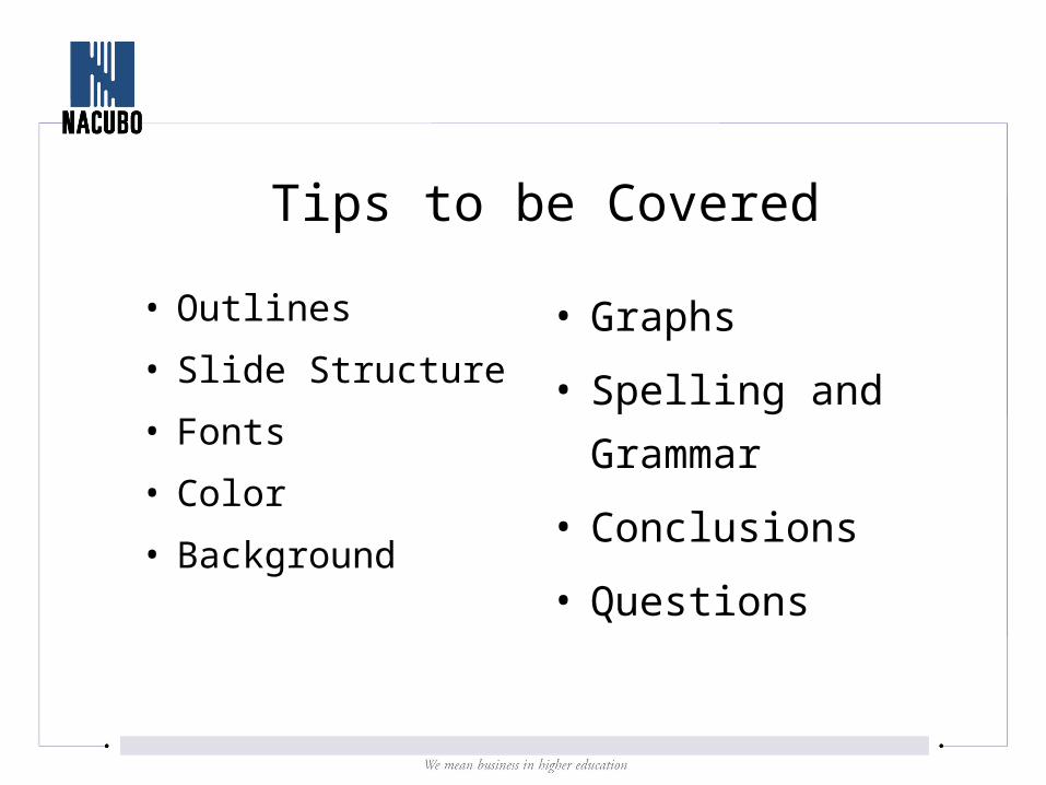
Tips to be Covered
• Outlines
• Slide Structure
• Fonts
• Color
• Background
• Graphs
• Spelling and
Grammar
• Conclusions
• Questions
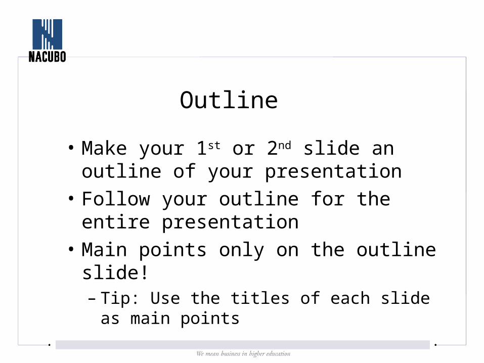
Outline
• Make your 1st or 2nd slide an outline of your presentation
• Follow your outline for the entire presentation
• Main points only on the outline slide!– Tip: Use the titles of each slide as main
points
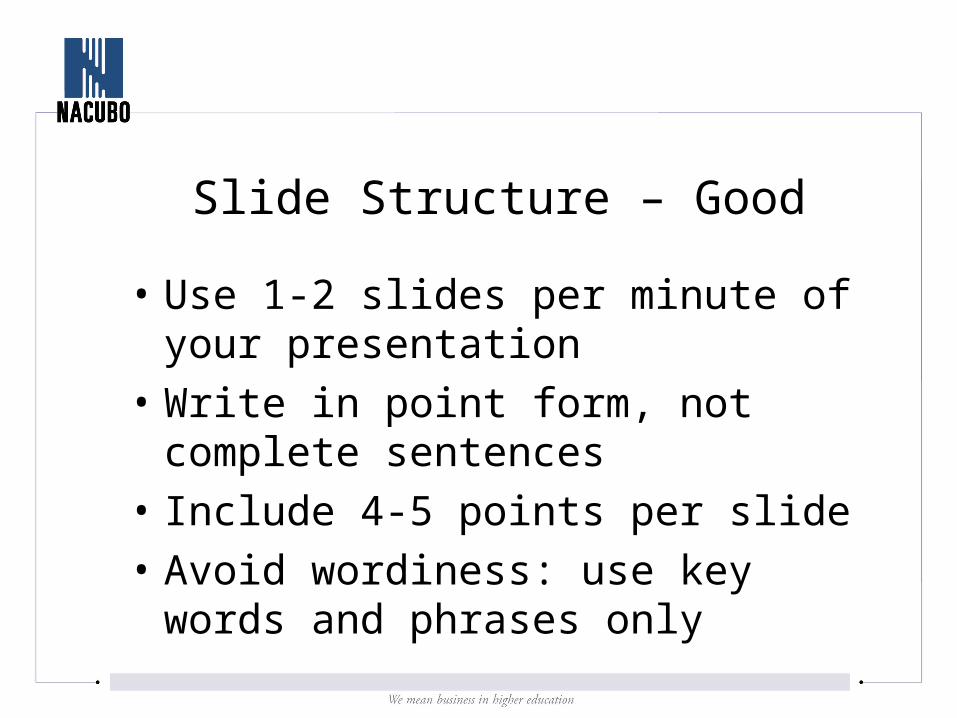
Slide Structure – Good
• Use 1-2 slides per minute of your presentation
• Write in point form, not complete sentences
• Include 4-5 points per slide
• Avoid wordiness: use key words and phrases only
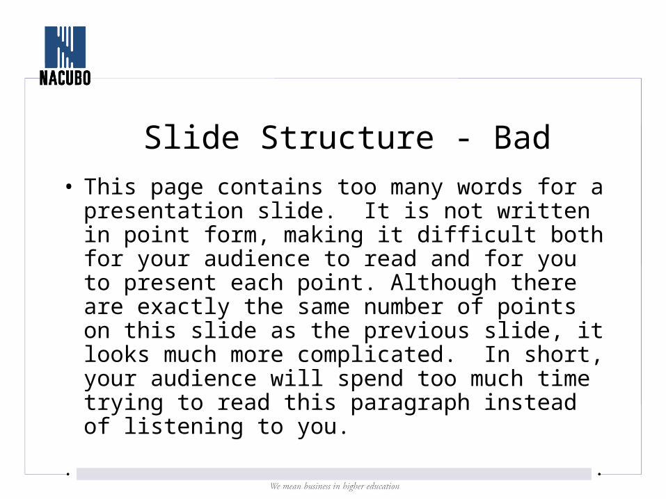
Slide Structure - Bad
• This page contains too many words for a presentation slide. It is not written in point form, making it difficult both for your audience to read and for you to present each point. Although there are exactly the same number of points on this slide as the previous slide, it looks much more complicated. In short, your audience will spend too much time trying to read this paragraph instead of listening to you.
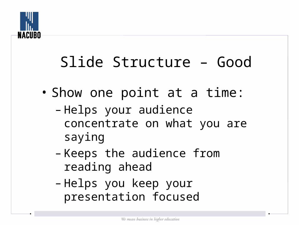
Slide Structure – Good
• Show one point at a time:– Helps your audience concentrate on what
you are saying– Keeps the audience from reading ahead– Helps you keep your presentation focused

Slide Structure - Bad
• Do not use distracting animation
• Do not go overboard with the animation
• Be consistent with the animation that you use
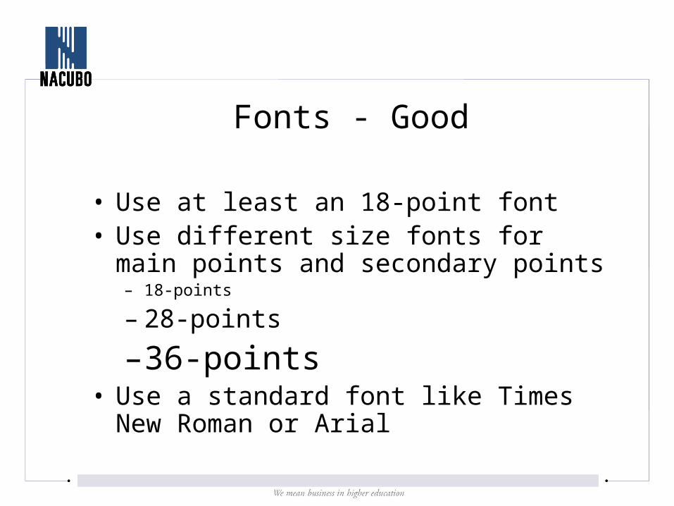
Fonts - Good
• Use at least an 18-point font• Use different size fonts for main points and
secondary points– 18-points
– 28-points
– 36-points• Use a standard font like Times New Roman or
Arial
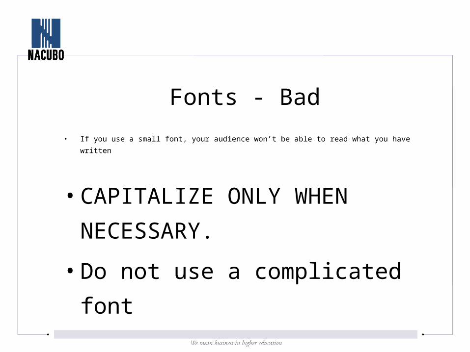
Fonts - Bad
• If you use a small font, your audience won’t be able to read what you have written
• CAPITALIZE ONLY WHEN
NECESSARY.
• Do not use a complicated
font
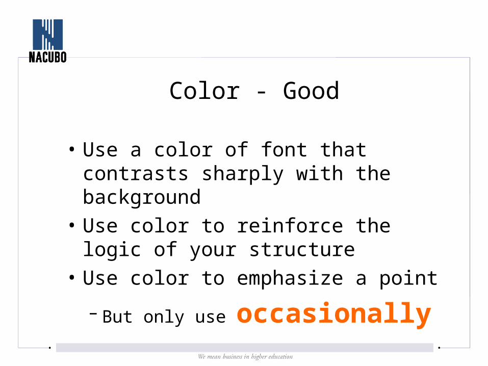
Color - Good
• Use a color of font that contrasts sharply with the background
• Use color to reinforce the logic of your structure
• Use color to emphasize a point
– But only use occasionally
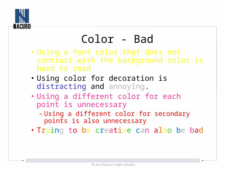
Color - Bad• Using a font color that does not contrast with
the background color is hard to read • Using color for decoration is distracting and
annoying.• Using a different color for each point is
unnecessary– Using a different color for secondary points is also
unnecessary
• Trying to be creative can also be bad
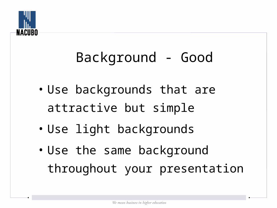
Background - Good
• Use backgrounds that are attractive but
simple
• Use light backgrounds
• Use the same background throughout
your presentation
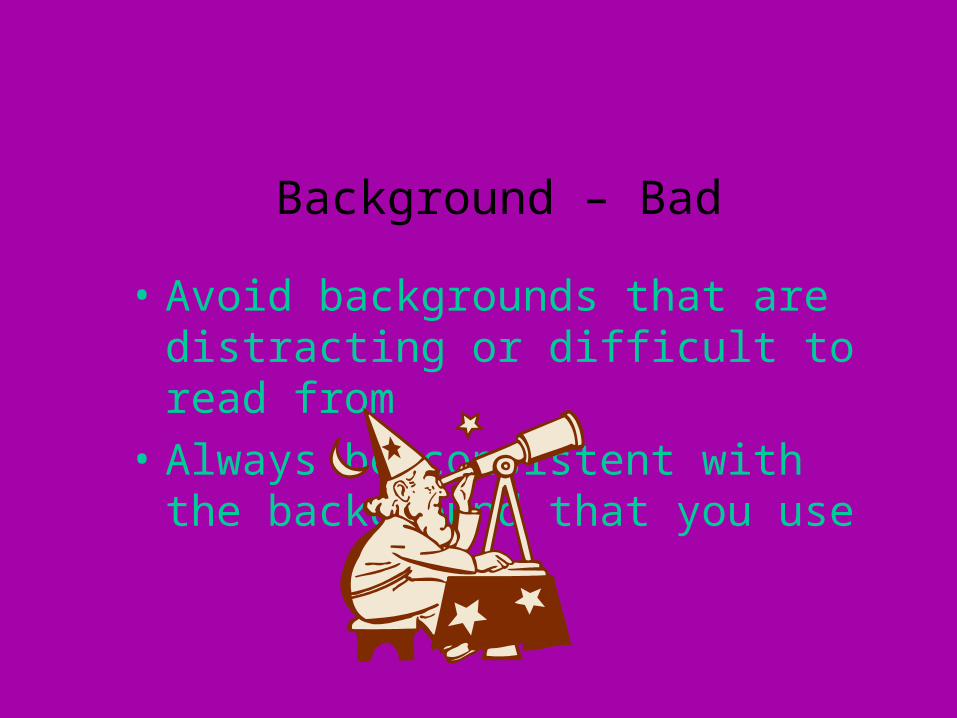
Background – Bad
• Avoid backgrounds that are distracting or difficult to read from
• Always be consistent with the background that you use
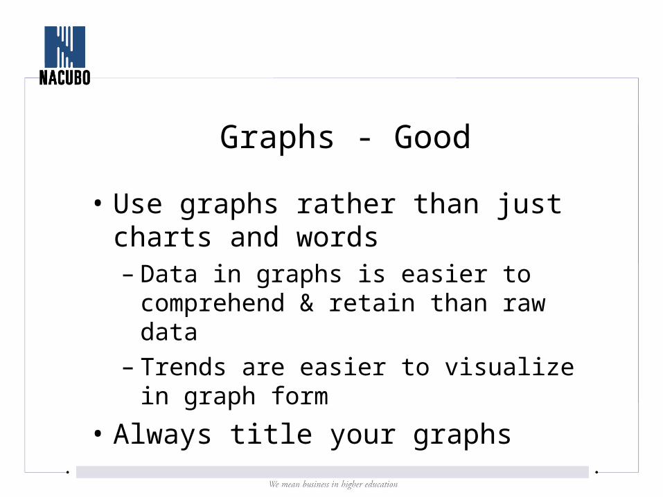
Graphs - Good
• Use graphs rather than just charts and words– Data in graphs is easier to comprehend &
retain than raw data– Trends are easier to visualize in graph form
• Always title your graphs
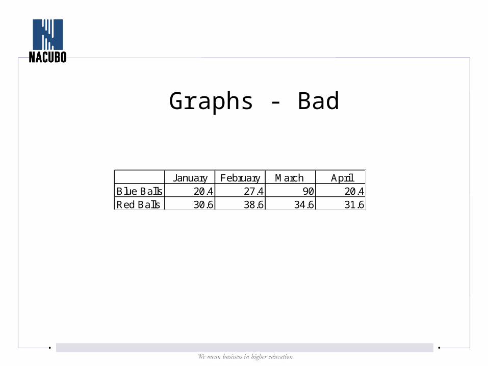
Graphs - Bad
January February March AprilBlue Balls 20.4 27.4 90 20.4Red Balls 30.6 38.6 34.6 31.6
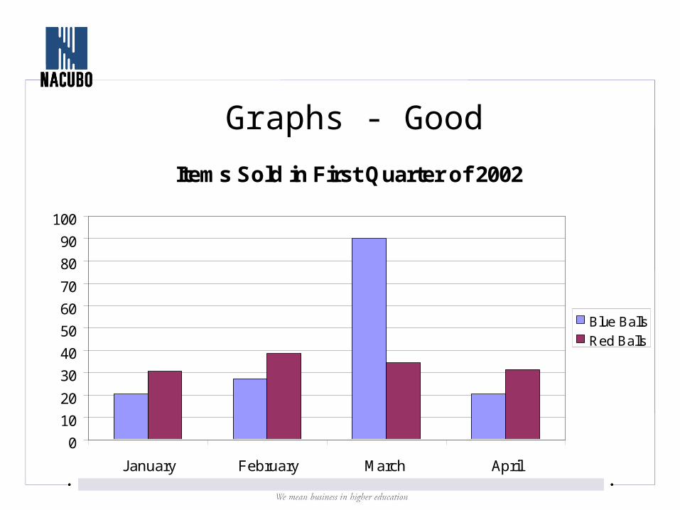
Graphs - Good
Items Sold in First Quarter of 2002
0
10
20
30
40
50
60
70
80
90
100
January February March April
Blue Balls
Red Balls
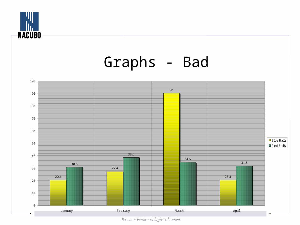
Graphs - Bad
20.4
27.4
90
20.4
30.6
38.6
34.631.6
0
10
20
30
40
50
60
70
80
90
100
January February March April
Blue Balls
Red Balls

Graphs - Bad
• Minor gridlines are unnecessary
• Font is too small
• Colors are illogical
• Title is missing
• Shading is distracting
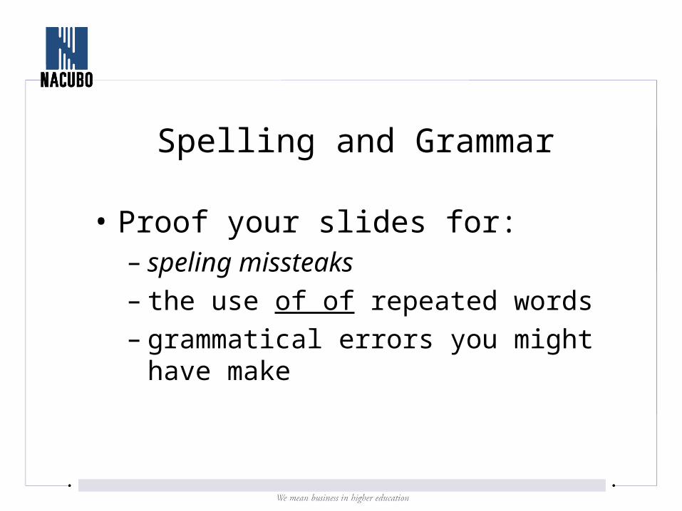
Spelling and Grammar
• Proof your slides for:– speling missteaks– the use of of repeated words– grammatical errors you might have make
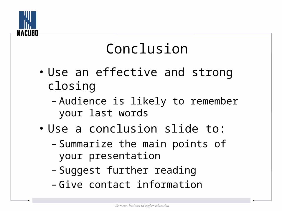
Conclusion
• Use an effective and strong closing– Audience is likely to remember your last
words
• Use a conclusion slide to:– Summarize the main points of your
presentation– Suggest further reading– Give contact information
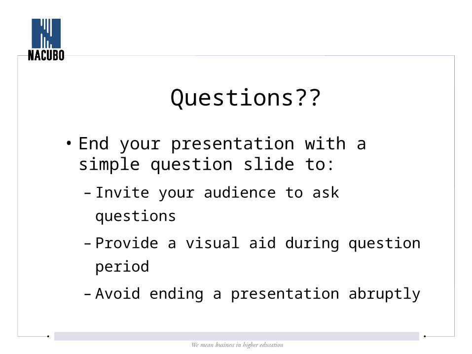
Questions??
• End your presentation with a simple question slide to:
– Invite your audience to ask questions
– Provide a visual aid during question period
– Avoid ending a presentation abruptly
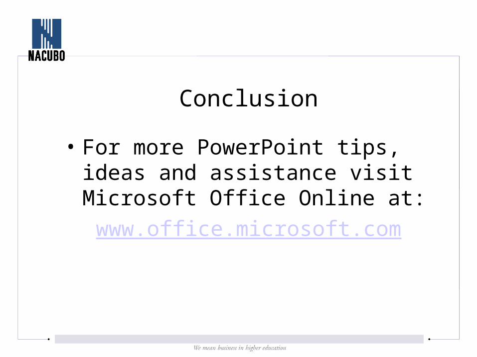
Conclusion
• For more PowerPoint tips, ideas and assistance visit Microsoft Office Online at:
www.office.microsoft.com