Embed Size (px)
DESCRIPTION
portfolio2,pdf, paul
Citation preview

PAUL BRANDRETHBA (HONS) GRAPHIC DESIGNPORTFOLIO
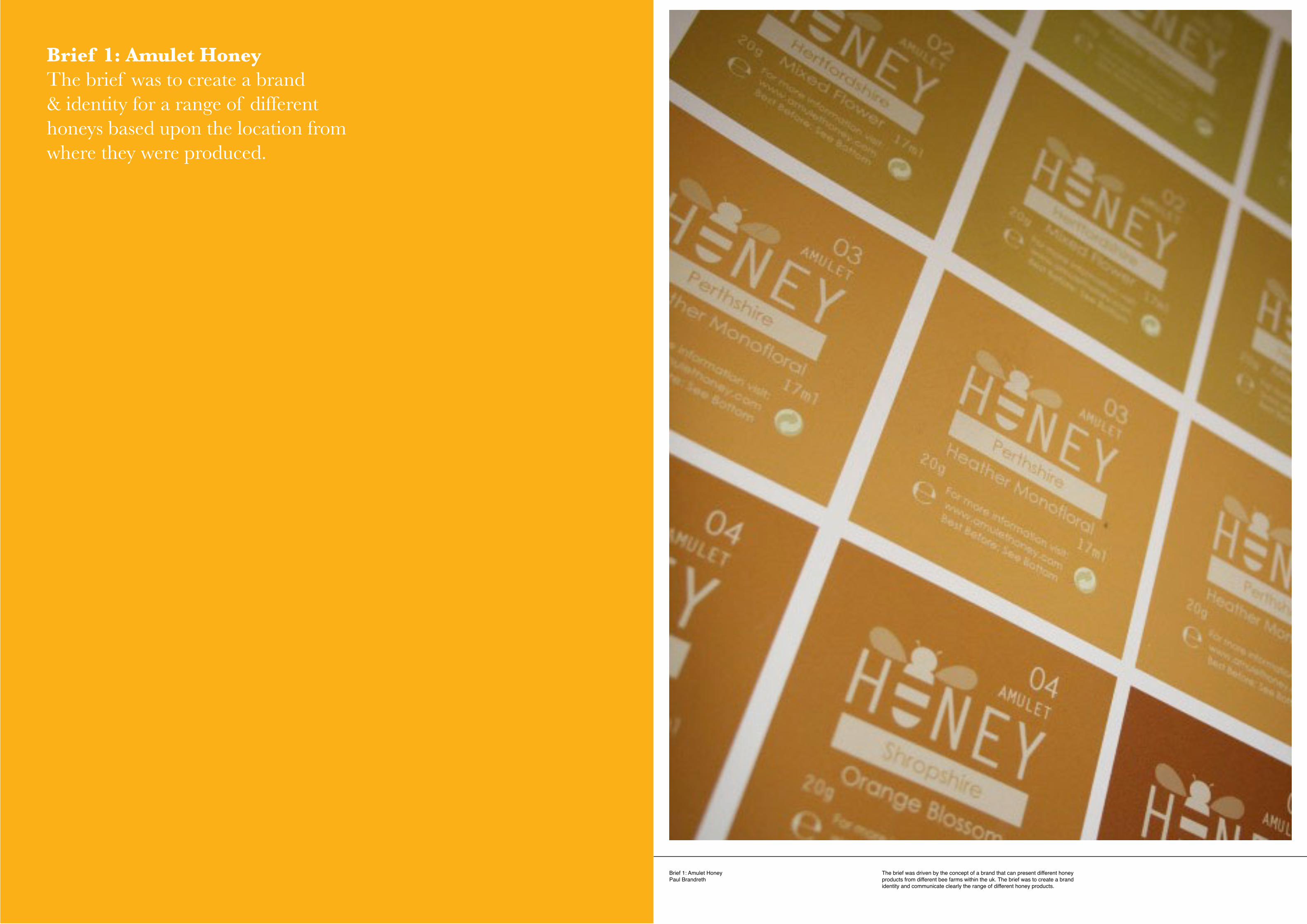
Brief 1: Amulet HoneyPaul Brandreth
The brief was driven by the concept of a brand that can present different honey products from different bee farms within the uk. The brief was to create a brand identity and communicate clearly the range of different honey products.
Brief 1: Amulet HoneyThe brief was to create a brand & identity for a range of different honeys based upon the location from where they were produced.
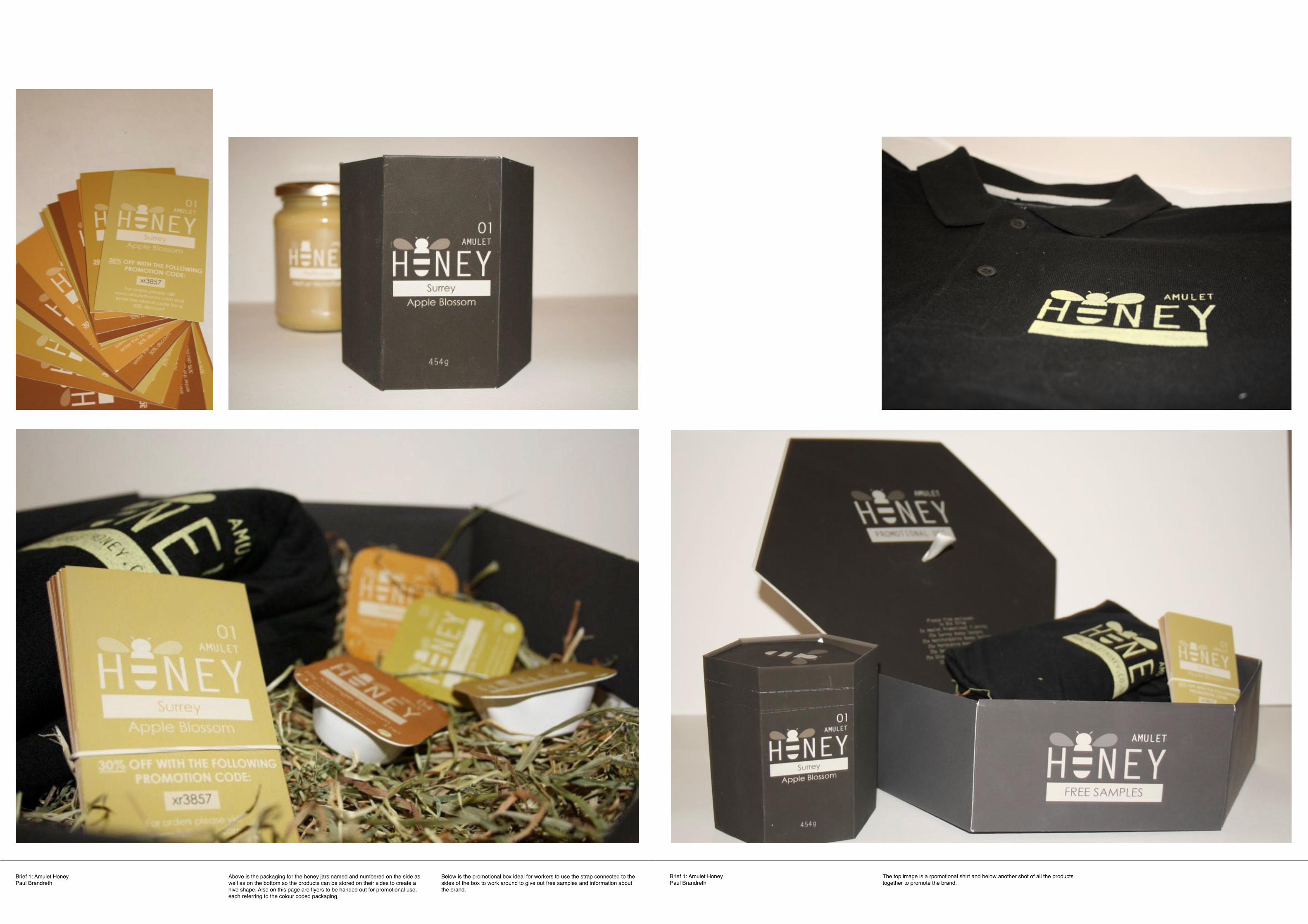
Brief 1: Amulet HoneyPaul Brandreth
Brief 1: Amulet HoneyPaul Brandreth
The top image is a rpomotional shirt and below another shot of all the products together to promote the brand.
Above is the packaging for the honey jars named and numbered on the side as well as on the bottom so the products can be stored on their sides to create a hive shape. Also on this page are flyers to be handed out for promotional use, each referring to the colour coded packaging.
Below is the promotional box ideal for workers to use the strap connected to the sides of the box to work around to give out free samples and information about the brand.
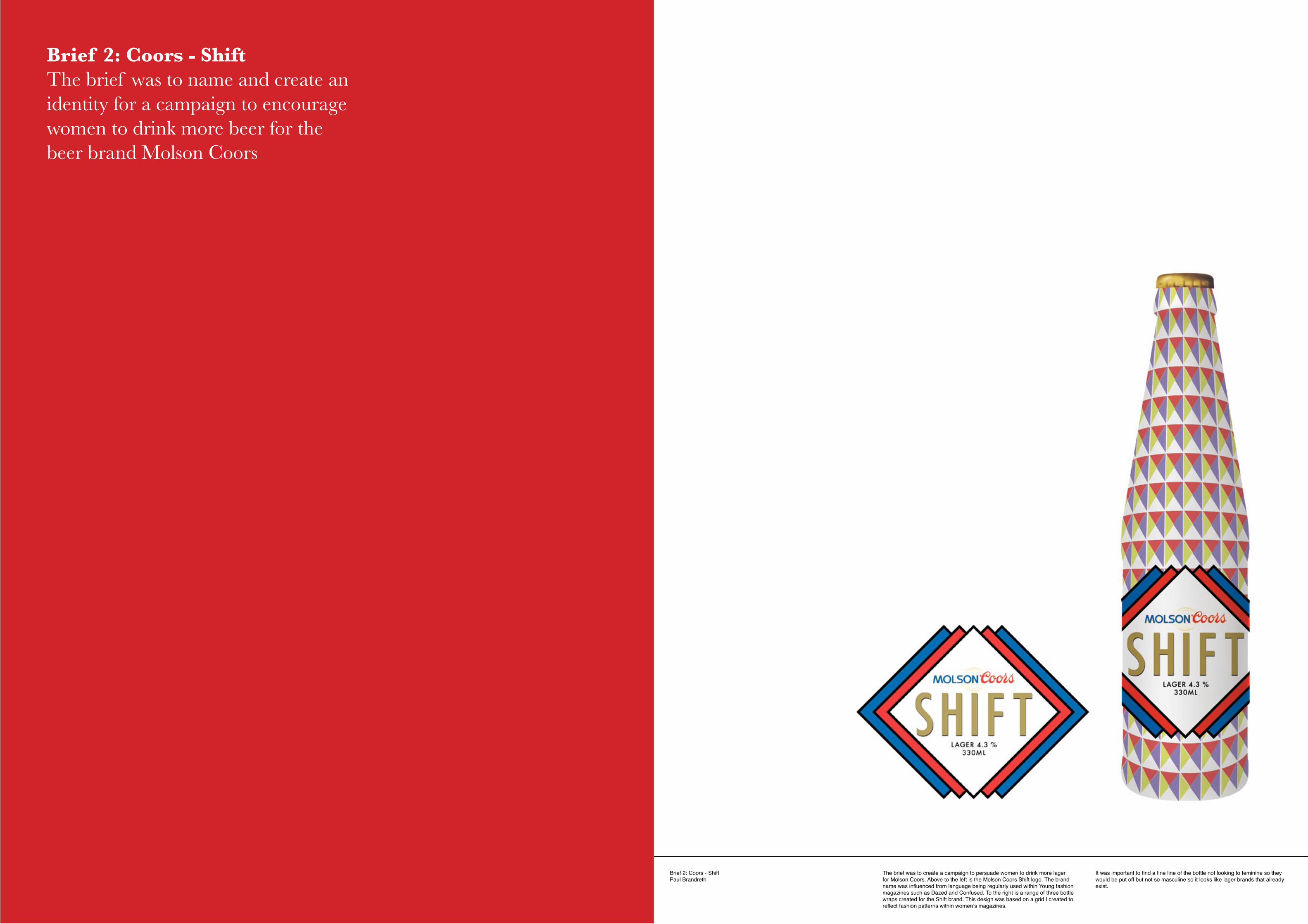
Brief 2: Coors - ShiftPaul Brandreth
The brief was to create a campaign to persuade women to drink more lager for Molson Coors. Above to the left is the Molson Coors Shift logo. The brand name was influenced from language being regularly used within Young fashion magazines such as Dazed and Confused. To the right is a range of three bottle wraps created for the Shift brand. This design was based on a grid I created to reflect fashion patterns within women’s magazines.
It was important to find a fine line of the bottle not looking to feminine so they would be put off but not so masculine so it looks like lager brands that already exist.
Brief 2: Coors - ShiftThe brief was to name and create an identity for a campaign to encourage women to drink more beer for the beer brand Molson Coors
Brief 2: Coors - ShiftPaul Brandreth
Brief 2: Coors - ShiftPaul Brandreth
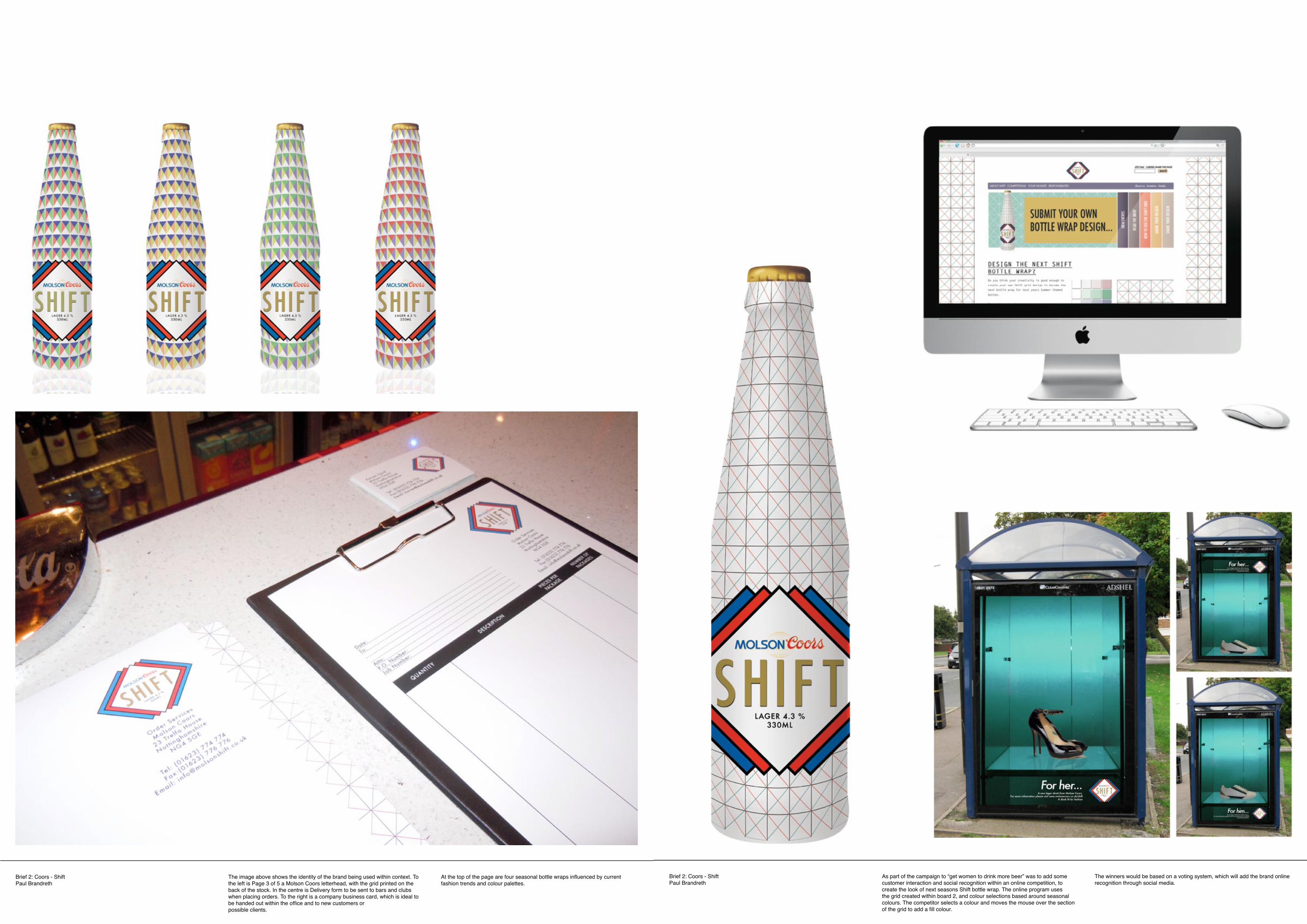
As part of the campaign to “get women to drink more beer” was to add some customer interaction and social recognition within an online competition, to create the look of next seasons Shift bottle wrap. The online program uses the grid created within board 2, and colour selections based around seasonal colours. The competitor selects a colour and moves the mouse over the section of the grid to add a fill colour.
The image above shows the identity of the brand being used within context. To the left is Page 3 of 5 a Molson Coors letterhead, with the grid printed on the back of the stock. In the centre is Delivery form to be sent to bars and clubs when placing orders. To the right is a company business card, which is ideal to be handed out within the office and to new customers orpossible clients.
The winners would be based on a voting system, which will add the brand online recognition through social media.
At the top of the page are four seasonal bottle wraps influenced by current fashion trends and colour palettes.
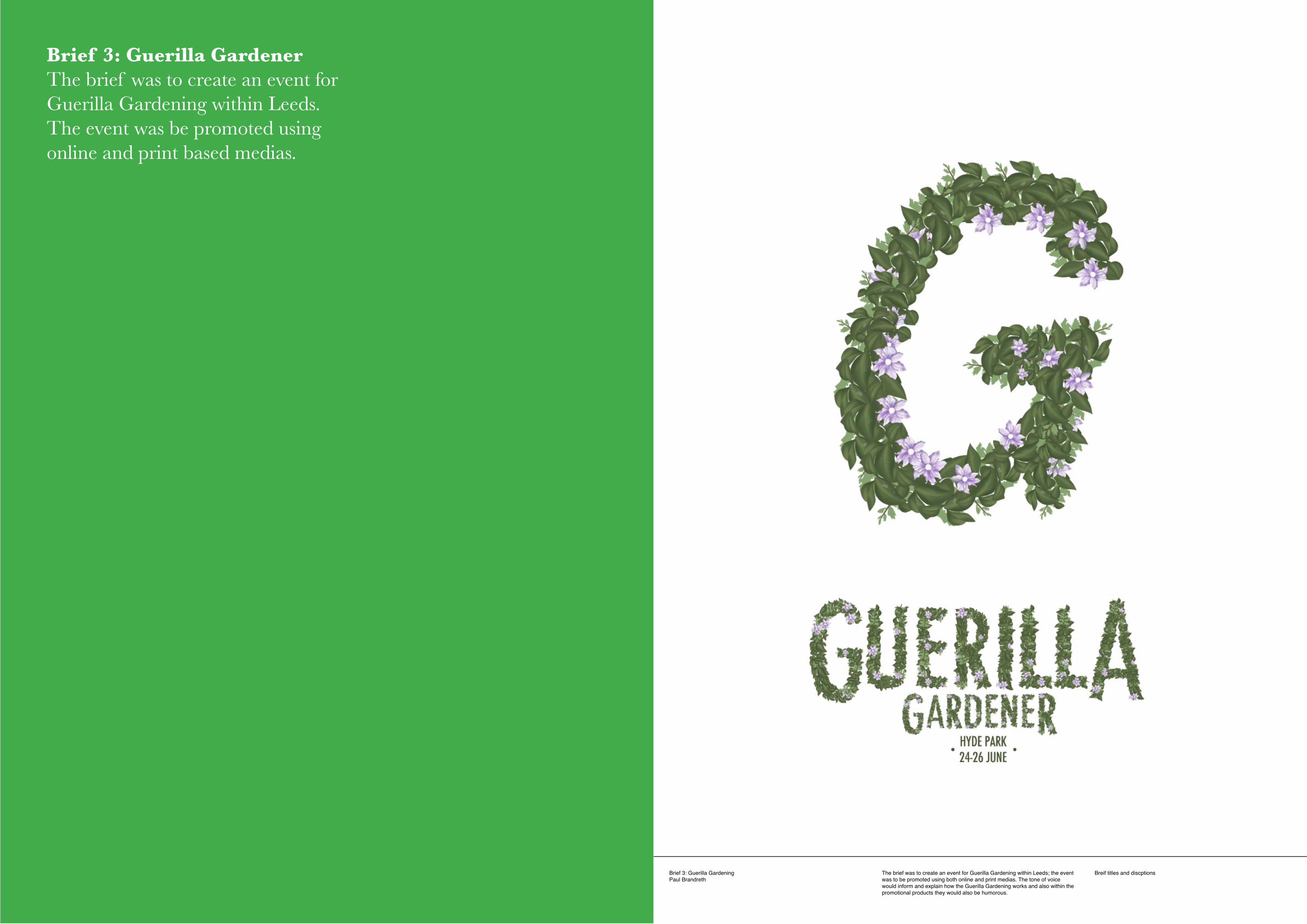
Brief 3: Guerilla GardeningPaul Brandreth
The brief was to create an event for Guerilla Gardening within Leeds; the event was to be promoted using both online and print medias. The tone of voice would inform and explain how the Guerilla Gardening works and also within the promotional products they would also be humorous.
Breif titles and discptions
Brief 3: Guerilla GardenerThe brief was to create an event for Guerilla Gardening within Leeds. The event was be promoted using online and print based medias.

Brief 3: Guerilla GardeningPaul Brandreth
Brief 3: Guerilla GardeningPaul Brandreth
Above are flyers for different events and dates. The concept was influenced from the idea of taking something away and replacing it with something new. The text demonstrates this as letter forms were scratched away from photographs of the venues to give it that Guerilla feel.
Above is an exploration into type and image by creating a Guerilla Gardening typeface based around the Futura font. I choose Futura as it was bold and legible which could be used at various sizes. Below are two pages from the online PDF, which are images and stories from people taken part within the specified events and is published and sent out by email a week after the event has taken place.
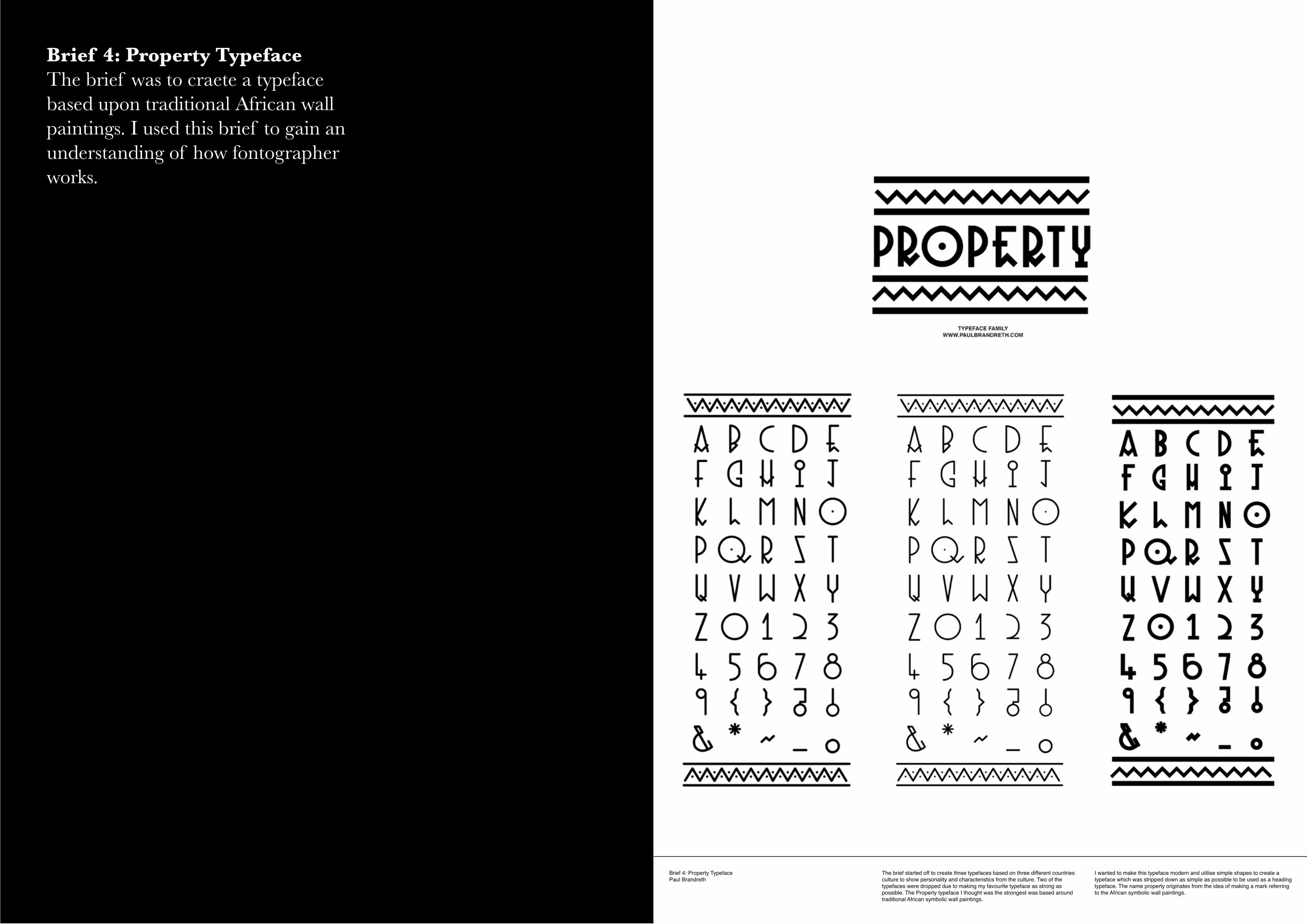
Brief 4: Property TypefacePaul Brandreth
The brief started off to create three typefaces based on three different countries culture to show personality and characteristics from the culture. Two of the typefaces were dropped due to making my favourite typeface as strong as possible. The Property typeface I thought was the strongest was based around traditional African symbolic wall paintings.
I wanted to make this typeface modern and utilise simple shapes to create a typeface which was stripped down as simple as possible to be used as a heading typeface. The name property originates from the idea of making a mark referring to the African symbolic wall paintings.
Brief 4: Property TypefaceThe brief was to craete a typeface based upon traditional African wall paintings. I used this brief to gain an understanding of how fontographer works.
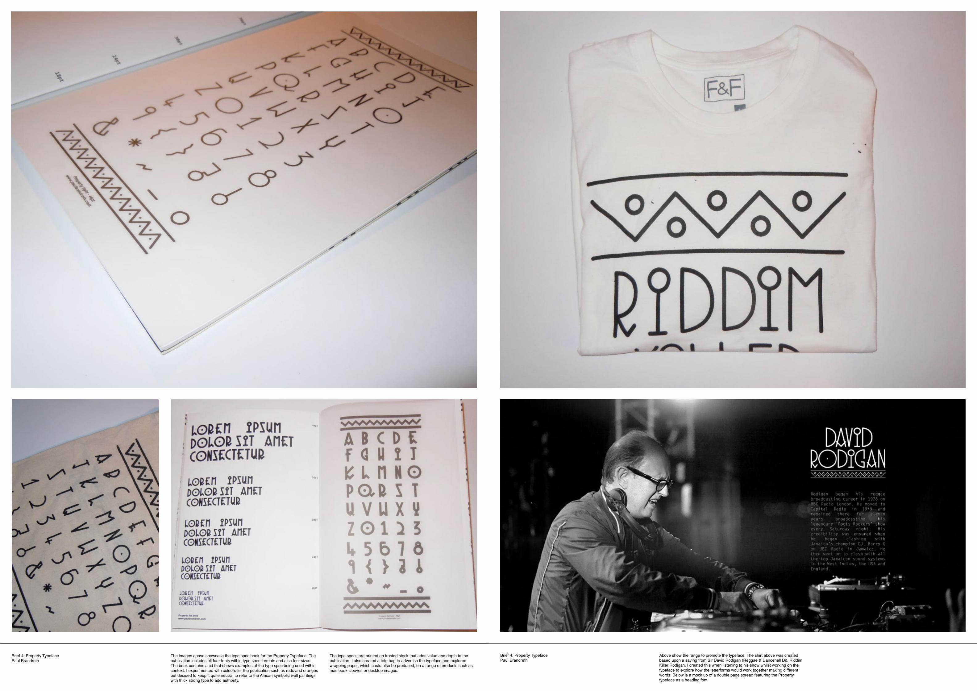
Brief 4: Property TypefacePaul Brandreth
Brief 4: Property TypefacePaul Brandreth
Above show the range to promote the typeface. The shirt above was created based upon a saying from Sir David Rodigan (Reggae & Dancehall Dj), Riddim Killer Rodigan. I created this when listening to his show whilst working on the typeface to explore how the letterforms would work together making different words. Below is a mock up of a double page spread featuring the Property typeface as a heading font.
The images above showcase the type spec book for the Property Typeface. The publication includes all four fonts within type spec formats and also font sizes. The book contains a cd that shows examples of the type spec being used within context. I experimented with colours for the publication such as reds and oranges but decided to keep it quite neutral to refer to the African symbolic wall paintings with thick strong type to add authority.
The type specs are printed on frosted stock that adds value and depth to the publication. I also created a tote bag to advertise the typeface and explored wrapping paper, which could also be produced, on a range of products such as mac book sleeves or desktop images.

Brief 5: YCN - WarpPaul Brandreth
Breif titles and discptions Breif titles and discptions
Brief 5: YCN - Warp RecordsThe YCN brief was to find a way of how to promote the Warp Records company and find a way how they can sell more music and merchandise.

Brief 5: YCN - WarpPaul Brandreth
Brief 5: YCN - WarpPaul Brandreth
Breif titles and discptionsBreif titles and discptions Breif titles and discptionsBreif titles and discptions