Embed Size (px)
Citation preview
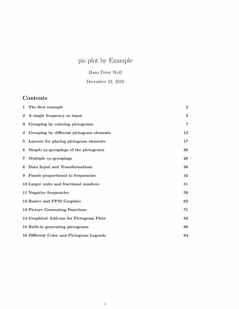
pic.plot by Example
Hans Peter Wolf
December 23, 2016
Contents
1 The first example 2
2 A single frequency as input 3
3 Grouping by coloring pictograms 7
4 Grouping by different pictogram elements 12
5 Layouts for placing pictogram elements 17
6 Simple xy-groupings of the pictograms 20
7 Multiple xy-groupings 28
8 Data Input and Transformations 38
9 Panels proportional to frequencies 43
10 Larger units and fractional numbers 51
11 Negative frequencies 59
12 Raster and PPM Graphics 62
13 Picture Generating Functions 71
14 Graphical Add-ons for Pictogram Plots 82
15 Built-in generating pictograms 89
16 Different Color and Pictogram Legends 94
1
1 THE FIRST EXAMPLE 2
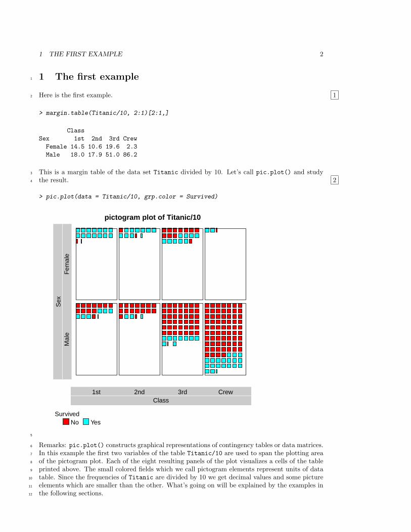
1 The first example1
Here is the first example.2 1
> margin.table(Titanic/10, 2:1)[2:1,]
Class
Sex 1st 2nd 3rd Crew
Female 14.5 10.6 19.6 2.3
Male 18.0 17.9 51.0 86.2
This is a margin table of the data set Titanic divided by 10. Let’s call pic.plot() and study3
the result. 24
> pic.plot(data = Titanic/10, grp.color = Survived)
pictogram plot of Titanic/10
Class1st 2nd 3rd Crew
Sex
Mal
eF
emal
e
SurvivedNo Yes
5
Remarks: pic.plot() constructs graphical representations of contingency tables or data matrices.6
In this example the first two variables of the table Titanic/10 are used to span the plotting area7
of the pictogram plot. Each of the eight resulting panels of the plot visualizes a cells of the table8
printed above. The small colored fields which we call pictogram elements represent units of data9
table. Since the frequencies of Titanic are divided by 10 we get decimal values and some picture10
elements which are smaller than the other. What’s going on will be explained by the examples in11
the following sections.12
2 A SINGLE FREQUENCY AS INPUT 3
2 A single frequency as input1
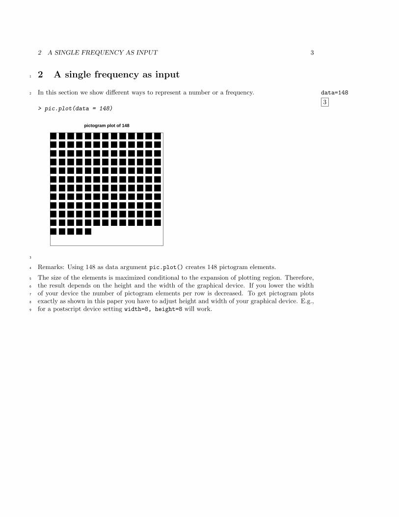
In this section we show different ways to represent a number or a frequency. data=148
3
2
> pic.plot(data = 148)
pictogram plot of 148
3
Remarks: Using 148 as data argument pic.plot() creates 148 pictogram elements.4
The size of the elements is maximized conditional to the expansion of plotting region. Therefore,5
the result depends on the height and the width of the graphical device. If you lower the width6
of your device the number of pictogram elements per row is decreased. To get pictogram plots7
exactly as shown in this paper you have to adjust height and width of your graphical device. E.g.,8
for a postscript device setting width=8, height=8 will work.9
2 A SINGLE FREQUENCY AS INPUT 4
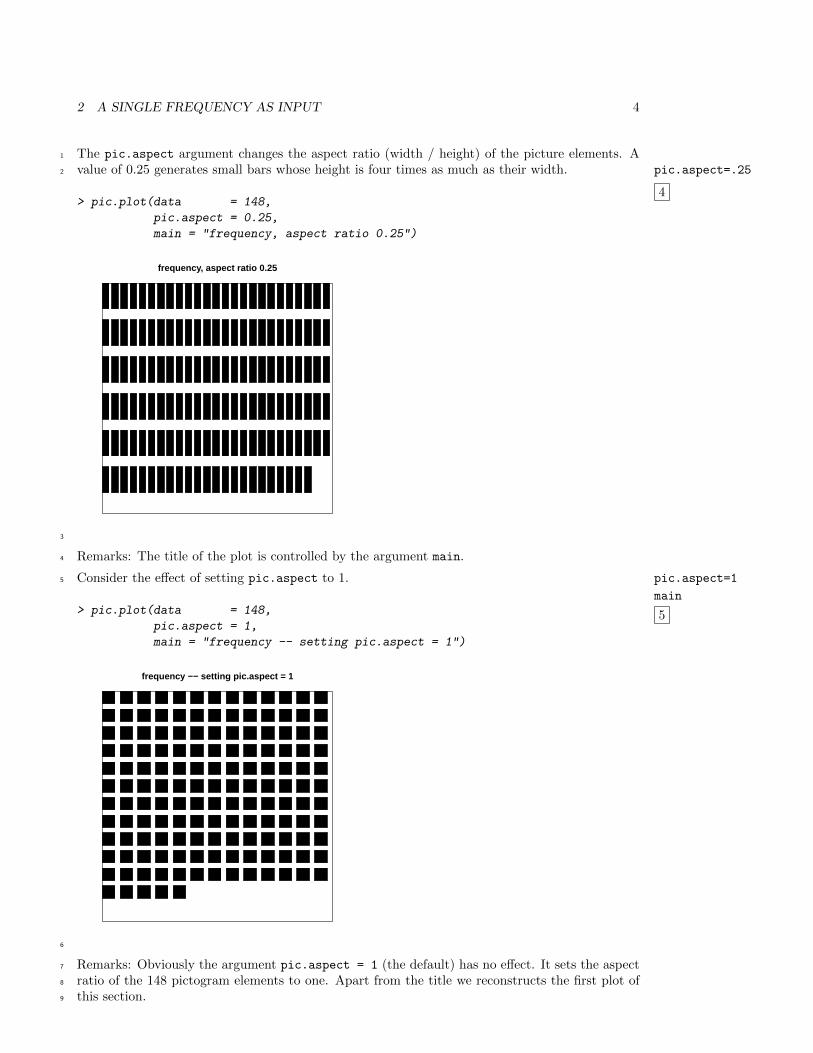
The pic.aspect argument changes the aspect ratio (width / height) of the picture elements. A1
value of 0.25 generates small bars whose height is four times as much as their width. pic.aspect=.25
4
2
> pic.plot(data = 148,
pic.aspect = 0.25,
main = "frequency, aspect ratio 0.25")
frequency, aspect ratio 0.25
3
Remarks: The title of the plot is controlled by the argument main.4
Consider the effect of setting pic.aspect to 1. pic.aspect=1
main
5
5
> pic.plot(data = 148,
pic.aspect = 1,
main = "frequency -- setting pic.aspect = 1")
frequency −− setting pic.aspect = 1
6
Remarks: Obviously the argument pic.aspect = 1 (the default) has no effect. It sets the aspect7
ratio of the 148 pictogram elements to one. Apart from the title we reconstructs the first plot of8
this section.9
2 A SINGLE FREQUENCY AS INPUT 5
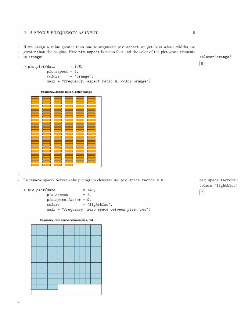
If we assign a value greater than one to argument pic.aspect we get bars whose widths are1
greater than the heights. Here pic.aspect is set to four and the color of the pictogram elements2
to orange: colors="orange"
6
3
> pic.plot(data = 148,
pic.aspect = 4,
colors = "orange",
main = "frequency, aspect ratio 4, color orange")
frequency, aspect ratio 4, color orange
4
To remove spaces between the pictogram elements use pic.space.factor = 0. pic.space.factor=0
colors="lightblue"
7
5
> pic.plot(data = 148,
pic.aspect = 1,
pic.space.factor = 0,
colors = "lightblue",
main = "frequency, zero space between pics, red")
frequency, zero space between pics, red
6
2 A SINGLE FREQUENCY AS INPUT 6
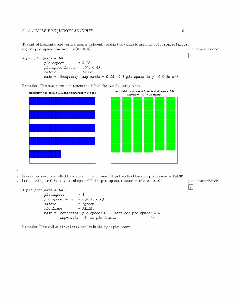
To control horizontal and vertical spaces differently assign two values to argument pic.space.factor,1
e.g. set pic.space.factor = c(0, 0.4): pic.space.factor
8
2
> pic.plot(data = 148,
pic.aspect = 0.25,
pic.space.factor = c(0, 0.4),
colors = "blue",
main = "frequency, asp-ratio = 0.25, 0.4 pic space in y, 0.0 in x")
Remarks: This statement constructs the left of the two following plots.3
frequency, asp−ratio = 0.25, 0.4 pic space in y, 0.0 in xhorizontal pic space: 0.2, vertical pic space: 0.0, asp−ratio = 4, no pic frames
4
Border lines are controlled by argument pic.frame. To get vertical bars set pic.frame = FALSE,5
horizontal space 0.2 and vertical space 0.0, i.e. pic.space.factor = c(0.2, 0.0). pic.frame=FALSE
9
6
> pic.plot(data = 148,
pic.aspect = 4,
pic.space.factor = c(0.2, 0.0),
colors = "green",
pic.frame = FALSE,
main = "horizontal pic space: 0.2, vertical pic space: 0.0,
asp-ratio = 4, no pic frames ")
Remarks: This call of pic.plot() results in the right plot above.7
3 GROUPING BY COLORING PICTOGRAMS 7
3 Grouping by coloring pictograms1
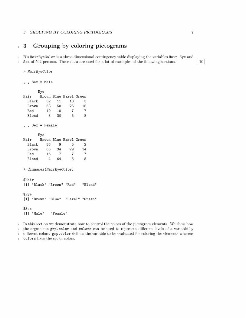
R’s HairEyeColor is a three-dimensional contingency table displaying the variables Hair, Eye and2
Sex of 592 persons. These data are used for a lot of examples of the following sections. 103
> HairEyeColor
, , Sex = Male
Eye
Hair Brown Blue Hazel Green
Black 32 11 10 3
Brown 53 50 25 15
Red 10 10 7 7
Blond 3 30 5 8
, , Sex = Female
Eye
Hair Brown Blue Hazel Green
Black 36 9 5 2
Brown 66 34 29 14
Red 16 7 7 7
Blond 4 64 5 8
> dimnames(HairEyeColor)
$Hair
[1] "Black" "Brown" "Red" "Blond"
$Eye
[1] "Brown" "Blue" "Hazel" "Green"
$Sex
[1] "Male" "Female"
In this section we demonstrate how to control the colors of the pictogram elements. We show how4
the arguments grp.color and colors can be used to represent different levels of a variable by5
different colors. grp.color defines the variable to be evaluated for coloring the elements whereas6
colors fixes the set of colors.7
3 GROUPING BY COLORING PICTOGRAMS 8
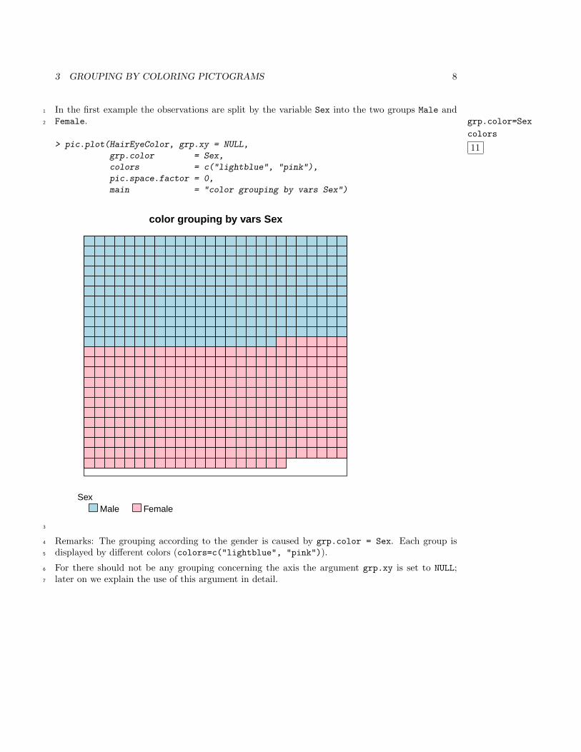
In the first example the observations are split by the variable Sex into the two groups Male and1
Female. grp.color=Sex
colors
11
2
> pic.plot(HairEyeColor, grp.xy = NULL,
grp.color = Sex,
colors = c("lightblue", "pink"),
pic.space.factor = 0,
main = "color grouping by vars Sex")
color grouping by vars Sex
SexMale Female
3
Remarks: The grouping according to the gender is caused by grp.color = Sex. Each group is4
displayed by different colors (colors=c("lightblue", "pink")).5
For there should not be any grouping concerning the axis the argument grp.xy is set to NULL;6
later on we explain the use of this argument in detail.7
3 GROUPING BY COLORING PICTOGRAMS 9
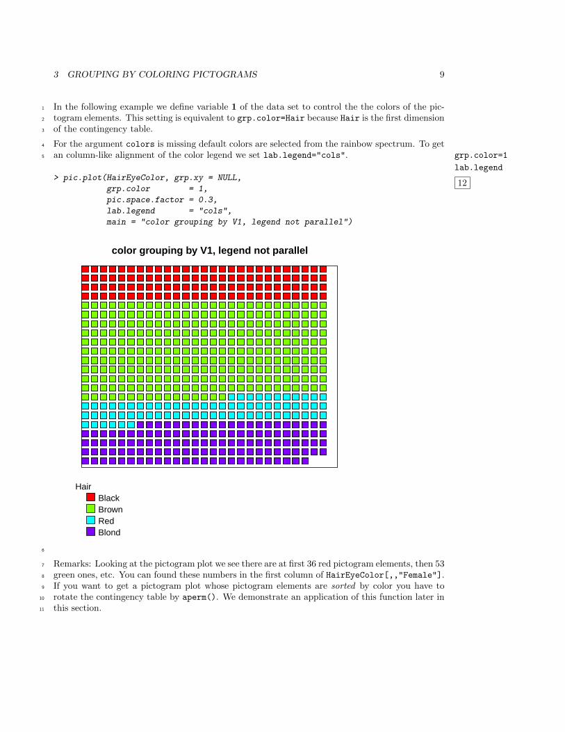
In the following example we define variable 1 of the data set to control the the colors of the pic-1
togram elements. This setting is equivalent to grp.color=Hair because Hair is the first dimension2
of the contingency table.3
For the argument colors is missing default colors are selected from the rainbow spectrum. To get4
an column-like alignment of the color legend we set lab.legend="cols". grp.color=1
lab.legend
12
5
> pic.plot(HairEyeColor, grp.xy = NULL,
grp.color = 1,
pic.space.factor = 0.3,
lab.legend = "cols",
main = "color grouping by V1, legend not parallel")
color grouping by V1, legend not parallel
HairBlackBrownRedBlond
6
Remarks: Looking at the pictogram plot we see there are at first 36 red pictogram elements, then 537
green ones, etc. You can found these numbers in the first column of HairEyeColor[,,"Female"].8
If you want to get a pictogram plot whose pictogram elements are sorted by color you have to9
rotate the contingency table by aperm(). We demonstrate an application of this function later in10
this section.11
3 GROUPING BY COLORING PICTOGRAMS 10
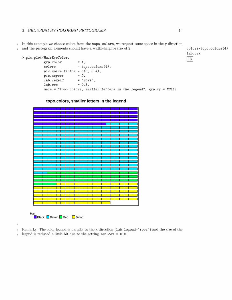
In this example we choose colors from the topo.colors, we request some space in the y direction1
and the pictogram elements should have a width-height-ratio of 2. colors=topo.colors(4)
lab.cex
13
2
> pic.plot(HairEyeColor,
grp.color = 1,
colors = topo.colors(4),
pic.space.factor = c(0, 0.4),
pic.aspect = 2,
lab.legend = "rows",
lab.cex = 0.8,
main = "topo.colors, smaller letters in the legend", grp.xy = NULL)
topo.colors, smaller letters in the legend
HairBlack Brown Red Blond
3
Remarks: The color legend is parallel to the x direction (lab.legend="rows") and the size of the4
legend is reduced a little bit due to the setting lab.cex = 0.8.5
3 GROUPING BY COLORING PICTOGRAMS 11
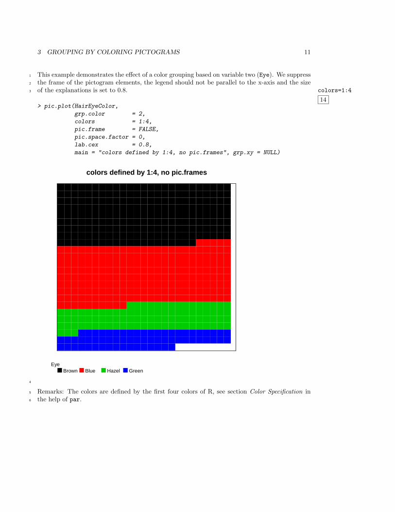
This example demonstrates the effect of a color grouping based on variable two (Eye). We suppress1
the frame of the pictogram elements, the legend should not be parallel to the x-axis and the size2
of the explanations is set to 0.8. colors=1:4
14
3
> pic.plot(HairEyeColor,
grp.color = 2,
colors = 1:4,
pic.frame = FALSE,
pic.space.factor = 0,
lab.cex = 0.8,
main = "colors defined by 1:4, no pic.frames", grp.xy = NULL)
colors defined by 1:4, no pic.frames
EyeBrown Blue Hazel Green
4
Remarks: The colors are defined by the first four colors of R, see section Color Specification in5
the help of par.6
4 GROUPING BY DIFFERENT PICTOGRAM ELEMENTS 12
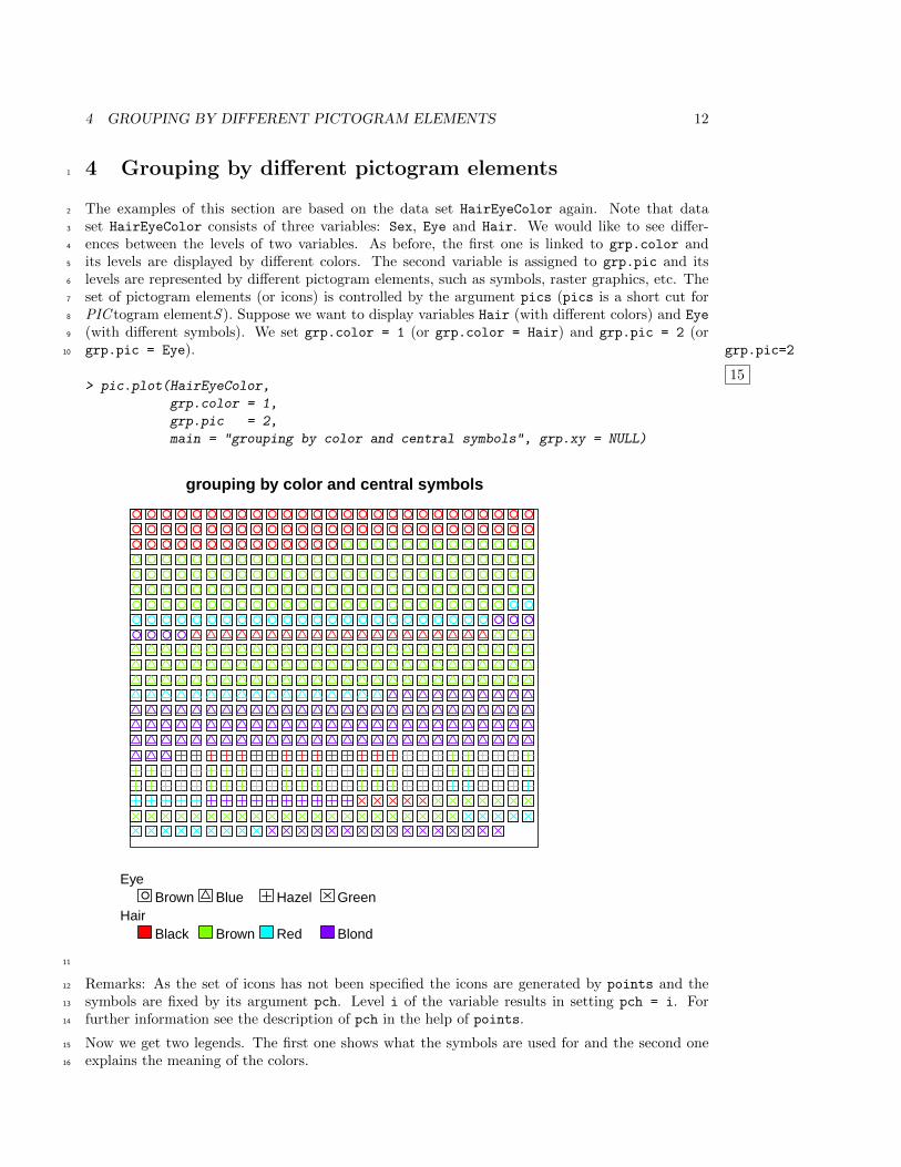
4 Grouping by different pictogram elements1
The examples of this section are based on the data set HairEyeColor again. Note that data2
set HairEyeColor consists of three variables: Sex, Eye and Hair. We would like to see differ-3
ences between the levels of two variables. As before, the first one is linked to grp.color and4
its levels are displayed by different colors. The second variable is assigned to grp.pic and its5
levels are represented by different pictogram elements, such as symbols, raster graphics, etc. The6
set of pictogram elements (or icons) is controlled by the argument pics (pics is a short cut for7
PIC togram elementS ). Suppose we want to display variables Hair (with different colors) and Eye8
(with different symbols). We set grp.color = 1 (or grp.color = Hair) and grp.pic = 2 (or9
grp.pic = Eye). grp.pic=2
15
10
> pic.plot(HairEyeColor,
grp.color = 1,
grp.pic = 2,
main = "grouping by color and central symbols", grp.xy = NULL)
● ● ● ● ● ● ● ● ● ● ● ● ● ● ● ● ● ● ● ● ● ● ● ● ● ● ●
● ● ● ● ● ● ● ● ● ● ● ● ● ● ● ● ● ● ● ● ● ● ● ● ● ● ●
● ● ● ● ● ● ● ● ● ● ● ● ● ● ● ● ● ● ● ● ● ● ● ● ● ● ●
● ● ● ● ● ● ● ● ● ● ● ● ● ● ● ● ● ● ● ● ● ● ● ● ● ● ●
● ● ● ● ● ● ● ● ● ● ● ● ● ● ● ● ● ● ● ● ● ● ● ● ● ● ●
● ● ● ● ● ● ● ● ● ● ● ● ● ● ● ● ● ● ● ● ● ● ● ● ● ● ●
● ● ● ● ● ● ● ● ● ● ● ● ● ● ● ● ● ● ● ● ● ● ● ● ● ● ●
● ● ● ● ● ● ● ● ● ● ● ● ● ● ● ● ● ● ● ● ● ● ● ● ● ● ●
● ● ● ●
grouping by color and central symbols
Eye● Brown Blue Hazel Green
HairBlack Brown Red Blond
11
Remarks: As the set of icons has not been specified the icons are generated by points and the12
symbols are fixed by its argument pch. Level i of the variable results in setting pch = i. For13
further information see the description of pch in the help of points.14
Now we get two legends. The first one shows what the symbols are used for and the second one15
explains the meaning of the colors.16
4 GROUPING BY DIFFERENT PICTOGRAM ELEMENTS 13
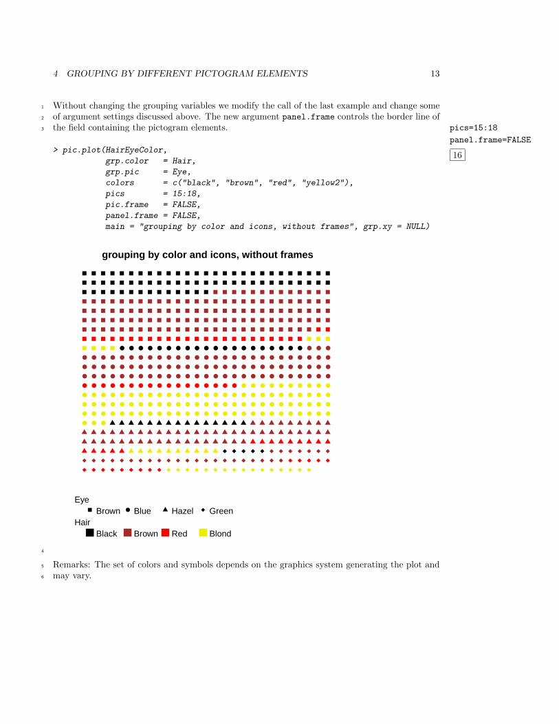
Without changing the grouping variables we modify the call of the last example and change some1
of argument settings discussed above. The new argument panel.frame controls the border line of2
the field containing the pictogram elements. pics=15:18
panel.frame=FALSE
16
3
> pic.plot(HairEyeColor,
grp.color = Hair,
grp.pic = Eye,
colors = c("black", "brown", "red", "yellow2"),
pics = 15:18,
pic.frame = FALSE,
panel.frame = FALSE,
main = "grouping by color and icons, without frames", grp.xy = NULL)
● ● ● ● ● ● ● ● ● ● ● ● ● ● ● ● ● ● ● ● ● ● ●
● ● ● ● ● ● ● ● ● ● ● ● ● ● ● ● ● ● ● ● ● ● ● ● ● ● ●
● ● ● ● ● ● ● ● ● ● ● ● ● ● ● ● ● ● ● ● ● ● ● ● ● ● ●
● ● ● ● ● ● ● ● ● ● ● ● ● ● ● ● ● ● ● ● ● ● ● ● ● ● ●
● ● ● ● ● ● ● ● ● ● ● ● ● ● ● ● ● ● ● ● ● ● ● ● ● ● ●
● ● ● ● ● ● ● ● ● ● ● ● ● ● ● ● ● ● ● ● ● ● ● ● ● ● ●
● ● ● ● ● ● ● ● ● ● ● ● ● ● ● ● ● ● ● ● ● ● ● ● ● ● ●
● ● ● ● ● ● ● ● ● ● ● ● ● ● ● ● ● ● ● ● ● ● ● ● ● ● ●
● ● ●
grouping by color and icons, without frames
Eye●Brown Blue Hazel Green
HairBlack Brown Red Blond
4
Remarks: The set of colors and symbols depends on the graphics system generating the plot and5
may vary.6
4 GROUPING BY DIFFERENT PICTOGRAM ELEMENTS 14
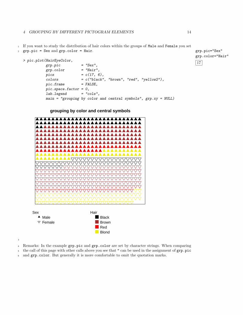
If you want to study the distribution of hair colors within the groups of Male and Female you set1
grp.pic = Sex and grp.color = Hair. grp.pic="Sex"
grp.color="Hair"
17
2
> pic.plot(HairEyeColor,
grp.pic = "Sex",
grp.color = "Hair",
pics = c(17, 6),
colors = c("black", "brown", "red", "yellow2"),
pic.frame = FALSE,
pic.space.factor = 0,
lab.legend = "cols",
main = "grouping by color and central symbols", grp.xy = NULL)
grouping by color and central symbols
SexMaleFemale
HairBlackBrownRedBlond
3
Remarks: In the example grp.pic and grp.color are set by character strings. When comparing4
the call of this page with other calls above you see that " can be used in the assignment of grp.pic5
and grp.color. But generally it is more comfortable to omit the quotation marks.6
4 GROUPING BY DIFFERENT PICTOGRAM ELEMENTS 15
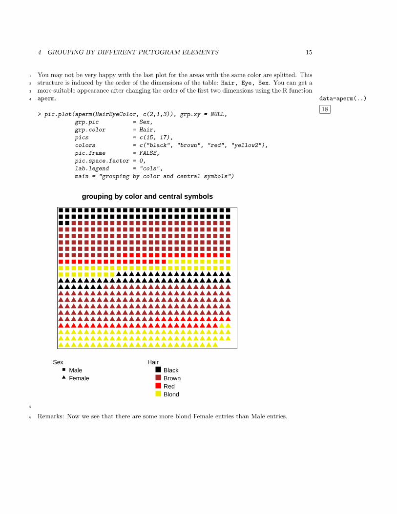
You may not be very happy with the last plot for the areas with the same color are splitted. This1
structure is induced by the order of the dimensions of the table: Hair, Eye, Sex. You can get a2
more suitable appearance after changing the order of the first two dimensions using the R function3
aperm. data=aperm(..)
18
4
> pic.plot(aperm(HairEyeColor, c(2,1,3)), grp.xy = NULL,
grp.pic = Sex,
grp.color = Hair,
pics = c(15, 17),
colors = c("black", "brown", "red", "yellow2"),
pic.frame = FALSE,
pic.space.factor = 0,
lab.legend = "cols",
main = "grouping by color and central symbols")
grouping by color and central symbols
SexMaleFemale
HairBlackBrownRedBlond
5
Remarks: Now we see that there are some more blond Female entries than Male entries.6
4 GROUPING BY DIFFERENT PICTOGRAM ELEMENTS 16
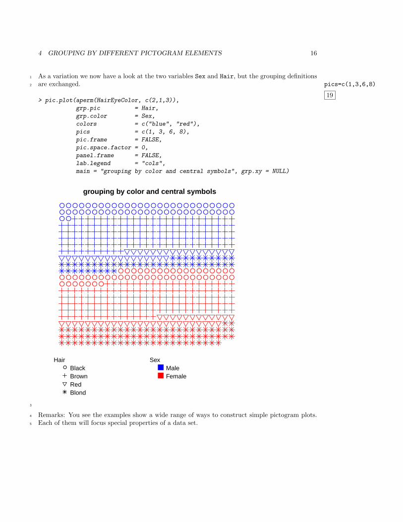
As a variation we now have a look at the two variables Sex and Hair, but the grouping definitions1
are exchanged. pics=c(1,3,6,8)
19
2
> pic.plot(aperm(HairEyeColor, c(2,1,3)),
grp.pic = Hair,
grp.color = Sex,
colors = c("blue", "red"),
pics = c(1, 3, 6, 8),
pic.frame = FALSE,
pic.space.factor = 0,
panel.frame = FALSE,
lab.legend = "cols",
main = "grouping by color and central symbols", grp.xy = NULL)
● ● ● ● ● ● ● ● ● ● ● ● ● ● ● ● ● ● ● ● ● ● ● ● ● ● ●● ● ● ● ● ● ● ● ● ● ● ● ● ● ● ● ● ● ● ● ● ● ● ● ● ● ●● ●
● ● ● ● ● ● ● ● ● ● ● ● ● ● ● ● ● ●● ● ● ● ● ● ● ● ● ● ● ● ● ● ● ● ● ● ● ● ● ● ● ● ● ● ●● ● ● ● ● ● ●
grouping by color and central symbols
Hair● Black
BrownRedBlond
SexMaleFemale
3
Remarks: You see the examples show a wide range of ways to construct simple pictogram plots.4
Each of them will focus special properties of a data set.5
5 LAYOUTS FOR PLACING PICTOGRAM ELEMENTS 17
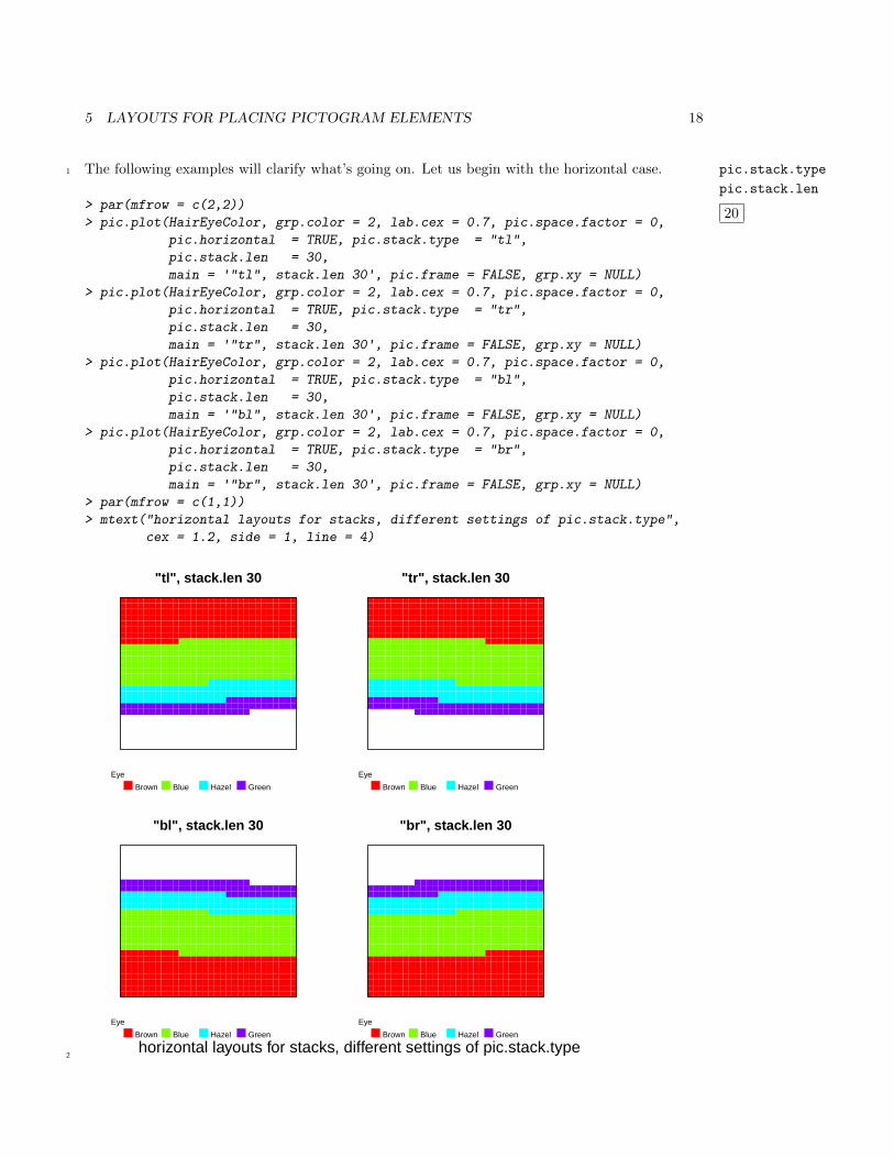
5 Layouts for placing pictogram elements1
In this section we use the data set HairEyeColor once again. There are a lot of layouts to control2
the way how pictogram elements are displayed in the plotting area. The elements are arranged3
in lines or stacks of length pic.stack.len, their orientation being horizontal (pic.horizontal4
= TRUE or vertical (pic.horizontal = FALSE).5
At first we consider horizontal = TRUE. In this case the first stack can be plotted at the bottom6
side ("b") or at the top side of the plotting area ("t"). Usually the number of elements of the last7
stack is lower than pic.stack.len. Therefore, it makes a difference whether we start to draw the8
elements of the last stack beginning at left-hand side ("l") or at the right-hand side ("r"). These9
decisions are controlled by the argument pic.stack.type and the letters "b","t","l","r". The10
default value of this argument is pic.stack.type = "lt".11
The vertical case (pic.horizontal = FALSE) leads to the same discussion and the user has to12
encode the desired layout in the same way by magic letters out of the set of the four letters.13
5 LAYOUTS FOR PLACING PICTOGRAM ELEMENTS 18
The following examples will clarify what’s going on. Let us begin with the horizontal case. pic.stack.type
pic.stack.len
20
1
> par(mfrow = c(2,2))
> pic.plot(HairEyeColor, grp.color = 2, lab.cex = 0.7, pic.space.factor = 0,
pic.horizontal = TRUE, pic.stack.type = "tl",
pic.stack.len = 30,
main = '"tl", stack.len 30', pic.frame = FALSE, grp.xy = NULL)
> pic.plot(HairEyeColor, grp.color = 2, lab.cex = 0.7, pic.space.factor = 0,
pic.horizontal = TRUE, pic.stack.type = "tr",
pic.stack.len = 30,
main = '"tr", stack.len 30', pic.frame = FALSE, grp.xy = NULL)
> pic.plot(HairEyeColor, grp.color = 2, lab.cex = 0.7, pic.space.factor = 0,
pic.horizontal = TRUE, pic.stack.type = "bl",
pic.stack.len = 30,
main = '"bl", stack.len 30', pic.frame = FALSE, grp.xy = NULL)
> pic.plot(HairEyeColor, grp.color = 2, lab.cex = 0.7, pic.space.factor = 0,
pic.horizontal = TRUE, pic.stack.type = "br",
pic.stack.len = 30,
main = '"br", stack.len 30', pic.frame = FALSE, grp.xy = NULL)
> par(mfrow = c(1,1))
> mtext("horizontal layouts for stacks, different settings of pic.stack.type",
cex = 1.2, side = 1, line = 4)
"tl", stack.len 30
Eye
Brown Blue Hazel Green
"tr", stack.len 30
Eye
Brown Blue Hazel Green
"bl", stack.len 30
Eye
Brown Blue Hazel Green
"br", stack.len 30
Eye
Brown Blue Hazel Green
horizontal layouts for stacks, different settings of pic.stack.type2
5 LAYOUTS FOR PLACING PICTOGRAM ELEMENTS 19
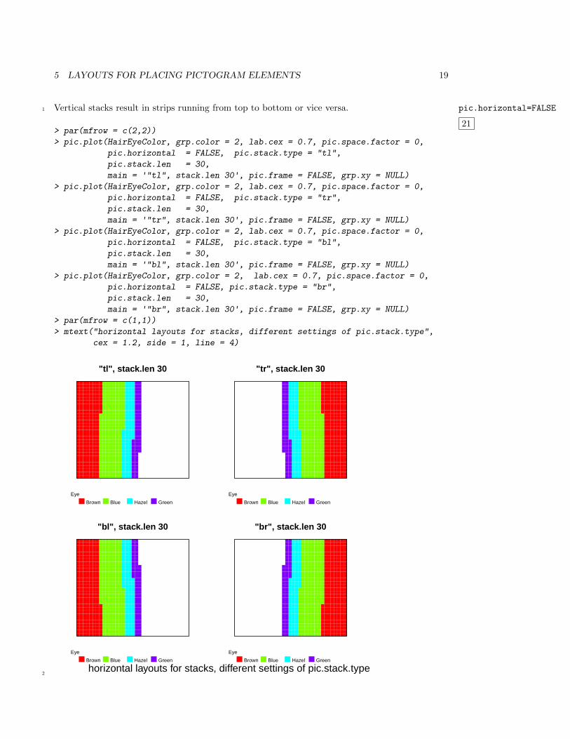
Vertical stacks result in strips running from top to bottom or vice versa. pic.horizontal=FALSE
21
1
> par(mfrow = c(2,2))
> pic.plot(HairEyeColor, grp.color = 2, lab.cex = 0.7, pic.space.factor = 0,
pic.horizontal = FALSE, pic.stack.type = "tl",
pic.stack.len = 30,
main = '"tl", stack.len 30', pic.frame = FALSE, grp.xy = NULL)
> pic.plot(HairEyeColor, grp.color = 2, lab.cex = 0.7, pic.space.factor = 0,
pic.horizontal = FALSE, pic.stack.type = "tr",
pic.stack.len = 30,
main = '"tr", stack.len 30', pic.frame = FALSE, grp.xy = NULL)
> pic.plot(HairEyeColor, grp.color = 2, lab.cex = 0.7, pic.space.factor = 0,
pic.horizontal = FALSE, pic.stack.type = "bl",
pic.stack.len = 30,
main = '"bl", stack.len 30', pic.frame = FALSE, grp.xy = NULL)
> pic.plot(HairEyeColor, grp.color = 2, lab.cex = 0.7, pic.space.factor = 0,
pic.horizontal = FALSE, pic.stack.type = "br",
pic.stack.len = 30,
main = '"br", stack.len 30', pic.frame = FALSE, grp.xy = NULL)
> par(mfrow = c(1,1))
> mtext("horizontal layouts for stacks, different settings of pic.stack.type",
cex = 1.2, side = 1, line = 4)
"tl", stack.len 30
Eye
Brown Blue Hazel Green
"tr", stack.len 30
Eye
Brown Blue Hazel Green
"bl", stack.len 30
Eye
Brown Blue Hazel Green
"br", stack.len 30
Eye
Brown Blue Hazel Green
horizontal layouts for stacks, different settings of pic.stack.type2
6 SIMPLE XY-GROUPINGS OF THE PICTOGRAMS 20
6 Simple xy-groupings of the pictograms1
Researchers often like to compare different subsets of a data set or groups of elements. They very2
often compute statistics or graphs of subsets of the observations and analyze the differences of the3
results. Within the framework of pictogram plots you are able to represent elements of different4
levels of one or more variables in different areas (called panels) of a pictogram plot. In this section5
we show how to define simple xy-groupings and how the results of the groupings look like.6
By a simple x-grouping the horizontal range of the plot (or range of x ) is split into several segments.7
In the rectangluar areas of the segments of vertical stripes the elements of the subsets are visualized.8
y-groupings lead to splittings along the vertical direction of the plot and you get horizontally9
extending panels. Using both of these elementary concepts the graphics area is fragmented like a10
chessboard and you get outputs that are similar to pairs plots. However, pairs() draws all of the11
data points in each of its chessboard squares whereas pic.plot() represents subsets of the data12
in the cells only. Beside these simple grouping approaches you can choose more than one variable13
for splitting the data in one or both of the direction(s). Examples are found in the next section14
multiple xy-groupings. These groupings induce recursive splittings of the ranges of x or y. Maybe15
you know this idea of structuring from lattice graphics or from the ggplot2 package.16
The user interface to define xy-groupings is based on R formulas. Especially in the context of17
regression R formulas are well known to describe models, e. g.: y ~ x. The variable on the18
left-hand side of a formula (y) has to be explained by the variable (x) on the right-hand side.19
Generally in scatter plots of these variables the dependent variable (y) spans the y-range, and in20
direction x you will find the values of the independent variable (x). Transferring this practice to21
pictogram plots y ~ x means that the vertical direction has to be split by the variable y and22
the other one by variable x.23
HairEyeColor is the data set for the examples in this section.24
6 SIMPLE XY-GROUPINGS OF THE PICTOGRAMS 21
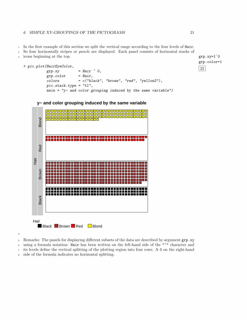
In the first example of this section we split the vertical range according to the four levels of Hair.1
So four horizontally stripes or panels are displayed. Each panel consists of horizontal stacks of2
icons beginning at the top. grp.xy=1˜0
grp.color=1
22
3
> pic.plot(HairEyeColor,
grp.xy = Hair ~ 0,
grp.color = Hair,
colors = c("black", "brown", "red", "yellow2"),
pic.stack.type = "tl",
main = "y- and color grouping induced by the same variable")
y− and color grouping induced by the same variable
Hai
rB
lack
Bro
wn
Red
Blo
nd
HairBlack Brown Red Blond
4
Remarks: The panels for displaying different subsets of the data are described by argument grp.xy5
using a formula notation: Hair has been written on the left-hand side of the "~" character and6
its levels define the vertical splitting of the plotting region into four rows. A 0 on the right-hand7
side of the formula indicates no horizontal splitting.8
6 SIMPLE XY-GROUPINGS OF THE PICTOGRAMS 22
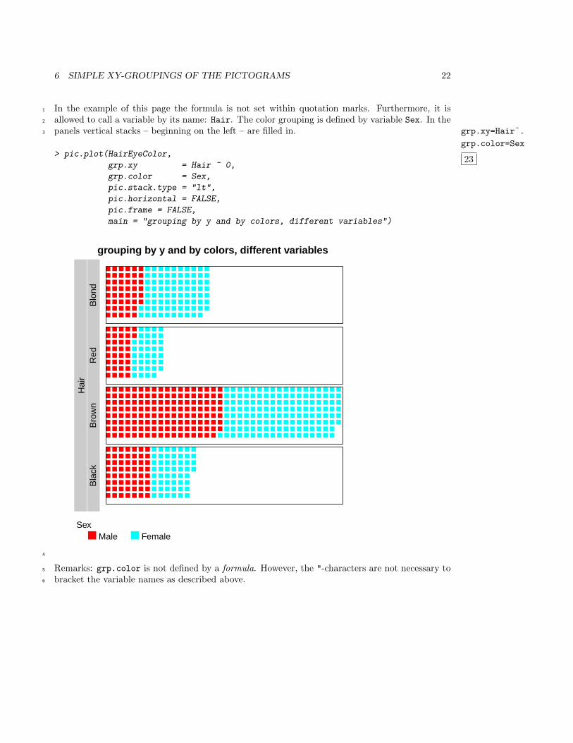
In the example of this page the formula is not set within quotation marks. Furthermore, it is1
allowed to call a variable by its name: Hair. The color grouping is defined by variable Sex. In the2
panels vertical stacks – beginning on the left – are filled in. grp.xy=Hair˜.
grp.color=Sex
23
3
> pic.plot(HairEyeColor,
grp.xy = Hair ~ 0,
grp.color = Sex,
pic.stack.type = "lt",
pic.horizontal = FALSE,
pic.frame = FALSE,
main = "grouping by y and by colors, different variables")
grouping by y and by colors, different variables
Hai
rB
lack
Bro
wn
Red
Blo
nd
SexMale Female
4
Remarks: grp.color is not defined by a formula. However, the "-characters are not necessary to5
bracket the variable names as described above.6
6 SIMPLE XY-GROUPINGS OF THE PICTOGRAMS 23
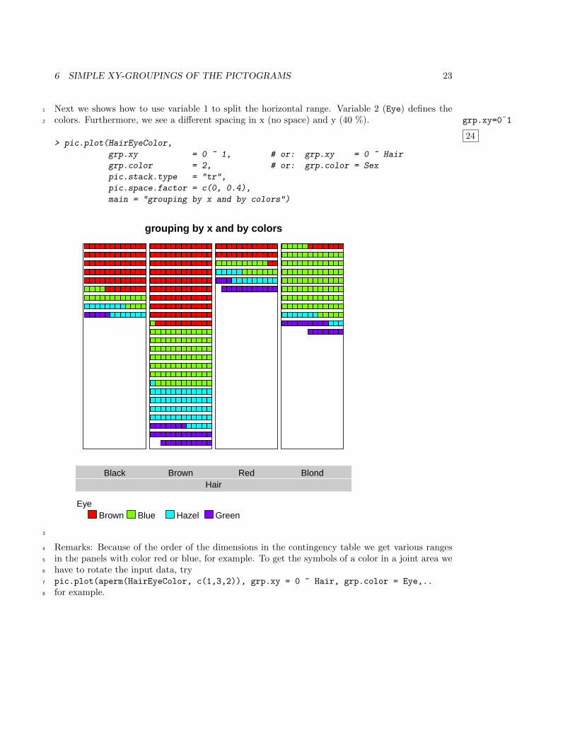
Next we shows how to use variable 1 to split the horizontal range. Variable 2 (Eye) defines the1
colors. Furthermore, we see a different spacing in x (no space) and y (40 %). grp.xy=0˜1
24
2
> pic.plot(HairEyeColor,
grp.xy = 0 ~ 1, # or: grp.xy = 0 ~ Hair
grp.color = 2, # or: grp.color = Sex
pic.stack.type = "tr",
pic.space.factor = c(0, 0.4),
main = "grouping by x and by colors")
grouping by x and by colors
HairBlack Brown Red Blond
EyeBrown Blue Hazel Green
3
Remarks: Because of the order of the dimensions in the contingency table we get various ranges4
in the panels with color red or blue, for example. To get the symbols of a color in a joint area we5
have to rotate the input data, try6
pic.plot(aperm(HairEyeColor, c(1,3,2)), grp.xy = 0 ~ Hair, grp.color = Eye,..7
for example.8
6 SIMPLE XY-GROUPINGS OF THE PICTOGRAMS 24
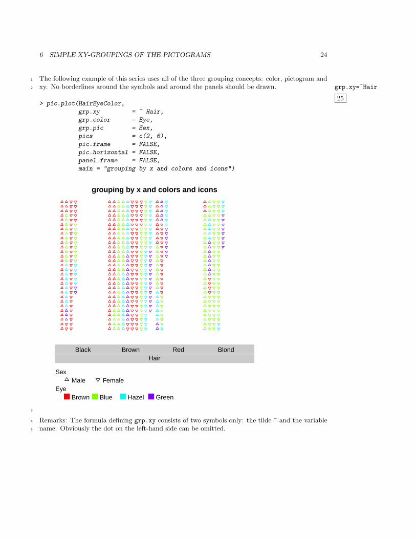
The following example of this series uses all of the three grouping concepts: color, pictogram and1
xy. No borderlines around the symbols and around the panels should be drawn. grp.xy=˜Hair
25
2
> pic.plot(HairEyeColor,
grp.xy = ~ Hair,
grp.color = Eye,
grp.pic = Sex,
pics = c(2, 6),
pic.frame = FALSE,
pic.horizontal = FALSE,
panel.frame = FALSE,
main = "grouping by x and colors and icons")
grouping by x and colors and icons
HairBlack Brown Red Blond
SexMale Female
EyeBrown Blue Hazel Green
3
Remarks: The formula defining grp.xy consists of two symbols only: the tilde ~ and the variable4
name. Obviously the dot on the left-hand side can be omitted.5
6 SIMPLE XY-GROUPINGS OF THE PICTOGRAMS 25
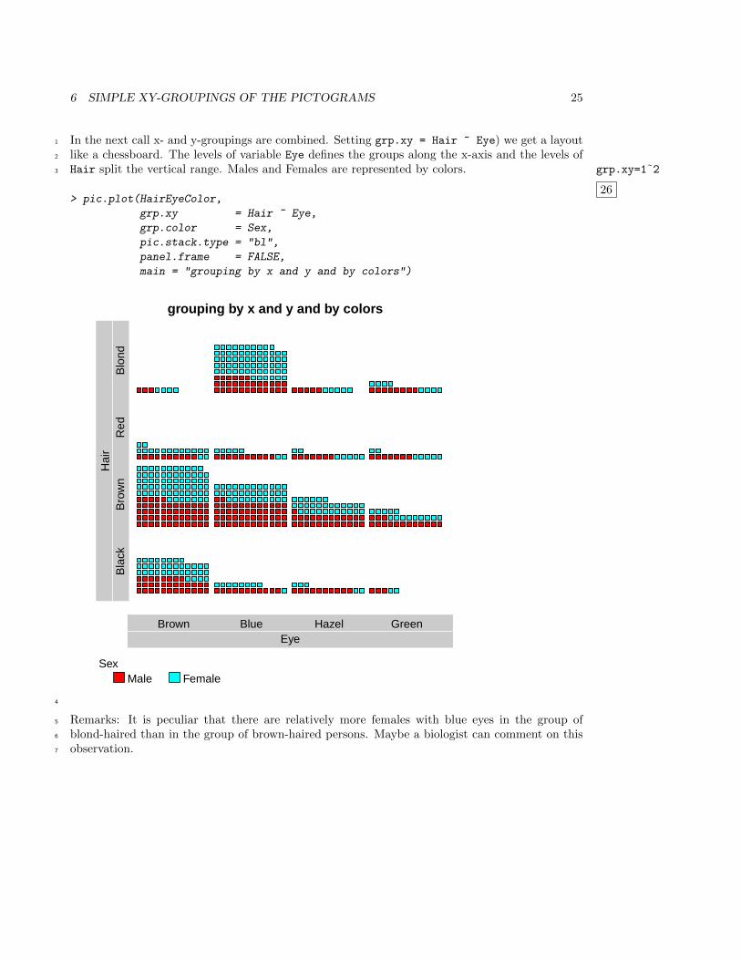
In the next call x- and y-groupings are combined. Setting grp.xy = Hair ~ Eye) we get a layout1
like a chessboard. The levels of variable Eye defines the groups along the x-axis and the levels of2
Hair split the vertical range. Males and Females are represented by colors. grp.xy=1˜2
26
3
> pic.plot(HairEyeColor,
grp.xy = Hair ~ Eye,
grp.color = Sex,
pic.stack.type = "bl",
panel.frame = FALSE,
main = "grouping by x and y and by colors")
grouping by x and y and by colors
EyeBrown Blue Hazel Green
Hai
rB
lack
Bro
wn
Red
Blo
nd
SexMale Female
4
Remarks: It is peculiar that there are relatively more females with blue eyes in the group of5
blond-haired than in the group of brown-haired persons. Maybe a biologist can comment on this6
observation.7
6 SIMPLE XY-GROUPINGS OF THE PICTOGRAMS 26
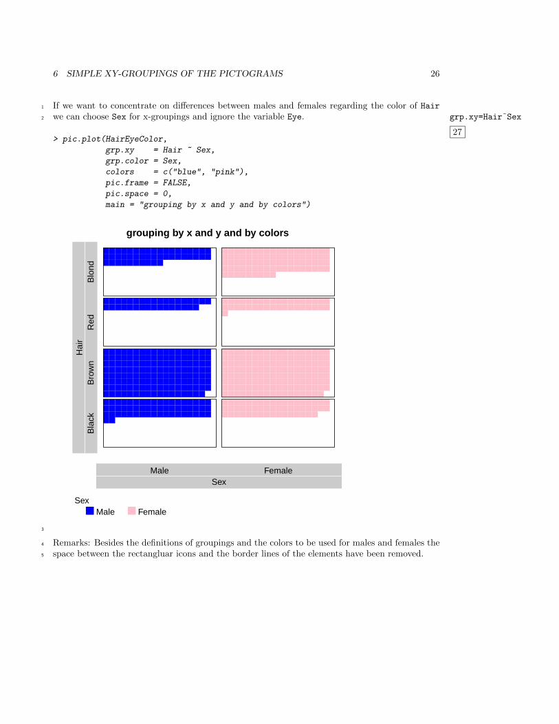
If we want to concentrate on differences between males and females regarding the color of Hair1
we can choose Sex for x-groupings and ignore the variable Eye. grp.xy=Hair˜Sex
27
2
> pic.plot(HairEyeColor,
grp.xy = Hair ~ Sex,
grp.color = Sex,
colors = c("blue", "pink"),
pic.frame = FALSE,
pic.space = 0,
main = "grouping by x and y and by colors")
grouping by x and y and by colors
SexMale Female
Hai
rB
lack
Bro
wn
Red
Blo
nd
SexMale Female
3
Remarks: Besides the definitions of groupings and the colors to be used for males and females the4
space between the rectangluar icons and the border lines of the elements have been removed.5
6 SIMPLE XY-GROUPINGS OF THE PICTOGRAMS 27
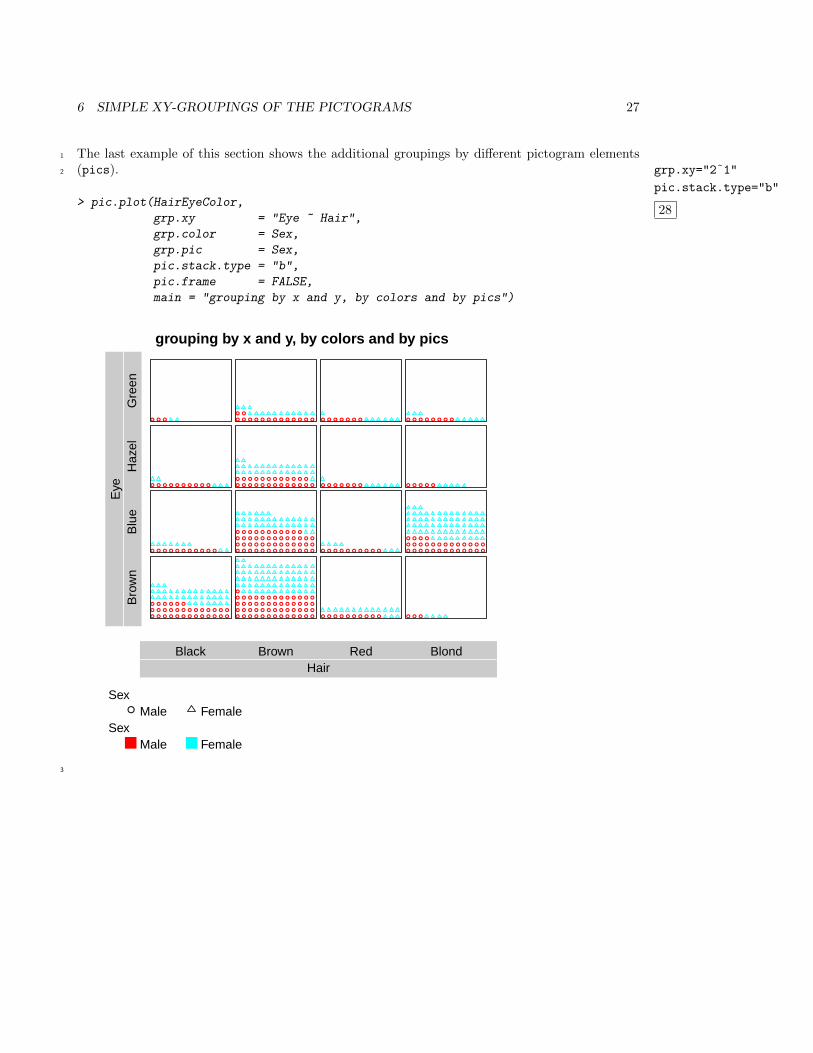
The last example of this section shows the additional groupings by different pictogram elements1
(pics). grp.xy="2˜1"
pic.stack.type="b"
28
2
> pic.plot(HairEyeColor,
grp.xy = "Eye ~ Hair",
grp.color = Sex,
grp.pic = Sex,
pic.stack.type = "b",
pic.frame = FALSE,
main = "grouping by x and y, by colors and by pics")
● ● ● ● ● ● ● ● ● ● ● ● ●
● ● ● ● ● ● ● ● ● ● ● ● ●
● ● ● ● ● ●
● ● ● ● ● ● ● ● ● ● ●
● ● ● ● ● ● ● ● ● ●
● ● ●
● ● ● ● ● ● ● ● ● ● ● ● ●
● ● ● ● ● ● ● ● ● ● ● ● ●
● ● ● ● ● ● ● ● ● ● ● ● ●
● ● ● ● ● ● ● ● ● ● ● ● ●
●
● ● ● ● ● ● ● ● ● ● ● ● ●
● ● ● ● ● ● ● ● ● ● ● ● ●
● ● ● ● ● ● ● ● ● ● ● ● ●
● ● ● ● ● ● ● ● ● ● ●
● ● ● ● ● ● ● ● ● ● ● ● ●
● ● ● ● ● ● ● ● ● ● ● ●
● ● ● ● ● ● ● ● ● ● ● ● ●
● ●
● ● ● ● ● ● ● ● ● ●
● ● ● ● ● ● ● ● ● ●
● ● ● ● ● ● ●
● ● ● ● ● ● ●
● ● ●
● ● ● ● ● ● ● ● ● ● ● ● ●
● ● ● ● ● ● ● ● ● ● ● ● ●
● ● ● ●
● ● ● ● ●
● ● ● ● ● ● ● ●
grouping by x and y, by colors and by pics
HairBlack Brown Red Blond
Eye
Bro
wn
Blu
eH
azel
Gre
en
Sex● Male Female
SexMale Female
3
7 MULTIPLE XY-GROUPINGS 28
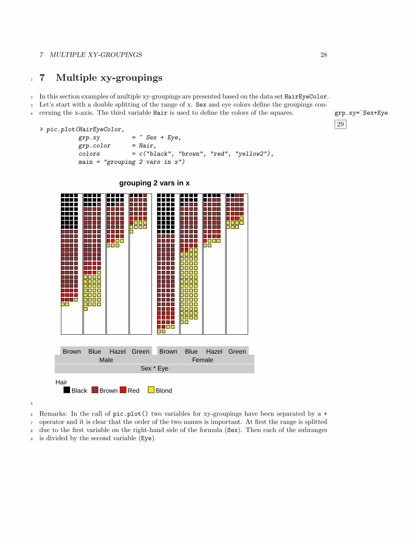
7 Multiple xy-groupings1
In this section examples of multiple xy-groupings are presented based on the data set HairEyeColor.2
Let’s start with a double splitting of the range of x. Sex and eye colors define the groupings con-3
cerning the x-axis. The third variable Hair is used to define the colors of the squares. grp.xy=˜Sex+Eye
29
4
> pic.plot(HairEyeColor,
grp.xy = ~ Sex + Eye,
grp.color = Hair,
colors = c("black", "brown", "red", "yellow2"),
main = "grouping 2 vars in x")
grouping 2 vars in x
Brown Blue Hazel Green Brown Blue Hazel Green
Sex * EyeMale Female
HairBlack Brown Red Blond
5
Remarks: In the call of pic.plot() two variables for xy-groupings have been separated by a +6
operator and it is clear that the order of the two names is important. At first the range is splitted7
due to the first variable on the right-hand side of the formula (Sex). Then each of the subranges8
is divided by the second variable (Eye).9
7 MULTIPLE XY-GROUPINGS 29
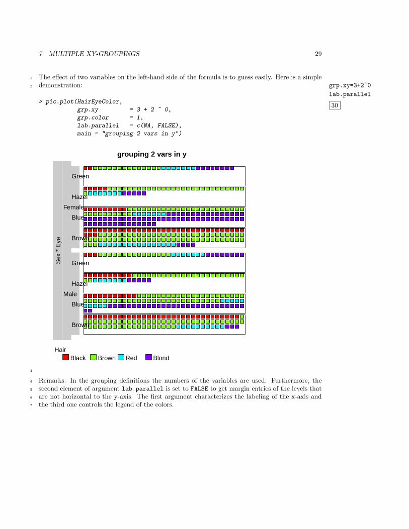
The effect of two variables on the left-hand side of the formula is to guess easily. Here is a simple1
demonstration: grp.xy=3+2˜0
lab.parallel
30
2
> pic.plot(HairEyeColor,
grp.xy = 3 + 2 ~ 0,
grp.color = 1,
lab.parallel = c(NA, FALSE),
main = "grouping 2 vars in y")
grouping 2 vars in y
Brown
Blue
Hazel
Green
Brown
Blue
Hazel
Green
Sex
* E
ye
Male
Female
HairBlack Brown Red Blond
3
Remarks: In the grouping definitions the numbers of the variables are used. Furthermore, the4
second element of argument lab.parallel is set to FALSE to get margin entries of the levels that5
are not horizontal to the y-axis. The first argument characterizes the labeling of the x-axis and6
the third one controls the legend of the colors.7
7 MULTIPLE XY-GROUPINGS 30
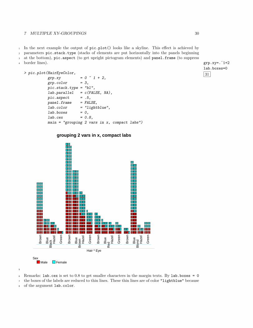
In the next example the output of pic.plot() looks like a skyline. This effect is achieved by1
parameters pic.stack.type (stacks of elements are put horizontally into the panels beginning2
at the bottom), pic.aspect (to get upright pictogram elements) and panel.frame (to suppress3
border lines). grp.xy=.˜1+2
lab.boxes=0
31
4
> pic.plot(HairEyeColor,
grp.xy = 0 ~ 1 + 2,
grp.color = 3,
pic.stack.type = "bl",
lab.parallel = c(FALSE, NA),
pic.aspect = .5,
panel.frame = FALSE,
lab.color = "lightblue",
lab.boxes = 0,
lab.cex = 0.8,
main = "grouping 2 vars in x, compact labs")
grouping 2 vars in x, compact labs
Bro
wn
Blu
e
Haz
el
Gre
en
Bro
wn
Blu
e
Haz
el
Gre
en
Bro
wn
Blu
e
Haz
el
Gre
en
Bro
wn
Blu
e
Haz
el
Gre
en
Hair * Eye
Bla
ck
Bro
wn
Red
Blo
nd
SexMale Female
5
Remarks: lab.cex is set to 0.8 to get smaller characters in the margin texts. By lab.boxes = 06
the boxes of the labels are reduced to thin lines. These thin lines are of color "lightblue" because7
of the argument lab.color.8
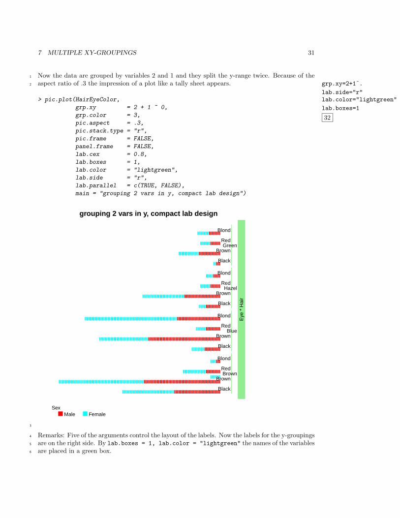
7 MULTIPLE XY-GROUPINGS 31
Now the data are grouped by variables 2 and 1 and they split the y-range twice. Because of the1
aspect ratio of .3 the impression of a plot like a tally sheet appears. grp.xy=2+1˜.
lab.side="r"lab.color="lightgreen"
lab.boxes=1
32
2
> pic.plot(HairEyeColor,
grp.xy = 2 + 1 ~ 0,
grp.color = 3,
pic.aspect = .3,
pic.stack.type = "r",
pic.frame = FALSE,
panel.frame = FALSE,
lab.cex = 0.8,
lab.boxes = 1,
lab.color = "lightgreen",
lab.side = "r",
lab.parallel = c(TRUE, FALSE),
main = "grouping 2 vars in y, compact lab design")
grouping 2 vars in y, compact lab design
Black
Brown
Red
Blond
Black
Brown
Red
Blond
Black
Brown
Red
Blond
Black
Brown
Red
Blond
Eye
* H
air
Brown
Blue
Hazel
Green
SexMale Female
3
Remarks: Five of the arguments control the layout of the labels. Now the labels for the y-groupings4
are on the right side. By lab.boxes = 1, lab.color = "lightgreen" the names of the variables5
are placed in a green box.6
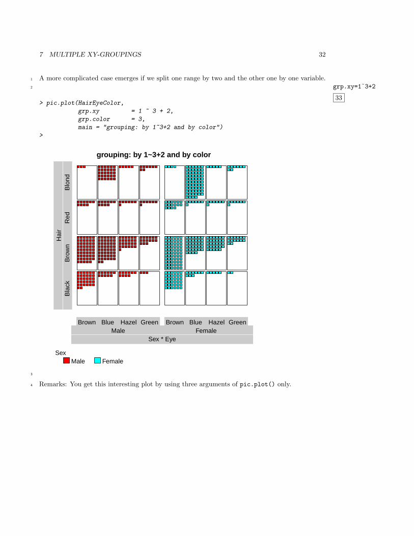
7 MULTIPLE XY-GROUPINGS 32
A more complicated case emerges if we split one range by two and the other one by one variable.1
grp.xy=1˜3+2
33
2
> pic.plot(HairEyeColor,
grp.xy = 1 ~ 3 + 2,
grp.color = 3,
main = "grouping: by 1~3+2 and by color")
>
grouping: by 1~3+2 and by color
Brown Blue Hazel Green Brown Blue Hazel Green
Sex * EyeMale Female
Hai
rB
lack
Bro
wn
Red
Blo
nd
SexMale Female
3
Remarks: You get this interesting plot by using three arguments of pic.plot() only.4
7 MULTIPLE XY-GROUPINGS 33
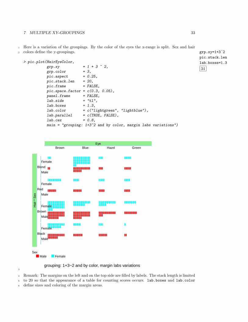
Here is a variation of the groupings. By the color of the eyes the x-range is split. Sex and hair1
colors define the y-groupings. grp.xy=1+3˜2
pic.stack.len
lab.boxes=1.3
34
2
> pic.plot(HairEyeColor,
grp.xy = 1 + 3 ~ 2,
grp.color = 3,
pic.aspect = 0.25,
pic.stack.len = 20,
pic.frame = FALSE,
pic.space.factor = c(0.3, 0.05),
panel.frame = FALSE,
lab.side = "tl",
lab.boxes = 1.3,
lab.color = c("lightgreen", "lightblue"),
lab.parallel = c(TRUE, FALSE),
lab.cex = 0.8,
main = "grouping: 1+3~2 and by color, margin labs variations")
grouping: 1+3~2 and by color, margin labs variations
EyeBrown Blue Hazel Green
Male
Female
Male
Female
Male
Female
Male
Female
Hai
r *
Sex
Black
Brown
Red
Blond
SexMale Female
3
Remark: The margins on the left and on the top side are filled by labels. The stack length is limited4
to 20 so that the appearance of a table for counting scores occurs. lab.boxes and lab.color5
define sizes and coloring of the margin areas.6
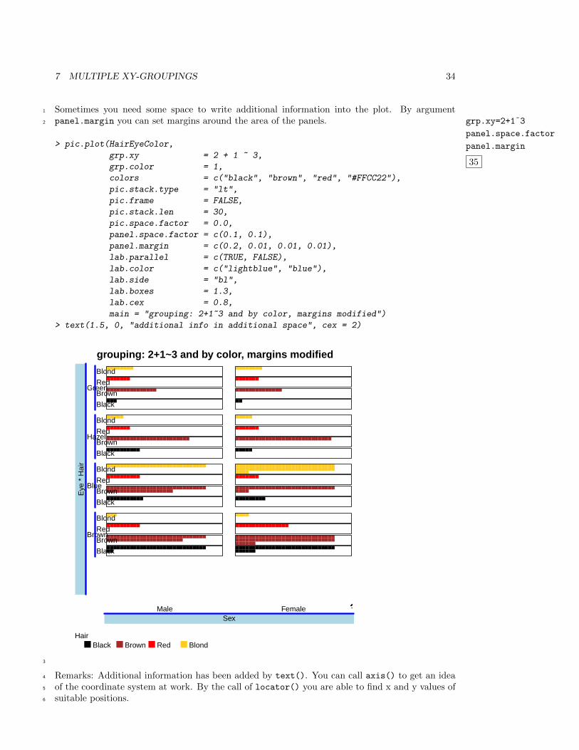
7 MULTIPLE XY-GROUPINGS 34
Sometimes you need some space to write additional information into the plot. By argument1
panel.margin you can set margins around the area of the panels. grp.xy=2+1˜3
panel.space.factor
panel.margin
35
2
> pic.plot(HairEyeColor,
grp.xy = 2 + 1 ~ 3,
grp.color = 1,
colors = c("black", "brown", "red", "#FFCC22"),
pic.stack.type = "lt",
pic.frame = FALSE,
pic.stack.len = 30,
pic.space.factor = 0.0,
panel.space.factor = c(0.1, 0.1),
panel.margin = c(0.2, 0.01, 0.01, 0.01),
lab.parallel = c(TRUE, FALSE),
lab.color = c("lightblue", "blue"),
lab.side = "bl",
lab.boxes = 1.3,
lab.cex = 0.8,
main = "grouping: 2+1~3 and by color, margins modified")
> text(1.5, 0, "additional info in additional space", cex = 2)
grouping: 2+1~3 and by color, margins modified
SexMale Female
Black
Brown
Red
Blond
Black
Brown
Red
Blond
Black
Brown
Red
Blond
Black
Brown
Red
Blond
Eye
* H
air
Brown
Blue
Hazel
Green
HairBlack Brown Red Blond
additional info in additional space
3
Remarks: Additional information has been added by text(). You can call axis() to get an idea4
of the coordinate system at work. By the call of locator() you are able to find x and y values of5
suitable positions.6
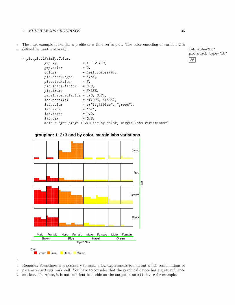
7 MULTIPLE XY-GROUPINGS 35
The next example looks like a profile or a time series plot. The color encoding of variable 2 is1
defined by heat.colors(). lab.side="br"pic.stack.type="lb"
36
2
> pic.plot(HairEyeColor,
grp.xy = 1 ~ 2 + 3,
grp.color = 2,
colors = heat.colors(4),
pic.stack.type = "lb",
pic.stack.len = 7,
pic.space.factor = 0.0,
pic.frame = FALSE,
panel.space.factor = c(0, 0.2),
lab.parallel = c(TRUE, FALSE),
lab.color = c("lightblue", "green"),
lab.side = "br",
lab.boxes = 0.2,
lab.cex = 0.8,
main = "grouping: 1~2+3 and by color, margin labs variations")
grouping: 1~2+3 and by color, margin labs variations
Male Female Male Female Male Female Male Female
Eye * SexBrown Blue Hazel Green
Hai
r
Black
Brown
Red
Blond
EyeBrown Blue Hazel Green
3
Remarks: Sometimes it is necessary to make a few experiments to find out which combinations of4
parameter settings work well. You have to consider that the graphical device has a great influence5
on sizes. Therefore, it is not sufficient to decide on the output in an x11 device for example.6
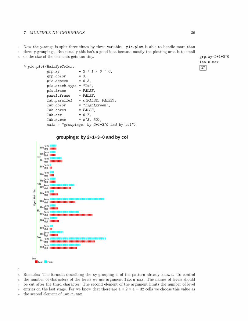
7 MULTIPLE XY-GROUPINGS 36
Now the y-range is split three times by three variables. pic.plot is able to handle more than1
three y-groupings. But usually this isn’t a good idea because mostly the plotting area is to small2
or the size of the elements gets too tiny. grp.xy=2+1+3˜0
lab.n.max
37
3
> pic.plot(HairEyeColor,
grp.xy = 2 + 1 + 3 ~ 0,
grp.color = 3,
pic.aspect = 0.3,
pic.stack.type = "lt",
pic.frame = FALSE,
panel.frame = FALSE,
lab.parallel = c(FALSE, FALSE),
lab.color = "lightgreen",
lab.boxes = FALSE,
lab.cex = 0.7,
lab.n.max = c(3, 32),
main = "groupings: by 2+1+3~0 and by col")
groupings: by 2+1+3~0 and by col
MalFemMalFemMalFemMalFem
MalFemMalFemMalFemMalFem
MalFemMalFemMalFemMalFem
MalFemMalFemMalFemMalFem
Bla
Bro
Red
Blo
Bla
Bro
Red
Blo
Bla
Bro
Red
Blo
Bla
Bro
Red
Blo
Eye
* H
ai *
Sex
Bro
Blu
Haz
Gre
SexMal Fem
4
Remarks: The formula describing the xy-grouping is of the pattern already known. To control5
the number of characters of the levels we use argument lab.n.max: The names of levels should6
be cut after the third character. The second element of the argument limits the number of level7
entries on the last stage. For we know that there are 4× 2× 4 = 32 cells we choose this value as8
the second element of lab.n.max.9
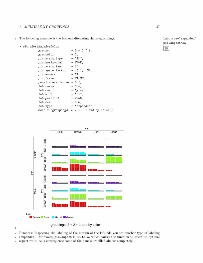
7 MULTIPLE XY-GROUPINGS 37
The following example is the last one discussing the xy-groupings. lab.type="expanded"
pic.aspect=NA
38
1
> pic.plot(HairEyeColor,
grp.xy = 3 + 2 ~ 1,
grp.color = 2,
pic.stack.type = "lb",
pic.horizontal = TRUE,
pic.stack.len = 10,
pic.space.factor = c(.1, .3),
pic.aspect = NA,
pic.frame = FALSE,
panel.space.factor = 0.1,
lab.boxes = 0.3,
lab.color = "grey",
lab.side = "tl",
lab.parallel = TRUE,
lab.cex = 0.8,
lab.type = "expanded",
main = "groupings: 3 + 2 ~ 1 and by color")
groupings: 3 + 2 ~ 1 and by color
HairBlack Brown Red Blond
Eye
Eye
Bro
wn
Blu
eH
azel
Gre
enB
row
nB
lue
Haz
elG
reen
Sex
Mal
eF
emal
e
EyeBrown Blue Hazel Green
2
Remarks: Inspecting the labeling of the margin of the left side you see another type of labeling3
(expanded). Moreover, pic.aspect is set to NA which causes the function to select an optimal4
aspect ratio. As a consequence some of the panels are filled almost completely.5
8 DATA INPUT AND TRANSFORMATIONS 38
8 Data Input and Transformations1
pic.plot() aims at visualizing data matrices or contingency tables. During the checking of2
arguments tables are expanded to data frames keeping the original observations. By default the3
variables of the data frames will be converted to factors by calling factor().4
Using argument vars.to.factors you can control the process of transformation. Element i5
of this variable defines how variable i of the data is treated. A value of 0 (or FALSE) skips6
the transformation step. A value greater 1 invokes the functions cut() and the range of the7
variable is cut in floor(vars.to.factors) intervals of equal size. A value lower 1 leads to classes8
each containing approximately vars.to.factors * 100 percent of the data. The default case9
corresponds to a value of 1 (or TRUE). If numerical data are not transformed to factors strange10
results may be occur. For more information see the help page of pic.plot().11
In this section we use the data set trees usually available in R. This data frame shows the values12
of the variables Girth, Height and Volume of 31 trees.13
8 DATA INPUT AND TRANSFORMATIONS 39
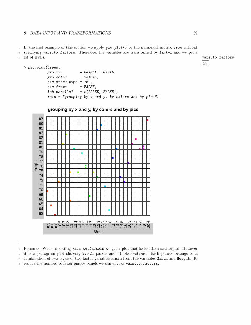
In the first example of this section we apply pic.plot() to the numerical matrix tree without1
specifying vars.to.factors. Therefore, the variables are transformed by factor and we get a2
lot of levels. vars.to.factors
39
3
> pic.plot(trees,
grp.xy = Height ~ Girth,
grp.color = Volume,
pic.stack.type = "b",
pic.frame = FALSE,
lab.parallel = c(FALSE, FALSE),
main = "grouping by x and y, by colors and by pics")
grouping by x and y, by colors and by pics
Girth
8.3
8.6
8.8
10.5
10.7
10.8
11 11.1
11.2
11.3
11.4
11.7
12 12.9
13.3
13.7
13.8
14 14.2
14.5
16 16.3
17.3
17.5
17.9
18 20.6
Hei
ght
636465666970717274757677787980818283858687
4
Remarks: Without setting vars.to.factors we get a plot that looks like a scatterplot. However5
it is a pictogram plot showing 27×21 panels and 31 observations. Each panels belongs to a6
combination of two levels of two factor variables arisen from the variables Girth and Height. To7
reduce the number of fewer empty panels we can envoke vars.to.factors.8
8 DATA INPUT AND TRANSFORMATIONS 40
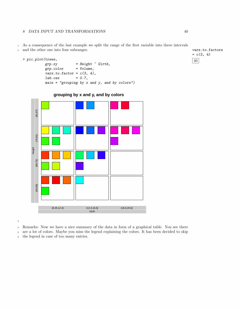
As a consequence of the last example we split the range of the first variable into three intervals1
and the other one into four subranges. vars.to.factors
= c(3, 4)
40
2
> pic.plot(trees,
grp.xy = Height ~ Girth,
grp.color = Volume,
vars.to.factor = c(3, 4),
lab.cex = 0.7,
main = "grouping by x and y, and by colors")
grouping by x and y, and by colors
Girth(8.29,12.4] (12.4,16.5] (16.5,20.6]
Hei
ght
(63,
69]
(69,
75]
(75,
81]
(81,
87]
3
Remarks: Now we have a nice summary of the data in form of a graphical table. You see there4
are a lot of colors. Maybe you miss the legend explaining the colors. It has been decided to skip5
the legend in case of too many entries.6
8 DATA INPUT AND TRANSFORMATIONS 41
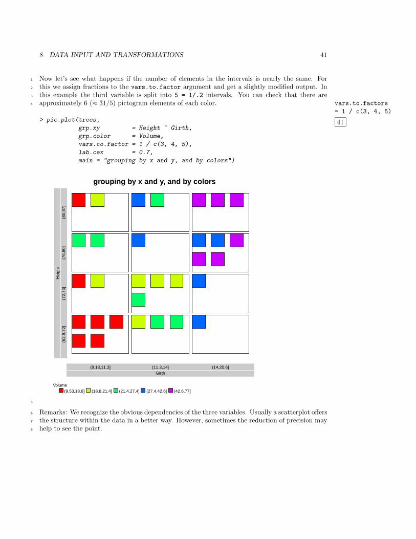
Now let’s see what happens if the number of elements in the intervals is nearly the same. For1
this we assign fractions to the vars.to.factor argument and get a slightly modified output. In2
this example the third variable is split into 5 = 1/.2 intervals. You can check that there are3
approximately 6 (≈ 31/5) pictogram elements of each color. vars.to.factors
= 1 / c(3, 4, 5)
41
4
> pic.plot(trees,
grp.xy = Height ~ Girth,
grp.color = Volume,
vars.to.factor = 1 / c(3, 4, 5),
lab.cex = 0.7,
main = "grouping by x and y, and by colors")
grouping by x and y, and by colors
Girth(8.18,11.3] (11.3,14] (14,20.6]
Hei
ght
(62.
8,72
](7
2,76
](7
6,80
](8
0,87
]
Volume(9.53,18.8] (18.8,21.4] (21.4,27.4] (27.4,42.6] (42.6,77]
5
Remarks: We recognize the obvious dependencies of the three variables. Usually a scatterplot offers6
the structure within the data in a better way. However, sometimes the reduction of precision may7
help to see the point.8
8 DATA INPUT AND TRANSFORMATIONS 42
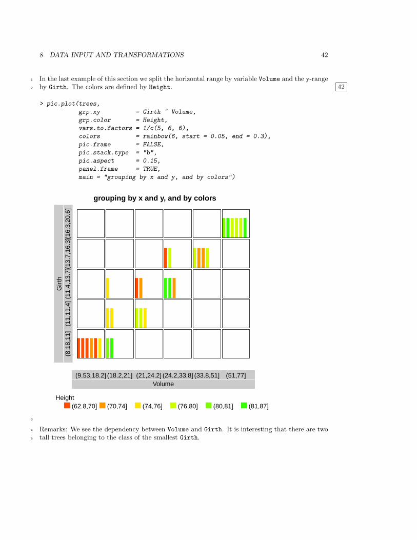
In the last example of this section we split the horizontal range by variable Volume and the y-range1
by Girth. The colors are defined by Height. 422
> pic.plot(trees,
grp.xy = Girth ~ Volume,
grp.color = Height,
vars.to.factors = 1/c(5, 6, 6),
colors = rainbow(6, start = 0.05, end = 0.3),
pic.frame = FALSE,
pic.stack.type = "b",
pic.aspect = 0.15,
panel.frame = TRUE,
main = "grouping by x and y, and by colors")
grouping by x and y, and by colors
Volume(9.53,18.2] (18.2,21] (21,24.2] (24.2,33.8] (33.8,51] (51,77]
Gir
th(8
.18,
11]
(11,
11.4
](1
1.4,
13.7
](13.
7,16
.3](1
6.3,
20.6
]
Height(62.8,70] (70,74] (74,76] (76,80] (80,81] (81,87]
3
Remarks: We see the dependency between Volume and Girth. It is interesting that there are two4
tall trees belonging to the class of the smallest Girth.5
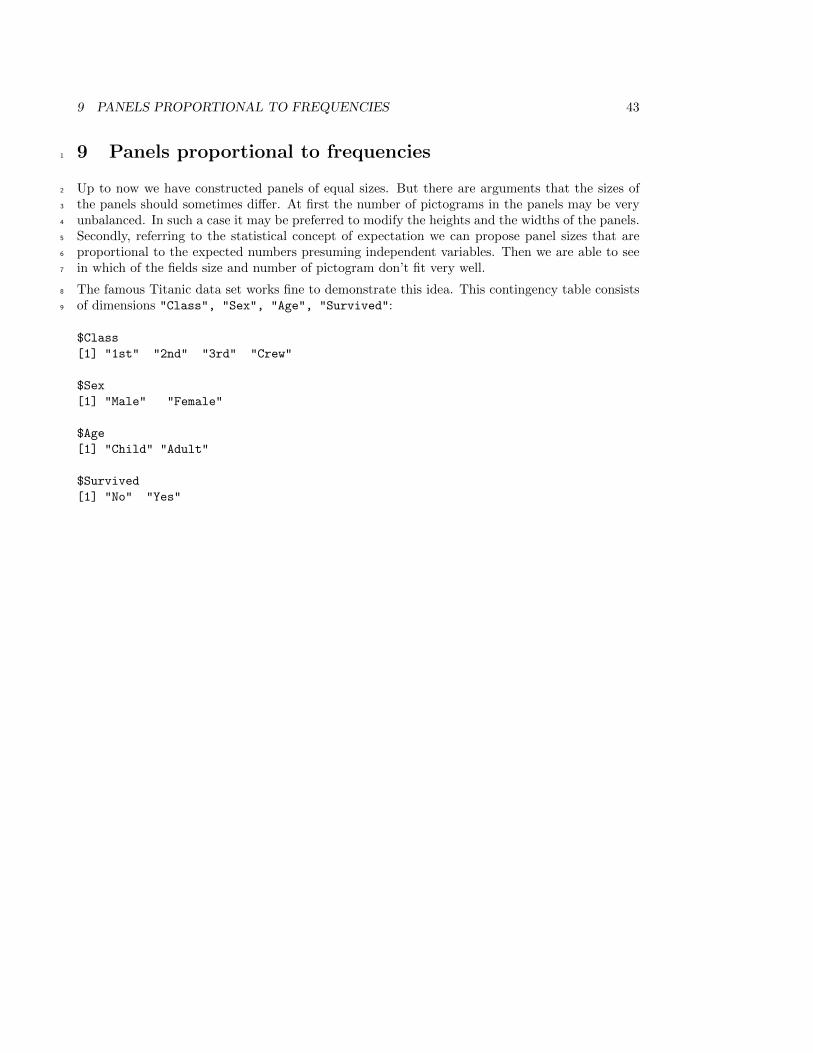
9 PANELS PROPORTIONAL TO FREQUENCIES 43
9 Panels proportional to frequencies1
Up to now we have constructed panels of equal sizes. But there are arguments that the sizes of2
the panels should sometimes differ. At first the number of pictograms in the panels may be very3
unbalanced. In such a case it may be preferred to modify the heights and the widths of the panels.4
Secondly, referring to the statistical concept of expectation we can propose panel sizes that are5
proportional to the expected numbers presuming independent variables. Then we are able to see6
in which of the fields size and number of pictogram don’t fit very well.7
The famous Titanic data set works fine to demonstrate this idea. This contingency table consists8
of dimensions "Class", "Sex", "Age", "Survived":9
$Class
[1] "1st" "2nd" "3rd" "Crew"
$Sex
[1] "Male" "Female"
$Age
[1] "Child" "Adult"
$Survived
[1] "No" "Yes"
9 PANELS PROPORTIONAL TO FREQUENCIES 44
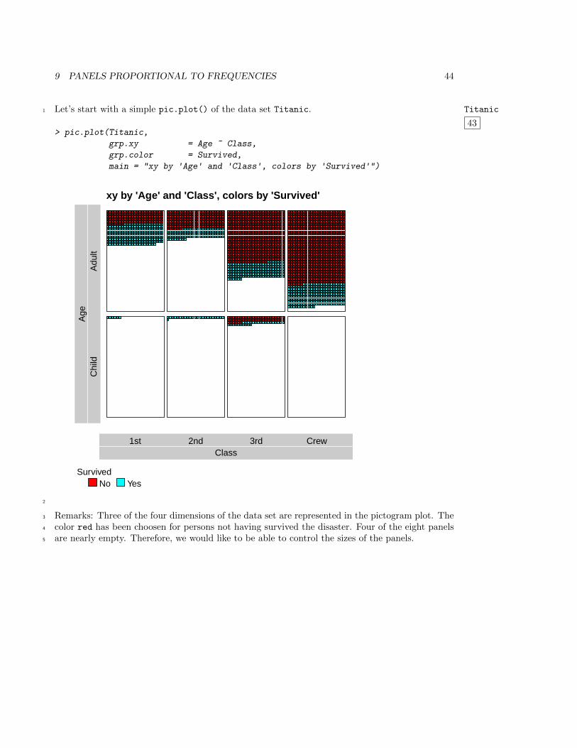
Let’s start with a simple pic.plot() of the data set Titanic. Titanic
43
1
> pic.plot(Titanic,
grp.xy = Age ~ Class,
grp.color = Survived,
main = "xy by 'Age' and 'Class', colors by 'Survived'")
xy by 'Age' and 'Class', colors by 'Survived'
Class1st 2nd 3rd Crew
Age
Chi
ldA
dult
SurvivedNo Yes
2
Remarks: Three of the four dimensions of the data set are represented in the pictogram plot. The3
color red has been choosen for persons not having survived the disaster. Four of the eight panels4
are nearly empty. Therefore, we would like to be able to control the sizes of the panels.5
9 PANELS PROPORTIONAL TO FREQUENCIES 45
In the second example all of the four variables have been used in defining grp.xy and grp.color.1
pic.stack.type="b"
44
2
> pic.plot(Titanic,
grp.xy = Survived ~ Class + Sex,
grp.color = Age,
colors = c("red", "lightblue"),
pic.stack.type = "b",
pic.frame = FALSE,
pic.space.factor= 0.5,
panel.frame = FALSE,
lab.boxes = 0.3,
lab.color = "lightgreen",
main = "x by 'Class*Sex', y by 'Survived', colors by 'Age'")
x by 'Class*Sex', y by 'Survived', colors by 'Age'
Male Female Male Female Male Female Male Female
Class * Sex1st 2nd 3rd Crew
Sur
vive
dN
oYe
s
AgeChild Adult
3
Remarks: The data set contains 2201 elements. Therefore, the space to represent a single one is4
very small. Additionally you may want to divide the whole plotting region in a different way. For5
there are more people that didn’t survive the upper row of panels could be a little bit smaller.6
9 PANELS PROPORTIONAL TO FREQUENCIES 46
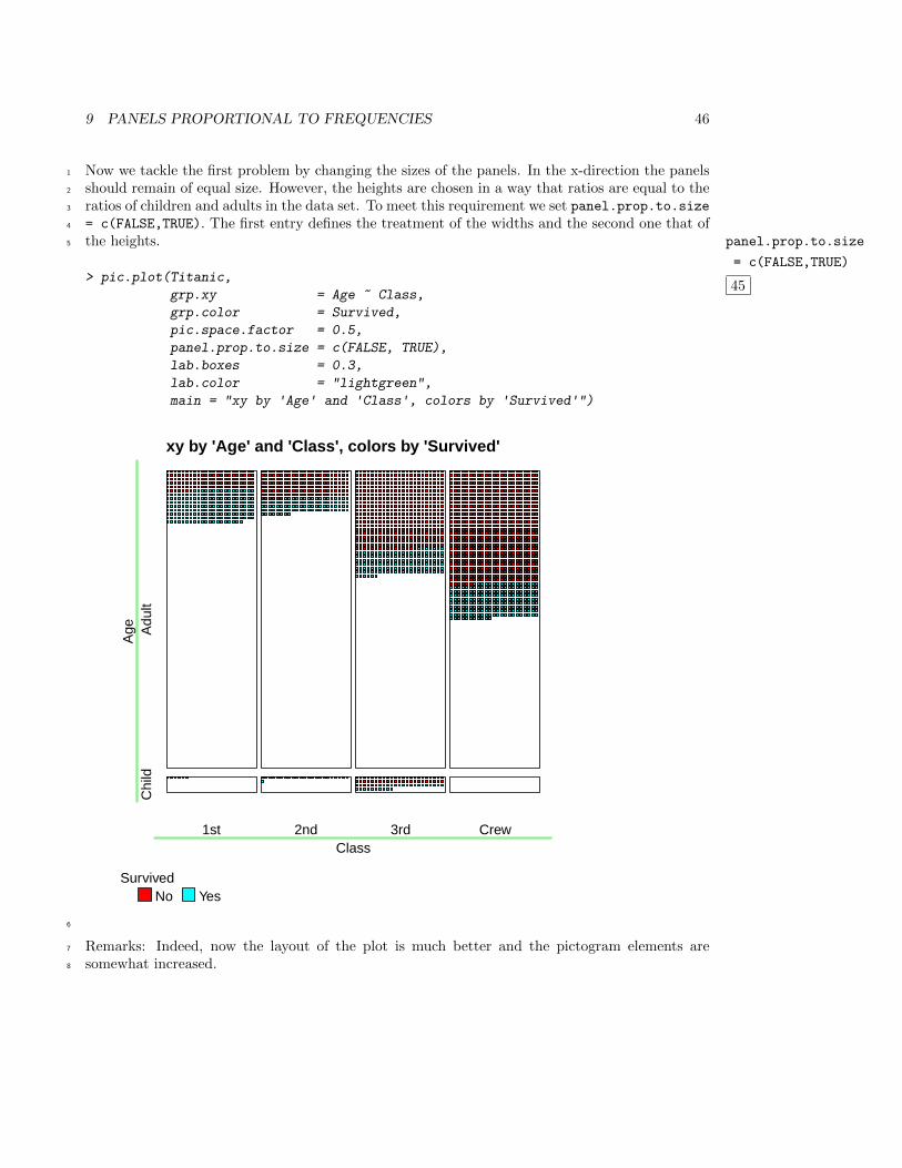
Now we tackle the first problem by changing the sizes of the panels. In the x-direction the panels1
should remain of equal size. However, the heights are chosen in a way that ratios are equal to the2
ratios of children and adults in the data set. To meet this requirement we set panel.prop.to.size3
= c(FALSE,TRUE). The first entry defines the treatment of the widths and the second one that of4
the heights. panel.prop.to.size
= c(FALSE,TRUE)
45
5
> pic.plot(Titanic,
grp.xy = Age ~ Class,
grp.color = Survived,
pic.space.factor = 0.5,
panel.prop.to.size = c(FALSE, TRUE),
lab.boxes = 0.3,
lab.color = "lightgreen",
main = "xy by 'Age' and 'Class', colors by 'Survived'")
xy by 'Age' and 'Class', colors by 'Survived'
Class1st 2nd 3rd Crew
Age
Chi
ldA
dult
SurvivedNo Yes
6
Remarks: Indeed, now the layout of the plot is much better and the pictogram elements are7
somewhat increased.8
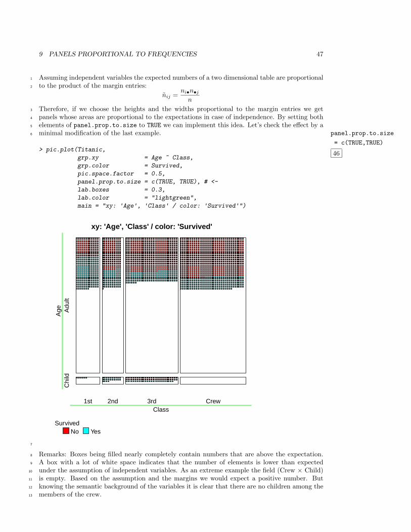
9 PANELS PROPORTIONAL TO FREQUENCIES 47
Assuming independent variables the expected numbers of a two dimensional table are proportional1
to the product of the margin entries:2
nij =ni•n•j
n
Therefore, if we choose the heights and the widths proportional to the margin entries we get3
panels whose areas are proportional to the expectations in case of independence. By setting both4
elements of panel.prop.to.size to TRUE we can implement this idea. Let’s check the effect by a5
minimal modification of the last example. panel.prop.to.size
= c(TRUE,TRUE)
46
6
> pic.plot(Titanic,
grp.xy = Age ~ Class,
grp.color = Survived,
pic.space.factor = 0.5,
panel.prop.to.size = c(TRUE, TRUE), # <-
lab.boxes = 0.3,
lab.color = "lightgreen",
main = "xy: 'Age', 'Class' / color: 'Survived'")
xy: 'Age', 'Class' / color: 'Survived'
Class1st 2nd 3rd Crew
Age
Chi
ldA
dult
SurvivedNo Yes
7
Remarks: Boxes being filled nearly completely contain numbers that are above the expectation.8
A box with a lot of white space indicates that the number of elements is lower than expected9
under the assumption of independent variables. As an extreme example the field (Crew × Child)10
is empty. Based on the assumption and the margins we would expect a positive number. But11
knowing the semantic background of the variables it is clear that there are no children among the12
members of the crew.13
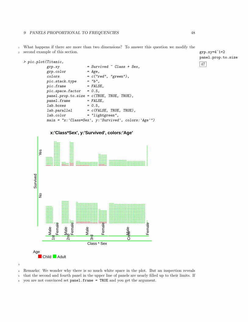
9 PANELS PROPORTIONAL TO FREQUENCIES 48
What happens if there are more than two dimensions? To answer this question we modify the1
second example of this section. grp.xy=4˜1+2
panel.prop.to.size
47
2
> pic.plot(Titanic,
grp.xy = Survived ~ Class + Sex,
grp.color = Age,
colors = c("red", "green"),
pic.stack.type = "b",
pic.frame = FALSE,
pic.space.factor = 0.5,
panel.prop.to.size = c(TRUE, TRUE, TRUE),
panel.frame = FALSE,
lab.boxes = 0.5,
lab.parallel = c(FALSE, TRUE, TRUE),
lab.color = "lightgreen",
main = "x:'Class*Sex', y:'Survived', colors:'Age'")
x:'Class*Sex', y:'Survived', colors:'Age'
Mal
e
Fem
ale
Mal
e
Fem
ale
Mal
e
Fem
ale
Mal
e
Fem
ale
Class * Sex
1st
2nd
3rd
Cre
w
Sur
vive
dN
oYe
s
AgeChild Adult
3
Remarks: We wonder why there is so much white space in the plot. But an inspection reveals4
that the second and fourth panel in the upper line of panels are nearly filled up to their limits. If5
you are not convinced set panel.frame = TRUE and you get the argument.6
9 PANELS PROPORTIONAL TO FREQUENCIES 49
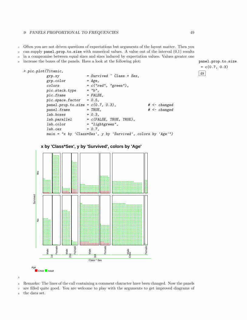
Often you are not driven questions of expectations but arguments of the layout matter. Then you1
can supply panel.prop.to.size with numerical values. A value out of the interval (0,1) results2
in a compromise between equal sizes and sizes induced by expectation values. Values greater one3
increase the boxes of the panels. Have a look at the following plot: panel.prop.to.size
= c(0.7, 0.3)
48
4
> pic.plot(Titanic,
grp.xy = Survived ~ Class + Sex,
grp.color = Age,
colors = c("red", "green"),
pic.stack.type = "b",
pic.frame = FALSE,
pic.space.factor = 0.5,
panel.prop.to.size = c(0.7, 0.3), # <- changed
panel.frame = TRUE, # <- changed
lab.boxes = 0.3,
lab.parallel = c(FALSE, TRUE, TRUE),
lab.color = "lightgreen",
lab.cex = 0.7,
main = "x by 'Class*Sex', y by 'Survived', colors by 'Age'")
x by 'Class*Sex', y by 'Survived', colors by 'Age'
Mal
e
Fem
ale
Mal
e
Fem
ale
Mal
e
Fem
ale
Mal
e
Fem
ale
Class * Sex
1st
2nd
3rd
Cre
w
Sur
vive
dN
oYe
s
AgeChild Adult
5
Remarks: The lines of the call containing a comment character have been changed. Now the panels6
are filled quite good. You are welcome to play with the arguments to get improved diagrams of7
the data set.8
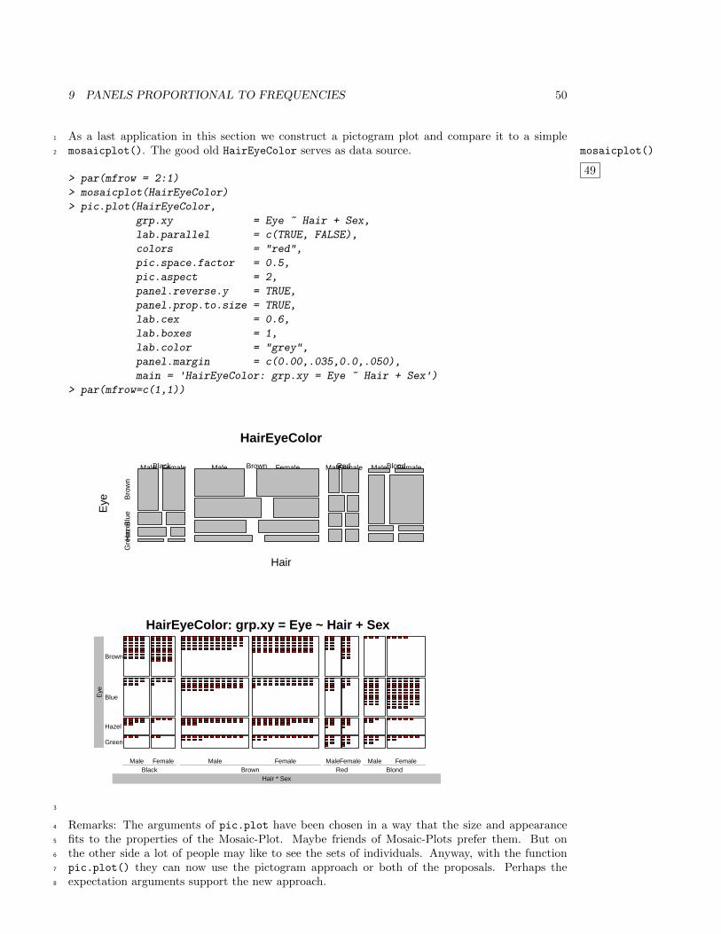
9 PANELS PROPORTIONAL TO FREQUENCIES 50
As a last application in this section we construct a pictogram plot and compare it to a simple1
mosaicplot(). The good old HairEyeColor serves as data source. mosaicplot()
49
2
> par(mfrow = 2:1)
> mosaicplot(HairEyeColor)
> pic.plot(HairEyeColor,
grp.xy = Eye ~ Hair + Sex,
lab.parallel = c(TRUE, FALSE),
colors = "red",
pic.space.factor = 0.5,
pic.aspect = 2,
panel.reverse.y = TRUE,
panel.prop.to.size = TRUE,
lab.cex = 0.6,
lab.boxes = 1,
lab.color = "grey",
panel.margin = c(0.00,.035,0.0,.050),
main = 'HairEyeColor: grp.xy = Eye ~ Hair + Sex')> par(mfrow=c(1,1))
HairEyeColor
Hair
Eye
Black Brown Red Blond
Bro
wn
Blu
eH
azel
Gre
en
Male Female Male Female MaleFemale Male Female
HairEyeColor: grp.xy = Eye ~ Hair + Sex
Male Female Male Female MaleFemale Male Female
Hair * SexBlack Brown Red Blond
Eye
Green
Hazel
Blue
Brown
3
Remarks: The arguments of pic.plot have been chosen in a way that the size and appearance4
fits to the properties of the Mosaic-Plot. Maybe friends of Mosaic-Plots prefer them. But on5
the other side a lot of people may like to see the sets of individuals. Anyway, with the function6
pic.plot() they can now use the pictogram approach or both of the proposals. Perhaps the7
expectation arguments support the new approach.8
10 LARGER UNITS AND FRACTIONAL NUMBERS 51
10 Larger units and fractional numbers1
Sometimes the numbers of elements in the cells of a table are very huge. The Titanic data contain2
a cell with entry 670. Counts belonging to the subpopulations of a country often exceed 1.000.000.3
In these cases it is helpful to change the units. E. g. you can count members of nations in millions.4
Or for the Titanic data we can choose a unit of 10 people.5
As a consequence fractional numbers occur in the cells of a table. The function pic.plot() is6
able to handle fractional numbers of tables. The representation of the fractional parts of numbers7
is realized by scaling the pictogram elements.8
First, we see an application based on the Titanic data set whose entries are divided by 10.9
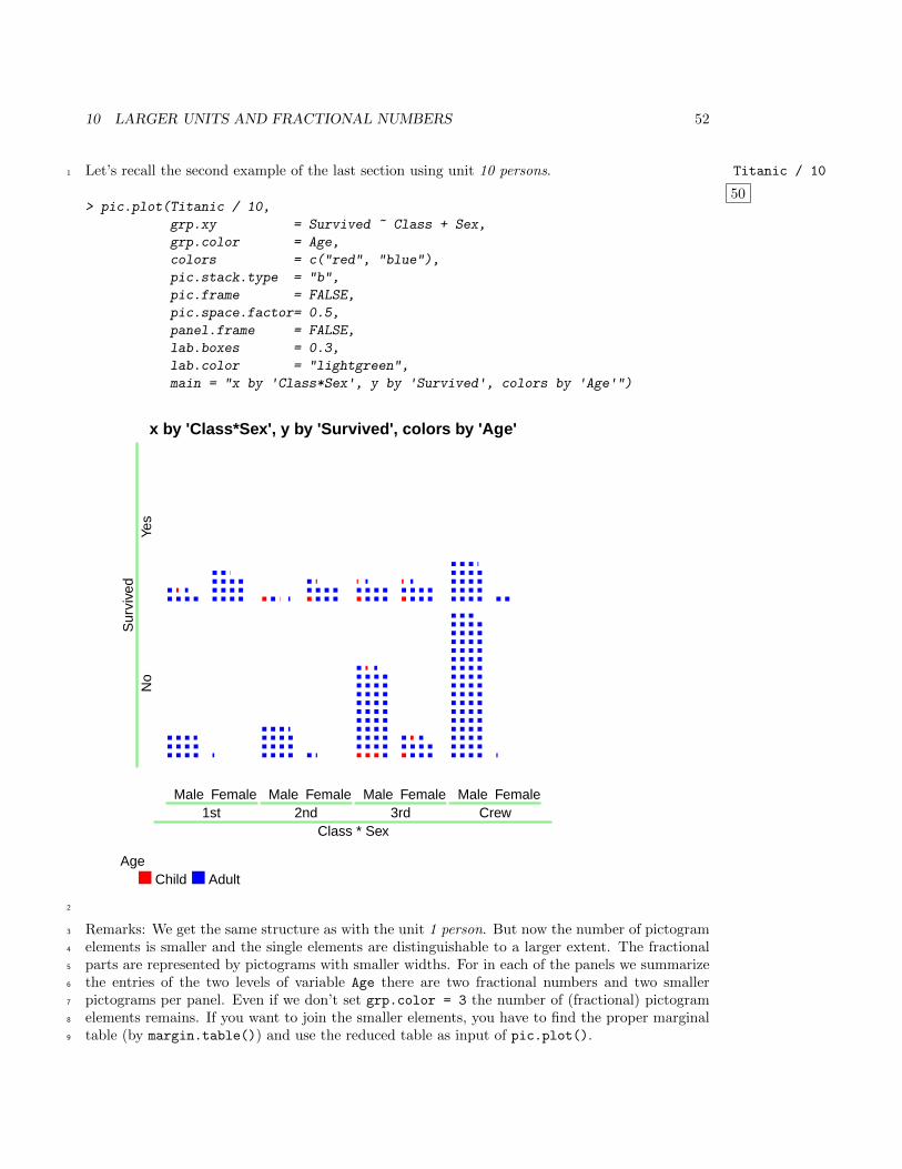
10 LARGER UNITS AND FRACTIONAL NUMBERS 52
Let’s recall the second example of the last section using unit 10 persons. Titanic / 10
50
1
> pic.plot(Titanic / 10,
grp.xy = Survived ~ Class + Sex,
grp.color = Age,
colors = c("red", "blue"),
pic.stack.type = "b",
pic.frame = FALSE,
pic.space.factor= 0.5,
panel.frame = FALSE,
lab.boxes = 0.3,
lab.color = "lightgreen",
main = "x by 'Class*Sex', y by 'Survived', colors by 'Age'")
x by 'Class*Sex', y by 'Survived', colors by 'Age'
Male Female Male Female Male Female Male Female
Class * Sex1st 2nd 3rd Crew
Sur
vive
dN
oYe
s
AgeChild Adult
2
Remarks: We get the same structure as with the unit 1 person. But now the number of pictogram3
elements is smaller and the single elements are distinguishable to a larger extent. The fractional4
parts are represented by pictograms with smaller widths. For in each of the panels we summarize5
the entries of the two levels of variable Age there are two fractional numbers and two smaller6
pictograms per panel. Even if we don’t set grp.color = 3 the number of (fractional) pictogram7
elements remains. If you want to join the smaller elements, you have to find the proper marginal8
table (by margin.table()) and use the reduced table as input of pic.plot().9
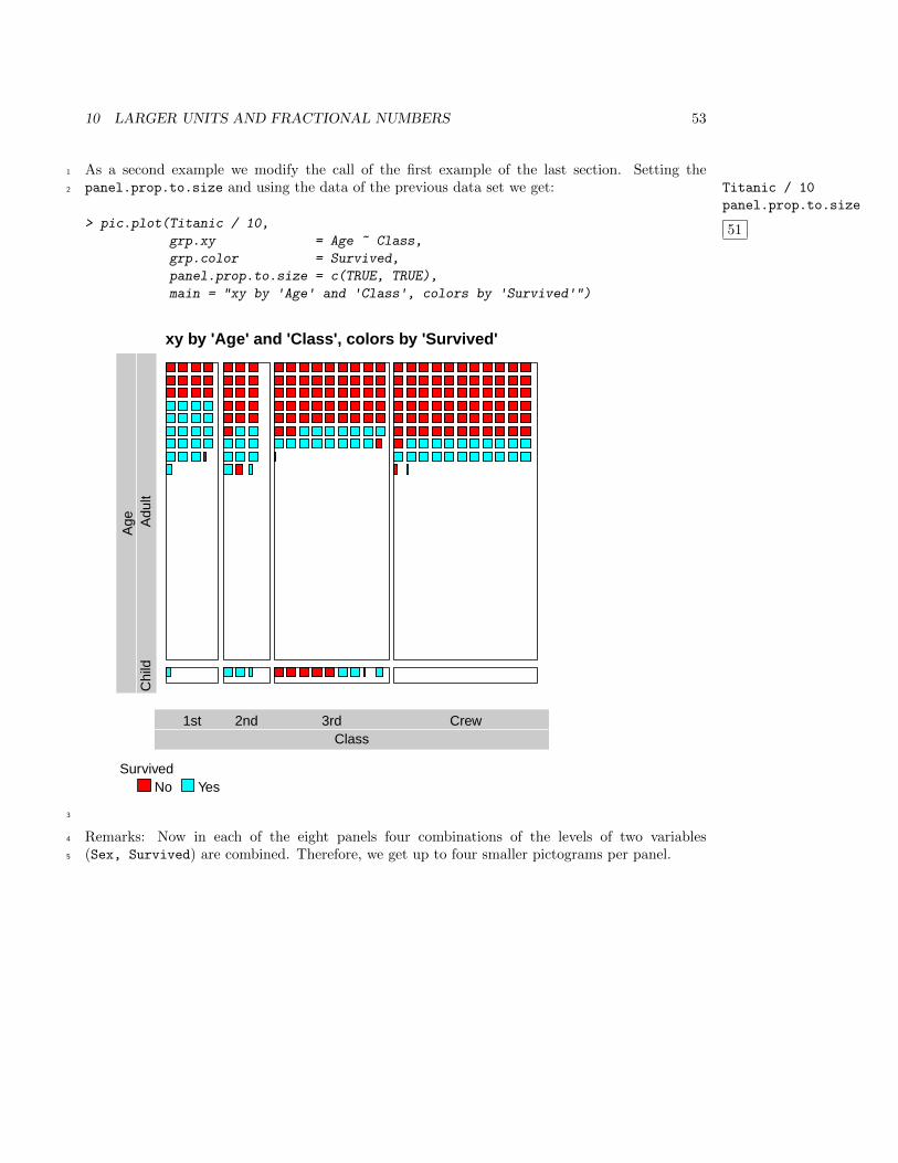
10 LARGER UNITS AND FRACTIONAL NUMBERS 53
As a second example we modify the call of the first example of the last section. Setting the1
panel.prop.to.size and using the data of the previous data set we get: Titanic / 10
panel.prop.to.size
51
2
> pic.plot(Titanic / 10,
grp.xy = Age ~ Class,
grp.color = Survived,
panel.prop.to.size = c(TRUE, TRUE),
main = "xy by 'Age' and 'Class', colors by 'Survived'")
xy by 'Age' and 'Class', colors by 'Survived'
Class1st 2nd 3rd Crew
Age
Chi
ldA
dult
SurvivedNo Yes
3
Remarks: Now in each of the eight panels four combinations of the levels of two variables4
(Sex, Survived) are combined. Therefore, we get up to four smaller pictograms per panel.5
10 LARGER UNITS AND FRACTIONAL NUMBERS 54
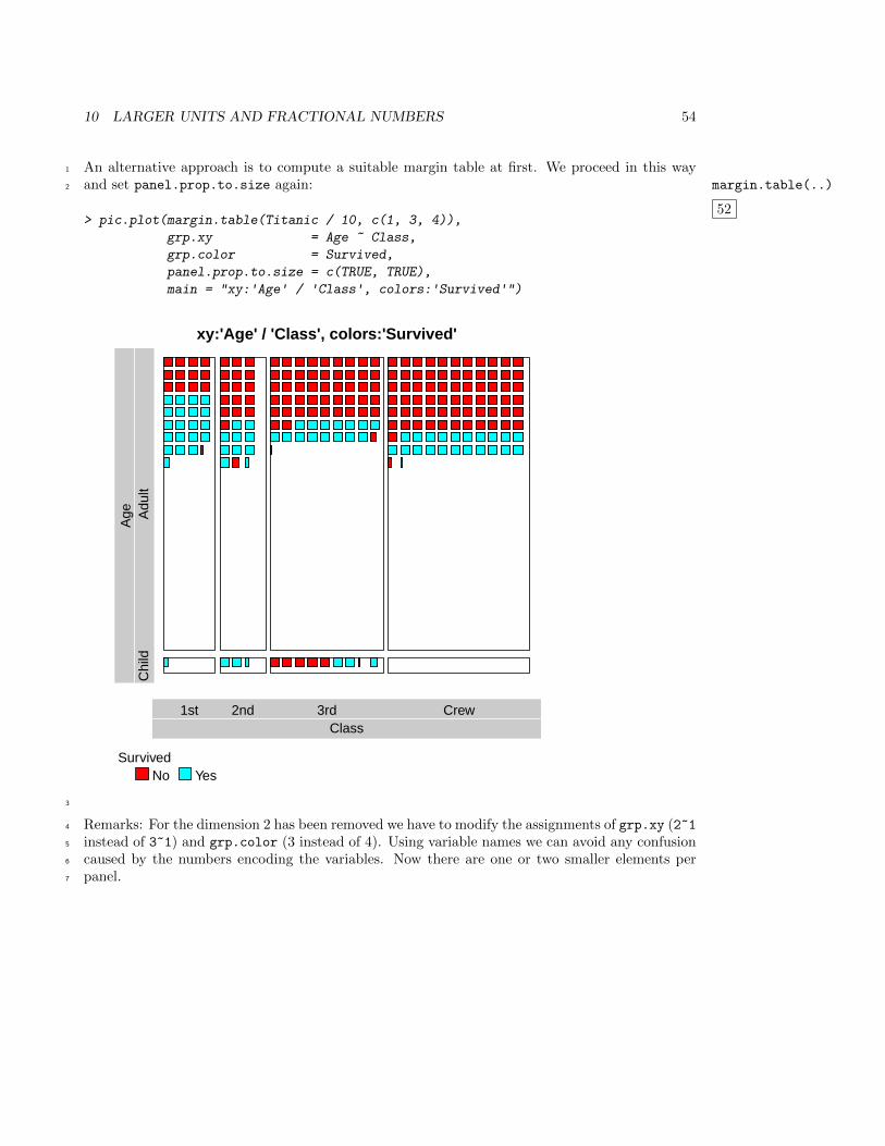
An alternative approach is to compute a suitable margin table at first. We proceed in this way1
and set panel.prop.to.size again: margin.table(..)
52
2
> pic.plot(margin.table(Titanic / 10, c(1, 3, 4)),
grp.xy = Age ~ Class,
grp.color = Survived,
panel.prop.to.size = c(TRUE, TRUE),
main = "xy:'Age' / 'Class', colors:'Survived'")
xy:'Age' / 'Class', colors:'Survived'
Class1st 2nd 3rd Crew
Age
Chi
ldA
dult
SurvivedNo Yes
3
Remarks: For the dimension 2 has been removed we have to modify the assignments of grp.xy (2~14
instead of 3~1) and grp.color (3 instead of 4). Using variable names we can avoid any confusion5
caused by the numbers encoding the variables. Now there are one or two smaller elements per6
panel.7
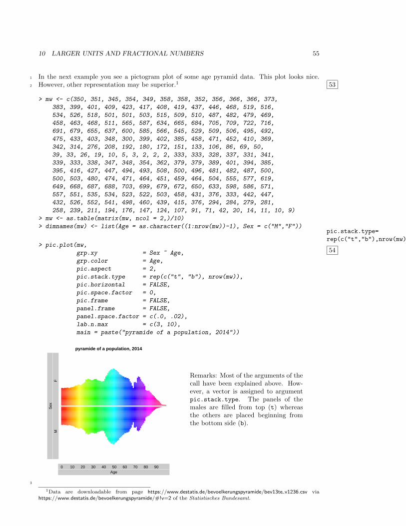
10 LARGER UNITS AND FRACTIONAL NUMBERS 55
In the next example you see a pictogram plot of some age pyramid data. This plot looks nice.1
However, other representation may be superior.1 532
> mw <- c(350, 351, 345, 354, 349, 358, 358, 352, 356, 366, 366, 373,
383, 399, 401, 409, 423, 417, 408, 419, 437, 446, 468, 519, 516,
534, 526, 518, 501, 501, 503, 515, 509, 510, 487, 482, 479, 469,
458, 463, 468, 511, 565, 587, 634, 665, 684, 705, 709, 722, 716,
691, 679, 655, 637, 600, 585, 566, 545, 529, 509, 506, 495, 492,
475, 433, 403, 348, 300, 399, 402, 385, 458, 471, 452, 410, 369,
342, 314, 276, 208, 192, 180, 172, 151, 133, 106, 86, 69, 50,
39, 33, 26, 19, 10, 5, 3, 2, 2, 2, 333, 333, 328, 337, 331, 341,
339, 333, 338, 347, 348, 354, 362, 379, 379, 389, 401, 394, 385,
395, 416, 427, 447, 494, 493, 508, 500, 496, 481, 482, 487, 500,
500, 503, 480, 474, 471, 464, 451, 459, 464, 504, 555, 577, 619,
649, 668, 687, 688, 703, 699, 679, 672, 650, 633, 598, 586, 571,
557, 551, 535, 534, 523, 522, 503, 458, 431, 376, 333, 442, 447,
432, 526, 552, 541, 498, 460, 439, 415, 376, 294, 284, 279, 281,
258, 239, 211, 194, 176, 147, 124, 107, 91, 71, 42, 20, 14, 11, 10, 9)
> mw <- as.table(matrix(mw, ncol = 2,)/10)
> dimnames(mw) <- list(Age = as.character((1:nrow(mw))-1), Sex = c("M","F"))pic.stack.type=
rep(c("t","b"),nrow(mw))
54> pic.plot(mw,
grp.xy = Sex ~ Age,
grp.color = Age,
pic.aspect = 2,
pic.stack.type = rep(c("t", "b"), nrow(mw)),
pic.horizontal = FALSE,
pic.space.factor = 0,
pic.frame = FALSE,
panel.frame = FALSE,
panel.space.factor = c(.0, .02),
lab.n.max = c(3, 10),
main = paste("pyramide of a population, 2014"))
pyramide of a population, 2014
Age0 10 20 30 40 50 60 70 80 90
Sex
MF
Remarks: Most of the arguments of thecall have been explained above. How-ever, a vector is assigned to argumentpic.stack.type. The panels of themales are filled from top (t) whereasthe others are placed beginning fromthe bottom side (b).
3
1Data are downloadable from page https://www.destatis.de/bevoelkerungspyramide/bev13te v1236.csv viahttps://www.destatis.de/bevoelkerungspyramide/#!v=2 of the Statistisches Bundesamt.
10 LARGER UNITS AND FRACTIONAL NUMBERS 56
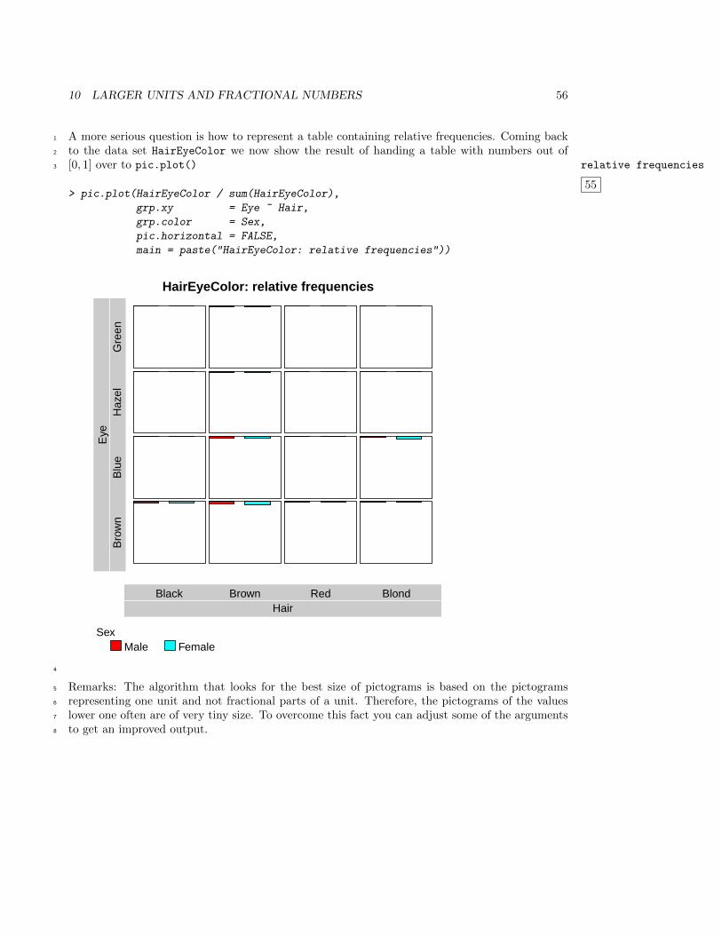
A more serious question is how to represent a table containing relative frequencies. Coming back1
to the data set HairEyeColor we now show the result of handing a table with numbers out of2
[0, 1] over to pic.plot() relative frequencies
55
3
> pic.plot(HairEyeColor / sum(HairEyeColor),
grp.xy = Eye ~ Hair,
grp.color = Sex,
pic.horizontal = FALSE,
main = paste("HairEyeColor: relative frequencies"))
HairEyeColor: relative frequencies
HairBlack Brown Red Blond
Eye
Bro
wn
Blu
eH
azel
Gre
en
SexMale Female
4
Remarks: The algorithm that looks for the best size of pictograms is based on the pictograms5
representing one unit and not fractional parts of a unit. Therefore, the pictograms of the values6
lower one often are of very tiny size. To overcome this fact you can adjust some of the arguments7
to get an improved output.8
10 LARGER UNITS AND FRACTIONAL NUMBERS 57
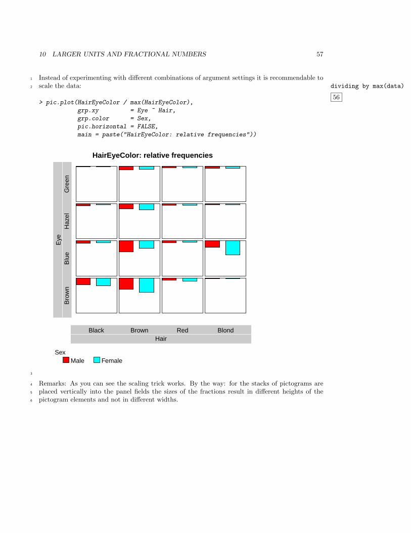
Instead of experimenting with different combinations of argument settings it is recommendable to1
scale the data: dividing by max(data)
56
2
> pic.plot(HairEyeColor / max(HairEyeColor),
grp.xy = Eye ~ Hair,
grp.color = Sex,
pic.horizontal = FALSE,
main = paste("HairEyeColor: relative frequencies"))
HairEyeColor: relative frequencies
HairBlack Brown Red Blond
Eye
Bro
wn
Blu
eH
azel
Gre
en
SexMale Female
3
Remarks: As you can see the scaling trick works. By the way: for the stacks of pictograms are4
placed vertically into the panel fields the sizes of the fractions result in different heights of the5
pictogram elements and not in different widths.6
10 LARGER UNITS AND FRACTIONAL NUMBERS 58
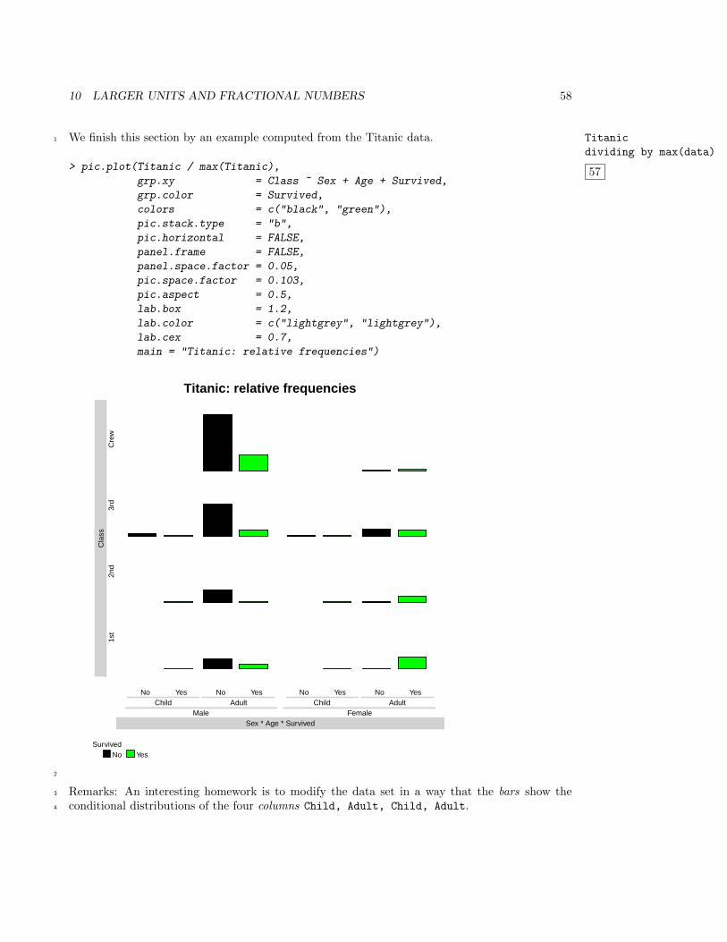
We finish this section by an example computed from the Titanic data. Titanic
dividing by max(data)
57
1
> pic.plot(Titanic / max(Titanic),
grp.xy = Class ~ Sex + Age + Survived,
grp.color = Survived,
colors = c("black", "green"),
pic.stack.type = "b",
pic.horizontal = FALSE,
panel.frame = FALSE,
panel.space.factor = 0.05,
pic.space.factor = 0.103,
pic.aspect = 0.5,
lab.box = 1.2,
lab.color = c("lightgrey", "lightgrey"),
lab.cex = 0.7,
main = "Titanic: relative frequencies")
Titanic: relative frequencies
No Yes No Yes No Yes No YesChild Adult Child Adult
Sex * Age * SurvivedMale Female
Cla
ss1s
t2n
d3r
dC
rew
SurvivedNo Yes
2
Remarks: An interesting homework is to modify the data set in a way that the bars show the3
conditional distributions of the four columns Child, Adult, Child, Adult.4
11 NEGATIVE FREQUENCIES 59
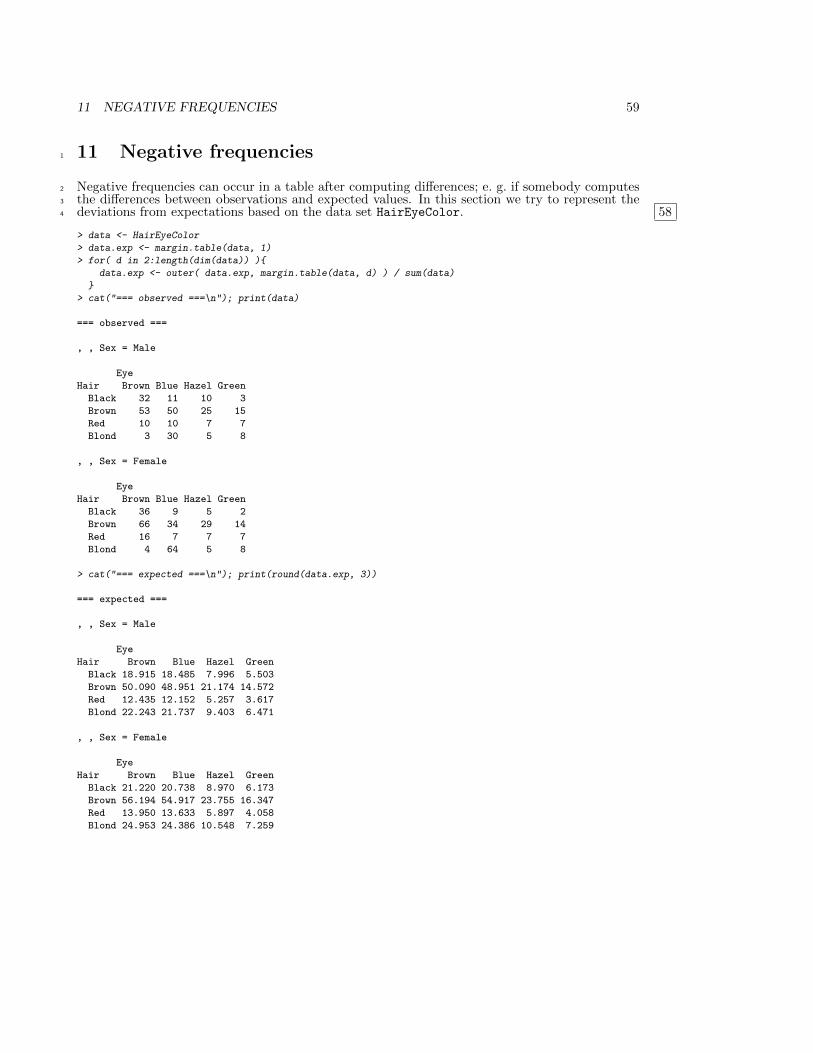
11 Negative frequencies1
Negative frequencies can occur in a table after computing differences; e. g. if somebody computes2
the differences between observations and expected values. In this section we try to represent the3
deviations from expectations based on the data set HairEyeColor. 584
> data <- HairEyeColor
> data.exp <- margin.table(data, 1)
> for( d in 2:length(dim(data)) ){
data.exp <- outer( data.exp, margin.table(data, d) ) / sum(data)
}
> cat("=== observed ===\n"); print(data)
=== observed ===
, , Sex = Male
Eye
Hair Brown Blue Hazel Green
Black 32 11 10 3
Brown 53 50 25 15
Red 10 10 7 7
Blond 3 30 5 8
, , Sex = Female
Eye
Hair Brown Blue Hazel Green
Black 36 9 5 2
Brown 66 34 29 14
Red 16 7 7 7
Blond 4 64 5 8
> cat("=== expected ===\n"); print(round(data.exp, 3))
=== expected ===
, , Sex = Male
Eye
Hair Brown Blue Hazel Green
Black 18.915 18.485 7.996 5.503
Brown 50.090 48.951 21.174 14.572
Red 12.435 12.152 5.257 3.617
Blond 22.243 21.737 9.403 6.471
, , Sex = Female
Eye
Hair Brown Blue Hazel Green
Black 21.220 20.738 8.970 6.173
Brown 56.194 54.917 23.755 16.347
Red 13.950 13.633 5.897 4.058
Blond 24.953 24.386 10.548 7.259
11 NEGATIVE FREQUENCIES 60
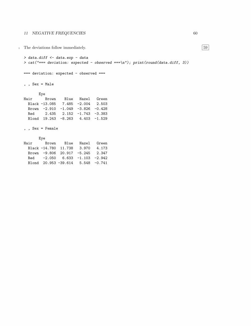
The deviations follow immediately. 591
> data.diff <- data.exp - data
> cat("=== deviation: expected - observed ===\n"); print(round(data.diff, 3))
=== deviation: expected - observed ===
, , Sex = Male
Eye
Hair Brown Blue Hazel Green
Black -13.085 7.485 -2.004 2.503
Brown -2.910 -1.049 -3.826 -0.428
Red 2.435 2.152 -1.743 -3.383
Blond 19.243 -8.263 4.403 -1.529
, , Sex = Female
Eye
Hair Brown Blue Hazel Green
Black -14.780 11.738 3.970 4.173
Brown -9.806 20.917 -5.245 2.347
Red -2.050 6.633 -1.103 -2.942
Blond 20.953 -39.614 5.548 -0.741
11 NEGATIVE FREQUENCIES 61
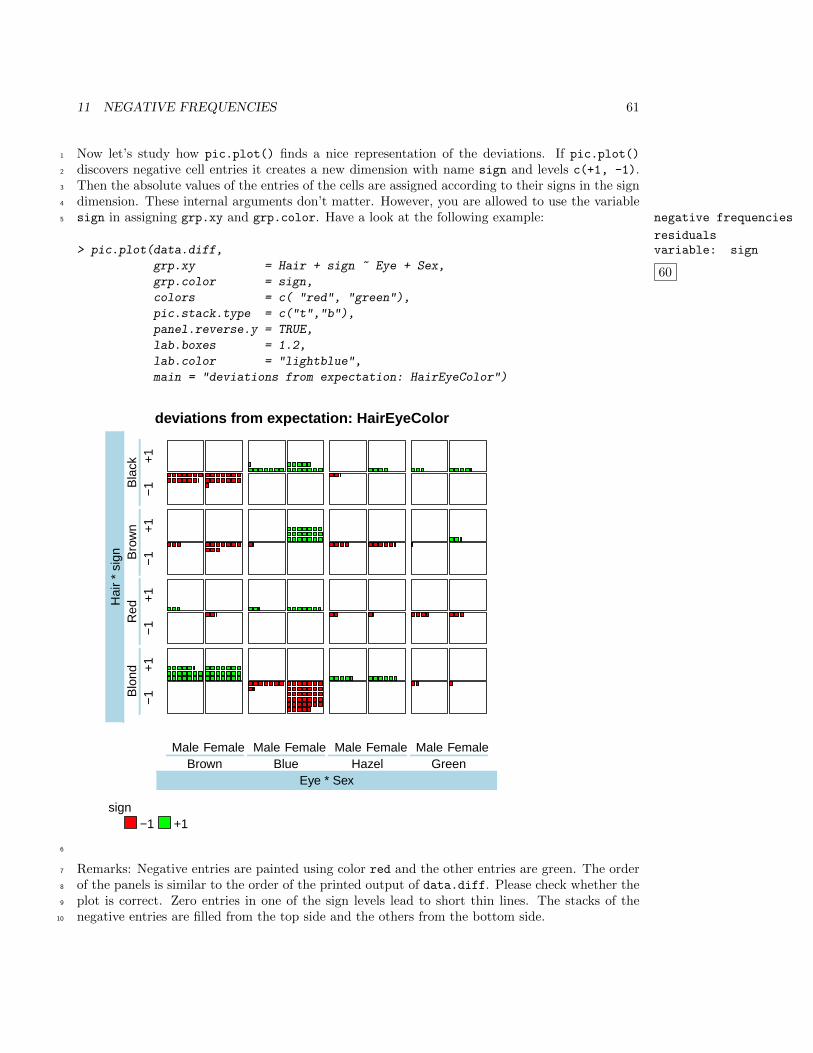
Now let’s study how pic.plot() finds a nice representation of the deviations. If pic.plot()1
discovers negative cell entries it creates a new dimension with name sign and levels c(+1, -1).2
Then the absolute values of the entries of the cells are assigned according to their signs in the sign3
dimension. These internal arguments don’t matter. However, you are allowed to use the variable4
sign in assigning grp.xy and grp.color. Have a look at the following example: negative frequencies
residualsvariable: sign
60
5
> pic.plot(data.diff,
grp.xy = Hair + sign ~ Eye + Sex,
grp.color = sign,
colors = c( "red", "green"),
pic.stack.type = c("t","b"),
panel.reverse.y = TRUE,
lab.boxes = 1.2,
lab.color = "lightblue",
main = "deviations from expectation: HairEyeColor")
deviations from expectation: HairEyeColor
Male Female Male Female Male Female Male Female
Eye * SexBrown Blue Hazel Green
−1
+1
−1
+1
−1
+1
−1
+1
Hai
r *
sign
Blo
ndR
edB
row
nB
lack
sign−1 +1
6
Remarks: Negative entries are painted using color red and the other entries are green. The order7
of the panels is similar to the order of the printed output of data.diff. Please check whether the8
plot is correct. Zero entries in one of the sign levels lead to short thin lines. The stacks of the9
negative entries are filled from the top side and the others from the bottom side.10
12 RASTER AND PPM GRAPHICS 62
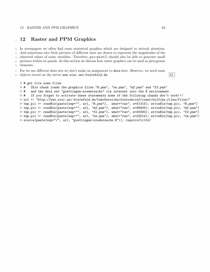
12 Raster and PPM Graphics1
In newspapers we often find some statistical graphics which are designed to attrack attention.2
And sometimes nice little pictures of different sizes are drawn to represent the magnitudes of the3
observed values of some variables. Therefore, pic-plot() should also be able to generate small4
pictures within its panels. In this section we discuss how raster graphics can be used as pictograms5
elements.6
For we use different data sets we don’t make an assignment to data here. However, we need some7
objects stored on the server www.wiwi.uni-bielefeld.de. 618
> # get file some files
> # This chunk loads the graphics files "R.pnm", "tm.pnm", "m2.pnm" and "f2.pnm"
> # and the data set "goettingen-niedersachs" via internet into the R environment.
> # If you forget to activate these statements some of the following chunks don't work!!!
> url <- "http://www.wiwi.uni-bielefeld.de/lehrbereiche/statoekoinf/comet/wolf/pw_files/files/"
> tmp.pic <- readBin(paste(sep="", url, "R.pnm"), what="raw", n=51315); writeBin(tmp.pic, "R.pnm")
> tmp.pic <- readBin(paste(sep="", url, "m2.pnm"), what="raw", n=89435); writeBin(tmp.pic, "m2.pnm")
> tmp.pic <- readBin(paste(sep="", url, "f2.pnm"), what="raw", n=83393); writeBin(tmp.pic, "f2.pnm")
> tmp.pic <- readBin(paste(sep="", url, "tm.pnm"), what="raw", n=22514); writeBin(tmp.pic, "tm.pnm")
> source(paste(sep="/", url, "goettingen-niedersachs.R")); require(tcltk)
12 RASTER AND PPM GRAPHICS 63
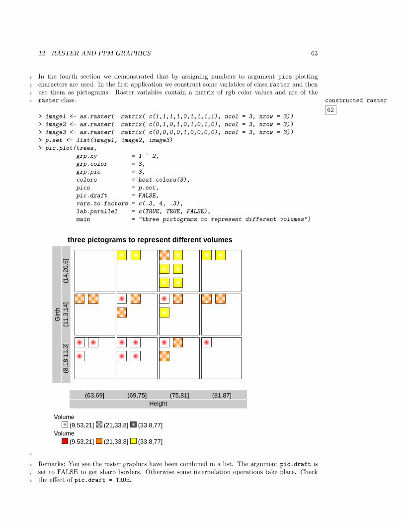
In the fourth section we demonstrated that by assigning numbers to argument pics plotting1
characters are used. In the first application we construct some variables of class raster and then2
use them as pictograms. Raster variables contain a matrix of rgb color values and are of the3
raster class. constructed raster
62
4
> image1 <- as.raster( matrix( c(1,1,1,1,0,1,1,1,1), ncol = 3, nrow = 3))
> image2 <- as.raster( matrix( c(0,1,0,1,0,1,0,1,0), ncol = 3, nrow = 3))
> image3 <- as.raster( matrix( c(0,0,0,0,1,0,0,0,0), ncol = 3, nrow = 3))
> p.set <- list(image1, image2, image3)
> pic.plot(trees,
grp.xy = 1 ~ 2,
grp.color = 3,
grp.pic = 3,
colors = heat.colors(3),
pics = p.set,
pic.draft = FALSE,
vars.to.factors = c(.3, 4, .3),
lab.parallel = c(TRUE, TRUE, FALSE),
main = "three pictograms to represent different volumes")
three pictograms to represent different volumes
Height(63,69] (69,75] (75,81] (81,87]
Gir
th(8
.18,
11.3
](1
1.3,
14]
(14,
20.6
]
Volume(9.53,21] (21,33.8] (33.8,77]
Volume(9.53,21] (21,33.8] (33.8,77]
5
Remarks: You see the raster graphics have been combined in a list. The argument pic.draft is6
set to FALSE to get sharp borders. Otherwise some interpolation operations take place. Check7
the effect of pic.draft = TRUE.8
12 RASTER AND PPM GRAPHICS 64
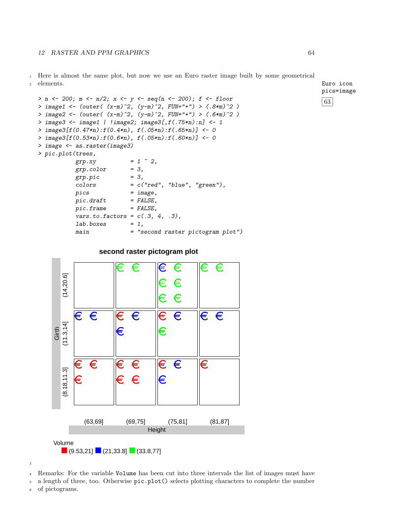
Here is almost the same plot, but now we use an Euro raster image built by some geometrical1
elements.2 Euro iconpics=image
63> n <- 200; m <- n/2; x <- y <- seq(n <- 200); f <- floor
> image1 <- (outer( (x-m)^2, (y-m)^2, FUN="+") > (.8*m)^2 )
> image2 <- (outer( (x-m)^2, (y-m)^2, FUN="+") > (.6*m)^2 )
> image3 <- image1 | !image2; image3[,f(.75*n):n] <- 1
> image3[f(0.47*n):f(0.4*n), f(.05*n):f(.65*n)] <- 0
> image3[f(0.53*n):f(0.6*n), f(.05*n):f(.60*n)] <- 0
> image <- as.raster(image3)
> pic.plot(trees,
grp.xy = 1 ~ 2,
grp.color = 3,
grp.pic = 3,
colors = c("red", "blue", "green"),
pics = image,
pic.draft = FALSE,
pic.frame = FALSE,
vars.to.factors = c(.3, 4, .3),
lab.boxes = 1,
main = "second raster pictogram plot")
second raster pictogram plot
Height(63,69] (69,75] (75,81] (81,87]
Gir
th(8
.18,
11.3
](1
1.3,
14]
(14,
20.6
]
Volume(9.53,21] (21,33.8] (33.8,77]
3
Remarks: For the variable Volume has been cut into three intervals the list of images must have4
a length of three, too. Otherwise pic.plot() selects plotting characters to complete the number5
of pictograms.6
12 RASTER AND PPM GRAPHICS 65
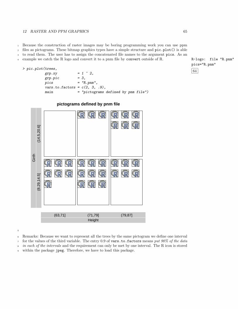
Because the construction of raster images may be boring programming work you can use ppm1
files as pictograms. These bitmap graphics types have a simple structure and pic.plot() is able2
to read them. The user has to assign the concatenated file names to the argument pics. As an3
example we catch the R logo and convert it to a pnm file by convert outside of R. R-logo: file "R.pnm"
pics="R.pnm"
64
4
> pic.plot(trees,
grp.xy = 1 ~ 2,
grp.pic = 3,
pics = "R.pnm",
vars.to.factors = c(2, 3, .9),
main = "pictograms defined by pnm file")
pictograms defined by pnm file
Height(63,71] (71,79] (79,87]
Gir
th(8
.29,
14.5
](1
4.5,
20.6
]
5
Remarks: Because we want to represent all the trees by the same pictogram we define one interval6
for the values of the third variable. The entry 0.9 of vars.to.factors means put 90% of the data7
in each of the intervals and the requirement can only be met by one interval. The R icon is stored8
within the package jpeg. Therefore, we have to load this package.9
12 RASTER AND PPM GRAPHICS 66
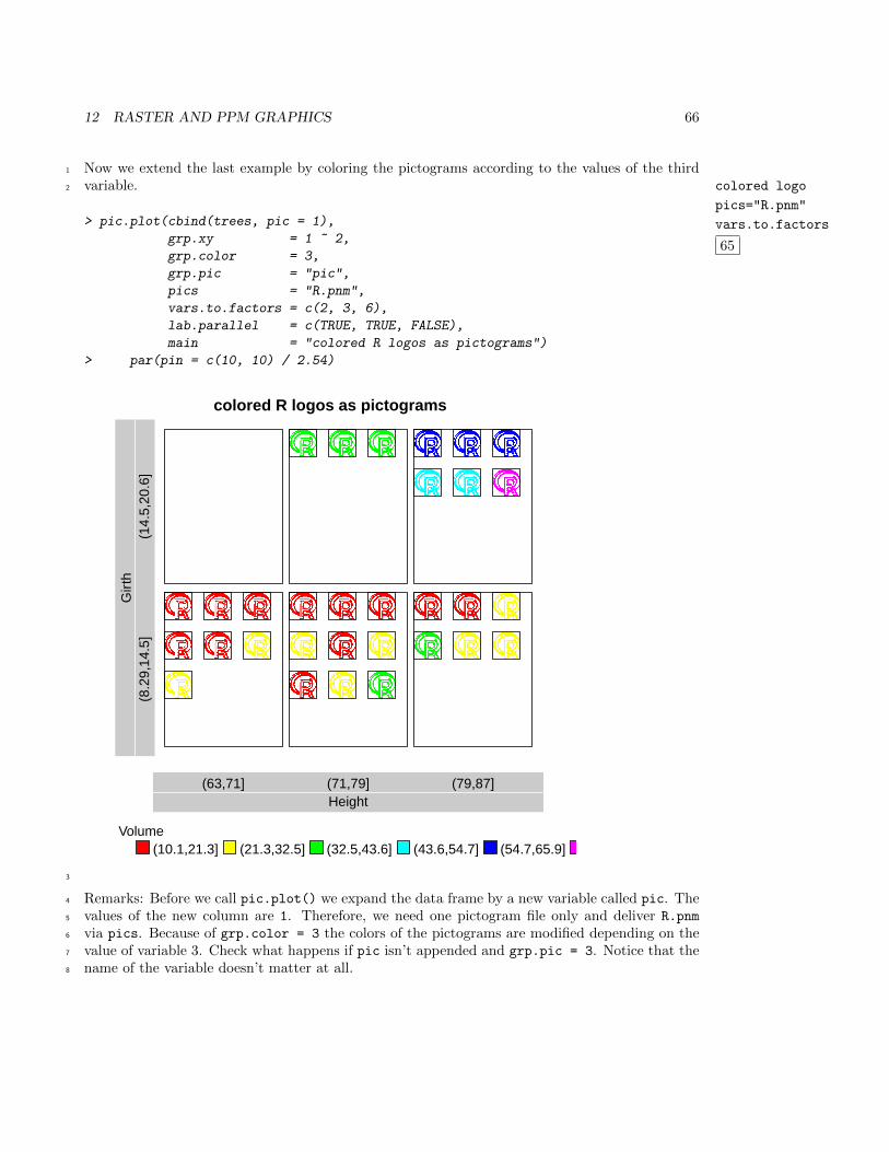
Now we extend the last example by coloring the pictograms according to the values of the third1
variable. colored logo
pics="R.pnm"
vars.to.factors
65
2
> pic.plot(cbind(trees, pic = 1),
grp.xy = 1 ~ 2,
grp.color = 3,
grp.pic = "pic",
pics = "R.pnm",
vars.to.factors = c(2, 3, 6),
lab.parallel = c(TRUE, TRUE, FALSE),
main = "colored R logos as pictograms")
> par(pin = c(10, 10) / 2.54)
colored R logos as pictograms
Height(63,71] (71,79] (79,87]
Gir
th(8
.29,
14.5
](1
4.5,
20.6
]
Volume(10.1,21.3] (21.3,32.5] (32.5,43.6] (43.6,54.7] (54.7,65.9]
3
Remarks: Before we call pic.plot() we expand the data frame by a new variable called pic. The4
values of the new column are 1. Therefore, we need one pictogram file only and deliver R.pnm5
via pics. Because of grp.color = 3 the colors of the pictograms are modified depending on the6
value of variable 3. Check what happens if pic isn’t appended and grp.pic = 3. Notice that the7
name of the variable doesn’t matter at all.8
12 RASTER AND PPM GRAPHICS 67
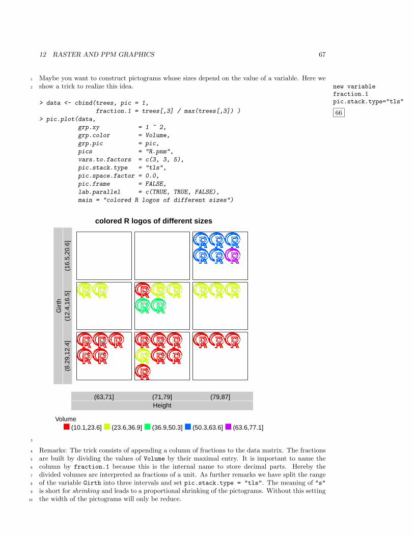
Maybe you want to construct pictograms whose sizes depend on the value of a variable. Here we1
show a trick to realize this idea. new variablefraction.1pic.stack.type="tls"
66
2
> data <- cbind(trees, pic = 1,
fraction.1 = trees[,3] / max(trees[,3]) )
> pic.plot(data,
grp.xy = 1 ~ 2,
grp.color = Volume,
grp.pic = pic,
pics = "R.pnm",
vars.to.factors = c(3, 3, 5),
pic.stack.type = "tls",
pic.space.factor = 0.0,
pic.frame = FALSE,
lab.parallel = c(TRUE, TRUE, FALSE),
main = "colored R logos of different sizes")
colored R logos of different sizes
Height(63,71] (71,79] (79,87]
Gir
th(8
.29,
12.4
](1
2.4,
16.5
](1
6.5,
20.6
]
Volume(10.1,23.6] (23.6,36.9] (36.9,50.3] (50.3,63.6] (63.6,77.1]
3
Remarks: The trick consists of appending a column of fractions to the data matrix. The fractions4
are built by dividing the values of Volume by their maximal entry. It is important to name the5
column by fraction.1 because this is the internal name to store decimal parts. Hereby the6
divided volumes are interpreted as fractions of a unit. As further remarks we have split the range7
of the variable Girth into three intervals and set pic.stack.type = "tls". The meaning of "s"8
is short for shrinking and leads to a proportional shrinking of the pictograms. Without this setting9
the width of the pictograms will only be reduce.10
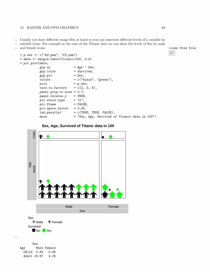
12 RASTER AND PPM GRAPHICS 68
Usually you have different image files at hand so you can represent different levels of a variable by1
suitable icons. For example in the case of the Titanic data we can show the levels of Sex by male2
and female icons: icons from file
67
3
> p.set <- c("m2.pnm", "f2.pnm")
> data <- margin.table(Titanic/100, 2:4)
> pic.plot(data,
grp.xy = Age ~ Sex,
grp.color = Survived,
grp.pic = Sex,
colors = c("black", "green"),
pics = p.set,
vars.to.factors = c(2, 3, 6),
panel.prop.to.size = 0.7,
panel.reverse.y = TRUE,
pic.stack.type = "s",
pic.frame = FALSE,
pic.space.factor = 0.05,
lab.parallel = c(TRUE, TRUE, FALSE),
main = "Sex, Age, Survived of Titanic data in 100")
Sex, Age, Survived of Titanic data in 100
SexMale Female
Age
Adu
ltC
hild
SexMale Female
SurvivedNo Yes
4
Sex
Age Male Female
Child 0.64 0.45
Adult 16.67 4.25
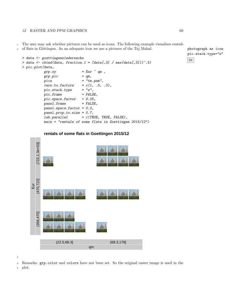
12 RASTER AND PPM GRAPHICS 69
The user may ask whether pictures can be used as icons. The following example visualizes rentals1
of flats in Gottingen. As an adequate icon we use a pictures of the Taj Mahal. photograph as icon
pic.stack.type="s"
68
2
> data <- goettingenniedersachs
> data <- cbind(data, fraction.1 = (data[,3] / max(data[,3]))^.5)
> pic.plot(data,
grp.xy = Eur ~ qm ,
grp.pic = qm,
pics = "tm.pnm",
vars.to.factors = c(1, .5, .3),
pic.stack.type = "s",
pic.frame = FALSE,
pic.space.factor = 0.05,
panel.frame = FALSE,
panel.space.factor = 0.2,
panel.prop.to.size = 0.7,
lab.parallel = c(TRUE, TRUE, FALSE),
main = "rentals of some flats in Goettingen 2015/12")
rentals of some flats in Goettingen 2015/12
qm(22.5,68.3] (68.3,178]
Eur
(356
,470
](4
70,7
22]
(722
,1.3
e+03
]
3
Remarks: grp.color and colors have not been set. So the original raster image is used in the4
plot.5
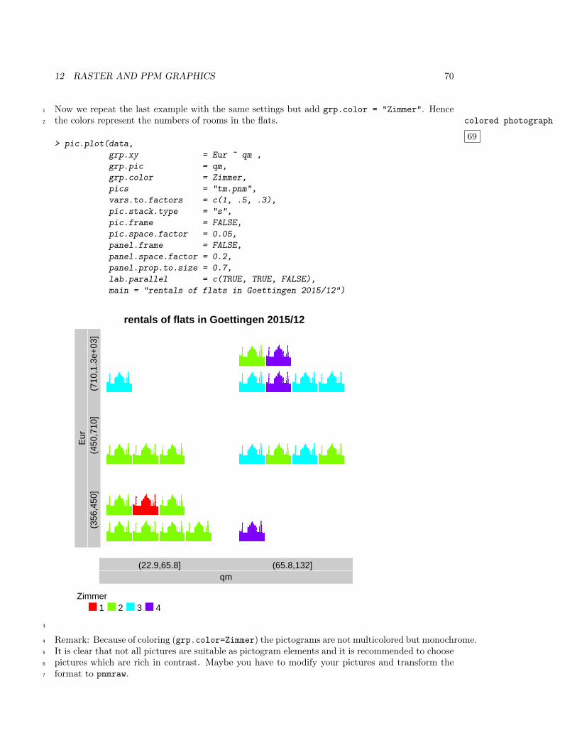
12 RASTER AND PPM GRAPHICS 70
Now we repeat the last example with the same settings but add grp.color = "Zimmer". Hence1
the colors represent the numbers of rooms in the flats. colored photograph
69
2
> pic.plot(data,
grp.xy = Eur ~ qm ,
grp.pic = qm,
grp.color = Zimmer,
pics = "tm.pnm",
vars.to.factors = c(1, .5, .3),
pic.stack.type = "s",
pic.frame = FALSE,
pic.space.factor = 0.05,
panel.frame = FALSE,
panel.space.factor = 0.2,
panel.prop.to.size = 0.7,
lab.parallel = c(TRUE, TRUE, FALSE),
main = "rentals of flats in Goettingen 2015/12")
rentals of flats in Goettingen 2015/12
qm(22.9,65.8] (65.8,132]
Eur
(356
,450
](4
50,7
10]
(710
,1.3
e+03
]
Zimmer1 2 3 4
3
Remark: Because of coloring (grp.color=Zimmer) the pictograms are not multicolored but monochrome.4
It is clear that not all pictures are suitable as pictogram elements and it is recommended to choose5
pictures which are rich in contrast. Maybe you have to modify your pictures and transform the6
format to pnmraw.7
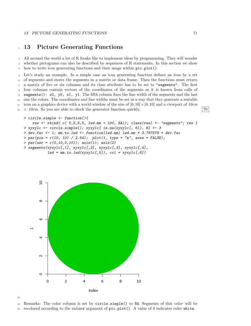
13 PICTURE GENERATING FUNCTIONS 71
13 Picture Generating Functions1
All around the world a lot of R freaks like to implement ideas by programming. They will wonder2
whether pictograms can also be described by sequences of R statements. In this section we show3
how to write icon generating functions and their usage within pic.plot().4
Let’s study an example. In a simple case an icon generating function defines an icon by a set5
of segments and stores the segments in a matrix or data frame. Then the functions must return6
a matrix of five or six columns and its class attribute has to be set to "segments". The first7
four columns contain vectors of the coordinates of the segments as it is known from calls of8
segments(): x0, y0, x1, y1. The fifth column fixes the line width of the segments and the last9
one the colors. The coordinates and line widths must be set in a way that they generate a suitable10
icon on a graphics device with a world window of the size of [0, 10]× [0, 10] and a viewport of 10cm11
× 10cm. So you are able to check the generator function quickly. 7012
> circle.simple <- function(){
res <- rbind( c( 5,5,5,5, lwd.mm = 100, NA)); class(res) <- "segments"; res }
> xyxylc <- circle.simple(); xyxylc[ is.na(xyxylc[, 6]), 6] <- 3
> dev.fac <- 1; mm.to.lwd <- function(lwd.mm) lwd.mm * 3.787878 * dev.fac
> par(pin = c(10, 10) / 2.54); plot(1, type = "n", axes = FALSE);
> par(usr = c(0,10,0,10)); axis(1); axis(2)
> segments(xyxylc[,1], xyxylc[,2], xyxylc[,3], xyxylc[,4],
lwd = mm.to.lwd(xyxylc[,5]), col = xyxylc[,6])
Index
1
0 2 4 6 8 10
02
46
810
13
Remarks: The color column is set by circle.simple() to NA. Segments of this color will be14
recolored according to the colors argument of pic.plot(). A value of 0 indicates color white.15
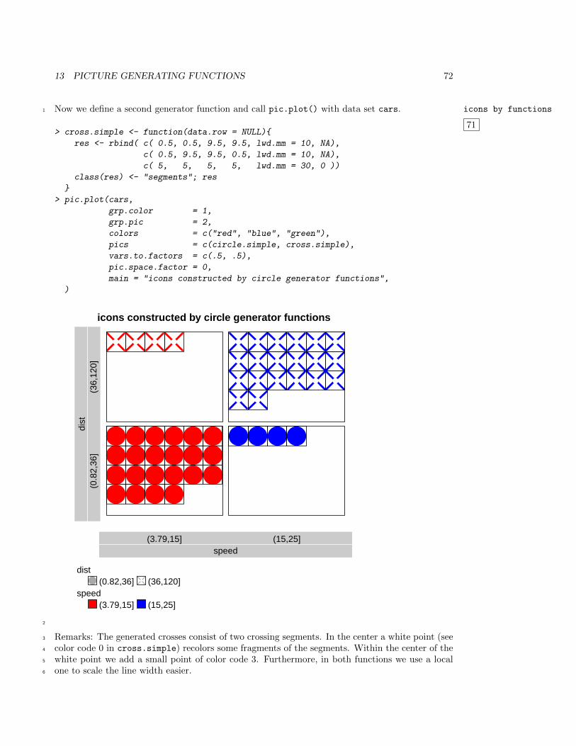
13 PICTURE GENERATING FUNCTIONS 72
Now we define a second generator function and call pic.plot() with data set cars. icons by functions
71
1
> cross.simple <- function(data.row = NULL){
res <- rbind( c( 0.5, 0.5, 9.5, 9.5, lwd.mm = 10, NA),
c( 0.5, 9.5, 9.5, 0.5, lwd.mm = 10, NA),
c( 5, 5, 5, 5, lwd.mm = 30, 0 ))
class(res) <- "segments"; res
}
> pic.plot(cars,
grp.color = 1,
grp.pic = 2,
colors = c("red", "blue", "green"),
pics = c(circle.simple, cross.simple),
vars.to.factors = c(.5, .5),
pic.space.factor = 0,
main = "icons constructed by circle generator functions",
)
icons constructed by circle generator functions
speed(3.79,15] (15,25]
dist
(0.8
2,36
](3
6,12
0]
dist(0.82,36] (36,120]
speed(3.79,15] (15,25]
2
Remarks: The generated crosses consist of two crossing segments. In the center a white point (see3
color code 0 in cross.simple) recolors some fragments of the segments. Within the center of the4
white point we add a small point of color code 3. Furthermore, in both functions we use a local5
one to scale the line width easier.6
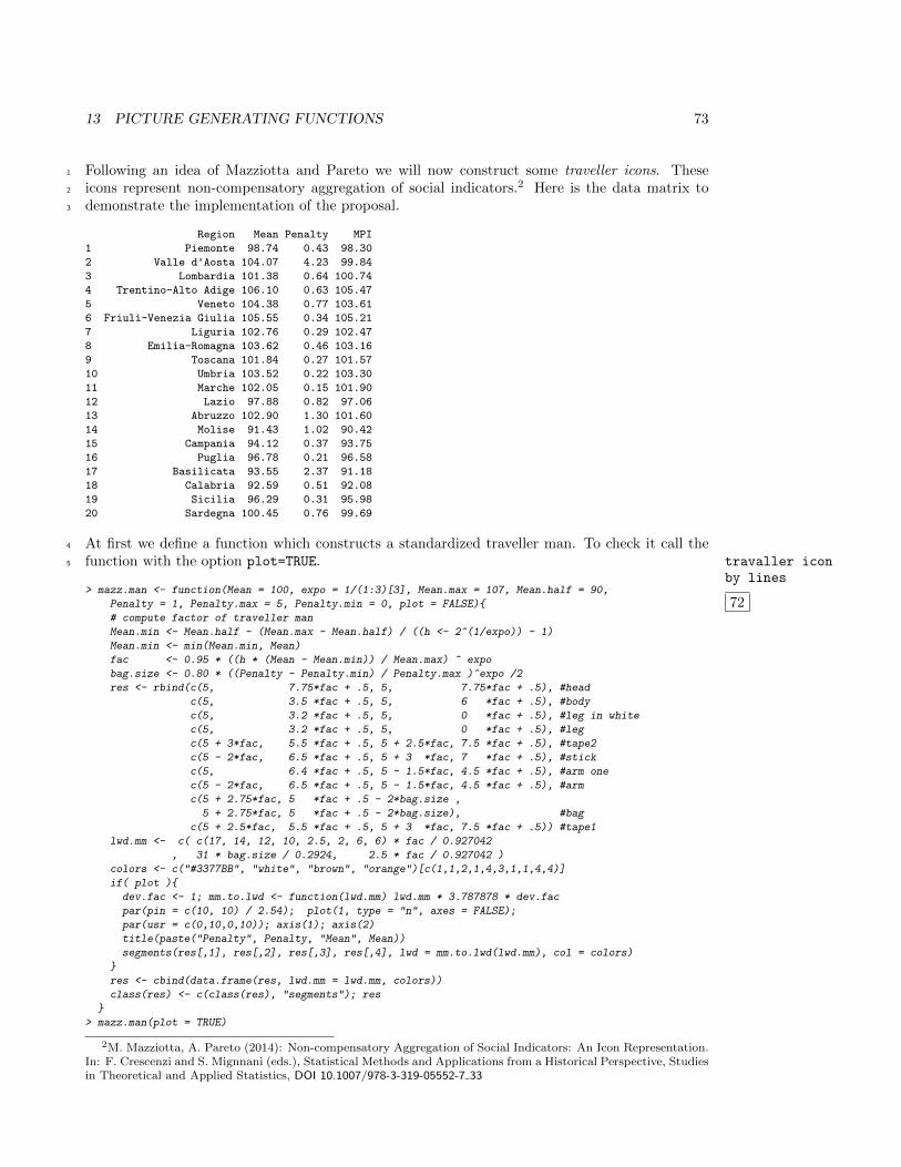
13 PICTURE GENERATING FUNCTIONS 73
Following an idea of Mazziotta and Pareto we will now construct some traveller icons. These1
icons represent non-compensatory aggregation of social indicators.2 Here is the data matrix to2
demonstrate the implementation of the proposal.3
Region Mean Penalty MPI
1 Piemonte 98.74 0.43 98.30
2 Valle d'Aosta 104.07 4.23 99.84
3 Lombardia 101.38 0.64 100.74
4 Trentino-Alto Adige 106.10 0.63 105.47
5 Veneto 104.38 0.77 103.61
6 Friuli-Venezia Giulia 105.55 0.34 105.21
7 Liguria 102.76 0.29 102.47
8 Emilia-Romagna 103.62 0.46 103.16
9 Toscana 101.84 0.27 101.57
10 Umbria 103.52 0.22 103.30
11 Marche 102.05 0.15 101.90
12 Lazio 97.88 0.82 97.06
13 Abruzzo 102.90 1.30 101.60
14 Molise 91.43 1.02 90.42
15 Campania 94.12 0.37 93.75
16 Puglia 96.78 0.21 96.58
17 Basilicata 93.55 2.37 91.18
18 Calabria 92.59 0.51 92.08
19 Sicilia 96.29 0.31 95.98
20 Sardegna 100.45 0.76 99.69
At first we define a function which constructs a standardized traveller man. To check it call the4
function with the option plot=TRUE. travaller iconby lines
5
72> mazz.man <- function(Mean = 100, expo = 1/(1:3)[3], Mean.max = 107, Mean.half = 90,
Penalty = 1, Penalty.max = 5, Penalty.min = 0, plot = FALSE){
# compute factor of traveller man
Mean.min <- Mean.half - (Mean.max - Mean.half) / ((h <- 2^(1/expo)) - 1)
Mean.min <- min(Mean.min, Mean)
fac <- 0.95 * ((h * (Mean - Mean.min)) / Mean.max) ^ expo
bag.size <- 0.80 * ((Penalty - Penalty.min) / Penalty.max )^expo /2
res <- rbind(c(5, 7.75*fac + .5, 5, 7.75*fac + .5), #head
c(5, 3.5 *fac + .5, 5, 6 *fac + .5), #body
c(5, 3.2 *fac + .5, 5, 0 *fac + .5), #leg in white
c(5, 3.2 *fac + .5, 5, 0 *fac + .5), #leg
c(5 + 3*fac, 5.5 *fac + .5, 5 + 2.5*fac, 7.5 *fac + .5), #tape2
c(5 - 2*fac, 6.5 *fac + .5, 5 + 3 *fac, 7 *fac + .5), #stick
c(5, 6.4 *fac + .5, 5 - 1.5*fac, 4.5 *fac + .5), #arm one
c(5 - 2*fac, 6.5 *fac + .5, 5 - 1.5*fac, 4.5 *fac + .5), #arm
c(5 + 2.75*fac, 5 *fac + .5 - 2*bag.size ,
5 + 2.75*fac, 5 *fac + .5 - 2*bag.size), #bag
c(5 + 2.5*fac, 5.5 *fac + .5, 5 + 3 *fac, 7.5 *fac + .5)) #tape1
lwd.mm <- c( c(17, 14, 12, 10, 2.5, 2, 6, 6) * fac / 0.927042
, 31 * bag.size / 0.2924, 2.5 * fac / 0.927042 )
colors <- c("#3377BB", "white", "brown", "orange")[c(1,1,2,1,4,3,1,1,4,4)]
if( plot ){
dev.fac <- 1; mm.to.lwd <- function(lwd.mm) lwd.mm * 3.787878 * dev.fac
par(pin = c(10, 10) / 2.54); plot(1, type = "n", axes = FALSE);
par(usr = c(0,10,0,10)); axis(1); axis(2)
title(paste("Penalty", Penalty, "Mean", Mean))
segments(res[,1], res[,2], res[,3], res[,4], lwd = mm.to.lwd(lwd.mm), col = colors)
}
res <- cbind(data.frame(res, lwd.mm = lwd.mm, colors))
class(res) <- c(class(res), "segments"); res
}
> mazz.man(plot = TRUE)
2M. Mazziotta, A. Pareto (2014): Non-compensatory Aggregation of Social Indicators: An Icon Representation.In: F. Crescenzi and S. Mignnani (eds.), Statistical Methods and Applications from a Historical Perspective, Studiesin Theoretical and Applied Statistics, DOI 10.1007/978-3-319-05552-7 33
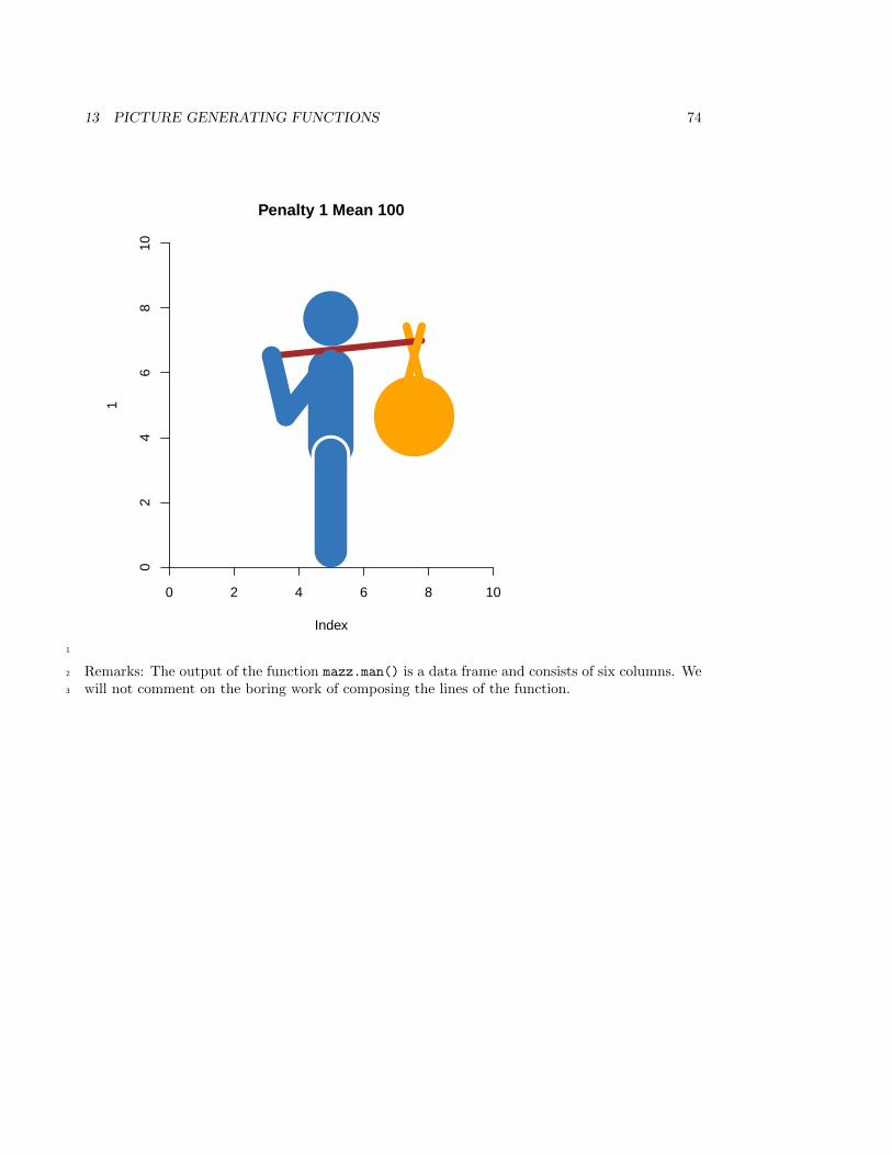
13 PICTURE GENERATING FUNCTIONS 74
Index
1
0 2 4 6 8 10
02
46
810
Penalty 1 Mean 100
1
Remarks: The output of the function mazz.man() is a data frame and consists of six columns. We2
will not comment on the boring work of composing the lines of the function.3
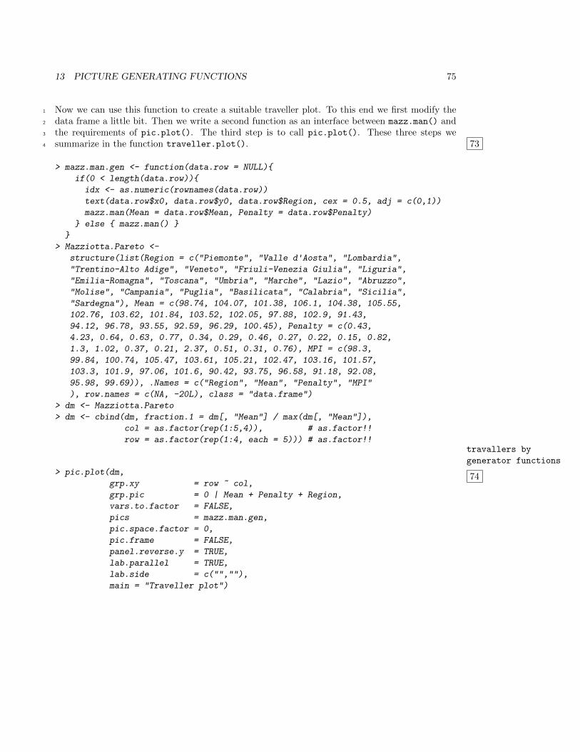
13 PICTURE GENERATING FUNCTIONS 75
Now we can use this function to create a suitable traveller plot. To this end we first modify the1
data frame a little bit. Then we write a second function as an interface between mazz.man() and2
the requirements of pic.plot(). The third step is to call pic.plot(). These three steps we3
summarize in the function traveller.plot(). 734
> mazz.man.gen <- function(data.row = NULL){
if(0 < length(data.row)){
idx <- as.numeric(rownames(data.row))
text(data.row$x0, data.row$y0, data.row$Region, cex = 0.5, adj = c(0,1))
mazz.man(Mean = data.row$Mean, Penalty = data.row$Penalty)
} else { mazz.man() }
}
> Mazziotta.Pareto <-
structure(list(Region = c("Piemonte", "Valle d'Aosta", "Lombardia",
"Trentino-Alto Adige", "Veneto", "Friuli-Venezia Giulia", "Liguria",
"Emilia-Romagna", "Toscana", "Umbria", "Marche", "Lazio", "Abruzzo",
"Molise", "Campania", "Puglia", "Basilicata", "Calabria", "Sicilia",
"Sardegna"), Mean = c(98.74, 104.07, 101.38, 106.1, 104.38, 105.55,
102.76, 103.62, 101.84, 103.52, 102.05, 97.88, 102.9, 91.43,
94.12, 96.78, 93.55, 92.59, 96.29, 100.45), Penalty = c(0.43,
4.23, 0.64, 0.63, 0.77, 0.34, 0.29, 0.46, 0.27, 0.22, 0.15, 0.82,
1.3, 1.02, 0.37, 0.21, 2.37, 0.51, 0.31, 0.76), MPI = c(98.3,
99.84, 100.74, 105.47, 103.61, 105.21, 102.47, 103.16, 101.57,
103.3, 101.9, 97.06, 101.6, 90.42, 93.75, 96.58, 91.18, 92.08,
95.98, 99.69)), .Names = c("Region", "Mean", "Penalty", "MPI"
), row.names = c(NA, -20L), class = "data.frame")
> dm <- Mazziotta.Pareto
> dm <- cbind(dm, fraction.1 = dm[, "Mean"] / max(dm[, "Mean"]),
col = as.factor(rep(1:5,4)), # as.factor!!
row = as.factor(rep(1:4, each = 5))) # as.factor!!travallers by
generator functions
74> pic.plot(dm,
grp.xy = row ~ col,
grp.pic = 0 | Mean + Penalty + Region,
vars.to.factor = FALSE,
pics = mazz.man.gen,
pic.space.factor = 0,
pic.frame = FALSE,
panel.reverse.y = TRUE,
lab.parallel = TRUE,
lab.side = c("",""),
main = "Traveller plot")
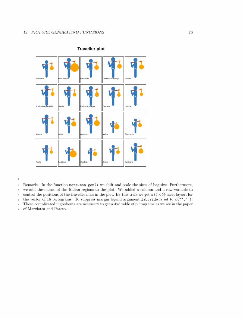
13 PICTURE GENERATING FUNCTIONS 76
Puglia
Marche
Friuli−Venezia Giulia
Piemonte
Basilicata
Lazio
Liguria
Valle d'Aosta
Calabria
Abruzzo
Emilia−Romagna
Lombardia
Sicilia
Molise
Toscana
Trentino−Alto Adige
Sardegna
Campania
Umbria
Veneto
Traveller plot
1
Remarks: In the function mazz.man.gen() we shift and scale the sizes of bag.size. Furthermore,2
we add the names of the Italian regions to the plot. We added a column and a row variable to3
control the positions of the traveller man in the plot. By this trick we get a (4×5)-facet layout for4
the vector of 16 pictograms. To suppress margin legend argument lab.side is set to c("","").5
These complicated ingredients are necessary to get a 4x5 table of pictograms as we see in the paper6
of Mazziotta and Pareto.7
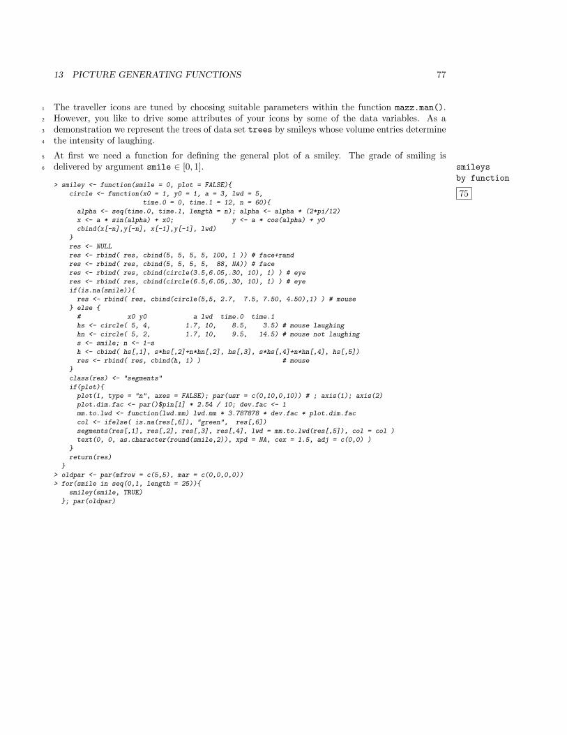
13 PICTURE GENERATING FUNCTIONS 77
The traveller icons are tuned by choosing suitable parameters within the function mazz.man().1
However, you like to drive some attributes of your icons by some of the data variables. As a2
demonstration we represent the trees of data set trees by smileys whose volume entries determine3
the intensity of laughing.4
At first we need a function for defining the general plot of a smiley. The grade of smiling is5
delivered by argument smile ∈ [0, 1]. smileys
by function
6
75> smiley <- function(smile = 0, plot = FALSE){
circle <- function(x0 = 1, y0 = 1, a = 3, lwd = 5,
time.0 = 0, time.1 = 12, n = 60){
alpha <- seq(time.0, time.1, length = n); alpha <- alpha * (2*pi/12)
x <- a * sin(alpha) + x0; y <- a * cos(alpha) + y0
cbind(x[-n],y[-n], x[-1],y[-1], lwd)
}
res <- NULL
res <- rbind( res, cbind(5, 5, 5, 5, 100, 1 )) # face+rand
res <- rbind( res, cbind(5, 5, 5, 5, 88, NA)) # face
res <- rbind( res, cbind(circle(3.5,6.05,.30, 10), 1) ) # eye
res <- rbind( res, cbind(circle(6.5,6.05,.30, 10), 1) ) # eye
if(is.na(smile)){
res <- rbind( res, cbind(circle(5,5, 2.7, 7.5, 7.50, 4.50),1) ) # mouse
} else {
# x0 y0 a lwd time.0 time.1
hs <- circle( 5, 4, 1.7, 10, 8.5, 3.5) # mouse laughing
hn <- circle( 5, 2, 1.7, 10, 9.5, 14.5) # mouse not laughing
s <- smile; n <- 1-s
h <- cbind( hs[,1], s*hs[,2]+n*hn[,2], hs[,3], s*hs[,4]+n*hn[,4], hs[,5])
res <- rbind( res, cbind(h, 1) ) # mouse
}
class(res) <- "segments"
if(plot){
plot(1, type = "n", axes = FALSE); par(usr = c(0,10,0,10)) # ; axis(1); axis(2)
plot.dim.fac <- par()$pin[1] * 2.54 / 10; dev.fac <- 1
mm.to.lwd <- function(lwd.mm) lwd.mm * 3.787878 * dev.fac * plot.dim.fac
col <- ifelse( is.na(res[,6]), "green", res[,6])
segments(res[,1], res[,2], res[,3], res[,4], lwd = mm.to.lwd(res[,5]), col = col )
text(0, 0, as.character(round(smile,2)), xpd = NA, cex = 1.5, adj = c(0,0) )
}
return(res)
}
> oldpar <- par(mfrow = c(5,5), mar = c(0,0,0,0))
> for(smile in seq(0,1, length = 25)){
smiley(smile, TRUE)
}; par(oldpar)
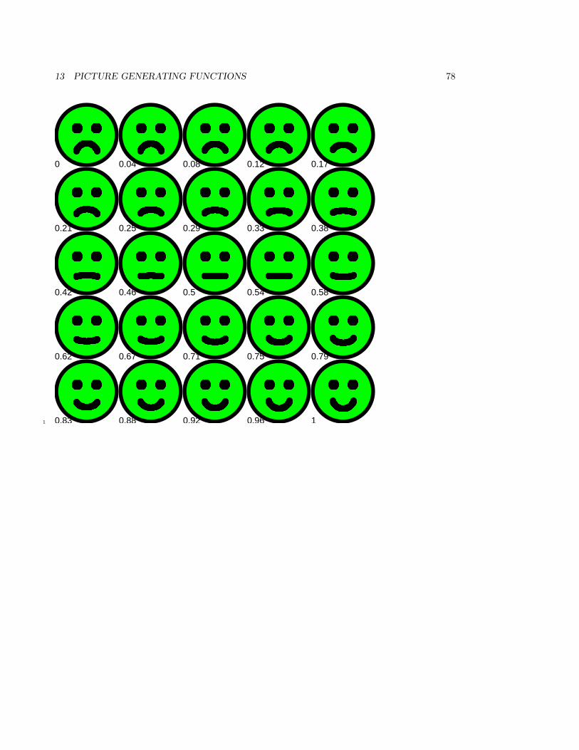
13 PICTURE GENERATING FUNCTIONS 78
Index
0
Index
1
0.04
Index
10.08
Index
1
0.12
Index
1
0.17
Index
0.21
Index
1
0.25
Index
1
0.29
Index
10.33
Index
1
0.38
Index
0.42
Index
1
0.46
Index
1
0.5
Index
1
0.54
Index
10.58
Index
0.62
Index
1
0.67
Index
1
0.71
Index
1
0.75
Index
1
0.79
0.83
1
0.88
1
0.92
1
0.96
1
11
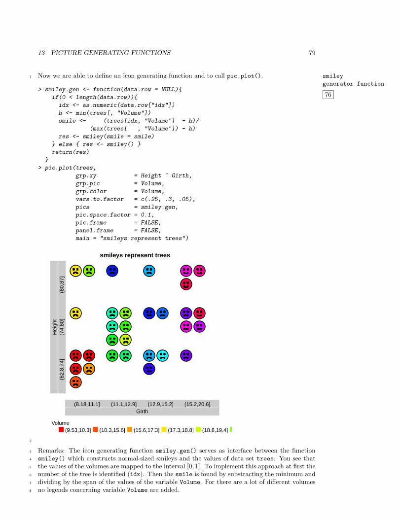
13 PICTURE GENERATING FUNCTIONS 79
Now we are able to define an icon generating function and to call pic.plot(). smiley
generator function
76
1
> smiley.gen <- function(data.row = NULL){
if(0 < length(data.row)){
idx <- as.numeric(data.row["idx"])
h <- min(trees[, "Volume"])
smile <- (trees[idx, "Volume"] - h)/
(max(trees[ , "Volume"]) - h)
res <- smiley(smile = smile)
} else { res <- smiley() }
return(res)
}
> pic.plot(trees,
grp.xy = Height ~ Girth,
grp.pic = Volume,
grp.color = Volume,
vars.to.factor = c(.25, .3, .05),
pics = smiley.gen,
pic.space.factor = 0.1,
pic.frame = FALSE,
panel.frame = FALSE,
main = "smileys represent trees")
smileys represent trees
Girth(8.18,11.1] (11.1,12.9] (12.9,15.2] (15.2,20.6]
Hei
ght
(62.
8,74
](7
4,80
](8
0,87
]
Volume(9.53,10.3] (10.3,15.6] (15.6,17.3] (17.3,18.8] (18.8,19.4]
2
Remarks: The icon generating function smiley.gen() serves as interface between the function3
smiley() which constructs normal-sized smileys and the values of data set trees. You see that4
the values of the volumes are mapped to the interval [0, 1]. To implement this approach at first the5
number of the tree is identified (idx). Then the smile is found by substracting the minimum and6
dividing by the span of the values of the variable Volume. For there are a lot of different volumes7
no legends concerning variable Volume are added.8
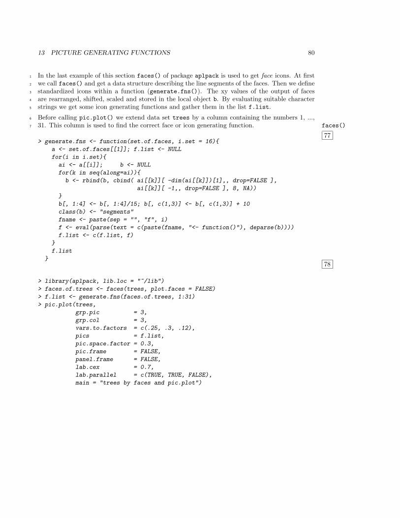
13 PICTURE GENERATING FUNCTIONS 80
In the last example of this section faces() of package aplpack is used to get face icons. At first1
we call faces() and get a data structure describing the line segments of the faces. Then we define2
standardized icons within a function (generate.fns()). The xy values of the output of faces3
are rearranged, shifted, scaled and stored in the local object b. By evaluating suitable character4
strings we get some icon generating functions and gather them in the list f.list.5
Before calling pic.plot() we extend data set trees by a column containing the numbers 1, ...,6
31. This column is used to find the correct face or icon generating function. faces()
77
7
> generate.fns <- function(set.of.faces, i.set = 16){
a <- set.of.faces[[1]]; f.list <- NULL
for(i in i.set){
ai <- a[[i]]; b <- NULL
for(k in seq(along=ai)){
b <- rbind(b, cbind( ai[[k]][ -dim(ai[[k]])[1],, drop=FALSE ],
ai[[k]][ -1,, drop=FALSE ], 8, NA))
}
b[, 1:4] <- b[, 1:4]/15; b[, c(1,3)] <- b[, c(1,3)] + 10
class(b) <- "segments"
fname <- paste(sep = "", "f", i)
f <- eval(parse(text = c(paste(fname, "<- function()"), deparse(b))))
f.list <- c(f.list, f)
}
f.list
}78
> library(aplpack, lib.loc = "~/lib")
> faces.of.trees <- faces(trees, plot.faces = FALSE)
> f.list <- generate.fns(faces.of.trees, 1:31)
> pic.plot(trees,
grp.pic = 3,
grp.col = 3,
vars.to.factors = c(.25, .3, .12),
pics = f.list,
pic.space.factor = 0.3,
pic.frame = FALSE,
panel.frame = FALSE,
lab.cex = 0.7,
lab.parallel = c(TRUE, TRUE, FALSE),
main = "trees by faces and pic.plot")
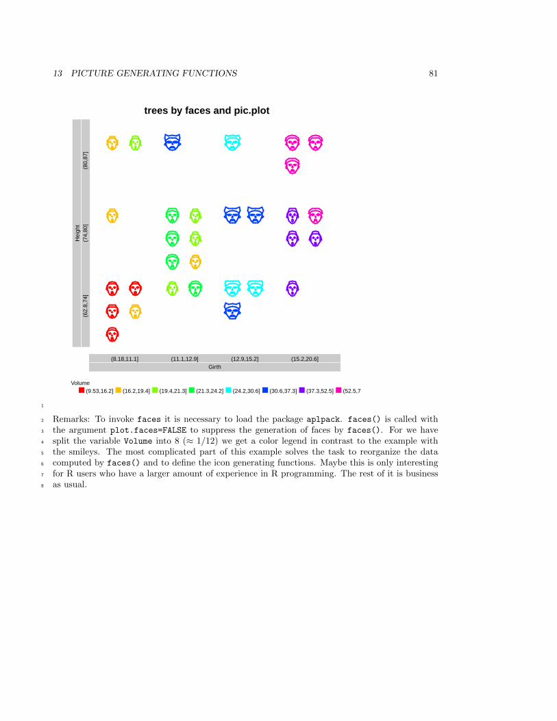
13 PICTURE GENERATING FUNCTIONS 81
trees by faces and pic.plot
Girth(8.18,11.1] (11.1,12.9] (12.9,15.2] (15.2,20.6]
Hei
ght
(62.
8,74
](7
4,80
](8
0,87
]
Volume(9.53,16.2] (16.2,19.4] (19.4,21.3] (21.3,24.2] (24.2,30.6] (30.6,37.3] (37.3,52.5] (52.5,77]
1
Remarks: To invoke faces it is necessary to load the package aplpack. faces() is called with2
the argument plot.faces=FALSE to suppress the generation of faces by faces(). For we have3
split the variable Volume into 8 (≈ 1/12) we get a color legend in contrast to the example with4
the smileys. The most complicated part of this example solves the task to reorganize the data5
computed by faces() and to define the icon generating functions. Maybe this is only interesting6
for R users who have a larger amount of experience in R programming. The rest of it is business7
as usual.8
14 GRAPHICAL ADD-ONS FOR PICTOGRAM PLOTS 82
14 Graphical Add-ons for Pictogram Plots1
After calling a high-level plotting function you often invoke some low-level plotting function to tune2
the plot. Therefore you wonder whether you can add some graphical elements to a pictogram plot.3
Indeed pic.plot() returns a list of three elements: The first element is a matrix and characterizes4
the panels whose columns have the names xmins, xmaxs, ymins, ymaxs, job.no, counts, row, col.5
So the first four columns store the coordinates of the world windows of the panels. counts show the6
number of elements drawn in the panels and row and col tell you the indices of the panels in a ma-7
trix like interpretation of a panel grid. Column five holds job.no which links the panels to the ele-8
ments of the data matrix stored in the second element of the list. By the way, the data matrix is ex-9
panded by some additional variables showing sign, fraction.1, color, pic, job.no, x0, y010
– all the information that may be interesting concerning a single pictogram element.11
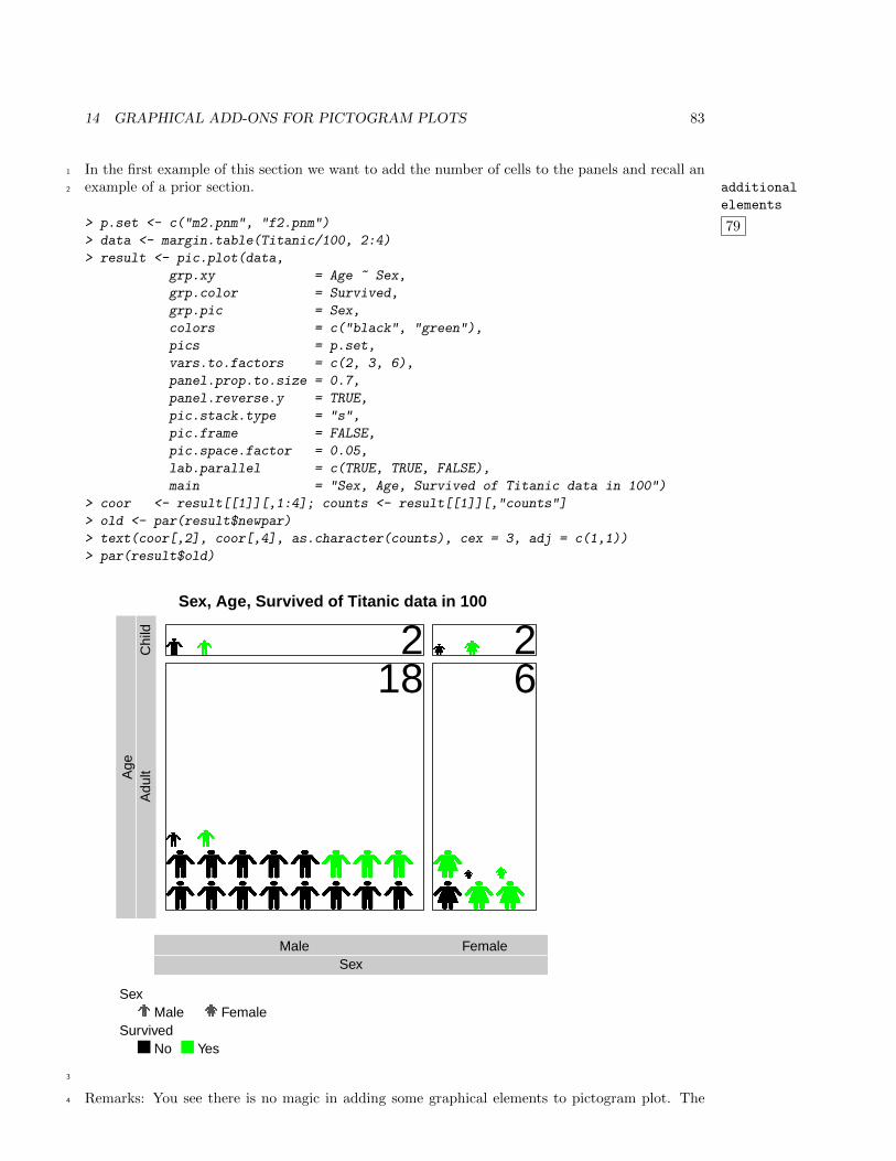
14 GRAPHICAL ADD-ONS FOR PICTOGRAM PLOTS 83
In the first example of this section we want to add the number of cells to the panels and recall an1
example of a prior section. additional
elements
79
2
> p.set <- c("m2.pnm", "f2.pnm")
> data <- margin.table(Titanic/100, 2:4)
> result <- pic.plot(data,
grp.xy = Age ~ Sex,
grp.color = Survived,
grp.pic = Sex,
colors = c("black", "green"),
pics = p.set,
vars.to.factors = c(2, 3, 6),
panel.prop.to.size = 0.7,
panel.reverse.y = TRUE,
pic.stack.type = "s",
pic.frame = FALSE,
pic.space.factor = 0.05,
lab.parallel = c(TRUE, TRUE, FALSE),
main = "Sex, Age, Survived of Titanic data in 100")
> coor <- result[[1]][,1:4]; counts <- result[[1]][,"counts"]
> old <- par(result$newpar)
> text(coor[,2], coor[,4], as.character(counts), cex = 3, adj = c(1,1))
> par(result$old)
Sex, Age, Survived of Titanic data in 100
SexMale Female
Age
Adu
ltC
hild
SexMale Female
SurvivedNo Yes
2 218 6
3
Remarks: You see there is no magic in adding some graphical elements to pictogram plot. The4
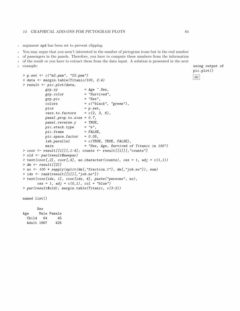
14 GRAPHICAL ADD-ONS FOR PICTOGRAM PLOTS 84
argument xpd has been set to prevent clipping.1
You may argue that you aren’t interested in the number of pictogram icons but in the real number2
of passengers in the panels. Therefore, you have to compute these numbers from the information3
of the result or you have to extract them from the data input. A solution is presented in the next4
example: using output of
pic.plot()
80
5
> p.set <- c("m2.pnm", "f2.pnm")
> data <- margin.table(Titanic/100, 2:4)
> result <- pic.plot(data,
grp.xy = Age ~ Sex,
grp.color = "Survived",
grp.pic = "Sex",
colors = c("black", "green"),
pics = p.set,
vars.to.factors = c(2, 3, 6),
panel.prop.to.size = 0.7,
panel.reverse.y = TRUE,
pic.stack.type = "s",
pic.frame = FALSE,
pic.space.factor = 0.05,
lab.parallel = c(TRUE, TRUE, FALSE),
main = "Sex, Age, Survived of Titanic in 100")
> coor <- result[[1]][,1:4]; counts <- result[[1]][,"counts"]
> old <- par(result$newpar)
> text(coor[,2], coor[,4], as.character(counts), cex = 1, adj = c(1,1))
> dm <- result[[2]]
> no <- 100 * sapply(split(dm[,"fraction.1"], dm[,"job.no"]), sum)
> idx <- rank(result[[1]][,"job.no"])
> text(coor[idx, 1], coor[idx, 4], paste("persons", no),
cex = 1, adj = c(0,1), col = "blue")
> par(result$old); margin.table(Titanic, c(3:2))
named list()
Sex
Age Male Female
Child 64 45
Adult 1667 425
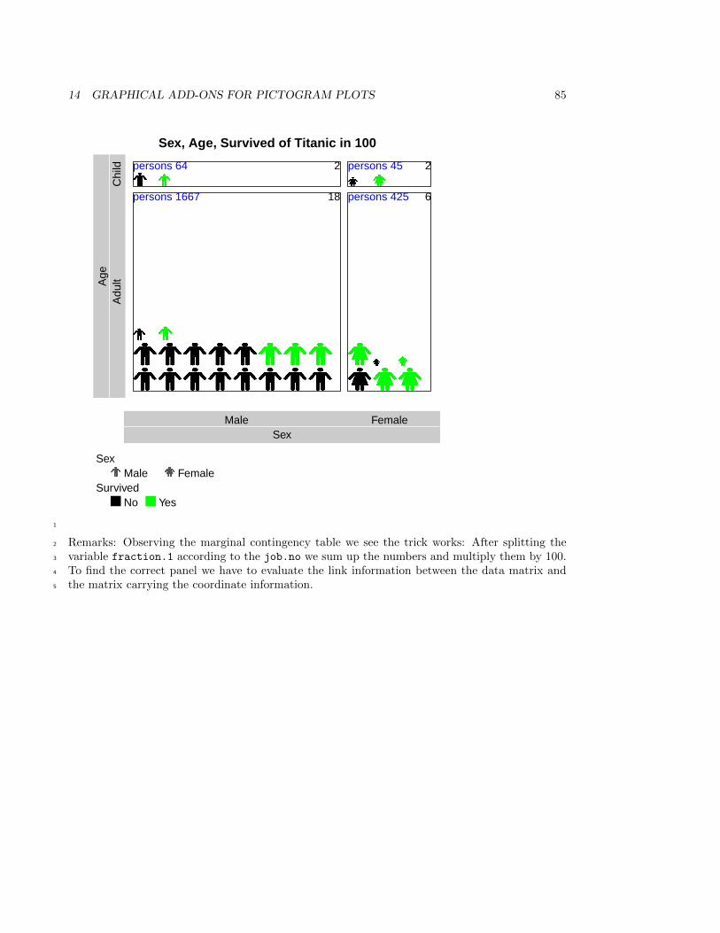
14 GRAPHICAL ADD-ONS FOR PICTOGRAM PLOTS 85
Sex, Age, Survived of Titanic in 100
SexMale Female
Age
Adu
ltC
hild
SexMale Female
SurvivedNo Yes
2 2
18 6persons 1667 persons 425
persons 64 persons 45
1
Remarks: Observing the marginal contingency table we see the trick works: After splitting the2
variable fraction.1 according to the job.no we sum up the numbers and multiply them by 100.3
To find the correct panel we have to evaluate the link information between the data matrix and4
the matrix carrying the coordinate information.5
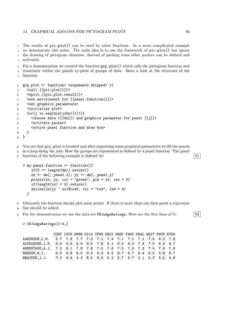
14 GRAPHICAL ADD-ONS FOR PICTOGRAM PLOTS 86
The results of pic.plot() can be used by other functions. In a more complicated example1
we demonstrate this point. The main idea is to use the framework of pic.plot() but ignore2
the drawing of pictogram elements. Instead of packing icons other packers can be defined and3
activated.4
For a demonstration we created the function grp.plot() which calls the pictogram function and5
constructs within the panels xy-plots of groups of data. Have a look at the structure of the6
function:7
grp.plot <- function( <arguments skipped> ){8
<call [[pic.plot()]]>9
<split [[pic.plot.result]]>10
<set environment for [[panel.function()]]>11
<set graphics parameters>12
<initialize plot>13
for(j in seq(dim(jobs)[1])){14
<choose data ([[dm]]) and graphics parameter for panel [[j]]>15
<activate packer>16
<active panel function and draw box>17
}18
}19
You see that pic.plot is invoked and after organizing some graphical parameters we fill the panels20
in a loop along the jobs. How the groups are represented is defined by a panel function. The panel21
function of the following example is defined by: 8122
> my.panel.function <- function(){
if(0 == length(dm)) return()
xx <- dm[, panel.x]; yy <- dm[, panel.y]
points(xx, yy, col = "green", pch = 16, cex = 2)
if(length(xx) < 2) return()
abline(lm(yy ~ xx)$coef, col = "red", lwd = 4)
}
Obviously the function should plot some points. If there is more than one data point a regression23
line should be added.24
For the demonstration we use the data set USJudgeRatings. Here are the first lines of it: 8225
> USJudgeRatings[1:5,]
CONT INTG DMNR DILG CFMG DECI PREP FAMI ORAL WRIT PHYS RTEN
AARONSON,L.H. 5.7 7.9 7.7 7.3 7.1 7.4 7.1 7.1 7.1 7.0 8.3 7.8
ALEXANDER,J.M. 6.8 8.9 8.8 8.5 7.8 8.1 8.0 8.0 7.8 7.9 8.5 8.7
ARMENTANO,A.J. 7.2 8.1 7.8 7.8 7.5 7.6 7.5 7.5 7.3 7.4 7.9 7.8
BERDON,R.I. 6.8 8.8 8.5 8.8 8.3 8.5 8.7 8.7 8.4 8.5 8.8 8.7
BRACKEN,J.J. 7.3 6.4 4.3 6.5 6.0 6.2 5.7 5.7 5.1 5.3 5.5 4.8
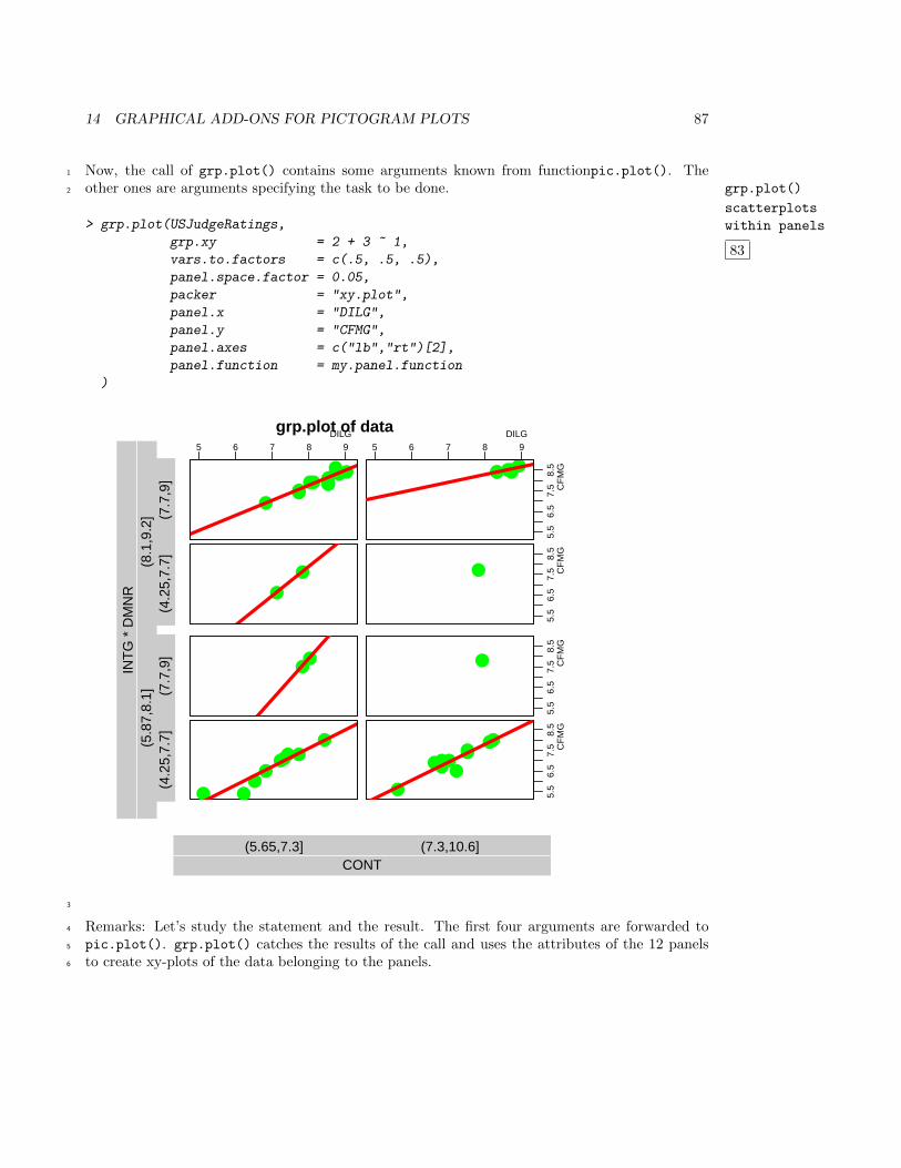
14 GRAPHICAL ADD-ONS FOR PICTOGRAM PLOTS 87
Now, the call of grp.plot() contains some arguments known from functionpic.plot(). The1
other ones are arguments specifying the task to be done. grp.plot()
scatterplots
within panels
83
2
> grp.plot(USJudgeRatings,
grp.xy = 2 + 3 ~ 1,
vars.to.factors = c(.5, .5, .5),
panel.space.factor = 0.05,
packer = "xy.plot",
panel.x = "DILG",
panel.y = "CFMG",
panel.axes = c("lb","rt")[2],
panel.function = my.panel.function
)
grp.plot of data
CONT(5.65,7.3] (7.3,10.6]
(4.2
5,7.
7](7
.7,9
](4
.25,
7.7]
(7.7
,9]
INT
G *
DM
NR
(5.8
7,8.
1](8
.1,9
.2]
5 6 7 8 9DILG
●●●●
●●
●●●●
●●
5.5
6.5
7.5
8.5
CF
MG
5 6 7 8 9DILG
●●●●●●
●●
5.5
6.5
7.5
8.5
CF
MG
●
●●
5.5
6.5
7.5
8.5
CF
MG
●
●
●●
●●●
●
●
●
5.5
6.5
7.5
8.5
CF
MG
●
●●
●●
●
●
●●●
3
Remarks: Let’s study the statement and the result. The first four arguments are forwarded to4
pic.plot(). grp.plot() catches the results of the call and uses the attributes of the 12 panels5
to create xy-plots of the data belonging to the panels.6
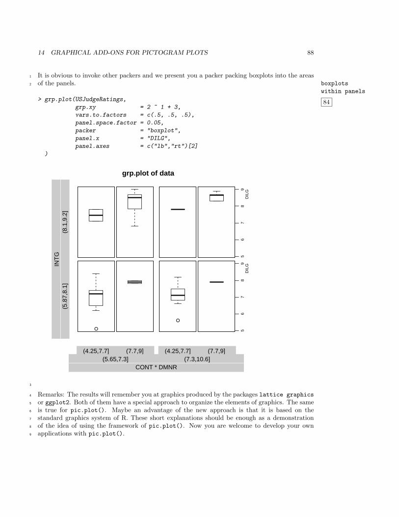
14 GRAPHICAL ADD-ONS FOR PICTOGRAM PLOTS 88
It is obvious to invoke other packers and we present you a packer packing boxplots into the areas1
of the panels. boxplots
within panels
84
2
> grp.plot(USJudgeRatings,
grp.xy = 2 ~ 1 + 3,
vars.to.factors = c(.5, .5, .5),
panel.space.factor = 0.05,
packer = "boxplot",
panel.x = "DILG",
panel.axes = c("lb","rt")[2]
)
grp.plot of data
(4.25,7.7] (7.7,9] (4.25,7.7] (7.7,9]
CONT * DMNR(5.65,7.3] (7.3,10.6]
INT
G(5
.87,
8.1]
(8.1
,9.2
]
56
78
9D
ILG
●
●
56
78
9D
ILG
3
Remarks: The results will remember you at graphics produced by the packages lattice graphics4
or ggplot2. Both of them have a special approach to organize the elements of graphics. The same5
is true for pic.plot(). Maybe an advantage of the new approach is that it is based on the6
standard graphics system of R. These short explanations should be enough as a demonstration7
of the idea of using the framework of pic.plot(). Now you are welcome to develop your own8
applications with pic.plot().9
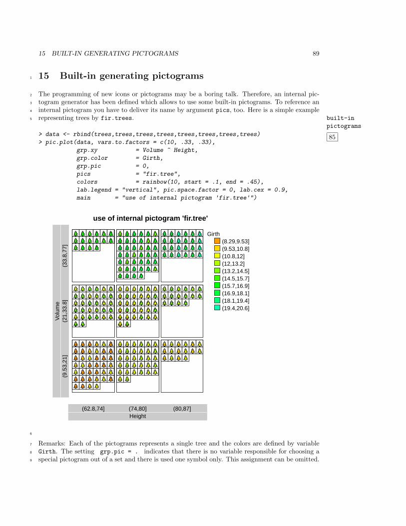
15 BUILT-IN GENERATING PICTOGRAMS 89
15 Built-in generating pictograms1
The programming of new icons or pictograms may be a boring talk. Therefore, an internal pic-2
togram generator has been defined which allows to use some built-in pictograms. To reference an3
internal pictogram you have to deliver its name by argument pics, too. Here is a simple example4
representing trees by fir.trees. built-in
pictograms
85
5
> data <- rbind(trees,trees,trees,trees,trees,trees,trees,trees)
> pic.plot(data, vars.to.factors = c(10, .33, .33),
grp.xy = Volume ~ Height,
grp.color = Girth,
grp.pic = 0,
pics = "fir.tree",
colors = rainbow(10, start = .1, end = .45),
lab.legend = "vertical", pic.space.factor = 0, lab.cex = 0.9,
main = "use of internal pictogram 'fir.tree'")
use of internal pictogram 'fir.tree'
Height(62.8,74] (74,80] (80,87]
Vol
ume
(9.5
3,21
](2
1,33
.8]
(33.
8,77
]
Girth(8.29,9.53](9.53,10.8](10.8,12](12,13.2](13.2,14.5](14.5,15.7](15.7,16.9](16.9,18.1](18.1,19.4](19.4,20.6]
6
Remarks: Each of the pictograms represents a single tree and the colors are defined by variable7
Girth. The setting grp.pic = . indicates that there is no variable responsible for choosing a8
special pictogram out of a set and there is used one symbol only. This assignment can be omitted.9
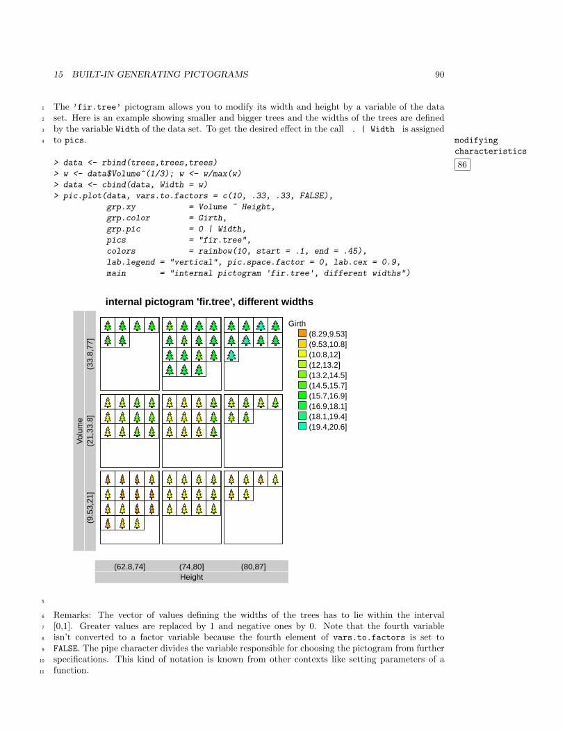
15 BUILT-IN GENERATING PICTOGRAMS 90
The ’fir.tree’ pictogram allows you to modify its width and height by a variable of the data1
set. Here is an example showing smaller and bigger trees and the widths of the trees are defined2
by the variable Width of the data set. To get the desired effect in the call . | Width is assigned3
to pics. modifying
characteristics
86
4
> data <- rbind(trees,trees,trees)
> w <- data$Volume^(1/3); w <- w/max(w)
> data <- cbind(data, Width = w)
> pic.plot(data, vars.to.factors = c(10, .33, .33, FALSE),
grp.xy = Volume ~ Height,
grp.color = Girth,
grp.pic = 0 | Width,
pics = "fir.tree",
colors = rainbow(10, start = .1, end = .45),
lab.legend = "vertical", pic.space.factor = 0, lab.cex = 0.9,
main = "internal pictogram 'fir.tree', different widths")
internal pictogram 'fir.tree', different widths
Height(62.8,74] (74,80] (80,87]
Vol
ume
(9.5
3,21
](2
1,33
.8]
(33.
8,77
]
Girth(8.29,9.53](9.53,10.8](10.8,12](12,13.2](13.2,14.5](14.5,15.7](15.7,16.9](16.9,18.1](18.1,19.4](19.4,20.6]
5
Remarks: The vector of values defining the widths of the trees has to lie within the interval6
[0,1]. Greater values are replaced by 1 and negative ones by 0. Note that the fourth variable7
isn’t converted to a factor variable because the fourth element of vars.to.factors is set to8
FALSE. The pipe character divides the variable responsible for choosing the pictogram from further9
specifications. This kind of notation is known from other contexts like setting parameters of a10
function.11
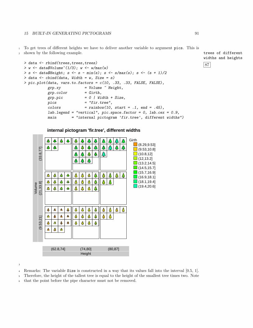
15 BUILT-IN GENERATING PICTOGRAMS 91
To get trees of different heights we have to deliver another variable to argument pics. This is1
shown by the following example. trees of different
widths and heights
87
2
> data <- rbind(trees,trees,trees)
> w <- data$Volume^(1/3); w <- w/max(w)
> s <- data$Height; s <- s - min(s); s <- s/max(s); s <- (s + 1)/2
> data <- cbind(data, Width = w, Size = s)
> pic.plot(data, vars.to.factors = c(10, .33, .33, FALSE, FALSE),
grp.xy = Volume ~ Height,
grp.color = Girth,
grp.pic = 0 | Width + Size,
pics = "fir.tree",
colors = rainbow(10, start = .1, end = .45),
lab.legend = "vertical", pic.space.factor = 0, lab.cex = 0.9,
main = "internal pictogram 'fir.tree', different widths")
internal pictogram 'fir.tree', different widths
Height(62.8,74] (74,80] (80,87]
Vol
ume
(9.5
3,21
](2
1,33
.8]
(33.
8,77
]
Girth(8.29,9.53](9.53,10.8](10.8,12](12,13.2](13.2,14.5](14.5,15.7](15.7,16.9](16.9,18.1](18.1,19.4](19.4,20.6]
3
Remarks: The variable Size is constructed in a way that its values fall into the interval [0.5, 1].4
Therefore, the height of the tallest tree is equal to the height of the smallest tree times two. Note5
that the point before the pipe character must not be removed.6
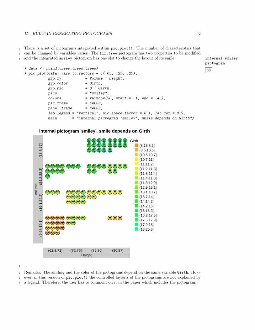
15 BUILT-IN GENERATING PICTOGRAMS 92
There is a set of pictograms integrated within pic.plot(). The number of characteristics that1
can be changed by variables varies: The fir.tree pictogram has two properties to be modified2
and the integrated smiley pictogram has one slot to change the layout of its smile. internal smiley
pictogram
88
3
> data <- rbind(trees,trees,trees)
> pic.plot(data, vars.to.factors = c(.05, .25, .25),
grp.xy = Volume ~ Height,
grp.color = Girth,
grp.pic = 0 | Girth,
pics = "smiley",
colors = rainbow(20, start = .1, end = .45),
pic.frame = FALSE,
panel.frame = FALSE,
lab.legend = "vertical", pic.space.factor = 0.1, lab.cex = 0.9,
main = "internal pictogram 'smiley', smile depends on Girth")
internal pictogram 'smiley', smile depends on Girth
Height(62.8,72] (72,76] (76,80] (80,87]
Vol
ume
(9.5
3,19
.1]
(19.
1,24
.2]
(24.
2,38
.3]
(38.
3,77
]
Girth(8.18,8.6](8.6,10.5](10.5,10.7](10.7,11](11,11.2](11.2,11.3](11.3,11.4](11.4,11.8](11.8,12.9](12.9,13.1](13.1,13.7](13.7,14](14,14.2](14.2,16](16,16.3](16.3,17.5](17.5,17.9](17.9,18](18,20.6]
4
Remarks: The smiling and the color of the pictograms depend on the same variable Girth. How-5
ever, in this version of pic.plot() the controlled layouts of the pictograms are not explained by6
a legend. Therefore, the user has to comment on it in the paper which includes the pictogram.7
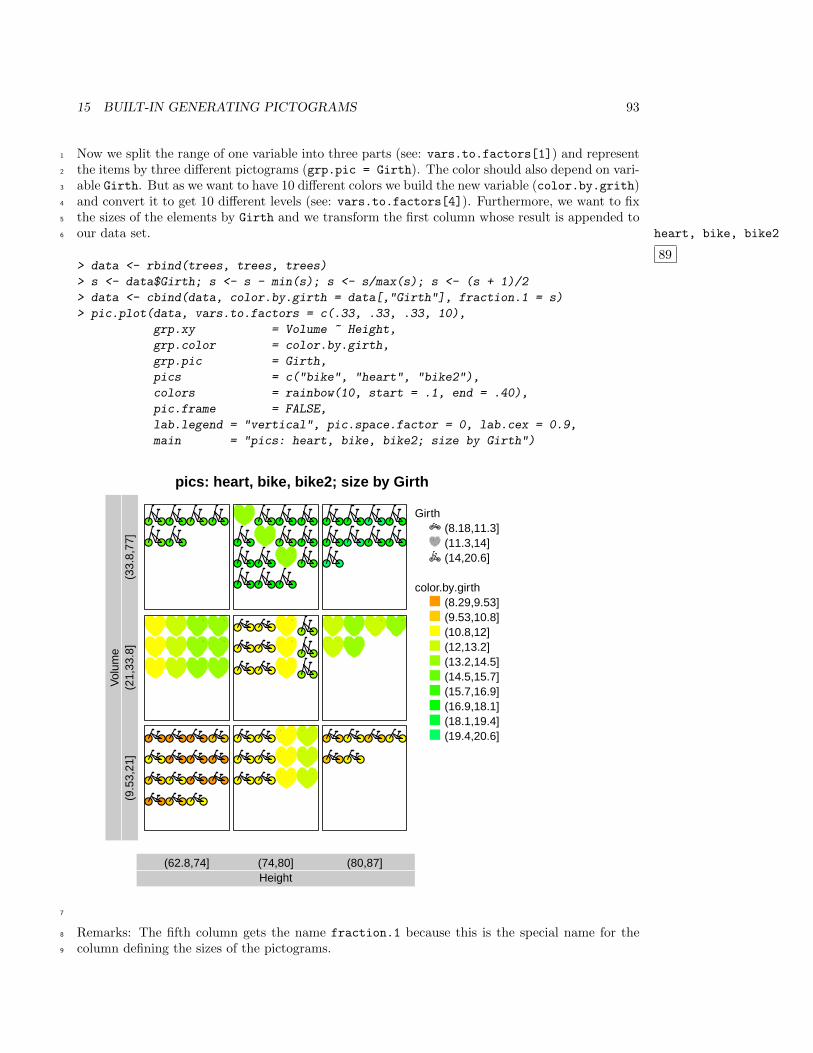
15 BUILT-IN GENERATING PICTOGRAMS 93
Now we split the range of one variable into three parts (see: vars.to.factors[1]) and represent1
the items by three different pictograms (grp.pic = Girth). The color should also depend on vari-2
able Girth. But as we want to have 10 different colors we build the new variable (color.by.grith)3
and convert it to get 10 different levels (see: vars.to.factors[4]). Furthermore, we want to fix4
the sizes of the elements by Girth and we transform the first column whose result is appended to5
our data set. heart, bike, bike2
89
6
> data <- rbind(trees, trees, trees)
> s <- data$Girth; s <- s - min(s); s <- s/max(s); s <- (s + 1)/2
> data <- cbind(data, color.by.girth = data[,"Girth"], fraction.1 = s)
> pic.plot(data, vars.to.factors = c(.33, .33, .33, 10),
grp.xy = Volume ~ Height,
grp.color = color.by.girth,
grp.pic = Girth,
pics = c("bike", "heart", "bike2"),
colors = rainbow(10, start = .1, end = .40),
pic.frame = FALSE,
lab.legend = "vertical", pic.space.factor = 0, lab.cex = 0.9,
main = "pics: heart, bike, bike2; size by Girth")
pics: heart, bike, bike2; size by Girth
Height(62.8,74] (74,80] (80,87]
Vol
ume
(9.5
3,21
](2
1,33
.8]
(33.
8,77
]
Girth(8.18,11.3](11.3,14](14,20.6]
color.by.girth(8.29,9.53](9.53,10.8](10.8,12](12,13.2](13.2,14.5](14.5,15.7](15.7,16.9](16.9,18.1](18.1,19.4](19.4,20.6]
7
Remarks: The fifth column gets the name fraction.1 because this is the special name for the8
column defining the sizes of the pictograms.9
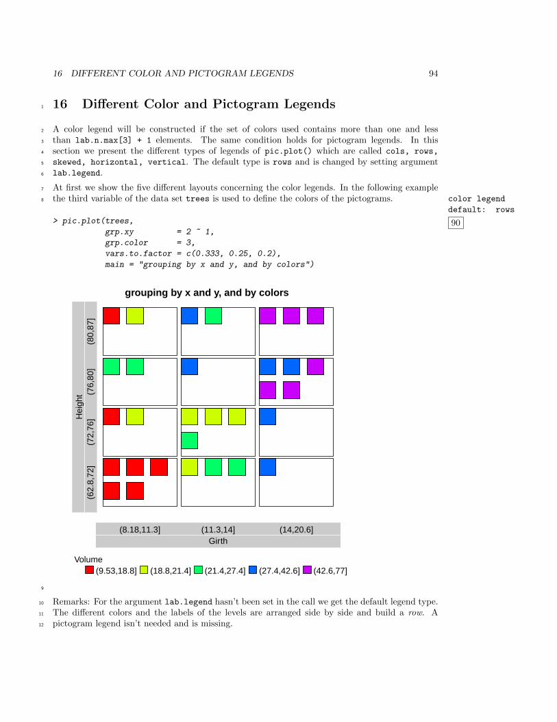
16 DIFFERENT COLOR AND PICTOGRAM LEGENDS 94
16 Different Color and Pictogram Legends1
A color legend will be constructed if the set of colors used contains more than one and less2
than lab.n.max[3] + 1 elements. The same condition holds for pictogram legends. In this3
section we present the different types of legends of pic.plot() which are called cols, rows,4
skewed, horizontal, vertical. The default type is rows and is changed by setting argument5
lab.legend.6
At first we show the five different layouts concerning the color legends. In the following example7
the third variable of the data set trees is used to define the colors of the pictograms. color legend
default: rows
90
8
> pic.plot(trees,
grp.xy = 2 ~ 1,
grp.color = 3,
vars.to.factor = c(0.333, 0.25, 0.2),
main = "grouping by x and y, and by colors")
grouping by x and y, and by colors
Girth(8.18,11.3] (11.3,14] (14,20.6]
Hei
ght
(62.
8,72
](7
2,76
](7
6,80
](8
0,87
]
Volume(9.53,18.8] (18.8,21.4] (21.4,27.4] (27.4,42.6] (42.6,77]
9
Remarks: For the argument lab.legend hasn’t been set in the call we get the default legend type.10
The different colors and the labels of the levels are arranged side by side and build a row. A11
pictogram legend isn’t needed and is missing.12
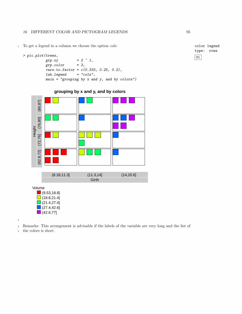
16 DIFFERENT COLOR AND PICTOGRAM LEGENDS 95
To get a legend in a column we choose the option cols: color legend
type: rows
91
1
> pic.plot(trees,
grp.xy = 2 ~ 1,
grp.color = 3,
vars.to.factor = c(0.333, 0.25, 0.2),
lab.legend = "cols",
main = "grouping by x and y, and by colors")
grouping by x and y, and by colors
Girth(8.18,11.3] (11.3,14] (14,20.6]
Hei
ght
(62.
8,72
](7
2,76
](7
6,80
](8
0,87
]
Volume(9.53,18.8](18.8,21.4](21.4,27.4](27.4,42.6](42.6,77]
2
Remarks: This arrangement is advisable if the labels of the variable are very long and the list of3
the colors is short.4
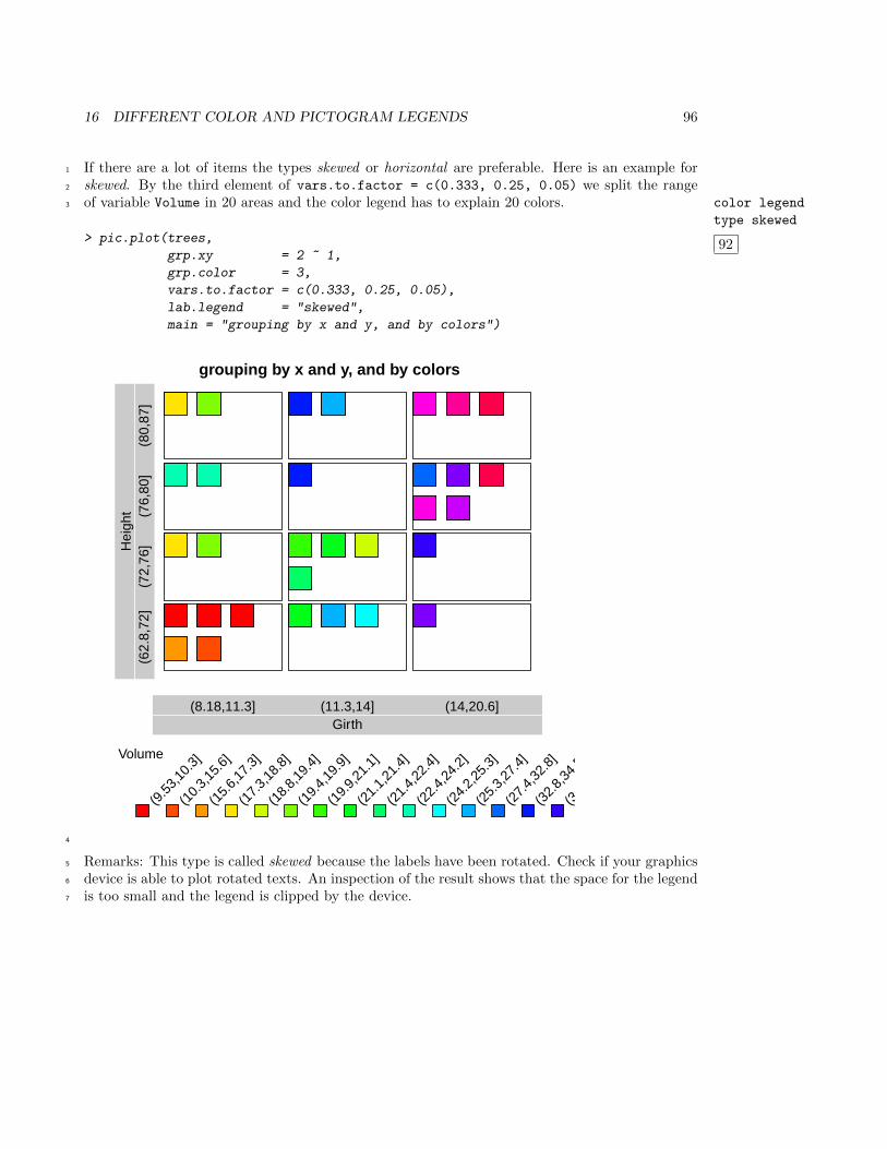
16 DIFFERENT COLOR AND PICTOGRAM LEGENDS 96
If there are a lot of items the types skewed or horizontal are preferable. Here is an example for1
skewed. By the third element of vars.to.factor = c(0.333, 0.25, 0.05) we split the range2
of variable Volume in 20 areas and the color legend has to explain 20 colors. color legend
type skewed
92
3
> pic.plot(trees,
grp.xy = 2 ~ 1,
grp.color = 3,
vars.to.factor = c(0.333, 0.25, 0.05),
lab.legend = "skewed",
main = "grouping by x and y, and by colors")
grouping by x and y, and by colors
Girth(8.18,11.3] (11.3,14] (14,20.6]
Hei
ght
(62.
8,72
](7
2,76
](7
6,80
](8
0,87
]
Volume
(9.5
3,10
.3]
(10.
3,15
.6]
(15.
6,17
.3]
(17.
3,18
.8]
(18.
8,19
.4]
(19.
4,19
.9]
(19.
9,21
.1]
(21.
1,21
.4]
(21.
4,22
.4]
(22.
4,24
.2]
(24.
2,25
.3]
(25.
3,27
.4]
(27.
4,32
.8]
(32.
8,34
.5]
(34.
5,37
.3]
4
Remarks: This type is called skewed because the labels have been rotated. Check if your graphics5
device is able to plot rotated texts. An inspection of the result shows that the space for the legend6
is too small and the legend is clipped by the device.7
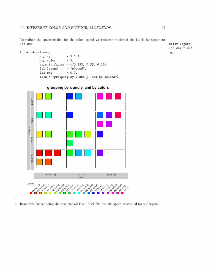
16 DIFFERENT COLOR AND PICTOGRAM LEGENDS 97
To reduce the space needed for the color legend we reduce the size of the labels by argument1
lab.cex. color legend
lab.cex = 0.7
93
2
> pic.plot(trees,
grp.xy = 2 ~ 1,
grp.color = 3,
vars.to.factor = c(0.333, 0.25, 0.05),
lab.legend = "skewed",
lab.cex = 0.7,
main = "grouping by x and y, and by colors")
grouping by x and y, and by colors
Girth(8.18,11.3] (11.3,14] (14,20.6]
Hei
ght
(62.
8,72
](7
2,76
](7
6,80
](8
0,87
]
Volume
(9.5
3,10
.3]
(10.
3,15
.6]
(15.
6,17
.3]
(17.
3,18
.8]
(18.
8,19
.4]
(19.
4,19
.9]
(19.
9,21
.1]
(21.
1,21
.4]
(21.
4,22
.4]
(22.
4,24
.2]
(24.
2,25
.3]
(25.
3,27
.4]
(27.
4,32
.8]
(32.
8,34
.5]
(34.
5,37
.3]
(37.
3,42
.6]
(42.
6,51
.2]
(51.
2,55
.4]
(55.
4,57
]
(57,
77]
3
Remarks: By reducing the text size all level labels fit into the space scheduled for the legend.4
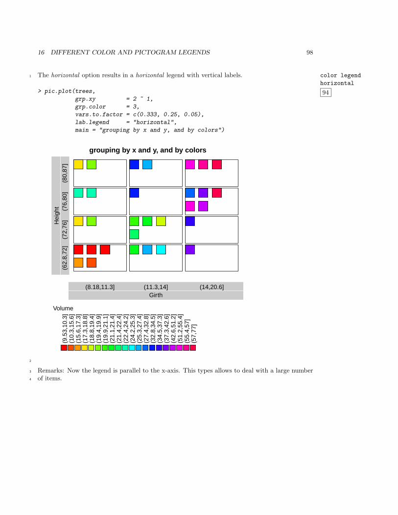
16 DIFFERENT COLOR AND PICTOGRAM LEGENDS 98
The horizontal option results in a horizontal legend with vertical labels. color legend
horizontal
94
1
> pic.plot(trees,
grp.xy = 2 ~ 1,
grp.color = 3,
vars.to.factor = c(0.333, 0.25, 0.05),
lab.legend = "horizontal",
main = "grouping by x and y, and by colors")
grouping by x and y, and by colors
Girth(8.18,11.3] (11.3,14] (14,20.6]
Hei
ght
(62.
8,72
](7
2,76
](7
6,80
](8
0,87
]
Volume
(9.5
3,10
.3]
(10.
3,15
.6]
(15.
6,17
.3]
(17.
3,18
.8]
(18.
8,19
.4]
(19.
4,19
.9]
(19.
9,21
.1]
(21.
1,21
.4]
(21.
4,22
.4]
(22.
4,24
.2]
(24.
2,25
.3]
(25.
3,27
.4]
(27.
4,32
.8]
(32.
8,34
.5]
(34.
5,37
.3]
(37.
3,42
.6]
(42.
6,51
.2]
(51.
2,55
.4]
(55.
4,57
](5
7,77
]
2
Remarks: Now the legend is parallel to the x-axis. This types allows to deal with a large number3
of items.4
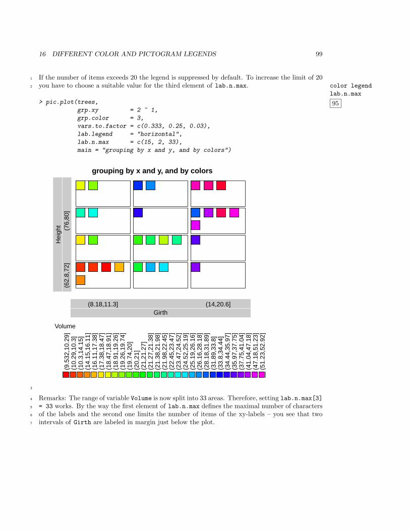
16 DIFFERENT COLOR AND PICTOGRAM LEGENDS 99
If the number of items exceeds 20 the legend is suppressed by default. To increase the limit of 201
you have to choose a suitable value for the third element of lab.n.max. color legend
lab.n.max
95
2
> pic.plot(trees,
grp.xy = 2 ~ 1,
grp.color = 3,
vars.to.factor = c(0.333, 0.25, 0.03),
lab.legend = "horizontal",
lab.n.max = c(15, 2, 33),
main = "grouping by x and y, and by colors")
grouping by x and y, and by colors
Girth(8.18,11.3] (14,20.6]
Hei
ght
(62.
8,72
](7
6,80
]
Volume
(9.5
32,1
0.29
](1
0.29
,10.
3](1
0.3,
14.1
5](1
4.15
,16.
11]
(16.
11,1
7.38
](1
7.38
,18.
47]
(18.
47,1
8.91
](1
8.91
,19.
26]
(19.
26,1
9.74
](1
9.74
,20]
(20,
21]
(21,
21.2
7](2
1.27
,21.
38]
(21.
38,2
1.98
](2
1.98
,22.
45]
(22.
45,2
3.47
](2
3.47
,24.
52]
(24.
52,2
5.19
](2
5.19
,26.
16]
(26.
16,2
8.18
](2
8.18
,31.
89]
(31.
89,3
3.8]
(33.
8,34
.44]
(34.
44,3
5.97
](3
5.97
,37.
75]
(37.
75,4
1.04
](4
1.04
,47.
18]
(47.
18,5
1.23
](5
1.23
,52.
92]
3
Remarks: The range of variable Volume is now split into 33 areas. Therefore, setting lab.n.max[3]4
= 33 works. By the way the first element of lab.n.max defines the maximal number of characters5
of the labels and the second one limits the number of items of the xy-labels – you see that two6
intervals of Girth are labeled in margin just below the plot.7
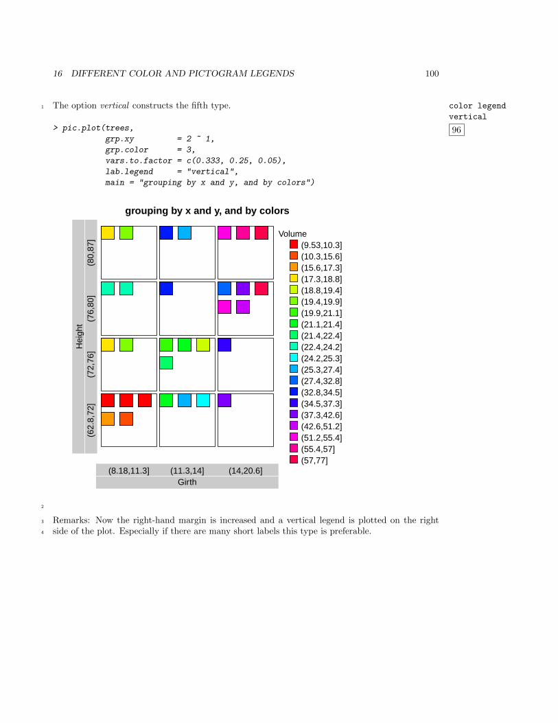
16 DIFFERENT COLOR AND PICTOGRAM LEGENDS 100
The option vertical constructs the fifth type. color legend
vertical
96
1
> pic.plot(trees,
grp.xy = 2 ~ 1,
grp.color = 3,
vars.to.factor = c(0.333, 0.25, 0.05),
lab.legend = "vertical",
main = "grouping by x and y, and by colors")
grouping by x and y, and by colors
Girth(8.18,11.3] (11.3,14] (14,20.6]
Hei
ght
(62.
8,72
](7
2,76
](7
6,80
](8
0,87
]
Volume(9.53,10.3](10.3,15.6](15.6,17.3](17.3,18.8](18.8,19.4](19.4,19.9](19.9,21.1](21.1,21.4](21.4,22.4](22.4,24.2](24.2,25.3](25.3,27.4](27.4,32.8](32.8,34.5](34.5,37.3](37.3,42.6](42.6,51.2](51.2,55.4](55.4,57](57,77]
2
Remarks: Now the right-hand margin is increased and a vertical legend is plotted on the right3
side of the plot. Especially if there are many short labels this type is preferable.4
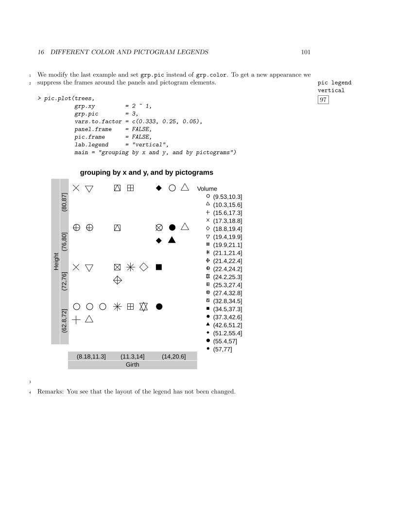
16 DIFFERENT COLOR AND PICTOGRAM LEGENDS 101
We modify the last example and set grp.pic instead of grp.color. To get a new appearance we1
suppress the frames around the panels and pictogram elements. pic legend
vertical
97
2
> pic.plot(trees,
grp.xy = 2 ~ 1,
grp.pic = 3,
vars.to.factor = c(0.333, 0.25, 0.05),
panel.frame = FALSE,
pic.frame = FALSE,
lab.legend = "vertical",
main = "grouping by x and y, and by pictograms")
● ● ●
● ●
●
● ●
●
grouping by x and y, and by pictograms
Girth(8.18,11.3] (11.3,14] (14,20.6]
Hei
ght
(62.
8,72
](7
2,76
](7
6,80
](8
0,87
]
Volume● (9.53,10.3]
(10.3,15.6](15.6,17.3](17.3,18.8](18.8,19.4](19.4,19.9](19.9,21.1](21.1,21.4](21.4,22.4]
● (22.4,24.2](24.2,25.3](25.3,27.4]
● (27.4,32.8](32.8,34.5](34.5,37.3]
● (37.3,42.6](42.6,51.2](51.2,55.4]
● (55.4,57]● (57,77]
3
Remarks: You see that the layout of the legend has not been changed.4
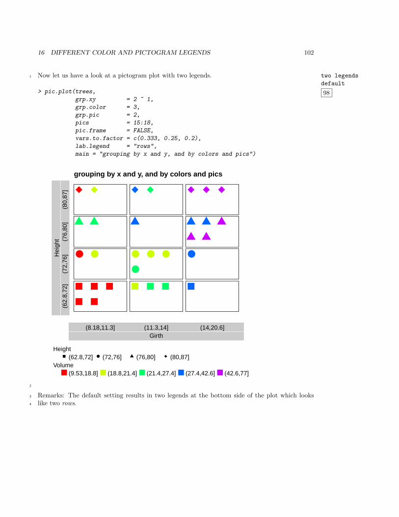
16 DIFFERENT COLOR AND PICTOGRAM LEGENDS 102
Now let us have a look at a pictogram plot with two legends. two legends
default
98
1
> pic.plot(trees,
grp.xy = 2 ~ 1,
grp.color = 3,
grp.pic = 2,
pics = 15:18,
pic.frame = FALSE,
vars.to.factor = c(0.333, 0.25, 0.2),
lab.legend = "rows",
main = "grouping by x and y, and by colors and pics")
● ● ● ● ●
●
●
grouping by x and y, and by colors and pics
Girth(8.18,11.3] (11.3,14] (14,20.6]
Hei
ght
(62.
8,72
](7
2,76
](7
6,80
](8
0,87
]
Height●(62.8,72] (72,76] (76,80] (80,87]
Volume(9.53,18.8] (18.8,21.4] (21.4,27.4] (27.4,42.6] (42.6,77]
2
Remarks: The default setting results in two legends at the bottom side of the plot which looks3
like two rows.4
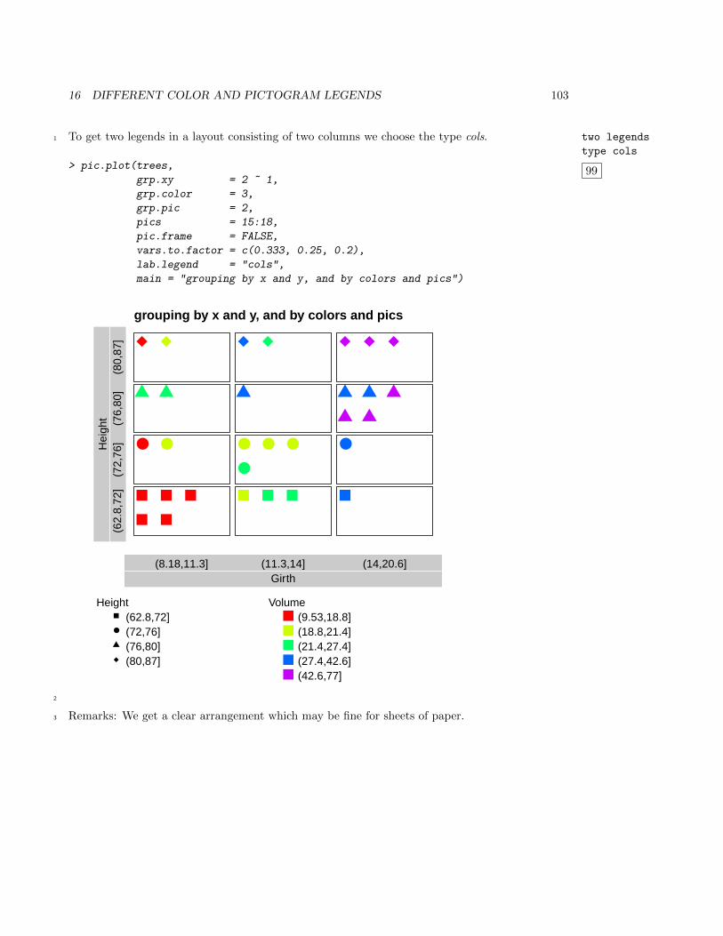
16 DIFFERENT COLOR AND PICTOGRAM LEGENDS 103
To get two legends in a layout consisting of two columns we choose the type cols. two legends
type cols
99
1
> pic.plot(trees,
grp.xy = 2 ~ 1,
grp.color = 3,
grp.pic = 2,
pics = 15:18,
pic.frame = FALSE,
vars.to.factor = c(0.333, 0.25, 0.2),
lab.legend = "cols",
main = "grouping by x and y, and by colors and pics")
● ● ● ● ●
●
●
grouping by x and y, and by colors and pics
Girth(8.18,11.3] (11.3,14] (14,20.6]
Hei
ght
(62.
8,72
](7
2,76
](7
6,80
](8
0,87
]
Height(62.8,72]
● (72,76](76,80](80,87]
Volume(9.53,18.8](18.8,21.4](21.4,27.4](27.4,42.6](42.6,77]
2
Remarks: We get a clear arrangement which may be fine for sheets of paper.3
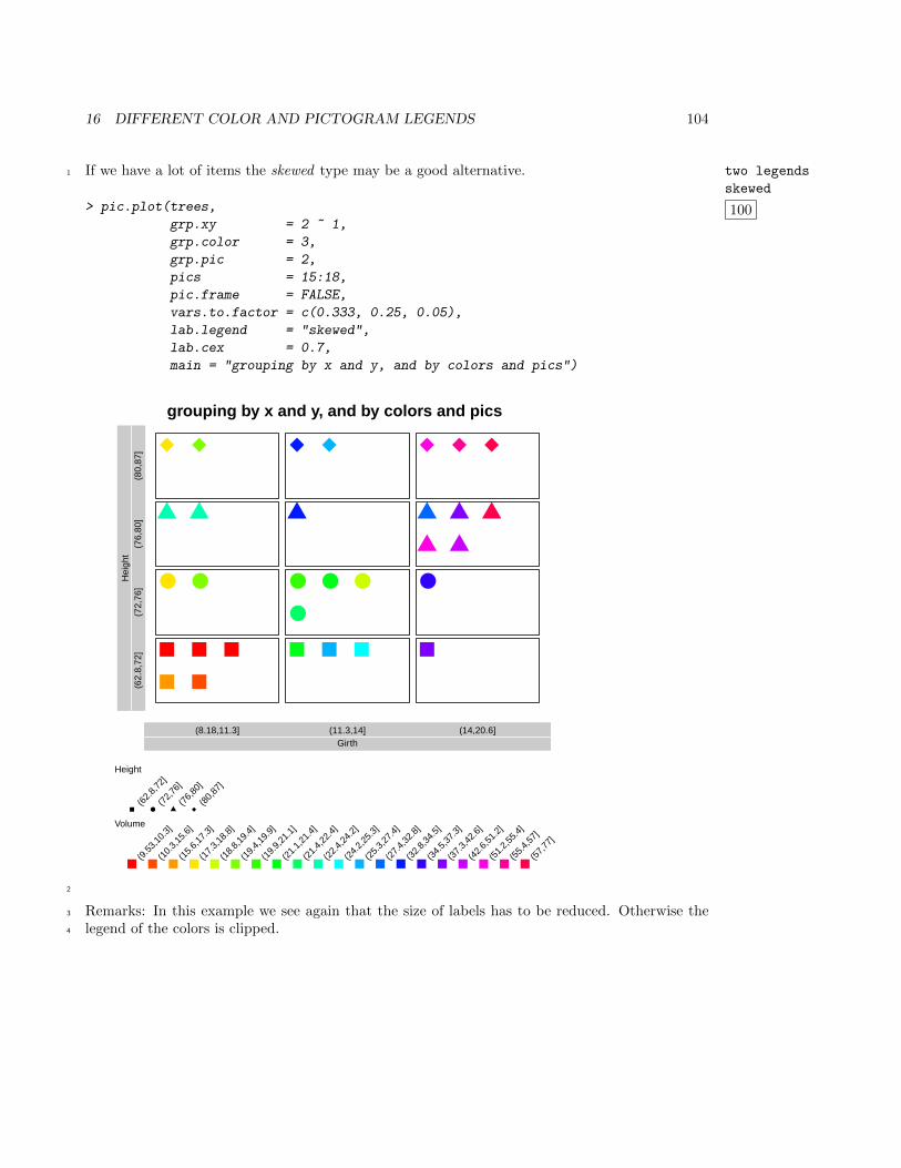
16 DIFFERENT COLOR AND PICTOGRAM LEGENDS 104
If we have a lot of items the skewed type may be a good alternative. two legends
skewed
100
1
> pic.plot(trees,
grp.xy = 2 ~ 1,
grp.color = 3,
grp.pic = 2,
pics = 15:18,
pic.frame = FALSE,
vars.to.factor = c(0.333, 0.25, 0.05),
lab.legend = "skewed",
lab.cex = 0.7,
main = "grouping by x and y, and by colors and pics")
● ● ● ● ●
●
●
grouping by x and y, and by colors and pics
Girth(8.18,11.3] (11.3,14] (14,20.6]
Hei
ght
(62.
8,72
](7
2,76
](7
6,80
](8
0,87
]
Height
●(6
2.8,
72]
(72,
76]
(76,
80]
(80,
87]
Volume
(9.5
3,10
.3]
(10.
3,15
.6]
(15.
6,17
.3]
(17.
3,18
.8]
(18.
8,19
.4]
(19.
4,19
.9]
(19.
9,21
.1]
(21.
1,21
.4]
(21.
4,22
.4]
(22.
4,24
.2]
(24.
2,25
.3]
(25.
3,27
.4]
(27.
4,32
.8]
(32.
8,34
.5]
(34.
5,37
.3]
(37.
3,42
.6]
(42.
6,51
.2]
(51.
2,55
.4]
(55.
4,57
]
(57,
77]
2
Remarks: In this example we see again that the size of labels has to be reduced. Otherwise the3
legend of the colors is clipped.4
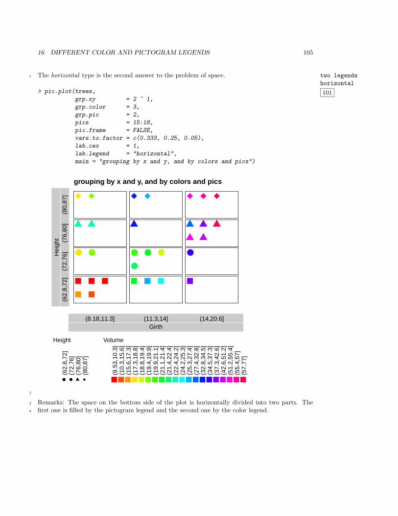
16 DIFFERENT COLOR AND PICTOGRAM LEGENDS 105
The horizontal type is the second answer to the problem of space. two legends
horizontal
101
1
> pic.plot(trees,
grp.xy = 2 ~ 1,
grp.color = 3,
grp.pic = 2,
pics = 15:18,
pic.frame = FALSE,
vars.to.factor = c(0.333, 0.25, 0.05),
lab.cex = 1,
lab.legend = "horizontal",
main = "grouping by x and y, and by colors and pics")
● ● ● ● ●
●
●
grouping by x and y, and by colors and pics
Girth(8.18,11.3] (11.3,14] (14,20.6]
Hei
ght
(62.
8,72
](7
2,76
](7
6,80
](8
0,87
]
Height
●
(62.
8,72
](7
2,76
](7
6,80
](8
0,87
]
Volume
(9.5
3,10
.3]
(10.
3,15
.6]
(15.
6,17
.3]
(17.
3,18
.8]
(18.
8,19
.4]
(19.
4,19
.9]
(19.
9,21
.1]
(21.
1,21
.4]
(21.
4,22
.4]
(22.
4,24
.2]
(24.
2,25
.3]
(25.
3,27
.4]
(27.
4,32
.8]
(32.
8,34
.5]
(34.
5,37
.3]
(37.
3,42
.6]
(42.
6,51
.2]
(51.
2,55
.4]
(55.
4,57
](5
7,77
]
2
Remarks: The space on the bottom side of the plot is horizontally divided into two parts. The3
first one is filled by the pictogram legend and the second one by the color legend.4
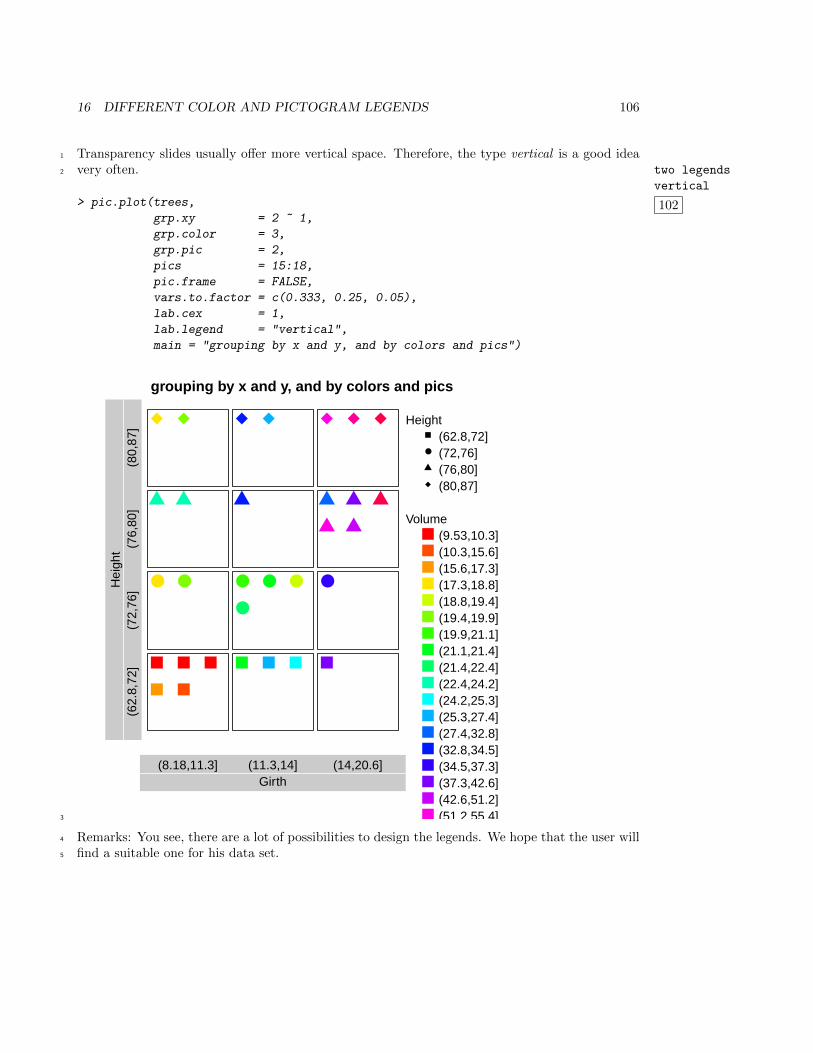
16 DIFFERENT COLOR AND PICTOGRAM LEGENDS 106
Transparency slides usually offer more vertical space. Therefore, the type vertical is a good idea1
very often. two legends
vertical
102
2
> pic.plot(trees,
grp.xy = 2 ~ 1,
grp.color = 3,
grp.pic = 2,
pics = 15:18,
pic.frame = FALSE,
vars.to.factor = c(0.333, 0.25, 0.05),
lab.cex = 1,
lab.legend = "vertical",
main = "grouping by x and y, and by colors and pics")
● ● ● ● ●
●
●
grouping by x and y, and by colors and pics
Girth(8.18,11.3] (11.3,14] (14,20.6]
Hei
ght
(62.
8,72
](7
2,76
](7
6,80
](8
0,87
]
Height(62.8,72]
● (72,76](76,80](80,87]
Volume(9.53,10.3](10.3,15.6](15.6,17.3](17.3,18.8](18.8,19.4](19.4,19.9](19.9,21.1](21.1,21.4](21.4,22.4](22.4,24.2](24.2,25.3](25.3,27.4](27.4,32.8](32.8,34.5](34.5,37.3](37.3,42.6](42.6,51.2](51.2,55.4]3
Remarks: You see, there are a lot of possibilities to design the legends. We hope that the user will4
find a suitable one for his data set.5