Embed Size (px)
Citation preview

Managing a Responsive Design Redesign Project
Rebekah GodshallDirector of Project Management, NewCity
Photos by David Poteet


Responsive DesignWe’ll discuss the HOW and the WHO of responsive design:
the complexities responsive design adds
a more agile approach to the process
forming and supporting a cross-functional team
For more on the WHAT, WHY and WHEN of responsive design, I have materials available.

Whatweb pages that respond to different devices
delivers quality experience to desktop computers, netbooks, tablets, and mobile phones
using new css techniques, fluid grids, flexible images, and media queries

Whythe proliferation of smart phones
high level of continuity between different devices
same URLs for every device
may not require updates to function on new devices

Whendifficult to retrofit an existing design, best to start from scratch
most appropriate when continuity between different devices is a priority for target audience
Responsive design does not constitute a mobile strategy; separate mobile sites and mobile apps may also be needed to satisfy user needs.

Who Forming Your Project Team

Forming the Teamsmall, dedicated team
working in the same location
people who enjoy working in a team environment
some training in a discipline other than their own

Supporting the TeamInvest in training.
It’s easy to make a bad responsive website.
Forge a team with the right skills and empower them to work closely together in an iterative manner.

Eva Baird, User Experience Architect
focuses on optimizing the experience of the user
trained in • interface design
• information architecture
cross-trained in graphic design

Sara Andrew, Graphic Designer
responsible for the look and feel of the site
trained in •graphic design
cross-trained in html/css

Jason Gillespie, Web Developer
transforms design files into templates browsers can interpret
trained in •html/css
• javascript
•media queries and new css techniques necessary for responsive design

How The Project Process

Project PhasesResearch and Strategy
User Experience Planning
Design
Development

Research and Strategy

Research Methods & TechniquesFocus Groups
KJ Sessions
Stakeholder Interviews
Audience Interviews
Site Audits
Baseline Usability Tests

Mobile Strategy

The Myth of Mobile ContextMobile users are always distracted, in a rush
Mobile users really only need location information.
That’s not a feature we should include because she’s on mobile.
– Luke Wroblewski

Where are people using mobile devices?84% at home
80% during miscellaneous downtime throughout the day
76% waiting in lines for appointments
69% while shopping
64% at work
62% while watching TV (alt. study claims 84%)
47% during commute in to work
READ MORE //Luke Wroblewski. "Mobile Context Revisited." http://www.lukew.com/ff/entry.asp?1333

ImplicationsThe device does not necessarily imply a context (stationary or mobile).
There is a misconception that mobile users want different things from your product than desktop users do.
Responsive design offers a high level of continuity between different devices.
With responsive design you only need to develop, manage and maintain one site and one content silo.

Most Valuable Content For Mobile
1. Academic program listing
2. Cost/scholarship calculators
3. A calendar of important dates and deadlines
4. Specific details about academic programs
5. An application process summary
6. Online application forms
READ MORE //Noel-Levitz. (Feb 2012). "The Mobile Browsing Behaviors and Expectations of College-Bound High School Students."

Desktops: First Link They Look For
1. Academic programs
2. Enrollment and admissions information
3. Cost
4. Scholarships
5. Other information
6. Student life information
7. Financial Aid
8. Campus visit detailsREAD MORE //Noel-Levitz. (Feb 2011). "The Online Expectations of Prospective College Students and Their Parents."

52% of students have looked at a campus Web site on a mobile device. (Up from 26% in 2011.)
– Noel-‐Levitz. (Feb 2012). "The Mobile Browsing Behaviors and ExpectaHons of College-‐Bound High School Students."

So, How To Begin?


Our Working Agreement
We will create only as many artifacts as are necessary to communicate the idea.
We will design on a grid.
We will keep all of the designs as close to the desktop design as possible to •maintain the high level of continuity that responsive design
offers
•minimize necessary reviews and approvals by the customer.
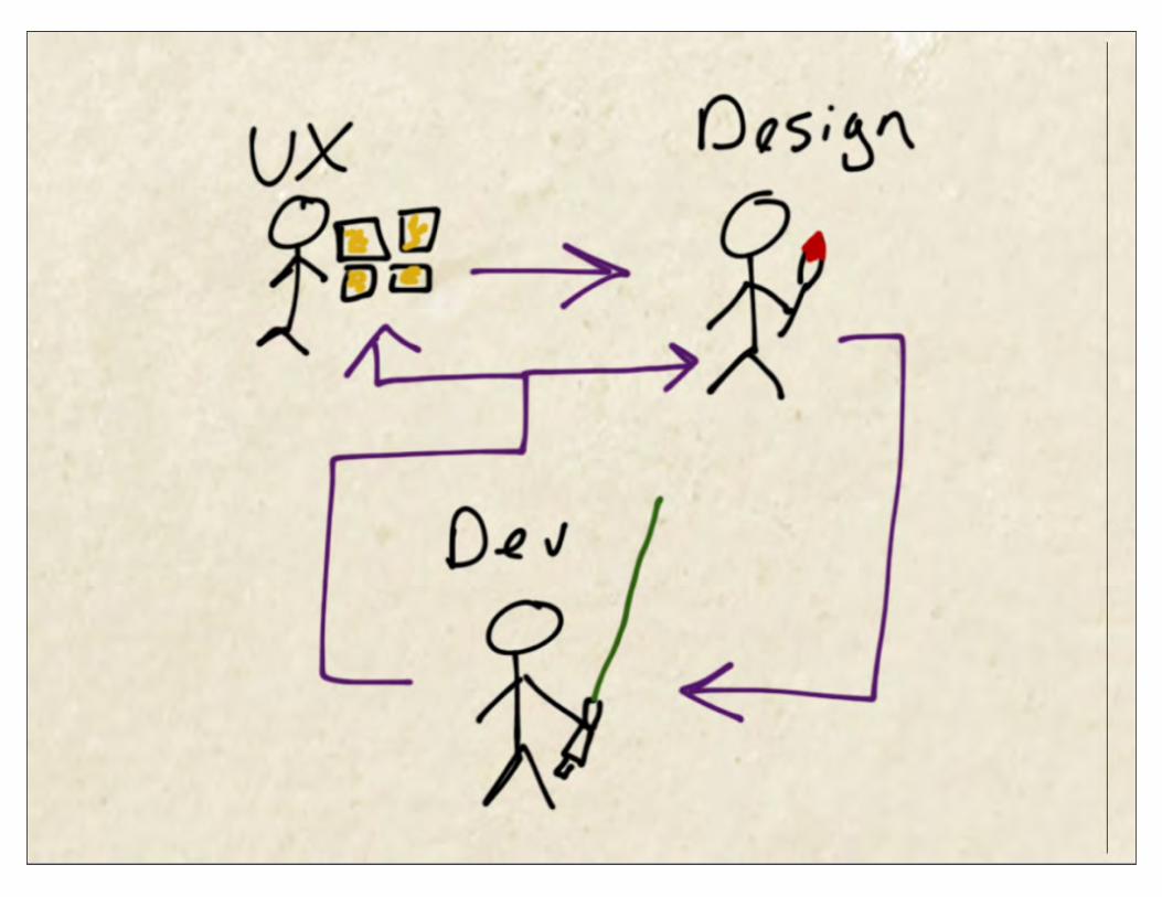
User Experience PlanningStart with what is familiar.Put your website on a diet.Know when enough is enough.

Start With What Is Familiar

Put Your Website on a Diet

Embracing ConstraintsSmall screen sizes forces you to prioritize.
Slow connections and limited data plans require you to be vigilant about performance.
"One eyeball, one thumb"

Know When Enough is Enough
Communicate just enough to the client, designers, and developers.
Trust the rest of the team.
For us, “enough” was wireframes for the desktop versions of each template.

Design and DevelopmentStart with what is familiar.Have regular design reviews.Get to the real thing quickly.

Start With What Is Familiar

Design ReviewsDiscuss and test the developers’ design recommendations.
Review, design, build and repeat.
This closes the gap between traditional “design” and “development” cycles.

Get to the real thing quicklyDevelopers act as ux designers, too, designing in the browser.
Close the communication gap across the project team.
Communicate to stakeholders how the responsive design will work.
Design within the constraints of the real medium.

START WITH THE WRAPPER
DESIGNING IN THE BROWSER


DEFINE HOW LAYOUTS WILL CHANGE
DESIGNING IN THE BROWSER


ADDRESS INDIVIDUAL CONTENT BLOCKS
DESIGNING IN THE BROWSER


Designing in the Browser1. Start with the wrapper.
2. Define how the layouts will change.
3. Address individual content blocks.

Timeline and Budget Impactredesign takes 20-30% longer than a desktop-only site
reduces ongoing maintenance costs
comparable to implementing a modest stand-alone mobile site
major milestones are unchanged, but a few new waypoints are added (e.g. development of the wrapper is complete)
bulk of time increase was in development
Implications for the Project Manager
Change makes people uncomfortable.
UX and Design may feel they are losing control.
Developers may feel overwhelmed by increased responsibilities.
Requires a high degree of trust.
As a manager, my role was to encourage, support, and promote conversation.

A Couple More Lessons LearnedTeam members report being pleased with how much they learned about their teammates’ disciplines. This cross-training was a natural outcome of the process.
Because the design at each breakpoint was so similar to the desktop design, the customer did not feel a loss of control despite not reviewing and approving each design.