Embed Size (px)
Citation preview
Perceptual maps: the good, the bad and the ugly
John Gower†, Patrick Groenen‡, Michel Van de Velden‡ and Karen Vines†
† Department of Mathematics and Statistics
The Open University
Walton Hall
MILTON KEYNES
MK7 6AA
‡ Econometric Institute
Erasmus School of Economics
Erasmus University
P.O. Box 1738
3000 DR ROTTERDAM
February 25, 2010
Abstract
Perceptual maps are often used in marketing to visually study relations between two or moreattributes. However, in many perceptual maps published in the recent literature it remainsunclear what is being shown and how the relations between the points in the map can beinterpreted or even what a point represents. The term perceptual map refers to plots obtained bya series of different techniques, such as principal component analysis, (multiple) correspondenceanalysis, and multidimensional scaling, each needing specific requirements for producing themap and interpreting it. Some of the major flaws of published perceptual maps are omission ofreference to the techniques that produced the map, non-unit shape parameters for the map, andunclear labelling of the points. The aim of this paper is to provide clear guidelines for producingthese maps so that they are indeed useful and simple aids for the reader. To facilitate this, wesuggest a small set of simple icons that indicate the rules for correctly interpreting the map.We present several examples, point out flaws and show how to produce better maps.
1
Keywords: Perceptual map, correspondence analysis, multiple correspondence analysis, prin-cipal component analysis, multidimensional scaling, biplot.
1 Introduction
The increase of computer efficiency and memory capacity has led to an enormous expansionof data collection. Consequently, businesses and organisations possess large quantities of data.These data contain important information covering several important areas. However, the sizeand complexity of the data sets require smart and efficient ways of distilling relevant information.Visualisation of complex data may help to separate the information from the “chaff” by allowingus to use our natural spatial/visual abilities to identify patterns in complex multivariate dataand/or to determine where further exploration should be done (Tegarden, 1999; Jarvenpaa,1989; DeSarbo et al., 2001). Furthermore, human abilities to recognise, process and remembervisual patterns make visualisations particularly suited to communicate the essence of the data(Spence and Lewandowski, 1990).
The versatility and power of graphical representations of complex high dimensional data haslong been acknowledged in marketing research (Frank and Green, 1968; Stefflre, 1969; Greenand Carmone, 1969, 1970) and practice (Doehlert, 1968; Huber, 2008). There are numerous ap-plications in which graphical representations are used to assist marketing managers with issuesrelated to market segmentation (Natter et al., 2008; DeSarbo et al., 2008; DeSarbo and Wu,2001), market structure analysis (Wind, 1982; Katahira, 1990; MacKay and Zinnes, 1986), prod-uct design and positioning (DeSarbo and Rao, 1986; Eliashberg and Manrai, 1992; Shocker andSrinivasan, 1974; Pessemier and Root, 1973), brand-switching (DeSarbo and Manrai, 1992; Dil-lon and Gupta, 1996; Lehmann, 1972), customer value (Sinha and DeSarbo, 1998), customersatisfaction (Wu et al., 2006), and understanding relationships among consumer perceptions(Lee et al., 2002; Manrai and Sinha, 1989; Torres and Bijmolt, 2009). In most cases, the graph-ical representations serve as a diagnostic tool. However, attempts have been made to use themin a predictive setting (Pessemier and Root, 1973; Shocker and Srinivasan, 1974). There areseveral methods used to produce graphical representations for high dimensional data; in mar-keting the resulting data visualisations are often referred to as perceptual maps. Methodologyyielding such perceptual maps is therefore simply referred to as “perceptual mapping”.
What actually is perceptual mapping? Hair et al. (1995, p.487) define a perceptual map asa “visual representation of a respondent’s perceptions of objects on two or more dimensions.”Lilien and Rangaswamy (2003, p.119) give as definition, a “graphical representation in whichcompeting alternatives are plotted in Euclidean space”. Although initially used only in com-bination with multidimensional scaling methods (Frank and Green, 1968; Green and Carmone,
2
1969; Lehmann, 1972), the term now appears to be used in conjunction with any multivariateanalysis method yielding a graphical representation of the data (Day et al., 1979), e.g. canonicaldiscrimination (Pankhania et al., 2007), principal component analysis (Hartmann et al., 2005),correspondence analysis (Torres and van de Velden, 2007), and canonical correlation analysis(Taks and Scheerder, 2006). In addition, new methods yielding perceptual maps are developedfor specific applications, (see, e.g., Chintagunta, 1998; Katahira, 1990; DeSarbo and Hoffman,1987; DeSarbo and Manrai, 1992; DeSarbo and Young, 1997; DeSarbo et al., 2008; Sinha andDeSarbo, 1998).
The common element among these methods is that they can all be termed multidimensionalanalyses1, to indicate that, potentially, results are available in many dimensions. Overwhelm-ingly, only two dimensions are exhibited, as this gives two-dimensional maps that can be shownon a sheet of paper or on a computer screen. Multidimensional analyses are widely used inmany fields of application. It so happens that in Market Research we are often interested inpeople’s perceptions of products, or relationships between pairs of products. Thus perceptualmapping refers to the type of data (perceptual) coupled with multidimensional methodology(mapping).
Regardless of what specific statistical method is used to produce the perceptual map, thepurpose of the map is to display complex information in an engaging graphical manner. Clearperceptual maps powerfully add weight to assertions in accompanying text about relationshipsbetween and within (possibly latent) attributes. By avoiding difficult statistical concepts (e.g.p-values, confidence intervals, hypotheses testing etc.), and relying on the human ability todeal efficiently with graphical data, perceptual maps are very appealing to applied marketingresearchers. Indeed such maps might be the primary means a reader uses to assess the messagethat the article is conveying. Maps tend to stand out from the page, and are used as part ofthe summary information given by some electronic journal databases. Thus it is crucial thatperceptual maps are presented in such a way that the information within them can be quicklyand correctly assimilated.
Unfortunately, as will be shown, the graphical presentation of perceptual maps both in themethodological literature and in applications is often defective. In a literature study coveringrecent academic publications we found many problems that either prohibit meaningful interpre-tations of perceptual maps or considerably complicate interpretations. We describe our findingsin more detail later in the paper. The nature of the encountered problems is diverse. Some-times, the problem is insufficient information given either, or both, in the caption or in thelabelling of elements in the body of the map. Sometimes, it is misleading relative scaling of the
1Most of the methods cited are regarded as part of the statistical methodology of multivariate analysis,concerning data with many variables. Multidimensional analysis is a useful term for describing methods wherethe results of analysis are multidimensional whereas the data themselves are not necessarily multivariate - e.g.correspondence analysis, where there are only two (categorical) variables.
3

horizontal and vertical axes (the shape parameter of a graph, see Cleveland and McGill, 1987).Sometimes, it is clear that interpretations are unjustified. Sometimes, it is not clear preciselywhat method of analysis has been used, leading to the impossibility of deciding whether or notinterpretations are valid. All of these problems severely undermine the important advantagesof graphical representations: rapid interpretation and communication of complex information.
There are many types of perceptual map, each with their own considerations that should betaken into account when constructed. The aim of this paper is to give guidelines for the presen-tation of perceptual maps so that their interpretation is best facilitated. We also propose theuse of icons to provide interpretation guidance. Potentially these icons allow readers to correctlyand confidently interpret a map even if they are unfamiliar with the statistical technique usedto create the map. Nowadays perceptual mapping is often used in marketing practice and lessfrequently in marketing research (Huber, 2008), so we shall primarily concern ourselves withcurrent practice in the applied marketing literature. Moreover, we will not concern ourselveswith the question whether or not an inappropriate analysis has been used; rather, our aim is toensure that whatever analysis underpins the perceptual map, the map is presented with clarity.
To achieve our aim, we shall first stipulate which properties of maps are necessary and/ordesirable. There exist several important and useful references that describe general principles ofgraphs (e.g. Tufte, 1983; Wainer, 2005; Cleveland and McGill, 1987). However, these treatisesdo not specifically address issues specific to the multidimensional methodology yielding theperceptual maps frequently encountered in the marketing literature. We will fill this gap byproviding some general principles or desiderata for such maps in Section 2. Then, using thesedesiderata we explore, in Section 3, the extent to which these ideals appear to be met inapplied marketing journals. As already mentioned, however, our findings suggest that there isroom and need for improvements. The diversity in criteria and method can lead to significantdifferences in the interpretation of perceptual maps. For example, sometimes distances betweencertain points have a clear interpretation whereas in other cases, distances cannot be interpreteddirectly. To facilitate an immediate interpretation of different perceptual maps, we introducean additional aid to perceptual map interpretation in Section 4; the use of iconography toindicate permissible interpretation strategies. Finally, in Section 5 we give our conclusions. Wealso give, in an appendix, a brief summary of various multidimensional techniques along withan indication of appropriate interpretation strategies that might be applied to the perceptualmaps they produce.
4
2 Desiderata for perceptual maps
The construction of any perceptual map requires many graphical design decisions to be taken,either by the creator of the map or automatically by the generating software. For example,the style and scale to be used on axes; the labelling to be applied to points and/or lines; andthe text of any title or captions. Though trivial sounding, such decisions are important asthey impact on the ability of the map to clearly and accurately represent the underlying data.Desiderata for a well-designed perceptual map are summarised in Box 1 below.
Box 1 Desiderata for perceptual maps
1. Include a caption or title.
2. Include a legend or key when there are two or more types of points or lines.
3. Ensure that the shape parameter is 1.
4. Indicate the origin when it is required for interpretational purposes.
5. Label points.
6. Avoid clutter.
That these are desiderata of good perceptual maps may seem obvious. However, even withsimple plots such as bar charts and scatterplots, examples of poor graphical design, and theconsequent misleading impact on the message that the plot conveys, have been described ex-tensively elsewhere, for example, Wainer (2005) and Tufte (1983). They contain numerous ex-amples that have appeared in newspapers and elsewhere which, whether by accident or design,give a misleading impression. With such examples they also show how revised well-designedgraphics can enhance the message in the underlying data. The impact of graphical design canbe at least as important with perceptual maps as failure to follow these desiderata can rendera map useless.
In Section 2.1, we will discuss in more detail Desiderata 1 and 2. In particular we will showthat it not always possible to deduce the exact type that a perceptual map is just by lookingat it. Desiderata 3 and 4 are discussed further in Section 2.2. Our final two desiderata arediscussed in more detail in Section 2.3.
We will illustrate the impact of good graphical design on perceptual maps with reference to aparticular data set about patterns of consumer satisfaction in the EU. In 2007 a report waspublished on the satisfaction of consumers in the EU with a range of eleven services, from
5
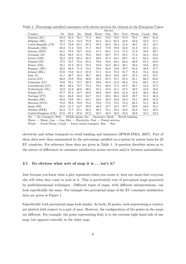
Table 1: Percentage satisfied consumers with eleven services for citizens in the European UnionService
Country Air Mob Ins Bank Water Gas Elec Post Phone Coach Bus
Austria (AT) 82.2 76.4 76.1 77.3 86.8 75.9 79.5 57.9 70.1 49.0 61.0Belgium (BE) 59.7 74.4 74.3 75.9 64.3 65.2 65.2 43.8 62.0 52.2 57.1Czech Republic (CZ) 75.7 73.8 65.1 67.4 59.2 64.5 58.3 51.8 40.7 43.7 42.7Denmark (DK) 65.0 71.4 73.6 71.7 84.8 77.9 78.9 52.8 61.3 37.5 42.1Estonia (EST) 64.1 78.3 70.7 84.2 51.5 68.1 71.8 71.5 71.0 58.0 49.7Germany (D) 83.2 83.5 81.4 78.6 83.9 69.7 72.7 58.5 71.4 42.4 52.3Greece (GR) 76.2 70.9 68.4 65.3 59.0 87.4 48.1 69.7 45.1 63.4 53.6Finland (FI) 77.5 72.7 75.2 87.4 79.6 76.6 63.2 66.4 60.9 67.4 63.9France (FR) 56.1 55.3 65.3 55.5 52.0 58.2 60.4 46.1 49.3 52.6 49.2Hungary (HU) 82.5 82.9 71.3 74.4 70.6 64.9 72.6 70.7 65.2 50.0 37.7Ireland (IRL) 67.0 73.0 81.3 67.8 71.5 81.8 73.2 81.7 78.3 72.4 65.6Italy (I) 51.1 49.7 42.3 36.7 40.4 36.4 34.8 28.7 27.4 24.2 33.7Latvia (LV) 68.0 79.9 70.6 80.6 50.5 67.5 73.1 67.8 65.1 66.2 62.0Lithuania (LT) 78.6 79.1 75.7 80.3 59.6 84.5 81.6 80.2 72.4 66.5 57.4Luxembourg (LU) 66.5 69.2 74.7 75.2 73.5 69.3 71.5 67.5 68.7 54.2 57.5Netherlands (NL) 52.9 51.0 46.6 50.5 53.4 47.6 41.1 47.5 39.7 24.0 25.0Poland (PL) 67.7 67.2 55.7 62.0 56.8 58.9 59.9 61.3 45.2 46.2 39.2Portugal (PT) 64.1 68.8 50.3 64.7 52.2 49.5 36.4 64.9 29.7 55.5 40.4Slovakia (SK) 62.0 73.0 58.1 64.7 52.8 43.3 52.8 59.4 53.1 28.6 21.9Slovenia (SVN) 73.8 76.8 73.9 75.2 72.0 77.2 73.5 74.2 68.5 51.5 46.4Spain (ES) 45.0 41.7 54.7 50.9 46.9 47.7 42.7 47.7 36.0 43.6 35.4Sweden (SWE) 62.4 71.7 67.1 80.3 80.7 74.1 53.2 44.8 63.4 54.1 39.5United Kingdom (UK) 67.6 67.5 67.6 67.2 59.7 58.3 58.2 55.8 59.8 55.4 43.3
Air — Air transport, Mob — Mobile phone, Ins — Insurance, Bank — Retail banking,Water — Water, Gas — Gas, Elec — Electricity, Post — Postal services,Phone — Fixed Phone, Coach — Extra urban transport, Bus — Bus
electricity and urban transport to retail banking and insurance (IPSOS-INRA, 2007). Part ofthese data were then summarised by the percentage satisfied on a nation by nation basis for 23EU countries. For reference these data are given in Table 1. A question therefore arises as tothe nature of differences in consumer satisfaction across services and/or between nationalities.
2.1 Its obvious what sort of map it is . . . isn’t it?
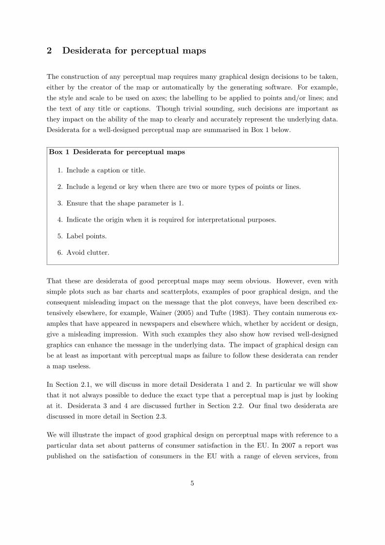
Just because you know what a plot represents when you create it, does not mean that everyoneelse will when they come to look at it. This is particularly true of perceptual maps generatedby multidimensional techniques. Different types of maps, with different interpretations, canlook superficially the same. For example two perceptual maps of the EU consumer satisfactiondata are given in Figure 1.
Superficially both perceptual maps look similar. In both, 23 points, each representing a countryare plotted with respect to a pair of axes. However, the configuration of the points in the mapsare different. For example, the point representing Italy is to the extreme right hand side of onemap, but appears centrally in the other map.
6
(a) (b)
AT
BE CZ
DK
EST
D
GR
FIFR
HU
IRL
I
LV
LTLU
NL
PL
PT
SK
SVN
ES
SWE
UK
AT
BE
CZ
DK
EST
D
GR
FI
FR
HU
IRL
I
LV
LT
LU
NLPL
PT
SK
SVN
ES
SWE
UK
Figure 1: Two perceptual maps
The discrepancy between the two maps in Figure 1 arises because the two perceptual mapswere generated using different multidimensional techniques, that are approximating differentquantities, and hence have different interpretations. Without an adequate caption neitherdiagram is interpretable. Readers are left unsure as to the type of map, and hence are invitedto guess what interpretations are valid. This ambiguity is avoided if Desideratum 1 in Box 1 isfollowed in an appropriate way.
So what should go in a caption? As general rule the caption should convey enough informationto allow a reader who is in possession of the data (and suitable software) to recreate theperceptual map. Obviously this includes the multidimensional technique used to generate themap (e.g. PCA, MDS, etc). It also includes which variant of the technique was used (e.g. thetype of non-metric MDS). Any preprocessing applied to the data (e.g. standardisation and/ordistance function used) should also be mentioned in the caption. In some circumstances it maybe helpful to mention the algorithm used to implement the multidimensional technique, suchas ALSCAL or MDPREF. However, this should not be seen as a substitute for specifying thetechnique the algorithm is performing. Thus an appropriate caption for Figure 1 is as follows.
Figure 1: (a) A plot of the scores for the first two principal components, based on ananalysis of standardised data. (b) A plot of the row points from a correspondenceanalysis using row principal or principal normalisation (α = 1 in Appendix A.3).
Similar issues also arise when a perceptual map contains plotted symbols of two or more differenttypes. For example, Figure 2 is a perceptual map of the consumer satisfaction data on whichboth countries and services are depicted. From the map itself it is clear that two types ofthings are being plotted, one thing with points and the other with lines. In this case the
7
DK
I
Air
MobIns/Water
Bank/GasElec
PostPhone
Coach
Bus
Figure 2: An interpolative biplot, based on an principal component analysis of standardiseddata. The length of each line representing a service corresponds to 10 units after standardisation.
caption happens to give a further clue, namely that the lines represent services. However, thereader is still left to guess what the points represents. And although many would recognisethe abbreviations for countries, there is no guarantee that all readers of the plot would. HenceDesideratum 2 in Box 1. A legend added to Figure 2 would to make it unambiguous that pointsrepresent countries and (dotted) lines represent services. Alternatively, the information can beincluded in the caption. For example, Figure 2’s caption could be amended in the followingway.
Figure 2: An interpolative biplot, based on an principal component analysis ofstandardised data. The length of each line representing a service corresponds to 10units after standardisation. ‘•’ represents countries and ‘- - - -’ represents services.
2.2 The bigger, the better?
To make a perceptual map requires ‘x’ and ‘y’ coordinates for individual plotted elements suchas points or lines. When the interpretation of a perceptual map only requires the relative,not absolute, positions of the plotted points, lines and the angles they subtend at some origin,the choice of the x and y coordinates used, is arbitrary with respect to rotation. When the x
and y coordinates are reified (that is they are interpreted as meaningful latent variables) thenrotation is admissible when governed by factor-analytical considerations such as an appeal tothe concept of simple structure. Factor rotation is beyond the scope of the present paper.
8
DK
IRL
I
-4 0 4 8
-2
0
2
DK
IRL
I
-4 0 4 8
-2
0
2DK
IRL
I
-4 0 4 8
-2
0
2
(a)
(b) (c)
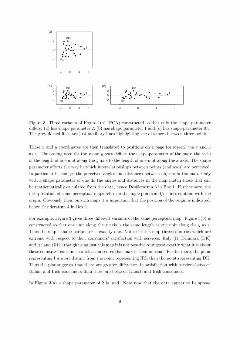
Figure 3: Three variants of Figure 1(a) (PCA) constructed so that only the shape parameterdiffers: (a) has shape parameter 2, (b) has shape parameter 1 and (c) has shape parameter 0.5.The grey dotted lines are just auxiliary lines highlighting the distances between three points.
These x and y coordinates are then translated to positions on a page (or screen) via x and y
axes. The scaling used for the x and y axes defines the shape parameter of the map: the ratioof the length of one unit along the y axis to the length of one unit along the x axis. The shapeparameter affects the way in which interrelationships between points (and axes) are perceived.In particular it changes the perceived angles and distances between objects in the map. Onlywith a shape parameter of one do the angles and distances in the map match those that canbe mathematically calculated from the data, hence Desideratum 3 in Box 1. Furthermore, theinterpretation of some perceptual maps relies on the angle points and/or lines subtend with theorigin. Obviously then, on such maps it is important that the position of the origin is indicated,hence Desideratum 4 in Box 1.
For example, Figure 3 gives three different variants of the same perceptual map. Figure 3(b) isconstructed so that one unit along the x axis is the same length as one unit along the y axis.Thus the map’s shape parameter is exactly one. Notice in this map three countries which areextreme with respect to their consumers’ satisfaction with services: Italy (I), Denmark (DK)and Ireland (IRL) though using just this map it is not possible to suggest exactly what it is aboutthese countries’ consumer satisfaction scores that makes them unusual. Furthermore, the pointrepresenting I is more distant from the point representing IRL than the point representing DK.Thus the plot suggests that there are greater differences in satisfaction with services betweenItalian and Irish consumers than there are between Danish and Irish consumers.
In Figure 3(a) a shape parameter of 2 is used. Note now that the data appear to be spread
9
equally in all directions, with the points labelled I, DK and IRL at the vertices of an approximateequilateral triangle. Although this might look more aesthetically pleasing, it has seriouslydistorted the true distances, for example making DK and IRL look relatively more distant thanthey are. In contrast in Figure 3(c), with its shape parameter of 0.5, the distortion is different,for example by making the point representing Italy look even more extreme than it is.
The distortion of distances and angles induced by the shape parameter is hard to overcome.Labelled scales can indicate the degree of distortion as well as merely its presence. For example,the labelling of the scales in all the maps of Figure 3 indicate accurately the shape parameterused in each map. But labelling, however good, cannot overcome the immediate visual impres-sion. And, after all, creating visual impressions of data is the whole point of constructing suchmaps in the first place. For this reason, as a general rule, a shape parameter of one shouldalways be used for perceptual maps.
2.3 And the point is?
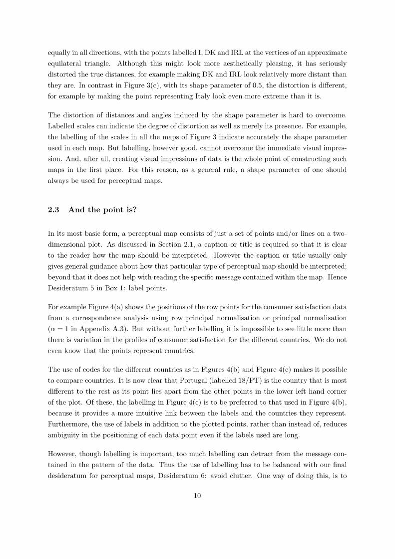
In its most basic form, a perceptual map consists of just a set of points and/or lines on a two-dimensional plot. As discussed in Section 2.1, a caption or title is required so that it is clearto the reader how the map should be interpreted. However the caption or title usually onlygives general guidance about how that particular type of perceptual map should be interpreted;beyond that it does not help with reading the specific message contained within the map. HenceDesideratum 5 in Box 1: label points.
For example Figure 4(a) shows the positions of the row points for the consumer satisfaction datafrom a correspondence analysis using row principal normalisation or principal normalisation(α = 1 in Appendix A.3). But without further labelling it is impossible to see little more thanthere is variation in the profiles of consumer satisfaction for the different countries. We do noteven know that the points represent countries.
The use of codes for the different countries as in Figures 4(b) and Figure 4(c) makes it possibleto compare countries. It is now clear that Portugal (labelled 18/PT) is the country that is mostdifferent to the rest as its point lies apart from the other points in the lower left hand cornerof the plot. Of these, the labelling in Figure 4(c) is to be preferred to that used in Figure 4(b),because it provides a more intuitive link between the labels and the countries they represent.Furthermore, the use of labels in addition to the plotted points, rather than instead of, reducesambiguity in the positioning of each data point even if the labels used are long.
However, though labelling is important, too much labelling can detract from the message con-tained in the pattern of the data. Thus the use of labelling has to be balanced with our finaldesideratum for perceptual maps, Desideratum 6: avoid clutter. One way of doing this, is to
10
-8 -4 0 4 8
-12
-8
-4
0
4
8
1
2
3
4
56
7
8
9
10
11
12
1314
15
1617
18
19
2021
22
23
-8 -4 0 4 8
-12
-8
-4
0
4
8
ATBE
CZ
DK
EST
D
GR
FI
FR
HU
IRL
I
LV
LT
LU
NLPL
PT
SK
SVN
ES SWEUK
-8 -4 0 4 8
-12
-8
-4
0
4
8
IRL
PT
DK
SK
-8 -4 0 4 8
-12
-8
-4
0
4
8
(a) (b)
(c) (d)
Figure 4: Four perceptual maps which differ only in the degree of labelling. All four mapswere constructed using correspondence analysis with a row principal or principal normalisation(α = 1 in Appendix A.3).
11
label only some of the data points as in done in Figure 4(d). Notice that the pattern of thepoints stands out more than it does in Figure 4, whilst the identity of a few key points is notlost. The choice of which labels to keep is necessarily a subjective one, driven by which datapoints are particularly noteworthy. For example, in Figure 4(d) just four points are specificallylabelled, selected because they are outlying. Colour can also be used effectively to reduce clutteron a map. Notice that on all the plots, Figures 4(a) to 4(d), the lines representing zero valueson the x and y axes are included, but using grey, not black. In this way, the position of theorigin can be conveyed (Desideratum 4) whilst allowing the data points to dominate the visualimpression. Apart from confirming the unit shape parameter, the x and y scales might even beregarded as clutter and removed without loss.
3 Current situation
In the previous section we highlighted six desiderata for presenting perceptual maps. A questiontherefore arises as to what extent these desiderata are respected in practice.
We conducted a survey of recent articles in marketing journals with the aim of seeing howoften published perceptual maps currently match our desiderata. For the survey, a GoogleScholar (http:\\www.scholar.google.com) search was conducted to identify articles publishedbetween 2005 and 2008 that contained perceptual maps. The search term was “perceptual map”and we constrained our results to results from the (Google Scholar) subject areas “Business,Administration, Finance, and Economics”. This yielded a total of approximately 180 resultsof which about half were eliminated from further consideration because they did not clearlyrelate to papers in academic journals. After eliminating those papers that contained no plots,59 papers remained. Of these, 1 was double counted, 1 finally came out in 2009, and 5 did notcontain perceptual maps after all. This left a total of 52 papers and 114 perceptual maps thatwere examined in detail. These 114 plots can be split up according to the used methodology. Wecategorised the methods as follows: CA, correspondence analysis, 27 (24%) plots in total. MCA,multiple correspondence analysis, 8 (7%) plots. PCA, principal component analysis (includingcategorical PCA and factor analysis), 13 (11%) plots. MDS, multidimensional scaling, 28 (25%)plots. Miscellaneous, maps based on discriminant analysis, nonlinear canonical correlationanalysis, neural networks and some undetermined but in the paper referenced methodology, 17(15%) plots. Finally, we include a category “Unknown” for those perceptual maps when wecould not establish which method had been used; there were 21 (18%) of such plots. Note thatour categorisation of the methods used is based on what the authors claimed they were doing.Unfortunately this means that there is no guarantee that the methodology the authors actuallyused fits in with the brief descriptions we provide in the appendix.
12
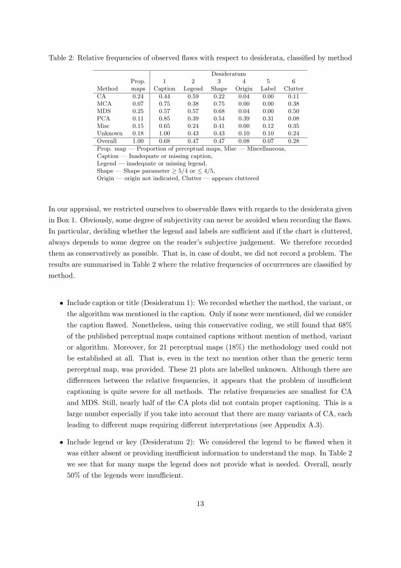
Table 2: Relative frequencies of observed flaws with respect to desiderata, classified by method
DesideratumProp. 1 2 3 4 5 6
Method maps Caption Legend Shape Origin Label Clutter
CA 0.24 0.44 0.59 0.22 0.04 0.00 0.11MCA 0.07 0.75 0.38 0.75 0.00 0.00 0.38MDS 0.25 0.57 0.57 0.68 0.04 0.00 0.50PCA 0.11 0.85 0.39 0.54 0.39 0.31 0.08Misc 0.15 0.65 0.24 0.41 0.00 0.12 0.35Unknown 0.18 1.00 0.43 0.43 0.10 0.10 0.24
Overall 1.00 0.68 0.47 0.47 0.08 0.07 0.28
Prop. map — Proportion of perceptual maps, Misc — Miscellaneous,Caption — Inadequate or missing caption,Legend — inadequate or missing legend,Shape — Shape parameter ≥ 5/4 or ≤ 4/5,Origin — origin not indicated, Clutter — appears cluttered
In our appraisal, we restricted ourselves to observable flaws with regards to the desiderata givenin Box 1. Obviously, some degree of subjectivity can never be avoided when recording the flaws.In particular, deciding whether the legend and labels are sufficient and if the chart is cluttered,always depends to some degree on the reader’s subjective judgement. We therefore recordedthem as conservatively as possible. That is, in case of doubt, we did not record a problem. Theresults are summarised in Table 2 where the relative frequencies of occurrences are classified bymethod.
• Include caption or title (Desideratum 1): We recorded whether the method, the variant, orthe algorithm was mentioned in the caption. Only if none were mentioned, did we considerthe caption flawed. Nonetheless, using this conservative coding, we still found that 68%of the published perceptual maps contained captions without mention of method, variantor algorithm. Moreover, for 21 perceptual maps (18%) the methodology used could notbe established at all. That is, even in the text no mention other than the generic termperceptual map, was provided. These 21 plots are labelled unknown. Although there aredifferences between the relative frequencies, it appears that the problem of insufficientcaptioning is quite severe for all methods. The relative frequencies are smallest for CAand MDS. Still, nearly half of the CA plots did not contain proper captioning. This is alarge number especially if you take into account that there are many variants of CA, eachleading to different maps requiring different interpretations (see Appendix A.3).
• Include legend or key (Desideratum 2): We considered the legend to be flawed when itwas either absent or providing insufficient information to understand the map. In Table 2we see that for many maps the legend does not provide what is needed. Overall, nearly50% of the legends were insufficient.
13

• Ensure shape parameter is one (Desideratum 3): As explained in Section 2.2, the shapeparameter for a perceptual map should always equal one. To see whether this is the casein practice we calculated, where possible, the shape parameters by dividing the y scaleby the x scale. The resulting shape parameters were considered to be unequal to onewhen the calculated parameter was either smaller than, or equal to, 4/5 and, similarly,larger than, or equal to 5/4. As obvious as it may seem to have a shape parameter of one,and given that this property is often emphasised in the literature at numerous occasions(Gower and Hand, 1996; Greenacre, 2007; Borg and Groenen, 2005), our sample indicatesthat in nearly half of the published plots, the shape parameter is not one. In fact, thisis a conservative estimate as for 22% of the maps we couldn’t establish what the shapeparameter was. In a perfect world, not being able to verify the shape parameter would notbe a problem as all perceptual maps would have a shape parameter of one. Unfortunately,however, we do not live in a perfect world. Yet.
• Indicate the origin (Desideratum 4): We conservatively recorded wrongful omissions ofthe origin. That is, only in cases where the origin was clearly essential but not present,did we record this as a flaw. The results are collected in Table 2. At first sight, omission ofthe origin does not appear to be a big problem with wrongful omissions in only 8% of theplots. However, it should be noted that this type of problem is only applicable for certainmethods. In PCA, angles typically do play an important role and an origin is usefulfor representing an average sample, whereas in MDS the origin is typically irrelevant.Omission of the origin in 30% of the PCA perceptual maps indicates that current practiceis far from satisfactory.
• Label points (Desideratum 5): Labelling appears to be less problematic. In most plotspoint were properly labelled. In fact, the (multiple) correspondence analysis and multi-dimensional scaling plots all contained appropriately labelled points. Sometimes softwareoverprints labels of adjacent points, it is useful to have the interactive capability to rear-range labels.
• Avoid clutter (Desideratum 6): The occurrence of chart clutter was recorded by visualinspection. In 28% of the maps we found the amount of clutter to be problematic.
To call these numbers disappointing would be an understatement. Consider for example themultidimensional scaling maps. Assuming that the plots with unknown shape parameters are infact correct, 71% of the maps are distorted, prohibiting, or, at its best, severely complicating ameaningful interpretation. Recall that the maps analysed here are all taken from scientificjournals. This means that in addition to the journal’s editor, the publications have beenreviewed by usually two or more field experts before publication. The severity of this problemleads one to wonder about the reasons. One possible explanation could be related to thesoftware used to prepare the maps. Several papers we reviewed used standard software leaving
14
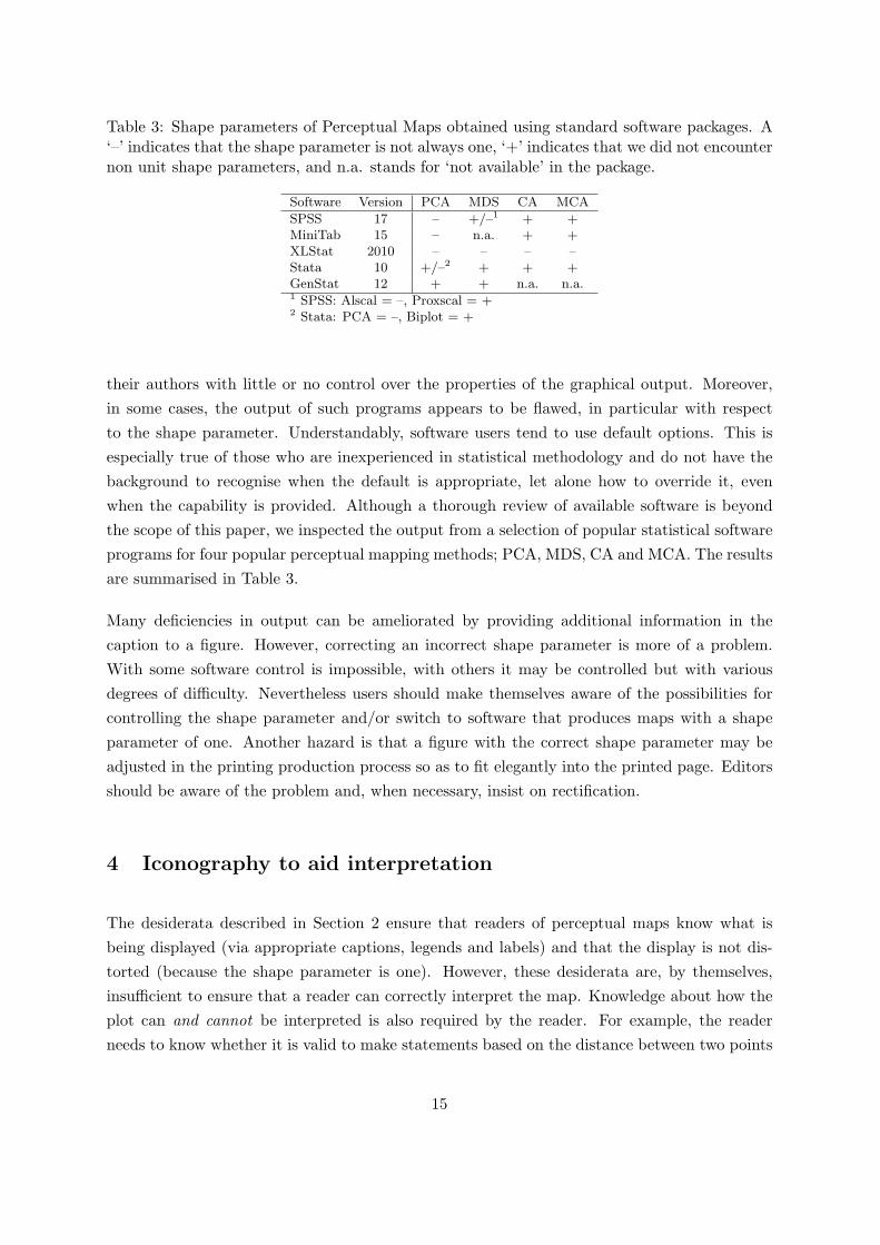
Table 3: Shape parameters of Perceptual Maps obtained using standard software packages. A‘–’ indicates that the shape parameter is not always one, ‘+’ indicates that we did not encounternon unit shape parameters, and n.a. stands for ‘not available’ in the package.
Software Version PCA MDS CA MCA
SPSS 17 – +/–1 + +MiniTab 15 – n.a. + +XLStat 2010 – – – –Stata 10 +/–2 + + +GenStat 12 + + n.a. n.a.1 SPSS: Alscal = –, Proxscal = +2 Stata: PCA = –, Biplot = +
their authors with little or no control over the properties of the graphical output. Moreover,in some cases, the output of such programs appears to be flawed, in particular with respectto the shape parameter. Understandably, software users tend to use default options. This isespecially true of those who are inexperienced in statistical methodology and do not have thebackground to recognise when the default is appropriate, let alone how to override it, evenwhen the capability is provided. Although a thorough review of available software is beyondthe scope of this paper, we inspected the output from a selection of popular statistical softwareprograms for four popular perceptual mapping methods; PCA, MDS, CA and MCA. The resultsare summarised in Table 3.
Many deficiencies in output can be ameliorated by providing additional information in thecaption to a figure. However, correcting an incorrect shape parameter is more of a problem.With some software control is impossible, with others it may be controlled but with variousdegrees of difficulty. Nevertheless users should make themselves aware of the possibilities forcontrolling the shape parameter and/or switch to software that produces maps with a shapeparameter of one. Another hazard is that a figure with the correct shape parameter may beadjusted in the printing production process so as to fit elegantly into the printed page. Editorsshould be aware of the problem and, when necessary, insist on rectification.
4 Iconography to aid interpretation
The desiderata described in Section 2 ensure that readers of perceptual maps know what isbeing displayed (via appropriate captions, legends and labels) and that the display is not dis-torted (because the shape parameter is one). However, these desiderata are, by themselves,insufficient to ensure that a reader can correctly interpret the map. Knowledge about how theplot can and cannot be interpreted is also required by the reader. For example, the readerneeds to know whether it is valid to make statements based on the distance between two points
15
in the map, something which depends on the multidimensional technique used to create themap. Currently there is the implicit expectation that this knowledge arises because readers aresufficiently conversant with the multidimensional technique used to produce the map. However,in the face of the variety of multidimensional techniques which underlie perceptual maps, eachtypically accompanied by a range of options, and implemented using a range of different soft-ware and algorithms, such an expectation is unrealistic. There is thus a clear need to includeinterpretational guidance with every perceptual map.
We feel that creators of perceptual maps are the ones who are best placed to give this inter-pretational guidance. We propose that this is done using iconography, using icons to denotethe means by which the map can be interpreted. If widely adopted and recognised, these iconsare a vehicle for directly passing interpretational guidance directly from map creator to reader.The reader then does not have to know the intricacies of the multidimensional technique usedby the map creator and can concentrate on the message the map is conveying.
Two key means of interpreting perceptual maps are distance and angle. Put quite simply,distance-based interpretations are those in which the plotted distance between points translatesdirectly to the implied similarity between them. Maps derived from different techniques can alsovary in whether distances or angles can only be compared between points of the same set (forexample, respondents) or between sets (for example, between respondents and product points).Table 4 presents the icons and their interpretation that we propose. Each icon either depictsadmissible or non-admissible interpretations in a particular perceptual map. Two solid circlesindicate that the relation concerns points of the same set, whereas an open circle combinedwith a solid one indicates that the relation holds between points of different sets. Negationof these icons is also possible. Such icons provide a proactive means of warning readers whensuch interpretations are tempting but should not be made. We also include an icon to indicatewhen the shape parameter is one. This can be used to reassure readers that shape parameterof the perceptual map is appropriate, even in situations where the shape parameter cannot beverified.
We illustrate the utility of the proposed iconography via two examples. In the first example,given in Section 4.1, correspondence analysis (CA) will be used to create some perceptual maps.CA is particularly suited for illustrating the usefulness of iconography as the interpretation of aCA plot depends on the chosen variant of CA. In particular, different CA normalisation schemesrequire different interpretations. Hence, unless the variant is clearly stated and the reader isfamiliar with the interpretational implications of that variant, interpretation is compromised.But just by adding icons, it becomes evident how and what can be interpreted in the CAplot. Our second example, given in Section 4.2, concerns a perceptual map constructed usingunfamiliar methodology. This means that readers are likely to be unsure of the appropriateinterpretational rules that apply to the perceptual map. Our iconography, however, allows all
16
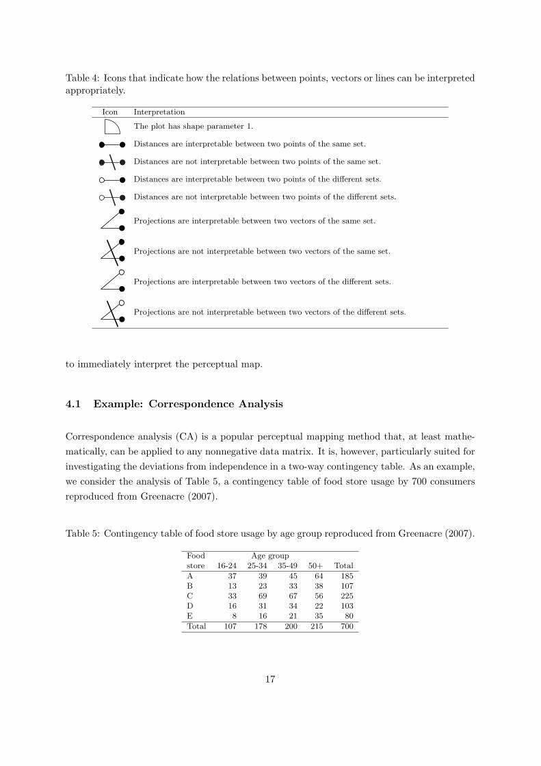
Table 4: Icons that indicate how the relations between points, vectors or lines can be interpretedappropriately.
Icon Interpretation
The plot has shape parameter 1.
Distances are interpretable between two points of the same set.
Distances are not interpretable between two points of the same set.
Distances are interpretable between two points of the different sets.
Distances are not interpretable between two points of the different sets.
Projections are interpretable between two vectors of the same set.
Projections are not interpretable between two vectors of the same set.
Projections are interpretable between two vectors of the different sets.
Projections are not interpretable between two vectors of the different sets.
to immediately interpret the perceptual map.
4.1 Example: Correspondence Analysis
Correspondence analysis (CA) is a popular perceptual mapping method that, at least mathe-matically, can be applied to any nonnegative data matrix. It is, however, particularly suited forinvestigating the deviations from independence in a two-way contingency table. As an example,we consider the analysis of Table 5, a contingency table of food store usage by 700 consumersreproduced from Greenacre (2007).
Table 5: Contingency table of food store usage by age group reproduced from Greenacre (2007).
Food Age groupstore 16-24 25-34 35-49 50+ Total
A 37 39 45 64 185B 13 23 33 38 107C 33 69 67 56 225D 16 31 34 22 103E 8 16 21 35 80
Total 107 178 200 215 700
17
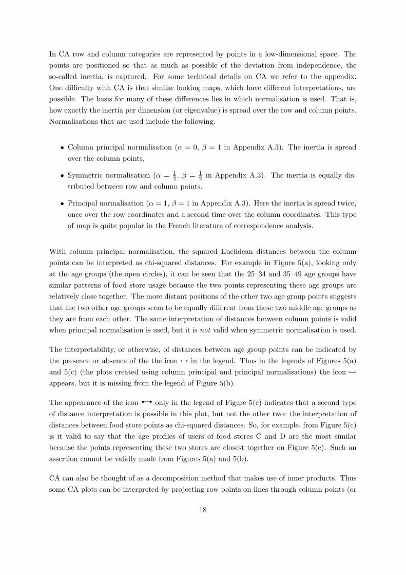
In CA row and column categories are represented by points in a low-dimensional space. Thepoints are positioned so that as much as possible of the deviation from independence, theso-called inertia, is captured. For some technical details on CA we refer to the appendix.One difficulty with CA is that similar looking maps, which have different interpretations, arepossible. The basis for many of these differences lies in which normalisation is used. That is,how exactly the inertia per dimension (or eigenvalue) is spread over the row and column points.Normalisations that are used include the following.
• Column principal normalisation (α = 0, β = 1 in Appendix A.3). The inertia is spreadover the column points.
• Symmetric normalisation (α = 12 , β = 1
2 in Appendix A.3). The inertia is equally dis-tributed between row and column points.
• Principal normalisation (α = 1, β = 1 in Appendix A.3). Here the inertia is spread twice,once over the row coordinates and a second time over the column coordinates. This typeof map is quite popular in the French literature of correspondence analysis.
With column principal normalisation, the squared Euclidean distances between the columnpoints can be interpreted as chi-squared distances. For example in Figure 5(a), looking onlyat the age groups (the open circles), it can be seen that the 25–34 and 35–49 age groups havesimilar patterns of food store usage because the two points representing these age groups arerelatively close together. The more distant positions of the other two age group points suggeststhat the two other age groups seem to be equally different from these two middle age groups asthey are from each other. The same interpretation of distances between column points is validwhen principal normalisation is used, but it is not valid when symmetric normalisation is used.
The interpretability, or otherwise, of distances between age group points can be indicated bythe presence or absence of the the icon in the legend. Thus in the legends of Figures 5(a)and 5(c) (the plots created using column principal and principal normalisations) the iconappears, but it is missing from the legend of Figure 5(b).
The appearance of the icon only in the legend of Figure 5(c) indicates that a second typeof distance interpretation is possible in this plot, but not the other two: the interpretation ofdistances between food store points as chi-squared distances. So, for example, from Figure 5(c)is it valid to say that the age profiles of users of food stores C and D are the most similarbecause the points representing these two stores are closest together on Figure 5(c). Such anassertion cannot be validly made from Figures 5(a) and 5(b).
CA can also be thought of as a decomposition method that makes use of inner products. Thussome CA plots can be interpreted by projecting row points on lines through column points (or
18
(a)
E
DC
B
A
50+
35-49
25-34
16-24
Legend:
Food store
Age group
Shape 1
Age group distances
Age-store projections
(b)
E
D
C
B
A
50+
35-49
25-34
16-24Legend:
Food store
Age group
Shape 1
Age-store projections
(c)
E
D
C
B
A
50+
35-49
25-34
16-24
Legend:
Food store
Age group
Shape 1
Food store distances
Age group distances
No age-store distances
No age-store projections
Figure 5: Correspondence analysis solution both row and columns in (a) column principalnormalisation (α = 0, β = 1 in Appendix A.3), (b) symmetric normalisation (α = 1
2 , β = 12 in
Appendix A.3) and (c) principal normalisation (α = 1, β = 1 in Appendix A.3). The data arethose from Table 5, a contingency table of five foodstores (rows) and four age groups (columns).
19
vice versa). In the legend, the presence of the icon can be used to indicate when projectionsbetween row and column points are interpretable. Thus, comparing legends, it is clear thatsuch projections are valid for Figures 5(a) and 5(b), but not Figure 5(c). For example, supposewe are interested in the age profile of shop A users. We can investigate this by consideringthe projection of each of the age groups points onto the line through the origin and point Ain Figure 5(b). The highest projection along this line occurs with the point representing the16–24 age group indicating that that there are more people than expected visiting shop A, thanfor any other age group. Note that the actual proportion is smallest in the 16-24 age group.The point representing the 50+ age group also projects on the positive side of this line, so thatshop A receives more than expected people from the 50+ age group. The 25–34 and 35–49 agegroups visit shop A less than expected as the projections of points representing these two agegroups fall on the negative side of the line through the origin and A. Figure 5(a) leads to thesame interpretation, but the scaling makes the process more difficult.
Another thing to notice about Figure 5 is that we have dispensed with the calibration andlabelling of the horizontal and vertical axes. This is because now that we have the iconto inform us that the shape parameter is one, calibration is superfluous. One would retain thelabelling, and perhaps calibration, only when discussing possible reifications of these directions.
Finally, note that the negated icons and are given in the legend of Figure 5(c). Thisis done to stress the uninterpretability of the distances between points age group and foodstore points and the uninterpretability of the projection of age group points on the lines tothe food store points (and vice versa). In other words, on this plot it is not valid to directlycompare the age group and food store point configurations, regardless of how tempting it isto do so. (However, Figure 5(b) and Figure 5(c) appear very similar. Thus invalid projectioninterpretations of Figure 5(c) would not be overly misleading in this case.)
4.2 Example: Perceptual Maps for Unfamiliar Models
The proposed iconography is particularly useful to aid interpretation of perceptual maps arisingfrom unfamiliar models. As an example, we take the clusterwise bilinear MDS model used byDeSarbo et al. (2008). This model takes data in the form of preferences, considerations, orintentions of consumer i to buy brand j and produces a perceptual map showing the clustersand the brands. It can be seen as an adaptation of k-means clustering with a low rank restrictionon the matrix of means per cluster (segment) and brand.
DeSarbo et al. (2008) apply the model to data obtained from a US automotive consumer researchstudy that asked 360 consumers their buying intentions for 18 compact SUVs scored on a fourpoint scale ranging from 1 (definitely would not consider) to 4 (definitely would consider). In
20
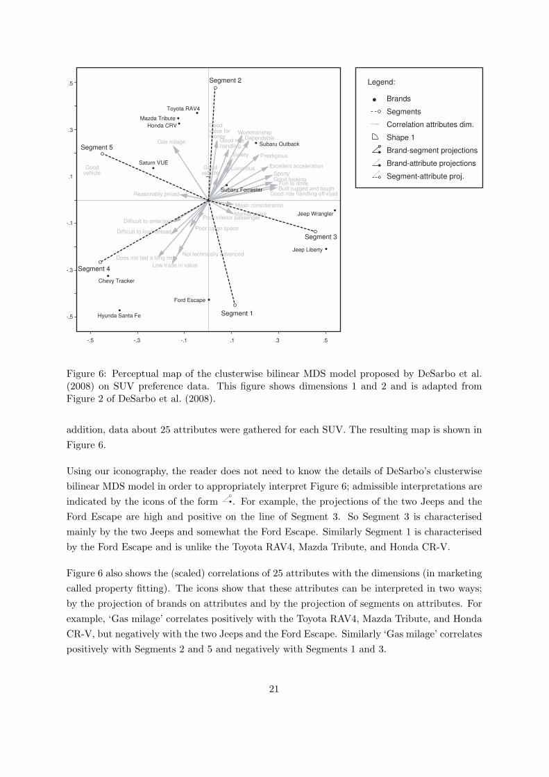
Segment 2
Segment 5
Segment 4
Segment 1
-.5 -.3 -.1 .1 .3 .5
-.5
-.3
-.1
.1
.3
.5
Toyota RAV4
Mazda Tribute
Honda CRV
Saturn VUE
Chevy Tracker
Hyunda Santa Fe
Ford Escape
Jeep Liberty
Jeep Wrangler
Subaru Outback
Subaru Forrester
Good value for money
Good ridehandling
Safety
LuxuriousGood vehicle
Good vehicle
WorkmanshipDependable
Prestigious
Excellent acceleration
SportyGood looking
Fun to driveBuilt rugged and tough
Good ride handling off-road
Mean consideration
Market sharePoor interior passenger
Poor cargo space
Not technically advanced
Low trade in value
Does not last a long time
Difficult to load/unload
Difficult to enter/exit
Reasonably priced
Gas milage
Legend:
Brands
Segments
Correlation attributes dim.
Shape 1
Brand-segment projections
Brand-attribute projections
Segment-attribute proj.
Segment 3
Figure 6: Perceptual map of the clusterwise bilinear MDS model proposed by DeSarbo et al.(2008) on SUV preference data. This figure shows dimensions 1 and 2 and is adapted fromFigure 2 of DeSarbo et al. (2008).
addition, data about 25 attributes were gathered for each SUV. The resulting map is shown inFigure 6.
Using our iconography, the reader does not need to know the details of DeSarbo’s clusterwisebilinear MDS model in order to appropriately interpret Figure 6; admissible interpretations areindicated by the icons of the form . For example, the projections of the two Jeeps and theFord Escape are high and positive on the line of Segment 3. So Segment 3 is characterisedmainly by the two Jeeps and somewhat the Ford Escape. Similarly Segment 1 is characterisedby the Ford Escape and is unlike the Toyota RAV4, Mazda Tribute, and Honda CR-V.
Figure 6 also shows the (scaled) correlations of 25 attributes with the dimensions (in marketingcalled property fitting). The icons show that these attributes can be interpreted in two ways;by the projection of brands on attributes and by the projection of segments on attributes. Forexample, ‘Gas milage’ correlates positively with the Toyota RAV4, Mazda Tribute, and HondaCR-V, but negatively with the two Jeeps and the Ford Escape. Similarly ‘Gas milage’ correlatespositively with Segments 2 and 5 and negatively with Segments 1 and 3.
21
5 Conclusion
We have been critical about the quality of graphical presentation in the marketing literaturebut it should not be thought that the problem is confined only to this and similar fields ofapplication of statistical methods. Indeed, it occurs throughout the applied literature (see,e.g., Gower, 2003). Originally, we had thought to address the use of graphics in the whole ofapplied statistics but it very quickly became apparent that this was too immense a task and wedecided to focus on one important field — marketing. There, we found serious deficiencies inlabelling diagrams, in identifying the method of analysis used and, above all, in considerationof the shape parameter. As we have seen, getting the shape parameter right is of utmostimportance. Primarily, getting the shape parameter right is the responsibility of authors, buteditors, providers of software and publishers all have roles to play. If we have done nothing elsein this paper, we hope that by drawing attention to this problem things will improve.
We have suggested certain icons to help readers appreciate what can and what cannot be usedwhen interpreting different presentations. We expect that our list of icons can be improved andextended. Just by showing icons, the reader is warned when to be careful interpreting graphicalpresentations. Perhaps there is more (or maybe less) to maps than meets the eye!
Rather than attempting an exhaustive discussion, we have thought it more important to tryand put across our main points. Two important issues that we have omitted, but of whichreaders should be aware, are (i) the use of calibrated biplot axes and (ii) the concept of linkedfigures. The former simplify the evaluation of inner-products (see Gower and Hand, 1996). Thelatter says that if showing two or more related panels in a figure (say dimensions 1 and 2 in onepanel and dimensions 3 and 4 in another panel) then it is not sufficient to ensure unit shapefactors for each panel, but the length of a unit must also be the same on both panels.
Finally, we mention again that we have been concerned solely with graphical presentation. Wehave made no attempt to examine whether or not the best or even, appropriate, methods ofanalysis have been used. That is another story.
References
Borg, I. and Groenen, P. J. (2005). Modern Multidimension Scaling, second edition. Springer,New York.
Chintagunta, P. K. (1998). Inertia and variety seeking in a model of brand-purchasing timing.Marketing Science, 17(3):253 – 270.
Cleveland, W. S. and McGill, R. (1987). Graphical perception: the visual decoding of quan-
22
titative information on graphical displays of data (with discussion). Journal of the RoyalStatistical Society, Series A, 150:192–229.
Day, G. S., Shocker, A. D., and Srivastava, R. K. (1979). Customer-oriented approaches toidentifying product markets. Journal of Marketing, 43(4):8 – 19.
DeSarbo, W. and Rao, V. R. (1986). A constrained unfolding methodology for product posi-tioning. Marketing Science, 5(1):1–19.
DeSarbo, W. S., Degeratu, A. M., Wedel, M., and Saxton, M. K. (2001). The spatial represen-tation of market information. Marketing Science, 20(4):426.
DeSarbo, W. S., Grewal, R., and Scott, C. J. (2008). A clusterwise bilinear multidimensionalscaling methodology for simultaneous segmentation and positioning analyses. Journal ofMarketing Research (JMR), 45(3):280 – 292.
DeSarbo, W. S. and Hoffman, D. L. (1987). Constructing mds joint spaces from binary choicedata: A multidimensional unfolding threshold model for marketing research. Journal ofMarketing Research (JMR), 24(1):40 – 54.
DeSarbo, W. S. and Manrai, A. K. (1992). A new multidimensional scaling methodology for theanalysis of asymmetric proximity data in marketing research. Marketing Science, 11(1):1–20.
DeSarbo, W. S. and Wu, J. (2001). The joint spatial representation of multiple variable batteriescollected in marketing research. Journal of Marketing Research (JMR), 38(2):244 – 253.
DeSarbo, W. S. and Young, M. R. (1997). A parametric multidimensional unfolding proce-dure for incomplete nonmetric preference/choice set date in marketing research. Journal ofMarketing Research (JMR), 34(4):499 – 516.
Dillon, W. R. and Gupta, S. (1996). A segment-level model of category volume and brandchoice. Marketing Science, 15(1):38–59.
Doehlert, D. H. (1968). Similarity and preference mapping: A color example, pages 250–258.American Marketing Association, Chicago.
Eliashberg, J. and Manrai, A. K. (1992). Optimal positioning of new product-concepts: Someanalytical implications and empirical results. European Journal of Operational Research,63(3):376 – 397.
Frank, R. E. and Green, P. E. (1968). Numerical taxonomy in marketing analysis: A reviewarticle. Journal of Marketing Research (JMR), 5(1):83 – 94.
Gower, J. and Hand, D. (1996). Biplots. Chapman & Hall, London.
Gower, J. C. (2003). Visualisation in multivariate and multidimensional data analysis. Bulletinof the International Statistical Institute, 54:101–104.
23
Green, P. E. and Carmone, F. J. (1969). Multidimensional scaling: An introduction and com-parison of nonmetric unfolding techniques. Journal of Marketing Research (JMR), 6(3):330– 341.
Green, P. E. and Carmone, F. J. (1970). Multidimensional scaling and related techniques inmarketing analysis. Allyn & Bacon, Boston.
Greenacre, M. (2007). Correspondence analysis in practice, second edition. Chapman &Hall/CRC, Boca Raton, Florida.
Greenacre, M. J. (1988). Correspondence analysis of multivariate categorical data by weightedleast squares. Biometrika, 75:457–467.
Hair, J. F., Anderson, R. E., Tatham, R. L., and Black, W. C. (1995). Multivariate DataAnalysis with readings, fourth edition. Prentice-Hall International, Upper Saddle River, NewJersey.
Hartmann, P., Ibanez, V. A., and Sainz, F. J. F. (2005). Green branding effect on attitude:functional versus emotional positioning strategies. Market Intelligence & Planning, 23:9–29.
Huber, J. (2008). The value of sticky articles. Journal of Marketing Research (JMR), 3:257 –260.
IPSOS-INRA (2007). Consumer satisfaction survey final report for the European CommissionHealth and Consumer Protection Directorate – General,.
Jarvenpaa, S. L. (1989). The effect of task demands and graphical format on informationprocessing strategies. Management Science, 35(3):285 – 303.
Katahira, H. (1990). Perceptual mapping using ordered logit analysis. Marketing Science,9(1):1.
Lee, J. K., Sudhir, K., and Steckel, J. H. (2002). A multiple ideal point model: Capturingmultiple preference effects from within an ideal point framework. Journal of MarketingResearch (JMR), 39(1):73 – 86.
Lehmann, D. R. (1972). Judged similarity and brand-switching data as similarity measures.Journal of Marketing Research (JMR), 9(3):331 – 334.
Lilien, G. L. and Rangaswamy, A. (2003). Marketing engineering: computer-assisted marketinganalysis and planning. Prentice Hall, Upper Saddle River, second edition.
MacKay, D. B. and Zinnes, J. L. (1986). A probabilistic model for the multidimensional scalingof proximity and preference data. Marketing Science, 5(4):325.
Manrai, A. K. and Sinha, P. (1989). Elimination-by-cutoffs. Marketing Science, 8(2):133–152.
24
Natter, M., Mild, A., Wagner, U., and Taudes, A. (2008). Planning new tariffs at tele.ring:The application and impact of an integrated segmentation, targeting, and positioning tool.Marketing Science, 27(4):600–609.
Pankhania, A., Lee, N., and Hooley, G. (2007). Within-country ethnic difference and productpositioning: a comparision of the perceptions of two British sub-cultures. Journal of StrategicMarketing, 15:121–138.
Pessemier, E. A. and Root, H. P. (1973). The dimensions of new product planning. Journal ofMarketing, 37(1):10 – 18.
Shocker, A. D. and Srinivasan, V. (1974). A consumer-based methodology for the identificationof new product ideas. Management Science, 20(6):921 – 937.
Sinha, I. and DeSarbo, W. S. (1998). An integrated approach toward the spatial modeling ofperceived customer value. Journal of Marketing Research (JMR), 35(2):236 – 249.
Spence, I. and Lewandowski, S. (1990). Graphical perception, pages 1–57. Sage, London.
Stefflre, V. (1969). Market structure studies: New products for old markets and new markets(foreign) for old products, pages 251–268. John Wiley & Sons, New York.
Taks, M. and Scheerder, J. (2006). Youth sports participation styles and market segmentationprofiles: evidence and applications. European Sport Management Quarterly, 6:85–121.
Tegarden, D. P. (1999). Business information visualization. Communications of the Associationfor Information Systems, 1(article 4).
Torres, A. and Bijmolt, T. H. (2009). Assessing brand image through communalities andasymmetries in brand-to-attribute and attribute-to-brand associations. European Journal ofOperational Research, 195(2):628 – 640.
Torres, A. and van de Velden, M. (2007). Perceptual mapping of multiple variable batteriesby plotting supplementary variables in correspondence analysis of rating data. Food Qualityand Preference, 18(1):121 – 129.
Tufte, E. R. (1983). The visual display of quantitative information. Graphics Press, Cheshire,Connecticut.
Wainer, H. (2005). Graphic discovery: a trout in the milk and other visual adventures. PrincetonUniversity Press, Princeton, NJ.
Wind, Y. (1982). Product policy: Concepts, methods and strategy. Addison-Wesley, Reading,MA.
Wu, J., DeSarbo, W. S., Chen, P.-J., and Fu, Y.-Y. (2006). A latent structure factor analyticapproach for customer satisfaction measurement. Marketing Letters, 17(3):221–238.
25
Appendix
A Summary of multidimensional techniques
Table 6 lists some of the more common multidimensional techniques used in marketing, togetherwith the icons appropriate for their interpretation.
A.1 Biplots
The term biplot has been used sporadically throughout the main text. A biplot is a graphicaldevice for showing and associating two kinds of information (the modes) on a single diagram.Typically, we might show samples (cases, units, persons, . . . ) and variables (responses, scores,category-levels, . . . ) or the rows and columns of a two-way table. Samples are usually shownas points and numerical variables as vectors though, especially for rows and columns, we mayuse two types of points (one representing row labels and the other column labels). Distance isthe main tool for interpreting differences between pairs of points of like mode. Interpretationof the association between modes may also use distance but it is usually in terms of inner-products, requiring the product of two lengths multiplied by the cosine of their containing angle.This calculation can be simplified by projecting points onto calibrated axes (extended vectors),as for ordinary coordinate axes. Nonlinear axes, and special considerations for categoricalvariables are available. The ability to associate the representations of the two modes is essential;when unavailable we refer to a joint plot. Biplots of various forms are associated with manymultidimensional methods, a few of which are described below.
A.2 Principal Components Analysis (PCA)
The PCA of a data-matrix X giving measurements on p variables (the columns) and n objects(the rows) has many derivations and interpretations. The simplest, and original is to regardthe rows of X as giving the coordinates of n points in p dimensions and seek an r-dimensionalapproximation X̂ (typically, r = 2). The solution to minimising ‖X−X̂‖2 is given by the Eckart-Young theorem using the singular value decomposition of X = nUpΣpV′
p where U′U = I,V′V = VV′ = I and Σ is diagonal with its (diagonal) elements non-negative and presentedin non-increasing order. Then, X̂ = UΣJV′ where J has its first r diagonal values units,else zero. We may plot the rows of UΣJ as n points P1, P2, . . . , Pn in r dimensions, giving arepresentation that may be interpreted in terms of approximations to the distances between therows of X. We may also plot VJ to give points Q1, Q2, . . . , Qp on p axes, the inner product ofUΣJ′ and VJ giving the approximation X̂ itself. This inner product (OPi)(OQj) cos(PiOQj)
26

Table 6: Overview of perceptual maps for different techniques and the icons for admissibleinterpretations. Inadmissible interpretations are implicit as some icons are omitted.
Icons
Row
sor
Colu
mns
or
Row
sand
Cols
or
Tec
hniq
ue
Plo
tR
esponden
tsV
ari
able
sR
esp.
and
Var.
PC
AB
iplo
t:R
esponden
tsas
poin
ts,va
riable
sre
pre
sente
das
vec
tors
,ei
gen
-va
lues
spre
ad
over
the
vari
able
s,
PC
AR
esponden
tsas
poin
ts,ei
gen
valu
essp
read
over
resp
onden
ts,va
riable
sre
pre
sente
das
vec
tors
CA
Bip
lot:
Row
sand
colu
mns
as
poin
ts,in
erti
asp
read
over
the
row
s(r
owpri
nci
palst
andard
izati
on,α
=1,β
=0)
CA
Bip
lot:
Row
sand
colu
mns
as
poin
ts,
iner
tia
spre
ad
over
the
colu
mns
(colu
mn
pri
nci
palst
andard
izati
on,α
=0,β
=1)
CA
Bip
lot:
Row
sand
colu
mnsaspoin
ts,in
erti
asp
read
equally
the
colu
mns
(canonic
alst
andard
izati
on,α
=1 2,β
=1 2)
CA
Join
tplo
tofro
wsand
colu
mnsaspoin
ts,in
erti
asp
read
twic
e,once
over
row
sand
again
over
the
colu
mns
(sym
met
ric
‘Fre
nch
’st
andard
izati
on,
α=
1,β
=1)
MD
SP
lot
ofth
eobje
cts
Unfo
ldin
g(i
dea
lpoin
tm
odel
)B
iplo
t:re
sponden
tsas
poin
ts,it
ems
as
poin
ts
Unfo
ldin
g(v
ecto
rm
odel
)B
iplo
t:re
sponden
tsas
vec
tors
,it
ems
as
poin
ts
27
may be evaluated directly or by projecting the point Pi onto the biplot axis OQj endowed withcalibrations.
The vectors V are often termed the loadings of the derived variables XV, the so-called prin-cipal components. Principal components are often regarded as interpretable latent variables, aprocess sometimes called reification. Note that X(VJ) = UΣJ, the plotted points.
A somewhat different approach is concerned with the approximation of X′X (the covarianceor, after normalisation, the correlation matrix). Because X′X = VΣ2V′, approximations tothe variances/correlations are obtained by plotting VΣJ and using its innerproduct with itself.The inner product giving X̂ may be completed by plotting UJ in association with VΣJ. Thisusage, together with the reification of latent variables is strongly influenced by factor analysiswith which PCA is often confused.
A.3 Correspondence Analysis (CA)
In principal, correspondence analysis is concerned with the analysis of contingency tables.Mathematically, however, the method can be applied to any nonnegative data matrix. Theobjective of correspondence analysis is to give an graphical representation of both rows andcolumns of the contingency table. For this purpose, high dimensional data is approximatedin a low (usually two) dimensional space. There are many ways to describe and define CA.Here, we confine ourselves to a brief summary of the most common configurations obtainedby CA. Let X be the nonnegative data matrix with row and column sums R1, C1 whereR and C are diagonal and X1 = R1 and X′1 = C1. Also, 1′X1 = 1′R1 = 1′C1 = n
the total of the entries in X. Visualisations are based on the singular value decompositionR−1/2(X− 1
nR11C′)C−1/2 = UΣV′.
Row and column coordinates are defined as A = R−1/2UΣαJ and B = C−1/2VΣβJ respec-tively. In CA, four sets of α and β are commonly distinguished.
1. α = 1 and β = 0. In this setting, the rows of A are referred to as principal coordinates andthe rows of B give standard coordinates. The corresponding plot is a biplot. Distancesbetween row points are (approximated) chi-squared distances. This setting is also calledthe row-principal normalisation.
2. α = 0 and β = 1. In this setting, the rows of B are referred to as principal coordinates andthe rows of A give standard coordinates. The corresponding plot is a biplot. Distancesbetween column points are (approximated) chi-squared distances. This setting is alsocalled the column-principal normalisation.
28
3. α = 12 and β = 1
2 . This setting again yields a biplot. It may be referred to as “symmetricalCA biplot”, but is also known as canonical biplot.
4. α = 1 and β = 1. A joint plot of A and B is sometimes referred to as a symmetricalCA plot. However, it should be noted that in this setting we are in fact merging twodifferent plots. Distances between rows are (approximated) chi-squared distances as arethe distances between columns. However, distances between row and column points arenot defined. Moreover, angles between row and column points cannot be meaningfullyinterpreted.
For cases 1, 2 and 3 we have that the inner product AB′ = R−1/2(UΣV′)C−1/2 = R−1(X −1nR11C′)C−1 = R−1XC−1 − 1
n11′. The quantity nR−1XC−1 is known as the contingencyratio and, assuming independence, gives the ratio observed/expected for each cell of X. Thisshows that the inner-product projections indicate whether the contingency ratio is greater orless than unity.
It is sometimes said that CA can represent three things (row-distances, column-distances andinner-products) but only two of these may be approximated in any map.
A.4 Multiple Correspondence Analysis (MCA)
When X is replaced by G, an indicator matrix for p categorical variables with a single dummyvariable for every category of every variable, we may formally analyse G by CA as if it were atwo-way contingency table. Alternatively, as in the PCA of a covariance or correlation matrix,we may approximate G′G, known as the Burt matrix. Rather than covariances, this gives allthe p(p−1)/2 two-way contingency tables. Writing L = diag(G′G), the normalised Burt matrixbecomes L−1/2G′GL−1/2 which gives the contingency tables in the form R−1/2XC−1/2 as forCA itself. Joint Correspondence Analysis (Greenacre, 1988) is concerned with approximatingthe off-diagonal blocks of the (normalised) Burt matrix, thus excluding the uninteresting blockdiagonals (i.e. L or, with normalisation, I).
Optimal Scores, Homogeneity Analysis, Multiple Correspondence Analysis are equivalent meth-ods concerned with p categorical variables observed on n cases. It is desired to replace the cat-egories by numerical values (the scores) that minimise the variability among the scores withincases, relative to the total variability. Ordinal restrictions may be admitted. Rather similarlyNonlinear PCA, increasingly called categorical PCA, also seeks scores that maximise the PCAfit in some nominated number r of dimensions, especially for r = 2.
29
A.5 Multidimensional Scaling (MDS)
MDS is concerned with drawing a map from a matrix giving the dissimilarities dij between allpairs of n objects. Thus, the data are like the road distance tables given in road gazetteers.MDS exists in two forms: metric MDS and nonmetric MDS. In metric MDS, the objective isto approximate the given dij by actual distances between n points in r dimensions (usuallyr = 2). In nonmetric MDS the objective is not for the dij to approximate the dissimilaries butmerely their order. Thus, on the face of things, nonmetric MDS applies to much softer datathan does metric MDS but, in practice, there is less difference between maps produced by thetwo approaches than might be expected.
There are several variants of both metric and nonmetric MDS but all are concerned withoptimising some criterion that measures the degree of fit between the given dissimilarities andfitted distances. Some criteria lead to sophisticated algorithms and associated software.
Multidimensional unfolding is a variant of MDS which draws maps given all pairs of distancesbetween p row-objects and q different column-objects. Originally, unfolding was concerned withtrying to map in one dimension how p persons scored their perceptions on q objects, in such away that the points representing objects scored highly by an individual, would lie near the pointfor that individual. Multidimensional unfolding is the extension to more than one dimension.
Another version of multidimensional unfolding is known as the Vector Model that models thepreferences of people for items in a similar biplot representation as in PCA. However, in thevector model of unfolding, the people are represented by vectors and the items by points. Apoint projecting highly on the direction of a person indicates strong preference of the person forthis item. The computations can be done through a standard PCA, usually having the personsas columns and items as rows so that default standardisation in PCA removes the averagepreference of the people and assumes equal spread of the preferences. The MDPREF model,which is popular in marketing, adds a unit length restriction to the vectors representing thepeople.
30

![IDNUM. [assigned in office] IDNUM District: DISTRICT CITY ... · Do you think it is very good, good, Fair, bad or very bad? (1) Very Good (2) Good (3) Fair (4) Bad (5) Very bad (8)](https://img.pdfslide.us/doc/110x75/5f027e487e708231d4048934/idnum-assigned-in-office-idnum-district-district-city-do-you-think-it-is.jpg)