Embed Size (px)
Citation preview
Media Technology
Fachhochschule St. Pölten GmbH, Matthias Corvinus-Straße 15, 3100 St. Pölten, T: +43 (2742) 313 228, F: +43 (2742) 313 228-339, E: [email protected], I: www.fhstp.ac.at
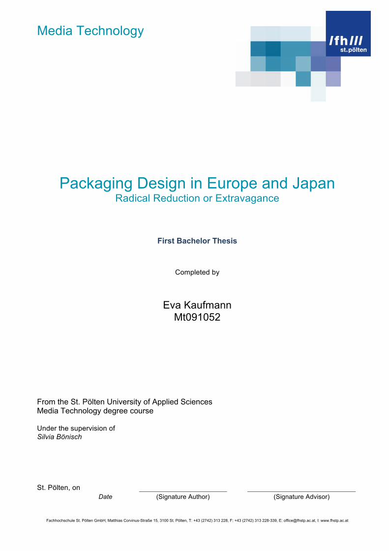
Packaging Design in Europe and Japan
Radical Reduction or Extravagance
First Bachelor Thesis
Completed by
Eva Kaufmann Mt091052
From the St. Pölten University of Applied Sciences Media Technology degree course Under the supervision of Silvia Bönisch St. Pölten, on
Date (Signature Author) (Signature Advisor)
Media Technology
2
Declaration
I declare, that the attached research paper is my own, original work undertaken in partial fulfillment of my degree.
I have made no use of sources, materials or assistance other than those which have been
openly and fully acknowledged in the text.
If any part of another person’s work has been quoted, this either appears in inverted
commas or (if beyond a few lines) is indented.
Any direct quotation or source of ideas has been identified in the text by author, date, and page number(s) immediately after such an item, and full details are provided in a reference list at the end of the text.
I understand that any breach of the fair practice regulations may result in a mark of zero for this research paper and that it could also involve other repercussions. I understand also that too great a reliance on the work of others may lead to a low mark.
St. Pölten, on Date (Signature Author)
Media Technology
3
Abstract This thesis deals with the development of packaging design because of the factors that have changed in the last degrees. Packaging design is influenced by many factors like taste and style, but also culturally factors have an effect on the look. In a time of overstimulation caused of too much adverts it is important to respond the consumers specific and effective. Packaging has been around since the birth of humanity. At a basic level, we package to protect, contain and identify products and to transport it from point A to point B. Even a banana has a packaging – its skin. Although there are also other reasons, for example some products need to be kept until consumption or at certain temperature until it reaches the final destination. Others have to be protected from kleptomaniacs. Besides of the constantly practical reasons, the aesthetic reasons are nowadays the exciting one’s and mostly the reason for a redesign. The future will show how long the trend to simplify and reduce the packaging will be. The main topics of this thesis are the definition of packaging design, the essential factors for the design of a packaging like historical or cultural factors, reasons for a redesign of a packaging and the actual trend of packaging design. For answering these topics, the research method was used. For all topics, the comparison between Europe and Japan was made.
Media Technology
4
Table of contents 1. OVERVIEW...................................................................................................................................................5
1.1. DEFINITION DESIGN ..................................................................................................................................5 1.2. THE PROFESSION DESIGNER .....................................................................................................................5 1.3. THE REASONS FOR PACKAGING..................................................................................................................5
2. ESSENTIAL FACTORS FOR THE DESIGN OF A PACKAGING ...............................................................8 2.1. HISTORICAL FACTORS ...............................................................................................................................8 2.2. CULTURAL FACTORS .................................................................................................................................8 2.3. THE TECHNIQUES OF PRINTING AND PACKAGING TYPES .............................................................................10 2.4. GLOBALIZATION ......................................................................................................................................12 2.5. PRODUCTS ON THE SHELF .......................................................................................................................14
3. REASONS FOR PACKAGING MAKEOVERS...........................................................................................16 3.1. CHANGE OF FOCUS .................................................................................................................................16 3.2. EXTREME MAKEOVERS............................................................................................................................19 3.3. TRADING UP ...........................................................................................................................................21 3.4. CHANGING FACES...................................................................................................................................23
4. RADICAL REDUCTION OR EXTRAVAGANCE ........................................................................................25 REFERENCES ...................................................................................................................................................28

Media Technology
5
1. Overview
package (pak’ij) verb
to make into a package; especially: to produce as an entertainment package b: to present (as a product) in such a way
as to heighten its appeal to the public.
Origin:
1540, “the act of packing,” from pack (n.) or from cognate Du. pakkage “baggage.” The main modern sense of “bundle, parcel”
is first attested 1722. The verb is 1922, from the noun.
(Adducci / Keller 2008, p. 6)
1.1. Definition Design
The word „design“ knows everyone, but the meaning is quite different. In the context of furniture or architecture it means something special and expensive, but for others it means the look of a product. The linguistic history says, that the word „design“ comes from the Italian word „disegno“, which means drawing as the artistic idea; concept and the brain work in the religious meaning. The first mention of „design“ was in the „Oxford English Dictionary“ in the 1588 as a plan from people for something, which should be accomplished. For this writing, it means the look of a product and its effects on consumers.
1.2. The profession Designer
It is one of the youngest professions, but nowadays it is also one of the best-paid jobs. For Japan, it was first a contract of the government. The Japan External Trade Organization sent Japanese students in foreign countries for design studies. So the government got information about foreign markets. But the government was not the absolute force. The most decisions about the packaging design were made intern in the companies. In the 1950 years, when Japan got a better economic system, also the profession designer got a higher reputation. After the Second World War, the Japanese designers informed them by the American ones. They recognized, that redesigning the packaging increases the sales. Japan also increased their export – with success. Japan is now one of the leading industrial nations. Today, ninety percent of Japanese designers work as employee in big companies but in Europe, designers most are individual with their own little agencies, which get engaged by companies. (cf. Luther 1997/1998, pp. 3-4)
1.3. The reasons for packaging
„Name something that doesn’t come in a package.“ (Adducci / Keller 2008, p.11)
Packaging has been around since the birth of humanity. At a basic level, we package to protect, contain and identify products and to transport it from point A to point B. Even a banana has a packaging – its skin. Although there are also other reasons, for example some products need to be kept until consumption or at certain temperature until it reaches the final destination. Others have to be protected from kleptomaniacs. (Adducci / Keller 2008, p. 12)

Media Technology
6
In the diagram below you can see the five basic reasons for packaging.
figure 1: five basic reasons for packaging (Adducci / Keller 2008, p.13)
With the new materials we have now, the globalization and the consumption-driven society, we live in wonderful times for packaging. Nowadays there are more reasons for packaging than just the five basic reasons. Here are twelve modern reasons:
Simplicity: Customers are still busy and desire packages that are simple to buy and understand. Complicated is the enemy.
Convenient Quality: People want speed and convenience, without sacrificing quality. Within ten to twenty seconds, shoppers make a category decision at the shelf. Quality of packaging conveys quality of product. Imagery and design only have a second or two for success or failure.
Globalization: This impacts the sourcing of products, market expansion opportunities, and the sourcing of services such as printing, prototyping, and manufacturing. Identifying the country of origin is often required on packages and is becoming a larger part of consumers’ decision-making criteria.
Media Technology
7
New Consumer Information: Price comparison is mere table stakes. Now customers compare corporate ethics, country of origin, and environmental responsibility.
Brand Trust: One million moments to build it and one moment to destroy it. Packaging can let consumers see inside the organization, and it requires trustworthy behaviors across all aspects of the organization.
Green is the new Gold: Environmentalism and the new consumer are drawn to behaviors hat preserve the planet we live on. Packaging design can make a large contribution to the fulfillment of this trend.
Convergence, Smergence: Technology that combines multiple media into once device or moment, the Apple iPhone being the most prolific example known today. How does convergence impact packaging? When the packaging is an essential part of the product experience, we see another form of convergence.
Mass Personalization: Products made for you, me, and the other guy in a way that feels like it was done one at a time but could really never be. The packaging design has great opportunities to bring mass customization to life on the packaging. The underwater art of this iceberg has yet to be discovered.
Me-Service: People are smart, crowds are not. Getting one person through a self-check-out isn’t much of a challenge, but when the crowd shows up, your new technology better be ready. As self-service shows up all over the packaging world, you’ll find the design must be simplified, again and again and again.
Everyone’s a Hilton: Luxury isn’t just reserved for the upper crust. Today’s consumers buy small moments of luxury through the products and services they purchase. Design can create luxury for the masses and packaging to match.
Über Speed Retail: Step behind the scences of a major retailer and you’ll find yourself on a merry-go-round moving at light speed. The neo-retailers require a level of speed unknown to most consumers and likely alien to the average Jamaican.
RFID: „Ready for Identity Detection“ is coming to visit you wherever you are. Yes, it is better known as Radio Frequency Identification Devices, which is quickly becoming the technology used to track where each and every packaging is from the supply chain to your home. Unlike other ingredients, you won’t be able to say, „I’d like that without any RFID, please.“
(Adducci / Keller 2008, pp. 16-19) Especially in Japan, packaging design has a particularly meaning, because they believe that in everything lives a „god“, so the soul of a god could be in your desk, chair, etc. For them it is not just packaging design. It is the home of a soul, and this home should be as nice as it could be. On the other hand, Japanese know, how to handle with natural material. Examples are woven baskets of rice straw, bowls from shells and packaging of leaves, bamboo or cherry springs. (cf. Izumi 1989, pp. 7-8)
Media Technology
8
2. Essential factors for the design of a packaging
„We consume, therefore we are“ (Adducci / Keller 2008, p. 14)
To consider the history of packaging, you have to consider the history of products. How products reach the consumers changed. 100 years ago, just two outlets existed – direct to consumer and a village shop. Packaging was a delivery device that was intended to get the products safely to the final owner. When we moved from a production-driven society to a consumption-driven society, packaging design got new aspects. (cf. Adducci / Keller 2008, p. 14)
2.1. Historical factors
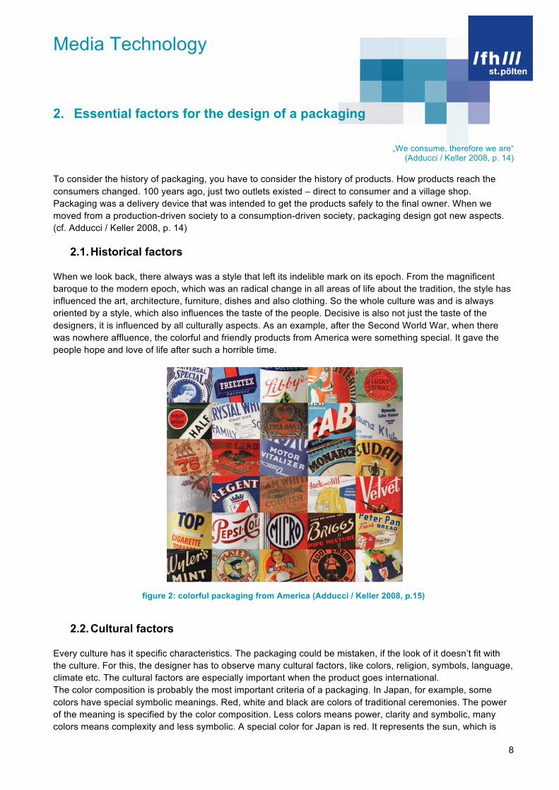
When we look back, there always was a style that left its indelible mark on its epoch. From the magnificent baroque to the modern epoch, which was an radical change in all areas of life about the tradition, the style has influenced the art, architecture, furniture, dishes and also clothing. So the whole culture was and is always oriented by a style, which also influences the taste of the people. Decisive is also not just the taste of the designers, it is influenced by all culturally aspects. As an example, after the Second World War, when there was nowhere affluence, the colorful and friendly products from America were something special. It gave the people hope and love of life after such a horrible time.
figure 2: colorful packaging from America (Adducci / Keller 2008, p.15)
2.2. Cultural factors
Every culture has it specific characteristics. The packaging could be mistaken, if the look of it doesn’t fit with the culture. For this, the designer has to observe many cultural factors, like colors, religion, symbols, language, climate etc. The cultural factors are especially important when the product goes international. The color composition is probably the most important criteria of a packaging. In Japan, for example, some colors have special symbolic meanings. Red, white and black are colors of traditional ceremonies. The power of the meaning is specified by the color composition. Less colors means power, clarity and symbolic, many colors means complexity and less symbolic. A special color for Japan is red. It represents the sun, which is

Media Technology
9
also shown on its flag. The western meaning of black and white as ceremony colors, white stands for wedding and purity and black for sorrow and elegance could be mistaken in Japan. There, white is the color of sorrow. Women are dressed white at their funeral and red is often the color of the wedding kimono. Like Austria, also Japan has its own symbols. Austria has its coat of arms, eagles and also the Alps. The typical Japanese symbols are the Maneki Neko, a cat that brings luck, cherry blossoms, also called Sakura, the rabbit in the moon, which has an old history and the Daruma, a typical symbol of the Buddhism. The symbols reflect the character of Japan - some kind of childlike, colorful and extravagant. Nevertheless it has its charm for the western people - maybe because of the lovely details of the packages.
figure 3: packaging with a “soul” (Rika 2007, p. 222)
figure 4: childlike, colorful packaging from Japan (Rika 2007, p. 57)
Media Technology
10
2.3. The techniques of printing and packaging types
„Yes, Madonna, we do live in a material world“ (Adducci / Keller 2008, p. 80)
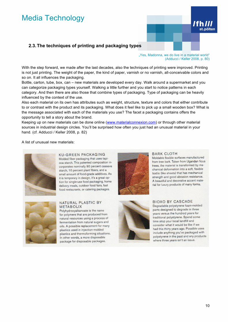
With the step forward, we made after the last decades, also the techniques of printing were improved. Printing is not just printing. The weight of the paper, the kind of paper, varnish or no varnish, all-conceivable colors and so on. It all influences the packaging. Bottle, carton, tube, box, can – new materials are developed every day. Walk around a supermarket and you can categorize packaging types yourself. Walking a little further and you start to notice patterns in each category. And then there are also those that combine types of packaging. Type of packaging can be heavily influenced by the context of the use. Also each material on its own has attributes such as weight, structure, texture and colors that either contribute to or contrast with the product and its packaging. What does it feel like to pick up a small wooden box? What is the message associated with each of the materials you use? The facet a packaging contains offers the opportunity to tell a story about the brand. Keeping up on new materials can be done online (www.materialconnexion.com) or through other material sources in industrial design circles. You’ll be surprised how often you just had an unusual material in your hand. (cf. Adducci / Keller 2008, p. 82) A list of unusual new materials:

Media Technology
11
figure 5: new materials (Adducci / Keller 2008, pp. 82-83)

Media Technology
12
A special material in Japan is “Furoshikibility” also called “Furoshiki“, it is just a piece of cloth, but with it, Japanese package everything. Money, books or vegetables, it is a varied packaging. The designer Kenji Ekuan (*1929) explained, that western devices of transport are one-sided functional. So the wallet is for the money, the bag is for the books and a net is for the vegetable. However the Japanese prefer to be surrounded by utility things. That you can find in numerous everyday life devices such as the Shoji. (cf. Luther 1997/1998, p. 11)
figure 6: Furoshiki (Rika 2007, p. 27)
2.4. Globalization
„Brands without borders“ (Adducci / Keller 2008, p. 22)
The fundamentals of globalization cover languages, graphics and visuals. Also the need to adapt to each country or region is important, but how much adaption takes place depends on the globalization strategy of the organization. Coca Cola – likely the most ubiquitous packaging and probably the most common brand name known in the world – its bottles from all around the world looks the same, while the visual language adapts. A special strategy follows McDonald’s. McDonald’s also adapts the visual language, but supplementary regional or seasonal products such as the „Rice Burger“. (cf. Adducci / Keller 2008, p. 22)

Media Technology
13
figure 7: Coca Cola global (Adducci / Keller 2008, p. 23)
figure 8: McDonald’s Japan: Rice Burger (Manya 2008, [http://manyapan.wordpress.com/2009/12/10/from-big-mac-to-rice-burger-globalization-mcdonalds-in-japan/])
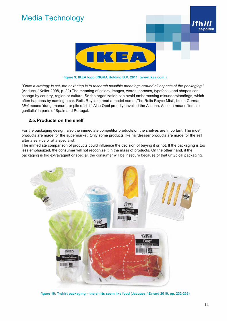
Some organizations like IKEA, make no apologies for product names that sound unusual in other languages. IKEA takes a country of origin approach and expects the shopper to learn, adapt and understand. None of this ways are right or wrong, but each represents a different strategy to globalization. (Adducci / Keller 2008, p. 22)
Media Technology
14
figure 9: IKEA logo (INGKA Holding B.V. 2011, [www.ikea.com])
“Once a strategy is set, the next step is to research possible meanings around all aspects of the packaging.” (Adducci / Keller 2008, p. 22) The meaning of colors, images, words, phrases, typefaces and shapes can change by country, region or culture. So the organization can avoid embarrassing misunderstandings, which often happens by naming a car. Rolls Royce spread a model name „The Rolls Royce Mist“, but in German, Mist means ‘dung, manure, or pile of shit.’ Also Opel proudly unveiled the Ascona. Ascona means ‘female genitalia’ in parts of Spain and Portugal.
2.5. Products on the shelf
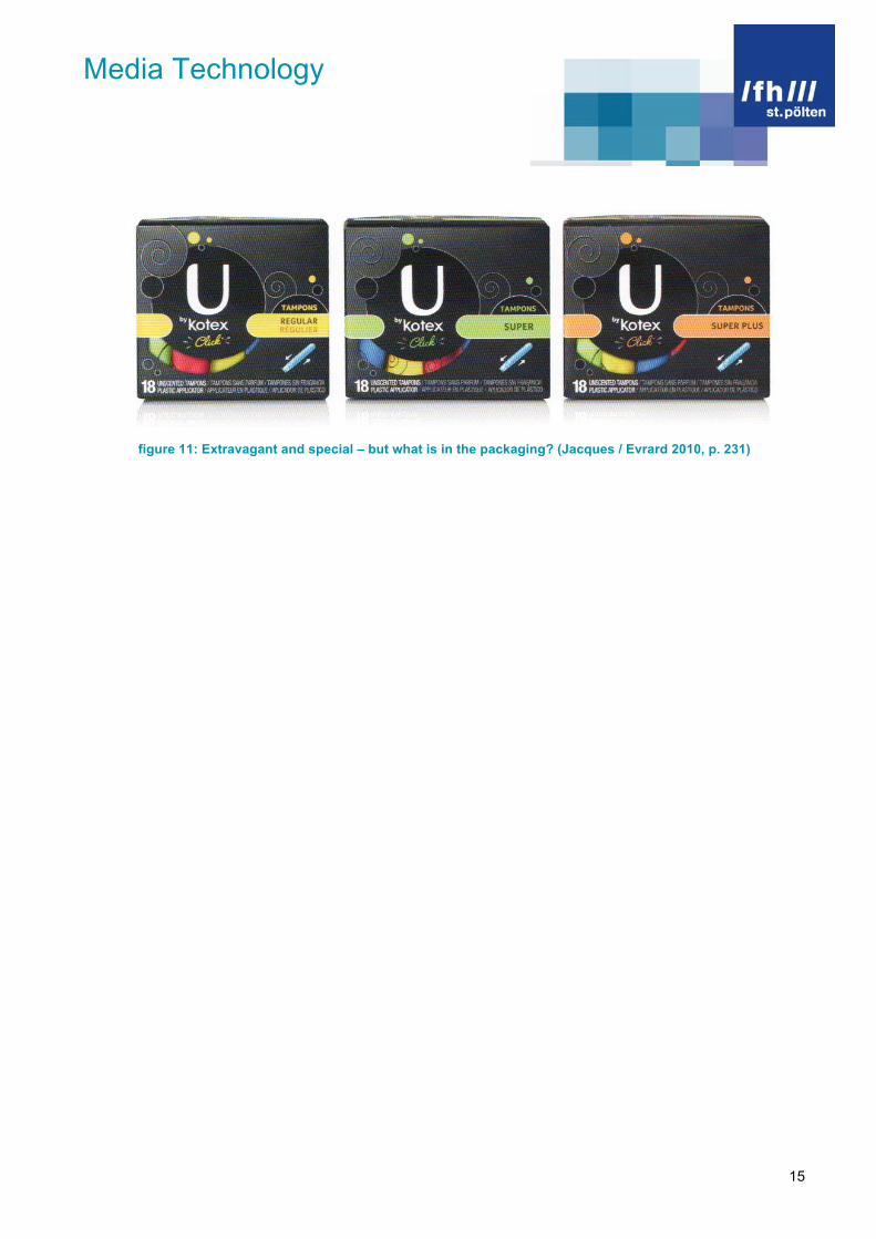
For the packaging design, also the immediate competitor products on the shelves are important. The most products are made for the supermarket. Only some products like hairdresser products are made for the sell after a service or at a specialist. The immediate comparison of products could influence the decision of buying it or not. If the packaging is too less emphasized, the consumer will not recognize it in the mass of products. On the other hand, if the packaging is too extravagant or special, the consumer will be insecure because of that untypical packaging.
figure 10: T-shirt packaging – the shirts seem like food (Jacques / Evrard 2010, pp. 232-233)
Media Technology
15
figure 11: Extravagant and special – but what is in the packaging? (Jacques / Evrard 2010, p. 231)
Media Technology
16
3. Reasons for Packaging Makeovers
Much of the work of a packaging designer contains the refreshing, evolution or completing the look of already developed product packaging. These days, it is usual to redesign product packaging every two years for many companies. And because this process of redesigning takes that long, the designers start all over again, when the new packaging is finally on every retail shelf all over the world. (cf. King Gordon 2005, p. 8) The reasons for this routine are obvious. “Consumers have more choices in the market than ever. New generations of consumers expect and demand different things. And these days, 80 percent of a consumer’s decision is now made at the shelf, with an emphasis more on first impressions and price than on brand reputation and purchasing history.” (King Gordon 2005, p. 8) Fact is, that any kind of change of the packaging is a dangerous proposition. Marketing managers can measure, analyze and hypothesize all they want, but the danger stays. Consumers are connected to brand emotional. A new look of a brand could destroy this bond. This is the reason for many companies to hover close to the original look and just freshen up the packaging. These different strategies could be categorized in four basic categories: (cf. King Gordon 2005, pp. 8-9)
Change of Focus Extreme Makeovers Trading Up Changing Faces
These categories will be emphasized with actual examples beyond.
3.1. Change of focus
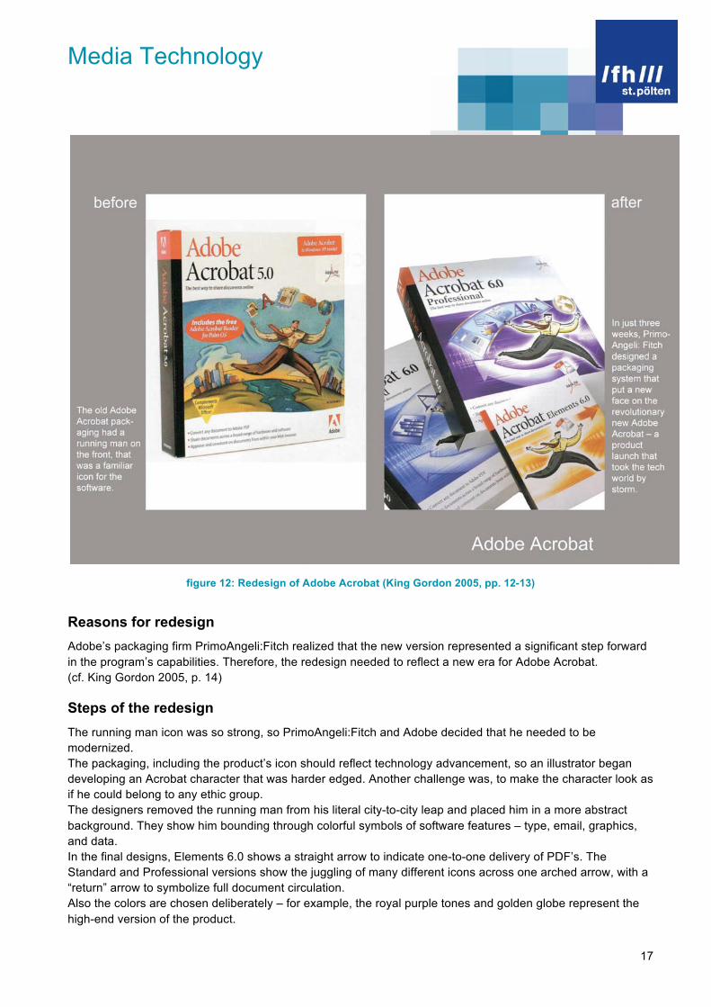
Often, a company wants to extend an existing brand into a variety of different flavors, strengths, or plans to add different kinds of product to forward the brand into different categories. The makeover will carry the company into a new era. Adobe Acrobat 5.0 had been on the shelf for three years, when it decided to launch a line of products that would be even more sophisticated and that would offer professional users a version with more powerful features. (cf. King Gordon 2005, p. 32)
Media Technology
17
figure 12: Redesign of Adobe Acrobat (King Gordon 2005, pp. 12-13)
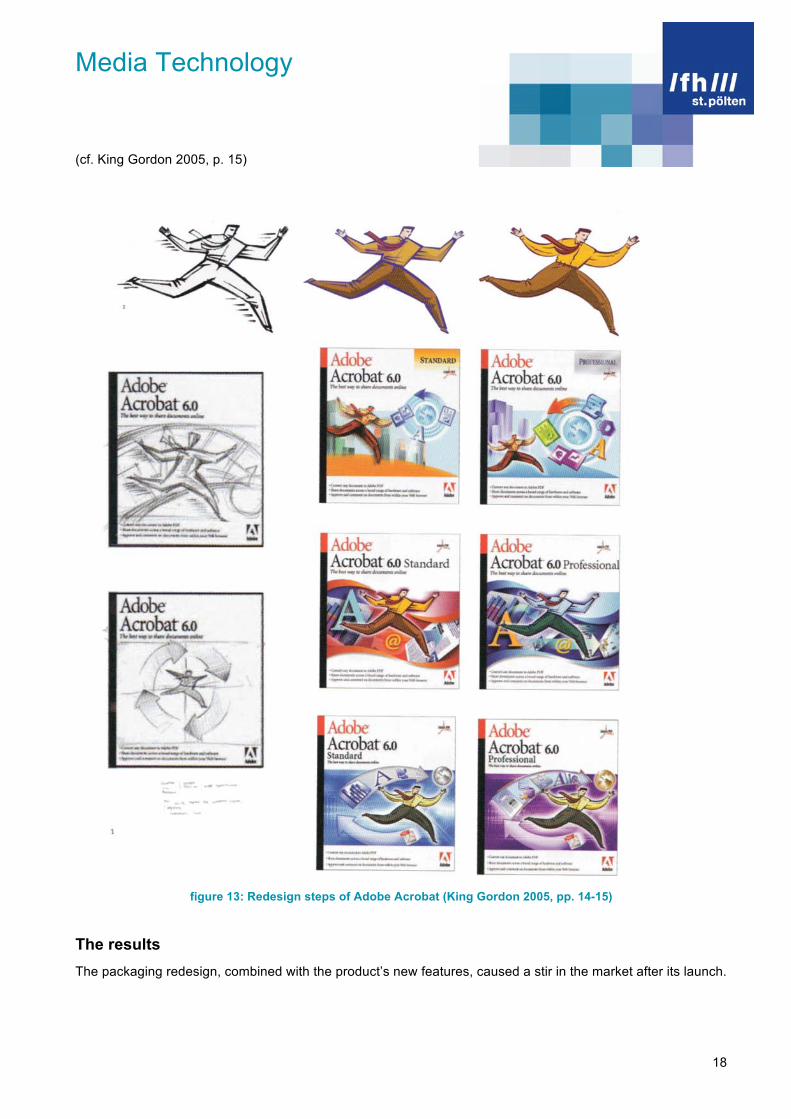
Reasons for redesign Adobe’s packaging firm PrimoAngeli:Fitch realized that the new version represented a significant step forward in the program’s capabilities. Therefore, the redesign needed to reflect a new era for Adobe Acrobat. (cf. King Gordon 2005, p. 14) Steps of the redesign The running man icon was so strong, so PrimoAngeli:Fitch and Adobe decided that he needed to be modernized. The packaging, including the product’s icon should reflect technology advancement, so an illustrator began developing an Acrobat character that was harder edged. Another challenge was, to make the character look as if he could belong to any ethic group. The designers removed the running man from his literal city-to-city leap and placed him in a more abstract background. They show him bounding through colorful symbols of software features – type, email, graphics, and data. In the final designs, Elements 6.0 shows a straight arrow to indicate one-to-one delivery of PDF’s. The Standard and Professional versions show the juggling of many different icons across one arched arrow, with a “return” arrow to symbolize full document circulation. Also the colors are chosen deliberately – for example, the royal purple tones and golden globe represent the high-end version of the product.
Media Technology
18
(cf. King Gordon 2005, p. 15)
figure 13: Redesign steps of Adobe Acrobat (King Gordon 2005, pp. 14-15)
The results The packaging redesign, combined with the product’s new features, caused a stir in the market after its launch.

Media Technology
19
3.2. Extreme Makeovers
When a packaging design is ineffective, the packaging is holding a product back from achieving great things. Sometimes the reason a packaging design is ineffective is that people just don’t get it – either the graphics misleading or they trigger an inaccurate association in the consumer. Often the first step is just to admit that the packaging is just bad. Fairytale Brownies Inc., the dream of two childhood best friends, was attracting a good deal of attention for its gourmet Belgian chocolate brownies and accompanying line of coffee and cocoa. (cf. King Gordon 2005, p. 72)
figure 14: Redesign of Fairytale (King Gordon 2005, pp. 64-65)
Reasons for redesign The goal was to make the different products’ bags complement each other while still looking completely distinct. They also needed to share colors on press. The unique redesign transformed the overall brand offering. In addition to the need for the redesign, Fairytale also needed to keep their products fresh longer, especially not that they were beginning to ship products around the world. This would require a rethinking of materials and printing processes as well. (cf. King Gordon 2005, p. 66)

Media Technology
20
Steps of the redesign The first design goals are to give the information on the packaging more breathing room and really celebrate the personality of the brand. An illustrator designed a hand-drawn typeface, Magico, for the beverage bags, which echoed the graphic embellishments used. As the business grew, Fairytale Brownies needed a more efficient and consistent way to label its products. Finally the designer chose an in-line printing process using silver metallic ink, which gave the labels a shiny, foil like look. (cf. King Gordon 2005, p. 67)
figure 15: Redesign steps of Fairytale (King Gordon 2005, p. 67)
The results The founder says the new packaging gives the products a premium look. This is essential, because more than 95 percent of the product Fairytale Brownies sells are gifts. (cf. King Gordon 2005, p. 66)

Media Technology
21
3.3. Trading Up
When a manufacturer decides its venerable brand needs a makeover, designers must walk a fine line between an effective, contemporary design and an unsetting makeover that confuses or turns off faithful consumers. The designers have also to know, that your target consumers are different than they were a generation ago. Mattel, the toy manufacturer that makes Barbie, calls its shapely blond sweetheart ‘the most collectible doll in the world’. Since the 1960s, Barbie has done it all, representing just about every career, culture, and celebrity status imaginable. This ambitious doll makes up one of the most successful brands in the world. (cf. King Gordon 2005, p. 108)
figure 16: Redesign of Barbie (King Gordon 2005, pp. 96-97)
Reasons for redesign Barbie’s packaging hadn’t been redesigned since the 1970s – the “Barbie pink” was undeniably powerful. As she approached her 40th anniversary, it simply would not do that the Barbie packaging still looked thirty years old. (cf. King Gordon 2005, p. 98)
Media Technology
22
Steps of the redesign In early stages of the redesign, designers explored a series of striped patterns. The final stripe pattern that Mattel selected and tested with focus groups was a pretty, modern motif that reflected the revised goal of the Barbie brand, to keep pace with fashion. The Barbie logo changed from the original bubbly type to a cute, but refined, script designed to appeal to a range of ages and to modern mothers. (cf. King Gordon 2005, p. 108) The results Retailers and consumers alike adored the new Barbie. (cf. King Gordon 2005, p. 98)
Media Technology
23
3.4. Changing Faces
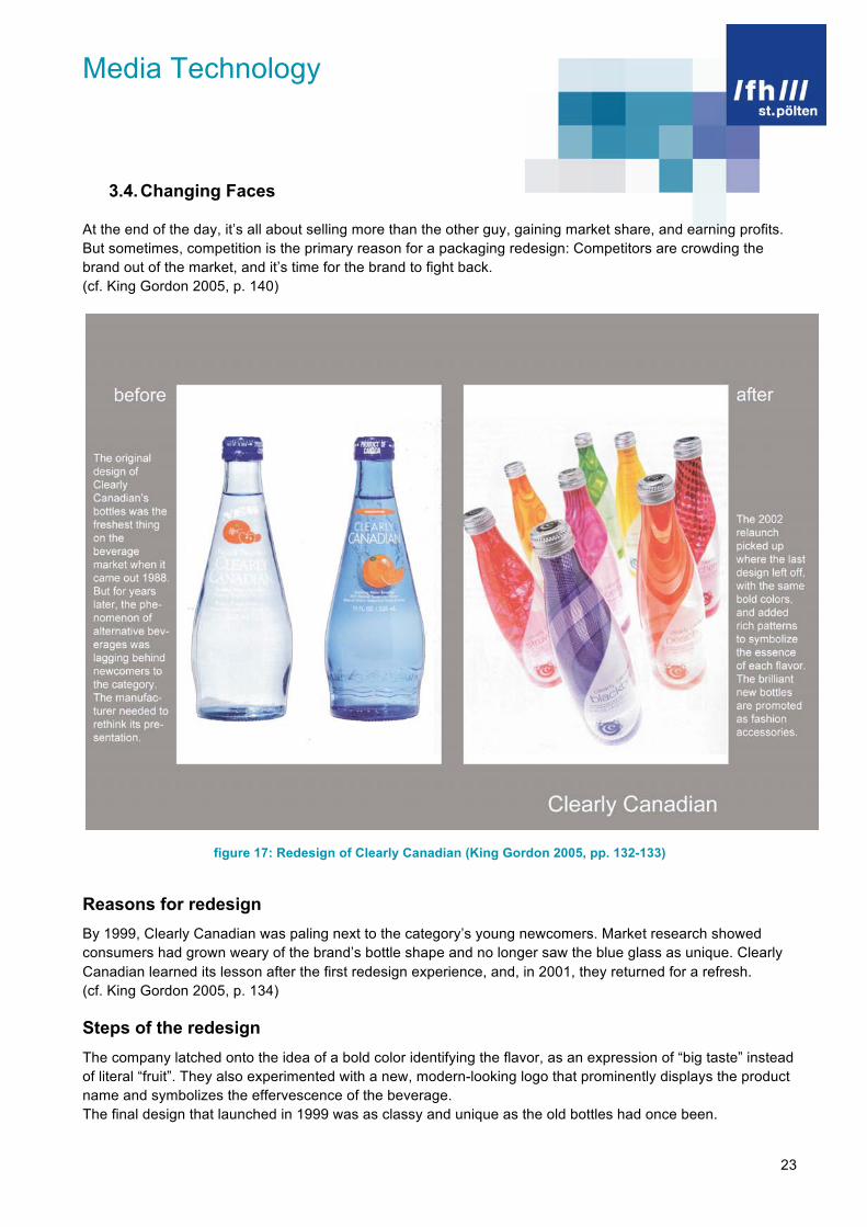
At the end of the day, it’s all about selling more than the other guy, gaining market share, and earning profits. But sometimes, competition is the primary reason for a packaging redesign: Competitors are crowding the brand out of the market, and it’s time for the brand to fight back. (cf. King Gordon 2005, p. 140)
figure 17: Redesign of Clearly Canadian (King Gordon 2005, pp. 132-133)
Reasons for redesign By 1999, Clearly Canadian was paling next to the category’s young newcomers. Market research showed consumers had grown weary of the brand’s bottle shape and no longer saw the blue glass as unique. Clearly Canadian learned its lesson after the first redesign experience, and, in 2001, they returned for a refresh. (cf. King Gordon 2005, p. 134) Steps of the redesign The company latched onto the idea of a bold color identifying the flavor, as an expression of “big taste” instead of literal “fruit”. They also experimented with a new, modern-looking logo that prominently displays the product name and symbolizes the effervescence of the beverage. The final design that launched in 1999 was as classy and unique as the old bottles had once been.
Media Technology
24
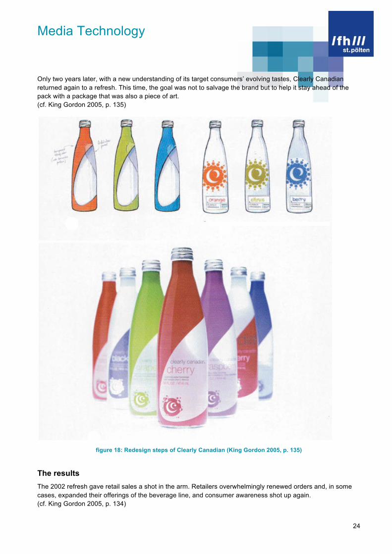
Only two years later, with a new understanding of its target consumers’ evolving tastes, Clearly Canadian returned again to a refresh. This time, the goal was not to salvage the brand but to help it stay ahead of the pack with a package that was also a piece of art. (cf. King Gordon 2005, p. 135)
figure 18: Redesign steps of Clearly Canadian (King Gordon 2005, p. 135)
The results The 2002 refresh gave retail sales a shot in the arm. Retailers overwhelmingly renewed orders and, in some cases, expanded their offerings of the beverage line, and consumer awareness shot up again. (cf. King Gordon 2005, p. 134)
Media Technology
25
4. Radical Reduction or Extravagance
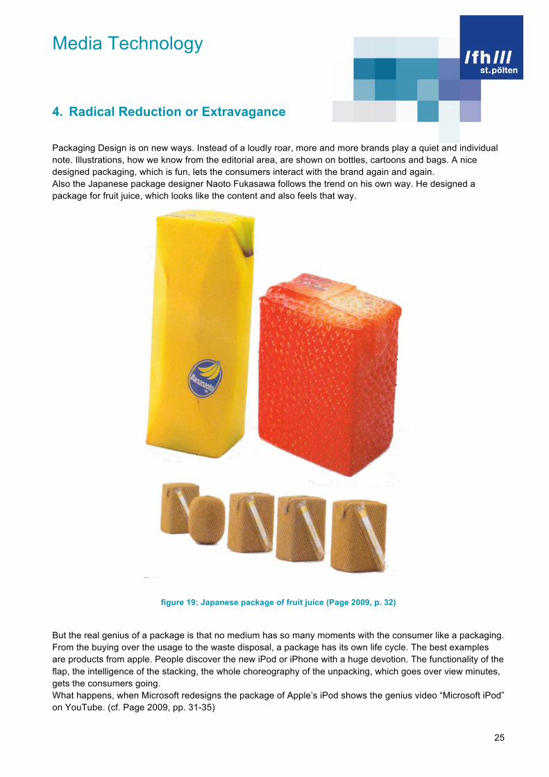
Packaging Design is on new ways. Instead of a loudly roar, more and more brands play a quiet and individual note. Illustrations, how we know from the editorial area, are shown on bottles, cartoons and bags. A nice designed packaging, which is fun, lets the consumers interact with the brand again and again. Also the Japanese package designer Naoto Fukasawa follows the trend on his own way. He designed a package for fruit juice, which looks like the content and also feels that way.
figure 19: Japanese package of fruit juice (Page 2009, p. 32)
But the real genius of a package is that no medium has so many moments with the consumer like a packaging. From the buying over the usage to the waste disposal, a package has its own life cycle. The best examples are products from apple. People discover the new iPod or iPhone with a huge devotion. The functionality of the flap, the intelligence of the stacking, the whole choreography of the unpacking, which goes over view minutes, gets the consumers going. What happens, when Microsoft redesigns the package of Apple’s iPod shows the genius video “Microsoft iPod” on YouTube. (cf. Page 2009, pp. 31-35)

Media Technology
26
figure 20: Video “Microsoft iPod” (Romph 2006, [http://www.youtube.com/watch?v=aeXAcwriid0])
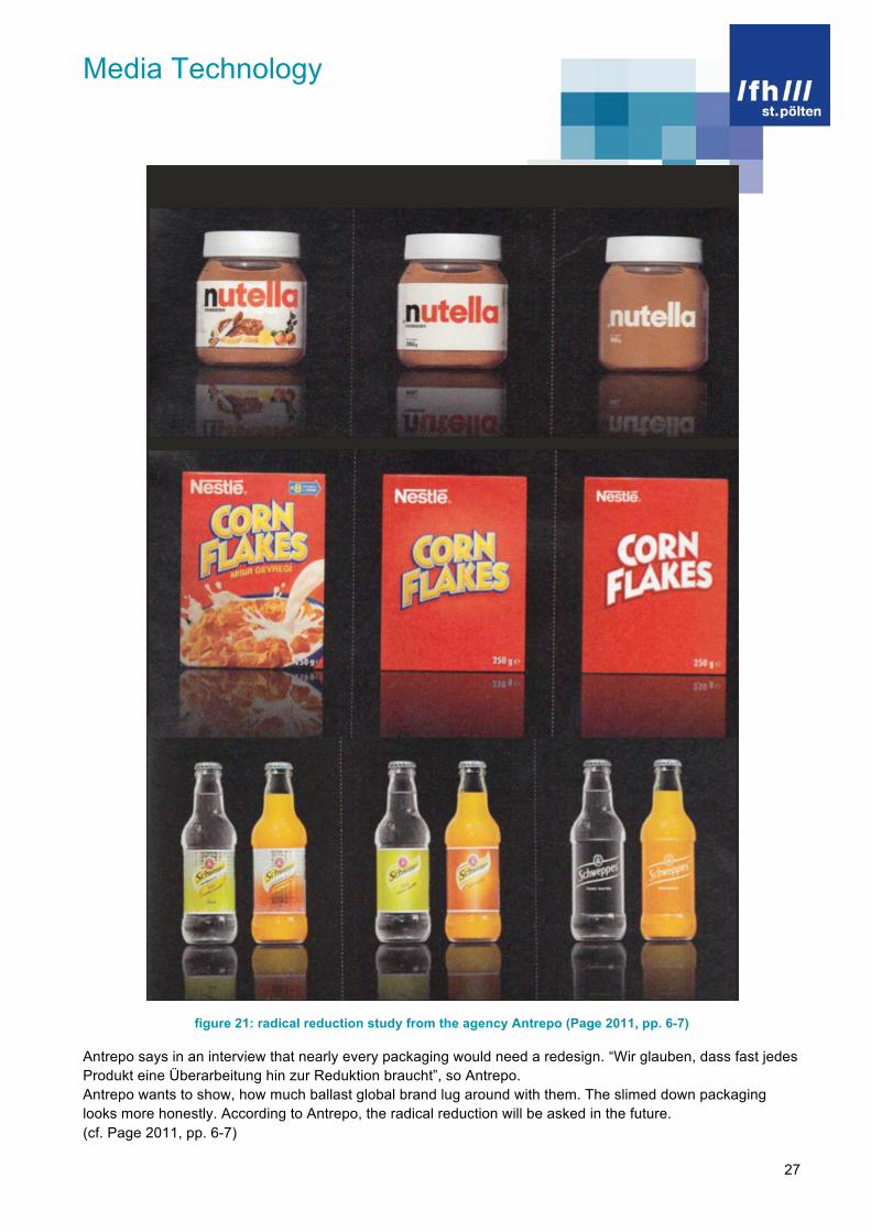
“Less is more” was also the devise of a design study “Minimalist effect in the maximalist market” from the agency Antrepo from Istanbul. Therefore Nutella lost its white bow, Nestlé’s Cornflakes shines in red and the bottles of Schweppes have just a white typo on it. The goal of the study was, ten international brands’ look to examine in two steps. The Design looks clearer and more concise.
Media Technology
27
figure 21: radical reduction study from the agency Antrepo (Page 2011, pp. 6-7)
Antrepo says in an interview that nearly every packaging would need a redesign. “Wir glauben, dass fast jedes Produkt eine Überarbeitung hin zur Reduktion braucht”, so Antrepo. Antrepo wants to show, how much ballast global brand lug around with them. The slimed down packaging looks more honestly. According to Antrepo, the radical reduction will be asked in the future. (cf. Page 2011, pp. 6-7)

Media Technology
28
References
Adducci, B. / Keller, A. (2008). Design Matters // Packaging. An essential primer for today’s competitive market. Beverly: Rockport Publishers, Inc.
Izumi, S. (1989). Package Design in Japan. Köln: Benedikt Taschen Verlag GmbH & Co. KG.
Jaques, J. / Evrard, B. (2010). The Package Design Book. From the winners of the Pentawards Package Design Prize. 2008 to 2010. Cologne: Taschen.
King Gordon, S. (2005). Packaging Makeovers. Graphic redesign for market change. Beverly: Rockport Publishers, Inc.
Luther, D. (1997/1998). Verpackungsdesign im Vergleich – Japan und Europa. Darmstadt: Grin Verlag GbR – Verlag für akademische Texte.
No author (2009). Schein und Sein. In: Page 2009, No. 8, pp. 30-35.
No author (2011). Radikale Reduktion. In: Page 2011, No. 3, pp. 6-7.
Rika, T. (2007). Package Design In Japan. Barcelona: Index Book S.L.

Media Technology
29
List of figures
figure 1: five basic reasons for packaging (Adducci / Keller 2008, p.13)..............................................................6 figure 2: colorful packaging from America (Adducci / Keller 2008, p.15)..............................................................8 figure 3: packaging with a “soul” (Rika 2007, p. 222) ...........................................................................................9 figure 4: childlike, colorful packaging from Japan (Rika 2007, p. 57) ...................................................................9 figure 5: new materials (Adducci / Keller 2008, pp. 82-83).................................................................................11 figure 6: Furoshiki (Rika 2007, p. 27) .................................................................................................................12 figure 7: Coca Cola global (Adducci / Keller 2008, p. 23)...................................................................................13 figure 8: McDonald’s Japan: Rice Burger (Manya 2008, [http://manyapan.wordpress.com/2009/12/10/from-big-mac-to-rice-burger-globalization-mcdonalds-in-japan/]) .....................................................................................13 figure 9: IKEA logo (INGKA Holding B.V. 2011, [www.ikea.com])......................................................................14 figure 10: T-shirt packaging – the shirts seem like food (Jacques / Evrard 2010, pp. 232-233).........................14 figure 11: Extravagant and special – but what is in the packaging? (Jacques / Evrard 2010, p. 231) ...............15 figure 12: Redesign of Adobe Acrobat (King Gordon 2005, pp. 12-13)..............................................................17 figure 13: Redesign steps of Adobe Acrobat (King Gordon 2005, pp. 14-15) ....................................................18 figure 14: Redesign of Fairytale (King Gordon 2005, pp. 64-65)........................................................................19 figure 15: Redesign steps of Fairytale (King Gordon 2005, p. 67) .....................................................................20 figure 16: Redesign of Barbie (King Gordon 2005, pp. 96-97) ...........................................................................21 figure 17: Redesign of Clearly Canadian (King Gordon 2005, pp. 132-133) ......................................................23 figure 18: Redesign steps of Clearly Canadian (King Gordon 2005, p. 135)......................................................24 figure 19: Japanese package of fruit juice (Page 2009, p. 32) ...........................................................................25 figure 20: Video “Microsoft iPod” (Romph 2006, [http://www.youtube.com/watch?v=aeXAcwriid0]) .................26 figure 21: radical reduction study from the agency Antrepo (Page 2011, pp. 6-7) .............................................27