Embed Size (px)
Citation preview
OVERCOMING CHARTAPHOBIAMoving Your Organization Toward Interesting & Enlightening Data Visualization
Meagan Longoria
GETTING STARTED
• Slides are on my blog (or the SQL Saturday site): http://datasavvy.wordpress.com/presentations
• Feel free to share questions and comments throughout the presentation
ABOUT ME
• Meagan Longoria
• Solutions Consultant with BlueGranite
• Blog: http://datasavvy.wordpress.com
• Twitter: @mmarie
• LinkedIn: www.linkedin.com/in/meaganlongoria/
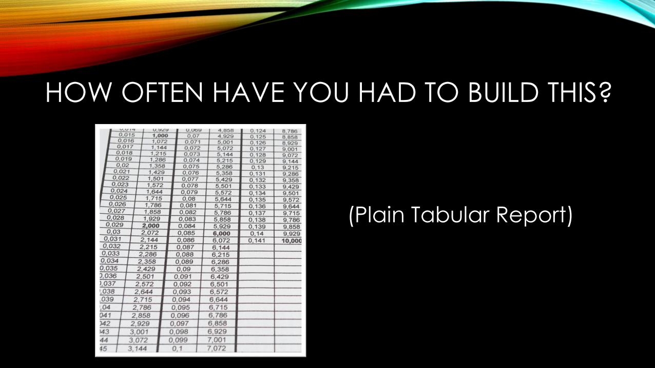
HOW OFTEN HAVE YOU HAD TO BUILD THIS?
(Plain Tabular Report)
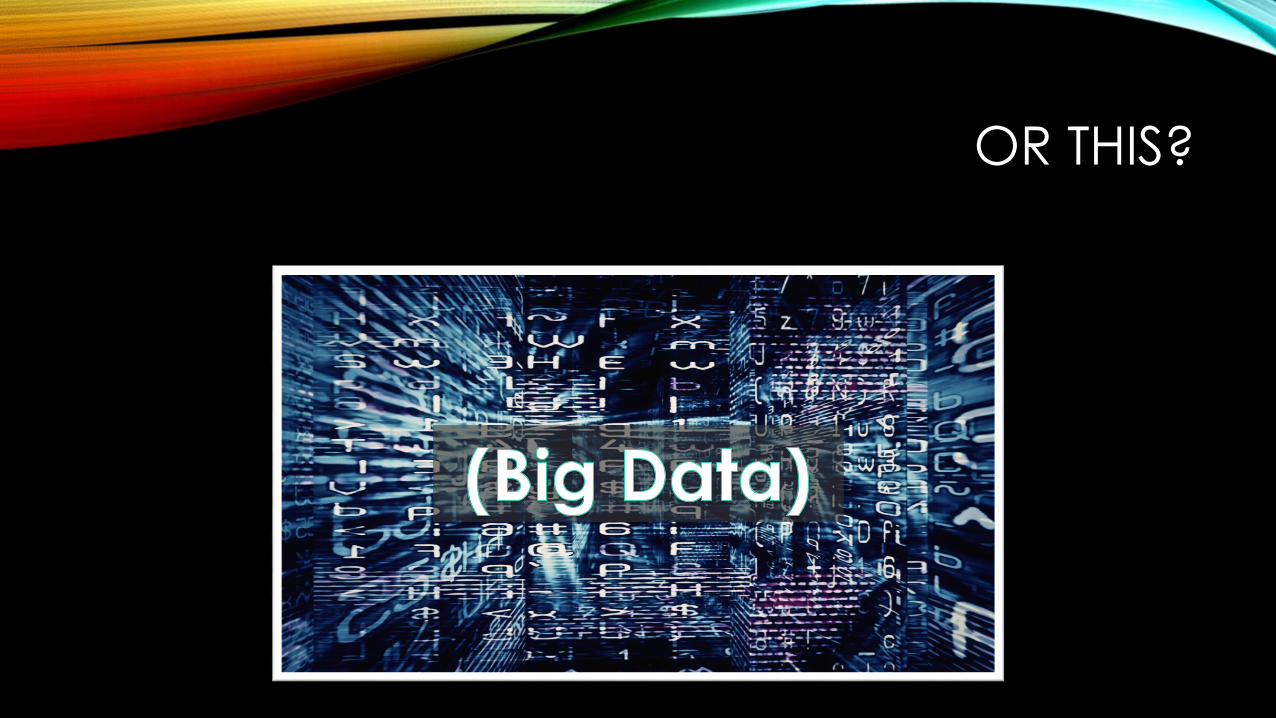
OR THIS?

WHAT’S THE BIG DEAL?
You are doing yourself and your customers (internal or external) a disservice if you always just make a table of data.
Our (developers’) outputs are decision-makers’ inputs – and theiroutputs are what ultimately matter. – Rob Collie (Power Pivot Pro)
The greatest value of a picture is when it forces us to notice what we never expected to see. - John Tukey.
“Don't let your design choices be happenstance; rather, they should be the result of explicit decisions” - Cole Nussbaumer Knaflic
WHY DO WE STRUGGLE WITH DATA VIZ?
Lack of appropriate data
Reports as intermediate steps
Poor presentation that makes it difficult to gain insight and take action
Poor presentation that discourages engagement

SNOW CHOLERA MAP
http://upload.wikimedia.org/wikipedia/commons/c/c7/Snow-cholera-map.jpg
GET THE SCOOP
• Who is your audience? (Executives? Analysts? Website users?)• Helps determine needs, priorities, and level of detail
• What metrics are important? What is the dimensionality?
• Is the report operational, analytical, or a mix of both?
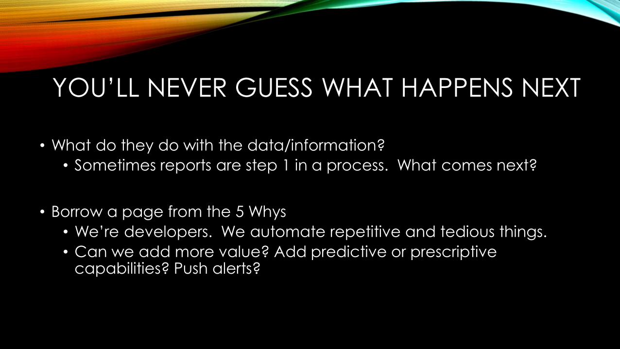
YOU’LL NEVER GUESS WHAT HAPPENS NEXT
• What do they do with the data/information?
• Sometimes reports are step 1 in a process. What comes next?
• Borrow a page from the 5 Whys
• We’re developers. We automate repetitive and tedious things.
• Can we add more value? Add predictive or prescriptive capabilities? Push alerts?
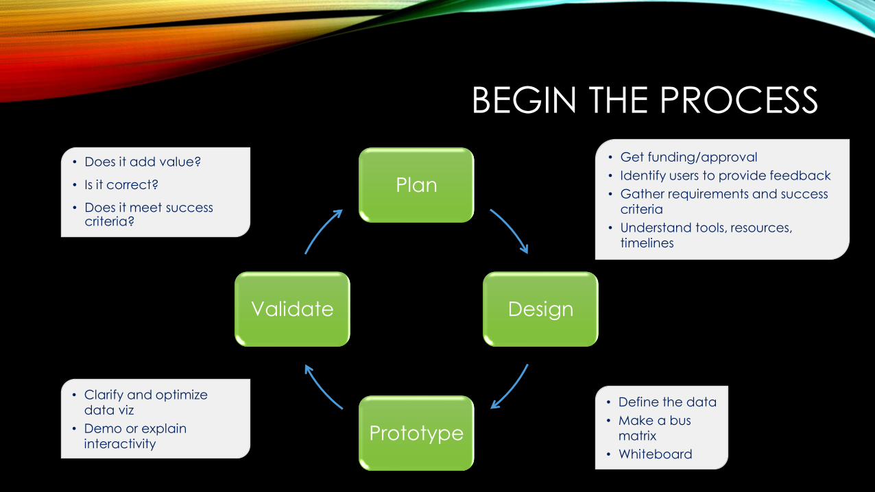
BEGIN THE PROCESS
Plan
Design
Prototype
Validate
• Does it add value?
• Is it correct?
• Does it meet success criteria?
• Clarify and optimize
data viz
• Demo or explain
interactivity
• Get funding/approval
• Identify users to provide feedback
• Gather requirements and success
criteria
• Understand tools, resources,
timelines
• Define the data
• Make a bus
matrix
• Whiteboard
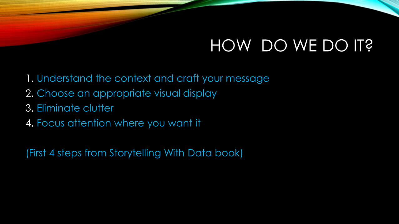
HOW DO WE DO IT?
1. Understand the context and craft your message
2. Choose an appropriate visual display
3. Eliminate clutter
4. Focus attention where you want it
(First 4 steps from Storytelling With Data book)
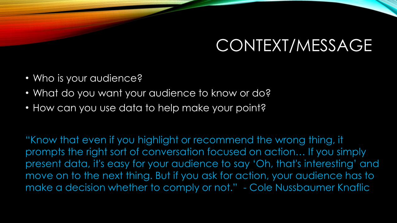
CONTEXT/MESSAGE
• Who is your audience?
• What do you want your audience to know or do?
• How can you use data to help make your point?
“Know that even if you highlight or recommend the wrong thing, it
prompts the right sort of conversation focused on action… If you simply
present data, it's easy for your audience to say ‘Oh, that's interesting’ and
move on to the next thing. But if you ask for action, your audience has to
make a decision whether to comply or not.” - Cole Nussbaumer Knaflic
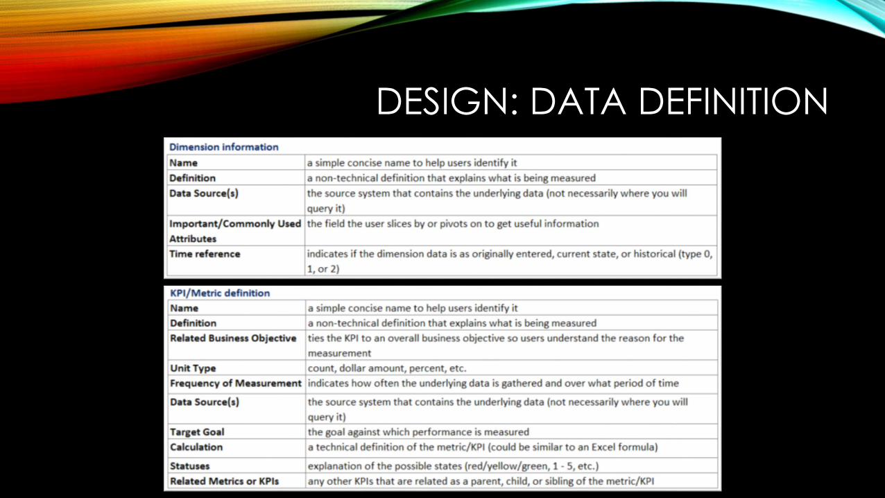
DESIGN: DATA DEFINITION
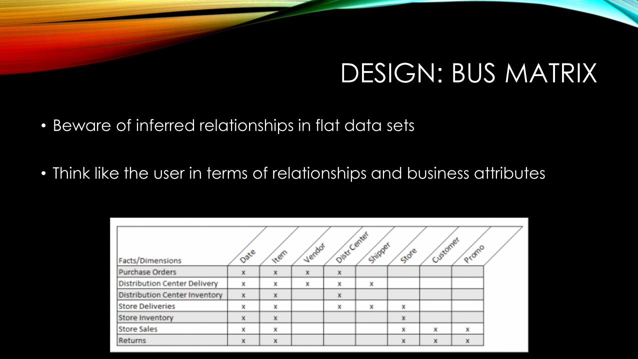
DESIGN: BUS MATRIX
• Beware of inferred relationships in flat data sets
• Think like the user in terms of relationships and business attributes

DESIGN: VIZ DESIGN DOCUMENTATIONNo long requirements docs. Life is too short and the business changes too quickly.
DESIGN: WHITEBOARD
• Are you making a single chart, a report, or a dashboard?
• Come up with high-level ideas and place them on your canvas
• What specific items of information should be displayed? What does each of these items tell you, and why is that important? At what level of summary or detail should the information be expressed?
• Use your Data Definitions and Bus Matrix as a catalog!
Mobile Reports Developer (formerly Datazen)
DESIGN QUESTIONS
• Which items of information are most important for achieving your objectives?
• What are the logical groupings that could be used to organize items of information on the dashboard? In which of these groups does each item belong?
• What are the most useful comparisons that will allow you to see these items of information in meaningful context?
(From Stephen Few’s Information Dashboard Design)
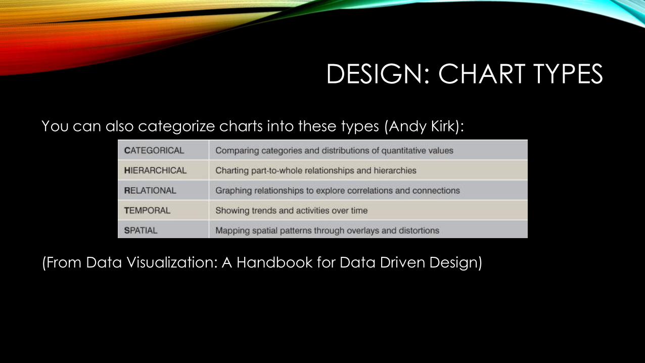
DESIGN: CHART TYPES
You can also categorize charts into these types (Andy Kirk):
(From Data Visualization: A Handbook for Data Driven Design)
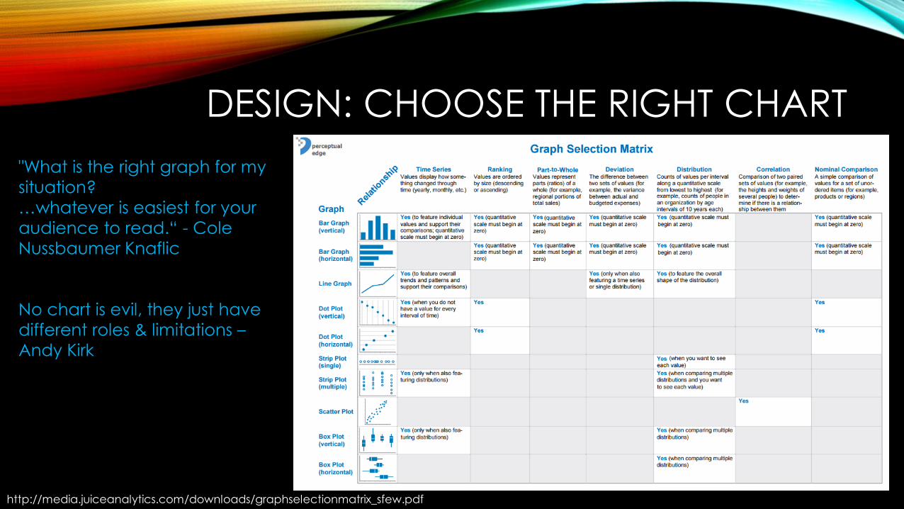
DESIGN: CHOOSE THE RIGHT CHART
http://media.juiceanalytics.com/downloads/graphselectionmatrix_sfew.pdf
"What is the right graph for my
situation?
…whatever is easiest for your
audience to read.“ - Cole
Nussbaumer Knaflic
No chart is evil, they just have
different roles & limitations –
Andy Kirk
CHECK YOURSELF
• Are the groupings of information obvious?
• Are the key metrics being featured adequately?
• Can you easily spot the items that need attention?
• Is enough information being displayed about the items that need attention to decide whether you must respond by taking action?
PROTOTYPE: TECHNICAL ITEMS TO CONSIDER
• Average or minimum screen resolution/size of users
• Capabilities of the reporting tool
• Method of access (mobile?)
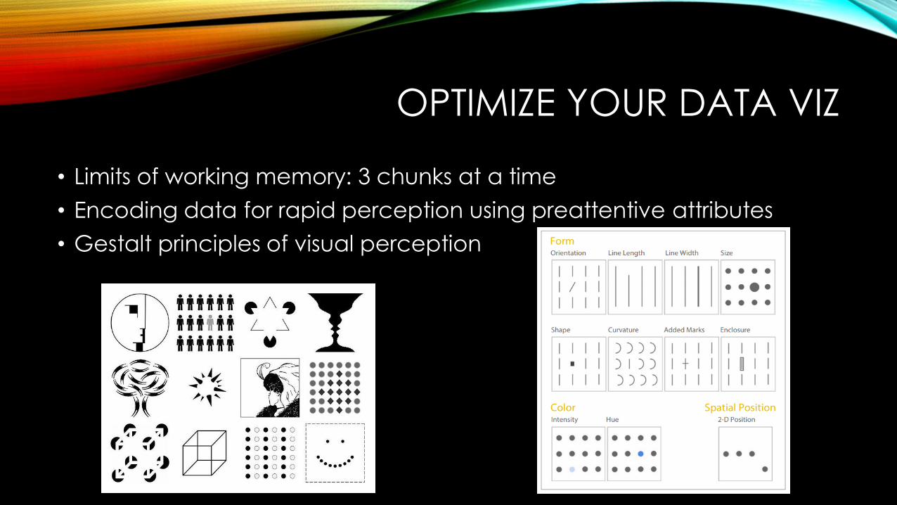
OPTIMIZE YOUR DATA VIZ
• Limits of working memory: 3 chunks at a time
• Encoding data for rapid perception using preattentive attributes
• Gestalt principles of visual perception
MORE TIPS
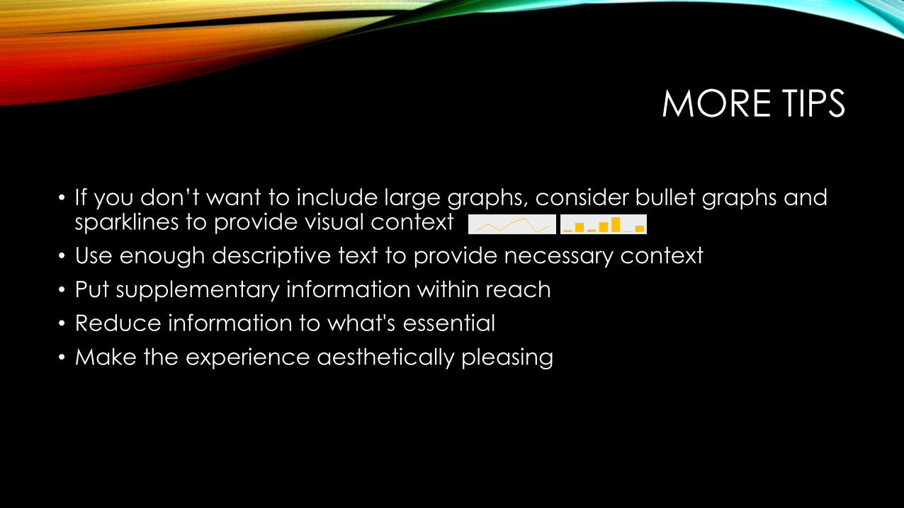
• If you don’t want to include large graphs, consider bullet graphs and sparklines to provide visual context
• Use enough descriptive text to provide necessary context
• Put supplementary information within reach
• Reduce information to what's essential
• Make the experience aesthetically pleasing
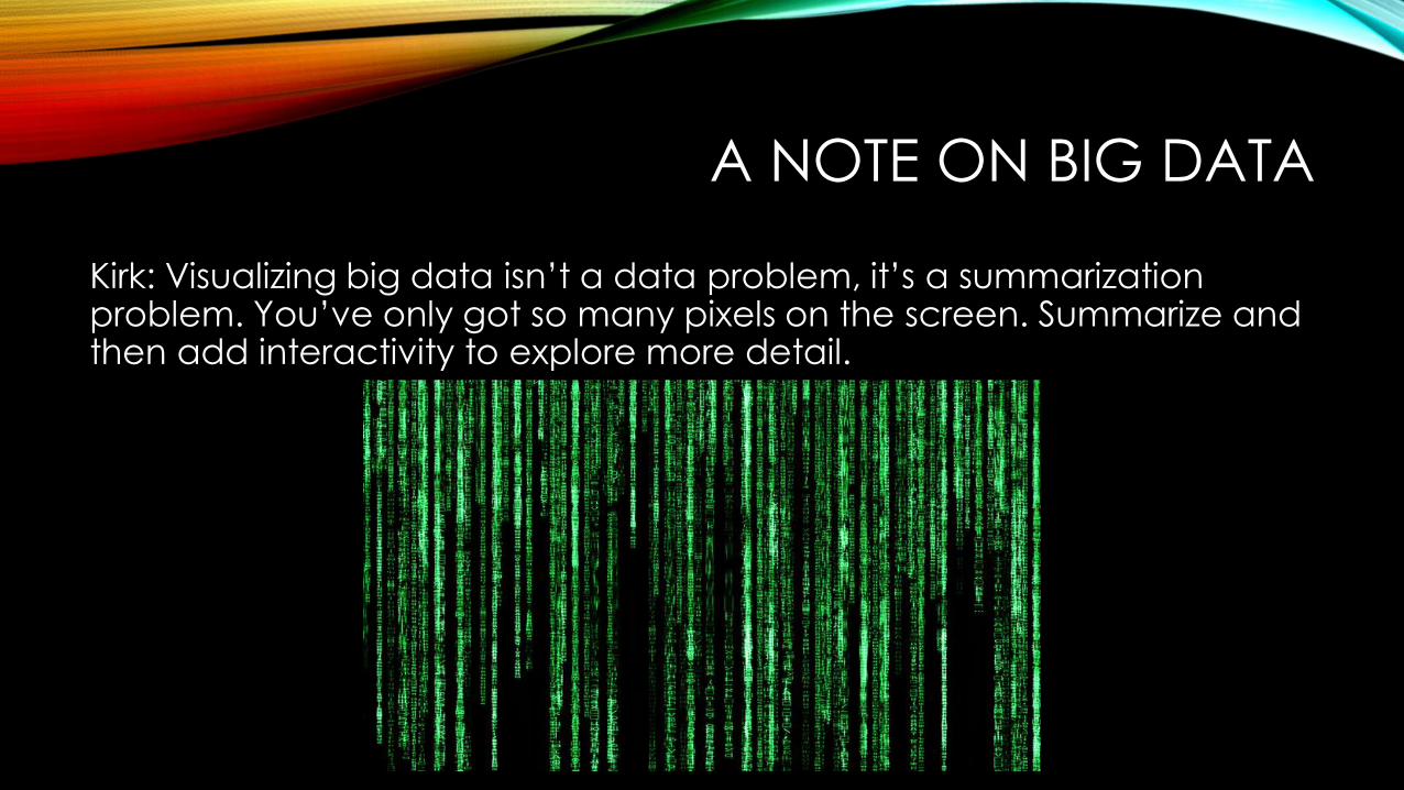
A NOTE ON BIG DATA
Kirk: Visualizing big data isn’t a data problem, it’s a summarization problem. You’ve only got so many pixels on the screen. Summarize and then add interactivity to explore more detail.
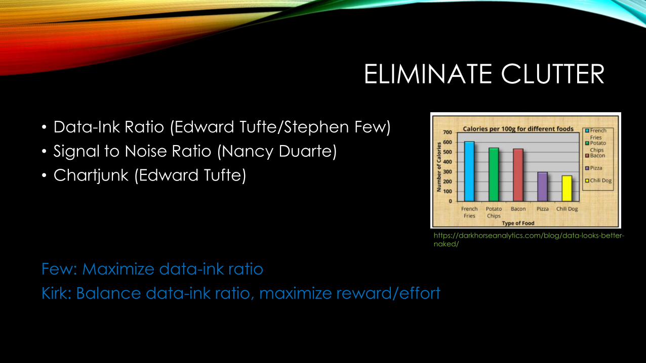
ELIMINATE CLUTTER
• Data-Ink Ratio (Edward Tufte/Stephen Few)
• Signal to Noise Ratio (Nancy Duarte)
• Chartjunk (Edward Tufte)
Few: Maximize data-ink ratio
Kirk: Balance data-ink ratio, maximize reward/effort
https://darkhorseanalytics.com/blog/data-looks-better-naked/
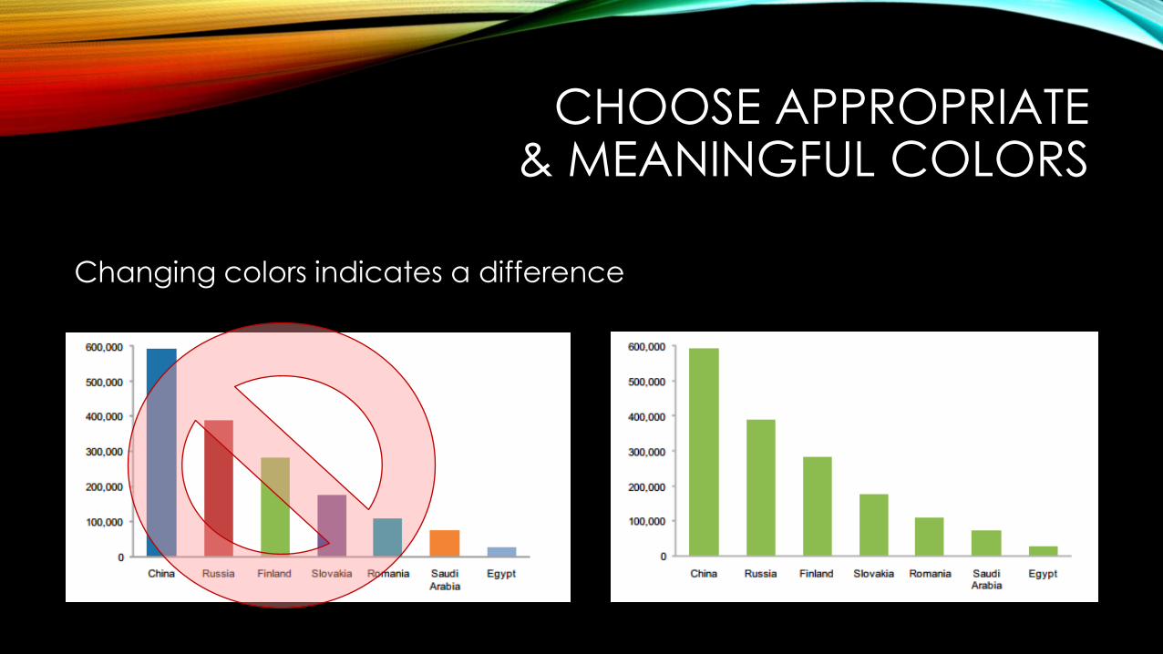
CHOOSE APPROPRIATE & MEANINGFUL COLORS
Changing colors indicates a difference
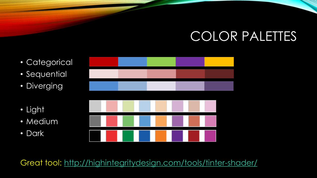
COLOR PALETTES
• Categorical
• Sequential
• Diverging
• Light
• Medium
• Dark
Great tool: http://highintegritydesign.com/tools/tinter-shader/
COLOR PALETTES
• Categorical
• Sequential
• Diverging
• Light
• Medium
• Dark
PLEASE STOP SCREAMING AT ME!
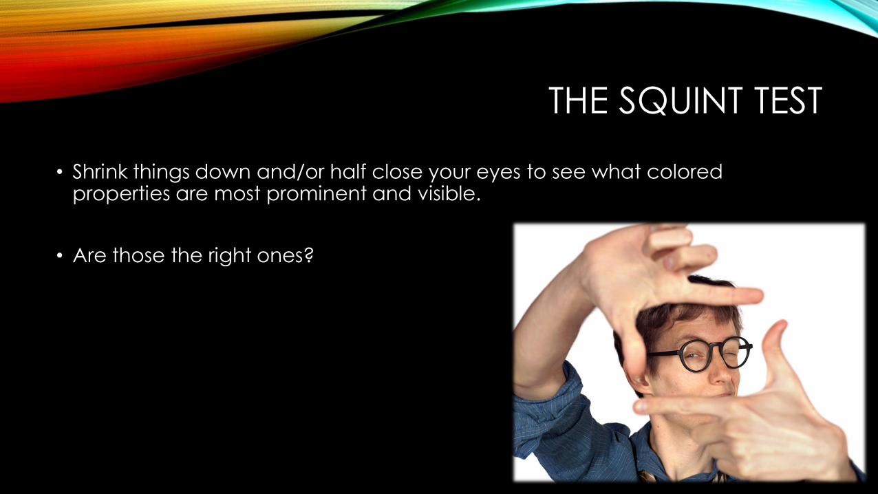
THE SQUINT TEST
• Shrink things down and/or half close your eyes to see what colored properties are most prominent and visible.
• Are those the right ones?

COLOR VISION DEFICIENCY
Color Vision Deficiency affects 1 in 12 men and 1 in 200 women.
Red-green color blindness is most common.
Blue and orange are good options for safe colors.
Use http://www.color-blindness.com/coblis-color-blindness-simulator/ to test your viz.
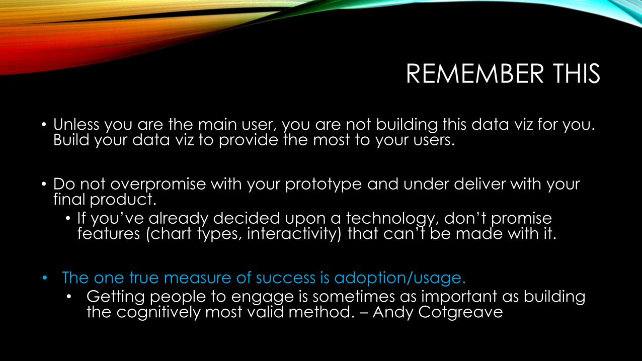
REMEMBER THIS
• Unless you are the main user, you are not building this data viz for you. Build your data viz to provide the most to your users.
• Do not overpromise with your prototype and under deliver with your final product.• If you’ve already decided upon a technology, don’t promise
features (chart types, interactivity) that can’t be made with it.
• The one true measure of success is adoption/usage.• Getting people to engage is sometimes as important as building
the cognitively most valid method. – Andy Cotgreave

REMEMBER THIS
Our (developers’) outputs are decision-makers’ inputs – and theiroutputs are what ultimately matter.
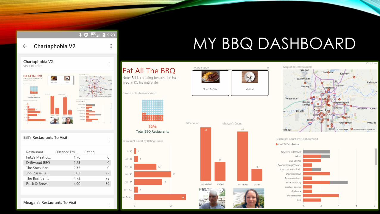
MY BBQ DASHBOARD

LINKS FOR FURTHER LEARNING
• Storytelling With Data: http://www.storytellingwithdata.com/
• Stephen Few/Perceptual Edge blog: http://www.perceptualedge.com/blog/
• Paul Turley - Transforming Reporting Requirements Into a Visual Masterpiece: https://www.youtube.com/watch?v=7c1hjdEzNfQ
• Preattentive Features and Tasks video: https://www.youtube.com/watch?v=wnvoZxe95bo
• Data Viz Done Right: http://www.datavizdoneright.com/
• Power Pivot Pro: A New Take on “Data Quality?”: http://www.powerpivotpro.com/2015/06/a-new-take-on-data-quality/ Improving Data Viz Effectiveness: http://www.blue-granite.com/blog/improving-data-visualization-effectiveness
• Andy Kirk: Separating Myth From Truth in Data Visualization: https://www.brighttalk.com/webcast/9059/193677
• Gestalt Principles Composition Image By Impronta (Own work) [CC BY-SA 3.0 (http://creativecommons.org/licenses/by-sa/3.0)], via Wikimedia Commons: http://commons.wikimedia.org/wiki/File:Gestalt_Principles_Composition.jpg
QUESTIONS & FINAL COMMENTS
Feel free to contact me with questions or feedback.
Meagan Longoria
Solutions Consultant
Blog: datasavvy.wordpress.com
Twitter: @mmarie
LinkedIn: www.linkedin.com/in/meaganlongoria/