Embed Size (px)
Citation preview
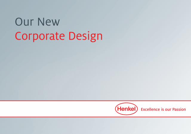
Our NewCorporate Design
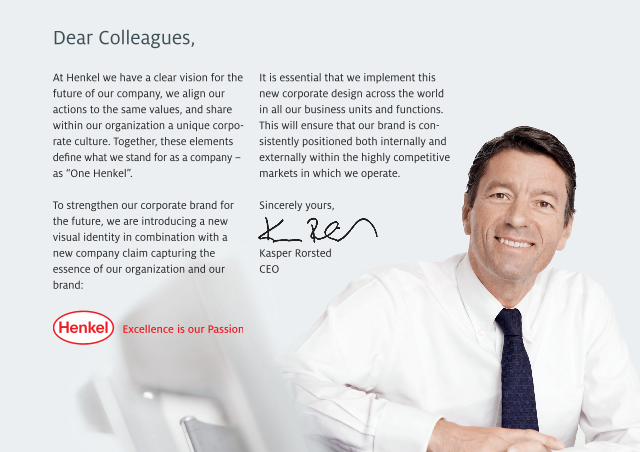
Dear Colleagues,
At Henkel we have a clear vision for the future of our company, we align our actions to the same values, and share within our organization a unique corpo-rate culture. Together, these elements defi ne what we stand for as a company – as “One Henkel”.
To strengthen our corporate brand for the future, we are introducing a new visual identity in combination with anew company claim capturing the essence of our organization and our brand:
It is essential that we implement this new corporate design across the world in all our business units and functions. This will ensure that our brand is con-sistently positioned both internally and externally within the highly competitive markets in which we operate.
Sincerely yours,
Kasper RorstedCEO
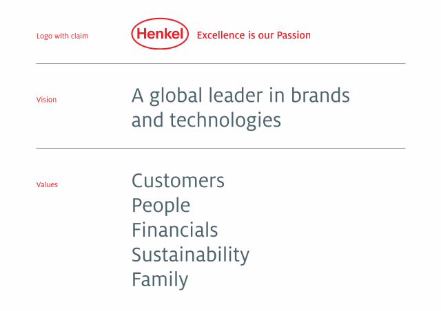
Vision
Values
Logo with claim
CustomersPeople FinancialsSustainabilityFamily
A global leader in brands and technologies

1985 20112002
1920 1950 1954 19651959
The Henkel logo is the core element of our brand appearance. It has a long tradition: an oval in corporate red appeared on a Henkel product pack for the first time back in 1907; the Henkel name was inte grated in the oval in 1920.
Over time, the logo has been regularly revised and modernized. In combination with our claim the logo communicates what we stand for as a company and what makes us unique.
The Henkel logo

Corporate Design principleThe basis of our identity is provided by our vision, our values, and our unique corporate culture driven by the aspiration to be the best in everything we do. This ambition is communicated by our claim and supported by a clear and modern corporate design. A major element of the new design is the white banner with red outline that frames our logo and claim.
The Henkel banner should, as a rule, be used in all our communication tools – whether annual report, internal publications or presentations – and placed
in the lower third of the format. As a corporate design constant, it serves to generate high recognition value.
On business cards and stationery, the logo and claim appear in a combination that excludes the banner outline. And in special applications such as fl ags and signage the logo appears without the claim.
The claim should never appear without the Henkel logo.
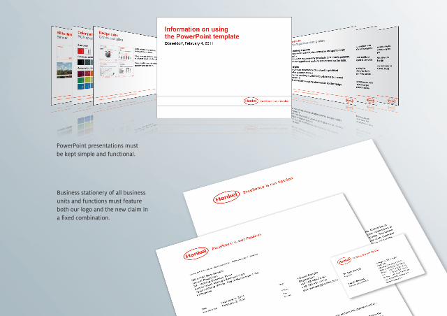
PowerPoint presentations must be kept simple and functional.
Business stationery of all business units and functions must feature both our logo and the new claim in a fi xed combination.
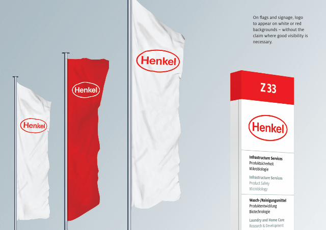
On flags and signage, logo to appear on white or red backgrounds – without the claim where good visibility is necessary.

ABCDEFGHIJKLMNOPQRST UVWXYZabcdefghijklmnopqrst uvwxyz,;/1234567890!?“”
ABCDEFGHIJKLMNOPQRST UVWXYZabcdefghijklmnopqrst uvwxyz,;/1234567890!?“”
ABCDEFGHIJKLMNOPQRST UVWXYZabcdefghijklmnopqrst uvwxyz,;/1234567890!?“”
ABCDEFGHIJKLMNOPQRST UVWXYZabcdefghijklmnopqrst uvwxyz,;/1234567890!?“”
Henkel Milo Arial
Henkel Milo Serif Times New Roman
TypographyThe typeface to be used for professional printed matter, such as internal and external publications, is Henkel Milo. This has been especially developed for use in magazines and journals and offers particularly good legibility in large blocks of text. The compact design of ̋Henkel Milo
generates a unique, individual style and appearance. It is available both with and without serifs. The standard type-faces for office and digital applications are Arial as the sans serif typeface and Times New Roman as the serif typeface.
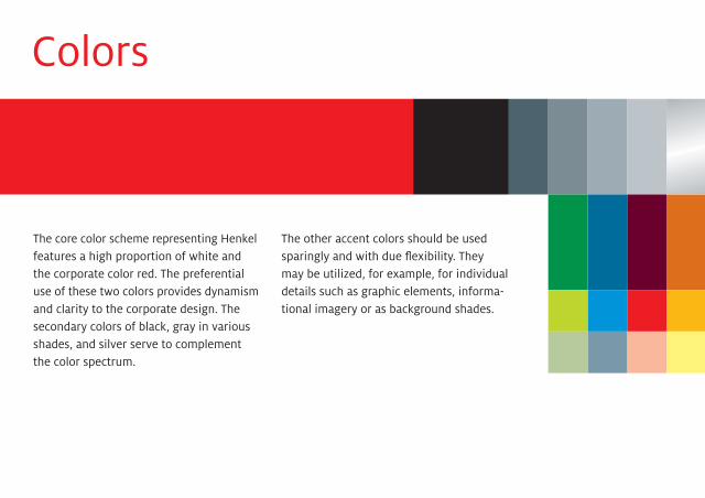
Colors
The core color scheme representing Henkel features a high proportion of white and the corporate color red. The preferential use of these two colors provides dynamism and clarity to the corporate design. The secondary colors of black, gray in various shades, and silver serve to complement the color spectrum.
The other accent colors should be used sparingly and with due flexibility. They may be utilized, for example, for individual details such as graphic elements, informa-tional imagery or as background shades.

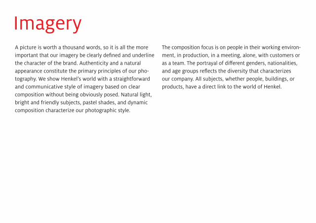
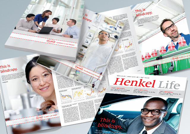
ImageryA picture is worth a thousand words, so it is all the more important that our imagery be clearly defined and underline the character of the brand. Authenticity and a natural appearance constitute the primary principles of our pho - to g raphy. We show Henkel’s world with a straightforward and communicative style of imagery based on clear composition without being obviously posed. Natural light, bright and friendly subjects, pastel shades, and dynamic composition characterize our photographic style.
The composition focus is on people in their working environ-ment, in production, in a meeting, alone, with customers or as a team. The portrayal of different genders, nationalities, and age groups reflects the diversity that characterizes our company. All subjects, whether people, buildings, or products, have a direct link to the world of Henkel.
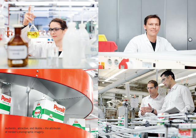
Authentic, attractive, and likable – the attributes of Henkel’s photographic imagery.
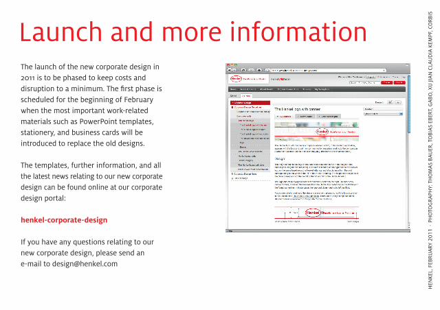
The launch of the new corporate design in 2011 is to be phased to keep costs and disruption to a minimum. The fi rst phase is scheduled for the beginning of February when the most important work-related materials such as PowerPoint templates, stationery, and business cards will be introduced to replace the old designs.
The templates, further information, and all the latest news relating to our new corporate design can be found online at our corporate design portal:
henkel-corporate-design
If you have any questions relating to our new corporate design, please send an e-mail to [email protected]
Launch and more information
HEN
KEL,
FEB
RUA
RY 2
011
⋅ PH
OTO
GRA
PHY:
TH
OM
AS
BAU
ER, T
OBI
AS
EBER
T, G
ABO
, XU
JIA
N C
LAU
DIA
KEM
PF, C
ORB
IS