Embed Size (px)
Citation preview

Demystifying the Academic Poster (or, how I learned to stop
worrying and love the format)
Jeremy Foin 2013-14 PFTF Fellow/Ph.D. candidate Department of Anthropology University of California, Davis

“The more strikingly visual your presentation is, the more people will remember it. And more importantly, they will remember you.”
— Paul Arden

What is the purpose of an academic poster?
“…to display information in a clear, concise manner, while generating interest to engage in a discussion” “…a big piece of paper (or wall-mounted monitor) that can communicate your research at a conference, and is composed of a short title, an introduction to your burning question, an overview of your novel approach, your amazing results in graphical form, some insightful discussion of aforementioned results, a listing of previously published articles that are important to your research, and some brief acknowledgement of the tremendous assistance and financial support conned from others” (Purrington 2014)

the poster format permits a great deal of creative freedom…
…but it must be used wisely
I think you should expand your Results section to fill up that entire space. Also, a picture of a Boba Fett in a tutu over there would be cool. Listen to him, do not!
Lead you astray, he will! For the path of tiny, cluttered text leads only to the Dark Side…

BEWARE THE DARK SIDE OF THE FORCE

YOU WILL LEARN FROM MASTER YODA, THE JEDI MASTER WHO TAUGHT ME HOW TO PUT TOGETHER A DYNAMITE POSTER PRESENTATION
I don’t believe it!

MASTER YODA’S 3 TIPS FOR GREAT POSTER SUCCESS
maintain sufficient white space, you will!
a Jedi’s strength flows from the use of logical column
arrangements
provide clear visual cues to guide the reader from start to finish, you must!

BONUS PRO TIP FROM R2-D2: BEEP-BOOP-BEEPBEEP-BIP-BOOP!* (*the drafting and revision process is your best friend – try to get a rough draft done early enough to incorporate feedback and make revisions!)
Sooooo… does it suck?
More graphics! Less text!

a typical poster session.

• crowded (hopefully) • noisy • last 1-3 hours • often too hot (or too cold) • bad lighting (this significantly impacts color
perception) • conferees may be a smidge intoxicated (if
poster session coincides with the beer and wine mixer)
• and finally…lots of other presenters to contend with (i.e., competition for attention)
what are poster sessions like?

≠
NO

=
YES

HERETICAL STATEMENT #1: conference presentations don’t really
have that much to do with the research.
HERETICAL STATEMENT #2: in reality, conference presentations are pretty much all about networking and
shameless self-promotion.
The implications, please…

IN A NUTSHELL:
YOUR POSTER MUST GRAB EYEBALLS.

what is a visual hierarchy? “The visual organization of elements within a design format to establish focal points based on their importance to the message to be communicated” “The organization and prioritization of content as a means to communicate a message” “Using color, contrast, texture, shape, position, orientation, and size to organize elements in a way that gives users a sense of visual importance”

• humans are primarily visual creatures • we tend to focus on differences, not
similarities, when making comparisons • this is a key consideration for designing an
effective poster
why use a visual hierarchy?
POSTER = COMMUNICATION, and
DESIGN = COMMUNICATION, so…
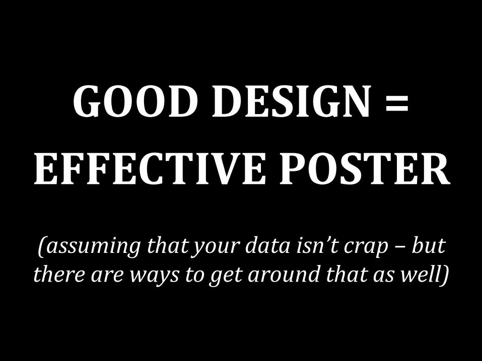
GOOD DESIGN = EFFECTIVE POSTER
(assuming that your data isn’t crap – but there are ways to get around that as well)

a simple exercise to illustrate the concept

a simple exercise to illustrate the concept

a visual hierarchy is constructed using some combination of the fundamental principles of graphic design • negative/positive space • contrast • repetition • proximity • color • alignment • typography (not really
a principle)
elements of a visual hierarchy

• the balance between negative (background) and positive (foreground) space in a composition is very important – too much negative space = incomplete or
disassociated appearance – too little negative space = busy, cluttered, and
difficult to read
negative/positive space
cramming too much information into too small of a space is far and away the number-
one mistake in academic poster designs

“Densely-packed, high word-count posters attract only those viewers that are excited by manuscripts tacked to walls, and you generally don’t want to talk to those types of people. They’re weird.” (Purrington 2014)

what’s wrong with this picture?

negative space ≠ nothing!

• contrast = differences in values, colors, textures, shapes, and other elements – visually attractive – aids organization of information – creates a focal point in the composition
the human eye finds contrast irresistible
contrast


types of contrast


• variation in size is a form of contrast • bigger = more important • one of the most powerful ways to organize
information • can be applied to both graphical and textual
elements
size
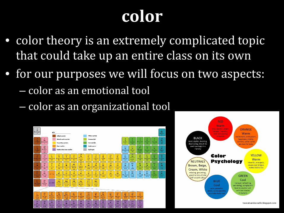
• color theory is an extremely complicated topic that could take up an entire class on its own
• for our purposes we will focus on two aspects: – color as an emotional tool – color as an organizational tool
color
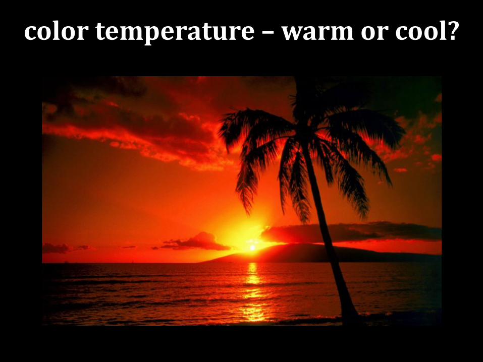
color temperature – warm or cool?

color temperature – warm or cool?

warm vs. cool colors • warm
– hues from red through yellow, including browns and tans
– seem to advance or appear more active; often evoke feelings of happiness, optimism and energy, but can be visually overwhelming
• cool – cool = blue-green through blue-violet, including most
grays – appear to recede into the background; usually
calming and soothing, but can also express sadness
color temperature

color as an organizational tool

color as an organizational tool

color as an organizational tool

• color is an extremely powerful tool – use with caution! – using too much and/or too many colors
drastically reduces effectiveness – a limit of 3 colors is usually recommended
• but not always possible (think pie charts and the like) – however, it is possible to substitute pattern for
color • also avoids potential problems with colorblindness in
your audience (it’s much more common than you may think)
a final word about color…
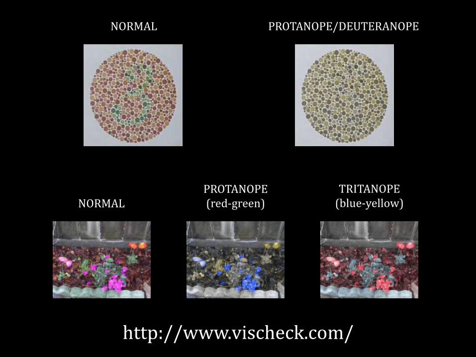
NORMAL PROTANOPE (red-green)
TRITANOPE (blue-yellow)
NORMAL PROTANOPE/DEUTERANOPE
http://www.vischeck.com/

a textbook example of poor use of color
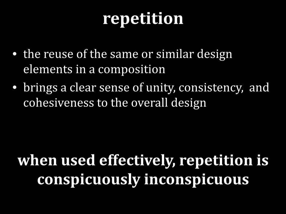
• the reuse of the same or similar design elements in a composition
• brings a clear sense of unity, consistency, and cohesiveness to the overall design
when used effectively, repetition is conspicuously inconspicuous
repetition


• moving elements closer or farther apart to achieve a more organized look
• based on the idea that related items in close proximity will be perceived as a unified group
• your audience will respond by: a) tending to naturally group similar items that are near to each other into a single unit, and b) assuming that items that are not near each other in a design are not closely related to one another
proximity


• arranging elements so that they line up – creates order – organizes page elements; links disparate groups
into a unified whole – satisfies the subconscious human desire to line
things up (I’m not kidding, this is an actual thing) – creates imaginary visual connections
alignment
ignore alignment at your own peril!

a well-aligned composition is invisible to the viewer…but a poorly-aligned one
sticks out like a sore thumb.

this poster has some serious alignment issues…

…but this one does not.

consider making a “reading path” to help reveal potential problems with eye flow

• the background of a poster may consist of: – whitespace – solid color (try to avoid using warm colors) – color gradient (again, avoid warm colors) – texture (may interfere with legibility) – photograph (frequently interferes with legibility)
background
Generally speaking, try to avoid using photographic backgrounds – they are
often much more trouble than they are worth, and can easily ruin an entire
poster if deployed improperly.
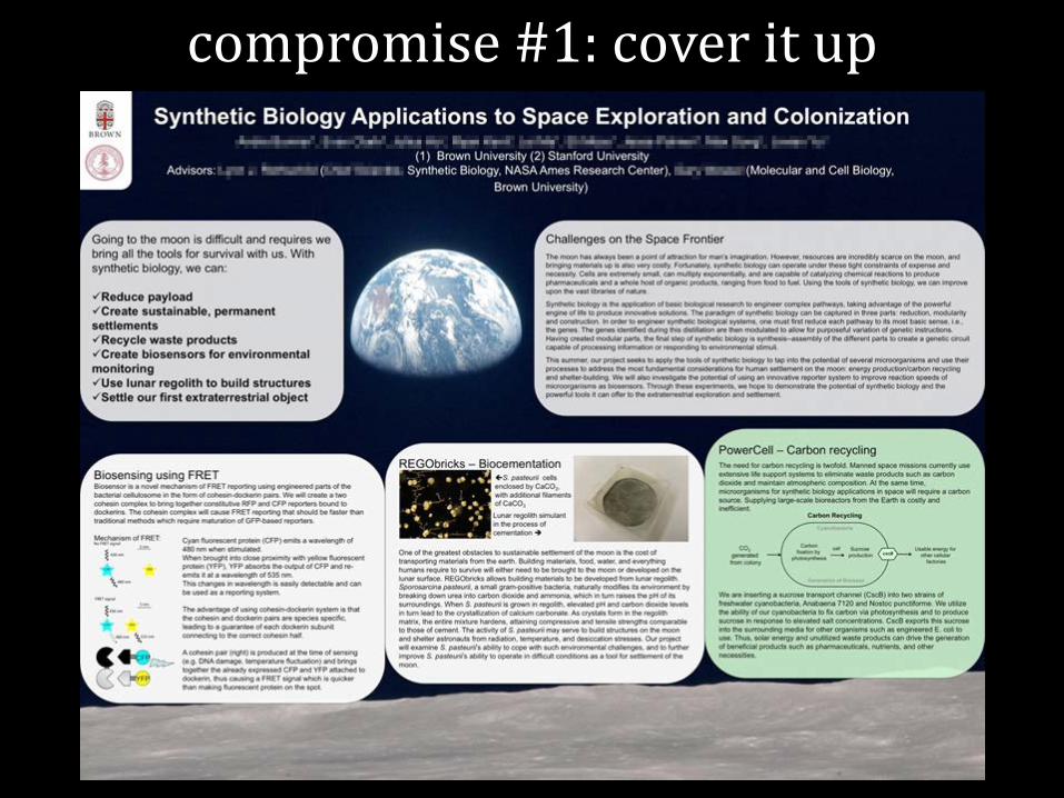
compromise #1: cover it up

compromise #2: fade it to pointlessness
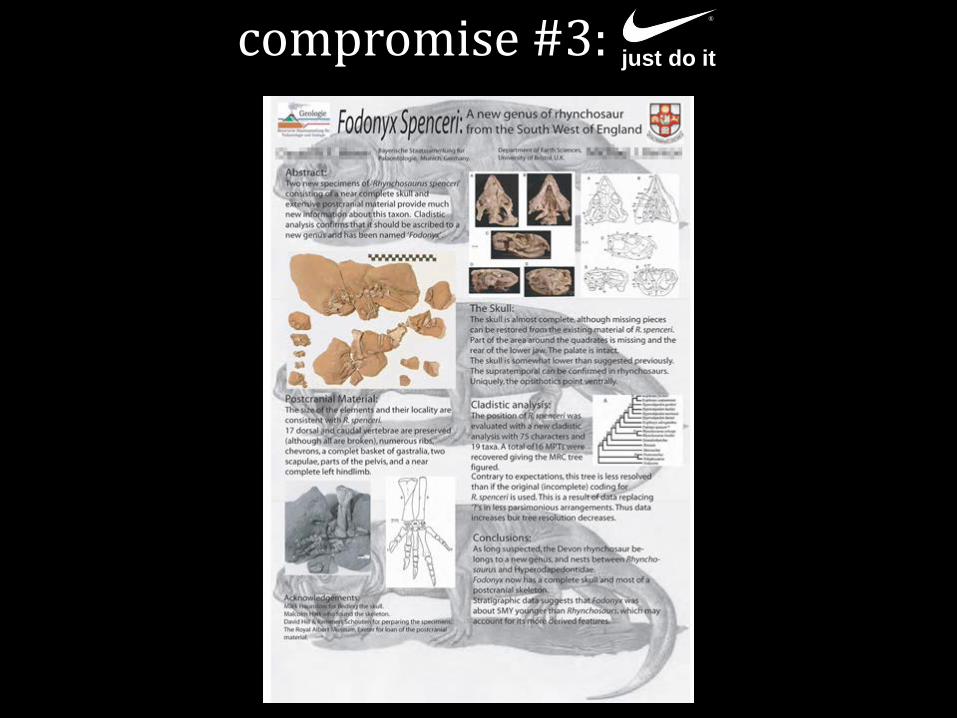
compromise #3: ®
just do it

• the theory and practice of letter and typeface design; necessarily concerned with design elements that can be applied to letters and text
• much like color theory, an entire course could be devoted to the ins and outs of typography
• so we will focus on only 4 aspects of type: – selecting a typeface (or faces) – the optimal number of unique typefaces – serif vs. sans serif fonts – size and weight
typography

• typefaces are like actors – each one has its own unique personality
• the “voice” of the font should comport well with the tone of the presentation
• some basic guidelines: – avoid novelty and calligraphic fonts; they look
cheap, cutesy, and/or unprofessional
font choice
AlgeriAn Matura MT Script Capitals
Edwardian Script

• if you intend to use more than one typeface, you must “go big or go home”
• use the Principle of Decisive Contrast – “either keep it the same, or change it a lot!” – subtle differences have no place in a hierarchical
system – they only serve to confuse the reader
font choice

Q: how many different typefaces should be used in a single poster?
A: NO MORE THAN 3. EVER. AND FOR THE LOVE OF ALL THAT IS GOOD, NEVER, EVER, EVER, USE
COMIC SANS.
number of fonts

• serif: a small line attached to the end of a stroke in a letter or symbol; assists the act of reading by guiding the eye from one character to the next
serif vs. sans serif fonts
Aa ‒ best suited for body copy or longer blocks of text;
avoid using serif fonts on titles and headings
try to avoid using the highly ubiquitous Times New Roman (my 2 cents)

• sans serif: a typeface that does not have serifs – clean, crisp, and minimalist – best suited for headings,
subheadings, table text, and figure captions; avoid using serif fonts on large blocks of text
serif vs. sans serif fonts
Aa try to avoid using Arial – it’s too ubiquitous (again, my 2 cents)

Myriad Caslon
Myriad Black Minion
Gill Sans Garamond
Franklin Gothic Medium Caslon
Franklin Gothic Demi Baskerville
a few classic font pairings:

Q: how large should you make your type? A: AS! LARGE! AS! POSSIBLE! THIS CANNOT BE OVEREMPHASIZED. MAKE IT AS BIG AS YOU CAN, THEN ADD ANOTHER 10% FOR GOOD MEASURE. • rule of thumb: the smallest text on your poster should be clearly
legible from 6 to 10 feet away – at a minimum, type should be approximately:
• 72 points for titles • 48 points for headings • 24 points for body copy
REMEMBER – THESE ARE MINIMUM VALUES!
BIGGER IS ALMOST ALWAYS BETTER (within reason, of course)
letter size

use changes in weight (i.e., boldface) and style (i.e., italics, SMALL CAPS) to denote rank-order differences in the visual hierarchy
letter weight and style


questions?