Embed Size (px)
Citation preview
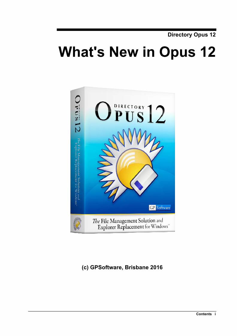
Directory Opus 12
What's New in Opus 12
(c) GPSoftware, Brisbane 2016
Contents i
Contents Copyright Notice 1
Welcome to Directory Opus 12! 3 Summary of major new features ......................................................................................... 3 Rename ............................................................................................................................... 5
Rename scripting .................................................................................................. 9 Other new rename features ................................................................................. 12 Removed options ................................................................................................ 12
Image Viewer ................................................................................................................... 14 Other new viewer features .................................................................................. 18
High DPI support .............................................................................................................. 20 File and folder labels ........................................................................................................ 22 Manual sorting .................................................................................................................. 26 File displays ...................................................................................................................... 30
Vertical folder tabs ............................................................................................. 30 Folder tab colors ................................................................................................. 30 Column headers in icon modes ........................................................................... 31 Relative graphs behind size and date fields ........................................................ 31 Vertical gridlines in Details and Power modes ................................................... 32 Show Everything ................................................................................................ 33 Other file display-related changes ...................................................................... 33 Preferences options relating to the file display ................................................... 34 Commands relating to the file display ................................................................ 35
Folder Formats and Folder Options .................................................................................. 35 Save format......................................................................................................... 35 Default format .................................................................................................... 36 Folder menu ........................................................................................................ 36 Columns tab ........................................................................................................ 36 Display tab .......................................................................................................... 40 Filters tabs .......................................................................................................... 40 Preferences options relating to folder formats .................................................... 41 Commands relating to folder formats ................................................................. 41 Folder formats scripting ..................................................................................... 42
Script dialogs .................................................................................................................... 43 Function editor ................................................................................................... 44
File copying ...................................................................................................................... 46 Transfer speed graph .......................................................................................... 46 Replace file – Keep Newer ................................................................................. 46 Commands relating to file copying .................................................................... 47 Copy Queue scripting ......................................................................................... 47
File operations .................................................................................................................. 48 Change Attributes & Times ................................................................................ 48 Create Folder ...................................................................................................... 48 Miscellaneous ..................................................................................................... 49
Find ................................................................................................................................... 50 Improvements to Simple Find mode .................................................................. 50 Improvements to Duplicate File Finder .............................................................. 51
Toolbars ............................................................................................................................ 53 Drop-down menu scrollbars ............................................................................... 53 Drive button drive letters .................................................................................... 53 Drives drop-down labels ..................................................................................... 53
ii Contents
Contents iii
Drop-down menu labels ..................................................................................... 54 Taskbar-style floating toolbars in Windows 10 .................................................. 54 Buttons can test recycle bin state ........................................................................ 54 Dynamic buttons for thumbnail sizes ................................................................. 55 DPI scaling for breadcrumbs path fields ............................................................ 55 Button context sensitivity ................................................................................... 55 Condition testing ................................................................................................ 55
FAYT / Filter Bar ............................................................................................................. 57 FAYT and Filter Bar Keys ................................................................................. 57 FAYT and Filter Bar Options ............................................................................. 57
Status Bar .......................................................................................................................... 58 Individual file information ................................................................................. 58 Show everything mode ....................................................................................... 58 DPI scaling for status bar graphs and parts ........................................................ 58
Miscellaneous things ........................................................................................................ 59 Script Miscellaneous ......................................................................................................... 63
Shell Properties ................................................................................................... 63 Viewer Events .................................................................................................... 63
Reference .......................................................................................................................... 65 Commands .......................................................................................................... 65 Command control codes and modifiers .............................................................. 74
Script objects .................................................................................................................... 75 CloseListerData .................................................................................................. 75 Column ............................................................................................................... 75 Command ........................................................................................................... 75 Control ................................................................................................................ 75 CustomFieldData ................................................................................................ 77 Dialog ................................................................................................................. 77 DialogListItem .................................................................................................... 77 DOpus ................................................................................................................. 78 DPI ..................................................................................................................... 78 Format ................................................................................................................ 78 FSUtil ................................................................................................................. 79 Item ..................................................................................................................... 79 Lister ................................................................................................................... 79 GetCopyQueueNameData .................................................................................. 79 GetCustomFieldData .......................................................................................... 80 GetNewNameData .............................................................................................. 80 Msg ..................................................................................................................... 80 Path ..................................................................................................................... 81 Script .................................................................................................................. 81 ScriptColumn ...................................................................................................... 81 ScriptColumnData .............................................................................................. 81 ScriptInitData ..................................................................................................... 81 ScriptStrings ....................................................................................................... 82 ShellProperty ...................................................................................................... 82 SortOrder ............................................................................................................ 82 Tab ...................................................................................................................... 83 Viewer ................................................................................................................ 83 Viewers ............................................................................................................... 83 ViewerEventData ............................................................................................... 84
Script resources ................................................................................................................. 85 String resources ................................................................................................................ 86 Icon sets ............................................................................................................................ 88

Copyright Notice Directory Opus 12 for Windows and this manual are Copyright © GPSoftware, Brisbane 2001-2016. All rights reserved. Title, ownership rights and intellectual property rights in and to the SOFTWARE shall at all times remain the property of GPSoftware.
No part of this publication or the accompanying SOFTWARE may be copied or distributed, transmitted, transcribed, stored in a retrieval system or translated into any human or computer language, in any form or by any means, electronic, mechanical, magnetic, manual or otherwise, or disclosed to any third-party without the express written permission of GPSoftware, Australia.
Disclaimer
GPSoftware and any associated dealers or distributors make no representation or warranties with respect to the performance of the SOFTWARE nor of the contents of this publication and specifically disclaim any implied warranties of merchandisable quality or fitness for any particular purpose. Further, GPSoftware reserves the right to revise the SOFTWARE and this publication and to make changes to them from time to time without obligation of GPSoftware to notify any person or organization of such revisions or changes.
Illustrations in this publication are intended to be representations and may not be exact duplicates of the screen layouts generated by the SOFTWARE.
License
GPSoftware provides this program and any updates to the original purchaser under the terms set out below and licenses its use worldwide. You assume responsibility for the selection of the program to achieve your intended results, and for the installation, use and results obtained from the program.
Warranty
All care has been taken to ensure that the program performs the functions as set out in this manual. However, GPSoftware provides the program “AS IS” and makes no express or implied warranties with respect to the SOFTWARE, its documentation, performance, fitness for a particular purpose, or merchantability. The entire risk as to the quality and performance of the SOFTWARE is borne by you. Should the SOFTWARE prove defective, you and not GPSoftware shall assume the entire cost of any service and/or repair.
To the maximum extent permitted by applicable law, in no event shall GPSoftware, its agents or suppliers be liable for any special, incidental, indirect, or consequential damages whatsoever (including, without limitation, damages for loss of business profits, business interruption, loss of business information, loss of data, or any other pecuniary loss) arising out of the use of or inability to use the SOFTWARE product, even if GPSoftware has been advised of the possibility of such damages.
What's New in Opus 12 Summary of major new features 1

2 What's New in Opus 12 Summary of major new features
At the discretion of GPSoftware, any and all warranty or technical support is available only to the original purchaser of this package. Please contact your local GPSoftware distributor in your local country for Technical Support in the first instance.
Welcome to Directory Opus 12! There are lots of changes and new features in Opus 12, and the length of this document may seem daunting!
Don’t be put off scanning through it though as there are lots of goodies lurking within. Here’s a summary of just a few of them.
Summary of major new features • Full support for high-DPI (e.g. 4K and 5K) monitors.
• Redesigned Rename dialog, with new features like:
o A unique macro recorder, which lets you perform complex batch renames without regular expressions.
o Enhanced scripting capabilities.
o Better handling of recursive renames and filename clashing.
o An Apply button which lets you perform multiple renames without closing the dialog.
• Improvements to the Image Viewer including:
o Configurable toolbar and hotkeys, including the ability to run arbitrary commands on the current image file.
o A new image marking system which makes it much easier to sort through a folder of photos to identify the ones you want to keep, print, share, etc.
o A read-ahead cache for faster image loading.
o An integrated metadata panel which lets you edit EXIF and other metadata from within the viewer.
• Enhanced file and folder labels including:
o The ability to assign more than one label at once (label attributes are combined).
o Label categories (lets you organise your labels into groups).
o Adjustable label priority (for when more than one wildcard or filter label applies to a file)
o A new status icon system that lets you assign one or more status icons to each files (e.g. to track which files are ‘done’, ‘watched’, ‘urgent’ or ‘to-do’).
• A manual sorting mode that lets you sort your files and folders exactly how you want.
• An integrated dialog editor that lets scripts create their own complex user interfaces.
• File display enhancements including:
o Vertical folder tabs (displayed down the left or right side of the file display).
Summary of major new features 3
o You can assign your own tab colors for specific folders.
o Optional vertical as well as horizontal gridlines.
o Relative size and age graphs displayed as the background of size and date fields (rather than requiring their own column).
o A new “show everything” mode to quickly disable all filters.
• Improvements to Folder Options including:
o Configure column widths to expand and fill the usable space in the file display.
o A column filter makes it easier to find and add the columns you want.
o File and folder name filters can be configured using regular expressions if desired.
• File copy improvements including a transfer speed graph in the progress dialog.
• Toolbar enhancements including scrollbars and distinct labels in drop-down menus.
• Lister layouts can now be arranged into folders and sub-folders.
• … and as always, much, much more!
4 Summary of major new features
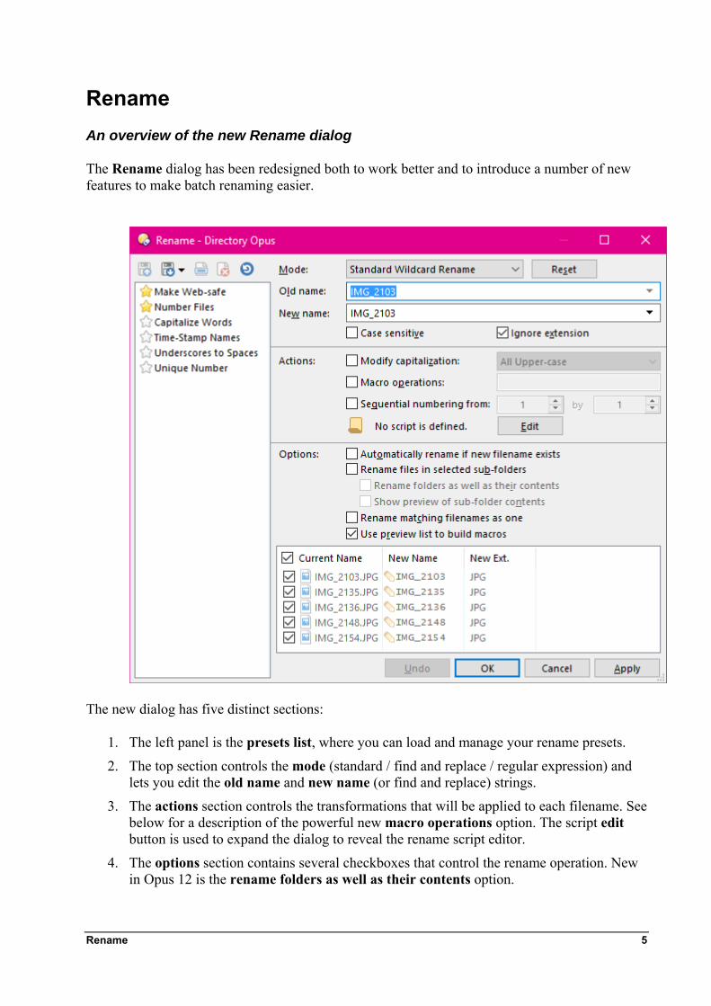
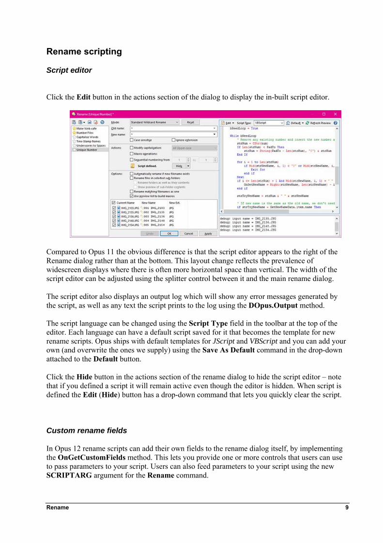
Rename An overview of the new Rename dialog
The Rename dialog has been redesigned both to work better and to introduce a number of new features to make batch renaming easier.
The new dialog has five distinct sections:
1. The left panel is the presets list, where you can load and manage your rename presets.
2. The top section controls the mode (standard / find and replace / regular expression) and lets you edit the old name and new name (or find and replace) strings.
3. The actions section controls the transformations that will be applied to each filename. See below for a description of the powerful new macro operations option. The script edit button is used to expand the dialog to reveal the rename script editor.
4. The options section contains several checkboxes that control the rename operation. New in Opus 12 is the rename folders as well as their contents option.
Rename 5
5. Finally, the preview section displays a preview of the transformed filenames. In Opus 12 the preview list is always displayed. Each file listed in the preview list (except for those from sub-folders) has a checkbox that you can use to remove the file from the rename operation. The preview list also doubles as the macro builder, which is described below.
At the bottom of the dialog, a new Apply button allows changes to be applied to the selected files while leaving the Rename dialog open. Once you use the Apply button the Undo button next to it becomes available, allowing you to undo the rename you just applied.
The presets list
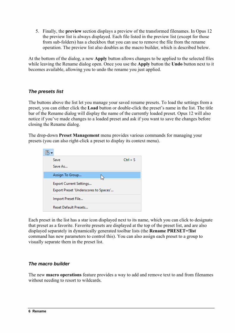
The buttons above the list let you manage your saved rename presets. To load the settings from a preset, you can either click the Load button or double-click the preset’s name in the list. The title bar of the Rename dialog will display the name of the currently loaded preset. Opus 12 will also notice if you’ve made changes to a loaded preset and ask if you want to save the changes before closing the Rename dialog.
The drop-down Preset Management menu provides various commands for managing your presets (you can also right-click a preset to display its context menu).
Each preset in the list has a star icon displayed next to its name, which you can click to designate that preset as a favorite. Favorite presets are displayed at the top of the preset list, and are also displayed separately in dynamically generated toolbar lists (the Rename PRESET=!list command has new parameters to control this). You can also assign each preset to a group to visually separate them in the preset list.
The macro builder
The new macro operations feature provides a way to add and remove text to and from filenames without needing to resort to wildcards.
6 Rename
As well as displaying a preview of the rename operation, the preview list at the bottom of the Rename dialog also doubles as a macro builder. You can edit file names directly in the preview list, and doing so generates macros which batch-rename all the files in the same way.
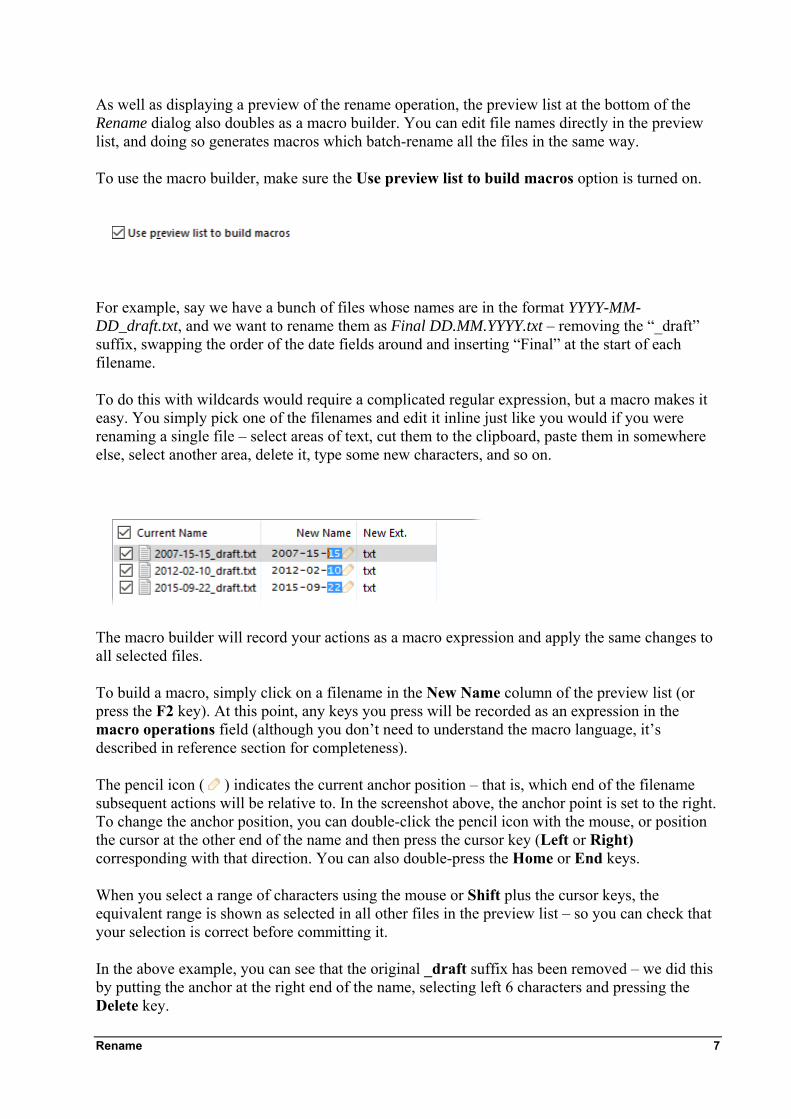
To use the macro builder, make sure the Use preview list to build macros option is turned on.
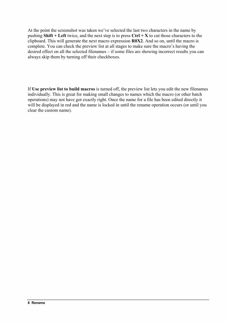
For example, say we have a bunch of files whose names are in the format YYYY-MM-DD_draft.txt, and we want to rename them as Final DD.MM.YYYY.txt – removing the “_draft” suffix, swapping the order of the date fields around and inserting “Final” at the start of each filename.
To do this with wildcards would require a complicated regular expression, but a macro makes it easy. You simply pick one of the filenames and edit it inline just like you would if you were renaming a single file – select areas of text, cut them to the clipboard, paste them in somewhere else, select another area, delete it, type some new characters, and so on.
The macro builder will record your actions as a macro expression and apply the same changes to all selected files.
To build a macro, simply click on a filename in the New Name column of the preview list (or press the F2 key). At this point, any keys you press will be recorded as an expression in the macro operations field (although you don’t need to understand the macro language, it’s described in reference section for completeness).
The pencil icon ( ) indicates the current anchor position – that is, which end of the filename subsequent actions will be relative to. In the screenshot above, the anchor point is set to the right. To change the anchor position, you can double-click the pencil icon with the mouse, or position the cursor at the other end of the name and then press the cursor key (Left or Right) corresponding with that direction. You can also double-press the Home or End keys.
When you select a range of characters using the mouse or Shift plus the cursor keys, the equivalent range is shown as selected in all other files in the preview list – so you can check that your selection is correct before committing it.
In the above example, you can see that the original _draft suffix has been removed – we did this by putting the anchor at the right end of the name, selecting left 6 characters and pressing the Delete key.
Rename 7
At the point the screenshot was taken we’ve selected the last two characters in the name by pushing Shift + Left twice, and the next step is to press Ctrl + X to cut those characters to the clipboard. This will generate the next macro expression R0X2. And so on, until the macro is complete. You can check the preview list at all stages to make sure the macro’s having the desired effect on all the selected filenames – if some files are showing incorrect results you can always skip them by turning off their checkboxes.
If Use preview list to build macros is turned off, the preview list lets you edit the new filenames individually. This is great for making small changes to names which the macro (or other batch operations) may not have got exactly right. Once the name for a file has been edited directly it will be displayed in red and the name is locked in until the rename operation occurs (or until you clear the custom name).
8 Rename
Rename scripting
Script editor
Click the Edit button in the actions section of the dialog to display the in-built script editor.
Compared to Opus 11 the obvious difference is that the script editor appears to the right of the Rename dialog rather than at the bottom. This layout change reflects the prevalence of widescreen displays where there is often more horizontal space than vertical. The width of the script editor can be adjusted using the splitter control between it and the main rename dialog.
The script editor also displays an output log which will show any error messages generated by the script, as well as any text the script prints to the log using the DOpus.Output method.
The script language can be changed using the Script Type field in the toolbar at the top of the editor. Each language can have a default script saved for it that becomes the template for new rename scripts. Opus ships with default templates for JScript and VBScript and you can add your own (and overwrite the ones we supply) using the Save As Default command in the drop-down attached to the Default button.
Click the Hide button in the actions section of the rename dialog to hide the script editor – note that if you defined a script it will remain active even though the editor is hidden. When script is defined the Edit (Hide) button has a drop-down command that lets you quickly clear the script.
Custom rename fields
In Opus 12 rename scripts can add their own fields to the rename dialog itself, by implementing the OnGetCustomFields method. This lets you provide one or more controls that users can use to pass parameters to your script. Users can also feed parameters to your script using the new SCRIPTARG argument for the Rename command.
Rename 9
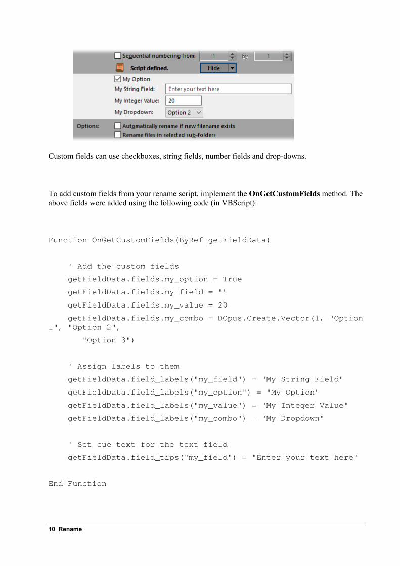
Custom fields can use checkboxes, string fields, number fields and drop-downs.
To add custom fields from your rename script, implement the OnGetCustomFields method. The above fields were added using the following code (in VBScript):
Function OnGetCustomFields(ByRef getFieldData)
' Add the custom fields
getFieldData.fields.my_option = True
getFieldData.fields.my_field = ""
getFieldData.fields.my_value = 20
getFieldData.fields.my_combo = DOpus.Create.Vector(1, "Option 1", "Option 2",
"Option 3")
' Assign labels to them
getFieldData.field_labels("my_field") = "My String Field"
getFieldData.field_labels("my_option") = "My Option"
getFieldData.field_labels("my_value") = "My Integer Value"
getFieldData.field_labels("my_combo") = "My Dropdown"
' Set cue text for the text field
getFieldData.field_tips("my_field") = "Enter your text here"
End Function
10 Rename
Custom fields are defined in much the same way as Script add-in defines its configuration using the ScriptConfig object. The OnGetCustomFields method is passed a GetCustomFieldData object. Fields are added by assigning properties of the GetCustomFieldData.fields object to the variable type you want the field to use (e.g. assign True or False for a Boolean, a string for a text string, etc.). The value you provide will become the default value for the field.
Each field can also have a label, and text fields can have a “cue banner” which is shown when the text field is empty (as seen above). Two Map objects are provided (GetCustomFieldData.field_labels and GetCustomFieldData.field_tips) which allow you to assign these.
The Rename dialog will expand automatically to accommodate your custom fields – obviously, screen space isn’t infinite, so you shouldn’t add too many fields or the dialog will grow too big for the screen!
The values that the user enters into your custom fields are provided to your OnGetNewName method via the CustomFieldData object passed as the GetNewNameData.custom. Each field you add in OnGetCustomFields will appear as a property of this object. For example, this function will print the provided values to the output log.
Function OnGetNewName(ByRef getNewNameData)
DOpus.Output "Option: " & getNewNameData.custom.my_option
DOpus.Output "String: " & getNewNameData.custom.my_field
DOpus.Output "Number: " & getNewNameData.custom.my_value
DOpus.Output "Dropdown: " & getNewNameData.custom.my_combo
OnGetNewName = True ' skip rename
End Function
When the user automates the Rename command to run your rename script directly (using the PRESET argument), they can use the new SCRIPTARG parameter to pass data for your custom fields through. This argument accepts multiple name:value pairs. For example, assume the above script was saved as the rename preset “MyRename”. The user might run the following command:
Rename PRESET MyRename SCRIPTARG my_option:True my_field:moocow
Rename 11
Other new rename features
Ignore extension
The ignore extension option causes the rename function to ignore file extensions when performing wildcard or batch transformations. With this enabled you can perform regular expression or wildcard renames without having to worry about preserving the file extension in your wildcard pattern. An additional advantage is that the same wildcard patterns can now be used for both files and folders.
Macro operations
The new macro operations function is discussed above.
Recursive renaming
When performing a recursive rename using rename files in selected sub-folders there are two new options available:
• Rename folders as well as their contents lets you rename folders as well as any files within the folders. The ignore extension option is particularly useful in this situation, as it makes it easy to use one wildcard pattern that applies to both files and folders.
• Show preview of sub-folder contents adds the contents of any sub-folders to the rename preview list. This lets you see exactly what the rename operation will do.
The new {parentbase} code is similar to {parent} except it returns the name of the base folder rather than that of the file's parent. This is most useful with a recursive rename, where the name returned by {parent} would change for files inside sub-folders.
If you want to use rename to move files into new folders, adding $.\ at the start of the new name lets each file be moved relative to the base folder rather than its parent.
Clash avoidance
Rename has new clash-avoidance technology that can prevent problems during batch renames. If the new name of a file would clash with an existing filename Opus will re-order the list of files to remove any dependencies. The rename matching filenames as one option has also been improved to work more reliably.
Removed options
The following options have been superseded and removed.
Enable file information fields
In Opus 12, Rename will notice when you use fields like {picwidth} in the new name field and automatically generate file information without an option having to be specifically turned on.
12 Rename
Include file extension
This option (which only affected find and replace mode) has been replaced by ignore extension. Where you might have previously turned include file extension on, you should now turn ignore extension off (and vice versa).
Script mode
In Opus 12, if a rename script has been defined it will always run, whether the script editor is currently displayed or not. That is, the Rename dialog is always in “script mode”, but the display of the script editor is optional. This lets you use rename presets based on scripts without needing to have the script editor displayed all the time.
Rename 13
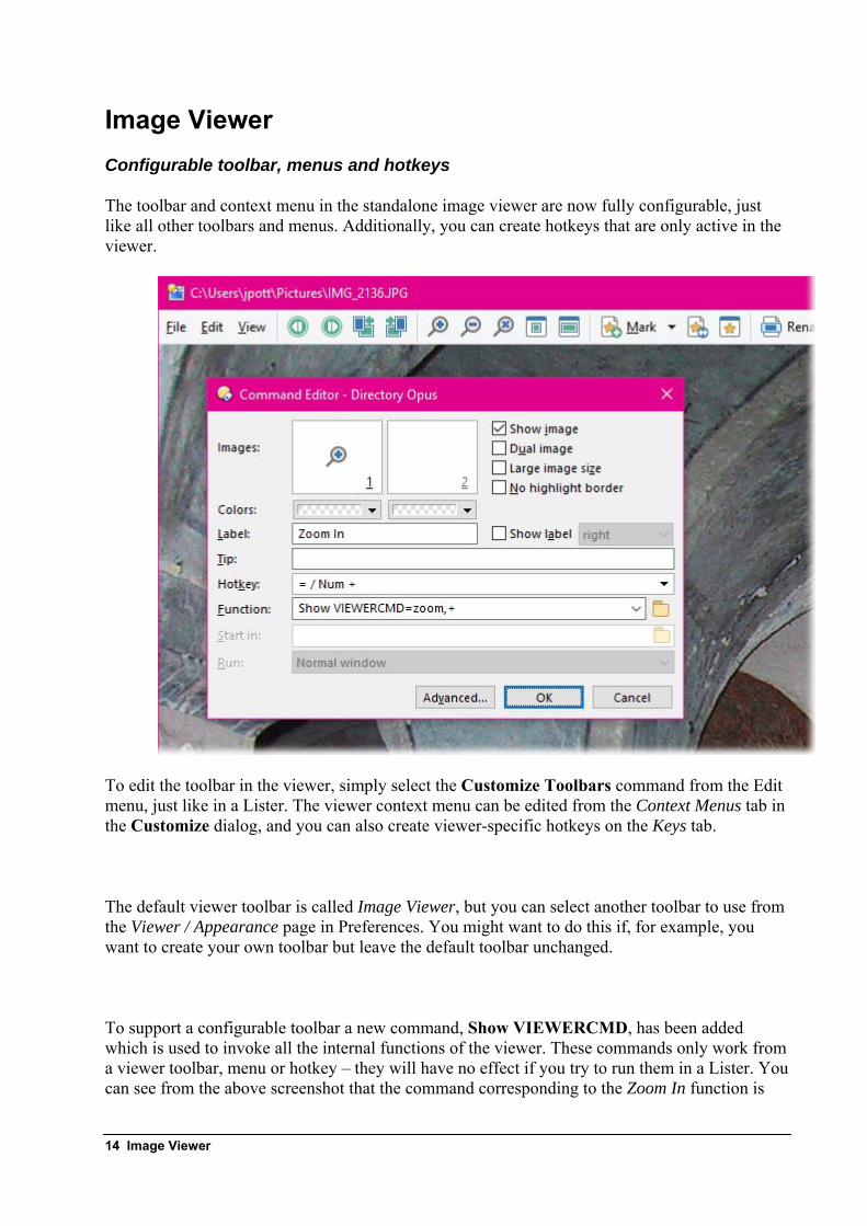
Image Viewer Configurable toolbar, menus and hotkeys
The toolbar and context menu in the standalone image viewer are now fully configurable, just like all other toolbars and menus. Additionally, you can create hotkeys that are only active in the viewer.
To edit the toolbar in the viewer, simply select the Customize Toolbars command from the Edit menu, just like in a Lister. The viewer context menu can be edited from the Context Menus tab in the Customize dialog, and you can also create viewer-specific hotkeys on the Keys tab.
The default viewer toolbar is called Image Viewer, but you can select another toolbar to use from the Viewer / Appearance page in Preferences. You might want to do this if, for example, you want to create your own toolbar but leave the default toolbar unchanged.
To support a configurable toolbar a new command, Show VIEWERCMD, has been added which is used to invoke all the internal functions of the viewer. These commands only work from a viewer toolbar, menu or hotkey – they will have no effect if you try to run them in a Lister. You can see from the above screenshot that the command corresponding to the Zoom In function is
14 Image Viewer
Show VIEWERCMD=zoom,+. A full list of VIEWERCMD commands is shown in the Commands Reference section of this document.
Although the Show VIEWERCMD command only works inside the viewer, this doesn’t mean it’s the only command that does – all other Opus commands and external functions also work inside the viewer. Of course, some commands (for example, Select) are not applicable to the viewer, but it’s certainly possible to use commands like Copy or Rename, or have buttons that open the current picture in, say, Photoshop.
The @if directive can test the state of various Show VIEWERCMD options when used within the viewer. For example, the following function would toggle between 100% zoom and Grow To Page modes:
@if:Show VIEWERCMD=zoom,reset Show VIEWERCMD=zoom,grow @if:else Show VIEWERCMD=zoom,reset
Image marking
A common task is sorting through a bunch of digital photos, working out which ones to keep, which ones to upload, which ones to print, etc. You might recognise this as the old function in Opus 11 called “Tag”, which let you select a picture in the viewer and have its checkbox in the Lister automatically turned on. While this system worked it was a bit clunky – firstly, the Lister had to remain open and in the same folder the whole time, and the checkbox state was easy to lose by, e.g., accidentally pushing F5 or changing the folder. Additionally, the state wasn’t persistent – so you really had to finish going through a whole photo collection at once.
In Opus 12 this task has been made much easier by the new “image marking” mode. Images you mark are automatically added to a file collection, which solves all the problems mentioned above. Additionally, thumbnails of the images you’ve marked are shown in a separate panel in the viewer, and there are commands that make it easy to move around the marked images.
Image Viewer 15
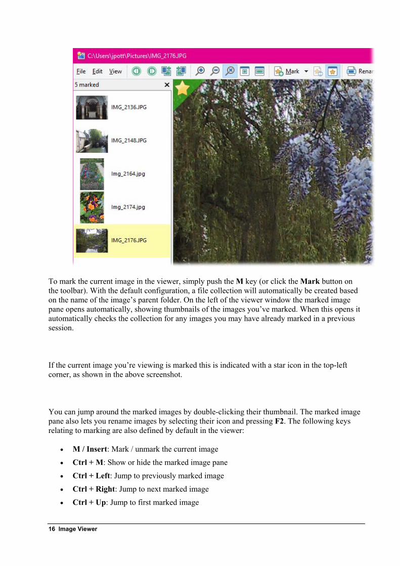
To mark the current image in the viewer, simply push the M key (or click the Mark button on the toolbar). With the default configuration, a file collection will automatically be created based on the name of the image’s parent folder. On the left of the viewer window the marked image pane opens automatically, showing thumbnails of the images you’ve marked. When this opens it automatically checks the collection for any images you may have already marked in a previous session.
If the current image you’re viewing is marked this is indicated with a star icon in the top-left corner, as shown in the above screenshot.
You can jump around the marked images by double-clicking their thumbnail. The marked image pane also lets you rename images by selecting their icon and pressing F2. The following keys relating to marking are also defined by default in the viewer:
• M / Insert: Mark / unmark the current image
• Ctrl + M: Show or hide the marked image pane
• Ctrl + Left: Jump to previously marked image
• Ctrl + Right: Jump to next marked image
• Ctrl + Up: Jump to first marked image
16 Image Viewer
• Ctrl + Down: Jump to last marked image
• Ctrl + Space: Return from jump to last viewed image
• Shift + M: Exchange mark with previously marked image
These keys make it very easy to jump back and forth between images you’ve marked and your current “position” in the list of images. The Exchange mark command comes in handy when you’ve got multiple photos of the same scene and you’re trying to decide which is the best. You might have marked the first photo because you thought it was ok, but then two or three photos later you find one that’s slightly better – simply press Shift + M to unmark the previous one and mark the new one instead.
If you want to take a break from your session you can simply close the viewer and come back to it later – all images that you’ve marked will be saved in the file collection. When you’ve marked one or more images and you close the viewer, Opus will automatically display the file collection for you in a new tab – you can change this behaviour in Preferences.
The name of the file collection can be configured on the Viewer / Behavior page in Preferences. When you configure the collection name, you can use the special code %F to insert the name of the parent folder, and %D to insert the current date. You can also have Opus ask you for a collection name before each marking session. And if you like you can disable the file collection behaviour and return to the old checkbox-based method, although this then has all the drawbacks mentioned above.
Scripting interface
The image viewer is now exposed via a simple scripting interface. All currently open viewers can be enumerated using the DOpus.Viewers property – this returns a collection of Viewer objects. You can also determine the last active viewer using the DOpus.Viewers.lastactive property.
The Viewer object implements the following properties:
• left / top / right / bottom: window position.
• foreground: True if the viewer is currently the foreground (active) window in the system.
• lastactive: True if the viewer is the last active viewer.
• files: returns a collection of Item objects representing the images in the viewer’s list. Each Item object has a current property that will be True if this is the currently displayed image.
• current: returns an Item object representing the currently displayed image.
The Viewer object also implements the following method:
• command(cmd): Run a command in the context of this viewer. You can either pass a full Command object, or a string. If you pass a string it must be a valid keyword for
Image Viewer 17
the Show VIEWERCMD command (e.g. to move to the next picture, you would simply pass the string "next" which equates to the command Show VIEWERCMD=next).
Other new viewer features
Metadata pane
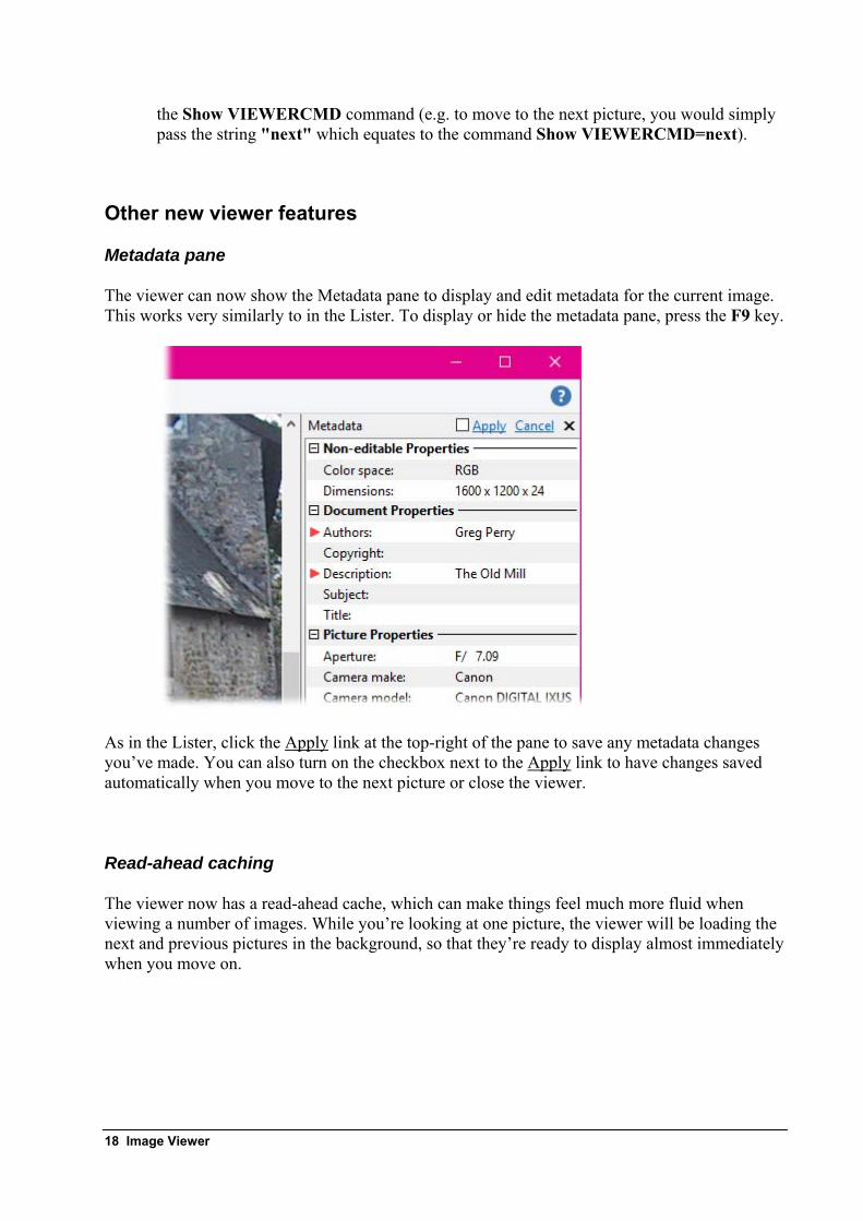
The viewer can now show the Metadata pane to display and edit metadata for the current image. This works very similarly to in the Lister. To display or hide the metadata pane, press the F9 key.
As in the Lister, click the Apply link at the top-right of the pane to save any metadata changes you’ve made. You can also turn on the checkbox next to the Apply link to have changes saved automatically when you move to the next picture or close the viewer.
Read-ahead caching
The viewer now has a read-ahead cache, which can make things feel much more fluid when viewing a number of images. While you’re looking at one picture, the viewer will be loading the next and previous pictures in the background, so that they’re ready to display almost immediately when you move on.
18 Image Viewer
Reselect command
In the Edit menu there’s a new Reselect command. This sets the selection to the same rectangle that was most recently selected in any viewer window (whether open or closed), which is handy for cropping the same part of multiple images.
Image conversion of displayed image
When the File / Convert Image command is run in the viewer, the conversion tool now gets the image data directly from the displayed image – meaning any rotation or cropping you’ve done will be reflected in the converted image. This uses the new @useimagedata command modifier and can be overridden for an individual command using the NOUSEIMAGEDATA argument (which would let you configure a viewer toolbar button to not behave like this if needed).
Minimum width when window auto-sizes
On the Viewer / Appearance page in Preferences, it’s now possible to configure a minimum width for the viewer window when the Auto-size option is turned on. You might want to use this to make sure your toolbar (or a certain amount of it) is always visible when viewing small images. You can set the minimum width automatically from an existing viewer window using the View / Save Minimum Width command in the default toolbar.
Mouse button functions
In Opus 11 you could configure the behaviour of the left and middle mouse buttons from a list of predefined functions. Opus 12 adds a text field letting you specify your own command as well as choosing from the drop-down list. You can now also have a command that runs on left double-click.
Image Viewer 19
High DPI support An overview of high DPI support
High DPI monitors are becoming more and more common. 4K or 5K monitors in 24” or 27” form factors have pixels too small to run them at their native resolution (unless you have super-vision) and so these will most commonly be used at higher DPI scaling levels (e.g. instead of the 96 dots-per-inch on a standard monitor, they may be run at 125% (120 dpi), 150% (144 dpi), 200% (192 dpi) or even higher). This lets text and icons be sharper and clearer, but without providing any more “usable” screen space.
In practical terms what this means is that software GUIs have to either be up-scaled by the OS (resulting in a blurry or fuzzy appearance of things like text and icons), or support higher DPI natively with higher resolution icon imagery.
Fonts
Opus 12 configurations store the DPI setting along with your configured font sizes, which means you can move your configuration between different DPIs (say, a high-DPI desktop and a low-DPI laptop) and the correct font size will be used. In Opus 11 this would result in your fonts being either too big or too small, depending on the machine the configuration was saved on.
The first time you use an earlier configuration with Opus 12, your existing font sizes will be reset to the defaults.
Toolbar icons
Toolbar icon sets have always supported two icon sizes (small and large); that is, an icon set could contain two completely different sets of images that were used for icons at the two sizes. In Opus 12 icon sets still support two “named” sizes (small and large), but each size can have more than one set of image data, flagged for differing DPI levels. Each set of images can be given a maximum and minimum DPI scaling level that it’s designed for, and Opus will pick the most appropriate size to use automatically.
If an icon set doesn’t have images designed for the current DPI level, Opus will pick the closest size and automatically scale it up (or down) so that all toolbar icons are displayed with the correct dimensions.
Status bar and toolbars
Elements with configurable widths (status bar parts, status bar graphs, and the breadcrumbs path field) are now scaled for the system DPI by default. E.g. a status bar part set to width 200 (with the {width200} code) will be 400 pixels wide on a system with 200% DPI scaling.
If you specifically want an absolute width that doesn’t get scaled, simply specify a negative number instead. For example, a status bar part set to {width-200} would be 200 pixels wide no matter what the DPI scale factor.
20 High DPI support
Commands and scripts
The new {dpi} command argument lets you use DPI-sensitive values with simple commands. This can be useful if you have buttons which specify column or window sizes and you want consistent results from the same button in different DPIs.
• {dpi} on its own will report the current DPI. 96 at standard DPI, 192 at 200% DPI, and so on.
• {dpi|%} will report the current DPI scale factor. 100 at standard DPI, 200 at 200% DPI, and so on.
• {dpi|<number>} converts a standard 96 DPI pixel width to the current DPI. For example, if you are at 200% DPI, {dpi|25} will output 50.
• {dpi|/<number>} will convert from the current DPI back to standard 96 DPI pixels. For example, if you are at 200% DPI, {dpi|/50} will output 25.
Example use in a command: Set LISTERSIZE {dpi|640},{dpi|480}. For scripts, the new DPI object (obtained via the DOpus.DPI method) provides similar functionality.
High DPI support 21
File and folder labels Stackable labels
File and folder labels can now “stack” on top of each other. This means that it’s now possible to apply multiple labels to one file, or have multiple wildcard labels that may match a single file. Instead of just the first matching label being used, Opus will continue to search for other matching labels and apply those label settings on top of the previous ones.
For example, you could have one label that colors the names of all JPEG files green, and another that bolds the filenames of all images that are 1920x1080 pixels or larger. In Opus 11 only one of these labels could ever be effective at once, but in Opus 12 any 1920x1080 JPEG files would have their filenames shown as bolded green.
Each label definition now has a “stop on match” flag which lets you prevent this behaviour on a per-label basis.
By default explicitly applied labels override wildcard labels, but the new Preferences setting Favorites and Recent / Labels / Apply wildcard and label filters to explicitly labeled files and folder lets wildcard labels stack on top of explicitly-assigned ones.
Adjustable priority
Filter and wildcard label assignments can now be rearranged to control their priority. The new Label Assignments page in Preferences has up and down buttons that let you move label assignments above or below each other.
Categories
Labels can now optionally be arranged into categories. These are used to group the labels on the Favorites and Recent / Labels page in Preferences, and can optionally group them in toolbars when displaying generated lists of labels (e.g. the list generated by the Properties SETLABEL !menu command).
22 File and folder labels
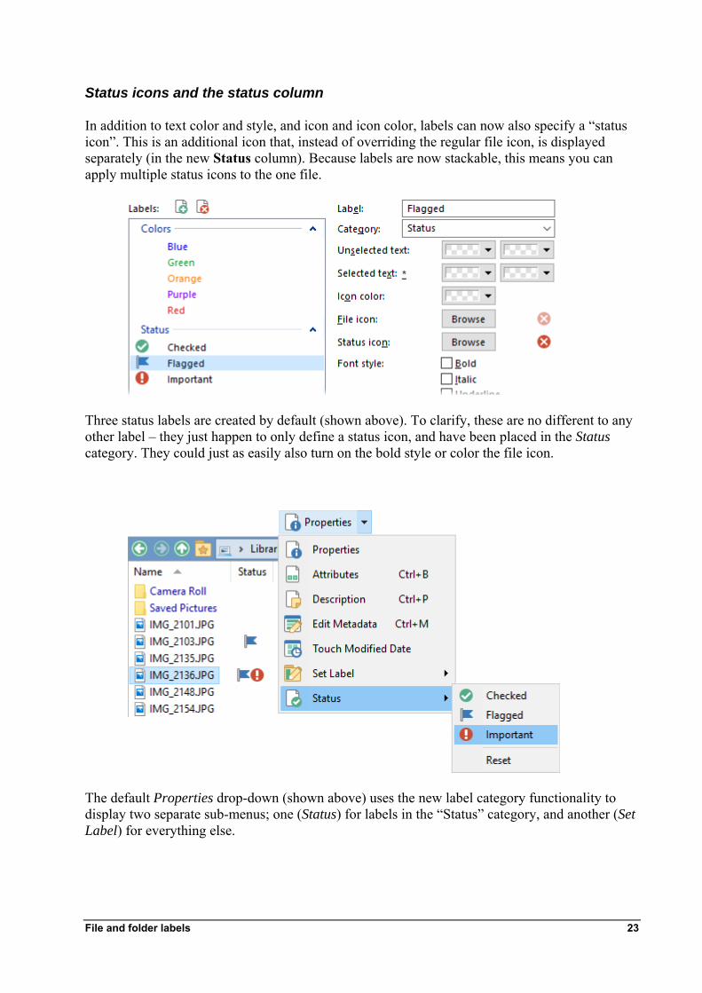
Status icons and the status column
In addition to text color and style, and icon and icon color, labels can now also specify a “status icon”. This is an additional icon that, instead of overriding the regular file icon, is displayed separately (in the new Status column). Because labels are now stackable, this means you can apply multiple status icons to the one file.
Three status labels are created by default (shown above). To clarify, these are no different to any other label – they just happen to only define a status icon, and have been placed in the Status category. They could just as easily also turn on the bold style or color the file icon.
The default Properties drop-down (shown above) uses the new label category functionality to display two separate sub-menus; one (Status) for labels in the “Status” category, and another (Set Label) for everything else.
File and folder labels 23
You can see in this example that one file has been assigned the “Flagged” label, and another has been assigned both “Flagged” and “Important”. The Status column has been added to the list and displays the assigned status icons.
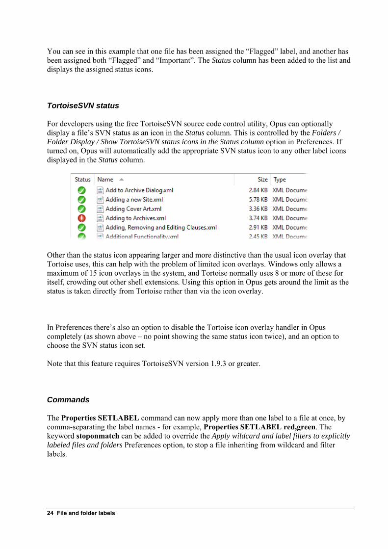
TortoiseSVN status
For developers using the free TortoiseSVN source code control utility, Opus can optionally display a file’s SVN status as an icon in the Status column. This is controlled by the Folders / Folder Display / Show TortoiseSVN status icons in the Status column option in Preferences. If turned on, Opus will automatically add the appropriate SVN status icon to any other label icons displayed in the Status column.
Other than the status icon appearing larger and more distinctive than the usual icon overlay that Tortoise uses, this can help with the problem of limited icon overlays. Windows only allows a maximum of 15 icon overlays in the system, and Tortoise normally uses 8 or more of these for itself, crowding out other shell extensions. Using this option in Opus gets around the limit as the status is taken directly from Tortoise rather than via the icon overlay.
In Preferences there’s also an option to disable the Tortoise icon overlay handler in Opus completely (as shown above – no point showing the same status icon twice), and an option to choose the SVN status icon set.
Note that this feature requires TortoiseSVN version 1.9.3 or greater.
Commands
The Properties SETLABEL command can now apply more than one label to a file at once, by comma-separating the label names - for example, Properties SETLABEL red,green. The keyword stoponmatch can be added to override the Apply wildcard and label filters to explicitly labeled files and folders Preferences option, to stop a file inheriting from wildcard and filter labels.
24 File and folder labels
The Properties SETLABELTOGGLE argument now accepts the optional keyword shift - if specified, the labels will only be toggled if the Shift key is held down (e.g. Properties SETLABEL red SETLABELTOGGLE shift).
The new Properties ADDLABEL argument lets you add a label to a file without replacing any existing labels it might have. If the optional keyword ctrl is specified, the label will only be added if the Control key is held down (e.g. Properties SETLABEL green ADDLABEL ctrl). ADDLABEL also works in conjunction with SETLABELTOGGLE, to toggle a label on and off without affecting any others the file may have.
The Properties SETLABEL !submenu command can be used to generate a list or menu of labels grouped into categories – this can also be combined with the !menu keyword. You can also combine the ADDLABEL and SETLABETOGGLE to dynamically generate a list of “toggle label” commands (e.g. Properties SETLABEL !menu !submenu ADDLABEL SETLABELTOGGLE).
The new Properties LABELCATEGORY argument can be used to filter the generated list of labels by category. It accepts one or more wildcard strings which let you match the name of categories to include. E.g. to display a list of labels in the Status category, the default drop-down uses the command:
Properties SETLABEL !menu LABELCATEGORY raw:Status ADDLABEL SETLABELTOGGLE
The specified categories will also be used when resetting labels using the Properties SETLABEL !reset command - if LABELCATEGORY is used as well, only labels in the specified categories will be cleared. This lets you have a command that, for example, clears all Status category labels (removes all status icons) without affecting any other labels the file may have.
File and folder labels 25
Manual sorting An overview of manual sorting
Manual sorting refers to being able to control the display order of files and folders arbitrarily. Although for most purposes the automatic sorting methods (e.g. sorting files alphabetically by name) are all you need, many people have use cases where being able to control the sort order exactly would be useful.
Manual sort mode needs to be activated in a Lister before files can be arbitrarily arranged. To activate manual sorting, use the Set MANUALSORT command, or turn on the Sorting Options / Manual sorting option on the Display tab in the Folder Options dialog. Obviously as a folder options setting, this mode can also be made permanent by saving the folder format.
If a manual sort order had previously been defined (and saved) for the current folder, the file list will resort automatically when manual sorting is turned on. Otherwise, turning on manual sorting will have no immediate effect on the file list.
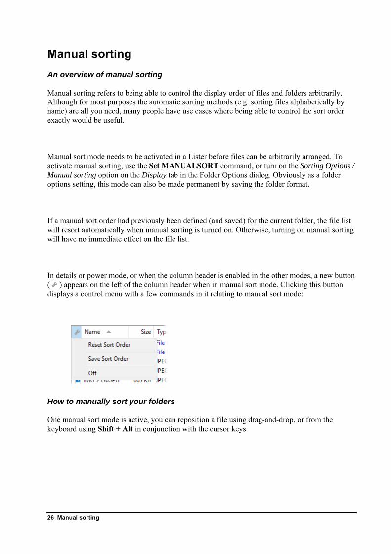
In details or power mode, or when the column header is enabled in the other modes, a new button ( ) appears on the left of the column header when in manual sort mode. Clicking this button displays a control menu with a few commands in it relating to manual sort mode:
How to manually sort your folders
One manual sort mode is active, you can reposition a file using drag-and-drop, or from the keyboard using Shift + Alt in conjunction with the cursor keys.
26 Manual sorting
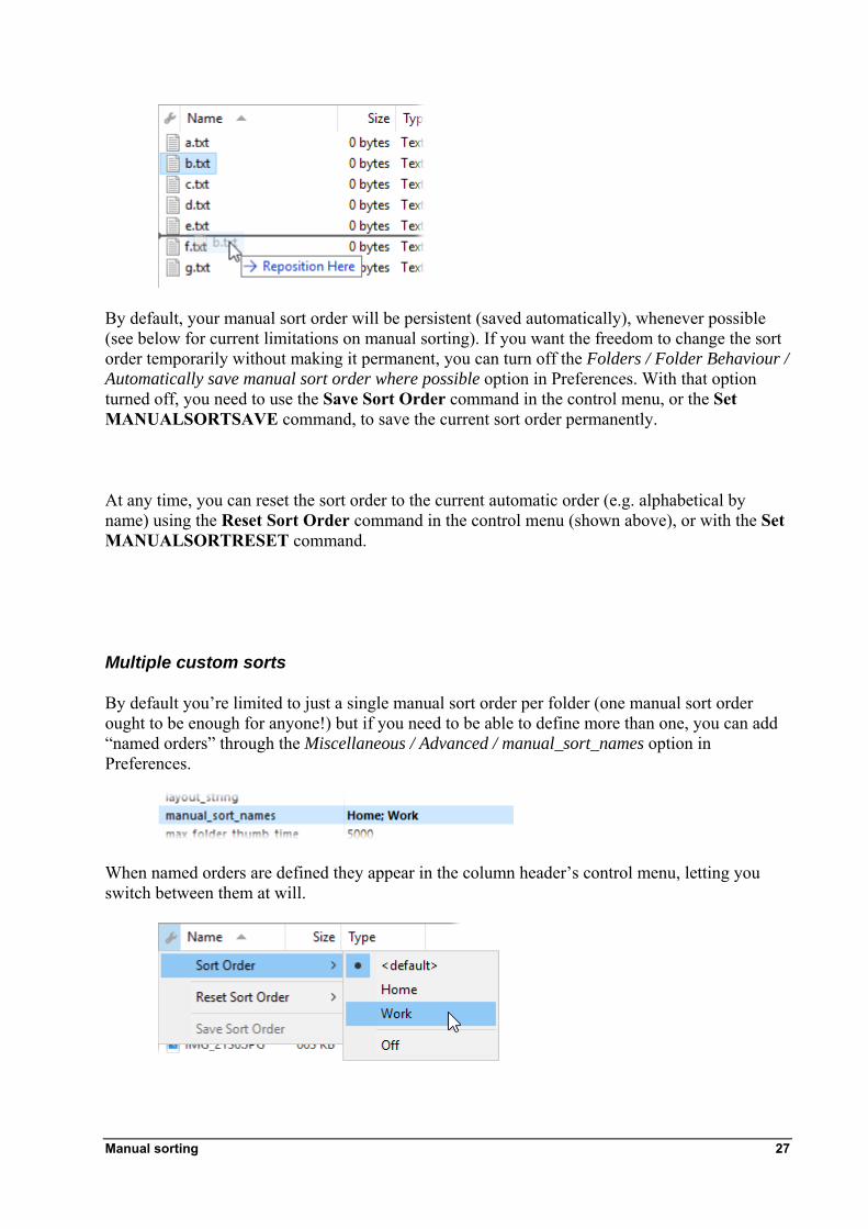
By default, your manual sort order will be persistent (saved automatically), whenever possible (see below for current limitations on manual sorting). If you want the freedom to change the sort order temporarily without making it permanent, you can turn off the Folders / Folder Behaviour / Automatically save manual sort order where possible option in Preferences. With that option turned off, you need to use the Save Sort Order command in the control menu, or the Set MANUALSORTSAVE command, to save the current sort order permanently.
At any time, you can reset the sort order to the current automatic order (e.g. alphabetical by name) using the Reset Sort Order command in the control menu (shown above), or with the Set MANUALSORTRESET command.
Multiple custom sorts
By default you’re limited to just a single manual sort order per folder (one manual sort order ought to be enough for anyone!) but if you need to be able to define more than one, you can add “named orders” through the Miscellaneous / Advanced / manual_sort_names option in Preferences.
When named orders are defined they appear in the column header’s control menu, letting you switch between them at will.
Manual sorting 27
The Folder Options dialog also displays a drop-down (on the Display tab) showing all the named sort orders, which lets you select the default for a folder if desired. The Set MANUALSORT command also lets you specify the named order to switch to a particular sort from a command.
Scripting
The Format script object provides the following properties relating to manual sorting:
• manual_sort: Returns True if manual sorting is active.
• manual_sort_name: The name of the current manual sort (or empty if the sort order is not named).
• manual_sort_order: Returns a SortOrder object that allows the current sort order to be queried and modified.
The SortOrder object returned by the manual_sort_order property has the following methods:
• GetOrder: Returns a Vector of strings representing the current sort order of the folder. An optional parameter lets you specify a particular named sort.
• SetOrder: Accepts a Vector of strings representing the desired sort order of the folder.
• ResetOrder: Resets the current sort order of the folder to the default. An optional parameter lets you specify a particular named sort.
Limitations
Currently manual sort orders can’t be saved for some types of folders:
• Non-NTFS disk folders (e.g. FAT/FAT32)
• Archives
• FTP
By default, manual sorting is disabled completely in folders that the order can’t be saved for. If you turn on the Folders / Folder Behaviour / Allow manual sorting in all folders Preferences option then manual sorting will be available everywhere, but changes to the sort order in those types of folders will only be temporary.
Manual sorting is currently not supported in Flat View or when the file display is grouped. It will also not work correctly in a folder when compatibility files are displayed and there are two files with the same name.
28 Manual sorting

Manual sorting 29
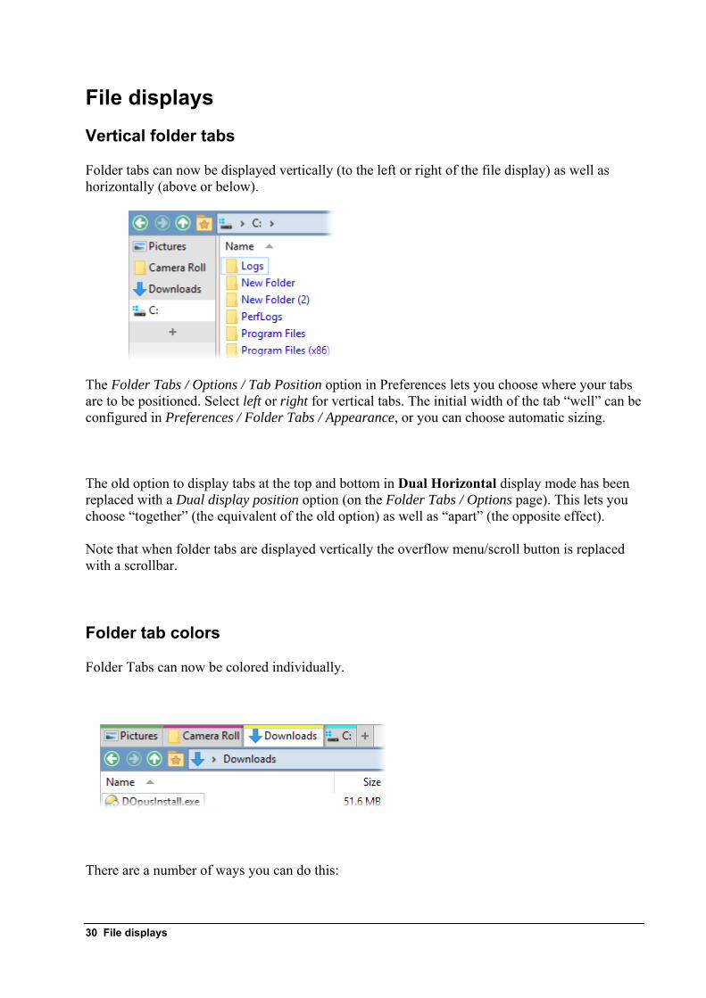
File displays Vertical folder tabs
Folder tabs can now be displayed vertically (to the left or right of the file display) as well as horizontally (above or below).
The Folder Tabs / Options / Tab Position option in Preferences lets you choose where your tabs are to be positioned. Select left or right for vertical tabs. The initial width of the tab “well” can be configured in Preferences / Folder Tabs / Appearance, or you can choose automatic sizing.
The old option to display tabs at the top and bottom in Dual Horizontal display mode has been replaced with a Dual display position option (on the Folder Tabs / Options page). This lets you choose “together” (the equivalent of the old option) as well as “apart” (the opposite effect).
Note that when folder tabs are displayed vertically the overflow menu/scroll button is replaced with a scrollbar.
Folder tab colors
Folder Tabs can now be colored individually.
There are a number of ways you can do this:
30 File displays
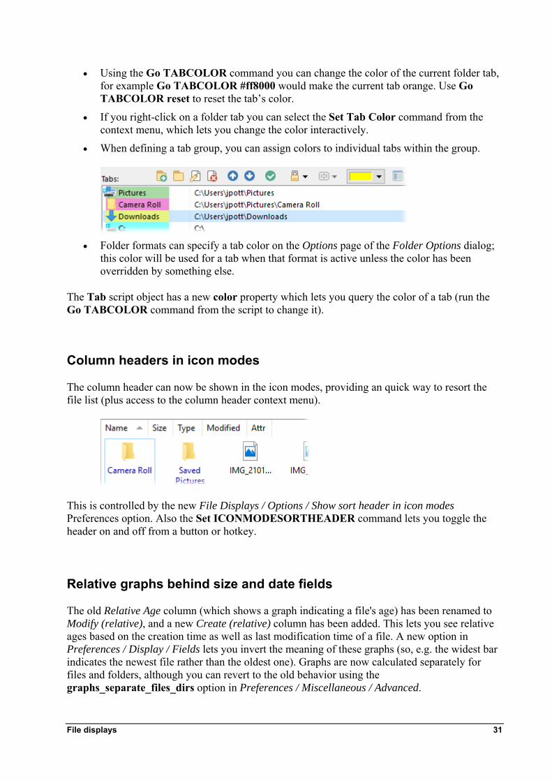
• Using the Go TABCOLOR command you can change the color of the current folder tab, for example Go TABCOLOR #ff8000 would make the current tab orange. Use Go TABCOLOR reset to reset the tab’s color.
• If you right-click on a folder tab you can select the Set Tab Color command from the context menu, which lets you change the color interactively.
• When defining a tab group, you can assign colors to individual tabs within the group.
• Folder formats can specify a tab color on the Options page of the Folder Options dialog;
this color will be used for a tab when that format is active unless the color has been overridden by something else.
The Tab script object has a new color property which lets you query the color of a tab (run the Go TABCOLOR command from the script to change it).
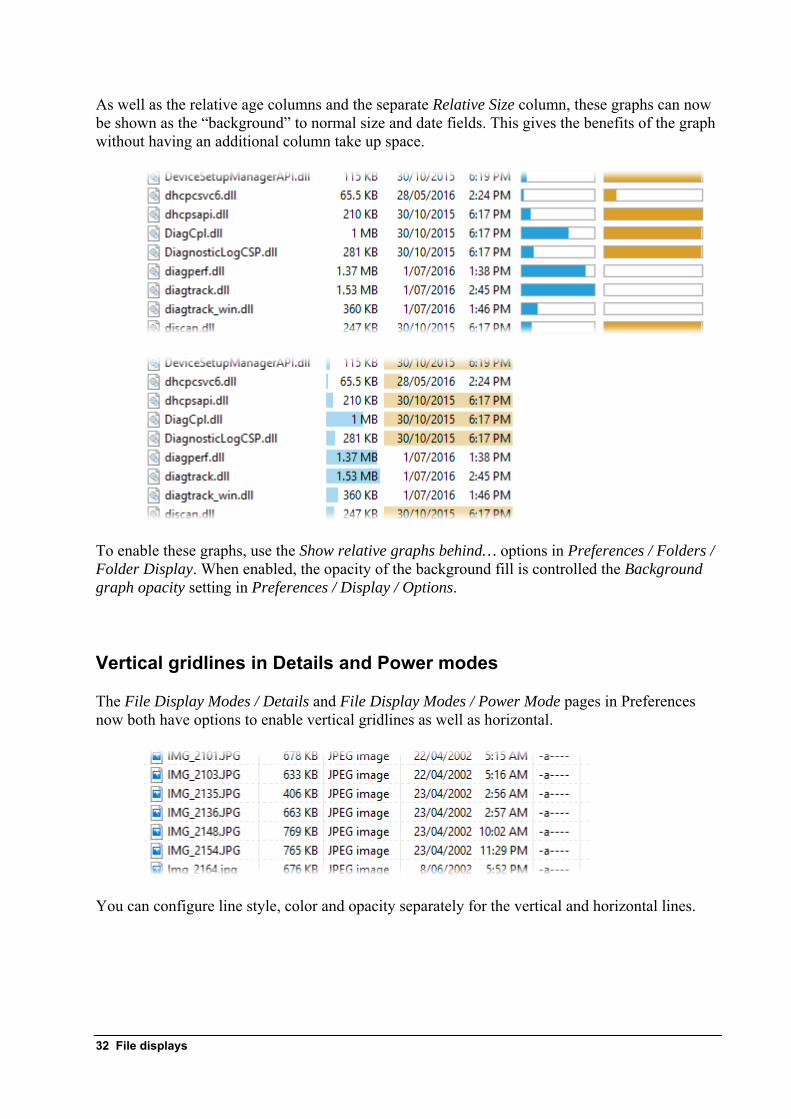
Column headers in icon modes
The column header can now be shown in the icon modes, providing an quick way to resort the file list (plus access to the column header context menu).
This is controlled by the new File Displays / Options / Show sort header in icon modes Preferences option. Also the Set ICONMODESORTHEADER command lets you toggle the header on and off from a button or hotkey.
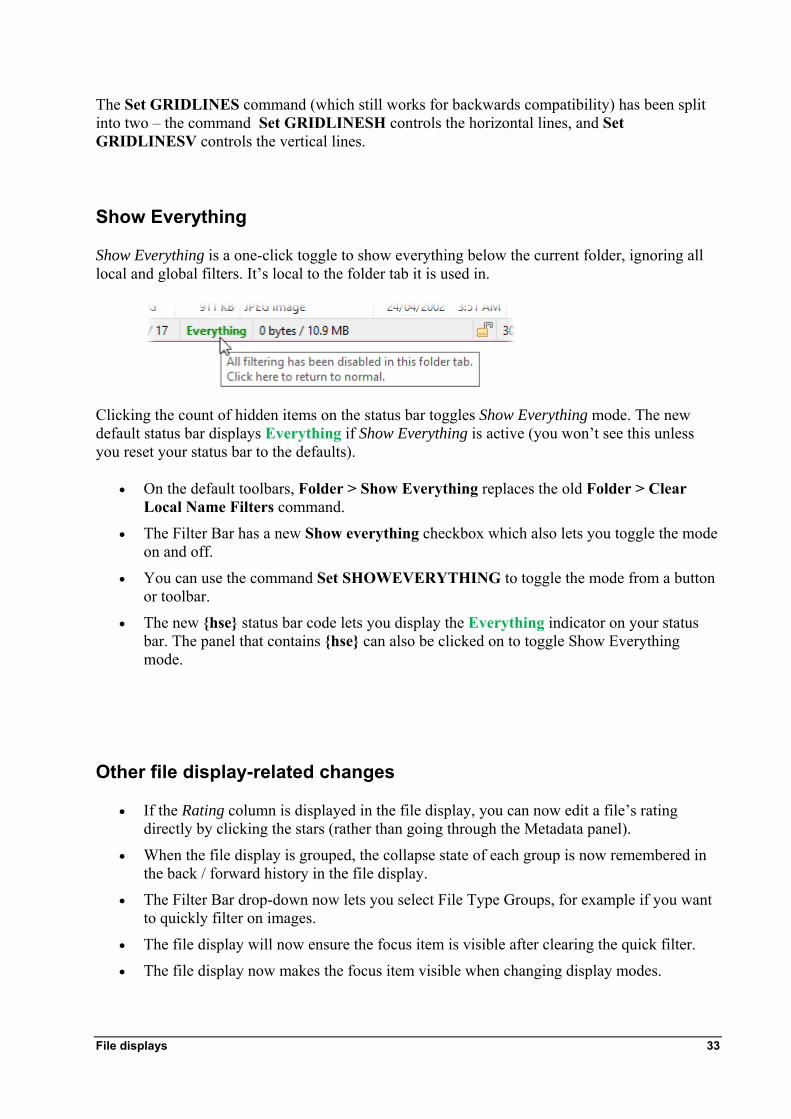
Relative graphs behind size and date fields
The old Relative Age column (which shows a graph indicating a file's age) has been renamed to Modify (relative), and a new Create (relative) column has been added. This lets you see relative ages based on the creation time as well as last modification time of a file. A new option in Preferences / Display / Fields lets you invert the meaning of these graphs (so, e.g. the widest bar indicates the newest file rather than the oldest one). Graphs are now calculated separately for files and folders, although you can revert to the old behavior using the graphs_separate_files_dirs option in Preferences / Miscellaneous / Advanced.
File displays 31
As well as the relative age columns and the separate Relative Size column, these graphs can now be shown as the “background” to normal size and date fields. This gives the benefits of the graph without having an additional column take up space.
To enable these graphs, use the Show relative graphs behind… options in Preferences / Folders / Folder Display. When enabled, the opacity of the background fill is controlled the Background graph opacity setting in Preferences / Display / Options.
Vertical gridlines in Details and Power modes
The File Display Modes / Details and File Display Modes / Power Mode pages in Preferences now both have options to enable vertical gridlines as well as horizontal.
You can configure line style, color and opacity separately for the vertical and horizontal lines.
32 File displays
The Set GRIDLINES command (which still works for backwards compatibility) has been split into two – the command Set GRIDLINESH controls the horizontal lines, and Set GRIDLINESV controls the vertical lines.
Show Everything
Show Everything is a one-click toggle to show everything below the current folder, ignoring all local and global filters. It’s local to the folder tab it is used in.
Clicking the count of hidden items on the status bar toggles Show Everything mode. The new default status bar displays Everything if Show Everything is active (you won’t see this unless you reset your status bar to the defaults).
• On the default toolbars, Folder > Show Everything replaces the old Folder > Clear Local Name Filters command.
• The Filter Bar has a new Show everything checkbox which also lets you toggle the mode on and off.
• You can use the command Set SHOWEVERYTHING to toggle the mode from a button or toolbar.
• The new {hse} status bar code lets you display the Everything indicator on your status bar. The panel that contains {hse} can also be clicked on to toggle Show Everything mode.
Other file display-related changes
• If the Rating column is displayed in the file display, you can now edit a file’s rating directly by clicking the stars (rather than going through the Metadata panel).
• When the file display is grouped, the collapse state of each group is now remembered in the back / forward history in the file display.
• The Filter Bar drop-down now lets you select File Type Groups, for example if you want to quickly filter on images.
• The file display will now ensure the focus item is visible after clearing the quick filter.
• The file display now makes the focus item visible when changing display modes.
File displays 33
• The file display now keeps the focus item visible, if it already is, when resizing the window or zooming the font/thumbnail size.
• Thumbnails, Tiles and Icon modes now automatically increase horizontal spacing to spread across the available space, rather than leave the unused space after the last column. The spacing setting still specifies the minimum spacing.
• The Thumbnail column can now be used in This PC (aka Computer and My Computer).
• Drag and drop of text (from applications that allow you to do that) to a Lister is now supported (it behaves the same as using Ctrl V to paste clipboard text to a Lister, creating a file called Clipboard Text.txt).
• Selected files hidden by Select HIDESEL and similar commands will no longer be selected when revealed again, since it was usually unexpected.
• The new Uncompressed column displays the uncompressed size of supported archive files.
• The new Encoding Software column, displays the TSSE frame for MP3 music files.
Preferences options relating to the file display
• Display / Fields: Now allows the alignment (left/right/center) for individual columns to be modified from the defaults.
• File Displays / Mouse / Double-click on file display background: The old “go up” option has been removed, now there is just a field that allows any command to be entered. If you had “go up” selected in your configuration this will turn into the Go UP BACK command automatically.
• File Displays / Mouse / Middle double-click on file display background: New option to run a command when the file display background is double-clicked with the middle mouse button.
• File Displays / Options / Hover to switch source/destination state: Hovering the mouse cursor over a file display for the specified time (in milliseconds) will set it as the source.
• File Displays / Options / Specify initial folder when switching to dual file display: The new Tab group option lets you configure a tab group to be opened automatically when switching to dual display mode (instead of just a folder).
• Folders / Auto-Loading: The Prevent automatic loading of certain types of folders options now include one for All other drive types, which applies to everything not listed separately. For each folder type, you can also now select Load on tab activation as an option which prevents the loading initially if the tab isn't the active one, but will load the folder automatically the first time the tab is activated.
• Folders / Global Filters: The two wildcard filters now have options to use regular expressions.
• Folders / Virtual Folders: New options to control the appearance of drive labels in the native My Computer display. Also a new option to Sort drives by name instead of letter.
• Miscellaneous / Advanced / scroll_lock: If the Scroll Lock key is turned on the cursor keys will scroll the file display without changing the focus.
34 File displays
Commands relating to the file display
• Set GLOBALHIDEFILENAME and GLOBALHIDEFOLDERS: You can now use a regular expression with these commands by specifying regex: as a prefix (e.g. Set GLOBALHIDEFILENAME regex:^tmp\.)
• Go TABCLOSEALL: Now has a dest argument that lets it be run against the destination file display in a dual-display Lister.
• Go TABGROUPLIST: Now works in conjunction with the USEQUALKEYS and KEYARGS arguments.
Folder Formats and Folder Options Save format
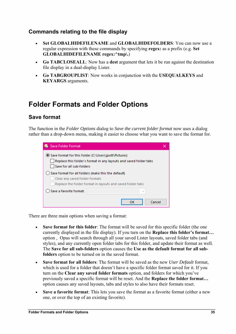
The function in the Folder Options dialog to Save the current folder format now uses a dialog rather than a drop-down menu, making it easier to choose what you want to save the format for.
There are three main options when saving a format:
• Save format for this folder: The format will be saved for this specific folder (the one currently displayed in the file display). If you turn on the Replace this folder’s format… option , Opus will search through all your saved Lister layouts, saved folder tabs (and styles), and any currently open folder tabs for this folder, and update their format as well. The Save for all sub-folders option causes the Use as the default format for all sub-folders option to be turned on in the saved format.
• Save format for all folders: The format will be saved as the new User Default format, which is used for a folder that doesn’t have a specific folder format saved for it. If you turn on the Clear any saved folder formats option, and folders for which you’ve previously saved a specific format will be reset. And the Replace the folder format… option causes any saved layouts, tabs and styles to also have their formats reset.
• Save a favorite format: This lets you save the format as a favorite format (either a new one, or over the top of an existing favorite).
Folder Formats and Folder Options 35
36 Folder Formats and Folder Options
Default format
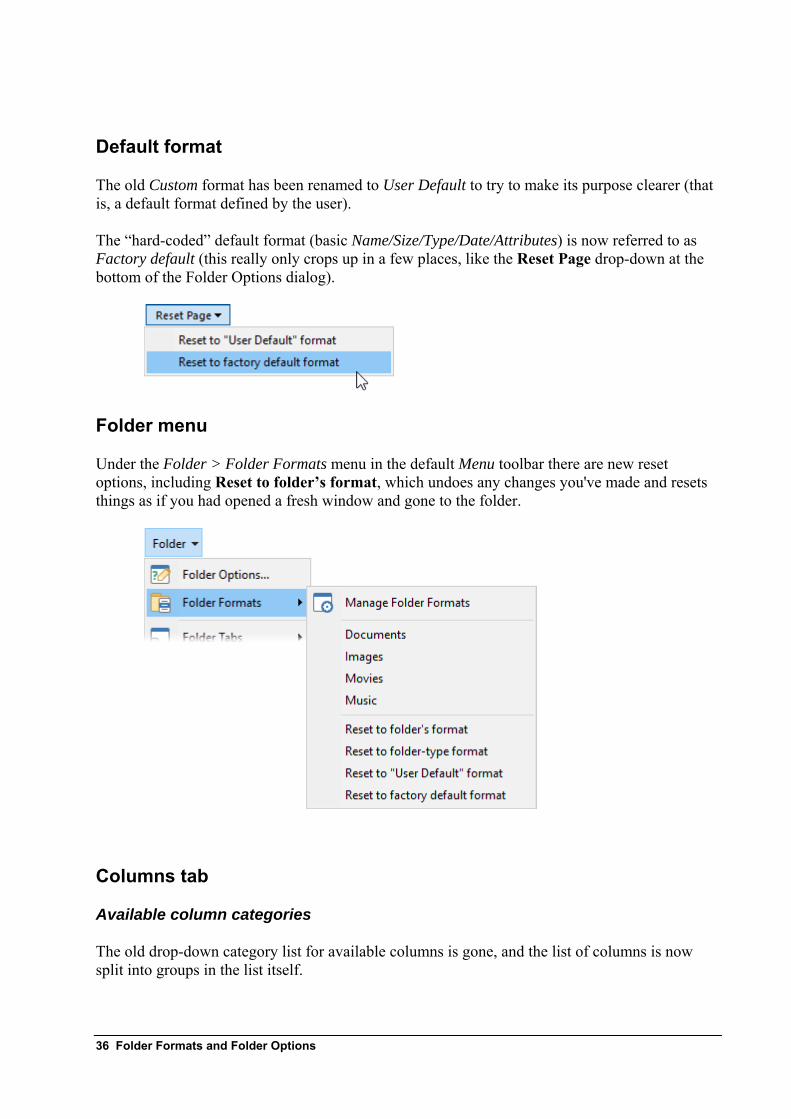
The old Custom format has been renamed to User Default to try to make its purpose clearer (that is, a default format defined by the user).
The “hard-coded” default format (basic Name/Size/Type/Date/Attributes) is now referred to as Factory default (this really only crops up in a few places, like the Reset Page drop-down at the bottom of the Folder Options dialog).
Folder menu
Under the Folder > Folder Formats menu in the default Menu toolbar there are new reset options, including Reset to folder’s format, which undoes any changes you've made and resets things as if you had opened a fresh window and gone to the folder.
Columns tab
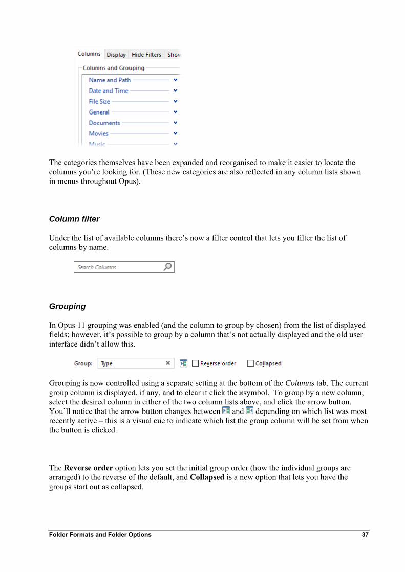
Available column categories
The old drop-down category list for available columns is gone, and the list of columns is now split into groups in the list itself.
Folder Formats and Folder Options 37
The categories themselves have been expanded and reorganised to make it easier to locate the columns you’re looking for. (These new categories are also reflected in any column lists shown in menus throughout Opus).
Column filter
Under the list of available columns there’s now a filter control that lets you filter the list of columns by name.
Grouping
In Opus 11 grouping was enabled (and the column to group by chosen) from the list of displayed fields; however, it’s possible to group by a column that’s not actually displayed and the old user interface didn’t allow this.
Grouping is now controlled using a separate setting at the bottom of the Columns tab. The current group column is displayed, if any, and to clear it click the symbol. To group by a new column, select the desired column in either of the two column lists above, and click the arrow button. You’ll notice that the arrow button changes between and depending on which list was mrecently active – this is a visual cue to indicate which list the group column will be set from when the button is clicked.
ost
The Reverse order option lets you set the initial group order (how the individual groups are arranged) to the reverse of the default, and Collapsed is a new option that lets you have the groups start out as collapsed.
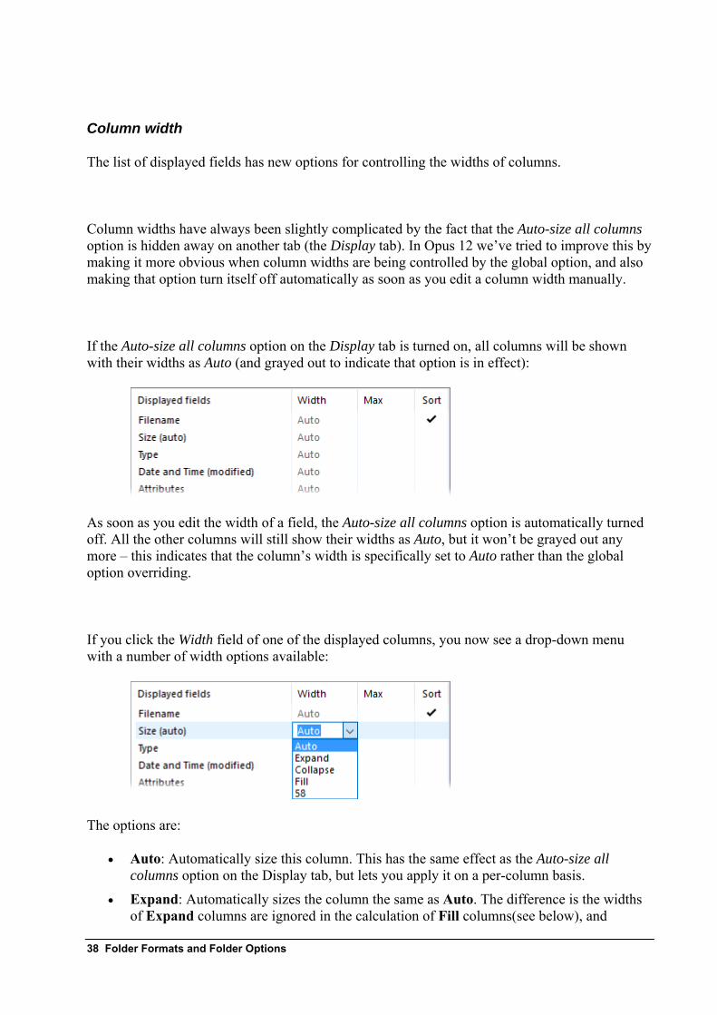
Column width
The list of displayed fields has new options for controlling the widths of columns.
Column widths have always been slightly complicated by the fact that the Auto-size all columns option is hidden away on another tab (the Display tab). In Opus 12 we’ve tried to improve this by making it more obvious when column widths are being controlled by the global option, and also making that option turn itself off automatically as soon as you edit a column width manually.
If the Auto-size all columns option on the Display tab is turned on, all columns will be shown with their widths as Auto (and grayed out to indicate that option is in effect):
As soon as you edit the width of a field, the Auto-size all columns option is automatically turned off. All the other columns will still show their widths as Auto, but it won’t be grayed out any more – this indicates that the column’s width is specifically set to Auto rather than the global option overriding.
If you click the Width field of one of the displayed columns, you now see a drop-down menu with a number of width options available:
The options are:
• Auto: Automatically size this column. This has the same effect as the Auto-size all columns option on the Display tab, but lets you apply it on a per-column basis.
• Expand: Automatically sizes the column the same as Auto. The difference is the widths of Expand columns are ignored in the calculation of Fill columns(see below), and
38 Folder Formats and Folder Options
columns set to Expand will go off the right hand side of the file display rather than making Collapse columns start to collapse.
• Collapse: Automatically sizes the column, but its width is able to collapse (down to zero width if necessary) to allow other fields to fit without horizontal scrollbars appearing. For example, you might want the Description column displayed, but not have it force other fields off the edge of the file display. Setting it to Collapse means it will only appear if there’s space for it.
• Fill: Columns set to fill will be automatically sized to fill any available horizontal space in the file display. If there is more than one Fill column they divide the available space between them. Columns set to Fill can potentially end up wider than they need to be (contrast with Auto + Fill described below).
You can also enter a desired pixel width into the Width field.
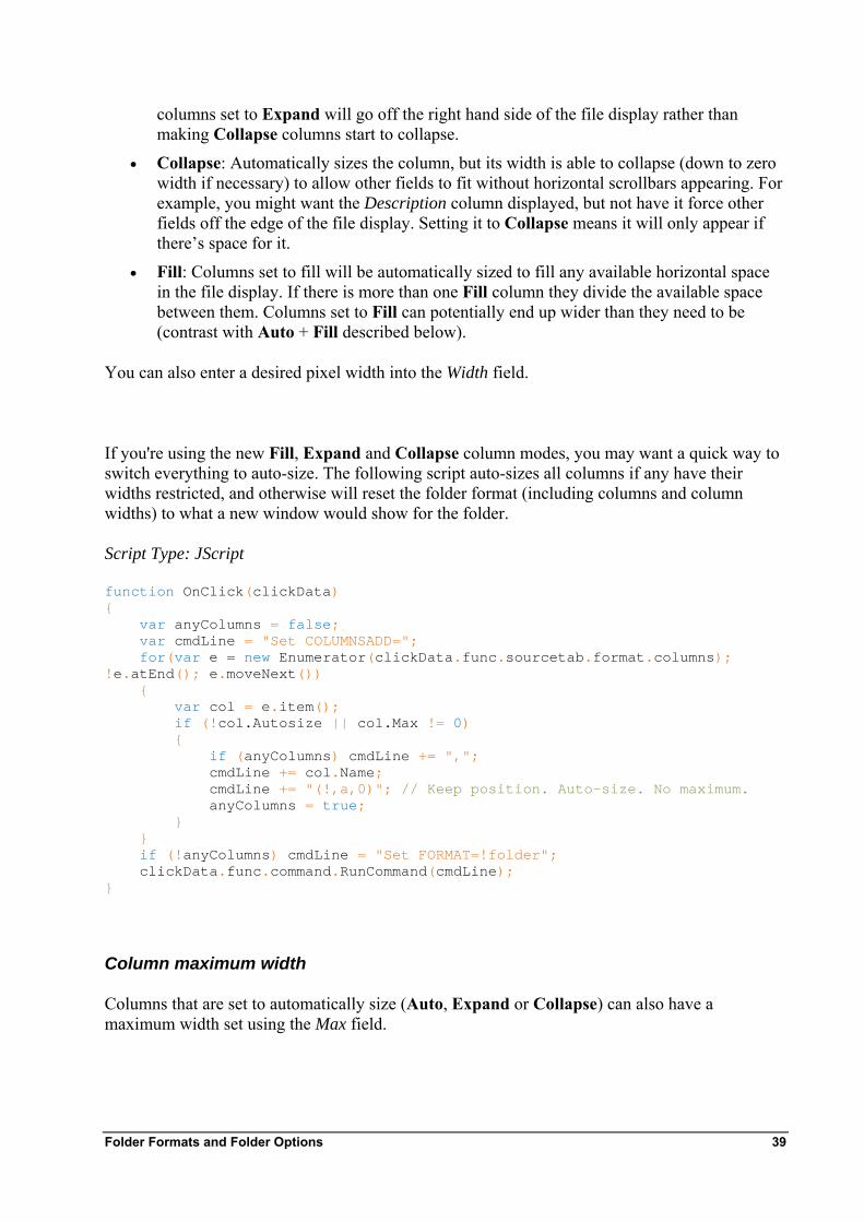
If you're using the new Fill, Expand and Collapse column modes, you may want a quick way to switch everything to auto-size. The following script auto-sizes all columns if any have their widths restricted, and otherwise will reset the folder format (including columns and column widths) to what a new window would show for the folder. Script Type: JScript
function OnClick(clickData) { var anyColumns = false; var cmdLine = "Set COLUMNSADD="; for(var e = new Enumerator(clickData.func.sourcetab.format.columns); !e.atEnd(); e.moveNext()) { var col = e.item(); if (!col.Autosize || col.Max != 0) { if (anyColumns) cmdLine += ","; cmdLine += col.Name; cmdLine += "(!,a,0)"; // Keep position. Auto-size. No maximum. anyColumns = true; } } if (!anyColumns) cmdLine = "Set FORMAT=!folder"; clickData.func.command.RunCommand(cmdLine); }
Column maximum width
Columns that are set to automatically size (Auto, Expand or Collapse) can also have a maximum width set using the Max field.
Folder Formats and Folder Options 39
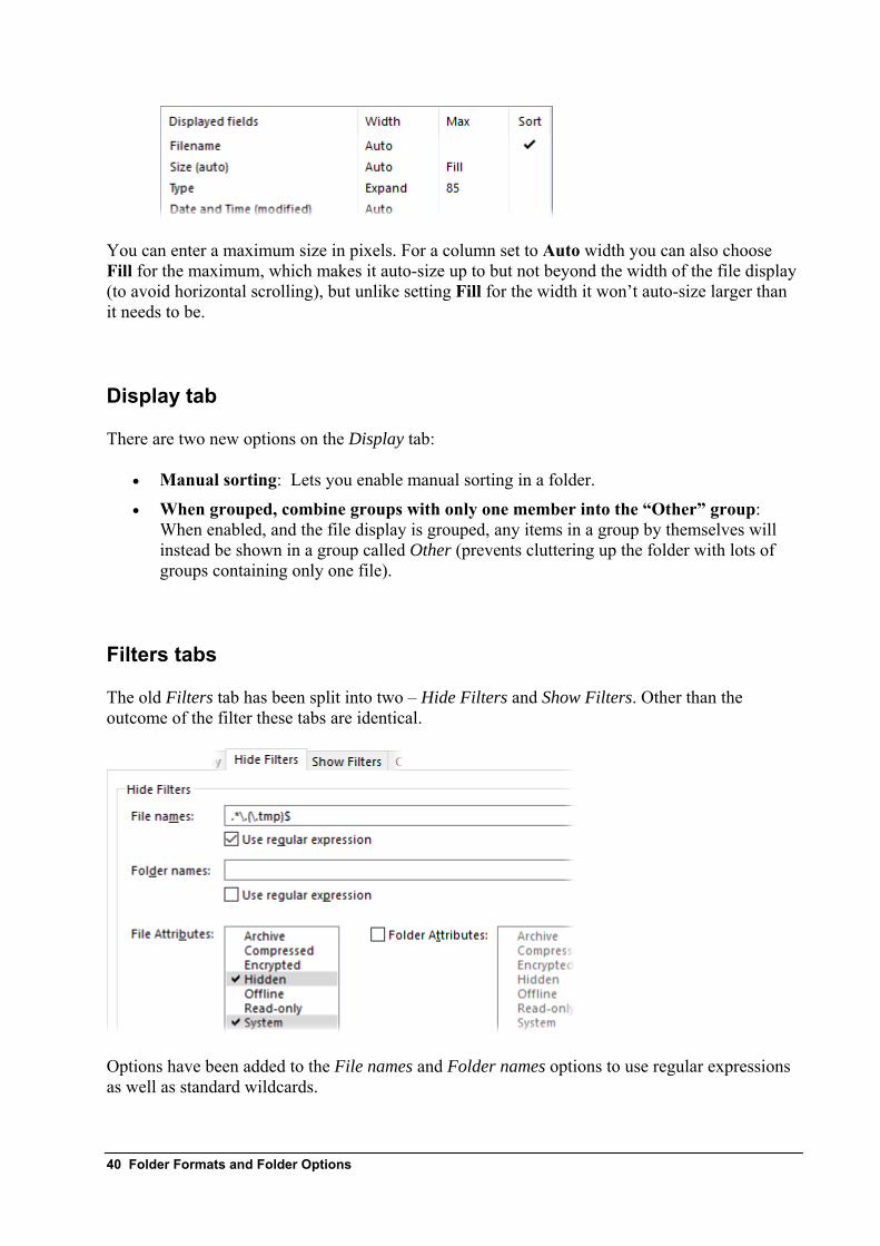
You can enter a maximum size in pixels. For a column set to Auto width you can also choose Fill for the maximum, which makes it auto-size up to but not beyond the width of the file display (to avoid horizontal scrolling), but unlike setting Fill for the width it won’t auto-size larger than it needs to be.
Display tab
There are two new options on the Display tab:
• Manual sorting: Lets you enable manual sorting in a folder.
• When grouped, combine groups with only one member into the “Other” group: When enabled, and the file display is grouped, any items in a group by themselves will instead be shown in a group called Other (prevents cluttering up the folder with lots of groups containing only one file).
Filters tabs
The old Filters tab has been split into two – Hide Filters and Show Filters. Other than the outcome of the filter these tabs are identical.
Options have been added to the File names and Folder names options to use regular expressions as well as standard wildcards.
40 Folder Formats and Folder Options
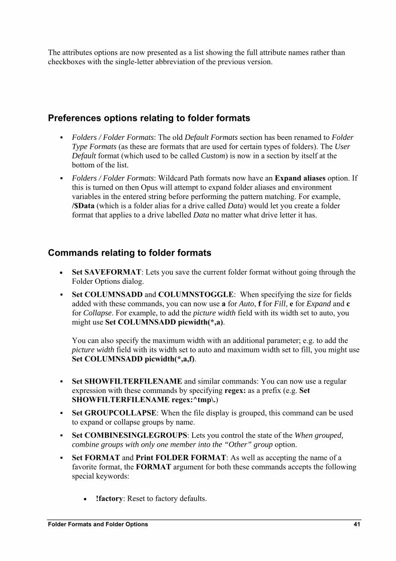
The attributes options are now presented as a list showing the full attribute names rather than checkboxes with the single-letter abbreviation of the previous version.
Preferences options relating to folder formats
Folders / Folder Formats: The old Default Formats section has been renamed to Folder Type Formats (as these are formats that are used for certain types of folders). The User Default format (which used to be called Custom) is now in a section by itself at the bottom of the list.
Folders / Folder Formats: Wildcard Path formats now have an Expand aliases option. If this is turned on then Opus will attempt to expand folder aliases and environment variables in the entered string before performing the pattern matching. For example, /$Data (which is a folder alias for a drive called Data) would let you create a folder format that applies to a drive labelled Data no matter what drive letter it has.
Commands relating to folder formats
• Set SAVEFORMAT: Lets you save the current folder format without going through the Folder Options dialog.
Set COLUMNSADD and COLUMNSTOGGLE: When specifying the size for fields added with these commands, you can now use a for Auto, f for Fill, e for Expand and c for Collapse. For example, to add the picture width field with its width set to auto, you might use Set COLUMNSADD picwidth(*,a). You can also specify the maximum width with an additional parameter; e.g. to add the picture width field with its width set to auto and maximum width set to fill, you might use Set COLUMNSADD picwidth(*,a,f).
Set SHOWFILTERFILENAME and similar commands: You can now use a regular expression with these commands by specifying regex: as a prefix (e.g. Set SHOWFILTERFILENAME regex:^tmp\.)
Set GROUPCOLLAPSE: When the file display is grouped, this command can be used to expand or collapse groups by name.
Set COMBINESINGLEGROUPS: Lets you control the state of the When grouped, combine groups with only one member into the “Other” group option.
Set FORMAT and Print FOLDER FORMAT: As well as accepting the name of a favorite format, the FORMAT argument for both these commands accepts the following special keywords:
• !factory: Reset to factory defaults.
Folder Formats and Folder Options 41
• !user: Reset to the user default (in Opus 11 this was !custom, which still works for compatibility).
• !default: Resets to Folder Type format applicable to current folder.
• !folder: Resets to the format for the folder that a brand new window would use.
• !current: Only useful for Print FOLDER FORMAT=!current – uses the current format shown in the Lister.
Folder formats scripting
The Column object has new properties to expose the new column width options (autosize, fill, expand, collapse, max).
The Format object has four new properties which indicate whether the file and folder filters are set to regular expression mode (hide_files_regex, hide_dirs_regex, show_files_regex, show_dirs_regex).
42 Folder Formats and Folder Options

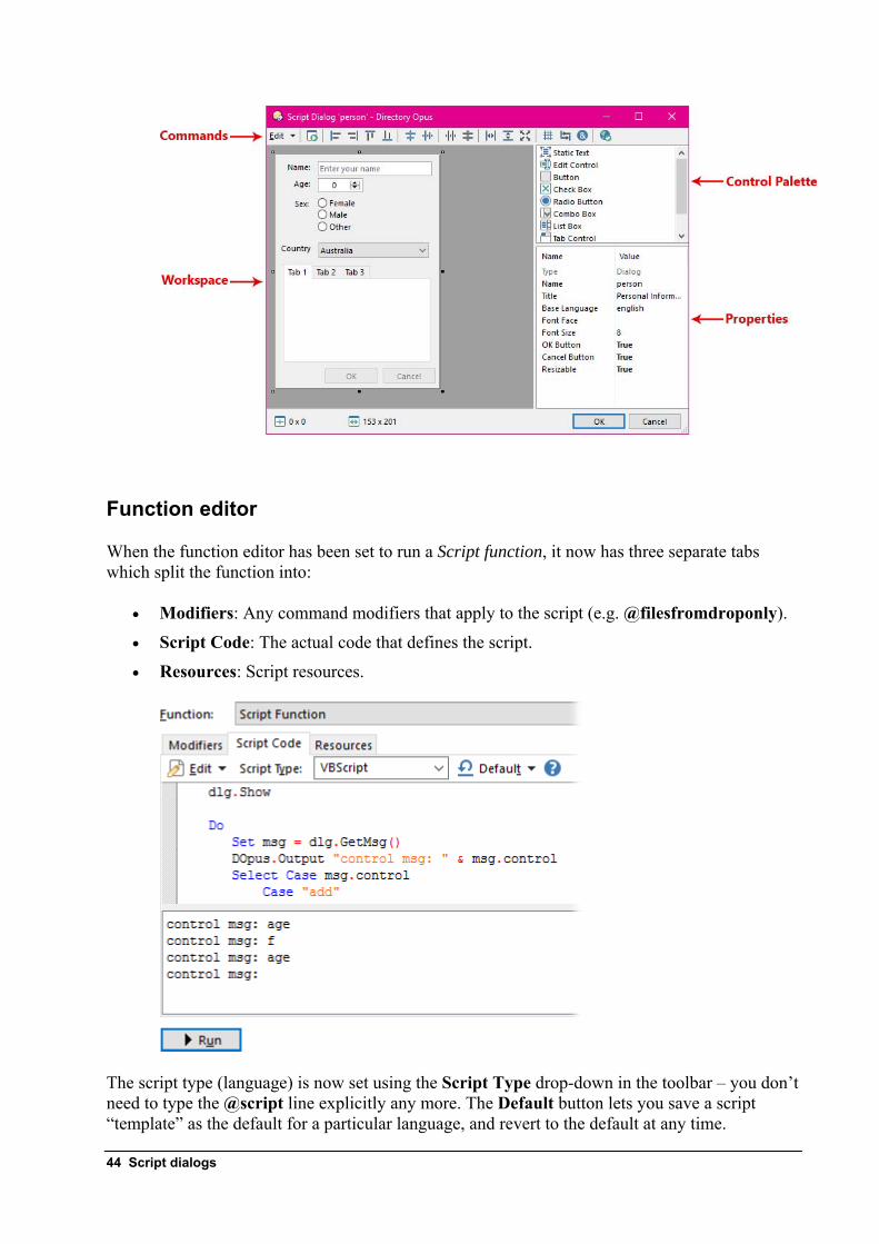
Script dialogs Scripts have always been able to display simple dialogs (e.g. Yes/No style requesters, or a dialog letting you enter a simple string or choose an item from a list). In Opus 12 scripts are now able to define free-form dialogs in much the same way that “proper” Windows software can, using many of the standard Windows controls.
Above is an example of the type of dialog that scripts can now create. Dialogs are defined as “resources” – XML formatted data that defines the dialog and control layout. Any script can have resources attached – either a script in a button, or one in the Script Add-Ins folder.
A full GUI-based dialog editor is provided inside the function editor, which makes it very easy to design script dialogs.
Script dialogs 43
Function editor
When the function editor has been set to run a Script function, it now has three separate tabs which split the function into:
• Modifiers: Any command modifiers that apply to the script (e.g. @filesfromdroponly).
• Script Code: The actual code that defines the script.
• Resources: Script resources.
The script type (language) is now set using the Script Type drop-down in the toolbar – you don’t need to type the @script line explicitly any more. The Default button lets you save a script “template” as the default for a particular language, and revert to the default at any time.
44 Script dialogs
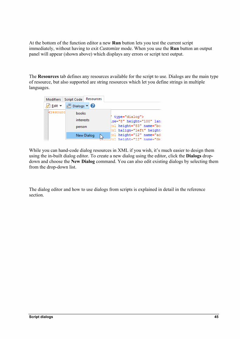
At the bottom of the function editor a new Run button lets you test the current script immediately, without having to exit Customize mode. When you use the Run button an output panel will appear (shown above) which displays any errors or script text output.
The Resources tab defines any resources available for the script to use. Dialogs are the main type of resource, but also supported are string resources which let you define strings in multiple languages.
While you can hand-code dialog resources in XML if you wish, it’s much easier to design them using the in-built dialog editor. To create a new dialog using the editor, click the Dialogs drop-down and choose the New Dialog command. You can also edit existing dialogs by selecting them from the drop-down list.
The dialog editor and how to use dialogs from scripts is explained in detail in the reference section.
Script dialogs 45
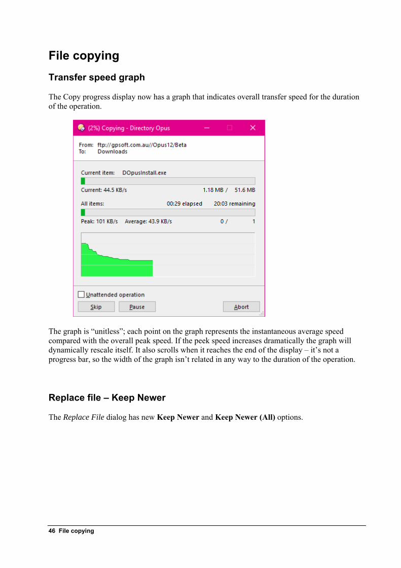
File copying Transfer speed graph
The Copy progress display now has a graph that indicates overall transfer speed for the duration of the operation.
The graph is “unitless”; each point on the graph represents the instantaneous average speed compared with the overall peak speed. If the peek speed increases dramatically the graph will dynamically rescale itself. It also scrolls when it reaches the end of the display – it’s not a progress bar, so the width of the graph isn’t related in any way to the duration of the operation.
Replace file – Keep Newer
The Replace File dialog has new Keep Newer and Keep Newer (All) options.
46 File copying
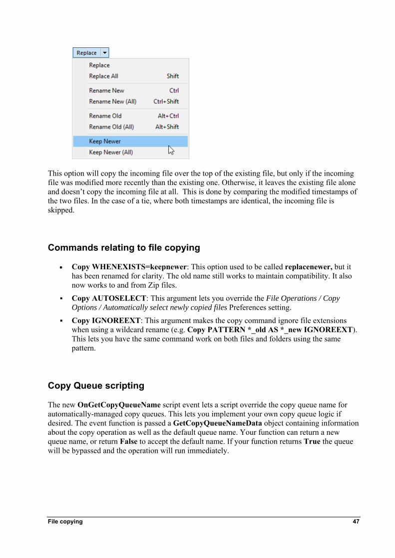
This option will copy the incoming file over the top of the existing file, but only if the incoming file was modified more recently than the existing one. Otherwise, it leaves the existing file alone and doesn’t copy the incoming file at all. This is done by comparing the modified timestamps of the two files. In the case of a tie, where both timestamps are identical, the incoming file is skipped.
Commands relating to file copying
• Copy WHENEXISTS=keepnewer: This option used to be called replacenewer, but it has been renamed for clarity. The old name still works to maintain compatibility. It also now works to and from Zip files.
Copy AUTOSELECT: This argument lets you override the File Operations / Copy Options / Automatically select newly copied files Preferences setting.
Copy IGNOREEXT: This argument makes the copy command ignore file extensions when using a wildcard rename (e.g. Copy PATTERN *_old AS *_new IGNOREEXT). This lets you have the same command work on both files and folders using the same pattern.
Copy Queue scripting
The new OnGetCopyQueueName script event lets a script override the copy queue name for automatically-managed copy queues. This lets you implement your own copy queue logic if desired. The event function is passed a GetCopyQueueNameData object containing information about the copy operation as well as the default queue name. Your function can return a new queue name, or return False to accept the default name. If your function returns True the queue will be bypassed and the operation will run immediately.
File copying 47
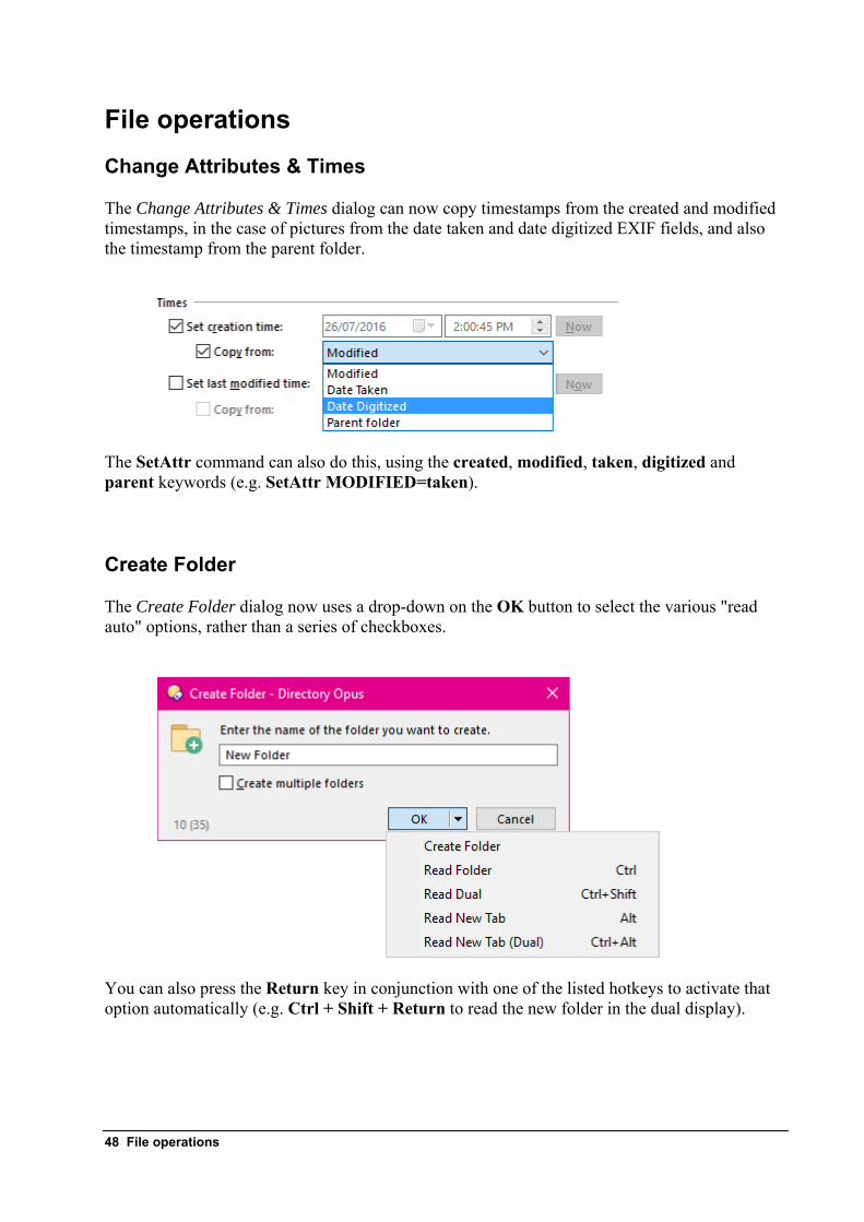
File operations Change Attributes & Times
The Change Attributes & Times dialog can now copy timestamps from the created and modified timestamps, in the case of pictures from the date taken and date digitized EXIF fields, and also the timestamp from the parent folder.
The SetAttr command can also do this, using the created, modified, taken, digitized and parent keywords (e.g. SetAttr MODIFIED=taken).
Create Folder
The Create Folder dialog now uses a drop-down on the OK button to select the various "read auto" options, rather than a series of checkboxes.
You can also press the Return key in conjunction with one of the listed hotkeys to activate that option automatically (e.g. Ctrl + Shift + Return to read the new folder in the dual display).
48 File operations
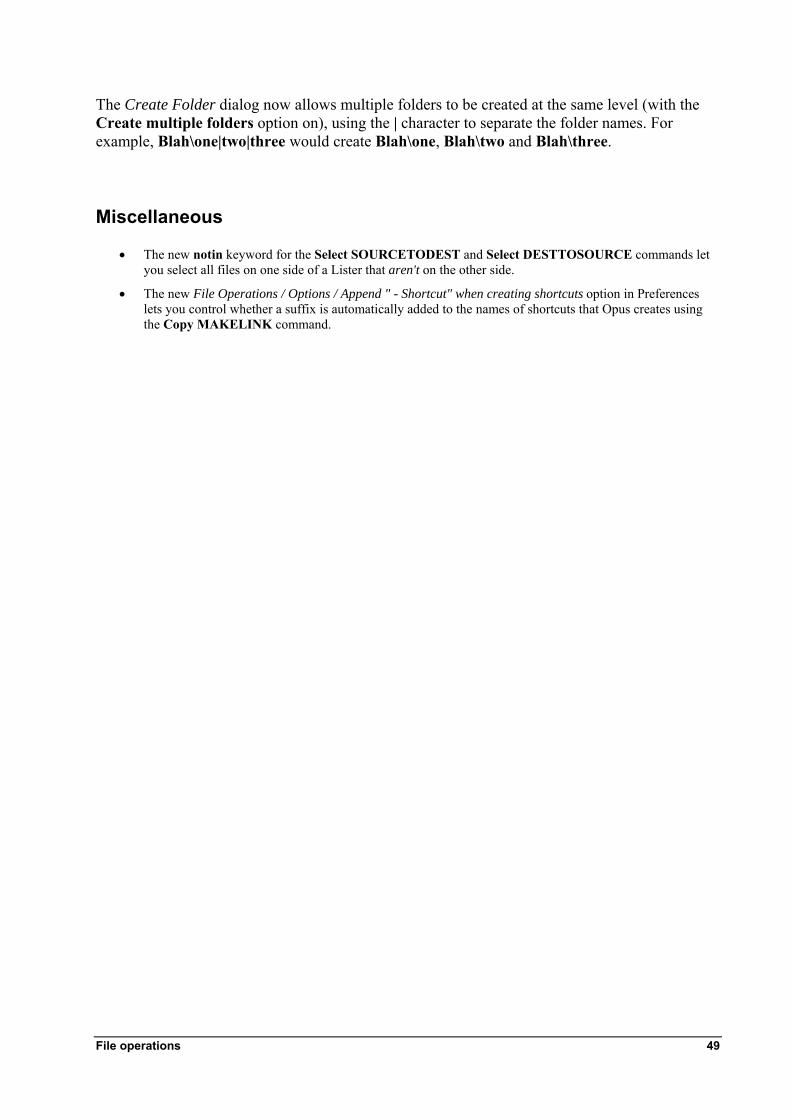
The Create Folder dialog now allows multiple folders to be created at the same level (with the Create multiple folders option on), using the | character to separate the folder names. For example, Blah\one|two|three would create Blah\one, Blah\two and Blah\three.
Miscellaneous
• The new notin keyword for the Select SOURCETODEST and Select DESTTOSOURCE commands let you select all files on one side of a Lister that aren't on the other side.
• The new File Operations / Options / Append " - Shortcut" when creating shortcuts option in Preferences lets you control whether a suffix is automatically added to the names of shortcuts that Opus creates using the Copy MAKELINK command.
File operations 49
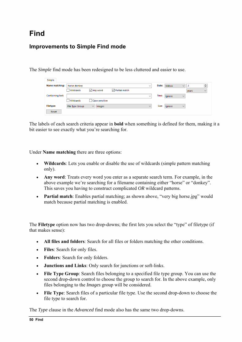
Find Improvements to Simple Find mode
The Simple find mode has been redesigned to be less cluttered and easier to use.
The labels of each search criteria appear in bold when something is defined for them, making it a bit easier to see exactly what you’re searching for.
Under Name matching there are three options:
• Wildcards: Lets you enable or disable the use of wildcards (simple pattern matching only).
• Any word: Treats every word you enter as a separate search term. For example, in the above example we’re searching for a filename containing either “horse” or “donkey”. This saves you having to construct complicated OR wildcard patterns.
• Partial match: Enables partial matching; as shown above, “very big horse.jpg” would match because partial matching is enabled.
The Filetype option now has two drop-downs; the first lets you select the “type” of filetype (if that makes sense):
• All files and folders: Search for all files or folders matching the other conditions.
• Files: Search for only files.
• Folders: Search for only folders.
• Junctions and Links: Only search for junctions or soft-links.
• File Type Group: Search files belonging to a specified file type group. You can use the second drop-down control to choose the group to search for. In the above example, only files belonging to the Images group will be considered.
• File Type: Search files of a particular file type. Use the second drop-down to choose the file type to search for.
The Type clause in the Advanced find mode also has the same two drop-downs.
50 Find
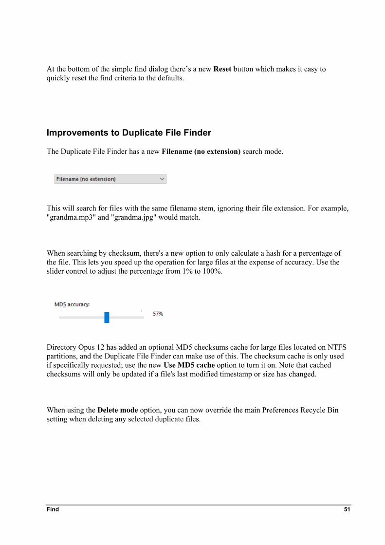
At the bottom of the simple find dialog there’s a new Reset button which makes it easy to quickly reset the find criteria to the defaults.
Improvements to Duplicate File Finder
The Duplicate File Finder has a new Filename (no extension) search mode.
This will search for files with the same filename stem, ignoring their file extension. For example, "grandma.mp3" and "grandma.jpg" would match.
When searching by checksum, there's a new option to only calculate a hash for a percentage of the file. This lets you speed up the operation for large files at the expense of accuracy. Use the slider control to adjust the percentage from 1% to 100%.
Directory Opus 12 has added an optional MD5 checksums cache for large files located on NTFS partitions, and the Duplicate File Finder can make use of this. The checksum cache is only used if specifically requested; use the new Use MD5 cache option to turn it on. Note that cached checksums will only be updated if a file's last modified timestamp or size has changed.
When using the Delete mode option, you can now override the main Preferences Recycle Bin setting when deleting any selected duplicate files.
Find 51
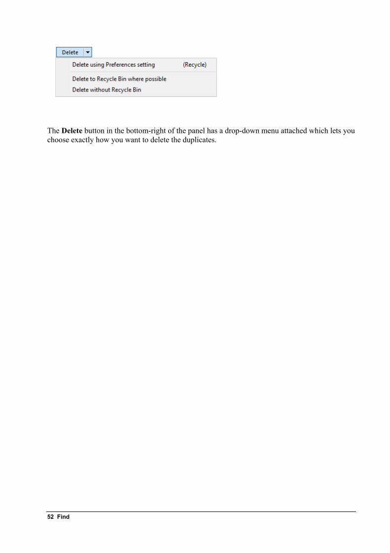
The Delete button in the bottom-right of the panel has a drop-down menu attached which lets you choose exactly how you want to delete the duplicates.
52 Find
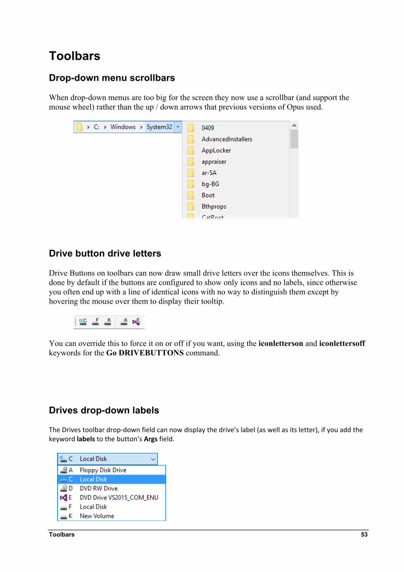
Toolbars Drop-down menu scrollbars
When drop-down menus are too big for the screen they now use a scrollbar (and support the mouse wheel) rather than the up / down arrows that previous versions of Opus used.
Drive button drive letters
Drive Buttons on toolbars can now draw small drive letters over the icons themselves. This is done by default if the buttons are configured to show only icons and no labels, since otherwise you often end up with a line of identical icons with no way to distinguish them except by hovering the mouse over them to display their tooltip.
You can override this to force it on or off if you want, using the iconletterson and iconlettersoff keywords for the Go DRIVEBUTTONS command.
Drives drop-down labels
The Drives toolbar drop‐down field can now display the drive’s label (as well as its letter), if you add the keyword labels to the button’s Args field.
Toolbars 53
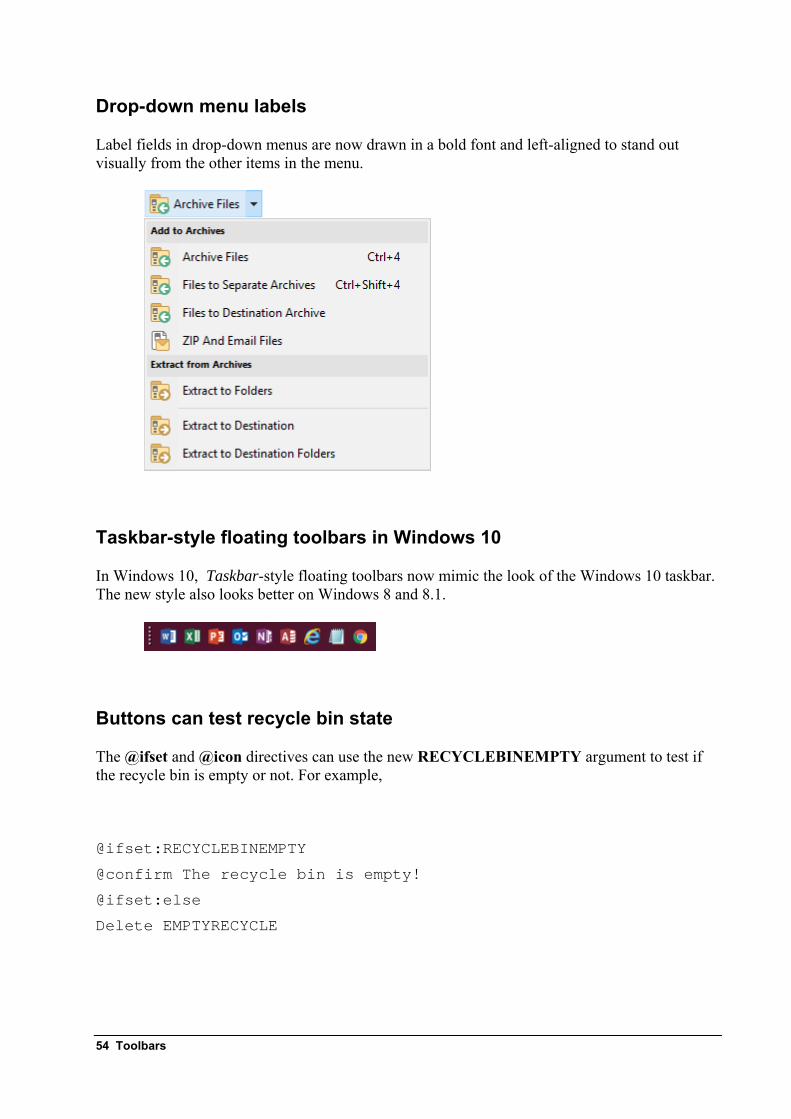
Drop-down menu labels
Label fields in drop-down menus are now drawn in a bold font and left-aligned to stand out visually from the other items in the menu.
Taskbar-style floating toolbars in Windows 10
In Windows 10, Taskbar-style floating toolbars now mimic the look of the Windows 10 taskbar. The new style also looks better on Windows 8 and 8.1.
Buttons can test recycle bin state
The @ifset and @icon directives can use the new RECYCLEBINEMPTY argument to test if the recycle bin is empty or not. For example,
@ifset:RECYCLEBINEMPTY
@confirm The recycle bin is empty!
@ifset:else
Delete EMPTYRECYCLE
54 Toolbars
Toolbar buttons that use @icon with RECYCLEBINEMPTY will refresh themselves automatically when the recycle bin state changes (this lets you have a button whose icon reflects the state of the recycle bin).
Dynamic buttons for thumbnail sizes
The new command Set THUMBNAILSIZE=list generates dynamic buttons that allow you to switch thumbnail sizes. The sizes it generates buttons for start with 32px and then double until the maximum size is reached (and the maximum size is determined by your system DPI).
DPI scaling for breadcrumbs path fields
The various components of the breadcrumbs path field that can have their sizes configured are now scaled for high DPI displays. For example, size=1+1+1+3+3 would equate to size=2+2+2+6+6 on a 200% DPI system. You can prevent scaling if you want by specifying negative numbers for the size; e.g. size=-1+-1+-1+-3+-3.
Button context sensitivity
It’s always been possible to use the @disablenosel modifier to make your buttons disabled when no files are selected. The new modifier, @hidenosel, works just the same – except a button with this modifier will be hidden instead of disabled when no files are selected.
Both @disablenosel and @hidenosel can now check for files or folders matching a certain wildcard pattern being selected, rather than just “any files”. For example, @hidenosel:type=*.jpg would hide the button unless at least one .jpg file was selected. Normal pattern matching is supported.
You can also test for files or folders specifically (otherwise the pattern can match both). For example, @disablenosel:files,type=old* would disable the button unless files whose names begin with “old” are selected. @hidenosel:dirs would hide the button if no folders were selected.
Condition testing
The @ifset: directive allows you to test if a Set command condition is active (e.g. @ifset:TREE). While the Set command is the main command that uses context sensitive commands, a few other commands do too in some cases (e.g. the Show THUMBNAILSIZE
Toolbars 55
command will “highlight” a button when the thumbnail size is set to the size specified in the command).
You can now use the more generalised @if: directive to test for those commands (it also works with Set as well). For example, @if:Set TREE is equivalent to @ifset:TREE. This will be mostly useful in the viewer now that the viewer toolbar is configurable. For example, a button in the viewer toolbar can test if the zoom mode is set to “fit” with the directive @if:Show VIEWERCMD=zoom,fit.
The script form of this test, Command.IsSet(), now takes an optional second argument which specifies the command to test against (and this defaults to “Set” if it’s not provided).
56 Toolbars
FAYT / Filter Bar The Preferences pages relating to the Find-As-You-Type field (FAYT) and Filter Bar have been reorganised.
FAYT and Filter Bar Keys
This page contains all settings relating to activation of the FAYT and Filter Bar via the keyboard. The new option Default mode lets you choose whether the Filter Bar or a specific FAYT mode is activated by default; that is, when you press a key that hasn’t been assigned to a specific mode.
FAYT and Filter Bar Options
This page contains options relating to the behaviour of the FAYT and Filter Bar. The new options on this page are:
Find-As-You-Type Filter Mode
• Allow return key to open selected item: In the FAYTFilter mode, pressing the Return key will open the item with focus rather than simply closing the FAYT field.
• Select first matching item: In the FAYTFilter mode, the first item that matches the filter will be automatically selected.
Filter Bar
• Match any word: In the Filter Bar, the Match Any word option treats all words you enter as separate patterns. For example, you can type “moo cow” and it would automatically match a file called “moo” or a file called “cow”. This saves you having to build up complex OR wildcards (the equivalent wildcard would be “(moo|cow)”).
• Use regular expression: When turned on, the pattern you enter into the Filter Bar will be treated as a regular expression rather than a simple wildcard.
FAYT / Filter Bar 57
Status Bar Individual file information
The status bar can now display information about the most recently selected file, using the new {sel:x} code.
The x in the code specifies the information to display; valid keywords are:
• name: Name of the file or folder.
• size: File size. Follow this keyword with b or k to specify the units as bytes or KB (otherwise the units are automatically chosen).
• create: Creation date stamp. Follow this keyword with d or t to specify date or time (otherwise both are shown).
• write: Last write (modification) date stamp. Follow this keyword with d or t to specify date or time (otherwise both are shown).
• access: Last access date stamp.
• attr: File or folder attributes.
• desc: Description string (the same as is displayed in the Description column).
• path: Full path of the file or folder.
• index: Index in the file display.
For example, {sel:sizek} {sel:desc}.
Show everything mode
The new {hse} code is used with the new Show Everything mode. When Show Everything is enabled, this code will display the text Everything. When Show Everything is disabled, this code will display the text Filtering (to indicate that filters may be in effect).
On the default status bar, {hse} is wrapped inside a {h!}…{h!} clause, which will cause it to be hidden unless Show Everything is turned on. That is, you may see the text Everything but not the text Filtering.
DPI scaling for status bar graphs and parts
Status bar graph width numbers are now scaled to DPI by default. You can use negative numbers to prevent scaling from happening. (i.e. Just put a - before the number you want.)
58 Status Bar
Status bar {widthXX} is similar: It now scales the pixels to the current DPI, and can be made to use an absolute value using negative numbers. e.g. {width-10} will be 10 pixels in all DPIs, while {width10} will be 10 pixels at 100% DPI and 20 pixels at 200% DPI.
Miscellaneous things Well there had to be a miscellaneous section didn’t there! Here are all the minor changes (in no particular order) that don’t fit into any of the other categories in this document.
In Preferences / Layouts and Styles / Layouts, Lister layouts can now be organised into folders.
Windows 8 and above add a significant delay before launching applications at startup. The new option Preferences / Launching Opus / Startup now indicates if this delay is in effect, and has buttons to remove or restore it. Changing this option affects all programs launched via the Start Menu startup folder, not just Opus, and the setting is in the registry rather than the Directory Opus configuration (so you'll need to change it on individual machines if desired). It's a Windows setting, not an Opus one - we just provide a convenient way to change it in Preferences. For those who are interested, the option has the effect of setting KEY_CURRENT_USER\SOFTWARE\Microsoft\Windows\CurrentVersion\Explorer\ Serialize:Startupdelayinmsec (DWORD) = 0 to remove the delay, or deleting the value to restore it.
The Set LISTERTITLE command (and the Display / Options / Custom title option in Preferences) can now use the code %G to display the target of the current folder if it's a junction or soft-link.
There is a new optional checksum cache for large files located on NTFS partitions. The checksum cache is only used if specifically requested - the GetSizes command has a new USEHASHCACHE argument, and Clipboard COPYNAMES has a new hashcache parameter to enable it. The Duplicate File Finder can also use it, either by setting the option in the user interface, or by specifying the MD5=cache argument for the Find command. Note that cached checksums will only be updated if a file's last modified timestamp or size has changed.
The FTP Address Book now allows a private key file to be specified explicitly for SSH connections (previously you had to use the external Pageant tool to use a key file for authentication instead of a password).
The Lister now automatically moves out of the current drive if it detects the drive has been removed. Files on the drive which are open in the viewer pane will be closed as well.
The Folder Tree / Contents page in Preferences has an option to hide the Homegroup from the folder tree, and separate options for Hidden and Protected operating system folders.
Miscellaneous things 59
Added option to the Folders / Virtual Folders page in Preferences to change what happens when you do a Windows Search from the Desktop virtual folder. By default, Opus now only searches your personal Desktop folder (/desktopdir) and, if configured to appear, the shared desktop folder (/commondesktopdir). If the setting is changed (or if native display of the Desktop folder is off), you will return to the old behavior: The search will include the profile and shared Desktop folders and also the Documents folder, and potentially others. (It is up to Windows exactly which folders are searched, and you'll see similar from Explorer.)
"Opus" audio format (no relation :)) tags can be read by the AudioTags plugin. (Read-only for file display columns, rename and scripting. Not supported in the metadata editor at time of writing.)
Added support for MP4 and basic MKV metadata under Windows 7 and up.
A version of the FileTypeDiag tool has been built into Opus. (File > Diagnostic, from the File Types dialog.)
Updated to 7z.dll 15.12. RAR unpacking is done using 7z by default again, since it now supports RAR 5 and has more accurate timestamps, but you can switch back to UnRAR.dll if preferred.
Various Preferences settings which used to allow a user command to be chosen from a drop-down list (e.g. the desktop double-dlick settings) now allow any single-line command to be typed. This means you no longer need to set up a user command just to run a single-line internal or script command.
Opus now has better support for dark color schemes:
• On the Display / Colors and Fonts page in Preferences, the Pane borders section has new options Use for lister column headers and Use for lister scrollbars. (The scrollbar option is only available if Windows visual styles are active, and is also disabled if WindowBlinds is detected).
• Labels for disabled toolbar buttons are now faded instead of being drawn using the system “gray” color, so they'll look better with non-standard colors, especially inverted or very dark colors.
The new folder alias /scripts takes you to the script add-ins folder (equivalent of /dopusdata/Script AddIns).
Zip AES encryption now uses the WinZip standard instead of the PKWare one. This seems to work with more applications, including popular ones like WinRar and 7-Zip which did not work with Opus encrypted archives in the past.
The animated GIF plugin supports image flipping (mirroring).
The Miscellaneous / Advanced section in Preferences has a new clipboard_image_paste_dpi option. When turned on, pasting clipboard image data to a file (by pressing Ctrl+V in a Lister) will automatically scale it to compensate for the system DPI. A similar option added to the dialog displayed by the Clipboard PASTE AS=ask command.
The Miscellaneous / Advanced: gloss_and_gradients Preferences setting now has an Automatic option which is selected by default. When set to Automatic, a flat and simple look is chosen if on Windows 8 or above, and a shiny look with gradients is chosen on Windows 7 and below.
60 Miscellaneous things
You can now disable internal image viewers via Preferences / Miscellaneous / Advanced: viewer_disable_internal. For example, this allows you to divert the TIFF viewer to a third-party ActiveX control which handles multi-page TIFFs.
The font used in the metadata control (in the Lister and the Viewer) is now configurable via Preferences / Display / Colors & Fonts.
Added Preferences / Folder Tabs / Options / Click selected tab to go to previous one option.
In Windows 10, the new Quick Access folder can be shown in the folder tree by turning on the Preferences / Folder Tree / Contents/ Quick Access option. The new /quickaccess path alias can be used to navigate to the Quick Access folder from a button (e.g. Go /quickaccess).
Added mycomputerfull argument for breadcrumbs pathfields, to enable the display of folders in the drop-down for the Computer folder.
You can now block the Movie plugin from handling certain extensions (even if their registry information specifies they are video types) by adding them to the list of extensions with a ~ before them. For example .avi,.mpg,~.wmv would tell the plugin to handle .avi and .mpg but ignore .wmv files.
The Navigation Lock algorithm has been redesigned to hopefully address various complaints about the old algorithm (in terms of how and when it goes out of sync). It should be much better now at recovering after having gone out of sync. The "slave tabs" system now uses the same algorithm as Navigation Lock in terms of staying in and going out of sync (i.e. when it goes out of sync it will show a warning message rather than changing the tab to show the same folder as the other side). The term "Slave Tab" has been replaced with "Navigation Lock" in the user interface to avoid confusion (since there's really only one system now instead of two completely separate ones).
The Scripts Preferences page has been redesigned: • It now uses a multicolumn list to display the list of scripts. Columns can be added/removed by
right-clicking the column header.
• Information about the selected script is displayed at the bottom of the list if not shown in a column.
• If a script supports configuration clicking its name now opens the configuration dialog.
• The list now remembers the previously selected script and reselects it next time it opens.
• Scripts that fail to parse are no longer removed from the list; instead they will display the failure reason in the Status column.
• Scripts that you disable are now completely disabled - no code from them is run at all. (previously, the OnInit function would run and commands/columns would still be queried).
• The new Import command can be used to import a script (as well as drag-and-drop like before).
• The new Delete command can be used to remove a script. It deletes the script file and removes the record of any configuration for it (so that if later on you add a new script with the same name, it won't inherit the old script's configuration).
• The new Disable All Scripts command lets you disable all script add-ins at once - individual enable/disable states will be preserved. The new Set SCRIPTDISABLE command lets you toggle this from a button or hotkey.
• Scripts can now specify a group in their OnInit function (using the ScriptInitData.group property). If any scripts specify a group this will be reflected in the Preferences list.
• Scripts can also specify a group for their configuration values using the new ScriptInitData.config_groups property (this accepts a Map in the same way as the config_desc property).
Added script support for Windows shell properties, making it easy for a script to enumerate properties in the system and retrieve the properties for a file.
Miscellaneous things 61

62 Miscellaneous things
Script Miscellaneous Shell Properties
Opus 12 has new script support for Windows shell properties, making it easy for a script to enumerate properties in the system and retrieve the properties for a file.
• Use FSUtil.GetShellPropertyList to retrieve a list of properties (optionally matching a wildcard pattern).
• Use FSUtil.GetShellProperty to get the value of one or more properties for a file.
• Use Item.ShellProp to get the value of a single property for the item.
• Additionally, the new ScriptColumn.userdata property has been added which lets a column specify an item of data that's passed back to column handlers. This is used below.
Below is an example script that adds columns to Opus that show the value of shell properties for DWG (AutoCAD) files added by a third party tool.
Function OnInit(initData) initData.name = "DWG Columns" initData.desc = "Adds DWG Columns from the JTB World extension" initData.copyright = "(c) 2016 jpotter" initData.version = "1.0" initData.default_enable = true initData.min_version = "12.0.8"
Dim props, prop, col Set props = DOpus.FSUtil.GetShellPropertyList("dwg.*", "r")
for each prop in props
Set col = initData.AddColumn col.name = prop.raw_name col.method = "OnDWGColumn" col.label = prop.display_name col.justify = "left" col.autogroup = true col.userdata = prop.pkey next
End Function
Function OnDWGColumn(scriptColData) scriptColData.value = scriptColData.item.shellprop(scriptColData.userdata) End Function
Viewer Events
There is a new OnViewerEvent script event, which is called when certain events occur in a standalone image viewer.
Script Miscellaneous 63

64 Script Miscellaneous
• The event is passed a ViewerEventData object, with properties viewer, event and item (if applicable).
• The events currently defined are create, setfocus, killfocus, destroy and load.
One possible use would be a script that automatically displays a floating toolbar whenever a standalone viewer is active, and hides it again when the window goes inactive or closes.
Reference
Commands
The following is a summary of the changes to the internal command set.
CLI
COMMANDAPPEND: This argument has been removed (the old toolbar Command field has been removed).
COMMANDSET: This argument has been removed (the old toolbar Command field has been removed).
The CLI command lets you use noselect: to set the text in the field and begin typing at the end of it, instead of typing over the top of it. For example, you could bind a hotkey to CLI QUICKGO=noselect:C:\ and then push it and start typing the name of a folder below C:\.
Clipboard
• COPYNAMES: This argument has a new hashcache parameter to enable use of the checksum cache when copying checksums to the clipboard.
• PASTE: An option to scale pasted images to compensate for the system DPI has been added to the dialog displayed by the Clipboard PASTE AS=ask command.
Copy
AUTOSELECT: Lets you override the Preferences / File Operations / Copy Options / Automatically select newly copied files option.
IGNOREEXT: Makes the function ignore file extensions when copying with a wildcard rename (e.g. so a button can work on both files and folders using the same wildcard pattern).
WHENEXISTS: The replacenewer keyword has been renamed to keepnewer to make it more obvious what it does.
Delete
• FAILNOTEMPTY: Fail when attempting to delete a non-empty folder (must be combined with NORECYCLE).
• SKIPNOTEMPTY: Skip over without error when attempting to delete a non-empty folder (must be combined with NORECYCLE).
Find
GOOGLE: This argument has been removed (Google Desktop Search is no longer supported).
Reference 65
MD5: This argument now lets you specify a percentage of the file's checksum to calculate, e.g. MD5=50 for 50% accuracy. You can also enable the checksum cache, e.g. MD5=cache,25.
GetSizes
• USEHASHCACHE: Enables the use of the checksum cache when calculating checksums for display in the file display.
Go
DRIVEBUTTONS: Use the keywords iconletterson and iconlettersoff to control whether drive letters are displayed in the icons for each drive.
FOLDERCONTENT: Now supports non-filesystem folders. For example, in Windows 10 you can use Go /quickaccess FOLDERCONTENT to show the Quick Access folder in a pop-out menu
TABCLOSEALL: Added the dest keyword, which lets you close tabs in the destination file display in a dual-display Lister.
TABCOLOR: Lets you change the color of the current tab (e.g. Go TABCOLOR #ff8000 or Go TABCOLOR 255,127,0). Use Go TABCOLOR reset to reset the tab color.
TABGROUPLIST: This argument now works in conjunction with the USEQUALKEYS and KEYARGS arguments.
TABLINK: The slave keyword has been renamed to navlock. The new reset keyword lets you reset the sync position when the current tab is linked in navlock mode with another.
Help
• REF: You can now use the Help command to directly open the page for any internal command. For example: Help REF=cmd_CreateFolder
Image
NOUSEIMAGEDATA: When used with the CONVERT argument (in the standalone image viewer), overrides the @useimagedata command modifier and makes the image converter load the image from disk rather than obtaining it from the viewer.
Prefs
PAGE: The keywords viewer and slideshow have been renamed viewer1 and viewer2 (the old ones still work for compatibility). Additional page keywords are viewer3 and assignedlabels.
FORMAT: When used with the Print FOLDER command,this argument accepts the following special keywords, as well as the name of a favorite format:
66 Reference Commands - GetSizes
o !factory: Reset to factory defaults.
o !user: Reset to the user default (in Opus 11 this was !custom, which still works for compatibility).
o !default: Resets to Folder Type format applicable to current folder.
o !folder: Resets to the format for the folder that a brand new window would use.
o !current: Uses the current format shown in the Lister.
Properties
ADDLABEL: In conjunction with the SETLABEL argument, this lets you add one or more labels without clearing any existing ones. If the optional keyword ctrl is specified, the labels will only be added if the Control key is held down (otherwise they will replace existing labels as normal).
LABELCATEGORY: When used on a command that generates a list of labels (e.g. Properties SETLABEL or Properties SETLABEL !menu) this argument lets you filter the generated list by category. It accepts one or more comma-separated wildcard strings which let you match the name of categories to include. The specified categories will also be used when resetting labels using the Properties SETLABEL !reset command - if LABELCATEGORY is used as well, only labels in the specified categories will be cleared. You can match uncategorized labels using the pattern ~* (which means "not anything").
SETLABEL: This argument now accepts multiple values, to assign more than one label to a file or folder. Label names must be comma-separated. Commas and back-slashes in label names must be escaped with a back-slash. There's also a new Properties SETLABEL=!submenu2 mode which puts uncategorized labels in an Uncategorized category. When used without an argument, to generate a dynamic list of labels, it now groups labels by their categories, while still producing a flat list. Similarly, SETLABEL=!menu does the same inside a sub-menu. You can use SETLABEL=!nogroup or SETLABEL=!menu,!nogroup to intermix the categories as before, if you wish.
SETLABELTOGGLE: This argument now accepts the optional keyword shift, which makes it only take effect if the Shift key is held down.
SETWALLPAPER: This argument now supports multi-monitor "Span" mode on Windows 8 and above (e.g. Properties SETWALLPAPER=span).
The Properties SETLABEL command supports embedded commands when it's used to generate dynamic buttons.
Reference 67
Rename
FILEINFO: This argument has been removed (file information is now generated automatically when needed).
IGNOREEXT: Lets you control the Rename dialog’s Ignore extension option when automating the Rename command.
MACRO: Lets you specify a rename macro operation string when automating the Rename command (e.g. Rename MACRO R0-6/L0+Final).
NOFILEINFO: Disable automatic file information inserts.
PRESET: With the !list keyword (which generates a list of your rename presets), the additional keywords favesonly (only displays presets marked as favorites), nofaves (only displays presets not marked as favorites) and nogroup (does not group favorite and non-favorite presets separately) can also be used (e.g. Rename PRESET=!list,favesonly).
SCRIPTARG: Used to pass the value of custom fields to a rename script (see the section on rename scripting for more information).
SHOWPREVIEW: This argument has been removed (the rename preview is now always displayed).
Select
DESTTOSOURCE: This argument now accepts the notin keyword which lets you select all files in the source file display that aren’t in the destination. This argument now accepts the in keyword which lets you select all files in the source that are in the destination.
DESELECTOTHERTYPE: When used with the TYPE argument to restrict a selection to either files or folders (or with the ALLFILES and ALLDIRS arguments), DESELECTOTHERTYPE causes all items of the other type to be deselected.
DESELECTNOMATCH: This argument now works when selecting with a filter (i.e. when using the FILTER argument)
SOURCETODEST: This argument now accepts the notin keyword which lets you select all files in the destination file display that aren’t in the source. This argument now accepts the in keyword which lets you select all files in the destination that are in the source.
Set
COLUMNSADD: When specifying the size for fields added with this argument, you can now use a for Auto, f for Fill, e for Expand and c for Collapse. For example, to add the picture width field with its width set to auto, you might use Set COLUMNSADD picwidth(*,a). You can also specify the maximum width with an additional parameter; e.g. to add the picture width field with its width set to auto and maximum width set to fill, you might use Set COLUMNSADD picwidth(*,a,f). Set COLUMNSADD is also capable of changing the auto-size and max-size properties of existing columns without changing their positions. For example, Set
68 Reference Commands - Rename
COLUMNSADD=name(!,a,0) will set the Name column to auto-size with no maximum width. Set COLUMNSADD and similar now allow column positions to be specified relative to existing columns. For example, to add the Status Icons column after the Name column: Set COLUMNSADD=Status(1+Name). "0+Name" is the position of the Name column. "1+Name" the next position. "1-Name" the previous position.
COLUMNSTOGGLE: See COLUMNSADD above.
COMBINESINGLEGROUPS: Lets you control the state of the When grouped, combine groups with only one member into the “Other” group option for the current file display.
FORMAT: This argument accepts the following special keywords, as well as the name of a favorite format:
o !factory: Reset to factory defaults.
o !user: Reset to the user default (in Opus 11 this was !custom, which still works for compatibility).
o !default: Resets to Folder Type format applicable to current folder.
o !folder: Resets to the format for the folder that a brand new window would use.
GLOBALHIDEFILENAME: The supplied pattern can be prefixed with regex: to specify the pattern is a regular expression.
GLOBALHIDEFOLDERS: The supplied pattern can be prefixed with regex: to specify the pattern is a regular expression.
GRIDLINESH: Control the display of horizontal grid lines in the current file display (this argument used to be called GRIDLINES).
GRIDLINESV: Control the display of vertical grid lines in the current file display.
GROUPCOLLAPSE: Controls the Collapsed option for grouping in the current file display.
HIDEFILTERFILENAME: The supplied pattern can be prefixed with regex: to specify the pattern is a regular expression.
HIDEFILTERFOLDERS: The supplied pattern can be prefixed with regex: to specify the pattern is a regular expression.
ICONMODESORTHEADER: Control the visibility of column headers in the icon modes (large icons, thumbnails, list, etc).
LISTERTITLE: The title string can now use %G to display the target of the current folder if it's a junction or soft-link.
MANUALSORTRESET: Reset the current manual sort arrangement in the file display and revert to automatic sorting.
MANUALSORT: Enable or disable manual sorting in the current file display.
MANUALSORTSAVE: Save the current manual sort arrangement (if the folder type supports saving the manual sort order).
RECYCLEBINEMPTY: Only used with the @ifset and @icon modifiers, tests if the recycle bin is empty.
Reference 69
SAVEFORMAT: Save the folder format for the current folder without having to go through the Folder Options dialog.
SCRIPTDISABLE: Toggle the global "disable all script add-ins" option on or off.
SHOWEVERYTHING: Toggle the Show Everything mode on or off in the current file display.
SHOWFILTERFILENAME: The supplied pattern can be prefixed with regex: to specify the pattern is a regular expression.
SHOWFILTERFOLDERS: The supplied pattern can be prefixed with regex: to specify the pattern is a regular expression.
UTILITY: Accepts the new keywords expand and noexpand. Functions which toggle the utility panel will now, by default, expand it when turning the panel on, if it was saved in a collapsed state. You can add the noexpand keyword to prevent this, e.g. Set UTILITY=find,toggle,noexpand would open a collapsed Find panel if that was how it was last saved. You can also explicitly specify expand if you would like expansion to take priority over closing a panel if the panel is currently in a shrunken state, e.g. Set UTILITY=find,toggle,expand (you'd probably want to add focus as well). When neither expand nor noexpand is explicitly specified, the default is to expand when showing the panel (including when changing which panel is displayed) and to not expand when hiding the panel.
SetAttr
CREATED: Now accepts the keywords modified, taken, digitized and parent to copy the date from another field or the parent folder.
MODIFIED: Now accepts the keywords created, taken, digitized and parent to copy the date from another field or the parent folder.
Show
• THUMBNAILSIZE: This argument accepts the special keyword list which makes it generate a list of thumbnail sizes automatically (based on your system DPI setting).
VIEWERCMD: This argument is only used within the standalone viewer. Keywords are:
o alpha: Toggle the Hide Alpha Channel option on and off.
o close: Close the viewer.
o copy: Copy the current selection to the clipboard.
o copyto: Copy the currently viewed file to another folder.
o crop: Crop the image to the current selection.
o cut: Cut the currently viewed file to the clipboard.
o delete: Delete the currently viewed file.
o first: Move to the first file in the list.
70 Reference Commands - SetAttr
o flip: Flip the current image (use either flip,horiz or flip,vert).
o fullscreen: Toggle full-screen mode on and off.
o gamma: Adjust the gamma of the image display (use gamma,+<val> or gamma,-<val> for relative adjustments, gamma,<val> for an absolute positive value, gamma,0-<val> for an absolute negative value, and gamma,reset to reset the gamma to the default).
o goto: Go to a specified image in the list (use goto,<index> where <index> is the 0-based offset of the file from the beginning of the list).
o help: Display help on the viewer.
o hex: Toggle the display in and out of hex mode.
o info: Toggle the Show Information overlay on and off.
o last: Move to the last file in the list.
o mark: Control image marking. This keyword has many different uses:
mark: (no sub-keyword) Toggle mark state of current image.
mark,toggle: Toggle mark state of current image.
mark,on: Mark the current image.
mark,off: Unmark the current image.
mark,view: Toggle the marked panel on and off.
mark,browse: Browse marked pictures.
mark,clear: Clear all marks.
mark,exchange: Exchange the current image for the previously marked image.
mark,first: Jump to the first marked image.
mark,last: Jump to the last marked image.
mark,prev: Jump to the previously marked image.
mark,next: Jump to the next marked image.
mark,return: Return from a jump to the image you were previously viewing.
The nohighlight keyword can also be added, which stops a toolbar button from displaying as highlighted when the condition in it is true (e.g. Set VIEWERCMD=mark,toggle,nohighlight).
o meta: Toggle the meta pane on and off, and control its width.
on: Turn the meta pane on.
off: Turn the meta pane off.
toggle: Toggle the meta pane state.
grow: Grow the viewer window to accommodate the meta pane if possible.
<width>: Specify the width of the meta pane (in pixels).
Reference 71
nofocus: Does not give focus to the meta pane when it opens.
o minwidth: Save the width of the current viewer window as the new minimum width.
o moveto: Move the currently viewed file to a new folder.
o next: Move to the next file in the list.
o nextlist: Generate a list of the next files in the list.
o notfullscreen: Button will only be visible when the viewer is not in full-screen mode (combine with other keywords, e.g. Show VIEWERCMD=delete,notfullscreen).
o onlyfullscreen: Button will only be visible when the viewer is in full-screen mode (combine with other keywords, e.g. Show VIEWERCMD=close,onlyfullscreen).
o open: Open a new file. Can be optionally given a filename to open (e.g. Show VIEWERCMD="open,c:\my pictures\image.jpg")
o pluginabout: Display the about dialog for the current viewer plugin.
o plugincfg: Display the configuration dialog for the current viewer plugin.
o plugincmd: Trigger a command provided by the current viewer plugin (given as an 0-based index).
o plugincmds: Generate a list of commands provided by the current viewer plugin.
o prev: Move to the previous file in the list.
o prevlist: Generate a list of the previous files in the list.
o print: Print the currently viewed file.
o refresh: Refresh (reload) the currently displayed file.
o reselect: Reselect the previous selection.
o restore: Undo the previous crop operation.
o rotate: Rotate the current image (use rotate,+<val> or rotate,-<val> for relative rotations, rotate,<val> for an absolute rotation and rotate,reset to reset the rotation).
o save: Save changes you have made to the current image. Add the quiet option to replace the existing file silently (e.g. Show VIEWERCMD save,quiet)
o saveas: Save the current image as a new file. Can be optionally given a filename to save (e.g. Show VIEWERCMD="saveas,c:\my pictures\image.jpg")
o selectall: Select the entire image.
o selectfile: Selects the viewer's current file in the folder tab it came from.
o scroll: Scroll the currently displayed image. You must specify either horiz or vert to indicate the dimension you want to scroll, and then another keyword (comma-separated) to indicate how far to scroll.
horiz: Scroll horizontally.
vert: Scroll vertically.
up: Scroll up or left.
72 Reference Commands - Show
down: Scroll down or right.
pageup: Scroll up (or left) a page.
pagedown: Scroll down (or right) a page.
top: Scroll to the top (or far left).
bottom: Scroll to the bottom (or far right).
o shortcutbar: Toggle the display of the shortcut bar on and off.
o slideshow: Toggle slideshow mode on and off.
o statusbar: Toggle the display of the status bar on and off.
o toolbar: Toggle display of the toolbar on and off.
o wallpaper: Set the current image as your desktop wallpaper (use the keywords center, tile, stretch, fit and fill to specify the wallpaper mode, e.g. Show VIEWERCMD=wallpaper,fit).
o zoom: Adjust the zoom level of the current image:
zoom,+: Zoom in.
zoom,-: Zoom out.
zoom,+<val>: Zoom in a specified amount.
zoom,-<val>: Zoom out a specified amount.
zoom,<val>: Set zoom to the specified level.
zoom,fit: Set zoom mode to “fit to page”.
zoom,grow: Set zoom mode to “grow to page”.
zoom,tile: Set zoom mode to “tile”.
zoom,reset: Reset the zoom level.
The Show command supports embedded commands, which let you open the viewer and run a command in the context of the viewer from the one button. For example, to show the selected file and automatically turn on the metadata pane in the viewer, you might use a command like:
Show
[Show VIEWERCMD=meta]
The @if directive can test the state of various Show VIEWERCMD options when used within the viewer. For example, the following function would toggle between 100% zoom and Grow To Page modes:
@if:Show VIEWERCMD=zoom,reset Show VIEWERCMD=zoom,grow
Reference 73
74 Reference Command control codes and modifiers - Show
@if:else Show VIEWERCMD=zoom,reset
Command control codes and modifiers
Added {dpi} control code so you can use DPI-sensitive values with simple commands. This can be useful if you have buttons which specify column or window sizes and you want consistent results from the same button in different DPIs.
o {dpi} on its own will report the current DPI. 96 at standard DPI, 192 at 200% DPI, and so on.
o {dpi|%} will report the current DPI scale factor. 100 at standard DPI, 200 at 200% DPI, and so on.
o {dpi|<number>} will convert a standard 96 DPI pixel width to the current DPI. For example, if you are at 200% DPI, {dpi|25} will output 50.
o {dpi|/<number>} will convert from the current DPI back to standard 96 DPI pixels. For example, if you are at 200% DPI, {dpi|/50} will output 25.
Example use in a command: Set LISTERSIZE {dpi|640},{dpi|480}
The new @if directive allows commands other than Set to be tested, e.g. @if:Show VIEWERCMD=zoom,fit tests whether the zoom mode is set to “fit to page” in the current viewer.
@if, @ifset and @icon directives can now test if the recycle bin is empty, with the RECYCLEBINEMPTY argument (e.g. @ifset:RECYCLEBINEMPTY). Toolbar buttons that use @icon with RECYCLEBINEMPTY refresh automatically when the recycle bin state changes.
The new @hidenosel modifier works like @disablenosel, except the button is hidden instead of disabled if no files are selected.
Both @hidenosel and @disablenosel can now check for specific file types being selected; for example, @disablenosel:type=*.jpg would disable the button unless at least one .jpg file was selected. Standard pattern matching is supported. You can also test for files (e.g. @hidenosel:files) or folders (e.g. @hidenosel:dirs.,type=*_tmp).
Added sep= as a modifier for the {allfilepath} etc. codes, allowing you to change the separator character from the default space. E.g. {allfilepath$|sep=,} would product a comma-separated list of filepaths.
Date and time codes, when renaming files or running commands, can now specify the "system invariant locale" instead of local language settings. This locale is similar to North American and gives the same results on all machines and in all languages. For example, running {date|Idd-MMM} {time|Ihh:mm tt} on June 23rd at 10:52 PM will always output "23-Jun 10:52 PM", always using English month names and AM/PM strings.
Script objects The following is a summary of the changes to scripting objects.
CloseListerData
The CloseListerData object has the following new properties:
• prevent_save: Set this to True to prevent the closing Lister from being saved as the new default Lister.
You can use this to revert to the old behavior of not auto-saving Listers that close when the Synchronize or Duplicate File Finder panels are showing: Script Type: VBScript
Function OnCloseLister(closeListerData) If closeListerData.lister.utilpane = 1 Then If closeListerData.lister.utilpage = "sync" Or closeListerData.lister.utilpage = "dupe" Then closeListerData.prevent_save = True End If End If End Function
Column
The Column object has the following new properties:
• autosize: True if the column width is set to auto.
• collapse: True if the column width is set to collapse.
• expand: True if the column width is set to expand.
• fill: True if the column width is set to fill.
• header: provides the name of the column as displayed in the Lister column header.
• label: provides the name of the column as displayed in the Columns tab in the Folder Options dialog.
• max: Maximum width of the column, or “fill” if the maximum is set to fill.
Command
IsSet: The IsSet() method now takes an optional second argument specifying the command to test against (defaults to "Set" if not provided).
Control
The Control object represents a control on a script dialog; it’s returned by the Dialog.Control method. It has the following methods and properties:
Script objects CloseListerData 75
• AddItem: Add an item to the control (list box or combo box). The first parameter is the item's name, and the second optional parameter is a data value to associate with the string. The item is added to the end of the list. You can also pass a DialogListItem object obtained from another control.
• InsertItemAt: Inserts an item in the control (list box or combo box). The first parameter is the index to insert the item at (0-based), the second parameter is the item's name and the third (optional) parameter is a data value to associate with the item. Instead of a name/data value you can also pass a DialogListItem object obtained from another control.
• GetItemAt: Returns a DialogListItem object representing the specified item in the list box or combo box control (specify the item's 0-based index).
• GetItemByName: Returns a DialogListItem object representing the specified item in the list box or combo box control (specify the item's name).
• RemoveItem: Removes an item from a list box or combo box. You can pass either the index of the item to remove (0-based), or a DialogListItem obtained from the GetItemAt or GetItemByName methods.
• SelectItem: Selects an item in a list box or combo box. You can pass either the index of the item to select (0-based), or a DialogListItem obtained from the GetItemAt or GetItemByName methods.
• SelectRange: Selects text within an edit control (or the edit field in a combo box). The two parameters represent the start and end position of the desired selection. To select the entire contents, use SelectRange(0, -1). The return value is a Vector with two members that provide the current start and end of the selection. To query the range without changing it, simply call SelectRange() with no arguments.
• count: Returns the number of items contained in the control.
• enabled: Set or query the enabled state of the control.
• visible: Set or query the visible state of the control.
• focus: Set or query the input focus state of the control.
• label: Set or query the control's label.
• value: Set or query the control's value. This property depends on the type of the control:
• Edit control: returns or accepts a string representing the current contents of the edit control.
• Checkbox: for a simple on/off checkbox, returns or accepts a bool - True for checked, False for unchecked. For a tri-state checkbox, returns or accepts a long - 0 (unchecked), 1(checked) or 2 (indeterminate).
• Radio button: returns or accepts a bool - True for checked, False for unchecked.
• Tab: returns or accepts a long indicating the current page.
• List box / combo box: returns or accepts a DialogListItem representing the selected item. When setting the value, also accepts a long representing the 0-based index of the item.
76 Script objects Control
CustomFieldData
The CustomFieldData object is passed to a rename script’s OnGetNewName method via the GetNewNameData.custom property. If a rename script adds custom fields to the Rename dialog using OnGetCustomFields, this object lets you access the values the user provided for each field.
Dialog
The Dialog object has the following new properties and methods:
• detach: Set to True if you want a script dialog to run in “detached” mode, where your script provides its message loop.
• language: Set this property to create a script dialog in a particular language (if one or more language overlays have been provided), rather than the currently selected language.
• template: Set this to the name of the script dialog to display.
• Create: Instead of setting detach to True and then calling Show, you can instead call Dialog.Create. This creates the dialog but does not show it immediately, letting you initialize controls first before the dialog goes visible. Call the Show method once you're ready to show the dialog.
• Control: Returns a Control object corresponding to one of the controls on the dialog. The first parameter is the name of the control; the optional second parameter is the name of the dialog (if you have any child dialogs hosted in tabs), and the optional third parameter is the name of the tab control (if you have multiple tab controls hosting the same dialog).
• EndDlg: Ends a dialog running in detached mode. Normally dialogs end automatically when the user clicks the close button or another button that has its Close Dialog property set to True. This method lets you end a dialog under script control. The optional parameter specifies the result code that the Dialog.result property will return.
• GetMsg: Returns a Msg object representing the most recent input event in the dialog (only used in detached mode).
• RunDlg: Turns a previously detached dialog into a non-detached one, by taking over and running the default message loop. The RunDlg method won’t return until the dialog has closed.
DialogListItem
The DialogListItem object is returned by the Control.GetItemAt and Control.GetItemByName methods. It represents an item in a combo or listbox control in a script dialog. It has the following properties:
• data: Returns or sets the optional data value associated with this item.
• index: Returns the 0-based index of this item within the control.
• name: Returns or sets the item's name.
Script objects CustomFieldData 77
DOpus
The DOpus object has the following changes:
• DPI: Returns a DPI object which provides information and utility methods relating to the system DPI setting.
• strings: Returns a ScriptStrings object which lets your script access any strings defined as string resources.
• viewers: Returns a Viewers object which represents any currently open standalone image viewers (each one is represented by a Viewer object).
• Output: Scripts can now request timestamps for log messages via an optional 3rd argument to DOpus.Output. e.g. DOpus.Output("Hello", false, true). Timestamps only appear in the utility panel, not in places like the Button Editor's output panel. Error messages always get timestamps so if the second argument is true then the third is ignored.
DPI
The DPI object is returned via the DOpus.DPI property. It contains the following properties and methods:
• factor: Returns the DPI settings as a “scale factor” (e.g. 100, 125, 200).
• dpi: Returns the system DPI setting as a “dpi value” (e.g. 96, 192).
• Scale: Scales the provided size by the system DPI; e.g. if the system DPI was set to 200%, DPI.Scale(75) would return 150.
• Divide: Divides the provided size by the system DPI; e.g. if the system DPI was set to 150%, DPI.Divide(60) would return 40.
Format
The Format object has the following new properties:
• hide_dirs_regex: True if the current hide_dirs pattern is using regular expressions.
• hide_files_regex: True if the current hide_files pattern is using regular expressions.
• manual_sort: Returns True if the manual sort option is active.
• manual_sort_name: If manual sort is active, returns the name of the current sort order (if it has one).
• manual_sort_order: If manual sort is active, returns a SortOrder object which lets you query and change the sort order.
• show_dirs_regex: True if the current show_dirs pattern is using regular expressions.
• show_files_regex: True if the current show_files pattern is using regular expressions.
78 Script objects DOpus
FSUtil
• OpenFile: The OpenFile method now accepts "NoElevate" or "ElevateNoAsk" to prevent triggering UAC prompts when opening files. "NoElevate" avoids elevation entirely while "ElevateNoAsk" gains elevation only if something else has already triggered it within the script's context. Script columns which open files should use these to avoid triggering annoying UAC prompts in the background.
• ReadDir: The ReadDir method can now optionally enumerate using the shell, which means non-filesystem folders like \\server\ or /mycomputer can be enumerated. Set the optional third parameter for this method to True to use this.
• GetShellPropertyList: Returns a list of shell properties, optionally matching the supplied wildcard pattern.
• GetShellProperty: Returns the value of one or more shell properties for the specified file. You can either provide the name of the property or a Map object to retrieve multiple properties at once.
Item
The Item object has the following changes:
• current: This is only present for Item objects obtained from a Viewer. It will be True if the item represents the currently displayed image.
• name_stem_m: Returns the name stem, taking multi-part file extensions into account (e.g. "cat.and.dog" instead of "cat.and.dog.part1")
• ext_m: Returns the file extension, taking multi-part file extensions into account (e.g. ".part1.rar" instead of ".rar")
• ShellProp: Returns the value of a shell property for the item.
• Open: The Open method now accepts "NoElevate" or "ElevateNoAsk" to prevent triggering UAC prompts when opening files. "NoElevate" avoids elevation entirely while "ElevateNoAsk" gains elevation only if something else has already triggered it within the script's context. Script columns which open files should use these to avoid triggering annoying UAC prompts in the background.
Lister
The Lister object has the following new property:
• utilpage: If the utility panel is open, returns a string representing the currently selected utility page.
GetCopyQueueNameData
This object is passed to the new OnGetCopyQueueName event. It lets a script override the name of the automatically-generated copy queue. The properties are:
• dest: Returns a Path object indicating the destination path of the copy operation.
• desttab: Returns the destination Tab object.
Script objects FSUtil 79
• dest_drives: Returns a binary string indicating the physical drive indices that the destination path is located on (if any).
• move: True if this is a move operation.
• name: The default name of the copy queue. To override this, return the new queue name from the OnGetCopyQueueName event. To accept the default name, return False.
• source: Returns a Path object indicating the source path of the copy operation.
• sourcetab: Returns the source Tab object.
• source_drives: Returns a binary string indicating the physical drive indices that the source path is located on (if any).
GetCustomFieldData
If a rename script implements the OnGetCustomFields method it will be passed a GetCustomField data object that it can use to add custom fields to the Rename dialog. The object contains the following properties:
• fields: Assign values to sub-properties of the fields property to add a field. For example, fields.my_option = True would create a Boolean field called “my_option”.
• field_labels: A Map that lets you provide display names for your fields. For example, fields.field_labels(“my_option”) = “Option name”.
• field_tips: A Map that lets you provide cue banner text for text fields. For example, fields.field_tips(“my_text”) = “Enter your text here”.
GetNewNameData
The GetNewNameData object has the following new properties:
• custom: Returns a CustomFieldData object which lets your script access the values of any custom fields you added via the OnGetCustomFields method.
• oldname_field: content of the Old Name field in the rename dialog (synonym of existing oldname property, which still works).
• newname_field: content of the New Name field in the rename dialog; was previously not available to scripts.
• newname_ext: the proposed new name, extension only, just the last part e.g. ".rar".
• newname_stem: the proposed new name, everything before newname_ext.
• newname_ext_m: the proposed new name, extension only, handles multi-part extensions e.g. ".part1.rar".
• newname_stem_m: the proposed new name, everything before newname_ext_m.
Msg
The Msg object represents a script dialog input event message. It’s returned by the Dialog.GetMsg method which you call when running the message loop for a detached dialog. It has the following properties:
• default value: Returns True if the message is valid, or False if the dialog has been closed (which means you should exit your message loop).
80 Script objects GetCustomFieldData
• control:The name of the control involved.
• data:The data associated with the current selection (for a combo box or list box).For a check box or radio button, indicates the check state of the control.
• dialog:The name of the dialog involved.
• event:The event that occurred (invalid, click, dblclk, selchange, editchange).
• focus:True if the control had input focus when the message was generated.
• index:The current selection index (for a combo box or list box).
• result:Returns True if the message is valid or False if the dialog has been closed.
• tab: The name of the tab control hosting the dialog (if any).
• value:The current text value of the control (e.g. for an edit control).
Path
The Path object has the following changes:
• stem: Returns the name stem, not taking multi-part file extensions into account (e.g. "cat.and.dog.part1" instead of "cat.and.dog")
• stem_m: Returns the name stem, taking multi-part file extensions into account (e.g. "cat.and.dog" instead of "cat.and.dog.part1")
• ext_m: Returns the file extension, taking multi-part file extensions into account (e.g. ".part1.rar" instead of ".rar").
Script
The Script object has the following new method:
• LoadResources: Load script resources from an external file (or a raw XML string). If the script is included in a package the file must have .odxml as a file extension.
ScriptColumn
• autorefresh: This property can now be set to 2 to force Opus to update the value for the column when the file's attributes change (normally it would only update if the file modification time or size changed).
• userdata: Allows you to associate a data value with a column. The value will be passed to your column handler in the ScriptColumnData.userdata property.
ScriptColumnData
• userdata: Returns the user data value associated with this column.
ScriptInitData
The ScriptInitData object has the following new properties:
• group: Lets you specify an arbitrary group for this script. If scripts specify a group they will be displayed in that group in the list in Preferences.
Script objects Path 81
• url: Lets you provide a URL where the user can go to find out more information about the script.
• config_groups: Lets you place configuration values in groups (which can make their display in Preferences easier for the user if you have a lot of options). Accepts a Map object in the same way as the config_desc property.
ScriptStrings
The ScriptStrings object is returned by the DOpus.strings property. It lets you access any strings defined via string resources. It contains the following methods and properties:
• langs: Returns a Vector of strings representing the languages that strings are defined for.
• Get: Returns the text of a specified string (by name). Optionally accepts a second parameter, specifying a language (otherwise the string is returned in current language if it’s defined).
ShellProperty
The ShellProperty object represents a shell property - an item of metadata for a file or folder that comes from Windows or third-party extensions (as opposed to metadata from Opus's native metadata system).
The FSUtil.GetShellPropertyList method lets you retrieve a list of available shell properties. You can then use FSUtil.GetShellProperty or Item.ShellProp to retrieve the value of a property for a particular file.
• defwidth: The default width a column displaying this property should use.
• display_name: The display name of this property (the name that should be shown to users).
• justify: The default column justification for this property (left, right, center).
• pkey: The PKEY (property key) for this property. This is a property's unique ID and the canonical way to refer to a property. You can use the raw_name and display_name values to access properties as well, but they are potentially inaccurate (since it’s possible to have two properties with the same name) and also slower as the property has to be looked up by name each time.
• raw_name: An internal name used by the property provider.
• type: The type of data this property returns; string, number, datetime are the only supported types currently.
SortOrder
The SortOrder object is returned by the Format.manual_sort_order property if manual sort mode is active. It lets you query and modify the sort order. The object supports the following properties:
• GetOrder: Returns a Vector of strings representing the current sort order of files in the folder. You can optionally provide the name of a sort order as a parameter if you have defined more than one.
• SetOrder: Pass this method a Vector of strings to change the sort order. You can optionally provide the name of a sort order as the second parameter if you’ve got more than one sort order defined.
82 Script objects ScriptStrings
• ResetOrder: Resets the current sort order to the default. You can optionally provide the name of a sort order as a parameter if you have defined more than one.
Tab
The Tab object has the following new property:
• color: Returns the current color of the tab (in “R,G,B” format) if one has been assigned.
Viewer
The Viewer object represents a standalone image viewer. A collection of Viewer objects is returned by the Viewers object, which is obtainable via the DOpus.viewers property. As well as querying its properties, you can also use a Viewer object as the parameter for the Command.SetSourceTab method, which lets you run commands against a viewer window.
The Viewer object contains the following properties and methods:
• current: Returns an Item object representing the currently displayed image.
• bottom: Returns the bottom coordinate of the viewer window.
• files: Returns a collection of Item objects representing the images in the viewer’s list.
• foreground: True if the viewer is currently the foreground (active) window in the system.
• lastactive: True if the viewer is the last active viewer.
• left: Returns the left coordinate of the viewer window.
• right: Returns the right coordinate of the viewer window.
• top: Returns the top coordinate of the viewer window.
• Command: Runs a command in the context of this viewer. You can either pass a command string (e.g. Command(“Show VIEWERCMD=next”) or a Command object).
Viewers
This object is obtained from the DOpus.viewers property. It represents all currently open standalone image viewers. It is a collection of Viewer objects and can be enumerated as such. It also has the following property:
• lastactive: Returns a Viewer object representing the last active viewer.
Script objects Tab 83
84 Script objects ViewerEventData
ViewerEventData
This object is passed to the OnViewerEvent method, whenever certain events occur in a standalone image viewer.
• event: A string indicating the event that occurred. The events currently defined are create, setfocus, killfocus, destroy and load.
• item: An Item object representing the image file involved (if applicable).
• viewer: A Viewer object representing the viewer the event occurred in.
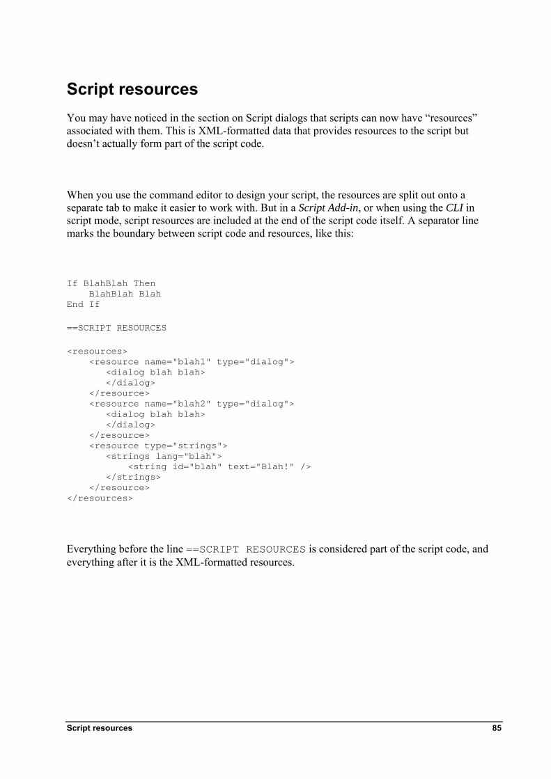
Script resources You may have noticed in the section on Script dialogs that scripts can now have “resources” associated with them. This is XML-formatted data that provides resources to the script but doesn’t actually form part of the script code.
When you use the command editor to design your script, the resources are split out onto a separate tab to make it easier to work with. But in a Script Add-in, or when using the CLI in script mode, script resources are included at the end of the script code itself. A separator line marks the boundary between script code and resources, like this:
If BlahBlah Then BlahBlah Blah End If
==SCRIPT RESOURCES
<resources> <resource name="blah1" type="dialog"> <dialog blah blah> </dialog> </resource> <resource name="blah2" type="dialog"> <dialog blah blah> </dialog> </resource> <resource type="strings"> <strings lang="blah"> <string id="blah" text="Blah!" /> </strings> </resource> </resources>
Everything before the line ==SCRIPT RESOURCES is considered part of the script code, and everything after it is the XML-formatted resources.
Script resources 85
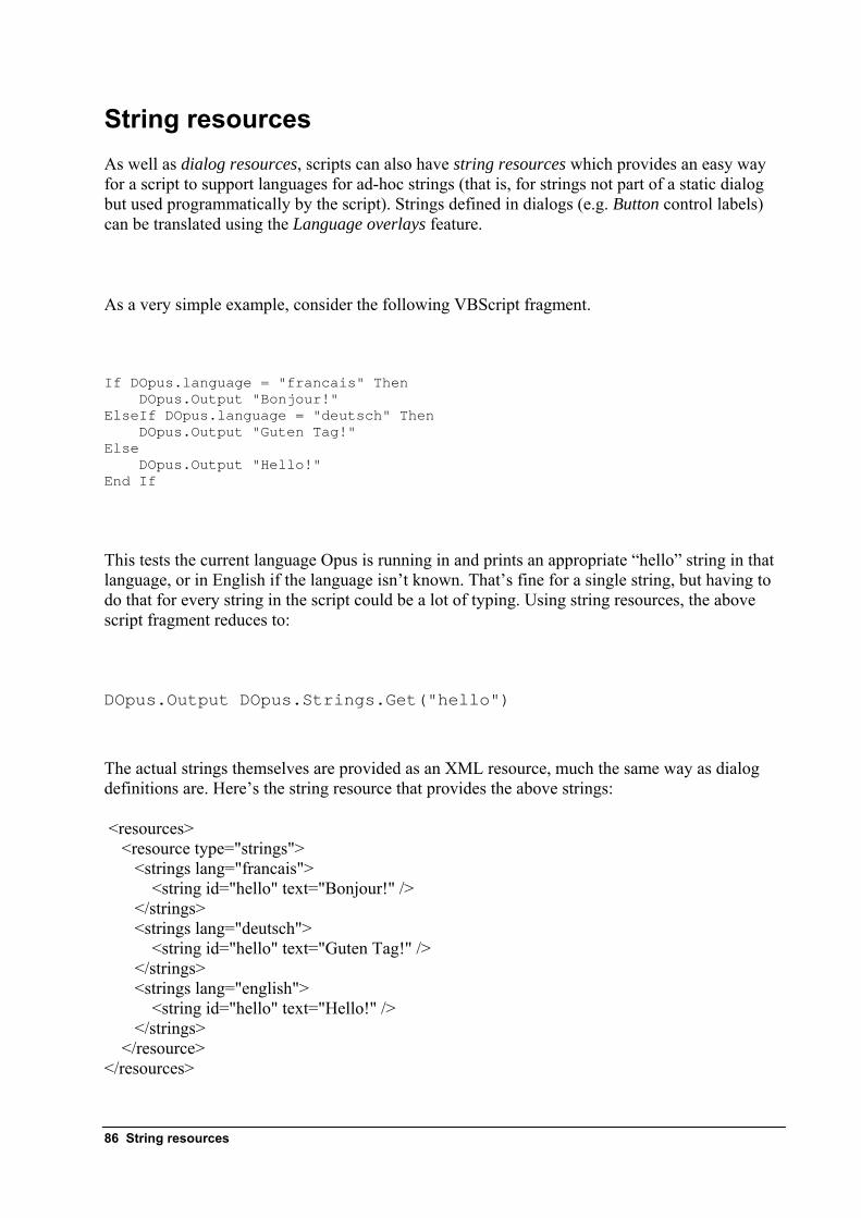
String resources As well as dialog resources, scripts can also have string resources which provides an easy way for a script to support languages for ad-hoc strings (that is, for strings not part of a static dialog but used programmatically by the script). Strings defined in dialogs (e.g. Button control labels) can be translated using the Language overlays feature.
As a very simple example, consider the following VBScript fragment.
If DOpus.language = "francais" Then DOpus.Output "Bonjour!" ElseIf DOpus.language = "deutsch" Then DOpus.Output "Guten Tag!" Else DOpus.Output "Hello!" End If
This tests the current language Opus is running in and prints an appropriate “hello” string in that language, or in English if the language isn’t known. That’s fine for a single string, but having to do that for every string in the script could be a lot of typing. Using string resources, the above script fragment reduces to:
DOpus.Output DOpus.Strings.Get("hello")
The actual strings themselves are provided as an XML resource, much the same way as dialog definitions are. Here’s the string resource that provides the above strings:
<resources> <resource type="strings"> <strings lang="francais"> <string id="hello" text="Bonjour!" /> </strings> <strings lang="deutsch"> <string id="hello" text="Guten Tag!" /> </strings> <strings lang="english"> <string id="hello" text="Hello!" /> </strings> </resource> </resources>
86 String resources

As you can see, there are three strings tags, each one with a different lang attribute (this specifies the language). Inside each strings tag are one or more string tags which provide the actual strings. The id attribute is a name of your choosing – it’s how your script refers to the string. The text attribute provides the translation of the string in the specified language.
The values for the lang attribute correspond to the names of the Directory Opus language libraries (which can be found in the /home/Language folder) – english, deutsch, francais, cat, czech, espanol, etc.
Note that there isn’t currently a GUI for editing string resources like there is for dialogs, so you need to code the XML resources yourself if you want to use them.
String resources 87
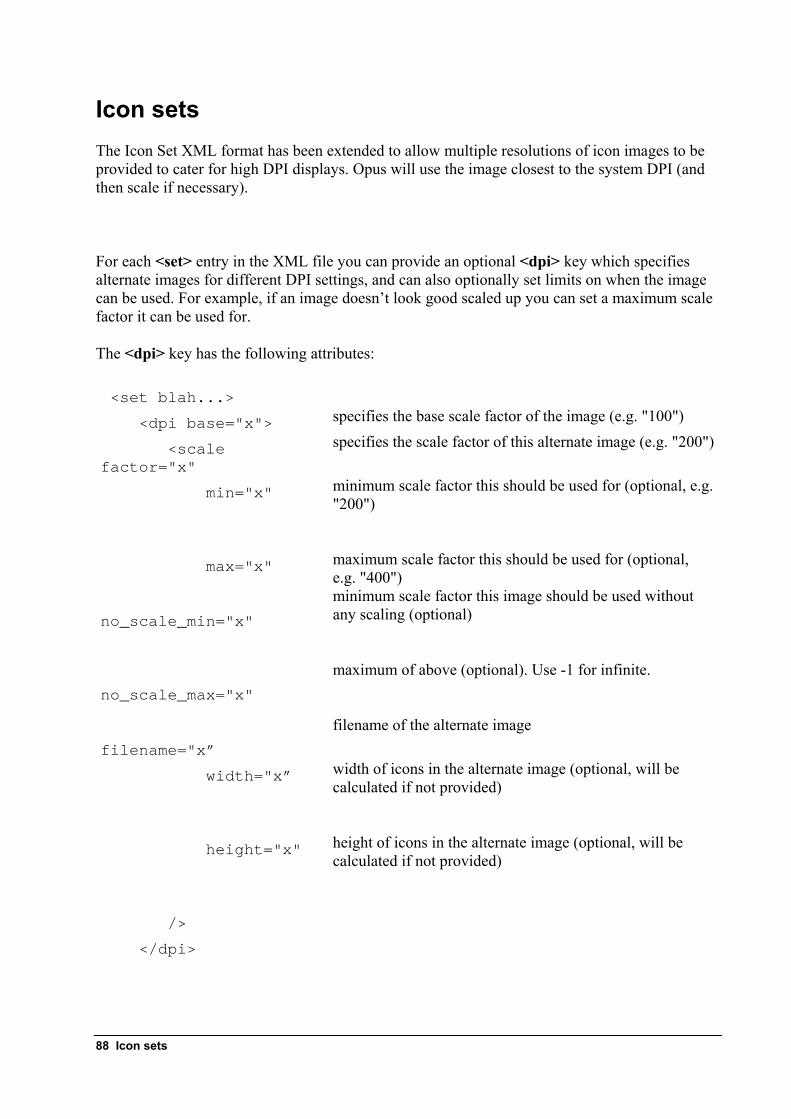
Icon sets The Icon Set XML format has been extended to allow multiple resolutions of icon images to be provided to cater for high DPI displays. Opus will use the image closest to the system DPI (and then scale if necessary).
For each <set> entry in the XML file you can provide an optional <dpi> key which specifies alternate images for different DPI settings, and can also optionally set limits on when the image can be used. For example, if an image doesn’t look good scaled up you can set a maximum scale factor it can be used for.
The <dpi> key has the following attributes:
<set blah...>
<dpi base="x"> specifies the base scale factor of the image (e.g. "100")
<scale factor="x"
specifies the scale factor of this alternate image (e.g. "200")
min="x" minimum scale factor this should be used for (optional, e.g. "200")
max="x" maximum scale factor this should be used for (optional,
e.g. "400") no_scale_min="x"
minimum scale factor this image should be used without any scaling (optional)
no_scale_max="x"
maximum of above (optional). Use -1 for infinite.
filename="x”
filename of the alternate image
width="x” width of icons in the alternate image (optional, will be calculated if not provided)
height="x" height of icons in the alternate image (optional, will be
calculated if not provided)
/>
</dpi>
88 Icon sets
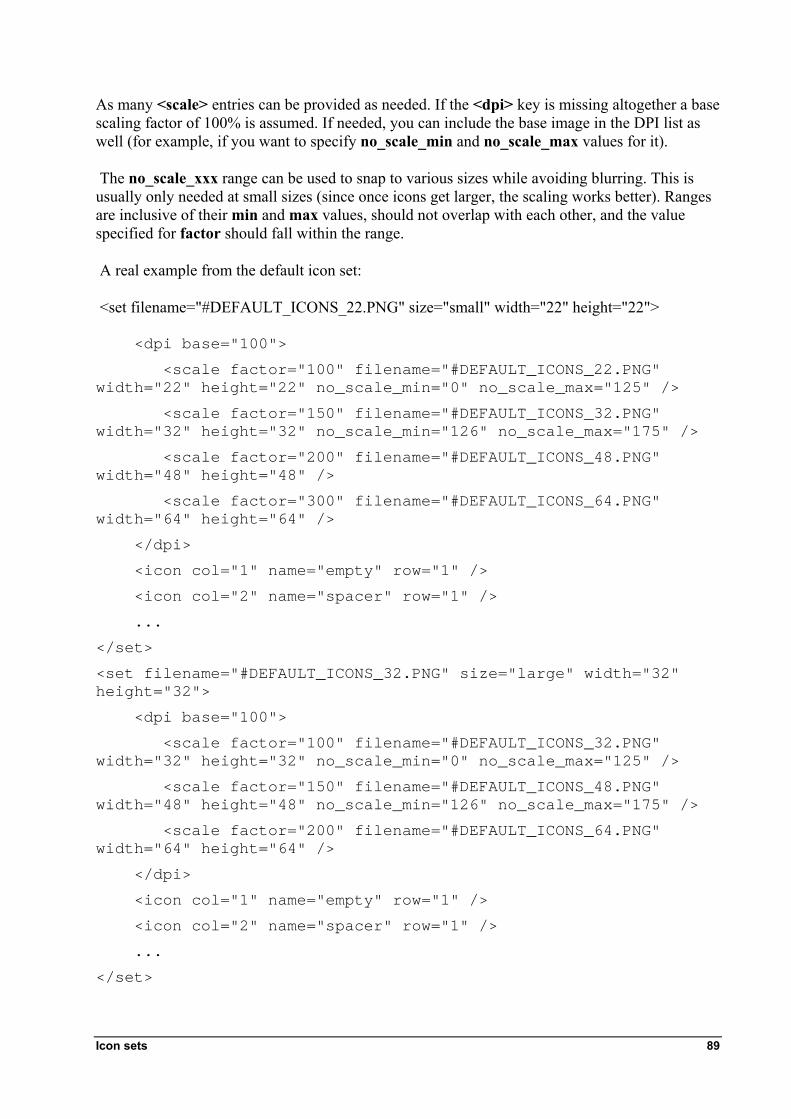
Icon sets 89
As many <scale> entries can be provided as needed. If the <dpi> key is missing altogether a base scaling factor of 100% is assumed. If needed, you can include the base image in the DPI list as well (for example, if you want to specify no_scale_min and no_scale_max values for it).
The no_scale_xxx range can be used to snap to various sizes while avoiding blurring. This is usually only needed at small sizes (since once icons get larger, the scaling works better). Ranges are inclusive of their min and max values, should not overlap with each other, and the value specified for factor should fall within the range.
A real example from the default icon set:
<set filename="#DEFAULT_ICONS_22.PNG" size="small" width="22" height="22">
<dpi base="100">
<scale factor="100" filename="#DEFAULT_ICONS_22.PNG" width="22" height="22" no_scale_min="0" no_scale_max="125" />
<scale factor="150" filename="#DEFAULT_ICONS_32.PNG" width="32" height="32" no_scale_min="126" no_scale_max="175" />
<scale factor="200" filename="#DEFAULT_ICONS_48.PNG" width="48" height="48" />
<scale factor="300" filename="#DEFAULT_ICONS_64.PNG" width="64" height="64" />
</dpi>
<icon col="1" name="empty" row="1" />
<icon col="2" name="spacer" row="1" />
...
</set>
<set filename="#DEFAULT_ICONS_32.PNG" size="large" width="32" height="32">
<dpi base="100">
<scale factor="100" filename="#DEFAULT_ICONS_32.PNG" width="32" height="32" no_scale_min="0" no_scale_max="125" />
<scale factor="150" filename="#DEFAULT_ICONS_48.PNG" width="48" height="48" no_scale_min="126" no_scale_max="175" />
<scale factor="200" filename="#DEFAULT_ICONS_64.PNG" width="64" height="64" />
</dpi>
<icon col="1" name="empty" row="1" />
<icon col="2" name="spacer" row="1" />
...
</set>


![Tristeza , la - Opus 22 - piano - solo - seul - [Opus 22 -] · Tristeza , la - Opus 22 - piano - solo - seul - [Opus 22 -] Author: stumpf, werner - Arranger: STUMPF Werner - Publisher:](https://img.pdfslide.us/doc/110x75/5fdeb08016d6b213e84f7eba/tristeza-la-opus-22-piano-solo-seul-opus-22-tristeza-la-opus.jpg)