Embed Size (px)
Citation preview
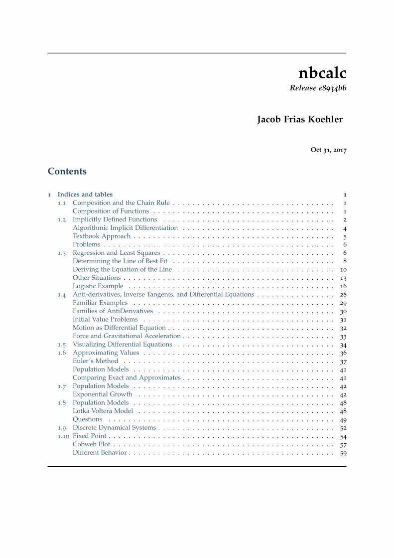
nbcalcRelease e8934bb
Jacob Frias Koehler
Oct 31, 2017
Contents
1 Indices and tables 11.1 Composition and the Chain Rule . . . . . . . . . . . . . . . . . . . . . . . . . . . . . . . . . 1
Composition of Functions . . . . . . . . . . . . . . . . . . . . . . . . . . . . . . . . . . . . . 1
1.2 Implicitly Defined Functions . . . . . . . . . . . . . . . . . . . . . . . . . . . . . . . . . . . 2
Algorithmic Implicit Differentiation . . . . . . . . . . . . . . . . . . . . . . . . . . . . . . . 4
Textbook Approach . . . . . . . . . . . . . . . . . . . . . . . . . . . . . . . . . . . . . . . . . 5
Problems . . . . . . . . . . . . . . . . . . . . . . . . . . . . . . . . . . . . . . . . . . . . . . . 6
1.3 Regression and Least Squares . . . . . . . . . . . . . . . . . . . . . . . . . . . . . . . . . . . 6
Determining the Line of Best Fit . . . . . . . . . . . . . . . . . . . . . . . . . . . . . . . . . 8
Deriving the Equation of the Line . . . . . . . . . . . . . . . . . . . . . . . . . . . . . . . . 10
Other Situations . . . . . . . . . . . . . . . . . . . . . . . . . . . . . . . . . . . . . . . . . . . 13
Logistic Example . . . . . . . . . . . . . . . . . . . . . . . . . . . . . . . . . . . . . . . . . . 16
1.4 Anti-derivatives, Inverse Tangents, and Differential Equations . . . . . . . . . . . . . . . . 28
Familiar Examples . . . . . . . . . . . . . . . . . . . . . . . . . . . . . . . . . . . . . . . . . 29
Families of AntiDerivatives . . . . . . . . . . . . . . . . . . . . . . . . . . . . . . . . . . . . 30
Initial Value Problems . . . . . . . . . . . . . . . . . . . . . . . . . . . . . . . . . . . . . . . 31
Motion as Differential Equation . . . . . . . . . . . . . . . . . . . . . . . . . . . . . . . . . . 32
Force and Gravitational Acceleration . . . . . . . . . . . . . . . . . . . . . . . . . . . . . . . 33
1.5 Visualizing Differential Equations . . . . . . . . . . . . . . . . . . . . . . . . . . . . . . . . 34
1.6 Approximating Values . . . . . . . . . . . . . . . . . . . . . . . . . . . . . . . . . . . . . . . 36
Euler’s Method . . . . . . . . . . . . . . . . . . . . . . . . . . . . . . . . . . . . . . . . . . . 37
Population Models . . . . . . . . . . . . . . . . . . . . . . . . . . . . . . . . . . . . . . . . . 41
Comparing Exact and Approximates . . . . . . . . . . . . . . . . . . . . . . . . . . . . . . . 41
1.7 Population Models . . . . . . . . . . . . . . . . . . . . . . . . . . . . . . . . . . . . . . . . . 42
Exponential Growth . . . . . . . . . . . . . . . . . . . . . . . . . . . . . . . . . . . . . . . . 42
1.8 Population Models . . . . . . . . . . . . . . . . . . . . . . . . . . . . . . . . . . . . . . . . . 48
Lotka Voltera Model . . . . . . . . . . . . . . . . . . . . . . . . . . . . . . . . . . . . . . . . 48
Questions . . . . . . . . . . . . . . . . . . . . . . . . . . . . . . . . . . . . . . . . . . . . . . 49
1.9 Discrete Dynamical Systems . . . . . . . . . . . . . . . . . . . . . . . . . . . . . . . . . . . . 52
1.10 Fixed Point . . . . . . . . . . . . . . . . . . . . . . . . . . . . . . . . . . . . . . . . . . . . . . 54
Cobweb Plot . . . . . . . . . . . . . . . . . . . . . . . . . . . . . . . . . . . . . . . . . . . . . 57
Different Behavior . . . . . . . . . . . . . . . . . . . . . . . . . . . . . . . . . . . . . . . . . . 59
1 Indices and tables
In [1]: %matplotlib inlineimport matplotlib.pyplot as pltimport numpy as npimport sympy as sy
1.1 Composition and the Chain Rule
As you may have guessed, once we apply the idea of differentiation to simple curves, we’d like to usethis method in more and more general situations. This notebook explores the use of differentiationand derivatives to explore functions formed by composition, and to use these results to differentiateimplicitly defined functions.
GOALS:
• Identify situations where chain rule is of use
• Define and Use Chain Rule
• Use Chain Rule to differentiate implicitly defined functions
• Use Descartes algorithm to explore alternative approach to differentation
Composition of Functions
Functions can be formed by combining other functions through famililar operations. For example, wecan consider the polynomial h(x) = x3 + x2 as formed by two simpler polynomials f (x) = x3 andg(x) = x2 combined through addition. So far, we have not had to worry about this, as differentiationand integration are linear operators that work across addition and subtraction.
If we instead have a function h given by:
h(x) =√
x3 + x2
we may recognize the square root function and the polynomial inside of it. This was not formedby addition, subtraction, multiplication, or division of simpler functions however. Instead, we canunderstand the function h as formed by composing two functions f and g where:
h(x) =√
x3 + x2 f (u) =√(u) g(x) = x3 + x2
The operation of composition means we apply the function f to the function g. We would write thisas
f (g(x)) =√(g(x)) =
√x3 + x2
We can use SymPy to explore a few examples and determine a general rule for differentiating functionsformed by compositions. We begin with trying to generalize the situation above, where we composesome function g into a function f of the form
f (x) = (g(x))n
It seems reasonable to expect that
f ′(x) = n(g(x))n−1
You need to adjust this statement to make it true. Consider the following examples, use sympy todifferentiate them and determine the remaining terms.
1. (x2 − 3x)2
2. (x2 − 3x)3
3.√
x2 − 3x
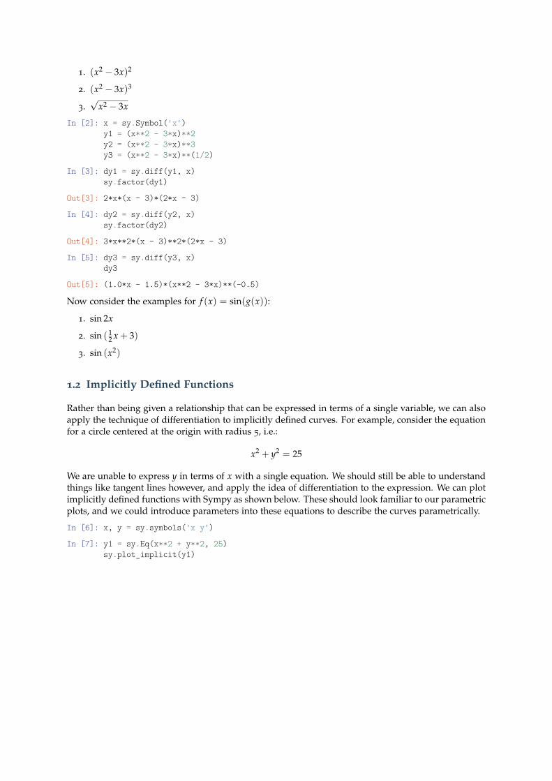
In [2]: x = sy.Symbol('x')y1 = (x**2 - 3*x)**2y2 = (x**2 - 3*x)**3y3 = (x**2 - 3*x)**(1/2)
In [3]: dy1 = sy.diff(y1, x)sy.factor(dy1)
Out[3]: 2*x*(x - 3)*(2*x - 3)
In [4]: dy2 = sy.diff(y2, x)sy.factor(dy2)
Out[4]: 3*x**2*(x - 3)**2*(2*x - 3)
In [5]: dy3 = sy.diff(y3, x)dy3
Out[5]: (1.0*x - 1.5)*(x**2 - 3*x)**(-0.5)
Now consider the examples for f (x) = sin(g(x)):
1. sin 2x
2. sin ( 12 x + 3)
3. sin (x2)
1.2 Implicitly Defined Functions
Rather than being given a relationship that can be expressed in terms of a single variable, we can alsoapply the technique of differentiation to implicitly defined curves. For example, consider the equationfor a circle centered at the origin with radius 5, i.e.:
x2 + y2 = 25
We are unable to express y in terms of x with a single equation. We should still be able to understandthings like tangent lines however, and apply the idea of differentiation to the expression. We can plotimplicitly defined functions with Sympy as shown below. These should look familiar to our parametricplots, and we could introduce parameters into these equations to describe the curves parametrically.
In [6]: x, y = sy.symbols('x y')
In [7]: y1 = sy.Eq(x**2 + y**2, 25)sy.plot_implicit(y1)
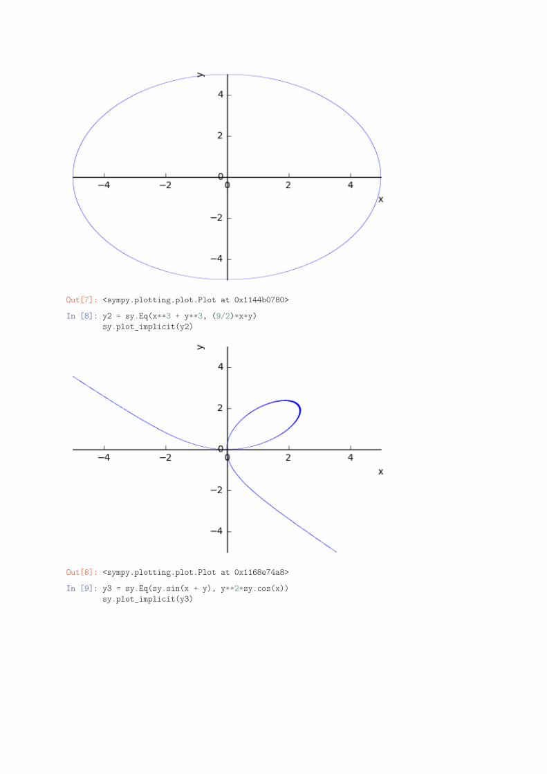
Out[7]: <sympy.plotting.plot.Plot at 0x1144b0780>
In [8]: y2 = sy.Eq(x**3 + y**3, (9/2)*x*y)sy.plot_implicit(y2)
Out[8]: <sympy.plotting.plot.Plot at 0x1168e74a8>
In [9]: y3 = sy.Eq(sy.sin(x + y), y**2*sy.cos(x))sy.plot_implicit(y3)
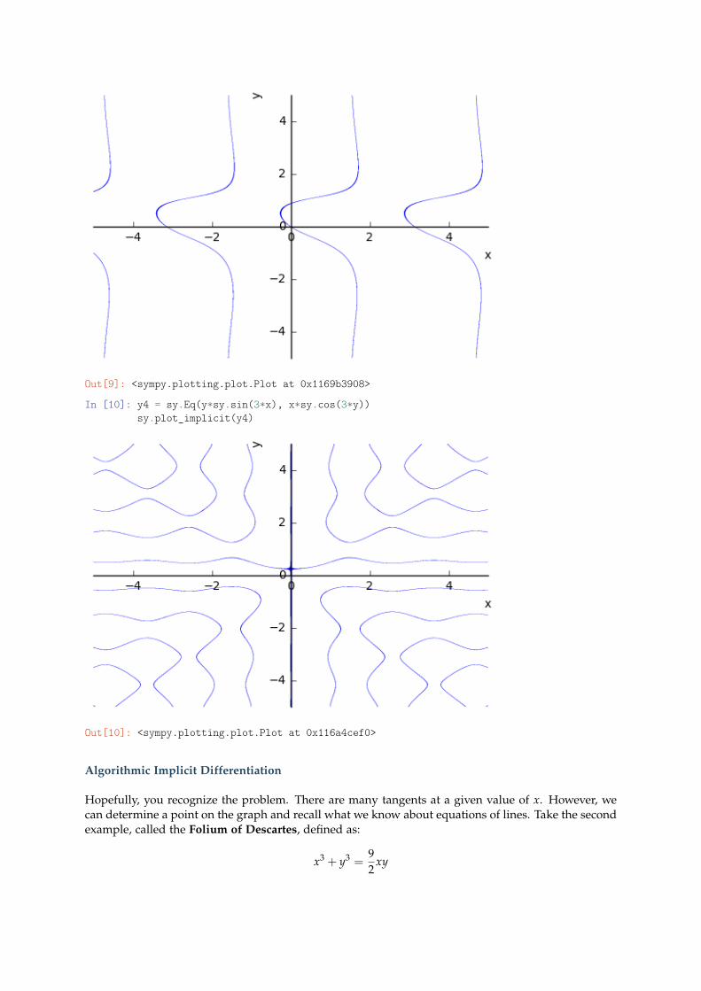
Out[9]: <sympy.plotting.plot.Plot at 0x1169b3908>
In [10]: y4 = sy.Eq(y*sy.sin(3*x), x*sy.cos(3*y))sy.plot_implicit(y4)
Out[10]: <sympy.plotting.plot.Plot at 0x116a4cef0>
Algorithmic Implicit Differentiation
Hopefully, you recognize the problem. There are many tangents at a given value of x. However, wecan determine a point on the graph and recall what we know about equations of lines. Take the secondexample, called the Folium of Descartes, defined as:
x3 + y3 =92
xy
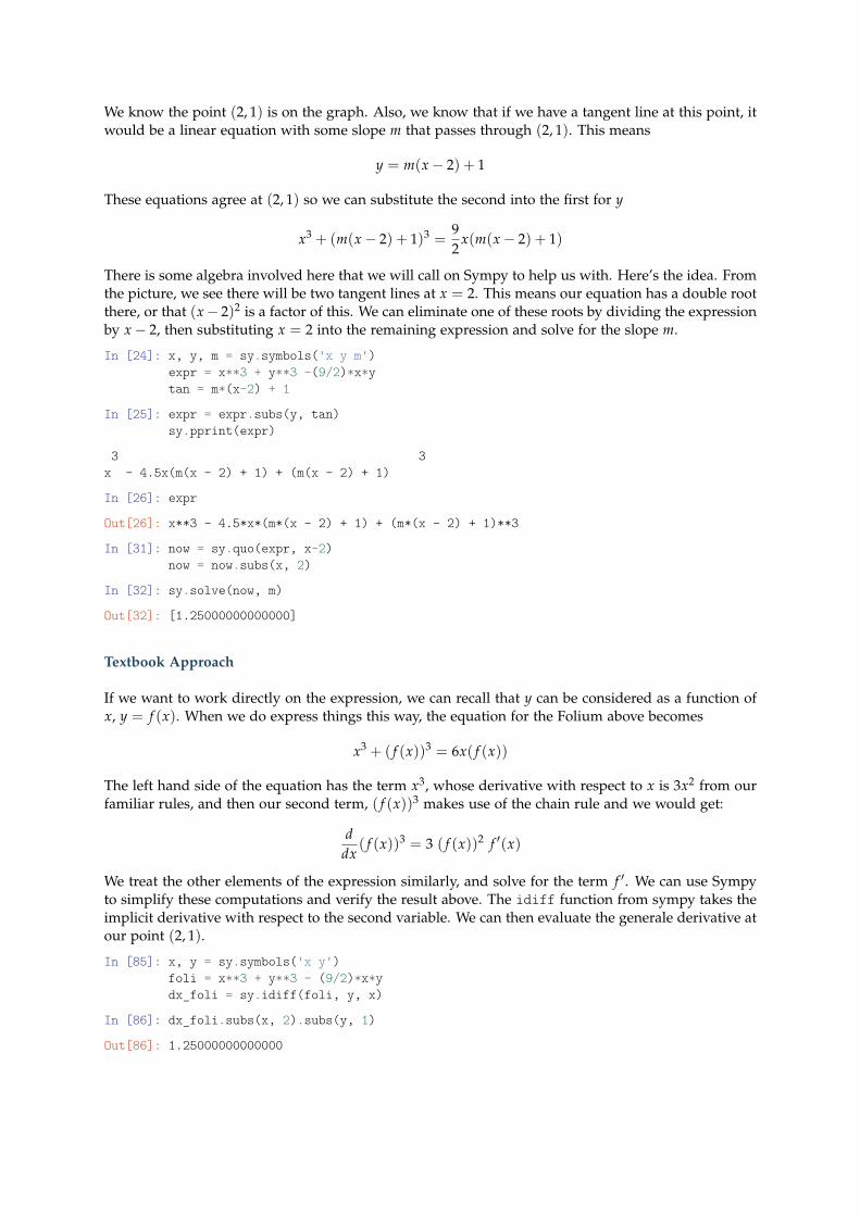
We know the point (2, 1) is on the graph. Also, we know that if we have a tangent line at this point, itwould be a linear equation with some slope m that passes through (2, 1). This means
y = m(x− 2) + 1
These equations agree at (2, 1) so we can substitute the second into the first for y
x3 + (m(x− 2) + 1)3 =92
x(m(x− 2) + 1)
There is some algebra involved here that we will call on Sympy to help us with. Here’s the idea. Fromthe picture, we see there will be two tangent lines at x = 2. This means our equation has a double rootthere, or that (x− 2)2 is a factor of this. We can eliminate one of these roots by dividing the expressionby x− 2, then substituting x = 2 into the remaining expression and solve for the slope m.
In [24]: x, y, m = sy.symbols('x y m')expr = x**3 + y**3 -(9/2)*x*ytan = m*(x-2) + 1
In [25]: expr = expr.subs(y, tan)sy.pprint(expr)
3 3x - 4.5x(m(x - 2) + 1) + (m(x - 2) + 1)
In [26]: expr
Out[26]: x**3 - 4.5*x*(m*(x - 2) + 1) + (m*(x - 2) + 1)**3
In [31]: now = sy.quo(expr, x-2)now = now.subs(x, 2)
In [32]: sy.solve(now, m)
Out[32]: [1.25000000000000]
Textbook Approach
If we want to work directly on the expression, we can recall that y can be considered as a function ofx, y = f (x). When we do express things this way, the equation for the Folium above becomes
x3 + ( f (x))3 = 6x( f (x))
The left hand side of the equation has the term x3, whose derivative with respect to x is 3x2 from ourfamiliar rules, and then our second term, ( f (x))3 makes use of the chain rule and we would get:
ddx
( f (x))3 = 3 ( f (x))2 f ′(x)
We treat the other elements of the expression similarly, and solve for the term f ′. We can use Sympyto simplify these computations and verify the result above. The idiff function from sympy takes theimplicit derivative with respect to the second variable. We can then evaluate the generale derivative atour point (2, 1).
In [85]: x, y = sy.symbols('x y')foli = x**3 + y**3 - (9/2)*x*ydx_foli = sy.idiff(foli, y, x)
In [86]: dx_foli.subs(x, 2).subs(y, 1)
Out[86]: 1.25000000000000
Problems
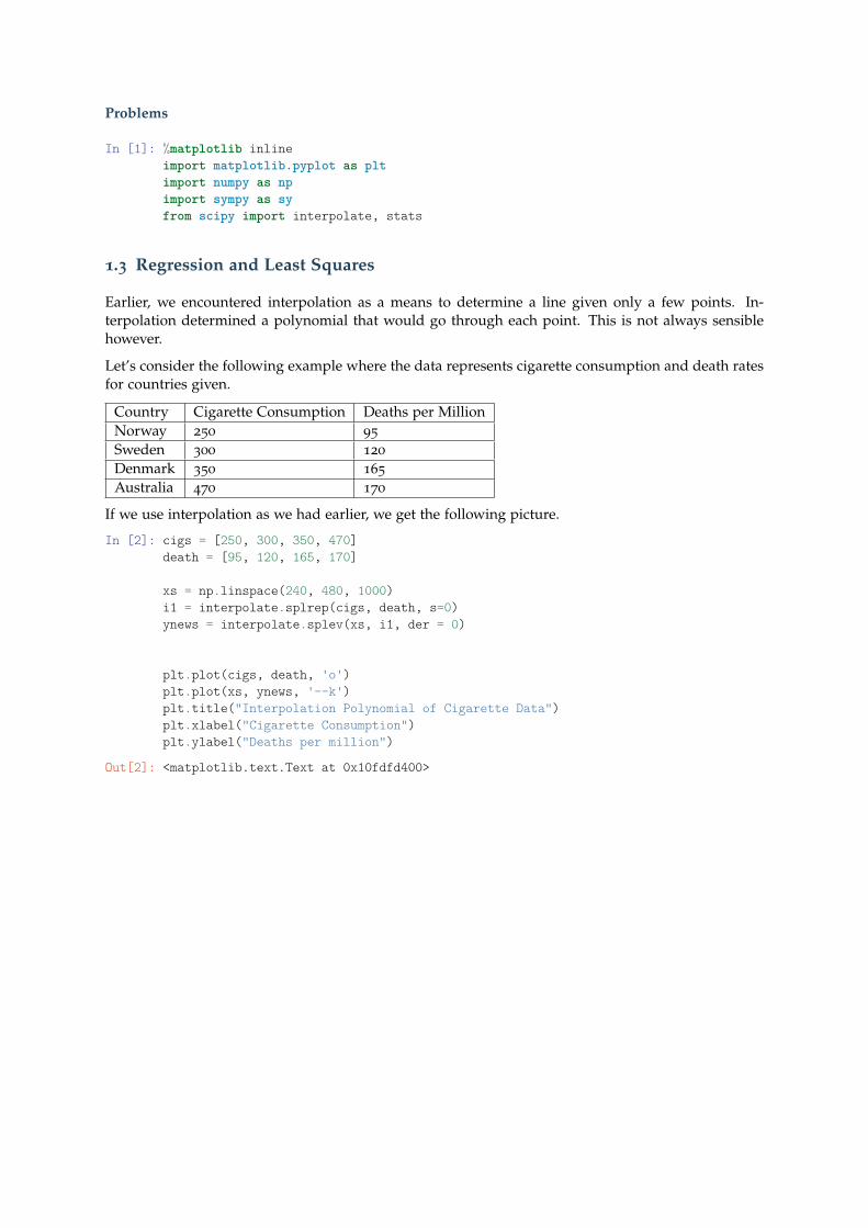
In [1]: %matplotlib inlineimport matplotlib.pyplot as pltimport numpy as npimport sympy as syfrom scipy import interpolate, stats
1.3 Regression and Least Squares
Earlier, we encountered interpolation as a means to determine a line given only a few points. In-terpolation determined a polynomial that would go through each point. This is not always sensiblehowever.
Let’s consider the following example where the data represents cigarette consumption and death ratesfor countries given.
Country Cigarette Consumption Deaths per MillionNorway 250 95
Sweden 300 120
Denmark 350 165
Australia 470 170
If we use interpolation as we had earlier, we get the following picture.
In [2]: cigs = [250, 300, 350, 470]death = [95, 120, 165, 170]
xs = np.linspace(240, 480, 1000)i1 = interpolate.splrep(cigs, death, s=0)ynews = interpolate.splev(xs, i1, der = 0)
plt.plot(cigs, death, 'o')plt.plot(xs, ynews, '--k')plt.title("Interpolation Polynomial of Cigarette Data")plt.xlabel("Cigarette Consumption")plt.ylabel("Deaths per million")
Out[2]: <matplotlib.text.Text at 0x10fdfd400>
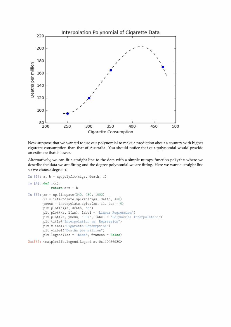
Now suppose that we wanted to use our polynomial to make a prediction about a country with highercigarette consumption than that of Australia. You should notice that our polynomial would providean estimate that is lower.
Alternatively, we can fit a straight line to the data with a simple numpy function polyfit where wedescribe the data we are fitting and the degree polynomial we are fitting. Here we want a straight lineso we choose degree 1.
In [3]: a, b = np.polyfit(cigs, death, 1)
In [4]: def l(x):return a*x + b
In [5]: xs = np.linspace(240, 480, 1000)i1 = interpolate.splrep(cigs, death, s=0)ynews = interpolate.splev(xs, i1, der = 0)plt.plot(cigs, death, 'o')plt.plot(xs, l(xs), label = 'Linear Regression')plt.plot(xs, ynews, '--k', label = 'Polynomial Interpolation')plt.title("Interpolation vs. Regression")plt.xlabel("Cigarette Consumption")plt.ylabel("Deaths per million")plt.legend(loc = 'best', frameon = False)
Out[5]: <matplotlib.legend.Legend at 0x110456d30>
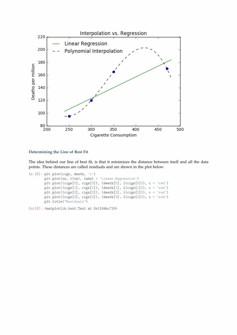
Determining the Line of Best Fit
The idea behind our line of best fit, is that it minimizes the distance between itself and all the datapoints. These distances are called residuals and are shown in the plot below.
In [6]: plt.plot(cigs, death, 'o')plt.plot(xs, l(xs), label = 'Linear Regression')plt.plot((cigs[0], cigs[0]), (death[0], l(cigs[0])), c = 'red')plt.plot((cigs[1], cigs[1]), (death[1], l(cigs[1])), c = 'red')plt.plot((cigs[2], cigs[2]), (death[2], l(cigs[2])), c = 'red')plt.plot((cigs[3], cigs[3]), (death[3], l(cigs[3])), c = 'red')plt.title("Residuals")
Out[6]: <matplotlib.text.Text at 0x1104bc710>
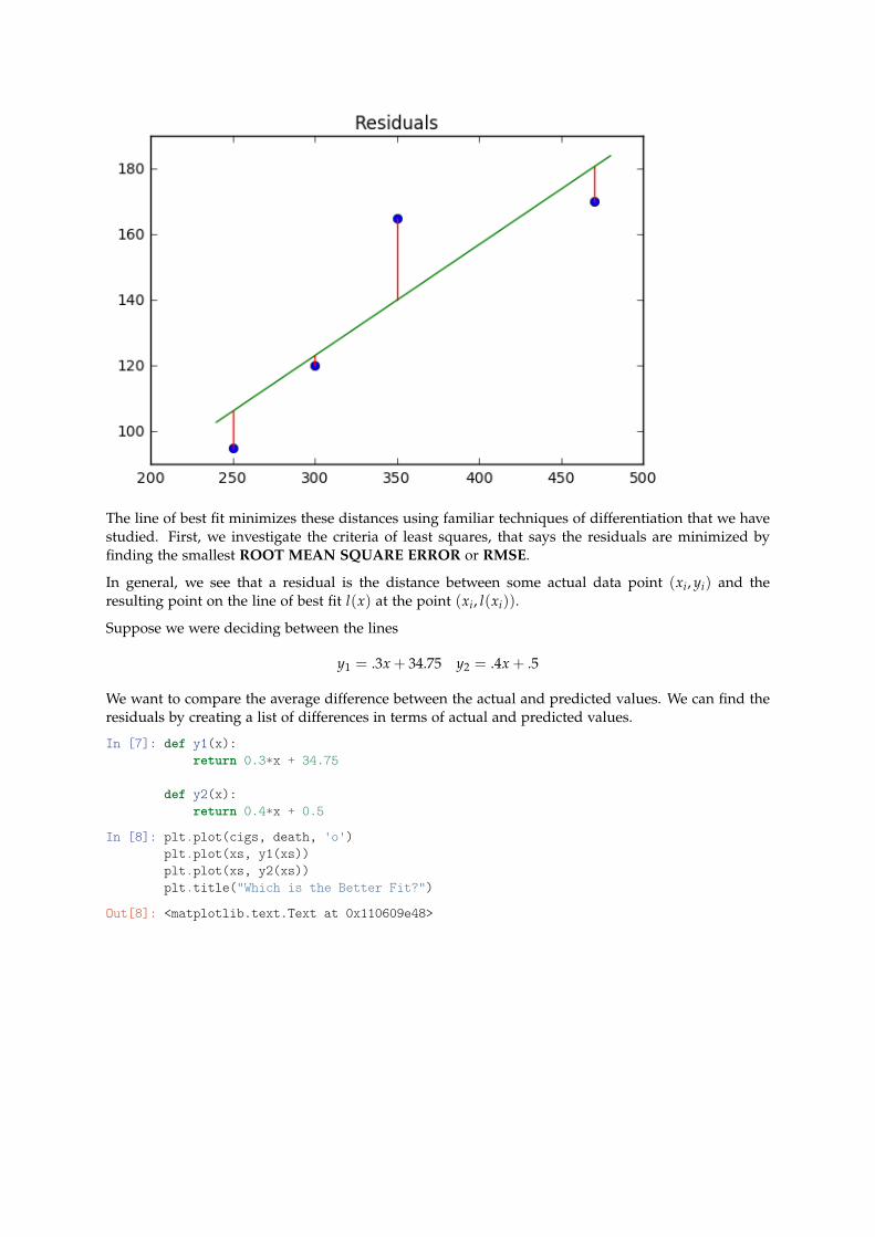
The line of best fit minimizes these distances using familiar techniques of differentiation that we havestudied. First, we investigate the criteria of least squares, that says the residuals are minimized byfinding the smallest ROOT MEAN SQUARE ERROR or RMSE.
In general, we see that a residual is the distance between some actual data point (xi, yi) and theresulting point on the line of best fit l(x) at the point (xi, l(xi)).
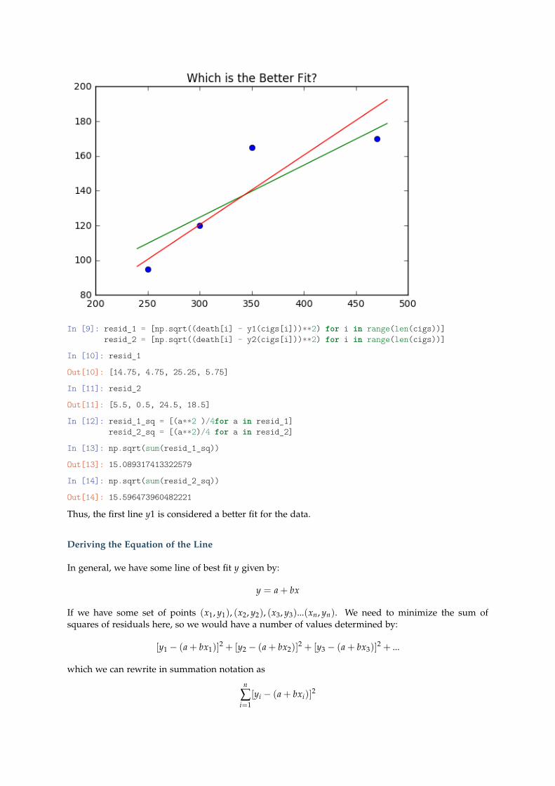
Suppose we were deciding between the lines
y1 = .3x + 34.75 y2 = .4x + .5
We want to compare the average difference between the actual and predicted values. We can find theresiduals by creating a list of differences in terms of actual and predicted values.
In [7]: def y1(x):return 0.3*x + 34.75
def y2(x):return 0.4*x + 0.5
In [8]: plt.plot(cigs, death, 'o')plt.plot(xs, y1(xs))plt.plot(xs, y2(xs))plt.title("Which is the Better Fit?")
Out[8]: <matplotlib.text.Text at 0x110609e48>
In [9]: resid_1 = [np.sqrt((death[i] - y1(cigs[i]))**2) for i in range(len(cigs))]resid_2 = [np.sqrt((death[i] - y2(cigs[i]))**2) for i in range(len(cigs))]
In [10]: resid_1
Out[10]: [14.75, 4.75, 25.25, 5.75]
In [11]: resid_2
Out[11]: [5.5, 0.5, 24.5, 18.5]
In [12]: resid_1_sq = [(a**2 )/4for a in resid_1]resid_2_sq = [(a**2)/4 for a in resid_2]
In [13]: np.sqrt(sum(resid_1_sq))
Out[13]: 15.089317413322579
In [14]: np.sqrt(sum(resid_2_sq))
Out[14]: 15.596473960482221
Thus, the first line y1 is considered a better fit for the data.
Deriving the Equation of the Line
In general, we have some line of best fit y given by:
y = a + bx
If we have some set of points (x1, y1), (x2, y2), (x3, y3)...(xn, yn). We need to minimize the sum ofsquares of residuals here, so we would have a number of values determined by:
[y1 − (a + bx1)]2 + [y2 − (a + bx2)]
2 + [y3 − (a + bx3)]2 + ...
which we can rewrite in summation notation as
n
∑i=1
[yi − (a + bxi)]2
We can consider this as a function in terms of the variable a that we are seeking to minimize.
g(a) =n
∑i=1
[yi − (a + bxi)]2
From here, we can apply our familiar strategy of differentiating the function and locating the criticalvalues. We are looking for the derivative of a sum, which turns out to be equivalent to the sum of thederivatives, hence we have
g′(a) =n
∑i=1
dda
[yi − (a + bxi)]2
g′(a) =n
∑i=1
2[yi − a− bxi](−1)
g′(a) = −2[n
∑i=1
yi − a− bn
∑i=1
xi]
Setting this equal to zero and solving for a we get
a =1n
n
∑i=1
yi − b1n
n
∑i=1
xi
The terms should be familiar as averages, and we can rewrite our equation as
a = y− bx
We now use this to investigate a similar function in terms of b to complete our solution.
f (b) =n
∑i=1
[yi − (y + b(xi − x))]2
We end up with
b =n
∑i=1
(xi − x)(yi − y)(x− xi)2
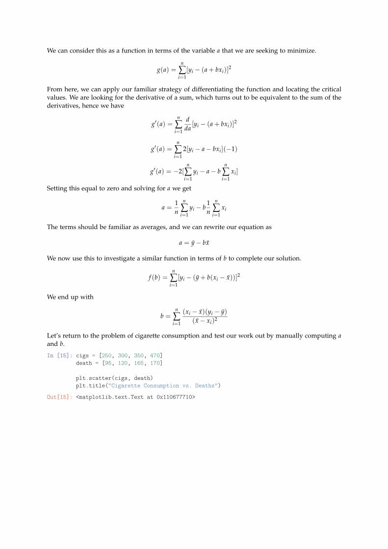
Let’s return to the problem of cigarette consumption and test our work out by manually computing aand b.
In [15]: cigs = [250, 300, 350, 470]death = [95, 120, 165, 170]
plt.scatter(cigs, death)plt.title("Cigarette Consumption vs. Deaths")
Out[15]: <matplotlib.text.Text at 0x110677710>
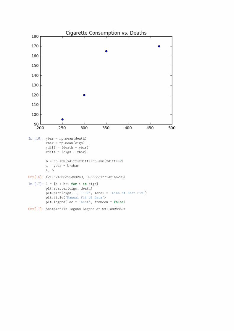
In [16]: ybar = np.mean(death)xbar = np.mean(cigs)ydiff = (death - ybar)xdiff = (cigs - xbar)
b = np.sum(ydiff*xdiff)/np.sum(xdiff**2)a = ybar - b*xbara, b
Out[16]: (21.621368322399249, 0.33833177132146203)
In [17]: l = [a + b*i for i in cigs]plt.scatter(cigs, death)plt.plot(cigs, l, '--k', label = 'Line of Best Fit')plt.title("Manual Fit of Data")plt.legend(loc = 'best', frameon = False)
Out[17]: <matplotlib.legend.Legend at 0x110898860>
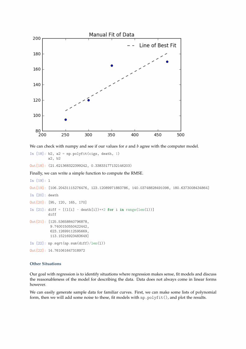
We can check with numpy and see if our values for a and b agree with the computer model.
In [18]: b2, a2 = np.polyfit(cigs, death, 1)a2, b2
Out[18]: (21.621368322399242, 0.33833177132146203)
Finally, we can write a simple function to compute the RMSE.
In [19]: l
Out[19]: [106.20431115276476, 123.12089971883786, 140.03748828491098, 180.6373008434864]
In [20]: death
Out[20]: [95, 120, 165, 170]
In [21]: diff = [(l[i] - death[i])**2 for i in range(len(l))]diff
Out[21]: [125.53658840796878,9.7400150550422442,623.12699112595669,113.15216923483649]
In [22]: np.sqrt(np.sum(diff)/len(l))
Out[22]: 14.761061647318972
Other Situations
Our goal with regression is to identify situations where regression makes sense, fit models and discussthe reasonableness of the model for describing the data. Data does not always come in linear formshowever.
We can easily generate sample data for familiar curves. First, we can make some lists of polynomialform, then we will add some noise to these, fit models with np.polyfit(), and plot the results.
Non-Linear Functions
Plotting and fitting non-linear functions follows a similar pattern, however we need to take into con-sideration the nature of the function. First, if we see something following a polynomial pattern, we canjust use whatever degree polynomial fit we believe is relevant. The derivation of these formulas fol-lows the same structure as the linear case, except you are replacing the line a− bxi with a polynomiala + bxi + cx2
i ....
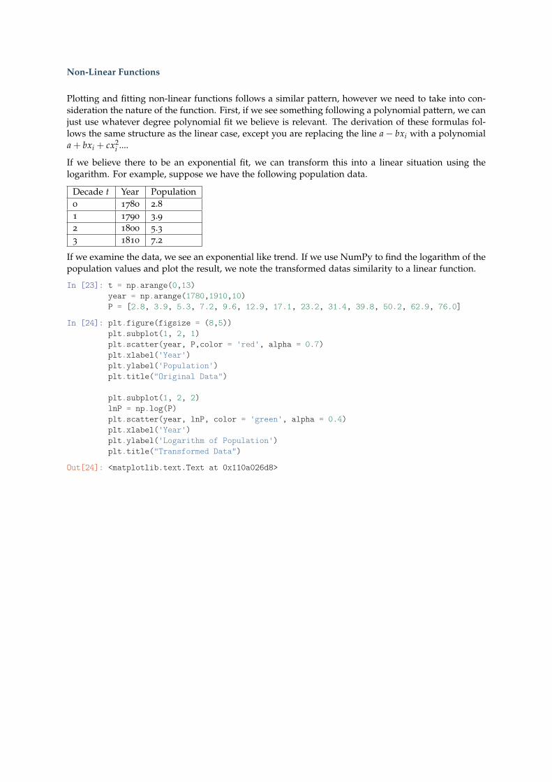
If we believe there to be an exponential fit, we can transform this into a linear situation using thelogarithm. For example, suppose we have the following population data.
Decade t Year Population0 1780 2.81 1790 3.92 1800 5.33 1810 7.2
If we examine the data, we see an exponential like trend. If we use NumPy to find the logarithm of thepopulation values and plot the result, we note the transformed datas similarity to a linear function.
In [23]: t = np.arange(0,13)year = np.arange(1780,1910,10)P = [2.8, 3.9, 5.3, 7.2, 9.6, 12.9, 17.1, 23.2, 31.4, 39.8, 50.2, 62.9, 76.0]
In [24]: plt.figure(figsize = (8,5))plt.subplot(1, 2, 1)plt.scatter(year, P,color = 'red', alpha = 0.7)plt.xlabel('Year')plt.ylabel('Population')plt.title("Original Data")
plt.subplot(1, 2, 2)lnP = np.log(P)plt.scatter(year, lnP, color = 'green', alpha = 0.4)plt.xlabel('Year')plt.ylabel('Logarithm of Population')plt.title("Transformed Data")
Out[24]: <matplotlib.text.Text at 0x110a026d8>
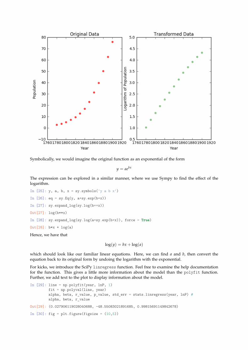
Symbolically, we would imagine the original function as an exponential of the form
y = aebx
The expression can be explored in a similar manner, where we use Sympy to find the effect of thelogarithm.
In [25]: y, a, b, x = sy.symbols('y a b x')
In [26]: eq = sy.Eq(y, a*sy.exp(b*x))
In [27]: sy.expand_log(sy.log(b**x))
Out[27]: log(b**x)
In [28]: sy.expand_log(sy.log(a*sy.exp(b*x)), force = True)
Out[28]: b*x + log(a)
Hence, we have that
log(y) = bx + log(a)
which should look like our familiar linear equations. Here, we can find a and b, then convert theequation back to its original form by undoing the logarithm with the exponential.
For kicks, we introduce the SciPy linregress function. Feel free to examine the help documentationfor the function. This gives a little more information about the model than the polyfit function.Further, we add text to the plot to display information about the model.
In [29]: line = np.polyfit(year, lnP, 1)fit = np.polyval(line, year)alpha, beta, r_value, p_value, std_err = stats.linregress(year, lnP) #alpha, beta, r_value
Out[29]: (0.027906119028040688, -48.55083021891685, 0.99815691149842678)
In [30]: fig = plt.figure(figsize = (10,5))
plt.subplot(1, 2, 2)plt.plot(year, np.exp(fit))plt.plot(year, P, 'o', markersize = 7, alpha = 0.8)ax = fig.add_subplot(121)text_string = "\nCorrelation coefficient: %f" % (r_value)ax.text(0.022, 0.972, text_string, transform=ax.transAxes, verticalalignment='top', fontsize=8)plt.title("Results of Linear Regression on ln P", fontsize = 9)plt.xlabel("Year", fontsize = 8)plt.ylabel("ln Population")
plt.subplot(1, 2, 1)plt.plot(year, fit)plt.plot(year, lnP, 'o', markersize = 7, alpha = 0.8)ax = fig.add_subplot(122)text_string = "\nCorrelation coefficient: %f" % (r_value)ax.text(0.022, 0.972, text_string, transform=ax.transAxes, verticalalignment='top', fontsize=8)plt.title("Results after returning to exponential form", fontsize = 9)plt.xlabel("Year", fontsize = 8)plt.ylabel("Population")
Out[30]: <matplotlib.text.Text at 0x110c1c748>
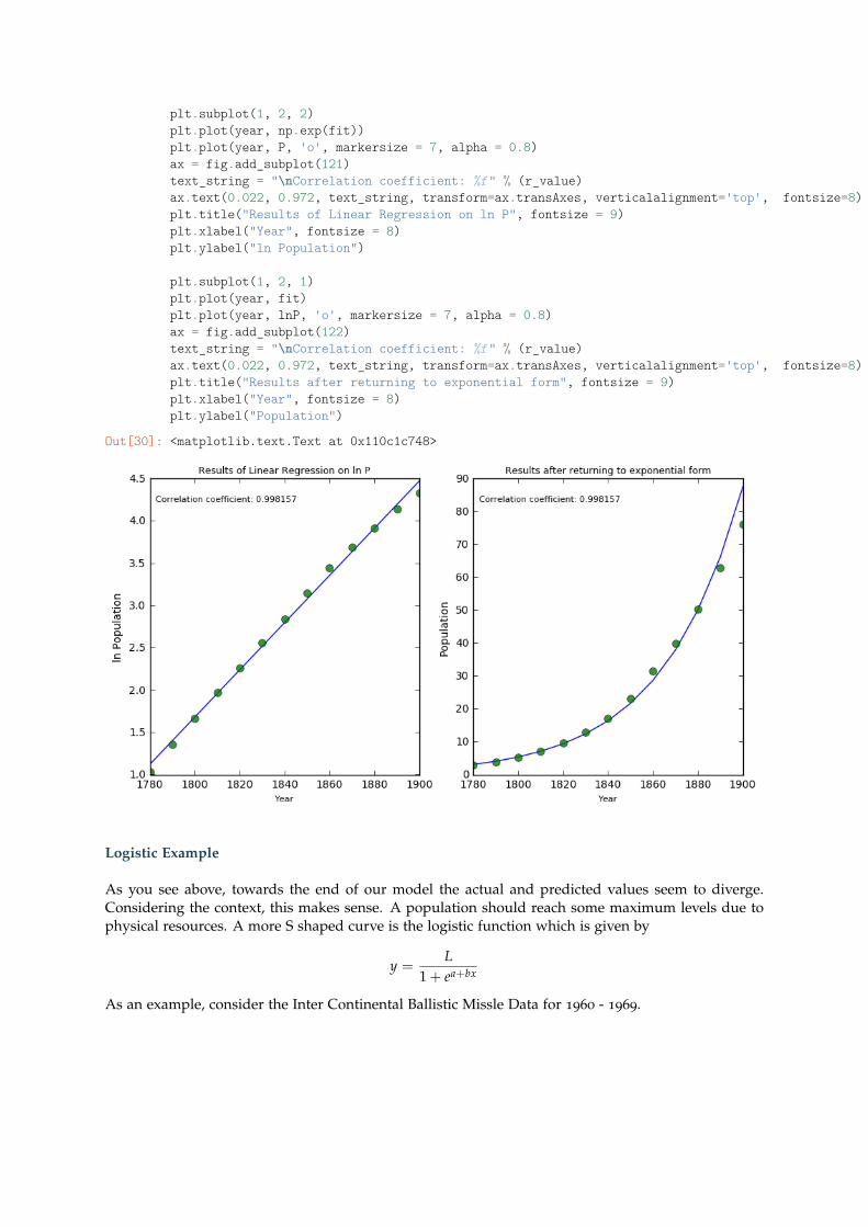
Logistic Example
As you see above, towards the end of our model the actual and predicted values seem to diverge.Considering the context, this makes sense. A population should reach some maximum levels due tophysical resources. A more S shaped curve is the logistic function which is given by
y =L
1 + ea+bx
As an example, consider the Inter Continental Ballistic Missle Data for 1960 - 1969.
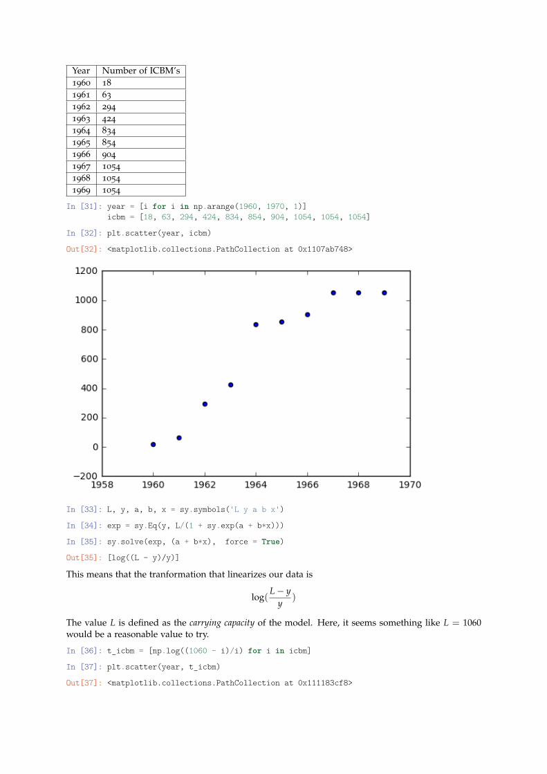
Year Number of ICBM’s1960 18
1961 63
1962 294
1963 424
1964 834
1965 854
1966 904
1967 1054
1968 1054
1969 1054
In [31]: year = [i for i in np.arange(1960, 1970, 1)]icbm = [18, 63, 294, 424, 834, 854, 904, 1054, 1054, 1054]
In [32]: plt.scatter(year, icbm)
Out[32]: <matplotlib.collections.PathCollection at 0x1107ab748>
In [33]: L, y, a, b, x = sy.symbols('L y a b x')
In [34]: exp = sy.Eq(y, L/(1 + sy.exp(a + b*x)))
In [35]: sy.solve(exp, (a + b*x), force = True)
Out[35]: [log((L - y)/y)]
This means that the tranformation that linearizes our data is
log(L− y
y)
The value L is defined as the carrying capacity of the model. Here, it seems something like L = 1060would be a reasonable value to try.
In [36]: t_icbm = [np.log((1060 - i)/i) for i in icbm]
In [37]: plt.scatter(year, t_icbm)
Out[37]: <matplotlib.collections.PathCollection at 0x111183cf8>
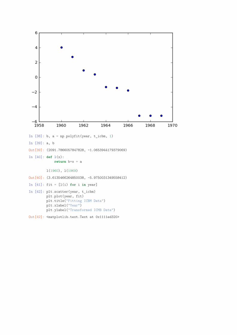
In [38]: b, a = np.polyfit(year, t_icbm, 1)
In [39]: a, b
Out[39]: (2091.7866057847828, -1.0653944179379069)
In [40]: def l(x):return b*x + a
l(1960), l(1969)
Out[40]: (3.6135466264850038, -5.9750031349558412)
In [41]: fit = [l(i) for i in year]
In [42]: plt.scatter(year, t_icbm)plt.plot(year, fit)plt.title("Fitting ICBM Data")plt.xlabel("Year")plt.ylabel("Transformed ICMB Data")
Out[42]: <matplotlib.text.Text at 0x1111ed320>
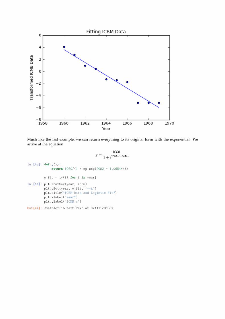
Much like the last example, we can return everything to its original form with the exponential. Wearrive at the equation
y =1060
1 + e2092−1.0654x
In [43]: def y(x):return 1060/(1 + np.exp(2092 - 1.0654*x))
o_fit = [y(i) for i in year]
In [44]: plt.scatter(year, icbm)plt.plot(year, o_fit, '--k')plt.title("ICBM Data and Logistic Fit")plt.xlabel("Year")plt.ylabel("ICMB's")
Out[44]: <matplotlib.text.Text at 0x1111c0d30>
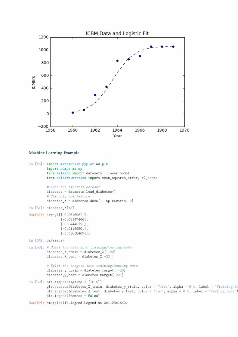
Machine Learning Example
In [46]: import matplotlib.pyplot as pltimport numpy as npfrom sklearn import datasets, linear_modelfrom sklearn.metrics import mean_squared_error, r2_score
# Load the diabetes datasetdiabetes = datasets.load_diabetes()# Use only one featurediabetes_X = diabetes.data[:, np.newaxis, 2]
In [61]: diabetes_X[:5]
Out[61]: array([[ 0.06169621],[-0.05147406],[ 0.04445121],[-0.01159501],[-0.03638469]])
In [64]: datasets?
In [53]: # Split the data into training/testing setsdiabetes_X_train = diabetes_X[:-20]diabetes_X_test = diabetes_X[-20:]
# Split the targets into training/testing setsdiabetes_y_train = diabetes.target[:-20]diabetes_y_test = diabetes.target[-20:]
In [60]: plt.figure(figsize = (10,5))plt.scatter(diabetes_X_train, diabetes_y_train, color = 'blue', alpha = 0.4, label = "Training Data")plt.scatter(diabetes_X_test, diabetes_y_test, color = 'red', alpha = 0.5, label = "Testing Data")plt.legend(frameon = False)
Out[60]: <matplotlib.legend.Legend at 0x1123e16a0>
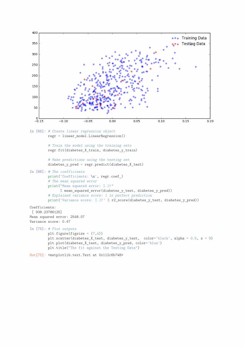
In [65]: # Create linear regression objectregr = linear_model.LinearRegression()
# Train the model using the training setsregr.fit(diabetes_X_train, diabetes_y_train)
# Make predictions using the testing setdiabetes_y_pred = regr.predict(diabetes_X_test)
In [66]: # The coefficientsprint('Coefficients: \n', regr.coef_)# The mean squared errorprint("Mean squared error: %.2f"
% mean_squared_error(diabetes_y_test, diabetes_y_pred))# Explained variance score: 1 is perfect predictionprint('Variance score: %.2f' % r2_score(diabetes_y_test, diabetes_y_pred))
Coefficients:[ 938.23786125]
Mean squared error: 2548.07Variance score: 0.47
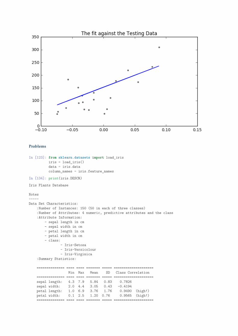
In [75]: # Plot outputsplt.figure(figsize = (7,4))plt.scatter(diabetes_X_test, diabetes_y_test, color='black', alpha = 0.5, s = 9)plt.plot(diabetes_X_test, diabetes_y_pred, color='blue')plt.title("The fit against the Testing Data")
Out[75]: <matplotlib.text.Text at 0x112c6b748>
Problems
In [123]: from sklearn.datasets import load_irisiris = load_iris()data = iris.datacolumn_names = iris.feature_names
In [134]: print(iris.DESCR)
Iris Plants Database
Notes-----Data Set Characteristics:
:Number of Instances: 150 (50 in each of three classes):Number of Attributes: 4 numeric, predictive attributes and the class:Attribute Information:
- sepal length in cm- sepal width in cm- petal length in cm- petal width in cm- class:
- Iris-Setosa- Iris-Versicolour- Iris-Virginica
:Summary Statistics:
============== ==== ==== ======= ===== ====================Min Max Mean SD Class Correlation
============== ==== ==== ======= ===== ====================sepal length: 4.3 7.9 5.84 0.83 0.7826sepal width: 2.0 4.4 3.05 0.43 -0.4194petal length: 1.0 6.9 3.76 1.76 0.9490 (high!)petal width: 0.1 2.5 1.20 0.76 0.9565 (high!)============== ==== ==== ======= ===== ====================
:Missing Attribute Values: None:Class Distribution: 33.3% for each of 3 classes.:Creator: R.A. Fisher:Donor: Michael Marshall (MARSHALL%[email protected]):Date: July, 1988
This is a copy of UCI ML iris datasets.http://archive.ics.uci.edu/ml/datasets/Iris
The famous Iris database, first used by Sir R.A Fisher
This is perhaps the best known database to be found in thepattern recognition literature. Fisher's paper is a classic in the field andis referenced frequently to this day. (See Duda & Hart, for example.) Thedata set contains 3 classes of 50 instances each, where each class refers to atype of iris plant. One class is linearly separable from the other 2; thelatter are NOT linearly separable from each other.
References----------
- Fisher,R.A. "The use of multiple measurements in taxonomic problems"Annual Eugenics, 7, Part II, 179-188 (1936); also in "Contributions toMathematical Statistics" (John Wiley, NY, 1950).
- Duda,R.O., & Hart,P.E. (1973) Pattern Classification and Scene Analysis.(Q327.D83) John Wiley & Sons. ISBN 0-471-22361-1. See page 218.
- Dasarathy, B.V. (1980) "Nosing Around the Neighborhood: A New SystemStructure and Classification Rule for Recognition in Partially ExposedEnvironments". IEEE Transactions on Pattern Analysis and MachineIntelligence, Vol. PAMI-2, No. 1, 67-71.
- Gates, G.W. (1972) "The Reduced Nearest Neighbor Rule". IEEE Transactionson Information Theory, May 1972, 431-433.
- See also: 1988 MLC Proceedings, 54-64. Cheeseman et al"s AUTOCLASS IIconceptual clustering system finds 3 classes in the data.
- Many, many more ...
In [125]: data
Out[125]: array([[ 5.1, 3.5, 1.4, 0.2],[ 4.9, 3. , 1.4, 0.2],[ 4.7, 3.2, 1.3, 0.2],[ 4.6, 3.1, 1.5, 0.2],[ 5. , 3.6, 1.4, 0.2],[ 5.4, 3.9, 1.7, 0.4],[ 4.6, 3.4, 1.4, 0.3],[ 5. , 3.4, 1.5, 0.2],[ 4.4, 2.9, 1.4, 0.2],[ 4.9, 3.1, 1.5, 0.1],[ 5.4, 3.7, 1.5, 0.2],[ 4.8, 3.4, 1.6, 0.2],[ 4.8, 3. , 1.4, 0.1],[ 4.3, 3. , 1.1, 0.1],[ 5.8, 4. , 1.2, 0.2],[ 5.7, 4.4, 1.5, 0.4],[ 5.4, 3.9, 1.3, 0.4],[ 5.1, 3.5, 1.4, 0.3],[ 5.7, 3.8, 1.7, 0.3],[ 5.1, 3.8, 1.5, 0.3],[ 5.4, 3.4, 1.7, 0.2],[ 5.1, 3.7, 1.5, 0.4],[ 4.6, 3.6, 1. , 0.2],
[ 5.1, 3.3, 1.7, 0.5],[ 4.8, 3.4, 1.9, 0.2],[ 5. , 3. , 1.6, 0.2],[ 5. , 3.4, 1.6, 0.4],[ 5.2, 3.5, 1.5, 0.2],[ 5.2, 3.4, 1.4, 0.2],[ 4.7, 3.2, 1.6, 0.2],[ 4.8, 3.1, 1.6, 0.2],[ 5.4, 3.4, 1.5, 0.4],[ 5.2, 4.1, 1.5, 0.1],[ 5.5, 4.2, 1.4, 0.2],[ 4.9, 3.1, 1.5, 0.1],[ 5. , 3.2, 1.2, 0.2],[ 5.5, 3.5, 1.3, 0.2],[ 4.9, 3.1, 1.5, 0.1],[ 4.4, 3. , 1.3, 0.2],[ 5.1, 3.4, 1.5, 0.2],[ 5. , 3.5, 1.3, 0.3],[ 4.5, 2.3, 1.3, 0.3],[ 4.4, 3.2, 1.3, 0.2],[ 5. , 3.5, 1.6, 0.6],[ 5.1, 3.8, 1.9, 0.4],[ 4.8, 3. , 1.4, 0.3],[ 5.1, 3.8, 1.6, 0.2],[ 4.6, 3.2, 1.4, 0.2],[ 5.3, 3.7, 1.5, 0.2],[ 5. , 3.3, 1.4, 0.2],[ 7. , 3.2, 4.7, 1.4],[ 6.4, 3.2, 4.5, 1.5],[ 6.9, 3.1, 4.9, 1.5],[ 5.5, 2.3, 4. , 1.3],[ 6.5, 2.8, 4.6, 1.5],[ 5.7, 2.8, 4.5, 1.3],[ 6.3, 3.3, 4.7, 1.6],[ 4.9, 2.4, 3.3, 1. ],[ 6.6, 2.9, 4.6, 1.3],[ 5.2, 2.7, 3.9, 1.4],[ 5. , 2. , 3.5, 1. ],[ 5.9, 3. , 4.2, 1.5],[ 6. , 2.2, 4. , 1. ],[ 6.1, 2.9, 4.7, 1.4],[ 5.6, 2.9, 3.6, 1.3],[ 6.7, 3.1, 4.4, 1.4],[ 5.6, 3. , 4.5, 1.5],[ 5.8, 2.7, 4.1, 1. ],[ 6.2, 2.2, 4.5, 1.5],[ 5.6, 2.5, 3.9, 1.1],[ 5.9, 3.2, 4.8, 1.8],[ 6.1, 2.8, 4. , 1.3],[ 6.3, 2.5, 4.9, 1.5],[ 6.1, 2.8, 4.7, 1.2],[ 6.4, 2.9, 4.3, 1.3],[ 6.6, 3. , 4.4, 1.4],[ 6.8, 2.8, 4.8, 1.4],[ 6.7, 3. , 5. , 1.7],[ 6. , 2.9, 4.5, 1.5],[ 5.7, 2.6, 3.5, 1. ],[ 5.5, 2.4, 3.8, 1.1],[ 5.5, 2.4, 3.7, 1. ],[ 5.8, 2.7, 3.9, 1.2],
[ 6. , 2.7, 5.1, 1.6],[ 5.4, 3. , 4.5, 1.5],[ 6. , 3.4, 4.5, 1.6],[ 6.7, 3.1, 4.7, 1.5],[ 6.3, 2.3, 4.4, 1.3],[ 5.6, 3. , 4.1, 1.3],[ 5.5, 2.5, 4. , 1.3],[ 5.5, 2.6, 4.4, 1.2],[ 6.1, 3. , 4.6, 1.4],[ 5.8, 2.6, 4. , 1.2],[ 5. , 2.3, 3.3, 1. ],[ 5.6, 2.7, 4.2, 1.3],[ 5.7, 3. , 4.2, 1.2],[ 5.7, 2.9, 4.2, 1.3],[ 6.2, 2.9, 4.3, 1.3],[ 5.1, 2.5, 3. , 1.1],[ 5.7, 2.8, 4.1, 1.3],[ 6.3, 3.3, 6. , 2.5],[ 5.8, 2.7, 5.1, 1.9],[ 7.1, 3. , 5.9, 2.1],[ 6.3, 2.9, 5.6, 1.8],[ 6.5, 3. , 5.8, 2.2],[ 7.6, 3. , 6.6, 2.1],[ 4.9, 2.5, 4.5, 1.7],[ 7.3, 2.9, 6.3, 1.8],[ 6.7, 2.5, 5.8, 1.8],[ 7.2, 3.6, 6.1, 2.5],[ 6.5, 3.2, 5.1, 2. ],[ 6.4, 2.7, 5.3, 1.9],[ 6.8, 3. , 5.5, 2.1],[ 5.7, 2.5, 5. , 2. ],[ 5.8, 2.8, 5.1, 2.4],[ 6.4, 3.2, 5.3, 2.3],[ 6.5, 3. , 5.5, 1.8],[ 7.7, 3.8, 6.7, 2.2],[ 7.7, 2.6, 6.9, 2.3],[ 6. , 2.2, 5. , 1.5],[ 6.9, 3.2, 5.7, 2.3],[ 5.6, 2.8, 4.9, 2. ],[ 7.7, 2.8, 6.7, 2. ],[ 6.3, 2.7, 4.9, 1.8],[ 6.7, 3.3, 5.7, 2.1],[ 7.2, 3.2, 6. , 1.8],[ 6.2, 2.8, 4.8, 1.8],[ 6.1, 3. , 4.9, 1.8],[ 6.4, 2.8, 5.6, 2.1],[ 7.2, 3. , 5.8, 1.6],[ 7.4, 2.8, 6.1, 1.9],[ 7.9, 3.8, 6.4, 2. ],[ 6.4, 2.8, 5.6, 2.2],[ 6.3, 2.8, 5.1, 1.5],[ 6.1, 2.6, 5.6, 1.4],[ 7.7, 3. , 6.1, 2.3],[ 6.3, 3.4, 5.6, 2.4],[ 6.4, 3.1, 5.5, 1.8],[ 6. , 3. , 4.8, 1.8],[ 6.9, 3.1, 5.4, 2.1],[ 6.7, 3.1, 5.6, 2.4],[ 6.9, 3.1, 5.1, 2.3],[ 5.8, 2.7, 5.1, 1.9],
[ 6.8, 3.2, 5.9, 2.3],[ 6.7, 3.3, 5.7, 2.5],[ 6.7, 3. , 5.2, 2.3],[ 6.3, 2.5, 5. , 1.9],[ 6.5, 3. , 5.2, 2. ],[ 6.2, 3.4, 5.4, 2.3],[ 5.9, 3. , 5.1, 1.8]])
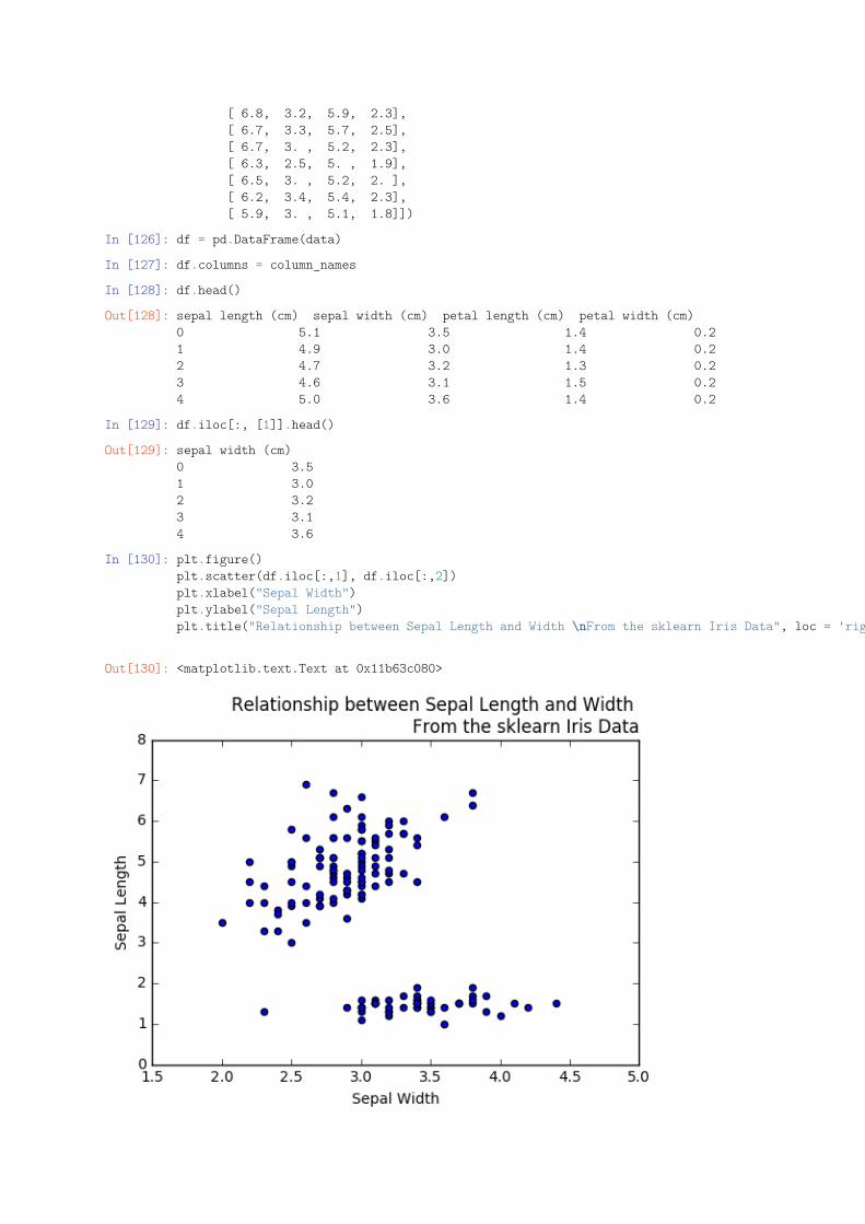
In [126]: df = pd.DataFrame(data)
In [127]: df.columns = column_names
In [128]: df.head()
Out[128]: sepal length (cm) sepal width (cm) petal length (cm) petal width (cm)0 5.1 3.5 1.4 0.21 4.9 3.0 1.4 0.22 4.7 3.2 1.3 0.23 4.6 3.1 1.5 0.24 5.0 3.6 1.4 0.2
In [129]: df.iloc[:, [1]].head()
Out[129]: sepal width (cm)0 3.51 3.02 3.23 3.14 3.6
In [130]: plt.figure()plt.scatter(df.iloc[:,1], df.iloc[:,2])plt.xlabel("Sepal Width")plt.ylabel("Sepal Length")plt.title("Relationship between Sepal Length and Width \nFrom the sklearn Iris Data", loc = 'right', fontsize = 12)
Out[130]: <matplotlib.text.Text at 0x11b63c080>
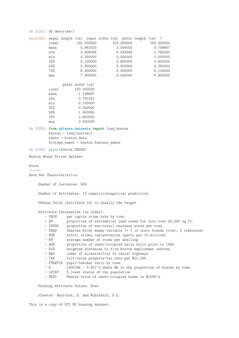
In [131]: df.describe()
Out[131]: sepal length (cm) sepal width (cm) petal length (cm) \count 150.000000 150.000000 150.000000mean 5.843333 3.054000 3.758667std 0.828066 0.433594 1.764420min 4.300000 2.000000 1.00000025% 5.100000 2.800000 1.60000050% 5.800000 3.000000 4.35000075% 6.400000 3.300000 5.100000max 7.900000 4.400000 6.900000
petal width (cm)count 150.000000mean 1.198667std 0.763161min 0.10000025% 0.30000050% 1.30000075% 1.800000max 2.500000
In [132]: from sklearn.datasets import load_bostonboston = load_boston()bdata = boston.databcolumn_names = boston.feature_names
In [133]: print(boston.DESCR)
Boston House Prices dataset
Notes------Data Set Characteristics:
:Number of Instances: 506
:Number of Attributes: 13 numeric/categorical predictive
:Median Value (attribute 14) is usually the target
:Attribute Information (in order):- CRIM per capita crime rate by town- ZN proportion of residential land zoned for lots over 25,000 sq.ft.- INDUS proportion of non-retail business acres per town- CHAS Charles River dummy variable (= 1 if tract bounds river; 0 otherwise)- NOX nitric oxides concentration (parts per 10 million)- RM average number of rooms per dwelling- AGE proportion of owner-occupied units built prior to 1940- DIS weighted distances to five Boston employment centres- RAD index of accessibility to radial highways- TAX full-value property-tax rate per $10,000- PTRATIO pupil-teacher ratio by town- B 1000(Bk - 0.63)^2 where Bk is the proportion of blacks by town- LSTAT % lower status of the population- MEDV Median value of owner-occupied homes in $1000's
:Missing Attribute Values: None
:Creator: Harrison, D. and Rubinfeld, D.L.
This is a copy of UCI ML housing dataset.
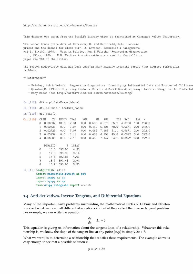
http://archive.ics.uci.edu/ml/datasets/Housing
This dataset was taken from the StatLib library which is maintained at Carnegie Mellon University.
The Boston house-price data of Harrison, D. and Rubinfeld, D.L. 'Hedonicprices and the demand for clean air', J. Environ. Economics & Management,vol.5, 81-102, 1978. Used in Belsley, Kuh & Welsch, 'Regression diagnostics...', Wiley, 1980. N.B. Various transformations are used in the table onpages 244-261 of the latter.
The Boston house-price data has been used in many machine learning papers that address regressionproblems.
**References**
- Belsley, Kuh & Welsch, 'Regression diagnostics: Identifying Influential Data and Sources of Collinearity', Wiley, 1980. 244-261.- Quinlan,R. (1993). Combining Instance-Based and Model-Based Learning. In Proceedings on the Tenth International Conference of Machine Learning, 236-243, University of Massachusetts, Amherst. Morgan Kaufmann.- many more! (see http://archive.ics.uci.edu/ml/datasets/Housing)
In [117]: df2 = pd.DataFrame(bdata)
In [118]: df2.columns = bcolumn_names
In [119]: df2.head()
Out[119]: CRIM ZN INDUS CHAS NOX RM AGE DIS RAD TAX \0 0.00632 18.0 2.31 0.0 0.538 6.575 65.2 4.0900 1.0 296.01 0.02731 0.0 7.07 0.0 0.469 6.421 78.9 4.9671 2.0 242.02 0.02729 0.0 7.07 0.0 0.469 7.185 61.1 4.9671 2.0 242.03 0.03237 0.0 2.18 0.0 0.458 6.998 45.8 6.0622 3.0 222.04 0.06905 0.0 2.18 0.0 0.458 7.147 54.2 6.0622 3.0 222.0
PTRATIO B LSTAT0 15.3 396.90 4.981 17.8 396.90 9.142 17.8 392.83 4.033 18.7 394.63 2.944 18.7 396.90 5.33
In [1]: %matplotlib inlineimport matplotlib.pyplot as pltimport numpy as npimport sympy as syfrom scipy.integrate import odeint
1.4 Anti-derivatives, Inverse Tangents, and Differential Equations
Many of the important early problems surrounding the mathematical circles of Leibniz and Newtoninvolved what we now call differential equations and what they called the inverse tangent problem.For example, we can write the equation
dydx
= 2x + 3
This equation is giving us information about the tangent lines of a relationship. Whatever this rela-tionship is, we know the slope of the tangent line at any point (x, y) is simply 2x + 3.
What we want, is to determine a relationship that satisfies these requirements. The example above iseasy enough to see that a possible solution is
y = x2 + 3x
In [2]: def dy(x):return 2*x + 3
x = sy.Symbol('x')anti_d = sy.integrate(2*x+3, x)sy.pprint(anti_d)
2x + 3x
We can check the work by seeing that the derivative of our antiderivative is what we started with.
In [3]: sy.diff(anti_d, x)
Out[3]: 2*x + 3
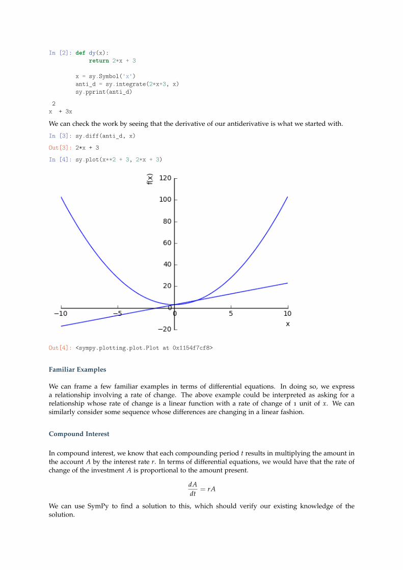
In [4]: sy.plot(x**2 + 3, 2*x + 3)
Out[4]: <sympy.plotting.plot.Plot at 0x1154f7cf8>
Familiar Examples
We can frame a few familiar examples in terms of differential equations. In doing so, we expressa relationship involving a rate of change. The above example could be interpreted as asking for arelationship whose rate of change is a linear function with a rate of change of 1 unit of x. We cansimilarly consider some sequence whose differences are changing in a linear fashion.
Compound Interest
In compound interest, we know that each compounding period t results in multiplying the amount inthe account A by the interest rate r. In terms of differential equations, we would have that the rate ofchange of the investment A is proportional to the amount present.
dAdt
= rA
We can use SymPy to find a solution to this, which should verify our existing knowledge of thesolution.
In [5]: t, A, r, P = sy.symbols('t A r P')
In [6]: A = sy.Function("A")(t)A_ = sy.Derivative(A, t)P = sy.Symbol('P')
In [7]: b = sy.Eq(A_, r*A)
In [8]: soln = sy.dsolve(b)sy.pprint(soln)
rtA(t) = C
We find that we are given the solution with some other constant C1. We will examine this in more detailin just a second, but for now let’s visit some familiar examples to get used to solving the differentialequations in SymPy.
Introductory Examples
Solve the differential equation with Sympy:
• dydx = y2
• 4x2 d2ydx2 + y = 0
• y′ + 2xy2 = 0
• y′ = y + 2e−x
Families of AntiDerivatives
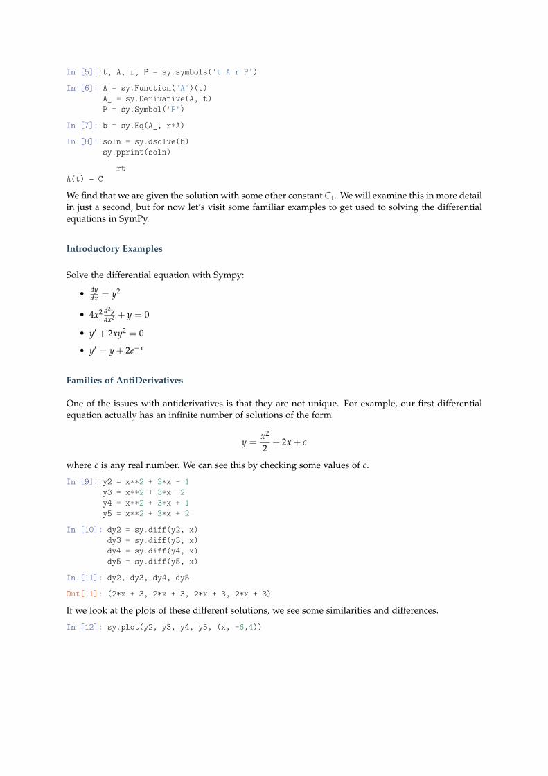
One of the issues with antiderivatives is that they are not unique. For example, our first differentialequation actually has an infinite number of solutions of the form
y =x2
2+ 2x + c
where c is any real number. We can see this by checking some values of c.
In [9]: y2 = x**2 + 3*x - 1y3 = x**2 + 3*x -2y4 = x**2 + 3*x + 1y5 = x**2 + 3*x + 2
In [10]: dy2 = sy.diff(y2, x)dy3 = sy.diff(y3, x)dy4 = sy.diff(y4, x)dy5 = sy.diff(y5, x)
In [11]: dy2, dy3, dy4, dy5
Out[11]: (2*x + 3, 2*x + 3, 2*x + 3, 2*x + 3)
If we look at the plots of these different solutions, we see some similarities and differences.
In [12]: sy.plot(y2, y3, y4, y5, (x, -6,4))
Out[12]: <sympy.plotting.plot.Plot at 0x1180c6e48>
In a similar manner, explore alternative values for the constants of integration and plot the solutionsto your earlier problems.
Initial Value Problems
Now, we will suppose that we know a certain point on the curve that the solution passes through. Forexample, or early example began with the differential equation
dydx
= 2x + 3
We found that the solutions to this equation take the form
y = x2 + 3x + C
where C is some constant.
In [13]: y = sy.Function("y")(x)dy = sy.Derivative(y, x)diff_eq = sy.Eq(dy, 2*x + 3)soln = sy.dsolve(diff_eq)sy.pprint(soln)
2y(x) = C + x + 3x
We may know some additional information however. Suppose we knew that the solution that wewanted passed through the point (1, 2). This would mean that if we substitute for each of thesevalues, we should get a true statement. We can find a value for C1 then, that would make this true.
In [14]: c = sy.Symbol('c')initial_value = sy.Eq(2, 1**2 + 3*1 + c)sy.solve(initial_value, c)
Out[14]: [-2]
Hence, we have that
y = x2 + 3x− 2
We find a more general solution for our compound interest problem in a similar manner where wehave the initial investment P at time t = 0.
In [15]: P = sy.Symbol('P')initial_value = sy.Eq(P, c*sy.exp(r*0))sy.solve(initial_value, c)
Out[15]: [P]
Hence, we have our solution as
y = Pert
Motion as Differential Equation
Before, we investigated the relationships between displacement, velocity, and acceleration. In the languageof differential equations, we can phrase this as
a =dvdt
=d2xdt2
where we have
x = f (t)
for the motion of some particle along the x-axis.
In [16]: a = sy.Symbol('a')v = sy.Function("v")(t)dv = sy.Derivative(v, t)diff_eq = sy.Eq(dv, a)soln = sy.dsolve(diff_eq)sy.pprint(soln)
v(t) = C + at
In [17]: v0 = sy.Symbol('v0')initial_value = sy.Eq(c + a*0, v0)sy.solve(initial_value, c)
Out[17]: [v0]
In [18]: x = sy.Function("x")(t)dx = sy.Derivative(x, t)diff_eq = sy.Eq(dx, v0 + a*t)soln2 = sy.dsolve(diff_eq)sy.pprint(soln2)
2at
x(t) = C + + tv2
Thus we have
v(t) = at + v0
and
x(t) =12
at2 + v0t + x0
Problems
Fintd the position function x(t) for some particle given the information about the constant accelerationa, the initial velocity v0, and initial position x0.
• a(t) = 40, v0 = 5, x0 = 10
• a(t) = −2, v0 = 20, x0 = 34
• a(t) = 3t, v0 = 2, x0 = 4
Force and Gravitational Acceleration
One of the accomplishments of Newton’s Principia was to set down laws of motion that were developedby assuming a universal force of gravity acting on all bodies. The acceleration due to the Earth’sgravity is approximated by 9.8 m/s2. Further, we can define the weight of a body as the force exertedby gravity on a body. Newton’s second law states that the Force on any body is equal to its mass timesacceleration. We call the unit of force required to move impart an acceleration of 1 m/s2 to a mass of1 kg a Newton.
Thus, we have that W = mg.
Returning to our problems with motion, we note that we view the action on bodies on Earth as anacceleration due to gravity g, hence we have
a =dvdt
v(t) = −gt + v0
y(t) =−12
gt2 + v0t + y0
and can use these equations to solve some basic problems dealing with bodies in motion on Earth. Forexample, suppose we throw a ball straight up from the ground with an initial velocity v0 = 90 ft/sec,hence it reaches its maximum height when the velocity is zero, or
v(t) = −32t + 96 = 0
or
t = 3
so we have a maximum height of
y(3) = −1/2(32)(32) + 96(3) + 0 = 144 f t
Problems
• A projectile is fired straight up from the top of a building 30m high, with initial velocity of40m/s. Find its maximum height above the ground, when it passes the top of the building andits time in the air.
• A bomb is dropped from a helicopter hovering at an altitude of 800 feet above the ground. Fromthe ground directly beneath the helicopter, a projectile is fired straight upward toward the bomb,exacly 2 seconds after the bomb is released. With waht initial velocity should the projectile befired, in order to hit the bomb at nan altitude of exacly 400 feet?
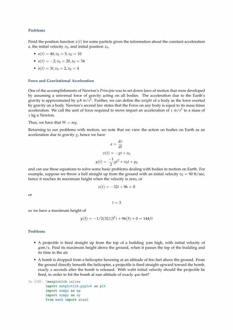
In [18]: %matplotlib inlineimport matplotlib.pyplot as pltimport numpy as npimport sympy as syfrom math import atan2
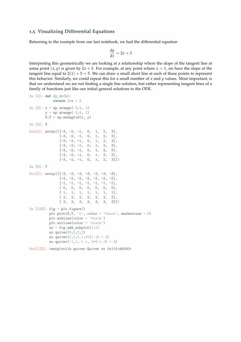
1.5 Visualizing Differential Equations
Returning to the example from our last notebook, we had the differential equation
dydx
= 2x + 3
Interpreting this geometrically we are looking at a relationship where the slope of the tangent line atsome point (x, y) is given by 2x + 3. For example, at any point where x = 1, we have the slope of thetangent line equal to 2(1) + 3 = 5. We can draw a small short line at each of these points to representthis behavior. Similarly, we could repeat this for a small number of x and y values. Most important, isthat we understand we are not finding a single line solution, but rather representing tangent lines of afamily of functions just like our initial general solutions to the ODE.
In [2]: def dy_dx(x):return 2*x + 3
In [3]: x = np.arange(-3,4, 1)y = np.arange(-3,4, 1)X,Y = np.meshgrid(x, y)
In [4]: X
Out[4]: array([[-3, -2, -1, 0, 1, 2, 3],[-3, -2, -1, 0, 1, 2, 3],[-3, -2, -1, 0, 1, 2, 3],[-3, -2, -1, 0, 1, 2, 3],[-3, -2, -1, 0, 1, 2, 3],[-3, -2, -1, 0, 1, 2, 3],[-3, -2, -1, 0, 1, 2, 3]])
In [5]: Y
Out[5]: array([[-3, -3, -3, -3, -3, -3, -3],[-2, -2, -2, -2, -2, -2, -2],[-1, -1, -1, -1, -1, -1, -1],[ 0, 0, 0, 0, 0, 0, 0],[ 1, 1, 1, 1, 1, 1, 1],[ 2, 2, 2, 2, 2, 2, 2],[ 3, 3, 3, 3, 3, 3, 3]])
In [122]: fig = plt.figure()plt.plot(X,Y, 'o', color = 'black', markersize = 6)plt.axhline(color = 'black')plt.axvline(color = 'black')ax = fig.add_subplot(111)ax.quiver(0,0,2,2)ax.quiver(1,1,1.1,2*(1.1) + 3)ax.quiver(-1,1,-1.1, 2*(-1.1) + 3)
Out[122]: <matplotlib.quiver.Quiver at 0x11fcd9160>
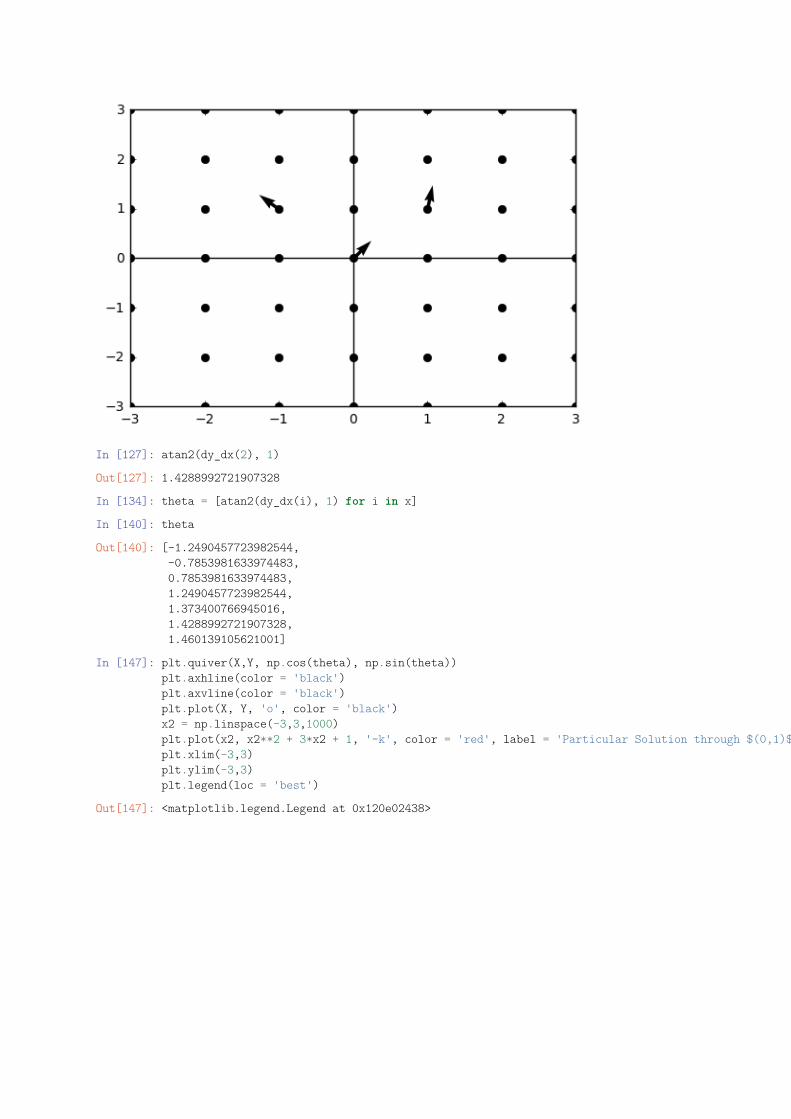
In [127]: atan2(dy_dx(2), 1)
Out[127]: 1.4288992721907328
In [134]: theta = [atan2(dy_dx(i), 1) for i in x]
In [140]: theta
Out[140]: [-1.2490457723982544,-0.7853981633974483,0.7853981633974483,1.2490457723982544,1.373400766945016,1.4288992721907328,1.460139105621001]
In [147]: plt.quiver(X,Y, np.cos(theta), np.sin(theta))plt.axhline(color = 'black')plt.axvline(color = 'black')plt.plot(X, Y, 'o', color = 'black')x2 = np.linspace(-3,3,1000)plt.plot(x2, x2**2 + 3*x2 + 1, '-k', color = 'red', label = 'Particular Solution through $(0,1)$')plt.xlim(-3,3)plt.ylim(-3,3)plt.legend(loc = 'best')
Out[147]: <matplotlib.legend.Legend at 0x120e02438>
In [1]: %matplotlib inlineimport matplotlib.pyplot as pltimport numpy as npimport sympy as sy
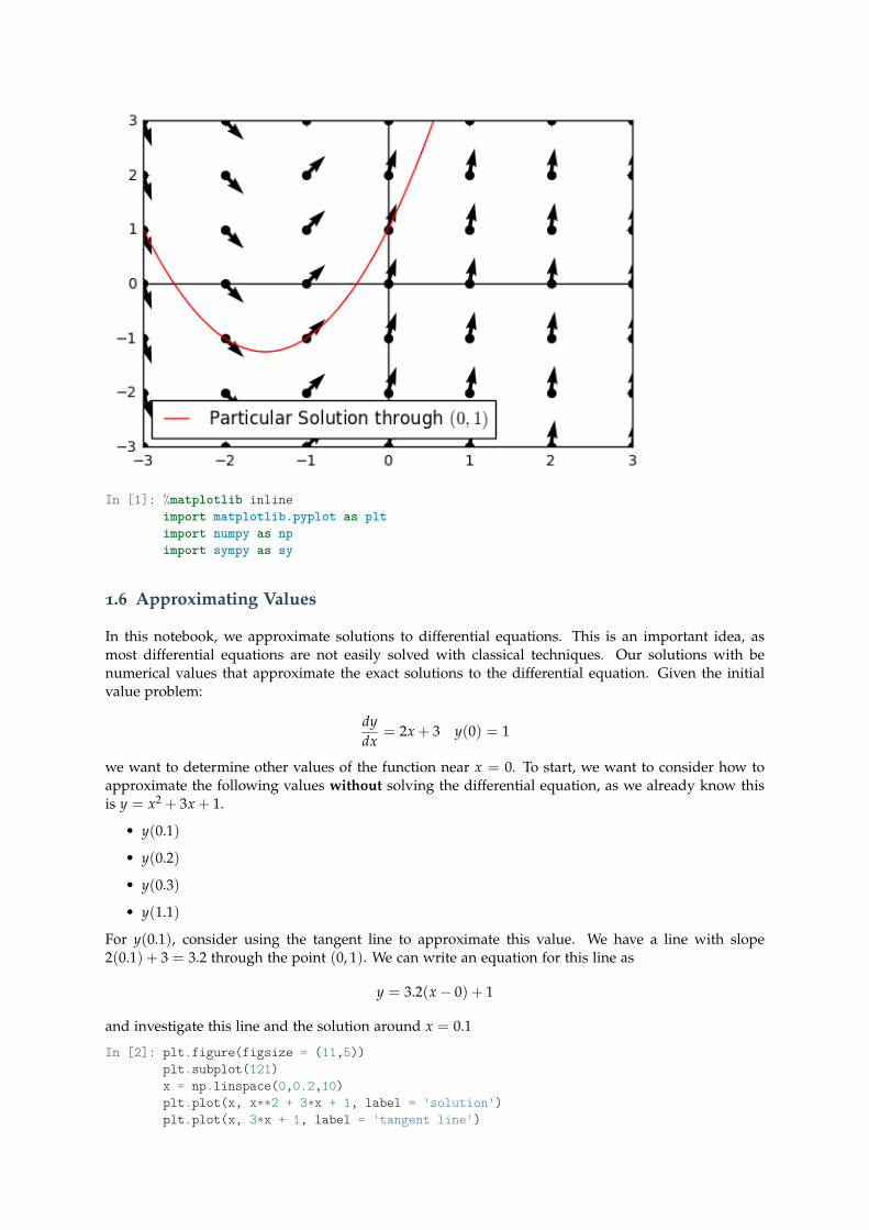
1.6 Approximating Values
In this notebook, we approximate solutions to differential equations. This is an important idea, asmost differential equations are not easily solved with classical techniques. Our solutions with benumerical values that approximate the exact solutions to the differential equation. Given the initialvalue problem:
dydx
= 2x + 3 y(0) = 1
we want to determine other values of the function near x = 0. To start, we want to consider how toapproximate the following values without solving the differential equation, as we already know thisis y = x2 + 3x + 1.
• y(0.1)
• y(0.2)
• y(0.3)
• y(1.1)
For y(0.1), consider using the tangent line to approximate this value. We have a line with slope2(0.1) + 3 = 3.2 through the point (0, 1). We can write an equation for this line as
y = 3.2(x− 0) + 1
and investigate this line and the solution around x = 0.1
In [2]: plt.figure(figsize = (11,5))plt.subplot(121)x = np.linspace(0,0.2,10)plt.plot(x, x**2 + 3*x + 1, label = 'solution')plt.plot(x, 3*x + 1, label = 'tangent line')
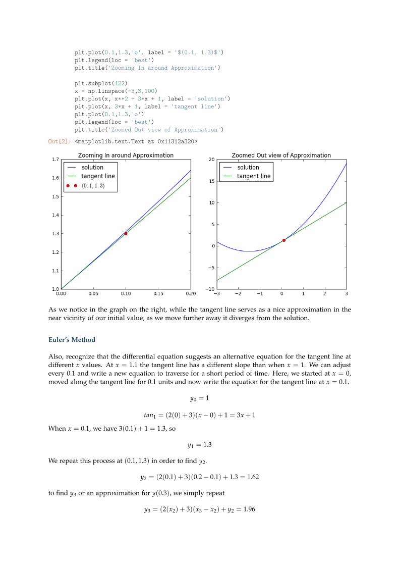
plt.plot(0.1,1.3,'o', label = '$(0.1, 1.3)$')plt.legend(loc = 'best')plt.title('Zooming In around Approximation')
plt.subplot(122)x = np.linspace(-3,3,100)plt.plot(x, x**2 + 3*x + 1, label = 'solution')plt.plot(x, 3*x + 1, label = 'tangent line')plt.plot(0.1,1.3,'o')plt.legend(loc = 'best')plt.title('Zoomed Out view of Approximation')
Out[2]: <matplotlib.text.Text at 0x11312a320>
As we notice in the graph on the right, while the tangent line serves as a nice approximation in thenear vicinity of our initial value, as we move further away it diverges from the solution.
Euler’s Method
Also, recognize that the differential equation suggests an alternative equation for the tangent line atdifferent x values. At x = 1.1 the tangent line has a different slope than when x = 1. We can adjustevery 0.1 and write a new equation to traverse for a short period of time. Here, we started at x = 0,moved along the tangent line for 0.1 units and now write the equation for the tangent line at x = 0.1.
y0 = 1
tan1 = (2(0) + 3)(x− 0) + 1 = 3x + 1
When x = 0.1, we have 3(0.1) + 1 = 1.3, so
y1 = 1.3
We repeat this process at (0.1, 1.3) in order to find y2.
y2 = (2(0.1) + 3)(0.2− 0.1) + 1.3 = 1.62
to find y3 or an approximation for y(0.3), we simply repeat
y3 = (2(x2) + 3)(x3 − x2) + y2 = 1.96
In [3]: (2*(0.1) + 3)*(0.2 - 0.1)+ 1.3
Out[3]: 1.62
In [4]: (2*(0.2) + 3)*(0.3 - 0.2)+ 1.62
Out[4]: 1.96
Perhaps you recognize a more general pattern. We are evaluating the derivative at each h step, multi-plying this by h and adding this to the previous approximation to get our new approximation. Let’sgenerate more terms and visualize our solutions. Formally, we can define a relationship betweensuccessive y terms as follows, where xi = h ∗ i and f = dy
dx :
yi+1 = h f (xi) + yi
In [5]: def df(x):return 2*x+3
h = 0.1y = [1]for i in range(10):
next = df(i*h)*h + y[i]y.append(next)
y
Out[5]: [1,1.3,1.62,1.9600000000000002,2.3200000000000003,2.7,3.1,3.52,3.96,4.42,4.9]
In [6]: x = np.linspace(0,1.0,11)plt.plot(x,y,'--o', label = 'Approximations')plt.plot(x, x**2 + 3*x + 1, '--o', color = 'red', label = 'Actual Solutions')plt.legend(loc = 'best')
Out[6]: <matplotlib.legend.Legend at 0x113916dd8>
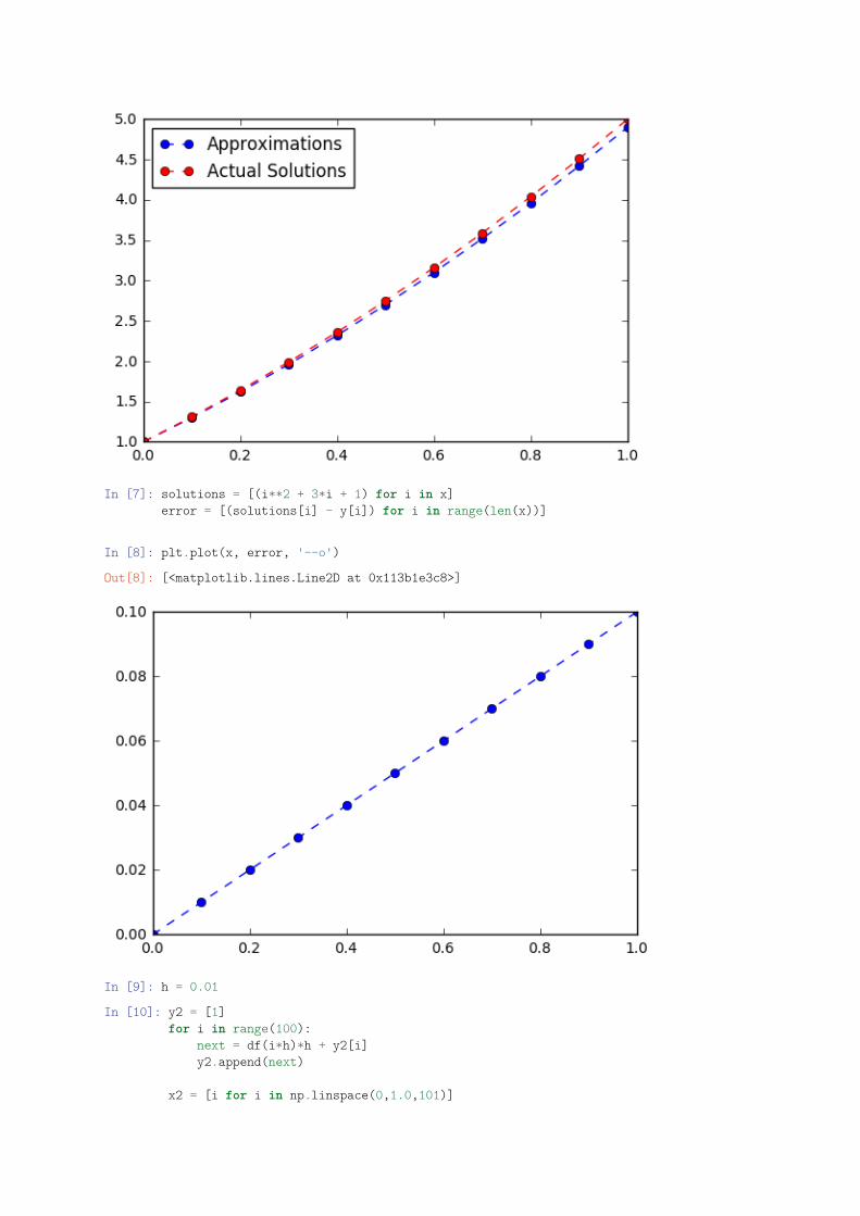
In [7]: solutions = [(i**2 + 3*i + 1) for i in x]error = [(solutions[i] - y[i]) for i in range(len(x))]
In [8]: plt.plot(x, error, '--o')
Out[8]: [<matplotlib.lines.Line2D at 0x113b1e3c8>]
In [9]: h = 0.01
In [10]: y2 = [1]for i in range(100):
next = df(i*h)*h + y2[i]y2.append(next)
x2 = [i for i in np.linspace(0,1.0,101)]
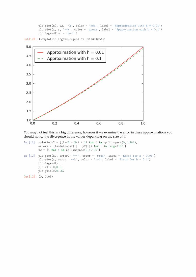
plt.plot(x2, y2, '-k', color = 'red', label = 'Approximation with h = 0.01')plt.plot(x, y, '--k', color = 'green', label = 'Approximation with h = 0.1')plt.legend(loc = 'best')
Out[10]: <matplotlib.legend.Legend at 0x113c40b38>
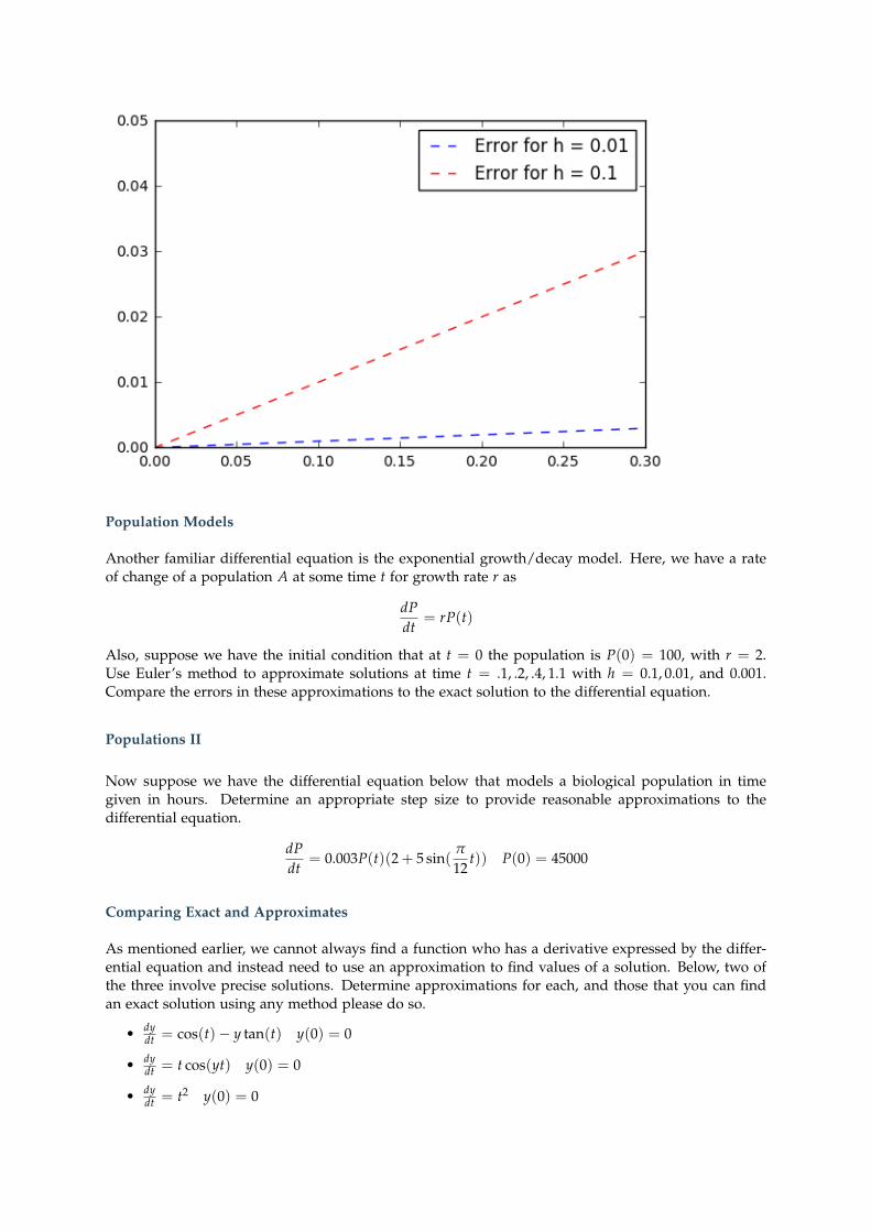
You may not feel this is a big difference, however if we examine the error in these approximations youshould notice the divergence in the values depending on the size of h.
In [11]: solutions2 = [(i**2 + 3*i + 1) for i in np.linspace(0,1,101)]error2 = [(solutions2[i] - y2[i]) for i in range(100)]x2 = [i for i in np.linspace(0,1,100)]
In [12]: plt.plot(x2, error2, '--', color = 'blue', label = 'Error for h = 0.01')plt.plot(x, error, '--k', color = 'red', label = 'Error for h = 0.1')plt.legend()plt.xlim(0,0.3)plt.ylim(0,0.05)
Out[12]: (0, 0.05)
Population Models
Another familiar differential equation is the exponential growth/decay model. Here, we have a rateof change of a population A at some time t for growth rate r as
dPdt
= rP(t)
Also, suppose we have the initial condition that at t = 0 the population is P(0) = 100, with r = 2.Use Euler’s method to approximate solutions at time t = .1, .2, .4, 1.1 with h = 0.1, 0.01, and 0.001.Compare the errors in these approximations to the exact solution to the differential equation.
Populations II
Now suppose we have the differential equation below that models a biological population in timegiven in hours. Determine an appropriate step size to provide reasonable approximations to thedifferential equation.
dPdt
= 0.003P(t)(2 + 5 sin(π
12t)) P(0) = 45000
Comparing Exact and Approximates
As mentioned earlier, we cannot always find a function who has a derivative expressed by the differ-ential equation and instead need to use an approximation to find values of a solution. Below, two ofthe three involve precise solutions. Determine approximations for each, and those that you can findan exact solution using any method please do so.
• dydt = cos(t)− y tan(t) y(0) = 0
• dydt = t cos(yt) y(0) = 0
• dydt = t2 y(0) = 0
In [1]: %matplotlib notebookimport matplotlib.pyplot as pltimport numpy as npimport sympy as syfrom scipy.integrate import odeintsize = (12, 9)from ipywidgets import interact, widgets, fixedfrom math import atan2
1.7 Population Models
A simple example of a model involving a differential equation could be the basic additive populationgrowth model. Here, suppose we have a constant rate of change k. As a differential equation wewould have:
dPdt
= k
We are familiar with the solution
P(t) = kt + c
In this notebook, we want to add complexity to this model and explore the results. Obviously, as-suming a constant rate of change in a population model is a fairly naive assumption. Regardless, let’squickly revisit our methods for visualizing and solving a differential equation expressed in this form.
In [2]: x, k, t, P = sy.symbols('x k t P')
In [3]: def dp_dt(x,k):return k
In [4]: sy.integrate(dp_dt(x,k), t)
Out[4]: k*t
In [5]: x = np.linspace(0,10,11)theta = [atan2(dp_dt(i, 1.1), 1) for i in x]
In [6]: x = np.linspace(0,10,11)y = np.linspace(0,10,11)X, Y = np.meshgrid(x, y)plt.figure()plt.plot(X, Y, 'o', color = 'black', alpha = 0.6)plt.quiver(X,Y, np.cos(theta), np.sin(theta))plt.plot(x, 1.1*x + 4, '-k', color = 'red', linewidth = 4, label = 'Solution Curve for $k = 1.1$ and $c=4$')plt.ylim(0,10)plt.legend(loc = 'best')
<IPython.core.display.Javascript object>
<IPython.core.display.HTML object>
Out[6]: <matplotlib.legend.Legend at 0x119402ef0>
Exponential Growth
Last notebook, we saw the basic population model expressed as a differential equation. Here, weshould recall our earlier work with discrete sequences and the passage to the limit that determines thechange from ∆P to dP. We will rely heavily on this idea when modeling with differential equations.For the simple exponential population model, as a differential equation we have
dPdt
= rP
whereas in the discrete case we have
∆P∆t
= rP or ∆P = rP∆t
Returning to a basic example, suppose we know a population has size P = 100 at time t = 0. Thepopulation grows at a 0.24% growth rate. If we consider this in terms of our abover relationship as away to approximate solutions every ∆t = 0.1, we get the following populations pi.
p0 = 100
p1 = 100 + 0.0024(100)(0.1) or p0(1 + r)∆t
Problem: A certain city had a population of 25,000 and a growth rate of r =1.8exponentiallyataconstantrate, whatpopulationcanitscityplannersexpectintheyear2000?
In [7]: r = 0.018p0 = 25000dt = 1
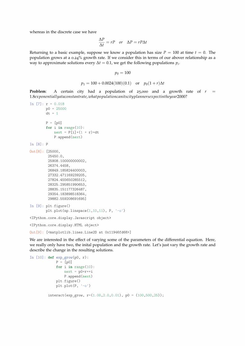
P = [p0]for i in range(10):
next = P[i]*(1 + r)*dtP.append(next)
In [8]: P
Out[8]: [25000,25450.0,25908.100000000002,26374.4458,26849.185824400003,27332.471169239205,27824.455650285512,28325.295851990653,28835.151177326487,29354.183898518364,29882.559208691695]
In [9]: plt.figure()plt.plot(np.linspace(1,10,11), P, '-o')
<IPython.core.display.Javascript object>
<IPython.core.display.HTML object>
Out[9]: [<matplotlib.lines.Line2D at 0x11946fd68>]
We are interested in the effect of varying some of the parameters of the differential equation. Here,we really only have two, the inital population and the growth rate. Let’s just vary the growth rate anddescribe the change in the resulting solutions.
In [10]: def exp_grow(p0, r):P = [p0]for i in range(10):
next = p0*r**iP.append(next)
plt.figure()plt.plot(P, '-o')
interact(exp_grow, r=(1.00,2.0,0.01), p0 = (100,500,25));
The Logistic Differential Equation
The logistic equation was introduced by Pierre-Francois Verhulst in a discussion on the United Statespopulation growth. In the middle of the 19th century, the United States was still expanding, and thepopulation had followed exponential growth. This could not continue however, as “the difficulty offinding good land has begun to make itself felt.”
“the population tends to grow in geometric progression while the production of food follows a more or lessarithmetic progression”–Verhulst 1845
This translates mathematically to the rate of births against those of deaths as a linear rate of change.We can examine this through an example.
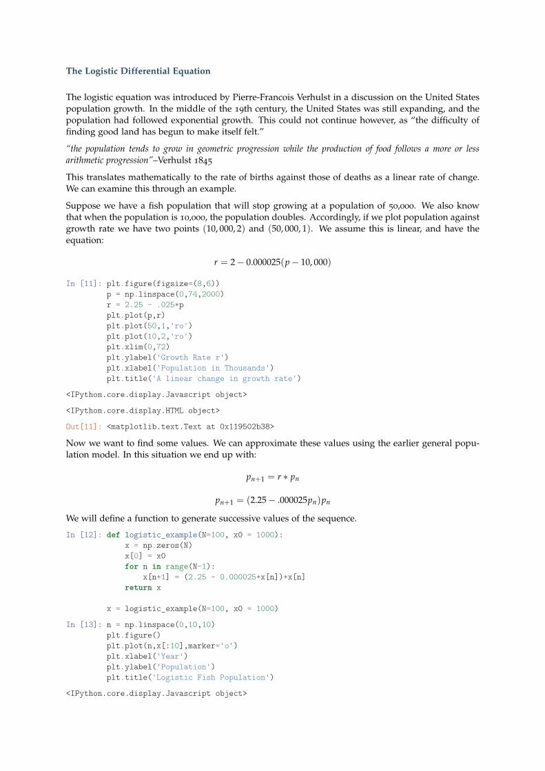
Suppose we have a fish population that will stop growing at a population of 50,000. We also knowthat when the population is 10,000, the population doubles. Accordingly, if we plot population againstgrowth rate we have two points (10, 000, 2) and (50, 000, 1). We assume this is linear, and have theequation:
r = 2− 0.000025(p− 10, 000)
In [11]: plt.figure(figsize=(8,6))p = np.linspace(0,74,2000)r = 2.25 - .025*pplt.plot(p,r)plt.plot(50,1,'ro')plt.plot(10,2,'ro')plt.xlim(0,72)plt.ylabel('Growth Rate r')plt.xlabel('Population in Thousands')plt.title('A linear change in growth rate')
<IPython.core.display.Javascript object>
<IPython.core.display.HTML object>
Out[11]: <matplotlib.text.Text at 0x119502b38>
Now we want to find some values. We can approximate these values using the earlier general popu-lation model. In this situation we end up with:
pn+1 = r ∗ pn
pn+1 = (2.25− .000025pn)pn
We will define a function to generate successive values of the sequence.
In [12]: def logistic_example(N=100, x0 = 1000):x = np.zeros(N)x[0] = x0for n in range(N-1):
x[n+1] = (2.25 - 0.000025*x[n])*x[n]return x
x = logistic_example(N=100, x0 = 1000)
In [13]: n = np.linspace(0,10,10)plt.figure()plt.plot(n,x[:10],marker='o')plt.xlabel('Year')plt.ylabel('Population')plt.title('Logistic Fish Population')
<IPython.core.display.Javascript object>

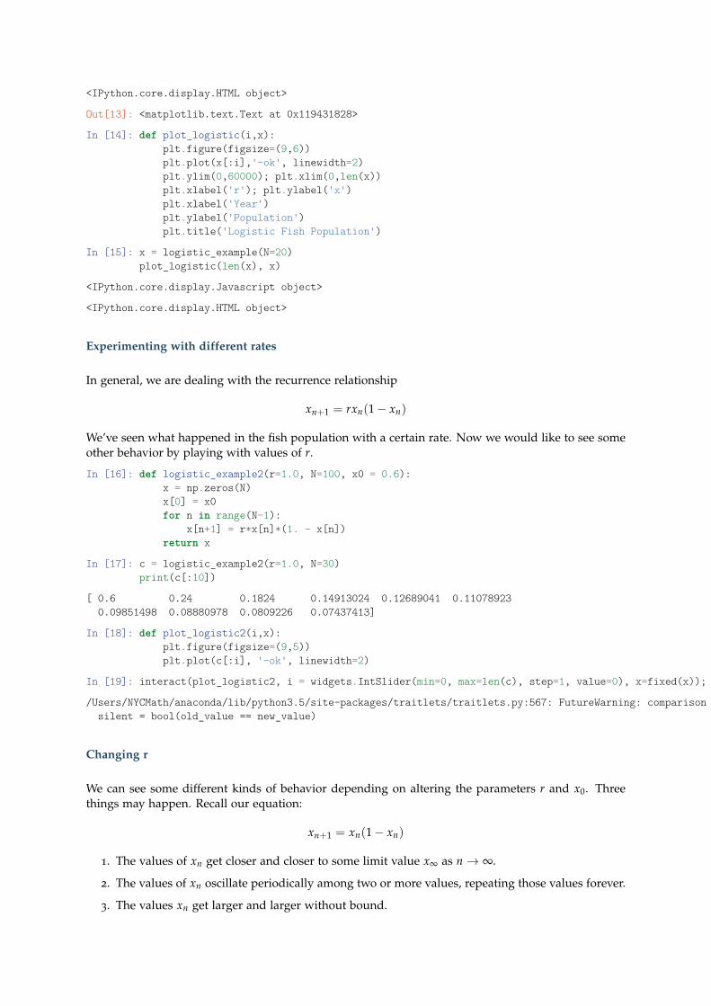
<IPython.core.display.HTML object>
Out[13]: <matplotlib.text.Text at 0x119431828>
In [14]: def plot_logistic(i,x):plt.figure(figsize=(9,6))plt.plot(x[:i],'-ok', linewidth=2)plt.ylim(0,60000); plt.xlim(0,len(x))plt.xlabel('r'); plt.ylabel('x')plt.xlabel('Year')plt.ylabel('Population')plt.title('Logistic Fish Population')
In [15]: x = logistic_example(N=20)plot_logistic(len(x), x)
<IPython.core.display.Javascript object>
<IPython.core.display.HTML object>
Experimenting with different rates
In general, we are dealing with the recurrence relationship
xn+1 = rxn(1− xn)
We’ve seen what happened in the fish population with a certain rate. Now we would like to see someother behavior by playing with values of r.
In [16]: def logistic_example2(r=1.0, N=100, x0 = 0.6):x = np.zeros(N)x[0] = x0for n in range(N-1):
x[n+1] = r*x[n]*(1. - x[n])return x
In [17]: c = logistic_example2(r=1.0, N=30)print(c[:10])
[ 0.6 0.24 0.1824 0.14913024 0.12689041 0.110789230.09851498 0.08880978 0.0809226 0.07437413]
In [18]: def plot_logistic2(i,x):plt.figure(figsize=(9,5))plt.plot(c[:i], '-ok', linewidth=2)
In [19]: interact(plot_logistic2, i = widgets.IntSlider(min=0, max=len(c), step=1, value=0), x=fixed(x));
/Users/NYCMath/anaconda/lib/python3.5/site-packages/traitlets/traitlets.py:567: FutureWarning: comparison to `None` will result in an elementwise object comparison in the future.silent = bool(old_value == new_value)
Changing r
We can see some different kinds of behavior depending on altering the parameters r and x0. Threethings may happen. Recall our equation:
xn+1 = xn(1− xn)
1. The values of xn get closer and closer to some limit value x∞ as n→ ∞.
2. The values of xn oscillate periodically among two or more values, repeating those values forever.
3. The values xn get larger and larger without bound.
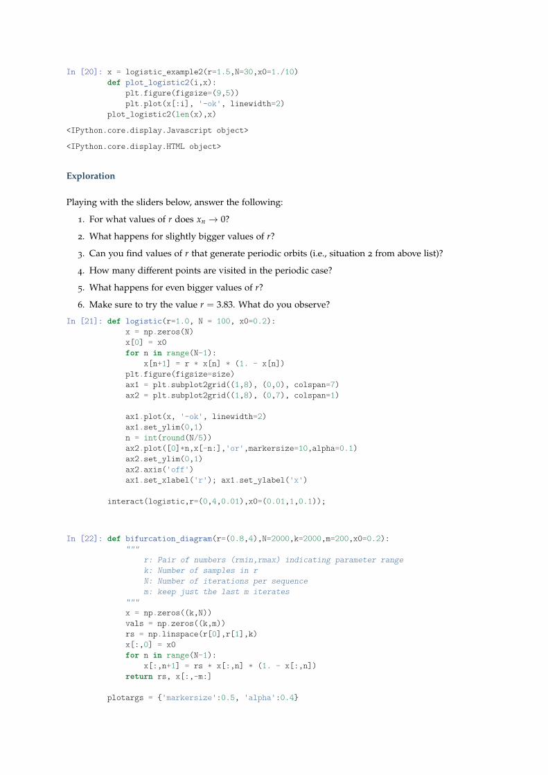
In [20]: x = logistic_example2(r=1.5,N=30,x0=1./10)def plot_logistic2(i,x):
plt.figure(figsize=(9,5))plt.plot(x[:i], '-ok', linewidth=2)
plot_logistic2(len(x),x)
<IPython.core.display.Javascript object>
<IPython.core.display.HTML object>
Exploration
Playing with the sliders below, answer the following:
1. For what values of r does xn → 0?
2. What happens for slightly bigger values of r?
3. Can you find values of r that generate periodic orbits (i.e., situation 2 from above list)?
4. How many different points are visited in the periodic case?
5. What happens for even bigger values of r?
6. Make sure to try the value r = 3.83. What do you observe?
In [21]: def logistic(r=1.0, N = 100, x0=0.2):x = np.zeros(N)x[0] = x0for n in range(N-1):
x[n+1] = r * x[n] * (1. - x[n])plt.figure(figsize=size)ax1 = plt.subplot2grid((1,8), (0,0), colspan=7)ax2 = plt.subplot2grid((1,8), (0,7), colspan=1)
ax1.plot(x, '-ok', linewidth=2)ax1.set_ylim(0,1)n = int(round(N/5))ax2.plot([0]*n,x[-n:],'or',markersize=10,alpha=0.1)ax2.set_ylim(0,1)ax2.axis('off')ax1.set_xlabel('r'); ax1.set_ylabel('x')
interact(logistic,r=(0,4,0.01),x0=(0.01,1,0.1));
In [22]: def bifurcation_diagram(r=(0.8,4),N=2000,k=2000,m=200,x0=0.2):"""
r: Pair of numbers (rmin,rmax) indicating parameter rangek: Number of samples in rN: Number of iterations per sequencem: keep just the last m iterates
"""x = np.zeros((k,N))vals = np.zeros((k,m))rs = np.linspace(r[0],r[1],k)x[:,0] = x0for n in range(N-1):
x[:,n+1] = rs * x[:,n] * (1. - x[:,n])return rs, x[:,-m:]
plotargs = {'markersize':0.5, 'alpha':0.4}
rs, vals = bifurcation_diagram()plt.figure(figsize=size)plt.plot(rs,vals,'ok',**plotargs);plt.xlim(rs.min(),rs.max());plt.xlabel('r'); plt.ylabel('x');
<IPython.core.display.Javascript object>
<IPython.core.display.HTML object>
In [1]: %matplotlib inlineimport matplotlib.pyplot as pltimport numpy as npimport sympy as syfrom ipywidgets import interact, widgets, fixed
1.8 Population Models
The simplest population model we examined was that of exponential growth. Here, we claimed apopulation that grows in direct proportion to itself can be represented both in terms of discrete timesteps and a continuous differential equation model, given below.
pn+1 = rpndPdt
= kP
Additionally, we looked at a population model that considered the limiting behavior of decreasedresources through the logistic equation. Again, we could describe this either based on a discretemodel or a continuous model as show below.
pn+1 = m(L− pn)pndPdt
= rP(1− P)
This model was interesting because of some unexpected behavior that we saw in the form of chaos.Today, we extend our discussion to population dynamics where we investigate predator prey relation-ships. Given some population of prey x(t) and some population of prey y(t) we aim to investigatethe changes in these populations over time depending on the values of certain population parametersmuch like we did with the logistic model. In general, we will be exploring variations on a theme. Thegeneral system of equations given by:
dxdt
= f1(t, x, y)− f2(t, x, y)
dydt
= f3(t, x, y)− f4(t, x, y)
Can be understood as describing the change in populations based on the difference between theincrease in the populations ( f1, f3) and the decrease in the populations ( f2, f4).
Lotka Voltera Model
An early example of a predator prey model is the Lotka Volterra model. We can follow Lotka’sargument for the construction of the model. First, he assumed:
• In the absence of predators, prey should grow exponentially without bound
• In the absence of prey, predators population should decrease similarly
Thus, we have the following:
dxdt
= ax
dydt
= −dy
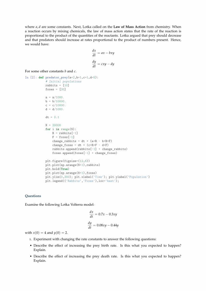
where a, d are some constants. Next, Lotka called on the Law of Mass Action from chemistry. Whena reaction occurs by mixing chemicals, the law of mass action states that the rate of the reaction isproportional to the product of the quantities of the reactants. Lotka argued that prey should decreaseand that predators should increase at rates proportional to the product of numbers present. Hence,we would have:
dxdt
= ax− bxy
dydt
= cxy− dy
For some other constants b and c.
In [2]: def predator_prey(a=2,b=1,c=1,d=5):# Initial populationsrabbits = [10]foxes = [20]
a = a/1000.b = b/10000.c = c/10000.d = d/1000.
dt = 0.1
N = 20000for i in range(N):
R = rabbits[-1]F = foxes[-1]change_rabbits = dt * (a*R - b*R*F)change_foxes = dt * (c*R*F - d*F)rabbits.append(rabbits[-1] + change_rabbits)foxes.append(foxes[-1] + change_foxes)
plt.figure(figsize=(12,6))plt.plot(np.arange(N+1),rabbits)plt.hold(True)plt.plot(np.arange(N+1),foxes)plt.ylim(0,200); plt.xlabel('Time'); plt.ylabel('Population')plt.legend(('Rabbits','Foxes'),loc='best');
Questions
Examine the following Lotka Volterra model:
dxdt
= 0.7x− 0.3xy
dydt
= 0.08xy− 0.44y
with x(0) = 4 and y(0) = 2.
1. Experiment with changing the rate constants to answer the following questions:
• Describe the effect of increasing the prey birth rate. Is this what you expected to happen?Explain.
• Describe the effect of increasing the prey death rate. Is this what you expected to happen?Explain.
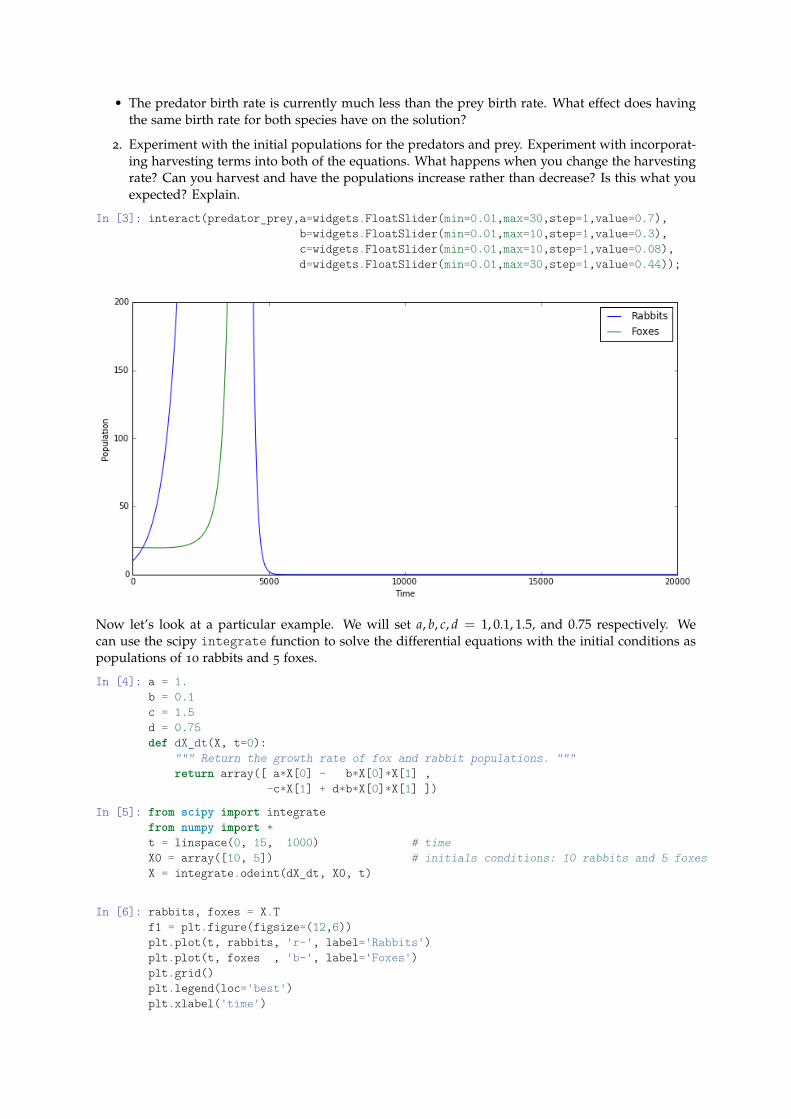
• The predator birth rate is currently much less than the prey birth rate. What effect does havingthe same birth rate for both species have on the solution?
2. Experiment with the initial populations for the predators and prey. Experiment with incorporat-ing harvesting terms into both of the equations. What happens when you change the harvestingrate? Can you harvest and have the populations increase rather than decrease? Is this what youexpected? Explain.
In [3]: interact(predator_prey,a=widgets.FloatSlider(min=0.01,max=30,step=1,value=0.7),b=widgets.FloatSlider(min=0.01,max=10,step=1,value=0.3),c=widgets.FloatSlider(min=0.01,max=10,step=1,value=0.08),d=widgets.FloatSlider(min=0.01,max=30,step=1,value=0.44));
Now let’s look at a particular example. We will set a, b, c, d = 1, 0.1, 1.5, and 0.75 respectively. Wecan use the scipy integrate function to solve the differential equations with the initial conditions aspopulations of 10 rabbits and 5 foxes.
In [4]: a = 1.b = 0.1c = 1.5d = 0.75def dX_dt(X, t=0):
""" Return the growth rate of fox and rabbit populations. """return array([ a*X[0] - b*X[0]*X[1] ,
-c*X[1] + d*b*X[0]*X[1] ])
In [5]: from scipy import integratefrom numpy import *t = linspace(0, 15, 1000) # timeX0 = array([10, 5]) # initials conditions: 10 rabbits and 5 foxesX = integrate.odeint(dX_dt, X0, t)
In [6]: rabbits, foxes = X.Tf1 = plt.figure(figsize=(12,6))plt.plot(t, rabbits, 'r-', label='Rabbits')plt.plot(t, foxes , 'b-', label='Foxes')plt.grid()plt.legend(loc='best')plt.xlabel('time')
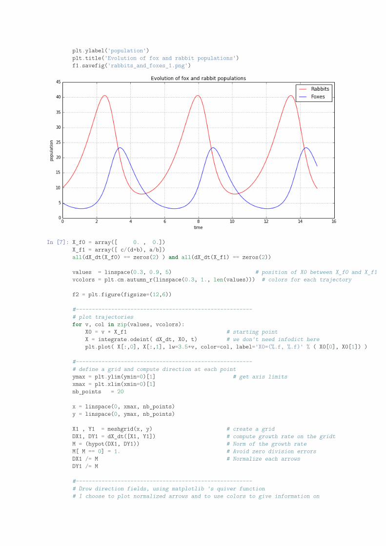
plt.ylabel('population')plt.title('Evolution of fox and rabbit populations')f1.savefig('rabbits_and_foxes_1.png')
In [7]: X_f0 = array([ 0. , 0.])X_f1 = array([ c/(d*b), a/b])all(dX_dt(X_f0) == zeros(2) ) and all(dX_dt(X_f1) == zeros(2))
values = linspace(0.3, 0.9, 5) # position of X0 between X_f0 and X_f1vcolors = plt.cm.autumn_r(linspace(0.3, 1., len(values))) # colors for each trajectory
f2 = plt.figure(figsize=(12,6))
#-------------------------------------------------------# plot trajectoriesfor v, col in zip(values, vcolors):
X0 = v * X_f1 # starting pointX = integrate.odeint( dX_dt, X0, t) # we don't need infodict hereplt.plot( X[:,0], X[:,1], lw=3.5*v, color=col, label='X0=(%.f, %.f)' % ( X0[0], X0[1]) )
#-------------------------------------------------------# define a grid and compute direction at each pointymax = plt.ylim(ymin=0)[1] # get axis limitsxmax = plt.xlim(xmin=0)[1]nb_points = 20
x = linspace(0, xmax, nb_points)y = linspace(0, ymax, nb_points)
X1 , Y1 = meshgrid(x, y) # create a gridDX1, DY1 = dX_dt([X1, Y1]) # compute growth rate on the gridtM = (hypot(DX1, DY1)) # Norm of the growth rateM[ M == 0] = 1. # Avoid zero division errorsDX1 /= M # Normalize each arrowsDY1 /= M
#-------------------------------------------------------# Drow direction fields, using matplotlib 's quiver function# I choose to plot normalized arrows and to use colors to give information on
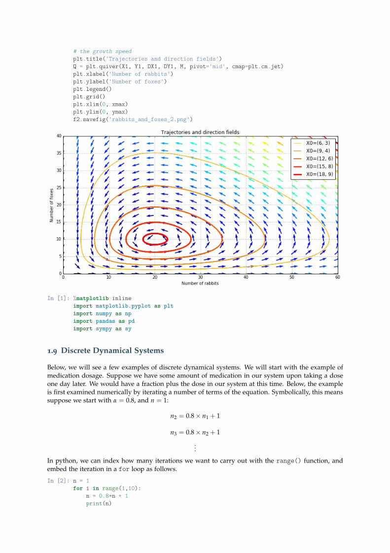
# the growth speedplt.title('Trajectories and direction fields')Q = plt.quiver(X1, Y1, DX1, DY1, M, pivot='mid', cmap=plt.cm.jet)plt.xlabel('Number of rabbits')plt.ylabel('Number of foxes')plt.legend()plt.grid()plt.xlim(0, xmax)plt.ylim(0, ymax)f2.savefig('rabbits_and_foxes_2.png')
In [1]: %matplotlib inlineimport matplotlib.pyplot as pltimport numpy as npimport pandas as pdimport sympy as sy
1.9 Discrete Dynamical Systems
Below, we will see a few examples of discrete dynamical systems. We will start with the example ofmedication dosage. Suppose we have some amount of medication in our system upon taking a doseone day later. We would have a fraction plus the dose in our system at this time. Below, the exampleis first examined numerically by iterating a number of terms of the equation. Symbolically, this meanssuppose we start with α = 0.8, and n = 1:
n2 = 0.8× n1 + 1
n3 = 0.8× n2 + 1
...
In python, we can index how many iterations we want to carry out with the range() function, andembed the iteration in a for loop as follows.
In [2]: n = 1for i in range(1,10):
n = 0.8*n + 1print(n)
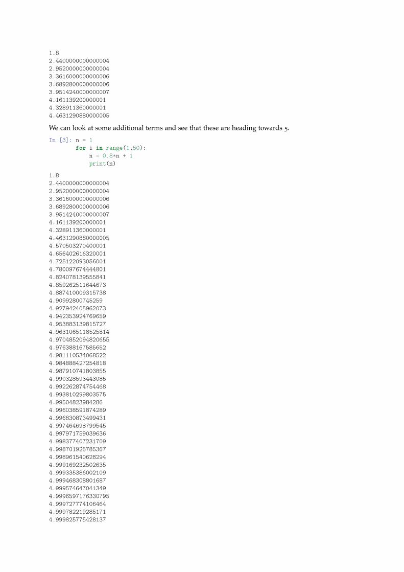
1.82.44000000000000042.95200000000000043.36160000000000063.68928000000000063.95142400000000074.1611392000000014.3289113600000014.4631290880000005
We can look at some additional terms and see that these are heading towards 5.
In [3]: n = 1for i in range(1,50):
n = 0.8*n + 1print(n)
1.82.44000000000000042.95200000000000043.36160000000000063.68928000000000063.95142400000000074.1611392000000014.3289113600000014.46312908800000054.5705032704000014.6564026163200014.7251220930560014.7800976744448014.8240781395558414.8592625116446734.8874100093157384.909928007452594.9279424059620734.9423539247696594.9538831398157274.96310651185258144.97048520948206554.9763881675856524.9811105340685224.9848884272548184.9879107418038554.9903285934430854.9922628747544684.9938102998035754.995048239842864.9960385918742894.9968308734994314.9974646987995454.9979717590396364.9983774072317094.9987019257853674.9989615406282944.9991692325026354.9993353860021094.9994683088016874.9995746470413494.99965971763307954.9997277741064644.9997822192851714.999825775428137
4.999860620342514.9998884962740084.9999107970192064.9999286376153655
In [4]: def f(n):return 0.8*n+1
In [5]: n = 1; y = [n]x = range(0,20)for i in x[1:]:
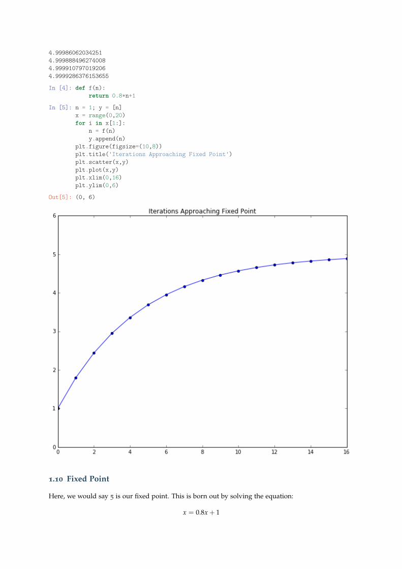
n = f(n)y.append(n)
plt.figure(figsize=(10,8))plt.title('Iterations Approaching Fixed Point')plt.scatter(x,y)plt.plot(x,y)plt.xlim(0,16)plt.ylim(0,6)
Out[5]: (0, 6)
1.10 Fixed Point
Here, we would say 5 is our fixed point. This is born out by solving the equation:
x = 0.8x + 1
x = 5
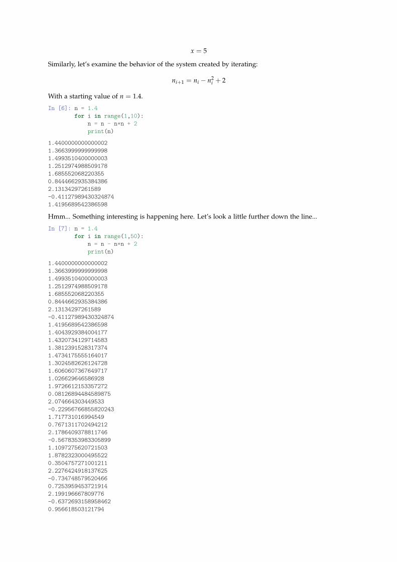
Similarly, let’s examine the behavior of the system created by iterating:
ni+1 = ni − n2i + 2
With a starting value of n = 1.4.
In [6]: n = 1.4for i in range(1,10):
n = n - n*n + 2print(n)
1.44000000000000021.36639999999999981.49935104000000031.25129749885091781.6855520682203550.84446629353843862.13134297261589-0.411279894303248741.4195689542386598
Hmm... Something interesting is happening here. Let’s look a little further down the line...
In [7]: n = 1.4for i in range(1,50):
n = n - n*n + 2print(n)
1.44000000000000021.36639999999999981.49935104000000031.25129749885091781.6855520682203550.84446629353843862.13134297261589-0.411279894303248741.41956895423865981.40439293840041771.43207341297145831.38123915283173741.47341755551640171.30245826261247281.60606073676497171.0266296465869281.97266121533572720.081268944845898752.074664303449533-0.229567668558202431.7177310169945490.76713117024942122.1786409378811746-0.56783539833058991.10972756207215031.87823230004955220.35047572710012112.2276424918137625-0.7347485795204660.72539594537219142.199196667809776-0.63726931589584620.956618503121794
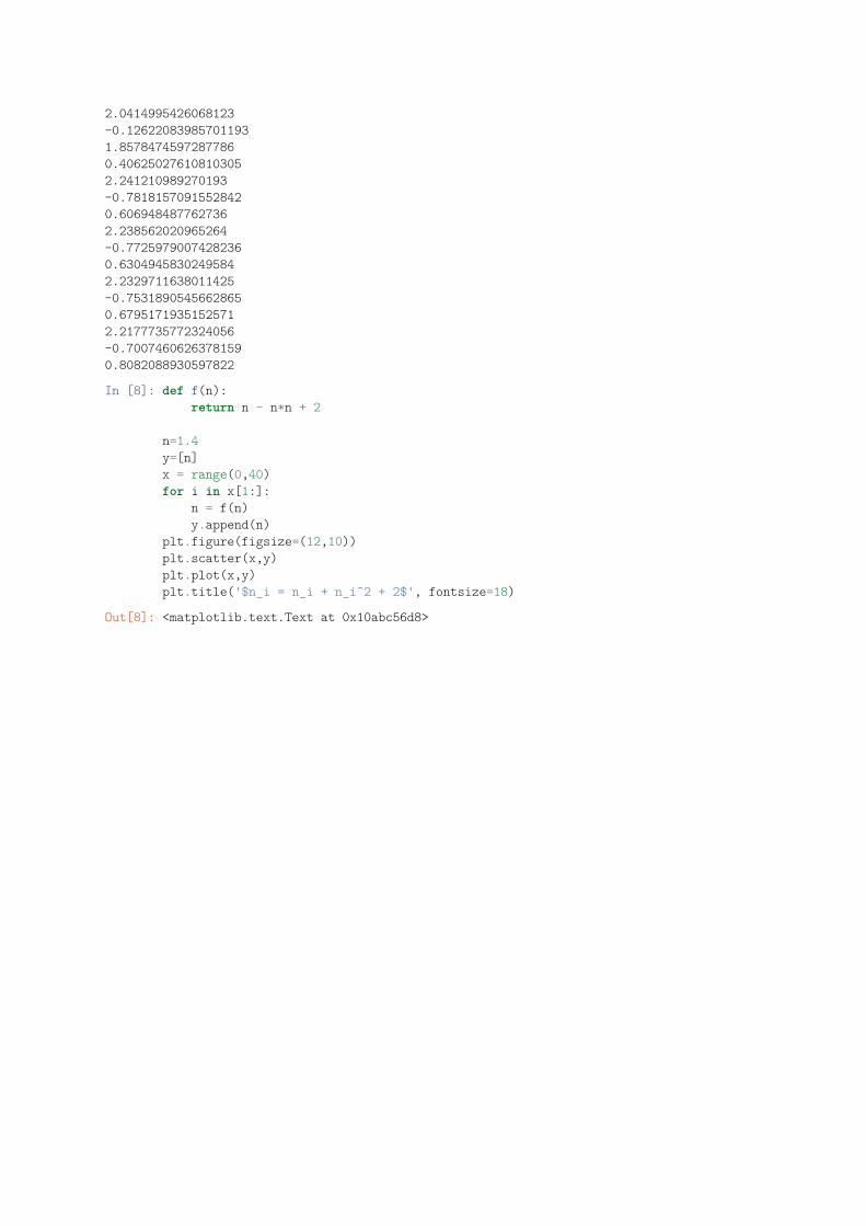
2.0414995426068123-0.126220839857011931.85784745972877860.406250276108103052.241210989270193-0.78181570915528420.6069484877627362.238562020965264-0.77259790074282360.63049458302495842.2329711638011425-0.75318905456628650.67951719351525712.2177735772324056-0.70074606263781590.8082088930597822
In [8]: def f(n):return n - n*n + 2
n=1.4y=[n]x = range(0,40)for i in x[1:]:
n = f(n)y.append(n)
plt.figure(figsize=(12,10))plt.scatter(x,y)plt.plot(x,y)plt.title('$n_i = n_i + n_i^2 + 2$', fontsize=18)
Out[8]: <matplotlib.text.Text at 0x10abc56d8>
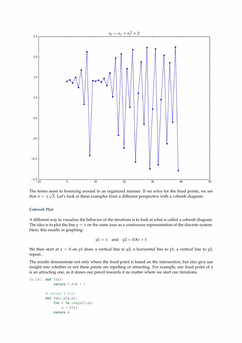
The terms seem to bouncing around in an organized manner. If we solve for the fixed points, we seethat n = ±
√2. Let’s look at these examples from a different perspective with a cobweb diagram.
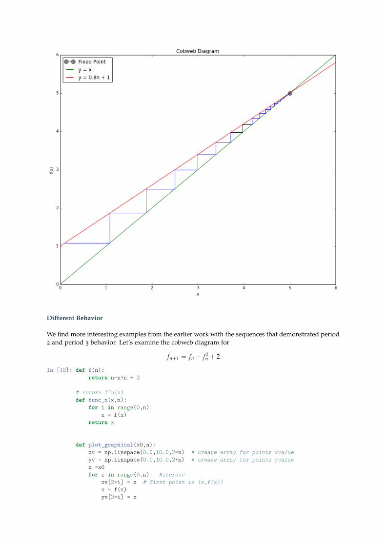
Cobweb Plot
A different way to visualize the behavior of the iterations is to look at what is called a cobweb diagram.The idea is to plot the line y = x on the same axes as a continuous representation of the discrete system.Here, this results in graphing:
y1 = x and y2 = 0.8x + 1
We then start at x = 0 on y1 draw a vertical line to y2, a horizontal line to y1, a vertical line to y2,repeat...
The results demonstrate not only where the fixed point is based on the intersection, but also give useinsight into whether or not these points are repelling or attracting. For example, our fixed point of 5
is an attracting one, as it draws our pencil towards it no matter where we start our iterations.
In [9]: def f(n):return 0.8*n + 1
# return f^n(x)def func_n(x,n):
for i in range(0,n):x = f(x)
return x
def plot_graphical(x0,n):xv = np.linspace(0.0,10.0,2*n) # create array for points xvalueyv = np.linspace(0.0,10.0,2*n) # create array for points yvaluex =x0for i in range(0,n): #iterate
xv[2*i] = x # first point is (x,f(x))x = f(x)yv[2*i] = xxv[2*i+1] = x #second point is (f(x),f(x))yv[2*i+1] = x
plt.plot(xv,yv,'b') # connect up all these points blue
plt.figure(figsize=(12,10))plt.xlabel('x')plt.ylabel('f(x)')plt.plot(5,5, marker = 'o', markersize=10, c='grey',label = 'Fixed Point')xcon = np.arange(0,7, 0.1) # to plot functionplt.plot(xcon,xcon, 'g', label = 'y = x')#y=x plotted greealpha=0.81ycon = f(xcon) # function computedplt.plot(xcon,ycon, 'r', label='y = 0.8n + 1') # function plotted redplot_graphical(0.1,500)plt.legend(loc='best')plt.xlim(0,6)plt.ylim(0,6)# cobweb plot, 0.3 is initial conditionplt.title('Cobweb Diagram')
Out[9]: <matplotlib.text.Text at 0x10a751278>
Different Behavior
We find more interesting examples from the earlier work with the sequences that demonstrated period2 and period 3 behavior. Let’s examine the cobweb diagram for
fn+1 = fn − f 2n + 2
In [10]: def f(n):return n-n*n + 2
# return f^n(x)def func_n(x,n):
for i in range(0,n):x = f(x)
return x
def plot_graphical(x0,n):xv = np.linspace(0.0,10.0,2*n) # create array for points xvalueyv = np.linspace(0.0,10.0,2*n) # create array for points yvaluex =x0for i in range(0,n): #iterate
xv[2*i] = x # first point is (x,f(x))x = f(x)yv[2*i] = x
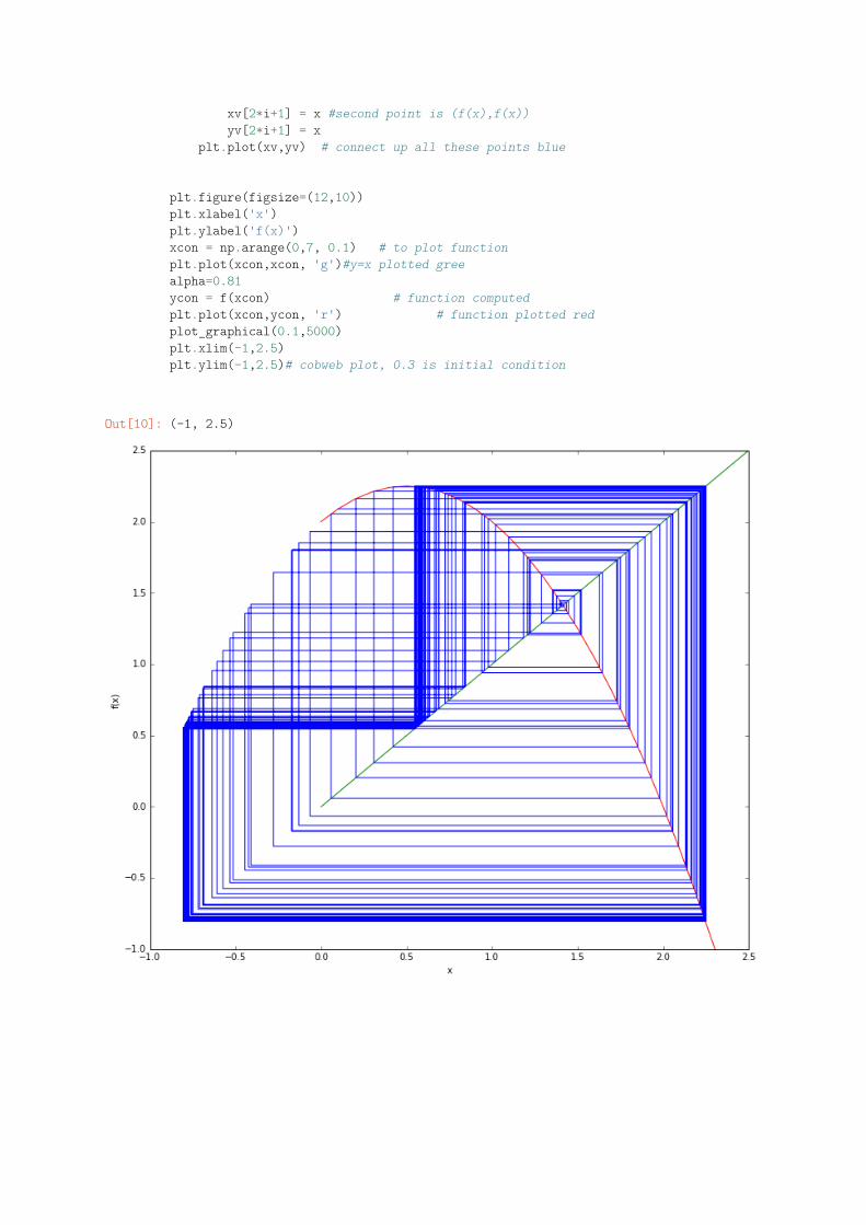
xv[2*i+1] = x #second point is (f(x),f(x))yv[2*i+1] = x
plt.plot(xv,yv) # connect up all these points blue
plt.figure(figsize=(12,10))plt.xlabel('x')plt.ylabel('f(x)')xcon = np.arange(0,7, 0.1) # to plot functionplt.plot(xcon,xcon, 'g')#y=x plotted greealpha=0.81ycon = f(xcon) # function computedplt.plot(xcon,ycon, 'r') # function plotted redplot_graphical(0.1,5000)plt.xlim(-1,2.5)plt.ylim(-1,2.5)# cobweb plot, 0.3 is initial condition
Out[10]: (-1, 2.5)