Embed Size (px)
Citation preview

L E A R N I N G O B J E C T I V E S
ÝÝ Insert charts
ÝÝ Use chart tools to modify charts
ÝÝ Move and size charts
ÝÝ Edit chart data
ÝÝ Add images to a worksheet
ÝÝ Apply conditional formatting
3 Data Visualization and Images
EXCEL
In this chapter, you will learn a variety
of ways to create visually interesting
worksheets. This chapter will help
you understand when to create charts, which
chart types to use, and how they are useful
in understanding relationships between
numbers in a worksheet. You will also learn
about formatting data based on desired
conditions and inserting pictures and shapes.
Microsoft Excel 2016 FOR EVALUATION ONLY © 2017 Labyrinth Learning – Not for Sale or Classroom Use
Labyrinth Learning http://www.lablearning.com
EVALUATIO
N ONLY

56 Excel Chapter 3: Data Visualization and Images
Ý Project: Reporting Company Sales DataAirspace Travel has put together a report of sales figures for the year and has asked you to help create some charts. You have to decide what data to use to create the charts and the chart types that will best help the company understand how it is performing. You want to show sales comparisons month by month, illustrate the contributions of each travel agent to compare them side by side, and highlight the top and bottom performers throughout the year.
Create Charts to Compare DataThere are many situations in which we are presented with numerical data, and it would be easier to interpret the data if we could visualize it in chart form. Charts are created from worksheet data, and similar to a formula the data is linked so that if the data changes, the chart changes as well. Creating a chart is as easy as selecting the data and chart type, and Excel does the rest. After the chart is created, you can add or modify chart elements to change the way your chart looks.
Choosing a Chart TypeExcel has more than a dozen different types of charts to choose from, with variations of each chart type as well. However, it is important to remember that the purpose of a chart is to simplify data and not make it more complicated. The most common options to use are a column or bar chart, a line chart, or a pie chart.
Column Chart and Bar Chart
A column chart displays data in columns across the horizontal axis. A bar chart displays data in bars across the vertical axis, so they are basically the same chart, simply vertical up and down or hori-zontal left to right. Column charts are useful to compare data across several categories.
Microsoft Excel 2016 FOR EVALUATION ONLY © 2017 Labyrinth Learning – Not for Sale or Classroom Use
Labyrinth Learning http://www.lablearning.com
EVALUATIO
N ONLY

Create Charts to Compare Data 57
Line Chart
A line chart displays your series of data in a line or several lines and is useful for showing trends in data over time, such as days, months, or years. Line charts are best for a large amount of data and when the order of data, for example chronological, is important. Line charts are very similar to column charts and have most of the same features.
Pie Chart
A pie chart shows a comparison of your data as parts of the whole. Pie charts are best for a small amount of data; too many pieces will be hard to see in a pie chart. Pie charts can contain only one series of data, and they do not have a horizontal or vertical axis like column charts and line charts.
Excel also has a Recommended Charts option that will list the top chart options for you based on the data you have selected. The Insert Chart window shows a preview of what your chart will look like before you decide which one to use.
ÝÍ Insert→Charts
ÝÍ Insert→Charts→Recommended Charts
EX
CE
L
Microsoft Excel 2016 FOR EVALUATION ONLY © 2017 Labyrinth Learning – Not for Sale or Classroom Use
Labyrinth Learning http://www.lablearning.com
EVALUATIO
N ONLY

58 Excel Chapter 3: Data Visualization and Images
Selecting Chart DataChoosing the right data is very important to make sure Excel can create the chart correctly. The best method is to always select the data and include the appropriate row and column headings.
To create a column, bar, or line chart, the data selection is the same.
The data, including row and column headings, is selected to create your chart; notice the blank cell in the top-left corner is also included.
These three charts result from the same selection of data.
To create a pie chart, you can only select one data series.
Only the January data series is selected to create the pie chart.
Microsoft Excel 2016 FOR EVALUATION ONLY © 2017 Labyrinth Learning – Not for Sale or Classroom Use
Labyrinth Learning http://www.lablearning.com
EVALUATIO
N ONLY

Create Charts to Compare Data 59
If you want to create charts showing only some of the data, use the [Ctrl] key to select the desired data.
For a column, bar, or line chart showing only Products 2 and 3, you would select the three rows of data as shown, again including the blank cell.
Chart ElementsA chart is made up of different elements that can be added, removed, or modified. These elements can help others understand the information on the chart or accentuate certain aspects of the data. There is a wide range of options for changing the look and style of your chart with each of the chart elements.
Data seriesChart title
Chart area (the whole chart window, where the chart elements are located)
Legend
Plot area
Horizontal axisVertical axis
DEVELOP YOUR SKILLS: E3-D1
In this exercise, you will select data and use it to create a chart.
1. Start Excel, open E3-D1-Sales from the Excel Chapter 3 folder, and save it as E3-D1-SalesCharts.
EX
CE
L
Microsoft Excel 2016 FOR EVALUATION ONLY © 2017 Labyrinth Learning – Not for Sale or Classroom Use
Labyrinth Learning http://www.lablearning.com
EVALUATIO
N ONLY
60 Excel Chapter 3: Data Visualization and Images
2. Follow these steps to insert a column chart:
A
B
C
A Select the range A3:D8 to compare the results for all agents for the first three months of the year.
B Choose Recommended Charts from the Ribbon.
C Excel recommends a clustered column chart. Click OK to accept and insert the chart.
Your chart will be inserted as a floating object onto your worksheet, meaning it can be moved easily by dragging.
After creating your chart, notice that resting the mouse pointer over a chart element will display a ScreenTip with the name of the element and pointing to your data will tell you the data series, point, and value.
3. Save the workbook.
Working with Chart ToolsThere are countless ways of formatting a chart; your chart can be as simple or as creative as you like. The way you format it will likely depend on your purpose and how much time you want to spend working on it. The Chart Tools are contextual tabs, meaning they are only available while a chart is selected. You can also use the Format pane on the right side of the screen to format chart elements, and the formatting options change for each chart element.
ÝÍ Chart Tools→Format→Current Selection→Format Selection | Right-click→Format (Selection)
Chart Design ToolsYou can use Design Tools to quickly and easily change the way your chart looks, using features like Chart Styles and Layouts. Styles modify the colors, shading, and layout of the various chart elements in one easy step. To change the appearance of a chart, there are many other design options, including changing the chart type, changing colors, or adding and removing the various chart elements.
View the Video “Using the Chart Design Tools.”
Microsoft Excel 2016 FOR EVALUATION ONLY © 2017 Labyrinth Learning – Not for Sale or Classroom Use
Labyrinth Learning http://www.lablearning.com
EVALUATIO
N ONLY

Working with Chart Tools 61
Using the Chart Formatting ButtonsThe chart formatting buttons can add elements to your chart, change the style, or filter the data visible on the chart.
One of the great new features of Excel charts is the ability to filter your data without changing the data selection or creating a new chart. You can simply filter the data to focus on the sets of data you want to compare and then add or remove the other series or categories as desired.
Chart Elements
Chart Styles
Chart Filters
ÝÍ Chart Tools→Design
DEVELOP YOUR SKILLS: E3-D2
In this exercise, you will adjust the appearance of your chart using the style, layout, and other chart design tools.
1. Save your workbook as E3-D2-SalesCharts.
2. If necessary, click anywhere on the column chart to select it, which displays the Chart Tools on the Ribbon.
3. Choose Chart Tools→Design→Chart Styles→Style 8 to apply the new style.
4. Choose Chart Tools→Design→Chart Layouts→Quick Layout→Layout 1 to apply the layout, which moves the Legend to the right side of the chart.
5. Follow these steps to add axis titles to your chart:
AB
A Click on the Chart Elements button.
B Click to check the box beside Axis Titles.
EX
CE
L
Microsoft Excel 2016 FOR EVALUATION ONLY © 2017 Labyrinth Learning – Not for Sale or Classroom Use
Labyrinth Learning http://www.lablearning.com
EVALUATIO
N ONLY

62 Excel Chapter 3: Data Visualization and Images
6. Point to the Vertical Axis Title you just added and triple-click to select the entire text.
7. Type Monthly Sales for the axis title.
8. Select the Horizontal Axis Title and replace the text with Agent for the title.
9. Replace the Chart Title with the title Airspace Q1 Sales.
10. Follow these steps to change the chart type:
A
B
C
A Select Change Chart Type from the Ribbon to open the dialog box.
B Go to Recommended Charts.
C Choose the second option, Stacked Column, and then click OK.
This chart more clearly shows a comparison of the total for each Agent during the three months, as well as the sales for each individual month.
11. Save the workbook.
Chart Format ToolsBeyond changing the basic style of a chart you may want to choose your own colors for the chart area, plot area, or data series. This can be done by modifying the Fill or Outline of a specific chart element. The Fill could be a color, gradient, texture, or even a picture. Other possibilities include adding shapes or WordArt to a chart.
Axis OptionsYou may want to adjust your axes to focus your data on significant differences or to simply adjust the appearance of the axes. One of the axis options is the minimum and maximum value displayed on the axis. For example, if the data you are charting all falls between 1000 and 1300, you can set your minimum at 1000 to highlight the differences because the first 1000 units are the same for all the data points. Another useful option is to change the Number Format for the axis; for example, to Currency.
Microsoft Excel 2016 FOR EVALUATION ONLY © 2017 Labyrinth Learning – Not for Sale or Classroom Use
Labyrinth Learning http://www.lablearning.com
EVALUATIO
N ONLY

Working with Chart Tools 63
ÝÍ Chart Tools→Format→Current Selection→Format Selection | Right-click axis→Format Axis
DEVELOP YOUR SKILLS: E3-D3
In this exercise, you will adjust the chart colors and axis numbering.
1. Save your workbook as E3-D3-SalesCharts.
2. Continuing with the Airspace Q1 Sales column chart, follow these steps to adjust the color of the FEB series:
A B
A Click once on any orange block to select the FEB Data series.
It is important to click only once. The first click selects the whole series, and clicking a second time would select only one data point from the series to modify.
B Right-click, click on Fill in the shortcut menu, and then choose Red from the Standard Colors.
3. Adjust the Fill Color for the MAR series to Standard Color Purple.
The data looks very similar with the axis values ranging from 0 to 1400.
The Product differences are much easier to see with the axis values starting at 1000.
EX
CE
L
Microsoft Excel 2016 FOR EVALUATION ONLY © 2017 Labyrinth Learning – Not for Sale or Classroom Use
Labyrinth Learning http://www.lablearning.com
EVALUATIO
N ONLY

64 Excel Chapter 3: Data Visualization and Images
4. Follow these steps to adjust the vertical axis:
A
B
C
D
A Point to a number on the vertical axis and then right-click to display the shortcut menu.
It is important to point to a number to get the right menu, if you are between the numbers, the Chart Area shortcut menu will appear, which has different options.
B Choose the Format Axis command.
C In the Format Axis pane, scroll to the bottom and click on Number to expand (then you may need to scroll down to see Number options).
D Choose Currency from the Category list using the menu button and, if necessary, change the Decimal places to 0.
The Number Format is changed for the vertical axis. You can either leave the Format pane open or close it by clicking the close button in the top-right corner.
5. Save the workbook.
Move and Size ChartsCharts can be moved around on a worksheet or moved to a different worksheet. A chart can be moved on the same sheet by a simple drag, but be sure you click the chart area and not another chart element, or you will be moving that element.
Because charts take up a lot of space, and you may want more than one chart in your workbook, it’s often a good idea to move charts onto a separate sheet. Charts that are moved onto their own sheet are referred to as Chart Sheets because they don’t contain any rows, columns, or cells—just the chart itself.
To resize a chart, the chart must first be selected. Then you can drag any of the sizing handles to resize appropriately. You can also resize the chart from the Ribbon to specify the exact height and width. Charts on a chart sheet, however, can’t be resized.
Microsoft Excel 2016 FOR EVALUATION ONLY © 2017 Labyrinth Learning – Not for Sale or Classroom Use
Labyrinth Learning http://www.lablearning.com
EVALUATIO
N ONLY

Edit Chart Data 65
The mouse pointer over the chart area displays the four-pointed arrow; drag to move the chart.
The sizing handles can be used to increase or decrease the chart size.
ÝÍ Chart Tools→Design→Location→Move Chart | Right-click chart area→Move Chart
ÝÍ Chart Tools→Format→Size
DEVELOP YOUR SKILLS: E3-D4
In this exercise, you will move the existing chart, create another chart, and resize it.
1. Save your workbook as E3-D4-SalesCharts.
2. With the Airspace Q1 Sales chart selected, choose Chart Tools→Design→Location→Move Chart to open the Move Chart dialog box.
The chart must be selected to display the Chart Tools on the Ribbon.
3. In the dialog box choose New Sheet, in the New Sheet box type Q1 Sales for the name of the new sheet, and then click OK.
This moves the chart to a chart sheet, which has no cells, and resizes the chart to fit your screen.
4. Go to the Sales worksheet to create a new chart.
5. Select the range A3:G6, which holds the data for Adam, Debra, and Elizabeth.
6. Choose Insert→Charts→Insert Line or Area Chart menu button →Line (the first option on the top row in the 2-D Line group).
7. Drag the chart so it is directly below the data.
8. Rename the Chart Title Semiannual Sales.
9. Save the workbook.
Edit Chart DataAfter a chart has been created, the data is linked, so that if you change the data in the worksheet source, the chart is automatically updated. You can also add or remove data from the chart or filter the chart to change which data is displayed. The easiest way to change the chart data is to reselect the entire range to be used, but you can also add or remove individual data series, points, or labels. You can also modify your chart data by swapping the Horizontal Axis and the Legend categories using the Switch Row/Column button.
EX
CE
L
Microsoft Excel 2016 FOR EVALUATION ONLY © 2017 Labyrinth Learning – Not for Sale or Classroom Use
Labyrinth Learning http://www.lablearning.com
EVALUATIO
N ONLY

66 Excel Chapter 3: Data Visualization and Images
Sometimes a better option is to keep all existing data in the chart but use a filter to display only the data you want to see. The Chart Filters feature allows you to quickly filter specific series and category values and then remove the filter later to display all the data again.
The Chart Filter feature lets you check off the Series or Category you wish to display and uncheck the ones to hide.
DEVELOP YOUR SKILLS: E3-D5
In this exercise, you will edit the chart to include all five Sales Agents and then filter the data in the chart.
1. Save your workbook as E3-D5-SalesCharts.
2. Ensure the Semiannual Sales chart is selected on the Sales worksheet.
3. Right-click anywhere in the chart and choose Select Data.
The Select Data Source dialog box appears, and the current data has an animated border around it on the worksheet.
4. The Chart data range is already selected, so drag across the worksheet range A3:G8 to select the new data and click OK.
The new data displays five lines, one for each of the five agents.
5. Click the Chart Filters button; click the checkbox next to Adam, Elizabeth, and Tim to remove the check and filter out their data; and then click Apply.
You should now see only Debra and Hope’s data on the chart and only their names in the legend.
6. Adjust the Number format for the vertical axis to display Currency with no decimals.
7. Save the workbook.
Add Images to a WorksheetFor the most part Excel is used for text and data; however, it is also possible to add pictures and shapes to a worksheet. Pictures might be used to display a company logo, add information to a spreadsheet, or simply add a little excitement to an otherwise plain set of data.
Pictures can be added from your computer or from an online search, and many types of shapes can be added via the menu button.
Microsoft Excel 2016 FOR EVALUATION ONLY © 2017 Labyrinth Learning – Not for Sale or Classroom Use
Labyrinth Learning http://www.lablearning.com
EVALUATIO
N ONLY

Add Images to a Worksheet 67
Adding a picture lets you access the Picture Tools features on the Ribbon, and adding a shape allows you to access the Drawing Tools. Both of these contextual tabs give you a great number of options for changing the style, shape, color, and size and for modifying many other aspects of the image as well.
Allows you to add pictures you have already saved on your computer
Will insert pictures from OneDrive or Bing, a web search engine from Microsoft that lets you browse an endless supply of images from the Internet
Accesses the shapes library
Using Online Pictures to do a Bing Search for Microsoft Excel returns many variations of the Excel logo.
ÝÍ Insert→Illustrations
ÝÍ Picture Tools→Format | Drawing Tools→Format
DEVELOP YOUR SKILLS: E3-D6
In this exercise, you will add a picture to the worksheet and make some modifications.
1. Save your workbook as E3-D6-SalesCharts.
2. Select cell J1 on the Sales sheet and then choose Insert→Illustrations→Online Pictures to open the dialog box.
EX
CE
L
Microsoft Excel 2016 FOR EVALUATION ONLY © 2017 Labyrinth Learning – Not for Sale or Classroom Use
Labyrinth Learning http://www.lablearning.com
EVALUATIO
N ONLY

68 Excel Chapter 3: Data Visualization and Images
3. Search for air travel in the Bing Search, choose a suitable image with a plane, and then click Insert.
Because this is an online search, the results will frequently change, and you may not see the same images from one search to the next.
4. With the image selected, go to Picture Tools→Format→Size→Height , type 1 in the box, and then tap [Enter].
5. Select cell I1 and choose Insert→Illustrations→Online Pictures again.
6. Search for space in the Bing Search, choose an appropriate image of a spaceship, and then click Insert.
7. Resize this image to be 1" in height to match the first image.
8. Choose Picture Tools→Format→Adjust→Color→Blue, Accent color 1 Light (in the Recolor group).
9. Save the workbook.
Use Conditional FormattingView the video “Highlighting Data with Conditional Formatting.”
Another way to better visualize your data is to use conditional formatting. Conditional formatting takes a set of data, applies a rule or rules, and modifies the formatting of the cells that match the rule. For example, you may have a large set of data containing student grades and want to quickly find the top three marks in the class. Or you may have sales data for a group of products and want to find which product sells the most and which one sells the least. Conditional formatting applies formatting of your choice to the cells that meet these criteria so that you can quickly find them.
Rules can be created to draw attention to the top, or bottom, or to numbers greater than or less than a specific number. You can also highlight a cell with a number equal to a specific amount or a cell that contains certain text; there are so many options!
To apply conditional formatting, the first step is always to select the entire range of data to apply the rule to. For conditional formatting, unlike with charts, you do not include any labels and generally don’t include any totals unless you set up a separate rule for total rows or columns. Different rule options are available from the Conditional Formatting drop-down menu, but the criteria and format-ting can also be modified to suit your needs. After a rule has been created, you can Clear Rules or Manage Rules to see all existing rules for either the current selection or the entire worksheet.
Microsoft Excel 2016 FOR EVALUATION ONLY © 2017 Labyrinth Learning – Not for Sale or Classroom Use
Labyrinth Learning http://www.lablearning.com
EVALUATIO
N ONLY
Use Conditional Formatting 69
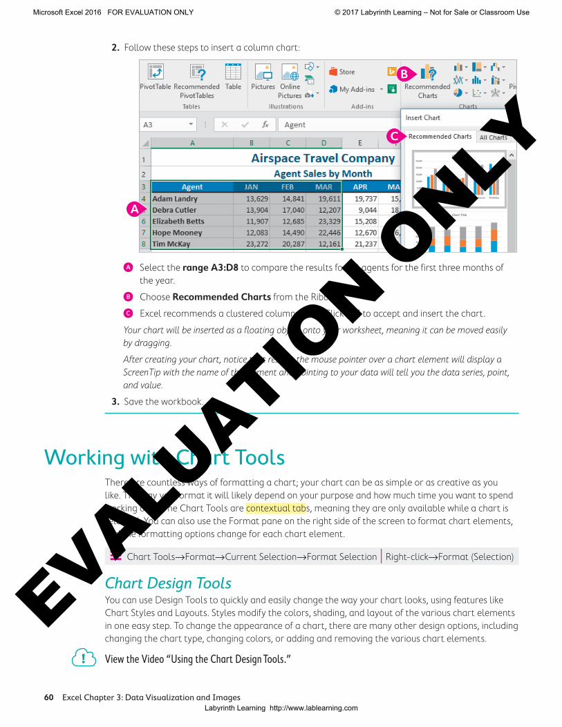
When a conditional formatting rule is created for the top five items, if two or more items are tied for fifth highest, six or more items could be included in the conditional formatting.
After a conditional formatting rule is created, if the data changes, the formatting is automatically updated to reflect the new data.
ÝÍ Home→Styles→Conditional Formatting
DEVELOP YOUR SKILLS: E3-D7
In this exercise, you will alter the appearance of the data using conditional formatting to show some of the top and bottom sales numbers for the agents.
1. Save your workbook as E3-D7-SalesCharts.
2. Select the range B4:G8 and choose Home→Styles→Conditional Formatting → Highlight Cells Rules.
3. Choose Greater Than, and then in the dialog box that opens, adjust the GREATER THAN value to 20000 (that is 20,000, with no comma needed).
The preview shows which data this will apply to.
4. Click OK to apply the format and close the dialog box.
For the six-month total you want to see the top and bottom agents, so you will apply two new rules to the data in column H under Total.
5. Select the range H4:H8 and choose Home→Styles→Conditional Formatting→Top/Bottom Rules→Top 10 Items.
6. Change the 10 to 1, change the format to Green Fill with Dark Green Text, and click OK.
The worksheet before creating conditional formatting, with the range selected
The worksheet after the conditional formatting rule is applied to the range, highlighting the top five items with Light Red Fill and Dark Red Text
Note!
EX
CE
L
Microsoft Excel 2016 FOR EVALUATION ONLY © 2017 Labyrinth Learning – Not for Sale or Classroom Use
Labyrinth Learning http://www.lablearning.com
EVALUATIO
N ONLY

70 Excel Chapter 3: Data Visualization and Images
7. With the range H4:H8 still selected, choose Home→Styles→Conditional Formatting→Top/Bottom Rules→Bottom 10 Items.
8. Change the 10 to 1, change the format to Yellow Fill with Dark Yellow Text, and click OK.
Now the data needs to be updated. A sale was missed for Debra in March, so the number should be higher.
9. Select cell D5 and edit the number 12,207 to be 22,207.
Notice that the formatting for cell D7 changes to red fill and red text, the formatting in the Total column also changes because Debra is no longer the lowest Total, and your Semiannual Sales chart below the data updates as well. Your worksheet should now look like this.
10. Save the workbook.
Self-AssessmentCheck your knowledge of this chapter’s key concepts and skills using the Self-Assessment in your ebook or eLab course.
Microsoft Excel 2016 FOR EVALUATION ONLY © 2017 Labyrinth Learning – Not for Sale or Classroom Use
Labyrinth Learning http://www.lablearning.com
EVALUATIO
N ONLY

Reinforce Your Skills 71
Reinforce Your SkillsREINFORCE YOUR SKILLS: E3-R1
Create and Modify ChartsIn this exercise, you will create several charts to compare volunteer hours for the Kids for Change volunteers and then make some changes to the charts.
1. Start Excel, open E3-R1-VHours from your Excel Chapter 3 folder, and save it as E3-R1-VHoursSummary.
2. Select the ranges A4:A10 and N4:N10.
Remember to use the [Ctrl] button to select nonadjacent ranges.
3. Choose Insert→Charts→Recommended Charts .
4. Select the third option, the Pie chart, then click OK.
5. Edit the Chart Title from Total to Annual Total.
6. Move the chart to its own sheet and name the new sheet Hours by Volunteer.
7. Return to the Summary sheet and select the ranges A4:M4 and A11:M11.
8. Choose Insert→Charts→Insert Line or Area Chart menu button →3-D Area (the first option on the bottom row in the 3-D Area group).
9. Edit the Chart Title from Total to Monthly Total.
10. Click the Chart Elements button.
11. Place your mouse over Axes and then click the menu button } that appears beside Axes to expand the options.
12. Uncheck the box beside Primary Vertical and Depth to remove those axes from the chart.
13. Right-click the data series and change the Fill to a Texture→Purple Mesh.
14. Modify the Chart Area Fill to Blue-Gray, Text 2, Darker 50% (under Theme Colors).
15. Move the chart to its own sheet and name the new sheet Hours by Month.
16. Go to the Hours by Volunteer sheet and change the Annual Total chart type from a Pie Chart to a 3-D Clustered Bar.
17. Change the Layout to Layout 5, which includes a data table below the chart.
18. Save the workbook.
EX
CE
L
Microsoft Excel 2016 FOR EVALUATION ONLY © 2017 Labyrinth Learning – Not for Sale or Classroom Use
Labyrinth Learning http://www.lablearning.com
EVALUATIO
N ONLY
72 Excel Chapter 3: Data Visualization and Images
REINFORCE YOUR SKILLS: E3-R2
Format Charts and Add Conditional FormattingIn this exercise, you will make some further changes to your charts and then add conditional formatting rules to your data.
1. Save your workbook as E3-R2-VHoursSummary.
2. Go to the Hours by Month sheet and select the Horizontal Axis.
3. Increase the Font Size to 12 and then right-click and choose Format Axis.
4. Click to select Text Options. If necessary, expand the Text Fill options and then change the Color to White, Background 1.
5. Leave the Format Pane open, select the Chart Title, and change the Text Fill to White, Background 1, and then close the Format Pane.
6. Use the Chart Filters button to remove the first six months from the chart, leaving only the data for July to December.
7. Go back to the Summary worksheet and select the range B5:M10.
8. Apply a Conditional Formatting Rule to Highlight Cells that are Greater than 29 with Light Red Fill and Dark Red Text.
9. Select the range N5:N10.
10. Apply a Conditional Formatting Rule to show the top three cells with Green Fill and Dark Green Text.
11. Select the range B11:M11.
12. Apply a Conditional Formatting Rule to show the top three cells with Green Fill and Dark Green Text.
13. Save the workbook and close Excel.
Microsoft Excel 2016 FOR EVALUATION ONLY © 2017 Labyrinth Learning – Not for Sale or Classroom Use
Labyrinth Learning http://www.lablearning.com
EVALUATIO
N ONLY

Reinforce Your Skills 73
REINFORCE YOUR SKILLS: E3-R3
Add Visual Aids for a Financial SummaryIn this exercise, you will use data from the Kids for Change Summer Fundraising results and will create charts, edit charts, add pictures, and use conditional formatting.
1. Start Excel, open E3-R3-SummerFunds from your Excel Chapter 3 folder, and save it as E3-R3-SummerFundsResults.
2. Select the range A4:D8.
3. Insert a 2-D Clustered Column chart.
4. Change the Chart Style to Style 8.
5. Modify the Chart Area by changing the Fill to Dark Blue.
6. Change the June Series Fill to Purple, and for the July Series change the Fill to White, Background 1.
7. Change the Chart Title to Results.
8. Move the chart to a new sheet named Results.
9. Go back to the Summary sheet and select the ranges B4:D4 and B9:D9.
10. Insert a 3-D Pie chart and then remove the title and the legend elements from the chart.
11. Move the chart as an object to the Results sheet.
12. Remove the Chart Area Fill from the Pie Chart you just moved (choose Fill and then No Fill) and then remove the Outline in the same way.
13. Change the June Series Fill to Purple, and for the July Series change the Fill to White, Background 1.
14. Move the Pie Chart to the top-right corner of the column chart and change the size to 2.5" tall.
15. Edit the vertical axis to be Currency with no decimal places, Bold, and in 10 pt font size.
16. Edit the horizontal axis to also be Bold and 10 pt font size.
17. Increase the Title to 20 pt font size.
18. Go back to the summary sheet and create a conditional formatting rule that will apply red text to the top three numbers in the range B5:D8.
19. Search for Online Pictures of running and barbecue and insert the images below the Total in cell A9.
20. Resize both images to 0.75" tall.
21. Save the workbook and close Excel.
EX
CE
L
Microsoft Excel 2016 FOR EVALUATION ONLY © 2017 Labyrinth Learning – Not for Sale or Classroom Use
Labyrinth Learning http://www.lablearning.com
EVALUATIO
N ONLY

74 Excel Chapter 3: Data Visualization and Images
Apply Your SkillsAPPLY YOUR SKILLS: E3-A1
Create Charts and Use Chart ToolsIn this exercise, you will use the expense data and revenue data for Universal Corporate Events to create two charts and then edit the charts.
1. Start Excel, open E3-A1-Profit from your Excel Chapter 3 folder, and save it as E3-A1-ProfitSummary.
2. Go to the Profit Q1&Q2 sheet.
3. Select the ranges A6:G6 and A10:G13 and then insert a 2-D Clustered Column chart.
4. Change the chart layout to Layout 11.
5. Choose Chart Tools→Design→Data→Switch Row/Column to switch the Months to the Legend and the categories to the Horizontal Axis.
6. Choose Chart Tools→Design→Chart Styles→Change Colors→Monochromatic Color 8 to make all series different shades of yellow.
7. Change the Chart Style to Style 8.
8. Move the chart to a new sheet and name the sheet Expenses.
9. Go back to the Profit Q1&Q2 sheet and select the range A6:G7.
10. Insert a 2-D line chart and adjust the style and colors to Monochromatic Color 8 and Style 7.
11. Move the chart to a new sheet and name the sheet Revenue.
12. Adjust the vertical axis format to display the Minimum value as 15,000 rather than zero.
13. Remove the Chart Title from the Revenue chart.
14. Save the workbook.
APPLY YOUR SKILLS: E3-A2
Apply Conditional Formatting RulesIn this exercise, you will use conditional formatting rules to identify the month with the highest revenue or expense for each category.
1. Save your workbook as E3-A2-ProfitSummary.
2. If necessary, go to the Profit Q1&Q2 sheet.
3. Select the range B7:G7 (the six months of data in row 7 for Revenue); do not include the total.
4. Create a conditional formatting rule to format the TOP 1 cell with Red Text.
5. Select the cells with the six months of data in row 10 for Employee Wages and again create a conditional formatting rule to format the TOP 1 cell with Red Text.
Notice that because the numbers are identical, the formatting applies to all of them.
6. Repeat this process again, five separate times, one time for each of the rows of data for Capital Expenditures, Material Costs, Marketing & Sales, Total Expenses, and Profit/Loss.
7. Select cell D17 and insert a picture of an up arrow using an Online Picture.
Microsoft Excel 2016 FOR EVALUATION ONLY © 2017 Labyrinth Learning – Not for Sale or Classroom Use
Labyrinth Learning http://www.lablearning.com
EVALUATIO
N ONLY

Apply Your Skills 75
8. Resize the inserted picture to 1" tall.
9. Save the workbook and close Excel.
APPLY YOUR SKILLS: E3-A3
Create Visual Tools for a Financial ForecastIn this exercise, you will create and modify a chart displaying the long-term financial forecast for Universal Corporate Events.
1. Start Excel, open E3-A3-LTForecast from your Excel Chapter 3 folder, and save it as E3-A3-5yrForecast.
2. Create a 3-D Column chart using the data from Revenue and Expenses for all five years. (Be sure to include the year headings.)
3. Change the Fill for Revenue to Gold, Accent 4 and the Fill for Expenses to Standard Dark Red.
4. Remove the Chart Title completely.
5. Move the chart so it is directly below Profit/Loss in row 8 and roughly centered below the data.
6. Edit the Chart Data to include Profit/Loss in row 8.
7. Change the Chart Type to a Combo Chart, with Revenue and Total Expenses being a Clustered Column Chart Type and Profit/Loss being a Line Chart.
8. Modify the Outline for Profit/Loss to Standard Dark Blue.
9. Edit the Number Format for the Vertical Axis to be Currency format with no decimals.
10. Create a Conditional Formatting rule to show the Profit/Loss cells that are greater than $100,000 with Yellow Fill and Dark Yellow Text.
11. Insert the UniversalCorporateEvents.jpg logo file from the Excel Chapter 3 folder in cell E1 to the right of the sheet title and resize the logo to 1" tall.
12. Save the workbook and close Excel.
EX
CE
L
Microsoft Excel 2016 FOR EVALUATION ONLY © 2017 Labyrinth Learning – Not for Sale or Classroom Use
Labyrinth Learning http://www.lablearning.com
EVALUATIO
N ONLY

76 Excel Chapter 3: Data Visualization and Images
Extend Your SkillsThese exercises challenge you to think critically and apply your new skills. You will be evaluated on your ability to follow directions, completeness, creativity, and the use of proper grammar and mechanics. Save files to your chapter folder. Submit assignments as directed.
E3-E1 That’s the Way I See ItAs a student who prides yourself on achieving top grades, you want to create a chart of your achieve-ments. Create a new blank worksheet and set up headings so that you can list your recent classes in one column and the grades for those classes in the next. List your classes in chronological order, oldest to newest (at least 10 classes), and then insert your grades in the next column (if you don’t have access to your grades, just make up numbers). Create a line chart from the data to show the trend in grades over time. Modify the chart to use your favorite colors and use conditional formatting to highlight the top three grades and the lowest three grades you received. Save your workbook as E3-E1-ClassGrades.
E3-E2 Be Your Own BossYou are looking to acquire more funding to expand Blue Jean Landscaping after a very successful year. You are preparing a report on last year’s financial statements, and you want to include some charts to emphasize your revenue growth and expense reduction. Open E3-E2-RevandExp, select the data, and then choose the best chart to show this trend. Insert the BlueJeanLandscaping.jpg logo and modify the chart as you see fit so that it looks professional and presentable. Apply condi-tional formatting to highlight the top three Revenue months and the bottom three Expense months. Save your workbook as E3-E2-RevandExpCharts.
E3-E3 Demonstrate ProficiencyThe BBQ sauce sales were very encouraging for their two new flavors last year, and Stormy BBQ has asked you to create some charts that represent a comparison of its three sauces. Open the file E3-E3-SauceSales and use the data to create both a column chart and a line chart for the year. Move both of these charts to new sheets. Then add a total at the bottom for each sauce and create a pie chart comparing the three totals. Be sure to include the Stormy BBQ logo (StormyBBQ.jpg) on each chart and adjust the styles, layouts, and formatting in the charts appropriately. Try and use the corporate colors, red and gold, where possible. Save your work-book as E3-E3-SauceSalesCharts.
Microsoft Excel 2016 FOR EVALUATION ONLY © 2017 Labyrinth Learning – Not for Sale or Classroom Use
Labyrinth Learning http://www.lablearning.com
EVALUATIO
N ONLY