Embed Size (px)
Citation preview

Microsoft Excel 2016 Advanced
Participants Guide
©OTS Training Rev. 12/16/16 Page 2
Contents Text to Columns .................................................................................................................... 4
Concatenate .......................................................................................................................... 6 The Concatenate Function ..............................................................................................................6 The Right Function with Concatenation ..........................................................................................6
Absolute Cell References ....................................................................................................... 7
Data Validation ..................................................................................................................... 8
Time and Date Calculations ................................................................................................. 10
Conditional Formatting ........................................................................................................ 12 Exploring Styles and Clearing Formatting ...................................................................................... 12 Using Conditional Formatting to Hide Cells ................................................................................... 13
Using the IF Function ........................................................................................................... 14 Changing the “Value if false” Condition to Text ............................................................................. 14
3D Formulas ........................................................................................................................ 15
Pivot Tables ......................................................................................................................... 16 Creating a Pivot Table .................................................................................................................. 16 Specifying PivotTable Data ........................................................................................................... 17 Changing a PivotTables Calculation ............................................................................................... 18 Filtering and Sorting a PivotTable ................................................................................................. 19 Creating a PivotChart ................................................................................................................... 20 Grouping Items ............................................................................................................................ 21 Updating a PivotTable .................................................................................................................. 22 Formatting a PivotTable ............................................................................................................... 22 Using Slicers ................................................................................................................................. 23
Charts ................................................................................................................................. 24 Creating a Simple Chart ................................................................................................................ 24 Chart Terminology ....................................................................................................................... 24 Charting Non-Adjacent Cells ......................................................................................................... 24 Creating a Chart Using the Chart Wizard ....................................................................................... 25
Modifying Charts ................................................................................................................. 25 Moving an Embedded Chart ......................................................................................................... 25 Sizing an Embedded Chart ............................................................................................................ 25 Changing the Chart Type .............................................................................................................. 25
Chart Types ......................................................................................................................................... 25 Changing the Way Data is Displayed ............................................................................................. 26 Moving the Legend ...................................................................................................................... 26
Formatting Charts................................................................................................................ 27 Adding Chart Items ...................................................................................................................... 27 Formatting All Text ...................................................................................................................... 28 Formatting and Aligning Numbers ................................................................................................ 28
©OTS Training Rev. 12/16/16 Page 3
Formatting the Plot Area .............................................................................................................. 29 Formatting Data Markers ............................................................................................................. 30
Pie Charts ............................................................................................................................ 31 Creating a Pie Chart ..................................................................................................................... 31 Moving the Pie Chart to its Own Sheet ......................................................................................... 31 Adding Data Labels ...................................................................................................................... 32 Exploding a Slice of a Pie Chart ..................................................................................................... 32 Rotating and Changing the Elevation of a Pie Chart ....................................................................... 33

©OTS Training Rev. 12/16/16 Page 4
Text to Columns Depending on the way your data is arranged, you can split the cell content based on a delimiter such as a space or a character (comma, a period, or a semicolon) or you can split it based on a specific column break location within your data. 1. Navigate to the Text to Columns worksheet. 2. Select column B and Insert a new column.
Note: If you do not insert a new column, the text to columns wizard will replace any content in the adjoining cell.
3. Select column A. 4. Choose Text to Columns in the Data tab. The Text to Columns wizard will appear.
5. Select the Delimited radio button (already selected by default) and click Next. 6. Select Comma from the list of delimiters. The preview of selected data will show the text
split.
Figure 1
Figure 2

©OTS Training Rev. 12/16/16 Page 5
7. Click Next. 8. The final step of the wizard appears. This allows you to pre-format the column before it goes
back into the Excel worksheet. In this example, we will leave the default as is.
9. Click Finish. The Excel worksheet will show the columns split. You may have to go into specific cells and do further clean up. See cell B14 for example.
Figure 3
Figure 4

©OTS Training Rev. 12/16/16 Page 6
Concatenate The concatenate function joins two or more text strings together into one string. For example, if you have the customer’s first name in column A and the last name in column B, you could use “=concatenate (A3,“ ”,B3)” to produce a string containing first name and last name. Concatenate text can also be achieved using the “&” symbol. Concatenation works best when combined with other functions like upper, proper, left, and right. Note: When you join two strings, Excel does not insert a space or any punctuation between the two. You must do it by inserting “ ” between the two strings, as shown above, or by replacing that space with a hyphen or other punctuation. The quotation marks are required.
The Concatenate Function 1. Navigate to the Concatenate sheet. 2. In cell A2, type: =concatenate(C2, “ ”,D2). 3. This will join the contents of two cells together and place a space in between them.
The Right Function with Concatenation The right function with concatenation enables you to take sensitive data (credit card numbers, social security numbers, etc.) and replace a portion of it. If you are handling data with sensitive personal identification information, this process will give you the ability to protect that information. 1. In cell B11, type: ="xxx-xx-"&right(C11,4). 2. This will append the social security number leaving the last four characters.
Figure 5
Figure 6

©OTS Training Rev. 12/16/16 Page 7
Absolute Cell References When copying a formula, you may want one of more of the cell references to remain unchanged. Unlike a relative cell reference, which preserves the relationship to the formula location, absolute cell references preserve the exact cell address in a formula. 1. Navigate to the Absolute sheet. 2. Click in cell F7. We are going to find the total of each item including the tax. 3. Type =D7*E4+E7 and press Enter. This will add tax to the product then add shipping. No
tax is added to the shipping cost. 4. Using the fill handle, drag the formula down to cell F10. Notice the odd looking results. This
is because it is using relative cell references. 5. Click back in cell F7. Press Delete and type =D7*E4+E7. 6. Highlight the E4 inside the formula and then press the F4 function key on your keyboard.
Notice the $ signs around cell E4. 7. Press Enter. 8. Drag the formula down to F10.
Figure 7
©OTS Training Rev. 12/16/16 Page 8
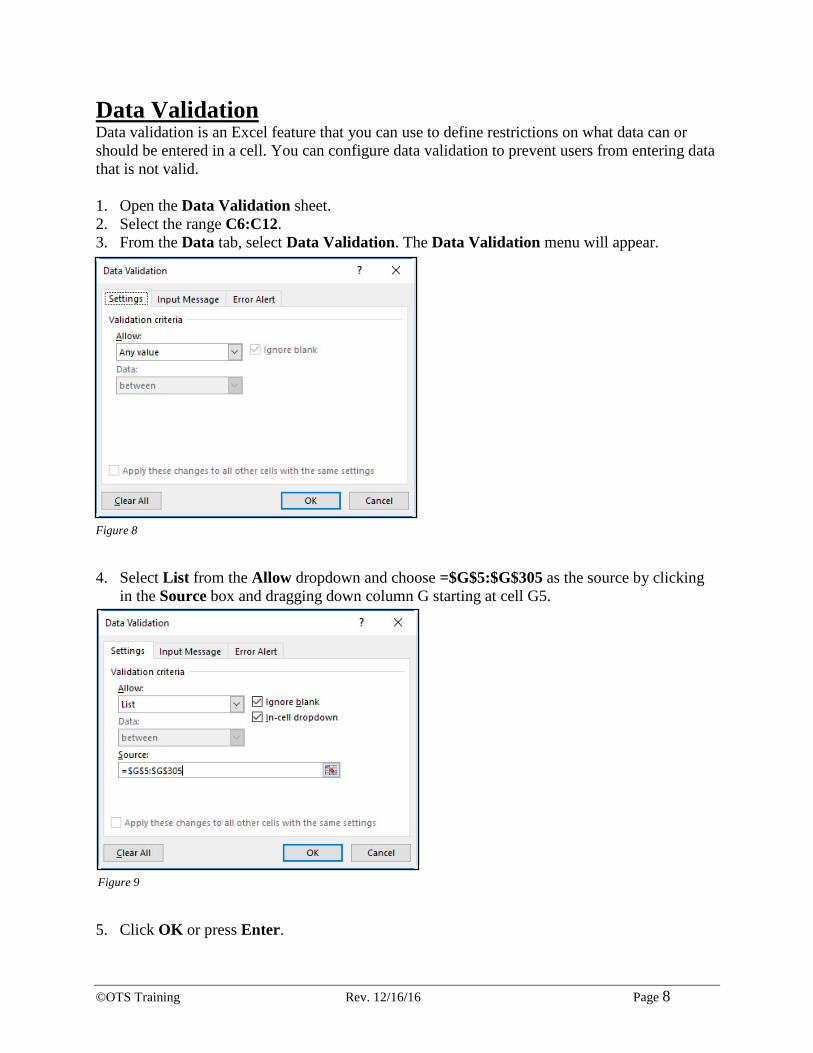
Data Validation Data validation is an Excel feature that you can use to define restrictions on what data can or should be entered in a cell. You can configure data validation to prevent users from entering data that is not valid. 1. Open the Data Validation sheet. 2. Select the range C6:C12. 3. From the Data tab, select Data Validation. The Data Validation menu will appear.
4. Select List from the Allow dropdown and choose =$G$5:$G$305 as the source by clicking
in the Source box and dragging down column G starting at cell G5.
5. Click OK or press Enter.
Figure 8
Figure 9
©OTS Training Rev. 12/16/16 Page 9
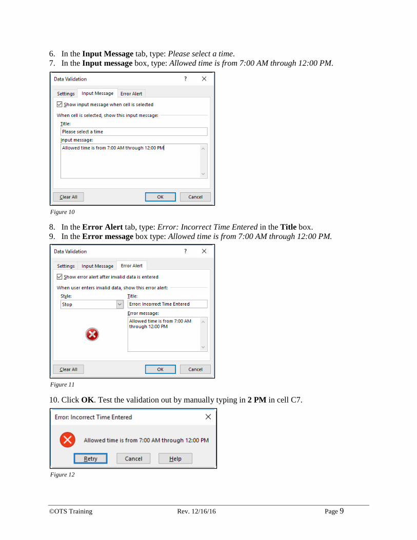
6. In the Input Message tab, type: Please select a time. 7. In the Input message box, type: Allowed time is from 7:00 AM through 12:00 PM.
8. In the Error Alert tab, type: Error: Incorrect Time Entered in the Title box. 9. In the Error message box type: Allowed time is from 7:00 AM through 12:00 PM.
10. Click OK. Test the validation out by manually typing in 2 PM in cell C7.
Figure 10
Figure 11
Figure 12
©OTS Training Rev. 12/16/16 Page 10
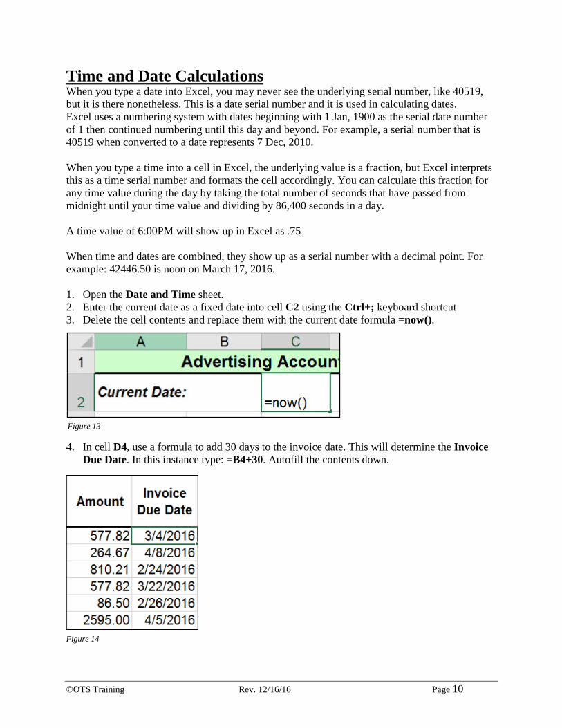
Time and Date Calculations When you type a date into Excel, you may never see the underlying serial number, like 40519, but it is there nonetheless. This is a date serial number and it is used in calculating dates. Excel uses a numbering system with dates beginning with 1 Jan, 1900 as the serial date number of 1 then continued numbering until this day and beyond. For example, a serial number that is 40519 when converted to a date represents 7 Dec, 2010. When you type a time into a cell in Excel, the underlying value is a fraction, but Excel interprets this as a time serial number and formats the cell accordingly. You can calculate this fraction for any time value during the day by taking the total number of seconds that have passed from midnight until your time value and dividing by 86,400 seconds in a day. A time value of 6:00PM will show up in Excel as .75 When time and dates are combined, they show up as a serial number with a decimal point. For example: 42446.50 is noon on March 17, 2016. 1. Open the Date and Time sheet. 2. Enter the current date as a fixed date into cell C2 using the Ctrl+; keyboard shortcut 3. Delete the cell contents and replace them with the current date formula =now().
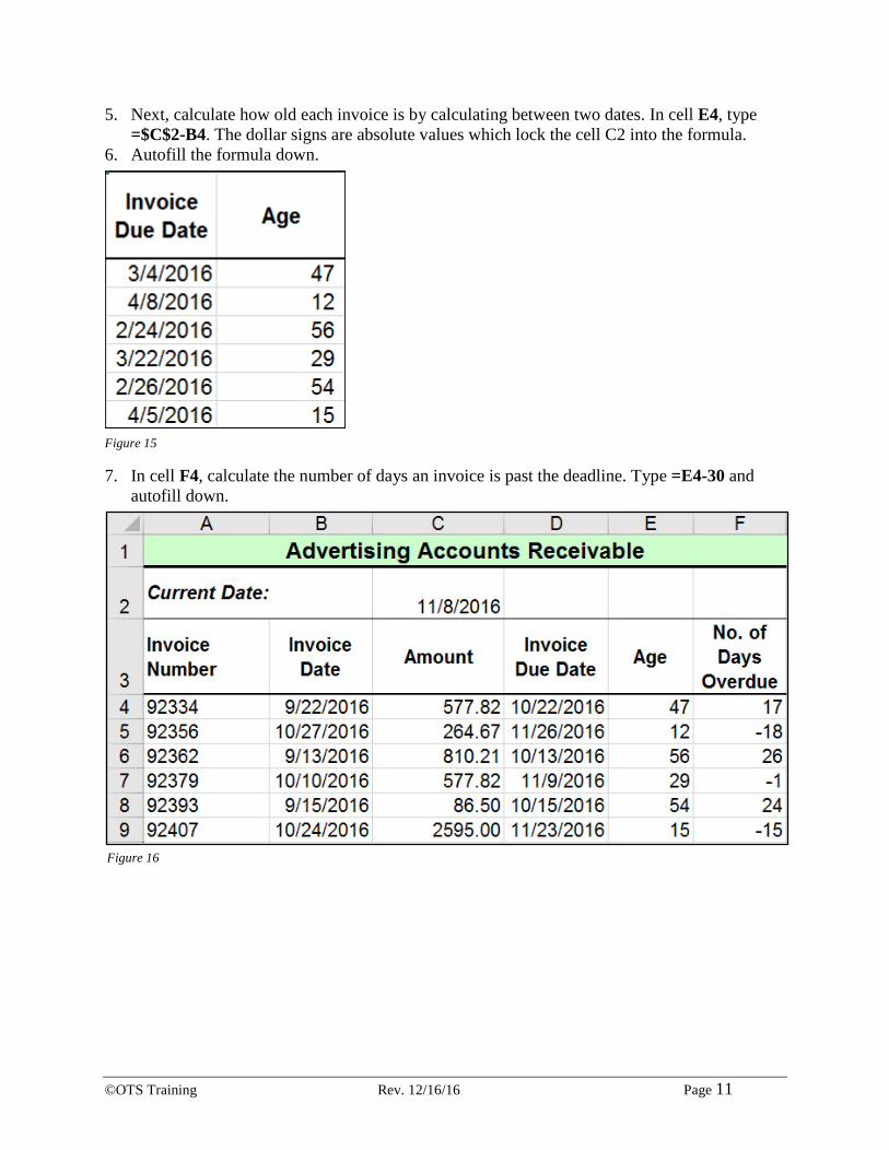
4. In cell D4, use a formula to add 30 days to the invoice date. This will determine the Invoice Due Date. In this instance type: =B4+30. Autofill the contents down.
Figure 13
Figure 14
©OTS Training Rev. 12/16/16 Page 11
5. Next, calculate how old each invoice is by calculating between two dates. In cell E4, type =$C$2-B4. The dollar signs are absolute values which lock the cell C2 into the formula.
6. Autofill the formula down.
7. In cell F4, calculate the number of days an invoice is past the deadline. Type =E4-30 and autofill down.
Figure 15
Figure 16
©OTS Training Rev. 12/16/16 Page 12
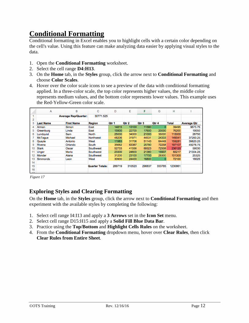
Conditional Formatting Conditional formatting in Excel enables you to highlight cells with a certain color depending on the cell's value. Using this feature can make analyzing data easier by applying visual styles to the data. 1. Open the Conditional Formatting worksheet. 2. Select the cell range D4:H13. 3. On the Home tab, in the Styles group, click the arrow next to Conditional Formatting and
choose Color Scales. 4. Hover over the color scale icons to see a preview of the data with conditional formatting
applied. In a three-color scale, the top color represents higher values, the middle color represents medium values, and the bottom color represents lower values. This example uses the Red-Yellow-Green color scale.
Exploring Styles and Clearing Formatting On the Home tab, in the Styles group, click the arrow next to Conditional Formatting and then experiment with the available styles by completing the following: 1. Select cell range I4:I13 and apply a 3 Arrows set in the Icon Set menu. 2. Select cell range D15:H15 and apply a Solid Fill Blue Data Bar. 3. Practice using the Top/Bottom and Highlight Cells Rules on the worksheet. 4. From the Conditional Formatting dropdown menu, hover over Clear Rules, then click
Clear Rules from Entire Sheet.
Figure 17
©OTS Training Rev. 12/16/16 Page 13
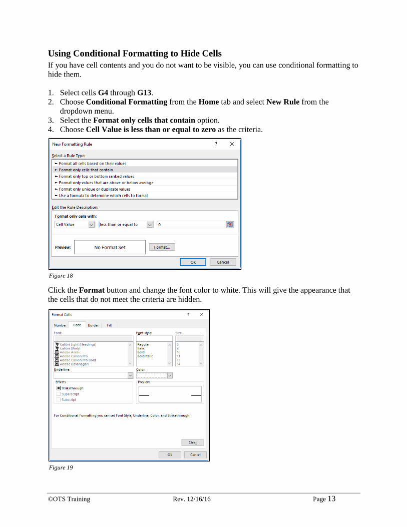
Using Conditional Formatting to Hide Cells If you have cell contents and you do not want to be visible, you can use conditional formatting to hide them. 1. Select cells G4 through G13. 2. Choose Conditional Formatting from the Home tab and select New Rule from the
dropdown menu. 3. Select the Format only cells that contain option. 4. Choose Cell Value is less than or equal to zero as the criteria.
Click the Format button and change the font color to white. This will give the appearance that the cells that do not meet the criteria are hidden.
Figure 18
Figure 19
©OTS Training Rev. 12/16/16 Page 14
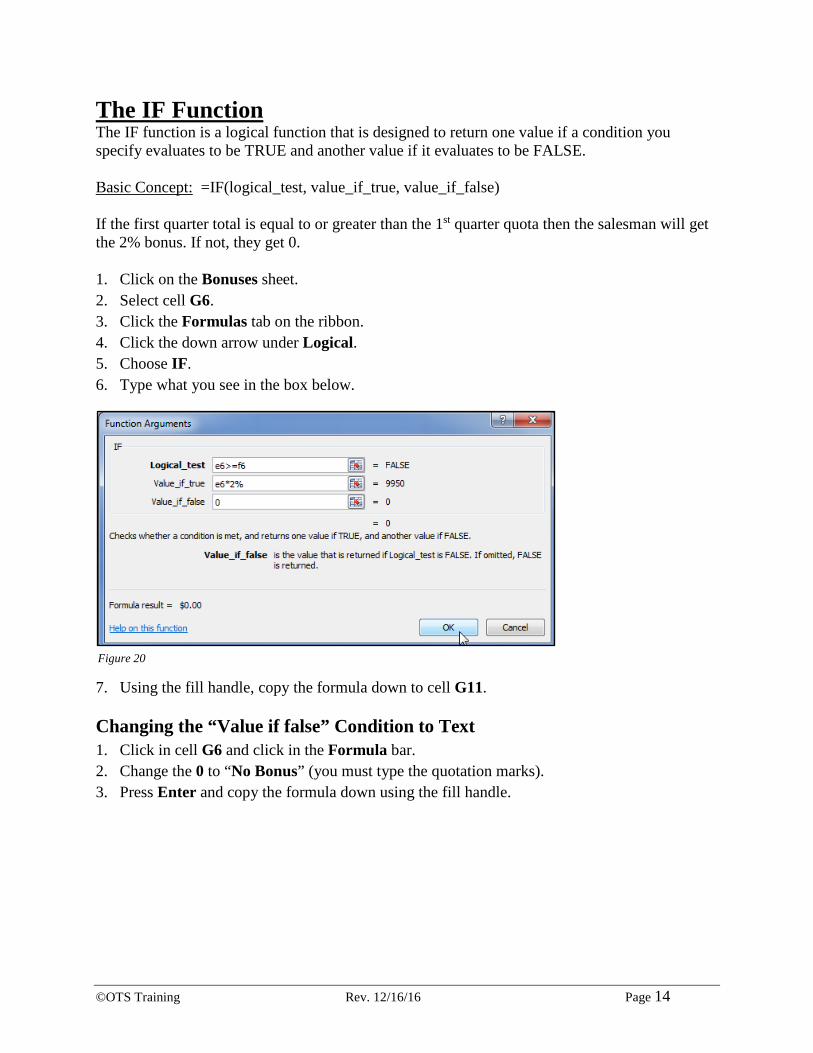
The IF Function The IF function is a logical function that is designed to return one value if a condition you specify evaluates to be TRUE and another value if it evaluates to be FALSE. Basic Concept: =IF(logical_test, value_if_true, value_if_false) If the first quarter total is equal to or greater than the 1st quarter quota then the salesman will get the 2% bonus. If not, they get 0. 1. Click on the Bonuses sheet. 2. Select cell G6. 3. Click the Formulas tab on the ribbon. 4. Click the down arrow under Logical. 5. Choose IF. 6. Type what you see in the box below.
7. Using the fill handle, copy the formula down to cell G11.
Changing the “Value if false” Condition to Text 1. Click in cell G6 and click in the Formula bar. 2. Change the 0 to “No Bonus” (you must type the quotation marks). 3. Press Enter and copy the formula down using the fill handle.
Figure 20
©OTS Training Rev. 12/16/16 Page 15
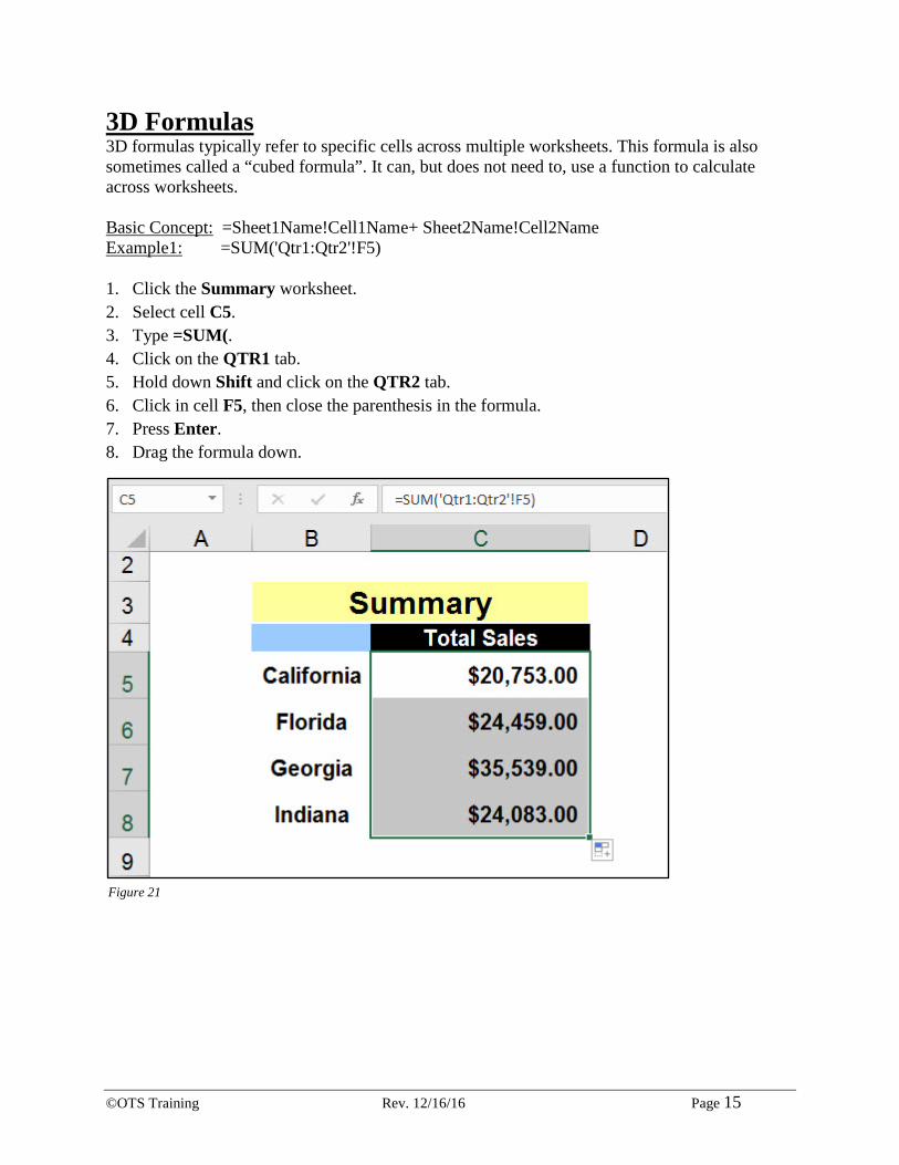
3D Formulas 3D formulas typically refer to specific cells across multiple worksheets. This formula is also sometimes called a “cubed formula”. It can, but does not need to, use a function to calculate across worksheets. Basic Concept: =Sheet1Name!Cell1Name+ Sheet2Name!Cell2Name Example1: =SUM('Qtr1:Qtr2'!F5) 1. Click the Summary worksheet. 2. Select cell C5. 3. Type =SUM(. 4. Click on the QTR1 tab. 5. Hold down Shift and click on the QTR2 tab. 6. Click in cell F5, then close the parenthesis in the formula. 7. Press Enter. 8. Drag the formula down.
Figure 21

©OTS Training Rev. 12/16/16 Page 16
Pivot Tables A pivot table is a special Excel tool that allows you to summarize and explore data interactively. Table - A collection of data. It was first coined in MS Access. However, it is commonly used in Excel nowadays. A table in Excel has a header and there are no entirely blank rows or columns. (Example: Home > Format as Table) Pivot - The ability to alter the perspective of retrieved data. Pivot Table - The ability to create a brand new table based on existing data for the purpose of viewing, reporting and analyzing data.
Creating a Pivot Table 1. Click on the Performance Appraisals worksheet. 2. Click in a cell within the data range.
Note: No entirely blank rows or columns can exist. There must be a header row for a PivotTable to work.
3. Click the Insert tab on the ribbon and click the PivotTable button in the Tables group. 4. Accept the defaults, click the OK button.
Figure 22

©OTS Training Rev. 12/16/16 Page 17
5. A PivotTable will open in a brand new sheet titled Sheet1 and inserted to the left of the Performance Appraisals worksheet.
Specifying PivotTable Data Before creating a PivotTable you must know what you want to analyze. There are three questions you have to ask before proceeding:
What do you want your column headers to be? What do you want your row headers to be? What data do you want to analyze?
By understanding the layout, you will have a better perspective on how to create a PivotTable. 1. Click back on the Performance Appraisals sheet and ask participants if it is possible to
determine the average salary for each performance rating. 2. Expand to see if you can group that data by Position and Department as well.
Figure 23

©OTS Training Rev. 12/16/16 Page 18
3. Click back on Sheet1. 4. Drag the Performance Rating field down to the Rows area. 5. Drag the Salary over to the Values area. 6. A PivotTable will begin to show the results of the data analysis. 7. Drag the Performance Rating field from the Rows area to the Column area. 8. Drag down Position to the Rows area. 9. Your PivotTable will now show the income for each position separated by Performance
Rating.
Changing a PivotTables Calculation 1. Click the dropdown arrow next to Salary in the PivotTable Fields list. 2. Select Value Field Settings. 3. Change the Summarize value field by: to Average. 4. Click OK. 5. Now, the totals will show the Average of each grouping.
Figure 24
Figure 25
©OTS Training Rev. 12/16/16 Page 19
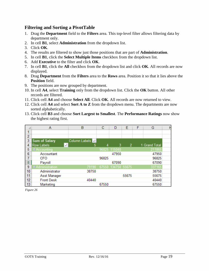
Filtering and Sorting a PivotTable 1. Drag the Department field to the Filters area. This top-level filter allows filtering data by
department only. 2. In cell B1, select Administration from the dropdown list. 3. Click OK. 4. The results are filtered to show just those positions that are part of Administration. 5. In cell B1, click the Select Multiple Items checkbox from the dropdown list. 6. Add Executive to the filter and click OK. 7. In cell B1, click the All checkbox from the dropdown list and click OK. All records are now
displayed. 8. Drag Department from the Filters area to the Rows area. Position it so that it lies above the
Position field. 9. The positions are now grouped by department. 10. In cell A4, select Training only from the dropdown list. Click the OK button. All other
records are filtered. 11. Click cell A4 and choose Select All. Click OK. All records are now returned to view. 12. Click cell A4 and select Sort A to Z from the dropdown menu. The departments are now
sorted alphabetically. 13. Click cell B3 and choose Sort Largest to Smallest. The Performance Ratings now show
the highest rating first.
Figure 26
©OTS Training Rev. 12/16/16 Page 20
Creating a PivotChart 1. Select Sheet1 (the PivotTable created based on Performance Appraisals). 2. In the Analyze tab under the PivotTable Tools tab menu, select PivotChart in the Tools
group. 3. Choose the default column chart. 4. Click OK. 5. A new chart is added on top of the data. 6. Remove Position from the Rows area. 7. The chart updates accordingly. 8. Delete the chart. 9. Click on a cell inside the PivotTable. 10. Press the F11 key. This is another way to create a chart. This time a chart is added to a new
sheet titled Chart1. 11. Drag Department from the Rows area (known as Axis Fields). 12. Drag Performance Rating from the Legend Fields (Column area) to the Axis Fields (Row
area). 13. Change Sum of Salary to Average. 14. The chart updates. 15. Click back on the PivotTable. 16. Double-click on cell B8 (the 1 rating).
Note: It is only one person listed and that is why the results may be skewed.

©OTS Training Rev. 12/16/16 Page 21
Grouping Items 1. Click the 2006Donations sheet. 2. Select a cell in the data range. 3. From the Insert tab on the ribbon, click PivotTable. 4. The Create PivotTable dialog window will appear. Click OK to accept the defaults. 5. A new PivotTable will be created on a new worksheet labeled Sheet3. 6. Drag Date to the Rows area. 7. Drag Amount to the Values area. 8. The PivotTable will summarize the amounts donated on a particular day. 9. Click on a cell in column A in the data range.
Note: It must be a cell in the data range and not a label (ie: A3).
10. Right-click and select Group from the pop-up menu. 11. Months will already be highlighted. Deselect Days and click OK to group by Months.
12. Select Ungroup from the Group group in the Analyze tab on the ribbon. The data will be ungrouped by months and now show dates.
Figure 27
©OTS Training Rev. 12/16/16 Page 22
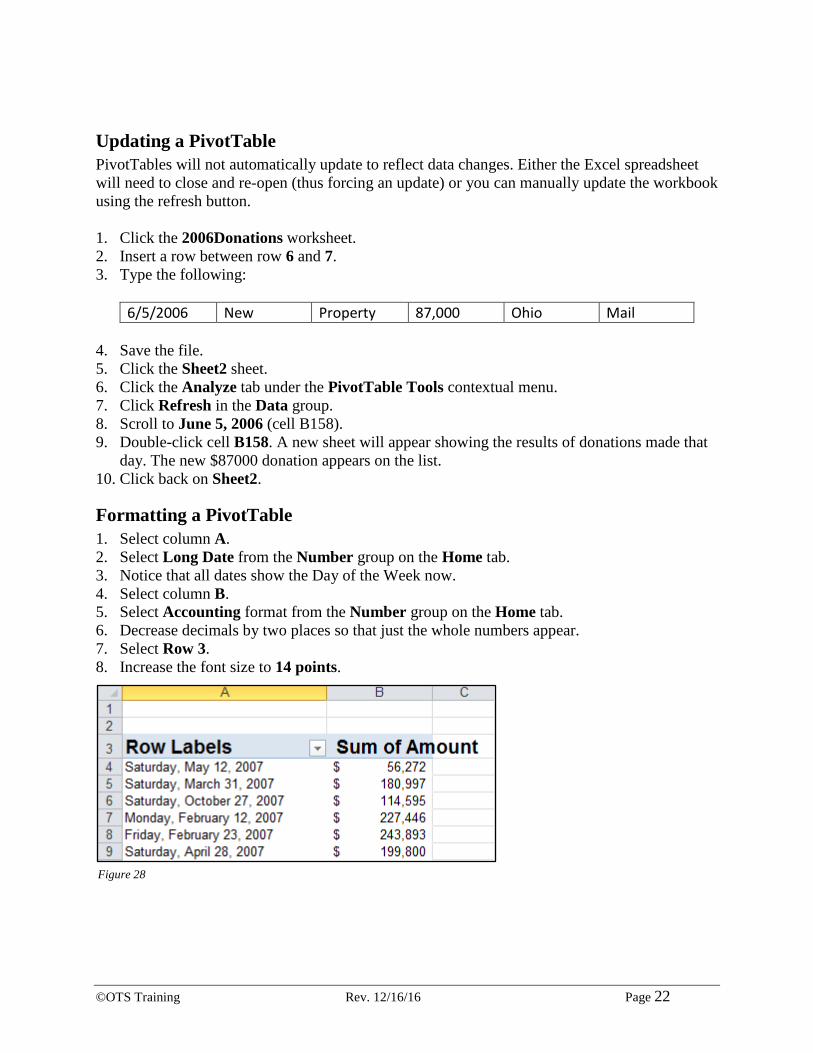
Updating a PivotTable PivotTables will not automatically update to reflect data changes. Either the Excel spreadsheet will need to close and re-open (thus forcing an update) or you can manually update the workbook using the refresh button. 1. Click the 2006Donations worksheet. 2. Insert a row between row 6 and 7. 3. Type the following:
6/5/2006 New Property 87,000 Ohio Mail
4. Save the file. 5. Click the Sheet2 sheet. 6. Click the Analyze tab under the PivotTable Tools contextual menu. 7. Click Refresh in the Data group. 8. Scroll to June 5, 2006 (cell B158). 9. Double-click cell B158. A new sheet will appear showing the results of donations made that
day. The new $87000 donation appears on the list. 10. Click back on Sheet2.
Formatting a PivotTable 1. Select column A. 2. Select Long Date from the Number group on the Home tab. 3. Notice that all dates show the Day of the Week now. 4. Select column B. 5. Select Accounting format from the Number group on the Home tab. 6. Decrease decimals by two places so that just the whole numbers appear. 7. Select Row 3. 8. Increase the font size to 14 points.
Figure 28
©OTS Training Rev. 12/16/16 Page 23
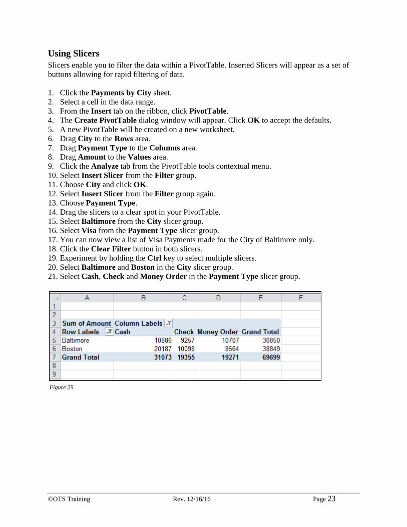
Using Slicers Slicers enable you to filter the data within a PivotTable. Inserted Slicers will appear as a set of buttons allowing for rapid filtering of data. 1. Click the Payments by City sheet. 2. Select a cell in the data range. 3. From the Insert tab on the ribbon, click PivotTable. 4. The Create PivotTable dialog window will appear. Click OK to accept the defaults. 5. A new PivotTable will be created on a new worksheet. 6. Drag City to the Rows area. 7. Drag Payment Type to the Columns area. 8. Drag Amount to the Values area. 9. Click the Analyze tab from the PivotTable tools contextual menu. 10. Select Insert Slicer from the Filter group. 11. Choose City and click OK. 12. Select Insert Slicer from the Filter group again. 13. Choose Payment Type. 14. Drag the slicers to a clear spot in your PivotTable. 15. Select Baltimore from the City slicer group. 16. Select Visa from the Payment Type slicer group. 17. You can now view a list of Visa Payments made for the City of Baltimore only. 18. Click the Clear Filter button in both slicers. 19. Experiment by holding the Ctrl key to select multiple slicers. 20. Select Baltimore and Boston in the City slicer group. 21. Select Cash, Check and Money Order in the Payment Type slicer group.
Figure 29

©OTS Training Rev. 12/16/16 Page 24
Charts Charts are a great way to visualize your data.
Creating a Simple Chart 1. Navigate to the worksheet called Charts. 2. Select the range of B2:E5. 3. Press the F11 key.
Chart Terminology
Charting Non-Adjacent Cells 1. Click on the Charts sheet again. Select the range B3:C5. Hold down the Ctrl key and select
the range E3:E5 (must use the dragging technique when the Ctrl key is held down). 2. Press the F11 key.
Vertical Axis
Legend
Horizontal Axis
Data Marker
Gridline
Figure 30
©OTS Training Rev. 12/16/16 Page 25
Creating a Chart Using the Chart Wizard 1. Click on the Charts sheet again. 2. Select the range of B2:E5. 3. Select the Insert tab on the ribbon. 4. In the Charts group, click the Recommended Charts icon. 5. Click the All Charts tab in the Insert Chart window. 6. Choose 3-D Clustered Column under the Column section. 7. Click OK. Point out the contextual tabs. Modifying Charts There are many different ways to modify your charts to best visualize your data.
Moving an Embedded Chart 1. Place your mouse on the chart area of the chart. This is the white area within the perimeter. 2. Hold down the mouse button and drag the chart to cell B7.
Sizing an Embedded Chart 1. Select the chart. You know the chart is selected because it has handles around the perimeter. 2. Place your mouse on one of the handles until your mouse turns into a dual headed arrow. 3. Hold down your left mouse button and drag until the chart becomes larger or smaller. 4. Drag the chart over to the H column and down to row 22.
Changing the Chart Type 1. Click on the chart to select it. 2. Click the Design contextual tab on the ribbon. 3. In the group named Type, click Change Chart Type. 4. Hover over the different chart types to see what they look like and look at the table above to
get an idea on how to use the different chart types. 5. End with a 3-D Clustered Column chart.
Chart Type Used For Area Displays values over a period of time. Emphasis on amount of change. Bar Displays values for comparison. Column Displays values for comparison. Line Shows trends over time. Pie Displays only one data series. Each piece of the pie is a percent of the
whole. Doughnut Similar to a pie, except it can display more than one data series. Radar Displays changes of data relative to a center point and also to each other. XY (Scatter) Displays the relationship between numeric values in several data series. Bubble Plot and coordinate values.
Chart Types

©OTS Training Rev. 12/16/16 Page 26
Changing the Way Data is Displayed 1. With the chart still selected, click the Design tab on the ribbon. 2. Click the Switch Row/Column button.
Moving the Legend 1. Click once on the legend to select it. 2. From the Chart Layouts group in the Design tab, select the Add Chart Element dropdown. 3. Select the Legend group and choose Right.
Figure 31
Figure 32
©OTS Training Rev. 12/16/16 Page 27
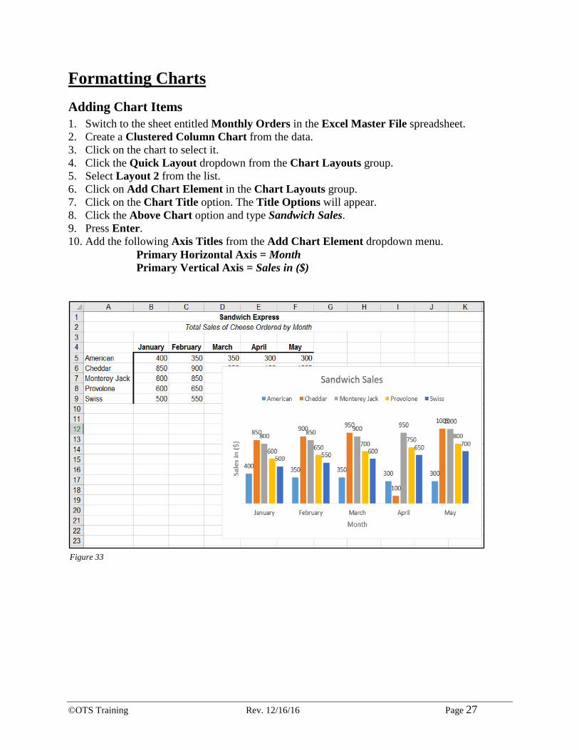
Formatting Charts Adding Chart Items 1. Switch to the sheet entitled Monthly Orders in the Excel Master File spreadsheet. 2. Create a Clustered Column Chart from the data. 3. Click on the chart to select it. 4. Click the Quick Layout dropdown from the Chart Layouts group. 5. Select Layout 2 from the list. 6. Click on Add Chart Element in the Chart Layouts group. 7. Click on the Chart Title option. The Title Options will appear. 8. Click the Above Chart option and type Sandwich Sales. 9. Press Enter. 10. Add the following Axis Titles from the Add Chart Element dropdown menu.
Primary Horizontal Axis = Month Primary Vertical Axis = Sales in ($)
Figure 33
©OTS Training Rev. 12/16/16 Page 28
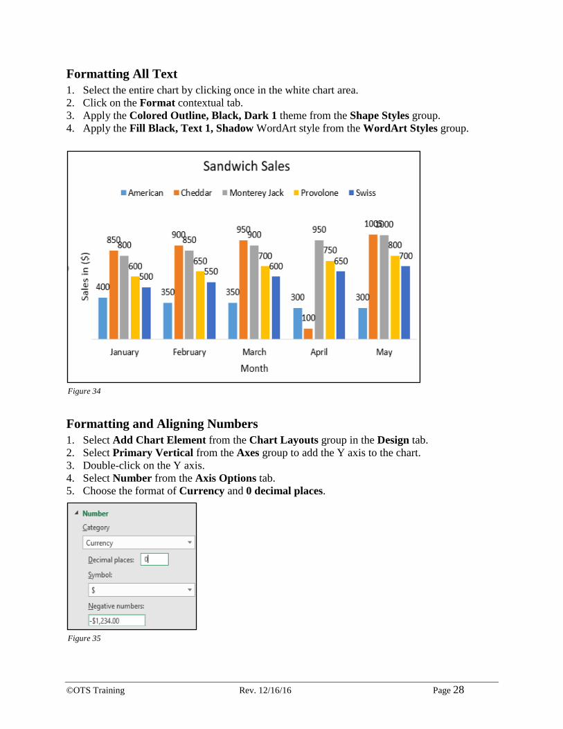
Formatting All Text 1. Select the entire chart by clicking once in the white chart area. 2. Click on the Format contextual tab. 3. Apply the Colored Outline, Black, Dark 1 theme from the Shape Styles group. 4. Apply the Fill Black, Text 1, Shadow WordArt style from the WordArt Styles group.
Formatting and Aligning Numbers 1. Select Add Chart Element from the Chart Layouts group in the Design tab. 2. Select Primary Vertical from the Axes group to add the Y axis to the chart. 3. Double-click on the Y axis. 4. Select Number from the Axis Options tab. 5. Choose the format of Currency and 0 decimal places.
Figure 34
Figure 35
©OTS Training Rev. 12/16/16 Page 29
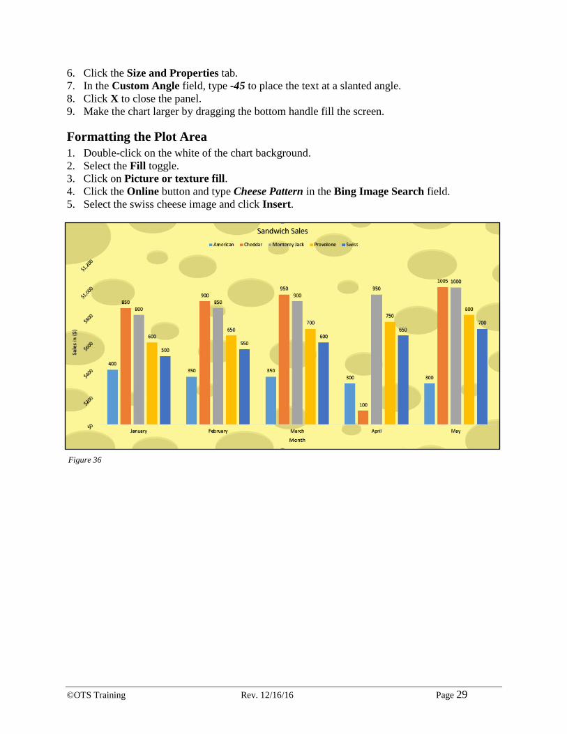
6. Click the Size and Properties tab. 7. In the Custom Angle field, type -45 to place the text at a slanted angle. 8. Click X to close the panel. 9. Make the chart larger by dragging the bottom handle fill the screen.
Formatting the Plot Area 1. Double-click on the white of the chart background. 2. Select the Fill toggle. 3. Click on Picture or texture fill. 4. Click the Online button and type Cheese Pattern in the Bing Image Search field. 5. Select the swiss cheese image and click Insert.
Figure 36
©OTS Training Rev. 12/16/16 Page 30
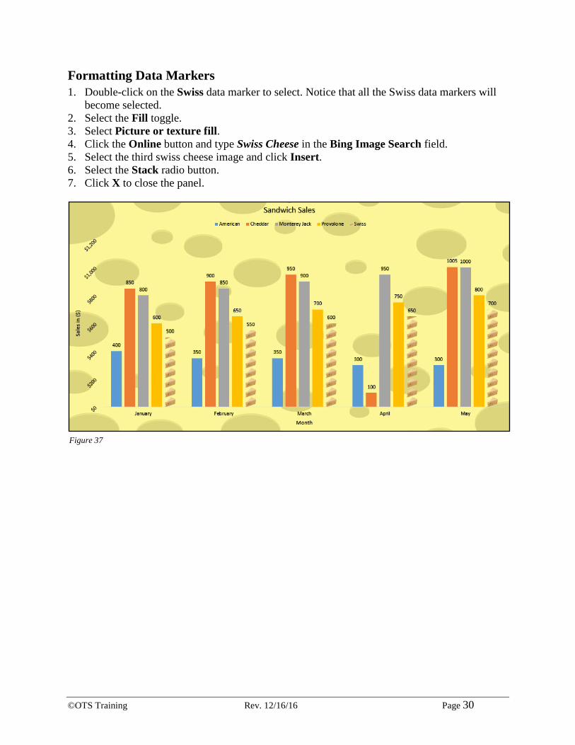
Formatting Data Markers 1. Double-click on the Swiss data marker to select. Notice that all the Swiss data markers will
become selected. 2. Select the Fill toggle. 3. Select Picture or texture fill. 4. Click the Online button and type Swiss Cheese in the Bing Image Search field. 5. Select the third swiss cheese image and click Insert. 6. Select the Stack radio button. 7. Click X to close the panel.
Figure 37
©OTS Training Rev. 12/16/16 Page 31
Pie Charts Pie charts can present the relationship of different classes of data in a visually simple way.
Creating a Pie Chart 1. Click on the Pastry Sales by State sheet. 2. Select the range of A4:B11. 3. Click the Insert tab on the ribbon. 4. In the Charts group, click on the Insert Pie or Doughnut Chart icon. 5. Under the 3-D Pie, click on 3-D Pie Chart.
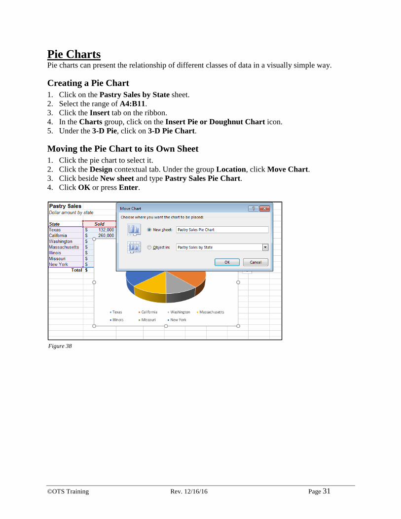
Moving the Pie Chart to its Own Sheet 1. Click the pie chart to select it. 2. Click the Design contextual tab. Under the group Location, click Move Chart. 3. Click beside New sheet and type Pastry Sales Pie Chart. 4. Click OK or press Enter.
Figure 38

©OTS Training Rev. 12/16/16 Page 32
Adding Data Labels 1. Click the Design contextual tab. 2. From the Chart Layouts group, select the Add Chart Element dropdown. 3. Select Data Labels and choose Inside End.
4. Click Data Labels again and choose More Data Labels Options. 5. Click Percentage to turn it on and click Value to turn it off. 6. Click Category Name to turn it on.
Exploding a Slice of a Pie Chart 1. Click directly on top of the pie chart to select the entire chart. 2. Click again on the California slice to select only that slice of the pie. 3. Hold down your mouse button and drag the slice towards you. 4. Press Esc on your keyboard to deselect the pie.
Figure 39
Figure 39
©OTS Training Rev. 12/16/16 Page 33
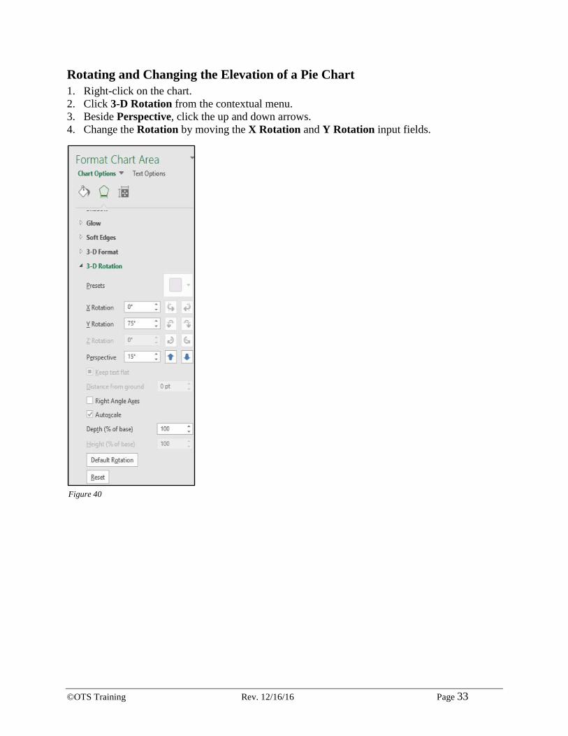
Rotating and Changing the Elevation of a Pie Chart 1. Right-click on the chart. 2. Click 3-D Rotation from the contextual menu. 3. Beside Perspective, click the up and down arrows. 4. Change the Rotation by moving the X Rotation and Y Rotation input fields.
Figure 40