Embed Size (px)
Citation preview
Evaluation Q1
Ryan Sampaio
Conventions – Music Videos
• The conventions of music videos:
Camera shots - music videos tend to involve many continuous close-ups, long-shots and mid-shots. This is used to portray the artist and show them off through the different camera shots and angles, as well as the artists’ emotions. Also, the use of camera movement is key to follow the artist around and show that they’re the main focus of the video. Mise en scene is also used to portray the mood of the artist or the song in general. This could be portrayed by the lighting, clothing or props. Edits also have an influence on how the music video is conveyed. Another is to keep the audience entertained and interested in the music video. Therefore many jump-cuts and transitions would be used to keep everything moving and alert. In comparison with my music video, we used a lot of jump-cuts and put in transitions such as fade in’s and out’s. Also the importance of lip-syncing. In order to make the match between what the audience hears to what they see, lip-syncing is a necessity to make the video believable and show he audience that this is the artist and this is his song. It also looks better. The audience wouldn’t want to watch a music video, in which the artists’ lips aren’t matching what they’re hearing.
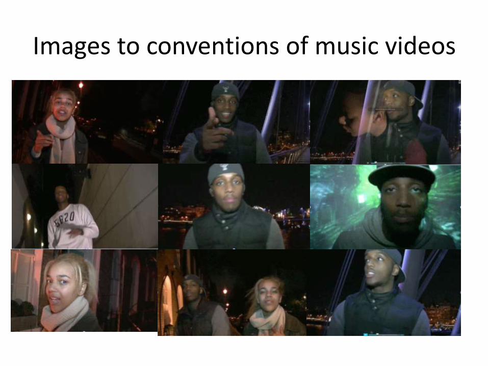
Images to conventions of music videos
Conventions – Digipak
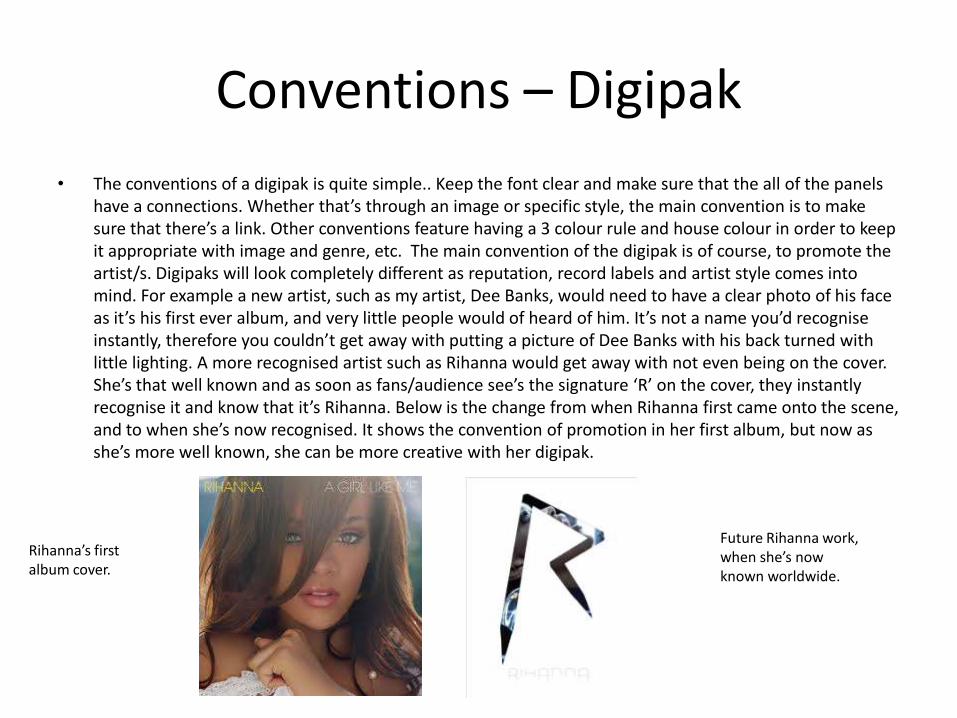
• The conventions of a digipak is quite simple.. Keep the font clear and make sure that the all of the panels have a connections. Whether that’s through an image or specific style, the main convention is to make sure that there’s a link. Other conventions feature having a 3 colour rule and house colour in order to keep it appropriate with image and genre, etc. The main convention of the digipak is of course, to promote the artist/s. Digipaks will look completely different as reputation, record labels and artist style comes into mind. For example a new artist, such as my artist, Dee Banks, would need to have a clear photo of his face as it’s his first ever album, and very little people would of heard of him. It’s not a name you’d recognise instantly, therefore you couldn’t get away with putting a picture of Dee Banks with his back turned with little lighting. A more recognised artist such as Rihanna would get away with not even being on the cover. She’s that well known and as soon as fans/audience see’s the signature ‘R’ on the cover, they instantly recognise it and know that it’s Rihanna. Below is the change from when Rihanna first came onto the scene, and to when she’s now recognised. It shows the convention of promotion in her first album, but now as she’s more well known, she can be more creative with her digipak.
Rihanna’s first album cover.
Future Rihanna work, when she’s now known worldwide.
Conventions - Advert
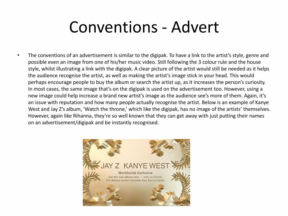
• The conventions of an advertisement is similar to the digipak. To have a link to the artist’s style, genre and possible even an image from one of his/her music video. Still following the 3 colour rule and the house style, whilst illustrating a link with the digipak. A clear picture of the artist would still be needed as it helps the audience recognise the artist, as well as making the artist’s image stick in your head. This would perhaps encourage people to buy the album or search the artist up, as it increases the person’s curiosity. In most cases, the same image that’s on the digipak is used on the advertisement too. However, using a new image could help increase a brand new artist’s image as the audience see’s more of them. Again, it’s an issue with reputation and how many people actually recognise the artist. Below is an example of Kanye West and Jay Z’s album, ‘Watch the throne,’ which like the digipak, has no image of the artists’ themselves. However, again like Rihanna, they’re so well known that they can get away with just putting their names on an advertisement/digipak and be instantly recognised.
Theories – Andrew Goodwin
• Andrew Goodwin believes that there are 3 structures, in which music videos are shown; illustration, amplification and disjuncture.
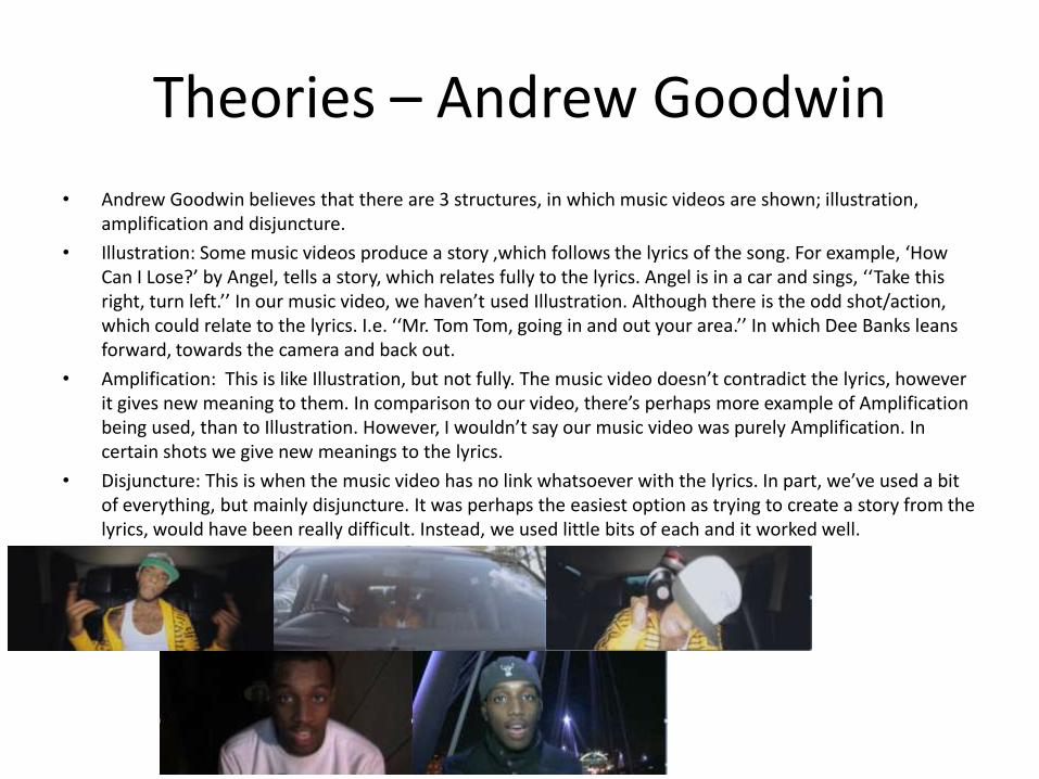
• Illustration: Some music videos produce a story ,which follows the lyrics of the song. For example, ‘How Can I Lose?’ by Angel, tells a story, which relates fully to the lyrics. Angel is in a car and sings, ‘‘Take this right, turn left.’’ In our music video, we haven’t used Illustration. Although there is the odd shot/action, which could relate to the lyrics. I.e. ‘‘Mr. Tom Tom, going in and out your area.’’ In which Dee Banks leans forward, towards the camera and back out.
• Amplification: This is like Illustration, but not fully. The music video doesn’t contradict the lyrics, however it gives new meaning to them. In comparison to our video, there’s perhaps more example of Amplification being used, than to Illustration. However, I wouldn’t say our music video was purely Amplification. In certain shots we give new meanings to the lyrics.
• Disjuncture: This is when the music video has no link whatsoever with the lyrics. In part, we’ve used a bit of everything, but mainly disjuncture. It was perhaps the easiest option as trying to create a story from the lyrics, would have been really difficult. Instead, we used little bits of each and it worked well.
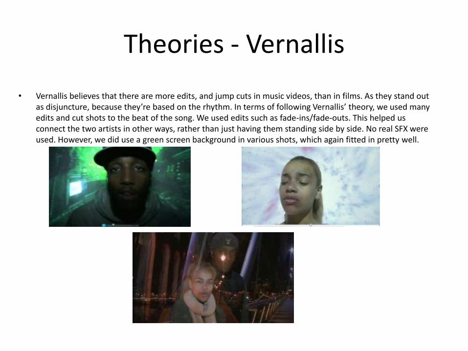
Theories - Vernallis
• Vernallis believes that there are more edits, and jump cuts in music videos, than in films. As they stand out as disjuncture, because they’re based on the rhythm. In terms of following Vernallis’ theory, we used many edits and cut shots to the beat of the song. We used edits such as fade-ins/fade-outs. This helped us connect the two artists in other ways, rather than just having them standing side by side. No real SFX were used. However, we did use a green screen background in various shots, which again fitted in pretty well.
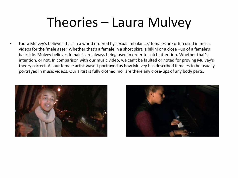
Theories – Laura Mulvey
• Laura Mulvey’s believes that ‘in a world ordered by sexual imbalance,’ females are often used in music videos for the ‘male gaze.’ Whether that’s a female in a short skirt, a bikini or a close –up of a female’s backside. Mulvey believes female’s are always being used in order to catch attention. Whether that’s intention, or not. In comparison with our music video, we can’t be faulted or noted for proving Mulvey’s theory correct. As our female artist wasn’t portrayed as how Mulvey has described females to be usually portrayed in music videos. Our artist is fully clothed, nor are there any close-ups of any body parts.
Real Media and conventions
• In most music videos, conventions are quite clearly followed and noticeable. There are of course, the more unique and challenging ones, where they go for something completely unknown or non-conventional. Which could work because of their reputation or simply because they managed to pull it off. It also depends on the genre and type of artist. Lip-syncing is always used, as it shows professional and conventional work. Unless the music video involves a short story, in which the artist is perhaps having a conversation, lip syncing is one of the most important things about the music video, in order to make the audience connect with what they’re hearing, to what they’re seeing.
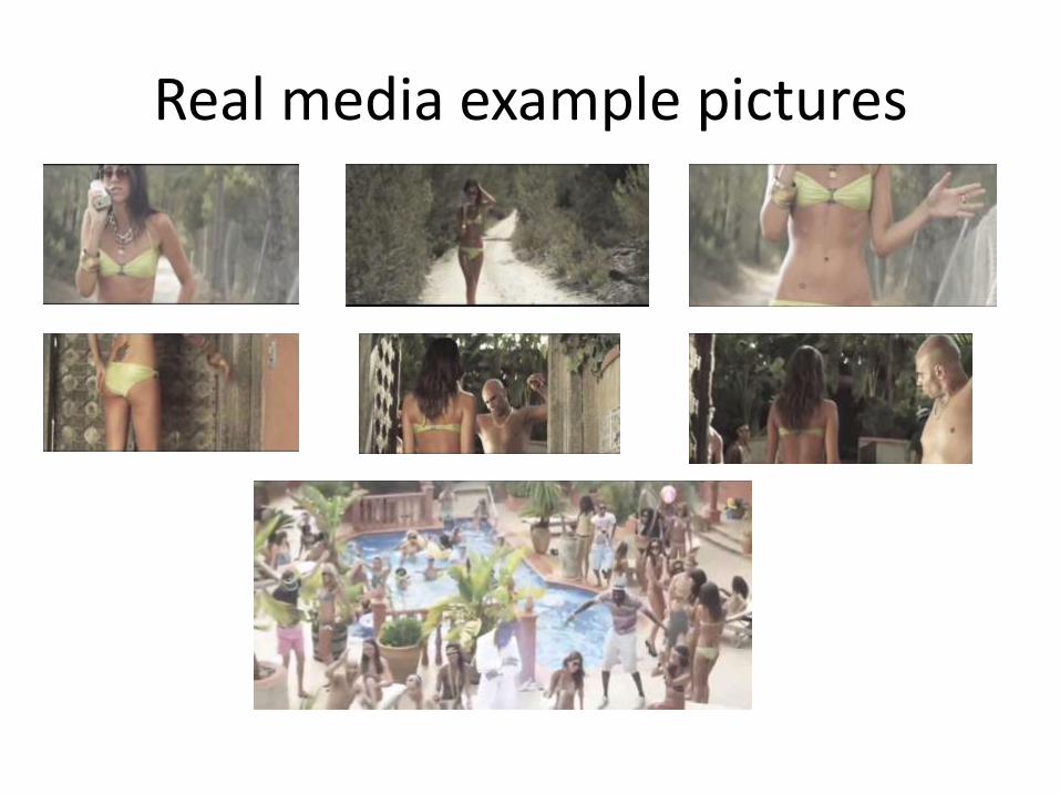
• Whether it’s following Goodwin’s theory, or Mulvey’s theory of the female’s being used as the ‘male gaze.’ An example of real media’s use of convention is Holiday, by Dizzee Rascal. In this video there’s an example of Illustration, as the music video’s following the lyrics and it’s telling the story through it. It also shows Mulvey’s theory on how female’s are used to attract the male gaze, as there are various shots portraying the female as eye candy. And that’s just the focus on the main female, as there are many others also being shows as eye candy, to cause the male gaze. There’s even an example of the male gaze, in the actual video itself. As the man at the gate, gazes at the female before and after she walks by. The cuts aren’t always matching the beat, for example there’s slow motion used, which of course is matching Vernallis’ theory. Despite not matching the beat, it fits in well as the type of song (summer/party song) it’s simply showing off the party life and a more in-depth view of people enjoying themselves.
Real media example pictures
My product compared to real Media conventions
• Compared to real media, I feel my product/s have matched what is expected of a new, up and coming artist. In terms of our music video, we have plenty of shots of our artist to make him the center of attention, close-ups of the artists’ face, in order to make him a more recognisable face to the audience. We also played it safe and chose to make our video disjuncture. The lip-syncing was done well and there seems to be no problems with that, as I’ve spoken of its vitality in a music video, especially when involving a new artist. We also followed the conventions of cutting to the beat of the song, as well as having plenty of jump cuts, following Vernallis’ theory.
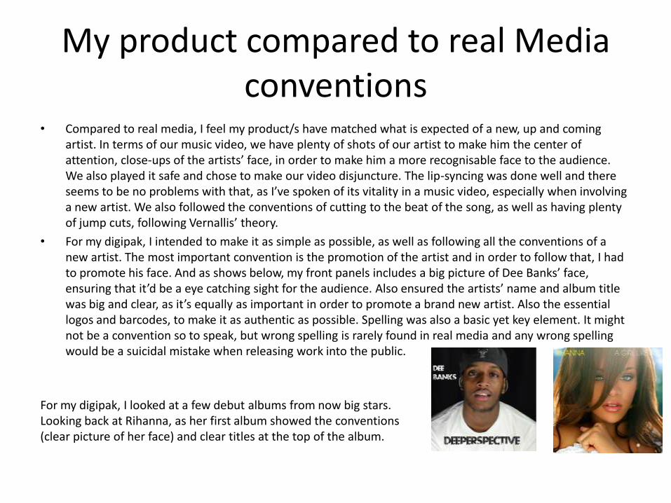
• For my digipak, I intended to make it as simple as possible, as well as following all the conventions of a new artist. The most important convention is the promotion of the artist and in order to follow that, I had to promote his face. And as shows below, my front panels includes a big picture of Dee Banks’ face, ensuring that it’d be a eye catching sight for the audience. Also ensured the artists’ name and album title was big and clear, as it’s equally as important in order to promote a brand new artist. Also the essential logos and barcodes, to make it as authentic as possible. Spelling was also a basic yet key element. It might not be a convention so to speak, but wrong spelling is rarely found in real media and any wrong spelling would be a suicidal mistake when releasing work into the public.
For my digipak, I looked at a few debut albums from now big stars. Looking back at Rihanna, as her first album showed the conventions (clear picture of her face) and clear titles at the top of the album.
My product compared to real Media conventions
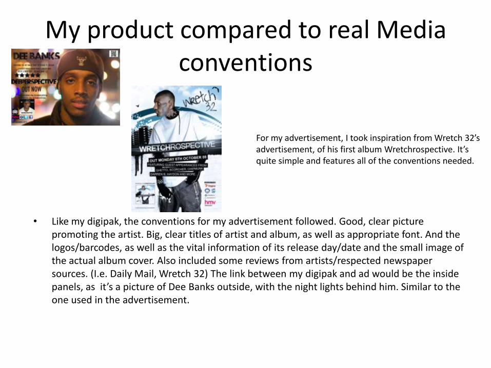
For my advertisement, I took inspiration from Wretch 32’s advertisement, of his first album Wretchrospective. It’s quite simple and features all of the conventions needed.
• Like my digipak, the conventions for my advertisement followed. Good, clear picture promoting the artist. Big, clear titles of artist and album, as well as appropriate font. And the logos/barcodes, as well as the vital information of its release day/date and the small image of the actual album cover. Also included some reviews from artists/respected newspaper sources. (I.e. Daily Mail, Wretch 32) The link between my digipak and ad would be the inside panels, as it’s a picture of Dee Banks outside, with the night lights behind him. Similar to the one used in the advertisement.