Embed Size (px)
Citation preview

Question One
In what ways does your media product use, develop or challenge forms and conventions of real media products?

Research on trailers and the horror genreFor my research I looked at many different trailers, firstly looking at all genres to figure out what the conventions of a film trailer are. I specifically looked at ‘Shadow People’ because I really liked the low budget, high fear factor that was involved in its creation. The film used lighting as a main effect to create a sense of anxiety and fear in the audience. The fact that the ‘monsters’ were shadows made the use of lighting really clever. I decided to use this low lighting and sudden lighting changes in my trailer, but also within my poster, where I used only a candle to light up the face of the clown character. This was to spark unease in the audience because they could only just see the face of the character but not any of the background around the clown. Low lighting and darkness is a common theme in horror films and because the subject of my film fits with this convention I decided to stick t this convention and use darkness as a form of light.
A radio talk show host unravels a conspiracy about encounters with mysterious beings known as The Shadow People and their role in the unexplained deaths of several hundred victims in the 1980s.
Sometimes POV shots are used to increase the anxiety in the audience by showing them the POV of either the victim or the Villain. However I decided not to use any POV shots because the trailer would be too short to fit that in.

The iconography used in horror films is conventional of the genre. Props like masks, weapons, supernatural symbols are used to connote danger, and most films that use weapons would usually have weapons such as axes or chainsaws, or saws to create and even stronger fear, because these weapons would all make the murder scene very bloody.Although my trailer is short and therefore doesn’t feature any people apart from the clown figure there are many icons I used, and many more I researched. I looked at supernatural symbols first for real life rituals and from different types of religions that meant death or the devil.
Using this information I created some designs for tarot cards and supernatural symbols. I eventually didn’t use the symbols in my trailer, however I did use the Nordic sign for madness on one of my film posters. Eventually I took the sign out because I couldn’t make it visible and subtle enough. However other iconography in my trailer was the tarot card, although not my design I did spend some time researching them and choosing which cards to feature. I chose three cards but didn’t include the death card in the three because during my researching I found that the death card actually meant rebirth spiritually, which would be strange for a museum that is full of things that can kill. So although the death card itself would have been a good visible icon of conventional horror, as the picture was a grim reaper with a scythe. I decided instead to use The Hanged Man, The Magician and the The Fool. These cards represented the plot of the film. The fool who entered, the magician who brought the items alive and the hanged man, the person/people who die during the film.
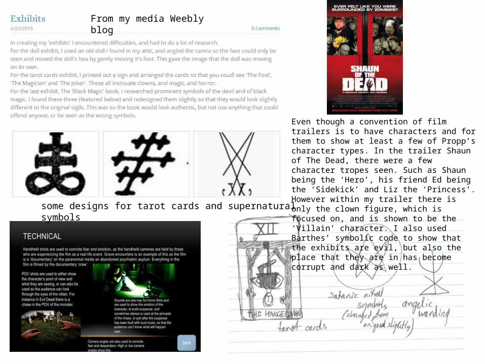
some designs for tarot cards and supernatural symbols
From my media Weebly blog
Even though a convention of film trailers is to have characters and for them to show at least a few of Propp’s character types. In the trailer Shaun of The Dead, there were a few character tropes seen. Such as Shaun being the ‘Hero’, his friend Ed being the ‘Sidekick’ and Liz the ‘Princess’. However within my trailer there is only the clown figure, which is focused on, and is shown to be the ‘Villain’ character. I also used Barthes’ symbolic code to show that the exhibits are evil, but also the place that they are in has become corrupt and dark as well.
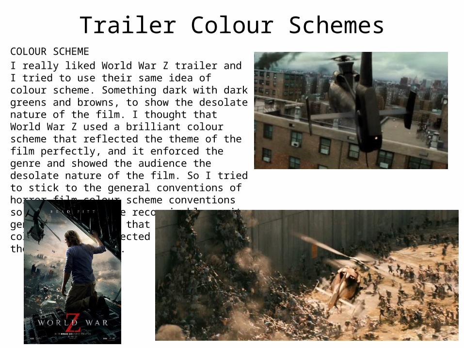
Trailer Colour SchemesCOLOUR SCHEMEI really liked World War Z trailer and I tried to use their same idea of colour scheme. Something dark with dark greens and browns, to show the desolate nature of the film. I thought that World War Z used a brilliant colour scheme that reflected the theme of the film perfectly, and it enforced the genre and showed the audience the desolate nature of the film. So I tried to stick to the general conventions of horror film colour scheme conventions so that it would be recognisable as its genre, but also so that the trailer’s colour scheme reflected the film and the subject matter.
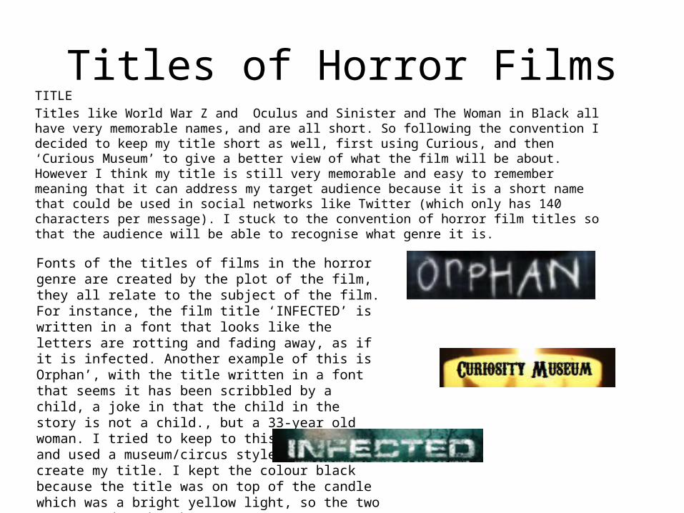
Titles of Horror FilmsTITLETitles like World War Z and Oculus and Sinister and The Woman in Black all have very memorable names, and are all short. So following the convention I decided to keep my title short as well, first using Curious, and then ‘Curious Museum’ to give a better view of what the film will be about. However I think my title is still very memorable and easy to remember meaning that it can address my target audience because it is a short name that could be used in social networks like Twitter (which only has 140 characters per message). I stuck to the convention of horror film titles so that the audience will be able to recognise what genre it is.
Fonts of the titles of films in the horror genre are created by the plot of the film, they all relate to the subject of the film. For instance, the film title ‘INFECTED’ is written in a font that looks like the letters are rotting and fading away, as if it is infected. Another example of this is Orphan’, with the title written in a font that seems it has been scribbled by a child, a joke in that the child in the story is not a child., but a 33-year old woman. I tried to keep to this convention and used a museum/circus style font to create my title. I kept the colour black because the title was on top of the candle which was a bright yellow light, so the two contrasted each other.