Embed Size (px)
Citation preview
Qlikview User Guide 1
May 13, 2016: QlikView User Guide
In this QlikView User Guide, you will create charts, listboxes, and summary statistics and compile into a
dashboard.
Contents Administration: ............................................................................................................................................. 2
Charts to Build:.............................................................................................................................................. 2
QlikView: Dashboard for Demographics ................................................................................................... 2
QlikView: Dashboards for Computed Metrics ........................................................................................ 15
Qlikview User Guide 2
Administration: First, you will need to install the software and obtain the data file.
a. Download QlikView
b. Excel file: “Computations.xlsx” (Download link:
http://www.nvc.vt.edu/rmajor/bit5534/Docs/Computations.xlsx)
Charts to Build: Below will be a sequence of instructions on creating the exact dashboards below (and as shown on the
website http://www.nvc.vt.edu/rmajor/bit5534/Dashboards.htm:
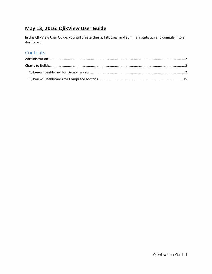
QlikView: Dashboard for Demographics
Above is the dashboard as displayed on the course website:
http://www.nvc.vt.edu/rmajor/bit5534/Docs/Qlik_Demographics.pdf
Qlikview User Guide 3
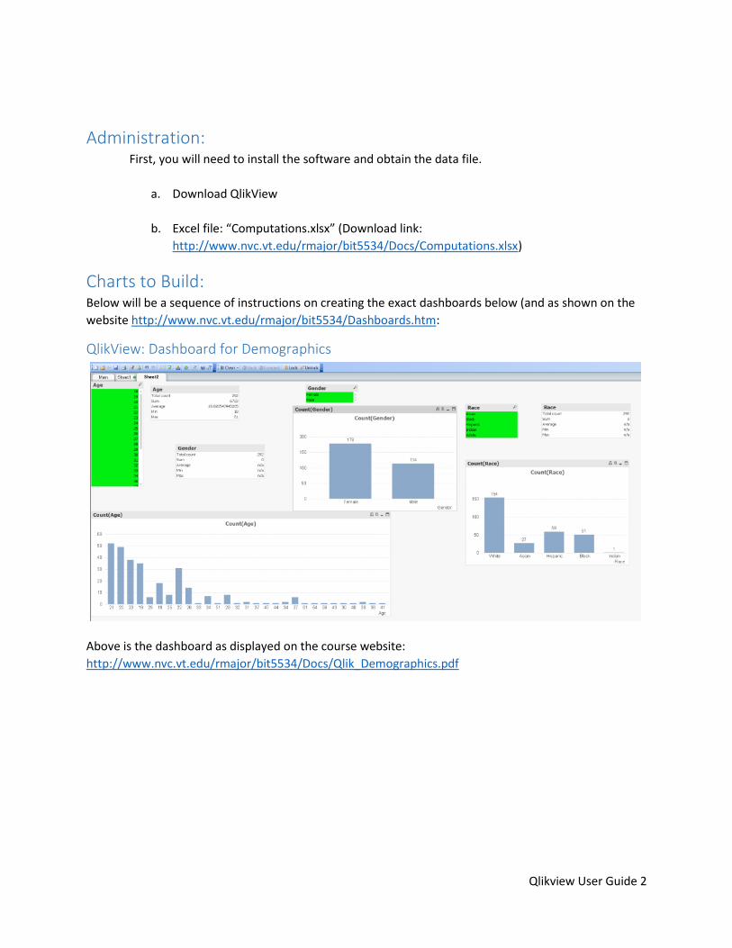
Step 1: Open up QlikView.
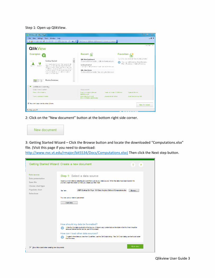
2: Click on the “New document” button at the bottom right side corner.
3: Getting Started Wizard – Click the Browse button and locate the downloaded “Computations.xlsx”
file. (Visit this page if you need to download:
http://www.nvc.vt.edu/rmajor/bit5534/Docs/Computations.xlsx) Then click the Next step button.
Qlikview User Guide 4
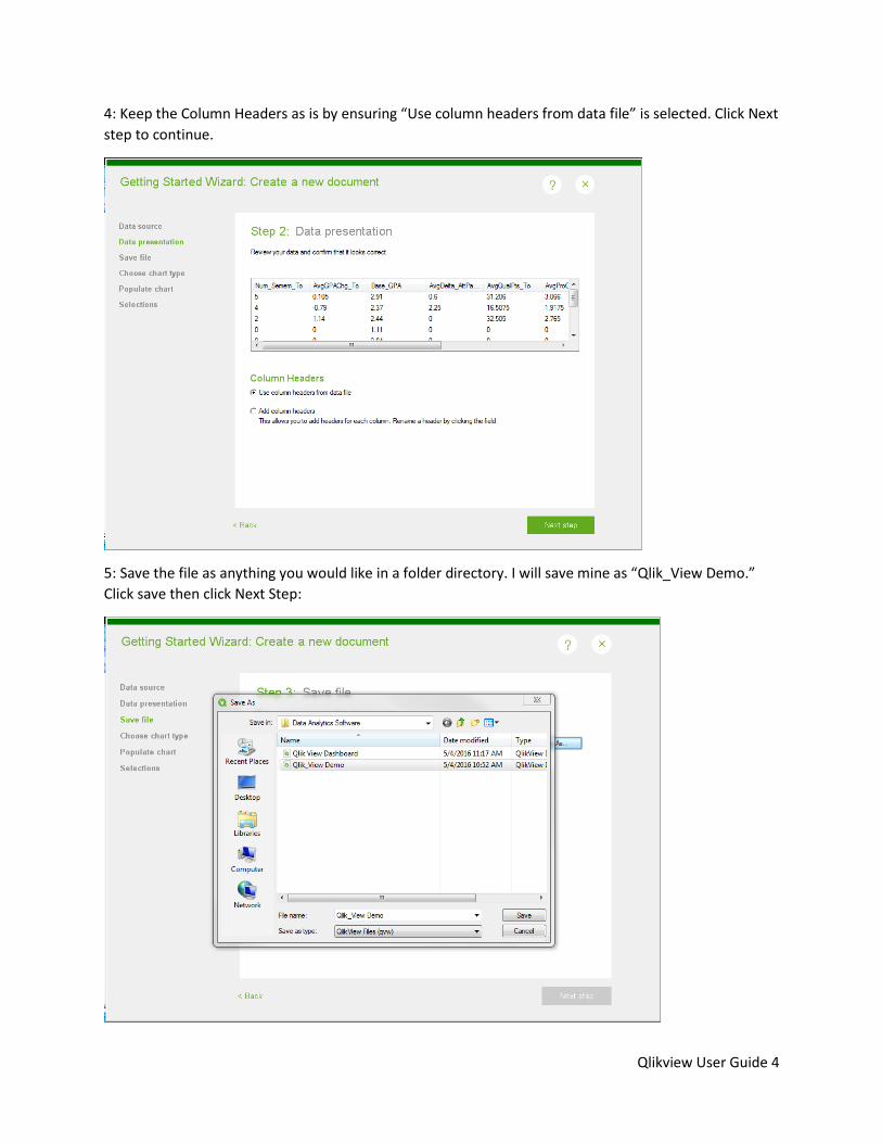
4: Keep the Column Headers as is by ensuring “Use column headers from data file” is selected. Click Next
step to continue.
5: Save the file as anything you would like in a folder directory. I will save mine as “Qlik_View Demo.”
Click save then click Next Step:
Qlikview User Guide 5
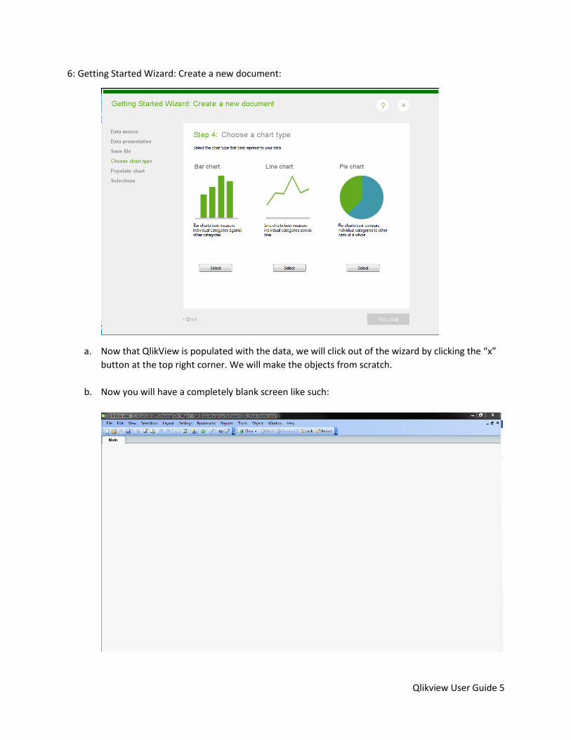
6: Getting Started Wizard: Create a new document:
a. Now that QlikView is populated with the data, we will click out of the wizard by clicking the “x”
button at the top right corner. We will make the objects from scratch.
b. Now you will have a completely blank screen like such:
Qlikview User Guide 6
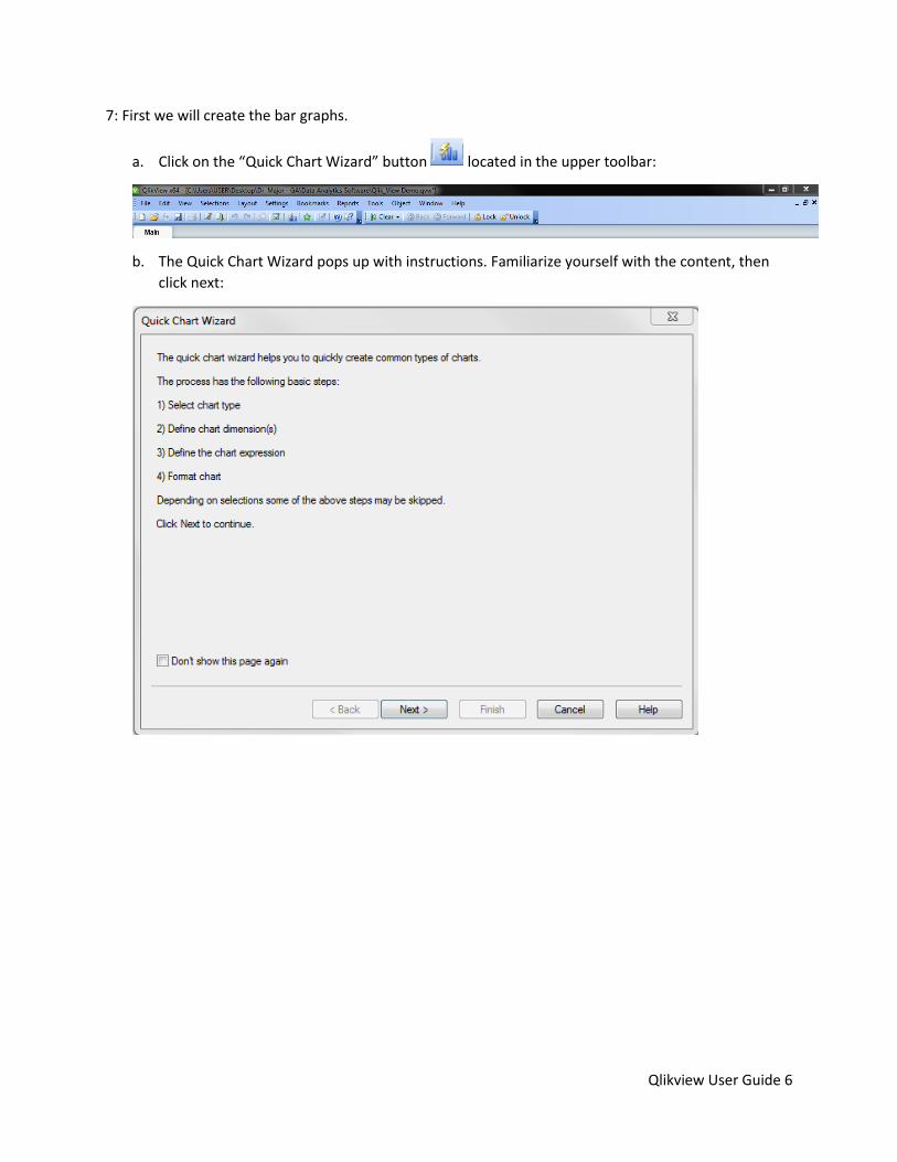
7: First we will create the bar graphs.
a. Click on the “Quick Chart Wizard” button located in the upper toolbar:
b. The Quick Chart Wizard pops up with instructions. Familiarize yourself with the content, then
click next:
Qlikview User Guide 7
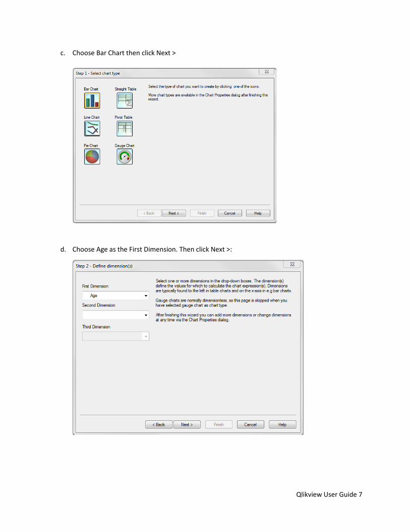
c. Choose Bar Chart then click Next >
d. Choose Age as the First Dimension. Then click Next >:
Qlikview User Guide 8
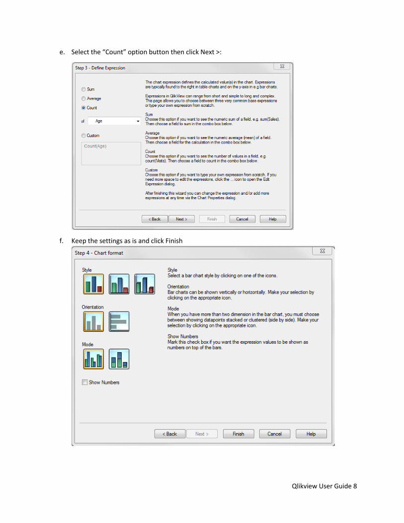
e. Select the “Count” option button then click Next >:
f. Keep the settings as is and click Finish
Qlikview User Guide 9
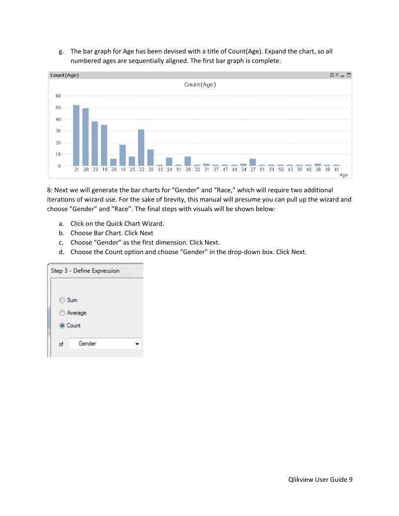
g. The bar graph for Age has been devised with a title of Count(Age). Expand the chart, so all
numbered ages are sequentially aligned. The first bar graph is complete.
8: Next we will generate the bar charts for “Gender” and “Race,” which will require two additional
iterations of wizard use. For the sake of brevity, this manual will presume you can pull up the wizard and
choose “Gender” and “Race”. The final steps with visuals will be shown below:
a. Click on the Quick Chart Wizard.
b. Choose Bar Chart. Click Next
c. Choose “Gender” as the first dimension. Click Next.
d. Choose the Count option and choose “Gender” in the drop-down box. Click Next.
Qlikview User Guide 10
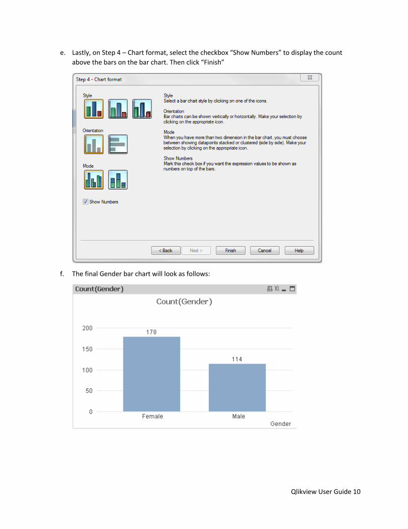
e. Lastly, on Step 4 – Chart format, select the checkbox “Show Numbers” to display the count
above the bars on the bar chart. Then click “Finish”
f. The final Gender bar chart will look as follows:
Qlikview User Guide 11
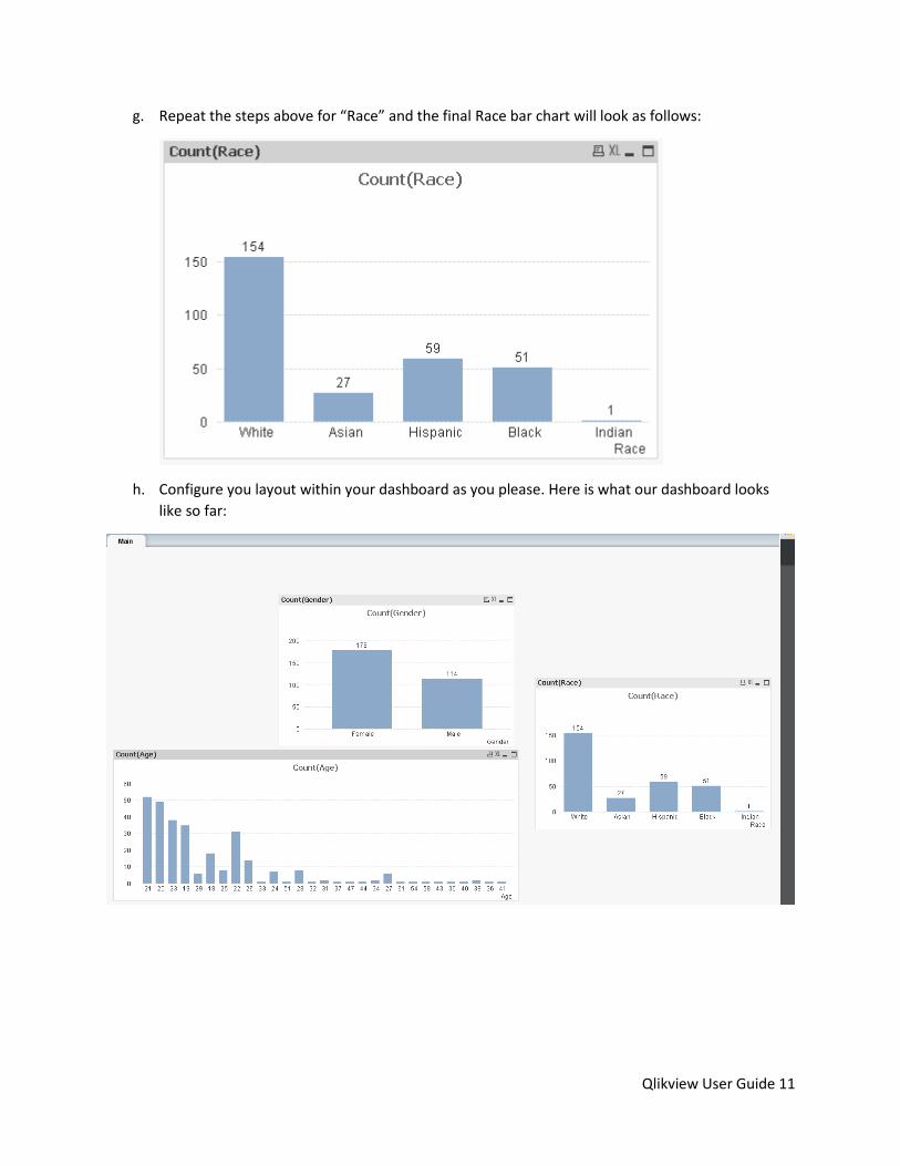
g. Repeat the steps above for “Race” and the final Race bar chart will look as follows:
h. Configure you layout within your dashboard as you please. Here is what our dashboard looks
like so far:
Qlikview User Guide 12
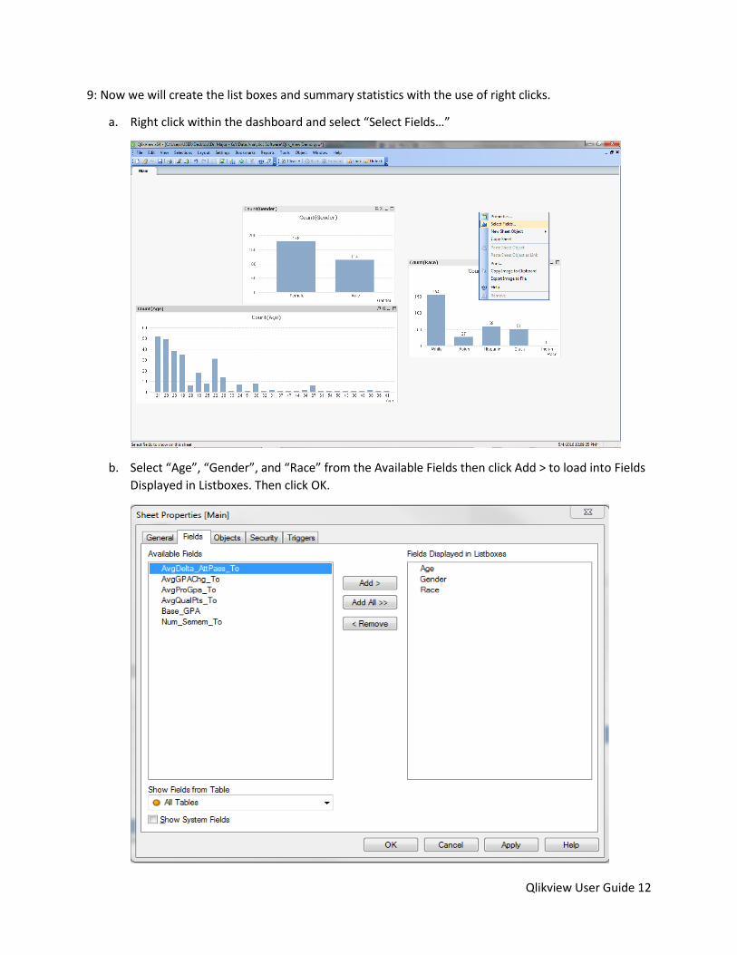
9: Now we will create the list boxes and summary statistics with the use of right clicks.
a. Right click within the dashboard and select “Select Fields…”
b. Select “Age”, “Gender”, and “Race” from the Available Fields then click Add > to load into Fields
Displayed in Listboxes. Then click OK.
Qlikview User Guide 13
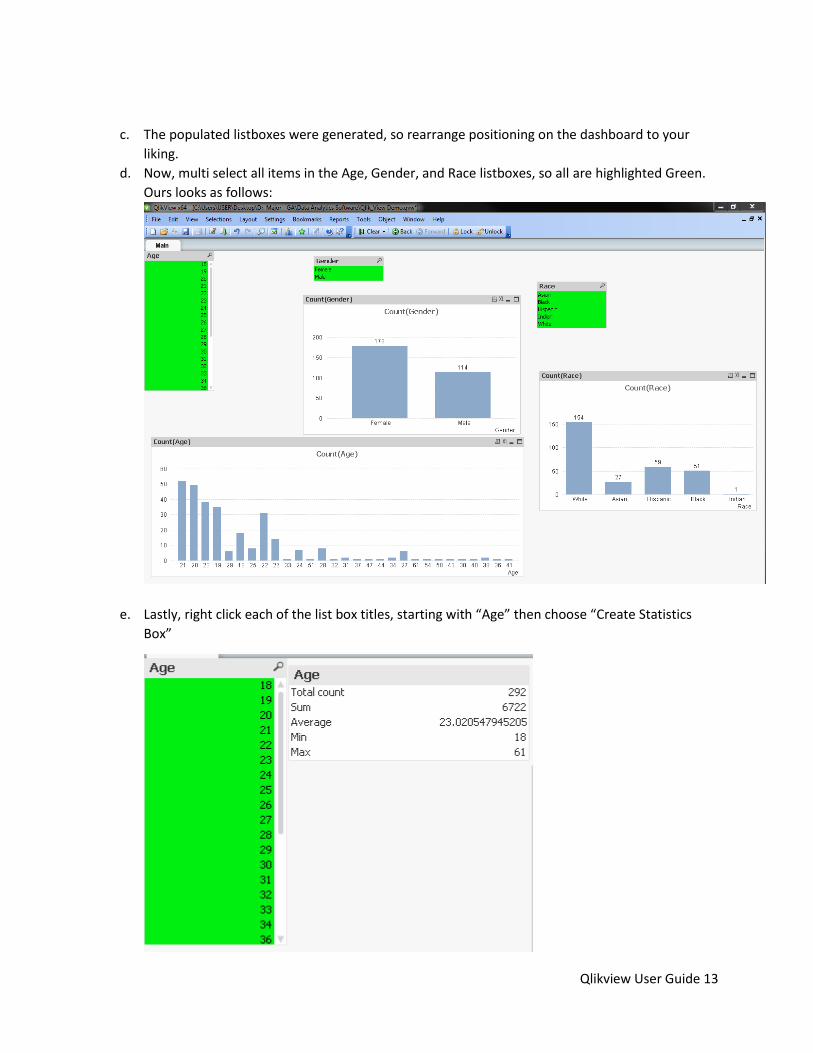
c. The populated listboxes were generated, so rearrange positioning on the dashboard to your
liking.
d. Now, multi select all items in the Age, Gender, and Race listboxes, so all are highlighted Green.
Ours looks as follows:
e. Lastly, right click each of the list box titles, starting with “Age” then choose “Create Statistics
Box”
Qlikview User Guide 14
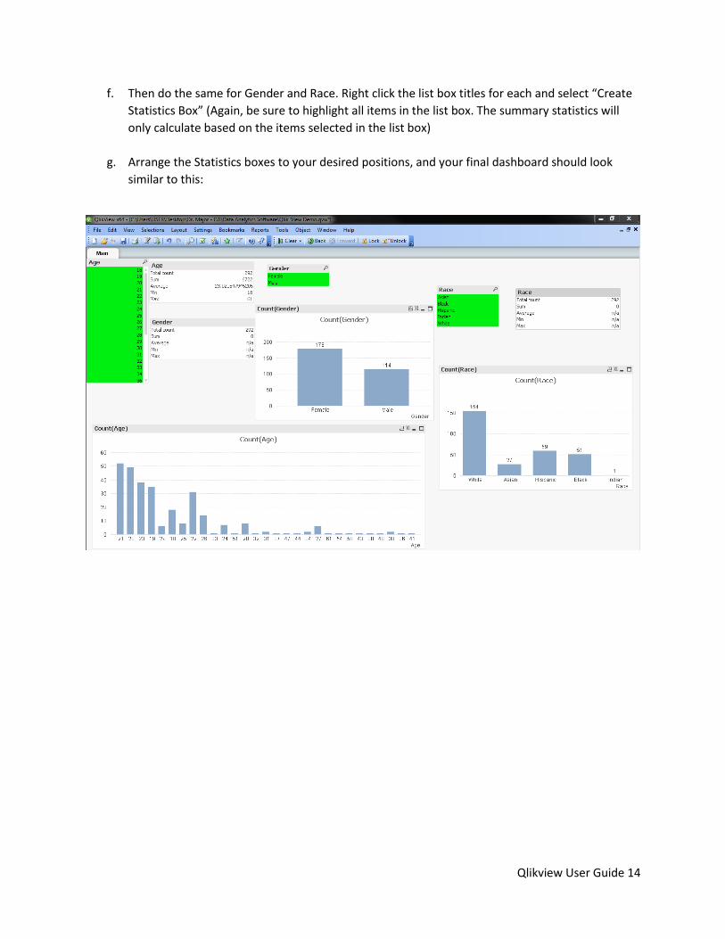
f. Then do the same for Gender and Race. Right click the list box titles for each and select “Create
Statistics Box” (Again, be sure to highlight all items in the list box. The summary statistics will
only calculate based on the items selected in the list box)
g. Arrange the Statistics boxes to your desired positions, and your final dashboard should look
similar to this:
Qlikview User Guide 15
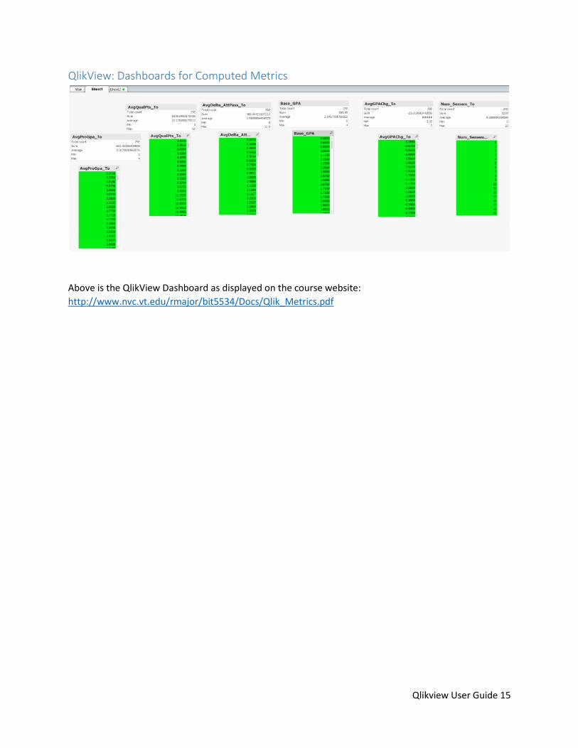
QlikView: Dashboards for Computed Metrics
Above is the QlikView Dashboard as displayed on the course website:
http://www.nvc.vt.edu/rmajor/bit5534/Docs/Qlik_Metrics.pdf
Qlikview User Guide 16
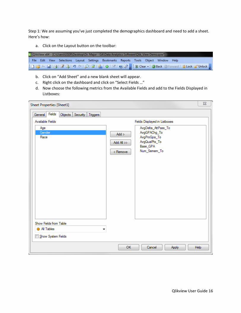
Step 1: We are assuming you’ve just completed the demographics dashboard and need to add a sheet.
Here’s how:
a. Click on the Layout button on the toolbar:
b. Click on “Add Sheet” and a new blank sheet will appear.
c. Right click on the dashboard and click on “Select Fields …”
d. Now choose the following metrics from the Available Fields and add to the Fields Displayed in
Listboxes:
Qlikview User Guide 17
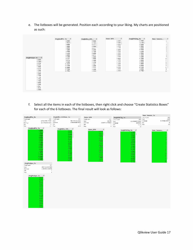
e. The listboxes will be generated. Position each according to your liking. My charts are positioned
as such:
f. Select all the items in each of the listboxes, then right click and choose “Create Statistics Boxes”
for each of the 6 listboxes. The final result will look as follows: