Embed Size (px)
Citation preview
Mapping inequality in accessibility: a global assessment of travel time to cities in
2015
*Weiss, D.J.1, Nelson, A.2, Gibson, H.S.1, Temperley, W.3, Peedell, S.3, Lieber, A.4,
Hancher, M.4, Poyart, E.4, Belchior, S.5, Fullman, N.6, Mappin, B.7, Dalrymple, U.1,
Rozier, J.1, Lucas, T.C.D.1, Howes, R.E.1, Tusting, L.S.1, Kang, S.Y.1, Cameron, E.1,
Bisanzio, D.1, Battle, K.E.1, Bhatt, S.8, Gething, P.W.1
* corresponding author
1 Malaria Atlas Project, Big Data Institute, Nuffield Department of Medicine, University
of Oxford, Roosevelt Drive, Oxford, OX3 7FY, UK
2 Department of Natural Resources. ITC - Faculty of Geo-Information Science and Earth
Observation of the University of Twente, PO Box 217, AE Enschede 7500, The
Netherlands
3 European Commission, Joint Research Centre, Unit D.6 Knowledge for Sustainable
Development and Food Security, Via Fermi 2749, Ispra 21027, VA, Italy
4 Google Inc., 1600 Amphitheatre Parkway, Mountain View, CA, 94043, USA
5 Vizzuality, Office D Dales Brewery, Gwydir Street, Cambridge CB1 2LJ, UK
6 Institute for Health Metrics and Evaluation, University of Washington, 2301 5th Ave.,
Suite 600, Seattle, WA 98121, USA
7 Centre for Biodiversity and Conservation Science, School of Biological Sciences,
University of Queensland, St. Lucia, Qld 4072, Australia
8 Department of Infectious Disease Epidemiology, Imperial College London, London W2 1PG, UK
The economic and manmade resources that sustain human wellbeing are not
distributed evenly across the world, but are instead heavily concentrated in cities.
Poor access to opportunities and services offered by urban centers (a function of
distance, transport infrastructure, and the spatial distribution of cities) is a major
barrier to improved livelihoods and overall development. Advancing accessibility
worldwide underpins the equity agenda of “leaving no one behind” established by
the United Nations’ Sustainable Development Goals (SDGs)1, bringing a renewed
international focus on accurately measuring accessibility and using this metric to
inform development policy design and implementation. The only previous attempt
to reliably map accessibility worldwide occurred nearly a decade ago2, which
predated the baseline for the SDGs and excluded the recent expansion in
infrastructure networks, particularly within lower-resource settings. In parallel,
new data sources provided by Open Street Map and Google now capture
transportation networks with unprecedented detail and precision. By integrating ten
global-scale surfaces that characterize factors affecting human movement rates and
13,840 high-density urban centers within an established geospatial-modeling
framework we develop and validate a map that quantifies travel time to cities for
2015 at a spatial resolution of approximately 1x1 kilometer. Our results highlight
disparities in accessibility relative to wealth as 50.9% of individuals living in low-
income settings (concentrated in sub-Saharan Africa) reside within an hour of a city
compared to 90.7% of individuals in high-income settings. By further triangulating
this map against socioeconomic datasets, we demonstrate how access to urban
centers stratifies the economic, educational, and health status of humanity.
An axiom for the twenty-first century is that the world is becoming increasingly
connected. While this is certainly true for electronic forms of communication, physical
links between locations, and thus the time it takes to move between them, remain
constrained by available infrastructure as well as physical and political impediments to
travel. Eliminating disparities in accessibility is central to the United Nations’ Sustainable
Development Goals (SDGs)1, which explicitly call for improved or universal access to
key services, including education programs, health services, and banking and financial
institutions. Cities are the epicenters of such activities3-6, and how easily people can reach
urban areas directly affects whether crucial services can be obtained.
What constitutes “accessibility” is widely debated and precise definitions of this
metric can be arbitrary. In this study, we operationalize accessibility in terms of travel
time required to reach the nearest urban center, defined as a contiguous area with 1,500
or more inhabitants per square kilometer or a majority of built-up land cover coincident
with a population center of at least 50,000 inhabitants7. We define accessibility using
travel time as it is readily interpretable, can be feasibly generated at global scales, and is
known to be a predictive metric in research domains including conservation8, food
security6, trade,9 and population health10,11. Furthermore, travel time better captures the
opportunity cost of travel than Euclidean or network distance, and ultimately reflects the
information humans use to inform transport decisions. The outcome of this research is a
map that provides an actionable dataset supportive of many research and policy needs. To
demonstrate the map’s utility for global and local decision-making, we provide
exploratory analyses examining relationships between accessibility and national-level
income as well as household-cluster-level economic prosperity, educational attainment,
and healthcare utilization.
Our study responds to a heightened need for fine-grained quantification of
accessibility worldwide. The only previous assessment of global accessibility2 was for the
year 2000 and tremendous advances in data quality and availability have since occurred.
By anchoring our global accessibility map to 2015 (i.e., the year of formal SDG
adoption), we provide a baseline from which to track infrastructural improvements and
urban expansion throughout the SDGs’ duration on the basis that accessibility is a
precondition for many development targets. While our results are useful in a variety of
contexts, their potential impact centers around a more unifying aim: catalyzing action to
narrow gaps in opportunity by improving accessibility for remote populations and/or
reducing disparities between populations with differing degrees of connectivity to cities.
To quantify travel time required to reach the nearest city via surface transport (air
travel is not considered) we applied a similar methodology to that used in producing the
foremost existing global accessibility map2 to updated and expanded input datasets for
2015. These inputs consisted of gridded surfaces that quantify the geographic positions
and salient attributes of roads, railways, rivers, water bodies, land cover types,
topographic conditions (slope angle and elevation), and national borders. Roads are the
primary driver of accessibility globally and also represent the most substantial advance
from the previous accessibility mapping effort. Our roads dataset was created by merging
Open Street Map (OSM) data with a distance-to-roads product derived from the Google
roads database; these datasets were extracted in November 2016 and March 2016,
respectively. The resulting roads dataset represents the first-ever, global-scale synthesis
of these two data sources, and the unparalleled data quality of this dataset led to a 4.8-
fold increase in road pixels relative to the dataset used for the previous accessibility
map2. While roads built since 2000 contributed to this heightened data volume, the
primary driver of this increase was the inclusion of minor roads (e.g., unpaved rural roads
and exurban residential streets). The OSM database also provided the information
necessary for assigning country- and road-type-specific speed data to road pixels. The
Google roads data provided information critical for maintaining connectivity in areas
where OSM coverage was sparse and/or fragmented due to its piecemeal data collection
approach. All input datasets were combined to create a global “friction surface” at a
resolution of approximately 1x1 kilometer at the equator (i.e., 30 arc-second resolution),
effectively enumerating the generalized rates at which humans can move through each
pixel of the world’s surface.
The geographic dataset representing cities was the Global Human Settlement grid
of high-density land cover (GHS-HDC)7. This dataset consisted of 13,840 urban areas, an
increase of 62.6% from the city points dataset used for the circa 2000 map2. We applied a
least-cost-path algorithm12 to the friction surface and the center points of pixels defined
as urban areas within the GHS-HDC, which ultimately produced a global accessibility
map enumerating travel time to the closest city for each pixel between 60° south and 85°
north latitude (figure 1). We generated the friction surface and most of the accessibility
map using the Google Earth Engine platform13, and by freely distributing our data and
code our design supports the construction of bespoke accessibility maps targeted at
specific policy or programmatic priorities and interests (e.g., travel time to healthcare
facilities, schools, employment centers, or markets). As with any global mapping effort,
however, this study is subject to limitations that we detail within the methods section.
Our accessibility map illustrates broad patterns of accessibility globally, capturing
both the asymmetric distribution of cities and vast inequalities in infrastructural
development. Highly accessible areas include those with abundant transportation
infrastructure and/or many spatially disaggregated cities, suggesting that accessibility to
cities can be increased via improvements in infrastructure as well as polycentric urban
development. Further exploration of accessibility relative to gridded population
datasets14-17 shows that 80.7% of people (5.88 billion individuals) reside within 60
minutes of cities, but accessibility is not equally distributed across the development
spectrum. This disparity is evident when comparing accessibility for populations
subdivided by World Bank classifications for income group and geographic region18
(figure 2), as 90.7% of people in high-income countries (concentrated in Europe and
North America) live within one hour of a city compared to 50.9% of people in low-
income countries (concentrated in sub-Saharan Africa). The relationship between national
wealth and population accessibility is more ambiguous for upper- and lower-middle
income countries due to the high population and large number of spatially diffuse urban
centers found in northern India. This finding exemplifies differences in accessibility that
can readily be discerned from our map because it was produced using a globally
consistent (and thus comparable) methodology. While global summaries are informative,
the accessibility map also supports fine-grained summarization and analysis (extended
figures 1-3, supplementary information). Our map also provides a means for more
nuanced characterizations of accessibility within rural populations than those based upon
commonly-used datasets such as binary classifications of urban vs. rural land cover19 or
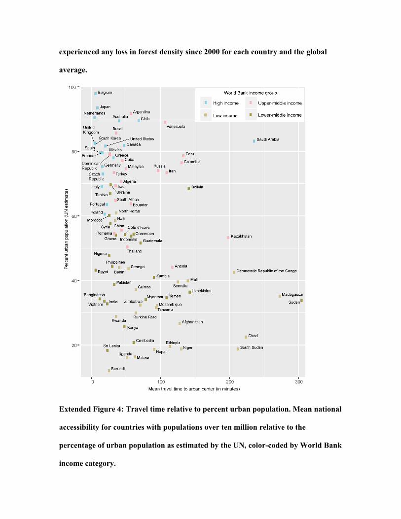
national estimates of urban population percentages20 (extended figure 4). As such our
map can be used to highlight major development gaps between predominantly urban and
rural populations and/or provide a means of enumerating accessibility within rural
populations along a continuum.
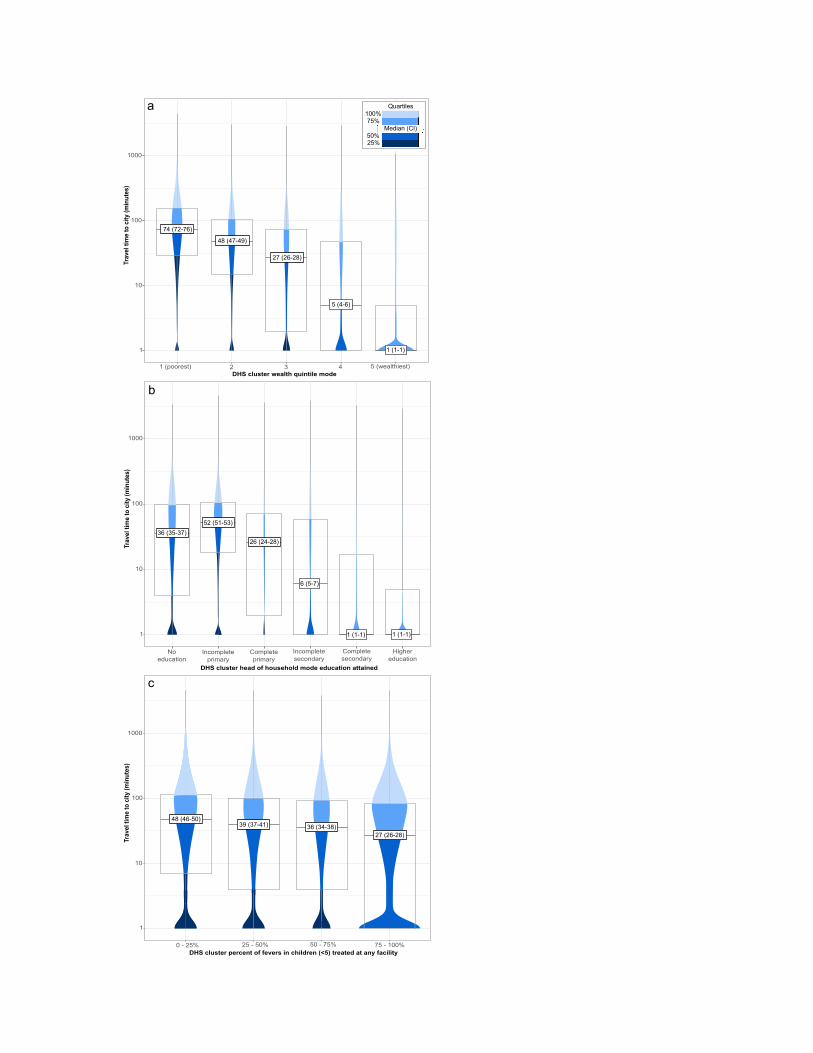
To analyze subnational relationships between accessibility and socioeconomic,
educational, and health measures we utilized data collected by the Demographic and
Health Surveys (DHS) program between 2000 and 2015. Our DHS database consisted of
66,768 household clusters, from 122 unique surveys spanning 52 countries, which were
aggregated from nearly 1.77 million surveyed households. While DHS surveys primarily
cover low- to middle-income countries (LMICs), and thus do not fully represent all
socioeconomic contexts, our results illustrate reciprocal relationships between
accessibility and key metrics of human wellbeing in many geographic, political, and
economic settings. We found a clear association between higher household wealth and
greater accessibility to population centers (figure 3a). Similar patterns emerged for
measures of educational attainment (figure 3b) and treatment of fever among children
under five (figure 3c). While exceptions occurred (e.g., there were wealthy household
clusters far from cities and vice-versa), and the selected metrics were strongly collinear,
the association between accessibility to cities and indicators of human wellbeing in
LMICs was unequivocal.
The 2015 global accessibility map provides an unprecedented level of detail while
also characterizing spatial heterogeneity in accessibility at a range of spatial scales. Our
map is likely to serve as a critical input for future geospatial modeling endeavors,
including those that highlight positive aspects of low accessibility, such as the protective
effect remoteness provides to wilderness areas21,22, or reinforce the need for strategic road
building that avoids unnecessary environmental damage23,24. We illustrate such utility
through a cursory case study relating accessibility with forest loss between 2000 and
2015 (extended figures 1-3) based upon the Global Forest Change dataset25. This
exemplar shows the potential of our map for contributing to natural science research,
conservation efforts, and formulation of environmental policy.
While results from our exploratory analyses do not causally link accessibility with
metrics of development (e.g., they cannot be used to determine whether places are more
affluent due to greater accessibility or vice-versa), they nevertheless illustrate the
relationship between travel time and socioeconomic outcomes encompassed within the
SDGs. Many view reducing inequalities in accessibility to the services, institutions, and
economic opportunities offered by cities as a vital pathway to sustainable development
and improved livelihoods for all populations. Our analysis supports this perspective and
future studies should track and evaluate the multifaceted effects that result from improved
accessibility.

Data availability statement
The accessibility map is available for visualization and/or download at
http://roadlessforest.eu/map.html and http://www.map.ox.ac.uk/accessibility_to_cities/.
Acknowledgements
Juan Carlos Alonso, Gerardo Pacheco, Edward Brett, Alicia Arenzana, and
Benjamin A. Laken developed http://roadlessforest.eu/map.html, and Daniel Pfeffer and
Kate Twohig formatted figures and references. Funding was provided by a Google Earth
Engine Research Award entitled “Developing and validating an online accessibility
mapping tool powered by Google Earth Engine” and the "Roadless Forest" project -
"Making efficient use of EU climate finance: Using roads as an early performance
indicator for REDD+ projects" (European Parliament / EC Directorate General for
Climate Action).
Author contributions
Research concept and design: D.J.W., A.N., S.P., and P.W.G. Drafted the
manuscript: D.J.W. Prepared and/or supplied data: D.J.W., A.N., H.G., W.T., A.L., B.M.,
and U.D. Conducted the analyses: D.J.W. Implemented algorithms: M.H and E.P. Project
coordination: D.J.W. and A.L. Supported the analyses and interpretations: A.N., H.G.,
N.F., T.C.D.L., R.E.H., K.E.B., and S.Bh. Produced visualizations: J.R. and S.Be. All
authors discussed the results and revised the final manuscript.
Author Information
Reprints and permissions information is available at www.nature.com/reprints. The
authors declare that there are no competing financial interests. Correspondence and
requests for materials should be addressed to D.J.W. ([email protected]).
References
1 UnitedNations.Transformingourworld:the2030AgendaforSustainableDevelopment.UnitedNationsDepartmentofEconomicandSocialAffairs:NewYork.(2015).
2 Nelson,A.Traveltimetomajorcities:Aglobalmapofaccessibility.GlobalEnvironmentMonitoringUnit–JointResearchCentreoftheEuropeanCommission:IspraItaly.http://forobs.jrc.ec.europa.eu/products/gam/(2008).
3 Young,A.Inequality,theurban-ruralgapandmigration.Q.J.Econ.128,1727-1785(2013).
4 Fotso,J.-C.Urban–ruraldifferentialsinchildmalnutrition:trendsandsocioeconomiccorrelatesinsub-SaharanAfrica.HealthPlace13,205-223(2007).
5 Bloom,D.E.,Canning,D.&Fink,G.UrbanizationandtheWealthofNations.Science319,772-775(2008).
6 Frelat,R.etal.Driversofhouseholdfoodavailabilityinsub-SaharanAfricabasedonbigdatafromsmallfarms.Proc.Natl.Acad.Sci.113,458-463(2016).
7 Pesaresi,M.&Freire,S.GHSSettlementgridfollowingtheREGIOmodel2014inapplicationtoGHSLLandsatandCIESINGPWv4-multitemporal(1975-1990-2000-2015)datasets.EuropeanCommission,JointResearchCentre.http://data.europa.eu/89h/jrc-ghsl-ghs_smod_pop_globe_r2016a(2016).
8 Nelson,A.&Chomitz,K.M.Effectivenessofstrictvs.multipleuseprotectedareasinreducingtropicalforestfires:aglobalanalysisusingmatchingmethods.PLoSONE6,e22722(2011).
9 Schmitz,C.etal.Tradingmorefood:Implicationsforlanduse,greenhousegasemissions,andthefoodsystem.Glob.lEnviron.Change22,189-209(2012).
10 Gilbert,M.etal.PredictingtheriskofavianinfluenzaAH7N9infectioninlive-poultrymarketsacrossAsia.Nat.Commun.5(2014).
11 Bhatt,S.etal.TheeffectofmalariacontrolonPlasmodiumfalciparuminAfricabetween2000and2015.Nature526,207-211(2015).
12 Dijkstra,E.W.Anoteontwoproblemsinconnexionwithgraphs.Numerischemathematik1,269-271(1959).
13 Gorelick,N.etal.GoogleEarthEngine:Planetary-scalegeospatialanalysisforeveryone.RemoteSens.Environ.,doi:http://dx.doi.org/10.1016/j.rse.2017.06.031(2017).
14 Gaughan,A.E.,Stevens,F.R.,Linard,C.,Jia,P.&Tatem,A.J.HighresolutionpopulationdistributionmapsforSoutheastAsiain2010and2015.PLoSONE8,e55882(2013).
15 Linard,C.,Gilbert,M.,Snow,R.W.,Noor,A.M.&Tatem,A.J.Populationdistribution,settlementpatternsandaccessibilityacrossAfricain2010.PLoSONE7,e31743(2012).
16 Sorichetta,A.etal.High-resolutiongriddedpopulationdatasetsforLatinAmericaandtheCaribbeanin2010,2015,and2020.ScientificData2,150045(2015).
17 CenterforInternationalEarthScienceInformationNetwork(CIESIN)&CentroInternacionaldeAgriculturaTropical(CIAT).GriddedPopulationoftheWorld,Version3(GPWv3):PopulationDensityGrids.NASASocioeconomicDataandApplicationsCenter(SEDAC)http://dx.doi.org/10.7927/H4ST7MRB(2005).
18 WorldBank.GDP(currentUS$).http://data.worldbank.org/indicator/NY.GDP.MKTP.CD(2016).
19 CenterforInternationalEarthScienceInformationNetwork-CIESIN-ColumbiaUniversity,CUNYInstituteforDemographicResearch-CIDR,InternationalFoodPolicyResearchInstitute-IFPRI,TheWorldBank&CentroInternacionaldeAgriculturaTropical-CIAT.Globalrural-urbanmappingproject,version1(GRUMPv1):settlementpointsrevision01.NASASocioeconomicDataandApplicationsCenter(SEDAC)https://doi.org/10.7927/H4BC3WG1(2016).
20 UnitedNations.Worldurbanizationprospects:the2014revision,highlights.UnitedNationsDepartmentofEconomicandSocialAffairs:NewYork.(2014).
21 Allan,J.R.etal.RecentincreasesinhumanpressureandforestlossthreatenmanyNaturalWorldHeritageSites.Biol.Conserv.206,47-55(2017).
22 Ibisch,P.L.etal.Aglobalmapofroadlessareasandtheirconservationstatus.Science354,1423-1427(2016).
23 Laurance,W.F.etal.Aglobalstrategyforroadbuilding.Nature513,229-232(2014).
24 Laurance,W.F.&Arrea,I.B.Roadstorichesorruin?Science358,442-444,doi:10.1126/science.aao0312(2017).
25 Hansen,M.C.etal.High-resolutionglobalmapsof21st-centuryforestcoverchange.Science342,850-853(2013).Dataavailableon-linefrom:http://earthenginepartners.appspot.com/science-2013-global-forest.
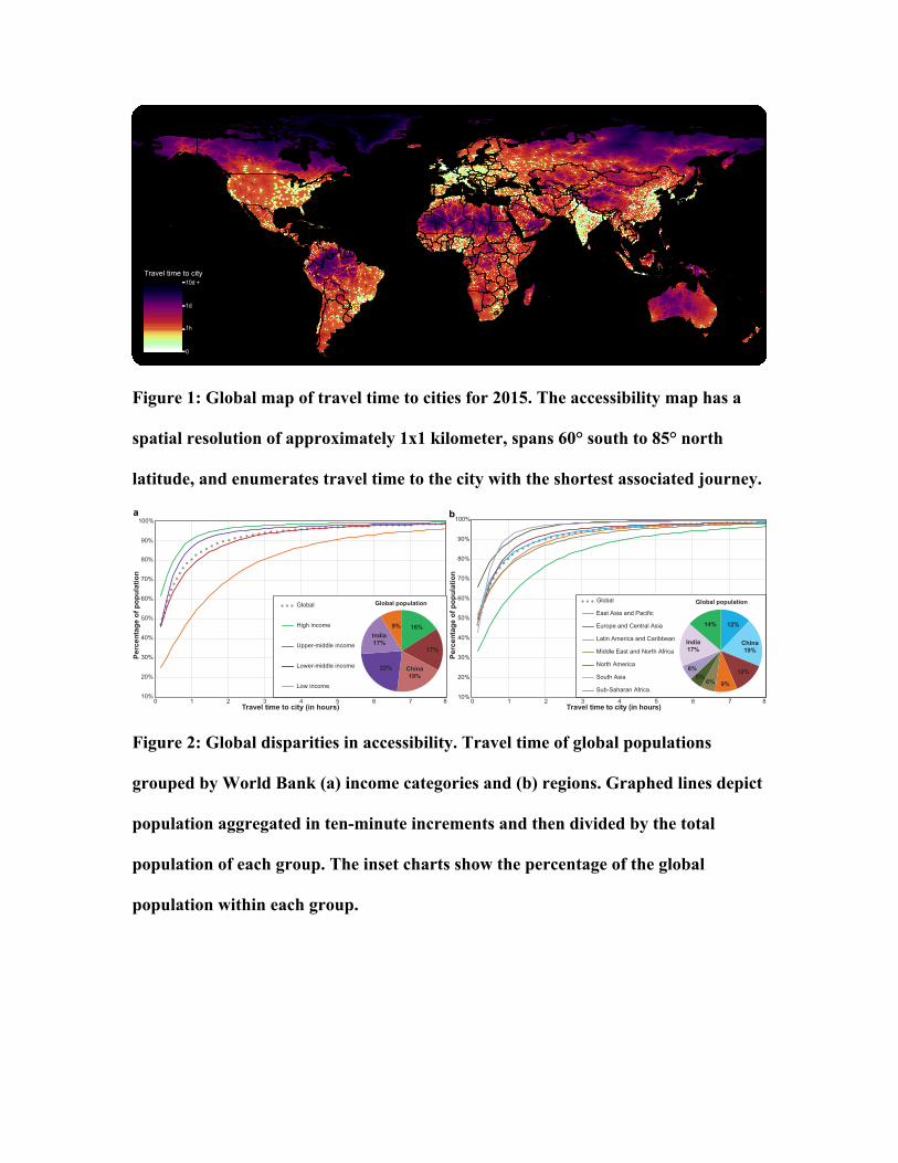
Figure 1: Global map of travel time to cities for 2015. The accessibility map has a
spatial resolution of approximately 1x1 kilometer, spans 60° south to 85° north
latitude, and enumerates travel time to the city with the shortest associated journey.
Figure 2: Global disparities in accessibility. Travel time of global populations
grouped by World Bank (a) income categories and (b) regions. Graphed lines depict
population aggregated in ten-minute increments and then divided by the total
population of each group. The inset charts show the percentage of the global
population within each group.
0
1h
10d +
1d
Travel time to city
10%
20%
30%
40%
50%
60%
70%
80%
90%
100%
0 1 2 3 4 5 6 7 8
Perc
enta
ge o
f pop
ulat
ion
Travel time to city (in hours)
Global
High income
Low income
16%
17%
China19%
22%
India17%
9%
Global population
0 1 2 3 4 5 6 7 8
Perc
enta
ge o
f pop
ulat
ion
Travel time to city (in hours) 10%
20%
30%
40%
50%
60%
70%
80%
90%
100%
12%
China19%
12%
9%6%5%
6%
India17%
14%
Global population
a b
Upper-middle income
Lower-middle income
Global
East Asia and Pacific
North America
South Asia
Sub-Saharan Africa
Middle East and North Africa
Latin America and Caribbean
Europe and Central Asia
1
10
100
1000
Noeducation
Incompleteprimary
Completeprimary
Incompletesecondary
Completesecondary
Highereducation
DHS cluster head of household mode education attained
Trav
el ti
me
to c
ity (m
inut
es)
b
36 (35-37)52 (51-53)
26 (24-28)
6 (5-7)
1 (1-1) 1 (1-1)
1
10
100
1000
0 - 25% 25 - 50% 50 - 75% 75 - 100%DHS cluster percent of fevers in children (<5) treated at any facility
Trav
el ti
me
to c
ity (m
inut
es)
c
48 (46-50)39 (37-41) 36 (34-38)
27 (26-28)
1
10
100
1000
1 (poorest) 2 3 4 5 (wealthiest)DHS cluster wealth quintile mode
Trav
el ti
me
to c
ity (m
inut
es)
a
74 (72-76)
48 (47-49)
27 (26-28)
5 (4-6)
1 (1-1)
100%75%
50%25%
Quartiles
Median (CI)
Figure 3: Relating accessibility with human wellbeing. Log-scale violin plots show
travel times (plus one minute) for household clusters for metrics of (a) wealth
(n=47,761), (b) educational attainment (n=59,686), and (c) healthcare utilization
(n=39,014). The overlaid boxplot hinges and color-coding indicate the data quartiles,
whiskers extend to the range of the data, violin shapes depict the data distributions,
and median and confidence intervals (CI) are displayed at the boxplot centers.
Methods
To model the time required for individuals to reach their most accessible city we
first quantified the speed at which humans move through the landscape. For this we built
upon previous work that integrated a number of infrastructural, political, and
environmental datasets within a GIS-based model2. The principle underlying this work
was that all areas on Earth, represented here as pixels within a 2-D grid, had a cost (i.e.,
time) associated with moving through them that we quantified as a movement speed
within a cost or “friction” surface. We then applied a least-cost-path algorithm12 to the
friction surface in relation to a set of high-density urban points. The algorithm calculated
pixel-level travel times for the optimal path between each pixel and its nearest (i.e.,
shortest journey time) city. From this work we ultimately produced two products: (a) an
accessibility map showing travel time to urban centers, as cities are proxies for access to
many goods and services that affect human wellbeing; and (b) a friction surface that
underpins the accessibility map and enables the creation of custom accessibility maps
from other point datasets of interest.
Accessibility mapping methodology
The datasets we used to construct the friction surface characterize the spatial
locations and properties of roads, railroads, rivers, bodies of water, topographic
conditions (elevation and slope angle), land cover, and national borders. The datasets
were converted into aligning grids with a 30 arc-second resolution, with the pixel values
representing speeds of movement. The layers were then combined following the approach
defined within an earlier accessibility mapping project2 such that the fastest mode of
transport took precedence. The lone exception to this logic was national borders, for
which a crossing-time penalty was superimposed with priority over all other layers. The
borders dataset was created from a UN global administrative units layer (GAUL) such
that each border segment had a unique numerical identifier. This approach supports
setting border-specific crossing times via a lookup table, however usable data do not
presently exist for universally defining this parameter. As such, we used a static, one-
hour crossing-time penalty for all borders other than those within the Schengen and the
UK-Ireland common security zones. Note that for readability the travel speeds for other
input layers are provided in km/h, but the actual units within the friction surface raster are
minutes required to travel one meter.
With the exception of the rivers input, each of the datasets we used in this project
and the methods we used to pre-process the data have improved considerably relative to
those of the circa 2000 accessibility map that was produced in 20082. Two roads datasets
were combined for this research. The first road input layer consisted of vector data
extracted from the Open Street Map (OSM) database, which was created by a user
community dedicated to producing open-source, geocoded datasets of infrastructural
resources. The OSM dataset was converted into a grid matching the geographic
resolution and extent of the eventual friction surface. In cases where vector features of
more than one road type were present within a single pixel, the road type with the highest
associated travel speed took precedence. This rasterization procedure resulted in an
integer grid where pixel values corresponded to a single road type that was subsequently
linked to a speed via a lookup table, which we also derived from the OSM database. The
lookup table contains the country-specific mean travel speeds associated with each
available road type, as derived from attributes linked to individual roads by the OSM user
community. We utilized this lookup table approach rather than direct assignment of road
speeds because such speed-of-travel information was infrequently assigned to road
vectors within the OSM database. This limitation also necessitated the creation of a
global default lookup table, which we created using mean values for each road type from
all countries. We applied values from the default table in cases where a country had no
speed limit records for one or more road types found within it.
The second, equally important source of road data was the Google distance to
roads surface. This Google dataset was also global in extent, though China and the
Korean Peninsula were omitted due to data distribution limitations. To combine the two
roads datasets the Google distance to roads raster was first restricted to include only
pixels with values of 500 meters or less, thereby approximating the 1x1 km rasterization
of the OSM road vectors. Unlike the OSM data the resulting Google roads raster lacked
road type information. As such the OSM road type designation took precedence if both
layers contained road information for a single pixel. Where only Google road data were
available the pixels were given the default integer value corresponding to the generic
“road” class from OSM. When creating the friction surface, all pixels from the combined
roads raster were assigned the road travel speeds from the OSM-based lookup tables. For
the lookup procedure we also utilized a grid of administrative units to determine each
pixel’s country association.
The railroad input layer was also created from the rasterized OSM surface. Unlike
the OSM roads data, however, the railroads were not differentiated by type within OSM
and thus consisted of a single class with a uniform movement speed. The railroad speed
used in this project was 24.3 km/h, which was the mean value assigned to railroad vectors
extracted from the OSM database.
Three datasets were used to account for travel time by water within the friction
surface. River travel time was added via a global set of navigable rivers rasterized from
the CIA World Data Bank II vector rivers dataset26, which was the only holdover input
variable from the circa 2000 accessibility mapping endeavor2. Other options available for
characterizing major rivers were explored, most notably the HydroSHEDS27 river
network and Vector Map Level 0 (VMAP0)28 datasets, but we ultimately concluded that
reusing the original data was warranted as neither of the alternatives was discernibly
superior given their associated limitations and lack of detail on which rivers were
navigable. For inland water bodies we utilized a newly created global surface water
occurrence dataset29, which we first aggregated from its native 30-meter resolution to
create a layer that enumerated the fraction of each pixel’s area that was covered by water
at the resolution of the friction surface. In this procedure, all 30-meter pixels within the
resulting fractional surface water dataset that were classified as water at least 80% of the
time were considered permanent water, as 80% was the lowest occurrence value we
observed within ocean pixels when screening the data. The resulting fractional surface
water layer was then converted into a binary surface whereby only pixels that were
completely covered by permanent water were codified as a body of water amenable to be
crossed via boat. The final dataset relating to water was a land-sea mask, which was used
to identify ocean pixels. The movement speeds assigned to the water types within the
friction surface were 10 km/h for rivers and lakes and 19 km/h for oceans. The value for
rivers was based on inland travel speeds reported in the UK, Ireland, and Australia30. The
ocean value was the average speed gleaned from over 142 million observations of
oceangoing passenger ships collected from theAutomatic Identification System (AIS)
and the Voluntary Observing Ship (VOS) program30.
For all pixels not covered by any of the water, road, or railroad datasets, we
derived a baseline speed of movement overland (i.e., on-foot) using the MODIS
MCD12Q1 land cover product31 whereby we assigned each land cover type a travel speed
from a lookup table. The lookup table was created by summarizing results from an online
survey designed to crowd-source estimates of how long it takes individuals to traverse
each cover type. The survey consisted of representative photos and global maps of each
land cover type. Respondents were asked to estimate the amount of time it would take
them to travel one kilometer (or one mile) on foot through each land cover type. The
survey received 407 complete responses and, after standardizing the distance units, the
median values for the fifteen land cover classes within the survey (in units of km/h) were
as follows: Evergreen Needleleaf Forest = 3.24, Evergreen Broadleaf Forest = 1.62,
Deciduous Needleleaf Forest = 3.24, Deciduous Broadleaf Forest = 4.00, Mixed Forest =
3.24, Closed Shrublands = 3.00, Open Shrublands = 4.20, Woody Savannas = 4.86,
Savannas = 4.86, Grasslands = 4.86, Permanent Wetlands = 2.00, Croplands = 2.50,
Cropland/Natural Vegetation = 3.24, Snow and Ice = 1.62, and Barren or Sparsely
Vegetated = 3.00. The two land cover classes we excluded from the survey were (a)
urban and built-up, which was given a speed of 5 km/h, but this value is virtually never
needed due to the higher speed (and thus precedence) of the roads datasets that dominate
urban landscapes at 1x1 kilometer resolution, and (b) open water, which was given a
speed of 1 km/h. The speed for the open water pixels was assigned using the rationale
that if these pixels were not considered inland water within the water bodies layer (and
would thus have received the inland water speed associated with boat travel) they were
likely more akin to permanent wetland pixels that had a very high subpixel fraction of
water to circumnavigate on foot. As such, all pixels that were classified as open water in
the land cover layer but not as permanent water in the water bodies layer were given a
speed half as fast as the crowd-sourced median speed for permanent wetlands of 2 km/h.
The land cover-dependent travel speeds were then adjusted to take into account
the effect of topographic properties. Topographic datasets used in this analysis were
produced from the Global Multi-resolution Terrain Elevation Dataset 2010
(GMTED2010), a derivative of the Shuttle Radar Topography Mission data produced by
USGS32. The adjustment we applied to elevation accounts for decreasing atmospheric
density (and thus available oxygen) with altitude, which closely parallels the drop in
maximal oxygen consumption (i.e., VO2 max, a measure of optimum heart and lung
function) and thus decreased the predicted travel speed as a function of altitude33.
Equation 1, based on the standard atmosphere calculation, shows the adjustment factor
we associated with elevation (in meters). We treated slope angle (in degrees) similarly, as
steep terrain slows humans’ ability to traverse it on foot. For the slope adjustment we
utilized Tobler’s Hiking Function34 as shown in Equations 2 and 3, with Tobler’s speed
capped at a maximum speed of five km/h and then divided by five to convert it into a
fraction of maximum travel speed. The elevation and slope adjustment factors were
subsequently multiplied by the land cover-dependent travel speeds, thus lowering the
speed of travel on foot and increasing the time required to traverse each associated pixel
within the friction surface.
EQ1: Elevation adjustment factor = 1.016e(-0.0001072 * elevation)
EQ2: Tobler's walking speed = 6e(-3.5|((TAN(0.01745 * slope angle)+ 0.05))|)
EQ3: Slope adjustment factor = Tobler's walking speed / 5.0
The final input for the accessibility map was the dataset of urban land cover,
which was created using a layer from the Global Human Settlement (GHS) project7. This
dataset was produced using a combination of satellite imagery and census data to map the
spatial distribution of urban areas across the globe. To be consistent with data used in
past accessibility mapping research2 we selected the “high-density centers” variant of the
GHS dataset, which is defined as “contiguous cells with a density of at least 1,500
inhabitants per km2 or a density of built-up greater than 50% and a minimum of 50k
inhabitants”. The dataset contained a total of 13,840 unique urban areas and, unlike the
circa 2000 accessibility map in which cities were represented as single geographic points,
cities extracted from the GHS consisted of a cluster of pixels, thus effectively
representing urban areas as polygons. The switch from single-point to multiple-pixel
representations of cities was operationalized by extracting each urban pixel’s center
coordinates and then applying the least-cost-path algorithm to only points on edges of
urban areas. Over 400,000 high-density urban points were processed in this manner, not
including points from the urban interiors, which were ignored to reduce redundant
processing and later masked to have travel times of zero in the resulting accessibility
map.
The friction surface was created entirely within Google Earth Engine, which was
also used to create the majority of the accessibility surface. In contrast to the process used
to create the friction surface, deriving the accessibility map was very computationally
intensive and required a more complex processing chain. Within Earth Engine
accessibility surfaces were generated using the cumulativeCost function35, a least-cost-
path function that was an experimental tool implemented specifically for this project but
is now freely available within Earth Engine. By harnessing the computational power of
the Google cloud-computing system the cumulativeCost function shortened the
production time of the global accessibility surface from several months (when relying on
local computing resources alone) to approximately two weeks. Despite reducing the
production time substantially, the cumulativeCost function was still an evolving tool that
was not yet capable of producing the global accessibility map in a single run or reliably
producing output for latitudes above 60° if the friction surface was in geographic
coordinates (i.e., units of degrees latitude and longitude). As such, we created the global
accessibility map by mosaicking a set of 31 tiles, 24 of which encapsulated the most
computationally demanding areas and were generated within Earth Engine, and seven of
which we created outside Earth Engine. The limitations of the least-cost-path function
within Earth Engine at high latitudes were due to the nature of processing raster data
stored in geographic coordinates because distances at high latitudes span far more
degrees of longitude (and thus more pixels) than comparable distances at low latitudes. In
order to parallelize computations efficiently the Earth Engine cumulativeCost function
required specification of a maximum search distance from the source points (i.e. high-
density urban land cover pixel centers), which we set to 1500km for most of the globe but
reduced to 1000 km in areas from 50° to 55° latitude due to the afore-mentioned
processing limitations at high latitudes. For latitudes above 50° we calculated
accessibility tiles using the gDistance package in R36, thus ensuring an overlapping area
of five-degrees latitude and providing data with which to compare the output maps from
the differing sources (pixel values in these areas proved to be virtually identical). We also
calculated accessibility times locally for very remote islands at lower latitudes that were
beyond the 1500km search distance threshold from their closest cities. Lastly, the
cumulativeCost function in Earth Engine could not account for wrapping at +/- 180°
longitude, so we created an alternative version of the friction surface centered at this
longitude and reprocessed approximately one fifth of the globe outside of Earth Engine to
ensure that any pixels that had their closest cities on the opposite side of this “edge” were
ascribed accurate travel times. We then mosaicked all of the tiles together by selecting
the minimum travel times for all pixels that fell within overlapping portions of multiple
tiles. The result of this mosaicking operation is the global accessibility map shown in
Figure 1.
Model validation
The approach we adopted for validating the accessibility map was to compare the
travel times extracted derived using least-cost-path calculations based on the friction
surface with corresponding estimates derived using the driving directions application
within Google Maps (i.e., comparison to travel time estimates derived using a network
distance algorithm). The data source we used for validation consisted of settlement points
from the Global Rural-Urban Mapping Project (GRUMP)19. Point pairs linking small
settlements (i.e., those with populations under 50,000 inhabitants) with their nearest city
(i.e., settlements with populations over 50,000 inhabitants) were processed using the
friction surface approach to produce travel times akin to those within the accessibility
map. After receiving special permission to automate the process of querying the Google
driving directions application programming interface (API), we acquired validation travel
times for each of the point pairs. A total of 53,091 validation point-pairs were available
after removing all coordinate pairs the API could not match. This approach limited the
validation to places that fell along road networks, which precluded an assessment of the
map’s accuracy in the most remote areas on Earth. However, the applied validation
approach does thoroughly validate the map with respect to human populations as (a) most
of the world’s people live in close proximity to a road of some variety, and (b) named
points along road networks that we tested were indicative, from an accessibility
perspective, of other points near roads at unnamed locations.
The validation results were encouraging, with an R2 of 0.66 and a mean absolute
error (i.e., the average difference between the travel times regardless of sign) of 20.7
minutes. The distribution of the differences between the travel times also matched our
expectations as 86.5% of the point pairs had lower travel time estimates from the friction
surface approach compared to the values derived from the Google API. We attributed this

unequal distribution to the presence of roads within the OSM dataset that were not
present within the Google data and were thus unknown to the Google API when it
calculated travel time via the Google road network. Another factor that helped explain the
preponderance of lower travel times to cities derived using the friction surface was that it
incorporated other forms of travel (e.g., by water). This factor was particularly important
for explaining point pairs with very large travel time disparities. Additional reasons why
the friction surface approach tended to produce lower travel times relative to the Google
API include (a) the abstraction of vector roads within raster space, which effectively
shortened some roads by reducing their sinuosity; (b) the speed limit look-up table which
assigned speeds to roads that may be unrealistically high (e.g., if road conditions are
poor); and (c) the friction surface approach assumed constant and optimal travel speeds,
unlike the Google API that incorporated temporally varying delays related to traffic
density (e.g., rush-hour delays).
The geographic distribution of the 13.5% of point pairs where the travel times
estimated via the Google API were shorter than the corresponding times from the friction
surface approach was heavily concentrated in China. This is noteworthy as the Google
roads dataset we utilized to create the friction surface lacked road data for China. As
such, this finding suggests that there were roads in China that the Google API utilized to
estimate travel times that were unaccounted for within the friction surface (i.e., not
present within OSM). Because both the under- and over-estimates were partially
attributable to incomplete road network data from either OSM or Google, using a
combination of these road data sources to produce the accessibility map represents a
major strength of this research.
Description of map limitations
Virtually all research projects that generate modeled data at global scales rely
upon assumptions, generalizations, and the use of best-available (even if suboptimal)
datasets. An important example of this for our work is that the time it takes an individual
to move through the landscape is mediated by far more factors than just infrastructure or
landscape properties. Wealth, in particular, is a likely determinant of whether someone
travels on foot rather than taking a vehicle and thus substantially affects accessibility on
the level of the individual. As such, users are cautioned from assuming our travel time
estimates are universally applicable. It should also be noted, however, that because the
accessibility mapping system was developed within Earth Engine, alternative variants of
the accessibility map (e.g., a walking only travel time map) can readily be created.
Another caveat relates to transport via rail and water, and specifically how the
least-cost-path algorithm is able to freely transition from these networks to roads or vice-
versa when, in reality, switching modes of transport typically requires a station or port. In
our friction surface this reality is not reflected and thus the least-cost-path algorithm will
occasionally utilize water and rail pixels unrealistically. Railroads are also problematic
because there is insufficient data within OSM to differentiate railroads by type and thus
all railroads are assigned a relatively slow speed. As such, high-speed train travel is
effectively absent from our map, although that point is largely moot when mapping
accessibility to the nearest city as high-speed trains typically link large cities together
(i.e., to utilize such a network an individual is likely already within a city of 50,000 or
more people) and are therefore similar to air travel within this context.
Including slope angle as an input layer also presents challenges because the level
of detail inherent to topographic datasets depends on the spatial resolution of the
elevation data used to generate such metrics. For example, data at a 1x1 kilometer
resolution can only reflect the slope angle at that resolution, likely missing large changes
in topographic relief (and thus slope angle) at finer resolutions. A related caveat is the
isotropic handling of slope angle such that it will always slow down movement regardless
of whether the least-cost-path is oriented uphill or downhill. The net result of these
caveats is that the friction and accessibility surfaces are less reliable for off-road areas,
and particularly in mountainous regions. It should also be noted that erroneous data
within the global topographic dataset resulted in unrealistically high travel time estimates
for a small cluster of pixels (i.e., less than 50) in western Colombia.
Another known limitation of the accessibility map is that it ignores geopolitical
conflicts, such as those currently occurring in Syria, where degraded infrastructure and
other impediments to movement will greatly impact travel times. The relative ease with
which a new friction surface can be generated using our methodology, however, would
allow us to create new a friction surface and accessibility map that tookdegraded
infrastructureintoaccountandthusidentifiesareasaffectedbythereducedaccess
toresources.Likewise, national borders are particularly challenging to incorporate into
the accessibility map because many borders are contested and/or unrecognized by the UN
(e.g., the border between Northern Cyprus and Cyprus) and thus not accounted for within
the friction surface. A related challenge is borders that are effectively impermeable
barriers to travel for most people (e.g., the border between North and South Korea). As
previously stated, there are simply no reliable data that quantify how long it takes to cross
most land borders, much less the contested ones, and thus we applied a universal value
that reflects the fact that most borders slow movement, particularly at road crossings,
while avoiding any baseless assumptions. These factors highlight the need for better
global data on border permeability and crossing times, particularly in light of ongoing
policy changes related to transnational migrant flows.
Seasonal changes also present a major challenge when characterizing
accessibility, particularly when they pertain to areas periodically inundated by water or
covered by deep snow in which movement may be precluded for portions of the year
and/or people may change their mode of transport (and thus their movement speed).
Likewise, rare events such as floods and earthquakes can sever transportation links like
roads and bridges, thereby dramatically changing spatial accessibility patterns. Because
the accessibility map was produced largely in Earth Engine, such modifications to
transportation networks can be addressed by rapidly remaking the friction surface to
reflect the changed reality on the ground. There are several crowd-sourced examples
demonstrating how quickly such information can be collected and made available for
analysis (e.g., https://www.hotosm.org/mapping_in_activations). A more common
issue of temporal variability in accessibility pertains to public forms of transportation,
which typically operate on schedules that produce delays in travel time as individuals
wait for buses, trains, or ferries. Similarly, traffic congestion will slow travel times both
predictably (e.g., at rush hour or due to construction) and unpredictably (e.g., due to
traffic accidents). As such, our accessibility should not be viewed as applicable at every
moment, but rather a general estimate of accessibility during nominal traveling hours and
in the absence of adverse conditions.
Exploratory analysis methodology – wealth, education, and healthcare utilization
The variables selected from the Demographic and Health Survey (DHS) Program
database for exploratory analysis consisted of household cluster measures for the mode
wealth index for heads of household, the mode educational attainment for heads of
household, and the percentage of children receiving treatment for a fever (i.e., healthcare
utilization). The wealth and education variables were aggregated directly from questions
asked within the surveys and, due to the categorical nature of these metrics, we selected
the mode head of household values for analysis. The healthcare utilization metric, in
contrast, was aggregated from individual-level data to provide cluster-level counts for
both the numerator and denominator of the fever-treated fractions. For fever treatment
this constitutes, respectively, the number of children (under five years of age) in each
household cluster who received treatment for their fever divided by the total number of
children within that household cluster who had a fever in the past two weeks. Summaries
of the DHS metrics relative to accessibility were depicted using violin plots (figure 3),
which show the distribution and number of household clusters via the violin shape and
area, respectively. To show the full data range these metrics were plotted using a
logarithmic scale, which necessitated adding one minute to each survey cluster to plot
those with travel times of zero. The added minute is reflected in Figure 3, including the
reported median and confidence interval values, the latter of which (derived following
equation 437) are quite narrow as a result of the large sample sizes.
EQ4: Confidence intervals = median ± 1.58(interquartile range / n0.5)
Exploratory analysis methodology – forest loss
Despite potential beneficial aspects of short travel times to cities for humans,
higher accessibility has an associated environmental cost due to the relative ease with
which humans can extract natural resources in places closer to population centers. This
relationship is observable when comparing a global dataset of changes in forest density
from 2000 to 201525 with travel time to cities. The initial step in this analysis was to
aggregate the data for (a) forest coverage in 2000 and (b) forest loss from 2000 to 2015
from their native 30-meter resolutions to match the 30-arc second resolution of the
accessibility surface. This process resulted in two grids quantifying the fraction of each
pixel that (a) contained forest in 2000 and (b) experienced forest loss by 2015. By
multiplying these layers by a grid of area per pixel (to convert the results to km2), binning
(in ten minute increments) the pixels in both resulting layers according to their
intersection with the accessibility map, and then dividing (a) the binned totals for area
forest that experienced loss by (b) the binned totals for area of forest in 2000, we
obtained the summarized proportion of the original forest that experienced any level of
loss for each travel time interval. The summarized results were then subdivided by
country. Brazil and Indonesia were selected to illustrate the relationship between
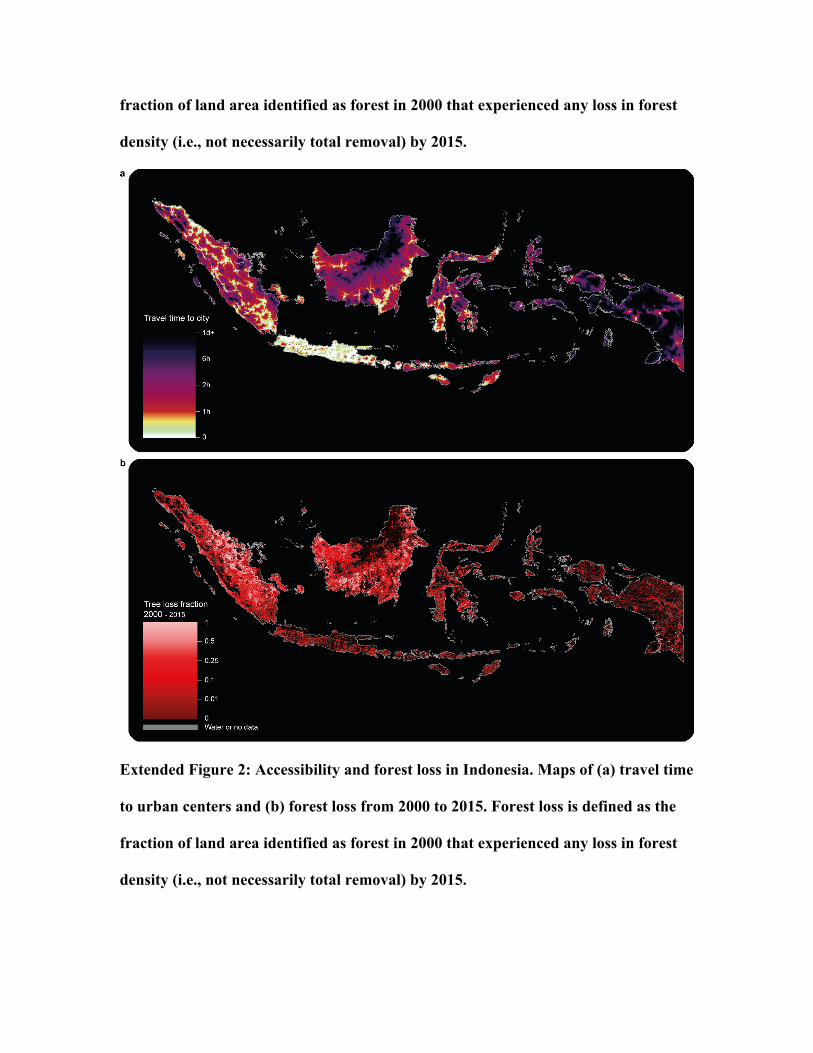
accessibility and forest loss using a combination of visual juxtaposition (extended figures
1-2) and a comparison of summarizations of the national population, land area, and forest
loss relative to accessibility (extended figure 3). Our results indicate that forest loss tends
to peak between 1 and 5 hours from cities, or just beyond the relatively stable forest
matrix associated with urban and suburban landscapes. This suggests that very close
proximity to urban areas has a protective effect for forests, but a more nuanced
assessment is that such areas were likely to have been heavily exploited prior to the year
2000 (i.e., they had little readily harvestable forest remaining in 2000) and thus do not
show major forest losses since the turn of the century. Geographic differences in both the
magnitude and shape of the curves, however, reflect the importance of local context when
interpreting results. Subnational patterns of forest loss also follow predictable patterns in
both Brazil and Indonesia, with the least accessible forests showing the least amount of
density loss.
Code availability statement
The core code used to create the accessibility map is available for download from
the Malaria Atlas Project website (http://www.map.ox.ac.uk/accessibility_to_cities/).
Additional references
26 CentralIntelligenceAgency,OfficeofGeographicandCartographicResearch.WorldDataBankII:NorthAmerica,SouthAmerica,Europe,Africa,Asia. Inter-universityConsortiumforPoliticalandSocialResearch(ICPSR) https://doi.org/10.3886/ICPSR08376.v1 (2000).
27 Lehner,B.,Verdin,K.&Jarvis,A.Newglobalhydrographyderivedfromspaceborneelevationdata.Eos89,93-94(2008).
28 NationalImageryandMappingAgency(NIMA).VectorMapLevel0(VMAP0).mapAbilityhttp://www.mapability.com/info/vmap0_download.html(1997).
29 Pekel,J.-F.,Cottam,A.,Gorelick,N.&Belward,A.S.High-resolutionmappingofglobalsurfacewateranditslong-termchanges.Nature540,418-422(2016).
30 Walbridge,S.Assessingshipmovementsusingvolunteeredgeographicinformation,Dissertation,UniversityofCalifornia,SantaBarbara,California(2013).
31 Friedl,M.A.etal.MODISCollection5globallandcover:Algorithmrefinementsandcharacterizationofnewdatasets.RemoteSens.Environ.114,168–182(2010).
32 Danielson,J.J.&Gesch,D.B.Globalmulti-resolutionterrainelevationdata2010(GMTED2010).USGeologicalSurveyhttps://explorer.earthengine.google.com/#detail/USGS%2FGMTED2010(2011).
33 Wehrlin,J.P.&Hallén,J.LineardecreaseinV02Maxandperformancewithincreasingaltitudeinenduranceathletes.EurJApplPhysiol96,404-412(2005).
34 Tobler,W.ThreePresentationsonGeographicalAnalysisandModeling:Non-IsotropicGeographicModeling;SpeculationsontheGeometryofGeography;andGlobalSpatialAnalysis.TechnicalReport93-1.NationalCenterforGeographicInformationandAnalysis(1993).
35 GoogleEarthEngineDevelopers.CumulativeCostMapping.https://developers.google.com/earth-engine/image_cumulative_cost(2017).
36 vanEtten,J.RPackagegdistance:DistancesandRoutesonGeographicalGrids.J.Stat.Softw.76,1-21,doi:10.18637/jss.v076.i13(2017).
37 Chambers,J.M.,Cleveland,W.S.,Kleiner,B.&TukeyP.A.Graphicalmethodsfordataanalysis.WadsworthInternationalGroup;DuxburyPress;Belmont,California.(1983).
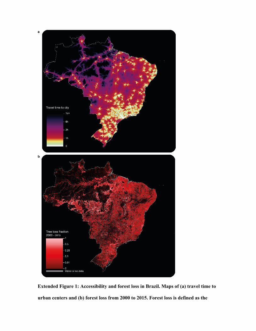
Extended Figure 1: Accessibility and forest loss in Brazil. Maps of (a) travel time to
urban centers and (b) forest loss from 2000 to 2015. Forest loss is defined as the
fraction of land area identified as forest in 2000 that experienced any loss in forest
density (i.e., not necessarily total removal) by 2015.
Extended Figure 2: Accessibility and forest loss in Indonesia. Maps of (a) travel time
to urban centers and (b) forest loss from 2000 to 2015. Forest loss is defined as the
fraction of land area identified as forest in 2000 that experienced any loss in forest
density (i.e., not necessarily total removal) by 2015.
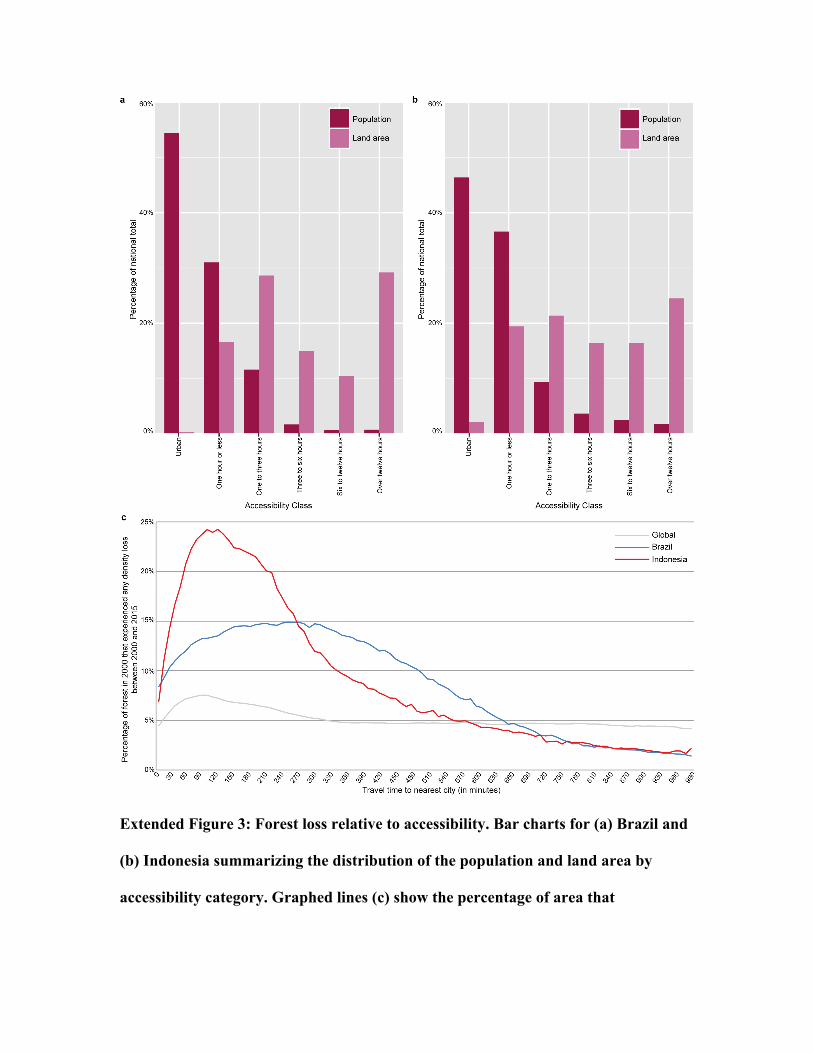
Extended Figure 3: Forest loss relative to accessibility. Bar charts for (a) Brazil and
(b) Indonesia summarizing the distribution of the population and land area by
accessibility category. Graphed lines (c) show the percentage of area that
experienced any loss in forest density since 2000 for each country and the global
average.
Extended Figure 4: Travel time relative to percent urban population. Mean national
accessibility for countries with populations over ten million relative to the
percentage of urban population as estimated by the UN, color-coded by World Bank
income category.