Embed Size (px)
Citation preview

463
11 Statistics
You will almost inevitably encounter statistics in one form or another on a daily basis. Here is an example:
The World Health Organization (WHO) collects and reports data pertaining to worldwide population health on all 192 UN member countries. Among the indicators reported is the health-adjusted life expectancy (HALE), which is based on life expectancy at birth, but includes an adjustment for time spent in poor health. It is most easily understood as the equivalent number of years in full health that a newborn can expect to live, based on current rates of ill-health and mortality. According to WHO rankings, lost years due to disability are substantially higher in poorer countries. Several factors contribute to this trend including injury, blindness, paralysis, and the debilitating effects of tropical disease.
Introduction
Assessment statements5.1 Conceptsofpopulation,sample,randomsampleandfrequency
distributionofdiscreteandcontinuousdata. Groupeddata:useofmid-intervalvalues,intervalwidth,upperandlower
intervalboundaries. Mean,variance,standarddeviation.
More information on HALE can be found by visiting www.pearsonhotlinks.com, enter the ISBN or title of this book and select weblink 1.
Freq
uenc
y
00
10
20
30
40
50
30 40 50 60 70 80HALE 2002

464
Statistics11
Of the 192 countries ranked by WHO, Japan has the highest life expectancy (75 years) and the lowest ranking country is Sierra Leone (29 years).
Reports similar to this one are commonplace in publications of several organizations, newspapers and magazines, and on the internet.
Questions that come to mind as we read such a report include: How did the researchers collect the data? How can we be sure that these results are reliable? What conclusions should be drawn from this report? The increased frequency with which statistical techniques are used in all fields, from business to agriculture to social and natural sciences, leads to the need for statistical literacy – familiarity with the goals and methods of these techniques – to be a part of any well-rounded educational programme.
Since statistical methods for summary and analysis provide us with powerful tools for making sense out of the data we collect, in this chapter we will first start by introducing two basic components of most statistical problems – population and sample – and then delve into the methods of presenting and making sense of data.
In the language of statistics, one of the most basic concepts is sampling. In most statistical problems, we draw a specified number of measurements or data – a sample – from a much larger body of measurements, called the population. On the basis of our observation of the data in the well-chosen sample, we try to describe or predict the behaviour of the population.
A population is any entire collection of people, animals, plants or things from which we may collect data. It is the entire group we are interested
in, which we wish to describe or draw conclusions about. In order to make any generalizations about a population, a sample, that is meant to be representative of the population, is often studied. For each population there are many possible samples.
For example, a report on the effect the economic status (ES) has on healthy children’s postures stated that:
‘…ES, independent of overt malnutrition, affects height, weight, … with some gender differences in healthy children. Influence of income on height and weight show sexual dimorphism, a slight but significant effect is observed only in boys. MPH (mid-parental height) is the most prominent variable effecting height in healthy children. Higher height … observed in higher income groups suggest that secular trend in growth still exists, at least in boys, in a country of favorable economic development.’
Source: European Journal of Clinical Nutrition (2007) 61, 752–758Sample
Population

465
The population is the 3-tuple measurement (economic status, height, weight) of all children of age 3–18 in Turkey. The sample is the set of measurements of the 428 boys and 386 girls that took part in the study. Notice that the population and sample are the measurements and not the people! The boys and girls are ‘experimental units’ or subjects in this study.
In this chapter we will present some basic techniques in descriptive statistics – the branch of statistics concerned with describing sets of measurements, both samples and populations.
11.1 Graphical tools
Once you have collected a set of measurements, how can you display this set in a clear, understandable and readable form? First, you must be able to define what is meant by measurement or ‘data’ and to categorize the types of data you are likely to encounter. We begin by introducing some definitions of the new terms in the statistical language that you need to know.
A variable is a characteristic that changes or varies over time and/or for different objects under consideration.
For example, if you are measuring the height of adults in a certain area, the height is a variable that changes with time for an individual and from person to person. When a variable is actually measured, a set of measurements or data will result. So, if you gather the heights of the students at your school, the set of measurements you get is a data set.
As the process of data collection begins, it becomes clear that often the number of data collected is so large that it is difficult for the statistician to see the findings of the data. The statistician’s objective is to summarize succinctly, bringing out the important characteristics of the numbers and values in such a way that a clear and accurate picture emerges.
There are several ways of summarizing and describing data. Among them are tables and graphs and numerical measures.
Data
Categorical/qualitative
Numerical/quantitative
Discrete Continuous

466
Statistics11
Classification of variablesNumerical or categorical
When classifying data, there are two major classifications: numerical or categorical data.
NUMERICAL (QUANTITATIVE) DATA – Quantitative variables measure a numerical quantity or amount on each experimental unit. Quantitative data yields a numerical response.
Examples: Yearly income of company presidents, the heights of students at school, the length of time it takes students to finish their lunch at school, and the total score you receive on exams, are all numerical.
Moreover, there are two types of numerical data:
DISCRETE – responses which arise from counting.
Example: Number of courses students take in a day.
CONTINUOUS – responses which arise from measuring.
Example: Time it takes a student to travel from home to school.
CATEGORICAL (QUALITATIVE) DATA – Qualitative variables measure a quality or characteristic of the experimental unit. Categorical data yields a qualitative response, i.e. data is kind or type rather than quantity.
Examples: Categorizing students into first year IB or second year IB; into Maths Studies SL, Maths SL, Further Maths SL, or Maths HL; or political affiliation, will result in qualitative variables and data.
Frequently we use pie charts as a way of summarizing a set of categorical data or displaying the different values of a given variable (e.g., percentage distribution). This type of chart is a circle divided into a series of segments. Each segment represents a particular category. The area of each segment is the same proportion of a circle as the category is of the total data set.
Pie charts usually show the component parts of a whole. Often you will see a segment of the drawing separated from the rest of the pie in order to emphasize an important piece of information.
For example, in a large school, there are 230 students in the Maths Studies class, 180 students in the Standard Level maths class and 90 students in the HL mathematics class.
The pie chart for this data is given below.
Maths HL18.0%
Maths SL36.0%
MathsStudies46.0%
Bar graphs are one of the many techniques also used to present data in a visual form so that the reader may readily recognize patterns or trends. A bar graph may be either horizontal or vertical. The important point to note about bar graphs is their bar length or height – the greater their length or height, the greater their value.
Bar graphs usually present categorical and numeric variables grouped in class intervals. They consist of an axis and a series of labelled horizontal or vertical bars. The bars depict frequencies of different values of a variable or simply the different values themselves. The student data in the previous box can be represented by a bar graph as shown below.
Notice here that the parts do not need to show the component parts of a whole. The key is to show their relative heights.
50
0
100
150
200
250
Math
s Stu
dies
Math
s SL
Class
Freq
uenc
y
Math
s HL 500 100 150 200 250
MathsStudies
Maths SL
Cla
ss
Frequency
Maths HL

467
When data is first collected, there are some simple ways of beginning to organize the data. These include an ordered array and the stem-and-leaf display – not required.
• Data in raw form (as collected): 24, 26, 24, 21, 27, 27, 30, 41, 32, 38
• Data in ordered array from smallest to largest (an ordered array is an arrangement of data in either ascending or descending order): 21, 24, 24, 26, 27, 27, 30, 32, 38, 41
Suppose a consumer organization was interested in studying weekly food and living expenses of college students. A survey of 80 students yielded the following expenses to the nearest euro:
38 50 55 60 46 51 58 64 50 49 48 65 58 61 65 53
39 51 56 61 48 53 59 65 54 54 54 59 65 66 47 49
40 51 56 62 47 55 60 63 60 59 59 50 46 45 54 47
41 52 57 64 50 53 58 67 67 66 65 58 54 52 55 52
44 52 57 64 51 55 61 68 67 54 55 48 57 57 66 66
The first step in the analysis is a summary of the data, which should show the following information:• What values of the variable have been measured?• How often has each value occurred?
Table 11.1
A stem-and-leaf plot, or stem plot, is a technique used to classify and organize data as they are collected.
A stem-and-leaf plot looks something like a bar graph. Each number in the data is broken down into a stem and a leaf, thus the name. Here is a set of data representing the lives of 43 light bulbs of a certain type.
The stem of the number, in this case, consists of the multiples of 10. For example, 183, 18 is the stem, and 3 is the leaf. The leaf of the number will always be a single digit.
The stem-and-leaf plot shows how the data are spread–that is, highest number, lowest number, most common number and outliers and it preserves the individual values.
Once you have decided that a stem-and-leaf plot is the best way to show your data, draw it as follows:
On the left-hand side, write down the thousands, hundreds or tens (all digits except the last one). These will be your stems.
Draw a line to the right of these stems.
On the other side of the line, write down the ones (the last digit of a number). These will be your leaves.
For example, if the observed value is 25, then the stem is 2 and the leaf is the 5. If the observed value is 369, then the stem is 36 and the leaf is 9. Where observations are accurate to one or more decimal places, such as 23.7, the stem is 23 and the leaf is 7. If the range of values is too great, the number 23.7 can be rounded up to 24 to limit the number of stems.
225 250 213 216 183
211 200 246 243 231
209 209 225 200 217
224 230 237 185 235
258 225 232 216 227
216 256 226 271 217
196 243 232 230 246
228 200 216 219
200 224 209 191
Stem-and-leaf display18 3 519 1 620 0 0 0 0 9 9 921 1 3 6 6 6 6 7 7 922 4 4 5 5 5 6 7 823 0 0 1 2 2 5 724 3 3 6 625 0 6 82627 1

468
Statistics11
Such summaries can be done in many ways. The most useful are the frequency distribution and the histogram. There are other methods of presenting data, some of which we will discuss later. The rest are not within the scope of this book.
Frequency distribution (table)A frequency distribution is a table used to organize data. The left column (called classes or groups) includes numerical intervals on a variable being studied. The right column is a list of the frequencies, or number of observations, for each class. Intervals normally are of equal size, must cover the range of the sample observations, and are non-overlapping (Table 11.2).
There are some general rules for preparing frequency distributions that make it easier to summarize data and to communicate results.
Construction of a frequency distribution (table)
Rule 1: Intervals (classes) must be inclusive and non-overlapping; each observation must belong to one and only one class interval. Consider a frequency distribution for the living expenses of the 80 college students. If the frequency distribution contains the intervals ‘35–40’ and ‘40–45’, to which of these two classes would a person spending E40 belong?
The boundaries, or endpoints, of each class must be clearly defined. For our example, appropriate intervals would be ‘35 but less than 40’ and ‘40 but less than 45’.
Rule 2: Determine k, the number of classes. Practice and experience are the best guidelines for deciding on the number of classes. In general, the number of classes could be between 5 and 10. But this is not an absolute rule. Practitioners use their judgement in these issues. If the number of classes is too few, some characteristics of the distribution will be hidden, and if too many, some characteristics will be lost with the detail.
Rule 3: Intervals should be the same width, w. The width is determined by the following:
interval width 5 largest number 2 smallest number
_____________________________ number of intervals
Both the number of intervals and the interval width should be rounded upward, possibly to the next largest integer. The above formula can be used when there are no natural ways of grouping the data. If this formula is used, the interval width is generally rounded to a convenient whole number to provide for easy interpretation.
In the example of the weekly living expenses of students, a reasonable grouping with nice round numbers was that of ‘35 but less than 40’ and ‘40 but less than 45’, etc.
In some cases, we do not necessarily create intervals with the same width. Look at the end of this section for an example.
If classes are described with discrete limits such as ‘30–34’, ‘35–39’, ‘40–44’…, then the boundaries are midway between the neighbouring class limits / end points. That is, the classes above will be considered as ‘29.5, but less than 34.5’, ‘34.5, but less than 39.5’, ‘39.5, but less than 44.5’ etc. Here, the boundaries are 29.5, 34.5, 39.5, 44.5. Each class width is 5. See Example 3.

469
Living expenses (E) Number of students Percentage of students
35 but , 40 2 2.50
40 but , 45 3 3.75
45 but , 50 11 13.75
50 but , 55 21 26.25
55 but , 60 19 23.75
60 but , 65 11 13.75
65 but , 70 13 16.25
Total 80 100.00
Grouping the data in a table like this one enables us to see some of its characteristics. For example, we can observe that there are few students who spend as little as 35 to 45 euros, while the majority of the students spend more than E45. Grouping the data will also cause some loss of detail, as we do not see from the table what the real values in each class are.
In the table above, the impression we get is that the class midpoint, also known as the mid-interval value, will represent the data in that interval. For example, 37.5 will represent the data in the first class, while 62.5 will represent the data in the 60 to 65 class. 35 and 40 are known as the interval boundaries.
Graphically, we have a tool that helps visualize the distribution. This tool is the histogram.
Histogram
A histogram is a graph that consists of vertical bars constructed on a horizontal line that is marked off with intervals for the variable being displayed. The intervals correspond to those in a frequency distribution table. The height of each bar is proportional to the number of observations in that interval. The number of observations can also be displayed above the bars.
Freq
uenc
y
0
10
20
25
5
15
37.5 42.5 47.5 52.5 57.5 62.5 67.5Midpoints
By looking at the histogram, it becomes visually clear that our observations above are true. From the histogram we can also see that the distribution is not symmetric.
Table 11.2 Frequency and percentage frequency distributions of the weekly expenses of 80 students.

470
Statistics11
To get a histogram on your GDC:• Enter your data into a list• Go to StatPlot and change it as shown below• Graph
Cumulative and relative cumulative frequency distributions
A cumulative frequency distribution contains the total number of observations whose values are less than the upper limit for each interval. It is constructed by adding the frequencies of all frequency distribution intervals up to and including the present interval. A relative cumulative frequency distribution converts all cumulative frequencies to cumulative percentages.
In our example above, the following is a cumulative distribution and a relative (percentage) cumulative distribution.
Living expenses (E)
Numberof students
Cumulative number
of students
Percentage ofstudents
Cumulative percentage of
students
35 but , 40 2 2 2.50 2.50
40 but , 45 3 5 3.75 6.25
45 but , 50 11 16 13.75 20.00
50 but , 55 21 37 26.25 46.25
55 but , 60 19 56 23.75 70.00
60 but , 65 11 67 13.75 83.75
65 but , 70 13 80 16.25 100.00
80 100.00
Notice how every cumulative frequency is added to the frequency in the next interval to give you the next cumulative frequency. The same is true for the relative frequencies.
As we will see later, cumulative frequencies and their graphs help in analyzing data that are given in group form.
Cumulative line graph/cumulative frequency graph
Sometimes called an ogive, this is a line that connects points that are the cumulative percentage of observations below the upper limit of each class in a cumulative frequency distribution.
Table 11.3 Cumulative frequency and cumulative relative frequency distributions of the weekly expenses of 80 students.
L2
L1( 1)=38min=38max<42.285714 n=4
P1:L 1L3 138394041444548
Plot2 Plot3Plot1
On OffType:
Xlist:L1Freq:1
L1

471
Cumulativefrequency
0
10
20
30
40
50
60
70
80 100%
80%
60%
40%
20%
0%40 45 50 55 60 65 70
Expenses (€)
Notice how the height of each line at the upper boundary represents the cumulative frequency for that interval. For example, at 50 the height is 16 and at 60 it is 56.
Example 1
Here is the WHO data in raw form.
Prepare a frequency table starting with 25 and with a class interval of 5. Then draw a histogram of the data and a cumulative frequency graph.
SolutionWe first sort the data and then make sure we count every number in one class only.
Lifeexpectancy (years)1
Numberof countries
Lifeexpectancy (years)
Numberof countries
25–30 1 55–60 26
30–35 4 60–65 54
35–40 14 65–70 22
40–45 14 70–75 27
45–50 11 75–80 1
50–55 18
125–30 contains all observations larger than or equal to 25 but less than 30.
The histogram created by Excel is shown on the next page. Since we have classes of equal width, the height and the area give the same impression
29 36 40 44 48 52 54 56 59 60 61 61 62 63 64 66 68 71 72 73 63 64 66 68
31 36 41 44 49 52 54 57 59 60 61 62 62 64 64 66 68 71 72 75 63 64 66 68
33 36 41 44 49 52 55 57 59 60 61 62 62 64 65 66 69 71 72 35 38 43 47 71
34 37 41 45 49 53 55 58 59 60 61 62 63 64 65 66 69 71 73 36 40 44 48 71
34 37 42 45 50 53 55 58 59 60 61 62 63 64 65 67 70 71 73 50 54 56 59 72
35 37 42 45 50 53 55 58 59 60 61 62 63 64 65 67 70 71 73 51 54 56 59 72
35 37 43 46 50 54 55 58 59 60 61 62 63 64 65 67 70 71 73 60 60 61 62 73
35 38 43 46 50 54 55 58 59 60 61 62 63 64 65 67 70 72 73 60 61 61 62 73

472
Statistics11
about the frequency of the class interval. For example, the class of 60–65 contains almost twice as much as the class of 55–60, and the height of the histogram is also twice as high. So is the area. Similarly, the height of the 65–70 class is double that of the 45–50 class.
Lifeexpectancy
(years)
Numberof
countries
Cumulativenumber ofcountries
Lifeexpectancy
(years)
Numberof
countries
Cumulativenumber ofcountries
25–30 1 1 55–60 26 88
30–35 4 5 60–65 54 142
35–40 14 19 65–70 22 164
40–45 14 33 70–75 27 191
45–50 11 44 75–80 1 192
50–55 18 62
Histograms when class widths are unequal
In some cases, the class widths are not equal. The basic idea behind the histogram is that the area of each ‘bar’ reflects the frequency of the class. Hence, using the frequency along the vertical axis is a practical thing. However, when the classes have different widths, this practice will be misleading. An alternative for the usual representation is to use the ‘frequency density’. The idea behind it is simple: the area of each bar must represent the frequency of the class. So, the height of each bar is measured by its density, which is the frequency of the class per unit of the class size.
Freq
uenc
y
0
20
40
50
60
10
30
25-3
0
Life expectancy (years)
30-3
5
35-4
0
40-4
5
45-5
0
50-5
5
55-6
0
60-6
5
65-7
0
70-7
5
75-8
0
Freq
uenc
y
0
100
200
250
50
150
25-3
0
Life expectancy (years)
30-3
5
35-4
0
40-4
5
45-5
0
50-5
5
55-6
0
60-6
5
65-7
0
70-7
5
75-8
0

473
This can be found by taking the height of each bar as:
Class height 5 frequency density 5 frequency
________class width
.
This means that the area of each bar 5 width height
5 width frequency
_______width
5 frequency
Note: The modal class in a grouped frequency distribution is the class with the largest frequency density.
Example 2
The following table gives the weights (in Newtons) of young children visiting a pediatrician’s practice in a certain week.
Weight 5–10 10–12 12–14 14–16 16–20 20–30
Frequency 10 18 24 30 22 16
To draw a meaningful histogram, we find the frequency density for each class.
Weight 5–10 10–12 12–14 14–16 16–20 20–30
Class width 5 2 2 2 4 10
Frequency 10 18 24 30 22 16
Frequency density 2 9 12 15 5.5 1.6
Freq
uenc
y de
nsity
0
2
4
6
8
10
12
14
16
10 12 14 16 205 30Weight
Histogram of weight
The modal class here is the class 14–16 as it has the largest frequency density of 15.
Look at the histogram below. Notice that if we were to draw the histogram using the frequency itself, the histogram would have given us the wrong representation of the relative size of the classes 5–10, 16–20, and 20–30.

474
Statistics11
Freq
uenc
y
0
5
10
15
20
25
30
10 12 14 16 205 30Weight
Histogram of weight
Example 3
The ages (to the nearest year) of visitors to the Prater (Amusement park) in Vienna on a Sunday in July are given in the table below.
Age 6–10 11–15 16–18 19–20 21–25 26–30 31–40
Frequency 120 265 390 320 240 100 45
Draw a histogram of the data in the table.
We first represent classes by their boundaries and change the frequencies into densities.
Age 5.5–10.510.5–15.5
15.5–18.5
18.5–20.5
20.5–25.5
25.5–30.5
30.5–40.5
Class width 5 5 3 2 5 5 10
Frequency 120 265 390 320 240 100 45
Density 24 53 130 160 48 20 4.5
Here is the histogram. The modal class here is the class 18.5–20.5 with a frequency density of 160.
Freq
uenc
y de
nsity
0
40
20
60
100
120
80
140160
180
18.515.5
10.520.5
25.530.5
40.55.5
Age
Histogram of age
Note: The frequency of each class is given by:
width height 5 width density 5 width frequency
_______width
5 frequency
475
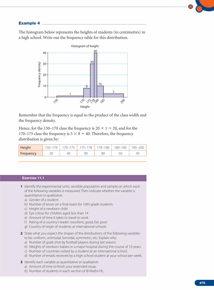
Example 4
The histogram below represents the heights of students (in centimetres) in a high school. Write out the frequency table for this distribution.
Freq
uenc
y de
nsity
01
8
30
40
10
3
10
20
30
40
175170
150178
180185
200
Height
Histogram of height
Remember that the frequency is equal to the product of the class width and the frequency density.
Hence, for the 150–170 class the frequency is 20 1 5 20, and for the 170–175 class the frequency is 5 8 5 40. Therefore, the frequency distribution is given by:
Height 150–170 170–175 175–178 178–180 180–185 185–200
Frequency 20 40 90 80 50 45
Exercise 11.1
1 Identify the experimental units, sensible population and sample on which each of the following variables is measured. Then indicate whether the variable is quantitative or qualitative.a) Gender of a studentb) Number of errors on a final exam for 10th-grade studentsc) Height of a newborn childd) Eye colour for children aged less than 14e) Amount of time it takes to travel to workf ) Rating of a country’s leader: excellent, good, fair, poorg) Country of origin of students at international schools
2 State what you expect the shapes of the distributions of the following variables to be: uniform, unimodal, bimodal, symmetric, etc. Explain why.a) Number of goals shot by football players during last season.b) Weights of newborn babies in a major hospital during the course of 10 years.c) Number of countries visited by a student at an international school.d) Number of emails received by a high school student at your school per week.
3 Identify each variable as quantitative or qualitative:a) Amount of time to finish your extended essay.b) Number of students in each section of IB Maths HL.

476
Statistics11
c) Rating of your textbook as excellent, good, satisfactory, terrible.d) Country of origin of each student on Maths HL courses.
4 Identify each variable as discrete or continuous:a) Population of each country represented by HL students in your session of the
exam.b) Weight of IB Maths HL exams printed every May since 1976.c) Time it takes to mark an exam paper by an examiner.d) Number of customers served at a bank counter.e) Time it takes to finish a transaction at a bank counter.f ) Amount of sugar used in preparing your favourite cake.
5 Grade point averages (GPA) in several colleges are on a scale of 0–4. Here are the GPAs of 45 students at a certain college.
1.8 1.9 1.9 2.0 2.1 2.1 2.1 2.2 2.2 2.3 2.3 2.4 2.4 2.4 2.5
2.5 2.5 2.5 2.5 2.5 2.6 2.6 2.6 2.6 2.6 2.7 2.7 2.7 2.7 2.7
2.8 2.8 2.8 2.9 2.9 2.9 3.0 3.0 3.0 3.1 3.1 3.1 3.2 3.2 3.4
Prepare a frequency histogram, a relative frequency histogram and a cumulative frequency graph. Describe the data in two to three sentences.
6 The following are the grades of an IB course with 40 students (two sections) on a 100-point test. Use the graphical methods you have learned so far to describe the grades.
61 62 93 94 91 92 86 87 55 56
63 64 86 87 82 83 76 77 57 58
94 95 89 90 67 68 62 63 72 73
87 88 68 69 65 66 75 76 84 85
7 The length of time (months) between repeated speeding violations of 50 young drivers are given in the table below:
2.1 1.3 9.9 0.3 32.3 8.3 2.7 0.2 4.4 7.4
9 18 1.6 2.4 3.9 2.4 6.6 1 2 14.1
14.7 5.8 8.2 8.2 7.4 1.4 16.7 24 9.6 8.7
19.2 26.7 1.2 18 3.3 11.4 4.3 3.5 6.9 1.6
4.1 0.4 13.5 5.6 6.1 23.1 0.2 12.6 18.4 3.7
a) Construct a histogram for the data.b) Would you describe the shape as symmetric?c) The law in this country requires that the driving licence be taken away if the
driver repeats the violation within a period of 10 months. Use a cumulative frequency graph to estimate the fraction of drivers who may lose their licence.
8 To decide on the number of counters needed to be open during rush hours in a supermarket, the management collected data from 60 customers for the time they spent waiting to be served. The times, in minutes, are given in the following table.

477
3.6 0.7 5.2 0.6 1.3 0.3 1.8 2.2 1.1 0.4
1 1.2 0.7 1.3 0.7 1.6 2.5 0.3 1.7 0.8
0.3 1.2 0.2 0.9 1.9 1.2 0.8 2.1 2.3 1.1
0.8 1.7 1.8 0.4 0.6 0.2 0.9 1.8 2.8 1.8
0.4 0.5 1.1 1.1 0.8 4.5 1.6 0.5 1.3 1.9
0.6 0.6 3.1 3.1 1.1 1.1 1.1 1.4 1 1.4
a) Construct a relative frequency histogram for the times.b) Construct a cumulative frequency graph and estimate the number of
customers who have to wait 2 minutes or more.
9 The histogram below shows the number of days spent by heart patients in Austrian hospitals in the 2003–2005 period.
a) Describe the data in a few sentences.b) Draw a cumulative frequency graph for the data.c) What percentage of the patients stayed less than 6 days?
10 One of the authors exercises on almost a daily basis. He records the length of time he exercises on most of the days. Here is what he recorded for 2006.
a) What is the longest time he has spent doing his exercises?b) What percentage of the time did he exercise more than 30 minutes?c) Draw a cumulative frequency graph for his exercise time.
11 Radar devices are installed at several locations on a main highway. Speeds, in km/h, of 400 cars travelling on that highway are measured and summarized in the following table.
Freq
uenc
y
00 10 20 30
400
800
1000
1200
200
600
Number of days
Freq
uenc
y
018 20 22 24 26 28 30 32 34 36 38 40
10
20
25
30
35
40
45
5
15
Number of minutes

478
Statistics11
Speed 60–75 75–90 90–105 105–120 120–135 Over 135
Frequency 20 70 110 150 40 10
a) Construct a frequency table for the data.b) Draw a histogram to illustrate the data.c) Draw a cumulative frequency graph for the data.d) The speed limit in this country is 130 km/h. Use your graph in c) to estimate
the percentage of the drivers driving faster than this limit.
12 Electronic components used in the production of CD players are manufactured in a factory and their measures must be very accurate. Here are the measures of a sample of 400 such components.
Length (mm)Less than
5.005.00–5.05 5.05–5.10 5.10–5.15 5.15–5.20
More than 5.20
Frequency 16 100 123 104 48 9
a) Construct a cumulative relative frequency graph for the data.b) The components must have a length between 5.01 and 5.18, and any
component beyond these measures must be scrapped. Use your graph to estimate the percentage of components that must be scrapped from this production facility.
13 The waiting time, in seconds, of 300 customers at a supermarket cash register are recorded in the table below.
Time ,60 60–120 120–180 180–240 240–300 300–360 .360
Frequency 12 15 42 105 66 45 15
a) Draw a histogram of the data.
b) Construct a cumulative frequency graph of the data.
c) Use the cumulative frequency graph to estimate the waiting time that is exceeded by 25% of the customers.
14 The time to solve a puzzle given to a large number of students is given below. Draw a histogram to illustrate the situation.
Time (seconds) 5–10 10–20 20–30 30–45 45–60More than
60
Frequency 20 120 70 150 20 0
15 Post offices weigh the letters customers send before they decide on the amount of postage required. The table below lists the masses (in grams) of letters processed by a post office in a large city on a certain day. (Any letter heavier than 2000 g is considered a parcel.) Draw a histogram to illustrate the situation.
Mass 1–200 201–400 401–600 601–800 801–1000 1001–2000
Frequency 3220 450 130 96 54 40
16 In a study to determine the relative frequency of delays at a major airport, the following histogram has been produced. Develop the frequency distribution of the study. Flights more than 2 hours late were considered as atypical.

479
Freq
uenc
y de
nsity
0
5
10
15
Time130120110100908070605040302010
17 Copy and complete the frequency distribution for the data represented by the frequency polygon below.
Freq
uenc
y de
nsity
0
5
10
15
32x
2 3028262422201816141210864
x 0 x , 1
1 x < 3
3 x < 6
6 x < 10
10 x < 15
15 x < 20
20 x < 30
Frequency 6
18 Write out the frequency distribution for the data represented by the frequency polygon below. The lowest boundary is 0.
Freq
uenc
y de
nsity
0
1
2
7
6
5
4
3
40x
2 4 6 8 10 12 14 16 18 20 22 24 26 28 30 32 34 36 38
19 Find the value of m, n, p, and q in the frequency density calculation table below.
x 20–24 25–34 35–42 43–49 50–60
Frequency m n 20 21 pFrequency density
2 4.5 q 3 3

480
Statistics11
11.2 Measures of central tendency
Summarizing data can help us understand them, especially when the number of data is large. This section presents several ways to summarize quantitative data by a typical value (a measure of location, such as the mean, median or mode) and a measure of how well the typical value represents the list (a measure of spread, such as the range, interquartile range or standard deviation). When looking at raw data, rather than looking at tables and graphs, it may be of interest to use summary measures to describe the data. The farthest we can reduce a set of data, and still retain any information at all, is to summarize the data with a single value. Measures of location do just that – they try to capture with a single number what is typical of the data. What single number is most representative of an entire list of numbers? We cannot say without defining ‘representative’ more precisely. We will study three common measures of location: the mean, the median and the mode. The mean, median and mode are all ‘most representative’, but for different, related notions of representativeness.
• The median is the number that divides the (ordered) data in half. At least half the data is equal to or smaller than the median, and at least half the data is equal to or greater than the median. (In a histogram, the median is that middle value that divides the histogram into two equal areas.)
• The mode of a set of data is the most common value among the data.
• The mean (more precisely, the arithmetic mean) is commonly called the average. It is the sum of the data, divided by the number of data:
mean 5 sum of data _____________ number of data
5 total _____________ number of data
When these measures are computed for a population, they are called parameters. When they are computed for a sample, they are called statistics.
Statistic and parameterA statistic is a descriptive measure computed from a sample of data. A parameter is a descriptive measure computed from an entire population of data.
Measures of central tendency provide information about a ‘typical’ observation in the data, or locate the data set.
The mean and the medianThe most common measure of central tendency is the arithmetic mean, usually referred to simply as the ‘mean’ or the ‘average.’
Example 5
The following are the five closing prices of the NASDAQ Index for the first business week in November 2007. This is a sample of size n 5 5 for the

481
closing prices from the entire 2007 population: 2794.83, 2810.38, 2795.18, 2825.18, 2748.76.
What is the average closing price?
Solution
Average 5 2794.83 1 2810.38 1 2795.18 1 2825.18 1 2748.76 __________________________________________ 5 5 2794.87.
This is called the sample mean. A second measure of central tendency is the median, which is the value in the middle position when the measurements are ordered from smallest to largest. The median of this data can only be calculated if we first sort them in ascending order:
2748.76 2794.83 2795.18 2810.38 2825.18
The arithmetic mean or average of a set of n measurements (data set) is equal to the sum of the measurements divided by n.
Notation
The sample mean: __
x 5 ∑ i 5 1
n
xi
_______ n 5 x1 1 x2 1 x3 1 … 1 xn ____________________ n , where n is the sample size.
This is a statistic.
The population mean: m 5 ∑ i 5 1
N
xi ______
N 5
x1 1 x2 1 x3 1 … 1 xN ____________________ N
, where N is the population size. This is a parameter.
It is important to observe that you normally do not know the mean of the population m and that you usually estimate it with the sample mean
__ x .
The median of a set of n measurements is the value of x that falls in the middle position when the data is sorted in ascending order.
In the previous example, we calculated the sample median by finding the third measurement to be in the middle position. However, in a different situation, where the number of measurements is even, the process is slightly different.
Let us assume that you took six tests last term and your marks were, in ascending order, 52, 63, 74, 78, 80, 89.
52 63 74 78 80 89
There are two ‘middle’ observations here. To find the median, choose a value halfway between the two middle observations:
m 5 74 1 78 _______ 2
5 76
Note: The position of the median can be given by n 1 1 _____ 2
. If this number
ends with a decimal, you need to average the adjacent values.

482
Statistics11
In the NASDAQ Index case, we have five observations, the position of
the median is then at 5 1 1 _____ 2
5 3, which we found. In the grades example,
the position of the median score is at 6 1 1 _____ 2
5 3.5, and hence we average
the numbers at positions three and four.
Although both the mean and median are good measures for the centre of a distribution, the median is less sensitive to extreme values or outliers. For example, the value 52 in the previous example is lower than all your test scores and is the only failing score you have. The median, 76, is not affected by this outlier even if it were much lower than 52. Assume, for example, that your lowest score is 12 rather than 52. The median calculation
12 63 74 78 80 89
still gives the same median of 76. If we were to calculate the mean of the original set, we would get
_ x 5 ̂
x ___
6 5 436 ___
6 5 72.
_ 6 .
While the new mean, with 12 as the lowest score, is
_ x 5 ̂
x ___
6 5 396 ___
6 5 66.
Clearly, the low outlier ‘pulled’ the mean towards it while leaving the median untouched. However, because the mean depends on every observation and uses all the information in the data, it is generally, wherever possible, the preferred measure of central tendency.
A third way to locate the centre of a distribution is to look for the value of x that occurs with the highest frequency. This measure of the centre is called the mode.
Example 6
Here is a table listing the frequency distribution of 25 families in Lower Austria that were polled in a marketing survey to list the number of litres of milk consumed during a particular week.
Number of litres Frequency Relative frequency
0 2 0.08
1 5 0.20
2 9 0.36
3 5 0.20
4 3 0.12
5 1 0.04
Find the frequency histogram.

483
Solution
Freq
uenc
y
0
2
4
5
6
7
8
9
10
1
3
0 1 2 3 4 5Number of litres
The histogram (Example 3) shows a relatively symmetric shape with a modal class at x 5 2. Apparently, the mean and median are not far from each other. The median is the 13th observation, which is 2, and the mean is calculated to be 2.2.
For lists, the mode is the most common (frequent) value. A list can have more than one mode. For histograms, the mode is a relative maximum.
Shape of the distribution
An examination of the shape of a distribution will illustrate how the distribution is centred around the mean. Distributions are either symmetric or they are not symmetric, in which case the shape of the distribution is described as asymmetric or skewed.
Symmetry The shape of a distribution is said to be symmetric if the observations are balanced, or evenly distributed, about the mean. In a symmetric distribution, the mean and the median are equal.
Skewness A distribution is skewed if the observations are not symmetrically distributed above and below the mean.
‘Negatively skewed’ distribution‘Positively skewed’ distribution
Mean Mean
Median Median
A positively skewed (or skewed to the right) distribution has a tail that extends to the right in the direction of positive values. A negatively skewed
Symmetric distribution
Mean Median

484
Statistics11
(or skewed to the left) distribution has a tail that extends to the left in the direction of negative values.
Looking back at the WHO data, we can clearly see that the data is skewed to the left. Few countries have low life expectancies. The bulk of the countries have life expectancies between approximately 50 and 65 years.
The average HALE is m5 ̂x ___ n 5 11028 _____
192 5 57.44. Looking at the raw data,
it does not appear sensible to search for the mode, as there are very few of them (61, 59, 60 or 62). However, after grouping the data into classes, we can see that the modal class is 60–65.
As there are 192 observations, which means that the median is at
n 1 1 _____ 2
5 192 1 1 _______ 2
5 96.5, we take the average of the 96th and 97th
observations, which are Palau and Moldova with 60 each. So, the median is 60!
Knowing the median, we could say that a typical life expectancy is 60 years. How much does this really tell us? How well does this median describe the real situation? After all, not all countries have the same 60 years HALE. Whenever we find the centre of data, the next step is always to ask how well it actually summarizes the data.
When we describe a distribution numerically, we always report a measure of its spread along with its centre.
1 You are given eight measurements: 5, 4, 7, 8, 6, 6, 5, 7.
a) Find __
x . b) Find the median.
c) Based on the previous results, is the data symmetric or skewed? Explain and support your conclusion with an appropriate graph.
2 You are given ten measurements: 5, 7, 8, 6, 12, 7, 8, 11, 4, 10.
a) Find __
x . b) Find the median. c) Find the mode.
3 The following table gives the number of DVD players owned by a sample of 50 typical families in a large city in Germany.
Number of DVD players 0 1 2 3
Number of households 12 24 8 6
Find the average and the median number of DVD players. Which measure is more appropriate here? Explain.
4 Ten of the Fortune 500 large businesses that lost money in 2006 are listed below:
Company Loss ($ million) Company Loss ($ million)
Vodafone 39 093 General Motors 10 567
Kodak 1362 Japan Airlines 417
UAL 21 167 Japan Post 3
Mitsubishi Motors 814 AMR 861
Visteon 270 Karstadt Quelle 393
Exercise 11.2

485
Calculate the mean and median of the losses. Which measure is more appropriate in this case? Explain.
5 Even on a crucial examination, students tend to lose focus while writing their tests. In a psychology experiment, 20 students were given a 10-minute quiz and the number of seconds they spent ‘on task’ were recorded. Here are the results:
350 380 500 460 480 400 370 380 450 530
520 460 390 360 410 470 470 490 390 340
Find the mean and median of the time spent on task. If you were writing a report to describe these times, which measure of central tendency would you use and why?
6 At 5:30 p.m. during the holiday season, a toy shop counted the number of items sold and the revenue collected for that day. The result was n 5 90 toys with a total revenue of ∑x 5 e4460.
a) Find the average amount spent on each toy that day.
Shortly before the shop closed at 6 p.m., two new purchases of €74 and €60 were made.
b) Calculate the new mean of the sales per toy that day.
7 A farmer has 144 bags of new potatoes weighing 2.15 kg each. He also has 56 bags of potatoes from last year with an average weight of 1.80 kg. Find the mean weight of a bag of potatoes available from this farmer.
8 The following are the grades earned by 25 students on a 50-mark test in statistics.
26, 27, 36, 38, 23, 26, 20, 35, 19, 24, 25, 27, 34, 27, 26, 42, 46, 18, 22, 23, 24, 42, 46, 33, 40.
a) Calculate the mean of the grades.
b) Draw a stem plot of the grades. Use the plot to estimate where the median is.
c) Draw a histogram of the grades.
d) Develop a cumulative frequency graph of the grades. Use your graph to estimate the median.
9 The following are data concerning the injuries in road accidents in the UK classified by severity.
Year Fatal Serious Slight
1970 758 7860 13 515
1975 699 6912 13 041
1980 644 7218 13 926
1985 550 6507 13 587
1990 491 5237 14 443
1995 361 4071 12 102
2000 297 3007 11 825
2005 264 2250 10 922
a) Draw bar graphs for the total number of injuries and describe any patterns you observe.
b) Draw pie charts for the different types of injuries for the years 1970, 1990 and 2005.

486
Statistics11
11.3 Measures of variability
Measures of location summarize what is typical of elements of a list, but not every element is typical. Are all the elements close to each other? Are most of the elements close to each other? What is the biggest difference between elements? On average, how far are the elements from each other? The answer lies in the measures of spread or variability.
10 The following data report the car driver casualties in Durham county in the UK in 2006.
a) Draw a histogram of the data.
b) Estimate the mean of the data.
c) Develop a cumulative frequency graph and use it to estimate the median of the data.
11 Use the data in question 9 of Exercise 11.1 to estimate the median and the mean of the number of days in hospital by heart patients.
12 Use the data in question 10 of Exercise 11.1 to estimate the median and the mean of the exercise time of the author for 2006.
13 Use the data in question 11 of Exercise 11.1 to estimate the median and the mean speed of cars on the highway.
14 Use the data in question 12 of Exercise 11.1 to estimate the median and the mean length of components at this facility.
15 Use the data in question 13 of Exercise 11.1 to estimate the median and the mean of the waiting time for customers at this supermarket.
16 a) Given that 40
∑i 51
xi 5 1664, find __
x.
b) Given that 20
∑i 51
(xi 2 20) 5 1664, find __
x.
17 For a large class of 60 students, 12 points are added to each grade to boost the student’s score on a relatively difficult test.
a) Knowing that ∑(x 1 12) 5 4404, find the mean score (without the 12 points) of this group of 60 students.
b) Another section of the class has 40 students and their average score is 67.4. Find the average of the whole group of 100 students.
Age Number
15–19 10320–24 12525–29 10330–34 8035–39 8840–44 9645–49 7850–54 6055–59 4560–64 3365–69 1770–74 1375–79 26

487
It is possible that two data sets have the same mean, but the individual observations in one set could vary more from the mean than do the observations in the second set. It takes more than the mean alone to describe data. Measures of variability (also called measures of dispersion or spread), which include the range, the variance, the standard deviation, interquartile range and the coefficient of variation, will help to summarize the data.
RangeThe range in a set of data is the difference between the largest and smallest observations.
Consider the expense data given at the beginning of this chapter. Also consider the same data when the largest value of 68 is replaced by 120. What is the range for these two sets of data?
Expense data Expense data with outlier
Minimum 38 38
Maximum 68 120
Range 30 82
Notice that the range is a single number, not an interval of values as you might think from its use in common speech. The maximum of the HALE data is 79 and the minimum is 29, so the range is 50.
Range doesn’t take into account how the data is distributed and is, of course, affected by extreme values (outliers) as you see above.
Variance and standard deviationNote: For an SL treatment of this topic, see our SL book. In this chapter, we will gear the discussion to HL notation.
The most comprehensive measures of dispersion are those in terms of the average deviation from some location parameter.
Variance
The sample variance, s 2, is the sum of the squared differences between each observation and the sample mean divided by the sample size minus 1.
s 2 5
∑ i 5 1
n
(xi 2 _ x )2
____________ n 2 1
Hint: Discussing the reason we define the sample variance in this manner is beyond the scope of this book. The use of n 2 1 in the denominator has to deal with the use of the sample variance as an estimate of the population variance. Such an estimate has to be unbiased, and this sample variance is the most unbiased estimate of the population variance. However, the IB syllabus uses a different definition of this variance.
Table 11.4

488
Statistics11
The IB variance is listed as s 2 n and is evaluated as follows:
s 2 n 5
∑ i 51
n
(xi 2 __
x )2 ___________ n
s2 is called the unbiased estimate of the population variance s 2 and is denoted as s2n 2 1.
However, it is not required for the current IB syllabus.
It is obvious that s2n 2 1 5
∑ i 51
n
(xi 2 __
x )2 ___________ n 2 1 5 n _____ n 2 1
∑ i 51
n
(xi 2 __
x )2 ___________
n 5 n _____ n 2 1
Or s2n 5 n 2 1 _____ n s2
n 2 1 in case you want to use s2x from your GDC.
With your calculators you should also be careful as the listed sx in TI and Casio GDCs corresponds to s2
n 2 1. So, when you use your GDC, make sure you use what is called sx.
The population variance, s 2, is the sum of the squared differences between each observation and the population mean divided by the population size, N.
s 2 5
∑ i 51
n
(xi 2 m)2
____________ N
The variance is a measure of the variation about the mean squared. In order to bring the measure down to the data measurements, the square root is taken and the measure looked at is the standard deviation.
The standard deviation measures the standard amount of deviation or spread around the mean.
Standard deviation
The sample standard deviation, sn, is the (positive) square root of the variance, and is defined as:
sn 5 √__
s 2 n 5 √
____________
∑ i 51
n
(xi 2 _ x )2
___________ n (IB)
sn 2 1 5 √____
s 2n 2 1 5 √ ____________
∑ i 51
n
(xi 2 _ x )2
___________ n 2 1
5 √_____
n _____ n 2 1
sn
or, sn 5 √_____
n 2 1 _____ n sn 2 1
The population standard deviation is:
s 5 √___
s 2 5 √ ____________
∑ i 51
n
(xi 2 m)2
____________ N
These are measures of variation about the mean.
When does s 5 0? Answer: When all the data take on the same value and there is no variability about the mean.
When is s large? Answer: When there is a large amount of variability about the mean.

489
Consider the following example:
In business, investors invest their money in stocks whose prices fluctuate with market conditions. Stocks are considered risky if they have high fluctuations. Here are the closing prices of two stocks traded on Vienna’s stock market for the first seven business days in September 2007:
Stock A Stock B
4 1
4.25 3
5 2.5
4.75 5
5.75 7
5.25 6.5
6 10
__
x A 5 5Median (A) 5 5
__
x B 5 5Median (B) 5 5
Even though the two stocks have similar central values, they do behave differently. It is obvious that stock B is more variable and it becomes more obvious when we calculate the standard deviations.
We will calculate the standard deviation manually in this example to demonstrate the process. You do not have to do this manually all the time!
This means that the standard deviations are sA 5 0.681 and sB 5 2.866. Stock B is 4.2 times as variable as stock A.
Note: When computing s 2 n or s 2
n 2 1 manually, you may find the following
shortcut of some use:
s 2 n 5
∑ i 5 1
n
(xi 2 _ x )2
____________ n 5
∑ i 5 1
n
(x 2 i 2 2xi
_ x 1
_ x 2)
__________________ n 5
∑ i 5 1
n
x 2 i 2 2 ∑
i 5 1
n
xi _ x 1 ∑
i 5 1
n
_ x 2
n
5
∑ i 5 1
n
x 2 i
______ n 2
2 _ x ∑ i 5 1
n
xi
________ n 1
∑ i 5 1
n
_ x 2
_______ n 5
∑ i 5 1
n
x 2 i
______ n 2 2 _ x ∑ i 5 1
n
xi __ n 1 n
_ x 2 ___ n 5
∑ i 5 1
n
x 2 i
______ n 2 _ x 2
s 2n 2 1 5 ( ∑ i 5 1
n
x 2i
______ n 2 _ x 2 ) n _____
n 2 1 5
∑ i 5 1
n
x 2i 2 n _ x 2
____________ n 2 1
s 2 A 5
∑ i 51
7
(xi 2 5)2
___________ 7 5 (4 2 5)2 1 (4.25 2 5)2 1 (5 2 5)2 1 (4.75 2 5)2 1 (5.75 2 5)2 1 (5.25 2 5)2 1 (6 2 5)2
__________________________________________________________________ 7 5 0.464
s 2 B 5
∑ i 51
7
(xi 2 5)2
___________ 7 5 (1 2 5)2 1 (3 2 5)2 1 (2.5 2 5)2 1 (5 2 5)2 1 (7 2 5)2 1 (6.5 2 5)2 1 (10 2 5)2
____________________________________________________________ 7 5 8.21

490
Statistics11
However, remember that once you have a good understanding of the standard deviation, you will rely on a GDC or software to do most of the calculation for you.
Here is how you can use your TI GDC:
L2
L1( 1)= 4
L3 144.2554.755.755.256
L1EDIT CALC TESTS1:Edit…2:SortA(3:SortD(4:ClrList5:SetUpEditor
EDIT CALC TESTS1:1–Var Stats2:2–Var Stats3:Med–Med4:LinReg(ax+b)5:QuadReg6:CubicReg7 QuartReg
1–Var Stats L 1 1–Var Statsx=5
Sx=.7359800722ox=.6813851439n=7
x=35x2=178.25
1–Var Statsn=7
Med=5Q3=5.75maxX=6
minX=4Q1=4.25
The sx used by your GDC gives sn 2 1 5 √____________
∑ i 5 1
n
(xi 2 __
x )2
____________ n 2 1
and s 5 √____________
∑ i 5 1
n
(xi 2 __
x )2
____________ n which is the sn used in IB exams.
The screenshots also show you that the GDC gives you ^x 2, which can be used if you want to find the variance by hand.
s 2 n 5
∑ i 5 1
n
x 2 i
_______ n 2 _ x 2 5 178.25 ______ 7 252 5 0.464 ⇒ sn 5 0.681
sn 2 1 5 √__
7 __ 6
0.681 5 0.736, or
s 2n 2 1 5
∑ i 5 1
n
x 2i 2 n _ x 2
____________ n 2 1
5 178.25 2 7.(5)2
_____________ 6
5 3.25 ____ 6
5 0.542
⇒ sn 2 1 5 0.736
The interquartile range and measures of non-central tendency To understand another measure of spread known as the interquartile range, it is first necessary to define percentiles and quartiles.
Percentiles and quartiles
Data must first be in ascending order.
Percentiles separate large ordered data sets into hundredths. The pth percentile is a number such that p per cent of the observations are at or below that number.

491
Quartiles are descriptive measures that separate large ordered data sets into four quarters.
To score in the 90th percentile indicates 90% of the test scores were less than or equal to your score. An excellent performance! You scored in the upper 10% of all persons taking the test.
• First quartile, Q1
The first quartile, Q1, is another name for the 25th percentile. The first quartile divides the ordered data such that 25% of the observations are at or below this value. Q1 is located in the 0.25(n 1 1)st position when the data is in ascending order. That is,
Q1 5 n 1 1 _____ 4 ordered observation
• Third quartile, Q3
The third quartile, Q3, is another name for the 75th percentile. The third quartile divides the ordered data such that 75% of the observations are at or below this value. Q3 is located in the 0.75(n + 1)st position when the data is in ascending order. That is,
Q3 5 3(n 1 1)
________ 4 ordered observation
• The median The median is the 50th percentile, or the second quartile, Q2.
A measure which helps to measure variability and is not affected by extreme values is the interquartile range. It avoids the problem of extreme values by just looking at the range of the middle 50% of the data.
Interquartile rangeThe interquartile range (IQR) measures the spread in the middle 50% of the data; it is the difference between the observations at the 25th and the 75th percentiles:
IQR 5 Q3 2 Q1
If we consider the student expense data in Table 11.1 (on page 467) and once again look at that same data with the outlier 120 replacing the largest value 68, we have the following results:
Expense data Expense data with outlier
Minimum 38 38
Q1 50 50
Median 55 55
Q3 61 61
Maximum 68 120
Range 30 82
IQR 11 11
Hint: The first quartile is also called the lower quartile. The third quartile is also called the upper quartile.
A practical method to calculate the quartiles is to split the data into two halves at the median. (When n is odd, include the median in both halves!) The first quartile is the median of the first half and the third quartile is the median of the second half. For example, with the stocks data, {4, 4.25, 4.75, 5, 5.25, 5.75, 6}, n 5 7, the median is the fourth observation, 5. The first quartile is then the median of {4, 4.25, 4.75, 5}, which is 4.5, and the third quartile is the median of {5, 5.25, 5.75, 6}, which is 5.5.

492
Statistics11
Range doesn’t take into account how the data is distributed and is, of course, affected by extreme values. We clearly saw that in Table 11.4 (page 487). However, the IQR evidently does not have that problem.
Five-number summary
Five-number summary refers to the five descriptive measures: minimum, first quartile, median, third quartile, maximum. Clearly, Xminimum , Q1 , Median , Q3 , Xmaximum.
Box-and-whisker plot
Whenever we have a five-number summary, we can put the information together in one graphical display called a box plot, also known as a box-and-whisker plot. In the student expenditure data, the IQR is E11. This is evident in the box plot below, where the IQR is the difference between 50 and 61.
Let us make a box plot with the student expense data.
• Draw an axis spanning the range of the data. Mark the numbers corresponding to the median, minimum, maximum, and the lower and upper quartiles.
• Draw a rectangle with lower end at Q1 and upper end at Q3, as shown below.
• To help us consider outliers, mark the points corresponding to lower and upper fences. Mark them with a dotted line since they are not part of the box. The fences are constructed at the following positions:• Lower fence: Q1 2 1.5 IQR (Here it is 50 2 1.5(11) 5 33.5.)• Upper fence: Q3 1 1.5 IQR (Here it is 61 1 1.5(11) 5 77.5.)
Any point beyond the lower or upper fence is considered an outlier.
• Mark any outlier with an asterisk (*) on the graph (shown below).
• Extend horizontal lines called ‘whiskers’ from the ends of the box to the smallest and largest observations that are not outliers. In the first case these are 38 and 68, while in the second they are 38 and 67.
33.5 38 50 55 61 68 77.5Lower fence
Minimum Q1 Median
IQR � 61 � 50 � 11
Q3 MaximumUpper fence
33.5 38 50 55 61 67 77.5Lower fence
Minimum Q1 Median
IQR � 61 � 50 � 11
Q3 MaximumUpper fence
120
*

493
Here is a box plot of the data done by a software package.
Box plot of student expense data
35 40 45 50 55 60 65 70Expenses (€)
As you can see, the box contains the middle 50% of the data. The width of the box is nothing but the IQR! Now we know that the middle 50% of the students’ expenditure is e11. This seems, at times, as a reasonable summary of the spread of the distribution, as you can see in the histogram below.
Freq
uenc
y
0
10
20
25
5
15
37.5 42.5 47.5 52.5 57.5 62.5 67.5Midpoints
If you locate the IQR on the histogram, you can also get another visual indication of the spread of the data.
How to use your GDC for histograms and box plots:
L2
L2( 1)=1
L3 238394041444546
L1 Plot2 Plot3Plot1
On OffType:
Xlist:L1Freq:L 2Mark:
1111112
For grouped data:
1–Var Stats L 1,L2
1–Var Statsx=55.475
Sx=7.2 930954ox=7.2 47370213n=80
x=4438x2=250400
1–Var Statsn=80
Med=55Q3=61maxX=68
minX=38Q1=50.5
An outlier is an unusual observation. It lies at an abnormal distance from the rest of the data. There is no unique way of describing what an outlier is. A common practice is to consider any observation that is further than 1.5 IQR from the first or third quartile as an outlier. Outliers are important in statistical analysis. Outliers may contain important information not shared with the rest of the data. Statisticians look very carefully at outliers because of their influence on the shapes of distributions and their effect on the values of the other statistics, such as the mean and standard deviation.
494
Statistics11
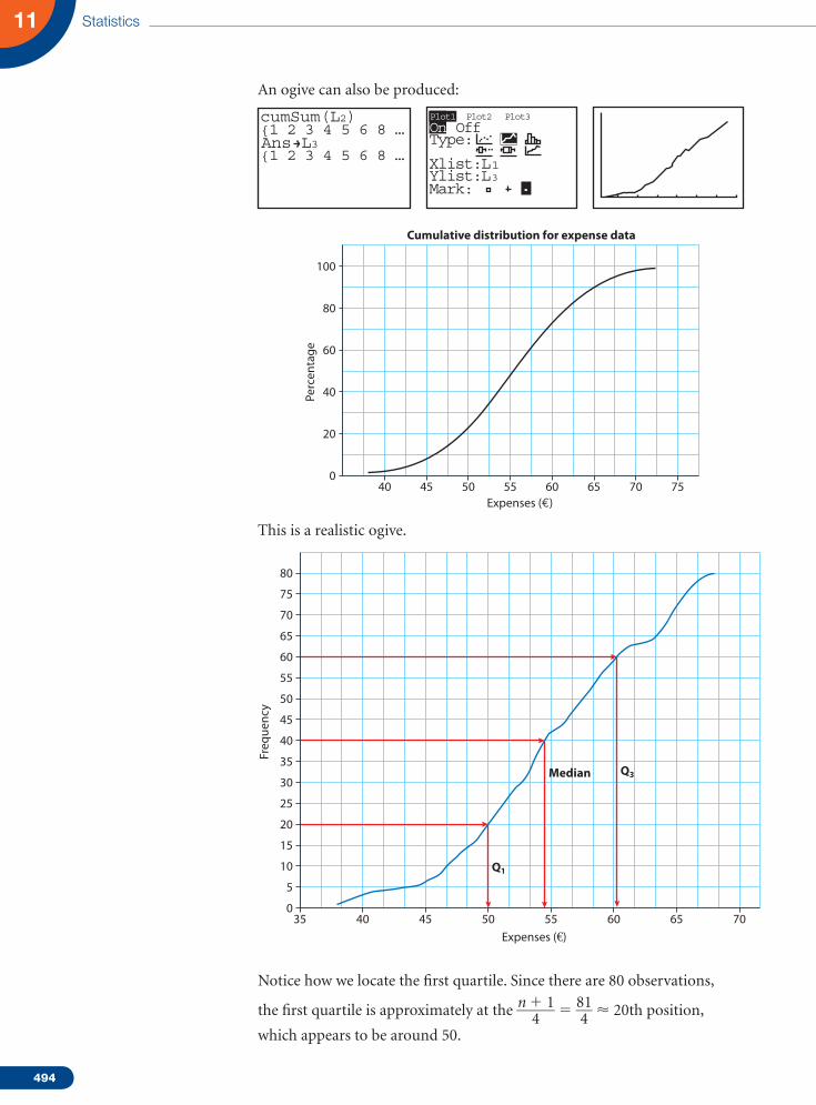
An ogive can also be produced:
cumSum(L2){1 2 3 4 5 6 8 …
{1 2 3 4 5 6 8 …Ans L3
Plot2 Plot3Plot1
On OffType:
Xlist:L 1Ylist:L 3Mark:
Perc
enta
ge
Cumulative distribution for expense data
0
20
40
60
80
100
40 45 50 55 60 65 70 75Expenses (€)
This is a realistic ogive.
Freq
uenc
y
0
10
20
30
40
50
55
60
65
70
75
80
5
15
25
35
45
35 40 45 50 55 60 65 70
Expenses (€)
Q1
Q3Median
Notice how we locate the first quartile. Since there are 80 observations,
the first quartile is approximately at the n 1 1 _____ 4 5 81 ___ 4 20th position,
which appears to be around 50.

495
The median is at the n 1 1 _____ 2
5 81 ___ 2
40th– 41st position, i.e. approximately at 55.
Similarly, the third quartile is at 3(n 1 1)
________ 4 5 243 ___ 4 61st, which happens
here at approximately 61!
The calculation of the mean and variance for grouped data is essentially the same as for raw data. The difference lies in the use of frequencies to save typing (writing) all numbers. Here is a comparison:
where xi 5 data point
f (xi) 5 frequency of xi
mi 5 interval midpoint (mid mark or mid value)
f (mi) 5 frequency of interval i
∑ f (xi), ∑ f (mi) 5 total number of data points
For the grouped data reproduced here, this is how we estimate the mean and variance:
Statistic Raw data Grouped data Grouped data with intervals
__
x __
x 5 ∑ all x
x _____ n
__ x 5
∑ all x
xi f(xi) __________ n 5
∑ all x
xi f(xi) __________
∑
f (xi)
__ x 5
∑ all x
mi f (mi) ___________ n 5
∑ all x
mi f (mi) ___________
∑
f (mi)
s2n s2
n 5
∑ all x
(xi 2 __
x )2
____________ n s2n 5
∑ all x
(xi 2 __
x )2 f (xi)
_________________ n
5 ∑
all x
(xi 2 _x)2 f (xi)
______________∑f (xi)
s2n 5
∑ all x
(mi 2 x)2 f (mi)
__________________ n
5 ∑
all x
(mi 2 _x)2 f(mi)
_______________∑f (mi)
Livingexpenses
Midpointm
Number ofstudents f (m) mi f (mi) (mi 2
__ x )2 (mi 2
__ x )2 f (mi)
35 but ,40 37.5 2 75 344.5 688.9
40 but ,45 42.5 3 127.5 183.9 551.6
45 but ,50 47.5 11 522.5 73.3 806.0
50 but ,55 52.5 21 1102.5 12.7 266.1
55 but ,60 57.5 19 1092.5 2.1 39.4
60 but ,65 62.5 11 687.5 41.5 456.2
65 but ,70 67.5 13 877.5 130.9 1701.4
Totals ∑ f (mi) 5 80 ∑ all x
mi f (mi) 5 4485 ∑ all x
( mi 2 __
x )2 · f (mi) 5 4509.6
Mean 4485 _____ 80 5 56.06 Variance 4509.6 ______ 80 5 56.37
Standarddeviation 7.51

496
Statistics11
The numbers here are estimates of the mean and the variance and eventually the standard deviation. As you will notice, they are not equal to the values we calculated earlier, but are close. The reason for this is that, with grouping, we lost the detail in each interval. For example, the interval between 45 and 50 is represented by the midpoint 47.5. In essence, we are assuming that every number in the interval is equal to 47.5.
Example 7
Speed limits in some European cities are set to 50 km/h. Drivers in various cities react to such limits differently. The results of the survey to compare drivers’ behaviour in Brussels, Vienna and Stockholm are given in the accompanying table. Use box plots to compare the results.
Vienna 62 60 59 50 61 63 53 46 58 49 51 37 47 51 63 52 44 50 45 44
Brussels 64 61 63 57 49 49 46 58 45 60 51 36 65 45 47 46
Stockholm 43 44 34 35 31 34 29 33 36 38 45 47 29 48 51 49 48
Solution
Parallel box plots may be an appropriate tool to enable a comparison between the three data sets.
It appears that, on average, drivers in Brussels and Vienna tend to be on the ‘speedy’ side. The median in both cities is higher than 50, which means than more than 50% of the drivers in the two cities tend not to respect the speed limit. The variation in both cities is comparable with Brussels having a slightly wider range than Vienna. Almost all drivers in Stockholm appear to adhere to the 50 km/h limit. The median is around 40 km/h and the third quartile about 47, which means that more than 75% of the drivers in this city drive at a speed less than the 50 km/h limit.
Vienna
Stockholm
Cit
y
Brussels
30 40 50Speed
Box plot of speed
60 70
497
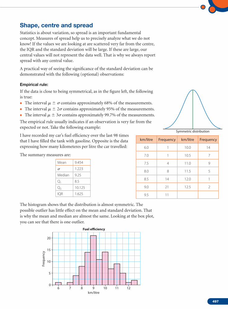
Shape, centre and spreadStatistics is about variation, so spread is an important fundamental concept. Measures of spread help us to precisely analyze what we do not know! If the values we are looking at are scattered very far from the centre, the IQR and the standard deviation will be large. If these are large, our central values will not represent the data well. That is why we always report spread with any central value.
A practical way of seeing the significance of the standard deviation can be demonstrated with the following (optional) observations:
Empirical rule:
If the data is close to being symmetrical, as in the figure left, the following is true:• The interval m 6 s contains approximately 68% of the measurements.• The interval m 6 2s contains approximately 95% of the measurements.• The interval m 6 3s contains approximately 99.7% of the measurements.
The empirical rule usually indicates if an observation is very far from the expected or not. Take the following example:
I have recorded my car’s fuel efficiency over the last 98 times that I have filled the tank with gasoline. Opposite is the data expressing how many kilometeres per litre the car travelled:
The summary measures are:
Mean 9.454
s 1.223
Median 9.25
Q1 8.5
Q3 10.125
IQR 1.625
The histogram shows that the distribution is almost symmetric. The possible outlier has little effect on the mean and standard deviation. That is why the mean and median are almost the same. Looking at the box plot, you can see that there is one outlier.
Symmetric distribution
km/litre Frequency km/litre Frequency
6.0 1 10.0 14
7.0 1 10.5 7
7.5 4 11.0 9
8.0 8 11.5 5
8.5 14 12.0 1
9.0 21 12.5 2
9.5 11
Fuel e�ciency
km/litre
0
5
10
Freq
uenc
y 15
20
6 7 8 9 10 11 12

498
Statistics11
The confirmation is below:
9.25 2 1.5 1.625 5 6.8, which is why 6 is considered as an outlier.
10.125 1 1.5 1.625 5 12.6, and hence no outliers on this side.
If we use the empirical rule, we can expect about 99.7% of the data to lie within three standard deviations of the mean, i.e. 9.454 2 3 1.223 5 5.8 and 9.454 1 3 1.223 5 13.1. In fact, you see all the data is within the specified interval, including the potential outlier!
Question: What should you be able to tell about a quantitative variable?
Answer: Report the shape of its distribution, and include a centre and a spread.
Question: Which central measure and which measure of spread?
Answer: The rules are:
• If the shape is skewed, report the median and IQR. You may want to include the mean and standard deviation, but you should point out that the mean and median differ as this difference is a sign that the data is skewed. A histogram can help.
• If the shape is symmetrical, report the mean and standard deviation. You may report the median and IQR as well.
• If there are clear outliers, report the data with and without the outliers. The differences may be revealing.
Example 8
The records of a large high school show the heights of their students for the year 2006.
Height (cm)
0
50
100
Freq
uenc
y 150
200
169 171 173 175 177 179 181 183 185 187 189 191 193 195
Fuel e�ciency
6
*
7 8 9 10 11 12 13km/litre
Chebyshev’s rule:This rule is similar to the empirical rule in the sense that it tries to interpret the standard deviation. Contrary to the empirical rule, it applies to any data set, regardless of the shape of the distribution.
Rule: For any number
k . 1, at least ( 1 2 1 __ k2 ) of the
measurements will fall within k standard deviations of the mean. [i.e. within the interval (
__ x 2 ks,
__ x 1 ks).]
a) No useful information is provided on the fraction of measurements that fall within 1 standard deviation from the mean – (
__ x 2 s,
__ x 1 s).
b) At least 8 _ 9 will fall within 3 standard deviations from the mean – (
__ x 2 3s,
__ x 1 3s).
c) At least 3 _ 4 will fall within 2 standard deviations from the mean – (
__ x 2 2s,
__ x 1 2s).

499
a) Which statistics would best represent the data here? Why?
b) Calculate the mean and standard deviation.
c) Develop a cumulative frequency graph of the data.
d) Use your result of c) above to estimate the median, Q1, Q3 and IQR.
e) Are there any outliers in the data? Why?
f ) Write a few sentences describing the distribution.
Solution
a) The data appears to have outliers and is slightly skewed to the right. The most appropriate measure is the median, since the mean is influenced by the extreme values.
b) To calculate the mean and standard deviation, we will set up a table that will facilitate the calculation.
Height (cm)x i
Number ofstudents f (x ) xi f (xi ) (xi 2
__ x )2 (xi 2
__ x )2 f (xi )
170 15 2550 51.84 777.6
171 60 10 260 38.44 2306.4
172 90 15 480 27.04 2433.6
173 70 12 110 17.64 1234.8
174 50 8700 10.24 512
175 200 35 000 4.84 968
176 180 31 680 1.44 259.2
177 70 12 390 0.04 2.8
178 120 21 360 0.64 76.8
179 50 8950 3.24 162
180 110 19 800 7.84 862.4
181 80 14 480 14.44 1155.2
182 90 16 380 23.04 2073.6
183 40 7320 33.64 1345.6
184 20 3680 46.24 924.8
185 40 7400 60.84 2433.6
186 10 1860 77.44 774.4
194 2 388 282.24 564.5
196 3 588 353.44 1060.3
Totals ∑f (xi)
5 1300
∑ all x
xi · f (xi)
5 230 376
∑ all x
(xi 2 __
x )2 · f (xi)
5 19 927.6
Mean 230 376 _______ 1300 5 177.2 Variance 19 927.4 ________ 1300 5 15.33
Standarddeviation 3.92
500
Statistics11
Note: Using the alternative formula for the variance will also give the same result. (Due to rounding, answers will differ slightly.)
s 2 n 5
∑ i 5 1
n
x 2 i f (xi)
_____________ n 2 _ x 2 5 40 845 390 _________
1300 2 177.21232 5 15.3315 ⇒
sn = √_______
15.3315 = 3.92
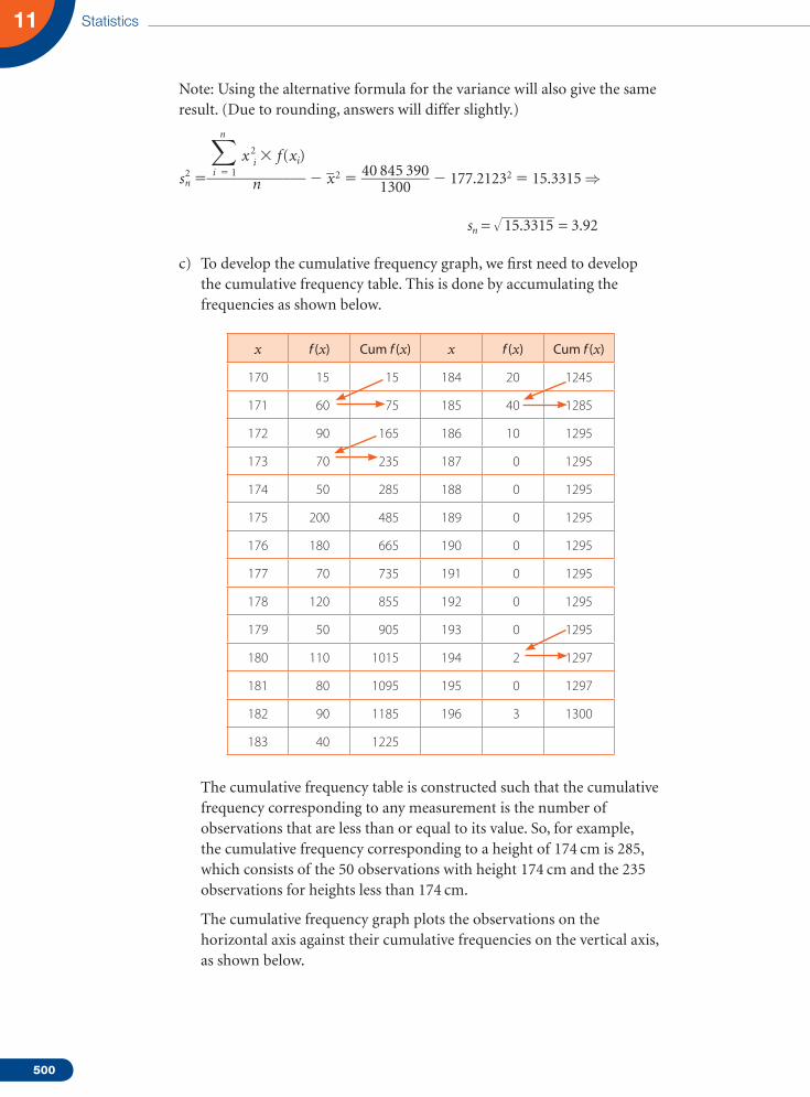
c) To develop the cumulative frequency graph, we first need to develop the cumulative frequency table. This is done by accumulating the frequencies as shown below.
x f (x) Cum f (x) x f (x) Cum f (x)
170 15 15 184 20 1245
171 60 75 185 40 1285
172 90 165 186 10 1295
173 70 235 187 0 1295
174 50 285 188 0 1295
175 200 485 189 0 1295
176 180 665 190 0 1295
177 70 735 191 0 1295
178 120 855 192 0 1295
179 50 905 193 0 1295
180 110 1015 194 2 1297
181 80 1095 195 0 1297
182 90 1185 196 3 1300
183 40 1225
The cumulative frequency table is constructed such that the cumulative frequency corresponding to any measurement is the number of observations that are less than or equal to its value. So, for example, the cumulative frequency corresponding to a height of 174 cm is 285, which consists of the 50 observations with height 174 cm and the 235 observations for heights less than 174 cm.
The cumulative frequency graph plots the observations on the horizontal axis against their cumulative frequencies on the vertical axis, as shown below.

501
Height (cm)
0
400
800
Cum
ulat
ive
freq
uenc
y1200
200285
174
1285
600
1000
1400
169 171 173 175 177 179 181 183 185 187 189 191 193 195
d) The median is the observation between 1300 ____ 2
5 650th and 651st
observations, since the number is even. From the cumulative table, we can see that the median is in the 176 interval. So the median is 176.
Q1 is at 1301 ____ 4 325th observation. From the table, as 174 has a
cumulative frequency of 285, and 175 has a cumulative frequency of 485, then Q1 has to be 175.
Also, Q3 is at 3 1301 ________ 4 976th observation. So, similarly, it is 180.
IQR 5 180 2 175 5 5.
e) To check for outliers, we can calculate the lengths of the whiskers.
Lower fence: 175 2 1.5 5 5 167.5, which is lower than the minimum value, so there are no outliers on the left.
Upper fence: 180 1 1.5 5 5 187.5. So we have five outliers, two at 194 cm and three at 196 cm.
f) The distribution appears to be bimodal with two modes at 175 and 176. It is slightly skewed to the right with a few extreme values at 194 and 196. This is further confirmed by the fact that the mean of 177.2 is higher than the median of 176.
Note: Here are the calculations using a GDC:
1–Var Statsx=177. 2 123077
Sx=3.9 16704232ox=3.9 15197517n=1300
x=230376x2=40845390
1–Var Statsn=1300
Med=176Q3=180maxX=196
minX=170Q1=175
L2
L3( 1)=
L3 3170171172173174175176
1560907050200180
L1
Plot2 Plot3Plot1
On OffType:
Xlist:L 1Freq:L 2
Plot3Plot1
On OffType:
Xlist:L 1Freq:L 2Mark:
Plot2

502
Statistics11
1 The pulse rates of 15 patients chosen at random from visitors of a local clinic are given below:
72, 80, 67, 68, 80, 68, 80, 56, 76, 68, 71, 76, 60, 79, 71
a) Calculate the mean and standard deviation of the pulse rate of the patients at the clinic.
b) Draw a box plot of the data and indicate the values of the different parts of the box.
c) Check if there are any outliers.
2 The number of passengers on 50 flights from Washington to London on a commercial airline were:
165 173 158 171 177 156 178 210 160 164
141 127 119 146 147 155 187 162 185 125
163 179 187 174 166 174 139 138 153 142
153 163 185 149 154 154 180 117 168 182
130 182 209 126 159 150 143 198 189 218
a) Calculate the mean and standard deviation of the number of passengers on this airline between the two cities.
b) Set up a stem plot for the data and use it to find the median of the number of passengers.
c) Develop a cumulative frequency graph. Estimate the median, and first and third quartiles. Draw a box plot.
d) Find the IQR and use it to check whether there are any outliers.
e) Use the empirical rule to check for outliers.
3 At a school, 100 students took a ‘mock’ IB exam using paper 3. The paper was marked out of 60 marks. Here are the results
Marks 0–9 10–19 20–29 30–39 40–49 50–60
No. of students 5 9 16 24 27 19
a) Draw a cumulative frequency curve.
b) Estimate the median and quartiles.
4 130 first-year IB students were given a placement test to decide whether they go for SL or HL. The times for these students to finish the test are given in the table below:
Time 30–40 40–50 50–60 60–70 70–80 80–90 90–100 100–110 110–120
No. of students 8 12 24 29 19 16 12 8 2
a) Develop a cumulative frequency curve.
b) Estimate the median and the IQR.
c) 20 students did not manage to finish the test after 120 minutes and had to hand it in uncompleted. Estimate the median finishing time for all 130 students.
Exercise 11.3

503
5 The mean score of 26 students on a 40-point paper is 22. The mean for another group of 84 other students is 32. Find the mean of the combined group of 110 students.
6 The scores on a 100-mark test of a sample of 80 students in a large school are given below.
Score 59–63 63–67 67–71 71–75 75–79 79–83 83–87
No. of students 6 10 18 24 10 8 4
a) Find the mean and standard deviation of the scores of all students.
b) A bonus of 13 points is to be added to these scores. What is the new value of the mean and standard deviation?
7 Cats is a famous musical. In a large theatre in Vienna (1744 capacity), during a period of 10 years, it played 1000 performances. The manager of the group kept a record of the empty seats on the days it played. Here is the table.
Number of empty seats
1–10 11–20 21–30 31–40 41–50 51–60 61–70 71–80 81–90 91–100
Days 15 50 100 170 260 220 90 45 30 20
a) Copy and complete the following cumulative frequency table for the above information.
Number of empty seats x < 10 x < 20 x < 30 x < 40 x < 50 x < 60 x < 70 x < 80 x < 90 x < 100
Days 15 165 815 1000
b) Draw a cumulative frequency graph of this distribution. Use 1 unit on the vertical axis to represent the number of 100 days and 1 unit on the horizontal axis to represent every 10 seats.
c) Use the graph from b) to answer the following questions: (i) Find an estimate of the median number of empty seats. (ii) Find an estimate for the first quartile, third quartile and the IQR. (iii) The days the number of empty seats was less than 35 seats were considered
bumper days (lots of profit). How many days were considered bumper days? (iv) The highest 15% of the days with empty seats were categorized as loss days.
What is the number of empty seats above which a day is claimed as a loss?
8 Aptitude tests sometimes use jigsaw puzzles to test the ability of new applicants to perform precision assembly work in electronic instruments. One such company that produces the computerized parts of video and CD players gave the following results:
Time to finish the puzzle (nearest second) Number of employees
30–35 16
35–40 24
40–45 22
45–50 26
50–55 38
55–60 36
60–65 32
65–70 18

504
Statistics11
a) Draw a histogram of the data.
b) Draw a cumulative frequency curve and estimate the median and IQR.
c) Calculate the estimates of the mean and standard deviation of all such participants.
9 The heights of football players at a given school are given in the table below:
Hei
ght
Freq
uenc
y
Hei
ght
Freq
uenc
y
Hei
ght
Freq
uenc
y
Hei
ght
Freq
uenc
y
Hei
ght
Freq
uenc
y
Hei
ght
Freq
uenc
y
152 2 160 7 168 18 175 5 183 9 191 4
155 6 163 5 170 7 178 11 185 4 193 1
157 9 165 20 173 12 180 8 188 2
a) Find the five-number summary for this data.
b) Display the data with a box plot and a histogram.
c) Find the mean and standard deviation of the data.
d) Describe the data with a few sentences.
e) Draw a cumulative frequency graph and estimate the height of the player that is in the 90th percentile.
f ) 10 players’ data were missing when we collected the data. The average height of the 10 players is 182. Find the average height of all the players, including the last 10.
10 Consider 10 data measures.
a) If the mean of the first 9 measures is 12 and the 10th measure is 12, what is the mean of the 10 measures?
b) If the mean of the first 9 measures is 11, and the 10th measure is 21, what is the mean of the 10 measures?
c) If the mean of the first 9 measures is 11, and the mean of the 10 measures is 21, what is the value of the 10th measure?
11 Suppose that the mean of a set of 10 data points is 30.
a) It is discovered that a data point having a value of 25 was incorrectly entered as 15. What should be the revised value of the mean?
b) Suppose an additional point of value 32 was added. Will this increase or decrease the value of the mean?
12 Half the values of a sample are equal to 20, one-sixth are equal to 40, and one-third are equal to 60. What is the sample mean?
13 The seven numbers 7, 10, 12, 17, 21, x and y have a mean m 5 12 and a variance
s 2 5 172 ____ 7 . Find x and y given that x , y.
14 A sample of 25 observations was taken out of a large population of
measurements. If it is given that ∑ i 51
25
xi 5 278 and ∑ i 51
n
x2i 5 3682 , estimate
the mean and the variance of the population of measurements.

505
1 Giventhatmisthemeanofadatasety1,y2,…,y30,andyouknowthat
∑ i 51
30
yi5360and∑ i 51
30
(yi2m)25925,find
a) thevalueofm
b) thestandarddeviationoftheset.
2 Lauramadeasurveyofsomestudentsatschoolaskingthemaboutthetimeittakeseachofthemtocometoschooleverymorning.Shescribbledthenumbersonapieceofpaperand,unfortunately,couldnotreadthenumberofstudentswhospend40minutesontheirtriptoschool.Theaveragenumberofminutesshehadoriginallyfoundwas34minutes.Findouthowmanystudentsspend40minutesontheirtrip.
Time in minutes 10 20 30 40 50
Number of students with this time 1 2 5 ? 3
3 Thefollowingtablegives50measurementsofthetimeittookacertainreactiontobedoneinalaboratoryexperiment.
3.1 5.1 4.9 1.8 2.8 5.6 3.6 2.2 2.5 3.4
4.5 2.5 3.5 3.6 3.7 5.1 4.1 4.8 4.9 1.6
2.9 3.6 2.1 6.1 3.5 4.7 4 3.9 3.7 3.9
2.7 4.3 4 5.7 4.4 3.7 3.7 4.6 4.2 4
3.8 5.6 6.2 4.9 2.5 4.2 2.9 3.1 2.8 3.9
a) Constructafrequencytableandhistogramstartingat1.6andwithintervallengthof0.5.
b) Whatfractionofthemeasurementsislessthan5.1?
c) Estimate,fromyourhistogram,themedianofthisdataset.
d) Estimatethemeanandstandarddeviationusingyourfrequencytable.
e) Constructacumulativefrequencygraph.
f) Fromyourcumulativefrequencygraph,estimateeachofthefivenumbersinthefive-numbersummary.
Practice questions
15 Use the data in question 9 of Exercise 11.1 to estimate the IQR and the standard deviation of the number of days in hospital by heart patients.
16 Use the data in question 10 of Exercise 11.1 to estimate the IQR and the standard deviation of the exercise time of the author for 2006.
17 Use the data in question 11 of Exercise 11.1 to estimate the IQR and the standard deviation of the speed of cars on the highway.
18 Use the data in question 12 of Exercise 11.1 to estimate the IQR and the standard deviation of the length of components at this facility.
19 Use the data in question 13 of Exercise 11.1 to estimate the IQR and the standard deviation of the waiting time for customers at this supermarket.

506
Statistics11
4 Inlargecitiesaroundtheworld,governmentsofferparkingfacilitiesforpublicuse.Thehistogrambelowgivesapictureofthenumberofparkingsitesavailablewiththecapacityofeach,inanumberofcitieschosenatrandom.
a) Whichstatisticswouldbestrepresentthedatahere?Why?
b) Calculatethemeanandstandarddeviation.
c) Developacumulativefrequencygraphofthedata.
d) Useyourresultfromc)abovetoestimatethemedian,Q1,Q3andIQR.
e) Arethereanyoutliersinthedata?Why?
f) Writeafewsentencesdescribingthedistribution.
5 Theboxplotsdisplaythecaseprices(ine)ofredwinesproducedinFrance,ItalyandSpain.
a) Whichcountryappearstoproducethemostexpensiveredwine?Thecheapest?
b) Inwhichcountryaretheredwinesgenerallymoreexpensive?
c) Writeafewsentencescomparingthepricingofredwinesinthethreecountries.
Parking spaces
0
20
40
Num
ber
of s
ites
60
10
30
50
70
80
90
0200
400600
8001000
12001400
16001800
20002200
24002600
France Italy Spain50
75
100
Case
pric
e
125
150

507
6 112.72 53.55 54.12 54.33 58.79 59.26 60.39 62.45 52.22 52.52 52.58 52.85
54.06 51.34 51.93 52.09 52.14 52.24 52.24 52.53 53.5 51.82 51.93 52
52.78 52.82 50.28 50.49 51.28 51.28 51.52 51.62 52.4 52.43 49.83 50.46
50.95 51.07 51.11 49.45 49.45 49.73 49.76 49.93 50.19 50.32 50.63 48.64
49.79 50.19 50.62 50.96 49.09 49.16 49.29 49.74 49.74 49.75 49.84 49.76
52.9 52.91 53.4 52.18 52.57 52.72 50.56 50.87 50.9 49.32 49.7
Thetableshowstherecordforthetimes(seconds)ofthe71maleswimmersinthe100mswimonthefirstdayduringtheSummerOlympics2000inSydney.a) Calculatethemeantimeandthestandarddeviation.b) CalculatethemedianandIQR.c) Explainthedifferencesbetweenthesetwosetsofmeasures.
7 Inasurveyofuniversitiesinmajorcitiesintheworld,thepercentageoffirst-yearstudentswhograduateontime(somerequire4yearsandsome5years)wasreported.Thesummarystatisticsaregivenbelow.
Numberofuniversitiessurveyed 120 Meanpercentage 69
Medianpercentage 70 Standarddeviation 9.8
Minimum 42 Maximum 86
Range 44 Q1 60.25
Q3 75.75
a) Isthisdistributionsymmetric?Explain.b) Checkforoutliers.c) Createaboxplotofthedata.d) Describethedatainashortparagraph.
8 TheInternationalHeartAssociationstudies,amongotherfactors,theinfluenceofcholesterollevel(inmg/dl)ontheconditionsofheartpatients.Inastudyof2000subjects,thefollowingcumulativerelativefrequencygraphwasrecorded.
a) Estimatethemediancholesterollevelofheartpatientsinthestudy.b) Estimatethefirstandthirdquartiles,andthe90thand10thpercentiles.c) EstimatetheIQR.Alsoestimatethenumberofpatientsinthemiddle50%ofthis
distribution.d) Createaboxplotofthedata.e) Giveashortdescriptionofthedistribution.
Cum
ulat
ive
perc
enta
ge
1000
10
20
30
40
50
60
70
80
90
100
125 150 175 200 225 250 275 300 325 350 375 400Cholesterol level (mg/dl)

508
Statistics11
9 ManyofthestreetsinVienna,Austriahaveaspeedlimitof30km/h.OnoneSundayeveningthepoliceregisteredthespeedofcarspassinganimportantintersection,inordertogivespeedingticketswhendriversexceededthelimit.Hereisarandomsampleof100carsrecordedthatevening.
26 46 39 41 44 37 38 35 34 31
27 47 39 41 44 37 38 35 34 32
27 47 39 41 44 37 38 35 34 32
27 48 39 41 44 27 38 35 34 32
29 48 40 41 45 37 38 36 34 33
30 48 40 41 45 37 38 36 35 33
30 48 40 42 45 38 39 36 35 33
30 49 40 42 46 38 39 36 35 33
30 50 41 42 46 38 39 36 35 33
31 54 41 43 46 38 39 36 35 33
a) Prepareafrequencytableforthedata.
b) Drawahistogramofthedataanddescribetheshape.
c) Calculate,showingallwork,themeanandstandarddeviationofthedata.
d) Prepareacumulativefrequencytableofthedata.
e) Findthemedian,Q1,Q3andIQR.
f) Arethereanyoutliersinthedata?Explainusinganappropriatediagram.
10 Thefollowingisthedatacollectedfrom50industrialcountrieschosenatrandomin2001.Thedatarepresentsthepercapitagasolineconsumptioninthesecountries.TheNetherlands’consumptionwasat1123litrespercapitawhileItalystoodat2220litrespercapita.
2062 2076 1795 1732 2101 2211 1748 1239 1936 1658
1639 1924 2086 1970 2220 1919 1632 1894 1934 1903
1714 1689 1123 1671 1950 1705 1822 1539 1976 1999
2017 2055 1943 1553 1888 1749 2053 1963 2053 2117
1600 1795 2176 1445 1727 1751 1714 2024 1714 2133
a) Calculatethemean,median,standarddeviation,Q1,Q3andIQR.
b) Arethereanyoutliers?
c) Drawaboxplot.
d) Whatconsumptionlevelsarewithin1standarddeviationfromthemean?
e) Germany,withaconsumptionlevelof2758litrespercapita,wasnotincludedinthesample.WhateffectonthedifferentstatisticscalculatedwouldaddingGermanyhave?Donotrecalculatethestatistics.

509
11 90studentsonastatisticscourseweregivenanexperimentwhereeachreported,tothenearestminute,thetime,x,ittookthemtocommutetoschoolonaspecificday.Theteachersthenreportedbackthatthetotaltravellingtimeforthecourseparticipantswas∑x54460minutes.
a) Findthemeannumberofminutesthestudentsspenttravellingtoschoolthatday.
Fourstudentswhowereabsentwhenthedatawasfirstcollectedreportedthattheyspent35,39,28and32minutes,respectively.
b) Calculatethenewmeanincludingthesefourstudents.
12 Twothousandstudentsatalargeuniversitytakethefinalstatisticsexamination,whichismarkedona100-scale,andthedistributionofmarksreceivedisgiveninthetablebelow.
Marks 1–10 11–20 21–30 31–40 41–50 51–60 61–70 71–80 81–90 91–100
Number of
candidates30 100 200 340 520 440 180 90 60 40
a) Completethetablebelowsothatitrepresentsthecumulativefrequencyforeachinterval.
Marks <10 <20 <30 <40 <50 <60 <70 <80 <90 <100
Number of candidates
30 130 1630
b) Drawacumulativefrequencygraphofthedistribution,usingascaleof1cmfor100studentsontheverticalaxisand1cmfor10marksonthehorizontalaxis.
c) Useyourgraphfromb)toanswerparts(i)–(iii)below. (i) Findanestimateforthemedianscore. (ii) Candidateswhoscoredlessthan35wererequiredtoretaketheexamination.
Howmanycandidateshadtoretaketheexam? (iii) Thehighest-scoring15%ofcandidateswereawardedadistinction.
Findthemarkaboveforwhichadistinctionwasawarded.
13 Ataconferenceof100mathematiciansthereare72menand28women.Themenhaveameanheightof1.79mandthewomenhaveameanheightof1.62m.Findthemeanheightofthe100mathematicians.
14 Themeanofthepopulationx1,x2,…,x25ism.Giventhat∑ i 51
25
xi5300and
∑ i 51
25
(xi2m)25625,find
a) thevalueofmb) thestandarddeviationofthepopulation.
15 Thetableshowsthescoresofcompetitorsinacompetition.
Score 10 20 30 40 50
Number of competitors with this score 1 2 5 k 3
Themeanscoreis34.Findthevalueofk.

510
Statistics11
16 Asurveyiscarriedouttofindthewaitingtimesfor100customersatasupermarket.
a) Calculateanestimateforthemeanofthewaitingtimes,byusinganappropriateapproximationtorepresenteachinterval.
b) Constructacumulativefrequencytableforthisdata.
c) Usethecumulativefrequencytabletodraw,ongraphpaper,acumulativefrequencygraph,usingascaleof1cmper20secondswaitingtimeforthehorizontalaxisand1cmper10customersfortheverticalaxis.
d) Usethecumulativefrequencygraphtofindestimatesforthemedianandthelowerandupperquartiles.
17 Thefollowingdiagramrepresentsthelengths,incm,of80plantsgrowninalaboratory.
a) Howmanyplantshavelengthsincmbetween (i) 50and60? (ii) 70and90?
b) Calculateestimatesforthemeanandthestandarddeviationofthelengthsoftheplants.
c) Explainwhatfeatureofthediagramsuggeststhatthemedianisdifferentfromthemean.
d) Thefollowingisanextractfromthecumulativefrequencytable.
Length in cmless than
Cumulativefrequency
. .
50 22
60 32
70 48
80 62
. .
Usetheinformationinthetabletoestimatethemedian.Giveyouranswerto2significantfigures.
Freq
uenc
y
00
5
10
15
20
10 20 30 40 50 60 70 80 90 100Length (cm)
Waiting time(seconds)
Number of customers
0–30 5
30–60 15
60–90 33
90–120 21
120–150 11
150–180 7
180–210 5
210–240 3

511
18 Thetablebelowrepresentstheweights,W,ingrams,of80packetsofroastedpeanuts.
Weight(W )80,W
< 8585,W
< 9090,W
< 9595,W< 100
100,W< 105
105,W< 110
110,W< 115
Number ofpackets
5 10 15 26 13 7 4
a) Usethemidpointofeachintervaltofindanestimateforthestandarddeviationoftheweights.
b) Copyandcompletethefollowingcumulativefrequencytablefortheabovedata.
Weight (W ) W<85 W<90 W<95 W<100 W<105 W<110 W<115
Number ofpackets
5 15 80
c) Acumulativefrequencygraphofthedistributionisshownbelow,withascaleof2cmfor10packetsontheverticalaxisand2cmfor5gramsonthehorizontalaxis.
Usethegraphtoestimate (i) themedian (ii) theupperquartile(thatis,thethirdquartile).
Giveyouranswerstothenearestgram.
d) LetW1,W2,…,W80betheindividualweightsofthepackets,andlet__
Wbetheirmean.Whatisthevalueofthesum
(W12__
W)1(W22__
W)1(W32__
W)1…1(W792__
W)1(W802__
W)?
e) Oneofthe80packetsisselectedatrandom.Giventhatitsweightsatisfies85,W<110,findtheprobabilitythatitsweightisgreaterthan100grams.
Num
ber o
f pac
kets
0
10
20
30
40
50
60
70
80
80 85 90 95 100Weight (grams)
105 110 115

512
Statistics11
19 Thespeeds,inkmh21,ofcarspassingapointonahighwayarerecordedinthefollowingtable.
Speed v Number of cars
v<60 0
60,v<70 7
70,v<80 25
80,v<90 63
90,v<100 70
100,v<110 71
110,v<120 39
120,v<130 20
130,v<140 5
v.140 0
a) Calculateanestimateofthemeanspeedofthecars.
b) Thefollowingtablegivessomeofthecumulativefrequenciesfortheinformationabove.
Speed v Cumulative frequency
v<60 0
v<70 7
v<80 32
v<90 95
v<100 a
v<110 236
v<120 b
v<130 295
v<140 300
(i) Writedownthevaluesofaandb. (ii) Ongraphpaper,constructacumulativefrequencycurvetorepresentthis
information.Useascaleof1cmfor10kmh21onthehorizontalaxisandascaleof1cmfor20carsontheverticalaxis.
c) Useyourgraphtodetermine (i) thepercentageofcarstravellingataspeedinexcessof105kmh21
(ii) thespeedwhichisexceededby15%ofthecars.

513
20 Ataxicompanyhas200taxicabs.Thecumulativefrequencycurvebelowshowsthefaresindollars($)takenbythecabsonaparticularmorning.
a) Usethecurvetoestimate (i) themedianfare (ii) thenumberofcabsinwhichthefaretakenis$35orless.
Thecompanycharges55centsperkilometrefordistancetravelled.Therearenoothercharges.Usethecurvetoanswerthefollowing.b) Onthatmorning,40%ofthecabstravellessthanakm.Findthevalueofa.c) Whatpercentageofthecabstravelmorethan90kmonthatmorning?
21 Threepositiveintegersa,bandc,wherea,b,c,aresuchthattheirmedianis11,theirmeanis9andtheirrangeis10.Findthevalueofa.
22 Inasuburbofalargecity,100housesweresoldinathree-monthperiod.Thefollowingcumulative frequency tableshowsthedistributionofsellingprices(inthousandsofdollars).
Selling price P ($ thousand) P<100 P<200 P<300 P<400 P<500
Total number of houses 12 58 87 94 100
a) Representthisinformationonacumulativefrequencycurve,usingascaleof1cmtorepresent$50000onthehorizontalaxisand1cmtorepresent5housesontheverticalaxis.
b) Useyourcurvetofindtheinterquartilerange.
Num
ber o
f cab
s
0
20
40
60
80
100
120
140
160
180
200
0 10 20 30 40Fares ($)
50 60 70 80

514
Statistics11
Thepriceinformationisrepresentedinthefollowingfrequencydistribution.c) Findthevaluesofaandb.d) Usemid-intervalvaluestocalculatean
estimateforthemeansellingprice.e) Houseswhichsellformorethan
$350000aredescribedasDeLuxe. (i) Useyourgraphtoestimatethenumber
ofDeLuxehousessold.Giveyouranswertothenearestinteger.
(ii) TwoDeLuxehousesareselectedatrandom.Findtheprobabilitythatbothhaveasellingpriceofmorethan$400000.
23 Astudentmeasuredthediametersof80snailshells.Hisresultsareshowninthefollowingcumulativefrequencygraph.Thelowerquartile(LQ)is14mmandismarkedclearlyonthegraph.a) Onthegraph,markclearly
andwritedownthevalueof (i) themedian (ii) theupperquartile.
b) Writedowntheinterquartilerange.
24 Thecumulativefrequencycurverightshowsthemarksobtainedinanexaminationbyagroupof200students.
a) Usethecumulativefrequencycurvetocompletethefrequencytableonthenextpage.
Num
ber o
f stu
dent
s
0
20
40
60
80
100
120
140
160
170
180
190
200
10
30
50
70
90
110
130
150
0 20 40 60 80Mark obtained
10010 30 50 70 90
20Diameter (mm)
Cum
ulat
ive
freq
uenc
y4015
LQ � 14
3510 3050 25 0
102030405060708090
Selling price P
($ thousand)
Total number
of houses
0,P<100 12
100,P<200 46
200,P<300 29
300,P<400 a
400,P<500 b

515
Mark (x) 0<x,20 20<x,40 40<x,60 60<x,80 80<x,100
Number ofstudents
22 20
b) Fortypercentofthestudentsfail.Findthepassmark.
25 Thecumulativefrequencycurverightshowstheheights(incentimetres)of120basketballplayers.Usethecurvetoestimatea) themedianheightb) theinterquartilerange.
26 Leta,b,canddbeintegerssuchthata,b,b,candc 5 d.Themodeofthesefournumbersis11.Therangeofthesefournumbersis8.Themeanofthesefournumbersis8.Calculatethevalueofeachoftheintegersa,b,candd.
27 Atest,tobemarkedoutof100,iscompletedby800students.Thecumulativefrequencygraphforthemarksisgivenbelow.
a) Writedownthenumberofstudentswhoscored40marksorlessonthetest.b) Themiddle50%oftestresultsliebetweenmarksaandb,wherea,b.Find
aandb.
28 xandyareintegerswithx,y.Thesetofnumbers{x,y,10,12,16,16,18,18}haveameanof13andavariances 2of21.Findxandy.
Questions13–27:©InternationalBaccalaureateOrganization
Num
ber o
f pla
yers
0
20
40
60
80
100
120
10
30
50
70
90
110
160 170 180 190 200Height in centimetres
165 175 185 195
0
100
200
300
400
Num
ber
of c
andi
date
s
500
600
700
800
10 20 30 40 50 60
Mark
70 80 90 100


![Popple5 c11[2]](https://img.pdfslide.us/doc/110x75/54bee44b4a7959ca0c8b45ed/popple5-c112.jpg)