Embed Size (px)
Citation preview
MORTALITY BY CAREER-AVERAGE EARNINGS LEVEL
ACTUARIAL STUDY NO. 124
Tiffany Bosley, FSA
Michael Morris, ASA
Karen Glenn, FSA, EA, MAAA
Social Security Administration
Office of the Chief Actuary
April 2018
2
MORTALITY BY
CAREER-AVERAGE EARNINGS LEVEL1
I. Introduction
Research has shown that higher income levels are associated with lower mortality rates.2 Higherlifetime earnings are also likely to be associated with lower mortality rates. This relationship isimportant for analyzing and projecting costs for the Social Security program because a worker’scareer-average earnings level is a critical factor in determining the level of monthly benefits thatwill be payable to the worker and his or her dependents. Average indexed monthly earnings(AIME) is a particularly useful measure of a person’s lifetime, or career-average, earnings.3 Inthis study, we analyze the relationship between AIME levels and mortality rates for Social Secu-rity retired-worker beneficiaries.
In general, we observe lower death rates for retired-worker beneficiaries with higher-than-averageAIME levels, and higher death rates for retired-worker beneficiaries with lower-than-averageAIME levels. At older ages, the differences in death rates across AIME levels diminish. This con-vergence at older ages is consistent with the fact that the healthiest individuals tend to survive toolder ages in each earnings-level group, and that the advantages associated with higher earningstend to dissipate with increased years after retirement. The trends from 1995 to 2015 show thespread in death rates among the AIME levels remaining fairly steady. The spread does not signifi-cantly increase in general, and even slightly decreases for some age groups in recent years.
Our basic approach for this study is to compare the death rates among retired-worker beneficiariesby sex, age group, and lifetime career-average earnings level (i.e., the beneficiary’s AIME) to theannual death rate among retired-worker beneficiaries for that sex and age group, for every fifthyear from 1995 to 2015. The actual number of deaths and the exposure used to calculate theannual death rate come from the Social Security Administration’s Master Beneficiary Record
1. The authors would like to thank Steve Goss, Bert Kestenbaum, and Alice Wade for their valuable input on data,methods, and presentation. We also thank Mark Bye, Chris Chaplain, Johanna Maleh, Polina Vlasenko, Hilary Wal-dron, and Bob Weathers for their helpful review and comments.2. Trends in Mortality Differentials and Life Expectancy for Male Social Security-Covered Workers, by Socioeco-nomic Status by Hilary Waldron includes a survey of literature on this topic. See https://www.ssa.gov/policy/docs/ssb/v67n3/v67n3p1.html.3. Another very closely related value that reflects the level of a worker’s lifetime earnings is the primary insuranceamount (PIA). Because of the way the PIA is calculated directly from the AIME, lower AIME levels lead directly tolower PIA levels and higher AIME levels lead directly to higher AIME levels. As will be seen later in the study,ordering individuals by either AIME or PIA is equivalent for those born in the same year. See https://www.ssa.gov/oact/cola/Benefits.html for information on the AIME and PIA calculations.
3
(MBR). For each sex and age group, we calculated relative mortality ratios1 at various AIME lev-els. A relative mortality ratio of 1.00 for an AIME level indicates that the death rate was the sameas the death rate for that sex and age group as a whole. A relative mortality ratio of less than 1.00means that the death rate for that AIME level was lower than the death rate for that sex and agegroup as a whole, and a ratio of greater than 1.00 means that the death rate for that AIME levelwas higher than the death rate for that sex and age group as a whole.
The remainder of this study discusses our data, methods, results, and also identifies possible areasof future study. We present results both by “AIME quintiles” (i.e., quintile of AIME level inter-vals) and by “hypothetical worker” intervals. (See Section II, Data and Methods, for more infor-mation about these hypothetical workers.)
II. Data and MethodsA. Data
In this study, we included retired-worker beneficiaries for the selected years from the 100 percentsample of the Social Security Administration’s June 2017 MBR file where a Primary InsuranceAmount (PIA) was available, allowing direct computation of the worker’s AIME. We excludedbeneficiaries affected by the Windfall Elimination Provision2 and Totalization agreements,3because such individuals generally have relatively low AIMEs that do not accurately representtheir true career-average earnings levels. We excluded those with benefits based on the old-startformula,4 because these records have a different benefit calculation which is not comparable withthe PIA and AIME. We also excluded retired-worker beneficiaries previously entitled for a dis-ability benefit, because such individuals generally have a shorter work history and AIMEs that arenot comparable to individuals in the same birth cohort included in the study. A detailed descrip-tion of the codes used to select the records from the MBR can be found in Appendix E.
B. AIME Quintiles
We analyzed the data in two different ways. First, we considered quintiles of beneficiaries basedon AIME level. For this analysis, we determined the records that had exposure and were in paystatus during the report year, and sorted the records by AIME level for each sex and single year ofage. We then determined the record number for each quintile breakpoint and the correspondingAIME value for that record number. We determined the quintile using the AIME values as thebreakpoints (which define the AIME ranges) for each sex and single year of age.
1. We define the relative mortality ratio to be the ratio of the death rate of a subgroup to the death rate of the group asa whole.2. As described in the Windfall Elimination Provision publication, https://www.ssa.gov/pubs/EN-05-10045.pdf, “Ifyou work for an employer who doesn’t withhold Social Security taxes from your salary, such as a government agencyor an employer in another country, any retirement or disability pension you get from that work can reduce your SocialSecurity benefits.”3. See https://www.ssa.gov/international/agreements_overview.html. 4. See https://www.ssa.gov/OP_Home/handbook/handbook.07/handbook-toc07.html.
4
Tables 1 and 2 show how the AIME quintiles are defined for males and for females at age 65 in2015. Note that the AIME ranges vary across ages and report years.
C. Hypothetical Worker Intervals
As a second approach, we grouped the records by AIME level, consistent with the AIME levels ofthe Office of the Chief Actuary’s five hypothetical worker examples.1 The first four are hypothet-ical scaled workers and are classified as “Very Low”, “Low”, “Medium”, and “High” earners. Thefifth is a hypothetical “Maximum” worker who has earnings equal to the OASDI maximum tax-able earnings level for each year. Using the midpoints between the AIMEs of adjacent hypotheti-cal worker examples, we calculated the AIME level breakpoints for the five intervals. Thesebreakpoints are the same for each sex because the hypothetical worker examples do not vary by
Table 1.—Male AIME Quintiles
Male Quintiles AIME Rangea
a. The AIME ranges in this example are for male retired-worker beneficiaries who were age 65 in 2015.
Percentage of Beneficiaries
Lowest AIME Quintile AIME ≤ $1,866 20%
2nd AIME Quintile $1,866 < AIME ≤ $3,230 20%
3rd AIME Quintile $3,230 < AIME ≤ $4,448 20%
4th AIME Quintile $4,448 < AIME ≤ $5,863 20%
Highest AIME Quintile $5,863 < AIME 20%
Table 2.—Female AIME Quintiles
Female Quintiles AIME Rangea
a. The AIME ranges in this example are for female retired-worker beneficiaries who were age 65 in 2015.
Percentage of Beneficiaries
Lowest AIME Quintile AIME ≤ $817 20%
2nd AIME Quintile $817 < AIME ≤ $1,640 20%
3rd AIME Quintile $1,640 < AIME ≤ $2,520 20%
4th AIME Quintile $2,520 < AIME ≤ $3,761 20%
Highest AIME Quintile $3,761 < AIME 20%
1. For more information about these hypothetical workers, see Actuarial Note 2017.3, Scaled Factors for Hypotheti-cal Earnings Examples Under the 2017 Trustees Report Assumptions, at https://www.ssa.gov/OACT/NOTES/ran3/an2017-3.pdf.
5
sex. We call the five intervals: “Very Low Interval”, “Low Interval”, “Medium Interval”, “HighInterval”, and “Very High Interval”. For example, a record with an AIME that is closest to that ofthe Very Low hypothetical worker would fall into the Very Low Interval. A record with an AIMEclosest to a Maximum worker would be in the Very High Interval. Table 3 shows how the inter-vals are defined for a retired worker born in 1950 who was age 65 in 2015, and also shows thepercentage distribution of retired-worker beneficiaries in each interval.
The AIME quintile approach will likely be more useful and intuitive for the reader. We includedthe hypothetical worker interval approach because of its potential use for incorporating mortalitydifferences into the Office of the Chief Actuary’s annual internal real rate of return1 and money’sworth ratio2 analyses.
D. Calculations
For each record, we determined the sex, age, AIME level, exposure, and death status.
• Sex and age – This study includes male and female retired-worker beneficiaries at ages 62 andolder.
• AIME level – As described in the previous sections, we grouped the records based on eitherthe AIME quintiles or the hypothetical worker intervals.
Each AIME quintile, ideally, should have 20 percent of record exposure. We assigned theAIME quintile based on age, calculated as the report year minus the birth year. However,when calculating exposure by age, exposure is assigned based on age at last birthday for eachmonth in the report year. Thus, each quintile may not contain exactly 20 percent of the expo-sure.
Table 3.—Hypothetical Worker Intervals
Interval AIME Rangea
a. The AIME ranges in this example are for retired-worker beneficiaries who were age 65 in 2015.
Percentage of Beneficiaries
Very Low Interval AIME ≤ $1,218 17%
Low Interval $1,218 < AIME ≤ $2,524 22%
Medium Interval $2,524 < AIME ≤ $4,527 29%
High Interval $4,527 < AIME ≤ $7,023 22%
Very High Interval $7,023 < AIME 10%
1. See Actuarial Note 2017.5, Internal Real Rates of Return under the OASDI Program for Hypothetical Workers, athttps://www.ssa.gov/OACT/NOTES/ran5/an2017-5.pdf. 2. See Actuarial Note 2017.7, Money’s Worth Ratios Under the OASDI Program for Hypothetical Workers, at https://www.ssa.gov/OACT/NOTES/ran7/an2017-7.pdf.
6
• Exposure – To determine the exposure, we grouped the records into three categories: Active,Death, and Termination Other Than Death. Active records are those that are in benefit entitledstatus during the report year and end the year in benefit entitled status. Death records are thosewith a reported death during the report year. Terminations Other Than Deaths are records in aterminated category, other than a death termination category, during the report year. (Forexample, a record could be categorized as terminated if the beneficiary were entitled to otherbenefits.) Terminations Other Than Deaths are an insignificant fraction, less than 0.01 percent,of the number of records.
Exposure is measured in terms of years; a month is equal to 1/12 of an exposure year. Deathsreceive a full year of exposure at the age when the death occurs, unless the record becomesactive at the same age as the death occurs. In that case, exposure starts when the recordbecomes active and ends at the end of the age period. Exposure is calculated for the record’sage based on the birth month, but not the day of the month, so that exposure is only calculatedin 1/12 year increments. Thus, for example, if a record is active all year and the claimant turnsage 65 on July 25th, the record will receive 1/2 year exposure for age 64 and 1/2 year exposurefor age 65. The exposure is calculated only during the selected report year (January 1 throughDecember 31). For each record, we determined the first month of the report year that therecord was active, which month the record terminated for death, and which month the recordterminated for reasons other than death.
Exposure calculation details and examples are presented in Appendix F.
• Deaths – The actual number of deaths by single year of age is from the MBR data. A death isrecorded if the date of death is during the report year. If the date of death is after the reportyear and the record was in entitled status during the entire report year, the record will receivea full year of “Active” exposure and the death is not recorded for that year.
We grouped the data by sex, age group, and AIME level, and calculated annual death rates bydividing the number of deaths by the years of exposure. Then we calculated the relative mortalityratio by dividing the death rates for each AIME level by the death rate for everyone in the sex andage group at all AIME levels.
III. Results by AIME Quintiles
For the AIME quintile analysis, records are assigned to the following quintiles using the break-points described in Section II, Data and Methods: “Lowest AIME Quintile”, “2nd AIME Quin-tile”, “3rd AIME Quintile”, “4th AIME Quintile”, and “Highest AIME Quintile”.
We only present relative mortality ratios for birth cohorts 1930 and later. Earlier birth cohortshave different benefit calculations, which makes consistent assignment into career-average earn-ings levels difficult.
7
A. Mortality Differences by AIME Quintile
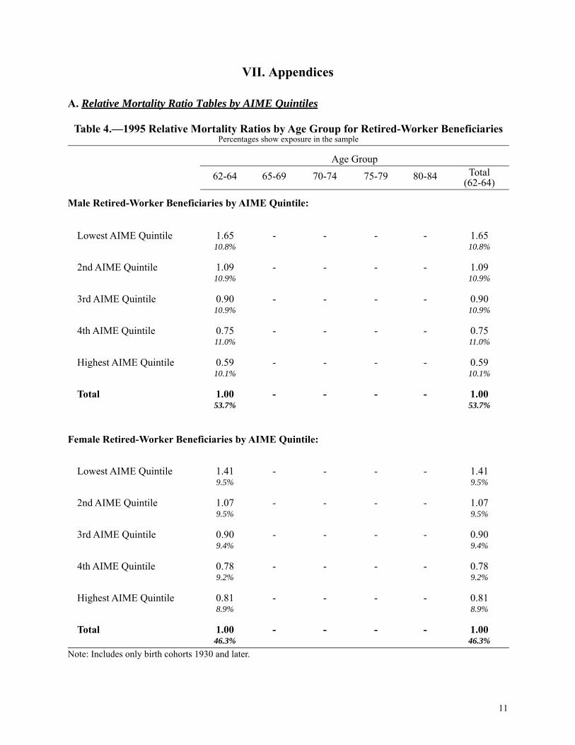
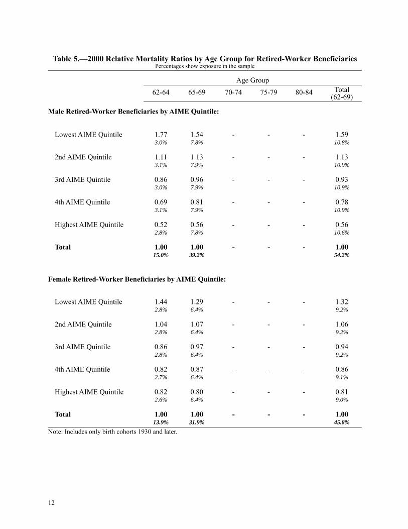
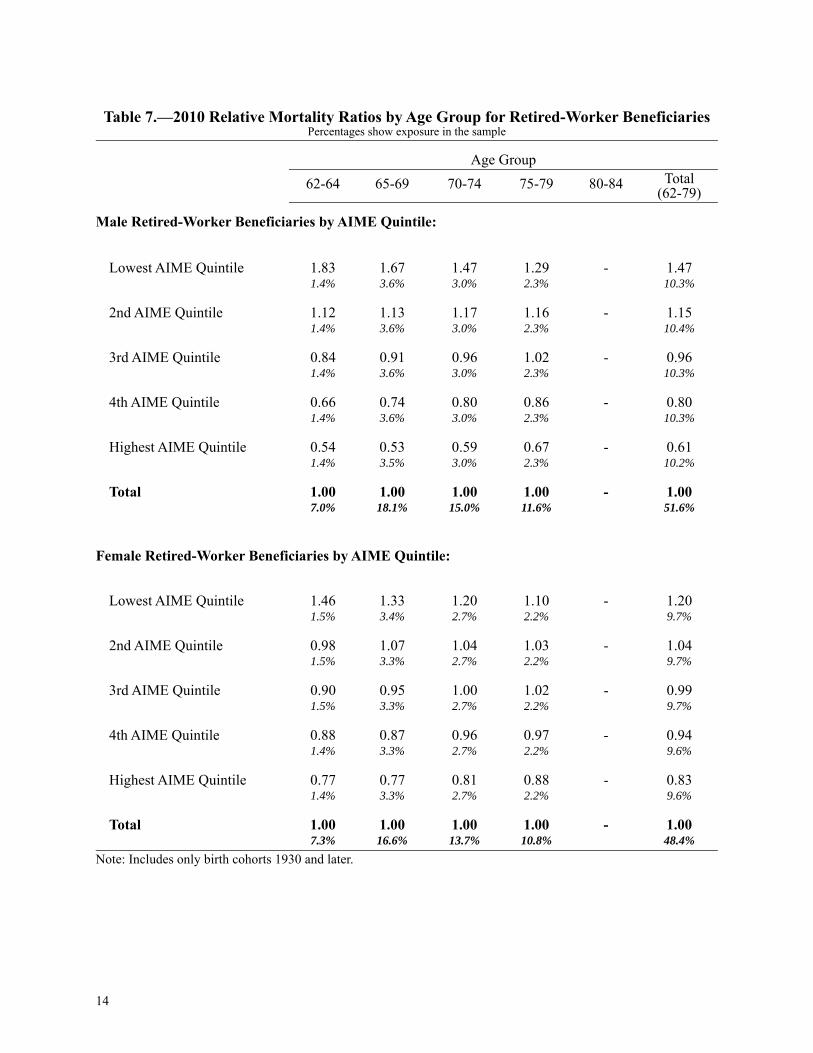
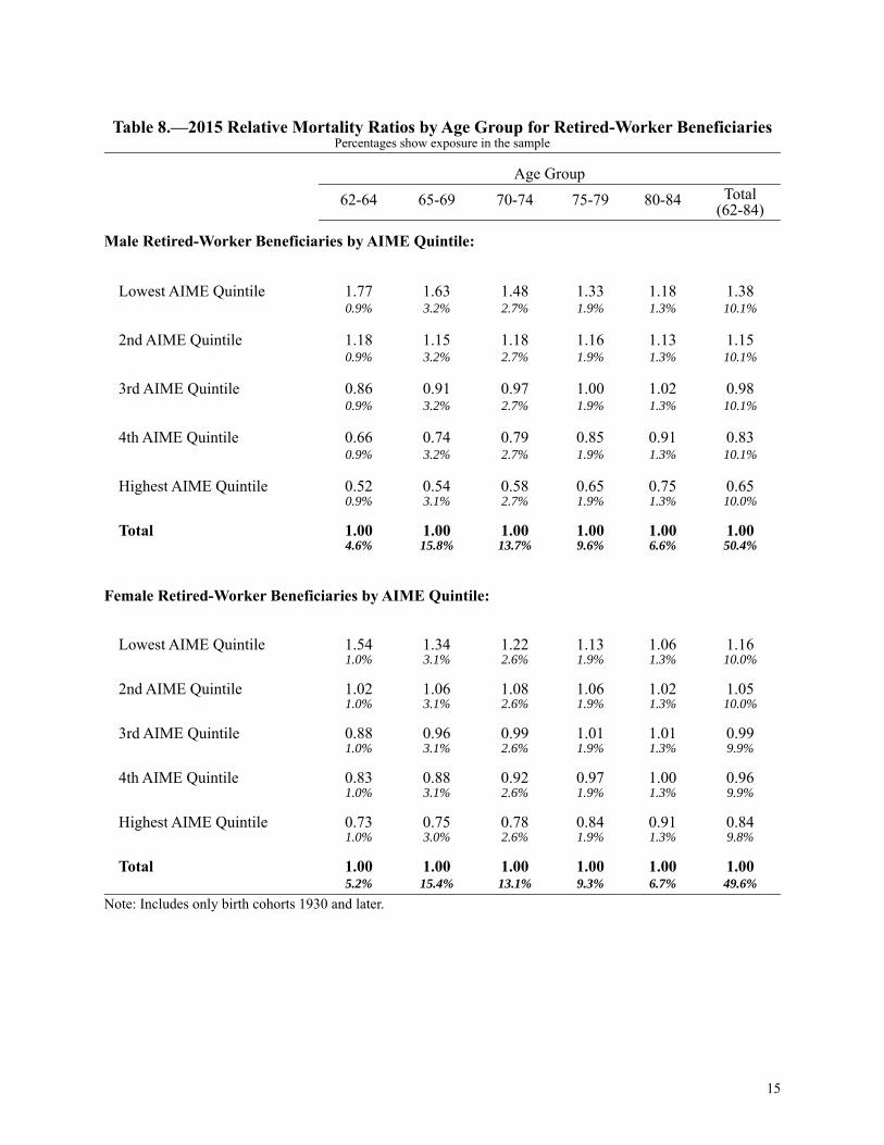
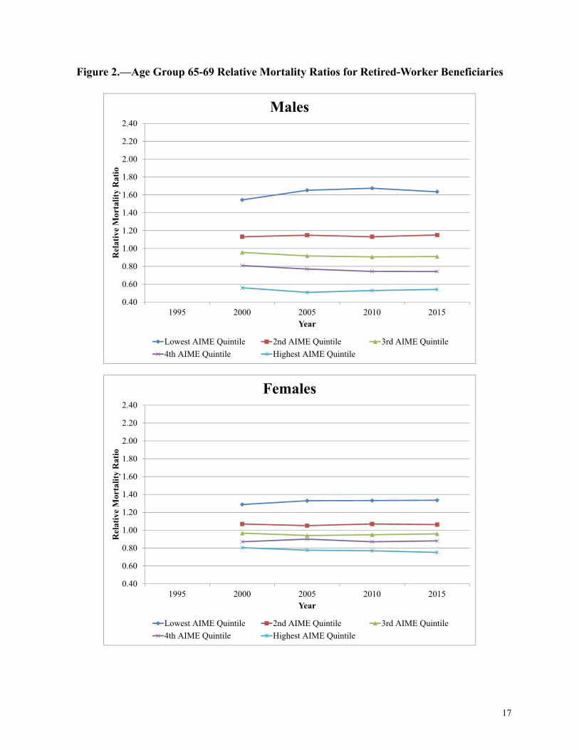
The tables in Appendix A1 show the relative mortality ratios by sex, age group, and AIME quin-tile for every fifth year from 1995 through 2015. For example, in 2015 (Table 8), the male 65-69age group ratios are 1.63, 1.15, 0.91, 0.74, and 0.54 for the Lowest AIME Quintile through theHighest AIME Quintile, respectively. Generally, as seen in the tables, higher AIME levels areassociated with lower mortality for both males and females.
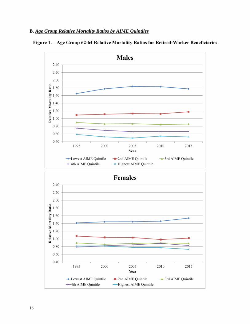
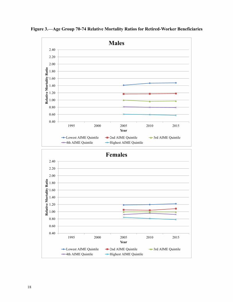
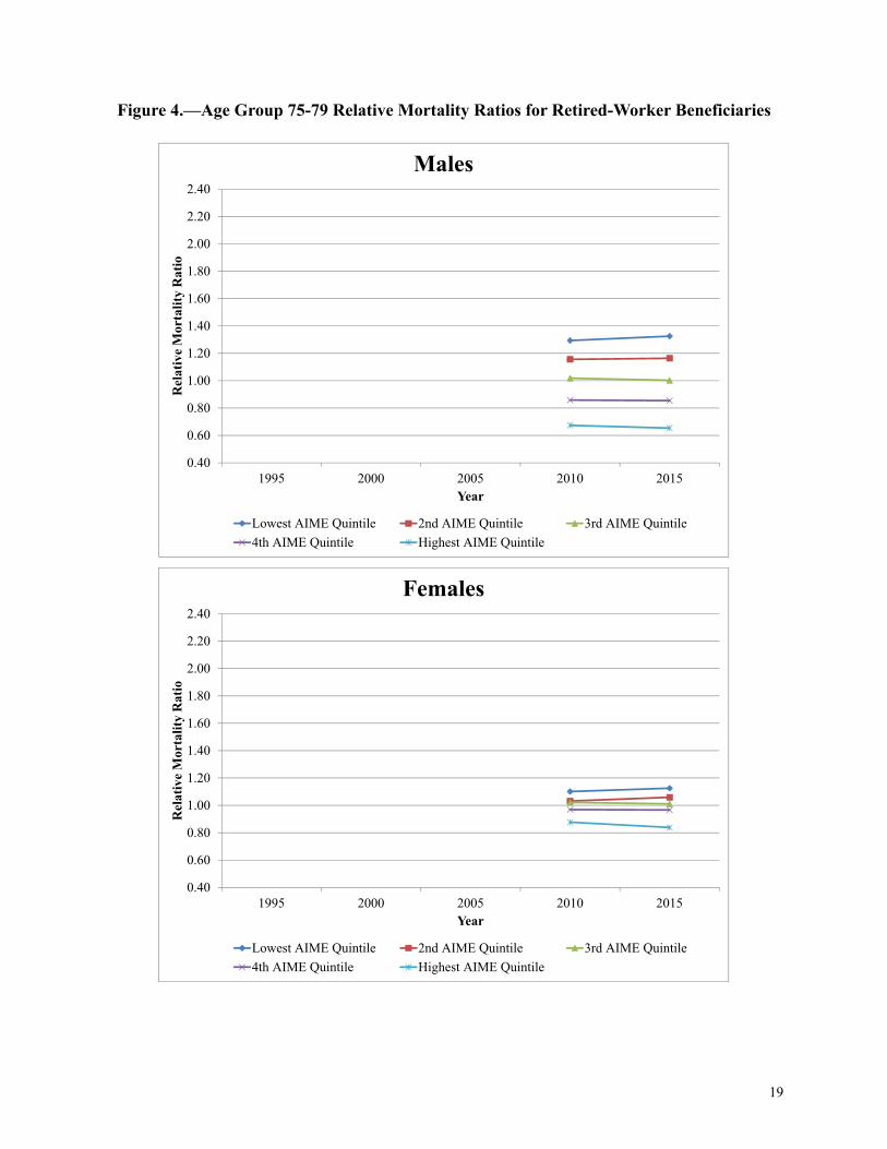
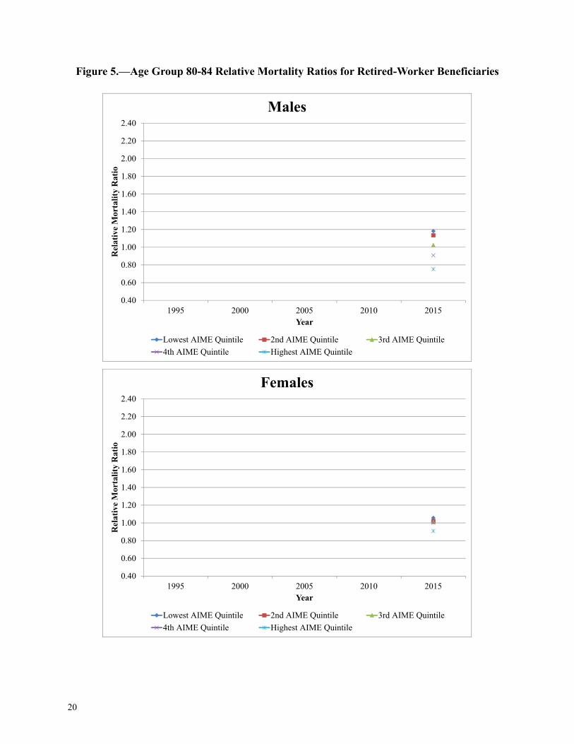
The figures in Appendix B illustrate the relative mortality ratios over time for each age group, bysex and AIME quintile. The figures also display the variation among the quintiles. For example,for males at ages 65-69 (Figure 2), the difference between the Lowest and 2nd AIME Quintilesand the 2nd and 3rd AIME Quintiles generally increases over time, but the difference between the3rd and 4th AIME Quintiles remains fairly constant, and the difference between the 4th and High-est AIME Quintiles slightly decreases over time. At older ages, there is less of a difference in rel-ative mortality ratios among the AIME quintiles. This may be because the healthiest individualsin each quintile are more likely to survive to older ages, and that the advantages associated withhigher career-average earnings tend to dissipate with increased years after retirement.
In the Appendix B figures, the difference between the relative mortality ratios for the Lowest andHighest AIME Quintiles for male age groups 62-64 and 65-69 decreased somewhat from 2010 to2015. During the same time period, there was a slight increase in the spread of relative mortalityratios for male age groups 70-74 and 75-79. For females, there was a significant increase in thespread of relative mortality ratios from 2010 to 2015 for the 62-64 age group. The remainingfemale age groups saw a slight increase in the spread of relative mortality ratios over the reportyears.
B. Male / Female Comparison
Historically, the majority of women worked in paid employment less consistently than men, andthus became dually entitled2 in retirement, so their personal earnings (as summarized by theAIME) may not have accurately represented their “family” income level, or their potential careerearnings level. For example, a woman with personal earnings in the Lowest AIME Quintile mayhave experienced a lifestyle on par with a woman with personal earnings in the Highest AIMEQuintile when considering her spouse’s income. Despite this, we find that females generally fol-low the same relative mortality pattern as males, in that higher earners have lower mortality.
1. This study only includes birth cohorts 1930 and later due to benefit formula differences in older cohorts. Thereader should use caution when comparing the total relative mortality ratios between report years, as they will includedifferent age groups. For example, the totals for the 1995 report year only include retired-worker beneficiaries at ages62-64, while the totals for the 2015 report year include ages 62-84.2. A person may be entitled to more than one benefit at the same time. For example, a person may be entitled as aretired worker on his/her own record and as a spouse on another record. In dual entitlement cases where the spousebenefit is higher than the worker benefit, the dually entitled beneficiary receives his or her full worker benefit in addi-tion to a partial spouse benefit. The total benefit is the same amount or approximately the same amount as the fullspouse benefit. See https://secure.ssa.gov/apps10/poms.nsf/lnx/0300615020 for details.
8
With the exception of females ages 62-64 in 1995, females have the same relative mortality pat-tern as males, with higher AIME beneficiaries having lower mortality. However, it is interestingto note that the spreads in female relative mortality ratios among AIME quintiles are smaller thanthose for males. The female relative mortality ratios for the Lowest and 2nd AIME Quintiles arelower (closer to the overall average) than those for males, and the female ratios in the 4th andHighest AIME Quintiles are higher (also closer to the overall average) than those for males. Thisleads to the following questions: Is the socioeconomic status gradient smaller for women? Or areearnings a less accurate measure of socioeconomic status for women? As previously noted, thismay be because the level of personal earnings for married women may not correspond to theirsocioeconomic status. Another possible reason for this is that, historically, most men worked con-sistently. Therefore, the sample of retired-worker beneficiaries tends to capture a male populationthat is very representative of the general population. However, many women did not work consis-tently, or did not work enough to be eligible for a retired-worker benefit. C. Age Groups
As briefly noted in the previous section, the spread in the relative mortality ratios among the quin-tiles decreases at older ages. For example, in 2015 (Table 8), the male age 62-64 relative mortalityratios are 1.77 and 0.52 for the Lowest and Highest AIME Quintiles, respectively. The LowestAIME Quintile relative mortality ratio steadily decreases for older age groups, while the HighestAIME Quintile relative mortality ratio increases. In 2015, the male 80-84 relative mortality ratiosare 1.18 and 0.75 for the Lowest and Highest AIME Quintiles, respectively. For females, in 2015,the relative mortality ratio for the Lowest AIME Quintile decreases from 1.54 for age group 62-64to 1.06 for age group 80-84, while the relative mortality ratio for the Highest AIME Quintileincreases from 0.73 for age group 62-64 to 0.91 for age group 80-84. Note that the spread in the2015 female 80-84 age group relative mortality ratio is very small, with mortality ratios rangingfrom 0.91 to 1.06. Again, this is most likely due to the healthier individuals being more likely tosurvive, and that the AIME quintiles are not as strong of an indication of higher or lower thanaverage mortality rates at older ages.
Also note that the 62-64 age group consists solely of retired workers who retired prior to normalretirement age (NRA), the age at which a person may first become entitled to retirement benefitswithout a reduction based on age. The NRA is 65 for those born in 1937 and earlier, 66 for thoseborn in 1943-1954, and 67 for those born in 1960 and later. For the intervening birth years, theNRA is increasing by 2 months per year. Some of the individuals who retired prior to the NRAmay have retired because they have physically demanding jobs they are no longer able to performor because they have knowledge about being in poor health.
IV. Results by Hypothetical Worker Intervals
We also analyzed results by proximity to the AIME level of hypothetical worker beneficiaryexamples. More information on these hypothetical workers may be found in Section II, Data andMethods. The intervals for this analysis are labeled as Very Low, Low, Medium, High, and VeryHigh. The tables in Appendix C show results for these five intervals.
9
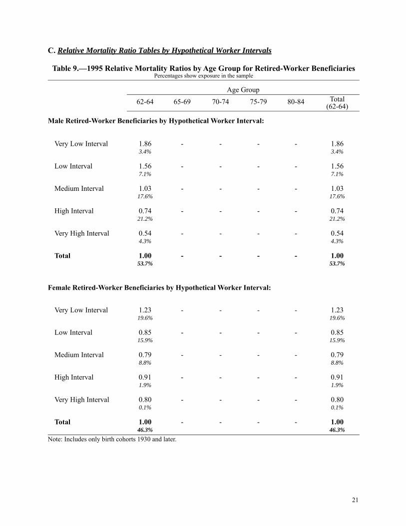
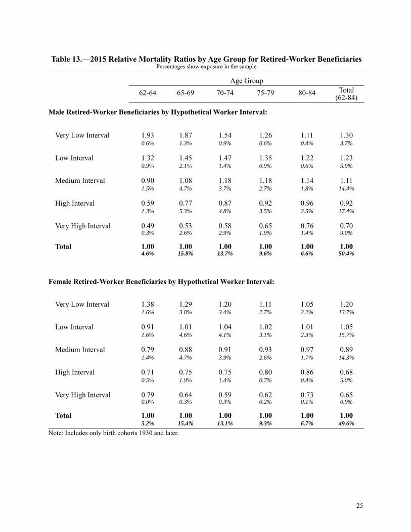
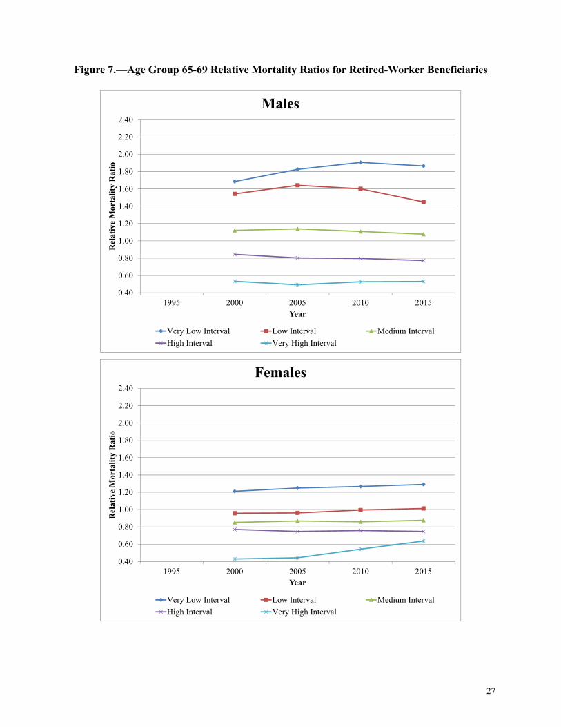
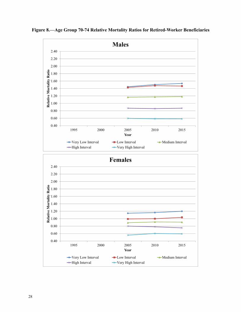
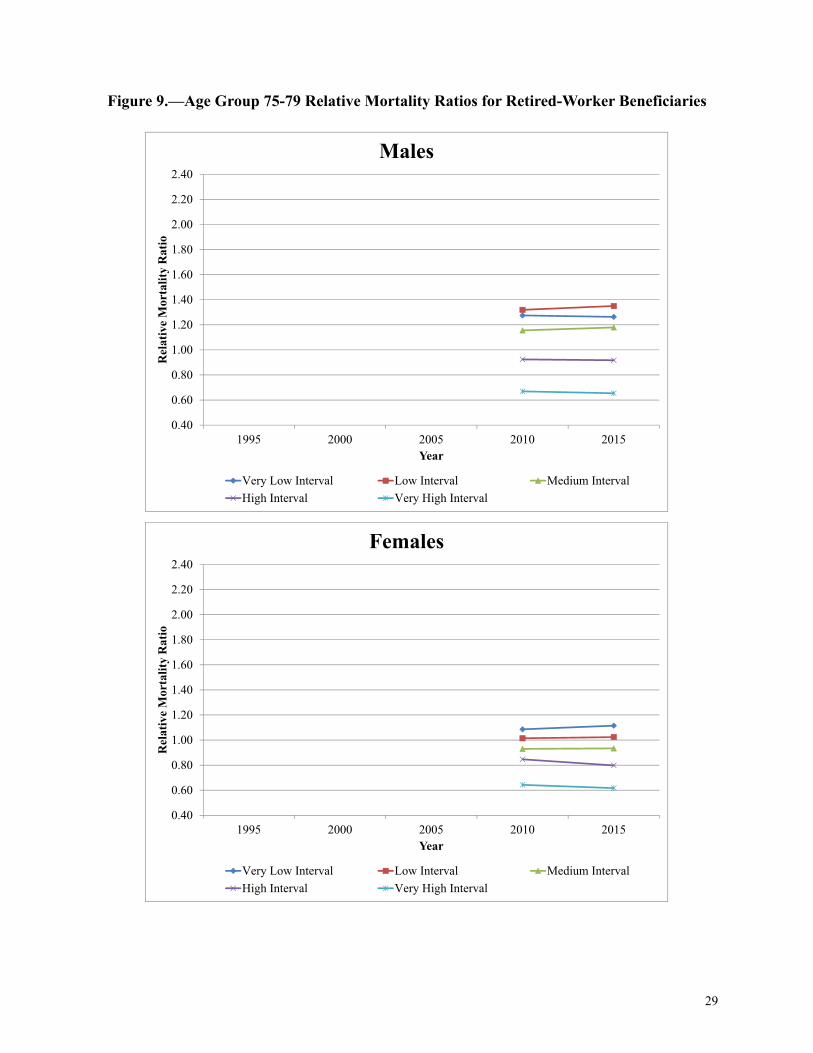
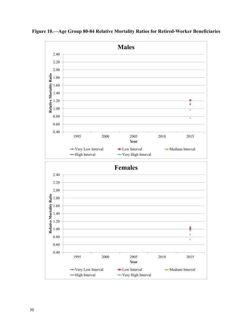
Similar to the results by AIME quintiles, the results by hypothetical worker intervals show highermortality for the Very Low Interval and lower mortality for the Very High Interval. One interest-ing thing to note is that mortality for the Very Low Interval is lower than the mortality for the LowInterval, for males at ages 75-79 in 2010 (Table 12) and ages 75-84 in 2015 (Table 13). This dif-fers from the results by AIME quintiles, where the mortality for the Lowest AIME Quintile isalways higher than the mortality for the 2nd AIME Quintile. One possible explanation is that theVery Low Interval may consist of a higher percentage of beneficiaries with many years of zeroearnings, such as foreign born workers, rather than consistent low earnings over many years.Other than these types of anomalies, the results by hypothetical worker intervals are very similarto the results by AIME quintiles. Females continue to show the same pattern as males, with higherearners generally having lower mortality. There are a few exceptions where females do not followthis pattern. For example, in 1995 (Table 9), for ages 62-64, the relative mortality ratio of theMedium Interval is lower than that of the Very High Interval. And in 2015 (Table 13), for ages62-64, the relative mortality ratio of the High Interval is lower than that of the Very High Interval.For the 1995 ages 62-64 intervals, we saw similar results in the 4th and Highest AIME Quintileanalysis. For the 2015 ages 62-64 intervals, note that the Very High Interval is extremely small, soa small number of additional deaths can skew the results.
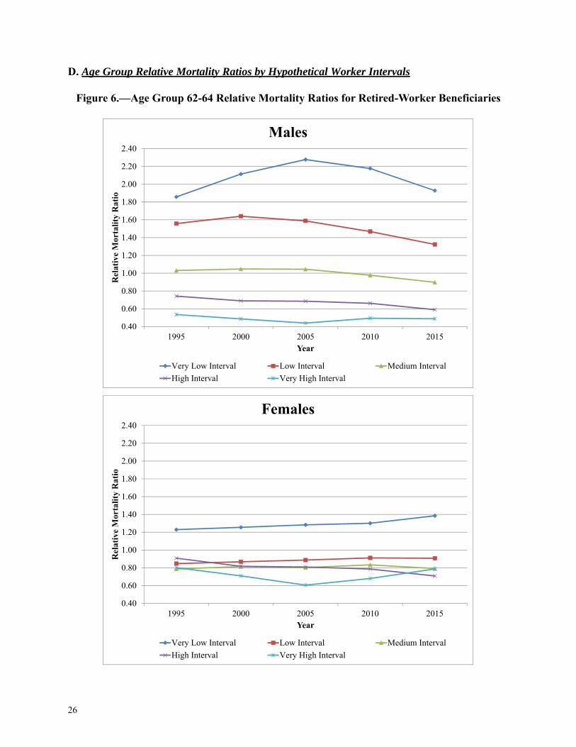
The figures in Appendix D illustrate the relative mortality ratios for each age group, by sex andhypothetical worker interval, over the years available in the data used for this study. These figuresare similar to the AIME quintile figures shown in Appendix B and described above.
V. Possible Areas of Future Study
This study leaves us with several questions and topics that could be further explored.
• As seen in the study, the spread in death rates among AIME levels is smaller for females thanfor males. For males ages 62-64 (Figure 1), the spread is relatively stable for most years butsomewhat smaller in 1995. The female 2015 group of 62-64 year olds has a larger spread thanprior birth cohorts. This coincides with increased female labor force participation over the lastseveral decades. Is it possible that the trend will continue for females? Will females convergeto males? Is there a possible cohort effect for women? Could there be a change in the charac-teristics of women taking early retirement?
• As briefly noted in the study, the hypothetical worker Very Low Interval consists of a mix ofindividuals with many years of zero earnings and individuals with a full career of low earn-ings. Many of these workers with years of zero earnings are likely foreign-born individualswho immigrated during their working years. One possible area that could be further exploredis to determine the percentage of foreign-born individuals in the Very Low Interval and toexamine their relative mortality ratios.1 We speculate that foreign-born immigrants may behealthier than average in order to travel and work.
1. We have done some analysis on the percentage of retired-worker beneficiaries who are foreign born, as shown intable B3 of our proposal memoranda. These memoranda provide actuarial analysis of the estimated financial effectsof legislative proposals to change the Social Security program. For an example, seehttps://www.ssa.gov/OACT/solvency/CCrist_20170802.pdf.
10
VI. Conclusion
As seen in this analysis, higher AIME levels correlate with lower mortality rates, while lowerAIME levels correlate with higher mortality rates. The trends from 1995 to 2015, presented in thefigures in Appendices B and D, show that the spread in relative mortality ratios among the AIMEquintiles and hypothetical worker intervals remains fairly steady. The spread widens, but not sig-nificantly, and even slightly compresses for some age groups in recent years.
Currently, the Office of the Chief Actuary’s projections of the actuarial status of the Social Secu-rity OASI and DI Trust Funds for annual Trustees Reports and other purposes include the effectsof lower mortality for beneficiaries with higher AIME and the effects of higher mortality for ben-eficiaries with lower AIME. These effects are incorporated into our projections by the use of“post-entitlement factors” which reflect the change in benefit levels beyond cost-of-living adjust-ments for retirement cohorts as they age. (For more information on post-entitlement factors, seethe Long-Range OASDI Projection Methodology documentation at the following website: https://www.ssa.gov/oact/TR/2017/2017_LR_Model_Documentation.pdf.) Our projections alsoinclude the effects of higher mortality for disabled-worker beneficiaries both before and after theirconversion to retired worker status at NRA. This study provides another measure of, and perspec-tive on, the extent of variation in mortality rates by AIME and how they have changed over time.We are evaluating ways to potentially incorporate the results of this study into our projections ofactuarial status. We also expect the hypothetical worker interval analysis included in this study tobe a useful first step toward incorporating mortality differences into our annual internal real rateof return and money’s worth ratio analyses.
Finally, the results presented in this study illustrate the spread in mortality rates by lifetime career-average earnings levels (i.e., the AIME). Previous studies have generally been done based on par-tial career earnings levels that are not reflective of earnings that determine Social Security benefitlevels. The spread in mortality rates by AIME appears to be relatively stable in recent years andeven diminishing in some cases. We plan to extend the analysis presented here as additional databecome available, to continue assessing the trends in mortality by AIME and to better inform ourprojections of Social Security cost.
11
VII. Appendices
A. Relative Mortality Ratio Tables by AIME Quintiles
Note: Includes only birth cohorts 1930 and later.
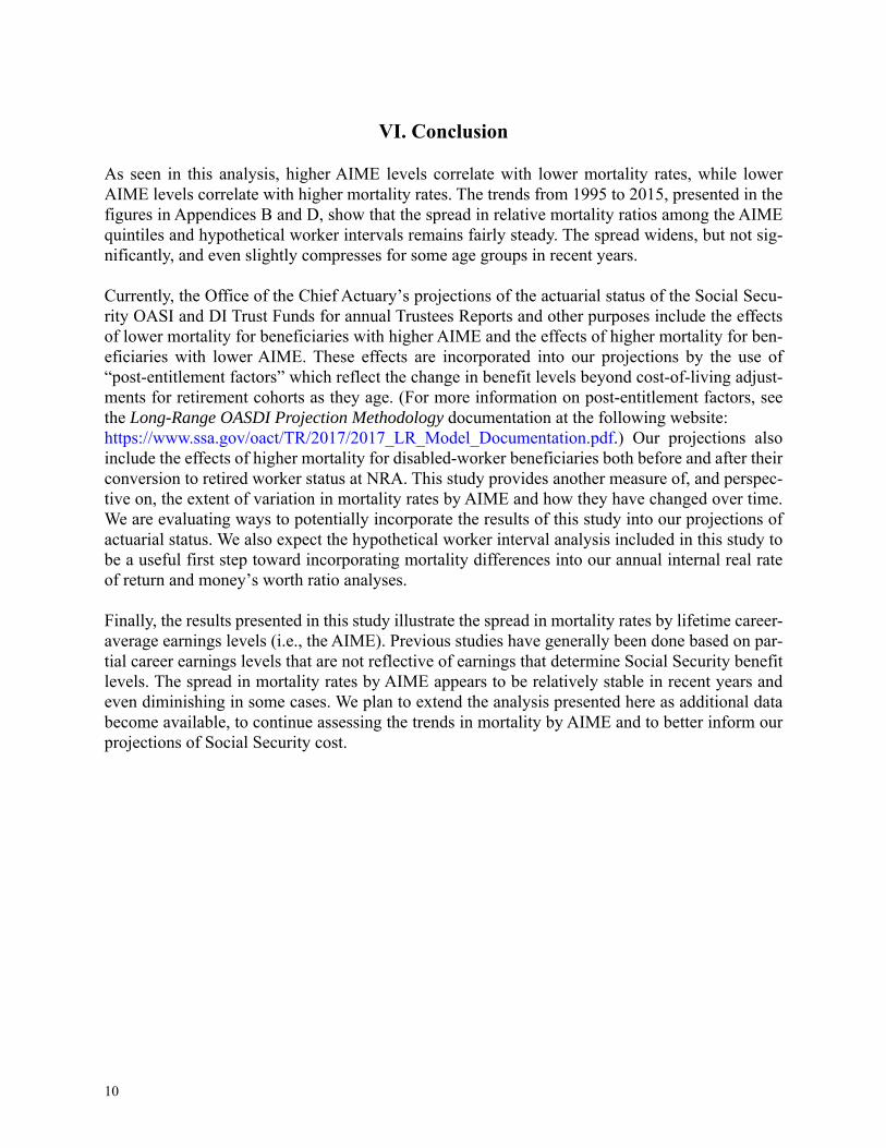
Table 4.—1995 Relative Mortality Ratios by Age Group for Retired-Worker BeneficiariesPercentages show exposure in the sample
Age Group62-64 65-69 70-74 75-79 80-84 Total
(62-64)
Male Retired-Worker Beneficiaries by AIME Quintile:
Lowest AIME Quintile 1.65 - - - - 1.65 10.8% 10.8%
2nd AIME Quintile 1.09 - - - - 1.09 10.9% 10.9%
3rd AIME Quintile 0.90 - - - - 0.90 10.9% 10.9%
4th AIME Quintile 0.75 - - - - 0.75 11.0% 11.0%
Highest AIME Quintile 0.59 - - - - 0.59 10.1% 10.1%
Total 1.00 - - - - 1.00 53.7% 53.7%
Female Retired-Worker Beneficiaries by AIME Quintile:
Lowest AIME Quintile 1.41 - - - - 1.419.5% 9.5%
2nd AIME Quintile 1.07 - - - - 1.079.5% 9.5%
3rd AIME Quintile 0.90 - - - - 0.909.4% 9.4%
4th AIME Quintile 0.78 - - - - 0.789.2% 9.2%
Highest AIME Quintile 0.81 - - - - 0.818.9% 8.9%
Total 1.00 - - - - 1.0046.3% 46.3%
12
Note: Includes only birth cohorts 1930 and later.
Table 5.—2000 Relative Mortality Ratios by Age Group for Retired-Worker BeneficiariesPercentages show exposure in the sample
Age Group62-64 65-69 70-74 75-79 80-84 Total
(62-69)
Male Retired-Worker Beneficiaries by AIME Quintile:
Lowest AIME Quintile 1.77 1.54 - - - 1.593.0% 7.8% 10.8%
2nd AIME Quintile 1.11 1.13 - - - 1.133.1% 7.9% 10.9%
3rd AIME Quintile 0.86 0.96 - - - 0.933.0% 7.9% 10.9%
4th AIME Quintile 0.69 0.81 - - - 0.783.1% 7.9% 10.9%
Highest AIME Quintile 0.52 0.56 - - - 0.562.8% 7.8% 10.6%
Total 1.00 1.00 - - - 1.0015.0% 39.2% 54.2%
Female Retired-Worker Beneficiaries by AIME Quintile:
Lowest AIME Quintile 1.44 1.29 - - - 1.322.8% 6.4% 9.2%
2nd AIME Quintile 1.04 1.07 - - - 1.062.8% 6.4% 9.2%
3rd AIME Quintile 0.86 0.97 - - - 0.942.8% 6.4% 9.2%
4th AIME Quintile 0.82 0.87 - - - 0.862.7% 6.4% 9.1%
Highest AIME Quintile 0.82 0.80 - - - 0.812.6% 6.4% 9.0%
Total 1.00 1.00 - - - 1.0013.9% 31.9% 45.8%
13
Note: Includes only birth cohorts 1930 and later.
Table 6.—2005 Relative Mortality Ratios by Age Group for Retired-Worker BeneficiariesPercentages show exposure in the sample
Age Group62-64 65-69 70-74 75-79 80-84 Total
(62-74)
Male Retired-Worker Beneficiaries by AIME Quintile:
Lowest AIME Quintile 1.84 1.65 1.41 - - 1.541.8% 4.7% 4.1% 10.6%
2nd AIME Quintile 1.13 1.15 1.17 - - 1.161.8% 4.7% 4.1% 10.6%
3rd AIME Quintile 0.87 0.92 1.00 - - 0.951.8% 4.7% 4.1% 10.6%
4th AIME Quintile 0.66 0.77 0.81 - - 0.781.8% 4.7% 4.1% 10.6%
Highest AIME Quintile 0.49 0.51 0.61 - - 0.561.7% 4.7% 4.1% 10.5%
Total 1.00 1.00 1.00 - - 1.009.0% 23.6% 20.4% 53.0%
Female Retired-Worker Beneficiaries by AIME Quintile:
Lowest AIME Quintile 1.44 1.33 1.19 - - 1.261.8% 4.1% 3.6% 9.5%
2nd AIME Quintile 1.03 1.05 1.05 - - 1.051.8% 4.1% 3.6% 9.5%
3rd AIME Quintile 0.88 0.94 1.00 - - 0.971.8% 4.1% 3.6% 9.4%
4th AIME Quintile 0.85 0.90 0.92 - - 0.911.8% 4.1% 3.6% 9.4%
Highest AIME Quintile 0.78 0.78 0.84 - - 0.821.7% 4.0% 3.6% 9.3%
Total 1.00 1.00 1.00 - - 1.008.9% 20.3% 17.8% 47.0%
14
Note: Includes only birth cohorts 1930 and later.
Table 7.—2010 Relative Mortality Ratios by Age Group for Retired-Worker BeneficiariesPercentages show exposure in the sample
Age Group62-64 65-69 70-74 75-79 80-84 Total
(62-79)
Male Retired-Worker Beneficiaries by AIME Quintile:
Lowest AIME Quintile 1.83 1.67 1.47 1.29 - 1.471.4% 3.6% 3.0% 2.3% 10.3%
2nd AIME Quintile 1.12 1.13 1.17 1.16 - 1.15 1.4% 3.6% 3.0% 2.3% 10.4%
3rd AIME Quintile 0.84 0.91 0.96 1.02 - 0.961.4% 3.6% 3.0% 2.3% 10.3%
4th AIME Quintile 0.66 0.74 0.80 0.86 - 0.80 1.4% 3.6% 3.0% 2.3% 10.3%
Highest AIME Quintile 0.54 0.53 0.59 0.67 - 0.61 1.4% 3.5% 3.0% 2.3% 10.2%
Total 1.00 1.00 1.00 1.00 - 1.00 7.0% 18.1% 15.0% 11.6% 51.6%
Female Retired-Worker Beneficiaries by AIME Quintile:
Lowest AIME Quintile 1.46 1.33 1.20 1.10 - 1.201.5% 3.4% 2.7% 2.2% 9.7%
2nd AIME Quintile 0.98 1.07 1.04 1.03 - 1.041.5% 3.3% 2.7% 2.2% 9.7%
3rd AIME Quintile 0.90 0.95 1.00 1.02 - 0.991.5% 3.3% 2.7% 2.2% 9.7%
4th AIME Quintile 0.88 0.87 0.96 0.97 - 0.941.4% 3.3% 2.7% 2.2% 9.6%
Highest AIME Quintile 0.77 0.77 0.81 0.88 - 0.831.4% 3.3% 2.7% 2.2% 9.6%
Total 1.00 1.00 1.00 1.00 - 1.007.3% 16.6% 13.7% 10.8% 48.4%
15
Note: Includes only birth cohorts 1930 and later.
Table 8.—2015 Relative Mortality Ratios by Age Group for Retired-Worker BeneficiariesPercentages show exposure in the sample
Age Group62-64 65-69 70-74 75-79 80-84 Total
(62-84)
Male Retired-Worker Beneficiaries by AIME Quintile:
Lowest AIME Quintile 1.77 1.63 1.48 1.33 1.18 1.380.9% 3.2% 2.7% 1.9% 1.3% 10.1%
2nd AIME Quintile 1.18 1.15 1.18 1.16 1.13 1.150.9% 3.2% 2.7% 1.9% 1.3% 10.1%
3rd AIME Quintile 0.86 0.91 0.97 1.00 1.02 0.980.9% 3.2% 2.7% 1.9% 1.3% 10.1%
4th AIME Quintile 0.66 0.74 0.79 0.85 0.91 0.830.9% 3.2% 2.7% 1.9% 1.3% 10.1%
Highest AIME Quintile 0.52 0.54 0.58 0.65 0.75 0.650.9% 3.1% 2.7% 1.9% 1.3% 10.0%
Total 1.00 1.00 1.00 1.00 1.00 1.004.6% 15.8% 13.7% 9.6% 6.6% 50.4%
Female Retired-Worker Beneficiaries by AIME Quintile:
Lowest AIME Quintile 1.54 1.34 1.22 1.13 1.06 1.161.0% 3.1% 2.6% 1.9% 1.3% 10.0%
2nd AIME Quintile 1.02 1.06 1.08 1.06 1.02 1.051.0% 3.1% 2.6% 1.9% 1.3% 10.0%
3rd AIME Quintile 0.88 0.96 0.99 1.01 1.01 0.991.0% 3.1% 2.6% 1.9% 1.3% 9.9%
4th AIME Quintile 0.83 0.88 0.92 0.97 1.00 0.961.0% 3.1% 2.6% 1.9% 1.3% 9.9%
Highest AIME Quintile 0.73 0.75 0.78 0.84 0.91 0.841.0% 3.0% 2.6% 1.9% 1.3% 9.8%
Total 1.00 1.00 1.00 1.00 1.00 1.005.2% 15.4% 13.1% 9.3% 6.7% 49.6%
16
B. Age Group Relative Mortality Ratios by AIME Quintiles
Figure 1.—Age Group 62-64 Relative Mortality Ratios for Retired-Worker Beneficiaries
17
Figure 2.—Age Group 65-69 Relative Mortality Ratios for Retired-Worker Beneficiaries
18
Figure 3.—Age Group 70-74 Relative Mortality Ratios for Retired-Worker Beneficiaries
19
Figure 4.—Age Group 75-79 Relative Mortality Ratios for Retired-Worker Beneficiaries
20
Figure 5.—Age Group 80-84 Relative Mortality Ratios for Retired-Worker Beneficiaries
21
C. Relative Mortality Ratio Tables by Hypothetical Worker Intervals
Note: Includes only birth cohorts 1930 and later.
Table 9.—1995 Relative Mortality Ratios by Age Group for Retired-Worker BeneficiariesPercentages show exposure in the sample
Age Group62-64 65-69 70-74 75-79 80-84 Total
(62-64)
Male Retired-Worker Beneficiaries by Hypothetical Worker Interval:
Very Low Interval 1.86 - - - - 1.863.4% 3.4%
Low Interval 1.56 - - - - 1.56 7.1% 7.1%
Medium Interval 1.03 - - - - 1.03 17.6% 17.6%
High Interval 0.74 - - - - 0.74 21.2% 21.2%
Very High Interval 0.54 - - - - 0.544.3% 4.3%
Total 1.00 - - - - 1.00 53.7% 53.7%
Female Retired-Worker Beneficiaries by Hypothetical Worker Interval:
Very Low Interval 1.23 - - - - 1.2319.6% 19.6%
Low Interval 0.85 - - - - 0.8515.9% 15.9%
Medium Interval 0.79 - - - - 0.798.8% 8.8%
High Interval 0.91 - - - - 0.911.9% 1.9%
Very High Interval 0.80 - - - - 0.800.1% 0.1%
Total 1.00 - - - - 1.0046.3% 46.3%

22
Note: Includes only birth cohorts 1930 and later.
Table 10.—2000 Relative Mortality Ratios by Age Group for Retired-Worker BeneficiariesPercentages show exposure in the sample
Age Group
62-64 65-69 70-74 75-79 80-84 Total(62-69)
Male Retired-Worker Beneficiaries by Hypothetical Worker Interval:
Very Low Interval 2.12 1.69 - - - 1.780.9% 2.3% 3.2%
Low Interval 1.64 1.54 - - - 1.551.9% 4.4% 6.3%
Medium Interval 1.05 1.12 - - - 1.104.9% 11.7% 16.7%
High Interval 0.69 0.84 - - - 0.815.8% 14.2% 20.0%
Very High Interval 0.49 0.53 - - - 0.541.3% 6.7% 8.0%
Total 1.00 1.00 - - - 1.0015.0% 39.2% 54.2%
Female Retired-Worker Beneficiaries by Hypothetical Worker Interval:
Very Low Interval 1.25 1.21 - - - 1.215.3% 10.9% 16.2%
Low Interval 0.87 0.96 - - - 0.944.8% 10.8% 15.7%
Medium Interval 0.81 0.85 - - - 0.853.0% 7.8% 10.8%
High Interval 0.82 0.77 - - - 0.790.7% 2.0% 2.7%
Very High Interval 0.71 0.43 - - - 0.490.0% 0.4% 0.5%
Total 1.00 1.00 - - - 1.0013.9% 31.9% 45.8%
23
Note: Includes only birth cohorts 1930 and later.
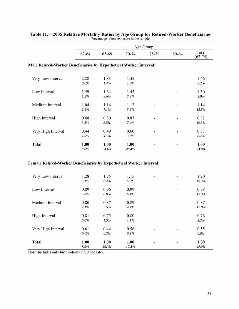
Table 11.—2005 Relative Mortality Ratios by Age Group for Retired-Worker BeneficiariesPercentages show exposure in the sample
Age Group62-64 65-69 70-74 75-79 80-84 Total
(62-74)
Male Retired-Worker Beneficiaries by Hypothetical Worker Interval:
Very Low Interval 2.28 1.83 1.45 - - 1.660.6% 1.4% 1.2% 3.2%
Low Interval 1.59 1.64 1.43 - - 1.501.2% 2.6% 2.2% 5.9%
Medium Interval 1.04 1.14 1.17 - - 1.142.8% 7.1% 5.9% 15.8%
High Interval 0.68 0.80 0.87 - - 0.823.5% 8.5% 7.4% 19.3%
Very High Interval 0.44 0.49 0.60 - - 0.571.0% 4.1% 3.7% 8.7%
Total 1.00 1.00 1.00 - - 1.009.0% 23.6% 20.4% 53.0%
Female Retired-Worker Beneficiaries by Hypothetical Worker Interval:
Very Low Interval 1.28 1.25 1.15 - - 1.203.1% 6.2% 5.9% 15.3%
Low Interval 0.89 0.96 0.99 - - 0.983.0% 6.8% 6.1% 15.9%
Medium Interval 0.80 0.87 0.89 - - 0.872.1% 5.5% 4.4% 12.0%
High Interval 0.81 0.75 0.80 - - 0.760.6% 1.5% 1.1% 3.3%
Very High Interval 0.61 0.44 0.56 - - 0.550.0% 0.3% 0.3% 0.6%
Total 1.00 1.00 1.00 - - 1.008.9% 20.3% 17.8% 47.0%
24
Note: Includes only birth cohorts 1930 and later.
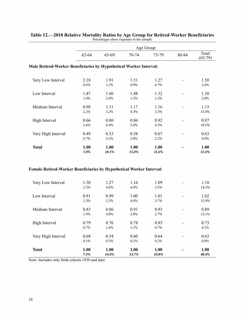
Table 12.—2010 Relative Mortality Ratios by Age Group for Retired-Worker BeneficiariesPercentages show exposure in the sample
Age Group62-64 65-69 70-74 75-79 80-84 Total
(62-79)
Male Retired-Worker Beneficiaries by Hypothetical Worker Interval:
Very Low Interval 2.18 1.91 1.51 1.27 - 1.500.6% 1.2% 0.9% 0.7% 3.4%
Low Interval 1.47 1.60 1.48 1.32 - 1.381.0% 2.0% 1.5% 1.2% 5.8%
Medium Interval 0.98 1.11 1.17 1.16 - 1.132.2% 5.2% 4.3% 3.3% 15.0%
High Interval 0.66 0.80 0.86 0.92 - 0.872.4% 6.4% 5.4% 4.3% 18.5%
Very High Interval 0.49 0.53 0.58 0.67 - 0.630.7% 3.3% 2.8% 2.2% 9.0%
Total 1.00 1.00 1.00 1.00 - 1.007.0% 18.1% 15.0% 11.6% 51.6%
Female Retired-Worker Beneficiaries by Hypothetical Worker Interval:
Very Low Interval 1.30 1.27 1.16 1.09 - 1.182.3% 4.6% 4.0% 3.5% 14.5%
Low Interval 0.91 0.99 1.00 1.01 - 1.022.3% 5.3% 4.6% 3.7% 15.9%
Medium Interval 0.83 0.86 0.91 0.93 - 0.891.9% 4.8% 3.8% 2.7% 13.1%
High Interval 0.79 0.76 0.78 0.85 - 0.730.7% 1.6% 1.1% 0.7% 4.1%
Very High Interval 0.68 0.54 0.60 0.64 - 0.630.1% 0.3% 0.2% 0.2% 0.8%
Total 1.00 1.00 1.00 1.00 - 1.007.3% 16.6% 13.7% 10.8% 48.4%
25
Note: Includes only birth cohorts 1930 and later.
Table 13.—2015 Relative Mortality Ratios by Age Group for Retired-Worker BeneficiariesPercentages show exposure in the sample
Age Group62-64 65-69 70-74 75-79 80-84 Total
(62-84)
Male Retired-Worker Beneficiaries by Hypothetical Worker Interval:
Very Low Interval 1.93 1.87 1.54 1.26 1.11 1.300.6% 1.3% 0.9% 0.6% 0.4% 3.7%
Low Interval 1.32 1.45 1.47 1.35 1.22 1.230.9% 2.1% 1.4% 0.9% 0.6% 5.9%
Medium Interval 0.90 1.08 1.18 1.18 1.14 1.111.5% 4.7% 3.7% 2.7% 1.8% 14.4%
High Interval 0.59 0.77 0.87 0.92 0.96 0.921.3% 5.3% 4.8% 3.5% 2.5% 17.4%
Very High Interval 0.49 0.53 0.58 0.65 0.76 0.700.3% 2.6% 2.9% 1.9% 1.4% 9.0%
Total 1.00 1.00 1.00 1.00 1.00 1.004.6% 15.8% 13.7% 9.6% 6.6% 50.4%
Female Retired-Worker Beneficiaries by Hypothetical Worker Interval:
Very Low Interval 1.38 1.29 1.20 1.11 1.05 1.201.6% 3.8% 3.4% 2.7% 2.2% 13.7%
Low Interval 0.91 1.01 1.04 1.02 1.01 1.051.6% 4.6% 4.1% 3.1% 2.3% 15.7%
Medium Interval 0.79 0.88 0.91 0.93 0.97 0.891.4% 4.7% 3.9% 2.6% 1.7% 14.3%
High Interval 0.71 0.75 0.75 0.80 0.86 0.680.5% 1.9% 1.4% 0.7% 0.4% 5.0%
Very High Interval 0.79 0.64 0.59 0.62 0.73 0.650.0% 0.3% 0.3% 0.2% 0.1% 0.9%
Total 1.00 1.00 1.00 1.00 1.00 1.005.2% 15.4% 13.1% 9.3% 6.7% 49.6%
26
D. Age Group Relative Mortality Ratios by Hypothetical Worker Intervals
Figure 6.—Age Group 62-64 Relative Mortality Ratios for Retired-Worker Beneficiaries
27
Figure 7.—Age Group 65-69 Relative Mortality Ratios for Retired-Worker Beneficiaries
28
Figure 8.—Age Group 70-74 Relative Mortality Ratios for Retired-Worker Beneficiaries
29
Figure 9.—Age Group 75-79 Relative Mortality Ratios for Retired-Worker Beneficiaries
30
Figure 10.—Age Group 80-84 Relative Mortality Ratios for Retired-Worker Beneficiaries
31
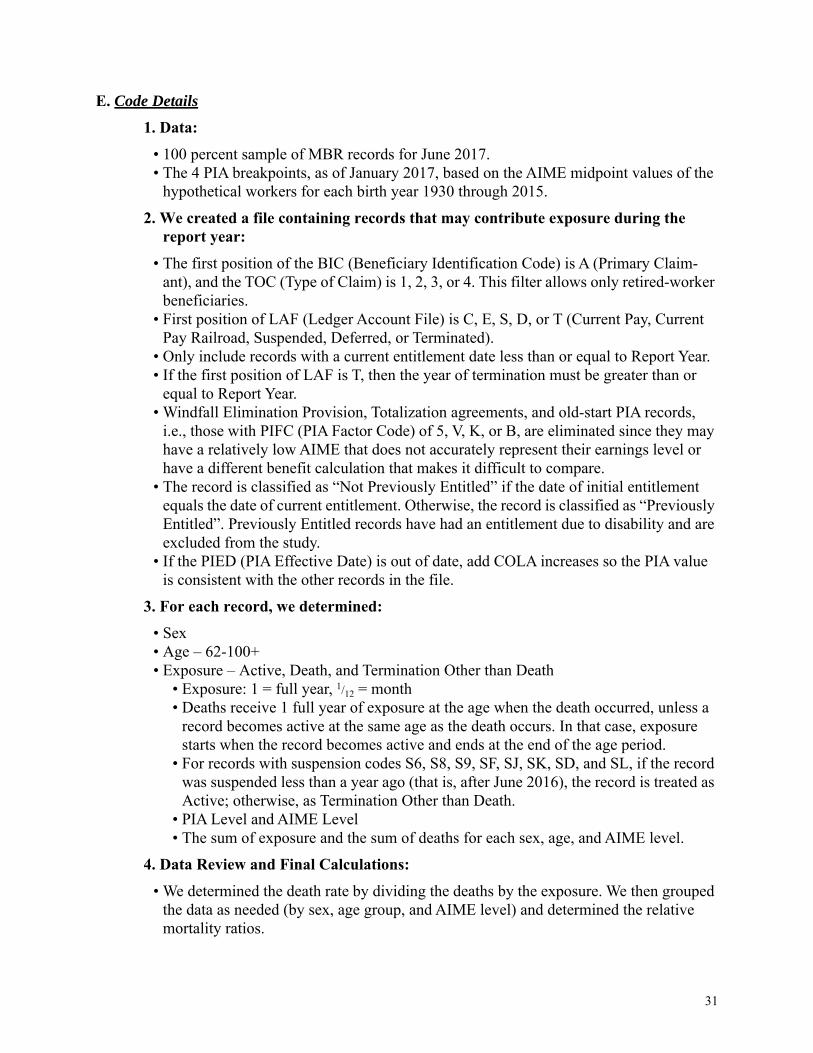
E. Code Details1. Data:
• 100 percent sample of MBR records for June 2017. • The 4 PIA breakpoints, as of January 2017, based on the AIME midpoint values of the
hypothetical workers for each birth year 1930 through 2015.2. We created a file containing records that may contribute exposure during the
report year:• The first position of the BIC (Beneficiary Identification Code) is A (Primary Claim-
ant), and the TOC (Type of Claim) is 1, 2, 3, or 4. This filter allows only retired-worker beneficiaries.
• First position of LAF (Ledger Account File) is C, E, S, D, or T (Current Pay, Current Pay Railroad, Suspended, Deferred, or Terminated).
• Only include records with a current entitlement date less than or equal to Report Year.• If the first position of LAF is T, then the year of termination must be greater than or
equal to Report Year.• Windfall Elimination Provision, Totalization agreements, and old-start PIA records,
i.e., those with PIFC (PIA Factor Code) of 5, V, K, or B, are eliminated since they may have a relatively low AIME that does not accurately represent their earnings level or have a different benefit calculation that makes it difficult to compare.
• The record is classified as “Not Previously Entitled” if the date of initial entitlement equals the date of current entitlement. Otherwise, the record is classified as “Previously Entitled”. Previously Entitled records have had an entitlement due to disability and are excluded from the study.
• If the PIED (PIA Effective Date) is out of date, add COLA increases so the PIA value is consistent with the other records in the file.
3. For each record, we determined:• Sex• Age – 62-100+ • Exposure – Active, Death, and Termination Other than Death
• Exposure: 1 = full year, 1/12 = month• Deaths receive 1 full year of exposure at the age when the death occurred, unless a
record becomes active at the same age as the death occurs. In that case, exposure starts when the record becomes active and ends at the end of the age period.
• For records with suspension codes S6, S8, S9, SF, SJ, SK, SD, and SL, if the record was suspended less than a year ago (that is, after June 2016), the record is treated as Active; otherwise, as Termination Other than Death.
• PIA Level and AIME Level• The sum of exposure and the sum of deaths for each sex, age, and AIME level.
4. Data Review and Final Calculations:• We determined the death rate by dividing the deaths by the exposure. We then grouped
the data as needed (by sex, age group, and AIME level) and determined the relative mortality ratios.
32
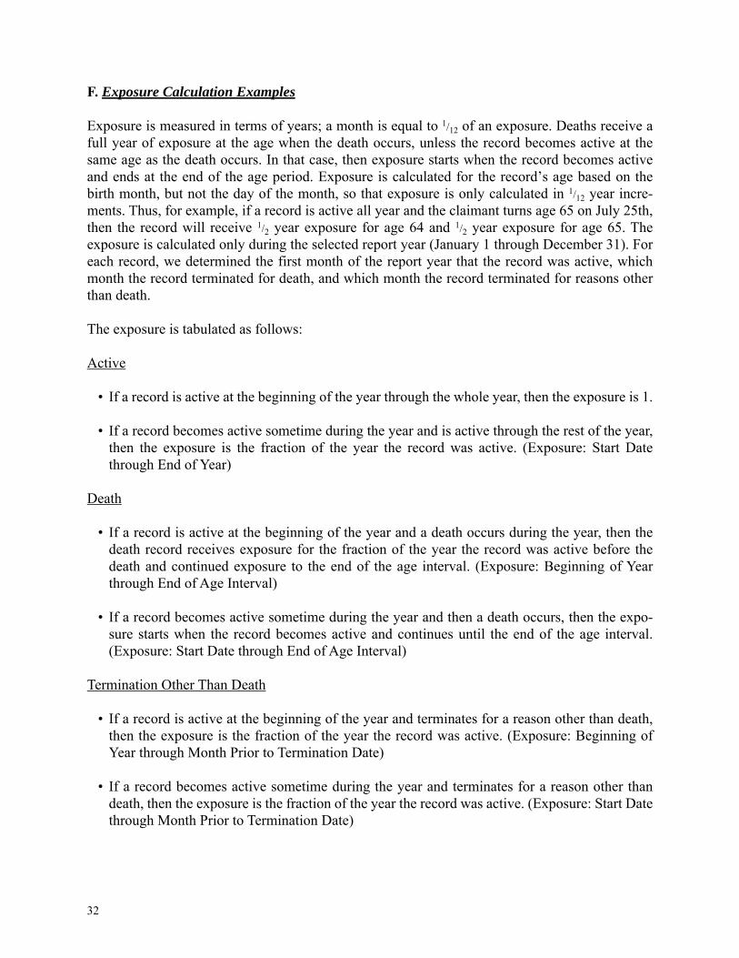
F. Exposure Calculation Examples
Exposure is measured in terms of years; a month is equal to 1/12 of an exposure. Deaths receive afull year of exposure at the age when the death occurs, unless the record becomes active at thesame age as the death occurs. In that case, then exposure starts when the record becomes activeand ends at the end of the age period. Exposure is calculated for the record’s age based on thebirth month, but not the day of the month, so that exposure is only calculated in 1/12 year incre-ments. Thus, for example, if a record is active all year and the claimant turns age 65 on July 25th,then the record will receive 1/2 year exposure for age 64 and 1/2 year exposure for age 65. Theexposure is calculated only during the selected report year (January 1 through December 31). Foreach record, we determined the first month of the report year that the record was active, whichmonth the record terminated for death, and which month the record terminated for reasons otherthan death.
The exposure is tabulated as follows:
Active
• If a record is active at the beginning of the year through the whole year, then the exposure is 1.
• If a record becomes active sometime during the year and is active through the rest of the year,then the exposure is the fraction of the year the record was active. (Exposure: Start Datethrough End of Year)
Death
• If a record is active at the beginning of the year and a death occurs during the year, then thedeath record receives exposure for the fraction of the year the record was active before thedeath and continued exposure to the end of the age interval. (Exposure: Beginning of Yearthrough End of Age Interval)
• If a record becomes active sometime during the year and then a death occurs, then the expo-sure starts when the record becomes active and continues until the end of the age interval.(Exposure: Start Date through End of Age Interval)
Termination Other Than Death
• If a record is active at the beginning of the year and terminates for a reason other than death,then the exposure is the fraction of the year the record was active. (Exposure: Beginning ofYear through Month Prior to Termination Date)
• If a record becomes active sometime during the year and terminates for a reason other thandeath, then the exposure is the fraction of the year the record was active. (Exposure: Start Datethrough Month Prior to Termination Date)
33
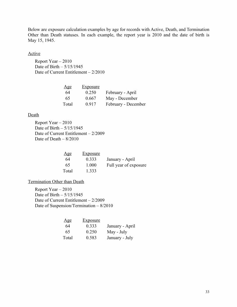
Below are exposure calculation examples by age for records with Active, Death, and TerminationOther than Death statuses. In each example, the report year is 2010 and the date of birth isMay 15, 1945.
ActiveReport Year – 2010Date of Birth – 5/15/1945Date of Current Entitlement – 2/2010
DeathReport Year – 2010Date of Birth – 5/15/1945Date of Current Entitlement – 2/2009Date of Death – 8/2010
Termination Other than DeathReport Year – 2010Date of Birth – 5/15/1945Date of Current Entitlement – 2/2009Date of Suspension/Termination – 8/2010
Age Exposure64 0.250 February - April65 0.667 May - December
Total 0.917 February - December
Age Exposure64 0.333 January - April65 1.000 Full year of exposure
Total 1.333
Age Exposure64 0.333 January - April65 0.250 May - July
Total 0.583 January - July