Embed Size (px)
Citation preview

Lightning ComponentsDeveloper Guide
Version 41.0, Winter ’18
@salesforcedocsLast updated: December 14, 2017

© Copyright 2000–2017 salesforce.com, inc. All rights reserved. Salesforce is a registered trademark of salesforce.com, inc.,as are other names and marks. Other marks appearing herein may be trademarks of their respective owners.
CONTENTS
Chapter 1: What is the Lightning Component Framework? . . . . . . . . . . . . . . . . . . . . . . 1
What is Salesforce Lightning? . . . . . . . . . . . . . . . . . . . . . . . . . . . . . . . . . . . . . . . . . . . . . . 2Why Use the Lightning Component Framework? . . . . . . . . . . . . . . . . . . . . . . . . . . . . . . . . . 2Components . . . . . . . . . . . . . . . . . . . . . . . . . . . . . . . . . . . . . . . . . . . . . . . . . . . . . . . . . 3Events . . . . . . . . . . . . . . . . . . . . . . . . . . . . . . . . . . . . . . . . . . . . . . . . . . . . . . . . . . . . . 3Open Source Aura Framework . . . . . . . . . . . . . . . . . . . . . . . . . . . . . . . . . . . . . . . . . . . . . 4Browser Support Considerations for Lightning Components . . . . . . . . . . . . . . . . . . . . . . . . . 4Using the Developer Console . . . . . . . . . . . . . . . . . . . . . . . . . . . . . . . . . . . . . . . . . . . . . . 6Online Content . . . . . . . . . . . . . . . . . . . . . . . . . . . . . . . . . . . . . . . . . . . . . . . . . . . . . . . 6
Chapter 2: Quick Start . . . . . . . . . . . . . . . . . . . . . . . . . . . . . . . . . . . . . . . . . . . . . . . . . 8
Before You Begin . . . . . . . . . . . . . . . . . . . . . . . . . . . . . . . . . . . . . . . . . . . . . . . . . . . . . . 9Trailhead: Explore Lightning Components Resources . . . . . . . . . . . . . . . . . . . . . . . . . . . . . . 9Create a Component for Lightning Experience and the Salesforce Mobile App . . . . . . . . . . . . 10
Load the Contacts . . . . . . . . . . . . . . . . . . . . . . . . . . . . . . . . . . . . . . . . . . . . . . . . . 13Fire the Events . . . . . . . . . . . . . . . . . . . . . . . . . . . . . . . . . . . . . . . . . . . . . . . . . . . . 17
Chapter 3: Creating Components . . . . . . . . . . . . . . . . . . . . . . . . . . . . . . . . . . . . . . . 19
Create Lightning Components in the Developer Console . . . . . . . . . . . . . . . . . . . . . . . . . . . 21Lightning Bundle Configurations Available in the Developer Console . . . . . . . . . . . . . . . 22
Component Markup . . . . . . . . . . . . . . . . . . . . . . . . . . . . . . . . . . . . . . . . . . . . . . . . . . . 23Component Namespace . . . . . . . . . . . . . . . . . . . . . . . . . . . . . . . . . . . . . . . . . . . . . . . . 24
Using the Default Namespace in Organizations with No Namespace Set . . . . . . . . . . . . 25Using Your Organization’s Namespace . . . . . . . . . . . . . . . . . . . . . . . . . . . . . . . . . . 25Using a Namespace in or from a Managed Package . . . . . . . . . . . . . . . . . . . . . . . . . 25Creating a Namespace in Your Organization . . . . . . . . . . . . . . . . . . . . . . . . . . . . . . 26Namespace Usage Examples and Reference . . . . . . . . . . . . . . . . . . . . . . . . . . . . . . 26
Component Bundles . . . . . . . . . . . . . . . . . . . . . . . . . . . . . . . . . . . . . . . . . . . . . . . . . . . 29Component IDs . . . . . . . . . . . . . . . . . . . . . . . . . . . . . . . . . . . . . . . . . . . . . . . . . . . . . . 30HTML in Components . . . . . . . . . . . . . . . . . . . . . . . . . . . . . . . . . . . . . . . . . . . . . . . . . . 31CSS in Components . . . . . . . . . . . . . . . . . . . . . . . . . . . . . . . . . . . . . . . . . . . . . . . . . . . . 31Component Attributes . . . . . . . . . . . . . . . . . . . . . . . . . . . . . . . . . . . . . . . . . . . . . . . . . . 33Component Composition . . . . . . . . . . . . . . . . . . . . . . . . . . . . . . . . . . . . . . . . . . . . . . . 34Component Body . . . . . . . . . . . . . . . . . . . . . . . . . . . . . . . . . . . . . . . . . . . . . . . . . . . . . 36Component Facets . . . . . . . . . . . . . . . . . . . . . . . . . . . . . . . . . . . . . . . . . . . . . . . . . . . . 37Best Practices for Conditional Markup . . . . . . . . . . . . . . . . . . . . . . . . . . . . . . . . . . . . . . . 38Component Versioning . . . . . . . . . . . . . . . . . . . . . . . . . . . . . . . . . . . . . . . . . . . . . . . . . 39Components with Minimum API Version Requirements . . . . . . . . . . . . . . . . . . . . . . . . . . . . 41Using Expressions . . . . . . . . . . . . . . . . . . . . . . . . . . . . . . . . . . . . . . . . . . . . . . . . . . . . 42
Dynamic Output in Expressions . . . . . . . . . . . . . . . . . . . . . . . . . . . . . . . . . . . . . . . . 43Conditional Expressions . . . . . . . . . . . . . . . . . . . . . . . . . . . . . . . . . . . . . . . . . . . . . 43Data Binding Between Components . . . . . . . . . . . . . . . . . . . . . . . . . . . . . . . . . . . . 44Value Providers . . . . . . . . . . . . . . . . . . . . . . . . . . . . . . . . . . . . . . . . . . . . . . . . . . 48Expression Evaluation . . . . . . . . . . . . . . . . . . . . . . . . . . . . . . . . . . . . . . . . . . . . . . 54Expression Operators Reference . . . . . . . . . . . . . . . . . . . . . . . . . . . . . . . . . . . . . . . 54Expression Functions Reference . . . . . . . . . . . . . . . . . . . . . . . . . . . . . . . . . . . . . . . 58
Using Labels . . . . . . . . . . . . . . . . . . . . . . . . . . . . . . . . . . . . . . . . . . . . . . . . . . . . . . . . 61Using Custom Labels . . . . . . . . . . . . . . . . . . . . . . . . . . . . . . . . . . . . . . . . . . . . . . . 62Input Component Labels . . . . . . . . . . . . . . . . . . . . . . . . . . . . . . . . . . . . . . . . . . . . 62Dynamically Populating Label Parameters . . . . . . . . . . . . . . . . . . . . . . . . . . . . . . . . 63Getting Labels in JavaScript . . . . . . . . . . . . . . . . . . . . . . . . . . . . . . . . . . . . . . . . . . 63Getting Labels in Apex . . . . . . . . . . . . . . . . . . . . . . . . . . . . . . . . . . . . . . . . . . . . . . 65Setting Label Values via a Parent Attribute . . . . . . . . . . . . . . . . . . . . . . . . . . . . . . . . . 66
Localization . . . . . . . . . . . . . . . . . . . . . . . . . . . . . . . . . . . . . . . . . . . . . . . . . . . . . . . . . 67Providing Component Documentation . . . . . . . . . . . . . . . . . . . . . . . . . . . . . . . . . . . . . . 68Working with Base Lightning Components . . . . . . . . . . . . . . . . . . . . . . . . . . . . . . . . . . . . 70
Base Lightning Components Considerations . . . . . . . . . . . . . . . . . . . . . . . . . . . . . . . 75Event Handling in Base Lightning Components . . . . . . . . . . . . . . . . . . . . . . . . . . . . . 77Lightning Design System Considerations . . . . . . . . . . . . . . . . . . . . . . . . . . . . . . . . . . 79
Working with UI Components . . . . . . . . . . . . . . . . . . . . . . . . . . . . . . . . . . . . . . . . . . . . . 94Event Handling in UI Components . . . . . . . . . . . . . . . . . . . . . . . . . . . . . . . . . . . . . . 96Using the UI Components . . . . . . . . . . . . . . . . . . . . . . . . . . . . . . . . . . . . . . . . . . . 97
Working with the Flow Lightning Component . . . . . . . . . . . . . . . . . . . . . . . . . . . . . . . . . . 98Set Flow Variable Values from a Lightning Component . . . . . . . . . . . . . . . . . . . . . . . . 99Get Flow Variable Values to a Lightning Component . . . . . . . . . . . . . . . . . . . . . . . . . 102Control a Flow’s Finish Behavior in a Lightning Component . . . . . . . . . . . . . . . . . . . . . 103Resume a Flow Interview from a Lightning Component . . . . . . . . . . . . . . . . . . . . . . . 104
Supporting Accessibility . . . . . . . . . . . . . . . . . . . . . . . . . . . . . . . . . . . . . . . . . . . . . . . . 105Button Labels . . . . . . . . . . . . . . . . . . . . . . . . . . . . . . . . . . . . . . . . . . . . . . . . . . . 105Audio Messages . . . . . . . . . . . . . . . . . . . . . . . . . . . . . . . . . . . . . . . . . . . . . . . . . 106Forms, Fields, and Labels . . . . . . . . . . . . . . . . . . . . . . . . . . . . . . . . . . . . . . . . . . . 106Events . . . . . . . . . . . . . . . . . . . . . . . . . . . . . . . . . . . . . . . . . . . . . . . . . . . . . . . . 107Menus . . . . . . . . . . . . . . . . . . . . . . . . . . . . . . . . . . . . . . . . . . . . . . . . . . . . . . . . 107
Chapter 4: Using Components . . . . . . . . . . . . . . . . . . . . . . . . . . . . . . . . . . . . . . . . 108
Use Lightning Components in Lightning Experience and the Salesforce Mobile App . . . . . . . . 109Configure Components for Custom Tabs . . . . . . . . . . . . . . . . . . . . . . . . . . . . . . . . . 109Add Lightning Components as Custom Tabs in Lightning Experience . . . . . . . . . . . . . . 110Add Lightning Components as Custom Tabs in the Salesforce App . . . . . . . . . . . . . . . . 111Lightning Component Actions . . . . . . . . . . . . . . . . . . . . . . . . . . . . . . . . . . . . . . . . . 112Override Standard Actions with Lightning Components . . . . . . . . . . . . . . . . . . . . . . . . 119
Get Your Lightning Components Ready to Use on Lightning Pages . . . . . . . . . . . . . . . . . . . 123Configure Components for Lightning Pages and the Lightning App Builder . . . . . . . . . . 124
Contents
Lightning Component Bundle Design Resources . . . . . . . . . . . . . . . . . . . . . . . . . . . . 126Configure Components for Lightning Experience Record Pages . . . . . . . . . . . . . . . . . . 128Create Components for Lightning for Outlook and Lightning for Gmail . . . . . . . . . . . . . 129Create Dynamic Picklists for Your Custom Components . . . . . . . . . . . . . . . . . . . . . . . 134Create a Custom Lightning Page Template Component . . . . . . . . . . . . . . . . . . . . . . . 135Lightning Page Template Component Best Practices . . . . . . . . . . . . . . . . . . . . . . . . . 138Make Your Lightning Page Components Width-Aware withlightning:flexipageRegionInfo . . . . . . . . . . . . . . . . . . . . . . . . . . . . . . . . . . . . . . . . 139Tips and Considerations for Configuring Components for Lightning Pages and the LightningApp Builder . . . . . . . . . . . . . . . . . . . . . . . . . . . . . . . . . . . . . . . . . . . . . . . . . . . . 140
Use Lightning Components in Community Builder . . . . . . . . . . . . . . . . . . . . . . . . . . . . . . . 141Configure Components for Communities . . . . . . . . . . . . . . . . . . . . . . . . . . . . . . . . . 142Create Custom Theme Layout Components for Communities . . . . . . . . . . . . . . . . . . . 142Create Custom Search and Profile Menu Components for Communities . . . . . . . . . . . . 145Create Custom Content Layout Components for Communities . . . . . . . . . . . . . . . . . . . 146
Add Components to Apps . . . . . . . . . . . . . . . . . . . . . . . . . . . . . . . . . . . . . . . . . . . . . . 148Integrate Your Custom Apps into the Chatter Publisher . . . . . . . . . . . . . . . . . . . . . . . . . . . 148Use Lightning Components in Visualforce Pages . . . . . . . . . . . . . . . . . . . . . . . . . . . . . . . 153Add Lightning Components to Any App with Lightning Out (Beta) . . . . . . . . . . . . . . . . . . . . 155
Lightning Out Requirements . . . . . . . . . . . . . . . . . . . . . . . . . . . . . . . . . . . . . . . . . 156Lightning Out Dependencies . . . . . . . . . . . . . . . . . . . . . . . . . . . . . . . . . . . . . . . . . 156Lightning Out Markup . . . . . . . . . . . . . . . . . . . . . . . . . . . . . . . . . . . . . . . . . . . . . . 157Authentication from Lightning Out . . . . . . . . . . . . . . . . . . . . . . . . . . . . . . . . . . . . . 159Share Lightning Out Apps with Non-Authenticated Users . . . . . . . . . . . . . . . . . . . . . . 160Lightning Out Considerations and Limitations . . . . . . . . . . . . . . . . . . . . . . . . . . . . . . 161
Chapter 5: Communicating with Events . . . . . . . . . . . . . . . . . . . . . . . . . . . . . . . . . . 163
Actions and Events . . . . . . . . . . . . . . . . . . . . . . . . . . . . . . . . . . . . . . . . . . . . . . . . . . . 164Handling Events with Client-Side Controllers . . . . . . . . . . . . . . . . . . . . . . . . . . . . . . . . . . 165Component Events . . . . . . . . . . . . . . . . . . . . . . . . . . . . . . . . . . . . . . . . . . . . . . . . . . . 167
Component Event Propagation . . . . . . . . . . . . . . . . . . . . . . . . . . . . . . . . . . . . . . . 168Create Custom Component Events . . . . . . . . . . . . . . . . . . . . . . . . . . . . . . . . . . . . . 169Fire Component Events . . . . . . . . . . . . . . . . . . . . . . . . . . . . . . . . . . . . . . . . . . . . . 169Handling Component Events . . . . . . . . . . . . . . . . . . . . . . . . . . . . . . . . . . . . . . . . . 170Component Event Example . . . . . . . . . . . . . . . . . . . . . . . . . . . . . . . . . . . . . . . . . . 176
Application Events . . . . . . . . . . . . . . . . . . . . . . . . . . . . . . . . . . . . . . . . . . . . . . . . . . . . 178Application Event Propagation . . . . . . . . . . . . . . . . . . . . . . . . . . . . . . . . . . . . . . . . 179Create Custom Application Events . . . . . . . . . . . . . . . . . . . . . . . . . . . . . . . . . . . . . 180Fire Application Events . . . . . . . . . . . . . . . . . . . . . . . . . . . . . . . . . . . . . . . . . . . . . 181Handling Application Events . . . . . . . . . . . . . . . . . . . . . . . . . . . . . . . . . . . . . . . . . 182Application Event Example . . . . . . . . . . . . . . . . . . . . . . . . . . . . . . . . . . . . . . . . . . 184
Event Handling Lifecycle . . . . . . . . . . . . . . . . . . . . . . . . . . . . . . . . . . . . . . . . . . . . . . . . 186Advanced Events Example . . . . . . . . . . . . . . . . . . . . . . . . . . . . . . . . . . . . . . . . . . . . . . 188Firing Lightning Events from Non-Lightning Code . . . . . . . . . . . . . . . . . . . . . . . . . . . . . . . 192
Contents
Events Best Practices . . . . . . . . . . . . . . . . . . . . . . . . . . . . . . . . . . . . . . . . . . . . . . . . . . 193Events Anti-Patterns . . . . . . . . . . . . . . . . . . . . . . . . . . . . . . . . . . . . . . . . . . . . . . . 194
Events Fired During the Rendering Lifecycle . . . . . . . . . . . . . . . . . . . . . . . . . . . . . . . . . . 194Events Handled in the Salesforce mobile app and Lightning Experience . . . . . . . . . . . . . . . . 196System Events . . . . . . . . . . . . . . . . . . . . . . . . . . . . . . . . . . . . . . . . . . . . . . . . . . . . . . 198
Chapter 6: Creating Apps . . . . . . . . . . . . . . . . . . . . . . . . . . . . . . . . . . . . . . . . . . . . 200
App Overview . . . . . . . . . . . . . . . . . . . . . . . . . . . . . . . . . . . . . . . . . . . . . . . . . . . . . . 201Designing App UI . . . . . . . . . . . . . . . . . . . . . . . . . . . . . . . . . . . . . . . . . . . . . . . . . . . . 201Creating App Templates . . . . . . . . . . . . . . . . . . . . . . . . . . . . . . . . . . . . . . . . . . . . . . . 202Developing Secure Code . . . . . . . . . . . . . . . . . . . . . . . . . . . . . . . . . . . . . . . . . . . . . . . 202
What is LockerService? . . . . . . . . . . . . . . . . . . . . . . . . . . . . . . . . . . . . . . . . . . . . . 202Content Security Policy Overview . . . . . . . . . . . . . . . . . . . . . . . . . . . . . . . . . . . . . . . 211
Validations for Lightning Component Code . . . . . . . . . . . . . . . . . . . . . . . . . . . . . . . . . . . 213Validation When You Save Code Changes . . . . . . . . . . . . . . . . . . . . . . . . . . . . . . . . 214Validation During Development Using the Salesforce CLI . . . . . . . . . . . . . . . . . . . . . . 215Review and Resolve Validation Errors and Warnings . . . . . . . . . . . . . . . . . . . . . . . . . 218Lightning Component Validation Rules . . . . . . . . . . . . . . . . . . . . . . . . . . . . . . . . . . 219Salesforce Lightning CLI (Deprecated) . . . . . . . . . . . . . . . . . . . . . . . . . . . . . . . . . . . 226
Styling Apps . . . . . . . . . . . . . . . . . . . . . . . . . . . . . . . . . . . . . . . . . . . . . . . . . . . . . . . 226Using the Salesforce Lightning Design System in Apps . . . . . . . . . . . . . . . . . . . . . . . 227Using External CSS . . . . . . . . . . . . . . . . . . . . . . . . . . . . . . . . . . . . . . . . . . . . . . . 228More Readable Styling Markup with the join Expression . . . . . . . . . . . . . . . . . . . . . . 229Tips for CSS in Components . . . . . . . . . . . . . . . . . . . . . . . . . . . . . . . . . . . . . . . . . 230Vendor Prefixes . . . . . . . . . . . . . . . . . . . . . . . . . . . . . . . . . . . . . . . . . . . . . . . . . . 231Styling with Design Tokens . . . . . . . . . . . . . . . . . . . . . . . . . . . . . . . . . . . . . . . . . . 231
Using JavaScript . . . . . . . . . . . . . . . . . . . . . . . . . . . . . . . . . . . . . . . . . . . . . . . . . . . . 245Invoking Actions on Component Initialization . . . . . . . . . . . . . . . . . . . . . . . . . . . . . . 247Sharing JavaScript Code in a Component Bundle . . . . . . . . . . . . . . . . . . . . . . . . . . . 248Sharing JavaScript Code Across Components . . . . . . . . . . . . . . . . . . . . . . . . . . . . . 250Using External JavaScript Libraries . . . . . . . . . . . . . . . . . . . . . . . . . . . . . . . . . . . . . 252Working with Attribute Values in JavaScript . . . . . . . . . . . . . . . . . . . . . . . . . . . . . . . 253Working with a Component Body in JavaScript . . . . . . . . . . . . . . . . . . . . . . . . . . . . . 254Working with Events in JavaScript . . . . . . . . . . . . . . . . . . . . . . . . . . . . . . . . . . . . . . 255Modifying the DOM . . . . . . . . . . . . . . . . . . . . . . . . . . . . . . . . . . . . . . . . . . . . . . . 258Checking Component Validity . . . . . . . . . . . . . . . . . . . . . . . . . . . . . . . . . . . . . . . . 262Modifying Components Outside the Framework Lifecycle . . . . . . . . . . . . . . . . . . . . . . 264Validating Fields . . . . . . . . . . . . . . . . . . . . . . . . . . . . . . . . . . . . . . . . . . . . . . . . . 265Throwing and Handling Errors . . . . . . . . . . . . . . . . . . . . . . . . . . . . . . . . . . . . . . . 267Calling Component Methods . . . . . . . . . . . . . . . . . . . . . . . . . . . . . . . . . . . . . . . . 269Using JavaScript Promises . . . . . . . . . . . . . . . . . . . . . . . . . . . . . . . . . . . . . . . . . . 274Making API Calls from Components . . . . . . . . . . . . . . . . . . . . . . . . . . . . . . . . . . . . 276Create CSP Trusted Sites to Access Third-Party APIs . . . . . . . . . . . . . . . . . . . . . . . . . . 277
JavaScript Cookbook . . . . . . . . . . . . . . . . . . . . . . . . . . . . . . . . . . . . . . . . . . . . . . . . . . 278
Contents
Dynamically Creating Components . . . . . . . . . . . . . . . . . . . . . . . . . . . . . . . . . . . . 279Detecting Data Changes with Change Handlers . . . . . . . . . . . . . . . . . . . . . . . . . . . . 281Finding Components by ID . . . . . . . . . . . . . . . . . . . . . . . . . . . . . . . . . . . . . . . . . . 282Dynamically Adding Event Handlers To a Component . . . . . . . . . . . . . . . . . . . . . . . . 282Dynamically Showing or Hiding Markup . . . . . . . . . . . . . . . . . . . . . . . . . . . . . . . . . 285Adding and Removing Styles . . . . . . . . . . . . . . . . . . . . . . . . . . . . . . . . . . . . . . . . 285Which Button Was Pressed? . . . . . . . . . . . . . . . . . . . . . . . . . . . . . . . . . . . . . . . . . 287Formatting Dates in JavaScript . . . . . . . . . . . . . . . . . . . . . . . . . . . . . . . . . . . . . . . 288
Using Apex . . . . . . . . . . . . . . . . . . . . . . . . . . . . . . . . . . . . . . . . . . . . . . . . . . . . . . . . 289Creating Server-Side Logic with Controllers . . . . . . . . . . . . . . . . . . . . . . . . . . . . . . . 290Working with Salesforce Records . . . . . . . . . . . . . . . . . . . . . . . . . . . . . . . . . . . . . . 303Testing Your Apex Code . . . . . . . . . . . . . . . . . . . . . . . . . . . . . . . . . . . . . . . . . . . . 310Making API Calls from Apex . . . . . . . . . . . . . . . . . . . . . . . . . . . . . . . . . . . . . . . . . . 311Creating Components in Apex . . . . . . . . . . . . . . . . . . . . . . . . . . . . . . . . . . . . . . . . 312
Lightning Data Service . . . . . . . . . . . . . . . . . . . . . . . . . . . . . . . . . . . . . . . . . . . . . . . . . 312Loading a Record . . . . . . . . . . . . . . . . . . . . . . . . . . . . . . . . . . . . . . . . . . . . . . . . 313Saving a Record . . . . . . . . . . . . . . . . . . . . . . . . . . . . . . . . . . . . . . . . . . . . . . . . . 315Creating a Record . . . . . . . . . . . . . . . . . . . . . . . . . . . . . . . . . . . . . . . . . . . . . . . . 318Deleting a Record . . . . . . . . . . . . . . . . . . . . . . . . . . . . . . . . . . . . . . . . . . . . . . . . 321Record Changes . . . . . . . . . . . . . . . . . . . . . . . . . . . . . . . . . . . . . . . . . . . . . . . . . 323Errors . . . . . . . . . . . . . . . . . . . . . . . . . . . . . . . . . . . . . . . . . . . . . . . . . . . . . . . . 324Considerations . . . . . . . . . . . . . . . . . . . . . . . . . . . . . . . . . . . . . . . . . . . . . . . . . . 325Lightning Data Service Example . . . . . . . . . . . . . . . . . . . . . . . . . . . . . . . . . . . . . . . 327SaveRecordResult . . . . . . . . . . . . . . . . . . . . . . . . . . . . . . . . . . . . . . . . . . . . . . . . 331
Lightning Container . . . . . . . . . . . . . . . . . . . . . . . . . . . . . . . . . . . . . . . . . . . . . . . . . . 332Using a Third-Party Framework . . . . . . . . . . . . . . . . . . . . . . . . . . . . . . . . . . . . . . . 333Lightning Container Component Limits . . . . . . . . . . . . . . . . . . . . . . . . . . . . . . . . . . 340The Lightning Realty App . . . . . . . . . . . . . . . . . . . . . . . . . . . . . . . . . . . . . . . . . . . 340lightning-container NPM Module Reference . . . . . . . . . . . . . . . . . . . . . . . . . . . . . . 343
Controlling Access . . . . . . . . . . . . . . . . . . . . . . . . . . . . . . . . . . . . . . . . . . . . . . . . . . . 348Application Access Control . . . . . . . . . . . . . . . . . . . . . . . . . . . . . . . . . . . . . . . . . . 351Interface Access Control . . . . . . . . . . . . . . . . . . . . . . . . . . . . . . . . . . . . . . . . . . . . 351Component Access Control . . . . . . . . . . . . . . . . . . . . . . . . . . . . . . . . . . . . . . . . . . 351Attribute Access Control . . . . . . . . . . . . . . . . . . . . . . . . . . . . . . . . . . . . . . . . . . . . 352Event Access Control . . . . . . . . . . . . . . . . . . . . . . . . . . . . . . . . . . . . . . . . . . . . . . 352
Using Object-Oriented Development . . . . . . . . . . . . . . . . . . . . . . . . . . . . . . . . . . . . . . . 352What is Inherited? . . . . . . . . . . . . . . . . . . . . . . . . . . . . . . . . . . . . . . . . . . . . . . . . 353Inherited Component Attributes . . . . . . . . . . . . . . . . . . . . . . . . . . . . . . . . . . . . . . . 353Abstract Components . . . . . . . . . . . . . . . . . . . . . . . . . . . . . . . . . . . . . . . . . . . . . 355Interfaces . . . . . . . . . . . . . . . . . . . . . . . . . . . . . . . . . . . . . . . . . . . . . . . . . . . . . 355Inheritance Rules . . . . . . . . . . . . . . . . . . . . . . . . . . . . . . . . . . . . . . . . . . . . . . . . 356
Using the AppCache . . . . . . . . . . . . . . . . . . . . . . . . . . . . . . . . . . . . . . . . . . . . . . . . . 357Distributing Applications and Components . . . . . . . . . . . . . . . . . . . . . . . . . . . . . . . . . . . 357
Contents
Chapter 7: Debugging . . . . . . . . . . . . . . . . . . . . . . . . . . . . . . . . . . . . . . . . . . . . . . 358
Enable Debug Mode for Lightning Components . . . . . . . . . . . . . . . . . . . . . . . . . . . . . . . 359Salesforce Lightning Inspector Chrome Extension . . . . . . . . . . . . . . . . . . . . . . . . . . . . . . 359
Install Salesforce Lightning Inspector . . . . . . . . . . . . . . . . . . . . . . . . . . . . . . . . . . . 359Salesforce Lightning Inspector . . . . . . . . . . . . . . . . . . . . . . . . . . . . . . . . . . . . . . . . 360
Log Messages . . . . . . . . . . . . . . . . . . . . . . . . . . . . . . . . . . . . . . . . . . . . . . . . . . . . . . 373
Chapter 8: Fixing Performance Warnings . . . . . . . . . . . . . . . . . . . . . . . . . . . . . . . . 374
<aura:if>—Clean Unrendered Body . . . . . . . . . . . . . . . . . . . . . . . . . . . . . . . . . . . . . . . 375<aura:iteration>—Multiple Items Set . . . . . . . . . . . . . . . . . . . . . . . . . . . . . . . . . . . . . . . 376
Chapter 9: Reference . . . . . . . . . . . . . . . . . . . . . . . . . . . . . . . . . . . . . . . . . . . . . . . 379
Reference Doc App . . . . . . . . . . . . . . . . . . . . . . . . . . . . . . . . . . . . . . . . . . . . . . . . . . 380Supported aura:attribute Types . . . . . . . . . . . . . . . . . . . . . . . . . . . . . . . . . . . . . . . . . . 380
Basic Types . . . . . . . . . . . . . . . . . . . . . . . . . . . . . . . . . . . . . . . . . . . . . . . . . . . . 381Function Type . . . . . . . . . . . . . . . . . . . . . . . . . . . . . . . . . . . . . . . . . . . . . . . . . . . 382Object Types . . . . . . . . . . . . . . . . . . . . . . . . . . . . . . . . . . . . . . . . . . . . . . . . . . . 383Standard and Custom Object Types . . . . . . . . . . . . . . . . . . . . . . . . . . . . . . . . . . . . 383Collection Types . . . . . . . . . . . . . . . . . . . . . . . . . . . . . . . . . . . . . . . . . . . . . . . . . 383Custom Apex Class Types . . . . . . . . . . . . . . . . . . . . . . . . . . . . . . . . . . . . . . . . . . 385Framework-Specific Types . . . . . . . . . . . . . . . . . . . . . . . . . . . . . . . . . . . . . . . . . . 385
aura:application . . . . . . . . . . . . . . . . . . . . . . . . . . . . . . . . . . . . . . . . . . . . . . . . . . . . 387aura:component . . . . . . . . . . . . . . . . . . . . . . . . . . . . . . . . . . . . . . . . . . . . . . . . . . . . 388aura:dependency . . . . . . . . . . . . . . . . . . . . . . . . . . . . . . . . . . . . . . . . . . . . . . . . . . . 389aura:event . . . . . . . . . . . . . . . . . . . . . . . . . . . . . . . . . . . . . . . . . . . . . . . . . . . . . . . . 390aura:interface . . . . . . . . . . . . . . . . . . . . . . . . . . . . . . . . . . . . . . . . . . . . . . . . . . . . . . 391aura:method . . . . . . . . . . . . . . . . . . . . . . . . . . . . . . . . . . . . . . . . . . . . . . . . . . . . . . . 391aura:set . . . . . . . . . . . . . . . . . . . . . . . . . . . . . . . . . . . . . . . . . . . . . . . . . . . . . . . . . . 393
Setting Attributes Inherited from a Super Component . . . . . . . . . . . . . . . . . . . . . . . . 393Setting Attributes on a Component Reference . . . . . . . . . . . . . . . . . . . . . . . . . . . . . 394Setting Attributes Inherited from an Interface . . . . . . . . . . . . . . . . . . . . . . . . . . . . . . 395
Component Reference . . . . . . . . . . . . . . . . . . . . . . . . . . . . . . . . . . . . . . . . . . . . . . . . 395aura:expression . . . . . . . . . . . . . . . . . . . . . . . . . . . . . . . . . . . . . . . . . . . . . . . . 396aura:html . . . . . . . . . . . . . . . . . . . . . . . . . . . . . . . . . . . . . . . . . . . . . . . . . . . . . 396aura:if . . . . . . . . . . . . . . . . . . . . . . . . . . . . . . . . . . . . . . . . . . . . . . . . . . . . . . . 396aura:iteration . . . . . . . . . . . . . . . . . . . . . . . . . . . . . . . . . . . . . . . . . . . . . . . . . . 397aura:renderIf . . . . . . . . . . . . . . . . . . . . . . . . . . . . . . . . . . . . . . . . . . . . . . . . . . . 398aura:template . . . . . . . . . . . . . . . . . . . . . . . . . . . . . . . . . . . . . . . . . . . . . . . . . . 398aura:text . . . . . . . . . . . . . . . . . . . . . . . . . . . . . . . . . . . . . . . . . . . . . . . . . . . . . . 399aura:unescapedHtml . . . . . . . . . . . . . . . . . . . . . . . . . . . . . . . . . . . . . . . . . . . . . 399auraStorage:init . . . . . . . . . . . . . . . . . . . . . . . . . . . . . . . . . . . . . . . . . . . . . . . . . 399force:canvasApp . . . . . . . . . . . . . . . . . . . . . . . . . . . . . . . . . . . . . . . . . . . . . . . . 401force:inputField . . . . . . . . . . . . . . . . . . . . . . . . . . . . . . . . . . . . . . . . . . . . . . . . . 402force:outputField . . . . . . . . . . . . . . . . . . . . . . . . . . . . . . . . . . . . . . . . . . . . . . . . 403
Contents
force:recordData . . . . . . . . . . . . . . . . . . . . . . . . . . . . . . . . . . . . . . . . . . . . . . . . 405force:recordEdit . . . . . . . . . . . . . . . . . . . . . . . . . . . . . . . . . . . . . . . . . . . . . . . . . 406force:recordPreview . . . . . . . . . . . . . . . . . . . . . . . . . . . . . . . . . . . . . . . . . . . . . . 406force:recordView . . . . . . . . . . . . . . . . . . . . . . . . . . . . . . . . . . . . . . . . . . . . . . . . 408forceChatter:feed . . . . . . . . . . . . . . . . . . . . . . . . . . . . . . . . . . . . . . . . . . . . . . . . 408forceChatter:fullFeed . . . . . . . . . . . . . . . . . . . . . . . . . . . . . . . . . . . . . . . . . . . . . . 410forceChatter:publisher . . . . . . . . . . . . . . . . . . . . . . . . . . . . . . . . . . . . . . . . . . . . . 411forceCommunity:appLauncher . . . . . . . . . . . . . . . . . . . . . . . . . . . . . . . . . . . . . . . . 411forceCommunity:navigationMenuBase . . . . . . . . . . . . . . . . . . . . . . . . . . . . . . . . . . 413forceCommunity:notifications . . . . . . . . . . . . . . . . . . . . . . . . . . . . . . . . . . . . . . . . 415forceCommunity:routeLink . . . . . . . . . . . . . . . . . . . . . . . . . . . . . . . . . . . . . . . . . . 416forceCommunity:waveDashboard . . . . . . . . . . . . . . . . . . . . . . . . . . . . . . . . . . . . . 417lightning:accordion . . . . . . . . . . . . . . . . . . . . . . . . . . . . . . . . . . . . . . . . . . . . . . . 418lightning:accordionSection . . . . . . . . . . . . . . . . . . . . . . . . . . . . . . . . . . . . . . . . . . 419lightning:avatar . . . . . . . . . . . . . . . . . . . . . . . . . . . . . . . . . . . . . . . . . . . . . . . . . 421lightning:badge . . . . . . . . . . . . . . . . . . . . . . . . . . . . . . . . . . . . . . . . . . . . . . . . . 422lightning:breadcrumb . . . . . . . . . . . . . . . . . . . . . . . . . . . . . . . . . . . . . . . . . . . . . 422lightning:breadcrumbs . . . . . . . . . . . . . . . . . . . . . . . . . . . . . . . . . . . . . . . . . . . . 424lightning:button . . . . . . . . . . . . . . . . . . . . . . . . . . . . . . . . . . . . . . . . . . . . . . . . . 425lightning:buttonGroup . . . . . . . . . . . . . . . . . . . . . . . . . . . . . . . . . . . . . . . . . . . . . 426lightning:buttonIcon . . . . . . . . . . . . . . . . . . . . . . . . . . . . . . . . . . . . . . . . . . . . . . 427lightning:buttonIconStateful . . . . . . . . . . . . . . . . . . . . . . . . . . . . . . . . . . . . . . . . . 429lightning:buttonMenu . . . . . . . . . . . . . . . . . . . . . . . . . . . . . . . . . . . . . . . . . . . . . 430lightning:buttonStateful . . . . . . . . . . . . . . . . . . . . . . . . . . . . . . . . . . . . . . . . . . . . 433lightning:card . . . . . . . . . . . . . . . . . . . . . . . . . . . . . . . . . . . . . . . . . . . . . . . . . . 435lightning:checkboxGroup . . . . . . . . . . . . . . . . . . . . . . . . . . . . . . . . . . . . . . . . . . 436lightning:clickToDial . . . . . . . . . . . . . . . . . . . . . . . . . . . . . . . . . . . . . . . . . . . . . . 438lightning:combobox . . . . . . . . . . . . . . . . . . . . . . . . . . . . . . . . . . . . . . . . . . . . . . 439lightning:container . . . . . . . . . . . . . . . . . . . . . . . . . . . . . . . . . . . . . . . . . . . . . . . 441lightning:datatable . . . . . . . . . . . . . . . . . . . . . . . . . . . . . . . . . . . . . . . . . . . . . . . 443lightning:dualListbox . . . . . . . . . . . . . . . . . . . . . . . . . . . . . . . . . . . . . . . . . . . . . . 449lightning:dynamicIcon . . . . . . . . . . . . . . . . . . . . . . . . . . . . . . . . . . . . . . . . . . . . . 452lightning:fileCard . . . . . . . . . . . . . . . . . . . . . . . . . . . . . . . . . . . . . . . . . . . . . . . . 453lightning:fileUpload (Beta) . . . . . . . . . . . . . . . . . . . . . . . . . . . . . . . . . . . . . . . . . . 453lightning:flexipageRegionInfo . . . . . . . . . . . . . . . . . . . . . . . . . . . . . . . . . . . . . . . . 455lightning:flow . . . . . . . . . . . . . . . . . . . . . . . . . . . . . . . . . . . . . . . . . . . . . . . . . . 455lightning:formattedDateTime (Beta) . . . . . . . . . . . . . . . . . . . . . . . . . . . . . . . . . . . . 457lightning:formattedEmail . . . . . . . . . . . . . . . . . . . . . . . . . . . . . . . . . . . . . . . . . . . 458lightning:formattedLocation . . . . . . . . . . . . . . . . . . . . . . . . . . . . . . . . . . . . . . . . . 459lightning:formattedNumber (Beta) . . . . . . . . . . . . . . . . . . . . . . . . . . . . . . . . . . . . . 460lightning:formattedPhone . . . . . . . . . . . . . . . . . . . . . . . . . . . . . . . . . . . . . . . . . . . 461lightning:formattedRichText . . . . . . . . . . . . . . . . . . . . . . . . . . . . . . . . . . . . . . . . . 462lightning:formattedText . . . . . . . . . . . . . . . . . . . . . . . . . . . . . . . . . . . . . . . . . . . . 464lightning:formattedUrl . . . . . . . . . . . . . . . . . . . . . . . . . . . . . . . . . . . . . . . . . . . . . 464
Contents
lightning:helptext . . . . . . . . . . . . . . . . . . . . . . . . . . . . . . . . . . . . . . . . . . . . . . . . 466lightning:icon . . . . . . . . . . . . . . . . . . . . . . . . . . . . . . . . . . . . . . . . . . . . . . . . . . 466lightning:input (Beta) . . . . . . . . . . . . . . . . . . . . . . . . . . . . . . . . . . . . . . . . . . . . . . 468lightning:inputLocation . . . . . . . . . . . . . . . . . . . . . . . . . . . . . . . . . . . . . . . . . . . . 474lightning:inputRichText (Beta) . . . . . . . . . . . . . . . . . . . . . . . . . . . . . . . . . . . . . . . . 476lightning:layout . . . . . . . . . . . . . . . . . . . . . . . . . . . . . . . . . . . . . . . . . . . . . . . . . 478lightning:layoutItem . . . . . . . . . . . . . . . . . . . . . . . . . . . . . . . . . . . . . . . . . . . . . . 480lightning:menuItem . . . . . . . . . . . . . . . . . . . . . . . . . . . . . . . . . . . . . . . . . . . . . . . 481lightning:omniToolkitAPI (Beta) . . . . . . . . . . . . . . . . . . . . . . . . . . . . . . . . . . . . . . . 483lightning:outputField . . . . . . . . . . . . . . . . . . . . . . . . . . . . . . . . . . . . . . . . . . . . . . 485lightning:path (Beta) . . . . . . . . . . . . . . . . . . . . . . . . . . . . . . . . . . . . . . . . . . . . . . 486lightning:picklistPath (Beta) . . . . . . . . . . . . . . . . . . . . . . . . . . . . . . . . . . . . . . . . . . 487lightning:pill . . . . . . . . . . . . . . . . . . . . . . . . . . . . . . . . . . . . . . . . . . . . . . . . . . . 488lightning:progressBar . . . . . . . . . . . . . . . . . . . . . . . . . . . . . . . . . . . . . . . . . . . . . 490lightning:progressIndicator . . . . . . . . . . . . . . . . . . . . . . . . . . . . . . . . . . . . . . . . . . 491lightning:radioGroup . . . . . . . . . . . . . . . . . . . . . . . . . . . . . . . . . . . . . . . . . . . . . 492lightning:relativeDateTime . . . . . . . . . . . . . . . . . . . . . . . . . . . . . . . . . . . . . . . . . . 494lightning:recordViewForm . . . . . . . . . . . . . . . . . . . . . . . . . . . . . . . . . . . . . . . . . . 495lightning:select . . . . . . . . . . . . . . . . . . . . . . . . . . . . . . . . . . . . . . . . . . . . . . . . . 496lightning:slider . . . . . . . . . . . . . . . . . . . . . . . . . . . . . . . . . . . . . . . . . . . . . . . . . . 500lightning:spinner . . . . . . . . . . . . . . . . . . . . . . . . . . . . . . . . . . . . . . . . . . . . . . . . 502lightning:tab (Beta) . . . . . . . . . . . . . . . . . . . . . . . . . . . . . . . . . . . . . . . . . . . . . . . 503lightning:tabset (Beta) . . . . . . . . . . . . . . . . . . . . . . . . . . . . . . . . . . . . . . . . . . . . . 504lightning:textarea . . . . . . . . . . . . . . . . . . . . . . . . . . . . . . . . . . . . . . . . . . . . . . . . 507lightning:tile . . . . . . . . . . . . . . . . . . . . . . . . . . . . . . . . . . . . . . . . . . . . . . . . . . . 509lightning:tree . . . . . . . . . . . . . . . . . . . . . . . . . . . . . . . . . . . . . . . . . . . . . . . . . . . 511lightning:utilityBarAPI . . . . . . . . . . . . . . . . . . . . . . . . . . . . . . . . . . . . . . . . . . . . . . 514lightning:verticalNavigation . . . . . . . . . . . . . . . . . . . . . . . . . . . . . . . . . . . . . . . . . 516lightning:verticalNavigationItem . . . . . . . . . . . . . . . . . . . . . . . . . . . . . . . . . . . . . . 519lightning:verticalNavigationItemBadge . . . . . . . . . . . . . . . . . . . . . . . . . . . . . . . . . . 519lightning:verticalNavigationItemIcon . . . . . . . . . . . . . . . . . . . . . . . . . . . . . . . . . . . 520lightning:verticalNavigationOverflow . . . . . . . . . . . . . . . . . . . . . . . . . . . . . . . . . . . 521lightning:verticalNavigationSection . . . . . . . . . . . . . . . . . . . . . . . . . . . . . . . . . . . . 521lightning:workspaceAPI . . . . . . . . . . . . . . . . . . . . . . . . . . . . . . . . . . . . . . . . . . . . 522ltng:require . . . . . . . . . . . . . . . . . . . . . . . . . . . . . . . . . . . . . . . . . . . . . . . . . . . . 524ui:actionMenuItem . . . . . . . . . . . . . . . . . . . . . . . . . . . . . . . . . . . . . . . . . . . . . . . 525ui:button . . . . . . . . . . . . . . . . . . . . . . . . . . . . . . . . . . . . . . . . . . . . . . . . . . . . . . 526ui:checkboxMenuItem . . . . . . . . . . . . . . . . . . . . . . . . . . . . . . . . . . . . . . . . . . . . 528ui:inputCheckbox . . . . . . . . . . . . . . . . . . . . . . . . . . . . . . . . . . . . . . . . . . . . . . . . 530ui:inputCurrency . . . . . . . . . . . . . . . . . . . . . . . . . . . . . . . . . . . . . . . . . . . . . . . . 532ui:inputDate . . . . . . . . . . . . . . . . . . . . . . . . . . . . . . . . . . . . . . . . . . . . . . . . . . . 534ui:inputDateTime . . . . . . . . . . . . . . . . . . . . . . . . . . . . . . . . . . . . . . . . . . . . . . . . 537ui:inputDefaultError . . . . . . . . . . . . . . . . . . . . . . . . . . . . . . . . . . . . . . . . . . . . . . . 540ui:inputEmail . . . . . . . . . . . . . . . . . . . . . . . . . . . . . . . . . . . . . . . . . . . . . . . . . . . 542
Contents
ui:inputNumber . . . . . . . . . . . . . . . . . . . . . . . . . . . . . . . . . . . . . . . . . . . . . . . . . 545ui:inputPhone . . . . . . . . . . . . . . . . . . . . . . . . . . . . . . . . . . . . . . . . . . . . . . . . . . 547ui:inputRadio . . . . . . . . . . . . . . . . . . . . . . . . . . . . . . . . . . . . . . . . . . . . . . . . . . . 550ui:inputRichText . . . . . . . . . . . . . . . . . . . . . . . . . . . . . . . . . . . . . . . . . . . . . . . . . 552ui:inputSecret . . . . . . . . . . . . . . . . . . . . . . . . . . . . . . . . . . . . . . . . . . . . . . . . . . 554ui:inputSelect . . . . . . . . . . . . . . . . . . . . . . . . . . . . . . . . . . . . . . . . . . . . . . . . . . . 556ui:inputSelectOption . . . . . . . . . . . . . . . . . . . . . . . . . . . . . . . . . . . . . . . . . . . . . . 560ui:inputText . . . . . . . . . . . . . . . . . . . . . . . . . . . . . . . . . . . . . . . . . . . . . . . . . . . . 561ui:inputTextArea . . . . . . . . . . . . . . . . . . . . . . . . . . . . . . . . . . . . . . . . . . . . . . . . . 563ui:inputURL . . . . . . . . . . . . . . . . . . . . . . . . . . . . . . . . . . . . . . . . . . . . . . . . . . . . 566ui:menu . . . . . . . . . . . . . . . . . . . . . . . . . . . . . . . . . . . . . . . . . . . . . . . . . . . . . . 568ui:menuItem . . . . . . . . . . . . . . . . . . . . . . . . . . . . . . . . . . . . . . . . . . . . . . . . . . . 572ui:menuItemSeparator . . . . . . . . . . . . . . . . . . . . . . . . . . . . . . . . . . . . . . . . . . . . 573ui:menuList . . . . . . . . . . . . . . . . . . . . . . . . . . . . . . . . . . . . . . . . . . . . . . . . . . . . 574ui:menuTrigger . . . . . . . . . . . . . . . . . . . . . . . . . . . . . . . . . . . . . . . . . . . . . . . . . 575ui:menuTriggerLink . . . . . . . . . . . . . . . . . . . . . . . . . . . . . . . . . . . . . . . . . . . . . . . 576ui:message . . . . . . . . . . . . . . . . . . . . . . . . . . . . . . . . . . . . . . . . . . . . . . . . . . . . 577ui:outputCheckbox . . . . . . . . . . . . . . . . . . . . . . . . . . . . . . . . . . . . . . . . . . . . . . . 579ui:outputCurrency . . . . . . . . . . . . . . . . . . . . . . . . . . . . . . . . . . . . . . . . . . . . . . . . 580ui:outputDate . . . . . . . . . . . . . . . . . . . . . . . . . . . . . . . . . . . . . . . . . . . . . . . . . . 582ui:outputDateTime . . . . . . . . . . . . . . . . . . . . . . . . . . . . . . . . . . . . . . . . . . . . . . . 583ui:outputEmail . . . . . . . . . . . . . . . . . . . . . . . . . . . . . . . . . . . . . . . . . . . . . . . . . . 585ui:outputNumber . . . . . . . . . . . . . . . . . . . . . . . . . . . . . . . . . . . . . . . . . . . . . . . . 586ui:outputPhone . . . . . . . . . . . . . . . . . . . . . . . . . . . . . . . . . . . . . . . . . . . . . . . . . 588ui:outputRichText . . . . . . . . . . . . . . . . . . . . . . . . . . . . . . . . . . . . . . . . . . . . . . . . 589ui:outputText . . . . . . . . . . . . . . . . . . . . . . . . . . . . . . . . . . . . . . . . . . . . . . . . . . . 591ui:outputTextArea . . . . . . . . . . . . . . . . . . . . . . . . . . . . . . . . . . . . . . . . . . . . . . . . 592ui:outputURL . . . . . . . . . . . . . . . . . . . . . . . . . . . . . . . . . . . . . . . . . . . . . . . . . . . 593ui:radioMenuItem . . . . . . . . . . . . . . . . . . . . . . . . . . . . . . . . . . . . . . . . . . . . . . . 595ui:scrollerWrapper . . . . . . . . . . . . . . . . . . . . . . . . . . . . . . . . . . . . . . . . . . . . . . . 596ui:spinner . . . . . . . . . . . . . . . . . . . . . . . . . . . . . . . . . . . . . . . . . . . . . . . . . . . . . 597wave:waveDashboard . . . . . . . . . . . . . . . . . . . . . . . . . . . . . . . . . . . . . . . . . . . . 598
Messaging Component Reference . . . . . . . . . . . . . . . . . . . . . . . . . . . . . . . . . . . . . . . . 600lightning:notificationsLibrary . . . . . . . . . . . . . . . . . . . . . . . . . . . . . . . . . . . . . . . . . 600lightning:overlayLibrary . . . . . . . . . . . . . . . . . . . . . . . . . . . . . . . . . . . . . . . . . . . . 602
Interface Reference . . . . . . . . . . . . . . . . . . . . . . . . . . . . . . . . . . . . . . . . . . . . . . . . . . . 607force:hasRecordId . . . . . . . . . . . . . . . . . . . . . . . . . . . . . . . . . . . . . . . . . . . . . . . . 608force:hasSObjectName . . . . . . . . . . . . . . . . . . . . . . . . . . . . . . . . . . . . . . . . . . . . 609lightning:actionOverride . . . . . . . . . . . . . . . . . . . . . . . . . . . . . . . . . . . . . . . . . . . . 610lightning:appHomeTemplate . . . . . . . . . . . . . . . . . . . . . . . . . . . . . . . . . . . . . . . . . 611lightning:availableForChatterExtensionComposer . . . . . . . . . . . . . . . . . . . . . . . . . . . 611lightning:availableForChatterExtensionRenderer . . . . . . . . . . . . . . . . . . . . . . . . . . . . 612lightning:homeTemplate . . . . . . . . . . . . . . . . . . . . . . . . . . . . . . . . . . . . . . . . . . . . 612lightning:recordHomeTemplate . . . . . . . . . . . . . . . . . . . . . . . . . . . . . . . . . . . . . . . 612
Contents
Event Reference . . . . . . . . . . . . . . . . . . . . . . . . . . . . . . . . . . . . . . . . . . . . . . . . . . . . . 613force:closeQuickAction . . . . . . . . . . . . . . . . . . . . . . . . . . . . . . . . . . . . . . . . . . . . 613force:createRecord . . . . . . . . . . . . . . . . . . . . . . . . . . . . . . . . . . . . . . . . . . . . . . . 614force:editRecord . . . . . . . . . . . . . . . . . . . . . . . . . . . . . . . . . . . . . . . . . . . . . . . . . 615force:navigateToComponent (Beta) . . . . . . . . . . . . . . . . . . . . . . . . . . . . . . . . . . . . . 616force:navigateToList . . . . . . . . . . . . . . . . . . . . . . . . . . . . . . . . . . . . . . . . . . . . . . . 617force:navigateToObjectHome . . . . . . . . . . . . . . . . . . . . . . . . . . . . . . . . . . . . . . . . 618force:navigateToRelatedList . . . . . . . . . . . . . . . . . . . . . . . . . . . . . . . . . . . . . . . . . . 618force:navigateToSObject . . . . . . . . . . . . . . . . . . . . . . . . . . . . . . . . . . . . . . . . . . . . 619force:navigateToURL . . . . . . . . . . . . . . . . . . . . . . . . . . . . . . . . . . . . . . . . . . . . . . 620force:recordSave . . . . . . . . . . . . . . . . . . . . . . . . . . . . . . . . . . . . . . . . . . . . . . . . . 621force:recordSaveSuccess . . . . . . . . . . . . . . . . . . . . . . . . . . . . . . . . . . . . . . . . . . . 621force:refreshView . . . . . . . . . . . . . . . . . . . . . . . . . . . . . . . . . . . . . . . . . . . . . . . . 622force:showToast . . . . . . . . . . . . . . . . . . . . . . . . . . . . . . . . . . . . . . . . . . . . . . . . . 622forceCommunity:analyticsInteraction . . . . . . . . . . . . . . . . . . . . . . . . . . . . . . . . . . . 624forceCommunity:routeChange . . . . . . . . . . . . . . . . . . . . . . . . . . . . . . . . . . . . . . . 625lightning:openFiles . . . . . . . . . . . . . . . . . . . . . . . . . . . . . . . . . . . . . . . . . . . . . . . 625lightning:sendChatterExtensionPayload . . . . . . . . . . . . . . . . . . . . . . . . . . . . . . . . . 626ltng:selectSObject . . . . . . . . . . . . . . . . . . . . . . . . . . . . . . . . . . . . . . . . . . . . . . . . 626ltng:sendMessage . . . . . . . . . . . . . . . . . . . . . . . . . . . . . . . . . . . . . . . . . . . . . . . 627ui:clearErrors . . . . . . . . . . . . . . . . . . . . . . . . . . . . . . . . . . . . . . . . . . . . . . . . . . . 627ui:collapse . . . . . . . . . . . . . . . . . . . . . . . . . . . . . . . . . . . . . . . . . . . . . . . . . . . . . 628ui:expand . . . . . . . . . . . . . . . . . . . . . . . . . . . . . . . . . . . . . . . . . . . . . . . . . . . . . 628ui:menuFocusChange . . . . . . . . . . . . . . . . . . . . . . . . . . . . . . . . . . . . . . . . . . . . . 629ui:menuSelect . . . . . . . . . . . . . . . . . . . . . . . . . . . . . . . . . . . . . . . . . . . . . . . . . . 629ui:menuTriggerPress . . . . . . . . . . . . . . . . . . . . . . . . . . . . . . . . . . . . . . . . . . . . . . 630ui:validationError . . . . . . . . . . . . . . . . . . . . . . . . . . . . . . . . . . . . . . . . . . . . . . . . . 631wave:discoverDashboard . . . . . . . . . . . . . . . . . . . . . . . . . . . . . . . . . . . . . . . . . . 631wave:discoverResponse . . . . . . . . . . . . . . . . . . . . . . . . . . . . . . . . . . . . . . . . . . . 632wave:selectionChanged . . . . . . . . . . . . . . . . . . . . . . . . . . . . . . . . . . . . . . . . . . . 633wave:update . . . . . . . . . . . . . . . . . . . . . . . . . . . . . . . . . . . . . . . . . . . . . . . . . . . 634
System Event Reference . . . . . . . . . . . . . . . . . . . . . . . . . . . . . . . . . . . . . . . . . . . . . . . . 635aura:doneRendering . . . . . . . . . . . . . . . . . . . . . . . . . . . . . . . . . . . . . . . . . . . . . . 635aura:doneWaiting . . . . . . . . . . . . . . . . . . . . . . . . . . . . . . . . . . . . . . . . . . . . . . . . 636aura:locationChange . . . . . . . . . . . . . . . . . . . . . . . . . . . . . . . . . . . . . . . . . . . . . 636aura:systemError . . . . . . . . . . . . . . . . . . . . . . . . . . . . . . . . . . . . . . . . . . . . . . . . 637aura:valueChange . . . . . . . . . . . . . . . . . . . . . . . . . . . . . . . . . . . . . . . . . . . . . . . 638aura:valueDestroy . . . . . . . . . . . . . . . . . . . . . . . . . . . . . . . . . . . . . . . . . . . . . . . 639aura:valueInit . . . . . . . . . . . . . . . . . . . . . . . . . . . . . . . . . . . . . . . . . . . . . . . . . . . 640aura:valueRender . . . . . . . . . . . . . . . . . . . . . . . . . . . . . . . . . . . . . . . . . . . . . . . . 640aura:waiting . . . . . . . . . . . . . . . . . . . . . . . . . . . . . . . . . . . . . . . . . . . . . . . . . . . . 641
Supported HTML Tags . . . . . . . . . . . . . . . . . . . . . . . . . . . . . . . . . . . . . . . . . . . . . . . . . 642Anchor Tag: <a> . . . . . . . . . . . . . . . . . . . . . . . . . . . . . . . . . . . . . . . . . . . . . . . . 642
Contents

INDEX . . . . . . . . . . . . . . . . . . . . . . . . . . . . . . . . . . . . . . . . . . . . . . . . . . . . . . . . . . 644
Contents

CHAPTER 1 What is the Lightning Component Framework?
The Lightning Component framework is a UI framework for developing dynamic web apps for mobileand desktop devices. It’s a modern framework for building single-page applications engineered forgrowth.
In this chapter ...
• What is SalesforceLightning?
The framework supports partitioned multi-tier component development that bridges the client andserver. It uses JavaScript on the client side and Apex on the server side.
• Why Use theLightning ComponentFramework?
• Components
• Events
• Open Source AuraFramework
• Browser SupportConsiderations forLightningComponents
• Using the DeveloperConsole
• Online Content
1
What is Salesforce Lightning?
Lightning includes the Lightning Component Framework and some exciting tools for developers. Lightning makes it easier to buildresponsive applications for any device.
Lightning includes these technologies:
• Lightning components give you a client-server framework that accelerates development, as well as app performance, and is idealfor use with the Salesforce mobile app and Salesforce Lightning Experience.
• The Lightning App Builder empowers you to build apps visually, without code, quicker than ever before using off-the-shelf andcustom-built Lightning components. You can make your Lightning components available in the Lightning App Builder so administratorscan build custom user interfaces without code.
Using these technologies, you can seamlessly customize and easily deploy new apps to mobile devices running Salesforce. In fact, theSalesforce mobile app and Salesforce Lightning Experience are built with Lightning components.
This guide provides you with an in-depth resource to help you create your own standalone Lightning apps, as well as custom Lightningcomponents that can be used in the Salesforce mobile app. You will also learn how to package applications and components anddistribute them in the AppExchange.
Why Use the Lightning Component Framework?
The benefits include an out-of-the-box set of components, event-driven architecture, and a framework optimized for performance.
Out-of-the-Box Component SetComes with an out-of-the-box set of components to kick start building apps. You don't have to spend your time optimizing yourapps for different devices as the components take care of that for you.
Rich component ecosystemCreate business-ready components and make them available in the Salesforce app, Lightning Experience, and Communities. Salesforceapp users access your components via the navigation menu. Customize Lightning Experience or Communities using drag-and-dropcomponents on a Lightning Page in the Lightning App Builder or using Community Builder. Additional components are availablefor your org in the AppExchange. Similarly, you can publish your components and share them with other users.
PerformanceUses a stateful client and stateless server architecture that relies on JavaScript on the client side to manage UI component metadataand application data. The client calls the server only when absolutely necessary; for example to get more metadata or data. Theserver only sends data that is needed by the user to maximize efficiency. The framework uses JSON to exchange data between theserver and the client. It intelligently utilizes your server, browser, devices, and network so you can focus on the logic and interactionsof your apps.
Event-driven architectureUses an event-driven architecture for better decoupling between components. Any component can subscribe to an applicationevent, or to a component event they can see.
Faster developmentEmpowers teams to work faster with out-of-the-box components that function seamlessly with desktop and mobile devices. Buildingan app with components facilitates parallel design, improving overall development efficiency.
Components are encapsulated and their internals stay private, while their public shape is visible to consumers of the component.This strong separation gives component authors freedom to change the internal implementation details and insulates componentconsumers from those changes.
2
What is Salesforce Lightning?What is the Lightning Component Framework?
Device-aware and cross browser compatibilityApps use responsive design and provide an enjoyable user experience. The Lightning Component framework supports the latest inbrowser technology such as HTML5, CSS3, and touch events.
Components
Components are the self-contained and reusable units of an app. They represent a reusable section of the UI, and can range in granularityfrom a single line of text to an entire app.
The framework includes a set of prebuilt components. For example, components that come with the Lightning Design System stylingare available in the lightning namespace. These components are also known as the base Lightning components. You can assembleand configure components to form new components in an app. Components are rendered to produce HTML DOM elements within thebrowser.
A component can contain other components, as well as HTML, CSS, JavaScript, or any other Web-enabled code. This enables you tobuild apps with sophisticated UIs.
The details of a component's implementation are encapsulated. This allows the consumer of a component to focus on building theirapp, while the component author can innovate and make changes without breaking consumers. You configure components by settingthe named attributes that they expose in their definition. Components interact with their environment by listening to or publishingevents.
SEE ALSO:
Creating Components
Component Reference
Working with Base Lightning Components
Events
Event-driven programming is used in many languages and frameworks, such as JavaScript and Java Swing. The idea is that you writehandlers that respond to interface events as they occur.
A component registers that it may fire an event in its markup. Events are fired from JavaScript controller actions that are typically triggeredby a user interacting with the user interface.
There are two types of events in the framework:
• Component events are handled by the component itself or a component that instantiates or contains the component.
• Application events are handled by all components that are listening to the event. These events are essentially a traditionalpublish-subscribe model.
You write the handlers in JavaScript controller actions.
SEE ALSO:
Communicating with Events
Handling Events with Client-Side Controllers
3
ComponentsWhat is the Lightning Component Framework?
Open Source Aura Framework
The Lightning Component framework is built on the open source Aura framework. The Aura framework enables you to build appscompletely independent of your data in Salesforce.
The Aura framework is available at https://github.com/forcedotcom/aura. Note that the open source Aura frameworkhas features and components that are not currently available in the Lightning Component framework. We are working to surface moreof these features and components for Salesforce developers.
The sample code in this guide uses out-of-the-box components from the Aura framework, such as aura:iteration andui:button. The aura namespace contains components to simplify your app logic, and the ui namespace contains componentsfor user interface elements like buttons and input fields. The force namespace contains components specific to Salesforce.
Browser Support Considerations for Lightning Components
EDITIONS
Salesforce Classic availablein: All Editions
EDITIONS
Lightning Experience isavailable in: Group,Professional, Enterprise,Performance, Unlimited,and Developer Editions
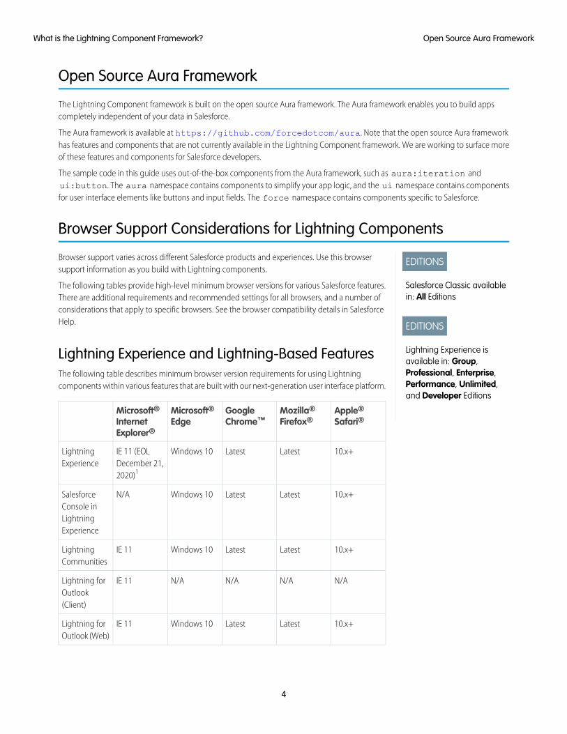
Browser support varies across different Salesforce products and experiences. Use this browsersupport information as you build with Lightning components.
The following tables provide high-level minimum browser versions for various Salesforce features.There are additional requirements and recommended settings for all browsers, and a number ofconsiderations that apply to specific browsers. See the browser compatibility details in SalesforceHelp.
Lightning Experience and Lightning-Based FeaturesThe following table describes minimum browser version requirements for using Lightningcomponents within various features that are built with our next-generation user interface platform.
Apple®
Safari®Mozilla®
Firefox®GoogleChrome™
Microsoft®Edge
Microsoft®InternetExplorer®
10.x+LatestLatestWindows 10IE 11 (EOLDecember 21,2020)1
LightningExperience
10.x+LatestLatestWindows 10N/ASalesforceConsole inLightningExperience
10.x+LatestLatestWindows 10IE 11LightningCommunities
N/AN/AN/AN/AIE 11Lightning forOutlook(Client)
10.x+LatestLatestWindows 10IE 11Lightning forOutlook (Web)
4
Open Source Aura FrameworkWhat is the Lightning Component Framework?
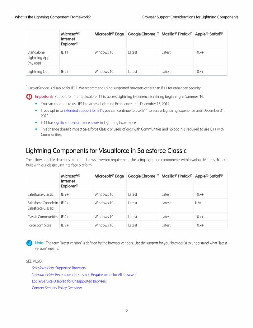
Apple® Safari®Mozilla® Firefox®Google Chrome™Microsoft® EdgeMicrosoft®InternetExplorer®
10.x+LatestLatestWindows 10IE 11StandaloneLightning App(my.app)
10.x+LatestLatestWindows 10IE 9+Lightning Out
1 LockerService is disabled for IE11. We recommend using supported browsers other than IE11 for enhanced security.
Important: Support for Internet Explorer 11 to access Lightning Experience is retiring beginning in Summer ’16.
• You can continue to use IE11 to access Lightning Experience until December 16, 2017.
• If you opt in to Extended Support for IE11, you can continue to use IE11 to access Lightning Experience until December 31,2020.
• IE11 has significant performance issues in Lightning Experience.
• This change doesn’t impact Salesforce Classic or users of orgs with Communities and no opt in is required to use IE11 withCommunities.
Lightning Components for Visualforce in Salesforce ClassicThe following table describes minimum browser version requirements for using Lightning components within various features that arebuilt with our classic user interface platform.
Apple® Safari®Mozilla® Firefox®Google Chrome™Microsoft® EdgeMicrosoft®InternetExplorer®
10.x+LatestLatestWindows 10IE 9+Salesforce Classic
N/ALatestLatestWindows 10IE 9+Salesforce Console inSalesforce Classic
10.x+LatestLatestWindows 10IE 9+Classic Communities
10.x+LatestLatestWindows 10IE 9+Force.com Sites
Note: The term “latest version” is defined by the browser vendors. Use the support for your browser(s) to understand what “latestversion” means.
SEE ALSO:
Salesforce Help: Supported Browsers
Salesforce Help: Recommendations and Requirements for All Browsers
LockerService Disabled for Unsupported Browsers
Content Security Policy Overview
5
Browser Support Considerations for Lightning ComponentsWhat is the Lightning Component Framework?
Using the Developer Console
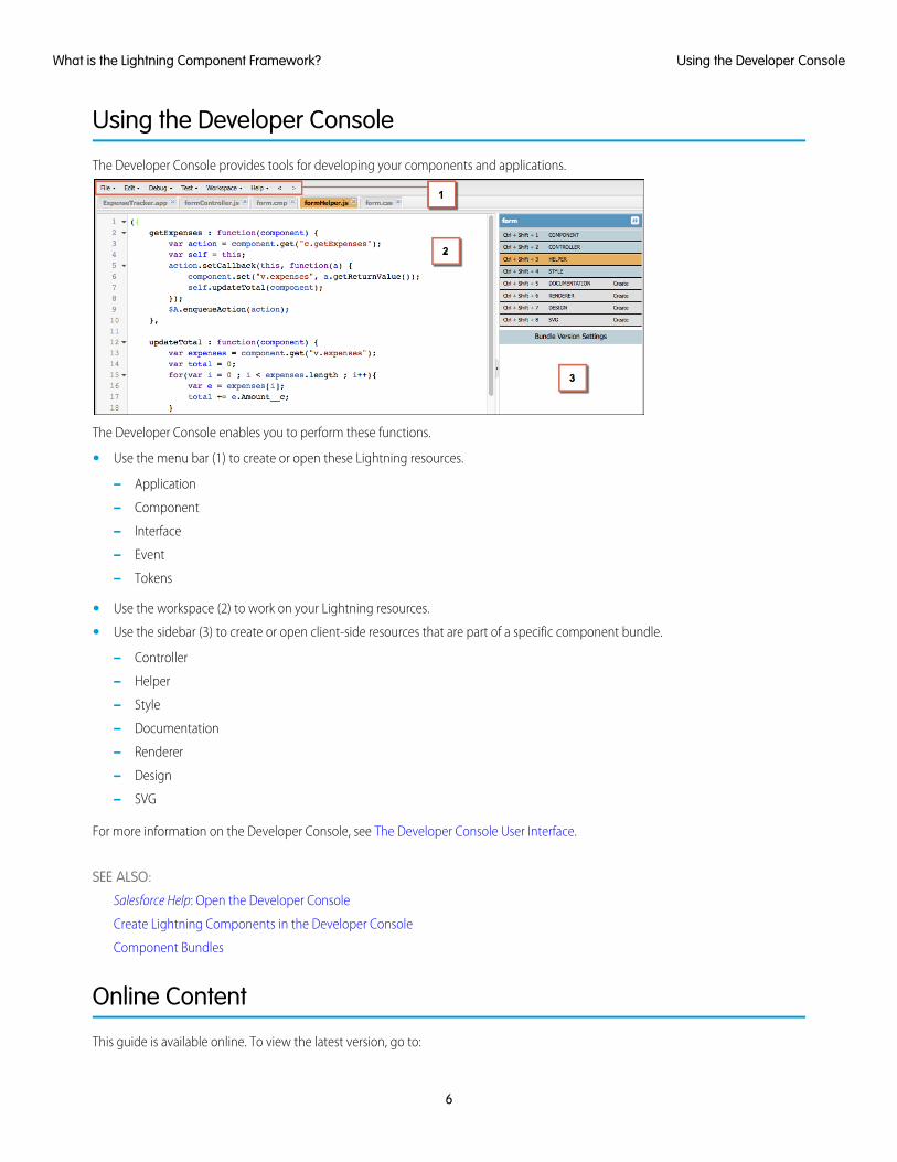
The Developer Console provides tools for developing your components and applications.
The Developer Console enables you to perform these functions.
• Use the menu bar (1) to create or open these Lightning resources.
– Application
– Component
– Interface
– Event
– Tokens
• Use the workspace (2) to work on your Lightning resources.
• Use the sidebar (3) to create or open client-side resources that are part of a specific component bundle.
– Controller
– Helper
– Style
– Documentation
– Renderer
– Design
– SVG
For more information on the Developer Console, see The Developer Console User Interface.
SEE ALSO:
Salesforce Help: Open the Developer Console
Create Lightning Components in the Developer Console
Component Bundles
Online Content
This guide is available online. To view the latest version, go to:
6
Using the Developer ConsoleWhat is the Lightning Component Framework?
https://developer.salesforce.com/docs/atlas.en-us.lightning.meta/lightning/
Go beyond this guide with exciting Trailhead content. To explore more of what you can do with Lightning Components, go to:
Trailhead Module: Lightning Components BasicsLink: https://trailhead.salesforce.com/module/lex_dev_lc_basics
Learn with a series of hands-on challenges on how to use Lightning Components to build modern web apps.
Quick Start: Lightning ComponentsLink: https://trailhead.salesforce.com/project/quickstart-lightning-components
Create your first component that renders a list of Contacts from your org.
Project: Build an Account Geolocation AppLink: https://trailhead.salesforce.com/project/account-geolocation-app
Build an app that maps your Accounts using Lightning Components.
Project: Build a Restaurant-Locator Lightning ComponentLink: https://trailhead.salesforce.com/project/workshop-lightning-restaurant-locator
Build a Lightning component with Yelp’s Search API that displays a list of businesses near a certain location.
Project: Build a Lightning App with the Lightning Design SystemLink: https://trailhead.salesforce.com/project/slds-lightning-components-workshop
Design a Lightning component that displays an Account list.
7
Online ContentWhat is the Lightning Component Framework?
CHAPTER 2 Quick Start
The quick start provides Trailhead resources for you to learn core Lightning components concepts, anda short tutorial that builds a Lightning component to manage selected contacts in the Salesforce app
In this chapter ...
• Before You Begin and Lightning Experience. You’ll create all components from the Developer Console. The tutorial usesseveral events to create or edit contact records, and view related cases.• Trailhead: Explore
LightningComponentsResources
• Create a Componentfor LightningExperience and theSalesforce MobileApp
8
Before You Begin
To work with Lightning apps and components , follow these prerequisites.
1. Create a Developer Edition organization
2. Define a Custom Salesforce Domain Name
Note: For this quick start tutorial, you don’t need to create a Developer Edition organization or register a namespace prefix. Butyou want to do so if you’re planning to offer managed packages. You can create Lightning components using the UI in Enterprise,Performance, Unlimited, Developer Editions or a sandbox. If you don’t plan to use a Developer Edition organization, you cango directly to Define a Custom Salesforce Domain Name.
Create a Developer Edition OrganizationYou need an org to do this quick start tutorial, and we recommend you don’t use your production org. You only need to create a DeveloperEdition org if you don’t already have one.
1. In your browser, go to https://developer.salesforce.com/signup?d=70130000000td6N.
2. Fill in the fields about you and your company.
3. In the Email field, make sure to use a public address you can easily check from a Web browser.
4. Type a unique Username. Note that this field is also in the form of an email address, but it does not have to be the same as youremail address, and in fact, it’s usually better if they aren’t the same. Your username is your login and your identity ondeveloper.salesforce.com, so you’re often better served by choosing a username such [email protected].
5. Read and then select the checkbox for the Master Subscription Agreement and then click Submit Registration.
6. In a moment you’ll receive an email with a login link. Click the link and change your password.
Define a Custom Salesforce Domain NameA custom domain name helps you enhance access security and better manage login and authentication for your organization. If yourcustom domain is universalcontainers, then your login URL would behttps://universalcontainers.lightning.force.com. For more information, see My Domain in the Salesforce Help.
Trailhead: Explore Lightning Components Resources
Get up to speed with the fundamentals of Lightning components with Trailhead resources.
Whether you’re a new Salesforce developer or a seasoned Visualforce developer, we recommend that you start with the followingTrailhead resources.
Lightning Components BasicsUse Lightning components to build modern web apps with reusable UI components. You’ll learn core Lightning componentsconcepts and build a simple expense tracker app that can be run in a standalone app, Salesforce app, or Lightning Experience.
Quick Start: Lightning ComponentsCreate your first component that renders a list of contacts from your org.
Build an Account Geolocation AppBuild an app that maps your accounts using Lightning components.
9
Before You BeginQuick Start
Build a Lightning App with the Lightning Design SystemDesign a Lightning component that displays an account list.
Build a Restaurant-Locator Lightning ComponentBuild a Lightning component with Yelp’s Search API that displays a list of businesses near a certain location.
Create a Component for Lightning Experience and the Salesforce MobileApp
Explore how to create a custom UI that loads contact data and interacts with Lightning Experience and the Salesforce app.
This tutorial walks you through creating a component that:
• Displays a toast message (1) using the force:showToast event when all contacts are loaded successfully.
• Updates the number of contacts (2) based on the selected lead source.
• Filters the contacts using the lightning:select component (3) when a lead source (referral or social media) is selected.
• Displays the contact data using the lightning:card component (4).
• Navigates to the record when the Details button (5) is clicked.
10
Create a Component for Lightning Experience and theSalesforce Mobile App
Quick Start
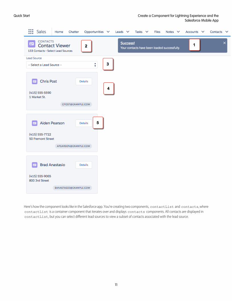
Here’s how the component looks like in the Salesforce app. You’re creating two components, contactList and contacts, wherecontactList is a container component that iterates over and displays contacts components. All contacts are displayed incontactList, but you can select different lead sources to view a subset of contacts associated with the lead source.
11
Create a Component for Lightning Experience and theSalesforce Mobile App
Quick Start
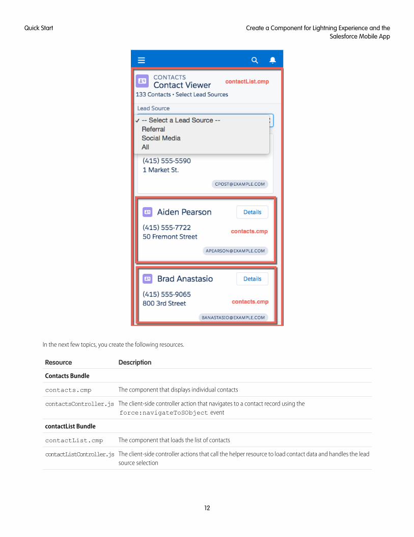
In the next few topics, you create the following resources.
DescriptionResource
Contacts Bundle
The component that displays individual contactscontacts.cmp
The client-side controller action that navigates to a contact record using theforce:navigateToSObject event
contactsController.js
contactList Bundle
The component that loads the list of contactscontactList.cmp
The client-side controller actions that call the helper resource to load contact data and handles the leadsource selection
contactListController.js
12
Create a Component for Lightning Experience and theSalesforce Mobile App
Quick Start
DescriptionResource
The helper function that retrieves contact data, displays a toast message on successful loading of contactdata, displays contact data based on lead source, and update the total number of contacts
contactListHelper.js
Apex Controller
The Apex controller that queries all contact records and those records based on different lead sourcesContactController.apxc
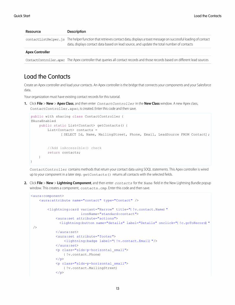
Load the ContactsCreate an Apex controller and load your contacts. An Apex controller is the bridge that connects your components and your Salesforcedata.
Your organization must have existing contact records for this tutorial.
1. Click File > New > Apex Class, and then enter ContactController in the New Class window. A new Apex class,ContactController.apxc, is created. Enter this code and then save.
public with sharing class ContactController {@AuraEnabled
public static List<Contact> getContacts() {List<Contact> contacts =
[SELECT Id, Name, MailingStreet, Phone, Email, LeadSource FROM Contact];
//Add isAccessible() checkreturn contacts;
}}
ContactController contains methods that return your contact data using SOQL statements. This Apex controller is wiredup to your component in a later step. getContacts() returns all contacts with the selected fields.
2. Click File > New > Lightning Component, and then enter contacts for the Name field in the New Lightning Bundle popupwindow. This creates a component, contacts.cmp. Enter this code and then save.
<aura:component><aura:attribute name="contact" type="Contact" />
<lightning:card variant="Narrow" title="{!v.contact.Name}"iconName="standard:contact">
<aura:set attribute="actions"><lightning:button name="details" label="Details" onclick="{!c.goToRecord}"
/></aura:set><aura:set attribute="footer">
<lightning:badge label="{!v.contact.Email}"/></aura:set><p class="slds-p-horizontal_small">
{!v.contact.Phone}</p><p class="slds-p-horizontal_small">
{!v.contact.MailingStreet}</p>
13
Load the ContactsQuick Start
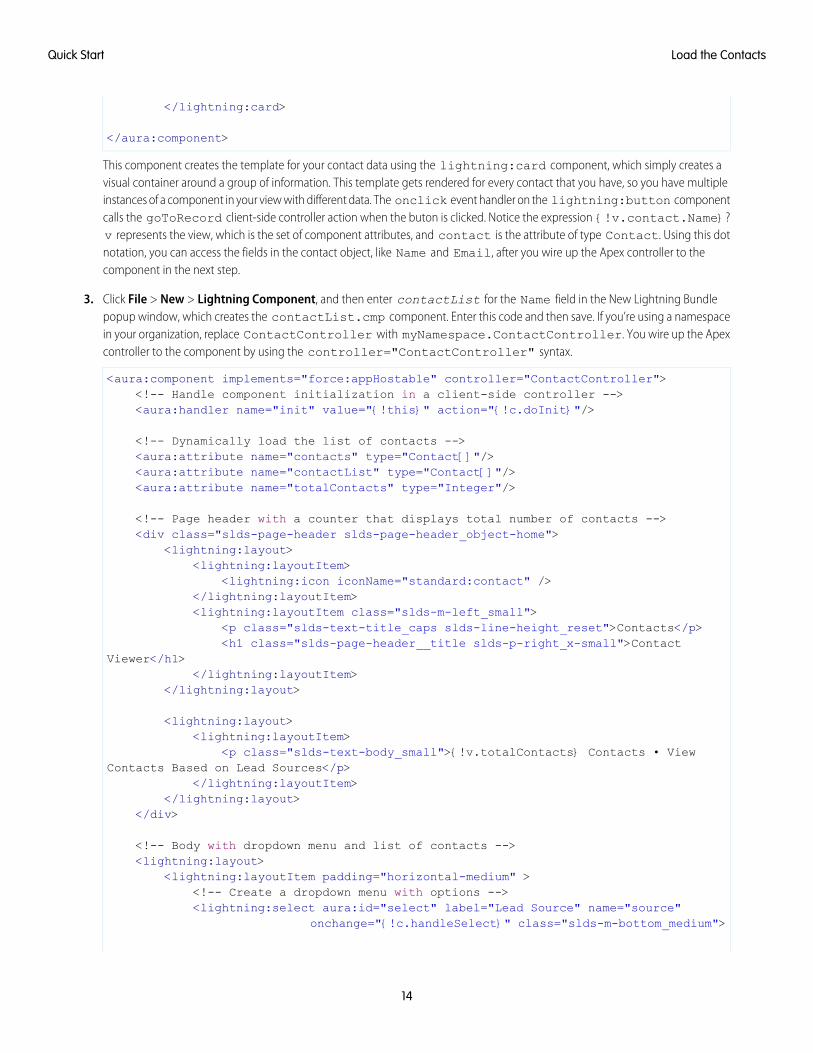
</lightning:card>
</aura:component>
This component creates the template for your contact data using the lightning:card component, which simply creates avisual container around a group of information. This template gets rendered for every contact that you have, so you have multipleinstances of a component in your view with different data. The onclick event handler on the lightning:button componentcalls the goToRecord client-side controller action when the buton is clicked. Notice the expression {!v.contact.Name}?v represents the view, which is the set of component attributes, and contact is the attribute of type Contact. Using this dotnotation, you can access the fields in the contact object, like Name and Email, after you wire up the Apex controller to thecomponent in the next step.
3. Click File > New > Lightning Component, and then enter contactList for the Name field in the New Lightning Bundlepopup window, which creates the contactList.cmp component. Enter this code and then save. If you’re using a namespacein your organization, replace ContactController with myNamespace.ContactController. You wire up the Apexcontroller to the component by using the controller="ContactController" syntax.
<aura:component implements="force:appHostable" controller="ContactController"><!-- Handle component initialization in a client-side controller --><aura:handler name="init" value="{!this}" action="{!c.doInit}"/>
<!-- Dynamically load the list of contacts --><aura:attribute name="contacts" type="Contact[]"/><aura:attribute name="contactList" type="Contact[]"/><aura:attribute name="totalContacts" type="Integer"/>
<!-- Page header with a counter that displays total number of contacts --><div class="slds-page-header slds-page-header_object-home">
<lightning:layout><lightning:layoutItem>
<lightning:icon iconName="standard:contact" /></lightning:layoutItem><lightning:layoutItem class="slds-m-left_small">
<p class="slds-text-title_caps slds-line-height_reset">Contacts</p><h1 class="slds-page-header__title slds-p-right_x-small">Contact
Viewer</h1></lightning:layoutItem>
</lightning:layout>
<lightning:layout><lightning:layoutItem>
<p class="slds-text-body_small">{!v.totalContacts} Contacts • ViewContacts Based on Lead Sources</p>
</lightning:layoutItem></lightning:layout>
</div>
<!-- Body with dropdown menu and list of contacts --><lightning:layout>
<lightning:layoutItem padding="horizontal-medium" ><!-- Create a dropdown menu with options --><lightning:select aura:id="select" label="Lead Source" name="source"
onchange="{!c.handleSelect}" class="slds-m-bottom_medium">
14
Load the ContactsQuick Start
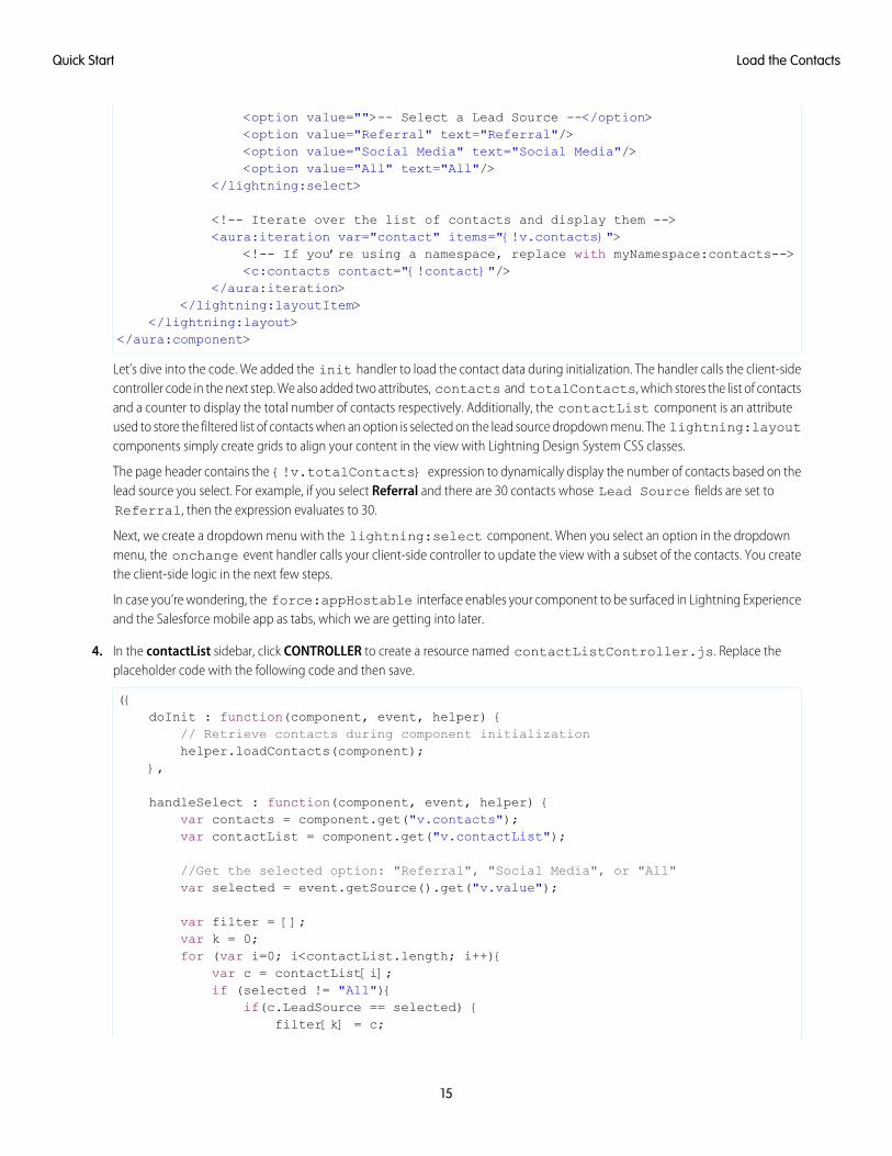
<option value="">-- Select a Lead Source --</option><option value="Referral" text="Referral"/><option value="Social Media" text="Social Media"/><option value="All" text="All"/>
</lightning:select>
<!-- Iterate over the list of contacts and display them --><aura:iteration var="contact" items="{!v.contacts}">
<!-- If you’re using a namespace, replace with myNamespace:contacts--><c:contacts contact="{!contact}"/>
</aura:iteration></lightning:layoutItem>
</lightning:layout></aura:component>
Let’s dive into the code. We added the init handler to load the contact data during initialization. The handler calls the client-sidecontroller code in the next step. We also added two attributes, contacts and totalContacts, which stores the list of contactsand a counter to display the total number of contacts respectively. Additionally, the contactList component is an attributeused to store the filtered list of contacts when an option is selected on the lead source dropdown menu. The lightning:layoutcomponents simply create grids to align your content in the view with Lightning Design System CSS classes.
The page header contains the {!v.totalContacts} expression to dynamically display the number of contacts based on thelead source you select. For example, if you select Referral and there are 30 contacts whose Lead Source fields are set toReferral, then the expression evaluates to 30.
Next, we create a dropdown menu with the lightning:select component. When you select an option in the dropdownmenu, the onchange event handler calls your client-side controller to update the view with a subset of the contacts. You createthe client-side logic in the next few steps.
In case you’re wondering, the force:appHostable interface enables your component to be surfaced in Lightning Experienceand the Salesforce mobile app as tabs, which we are getting into later.
4. In the contactList sidebar, click CONTROLLER to create a resource named contactListController.js. Replace theplaceholder code with the following code and then save.
({doInit : function(component, event, helper) {
// Retrieve contacts during component initializationhelper.loadContacts(component);
},
handleSelect : function(component, event, helper) {var contacts = component.get("v.contacts");var contactList = component.get("v.contactList");
//Get the selected option: "Referral", "Social Media", or "All"var selected = event.getSource().get("v.value");
var filter = [];var k = 0;for (var i=0; i<contactList.length; i++){
var c = contactList[i];if (selected != "All"){
if(c.LeadSource == selected) {filter[k] = c;
15
Load the ContactsQuick Start
k++;}
}else {
filter = contactList;}
}//Set the filtered list of contacts based on the selected optioncomponent.set("v.contacts", filter);helper.updateTotal(component);
}})
The client-side controller calls helper functions to do most of the heavy-lifting, which is a recommended pattern to promote codereuse. Helper functions also enable specialization of tasks, such as processing data and firing server-side actions, which is what weare covering next. Recall that the onchange event handler on the lightning:select component calls the handleSelectclient-side controller action, which is triggered when you select an option in the dropdown menu. handleSelect checks theoption value that’s passed in using event.getSource().get("v.value"). It creates a filtered list of contacts by checkingthat the lead source field on each contact matches the selected lead source. Finally, update the view and the total number of contactsbased on the selected lead source.
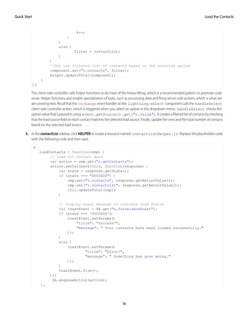
5. In the contactList sidebar, click HELPER to create a resource named contactListHelper.js. Replace the placeholder codewith the following code and then save.
({loadContacts : function(cmp) {
// Load all contact datavar action = cmp.get("c.getContacts");action.setCallback(this, function(response) {
var state = response.getState();if (state === "SUCCESS") {
cmp.set("v.contacts", response.getReturnValue());cmp.set("v.contactList", response.getReturnValue());this.updateTotal(cmp);
}
// Display toast message to indicate load statusvar toastEvent = $A.get("e.force:showToast");if (state === 'SUCCESS'){
toastEvent.setParams({"title": "Success!","message": " Your contacts have been loaded successfully."
});}else {
toastEvent.setParams({"title": "Error!","message": " Something has gone wrong."
});}toastEvent.fire();
});$A.enqueueAction(action);
},
16
Load the ContactsQuick Start
updateTotal: function(cmp) {var contacts = cmp.get("v.contacts");cmp.set("v.totalContacts", contacts.length);
}})
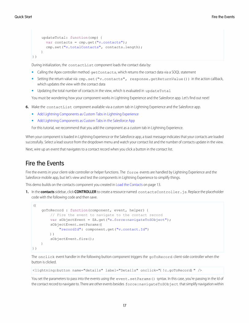
During initialization, the contactList component loads the contact data by:
• Calling the Apex controller method getContacts, which returns the contact data via a SOQL statement
• Setting the return value via cmp.set("v.contacts", response.getReturnValue()) in the action callback,which updates the view with the contact data
• Updating the total number of contacts in the view, which is evaluated in updateTotal
You must be wondering how your component works in Lightning Experience and the Salesforce app. Let’s find out next!
6. Make the contactList component available via a custom tab in Lightning Experience and the Salesforce app.
• Add Lightning Components as Custom Tabs in Lightning Experience
• Add Lightning Components as Custom Tabs in the Salesforce App
For this tutorial, we recommend that you add the component as a custom tab in Lightning Experience.
When your component is loaded in Lightning Experience or the Salesforce app, a toast message indicates that your contacts are loadedsuccessfully. Select a lead source from the dropdown menu and watch your contact list and the number of contacts update in the view.
Next, wire up an event that navigates to a contact record when you click a button in the contact list.
Fire the EventsFire the events in your client-side controller or helper functions. The force events are handled by Lightning Experience and theSalesforce mobile app, but let’s view and test the components in Lightning Experience to simplify things.
This demo builds on the contacts component you created in Load the Contacts on page 13.
1. In the contacts sidebar, click CONTROLLER to create a resource named contactsController.js. Replace the placeholdercode with the following code and then save.
({goToRecord : function(component, event, helper) {
// Fire the event to navigate to the contact recordvar sObjectEvent = $A.get("e.force:navigateToSObject");sObjectEvent.setParams({
"recordId": component.get("v.contact.Id")})sObjectEvent.fire();
}})
The onclick event handler in the following button component triggers the goToRecord client-side controller when thebutton is clicked.
<lightning:button name="details" label="Details" onclick="{!c.goToRecord}" />
You set the parameters to pass into the events using the event.setParams() syntax. In this case, you’re passing in the Id ofthe contact record to navigate to. There are other events besides force:navigateToSObject that simplify navigation within
17
Fire the EventsQuick Start
Lightning Experience and the Salesforce app. For more information, see Events Handled in the Salesforce mobile app and LightningExperience.
2. To test the event, refresh your custom tab in Lightning Experience, and click the Details button.
The force:navigateToSObject is fired, which updates the view to display the contact record page.
We stepped through creating a component that loads contact data using a combination of client-side controllers and Apex controllermethods to create a custom UI with your Salesforce data. The possibilities of what you can do with Lightning components are endless.While we showed you how to surface a component via a tab in Lightning Experience and the Salesforce app, you can take this tutorialfurther by surfacing the component on record pages via the Lightning App Builder and even Communities. To explore the possibilities,blaze the trail with the resources available at Trailhead: Explore Lightning Components Resources.
18
Fire the EventsQuick Start
CHAPTER 3 Creating Components
Components are the functional units of the Lightning Component framework.In this chapter ...A component encapsulates a modular and potentially reusable section of UI, and can range in granularityfrom a single line of text to an entire application.
• Create LightningComponents in theDeveloper Console
• Component Markup
• ComponentNamespace
• Component Bundles
• Component IDs
• HTML in Components
• CSS in Components
• ComponentAttributes
• ComponentComposition
• Component Body
• Component Facets
• Best Practices forConditional Markup
• ComponentVersioning
• Components withMinimum API VersionRequirements
• Using Expressions
• Using Labels
• Localization
• ProvidingComponentDocumentation
• Working with BaseLightningComponents
• Working with UIComponents
19
• Working with theFlow LightningComponent
• SupportingAccessibility
20
Creating Components
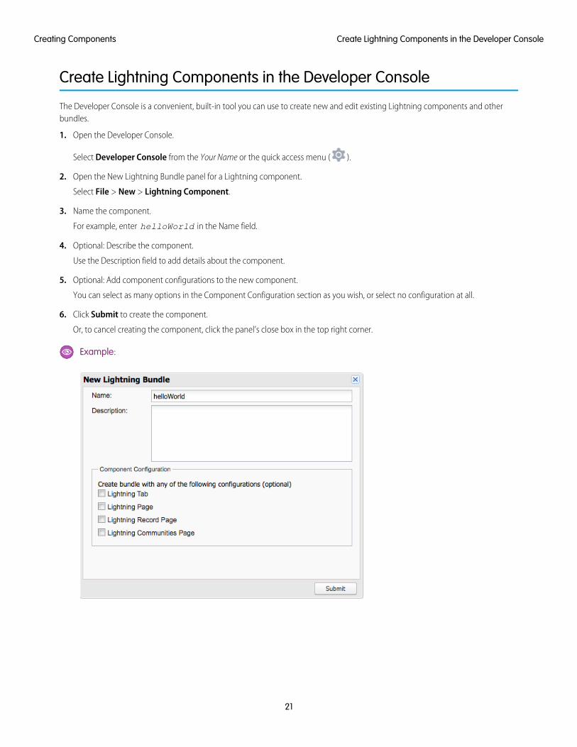
Create Lightning Components in the Developer Console
The Developer Console is a convenient, built-in tool you can use to create new and edit existing Lightning components and otherbundles.
1. Open the Developer Console.
Select Developer Console from the Your Name or the quick access menu ( ).
2. Open the New Lightning Bundle panel for a Lightning component.
Select File > New > Lightning Component.
3. Name the component.
For example, enter helloWorld in the Name field.
4. Optional: Describe the component.
Use the Description field to add details about the component.
5. Optional: Add component configurations to the new component.
You can select as many options in the Component Configuration section as you wish, or select no configuration at all.
6. Click Submit to create the component.
Or, to cancel creating the component, click the panel’s close box in the top right corner.
Example:
21
Create Lightning Components in the Developer ConsoleCreating Components
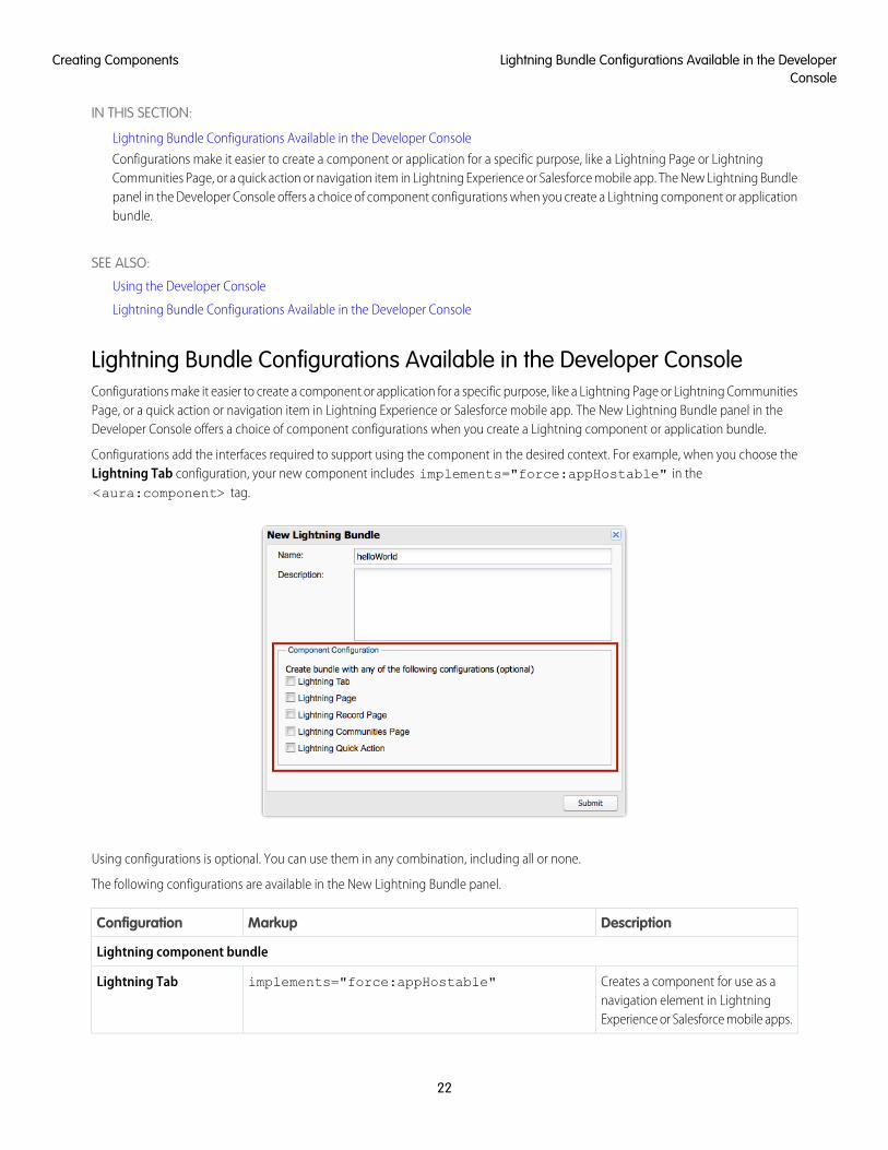
IN THIS SECTION:
Lightning Bundle Configurations Available in the Developer Console
Configurations make it easier to create a component or application for a specific purpose, like a Lightning Page or LightningCommunities Page, or a quick action or navigation item in Lightning Experience or Salesforce mobile app. The New Lightning Bundlepanel in the Developer Console offers a choice of component configurations when you create a Lightning component or applicationbundle.
SEE ALSO:
Using the Developer Console
Lightning Bundle Configurations Available in the Developer Console
Lightning Bundle Configurations Available in the Developer ConsoleConfigurations make it easier to create a component or application for a specific purpose, like a Lightning Page or Lightning CommunitiesPage, or a quick action or navigation item in Lightning Experience or Salesforce mobile app. The New Lightning Bundle panel in theDeveloper Console offers a choice of component configurations when you create a Lightning component or application bundle.
Configurations add the interfaces required to support using the component in the desired context. For example, when you choose theLightning Tab configuration, your new component includes implements="force:appHostable" in the<aura:component> tag.
Using configurations is optional. You can use them in any combination, including all or none.
The following configurations are available in the New Lightning Bundle panel.
DescriptionMarkupConfiguration
Lightning component bundle
Creates a component for use as anavigation element in LightningExperience or Salesforce mobile apps.
implements="force:appHostable"Lightning Tab
22
Lightning Bundle Configurations Available in the DeveloperConsole
Creating Components
DescriptionMarkupConfiguration
Creates a component for use inLightning pages or the Lightning AppBuilder.
implements="flexipage:availableForAllPageTypes"and access="global"
Lightning Page
Creates a component for use on arecord home page in LightningExperience.
implements="flexipage:availableForRecordHome,force:hasRecordId" and access="global"
Lightning Record Page
Creates a component that’s availablefor drag and drop in the CommunityBuilder.
implements="forceCommunity:availableForAllPageTypes"and access="global"
Lightning CommunitiesPage
Creates a component that can beused with a Lightning quick action.
implements="force:lightningQuickAction"Lightning Quick Action
Lightning application bundle
Creates an empty Lightning Outdependency app.
extends="ltng:outApp"Lightning OutDependency App
Note: For details of the markup added by each configuration, see the respective documentation for those features.
SEE ALSO:
Create Lightning Components in the Developer Console
Interface Reference
Configure Components for Custom Tabs
Configure Components for Custom Actions
Configure Components for Lightning Pages and the Lightning App Builder
Configure Components for Lightning Experience Record Pages
Configure Components for Communities
Component Markup
Component resources contain markup and have a .cmp suffix. The markup can contain text or references to other components, andalso declares metadata about the component.
Let's start with a simple "Hello, world!" example in a helloWorld.cmp component.
<aura:component>Hello, world!
</aura:component>
This is about as simple as a component can get. The "Hello, world!" text is wrapped in the <aura:component> tags, which appearat the beginning and end of every component definition.
23
Component MarkupCreating Components
Components can contain most HTML tags so you can use markup, such as <div> and <span>. HTML5 tags are also supported.
<aura:component><div class="container">
<!--Other HTML tags or components here--></div>
</aura:component>
Note: Case sensitivity should be respected as your markup interacts with JavaScript, CSS, and Apex.
Use the Developer Console to create components.
Component Naming RulesA component name must follow these naming rules:
• Must begin with a letter
• Must contain only alphanumeric or underscore characters
• Must be unique in the namespace
• Can’t include whitespace
• Can’t end with an underscore
• Can’t contain two consecutive underscores
SEE ALSO:
aura:component
Using the Developer Console
Component Access Control
Create a Custom Renderer
Dynamically Creating Components
Component Namespace
Every component is part of a namespace, which is used to group related components together. If your organization has a namespaceprefix set, use that namespace to access your components. Otherwise, use the default namespace to access your components.
Another component or application can reference a component by adding <myNamespace:myComponent> in its markup. Forexample, the helloWorld component is in the docsample namespace. Another component can reference it by adding<docsample:helloWorld /> in its markup.
Lightning components that Salesforce provides are grouped into several namespaces, such as aura, ui, and force. Componentsfrom third-party managed packages have namespaces from the providing organizations.
In your organization, you can choose to set a namespace prefix. If you do, that namespace is used for all of your Lightning components.A namespace prefix is required if you plan to offer managed packages on the AppExchange.
If you haven’t set a namespace prefix for your organization, use the default namespace c when referencing components that you’vecreated.
24
Component NamespaceCreating Components
Namespaces in Code SamplesThe code samples throughout this guide use the default c namespace. Replace c with your namespace if you’ve set a namespaceprefix.
Using the Default Namespace in Organizations with No Namespace SetIf your organization hasn’t set a namespace prefix, use the default namespace c when referencing Lightning components that you’vecreated.
The following items must use the c namespace when your organization doesn’t have a namespace prefix set.
• References to components that you’ve created
• References to events that you’ve defined
The following items use an implicit namespace for your organization and don’t require you to specify a namespace.
• References to custom objects
• References to custom fields on standard and custom objects
• References to Apex controllers
See Namespace Usage Examples and Reference on page 26 for examples of all of the preceding items.
Using Your Organization’s NamespaceIf your organization has set a namespace prefix, use that namespace to reference Lightning components, events, custom objects andfields, and other items in your Lightning markup.
The following items use your organization’s namespace when your organization has a namespace prefix set.
• References to components that you’ve created
• References to events that you’ve defined
• References to custom objects
• References to custom fields on standard and custom objects
• References to Apex controllers
• References to static resources
Note: Support for the c namespace in organizations that have set a namespace prefix is incomplete. The following items canuse the c namespace if you prefer to use the shortcut, but it’s not currently a recommended practice.
• References to components that you’ve created when used in Lightning markup, but not in expressions or JavaScript
• References to events that you’ve defined when used in Lightning markup, but not in expressions or JavaScript
• References to custom objects when used in component and event type and default system attributes, but not inexpressions or JavaScript
See Namespace Usage Examples and Reference on page 26 for examples of the preceding items.
Using a Namespace in or from a Managed PackageAlways use the complete namespace when referencing items from a managed package, or when creating code that you intend todistribute in your own managed packages.
25
Using the Default Namespace in Organizations with NoNamespace Set
Creating Components
Creating a Namespace in Your OrganizationCreate a namespace for your organization by registering a namespace prefix.
If you’re not creating managed packages for distribution then registering a namespace prefix isn’t required, but it’s a best practice forall but the smallest organizations.
Your namespace prefix must:
• Begin with a letter
• Contain one to 15 alphanumeric characters
• Not contain two consecutive underscores
For example, myNp123 and my_np are valid namespaces, but 123Company and my__np aren’t.
To register a namespace prefix:
1. From Setup, enter Packages in the Quick Find box. Under Create, select Packages.
Note: This item is only available in Salesforce Classic.
2. In the Developer Settings panel, click Edit.
Note: This button doesn’t appear if you’ve already configured your developer settings.
3. Review the selections that are required for configuring developer settings, and then click Continue.
4. Enter the namespace prefix you want to register.
5. Click Check Availability to determine if the namespace prefix is already in use.
6. If the namespace prefix that you entered isn’t available, repeat the previous two steps.
7. Click Review My Selections.
8. Click Save.
Namespace Usage Examples and ReferenceThis topic provides examples of referencing components, objects, fields, and so on in Lightning components code.
Examples are provided for the following.
• Components, events, and interfaces in your organization
• Custom objects in your organization
• Custom fields on standard and custom objects in your organization
• Server-side Apex controllers in your organization
• Dynamic creation of components in JavaScript
• Static resources in your organization
Organizations with No Namespace Prefix SetThe following illustrates references to elements in your organization when your organization doesn’t have a namespace prefix set.References use the default namespace, c, where necessary.
26
Creating a Namespace in Your OrganizationCreating Components
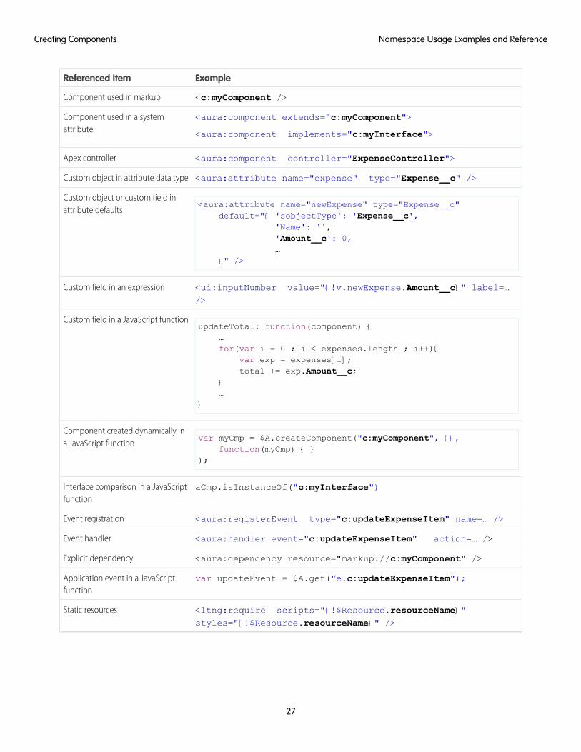
ExampleReferenced Item
<c:myComponent />Component used in markup
<aura:component extends="c:myComponent">
<aura:component implements="c:myInterface">
Component used in a systemattribute
<aura:component controller="ExpenseController">Apex controller
<aura:attribute name="expense" type="Expense__c" />Custom object in attribute data type
<aura:attribute name="newExpense" type="Expense__c"default="{ 'sobjectType': 'Expense__c',
Custom object or custom field inattribute defaults
'Name': '','Amount__c': 0,…
}" />
<ui:inputNumber value="{!v.newExpense.Amount__c}" label=…/>
Custom field in an expression
updateTotal: function(component) {…
Custom field in a JavaScript function
for(var i = 0 ; i < expenses.length ; i++){var exp = expenses[i];total += exp.Amount__c;
}…
}
var myCmp = $A.createComponent("c:myComponent", {},function(myCmp) { }
);
Component created dynamically ina JavaScript function
aCmp.isInstanceOf("c:myInterface")Interface comparison in a JavaScriptfunction
<aura:registerEvent type="c:updateExpenseItem" name=… />Event registration
<aura:handler event="c:updateExpenseItem" action=… />Event handler
<aura:dependency resource="markup://c:myComponent" />Explicit dependency
var updateEvent = $A.get("e.c:updateExpenseItem");Application event in a JavaScriptfunction
<ltng:require scripts="{!$Resource.resourceName}"styles="{!$Resource.resourceName}" />
Static resources
27
Namespace Usage Examples and ReferenceCreating Components
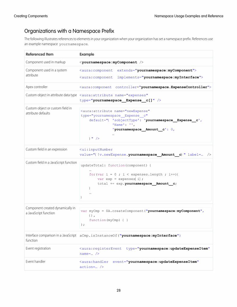
Organizations with a Namespace PrefixThe following illustrates references to elements in your organization when your organization has set a namespace prefix. References usean example namespace yournamespace.
ExampleReferenced Item
<yournamespace:myComponent />Component used in markup
<aura:component extends="yournamespace:myComponent">
<aura:component implements="yournamespace:myInterface">
Component used in a systemattribute
<aura:component controller="yournamespace.ExpenseController">Apex controller
<aura:attribute name="expenses"type="yournamespace__Expense__c[]" />
Custom object in attribute data type
<aura:attribute name="newExpense"type="yournamespace__Expense__c"
Custom object or custom field inattribute defaults
default="{ 'sobjectType': 'yournamespace__Expense__c','Name': '','yournamespace__Amount__c': 0,…
}" />
<ui:inputNumbervalue="{!v.newExpense.yournamespace__Amount__c}" label=… />
Custom field in an expression
updateTotal: function(component) {…
Custom field in a JavaScript function
for(var i = 0 ; i < expenses.length ; i++){var exp = expenses[i];total += exp.yournamespace__Amount__c;
}…
}
var myCmp = $A.createComponent("yournamespace:myComponent",{},
Component created dynamically ina JavaScript function
function(myCmp) { });
aCmp.isInstanceOf("yournamespace:myInterface")Interface comparison in a JavaScriptfunction
<aura:registerEvent type="yournamespace:updateExpenseItem"name=… />
Event registration
<aura:handler event="yournamespace:updateExpenseItem"action=… />
Event handler
28
Namespace Usage Examples and ReferenceCreating Components
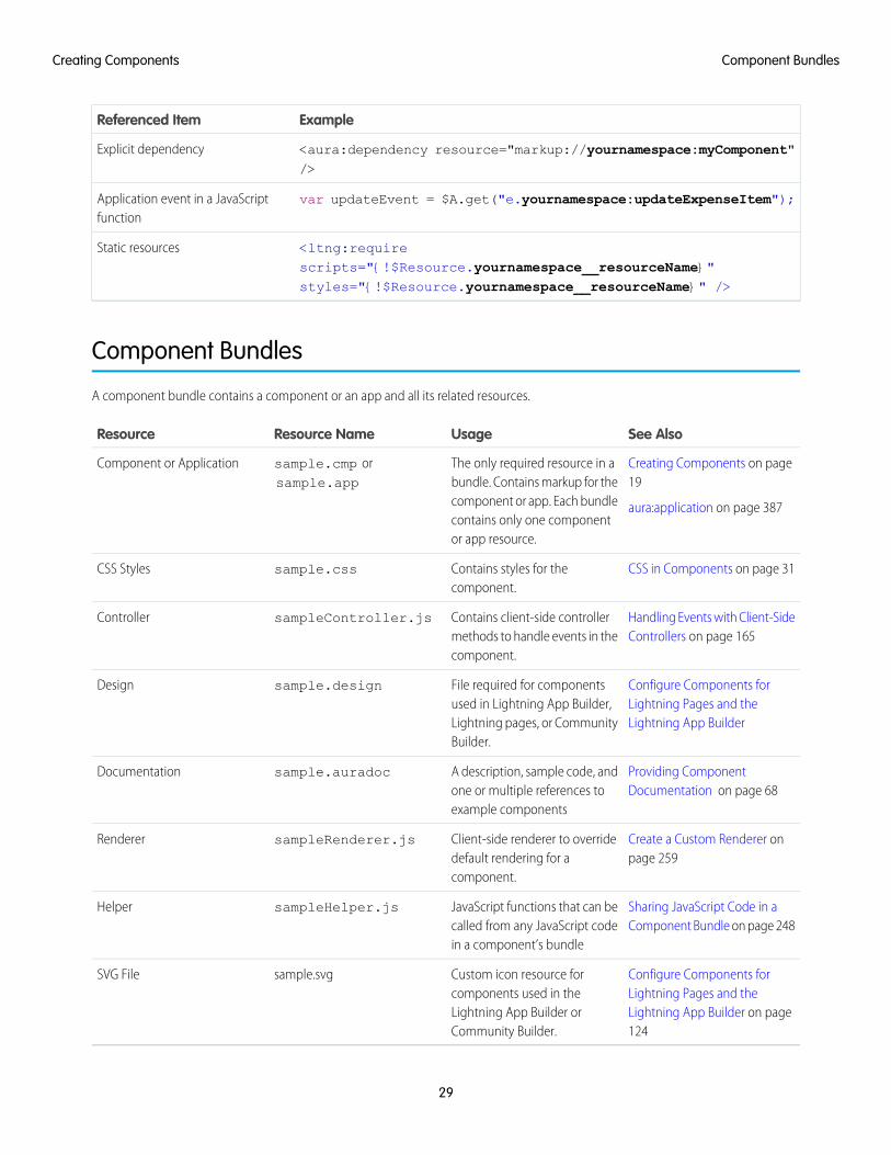
ExampleReferenced Item
<aura:dependency resource="markup://yournamespace:myComponent"/>
Explicit dependency
var updateEvent = $A.get("e.yournamespace:updateExpenseItem");Application event in a JavaScriptfunction
<ltng:requirescripts="{!$Resource.yournamespace__resourceName}"styles="{!$Resource.yournamespace__resourceName}" />
Static resources
Component Bundles
A component bundle contains a component or an app and all its related resources.
See AlsoUsageResource NameResource
Creating Components on page19
aura:application on page 387
The only required resource in abundle. Contains markup for thecomponent or app. Each bundlecontains only one componentor app resource.
sample.cmp orsample.app
Component or Application
CSS in Components on page 31Contains styles for thecomponent.
sample.cssCSS Styles
Handling Events with Client-SideControllers on page 165
Contains client-side controllermethods to handle events in thecomponent.
sampleController.jsController
Configure Components forLightning Pages and theLightning App Builder
File required for componentsused in Lightning App Builder,Lightning pages, or CommunityBuilder.
sample.designDesign
Providing ComponentDocumentation on page 68
A description, sample code, andone or multiple references toexample components
sample.auradocDocumentation
Create a Custom Renderer onpage 259
Client-side renderer to overridedefault rendering for acomponent.
sampleRenderer.jsRenderer
Sharing JavaScript Code in aComponent Bundle on page 248
JavaScript functions that can becalled from any JavaScript codein a component’s bundle
sampleHelper.jsHelper
Configure Components forLightning Pages and the
Custom icon resource forcomponents used in the
sample.svgSVG File
Lightning App Builder on page124
Lightning App Builder orCommunity Builder.
29
Component BundlesCreating Components
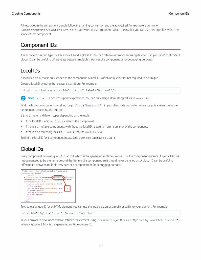
All resources in the component bundle follow the naming convention and are auto-wired. For example, a controller<componentName>Controller.js is auto-wired to its component, which means that you can use the controller within thescope of that component.
Component IDs
A component has two types of IDs: a local ID and a global ID. You can retrieve a component using its local ID in your JavaScript code. Aglobal ID can be useful to differentiate between multiple instances of a component or for debugging purposes.
Local IDsA local ID is an ID that is only scoped to the component. A local ID is often unique but it’s not required to be unique.
Create a local ID by using the aura:id attribute. For example:
<lightning:button aura:id="button1" label="button1"/>
Note: aura:id doesn't support expressions. You can only assign literal string values to aura:id.
Find the button component by calling cmp.find("button1") in your client-side controller, where cmp is a reference to thecomponent containing the button.
find() returns different types depending on the result.
• If the local ID is unique, find() returns the component.
• If there are multiple components with the same local ID, find() returns an array of the components.
• If there is no matching local ID, find() returns undefined.
To find the local ID for a component in JavaScript, use cmp.getLocalId().
Global IDsEvery component has a unique globalId, which is the generated runtime-unique ID of the component instance. A global ID (1) isnot guaranteed to be the same beyond the lifetime of a component, so it should never be relied on. A global ID can be useful todifferentiate between multiple instances of a component or for debugging purposes.
To create a unique ID for an HTML element, you can use the globalId as a prefix or suffix for your element. For example:
<div id="{!globalId + '_footer'}"></div>
In your browser’s developer console, retrieve the element using document.getElementById("<globalId>_footer"),where <globalId> is the generated runtime-unique ID.
30
Component IDsCreating Components
To retrieve a component’s global ID in JavaScript, use the getGlobalId() function.
var globalId = cmp.getGlobalId();
SEE ALSO:
Finding Components by ID
Which Button Was Pressed?
HTML in Components
An HTML tag is treated as a first-class component by the framework. Each HTML tag is translated into an <aura:html> component,allowing it to enjoy the same rights and privileges as any other component.
For example, the framework automatically converts a standard HTML <div> tag to this component:
<aura:html tag="div" />
You can add HTML markup in components. Note that you must use strict XHTML. For example, use <br/> instead of <br>. You canalso use HTML attributes and DOM events, such as onclick.
Warning: Some tags, like <applet> and <font>, aren’t supported. For a full list of unsupported tags, see Supported HTMLTags on page 642.
Unescaping HTMLTo output pre-formatted HTML, use aura:unescapedHTML. For example, this is useful if you want to display HTML that is generatedon the server and add it to the DOM. You must escape any HTML if necessary or your app might be exposed to security vulnerabilities.
You can pass in values from an expression, such as in <aura:unescapedHtml value="{!v.note.body}"/>.
{!expression} is the framework's expression syntax. For more information, see Using Expressions on page 42.
SEE ALSO:
Supported HTML Tags
CSS in Components
CSS in Components
Style your components with CSS.
Add CSS to a component bundle by clicking the STYLE button in the Developer Console sidebar.
For external CSS resources, see Styling Apps on page 226.
All top-level elements in a component have a special THIS CSS class added to them. This, effectively, adds namespacing to CSS andhelps prevent one component's CSS from blowing away another component's styling. The framework throws an error if a CSS file doesn'tfollow this convention.
Let's look at a sample helloHTML.cmp component. The CSS is in helloHTML.css.
31
HTML in ComponentsCreating Components
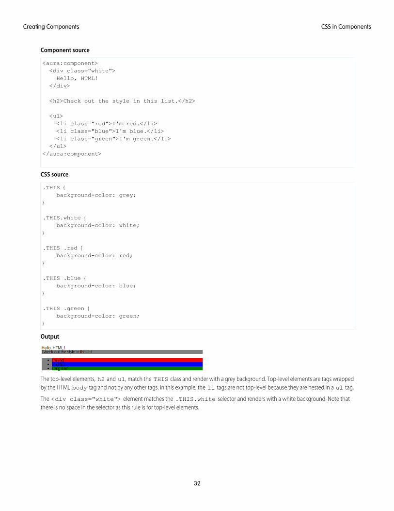
Component source
<aura:component><div class="white">Hello, HTML!
</div>
<h2>Check out the style in this list.</h2>
<ul><li class="red">I'm red.</li><li class="blue">I'm blue.</li><li class="green">I'm green.</li>
</ul></aura:component>
CSS source
.THIS {background-color: grey;
}
.THIS.white {background-color: white;
}
.THIS .red {background-color: red;
}
.THIS .blue {background-color: blue;
}
.THIS .green {background-color: green;
}
Output
The top-level elements, h2 and ul, match the THIS class and render with a grey background. Top-level elements are tags wrappedby the HTML body tag and not by any other tags. In this example, the li tags are not top-level because they are nested in a ul tag.
The <div class="white"> element matches the .THIS.white selector and renders with a white background. Note thatthere is no space in the selector as this rule is for top-level elements.
32
CSS in ComponentsCreating Components
The <li class="red"> element matches the .THIS .red selector and renders with a red background. Note that this is adescendant selector and it contains a space as the <li> element is not a top-level element.
SEE ALSO:
Adding and Removing Styles
HTML in Components
Component Attributes
Component attributes are like member variables on a class in Apex. They are typed fields that are set on a specific instance of a component,and can be referenced from within the component's markup using an expression syntax. Attributes enable you to make componentsmore dynamic.
Use the <aura:attribute> tag to add an attribute to the component or app. Let’s look at the following sample,helloAttributes.app:
<aura:application><aura:attribute name="whom" type="String" default="world"/>Hello {!v.whom}!
</aura:application>
All attributes have a name and a type. Attributes may be marked as required by specifying required="true", and may also specifya default value.
In this case we've got an attribute named whom of type String. If no value is specified, it defaults to "world".
Though not a strict requirement, <aura:attribute> tags are usually the first things listed in a component’s markup, as it providesan easy way to read the component's shape at a glance.
Attribute Naming RulesAn attribute name must follow these naming rules:
• Must begin with a letter or an underscore
• Must contain only alphanumeric or underscore characters
ExpressionshelloAttributes.app contains an expression, {!v.whom}, which is responsible for the component's dynamic output.
{!expression} is the framework's expression syntax. In this case, the expression we are evaluating is v.whom. The name of theattribute we defined is whom, while v is the value provider for a component's attribute set, which represents the view.
Note: Expressions are case sensitive. For example, if you have a custom field myNamespace__Amount__c, you must referto it as {!v.myObject.myNamespace__Amount__c}.
SEE ALSO:
Supported aura:attribute Types
Using Expressions
33
Component AttributesCreating Components
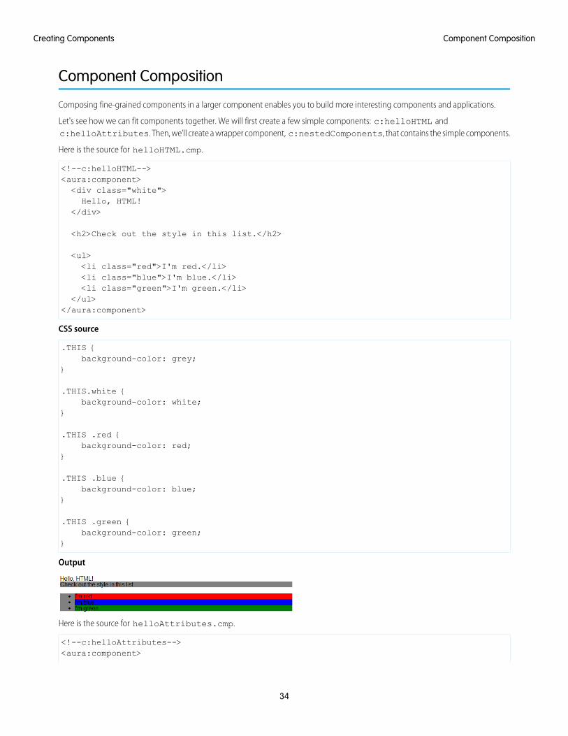
Component Composition
Composing fine-grained components in a larger component enables you to build more interesting components and applications.
Let's see how we can fit components together. We will first create a few simple components: c:helloHTML andc:helloAttributes. Then, we’ll create a wrapper component, c:nestedComponents, that contains the simple components.
Here is the source for helloHTML.cmp.
<!--c:helloHTML--><aura:component><div class="white">Hello, HTML!
</div>
<h2>Check out the style in this list.</h2>
<ul><li class="red">I'm red.</li><li class="blue">I'm blue.</li><li class="green">I'm green.</li>
</ul></aura:component>
CSS source
.THIS {background-color: grey;
}
.THIS.white {background-color: white;
}
.THIS .red {background-color: red;
}
.THIS .blue {background-color: blue;
}
.THIS .green {background-color: green;
}
Output
Here is the source for helloAttributes.cmp.
<!--c:helloAttributes--><aura:component>
34
Component CompositionCreating Components
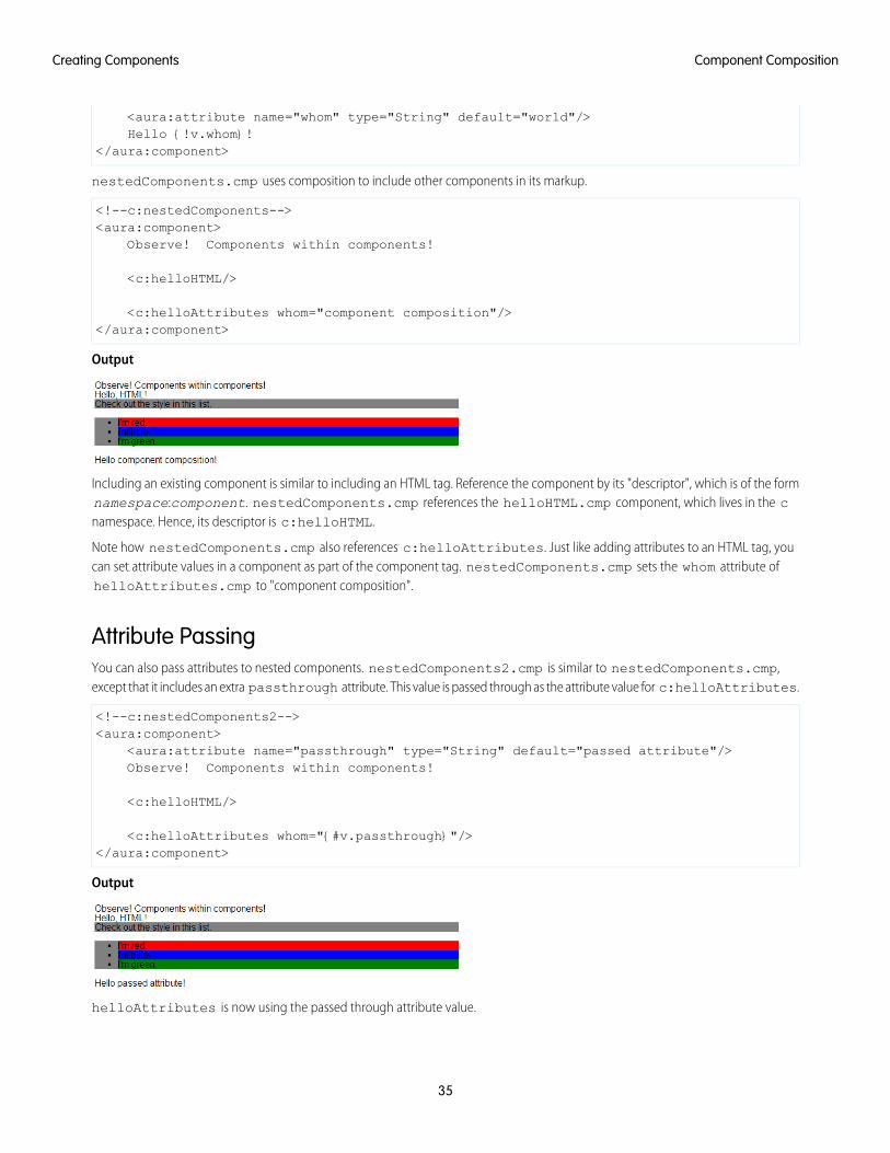
<aura:attribute name="whom" type="String" default="world"/>Hello {!v.whom}!
</aura:component>
nestedComponents.cmp uses composition to include other components in its markup.
<!--c:nestedComponents--><aura:component>
Observe! Components within components!
<c:helloHTML/>
<c:helloAttributes whom="component composition"/></aura:component>
Output
Including an existing component is similar to including an HTML tag. Reference the component by its "descriptor", which is of the formnamespace:component. nestedComponents.cmp references the helloHTML.cmp component, which lives in the cnamespace. Hence, its descriptor is c:helloHTML.
Note how nestedComponents.cmp also references c:helloAttributes. Just like adding attributes to an HTML tag, youcan set attribute values in a component as part of the component tag. nestedComponents.cmp sets the whom attribute ofhelloAttributes.cmp to "component composition".
Attribute PassingYou can also pass attributes to nested components. nestedComponents2.cmp is similar to nestedComponents.cmp,except that it includes an extra passthrough attribute. This value is passed through as the attribute value for c:helloAttributes.
<!--c:nestedComponents2--><aura:component>
<aura:attribute name="passthrough" type="String" default="passed attribute"/>Observe! Components within components!
<c:helloHTML/>
<c:helloAttributes whom="{#v.passthrough}"/></aura:component>
Output
helloAttributes is now using the passed through attribute value.
35
Component CompositionCreating Components
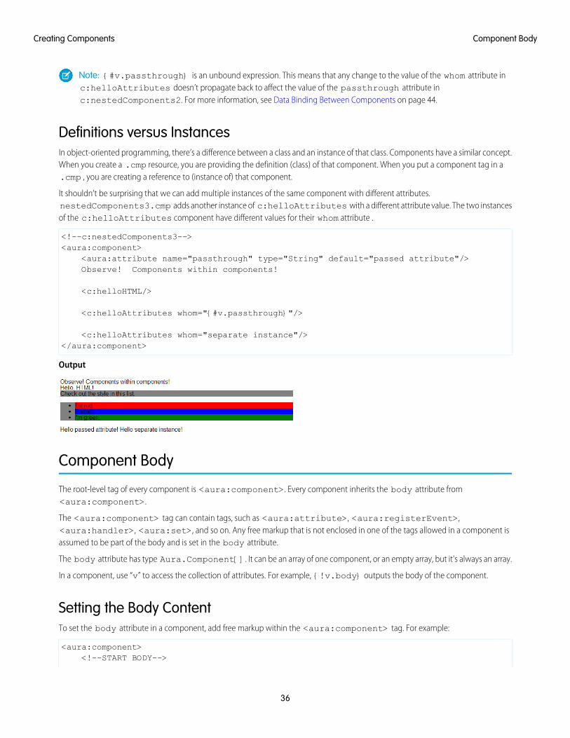
Note: {#v.passthrough} is an unbound expression. This means that any change to the value of the whom attribute inc:helloAttributes doesn’t propagate back to affect the value of the passthrough attribute inc:nestedComponents2. For more information, see Data Binding Between Components on page 44.
Definitions versus InstancesIn object-oriented programming, there’s a difference between a class and an instance of that class. Components have a similar concept.When you create a .cmp resource, you are providing the definition (class) of that component. When you put a component tag in a.cmp , you are creating a reference to (instance of) that component.
It shouldn't be surprising that we can add multiple instances of the same component with different attributes.nestedComponents3.cmp adds another instance of c:helloAttributes with a different attribute value. The two instancesof the c:helloAttributes component have different values for their whom attribute .
<!--c:nestedComponents3--><aura:component>
<aura:attribute name="passthrough" type="String" default="passed attribute"/>Observe! Components within components!
<c:helloHTML/>
<c:helloAttributes whom="{#v.passthrough}"/>
<c:helloAttributes whom="separate instance"/></aura:component>
Output
Component Body
The root-level tag of every component is <aura:component>. Every component inherits the body attribute from<aura:component>.
The <aura:component> tag can contain tags, such as <aura:attribute>, <aura:registerEvent>,<aura:handler>, <aura:set>, and so on. Any free markup that is not enclosed in one of the tags allowed in a component isassumed to be part of the body and is set in the body attribute.
The body attribute has type Aura.Component[]. It can be an array of one component, or an empty array, but it's always an array.
In a component, use “v” to access the collection of attributes. For example, {!v.body} outputs the body of the component.
Setting the Body ContentTo set the body attribute in a component, add free markup within the <aura:component> tag. For example:
<aura:component><!--START BODY-->
36
Component BodyCreating Components
<div>Body part</div><lightning:button label="Push Me" onclick="{!c.doSomething}"/><!--END BODY-->
</aura:component>
To set the value of an inherited attribute, use the <aura:set> tag. Setting the body content is equivalent to wrapping that freemarkup inside <aura:set attribute="body">. Since the body attribute has this special behavior, you can omit <aura:setattribute="body">.
The previous sample is a shortcut for this markup. We recommend the less verbose syntax in the previous sample.
<aura:component><aura:set attribute="body">
<!--START BODY--><div>Body part</div><lightning:button label="Push Me" onclick="{!c.doSomething}"/><!--END BODY-->
</aura:set></aura:component>
The same logic applies when you use any component that has a body attribute, not just <aura:component>. For example:
<lightning:tabset><lightning:tab label="Tab 1">
Hello world!</lightning:tab>
</lightning:tabset>
This is a shortcut for:
<lightning:tabset><lightning:tab label="Tab 1">
<aura:set attribute="body">Hello World!
</aura:set></lightning:tab>
</lightning:tabset>
Accessing the Component BodyTo access a component body in JavaScript, use component.get("v.body").
SEE ALSO:
aura:set
Working with a Component Body in JavaScript
Component Facets
A facet is any attribute of type Aura.Component[]. The body attribute is an example of a facet.
37
Component FacetsCreating Components
To define your own facet, add an aura:attribute tag of type Aura.Component[] to your component. For example, let'screate a new component called facetHeader.cmp.
<!--c:facetHeader--><aura:component>
<aura:attribute name="header" type="Aura.Component[]"/>
<div><span class="header">{!v.header}</span><br/><span class="body">{!v.body}</span>
</div></aura:component>
This component has a header facet. Note how we position the output of the header using the v.header expression.
The component doesn't have any output when you access it directly as the header and body attributes aren't set. Let’s create anothercomponent, helloFacets.cmp, that sets these attributes.
<!--c:helloFacets--><aura:component>
See how we set the header facet.<br/>
<c:facetHeader>
Nice body!
<aura:set attribute="header">Hello Header!
</aura:set></c:facetHeader>
</aura:component>
Note that aura:set sets the value of the header attribute of facetHeader.cmp, but you don’t need to use aura:set ifyou’re setting the body attribute.
SEE ALSO:
Component Body
Best Practices for Conditional Markup
Using the <aura:if> tag is the preferred approach to conditionally display markup but there are alternatives. Consider the performancecost and code maintainability when you design components. The best design choice depends on your use case.
38
Best Practices for Conditional MarkupCreating Components
Conditionally Create Elements with <aura:if>Let’s look at a simple example that shows an error message when an error occurs.
<aura:if isTrue="{!v.isError}"><div>{!v.errorMessage}</div>
</aura:if>
The <div> component and its contents are only created and rendered if the value of the isTrue expression evaluates to true. Ifthe value of the isTrue expression changes and evaluates to false, all the components inside the <aura:if> tag are destroyed.The components are created again if the isTrue expression changes again and evaluates to true.
The general guideline is to use <aura:if> because it helps your components load faster initially by deferring the creation andrendering of the enclosed element tree until the condition is fulfilled.
Toggle Visibility Using CSSYou can use CSS to toggle visibility of markup by calling $A.util.toggleClass(cmp, 'class') in JavaScript code.
Elements in markup are created and rendered up front, but they’re hidden. For an example, see Dynamically Showing or Hiding Markup.
The conditional markup is created and rendered even if it’s not used, so <aura:if> is preferred.
Dynamically Create Components in JavaScriptYou can dynamically create components in JavaScript code. However, writing code is usually harder to maintain and debug than usingmarkup. Again, using <aura:if> is preferred but the best design choice depends on your use case.
SEE ALSO:
aura:if
Conditional Expressions
Dynamically Creating Components
Component Versioning
Component versioning enables you to declare dependencies against specific revisions of an installed managed package.
By assigning a version to your component, you have granular control over how the component functions when new versions of amanaged package are released. For example, imagine that a <packageNamespace>:button is pinned to version 2.0 of a package.Upon installing version 3.0, the button retains its version 2.0 functionality.
Note: The package developer is responsible for inserting versioning logic into the markup when updating a component. If thecomponent wasn’t changed in the update or if the markup doesn’t account for version, the component behaves in the contextof the most recent version.
Versions are assigned declaratively in the Developer Console. When you’re working on a component, click Bundle Version Settingsin the right panel to define the version. You can only version a component if you’ve installed a package, and the valid versions for thecomponent are the available versions of that package. Versions are in the format <major>.<minor>. So if you assign a componentversion 1.4, its behavior depends on the first major release and fourth minor release of the associated package.
39
Component VersioningCreating Components
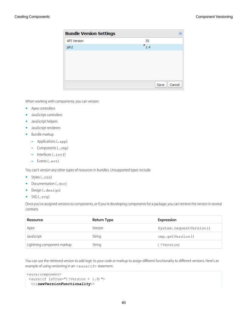
When working with components, you can version:
• Apex controllers
• JavaScript controllers
• JavaScript helpers
• JavaScript renderers
• Bundle markup
– Applications (.app)
– Components (.cmp)
– Interfaces (.intf)
– Events (.evt)
You can’t version any other types of resources in bundles. Unsupported types include:
• Styles (.css)
• Documentation (.doc)
• Design (.design)
• SVG (.svg)
Once you’ve assigned versions to components, or if you’re developing components for a package, you can retrieve the version in severalcontexts.
ExpressionReturn TypeResource
System.requestVersion()VersionApex
cmp.getVersion()StringJavaScript
{!Version}StringLightning component markup
You can use the retrieved version to add logic to your code or markup to assign different functionality to different versions. Here’s anexample of using versioning in an <aura:if> statement.
<aura:component><aura:if isTrue="{!Version > 1.0}"><c:newVersionFunctionality/>
40
Component VersioningCreating Components
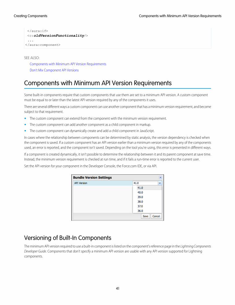
</aura:if><c:oldVersionFunctionality/>...</aura:component>
SEE ALSO:
Components with Minimum API Version Requirements
Don’t Mix Component API Versions
Components with Minimum API Version Requirements
Some built-in components require that custom components that use them are set to a minimum API version. A custom componentmust be equal to or later than the latest API version required by any of the components it uses.
There are several different ways a custom component can use another component that has a minimum version requirement, and becomesubject to that requirement.
• The custom component can extend from the component with the minimum version requirement.
• The custom component can add another component as a child component in markup.
• The custom component can dynamically create and add a child component in JavaScript.
In cases where the relationship between components can be determined by static analysis, the version dependency is checked whenthe component is saved. If a custom component has an API version earlier than a minimum version required by any of the componentsused, an error is reported, and the component isn’t saved. Depending on the tool you’re using, this error is presented in different ways.
If a component is created dynamically, it isn’t possible to determine the relationship between it and its parent component at save time.Instead, the minimum version requirement is checked at run time, and if it fails a run-time error is reported to the current user.
Set the API version for your component in the Developer Console, the Force.com IDE, or via API.
Versioning of Built-In ComponentsThe minimum API version required to use a built-in component is listed on the component’s reference page in the Lightning ComponentsDeveloper Guide. Components that don’t specify a minimum API version are usable with any API version supported for Lightningcomponents.
41
Components with Minimum API Version RequirementsCreating Components
The minimum version for built-in components that are Generally Available (GA) won’t increase in future releases. (However, as withVisualforce components, their behavior might change depending on the API version of the containing component.)
SEE ALSO:
Component Versioning
Don’t Mix Component API Versions
Using Expressions
Expressions allow you to make calculations and access property values and other data within component markup. Use expressions fordynamic output or passing values into components by assigning them to attributes.
An expression is any set of literal values, variables, sub-expressions, or operators that can be resolved to a single value. Method calls arenot allowed in expressions.
The expression syntax is: {!expression}
expression is a placeholder for the expression.
Anything inside the {! } delimiters is evaluated and dynamically replaced when the component is rendered or when the value isused by the component. Whitespace is ignored.
The resulting value can be a primitive, such as an integer, string, or boolean. It can also be a JavaScript object, a component or collection,a controller method such as an action method, and other useful results.
Note: If you're familiar with other languages, you may be tempted to read the ! as the "bang" operator, which negates booleanvalues in many programming languages. In the Lightning Component framework, {! is simply the delimiter used to begin anexpression.
If you're familiar with Visualforce, this syntax will look familiar.
There is a second expression syntax: {#expression}. For more details on the difference between the two forms of expressionsyntax, see Data Binding Between Components.
Identifiers in an expression, such as attribute names accessed through the view, controller values, or labels, must start with a letter orunderscore. They can also contain numbers or hyphens after the first character. For example, {!v.2count} is not valid, but{!v.count} is.
Important: Only use the {! } syntax in markup in .app or .cmp files. In JavaScript, use string syntax to evaluate an expression.For example:
var theLabel = cmp.get("v.label");
If you want to escape {!, use this syntax:
<aura:text value="{!"/>
This renders {! in plain text because the aura:text component never interprets {! as the start of an expression.
IN THIS SECTION:
Dynamic Output in Expressions
The simplest way to use expressions is to output dynamic values.
42
Using ExpressionsCreating Components
Conditional Expressions
Here are examples of conditional expressions using the ternary operator and the <aura:if> tag.
Data Binding Between Components
When you add a component in markup, you can use an expression to initialize attribute values in the component based on attributevalues of the container component. There are two forms of expression syntax, which exhibit different behaviors for data bindingbetween the components.
Value Providers
Value providers are a way to access data. Value providers encapsulate related values together, similar to how an object encapsulatesproperties and methods.
Expression Evaluation
Expressions are evaluated much the same way that expressions in JavaScript or other programming languages are evaluated.
Expression Operators Reference
The expression language supports operators to enable you to create more complex expressions.
Expression Functions Reference
The expression language contains math, string, array, comparison, boolean, and conditional functions. All functions are case-sensitive.
Dynamic Output in ExpressionsThe simplest way to use expressions is to output dynamic values.
Values used in the expression can be from component attributes, literal values, booleans, and so on. For example:
{!v.desc}
In this expression, v represents the view, which is the set of component attributes, and desc is an attribute of the component. Theexpression is simply outputting the desc attribute value for the component that contains this markup.
If you're including literal values in expressions, enclose text values within single quotes, such as {!'Some text'}.
Include numbers without quotes, for example, {!123}.
For booleans, use {!true} for true and {!false} for false.
SEE ALSO:
Component Attributes
Value Providers
Conditional ExpressionsHere are examples of conditional expressions using the ternary operator and the <aura:if> tag.
Ternary OperatorThis expression uses the ternary operator to conditionally output one of two values dependent on a condition.
<a class="{!v.location == '/active' ? 'selected' : ''}" href="#/active">Active</a>
The {!v.location == '/active' ? 'selected' : ''} expression conditionally sets the class attribute of an HTML<a> tag, by checking whether the location attribute is set to /active. If true, the expression sets class to selected.
43
Dynamic Output in ExpressionsCreating Components
Using <aura:if> for Conditional MarkupThis snippet of markup uses the <aura:if> tag to conditionally display an edit button.
<aura:attribute name="edit" type="Boolean" default="true"/><aura:if isTrue="{!v.edit}">
<ui:button label="Edit"/><aura:set attribute="else">
You can’t edit this.</aura:set>
</aura:if>
If the edit attribute is set to true, a ui:button displays. Otherwise, the text in the else attribute displays.
SEE ALSO:
Best Practices for Conditional Markup
Data Binding Between ComponentsWhen you add a component in markup, you can use an expression to initialize attribute values in the component based on attributevalues of the container component. There are two forms of expression syntax, which exhibit different behaviors for data binding betweenthe components.
This concept is a little tricky, but it will make more sense when we look at an example. Consider a c:parent component that has aparentAttr attribute. c:parent contains a c:child component with a childAttr attribute that’s initialized to the valueof the parentAttr attribute. We’re passing the parentAttr attribute value from c:parent into the c:child component,which results in a data binding, also known as a value binding, between the two components.
<!--c:parent--><aura:component>
<aura:attribute name="parentAttr" type="String" default="parent attribute"/>
<!-- Instantiate the child component --><c:child childAttr="{!v.parentAttr}" />
</aura:component>
{!v.parentAttr} is a bound expression. Any change to the value of the childAttr attribute in c:child also affects theparentAttr attribute in c:parent and vice versa.
Now, let's change the markup from:
<c:child childAttr="{!v.parentAttr}" />
to:
<c:child childAttr="{#v.parentAttr}" />
{#v.parentAttr} is an unbound expression. Any change to the value of the childAttr attribute in c:child doesn’t affectthe parentAttr attribute in c:parent and vice versa.
Here’s a summary of the differences between the forms of expression syntax.
{#expression} (Unbound Expressions)Data updates behave as you would expect in JavaScript. Primitives, such as String, are passed by value, and data updates for theexpression in the parent and child are decoupled.
44
Data Binding Between ComponentsCreating Components
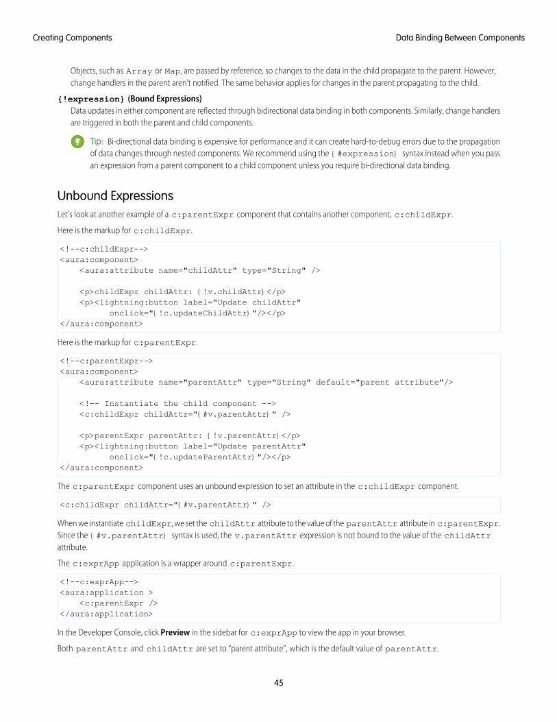
Objects, such as Array or Map, are passed by reference, so changes to the data in the child propagate to the parent. However,change handlers in the parent aren’t notified. The same behavior applies for changes in the parent propagating to the child.
{!expression} (Bound Expressions)Data updates in either component are reflected through bidirectional data binding in both components. Similarly, change handlersare triggered in both the parent and child components.
Tip: Bi-directional data binding is expensive for performance and it can create hard-to-debug errors due to the propagationof data changes through nested components. We recommend using the {#expression} syntax instead when you passan expression from a parent component to a child component unless you require bi-directional data binding.
Unbound ExpressionsLet’s look at another example of a c:parentExpr component that contains another component, c:childExpr.
Here is the markup for c:childExpr.
<!--c:childExpr--><aura:component>
<aura:attribute name="childAttr" type="String" />
<p>childExpr childAttr: {!v.childAttr}</p><p><lightning:button label="Update childAttr"
onclick="{!c.updateChildAttr}"/></p></aura:component>
Here is the markup for c:parentExpr.
<!--c:parentExpr--><aura:component>
<aura:attribute name="parentAttr" type="String" default="parent attribute"/>
<!-- Instantiate the child component --><c:childExpr childAttr="{#v.parentAttr}" />
<p>parentExpr parentAttr: {!v.parentAttr}</p><p><lightning:button label="Update parentAttr"
onclick="{!c.updateParentAttr}"/></p></aura:component>
The c:parentExpr component uses an unbound expression to set an attribute in the c:childExpr component.
<c:childExpr childAttr="{#v.parentAttr}" />
When we instantiate childExpr, we set the childAttr attribute to the value of the parentAttr attribute in c:parentExpr.Since the {#v.parentAttr} syntax is used, the v.parentAttr expression is not bound to the value of the childAttrattribute.
The c:exprApp application is a wrapper around c:parentExpr.
<!--c:exprApp--><aura:application >
<c:parentExpr /></aura:application>
In the Developer Console, click Preview in the sidebar for c:exprApp to view the app in your browser.
Both parentAttr and childAttr are set to “parent attribute”, which is the default value of parentAttr.
45
Data Binding Between ComponentsCreating Components
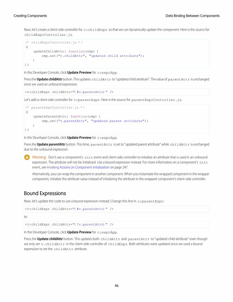
Now, let’s create a client-side controller for c:childExpr so that we can dynamically update the component. Here is the source forchildExprController.js.
/* childExprController.js */({
updateChildAttr: function(cmp) {cmp.set("v.childAttr", "updated child attribute");
}})
In the Developer Console, click Update Preview for c:exprApp.
Press the Update childAttr button. This updates childAttr to “updated child attribute”. The value of parentAttr is unchangedsince we used an unbound expression.
<c:childExpr childAttr="{#v.parentAttr}" />
Let’s add a client-side controller for c:parentExpr. Here is the source for parentExprController.js.
/* parentExprController.js */({
updateParentAttr: function(cmp) {cmp.set("v.parentAttr", "updated parent attribute");
}})
In the Developer Console, click Update Preview for c:exprApp.
Press the Update parentAttr button. This time, parentAttr is set to “updated parent attribute” while childAttr is unchangeddue to the unbound expression.
Warning: Don’t use a component’s init event and client-side controller to initialize an attribute that is used in an unboundexpression. The attribute will not be initialized. Use a bound expression instead. For more information on a component’s initevent, see Invoking Actions on Component Initialization on page 247.
Alternatively, you can wrap the component in another component. When you instantiate the wrapped component in the wrappercomponent, initialize the attribute value instead of initializing the attribute in the wrapped component’s client-side controller.
Bound ExpressionsNow, let’s update the code to use a bound expression instead. Change this line in c:parentExpr:
<c:childExpr childAttr="{#v.parentAttr}" />
to:
<c:childExpr childAttr="{!v.parentAttr}" />
In the Developer Console, click Update Preview for c:exprApp.
Press the Update childAttr button. This updates both childAttr and parentAttr to “updated child attribute” even thoughwe only set v.childAttr in the client-side controller of childExpr. Both attributes were updated since we used a boundexpression to set the childAttr attribute.
46
Data Binding Between ComponentsCreating Components
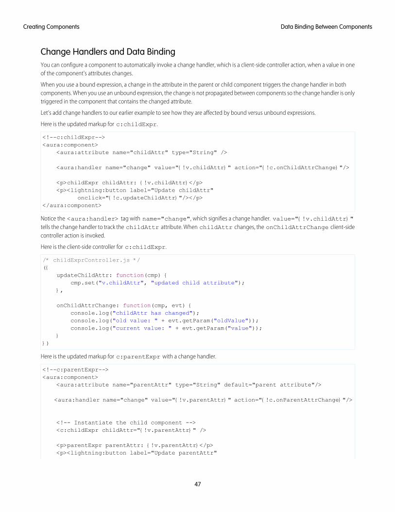
Change Handlers and Data BindingYou can configure a component to automatically invoke a change handler, which is a client-side controller action, when a value in oneof the component's attributes changes.
When you use a bound expression, a change in the attribute in the parent or child component triggers the change handler in bothcomponents. When you use an unbound expression, the change is not propagated between components so the change handler is onlytriggered in the component that contains the changed attribute.
Let’s add change handlers to our earlier example to see how they are affected by bound versus unbound expressions.
Here is the updated markup for c:childExpr.
<!--c:childExpr--><aura:component>
<aura:attribute name="childAttr" type="String" />
<aura:handler name="change" value="{!v.childAttr}" action="{!c.onChildAttrChange}"/>
<p>childExpr childAttr: {!v.childAttr}</p><p><lightning:button label="Update childAttr"
onclick="{!c.updateChildAttr}"/></p></aura:component>
Notice the <aura:handler> tag with name="change", which signifies a change handler. value="{!v.childAttr}"tells the change handler to track the childAttr attribute. When childAttr changes, the onChildAttrChange client-sidecontroller action is invoked.
Here is the client-side controller for c:childExpr.
/* childExprController.js */({
updateChildAttr: function(cmp) {cmp.set("v.childAttr", "updated child attribute");
},
onChildAttrChange: function(cmp, evt) {console.log("childAttr has changed");console.log("old value: " + evt.getParam("oldValue"));console.log("current value: " + evt.getParam("value"));
}})
Here is the updated markup for c:parentExpr with a change handler.
<!--c:parentExpr--><aura:component>
<aura:attribute name="parentAttr" type="String" default="parent attribute"/>
<aura:handler name="change" value="{!v.parentAttr}" action="{!c.onParentAttrChange}"/>
<!-- Instantiate the child component --><c:childExpr childAttr="{!v.parentAttr}" />
<p>parentExpr parentAttr: {!v.parentAttr}</p><p><lightning:button label="Update parentAttr"
47
Data Binding Between ComponentsCreating Components
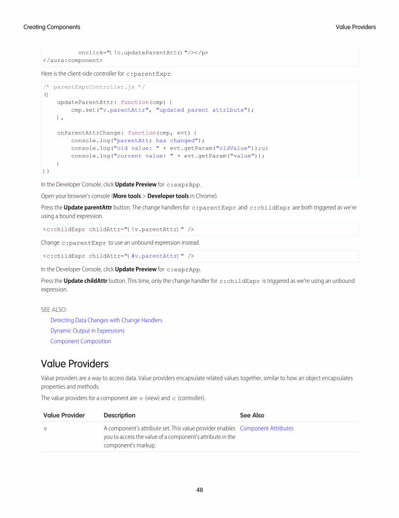
onclick="{!c.updateParentAttr}"/></p></aura:component>
Here is the client-side controller for c:parentExpr.
/* parentExprController.js */({
updateParentAttr: function(cmp) {cmp.set("v.parentAttr", "updated parent attribute");
},
onParentAttrChange: function(cmp, evt) {console.log("parentAttr has changed");console.log("old value: " + evt.getParam("oldValue"));uiconsole.log("current value: " + evt.getParam("value"));
}})
In the Developer Console, click Update Preview for c:exprApp.
Open your browser’s console (More tools > Developer tools in Chrome).
Press the Update parentAttr button. The change handlers for c:parentExpr and c:childExpr are both triggered as we’reusing a bound expression.
<c:childExpr childAttr="{!v.parentAttr}" />
Change c:parentExpr to use an unbound expression instead.
<c:childExpr childAttr="{#v.parentAttr}" />
In the Developer Console, click Update Preview for c:exprApp.
Press the Update childAttr button. This time, only the change handler for c:childExpr is triggered as we’re using an unboundexpression.
SEE ALSO:
Detecting Data Changes with Change Handlers
Dynamic Output in Expressions
Component Composition
Value ProvidersValue providers are a way to access data. Value providers encapsulate related values together, similar to how an object encapsulatesproperties and methods.
The value providers for a component are v (view) and c (controller).
See AlsoDescriptionValue Provider
Component AttributesA component’s attribute set. This value provider enablesyou to access the value of a component’s attribute in thecomponent’s markup.
v
48
Value ProvidersCreating Components
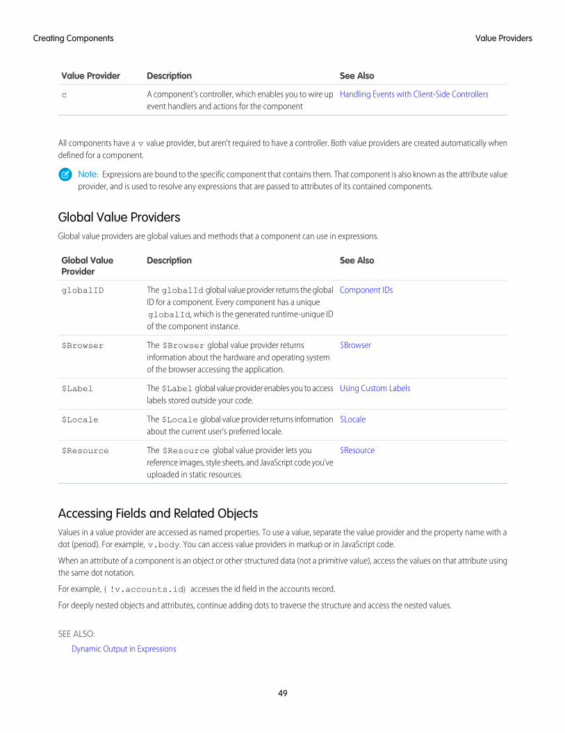
See AlsoDescriptionValue Provider
Handling Events with Client-Side ControllersA component’s controller, which enables you to wire upevent handlers and actions for the component
c
All components have a v value provider, but aren't required to have a controller. Both value providers are created automatically whendefined for a component.
Note: Expressions are bound to the specific component that contains them. That component is also known as the attribute valueprovider, and is used to resolve any expressions that are passed to attributes of its contained components.
Global Value ProvidersGlobal value providers are global values and methods that a component can use in expressions.
See AlsoDescriptionGlobal ValueProvider
Component IDsThe globalId global value provider returns the globalID for a component. Every component has a unique
globalID
globalId, which is the generated runtime-unique IDof the component instance.
$BrowserThe $Browser global value provider returnsinformation about the hardware and operating systemof the browser accessing the application.
$Browser
Using Custom LabelsThe $Label global value provider enables you to accesslabels stored outside your code.
$Label
$LocaleThe $Locale global value provider returns informationabout the current user’s preferred locale.
$Locale
$ResourceThe $Resource global value provider lets youreference images, style sheets, and JavaScript code you’veuploaded in static resources.
$Resource
Accessing Fields and Related ObjectsValues in a value provider are accessed as named properties. To use a value, separate the value provider and the property name with adot (period). For example, v.body. You can access value providers in markup or in JavaScript code.
When an attribute of a component is an object or other structured data (not a primitive value), access the values on that attribute usingthe same dot notation.
For example, {!v.accounts.id} accesses the id field in the accounts record.
For deeply nested objects and attributes, continue adding dots to traverse the structure and access the nested values.
SEE ALSO:
Dynamic Output in Expressions
49
Value ProvidersCreating Components
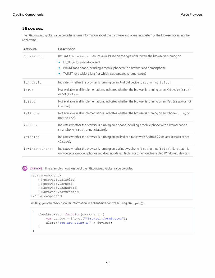
$Browser
The $Browser global value provider returns information about the hardware and operating system of the browser accessing theapplication.
DescriptionAttribute
Returns a FormFactor enum value based on the type of hardware the browser is running on.formFactor
• DESKTOP for a desktop client
• PHONE for a phone including a mobile phone with a browser and a smartphone
• TABLET for a tablet client (for which isTablet returns true)
Indicates whether the browser is running on an Android device (true) or not (false).isAndroid
Not available in all implementations. Indicates whether the browser is running on an iOS device (true)or not (false).
isIOS
Not available in all implementations. Indicates whether the browser is running on an iPad (true) or not(false).
isIPad
Not available in all implementations. Indicates whether the browser is running on an iPhone (true) ornot (false).
isIPhone
Indicates whether the browser is running on a phone including a mobile phone with a browser and asmartphone (true), or not (false).
isPhone
Indicates whether the browser is running on an iPad or a tablet with Android 2.2 or later (true) or not(false).
isTablet
Indicates whether the browser is running on a Windows phone (true) or not (false). Note that thisonly detects Windows phones and does not detect tablets or other touch-enabled Windows 8 devices.
isWindowsPhone
Example: This example shows usage of the $Browser global value provider.
<aura:component>{!$Browser.isTablet}{!$Browser.isPhone}{!$Browser.isAndroid}{!$Browser.formFactor}
</aura:component>
Similarly, you can check browser information in a client-side controller using $A.get().
({checkBrowser: function(component) {
var device = $A.get("$Browser.formFactor");alert("You are using a " + device);
}})
50
Value ProvidersCreating Components
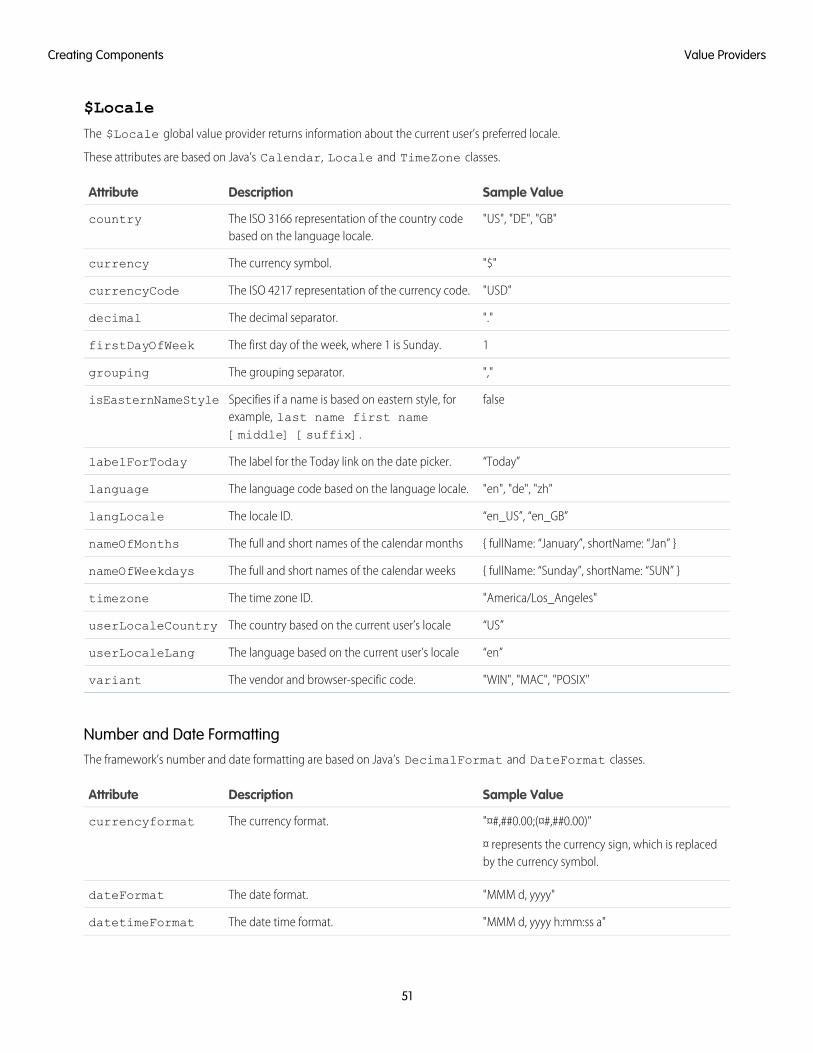
$Locale
The $Locale global value provider returns information about the current user’s preferred locale.
These attributes are based on Java’s Calendar, Locale and TimeZone classes.
Sample ValueDescriptionAttribute
"US", "DE", "GB"The ISO 3166 representation of the country codebased on the language locale.
country
"$"The currency symbol.currency
"USD"The ISO 4217 representation of the currency code.currencyCode
"."The decimal separator.decimal
1The first day of the week, where 1 is Sunday.firstDayOfWeek
","The grouping separator.grouping
falseSpecifies if a name is based on eastern style, forexample, last name first name[middle] [suffix].
isEasternNameStyle
“Today”The label for the Today link on the date picker.labelForToday
"en", "de", "zh"The language code based on the language locale.language
“en_US”, “en_GB”The locale ID.langLocale
{ fullName: “January”, shortName: “Jan” }The full and short names of the calendar monthsnameOfMonths
{ fullName: “Sunday”, shortName: “SUN” }The full and short names of the calendar weeksnameOfWeekdays
"America/Los_Angeles"The time zone ID.timezone
“US”The country based on the current user’s localeuserLocaleCountry
“en”The language based on the current user’s localeuserLocaleLang
"WIN", "MAC", "POSIX"The vendor and browser-specific code.variant
Number and Date FormattingThe framework’s number and date formatting are based on Java’s DecimalFormat and DateFormat classes.
Sample ValueDescriptionAttribute
"¤#,##0.00;(¤#,##0.00)"
¤ represents the currency sign, which is replacedby the currency symbol.
The currency format.currencyformat
"MMM d, yyyy"The date format.dateFormat
"MMM d, yyyy h:mm:ss a"The date time format.datetimeFormat
51
Value ProvidersCreating Components
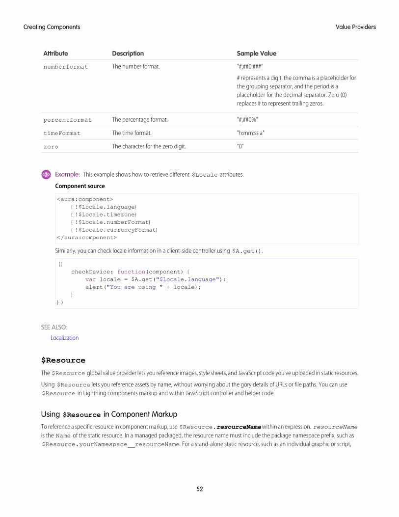
Sample ValueDescriptionAttribute
"#,##0.###"
# represents a digit, the comma is a placeholder forthe grouping separator, and the period is a
The number format.numberformat
placeholder for the decimal separator. Zero (0)replaces # to represent trailing zeros.
"#,##0%"The percentage format.percentformat
"h:mm:ss a"The time format.timeFormat
“0”The character for the zero digit.zero
Example: This example shows how to retrieve different $Locale attributes.
Component source
<aura:component>{!$Locale.language}{!$Locale.timezone}{!$Locale.numberFormat}{!$Locale.currencyFormat}
</aura:component>
Similarly, you can check locale information in a client-side controller using $A.get().
({checkDevice: function(component) {
var locale = $A.get("$Locale.language");alert("You are using " + locale);
}})
SEE ALSO:
Localization
$Resource
The $Resource global value provider lets you reference images, style sheets, and JavaScript code you’ve uploaded in static resources.
Using $Resource lets you reference assets by name, without worrying about the gory details of URLs or file paths. You can use$Resource in Lightning components markup and within JavaScript controller and helper code.
Using $Resource in Component Markup
To reference a specific resource in component markup, use $Resource.resourceName within an expression. resourceNameis the Name of the static resource. In a managed packaged, the resource name must include the package namespace prefix, such as$Resource.yourNamespace__resourceName. For a stand-alone static resource, such as an individual graphic or script,
52
Value ProvidersCreating Components
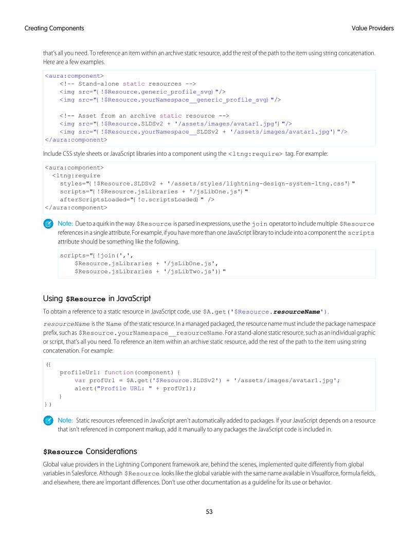
that’s all you need. To reference an item within an archive static resource, add the rest of the path to the item using string concatenation.Here are a few examples.
<aura:component><!-- Stand-alone static resources --><img src="{!$Resource.generic_profile_svg}"/><img src="{!$Resource.yourNamespace__generic_profile_svg}"/>
<!-- Asset from an archive static resource --><img src="{!$Resource.SLDSv2 + '/assets/images/avatar1.jpg'}"/><img src="{!$Resource.yourNamespace__SLDSv2 + '/assets/images/avatar1.jpg'}"/>
</aura:component>
Include CSS style sheets or JavaScript libraries into a component using the <ltng:require> tag. For example:
<aura:component><ltng:requirestyles="{!$Resource.SLDSv2 + '/assets/styles/lightning-design-system-ltng.css'}"scripts="{!$Resource.jsLibraries + '/jsLibOne.js'}"afterScriptsLoaded="{!c.scriptsLoaded}" />
</aura:component>
Note: Due to a quirk in the way $Resource is parsed in expressions, use the join operator to include multiple $Resourcereferences in a single attribute. For example, if you have more than one JavaScript library to include into a component the scriptsattribute should be something like the following.
scripts="{!join(',',$Resource.jsLibraries + '/jsLibOne.js',$Resource.jsLibraries + '/jsLibTwo.js')}"
Using $Resource in JavaScript
To obtain a reference to a static resource in JavaScript code, use $A.get('$Resource.resourceName').
resourceName is the Name of the static resource. In a managed packaged, the resource name must include the package namespaceprefix, such as $Resource.yourNamespace__resourceName. For a stand-alone static resource, such as an individual graphicor script, that’s all you need. To reference an item within an archive static resource, add the rest of the path to the item using stringconcatenation. For example:
({profileUrl: function(component) {
var profUrl = $A.get('$Resource.SLDSv2') + '/assets/images/avatar1.jpg';alert("Profile URL: " + profUrl);
}})
Note: Static resources referenced in JavaScript aren’t automatically added to packages. If your JavaScript depends on a resourcethat isn’t referenced in component markup, add it manually to any packages the JavaScript code is included in.
$Resource Considerations
Global value providers in the Lightning Component framework are, behind the scenes, implemented quite differently from globalvariables in Salesforce. Although $Resource looks like the global variable with the same name available in Visualforce, formula fields,and elsewhere, there are important differences. Don’t use other documentation as a guideline for its use or behavior.
53
Value ProvidersCreating Components
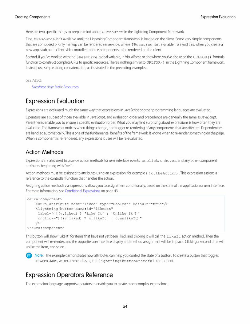
Here are two specific things to keep in mind about $Resource in the Lightning Component framework.
First, $Resource isn’t available until the Lightning Component framework is loaded on the client. Some very simple componentsthat are composed of only markup can be rendered server-side, where $Resource isn’t available. To avoid this, when you create anew app, stub out a client-side controller to force components to be rendered on the client.
Second, if you’ve worked with the $Resource global variable, in Visualforce or elsewhere, you’ve also used the URLFOR() formulafunction to construct complete URLs to specific resources. There’s nothing similar to URLFOR() in the Lightning Component framework.Instead, use simple string concatenation, as illustrated in the preceding examples.
SEE ALSO:
Salesforce Help: Static Resources
Expression EvaluationExpressions are evaluated much the same way that expressions in JavaScript or other programming languages are evaluated.
Operators are a subset of those available in JavaScript, and evaluation order and precedence are generally the same as JavaScript.Parentheses enable you to ensure a specific evaluation order. What you may find surprising about expressions is how often they areevaluated. The framework notices when things change, and trigger re-rendering of any components that are affected. Dependenciesare handled automatically. This is one of the fundamental benefits of the framework. It knows when to re-render something on the page.When a component is re-rendered, any expressions it uses will be re-evaluated.
Action MethodsExpressions are also used to provide action methods for user interface events: onclick, onhover, and any other componentattributes beginning with "on".
Action methods must be assigned to attributes using an expression, for example {!c.theAction}. This expression assigns areference to the controller function that handles the action.
Assigning action methods via expressions allows you to assign them conditionally, based on the state of the application or user interface.For more information, see Conditional Expressions on page 43.
<aura:component><aura:attribute name="liked" type="Boolean" default="true"/><lightning:button aura:id="likeBtn"label="{!(v.liked) ? 'Like It' : 'Unlike It'}"onclick="{!(v.liked) ? c.likeIt : c.unlikeIt}"/>
</aura:component>
This button will show "Like It" for items that have not yet been liked, and clicking it will call the likeIt action method. Then thecomponent will re-render, and the opposite user interface display and method assignment will be in place. Clicking a second time willunlike the item, and so on.
Note: The example demonstrates how attributes can help you control the state of a button. To create a button that togglesbetween states, we recommend using the lightning:buttonStateful component.
Expression Operators ReferenceThe expression language supports operators to enable you to create more complex expressions.
54
Expression EvaluationCreating Components
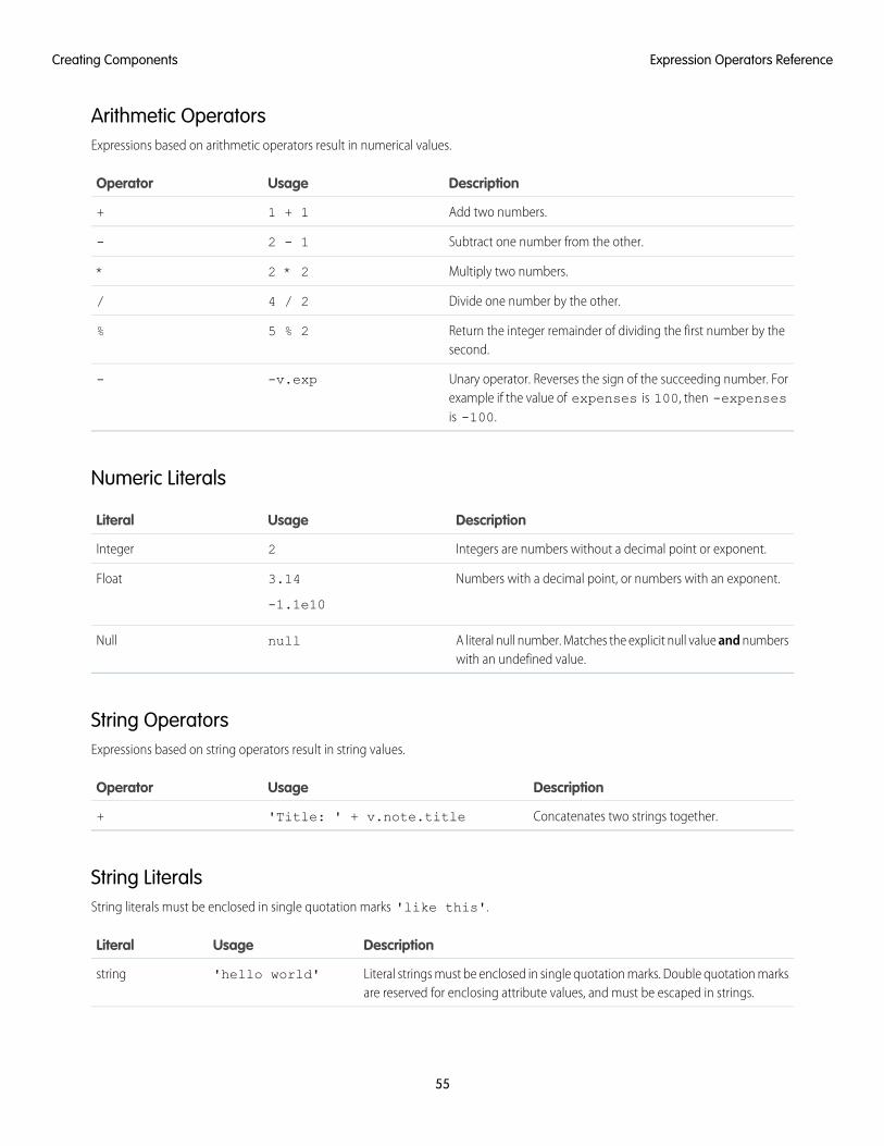
Arithmetic OperatorsExpressions based on arithmetic operators result in numerical values.
DescriptionUsageOperator
Add two numbers.1 + 1+
Subtract one number from the other.2 - 1-
Multiply two numbers.2 * 2*
Divide one number by the other.4 / 2/
Return the integer remainder of dividing the first number by thesecond.
5 % 2%
Unary operator. Reverses the sign of the succeeding number. Forexample if the value of expenses is 100, then -expensesis -100.
-v.exp-
Numeric Literals
DescriptionUsageLiteral
Integers are numbers without a decimal point or exponent.2Integer
Numbers with a decimal point, or numbers with an exponent.3.14
-1.1e10
Float
A literal null number. Matches the explicit null value and numberswith an undefined value.
nullNull
String OperatorsExpressions based on string operators result in string values.
DescriptionUsageOperator
Concatenates two strings together.'Title: ' + v.note.title+
String LiteralsString literals must be enclosed in single quotation marks 'like this'.
DescriptionUsageLiteral
Literal strings must be enclosed in single quotation marks. Double quotation marksare reserved for enclosing attribute values, and must be escaped in strings.
'hello world'string
55
Expression Operators ReferenceCreating Components
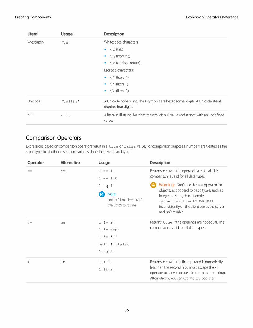
DescriptionUsageLiteral
Whitespace characters:'\n'\<escape>
• \t (tab)
• \n (newline)
• \r (carriage return)
Escaped characters:
• \" (literal ")
• \' (literal ')
• \\ (literal \)
A Unicode code point. The # symbols are hexadecimal digits. A Unicode literalrequires four digits.
'\u####'Unicode
A literal null string. Matches the explicit null value and strings with an undefinedvalue.
nullnull
Comparison OperatorsExpressions based on comparison operators result in a true or false value. For comparison purposes, numbers are treated as thesame type. In all other cases, comparisons check both value and type.
DescriptionUsageAlternativeOperator
Returns true if the operands are equal. Thiscomparison is valid for all data types.
1 == 1
1 == 1.0
eq==
Warning: Don’t use the == operator forobjects, as opposed to basic types, such as
1 eq 1
Note:undefined==nullevaluates to true.
Integer or String. For example,object1==object2 evaluatesinconsistently on the client versus the serverand isn’t reliable.
Returns true if the operands are not equal. Thiscomparison is valid for all data types.
1 != 2
1 != true
ne!=
1 != '1'
null != false
1 ne 2
Returns true if the first operand is numericallyless than the second. You must escape the <
1 < 2
1 lt 2
lt<
operator to < to use it in component markup.Alternatively, you can use the lt operator.
56
Expression Operators ReferenceCreating Components
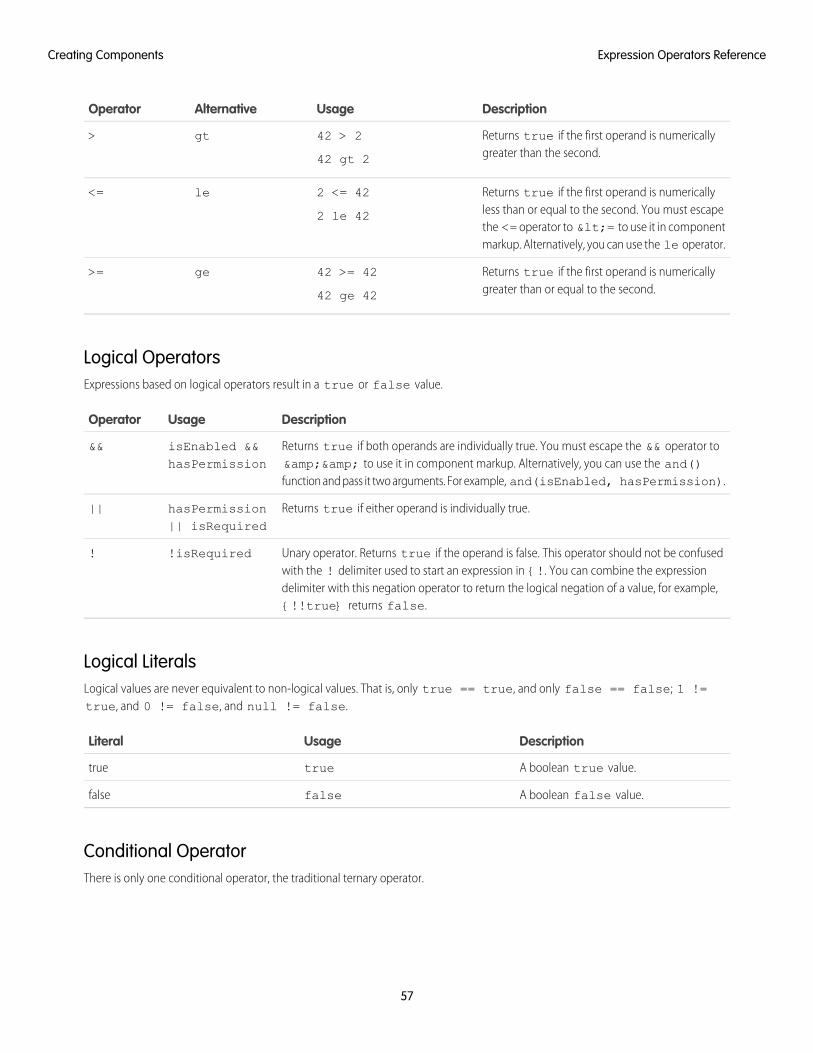
DescriptionUsageAlternativeOperator
Returns true if the first operand is numericallygreater than the second.
42 > 2
42 gt 2
gt>
Returns true if the first operand is numericallyless than or equal to the second. You must escape
2 <= 42
2 le 42
le<=
the <= operator to <= to use it in componentmarkup. Alternatively, you can use the le operator.
Returns true if the first operand is numericallygreater than or equal to the second.
42 >= 42
42 ge 42
ge>=
Logical OperatorsExpressions based on logical operators result in a true or false value.
DescriptionUsageOperator
Returns true if both operands are individually true. You must escape the && operator to&& to use it in component markup. Alternatively, you can use the and()function and pass it two arguments. For example, and(isEnabled, hasPermission).
isEnabled &&hasPermission
&&
Returns true if either operand is individually true.hasPermission|| isRequired
||
Unary operator. Returns true if the operand is false. This operator should not be confusedwith the ! delimiter used to start an expression in {!. You can combine the expression
!isRequired!
delimiter with this negation operator to return the logical negation of a value, for example,{!!true} returns false.
Logical LiteralsLogical values are never equivalent to non-logical values. That is, only true == true, and only false == false; 1 !=true, and 0 != false, and null != false.
DescriptionUsageLiteral
A boolean true value.truetrue
A boolean false value.falsefalse
Conditional OperatorThere is only one conditional operator, the traditional ternary operator.
57
Expression Operators ReferenceCreating Components
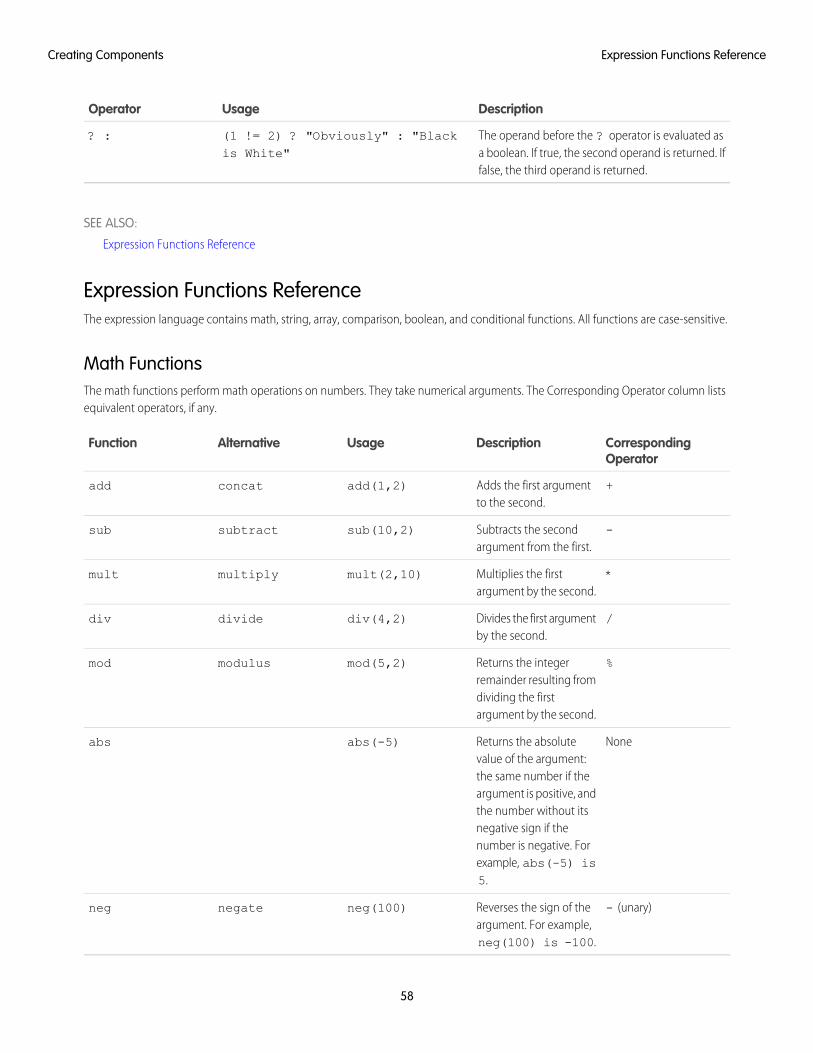
DescriptionUsageOperator
The operand before the ? operator is evaluated asa boolean. If true, the second operand is returned. Iffalse, the third operand is returned.
(1 != 2) ? "Obviously" : "Blackis White"
? :
SEE ALSO:
Expression Functions Reference
Expression Functions ReferenceThe expression language contains math, string, array, comparison, boolean, and conditional functions. All functions are case-sensitive.
Math FunctionsThe math functions perform math operations on numbers. They take numerical arguments. The Corresponding Operator column listsequivalent operators, if any.
CorrespondingOperator
DescriptionUsageAlternativeFunction
+Adds the first argumentto the second.
add(1,2)concatadd
-Subtracts the secondargument from the first.
sub(10,2)subtractsub
*Multiplies the firstargument by the second.
mult(2,10)multiplymult
/Divides the first argumentby the second.
div(4,2)dividediv
%Returns the integerremainder resulting from
mod(5,2)modulusmod
dividing the firstargument by the second.
NoneReturns the absolutevalue of the argument:
abs(-5)abs
the same number if theargument is positive, andthe number without itsnegative sign if thenumber is negative. Forexample, abs(-5) is5.
- (unary)Reverses the sign of theargument. For example,neg(100) is -100.
neg(100)negateneg
58
Expression Functions ReferenceCreating Components
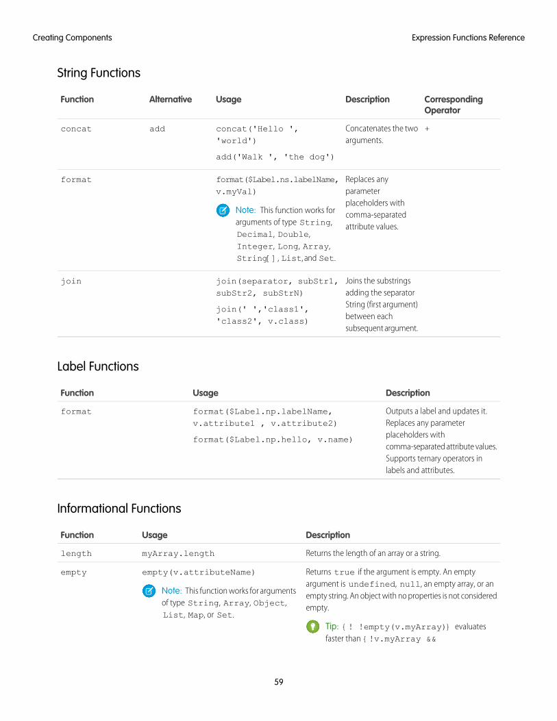
String Functions
CorrespondingOperator
DescriptionUsageAlternativeFunction
+Concatenates the twoarguments.
concat('Hello ','world')
add('Walk ', 'the dog')
addconcat
Replaces anyparameter
format($Label.ns.labelName,v.myVal)
format
placeholders withNote: This function works forarguments of type String,
comma-separatedattribute values.
Decimal, Double,Integer, Long, Array,String[], List, and Set.
Joins the substringsadding the separator
join(separator, subStr1,subStr2, subStrN)
join(' ','class1','class2', v.class)
join
String (first argument)between eachsubsequent argument.
Label Functions
DescriptionUsageFunction
Outputs a label and updates it.Replaces any parameter
format($Label.np.labelName,v.attribute1 , v.attribute2)
format($Label.np.hello, v.name)
format
placeholders withcomma-separated attribute values.Supports ternary operators inlabels and attributes.
Informational Functions
DescriptionUsageFunction
Returns the length of an array or a string.myArray.lengthlength
Returns true if the argument is empty. An emptyargument is undefined, null, an empty array, or an
empty(v.attributeName)empty
Note: This function works for argumentsof type String, Array, Object,List, Map, or Set.
empty string. An object with no properties is not consideredempty.
Tip: {! !empty(v.myArray)} evaluatesfaster than {!v.myArray &&
59
Expression Functions ReferenceCreating Components
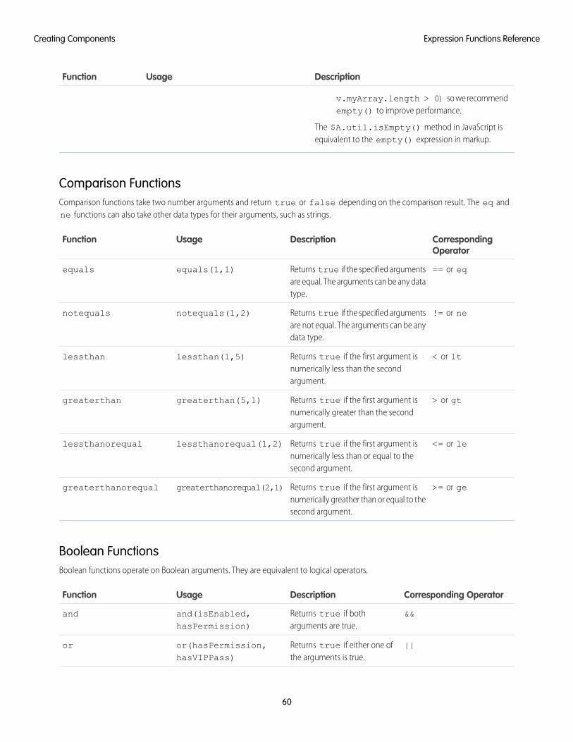
DescriptionUsageFunction
v.myArray.length > 0} so we recommendempty() to improve performance.
The $A.util.isEmpty() method in JavaScript isequivalent to the empty() expression in markup.
Comparison FunctionsComparison functions take two number arguments and return true or false depending on the comparison result. The eq andne functions can also take other data types for their arguments, such as strings.
CorrespondingOperator
DescriptionUsageFunction
== or eqReturns true if the specified argumentsare equal. The arguments can be any datatype.
equals(1,1)equals
!= or neReturns true if the specified argumentsare not equal. The arguments can be anydata type.
notequals(1,2)notequals
< or ltReturns true if the first argument isnumerically less than the secondargument.
lessthan(1,5)lessthan
> or gtReturns true if the first argument isnumerically greater than the secondargument.
greaterthan(5,1)greaterthan
<= or leReturns true if the first argument isnumerically less than or equal to thesecond argument.
lessthanorequal(1,2)lessthanorequal
>= or geReturns true if the first argument isnumerically greather than or equal to thesecond argument.
greaterthanorequal(2,1)greaterthanorequal
Boolean FunctionsBoolean functions operate on Boolean arguments. They are equivalent to logical operators.
Corresponding OperatorDescriptionUsageFunction
&&Returns true if botharguments are true.
and(isEnabled,hasPermission)
and
||Returns true if either one ofthe arguments is true.
or(hasPermission,hasVIPPass)
or
60
Expression Functions ReferenceCreating Components
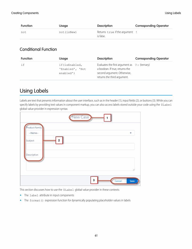
Corresponding OperatorDescriptionUsageFunction
!Returns true if the argumentis false.
not(isNew)not
Conditional Function
Corresponding OperatorDescriptionUsageFunction
?: (ternary)Evaluates the first argument asa boolean. If true, returns the
if(isEnabled,'Enabled', 'Notenabled')
if
second argument. Otherwise,returns the third argument.
Using Labels
Labels are text that presents information about the user interface, such as in the header (1), input fields (2), or buttons (3). While you canspecify labels by providing text values in component markup, you can also access labels stored outside your code using the $Labelglobal value provider in expression syntax.
This section discusses how to use the $Label global value provider in these contexts:
• The label attribute in input components
• The format() expression function for dynamically populating placeholder values in labels
61
Using LabelsCreating Components
IN THIS SECTION:
Using Custom Labels
Custom labels are custom text values that can be translated into any language that Salesforce supports. To access custom labels inLightning components, use the $Label global value provider.
Input Component Labels
A label describes the purpose of an input component. To set a label on an input component, use the label attribute.
Dynamically Populating Label Parameters
Output and update labels using the format() expression function.
Getting Labels in JavaScript
You can retrieve labels in JavaScript code. Your code performs optimally if the labels are statically defined and sent to the clientwhen the component is loaded.
Getting Labels in Apex
You can retrieve label values in Apex code and set them on your component using JavaScript.
Setting Label Values via a Parent Attribute
Setting label values via a parent attribute is useful if you want control over labels in child components.
Using Custom LabelsCustom labels are custom text values that can be translated into any language that Salesforce supports. To access custom labels inLightning components, use the $Label global value provider.
Custom labels enable developers to create multilingual applications by automatically presenting information (for example, help text orerror messages) in a user's native language.
To create custom labels, from Setup, enter Custom Labels in the Quick Find box, then select Custom Labels.
Use the following syntax to access custom labels in Lightning components.
• $Label.c.labelName for the default namespace
• $Label.namespace.labelName if your org has a namespace, or to access a label in a managed package
You can reference custom labels in component markup and in JavaScript code. Here are some examples.
Label in a markup expression using the default namespace{!$Label.c.labelName}
Note: Label expressions in markup are supported in .cmp and .app resources only.
Label in JavaScript code if your org has a namespace$A.get("$Label.namespace.labelName")
SEE ALSO:
Value Providers
Input Component LabelsA label describes the purpose of an input component. To set a label on an input component, use the label attribute.
62
Using Custom LabelsCreating Components
This example shows how to use labels using the label attribute on an input component.
<lightning:input type="number" name="myNumber" label="Pick a Number:" value="54" />
The label is placed on the left of the input field and can be hidden by setting variant="label-hidden", which applies theslds-assistive-text class to the label to support accessibility.
Using $LabelUse the $Label global value provider to access labels stored in an external source. For example:
<lightning:input type="number" name="myNumber" label="{!$Label.Number.PickOne}" />
To output a label and dynamically update it, use the format() expression function. For example, if you have np.labelName setto Hello {0}, the following expression returns Hello World if v.name is set to World.
{!format($Label.np.labelName, v.name)}
SEE ALSO:
Supporting Accessibility
Dynamically Populating Label ParametersOutput and update labels using the format() expression function.
You can provide a string with placeholders, which are replaced by the substitution values at runtime.
Add as many parameters as you need. The parameters are numbered and are zero-based. For example, if you have three parameters,they will be named {0}, {1}, and {2}, and they will be substituted in the order they're specified.
Let's look at a custom label, $Label.mySection.myLabel, with a value of Hello {0} and {1}, where $Label is theglobal value provider that accesses your labels.
This expression dynamically populates the placeholder parameters with the values of the supplied attributes.
{!format($Label.mySection.myLabel, v.attribute1, v.attribute2)}
The label is automatically refreshed if one of the attribute values changes.
Note: Always use the $Label global value provider to reference a label with placeholder parameters. You can't set a stringwith placeholder parameters as the first argument for format(). For example, this syntax doesn't work:
{!format('Hello {0}', v.name)}
Use this expression instead.
{!format($Label.mySection.salutation, v.name)}
where $Label.mySection.salutation is set to Hello {0}.
Getting Labels in JavaScriptYou can retrieve labels in JavaScript code. Your code performs optimally if the labels are statically defined and sent to the client whenthe component is loaded.
63
Dynamically Populating Label ParametersCreating Components
Static LabelsStatic labels are defined in one string, such as "$Label.c.task_mode_today". The framework parses static labels in markupor JavaScript code and sends the labels to the client when the component is loaded. A server trip isn’t required to resolve the label.
Use $A.get() to retrieve static labels in JavaScript code. For example:
var staticLabel = $A.get("$Label.c.task_mode_today");component.set("v.mylabel", staticLabel);
You can also retrieve label values using Apex code and send them to the component via JavaScript code. For more information, seeGetting Labels in Apex.
Dynamic Labels$A.get(labelReference) must be able to resolve the label reference at compile time, so that the label values can be sent tothe client along with the component definition.
If you must defer label resolution until runtime, you can dynamically create labels in JavaScript code. This technique can be useful whenyou need to use a label, but which specific label isn’t known until runtime.
// Assume the day variable is dynamically generated// earlier in the code// THIS CODE WON’T WORKvar dynamicLabel = $A.get("$Label.c." + day);
If the label is already known on the client, $A.get() displays the label. If the value is not known, an empty string is displayed inproduction mode, or a placeholder value showing the label key is displayed in debug mode.
Using $A.get()with a label that can't be determined at runtime means that dynamicLabel is an empty string, and won’t beupdated to the retrieved value. Since the label, "$Label.c." + day, is dynamically generated, the framework can’t parse it orsend it to the client when the component is requested.
There are a few alternative approaches to using $A.get() so that you can work with dynamically generated labels.
If your component uses a known set of dynamically constructed labels, you can avoid a server roundtrip for the labels by adding areference to the labels in a JavaScript resource. The framework sends these labels to the client when the component is requested. Forexample, if your component dynamically generates $Label.c.task_mode_today and $Label.c.task_mode_tomorrowlabel keys, you can add references to the labels in a comment in a JavaScript resource, such as a client-side controller or helper.
// hints to ensure labels are preloaded// $Label.c.task_mode_today// $Label.c.task_mode_tomorrow
If your code dynamically generates many labels, this approach doesn’t scale well.
If you don’t want to add comment hints for all the potential labels, the alternative is to use $A.getReference(). This approachcomes with the added cost of a server trip to retrieve the label value.
This example dynamically constructs the label value by calling $A.getReference() and updates a tempLabelAttr componentattribute with the retrieved label.
var labelSubStr = "task_mode_today";var labelReference = $A.getReference("$Label.c." + labelSubStr);cmp.set("v.tempLabelAttr", labelReference);var dynamicLabel = cmp.get("v.tempLabelAttr");
64
Getting Labels in JavaScriptCreating Components
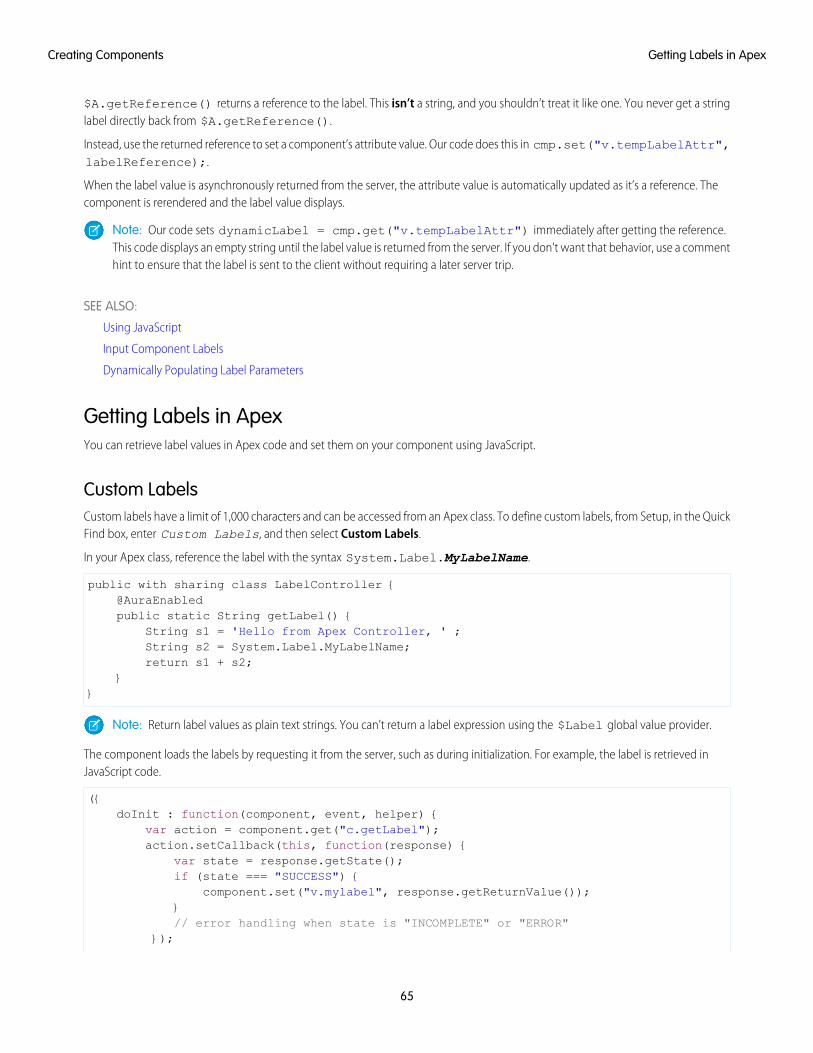
$A.getReference() returns a reference to the label. This isn’t a string, and you shouldn’t treat it like one. You never get a stringlabel directly back from $A.getReference().
Instead, use the returned reference to set a component’s attribute value. Our code does this in cmp.set("v.tempLabelAttr",labelReference);.
When the label value is asynchronously returned from the server, the attribute value is automatically updated as it’s a reference. Thecomponent is rerendered and the label value displays.
Note: Our code sets dynamicLabel = cmp.get("v.tempLabelAttr") immediately after getting the reference.This code displays an empty string until the label value is returned from the server. If you don’t want that behavior, use a commenthint to ensure that the label is sent to the client without requiring a later server trip.
SEE ALSO:
Using JavaScript
Input Component Labels
Dynamically Populating Label Parameters
Getting Labels in ApexYou can retrieve label values in Apex code and set them on your component using JavaScript.
Custom LabelsCustom labels have a limit of 1,000 characters and can be accessed from an Apex class. To define custom labels, from Setup, in the QuickFind box, enter Custom Labels, and then select Custom Labels.
In your Apex class, reference the label with the syntax System.Label.MyLabelName.
public with sharing class LabelController {@AuraEnabledpublic static String getLabel() {
String s1 = 'Hello from Apex Controller, ' ;String s2 = System.Label.MyLabelName;return s1 + s2;
}}
Note: Return label values as plain text strings. You can’t return a label expression using the $Label global value provider.
The component loads the labels by requesting it from the server, such as during initialization. For example, the label is retrieved inJavaScript code.
({doInit : function(component, event, helper) {
var action = component.get("c.getLabel");action.setCallback(this, function(response) {
var state = response.getState();if (state === "SUCCESS") {
component.set("v.mylabel", response.getReturnValue());}// error handling when state is "INCOMPLETE" or "ERROR"
});
65
Getting Labels in ApexCreating Components
$A.enqueueAction(action);}
})
Finally, make sure you wire up the Apex class to your component. The label is set on the component during initialization.
<aura:component controller="LabelController"><aura:handler name="init" value="{!this}" action="{!c.doInit}" /><aura:attribute name="mylabel" type="String"/>{!v.mylabel}
</aura:component>
Passing in Label ValuesPass label values into components using the expression syntax {!v.mylabel}. You must provide a default value to the Stringattribute. Depending on your use case, the default value might be the label in the default language or, if the specific label can’t be knownuntil runtime, perhaps just a single space.
<aura:component controller="LabelController"><aura:attribute name="mylabel" type="String" default=" "/><lightning:input name="mytext" label="{!v.mylabel}"/>
</aura:component>
You can also retrieve labels in JavaScript code, including dynamically creating labels that are generated during runtime. For moreinformation, see Getting Labels in JavaScript.
Setting Label Values via a Parent AttributeSetting label values via a parent attribute is useful if you want control over labels in child components.
Let’s say that you have a container component, which contains another component, inner.cmp. You want to set a label value ininner.cmp via an attribute on the container component. This can be done by specifying the attribute type and default value. Youmust set a default value in the parent attribute if you are setting a label on an inner component, as shown in the following example.
This is the container component, which contains a default value My Label for the _label attribute .
<aura:component><aura:attribute name="_label"
type="String"default="My Label"/>
<lightning:button label="Set Label" aura:id="button1" onclick="{!c.setLabel}"/><auradocs:inner aura:id="inner" label="{!v._label}"/>
</aura:component>
This inner component contains a text area component and a label attribute that’s set by the container component.
<aura:component><aura:attribute name="label" type="String"/><lightning:textarea aura:id="textarea"
name="myTextarea"label="{!v.label}"/>
</aura:component>
66
Setting Label Values via a Parent AttributeCreating Components
This client-side controller action updates the label value.
({setLabel:function(cmp) {
cmp.set("v._label", 'new label');}
})
When the component is initialized, you’ll see a button and a text area with the label My Label. When the button in the containercomponent is clicked, the setLabel action updates the label value in the inner component. This action finds the label attributeand sets its value to new label.
SEE ALSO:
Input Component Labels
Component Attributes
Localization
The framework provides client-side localization support on input and output components.
The following example shows how you can override the default timezone attribute. The output displays the time in the formathh:mm by default.
<aura:component><ui:outputDateTime value="2013-10-07T00:17:08.997Z" timezone="Europe/Berlin" />
</aura:component>
The component renders as Oct 7, 2013 2:17:08 AM.
To customize the date and time formatting, we recommend using lightning:formattedDateTime. This example sets thedate and time using the init handler.
<aura:component><aura:handler name="init" value="{!this}" action="{!c.doInit}"/><aura:attribute name="datetime" type="DateTime"/><lightning:formattedDateTime value="{!v.datetime}" timeZone="Europe/Berlin"
year="numeric" month="short" day="2-digit" hour="2-digit"
minute="2-digit" second="2-digit"/></aura:component>
({doInit : function(component, event, helper) {
var date = new Date();component.set("v.datetime", date)
}})
This example creates a JavaScript Date instance, which is rendered in the format MMM DD, YYYY HH:MM:SS AM.
67
LocalizationCreating Components
Although the output for this example is similar to <ui:outputDateTime value="{!v.datetime}"timezone="Europe/Berlin" />, the attributes on lightning:formattedDateTime enable you to control formattingat a granular level. For example, you can display the date using the MM/DD/YYYY format.
<lightning:formattedDateTime value="{!v.datetime}" timeZone="Europe/Berlin" year="numeric"month="numeric" day="numeric"/>
Note: For more information, see lightning:formattedDateTime (Beta) and ui:outputDateTime .
Additionally, you can use the global value provider, $Locale, to obtain the locale information. The locale settings in your organizationoverrides the browser’s locale information.
Working with Locale InformationIn a single currency organization, Salesforce administrators set the currency locale, default language, default locale, and default timezone for their organizations. Users can set their individual language, locale, and time zone on their personal settings pages.
Note: Single language organizations cannot change their language, although they can change their locale.
For example, setting the time zone on the Language & Time Zone page to (GMT+02:00) returns 28.09.2015 09:00:00when you run the following code.
<ui:outputDateTime value="09/28/2015" />
Running $A.get("$Locale.timezone") returns the time zone name, for example, Europe/Paris. For more information,see "Supported Time Zones" in the Salesforce Help.
Setting the currency locale on the Company Information page to Japanese (Japan) - JPY returns ¥100,000 when yourun the following code.
<ui:outputCurrency value="100000" />
Note: To change between using the currency symbol, code, or name, use lightning:formattedNumber instead. Formore information, see lightning:formattedNumber (Beta) .
Similarly, running $A.get("$Locale.currency") returns "¥" when your org’s currency locale is set to Japanese(Japan) - JPY. For more information, see "Supported Currencies" in the Salesforce Help.
SEE ALSO:
Formatting Dates in JavaScript
Providing Component Documentation
Component documentation helps others understand and use your components.
You can provide two types of component reference documentation:
• Documentation definition (DocDef): Full documentation on a component, including a description, sample code, and a reference toan example. DocDef supports extensive HTML markup and is useful for describing what a component is and what it does.
• Inline descriptions: Text-only descriptions, typically one or two sentences, set via the description attribute in a tag.
To provide a DocDef, click DOCUMENTATION in the component sidebar of the Developer Console. The following example shows theDocDef for np:myComponent.
68
Providing Component DocumentationCreating Components
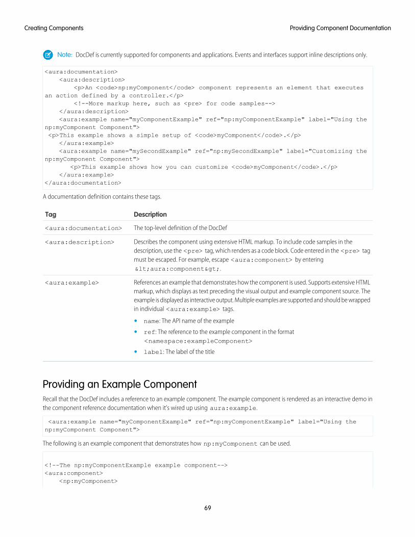
Note: DocDef is currently supported for components and applications. Events and interfaces support inline descriptions only.
<aura:documentation><aura:description>
<p>An <code>np:myComponent</code> component represents an element that executesan action defined by a controller.</p>
<!--More markup here, such as <pre> for code samples--></aura:description><aura:example name="myComponentExample" ref="np:myComponentExample" label="Using the
np:myComponent Component"><p>This example shows a simple setup of <code>myComponent</code>.</p>
</aura:example><aura:example name="mySecondExample" ref="np:mySecondExample" label="Customizing the
np:myComponent Component"><p>This example shows how you can customize <code>myComponent</code>.</p>
</aura:example></aura:documentation>
A documentation definition contains these tags.
DescriptionTag
The top-level definition of the DocDef<aura:documentation>
Describes the component using extensive HTML markup. To include code samples in thedescription, use the <pre> tag, which renders as a code block. Code entered in the <pre> tag
<aura:description>
must be escaped. For example, escape <aura:component> by entering<aura:component>.
References an example that demonstrates how the component is used. Supports extensive HTMLmarkup, which displays as text preceding the visual output and example component source. The
<aura:example>
example is displayed as interactive output. Multiple examples are supported and should be wrappedin individual <aura:example> tags.
• name: The API name of the example
• ref: The reference to the example component in the format<namespace:exampleComponent>
• label: The label of the title
Providing an Example ComponentRecall that the DocDef includes a reference to an example component. The example component is rendered as an interactive demo inthe component reference documentation when it’s wired up using aura:example.
<aura:example name="myComponentExample" ref="np:myComponentExample" label="Using thenp:myComponent Component">
The following is an example component that demonstrates how np:myComponent can be used.
<!--The np:myComponentExample example component--><aura:component>
<np:myComponent>
69
Providing Component DocumentationCreating Components
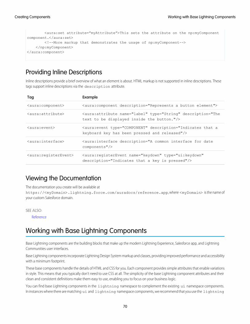
<aura:set attribute=”myAttribute”>This sets the attribute on the np:myComponentcomponent.</aura:set>
<!--More markup that demonstrates the usage of np:myComponent--></np:myComponent>
</aura:component>
Providing Inline DescriptionsInline descriptions provide a brief overview of what an element is about. HTML markup is not supported in inline descriptions. Thesetags support inline descriptions via the description attribute.
ExampleTag
<aura:component description="Represents a button element"><aura:component>
<aura:attribute name="label" type="String" description="Thetext to be displayed inside the button."/>
<aura:attribute>
<aura:event type="COMPONENT" description="Indicates that akeyboard key has been pressed and released"/>
<aura:event>
<aura:interface description="A common interface for datecomponents"/>
<aura:interface>
<aura:registerEvent name="keydown" type="ui:keydown"description="Indicates that a key is pressed"/>
<aura:registerEvent>
Viewing the DocumentationThe documentation you create will be available athttps://<myDomain>.lightning.force.com/auradocs/reference.app, where <myDomain> is the name ofyour custom Salesforce domain.
SEE ALSO:
Reference
Working with Base Lightning Components
Base Lightning components are the building blocks that make up the modern Lightning Experience, Salesforce app, and LightningCommunities user interfaces.
Base Lightning components incorporate Lightning Design System markup and classes, providing improved performance and accessibilitywith a minimum footprint.
These base components handle the details of HTML and CSS for you. Each component provides simple attributes that enable variationsin style. This means that you typically don’t need to use CSS at all. The simplicity of the base Lightning component attributes and theirclean and consistent definitions make them easy to use, enabling you to focus on your business logic.
You can find base Lightning components in the lightning namespace to complement the existing ui namespace components.In instances where there are matching ui and lightning namespace components, we recommend that you use the lightning
70
Working with Base Lightning ComponentsCreating Components
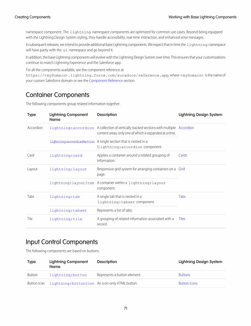
namespace component. The lightning namespace components are optimized for common use cases. Beyond being equippedwith the Lightning Design System styling, they handle accessibility, real-time interaction, and enhanced error messages.
In subsequent releases, we intend to provide additional base Lightning components. We expect that in time the lightning namespacewill have parity with the ui namespace and go beyond it.
In addition, the base Lightning components will evolve with the Lightning Design System over time. This ensures that your customizationscontinue to match Lightning Experience and the Salesforce app.
For all the components available, see the component reference athttps://<myDomain>.lightning.force.com/auradocs/reference.app, where <myDomain> is the name ofyour custom Salesforce domain or see the Component Reference section.
Container ComponentsThe following components group related information together.
Lightning Design SystemDescriptionLightning ComponentName
Type
AccordionA collection of vertically stacked sections with multiplecontent areas, only one of which is expanded at a time.
lightning:accordionAccordion
A single section that is nested in allightning:accordion component.
lightning:accordionSection
CardsApplies a container around a related grouping ofinformation.
lightning:cardCard
GridResponsive grid system for arranging containers on apage.
lightning:layoutLayout
A container within a lightning:layoutcomponent.
lightning:layoutItem
TabsA single tab that is nested in alightning:tabset component.
lightning:tabTabs
Represents a list of tabs.lightning:tabset
TilesA grouping of related information associated with arecord.
lightning:tileTile
Input Control ComponentsThe following components are based on buttons.
Lightning Design SystemDescriptionLightning ComponentName
Type
ButtonsRepresents a button element.lightning:buttonButton
Button IconsAn icon-only HTML button.lightning:buttonIconButton Icon
71
Working with Base Lightning ComponentsCreating Components
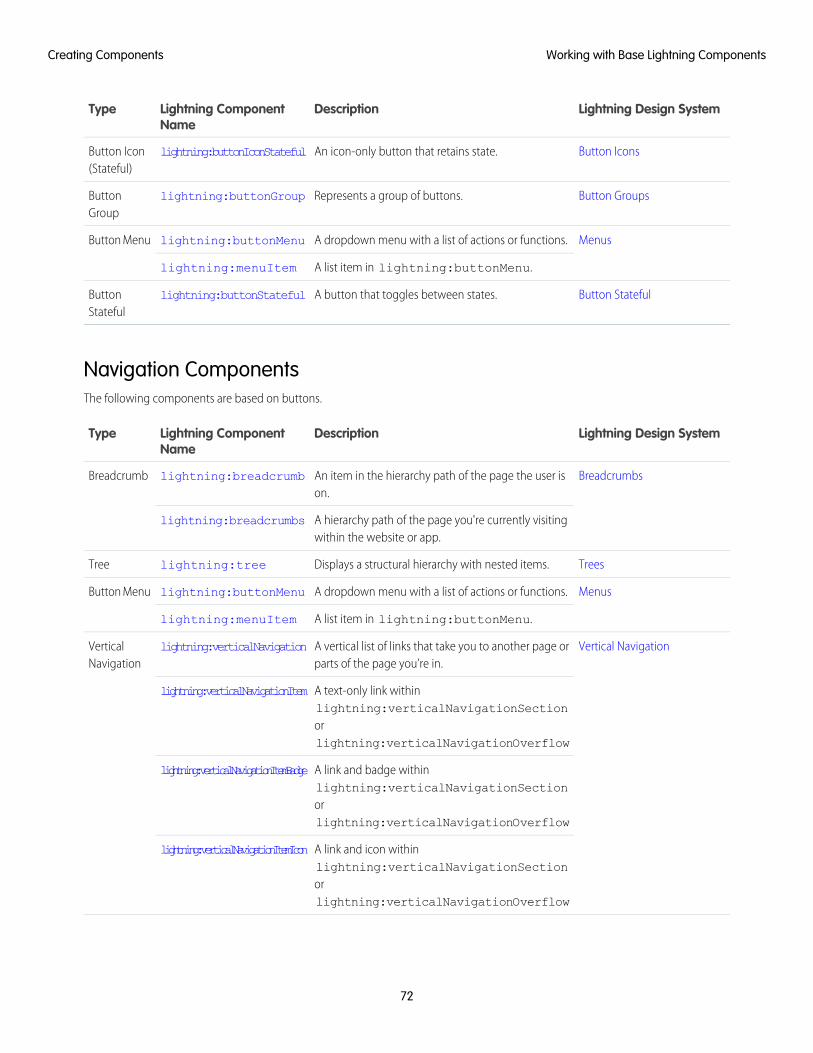
Lightning Design SystemDescriptionLightning ComponentName
Type
Button IconsAn icon-only button that retains state.lightning:buttonIconStatefulButton Icon(Stateful)
Button GroupsRepresents a group of buttons.lightning:buttonGroupButtonGroup
MenusA dropdown menu with a list of actions or functions.lightning:buttonMenuButton Menu
A list item in lightning:buttonMenu.lightning:menuItem
Button StatefulA button that toggles between states.lightning:buttonStatefulButtonStateful
Navigation ComponentsThe following components are based on buttons.
Lightning Design SystemDescriptionLightning ComponentName
Type
BreadcrumbsAn item in the hierarchy path of the page the user ison.
lightning:breadcrumbBreadcrumb
A hierarchy path of the page you're currently visitingwithin the website or app.
lightning:breadcrumbs
TreesDisplays a structural hierarchy with nested items.lightning:treeTree
MenusA dropdown menu with a list of actions or functions.lightning:buttonMenuButton Menu
A list item in lightning:buttonMenu.lightning:menuItem
Vertical NavigationA vertical list of links that take you to another page orparts of the page you’re in.
lightning:verticalNavigationVerticalNavigation
A text-only link withinlightning:verticalNavigationSection
lightning:verticalNavigationItem
orlightning:verticalNavigationOverflow
A link and badge withinlightning:verticalNavigationSection
lightning:verticalNavigationItemBadge
orlightning:verticalNavigationOverflow
A link and icon withinlightning:verticalNavigationSection
lightning:verticalNavigationItemIcon
orlightning:verticalNavigationOverflow
72
Working with Base Lightning ComponentsCreating Components
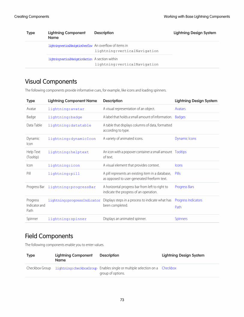
Lightning Design SystemDescriptionLightning ComponentName
Type
An overflow of items inlightning:verticalNavigation
lightning:verticalNavigationOverflow
A section withinlightning:verticalNavigation
lightning:verticalNavigationSection
Visual ComponentsThe following components provide informative cues, for example, like icons and loading spinners.
Lightning Design SystemDescriptionLightning Component NameType
AvatarsA visual representation of an object.lightning:avatarAvatar
BadgesA label that holds a small amount of information.lightning:badgeBadge
A table that displays columns of data, formattedaccording to type.
lightning:datatableData Table
Dynamic IconsA variety of animated icons.lightning:dynamicIconDynamicIcon
TooltipsAn icon with a popover container a small amountof text.
lightning:helptextHelp Text(Tooltip)
IconsA visual element that provides context.lightning:iconIcon
PillsA pill represents an existing item in a database,as opposed to user-generated freeform text.
lightning:pillPill
Progress BarsA horizontal progress bar from left to right toindicate the progress of an operation.
lightning:progressBarProgress Bar
Progress Indicators
Path
Displays steps in a process to indicate what hasbeen completed.
lightning:progressIndicatorProgressIndicator andPath
SpinnersDisplays an animated spinner.lightning:spinnerSpinner
Field ComponentsThe following components enable you to enter values.
Lightning Design SystemDescriptionLightning ComponentName
Type
CheckboxEnables single or multiple selection on agroup of options.
lightning:checkboxGroupCheckbox Group
73
Working with Base Lightning ComponentsCreating Components
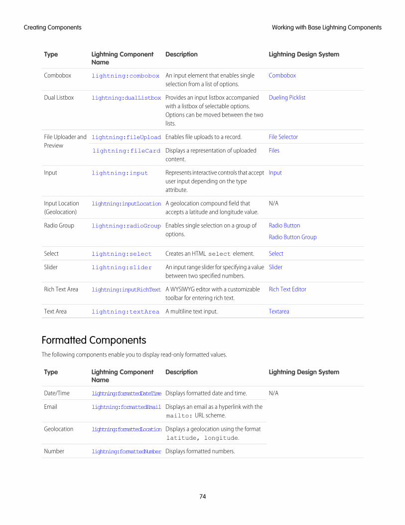
Lightning Design SystemDescriptionLightning ComponentName
Type
ComboboxAn input element that enables singleselection from a list of options.
lightning:comboboxCombobox
Dueling PicklistProvides an input listbox accompaniedwith a listbox of selectable options.
lightning:dualListboxDual Listbox
Options can be moved between the twolists.
File SelectorEnables file uploads to a record.lightning:fileUploadFile Uploader andPreview
FilesDisplays a representation of uploadedcontent.
lightning:fileCard
InputRepresents interactive controls that acceptuser input depending on the typeattribute.
lightning:inputInput
N/AA geolocation compound field thataccepts a latitude and longitude value.
lightning:inputLocationInput Location(Geolocation)
Radio Button
Radio Button Group
Enables single selection on a group ofoptions.
lightning:radioGroupRadio Group
SelectCreates an HTML select element.lightning:selectSelect
SliderAn input range slider for specifying a valuebetween two specified numbers.
lightning:sliderSlider
Rich Text EditorA WYSIWYG editor with a customizabletoolbar for entering rich text.
lightning:inputRichTextRich Text Area
TextareaA multiline text input.lightning:textAreaText Area
Formatted ComponentsThe following components enable you to display read-only formatted values.
Lightning Design SystemDescriptionLightning ComponentName
Type
N/ADisplays formatted date and time.lightning:formattedDateTimeDate/Time
Displays an email as a hyperlink with themailto: URL scheme.
lightning:formattedEmailEmail
Displays a geolocation using the formatlatitude, longitude.
lightning:formattedLocationGeolocation
Displays formatted numbers.lightning:formattedNumberNumber
74
Working with Base Lightning ComponentsCreating Components
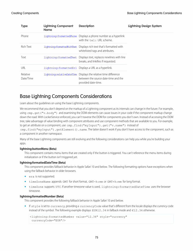
Lightning Design SystemDescriptionLightning ComponentName
Type
Displays a phone number as a hyperlinkwith the tel: URL scheme.
lightning:formattedPhonePhone
Displays rich text that’s formatted withwhitelisted tags and attributes.
lightning:formattedRichTextRich Text
Displays text, replaces newlines with linebreaks, and linkifies if requested.
lightning:formattedTextText
Displays a URL as a hyperlink.lightning:formattedUrlURL
Displays the relative time differencebetween the source date-time and theprovided date-time.
lightning:relativeDateTimeRelativeDate/Time
Base Lightning Components ConsiderationsLearn about the guidelines on using the base Lightning components.
We recommend that you don't depend on the markup of a Lightning component as its internals can change in the future. For example,using cmp.get("v.body") and examining the DOM elements can cause issues in your code if the component markup changedown the road. With LockerService enforced, you can’t traverse the DOM for components you don't own. Instead of accessing the DOMtree, take advantage of value binding with component attributes and use component methods that are available to you. For example,to get an attribute on a component, use cmp.find("myInput").get("v.name") instead ofcmp.find("myInput").getElement().name. The latter doesn’t work if you don’t have access to the component, such asa component in another namespace.
Many of the base Lightning components are still evolving and the following considerations can help you while you’re building yourapps.
lightning:buttonMenu (Beta)This component contains menu items that are created only if the button is triggered. You can’t reference the menu items duringinitialization or if the button isn’t triggered yet.
lightning:formattedDateTime (Beta)This component provides fallback behavior in Apple Safari 10 and below. The following formatting options have exceptions whenusing the fallback behavior in older browsers.
• era is not supported.
• timeZoneName appends GMT for short format, GMT-h:mm or GMT+h:mm for long format.
• timeZone supports UTC. If another timezone value is used, lightning:formattedDateTime uses the browsertimezone.
lightning:formattedNumber (Beta)This component provides the following fallback behavior in Apple Safari 10 and below.
• If style is set to currency, providing a currencyCode value that’s different from the locale displays the currency codeinstead of the symbol. The following example displays EUR12.34 in fallback mode and €12.34 otherwise.
<lightning:formattedNumber value="12.34" style="currency"currencyCode="EUR"/>
75
Base Lightning Components ConsiderationsCreating Components
• currencyDisplayAs supports symbol only. The following example displays $12.34 in fallback mode only if thecurrencyCode matches the user’s locale currency and USD12.34 otherwise.
<lightning:formattedNumber value="12.34" style="currency"currencyCode="USD" currencyDisplayAs="symbol"/>
lightning:input (Beta)Date pickers are available in the following components but they don’t inherit the Lightning Design System styling.
• <lightning:input type="date" />
• <lightning:input type="datetime-local" />
Fields for percentage and currency input must specify a step increment of 0.01 as required by the native implementation.
<lightning:input type="number" name="percentVal" label="Enter a percentage value"formatter="percent" step="0.01" /><lightning:input type="number" name="currencyVal" label="Enter a dollar amount"formatter="currency" step="0.01" />
When working with checkboxes, radio buttons, and toggle switches, use aura:id to group and traverse the array of components.Grouping them enables you to use get("v.checked") to determine which elements are checked or unchecked withoutreaching into the DOM. You can also use the name and value attributes to identify each component during the iteration. Thefollowing example groups three checkboxes together using aura:id.
<aura:component><form><fieldset><legend>Select your favorite color:</legend><lightning:input type="checkbox" label="Red"
name="color1" value="1" aura:id="colors"/><lightning:input type="checkbox" label="Blue"
name="color2" value="2" aura:id="colors"/><lightning:input type="checkbox" label="Green"
name="color3" value="3" aura:id="colors"/></fieldset>
<lightning:button label="Submit" onclick="{!c.submitForm}"/></form>
</aura:component>
In your client-side controller, you can retrieve the array using cmp.find("colors") and inspect the checked values.
When working with type="file", you must provide your own server-side logic for uploading files to Salesforce. Read the fileusing the FileReader HTML object, and then encode the file contents before sending them to your Apex controller. In your Apexcontroller, you can use the EncodingUtil methods to decode the file data. For example, you can use the Attachment objectto upload files to a parent object. In this case, you pass in the base64 encoded file to the Body field to save the file as an attachmentin your Apex controller.
Uploading files using this component is subject to regular Apex controller limits, which is 1 MB. To accommodate file size increasedue to base64 encoding, we recommend that you set the maximum file size to 750 KB. You must implement chunking for file sizelarger than 1 MB. Files uploaded via chunking are subject to a size limit of 4 MB. For more information, see the Apex Developer Guide.
lightning:tab (Beta)This component creates its body during runtime. You can’t reference the component during initialization. Referencing the componentusing aura:id can return unexpected results, such as the component returning an undefined value when implementingcmp.find("myComponent").
76
Base Lightning Components ConsiderationsCreating Components
lightning:tabset (Beta)When you load more tabs than can fit the width of the viewport, the tabset provides navigation buttons that scrolls horizontally todisplay the overflow tabs.
SEE ALSO:
Component Reference
Event Handling in Base Lightning ComponentsBase components are lightweight and closely resemble HTML markup. They follow standard HTML practices by providing event handlersas attributes, such as onfocus, instead of registering and firing Lightning component events, like components in the ui namespace.
Because of their markup, you might expect to access DOM elements via event.target or event.currentTarget. However,this type of access breaks encapsulation because it provides access to another component’s DOM elements, which are subject to change.
LockerService, which will be enabled for all orgs in Summer ’17, enforces encapsulation. Use the methods described here to make yourcode compliant with LockerService.
To retrieve the component that fired the event, use event.getSource().
<aura:component><lightning:button name="myButton" onclick="{!c.doSomething}"/>
</aura:component>
({doSomething: function(cmp, event, helper) {
var button = event.getSource();
//The following patterns are not supported//when you’re trying to access another component’s//DOM elements.var el = event.target;var currentEl = event.currentTarget;
}})
Retrieve a component attribute that’s passed to the event by using this syntax.
event.getSource().get("v.name")
Reusing Event Handlersevent.getSource() helps you determine which component fired an event. Let’s say you have several buttons that reuse thesame onclick handler. To retrieve the name of the button that fired the event, use event.getSource().get("v.name").
<aura:component><lightning:button label="New Record" name="new" onclick="{!c.handleClick}"/><lightning:button label="Edit" name="edit" onclick="{!c.handleClick}"/><lightning:button label="Delete" name="delete" onclick="{!c.handleClick}"/>
</aura:component>
({handleClick: function(cmp, event, helper) {
77
Event Handling in Base Lightning ComponentsCreating Components
//returns "new", "edit", or "delete"var buttonName = event.getSource().get("v.name");
}})
Retrieving the Active Component Using the onactive HandlerWhen working with tabs, you want to know which one is active. The lightning:tab component enables you to obtain a referenceto the target component when it becomes active using the onactive handler . Clicking the component multiple times invokes thehandler once only.
<aura:component><lightning:tabset><lightning:tab onactive="{! c.handleActive }" label="Tab 1" id="tab1" /><lightning:tab onactive="{! c.handleActive }" label="Tab 2" id="tab2" />
</lightning:tabset></aura:component>
({handleActive: function (cmp, event) {
var tab = event.getSource();switch (tab.get('v.id')) {
case 'tab1'://do something when tab1 is clickedbreak;
case 'tab2'://do something when tab2 is clickedbreak;
}}
})
Retrieving the ID and Value Using the onselect HandlerSome components provide event handlers to pass in events to child components, such as the onselect event handler on thefollowing components.
• lightning:buttonMenu
• lightning:tabset
Although the event.detail syntax continues to be supported, we recommend that you update your JavaScript code to use thefollowing patterns for the onselect handler as we plan to deprecate event.detail in a future release.
• event.getParam("id")
• event.getParam("value")
For example, you want to retrieve the value of a selected menu item in a lightning:buttonMenu component from a client-sidecontroller.
//Beforevar menuItem = event.detail.menuItem;var itemValue = menuItem.get("v.value");//Aftervar itemValue = event.getParam("value");
78
Event Handling in Base Lightning ComponentsCreating Components
Similarly, to retrieve the ID of a selected tab in a lightning:tabset component:
//Beforevar tab = event.detail.selectedTab;var tabId = tab.get("v.id");//Aftervar tabId = event.getParam("id");
Note: If you need a reference to the target component, use the onactive event handler instead.
Lightning Design System ConsiderationsAlthough the base Lightning components provide Salesforce Lightning Design System styling out-of-the-box, you may still want towrite some CSS depending on your requirements.
If you're using the components outside of the Salesforce app and Lightning Experience, such as in standalone apps and Lightning Out,extend force:slds to apply Lightning Design System styling to your components. Here are several guidelines for using LightningDesign System in base components.
Using Utility Classes in Base ComponentsLightning Design System utility classes are the fundamentals of your component's visual design and promote reusability, such as foralignments, grid, spacing, and typography. Most base components provide a class attribute, so you can add a utility class or customclass to the outer element of the components. For example, you can apply a spacing utility class to lightning:button.
<lightning:button name="submit" label="Submit" class="slds-m-around_medium"/>
The class you add is appended to other base classes that are applied to the component, resulting in the following markup.
<button class="slds-button slds-button_neutral slds-m-around_medium"type="button" name="submit">Submit</button>
Similarly, you can create a custom class and pass it into the class attribute.
<lightning:badge label="My badge" class="myCustomClass"/>
You have the flexibility to customize the components at a granular level beyond the CSS scaffolding we provide. Let’s look at thelightning:card component, where you can create your own body markup. You can apply the slds-p-horizontal_smallor slds-card__body_inner class in the body markup to add padding around the body.
<!-- lightning:card example using slds-p-horizontal_small class --><lightning:card><aura:set attribute="title">My Account</aura:set><aura:set attribute="footer">Footer</aura:set><aura:set attribute="actions"><lightning:button label="New"/>
</aura:set><p class="slds-p-horizontal_small">Card Body
</p></lightning:card>
<!-- lightning:card example using slds-card__body_inner --><lightning:card>
<aura:set attribute="title">My Account</aura:set>
79
Lightning Design System ConsiderationsCreating Components
<aura:set attribute="footer">Footer</aura:set><aura:set attribute="actions"><lightning:button label="New"/>
</aura:set><div class="slds-card__body_inner">Card Body
</div></lightning:card>
Applying Custom Component StylingSometimes the utility classes aren’t enough and you want to add custom styling in your component bundle. You saw earlier that youcan create a custom class and pass it into the class attribute. We recommend that you create a class instead of targeting a class nameyou don’t own, since those classes might change anytime. For example, don’t try to target .slds-input or .lightningInput,as they are CSS classes that are available by default in base components. You can also consider using tokens to ensure that your designis consistent across your components. Specify values in the token bundle and reuse them in your components’ CSS resources.
Using the Grid for Layoutlightning:layout is your answer to a flexible grid system. You can achieve a simple layout by enclosinglightning:layoutItem components within lightning:layout, which creates a div container with the slds-gridclass. To apply additional Lightning Design System grid classes, specify any combination of the lightning:layout attributes. Forexample, specify vertical-align="stretch" to append the slds-grid_vertical-stretch class. You can applyLightning Design System grid classes to the component using the horizontalAlign, verticalAlign, and pullToBoundaryattributes. However, not all grid classes are available through these attributes. To provide additional grid classes, use the class attribute.The following grid classes can be added using the class attribute.
• .slds-grid_frame
• .slds-grid_vertical
• .slds-grid_reverse
• .slds-grid_vertical-reverse
• .slds-grid_pull-padded-x-small
• .slds-grid_pull-padded-xx-small
• .slds-grid_pull-padded-xxx-small
This example adds the slds-grid_reverse class to the slds-grid class.
<lightning:layout horizontalAlign="space" class="slds-grid_reverse"><lightning:layoutItem padding="around-small"><!-- more markup here -->
</lightning:layoutItem><!-- more lightning:layoutItem components here -->
</lightning:layout>
For more information, see lightning:layout and the Grid utility.
Applying Variants to Base ComponentsVariants on a component refer to design variations for that component, enabling you to change the appearance of the componenteasily. While we try to match base component variants to their respective Lightning Design System variants, it’s not a one-to-one
80
Lightning Design System ConsiderationsCreating Components
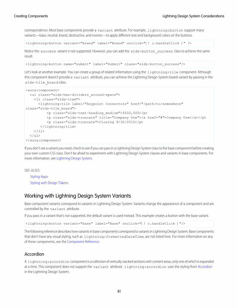
correspondence. Most base components provide a variant attribute. For example, lightning:button support manyvariants—base, neutral, brand, destructive, and inverse—to apply different text and background colors on the buttons.
<lightning:button variant="brand" label="Brand" onclick="{! c.handleClick }" />
Notice the success variant is not supported. However, you can add the slds-button_success class to achieve the sameresult.
<lightning:button name="submit" label="Submit" class="slds-button_success"/>
Let’s look at another example. You can create a group of related information using the lightning:tile component. Althoughthis component doesn’t provide a variant attribute, you can achieve the Lightning Design System board variant by passing in theslds-tile_board class.
<aura:component><ul class="slds-has-dividers_around-space"><li class="slds-item"><lightning:tile label="Anypoint Connectors" href="/path/to/somewhere"
class="slds-tile_board"><p class="slds-text-heading_medium">$500,000</p><p class="slds-truncate" title="Company One"><a href="#">Company One</a></p><p class="slds-truncate">Closing 9/30/2015</p>
</lightning:tile></li>
</ul></aura:component>
If you don’t see a variant you need, check to see if you can pass in a Lightning Design System class to the base component before creatingyour own custom CSS class. Don’t be afraid to experiment with Lightning Design System classes and variants in base components. Formore information, see Lightning Design System.
SEE ALSO:
Styling Apps
Styling with Design Tokens
Working with Lightning Design System VariantsBase component variants correspond to variants in Lightning Design System. Variants change the appearance of a component and arecontrolled by the variant attribute.
If you pass in a variant that’s not supported, the default variant is used instead. This example creates a button with the base variant.
<lightning:button variant="base" label="Base" onclick="{! c.handleClick }"/>
The following reference describes how variants in base components correspond to variants in Lightning Design System. Base componentsthat don’t have any visual styling, such as lightning:formattedDateTime, are not listed here. For more information on anyof these components, see the Component Reference.
AccordionA lightning:accordion component is a collection of vertically stacked sections with content areas, only one of which is expandedat a time. This component does not support the variant attribute. lightning:accordion uses the styling from Accordionin the Lightning Design System.
81
Lightning Design System ConsiderationsCreating Components
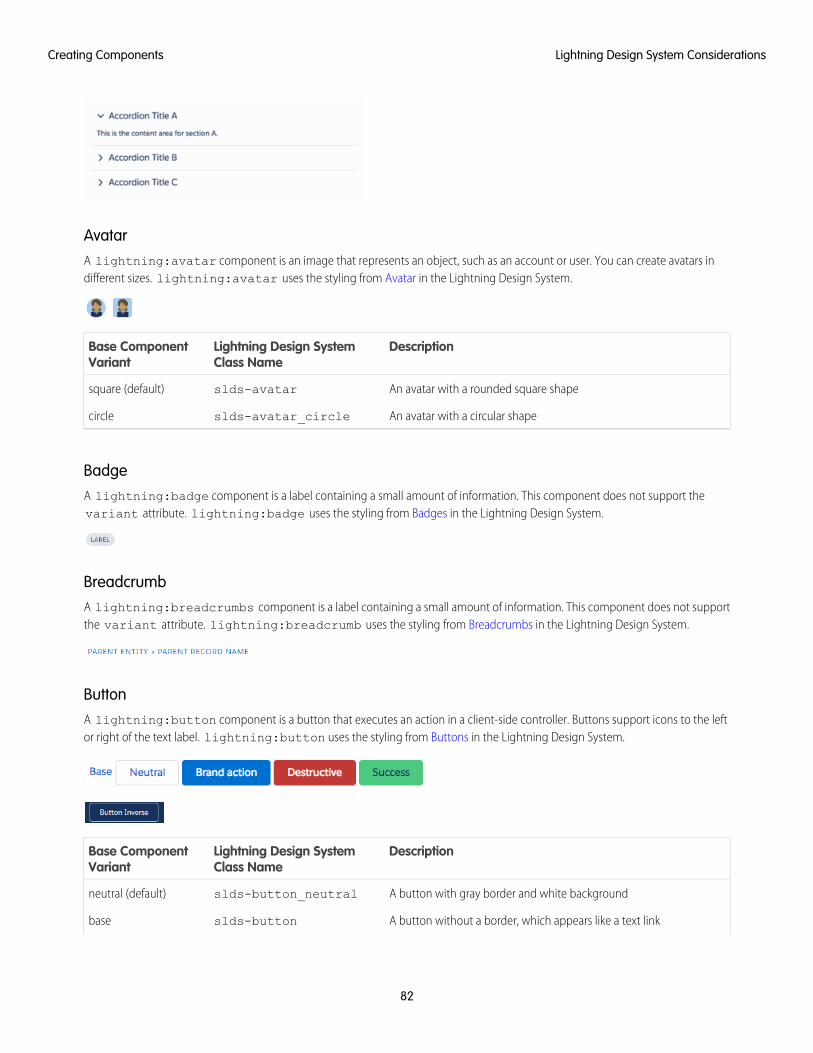
AvatarA lightning:avatar component is an image that represents an object, such as an account or user. You can create avatars indifferent sizes. lightning:avatar uses the styling from Avatar in the Lightning Design System.
DescriptionLightning Design SystemClass Name
Base ComponentVariant
An avatar with a rounded square shapeslds-avatarsquare (default)
An avatar with a circular shapeslds-avatar_circlecircle
BadgeA lightning:badge component is a label containing a small amount of information. This component does not support thevariant attribute. lightning:badge uses the styling from Badges in the Lightning Design System.
BreadcrumbA lightning:breadcrumbs component is a label containing a small amount of information. This component does not supportthe variant attribute. lightning:breadcrumb uses the styling from Breadcrumbs in the Lightning Design System.
ButtonA lightning:button component is a button that executes an action in a client-side controller. Buttons support icons to the leftor right of the text label. lightning:button uses the styling from Buttons in the Lightning Design System.
DescriptionLightning Design SystemClass Name
Base ComponentVariant
A button with gray border and white backgroundslds-button_neutralneutral (default)
A button without a border, which appears like a text linkslds-buttonbase
82
Lightning Design System ConsiderationsCreating Components
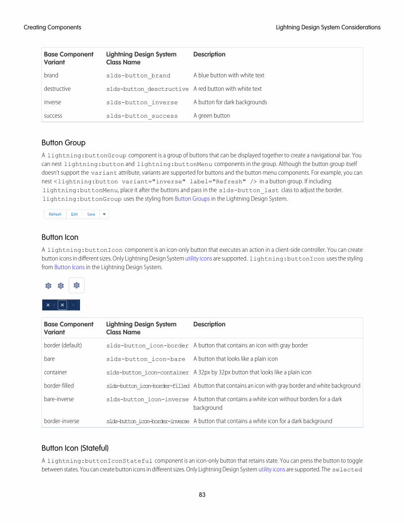
DescriptionLightning Design SystemClass Name
Base ComponentVariant
A blue button with white textslds-button_brandbrand
A red button with white textslds-button_desctructivedestructive
A button for dark backgroundsslds-button_inverseinverse
A green buttonslds-button_successsuccess
Button GroupA lightning:buttonGroup component is a group of buttons that can be displayed together to create a navigational bar. Youcan nest lightning:button and lightning:buttonMenu components in the group. Although the button group itselfdoesn’t support the variant attribute, variants are supported for buttons and the button menu components. For example, you cannest <lightning:button variant="inverse" label="Refresh" /> in a button group. If includinglightning:buttonMenu, place it after the buttons and pass in the slds-button_last class to adjust the border.lightning:buttonGroup uses the styling from Button Groups in the Lightning Design System.
Button IconA lightning:buttonIcon component is an icon-only button that executes an action in a client-side controller. You can createbutton icons in different sizes. Only Lightning Design System utility icons are supported. lightning:buttonIcon uses the stylingfrom Button Icons in the Lightning Design System.
DescriptionLightning Design SystemClass Name
Base ComponentVariant
A button that contains an icon with gray borderslds-button_icon-borderborder (default)
A button that looks like a plain iconslds-button_icon-barebare
A 32px by 32px button that looks like a plain iconslds-button_icon-containercontainer
A button that contains an icon with gray border and white backgroundslds-button_icon-border-filledborder-filled
A button that contains a white icon without borders for a darkbackground
slds-button_icon-inversebare-inverse
A button that contains a white icon for a dark backgroundslds-button_icon-border-inverseborder-inverse
Button Icon (Stateful)A lightning:buttonIconStateful component is an icon-only button that retains state. You can press the button to togglebetween states. You can create button icons in different sizes. Only Lightning Design System utility icons are supported. The selected
83
Lightning Design System ConsiderationsCreating Components
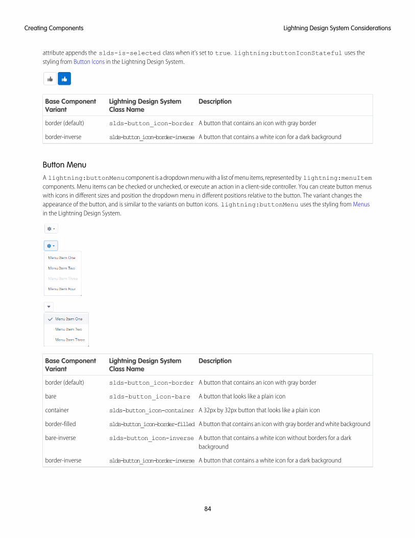
attribute appends the slds-is-selected class when it’s set to true. lightning:buttonIconStateful uses thestyling from Button Icons in the Lightning Design System.
DescriptionLightning Design SystemClass Name
Base ComponentVariant
A button that contains an icon with gray borderslds-button_icon-borderborder (default)
A button that contains a white icon for a dark backgroundslds-button_icon-border-inverseborder-inverse
Button MenuA lightning:buttonMenu component is a dropdown menu with a list of menu items, represented by lightning:menuItemcomponents. Menu items can be checked or unchecked, or execute an action in a client-side controller. You can create button menuswith icons in different sizes and position the dropdown menu in different positions relative to the button. The variant changes theappearance of the button, and is similar to the variants on button icons. lightning:buttonMenu uses the styling from Menusin the Lightning Design System.
DescriptionLightning Design SystemClass Name
Base ComponentVariant
A button that contains an icon with gray borderslds-button_icon-borderborder (default)
A button that looks like a plain iconslds-button_icon-barebare
A 32px by 32px button that looks like a plain iconslds-button_icon-containercontainer
A button that contains an icon with gray border and white backgroundslds-button_icon-border-filledborder-filled
A button that contains a white icon without borders for a darkbackground
slds-button_icon-inversebare-inverse
A button that contains a white icon for a dark backgroundslds-button_icon-border-inverseborder-inverse
84
Lightning Design System ConsiderationsCreating Components
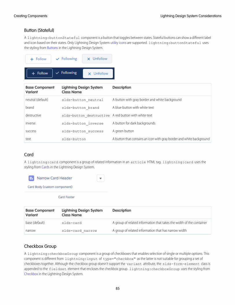
Button (Stateful)A lightning:buttonStateful component is a button that toggles between states. Stateful buttons can show a different labeland icon based on their states. Only Lightning Design System utility icons are supported. lightning:buttonStateful usesthe styling from Buttons in the Lightning Design System.
DescriptionLightning Design SystemClass Name
Base ComponentVariant
A button with gray border and white backgroundslds-button_neutralneutral (default)
A blue button with white textslds-button_brandbrand
A red button with white textslds-button_destructivedestructive
A button for dark backgroundsslds-button_inverseinverse
A green buttonslds-button_successsuccess
A button that contains an icon with gray border and white backgroundslds-buttontext
CardA lightning:card component is a group of related information in an article HTML tag. lightning:card uses thestyling from Cards in the Lightning Design System.
DescriptionLightning Design SystemClass Name
Base ComponentVariant
A group of related information that takes the width of the containerslds-cardbase (default)
A group of related information that has narrow widthslds-card_narrownarrow
Checkbox GroupA lightning:checkboxGroup component is a group of checkboxes that enables selection of single or multiple options. Thiscomponent is different from lightning:input of type="checkbox" as the latter is not suitable for grouping a set ofcheckboxes together. Although the checkbox group doesn’t support the variant attribute, the slds-form-element class isappended to the fieldset element that encloses the checkbox group. lightning:checkboxGroup uses the styling fromCheckbox in the Lightning Design System.
85
Lightning Design System ConsiderationsCreating Components
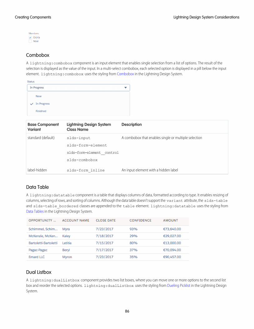
ComboboxA lightning:combobox component is an input element that enables single selection from a list of options. The result of theselection is displayed as the value of the input. In a multi-select combobox, each selected option is displayed in a pill below the inputelement. lightning:combobox uses the styling from Combobox in the Lightning Design System.
DescriptionLightning Design SystemClass Name
Base ComponentVariant
A combobox that enables single or multiple selectionslds-input
slds-form-element
standard (default)
slds-form-element__control
slds-combobox
An input element with a hidden labelslds-form_inlinelabel-hidden
Data TableA lightning:datatable component is a table that displays columns of data, formatted according to type. It enables resizing ofcolumns, selecting of rows, and sorting of columns. Although the data table doesn’t support the variant attribute, the slds-tableand slds-table_bordered classes are appended to the table element. lightning:datatable uses the styling fromData Tables in the Lightning Design System.
Dual ListboxA lightning:dualListbox component provides two list boxes, where you can move one or more options to the second listbox and reorder the selected options. lightning:dualListbox uses the styling from Dueling Picklist in the Lightning DesignSystem.
86
Lightning Design System ConsiderationsCreating Components
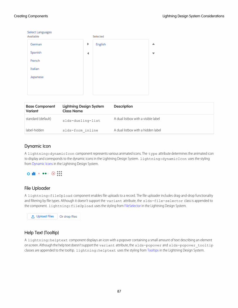
DescriptionLightning Design SystemClass Name
Base ComponentVariant
A dual listbox with a visible labelslds-dueling-liststandard (default)
A dual listbox with a hidden labelslds-form_inlinelabel-hidden
Dynamic IconA lightning:dynamicIcon component represents various animated icons. The type attribute determines the animated iconto display and corresponds to the dynamic icons in the Lightning Design System. lightning:dynamicIcon uses the stylingfrom Dynamic Icons in the Lightning Design System.
File UploaderA lightning:fileUpload component enables file uploads to a record. The file uploader includes drag-and-drop functionalityand filtering by file types. Although it doesn’t support the variant attribute, the slds-file-selector class is appended tothe component. lightning:fileUpload uses the styling from FileSelector in the Lightning Design System.
Help Text (Tooltip)A lightning:helptext component displays an icon with a popover containing a small amount of text describing an elementon screen. Although the help text doesn’t support the variant attribute, the slds-popover and slds-popover_tooltipclasses are appended to the tooltip. lightning:helptext uses the styling from Tooltips in the Lightning Design System.
87
Lightning Design System ConsiderationsCreating Components
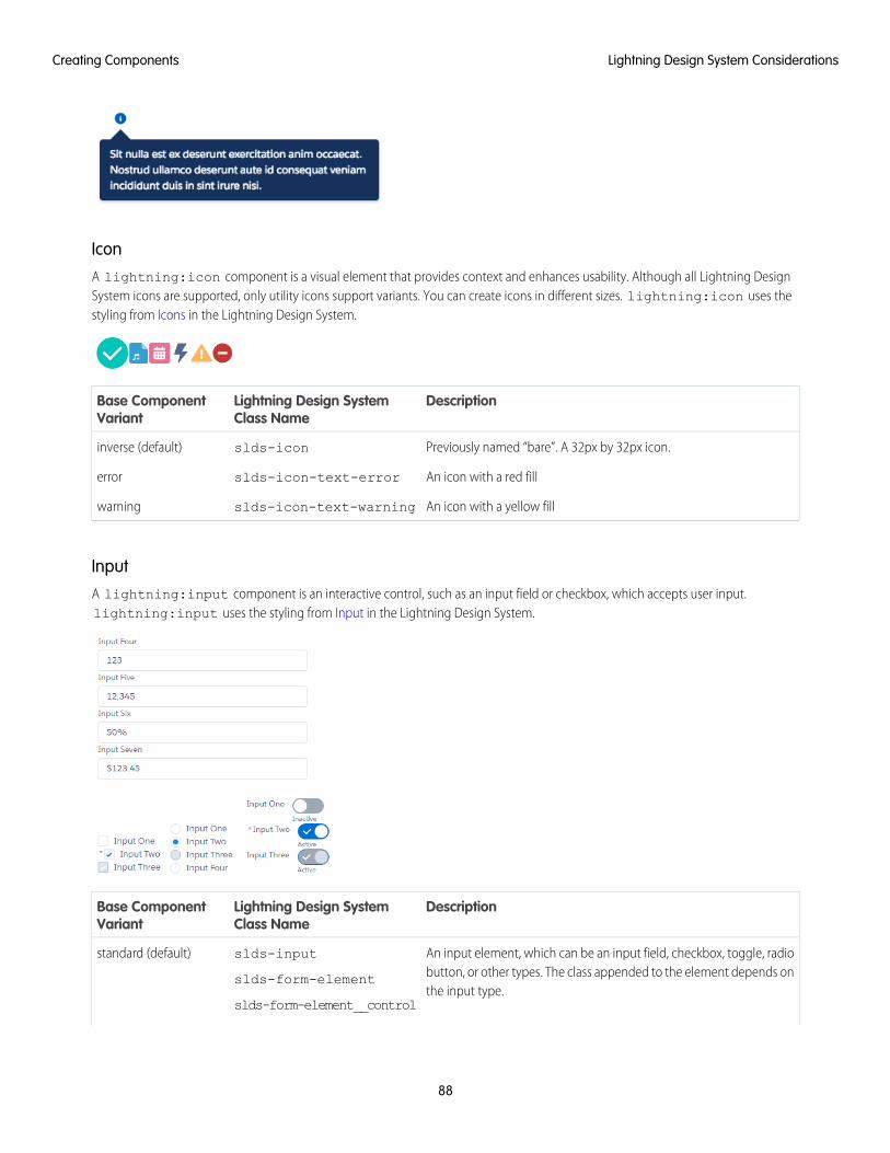
IconA lightning:icon component is a visual element that provides context and enhances usability. Although all Lightning DesignSystem icons are supported, only utility icons support variants. You can create icons in different sizes. lightning:icon uses thestyling from Icons in the Lightning Design System.
DescriptionLightning Design SystemClass Name
Base ComponentVariant
Previously named “bare”. A 32px by 32px icon.slds-iconinverse (default)
An icon with a red fillslds-icon-text-errorerror
An icon with a yellow fillslds-icon-text-warningwarning
InputA lightning:input component is an interactive control, such as an input field or checkbox, which accepts user input.lightning:input uses the styling from Input in the Lightning Design System.
DescriptionLightning Design SystemClass Name
Base ComponentVariant
An input element, which can be an input field, checkbox, toggle, radiobutton, or other types. The class appended to the element depends onthe input type.
slds-input
slds-form-element
slds-form-element__control
standard (default)
88
Lightning Design System ConsiderationsCreating Components
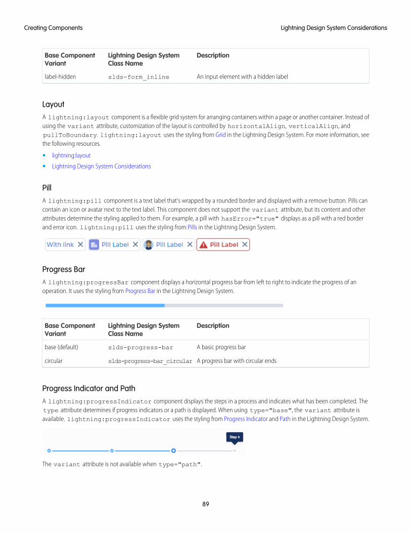
DescriptionLightning Design SystemClass Name
Base ComponentVariant
An input element with a hidden labelslds-form_inlinelabel-hidden
LayoutA lightning:layout component is a flexible grid system for arranging containers within a page or another container. Instead ofusing the variant attribute, customization of the layout is controlled by horizontalAlign, verticalAlign, andpullToBoundary. lightning:layout uses the styling from Grid in the Lightning Design System. For more information, seethe following resources.
• lightning:layout
• Lightning Design System Considerations
PillA lightning:pill component is a text label that’s wrapped by a rounded border and displayed with a remove button. Pills cancontain an icon or avatar next to the text label. This component does not support the variant attribute, but its content and otherattributes determine the styling applied to them. For example, a pill with hasError="true" displays as a pill with a red borderand error icon. lightning:pill uses the styling from Pills in the Lightning Design System.
Progress BarA lightning:progressBar component displays a horizontal progress bar from left to right to indicate the progress of anoperation. It uses the styling from Progress Bar in the Lightning Design System.
DescriptionLightning Design SystemClass Name
Base ComponentVariant
A basic progress barslds-progress-barbase (default)
A progress bar with circular endsslds-progress-bar_circularcircular
Progress Indicator and PathA lightning:progressIndicator component displays the steps in a process and indicates what has been completed. Thetype attribute determines if progress indicators or a path is displayed. When using type="base", the variant attribute isavailable. lightning:progressIndicator uses the styling from Progress Indicator and Path in the Lightning Design System.
The variant attribute is not available when type="path".
89
Lightning Design System ConsiderationsCreating Components
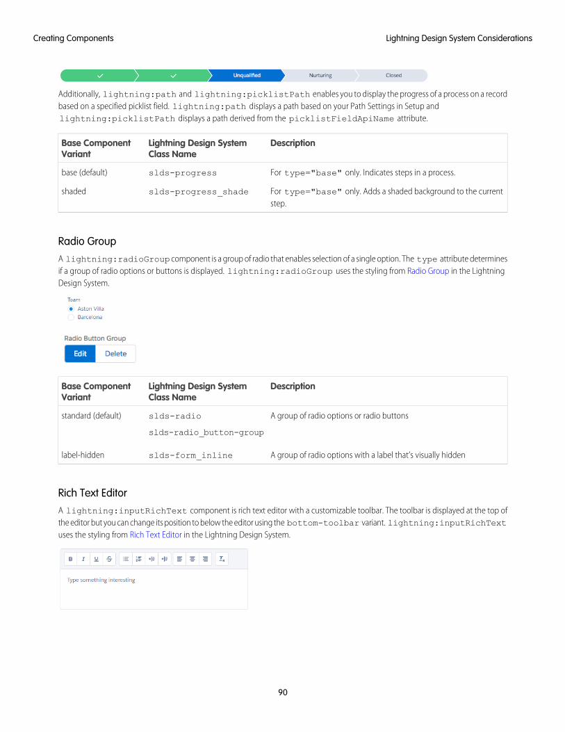
Additionally, lightning:path and lightning:picklistPath enables you to display the progress of a process on a recordbased on a specified picklist field. lightning:path displays a path based on your Path Settings in Setup andlightning:picklistPath displays a path derived from the picklistFieldApiName attribute.
DescriptionLightning Design SystemClass Name
Base ComponentVariant
For type="base" only. Indicates steps in a process.slds-progressbase (default)
For type="base" only. Adds a shaded background to the currentstep.
slds-progress_shadeshaded
Radio GroupA lightning:radioGroup component is a group of radio that enables selection of a single option. The type attribute determinesif a group of radio options or buttons is displayed. lightning:radioGroup uses the styling from Radio Group in the LightningDesign System.
DescriptionLightning Design SystemClass Name
Base ComponentVariant
A group of radio options or radio buttonsslds-radio
slds-radio_button-group
standard (default)
A group of radio options with a label that’s visually hiddenslds-form_inlinelabel-hidden
Rich Text EditorA lightning:inputRichText component is rich text editor with a customizable toolbar. The toolbar is displayed at the top ofthe editor but you can change its position to below the editor using the bottom-toolbar variant. lightning:inputRichTextuses the styling from Rich Text Editor in the Lightning Design System.
90
Lightning Design System ConsiderationsCreating Components
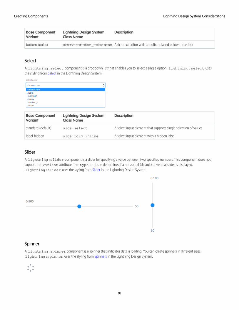
DescriptionLightning Design SystemClass Name
Base ComponentVariant
A rich text editor with a toolbar placed below the editorslds-rich-text-editor__toolbar-bottombottom-toolbar
SelectA lightning:select component is a dropdown list that enables you to select a single option. lightning:select usesthe styling from Select in the Lightning Design System.
DescriptionLightning Design SystemClass Name
Base ComponentVariant
A select input element that supports single selection of valuesslds-selectstandard (default)
A select input element with a hidden labelslds-form_inlinelabel-hidden
SliderA lightning:slider component is a slider for specifying a value between two specified numbers. This component does notsupport the variant attribute. The type attribute determines if a horizontal (default) or vertical slider is displayed.lightning:slider uses the styling from Slider in the Lightning Design System.
SpinnerA lightning:spinner component is a spinner that indicates data is loading. You can create spinners in different sizes.lightning:spinner uses the styling from Spinners in the Lightning Design System.
91
Lightning Design System ConsiderationsCreating Components
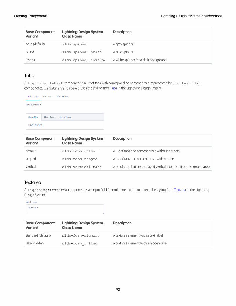
DescriptionLightning Design SystemClass Name
Base ComponentVariant
A gray spinnerslds-spinnerbase (default)
A blue spinnerslds-spinner_brandbrand
A white spinner for a dark backgroundslds-spinner_inverseinverse
TabsA lightning:tabset component is a list of tabs with corresponding content areas, represented by lightning:tabcomponents. lightning:tabset uses the styling from Tabs in the Lightning Design System.
DescriptionLightning Design SystemClass Name
Base ComponentVariant
A list of tabs and content areas without bordersslds-tabs_defaultdefault
A list of tabs and content areas with bordersslds-tabs_scopedscoped
A list of tabs that are displayed vertically to the left of the content areasslds-vertical-tabsvertical
TextareaA lightning:textarea component is an input field for multi-line text input. It uses the styling from Textarea in the LightningDesign System.
DescriptionLightning Design SystemClass Name
Base ComponentVariant
A textarea element with a text labelslds-form-elementstandard (default)
A textarea element with a hidden labelslds-form_inlinelabel-hidden
92
Lightning Design System ConsiderationsCreating Components
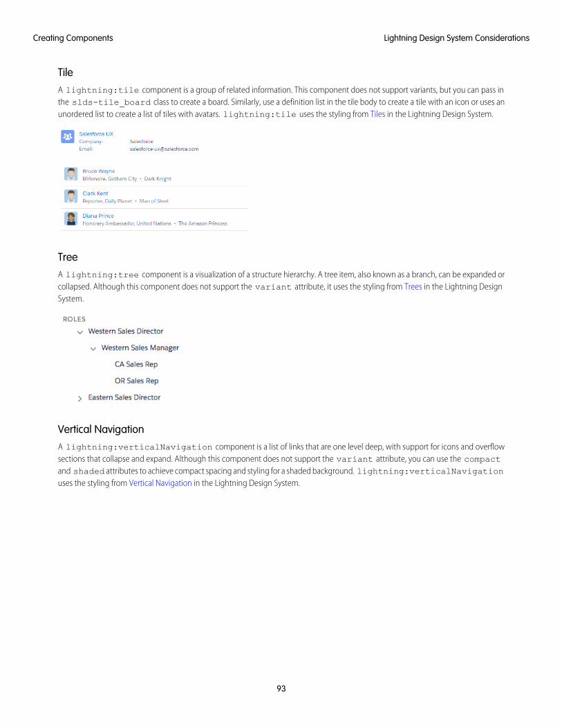
TileA lightning:tile component is a group of related information. This component does not support variants, but you can pass inthe slds-tile_board class to create a board. Similarly, use a definition list in the tile body to create a tile with an icon or uses anunordered list to create a list of tiles with avatars. lightning:tile uses the styling from Tiles in the Lightning Design System.
TreeA lightning:tree component is a visualization of a structure hierarchy. A tree item, also known as a branch, can be expanded orcollapsed. Although this component does not support the variant attribute, it uses the styling from Trees in the Lightning DesignSystem.
Vertical NavigationA lightning:verticalNavigation component is a list of links that are one level deep, with support for icons and overflowsections that collapse and expand. Although this component does not support the variant attribute, you can use the compactand shaded attributes to achieve compact spacing and styling for a shaded background. lightning:verticalNavigationuses the styling from Vertical Navigation in the Lightning Design System.
93
Lightning Design System ConsiderationsCreating Components
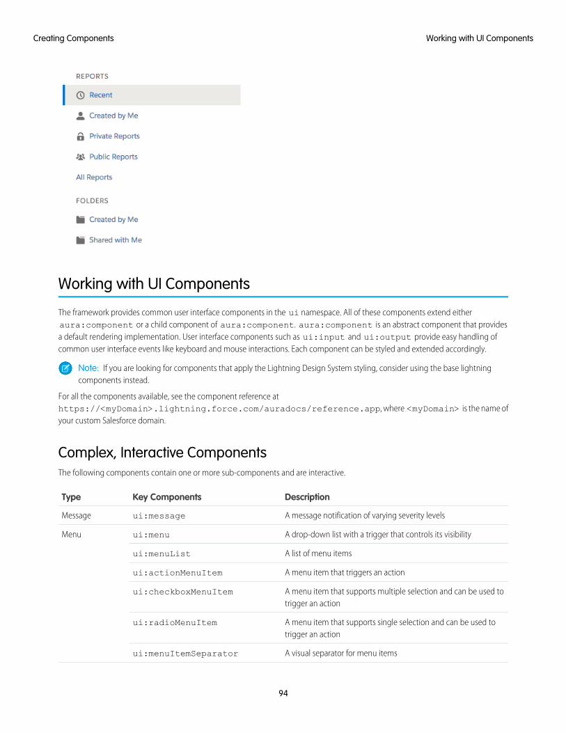
Working with UI Components
The framework provides common user interface components in the ui namespace. All of these components extend eitheraura:component or a child component of aura:component. aura:component is an abstract component that providesa default rendering implementation. User interface components such as ui:input and ui:output provide easy handling ofcommon user interface events like keyboard and mouse interactions. Each component can be styled and extended accordingly.
Note: If you are looking for components that apply the Lightning Design System styling, consider using the base lightningcomponents instead.
For all the components available, see the component reference athttps://<myDomain>.lightning.force.com/auradocs/reference.app, where <myDomain> is the name ofyour custom Salesforce domain.
Complex, Interactive ComponentsThe following components contain one or more sub-components and are interactive.
DescriptionKey ComponentsType
A message notification of varying severity levelsui:messageMessage
A drop-down list with a trigger that controls its visibilityui:menuMenu
A list of menu itemsui:menuList
A menu item that triggers an actionui:actionMenuItem
A menu item that supports multiple selection and can be used totrigger an action
ui:checkboxMenuItem
A menu item that supports single selection and can be used totrigger an action
ui:radioMenuItem
A visual separator for menu itemsui:menuItemSeparator
94
Working with UI ComponentsCreating Components
DescriptionKey ComponentsType
An abstract and extensible component for menu items in aui:menuList component
ui:menuItem
A trigger that expands and collapses a menuui:menuTrigger
A link that triggers a dropdown menu. This component extendsui:menuTrigger
ui:menuTriggerLink
Input Control ComponentsThe following components are interactive, for example, like buttons and checkboxes.
DescriptionKey ComponentsType
An actionable button that can be pressed or clickedui:buttonButton
A selectable option that supports multiple selectionsui:inputCheckboxCheckbox
Displays a read-only value of the checkboxui:outputCheckbox
A selectable option that supports only a single selectionui:inputRadioRadio button
A drop-down list with optionsui:inputSelectDrop-down List
An option in a ui:inputSelect componentui:inputSelectOption
Visual ComponentsThe following components provides informative cues, for example, like error messages and loading spinners.
DescriptionKey ComponentsType
An error message that is displayed when an error occursui:inputDefaultErrorField-level error
A loading spinnerui:spinnerSpinner
Field ComponentsThe following components enables you to enter or display values.
DescriptionKey ComponentsType
An input field for entering currencyui:inputCurrencyCurrency
Displays currency in a default or specified formatui:outputCurrency
An input field for entering an email addressui:inputEmailEmail
Displays a clickable email addressui:outputEmail
An input field for entering a dateui:inputDateDate and time
95
Working with UI ComponentsCreating Components
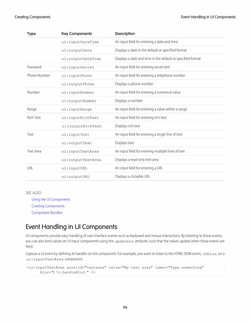
DescriptionKey ComponentsType
An input field for entering a date and timeui:inputDateTime
Displays a date in the default or specified formatui:outputDate
Displays a date and time in the default or specified formatui:outputDateTime
An input field for entering secret textui:inputSecretPassword
An input field for entering a telephone numberui:inputPhonePhone Number
Displays a phone numberui:outputPhone
An input field for entering a numerical valueui:inputNumberNumber
Displays a numberui:outputNumber
An input field for entering a value within a rangeui:inputRangeRange
An input field for entering rich textui:inputRichTextRich Text
Displays rich textui:outputRichText
An input field for entering a single line of textui:inputTextText
Displays textui:outputText
An input field for entering multiple lines of textui:inputTextAreaText Area
Displays a read-only text areaui:outputTextArea
An input field for entering a URLui:inputURLURL
Displays a clickable URLui:outputURL
SEE ALSO:
Using the UI Components
Creating Components
Component Bundles
Event Handling in UI ComponentsUI components provide easy handling of user interface events such as keyboard and mouse interactions. By listening to these events,you can also bind values on UI input components using the updateon attribute, such that the values update when those events arefired.
Capture a UI event by defining its handler on the component. For example, you want to listen to the HTML DOM event, onblur, on aui:inputTextArea component.
<ui:inputTextArea aura:id="textarea" value="My text area" label="Type something"blur="{!c.handleBlur}" />
96
Event Handling in UI ComponentsCreating Components
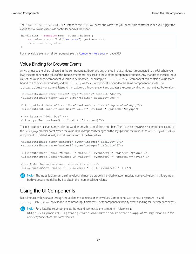
The blur="{!c.handleBlur}" listens to the onblur event and wires it to your client-side controller. When you trigger theevent, the following client-side controller handles the event.
handleBlur : function(cmp, event, helper){var elem = cmp.find("textarea").getElement();//do something else
}
For all available events on all components, see the Component Reference on page 395.
Value Binding for Browser EventsAny changes to the UI are reflected in the component attribute, and any change in that attribute is propagated to the UI. When youload the component, the value of the input elements are initialized to those of the component attributes. Any changes to the user inputcauses the value of the component variable to be updated. For example, a ui:inputText component can contain a value that’sbound to a component attribute, and the ui:outputText component is bound to the same component attribute. Theui:inputText component listens to the onkeyup browser event and updates the corresponding component attribute values.
<aura:attribute name="first" type="String" default="John"/><aura:attribute name="last" type="String" default="Doe"/>
<ui:inputText label="First Name" value="{!v.first}" updateOn="keyup"/><ui:inputText label="Last Name" value="{!v.last}" updateOn="keyup"/>
<!-- Returns "John Doe" --><ui:outputText value="{!v.first +' '+ v.last}"/>
The next example takes in numerical inputs and returns the sum of those numbers. The ui:inputNumber component listens tothe onkeyup browser event. When the value in this component changes on the keyup event, the value in the ui:outputNumbercomponent is updated as well, and returns the sum of the two values.
<aura:attribute name="number1" type="integer" default="1"/><aura:attribute name="number2" type="integer" default="2"/>
<ui:inputNumber label="Number 1" value="{!v.number1}" updateOn="keyup" /><ui:inputNumber label="Number 2" value="{!v.number2}" updateOn="keyup" />
<!-- Adds the numbers and returns the sum --><ui:outputNumber value="{!(v.number1 * 1) + (v.number2 * 1)}"/>
Note: The input fields return a string value and must be properly handled to accommodate numerical values. In this example,both values are multiplied by 1 to obtain their numerical equivalents.
Using the UI ComponentsUsers interact with your app through input elements to select or enter values. Components such as ui:inputText andui:inputCheckbox correspond to common input elements. These components simplify event handling for user interface events.
Note: For all available component attributes and events, see the component reference athttps://<myDomain>.lightning.force.com/auradocs/reference.app, where <myDomain> is thename of your custom Salesforce domain .
97
Using the UI ComponentsCreating Components
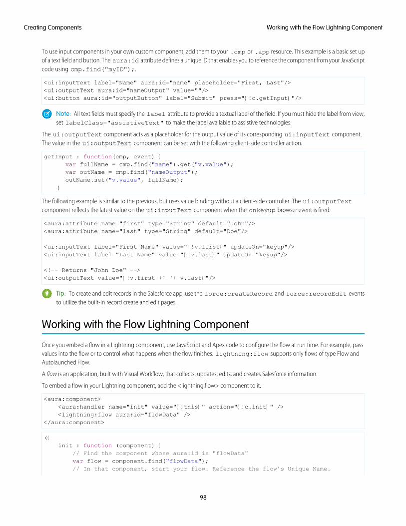
To use input components in your own custom component, add them to your .cmp or .app resource. This example is a basic set upof a text field and button. The aura:id attribute defines a unique ID that enables you to reference the component from your JavaScriptcode using cmp.find("myID");.
<ui:inputText label="Name" aura:id="name" placeholder="First, Last"/><ui:outputText aura:id="nameOutput" value=""/><ui:button aura:id="outputButton" label="Submit" press="{!c.getInput}"/>
Note: All text fields must specify the label attribute to provide a textual label of the field. If you must hide the label from view,set labelClass="assistiveText" to make the label available to assistive technologies.
The ui:outputText component acts as a placeholder for the output value of its corresponding ui:inputText component.The value in the ui:outputText component can be set with the following client-side controller action.
getInput : function(cmp, event) {var fullName = cmp.find("name").get("v.value");var outName = cmp.find("nameOutput");outName.set("v.value", fullName);
}
The following example is similar to the previous, but uses value binding without a client-side controller. The ui:outputTextcomponent reflects the latest value on the ui:inputText component when the onkeyup browser event is fired.
<aura:attribute name="first" type="String" default="John"/><aura:attribute name="last" type="String" default="Doe"/>
<ui:inputText label="First Name" value="{!v.first}" updateOn="keyup"/><ui:inputText label="Last Name" value="{!v.last}" updateOn="keyup"/>
<!-- Returns "John Doe" --><ui:outputText value="{!v.first +' '+ v.last}"/>
Tip: To create and edit records in the Salesforce app, use the force:createRecord and force:recordEdit eventsto utilize the built-in record create and edit pages.
Working with the Flow Lightning Component
Once you embed a flow in a Lightning component, use JavaScript and Apex code to configure the flow at run time. For example, passvalues into the flow or to control what happens when the flow finishes. lightning:flow supports only flows of type Flow andAutolaunched Flow.
A flow is an application, built with Visual Workflow, that collects, updates, edits, and creates Salesforce information.
To embed a flow in your Lightning component, add the <lightning:flow> component to it.
<aura:component><aura:handler name="init" value="{!this}" action="{!c.init}" /><lightning:flow aura:id="flowData" />
</aura:component>
({init : function (component) {
// Find the component whose aura:id is "flowData"var flow = component.find("flowData");// In that component, start your flow. Reference the flow's Unique Name.
98
Working with the Flow Lightning ComponentCreating Components
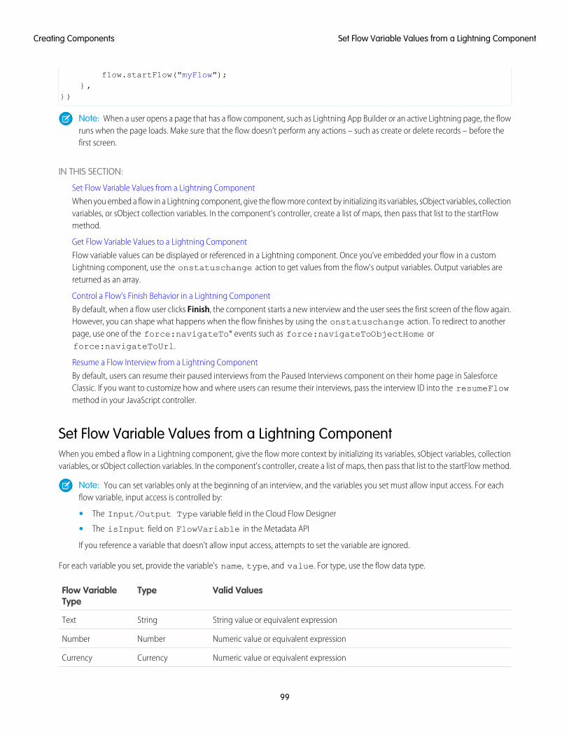
flow.startFlow("myFlow");},
})
Note: When a user opens a page that has a flow component, such as Lightning App Builder or an active Lightning page, the flowruns when the page loads. Make sure that the flow doesn’t perform any actions – such as create or delete records – before thefirst screen.
IN THIS SECTION:
Set Flow Variable Values from a Lightning Component
When you embed a flow in a Lightning component, give the flow more context by initializing its variables, sObject variables, collectionvariables, or sObject collection variables. In the component's controller, create a list of maps, then pass that list to the startFlowmethod.
Get Flow Variable Values to a Lightning Component
Flow variable values can be displayed or referenced in a Lightning component. Once you’ve embedded your flow in a customLightning component, use the onstatuschange action to get values from the flow's output variables. Output variables arereturned as an array.
Control a Flow’s Finish Behavior in a Lightning Component
By default, when a flow user clicks Finish, the component starts a new interview and the user sees the first screen of the flow again.However, you can shape what happens when the flow finishes by using the onstatuschange action. To redirect to anotherpage, use one of the force:navigateTo* events such as force:navigateToObjectHome orforce:navigateToUrl.
Resume a Flow Interview from a Lightning Component
By default, users can resume their paused interviews from the Paused Interviews component on their home page in SalesforceClassic. If you want to customize how and where users can resume their interviews, pass the interview ID into the resumeFlowmethod in your JavaScript controller.
Set Flow Variable Values from a Lightning ComponentWhen you embed a flow in a Lightning component, give the flow more context by initializing its variables, sObject variables, collectionvariables, or sObject collection variables. In the component's controller, create a list of maps, then pass that list to the startFlow method.
Note: You can set variables only at the beginning of an interview, and the variables you set must allow input access. For eachflow variable, input access is controlled by:
• The Input/Output Type variable field in the Cloud Flow Designer
• The isInput field on FlowVariable in the Metadata API
If you reference a variable that doesn’t allow input access, attempts to set the variable are ignored.
For each variable you set, provide the variable's name, type, and value. For type, use the flow data type.
Valid ValuesTypeFlow VariableType
String value or equivalent expressionStringText
Numeric value or equivalent expressionNumberNumber
Numeric value or equivalent expressionCurrencyCurrency
99
Set Flow Variable Values from a Lightning ComponentCreating Components
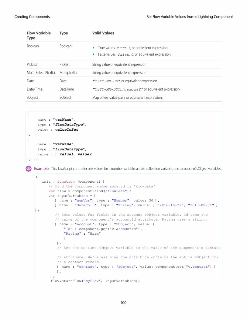
Valid ValuesTypeFlow VariableType
BooleanBoolean • True values: true, 1, or equivalent expression
• False values: false, 0, or equivalent expression
String value or equivalent expressionPicklistPicklist
String value or equivalent expressionMultipicklistMulti-Select Picklist
"YYYY-MM-DD" or equivalent expressionDateDate
"YYYY-MM-DDThh:mm:ssZ" or equivalent expressionDateTimeDate/Time
Map of key-value pairs or equivalent expression.SObjectsObject
{name : "varName",type : "flowDataType",value : valueToSet
},{
name : "varName",type : "flowDataType",value : [ value1, value2]
}, ...
Example: This JavaScript controller sets values for a number variable, a date collection variable, and a couple of sObject variables.
({init : function (component) {
// Find the component whose aura:id is "flowData"var flow = component.find("flowData");var inputVariables = [
{ name : "numVar", type : "Number", value: 30 },{ name : "dateColl", type : "String", value: [ "2016-10-27", "2017-08-01" ]
},// Sets values for fields in the account sObject variable. Id uses the// value of the component's accountId attribute. Rating uses a string.{ name : "account", type : "SObject", value: {
"Id" : component.get("v.accountId"),"Rating" : "Warm"}
},// Set the contact sObject variable to the value of the component's contact
// attribute. We're assuming the attribute contains the entire sObject for// a contact record.{ name : "contact", type : "SObject", value: component.get("v.contact") }},
];flow.startFlow("myFlow", inputVariables);
100
Set Flow Variable Values from a Lightning ComponentCreating Components
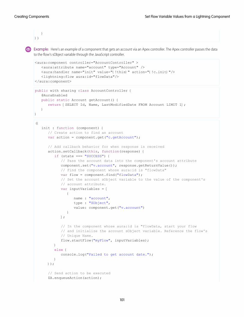
}})
Example: Here's an example of a component that gets an account via an Apex controller. The Apex controller passes the datato the flow's sObject variable through the JavaScript controller.
<aura:component controller="AccountController" ><aura:attribute name="account" type="Account" /><aura:handler name="init" value="{!this}" action="{!c.init}"/><lightning:flow aura:id="flowData"/>
</aura:component>
public with sharing class AccountController {@AuraEnabledpublic static Account getAccount() {
return [SELECT Id, Name, LastModifiedDate FROM Account LIMIT 1];}
}
({init : function (component) {
// Create action to find an accountvar action = component.get("c.getAccount");
// Add callback behavior for when response is receivedaction.setCallback(this, function(response) {
if (state === "SUCCESS") {// Pass the account data into the component's account attributecomponent.set("v.account", response.getReturnValue());// Find the component whose aura:id is "flowData"var flow = component.find("flowData");// Set the account sObject variable to the value of the component's// account attribute.var inputVariables = [
{name : "account",type : "SObject",value: component.get("v.account")
}];
// In the component whose aura:id is "flowData, start your flow// and initialize the account sObject variable. Reference the flow's// Unique Name.flow.startFlow("myFlow", inputVariables);
}else {
console.log("Failed to get account date.");}
});
// Send action to be executed$A.enqueueAction(action);
101
Set Flow Variable Values from a Lightning ComponentCreating Components
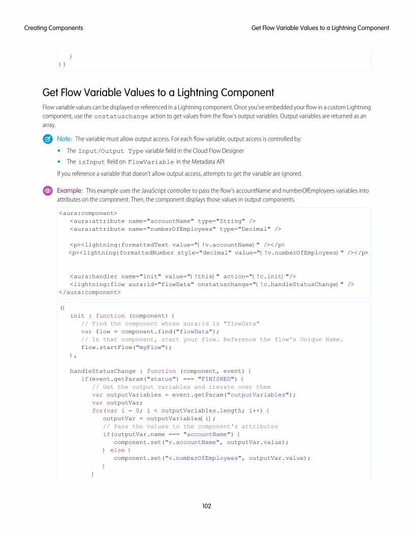
}})
Get Flow Variable Values to a Lightning ComponentFlow variable values can be displayed or referenced in a Lightning component. Once you’ve embedded your flow in a custom Lightningcomponent, use the onstatuschange action to get values from the flow's output variables. Output variables are returned as anarray.
Note: The variable must allow output access. For each flow variable, output access is controlled by:
• The Input/Output Type variable field in the Cloud Flow Designer
• The isInput field on FlowVariable in the Metadata API
If you reference a variable that doesn’t allow output access, attempts to get the variable are ignored.
Example: This example uses the JavaScript controller to pass the flow's accountName and numberOfEmployees variables intoattributes on the component. Then, the component displays those values in output components.
<aura:component><aura:attribute name="accountName" type="String" /><aura:attribute name="numberOfEmployees" type="Decimal" />
<p><lightning:formattedText value="{!v.accountName}" /></p><p><lightning:formattedNumber style="decimal" value="{!v.numberOfEmployees}" /></p>
<aura:handler name="init" value="{!this}" action="{!c.init}"/><lightning:flow aura:id="flowData" onstatuschange="{!c.handleStatusChange}" />
</aura:component>
({init : function (component) {
// Find the component whose aura:id is "flowData"var flow = component.find("flowData");// In that component, start your flow. Reference the flow's Unique Name.flow.startFlow("myFlow");
},
handleStatusChange : function (component, event) {if(event.getParam("status") === "FINISHED") {
// Get the output variables and iterate over themvar outputVariables = event.getParam("outputVariables");var outputVar;for(var i = 0; i < outputVariables.length; i++) {
outputVar = outputVariables[i];// Pass the values to the component's attributesif(outputVar.name === "accountName") {
component.set("v.accountName", outputVar.value);} else {
component.set("v.numberOfEmployees", outputVar.value);}
}
102
Get Flow Variable Values to a Lightning ComponentCreating Components
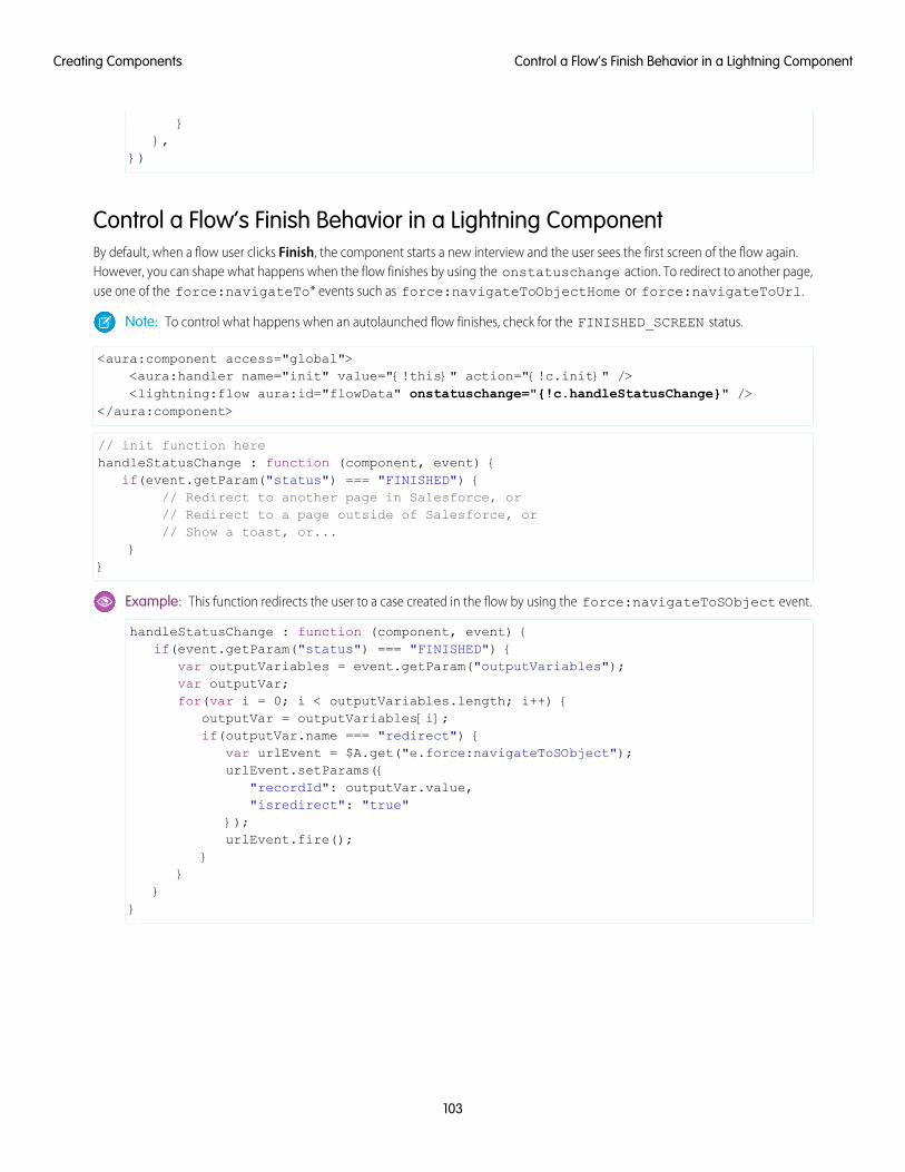
}},
})
Control a Flow’s Finish Behavior in a Lightning ComponentBy default, when a flow user clicks Finish, the component starts a new interview and the user sees the first screen of the flow again.However, you can shape what happens when the flow finishes by using the onstatuschange action. To redirect to another page,use one of the force:navigateTo* events such as force:navigateToObjectHome or force:navigateToUrl.
Note: To control what happens when an autolaunched flow finishes, check for the FINISHED_SCREEN status.
<aura:component access="global"><aura:handler name="init" value="{!this}" action="{!c.init}" /><lightning:flow aura:id="flowData" onstatuschange="{!c.handleStatusChange}" />
</aura:component>
// init function herehandleStatusChange : function (component, event) {
if(event.getParam("status") === "FINISHED") {// Redirect to another page in Salesforce, or// Redirect to a page outside of Salesforce, or// Show a toast, or...
}}
Example: This function redirects the user to a case created in the flow by using the force:navigateToSObject event.
handleStatusChange : function (component, event) {if(event.getParam("status") === "FINISHED") {
var outputVariables = event.getParam("outputVariables");var outputVar;for(var i = 0; i < outputVariables.length; i++) {
outputVar = outputVariables[i];if(outputVar.name === "redirect") {
var urlEvent = $A.get("e.force:navigateToSObject");urlEvent.setParams({
"recordId": outputVar.value,"isredirect": "true"
});urlEvent.fire();
}}
}}
103
Control a Flow’s Finish Behavior in a Lightning ComponentCreating Components
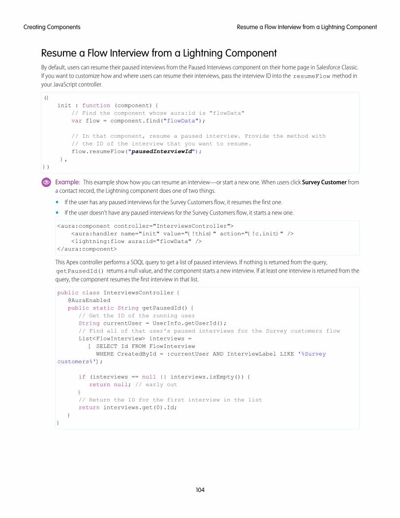
Resume a Flow Interview from a Lightning ComponentBy default, users can resume their paused interviews from the Paused Interviews component on their home page in Salesforce Classic.If you want to customize how and where users can resume their interviews, pass the interview ID into the resumeFlow method inyour JavaScript controller.
({init : function (component) {
// Find the component whose aura:id is "flowData"var flow = component.find("flowData");
// In that component, resume a paused interview. Provide the method with// the ID of the interview that you want to resume.flow.resumeFlow("pausedInterviewId");
},})
Example: This example show how you can resume an interview—or start a new one. When users click Survey Customer froma contact record, the Lightning component does one of two things.
• If the user has any paused interviews for the Survey Customers flow, it resumes the first one.
• If the user doesn’t have any paused interviews for the Survey Customers flow, it starts a new one.
<aura:component controller="InterviewsController"><aura:handler name="init" value="{!this}" action="{!c.init}" /><lightning:flow aura:id="flowData" />
</aura:component>
This Apex controller performs a SOQL query to get a list of paused interviews. If nothing is returned from the query,getPausedId() returns a null value, and the component starts a new interview. If at least one interview is returned from thequery, the component resumes the first interview in that list.
public class InterviewsController {@AuraEnabledpublic static String getPausedId() {
// Get the ID of the running userString currentUser = UserInfo.getUserId();// Find all of that user's paused interviews for the Survey customers flowList<FlowInterview> interviews =
[ SELECT Id FROM FlowInterviewWHERE CreatedById = :currentUser AND InterviewLabel LIKE '%Survey
customers%'];
if (interviews == null || interviews.isEmpty()) {return null; // early out
}// Return the ID for the first interview in the listreturn interviews.get(0).Id;
}}
104
Resume a Flow Interview from a Lightning ComponentCreating Components
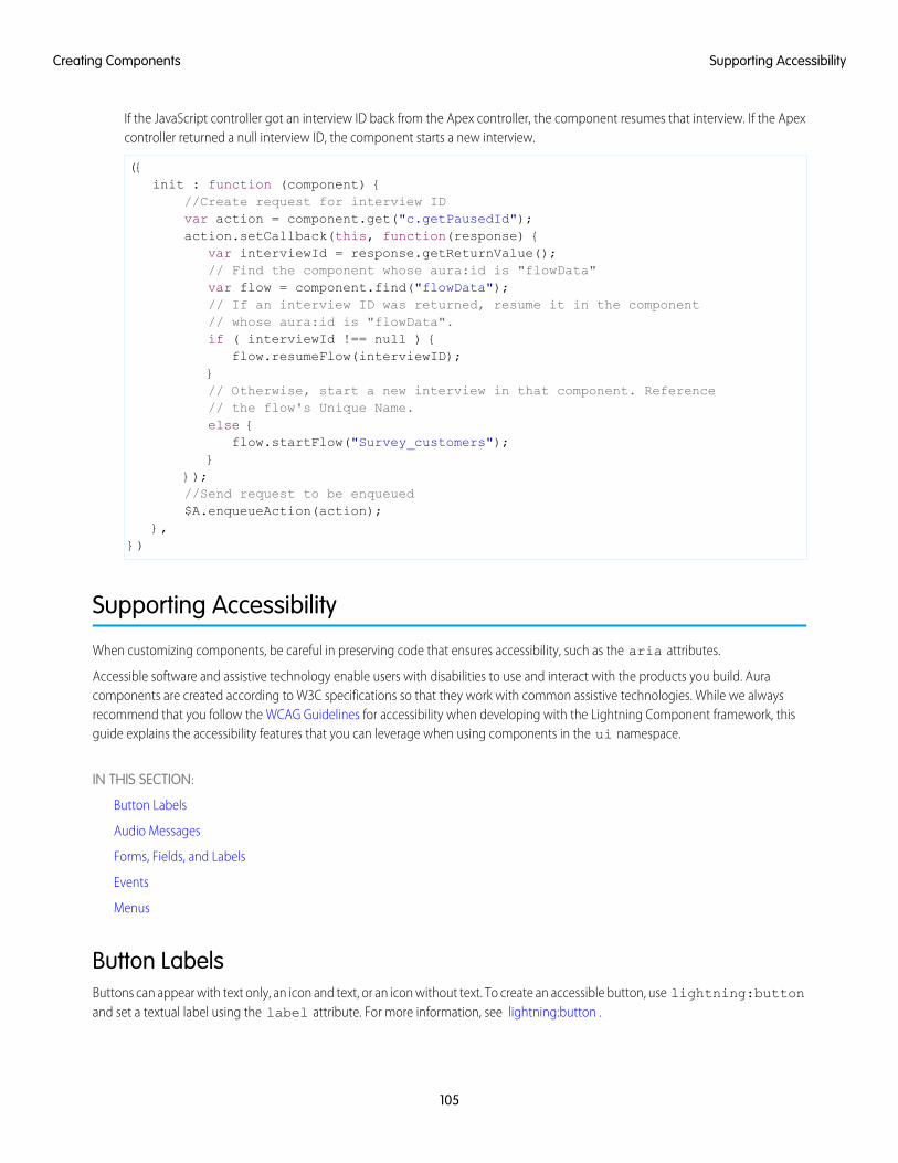
If the JavaScript controller got an interview ID back from the Apex controller, the component resumes that interview. If the Apexcontroller returned a null interview ID, the component starts a new interview.
({init : function (component) {
//Create request for interview IDvar action = component.get("c.getPausedId");action.setCallback(this, function(response) {
var interviewId = response.getReturnValue();// Find the component whose aura:id is "flowData"var flow = component.find("flowData");// If an interview ID was returned, resume it in the component// whose aura:id is "flowData".if ( interviewId !== null ) {
flow.resumeFlow(interviewID);}// Otherwise, start a new interview in that component. Reference// the flow's Unique Name.else {
flow.startFlow("Survey_customers");}
});//Send request to be enqueued$A.enqueueAction(action);
},})
Supporting Accessibility
When customizing components, be careful in preserving code that ensures accessibility, such as the aria attributes.
Accessible software and assistive technology enable users with disabilities to use and interact with the products you build. Auracomponents are created according to W3C specifications so that they work with common assistive technologies. While we alwaysrecommend that you follow the WCAG Guidelines for accessibility when developing with the Lightning Component framework, thisguide explains the accessibility features that you can leverage when using components in the ui namespace.
IN THIS SECTION:
Button Labels
Audio Messages
Forms, Fields, and Labels
Events
Menus
Button LabelsButtons can appear with text only, an icon and text, or an icon without text. To create an accessible button, use lightning:buttonand set a textual label using the label attribute. For more information, see lightning:button .
105
Supporting AccessibilityCreating Components
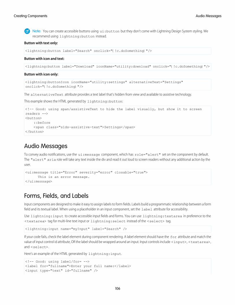
Note: You can create accessible buttons using ui:button but they don’t come with Lightning Design System styling. Werecommend using lightning:button instead.
Button with text only:
<lightning:button label="Search" onclick="{!c.doSomething}"/>
Button with icon and text:
<lightning:button label="Download" iconName="utility:download" onclick="{!c.doSomething}"/>
Button with icon only:
<lightning:buttonIcon iconName="utility:settings" alternativeText="Settings"onclick="{!c.doSomething}"/>
The alternativeText attribute provides a text label that’s hidden from view and available to assistive technology.
This example shows the HTML generated by lightning:button:
<!-- Good: using span/assistiveText to hide the label visually, but show it to screenreaders --><button>
::before<span class="slds-assistive-text">Settings</span>
</button>
Audio MessagesTo convey audio notifications, use the ui:message component, which has role="alert" set on the component by default.The "alert" aria role will take any text inside the div and read it out loud to screen readers without any additional action by theuser.
<ui:message title="Error" severity="error" closable="true">This is an error message.
</ui:message>
Forms, Fields, and LabelsInput components are designed to make it easy to assign labels to form fields. Labels build a programmatic relationship between a formfield and its textual label. When using a placeholder in an input component, set the label attribute for accessibility.
Use lightning:input to create accessible input fields and forms. You can use lightning:textarea in preference to the<textarea> tag for multi-line text input or lightning:select instead of the <select> tag.
<lightning:input name="myInput" label="Search" />
If your code fails, check the label element during component rendering. A label element should have the for attribute and match thevalue of input control id attribute, OR the label should be wrapped around an input. Input controls include <input>, <textarea>,and <select>.
Here’s an example of the HTML generated by lightning:input.
<!-- Good: using label/for= --><label for="fullname">Enter your full name:</label><input type="text" id="fullname" />
106
Audio MessagesCreating Components
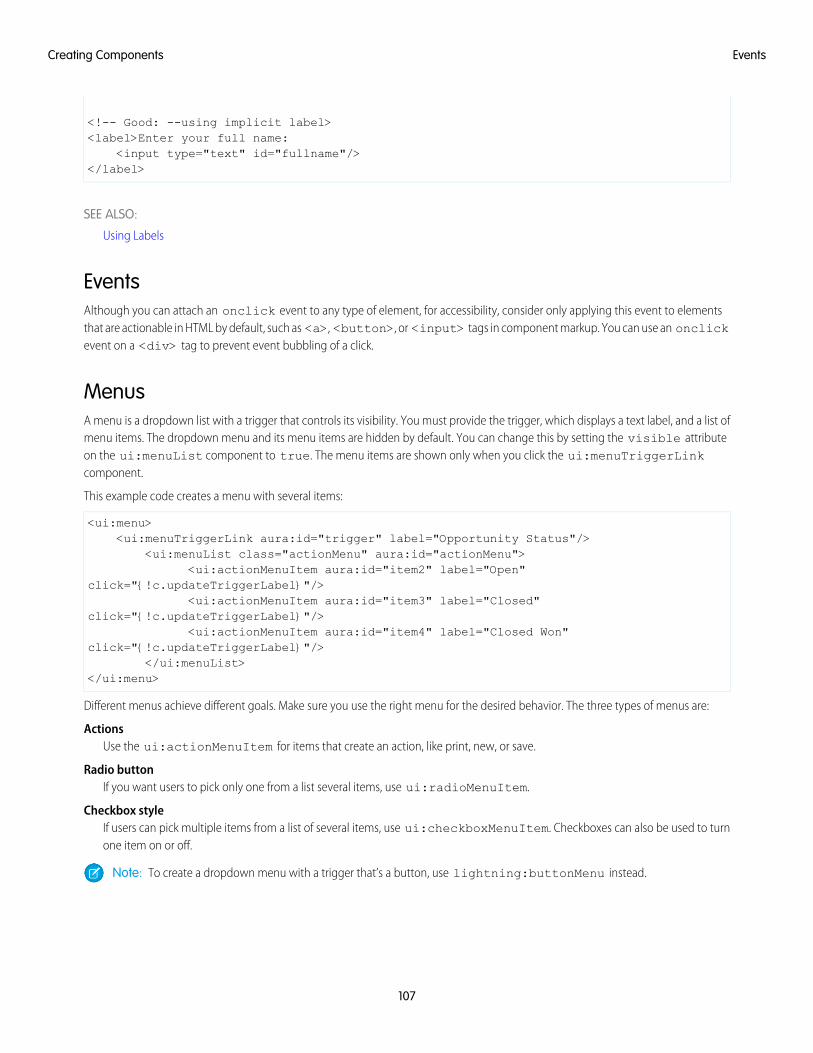
<!-- Good: --using implicit label><label>Enter your full name:
<input type="text" id="fullname"/></label>
SEE ALSO:
Using Labels
EventsAlthough you can attach an onclick event to any type of element, for accessibility, consider only applying this event to elementsthat are actionable in HTML by default, such as <a>, <button>, or <input> tags in component markup. You can use an onclickevent on a <div> tag to prevent event bubbling of a click.
MenusA menu is a dropdown list with a trigger that controls its visibility. You must provide the trigger, which displays a text label, and a list ofmenu items. The dropdown menu and its menu items are hidden by default. You can change this by setting the visible attributeon the ui:menuList component to true. The menu items are shown only when you click the ui:menuTriggerLinkcomponent.
This example code creates a menu with several items:
<ui:menu><ui:menuTriggerLink aura:id="trigger" label="Opportunity Status"/>
<ui:menuList class="actionMenu" aura:id="actionMenu"><ui:actionMenuItem aura:id="item2" label="Open"
click="{!c.updateTriggerLabel}"/><ui:actionMenuItem aura:id="item3" label="Closed"
click="{!c.updateTriggerLabel}"/><ui:actionMenuItem aura:id="item4" label="Closed Won"
click="{!c.updateTriggerLabel}"/></ui:menuList>
</ui:menu>
Different menus achieve different goals. Make sure you use the right menu for the desired behavior. The three types of menus are:
ActionsUse the ui:actionMenuItem for items that create an action, like print, new, or save.
Radio buttonIf you want users to pick only one from a list several items, use ui:radioMenuItem.
Checkbox styleIf users can pick multiple items from a list of several items, use ui:checkboxMenuItem. Checkboxes can also be used to turnone item on or off.
Note: To create a dropdown menu with a trigger that’s a button, use lightning:buttonMenu instead.
107
EventsCreating Components
CHAPTER 4 Using Components
You can use components in many different contexts. This section shows you how.In this chapter ...
• Use LightningComponents inLightning Experienceand the SalesforceMobile App
• Get Your LightningComponents Readyto Use on LightningPages
• Use LightningComponents inCommunity Builder
• Add Components toApps
• Integrate YourCustom Apps into theChatter Publisher
• Use LightningComponents inVisualforce Pages
• Add LightningComponents to AnyApp with LightningOut (Beta)
108
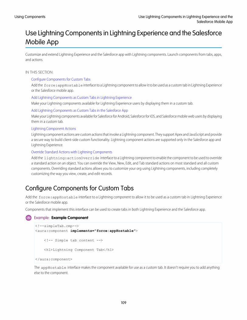
Use Lightning Components in Lightning Experience and the SalesforceMobile App
Customize and extend Lightning Experience and the Salesforce app with Lightning components. Launch components from tabs, apps,and actions.
IN THIS SECTION:
Configure Components for Custom Tabs
Add the force:appHostable interface to a Lightning component to allow it to be used as a custom tab in Lightning Experienceor the Salesforce mobile app.
Add Lightning Components as Custom Tabs in Lightning Experience
Make your Lightning components available for Lightning Experience users by displaying them in a custom tab.
Add Lightning Components as Custom Tabs in the Salesforce App
Make your Lightning components available for Salesforce for Android, Salesforce for iOS, and Salesforce mobile web users by displayingthem in a custom tab.
Lightning Component Actions
Lightning component actions are custom actions that invoke a Lightning component. They support Apex and JavaScript and providea secure way to build client-side custom functionality. Lightning component actions are supported only in the Salesforce app andLightning Experience.
Override Standard Actions with Lightning Components
Add the lightning:actionOverride interface to a Lightning component to enable the component to be used to overridea standard action on an object. You can override the View, New, Edit, and Tab standard actions on most standard and all customcomponents. Overriding standard actions allows you to customize your org using Lightning components, including completelycustomizing the way you view, create, and edit records.
Configure Components for Custom TabsAdd the force:appHostable interface to a Lightning component to allow it to be used as a custom tab in Lightning Experienceor the Salesforce mobile app.
Components that implement this interface can be used to create tabs in both Lightning Experience and the Salesforce app.
Example: Example Component
<!--simpleTab.cmp--><aura:component implements="force:appHostable">
<!-- Simple tab content -->
<h1>Lightning Component Tab</h1>
</aura:component>
The appHostable interface makes the component available for use as a custom tab. It doesn’t require you to add anythingelse to the component.
109
Use Lightning Components in Lightning Experience and theSalesforce Mobile App
Using Components
Add Lightning Components as Custom Tabs in Lightning Experience
EDITIONS
Available in: SalesforceClassic and LightningExperience
Available for use in: ContactManager, Group,Professional, Enterprise,Performance, Unlimited,and Developer Editions
Create Lightningcomponents using the UI inEnterprise, Performance,Unlimited, DeveloperEditions or a sandbox.
USER PERMISSIONS
To create LightningComponent Tabs:• Customize Application
Make your Lightning components available for Lightning Experience users by displaying them ina custom tab.
In the components you wish to include in Lightning Experience, addimplements="force:appHostable" in the aura:component tag and save yourchanges.
<aura:component implements="force:appHostable">
Use the Developer Console to create Lightning components.
Follow these steps to include your components in Lightning Experience and make them available to users in your organization.
1. Create a custom tab for this component.
a. From Setup, enter Tabs in the Quick Find box, then select Tabs.
b. Click New in the Lightning Component Tabs related list.
c. Select the Lightning component that you want to make available to users.
d. Enter a label to display on the tab.
e. Select the tab style and click Next.
f. When prompted to add the tab to profiles, accept the default and click Save.
2. Add your Lightning components to the App Launcher.
a. From Setup, enter Apps in the Quick Find box, then select Apps.
b. Click New. Select Custom app and then click Next.
c. Enter Lightning for App Labeland click Next.
d. In the Available Tabs dropdown menu, select the Lightning Component tab you created and click the right arrow buttonto add it to the custom app.
e. Click Next. Select the Visible checkbox to assign the app to profiles and then Save.
110
Add Lightning Components as Custom Tabs in LightningExperience
Using Components
3. Check your output by navigating to the App Launcher in Lightning Experience. Your custom app should appear in theApp Launcher.Click the custom app to see the components you added.
Add Lightning Components as Custom Tabs in the Salesforce App
EDITIONS
Available in: SalesforceClassic and LightningExperience
Available for use in: ContactManager, Group,Professional, Enterprise,Performance, Unlimited,and Developer Editions
Create Lightningcomponents using the UI inEnterprise, Performance,Unlimited, DeveloperEditions or a sandbox.
USER PERMISSIONS
To create LightningComponent Tabs:• Customize Application
Make your Lightning components available for Salesforce for Android, Salesforce for iOS, andSalesforce mobile web users by displaying them in a custom tab.
In the component you wish to add, include implements="force:appHostable" in youraura:component tag and save your changes.
<aura:component implements="force:appHostable">
The appHostable interface makes the component available as a custom tab.
Use the Developer Console to create Lightning components.
Include your components in the navigation menu by following these steps.
1. Create a custom Lightning component tab for the component. From Setup, enter Tabs in the Quick Find box, then selectTabs.
Note: You must create a custom Lightning component tab before you can add your component to the navigation menu.Accessing your Lightning component from the full Salesforce site is not supported.
2. Add your Lightning component to the Salesforce app navigation menu.
a. From Setup, enter Navigation in the Quick Find box, then select Salesforce Navigation.
b. Select the custom tab you just created and click Add.
c. Sort items by selecting them and clicking Up or Down.
In the navigation menu, items appear in the order you specify. The first item in the Selected list becomes your users’ landingpage.
3. Check your output by going to Salesforce mobile web. Your new menu item should appear in the navigation menu.
111
Add Lightning Components as Custom Tabs in the SalesforceApp
Using Components
Note: By default, Salesforce mobile web is turned on for your org. For more information on using mobile web, see the SalesforceApp Developer Guide.
Lightning Component Actions
EDITIONS
Available in: both theSalesforce app andLightning Experience
Available in: Essentials,Group, Professional,Enterprise, Performance,Unlimited, ContactManager, and DeveloperEditions
Lightning component actions are custom actions that invoke a Lightning component. They supportApex and JavaScript and provide a secure way to build client-side custom functionality. Lightningcomponent actions are supported only in the Salesforce app and Lightning Experience.
Note: My Domain must be deployed in your org for Lightning component actions to workproperly.
You can add Lightning component actions to an object’s page layout using the page layout editor.If you have Lightning component actions in your org, you can find them in the Mobile & LightningActions category in the page layout editor’s palette.
Lightning component actions can’t call just any Lightning component in your org. For a componentto work as a Lightning component action, it has to be configured specifically for that purpose andimplement either the force:LightningQuickAction orforce:LightningQuickActionWithoutHeader interfaces.
If you plan on packaging a Lightning component action, the component the action invokes must be marked as access=global.
IN THIS SECTION:
Configure Components for Custom Actions
Add the force:lightningQuickAction or force:lightningQuickActionWithoutHeader interface to aLightning component to enable it to be used as a custom action in Lightning Experience or the Salesforce mobile app. You can usecomponents that implement one of these interfaces as object-specific or global actions in both Lightning Experience and theSalesforce app.
Configure Components for Record-Specific Actions
Add the force:hasRecordId interface to a Lightning component to enable the component to be assigned the ID of thecurrent record. The current record ID is useful if the component is used on a Lightning record page, as an object-specific customaction or action override in Lightning Experience or the Salesforce app, and so on.
Configure Components for Custom ActionsAdd the force:lightningQuickAction or force:lightningQuickActionWithoutHeader interface to aLightning component to enable it to be used as a custom action in Lightning Experience or the Salesforce mobile app. You can usecomponents that implement one of these interfaces as object-specific or global actions in both Lightning Experience and the Salesforceapp.
When used as actions, components that implement the force:lightningQuickAction interface display in a panel withstandard action controls, such as a Cancel button. These components can display and implement their own controls in the body of thepanel, but can’t affect the standard controls. It should nevertheless be prepared to handle events from the standard controls.
If instead you want complete control over the user interface, use the force:lightningQuickActionWithoutHeaderinterface. Components that implement force:lightningQuickActionWithoutHeader display in a panel without additionalcontrols and are expected to provide a complete user interface for the action.
112
Lightning Component ActionsUsing Components
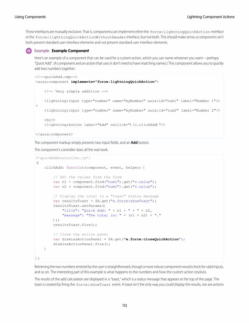
These interfaces are mutually exclusive. That is, components can implement either the force:lightningQuickAction interfaceor the force:lightningQuickActionWithoutHeader interface, but not both. This should make sense; a component can’tboth present standard user interface elements and not present standard user interface elements.
Example: Example Component
Here’s an example of a component that can be used for a custom action, which you can name whatever you want—perhaps“Quick Add”. (A component and an action that uses it don’t need to have matching names.) This component allows you to quicklyadd two numbers together.
<!--quickAdd.cmp--><aura:component implements="force:lightningQuickAction">
<!-- Very simple addition -->
<lightning:input type="number" name="myNumber" aura:id="num1" label="Number 1"/>+
<lightning:input type="number" name="myNumber" aura:id="num2" label="Number 2"/>
<br/><lightning:button label="Add" onclick="{!c.clickAdd}"/>
</aura:component>
The component markup simply presents two input fields, and an Add button.
The component’s controller does all the real work.
/*quickAddController.js*/({
clickAdd: function(component, event, helper) {
// Get the values from the formvar n1 = component.find("num1").get("v.value");var n2 = component.find("num2").get("v.value");
// Display the total in a "toast" status messagevar resultsToast = $A.get("e.force:showToast");resultsToast.setParams({
"title": "Quick Add: " + n1 + " + " + n2,"message": "The total is: " + (n1 + n2) + "."
});resultsToast.fire();
// Close the action panelvar dismissActionPanel = $A.get("e.force:closeQuickAction");dismissActionPanel.fire();
}
})
Retrieving the two numbers entered by the user is straightforward, though a more robust component would check for valid inputs,and so on. The interesting part of this example is what happens to the numbers and how the custom action resolves.
The results of the add calculation are displayed in a “toast,” which is a status message that appears at the top of the page. Thetoast is created by firing the force:showToast event. A toast isn’t the only way you could display the results, nor are actions
113
Lightning Component ActionsUsing Components
the only use for toasts. It’s just a handy way to show a message at the top of the screen in Lightning Experience or the Salesforceapp.
What’s interesting about using a toast here, though, is what happens afterward. The clickAdd controller action fires theforce:closeQuickAction event, which dismisses the action panel. But, even though the action panel is closed, the toaststill displays. The force:closeQuickAction event is handled by the action panel, which closes. The force:showToastevent is handled by the one.app container, so it doesn’t need the panel to work.
SEE ALSO:
Configure Components for Record-Specific Actions
Configure Components for Record-Specific ActionsAdd the force:hasRecordId interface to a Lightning component to enable the component to be assigned the ID of the currentrecord. The current record ID is useful if the component is used on a Lightning record page, as an object-specific custom action or actionoverride in Lightning Experience or the Salesforce app, and so on.
The force:hasRecordId interface does two things to a component that implements it.
• It adds an attribute named recordId to your component. This attribute is of type String, and its value is an 18-character Salesforcerecord ID, for example: 001xx000003DGSWAA4. If you added it yourself, the attribute definition would look like the following markup:
<aura:attribute name="recordId" type="String" />
Note: If your component implements force:hasRecordId, you don’t need to add a recordId attribute to thecomponent yourself. If you do add it, don’t change the access level or type of the attribute or the component will cause aruntime error.
• When your component is invoked in a record context in Lightning Experience or the Salesforce app, the recordId is set to theID of the record being viewed.
This behavior is different than you might expect for an interface in a programming language. This difference is becauseforce:hasRecordId is a marker interface. A marker interface is a signal to the component’s container to add the interface’s behaviorto the component.
The recordId attribute is set only when you place or invoke the component in an explicit record context. For example, when youplace the component directly on a record page layout, or invoke it as an object-specific action from a record page or object home. In allother cases, such as when you invoke the component as a global action, or create the component programmatically inside anothercomponent, recordId isn’t set, and your component shouldn’t depend on it.
Example: Example of a Component for a Record-Specific Action
This extended example shows a component designed to be invoked as a custom object-specific action from the detail page ofan account record. After creating the component, you need to create the custom action on the account object, and then add theaction to an account page layout. When opened using an action, the component appears in an action panel that looks like this:
114
Lightning Component ActionsUsing Components
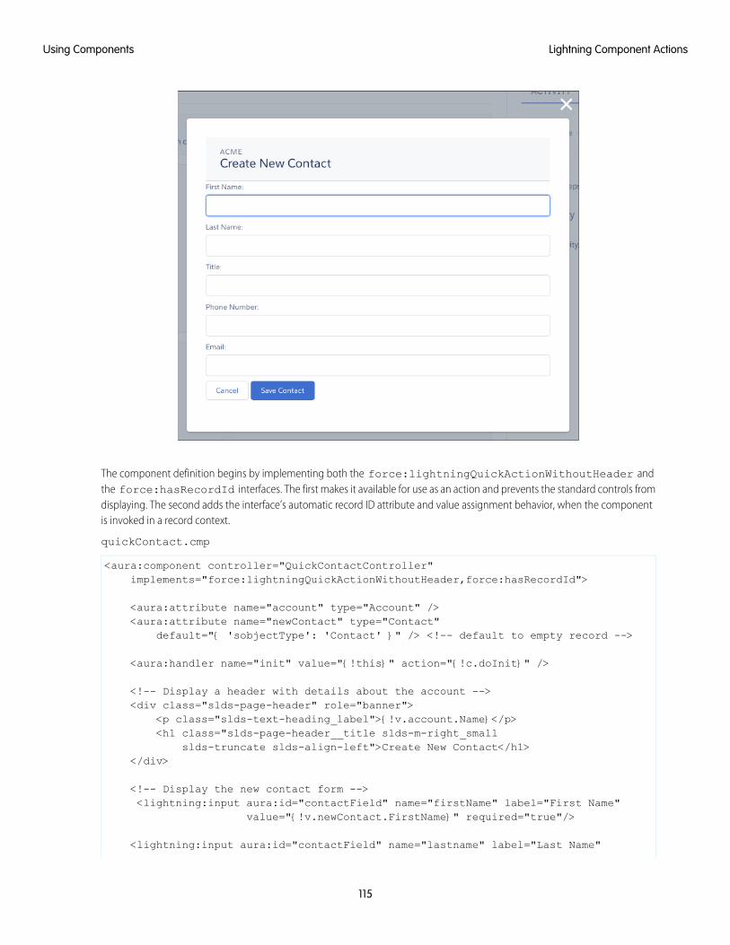
The component definition begins by implementing both the force:lightningQuickActionWithoutHeader andthe force:hasRecordId interfaces. The first makes it available for use as an action and prevents the standard controls fromdisplaying. The second adds the interface’s automatic record ID attribute and value assignment behavior, when the componentis invoked in a record context.
quickContact.cmp
<aura:component controller="QuickContactController"implements="force:lightningQuickActionWithoutHeader,force:hasRecordId">
<aura:attribute name="account" type="Account" /><aura:attribute name="newContact" type="Contact"
default="{ 'sobjectType': 'Contact' }" /> <!-- default to empty record -->
<aura:handler name="init" value="{!this}" action="{!c.doInit}" />
<!-- Display a header with details about the account --><div class="slds-page-header" role="banner">
<p class="slds-text-heading_label">{!v.account.Name}</p><h1 class="slds-page-header__title slds-m-right_small
slds-truncate slds-align-left">Create New Contact</h1></div>
<!-- Display the new contact form --><lightning:input aura:id="contactField" name="firstName" label="First Name"
value="{!v.newContact.FirstName}" required="true"/>
<lightning:input aura:id="contactField" name="lastname" label="Last Name"
115
Lightning Component ActionsUsing Components
value="{!v.newContact.LastName}" required="true"/>
<lightning:input aura:id="contactField" name="title" label="Title"value="{!v.newContact.Title}" />
<lightning:input aura:id="contactField" type="phone" name="phone" label="PhoneNumber"
pattern="^(1?(-?\d{3})-?)?(\d{3})(-?\d{4})$"messageWhenPatternMismatch="The phone number must contain 7, 10,
or 11 digits. Hyphens are optional."value="{!v.newContact.Phone}" required="true"/>
<lightning:input aura:id="contactField" type="email" name="email" label="Email"value="{!v.newContact.Email}" />
<lightning:button label="Cancel" onclick="{!c.handleCancel}"class="slds-m-top_medium" />
<lightning:button label="Save Contact" onclick="{!c.handleSaveContact}"variant="brand" class="slds-m-top_medium"/>
</aura:component>
The component defines the following attributes, which are used as member variables.
• account—holds the full account record, after it’s loaded in the init handler
• newContact—an empty contact, used to capture the form field values
The rest of the component definition is a standard form that displays an error on the field if the required fields are empty or thephone field doesn’t match the specified pattern.
The component’s controller has all of the interesting code, in three action handlers.
quickContactController.js
({doInit : function(component, event, helper) {
// Prepare the action to load account recordvar action = component.get("c.getAccount");action.setParams({"accountId": component.get("v.recordId")});
// Configure response handleraction.setCallback(this, function(response) {
var state = response.getState();if(state === "SUCCESS") {
component.set("v.account", response.getReturnValue());} else {
console.log('Problem getting account, response state: ' + state);}
});$A.enqueueAction(action);
},
handleSaveContact: function(component, event, helper) {if(helper.validateContactForm(component)) {
116
Lightning Component ActionsUsing Components
// Prepare the action to create the new contactvar saveContactAction = component.get("c.saveContactWithAccount");saveContactAction.setParams({
"contact": component.get("v.newContact"),"accountId": component.get("v.recordId")
});
// Configure the response handler for the actionsaveContactAction.setCallback(this, function(response) {
var state = response.getState();if(state === "SUCCESS") {
// Prepare a toast UI messagevar resultsToast = $A.get("e.force:showToast");resultsToast.setParams({
"title": "Contact Saved","message": "The new contact was created."
});
// Update the UI: close panel, show toast, refresh account page$A.get("e.force:closeQuickAction").fire();resultsToast.fire();$A.get("e.force:refreshView").fire();
}else if (state === "ERROR") {
console.log('Problem saving contact, response state: ' + state);}else {
console.log('Unknown problem, response state: ' + state);}
});
// Send the request to create the new contact$A.enqueueAction(saveContactAction);
}
},
handleCancel: function(component, event, helper) {$A.get("e.force:closeQuickAction").fire();}
})
The first action handler, doInit, is an init handler. Its job is to use the record ID that’s provided via the force:hasRecordIdinterface and load the full account record. Note that there’s nothing to stop this component from being used in an action onanother object, like a lead, opportunity, or custom object. In that case, doInit will fail to load a record, but the form will stilldisplay.
The handleSaveContact action handler validates the form by calling a helper function. If the form isn’t valid, the field-levelerrors are displayed. If the form is valid, then the action handler:
• Prepares the server action to save the new contact.
• Defines a callback function, called the response handler, for when the server completes the action. The response handler isdiscussed in a moment.
117
Lightning Component ActionsUsing Components
• Enqueues the server action.
The server action’s response handler does very little itself. If the server action was successful, the response handler:
• Closes the action panel by firing the force:closeQuickAction event.
• Displays a “toast” message that the contact was created by firing the force:showToast event.
• Updates the record page by firing the force:refreshView event, which tells the record page to update itself.
This last item displays the new record in the list of contacts, once that list updates itself in response to the refresh event.
The handleCancel action handler closes the action panel by firing the force:closeQuickAction event.
The component helper provided here is minimal, sufficient to illustrate its use. You’ll likely have more work to do in any productionquality form validation code.
quickContactHelper.js
({validateContactForm: function(component) {
var validContact = true;
// Show error messages if required fields are blankvar allValid = component.find('contactField').reduce(function (validFields,
inputCmp) {inputCmp.showHelpMessageIfInvalid();return validFields && inputCmp.get('v.validity').valid;
}, true);
if (allValid) {// Verify we have an account to attach it tovar account = component.get("v.account");if($A.util.isEmpty(account)) {
validContact = false;console.log("Quick action context doesn't have a valid account.");
}
return(validContact);}
}})
Finally, the Apex class used as the server-side controller for this component is deliberately simple to the point of being obvious.
QuickContactController.apxc
public with sharing class QuickContactController {
@AuraEnabledpublic static Account getAccount(Id accountId) {
// Perform isAccessible() checks herereturn [SELECT Name, BillingCity, BillingState FROM Account WHERE Id =
:accountId];}
@AuraEnabledpublic static Contact saveContactWithAccount(Contact contact, Id accountId) {
// Perform isAccessible() and isUpdateable() checks here
118
Lightning Component ActionsUsing Components
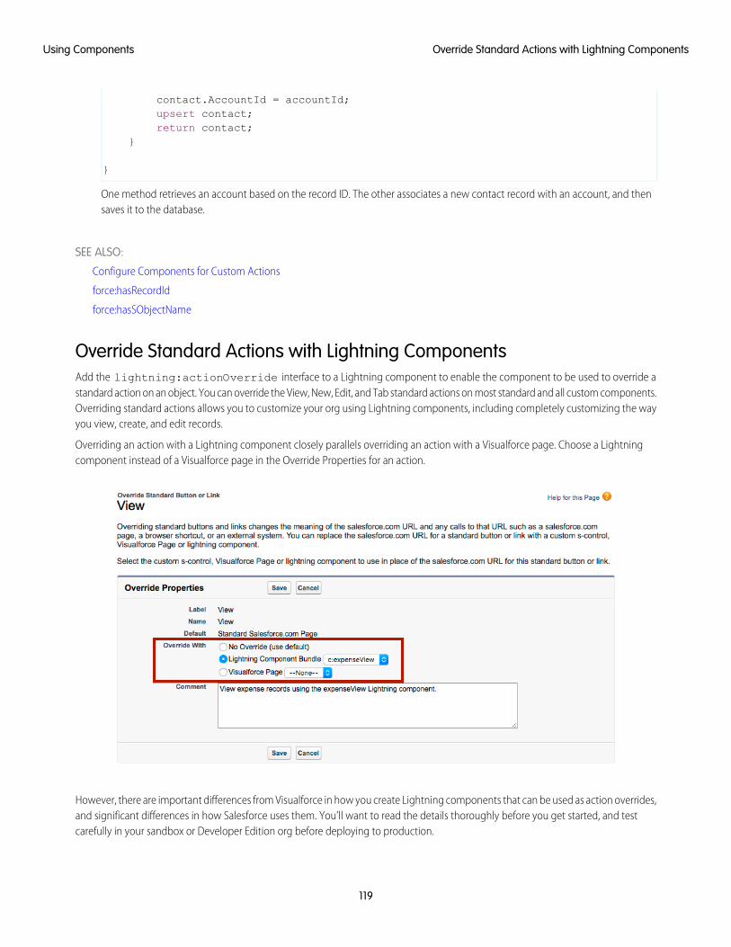
contact.AccountId = accountId;upsert contact;return contact;
}
}
One method retrieves an account based on the record ID. The other associates a new contact record with an account, and thensaves it to the database.
SEE ALSO:
Configure Components for Custom Actions
force:hasRecordId
force:hasSObjectName
Override Standard Actions with Lightning ComponentsAdd the lightning:actionOverride interface to a Lightning component to enable the component to be used to override astandard action on an object. You can override the View, New, Edit, and Tab standard actions on most standard and all custom components.Overriding standard actions allows you to customize your org using Lightning components, including completely customizing the wayyou view, create, and edit records.
Overriding an action with a Lightning component closely parallels overriding an action with a Visualforce page. Choose a Lightningcomponent instead of a Visualforce page in the Override Properties for an action.
However, there are important differences from Visualforce in how you create Lightning components that can be used as action overrides,and significant differences in how Salesforce uses them. You’ll want to read the details thoroughly before you get started, and testcarefully in your sandbox or Developer Edition org before deploying to production.
119
Override Standard Actions with Lightning ComponentsUsing Components
IN THIS SECTION:
Standard Actions and Overrides Basics
There are six standard actions available on most standard and all custom objects: Tab, List, View, Edit, New, and Delete. In SalesforceClassic, these are all distinct actions.
Override a Standard Action with a Lightning Component
You can override a standard action in both Salesforce Classic and Lightning Experience. While the destination is the same, thenavigation paths are different.
Creating a Lightning Component for Use as an Action Override
Add the lightning:actionOverride interface to a Lightning component to allow it to be used as an action override inLightning Experience or the Salesforce mobile app. Only components that implement this interface appear in the LightningComponent Bundle menu of an object action Override Properties panel.
Packaging Action Overrides
Action overrides for custom objects are automatically packaged with the custom object. Action overrides for standard objects can’tbe packaged.
SEE ALSO:
lightning:actionOverride
Standard Actions and Overrides BasicsThere are six standard actions available on most standard and all custom objects: Tab, List, View, Edit, New, and Delete. In SalesforceClassic, these are all distinct actions.
Lightning Experience and the Salesforcemobile app combine the Tab and List actions into one action, Object Home. However, ObjectHome is reached via the Tab action in Lightning Experience, and the List action in the Salesforce app. In this release, you can only overridethe Tab action with a Lightning component, so you can’t use a component to override the List action for the Salesforce app. Finally, theSalesforce app has a unique Search action (reached via Tab). (Yes, it’s a bit awkward and complicated.)
This table lists the standard actions you can override for an object as the actions are named in Setup, and the resulting action that’soverridden in the three different user experiences.
Saleforce1Lightning ExperienceSalesforce ClassicOverride in Setup
searchobject homeobject tabTab
object homen/aobject listList
record homerecord homerecord viewView
record editrecord editrecord editEdit
record createrecord createrecord createNew
record deleterecord deleterecord deleteDelete
Note:
• “n/a” doesn’t mean you can’t access the standard behavior, and it doesn’t mean you can’t override the standard behavior. Itmeans you can’t access the override. It’s the override’s functionality that’s not available.
120
Override Standard Actions with Lightning ComponentsUsing Components
• There are two additional standard actions, Accept and Clone. These actions are more complex, and overriding them is anadvanced project. Overriding them with Lightning components isn’t supported.
How and Where You Can Use Lightning Component Action OverridesLightning components can be used to override the View, New, Edit, and Tab standard actions in Lightning Experience and the Salesforceapp. Unlike Visualforce, overrides that use Lightning components don’t affect Salesforce Classic. That is:
• If you override a standard action with a Visualforce page, it overrides the action in Salesforce Classic, Lightning Experience, and theSalesforce app.
• If you override a standard action with a Lightning component, it overrides the action in Lightning Experience and the Salesforceapp, but the standard Salesforce page is used in Salesforce Classic.
A Lightning record page for an object takes precedence over an override of the object’s View action. That is, if you override the Viewaction for an object, and you also create and assign a Lightning record page for the object, the Lightning record page is used. The overridehas no effect. This is true whether the override uses a Lightning component or a Visualforce page.
Action overrides aren’t supported in Lightning console apps, and are silently ignored when invoked. If a Lightning console app usertriggers an action that has been overridden, they see the standard action instead. If they trigger the same action outside of a Lightningconsole app, they see the overridden action. This behavior can result in an inconsistent user experience, which you should warn usersabout. Also ensure that you meet your data validation requirements using triggers and validation rules, rather than code that only runsin the action override. This strategy ensures that your data is valid, whether it’s changed using a standard action or an action override.
Override a Standard Action with a Lightning ComponentYou can override a standard action in both Salesforce Classic and Lightning Experience. While the destination is the same, the navigationpaths are different.
You need at least one Lightning component in your org that implements the lightning:actionOverride interface. You canuse a custom component of your own, or a component from a managed package.
Go to the object management settings for the object with the action you plan to override.
1. Select Buttons, Links, and Actions.
2. Select Edit for the action you want to override.
3. For Override With, select Lightning Component Bundle.
4. From the drop-down menu, select the name of the Lightning component to use as the action override.
5. Select Save.
Note: Users won’t see changes to action overrides until they reload Lightning Experience or the Salesforce app.
SEE ALSO:
Salesforce Help: Find Object Management Settings
Salesforce Help: Override Standard Buttons and Tab Home Pages
121
Override Standard Actions with Lightning ComponentsUsing Components
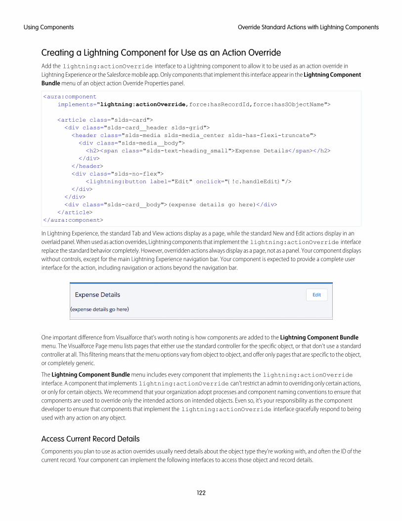
Creating a Lightning Component for Use as an Action OverrideAdd the lightning:actionOverride interface to a Lightning component to allow it to be used as an action override inLightning Experience or the Salesforce mobile app. Only components that implement this interface appear in the Lightning ComponentBundle menu of an object action Override Properties panel.
<aura:componentimplements="lightning:actionOverride,force:hasRecordId,force:hasSObjectName">
<article class="slds-card"><div class="slds-card__header slds-grid"><header class="slds-media slds-media_center slds-has-flexi-truncate"><div class="slds-media__body"><h2><span class="slds-text-heading_small">Expense Details</span></h2>
</div></header><div class="slds-no-flex">
<lightning:button label="Edit" onclick="{!c.handleEdit}"/></div>
</div><div class="slds-card__body">(expense details go here)</div>
</article></aura:component>
In Lightning Experience, the standard Tab and View actions display as a page, while the standard New and Edit actions display in anoverlaid panel. When used as action overrides, Lightning components that implement the lightning:actionOverride interfacereplace the standard behavior completely. However, overridden actions always display as a page, not as a panel. Your component displayswithout controls, except for the main Lightning Experience navigation bar. Your component is expected to provide a complete userinterface for the action, including navigation or actions beyond the navigation bar.
One important difference from Visualforce that’s worth noting is how components are added to the Lightning Component Bundlemenu. The Visualforce Page menu lists pages that either use the standard controller for the specific object, or that don’t use a standardcontroller at all. This filtering means that the menu options vary from object to object, and offer only pages that are specific to the object,or completely generic.
The Lightning Component Bundle menu includes every component that implements the lightning:actionOverrideinterface. A component that implements lightning:actionOverride can’t restrict an admin to overriding only certain actions,or only for certain objects. We recommend that your organization adopt processes and component naming conventions to ensure thatcomponents are used to override only the intended actions on intended objects. Even so, it’s your responsibility as the componentdeveloper to ensure that components that implement the lightning:actionOverride interface gracefully respond to beingused with any action on any object.
Access Current Record DetailsComponents you plan to use as action overrides usually need details about the object type they’re working with, and often the ID of thecurrent record. Your component can implement the following interfaces to access those object and record details.
122
Override Standard Actions with Lightning ComponentsUsing Components
force:hasRecordId
Add the force:hasRecordId interface to a Lightning component to enable the component to be assigned the ID of the currentrecord. The current record ID is useful if the component is used on a Lightning record page, as an object-specific custom action or actionoverride in Lightning Experience or the Salesforce app, and so on.
force:hasSObjectName
Add the force:hasSObjectName interface to a Lightning component to enable the component to be assigned the API name ofcurrent record’s sObject type. The sObject name is useful if the component can be used with records of different sObject types, andneeds to adapt to the specific type of the current record.
SEE ALSO:
force:hasRecordId
force:hasSObjectName
Packaging Action OverridesAction overrides for custom objects are automatically packaged with the custom object. Action overrides for standard objects can’t bepackaged.
When you package a custom object, overrides on that object’s standard actions are packaged with it. This includes any Lightningcomponents used by the overrides. Your experience should be “it just works.”
However, standard objects can’t be packaged. As a consequence, there’s no way to package overrides on the object’s standard actions.
To override standard actions on standard objects in a package, do the following:
• Manually package any Lightning components that are used by the overrides.
• Provide instructions for subscribing orgs to manually override the relevant standard actions on the affected standard objects.
SEE ALSO:
Override a Standard Action with a Lightning Component
Metadata API Developer Guide : ActionOverride
Get Your Lightning Components Ready to Use on Lightning Pages
Custom Lightning components don’t work on Lightning pages or in the Lightning App Builder right out of the box. To use a customcomponent in either of these places, you must configure the component and its component bundle so that they’re compatible.
IN THIS SECTION:
Configure Components for Lightning Pages and the Lightning App Builder
There are a few steps to take before you can use your custom Lightning components in either Lightning pages or the Lightning AppBuilder.
Lightning Component Bundle Design Resources
Use a design resource to control which attributes are exposed to builder tools like the Lightning App Builder. A design resource livesin the same folder as your .cmp resource, and describes the design-time behavior of the Lightning component—information thatvisual tools need to display the component in a page or app.
123
Get Your Lightning Components Ready to Use on LightningPages
Using Components
Configure Components for Lightning Experience Record Pages
After your component is set up to work on Lightning pages and in the Lightning App Builder, use these guidelines to configure thecomponent so it works on record pages in Lightning Experience.
Create Components for Lightning for Outlook and Lightning for Gmail
Create custom Lightning components that are available for drag-and-drop in the Email Application Pane for Lightning for Outlookand Lightning for Gmail.
Create Dynamic Picklists for Your Custom Components
You can expose a component property as a picklist when the component is configured in the Lightning App Builder. The picklist’svalues are provided by an Apex class that you create.
Create a Custom Lightning Page Template Component
Every standard Lightning page is associated with a default template component, which defines the page’s regions and whatcomponents the page includes. Custom Lightning page template components let you create page templates to fit your businessneeds with the structure and components that you define. Once implemented, your custom template is available in the LightningApp Builder’s new page wizard for your page creators to use.
Lightning Page Template Component Best Practices
Keep these best practices and limitations in mind when creating Lightning page template components.
Make Your Lightning Page Components Width-Aware with lightning:flexipageRegionInfo
When you add a component to a region on a page in the Lightning App Builder, the lightning:flexipageRegionInfosub-component passes the width of that region to its parent component. With lightning:flexipageRegionInfo andsome strategic CSS, you can tell the parent component to render in different ways in different regions at runtime.
Tips and Considerations for Configuring Components for Lightning Pages and the Lightning App Builder
Keep these guidelines in mind when creating components and component bundles for Lightning pages and the Lightning AppBuilder.
Configure Components for Lightning Pages and the Lightning App BuilderThere are a few steps to take before you can use your custom Lightning components in either Lightning pages or the Lightning AppBuilder.
1. Deploy My Domain in Your OrgYou must deploy My Domain in your org if you want to use Lightning components in Lightning tabs, Lightning pages, as customLightning page templates, or as standalone apps.
For more information about My Domain, see the Salesforce Help.
2. Add a New Interface to Your ComponentTo appear in the Lightning App Builder or on a Lightning page, a component must implement one of these interfaces.
DescriptionInterface
Makes your component available for record pages and any othertype of page, including a Lightning app’s utility bar.
flexipage:availableForAllPageTypes
124
Configure Components for Lightning Pages and the LightningApp Builder
Using Components
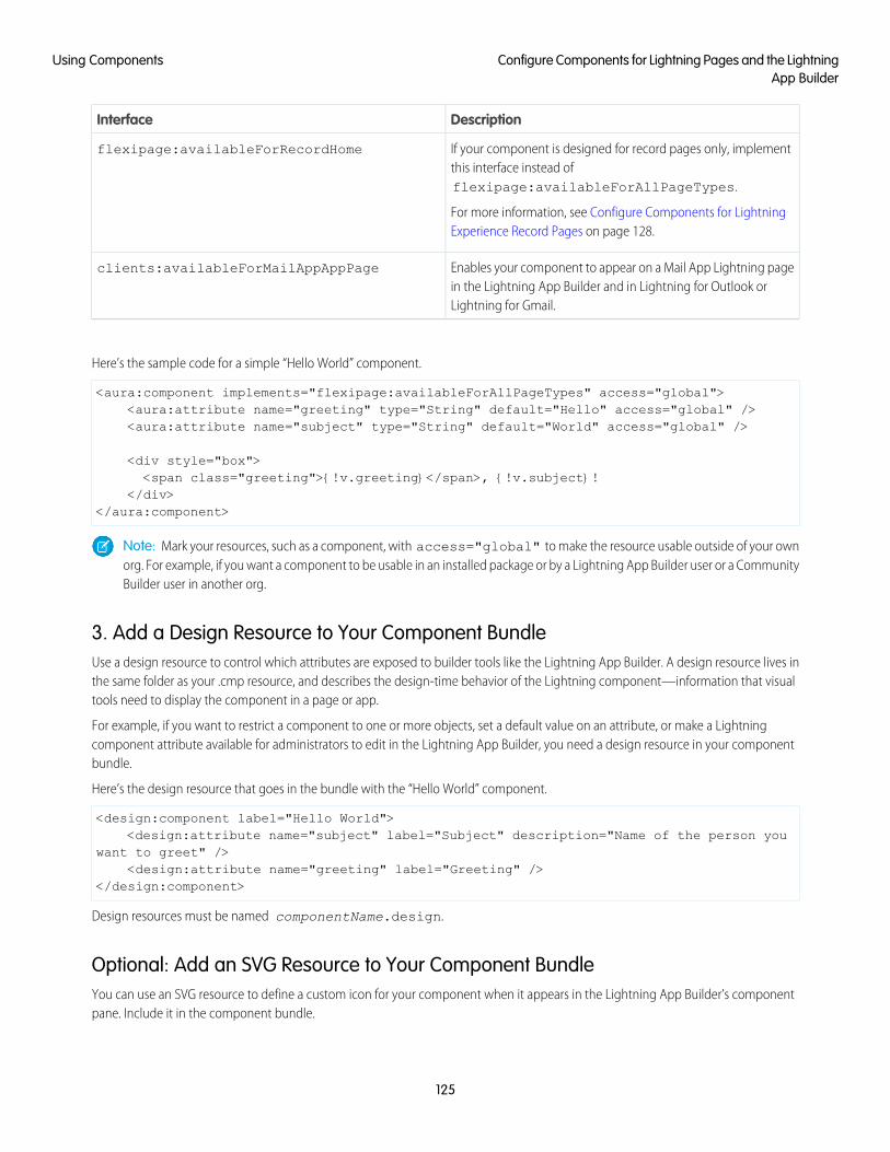
DescriptionInterface
If your component is designed for record pages only, implementthis interface instead offlexipage:availableForAllPageTypes.
For more information, see Configure Components for LightningExperience Record Pages on page 128.
flexipage:availableForRecordHome
Enables your component to appear on a Mail App Lightning pagein the Lightning App Builder and in Lightning for Outlook orLightning for Gmail.
clients:availableForMailAppAppPage
Here’s the sample code for a simple “Hello World” component.
<aura:component implements="flexipage:availableForAllPageTypes" access="global"><aura:attribute name="greeting" type="String" default="Hello" access="global" /><aura:attribute name="subject" type="String" default="World" access="global" />
<div style="box"><span class="greeting">{!v.greeting}</span>, {!v.subject}!
</div></aura:component>
Note: Mark your resources, such as a component, with access="global" to make the resource usable outside of your ownorg. For example, if you want a component to be usable in an installed package or by a Lightning App Builder user or a CommunityBuilder user in another org.
3. Add a Design Resource to Your Component BundleUse a design resource to control which attributes are exposed to builder tools like the Lightning App Builder. A design resource lives inthe same folder as your .cmp resource, and describes the design-time behavior of the Lightning component—information that visualtools need to display the component in a page or app.
For example, if you want to restrict a component to one or more objects, set a default value on an attribute, or make a Lightningcomponent attribute available for administrators to edit in the Lightning App Builder, you need a design resource in your componentbundle.
Here’s the design resource that goes in the bundle with the “Hello World” component.
<design:component label="Hello World"><design:attribute name="subject" label="Subject" description="Name of the person you
want to greet" /><design:attribute name="greeting" label="Greeting" />
</design:component>
Design resources must be named componentName.design.
Optional: Add an SVG Resource to Your Component BundleYou can use an SVG resource to define a custom icon for your component when it appears in the Lightning App Builder’s componentpane. Include it in the component bundle.
125
Configure Components for Lightning Pages and the LightningApp Builder
Using Components
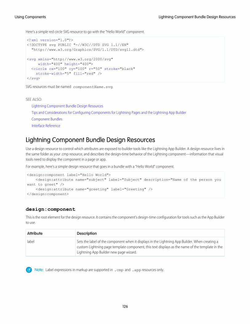
Here’s a simple red circle SVG resource to go with the “Hello World” component.
<?xml version="1.0"?><!DOCTYPE svg PUBLIC "-//W3C//DTD SVG 1.1//EN""http://www.w3.org/Graphics/SVG/1.1/DTD/svg11.dtd">
<svg xmlns="http://www.w3.org/2000/svg"width="400" height="400">
<circle cx="100" cy="100" r="50" stroke="black"stroke-width="5" fill="red" />
</svg>
SVG resources must be named componentName.svg.
SEE ALSO:
Lightning Component Bundle Design Resources
Tips and Considerations for Configuring Components for Lightning Pages and the Lightning App Builder
Component Bundles
Interface Reference
Lightning Component Bundle Design ResourcesUse a design resource to control which attributes are exposed to builder tools like the Lightning App Builder. A design resource lives inthe same folder as your .cmp resource, and describes the design-time behavior of the Lightning component—information that visualtools need to display the component in a page or app.
For example, here’s a simple design resource that goes in a bundle with a “Hello World” component.
<design:component label="Hello World"><design:attribute name="subject" label="Subject" description="Name of the person you
want to greet" /><design:attribute name="greeting" label="Greeting" />
</design:component>
design:component
This is the root element for the design resource. It contains the component’s design-time configuration for tools such as the App Builderto use.
DescriptionAttribute
Sets the label of the component when it displays in the Lightning App Builder. When creating acustom Lightning page template component, this text displays as the name of the template in theLightning App Builder new page wizard.
label
Note: Label expressions in markup are supported in .cmp and .app resources only.
126
Lightning Component Bundle Design ResourcesUsing Components
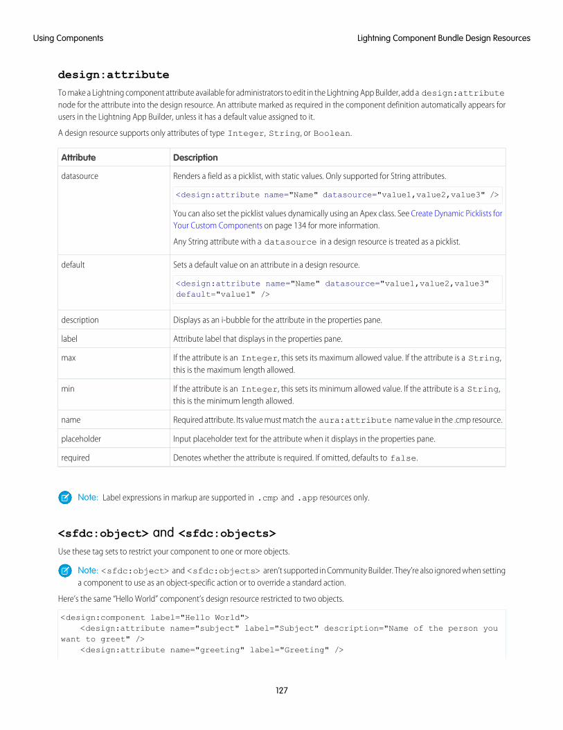
design:attribute
To make a Lightning component attribute available for administrators to edit in the Lightning App Builder, add a design:attributenode for the attribute into the design resource. An attribute marked as required in the component definition automatically appears forusers in the Lightning App Builder, unless it has a default value assigned to it.
A design resource supports only attributes of type Integer, String, or Boolean.
DescriptionAttribute
Renders a field as a picklist, with static values. Only supported for String attributes.
<design:attribute name="Name" datasource="value1,value2,value3" />
datasource
You can also set the picklist values dynamically using an Apex class. See Create Dynamic Picklists forYour Custom Components on page 134 for more information.
Any String attribute with a datasource in a design resource is treated as a picklist.
Sets a default value on an attribute in a design resource.
<design:attribute name="Name" datasource="value1,value2,value3"default="value1" />
default
Displays as an i-bubble for the attribute in the properties pane.description
Attribute label that displays in the properties pane.label
If the attribute is an Integer, this sets its maximum allowed value. If the attribute is a String,this is the maximum length allowed.
max
If the attribute is an Integer, this sets its minimum allowed value. If the attribute is a String,this is the minimum length allowed.
min
Required attribute. Its value must match the aura:attribute name value in the .cmp resource.name
Input placeholder text for the attribute when it displays in the properties pane.placeholder
Denotes whether the attribute is required. If omitted, defaults to false.required
Note: Label expressions in markup are supported in .cmp and .app resources only.
<sfdc:object> and <sfdc:objects>Use these tag sets to restrict your component to one or more objects.
Note: <sfdc:object> and <sfdc:objects> aren’t supported in Community Builder. They’re also ignored when settinga component to use as an object-specific action or to override a standard action.
Here’s the same “Hello World” component’s design resource restricted to two objects.
<design:component label="Hello World"><design:attribute name="subject" label="Subject" description="Name of the person you
want to greet" /><design:attribute name="greeting" label="Greeting" />
127
Lightning Component Bundle Design ResourcesUsing Components
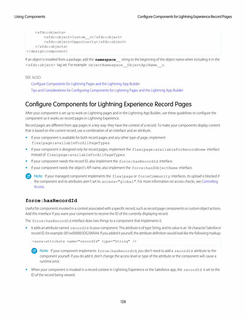
<sfdc:objects><sfdc:object>Custom__c</sfdc:object><sfdc:object>Opportunity</sfdc:object>
</sfdc:objects></design:component>
If an object is installed from a package, add the namespace__ string to the beginning of the object name when including it in the<sfdc:object> tag set. For example: objectNamespace__ObjectApiName__c.
SEE ALSO:
Configure Components for Lightning Pages and the Lightning App Builder
Tips and Considerations for Configuring Components for Lightning Pages and the Lightning App Builder
Configure Components for Lightning Experience Record PagesAfter your component is set up to work on Lightning pages and in the Lightning App Builder, use these guidelines to configure thecomponent so it works on record pages in Lightning Experience.
Record pages are different from app pages in a key way: they have the context of a record. To make your components display contentthat is based on the current record, use a combination of an interface and an attribute.
• If your component is available for both record pages and any other type of page, implementflexipage:availableForAllPageTypes.
• If your component is designed only for record pages, implement the flexipage:availableForRecordHome interfaceinstead of flexipage:availableForAllPageTypes.
• If your component needs the record ID, also implement the force:hasRecordId interface.
• If your component needs the object’s API name, also implement the force:hasSObjectName interface.
Note: If your managed component implements the flexipage or forceCommunity interfaces, its upload is blocked ifthe component and its attributes aren’t set to access="global". For more information on access checks, see ControllingAccess.
force:hasRecordId
Useful for components invoked in a context associated with a specific record, such as record page components or custom object actions.Add this interface if you want your component to receive the ID of the currently displaying record.
The force:hasRecordId interface does two things to a component that implements it.
• It adds an attribute named recordId to your component. This attribute is of type String, and its value is an 18-character Salesforcerecord ID, for example: 001xx000003DGSWAA4. If you added it yourself, the attribute definition would look like the following markup:
<aura:attribute name="recordId" type="String" />
Note: If your component implements force:hasRecordId, you don’t need to add a recordId attribute to thecomponent yourself. If you do add it, don’t change the access level or type of the attribute or the component will cause aruntime error.
• When your component is invoked in a record context in Lightning Experience or the Salesforce app, the recordId is set to theID of the record being viewed.
128
Configure Components for Lightning Experience Record PagesUsing Components
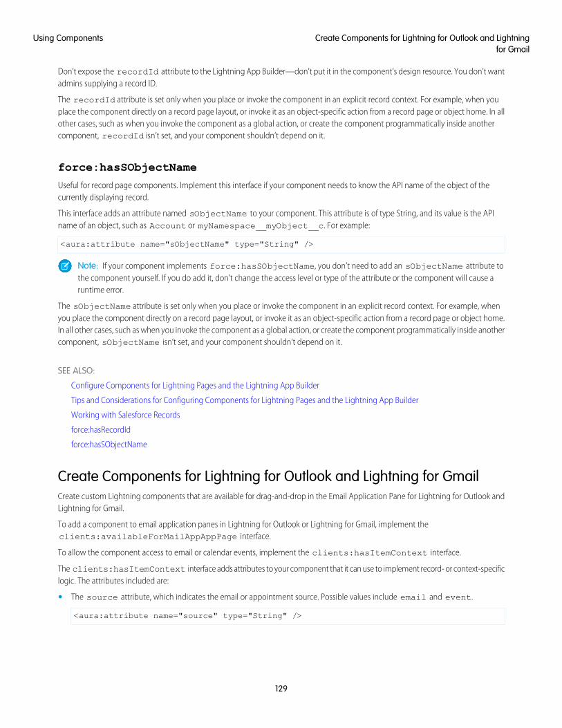
Don’t expose the recordId attribute to the Lightning App Builder—don’t put it in the component’s design resource. You don’t wantadmins supplying a record ID.
The recordId attribute is set only when you place or invoke the component in an explicit record context. For example, when youplace the component directly on a record page layout, or invoke it as an object-specific action from a record page or object home. In allother cases, such as when you invoke the component as a global action, or create the component programmatically inside anothercomponent, recordId isn’t set, and your component shouldn’t depend on it.
force:hasSObjectName
Useful for record page components. Implement this interface if your component needs to know the API name of the object of thecurrently displaying record.
This interface adds an attribute named sObjectName to your component. This attribute is of type String, and its value is the APIname of an object, such as Account or myNamespace__myObject__c. For example:
<aura:attribute name="sObjectName" type="String" />
Note: If your component implements force:hasSObjectName, you don’t need to add an sObjectName attribute tothe component yourself. If you do add it, don’t change the access level or type of the attribute or the component will cause aruntime error.
The sObjectName attribute is set only when you place or invoke the component in an explicit record context. For example, whenyou place the component directly on a record page layout, or invoke it as an object-specific action from a record page or object home.In all other cases, such as when you invoke the component as a global action, or create the component programmatically inside anothercomponent, sObjectName isn’t set, and your component shouldn’t depend on it.
SEE ALSO:
Configure Components for Lightning Pages and the Lightning App Builder
Tips and Considerations for Configuring Components for Lightning Pages and the Lightning App Builder
Working with Salesforce Records
force:hasRecordId
force:hasSObjectName
Create Components for Lightning for Outlook and Lightning for GmailCreate custom Lightning components that are available for drag-and-drop in the Email Application Pane for Lightning for Outlook andLightning for Gmail.
To add a component to email application panes in Lightning for Outlook or Lightning for Gmail, implement theclients:availableForMailAppAppPage interface.
To allow the component access to email or calendar events, implement the clients:hasItemContext interface.
The clients:hasItemContext interface adds attributes to your component that it can use to implement record- or context-specificlogic. The attributes included are:
• The source attribute, which indicates the email or appointment source. Possible values include email and event.
<aura:attribute name="source" type="String" />
129
Create Components for Lightning for Outlook and Lightningfor Gmail
Using Components
• The people attribute indicates recipients’ email addresses on the current email or appointment.
<aura:attribute name="people" type="Object" />
The shape of the people attribute changes according to the value of the source attribute.
When the source attribute is set to email, the people object contains the following elements.
{to: [ { name: nameString, email: emailString }, ... ],cc: [ ... ],from: [ { name: senderName, email: senderEmail } ],
}
When the source attribute is set to event, the people object contains the following elements.
{requiredAttendees: [ { name: attendeenameString, email: emailString }, ... ],optionalAttendees: [ { name: optattendeenameString, email: emailString }, ... ],organizer: [ { name: organizerName, email: senderEmail } ],
}
• The subject indicates the subject on the current email.
<aura:attribute name="subject" type="String" />
• The messageBody indicates the email message on the current email.
<aura:attribute name="messageBody" type="String" />
To provide the component with an event’s date or location, implement the clients:hasEventContext interface.
dates: {"start": value (String),"end": value (String),
}
Lightning for Outlook and Lightning for Gmail don’t support the following events:
• force:navigateToList
• force:navigateToRelatedList
• force:navigateToObjectHome
• force:refreshView
Note: To ensure that custom components appear correctly in Lightning for Outlook or Lightning for Gmail, enable them to adjustto variable widths.
IN THIS SECTION:
Sample Custom Components for Lightning for Outlook and Lightning for Gmail
Review samples of custom Lightning components that you can implement in the Email Application Pane for Lightning for Outlookand Lightning for Gmail.
130
Create Components for Lightning for Outlook and Lightningfor Gmail
Using Components
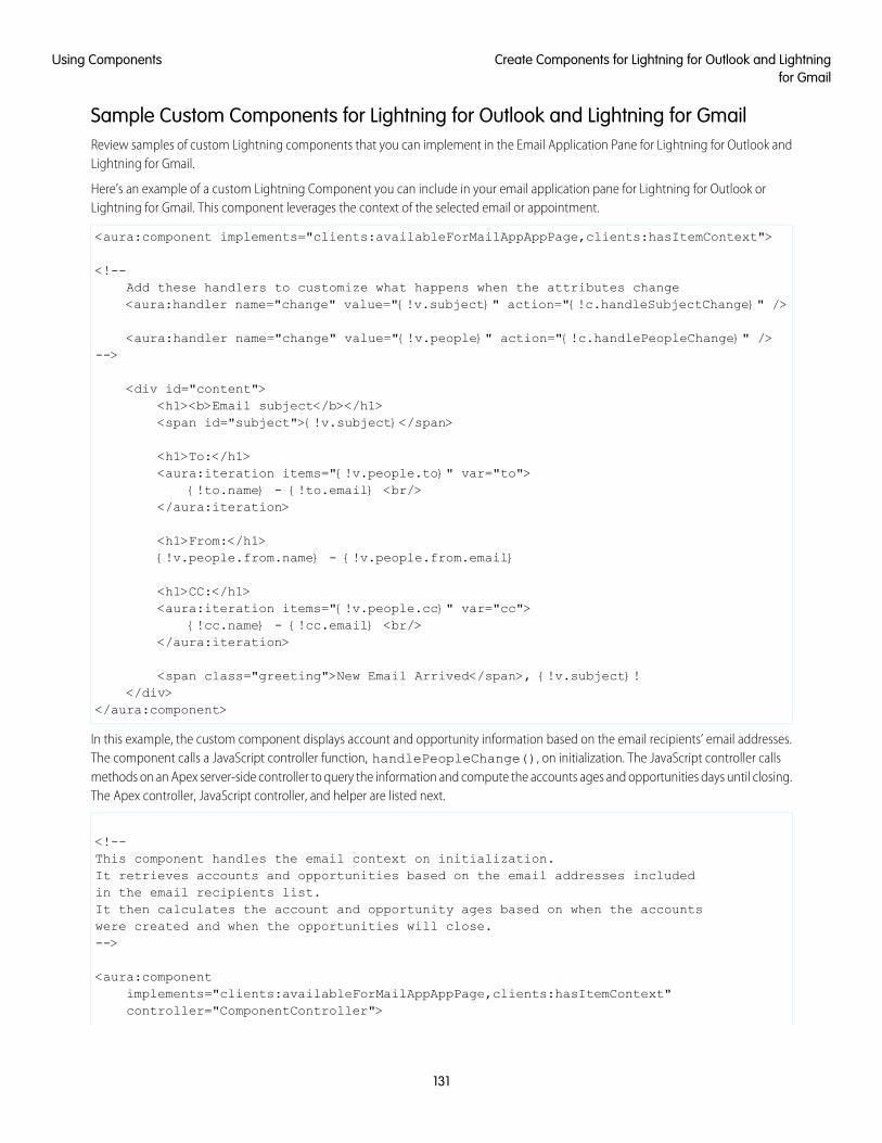
Sample Custom Components for Lightning for Outlook and Lightning for GmailReview samples of custom Lightning components that you can implement in the Email Application Pane for Lightning for Outlook andLightning for Gmail.
Here’s an example of a custom Lightning Component you can include in your email application pane for Lightning for Outlook orLightning for Gmail. This component leverages the context of the selected email or appointment.
<aura:component implements="clients:availableForMailAppAppPage,clients:hasItemContext">
<!--Add these handlers to customize what happens when the attributes change<aura:handler name="change" value="{!v.subject}" action="{!c.handleSubjectChange}" />
<aura:handler name="change" value="{!v.people}" action="{!c.handlePeopleChange}" />-->
<div id="content"><h1><b>Email subject</b></h1><span id="subject">{!v.subject}</span>
<h1>To:</h1><aura:iteration items="{!v.people.to}" var="to">
{!to.name} - {!to.email} <br/></aura:iteration>
<h1>From:</h1>{!v.people.from.name} - {!v.people.from.email}
<h1>CC:</h1><aura:iteration items="{!v.people.cc}" var="cc">
{!cc.name} - {!cc.email} <br/></aura:iteration>
<span class="greeting">New Email Arrived</span>, {!v.subject}!</div>
</aura:component>
In this example, the custom component displays account and opportunity information based on the email recipients’ email addresses.The component calls a JavaScript controller function, handlePeopleChange(), on initialization. The JavaScript controller callsmethods on an Apex server-side controller to query the information and compute the accounts ages and opportunities days until closing.The Apex controller, JavaScript controller, and helper are listed next.
<!--This component handles the email context on initialization.It retrieves accounts and opportunities based on the email addresses includedin the email recipients list.It then calculates the account and opportunity ages based on when the accountswere created and when the opportunities will close.-->
<aura:componentimplements="clients:availableForMailAppAppPage,clients:hasItemContext"controller="ComponentController">
131
Create Components for Lightning for Outlook and Lightningfor Gmail
Using Components
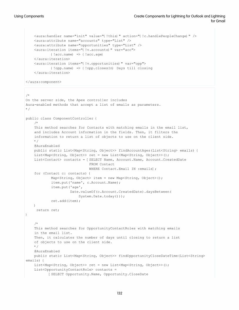
<aura:handler name="init" value="{!this}" action="{!c.handlePeopleChange}" /><aura:attribute name="accounts" type="List" /><aura:attribute name="opportunities" type="List" /><aura:iteration items="{!v.accounts}" var="acc">
{!acc.name} => {!acc.age}</aura:iteration><aura:iteration items="{!v.opportunities}" var="opp">
{!opp.name} => {!opp.closesIn} Days till closing</aura:iteration>
</aura:component>
/*On the server side, the Apex controller includesAura-enabled methods that accept a list of emails as parameters.*/
public class ComponentController {/*This method searches for Contacts with matching emails in the email list,and includes Account information in the fields. Then, it filters theinformation to return a list of objects to use on the client side.*/@AuraEnabledpublic static List<Map<String, Object>> findAccountAges(List<String> emails) {List<Map<String, Object>> ret = new List<Map<String, Object>>();List<Contact> contacts = [SELECT Name, Account.Name, Account.CreatedDate
FROM ContactWHERE Contact.Email IN :emails];
for (Contact c: contacts) {Map<String, Object> item = new Map<String, Object>();item.put('name', c.Account.Name);item.put('age',
Date.valueOf(c.Account.CreatedDate).daysBetween(System.Date.today()));
ret.add(item);}return ret;
}
/*This method searches for OpportunityContactRoles with matching emailsin the email list.Then, it calculates the number of days until closing to return a listof objects to use on the client side.*/@AuraEnabledpublic static List<Map<String, Object>> findOpportunityCloseDateTime(List<String>
emails) {List<Map<String, Object>> ret = new List<Map<String, Object>>();List<OpportunityContactRole> contacts =
[SELECT Opportunity.Name, Opportunity.CloseDate
132
Create Components for Lightning for Outlook and Lightningfor Gmail
Using Components
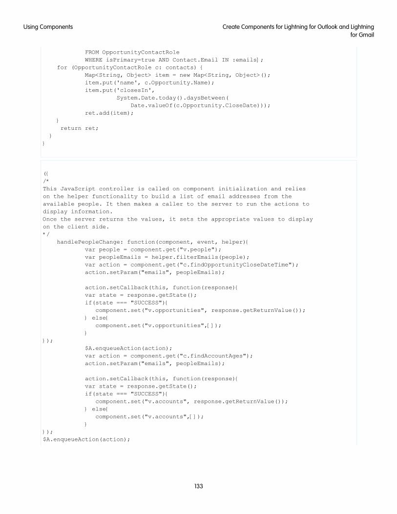
FROM OpportunityContactRoleWHERE isPrimary=true AND Contact.Email IN :emails];
for (OpportunityContactRole c: contacts) {Map<String, Object> item = new Map<String, Object>();item.put('name', c.Opportunity.Name);item.put('closesIn',
System.Date.today().daysBetween(Date.valueOf(c.Opportunity.CloseDate)));
ret.add(item);}return ret;
}}
({/*This JavaScript controller is called on component initialization and relieson the helper functionality to build a list of email addresses from theavailable people. It then makes a caller to the server to run the actions todisplay information.Once the server returns the values, it sets the appropriate values to displayon the client side.*/
handlePeopleChange: function(component, event, helper){var people = component.get("v.people");var peopleEmails = helper.filterEmails(people);var action = component.get("c.findOpportunityCloseDateTime");action.setParam("emails", peopleEmails);
action.setCallback(this, function(response){var state = response.getState();if(state === "SUCCESS"){
component.set("v.opportunities", response.getReturnValue());} else{
component.set("v.opportunities",[]);}
});$A.enqueueAction(action);var action = component.get("c.findAccountAges");action.setParam("emails", peopleEmails);
action.setCallback(this, function(response){var state = response.getState();if(state === "SUCCESS"){
component.set("v.accounts", response.getReturnValue());} else{
component.set("v.accounts",[]);}
});$A.enqueueAction(action);
133
Create Components for Lightning for Outlook and Lightningfor Gmail
Using Components
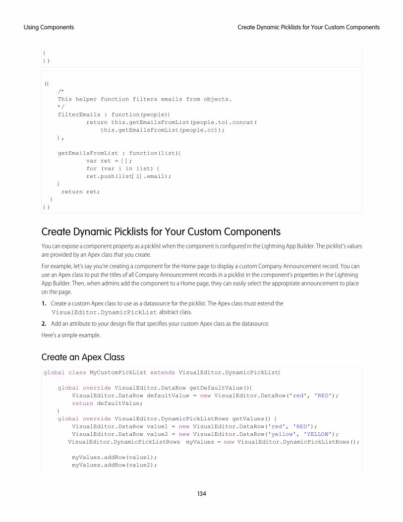
}})
({/*This helper function filters emails from objects.*/filterEmails : function(people){
return this.getEmailsFromList(people.to).concat(this.getEmailsFromList(people.cc));
},
getEmailsFromList : function(list){var ret = [];for (var i in list) {ret.push(list[i].email);
}return ret;
}})
Create Dynamic Picklists for Your Custom ComponentsYou can expose a component property as a picklist when the component is configured in the Lightning App Builder. The picklist’s valuesare provided by an Apex class that you create.
For example, let’s say you’re creating a component for the Home page to display a custom Company Announcement record. You canuse an Apex class to put the titles of all Company Announcement records in a picklist in the component’s properties in the LightningApp Builder. Then, when admins add the component to a Home page, they can easily select the appropriate announcement to placeon the page.
1. Create a custom Apex class to use as a datasource for the picklist. The Apex class must extend theVisualEditor.DynamicPickList abstract class.
2. Add an attribute to your design file that specifies your custom Apex class as the datasource.
Here’s a simple example.
Create an Apex Classglobal class MyCustomPickList extends VisualEditor.DynamicPickList{
global override VisualEditor.DataRow getDefaultValue(){VisualEditor.DataRow defaultValue = new VisualEditor.DataRow('red', 'RED');return defaultValue;
}global override VisualEditor.DynamicPickListRows getValues() {
VisualEditor.DataRow value1 = new VisualEditor.DataRow('red', 'RED');VisualEditor.DataRow value2 = new VisualEditor.DataRow('yellow', 'YELLOW');
VisualEditor.DynamicPickListRows myValues = new VisualEditor.DynamicPickListRows();
myValues.addRow(value1);myValues.addRow(value2);
134
Create Dynamic Picklists for Your Custom ComponentsUsing Components
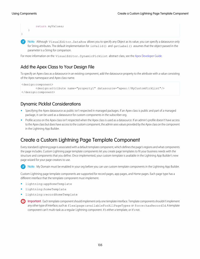
return myValues;}
}
Note: Although VisualEditor.DataRow allows you to specify any Object as its value, you can specify a datasource onlyfor String attributes. The default implementation for isValid() and getLabel() assumes that the object passed in theparameter is a String for comparison.
For more information on the VisualEditor.DynamicPickList abstract class, see the Apex Developer Guide.
Add the Apex Class to Your Design FileTo specify an Apex class as a datasource in an existing component, add the datasource property to the attribute with a value consistingof the Apex namespace and Apex class name.
<design:component><design:attribute name="property1" datasource="apex://MyCustomPickList"/>
</design:component>
Dynamic Picklist Considerations• Specifying the Apex datasource as public isn’t respected in managed packages. If an Apex class is public and part of a managed
package, it can be used as a datasource for custom components in the subscriber org.
• Profile access on the Apex class isn’t respected when the Apex class is used as a datasource. If an admin’s profile doesn’t have accessto the Apex class but does have access to the custom component, the admin sees values provided by the Apex class on the componentin the Lightning App Builder.
Create a Custom Lightning Page Template ComponentEvery standard Lightning page is associated with a default template component, which defines the page’s regions and what componentsthe page includes. Custom Lightning page template components let you create page templates to fit your business needs with thestructure and components that you define. Once implemented, your custom template is available in the Lightning App Builder’s newpage wizard for your page creators to use.
Note: My Domain must be enabled in your org before you can use custom template components in the Lightning App Builder.
Custom Lightning page template components are supported for record pages, app pages, and Home pages. Each page type has adifferent interface that the template component must implement.
• lightning:appHomeTemplate
• lightning:homeTemplate
• lightning:recordHomeTemplate
Important: Each template component should implement only one template interface. Template components shouldn’t implementany other type of interface, such as flexipage:availableForAllPageTypes or force:hasRecordId. A templatecomponent can’t multi-task as a regular Lightning component. It’s either a template, or it’s not.
135
Create a Custom Lightning Page Template ComponentUsing Components
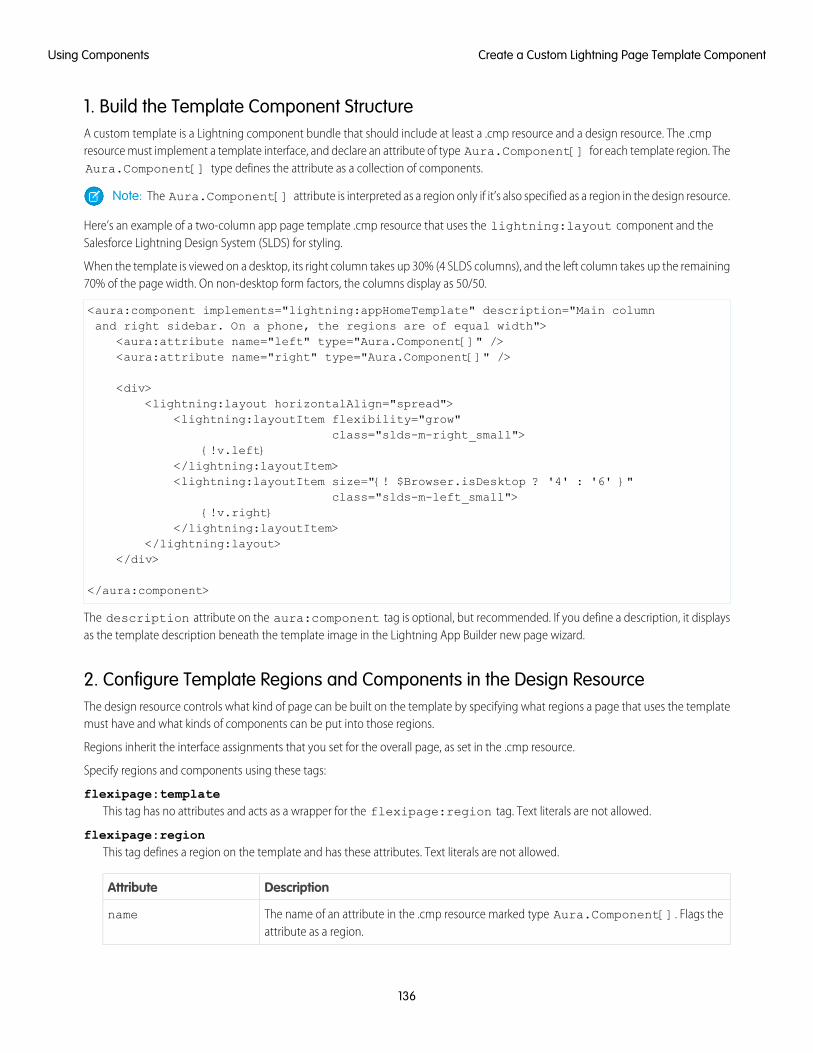
1. Build the Template Component StructureA custom template is a Lightning component bundle that should include at least a .cmp resource and a design resource. The .cmpresource must implement a template interface, and declare an attribute of type Aura.Component[] for each template region. TheAura.Component[] type defines the attribute as a collection of components.
Note: The Aura.Component[] attribute is interpreted as a region only if it’s also specified as a region in the design resource.
Here’s an example of a two-column app page template .cmp resource that uses the lightning:layout component and theSalesforce Lightning Design System (SLDS) for styling.
When the template is viewed on a desktop, its right column takes up 30% (4 SLDS columns), and the left column takes up the remaining70% of the page width. On non-desktop form factors, the columns display as 50/50.
<aura:component implements="lightning:appHomeTemplate" description="Main columnand right sidebar. On a phone, the regions are of equal width">
<aura:attribute name="left" type="Aura.Component[]" /><aura:attribute name="right" type="Aura.Component[]" />
<div><lightning:layout horizontalAlign="spread">
<lightning:layoutItem flexibility="grow"class="slds-m-right_small">
{!v.left}</lightning:layoutItem><lightning:layoutItem size="{! $Browser.isDesktop ? '4' : '6' }"
class="slds-m-left_small">{!v.right}
</lightning:layoutItem></lightning:layout>
</div>
</aura:component>
The description attribute on the aura:component tag is optional, but recommended. If you define a description, it displaysas the template description beneath the template image in the Lightning App Builder new page wizard.
2. Configure Template Regions and Components in the Design ResourceThe design resource controls what kind of page can be built on the template by specifying what regions a page that uses the templatemust have and what kinds of components can be put into those regions.
Regions inherit the interface assignments that you set for the overall page, as set in the .cmp resource.
Specify regions and components using these tags:
flexipage:templateThis tag has no attributes and acts as a wrapper for the flexipage:region tag. Text literals are not allowed.
flexipage:regionThis tag defines a region on the template and has these attributes. Text literals are not allowed.
DescriptionAttribute
The name of an attribute in the .cmp resource marked type Aura.Component[]. Flags theattribute as a region.
name
136
Create a Custom Lightning Page Template ComponentUsing Components
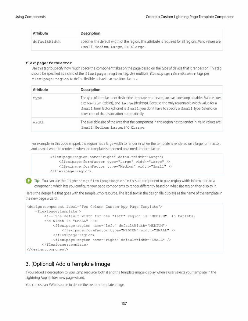
DescriptionAttribute
Specifies the default width of the region. This attribute is required for all regions. Valid values are:Small, Medium, Large, and Xlarge.
defaultWidth
flexipage:formFactorUse this tag to specify how much space the component takes on the page based on the type of device that it renders on. This tagshould be specified as a child of the flexipage:region tag. Use multiple flexipage:formFactor tags perflexipage:region to define flexible behavior across form factors.
DescriptionAttribute
The type of form factor or device the template renders on, such as a desktop or tablet. Valid valuesare: Medium (tablet), and Large (desktop). Because the only reasonable width value for a
type
Small form factor (phone) is Small, you don’t have to specify a Small type. Salesforcetakes care of that association automatically.
The available size of the area that the component in this region has to render in. Valid values are:Small, Medium, Large, and Xlarge.
width
For example, in this code snippet, the region has a large width to render in when the template is rendered on a large form factor,and a small width to render in when the template is rendered on a medium form factor.
<flexipage:region name="right" defaultWidth="Large"><flexipage:formFactor type="Large" width="Large" /><flexipage:formFactor type="Medium" width="Small" />
</flexipage:region>
Tip: You can use the lightning:flexipageRegionInfo sub-component to pass region width information to acomponent, which lets you configure your page components to render differently based on what size region they display in.
Here’s the design file that goes with the sample .cmp resource. The label text in the design file displays as the name of the template inthe new page wizard.
<design:component label="Two Column Custom App Page Template"><flexipage:template >
<!-- The default width for the "left" region is "MEDIUM". In tablets,the width is "SMALL" -->
<flexipage:region name="left" defaultWidth="MEDIUM"><flexipage:formfactor type="MEDIUM" width="SMALL" />
</flexipage:region><flexipage:region name="right" defaultWidth="SMALL" />
</flexipage:template></design:component>
3. (Optional) Add a Template ImageIf you added a description to your .cmp resource, both it and the template image display when a user selects your template in theLightning App Builder new page wizard.
You can use an SVG resource to define the custom template image.
137
Create a Custom Lightning Page Template ComponentUsing Components
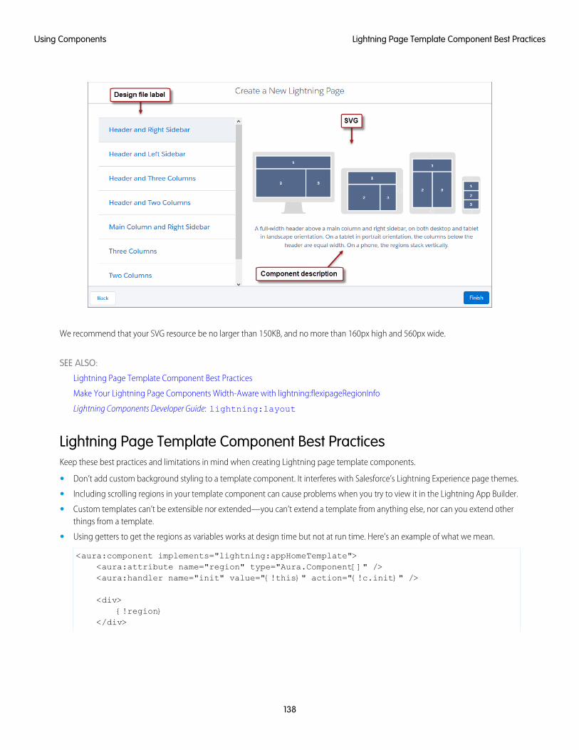
We recommend that your SVG resource be no larger than 150KB, and no more than 160px high and 560px wide.
SEE ALSO:
Lightning Page Template Component Best Practices
Make Your Lightning Page Components Width-Aware with lightning:flexipageRegionInfo
Lightning Components Developer Guide: lightning:layout
Lightning Page Template Component Best PracticesKeep these best practices and limitations in mind when creating Lightning page template components.
• Don’t add custom background styling to a template component. It interferes with Salesforce’s Lightning Experience page themes.
• Including scrolling regions in your template component can cause problems when you try to view it in the Lightning App Builder.
• Custom templates can’t be extensible nor extended—you can’t extend a template from anything else, nor can you extend otherthings from a template.
• Using getters to get the regions as variables works at design time but not at run time. Here’s an example of what we mean.
<aura:component implements="lightning:appHomeTemplate"><aura:attribute name="region" type="Aura.Component[]" /><aura:handler name="init" value="{!this}" action="{!c.init}" />
<div>{!region}
</div>
138
Lightning Page Template Component Best PracticesUsing Components
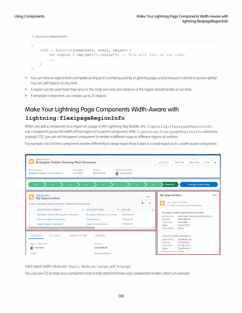
</aura:component>
{init : function(component, event, helper) {
var region = cmp.get('v.region'); // This will fail at run time....
}}
• You can remove regions from a template as long as it’s not being used by a Lightning page, and as long as it’s not set to access=global.You can add regions at any time.
• A region can be used more than once in the code, but only one instance of the region should render at run time.
• A template component can contain up to 25 regions.
Make Your Lightning Page Components Width-Aware withlightning:flexipageRegionInfoWhen you add a component to a region on a page in the Lightning App Builder, the lightning:flexipageRegionInfosub-component passes the width of that region to its parent component. With lightning:flexipageRegionInfo and somestrategic CSS, you can tell the parent component to render in different ways in different regions at runtime.
For example, the List View component renders differently in a large region than it does in a small region as it’s a width-aware component.
Valid region width values are: Small, Medium, Large, and Xlarge.
You can use CSS to style your component and to help determine how your component renders. Here’s an example.
139
Make Your Lightning Page Components Width-Aware withlightning:flexipageRegionInfo
Using Components
This simple component has two fields, field1 and field2. The component renders with the fields side by side, filling 50% of the region’savailable width when not in a small region. When the component is in a small region, the fields render as a list, using 100% of the region’swidth.
<aura:component implements="flexipage:availableForAllPageTypes"><aura:attribute name="width" type="String"/><lightning:flexipageRegionInfo width="{!v.width}"/><div class="{! 'container' + (v.width=='SMALL'?' narrowRegion':'')}">
<div class="{! 'eachField f1' + (v.width=='SMALL'?' narrowRegion':'')}"><lightning:input name="field1" label="First Name"/>
</div><div class="{! 'eachField f2' + (v.width=='SMALL'?' narrowRegion':'')}">
<lightning:input name="field2" label="Last Name"/></div>
</div></aura:component>
Here’s the CSS file that goes with the component.
.THIS .eachField.narrowRegion{width:100%;
}.THIS .eachField{
width:50%;display:inline-block;
}
Tips and Considerations for Configuring Components for Lightning Pagesand the Lightning App BuilderKeep these guidelines in mind when creating components and component bundles for Lightning pages and the Lightning App Builder.
Note: Mark your resources, such as a component, with access="global" to make the resource usable outside of your ownorg. For example, if you want a component to be usable in an installed package or by a Lightning App Builder user or a CommunityBuilder user in another org.
Components• Set a friendly name for the component using the label attribute in the element in the design file, such as <design:component
label="foo">.
• Design your components to fill 100% of the width (including margins) of the region that they display in.
• Components must provide an appropriate placeholder behavior in declarative tools if they require interaction.
• A component must never display a blank box. Think of how other sites work. For example, Facebook displays an outline of the feedbefore the actual feed items come back from the server. This improves the user’s perception of UI responsiveness.
• If the component depends on a fired event, then give it a default state that displays before the event fires.
• Style components in a manner consistent with the styling of Lightning Experience and consistent with the Salesforce Design System.
• If you don’t have My Domain enabled in your org and you activate a Lightning page that contains a custom component, thecomponent is dropped from the page at runtime.
140
Tips and Considerations for Configuring Components forLightning Pages and the Lightning App Builder
Using Components
Attributes• Use the design file to control which attributes are exposed to the Lightning App Builder.
• Make your attributes easy to use and understandable to an administrator. Don’t expose SOQL queries, JSON objects, or Apex classnames.
• Give your required attributes default values. When a component that has required attributes with no default values is added to theApp Builder, it appears invalid, which is a poor user experience.
• Use basic supported types (string, integer, boolean) for any exposed attributes.
• Specify a min and max attribute for integer attributes in the <design:attribute> element to control the range of acceptedvalues.
• String attributes can provide a datasource with a set of predefined values allowing the attribute to expose its configuration as apicklist.
• Give all attributes a label with a friendly display name.
• Provide descriptions to explain the expected data and any guidelines, such as data format or expected range of values. Descriptiontext appears as a tooltip in the Property Editor.
• To delete a design attribute for a component that implements the flexipage:availableForAllPageTypes orforceCommunity:availableForAllPageTypes interface, first remove the interface from the component beforedeleting the design attribute. Then re-implement the interface. If the component is referenced in a Lightning page, you must removethe component from the page before you can change it.
LimitationsThe Lightning App Builder doesn’t support the Map, Object, or java:// complex types.
SEE ALSO:
Configure Components for Lightning Pages and the Lightning App Builder
Configure Components for Lightning Experience Record Pages
Use Lightning Components in Community Builder
To use a custom Lightning component in Community Builder, you must configure the component and its component bundle so thatthey’re compatible.
IN THIS SECTION:
Configure Components for Communities
Make your custom Lightning components available for drag and drop in the Lightning Components pane in Community Builder.
Create Custom Theme Layout Components for Communities
Create a custom theme layout to transform the appearance and overall structure of the pages in the Customer Service (Napili)template.
Create Custom Search and Profile Menu Components for Communities
Create custom components to replace the Customer Service (Napili) template’s standard Profile Header and Search & Post Publishercomponents in Community Builder.
141
Use Lightning Components in Community BuilderUsing Components
Create Custom Content Layout Components for Communities
Community Builder includes several ready-to-use layouts that define the content regions of your page, such as a two-column layoutwith a 2:1 ratio. However, if you need a layout that’s customized for your community, create a custom content layout componentto use when building new pages in Community Builder. You can also update the content layout of the default pages that come withyour community template.
Configure Components for CommunitiesMake your custom Lightning components available for drag and drop in the Lightning Components pane in Community Builder.
Add a New Interface to Your ComponentTo appear in Community Builder, a component must implement the forceCommunity:availableForAllPageTypesinterface.
Here’s the sample code for a simple “Hello World” component.
<aura:component implements="forceCommunity:availableForAllPageTypes" access="global"><aura:attribute name="greeting" type="String" default="Hello" access="global" /><aura:attribute name="subject" type="String" default="World" access="global" />
<div style="box"><span class="greeting">{!v.greeting}</span>, {!v.subject}!
</div></aura:component>
Note: Mark your resources, such as a component, with access="global" to make the resource usable outside of your ownorg. For example, if you want a component to be usable in an installed package or by a Lightning App Builder user or a CommunityBuilder user in another org.
Next, add a design resource to your component bundle. A design resource describes the design-time behavior of a Lightningcomponent—information that visual tools need to allow adding the component to a page or app. It contains attributes that are availablefor administrators to edit in Community Builder.
Adding this resource is similar to adding it for the Lightning App Builder. For more information, see Configure Components for LightningPages and the Lightning App Builder.
Important: When you add custom components to your community, they can bypass the object- and field-level security (FLS)you set for the guest user profile. Lightning components don’t automatically enforce CRUD and FLS when referencing objects orretrieving the objects from an Apex controller. This means that the framework continues to display records and fields for whichusers don’t have CRUD permissions and FLS visibility. You must manually enforce CRUD and FLS in your Apex controllers.
SEE ALSO:
Component Bundles
Standard Design Tokens for Communities
Create Custom Theme Layout Components for CommunitiesCreate a custom theme layout to transform the appearance and overall structure of the pages in the Customer Service (Napili) template.
142
Configure Components for CommunitiesUsing Components
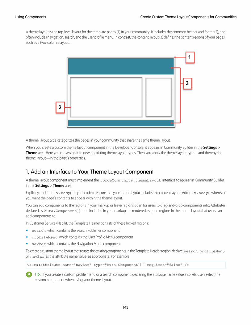
A theme layout is the top-level layout for the template pages (1) in your community. It includes the common header and footer (2), andoften includes navigation, search, and the user profile menu. In contrast, the content layout (3) defines the content regions of your pages,such as a two-column layout.
A theme layout type categorizes the pages in your community that share the same theme layout.
When you create a custom theme layout component in the Developer Console, it appears in Community Builder in the Settings >Theme area. Here you can assign it to new or existing theme layout types. Then you apply the theme layout type—and thereby thetheme layout—in the page’s properties.
1. Add an Interface to Your Theme Layout ComponentA theme layout component must implement the forceCommunity:themeLayout interface to appear in Community Builderin the Settings > Theme area.
Explicitly declare {!v.body} in your code to ensure that your theme layout includes the content layout. Add {!v.body} whereveryou want the page’s contents to appear within the theme layout.
You can add components to the regions in your markup or leave regions open for users to drag-and-drop components into. Attributesdeclared as Aura.Component[] and included in your markup are rendered as open regions in the theme layout that users canadd components to.
In Customer Service (Napili), the Template Header consists of these locked regions:
• search, which contains the Search Publisher component
• profileMenu, which contains the User Profile Menu component
• navBar, which contains the Navigation Menu component
To create a custom theme layout that reuses the existing components in the Template Header region, declare search, profileMenu,or navBar as the attribute name value, as appropriate. For example:
<aura:attribute name="navBar" type="Aura.Component[]" required="false" />
Tip: If you create a custom profile menu or a search component, declaring the attribute name value also lets users select thecustom component when using your theme layout.
143
Create Custom Theme Layout Components for CommunitiesUsing Components
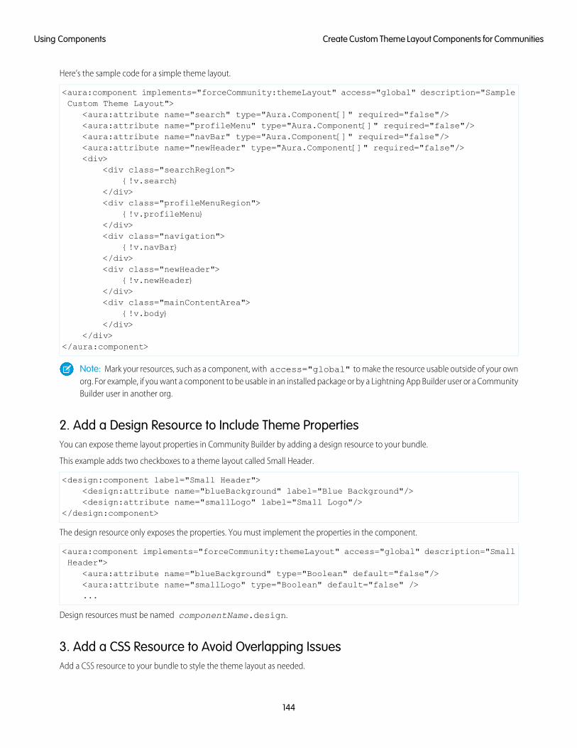
Here’s the sample code for a simple theme layout.
<aura:component implements="forceCommunity:themeLayout" access="global" description="SampleCustom Theme Layout">
<aura:attribute name="search" type="Aura.Component[]" required="false"/><aura:attribute name="profileMenu" type="Aura.Component[]" required="false"/><aura:attribute name="navBar" type="Aura.Component[]" required="false"/><aura:attribute name="newHeader" type="Aura.Component[]" required="false"/><div>
<div class="searchRegion">{!v.search}
</div><div class="profileMenuRegion">
{!v.profileMenu}</div><div class="navigation">
{!v.navBar}</div><div class="newHeader">
{!v.newHeader}</div><div class="mainContentArea">
{!v.body}</div>
</div></aura:component>
Note: Mark your resources, such as a component, with access="global" to make the resource usable outside of your ownorg. For example, if you want a component to be usable in an installed package or by a Lightning App Builder user or a CommunityBuilder user in another org.
2. Add a Design Resource to Include Theme PropertiesYou can expose theme layout properties in Community Builder by adding a design resource to your bundle.
This example adds two checkboxes to a theme layout called Small Header.
<design:component label="Small Header"><design:attribute name="blueBackground" label="Blue Background"/><design:attribute name="smallLogo" label="Small Logo"/>
</design:component>
The design resource only exposes the properties. You must implement the properties in the component.
<aura:component implements="forceCommunity:themeLayout" access="global" description="SmallHeader">
<aura:attribute name="blueBackground" type="Boolean" default="false"/><aura:attribute name="smallLogo" type="Boolean" default="false" />...
Design resources must be named componentName.design.
3. Add a CSS Resource to Avoid Overlapping IssuesAdd a CSS resource to your bundle to style the theme layout as needed.
144
Create Custom Theme Layout Components for CommunitiesUsing Components
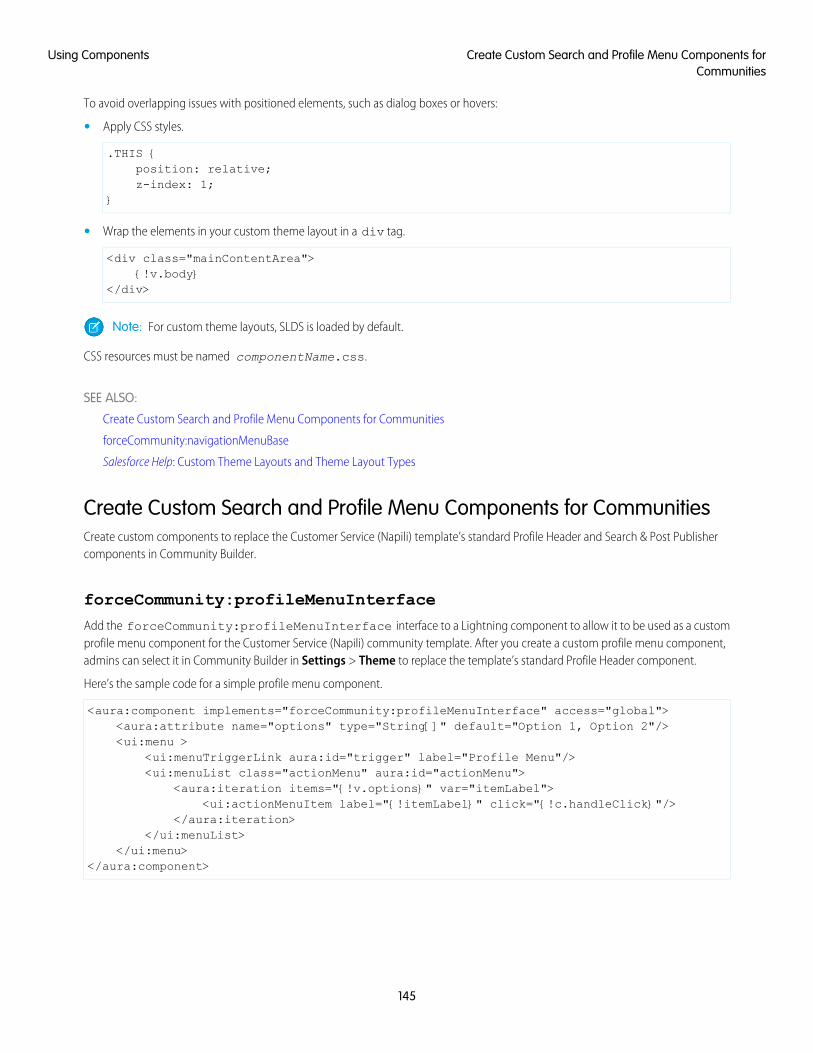
To avoid overlapping issues with positioned elements, such as dialog boxes or hovers:
• Apply CSS styles.
.THIS {position: relative;z-index: 1;
}
• Wrap the elements in your custom theme layout in a div tag.
<div class="mainContentArea">{!v.body}
</div>
Note: For custom theme layouts, SLDS is loaded by default.
CSS resources must be named componentName.css.
SEE ALSO:
Create Custom Search and Profile Menu Components for Communities
forceCommunity:navigationMenuBase
Salesforce Help: Custom Theme Layouts and Theme Layout Types
Create Custom Search and Profile Menu Components for CommunitiesCreate custom components to replace the Customer Service (Napili) template’s standard Profile Header and Search & Post Publishercomponents in Community Builder.
forceCommunity:profileMenuInterface
Add the forceCommunity:profileMenuInterface interface to a Lightning component to allow it to be used as a customprofile menu component for the Customer Service (Napili) community template. After you create a custom profile menu component,admins can select it in Community Builder in Settings > Theme to replace the template’s standard Profile Header component.
Here’s the sample code for a simple profile menu component.
<aura:component implements="forceCommunity:profileMenuInterface" access="global"><aura:attribute name="options" type="String[]" default="Option 1, Option 2"/><ui:menu >
<ui:menuTriggerLink aura:id="trigger" label="Profile Menu"/><ui:menuList class="actionMenu" aura:id="actionMenu">
<aura:iteration items="{!v.options}" var="itemLabel"><ui:actionMenuItem label="{!itemLabel}" click="{!c.handleClick}"/>
</aura:iteration></ui:menuList>
</ui:menu></aura:component>
145
Create Custom Search and Profile Menu Components forCommunities
Using Components
forceCommunity:searchInterface
Add the forceCommunity:searchInterface interface to a Lightning component to allow it to be used as a custom searchcomponent for the Customer Service (Napili) community template. After you create a custom search component, admins can select itin Community Builder in Settings > Theme to replace the template’s standard Search & Post Publisher component.
Here’s the sample code for a simple search component.
<aura:component implements="forceCommunity:searchInterface" access="global"><div class="search">
<div class="search-wrapper"><form class="search-form">
<div class="search-input-wrapper"><input class="search-input" type="text" placeholder="My Search"/>
</div><input type="hidden" name="language" value="en" />
</form></div>
</div></aura:component>
SEE ALSO:
Create Custom Theme Layout Components for Communities
forceCommunity:navigationMenuBase
Salesforce Help: Custom Theme Layouts and Theme Layout Types
Create Custom Content Layout Components for CommunitiesCommunity Builder includes several ready-to-use layouts that define the content regions of your page, such as a two-column layoutwith a 2:1 ratio. However, if you need a layout that’s customized for your community, create a custom content layout component to usewhen building new pages in Community Builder. You can also update the content layout of the default pages that come with yourcommunity template.
When you create a custom content layout component in the Developer Console, it appears in Community Builder in the New Page andthe Change Layout dialog boxes.
1. Add a New Interface to Your Content Layout ComponentTo appear in the New Page and the Change Layout dialog boxes in Community Builder, a content layout component must implementthe forceCommunity:layout interface.
Here’s the sample code for a simple two-column content layout.
<aura:component implements="forceCommunity:layout" description=”Custom Content Layout”access="global">
<aura:attribute name="column1" type="Aura.Component[]" required="false"></aura:attribute>
<aura:attribute name="column2" type="Aura.Component[]" required="false"></aura:attribute>
<div class="container"><div class="contentPanel">
146
Create Custom Content Layout Components for CommunitiesUsing Components
<div class="left">{!v.column1}
</div><div class="right">
{!v.column2}</div>
</div></div>
</aura:component>
Note: Mark your resources, such as a component, with access="global" to make the resource usable outside of your ownorg. For example, if you want a component to be usable in an installed package or by a Lightning App Builder user or a CommunityBuilder user in another org.
2. Add a CSS Resource to Your Component BundleNext, add a CSS resource to style the content layout as needed.
Here’s the sample CSS for our simple two-column content layout.
.THIS .contentPanel:before,
.THIS .contentPanel:after {content: " ";display: table;
}.THIS .contentPanel:after {
clear: both;}.THIS .left {
float: left;width: 50%;
}.THIS .right {
float: right;width: 50%;
}
CSS resources must be named componentName.css.
3. Optional: Add an SVG Resource to Your Component BundleYou can include an SVG resource in your component bundle to define a custom icon for the content layout component when it appearsin the Community Builder.
The recommended image size for a content layout component in Community Builder is 170px by 170px. However, if the image hasdifferent dimensions, Community Builder scales the image to fit.
SVG resources must be named componentName.svg.
SEE ALSO:
Component Bundles
Standard Design Tokens for Communities
147
Create Custom Content Layout Components for CommunitiesUsing Components
Add Components to Apps
When you’re ready to add components to your app, you should first look at the out-of-the-box components that come with the framework.You can also leverage these components by extending them or using composition to add them to custom components that you’rebuilding.
Note: For all the out-of-the-box components, see the Components folder athttps://<myDomain>.lightning.force.com/auradocs/reference.app, where <myDomain> is thename of your custom Salesforce domain. The ui namespace includes many components that are common on Web pages.
Components are encapsulated and their internals stay private, while their public shape is visible to consumers of the component. Thisstrong separation gives component authors freedom to change the internal implementation details and insulates component consumersfrom those changes.
The public shape of a component is defined by the attributes that can be set and the events that interact with the component. Theshape is essentially the API for developers to interact with the component. To design a new component, think about the attributes thatyou want to expose and the events that the component should initiate or respond to.
Once you have defined the shape of any new components, developers can work on the components in parallel. This is a useful approachif you have a team working on an app.
To add a new custom component to your app, see Using the Developer Console on page 6.
SEE ALSO:
Component Composition
Using Object-Oriented Development
Component Attributes
Communicating with Events
Integrate Your Custom Apps into the Chatter Publisher
Use the Chatter Rich Publisher Apps API to integrate your custom apps into the Chatter publisher. The Rich Publisher Apps API enablesdevelopers to attach any custom payload to a feed item. Rich Publisher Apps uses lightning components for composition and rendering.We provide two lightning interfaces and a lightning event to assist with integration. You can package your apps and upload them toAppExchange. A community admin page provides a selector for choosing which five of your apps to add to the Chatter publisher forthat community.
Note: Rich Publisher Apps are available to Lightning communities in topics, group, and profile feeds and in direct messages.
Use the lightning:availableForChatterExtensionComposer andlightning:availableForChatterExtensionRenderer interfaces with thelightning:sendChatterExtensionPayload event to integrate your custom apps into the Chatter publisher and carryyour apps’ payload into a Chatter feed.
Note: The payload must be an object.
Example: Example of a Custom App Integrated into a Chatter Publisher
This example shows a Chatter publisher with three custom app integrations. There are icons for a video meeting app (1), an emojiapp (2), and an app for selecting a daily quotation (3).
148
Add Components to AppsUsing Components
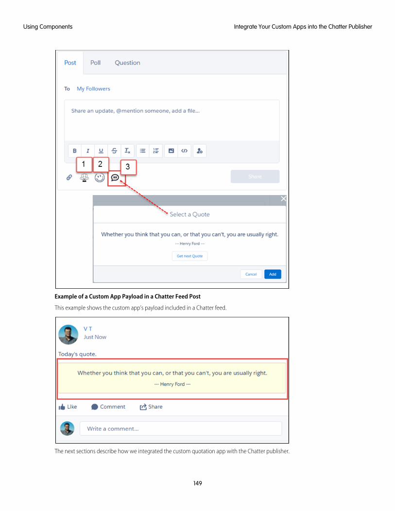
Example of a Custom App Payload in a Chatter Feed Post
This example shows the custom app’s payload included in a Chatter feed.
The next sections describe how we integrated the custom quotation app with the Chatter publisher.
149
Integrate Your Custom Apps into the Chatter PublisherUsing Components
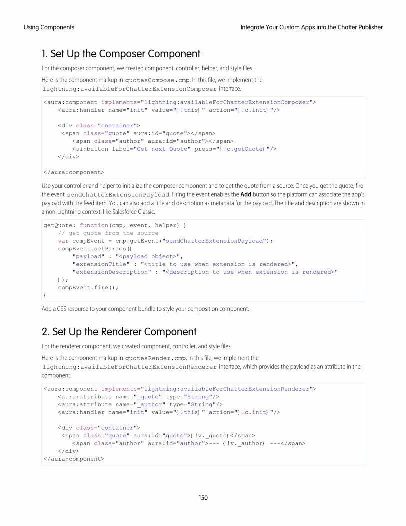
1. Set Up the Composer ComponentFor the composer component, we created component, controller, helper, and style files.
Here is the component markup in quotesCompose.cmp. In this file, we implement thelightning:availableForChatterExtensionComposer interface.
<aura:component implements="lightning:availableForChatterExtensionComposer"><aura:handler name="init" value="{!this}" action="{!c.init}"/>
<div class="container"><span class="quote" aura:id="quote"></span>
<span class="author" aura:id="author"></span><ui:button label="Get next Quote" press="{!c.getQuote}"/>
</div>
</aura:component>
Use your controller and helper to initialize the composer component and to get the quote from a source. Once you get the quote, firethe event sendChatterExtensionPayload. Firing the event enables the Add button so the platform can associate the app’spayload with the feed item. You can also add a title and description as metadata for the payload. The title and description are shown ina non-Lightning context, like Salesforce Classic.
getQuote: function(cmp, event, helper) {// get quote from the sourcevar compEvent = cmp.getEvent("sendChatterExtensionPayload");compEvent.setParams({
"payload" : "<payload object>","extensionTitle" : "<title to use when extension is rendered>","extensionDescription" : "<description to use when extension is rendered>"
});compEvent.fire();
}
Add a CSS resource to your component bundle to style your composition component.
2. Set Up the Renderer ComponentFor the renderer component, we created component, controller, and style files.
Here is the component markup in quotesRender.cmp. In this file, we implement thelightning:availableForChatterExtensionRenderer interface, which provides the payload as an attribute in thecomponent.
<aura:component implements="lightning:availableForChatterExtensionRenderer"><aura:attribute name="_quote" type="String"/><aura:attribute name="_author" type="String"/><aura:handler name="init" value="{!this}" action="{!c.init}"/>
<div class="container"><span class="quote" aura:id="quote">{!v._quote}</span>
<span class="author" aura:id="author">--- {!v._author} ---</span></div>
</aura:component>
150
Integrate Your Custom Apps into the Chatter PublisherUsing Components
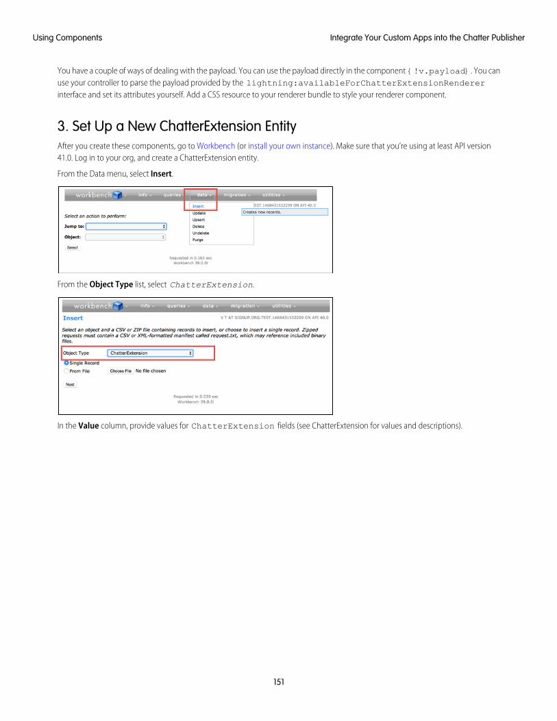
You have a couple of ways of dealing with the payload. You can use the payload directly in the component {!v.payload}. You canuse your controller to parse the payload provided by the lightning:availableForChatterExtensionRendererinterface and set its attributes yourself. Add a CSS resource to your renderer bundle to style your renderer component.
3. Set Up a New ChatterExtension EntityAfter you create these components, go to Workbench (or install your own instance). Make sure that you’re using at least API version41.0. Log in to your org, and create a ChatterExtension entity.
From the Data menu, select Insert.
From the Object Type list, select ChatterExtension.
In the Value column, provide values for ChatterExtension fields (see ChatterExtension for values and descriptions).
151
Integrate Your Custom Apps into the Chatter PublisherUsing Components
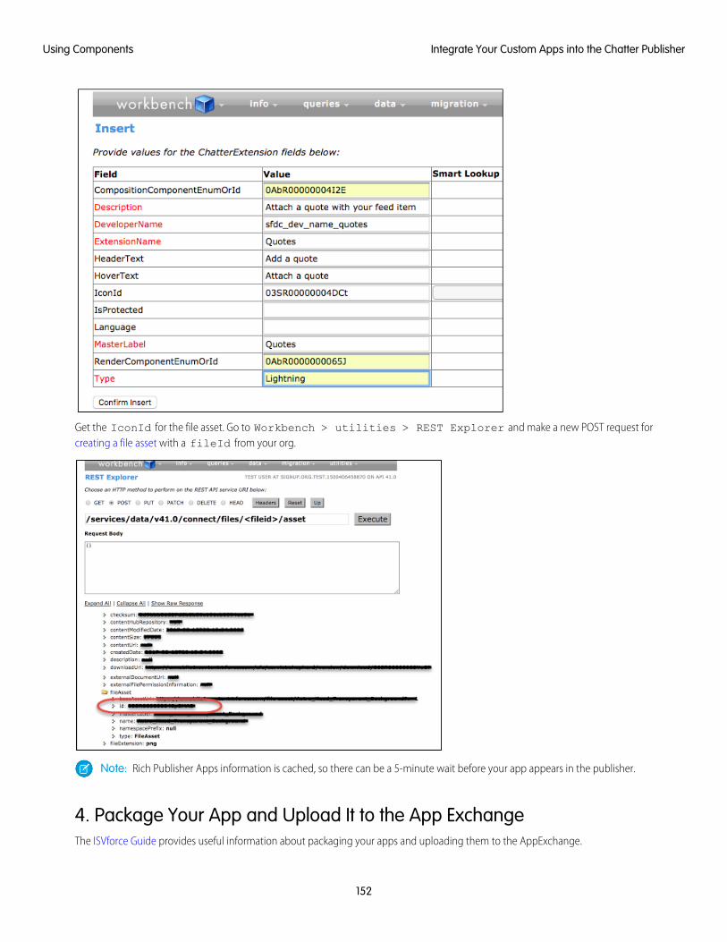
Get the IconId for the file asset. Go to Workbench > utilities > REST Explorer and make a new POST request forcreating a file asset with a fileId from your org.
Note: Rich Publisher Apps information is cached, so there can be a 5-minute wait before your app appears in the publisher.
4. Package Your App and Upload It to the App ExchangeThe ISVforce Guide provides useful information about packaging your apps and uploading them to the AppExchange.
152
Integrate Your Custom Apps into the Chatter PublisherUsing Components
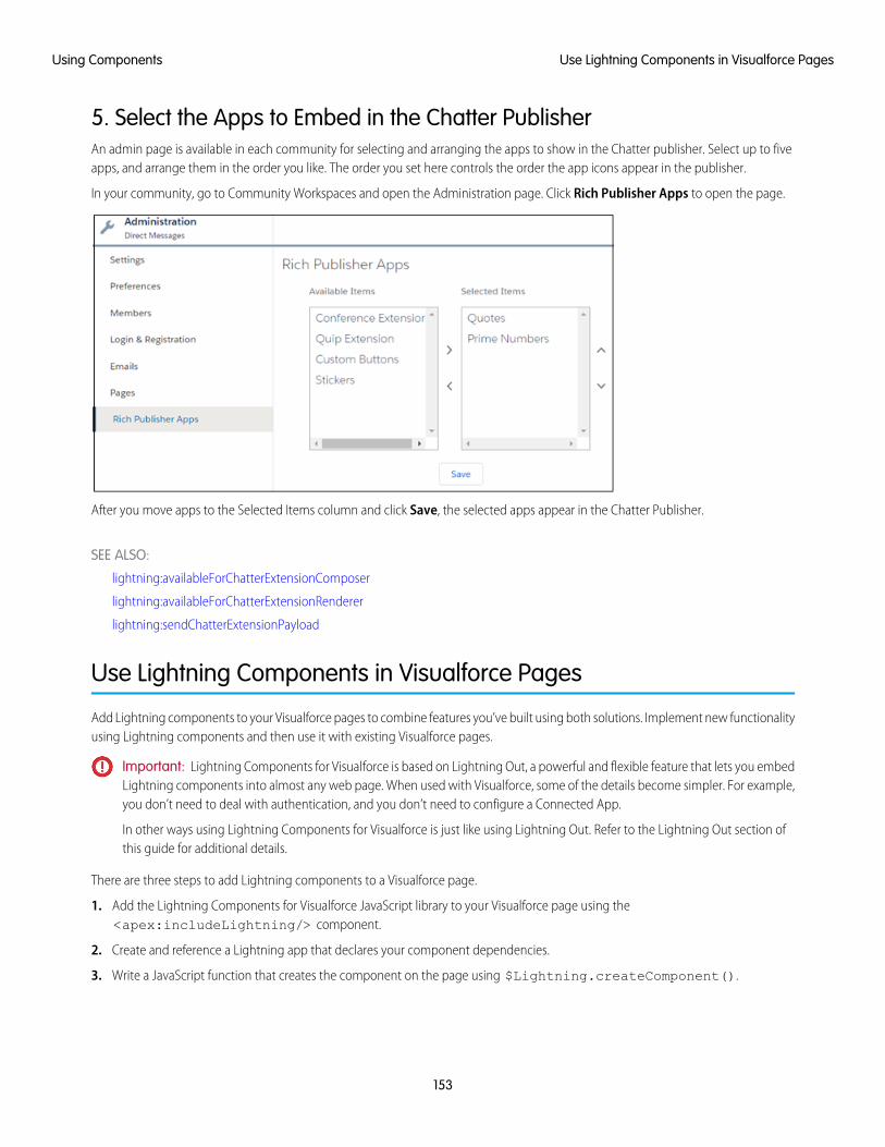
5. Select the Apps to Embed in the Chatter PublisherAn admin page is available in each community for selecting and arranging the apps to show in the Chatter publisher. Select up to fiveapps, and arrange them in the order you like. The order you set here controls the order the app icons appear in the publisher.
In your community, go to Community Workspaces and open the Administration page. Click Rich Publisher Apps to open the page.
After you move apps to the Selected Items column and click Save, the selected apps appear in the Chatter Publisher.
SEE ALSO:
lightning:availableForChatterExtensionComposer
lightning:availableForChatterExtensionRenderer
lightning:sendChatterExtensionPayload
Use Lightning Components in Visualforce Pages
Add Lightning components to your Visualforce pages to combine features you’ve built using both solutions. Implement new functionalityusing Lightning components and then use it with existing Visualforce pages.
Important: Lightning Components for Visualforce is based on Lightning Out, a powerful and flexible feature that lets you embedLightning components into almost any web page. When used with Visualforce, some of the details become simpler. For example,you don’t need to deal with authentication, and you don’t need to configure a Connected App.
In other ways using Lightning Components for Visualforce is just like using Lightning Out. Refer to the Lightning Out section ofthis guide for additional details.
There are three steps to add Lightning components to a Visualforce page.
1. Add the Lightning Components for Visualforce JavaScript library to your Visualforce page using the<apex:includeLightning/> component.
2. Create and reference a Lightning app that declares your component dependencies.
3. Write a JavaScript function that creates the component on the page using $Lightning.createComponent().
153
Use Lightning Components in Visualforce PagesUsing Components
Add the Lightning Components for Visualforce JavaScript LibraryAdd <apex:includeLightning/> at the beginning of your page. This component loads the JavaScript file used by LightningComponents for Visualforce.
Create and Reference a Lightning Dependency AppTo use Lightning Components for Visualforce, define component dependencies by referencing a Lightning dependency app. This appis globally accessible and extends ltng:outApp. The app declares dependencies on any Lightning definitions (like components)that it uses.
Here’s an example of a simple app named lcvfTest.app. The app uses the <aura:dependency> tag to indicate that it usesthe standard Lightning component, ui:button.
<aura:application access="GLOBAL" extends="ltng:outApp"><aura:dependency resource="ui:button"/>
</aura:application>
Note: Extending from ltng:outApp adds SLDS resources to the page to allow your Lightning components to be styled withthe Salesforce Lightning Design System (SLDS). If you don’t want SLDS resources added to the page, extend fromltng:outAppUnstyled instead.
To reference this app on your page, use the following JavaScript code, where theNamespace is the namespace prefix for the app.That is, either your org’s namespace, or the namespace of the managed package that provides the app.
$Lightning.use("theNamespace:lcvfTest", function() {});
If the app is defined in your org (that is, not in a managed package), you can use the default “c” namespace instead, as shown in thenext example. If your org doesn’t have a namespace defined, you must use the default namespace.
For further details about creating a Lightning dependency app, see Lightning Out Dependencies.
Creating a Component on a PageFinally, add your top-level component to a page using $Lightning.createComponent(String type, Objectattributes, String locator, function callback). This function is similar to $A.createComponent(), butincludes an additional parameter, domLocator, which specifies the DOM element where you want the component inserted.
Let’s look at a sample Visualforce page that creates a ui:button using the lcvfTest.app from the previous example.
<apex:page><apex:includeLightning />
<div id="lightning" />
<script>$Lightning.use("c:lcvfTest", function() {$Lightning.createComponent("ui:button",{ label : "Press Me!" },"lightning",function(cmp) {// do some stuff
});});
154
Use Lightning Components in Visualforce PagesUsing Components
</script></apex:page>
This code creates a DOM element with the ID “lightning”, which is then referenced in the $Lightning.createComponent()method. This method creates a ui:button that says “Press Me!”, and then executes the callback function.
Important: You can call $Lightning.use() multiple times on a page, but all calls must reference the same Lightningdependency app.
For further details about using $Lightning.use() and $Lightning.createComponent(), see Lightning Out Markup.
SEE ALSO:
Lightning Out Dependencies
Add Lightning Components to Any App with Lightning Out (Beta)
Lightning Out Markup
Share Lightning Out Apps with Non-Authenticated Users
Lightning Out Considerations and Limitations
Add Lightning Components to Any App with Lightning Out (Beta)
Use Lightning Out to run Lightning components apps outside of Salesforce servers. Whether it’s a Node.js app running on Heroku, adepartment server inside the firewall, or even SharePoint, build your custom app with Force.com and run it wherever your users are.
Note: This release contains a beta version of Lightning Out, which means it’s a high quality feature with known limitations. Youcan provide feedback and suggestions for Lightning Out on the IdeaExchange.
Developing Lightning components that you can deploy anywhere is for the most part the same as developing them to run withinSalesforce. Everything you already know about Lightning components development still applies. The only real difference is in how youembed your Lightning components app in the remote web container, or origin server.
Lightning Out is added to external apps in the form of a JavaScript library you include in the page on the origin server, and markup youadd to configure and activate your Lightning components app. Once initialized, Lightning Out pulls in your Lightning components appover a secure connection, spins it up, and inserts it into the DOM of the page it’s running on. Once it reaches this point, your “normal”Lightning components code takes over and runs the show.
Note: This approach is quite different from embedding an app using an iframe. Lightning components running via LightningOut are full citizens on the page. If you choose to, you can enable interaction between your Lightning components app and thepage or app you’ve embedded it in. This interaction is handled using Lightning events.
In addition to some straightforward markup, there’s a modest amount of setup and preparation within Salesforce to enable the secureconnection between Salesforce and the origin server. And, because the origin server is hosting the app, you need to manage authenticationwith your own code.
This setup process is similar to what you’d do for an application that connects to Salesforce using the Force.com REST API, and youshould expect it to require an equivalent amount of work.
IN THIS SECTION:
Lightning Out Requirements
Deploying a Lightning components app using Lightning Out has a few modest requirements to ensure connectivity and security.
155
Add Lightning Components to Any App with Lightning Out(Beta)
Using Components
Lightning Out Dependencies
Create a special Lightning dependency app to describe the component dependencies of a Lightning components app to be deployedusing Lightning Out or Lightning Components for Visualforce.
Lightning Out Markup
Lightning Out requires some simple markup on the page, and is activated using two straightforward JavaScript functions.
Authentication from Lightning Out
Lightning Out doesn’t handle authentication. Instead, you manually provide a Salesforce session ID or authentication token whenyou initialize a Lightning Out app.
Share Lightning Out Apps with Non-Authenticated Users
Add the ltng:allowGuestAccess interface to your Lightning Out dependency app to make it available to users withoutrequiring them to authenticate with Salesforce. This interface lets you build your app with Lightning components, and deploy itanywhere and to anyone.
Lightning Out Considerations and Limitations
Creating an app using Lightning Out is, for the most part, much like creating any app with Lightning components. However, becauseyour components are running “outside” of Salesforce, there are a few issues you want to be aware of. And it’s possible there arechanges you might need to make to your components or your app.
SEE ALSO:
Idea Exchange: Lightning Components Anywhere / Everywhere
Lightning Out RequirementsDeploying a Lightning components app using Lightning Out has a few modest requirements to ensure connectivity and security.
The remote web container, or origin server, must support the following.
• Ability to modify the markup served to the client browser, including both HTML and JavaScript. You need to be able to add theLightning Out markup.
• Ability to acquire a valid Salesforce session ID. This will most likely require you to configure a Connected App for the origin server.
• Ability to access your Salesforce instance. For example, if the origin server is behind a firewall, it needs permission to access theInternet, at least to reach Salesforce.
Your Salesforce org must be configured to allow the following.
• The ability for the origin server to authenticate and connect. This will most likely require you to configure a Connected App for theorigin server.
• The origin server must be added to the Cross-Origin Resource Sharing (CORS) whitelist.
Finally, you create a special Lightning components app that contains dependency information for the Lightning components to behosted on the origin server. This app is only used by Lightning Out or Lightning Components for Visualforce.
Lightning Out DependenciesCreate a special Lightning dependency app to describe the component dependencies of a Lightning components app to be deployedusing Lightning Out or Lightning Components for Visualforce.
When a Lightning components app is initialized using Lightning Out, Lightning Out loads the definitions for the components in the app.To do this efficiently, Lightning Out requires you to specify the component dependencies in advance, so that the definitions can beloaded once, at startup time.
156
Lightning Out RequirementsUsing Components
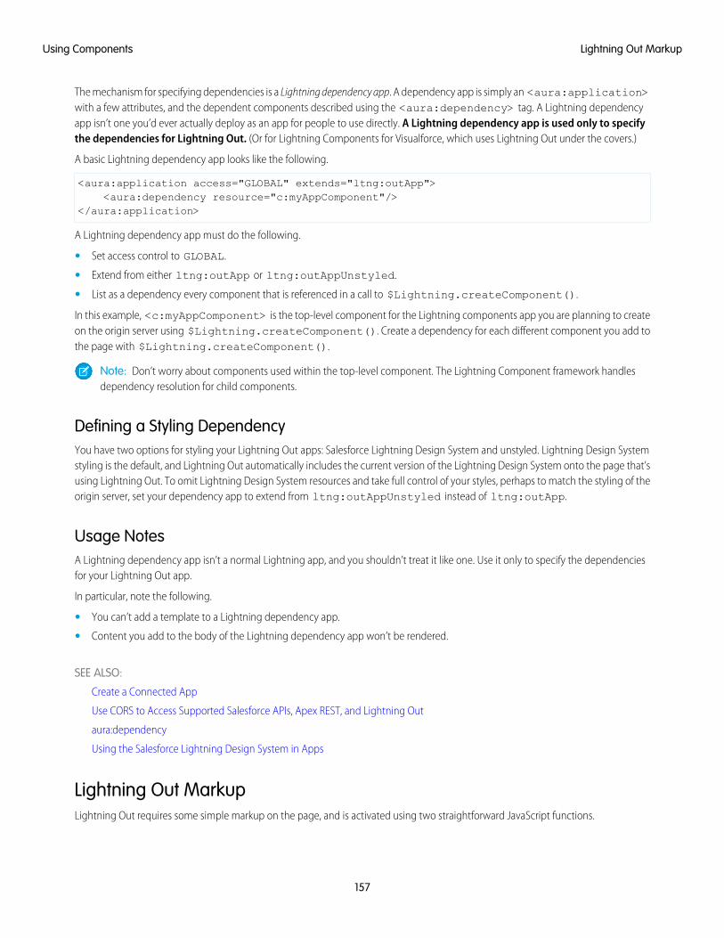
The mechanism for specifying dependencies is a Lightning dependency app. A dependency app is simply an <aura:application>with a few attributes, and the dependent components described using the <aura:dependency> tag. A Lightning dependencyapp isn’t one you’d ever actually deploy as an app for people to use directly. A Lightning dependency app is used only to specifythe dependencies for Lightning Out. (Or for Lightning Components for Visualforce, which uses Lightning Out under the covers.)
A basic Lightning dependency app looks like the following.
<aura:application access="GLOBAL" extends="ltng:outApp"><aura:dependency resource="c:myAppComponent"/>
</aura:application>
A Lightning dependency app must do the following.
• Set access control to GLOBAL.
• Extend from either ltng:outApp or ltng:outAppUnstyled.
• List as a dependency every component that is referenced in a call to $Lightning.createComponent().
In this example, <c:myAppComponent> is the top-level component for the Lightning components app you are planning to createon the origin server using $Lightning.createComponent(). Create a dependency for each different component you add tothe page with $Lightning.createComponent().
Note: Don’t worry about components used within the top-level component. The Lightning Component framework handlesdependency resolution for child components.
Defining a Styling DependencyYou have two options for styling your Lightning Out apps: Salesforce Lightning Design System and unstyled. Lightning Design Systemstyling is the default, and Lightning Out automatically includes the current version of the Lightning Design System onto the page that’susing Lightning Out. To omit Lightning Design System resources and take full control of your styles, perhaps to match the styling of theorigin server, set your dependency app to extend from ltng:outAppUnstyled instead of ltng:outApp.
Usage NotesA Lightning dependency app isn’t a normal Lightning app, and you shouldn’t treat it like one. Use it only to specify the dependenciesfor your Lightning Out app.
In particular, note the following.
• You can’t add a template to a Lightning dependency app.
• Content you add to the body of the Lightning dependency app won’t be rendered.
SEE ALSO:
Create a Connected App
Use CORS to Access Supported Salesforce APIs, Apex REST, and Lightning Out
aura:dependency
Using the Salesforce Lightning Design System in Apps
Lightning Out MarkupLightning Out requires some simple markup on the page, and is activated using two straightforward JavaScript functions.
157
Lightning Out MarkupUsing Components
The markup and JavaScript functions in the Lightning Out library are the only things specific to Lightning Out. Everything else is theLightning components code you already know and love.
Adding the Lightning Out Library to the PageEnable an origin server for use with Lightning Out by including the Lightning Out JavaScript library in the app or page hosting yourLightning components app. Including the library requires a single line of markup.
<script src="https://myDomain.my.salesforce.com/lightning/lightning.out.js"></script>
Important: Use your custom domain for the host. Don’t copy-and-paste someone else’s instance from example source code. Ifyou do this, your app will break whenever there’s a version mismatch between your Salesforce instance and the instance fromwhich you’re loading the Lightning Out library. This happens at least three times a year, during regular upgrades of Salesforce.Don’t do it!
Loading and Initializing Your Lightning Components AppLoad and initialize the Lightning Component framework and your Lightning components app with the $Lightning.use()function.
The $Lightning.use() function takes four arguments.
DescriptionTypeName
Required. The name of your Lightning dependency app, including thenamespace. For example, "c:expenseAppDependencies".
stringappName
A function to call once the Lightning Component framework and your apphave fully loaded. The callback receives no arguments.
This callback is usually where you call$Lightning.createComponent() to add your app to the page
functioncallback
(see the next section). You might also update your display in other ways, orotherwise respond to your Lightning components app being ready.
The URL for the Lightning domain on your Salesforce instance. For example,“https://myDomain.lightning.force.com”.
stringlightningEndPointURI
The session ID or OAuth access token for a valid, active Salesforce session.stringauthToken
Note: You must obtain this token in your own code. Lightning Outdoesn’t handle authentication for you. See Authentication fromLightning Out.
appName is required. The other three parameters are optional. In normal use you provide all four parameters.
Note: You can’t use more than one Lightning dependency app on a page. You can call $Lightning.use() more thanonce, but you must reference the same dependency app in every call.
158
Lightning Out MarkupUsing Components
Adding Your Lightning Components to the PageAdd to and activate your Lightning components on the page with the $Lightning.createComponent() function.
The $Lightning.createComponent() function takes four arguments.
DescriptionTypeName
Required. The name of the Lightning component to add to the page,including the namespace. For example, "c:newExpenseForm".
stringcomponentName
Required. The attributes to set on the component when it’s created. Forexample, { name: theName, amount: theAmount }. If thecomponent doesn’t require any attributes, pass in an empty object, { }.
Objectattributes
Required. The DOM element or element ID that indicates where on the pageto insert the created component.
Element or stringdomLocator
A function to call once the component is added to and active on the page.The callback receives the component created as its only argument.
functioncallback
Note: You can add more than one Lightning component to a page. That is, you can call $Lightning.createComponent()multiple times, with multiple DOM locators, to add components to different parts of the page. Each component created this waymust be specified in the page’s Lightning dependency app.
Behind the scenes $Lightning.createComponent() calls the standard $A.createComponent() function. Except forthe DOM locator, the arguments are the same. And except for wrapping the call in some Lightning Out semantics, the behavior is thesame, too.
SEE ALSO:
Dynamically Creating Components
Authentication from Lightning OutLightning Out doesn’t handle authentication. Instead, you manually provide a Salesforce session ID or authentication token when youinitialize a Lightning Out app.
There are two supported ways to obtain an authentication token for use with Lightning Out.
• On a Visualforce page, using Lightning Components for Visualforce, you can obtain the current Visualforce session ID using theexpression {! $Api.Session_ID }. This session is intended for use only on Visualforce pages.
• Elsewhere, an authenticated session is obtained using OAuth, following the same process you’d use to obtain an authenticatedsession to use with the Force.com REST API. In this case, you obtain an OAuth token, and can use it anywhere.
Important: Lightning Out isn’t in the business of authentication. The $Lightning.use() function simply passes along tothe security subsystem whatever authentication token you provide it. For most organizations, this will be a session ID or an OAuthtoken.
Lightning Out has the same privileges as the session from which you obtain the authentication token. For Visualforce using {!$Api.Session_ID }, the session has the privileges of the current user. For OAuth it’s whatever OAuth scope setting thatthe OAuth Connected App is defined with. In most cases, using Lightning Out with OAuth requires you to grant “Full Access” scopeto the Connected App returning the OAuth token.
159
Authentication from Lightning OutUsing Components
Share Lightning Out Apps with Non-Authenticated UsersAdd the ltng:allowGuestAccess interface to your Lightning Out dependency app to make it available to users without requiringthem to authenticate with Salesforce. This interface lets you build your app with Lightning components, and deploy it anywhere andto anyone.
A Lightning Out dependency app with the ltng:allowGuestAccess interface can be used with Lightning Components forVisualforce and with Lightning Out.
• Using Lightning Components for Visualforce, you can add your Lightning app to a Visualforce page, and then use that page inSalesforce Tabs + Visualforce communities. Then you can allow public access to that page.
• Using Lightning Out, you can deploy your Lightning app anywhere Lightning Out is supported—which is almost anywhere!
The ltng:allowGuestAccess interface is only usable in orgs that have Communities enabled, and your Lightning Out app isassociated with all community endpoints that you’ve defined in your org.
Important: When you make a Lightning app accessible to guest users by adding the ltng:allowGuestAccess interface,it’s available through every community in your org, whether that community is enabled for public access or not. You can’t preventit from being accessible via community URLs, and you can’t make it available for some communities but not others.
Warning: Be extremely careful about apps you open for guest access. Apps enabled for guest access bypass the object- andfield-level security (FLS) you set for your community’s guest user profile. Lightning components don’t automatically enforce CRUDand FLS when you reference objects or retrieve the objects from an Apex controller. This means that the framework continues todisplay records and fields for which users don’t have CRUD access and FLS visibility. You must manually enforce CRUD and FLS inyour Apex controllers. A mistake in code used in an app enabled for guest access can open your org’s data to the world.
Lightning Out Lightning Components for Visualforce
UsageTo begin with, add the ltng:allowGuestAccess interface to your Lightning Out dependency app. For example:
<aura:application access="GLOBAL" extends="ltng:outApp"implements="ltng:allowGuestAccess">
<aura:dependency resource="c:storeLocatorMain"/>
</aura:application>
Note: You can only add the ltng:allowGuestAccess interface to Lightning apps, not to individual components.
Next, add the Lightning Out JavaScript library to your page.
• With Lightning Components for Visualforce, simply add the <apex:includeLightning /> tag anywhere on your page.
• With Lightning Out, add a <script> tag that references the library directly, using a community endpoint URL. For example:
<scriptsrc="https://yourCommunityDomain/communityURL/lightning/lightning.out.js"></script>
For example, https://universalcontainers.force.com/ourstores/lightning/lightning.out.js
160
Share Lightning Out Apps with Non-Authenticated UsersUsing Components
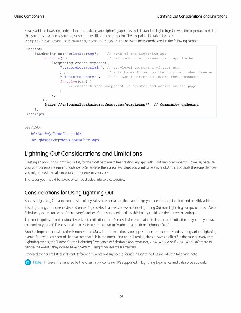
Finally, add the JavaScript code to load and activate your Lightning app. This code is standard Lightning Out, with the important additionthat you must use one of your org’s community URLs for the endpoint. The endpoint URL takes the formhttps://yourCommunityDomain/communityURL/. The relevant line is emphasized in the following sample.
<script>$Lightning.use("c:locatorApp", // name of the Lightning app
function() { // Callback once framework and app loaded$Lightning.createComponent(
"c:storeLocatorMain", // top-level component of your app{ }, // attributes to set on the component when created"lightningLocator", // the DOM location to insert the componentfunction(cmp) {
// callback when component is created and active on the page}
);},'https://universalcontainers.force.com/ourstores/' // Community endpoint
);</script>
SEE ALSO:
Salesforce Help: Create Communities
Use Lightning Components in Visualforce Pages
Lightning Out Considerations and LimitationsCreating an app using Lightning Out is, for the most part, much like creating any app with Lightning components. However, becauseyour components are running “outside” of Salesforce, there are a few issues you want to be aware of. And it’s possible there are changesyou might need to make to your components or your app.
The issues you should be aware of can be divided into two categories.
Considerations for Using Lightning OutBecause Lightning Out apps run outside of any Salesforce container, there are things you need to keep in mind, and possibly address.
First, Lightning components depend on setting cookies in a user’s browser. Since Lightning Out runs Lightning components outside ofSalesforce, those cookies are “third-party” cookies. Your users need to allow third-party cookies in their browser settings.
The most significant and obvious issue is authentication. There’s no Salesforce container to handle authentication for you, so you haveto handle it yourself. This essential topic is discussed in detail in “Authentication from Lightning Out.”
Another important consideration is more subtle. Many important actions your apps support are accomplished by firing various Lightningevents. But events are sort of like that tree that falls in the forest. If no one’s listening, does it have an effect? In the case of many coreLightning events, the “listener” is the Lightning Experience or Salesforce app container, one.app. And if one.app isn’t there tohandle the events, they indeed have no effect. Firing those events silently fails.
Standard events are listed in “Event Reference.” Events not supported for use in Lightning Out include the following note:
Note: This event is handled by the one.app container. It’s supported in Lightning Experience and Salesforce app only.
161
Lightning Out Considerations and LimitationsUsing Components
Limitations With Standard ComponentsWhile the core Lightning Out functionality is stable and complete, there are a few interactions with other Salesforce features that we’restill working on.
Chief among these is the standard components built into the Lightning Component framework. Many standard components don’tbehave correctly when used in a stand-alone context, such as Lightning Out, and Lightning Components for Visualforce, which is basedon Lightning Out. This is because the components implicitly depend on resources available in the one.app container.
Avoid this issue with your own components by making all of their dependencies explicit. Use ltng:require to reference all requiredJavaScript and CSS resources that aren’t embedded in the component itself.
If you’re using standard components in your apps, they might not be fully styled, or behave as documented, when they’re used inLightning Out or Lightning Components for Visualforce.
SEE ALSO:
Browser Support Considerations for Lightning Components
Authentication from Lightning Out
System Event Reference
Use Lightning Components in Visualforce Pages
162
Lightning Out Considerations and LimitationsUsing Components
CHAPTER 5 Communicating with Events
The framework uses event-driven programming. You write handlers that respond to interface events asthey occur. The events may or may not have been triggered by user interaction.
In this chapter ...
• Actions and EventsIn the Lightning Component framework, events are fired from JavaScript controller actions. Events cancontain attributes that can be set before the event is fired and read when the event is handled.• Handling Events with
Client-SideControllers Events are declared by the aura:event tag in a .evt resource, and they can have one of two types:
component or application.• Component EventsComponent Events
A component event is fired from an instance of a component. A component event can be handledby the component that fired the event or by a component in the containment hierarchy that receivesthe event.
• Application Events
• Event HandlingLifecycle
• Advanced EventsExample Application Events
Application events follow a traditional publish-subscribe model. An application event is fired froman instance of a component. All components that provide a handler for the event are notified.
• Firing LightningEvents fromNon-Lightning Code Note: Always try to use a component event instead of an application event, if possible. Component
events can only be handled by components above them in the containment hierarchy so their• Events Best Practices
• Events Fired Duringthe RenderingLifecycle
usage is more localized to the components that need to know about them. Application eventsare best used for something that should be handled at the application level, such as navigatingto a specific record. Application events allow communication between components that are inseparate parts of the application and have no direct containment relationship.• Events Handled in
the Salesforce mobileapp and LightningExperience
• System Events
163
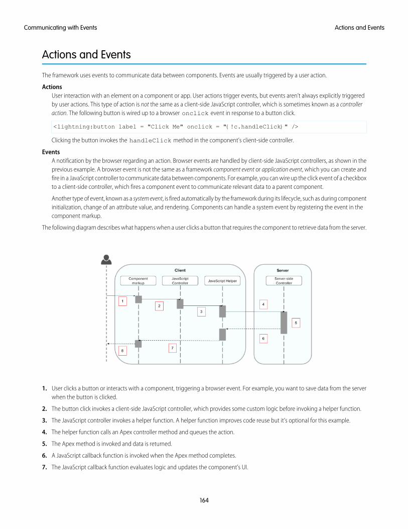
Actions and Events
The framework uses events to communicate data between components. Events are usually triggered by a user action.
ActionsUser interaction with an element on a component or app. User actions trigger events, but events aren’t always explicitly triggeredby user actions. This type of action is not the same as a client-side JavaScript controller, which is sometimes known as a controlleraction. The following button is wired up to a browser onclick event in response to a button click.
<lightning:button label = "Click Me" onclick = "{!c.handleClick}" />
Clicking the button invokes the handleClick method in the component’s client-side controller.
EventsA notification by the browser regarding an action. Browser events are handled by client-side JavaScript controllers, as shown in theprevious example. A browser event is not the same as a framework component event or application event, which you can create andfire in a JavaScript controller to communicate data between components. For example, you can wire up the click event of a checkboxto a client-side controller, which fires a component event to communicate relevant data to a parent component.
Another type of event, known as a system event, is fired automatically by the framework during its lifecycle, such as during componentinitialization, change of an attribute value, and rendering. Components can handle a system event by registering the event in thecomponent markup.
The following diagram describes what happens when a user clicks a button that requires the component to retrieve data from the server.
1. User clicks a button or interacts with a component, triggering a browser event. For example, you want to save data from the serverwhen the button is clicked.
2. The button click invokes a client-side JavaScript controller, which provides some custom logic before invoking a helper function.
3. The JavaScript controller invokes a helper function. A helper function improves code reuse but it’s optional for this example.
4. The helper function calls an Apex controller method and queues the action.
5. The Apex method is invoked and data is returned.
6. A JavaScript callback function is invoked when the Apex method completes.
7. The JavaScript callback function evaluates logic and updates the component’s UI.
164
Actions and EventsCommunicating with Events
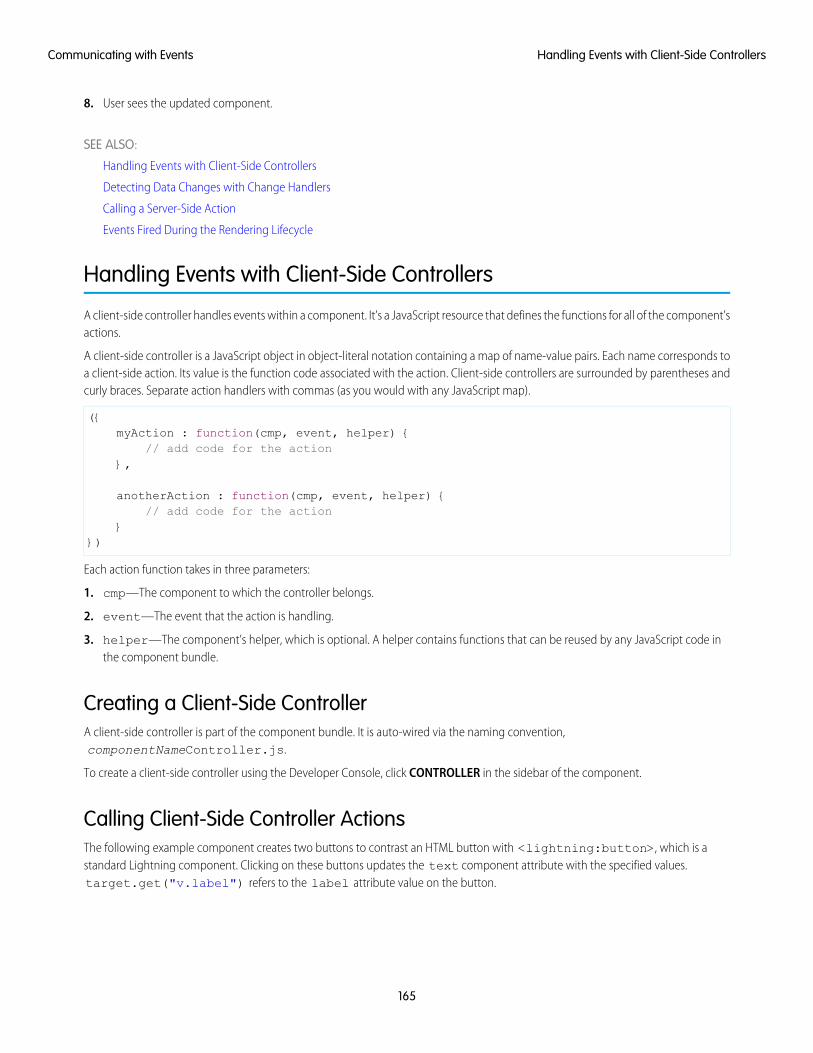
8. User sees the updated component.
SEE ALSO:
Handling Events with Client-Side Controllers
Detecting Data Changes with Change Handlers
Calling a Server-Side Action
Events Fired During the Rendering Lifecycle
Handling Events with Client-Side Controllers
A client-side controller handles events within a component. It’s a JavaScript resource that defines the functions for all of the component’sactions.
A client-side controller is a JavaScript object in object-literal notation containing a map of name-value pairs. Each name corresponds toa client-side action. Its value is the function code associated with the action. Client-side controllers are surrounded by parentheses andcurly braces. Separate action handlers with commas (as you would with any JavaScript map).
({myAction : function(cmp, event, helper) {
// add code for the action},
anotherAction : function(cmp, event, helper) {// add code for the action
}})
Each action function takes in three parameters:
1. cmp—The component to which the controller belongs.
2. event—The event that the action is handling.
3. helper—The component’s helper, which is optional. A helper contains functions that can be reused by any JavaScript code inthe component bundle.
Creating a Client-Side ControllerA client-side controller is part of the component bundle. It is auto-wired via the naming convention,componentNameController.js.
To create a client-side controller using the Developer Console, click CONTROLLER in the sidebar of the component.
Calling Client-Side Controller ActionsThe following example component creates two buttons to contrast an HTML button with <lightning:button>, which is astandard Lightning component. Clicking on these buttons updates the text component attribute with the specified values.target.get("v.label") refers to the label attribute value on the button.
165
Handling Events with Client-Side ControllersCommunicating with Events
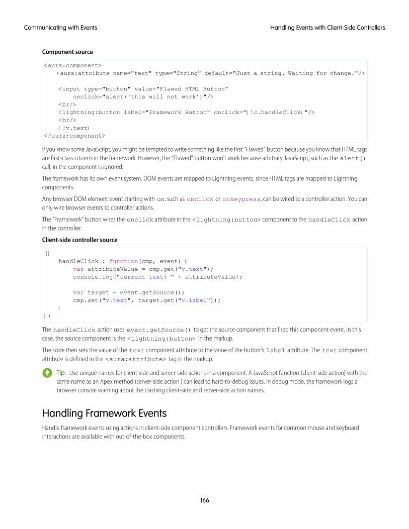
Component source
<aura:component><aura:attribute name="text" type="String" default="Just a string. Waiting for change."/>
<input type="button" value="Flawed HTML Button"onclick="alert('this will not work')"/>
<br/><lightning:button label="Framework Button" onclick="{!c.handleClick}"/><br/>{!v.text}
</aura:component>
If you know some JavaScript, you might be tempted to write something like the first "Flawed" button because you know that HTML tagsare first-class citizens in the framework. However, the "Flawed" button won't work because arbitrary JavaScript, such as the alert()call, in the component is ignored.
The framework has its own event system. DOM events are mapped to Lightning events, since HTML tags are mapped to Lightningcomponents.
Any browser DOM element event starting with on, such as onclick or onkeypress, can be wired to a controller action. You canonly wire browser events to controller actions.
The "Framework" button wires the onclick attribute in the <lightning:button> component to the handleClick actionin the controller.
Client-side controller source
({handleClick : function(cmp, event) {
var attributeValue = cmp.get("v.text");console.log("current text: " + attributeValue);
var target = event.getSource();cmp.set("v.text", target.get("v.label"));
}})
The handleClick action uses event.getSource() to get the source component that fired this component event. In thiscase, the source component is the <lightning:button> in the markup.
The code then sets the value of the text component attribute to the value of the button’s label attribute. The text componentattribute is defined in the <aura:attribute> tag in the markup.
Tip: Use unique names for client-side and server-side actions in a component. A JavaScript function (client-side action) with thesame name as an Apex method (server-side action ) can lead to hard-to-debug issues. In debug mode, the framework logs abrowser console warning about the clashing client-side and server-side action names.
Handling Framework EventsHandle framework events using actions in client-side component controllers. Framework events for common mouse and keyboardinteractions are available with out-of-the-box components.
166
Handling Events with Client-Side ControllersCommunicating with Events
Accessing Component AttributesIn the handleClick function, notice that the first argument to every action is the component to which the controller belongs. Oneof the most common things you'll want to do with this component is look at and change its attribute values.
cmp.get("v.attributeName") returns the value of the attributeName attribute.
cmp.set("v.attributeName", "attribute value") sets the value of the attributeName attribute.
Invoking Another Action in the ControllerTo call an action method from another method, put the common code in a helper function and invoke it usinghelper.someFunction(cmp).
SEE ALSO:
Sharing JavaScript Code in a Component Bundle
Event Handling Lifecycle
Creating Server-Side Logic with Controllers
Component Events
A component event is fired from an instance of a component. A component event can be handled by the component that fired theevent or by a component in the containment hierarchy that receives the event.
IN THIS SECTION:
Component Event Propagation
The framework supports capture and bubble phases for the propagation of component events. These phases are similar to DOMhandling patterns and provide an opportunity for interested components to interact with an event and potentially control thebehavior for subsequent handlers.
Create Custom Component Events
Create a custom component event using the <aura:event> tag in a .evt resource. Events can contain attributes that canbe set before the event is fired and read when the event is handled.
Fire Component Events
Fire a component event to communicate data to another component. A component event can be handled by the component thatfired the event or by a component in the containment hierarchy that receives the event.
167
Component EventsCommunicating with Events
Handling Component Events
A component event can be handled by the component that fired the event or by a component in the containment hierarchy thatreceives the event.
SEE ALSO:
aura:method
Application Events
Handling Events with Client-Side Controllers
Advanced Events Example
What is Inherited?
Component Event PropagationThe framework supports capture and bubble phases for the propagation of component events. These phases are similar to DOM handlingpatterns and provide an opportunity for interested components to interact with an event and potentially control the behavior forsubsequent handlers.
The component that fires an event is known as the source component. The framework allows you to handle the event in different phases.These phases give you flexibility for how to best process the event for your application.
The phases are:
CaptureThe event is captured and trickles down from the application root to the source component. The event can be handled by a componentin the containment hierarchy that receives the captured event.
Event handlers are invoked in order from the application root down to the source component that fired the event.
Any registered handler in this phase can stop the event from propagating, at which point no more handlers are called in this phaseor the bubble phase.
BubbleThe component that fired the event can handle it. The event then bubbles up from the source component to the application root.The event can be handled by a component in the containment hierarchy that receives the bubbled event.
Event handlers are invoked in order from the source component that fired the event up to the application root.
Any registered handler in this phase can stop the event from propagating, at which point no more handlers are called in this phase.
Here’s the sequence of component event propagation.
1. Event fired—A component event is fired.
2. Capture phase—The framework executes the capture phase from the application root to the source component until all componentsare traversed. Any handling event can stop propagation by calling stopPropagation() on the event.
3. Bubble phase—The framework executes the bubble phase from the source component to the application root until all componentsare traversed or stopPropagation() is called.
Note: Application events have a separate default phase. There’s no separate default phase for component events. The defaultphase is the bubble phase.
168
Component Event PropagationCommunicating with Events
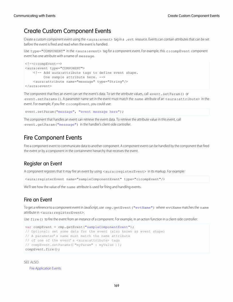
Create Custom Component EventsCreate a custom component event using the <aura:event> tag in a .evt resource. Events can contain attributes that can be setbefore the event is fired and read when the event is handled.
Use type="COMPONENT" in the <aura:event> tag for a component event. For example, this c:compEvent componentevent has one attribute with a name of message.
<!--c:compEvent--><aura:event type="COMPONENT">
<!-- Add aura:attribute tags to define event shape.One sample attribute here. -->
<aura:attribute name="message" type="String"/></aura:event>
The component that fires an event can set the event’s data. To set the attribute values, call event.setParam() orevent.setParams(). A parameter name set in the event must match the name attribute of an <aura:attribute> in theevent. For example, if you fire c:compEvent, you could use:
event.setParam("message", "event message here");
The component that handles an event can retrieve the event data. To retrieve the attribute value in this event, callevent.getParam("message") in the handler’s client-side controller.
Fire Component EventsFire a component event to communicate data to another component. A component event can be handled by the component that firedthe event or by a component in the containment hierarchy that receives the event.
Register an EventA component registers that it may fire an event by using <aura:registerEvent> in its markup. For example:
<aura:registerEvent name="sampleComponentEvent" type="c:compEvent"/>
We’ll see how the value of the name attribute is used for firing and handling events.
Fire an EventTo get a reference to a component event in JavaScript, use cmp.getEvent("evtName") where evtName matches the nameattribute in <aura:registerEvent>.
Use fire() to fire the event from an instance of a component. For example, in an action function in a client-side controller:
var compEvent = cmp.getEvent("sampleComponentEvent");// Optional: set some data for the event (also known as event shape)// A parameter’s name must match the name attribute// of one of the event’s <aura:attribute> tags// compEvent.setParams({"myParam" : myValue });compEvent.fire();
SEE ALSO:
Fire Application Events
169
Create Custom Component EventsCommunicating with Events
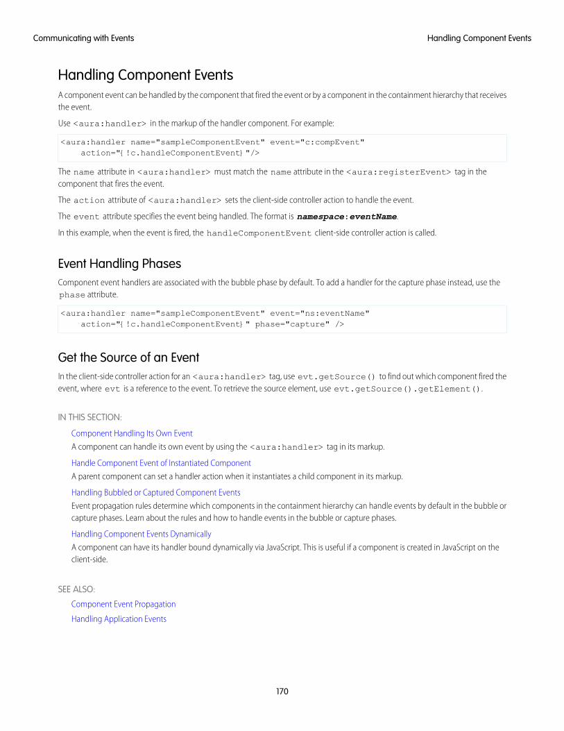
Handling Component EventsA component event can be handled by the component that fired the event or by a component in the containment hierarchy that receivesthe event.
Use <aura:handler> in the markup of the handler component. For example:
<aura:handler name="sampleComponentEvent" event="c:compEvent"action="{!c.handleComponentEvent}"/>
The name attribute in <aura:handler> must match the name attribute in the <aura:registerEvent> tag in thecomponent that fires the event.
The action attribute of <aura:handler> sets the client-side controller action to handle the event.
The event attribute specifies the event being handled. The format is namespace:eventName.
In this example, when the event is fired, the handleComponentEvent client-side controller action is called.
Event Handling PhasesComponent event handlers are associated with the bubble phase by default. To add a handler for the capture phase instead, use thephase attribute.
<aura:handler name="sampleComponentEvent" event="ns:eventName"action="{!c.handleComponentEvent}" phase="capture" />
Get the Source of an EventIn the client-side controller action for an <aura:handler> tag, use evt.getSource() to find out which component fired theevent, where evt is a reference to the event. To retrieve the source element, use evt.getSource().getElement().
IN THIS SECTION:
Component Handling Its Own Event
A component can handle its own event by using the <aura:handler> tag in its markup.
Handle Component Event of Instantiated Component
A parent component can set a handler action when it instantiates a child component in its markup.
Handling Bubbled or Captured Component Events
Event propagation rules determine which components in the containment hierarchy can handle events by default in the bubble orcapture phases. Learn about the rules and how to handle events in the bubble or capture phases.
Handling Component Events Dynamically
A component can have its handler bound dynamically via JavaScript. This is useful if a component is created in JavaScript on theclient-side.
SEE ALSO:
Component Event Propagation
Handling Application Events
170
Handling Component EventsCommunicating with Events
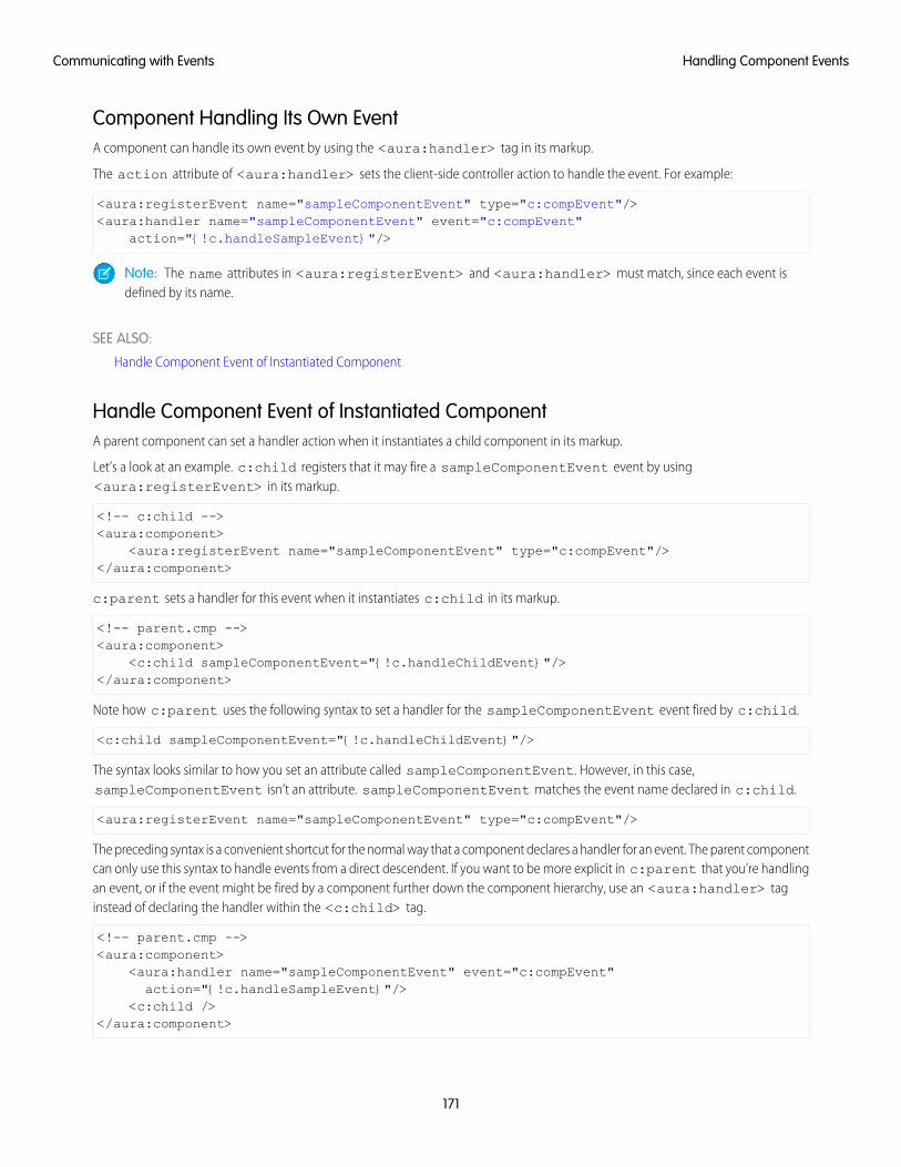
Component Handling Its Own EventA component can handle its own event by using the <aura:handler> tag in its markup.
The action attribute of <aura:handler> sets the client-side controller action to handle the event. For example:
<aura:registerEvent name="sampleComponentEvent" type="c:compEvent"/><aura:handler name="sampleComponentEvent" event="c:compEvent"
action="{!c.handleSampleEvent}"/>
Note: The name attributes in <aura:registerEvent> and <aura:handler> must match, since each event isdefined by its name.
SEE ALSO:
Handle Component Event of Instantiated Component
Handle Component Event of Instantiated ComponentA parent component can set a handler action when it instantiates a child component in its markup.
Let’s a look at an example. c:child registers that it may fire a sampleComponentEvent event by using<aura:registerEvent> in its markup.
<!-- c:child --><aura:component>
<aura:registerEvent name="sampleComponentEvent" type="c:compEvent"/></aura:component>
c:parent sets a handler for this event when it instantiates c:child in its markup.
<!-- parent.cmp --><aura:component>
<c:child sampleComponentEvent="{!c.handleChildEvent}"/></aura:component>
Note how c:parent uses the following syntax to set a handler for the sampleComponentEvent event fired by c:child.
<c:child sampleComponentEvent="{!c.handleChildEvent}"/>
The syntax looks similar to how you set an attribute called sampleComponentEvent. However, in this case,sampleComponentEvent isn’t an attribute. sampleComponentEvent matches the event name declared in c:child.
<aura:registerEvent name="sampleComponentEvent" type="c:compEvent"/>
The preceding syntax is a convenient shortcut for the normal way that a component declares a handler for an event. The parent componentcan only use this syntax to handle events from a direct descendent. If you want to be more explicit in c:parent that you’re handlingan event, or if the event might be fired by a component further down the component hierarchy, use an <aura:handler> taginstead of declaring the handler within the <c:child> tag.
<!-- parent.cmp --><aura:component>
<aura:handler name="sampleComponentEvent" event="c:compEvent"action="{!c.handleSampleEvent}"/>
<c:child /></aura:component>
171
Handling Component EventsCommunicating with Events
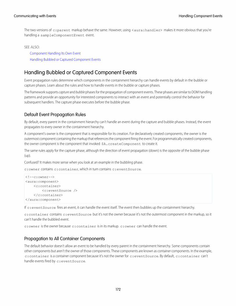
The two versions of c:parent markup behave the same. However, using <aura:handler> makes it more obvious that you’rehandling a sampleComponentEvent event.
SEE ALSO:
Component Handling Its Own Event
Handling Bubbled or Captured Component Events
Handling Bubbled or Captured Component EventsEvent propagation rules determine which components in the containment hierarchy can handle events by default in the bubble orcapture phases. Learn about the rules and how to handle events in the bubble or capture phases.
The framework supports capture and bubble phases for the propagation of component events. These phases are similar to DOM handlingpatterns and provide an opportunity for interested components to interact with an event and potentially control the behavior forsubsequent handlers. The capture phase executes before the bubble phase.
Default Event Propagation RulesBy default, every parent in the containment hierarchy can’t handle an event during the capture and bubble phases. Instead, the eventpropagates to every owner in the containment hierarchy.
A component’s owner is the component that is responsible for its creation. For declaratively created components, the owner is theoutermost component containing the markup that references the component firing the event. For programmatically created components,the owner component is the component that invoked $A.createComponent to create it.
The same rules apply for the capture phase, although the direction of event propagation (down) is the opposite of the bubble phase(up).
Confused? It makes more sense when you look at an example in the bubbling phase.
c:owner contains c:container, which in turn contains c:eventSource.
<!--c:owner--><aura:component>
<c:container><c:eventSource />
</c:container></aura:component>
If c:eventSource fires an event, it can handle the event itself. The event then bubbles up the containment hierarchy.
c:container contains c:eventSource but it’s not the owner because it’s not the outermost component in the markup, so itcan’t handle the bubbled event.
c:owner is the owner because c:container is in its markup. c:owner can handle the event.
Propagation to All Container ComponentsThe default behavior doesn’t allow an event to be handled by every parent in the containment hierarchy. Some components containother components but aren’t the owner of those components. These components are known as container components. In the example,c:container is a container component because it’s not the owner for c:eventSource. By default, c:container can’thandle events fired by c:eventSource.
172
Handling Component EventsCommunicating with Events
A container component has a facet attribute whose type is Aura.Component[], such as the default body attribute. The containercomponent includes those components in its definition using an expression, such as {!v.body}. The container component isn’t theowner of the components rendered with that expression.
To allow a container component to handle the event, add includeFacets="true" to the <aura:handler> tag of thecontainer component. For example, adding includeFacets="true" to the handler in the container component, c:container,enables it to handle the component event bubbled from c:eventSource.
<aura:handler name="bubblingEvent" event="c:compEvent" action="{!c.handleBubbling}"includeFacets="true" />
Handle Bubbled EventA component that fires a component event registers that it fires the event by using the <aura:registerEvent> tag.
<aura:component><aura:registerEvent name="compEvent" type="c:compEvent" />
</aura:component>
A component handling the event in the bubble phase uses the <aura:handler> tag to assign a handling action in its client-sidecontroller.
<aura:component><aura:handler name="compEvent" event="c:compEvent" action="{!c.handleBubbling}"/>
</aura:component>
Note: The name attribute in <aura:handler> must match the name attribute in the <aura:registerEvent> tagin the component that fires the event.
Handle Captured EventA component handling the event in the capture phase uses the <aura:handler> tag to assign a handling action in its client-sidecontroller.
<aura:component><aura:handler name="compEvent" event="c:compEvent" action="{!c.handleCapture}"
phase="capture" /></aura:component>
The default handling phase for component events is bubble if no phase attribute is set.
Stop Event PropagationUse the stopPropagation() method in the Event object to stop the event propagating to other components.
Pausing Event Propagation for Asynchronous Code ExecutionUse event.pause() to pause event handling and propagation until event.resume() is called. This flow-control mechanismis useful for any decision that depends on the response from the execution of asynchronous code. For example, you might make adecision about event propagation based on the response from an asynchronous call to native mobile code.
You can call pause() or resume() in the capture or bubble phases.
173
Handling Component EventsCommunicating with Events
Event Bubbling ExampleLet’s look at an example so you can play around with it yourself.
<!--c:eventBubblingParent--><aura:component>
<c:eventBubblingChild><c:eventBubblingGrandchild />
</c:eventBubblingChild></aura:component>
Note: This sample code uses the default c namespace. If your org has a namespace, use that namespace instead.
First, we define a simple component event.
<!--c:compEvent--><aura:event type="COMPONENT">
<!--simple event with no attributes--></aura:event>
c:eventBubblingEmitter is the component that fires c:compEvent.
<!--c:eventBubblingEmitter--><aura:component>
<aura:registerEvent name="bubblingEvent" type="c:compEvent" /><lightning:button onclick="{!c.fireEvent}" label="Start Bubbling"/>
</aura:component>
Here’s the controller for c:eventBubblingEmitter. When you press the button, it fires the bubblingEvent event registeredin the markup.
/*eventBubblingEmitterController.js*/{
fireEvent : function(cmp) {var cmpEvent = cmp.getEvent("bubblingEvent");cmpEvent.fire();
}}
c:eventBubblingGrandchild contains c:eventBubblingEmitter and uses <aura:handler> to assign a handlerfor the event.
<!--c:eventBubblingGrandchild--><aura:component>
<aura:handler name="bubblingEvent" event="c:compEvent" action="{!c.handleBubbling}"/>
<div class="grandchild"><c:eventBubblingEmitter />
</div></aura:component>
Here’s the controller for c:eventBubblingGrandchild.
/*eventBubblingGrandchildController.js*/{
handleBubbling : function(component, event) {
174
Handling Component EventsCommunicating with Events
console.log("Grandchild handler for " + event.getName());}
}
The controller logs the event name when the handler is called.
Here’s the markup for c:eventBubblingChild. We will pass c:eventBubblingGrandchild in as the body ofc:eventBubblingChild when we create c:eventBubblingParent later in this example.
<!--c:eventBubblingChild--><aura:component>
<aura:handler name="bubblingEvent" event="c:compEvent" action="{!c.handleBubbling}"/>
<div class="child">{!v.body}
</div></aura:component>
Here’s the controller for c:eventBubblingChild.
/*eventBubblingChildController.js*/{
handleBubbling : function(component, event) {console.log("Child handler for " + event.getName());
}}
c:eventBubblingParent contains c:eventBubblingChild, which in turn contains c:eventBubblingGrandchild.
<!--c:eventBubblingParent--><aura:component>
<aura:handler name="bubblingEvent" event="c:compEvent" action="{!c.handleBubbling}"/>
<div class="parent"><c:eventBubblingChild>
<c:eventBubblingGrandchild /></c:eventBubblingChild>
</div></aura:component>
Here’s the controller for c:eventBubblingParent.
/*eventBubblingParentController.js*/{
handleBubbling : function(component, event) {console.log("Parent handler for " + event.getName());
}}
Now, let’s see what happens when you run the code.
1. In your browser, navigate to c:eventBubblingParent. Create a .app resource that contains<c:eventBubblingParent />.
2. Click the Start Bubbling button that is part of the markup in c:eventBubblingEmitter.
175
Handling Component EventsCommunicating with Events
3. Note the output in your browser’s console:
Grandchild handler for bubblingEventParent handler for bubblingEvent
The c:compEvent event is bubbled to c:eventBubblingGrandchild and c:eventBubblingParent as they areowners in the containment hierarchy. The event is not handled by c:eventBubblingChild as c:eventBubblingChildis in the markup for c:eventBubblingParent but it’s not an owner as it’s not the outermost component in that markup.
Now, let’s see how to stop event propagation. Edit the controller for c:eventBubblingGrandchild to stop propagation.
/*eventBubblingGrandchildController.js*/{
handleBubbling : function(component, event) {console.log("Grandchild handler for " + event.getName());event.stopPropagation();
}}
Now, navigate to c:eventBubblingParent and click the Start Bubbling button.
Note the output in your browser’s console:
Grandchild handler for bubblingEvent
The event no longer bubbles up to the c:eventBubblingParent component.
SEE ALSO:
Component Event Propagation
Handle Component Event of Instantiated Component
Handling Component Events DynamicallyA component can have its handler bound dynamically via JavaScript. This is useful if a component is created in JavaScript on the client-side.
For more information, see Dynamically Adding Event Handlers To a Component on page 282.
Component Event ExampleHere’s a simple use case of using a component event to update an attribute in another component.
1. A user clicks a button in the notifier component, ceNotifier.cmp.
2. The client-side controller for ceNotifier.cmp sets a message in a component event and fires the event.
3. The handler component, ceHandler.cmp, contains the notifier component, and handles the fired event.
4. The client-side controller for ceHandler.cmp sets an attribute in ceHandler.cmp based on the data sent in the event.
Note: The event and components in this example use the default c namespace. If your org has a namespace, use that namespaceinstead.
176
Component Event ExampleCommunicating with Events
Component EventThe ceEvent.evt component event has one attribute. We’ll use this attribute to pass some data in the event when it’s fired.
<!--c:ceEvent--><aura:event type="COMPONENT">
<aura:attribute name="message" type="String"/></aura:event>
Notifier ComponentThe c:ceNotifier component uses aura:registerEvent to declare that it may fire the component event.
The button in the component contains an onclick browser event that is wired to the fireComponentEvent action in theclient-side controller. The action is invoked when you click the button.
<!--c:ceNotifier--><aura:component>
<aura:registerEvent name="cmpEvent" type="c:ceEvent"/>
<h1>Simple Component Event Sample</h1><p><lightning:button
label="Click here to fire a component event"onclick="{!c.fireComponentEvent}" />
</p></aura:component>
The client-side controller gets an instance of the event by calling cmp.getEvent("cmpEvent"), where cmpEvent matchesthe value of the name attribute in the <aura:registerEvent> tag in the component markup. The controller sets the messageattribute of the event and fires the event.
/* ceNotifierController.js */{
fireComponentEvent : function(cmp, event) {// Get the component event by using the// name value from aura:registerEventvar cmpEvent = cmp.getEvent("cmpEvent");cmpEvent.setParams({
"message" : "A component event fired me. " +"It all happened so fast. Now, I'm here!" });
cmpEvent.fire();}
}
Handler ComponentThe c:ceHandler handler component contains the c:ceNotifier component. The <aura:handler> tag uses the samevalue of the name attribute, cmpEvent, from the <aura:registerEvent> tag in c:ceNotifier. This wires upc:ceHandler to handle the event bubbled up from c:ceNotifier.
When the event is fired, the handleComponentEvent action in the client-side controller of the handler component is invoked.
<!--c:ceHandler--><aura:component>
<aura:attribute name="messageFromEvent" type="String"/>
177
Component Event ExampleCommunicating with Events
<aura:attribute name="numEvents" type="Integer" default="0"/>
<!-- Note that name="cmpEvent" in aura:registerEventin ceNotifier.cmp --><aura:handler name="cmpEvent" event="c:ceEvent" action="{!c.handleComponentEvent}"/>
<!-- handler contains the notifier component --><c:ceNotifier />
<p>{!v.messageFromEvent}</p><p>Number of events: {!v.numEvents}</p>
</aura:component>
The controller retrieves the data sent in the event and uses it to update the messageFromEvent attribute in the handler component.
/* ceHandlerController.js */{
handleComponentEvent : function(cmp, event) {var message = event.getParam("message");
// set the handler attributes based on event datacmp.set("v.messageFromEvent", message);var numEventsHandled = parseInt(cmp.get("v.numEvents")) + 1;cmp.set("v.numEvents", numEventsHandled);
}}
Put It All TogetherAdd the c:ceHandler component to a c:ceHandlerApp application. Navigate to the application and click the button to firethe component event.
https://<myDomain>.lightning.force.com/c/ceHandlerApp.app, where <myDomain> is the name of yourcustom Salesforce domain.
If you want to access data on the server, you could extend this example to call a server-side controller from the handler’s client-sidecontroller.
SEE ALSO:
Component Events
Creating Server-Side Logic with Controllers
Application Event Example
Application Events
Application events follow a traditional publish-subscribe model. An application event is fired from an instance of a component. Allcomponents that provide a handler for the event are notified.
178
Application EventsCommunicating with Events
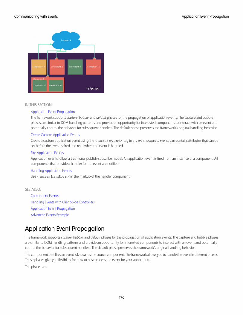
IN THIS SECTION:
Application Event Propagation
The framework supports capture, bubble, and default phases for the propagation of application events. The capture and bubblephases are similar to DOM handling patterns and provide an opportunity for interested components to interact with an event andpotentially control the behavior for subsequent handlers. The default phase preserves the framework’s original handling behavior.
Create Custom Application Events
Create a custom application event using the <aura:event> tag in a .evt resource. Events can contain attributes that can beset before the event is fired and read when the event is handled.
Fire Application Events
Application events follow a traditional publish-subscribe model. An application event is fired from an instance of a component. Allcomponents that provide a handler for the event are notified.
Handling Application Events
Use <aura:handler> in the markup of the handler component.
SEE ALSO:
Component Events
Handling Events with Client-Side Controllers
Application Event Propagation
Advanced Events Example
Application Event PropagationThe framework supports capture, bubble, and default phases for the propagation of application events. The capture and bubble phasesare similar to DOM handling patterns and provide an opportunity for interested components to interact with an event and potentiallycontrol the behavior for subsequent handlers. The default phase preserves the framework’s original handling behavior.
The component that fires an event is known as the source component. The framework allows you to handle the event in different phases.These phases give you flexibility for how to best process the event for your application.
The phases are:
179
Application Event PropagationCommunicating with Events
CaptureThe event is captured and trickles down from the application root to the source component. The event can be handled by a componentin the containment hierarchy that receives the captured event.
Event handlers are invoked in order from the application root down to the source component that fired the event.
Any registered handler in this phase can stop the event from propagating, at which point no more handlers are called in this phaseor the bubble phase. If a component stops the event propagation using event.stopPropagation(), the componentbecomes the root node used in the default phase.
Any registered handler in this phase can cancel the default behavior of the event by calling event.preventDefault(). Thiscall prevents execution of any of the handlers in the default phase.
BubbleThe component that fired the event can handle it. The event then bubbles up from the source component to the application root.The event can be handled by a component in the containment hierarchy that receives the bubbled event.
Event handlers are invoked in order from the source component that fired the event up to the application root.
Any registered handler in this phase can stop the event from propagating, at which point no more handlers will be called in thisphase. If a component stops the event propagation using event.stopPropagation(), the component becomes the rootnode used in the default phase.
Any registered handler in this phase can cancel the default behavior of the event by calling event.preventDefault(). Thiscall prevents execution of any of the handlers in the default phase.
DefaultEvent handlers are invoked in a non-deterministic order from the root node through its subtree. The default phase doesn’t have thesame propagation rules related to component hierarchy as the capture and bubble phases. The default phase can be useful forhandling application events that affect components in different sub-trees of your app.
If the event’s propagation wasn’t stopped in a previous phase, the root node defaults to the application root. If the event’s propagationwas stopped in a previous phase, the root node is set to the component whose handler invoked event.stopPropagation().
Here is the sequence of application event propagation.
1. Event fired—An application event is fired. The component that fires the event is known as the source component.
2. Capture phase—The framework executes the capture phase from the application root to the source component until all componentsare traversed. Any handling event can stop propagation by calling stopPropagation() on the event.
3. Bubble phase—The framework executes the bubble phase from the source component to the application root until all componentsare traversed or stopPropagation() is called.
4. Default phase—The framework executes the default phase from the root node unless preventDefault() was called in thecapture or bubble phases. If the event’s propagation wasn’t stopped in a previous phase, the root node defaults to the applicationroot. If the event’s propagation was stopped in a previous phase, the root node is set to the component whose handler invokedevent.stopPropagation().
Create Custom Application EventsCreate a custom application event using the <aura:event> tag in a .evt resource. Events can contain attributes that can be setbefore the event is fired and read when the event is handled.
Use type="APPLICATION" in the <aura:event> tag for an application event. For example, this c:appEvent applicationevent has one attribute with a name of message.
<!--c:appEvent--><aura:event type="APPLICATION">
180
Create Custom Application EventsCommunicating with Events
<!-- Add aura:attribute tags to define event shape.One sample attribute here. -->
<aura:attribute name="message" type="String"/></aura:event>
The component that fires an event can set the event’s data. To set the attribute values, call event.setParam() orevent.setParams(). A parameter name set in the event must match the name attribute of an <aura:attribute> in theevent. For example, if you fire c:appEvent, you could use:
event.setParam("message", "event message here");
The component that handles an event can retrieve the event data. To retrieve the attribute in this event, callevent.getParam("message") in the handler’s client-side controller.
Fire Application EventsApplication events follow a traditional publish-subscribe model. An application event is fired from an instance of a component. Allcomponents that provide a handler for the event are notified.
Register an EventA component registers that it may fire an application event by using <aura:registerEvent> in its markup. The name attributeis required but not used for application events. The name attribute is only relevant for component events. This example usesname="appEvent" but the value isn’t used anywhere.
<aura:registerEvent name="appEvent" type="c:appEvent"/>
Fire an EventUse $A.get("e.myNamespace:myAppEvent") in JavaScript to get an instance of the myAppEvent event in themyNamespace namespace.
Note: The syntax to get an instance of an application event is different than the syntax to get a component event, which iscmp.getEvent("evtName").
Use fire() to fire the event.
var appEvent = $A.get("e.c:appEvent");// Optional: set some data for the event (also known as event shape)// A parameter’s name must match the name attribute// of one of the event’s <aura:attribute> tags//appEvent.setParams({ "myParam" : myValue });appEvent.fire();
Events Fired on App RenderingSeveral events are fired when an app is rendering. All init events are fired to indicate the component or app has been initialized. If acomponent is contained in another component or app, the inner component is initialized first.
If a server call is made during rendering, aura:waiting is fired. When the framework receives a server response,aura:doneWaiting is fired.
Finally, aura:doneRendering is fired when all rendering has been completed.
181
Fire Application EventsCommunicating with Events
Note: We don't recommend using the legacy aura:waiting, aura:doneWaiting, and aura:doneRenderingapplication events except as a last resort. The aura:waiting and aura:doneWaiting application events are fired forevery batched server request, even for requests from other components in your app. Unless your component is running in completeisolation in a standalone app and not included in Lightning Experience or the Salesforce app, you probably don’t want to handlethese application events. The container app may fire server-side actions and trigger your event handlers multiple times.
For more information, see Events Fired During the Rendering Lifecycle on page 194.
SEE ALSO:
Fire Component Events
Handling Application EventsUse <aura:handler> in the markup of the handler component.
For example:
<aura:handler event="c:appEvent" action="{!c.handleApplicationEvent}"/>
The event attribute specifies the event being handled. The format is namespace:eventName.
The action attribute of <aura:handler> sets the client-side controller action to handle the event.
Note: The handler for an application event won’t work if you set the name attribute in <aura:handler>. Use the nameattribute only when you’re handling component events.
In this example, when the event is fired, the handleApplicationEvent client-side controller action is called.
Event Handling PhasesThe framework allows you to handle the event in different phases. These phases give you flexibility for how to best process the eventfor your application.
Application event handlers are associated with the default phase. To add a handler for the capture or bubble phases instead, use thephase attribute.
Get the Source of an EventIn the client-side controller action for an <aura:handler> tag, use evt.getSource() to find out which component fired theevent, where evt is a reference to the event. To retrieve the source element, use evt.getSource().getElement().
IN THIS SECTION:
Handling Bubbled or Captured Application Events
Event propagation rules determine which components in the containment hierarchy can handle events by default in the bubble orcapture phases. Learn about the rules and how to handle events in the bubble or capture phases.
SEE ALSO:
Handling Component Events
182
Handling Application EventsCommunicating with Events
Handling Bubbled or Captured Application EventsEvent propagation rules determine which components in the containment hierarchy can handle events by default in the bubble orcapture phases. Learn about the rules and how to handle events in the bubble or capture phases.
The framework supports capture, bubble, and default phases for the propagation of application events. The capture and bubble phasesare similar to DOM handling patterns and provide an opportunity for interested components to interact with an event and potentiallycontrol the behavior for subsequent handlers. The default phase preserves the framework’s original handling behavior.
Default Event Propagation RulesBy default, every parent in the containment hierarchy can’t handle an event during the capture and bubble phases. Instead, the eventpropagates to every owner in the containment hierarchy.
A component’s owner is the component that is responsible for its creation. For declaratively created components, the owner is theoutermost component containing the markup that references the component firing the event. For programmatically created components,the owner component is the component that invoked $A.createComponent to create it.
The same rules apply for the capture phase, although the direction of event propagation (down) is the opposite of the bubble phase(up).
Confused? It makes more sense when you look at an example in the bubbling phase.
c:owner contains c:container, which in turn contains c:eventSource.
<!--c:owner--><aura:component>
<c:container><c:eventSource />
</c:container></aura:component>
If c:eventSource fires an event, it can handle the event itself. The event then bubbles up the containment hierarchy.
c:container contains c:eventSource but it’s not the owner because it’s not the outermost component in the markup, so itcan’t handle the bubbled event.
c:owner is the owner because c:container is in its markup. c:owner can handle the event.
Propagation to All Container ComponentsThe default behavior doesn’t allow an event to be handled by every parent in the containment hierarchy. Some components containother components but aren’t the owner of those components. These components are known as container components. In the example,c:container is a container component because it’s not the owner for c:eventSource. By default, c:container can’thandle events fired by c:eventSource.
A container component has a facet attribute whose type is Aura.Component[], such as the default body attribute. The containercomponent includes those components in its definition using an expression, such as {!v.body}. The container component isn’t theowner of the components rendered with that expression.
To allow a container component to handle the event, add includeFacets="true" to the <aura:handler> tag of thecontainer component. For example, adding includeFacets="true" to the handler in the container component, c:container,enables it to handle the component event bubbled from c:eventSource.
<aura:handler name="bubblingEvent" event="c:compEvent" action="{!c.handleBubbling}"includeFacets="true" />
183
Handling Application EventsCommunicating with Events
Handle Bubbled EventTo add a handler for the bubble phase, set phase="bubble".
<aura:handler event="c:appEvent" action="{!c.handleBubbledEvent}"phase="bubble" />
The event attribute specifies the event being handled. The format is namespace:eventName.
The action attribute of <aura:handler> sets the client-side controller action to handle the event.
Handle Captured EventTo add a handler for the capture phase, set phase="capture".
<aura:handler event="c:appEvent" action="{!c.handleCapturedEvent}"phase="capture" />
Stop Event PropagationUse the stopPropagation() method in the Event object to stop the event propagating to other components.
Pausing Event Propagation for Asynchronous Code ExecutionUse event.pause() to pause event handling and propagation until event.resume() is called. This flow-control mechanismis useful for any decision that depends on the response from the execution of asynchronous code. For example, you might make adecision about event propagation based on the response from an asynchronous call to native mobile code.
You can call pause() or resume() in the capture or bubble phases.
Application Event ExampleHere’s a simple use case of using an application event to update an attribute in another component.
1. A user clicks a button in the notifier component, aeNotifier.cmp.
2. The client-side controller for aeNotifier.cmp sets a message in a component event and fires the event.
3. The handler component, aeHandler.cmp, handles the fired event.
4. The client-side controller for aeHandler.cmp sets an attribute in aeHandler.cmp based on the data sent in the event.
Note: The event and components in this example use the default c namespace. If your org has a namespace, use that namespaceinstead.
Application EventThe aeEvent.evt application event has one attribute. We’ll use this attribute to pass some data in the event when it’s fired.
<!--c:aeEvent--><aura:event type="APPLICATION">
<aura:attribute name="message" type="String"/></aura:event>
184
Application Event ExampleCommunicating with Events
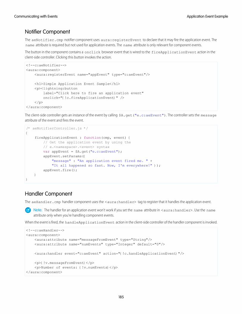
Notifier ComponentThe aeNotifier.cmp notifier component uses aura:registerEvent to declare that it may fire the application event. Thename attribute is required but not used for application events. The name attribute is only relevant for component events.
The button in the component contains a onclick browser event that is wired to the fireApplicationEvent action in theclient-side controller. Clicking this button invokes the action.
<!--c:aeNotifier--><aura:component>
<aura:registerEvent name="appEvent" type="c:aeEvent"/>
<h1>Simple Application Event Sample</h1><p><lightning:button
label="Click here to fire an application event"onclick="{!c.fireApplicationEvent}" />
</p></aura:component>
The client-side controller gets an instance of the event by calling $A.get("e.c:aeEvent"). The controller sets the messageattribute of the event and fires the event.
/* aeNotifierController.js */{
fireApplicationEvent : function(cmp, event) {// Get the application event by using the// e.<namespace>.<event> syntaxvar appEvent = $A.get("e.c:aeEvent");appEvent.setParams({
"message" : "An application event fired me. " +"It all happened so fast. Now, I'm everywhere!" });
appEvent.fire();}
}
Handler ComponentThe aeHandler.cmp handler component uses the <aura:handler> tag to register that it handles the application event.
Note: The handler for an application event won’t work if you set the name attribute in <aura:handler>. Use the nameattribute only when you’re handling component events.
When the event is fired, the handleApplicationEvent action in the client-side controller of the handler component is invoked.
<!--c:aeHandler--><aura:component>
<aura:attribute name="messageFromEvent" type="String"/><aura:attribute name="numEvents" type="Integer" default="0"/>
<aura:handler event="c:aeEvent" action="{!c.handleApplicationEvent}"/>
<p>{!v.messageFromEvent}</p><p>Number of events: {!v.numEvents}</p>
</aura:component>
185
Application Event ExampleCommunicating with Events
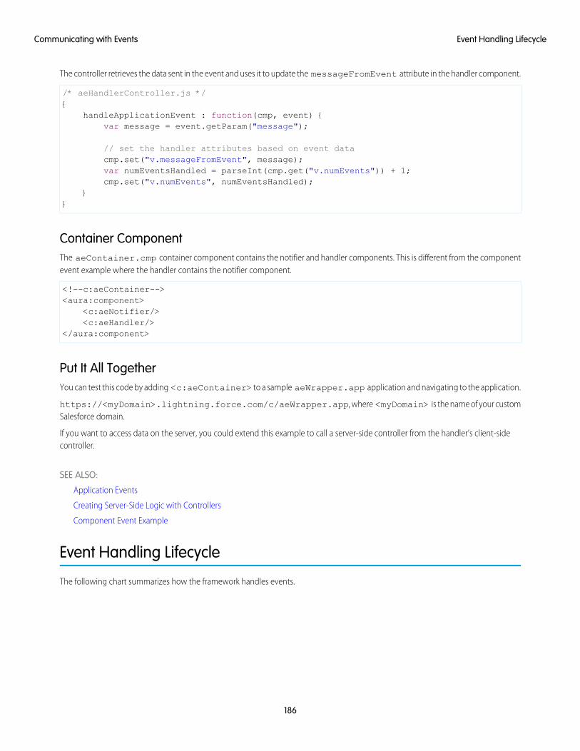
The controller retrieves the data sent in the event and uses it to update the messageFromEvent attribute in the handler component.
/* aeHandlerController.js */{
handleApplicationEvent : function(cmp, event) {var message = event.getParam("message");
// set the handler attributes based on event datacmp.set("v.messageFromEvent", message);var numEventsHandled = parseInt(cmp.get("v.numEvents")) + 1;cmp.set("v.numEvents", numEventsHandled);
}}
Container ComponentThe aeContainer.cmp container component contains the notifier and handler components. This is different from the componentevent example where the handler contains the notifier component.
<!--c:aeContainer--><aura:component>
<c:aeNotifier/><c:aeHandler/>
</aura:component>
Put It All TogetherYou can test this code by adding <c:aeContainer> to a sample aeWrapper.app application and navigating to the application.
https://<myDomain>.lightning.force.com/c/aeWrapper.app, where <myDomain> is the name of your customSalesforce domain.
If you want to access data on the server, you could extend this example to call a server-side controller from the handler’s client-sidecontroller.
SEE ALSO:
Application Events
Creating Server-Side Logic with Controllers
Component Event Example
Event Handling Lifecycle
The following chart summarizes how the framework handles events.
186
Event Handling LifecycleCommunicating with Events
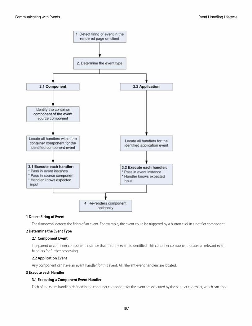
1 Detect Firing of Event
The framework detects the firing of an event. For example, the event could be triggered by a button click in a notifier component.
2 Determine the Event Type
2.1 Component Event
The parent or container component instance that fired the event is identified. This container component locates all relevant eventhandlers for further processing.
2.2 Application Event
Any component can have an event handler for this event. All relevant event handlers are located.
3 Execute each Handler
3.1 Executing a Component Event Handler
Each of the event handlers defined in the container component for the event are executed by the handler controller, which can also:
187
Event Handling LifecycleCommunicating with Events
• Set attributes or modify data on the component (causing a re-rendering of the component).
• Fire another event or invoke a client-side or server-side action.
3.2 Executing an Application Event Handler
All event handlers are executed. When the event handler is executed, the event instance is passed into the event handler.
4 Re-render Component (optional)
After the event handlers and any callback actions are executed, a component might be automatically re-rendered if it was modifiedduring the event handling process.
SEE ALSO:
Create a Custom Renderer
Advanced Events Example
This example builds on the simpler component and application event examples. It uses one notifier component and one handlercomponent that work with both component and application events. Before we see a component wired up to events, let's look at theindividual resources involved.
This table summarizes the roles of the various resources used in the example. The source code for these resources is included after thetable.
UsageResource NameResource
Defines the component and application events inseparate resources. eventsContainer.cmp
Component event (compEvent.evt)and application event (appEvent.evt)
Event files
shows how to use both component and applicationevents.
The notifier contains an onclick browser event toinitiate the event. The controller fires the event.
Component (eventsNotifier.cmp)and its controller(eventsNotifierController.js)
Notifier
The handler component contains the notifiercomponent (or a <aura:handler> tag for
Component (eventsHandler.cmp)and its controller(eventsHandlerController.js)
Handler
application events), and calls the controller action thatis executed after the event is fired.
Displays the event handlers on the UI for the completedemo.
eventsContainer.cmpContainer Component
The definitions of component and application events are stored in separate .evt resources, but individual notifier and handlercomponent bundles can contain code to work with both types of events.
The component and application events both contain a context attribute that defines the shape of the event. This is the data that ispassed to handlers of the event.
188
Advanced Events ExampleCommunicating with Events
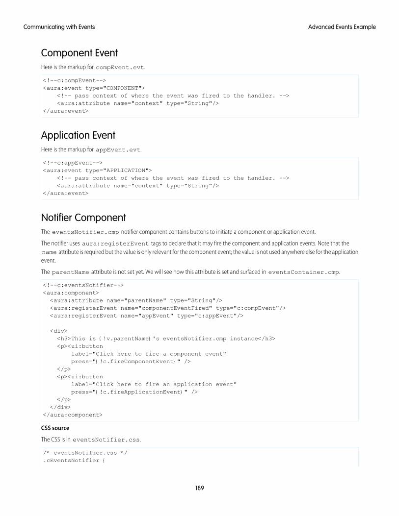
Component EventHere is the markup for compEvent.evt.
<!--c:compEvent--><aura:event type="COMPONENT">
<!-- pass context of where the event was fired to the handler. --><aura:attribute name="context" type="String"/>
</aura:event>
Application EventHere is the markup for appEvent.evt.
<!--c:appEvent--><aura:event type="APPLICATION">
<!-- pass context of where the event was fired to the handler. --><aura:attribute name="context" type="String"/>
</aura:event>
Notifier ComponentThe eventsNotifier.cmp notifier component contains buttons to initiate a component or application event.
The notifier uses aura:registerEvent tags to declare that it may fire the component and application events. Note that thename attribute is required but the value is only relevant for the component event; the value is not used anywhere else for the applicationevent.
The parentName attribute is not set yet. We will see how this attribute is set and surfaced in eventsContainer.cmp.
<!--c:eventsNotifier--><aura:component><aura:attribute name="parentName" type="String"/><aura:registerEvent name="componentEventFired" type="c:compEvent"/><aura:registerEvent name="appEvent" type="c:appEvent"/>
<div><h3>This is {!v.parentName}'s eventsNotifier.cmp instance</h3><p><ui:button
label="Click here to fire a component event"press="{!c.fireComponentEvent}" />
</p><p><ui:button
label="Click here to fire an application event"press="{!c.fireApplicationEvent}" />
</p></div>
</aura:component>
CSS source
The CSS is in eventsNotifier.css.
/* eventsNotifier.css */.cEventsNotifier {
189
Advanced Events ExampleCommunicating with Events
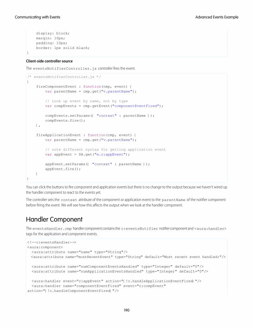
display: block;margin: 10px;padding: 10px;border: 1px solid black;
}
Client-side controller source
The eventsNotifierController.js controller fires the event.
/* eventsNotifierController.js */{
fireComponentEvent : function(cmp, event) {var parentName = cmp.get("v.parentName");
// Look up event by name, not by typevar compEvents = cmp.getEvent("componentEventFired");
compEvents.setParams({ "context" : parentName });compEvents.fire();
},
fireApplicationEvent : function(cmp, event) {var parentName = cmp.get("v.parentName");
// note different syntax for getting application eventvar appEvent = $A.get("e.c:appEvent");
appEvent.setParams({ "context" : parentName });appEvent.fire();
}}
You can click the buttons to fire component and application events but there is no change to the output because we haven't wired upthe handler component to react to the events yet.
The controller sets the context attribute of the component or application event to the parentName of the notifier componentbefore firing the event. We will see how this affects the output when we look at the handler component.
Handler ComponentThe eventsHandler.cmp handler component contains the c:eventsNotifier notifier component and <aura:handler>tags for the application and component events.
<!--c:eventsHandler--><aura:component><aura:attribute name="name" type="String"/><aura:attribute name="mostRecentEvent" type="String" default="Most recent event handled:"/>
<aura:attribute name="numComponentEventsHandled" type="Integer" default="0"/><aura:attribute name="numApplicationEventsHandled" type="Integer" default="0"/>
<aura:handler event="c:appEvent" action="{!c.handleApplicationEventFired}"/><aura:handler name="componentEventFired" event="c:compEvent"
action="{!c.handleComponentEventFired}"/>
190
Advanced Events ExampleCommunicating with Events
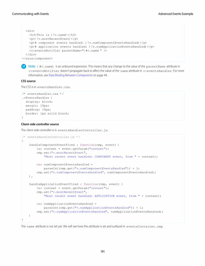
<div><h3>This is {!v.name}</h3><p>{!v.mostRecentEvent}</p><p># component events handled: {!v.numComponentEventsHandled}</p><p># application events handled: {!v.numApplicationEventsHandled}</p><c:eventsNotifier parentName="{#v.name}" />
</div></aura:component>
Note: {#v.name} is an unbound expression. This means that any change to the value of the parentName attribute inc:eventsNotifier doesn’t propagate back to affect the value of the name attribute in c:eventsHandler. For moreinformation, see Data Binding Between Components on page 44.
CSS source
The CSS is in eventsHandler.css.
/* eventsHandler.css */.cEventsHandler {display: block;margin: 10px;padding: 10px;border: 1px solid black;
}
Client-side controller source
The client-side controller is in eventsHandlerController.js.
/* eventsHandlerController.js */{
handleComponentEventFired : function(cmp, event) {var context = event.getParam("context");cmp.set("v.mostRecentEvent",
"Most recent event handled: COMPONENT event, from " + context);
var numComponentEventsHandled =parseInt(cmp.get("v.numComponentEventsHandled")) + 1;
cmp.set("v.numComponentEventsHandled", numComponentEventsHandled);},
handleApplicationEventFired : function(cmp, event) {var context = event.getParam("context");cmp.set("v.mostRecentEvent",
"Most recent event handled: APPLICATION event, from " + context);
var numApplicationEventsHandled =parseInt(cmp.get("v.numApplicationEventsHandled")) + 1;
cmp.set("v.numApplicationEventsHandled", numApplicationEventsHandled);}
}
The name attribute is not set yet. We will see how this attribute is set and surfaced in eventsContainer.cmp.
191
Advanced Events ExampleCommunicating with Events
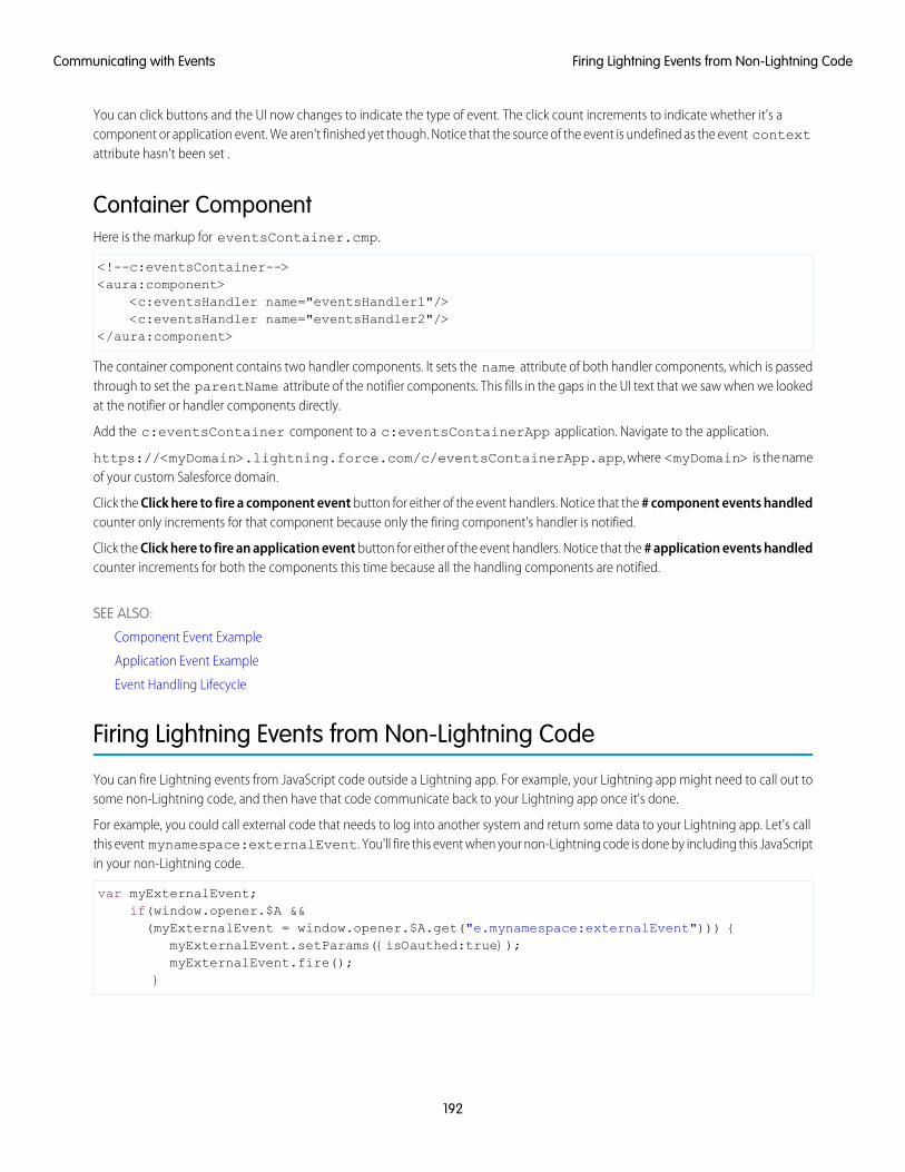
You can click buttons and the UI now changes to indicate the type of event. The click count increments to indicate whether it's acomponent or application event. We aren't finished yet though. Notice that the source of the event is undefined as the event contextattribute hasn't been set .
Container ComponentHere is the markup for eventsContainer.cmp.
<!--c:eventsContainer--><aura:component>
<c:eventsHandler name="eventsHandler1"/><c:eventsHandler name="eventsHandler2"/>
</aura:component>
The container component contains two handler components. It sets the name attribute of both handler components, which is passedthrough to set the parentName attribute of the notifier components. This fills in the gaps in the UI text that we saw when we lookedat the notifier or handler components directly.
Add the c:eventsContainer component to a c:eventsContainerApp application. Navigate to the application.
https://<myDomain>.lightning.force.com/c/eventsContainerApp.app, where <myDomain> is the nameof your custom Salesforce domain.
Click the Click here to fire a component event button for either of the event handlers. Notice that the # component events handledcounter only increments for that component because only the firing component's handler is notified.
Click the Click here to fire an application event button for either of the event handlers. Notice that the # application events handledcounter increments for both the components this time because all the handling components are notified.
SEE ALSO:
Component Event Example
Application Event Example
Event Handling Lifecycle
Firing Lightning Events from Non-Lightning Code
You can fire Lightning events from JavaScript code outside a Lightning app. For example, your Lightning app might need to call out tosome non-Lightning code, and then have that code communicate back to your Lightning app once it's done.
For example, you could call external code that needs to log into another system and return some data to your Lightning app. Let's callthis event mynamespace:externalEvent. You'll fire this event when your non-Lightning code is done by including this JavaScriptin your non-Lightning code.
var myExternalEvent;if(window.opener.$A &&(myExternalEvent = window.opener.$A.get("e.mynamespace:externalEvent"))) {
myExternalEvent.setParams({isOauthed:true});myExternalEvent.fire();
}
192
Firing Lightning Events from Non-Lightning CodeCommunicating with Events
window.opener.$A.get() references the master window where your Lightning app is loaded.
SEE ALSO:
Application Events
Modifying Components Outside the Framework Lifecycle
Events Best Practices
Here are some best practices for working with events.
Use Component Events Whenever PossibleAlways try to use a component event instead of an application event, if possible. Component events can only be handled by componentsabove them in the containment hierarchy so their usage is more localized to the components that need to know about them. Applicationevents are best used for something that should be handled at the application level, such as navigating to a specific record. Applicationevents allow communication between components that are in separate parts of the application and have no direct containmentrelationship.
Separate Low-Level Events from Business Logic EventsIt's a good practice to handle low-level events, such as a click, in your event handler and refire them as higher-level events, such as anapprovalChange event or whatever is appropriate for your business logic.
Dynamic Actions based on Component StateIf you need to invoke a different action on a click event depending on the state of the component, try this approach:
1. Store the component state as a discrete value, such as New or Pending, in a component attribute.
2. Put logic in your client-side controller to determine the next action to take.
3. If you need to reuse the logic in your component bundle, put the logic in the helper.
For example:
1. Your component markup contains <ui:button label="do something" press="{!c.click}" />.
2. In your controller, define the click function, which delegates to the appropriate helper function or potentially fires the correctevent.
Using a Dispatcher Component to Listen and Relay EventsIf you have a large number of handler component instances listening for an event, it may be better to identify a dispatcher componentto listen for the event. The dispatcher component can perform some logic to decide which component instances should receive furtherinformation and fire another component or application event targeted at those component instances.
SEE ALSO:
Handling Events with Client-Side Controllers
Events Anti-Patterns
193
Events Best PracticesCommunicating with Events
Events Anti-PatternsThese are some anti-patterns that you should avoid when using events.
Don't Fire an Event in a RendererFiring an event in a renderer can cause an infinite rendering loop.
Don’t do this!
afterRender: function(cmp, helper) {this.superAfterRender();$A.get("e.myns:mycmp").fire();
}
Instead, use the init hook to run a controller action after component construction but before rendering. Add this code to yourcomponent:
<aura:handler name="init" value="{!this}" action="{!c.doInit}"/>
For more details, see .Invoking Actions on Component Initialization on page 247.
Don’t Use onclick and ontouchend EventsYou can’t use different actions for onclick and ontouchend events in a component. The framework translates touch-tap eventsinto clicks and activates any onclick handlers that are present.
SEE ALSO:
Create a Custom Renderer
Events Best Practices
Events Fired During the Rendering Lifecycle
A component is instantiated, rendered, and rerendered during its lifecycle. A component is rerendered only when there’s a programmaticor value change that would require a rerender, such as when a browser event triggers an action that updates its data.
Component CreationThe component lifecycle starts when the client sends an HTTP request to the server and the component configuration data is returnedto the client. No server trip is made if the component definition is already on the client from a previous request and the component hasno server dependencies.
Let’s look at an app with several nested components. The framework instantiates the app and goes through the children of the v.bodyfacet to create each component, First, it creates the component definition, its entire parent hierarchy, and then creates the facets withinthose components. The framework also creates any component dependencies on the server, including definitions for attributes, interfaces,controllers, and actions.
The following image lists the order of component creation.
194
Events Anti-PatternsCommunicating with Events
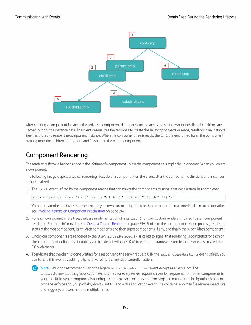
After creating a component instance, the serialized component definitions and instances are sent down to the client. Definitions arecached but not the instance data. The client deserializes the response to create the JavaScript objects or maps, resulting in an instancetree that’s used to render the component instance. When the component tree is ready, the init event is fired for all the components,starting from the children component and finishing in the parent component.
Component RenderingThe rendering lifecycle happens once in the lifetime of a component unless the component gets explicitly unrendered. When you createa component:
The following image depicts a typical rendering lifecycle of a component on the client, after the component definitions and instancesare deserialized.
1. The init event is fired by the component service that constructs the components to signal that initialization has completed.
<aura:handler name="init" value="{!this}" action="{!c.doInit}"/>
You can customize the init handler and add your own controller logic before the component starts rendering. For more information,see Invoking Actions on Component Initialization on page 247.
2. For each component in the tree, the base implementation of render() or your custom renderer is called to start componentrendering. For more information, see Create a Custom Renderer on page 259. Similar to the component creation process, renderingstarts at the root component, its children components and their super components, if any, and finally the subchildren components.
3. Once your components are rendered to the DOM, afterRender() is called to signal that rendering is completed for each ofthese component definitions. It enables you to interact with the DOM tree after the framework rendering service has created theDOM elements.
4. To indicate that the client is done waiting for a response to the server request XHR, the aura:doneWaiting event is fired. Youcan handle this event by adding a handler wired to a client-side controller action.
Note: We don't recommend using the legacy aura:doneWaiting event except as a last resort. Theaura:doneWaiting application event is fired for every server response, even for responses from other components inyour app. Unless your component is running in complete isolation in a standalone app and not included in Lightning Experienceor the Salesforce app, you probably don’t want to handle this application event. The container app may fire server-side actionsand trigger your event handler multiple times.
195
Events Fired During the Rendering LifecycleCommunicating with Events
5. The framework fires a render event, enabling you to interact with the DOM tree after the framework’s rendering service hasinserted DOM elements. Handling the render event is preferred to creating a custom renderer and overriding afterRender().For more information, see Handle the render Event.
6. Finally, the aura:doneRendering event is fired at the end of the rendering lifecycle.
Note: We don't recommend using the legacy aura:doneRendering event except as a last resort. Unless your componentis running in complete isolation in a standalone app and not included in complex apps, such as Lightning Experience or theSalesforce app, you probably don’t want to handle this application event. The container app may trigger your event handlermultiple times.
Rendering Nested ComponentsLet’s say that you have an app myApp.app that contains a component myCmp.cmp with a ui:button component.
During initialization, the init() event is fired in this order: ui:button, ui:myCmp, and myApp.app.
SEE ALSO:
Create a Custom Renderer
System Event Reference
Events Handled in the Salesforce mobile app and Lightning Experience
The Salesforce app and Lightning Experience handle some events, which you can fire in your Lightning component.
If you fire one of these force or lightning events in your Lightning apps or components outside of the Salesforce app or LightningExperience:
• You must handle the event by using the <aura:handler> tag in the handling component.
• Use the <aura:registerEvent> or <aura:dependency> tags to ensure that the event is sent to the client, whenneeded.
DescriptionEvent Name
Closes a quick action panel. Only one quick action panel can be open in the appat a time.
force:closeQuickAction
196
Events Handled in the Salesforce mobile app and LightningExperience
Communicating with Events
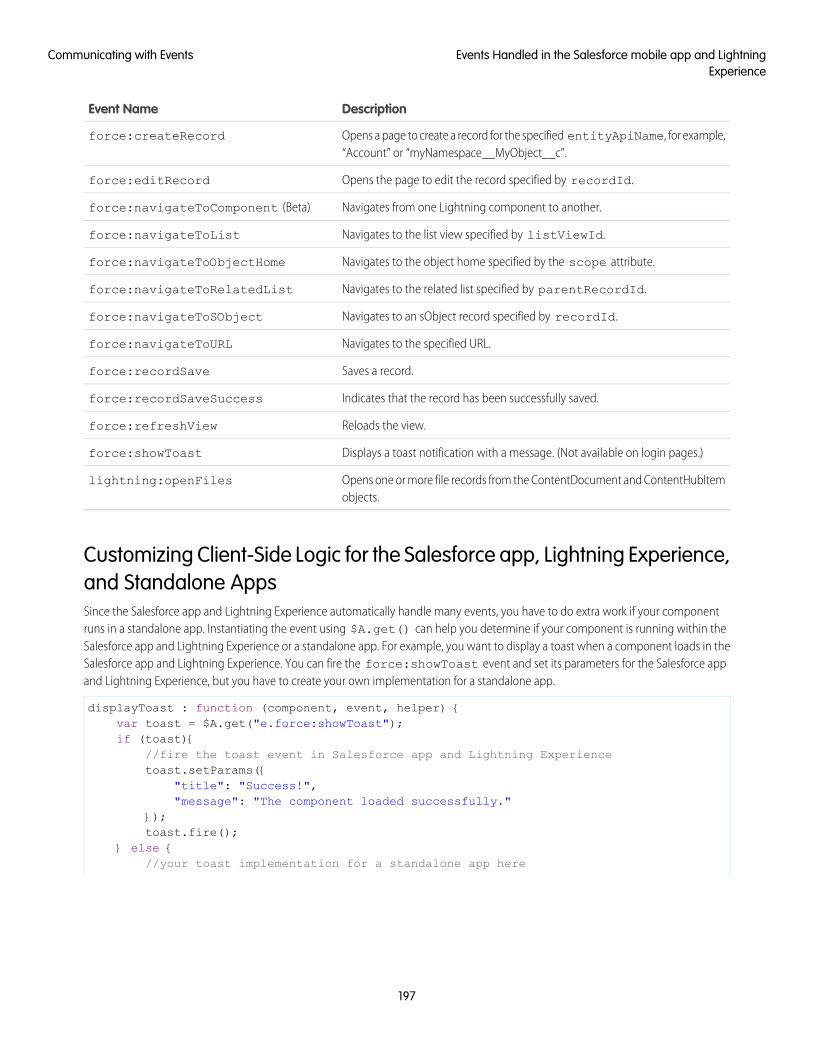
DescriptionEvent Name
Opens a page to create a record for the specified entityApiName, for example,“Account” or “myNamespace__MyObject__c”.
force:createRecord
Opens the page to edit the record specified by recordId.force:editRecord
Navigates from one Lightning component to another.force:navigateToComponent (Beta)
Navigates to the list view specified by listViewId.force:navigateToList
Navigates to the object home specified by the scope attribute.force:navigateToObjectHome
Navigates to the related list specified by parentRecordId.force:navigateToRelatedList
Navigates to an sObject record specified by recordId.force:navigateToSObject
Navigates to the specified URL.force:navigateToURL
Saves a record.force:recordSave
Indicates that the record has been successfully saved.force:recordSaveSuccess
Reloads the view.force:refreshView
Displays a toast notification with a message. (Not available on login pages.)force:showToast
Opens one or more file records from the ContentDocument and ContentHubItemobjects.
lightning:openFiles
Customizing Client-Side Logic for the Salesforce app, Lightning Experience,and Standalone AppsSince the Salesforce app and Lightning Experience automatically handle many events, you have to do extra work if your componentruns in a standalone app. Instantiating the event using $A.get() can help you determine if your component is running within theSalesforce app and Lightning Experience or a standalone app. For example, you want to display a toast when a component loads in theSalesforce app and Lightning Experience. You can fire the force:showToast event and set its parameters for the Salesforce appand Lightning Experience, but you have to create your own implementation for a standalone app.
displayToast : function (component, event, helper) {var toast = $A.get("e.force:showToast");if (toast){
//fire the toast event in Salesforce app and Lightning Experiencetoast.setParams({
"title": "Success!","message": "The component loaded successfully."
});toast.fire();
} else {//your toast implementation for a standalone app here
197
Events Handled in the Salesforce mobile app and LightningExperience
Communicating with Events
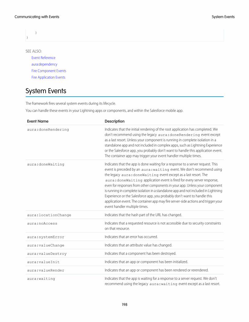
}}
SEE ALSO:
Event Reference
aura:dependency
Fire Component Events
Fire Application Events
System Events
The framework fires several system events during its lifecycle.
You can handle these events in your Lightning apps or components, and within the Salesforce mobile app.
DescriptionEvent Name
Indicates that the initial rendering of the root application has completed. Wedon't recommend using the legacy aura:doneRendering event except
aura:doneRendering
as a last resort. Unless your component is running in complete isolation in astandalone app and not included in complex apps, such as Lightning Experienceor the Salesforce app, you probably don’t want to handle this application event.The container app may trigger your event handler multiple times.
Indicates that the app is done waiting for a response to a server request. Thisevent is preceded by an aura:waiting event. We don't recommend using
aura:doneWaiting
the legacy aura:doneWaiting event except as a last resort. Theaura:doneWaiting application event is fired for every server response,even for responses from other components in your app. Unless your componentis running in complete isolation in a standalone app and not included in LightningExperience or the Salesforce app, you probably don’t want to handle thisapplication event. The container app may fire server-side actions and trigger yourevent handler multiple times.
Indicates that the hash part of the URL has changed.aura:locationChange
Indicates that a requested resource is not accessible due to security constraintson that resource.
aura:noAccess
Indicates that an error has occurred.aura:systemError
Indicates that an attribute value has changed.aura:valueChange
Indicates that a component has been destroyed.aura:valueDestroy
Indicates that an app or component has been initialized.aura:valueInit
Indicates that an app or component has been rendered or rerendered.aura:valueRender
Indicates that the app is waiting for a response to a server request. We don'trecommend using the legacy aura:waiting event except as a last resort.
aura:waiting
198
System EventsCommunicating with Events
DescriptionEvent Name
The aura:waiting application event is fired for every server request, evenfor requests from other components in your app. Unless your component isrunning in complete isolation in a standalone app and not included in LightningExperience or the Salesforce app, you probably don’t want to handle thisapplication event. The container app may fire server-side actions and trigger yourevent handler multiple times.
SEE ALSO:
System Event Reference
199
System EventsCommunicating with Events
CHAPTER 6 Creating Apps
Components are the building blocks of an app. This section shows you a typical workflow to put thepieces together to create a new app.
In this chapter ...
• App OverviewFirst, you should decide whether you’re creating a component for a standalone app or for Salesforceapps, such as Lightning Experience or Salesforce for Android, iOS, and mobile web. Both components• Designing App UI
• Creating AppTemplates
can access your Salesforce data, but only a component created for Lightning Experience or Salesforcefor Android, iOS, and mobile web can automatically handle Salesforce events that take advantage ofrecord create and edit pages, among other benefits.• Developing Secure
CodeThe Quick Start on page 8 walks you through creating components for a standalone app andcomponents for Salesforce for Android, iOS, and mobile web to help you determine which one you need.• Validations for
Lightning ComponentCode
• Styling Apps
• Using JavaScript
• JavaScript Cookbook
• Using Apex
• Lightning DataService
• Lightning Container
• Controlling Access
• UsingObject-OrientedDevelopment
• Using the AppCache
• DistributingApplications andComponents
200
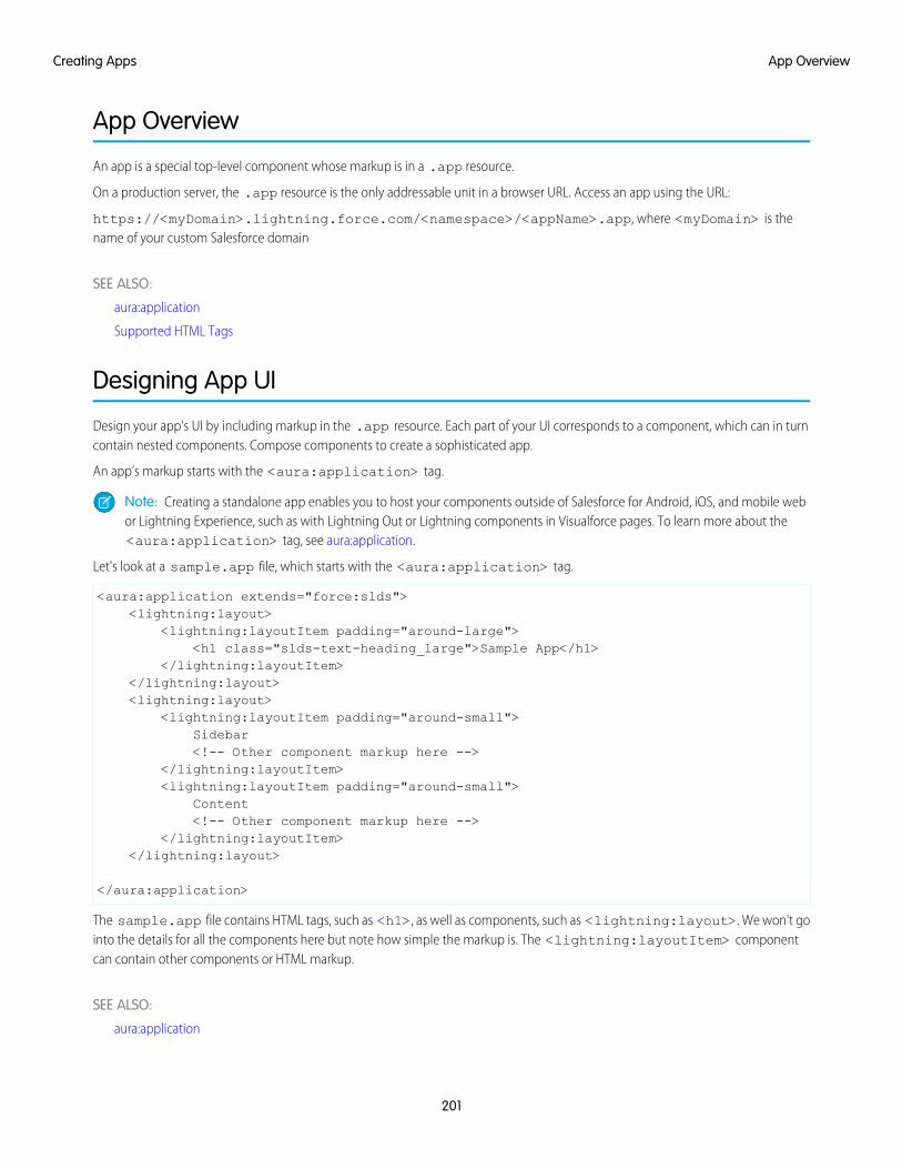
App Overview
An app is a special top-level component whose markup is in a .app resource.
On a production server, the .app resource is the only addressable unit in a browser URL. Access an app using the URL:
https://<myDomain>.lightning.force.com/<namespace>/<appName>.app, where <myDomain> is thename of your custom Salesforce domain
SEE ALSO:
aura:application
Supported HTML Tags
Designing App UI
Design your app's UI by including markup in the .app resource. Each part of your UI corresponds to a component, which can in turncontain nested components. Compose components to create a sophisticated app.
An app’s markup starts with the <aura:application> tag.
Note: Creating a standalone app enables you to host your components outside of Salesforce for Android, iOS, and mobile webor Lightning Experience, such as with Lightning Out or Lightning components in Visualforce pages. To learn more about the<aura:application> tag, see aura:application.
Let's look at a sample.app file, which starts with the <aura:application> tag.
<aura:application extends="force:slds"><lightning:layout>
<lightning:layoutItem padding="around-large"><h1 class="slds-text-heading_large">Sample App</h1>
</lightning:layoutItem></lightning:layout><lightning:layout>
<lightning:layoutItem padding="around-small">Sidebar<!-- Other component markup here -->
</lightning:layoutItem><lightning:layoutItem padding="around-small">
Content<!-- Other component markup here -->
</lightning:layoutItem></lightning:layout>
</aura:application>
The sample.app file contains HTML tags, such as <h1>, as well as components, such as <lightning:layout>. We won't gointo the details for all the components here but note how simple the markup is. The <lightning:layoutItem> componentcan contain other components or HTML markup.
SEE ALSO:
aura:application
201
App OverviewCreating Apps
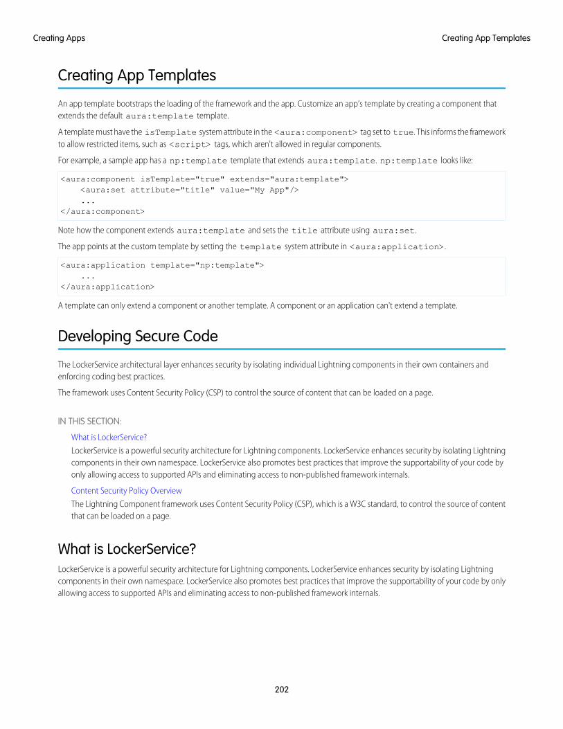
Creating App Templates
An app template bootstraps the loading of the framework and the app. Customize an app’s template by creating a component thatextends the default aura:template template.
A template must have the isTemplate system attribute in the <aura:component> tag set to true. This informs the frameworkto allow restricted items, such as <script> tags, which aren't allowed in regular components.
For example, a sample app has a np:template template that extends aura:template. np:template looks like:
<aura:component isTemplate="true" extends="aura:template"><aura:set attribute="title" value="My App"/>...
</aura:component>
Note how the component extends aura:template and sets the title attribute using aura:set.
The app points at the custom template by setting the template system attribute in <aura:application>.
<aura:application template="np:template">...
</aura:application>
A template can only extend a component or another template. A component or an application can't extend a template.
Developing Secure Code
The LockerService architectural layer enhances security by isolating individual Lightning components in their own containers andenforcing coding best practices.
The framework uses Content Security Policy (CSP) to control the source of content that can be loaded on a page.
IN THIS SECTION:
What is LockerService?
LockerService is a powerful security architecture for Lightning components. LockerService enhances security by isolating Lightningcomponents in their own namespace. LockerService also promotes best practices that improve the supportability of your code byonly allowing access to supported APIs and eliminating access to non-published framework internals.
Content Security Policy Overview
The Lightning Component framework uses Content Security Policy (CSP), which is a W3C standard, to control the source of contentthat can be loaded on a page.
What is LockerService?LockerService is a powerful security architecture for Lightning components. LockerService enhances security by isolating Lightningcomponents in their own namespace. LockerService also promotes best practices that improve the supportability of your code by onlyallowing access to supported APIs and eliminating access to non-published framework internals.
202
Creating App TemplatesCreating Apps
IN THIS SECTION:
JavaScript ES5 Strict Mode Enforcement
LockerService implicitly enables JavaScript ES5 strict mode. You don’t need to specify "use strict" in your code. JavaScriptstrict mode makes code more robust and supportable. For example, it throws some errors that would otherwise be suppressed.
DOM Access Containment
A component can only traverse the DOM and access elements created by a component in the same namespace. This behaviorprevents the anti-pattern of reaching into DOM elements owned by components in another namespace.
Secure Wrappers for Global References
LockerService applies restrictions to global references. LockerService provides secure versions of non-intrinsic objects, such aswindow. For example, the secure version of window is SecureWindow. You can interact with a secure wrapper in the sameway as you interact with the non-intrinsic object, but the secure wrappers filter access to the object and its properties. The securewrappers expose a subset of the API of the underlying objects.
Access to Supported JavaScript API Framework Methods Only
You can access published, supported JavaScript API framework methods only. These methods are published in the reference docapp at https://<myDomain>.lightning.force.com/auradocs/reference.app, where <myDomain> isthe name of your custom Salesforce domain. Previously, unsupported methods were accessible, which exposed your code to therisk of breaking when unsupported methods were changed or removed.
What Does LockerService Affect?
Find out what’s affected and what’s not affected by LockerService.
Disabling LockerService for a Component
You can disable LockerService for a component by setting API version 39.0 or lower for the component. If a component is set to atleast API version 40.0, LockerService is enabled. API version 40.0 corresponds to Summer ’17, when LockerService was enabled forall orgs.
Don’t Mix Component API Versions
For consistency and ease of debugging, we recommend that you set the same API version for all custom components in your app,containment hierarchy (component within component), or extension hierarchy (component extending component).
LockerService Disabled for Unsupported Browsers
LockerService relies on some JavaScript features in the browser: support for strict mode, the Map object, and the Proxy object.If a browser doesn’t meet the requirements, LockerService can’t enforce all its security features and is disabled.
SEE ALSO:
Content Security Policy Overview
Modifying the DOM
Reference Doc App
Salesforce Lightning CLI (Deprecated)
Salesforce Help: Supported Browsers for Lightning Experience
JavaScript ES5 Strict Mode EnforcementLockerService implicitly enables JavaScript ES5 strict mode. You don’t need to specify "use strict" in your code. JavaScript strictmode makes code more robust and supportable. For example, it throws some errors that would otherwise be suppressed.
A few common stumbling points when using strict mode are:
• You must declare variables with the var keyword.
203
What is LockerService?Creating Apps
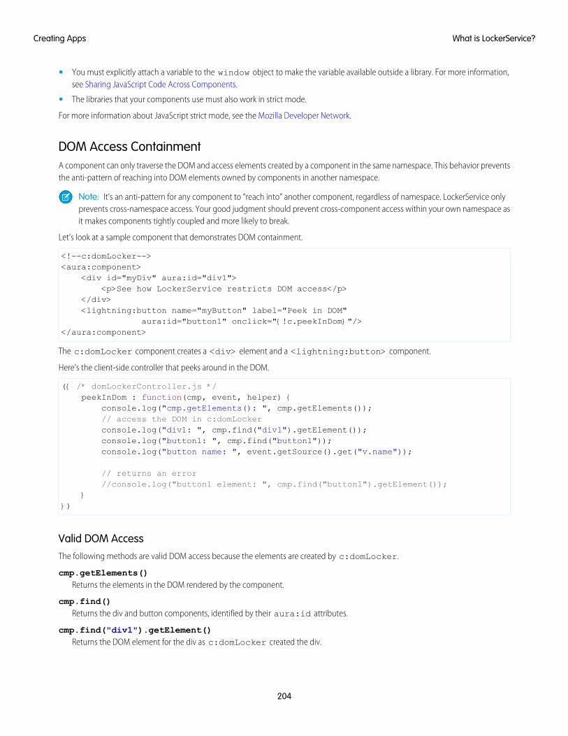
• You must explicitly attach a variable to the window object to make the variable available outside a library. For more information,see Sharing JavaScript Code Across Components.
• The libraries that your components use must also work in strict mode.
For more information about JavaScript strict mode, see the Mozilla Developer Network.
DOM Access ContainmentA component can only traverse the DOM and access elements created by a component in the same namespace. This behavior preventsthe anti-pattern of reaching into DOM elements owned by components in another namespace.
Note: It’s an anti-pattern for any component to “reach into” another component, regardless of namespace. LockerService onlyprevents cross-namespace access. Your good judgment should prevent cross-component access within your own namespace asit makes components tightly coupled and more likely to break.
Let’s look at a sample component that demonstrates DOM containment.
<!--c:domLocker--><aura:component>
<div id="myDiv" aura:id="div1"><p>See how LockerService restricts DOM access</p>
</div><lightning:button name="myButton" label="Peek in DOM"
aura:id="button1" onclick="{!c.peekInDom}"/></aura:component>
The c:domLocker component creates a <div> element and a <lightning:button> component.
Here’s the client-side controller that peeks around in the DOM.
({ /* domLockerController.js */peekInDom : function(cmp, event, helper) {
console.log("cmp.getElements(): ", cmp.getElements());// access the DOM in c:domLockerconsole.log("div1: ", cmp.find("div1").getElement());console.log("button1: ", cmp.find("button1"));console.log("button name: ", event.getSource().get("v.name"));
// returns an error//console.log("button1 element: ", cmp.find("button1").getElement());
}})
Valid DOM AccessThe following methods are valid DOM access because the elements are created by c:domLocker.
cmp.getElements()Returns the elements in the DOM rendered by the component.
cmp.find()Returns the div and button components, identified by their aura:id attributes.
cmp.find("div1").getElement()Returns the DOM element for the div as c:domLocker created the div.
204
What is LockerService?Creating Apps
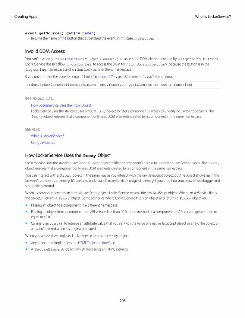
event.getSource().get("v.name")Returns the name of the button that dispatched the event; in this case, myButton.
Invalid DOM AccessYou can’t use cmp.find("button1").getElement() to access the DOM element created by <lightning:button>.LockerService doesn’t allow c:domLocker to access the DOM for <lightning:button> because the button is in thelightning namespace and c:domLocker is in the c namespace.
If you uncomment the code for cmp.find("button1").getElement(), you’ll see an error:
c:domLocker$controller$peekInDom [cmp.find(...).getElement is not a function]
IN THIS SECTION:
How LockerService Uses the Proxy Object
LockerService uses the standard JavaScript Proxy object to filter a component’s access to underlying JavaScript objects. TheProxy object ensures that a component only sees DOM elements created by a component in the same namespace.
SEE ALSO:
What is LockerService?
Using JavaScript
How LockerService Uses the Proxy Object
LockerService uses the standard JavaScript Proxy object to filter a component’s access to underlying JavaScript objects. The Proxyobject ensures that a component only sees DOM elements created by a component in the same namespace.
You can interact with a Proxy object in the same way as you interact with the raw JavaScript object, but the object shows up in thebrowser’s console as a Proxy. It’s useful to understand LockerService’s usage of Proxy if you drop into your browser’s debugger andstart poking around.
When a component creates an intrinsic JavaScript object, LockerService returns the raw JavaScript object. When LockerService filtersthe object, it returns a Proxy object. Some scenarios where LockerService filters an object and returns a Proxy object are:
• Passing an object to a component in a different namespace.
• Passing an object from a component on API version less than 40.0 to the method of a component on API version greater than orequal to 40.0.
• Calling cmp.get() to retrieve an attribute value that you set with the value of a native JavaScript object or array. The object orarray isn’t filtered when it’s originally created.
When you access these objects, LockerService returns a Proxy object.
• Any object that implements the HTMLCollection interface
• A SecureElement object, which represents an HTML element.
205
What is LockerService?Creating Apps
For more information about standard JavaScript Proxy object, see the Mozilla Developer Network.
SEE ALSO:
DOM Access Containment
Secure Wrappers for Global References
Don’t Mix Component API Versions
Secure Wrappers for Global ReferencesLockerService applies restrictions to global references. LockerService provides secure versions of non-intrinsic objects, such as window.For example, the secure version of window is SecureWindow. You can interact with a secure wrapper in the same way as youinteract with the non-intrinsic object, but the secure wrappers filter access to the object and its properties. The secure wrappers exposea subset of the API of the underlying objects.
Here’s a list of the secure objects that you’ll most commonly encounter.
SecureAuraSecure wrapper for $A, which is the entry point for using the framework in JavaScript code.
SecureComponentSecure wrapper for the Component object.
SecureComponentRefSecureComponentRef is a subset of SecureComponent that provides the external API for a component in a differentnamespace.
When you’re in a controller or helper, you have access to a SecureComponent, essentially the this object. In other contextswhen you’re working with a component, you get a SecureComponentRef instead if you reference a component in a differentnamespace. For example, if your markup includes a lightning:button and you call cmp.find("buttonAuraId"),you get a SecureComponentRef as lightning:button is in a different namespace from the component containingthe button markup.
SecureDocumentSecure wrapper for the Document object, which represents the root node of the HTML document or page. The Documentobject is the entry point into the page’s content, which is the DOM tree.
SecureElementSecure wrapper for the Element object, which represents an HTML element. SecureElement is wrapped in a Proxy objectas a performance optimization so that its data can be lazily filtered when it’s accessed. The HTML element is represented by a Proxyobject if you’re debugging in the browser console.
SecureObjectSecure wrapper for an object that is wrapped by LockerService. When you see a SecureObject, it typically means you don’thave access to the object so some properties aren’t available.
SecureWindowSecure wrapper for the Window object, which represents a window containing a DOM document.
ExampleLet’s look at a sample component that demonstrates some of the secure wrappers.
<!--c:secureWrappers--><aura:component >
206
What is LockerService?Creating Apps
<div id="myDiv" aura:id="div1"><p>See how LockerService uses secure wrappers</p>
</div><lightning:button name="myButton" label="Peek in DOM"
aura:id="button1" onclick="{!c.peekInDom}"/></aura:component>
The c:secureWrappers component creates a <div> HTML element and a <lightning:button> component.
Here’s the client-side controller that peeks around in the DOM.
({ /* secureWrappersController.js */peekInDom : function(cmp, event, helper) {
console.log("div1: ", cmp.find("div1").getElement());
console.log("button1: ", cmp.find("button1"));console.log("button name: ", event.getSource().get("v.name"));// add debugger statement for inspection// always remove this from production codedebugger;
}})
We use console.log() to look at the <div> element and the button. The <div> SecureElement is wrapped in a Proxyobject as a performance optimization so that its data can be lazily filtered when it’s accessed.
We put a debugger statement in the code so that we could inspect the elements in the browser console.
Type these expressions into the browser console and look at the results.
cmpcmp+""cmp.find("button1")cmp.find("button1")+""windowwindow+""$A$A+""
We add an empty string to some expressions so that the object is converted to a String. You could also use the toString()method.
Here’s the output.
207
What is LockerService?Creating Apps
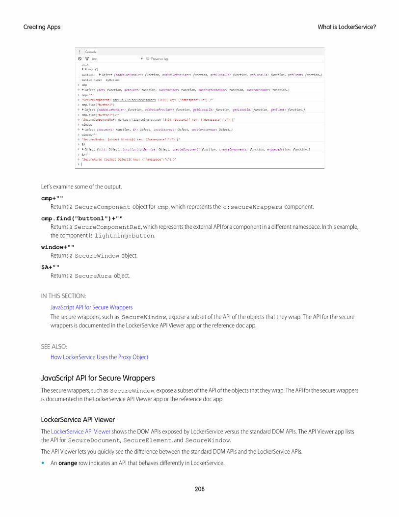
Let’s examine some of the output.
cmp+""Returns a SecureComponent object for cmp, which represents the c:secureWrappers component.
cmp.find("button1")+""Returns a SecureComponentRef, which represents the external API for a component in a different namespace. In this example,the component is lightning:button.
window+""Returns a SecureWindow object.
$A+""Returns a SecureAura object.
IN THIS SECTION:
JavaScript API for Secure Wrappers
The secure wrappers, such as SecureWindow, expose a subset of the API of the objects that they wrap. The API for the securewrappers is documented in the LockerService API Viewer app or the reference doc app.
SEE ALSO:
How LockerService Uses the Proxy Object
JavaScript API for Secure WrappersThe secure wrappers, such as SecureWindow, expose a subset of the API of the objects that they wrap. The API for the secure wrappersis documented in the LockerService API Viewer app or the reference doc app.
LockerService API Viewer
The LockerService API Viewer shows the DOM APIs exposed by LockerService versus the standard DOM APIs. The API Viewer app liststhe API for SecureDocument, SecureElement, and SecureWindow.
The API Viewer lets you quickly see the difference between the standard DOM APIs and the LockerService APIs.
• An orange row indicates an API that behaves differently in LockerService.
208
What is LockerService?Creating Apps
• A red row means the API isn’t supported in LockerService.
There are several ways to validate your code to ensure compatibility with Lightning component APIs. For more information, see Validationsfor Lightning Component Code.
Reference Doc App
The reference doc app lists the API for SecureComponent under JavaScript API > Component.
SecureAura is the wrapper for $A.
Access the reference doc app at:
https://<myDomain>.lightning.force.com/auradocs/reference.app, where <myDomain> is the name ofyour custom Salesforce domain.
SEE ALSO:
Secure Wrappers for Global References
Access to Supported JavaScript API Framework Methods OnlyYou can access published, supported JavaScript API framework methods only. These methods are published in the reference doc appat https://<myDomain>.lightning.force.com/auradocs/reference.app, where <myDomain> is the nameof your custom Salesforce domain. Previously, unsupported methods were accessible, which exposed your code to the risk of breakingwhen unsupported methods were changed or removed.
What Does LockerService Affect?Find out what’s affected and what’s not affected by LockerService.
LockerService enforces security and best practices for custom Lightning components you use in:
• Lightning Experience
• Salesforce app
• Lightning Communities
• Standalone apps that you create (for example, myApp.app)
• Any other app where you can add a custom Lightning component, such as Salesforce Console in Lightning Experience
• Lightning Out
LockerService doesn’t affect the following except for usage of Lightning components in Visualforce in these contexts:
• Salesforce Classic
• Visualforce-based communities
• Any apps for Salesforce Classic, such as Salesforce Console in Salesforce Classic
Disabling LockerService for a ComponentYou can disable LockerService for a component by setting API version 39.0 or lower for the component. If a component is set to at leastAPI version 40.0, LockerService is enabled. API version 40.0 corresponds to Summer ’17, when LockerService was enabled for all orgs.
LockerService is disabled for any component created before Summer ’17 because these components have an API version less than 40.0.
209
What is LockerService?Creating Apps
Component versioning enables you to associate a component with an API version. When you create a component, the default versionis the latest API version. In Developer Console, click Bundle Version Settings in the right panel to set the component version.
For consistency and ease of debugging, we recommend that you set the same API version for all components in your app, when possible.
SEE ALSO:
Don’t Mix Component API Versions
Component Versioning
Create Lightning Components in the Developer Console
Don’t Mix Component API VersionsFor consistency and ease of debugging, we recommend that you set the same API version for all custom components in your app,containment hierarchy (component within component), or extension hierarchy (component extending component).
If you mix API versions in your containment or extension hierarchy and LockerService is enabled for some components and disabled forother components, your app will be harder to debug.
Extension HierarchyLockerService is enabled for a component or an application purely based on component version. The extension hierarchy for a componentdoesn’t factor into LockerService enforcement.
Let’s look at an example where a Car component extends a Vehicle component. Car has API version 39.0 so LockerService isdisabled. Vehicle has API version 40.0 so LockerService is enabled.
Now, let’s say that Vehicle adds an expando property, _counter, to the window object by assigning a value towindow._counter. Since LockerService is enabled for Vehicle, the _counter property is added to SecureWindow, thesecure wrapper for window for the component’s namespace. The property isn’t added to the native window object.
LockerService is disabled for Car so the component has access to the native window object. Car can’t see the _counter propertyas it’s only available in the SecureWindow object.
This subtle behavior can cause much gnashing of teeth when your code doesn’t work as you expect. You’ll never get that debuggingtime back! Save yourself some grief and use the same API version for all components in an extension hierarchy.
Containment HierarchyThe containment hierarchy within an application or a component doesn’t factor into LockerService enforcement.
Let’s look at an example where a Bicycle component contains a Wheel component. If Bicycle has API version 40.0, LockerServiceis enabled. If Wheel has API version 39.0, LockerService is disabled for Wheel even though it’s contained in a component, Bicycle,that has LockerService enabled.
Due to the mix of component API versions, you’re likely to run into issues similar to those for the extension hierarchy. We recommendthat you set the same API version for all components in your app or component hierarchy, when possible.
SEE ALSO:
Component Versioning
Disabling LockerService for a Component
Secure Wrappers for Global References
Sharing JavaScript Code Across Components
210
What is LockerService?Creating Apps
LockerService Disabled for Unsupported BrowsersLockerService relies on some JavaScript features in the browser: support for strict mode, the Map object, and the Proxy object. If abrowser doesn’t meet the requirements, LockerService can’t enforce all its security features and is disabled.
LockerService is disabled for unsupported browsers. If you use an unsupported browser, you’re likely to encounter issues that won’t befixed. Make your life easier and your browsing experience more secure by using a supported browser.
Note: The LockerService requirements align with the supported browsers for Lightning Experience, except for IE11. LockerServiceis disabled for IE11. We recommend using supported browsers other than IE11 for enhanced security.
SEE ALSO:
Browser Support Considerations for Lightning Components
Salesforce Help: Supported Browsers for Lightning Experience
Content Security Policy OverviewThe Lightning Component framework uses Content Security Policy (CSP), which is a W3C standard, to control the source of content thatcan be loaded on a page.
CSP is a Candidate Recommendation of the W3C working group on Web Application Security. The framework uses the Content-Security-Policy HTTP header recommended by the W3C.
The framework’s CSP covers these resources:
JavaScript LibrariesAll JavaScript libraries must be uploaded to Salesforce static resources. For more information, see Using External JavaScript Librarieson page 252.
HTTPS Connections for ResourcesAll external fonts, images, frames, and CSS must use an HTTPS URL.
You can change the CSP policy and expand access to third-party resources by adding CSP Trusted Sites.
Browser SupportCSP isn’t enforced by all browsers. For a list of browsers that enforce CSP, see caniuse.com.
Note: IE11 doesn’t support CSP, so we recommend using other supported browsers for enhanced security.
Finding CSP ViolationsAny policy violations are logged in the browser’s developer console. The violations look like the following message.
Refused to load the script 'https://externaljs.docsample.com/externalLib.js'because it violates the following Content Security Policy directive: ...
If your app’s functionality isn’t affected, you can ignore the CSP violation.
211
Content Security Policy OverviewCreating Apps
IN THIS SECTION:
Critical Update for Stricter CSP Restrictions
The Lightning Component framework already uses Content Security Policy (CSP), which is a W3C standard, to control the source ofcontent that can be loaded on a page. The “Enable Stricter Content Security Policy for Lightning Components” critical update tightensCSP to mitigate the risk of cross-site scripting attacks. Stricter CSP is only enforced in sandboxes and Developer Edition orgs.
SEE ALSO:
Browser Support Considerations for Lightning Components
Making API Calls from Components
Create CSP Trusted Sites to Access Third-Party APIs
Salesforce Help: Supported Browsers for Lightning Experience
Critical Update for Stricter CSP RestrictionsThe Lightning Component framework already uses Content Security Policy (CSP), which is a W3C standard, to control the source ofcontent that can be loaded on a page. The “Enable Stricter Content Security Policy for Lightning Components” critical update tightensCSP to mitigate the risk of cross-site scripting attacks. Stricter CSP is only enforced in sandboxes and Developer Edition orgs.
The stricter CSP disallows the unsafe-inline and unsafe-eval keywords for inline scripts (script-src). Ensure that yourcode and third-party libraries you use adhere to these rules by removing all calls using eval() or inline JavaScript code execution.You might have to update your third-party libraries to modern versions that don’t depend on unsafe-inline or unsafe-eval.
Note: Stricter CSP was originally part of the LockerService critical update, which was automatically activated for all orgs in Summer’17. Stricter CSP was decoupled from LockerService in Summer ’17 to give you more time to update your code.
Critical Update TimelineStricter CSP will gradually be available in more orgs. This is the planned timeline but the schedule might change for future releases.
Winter ’18The critical update is only available in sandboxes and Developer Edition orgs.
Spring ’18 (future plans)The critical update will be extended to all orgs, including production orgs.
Winter ’19 (future plans)The critical update will be automatically activated for all orgs when the critical update expires.
Activate the Critical UpdateStricter CSP is enabled by default for sandboxes and Developer Edition orgs that have previously enabled the “Enable LightningLockerService Security” critical update. For all other sandboxes and Developer Edition orgs, stricter CSP is disabled by default.
To enable stricter CSP:
1. From Setup, enter Critical Updates in the Quick Find box, and then select Critical Updates.
2. For “Enable Stricter Content Security Policy for Lightning Components”, click Activate.
3. Refresh your browser page to proceed with stricter CSP enabled.
212
Content Security Policy OverviewCreating Apps
What Does This Critical Update Affect?The “Enable Stricter Content Security Policy for Lightning Components” critical update enables stricter CSP in sandboxes and DeveloperEdition orgs for:
• Lightning Experience
• Salesforce app
• Standalone apps that you create (for example, myApp.app)
Note: There is a separate “Enable Stricter Content Security Policy for Lightning Components in Communities” critical update toenable stricter CSP for Communities.
The critical update doesn’t affect:
• Salesforce Classic
• Any apps for Salesforce Classic, such as Salesforce Console in Salesforce Classic
• Lightning Out, which allows you to run Lightning components in a container outside of Lightning apps, such as Lightning componentsin Visualforce and Visualforce-based Communities. The container defines the CSP rules.
Validations for Lightning Component Code
Validate your Lightning component code to ensure compatibility with Lightning component APIs, best practices, and avoidance ofanti-patterns. There are several ways to validate your code. Minimal save-time validations catch the most significant issues only, whileSalesforce DX tools provide more comprehensive static code analysis.
IN THIS SECTION:
Validation When You Save Code Changes
Lightning component JavaScript code is validated when you save it. Validation ensures that your components are written using bestpractices and avoid common pitfalls that can make them incompatible with LockerService. Validation happens automatically whenyou save Lightning component resources in the Developer Console, in your favorite IDE, and via API.
Validation During Development Using the Salesforce CLI
Salesforce DX includes a code analysis and validation tool usable via the Salesforce CLI. Use force:lightning:lint to scanand improve your code during development. Validation using the Salesforce CLI doesn’t just help you avoid LockerService conflictsand anti-patterns. It’s a terrific practice for improving your code quality and consistency, and to uncover subtle bugs before youcommit them to your codebase.
Review and Resolve Validation Errors and Warnings
When you run validations on your Lightning component code, the results include details for each issue found in the files scanned.Review the results and resolve problems in your code.
Lightning Component Validation Rules
Rules built into Lightning component code validations cover restrictions under LockerService, correct use of Lightning APIs, and anumber of best practices for writing Lightning component code. Each rule, when triggered by your code, points to an area whereyour code might have an issue.
Salesforce Lightning CLI (Deprecated)
Lightning CLI was a Heroku Toolbelt plugin to scan your code for general JavaScript coding issues and Lightning-specific issues.Lightning CLI is deprecated in favor of the force:lightning:lint tool available in the Salesforce DX CLI.
213
Validations for Lightning Component CodeCreating Apps
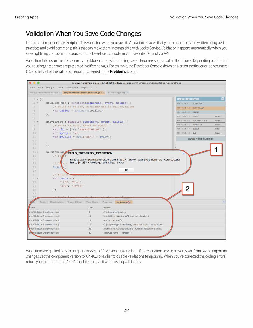
Validation When You Save Code ChangesLightning component JavaScript code is validated when you save it. Validation ensures that your components are written using bestpractices and avoid common pitfalls that can make them incompatible with LockerService. Validation happens automatically when yousave Lightning component resources in the Developer Console, in your favorite IDE, and via API.
Validation failures are treated as errors and block changes from being saved. Error messages explain the failures. Depending on the toolyou’re using, these errors are presented in different ways. For example, the Developer Console shows an alert for the first error it encounters(1), and lists all of the validation errors discovered in the Problems tab (2).
Validations are applied only to components set to API version 41.0 and later. If the validation service prevents you from saving importantchanges, set the component version to API 40.0 or earlier to disable validations temporarily. When you’ve corrected the coding errors,return your component to API 41.0 or later to save it with passing validations.
214
Validation When You Save Code ChangesCreating Apps
Validation During Development Using the Salesforce CLISalesforce DX includes a code analysis and validation tool usable via the Salesforce CLI. Use force:lightning:lint to scan andimprove your code during development. Validation using the Salesforce CLI doesn’t just help you avoid LockerService conflicts andanti-patterns. It’s a terrific practice for improving your code quality and consistency, and to uncover subtle bugs before you committhem to your codebase.
Validations using the Salesforce CLI are done separately from saving your code to Salesforce. The results are informational only. Validationsperformed by the Salesforce CLI fall into two categories, failures and warnings. Error messages explain both, and are displayed in yourshell window. Here’s some example output:
error secure-document Invalid SecureDocument APILine:109:29scraping = document.innerHTML;^
warning no-plusplus Unary operator '++' usedLine:120:50for (var i = (index+1); i < sibs.length; i++) {^
error secure-window Invalid SecureWindow APILine:33:21var req = new XMLHttpRequest();^
error default-case Expected a default caseLine:108:13switch (e.keyCode) {^
Validations performed using the Salesforce CLI are different from validations performed at save time in the following important ways.
• The Salesforce CLI uses many more rules to analyze your component code. Save time validations prevent you from making the mostfundamental mistakes only. Validation with the Salesforce CLI errs on the side of giving you more information.
• Validation via the Salesforce CLI ignores the API version of your components. Save time validations are performed only for componentsset to API 41.0 and later.
IN THIS SECTION:
Use force:lightning:lint
Run force:lightning:lint just like any other lint command-line tool. The only trick is invoking it through the sfdxcommand. Your shell window shows the results.
force:lightning:lint Options
Use options to modify the behavior of force:lightning:lint.
Custom “House Style” Rules
Customize the JavaScript style rules that force:lightning:lint applies to your code.
Use force:lightning:lintRun force:lightning:lint just like any other lint command-line tool. The only trick is invoking it through the sfdx command.Your shell window shows the results.
215
Validation During Development Using the Salesforce CLICreating Apps
Normal UseYou can run the force:lightning:lint lint tool on any folder that contains Lightning components:
sfdx force:lightning:lint ./path/to/lightning/components/
Note: force:lightning:lint runs only on local files. Use Salesforce DX or third-party tools to download your componentcode to your machine. Options include Salesforce CLI commands like force:mdapi:retrieve and force:source:pull,or other tools such as the Force.com IDE, the Force.com Migration Tool, or various third-party options.
The default output only shows errors. To see warnings too, use the verbose mode option.
See “Review and Resolve Validation Errors and Warnings” for what to do with the output of running force:lightning:lint.
SEE ALSO:
force:lightning:lint Options
force:lightning:lint OptionsUse options to modify the behavior of force:lightning:lint.
Common OptionsFiltering Files
Sometimes, you just want to scan a particular kind of file. The --files argument allows you to set a pattern to match files against.
For example, the following command allows you to scan controllers only:
sfdx force:lightning:lint ./path/to/lightning/components/ --files **/*Controller.js
Verbose Mode
The default output shows only errors so you can focus on bigger issues. The --verbose argument allows you to see both warningmessages and errors during the linting process.
For a complete list of command line parameters and how they affect tool behavior, see the Salesforce CLI Command Reference.
force:lightning:lint has built-in help, which you can access with the following command:
sfdx force:lightning:lint --help
SEE ALSO:
Use force:lightning:lint
Custom “House Style” RulesCustomize the JavaScript style rules that force:lightning:lint applies to your code.
It’s common that different organizations or projects will adopt different JavaScript rules. Lightning component validations help you workwith Lightning component APIs, not enforce Salesforce coding conventions. To that end, the validation rules are divided into two sets,security rules and style rules. The security rules can’t be modified, but you can modify or add to the style rules.
Use the --config argument to provide a custom rules configuration file. A custom rules configuration file allows you to define yourown code style rules, which affect the style rules used by force:lightning:lint.
216
Validation During Development Using the Salesforce CLICreating Apps
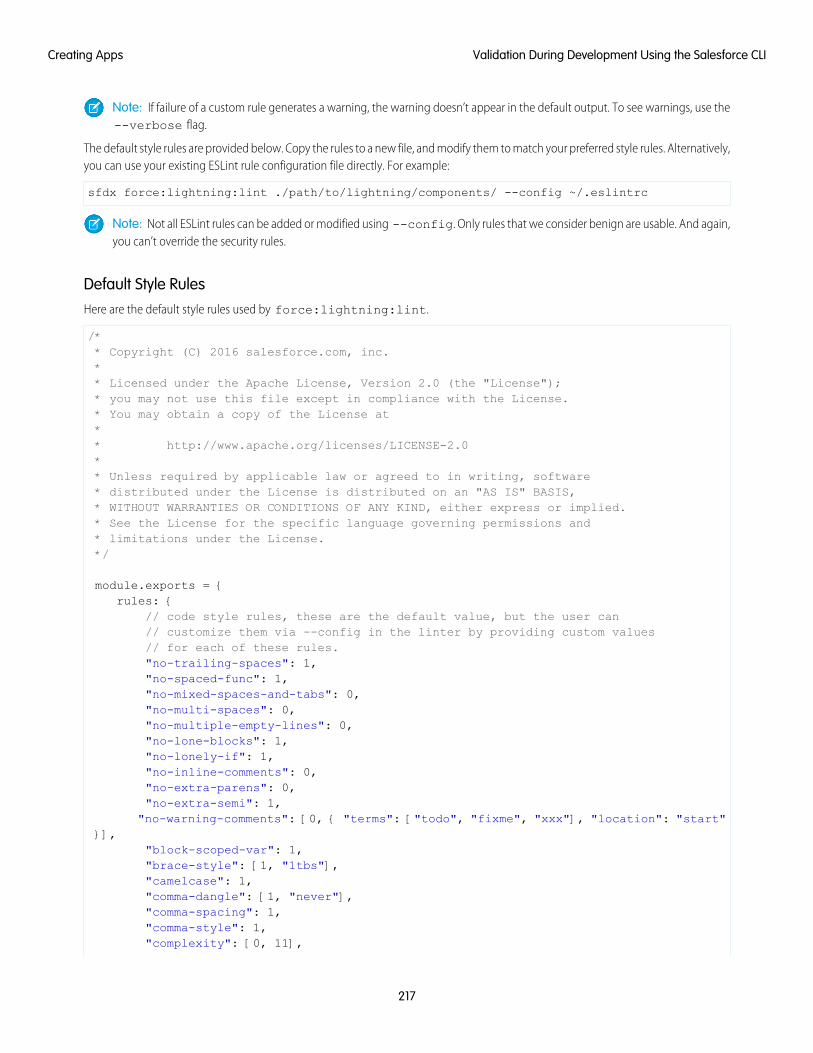
Note: If failure of a custom rule generates a warning, the warning doesn’t appear in the default output. To see warnings, use the--verbose flag.
The default style rules are provided below. Copy the rules to a new file, and modify them to match your preferred style rules. Alternatively,you can use your existing ESLint rule configuration file directly. For example:
sfdx force:lightning:lint ./path/to/lightning/components/ --config ~/.eslintrc
Note: Not all ESLint rules can be added or modified using --config. Only rules that we consider benign are usable. And again,you can’t override the security rules.
Default Style RulesHere are the default style rules used by force:lightning:lint.
/** Copyright (C) 2016 salesforce.com, inc.** Licensed under the Apache License, Version 2.0 (the "License");* you may not use this file except in compliance with the License.* You may obtain a copy of the License at** http://www.apache.org/licenses/LICENSE-2.0** Unless required by applicable law or agreed to in writing, software* distributed under the License is distributed on an "AS IS" BASIS,* WITHOUT WARRANTIES OR CONDITIONS OF ANY KIND, either express or implied.* See the License for the specific language governing permissions and* limitations under the License.*/
module.exports = {rules: {
// code style rules, these are the default value, but the user can// customize them via --config in the linter by providing custom values// for each of these rules."no-trailing-spaces": 1,"no-spaced-func": 1,"no-mixed-spaces-and-tabs": 0,"no-multi-spaces": 0,"no-multiple-empty-lines": 0,"no-lone-blocks": 1,"no-lonely-if": 1,"no-inline-comments": 0,"no-extra-parens": 0,"no-extra-semi": 1,
"no-warning-comments": [0, { "terms": ["todo", "fixme", "xxx"], "location": "start"}],
"block-scoped-var": 1,"brace-style": [1, "1tbs"],"camelcase": 1,"comma-dangle": [1, "never"],"comma-spacing": 1,"comma-style": 1,"complexity": [0, 11],
217
Validation During Development Using the Salesforce CLICreating Apps
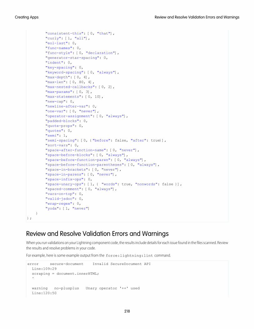
"consistent-this": [0, "that"],"curly": [1, "all"],"eol-last": 0,"func-names": 0,"func-style": [0, "declaration"],"generator-star-spacing": 0,"indent": 0,"key-spacing": 0,"keyword-spacing": [0, "always"],"max-depth": [0, 4],"max-len": [0, 80, 4],"max-nested-callbacks": [0, 2],"max-params": [0, 3],"max-statements": [0, 10],"new-cap": 0,"newline-after-var": 0,"one-var": [0, "never"],"operator-assignment": [0, "always"],"padded-blocks": 0,"quote-props": 0,"quotes": 0,"semi": 1,"semi-spacing": [0, {"before": false, "after": true}],"sort-vars": 0,"space-after-function-name": [0, "never"],"space-before-blocks": [0, "always"],"space-before-function-paren": [0, "always"],"space-before-function-parentheses": [0, "always"],"space-in-brackets": [0, "never"],"space-in-parens": [0, "never"],"space-infix-ops": 0,"space-unary-ops": [1, { "words": true, "nonwords": false }],"spaced-comment": [0, "always"],"vars-on-top": 0,"valid-jsdoc": 0,"wrap-regex": 0,"yoda": [1, "never"]
}};
Review and Resolve Validation Errors and WarningsWhen you run validations on your Lightning component code, the results include details for each issue found in the files scanned. Reviewthe results and resolve problems in your code.
For example, here is some example output from the force:lightning:lint command.
error secure-document Invalid SecureDocument APILine:109:29scraping = document.innerHTML;^
warning no-plusplus Unary operator '++' usedLine:120:50
218
Review and Resolve Validation Errors and WarningsCreating Apps
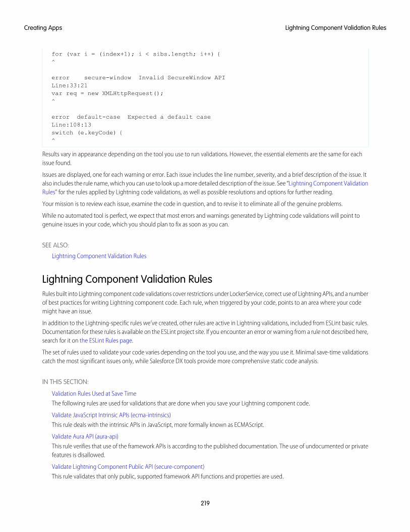
for (var i = (index+1); i < sibs.length; i++) {^
error secure-window Invalid SecureWindow APILine:33:21var req = new XMLHttpRequest();^
error default-case Expected a default caseLine:108:13switch (e.keyCode) {^
Results vary in appearance depending on the tool you use to run validations. However, the essential elements are the same for eachissue found.
Issues are displayed, one for each warning or error. Each issue includes the line number, severity, and a brief description of the issue. Italso includes the rule name, which you can use to look up a more detailed description of the issue. See “Lightning Component ValidationRules” for the rules applied by Lightning code validations, as well as possible resolutions and options for further reading.
Your mission is to review each issue, examine the code in question, and to revise it to eliminate all of the genuine problems.
While no automated tool is perfect, we expect that most errors and warnings generated by Lightning code validations will point togenuine issues in your code, which you should plan to fix as soon as you can.
SEE ALSO:
Lightning Component Validation Rules
Lightning Component Validation RulesRules built into Lightning component code validations cover restrictions under LockerService, correct use of Lightning APIs, and a numberof best practices for writing Lightning component code. Each rule, when triggered by your code, points to an area where your codemight have an issue.
In addition to the Lightning-specific rules we’ve created, other rules are active in Lightning validations, included from ESLint basic rules.Documentation for these rules is available on the ESLint project site. If you encounter an error or warning from a rule not described here,search for it on the ESLint Rules page.
The set of rules used to validate your code varies depending on the tool you use, and the way you use it. Minimal save-time validationscatch the most significant issues only, while Salesforce DX tools provide more comprehensive static code analysis.
IN THIS SECTION:
Validation Rules Used at Save Time
The following rules are used for validations that are done when you save your Lightning component code.
Validate JavaScript Intrinsic APIs (ecma-intrinsics)
This rule deals with the intrinsic APIs in JavaScript, more formally known as ECMAScript.
Validate Aura API (aura-api)
This rule verifies that use of the framework APIs is according to the published documentation. The use of undocumented or privatefeatures is disallowed.
Validate Lightning Component Public API (secure-component)
This rule validates that only public, supported framework API functions and properties are used.
219
Lightning Component Validation RulesCreating Apps
Validate Secure Document Public API (secure-document)
This rule validates that only supported functions and properties of the document global are accessed.
Validate Secure Window Public API (secure-window)
This rule validates that only supported functions and properties of the window global are accessed.
Disallow Use of caller and callee (no-caller)
Prevent the use of arguments.caller and arguments.callee. These are also forbidden in ECMAScript 5 and later whenin strict mode, which is enabled under LockerService. This is a standard rule built into ESLint.
Disallow Use of eval() (no-eval)
Prevent the use of eval() to execute arbitrary code. eval() represents a significant security risk, and is forbidden underLockerService. This is a standard rule built into ESLint.
Disallow Implied Use of eval() (no-implied-eval)
Prevent the indirect use of eval() by passing code as a string to built-in functions that will evaluate it, such as setTimeout().Pass in a real function instead. This is a standard rule built into ESLint.
Disallow Script URLs (no-script-url)
Prevents the use of javascript: URLs, which is yet another way to try to eval() a string. This is a standard rule built intoESLint.
Disallow Extending Native Objects (no-extend-native)
Prevent changing the behavior of built-in JavaScript objects, such as Object or Array, by modifying their prototypes. This is a standardrule built into ESLint.
Disallow Use of Function Constructor (no-new-func)
Prevents the creation of new functions using the Function() constructor. This is a non-standard, hard to read, and thereforeterrible practice. It also requires parsing a string as code in much the same way eval() does. This is a standard rule built intoESLint.
Disallow Calling Global Object Properties as Functions (no-obj-calls)
Prevents calling the Math, JSON, and Reflect global objects as though they were functions. For example, Math() isdisallowed. This follows the ECMAScript 5 specification. This is a standard rule built into ESLint.
Disallow Use of __iterator__ Property (no-iterator)
Prevents using the obsolete __iterator__ property. Use standard JavaScript iterators and generators instead. This is a standardrule built into ESLint.
Disallow Use of __proto__ (no-proto)
Prevents using the obsolete __proto__ property, which was deprecated in ECMAScript 3.1. Use Object.getPrototypeOf()instead. This is a standard rule built into ESLint.
Disallow with Statements (no-with)
Prevents using with statements, which adds members of an object to the current scope in a way that makes it hard to predict orview impact or behavior. This is a standard rule built into ESLint.
Validation Rules Used at Save TimeThe following rules are used for validations that are done when you save your Lightning component code.
Validation failures for any of these rules prevents saving changes to your code.
Lightning Platform RulesThese rules are specific to Lightning component JavaScript code. These custom rules are written and maintained by Salesforce.
220
Lightning Component Validation RulesCreating Apps
Validate Aura API (aura-api)This rule verifies that use of the framework APIs is according to the published documentation. The use of undocumented or privatefeatures is disallowed.
Validate Secure Document Public API (secure-document)This rule validates that only supported functions and properties of the document global are accessed.
Validate Secure Window Public API (secure-window)This rule validates that only supported functions and properties of the window global are accessed.
General JavaScript RulesThese rules are general JavaScript rules, which enforce basic correct use of JavaScript required for Lightning components. These rulesare built into the ESLint tool.
Disallow Use of caller and callee (no-caller)Prevent the use of arguments.caller and arguments.callee. These are also forbidden in ECMAScript 5 and later whenin strict mode, which is enabled under LockerService.
Disallow Use of eval() (no-eval)Prevent the use of eval() to execute arbitrary code. eval() represents a significant security risk, and is forbidden underLockerService.
Disallow Extending Native Objects (no-extend-native)Prevent changing the behavior of built-in JavaScript objects, such as Object or Array, by modifying their prototypes.
Disallow Implied Use of eval() (no-implied-eval)Prevent the indirect use of eval() by passing code as a string to built-in functions that will evaluate it, such as setTimeout().Pass in a real function instead.
Disallow Use of __iterator__ Property (no-iterator)Prevents using the obsolete __iterator__ property. Use standard JavaScript iterators and generators instead.
Disallow Use of Function Constructor (no-new-func)Prevents the creation of new functions using the Function() constructor. This is a non-standard, hard to read, and thereforeterrible practice. It also requires parsing a string as code in much the same way eval() does.
Disallow Calling Global Object Properties as Functions (no-obj-calls)Prevents calling the Math, JSON, and Reflect global objects as though they were functions. For example, Math() isdisallowed. This follows the ECMAScript 5 specification.
Disallow Use of __proto__ (no-proto)Prevents using the obsolete __proto__ property, which was deprecated in ECMAScript 3.1. Use Object.getPrototypeOf()instead.
Disallow Script URLs (no-script-url)Prevents the use of javascript: URLs, which is yet another way to try to eval() a string.
Disallow with Statements (no-with)Prevents using with statements, which adds members of an object to the current scope in a way that makes it hard to predict orview impact or behavior.
Validate JavaScript Intrinsic APIs (ecma-intrinsics)This rule deals with the intrinsic APIs in JavaScript, more formally known as ECMAScript.
221
Lightning Component Validation RulesCreating Apps
When LockerService is enabled, the framework prevents the use of unsupported API objects or calls. That means your Lightningcomponents code is allowed to use:
• Features built into JavaScript (“intrinsic” features)
• Published, supported features built into the Lightning Component framework
• Published, supported features built into LockerService SecureObject objects
What exactly are these “intrinsic APIs”? They’re the APIs defined in the ECMAScript Language Specification. That is, things built intoJavaScript. This includes Annex B of the specification, which deals with legacy browser features that aren’t part of the “core” of JavaScript,but are nevertheless still supported for JavaScript running inside a web browser.
Note that some features of JavaScript that you might consider intrinsic—for example, the window and document global variables—aresuperceded by SecureObject objects, which offer a more constrained API.
Rule DetailsThis rule verifies that use of the intrinsic JavaScript APIs is according to the published specification. The use of non-standard, deprecated,and removed language features is disallowed.
Further Reading
• ECMAScript specification
• Annex B: Additional ECMAScript Features for Web Browsers
• Intrinsic Objects (JavaScript)
SEE ALSO:
Validate Aura API (aura-api)
Validate Lightning Component Public API (secure-component)
Validate Secure Document Public API (secure-document)
Validate Secure Window Public API (secure-window)
Validate Aura API (aura-api)This rule verifies that use of the framework APIs is according to the published documentation. The use of undocumented or privatefeatures is disallowed.
When LockerService is enabled, the framework prevents the use of unsupported API objects or calls. That means your Lightningcomponents code is allowed to use:
• Features built into JavaScript (“intrinsic” features)
• Published, supported features built into the Lightning Component framework
• Published, supported features built into LockerService SecureObject objects
This rule deals with the supported, public framework APIs, for example, those available through the framework global $A.
Why is this rule called “Aura API”? Because the core of the the Lightning Component framework is the open source Aura Framework.And this rule verifies permitted uses of that framework, rather than anything specific to Lightning Components.
222
Lightning Component Validation RulesCreating Apps
Rule DetailsThe following patterns are considered problematic:
Aura.something(); // Use $A instead$A.util.fake(); // fake is not available in $A.util
Further ReadingFor details of all of the methods available in the framework, including $A, see the JavaScript API athttps://myDomain.lightning.force.com/auradocs/reference.app, where myDomain is the name of yourcustom Salesforce domain.
SEE ALSO:
Validate Lightning Component Public API (secure-component)
Validate Secure Document Public API (secure-document)
Validate Secure Window Public API (secure-window)
Validate Lightning Component Public API (secure-component)This rule validates that only public, supported framework API functions and properties are used.
When LockerService is enabled, the framework prevents the use of unsupported API objects or calls. That means your Lightningcomponents code is allowed to use:
• Features built into JavaScript (“intrinsic” features)
• Published, supported features built into the Lightning Component framework
• Published, supported features built into LockerService SecureObject objects
Prior to LockerService, when you created or obtained a reference to a component, you could call any function and access any propertyavailable on that component, even if it wasn’t public. When LockerService is enabled, components are “wrapped” by a newSecureComponent object, which controls access to the component and its functions and properties. SecureComponent restricts you tousing only published, supported component API.
Rule DetailsThe reference doc app lists the API for SecureComponent. Access the reference doc app at:
https://<myDomain>.lightning.force.com/auradocs/reference.app, where <myDomain> is the name ofyour custom Salesforce domain.
The API for SecureComponent is listed at JavaScript API > Component.
Further Reading
• SecureComponent.js Implementation
SEE ALSO:
Validate Aura API (aura-api)
Validate Secure Document Public API (secure-document)
Validate Secure Window Public API (secure-window)
223
Lightning Component Validation RulesCreating Apps
Validate Secure Document Public API (secure-document)This rule validates that only supported functions and properties of the document global are accessed.
When LockerService is enabled, the framework prevents the use of unsupported API objects or calls. That means your Lightningcomponents code is allowed to use:
• Features built into JavaScript (“intrinsic” features)
• Published, supported features built into the Lightning Component framework
• Published, supported features built into LockerService SecureObject objects
Prior to LockerService, when you accessed the document global, you could call any function and access any property available. WhenLockerService is enabled, the document global is “wrapped” by a new SecureDocument object, which controls access to documentand its functions and properties. SecureDocument restricts you to using only “safe” features of the document global.
Further Reading
• SecureDocument.js Implementation
SEE ALSO:
Validate Aura API (aura-api)
Validate Lightning Component Public API (secure-component)
Validate Secure Window Public API (secure-window)
Validate Secure Window Public API (secure-window)This rule validates that only supported functions and properties of the window global are accessed.
When LockerService is enabled, the framework prevents the use of unsupported API objects or calls. That means your Lightningcomponents code is allowed to use:
• Features built into JavaScript (“intrinsic” features)
• Published, supported features built into the Lightning Component framework
• Published, supported features built into LockerService SecureObject objects
Prior to LockerService, when you accessed the window global, you could call any function and access any property available. WhenLockerService is enabled, the window global is “wrapped” by a new SecureWindow object, which controls access to window andits functions and properties. SecureWindow restricts you to using only “safe” features of the window global.
Further Reading
• SecureWindow.js Implementation
SEE ALSO:
Validate Aura API (aura-api)
Validate Lightning Component Public API (secure-component)
Validate Secure Document Public API (secure-document)
224
Lightning Component Validation RulesCreating Apps
Disallow Use of caller and callee (no-caller)Prevent the use of arguments.caller and arguments.callee. These are also forbidden in ECMAScript 5 and later whenin strict mode, which is enabled under LockerService. This is a standard rule built into ESLint.
For complete details about this rule, including examples, see the corresponding ESLint documentation, Disallow Use of caller/callee(no-caller).
Disallow Use of eval() (no-eval)Prevent the use of eval() to execute arbitrary code. eval() represents a significant security risk, and is forbidden under LockerService.This is a standard rule built into ESLint.
For complete details about this rule, including examples, see the corresponding ESLint documentation, Disallow eval() (no-eval).
Disallow Implied Use of eval() (no-implied-eval)Prevent the indirect use of eval() by passing code as a string to built-in functions that will evaluate it, such as setTimeout().Pass in a real function instead. This is a standard rule built into ESLint.
For complete details about this rule, including examples, see the corresponding ESLint documentation, Disallow Implied eval()(no-implied-eval).
Disallow Script URLs (no-script-url)Prevents the use of javascript: URLs, which is yet another way to try to eval() a string. This is a standard rule built into ESLint.
For complete details about this rule, including examples, see the corresponding ESLint documentation, Disallow Script URLs (no-script-url).
Disallow Extending Native Objects (no-extend-native)Prevent changing the behavior of built-in JavaScript objects, such as Object or Array, by modifying their prototypes. This is a standardrule built into ESLint.
For complete details about this rule, including examples, see the corresponding ESLint documentation, Disallow Extending of NativeObjects (no-extend-native).
Disallow Use of Function Constructor (no-new-func)Prevents the creation of new functions using the Function() constructor. This is a non-standard, hard to read, and therefore terriblepractice. It also requires parsing a string as code in much the same way eval() does. This is a standard rule built into ESLint.
For complete details about this rule, including examples, see the corresponding ESLint documentation, Disallow Function Constructor(no-new-func).
Disallow Calling Global Object Properties as Functions (no-obj-calls)Prevents calling the Math, JSON, and Reflect global objects as though they were functions. For example, Math() is disallowed.This follows the ECMAScript 5 specification. This is a standard rule built into ESLint.
For complete details about this rule, including examples, see the corresponding ESLint documentation, disallow calling global objectproperties as functions (no-obj-calls).
225
Lightning Component Validation RulesCreating Apps
Disallow Use of __iterator__ Property (no-iterator)Prevents using the obsolete __iterator__ property. Use standard JavaScript iterators and generators instead. This is a standardrule built into ESLint.
For complete details about this rule, including examples, see the corresponding ESLint documentation, Disallow Iterator (no-iterator).
Disallow Use of __proto__ (no-proto)Prevents using the obsolete __proto__ property, which was deprecated in ECMAScript 3.1. Use Object.getPrototypeOf()instead. This is a standard rule built into ESLint.
For complete details about this rule, including examples, see the corresponding ESLint documentation, Disallow Use of __proto__(no-proto).
Disallow with Statements (no-with)Prevents using with statements, which adds members of an object to the current scope in a way that makes it hard to predict or viewimpact or behavior. This is a standard rule built into ESLint.
For complete details about this rule, including examples, see the corresponding ESLint documentation, disallow with statements (no-with).
Salesforce Lightning CLI (Deprecated)Lightning CLI was a Heroku Toolbelt plugin to scan your code for general JavaScript coding issues and Lightning-specific issues. LightningCLI is deprecated in favor of the force:lightning:lint tool available in the Salesforce DX CLI.
For more information about code validation using Salesforce DX, see the Salesforce CLI Command Reference.
IN THIS SECTION:
Install Salesforce Lightning CLI (Deprecated)
Lightning CLI was a Heroku Toolbelt plugin to scan your code for general JavaScript coding issues and Lightning-specific issues.Lightning CLI is deprecated in favor of the force:lightning:lint tool available in the Salesforce DX CLI.
Install Salesforce Lightning CLI (Deprecated)Lightning CLI was a Heroku Toolbelt plugin to scan your code for general JavaScript coding issues and Lightning-specific issues. LightningCLI is deprecated in favor of the force:lightning:lint tool available in the Salesforce DX CLI.
For instructions on how to install the Salesforce DX CLI, see “Install the Salesforce CLI” in the Salesforce DX Setup Guide.
Styling Apps
An app is a special top-level component whose markup is in a .app resource. Just like any other component, you can put CSS in itsbundle in a resource called <appName>.css.
For example, if the app markup is in notes.app, its CSS is in notes.css.
When viewed in Salesforce for Android, iOS, and mobile web and Lightning Experience, the UI components include styling that matchesthose visual themes. For example, the ui:button includes the button--neutral class to display a neutral style. The input
226
Salesforce Lightning CLI (Deprecated)Creating Apps
components that extend ui:input include the uiInput--input class to display the input fields using a custom font in additionto other styling.
Note: Styles added to UI components in Salesforce for Android, iOS, and mobile web and Lightning Experience don’t apply tocomponents in standalone apps.
IN THIS SECTION:
Using the Salesforce Lightning Design System in Apps
The Salesforce Lightning Design System provides a look and feel that’s consistent with Lightning Experience. Use Lightning DesignSystem styles to give your custom applications a UI that is consistent with Salesforce, without having to reverse-engineer our styles.
Using External CSS
To reference an external CSS resource that you’ve uploaded as a static resource, use a <ltng:require> tag in your .cmp or.app markup.
More Readable Styling Markup with the join Expression
Markup can get messy when you specify the class names to apply based on the component attribute values. Try using a joinexpression for easier-to-read markup.
Tips for CSS in Components
Here are some tips for configuring the CSS for components that you plan to use in Lightning pages, the Lightning App Builder, orthe Community Builder.
Styling with Design Tokens
Capture the essential values of your visual design into named tokens. Define the token values once and reuse them throughout yourLightning components CSS resources. Tokens make it easy to ensure that your design is consistent, and even easier to update it asyour design evolves.
SEE ALSO:
CSS in Components
Add Lightning Components as Custom Tabs in the Salesforce App
Using the Salesforce Lightning Design System in AppsThe Salesforce Lightning Design System provides a look and feel that’s consistent with Lightning Experience. Use Lightning DesignSystem styles to give your custom applications a UI that is consistent with Salesforce, without having to reverse-engineer our styles.
Your application automatically gets Lightning Design System styles and design tokens if it extends force:slds. This method is theeasiest way to stay up to date and consistent with Lightning Design System enhancements.
To extend force:slds:
<aura:application extends="force:slds"><!-- customize your application here -->
</aura:application>
Using a Static ResourceWhen you extend force:slds, the version of Lightning Design System styles are automatically updated whenever the CSS changes.If you want to use a specific Lightning Design System version, download the version and add it to your org as a static resource.
227
Using the Salesforce Lightning Design System in AppsCreating Apps
Note: We recommend extending force:slds instead so that you automatically get the latest Lightning Design System styles.If you stick to a specific Lightning Design System version, your app’s styles will gradually start to drift from later versions in LightningExperience or incur the cost of duplicate CSS downloads.
To download the latest version of Lightning Design System, generate and download it.
We recommend that you name the Lightning Design System archive static resource using the name format SLDS###, where ### isthe Lightning Design System version number (for example, SLDS203). This lets you have multiple versions of the Lightning DesignSystem installed, and manage version usage in your components.
To use the static version of the Lightning Design System in a component, include it using <ltng:require/>. For example:
<aura:component><ltng:require
styles="{!$Resource.SLDS203 + '/assets/styles/lightning-design-system-ltng.css'}"/></aura:component>
SEE ALSO:
Styling with Design Tokens
Using External CSSTo reference an external CSS resource that you’ve uploaded as a static resource, use a <ltng:require> tag in your .cmp or .appmarkup.
Here’s an example of using <ltng:require>:
<ltng:require styles="{!$Resource.resourceName}" />
resourceName is the Name of the static resource. In a managed packaged, the resource name must include the package namespaceprefix, such as $Resource.yourNamespace__resourceName. For a stand-alone static resource, such as an individual graphicor script, that’s all you need. To reference an item within an archive static resource, add the rest of the path to the item using stringconcatenation.
Here are some considerations for loading styles:
Loading Sets of CSSSpecify a comma-separated list of resources in the styles attribute to load a set of CSS.
Note: Due to a quirk in the way $Resource is parsed in expressions, use the join operator to include multiple$Resource references in a single attribute. For example, if you have more than one style sheet to include into a componentthe styles attribute should be something like the following.
styles="{!join(',',$Resource.myStyles + '/stylesheetOne.css',$Resource.myStyles + '/moreStyles.css')}"
Loading OrderThe styles are loaded in the order that they are listed.
One-Time LoadingThe styles load only once, even if they’re specified in multiple <ltng:require> tags in the same component or across differentcomponents.
228
Using External CSSCreating Apps
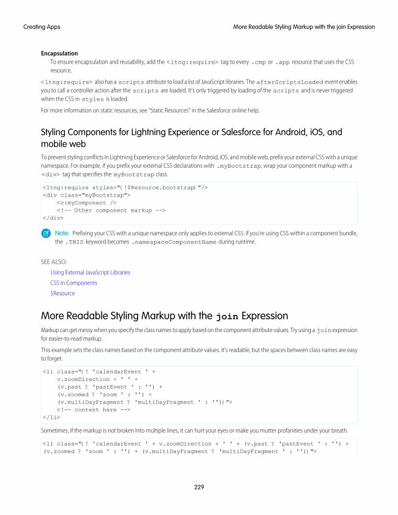
EncapsulationTo ensure encapsulation and reusability, add the <ltng:require> tag to every .cmp or .app resource that uses the CSSresource.
<ltng:require> also has a scripts attribute to load a list of JavaScript libraries. The afterScriptsLoaded event enablesyou to call a controller action after the scripts are loaded. It's only triggered by loading of the scripts and is never triggeredwhen the CSS in styles is loaded.
For more information on static resources, see “Static Resources” in the Salesforce online help.
Styling Components for Lightning Experience or Salesforce for Android, iOS, andmobile webTo prevent styling conflicts in Lightning Experience or Salesforce for Android, iOS, and mobile web, prefix your external CSS with a uniquenamespace. For example, if you prefix your external CSS declarations with .myBootstrap, wrap your component markup with a<div> tag that specifies the myBootstrap class.
<ltng:require styles="{!$Resource.bootstrap}"/><div class="myBootstrap">
<c:myComponent /><!-- Other component markup -->
</div>
Note: Prefixing your CSS with a unique namespace only applies to external CSS. If you’re using CSS within a component bundle,the .THIS keyword becomes .namespaceComponentName during runtime.
SEE ALSO:
Using External JavaScript Libraries
CSS in Components
$Resource
More Readable Styling Markup with the join ExpressionMarkup can get messy when you specify the class names to apply based on the component attribute values. Try using a join expressionfor easier-to-read markup.
This example sets the class names based on the component attribute values. It’s readable, but the spaces between class names are easyto forget.
<li class="{! 'calendarEvent ' +v.zoomDirection + ' ' +(v.past ? 'pastEvent ' : '') +(v.zoomed ? 'zoom ' : '') +(v.multiDayFragment ? 'multiDayFragment ' : '')}"><!-- content here -->
</li>
Sometimes, if the markup is not broken into multiple lines, it can hurt your eyes or make you mutter profanities under your breath.
<li class="{! 'calendarEvent ' + v.zoomDirection + ' ' + (v.past ? 'pastEvent ' : '') +(v.zoomed ? 'zoom ' : '') + (v.multiDayFragment ? 'multiDayFragment ' : '')}">
229
More Readable Styling Markup with the join ExpressionCreating Apps
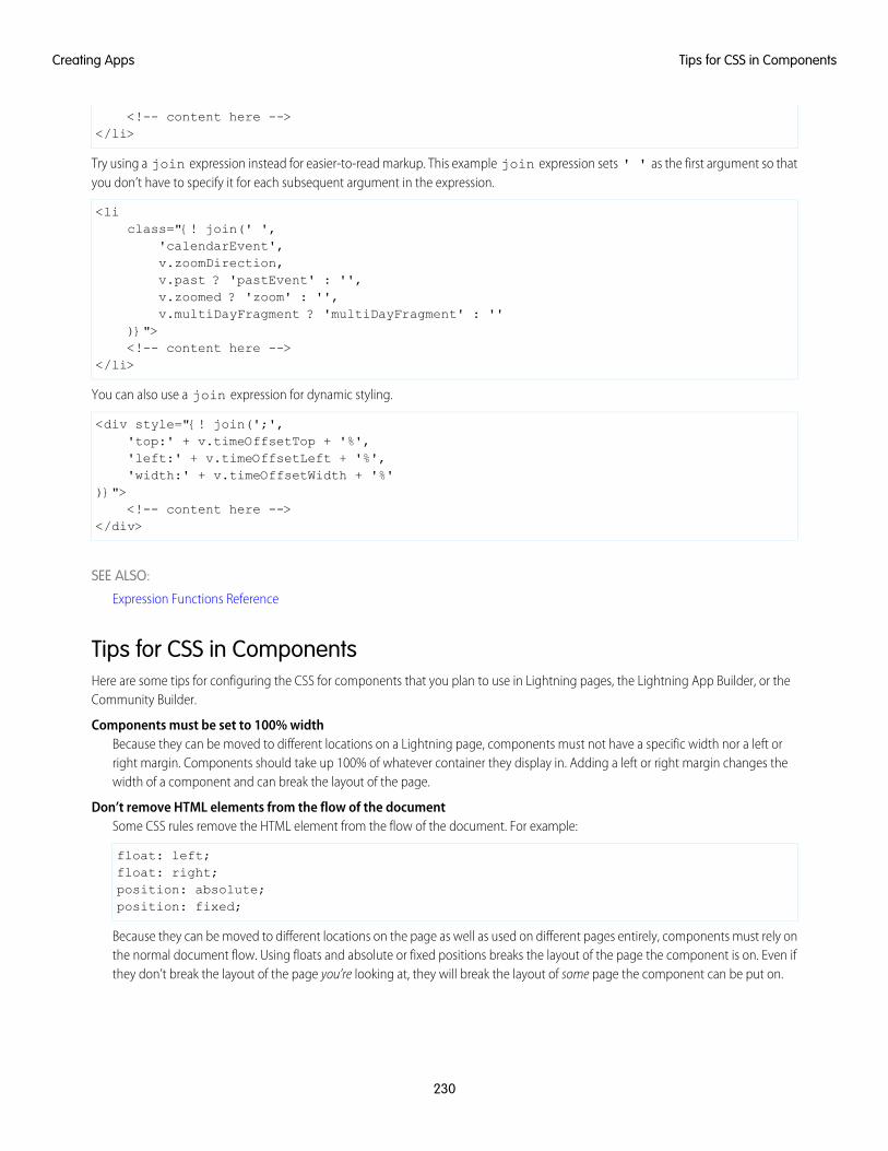
<!-- content here --></li>
Try using a join expression instead for easier-to-read markup. This example join expression sets ' ' as the first argument so thatyou don’t have to specify it for each subsequent argument in the expression.
<liclass="{! join(' ',
'calendarEvent',v.zoomDirection,v.past ? 'pastEvent' : '',v.zoomed ? 'zoom' : '',v.multiDayFragment ? 'multiDayFragment' : ''
)}"><!-- content here -->
</li>
You can also use a join expression for dynamic styling.
<div style="{! join(';','top:' + v.timeOffsetTop + '%','left:' + v.timeOffsetLeft + '%','width:' + v.timeOffsetWidth + '%'
)}"><!-- content here -->
</div>
SEE ALSO:
Expression Functions Reference
Tips for CSS in ComponentsHere are some tips for configuring the CSS for components that you plan to use in Lightning pages, the Lightning App Builder, or theCommunity Builder.
Components must be set to 100% widthBecause they can be moved to different locations on a Lightning page, components must not have a specific width nor a left orright margin. Components should take up 100% of whatever container they display in. Adding a left or right margin changes thewidth of a component and can break the layout of the page.
Don’t remove HTML elements from the flow of the documentSome CSS rules remove the HTML element from the flow of the document. For example:
float: left;float: right;position: absolute;position: fixed;
Because they can be moved to different locations on the page as well as used on different pages entirely, components must rely onthe normal document flow. Using floats and absolute or fixed positions breaks the layout of the page the component is on. Even ifthey don’t break the layout of the page you’re looking at, they will break the layout of some page the component can be put on.
230
Tips for CSS in ComponentsCreating Apps
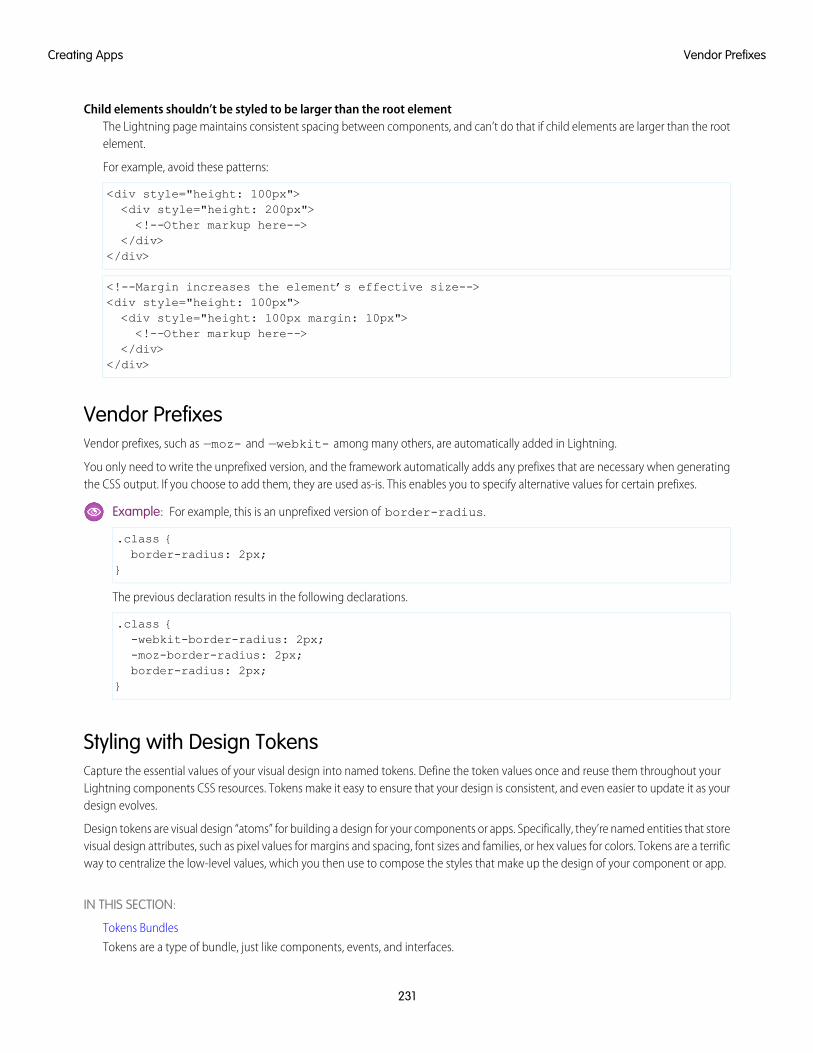
Child elements shouldn’t be styled to be larger than the root elementThe Lightning page maintains consistent spacing between components, and can’t do that if child elements are larger than the rootelement.
For example, avoid these patterns:
<div style="height: 100px"><div style="height: 200px"><!--Other markup here-->
</div></div>
<!--Margin increases the element’s effective size--><div style="height: 100px"><div style="height: 100px margin: 10px"><!--Other markup here-->
</div></div>
Vendor PrefixesVendor prefixes, such as —moz- and —webkit- among many others, are automatically added in Lightning.
You only need to write the unprefixed version, and the framework automatically adds any prefixes that are necessary when generatingthe CSS output. If you choose to add them, they are used as-is. This enables you to specify alternative values for certain prefixes.
Example: For example, this is an unprefixed version of border-radius.
.class {border-radius: 2px;
}
The previous declaration results in the following declarations.
.class {-webkit-border-radius: 2px;-moz-border-radius: 2px;border-radius: 2px;
}
Styling with Design TokensCapture the essential values of your visual design into named tokens. Define the token values once and reuse them throughout yourLightning components CSS resources. Tokens make it easy to ensure that your design is consistent, and even easier to update it as yourdesign evolves.
Design tokens are visual design “atoms” for building a design for your components or apps. Specifically, they’re named entities that storevisual design attributes, such as pixel values for margins and spacing, font sizes and families, or hex values for colors. Tokens are a terrificway to centralize the low-level values, which you then use to compose the styles that make up the design of your component or app.
IN THIS SECTION:
Tokens Bundles
Tokens are a type of bundle, just like components, events, and interfaces.
231
Vendor PrefixesCreating Apps
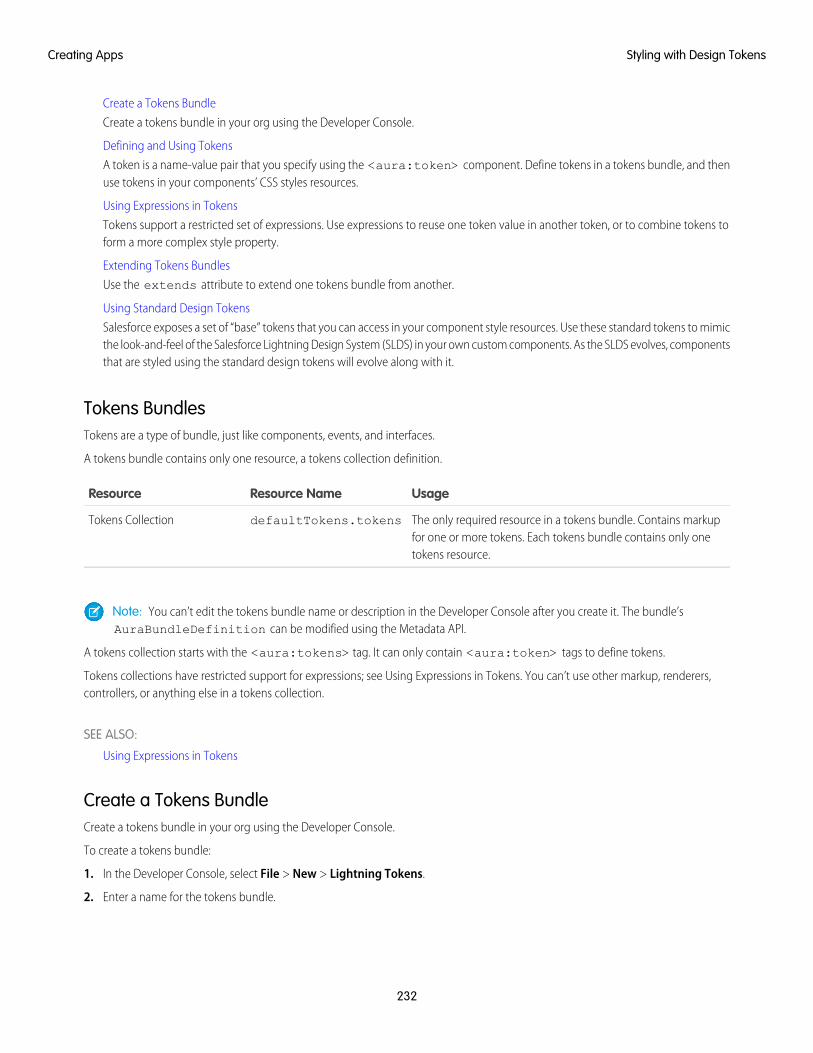
Create a Tokens Bundle
Create a tokens bundle in your org using the Developer Console.
Defining and Using Tokens
A token is a name-value pair that you specify using the <aura:token> component. Define tokens in a tokens bundle, and thenuse tokens in your components’ CSS styles resources.
Using Expressions in Tokens
Tokens support a restricted set of expressions. Use expressions to reuse one token value in another token, or to combine tokens toform a more complex style property.
Extending Tokens Bundles
Use the extends attribute to extend one tokens bundle from another.
Using Standard Design Tokens
Salesforce exposes a set of “base” tokens that you can access in your component style resources. Use these standard tokens to mimicthe look-and-feel of the Salesforce Lightning Design System (SLDS) in your own custom components. As the SLDS evolves, componentsthat are styled using the standard design tokens will evolve along with it.
Tokens BundlesTokens are a type of bundle, just like components, events, and interfaces.
A tokens bundle contains only one resource, a tokens collection definition.
UsageResource NameResource
The only required resource in a tokens bundle. Contains markupfor one or more tokens. Each tokens bundle contains only onetokens resource.
defaultTokens.tokensTokens Collection
Note: You can’t edit the tokens bundle name or description in the Developer Console after you create it. The bundle’sAuraBundleDefinition can be modified using the Metadata API.
A tokens collection starts with the <aura:tokens> tag. It can only contain <aura:token> tags to define tokens.
Tokens collections have restricted support for expressions; see Using Expressions in Tokens. You can’t use other markup, renderers,controllers, or anything else in a tokens collection.
SEE ALSO:
Using Expressions in Tokens
Create a Tokens BundleCreate a tokens bundle in your org using the Developer Console.
To create a tokens bundle:
1. In the Developer Console, select File > New > Lightning Tokens.
2. Enter a name for the tokens bundle.
232
Styling with Design TokensCreating Apps
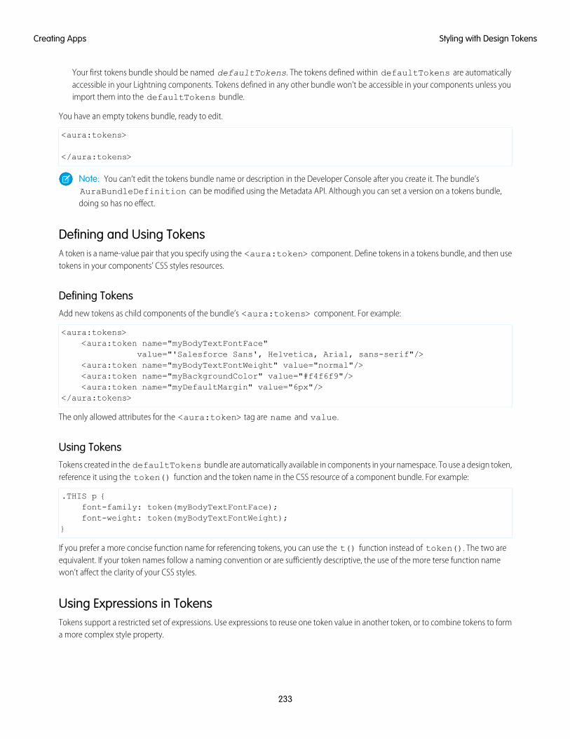
Your first tokens bundle should be named defaultTokens. The tokens defined within defaultTokens are automaticallyaccessible in your Lightning components. Tokens defined in any other bundle won’t be accessible in your components unless youimport them into the defaultTokens bundle.
You have an empty tokens bundle, ready to edit.
<aura:tokens>
</aura:tokens>
Note: You can’t edit the tokens bundle name or description in the Developer Console after you create it. The bundle’sAuraBundleDefinition can be modified using the Metadata API. Although you can set a version on a tokens bundle,doing so has no effect.
Defining and Using TokensA token is a name-value pair that you specify using the <aura:token> component. Define tokens in a tokens bundle, and then usetokens in your components’ CSS styles resources.
Defining TokensAdd new tokens as child components of the bundle’s <aura:tokens> component. For example:
<aura:tokens><aura:token name="myBodyTextFontFace"
value="'Salesforce Sans', Helvetica, Arial, sans-serif"/><aura:token name="myBodyTextFontWeight" value="normal"/><aura:token name="myBackgroundColor" value="#f4f6f9"/><aura:token name="myDefaultMargin" value="6px"/>
</aura:tokens>
The only allowed attributes for the <aura:token> tag are name and value.
Using TokensTokens created in the defaultTokens bundle are automatically available in components in your namespace. To use a design token,reference it using the token() function and the token name in the CSS resource of a component bundle. For example:
.THIS p {font-family: token(myBodyTextFontFace);font-weight: token(myBodyTextFontWeight);
}
If you prefer a more concise function name for referencing tokens, you can use the t() function instead of token(). The two areequivalent. If your token names follow a naming convention or are sufficiently descriptive, the use of the more terse function namewon’t affect the clarity of your CSS styles.
Using Expressions in TokensTokens support a restricted set of expressions. Use expressions to reuse one token value in another token, or to combine tokens to forma more complex style property.
233
Styling with Design TokensCreating Apps
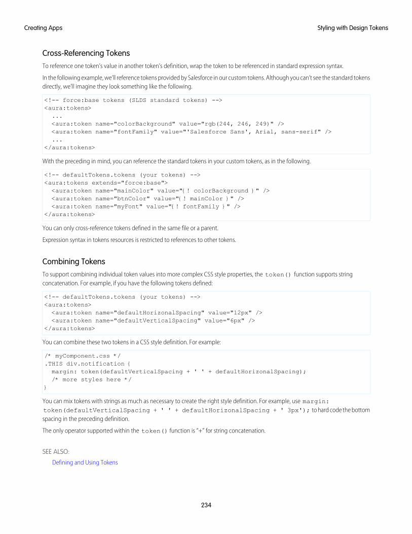
Cross-Referencing TokensTo reference one token’s value in another token’s definition, wrap the token to be referenced in standard expression syntax.
In the following example, we’ll reference tokens provided by Salesforce in our custom tokens. Although you can’t see the standard tokensdirectly, we’ll imagine they look something like the following.
<!-- force:base tokens (SLDS standard tokens) --><aura:tokens>...<aura:token name="colorBackground" value="rgb(244, 246, 249)" /><aura:token name="fontFamily" value="'Salesforce Sans', Arial, sans-serif" />...
</aura:tokens>
With the preceding in mind, you can reference the standard tokens in your custom tokens, as in the following.
<!-- defaultTokens.tokens (your tokens) --><aura:tokens extends="force:base"><aura:token name="mainColor" value="{! colorBackground }" /><aura:token name="btnColor" value="{! mainColor }" /><aura:token name="myFont" value="{! fontFamily }" />
</aura:tokens>
You can only cross-reference tokens defined in the same file or a parent.
Expression syntax in tokens resources is restricted to references to other tokens.
Combining TokensTo support combining individual token values into more complex CSS style properties, the token() function supports stringconcatenation. For example, if you have the following tokens defined:
<!-- defaultTokens.tokens (your tokens) --><aura:tokens><aura:token name="defaultHorizonalSpacing" value="12px" /><aura:token name="defaultVerticalSpacing" value="6px" />
</aura:tokens>
You can combine these two tokens in a CSS style definition. For example:
/* myComponent.css */.THIS div.notification {margin: token(defaultVerticalSpacing + ' ' + defaultHorizonalSpacing);/* more styles here */
}
You can mix tokens with strings as much as necessary to create the right style definition. For example, use margin:token(defaultVerticalSpacing + ' ' + defaultHorizonalSpacing + ' 3px'); to hard code the bottomspacing in the preceding definition.
The only operator supported within the token() function is “+” for string concatenation.
SEE ALSO:
Defining and Using Tokens
234
Styling with Design TokensCreating Apps
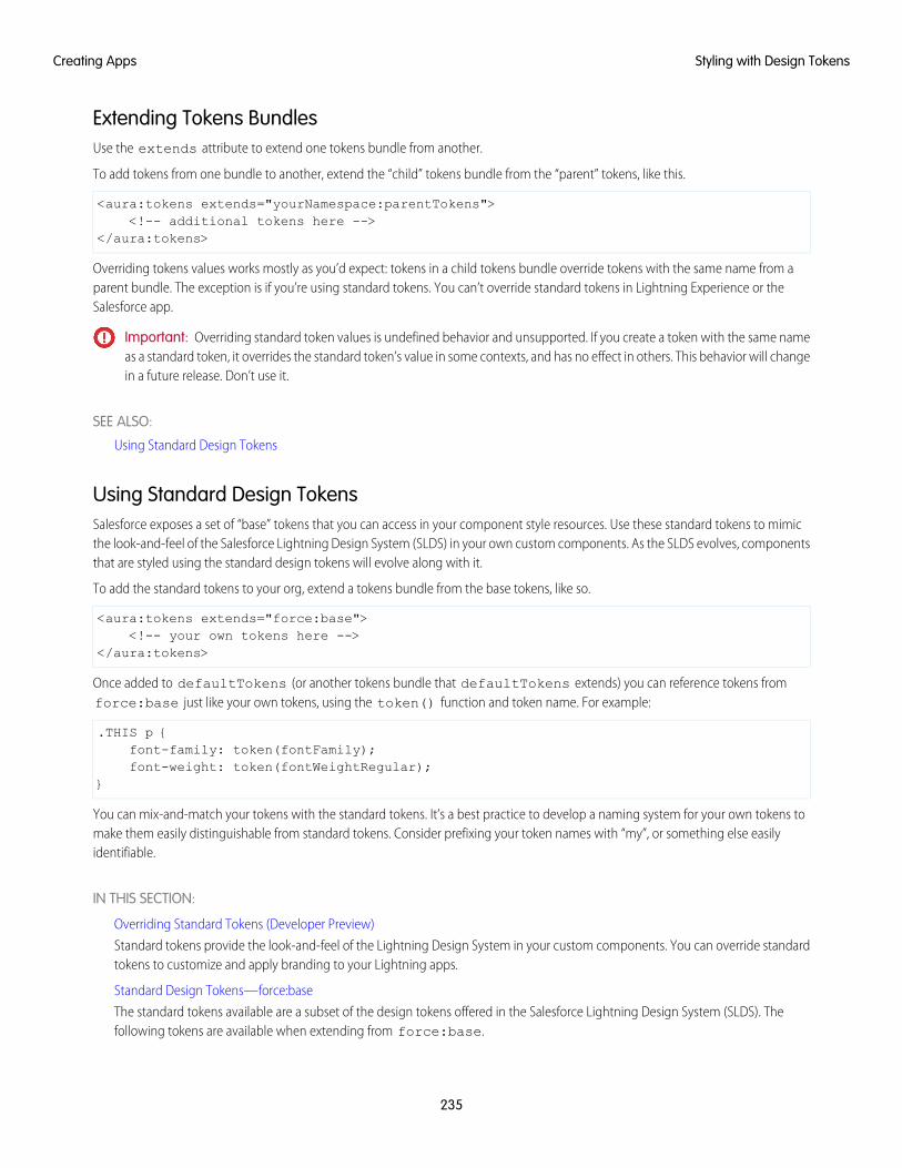
Extending Tokens BundlesUse the extends attribute to extend one tokens bundle from another.
To add tokens from one bundle to another, extend the “child” tokens bundle from the “parent” tokens, like this.
<aura:tokens extends="yourNamespace:parentTokens"><!-- additional tokens here -->
</aura:tokens>
Overriding tokens values works mostly as you’d expect: tokens in a child tokens bundle override tokens with the same name from aparent bundle. The exception is if you’re using standard tokens. You can’t override standard tokens in Lightning Experience or theSalesforce app.
Important: Overriding standard token values is undefined behavior and unsupported. If you create a token with the same nameas a standard token, it overrides the standard token’s value in some contexts, and has no effect in others. This behavior will changein a future release. Don’t use it.
SEE ALSO:
Using Standard Design Tokens
Using Standard Design TokensSalesforce exposes a set of “base” tokens that you can access in your component style resources. Use these standard tokens to mimicthe look-and-feel of the Salesforce Lightning Design System (SLDS) in your own custom components. As the SLDS evolves, componentsthat are styled using the standard design tokens will evolve along with it.
To add the standard tokens to your org, extend a tokens bundle from the base tokens, like so.
<aura:tokens extends="force:base"><!-- your own tokens here -->
</aura:tokens>
Once added to defaultTokens (or another tokens bundle that defaultTokens extends) you can reference tokens fromforce:base just like your own tokens, using the token() function and token name. For example:
.THIS p {font-family: token(fontFamily);font-weight: token(fontWeightRegular);
}
You can mix-and-match your tokens with the standard tokens. It’s a best practice to develop a naming system for your own tokens tomake them easily distinguishable from standard tokens. Consider prefixing your token names with “my”, or something else easilyidentifiable.
IN THIS SECTION:
Overriding Standard Tokens (Developer Preview)
Standard tokens provide the look-and-feel of the Lightning Design System in your custom components. You can override standardtokens to customize and apply branding to your Lightning apps.
Standard Design Tokens—force:base
The standard tokens available are a subset of the design tokens offered in the Salesforce Lightning Design System (SLDS). Thefollowing tokens are available when extending from force:base.
235
Styling with Design TokensCreating Apps
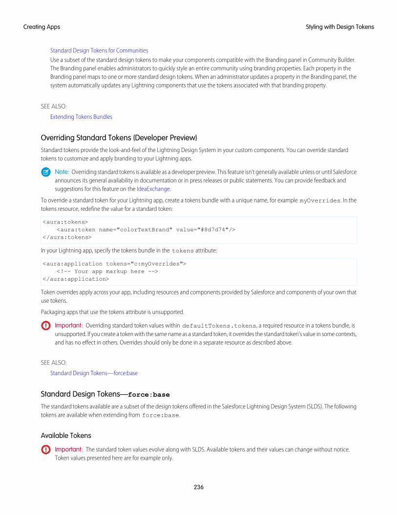
Standard Design Tokens for Communities
Use a subset of the standard design tokens to make your components compatible with the Branding panel in Community Builder.The Branding panel enables administrators to quickly style an entire community using branding properties. Each property in theBranding panel maps to one or more standard design tokens. When an administrator updates a property in the Branding panel, thesystem automatically updates any Lightning components that use the tokens associated with that branding property.
SEE ALSO:
Extending Tokens Bundles
Overriding Standard Tokens (Developer Preview)Standard tokens provide the look-and-feel of the Lightning Design System in your custom components. You can override standardtokens to customize and apply branding to your Lightning apps.
Note: Overriding standard tokens is available as a developer preview. This feature isn’t generally available unless or until Salesforceannounces its general availability in documentation or in press releases or public statements. You can provide feedback andsuggestions for this feature on the IdeaExchange.
To override a standard token for your Lightning app, create a tokens bundle with a unique name, for example myOverrides. In thetokens resource, redefine the value for a standard token:
<aura:tokens><aura:token name="colorTextBrand" value="#8d7d74"/>
</aura:tokens>
In your Lightning app, specify the tokens bundle in the tokens attribute:
<aura:application tokens="c:myOverrides"><!-- Your app markup here -->
</aura:application>
Token overrides apply across your app, including resources and components provided by Salesforce and components of your own thatuse tokens.
Packaging apps that use the tokens attribute is unsupported.
Important: Overriding standard token values within defaultTokens.tokens, a required resource in a tokens bundle, isunsupported. If you create a token with the same name as a standard token, it overrides the standard token’s value in some contexts,and has no effect in others. Overrides should only be done in a separate resource as described above.
SEE ALSO:
Standard Design Tokens—force:base
Standard Design Tokens—force:base
The standard tokens available are a subset of the design tokens offered in the Salesforce Lightning Design System (SLDS). The followingtokens are available when extending from force:base.
Available Tokens
Important: The standard token values evolve along with SLDS. Available tokens and their values can change without notice.Token values presented here are for example only.
236
Styling with Design TokensCreating Apps
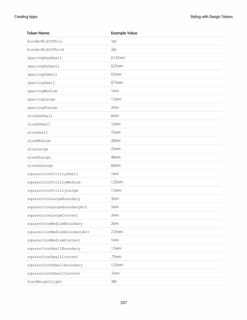
Example ValueToken Name
1pxborderWidthThin
2pxborderWidthThick
0.125remspacingXxxSmall
0.25remspacingXxSmall
0.5remspacingXSmall
0.75remspacingSmall
1remspacingMedium
1.5remspacingLarge
2remspacingXLarge
6remsizeXxSmall
12remsizeXSmall
15remsizeSmall
20remsizeMedium
25remsizeLarge
40remsizeXLarge
60remsizeXxLarge
1remsquareIconUtilitySmall
1.25remsquareIconUtilityMedium
1.5remsquareIconUtilityLarge
3remsquareIconLargeBoundary
5remsquareIconLargeBoundaryAlt
2remsquareIconLargeContent
2remsquareIconMediumBoundary
2.25remsquareIconMediumBoundaryAlt
1remsquareIconMediumContent
1.5remsquareIconSmallBoundary
.75remsquareIconSmallContent
1.25remsquareIconXSmallBoundary
.5remsquareIconXSmallContent
300fontWeightLight
237
Styling with Design TokensCreating Apps
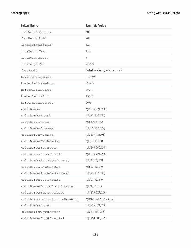
Example ValueToken Name
400fontWeightRegular
700fontWeightBold
1.25lineHeightHeading
1.375lineHeightText
1lineHeightReset
2.5remlineHeightTab
'Salesforce Sans', Arial, sans-seriffontFamily
.125remborderRadiusSmall
.25remborderRadiusMedium
.5remborderRadiusLarge
15remborderRadiusPill
50%borderRadiusCircle
rgb(216, 221, 230)colorBorder
rgb(21, 137, 238)colorBorderBrand
rgb(194, 57, 52)colorBorderError
rgb(75, 202, 129)colorBorderSuccess
rgb(255, 183, 93)colorBorderWarning
rgb(0, 112, 210)colorBorderTabSelected
rgb(244, 246, 249)colorBorderSeparator
rgb(216, 221, 230)colorBorderSeparatorAlt
rgb(42, 66, 108)colorBorderSeparatorInverse
rgb(0, 112, 210)colorBorderRowSelected
rgb(21, 137, 238)colorBorderRowSelectedHover
rgb(0, 112, 210)colorBorderButtonBrand
rgba(0, 0, 0, 0)colorBorderButtonBrandDisabled
rgb(216, 221, 230)colorBorderButtonDefault
rgba(255, 255, 255, 0.15)colorBorderButtonInverseDisabled
rgb(216, 221, 230)colorBorderInput
rgb(21, 137, 238)colorBorderInputActive
rgb(168, 183, 199)colorBorderInputDisabled
238
Styling with Design TokensCreating Apps
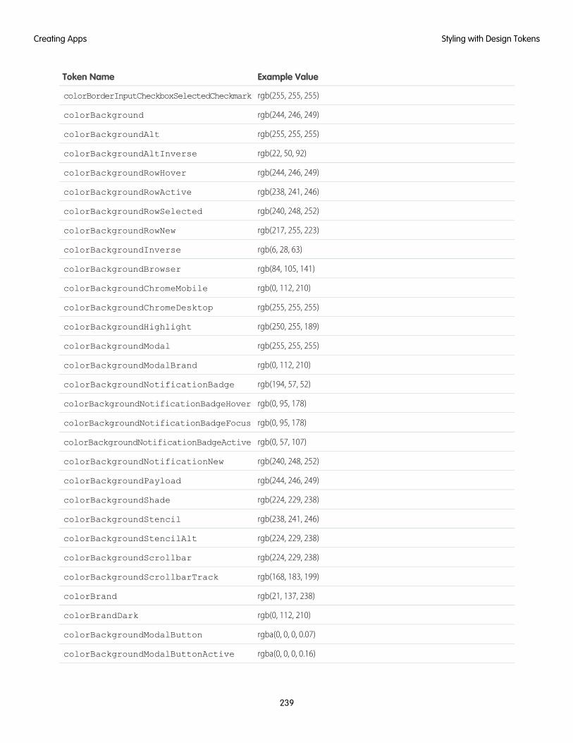
Example ValueToken Name
rgb(255, 255, 255)colorBorderInputCheckboxSelectedCheckmark
rgb(244, 246, 249)colorBackground
rgb(255, 255, 255)colorBackgroundAlt
rgb(22, 50, 92)colorBackgroundAltInverse
rgb(244, 246, 249)colorBackgroundRowHover
rgb(238, 241, 246)colorBackgroundRowActive
rgb(240, 248, 252)colorBackgroundRowSelected
rgb(217, 255, 223)colorBackgroundRowNew
rgb(6, 28, 63)colorBackgroundInverse
rgb(84, 105, 141)colorBackgroundBrowser
rgb(0, 112, 210)colorBackgroundChromeMobile
rgb(255, 255, 255)colorBackgroundChromeDesktop
rgb(250, 255, 189)colorBackgroundHighlight
rgb(255, 255, 255)colorBackgroundModal
rgb(0, 112, 210)colorBackgroundModalBrand
rgb(194, 57, 52)colorBackgroundNotificationBadge
rgb(0, 95, 178)colorBackgroundNotificationBadgeHover
rgb(0, 95, 178)colorBackgroundNotificationBadgeFocus
rgb(0, 57, 107)colorBackgroundNotificationBadgeActive
rgb(240, 248, 252)colorBackgroundNotificationNew
rgb(244, 246, 249)colorBackgroundPayload
rgb(224, 229, 238)colorBackgroundShade
rgb(238, 241, 246)colorBackgroundStencil
rgb(224, 229, 238)colorBackgroundStencilAlt
rgb(224, 229, 238)colorBackgroundScrollbar
rgb(168, 183, 199)colorBackgroundScrollbarTrack
rgb(21, 137, 238)colorBrand
rgb(0, 112, 210)colorBrandDark
rgba(0, 0, 0, 0.07)colorBackgroundModalButton
rgba(0, 0, 0, 0.16)colorBackgroundModalButtonActive
239
Styling with Design TokensCreating Apps
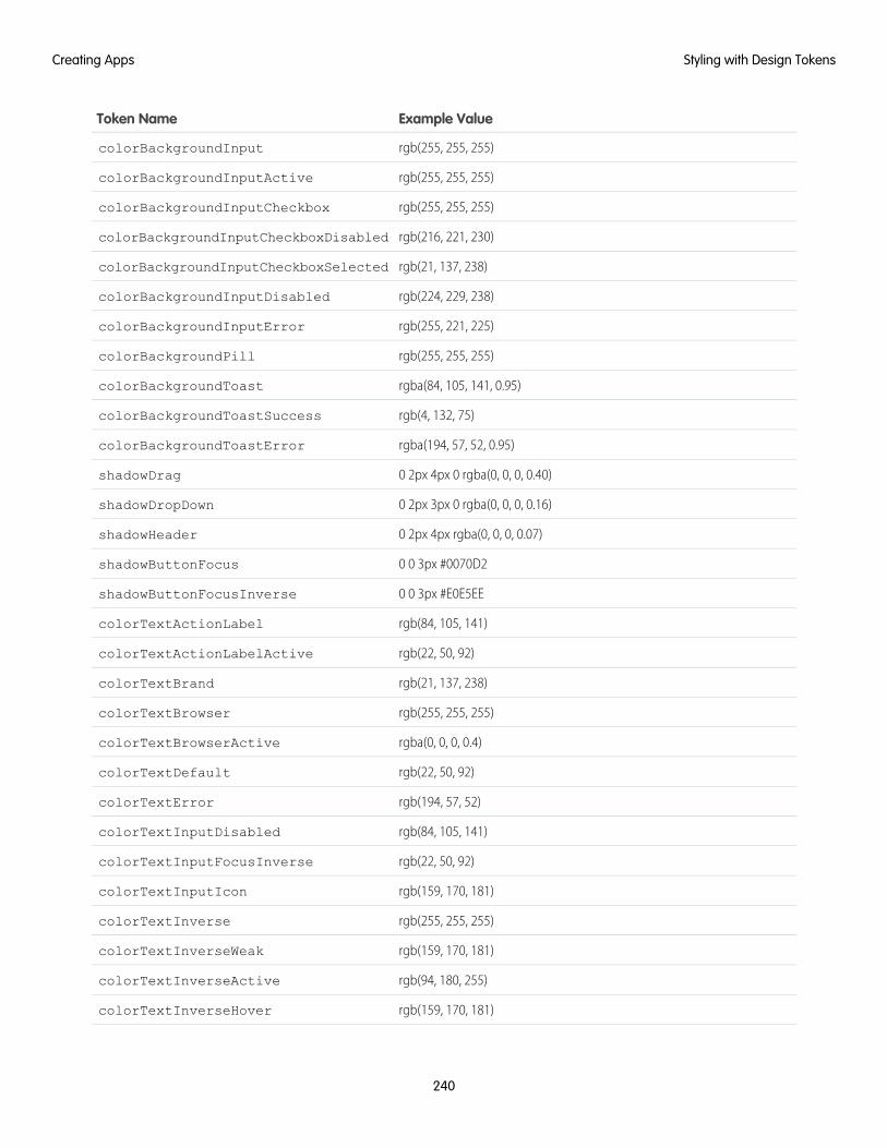
Example ValueToken Name
rgb(255, 255, 255)colorBackgroundInput
rgb(255, 255, 255)colorBackgroundInputActive
rgb(255, 255, 255)colorBackgroundInputCheckbox
rgb(216, 221, 230)colorBackgroundInputCheckboxDisabled
rgb(21, 137, 238)colorBackgroundInputCheckboxSelected
rgb(224, 229, 238)colorBackgroundInputDisabled
rgb(255, 221, 225)colorBackgroundInputError
rgb(255, 255, 255)colorBackgroundPill
rgba(84, 105, 141, 0.95)colorBackgroundToast
rgb(4, 132, 75)colorBackgroundToastSuccess
rgba(194, 57, 52, 0.95)colorBackgroundToastError
0 2px 4px 0 rgba(0, 0, 0, 0.40)shadowDrag
0 2px 3px 0 rgba(0, 0, 0, 0.16)shadowDropDown
0 2px 4px rgba(0, 0, 0, 0.07)shadowHeader
0 0 3px #0070D2shadowButtonFocus
0 0 3px #E0E5EEshadowButtonFocusInverse
rgb(84, 105, 141)colorTextActionLabel
rgb(22, 50, 92)colorTextActionLabelActive
rgb(21, 137, 238)colorTextBrand
rgb(255, 255, 255)colorTextBrowser
rgba(0, 0, 0, 0.4)colorTextBrowserActive
rgb(22, 50, 92)colorTextDefault
rgb(194, 57, 52)colorTextError
rgb(84, 105, 141)colorTextInputDisabled
rgb(22, 50, 92)colorTextInputFocusInverse
rgb(159, 170, 181)colorTextInputIcon
rgb(255, 255, 255)colorTextInverse
rgb(159, 170, 181)colorTextInverseWeak
rgb(94, 180, 255)colorTextInverseActive
rgb(159, 170, 181)colorTextInverseHover
240
Styling with Design TokensCreating Apps
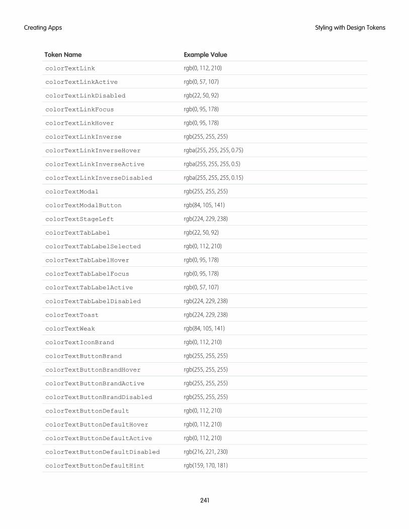
Example ValueToken Name
rgb(0, 112, 210)colorTextLink
rgb(0, 57, 107)colorTextLinkActive
rgb(22, 50, 92)colorTextLinkDisabled
rgb(0, 95, 178)colorTextLinkFocus
rgb(0, 95, 178)colorTextLinkHover
rgb(255, 255, 255)colorTextLinkInverse
rgba(255, 255, 255, 0.75)colorTextLinkInverseHover
rgba(255, 255, 255, 0.5)colorTextLinkInverseActive
rgba(255, 255, 255, 0.15)colorTextLinkInverseDisabled
rgb(255, 255, 255)colorTextModal
rgb(84, 105, 141)colorTextModalButton
rgb(224, 229, 238)colorTextStageLeft
rgb(22, 50, 92)colorTextTabLabel
rgb(0, 112, 210)colorTextTabLabelSelected
rgb(0, 95, 178)colorTextTabLabelHover
rgb(0, 95, 178)colorTextTabLabelFocus
rgb(0, 57, 107)colorTextTabLabelActive
rgb(224, 229, 238)colorTextTabLabelDisabled
rgb(224, 229, 238)colorTextToast
rgb(84, 105, 141)colorTextWeak
rgb(0, 112, 210)colorTextIconBrand
rgb(255, 255, 255)colorTextButtonBrand
rgb(255, 255, 255)colorTextButtonBrandHover
rgb(255, 255, 255)colorTextButtonBrandActive
rgb(255, 255, 255)colorTextButtonBrandDisabled
rgb(0, 112, 210)colorTextButtonDefault
rgb(0, 112, 210)colorTextButtonDefaultHover
rgb(0, 112, 210)colorTextButtonDefaultActive
rgb(216, 221, 230)colorTextButtonDefaultDisabled
rgb(159, 170, 181)colorTextButtonDefaultHint
241
Styling with Design TokensCreating Apps
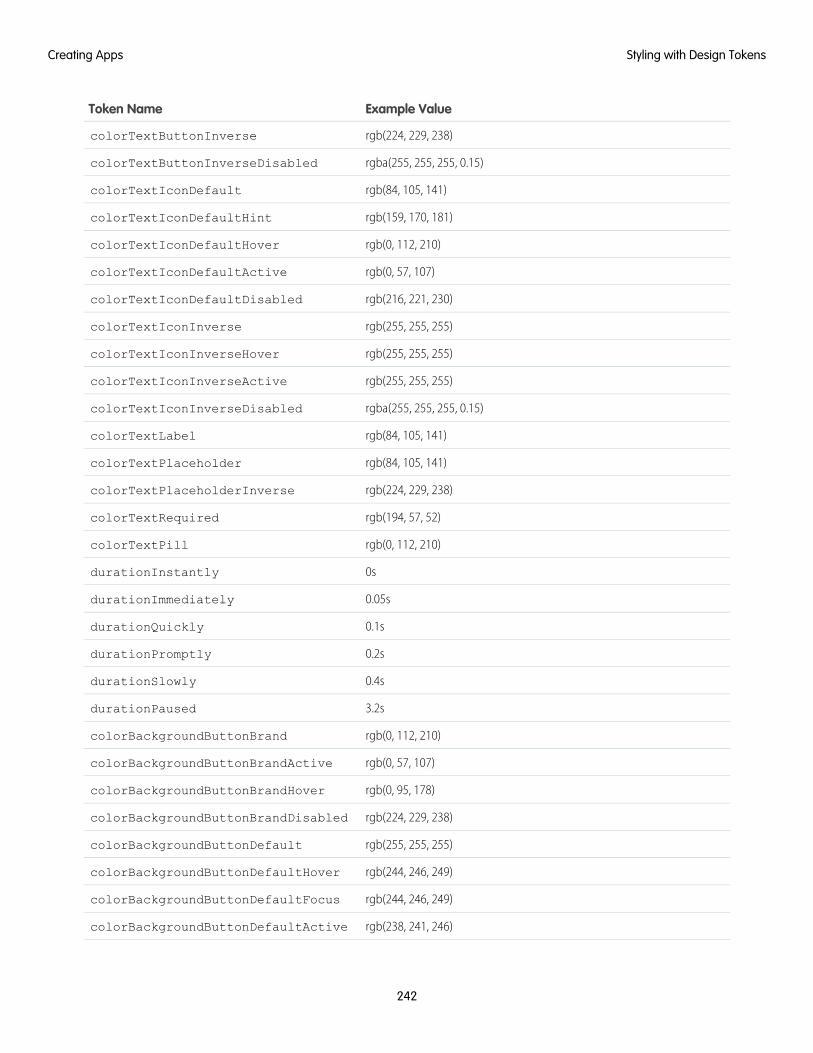
Example ValueToken Name
rgb(224, 229, 238)colorTextButtonInverse
rgba(255, 255, 255, 0.15)colorTextButtonInverseDisabled
rgb(84, 105, 141)colorTextIconDefault
rgb(159, 170, 181)colorTextIconDefaultHint
rgb(0, 112, 210)colorTextIconDefaultHover
rgb(0, 57, 107)colorTextIconDefaultActive
rgb(216, 221, 230)colorTextIconDefaultDisabled
rgb(255, 255, 255)colorTextIconInverse
rgb(255, 255, 255)colorTextIconInverseHover
rgb(255, 255, 255)colorTextIconInverseActive
rgba(255, 255, 255, 0.15)colorTextIconInverseDisabled
rgb(84, 105, 141)colorTextLabel
rgb(84, 105, 141)colorTextPlaceholder
rgb(224, 229, 238)colorTextPlaceholderInverse
rgb(194, 57, 52)colorTextRequired
rgb(0, 112, 210)colorTextPill
0sdurationInstantly
0.05sdurationImmediately
0.1sdurationQuickly
0.2sdurationPromptly
0.4sdurationSlowly
3.2sdurationPaused
rgb(0, 112, 210)colorBackgroundButtonBrand
rgb(0, 57, 107)colorBackgroundButtonBrandActive
rgb(0, 95, 178)colorBackgroundButtonBrandHover
rgb(224, 229, 238)colorBackgroundButtonBrandDisabled
rgb(255, 255, 255)colorBackgroundButtonDefault
rgb(244, 246, 249)colorBackgroundButtonDefaultHover
rgb(244, 246, 249)colorBackgroundButtonDefaultFocus
rgb(238, 241, 246)colorBackgroundButtonDefaultActive
242
Styling with Design TokensCreating Apps
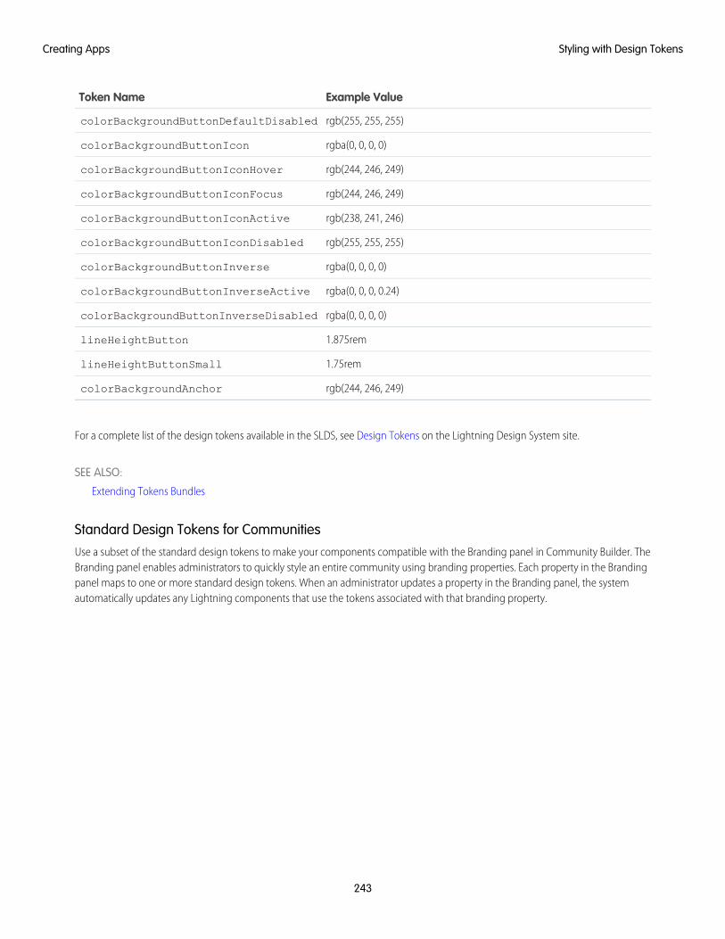
Example ValueToken Name
rgb(255, 255, 255)colorBackgroundButtonDefaultDisabled
rgba(0, 0, 0, 0)colorBackgroundButtonIcon
rgb(244, 246, 249)colorBackgroundButtonIconHover
rgb(244, 246, 249)colorBackgroundButtonIconFocus
rgb(238, 241, 246)colorBackgroundButtonIconActive
rgb(255, 255, 255)colorBackgroundButtonIconDisabled
rgba(0, 0, 0, 0)colorBackgroundButtonInverse
rgba(0, 0, 0, 0.24)colorBackgroundButtonInverseActive
rgba(0, 0, 0, 0)colorBackgroundButtonInverseDisabled
1.875remlineHeightButton
1.75remlineHeightButtonSmall
rgb(244, 246, 249)colorBackgroundAnchor
For a complete list of the design tokens available in the SLDS, see Design Tokens on the Lightning Design System site.
SEE ALSO:
Extending Tokens Bundles
Standard Design Tokens for CommunitiesUse a subset of the standard design tokens to make your components compatible with the Branding panel in Community Builder. TheBranding panel enables administrators to quickly style an entire community using branding properties. Each property in the Brandingpanel maps to one or more standard design tokens. When an administrator updates a property in the Branding panel, the systemautomatically updates any Lightning components that use the tokens associated with that branding property.
243
Styling with Design TokensCreating Apps
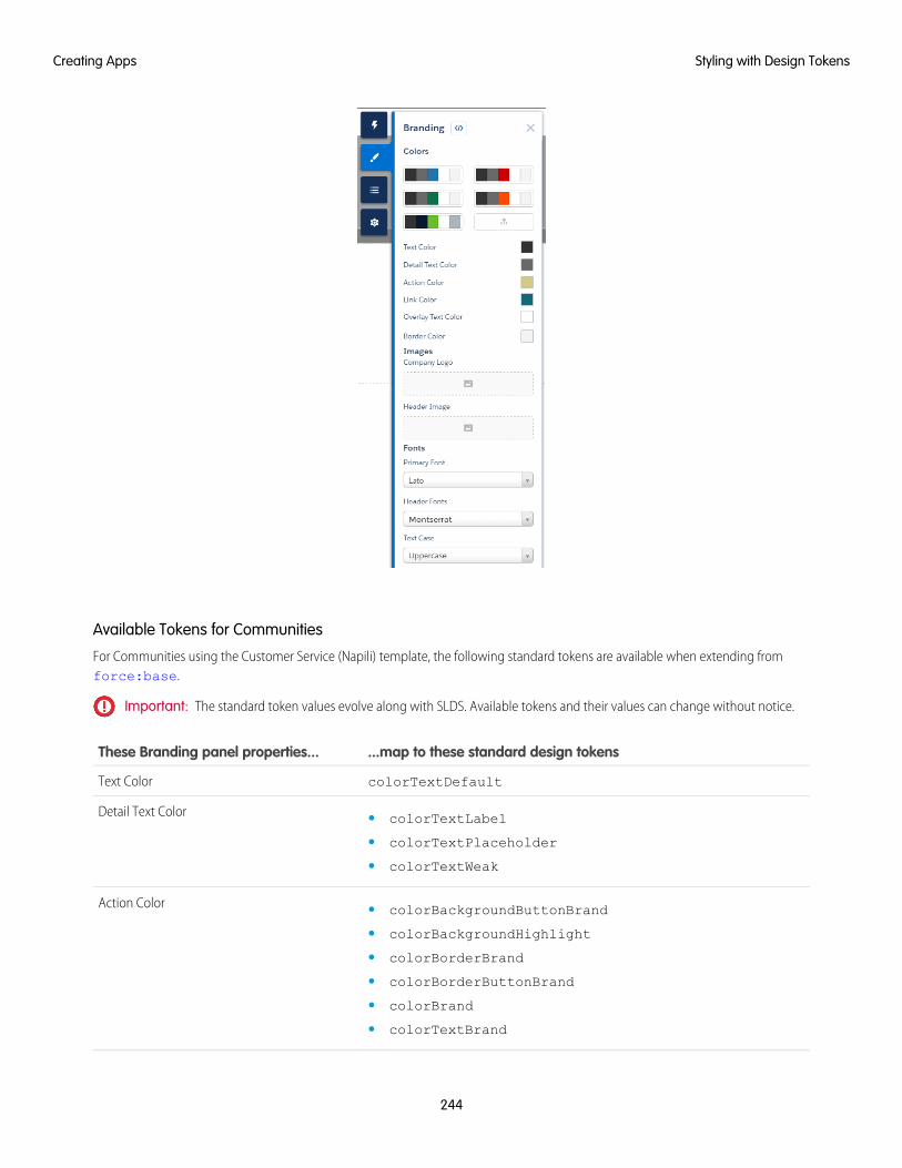
Available Tokens for Communities
For Communities using the Customer Service (Napili) template, the following standard tokens are available when extending fromforce:base.
Important: The standard token values evolve along with SLDS. Available tokens and their values can change without notice.
...map to these standard design tokensThese Branding panel properties...
colorTextDefaultText Color
Detail Text Color • colorTextLabel
• colorTextPlaceholder
• colorTextWeak
Action Color • colorBackgroundButtonBrand
• colorBackgroundHighlight
• colorBorderBrand
• colorBorderButtonBrand
• colorBrand
• colorTextBrand
244
Styling with Design TokensCreating Apps
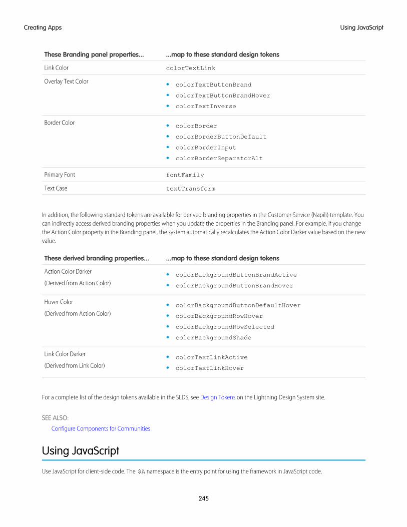
...map to these standard design tokensThese Branding panel properties...
colorTextLinkLink Color
Overlay Text Color • colorTextButtonBrand
• colorTextButtonBrandHover
• colorTextInverse
Border Color • colorBorder
• colorBorderButtonDefault
• colorBorderInput
• colorBorderSeparatorAlt
fontFamilyPrimary Font
textTransformText Case
In addition, the following standard tokens are available for derived branding properties in the Customer Service (Napili) template. Youcan indirectly access derived branding properties when you update the properties in the Branding panel. For example, if you changethe Action Color property in the Branding panel, the system automatically recalculates the Action Color Darker value based on the newvalue.
...map to these standard design tokensThese derived branding properties...
Action Color Darker
(Derived from Action Color)• colorBackgroundButtonBrandActive
• colorBackgroundButtonBrandHover
Hover Color
(Derived from Action Color)• colorBackgroundButtonDefaultHover
• colorBackgroundRowHover
• colorBackgroundRowSelected
• colorBackgroundShade
Link Color Darker
(Derived from Link Color)• colorTextLinkActive
• colorTextLinkHover
For a complete list of the design tokens available in the SLDS, see Design Tokens on the Lightning Design System site.
SEE ALSO:
Configure Components for Communities
Using JavaScript
Use JavaScript for client-side code. The $A namespace is the entry point for using the framework in JavaScript code.
245
Using JavaScriptCreating Apps
For all the methods available in $A, see the JavaScript API athttps://<myDomain>.lightning.force.com/auradocs/reference.app, where <myDomain> is the name ofyour custom Salesforce domain.
A component bundle can contain JavaScript code in a client-side controller, helper, or renderer. Client-side controllers are the mostcommonly used of these JavaScript resources.
Expressions in JavaScript CodeIn JavaScript, use string syntax to evaluate an expression. For example, this expression retrieves the label attribute in a component.
var theLabel = cmp.get("v.label");
Note: Only use the {! } expression syntax in markup in .app or .cmp resources.
IN THIS SECTION:
Invoking Actions on Component Initialization
Use the init event to initialize a component or fire an event after component construction but before rendering.
Sharing JavaScript Code in a Component Bundle
Put functions that you want to reuse in the component’s helper. Helper functions also enable specialization of tasks, such as processingdata and firing server-side actions.
Sharing JavaScript Code Across Components
You can build simple Lightning components that are entirely self-contained. However, if you build more complex applications, youprobably want to share code, or even client-side data, between components.
Using External JavaScript Libraries
To reference a JavaScript library that you’ve uploaded as a static resource, use a <ltng:require> tag in your .cmp or .appmarkup.
Working with Attribute Values in JavaScript
These are useful and common patterns for working with attribute values in JavaScript.
Working with a Component Body in JavaScript
These are useful and common patterns for working with a component’s body in JavaScript.
Working with Events in JavaScript
These are useful and common patterns for working with events in JavaScript.
Modifying the DOM
The Document Object Model (DOM) is the language-independent model for representing and interacting with objects in HTML andXML documents. It’s important to know how to modify the DOM safely so that the framework’s rendering service doesn’t stomp onyour changes and give you unexpected results.
Checking Component Validity
If you navigate elsewhere in the UI while asynchronous code is executing, the framework unrenders and destroys the componentthat made the asynchronous request. You can still have a reference to that component, but it is no longer valid. Thecmp.isValid() call returns false for an invalid component.
Modifying Components Outside the Framework Lifecycle
Use $A.getCallback() to wrap any code that modifies a component outside the normal rerendering lifecycle, such as in asetTimeout() call. The $A.getCallback() call ensures that the framework rerenders the modified component andprocesses any enqueued actions.
246
Using JavaScriptCreating Apps
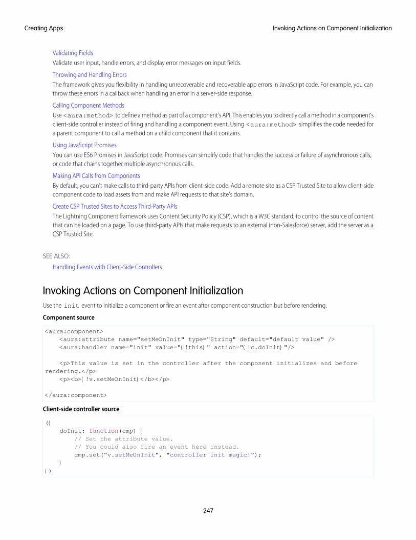
Validating Fields
Validate user input, handle errors, and display error messages on input fields.
Throwing and Handling Errors
The framework gives you flexibility in handling unrecoverable and recoverable app errors in JavaScript code. For example, you canthrow these errors in a callback when handling an error in a server-side response.
Calling Component Methods
Use <aura:method> to define a method as part of a component's API. This enables you to directly call a method in a component’sclient-side controller instead of firing and handling a component event. Using <aura:method> simplifies the code needed fora parent component to call a method on a child component that it contains.
Using JavaScript Promises
You can use ES6 Promises in JavaScript code. Promises can simplify code that handles the success or failure of asynchronous calls,or code that chains together multiple asynchronous calls.
Making API Calls from Components
By default, you can’t make calls to third-party APIs from client-side code. Add a remote site as a CSP Trusted Site to allow client-sidecomponent code to load assets from and make API requests to that site’s domain.
Create CSP Trusted Sites to Access Third-Party APIs
The Lightning Component framework uses Content Security Policy (CSP), which is a W3C standard, to control the source of contentthat can be loaded on a page. To use third-party APIs that make requests to an external (non-Salesforce) server, add the server as aCSP Trusted Site.
SEE ALSO:
Handling Events with Client-Side Controllers
Invoking Actions on Component InitializationUse the init event to initialize a component or fire an event after component construction but before rendering.
Component source
<aura:component><aura:attribute name="setMeOnInit" type="String" default="default value" /><aura:handler name="init" value="{!this}" action="{!c.doInit}"/>
<p>This value is set in the controller after the component initializes and beforerendering.</p>
<p><b>{!v.setMeOnInit}</b></p>
</aura:component>
Client-side controller source
({doInit: function(cmp) {
// Set the attribute value.// You could also fire an event here instead.cmp.set("v.setMeOnInit", "controller init magic!");
}})
247
Invoking Actions on Component InitializationCreating Apps
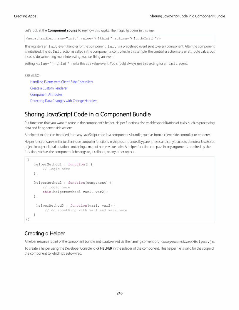
Let's look at the Component source to see how this works. The magic happens in this line.
<aura:handler name="init" value="{!this}" action="{!c.doInit}"/>
This registers an init event handler for the component. init is a predefined event sent to every component. After the componentis initialized, the doInit action is called in the component's controller. In this sample, the controller action sets an attribute value, butit could do something more interesting, such as firing an event.
Setting value="{!this}" marks this as a value event. You should always use this setting for an init event.
SEE ALSO:
Handling Events with Client-Side Controllers
Create a Custom Renderer
Component Attributes
Detecting Data Changes with Change Handlers
Sharing JavaScript Code in a Component BundlePut functions that you want to reuse in the component’s helper. Helper functions also enable specialization of tasks, such as processingdata and firing server-side actions.
A helper function can be called from any JavaScript code in a component’s bundle, such as from a client-side controller or renderer.
Helper functions are similar to client-side controller functions in shape, surrounded by parentheses and curly braces to denote a JavaScriptobject in object-literal notation containing a map of name-value pairs. A helper function can pass in any arguments required by thefunction, such as the component it belongs to, a callback, or any other objects.
({helperMethod1 : function() {
// logic here},
helperMethod2 : function(component) {// logic herethis.helperMethod3(var1, var2);
},
helperMethod3 : function(var1, var2) {// do something with var1 and var2 here
}})
Creating a HelperA helper resource is part of the component bundle and is auto-wired via the naming convention, <componentName>Helper.js.
To create a helper using the Developer Console, click HELPER in the sidebar of the component. This helper file is valid for the scope ofthe component to which it’s auto-wired.
248
Sharing JavaScript Code in a Component BundleCreating Apps
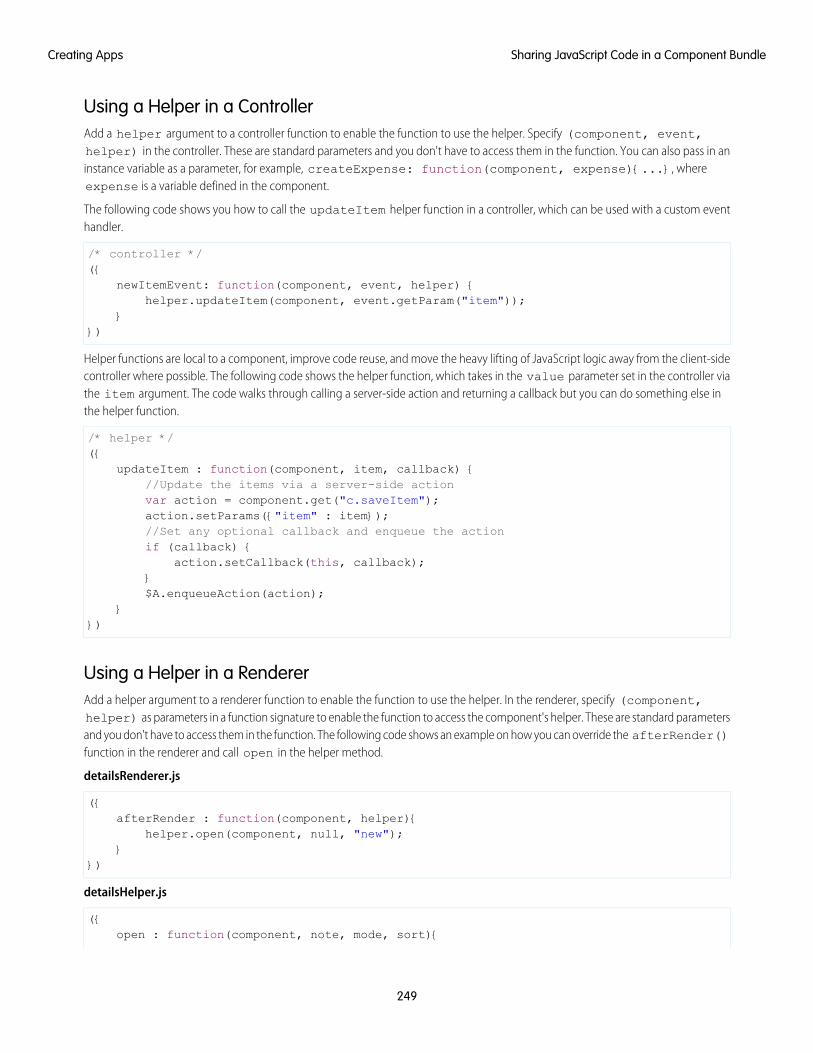
Using a Helper in a ControllerAdd a helper argument to a controller function to enable the function to use the helper. Specify (component, event,helper) in the controller. These are standard parameters and you don't have to access them in the function. You can also pass in aninstance variable as a parameter, for example, createExpense: function(component, expense){...}, whereexpense is a variable defined in the component.
The following code shows you how to call the updateItem helper function in a controller, which can be used with a custom eventhandler.
/* controller */({
newItemEvent: function(component, event, helper) {helper.updateItem(component, event.getParam("item"));
}})
Helper functions are local to a component, improve code reuse, and move the heavy lifting of JavaScript logic away from the client-sidecontroller where possible. The following code shows the helper function, which takes in the value parameter set in the controller viathe item argument. The code walks through calling a server-side action and returning a callback but you can do something else inthe helper function.
/* helper */({
updateItem : function(component, item, callback) {//Update the items via a server-side actionvar action = component.get("c.saveItem");action.setParams({"item" : item});//Set any optional callback and enqueue the actionif (callback) {
action.setCallback(this, callback);}$A.enqueueAction(action);
}})
Using a Helper in a RendererAdd a helper argument to a renderer function to enable the function to use the helper. In the renderer, specify (component,helper) as parameters in a function signature to enable the function to access the component's helper. These are standard parametersand you don't have to access them in the function. The following code shows an example on how you can override the afterRender()function in the renderer and call open in the helper method.
detailsRenderer.js
({afterRender : function(component, helper){
helper.open(component, null, "new");}
})
detailsHelper.js
({open : function(component, note, mode, sort){
249
Sharing JavaScript Code in a Component BundleCreating Apps
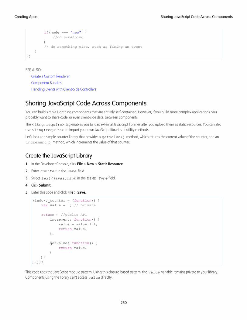
if(mode === "new") {//do something
}// do something else, such as firing an event
}})
SEE ALSO:
Create a Custom Renderer
Component Bundles
Handling Events with Client-Side Controllers
Sharing JavaScript Code Across ComponentsYou can build simple Lightning components that are entirely self-contained. However, if you build more complex applications, youprobably want to share code, or even client-side data, between components.
The <ltng:require> tag enables you to load external JavaScript libraries after you upload them as static resources. You can alsouse <ltng:require> to import your own JavaScript libraries of utility methods.
Let’s look at a simple counter library that provides a getValue() method, which returns the current value of the counter, and anincrement() method, which increments the value of that counter.
Create the JavaScript Library1. In the Developer Console, click File > New > Static Resource.
2. Enter counter in the Name field.
3. Select text/javascript in the MIME Type field.
4. Click Submit.
5. Enter this code and click File > Save.
window._counter = (function() {var value = 0; // private
return { //public APIincrement: function() {
value = value + 1;return value;
},
getValue: function() {return value;
}};
}());
This code uses the JavaScript module pattern. Using this closure-based pattern, the value variable remains private to your library.Components using the library can’t access value directly.
250
Sharing JavaScript Code Across ComponentsCreating Apps
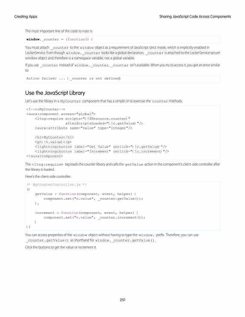
The most important line of the code to note is:
window._counter = (function() {
You must attach _counter to the window object as a requirement of JavaScript strict mode, which is implicitly enabled inLockerService. Even though window._counter looks like a global declaration, _counter is attached to the LockerService securewindow object and therefore is a namespace variable, not a global variable.
If you use _counter instead of window._counter, _counter isn’t available. When you try to access it, you get an error similarto:
Action failed: ... [_counter is not defined]
Use the JavaScript LibraryLet’s use the library in a MyCounter component that has a simple UI to exercise the counter methods.
<!--c:MyCounter--><aura:component access="global">
<ltng:require scripts="{!$Resource.counter}"afterScriptsLoaded="{!c.getValue}"/>
<aura:attribute name="value" type="Integer"/>
<h1>MyCounter</h1><p>{!v.value}</p><lightning:button label="Get Value" onclick="{!c.getValue}"/><lightning:button label="Increment" onclick="{!c.increment}"/>
</aura:component>
The <ltng:require> tag loads the counter library and calls the getValue action in the component’s client-side controller afterthe library is loaded.
Here’s the client-side controller.
/* MyCounterController.js */({
getValue : function(component, event, helper) {component.set("v.value", _counter.getValue());
},
increment : function(component, event, helper) {component.set("v.value", _counter.increment());
}})
You can access properties of the window object without having to type the window. prefix. Therefore, you can use_counter.getValue() as shorthand for window._counter.getValue().
Click the buttons to get the value or increment it.
251
Sharing JavaScript Code Across ComponentsCreating Apps
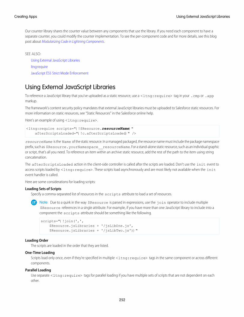
Our counter library shares the counter value between any components that use the library. If you need each component to have aseparate counter, you could modify the counter implementation. To see the per-component code and for more details, see this blogpost about Modularizing Code in Lightning Components.
SEE ALSO:
Using External JavaScript Libraries
ltng:require
JavaScript ES5 Strict Mode Enforcement
Using External JavaScript LibrariesTo reference a JavaScript library that you’ve uploaded as a static resource, use a <ltng:require> tag in your .cmp or .appmarkup.
The framework’s content security policy mandates that external JavaScript libraries must be uploaded to Salesforce static resources. Formore information on static resources, see “Static Resources” in the Salesforce online help.
Here’s an example of using <ltng:require>.
<ltng:require scripts="{!$Resource.resourceName}"afterScriptsLoaded="{!c.afterScriptsLoaded}" />
resourceName is the Name of the static resource. In a managed packaged, the resource name must include the package namespaceprefix, such as $Resource.yourNamespace__resourceName. For a stand-alone static resource, such as an individual graphicor script, that’s all you need. To reference an item within an archive static resource, add the rest of the path to the item using stringconcatenation.
The afterScriptsLoaded action in the client-side controller is called after the scripts are loaded. Don't use the init event toaccess scripts loaded by <ltng:require>. These scripts load asynchronously and are most likely not available when the initevent handler is called.
Here are some considerations for loading scripts:
Loading Sets of ScriptsSpecify a comma-separated list of resources in the scripts attribute to load a set of resources.
Note: Due to a quirk in the way $Resource is parsed in expressions, use the join operator to include multiple$Resource references in a single attribute. For example, if you have more than one JavaScript library to include into acomponent the scripts attribute should be something like the following.
scripts="{!join(',',$Resource.jsLibraries + '/jsLibOne.js',$Resource.jsLibraries + '/jsLibTwo.js')}"
Loading OrderThe scripts are loaded in the order that they are listed.
One-Time LoadingScripts load only once, even if they’re specified in multiple <ltng:require> tags in the same component or across differentcomponents.
Parallel LoadingUse separate <ltng:require> tags for parallel loading if you have multiple sets of scripts that are not dependent on eachother.
252
Using External JavaScript LibrariesCreating Apps
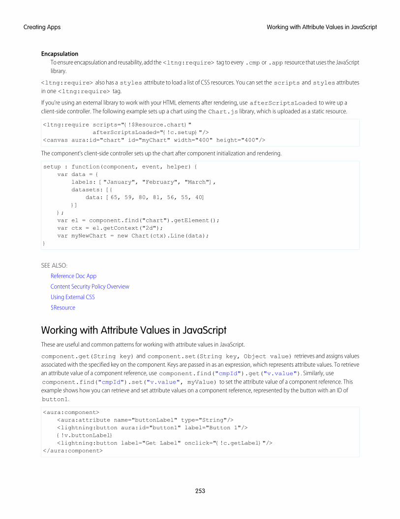
EncapsulationTo ensure encapsulation and reusability, add the <ltng:require> tag to every .cmp or .app resource that uses the JavaScriptlibrary.
<ltng:require> also has a styles attribute to load a list of CSS resources. You can set the scripts and styles attributesin one <ltng:require> tag.
If you’re using an external library to work with your HTML elements after rendering, use afterScriptsLoaded to wire up aclient-side controller. The following example sets up a chart using the Chart.js library, which is uploaded as a static resource.
<ltng:require scripts="{!$Resource.chart}"afterScriptsLoaded="{!c.setup}"/>
<canvas aura:id="chart" id="myChart" width="400" height="400"/>
The component’s client-side controller sets up the chart after component initialization and rendering.
setup : function(component, event, helper) {var data = {
labels: ["January", "February", "March"],datasets: [{
data: [65, 59, 80, 81, 56, 55, 40]}]
};var el = component.find("chart").getElement();var ctx = el.getContext("2d");var myNewChart = new Chart(ctx).Line(data);
}
SEE ALSO:
Reference Doc App
Content Security Policy Overview
Using External CSS
$Resource
Working with Attribute Values in JavaScriptThese are useful and common patterns for working with attribute values in JavaScript.
component.get(String key) and component.set(String key, Object value) retrieves and assigns valuesassociated with the specified key on the component. Keys are passed in as an expression, which represents attribute values. To retrievean attribute value of a component reference, use component.find("cmpId").get("v.value"). Similarly, usecomponent.find("cmpId").set("v.value", myValue) to set the attribute value of a component reference. Thisexample shows how you can retrieve and set attribute values on a component reference, represented by the button with an ID ofbutton1.
<aura:component><aura:attribute name="buttonLabel" type="String"/><lightning:button aura:id="button1" label="Button 1"/>{!v.buttonLabel}<lightning:button label="Get Label" onclick="{!c.getLabel}"/>
</aura:component>
253
Working with Attribute Values in JavaScriptCreating Apps
This controller action retrieves the label attribute value of a button in a component and sets its value on the buttonLabelattribute.
({getLabel : function(component, event, helper) {
var myLabel = component.find("button1").get("v.label");component.set("v.buttonLabel", myLabel);
}})
In the following examples, cmp is a reference to a component in your JavaScript code.
Get an Attribute ValueTo get the value of a component’s label attribute:
var label = cmp.get("v.label");
Set an Attribute ValueTo set the value of a component’s label attribute:
cmp.set("v.label","This is a label");
Validate that an Attribute Value is DefinedTo determine if a component’s label attribute is defined:
var isDefined = !$A.util.isUndefined(cmp.get("v.label"));
Validate that an Attribute Value is EmptyTo determine if a component’s label attribute is empty:
var isEmpty = $A.util.isEmpty(cmp.get("v.label"));
SEE ALSO:
Working with a Component Body in JavaScript
Working with a Component Body in JavaScriptThese are useful and common patterns for working with a component’s body in JavaScript.
In these examples, cmp is a reference to a component in your JavaScript code. It’s usually easy to get a reference to a component inJavaScript code. Remember that the body attribute is an array of components, so you can use the JavaScript Array methods on it.
Note: When you use cmp.set("v.body", ...) to set the component body, you must explicitly include {!v.body}in your component markup.
254
Working with a Component Body in JavaScriptCreating Apps
Replace a Component's BodyTo replace the current value of a component’s body with another component:
// newCmp is a reference to another componentcmp.set("v.body", newCmp);
Clear a Component's BodyTo clear or empty the current value of a component’s body:
cmp.set("v.body", []);
Append a Component to a Component's BodyTo append a newCmp component to a component’s body:
var body = cmp.get("v.body");// newCmp is a reference to another componentbody.push(newCmp);cmp.set("v.body", body);
Prepend a Component to a Component's BodyTo prepend a newCmp component to a component’s body:
var body = cmp.get("v.body");body.unshift(newCmp);cmp.set("v.body", body);
Remove a Component from a Component's BodyTo remove an indexed entry from a component’s body:
var body = cmp.get("v.body");// Index (3) is zero-based so remove the fourth component in the bodybody.splice(3, 1);cmp.set("v.body", body);
SEE ALSO:
Component Body
Working with Attribute Values in JavaScript
Working with Events in JavaScriptThese are useful and common patterns for working with events in JavaScript.
Events communicate data across components. Events can contain attributes with values set before the event is fired and read when theevent is handled.
255
Working with Events in JavaScriptCreating Apps
Fire an EventFire a component event or an application event that’s registered on a component.
//Fire a component eventvar compEvent = cmp.getEvent("sampleComponentEvent");compEvent.fire();
//Fire an application eventvar appEvent = $A.get("e.c:appEvent");appEvent.fire();
For more information, see:
• Fire Component Events
• Fire Application Events
Get an Event NameTo get the name of the event that’s fired:
event.getSource().getName();
Get an Event ParameterTo get an attribute that’s passed into an event:
event.getParam("value");
Get Parameters on an EventTo get all attributes that are passed into an event:
event.getParams();
event.getParams() returns an object containing all event parameters.
Get the Current Phase of an EventTo get the current phase of an event:
event.getPhase();
If the event hasn’t been fired, event.getPhase() returns undefined. Possible return values for component and applicationevents are capture, bubble, and default. Value events return default. For more information, see:
• Component Event Propagation
• Application Event Propagation
Get the Source ComponentTo get the component that fired the event:
event.getSource();
256
Working with Events in JavaScriptCreating Apps
To retrieve an attribute on the component that fired the event:
event.getSource().get("v.myName");
Pause the EventTo pause the fired event:
event.pause();
If paused, the event is not handled until event.resume() is called. You can pause an event in the capture or bubble phaseonly. For more information, see:
• Handling Bubbled or Captured Component Events
• Handling Bubbled or Captured Application Events
Prevent the Default Event ExecutionTo cancel the default action on the event:
event.preventDefault();
For example, you can prevent a lightning:button component from submitting a form when it’s clicked.
Resume a Paused EventTo resume event handling for a paused event:
event.resume();
You can resume a paused event in the capture or bubble phase only. For more information, see:
• Handling Bubbled or Captured Component Events
• Handling Bubbled or Captured Application Events
Set a Value for an Event ParameterTo set a value for an event parameter:
event.setParam("name", cmp.get("v.myName");
If the event has already been fired, setting a parameter value has no effect on the event.
Set Values for Event ParametersTo set values for parameters on an event:
event.setParams({key : value
});
If the event has already been fired, setting the parameter values has no effect on the event.
257
Working with Events in JavaScriptCreating Apps
Stop Event PropagationTo prevent further propagation of an event:
event.stopPropagation();
You can stop event propagation in the capture or bubble phase only.
Modifying the DOMThe Document Object Model (DOM) is the language-independent model for representing and interacting with objects in HTML andXML documents. It’s important to know how to modify the DOM safely so that the framework’s rendering service doesn’t stomp on yourchanges and give you unexpected results.
IN THIS SECTION:
Modifying DOM Elements Managed by the Lightning Component Framework
The framework creates and manages the DOM elements owned by a component. If you want to modify these DOM elements createdby the framework, modify the DOM elements in the handler for the component’s render event or in a custom renderer. Otherwise,the framework will override your changes when the component is rerendered.
Modifying DOM Elements Managed by External Libraries
You can use different libraries, such as a charting library, to create and manage DOM elements. You don’t have to modify these DOMelements within the render event handler or a renderer because they are managed by the external library.
Modifying DOM Elements Managed by the Lightning Component FrameworkThe framework creates and manages the DOM elements owned by a component. If you want to modify these DOM elements createdby the framework, modify the DOM elements in the handler for the component’s render event or in a custom renderer. Otherwise,the framework will override your changes when the component is rerendered.
For example, if you modify DOM elements directly from a client-side controller, the changes may be overwritten when the componentis rendered.
You can read from the DOM outside a render event handler or a custom renderer.
The simplest approach is to leave DOM updates to the framework. Update a component’s attribute and use an expression in the markup.The framework’s rendering service takes care of the DOM updates.
You can modify CSS classes for a component outside a renderer by using the $A.util.addClass(), $A.util.removeClass(),and $A.util.toggleClass() methods.
There are some use cases where you want to perform post-processing on the DOM or react to rendering or rerendering of a component.For these use cases, there are a few options.
IN THIS SECTION:
Handle the render Event
When a component is rendered or rerendered, the aura:valueRender event, also known as the render event, is fired.Handle this event to perform post-processing on the DOM or react to component rendering or rerendering. The event is preferredand easier to use than the alternative of creating a custom renderer.
258
Modifying the DOMCreating Apps
Create a Custom Renderer
The framework’s rendering service takes in-memory component state and creates and manages the DOM elements owned by thecomponent. If you want to modify DOM elements created by the framework for a component, you can modify the DOM elementsin the component’s renderer. Otherwise, the framework will override your changes when the component is rerendered.
SEE ALSO:
Modifying DOM Elements Managed by External Libraries
Using Expressions
Dynamically Showing or Hiding Markup
Handle the render Event
When a component is rendered or rerendered, the aura:valueRender event, also known as the render event, is fired. Handlethis event to perform post-processing on the DOM or react to component rendering or rerendering. The event is preferred and easierto use than the alternative of creating a custom renderer.
The render event is fired after all methods in a custom renderer are invoked. For more details on the sequence in the rendering orrerendering lifecycles, see Create a Custom Renderer.
Handling the aura:valueRender event is similar to handling the init hook. Add a handler to your component's markup.
<aura:handler name="render" value="{!this}" action="{!c.onRender}"/>
In this example, the onRender action in your client-side controller handles initial rendering and rerendering of the component. Youcan choose any name for the action attribute.
SEE ALSO:
Invoking Actions on Component Initialization
Create a Custom Renderer
Create a Custom RendererThe framework’s rendering service takes in-memory component state and creates and manages the DOM elements owned by thecomponent. If you want to modify DOM elements created by the framework for a component, you can modify the DOM elements inthe component’s renderer. Otherwise, the framework will override your changes when the component is rerendered.
The DOM is the language-independent model for representing and interacting with objects in HTML and XML documents. The frameworkautomatically renders your components so you don’t have to know anything more about rendering unless you need to customize thedefault rendering behavior for a component.
Note: It’s preferred and easier to handle the render event rather than the alternative of creating a custom renderer.
Base Component Rendering
The base component in the framework is aura:component. Every component extends this base component.
The renderer for aura:component is in componentRenderer.js. This renderer has base implementations for the four phasesof the rendering and rerendering cycles:
• render()
• rerender()
259
Modifying the DOMCreating Apps
• afterRender()
• unrender()
The framework calls these functions as part of the rendering and rerendering lifecycles and we will learn more about them soon. Youcan override the base rendering functions in a custom renderer.
Rendering Lifecycle
The rendering lifecycle happens once in the lifetime of a component unless the component gets explicitly unrendered. When you createa component:
1. The framework fires an init event, enabling you to update a component or fire an event after component construction but beforerendering.
2. The render() method is called to render the component’s body.
3. The afterRender() method is called to enable you to interact with the DOM tree after the framework’s rendering service hasinserted DOM elements.
4. The framework fires a render event, enabling you to interact with the DOM tree after the framework’s rendering service hasinserted DOM elements. Handling the render event is preferred to creating a custom renderer and overriding afterRender().
Rerendering Lifecycle
The rerendering lifecycle automatically handles rerendering of components whenever the underlying data changes. Here is a typicalsequence.
1. A browser event triggers one or more Lightning events.
2. Each Lightning event triggers one or more actions that can update data. The updated data can fire more events.
3. The rendering service tracks the stack of events that are fired.
4. The framework rerenders all the components that own modified data by calling each component’s rerender() method.
5. The framework fires a render event, enabling you to interact with the DOM tree after the framework rerenders a component.Handling the render event is preferred to creating a custom renderer and overriding rerender().
The component rerendering lifecycle repeats whenever the underlying data changes as long as the component is valid and not explicitlyunrendered.
For more information, see Events Fired During the Rendering Lifecycle .
Custom Renderer
You don’t normally have to write a custom renderer, but it’s useful when you want to interact with the DOM tree after the framework’srendering service has inserted DOM elements. If you want to customize rendering behavior and you can’t do it in markup or by usingthe init event, you can create a client-side renderer.
A renderer file is part of the component bundle and is auto-wired if you follow the naming convention,<componentName>Renderer.js. For example, the renderer for sample.cmp would be in sampleRenderer.js.
Note: These guidelines are important when you customize rendering.
• Only modify DOM elements that are part of the component. Never break component encapsulation by reaching in to anothercomponent and changing its DOM elements, even if you are reaching in from the parent component.
• Never fire an event as it can trigger new rendering cycles. An alternative is to use an init event instead.
• Don’t set attribute values on other components as these changes can trigger new rendering cycles.
260
Modifying the DOMCreating Apps
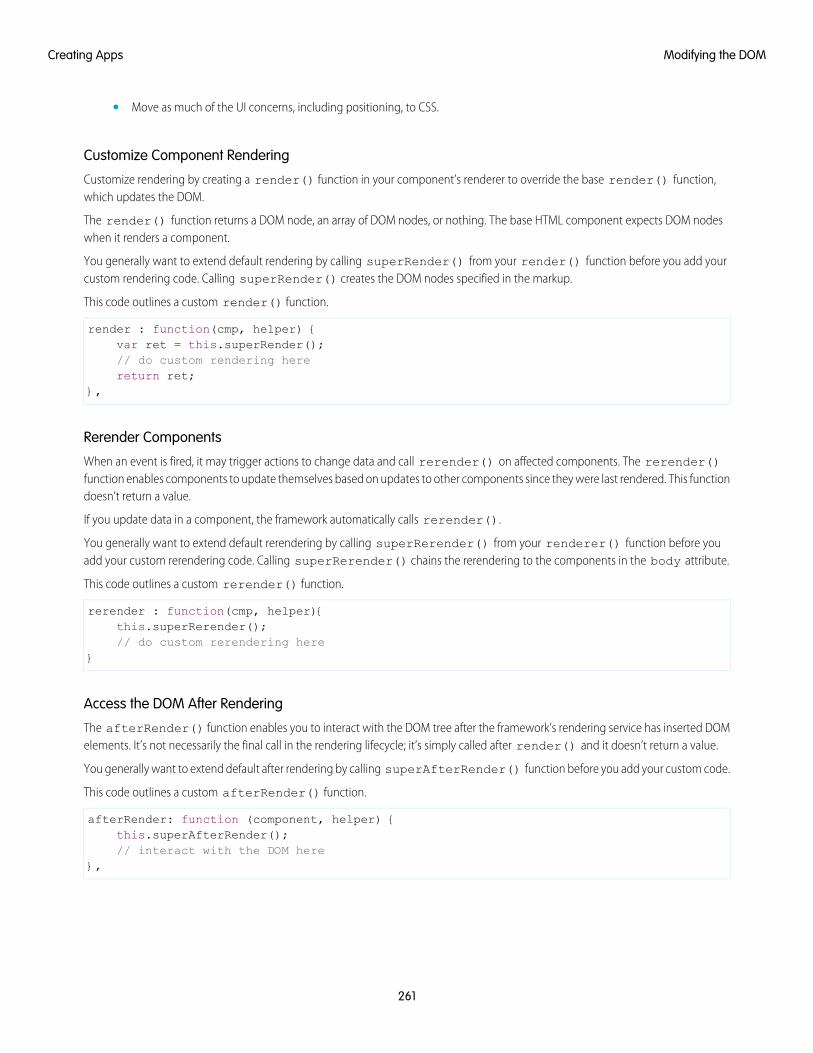
• Move as much of the UI concerns, including positioning, to CSS.
Customize Component Rendering
Customize rendering by creating a render() function in your component’s renderer to override the base render() function,which updates the DOM.
The render() function returns a DOM node, an array of DOM nodes, or nothing. The base HTML component expects DOM nodeswhen it renders a component.
You generally want to extend default rendering by calling superRender() from your render() function before you add yourcustom rendering code. Calling superRender() creates the DOM nodes specified in the markup.
This code outlines a custom render() function.
render : function(cmp, helper) {var ret = this.superRender();// do custom rendering herereturn ret;
},
Rerender Components
When an event is fired, it may trigger actions to change data and call rerender() on affected components. The rerender()function enables components to update themselves based on updates to other components since they were last rendered. This functiondoesn’t return a value.
If you update data in a component, the framework automatically calls rerender().
You generally want to extend default rerendering by calling superRerender() from your renderer() function before youadd your custom rerendering code. Calling superRerender() chains the rerendering to the components in the body attribute.
This code outlines a custom rerender() function.
rerender : function(cmp, helper){this.superRerender();// do custom rerendering here
}
Access the DOM After Rendering
The afterRender() function enables you to interact with the DOM tree after the framework’s rendering service has inserted DOMelements. It’s not necessarily the final call in the rendering lifecycle; it’s simply called after render() and it doesn’t return a value.
You generally want to extend default after rendering by calling superAfterRender() function before you add your custom code.
This code outlines a custom afterRender() function.
afterRender: function (component, helper) {this.superAfterRender();// interact with the DOM here
},
261
Modifying the DOMCreating Apps
Unrender Components
The base unrender() function deletes all the DOM nodes rendered by a component’s render() function. It is called by theframework when a component is being destroyed. Customize this behavior by overriding unrender() in your component’s renderer.This method can be useful when you are working with third-party libraries that are not native to the framework.
You generally want to extend default unrendering by calling superUnrender() from your unrender() function before youadd your custom code.
This code outlines a custom unrender() function.
unrender: function () {this.superUnrender();// do custom unrendering here
}
SEE ALSO:
Modifying the DOM
Invoking Actions on Component Initialization
Component Bundles
Modifying Components Outside the Framework Lifecycle
Sharing JavaScript Code in a Component Bundle
Modifying DOM Elements Managed by External LibrariesYou can use different libraries, such as a charting library, to create and manage DOM elements. You don’t have to modify these DOMelements within the render event handler or a renderer because they are managed by the external library.
A render event handler or a renderer are used only to customize DOM elements created and managed by the Lightning Componentframework.
To use external libraries, use <ltng:require>. The afterScriptsLoaded attribute enables you to interact with the DOMafter your libraries have loaded and the DOM is ready. <ltng:require> tag orchestrates the loading of your library of choice withthe rendering cycle of the Lightning Component framework to ensure that everything works in concert.
SEE ALSO:
ltng:require
Using External JavaScript Libraries
Modifying DOM Elements Managed by the Lightning Component Framework
Checking Component ValidityIf you navigate elsewhere in the UI while asynchronous code is executing, the framework unrenders and destroys the component thatmade the asynchronous request. You can still have a reference to that component, but it is no longer valid. The cmp.isValid()call returns false for an invalid component.
If you call cmp.get() on an invalid component, cmp.get() returns null.
If you call cmp.set() on an invalid component, nothing happens and no error occurs. It’s essentially a no op.
262
Checking Component ValidityCreating Apps
In many scenarios, the cmp.isValid() call isn’t necessary because a null check on a value retrieved from cmp.get() issufficient. The main reason to call cmp.isValid() is if you’re making multiple calls against the component and you want to avoida null check for each result.
Inside the Framework LifecycleYou don’t need a cmp.isValid() check in the callback in a client-side controller when you reference the component associatedwith the client-side controller. The framework automatically checks that the component is valid. Similarly, you don’t need acmp.isValid() check during event handling or in a framework lifecycle hook, such as the init event.
Let’s look at a sample client-side controller.
({"doSomething" : function(cmp) {
var action = cmp.get("c.serverEcho");action.setCallback(this, function(response) {
var state = response.getState();if (state === "SUCCESS") {
if (cmp.get("v.displayResult)) {alert("From server: " + response.getReturnValue());
}}// other state handling omitted for brevity
});
$A.enqueueAction(action);}
})
The component wired to the client-side controller is passed into the doSomething action as the cmp parameter. Whencmp.get("v.displayResult) is called, we don’t need a cmp.isValid() check.
However, if you hold a reference to another component that may not be valid despite your component being valid, you might need acmp.isValid() check for the other component. Let’s look at another example of a component that has a reference to anothercomponent with a local ID of child.
({"doSomething" : function(cmp) {
var action = cmp.get("c.serverEcho");var child = cmp.find("child");action.setCallback(this, function(response) {
var state = response.getState();if (state === "SUCCESS") {
if (child.get("v.displayResult)) {alert("From server: " + response.getReturnValue());
}}// other state handling omitted for brevity
});
$A.enqueueAction(action);}
})
263
Checking Component ValidityCreating Apps
This line in the previous example without the child component:
if (cmp.get("v.displayResult)) {
changed to:
if (child.get("v.displayResult)) {
You don’t need a child.isValid() call here as child.get("v.displayResult) will return null if the child componentis invalid. Add a child.isValid() check only if you’re making multiple calls against the child component and you want to avoida null check for each result.
Outside the Framework LifecycleIf you reference a component in asynchronous code, such as setTimeout() or setInterval(), or when you use Promises, acmp.isValid() call checks that the component is still valid before processing the results of the asynchronous request. In manyscenarios, the cmp.isValid() call isn’t necessary because a null check on a value retrieved from cmp.get() is sufficient.The main reason to call cmp.isValid() is if you’re making multiple calls against the component and you want to avoid a nullcheck for each result.
For example, you don’t need a cmp.isValid() check within this setTimeout() call as the cmp.set() call doesn’t doanything when the component is invalid.
window.setTimeout($A.getCallback(function() {
cmp.set("v.visible", true);}), 5000
);
SEE ALSO:
Handling Events with Client-Side Controllers
Invoking Actions on Component Initialization
Modifying Components Outside the Framework Lifecycle
Modifying Components Outside the Framework LifecycleUse $A.getCallback() to wrap any code that modifies a component outside the normal rerendering lifecycle, such as in asetTimeout() call. The $A.getCallback() call ensures that the framework rerenders the modified component and processesany enqueued actions.
Note: $A.run() is deprecated. Use $A.getCallback() instead.
You don't need to use $A.getCallback() if your code is executed as part of the framework's call stack; for example, your code ishandling an event or in the callback for a server-side controller action.
An example of where you need to use $A.getCallback() is calling window.setTimeout() in an event handler to executesome logic after a time delay. This puts your code outside the framework's call stack.
This sample sets the visible attribute on a component to true after a five-second delay.
window.setTimeout($A.getCallback(function() {
cmp.set("v.visible", true);
264
Modifying Components Outside the Framework LifecycleCreating Apps
}), 5000);
Note how the code updating a component attribute is wrapped in $A.getCallback(), which ensures that the framework rerendersthe modified component.
Note: You don't need a cmp.isValid() check within this setTimeout() call as the cmp.set() call doesn't doanything when the component is invalid.
Warning: Don't save a reference to a function wrapped in $A.getCallback(). If you use the reference later to send actions,the saved transaction state will cause the actions to be aborted.
SEE ALSO:
Handling Events with Client-Side Controllers
Checking Component Validity
Firing Lightning Events from Non-Lightning Code
Communicating with Events
Validating FieldsValidate user input, handle errors, and display error messages on input fields.
Client-side input validation is available for the following components:
• lightning:input
• lightning:select
• lightning:textarea
• ui:input*
Components in the lightning namespace simplify input validation by providing attributes to define error conditions, enabling youto handle errors by checking the component’s validity state. For example, you can set a minimum length for a field , display an errormessage when the condition is not met, and handle the error based on the given validity state. For more information, see the lightningnamespace components in the Component Reference.
Alternatively, input components in the ui namespace let you define and handle errors in a client-side controller, enabling you to iteratethrough a list of errors.
The following sections discuss error handling for ui:input* components.
Default Error HandlingThe framework can handle and display errors using the default error component, ui:inputDefaultError. This component isdynamically created when you set the errors using the inputCmp.set("v.errors",[{message:"my errormessage"}]) syntax. The following example shows how you can handle a validation error and display an error message. Here is themarkup.
<!--c:errorHandling--><aura:component>
Enter a number: <ui:inputNumber aura:id="inputCmp"/> <br/><lightning:button label="Submit" onclick="{!c.doAction}"/>
</aura:component>
265
Validating FieldsCreating Apps
Here is the client-side controller.
/*errorHandlingController.js*/{
doAction : function(component) {var inputCmp = component.find("inputCmp");var value = inputCmp.get("v.value");
// Is input numeric?if (isNaN(value)) {
// Set errorinputCmp.set("v.errors", [{message:"Input not a number: " + value}]);
} else {// Clear errorinputCmp.set("v.errors", null);
}}
}
When you enter a value and click Submit, doAction in the controller validates the input and displays an error message if the inputis not a number. Entering a valid input clears the error. Add error messages to the input component using the errors attribute.
Custom Error Handlingui:input and its child components can handle errors using the onError and onClearErrors events, which are wired toyour custom error handlers defined in a controller. onError maps to a ui:validationError event, and onClearErrorsmaps to ui:clearErrors.
The following example shows how you can handle a validation error using custom error handlers and display the error message usingthe default error component. Here is the markup.
<!--c:errorHandlingCustom--><aura:component>
Enter a number: <ui:inputNumber aura:id="inputCmp" onError="{!c.handleError}"onClearErrors="{!c.handleClearError}"/> <br/>
<ui:button label="Submit" press="{!c.doAction}"/></aura:component>
Here is the client-side controller.
/*errorHandlingCustomController.js*/{
doAction : function(component, event) {var inputCmp = component.find("inputCmp");var value = inputCmp.get("v.value");
// is input numeric?if (isNaN(value)) {
inputCmp.set("v.errors", [{message:"Input not a number: " + value}]);} else {
inputCmp.set("v.errors", null);}
},
handleError: function(component, event){
266
Validating FieldsCreating Apps
/* do any custom error handling* logic desired here */// get v.errors, which is an Object[]var errorsArr = event.getParam("errors");for (var i = 0; i < errorsArr.length; i++) {
console.log("error " + i + ": " + JSON.stringify(errorsArr[i]));}
},
handleClearError: function(component, event) {/* do any custom error handling* logic desired here */
}}
When you enter a value and click Submit, doAction in the controller executes. However, instead of letting the framework handlethe errors, we define a custom error handler using the onError event in <ui:inputNumber>. If the validation fails, doActionadds an error message using the errors attribute. This automatically fires the handleError custom error handler.
Similarly, you can customize clearing the errors by using the onClearErrors event. See the handleClearError handler inthe controller for an example.
SEE ALSO:
Handling Events with Client-Side Controllers
Component Events
Throwing and Handling ErrorsThe framework gives you flexibility in handling unrecoverable and recoverable app errors in JavaScript code. For example, you can throwthese errors in a callback when handling an error in a server-side response.
Unrecoverable ErrorsUse throw new Error("error message here") for unrecoverable errors, such as an error that prevents your app fromstarting successfully. The error message is displayed.
Note: $A.error() is deprecated. Throw the native JavaScript Error object instead by using throw new Error().
This example shows you the basics of throwing an unrecoverable error in a JavaScript controller.
<!--c:unrecoverableError--><aura:component>
<lightning:button label="throw error" onclick="{!c.throwError}"/></aura:component>
Here is the client-side controller source.
/*unrecoverableErrorController.js*/({
throwError : function(component, event){throw new Error("I can’t go on. This is the end.");
}})
267
Throwing and Handling ErrorsCreating Apps
Recoverable ErrorsTo handle recoverable errors, use a component, such as ui:message, to tell users about the problem.
This sample shows you the basics of throwing and catching a recoverable error in a JavaScript controller.
<!--c:recoverableError--><aura:component>
<p>Click the button to trigger the controller to throw an error.</p><div aura:id="div1"></div>
<lightning:button label="Throw an Error" onclick="{!c.throwErrorForKicks}"/></aura:component>
Here is the client-side controller source.
/*recoverableErrorController.js*/({
throwErrorForKicks: function(cmp) {// this sample always throws an error to demo try/catchvar hasPerm = false;try {
if (!hasPerm) {throw new Error("You don't have permission to edit this record.");
}}catch (e) {
$A.createComponents([["ui:message",{
"title" : "Sample Thrown Error","severity" : "error",
}],["ui:outputText",{
"value" : e.message}]],function(components, status, errorMessage){
if (status === "SUCCESS") {var message = components[0];var outputText = components[1];// set the body of the ui:message to be the ui:outputTextmessage.set("v.body", outputText);var div1 = cmp.find("div1");// Replace div body with the dynamic componentdiv1.set("v.body", message);
}else if (status === "INCOMPLETE") {
console.log("No response from server or client is offline.")// Show offline error
}else if (status === "ERROR") {
console.log("Error: " + errorMessage);// Show error message
}}
);
268
Throwing and Handling ErrorsCreating Apps
}}
})
The controller code always throws an error and catches it in this example. The message in the error is displayed to the user in a dynamicallycreated ui:message component. The body of the ui:message is a ui:outputText component containing the error text.
SEE ALSO:
Validating Fields
Dynamically Creating Components
Calling Component MethodsUse <aura:method> to define a method as part of a component's API. This enables you to directly call a method in a component’sclient-side controller instead of firing and handling a component event. Using <aura:method> simplifies the code needed for aparent component to call a method on a child component that it contains.
Communicate Between ComponentsUse aura:method to communicate down the containment hierarchy. For example, a parent component calls an aura:methodon a child component that it contains.
To communicate up the containment hierarchy, fire a component event in the child component and handle it in the parent component.
SyntaxUse this syntax to call a method in JavaScript code.
cmp.sampleMethod(arg1, … argN);
cmp is a reference to the component.
sampleMethod is the name of the aura:method.
arg1, … argN is an optional comma-separated list of arguments passed to the method. Each argument corresponds to anaura:attribute defined in the aura:method markup.
Using Inherited MethodsA sub component that extends a super component has access to any methods defined in the super component.
An interface can also include an <aura:method> tag. A component that implements the interface can access the method.
ExampleLet's look at an example app.
<!-- c:auraMethodCallerWrapper.app --><aura:application >
<c:auraMethodCaller /></aura:application>
269
Calling Component MethodsCreating Apps
c:auraMethodCallerWrapper.app contains a c:auraMethodCaller component.
<!-- c:auraMethodCaller.cmp --><aura:component >
<p>Parent component calls aura:method in child component</p><c:auraMethod aura:id="child" />
...</aura:component>
c:auraMethodCaller is the parent component. c:auraMethodCaller contains the child component, c:auraMethod.
We'll show how c:auraMethodCaller calls an aura:method defined in c:auraMethod.
We'll use c:auraMethodCallerWrapper.app to see how to return results from synchronous and asynchronous code.
IN THIS SECTION:
Return Result for Synchronous Code
aura:method executes synchronously. A synchronous method finishes executing before it returns. Use the return statementto return a value from synchronous JavaScript code.
Return Result for Asynchronous Code
aura:method executes synchronously. Use the return statement to return a value from synchronous JavaScript code. JavaScriptcode that calls a server-side action is asynchronous. Asynchronous code can continue to execute after it returns. You can’t use thereturn statement to return the result of an asynchronous call because the aura:method returns before the asynchronouscode completes. For asynchronous code, use a callback instead of a return statement.
SEE ALSO:
aura:method
Component Events
Return Result for Synchronous Codeaura:method executes synchronously. A synchronous method finishes executing before it returns. Use the return statement toreturn a value from synchronous JavaScript code.
An asynchronous method can continue to execute after it returns. JavaScript code often uses the callback pattern to return a result afterasynchronous code completes. We’ll describe later how to return a result for an asynchronous action.
Step 1: Define aura:method in Markup
Let’s look at a logParam aura:method that executes synchronous code. We’ll use the c:auraMethodCallerWrapper.appand components outlined in Calling Component Methods. Here’s the markup that defines the aura:method.
<!-- c:auraMethod --><aura:component>
<aura:method name="logParam"description="Sample method with parameter"><aura:attribute name="message" type="String" default="default message" />
</aura:method>
270
Calling Component MethodsCreating Apps
<p>This component has an aura:method definition.</p></aura:component>
The logParam aura:method has an aura:attribute with a name of message. This attribute enables you to set amessage parameter when you call the logParam method.
The name attribute of logParam configures the aura:method to invoke logParam() in the client-side controller.
An aura:method can have multiple aura:attribute tags. Each aura:attribute corresponds to a parameter that youcan pass into the aura:method. For more details on the syntax, see aura:method.
You don’t explicitly declare a return value in the aura:method markup. You just use a return statement in the JavaScript controller.
Step 2: Implement aura:method Logic in Controller
The logParam aura:method invokes logParam() in auraMethodController.js. Let’s look at that source.
/* auraMethodController.js */({
logParam : function(cmp, event) {var params = event.getParam('arguments');if (params) {
var message = params.message;console.log("message: " + message);return message;
}},
})
logParam() simply logs the parameter passed in and returns the parameter value to demonstrate how to use the return statement.If your code is synchronous, you can use a return statement; for example, you’re not making an asynchronous server-side action call.
Step 3: Call aura:method from Parent Controller
callAuraMethod() in the controller for c:auraMethodCaller calls the logParam aura:method defined in its childcomponent, c:auraMethod. Here’s the controller for c:auraMethodCaller.
/* auraMethodCallerController.js */({
callAuraMethod : function(component, event, helper) {var childCmp = component.find("child");// call the aura:method in the child componentvar auraMethodResult =childCmp.logParam("message sent by parent component");
console.log("auraMethodResult: " + auraMethodResult);},
})
callAuraMethod() finds the child component, c:auraMethod, and calls its logParam aura:method with an argumentfor the message parameter of the aura:method.
childCmp.logParam("message sent by parent component");
auraMethodResult is the value returned from logParam.
271
Calling Component MethodsCreating Apps
Step 4: Add Button to Initiate Call to aura:method
The c:auraMethodCaller markup contains a lightning:button that invokes callAuraMethod() inauraMethodCallerController.js. We use this button to initiate the call to aura:method in the child component.
<!-- c:auraMethodCaller.cmp --><aura:component >
<p>Parent component calls aura:method in child component</p><c:auraMethod aura:id="child" />
<lightning:button label="Call aura:method in child component"onclick="{! c.callAuraMethod}" />
</aura:component>
SEE ALSO:
Return Result for Asynchronous Code
Calling Component Methods
aura:method
Return Result for Asynchronous Codeaura:method executes synchronously. Use the return statement to return a value from synchronous JavaScript code. JavaScriptcode that calls a server-side action is asynchronous. Asynchronous code can continue to execute after it returns. You can’t use thereturn statement to return the result of an asynchronous call because the aura:method returns before the asynchronous codecompletes. For asynchronous code, use a callback instead of a return statement.
Step 1: Define aura:method in Markup
Let’s look at an echo aura:method that uses a callback. We’ll use the c:auraMethodCallerWrapper.app and componentsoutlined in Calling Component Methods. Here’s the echo aura:method in the c:auraMethod component.
<!-- c:auraMethod --><aura:component controller="SimpleServerSideController">
<aura:method name="echo"description="Sample method with server-side call"><aura:attribute name="callback" type="Function" />
</aura:method>
<p>This component has an aura:method definition.</p></aura:component>
The echo aura:method has an aura:attribute with a name of callback. This attribute enables you to set a callback that’sinvoked by the aura:method after execution of the server-side action in SimpleServerSideController.
Step 2: Implement aura:method Logic in Controller
The echo aura:method invokes echo() in auraMethodController.js. Let’s look at the source.
/* auraMethodController.js */({
echo : function(cmp, event) {var params = event.getParam('arguments');
272
Calling Component MethodsCreating Apps
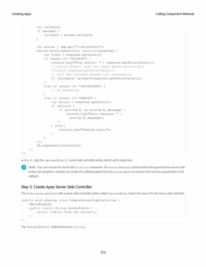
var callback;if (params) {
callback = params.callback;}
var action = cmp.get("c.serverEcho");action.setCallback(this, function(response) {
var state = response.getState();if (state === "SUCCESS") {
console.log("From server: " + response.getReturnValue());// return doesn't work for async server action call//return response.getReturnValue();// call the callback passed into aura:methodif (callback) callback(response.getReturnValue());
}else if (state === "INCOMPLETE") {
// do something}else if (state === "ERROR") {
var errors = response.getError();if (errors) {
if (errors[0] && errors[0].message) {console.log("Error message: " +errors[0].message);
}} else {
console.log("Unknown error");}
}});$A.enqueueAction(action);
},})
echo() calls the serverEcho() server-side controller action, which we’ll create next.
Note: You can’t return the result with a return statement. The aura:method returns before the asynchronous server-sideaction call completes. Instead, we invoke the callback passed into the aura:method and set the result as a parameter in thecallback.
Step 3: Create Apex Server-Side ControllerThe echo aura:method calls a server-side controller action called serverEcho. Here’s the source for the server-side controller.
public with sharing class SimpleServerSideController {@AuraEnabledpublic static String serverEcho() {
return ('Hello from the server');}
}
The serverEcho() method returns a String.
273
Calling Component MethodsCreating Apps
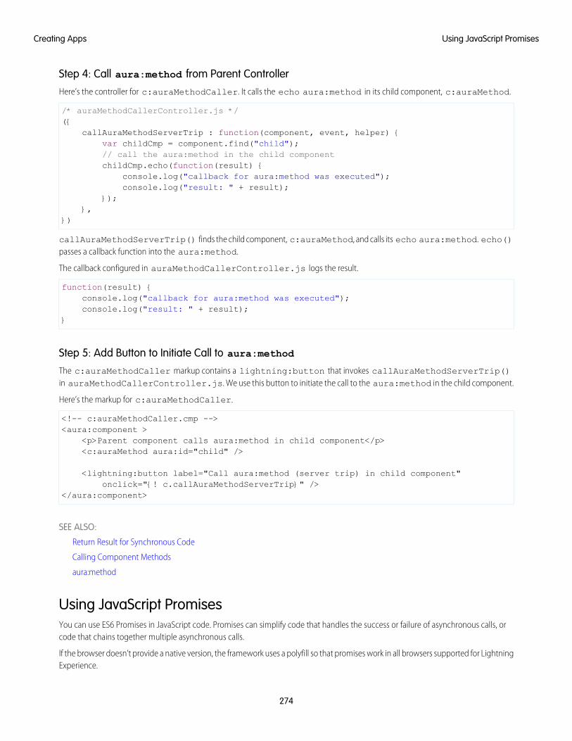
Step 4: Call aura:method from Parent Controller
Here’s the controller for c:auraMethodCaller. It calls the echo aura:method in its child component, c:auraMethod.
/* auraMethodCallerController.js */({
callAuraMethodServerTrip : function(component, event, helper) {var childCmp = component.find("child");// call the aura:method in the child componentchildCmp.echo(function(result) {
console.log("callback for aura:method was executed");console.log("result: " + result);
});},
})
callAuraMethodServerTrip() finds the child component, c:auraMethod, and calls its echo aura:method. echo()passes a callback function into the aura:method.
The callback configured in auraMethodCallerController.js logs the result.
function(result) {console.log("callback for aura:method was executed");console.log("result: " + result);
}
Step 5: Add Button to Initiate Call to aura:method
The c:auraMethodCaller markup contains a lightning:button that invokes callAuraMethodServerTrip()in auraMethodCallerController.js. We use this button to initiate the call to the aura:method in the child component.
Here’s the markup for c:auraMethodCaller.
<!-- c:auraMethodCaller.cmp --><aura:component >
<p>Parent component calls aura:method in child component</p><c:auraMethod aura:id="child" />
<lightning:button label="Call aura:method (server trip) in child component"onclick="{! c.callAuraMethodServerTrip}" />
</aura:component>
SEE ALSO:
Return Result for Synchronous Code
Calling Component Methods
aura:method
Using JavaScript PromisesYou can use ES6 Promises in JavaScript code. Promises can simplify code that handles the success or failure of asynchronous calls, orcode that chains together multiple asynchronous calls.
If the browser doesn’t provide a native version, the framework uses a polyfill so that promises work in all browsers supported for LightningExperience.
274
Using JavaScript PromisesCreating Apps
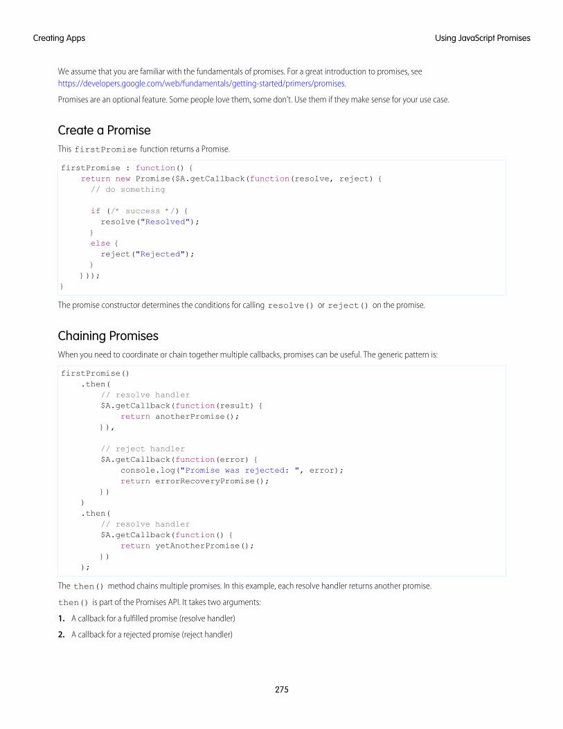
We assume that you are familiar with the fundamentals of promises. For a great introduction to promises, seehttps://developers.google.com/web/fundamentals/getting-started/primers/promises.
Promises are an optional feature. Some people love them, some don’t. Use them if they make sense for your use case.
Create a PromiseThis firstPromise function returns a Promise.
firstPromise : function() {return new Promise($A.getCallback(function(resolve, reject) {// do something
if (/* success */) {resolve("Resolved");
}else {reject("Rejected");
}}));
}
The promise constructor determines the conditions for calling resolve() or reject() on the promise.
Chaining PromisesWhen you need to coordinate or chain together multiple callbacks, promises can be useful. The generic pattern is:
firstPromise().then(
// resolve handler$A.getCallback(function(result) {
return anotherPromise();}),
// reject handler$A.getCallback(function(error) {
console.log("Promise was rejected: ", error);return errorRecoveryPromise();
})).then(
// resolve handler$A.getCallback(function() {
return yetAnotherPromise();})
);
The then() method chains multiple promises. In this example, each resolve handler returns another promise.
then() is part of the Promises API. It takes two arguments:
1. A callback for a fulfilled promise (resolve handler)
2. A callback for a rejected promise (reject handler)
275
Using JavaScript PromisesCreating Apps
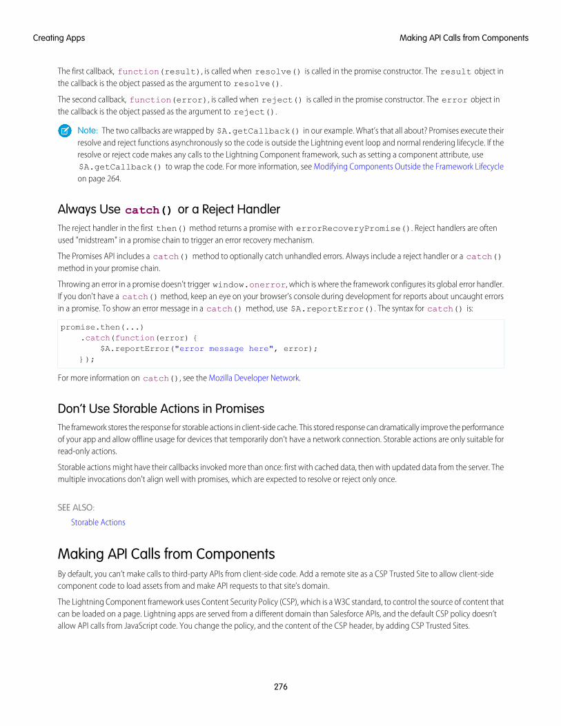
The first callback, function(result), is called when resolve() is called in the promise constructor. The result object inthe callback is the object passed as the argument to resolve().
The second callback, function(error), is called when reject() is called in the promise constructor. The error object inthe callback is the object passed as the argument to reject().
Note: The two callbacks are wrapped by $A.getCallback() in our example. What’s that all about? Promises execute theirresolve and reject functions asynchronously so the code is outside the Lightning event loop and normal rendering lifecycle. If theresolve or reject code makes any calls to the Lightning Component framework, such as setting a component attribute, use$A.getCallback() to wrap the code. For more information, see Modifying Components Outside the Framework Lifecycleon page 264.
Always Use catch() or a Reject HandlerThe reject handler in the first then() method returns a promise with errorRecoveryPromise(). Reject handlers are oftenused "midstream" in a promise chain to trigger an error recovery mechanism.
The Promises API includes a catch() method to optionally catch unhandled errors. Always include a reject handler or a catch()method in your promise chain.
Throwing an error in a promise doesn’t trigger window.onerror, which is where the framework configures its global error handler.If you don't have a catch() method, keep an eye on your browser’s console during development for reports about uncaught errorsin a promise. To show an error message in a catch() method, use $A.reportError(). The syntax for catch() is:
promise.then(...).catch(function(error) {
$A.reportError("error message here", error);});
For more information on catch(), see the Mozilla Developer Network.
Don’t Use Storable Actions in PromisesThe framework stores the response for storable actions in client-side cache. This stored response can dramatically improve the performanceof your app and allow offline usage for devices that temporarily don’t have a network connection. Storable actions are only suitable forread-only actions.
Storable actions might have their callbacks invoked more than once: first with cached data, then with updated data from the server. Themultiple invocations don't align well with promises, which are expected to resolve or reject only once.
SEE ALSO:
Storable Actions
Making API Calls from ComponentsBy default, you can’t make calls to third-party APIs from client-side code. Add a remote site as a CSP Trusted Site to allow client-sidecomponent code to load assets from and make API requests to that site’s domain.
The Lightning Component framework uses Content Security Policy (CSP), which is a W3C standard, to control the source of content thatcan be loaded on a page. Lightning apps are served from a different domain than Salesforce APIs, and the default CSP policy doesn’tallow API calls from JavaScript code. You change the policy, and the content of the CSP header, by adding CSP Trusted Sites.
276
Making API Calls from ComponentsCreating Apps
Important: You can’t load JavaScript resources from a third-party site, even a CSP Trusted Site. To use a JavaScript library from athird-party site, add it to a static resource, and then add the static resource to your component. After the library is loaded from thestatic resource, you can use it as normal.
Sometimes, you have to make API calls from server-side controllers rather than client-side code. In particular, you can’t make calls toSalesforce APIs from client-side Lightning component code. For information about making API calls from server-side controllers, seeMaking API Calls from Apex on page 311.
SEE ALSO:
Content Security Policy Overview
Create CSP Trusted Sites to Access Third-Party APIs
Create CSP Trusted Sites to Access Third-Party APIs
EDITIONS
Available in: SalesforceClassic and LightningExperience
Available in: Developer,Enterprise, Performance,and Unlimited
USER PERMISSIONS
To create, read, update, anddelete:• Customize Application
or Modify All Data
The Lightning Component framework uses Content Security Policy (CSP), which is a W3C standard,to control the source of content that can be loaded on a page. To use third-party APIs that makerequests to an external (non-Salesforce) server, add the server as a CSP Trusted Site.
CSP is a Candidate Recommendation of the W3C working group on Web Application Security. Theframework uses the Content-Security-Policy HTTP header recommended by the W3C.By default, the framework’s headers allow content to be loaded only from secure (HTTPS) URLs andforbid XHR requests from JavaScript.
When you define a CSP Trusted Site, the site’s URL is added to the list of allowed sites for the followingdirectives in the CSP header.
• connect-src
• frame-src
• img-src
• style-src
• font-src
• media-src
This change to the CSP header directives allows Lightning components to load resources, such as images, styles, and fonts, from thesite. It also allows client-side code to make requests to the site.
Important: You can’t load JavaScript resources from a third-party site, even a CSP Trusted Site. To use a JavaScript library from athird-party site, add it to a static resource, and then add the static resource to your component. After the library is loaded from thestatic resource, you can use it as normal.
1. From Setup, enter CSP in the Quick Find box, then select CSP Trusted Sites.This page displays a list of any CSP Trusted Sites already registered, and provides additional information about each site, includingsite name and URL.
2. Select New Trusted Site.
3. Name the Trusted Site.
For example, enter Google Maps.
4. Enter the URL for the Trusted Site.
The URL must begin with http:// or https://. It must include a domain name, and can include a port.
277
Create CSP Trusted Sites to Access Third-Party APIsCreating Apps
Warning: The default CSP requires secure (HTTPS) connections for external resources. Configuring a CSP Trusted Site withan insecure (HTTP) URL is an anti-pattern, and compromises the security of your org.
5. Optional: Enter a description for the Trusted Site.
6. Optional: To temporarily disable a Trusted Site without actually deleting it, deselect the Active checkbox.
7. Select Save.
Note: CSP Trusted Sites affect the CSP header only for Lightning Component framework requests. To enable corresponding accessfor Visualforce or Apex, create a Remote Site.
CSP isn’t enforced by all browsers. For a list of browsers that enforce CSP, see caniuse.com.
IE11 doesn’t support CSP, so we recommend using other supported browsers for enhanced security.
SEE ALSO:
Content Security Policy Overview
Making API Calls from Components
Browser Support Considerations for Lightning Components
JavaScript Cookbook
This section includes code snippets and samples that can be used in various JavaScript files.
IN THIS SECTION:
Dynamically Creating Components
Create a component dynamically in your client-side JavaScript code by using the $A.createComponent() method. To createmultiple components, use $A.createComponents().
Detecting Data Changes with Change Handlers
Configure a component to automatically invoke a change handler, which is a client-side controller action, when a value in one ofthe component's attributes changes.
Finding Components by ID
Retrieve a component by its ID in JavaScript code.
Dynamically Adding Event Handlers To a Component
You can dynamically add a handler for an event that a component fires.
Dynamically Showing or Hiding Markup
You can use CSS to toggle markup visibility. However, <aura:if> is the preferred approach because it defers the creation andrendering of the enclosed element tree until needed.
Adding and Removing Styles
You can add or remove a CSS style on a component or element during runtime.
Which Button Was Pressed?
To find out which button was pressed in a component containing multiple buttons, use Component.getLocalId().
Formatting Dates in JavaScript
The AuraLocalizationService JavaScript API provides methods for formatting and localizing dates.
278
JavaScript CookbookCreating Apps
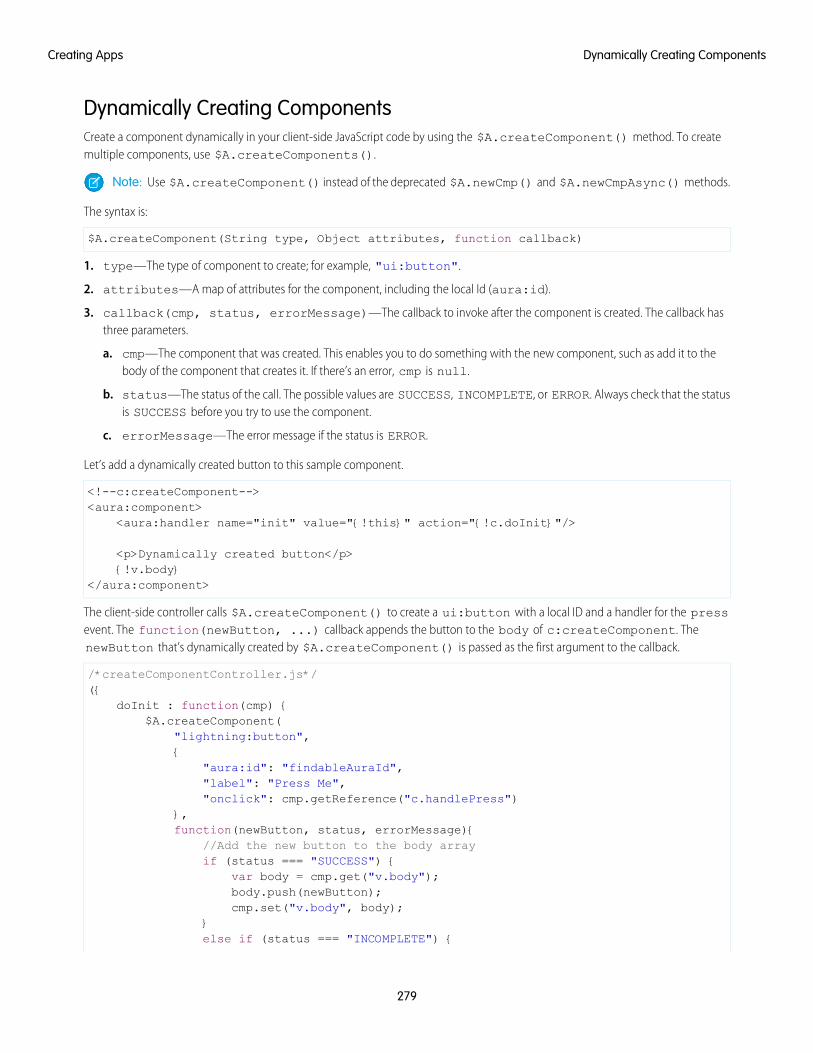
Dynamically Creating ComponentsCreate a component dynamically in your client-side JavaScript code by using the $A.createComponent() method. To createmultiple components, use $A.createComponents().
Note: Use $A.createComponent() instead of the deprecated $A.newCmp() and $A.newCmpAsync() methods.
The syntax is:
$A.createComponent(String type, Object attributes, function callback)
1. type—The type of component to create; for example, "ui:button".
2. attributes—A map of attributes for the component, including the local Id (aura:id).
3. callback(cmp, status, errorMessage)—The callback to invoke after the component is created. The callback hasthree parameters.
a. cmp—The component that was created. This enables you to do something with the new component, such as add it to thebody of the component that creates it. If there’s an error, cmp is null.
b. status—The status of the call. The possible values are SUCCESS, INCOMPLETE, or ERROR. Always check that the statusis SUCCESS before you try to use the component.
c. errorMessage—The error message if the status is ERROR.
Let’s add a dynamically created button to this sample component.
<!--c:createComponent--><aura:component>
<aura:handler name="init" value="{!this}" action="{!c.doInit}"/>
<p>Dynamically created button</p>{!v.body}
</aura:component>
The client-side controller calls $A.createComponent() to create a ui:button with a local ID and a handler for the pressevent. The function(newButton, ...) callback appends the button to the body of c:createComponent. ThenewButton that’s dynamically created by $A.createComponent() is passed as the first argument to the callback.
/*createComponentController.js*/({
doInit : function(cmp) {$A.createComponent(
"lightning:button",{
"aura:id": "findableAuraId","label": "Press Me","onclick": cmp.getReference("c.handlePress")
},function(newButton, status, errorMessage){
//Add the new button to the body arrayif (status === "SUCCESS") {
var body = cmp.get("v.body");body.push(newButton);cmp.set("v.body", body);
}else if (status === "INCOMPLETE") {
279
Dynamically Creating ComponentsCreating Apps
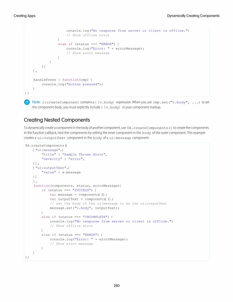
console.log("No response from server or client is offline.")// Show offline error
}else if (status === "ERROR") {
console.log("Error: " + errorMessage);// Show error message
}}
);},
handlePress : function(cmp) {console.log("button pressed");
}})
Note: c:createComponent contains a {!v.body} expression. When you use cmp.set("v.body", ...) to setthe component body, you must explicitly include {!v.body} in your component markup.
Creating Nested ComponentsTo dynamically create a component in the body of another component, use $A.createComponents() to create the components.In the function callback, nest the components by setting the inner component in the body of the outer component. This examplecreates a ui:outputText component in the body of a ui:message component.
$A.createComponents([["ui:message",{
"title" : "Sample Thrown Error","severity" : "error",
}],["ui:outputText",{
"value" : e.message}]],function(components, status, errorMessage){
if (status === "SUCCESS") {var message = components[0];var outputText = components[1];// set the body of the ui:message to be the ui:outputTextmessage.set("v.body", outputText);
}else if (status === "INCOMPLETE") {
console.log("No response from server or client is offline.")// Show offline error
}else if (status === "ERROR") {
console.log("Error: " + errorMessage);// Show error message
}}
);
280
Dynamically Creating ComponentsCreating Apps
Destroying Dynamically Created ComponentsAfter a component that is declared in markup is no longer in use, the framework automatically destroys it and frees up its memory.
If you create a component dynamically in JavaScript and that component isn't added to a facet (v.body or another attribute of typeAura.Component[]), you have to destroy it manually using Component.destroy() to avoid memory leaks.
Avoiding a Server TripThe createComponent() and createComponents() methods support both client-side and server-side component creation.For performance and other reasons, client-side creation is preferred. If no server-side dependencies are found, the methods are executedclient-side. The top-level component determines whether a server request is necessary for component creation.
The framework automatically tracks dependencies between definitions, such as components, defined in markup. These dependenciesare loaded with the component. However, some dependencies aren’t easily discoverable by the framework; for example, if you dynamicallycreate a component that isn’t directly referenced in the component’s markup. To tell the framework about such a dynamic dependency,use the <aura:dependency> tag. This declaration ensures that the component and its dependencies are sent to the client.
A component with server-side dependencies must be created on the server. Server-side dependencies include dynamically createdcomponent definitions, dynamically loaded labels, and other elements that can’t be predetermined by static markup analysis.
Note: A server-side controller isn’t a server-side dependency for component creation because controller actions are only calledafter the component has been created.
A single call to createComponent() or createComponents() can result in many components being created. The call createsthe requested component and all its child components. In addition to performance considerations, server-side component creation hasa limit of 10,000 components that can be created in a single request. If you hit this limit, ensure you’re explicitly declaring componentdependencies with the <aura:dependency> tag or otherwise pre-loading dependent elements, so that your component can becreated on the client side instead.
There’s no limit on component creation on the client side.
Note: Creating components where the top-level components don’t have server dependencies but nested inner components doisn’t currently supported.
SEE ALSO:
Reference Doc App
aura:dependency
Invoking Actions on Component Initialization
Dynamically Adding Event Handlers To a Component
Detecting Data Changes with Change HandlersConfigure a component to automatically invoke a change handler, which is a client-side controller action, when a value in one of thecomponent's attributes changes.
When the value changes, the valueChange.evt event is automatically fired. The event has type="VALUE".
In the component, define a handler with name="change".
<aura:handler name="change" value="{!v.numItems}" action="{!c.itemsChange}"/>
The value attribute sets the component attribute that the change handler tracks.
The action attribute sets the client-side controller action to invoke when the attribute value changes.
281
Detecting Data Changes with Change HandlersCreating Apps
A component can have multiple <aura:handler name="change"> tags to detect changes to different attributes.
In the controller, define the action for the handler.
({itemsChange: function(cmp, evt) {
console.log("numItems has changed");console.log("old value: " + evt.getParam("oldValue"));console.log("current value: " + evt.getParam("value"));
}})
The valueChange event gives you access to the previous value (oldValue) and the current value (value) in the handler action.
When a change occurs to a value that is represented by the change handler, the framework handles the firing of the event andrerendering of the component.
SEE ALSO:
Invoking Actions on Component Initialization
aura:valueChange
Finding Components by IDRetrieve a component by its ID in JavaScript code.
Use aura:id to add a local ID of button1 to the lightning:button component.
<lightning:button aura:id="button1" label="button1"/>
You can find the component by calling cmp.find("button1"), where cmp is a reference to the component containing thebutton. The find() function has one parameter, which is the local ID of a component within the markup.
find() returns different types depending on the result.
• If the local ID is unique, find() returns the component.
• If there are multiple components with the same local ID, find() returns an array of the components.
• If there is no matching local ID, find() returns undefined.
SEE ALSO:
Component IDs
Value Providers
Dynamically Adding Event Handlers To a ComponentYou can dynamically add a handler for an event that a component fires.
The addEventHandler() method in the Component object replaces the deprecated addHandler() method.
To add an event handler to a component dynamically, use the addEventHandler() method.
addEventHandler(String event, Function handler, String phase, String includeFacets)
282
Finding Components by IDCreating Apps
eventThe first argument is the name of the event that triggers the handler. You can’t force a component to start firing events that it doesn’tfire, so make sure that this argument corresponds to an event that the component fires. The <aura:registerEvent> tag ina component’s markup advertises an event that the component fires.
• For a component event, set this argument to match the name attribute of the <aura:registerEvent> tag.
• For an application event, set this argument to match the event descriptor in the format namespace:eventName.
handlerThe second argument is the action that handles the event. The format is similar to the value you would put in the action attributein the <aura:handler> tag if the handler was statically defined in the markup. There are two options for this argument.
• To use a controller action, use the format: cmp.getReference("c.actionName").
• To use an anonymous function, use the format:
function(auraEvent) {// handling logic here
}
For a description of the other arguments, see the JavaScript API in the doc reference app.
You can also add an event handler to a component that is created dynamically in the callback function of $A.createComponent().For more information, see Dynamically Creating Components.
ExampleThis component has buttons to fire and handle a component event and an application event.
<!--c:dynamicHandler--><aura:component >
<aura:registerEvent name="compEvent" type="c:sampleEvent"/><aura:registerEvent name="appEvent" type="c:appEvent"/><h1>Add dynamic handler for event</h1><p>
<lightning:button label="Fire component event" onclick="{!c.fireEvent}" /><lightning:button label="Add dynamic event handler for component event"
onclick="{!c.addEventHandler}" /></p><p>
<lightning:button label="Fire application event" onclick="{!c.fireAppEvent}" /><lightning:button label="Add dynamic event handler for application event"
onclick="{!c.addAppEventHandler}" /></p>
</aura:component>
Here’s the client-side controller.
/* dynamicHandlerController.js */({
fireEvent : function(cmp, event) {// Get the component event by using the// name value from <aura:registerEvent> tagvar compEvent = cmp.getEvent("compEvent");compEvent.fire();
283
Dynamically Adding Event Handlers To a ComponentCreating Apps
console.log("Fired a component event");},
addEventHandler : function(cmp, event) {// First param matches name attribute in <aura:registerEvent> tagcmp.addEventHandler("compEvent", cmp.getReference("c.handleEvent"));console.log("Added handler for component event");
},
handleEvent : function(cmp, event) {alert("Handled the component event");
},
fireAppEvent : function(cmp, event) {var appEvent = $A.get("e.c:appEvent");appEvent.fire();console.log("Fired an application event");
},
addAppEventHandler : function(cmp, event) {// Can use cmp.getReference() or anonymous function for handler// First param is event descriptor, "c:appEvent", for application eventscmp.addEventHandler("c:appEvent", cmp.getReference("c.handleAppEvent"));// Can alternatively use anonymous function for handler//cmp.addEventHandler("c:appEvent", function(auraEvent) {
// console.log("Handled the application event in anonymous function");//});console.log("Added handler for application event");
},
handleAppEvent : function(cmp, event) {alert("Handled the application event");
}})
Notice the first parameter of the addEventHandler() calls. The syntax for a component event is:
cmp.addEventHandler("compEvent", cmp.getReference("c.handleEvent"));
The syntax for an application event is:
cmp.addEventHandler("c:appEvent", cmp.getReference("c.handleAppEvent"));
For either a component or application event, you can use an anonymous function as a handler instead of using cmp.getReference()for a controller action.
For example, the application event handler could be:
cmp.addEventHandler("c:appEvent", function(auraEvent) {// add handler logic here
284
Dynamically Adding Event Handlers To a ComponentCreating Apps
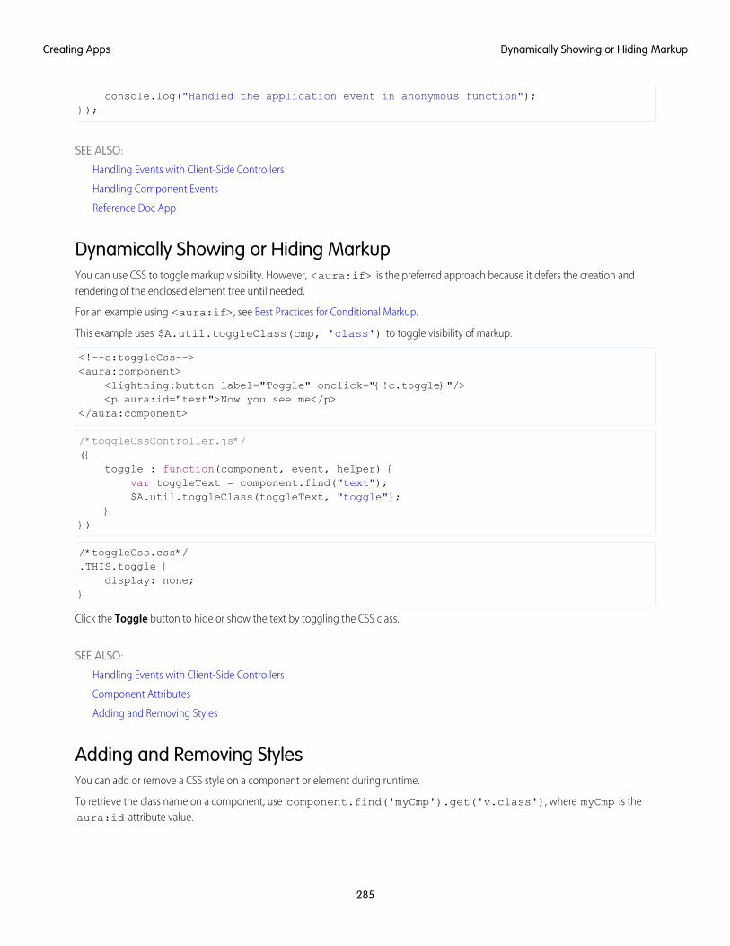
console.log("Handled the application event in anonymous function");});
SEE ALSO:
Handling Events with Client-Side Controllers
Handling Component Events
Reference Doc App
Dynamically Showing or Hiding MarkupYou can use CSS to toggle markup visibility. However, <aura:if> is the preferred approach because it defers the creation andrendering of the enclosed element tree until needed.
For an example using <aura:if>, see Best Practices for Conditional Markup.
This example uses $A.util.toggleClass(cmp, 'class') to toggle visibility of markup.
<!--c:toggleCss--><aura:component>
<lightning:button label="Toggle" onclick="{!c.toggle}"/><p aura:id="text">Now you see me</p>
</aura:component>
/*toggleCssController.js*/({
toggle : function(component, event, helper) {var toggleText = component.find("text");$A.util.toggleClass(toggleText, "toggle");
}})
/*toggleCss.css*/.THIS.toggle {
display: none;}
Click the Toggle button to hide or show the text by toggling the CSS class.
SEE ALSO:
Handling Events with Client-Side Controllers
Component Attributes
Adding and Removing Styles
Adding and Removing StylesYou can add or remove a CSS style on a component or element during runtime.
To retrieve the class name on a component, use component.find('myCmp').get('v.class'), where myCmp is theaura:id attribute value.
285
Dynamically Showing or Hiding MarkupCreating Apps
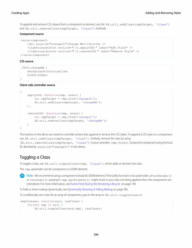
To append and remove CSS classes from a component or element, use the $A.util.addClass(cmpTarget, 'class')and $A.util.removeClass(cmpTarget, 'class') methods.
Component source
<aura:component><div aura:id="changeIt">Change Me!</div><br /><lightning:button onclick="{!c.applyCSS}" label="Add Style" /><lightning:button onclick="{!c.removeCSS}" label="Remove Style" />
</aura:component>
CSS source
.THIS.changeMe {background-color:yellow;width:200px;
}
Client-side controller source
{applyCSS: function(cmp, event) {
var cmpTarget = cmp.find('changeIt');$A.util.addClass(cmpTarget, 'changeMe');
},
removeCSS: function(cmp, event) {var cmpTarget = cmp.find('changeIt');$A.util.removeClass(cmpTarget, 'changeMe');
}}
The buttons in this demo are wired to controller actions that append or remove the CSS styles. To append a CSS style to a component,use $A.util.addClass(cmpTarget, 'class'). Similarly, remove the class by using$A.util.removeClass(cmpTarget, 'class') in your controller. cmp.find() locates the component using the localID, denoted by aura:id="changeIt" in this demo.
Toggling a ClassTo toggle a class, use $A.util.toggleClass(cmp, 'class'), which adds or removes the class.
The cmp parameter can be component or a DOM element.
Note: We recommend using a component instead of a DOM element. If the utility function is not used inside afterRender()or rerender(), passing in cmp.getElement() might result in your class not being applied when the components arererendered. For more information, see Events Fired During the Rendering Lifecycle on page 194.
To hide or show markup dynamically, see Dynamically Showing or Hiding Markup on page 285.
To conditionally set a class for an array of components, pass in the array to $A.util.toggleClass().
mapClasses: function(arr, cssClass) {for(var cmp in arr) {
$A.util.toggleClass(arr[cmp], cssClass);
286
Adding and Removing StylesCreating Apps
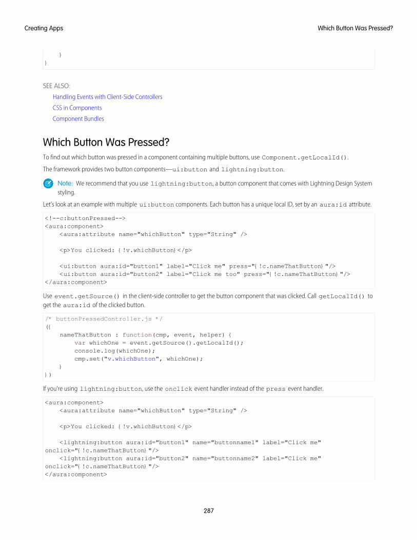
}}
SEE ALSO:
Handling Events with Client-Side Controllers
CSS in Components
Component Bundles
Which Button Was Pressed?To find out which button was pressed in a component containing multiple buttons, use Component.getLocalId().
The framework provides two button components—ui:button and lightning:button.
Note: We recommend that you use lightning:button, a button component that comes with Lightning Design Systemstyling.
Let’s look at an example with multiple ui:button components. Each button has a unique local ID, set by an aura:id attribute.
<!--c:buttonPressed--><aura:component>
<aura:attribute name="whichButton" type="String" />
<p>You clicked: {!v.whichButton}</p>
<ui:button aura:id="button1" label="Click me" press="{!c.nameThatButton}"/><ui:button aura:id="button2" label="Click me too" press="{!c.nameThatButton}"/>
</aura:component>
Use event.getSource() in the client-side controller to get the button component that was clicked. Call getLocalId() toget the aura:id of the clicked button.
/* buttonPressedController.js */({
nameThatButton : function(cmp, event, helper) {var whichOne = event.getSource().getLocalId();console.log(whichOne);cmp.set("v.whichButton", whichOne);
}})
If you’re using lightning:button, use the onclick event handler instead of the press event handler.
<aura:component><aura:attribute name="whichButton" type="String" />
<p>You clicked: {!v.whichButton}</p>
<lightning:button aura:id="button1" name="buttonname1" label="Click me"onclick="{!c.nameThatButton}"/>
<lightning:button aura:id="button2" name="buttonname2" label="Click me"onclick="{!c.nameThatButton}"/></aura:component>
287
Which Button Was Pressed?Creating Apps
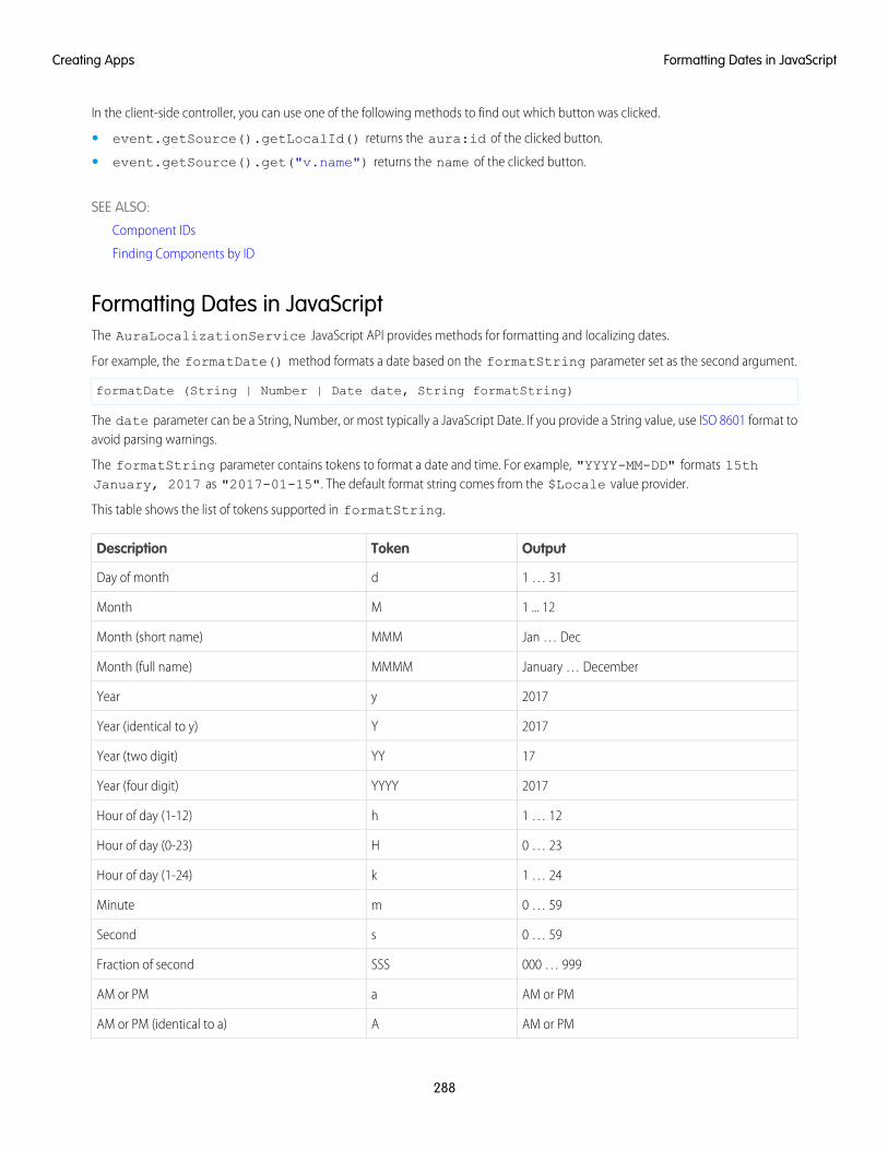
In the client-side controller, you can use one of the following methods to find out which button was clicked.
• event.getSource().getLocalId() returns the aura:id of the clicked button.
• event.getSource().get("v.name") returns the name of the clicked button.
SEE ALSO:
Component IDs
Finding Components by ID
Formatting Dates in JavaScriptThe AuraLocalizationService JavaScript API provides methods for formatting and localizing dates.
For example, the formatDate() method formats a date based on the formatString parameter set as the second argument.
formatDate (String | Number | Date date, String formatString)
The date parameter can be a String, Number, or most typically a JavaScript Date. If you provide a String value, use ISO 8601 format toavoid parsing warnings.
The formatString parameter contains tokens to format a date and time. For example, "YYYY-MM-DD" formats 15thJanuary, 2017 as "2017-01-15". The default format string comes from the $Locale value provider.
This table shows the list of tokens supported in formatString.
OutputTokenDescription
1 … 31dDay of month
1 ... 12MMonth
Jan … DecMMMMonth (short name)
January … DecemberMMMMMonth (full name)
2017yYear
2017YYear (identical to y)
17YYYear (two digit)
2017YYYYYear (four digit)
1 … 12hHour of day (1-12)
0 … 23HHour of day (0-23)
1 … 24kHour of day (1-24)
0 … 59mMinute
0 … 59sSecond
000 … 999SSSFraction of second
AM or PMaAM or PM
AM or PMAAM or PM (identical to a)
288
Formatting Dates in JavaScriptCreating Apps
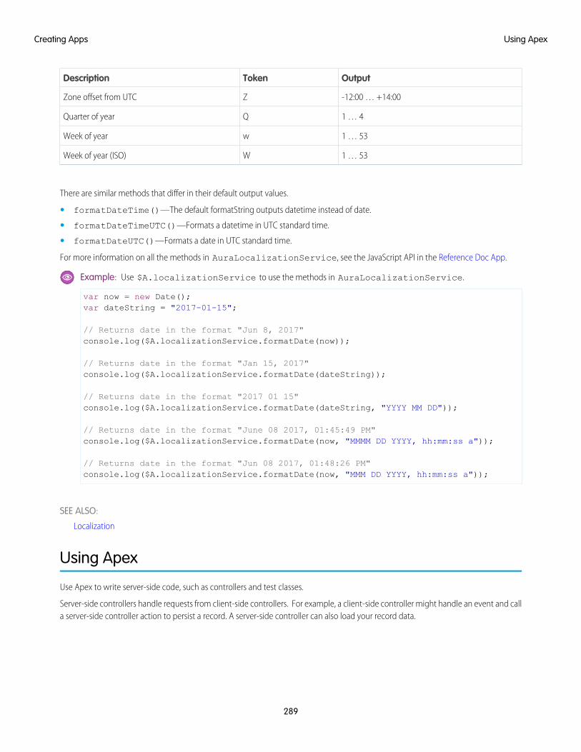
OutputTokenDescription
-12:00 … +14:00ZZone offset from UTC
1 … 4QQuarter of year
1 … 53wWeek of year
1 … 53WWeek of year (ISO)
There are similar methods that differ in their default output values.
• formatDateTime()—The default formatString outputs datetime instead of date.
• formatDateTimeUTC()—Formats a datetime in UTC standard time.
• formatDateUTC()—Formats a date in UTC standard time.
For more information on all the methods in AuraLocalizationService, see the JavaScript API in the Reference Doc App.
Example: Use $A.localizationService to use the methods in AuraLocalizationService.
var now = new Date();var dateString = "2017-01-15";
// Returns date in the format "Jun 8, 2017"console.log($A.localizationService.formatDate(now));
// Returns date in the format "Jan 15, 2017"console.log($A.localizationService.formatDate(dateString));
// Returns date in the format "2017 01 15"console.log($A.localizationService.formatDate(dateString, "YYYY MM DD"));
// Returns date in the format "June 08 2017, 01:45:49 PM"console.log($A.localizationService.formatDate(now, "MMMM DD YYYY, hh:mm:ss a"));
// Returns date in the format "Jun 08 2017, 01:48:26 PM"console.log($A.localizationService.formatDate(now, "MMM DD YYYY, hh:mm:ss a"));
SEE ALSO:
Localization
Using Apex
Use Apex to write server-side code, such as controllers and test classes.
Server-side controllers handle requests from client-side controllers. For example, a client-side controller might handle an event and calla server-side controller action to persist a record. A server-side controller can also load your record data.
289
Using ApexCreating Apps
IN THIS SECTION:
Creating Server-Side Logic with Controllers
The framework supports client-side and server-side controllers. An event is always wired to a client-side controller action, which canin turn call a server-side controller action. For example, a client-side controller might handle an event and call a server-side controlleraction to persist a record.
Working with Salesforce Records
It’s easy to work with your Salesforce records in Apex.
Testing Your Apex Code
Before you can upload a managed package, you must write and execute tests for your Apex code to meet minimum code coveragerequirements. Also, all tests must run without errors when you upload your package to AppExchange.
Making API Calls from Apex
Make API calls from an Apex controller. You can’t make Salesforce API calls from JavaScript code.
Creating Components in Apex
Creating components on the server side in Apex, using the Cmp.<myNamespace>.<myComponent> syntax, is deprecated.Use $A.createComponent() in client-side JavaScript code instead.
Creating Server-Side Logic with ControllersThe framework supports client-side and server-side controllers. An event is always wired to a client-side controller action, which can inturn call a server-side controller action. For example, a client-side controller might handle an event and call a server-side controller actionto persist a record.
Server-side actions need to make a round trip, from the client to the server and back again, so they usually complete more slowly thanclient-side actions.
For more details on the process of calling a server-side action, see Calling a Server-Side Action on page 295.
IN THIS SECTION:
Apex Server-Side Controller Overview
Create a server-side controller in Apex and use the @AuraEnabled annotation to enable access to the controller method.
Creating an Apex Server-Side Controller
Use the Developer Console to create an Apex server-side controller.
Returning Data from an Apex Server-Side Controller
Return results from a server-side controller to a client-side controller using the return statement. Results data must be serializableinto JSON format.
Returning Errors from an Apex Server-Side Controller
Create and throw a System.AuraHandledException from your server-side controller to return a custom error message.
AuraEnabled Annotation
The AuraEnabled annotation provides support for Apex methods and properties to be used with the Lightning Componentframework.
Calling a Server-Side Action
Call a server-side controller action from a client-side controller. In the client-side controller, you set a callback, which is called afterthe server-side action is completed. A server-side action can return any object containing serializable JSON data.
290
Creating Server-Side Logic with ControllersCreating Apps
Queueing of Server-Side Actions
The framework queues up actions before sending them to the server. This mechanism is largely transparent to you when you’rewriting code but it enables the framework to minimize network traffic by batching multiple actions into one request (XHR).
Foreground and Background Actions
Foreground actions are the default. An action can be marked as a background action. This is useful when you want your app toremain responsive to a user while it executes a low priority, long-running action. A rough guideline is to use a background action ifit takes more than five seconds for the response to return from the server.
Storable Actions
Enhance your component’s performance by marking actions as storable to quickly show cached data from client-side storage withoutwaiting for a server trip. If the cached data is stale, the framework retrieves the latest data from the server. Caching is especiallybeneficial for users on high latency, slow, or unreliable connections such as 3G networks.
Abortable Actions
Mark an action as abortable to make it potentially abortable while it's queued to be sent to the server. An abortable action in thequeue is not sent to the server if the component that created the action is no longer valid, that is cmp.isValid() == false.A component is automatically destroyed and marked invalid by the framework when it is unrendered.
Apex Server-Side Controller OverviewCreate a server-side controller in Apex and use the @AuraEnabled annotation to enable access to the controller method.
Only methods that you have explicitly annotated with @AuraEnabled are exposed. Calling server-side actions aren’t counted againstyour org’s API limits. However, your server-side controller actions are written in Apex, and as such are subject to all the usual Apex limits.
This Apex controller contains a serverEcho action that prepends a string to the value passed in.
public with sharing class SimpleServerSideController {
//Use @AuraEnabled to enable client- and server-side access to the method@AuraEnabledpublic static String serverEcho(String firstName) {
return ('Hello from the server, ' + firstName);}
}
In addition to using the @AuraEnabled annotation, your Apex controller must follow these requirements.
• Methods must be static and marked public or global. Non-static methods aren’t supported.
• If a method returns an object, instance methods that retrieve the value of the object’s instance field must be public.
• Use unique names for client-side and server-side actions in a component. A JavaScript function (client-side action) with the samename as an Apex method (server-side action ) can lead to hard-to-debug issues. In debug mode, the framework logs a browserconsole warning about the clashing client-side and server-side action names.
Tip: Don’t store component state in your controller (client-side or server-side). Store state in a component’s client-side attributesinstead.
For more information, see Classes in the Apex Developer Guide.
SEE ALSO:
Calling a Server-Side Action
Creating an Apex Server-Side Controller
AuraEnabled Annotation
291
Creating Server-Side Logic with ControllersCreating Apps
Creating an Apex Server-Side ControllerUse the Developer Console to create an Apex server-side controller.
1. Open the Developer Console.
2. Click File > New > Apex Class.
3. Enter a name for your server-side controller.
4. Click OK.
5. Enter a method for each server-side action in the body of the class.
Add the @AuraEnabled annotation to a method to expose it as a server-side action. Additionally, server-side actions must bestatic methods, and either global or public.
6. Click File > Save.
7. Open the component that you want to wire to the new controller class.
8. Add a controller system attribute to the <aura:component> tag to wire the component to the controller. For example:
<aura:component controller="SimpleServerSideController">
SEE ALSO:
Salesforce Help: Open the Developer Console
Returning Data from an Apex Server-Side Controller
AuraEnabled Annotation
Returning Data from an Apex Server-Side ControllerReturn results from a server-side controller to a client-side controller using the return statement. Results data must be serializableinto JSON format.
Return data types can be any of the following.
• Simple—String, Integer, and so on. See Basic Types for details.
• sObject—standard and custom sObjects are both supported. See Standard and Custom Object Types.
• Apex—an instance of an Apex class. (Most often a custom class.) See Custom Apex Class Types.
• Collection—a collection of any of the other types. See Collection Types.
Returning Apex ObjectsHere’s an example of a controller that returns a collection of custom Apex objects.
public with sharing class SimpleAccountController {
@AuraEnabledpublic static List<SimpleAccount> getAccounts() {
// Perform isAccessible() check here
// SimpleAccount is a simple "wrapper" Apex class for transportList<SimpleAccount> simpleAccounts = new List<SimpleAccount>();
292
Creating Server-Side Logic with ControllersCreating Apps
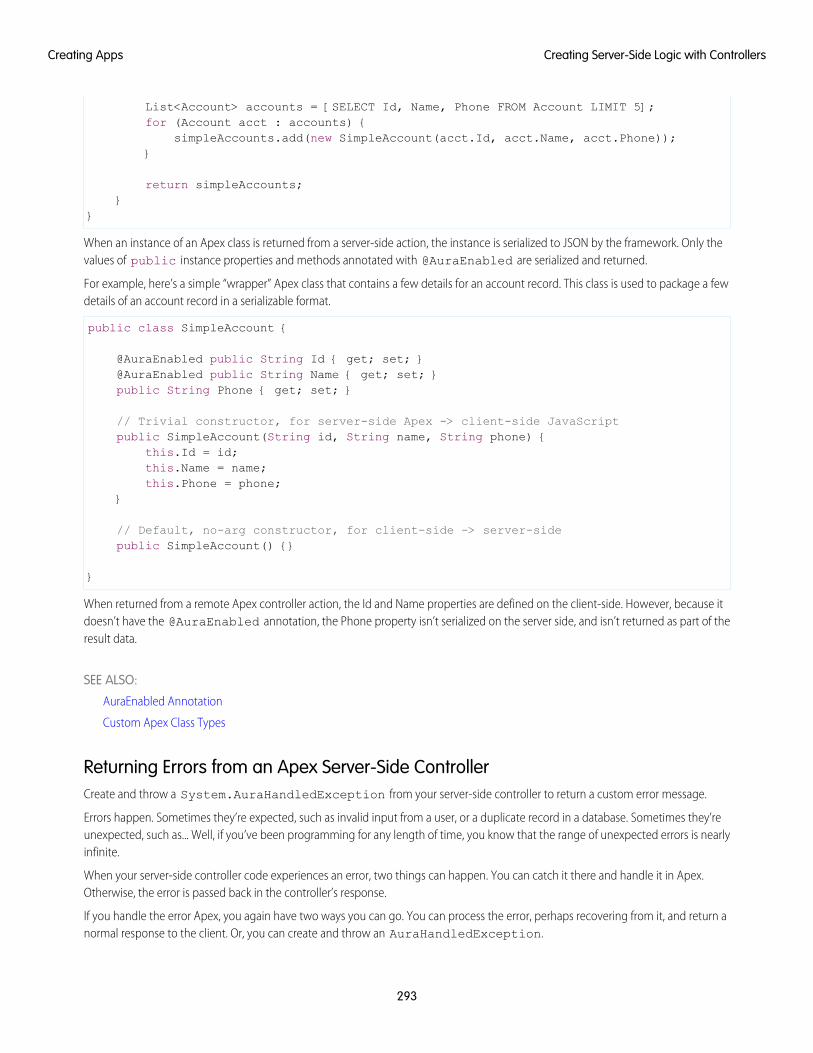
List<Account> accounts = [SELECT Id, Name, Phone FROM Account LIMIT 5];for (Account acct : accounts) {
simpleAccounts.add(new SimpleAccount(acct.Id, acct.Name, acct.Phone));}
return simpleAccounts;}
}
When an instance of an Apex class is returned from a server-side action, the instance is serialized to JSON by the framework. Only thevalues of public instance properties and methods annotated with @AuraEnabled are serialized and returned.
For example, here’s a simple “wrapper” Apex class that contains a few details for an account record. This class is used to package a fewdetails of an account record in a serializable format.
public class SimpleAccount {
@AuraEnabled public String Id { get; set; }@AuraEnabled public String Name { get; set; }public String Phone { get; set; }
// Trivial constructor, for server-side Apex -> client-side JavaScriptpublic SimpleAccount(String id, String name, String phone) {
this.Id = id;this.Name = name;this.Phone = phone;
}
// Default, no-arg constructor, for client-side -> server-sidepublic SimpleAccount() {}
}
When returned from a remote Apex controller action, the Id and Name properties are defined on the client-side. However, because itdoesn’t have the @AuraEnabled annotation, the Phone property isn’t serialized on the server side, and isn’t returned as part of theresult data.
SEE ALSO:
AuraEnabled Annotation
Custom Apex Class Types
Returning Errors from an Apex Server-Side ControllerCreate and throw a System.AuraHandledException from your server-side controller to return a custom error message.
Errors happen. Sometimes they’re expected, such as invalid input from a user, or a duplicate record in a database. Sometimes they’reunexpected, such as... Well, if you’ve been programming for any length of time, you know that the range of unexpected errors is nearlyinfinite.
When your server-side controller code experiences an error, two things can happen. You can catch it there and handle it in Apex.Otherwise, the error is passed back in the controller’s response.
If you handle the error Apex, you again have two ways you can go. You can process the error, perhaps recovering from it, and return anormal response to the client. Or, you can create and throw an AuraHandledException.
293
Creating Server-Side Logic with ControllersCreating Apps
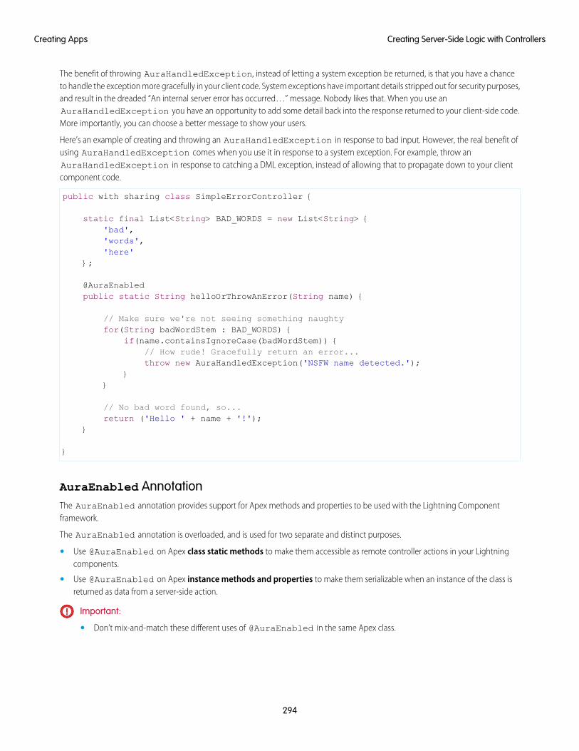
The benefit of throwing AuraHandledException, instead of letting a system exception be returned, is that you have a chanceto handle the exception more gracefully in your client code. System exceptions have important details stripped out for security purposes,and result in the dreaded “An internal server error has occurred…” message. Nobody likes that. When you use anAuraHandledException you have an opportunity to add some detail back into the response returned to your client-side code.More importantly, you can choose a better message to show your users.
Here’s an example of creating and throwing an AuraHandledException in response to bad input. However, the real benefit ofusing AuraHandledException comes when you use it in response to a system exception. For example, throw anAuraHandledException in response to catching a DML exception, instead of allowing that to propagate down to your clientcomponent code.
public with sharing class SimpleErrorController {
static final List<String> BAD_WORDS = new List<String> {'bad','words','here'
};
@AuraEnabledpublic static String helloOrThrowAnError(String name) {
// Make sure we're not seeing something naughtyfor(String badWordStem : BAD_WORDS) {
if(name.containsIgnoreCase(badWordStem)) {// How rude! Gracefully return an error...throw new AuraHandledException('NSFW name detected.');
}}
// No bad word found, so...return ('Hello ' + name + '!');
}
}
AuraEnabled AnnotationThe AuraEnabled annotation provides support for Apex methods and properties to be used with the Lightning Componentframework.
The AuraEnabled annotation is overloaded, and is used for two separate and distinct purposes.
• Use @AuraEnabled on Apex class static methods to make them accessible as remote controller actions in your Lightningcomponents.
• Use @AuraEnabled on Apex instance methods and properties to make them serializable when an instance of the class isreturned as data from a server-side action.
Important:
• Don’t mix-and-match these different uses of @AuraEnabled in the same Apex class.
294
Creating Server-Side Logic with ControllersCreating Apps
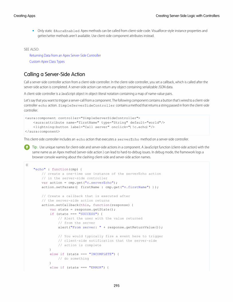
• Only static @AuraEnabled Apex methods can be called from client-side code. Visualforce-style instance properties andgetter/setter methods aren’t available. Use client-side component attributes instead.
SEE ALSO:
Returning Data from an Apex Server-Side Controller
Custom Apex Class Types
Calling a Server-Side ActionCall a server-side controller action from a client-side controller. In the client-side controller, you set a callback, which is called after theserver-side action is completed. A server-side action can return any object containing serializable JSON data.
A client-side controller is a JavaScript object in object-literal notation containing a map of name-value pairs.
Let’s say that you want to trigger a server-call from a component. The following component contains a button that’s wired to a client-sidecontroller echo action. SimpleServerSideController contains a method that returns a string passed in from the client-sidecontroller.
<aura:component controller="SimpleServerSideController"><aura:attribute name="firstName" type="String" default="world"/><lightning:button label="Call server" onclick="{!c.echo}"/>
</aura:component>
This client-side controller includes an echo action that executes a serverEcho method on a server-side controller.
Tip: Use unique names for client-side and server-side actions in a component. A JavaScript function (client-side action) with thesame name as an Apex method (server-side action ) can lead to hard-to-debug issues. In debug mode, the framework logs abrowser console warning about the clashing client-side and server-side action names.
({"echo" : function(cmp) {
// create a one-time use instance of the serverEcho action// in the server-side controllervar action = cmp.get("c.serverEcho");action.setParams({ firstName : cmp.get("v.firstName") });
// Create a callback that is executed after// the server-side action returnsaction.setCallback(this, function(response) {
var state = response.getState();if (state === "SUCCESS") {
// Alert the user with the value returned// from the serveralert("From server: " + response.getReturnValue());
// You would typically fire a event here to trigger// client-side notification that the server-side// action is complete
}else if (state === "INCOMPLETE") {
// do something}else if (state === "ERROR") {
295
Creating Server-Side Logic with ControllersCreating Apps
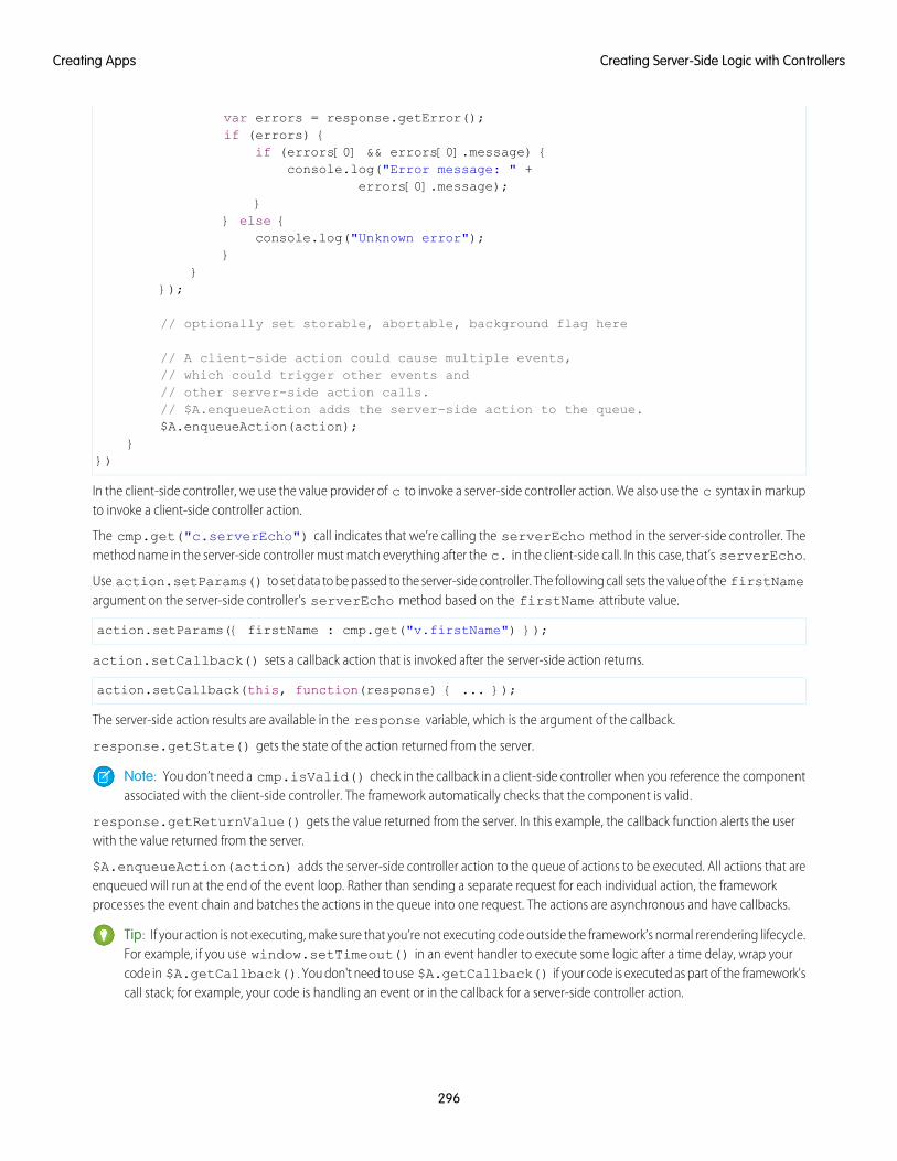
var errors = response.getError();if (errors) {
if (errors[0] && errors[0].message) {console.log("Error message: " +
errors[0].message);}
} else {console.log("Unknown error");
}}
});
// optionally set storable, abortable, background flag here
// A client-side action could cause multiple events,// which could trigger other events and// other server-side action calls.// $A.enqueueAction adds the server-side action to the queue.$A.enqueueAction(action);
}})
In the client-side controller, we use the value provider of c to invoke a server-side controller action. We also use the c syntax in markupto invoke a client-side controller action.
The cmp.get("c.serverEcho") call indicates that we’re calling the serverEcho method in the server-side controller. Themethod name in the server-side controller must match everything after the c. in the client-side call. In this case, that’s serverEcho.
Use action.setParams() to set data to be passed to the server-side controller. The following call sets the value of the firstNameargument on the server-side controller’s serverEcho method based on the firstName attribute value.
action.setParams({ firstName : cmp.get("v.firstName") });
action.setCallback() sets a callback action that is invoked after the server-side action returns.
action.setCallback(this, function(response) { ... });
The server-side action results are available in the response variable, which is the argument of the callback.
response.getState() gets the state of the action returned from the server.
Note: You don’t need a cmp.isValid() check in the callback in a client-side controller when you reference the componentassociated with the client-side controller. The framework automatically checks that the component is valid.
response.getReturnValue() gets the value returned from the server. In this example, the callback function alerts the userwith the value returned from the server.
$A.enqueueAction(action) adds the server-side controller action to the queue of actions to be executed. All actions that areenqueued will run at the end of the event loop. Rather than sending a separate request for each individual action, the frameworkprocesses the event chain and batches the actions in the queue into one request. The actions are asynchronous and have callbacks.
Tip: If your action is not executing, make sure that you’re not executing code outside the framework’s normal rerendering lifecycle.For example, if you use window.setTimeout() in an event handler to execute some logic after a time delay, wrap yourcode in $A.getCallback(). You don't need to use $A.getCallback() if your code is executed as part of the framework'scall stack; for example, your code is handling an event or in the callback for a server-side controller action.
296
Creating Server-Side Logic with ControllersCreating Apps
Client Payload Data LimitUse action.setParams() to set data for an action to be passed to a server-side controller.
The framework batches the actions in the queue into one server request. The request payload includes all of the actions and their dataserialized into JSON. The request payload limit is 4 MB.
IN THIS SECTION:
Action States
Call a server-side controller action from a client-side controller. The action can have different states during processing.
SEE ALSO:
Handling Events with Client-Side Controllers
Queueing of Server-Side Actions
Action States
Checking Component Validity
Action StatesCall a server-side controller action from a client-side controller. The action can have different states during processing.
The possible action states are:
NEWThe action was created but is not in progress yet
RUNNINGThe action is in progress
SUCCESSThe action executed successfully
ERRORThe server returned an error
INCOMPLETEThe server didn’t return a response. The server might be down or the client might be offline. The framework guarantees that anaction’s callback is always invoked as long as the component is valid. If the socket to the server is never successfully opened, or closesabruptly, or any other network error occurs, the XHR resolves and the callback is invoked with state equal to INCOMPLETE.
ABORTEDThe action was aborted. This action state is deprecated. A callback for an aborted action is never executed so you can’t do anythingto handle this state.
SEE ALSO:
Calling a Server-Side Action
Queueing of Server-Side ActionsThe framework queues up actions before sending them to the server. This mechanism is largely transparent to you when you’re writingcode but it enables the framework to minimize network traffic by batching multiple actions into one request (XHR).
The batching of actions is also known as boxcar’ing, similar to a train that couples boxcars together.
297
Creating Server-Side Logic with ControllersCreating Apps
The framework uses a stack to keep track of the actions to send to the server. When the browser finishes processing events and JavaScripton the client, the enqueued actions on the stack are sent to the server in a batch.
Tip: If your action is not executing, make sure that you’re not executing code outside the framework’s normal rerendering lifecycle.For example, if you use window.setTimeout() in an event handler to execute some logic after a time delay, wrap yourcode in $A.getCallback().
There are some properties that you can set on an action to influence how the framework manages the action while it’s in the queuewaiting to be sent to the server. For more information, see:
• Foreground and Background Actions on page 298
• Storable Actions on page 299
• Abortable Actions on page 302
SEE ALSO:
Modifying Components Outside the Framework Lifecycle
Foreground and Background ActionsForeground actions are the default. An action can be marked as a background action. This is useful when you want your app to remainresponsive to a user while it executes a low priority, long-running action. A rough guideline is to use a background action if it takes morethan five seconds for the response to return from the server.
Batching of ActionsMultiple queued foreground actions are batched in a single request (XHR) to minimize network traffic. The batching of actions is alsoknown as boxcar’ing, similar to a train that couples boxcars together.
The server sends the XHR response to the client when all actions have been processed on the server. If a long-running action is in theboxcar, the XHR response is held until that long-running action completes. Marking an action as background results in that action beingsent separately from any foreground actions. The separate transmission ensures that the background action doesn’t impact the responsetime of the foreground actions.
When the server-side actions in the queue are executed, the foreground actions execute first and then the background actions execute.Background actions run in parallel with foreground actions and responses of foreground and background actions may come back ineither order.
We don’t make any guarantees for the order of execution of action callbacks. XHR responses may return in a different order than theorder in which the XHR requests were sent due to server processing time.
Note: Don’t rely on each background action being sent in its own request as that behavior isn’t guaranteed and it can lead toperformance issues. Remember that the motivation for background actions is to isolate long-running requests into a separaterequest to avoid slowing the response for foreground actions.
If two actions must be executed sequentially, the component must orchestrate the ordering. The component can enqueue the firstaction. In the first action’s callback, the component can then enqueue the second action.
Framework-Managed Request ThrottlingThe framework throttles foreground and background requests separately. This means that the framework can control the number offoreground requests and the number of background actions running at any time. The framework automatically throttles requests andit’s not user controlled. The framework manages the number of foreground and background XHRs, which varies depending on availableresources.
298
Creating Server-Side Logic with ControllersCreating Apps
Even with separate throttling, background actions might affect performance in some conditions, such as an excessive number of requeststo the server.
Setting Background ActionsTo set an action as a background action, call the setBackground() method on the action object in JavaScript.
// set up the server-action actionvar action = cmp.get("c.serverEcho");// optionally set actions params//action.setParams({ firstName : cmp.get("v.firstName") });// set as a background actionaction.setBackground();
Note: A background action can’t be set back to a foreground action. In other words, calling setBackground to set it tofalse will have no effect.
SEE ALSO:
Queueing of Server-Side Actions
Calling a Server-Side Action
Storable ActionsEnhance your component’s performance by marking actions as storable to quickly show cached data from client-side storage withoutwaiting for a server trip. If the cached data is stale, the framework retrieves the latest data from the server. Caching is especially beneficialfor users on high latency, slow, or unreliable connections such as 3G networks.
Warning:
• A storable action might result in no call to the server. Never mark as storable an action that updates or deletes data.
• For storable actions in the cache, the framework returns the cached response immediately and also refreshes the data if it’sstale. Therefore, storable actions might have their callbacks invoked more than once: first with cached data, then with updateddata from the server.
Most server requests are read-only and idempotent, which means that a request can be repeated or retried as often as necessary withoutcausing data changes. The responses to idempotent actions can be cached and quickly reused for subsequent identical actions. Forstorable actions, the key for determining an identical action is a combination of:
• Apex controller name
• Method name
• Method parameter values
Marking an Action as StorableTo mark a server-side action as storable, call setStorable() on the action in JavaScript code, as follows.
action.setStorable();
Note: Storable actions are always implicitly marked as abortable too.
The setStorable function takes an optional argument, which is a configuration map of key-value pairs representing the storageoptions and values to set. You can only set the following property:
299
Creating Server-Side Logic with ControllersCreating Apps
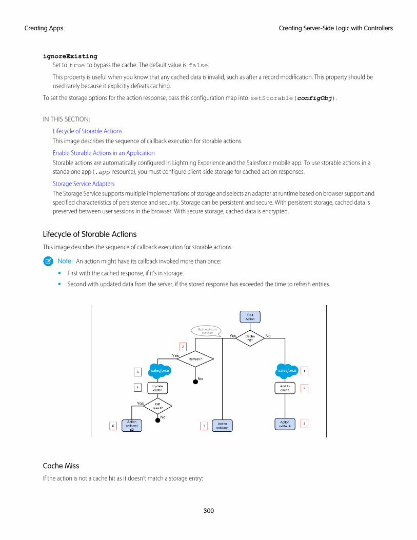
ignoreExistingSet to true to bypass the cache. The default value is false.
This property is useful when you know that any cached data is invalid, such as after a record modification. This property should beused rarely because it explicitly defeats caching.
To set the storage options for the action response, pass this configuration map into setStorable(configObj).
IN THIS SECTION:
Lifecycle of Storable Actions
This image describes the sequence of callback execution for storable actions.
Enable Storable Actions in an Application
Storable actions are automatically configured in Lightning Experience and the Salesforce mobile app. To use storable actions in astandalone app (.app resource), you must configure client-side storage for cached action responses.
Storage Service Adapters
The Storage Service supports multiple implementations of storage and selects an adapter at runtime based on browser support andspecified characteristics of persistence and security. Storage can be persistent and secure. With persistent storage, cached data ispreserved between user sessions in the browser. With secure storage, cached data is encrypted.
Lifecycle of Storable ActionsThis image describes the sequence of callback execution for storable actions.
Note: An action might have its callback invoked more than once:
• First with the cached response, if it’s in storage.
• Second with updated data from the server, if the stored response has exceeded the time to refresh entries.
Cache Miss
If the action is not a cache hit as it doesn’t match a storage entry:
300
Creating Server-Side Logic with ControllersCreating Apps
1. The action is sent to the server-side controller.
2. If the response is SUCCESS, the response is added to storage.
3. The callback in the client-side controller is executed.
Cache Hit
If the action is a cache hit as it matches a storage entry:
1. The callback in the client-side controller is executed with the cached action response.
2. If the response has been cached for longer than the refresh time, the storage entry is refreshed.
When an application enables storable actions, a refresh time is configured. The refresh time is the duration in seconds before anentry is refreshed in storage. The refresh time is automatically configured in Lightning Experience and the Salesforce mobile app.
3. The action is sent to the server-side controller.
4. If the response is SUCCESS, the response is added to storage.
5. If the refreshed response is different from the cached response, the callback in the client-side controller is executed for a secondtime.
SEE ALSO:
Storable Actions
Enable Storable Actions in an Application
Enable Storable Actions in an ApplicationStorable actions are automatically configured in Lightning Experience and the Salesforce mobile app. To use storable actions in astandalone app (.app resource), you must configure client-side storage for cached action responses.
To configure client-side storage for your standalone app, use <auraStorage:init> in the auraPreInitBlock attribute ofyour application’s template. For example:
<aura:component isTemplate="true" extends="aura:template"><aura:set attribute="auraPreInitBlock">
<auraStorage:initname="actions"persistent="false"secure="true"maxSize="1024"defaultExpiration="900"defaultAutoRefreshInterval="30" />
</aura:set></aura:component>
nameThe storage name must be actions. Storable actions are the only currently supported type of storage.
persistentSet to true to preserve cached data between user sessions in the browser.
secureSet to true to encrypt cached data.
301
Creating Server-Side Logic with ControllersCreating Apps
maxsizeThe maximum size in KB of the storage.
defaultExpirationThe duration in seconds that an entry is retained in storage.
defaultAutoRefreshIntervalThe duration in seconds before an entry is refreshed in storage.
For more information, see the Reference Doc App.
Storable actions use the Storage Service. The Storage Service supports multiple implementations of storage and selects an adapter atruntime based on browser support and specified characteristics of persistence and security.
SEE ALSO:
Storage Service Adapters
Storage Service AdaptersThe Storage Service supports multiple implementations of storage and selects an adapter at runtime based on browser support andspecified characteristics of persistence and security. Storage can be persistent and secure. With persistent storage, cached data is preservedbetween user sessions in the browser. With secure storage, cached data is encrypted.
SecurePersistentStorage Adapter Name
falsetrueIndexedDB
truefalseMemory
IndexedDB(Persistent but not secure) Provides access to an API for client-side storage and search of structured data. For more information, seethe Indexed Database API.
Memory(Not persistent but secure) Provides access to JavaScript memory for caching data. The stored cache persists only per browser page.Browsing to a new page resets the cache.
The Storage Service selects a storage adapter on your behalf that matches the persistent and secure options you specify when initializingthe service. For example, if you request a persistent and insecure storage service, the Storage Service returns the IndexedDB storage ifthe browser supports it.
Abortable ActionsMark an action as abortable to make it potentially abortable while it's queued to be sent to the server. An abortable action in the queueis not sent to the server if the component that created the action is no longer valid, that is cmp.isValid() == false. A componentis automatically destroyed and marked invalid by the framework when it is unrendered.
Note: We recommend that you only use abortable actions for read-only operations as they are not guaranteed to be sent to theserver.
An abortable action is sent to the server and executed normally unless the component that created the action is invalid before the actionis sent to the server.
A non-abortable action is always sent to the server and can't be aborted in the queue.
302
Creating Server-Side Logic with ControllersCreating Apps
If an action response returns from the server and the associated component is now invalid, the logic has been executed on the serverbut the action callback isn’t executed. This is true whether or not the action is marked as abortable.
Marking an Action as AbortableMark a server-side action as abortable by using the setAbortable() method on the Action object in JavaScript. For example:
var action = cmp.get("c.serverEcho");action.setAbortable();
SEE ALSO:
Creating Server-Side Logic with Controllers
Queueing of Server-Side Actions
Calling a Server-Side Action
Working with Salesforce RecordsIt’s easy to work with your Salesforce records in Apex.
The term sObject refers to any object that can be stored in Force.com. This could be a standard object, such as Account, or a customobject that you create, such as a Merchandise object.
An sObject variable represents a row of data, also known as a record. To work with an object in Apex, declare it using the SOAPAPI name of the object. For example:
Account a = new Account();MyCustomObject__c co = new MyCustomObject__c();
For more information on working on records with Apex, see Working with Data in Apex.
This example controller persists an updated Account record. Note that the update method has the @AuraEnabled annotation,which enables it to be called as a server-side controller action.
public with sharing class AccountController {
@AuraEnabledpublic static void updateAnnualRevenue(String accountId, Decimal annualRevenue) {
Account acct = [SELECT Id, Name, BillingCity FROM Account WHERE Id = :accountId];
acct.AnnualRevenue = annualRevenue;
// Perform isAccessible() and isUpdateable() checks hereupdate acct;
}}
For an example of calling Apex code from JavaScript code, see the Quick Start on page 8.
303
Working with Salesforce RecordsCreating Apps
Loading Record Data from a Standard ObjectLoad records from a standard object in a server-side controller. The following server-side controller has methods that return a list ofopportunity records and an individual opportunity record.
public with sharing class OpportunityController {
@AuraEnabledpublic static List<Opportunity> getOpportunities() {
List<Opportunity> opportunities =[SELECT Id, Name, CloseDate FROM Opportunity];
return opportunities;}
@AuraEnabledpublic static Opportunity getOpportunity(Id id) {
Opportunity opportunity = [SELECT Id, Account.Name, Name, CloseDate,
Owner.Name, Amount, Description, StageNameFROM OpportunityWHERE Id = :id
];
// Perform isAccessible() check herereturn opportunity;
}}
This example component uses the previous server-side controller to display a list of opportunity records when you press a button.
<aura:component controller="OpportunityController"><aura:attribute name="opportunities" type="Opportunity[]"/>
<ui:button label="Get Opportunities" press="{!c.getOpps}"/><aura:iteration var="opportunity" items="{!v.opportunities}"><p>{!opportunity.Name} : {!opportunity.CloseDate}</p></aura:iteration>
</aura:component>
When you press the button, the following client-side controller calls the getOpportunities() server-side controller and sets theopportunities attribute on the component. For more information about calling server-side controller methods, see Calling aServer-Side Action on page 295.
({getOpps: function(cmp){
var action = cmp.get("c.getOpportunities");action.setCallback(this, function(response){
var state = response.getState();if (state === "SUCCESS") {
cmp.set("v.opportunities", response.getReturnValue());}
});$A.enqueueAction(action);}
})
304
Working with Salesforce RecordsCreating Apps
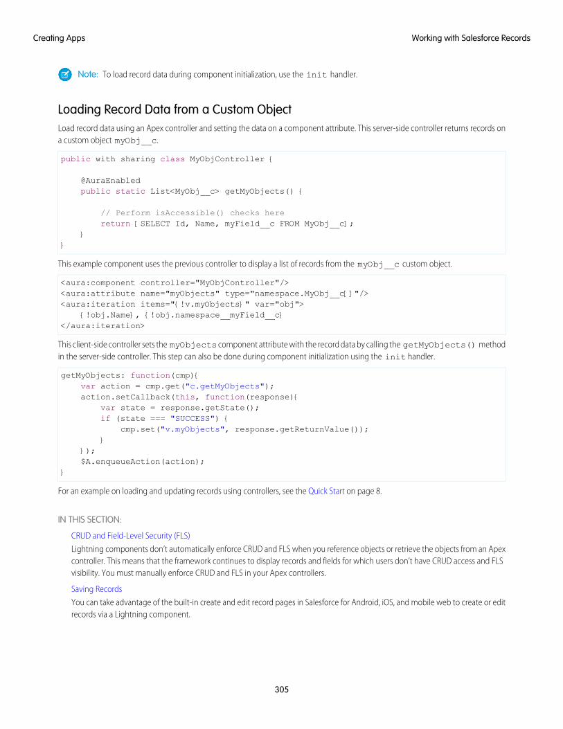
Note: To load record data during component initialization, use the init handler.
Loading Record Data from a Custom ObjectLoad record data using an Apex controller and setting the data on a component attribute. This server-side controller returns records ona custom object myObj__c.
public with sharing class MyObjController {
@AuraEnabledpublic static List<MyObj__c> getMyObjects() {
// Perform isAccessible() checks herereturn [SELECT Id, Name, myField__c FROM MyObj__c];
}}
This example component uses the previous controller to display a list of records from the myObj__c custom object.
<aura:component controller="MyObjController"/><aura:attribute name="myObjects" type="namespace.MyObj__c[]"/><aura:iteration items="{!v.myObjects}" var="obj">
{!obj.Name}, {!obj.namespace__myField__c}</aura:iteration>
This client-side controller sets the myObjects component attribute with the record data by calling the getMyObjects() methodin the server-side controller. This step can also be done during component initialization using the init handler.
getMyObjects: function(cmp){var action = cmp.get("c.getMyObjects");action.setCallback(this, function(response){
var state = response.getState();if (state === "SUCCESS") {
cmp.set("v.myObjects", response.getReturnValue());}
});$A.enqueueAction(action);
}
For an example on loading and updating records using controllers, see the Quick Start on page 8.
IN THIS SECTION:
CRUD and Field-Level Security (FLS)
Lightning components don’t automatically enforce CRUD and FLS when you reference objects or retrieve the objects from an Apexcontroller. This means that the framework continues to display records and fields for which users don’t have CRUD access and FLSvisibility. You must manually enforce CRUD and FLS in your Apex controllers.
Saving Records
You can take advantage of the built-in create and edit record pages in Salesforce for Android, iOS, and mobile web to create or editrecords via a Lightning component.
305
Working with Salesforce RecordsCreating Apps
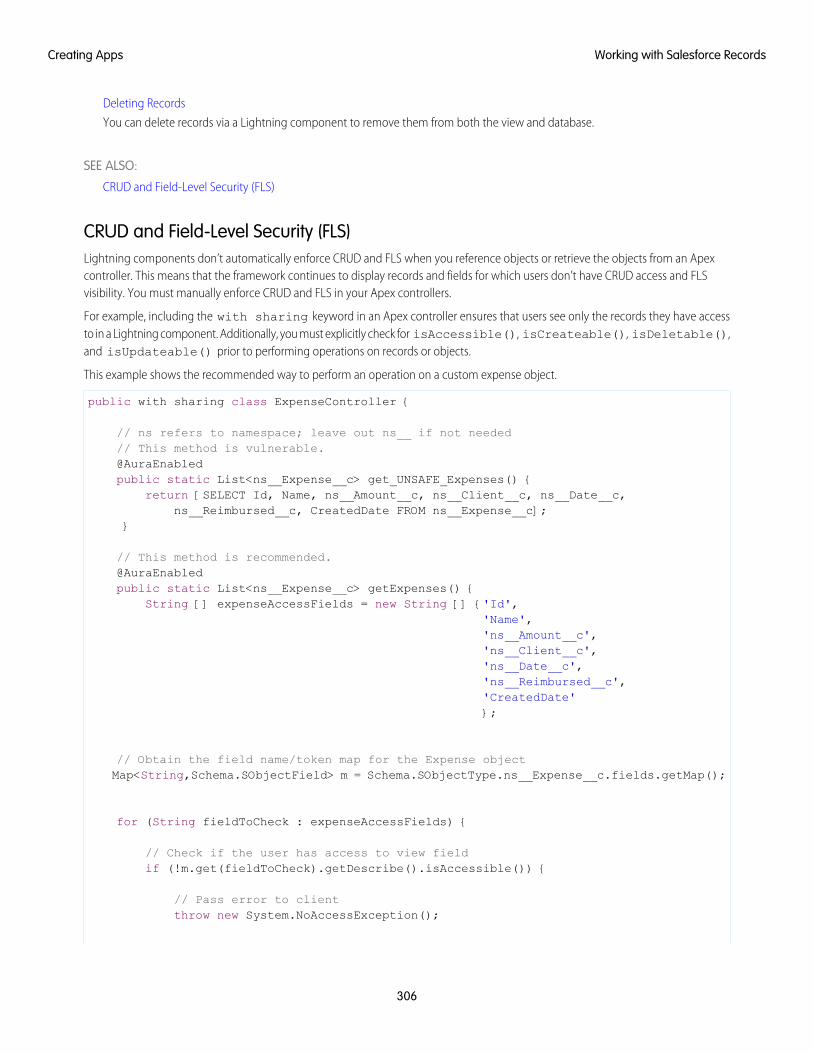
Deleting Records
You can delete records via a Lightning component to remove them from both the view and database.
SEE ALSO:
CRUD and Field-Level Security (FLS)
CRUD and Field-Level Security (FLS)Lightning components don’t automatically enforce CRUD and FLS when you reference objects or retrieve the objects from an Apexcontroller. This means that the framework continues to display records and fields for which users don’t have CRUD access and FLSvisibility. You must manually enforce CRUD and FLS in your Apex controllers.
For example, including the with sharing keyword in an Apex controller ensures that users see only the records they have accessto in a Lightning component. Additionally, you must explicitly check for isAccessible(), isCreateable(), isDeletable(),and isUpdateable() prior to performing operations on records or objects.
This example shows the recommended way to perform an operation on a custom expense object.
public with sharing class ExpenseController {
// ns refers to namespace; leave out ns__ if not needed// This method is vulnerable.@AuraEnabledpublic static List<ns__Expense__c> get_UNSAFE_Expenses() {
return [SELECT Id, Name, ns__Amount__c, ns__Client__c, ns__Date__c,ns__Reimbursed__c, CreatedDate FROM ns__Expense__c];
}
// This method is recommended.@AuraEnabledpublic static List<ns__Expense__c> getExpenses() {
String [] expenseAccessFields = new String [] {'Id','Name','ns__Amount__c','ns__Client__c','ns__Date__c','ns__Reimbursed__c','CreatedDate'};
// Obtain the field name/token map for the Expense objectMap<String,Schema.SObjectField> m = Schema.SObjectType.ns__Expense__c.fields.getMap();
for (String fieldToCheck : expenseAccessFields) {
// Check if the user has access to view fieldif (!m.get(fieldToCheck).getDescribe().isAccessible()) {
// Pass error to clientthrow new System.NoAccessException();
306
Working with Salesforce RecordsCreating Apps
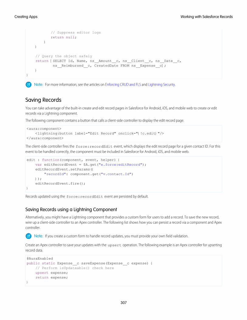
// Suppress editor logsreturn null;
}}
// Query the object safelyreturn [SELECT Id, Name, ns__Amount__c, ns__Client__c, ns__Date__c,
ns__Reimbursed__c, CreatedDate FROM ns__Expense__c];}
}
Note: For more information, see the articles on Enforcing CRUD and FLS and Lightning Security.
Saving RecordsYou can take advantage of the built-in create and edit record pages in Salesforce for Android, iOS, and mobile web to create or editrecords via a Lightning component.
The following component contains a button that calls a client-side controller to display the edit record page.
<aura:component><lightning:button label="Edit Record" onclick="{!c.edit}"/>
</aura:component>
The client-side controller fires the force:recordEdit event, which displays the edit record page for a given contact ID. For thisevent to be handled correctly, the component must be included in Salesforce for Android, iOS, and mobile web.
edit : function(component, event, helper) {var editRecordEvent = $A.get("e.force:editRecord");editRecordEvent.setParams({
"recordId": component.get("v.contact.Id")});editRecordEvent.fire();
}
Records updated using the force:recordEdit event are persisted by default.
Saving Records using a Lightning ComponentAlternatively, you might have a Lightning component that provides a custom form for users to add a record. To save the new record,wire up a client-side controller to an Apex controller. The following list shows how you can persist a record via a component and Apexcontroller.
Note: If you create a custom form to handle record updates, you must provide your own field validation.
Create an Apex controller to save your updates with the upsert operation. The following example is an Apex controller for upsertingrecord data.
@AuraEnabledpublic static Expense__c saveExpense(Expense__c expense) {
// Perform isUpdateable() check hereupsert expense;return expense;
}
307
Working with Salesforce RecordsCreating Apps
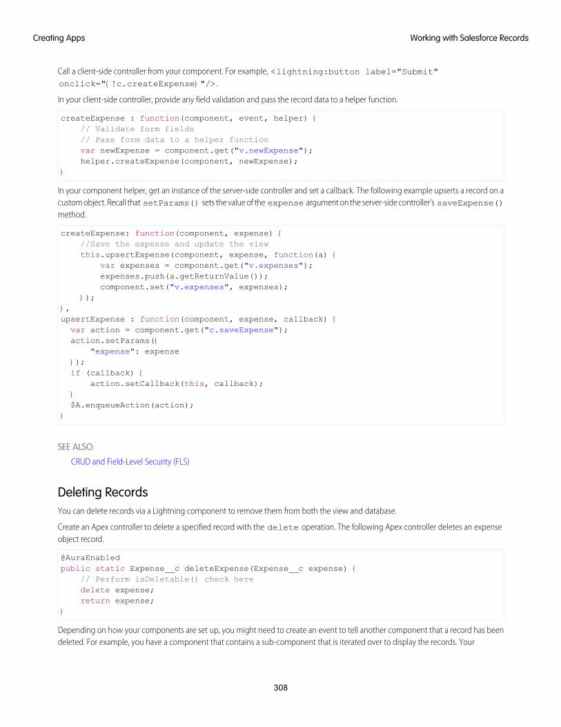
Call a client-side controller from your component. For example, <lightning:button label="Submit"onclick="{!c.createExpense}"/>.
In your client-side controller, provide any field validation and pass the record data to a helper function.
createExpense : function(component, event, helper) {// Validate form fields// Pass form data to a helper functionvar newExpense = component.get("v.newExpense");helper.createExpense(component, newExpense);
}
In your component helper, get an instance of the server-side controller and set a callback. The following example upserts a record on acustom object. Recall that setParams() sets the value of the expense argument on the server-side controller’s saveExpense()method.
createExpense: function(component, expense) {//Save the expense and update the viewthis.upsertExpense(component, expense, function(a) {
var expenses = component.get("v.expenses");expenses.push(a.getReturnValue());component.set("v.expenses", expenses);
});},upsertExpense : function(component, expense, callback) {var action = component.get("c.saveExpense");action.setParams({
"expense": expense});if (callback) {
action.setCallback(this, callback);}$A.enqueueAction(action);
}
SEE ALSO:
CRUD and Field-Level Security (FLS)
Deleting RecordsYou can delete records via a Lightning component to remove them from both the view and database.
Create an Apex controller to delete a specified record with the delete operation. The following Apex controller deletes an expenseobject record.
@AuraEnabledpublic static Expense__c deleteExpense(Expense__c expense) {
// Perform isDeletable() check heredelete expense;return expense;
}
Depending on how your components are set up, you might need to create an event to tell another component that a record has beendeleted. For example, you have a component that contains a sub-component that is iterated over to display the records. Your
308
Working with Salesforce RecordsCreating Apps
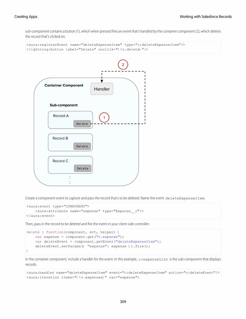
sub-component contains a button (1), which when pressed fires an event that’s handled by the container component (2), which deletesthe record that’s clicked on.
<aura:registerEvent name="deleteExpenseItem" type="c:deleteExpenseItem"/><lightning:button label="Delete" onclick="{!c.delete}"/>
Create a component event to capture and pass the record that’s to be deleted. Name the event deleteExpenseItem.
<aura:event type="COMPONENT"><aura:attribute name="expense" type="Expense__c"/>
</aura:event>
Then, pass in the record to be deleted and fire the event in your client-side controller.
delete : function(component, evt, helper) {var expense = component.get("v.expense");var deleteEvent = component.getEvent("deleteExpenseItem");deleteEvent.setParams({ "expense": expense }).fire();
}
In the container component, include a handler for the event. In this example, c:expenseList is the sub-component that displaysrecords.
<aura:handler name="deleteExpenseItem" event="c:deleteExpenseItem" action="c:deleteEvent"/><aura:iteration items="{!v.expenses}" var="expense">
309
Working with Salesforce RecordsCreating Apps
<c:expenseList expense="{!expense}"/></aura:iteration>
And handle the event in the client-side controller of the container component.
deleteEvent : function(component, event, helper) {// Call the helper function to delete record and update viewhelper.deleteExpense(component, event.getParam("expense"));
}
Finally, in the helper function of the container component, call your Apex controller to delete the record and update the view.
deleteExpense : function(component, expense, callback) {// Call the Apex controller and update the view in the callbackvar action = component.get("c.deleteExpense");action.setParams({
"expense": expense});action.setCallback(this, function(response) {
var state = response.getState();if (state === "SUCCESS") {
// Remove only the deleted expense from viewvar expenses = component.get("v.expenses");var items = [];for (i = 0; i < expenses.length; i++) {
if(expenses[i]!==expense) {items.push(expenses[i]);
}}component.set("v.expenses", items);// Other client-side logic
}});$A.enqueueAction(action);
}
The helper function calls the Apex controller to delete the record in the database. In the callback function,component.set("v.expenses", items) updates the view with the updated array of records.
SEE ALSO:
CRUD and Field-Level Security (FLS)
Component Events
Calling a Server-Side Action
Testing Your Apex CodeBefore you can upload a managed package, you must write and execute tests for your Apex code to meet minimum code coveragerequirements. Also, all tests must run without errors when you upload your package to AppExchange.
To package your application and components that depend on Apex code, the following must be true.
• At least 75% of your Apex code must be covered by unit tests, and all of those tests must complete successfully.
Note the following.
310
Testing Your Apex CodeCreating Apps
When deploying Apex to a production organization, each unit test in your organization namespace is executed by default.–
– Calls to System.debug are not counted as part of Apex code coverage.
– Test methods and test classes are not counted as part of Apex code coverage.
– While only 75% of your Apex code must be covered by tests, your focus shouldn't be on the percentage of code that is covered.Instead, you should make sure that every use case of your application is covered, including positive and negative cases, as wellas bulk and single records. This should lead to 75% or more of your code being covered by unit tests.
• Every trigger must have some test coverage.
• All classes and triggers must compile successfully.
This sample shows an Apex test class for a custom object that’s wired up to a component.
@isTestclass TestExpenseController {
static testMethod void test() {//Create new expense and insert it into the databaseExpense__c exp = new Expense__c(name='My New Expense',
amount__c=20, client__c='ABC',reimbursed__c=false, date__c=null);
ExpenseController.saveExpense(exp);
//Assert the name field and saved expenseSystem.assertEquals('My New Expense',
ExpenseController.getExpenses()[0].Name,'Name does not match');
System.assertEquals(exp, ExpenseController.saveExpense(exp));}
}
Note: Apex classes must be manually added to your package.
For more information on distributing Apex code, see the Apex Code Developer's Guide.
SEE ALSO:
Distributing Applications and Components
Making API Calls from ApexMake API calls from an Apex controller. You can’t make Salesforce API calls from JavaScript code.
For security reasons, the Lightning Component framework places restrictions on making API calls from JavaScript code. To call third-partyAPIs from your component’s JavaScript code, add the API endpoint as a CSP Trusted Site.
To call Salesforce APIs, make the API calls from your component’s Apex controller. Use a named credential to authenticate to Salesforce.
Note: By security policy, sessions created by Lightning components aren’t enabled for API access. This prevents even your Apexcode from making API calls to Salesforce. Using a named credential for specific API calls allows you to carefully and selectivelybypass this security restriction.
The restrictions on API-enabled sessions aren’t accidental. Carefully review any code that uses a named credential to ensure you’renot creating a vulnerability.
311
Making API Calls from ApexCreating Apps
For information about making API calls from Apex, see the Apex Developer Guide.
SEE ALSO:
Apex Developer Guide: Named Credentials as Callout Endpoints
Making API Calls from Components
Create CSP Trusted Sites to Access Third-Party APIs
Content Security Policy Overview
Creating Components in ApexCreating components on the server side in Apex, using the Cmp.<myNamespace>.<myComponent> syntax, is deprecated. Use$A.createComponent() in client-side JavaScript code instead.
SEE ALSO:
Dynamically Creating Components
Lightning Data Service
Use Lightning Data Service to load, create, edit, or delete a record in your component without requiring Apex code. Lightning DataService handles sharing rules and field-level security for you. In addition to not needing Apex, Lightning Data Service improves performanceand user interface consistency.
At the simplest level, you can think of Lightning Data Service as the Lightning Components version of the Visualforce standard controller.While this statement is an over-simplification, it serves to illustrate a point. Whenever possible, use Lightning Data Service to read andmodify Salesforce data in your components.
Data access with Lightning Data Service is simpler than the equivalent using a server-side Apex controller. Read-only access can beentirely declarative in your component’s markup. For code that modifies data, your component’s JavaScript controller is roughly thesame amount of code, and you eliminate the Apex entirely. All your data access code is consolidated into your component, whichsignificantly reduces complexity.
Lightning Data Service provides other benefits aside from the code. It’s built on highly efficient local storage that’s shared across allcomponents that use it. Records loaded in Lightning Data Service are cached and shared across components. Components accessingthe same record see significant performance improvements, because a record is loaded only once, no matter how many componentsare using it. Shared records also improve user interface consistency. When one component updates a record, the other componentsusing it are notified, and in most cases, refresh automatically.
IN THIS SECTION:
Loading a Record
Loading a record is the simplest operation in Lightning Data Service. You can accomplish it entirely in markup.
Saving a Record
To save a record using Lightning Data Service, call saveRecord on the force:recordData component, and pass in acallback function to be invoked after the save operation completes.
312
Creating Components in ApexCreating Apps
Creating a Record
To create a record using Lightning Data Service, declare force:recordData without assigning a recordId. Next, load arecord template by calling the getNewRecord function on force:recordData. Finally, apply values to the new record,and save the record by calling the saveRecord function on force:recordData.
Deleting a Record
To delete a record using Lightning Data Service, call deleteRecord on the force:recordData component, and pass ina callback function to be invoked after the delete operation completes.
Record Changes
To perform tasks beyond rerendering the record when the record changes, handle the recordUpdated event. You can handlerecord loaded, updated, and deleted changes, applying different actions to each change type.
Errors
To act when an error occurs, handle the recordUpdated event and handle the case where the changeType is “ERROR”.
Considerations
Lightning Data Service is powerful and simple to use. However, it’s not a complete replacement for writing your own data accesscode. Here are some considerations to keep in mind when using it.
Lightning Data Service Example
Here’s a longer, more detailed example of using Lightning Data Service to create a Quick Contact action panel.
SaveRecordResult
Represents the result of a Lightning Data Service operation that makes a persistent change to record data.
Loading a RecordLoading a record is the simplest operation in Lightning Data Service. You can accomplish it entirely in markup.
To load a record using Lightning Data Service, add the force:recordData tag to your component. In the force:recordDatatag, specify the ID of the record to be loaded, a list of fields, and the attribute to which to assign the loaded record. force:recordDatamust specify the following.
• The ID of the record to load
• Which component attribute to assign the loaded record
• A list of fields to load
You can explicitly specify the list of fields to load with the fields attribute. For example,fields="Name,BillingCity,BillingState".
Alternatively, you can specify a layout using the layoutType attribute. All fields on that layout are loaded for the record. Layouts aretypically modified by administrators. Loading record data using layoutType allows your component to adapt to those layoutdefinitions. Valid values for layoutType are FULL and COMPACT.
Example: Loading a Record
The following example illustrates the essentials of loading a record using Lightning Data Service. This component can be addedto a record home page in the Lightning App Builder, or as a custom action. The record ID is supplied by the implicit recordIdattribute added by the force:hasRecordId interface.
ldsLoad.cmp
<aura:componentimplements="flexipage:availableForRecordHome,force:lightningQuickActionWithoutHeader,force:hasRecordId">
313
Loading a RecordCreating Apps
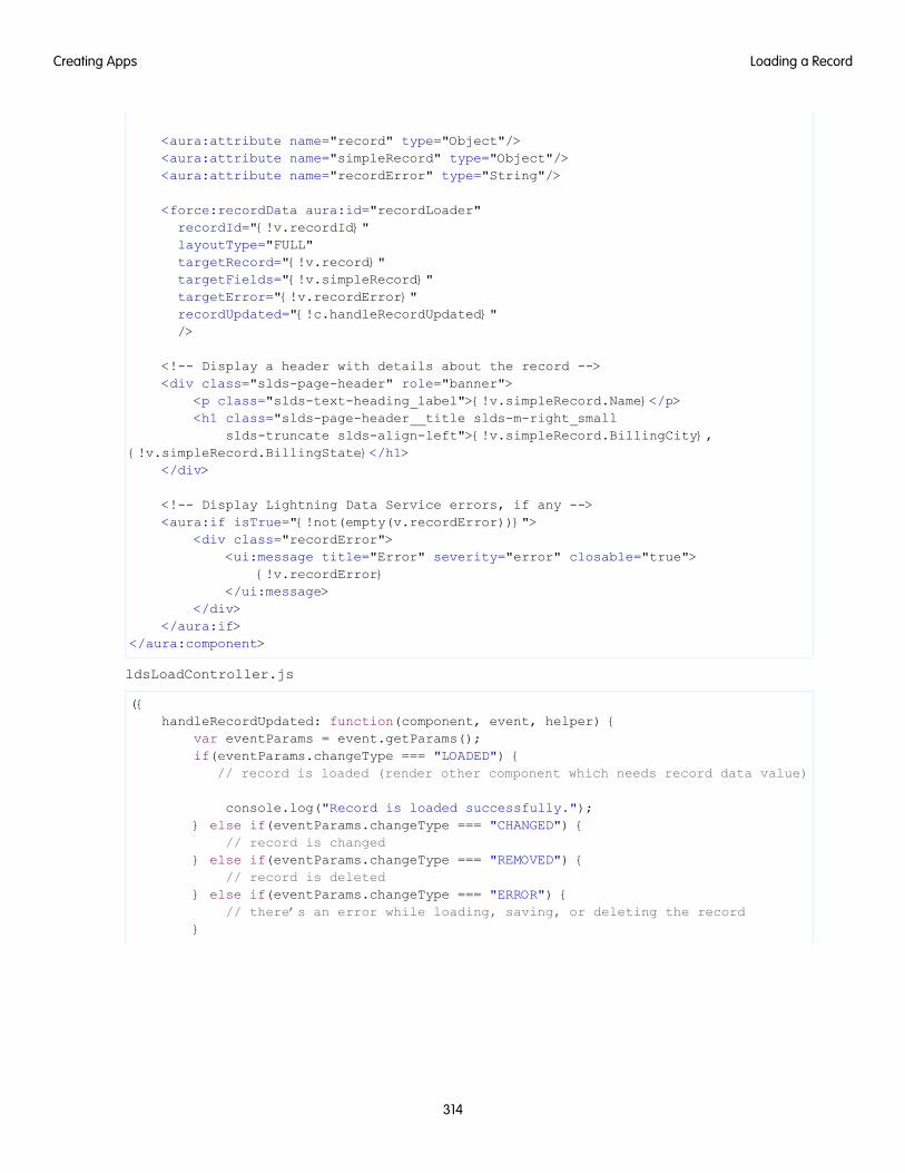
<aura:attribute name="record" type="Object"/><aura:attribute name="simpleRecord" type="Object"/><aura:attribute name="recordError" type="String"/>
<force:recordData aura:id="recordLoader"recordId="{!v.recordId}"layoutType="FULL"targetRecord="{!v.record}"targetFields="{!v.simpleRecord}"targetError="{!v.recordError}"recordUpdated="{!c.handleRecordUpdated}"/>
<!-- Display a header with details about the record --><div class="slds-page-header" role="banner">
<p class="slds-text-heading_label">{!v.simpleRecord.Name}</p><h1 class="slds-page-header__title slds-m-right_small
slds-truncate slds-align-left">{!v.simpleRecord.BillingCity},{!v.simpleRecord.BillingState}</h1>
</div>
<!-- Display Lightning Data Service errors, if any --><aura:if isTrue="{!not(empty(v.recordError))}">
<div class="recordError"><ui:message title="Error" severity="error" closable="true">
{!v.recordError}</ui:message>
</div></aura:if>
</aura:component>
ldsLoadController.js
({handleRecordUpdated: function(component, event, helper) {
var eventParams = event.getParams();if(eventParams.changeType === "LOADED") {
// record is loaded (render other component which needs record data value)
console.log("Record is loaded successfully.");} else if(eventParams.changeType === "CHANGED") {
// record is changed} else if(eventParams.changeType === "REMOVED") {
// record is deleted} else if(eventParams.changeType === "ERROR") {
// there’s an error while loading, saving, or deleting the record}
314
Loading a RecordCreating Apps
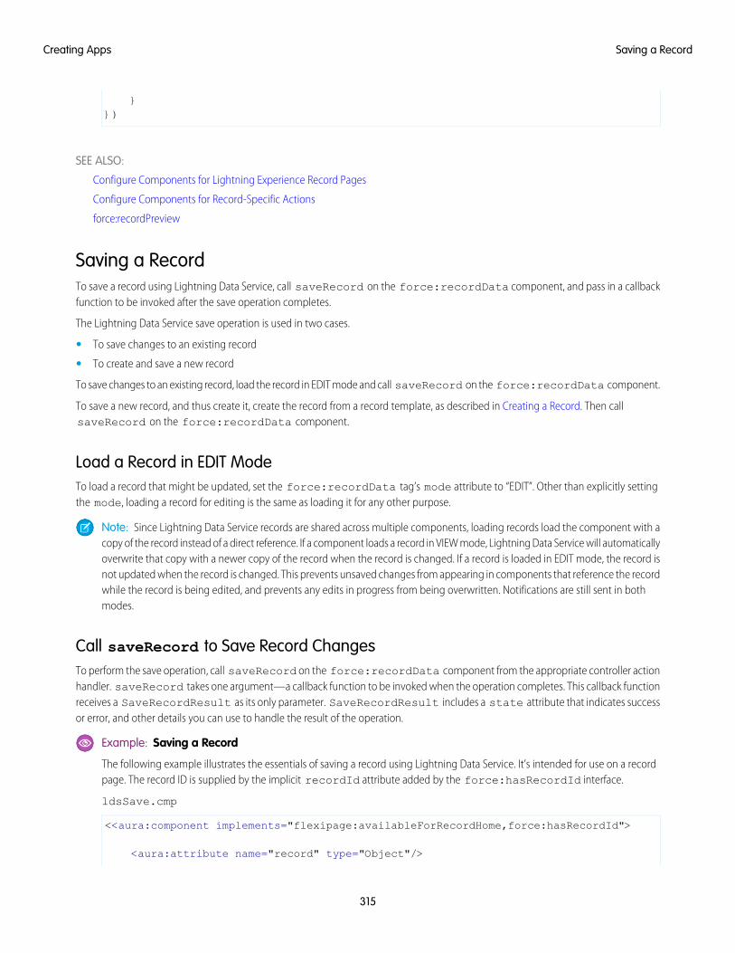
}})
SEE ALSO:
Configure Components for Lightning Experience Record Pages
Configure Components for Record-Specific Actions
force:recordPreview
Saving a RecordTo save a record using Lightning Data Service, call saveRecord on the force:recordData component, and pass in a callbackfunction to be invoked after the save operation completes.
The Lightning Data Service save operation is used in two cases.
• To save changes to an existing record
• To create and save a new record
To save changes to an existing record, load the record in EDIT mode and call saveRecord on the force:recordData component.
To save a new record, and thus create it, create the record from a record template, as described in Creating a Record. Then callsaveRecord on the force:recordData component.
Load a Record in EDIT ModeTo load a record that might be updated, set the force:recordData tag’s mode attribute to “EDIT”. Other than explicitly settingthe mode, loading a record for editing is the same as loading it for any other purpose.
Note: Since Lightning Data Service records are shared across multiple components, loading records load the component with acopy of the record instead of a direct reference. If a component loads a record in VIEW mode, Lightning Data Service will automaticallyoverwrite that copy with a newer copy of the record when the record is changed. If a record is loaded in EDIT mode, the record isnot updated when the record is changed. This prevents unsaved changes from appearing in components that reference the recordwhile the record is being edited, and prevents any edits in progress from being overwritten. Notifications are still sent in bothmodes.
Call saveRecord to Save Record ChangesTo perform the save operation, call saveRecord on the force:recordData component from the appropriate controller actionhandler. saveRecord takes one argument—a callback function to be invoked when the operation completes. This callback functionreceives a SaveRecordResult as its only parameter. SaveRecordResult includes a state attribute that indicates successor error, and other details you can use to handle the result of the operation.
Example: Saving a Record
The following example illustrates the essentials of saving a record using Lightning Data Service. It’s intended for use on a recordpage. The record ID is supplied by the implicit recordId attribute added by the force:hasRecordId interface.
ldsSave.cmp
<<aura:component implements="flexipage:availableForRecordHome,force:hasRecordId">
<aura:attribute name="record" type="Object"/>
315
Saving a RecordCreating Apps
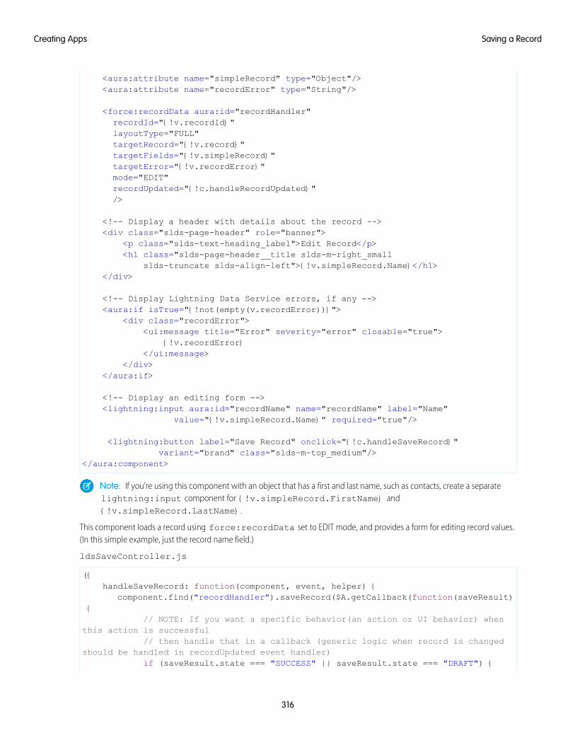
<aura:attribute name="simpleRecord" type="Object"/><aura:attribute name="recordError" type="String"/>
<force:recordData aura:id="recordHandler"recordId="{!v.recordId}"layoutType="FULL"targetRecord="{!v.record}"targetFields="{!v.simpleRecord}"targetError="{!v.recordError}"mode="EDIT"recordUpdated="{!c.handleRecordUpdated}"/>
<!-- Display a header with details about the record --><div class="slds-page-header" role="banner">
<p class="slds-text-heading_label">Edit Record</p><h1 class="slds-page-header__title slds-m-right_small
slds-truncate slds-align-left">{!v.simpleRecord.Name}</h1></div>
<!-- Display Lightning Data Service errors, if any --><aura:if isTrue="{!not(empty(v.recordError))}">
<div class="recordError"><ui:message title="Error" severity="error" closable="true">
{!v.recordError}</ui:message>
</div></aura:if>
<!-- Display an editing form --><lightning:input aura:id="recordName" name="recordName" label="Name"
value="{!v.simpleRecord.Name}" required="true"/>
<lightning:button label="Save Record" onclick="{!c.handleSaveRecord}"variant="brand" class="slds-m-top_medium"/>
</aura:component>
Note: If you’re using this component with an object that has a first and last name, such as contacts, create a separatelightning:input component for {!v.simpleRecord.FirstName} and{!v.simpleRecord.LastName}.
This component loads a record using force:recordData set to EDIT mode, and provides a form for editing record values.(In this simple example, just the record name field.)
ldsSaveController.js
({handleSaveRecord: function(component, event, helper) {
component.find("recordHandler").saveRecord($A.getCallback(function(saveResult){
// NOTE: If you want a specific behavior(an action or UI behavior) whenthis action is successful
// then handle that in a callback (generic logic when record is changedshould be handled in recordUpdated event handler)
if (saveResult.state === "SUCCESS" || saveResult.state === "DRAFT") {
316
Saving a RecordCreating Apps
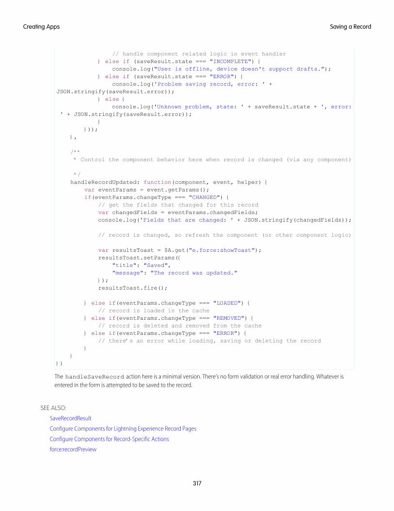
// handle component related logic in event handler} else if (saveResult.state === "INCOMPLETE") {
console.log("User is offline, device doesn't support drafts.");} else if (saveResult.state === "ERROR") {
console.log('Problem saving record, error: ' +JSON.stringify(saveResult.error));
} else {console.log('Unknown problem, state: ' + saveResult.state + ', error:
' + JSON.stringify(saveResult.error));}
}));},
/*** Control the component behavior here when record is changed (via any component)
*/handleRecordUpdated: function(component, event, helper) {
var eventParams = event.getParams();if(eventParams.changeType === "CHANGED") {
// get the fields that changed for this recordvar changedFields = eventParams.changedFields;console.log('Fields that are changed: ' + JSON.stringify(changedFields));
// record is changed, so refresh the component (or other component logic)
var resultsToast = $A.get("e.force:showToast");resultsToast.setParams({
"title": "Saved","message": "The record was updated."
});resultsToast.fire();
} else if(eventParams.changeType === "LOADED") {// record is loaded in the cache
} else if(eventParams.changeType === "REMOVED") {// record is deleted and removed from the cache
} else if(eventParams.changeType === "ERROR") {// there’s an error while loading, saving or deleting the record
}}
})
The handleSaveRecord action here is a minimal version. There’s no form validation or real error handling. Whatever isentered in the form is attempted to be saved to the record.
SEE ALSO:
SaveRecordResult
Configure Components for Lightning Experience Record Pages
Configure Components for Record-Specific Actions
force:recordPreview
317
Saving a RecordCreating Apps
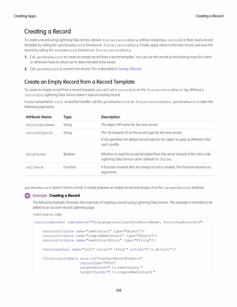
Creating a RecordTo create a record using Lightning Data Service, declare force:recordData without assigning a recordId. Next, load a recordtemplate by calling the getNewRecord function on force:recordData. Finally, apply values to the new record, and save therecord by calling the saveRecord function on force:recordData.
1. Call getNewRecord to create an empty record from a record template. You can use this record as the backing store for a formor otherwise have its values set to data intended to be saved.
2. Call saveRecord to commit the record. This is described in Saving a Record.
Create an Empty Record from a Record TemplateTo create an empty record from a record template, you can’t set a recordId on the force:recordData tag. Without arecordId, Lightning Data Service doesn’t load an existing record.
In your component’s init or another handler, call the getNewRecord on force:recordData. getNewRecord takes thefollowing arguments.
DescriptionTypeAttribute Name
The object API name for the new record.StringobjectApiName
The 18 character ID of the record type for the new record.
If not specified, the default record type for the object is used, as defined in theuser’s profile.
StringrecordTypeId
Whether to load the record template from the server instead of the client-sideLightning Data Service cache. Defaults to false.
BooleanskipCache
A function invoked after the empty record is created. This function receives noarguments.
Functioncallback
getNewRecord doesn’t return a result. It simply prepares an empty record and assigns it to the targetRecord attribute.
Example: Creating a Record
The following example illustrates the essentials of creating a record using Lightning Data Service. This example is intended to beadded to an account record Lightning page.
ldsCreate.cmp
<aura:component implements="flexipage:availableForRecordHome, force:hasRecordId">
<aura:attribute name="newContact" type="Object"/><aura:attribute name="simpleNewContact" type="Object"/><aura:attribute name="newContactError" type="String"/>
<aura:handler name="init" value="{!this}" action="{!c.doInit}"/>
<force:recordData aura:id="contactRecordCreator"layoutType="FULL"targetRecord="{!v.newContact}"targetFields="{!v.simpleNewContact}"
318
Creating a RecordCreating Apps
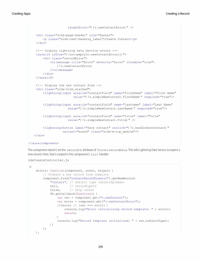
targetError="{!v.newContactError}" />
<div class="slds-page-header" role="banner"><p class="slds-text-heading_label">Create Contact</p>
</div>
<!-- Display Lightning Data Service errors --><aura:if isTrue="{!not(empty(v.newContactError))}">
<div class="recordError"><ui:message title="Error" severity="error" closable="true">
{!v.newContactError}</ui:message>
</div></aura:if>
<!-- Display the new contact form --><div class="slds-form_stacked">
<lightning:input aura:id="contactField" name="firstName" label="First Name"value="{!v.simpleNewContact.FirstName}" required="true"/>
<lightning:input aura:id="contactField" name="lastname" label="Last Name"value="{!v.simpleNewContact.LastName}" required="true"/>
<lightning:input aura:id="contactField" name="title" label="Title"value="{!v.simpleNewContact.Title}" />
<lightning:button label="Save contact" onclick="{!c.handleSaveContact}"variant="brand" class="slds-m-top_medium"/>
</div>
</aura:component>
This component doesn’t set the recordId attribute of force:recordData. This tells Lightning Data Service to expect anew record. Here, that’s created in the component’s init handler.
ldsCreateController.js
({doInit: function(component, event, helper) {
// Prepare a new record from templatecomponent.find("contactRecordCreator").getNewRecord(
"Contact", // sObject type (objectApiName)null, // recordTypeIdfalse, // skip cache?$A.getCallback(function() {
var rec = component.get("v.newContact");var error = component.get("v.newContactError");if(error || (rec === null)) {
console.log("Error initializing record template: " + error);return;
}console.log("Record template initialized: " + rec.sobjectType);
}));
},
319
Creating a RecordCreating Apps
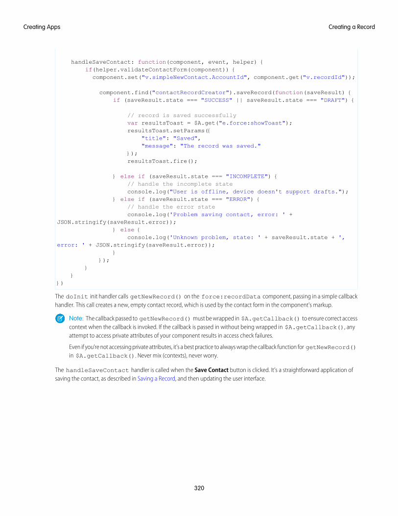
handleSaveContact: function(component, event, helper) {if(helper.validateContactForm(component)) {
component.set("v.simpleNewContact.AccountId", component.get("v.recordId"));
component.find("contactRecordCreator").saveRecord(function(saveResult) {if (saveResult.state === "SUCCESS" || saveResult.state === "DRAFT") {
// record is saved successfullyvar resultsToast = $A.get("e.force:showToast");resultsToast.setParams({
"title": "Saved","message": "The record was saved."
});resultsToast.fire();
} else if (saveResult.state === "INCOMPLETE") {// handle the incomplete stateconsole.log("User is offline, device doesn't support drafts.");
} else if (saveResult.state === "ERROR") {// handle the error stateconsole.log('Problem saving contact, error: ' +
JSON.stringify(saveResult.error));} else {
console.log('Unknown problem, state: ' + saveResult.state + ',error: ' + JSON.stringify(saveResult.error));
}});
}}
})
The doInit init handler calls getNewRecord() on the force:recordData component, passing in a simple callbackhandler. This call creates a new, empty contact record, which is used by the contact form in the component’s markup.
Note: The callback passed to getNewRecord() must be wrapped in $A.getCallback() to ensure correct accesscontext when the callback is invoked. If the callback is passed in without being wrapped in $A.getCallback(), anyattempt to access private attributes of your component results in access check failures.
Even if you’re not accessing private attributes, it’s a best practice to always wrap the callback function for getNewRecord()in $A.getCallback(). Never mix (contexts), never worry.
The handleSaveContact handler is called when the Save Contact button is clicked. It’s a straightforward application ofsaving the contact, as described in Saving a Record, and then updating the user interface.
320
Creating a RecordCreating Apps
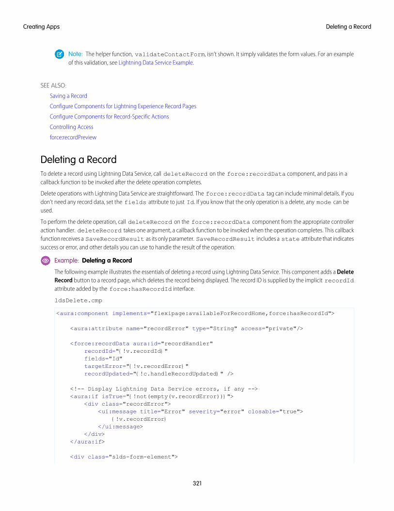
Note: The helper function, validateContactForm, isn’t shown. It simply validates the form values. For an exampleof this validation, see Lightning Data Service Example.
SEE ALSO:
Saving a Record
Configure Components for Lightning Experience Record Pages
Configure Components for Record-Specific Actions
Controlling Access
force:recordPreview
Deleting a RecordTo delete a record using Lightning Data Service, call deleteRecord on the force:recordData component, and pass in acallback function to be invoked after the delete operation completes.
Delete operations with Lightning Data Service are straightforward. The force:recordData tag can include minimal details. If youdon’t need any record data, set the fields attribute to just Id. If you know that the only operation is a delete, any mode can beused.
To perform the delete operation, call deleteRecord on the force:recordData component from the appropriate controlleraction handler. deleteRecord takes one argument, a callback function to be invoked when the operation completes. This callbackfunction receives a SaveRecordResult as its only parameter. SaveRecordResult includes a state attribute that indicatessuccess or error, and other details you can use to handle the result of the operation.
Example: Deleting a Record
The following example illustrates the essentials of deleting a record using Lightning Data Service. This component adds a DeleteRecord button to a record page, which deletes the record being displayed. The record ID is supplied by the implicit recordIdattribute added by the force:hasRecordId interface.
ldsDelete.cmp
<aura:component implements="flexipage:availableForRecordHome,force:hasRecordId">
<aura:attribute name="recordError" type="String" access="private"/>
<force:recordData aura:id="recordHandler"recordId="{!v.recordId}"fields="Id"targetError="{!v.recordError}"recordUpdated="{!c.handleRecordUpdated}" />
<!-- Display Lightning Data Service errors, if any --><aura:if isTrue="{!not(empty(v.recordError))}">
<div class="recordError"><ui:message title="Error" severity="error" closable="true">
{!v.recordError}</ui:message>
</div></aura:if>
<div class="slds-form-element">
321
Deleting a RecordCreating Apps
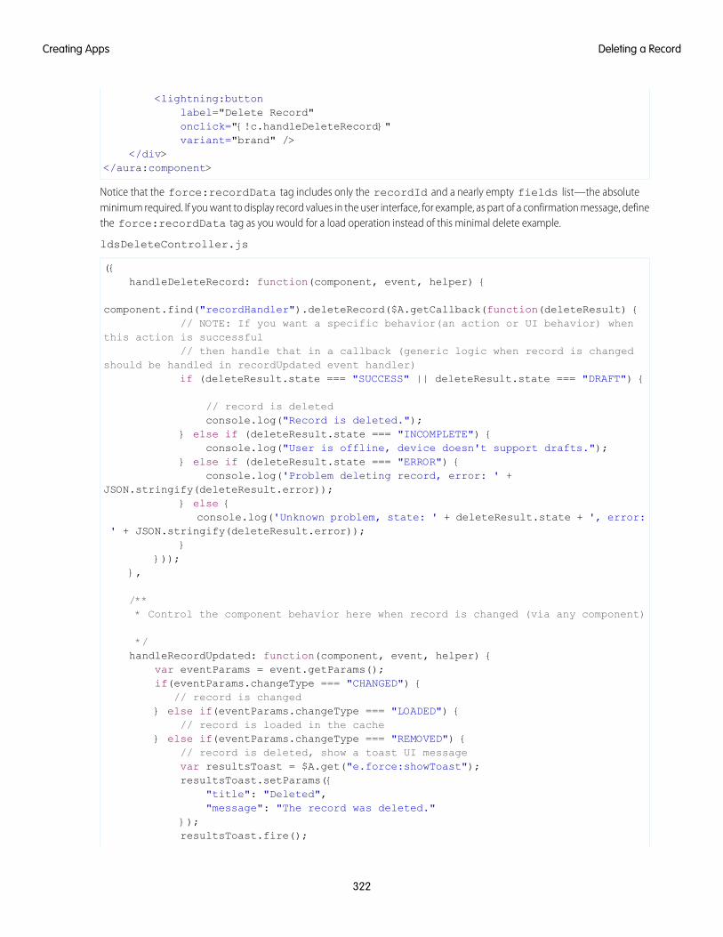
<lightning:buttonlabel="Delete Record"onclick="{!c.handleDeleteRecord}"variant="brand" />
</div></aura:component>
Notice that the force:recordData tag includes only the recordId and a nearly empty fields list—the absoluteminimum required. If you want to display record values in the user interface, for example, as part of a confirmation message, definethe force:recordData tag as you would for a load operation instead of this minimal delete example.
ldsDeleteController.js
({handleDeleteRecord: function(component, event, helper) {
component.find("recordHandler").deleteRecord($A.getCallback(function(deleteResult) {// NOTE: If you want a specific behavior(an action or UI behavior) when
this action is successful// then handle that in a callback (generic logic when record is changed
should be handled in recordUpdated event handler)if (deleteResult.state === "SUCCESS" || deleteResult.state === "DRAFT") {
// record is deletedconsole.log("Record is deleted.");
} else if (deleteResult.state === "INCOMPLETE") {console.log("User is offline, device doesn't support drafts.");
} else if (deleteResult.state === "ERROR") {console.log('Problem deleting record, error: ' +
JSON.stringify(deleteResult.error));} else {
console.log('Unknown problem, state: ' + deleteResult.state + ', error:' + JSON.stringify(deleteResult.error));
}}));
},
/*** Control the component behavior here when record is changed (via any component)
*/handleRecordUpdated: function(component, event, helper) {
var eventParams = event.getParams();if(eventParams.changeType === "CHANGED") {
// record is changed} else if(eventParams.changeType === "LOADED") {
// record is loaded in the cache} else if(eventParams.changeType === "REMOVED") {
// record is deleted, show a toast UI messagevar resultsToast = $A.get("e.force:showToast");resultsToast.setParams({
"title": "Deleted","message": "The record was deleted."
});resultsToast.fire();
322
Deleting a RecordCreating Apps
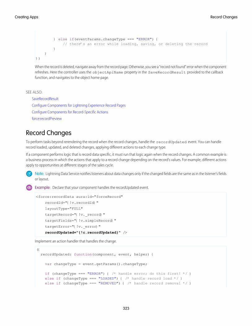
} else if(eventParams.changeType === "ERROR") {// there’s an error while loading, saving, or deleting the record
}}
})
When the record is deleted, navigate away from the record page. Otherwise, you see a “record not found” error when the componentrefreshes. Here the controller uses the objectApiName property in the SaveRecordResult provided to the callbackfunction, and navigates to the object home page.
SEE ALSO:
SaveRecordResult
Configure Components for Lightning Experience Record Pages
Configure Components for Record-Specific Actions
force:recordPreview
Record ChangesTo perform tasks beyond rerendering the record when the record changes, handle the recordUpdated event. You can handlerecord loaded, updated, and deleted changes, applying different actions to each change type.
If a component performs logic that is record data specific, it must run that logic again when the record changes. A common example isa business process in which the actions that apply to a record change depending on the record’s values. For example, different actionsapply to opportunities at different stages of the sales cycle.
Note: Lightning Data Service notifies listeners about data changes only if the changed fields are the same as in the listener’s fieldsor layout.
Example: Declare that your component handles the recordUpdated event.
<force:recordData aura:id="forceRecord"
recordId="{!v.recordId}"
layoutType="FULL"
targetRecord="{!v._record}"
targetFields="{!v.simpleRecord}"
targetError="{!v._error}"
recordUpdated="{!c.recordUpdated}" />
Implement an action handler that handles the change.
({recordUpdated: function(component, event, helper) {
var changeType = event.getParams().changeType;
if (changeType === "ERROR") { /* handle error; do this first! */ }else if (changeType === "LOADED") { /* handle record load */ }else if (changeType === "REMOVED") { /* handle record removal */ }
323
Record ChangesCreating Apps
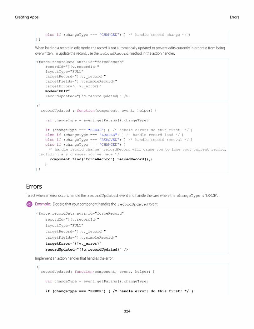
else if (changeType === "CHANGED") { /* handle record change */ }})
When loading a record in edit mode, the record is not automatically updated to prevent edits currently in progress from beingoverwritten. To update the record, use the reloadRecord method in the action handler.
<force:recordData aura:id="forceRecord"recordId="{!v.recordId}"layoutType="FULL"targetRecord="{!v._record}"targetFields="{!v.simpleRecord}"targetError="{!v._error}"mode=”EDIT”recordUpdated="{!c.recordUpdated}" />
({recordUpdated : function(component, event, helper) {
var changeType = event.getParams().changeType;
if (changeType === "ERROR") { /* handle error; do this first! */ }else if (changeType === "LOADED") { /* handle record load */ }else if (changeType === "REMOVED") { /* handle record removal */ }else if (changeType === "CHANGED") {/* handle record change; reloadRecord will cause you to lose your current record,
including any changes you’ve made */component.find("forceRecord").reloadRecord();}
}})
ErrorsTo act when an error occurs, handle the recordUpdated event and handle the case where the changeType is “ERROR”.
Example: Declare that your component handles the recordUpdated event.
<force:recordData aura:id="forceRecord"
recordId="{!v.recordId}"
layoutType="FULL"
targetRecord="{!v._record}"
targetFields="{!v.simpleRecord}"
targetError="{!v._error}"
recordUpdated="{!c.recordUpdated}" />
Implement an action handler that handles the error.
({recordUpdated: function(component, event, helper) {
var changeType = event.getParams().changeType;
if (changeType === "ERROR") { /* handle error; do this first! */ }
324
ErrorsCreating Apps
else if (changeType === "LOADED") { /* handle record load */ }else if (changeType === "REMOVED") { /* handle record removal */ }else if (changeType === "CHANGED") { /* handle record change */ }
})
If an error occurs when the record begins to load, targetError is set to a localized error message. An error occurs if:
• Input is invalid because of an invalid attribute value, or combination of attribute values. For example, an invalid recordId,or omitting both the layoutType and the fields attributes.
• The record isn’t in the cache and the server is unreachable (offline).
If the record becomes inaccessible on the server, the recordUpdated event is fired with changeType set to "REMOVED."No error is set on targetError, since records becoming inaccessible is sometimes the expected outcome of an operation.For example, after lead convert the lead record becomes inaccessible.
Records can become inaccessible for the following reasons.
• Record or entity sharing or visibility settings
• Record or entity being deleted
When the record becomes inaccessible on the server, the record’s JavaScript object assigned to targetRecord is unchanged.
ConsiderationsLightning Data Service is powerful and simple to use. However, it’s not a complete replacement for writing your own data access code.Here are some considerations to keep in mind when using it.
Lightning Data Service is only available in Lightning Experience and the Salesforce app. Using Lightning Data Service in other containers,such as Lightning Components for Visualforce, Lightning Out, or Communities isn’t supported. This is true even if these containers areaccessed inside Lightning Experience or the Salesforce mobile app, for example, a Visualforce page added to Lightning Experience.
Lightning Data Service supports primitive DML operations—create, read, update, and delete. It operates on one record at a time, whichyou retrieve or modify using the record ID. Lightning Data Service supports spanned fields with a maximum depth of five levels. Supportfor working with collections of records or for querying for a record by anything other than the record ID isn’t available. If you must supporthigher-level operations or multiple operations in one transaction, use standard @AuraEnabled Apex methods.
Lightning Data Service shared data storage provides notifications to all components that use a record whenever a component changesthat record. It doesn’t notify components if that record is changed on the server, for example, if someone else modifies it. Recordschanged on the server aren’t updated locally until they’re reloaded. Lightning Data Service notifies listeners about data changes only ifthe changed fields are the same as in the listener’s fields or layout.
Supported ObjectsLightning Data Service supports custom objects and the following.
• Account
• AccountTeamMember
• Asset
• AssetRelationship
• AssignedResource
• AttachedContentNote
• BusinessAccount
• Campaign
325
ConsiderationsCreating Apps
• CampaignMember
• Case
• Contact
• ContentDocument
• ContentNote
• ContentVersion
• ContentWorkspace
• Contract
• ContractContactRole
• ContractLineItem
• Custom Object
• Entitlement
• EnvironmentHubMember
• Lead
• LicensingRequest
• MaintenanceAsset
• MaintenancePlan
• MarketingAction
• MarketingResource
• Note
• OperatingHours
• Opportunity
• OpportunityLineItem
• OpportunityTeamMember
• Order
• OrderItem
• PersonAccount
• Pricebook2
• PricebookEntry
• Product2
• Quote
• QuoteDocument
• QuoteLineItem
• ResourceAbsence
• ResourcePreference
• ServiceAppointment
• ServiceContract
• ServiceCrew
• ServiceCrewMember
• ServiceResource
326
ConsiderationsCreating Apps
• ServiceResourceCapacity
• ServiceResourceSkill
• ServiceTerritory
• ServiceTerritoryLocation
• ServiceTerritoryMember
• Shipment
• SkillRequirement
• SocialPost
• Tenant
• TimeSheet
• TimeSheetEntry
• TimeSlot
• UsageEntitlement
• UsageEntitlementPeriod
• User
• WorkOrder
• WorkOrderLineItem
• WorkType
Lightning Data Service ExampleHere’s a longer, more detailed example of using Lightning Data Service to create a Quick Contact action panel.
Example: This example is intended to be added as a Lightning action on the account object. Clicking the action’s button on theaccount layout opens a panel to create a new contact.
327
Lightning Data Service ExampleCreating Apps
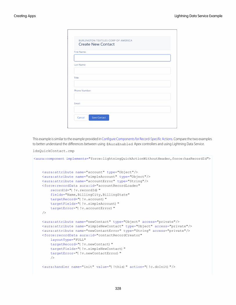
This example is similar to the example provided in Configure Components for Record-Specific Actions. Compare the two examplesto better understand the differences between using @AuraEnabled Apex controllers and using Lightning Data Service.
ldsQuickContact.cmp
<aura:component implements="force:lightningQuickActionWithoutHeader,force:hasRecordId">
<aura:attribute name="account" type="Object"/><aura:attribute name="simpleAccount" type="Object"/><aura:attribute name="accountError" type="String"/><force:recordData aura:id="accountRecordLoader"
recordId="{!v.recordId}"fields="Name,BillingCity,BillingState"targetRecord="{!v.account}"targetFields="{!v.simpleAccount}"targetError="{!v.accountError}"
/>
<aura:attribute name="newContact" type="Object" access="private"/><aura:attribute name="simpleNewContact" type="Object" access="private"/><aura:attribute name="newContactError" type="String" access="private"/><force:recordData aura:id="contactRecordCreator"
layoutType="FULL"targetRecord="{!v.newContact}"targetFields="{!v.simpleNewContact}"targetError="{!v.newContactError}"/>
<aura:handler name="init" value="{!this}" action="{!c.doInit}"/>
328
Lightning Data Service ExampleCreating Apps
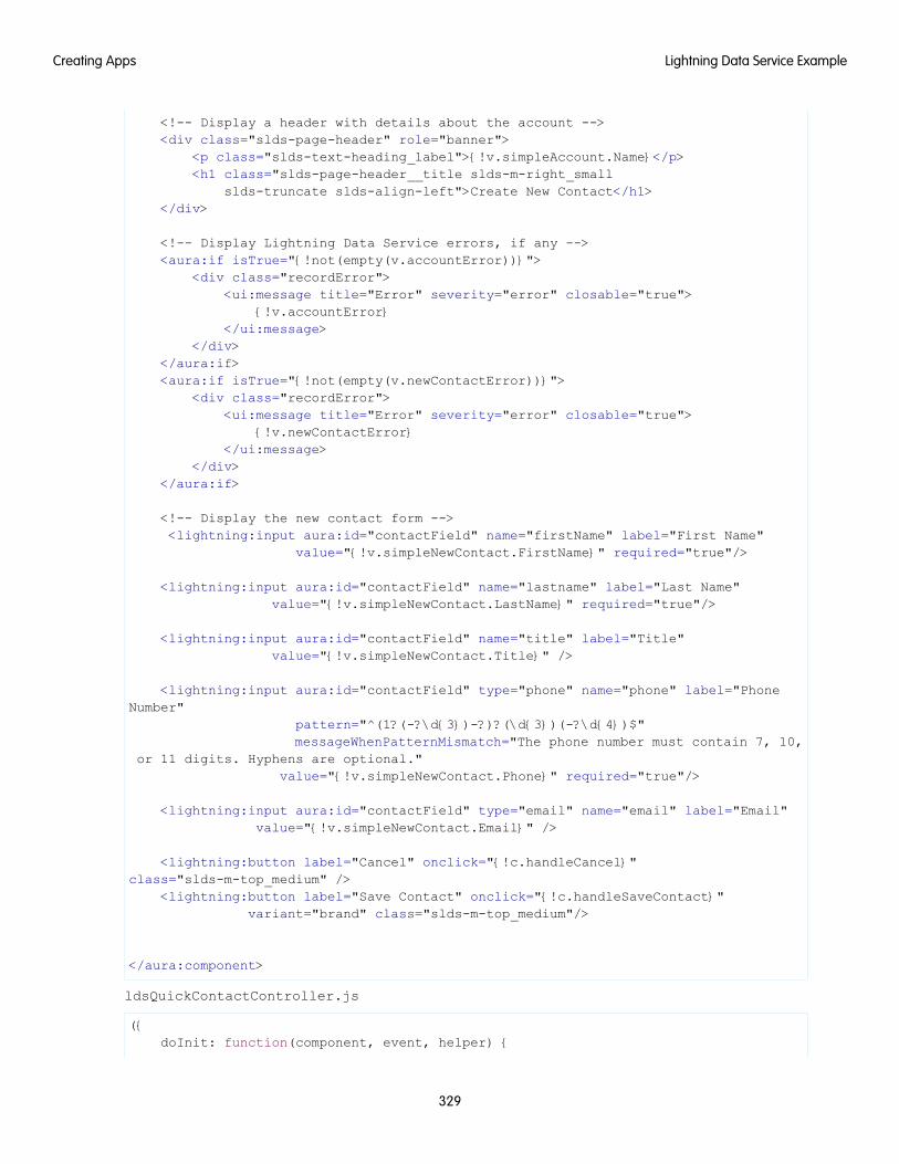
<!-- Display a header with details about the account --><div class="slds-page-header" role="banner">
<p class="slds-text-heading_label">{!v.simpleAccount.Name}</p><h1 class="slds-page-header__title slds-m-right_small
slds-truncate slds-align-left">Create New Contact</h1></div>
<!-- Display Lightning Data Service errors, if any --><aura:if isTrue="{!not(empty(v.accountError))}">
<div class="recordError"><ui:message title="Error" severity="error" closable="true">
{!v.accountError}</ui:message>
</div></aura:if><aura:if isTrue="{!not(empty(v.newContactError))}">
<div class="recordError"><ui:message title="Error" severity="error" closable="true">
{!v.newContactError}</ui:message>
</div></aura:if>
<!-- Display the new contact form --><lightning:input aura:id="contactField" name="firstName" label="First Name"
value="{!v.simpleNewContact.FirstName}" required="true"/>
<lightning:input aura:id="contactField" name="lastname" label="Last Name"value="{!v.simpleNewContact.LastName}" required="true"/>
<lightning:input aura:id="contactField" name="title" label="Title"value="{!v.simpleNewContact.Title}" />
<lightning:input aura:id="contactField" type="phone" name="phone" label="PhoneNumber"
pattern="^(1?(-?\d{3})-?)?(\d{3})(-?\d{4})$"messageWhenPatternMismatch="The phone number must contain 7, 10,
or 11 digits. Hyphens are optional."value="{!v.simpleNewContact.Phone}" required="true"/>
<lightning:input aura:id="contactField" type="email" name="email" label="Email"value="{!v.simpleNewContact.Email}" />
<lightning:button label="Cancel" onclick="{!c.handleCancel}"class="slds-m-top_medium" />
<lightning:button label="Save Contact" onclick="{!c.handleSaveContact}"variant="brand" class="slds-m-top_medium"/>
</aura:component>
ldsQuickContactController.js
({doInit: function(component, event, helper) {
329
Lightning Data Service ExampleCreating Apps
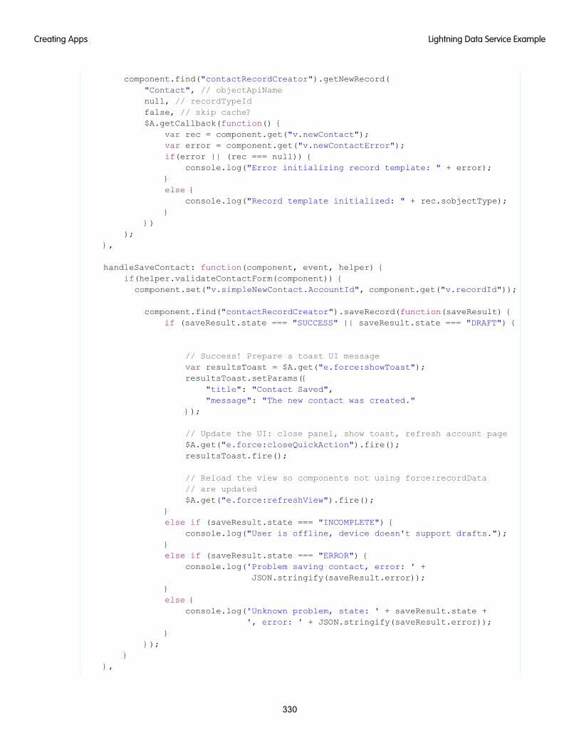
component.find("contactRecordCreator").getNewRecord("Contact", // objectApiNamenull, // recordTypeIdfalse, // skip cache?$A.getCallback(function() {
var rec = component.get("v.newContact");var error = component.get("v.newContactError");if(error || (rec === null)) {
console.log("Error initializing record template: " + error);}else {
console.log("Record template initialized: " + rec.sobjectType);}
}));
},
handleSaveContact: function(component, event, helper) {if(helper.validateContactForm(component)) {
component.set("v.simpleNewContact.AccountId", component.get("v.recordId"));
component.find("contactRecordCreator").saveRecord(function(saveResult) {if (saveResult.state === "SUCCESS" || saveResult.state === "DRAFT") {
// Success! Prepare a toast UI messagevar resultsToast = $A.get("e.force:showToast");resultsToast.setParams({
"title": "Contact Saved","message": "The new contact was created."
});
// Update the UI: close panel, show toast, refresh account page$A.get("e.force:closeQuickAction").fire();resultsToast.fire();
// Reload the view so components not using force:recordData// are updated$A.get("e.force:refreshView").fire();
}else if (saveResult.state === "INCOMPLETE") {
console.log("User is offline, device doesn't support drafts.");}else if (saveResult.state === "ERROR") {
console.log('Problem saving contact, error: ' +JSON.stringify(saveResult.error));
}else {
console.log('Unknown problem, state: ' + saveResult.state +', error: ' + JSON.stringify(saveResult.error));
}});
}},
330
Lightning Data Service ExampleCreating Apps
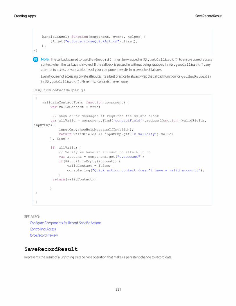
handleCancel: function(component, event, helper) {$A.get("e.force:closeQuickAction").fire();
},})
Note: The callback passed to getNewRecord() must be wrapped in $A.getCallback() to ensure correct accesscontext when the callback is invoked. If the callback is passed in without being wrapped in $A.getCallback(), anyattempt to access private attributes of your component results in access check failures.
Even if you’re not accessing private attributes, it’s a best practice to always wrap the callback function for getNewRecord()in $A.getCallback(). Never mix (contexts), never worry.
ldsQuickContactHelper.js
({validateContactForm: function(component) {
var validContact = true;
// Show error messages if required fields are blankvar allValid = component.find('contactField').reduce(function (validFields,
inputCmp) {inputCmp.showHelpMessageIfInvalid();return validFields && inputCmp.get('v.validity').valid;
}, true);
if (allValid) {// Verify we have an account to attach it tovar account = component.get("v.account");if($A.util.isEmpty(account)) {
validContact = false;console.log("Quick action context doesn't have a valid account.");
}return(validContact);
}}
})
SEE ALSO:
Configure Components for Record-Specific Actions
Controlling Access
force:recordPreview
SaveRecordResultRepresents the result of a Lightning Data Service operation that makes a persistent change to record data.
331
SaveRecordResultCreating Apps
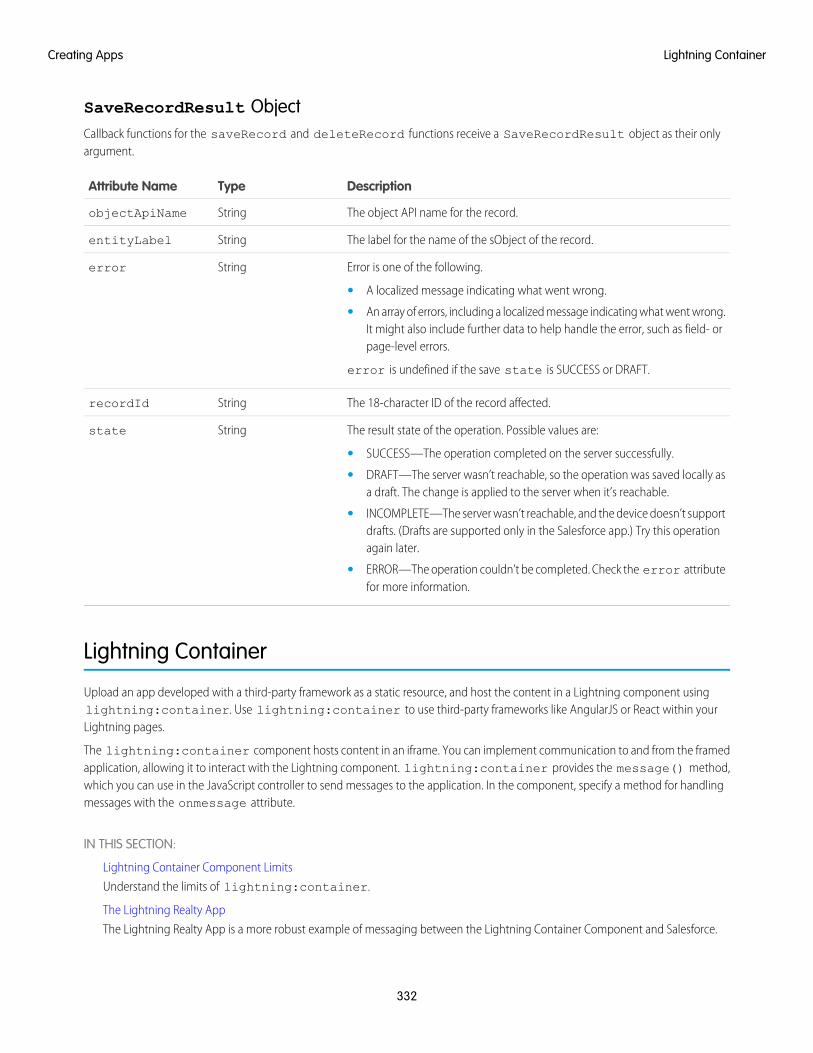
SaveRecordResult ObjectCallback functions for the saveRecord and deleteRecord functions receive a SaveRecordResult object as their onlyargument.
DescriptionTypeAttribute Name
The object API name for the record.StringobjectApiName
The label for the name of the sObject of the record.StringentityLabel
Error is one of the following.Stringerror
• A localized message indicating what went wrong.
• An array of errors, including a localized message indicating what went wrong.It might also include further data to help handle the error, such as field- orpage-level errors.
error is undefined if the save state is SUCCESS or DRAFT.
The 18-character ID of the record affected.StringrecordId
The result state of the operation. Possible values are:Stringstate
• SUCCESS—The operation completed on the server successfully.
• DRAFT—The server wasn’t reachable, so the operation was saved locally asa draft. The change is applied to the server when it’s reachable.
• INCOMPLETE—The server wasn’t reachable, and the device doesn’t supportdrafts. (Drafts are supported only in the Salesforce app.) Try this operationagain later.
• ERROR—The operation couldn’t be completed. Check the error attributefor more information.
Lightning Container
Upload an app developed with a third-party framework as a static resource, and host the content in a Lightning component usinglightning:container. Use lightning:container to use third-party frameworks like AngularJS or React within yourLightning pages.
The lightning:container component hosts content in an iframe. You can implement communication to and from the framedapplication, allowing it to interact with the Lightning component. lightning:container provides the message() method,which you can use in the JavaScript controller to send messages to the application. In the component, specify a method for handlingmessages with the onmessage attribute.
IN THIS SECTION:
Lightning Container Component Limits
Understand the limits of lightning:container.
The Lightning Realty App
The Lightning Realty App is a more robust example of messaging between the Lightning Container Component and Salesforce.
332
Lightning ContainerCreating Apps
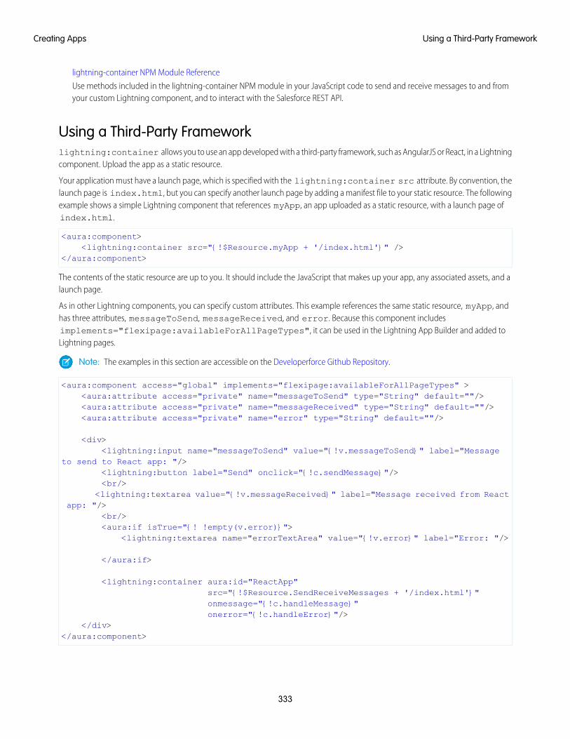
lightning-container NPM Module Reference
Use methods included in the lightning-container NPM module in your JavaScript code to send and receive messages to and fromyour custom Lightning component, and to interact with the Salesforce REST API.
Using a Third-Party Frameworklightning:container allows you to use an app developed with a third-party framework, such as AngularJS or React, in a Lightningcomponent. Upload the app as a static resource.
Your application must have a launch page, which is specified with the lightning:container src attribute. By convention, thelaunch page is index.html, but you can specify another launch page by adding a manifest file to your static resource. The followingexample shows a simple Lightning component that references myApp, an app uploaded as a static resource, with a launch page ofindex.html.
<aura:component><lightning:container src="{!$Resource.myApp + '/index.html'}" />
</aura:component>
The contents of the static resource are up to you. It should include the JavaScript that makes up your app, any associated assets, and alaunch page.
As in other Lightning components, you can specify custom attributes. This example references the same static resource, myApp, andhas three attributes, messageToSend, messageReceived, and error. Because this component includesimplements="flexipage:availableForAllPageTypes", it can be used in the Lightning App Builder and added toLightning pages.
Note: The examples in this section are accessible on the Developerforce Github Repository.
<aura:component access="global" implements="flexipage:availableForAllPageTypes" ><aura:attribute access="private" name="messageToSend" type="String" default=""/><aura:attribute access="private" name="messageReceived" type="String" default=""/><aura:attribute access="private" name="error" type="String" default=""/>
<div><lightning:input name="messageToSend" value="{!v.messageToSend}" label="Message
to send to React app: "/><lightning:button label="Send" onclick="{!c.sendMessage}"/><br/>
<lightning:textarea value="{!v.messageReceived}" label="Message received from Reactapp: "/>
<br/><aura:if isTrue="{! !empty(v.error)}">
<lightning:textarea name="errorTextArea" value="{!v.error}" label="Error: "/>
</aura:if>
<lightning:container aura:id="ReactApp"src="{!$Resource.SendReceiveMessages + '/index.html'}"onmessage="{!c.handleMessage}"onerror="{!c.handleError}"/>
</div></aura:component>
333
Using a Third-Party FrameworkCreating Apps
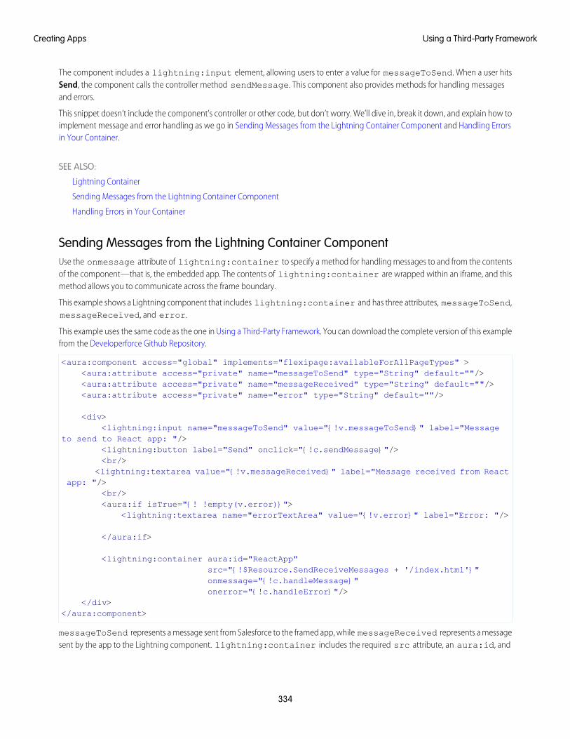
The component includes a lightning:input element, allowing users to enter a value for messageToSend. When a user hitsSend, the component calls the controller method sendMessage. This component also provides methods for handling messagesand errors.
This snippet doesn’t include the component’s controller or other code, but don’t worry. We’ll dive in, break it down, and explain how toimplement message and error handling as we go in Sending Messages from the Lightning Container Component and Handling Errorsin Your Container.
SEE ALSO:
Lightning Container
Sending Messages from the Lightning Container Component
Handling Errors in Your Container
Sending Messages from the Lightning Container ComponentUse the onmessage attribute of lightning:container to specify a method for handling messages to and from the contentsof the component—that is, the embedded app. The contents of lightning:container are wrapped within an iframe, and thismethod allows you to communicate across the frame boundary.
This example shows a Lightning component that includes lightning:container and has three attributes, messageToSend,messageReceived, and error.
This example uses the same code as the one in Using a Third-Party Framework. You can download the complete version of this examplefrom the Developerforce Github Repository.
<aura:component access="global" implements="flexipage:availableForAllPageTypes" ><aura:attribute access="private" name="messageToSend" type="String" default=""/><aura:attribute access="private" name="messageReceived" type="String" default=""/><aura:attribute access="private" name="error" type="String" default=""/>
<div><lightning:input name="messageToSend" value="{!v.messageToSend}" label="Message
to send to React app: "/><lightning:button label="Send" onclick="{!c.sendMessage}"/><br/>
<lightning:textarea value="{!v.messageReceived}" label="Message received from Reactapp: "/>
<br/><aura:if isTrue="{! !empty(v.error)}">
<lightning:textarea name="errorTextArea" value="{!v.error}" label="Error: "/>
</aura:if>
<lightning:container aura:id="ReactApp"src="{!$Resource.SendReceiveMessages + '/index.html'}"onmessage="{!c.handleMessage}"onerror="{!c.handleError}"/>
</div></aura:component>
messageToSend represents a message sent from Salesforce to the framed app, while messageReceived represents a messagesent by the app to the Lightning component. lightning:container includes the required src attribute, an aura:id, and
334
Using a Third-Party FrameworkCreating Apps
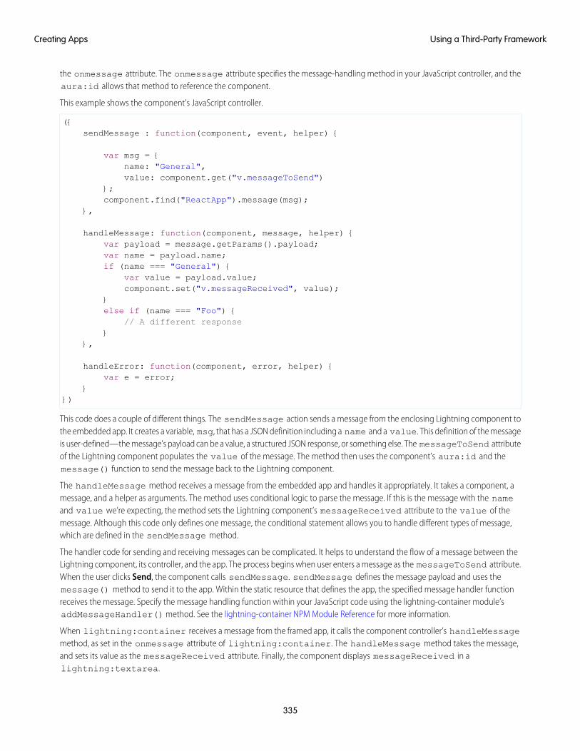
the onmessage attribute. The onmessage attribute specifies the message-handling method in your JavaScript controller, and theaura:id allows that method to reference the component.
This example shows the component’s JavaScript controller.
({sendMessage : function(component, event, helper) {
var msg = {name: "General",value: component.get("v.messageToSend")
};component.find("ReactApp").message(msg);
},
handleMessage: function(component, message, helper) {var payload = message.getParams().payload;var name = payload.name;if (name === "General") {
var value = payload.value;component.set("v.messageReceived", value);
}else if (name === "Foo") {
// A different response}
},
handleError: function(component, error, helper) {var e = error;
}})
This code does a couple of different things. The sendMessage action sends a message from the enclosing Lightning component tothe embedded app. It creates a variable, msg, that has a JSON definition including a name and a value. This definition of the messageis user-defined—the message’s payload can be a value, a structured JSON response, or something else. The messageToSend attributeof the Lightning component populates the value of the message. The method then uses the component’s aura:id and themessage() function to send the message back to the Lightning component.
The handleMessage method receives a message from the embedded app and handles it appropriately. It takes a component, amessage, and a helper as arguments. The method uses conditional logic to parse the message. If this is the message with the nameand value we’re expecting, the method sets the Lightning component’s messageReceived attribute to the value of themessage. Although this code only defines one message, the conditional statement allows you to handle different types of message,which are defined in the sendMessage method.
The handler code for sending and receiving messages can be complicated. It helps to understand the flow of a message between theLightning component, its controller, and the app. The process begins when user enters a message as the messageToSend attribute.When the user clicks Send, the component calls sendMessage. sendMessage defines the message payload and uses themessage() method to send it to the app. Within the static resource that defines the app, the specified message handler functionreceives the message. Specify the message handling function within your JavaScript code using the lightning-container module’saddMessageHandler() method. See the lightning-container NPM Module Reference for more information.
When lightning:container receives a message from the framed app, it calls the component controller’s handleMessagemethod, as set in the onmessage attribute of lightning:container. The handleMessage method takes the message,and sets its value as the messageReceived attribute. Finally, the component displays messageReceived in alightning:textarea.
335
Using a Third-Party FrameworkCreating Apps
This is a simple example of message handling across the container. Because you implement the controller-side code and the functionalityof the app, you can use this functionality for any kind of communication between Salesforce and the app embedded inlightning:container.
Important: Don't send cryptographic secrets like an API key in a message. It's important to keep your API key secure.
SEE ALSO:
Lightning Container
Using a Third-Party Framework
Handling Errors in Your Container
Sending Messages to the Lightning Container ComponentUse the methods in the lightning-container NPM module to send messages from the JavaScript code framed bylightning:container.
The Lightning-container NPM module provides methods to send and receive messages between your JavaScript app and the Lightningcontainer component. You can see the lightning-container module on the NPM website.
Add the lightning-container module as a dependency in your code to implement the messaging framework in your app.
import LCC from 'lightning-container';
lightning-container must also be listed as a dependency in your app’s package.json file.
The code to send a message to lightning:container from the app is simple. This code corresponds to the code samples inSending Messages from the Lightning Container Component and Handling Errors in Your Container, and can be downloaded from theDeveloperforce Github Repository.
sendMessage() {LCC.sendMessage({name: "General", value: this.state.messageToSend});
}
This code, part of the static resource, sends a message as an object containing a name and a value, which is user-defined.
When the app receives a message, it’s handled by the function mounted by the addMessageHandler() method. In a React app,functions must be mounted to be part of the document-object model and rendered in the output.
The lightning-container module provides similar methods for defining a function to handle errors in the messaging framework. For moreinformation, see lightning-container NPM Module Reference
Important: Don't send cryptographic secrets like an API key in a message. It's important to keep your API key secure.
Handling Errors in Your ContainerHandle errors in Lightning container with a method in your component’s controller.
This example uses the same code as the examples in Using a Third-Party Framework and Sending Messages from the Lightning ContainerComponent.
In this component, the onerror attribute of lightning:container specifies handleError as the error handling method.To display the error, the component markup uses a conditional statement, and another attribute, error, for holding an error message.
<aura:component access="global" implements="flexipage:availableForAllPageTypes" >
336
Using a Third-Party FrameworkCreating Apps
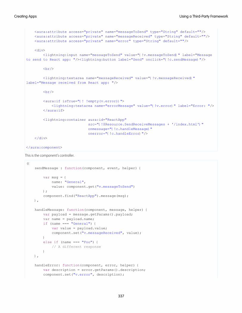
<aura:attribute access="private" name="messageToSend" type="String" default=""/><aura:attribute access="private" name="messageReceived" type="String" default=""/><aura:attribute access="private" name="error" type="String" default=""/>
<div><lightning:input name="messageToSend" value="{!v.messageToSend}" label="Message
to send to React app: "/><lightning:button label="Send" onclick="{!c.sendMessage}"/>
<br/>
<lightning:textarea name="messageReceived" value="{!v.messageReceived}"label="Message received from React app: "/>
<br/>
<aura:if isTrue="{! !empty(v.error)}"><lightning:textarea name="errorMessage" value="{!v.error}" label="Error: "/>
</aura:if>
<lightning:container aura:id="ReactApp"src="{!$Resource.SendReceiveMessages + '/index.html'}"onmessage="{!c.handleMessage}"onerror="{!c.handleError}"/>
</div>
</aura:component>
This is the component’s controller.
({sendMessage : function(component, event, helper) {
var msg = {name: "General",value: component.get("v.messageToSend")
};component.find("ReactApp").message(msg);
},
handleMessage: function(component, message, helper) {var payload = message.getParams().payload;var name = payload.name;if (name === "General") {
var value = payload.value;component.set("v.messageReceived", value);
}else if (name === "Foo") {
// A different response}
},
handleError: function(component, error, helper) {var description = error.getParams().description;component.set("v.error", description);
337
Using a Third-Party FrameworkCreating Apps
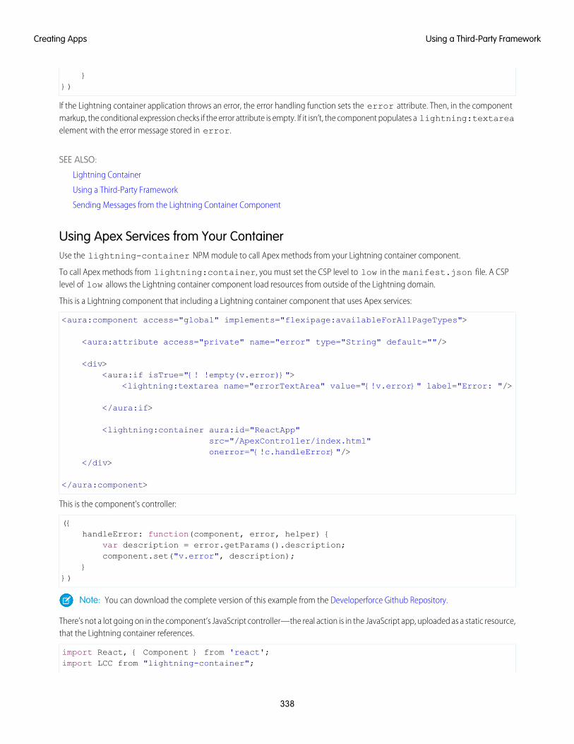
}})
If the Lightning container application throws an error, the error handling function sets the error attribute. Then, in the componentmarkup, the conditional expression checks if the error attribute is empty. If it isn’t, the component populates a lightning:textareaelement with the error message stored in error.
SEE ALSO:
Lightning Container
Using a Third-Party Framework
Sending Messages from the Lightning Container Component
Using Apex Services from Your ContainerUse the lightning-container NPM module to call Apex methods from your Lightning container component.
To call Apex methods from lightning:container, you must set the CSP level to low in the manifest.json file. A CSPlevel of low allows the Lightning container component load resources from outside of the Lightning domain.
This is a Lightning component that including a Lightning container component that uses Apex services:
<aura:component access="global" implements="flexipage:availableForAllPageTypes">
<aura:attribute access="private" name="error" type="String" default=""/>
<div><aura:if isTrue="{! !empty(v.error)}">
<lightning:textarea name="errorTextArea" value="{!v.error}" label="Error: "/>
</aura:if>
<lightning:container aura:id="ReactApp"src="/ApexController/index.html"onerror="{!c.handleError}"/>
</div>
</aura:component>
This is the component’s controller:
({handleError: function(component, error, helper) {
var description = error.getParams().description;component.set("v.error", description);
}})
Note: You can download the complete version of this example from the Developerforce Github Repository.
There’s not a lot going on in the component’s JavaScript controller—the real action is in the JavaScript app, uploaded as a static resource,that the Lightning container references.
import React, { Component } from 'react';import LCC from "lightning-container";
338
Using a Third-Party FrameworkCreating Apps
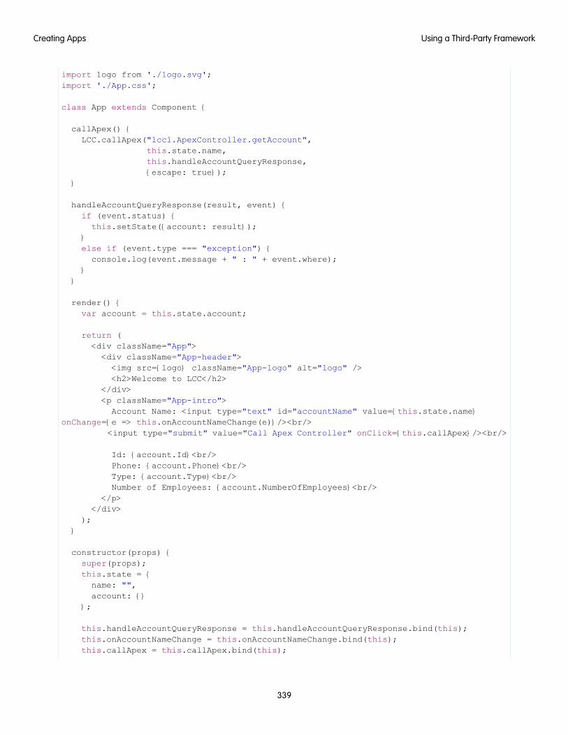
import logo from './logo.svg';import './App.css';
class App extends Component {
callApex() {LCC.callApex("lcc1.ApexController.getAccount",
this.state.name,this.handleAccountQueryResponse,{escape: true});
}
handleAccountQueryResponse(result, event) {if (event.status) {this.setState({account: result});
}else if (event.type === "exception") {console.log(event.message + " : " + event.where);
}}
render() {var account = this.state.account;
return (<div className="App"><div className="App-header"><img src={logo} className="App-logo" alt="logo" /><h2>Welcome to LCC</h2>
</div><p className="App-intro">Account Name: <input type="text" id="accountName" value={this.state.name}
onChange={e => this.onAccountNameChange(e)}/><br/><input type="submit" value="Call Apex Controller" onClick={this.callApex}/><br/>
Id: {account.Id}<br/>Phone: {account.Phone}<br/>Type: {account.Type}<br/>Number of Employees: {account.NumberOfEmployees}<br/>
</p></div>
);}
constructor(props) {super(props);this.state = {name: "",account: {}
};
this.handleAccountQueryResponse = this.handleAccountQueryResponse.bind(this);this.onAccountNameChange = this.onAccountNameChange.bind(this);this.callApex = this.callApex.bind(this);
339
Using a Third-Party FrameworkCreating Apps
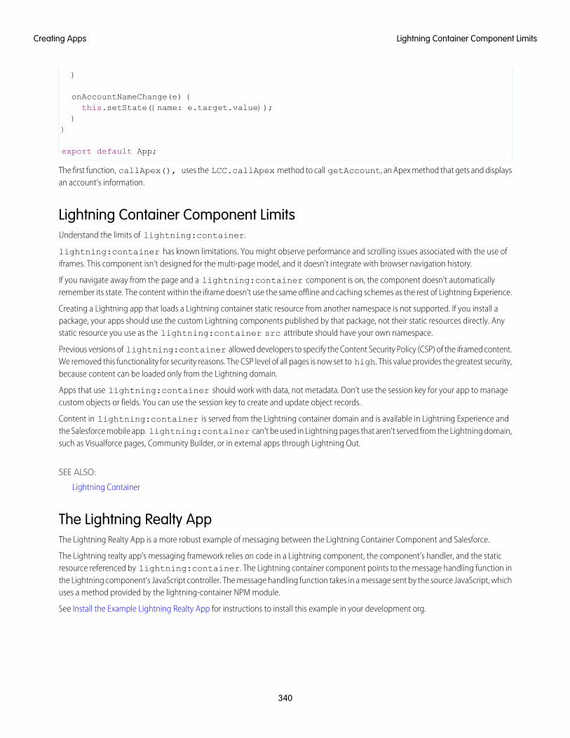
}
onAccountNameChange(e) {this.setState({name: e.target.value});
}}
export default App;
The first function, callApex(), uses the LCC.callApex method to call getAccount, an Apex method that gets and displaysan account’s information.
Lightning Container Component LimitsUnderstand the limits of lightning:container.
lightning:container has known limitations. You might observe performance and scrolling issues associated with the use ofiframes. This component isn’t designed for the multi-page model, and it doesn’t integrate with browser navigation history.
If you navigate away from the page and a lightning:container component is on, the component doesn’t automaticallyremember its state. The content within the iframe doesn’t use the same offline and caching schemes as the rest of Lightning Experience.
Creating a Lightning app that loads a Lightning container static resource from another namespace is not supported. If you install apackage, your apps should use the custom Lightning components published by that package, not their static resources directly. Anystatic resource you use as the lightning:container src attribute should have your own namespace.
Previous versions of lightning:container allowed developers to specify the Content Security Policy (CSP) of the iframed content.We removed this functionality for security reasons. The CSP level of all pages is now set to high. This value provides the greatest security,because content can be loaded only from the Lightning domain.
Apps that use lightning:container should work with data, not metadata. Don’t use the session key for your app to managecustom objects or fields. You can use the session key to create and update object records.
Content in lightning:container is served from the Lightning container domain and is available in Lightning Experience andthe Salesforce mobile app. lightning:container can’t be used in Lightning pages that aren’t served from the Lightning domain,such as Visualforce pages, Community Builder, or in external apps through Lightning Out.
SEE ALSO:
Lightning Container
The Lightning Realty AppThe Lightning Realty App is a more robust example of messaging between the Lightning Container Component and Salesforce.
The Lightning realty app’s messaging framework relies on code in a Lightning component, the component’s handler, and the staticresource referenced by lightning:container. The Lightning container component points to the message handling function inthe Lightning component’s JavaScript controller. The message handling function takes in a message sent by the source JavaScript, whichuses a method provided by the lightning-container NPM module.
See Install the Example Lightning Realty App for instructions to install this example in your development org.
340
Lightning Container Component LimitsCreating Apps
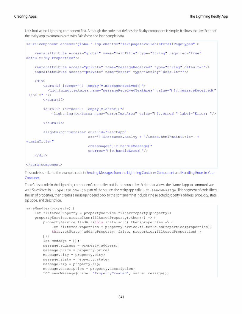
Let’s look at the Lightning component first. Although the code that defines the Realty component is simple, it allows the JavaScript ofthe realty app to communicate with Salesforce and load sample data.
<aura:component access="global" implements="flexipage:availableForAllPageTypes" >
<aura:attribute access="global" name="mainTitle" type="String" required="true"default="My Properties"/>
<aura:attribute access="private" name="messageReceived" type="String" default=""/><aura:attribute access="private" name="error" type="String" default=""/>
<div><aura:if isTrue="{! !empty(v.messageReceived)}">
<lightning:textarea name="messageReceivedTextArea" value="{!v.messageReceived}"label=" "/>
</aura:if>
<aura:if isTrue="{! !empty(v.error)}"><lightning:textarea name="errorTextArea" value="{!v.error}" label="Error: "/>
</aura:if>
<lightning:container aura:id="ReactApp"src="{!$Resource.Realty + '/index.html?mainTitle=' +
v.mainTitle}"onmessage="{!c.handleMessage}"onerror="{!c.handleError}"/>
</div>
</aura:component>
This code is similar to the example code in Sending Messages from the Lightning Container Component and Handling Errors in YourContainer.
There’s also code in the Lightning component’s controller and in the source JavaScript that allows the iframed app to communicatewith Salesforce. In PropertyHome.js, part of the source, the realty app calls LCC.sendMessage. This segment of code filtersthe list of properties, then creates a message to send back to the container that includes the selected property’s address, price, city, state,zip code, and description.
saveHandler(property) {let filteredProperty = propertyService.filterProperty(property);propertyService.createItem(filteredProperty).then(() => {
propertyService.findAll(this.state.sort).then(properties => {let filteredProperties = propertyService.filterFoundProperties(properties);this.setState({addingProperty: false, properties:filteredProperties});
});let message = {};message.address = property.address;message.price = property.price;message.city = property.city;message.state = property.state;message.zip = property.zip;message.description = property.description;LCC.sendMessage({name: "PropertyCreated", value: message});
341
The Lightning Realty AppCreating Apps
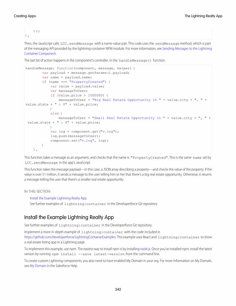
});},
Then, the JavaScript calls LCC.sendMessage with a name-value pair. This code uses the sendMessage method, which is partof the messaging API provided by the lightning-container NPM module. For more information, see Sending Messages to the LightningContainer Component.
The last bit of action happens in the component’s controller, in the handleMessage() function.
handleMessage: function(component, message, helper) {var payload = message.getParams().payload;var name = payload.name;if (name === "PropertyCreated") {
var value = payload.value;var messageToUser;if (value.price > 1000000) {
messageToUser = "Big Real Estate Opportunity in " + value.city + ", " +value.state + " : $" + value.price;
}else {
messageToUser = "Small Real Estate Opportunity in " + value.city + ", " +value.state + " : $" + value.price;
}var log = component.get("v.log");log.push(messageToUser);component.set("v.log", log);
}},
This function takes a message as an argument, and checks that the name is "PropertyCreated". This is the same name set byLCC.sendMessage in the app’s JavaScript.
This function takes the message payload—in this case, a JSON array describing a property—and checks the value of the property. If thevalue is over $1 million, it sends a message to the user telling him or her that there’s a big real estate opportunity. Otherwise, it returnsa message telling the user that there’s a smaller real estate opportunity.
IN THIS SECTION:
Install the Example Lightning Realty App
See further examples of lightning:container in the Developerforce Git repository.
Install the Example Lightning Realty AppSee further examples of lightning:container in the Developerforce Git repository.
Implement a more in-depth example of lightning:container with the code included inhttps://github.com/developerforce/LightningContainerExamples. This example uses React and lightning:container to showa real estate listing app in a Lightning page.
To implement this example, use npm. The easiest way to install npm is by installing node.js. Once you’ve installed npm, install the latestversion by running npm install --save latest-version from the command line.
To create custom Lightning components, you also need to have enabled My Domain in your org. For more information on My Domain,see My Domain in the Salesforce Help.
342
The Lightning Realty AppCreating Apps
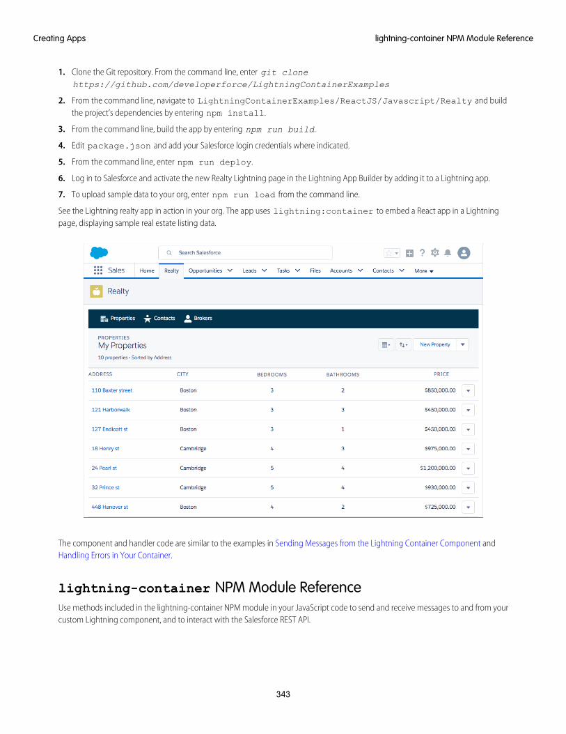
1. Clone the Git repository. From the command line, enter git clonehttps://github.com/developerforce/LightningContainerExamples
2. From the command line, navigate to LightningContainerExamples/ReactJS/Javascript/Realty and buildthe project’s dependencies by entering npm install.
3. From the command line, build the app by entering npm run build.
4. Edit package.json and add your Salesforce login credentials where indicated.
5. From the command line, enter npm run deploy.
6. Log in to Salesforce and activate the new Realty Lightning page in the Lightning App Builder by adding it to a Lightning app.
7. To upload sample data to your org, enter npm run load from the command line.
See the Lightning realty app in action in your org. The app uses lightning:container to embed a React app in a Lightningpage, displaying sample real estate listing data.
The component and handler code are similar to the examples in Sending Messages from the Lightning Container Component andHandling Errors in Your Container.
lightning-container NPM Module ReferenceUse methods included in the lightning-container NPM module in your JavaScript code to send and receive messages to and from yourcustom Lightning component, and to interact with the Salesforce REST API.
343
lightning-container NPM Module ReferenceCreating Apps
IN THIS SECTION:
addMessageErrorHandler()
Mounts an error handling function, to be called when the messaging framework encounters an error.
addMessageHandler()
Mounts a message handling function, used to handle messages sent from the Lightning component to the framed JavaScript app.
callApex()
Makes an Apex call.
getRESTAPISessionKey()
Returns the Salesforce REST API session key.
removeMessageErrorHandler()
Unmounts the error handling function.
removeMessageHandler()
Unmounts the message-handling function.
sendMessage()
Sends a message from the framed JavaScript code to the Lightning component.
addMessageErrorHandler()
Mounts an error handling function, to be called when the messaging framework encounters an error.
SampleUsed within a JavaScript app uploaded as a static resource and referenced by lightning:container, this example mounts amessage error handling function. In a React app, functions must be mounted to be part of the document-object model and renderedin the output.
componentDidMount() {LCC.addMessageErrorHandler(this.onMessageError);
}
You can view and download this example in the Developerforce Github Repository.
Arguments
DescriptionTypeName
The function that handles error messages encountered inthe messaging framework.
functionhandler: (errorMsg:string) => void)
ResponseNone.
addMessageHandler()
Mounts a message handling function, used to handle messages sent from the Lightning component to the framed JavaScript app.
344
lightning-container NPM Module ReferenceCreating Apps
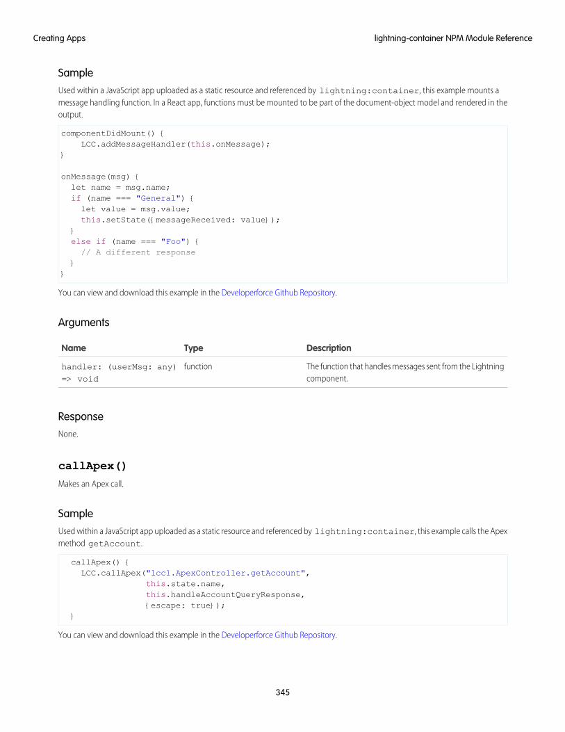
SampleUsed within a JavaScript app uploaded as a static resource and referenced by lightning:container, this example mounts amessage handling function. In a React app, functions must be mounted to be part of the document-object model and rendered in theoutput.
componentDidMount() {LCC.addMessageHandler(this.onMessage);
}
onMessage(msg) {let name = msg.name;if (name === "General") {let value = msg.value;this.setState({messageReceived: value});
}else if (name === "Foo") {// A different response
}}
You can view and download this example in the Developerforce Github Repository.
Arguments
DescriptionTypeName
The function that handles messages sent from the Lightningcomponent.
functionhandler: (userMsg: any)=> void
ResponseNone.
callApex()
Makes an Apex call.
SampleUsed within a JavaScript app uploaded as a static resource and referenced by lightning:container, this example calls the Apexmethod getAccount.
callApex() {LCC.callApex("lcc1.ApexController.getAccount",
this.state.name,this.handleAccountQueryResponse,{escape: true});
}
You can view and download this example in the Developerforce Github Repository.
345
lightning-container NPM Module ReferenceCreating Apps
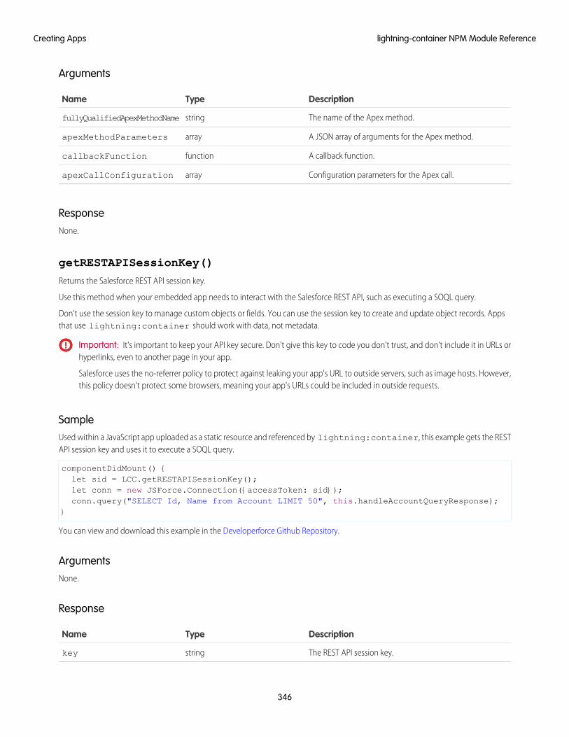
Arguments
DescriptionTypeName
The name of the Apex method.stringfullyQualifiedApexMethodName
A JSON array of arguments for the Apex method.arrayapexMethodParameters
A callback function.functioncallbackFunction
Configuration parameters for the Apex call.arrayapexCallConfiguration
ResponseNone.
getRESTAPISessionKey()
Returns the Salesforce REST API session key.
Use this method when your embedded app needs to interact with the Salesforce REST API, such as executing a SOQL query.
Don’t use the session key to manage custom objects or fields. You can use the session key to create and update object records. Appsthat use lightning:container should work with data, not metadata.
Important: It's important to keep your API key secure. Don't give this key to code you don't trust, and don't include it in URLs orhyperlinks, even to another page in your app.
Salesforce uses the no-referrer policy to protect against leaking your app's URL to outside servers, such as image hosts. However,this policy doesn't protect some browsers, meaning your app's URLs could be included in outside requests.
SampleUsed within a JavaScript app uploaded as a static resource and referenced by lightning:container, this example gets the RESTAPI session key and uses it to execute a SOQL query.
componentDidMount() {let sid = LCC.getRESTAPISessionKey();let conn = new JSForce.Connection({accessToken: sid});conn.query("SELECT Id, Name from Account LIMIT 50", this.handleAccountQueryResponse);
}
You can view and download this example in the Developerforce Github Repository.
ArgumentsNone.
Response
DescriptionTypeName
The REST API session key.stringkey
346
lightning-container NPM Module ReferenceCreating Apps
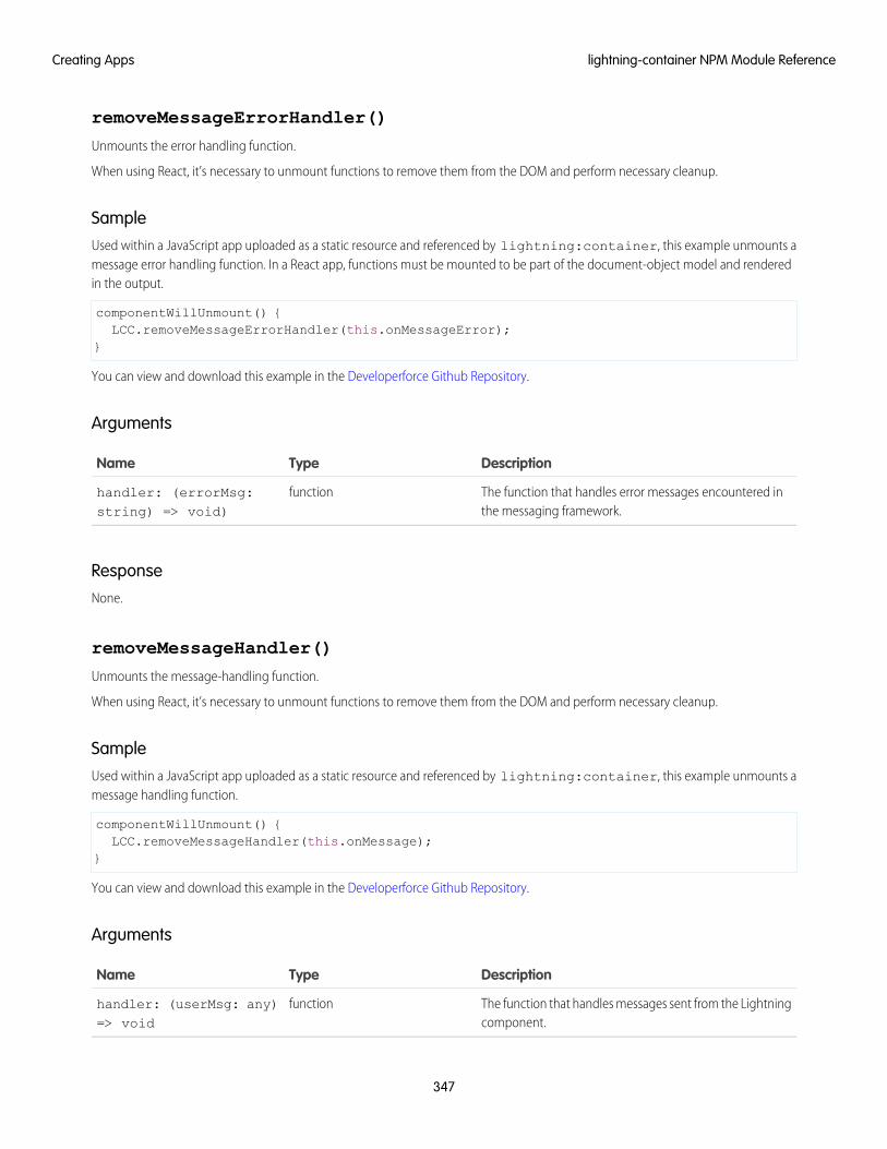
removeMessageErrorHandler()
Unmounts the error handling function.
When using React, it’s necessary to unmount functions to remove them from the DOM and perform necessary cleanup.
SampleUsed within a JavaScript app uploaded as a static resource and referenced by lightning:container, this example unmounts amessage error handling function. In a React app, functions must be mounted to be part of the document-object model and renderedin the output.
componentWillUnmount() {LCC.removeMessageErrorHandler(this.onMessageError);
}
You can view and download this example in the Developerforce Github Repository.
Arguments
DescriptionTypeName
The function that handles error messages encountered inthe messaging framework.
functionhandler: (errorMsg:string) => void)
ResponseNone.
removeMessageHandler()
Unmounts the message-handling function.
When using React, it’s necessary to unmount functions to remove them from the DOM and perform necessary cleanup.
SampleUsed within a JavaScript app uploaded as a static resource and referenced by lightning:container, this example unmounts amessage handling function.
componentWillUnmount() {LCC.removeMessageHandler(this.onMessage);
}
You can view and download this example in the Developerforce Github Repository.
Arguments
DescriptionTypeName
The function that handles messages sent from the Lightningcomponent.
functionhandler: (userMsg: any)=> void
347
lightning-container NPM Module ReferenceCreating Apps
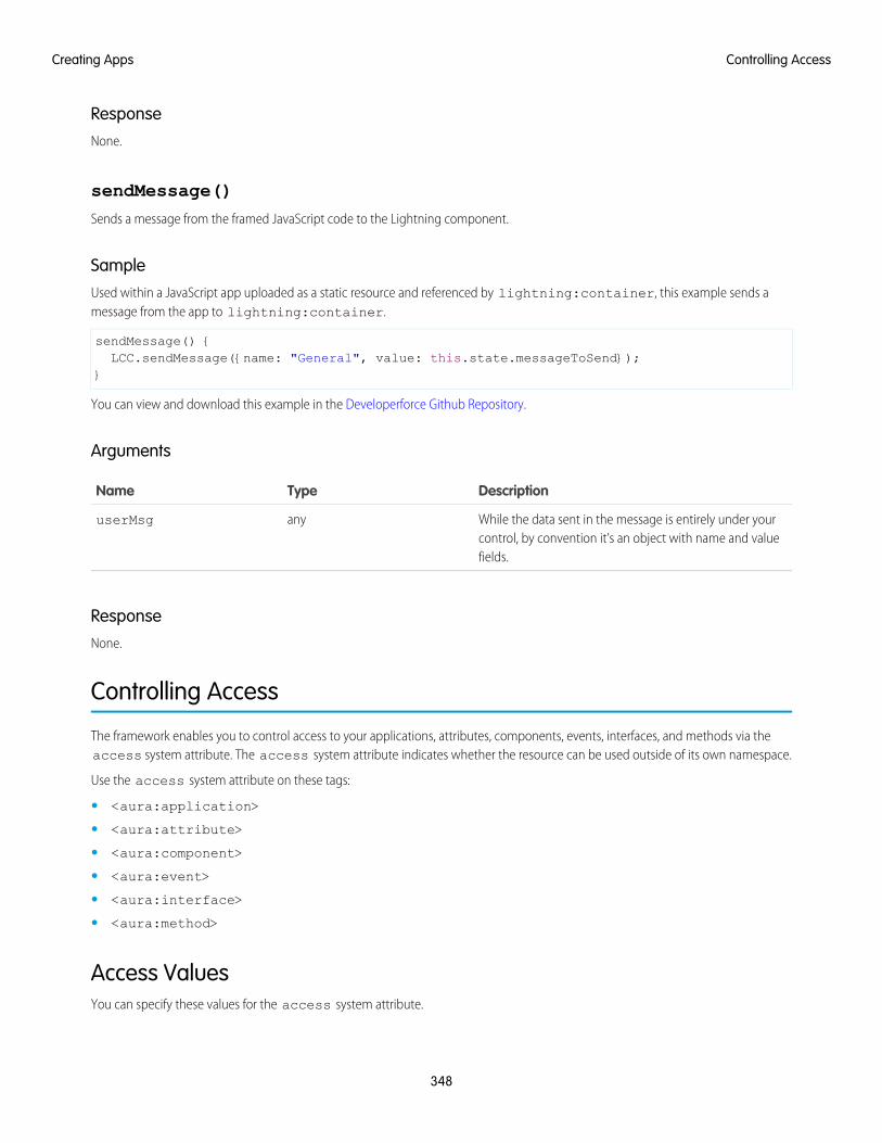
ResponseNone.
sendMessage()
Sends a message from the framed JavaScript code to the Lightning component.
SampleUsed within a JavaScript app uploaded as a static resource and referenced by lightning:container, this example sends amessage from the app to lightning:container.
sendMessage() {LCC.sendMessage({name: "General", value: this.state.messageToSend});
}
You can view and download this example in the Developerforce Github Repository.
Arguments
DescriptionTypeName
While the data sent in the message is entirely under yourcontrol, by convention it’s an object with name and valuefields.
anyuserMsg
ResponseNone.
Controlling Access
The framework enables you to control access to your applications, attributes, components, events, interfaces, and methods via theaccess system attribute. The access system attribute indicates whether the resource can be used outside of its own namespace.
Use the access system attribute on these tags:
• <aura:application>
• <aura:attribute>
• <aura:component>
• <aura:event>
• <aura:interface>
• <aura:method>
Access ValuesYou can specify these values for the access system attribute.
348
Controlling AccessCreating Apps
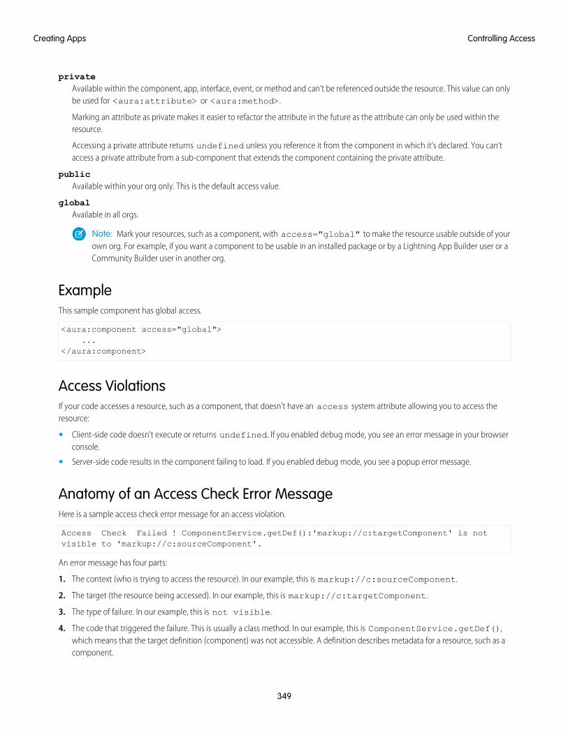
privateAvailable within the component, app, interface, event, or method and can’t be referenced outside the resource. This value can onlybe used for <aura:attribute> or <aura:method>.
Marking an attribute as private makes it easier to refactor the attribute in the future as the attribute can only be used within theresource.
Accessing a private attribute returns undefined unless you reference it from the component in which it’s declared. You can’taccess a private attribute from a sub-component that extends the component containing the private attribute.
publicAvailable within your org only. This is the default access value.
globalAvailable in all orgs.
Note: Mark your resources, such as a component, with access="global" to make the resource usable outside of yourown org. For example, if you want a component to be usable in an installed package or by a Lightning App Builder user or aCommunity Builder user in another org.
ExampleThis sample component has global access.
<aura:component access="global">...
</aura:component>
Access ViolationsIf your code accesses a resource, such as a component, that doesn’t have an access system attribute allowing you to access theresource:
• Client-side code doesn’t execute or returns undefined. If you enabled debug mode, you see an error message in your browserconsole.
• Server-side code results in the component failing to load. If you enabled debug mode, you see a popup error message.
Anatomy of an Access Check Error MessageHere is a sample access check error message for an access violation.
Access Check Failed ! ComponentService.getDef():'markup://c:targetComponent' is notvisible to 'markup://c:sourceComponent'.
An error message has four parts:
1. The context (who is trying to access the resource). In our example, this is markup://c:sourceComponent.
2. The target (the resource being accessed). In our example, this is markup://c:targetComponent.
3. The type of failure. In our example, this is not visible.
4. The code that triggered the failure. This is usually a class method. In our example, this is ComponentService.getDef(),which means that the target definition (component) was not accessible. A definition describes metadata for a resource, such as acomponent.
349
Controlling AccessCreating Apps
Fixing Access Check ErrorsTip: If your code isn’t working as you expect, enable debug mode to get better error reporting.
You can fix access check errors using one or more of these techniques.
• Add appropriate access system attributes to the resources that you own.
• Remove references in your code to resources that aren’t available. In the earlier example, markup://c:targetComponentdoesn’t have an access value allowing markup://c:sourceComponent to access it.
• Ensure that an attribute that you’re accessing exists by looking at its <aura:attribute> definition. Confirm that you’re usingthe correct case-sensitive spelling for the name.
Accessing an undefined attribute or an attribute that is out of scope, for example a private attribute, triggers the same access violationmessage. The access context doesn’t know whether the attribute is undefined or inaccessible.
Example: is not visible to 'undefined'
ComponentService.getDef():'markup://c:targetComponent' is not visible to 'undefined'
The key word in this error message is undefined, which indicates that the framework has lost context. This happens when your codeaccesses a component outside the normal framework lifecycle, such as in a setTimeout() or setInterval() call or in an ES6Promise.
Fix this error by wrapping the code in a $A.getCallback() call. For more information, see Modifying Components Outside theFramework Lifecycle.
Example: Cannot read property 'Yb' of undefined
Action failed: c$sourceComponent$controller$doInit [Cannot read property 'Yb' of undefined]
This error message happens when you reference a property on a variable with a value of undefined. The error can happen in manycontexts, one of which is the side-effect of an access check failure. For example, let’s see what happens when you try to access anundefined attribute, imaginaryAttribute, in JavaScript.
var whatDoYouExpect = cmp.get("v.imaginaryAttribute");
This is an access check error and whatDoYouExpect is set to undefined. Now, if you try to access a property onwhatDoYouExpect, you get an error.
Action failed: c$sourceComponent$controller$doInit [Cannot read property 'Yb' of undefined]
The c$sourceComponent$controller$doInit portion of the error message tells you that the error is in the doInitmethod of the controller of the sourceComponent component in the c namespace.
IN THIS SECTION:
Application Access Control
The access attribute on the aura:application tag controls whether the app can be used outside of the app’s namespace.
Interface Access Control
The access attribute on the aura:interface tag controls whether the interface can be used outside of the interface’snamespace.
350
Controlling AccessCreating Apps
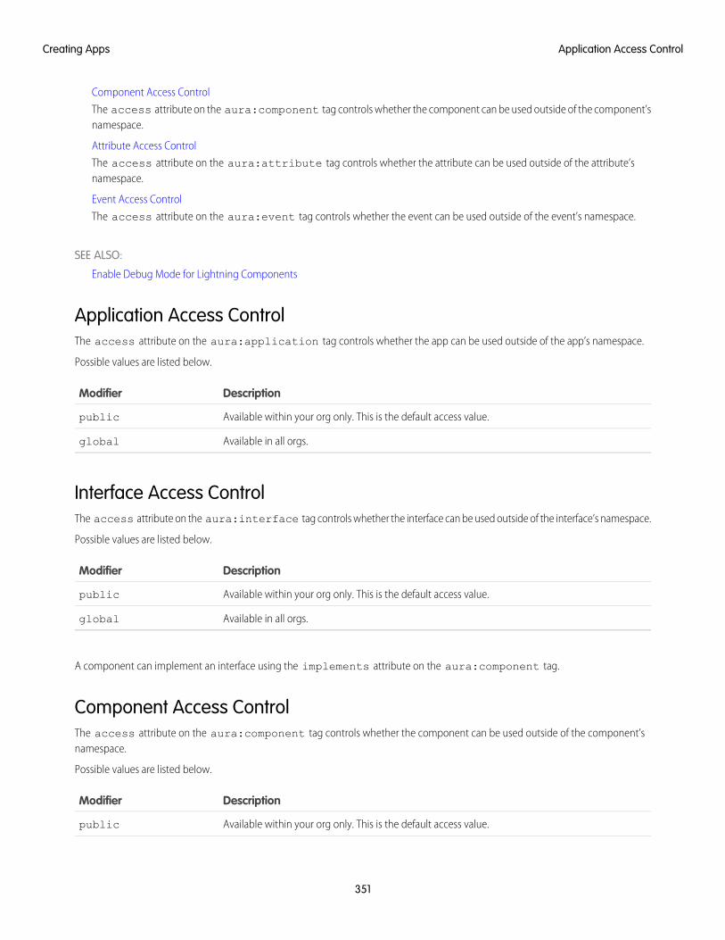
Component Access Control
The access attribute on the aura:component tag controls whether the component can be used outside of the component’snamespace.
Attribute Access Control
The access attribute on the aura:attribute tag controls whether the attribute can be used outside of the attribute’snamespace.
Event Access Control
The access attribute on the aura:event tag controls whether the event can be used outside of the event’s namespace.
SEE ALSO:
Enable Debug Mode for Lightning Components
Application Access ControlThe access attribute on the aura:application tag controls whether the app can be used outside of the app’s namespace.
Possible values are listed below.
DescriptionModifier
Available within your org only. This is the default access value.public
Available in all orgs.global
Interface Access ControlThe access attribute on the aura:interface tag controls whether the interface can be used outside of the interface’s namespace.
Possible values are listed below.
DescriptionModifier
Available within your org only. This is the default access value.public
Available in all orgs.global
A component can implement an interface using the implements attribute on the aura:component tag.
Component Access ControlThe access attribute on the aura:component tag controls whether the component can be used outside of the component’snamespace.
Possible values are listed below.
DescriptionModifier
Available within your org only. This is the default access value.public
351
Application Access ControlCreating Apps
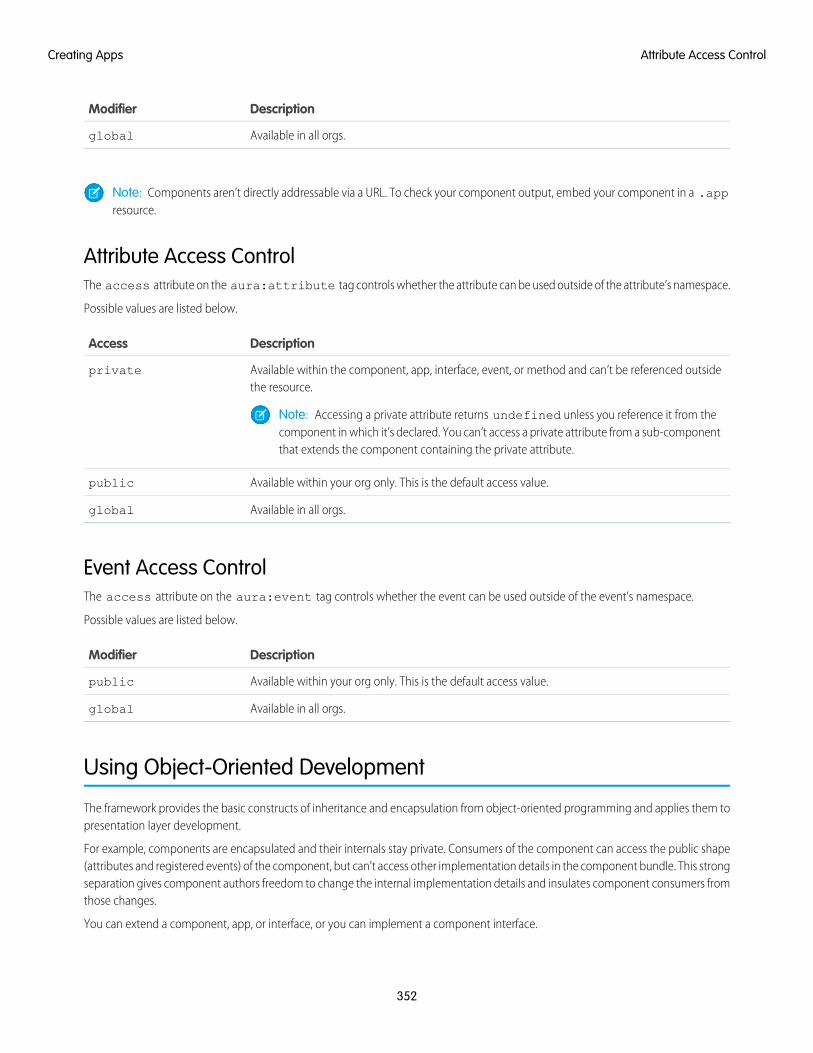
DescriptionModifier
Available in all orgs.global
Note: Components aren’t directly addressable via a URL. To check your component output, embed your component in a .appresource.
Attribute Access ControlThe access attribute on the aura:attribute tag controls whether the attribute can be used outside of the attribute’s namespace.
Possible values are listed below.
DescriptionAccess
Available within the component, app, interface, event, or method and can’t be referenced outsidethe resource.
private
Note: Accessing a private attribute returns undefined unless you reference it from thecomponent in which it’s declared. You can’t access a private attribute from a sub-componentthat extends the component containing the private attribute.
Available within your org only. This is the default access value.public
Available in all orgs.global
Event Access ControlThe access attribute on the aura:event tag controls whether the event can be used outside of the event’s namespace.
Possible values are listed below.
DescriptionModifier
Available within your org only. This is the default access value.public
Available in all orgs.global
Using Object-Oriented Development
The framework provides the basic constructs of inheritance and encapsulation from object-oriented programming and applies them topresentation layer development.
For example, components are encapsulated and their internals stay private. Consumers of the component can access the public shape(attributes and registered events) of the component, but can't access other implementation details in the component bundle. This strongseparation gives component authors freedom to change the internal implementation details and insulates component consumers fromthose changes.
You can extend a component, app, or interface, or you can implement a component interface.
352
Attribute Access ControlCreating Apps
What is Inherited?This topic lists what is inherited when you extend a definition, such as a component.
When a component contains another component, we refer in the documentation to parent and child components in the containmenthierarchy. When a component extends another component, we refer to sub and super components in the inheritance hierarchy.
Component AttributesA sub component that extends a super component inherits the attributes of the super component. Use <aura:set> in the markupof a sub component to set the value of an attribute inherited from a super component.
EventsA sub component that extends a super component can handle events fired by the super component. The sub component automaticallyinherits the event handlers from the super component.
The super and sub component can handle the same event in different ways by adding an <aura:handler> tag to the sub component.The framework doesn't guarantee the order of event handling.
HelpersA sub component's helper inherits the methods from the helper of its super component. A sub component can override a supercomponent's helper method by defining a method with the same name as an inherited method.
ControllersA sub component that extends a super component can call actions in the super component's client-side controller. For example, if thesuper component has an action called doSomething, the sub component can directly call the action using the {!c.doSomething}syntax.
Note: We don't recommend using inheritance of client-side controllers as this feature may be deprecated in the future to preservebetter component encapsulation. We recommend that you put common code in a helper instead.
SEE ALSO:
Component Attributes
Communicating with Events
Sharing JavaScript Code in a Component Bundle
Handling Events with Client-Side Controllers
aura:set
Inherited Component AttributesA sub component that extends a super component inherits the attributes of the super component.
Attribute values are identical at any level of extension. There is an exception to this rule for the body attribute, which we'll look at moreclosely soon.
353
What is Inherited?Creating Apps
Let's start with a simple example. c:super has a description attribute with a value of "Default description",
<!--c:super--><aura:component extensible="true">
<aura:attribute name="description" type="String" default="Default description" />
<p>super.cmp description: {!v.description}</p>
{!v.body}</aura:component>
Don’t worry about the {!v.body} expression for now. We’ll explain that when we talk about the body attribute.
c:sub extends c:super by setting extends="c:super" in its <aura:component> tag.
<!--c:sub--><aura:component extends="c:super">
<p>sub.cmp description: {!v.description}</p></aura:component
Note that sub.cmp has access to the inherited description attribute and it has the same value in sub.cmp and super.cmp.
Use <aura:set> in the markup of a sub component to set the value of an inherited attribute.
Inherited body AttributeEvery component inherits the body attribute from <aura:component>. The inheritance behavior of body is different than otherattributes. It can have different values at each level of component extension to enable different output from each component in theinheritance chain. This will be clearer when we look at an example.
Any free markup that is not enclosed in another tag is assumed to be part of the body. It's equivalent to wrapping that free markupinside <aura:set attribute="body">.
The default renderer for a component iterates through its body attribute, renders everything, and passes the rendered data to its supercomponent. The super component can output the data passed to it by including {!v.body} in its markup. If there is no supercomponent, you've hit the root component and the data is inserted into document.body.
Let's look at a simple example to understand how the body attribute behaves at different levels of component extension. We havethree components.
c:superBody is the super component. It inherently extends <aura:component>.
<!--c:superBody--><aura:component extensible="true">
Parent body: {!v.body}</aura:component>
At this point, c:superBody doesn’t output anything for {!v.body} as it’s just a placeholder for data that will be passed in by acomponent that extends c:superBody.
c:subBody extends c:superBody by setting extends="c:superBody" in its <aura:component> tag.
<!--c:subBody--><aura:component extends="c:superBody">
Child body: {!v.body}</aura:component>
354
Inherited Component AttributesCreating Apps
c:subBody outputs:
Parent body: Child body:
In other words, c:subBody sets the value for {!v.body} in its super component, c:superBody.
c:containerBody contains a reference to c:subBody.
<!--c:containerBody--><aura:component>
<c:subBody>Body value
</c:subBody></aura:component>
In c:containerBody, we set the body attribute of c:subBody to Body value. c:containerBody outputs:
Parent body: Child body: Body value
SEE ALSO:
aura:set
Component Body
Component Markup
Abstract ComponentsObject-oriented languages, such as Java, support the concept of an abstract class that provides a partial implementation for an objectbut leaves the remaining implementation to concrete sub-classes. An abstract class in Java can't be instantiated directly, but a non-abstractsubclass can.
Similarly, the Lightning Component framework supports the concept of abstract components that have a partial implementation butleave the remaining implementation to concrete sub-components.
To use an abstract component, you must extend it and fill out the remaining implementation. An abstract component can't be useddirectly in markup.
The <aura:component> tag has a boolean abstract attribute. Set abstract="true" to make the component abstract.
SEE ALSO:
Interfaces
InterfacesObject-oriented languages, such as Java, support the concept of an interface that defines a set of method signatures. A class thatimplements the interface must provide the method implementations. An interface in Java can't be instantiated directly, but a class thatimplements the interface can.
Similarly, the Lightning Component framework supports the concept of interfaces that define a component's shape by defining itsattributes.
An interface starts with the <aura:interface> tag. It can only contain these tags:
• <aura:attribute> tags to define the interface's attributes.
355
Abstract ComponentsCreating Apps
• <aura:registerEvent> tags to define the events that it may fire.
You can't use markup, renderers, controllers, or anything else in an interface.
To use an interface, you must implement it. An interface can't be used directly in markup otherwise. Set the implements systemattribute in the <aura:component> tag to the name of the interface that you are implementing. For example:
<aura:component implements="mynamespace:myinterface" >
A component can implement an interface and extend another component.
<aura:component extends="ns1:cmp1" implements="ns2:intf1" >
An interface can extend multiple interfaces using a comma-separated list.
<aura:interface extends="ns:intf1,ns:int2" >
Note: Use <aura:set> in a sub component to set the value of any attribute that is inherited from the super component. Thisusage works for components and abstract components, but it doesn't work for interfaces. To set the value of an attribute inheritedfrom an interface, redefine the attribute in the sub component using <aura:attribute> and set the value in its defaultattribute.
Since there are fewer restrictions on the content of abstract components, they are more common than interfaces. A component canimplement multiple interfaces but can only extend one abstract component, so interfaces can be more useful for some design patterns.
SEE ALSO:
Setting Attributes Inherited from an Interface
Abstract Components
Marker InterfacesYou can use an interface as a marker interface that is implemented by a set of components that you want to easily identify for specificusage in your app.
In JavaScript, you can determine if a component implements an interface by usingmyCmp.isInstanceOf("mynamespace:myinterface").
Inheritance RulesThis table describes the inheritance rules for various elements.
Default Base ElementimplementsextendsElement
<aura:component>multiple interfacesone extensible componentcomponent
<aura:application>N/Aone extensible appapp
N/AN/Amultiple interfaces using a comma-separated list(extends="ns:intf1,ns:int2")
interface
SEE ALSO:
Interfaces
356
Inheritance RulesCreating Apps
Using the AppCache
AppCache support is deprecated. Browser vendors have deprecated AppCache, so we followed their lead. Remove the useAppcacheattribute in the <aura:application> tag of your standalone apps (.app resources) to avoid cross-browser support issues dueto deprecation by browser vendors.
If you don’t currently set useAppcache in an <aura:application> tag, you don’t have to do anything because the defaultvalue of useAppcache is false.
Note: See an introduction to AppCache for more information.
SEE ALSO:
aura:application
Distributing Applications and Components
As an ISV or Salesforce partner, you can package and distribute applications and components to other Salesforce users and organizations,including those outside your company.
Publish applications and components to and install them from AppExchange. When adding an application or component to a package,all definition bundles referenced by the application or component are automatically included, such as other components, events, andinterfaces. Custom fields, custom objects, list views, page layouts, and Apex classes referenced by the application or component are alsoincluded. However, when you add a custom object to a package, the application and other definition bundles that reference that customobject must be explicitly added to the package. Other dependencies that must be explicitly added to a package include the following.
• CSP Trusted Sites
• Remote Site Settings
A managed package ensures that your application and other resources are fully upgradeable. To create and work with managed packages,you must use a Developer Edition organization and register a namespace prefix. A managed package includes your namespace prefixin the component names and prevents naming conflicts in an installer’s organization. An organization can create a single managedpackage that can be downloaded and installed by other organizations. After installation from a managed package, the application orcomponent names are locked, but the following attributes are editable.
• API Version
• Description
• Label
• Language
• Markup
Any Apex that is included as part of your definition bundle must have at least 75% cumulative test coverage. When you upload yourpackage to AppExchange, all tests are run to ensure that they run without errors. The tests are also run when the package is installed.
For more information on packaging and distributing, see the ISVforce Guide.
SEE ALSO:
Testing Your Apex Code
357
Using the AppCacheCreating Apps
CHAPTER 7 Debugging
There are a few basic tools and techniques that can help you to debug applications.In this chapter ...Use Chrome DevTools to debug your client-side code.• Enable Debug Mode
for LightningComponents
• To open DevTools on Windows and Linux, press Control-Shift-I in your Google Chrome browser. OnMac, press Option-Command-I.
• Salesforce LightningInspector ChromeExtension
• To quickly find which line of code is failing, enable the Pause on all exceptions option beforerunning your code.
To learn more about debugging JavaScript on Google Chrome, refer to the Google Chrome's DevToolswebsite.• Log Messages
358
Enable Debug Mode for Lightning Components
EDITIONS
Available in: SalesforceClassic and LightningExperience
Available for use in: ContactManager, Group,Professional, Enterprise,Performance, Unlimited,and Developer Editions
Create Lightningcomponents using the UI inEnterprise, Performance,Unlimited, DeveloperEditions or a sandbox.
Enable debug mode to make it easier to debug JavaScript code in your Lightning components.
There are two modes: production and debug. By default, the Lightning Component frameworkruns in production mode. This mode is optimized for performance. It uses the Google ClosureCompiler to optimize and minimize the size of the JavaScript code. The method names and codeare heavily obfuscated.
When you enable debug mode, the JavaScript code isn’t minimized and is easier to read and debug.Debug mode also adds more detailed output for some warnings and errors.
Important: Debug mode has a significant performance impact. The setting affects all usersin your org. For this reason, we recommend using it only in sandbox and Developer Editionorgs. Don’t leave debug mode on permanently in your production org.
To enable debug mode for your org:
1. From Setup, enter Lightning Components in the Quick Find box, then selectLightning Components.
2. Select the Enable Debug Mode checkbox.
3. Click Save.
Salesforce Lightning Inspector Chrome Extension
The Salesforce Lightning Inspector is a Google Chrome DevTools extension that enables you to navigate the component tree, inspectcomponent attributes, and profile component performance. The extension also helps you to understand the sequence of event firingand handling.
The extension helps you to:
• Navigate the component tree in your app, inspect components and their associated DOM elements.
• Identify performance bottlenecks by looking at a graph of component creation time.
• Debug server interactions faster by monitoring and modifying responses.
• Test the fault tolerance of your app by simulating error conditions or dropped action responses.
• Track the sequence of event firing and handling for one or more actions.
This documentation assumes that you are familiar with Google Chrome DevTools.
IN THIS SECTION:
Install Salesforce Lightning Inspector
Install the Google Chrome DevTools extension to help you debug and profile component performance.
Salesforce Lightning Inspector
The Chrome extension adds a Lightning tab to the DevTools menu. Use it to inspect different aspects of your app.
Install Salesforce Lightning InspectorInstall the Google Chrome DevTools extension to help you debug and profile component performance.
1. In Google Chrome, navigate to the Salesforce Lightning Inspector extension page on the Chrome Web Store.
359
Enable Debug Mode for Lightning ComponentsDebugging
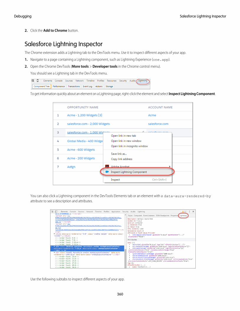
2. Click the Add to Chrome button.
Salesforce Lightning InspectorThe Chrome extension adds a Lightning tab to the DevTools menu. Use it to inspect different aspects of your app.
1. Navigate to a page containing a Lightning component, such as Lightning Experience (one.app).
2. Open the Chrome DevTools (More tools > Developer tools in the Chrome control menu).
You should see a Lightning tab in the DevTools menu.
To get information quickly about an element on a Lightning page, right-click the element and select Inspect Lightning Component.
You can also click a Lightning component in the DevTools Elements tab or an element with a data-aura-rendered-byattribute to see a description and attributes.
Use the following subtabs to inspect different aspects of your app.
360
Salesforce Lightning InspectorDebugging
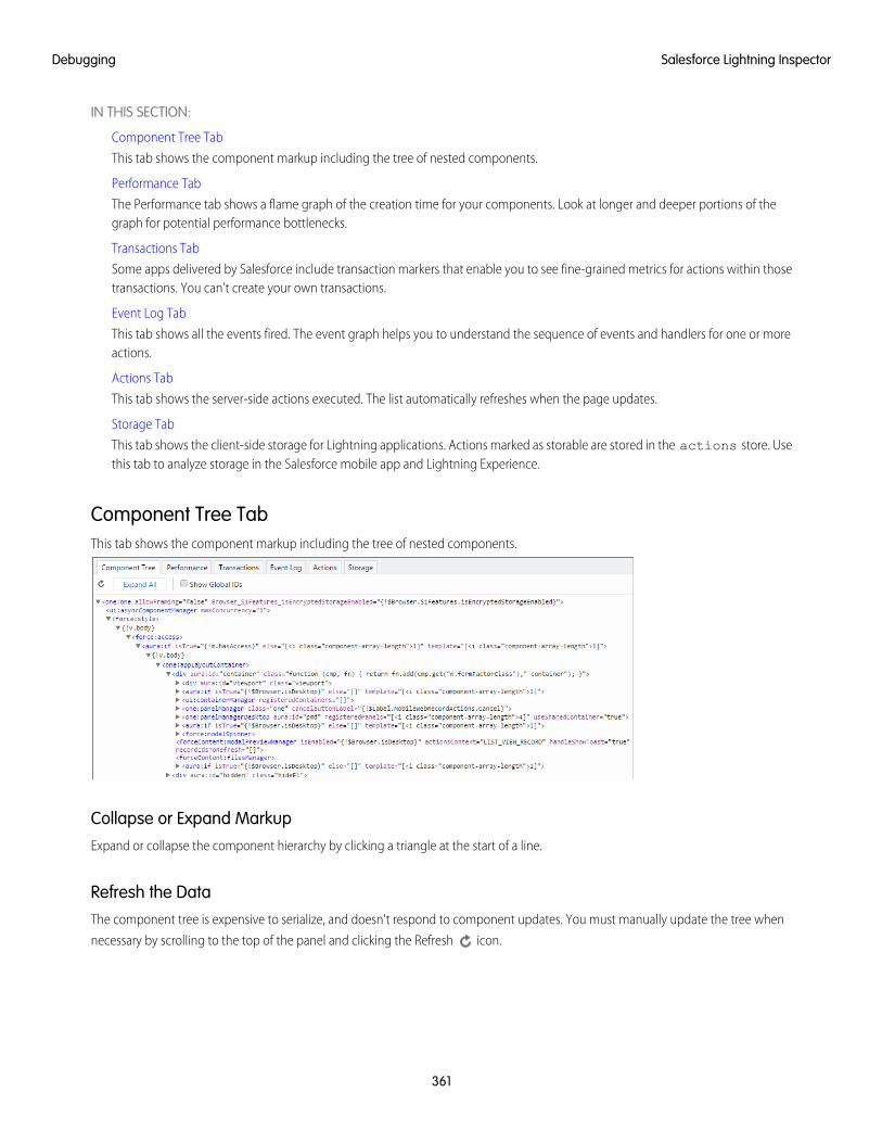
IN THIS SECTION:
Component Tree Tab
This tab shows the component markup including the tree of nested components.
Performance Tab
The Performance tab shows a flame graph of the creation time for your components. Look at longer and deeper portions of thegraph for potential performance bottlenecks.
Transactions Tab
Some apps delivered by Salesforce include transaction markers that enable you to see fine-grained metrics for actions within thosetransactions. You can’t create your own transactions.
Event Log Tab
This tab shows all the events fired. The event graph helps you to understand the sequence of events and handlers for one or moreactions.
Actions Tab
This tab shows the server-side actions executed. The list automatically refreshes when the page updates.
Storage Tab
This tab shows the client-side storage for Lightning applications. Actions marked as storable are stored in the actions store. Usethis tab to analyze storage in the Salesforce mobile app and Lightning Experience.
Component Tree TabThis tab shows the component markup including the tree of nested components.
Collapse or Expand MarkupExpand or collapse the component hierarchy by clicking a triangle at the start of a line.
Refresh the DataThe component tree is expensive to serialize, and doesn't respond to component updates. You must manually update the tree when
necessary by scrolling to the top of the panel and clicking the Refresh icon.
361
Salesforce Lightning InspectorDebugging
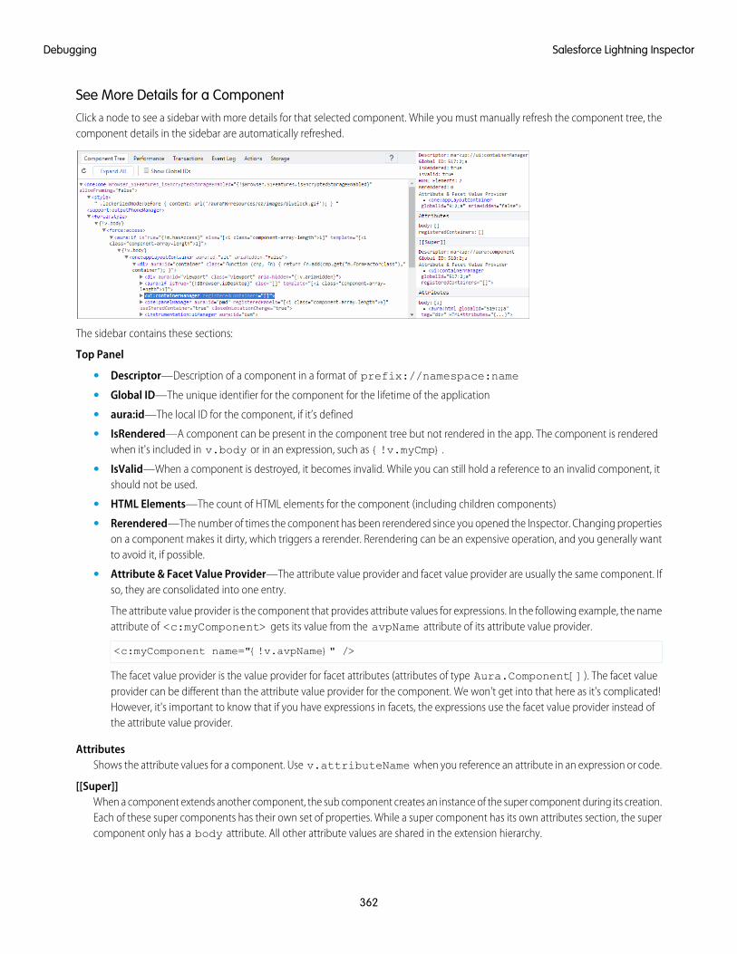
See More Details for a ComponentClick a node to see a sidebar with more details for that selected component. While you must manually refresh the component tree, thecomponent details in the sidebar are automatically refreshed.
The sidebar contains these sections:
Top Panel
• Descriptor—Description of a component in a format of prefix://namespace:name
• Global ID—The unique identifier for the component for the lifetime of the application
• aura:id—The local ID for the component, if it’s defined
• IsRendered—A component can be present in the component tree but not rendered in the app. The component is renderedwhen it's included in v.body or in an expression, such as {!v.myCmp}.
• IsValid—When a component is destroyed, it becomes invalid. While you can still hold a reference to an invalid component, itshould not be used.
• HTML Elements—The count of HTML elements for the component (including children components)
• Rerendered—The number of times the component has been rerendered since you opened the Inspector. Changing propertieson a component makes it dirty, which triggers a rerender. Rerendering can be an expensive operation, and you generally wantto avoid it, if possible.
• Attribute & Facet Value Provider—The attribute value provider and facet value provider are usually the same component. Ifso, they are consolidated into one entry.
The attribute value provider is the component that provides attribute values for expressions. In the following example, the nameattribute of <c:myComponent> gets its value from the avpName attribute of its attribute value provider.
<c:myComponent name="{!v.avpName}" />
The facet value provider is the value provider for facet attributes (attributes of type Aura.Component[]). The facet valueprovider can be different than the attribute value provider for the component. We won't get into that here as it's complicated!However, it's important to know that if you have expressions in facets, the expressions use the facet value provider instead ofthe attribute value provider.
AttributesShows the attribute values for a component. Use v.attributeName when you reference an attribute in an expression or code.
[[Super]]When a component extends another component, the sub component creates an instance of the super component during its creation.Each of these super components has their own set of properties. While a super component has its own attributes section, the supercomponent only has a body attribute. All other attribute values are shared in the extension hierarchy.
362
Salesforce Lightning InspectorDebugging
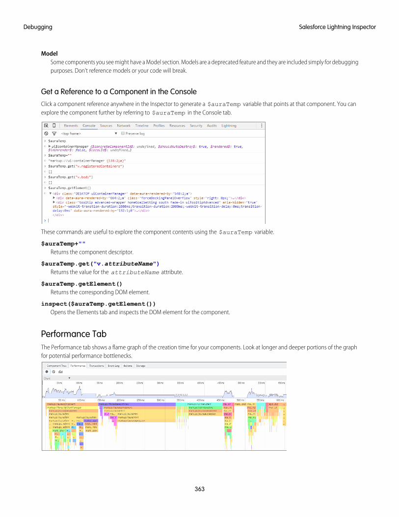
ModelSome components you see might have a Model section. Models are a deprecated feature and they are included simply for debuggingpurposes. Don't reference models or your code will break.
Get a Reference to a Component in the ConsoleClick a component reference anywhere in the Inspector to generate a $auraTemp variable that points at that component. You canexplore the component further by referring to $auraTemp in the Console tab.
These commands are useful to explore the component contents using the $auraTemp variable.
$auraTemp+""Returns the component descriptor.
$auraTemp.get("v.attributeName")Returns the value for the attributeName attribute.
$auraTemp.getElement()Returns the corresponding DOM element.
inspect($auraTemp.getElement())Opens the Elements tab and inspects the DOM element for the component.
Performance TabThe Performance tab shows a flame graph of the creation time for your components. Look at longer and deeper portions of the graphfor potential performance bottlenecks.
363
Salesforce Lightning InspectorDebugging
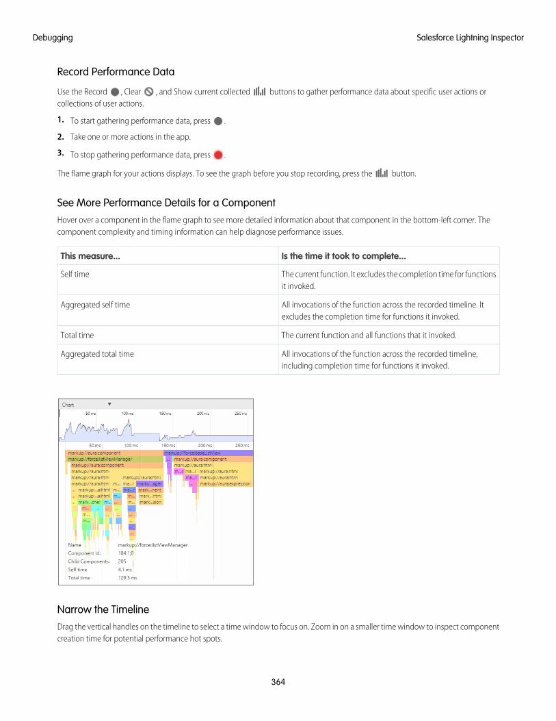
Record Performance Data
Use the Record , Clear , and Show current collected buttons to gather performance data about specific user actions orcollections of user actions.
1. To start gathering performance data, press .
2. Take one or more actions in the app.
3. To stop gathering performance data, press .
The flame graph for your actions displays. To see the graph before you stop recording, press the button.
See More Performance Details for a ComponentHover over a component in the flame graph to see more detailed information about that component in the bottom-left corner. Thecomponent complexity and timing information can help diagnose performance issues.
Is the time it took to complete...This measure...
The current function. It excludes the completion time for functionsit invoked.
Self time
All invocations of the function across the recorded timeline. Itexcludes the completion time for functions it invoked.
Aggregated self time
The current function and all functions that it invoked.Total time
All invocations of the function across the recorded timeline,including completion time for functions it invoked.
Aggregated total time
Narrow the TimelineDrag the vertical handles on the timeline to select a time window to focus on. Zoom in on a smaller time window to inspect componentcreation time for potential performance hot spots.
364
Salesforce Lightning InspectorDebugging
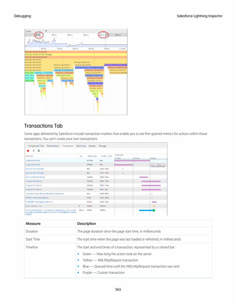
Transactions TabSome apps delivered by Salesforce include transaction markers that enable you to see fine-grained metrics for actions within thosetransactions. You can’t create your own transactions.
DescriptionMeasure
The page duration since the page start time, in millisecondsDuration
The start time when the page was last loaded or refreshed, in millisecondsStart Time
The start and end times of a transaction, represented by a colored bar:Timeline
• Green — How long the action took on the server
• Yellow — XMLHttpRequest transaction
• Blue — Queued time until the XMLHttpRequest transaction was sent
• Purple — Custom transaction
365
Salesforce Lightning InspectorDebugging
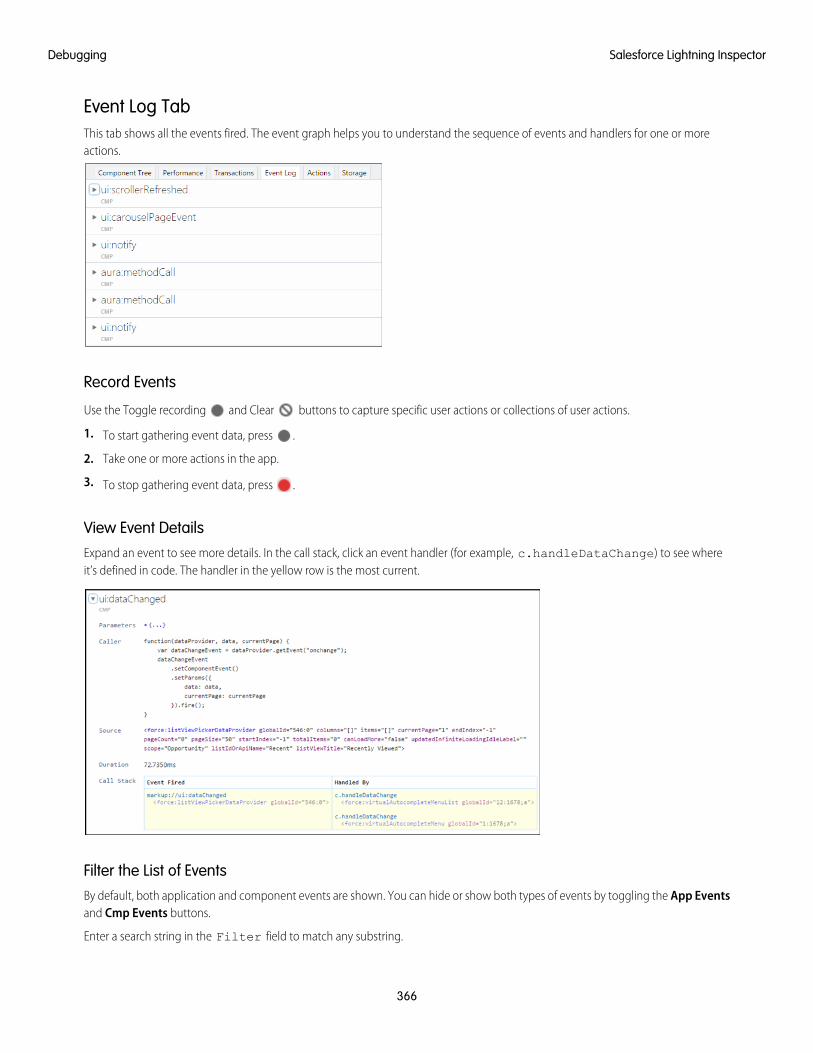
Event Log TabThis tab shows all the events fired. The event graph helps you to understand the sequence of events and handlers for one or moreactions.
Record Events
Use the Toggle recording and Clear buttons to capture specific user actions or collections of user actions.
1. To start gathering event data, press .
2. Take one or more actions in the app.
3. To stop gathering event data, press .
View Event DetailsExpand an event to see more details. In the call stack, click an event handler (for example, c.handleDataChange) to see whereit’s defined in code. The handler in the yellow row is the most current.
Filter the List of EventsBy default, both application and component events are shown. You can hide or show both types of events by toggling the App Eventsand Cmp Events buttons.
Enter a search string in the Filter field to match any substring.
366
Salesforce Lightning InspectorDebugging
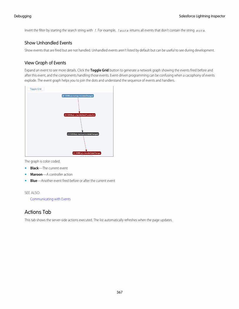
Invert the filter by starting the search string with !. For example, !aura returns all events that don’t contain the string aura.
Show Unhandled EventsShow events that are fired but are not handled. Unhandled events aren't listed by default but can be useful to see during development.
View Graph of EventsExpand an event to see more details. Click the Toggle Grid button to generate a network graph showing the events fired before andafter this event, and the components handling those events. Event-driven programming can be confusing when a cacophony of eventsexplode. The event graph helps you to join the dots and understand the sequence of events and handlers.
The graph is color coded.
• Black—The current event
• Maroon—A controller action
• Blue—Another event fired before or after the current event
SEE ALSO:
Communicating with Events
Actions TabThis tab shows the server-side actions executed. The list automatically refreshes when the page updates.
367
Salesforce Lightning InspectorDebugging
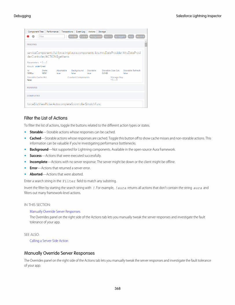
Filter the List of ActionsTo filter the list of actions, toggle the buttons related to the different action types or states.
• Storable—Storable actions whose responses can be cached.
• Cached—Storable actions whose responses are cached. Toggle this button off to show cache misses and non-storable actions. Thisinformation can be valuable if you're investigating performance bottlenecks.
• Background—Not supported for Lightning components. Available in the open-source Aura framework.
• Success—Actions that were executed successfully.
• Incomplete—Actions with no server response. The server might be down or the client might be offline.
• Error—Actions that returned a server error.
• Aborted—Actions that were aborted.
Enter a search string in the Filter field to match any substring.
Invert the filter by starting the search string with !. For example, !aura returns all actions that don't contain the string aura andfilters out many framework-level actions.
IN THIS SECTION:
Manually Override Server Responses
The Overrides panel on the right side of the Actions tab lets you manually tweak the server responses and investigate the faulttolerance of your app.
SEE ALSO:
Calling a Server-Side Action
Manually Override Server ResponsesThe Overrides panel on the right side of the Actions tab lets you manually tweak the server responses and investigate the fault toleranceof your app.
368
Salesforce Lightning InspectorDebugging
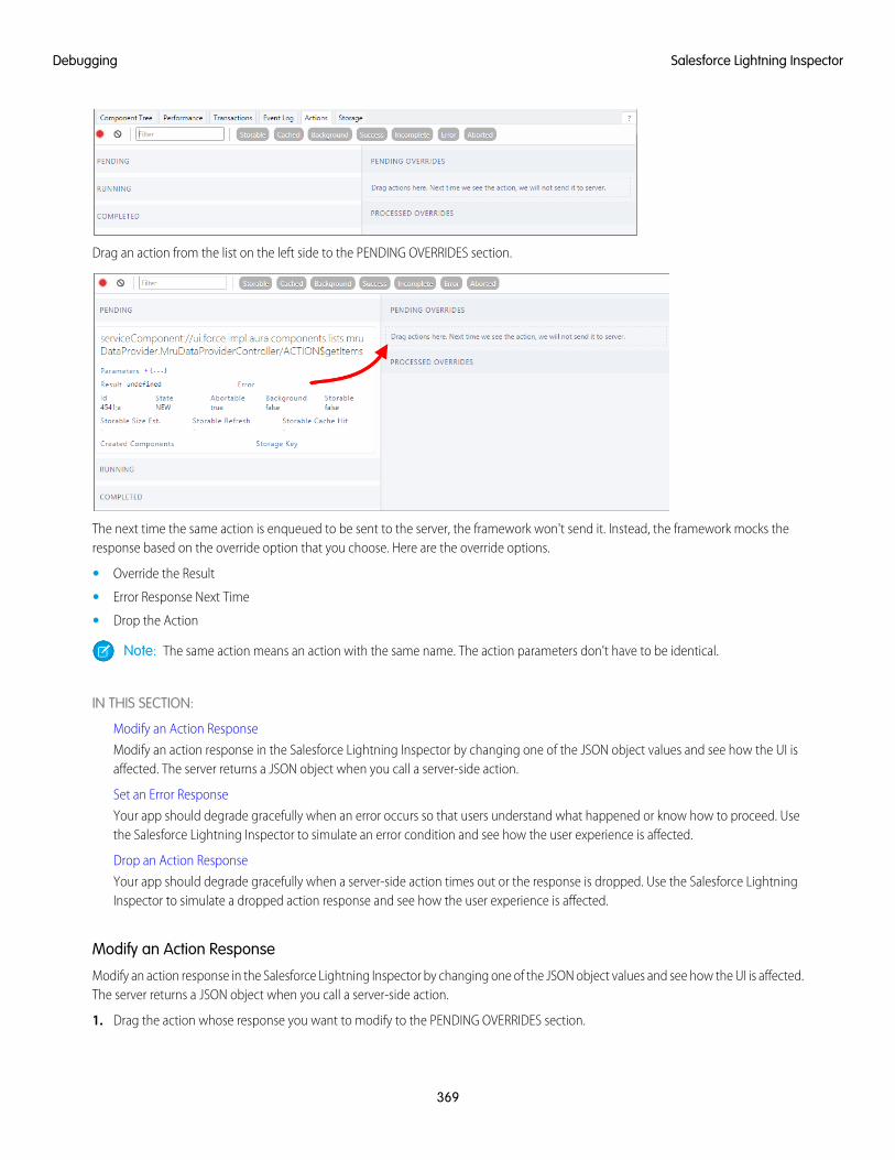
Drag an action from the list on the left side to the PENDING OVERRIDES section.
The next time the same action is enqueued to be sent to the server, the framework won't send it. Instead, the framework mocks theresponse based on the override option that you choose. Here are the override options.
• Override the Result
• Error Response Next Time
• Drop the Action
Note: The same action means an action with the same name. The action parameters don't have to be identical.
IN THIS SECTION:
Modify an Action Response
Modify an action response in the Salesforce Lightning Inspector by changing one of the JSON object values and see how the UI isaffected. The server returns a JSON object when you call a server-side action.
Set an Error Response
Your app should degrade gracefully when an error occurs so that users understand what happened or know how to proceed. Usethe Salesforce Lightning Inspector to simulate an error condition and see how the user experience is affected.
Drop an Action Response
Your app should degrade gracefully when a server-side action times out or the response is dropped. Use the Salesforce LightningInspector to simulate a dropped action response and see how the user experience is affected.
Modify an Action Response
Modify an action response in the Salesforce Lightning Inspector by changing one of the JSON object values and see how the UI is affected.The server returns a JSON object when you call a server-side action.
1. Drag the action whose response you want to modify to the PENDING OVERRIDES section.
369
Salesforce Lightning InspectorDebugging
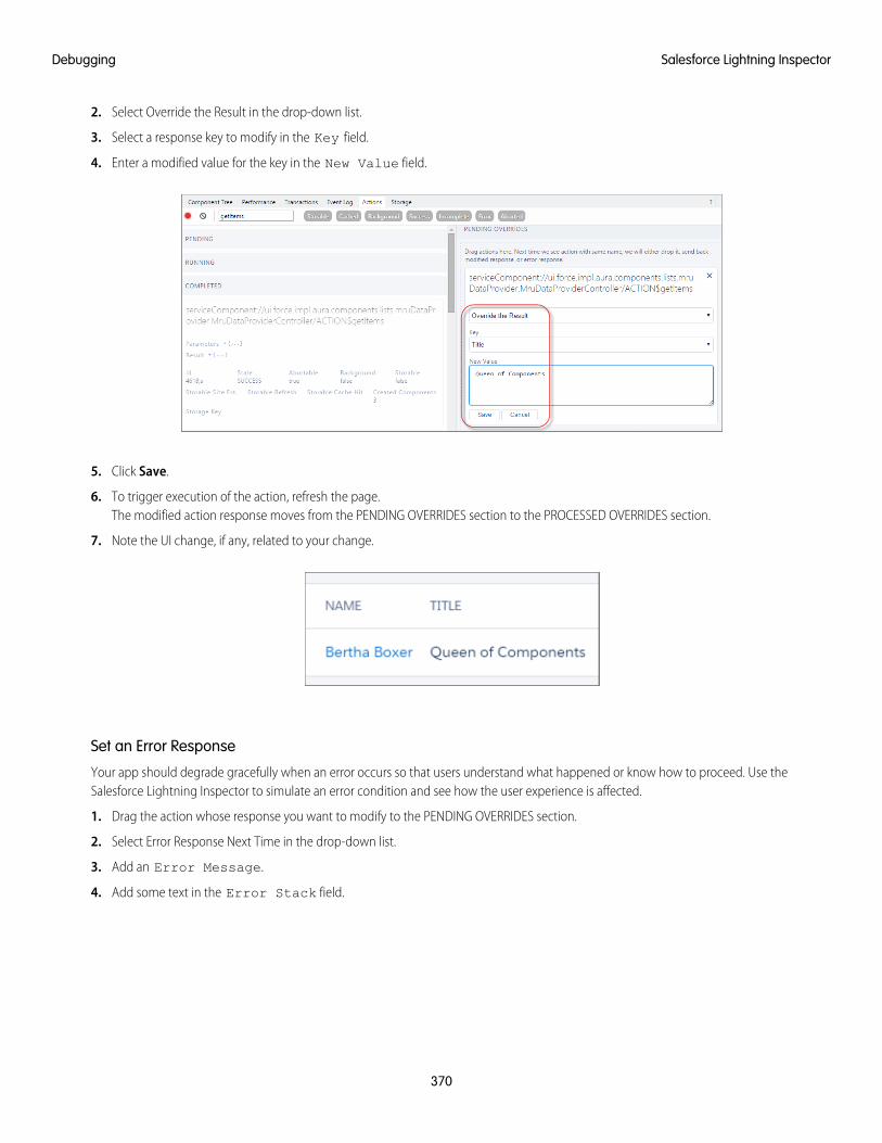
2. Select Override the Result in the drop-down list.
3. Select a response key to modify in the Key field.
4. Enter a modified value for the key in the New Value field.
5. Click Save.
6. To trigger execution of the action, refresh the page.The modified action response moves from the PENDING OVERRIDES section to the PROCESSED OVERRIDES section.
7. Note the UI change, if any, related to your change.
Set an Error Response
Your app should degrade gracefully when an error occurs so that users understand what happened or know how to proceed. Use theSalesforce Lightning Inspector to simulate an error condition and see how the user experience is affected.
1. Drag the action whose response you want to modify to the PENDING OVERRIDES section.
2. Select Error Response Next Time in the drop-down list.
3. Add an Error Message.
4. Add some text in the Error Stack field.
370
Salesforce Lightning InspectorDebugging
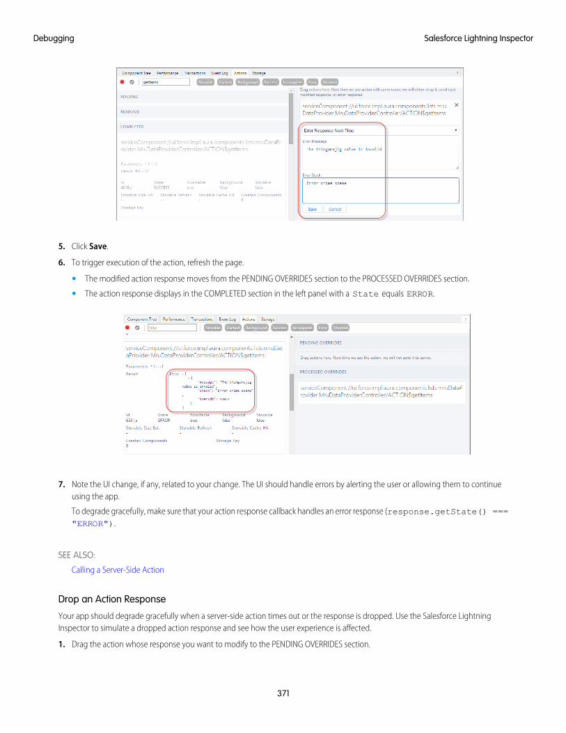
5. Click Save.
6. To trigger execution of the action, refresh the page.
• The modified action response moves from the PENDING OVERRIDES section to the PROCESSED OVERRIDES section.
• The action response displays in the COMPLETED section in the left panel with a State equals ERROR.
7. Note the UI change, if any, related to your change. The UI should handle errors by alerting the user or allowing them to continueusing the app.
To degrade gracefully, make sure that your action response callback handles an error response (response.getState() ==="ERROR").
SEE ALSO:
Calling a Server-Side Action
Drop an Action Response
Your app should degrade gracefully when a server-side action times out or the response is dropped. Use the Salesforce LightningInspector to simulate a dropped action response and see how the user experience is affected.
1. Drag the action whose response you want to modify to the PENDING OVERRIDES section.
371
Salesforce Lightning InspectorDebugging
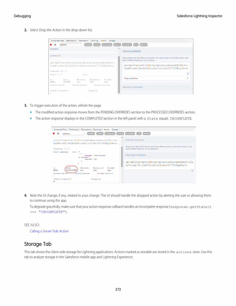
2. Select Drop the Action in the drop-down list.
3. To trigger execution of the action, refresh the page.
• The modified action response moves from the PENDING OVERRIDES section to the PROCESSED OVERRIDES section.
• The action response displays in the COMPLETED section in the left panel with a State equals INCOMPLETE.
4. Note the UI change, if any, related to your change. The UI should handle the dropped action by alerting the user or allowing themto continue using the app.
To degrade gracefully, make sure that your action response callback handles an incomplete response (response.getState()=== "INCOMPLETE").
SEE ALSO:
Calling a Server-Side Action
Storage TabThis tab shows the client-side storage for Lightning applications. Actions marked as storable are stored in the actions store. Use thistab to analyze storage in the Salesforce mobile app and Lightning Experience.
372
Salesforce Lightning InspectorDebugging
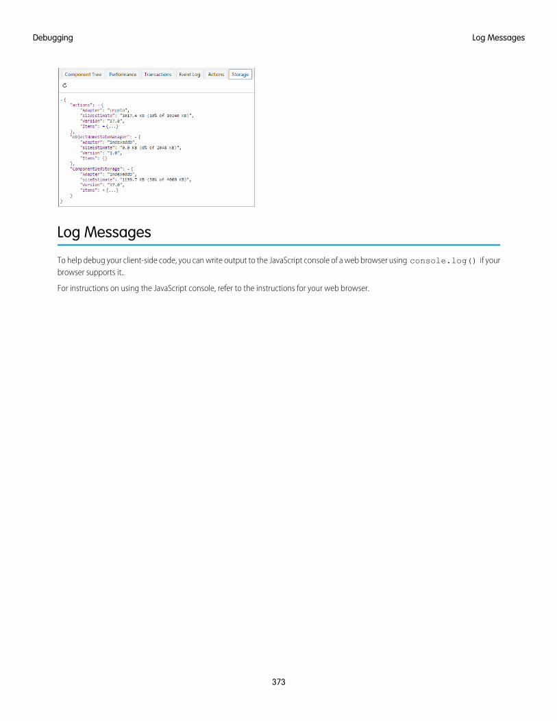
Log Messages
To help debug your client-side code, you can write output to the JavaScript console of a web browser using console.log() if yourbrowser supports it..
For instructions on using the JavaScript console, refer to the instructions for your web browser.
373
Log MessagesDebugging
CHAPTER 8 Fixing Performance Warnings
A few common performance anti-patterns in code prompt the framework to log warning messages tothe browser console. Fix the warning messages to speed up your components!
In this chapter ...
• <aura:if>—CleanUnrendered Body The warnings display in the browser console only if you enabled debug mode.
SEE ALSO:
Enable Debug Mode for Lightning Components
• <aura:iteration>—MultipleItems Set
374
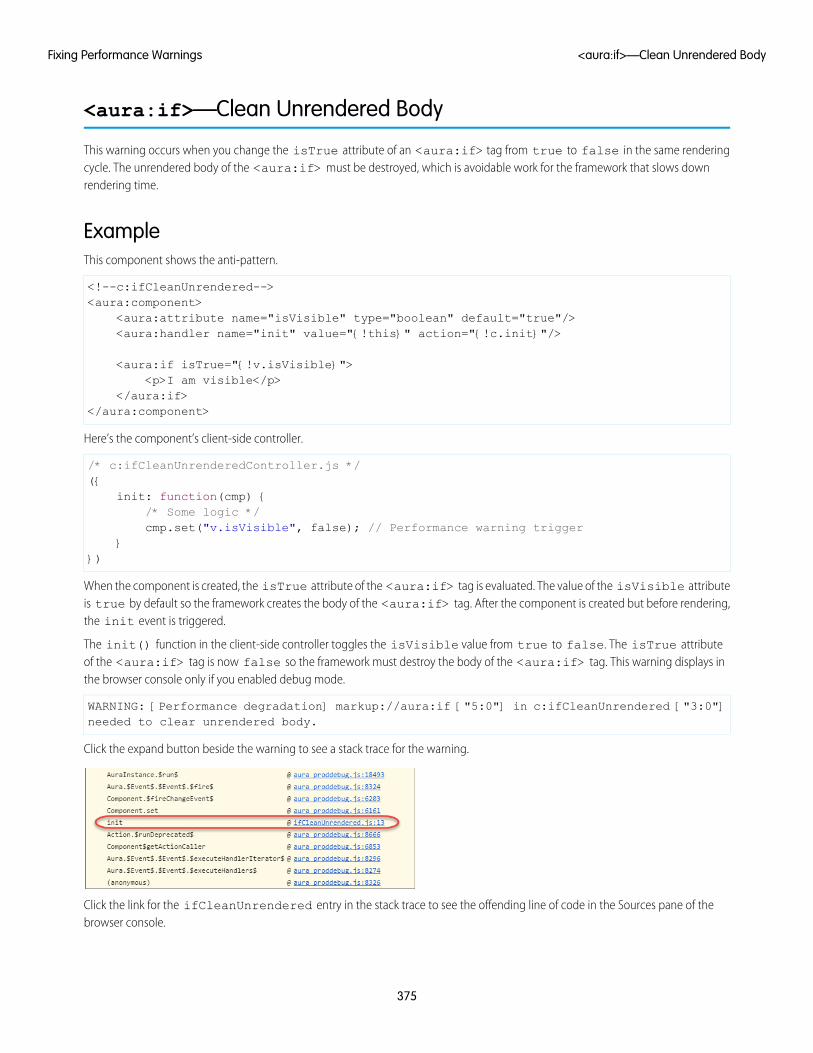
<aura:if>—Clean Unrendered Body
This warning occurs when you change the isTrue attribute of an <aura:if> tag from true to false in the same renderingcycle. The unrendered body of the <aura:if> must be destroyed, which is avoidable work for the framework that slows downrendering time.
ExampleThis component shows the anti-pattern.
<!--c:ifCleanUnrendered--><aura:component>
<aura:attribute name="isVisible" type="boolean" default="true"/><aura:handler name="init" value="{!this}" action="{!c.init}"/>
<aura:if isTrue="{!v.isVisible}"><p>I am visible</p>
</aura:if></aura:component>
Here’s the component’s client-side controller.
/* c:ifCleanUnrenderedController.js */({
init: function(cmp) {/* Some logic */cmp.set("v.isVisible", false); // Performance warning trigger
}})
When the component is created, the isTrue attribute of the <aura:if> tag is evaluated. The value of the isVisible attributeis true by default so the framework creates the body of the <aura:if> tag. After the component is created but before rendering,the init event is triggered.
The init() function in the client-side controller toggles the isVisible value from true to false. The isTrue attributeof the <aura:if> tag is now false so the framework must destroy the body of the <aura:if> tag. This warning displays inthe browser console only if you enabled debug mode.
WARNING: [Performance degradation] markup://aura:if ["5:0"] in c:ifCleanUnrendered ["3:0"]needed to clear unrendered body.
Click the expand button beside the warning to see a stack trace for the warning.
Click the link for the ifCleanUnrendered entry in the stack trace to see the offending line of code in the Sources pane of thebrowser console.
375
<aura:if>—Clean Unrendered BodyFixing Performance Warnings
How to Fix the WarningReverse the logic for the isTrue expression. Instead of setting the isTrue attribute to true by default, set it to false. Set theisTrue expression to true in the init() method, if needed.
Here’s the fixed component:
<!--c:ifCleanUnrenderedFixed--><aura:component>
<!-- FIX: Change default to false.Update isTrue expression in controller instead. -->
<aura:attribute name="isVisible" type="boolean" default="false"/><aura:handler name="init" value="{!this}" action="{!c.init}"/>
<aura:if isTrue="{!v.isVisible}"><p>I am visible</p>
</aura:if></aura:component>
Here’s the fixed controller:
/* c:ifCleanUnrenderedFixedController.js */({
init: function(cmp) {// Some logic// FIX: set isVisible to true if logic criteria metcmp.set("v.isVisible", true);
}})
SEE ALSO:
aura:if
Enable Debug Mode for Lightning Components
<aura:iteration>—Multiple Items Set
This warning occurs when you set the items attribute of an <aura:iteration> tag multiple times in the same rendering cycle.
There’s no easy and performant way to check if two collections are the same in JavaScript. Even if the old value of items is the sameas the new value, the framework deletes and replaces the previously created body of the <aura:iteration> tag.
ExampleThis component shows the anti-pattern.
<!--c:iterationMultipleItemsSet--><aura:component>
<aura:attribute name="groceries" type="List"default="[ 'Eggs', 'Bacon', 'Bread' ]"/>
<aura:handler name="init" value="{!this}" action="{!c.init}"/>
376
<aura:iteration>—Multiple Items SetFixing Performance Warnings
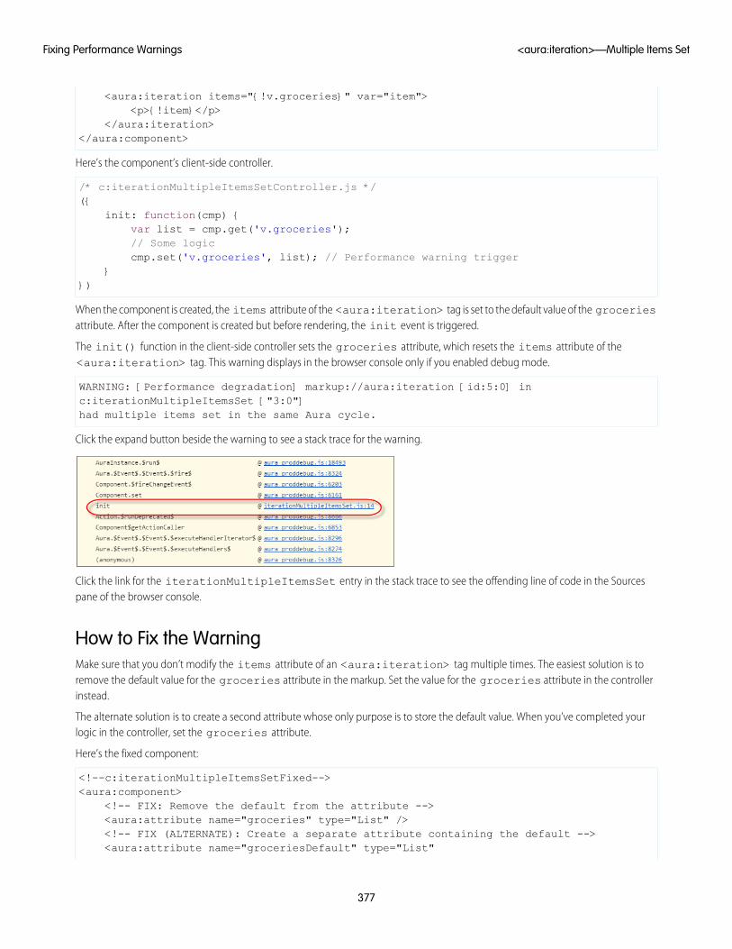
<aura:iteration items="{!v.groceries}" var="item"><p>{!item}</p>
</aura:iteration></aura:component>
Here’s the component’s client-side controller.
/* c:iterationMultipleItemsSetController.js */({
init: function(cmp) {var list = cmp.get('v.groceries');// Some logiccmp.set('v.groceries', list); // Performance warning trigger
}})
When the component is created, the items attribute of the <aura:iteration> tag is set to the default value of the groceriesattribute. After the component is created but before rendering, the init event is triggered.
The init() function in the client-side controller sets the groceries attribute, which resets the items attribute of the<aura:iteration> tag. This warning displays in the browser console only if you enabled debug mode.
WARNING: [Performance degradation] markup://aura:iteration [id:5:0] inc:iterationMultipleItemsSet ["3:0"]had multiple items set in the same Aura cycle.
Click the expand button beside the warning to see a stack trace for the warning.
Click the link for the iterationMultipleItemsSet entry in the stack trace to see the offending line of code in the Sourcespane of the browser console.
How to Fix the WarningMake sure that you don’t modify the items attribute of an <aura:iteration> tag multiple times. The easiest solution is toremove the default value for the groceries attribute in the markup. Set the value for the groceries attribute in the controllerinstead.
The alternate solution is to create a second attribute whose only purpose is to store the default value. When you’ve completed yourlogic in the controller, set the groceries attribute.
Here’s the fixed component:
<!--c:iterationMultipleItemsSetFixed--><aura:component>
<!-- FIX: Remove the default from the attribute --><aura:attribute name="groceries" type="List" /><!-- FIX (ALTERNATE): Create a separate attribute containing the default --><aura:attribute name="groceriesDefault" type="List"
377
<aura:iteration>—Multiple Items SetFixing Performance Warnings
default="[ 'Eggs', 'Bacon', 'Bread' ]"/>
<aura:handler name="init" value="{!this}" action="{!c.init}"/>
<aura:iteration items="{!v.groceries}" var="item"><p>{!item}</p>
</aura:iteration></aura:component>
Here’s the fixed controller:
/* c:iterationMultipleItemsSetFixedController.js */({
init: function(cmp) {// FIX (ALTERNATE) if need to set default in markup// use a different attribute// var list = cmp.get('v.groceriesDefault');// FIX: Set the value in codevar list = ['Eggs', 'Bacon', 'Bread'];// Some logiccmp.set('v.groceries', list);
}})
SEE ALSO:
aura:iteration
Enable Debug Mode for Lightning Components
378
<aura:iteration>—Multiple Items SetFixing Performance Warnings
CHAPTER 9 Reference
This section contains reference documentation including details of the various tags available in theframework.
In this chapter ...
• Reference Doc AppNote that the the Lightning Component framework provides a subset of what’s available in theopen-source Aura framework, in addition to components and events that are specific to Salesforce.• Supported
aura:attribute Types
• aura:application
• aura:component
• aura:dependency
• aura:event
• aura:interface
• aura:method
• aura:set
• ComponentReference
• MessagingComponentReference
• Interface Reference
• Event Reference
• System EventReference
• Supported HTMLTags
379
Reference Doc App
Explore the look and feel of Lightning components in the Component Library (Beta) athttps://<myDomain>.lightning.force.com/componentReference/suite.app where <myDomain> is thename of your custom Salesforce domain.
You can also continue to use the reference doc app, which includes reference information, as well as the JavaScript API. Access the appat:
https://<myDomain>.lightning.force.com/auradocs/reference.app, where <myDomain> is the name ofyour custom Salesforce domain.
Supported aura:attribute Types
aura:attribute describes an attribute available on an app, interface, component, or event.
DescriptionTypeAttribute Name
Indicates whether the attribute can be used outside of its own namespace.Possible values are public (default), and global, and private.
Stringaccess
Required. The name of the attribute. For example, if you set<aura:attribute name="isTrue" type="Boolean" />
Stringname
on a component called aura:newCmp, you can set this attribute when youinstantiate the component; for example,<aura:newCmpisTrue="false" />.
Required. The type of the attribute. For a list of basic types supported, see BasicTypes.
Stringtype
The default value for the attribute, which can be overwritten as needed. Whensetting a default value, expressions using the $Label, $Locale, and
Stringdefault
$Browser global value providers are supported. Alternatively, to set adynamic default, use an init event. See Invoking Actions on ComponentInitialization on page 247.
Determines if the attribute is required. The default is false.Booleanrequired
A summary of the attribute and its usage.Stringdescription
All <aura:attribute> tags have name and type values. For example:
<aura:attribute name="whom" type="String" />
Note: Although type values are case insensitive, case sensitivity should be respected as your markup interacts with JavaScript,CSS, and Apex.
SEE ALSO:
Component Attributes
380
Reference Doc AppReference
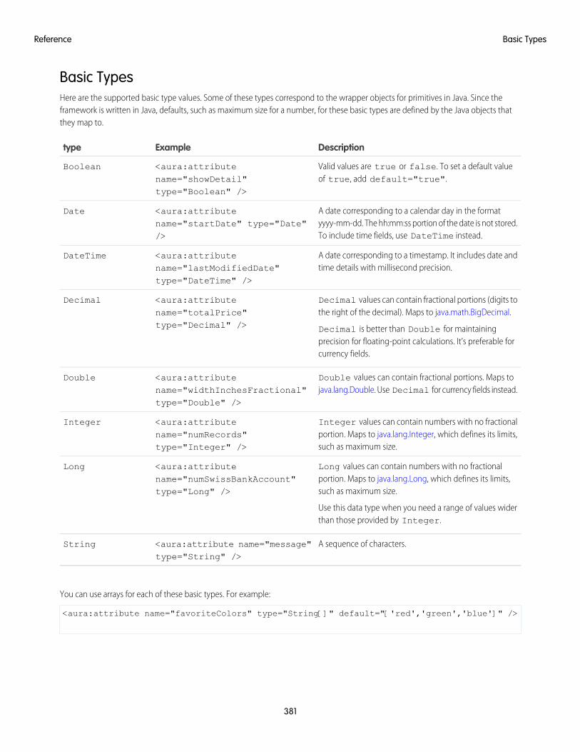
Basic TypesHere are the supported basic type values. Some of these types correspond to the wrapper objects for primitives in Java. Since theframework is written in Java, defaults, such as maximum size for a number, for these basic types are defined by the Java objects thatthey map to.
DescriptionExampletype
Valid values are true or false. To set a default valueof true, add default="true".
<aura:attributename="showDetail"type="Boolean" />
Boolean
A date corresponding to a calendar day in the formatyyyy-mm-dd. The hh:mm:ss portion of the date is not stored.To include time fields, use DateTime instead.
<aura:attributename="startDate" type="Date"/>
Date
A date corresponding to a timestamp. It includes date andtime details with millisecond precision.
<aura:attributename="lastModifiedDate"type="DateTime" />
DateTime
Decimal values can contain fractional portions (digits tothe right of the decimal). Maps to java.math.BigDecimal.
Decimal is better than Double for maintainingprecision for floating-point calculations. It’s preferable forcurrency fields.
<aura:attributename="totalPrice"type="Decimal" />
Decimal
Double values can contain fractional portions. Maps tojava.lang.Double. Use Decimal for currency fields instead.
<aura:attributename="widthInchesFractional"type="Double" />
Double
Integer values can contain numbers with no fractionalportion. Maps to java.lang.Integer, which defines its limits,such as maximum size.
<aura:attributename="numRecords"type="Integer" />
Integer
Long values can contain numbers with no fractionalportion. Maps to java.lang.Long, which defines its limits,such as maximum size.
Use this data type when you need a range of values widerthan those provided by Integer.
<aura:attributename="numSwissBankAccount"type="Long" />
Long
A sequence of characters.<aura:attribute name="message"type="String" />
String
You can use arrays for each of these basic types. For example:
<aura:attribute name="favoriteColors" type="String[]" default="['red','green','blue']" />
381
Basic TypesReference
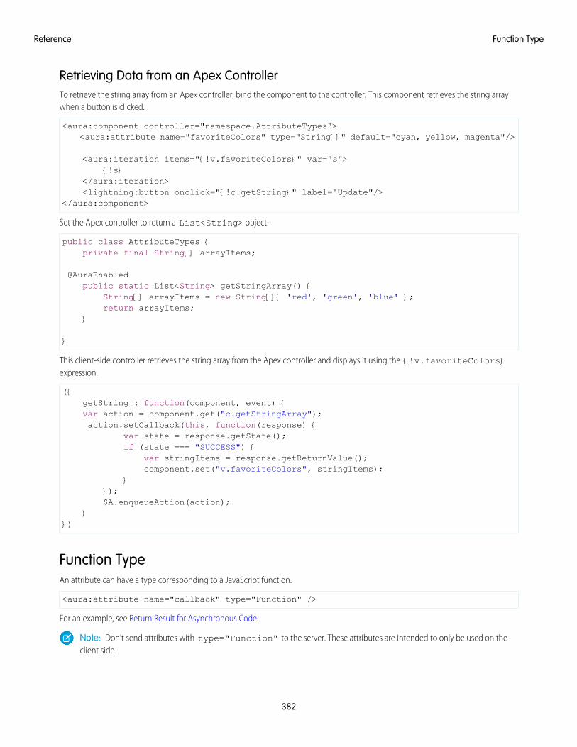
Retrieving Data from an Apex ControllerTo retrieve the string array from an Apex controller, bind the component to the controller. This component retrieves the string arraywhen a button is clicked.
<aura:component controller="namespace.AttributeTypes"><aura:attribute name="favoriteColors" type="String[]" default="cyan, yellow, magenta"/>
<aura:iteration items="{!v.favoriteColors}" var="s">{!s}
</aura:iteration><lightning:button onclick="{!c.getString}" label="Update"/>
</aura:component>
Set the Apex controller to return a List<String> object.
public class AttributeTypes {private final String[] arrayItems;
@AuraEnabledpublic static List<String> getStringArray() {
String[] arrayItems = new String[]{ 'red', 'green', 'blue' };return arrayItems;
}
}
This client-side controller retrieves the string array from the Apex controller and displays it using the {!v.favoriteColors}expression.
({getString : function(component, event) {var action = component.get("c.getStringArray");action.setCallback(this, function(response) {
var state = response.getState();if (state === "SUCCESS") {
var stringItems = response.getReturnValue();component.set("v.favoriteColors", stringItems);
}});$A.enqueueAction(action);
}})
Function TypeAn attribute can have a type corresponding to a JavaScript function.
<aura:attribute name="callback" type="Function" />
For an example, see Return Result for Asynchronous Code.
Note: Don’t send attributes with type="Function" to the server. These attributes are intended to only be used on theclient side.
382
Function TypeReference
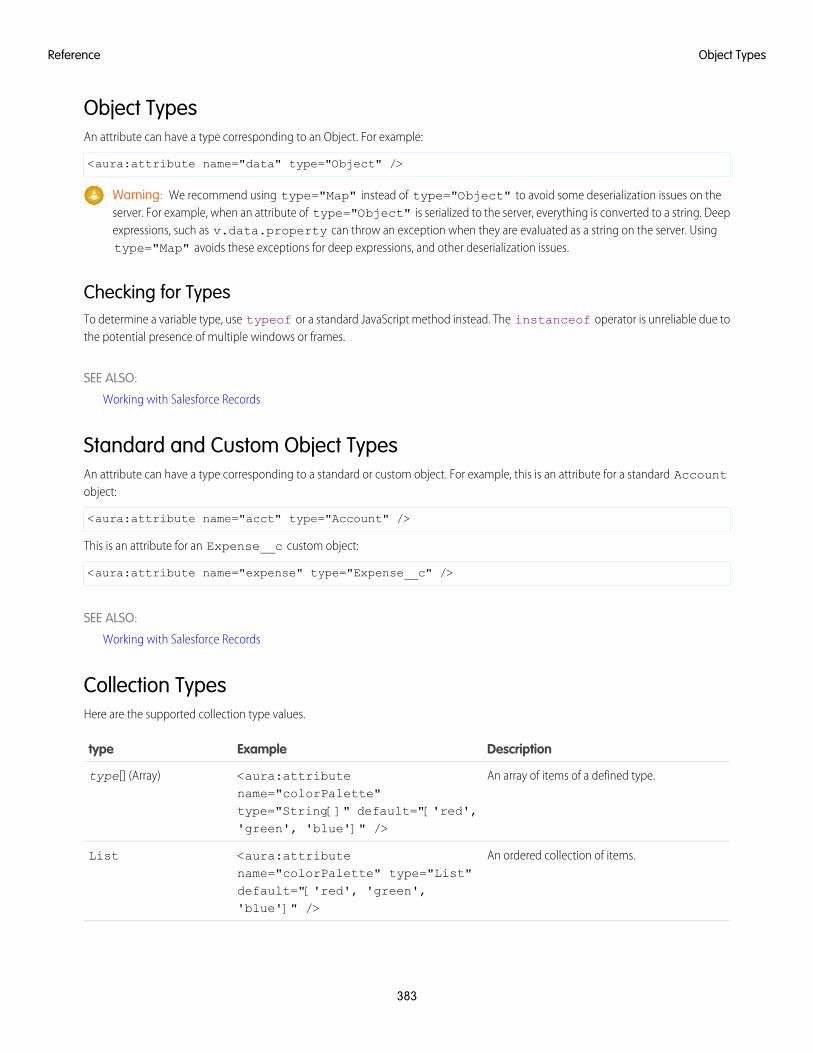
Object TypesAn attribute can have a type corresponding to an Object. For example:
<aura:attribute name="data" type="Object" />
Warning: We recommend using type="Map" instead of type="Object" to avoid some deserialization issues on theserver. For example, when an attribute of type="Object" is serialized to the server, everything is converted to a string. Deepexpressions, such as v.data.property can throw an exception when they are evaluated as a string on the server. Usingtype="Map" avoids these exceptions for deep expressions, and other deserialization issues.
Checking for TypesTo determine a variable type, use typeof or a standard JavaScript method instead. The instanceof operator is unreliable due tothe potential presence of multiple windows or frames.
SEE ALSO:
Working with Salesforce Records
Standard and Custom Object TypesAn attribute can have a type corresponding to a standard or custom object. For example, this is an attribute for a standard Accountobject:
<aura:attribute name="acct" type="Account" />
This is an attribute for an Expense__c custom object:
<aura:attribute name="expense" type="Expense__c" />
SEE ALSO:
Working with Salesforce Records
Collection TypesHere are the supported collection type values.
DescriptionExampletype
An array of items of a defined type.<aura:attributename="colorPalette"
type[] (Array)
type="String[]" default="['red','green', 'blue']" />
An ordered collection of items.<aura:attributename="colorPalette" type="List"
List
default="['red', 'green','blue']" />
383
Object TypesReference
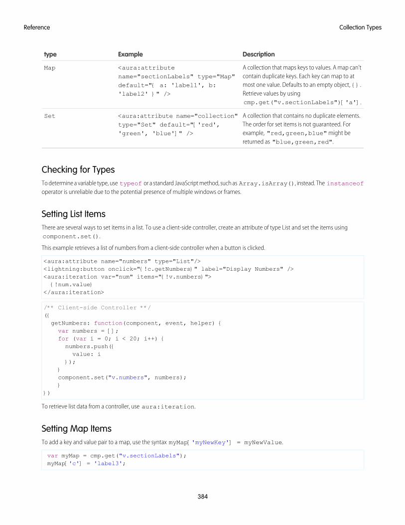
DescriptionExampletype
A collection that maps keys to values. A map can’tcontain duplicate keys. Each key can map to at
<aura:attributename="sectionLabels" type="Map"
Map
most one value. Defaults to an empty object, {}.default="{ a: 'label1', b:'label2' }" /> Retrieve values by using
cmp.get("v.sectionLabels")['a'].
A collection that contains no duplicate elements.The order for set items is not guaranteed. For
<aura:attribute name="collection"type="Set" default="['red','green', 'blue']" />
Set
example, "red,green,blue" might bereturned as "blue,green,red".
Checking for TypesTo determine a variable type, use typeof or a standard JavaScript method, such as Array.isArray(), instead. The instanceofoperator is unreliable due to the potential presence of multiple windows or frames.
Setting List ItemsThere are several ways to set items in a list. To use a client-side controller, create an attribute of type List and set the items usingcomponent.set().
This example retrieves a list of numbers from a client-side controller when a button is clicked.
<aura:attribute name="numbers" type="List"/><lightning:button onclick="{!c.getNumbers}" label="Display Numbers" /><aura:iteration var="num" items="{!v.numbers}">{!num.value}
</aura:iteration>
/** Client-side Controller **/({getNumbers: function(component, event, helper) {var numbers = [];for (var i = 0; i < 20; i++) {numbers.push({value: i
});}component.set("v.numbers", numbers);}
})
To retrieve list data from a controller, use aura:iteration.
Setting Map ItemsTo add a key and value pair to a map, use the syntax myMap['myNewKey'] = myNewValue.
var myMap = cmp.get("v.sectionLabels");myMap['c'] = 'label3';
384
Collection TypesReference
The following example retrieves data from a map.
for (var key in myMap){//do something
}
Custom Apex Class TypesAn attribute can have a type corresponding to an Apex class. For example, this is an attribute for a Color Apex class:
<aura:attribute name="color" type="docSampleNamespace.Color" />
When an instance of an Apex class is returned from a server-side action, the instance is serialized to JSON by the framework. Only thevalues of public instance properties and methods annotated with @AuraEnabled are serialized and returned.
Using ArraysIf an attribute can contain more than one element, use an array.
This aura:attribute tag shows the syntax for an array of Apex objects:
<aura:attribute name="colorPalette" type="docSampleNamespace.Color[]" />
SEE ALSO:
Returning Data from an Apex Server-Side Controller
AuraEnabled Annotation
Working with Salesforce Records
Framework-Specific TypesHere are the supported type values that are specific to the framework.
DescriptionExampletype
A single component. We recommend usingAura.Component[] instead.
N/AAura.Component
Use this type to set blocks of markup. Anattribute of type Aura.Component[]is called a facet.
<aura:attributename="detail"type="Aura.Component[]"/>
To set a default value fortype="Aura.Component[]", put
Aura.Component[]
the default markup in the body ofaura:attribute. For example:
<aura:component><aura:attribute
name="detail"type="Aura.Component[]">
<p>defaultparagraph1</p>
385
Custom Apex Class TypesReference
DescriptionExampletype
</aura:attribute>Default value is:
{!v.detail}</aura:component>
Use this type to pass an action to acomponent. See Using the Aura.ActionAttribute Type.
<aura:attributename="onclick"type="Aura.Action"/>
Aura.Action
SEE ALSO:
Component Body
Component Facets
Using the Aura.Action Attribute TypeAn Aura.Action is a reference to an action in the framework. If a child component has an Aura.Action attribute, a parentcomponent can pass in an action handler when it instantiates the child component in its markup. This pattern is a shortcut to pass acontroller action from a parent component to a child component that it contains, and is used for on* handlers, such as onclick.
Warning: Although Aura.Action works for passing an action handler to a child component, we recommend registering anevent in the child component and firing the event in the child’s controller instead. Then, handle the event in the parent component.The event approach requires a few extra steps in creating or choosing an event and firing it but events are the standard way tocommunicate between components.
Aura.Action shouldn’t be used for other use cases. Here are some known limitations of Aura.Action.
• Don’t use cmp.set() in JavaScript code to reset an attribute of type="Aura.Action" after it’s previously been set.Doing so generates an error.
Unable to set value for key 'c.passedAction'. Value provider does not implement'set(key, value)'. : false
• Don’t use $A.enqueueAction() in the child component to enqueue the action passed to the Aura.Action attribute.
ExampleThis example demonstrates how to pass an action handler from a parent component to a child component.
Here’s the child component with the Aura.Action attribute. The onclick handler for the button uses the value of the onclickattribute, which has type of Aura.Action.
<!-- child.cmp --><aura:component>
<aura:attribute name="onclick" type="Aura.Action"/>
<p>Child component with Aura.Action attribute</p><lightning:button label="Execute the passed action" onclick="{!v.onclick}"/>
</aura:component>
386
Framework-Specific TypesReference
Here’s the parent component that contains the child component in its markup.
<!-- parent.cmp --><aura:component>
<p>Parent component passes handler action to c:child</p><c:child onclick="{!c.parentAction}"/>
</aura:component>
When you click the button in c:child, the parentAction action in the controller of c:parent is executed.
Instead of an Aura.Action attribute, you could use <aura:registerEvent> to register an onclick event in the childcomponent. You’d have to define the event and create an action in the child’s controller to fire the event. This event-based approachrequires a few extra steps but it’s more in line with standard practices for communicating between components.
SEE ALSO:
Framework-Specific Types
Handling Events with Client-Side Controllers
aura:application
An app is a special top-level component whose markup is in a .app resource.
The markup looks similar to HTML and can contain components as well as a set of supported HTML tags. The .app resource is astandalone entry point for the app and enables you to define the overall application layout, style sheets, and global JavaScript includes.It starts with the top-level <aura:application> tag, which contains optional system attributes. These system attributes tell theframework how to configure the app.
DescriptionTypeSystem Attribute
Indicates whether the app can be extended by another app outside of a namespace.Possible values are public (default), and global.
Stringaccess
The server-side controller class for the app. The format isnamespace.myController.
Stringcontroller
A brief description of the app.Stringdescription
The app to be extended, if applicable. For example,extends="namespace:yourApp".
Componentextends
Indicates whether the app is extensible by another app. Defaults to false.Booleanextensible
A comma-separated list of interfaces that the app implements.Stringimplements
The name of the template used to bootstrap the loading of the framework andthe app. The default value is aura:template. You can customize the templateby creating your own component that extends the default template. For example:
<aura:component extends="aura:template" ... >
Componenttemplate
A comma-separated list of tokens bundles for the application. For example,tokens="ns:myAppTokens". Tokens make it easy to ensure that your
Stringtokens
design is consistent, and even easier to update it as your design evolves. Definethe token values once and reuse them throughout your application.
387
aura:applicationReference
DescriptionTypeSystem Attribute
Deprecated. Browser vendors have deprecated AppCache, so we followed theirlead. Remove the useAppcache attribute in the <aura:application>
BooleanuseAppcache
tag of your standalone apps (.app resources) to avoid cross-browser supportissues due to deprecation by browser vendors.
If you don’t currently set useAppcache in an <aura:application> tag,you don’t have to do anything because the default value of useAppcache isfalse.
aura:application also includes a body attribute defined in a <aura:attribute> tag. Attributes usually control the outputor behavior of a component, but not the configuration information in system attributes.
DescriptionTypeAttribute
The body of the app. In markup, this iseverything in the body of the tag.
Component[]body
SEE ALSO:
Creating Apps
Using the AppCache
Application Access Control
aura:component
The root of the component hierarchy. Provides a default rendering implementation.
Components are the functional units of Aura, which encapsulate modular and reusable sections of UI. They can contain other componentsor HTML markup. The public parts of a component are its attributes and events. Aura provides out-of-the-box components in the auraand ui namespaces.
Every component is part of a namespace. For example, the button component is saved as button.cmp in the ui namespacecan be referenced in another component with the syntax <ui:button label="Submit"/>, where label="Submit" isan attribute setting.
To create a component, follow this syntax.
<aura:component><!-- Optional coponent attributes here --><!-- Optional HTML markup --><div class="container">
Hello world!<!-- Other components -->
</div></aura:component>
A component has the following optional attributes.
388
aura:componentReference
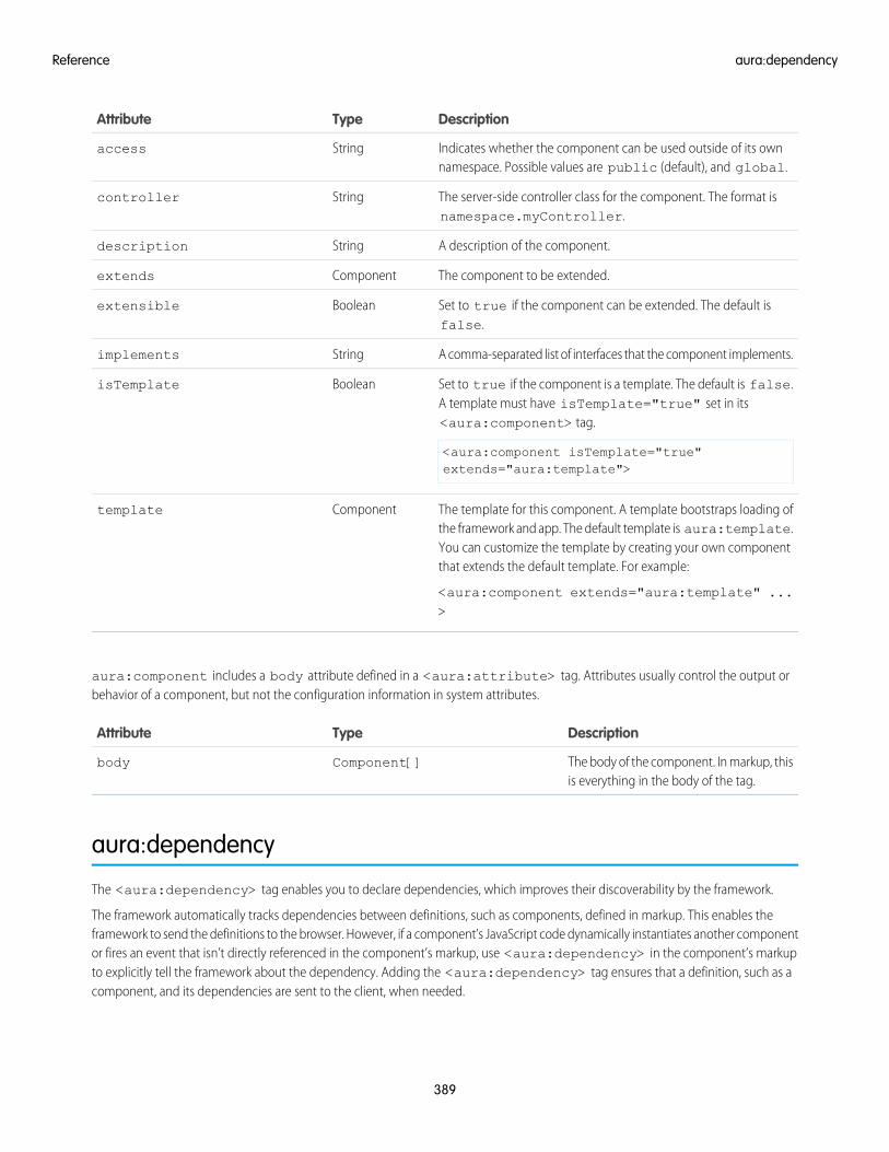
DescriptionTypeAttribute
Indicates whether the component can be used outside of its ownnamespace. Possible values are public (default), and global.
Stringaccess
The server-side controller class for the component. The format isnamespace.myController.
Stringcontroller
A description of the component.Stringdescription
The component to be extended.Componentextends
Set to true if the component can be extended. The default isfalse.
Booleanextensible
A comma-separated list of interfaces that the component implements.Stringimplements
Set to true if the component is a template. The default is false.A template must have isTemplate="true" set in its<aura:component> tag.
<aura:component isTemplate="true"extends="aura:template">
BooleanisTemplate
The template for this component. A template bootstraps loading ofthe framework and app. The default template is aura:template.
Componenttemplate
You can customize the template by creating your own componentthat extends the default template. For example:
<aura:component extends="aura:template" ...>
aura:component includes a body attribute defined in a <aura:attribute> tag. Attributes usually control the output orbehavior of a component, but not the configuration information in system attributes.
DescriptionTypeAttribute
The body of the component. In markup, thisis everything in the body of the tag.
Component[]body
aura:dependency
The <aura:dependency> tag enables you to declare dependencies, which improves their discoverability by the framework.
The framework automatically tracks dependencies between definitions, such as components, defined in markup. This enables theframework to send the definitions to the browser. However, if a component’s JavaScript code dynamically instantiates another componentor fires an event that isn’t directly referenced in the component’s markup, use <aura:dependency> in the component’s markupto explicitly tell the framework about the dependency. Adding the <aura:dependency> tag ensures that a definition, such as acomponent, and its dependencies are sent to the client, when needed.
389
aura:dependencyReference
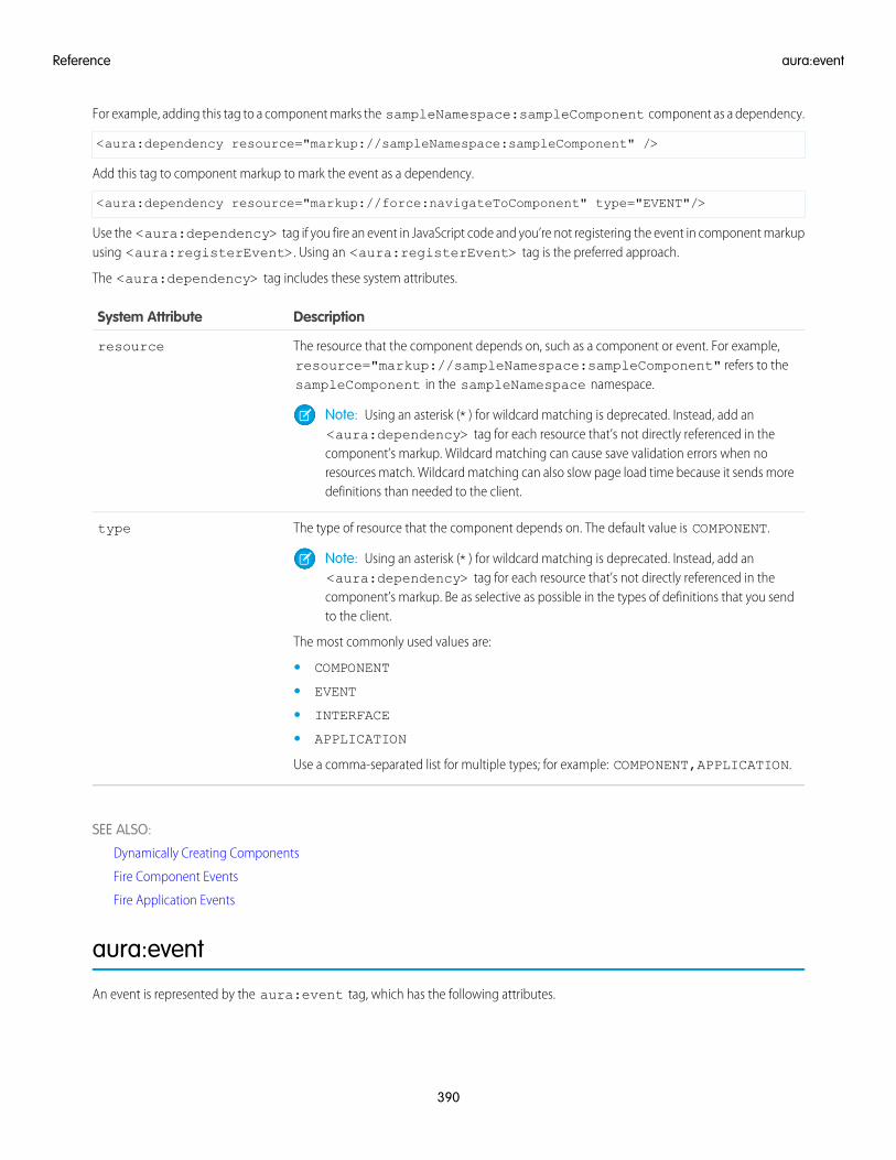
For example, adding this tag to a component marks the sampleNamespace:sampleComponent component as a dependency.
<aura:dependency resource="markup://sampleNamespace:sampleComponent" />
Add this tag to component markup to mark the event as a dependency.
<aura:dependency resource="markup://force:navigateToComponent" type="EVENT"/>
Use the <aura:dependency> tag if you fire an event in JavaScript code and you’re not registering the event in component markupusing <aura:registerEvent>. Using an <aura:registerEvent> tag is the preferred approach.
The <aura:dependency> tag includes these system attributes.
DescriptionSystem Attribute
The resource that the component depends on, such as a component or event. For example,resource="markup://sampleNamespace:sampleComponent" refers to thesampleComponent in the sampleNamespace namespace.
resource
Note: Using an asterisk (*) for wildcard matching is deprecated. Instead, add an<aura:dependency> tag for each resource that’s not directly referenced in thecomponent’s markup. Wildcard matching can cause save validation errors when noresources match. Wildcard matching can also slow page load time because it sends moredefinitions than needed to the client.
The type of resource that the component depends on. The default value is COMPONENT.type
Note: Using an asterisk (*) for wildcard matching is deprecated. Instead, add an<aura:dependency> tag for each resource that’s not directly referenced in thecomponent’s markup. Be as selective as possible in the types of definitions that you sendto the client.
The most commonly used values are:
• COMPONENT
• EVENT
• INTERFACE
• APPLICATION
Use a comma-separated list for multiple types; for example: COMPONENT,APPLICATION.
SEE ALSO:
Dynamically Creating Components
Fire Component Events
Fire Application Events
aura:event
An event is represented by the aura:event tag, which has the following attributes.
390
aura:eventReference
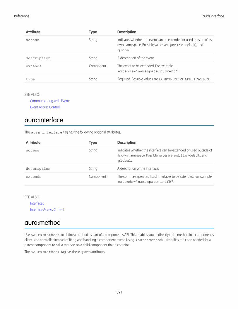
DescriptionTypeAttribute
Indicates whether the event can be extended or used outside of itsown namespace. Possible values are public (default), andglobal.
Stringaccess
A description of the event.Stringdescription
The event to be extended. For example,extends="namespace:myEvent".
Componentextends
Required. Possible values are COMPONENT or APPLICATION.Stringtype
SEE ALSO:
Communicating with Events
Event Access Control
aura:interface
The aura:interface tag has the following optional attributes.
DescriptionTypeAttribute
Indicates whether the interface can be extended or used outside ofits own namespace. Possible values are public (default), andglobal.
Stringaccess
A description of the interface.Stringdescription
The comma-seperated list of interfaces to be extended. For example,extends="namespace:intfB".
Componentextends
SEE ALSO:
Interfaces
Interface Access Control
aura:method
Use <aura:method> to define a method as part of a component's API. This enables you to directly call a method in a component’sclient-side controller instead of firing and handling a component event. Using <aura:method> simplifies the code needed for aparent component to call a method on a child component that it contains.
The <aura:method> tag has these system attributes.
391
aura:interfaceReference
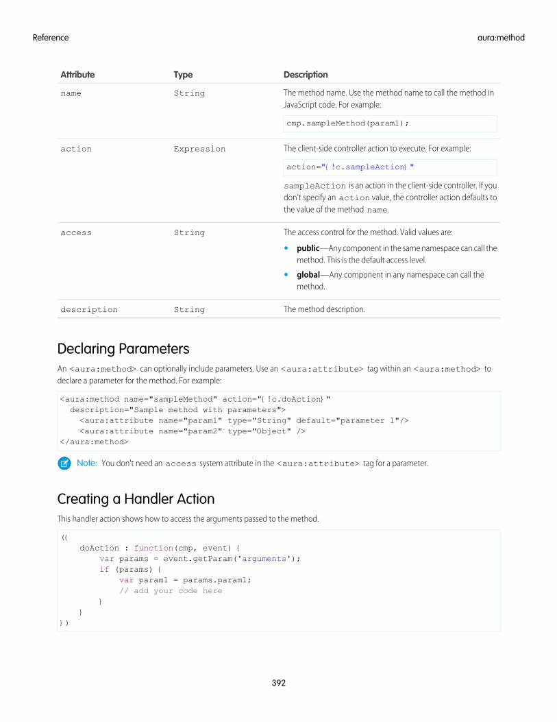
DescriptionTypeAttribute
The method name. Use the method name to call the method inJavaScript code. For example:
cmp.sampleMethod(param1);
Stringname
The client-side controller action to execute. For example:
action="{!c.sampleAction}"
Expressionaction
sampleAction is an action in the client-side controller. If youdon’t specify an action value, the controller action defaults tothe value of the method name.
The access control for the method. Valid values are:Stringaccess
• public—Any component in the same namespace can call themethod. This is the default access level.
• global—Any component in any namespace can call themethod.
The method description.Stringdescription
Declaring ParametersAn <aura:method> can optionally include parameters. Use an <aura:attribute> tag within an <aura:method> todeclare a parameter for the method. For example:
<aura:method name="sampleMethod" action="{!c.doAction}"description="Sample method with parameters"><aura:attribute name="param1" type="String" default="parameter 1"/><aura:attribute name="param2" type="Object" />
</aura:method>
Note: You don’t need an access system attribute in the <aura:attribute> tag for a parameter.
Creating a Handler ActionThis handler action shows how to access the arguments passed to the method.
({doAction : function(cmp, event) {
var params = event.getParam('arguments');if (params) {
var param1 = params.param1;// add your code here
}}
})
392
aura:methodReference
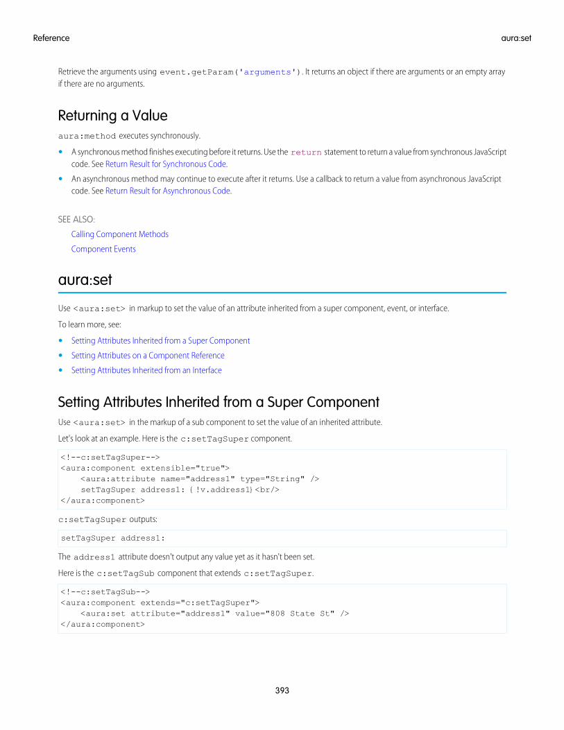
Retrieve the arguments using event.getParam('arguments'). It returns an object if there are arguments or an empty arrayif there are no arguments.
Returning a Valueaura:method executes synchronously.
• A synchronous method finishes executing before it returns. Use the return statement to return a value from synchronous JavaScriptcode. See Return Result for Synchronous Code.
• An asynchronous method may continue to execute after it returns. Use a callback to return a value from asynchronous JavaScriptcode. See Return Result for Asynchronous Code.
SEE ALSO:
Calling Component Methods
Component Events
aura:set
Use <aura:set> in markup to set the value of an attribute inherited from a super component, event, or interface.
To learn more, see:
• Setting Attributes Inherited from a Super Component
• Setting Attributes on a Component Reference
• Setting Attributes Inherited from an Interface
Setting Attributes Inherited from a Super ComponentUse <aura:set> in the markup of a sub component to set the value of an inherited attribute.
Let's look at an example. Here is the c:setTagSuper component.
<!--c:setTagSuper--><aura:component extensible="true">
<aura:attribute name="address1" type="String" />setTagSuper address1: {!v.address1}<br/>
</aura:component>
c:setTagSuper outputs:
setTagSuper address1:
The address1 attribute doesn't output any value yet as it hasn't been set.
Here is the c:setTagSub component that extends c:setTagSuper.
<!--c:setTagSub--><aura:component extends="c:setTagSuper">
<aura:set attribute="address1" value="808 State St" /></aura:component>
393
aura:setReference
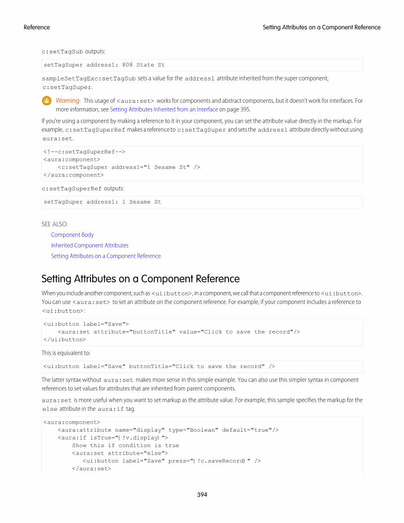
c:setTagSub outputs:
setTagSuper address1: 808 State St
sampleSetTagExc:setTagSub sets a value for the address1 attribute inherited from the super component,c:setTagSuper.
Warning: This usage of <aura:set> works for components and abstract components, but it doesn’t work for interfaces. Formore information, see Setting Attributes Inherited from an Interface on page 395.
If you’re using a component by making a reference to it in your component, you can set the attribute value directly in the markup. Forexample, c:setTagSuperRef makes a reference to c:setTagSuper and sets the address1 attribute directly without usingaura:set.
<!--c:setTagSuperRef--><aura:component>
<c:setTagSuper address1="1 Sesame St" /></aura:component>
c:setTagSuperRef outputs:
setTagSuper address1: 1 Sesame St
SEE ALSO:
Component Body
Inherited Component Attributes
Setting Attributes on a Component Reference
Setting Attributes on a Component ReferenceWhen you include another component, such as <ui:button>, in a component, we call that a component reference to <ui:button>.You can use <aura:set> to set an attribute on the component reference. For example, if your component includes a reference to<ui:button>:
<ui:button label="Save"><aura:set attribute="buttonTitle" value="Click to save the record"/>
</ui:button>
This is equivalent to:
<ui:button label="Save" buttonTitle="Click to save the record" />
The latter syntax without aura:set makes more sense in this simple example. You can also use this simpler syntax in componentreferences to set values for attributes that are inherited from parent components.
aura:set is more useful when you want to set markup as the attribute value. For example, this sample specifies the markup for theelse attribute in the aura:if tag.
<aura:component><aura:attribute name="display" type="Boolean" default="true"/><aura:if isTrue="{!v.display}">
Show this if condition is true<aura:set attribute="else">
<ui:button label="Save" press="{!c.saveRecord}" /></aura:set>
394
Setting Attributes on a Component ReferenceReference
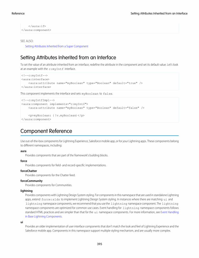
</aura:if></aura:component>
SEE ALSO:
Setting Attributes Inherited from a Super Component
Setting Attributes Inherited from an InterfaceTo set the value of an attribute inherited from an interface, redefine the attribute in the component and set its default value. Let’s lookat an example with the c:myIntf interface.
<!--c:myIntf--><aura:interface>
<aura:attribute name="myBoolean" type="Boolean" default="true" /></aura:interface>
This component implements the interface and sets myBoolean to false.
<!--c:myIntfImpl--><aura:component implements="c:myIntf">
<aura:attribute name="myBoolean" type="Boolean" default="false" />
<p>myBoolean: {!v.myBoolean}</p></aura:component>
Component Reference
Use out-of-the-box components for Lightning Experience, Salesforce mobile app, or for your Lightning apps. These components belongto different namespaces, including:
auraProvides components that are part of the framework’s building blocks.
forceProvides components for field- and record-specific implementations.
forceChatterProvides components for the Chatter feed.
forceCommunityProvides components for Communities.
lightningProvides components with Lightning Design System styling. For components in this namespace that are used in standalone Lightningapps, extend force:slds to implement Lightning Design System styling. In instances where there are matching ui andlightning namespace components, we recommend that you use the lightning namespace component. The lightningnamespace components are optimized for common use cases. Event handling for lightning namespace components followsstandard HTML practices and are simpler than that for the ui namespace components. For more information, see Event Handlingin Base Lightning Components.
uiProvides an older implementation of user interface components that don’t match the look and feel of Lightning Experience and theSalesforce mobile app. Components in this namespace support multiple styling mechanism, and are usually more complex.
395
Setting Attributes Inherited from an InterfaceReference
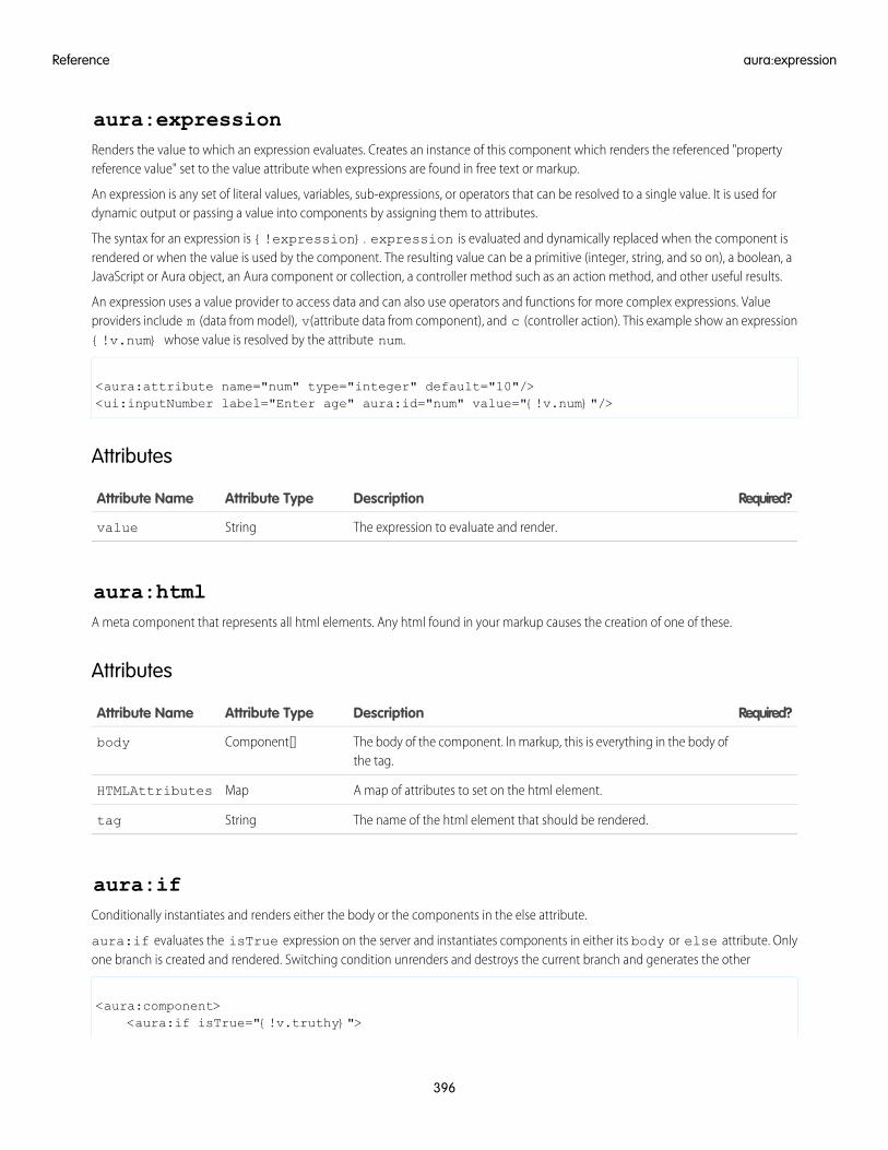
aura:expressionRenders the value to which an expression evaluates. Creates an instance of this component which renders the referenced "propertyreference value" set to the value attribute when expressions are found in free text or markup.
An expression is any set of literal values, variables, sub-expressions, or operators that can be resolved to a single value. It is used fordynamic output or passing a value into components by assigning them to attributes.
The syntax for an expression is {!expression}. expression is evaluated and dynamically replaced when the component isrendered or when the value is used by the component. The resulting value can be a primitive (integer, string, and so on), a boolean, aJavaScript or Aura object, an Aura component or collection, a controller method such as an action method, and other useful results.
An expression uses a value provider to access data and can also use operators and functions for more complex expressions. Valueproviders include m (data from model), v(attribute data from component), and c (controller action). This example show an expression{!v.num} whose value is resolved by the attribute num.
<aura:attribute name="num" type="integer" default="10"/><ui:inputNumber label="Enter age" aura:id="num" value="{!v.num}"/>
Attributes
Required?DescriptionAttribute TypeAttribute Name
The expression to evaluate and render.Stringvalue
aura:htmlA meta component that represents all html elements. Any html found in your markup causes the creation of one of these.
Attributes
Required?DescriptionAttribute TypeAttribute Name
The body of the component. In markup, this is everything in the body ofthe tag.
Component[]body
A map of attributes to set on the html element.MapHTMLAttributes
The name of the html element that should be rendered.Stringtag
aura:ifConditionally instantiates and renders either the body or the components in the else attribute.
aura:if evaluates the isTrue expression on the server and instantiates components in either its body or else attribute. Onlyone branch is created and rendered. Switching condition unrenders and destroys the current branch and generates the other
<aura:component><aura:if isTrue="{!v.truthy}">
396
aura:expressionReference
True<aura:set attribute="else">False
</aura:set></aura:if>
</aura:component>
Attributes
Required?DescriptionAttribute TypeAttribute Name
YesThe components to render when isTrue evaluates to true.ComponentDefRef[]body
The alternative to render when isTrue evaluates to false, and the body isnot rendered. Should always be set using the aura:set tag.
ComponentDefRef[]else
YesAn expression that must be fulfilled in order to display the body.BooleanisTrue
aura:iterationRenders a view of a collection of items. Supports iterations containing components that can be created exclusively on the client-side.
aura:iteration iterates over a collection of items and renders the body of the tag for each item. Data changes in the collectionare rerendered automatically on the page. It also supports iterations containing components that are created exclusively on the client-sideor components that have server-side dependencies.
This example shows a basic way to use aura:iteration exclusively on the client-side.
<aura:component>
<aura:iteration items="1,2,3,4,5" var="item"><meter value="{!item / 5}"/><br/>
</aura:iteration>
</aura:component>
Attributes
Required?DescriptionAttribute TypeAttribute Name
YesTemplate to use when creating components for each iteration.ComponentDefRef[]body
The index of the collection to stop at (exclusive)Integerend
The name of variable to use for the index of each item inside the iterationStringindexVar
YesThe collection of data to iterate overListitems
True if the iteration has finished loading the set of templates.Booleanloaded
The index of the collection to start at (inclusive)Integerstart
397
aura:iterationReference
Required?DescriptionAttribute TypeAttribute Name
The template that is used to generate components. By default, this is setfrom the body markup on first load.
ComponentDefRef[]template
YesThe name of the variable to use for each item inside the iterationStringvar
aura:renderIfDeprecated. Use aura:if instead. This component allows you to conditionally render its contents. It renders its body only if isTrue evaluatesto true. The else attribute allows you to render an alternative when isTrue evaluates to false.
The expression in isTrue is re-evaluated every time any value used in the expression changes. When the results of the expressionchange, it triggers a re-rendering of the component. Use aura:renderIf if you expect to show the components for both the trueand false states, and it would require a server round trip to instantiate the components that aren't initially rendered. Switching conditionunrenders current branch and renders the other. Otherwise, use aura:if instead if you want to instantiate the components in eitherits body or the else attribute, but not both.
<aura:component><aura:renderIf isTrue="{!v.truthy}">True<aura:set attribute="else">False
</aura:set></aura:renderIf>
</aura:component>
Attributes
Required?DescriptionAttribute TypeAttribute Name
The body of the component. In markup, this is everything in the body ofthe tag.
Component[]body
The alternative content to render when isTrue evaluates to false, and thebody is not rendered. Set using the <aura:set> tag.
Component[]else
YesAn expression that must evaluate to true to display the body of thecomponent.
BooleanisTrue
aura:templateDefault template used to bootstrap Aura framework. To use another template, extend aura:template and set attributes using aura:set.
Attributes
Required?DescriptionAttribute TypeAttribute Name
The block of content that is rendered before Aura initialization.Component[]auraPreInitBlock
398
aura:renderIfReference
Required?DescriptionAttribute TypeAttribute Name
The body of the component. In markup, this is everything in the body ofthe tag.
Component[]body
Extra body CSS stylesStringbodyClass
Default body CSS styles.StringdefaultBodyClass
The DOCTYPE declaration for the template.Stringdoctype
Error loading textStringerrorMessage
Error title when an error has occured.StringerrorTitle
Loading textStringloadingText
The title of the template.Stringtitle
aura:textRenders plain text. When any free text (not a tag or attribute value) is found in markup, an instance of this component is created withthe value attribute set to the text found in the markup.
Attributes
Required?DescriptionAttribute TypeAttribute Name
The String to be rendered.Stringvalue
aura:unescapedHtmlThe value assigned to this component will be rendered as-is, without altering its contents. It's intended for outputting pre-formattedHTML, for example, where the formatting is arbitrary, or expensive to calculate. The body of this component is ignored, and won't berendered. Warning: this component outputs value as unescaped HTML, which introduces the possibility of security vulnerabilities inyour code. You must sanitize user input before rendering it unescaped, or you will create a cross-site scripting (XSS) vulnerability. Onlyuse <aura:unescapedHtml> with trusted or sanitized sources of data.
Attributes
Required?DescriptionAttribute TypeAttribute Name
The body of <aura:unescapedHtml> is ignored and won't be rendered.Component[]body
The string that should be rendered as unescaped HTML.Stringvalue
auraStorage:initInitializes a storage instance using an adapter that satisfies the provided criteria.
399
aura:textReference
Use auraStorage:init to initialize storage in your app’s template for caching server-side action response values.
This example uses a template to initialize storage for server-side action response values. The template contains an auraStorage:inittag that specifies storage initialization properties.
<aura:component isTemplate="true" extends="aura:template"><aura:set attribute="auraPreInitBlock">
<!-- Note that the maxSize attribute in auraStorage:init is in KB --><auraStorage:init name="actions" persistent="false" secure="false"
maxSize="1024" /></aura:set>
</aura:component>
When you initialize storage, you can set certain options, such as the name, maximum cache size, and the default expiration time.
Storage for server-side actions caches action response values. The storage name must be actions.
Attributes
Required?DescriptionAttribute TypeAttribute Name
The body of the component. In markup, this is everything in the body ofthe tag.
Component[]body
Set to true to delete all previous data on initialization (relevant forpersistent storage only). This value defaults to true.
BooleanclearStorageOnInit
Set to true to enable debug logging with $A.log(). This value defaults tofalse.
BooleandebugLoggingEnabled
The default duration (seconds) before an auto refresh request will beinitiated. Actions may override this on a per-entry basis withAction.setStorable(). This value defaults to 30.
IntegerdefaultAutoRefreshInterval
The default duration (seconds) that an object will be retained in storage.Actions may override this on a per-entry basis with Action.setStorable().This value defaults to 10.
IntegerdefaultExpiration
Maximum size (KB) of the storage instance. Existing items will be evictedto make room for new items; algorithm is adapter-specific. This valuedefaults to 1000.
IntegermaxSize
YesThe programmatic name for the storage instance.Stringname
Set to true if this storage desires persistence. This value defaults to false.Booleanpersistent
Set to true if this storage requires secure storage support. This valuedefaults to false.
Booleansecure
Version to associate with all stored items.Stringversion
400
auraStorage:initReference
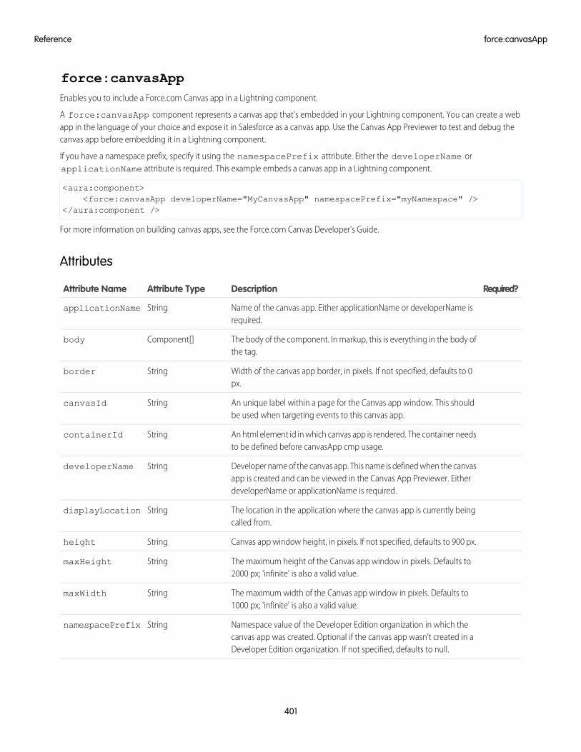
force:canvasAppEnables you to include a Force.com Canvas app in a Lightning component.
A force:canvasApp component represents a canvas app that's embedded in your Lightning component. You can create a webapp in the language of your choice and expose it in Salesforce as a canvas app. Use the Canvas App Previewer to test and debug thecanvas app before embedding it in a Lightning component.
If you have a namespace prefix, specify it using the namespacePrefix attribute. Either the developerName orapplicationName attribute is required. This example embeds a canvas app in a Lightning component.
<aura:component><force:canvasApp developerName="MyCanvasApp" namespacePrefix="myNamespace" />
</aura:component />
For more information on building canvas apps, see the Force.com Canvas Developer's Guide.
Attributes
Required?DescriptionAttribute TypeAttribute Name
Name of the canvas app. Either applicationName or developerName isrequired.
StringapplicationName
The body of the component. In markup, this is everything in the body ofthe tag.
Component[]body
Width of the canvas app border, in pixels. If not specified, defaults to 0px.
Stringborder
An unique label within a page for the Canvas app window. This shouldbe used when targeting events to this canvas app.
StringcanvasId
An html element id in which canvas app is rendered. The container needsto be defined before canvasApp cmp usage.
StringcontainerId
Developer name of the canvas app. This name is defined when the canvasapp is created and can be viewed in the Canvas App Previewer. EitherdeveloperName or applicationName is required.
StringdeveloperName
The location in the application where the canvas app is currently beingcalled from.
StringdisplayLocation
Canvas app window height, in pixels. If not specified, defaults to 900 px.Stringheight
The maximum height of the Canvas app window in pixels. Defaults to2000 px; 'infinite' is also a valid value.
StringmaxHeight
The maximum width of the Canvas app window in pixels. Defaults to1000 px; 'infinite' is also a valid value.
StringmaxWidth
Namespace value of the Developer Edition organization in which thecanvas app was created. Optional if the canvas app wasn’t created in aDeveloper Edition organization. If not specified, defaults to null.
StringnamespacePrefix
401
force:canvasAppReference
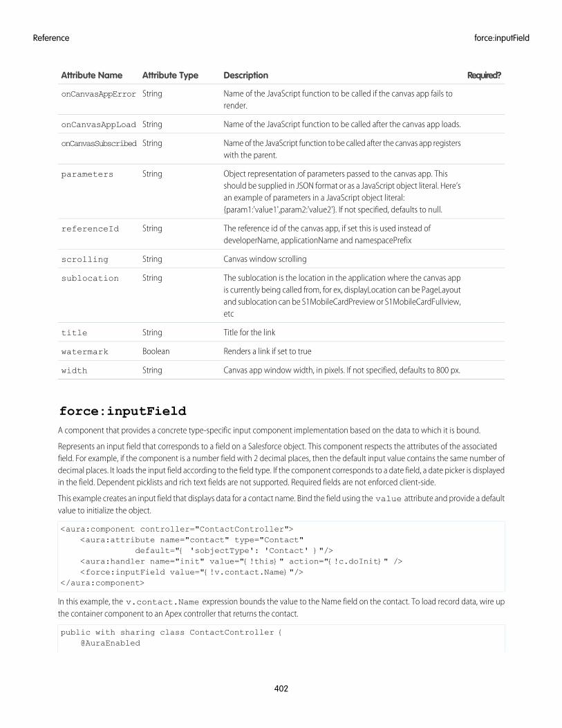
Required?DescriptionAttribute TypeAttribute Name
Name of the JavaScript function to be called if the canvas app fails torender.
StringonCanvasAppError
Name of the JavaScript function to be called after the canvas app loads.StringonCanvasAppLoad
Name of the JavaScript function to be called after the canvas app registerswith the parent.
StringonCanvasSubscribed
Object representation of parameters passed to the canvas app. Thisshould be supplied in JSON format or as a JavaScript object literal. Here’s
Stringparameters
an example of parameters in a JavaScript object literal:{param1:'value1',param2:'value2'}. If not specified, defaults to null.
The reference id of the canvas app, if set this is used instead ofdeveloperName, applicationName and namespacePrefix
StringreferenceId
Canvas window scrollingStringscrolling
The sublocation is the location in the application where the canvas appis currently being called from, for ex, displayLocation can be PageLayout
Stringsublocation
and sublocation can be S1MobileCardPreview or S1MobileCardFullview,etc
Title for the linkStringtitle
Renders a link if set to trueBooleanwatermark
Canvas app window width, in pixels. If not specified, defaults to 800 px.Stringwidth
force:inputFieldA component that provides a concrete type-specific input component implementation based on the data to which it is bound.
Represents an input field that corresponds to a field on a Salesforce object. This component respects the attributes of the associatedfield. For example, if the component is a number field with 2 decimal places, then the default input value contains the same number ofdecimal places. It loads the input field according to the field type. If the component corresponds to a date field, a date picker is displayedin the field. Dependent picklists and rich text fields are not supported. Required fields are not enforced client-side.
This example creates an input field that displays data for a contact name. Bind the field using the value attribute and provide a defaultvalue to initialize the object.
<aura:component controller="ContactController"><aura:attribute name="contact" type="Contact"
default="{ 'sobjectType': 'Contact' }"/><aura:handler name="init" value="{!this}" action="{!c.doInit}" /><force:inputField value="{!v.contact.Name}"/>
</aura:component>
In this example, the v.contact.Name expression bounds the value to the Name field on the contact. To load record data, wire upthe container component to an Apex controller that returns the contact.
public with sharing class ContactController {@AuraEnabled
402
force:inputFieldReference
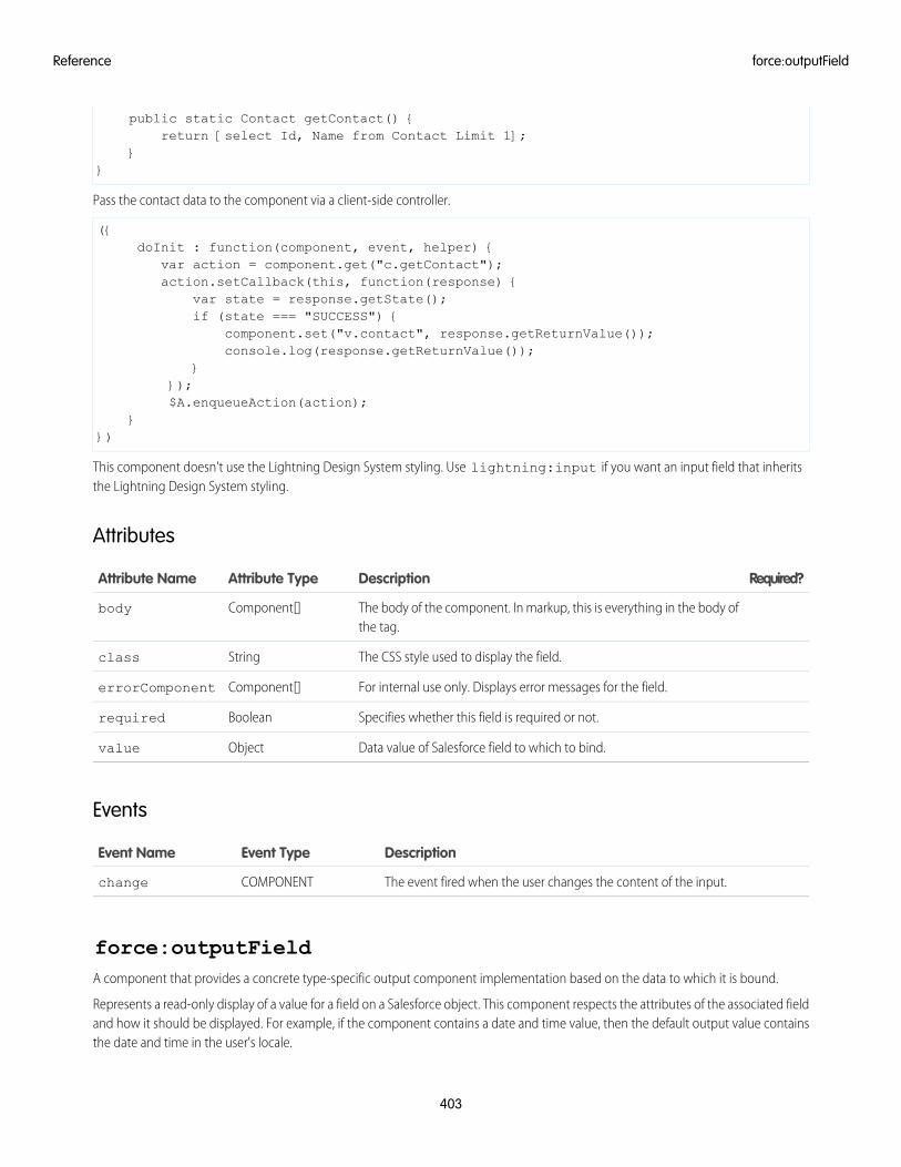
public static Contact getContact() {return [select Id, Name from Contact Limit 1];
}}
Pass the contact data to the component via a client-side controller.
({doInit : function(component, event, helper) {
var action = component.get("c.getContact");action.setCallback(this, function(response) {
var state = response.getState();if (state === "SUCCESS") {
component.set("v.contact", response.getReturnValue());console.log(response.getReturnValue());
}});$A.enqueueAction(action);
}})
This component doesn't use the Lightning Design System styling. Use lightning:input if you want an input field that inheritsthe Lightning Design System styling.
Attributes
Required?DescriptionAttribute TypeAttribute Name
The body of the component. In markup, this is everything in the body ofthe tag.
Component[]body
The CSS style used to display the field.Stringclass
For internal use only. Displays error messages for the field.Component[]errorComponent
Specifies whether this field is required or not.Booleanrequired
Data value of Salesforce field to which to bind.Objectvalue
Events
DescriptionEvent TypeEvent Name
The event fired when the user changes the content of the input.COMPONENTchange
force:outputFieldA component that provides a concrete type-specific output component implementation based on the data to which it is bound.
Represents a read-only display of a value for a field on a Salesforce object. This component respects the attributes of the associated fieldand how it should be displayed. For example, if the component contains a date and time value, then the default output value containsthe date and time in the user's locale.
403
force:outputFieldReference
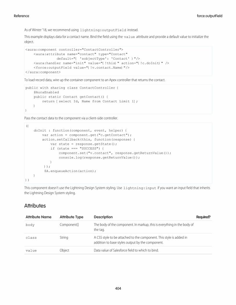
As of Winter '18, we recommend using lightning:outputField instead.
This example displays data for a contact name. Bind the field using the value attribute and provide a default value to initialize theobject.
<aura:component controller="ContactController"><aura:attribute name="contact" type="Contact"
default="{ 'sobjectType': 'Contact' }"/><aura:handler name="init" value="{!this}" action="{!c.doInit}" /><force:outputField value="{!v.contact.Name}"/>
</aura:component>
To load record data, wire up the container component to an Apex controller that returns the contact.
public with sharing class ContactController {@AuraEnabledpublic static Contact getContact() {
return [select Id, Name from Contact Limit 1];}
}
Pass the contact data to the component via a client-side controller.
({doInit : function(component, event, helper) {
var action = component.get("c.getContact");action.setCallback(this, function(response) {
var state = response.getState();if (state === "SUCCESS") {
component.set("v.contact", response.getReturnValue());console.log(response.getReturnValue());
}});$A.enqueueAction(action);
}})
This component doesn't use the Lightning Design System styling. Use lightning:input if you want an input field that inheritsthe Lightning Design System styling.
Attributes
Required?DescriptionAttribute TypeAttribute Name
The body of the component. In markup, this is everything in the body ofthe tag.
Component[]body
A CSS style to be attached to the component. This style is added inaddition to base styles output by the component.
Stringclass
Data value of Salesforce field to which to bind.Objectvalue
404
force:outputFieldReference
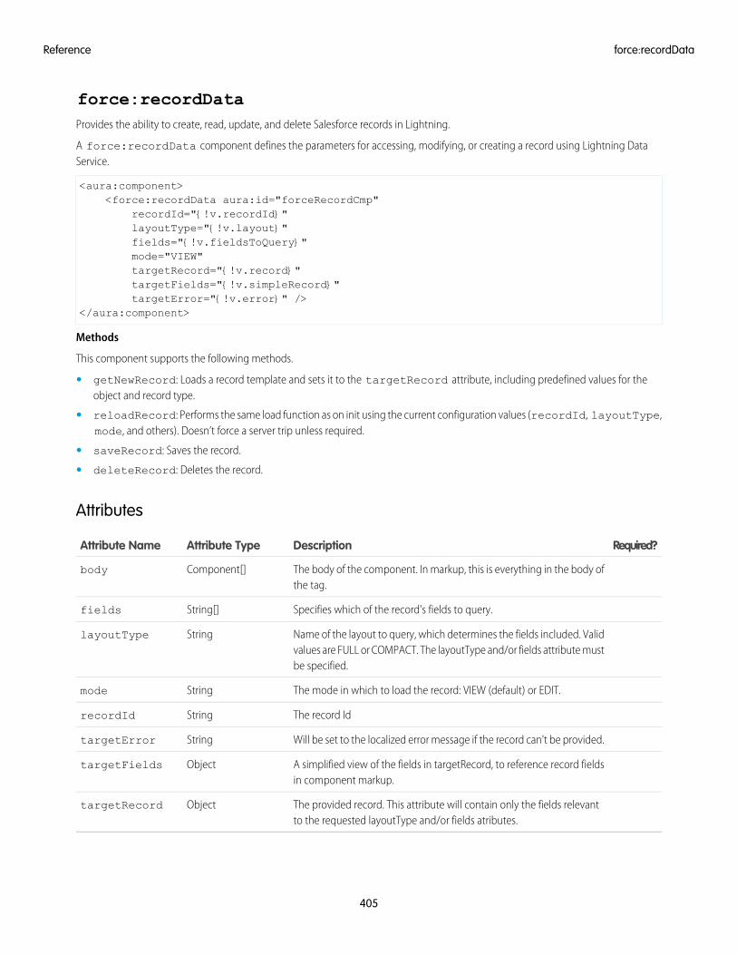
force:recordDataProvides the ability to create, read, update, and delete Salesforce records in Lightning.
A force:recordData component defines the parameters for accessing, modifying, or creating a record using Lightning DataService.
<aura:component><force:recordData aura:id="forceRecordCmp"
recordId="{!v.recordId}"layoutType="{!v.layout}"fields="{!v.fieldsToQuery}"mode="VIEW"targetRecord="{!v.record}"targetFields="{!v.simpleRecord}"targetError="{!v.error}" />
</aura:component>
Methods
This component supports the following methods.
• getNewRecord: Loads a record template and sets it to the targetRecord attribute, including predefined values for theobject and record type.
• reloadRecord: Performs the same load function as on init using the current configuration values (recordId, layoutType,mode, and others). Doesn’t force a server trip unless required.
• saveRecord: Saves the record.
• deleteRecord: Deletes the record.
Attributes
Required?DescriptionAttribute TypeAttribute Name
The body of the component. In markup, this is everything in the body ofthe tag.
Component[]body
Specifies which of the record's fields to query.String[]fields
Name of the layout to query, which determines the fields included. Validvalues are FULL or COMPACT. The layoutType and/or fields attribute mustbe specified.
StringlayoutType
The mode in which to load the record: VIEW (default) or EDIT.Stringmode
The record IdStringrecordId
Will be set to the localized error message if the record can't be provided.StringtargetError
A simplified view of the fields in targetRecord, to reference record fieldsin component markup.
ObjecttargetFields
The provided record. This attribute will contain only the fields relevantto the requested layoutType and/or fields atributes.
ObjecttargetRecord
405
force:recordDataReference
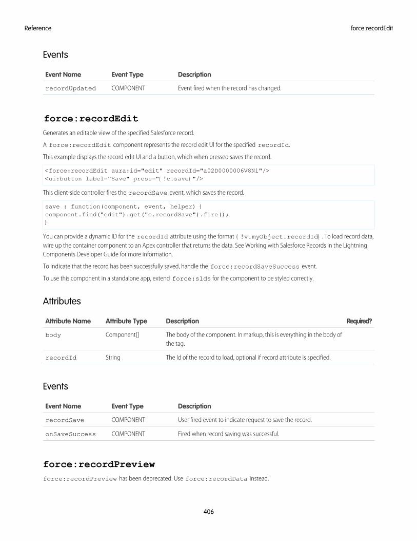
Events
DescriptionEvent TypeEvent Name
Event fired when the record has changed.COMPONENTrecordUpdated
force:recordEditGenerates an editable view of the specified Salesforce record.
A force:recordEdit component represents the record edit UI for the specified recordId.
This example displays the record edit UI and a button, which when pressed saves the record.
<force:recordEdit aura:id="edit" recordId="a02D0000006V8Ni"/><ui:button label="Save" press="{!c.save}"/>
This client-side controller fires the recordSave event, which saves the record.
save : function(component, event, helper) {component.find("edit").get("e.recordSave").fire();}
You can provide a dynamic ID for the recordId attribute using the format {!v.myObject.recordId}. To load record data,wire up the container component to an Apex controller that returns the data. See Working with Salesforce Records in the LightningComponents Developer Guide for more information.
To indicate that the record has been successfully saved, handle the force:recordSaveSuccess event.
To use this component in a standalone app, extend force:slds for the component to be styled correctly.
Attributes
Required?DescriptionAttribute TypeAttribute Name
The body of the component. In markup, this is everything in the body ofthe tag.
Component[]body
The Id of the record to load, optional if record attribute is specified.StringrecordId
Events
DescriptionEvent TypeEvent Name
User fired event to indicate request to save the record.COMPONENTrecordSave
Fired when record saving was successful.COMPONENTonSaveSuccess
force:recordPreviewforce:recordPreview has been deprecated. Use force:recordData instead.
406
force:recordEditReference
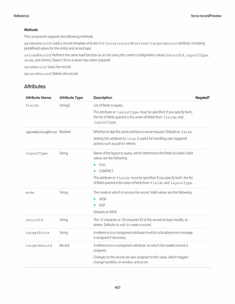
Methods
This component supports the following methods.
getNewRecord: Loads a record template and sets it to force:recordPreview’s targetRecord attribute, includingpredefined values for the entity and record type.
reloadRecord: Performs the same load function as on init using the current configuration values (recordId, layoutType,mode, and others). Doesn’t force a server trip unless required.
saveRecord: Saves the record.
deleteRecord: Deletes the record.
Attributes
Required?DescriptionAttribute TypeAttribute Name
List of fields to query.
This attribute or layoutType must be specified. If you specify both,the list of fields queried is the union of fields from fields andlayoutType.
String[]fields
Whether to skip the cache and force a server request. Defaults to false.
Setting this attribute to true is useful for handling user-triggeredactions such as pull-to-refresh.
BooleanignoreExistingAction
Name of the layout to query, which determines the fields included. Validvalues are the following.
StringlayoutType
• FULL
• COMPACT
This attribute or fields must be specified. If you specify both, the listof fields queried is the union of fields from fields and layoutType.
The mode in which to access the record. Valid values are the following.Stringmode
• VIEW
• EDIT
Defaults to VIEW.
The 15-character or 18-character ID of the record to load, modify, ordelete. Defaults to null, to create a record.
StringrecordId
A reference to a component attribute to which a localized error messageis assigned if necessary.
StringtargetError
A reference to a component attribute, to which the loaded record isassigned.
Changes to the record are also assigned to this value, which triggerschange handlers, re-renders, and so on.
RecordtargetRecord
407
force:recordPreviewReference
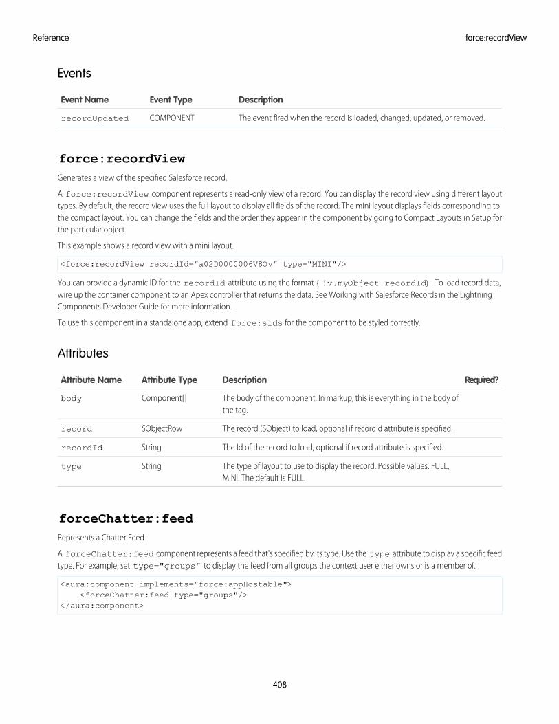
Events
DescriptionEvent TypeEvent Name
The event fired when the record is loaded, changed, updated, or removed.COMPONENTrecordUpdated
force:recordViewGenerates a view of the specified Salesforce record.
A force:recordView component represents a read-only view of a record. You can display the record view using different layouttypes. By default, the record view uses the full layout to display all fields of the record. The mini layout displays fields corresponding tothe compact layout. You can change the fields and the order they appear in the component by going to Compact Layouts in Setup forthe particular object.
This example shows a record view with a mini layout.
<force:recordView recordId="a02D0000006V8Ov" type="MINI"/>
You can provide a dynamic ID for the recordId attribute using the format {!v.myObject.recordId}. To load record data,wire up the container component to an Apex controller that returns the data. See Working with Salesforce Records in the LightningComponents Developer Guide for more information.
To use this component in a standalone app, extend force:slds for the component to be styled correctly.
Attributes
Required?DescriptionAttribute TypeAttribute Name
The body of the component. In markup, this is everything in the body ofthe tag.
Component[]body
The record (SObject) to load, optional if recordId attribute is specified.SObjectRowrecord
The Id of the record to load, optional if record attribute is specified.StringrecordId
The type of layout to use to display the record. Possible values: FULL,MINI. The default is FULL.
Stringtype
forceChatter:feedRepresents a Chatter Feed
A forceChatter:feed component represents a feed that's specified by its type. Use the type attribute to display a specific feedtype. For example, set type="groups" to display the feed from all groups the context user either owns or is a member of.
<aura:component implements="force:appHostable"><forceChatter:feed type="groups"/>
</aura:component>
408
force:recordViewReference
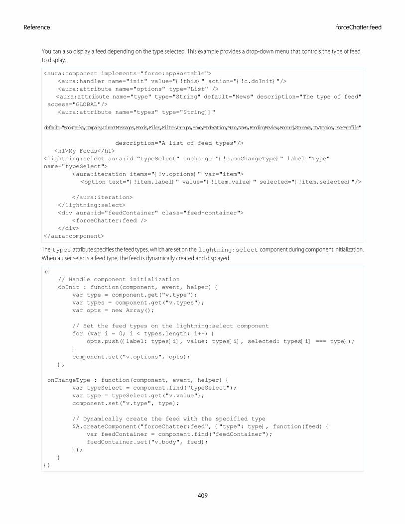
You can also display a feed depending on the type selected. This example provides a drop-down menu that controls the type of feedto display.
<aura:component implements="force:appHostable"><aura:handler name="init" value="{!this}" action="{!c.doInit}"/><aura:attribute name="options" type="List" /><aura:attribute name="type" type="String" default="News" description="The type of feed"
access="GLOBAL"/><aura:attribute name="types" type="String[]"
default="Bookmarks,Company,DirectMessages,Feeds,Files,Filter,Groups,Home,Moderation,Mute,News,PendingReview,Record,Streams,To,Topics,UserProfile"
description="A list of feed types"/><h1>My Feeds</h1>
<lightning:select aura:id="typeSelect" onchange="{!c.onChangeType}" label="Type"name="typeSelect">
<aura:iteration items="{!v.options}" var="item"><option text="{!item.label}" value="{!item.value}" selected="{!item.selected}"/>
</aura:iteration></lightning:select><div aura:id="feedContainer" class="feed-container">
<forceChatter:feed /></div>
</aura:component>
The types attribute specifies the feed types, which are set on the lightning:select component during component initialization.When a user selects a feed type, the feed is dynamically created and displayed.
({// Handle component initializationdoInit : function(component, event, helper) {
var type = component.get("v.type");var types = component.get("v.types");var opts = new Array();
// Set the feed types on the lightning:select componentfor (var i = 0; i < types.length; i++) {
opts.push({label: types[i], value: types[i], selected: types[i] === type});}component.set("v.options", opts);
},
onChangeType : function(component, event, helper) {var typeSelect = component.find("typeSelect");var type = typeSelect.get("v.value");component.set("v.type", type);
// Dynamically create the feed with the specified type$A.createComponent("forceChatter:feed", {"type": type}, function(feed) {
var feedContainer = component.find("feedContainer");feedContainer.set("v.body", feed);
});}
})
409
forceChatter:feedReference
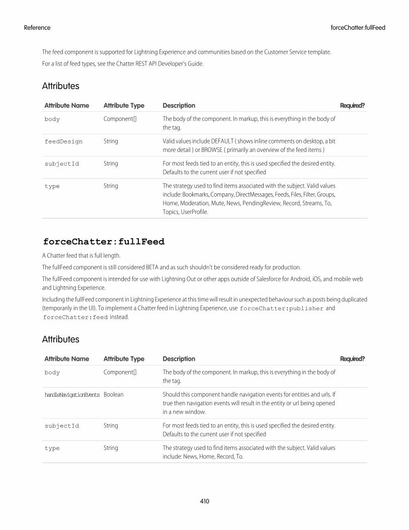
The feed component is supported for Lightning Experience and communities based on the Customer Service template.
For a list of feed types, see the Chatter REST API Developer's Guide.
Attributes
Required?DescriptionAttribute TypeAttribute Name
The body of the component. In markup, this is everything in the body ofthe tag.
Component[]body
Valid values include DEFAULT ( shows inline comments on desktop, a bitmore detail ) or BROWSE ( primarily an overview of the feed items )
StringfeedDesign
For most feeds tied to an entity, this is used specified the desired entity.Defaults to the current user if not specified
StringsubjectId
The strategy used to find items associated with the subject. Valid valuesinclude: Bookmarks, Company, DirectMessages, Feeds, Files, Filter, Groups,
Stringtype
Home, Moderation, Mute, News, PendingReview, Record, Streams, To,Topics, UserProfile.
forceChatter:fullFeedA Chatter feed that is full length.
The fullFeed component is still considered BETA and as such shouldn't be considered ready for production.
The fullFeed component is intended for use with Lightning Out or other apps outside of Salesforce for Android, iOS, and mobile weband Lightning Experience.
Including the fullFeed component in Lightning Experience at this time will result in unexpected behaviour such as posts being duplicated(temporarily in the UI). To implement a Chatter feed in Lightning Experience, use forceChatter:publisher andforceChatter:feed instead.
Attributes
Required?DescriptionAttribute TypeAttribute Name
The body of the component. In markup, this is everything in the body ofthe tag.
Component[]body
Should this component handle navigation events for entities and urls. Iftrue then navigation events will result in the entity or url being openedin a new window.
BooleanhandleNavigationEvents
For most feeds tied to an entity, this is used specified the desired entity.Defaults to the current user if not specified
StringsubjectId
The strategy used to find items associated with the subject. Valid valuesinclude: News, Home, Record, To.
Stringtype
410
forceChatter:fullFeedReference
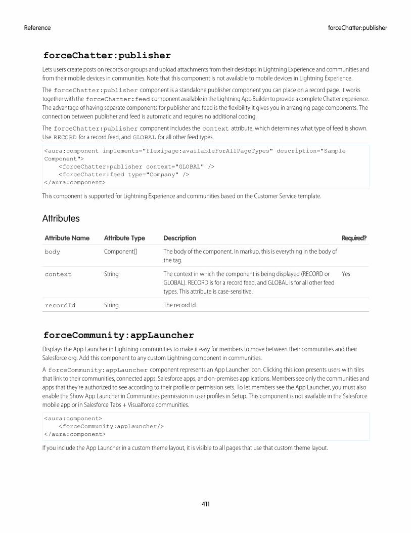
forceChatter:publisherLets users create posts on records or groups and upload attachments from their desktops in Lightning Experience and communities andfrom their mobile devices in communities. Note that this component is not available to mobile devices in Lightning Experience.
The forceChatter:publisher component is a standalone publisher component you can place on a record page. It workstogether with the forceChatter:feed component available in the Lightning App Builder to provide a complete Chatter experience.The advantage of having separate components for publisher and feed is the flexibility it gives you in arranging page components. Theconnection between publisher and feed is automatic and requires no additional coding.
The forceChatter:publisher component includes the context attribute, which determines what type of feed is shown.Use RECORD for a record feed, and GLOBAL for all other feed types.
<aura:component implements="flexipage:availableForAllPageTypes" description="SampleComponent">
<forceChatter:publisher context="GLOBAL" /><forceChatter:feed type="Company" />
</aura:component>
This component is supported for Lightning Experience and communities based on the Customer Service template.
Attributes
Required?DescriptionAttribute TypeAttribute Name
The body of the component. In markup, this is everything in the body ofthe tag.
Component[]body
YesThe context in which the component is being displayed (RECORD orGLOBAL). RECORD is for a record feed, and GLOBAL is for all other feedtypes. This attribute is case-sensitive.
Stringcontext
The record IdStringrecordId
forceCommunity:appLauncherDisplays the App Launcher in Lightning communities to make it easy for members to move between their communities and theirSalesforce org. Add this component to any custom Lightning component in communities.
A forceCommunity:appLauncher component represents an App Launcher icon. Clicking this icon presents users with tilesthat link to their communities, connected apps, Salesforce apps, and on-premises applications. Members see only the communities andapps that they’re authorized to see according to their profile or permission sets. To let members see the App Launcher, you must alsoenable the Show App Launcher in Communities permission in user profiles in Setup. This component is not available in the Salesforcemobile app or in Salesforce Tabs + Visualforce communities.
<aura:component><forceCommunity:appLauncher/>
</aura:component>
If you include the App Launcher in a custom theme layout, it is visible to all pages that use that custom theme layout.
411
forceChatter:publisherReference
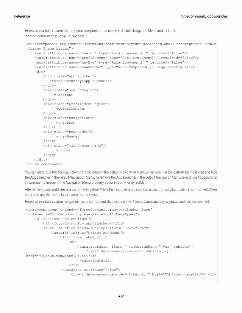
Here’s an example custom theme layout component that uses the default Navigation Menu and includesforceCommunity:appLauncher.
<aura:component implements="forceCommunity:themeLayout" access="global" description="SampleCustom Theme Layout">
<aura:attribute name="search" type="Aura.Component[]" required="false"/><aura:attribute name="profileMenu" type="Aura.Component[]" required="false"/><aura:attribute name="navBar" type="Aura.Component[]" required="false"/><aura:attribute name="newHeader" type="Aura.Component[]" required="false"/><div>
<div class="appLauncher"><forceCommunity:appLauncher/>
</div><div class="searchRegion">
{!v.search}</div><div class="profileMenuRegion">
{!v.profileMenu}</div><div class="navigation">
{!v.navBar}</div><div class="newHeader">
{!v.newHeader}</div><div class="mainContentArea">
{!v.body}</div>
</div></aura:component>
You can either use the App Launcher that’s included in the default Navigation Menu, or include it in the custom theme layout and hidethe App Launcher in the default Navigation Menu. To remove the App Launcher in the default Navigation Menu, select Hide App Launcherin community header in the Navigation Menu property editor in Community Builder.
Alternatively, you could create a custom Navigation Menu that includes a forceCommunity:appLauncher component. Thenyou could use this menu in a custom theme layout.
Here's an example custom navigation menu component that includes the forceCommunity:appLauncher component.
<aura:component extends="forceCommunity:navigationMenuBase"implements="forceCommunity:availableForAllPageTypes">
<ul onclick="{!c.onClick}"><li><forceCommunity:appLauncher/></li><aura:iteration items="{!v.menuItems}" var="item">
<aura:if isTrue="{!item.subMenu}"><li>{!item.label}</li>
<ul><aura:iteration items="{!item.subMenu}" var="subItem">
<li><a data-menu-item-id="{!subItem.id}"href="">{!subItem.label}</a></li>
</aura:iteration></ul>
<aura:set attribute="else"><li><a data-menu-item-id="{!item.id}" href="">{!item.label}</a></li>
412
forceCommunity:appLauncherReference
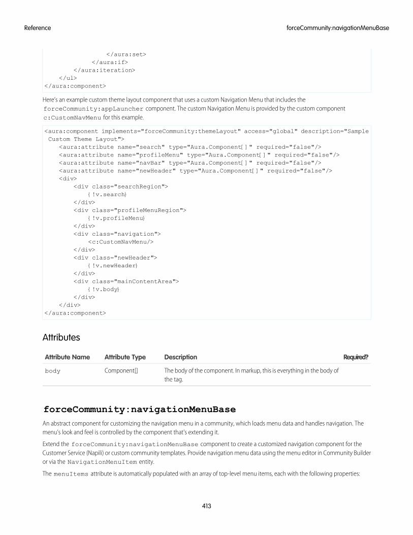
</aura:set></aura:if>
</aura:iteration></ul>
</aura:component>
Here’s an example custom theme layout component that uses a custom Navigation Menu that includes theforceCommunity:appLauncher component. The custom Navigation Menu is provided by the custom componentc:CustomNavMenu for this example.
<aura:component implements="forceCommunity:themeLayout" access="global" description="SampleCustom Theme Layout">
<aura:attribute name="search" type="Aura.Component[]" required="false"/><aura:attribute name="profileMenu" type="Aura.Component[]" required="false"/><aura:attribute name="navBar" type="Aura.Component[]" required="false"/><aura:attribute name="newHeader" type="Aura.Component[]" required="false"/><div>
<div class="searchRegion">{!v.search}
</div><div class="profileMenuRegion">
{!v.profileMenu}</div><div class="navigation">
<c:CustomNavMenu/></div><div class="newHeader">
{!v.newHeader}</div><div class="mainContentArea">
{!v.body}</div>
</div></aura:component>
Attributes
Required?DescriptionAttribute TypeAttribute Name
The body of the component. In markup, this is everything in the body ofthe tag.
Component[]body
forceCommunity:navigationMenuBaseAn abstract component for customizing the navigation menu in a community, which loads menu data and handles navigation. Themenu’s look and feel is controlled by the component that's extending it.
Extend the forceCommunity:navigationMenuBase component to create a customized navigation component for theCustomer Service (Napili) or custom community templates. Provide navigation menu data using the menu editor in Community Builderor via the NavigationMenuItem entity.
The menuItems attribute is automatically populated with an array of top-level menu items, each with the following properties:
413
forceCommunity:navigationMenuBaseReference
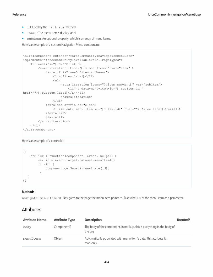
• id: Used by the navigate method.
• label: The menu item’s display label.
• subMenu: An optional property, which is an array of menu items.
Here's an example of a custom Navigation Menu component:
<aura:component extends="forceCommunity:navigationMenuBase"implements="forceCommunity:availableForAllPageTypes">
<ul onclick="{!c.onClick}"><aura:iteration items="{!v.menuItems}" var="item" >
<aura:if isTrue="{!item.subMenu}"><li>{!item.label}</li><ul>
<aura:iteration items="{!item.subMenu}" var="subItem"><li><a data-menu-item-id="{!subItem.id}"
href="">{!subItem.label}</a></li></aura:iteration>
</ul><aura:set attribute="else">
<li><a data-menu-item-id="{!item.id}" href="">{!item.label}</a></li></aura:set></aura:if>
</aura:iteration></ul>
</aura:component>
Here's an example of a controller:
({onClick : function(component, event, helper) {
var id = event.target.dataset.menuItemId;if (id) {
component.getSuper().navigate(id);}
}})
Methods
navigate(menuItemId): Navigates to the page the menu item points to. Takes the id of the menu item as a parameter.
Attributes
Required?DescriptionAttribute TypeAttribute Name
The body of the component. In markup, this is everything in the body ofthe tag.
Component[]body
Automatically populated with menu item’s data. This attribute isread-only.
ObjectmenuItems
414
forceCommunity:navigationMenuBaseReference
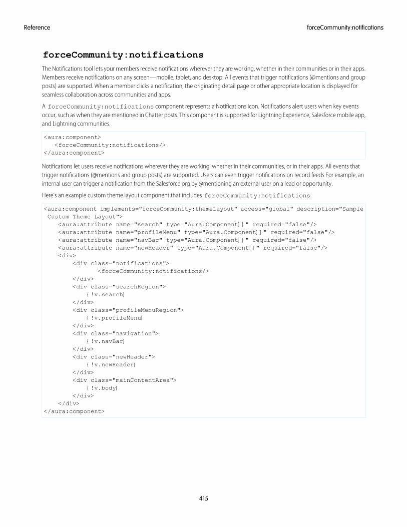
forceCommunity:notificationsThe Notifications tool lets your members receive notifications wherever they are working, whether in their communities or in their apps.Members receive notifications on any screen—mobile, tablet, and desktop. All events that trigger notifications (@mentions and groupposts) are supported. When a member clicks a notification, the originating detail page or other appropriate location is displayed forseamless collaboration across communities and apps.
A forceCommunity:notifications component represents a Notifications icon. Notifications alert users when key eventsoccur, such as when they are mentioned in Chatter posts. This component is supported for Lightning Experience, Salesforce mobile app,and Lightning communities.
<aura:component><forceCommunity:notifications/>
</aura:component>
Notifications let users receive notifications wherever they are working, whether in their communities, or in their apps. All events thattrigger notifications (@mentions and group posts) are supported. Users can even trigger notifications on record feeds For example, aninternal user can trigger a notification from the Salesforce org by @mentioning an external user on a lead or opportunity.
Here’s an example custom theme layout component that includes forceCommunity:notifications.
<aura:component implements="forceCommunity:themeLayout" access="global" description="SampleCustom Theme Layout">
<aura:attribute name="search" type="Aura.Component[]" required="false"/><aura:attribute name="profileMenu" type="Aura.Component[]" required="false"/><aura:attribute name="navBar" type="Aura.Component[]" required="false"/><aura:attribute name="newHeader" type="Aura.Component[]" required="false"/><div>
<div class="notifications"><forceCommunity:notifications/>
</div><div class="searchRegion">
{!v.search}</div><div class="profileMenuRegion">
{!v.profileMenu}</div><div class="navigation">
{!v.navBar}</div><div class="newHeader">
{!v.newHeader}</div><div class="mainContentArea">
{!v.body}</div>
</div></aura:component>
415
forceCommunity:notificationsReference
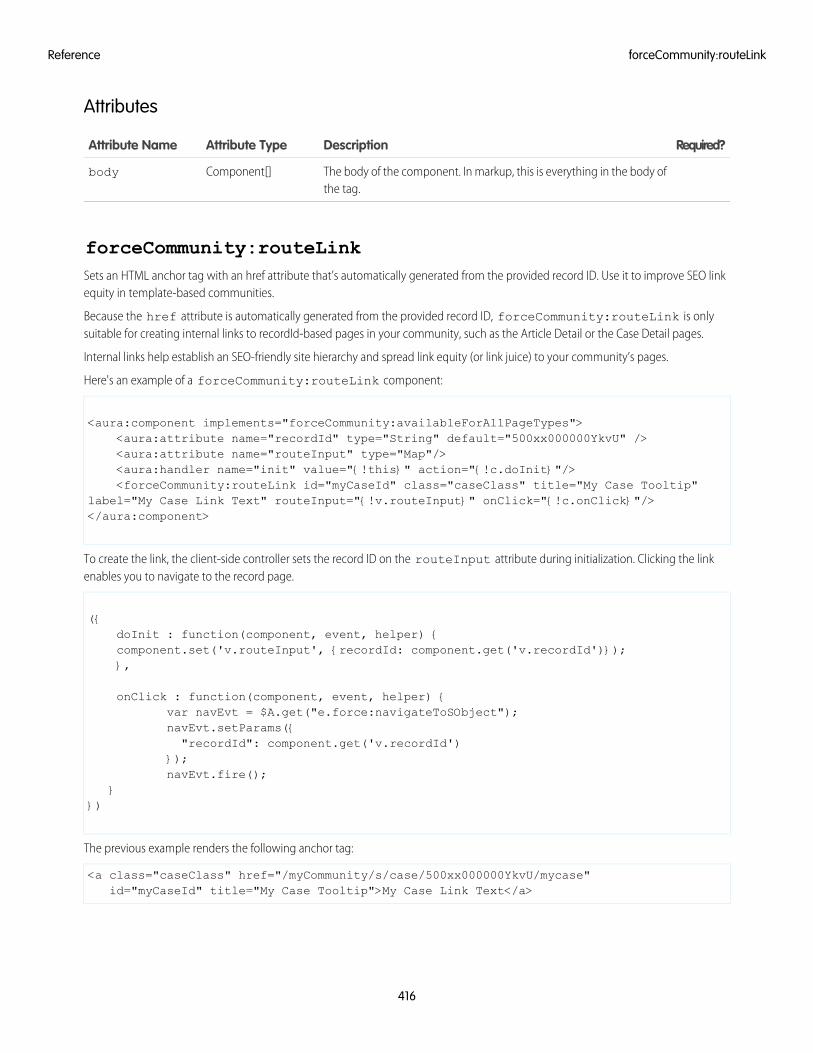
Attributes
Required?DescriptionAttribute TypeAttribute Name
The body of the component. In markup, this is everything in the body ofthe tag.
Component[]body
forceCommunity:routeLinkSets an HTML anchor tag with an href attribute that’s automatically generated from the provided record ID. Use it to improve SEO linkequity in template-based communities.
Because the href attribute is automatically generated from the provided record ID, forceCommunity:routeLink is onlysuitable for creating internal links to recordId-based pages in your community, such as the Article Detail or the Case Detail pages.
Internal links help establish an SEO-friendly site hierarchy and spread link equity (or link juice) to your community’s pages.
Here's an example of a forceCommunity:routeLink component:
<aura:component implements="forceCommunity:availableForAllPageTypes"><aura:attribute name="recordId" type="String" default="500xx000000YkvU" /><aura:attribute name="routeInput" type="Map"/><aura:handler name="init" value="{!this}" action="{!c.doInit}"/><forceCommunity:routeLink id="myCaseId" class="caseClass" title="My Case Tooltip"
label="My Case Link Text" routeInput="{!v.routeInput}" onClick="{!c.onClick}"/></aura:component>
To create the link, the client-side controller sets the record ID on the routeInput attribute during initialization. Clicking the linkenables you to navigate to the record page.
({doInit : function(component, event, helper) {component.set('v.routeInput', {recordId: component.get('v.recordId')});},
onClick : function(component, event, helper) {var navEvt = $A.get("e.force:navigateToSObject");navEvt.setParams({"recordId": component.get('v.recordId')
});navEvt.fire();
}})
The previous example renders the following anchor tag:
<a class="caseClass" href="/myCommunity/s/case/500xx000000YkvU/mycase"id="myCaseId" title="My Case Tooltip">My Case Link Text</a>
416
forceCommunity:routeLinkReference
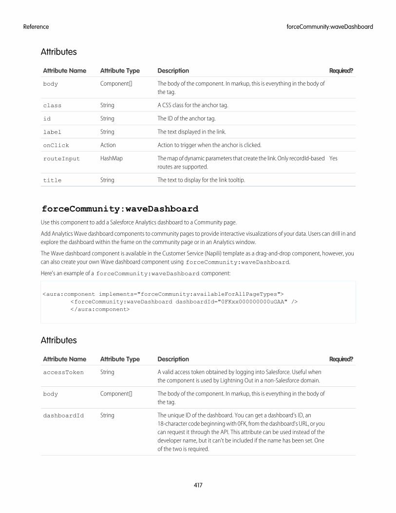
Attributes
Required?DescriptionAttribute TypeAttribute Name
The body of the component. In markup, this is everything in the body ofthe tag.
Component[]body
A CSS class for the anchor tag.Stringclass
The ID of the anchor tag.Stringid
The text displayed in the link.Stringlabel
Action to trigger when the anchor is clicked.ActiononClick
YesThe map of dynamic parameters that create the link. Only recordId-basedroutes are supported.
HashMaprouteInput
The text to display for the link tooltip.Stringtitle
forceCommunity:waveDashboardUse this component to add a Salesforce Analytics dashboard to a Community page.
Add Analytics Wave dashboard components to community pages to provide interactive visualizations of your data. Users can drill in andexplore the dashboard within the frame on the community page or in an Analytics window.
The Wave dashboard component is available in the Customer Service (Napili) template as a drag-and-drop component, however, youcan also create your own Wave dashboard component using forceCommunity:waveDashboard.
Here's an example of a forceCommunity:waveDashboard component:
<aura:component implements="forceCommunity:availableForAllPageTypes"><forceCommunity:waveDashboard dashboardId="0FKxx000000000uGAA" /></aura:component>
Attributes
Required?DescriptionAttribute TypeAttribute Name
A valid access token obtained by logging into Salesforce. Useful whenthe component is used by Lightning Out in a non-Salesforce domain.
StringaccessToken
The body of the component. In markup, this is everything in the body ofthe tag.
Component[]body
The unique ID of the dashboard. You can get a dashboard’s ID, an18-character code beginning with 0FK, from the dashboard's URL, or you
StringdashboardId
can request it through the API. This attribute can be used instead of thedeveloper name, but it can't be included if the name has been set. Oneof the two is required.
417
forceCommunity:waveDashboardReference
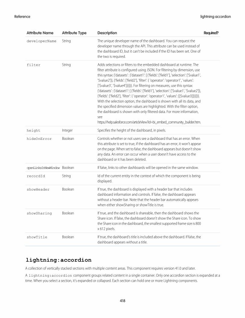
Required?DescriptionAttribute TypeAttribute Name
The unique developer name of the dashboard. You can request thedeveloper name through the API. This attribute can be used instead of
StringdeveloperName
the dashboard ID, but it can't be included if the ID has been set. One ofthe two is required.
Adds selections or filters to the embedded dashboard at runtime. Thefilter attribute is configured using JSON. For filtering by dimension, use
Stringfilter
this syntax: {'datasets' : {'dataset1': [ {'fields': ['field1'], 'selection': ['$value1','$value2']}, {'fields': ['field2'], 'filter': { 'operator': 'operator1', 'values':['$value3', '$value4']}}]}}. For filtering on measures, use this syntax:{'datasets' : {'dataset1': [ {'fields': ['field1'], 'selection': ['$value1', '$value2']},{'fields': ['field2'], 'filter': { 'operator': 'operator1', 'values': [[$value3]]}}]}}.With the selection option, the dashboard is shown with all its data, andthe specified dimension values are highlighted. With the filter option,the dashboard is shown with only filtered data. For more information,seehttps://help.salesforce.com/articleView?id=bi_embed_community_builder.htm.
Specifies the height of the dashboard, in pixels.Integerheight
Controls whether or not users see a dashboard that has an error. Whenthis attribute is set to true, if the dashboard has an error, it won’t appear
BooleanhideOnError
on the page. When set to false, the dashboard appears but doesn’t showany data. An error can occur when a user doesn't have access to thedashboard or it has been deleted.
If false, links to other dashboards will be opened in the same window.BooleanopenLinksInNewWindow
Id of the current entity in the context of which the component is beingdisplayed.
StringrecordId
If true, the dashboard is displayed with a header bar that includesdashboard information and controls. If false, the dashboard appears
BooleanshowHeader
without a header bar. Note that the header bar automatically appearswhen either showSharing or showTitle is true.
If true, and the dashboard is shareable, then the dashboard shows theShare icon. If false, the dashboard doesn't show the Share icon. To show
BooleanshowSharing
the Share icon in the dashboard, the smallest supported frame size is 800x 612 pixels.
If true, the dashboard’s title is included above the dashboard. If false, thedashboard appears without a title.
BooleanshowTitle
lightning:accordionA collection of vertically stacked sections with multiple content areas. This component requires version 41.0 and later.
A lightning:accordion component groups related content in a single container. Only one accordion section is expanded at atime. When you select a section, it's expanded or collapsed. Each section can hold one or more Lightning components.
418
lightning:accordionReference
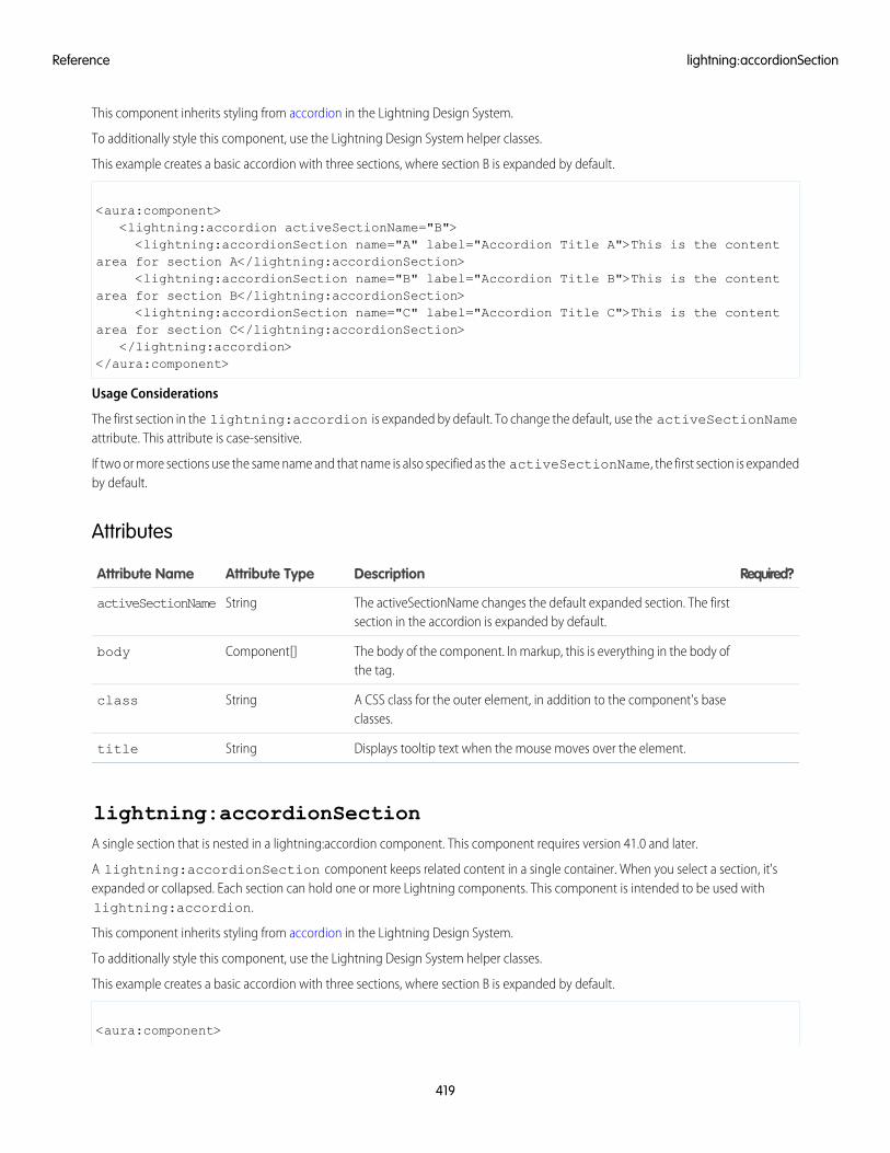
This component inherits styling from accordion in the Lightning Design System.
To additionally style this component, use the Lightning Design System helper classes.
This example creates a basic accordion with three sections, where section B is expanded by default.
<aura:component><lightning:accordion activeSectionName="B"><lightning:accordionSection name="A" label="Accordion Title A">This is the content
area for section A</lightning:accordionSection><lightning:accordionSection name="B" label="Accordion Title B">This is the content
area for section B</lightning:accordionSection><lightning:accordionSection name="C" label="Accordion Title C">This is the content
area for section C</lightning:accordionSection></lightning:accordion>
</aura:component>
Usage Considerations
The first section in the lightning:accordion is expanded by default. To change the default, use the activeSectionNameattribute. This attribute is case-sensitive.
If two or more sections use the same name and that name is also specified as the activeSectionName, the first section is expandedby default.
Attributes
Required?DescriptionAttribute TypeAttribute Name
The activeSectionName changes the default expanded section. The firstsection in the accordion is expanded by default.
StringactiveSectionName
The body of the component. In markup, this is everything in the body ofthe tag.
Component[]body
A CSS class for the outer element, in addition to the component's baseclasses.
Stringclass
Displays tooltip text when the mouse moves over the element.Stringtitle
lightning:accordionSectionA single section that is nested in a lightning:accordion component. This component requires version 41.0 and later.
A lightning:accordionSection component keeps related content in a single container. When you select a section, it'sexpanded or collapsed. Each section can hold one or more Lightning components. This component is intended to be used withlightning:accordion.
This component inherits styling from accordion in the Lightning Design System.
To additionally style this component, use the Lightning Design System helper classes.
This example creates a basic accordion with three sections, where section B is expanded by default.
<aura:component>
419
lightning:accordionSectionReference
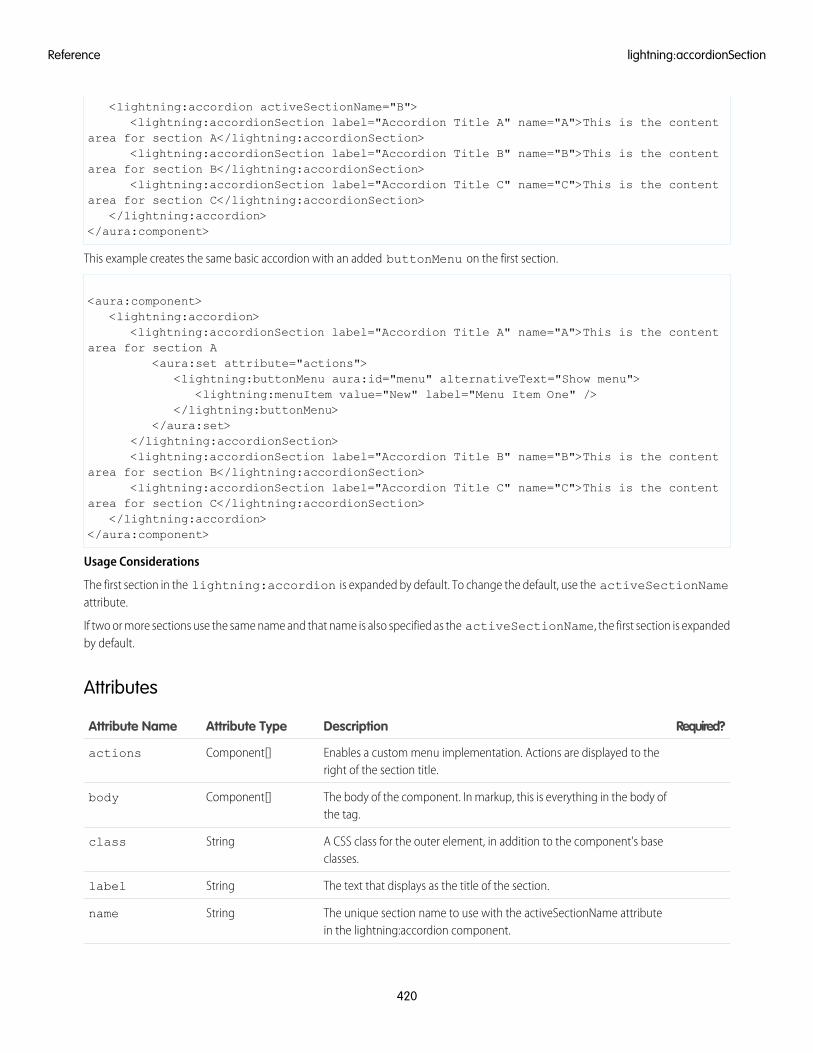
<lightning:accordion activeSectionName="B"><lightning:accordionSection label="Accordion Title A" name="A">This is the content
area for section A</lightning:accordionSection><lightning:accordionSection label="Accordion Title B" name="B">This is the content
area for section B</lightning:accordionSection><lightning:accordionSection label="Accordion Title C" name="C">This is the content
area for section C</lightning:accordionSection></lightning:accordion>
</aura:component>
This example creates the same basic accordion with an added buttonMenu on the first section.
<aura:component><lightning:accordion>
<lightning:accordionSection label="Accordion Title A" name="A">This is the contentarea for section A
<aura:set attribute="actions"><lightning:buttonMenu aura:id="menu" alternativeText="Show menu">
<lightning:menuItem value="New" label="Menu Item One" /></lightning:buttonMenu>
</aura:set></lightning:accordionSection><lightning:accordionSection label="Accordion Title B" name="B">This is the content
area for section B</lightning:accordionSection><lightning:accordionSection label="Accordion Title C" name="C">This is the content
area for section C</lightning:accordionSection></lightning:accordion>
</aura:component>
Usage Considerations
The first section in the lightning:accordion is expanded by default. To change the default, use the activeSectionNameattribute.
If two or more sections use the same name and that name is also specified as the activeSectionName, the first section is expandedby default.
Attributes
Required?DescriptionAttribute TypeAttribute Name
Enables a custom menu implementation. Actions are displayed to theright of the section title.
Component[]actions
The body of the component. In markup, this is everything in the body ofthe tag.
Component[]body
A CSS class for the outer element, in addition to the component's baseclasses.
Stringclass
The text that displays as the title of the section.Stringlabel
The unique section name to use with the activeSectionName attributein the lightning:accordion component.
Stringname
420
lightning:accordionSectionReference
Required?DescriptionAttribute TypeAttribute Name
Displays tooltip text when the mouse moves over the element.Stringtitle
lightning:avatarA visual representation of an object.
A lightning:avatar component is an image that represents an object, such as an account or user. By default, the image rendersin medium sizing with a rounded rectangle, which is also known as the square variant.
This component inherits styling from avatars in the Lightning Design System.
Use the class attribute to apply additional styling.
Here is an example.
<aura:component><lightning:avatar src="/images/codey.jpg" alternativeText="Codey Bear"/>
</aura:component>
Handling Invalid Image Paths
The src attribute resolves the relative path to an image, but sometimes the image path doesn't resolve correctly because the app isoffline or the image has been deleted. To handle an invalid image path, you can provide fallback initials using the initials attribute.This example displays the initials "Sa" if the image path is invalid.
<lightning:avatar src="/bad/image/url.jpg" initials="Sa"fallbackIconName="standard:account" alternativeText="Salesforce"/>
In the previous example, the fallback icon "standard:account" is displayed if initials are not provided.
Accessibility
Use the alternativeText attribute to describe the avatar, such as a user's initials or name. This description provides the value forthe alt attribute in the img HTML tag.
Attributes
Required?DescriptionAttribute TypeAttribute Name
YesThe alternative text used to describe the avatar, which is displayed ashover text on the image.
StringalternativeText
The body of the component. In markup, this is everything in the body ofthe tag.
Component[]body
A CSS class for the outer element, in addition to the component's baseclasses.
Stringclass
The Lightning Design System name of the icon used as a fallback whenthe image fails to load. The initials fallback relies on this for its background
StringfallbackIconName
color. Names are written in the format 'standard:account' where 'standard'is the category, and 'account' is the specific icon to be displayed. Onlyicons from the standard and custom categories are allowed.
421
lightning:avatarReference
Required?DescriptionAttribute TypeAttribute Name
If the record name contains two words, like first and last name, use thefirst capitalized letter of each. For records that only have a single word
Stringinitials
name, use the first two letters of that word using one capital and onelower case letter.
The size of the avatar. Valid values are x-small, small, medium, and large.This value defaults to medium.
Stringsize
YesThe URL for the image.Stringsrc
Displays tooltip text when the mouse moves over the element.Stringtitle
The variant changes the shape of the avatar. Valid values are empty, circle,and square. This value defaults to square.
Stringvariant
lightning:badgeRepresents a label which holds a small amount of information, such as the number of unread notifications.
A lightning:badge is a label that holds small amounts of information. A badge can be used to display unread notifications, or tolabel a block of text. Badges don’t work for navigation because they can't include a hyperlink.
This component inherits styling from badges in the Lightning Design System.
Here is an example.
<aura:component><lightning:badge label="Label" />
</aura:component>
Attributes
Required?DescriptionAttribute TypeAttribute Name
The body of the component. In markup, this is everything in the body ofthe tag.
Component[]body
A CSS class for the outer element, in addition to the component's baseclasses.
Stringclass
Displays tooltip text when the mouse moves over the element.Stringtitle
YesThe text to be displayed inside the badge.Stringlabel
lightning:breadcrumbAn item in the hierarchy path of the page the user is on.
A lightning:breadcrumb component displays the path of a page relative to a parent page. Breadcrumbs are nested in alightning:breadcrumbs component. Each breadcrumb is actionable and separated by a greater-than sign. The order thebreadcrumbs appear depends on the order they are listed in markup.
422
lightning:badgeReference
This component inherits styling from breadcrumbs in the Lightning Design System.
Here is an example.
<aura:component><lightning:breadcrumbs>
<lightning:breadcrumb label="Parent Account" href="path/to/place/1"/><lightning:breadcrumb label="Case" href="path/to/place/2"/>
</lightning:breadcrumbs></aura:component>
The behavior of a breadcrumb is similar to a link. If a link is not provided via the href attribute, the value defaults tojavascript:void(0);. To provide custom navigation, use an onclick handler. For example, using onclick is useful ifyou're navigating using an event like force:navigateToSObject. If you provide a link in the href attribute, callingevent.preventDefault() enables you to bypass the link and use your custom navigation instead.
<aura:component><lightning:breadcrumbs>
<lightning:breadcrumb label="Parent Account" href="path/to/place/1" onclick="{!c.navigateToCustomPage1 }"/>
<lightning:breadcrumb label="Case" href="path/to/place/2" onclick="{!c.navigateToCustomPage2 }"/>
</lightning:breadcrumbs></aura:component>
/** Client-Side Controller **/({
navigateToCustomPage1: function (cmp, event) {event.preventDefault();//your custom navigation here
},navigateToCustomPage2: function (cmp, event) {
event.preventDefault();//your custom navigation here
}})
Generating Breadcrumbs with aura:iteration
Iterate over a list of items using aura:iteration to generate breadcrumbs. For example, you can create an array of breadcrumbswith label and name values. Set these values in the init handler.
<aura:component><aura:attribute name="myBreadcrumbs" type="Object"/><aura:handler name="init" value="{! this }" action="{! c.init }"/><lightning:breadcrumbs>
<aura:iteration items="{! v.myBreadcrumbs }" var="crumbs"><lightning:breadcrumb label="{! crumbs.label }" onclick="{! c.navigateTo }"
name="{! crumbs.name }"/></aura:iteration>
</lightning:breadcrumbs></aura:component>
/* Client-Side Controller */({
init: function (cmp, event, helper) {
423
lightning:breadcrumbReference
var myBreadcrumbs = [{label: 'Account', name: 'objectName' },{label: 'Record Name', name: 'record' }
];cmp.set('v.myBreadcrumbs', myBreadcrumbs);
},navigateTo: function (cmp, event, helper) {
//get the name of the breadcrumb that's clickedvar name = event.getSource().get('v.name');
//your custom navigation here}
})
Attributes
Required?DescriptionAttribute TypeAttribute Name
The body of the component. In markup, this is everything in the body ofthe tag.
Component[]body
A CSS class for the outer element, in addition to the component's baseclasses.
Stringclass
The URL of the page that the breadcrumb goes to.Stringhref
YesThe text label for the breadcrumb.Stringlabel
The name for the breadcrumb component. This value is optional andcan be used to identify the breadcrumb in a callback.
Stringname
The action triggered when the breadcrumb is clicked.Actiononclick
Displays tooltip text when the mouse moves over the element.Stringtitle
lightning:breadcrumbsA hierarchy path of the page you're currently visiting within the website or app.
A lightning:breadcrumbs component is an ordered list that displays the path of a page and helps you navigate back to theparent. Each breadcrumb item is represented by a lightning:breadcrumb component. Breadcrumbs are actionable and separatedby a greater-than sign.
This component inherits styling from breadcrumbs in the Lightning Design System.
For more information, see lightning:breadcrumb.
Attributes
Required?DescriptionAttribute TypeAttribute Name
The body of the component. In markup, this is everything in the body ofthe tag.
Component[]body
424
lightning:breadcrumbsReference
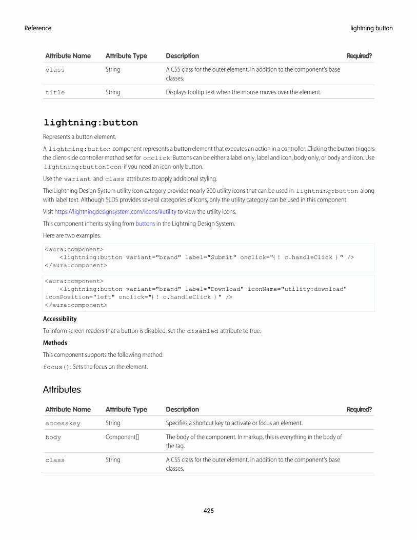
Required?DescriptionAttribute TypeAttribute Name
A CSS class for the outer element, in addition to the component's baseclasses.
Stringclass
Displays tooltip text when the mouse moves over the element.Stringtitle
lightning:buttonRepresents a button element.
A lightning:button component represents a button element that executes an action in a controller. Clicking the button triggersthe client-side controller method set for onclick. Buttons can be either a label only, label and icon, body only, or body and icon. Uselightning:buttonIcon if you need an icon-only button.
Use the variant and class attributes to apply additional styling.
The Lightning Design System utility icon category provides nearly 200 utility icons that can be used in lightning:button alongwith label text. Although SLDS provides several categories of icons, only the utility category can be used in this component.
Visit https://lightningdesignsystem.com/icons/#utility to view the utility icons.
This component inherits styling from buttons in the Lightning Design System.
Here are two examples.
<aura:component><lightning:button variant="brand" label="Submit" onclick="{! c.handleClick }" />
</aura:component>
<aura:component><lightning:button variant="brand" label="Download" iconName="utility:download"
iconPosition="left" onclick="{! c.handleClick }" /></aura:component>
Accessibility
To inform screen readers that a button is disabled, set the disabled attribute to true.
Methods
This component supports the following method.
focus(): Sets the focus on the element.
Attributes
Required?DescriptionAttribute TypeAttribute Name
Specifies a shortcut key to activate or focus an element.Stringaccesskey
The body of the component. In markup, this is everything in the body ofthe tag.
Component[]body
A CSS class for the outer element, in addition to the component's baseclasses.
Stringclass
425
lightning:buttonReference
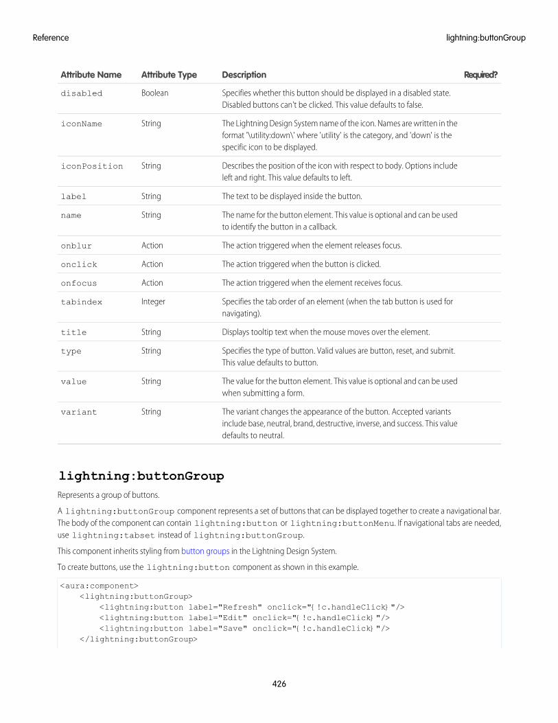
Required?DescriptionAttribute TypeAttribute Name
Specifies whether this button should be displayed in a disabled state.Disabled buttons can't be clicked. This value defaults to false.
Booleandisabled
The Lightning Design System name of the icon. Names are written in theformat '\utility:down\' where 'utility' is the category, and 'down' is thespecific icon to be displayed.
StringiconName
Describes the position of the icon with respect to body. Options includeleft and right. This value defaults to left.
StringiconPosition
The text to be displayed inside the button.Stringlabel
The name for the button element. This value is optional and can be usedto identify the button in a callback.
Stringname
The action triggered when the element releases focus.Actiononblur
The action triggered when the button is clicked.Actiononclick
The action triggered when the element receives focus.Actiononfocus
Specifies the tab order of an element (when the tab button is used fornavigating).
Integertabindex
Displays tooltip text when the mouse moves over the element.Stringtitle
Specifies the type of button. Valid values are button, reset, and submit.This value defaults to button.
Stringtype
The value for the button element. This value is optional and can be usedwhen submitting a form.
Stringvalue
The variant changes the appearance of the button. Accepted variantsinclude base, neutral, brand, destructive, inverse, and success. This valuedefaults to neutral.
Stringvariant
lightning:buttonGroupRepresents a group of buttons.
A lightning:buttonGroup component represents a set of buttons that can be displayed together to create a navigational bar.The body of the component can contain lightning:button or lightning:buttonMenu. If navigational tabs are needed,use lightning:tabset instead of lightning:buttonGroup.
This component inherits styling from button groups in the Lightning Design System.
To create buttons, use the lightning:button component as shown in this example.
<aura:component><lightning:buttonGroup>
<lightning:button label="Refresh" onclick="{!c.handleClick}"/><lightning:button label="Edit" onclick="{!c.handleClick}"/><lightning:button label="Save" onclick="{!c.handleClick}"/>
</lightning:buttonGroup>
426
lightning:buttonGroupReference
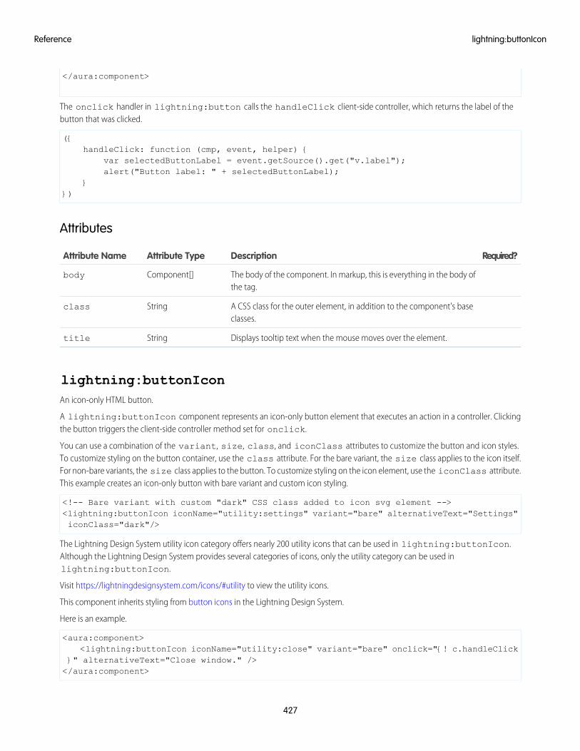
</aura:component>
The onclick handler in lightning:button calls the handleClick client-side controller, which returns the label of thebutton that was clicked.
({handleClick: function (cmp, event, helper) {
var selectedButtonLabel = event.getSource().get("v.label");alert("Button label: " + selectedButtonLabel);
}})
Attributes
Required?DescriptionAttribute TypeAttribute Name
The body of the component. In markup, this is everything in the body ofthe tag.
Component[]body
A CSS class for the outer element, in addition to the component's baseclasses.
Stringclass
Displays tooltip text when the mouse moves over the element.Stringtitle
lightning:buttonIconAn icon-only HTML button.
A lightning:buttonIcon component represents an icon-only button element that executes an action in a controller. Clickingthe button triggers the client-side controller method set for onclick.
You can use a combination of the variant, size, class, and iconClass attributes to customize the button and icon styles.To customize styling on the button container, use the class attribute. For the bare variant, the size class applies to the icon itself.For non-bare variants, the size class applies to the button. To customize styling on the icon element, use the iconClass attribute.This example creates an icon-only button with bare variant and custom icon styling.
<!-- Bare variant with custom "dark" CSS class added to icon svg element --><lightning:buttonIcon iconName="utility:settings" variant="bare" alternativeText="Settings"iconClass="dark"/>
The Lightning Design System utility icon category offers nearly 200 utility icons that can be used in lightning:buttonIcon.Although the Lightning Design System provides several categories of icons, only the utility category can be used inlightning:buttonIcon.
Visit https://lightningdesignsystem.com/icons/#utility to view the utility icons.
This component inherits styling from button icons in the Lightning Design System.
Here is an example.
<aura:component><lightning:buttonIcon iconName="utility:close" variant="bare" onclick="{! c.handleClick
}" alternativeText="Close window." /></aura:component>
427
lightning:buttonIconReference
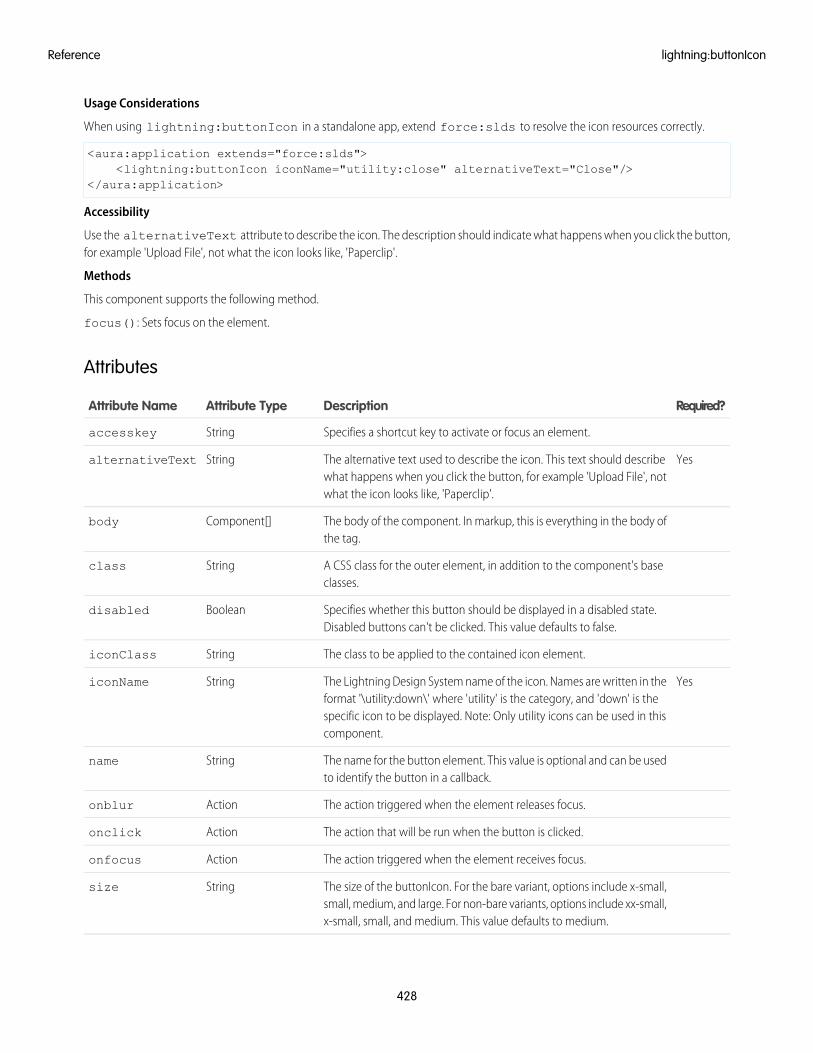
Usage Considerations
When using lightning:buttonIcon in a standalone app, extend force:slds to resolve the icon resources correctly.
<aura:application extends="force:slds"><lightning:buttonIcon iconName="utility:close" alternativeText="Close"/>
</aura:application>
Accessibility
Use the alternativeText attribute to describe the icon. The description should indicate what happens when you click the button,for example 'Upload File', not what the icon looks like, 'Paperclip'.
Methods
This component supports the following method.
focus(): Sets focus on the element.
Attributes
Required?DescriptionAttribute TypeAttribute Name
Specifies a shortcut key to activate or focus an element.Stringaccesskey
YesThe alternative text used to describe the icon. This text should describewhat happens when you click the button, for example 'Upload File', notwhat the icon looks like, 'Paperclip'.
StringalternativeText
The body of the component. In markup, this is everything in the body ofthe tag.
Component[]body
A CSS class for the outer element, in addition to the component's baseclasses.
Stringclass
Specifies whether this button should be displayed in a disabled state.Disabled buttons can't be clicked. This value defaults to false.
Booleandisabled
The class to be applied to the contained icon element.StringiconClass
YesThe Lightning Design System name of the icon. Names are written in theformat '\utility:down\' where 'utility' is the category, and 'down' is the
StringiconName
specific icon to be displayed. Note: Only utility icons can be used in thiscomponent.
The name for the button element. This value is optional and can be usedto identify the button in a callback.
Stringname
The action triggered when the element releases focus.Actiononblur
The action that will be run when the button is clicked.Actiononclick
The action triggered when the element receives focus.Actiononfocus
The size of the buttonIcon. For the bare variant, options include x-small,small, medium, and large. For non-bare variants, options include xx-small,x-small, small, and medium. This value defaults to medium.
Stringsize
428
lightning:buttonIconReference
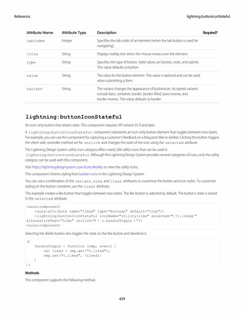
Required?DescriptionAttribute TypeAttribute Name
Specifies the tab order of an element (when the tab button is used fornavigating).
Integertabindex
Displays tooltip text when the mouse moves over the element.Stringtitle
Specifies the type of button. Valid values are button, reset, and submit.This value defaults to button.
Stringtype
The value for the button element. This value is optional and can be usedwhen submitting a form.
Stringvalue
The variant changes the appearance of buttonIcon. Accepted variantsinclude bare, container, border, border-filled, bare-inverse, andborder-inverse. This value defaults to border.
Stringvariant
lightning:buttonIconStatefulAn icon-only button that retains state. This component requires API version 41.0 and later.
A lightning:buttonIconStateful component represents an icon-only button element that toggles between two states.For example, you can use this component for capturing a customer's feedback on a blog post (like or dislike). Clicking the button triggersthe client-side controller method set for onclick and changes the state of the icon using the selected attribute.
The Lightning Design System utility icon category offers nearly 200 utility icons that can be used inlightning:buttonIconStateful. Although the Lightning Design System provides several categories of icons, only the utilitycategory can be used with this component.
Visit https://lightningdesignsystem.com/icons/#utility to view the utility icons.
This component inherits styling from button icons in the Lightning Design System.
You can use a combination of the variant, size, and class attributes to customize the button and icon styles. To customizestyling on the button container, use the class attribute.
This example creates a like button that toggles between two states. The like button is selected by default. The button's state is storedin the selected attribute.
<aura:component><aura:attribute name="liked" type="Boolean" default="true"/><lightning:buttonIconStateful iconName="utility:like" selected="{!v.liked}"
alternativeText="Like" onclick="{! c.handleToggle }"/><aura:component>
Selecting the dislike button also toggles the state on the like button and deselects it.
({handleToggle : function (cmp, event) {
var liked = cmp.get("v.liked");cmp.set("v.liked", !liked);
}})
Methods
This component supports the following method.
429
lightning:buttonIconStatefulReference
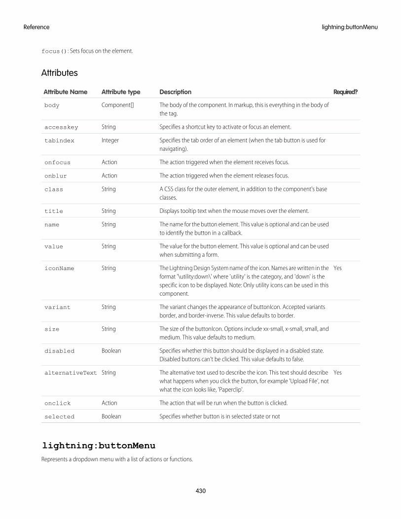
focus(): Sets focus on the element.
Attributes
Required?DescriptionAttribute typeAttribute Name
The body of the component. In markup, this is everything in the body ofthe tag.
Component[]body
Specifies a shortcut key to activate or focus an element.Stringaccesskey
Specifies the tab order of an element (when the tab button is used fornavigating).
Integertabindex
The action triggered when the element receives focus.Actiononfocus
The action triggered when the element releases focus.Actiononblur
A CSS class for the outer element, in addition to the component's baseclasses.
Stringclass
Displays tooltip text when the mouse moves over the element.Stringtitle
The name for the button element. This value is optional and can be usedto identify the button in a callback.
Stringname
The value for the button element. This value is optional and can be usedwhen submitting a form.
Stringvalue
YesThe Lightning Design System name of the icon. Names are written in theformat '\utility:down\' where 'utility' is the category, and 'down' is the
StringiconName
specific icon to be displayed. Note: Only utility icons can be used in thiscomponent.
The variant changes the appearance of buttonIcon. Accepted variantsborder, and border-inverse. This value defaults to border.
Stringvariant
The size of the buttonIcon. Options include xx-small, x-small, small, andmedium. This value defaults to medium.
Stringsize
Specifies whether this button should be displayed in a disabled state.Disabled buttons can't be clicked. This value defaults to false.
Booleandisabled
YesThe alternative text used to describe the icon. This text should describewhat happens when you click the button, for example 'Upload File', notwhat the icon looks like, 'Paperclip'.
StringalternativeText
The action that will be run when the button is clicked.Actiononclick
Specifies whether button is in selected state or notBooleanselected
lightning:buttonMenuRepresents a dropdown menu with a list of actions or functions.
430
lightning:buttonMenuReference
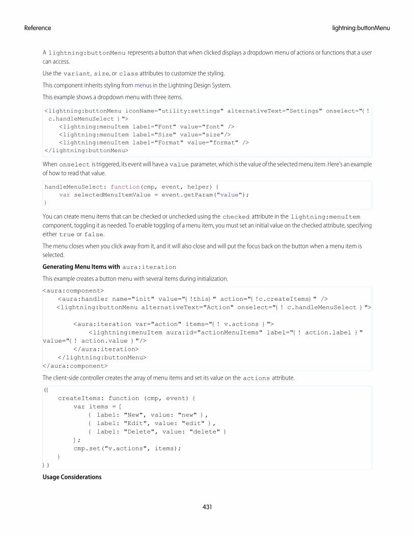
A lightning:buttonMenu represents a button that when clicked displays a dropdown menu of actions or functions that a usercan access.
Use the variant, size, or class attributes to customize the styling.
This component inherits styling from menus in the Lightning Design System.
This example shows a dropdown menu with three items.
<lightning:buttonMenu iconName="utility:settings" alternativeText="Settings" onselect="{!c.handleMenuSelect }">
<lightning:menuItem label="Font" value="font" /><lightning:menuItem label="Size" value="size"/><lightning:menuItem label="Format" value="format" />
</lightning:buttonMenu>
When onselect is triggered, its event will have a value parameter, which is the value of the selected menu item. Here's an exampleof how to read that value.
handleMenuSelect: function(cmp, event, helper) {var selectedMenuItemValue = event.getParam("value");
}
You can create menu items that can be checked or unchecked using the checked attribute in the lightning:menuItemcomponent, toggling it as needed. To enable toggling of a menu item, you must set an initial value on the checked attribute, specifyingeither true or false.
The menu closes when you click away from it, and it will also close and will put the focus back on the button when a menu item isselected.
Generating Menu Items with aura:iteration
This example creates a button menu with several items during initialization.
<aura:component><aura:handler name="init" value="{!this}" action="{!c.createItems}" /><lightning:buttonMenu alternativeText="Action" onselect="{! c.handleMenuSelect }">
<aura:iteration var="action" items="{! v.actions }"><lightning:menuItem aura:id="actionMenuItems" label="{! action.label }"
value="{! action.value }"/></aura:iteration>
</lightning:buttonMenu></aura:component>
The client-side controller creates the array of menu items and set its value on the actions attribute.
({createItems: function (cmp, event) {
var items = [{ label: "New", value: "new" },{ label: "Edit", value: "edit" },{ label: "Delete", value: "delete" }
];cmp.set("v.actions", items);
}})
Usage Considerations
431
lightning:buttonMenuReference
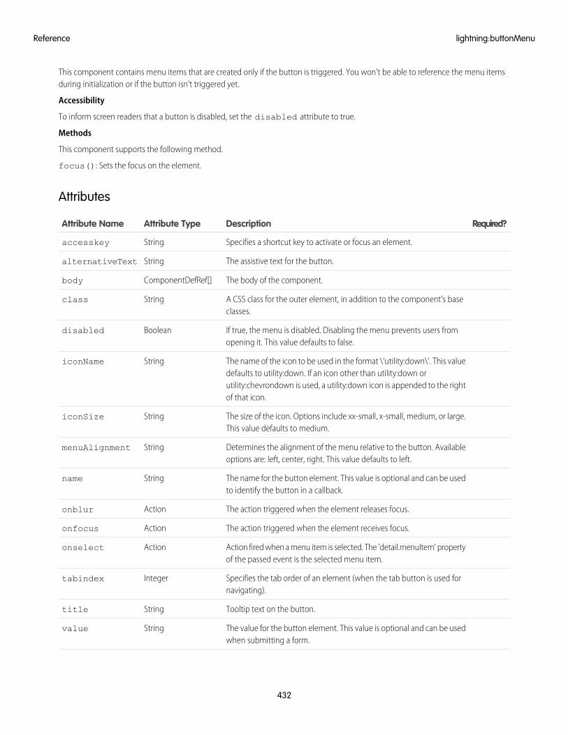
This component contains menu items that are created only if the button is triggered. You won't be able to reference the menu itemsduring initialization or if the button isn't triggered yet.
Accessibility
To inform screen readers that a button is disabled, set the disabled attribute to true.
Methods
This component supports the following method.
focus(): Sets the focus on the element.
Attributes
Required?DescriptionAttribute TypeAttribute Name
Specifies a shortcut key to activate or focus an element.Stringaccesskey
The assistive text for the button.StringalternativeText
The body of the component.ComponentDefRef[]body
A CSS class for the outer element, in addition to the component's baseclasses.
Stringclass
If true, the menu is disabled. Disabling the menu prevents users fromopening it. This value defaults to false.
Booleandisabled
The name of the icon to be used in the format \'utility:down\'. This valuedefaults to utility:down. If an icon other than utility:down or
StringiconName
utility:chevrondown is used, a utility:down icon is appended to the rightof that icon.
The size of the icon. Options include xx-small, x-small, medium, or large.This value defaults to medium.
StringiconSize
Determines the alignment of the menu relative to the button. Availableoptions are: left, center, right. This value defaults to left.
StringmenuAlignment
The name for the button element. This value is optional and can be usedto identify the button in a callback.
Stringname
The action triggered when the element releases focus.Actiononblur
The action triggered when the element receives focus.Actiononfocus
Action fired when a menu item is selected. The 'detail.menuItem' propertyof the passed event is the selected menu item.
Actiononselect
Specifies the tab order of an element (when the tab button is used fornavigating).
Integertabindex
Tooltip text on the button.Stringtitle
The value for the button element. This value is optional and can be usedwhen submitting a form.
Stringvalue
432
lightning:buttonMenuReference
Required?DescriptionAttribute TypeAttribute Name
The variant changes the look of the button. Accepted variants includebare, container, border, border-filled, bare-inverse, and border-inverse.This value defaults to border.
Stringvariant
If true, the menu items are displayed. This value defaults to false.Booleanvisible
lightning:buttonStatefulA button that toggles between states.
A lightning:buttonStateful component represents a button that toggles between states, similar to a like button on socialmedia. Stateful buttons can show a different label and icon based on their states.
Use the variant and class attributes to apply additional styling.
The Lightning Design System utility icon category provides nearly 200 utility icons that can be used in lightning:button alongwith a text label. Although the Lightning Design System provides several categories of icons, only the utility category can be used withthis component.
Visit https://lightningdesignsystem.com/icons/#utility to view the utility icons.
This component inherits styling from stateful buttons in the Lightning Design System.
To handle the state change when the button is clicked, use the onclick event handler. This example enables you to toggle the buttonbetween states, displaying the "Follow" label by default, and replacing it with "Following" when the button is selected. Selecting thebutton toggles the state to true, and deselecting it toggles the state to false. When the state is true, the button displays "Unfollow" whenyou mouse over it or when it receives focus.
<aura:component><aura:attribute name="buttonstate" type="Boolean" default="false"/><lightning:buttonStateful
labelWhenOff="Follow"labelWhenOn="Following"labelWhenHover="Unfollow"iconNameWhenOff="utility:add"iconNameWhenOn="utility:check"iconNameWhenHover="utility:close"state="{! v.buttonstate }"onclick="{! c.handleClick }"
/></aura:component>
The client-side controller toggles the state via the buttonstate attribute.
({handleClick : function (cmp, event, helper) {
var buttonstate = cmp.get('v.buttonstate');cmp.set('v.buttonstate', !buttonstate);
}})
Accessibility
For accessibility, include the attribute aria-live="assertive" on the button. The aria-live="assertive" attributemeans the value of the <span> inside the button will be spoken whenever it changes.
433
lightning:buttonStatefulReference
To inform screen readers that a button is disabled, set the disabled attribute to true.
Methods
This component supports the following method.
focus(): Sets focus on the element.
Attributes
Required?DescriptionAttribute TypeAttribute Name
Specifies a shortcut key to activate or focus an element.Stringaccesskey
The body of the component. In markup, this is everything in the body ofthe tag.
Component[]body
A CSS class for the outer element, in addition to the component's baseclasses.
Stringclass
The name of the icon to be used in the format \'utility:close\' when thestate is true and the button receives focus.
StringiconNameWhenHover
The name of the icon to be used in the format \'utility:add\' when thestate is false.
StringiconNameWhenOff
The name of the icon to be used in the format \'utility:check\' when thestate is true.
StringiconNameWhenOn
The text to be displayed inside the button when state is true and thebutton receives focus.
StringlabelWhenHover
YesThe text to be displayed inside the button when state is false.StringlabelWhenOff
YesThe text to be displayed inside the button when state is true.StringlabelWhenOn
The action triggered when the element releases focus.Actiononblur
The action triggered when the button is clicked.Actiononclick
The action triggered when the element receives focus.Actiononfocus
The state of the button, which shows whether the button has beenselected or not. The default state is false.
Booleanstate
Specifies the tab order of an element (when the tab button is used fornavigating).
Integertabindex
Displays tooltip text when the mouse moves over the element.Stringtitle
The variant changes the appearance of the button. Accepted variantsinclude brand, destructive, inverse, neutral, success, and text. This valuedefaults to neutral.
Stringvariant
434
lightning:buttonStatefulReference
lightning:cardCards are used to apply a container around a related grouping of information.
A lightning:card is used to apply a stylized container around a grouping of information. The information could be a single itemor a group of items such as a related list.
Use the variant or class attributes to customize the styling.
A lightning:card contains a title, body, and footer. To style the card body, use the Lightning Design System helper classes.
This component inherits styling from cards in the Lightning Design System.
Here is an example.
<aura:component><lightning:card>
<aura:set attribute="title">Hello!
</aura:set><aura:set attribute="footer">
<lightning:badge label="footer"/></aura:set><aura:set attribute="actions">
<lightning:button label="New"/></aura:set><p class="slds-p-horizontal_small">
Card Body (custom component)</p>
</lightning:card></aura:component>
Usage Considerations
The title and footer attributes are of type Object, which means that you can pass in values of String or Component[]types among some others. The previous example passes in the title and footer attributes as a Component[] type, also knownas a facet. The Component[] type is useful if you need to pass in markup to the title or footer, as shown in this example.
<aura:component><aura:attribute name="name" type="String" default="Your Name"/><aura:attribute name="myTitleName" type="Aura.Component[]">
<h1>Hello {! v.name }</h1></aura:attribute><lightning:card footer="Card Footer">
<aura:set attribute="title">{!v.myTitleName}
</aura:set><!-- actions and body markup here -->
</lightning:card></aura:component>
To pass in a value of String type, you can include it in the <lightning:card> tag.
<aura:component><aura:attribute name="myTitle" type="String" default="My Card Title"/><lightning:card title="{!v.myTitle}" footer="Card Footer">
<aura:set attribute="actions"><lightning:button label="New"/>
435
lightning:cardReference
</aura:set><p class="slds-p-horizontal_small">
Card Body (custom component)</p>
</lightning:card>
Attributes
Required?DescriptionAttribute TypeAttribute Name
Actions are components such as button or buttonIcon. Actions aredisplayed in the header.
Component[]actions
The body of the component. In markup, this is everything in the body ofthe tag.
Component[]body
A CSS class for the outer element, in addition to the component's baseclasses.
Stringclass
The footer can include text or another componentObjectfooter
The Lightning Design System name of the icon. Names are written in theformat '\utility:down\' where 'utility' is the category, and 'down' is the
StringiconName
specific icon to be displayed. The icon is displayed in the header to theleft of the title.
YesThe title can include text or another component, and is displayed in theheader.
Objecttitle
The variant changes the appearance of the card. Accepted variants includebase or narrow. This value defaults to base.
Stringvariant
lightning:checkboxGroupA checkbox group that enables selection of single or multiple options. This component requires API version 41.0 and later.
A lightning:checkboxGroup component represents a checkbox group that enables selection of single or multiple options.
If the required attribute is set to true, at least one checkbox must be selected. When a user interacts with the checkbox groupand doesn't make a selection, an error message is displayed. You can provide a custom error message using themessageWhenValueMissing attribute.
If the disabled attribute is set to true, checkbox selections can't be changed.
This component inherits styling from Checkbox in the Lightning Design System.
This example creates a checkbox group with two options and option1 is selected by default. At least one checkbox must be selectedas the required attribute is true.
<aura:component><aura:attribute name="options" type="List" default="[{'label': 'Ross', 'value': 'option1'},{'label': 'Rachel', 'value': 'option2'},
436
lightning:checkboxGroupReference
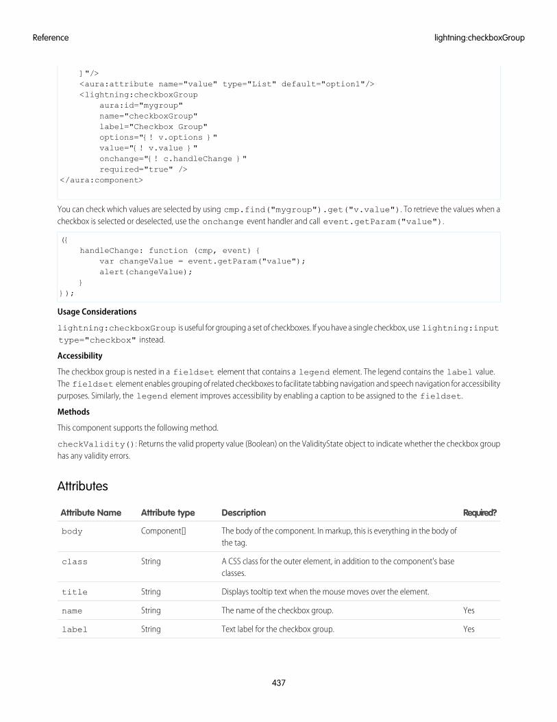
]"/><aura:attribute name="value" type="List" default="option1"/><lightning:checkboxGroup
aura:id="mygroup"name="checkboxGroup"label="Checkbox Group"options="{! v.options }"value="{! v.value }"onchange="{! c.handleChange }"required="true" />
</aura:component>
You can check which values are selected by using cmp.find("mygroup").get("v.value"). To retrieve the values when acheckbox is selected or deselected, use the onchange event handler and call event.getParam("value").
({handleChange: function (cmp, event) {
var changeValue = event.getParam("value");alert(changeValue);
}});
Usage Considerations
lightning:checkboxGroup is useful for grouping a set of checkboxes. If you have a single checkbox, use lightning:inputtype="checkbox" instead.
Accessibility
The checkbox group is nested in a fieldset element that contains a legend element. The legend contains the label value.The fieldset element enables grouping of related checkboxes to facilitate tabbing navigation and speech navigation for accessibilitypurposes. Similarly, the legend element improves accessibility by enabling a caption to be assigned to the fieldset.
Methods
This component supports the following method.
checkValidity(): Returns the valid property value (Boolean) on the ValidityState object to indicate whether the checkbox grouphas any validity errors.
Attributes
Required?DescriptionAttribute typeAttribute Name
The body of the component. In markup, this is everything in the body ofthe tag.
Component[]body
A CSS class for the outer element, in addition to the component's baseclasses.
Stringclass
Displays tooltip text when the mouse moves over the element.Stringtitle
YesThe name of the checkbox group.Stringname
YesText label for the checkbox group.Stringlabel
437
lightning:checkboxGroupReference
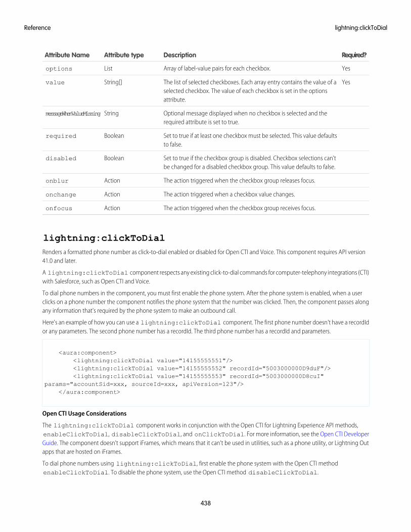
Required?DescriptionAttribute typeAttribute Name
YesArray of label-value pairs for each checkbox.Listoptions
YesThe list of selected checkboxes. Each array entry contains the value of aselected checkbox. The value of each checkbox is set in the optionsattribute.
String[]value
Optional message displayed when no checkbox is selected and therequired attribute is set to true.
StringmessageWhenValueMissing
Set to true if at least one checkbox must be selected. This value defaultsto false.
Booleanrequired
Set to true if the checkbox group is disabled. Checkbox selections can'tbe changed for a disabled checkbox group. This value defaults to false.
Booleandisabled
The action triggered when the checkbox group releases focus.Actiononblur
The action triggered when a checkbox value changes.Actiononchange
The action triggered when the checkbox group receives focus.Actiononfocus
lightning:clickToDialRenders a formatted phone number as click-to-dial enabled or disabled for Open CTI and Voice. This component requires API version41.0 and later.
A lightning:clickToDial component respects any existing click-to-dial commands for computer-telephony integrations (CTI)with Salesforce, such as Open CTI and Voice.
To dial phone numbers in the component, you must first enable the phone system. After the phone system is enabled, when a userclicks on a phone number the component notifies the phone system that the number was clicked. Then, the component passes alongany information that's required by the phone system to make an outbound call.
Here's an example of how you can use a lightning:clickToDial component. The first phone number doesn't have a recordIdor any parameters. The second phone number has a recordId. The third phone number has a recordId and parameters.
<aura:component><lightning:clickToDial value="14155555551"/><lightning:clickToDial value="14155555552" recordId="5003000000D9duF"/><lightning:clickToDial value="14155555553" recordId="5003000000D8cuI"
params="accountSid=xxx, sourceId=xxx, apiVersion=123"/></aura:component>
Open CTI Usage Considerations
The lightning:clickToDial component works in conjunction with the Open CTI for Lightning Experience API methods,enableClickToDial, disableClickToDial, and onClickToDial. For more information, see the Open CTI DeveloperGuide. The component doesn't support iFrames, which means that it can’t be used in utilities, such as a phone utility, or Lightning Outapps that are hosted on iFrames.
To dial phone numbers using lightning:clickToDial, first enable the phone system with the Open CTI methodenableClickToDial. To disable the phone system, use the Open CTI method disableClickToDial.
438
lightning:clickToDialReference
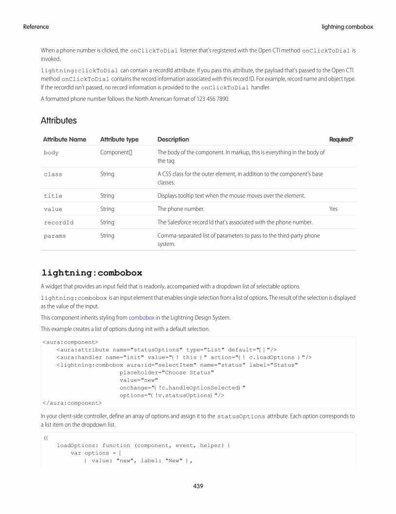
When a phone number is clicked, the onClickToDial listener that’s registered with the Open CTI method onClickToDial isinvoked.
lightning:clickToDial can contain a recordId attribute. If you pass this attribute, the payload that’s passed to the Open CTImethod onClickToDial contains the record information associated with this record ID. For example, record name and object type.If the recordId isn’t passed, no record information is provided to the onClickToDial handler.
A formatted phone number follows the North American format of 123 456 7890.
Attributes
Required?DescriptionAttribute typeAttribute Name
The body of the component. In markup, this is everything in the body ofthe tag.
Component[]body
A CSS class for the outer element, in addition to the component's baseclasses.
Stringclass
Displays tooltip text when the mouse moves over the element.Stringtitle
YesThe phone number.Stringvalue
The Salesforce record Id that's associated with the phone number.StringrecordId
Comma-separated list of parameters to pass to the third-party phonesystem.
Stringparams
lightning:comboboxA widget that provides an input field that is readonly, accompanied with a dropdown list of selectable options.
lightning:combobox is an input element that enables single selection from a list of options. The result of the selection is displayedas the value of the input.
This component inherits styling from combobox in the Lightning Design System.
This example creates a list of options during init with a default selection.
<aura:component><aura:attribute name="statusOptions" type="List" default="[]"/><aura:handler name="init" value="{! this }" action="{! c.loadOptions }"/><lightning:combobox aura:id="selectItem" name="status" label="Status"
placeholder="Choose Status"value="new"onchange="{!c.handleOptionSelected}"options="{!v.statusOptions}"/>
</aura:component>
In your client-side controller, define an array of options and assign it to the statusOptions attribute. Each option corresponds toa list item on the dropdown list.
({loadOptions: function (component, event, helper) {
var options = [{ value: "new", label: "New" },
439
lightning:comboboxReference
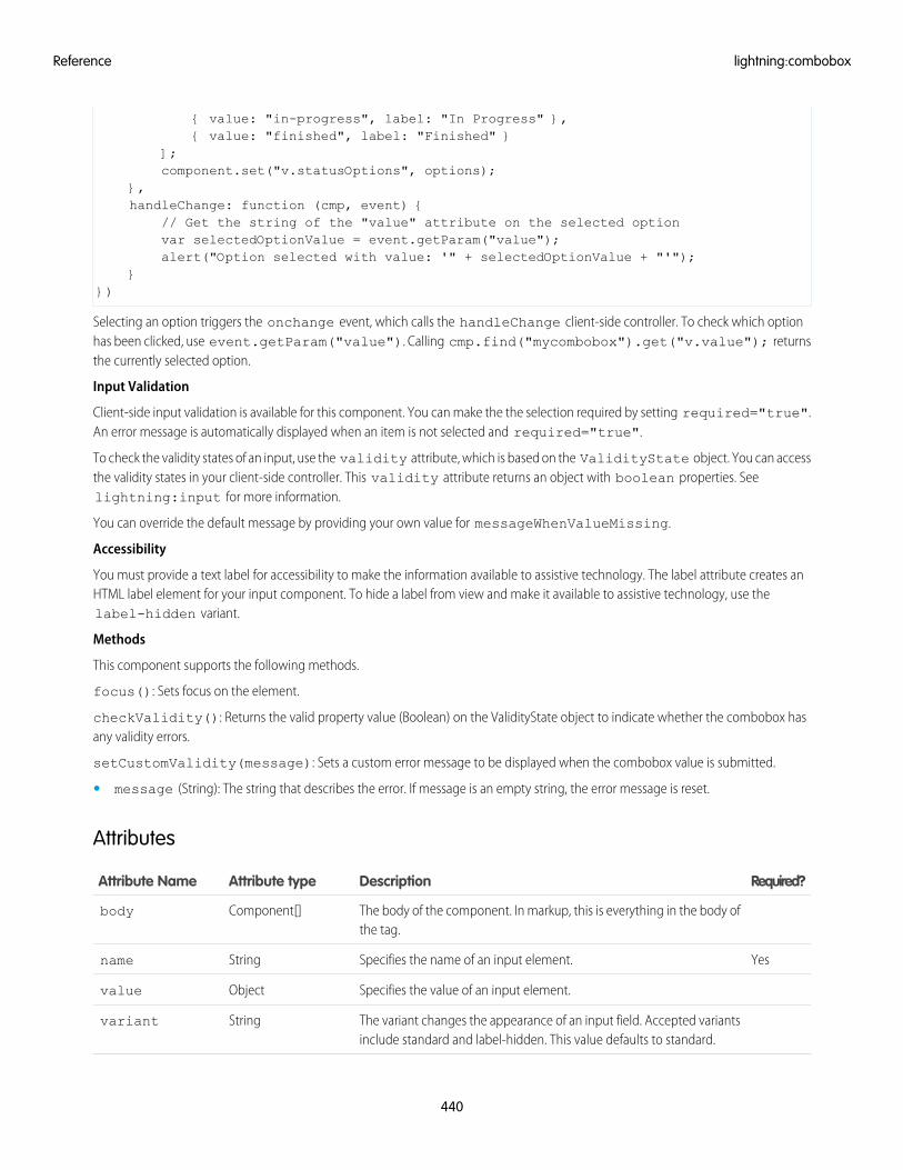
{ value: "in-progress", label: "In Progress" },{ value: "finished", label: "Finished" }
];component.set("v.statusOptions", options);
},handleChange: function (cmp, event) {
// Get the string of the "value" attribute on the selected optionvar selectedOptionValue = event.getParam("value");alert("Option selected with value: '" + selectedOptionValue + "'");
}})
Selecting an option triggers the onchange event, which calls the handleChange client-side controller. To check which optionhas been clicked, use event.getParam("value"). Calling cmp.find("mycombobox").get("v.value"); returnsthe currently selected option.
Input Validation
Client-side input validation is available for this component. You can make the the selection required by setting required="true".An error message is automatically displayed when an item is not selected and required="true".
To check the validity states of an input, use the validity attribute, which is based on the ValidityState object. You can accessthe validity states in your client-side controller. This validity attribute returns an object with boolean properties. Seelightning:input for more information.
You can override the default message by providing your own value for messageWhenValueMissing.
Accessibility
You must provide a text label for accessibility to make the information available to assistive technology. The label attribute creates anHTML label element for your input component. To hide a label from view and make it available to assistive technology, use thelabel-hidden variant.
Methods
This component supports the following methods.
focus(): Sets focus on the element.
checkValidity(): Returns the valid property value (Boolean) on the ValidityState object to indicate whether the combobox hasany validity errors.
setCustomValidity(message): Sets a custom error message to be displayed when the combobox value is submitted.
• message (String): The string that describes the error. If message is an empty string, the error message is reset.
Attributes
Required?DescriptionAttribute typeAttribute Name
The body of the component. In markup, this is everything in the body ofthe tag.
Component[]body
YesSpecifies the name of an input element.Stringname
Specifies the value of an input element.Objectvalue
The variant changes the appearance of an input field. Accepted variantsinclude standard and label-hidden. This value defaults to standard.
Stringvariant
440
lightning:comboboxReference
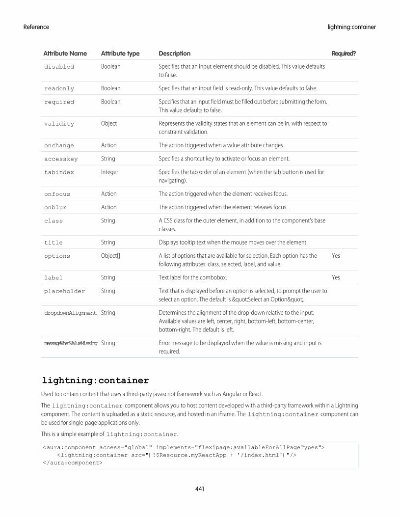
Required?DescriptionAttribute typeAttribute Name
Specifies that an input element should be disabled. This value defaultsto false.
Booleandisabled
Specifies that an input field is read-only. This value defaults to false.Booleanreadonly
Specifies that an input field must be filled out before submitting the form.This value defaults to false.
Booleanrequired
Represents the validity states that an element can be in, with respect toconstraint validation.
Objectvalidity
The action triggered when a value attribute changes.Actiononchange
Specifies a shortcut key to activate or focus an element.Stringaccesskey
Specifies the tab order of an element (when the tab button is used fornavigating).
Integertabindex
The action triggered when the element receives focus.Actiononfocus
The action triggered when the element releases focus.Actiononblur
A CSS class for the outer element, in addition to the component's baseclasses.
Stringclass
Displays tooltip text when the mouse moves over the element.Stringtitle
YesA list of options that are available for selection. Each option has thefollowing attributes: class, selected, label, and value.
Object[]options
YesText label for the combobox.Stringlabel
Text that is displayed before an option is selected, to prompt the user toselect an option. The default is "Select an Option".
Stringplaceholder
Determines the alignment of the drop-down relative to the input.Available values are left, center, right, bottom-left, bottom-center,bottom-right. The default is left.
StringdropdownAlignment
Error message to be displayed when the value is missing and input isrequired.
StringmessageWhenValueMissing
lightning:containerUsed to contain content that uses a third-party javascript framework such as Angular or React.
The lightning:container component allows you to host content developed with a third-party framework within a Lightningcomponent. The content is uploaded as a static resource, and hosted in an iFrame. The lightning:container component canbe used for single-page applications only.
This is a simple example of lightning:container.
<aura:component access="global" implements="flexipage:availableForAllPageTypes"><lightning:container src="{!$Resource.myReactApp + '/index.html'}"/>
</aura:component>
441
lightning:containerReference
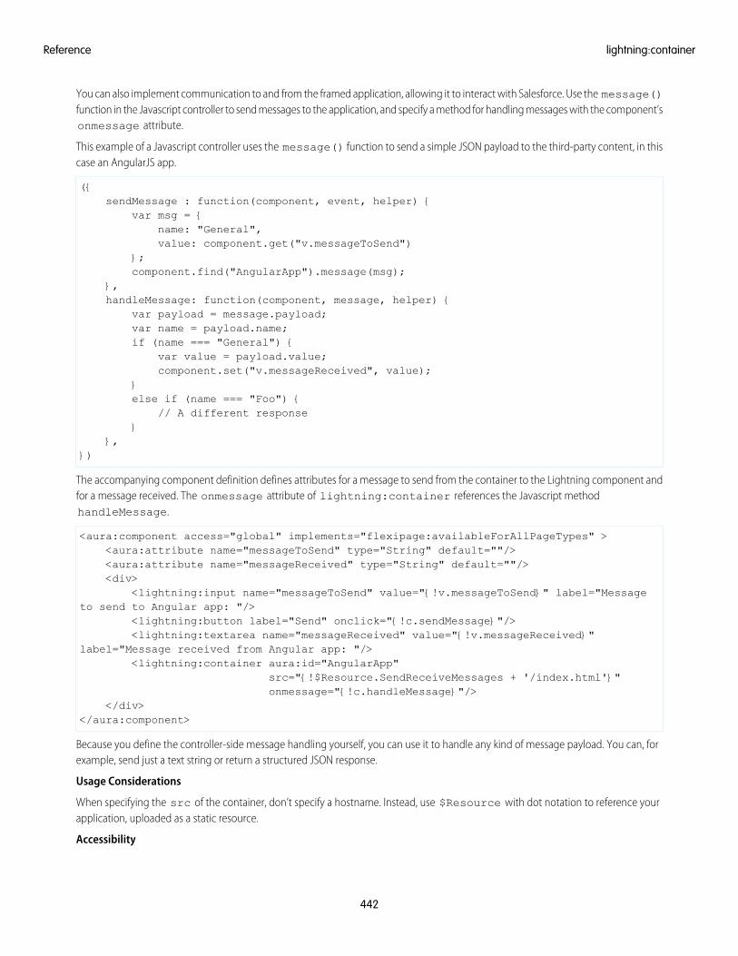
You can also implement communication to and from the framed application, allowing it to interact with Salesforce. Use the message()function in the Javascript controller to send messages to the application, and specify a method for handling messages with the component’sonmessage attribute.
This example of a Javascript controller uses the message() function to send a simple JSON payload to the third-party content, in thiscase an AngularJS app.
({sendMessage : function(component, event, helper) {
var msg = {name: "General",value: component.get("v.messageToSend")
};component.find("AngularApp").message(msg);
},handleMessage: function(component, message, helper) {
var payload = message.payload;var name = payload.name;if (name === "General") {
var value = payload.value;component.set("v.messageReceived", value);
}else if (name === "Foo") {
// A different response}
},})
The accompanying component definition defines attributes for a message to send from the container to the Lightning component andfor a message received. The onmessage attribute of lightning:container references the Javascript methodhandleMessage.
<aura:component access="global" implements="flexipage:availableForAllPageTypes" ><aura:attribute name="messageToSend" type="String" default=""/><aura:attribute name="messageReceived" type="String" default=""/><div>
<lightning:input name="messageToSend" value="{!v.messageToSend}" label="Messageto send to Angular app: "/>
<lightning:button label="Send" onclick="{!c.sendMessage}"/><lightning:textarea name="messageReceived" value="{!v.messageReceived}"
label="Message received from Angular app: "/><lightning:container aura:id="AngularApp"
src="{!$Resource.SendReceiveMessages + '/index.html'}"onmessage="{!c.handleMessage}"/>
</div></aura:component>
Because you define the controller-side message handling yourself, you can use it to handle any kind of message payload. You can, forexample, send just a text string or return a structured JSON response.
Usage Considerations
When specifying the src of the container, don’t specify a hostname. Instead, use $Resource with dot notation to reference yourapplication, uploaded as a static resource.
Accessibility
442
lightning:containerReference
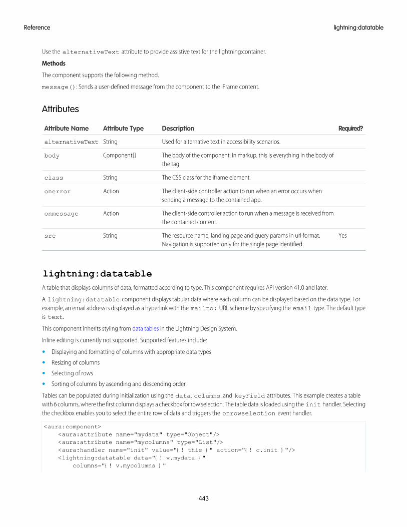
Use the alternativeText attribute to provide assistive text for the lightning:container.
Methods
The component supports the following method.
message(): Sends a user-defined message from the component to the iFrame content.
Attributes
Required?DescriptionAttribute TypeAttribute Name
Used for alternative text in accessibility scenarios.StringalternativeText
The body of the component. In markup, this is everything in the body ofthe tag.
Component[]body
The CSS class for the iframe element.Stringclass
The client-side controller action to run when an error occurs whensending a message to the contained app.
Actiononerror
The client-side controller action to run when a message is received fromthe contained content.
Actiononmessage
YesThe resource name, landing page and query params in url format.Navigation is supported only for the single page identified.
Stringsrc
lightning:datatableA table that displays columns of data, formatted according to type. This component requires API version 41.0 and later.
A lightning:datatable component displays tabular data where each column can be displayed based on the data type. Forexample, an email address is displayed as a hyperlink with the mailto: URL scheme by specifying the email type. The default typeis text.
This component inherits styling from data tables in the Lightning Design System.
Inline editing is currently not supported. Supported features include:
• Displaying and formatting of columns with appropriate data types
• Resizing of columns
• Selecting of rows
• Sorting of columns by ascending and descending order
Tables can be populated during initialization using the data, columns, and keyField attributes. This example creates a tablewith 6 columns, where the first column displays a checkbox for row selection. The table data is loaded using the init handler. Selectingthe checkbox enables you to select the entire row of data and triggers the onrowselection event handler.
<aura:component><aura:attribute name="mydata" type="Object"/><aura:attribute name="mycolumns" type="List"/><aura:handler name="init" value="{! this }" action="{! c.init }"/><lightning:datatable data="{! v.mydata }"
columns="{! v.mycolumns }"
443
lightning:datatableReference
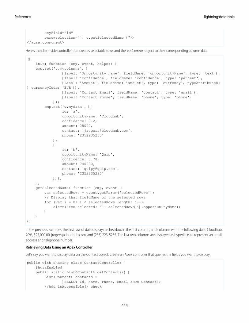
keyField="id"onrowselection="{! c.getSelectedName }"/>
</aura:component>
Here's the client-side controller that creates selectable rows and the columns object to their corresponding column data.
({init: function (cmp, event, helper) {cmp.set('v.mycolumns', [
{label: 'Opportunity name', fieldName: 'opportunityName', type: 'text'},{label: 'Confidence', fieldName: 'confidence', type: 'percent'},{label: 'Amount', fieldName: 'amount', type: 'currency', typeAttributes:
{ currencyCode: 'EUR'}},{label: 'Contact Email', fieldName: 'contact', type: 'email'},{label: 'Contact Phone', fieldName: 'phone', type: 'phone'}
]);cmp.set('v.mydata', [{
id: 'a',opportunityName: 'Cloudhub',confidence: 0.2,amount: 25000,contact: '[email protected]',phone: '2352235235'
},{
id: 'b',opportunityName: 'Quip',confidence: 0.78,amount: 740000,contact: '[email protected]',phone: '2352235235'
}]);},getSelectedName: function (cmp, event) {
var selectedRows = event.getParam('selectedRows');// Display that fieldName of the selected rowsfor (var i = 0; i < selectedRows.length; i++){
alert("You selected: " + selectedRows[i].opportunityName);}
}})
In the previous example, the first row of data displays a checkbox in the first column, and columns with the following data: Cloudhub,20%, $25,000.00, [email protected], and (235) 223-5235. The last two columns are displayed as hyperlinks to represent an emailaddress and telephone number.
Retrieving Data Using an Apex Controller
Let's say you want to display data on the Contact object. Create an Apex controller that queries the fields you want to display.
public with sharing class ContactController {@AuraEnabledpublic static List<Contact> getContacts() {
List<Contact> contacts =[SELECT Id, Name, Phone, Email FROM Contact];
//Add isAccessible() check
444
lightning:datatableReference
return contacts;}
}
Wire this up to your component via the controller attribute. The markup looks similar to the previous example.
<aura:component controller="ContactController"><aura:attribute name="mydata" type="Object"/><aura:attribute name="mycolumns" type="List"/><aura:handler name="init" value="{! this }" action="{! c.init }"/><lightning:datatable data="{! v.mydata }"
columns="{! v.mycolumns }"keyField="Id"hideCheckboxColumn="true"/>
</aura:component>
Initialize the column data by mapping the fieldName property to the API name of the field.
({init: function (cmp, event, helper) {
cmp.set('v.mycolumns', [{label: 'Contact Name', fieldName: 'Name', type: 'text'},{label: 'Phone', fieldName: 'Phone', type: 'phone'},{label: 'Email', fieldName: 'Email', type: 'email'}
]);helper.getData(cmp);
}})
Finally, retrieve the contacts in your helper.
({getData : function(cmp) {
var action = cmp.get('c.getContacts');action.setCallback(this, $A.getCallback(function (response) {
var state = response.getState();if (state === "SUCCESS") {
cmp.set('v.mydata', response.getReturnValue());} else if (state === "ERROR") {
var errors = response.getError();console.error(errors);
}}));$A.enqueueAction(action);
}})
Working with Column Data
Besides providing the column data, you must define the following column properties.
• label: Required. The text label displayed in the column header.
• fieldName: Required. The name that binds the columns properties to the associated data. Each columns property mustcorrespond to an item in the data array.
• type: Required. The data type to be used for data formatting.
445
lightning:datatableReference
• initialWidth: The width of the column when it's initialized, which must be within the minColumnWidth andmaxColumnWidth values, or within 50px and 1000px if they are not provided.
• typeAttributes: Provides custom formatting with component attributes for the data type. For example, currencyCodefor the currency type.
• sortable: Specifies whether sorting by columns is enabled. The default is false.
Formatting with Data Types
The data table determines the format based on the type you specify. Each data type is associated to a base Lightning component. Forexample, specifying the text type renders the associated data using a lightning:formattedText component. Some ofthese types allow you to pass in the attributes via the typeAttributes property to customize your output. For supported attributevalues, refer to the component’s reference documentation. Valid data types and their supported attributes include:
Supported Type AttributesDescriptionType
N/ADisplays a date and time based onthe locale usinglightning:formattedDateTime
date
N/ADisplays an email address usinglightning:formattedEmail
latitude, longitudeDisplays a latitude and longitude ofa location usinglightning:formattedLocation
location
minimumIntegerDigits, minimumFractionDigits,maximumFractionDigits, minimumSignificanentryigits,maximumSignificanentryigits
Displays a number usinglightning:formattedNumber
number
currencyCode, currencyDisplayAsDisplays a currency usinglightning:formattedNumber
currency
Same as number typeDisplays a percentage usinglightning:formattedNumber
percent
N/ADisplays a phone number usinglightning:formattedPhone
phone
N/ADisplays text usinglightning:formattedText
text
targetDisplays a URL usinglightning:formattedUrl
url
To customize the formatting based on the data type, pass in the attributes for the corresponding base Lightning component. For example,pass in a custom currencyCode value to override the default currency code.
columns: [{label: 'Amount', fieldName: 'amount', type: 'currency', typeAttributes: { currencyCode:
'EUR' }}]
When using currency or date and time types, the default user locale is used when no locale formatting is provided.
446
lightning:datatableReference
For more information on attributes, see the corresponding component documentation.
Resizing Tables and Columns
The width and height of the datatable is determined by the container element. A scroller is appended to the table body if there are morerows to display. For example, you can restrict the height to 300px by applying CSS styling to the container element.
<div style="height: 300px;"><!-- lightning:datatable goes here -->
</div>
By default, columns are resizable. Users can click and drag the width to a minimum of 50px and a maximum of 1000px, unless the defaultvalues are changed. Columns can be resized by default. You can disable column resizing by setting resizeColumnDisabled totrue. To change the minimum and maximum width column, use the minColumnWidth and maxColumnWidth attributes.
Sorting Data By Column
To enable sorting of row data by a column label, set sortable to true for the column on which you want to enable sorting. SetsortedBy to match the fieldName property on the column. Clicking a column header sorts rows by ascending order unless thedefaultSortDirection is changed, and clicking it subsequently reverses the order. Handle the onsort event handler toupdate the table with the new column index and sort direction.
Here's an example of the client-side controller that's called by the onsort event handler.
({// Client-side controller called by the onsort event handlerupdateColumnSorting: function (cmp, event, helper) {
var fieldName = event.getParam('fieldName');var sortDirection = event.getParam('sortDirection');
// assign the latest attribute with the sorted column fieldName and sorted direction
cmp.set("v.sortedBy", fieldName);cmp.set("v.sortedDirection", sortDirection);helper.sortData(cmp, fieldName, sortDirection);
}})
The helper function is as follows.
({sortData: function (cmp, fieldName, sortDirection) {
var data = cmp.get("v.data");var reverse = sortDirection !== 'asc';//sorts the rows based on the column header that's clickeddata.sort(this.sortBy(fieldName, reverse))cmp.set("v.data", data);
},sortBy: function (field, reverse, primer) {
var key = primer ?function(x) {return primer(x[field])} :function(x) {return x[field]};
//checks if the two rows should switch placesreverse = !reverse ? 1 : -1;return function (a, b) {
return a = key(a), b = key(b), reverse * ((a > b) - (b > a));}
}})
447
lightning:datatableReference
Accessibility
You can use data tables in navigation mode and action mode using the keyboard. To enter navigation mode, tab into the data table,which triggers focus on the first data cell in the table body. Use the arrow keys to move around the table.
Columns can be resized in action mode. To resize a column, navigate to the header by pressing the Up Arrow key. Press the Enter keyor Space Bar to enter action mode. Then, press the Tab key to activate the column divider, and resize the column using the Left Arrowand Right Arrow key. To finish resizing the column and return to navigation mode, press the Tab key.
Methods
This component supports the following method.
getSelectedRows(): Returns an array of data in each selected row.
Attributes
Required?DescriptionAttribute TypeAttribute Name
The body of the component. In markup, this is everything in the body ofthe tag.
Component[]body
A CSS class for the outer element, in addition to the component's baseclasses.
Stringclass
Displays tooltip text when the mouse moves over the element.Stringtitle
YesRequired for better performance. Associates each row with a unique ID.StringkeyField
Array of the columns object that's used to define the data types. Requiredproperties include 'label', 'fieldName', and 'type'. The default type is 'text'.
Listcolumns
The array of data to be displayed.Objectdata
Hides or displays the checkbox column for row selection. To hide thecheckbox column, set hideCheckboxColumn to true. The default is false.
BooleanhideCheckboxColumn
Specifies whether column resizing is disabled. The default is false.BooleanresizeColumnDisabled
The minimum width for all columns. The default is 50px.IntegerminColumnWidth
The maximum width for all columns. The default is 1000px.IntegermaxColumnWidth
The width to resize the column when user press left or right arrow. Thedefault is 10px.
IntegerresizeStep
The column fieldName that controls the sorting order. Sort the data usingthe onsort event handler.
StringsortedBy
Specifies the sorting direction. Sort the data using the onsort eventhandler. Valid options include 'asc' and 'desc'.
StringsortedDirection
Specifies the default sorting direction on an unsorted column. Validoptions include 'asc' and 'desc'. The default is 'asc' for sorting in ascendingorder.
StringdefaultSortDirection
The action triggered when a row is selected.Actiononrowselection
448
lightning:datatableReference
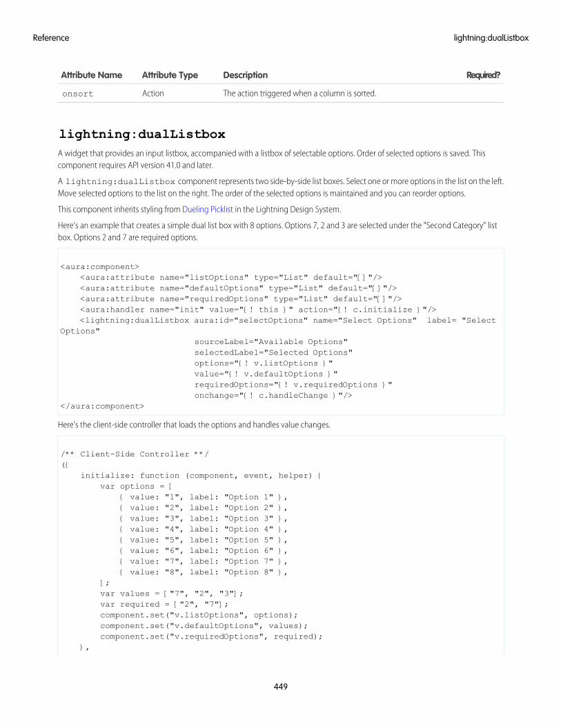
Required?DescriptionAttribute TypeAttribute Name
The action triggered when a column is sorted.Actiononsort
lightning:dualListboxA widget that provides an input listbox, accompanied with a listbox of selectable options. Order of selected options is saved. Thiscomponent requires API version 41.0 and later.
A lightning:dualListbox component represents two side-by-side list boxes. Select one or more options in the list on the left.Move selected options to the list on the right. The order of the selected options is maintained and you can reorder options.
This component inherits styling from Dueling Picklist in the Lightning Design System.
Here's an example that creates a simple dual list box with 8 options. Options 7, 2 and 3 are selected under the "Second Category" listbox. Options 2 and 7 are required options.
<aura:component><aura:attribute name="listOptions" type="List" default="[]"/><aura:attribute name="defaultOptions" type="List" default="[]"/><aura:attribute name="requiredOptions" type="List" default="[]"/><aura:handler name="init" value="{! this }" action="{! c.initialize }"/><lightning:dualListbox aura:id="selectOptions" name="Select Options" label= "Select
Options"sourceLabel="Available Options"selectedLabel="Selected Options"options="{! v.listOptions }"value="{! v.defaultOptions }"requiredOptions="{! v.requiredOptions }"onchange="{! c.handleChange }"/>
</aura:component>
Here's the client-side controller that loads the options and handles value changes.
/** Client-Side Controller **/({
initialize: function (component, event, helper) {var options = [
{ value: "1", label: "Option 1" },{ value: "2", label: "Option 2" },{ value: "3", label: "Option 3" },{ value: "4", label: "Option 4" },{ value: "5", label: "Option 5" },{ value: "6", label: "Option 6" },{ value: "7", label: "Option 7" },{ value: "8", label: "Option 8" },
];var values = ["7", "2", "3"];var required = ["2", "7"];component.set("v.listOptions", options);component.set("v.defaultOptions", values);component.set("v.requiredOptions", required);
},
449
lightning:dualListboxReference
handleChange: function (cmp, event) {// Get the list of the "value" attribute on all the selected optionsvar selectedOptionsList = event.getParam("value");alert("Options selected: '" + selectedOptionsList + "'");
}})
To specify the number of options users can select, use the min and max attributes. For example, if you set min to 3 and max to 8,users must select at least 3 options and at most 8 options.
Usage Considerations
To retrieve the selected values, use the onchange handler.
({onChange: function (cmp, event) {// Retrieve an array of the selected optionsvar selectedOptionValue = event.getParam("value");}
})
The onchange handler is triggered when you click the left and right buttons to move options from one list to another or when youchange the order of options in the selected options list.
Accessibility
Use the following keyboard shortcuts to work with dual list boxes.
• Click - Select a single option.
• Cmd+Click - Select multiple options or deselect selected options.
• Shift+Click - Select all options between the current and last clicked option.
When focus is on options:
• Up Arrow - Move selection to previous option.
• Down Arrow - Move selection to next option.
• Cmd/Ctrl+Up Arrow - Move focus to previous option.
• Cmd/Ctrl+Down Arrow - Move focus to next option.
• Ctrl+Space - Toggle selection of focused option.
• Cmd/Ctrl+Right Arrow - Move selected options to right list box.
• Cmd/Ctrl+Left Arrow - Move selected options to left list box.
• Tab - Move focus to next element.
When focus is on a button:
• Enter - Perform the operation associated with that button.
Methods
This component supports the following methods.
focus(): Sets focus on the element.
checkValidity(): Returns the valid property value (Boolean) on the ValidityState object to indicate whether the dual listbox hasany validity errors.
setCustomValidity(message): Sets a custom error message to be displayed when the dual listbox value is submitted.
450
lightning:dualListboxReference
• message (String): The string that describes the error. If message is an empty string, the error message is reset.
showHelpMessageIfInvalid(): Shows the help message if the form control is in an invalid state.
Attributes
Required?DescriptionAttribute typeAttribute Name
The body of the component. In markup, this is everything in the body ofthe tag.
Component[]body
YesSpecifies the name of an input element.Stringname
Specifies the value of an input element.Objectvalue
The variant changes the appearance of an input field. Accepted variantsinclude standard and label-hidden. This value defaults to standard.
Stringvariant
Specifies that an input element should be disabled. This value defaultsto false.
Booleandisabled
Specifies that an input field is read-only. This value defaults to false.Booleanreadonly
Specifies that an input field must be filled out before submitting the form.This value defaults to false.
Booleanrequired
Represents the validity states that an element can be in, with respect toconstraint validation.
Objectvalidity
The action triggered when a value attribute changes.Actiononchange
Specifies a shortcut key to activate or focus an element.Stringaccesskey
Specifies the tab order of an element (when the tab button is used fornavigating).
Integertabindex
The action triggered when the element receives focus.Actiononfocus
The action triggered when the element releases focus.Actiononblur
YesLabel for the dual list box.Stringlabel
YesLabel for source options list box.StringsourceLabel
YesLabel for selected options list box.StringselectedLabel
YesA list of options that are available for selection. Each option has thefollowing attributes: label and value.
Object[]options
A list of required options that cannot be removed from selected optionslist box. This list is populated with values from options attribute.
ListrequiredOptions
A list of default options that are included in the selected options list box.This list is populated with values from the options attribute.
Listvalues
Minimum number of options required in the selected options list box.Integermin
Maximum number of options required in the selected options list box.Integermax
451
lightning:dualListboxReference
lightning:dynamicIconRepresents various animated icons with different states. This component requires API version 41.0 and later.
A lightning:dynamicIcon component visually displays an event that's in progress, such as a graph that's loading.
This component inherits styling from dynamic icons in the Lightning Design System.
Here’s an example of an ellie icon with alternative text.
<aura:component><lightning:dynamicIcon type="ellie" alternativeText="Your calculation is running."/>
</aura:component>
Usage Considerations
The following options are available.
• Use the type="ellie" attribute to show a pulsing blue circle, which pulses and stops after one animation cycle. This icon isgreat for field calculations or a process that’s running in the background.
• Use the type="eq" attribute to show an animated graph with three bars that rise and fall randomly. This icon is great for a graphthat’s refreshing.
• Use the type="score" attribute to show a green filled circle or a red unfilled circle. This icon is great for showing positive andnegative indicators.
• Use the type="strength" attribute to show three animated horizontal circles that are colored green or red. This icon is greatfor Einstein calculations or indicating password strengths.
• Use the type="trend" attribute to show animated arrows that point up, down, or straight. This icon is great for showingmovement of a value from one range to another, like a forecast score.
• Use the type="waffle" attribute to show a square made up of a 3x3 grid of circles. This icon animates on hover. This icon isgreat for app-related items, like the App Launcher in Lightning Experience.
Accessibility
Optionally, you can use the alternativeText attribute to describe the dynamicIcon.
Sometimes a dynamicIcon is decorative and doesn’t need a description. However, on smaller screens and windows thedynamicIcon can also be informational. In this case, include alternativeText. If you don’t include alternativeText,check smaller screens and windows to ensure that the dynamicIcon is only decorative on all formats.
Attributes
Required?DescriptionAttribute typeAttribute Name
The body of the component. In markup, this is everything in the body ofthe tag.
Component[]body
A CSS class for the outer element, in addition to the component's baseclasses.
Stringclass
Displays tooltip text when the mouse moves over the element.Stringtitle
YesThe Lightning Design System name of the dynamicIcon. Valid values are:ellie, eq, score, strength, trend, and waffle.
Stringtype
The option attribute changes the appearance of the dynamicIcon. Theoptions available depend on the type attribute. For eq: play (default) or
Stringoption
452
lightning:dynamicIconReference
Required?DescriptionAttribute typeAttribute Name
stop For score: positive (default) or negative For strength: -3, -2, -1, 0(default), 1, 2, 3 For trend: neutral (default), up, or down
The alternative text used to describe the dynamicIcon. This text shoulddescribe what’s happening. For example, 'Graph is refreshing',not what the icon looks like, 'Graph'.
StringalternativeText
The action triggered when the icon is clicked.Actiononclick
lightning:fileCardDisplays a preview of an uploaded file available in Salesforce CRM Content or Salesforce Files.
A lightning:fileCard component displays a preview of a file. On desktops, clicking the file preview opens the SVG file previewplayer, enabling you to preview images, documents, and other files in the browser. The file preview player provides quick access to fileactions, such as upload, delete, download, and share. On mobile devices, clicking the file preview downloads the file. If a title is available,it's displayed below the file preview in the caption area. The file type determines the icon used on the file preview and caption area.
This component inherits styling from files in the Lightning Design System.
Here's an example of a file preview. The fileId value must be a valid 15 character ContentDocument ID.
<aura:component><lightning:fileCard fileId="069XXXXXXXXXXXX"/>
</aura:component>
Usage Considerations
Opening the file preview player is supported in Lightning Experience, the Salesforce mobile web, and Lightning communities.
Attributes
Required?DescriptionAttribute TypeAttribute Name
The body of the component. In markup, this is everything in the body ofthe tag.
Component[]body
YesThe Salesforce File ID (ContentDocument).StringfileId
lightning:fileUpload (Beta)A file uploader for uploading and attaching files to records.
A lightning:fileUpload component provides an easy and integrated way for users to upload multiple files. The file uploaderincludes drag-and-drop functionality and filtering by file types.
This component inherits styling from file selector in the Lightning Design System.
File uploads are always associated to a record, hence the recordId attribute is required. Uploaded files are available in Files Homeunder the Owned by Me filter and on the record's Attachments related list on the record detail page. Although all file formats that aresupported by Salesforce are allowed, you can restrict the file formats using the accept attribute.
453
lightning:fileCardReference
This example creates a file uploader that allows multiple PDF and PNG files to be uploaded. Change the recordId value to your own.
<aura:component><aura:attribute name="myRecordId" type="String" description="Record to which the files
should be attached" /><lightning:fileUpload label="Attach receipt"
multiple="true"accept=".pdf, .png"recordId="{!v.myRecordId}"onuploadfinished="{!c.handleUploadFinished}" />
</aura:component
You must handle the onuploadfinished event, which is fired when the upload is finished.
({handleUploadFinished: function (cmp, event) {
// Get the list of uploaded filesvar uploadedFiles = event.getParam("files");alert("Files uploaded : " + uploadedFiles.length);
}})
event.getParam("files") returns a list of uploaded files with the properties name and documentId.
• name: The file name in the format filename.extension, for example, account.jpg.
• documentId: The ContentDocument Id in the format 069XXXXXXXXXXXX.
File Upload Limits
By default, you can upload up to 10 files simultaneously unless your Salesforce admin has changed that limit. The org limit for the numberof files simultaneously uploaded is a maximum of 25 files and a minimum of 3 files. The maximum file size you can upload is 2 GB. InCommunities, the file size limits and types allowed follow the settings determined by community file moderation.
Usage Considerations
This component is not supported in Lightning Out or standalone apps, and displays as a disabled input. Additionally, if the Don'tallow HTML uploads as attachments or document records security setting is enabled for your organization,the file uploader cannot be used to upload files with the following file extensions: .htm, .html, .htt, .htx, .mhtm, .mhtml, .shtm, .shtml,.acgi, .svg. For more information, see Upload and Share Files in Salesforce Help.
Attributes
Required?DescriptionAttribute typeAttribute Name
The body of the component. In markup, this is everything in the body ofthe tag.
Component[]body
A CSS class for the outer element, in addition to the component's baseclasses.
Stringclass
Displays tooltip text when the mouse moves over the element.Stringtitle
YesThe text label for the file uploader.Stringlabel
YesThe record Id of the record that the uploaded file is associated to.StringrecordId
454
lightning:fileUpload (Beta)Reference
Required?DescriptionAttribute typeAttribute Name
Specifies whether a user can upload more than one file simultanesouly.This value defaults to false.
Booleanmultiple
Specifies whether this component should be displayed in a disabledstate. Disabled components can't be clicked. This value defaults to false.
Booleandisabled
Comma-separated list of file extensions that can be uploaded in theformat .ext, such as .pdf, .jpg, or .png
Listaccept
The action triggered when files have finished uploading.Actiononuploadfinished
lightning:flexipageRegionInfoProvides Lightning page region information to the component that contains it.
The lightning:flexipageRegionInfo component provides Lightning page region information to the component thatcontains it. It passes the width of the region that the component is dropped into in the Lightning App Builder. For more information,see "Make Your Lightning Page Components Width Aware With lightning:flexipageRegionInfo."
<aura:component implements="flexipage:availableForAllPageTypes"><aura:attribute name="width" type="String" description=" width of parent region"/><lightning:flexipageRegionInfo width="{!v.width}"/>
<div id="MyCustomComponent" class="{! v.width}"><!-- Your custom component here -->
</div></aura:component>
Attributes
Required?DescriptionAttribute TypeAttribute Name
The body of the component. In markup, this is everything in the body ofthe tag.
Component[]body
The width of the region that the component resides in.Stringwidth
lightning:flowRepresents a flow interview in Lightning runtime. This component requires API version 41.0 and later.
A lightning:flow component represents a flow interview in Lightning runtime.
Specify which flow to render with the name attribute. If it’s appropriate for your flow, initialize the flow’s input variables with theinputVariables attribute.
This example renders the Survey Customers flow (from the Create a Satisfaction Survey Trailhead project).
<aura:component><aura:handler name="init" value="{!this}" action="{!c.init}"/>
455
lightning:flexipageRegionInfoReference
<lightning:flow aura:id="flowData"/></aura:component>
In your client-side controller, identify which flow to start.
({init : function (cmp) {var flow = cmp.find("flowData");flow.startFlow("Survey_customers");
}})
Usage Considerations
The referenced flow must be active.
Valid statuses for a flow interview are:
• STARTED: the interview successfully started.
• PAUSED: the interview was successfully paused.
• FINISHED: the interview for a flow with screens finished.
• FINISHED_SCREEN: the interview for a flow without screens finished, and the component displayed a default screen with thismessage: “Your flow finished”
• ERROR: something went wrong and the interview has failed.
Each flow component includes navigation buttons (Back, Next, Pause, and Finish), which navigate within the flow. By default, when theflow finishes, the component reloads the first screen for a new interview. To customize what happens when the flow finishes, add anevent handler for the onstatuschange action when status contains FINISHED.
Methods
This component supports the following methods.
startFlow(flowName, inputVariables): Starts a flow interview.
• flowName (String): The unique name of the flow to render.
• inputVariables (Object[]): Sets initial values for the flow’s input variables.
resumeFlow(interviewId): Resumes a paused flow interview.
• interviewId (String): ID of the interview to resume.
For more information, see Working with the Flow Lightning Component in the Lightning Components Developer Guide.
Attributes
Required?DescriptionAttribute TypeAttribute Name
The body of the component. In markup, this is everything in the body ofthe tag.
Component[]body
A CSS class for the outer element, in addition to the component's baseclasses.
Stringclass
Displays tooltip text when the mouse moves over the element.Stringtitle
The current status of the flow interview.Actiononstatuschange
456
lightning:flowReference
lightning:formattedDateTime (Beta)Displays formatted date and time.
A lightning:formattedDateTime component displays formatted date and time. This component uses the Intl.DateTimeFormatJavaScript object to format date values. The locale set in the app's user preferences determines the formatting. The following inputvalues are supported.
• Date object
• ISO8601 formatted string
• Timestamp
An ISO8601 formatted string matches one of the following patterns.
• YYYY
• YYYY-MM
• YYYY-MM-DD
• YYYY-MM-DDThh:mmTZD
• YYYY-MM-DDThh:mm:ssTZD
• YYYY-MM-DDThh:mm:ss.sTZD
Here are some examples based on a locale of en-US.
Displays: 8/2/2016
<aura:component><lightning:formattedDateTime value="1470174029742" />
</aura:component>
Displays: Tuesday, Aug 02, 16
<aura:component><lightning:formattedDateTime value="1470174029742" year="2-digit" month="short"
day="2-digit" weekday="long"/></aura:component>
Displays: 8/2/2016, 3:15 PM PDT
<aura:component><lightning:formattedDateTime value="1470174029742" year="numeric" month="numeric"
day="numeric" hour="2-digit" minute="2-digit" timeZoneName="short" /></aura:component>
Usage Considerations
This component provides fallback behavior in Apple Safari 10 and below. The following formatting options have exceptions when usingthe fallback behavior in older browsers.
• era is not supported.
• timeZoneName appends GMT for short format, GMT-h:mm or GMT+h:mm for long format.
• timeZone supports UTC. If another timezone value is used, lightning:formattedDateTime uses the browser timezone.
457
lightning:formattedDateTime (Beta)Reference
Attributes
Required?DescriptionAttribute TypeAttribute Name
The body of the component. In markup, this is everything in the body ofthe tag.
Component[]body
A CSS class for the outer element, in addition to the component's baseclasses.
Stringclass
Allowed values are numeric or 2-digit.Stringday
Allowed values are narrow, short, or long.Stringera
Allowed values are numeric or 2-digit.Stringhour
Determines whether time is displayed as 12-hour. If false, time displaysas 24-hour. The default setting is determined by the user's locale.
Booleanhour12
Allowed values are numeric or 2-digit.Stringminute
Allowed values are 2-digit, narrow, short, or long.Stringmonth
Allowed values are numeric or 2-digit.Stringsecond
The time zone to use. Implementations can include any time zone listedin the IANA time zone database. The default is the runtime's default timezone. Use this attribute only if you want to override the default time zone.
StringtimeZone
Allowed values are short or long. For example, the Pacific Time zonewould display as 'PST' if you select 'short', or 'Pacific Standard Time' if youselect 'long.'
StringtimeZoneName
Displays tooltip text when the mouse moves over the element.Stringtitle
YesThe value to be formatted, which can be a Date object, timestamp, oran ISO8601 formatted string.
Objectvalue
Allowed values are narrow, short, or long.Stringweekday
Allowed values are numeric or 2-digit.Stringyear
lightning:formattedEmailDisplays an email as a hyperlink with the mailto: URL scheme. This component requires API version 41.0 and later.
A lightning:formattedEmail component displays a read-only representation of an email address as a hyperlink using themailto: URL scheme. Clicking on the email address opens the default mail application for the desktop or mobile device.
This example displays an email address with an email icon. The email address is displayed as the default label.
<aura:component><lightning:formattedEmail value="[email protected]" />
</aura:component>
458
lightning:formattedEmailReference
Multiple email addresses are supported. The label "Send a group email" is displayed as a hyperlink in this example.
<aura:component><lightning:formattedEmail value="[email protected],[email protected]" label="Send a group
email" /></aura:component>
This example creates an email address with values for cc, subject, and email body. The label is displayed as a hyperlink.
<aura:component><lightning:formattedEmail value="[email protected][email protected]&subject=My%20subject
&body=The%20email%20body"label="Send us your feedback" />
</aura:component>
Attributes
Required?DescriptionAttribute typeAttribute Name
The body of the component. In markup, this is everything in the body ofthe tag.
Component[]body
A CSS class for the outer element, in addition to the component's baseclasses.
Stringclass
Displays tooltip text when the mouse moves over the element.Stringtitle
YesThe email address that's displayed if a label is not provided.Stringvalue
The text label for the email.Stringlabel
The action triggered when the email is clicked.Actiononclick
lightning:formattedLocationDisplays a geolocation in Decimal degrees (DD) using the format [latitude, longitude]. This component requires API version 41.0 andlater.
A lightning:formattedLocation component displays a read-only representation of a latitude and longitude value. Latitudeand longitude are geographic coordinates specified in decimal degrees. If one of the values are invalid or outside the allowed range,this component doesn't display anything.
Here are a few examples of latitudes: -30, 45, 37.12345678, -10.0. Values such as 90.5 or -90.5 are not valid latitudes. Here are a fewexamples of longitudes: -100, -120.9762, 115.84. Values such as 180.5 or -180.5 are not valid longitudes.
This example displays a geolocation with a latitude of 37.7938460 and a longitude of -122.3948370.
<aura:component><lightning:formattedLocation latitude="37.7938460" longitude="-122.3948370"/>
</aura:component>
459
lightning:formattedLocationReference
Attributes
Required?DescriptionAttribute typeAttribute Name
The body of the component. In markup, this is everything in the body ofthe tag.
Component[]body
A CSS class for the outer element, in addition to the component's baseclasses.
Stringclass
Displays tooltip text when the mouse moves over the element.Stringtitle
YesThe latitude value of the geolocation. Latitude values must be within -90and 90.
Decimallatitude
YesThe longitude value of the geolocation. Longitude values must be within-180 and 180.
Decimallongitude
lightning:formattedNumber (Beta)Displays formatted numbers for decimals, currency, and percentages.
A lightning:formattedNumber component displays formatted numbers for decimals, currency, and percentages. Thiscomponent uses the Intl.NumberFormat JavaScript object to format numerical values. The locale set in the app's user preferencesdetermines how numbers are formatted.
The component has several attributes that specify how number formatting is handled in your app. Among these attributes areminimumSignificantDigits and maximumSignificantDigits. Significant digits refer the accuracy of a number. Forexample, 1000 has one significant digit, but 1000.0 has five significant digits. Additionally, the number of decimal places can be customizedusing maximumFractionDigits.
Decimal numbers default to 3 decimal places. This example returns 1234.568.
<aura:component><lightning:formattedNumber value="1234.5678" />
</aura:component>
Currencies default to 2 decimal places. In this example, the formatted number displays as $5,000.00.
<aura:component><lightning:formattedNumber value="5000" style="currency" currencyCode="USD" />
</aura:component>
Percentages default to 0 decimal places. In this example, the formatted number displays as 50%.
<aura:component><lightning:formattedNumber value="0.5" style="percent" />
</aura:component>
Usage Considerations
This component provides the following fallback behavior in Apple Safari 10 and below.
460
lightning:formattedNumber (Beta)Reference
• If style is set to currency, providing a currencyCode value that’s different from the locale displays the currency codeinstead of the symbol. The following example displays EUR12.34 in fallback mode and €12.34 otherwise.
<lightning:formattedNumber value="12.34" style="currency"currencyCode="EUR"/>
• currencyDisplayAs supports symbol only. The following example displays $12.34 in fallback mode only if currencyCodematches the user’s locale currency and USD12.34 otherwise.
<lightning:formattedNumber value="12.34" style="currency"currencyCode="USD" currencyDisplayAs="symbol"/>
Attributes
Required?DescriptionAttribute TypeAttribute Name
The body of the component. In markup, this is everything in the body ofthe tag.
Component[]body
A CSS class for the outer element, in addition to the component's baseclasses.
Stringclass
Only used if style='currency', this attribute determines which currencyis displayed. Possible values are the ISO 4217 currency codes, such as'USD' for the US dollar.
StringcurrencyCode
Determines how currency is displayed. Possible values are symbol, code,and name. This value defaults to symbol.
StringcurrencyDisplayAs
The maximum number of fraction digits that are allowed.IntegermaximumFractionDigits
The maximum number of significant digits that are allowed. Possiblevalues are from 1 to 21.
IntegermaximumSignificantDigits
The minimum number of fraction digits that are required.IntegerminimumFractionDigits
The minimum number of integer digits that are required. Possible valuesare from 1 to 21.
IntegerminimumIntegerDigits
The minimum number of significant digits that are required. Possiblevalues are from 1 to 21.
IntegerminimumSignificantDigits
The number formatting style to use. Possible values are decimal, currency,and percent. This value defaults to decimal.
Stringstyle
Displays tooltip text when the mouse moves over the element.Stringtitle
YesThe value to be formatted.BigDecimalvalue
lightning:formattedPhoneDisplays a phone number as a hyperlink with the tel: URL scheme. This component requires API version 41.0 and later.
461
lightning:formattedPhoneReference
A lightning:formattedPhone component displays a read-only representation of a phone number as a hyperlink using thetel: URL scheme. Clicking the phone number opens the default VOIP call application on a desktop. On mobile devices, clicking thephone number calls the number.
Providing a phone number with 10 or 11 digits that starts with 1 displays the number in the format (999) 999-9999. Including a "+" signbefore the number displays the number in the format +19999999999.
Here are two ways to display (425) 333-4444 as a hyperlink.
<aura:component><p><lightning:formattedPhone value="4253334444"></lightning:formattedPhone></p><p><lightning:formattedPhone value="14253334444"></lightning:formattedPhone></p>
</aura:component>
The previous example renders the following HTML.
<a href="tel:4253334444">(425) 333-4444</a><a href="tel:14253334444">(425) 333-4444</a>
Attributes
Required?DescriptionAttribute typeAttribute Name
The body of the component. In markup, this is everything in the body ofthe tag.
Component[]body
A CSS class for the outer element, in addition to the component's baseclasses.
Stringclass
Displays tooltip text when the mouse moves over the element.Stringtitle
Sets the phone number to display.Integervalue
The action triggered when the phone number is clicked.Actiononclick
lightning:formattedRichTextDisplays rich text that's formatted with whitelisted tags and attributes. Other tags and attributes are removed and only their text contentis displayed. This component requires API version 41.0 and later.
A lightning:formattedRichText component is a read-only representation of rich text. Rich text refers to text that's formattedby HTML tags, such as <b> for bold text or <u> for underlined text. You can pass in rich text to this component using thelightning:inputRichText component or programmatically by setting a value in the client-side controller.
This example creates a rich text editor that's wired up to a lightning:formattedRichText component. The rich text contentis set during initialization.
<aura:component><aura:handler name="init" value="{! this }" action="{! c.init }" /><aura:attribute name="richtext" type="String"/><!-- Rich text editor and formatted output --><lightning:inputRichText value="{!v.richtext}"/><lightning:formattedRichText value="{!v.richtext}" />
</aura:component>
462
lightning:formattedRichTextReference
Initialize the rich text content in the client-side controller.
({init: function(cmp) {
var content = "<h1>Hello!</h1>";cmp.set("v.richtext", content);
}})
To use double quotes in your value definitions, escape them using the \ character.
var rte = "<h1 style=\"color:blue;\">This is a blue heading</h1>";cmp.set("v.richtext", rte);
To pass in HTML tags in your component markup, escape the tags like this.
<lightning:formattedRichText value="<h1>TEST</h1>" />
Supported HTML Tags and Attributes
The component sanitizes HTML tags passed to the value attribute to prevent XSS vulnerabilities. It also ensures that the formattedoutput is valid HTML. For example, if you have mismatched tags like <div>My Title</h1>, the component returns <div>MyTitle</div>.
If you set unsupported tags via a client-side controller, those tags are removed and the text content is preserved. The supported HTMLtags are: a, abbr, acronym, address, b, br, big, blockquote, caption, cite, code, col, colgroup, del, div,dl, dd, dt, em, font, h1, h2, h3, h4, h5, h6, hr, i, img, ins, kbd, li, ol, p, q, s, samp, small, span, strong,sub, sup, table, tbody, td, tfoot, th, thead, tr, tt, u, ul, var, strike.
Supported HTML attributes include: accept, action, align, alt, autocomplete, background, bgcolor, border,cellpadding, cellspacing, checked, cite, class, clear, color, cols, colspan, coords, data-fileid,datetime, default, dir, disabled, download, enctype, face, for, headers, height, hidden, high, href,hreflang, id, ismap, label, lang, list, loop, low, max, maxlength, media, method, min, multiple, name,noshade, novalidate, nowrap, open, optimum, pattern, placeholder, poster, preload, pubdate,radiogroup, readonly, rel, required, rev, reversed, rows, rowspan, spellcheck, scope, selected,shape, size, span, srclang, start, src, step, style, summary, tabindex, target, title, type, usemap,valign, value, width, xmlns.
Attributes
Required?DescriptionAttribute typeAttribute Name
The body of the component. In markup, this is everything in the body ofthe tag.
Component[]body
A CSS class for the outer element, in addition to the component's baseclasses.
Stringclass
Displays tooltip text when the mouse moves over the element.Stringtitle
Sets the rich text to display.Stringvalue
463
lightning:formattedRichTextReference
lightning:formattedTextDisplays text, replaces newlines with line breaks, and linkifies if requested. This component requires API version 41.0 and later.
A lightning:formattedText component displays a read-only representation of text, wrapping URLs and email addresses inanchor tags (also known as "linkify"). It also converts the \r or \n characters into <br /> tags.
To display URLs and email addresses in a block of text in anchor tags, set linkify="true". If not set, URLs and email addressesdisplay as plain text. Setting linkify="true" wraps URLs and email addresses in anchor tags with format="html"scope="external" type="new-window:HTML". URLs and email addresses are appended by http:// and mailto://respectively.
<aura:component><lightning:formattedText linkify="true" value="I like salesforce.com and
trailhead.salesforce.com." /></aura:component>
The previous example renders like this.
I like <a format="html" scope="external" type="new-window:HTML"href="http://salesforce.com">salesforce.com</a>and <a format="html" scope="external" type="new-window:HTML"href="http://trailhead.salesforce.com">trailhead.salesforce.com</a>.
Usage Considerations
lightning:formattedText supports the following protocols: http, https, ftp and mailto.
If you're working with hyperlinks and need to specify the target value, use lightning:formattedURL instead. If you'reworking with email addresses only, use lightning:formattedEmail.
For rich text that uses tags beyond anchor tags, use lightning:formattedRichText instead.
Attributes
Required?DescriptionAttribute typeAttribute Name
The body of the component. In markup, this is everything in the body ofthe tag.
Component[]body
A CSS class for the outer element, in addition to the component's baseclasses.
Stringclass
Displays tooltip text when the mouse moves over the element.Stringtitle
Text to output.Stringvalue
Specifies whether the text should be converted to a link. If set to true,URLs and email addresses are displayed in anchor tags.
Booleanlinkify
lightning:formattedUrlDisplays a URL as a hyperlink. This component requires API version 41.0 and later.
464
lightning:formattedTextReference
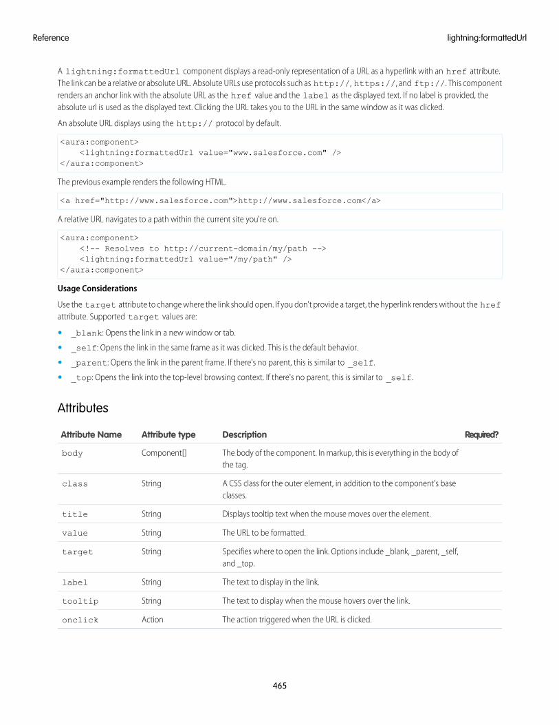
A lightning:formattedUrl component displays a read-only representation of a URL as a hyperlink with an href attribute.The link can be a relative or absolute URL. Absolute URLs use protocols such as http://, https://, and ftp://. This componentrenders an anchor link with the absolute URL as the href value and the label as the displayed text. If no label is provided, theabsolute url is used as the displayed text. Clicking the URL takes you to the URL in the same window as it was clicked.
An absolute URL displays using the http:// protocol by default.
<aura:component><lightning:formattedUrl value="www.salesforce.com" />
</aura:component>
The previous example renders the following HTML.
<a href="http://www.salesforce.com">http://www.salesforce.com</a>
A relative URL navigates to a path within the current site you're on.
<aura:component><!-- Resolves to http://current-domain/my/path --><lightning:formattedUrl value="/my/path" />
</aura:component>
Usage Considerations
Use the target attribute to change where the link should open. If you don't provide a target, the hyperlink renders without the hrefattribute. Supported target values are:
• _blank: Opens the link in a new window or tab.
• _self: Opens the link in the same frame as it was clicked. This is the default behavior.
• _parent: Opens the link in the parent frame. If there's no parent, this is similar to _self.
• _top: Opens the link into the top-level browsing context. If there's no parent, this is similar to _self.
Attributes
Required?DescriptionAttribute typeAttribute Name
The body of the component. In markup, this is everything in the body ofthe tag.
Component[]body
A CSS class for the outer element, in addition to the component's baseclasses.
Stringclass
Displays tooltip text when the mouse moves over the element.Stringtitle
The URL to be formatted.Stringvalue
Specifies where to open the link. Options include _blank, _parent, _self,and _top.
Stringtarget
The text to display in the link.Stringlabel
The text to display when the mouse hovers over the link.Stringtooltip
The action triggered when the URL is clicked.Actiononclick
465
lightning:formattedUrlReference
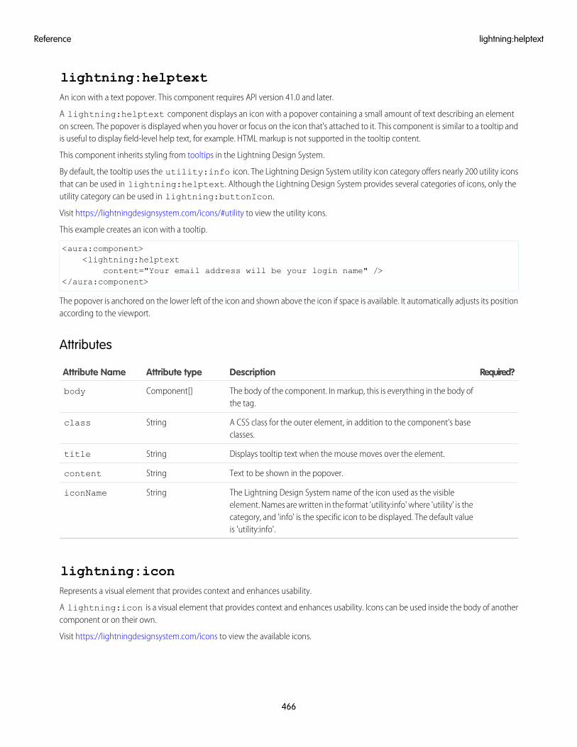
lightning:helptextAn icon with a text popover. This component requires API version 41.0 and later.
A lightning:helptext component displays an icon with a popover containing a small amount of text describing an elementon screen. The popover is displayed when you hover or focus on the icon that's attached to it. This component is similar to a tooltip andis useful to display field-level help text, for example. HTML markup is not supported in the tooltip content.
This component inherits styling from tooltips in the Lightning Design System.
By default, the tooltip uses the utility:info icon. The Lightning Design System utility icon category offers nearly 200 utility iconsthat can be used in lightning:helptext. Although the Lightning Design System provides several categories of icons, only theutility category can be used in lightning:buttonIcon.
Visit https://lightningdesignsystem.com/icons/#utility to view the utility icons.
This example creates an icon with a tooltip.
<aura:component><lightning:helptext
content="Your email address will be your login name" /></aura:component>
The popover is anchored on the lower left of the icon and shown above the icon if space is available. It automatically adjusts its positionaccording to the viewport.
Attributes
Required?DescriptionAttribute typeAttribute Name
The body of the component. In markup, this is everything in the body ofthe tag.
Component[]body
A CSS class for the outer element, in addition to the component's baseclasses.
Stringclass
Displays tooltip text when the mouse moves over the element.Stringtitle
Text to be shown in the popover.Stringcontent
The Lightning Design System name of the icon used as the visibleelement. Names are written in the format 'utility:info' where 'utility' is the
StringiconName
category, and 'info' is the specific icon to be displayed. The default valueis 'utility:info'.
lightning:iconRepresents a visual element that provides context and enhances usability.
A lightning:icon is a visual element that provides context and enhances usability. Icons can be used inside the body of anothercomponent or on their own.
Visit https://lightningdesignsystem.com/icons to view the available icons.
466
lightning:helptextReference
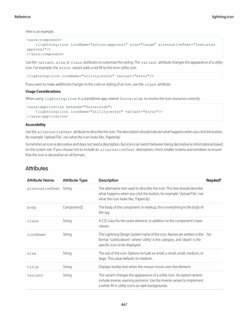
Here is an example.
<aura:component><lightning:icon iconName="action:approval" size="large" alternativeText="Indicates
approval"/></aura:component>
Use the variant, size, or class attributes to customize the styling. The variant attribute changes the appearance of a utilityicon. For example, the error variant adds a red fill to the error utility icon.
<lightning:icon iconName="utility:error" variant="error"/>
If you want to make additional changes to the color or styling of an icon, use the class attribute.
Usage Considerations
When using lightning:icon in a standalone app, extend force:slds to resolve the icon resources correctly.
<aura:application extends="force:slds"><lightning:icon iconName="utility:error" variant="error"/>
</aura:application>
Accessibility
Use the alternativeText attribute to describe the icon. The description should indicate what happens when you click the button,for example 'Upload File', not what the icon looks like, 'Paperclip'.
Sometimes an icon is decorative and does not need a description. But icons can switch between being decorative or informational basedon the screen size. If you choose not to include an alternativeText description, check smaller screens and windows to ensurethat the icon is decorative on all formats.
Attributes
Required?DescriptionAttribute TypeAttribute Name
The alternative text used to describe the icon. This text should describewhat happens when you click the button, for example 'Upload File', notwhat the icon looks like, 'Paperclip'.
StringalternativeText
The body of the component. In markup, this is everything in the body ofthe tag.
Component[]body
A CSS class for the outer element, in addition to the component's baseclasses.
Stringclass
YesThe Lightning Design System name of the icon. Names are written in theformat '\utility:down\' where 'utility' is the category, and 'down' is thespecific icon to be displayed.
StringiconName
The size of the icon. Options include xx-small, x-small, small, medium, orlarge. This value defaults to medium.
Stringsize
Displays tooltip text when the mouse moves over the element.Stringtitle
The variant changes the appearance of a utility icon. Accepted variantsinclude inverse, warning and error. Use the inverse variant to implementa white fill in utility icons on dark backgrounds.
Stringvariant
467
lightning:iconReference
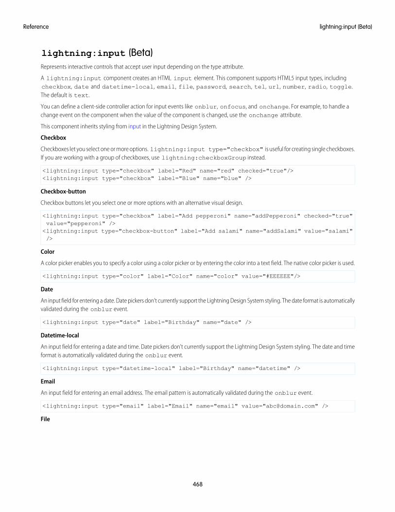
lightning:input (Beta)Represents interactive controls that accept user input depending on the type attribute.
A lightning:input component creates an HTML input element. This component supports HTML5 input types, includingcheckbox, date and datetime-local, email, file, password, search, tel, url, number, radio, toggle.The default is text.
You can define a client-side controller action for input events like onblur, onfocus, and onchange. For example, to handle achange event on the component when the value of the component is changed, use the onchange attribute.
This component inherits styling from input in the Lightning Design System.
Checkbox
Checkboxes let you select one or more options. lightning:input type="checkbox" is useful for creating single checkboxes.If you are working with a group of checkboxes, use lightning:checkboxGroup instead.
<lightning:input type="checkbox" label="Red" name="red" checked="true"/><lightning:input type="checkbox" label="Blue" name="blue" />
Checkbox-button
Checkbox buttons let you select one or more options with an alternative visual design.
<lightning:input type="checkbox" label="Add pepperoni" name="addPepperoni" checked="true"value="pepperoni" /><lightning:input type="checkbox-button" label="Add salami" name="addSalami" value="salami"/>
Color
A color picker enables you to specify a color using a color picker or by entering the color into a text field. The native color picker is used.
<lightning:input type="color" label="Color" name="color" value="#EEEEEE"/>
Date
An input field for entering a date. Date pickers don't currently support the Lightning Design System styling. The date format is automaticallyvalidated during the onblur event.
<lightning:input type="date" label="Birthday" name="date" />
Datetime-local
An input field for entering a date and time. Date pickers don't currently support the Lightning Design System styling. The date and timeformat is automatically validated during the onblur event.
<lightning:input type="datetime-local" label="Birthday" name="datetime" />
An input field for entering an email address. The email pattern is automatically validated during the onblur event.
<lightning:input type="email" label="Email" name="email" value="[email protected]" />
File
468
lightning:input (Beta)Reference
An input field for uploading files using a Upload Files button or a drag-and-drop zone. To retrieve the list of selected files, useevent.getSource().get("v.files");.
<lightning:input type="file" label="Attachment" name="file" multiple="true"accept="image/png, .zip" onchange="{! c.handleFilesChange }"/>
Month
An input field for entering a month and year. Date pickers don't currently inherit the Lightning Design System styling. The month andyear format is automatically validated during the onblur event.
<lightning:input type="month" label="Birthday" name="month" />
Number
An input field for entering a number. When working with numerical input, you can use attributes like max, min, and step.
<lightning:input type="number" name="number" label="Number" value="12345"/>
To format numerical input as a percentage or currency, set formatter to percent or currency respectively.
<lightning:input type="number" name="ItemPrice"label="Price" value="12345" formatter="currency"/>
Fields for percentage and currency input must specify a step increment of 0.01 as required by the native implementation.
<lightning:input type="number" name="percentVal" label="Enter a percentage value"formatter="percent" step="0.01" /><lightning:input type="number" name="currencyVal" label="Enter a dollar amount"formatter="currency" step="0.01" />
Password
An input field for entering a password. Characters you enter are masked.
<lightning:input type="password" label="Password" name="password" />
Radio
Radio buttons let you select only one of a given number of options. lightning:input type="radio" is useful for creatingsingle radio buttons. If you are working with a set of radio buttons, use lightning:radioGroup instead.
<lightning:input type="radio" label="Red" name="red" value="red" checked="true" /><lightning:input type="radio" label="Blue" name="blue" value="blue" />
Range
A slider control for entering a number. When working with numerical input, you can use attributes like max, min, and step.
<lightning:input type="range" label="Number" name="number" min="0" max="10" />
Search
An input field for entering a search string. This field displays the Lightning Design System search utility icon.
<lightning:input type="search" label="Search" name="search" />
Tel
An input field for entering a telephone number. Use the pattern attribute to define a pattern for field validation.
<lightning:input type="tel" label="Telephone" name="tel" value="343-343-3434"pattern="[0-9]{3}-[0-9]{3}-[0-9]{4}"/>
469
lightning:input (Beta)Reference
Text
An input field for entering text. This is the default input type.
<lightning:input label="Name" name="myname" />
Time
An input field for entering time. The time format is automatically validated during the onblur event.
<lightning:input type="time" label="Time" name="time" />
Toggle
A checkbox toggle for selecting one of two given values.
<lightning:input type="toggle" label="Toggle value" name="togglevalue" checked="true" />
URL
An input field for entering a URL. This URL pattern is automatically validated during the onblur event.
<lightning:input type="url" label="Website" name="website" />
Week
An input field for entering a week and year. Date pickers don't currently inherit the Lightning Design System styling. The week and yearformat is automatically validated during the onblur event.
<lightning:input type="week" label="Week" name="week" />
Input Validation
Client-side input validation is available for this component. For example, an error message is displayed when a URL or email address isexpected for an input type of url or email.
You can define additional field requirements. For example, to set a maximum length, use the maxlength attribute.
<lightning:input name="quantity" value="1234567890" label="Quantity" maxlength="10" />
To check the validity states of an input, use the validity attribute, which is based on the ValidityState Web API. To determineif a field is valid, you can access the validity states in your client-side controller. Let's say you have the following input field.
<lightning:input name="input" aura:id="myinput" label="Enter some text" onblur="{!c.handleBlur }" />
The valid property returns true because all constraint validations are met, and in this case there are none.
handleBlur: function (cmp, event) {var validity = cmp.find("myinput").get("v.validity");console.log(validity.valid); //returns true}
For example, you have the following form with several fields and a button. To display error messages on invalid fields, use theshowHelpMessageIfInvalid() method.
<aura:component><lightning:input aura:id="field" label="First name" placeholder="First name"
required="true" /><lightning:input aura:id="field" label="Last name" placeholder="Last name"
required="true" /><lightning:button aura:id="submit" type="submit" label="Submit" onclick="{! c.onClick
470
lightning:input (Beta)Reference
}" /></aura:component>
Validate the fields in the client-side controller.
({onClick: function (cmp, evt, helper) {
var allValid = cmp.find('field').reduce(function (validSoFar, inputCmp) {inputCmp.showHelpMessageIfInvalid();return validSoFar && inputCmp.get('v.validity').valid;
}, true);if (allValid) {
alert('All form entries look valid. Ready to submit!');} else {
alert('Please update the invalid form entries and try again.');}
}})
This validity attribute returns an object with the following boolean properties.
• badInput: Indicates that the value is invalid
• patternMismatch: Indicates that the value doesn't match the specified pattern
• rangeOverflow: Indicates that the value is greater than the specified max attribute
• rangeUnderflow: Indicates that the value is less than the specified min attribute
• stepMismatch: Indicates that the value doesn't match the specified step attribute
• tooLong: Indicates that the value exceeds the specified maxlength attribute
• typeMismatch: Indicates that the value doesn't match the required syntax for an email or url input type
• valid: Indicates that the value is valid
• valueMissing: Indicates that an empty value is provided when required attribute is set to true
Error Messages
When an input validation fails, the following messages are displayed by default.
• badInput: Enter a valid value.
• patternMismatch: Your entry does not match the allowed pattern.
• rangeOverflow: The number is too high.
• rangeUnderflow: The number is too low.
• stepMismatch: Your entry isn't a valid increment.
• tooLong: Your entry is too long.
• typeMismatch: You have entered an invalid format.
• valueMissing: Complete this field.
You can override the default messages by providing your own values for these attributes: messageWhenBadInput,messageWhenPatternMismatch, messageWhenTypeMismatch, messageWhenValueMissing,messageWhenRangeOverflow, messageWhenRangeUnderflow, messageWhenStepMismatch,messageWhenTooLong.
471
lightning:input (Beta)Reference
For example, you want to display a custom error message when the input is less than five characters.
<lightning:input name="firstname" label="First Name" minlength="5"messageWhenBadInput="Your entry must be at least 5 characters." />
Usage Considerations
maxlength limits the number of characters you can enter. The messageWhenTooLong error message isn't triggered becauseyou can't type more than the number of characters allowed. However, you can use the messageWhenPatternMismatch andpattern to achieve the same behavior.
<lightning:input type="text" messageWhenPatternMismatch="Too many characters!"pattern=".{0,5}" name="input-name" label="Enter up to 5 characters" />
The following input types are not supported.
• button
• hidden
• image
• reset
• submit
Use lightning:button instead for input types button, reset, and submit.
Additionally, when working with checkboxes, radio buttons, and toggle switches, use aura:id to group and traverse the array ofcomponents. You can use get("v.checked") to determine which elements are checked or unchecked without reaching into theDOM. You can also use the name and value attributes to identify each component during the iteration. The following examplegroups three checkboxes together using aura:id.
<aura:component><fieldset>
<legend>Select your favorite color:</legend><lightning:input type="checkbox" label="Red"
name="color1" value="1" aura:id="colors"/><lightning:input type="checkbox" label="Blue"
name="color2" value="2" aura:id="colors"/><lightning:input type="checkbox" label="Green"
name="color3" value="3" aura:id="colors"/></fieldset>
<lightning:button label="Submit" onclick="{!c.submitForm}"/></aura:component>
Accessibility
You must provide a text label for accessibility to make the information available to assistive technology. The label attribute createsan HTML label element for your input component. To hide a label from view and make it available to assistive technology, use thelabel-hidden variant.
Methods
This component supports the following methods.
focus(): Sets focus on the element.
showHelpMessageIfInvalid(): Shows the help message if the form control is in an invalid state.
472
lightning:input (Beta)Reference
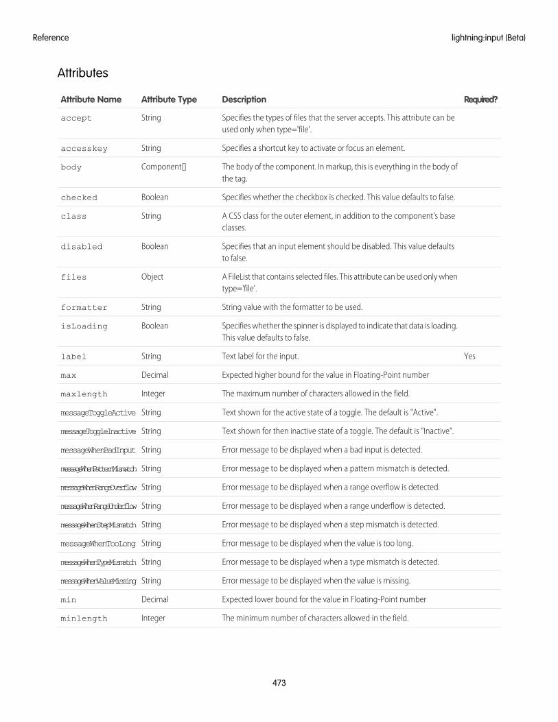
Attributes
Required?DescriptionAttribute TypeAttribute Name
Specifies the types of files that the server accepts. This attribute can beused only when type='file'.
Stringaccept
Specifies a shortcut key to activate or focus an element.Stringaccesskey
The body of the component. In markup, this is everything in the body ofthe tag.
Component[]body
Specifies whether the checkbox is checked. This value defaults to false.Booleanchecked
A CSS class for the outer element, in addition to the component's baseclasses.
Stringclass
Specifies that an input element should be disabled. This value defaultsto false.
Booleandisabled
A FileList that contains selected files. This attribute can be used only whentype='file'.
Objectfiles
String value with the formatter to be used.Stringformatter
Specifies whether the spinner is displayed to indicate that data is loading.This value defaults to false.
BooleanisLoading
YesText label for the input.Stringlabel
Expected higher bound for the value in Floating-Point numberDecimalmax
The maximum number of characters allowed in the field.Integermaxlength
Text shown for the active state of a toggle. The default is "Active".StringmessageToggleActive
Text shown for then inactive state of a toggle. The default is "Inactive".StringmessageToggleInactive
Error message to be displayed when a bad input is detected.StringmessageWhenBadInput
Error message to be displayed when a pattern mismatch is detected.StringmessageWhenPatternMismatch
Error message to be displayed when a range overflow is detected.StringmessageWhenRangeOverflow
Error message to be displayed when a range underflow is detected.StringmessageWhenRangeUnderflow
Error message to be displayed when a step mismatch is detected.StringmessageWhenStepMismatch
Error message to be displayed when the value is too long.StringmessageWhenTooLong
Error message to be displayed when a type mismatch is detected.StringmessageWhenTypeMismatch
Error message to be displayed when the value is missing.StringmessageWhenValueMissing
Expected lower bound for the value in Floating-Point numberDecimalmin
The minimum number of characters allowed in the field.Integerminlength
473
lightning:input (Beta)Reference
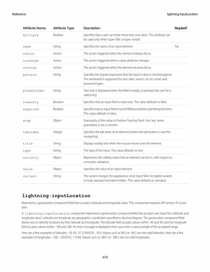
Required?DescriptionAttribute TypeAttribute Name
Specifies that a user can enter more than one value. This attribute canbe used only when type='file' or type='email'.
Booleanmultiple
YesSpecifies the name of an input element.Stringname
The action triggered when the element releases focus.Actiononblur
The action triggered when a value attribute changes.Actiononchange
The action triggered when the element receives focus.Actiononfocus
Specifies the regular expression that the input's value is checked against.This attributed is supported for text, date, search, url, tel, email, andpassword types.
Stringpattern
Text that is displayed when the field is empty, to prompt the user for avalid entry.
Stringplaceholder
Specifies that an input field is read-only. This value defaults to false.Booleanreadonly
Specifies that an input field must be filled out before submitting the form.This value defaults to false.
Booleanrequired
Granularity of the value in Positive Floating Point. Use 'any' whengranularity is not a concern.
Objectstep
Specifies the tab order of an element (when the tab button is used fornavigating).
Integertabindex
Displays tooltip text when the mouse moves over the element.Stringtitle
The type of the input. This value defaults to text.Stringtype
Represents the validity states that an element can be in, with respect toconstraint validation.
Objectvalidity
Specifies the value of an input element.Objectvalue
The variant changes the appearance of an input field. Accepted variantsinclude standard and label-hidden. This value defaults to standard.
Stringvariant
lightning:inputLocationRepresents a geolocation compound field that accepts a latitude and longitude value. This component requires API version 41.0 andlater.
A lightning:inputLocation component represents a geolocation compound field that accepts user input for a latitude andlongitude value. Latitude and longitude are geographic coordinates specified in decimal degrees. The geolocation compound fieldallows you to identify locations by their latitude and longitude. The latitude field accepts values within -90 and 90, and the longitudefield accepts values within -180 and 180. An error message is displayed when you enter a value outside of the accepted range.
Here are a few examples of latitudes: -30, 45, 37.12345678, -10.0. Values such as 90.5 or -90.5 are not valid latitudes. Here are a fewexamples of longitudes: -100, -120.9762, 115.84. Values such as 180.5 or -180.5 are not valid longitudes.
474
lightning:inputLocationReference
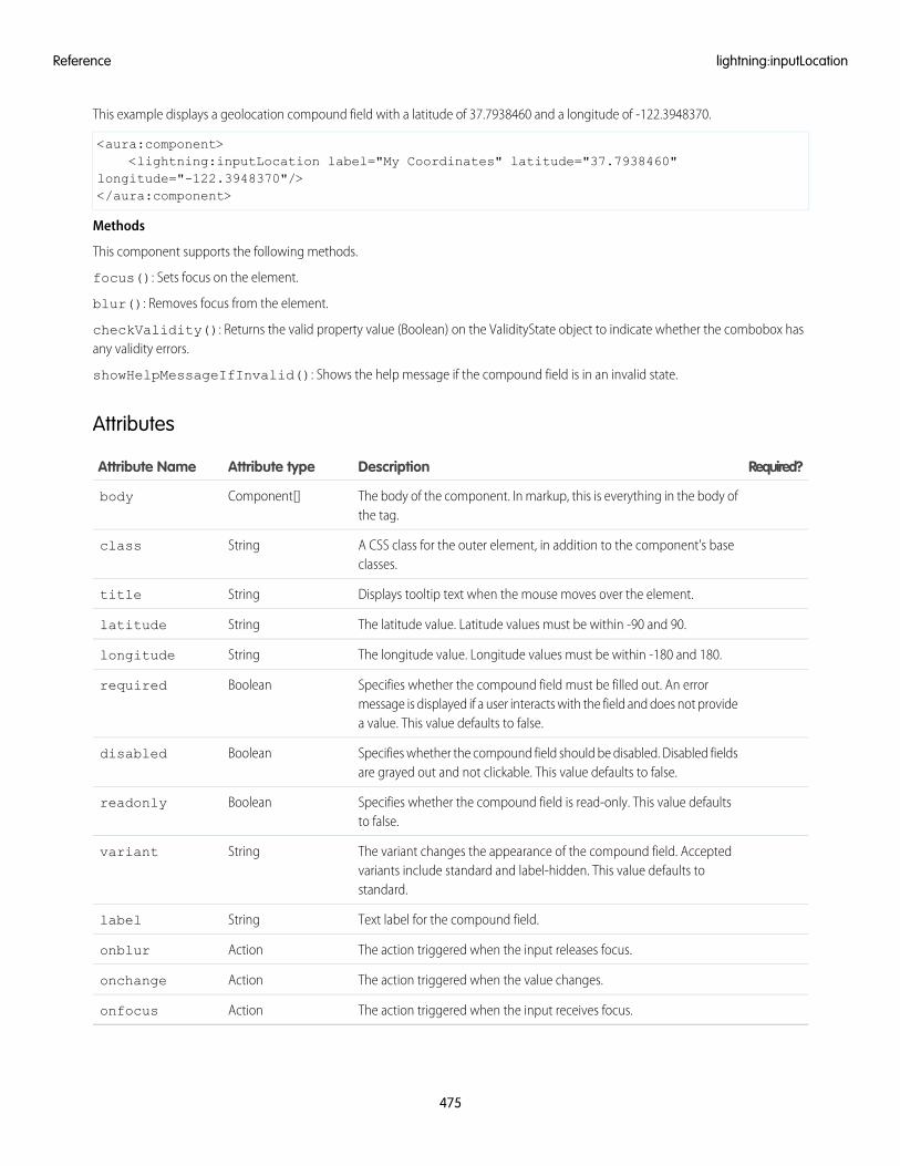
This example displays a geolocation compound field with a latitude of 37.7938460 and a longitude of -122.3948370.
<aura:component><lightning:inputLocation label="My Coordinates" latitude="37.7938460"
longitude="-122.3948370"/></aura:component>
Methods
This component supports the following methods.
focus(): Sets focus on the element.
blur(): Removes focus from the element.
checkValidity(): Returns the valid property value (Boolean) on the ValidityState object to indicate whether the combobox hasany validity errors.
showHelpMessageIfInvalid(): Shows the help message if the compound field is in an invalid state.
Attributes
Required?DescriptionAttribute typeAttribute Name
The body of the component. In markup, this is everything in the body ofthe tag.
Component[]body
A CSS class for the outer element, in addition to the component's baseclasses.
Stringclass
Displays tooltip text when the mouse moves over the element.Stringtitle
The latitude value. Latitude values must be within -90 and 90.Stringlatitude
The longitude value. Longitude values must be within -180 and 180.Stringlongitude
Specifies whether the compound field must be filled out. An errormessage is displayed if a user interacts with the field and does not providea value. This value defaults to false.
Booleanrequired
Specifies whether the compound field should be disabled. Disabled fieldsare grayed out and not clickable. This value defaults to false.
Booleandisabled
Specifies whether the compound field is read-only. This value defaultsto false.
Booleanreadonly
The variant changes the appearance of the compound field. Acceptedvariants include standard and label-hidden. This value defaults tostandard.
Stringvariant
Text label for the compound field.Stringlabel
The action triggered when the input releases focus.Actiononblur
The action triggered when the value changes.Actiononchange
The action triggered when the input receives focus.Actiononfocus
475
lightning:inputLocationReference
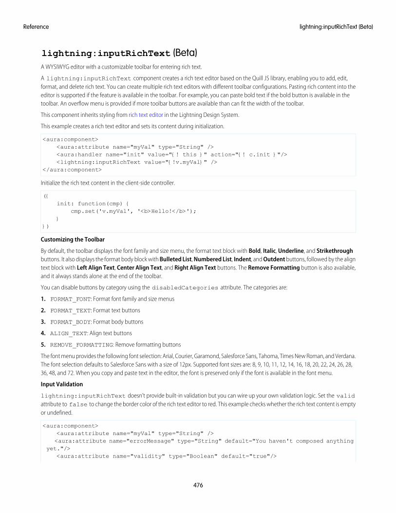
lightning:inputRichText (Beta)A WYSIWYG editor with a customizable toolbar for entering rich text.
A lightning:inputRichText component creates a rich text editor based on the Quill JS library, enabling you to add, edit,format, and delete rich text. You can create multiple rich text editors with different toolbar configurations. Pasting rich content into theeditor is supported if the feature is available in the toolbar. For example, you can paste bold text if the bold button is available in thetoolbar. An overflow menu is provided if more toolbar buttons are available than can fit the width of the toolbar.
This component inherits styling from rich text editor in the Lightning Design System.
This example creates a rich text editor and sets its content during initialization.
<aura:component><aura:attribute name="myVal" type="String" /><aura:handler name="init" value="{! this }" action="{! c.init }"/><lightning:inputRichText value="{!v.myVal}" />
</aura:component>
Initialize the rich text content in the client-side controller.
({init: function(cmp) {
cmp.set('v.myVal', '<b>Hello!</b>');}
})
Customizing the Toolbar
By default, the toolbar displays the font family and size menu, the format text block with Bold, Italic, Underline, and Strikethroughbuttons. It also displays the format body block with Bulleted List, Numbered List, Indent, and Outdent buttons, followed by the aligntext block with Left Align Text, Center Align Text, and Right Align Text buttons. The Remove Formatting button is also available,and it always stands alone at the end of the toolbar.
You can disable buttons by category using the disabledCategories attribute. The categories are:
1. FORMAT_FONT: Format font family and size menus
2. FORMAT_TEXT: Format text buttons
3. FORMAT_BODY: Format body buttons
4. ALIGN_TEXT: Align text buttons
5. REMOVE_FORMATTING: Remove formatting buttons
The font menu provides the following font selection: Arial, Courier, Garamond, Salesforce Sans, Tahoma, Times New Roman, and Verdana.The font selection defaults to Salesforce Sans with a size of 12px. Supported font sizes are: 8, 9, 10, 11, 12, 14, 16, 18, 20, 22, 24, 26, 28,36, 48, and 72. When you copy and paste text in the editor, the font is preserved only if the font is available in the font menu.
Input Validation
lightning:inputRichText doesn't provide built-in validation but you can wire up your own validation logic. Set the validattribute to false to change the border color of the rich text editor to red. This example checks whether the rich text content is emptyor undefined.
<aura:component><aura:attribute name="myVal" type="String" /><aura:attribute name="errorMessage" type="String" default="You haven't composed anything
yet."/><aura:attribute name="validity" type="Boolean" default="true"/>
476
lightning:inputRichText (Beta)Reference
<lightning:inputRichText value="{!v.myVal}" placeholder="Type something interesting"messageWhenBadInput="{!v.errorMessage}" valid="{!v.validity}"/>
<lightning:button name="validate" label="Validate" onclick="{!c.validate}"/></aura:component>
The client-side controller toggles the validity of the rich text editor, and displays the error message when it's invalid.
({validate: function(cmp) {
if(!cmp.get("v.myVal")){cmp.set("v.validity", false);
}else{
cmp.set("v.validity", true);}
}})
Supported HTML Tags
The rich text editor provides a WYSIWYG interface only. You can't edit HTML tags using the editor, but you can set the HTML tags via thevalue attribute. When you copy content from a web page or another source and paste it into the editor, unsupported tags are removed.Only formatting that corresponds to an enabled toolbar button or menu is preserved. For example, if you disable the FORMAT_TEXTcategory, the Bold, Italic, Underline, and Strikethrough buttons are not available. Furthermore, pasting bold, italic, underlined, orstrikethrough text in the editor are not supported when you disable the FORMAT_TEXT category. Text that was enclosed in unsupportedtags is preserved as plain text. However, tables, images, and links can be pasted into the editor and set via the value attribute, eventhough there are no corresponding toolbar buttons or menus for them.
The component sanitizes HTML tags passed to the value attribute to prevent XSS vulnerabilities. Only HTML tags that correspond tofeatures available on the toolbar are supported. If you set unsupported tags via a client-side controller, those tags are removed and thetext content is preserved. The supported HTML tags are: a, b, col, colgroup, em (converted to i), h1, h2, h3, h4, h5, h6, i,img, li, ol, p, q, s, strike (converted to s), strong, table, tbody, td, tfoot, th, thead, tr, u, ul, strike.
Pasting text enclosed in div and span tags convert those tags to p tags. Let’s say you paste or set some text in the editor that lookslike this.
The sky is <span style="color:blue;font-weight:bold">blue</span>.<div style="color:#0000FF;font-weight:bold">This is some text in a div element.</div>
The editor returns the following markup.
<p>The sky is <b>blue</b>.</p><p><b>This is some text in a div element.</b></p>
Notice that the font-weight:bold formatting is preserved and converted to a b tag since it corresponds to the Bold toolbarbutton. Color formatting in the markup is removed.
Usage Considerations
Although the toolbar buttons for creating tables and inserting images and links are not available, creating them programmatically orcopy and pasting these elements preserves the formatting in the editor. However, resizing of images is not supported.
Methods
This component supports the following method.
focus(): Sets focus on the element.
477
lightning:inputRichText (Beta)Reference
Attributes
Required?DescriptionAttribute TypeAttribute Name
Specifies a shortcut key to activate or focus an element.Stringaccesskey
The body of the component. In markup, this is everything in the body ofthe tag.
Component[]body
A CSS class for the outer element, in addition to the component's baseclasses.
Stringclass
Displays tooltip text when the mouse moves over the element.Stringtitle
Specifies whether the editor is disabled. This value defaults to false.Booleandisabled
A comma-separated list of button categories to remove from the toolbar.ListdisabledCategories
Error message that's displayed when valid is false.StringmessageWhenBadInput
The action triggered when the element releases focus.Actiononblur
The action triggered when the element receives focus.Actiononfocus
Text that is displayed when the field is empty.Stringplaceholder
Specifies the tab order of an element (when the tab button is used fornavigating).
Integertabindex
Specifies whether the editor content is valid. If invalid, the slds-has-errorclass is added. This value defaults to true.
Booleanvalid
The HTML content in the rich text editor.Stringvalue
The variant changes the appearance of the toolbar. Accepted variantsinclude bottom-toolbar.
Stringvariant
lightning:layoutRepresents a responsive grid system for arranging containers on a page.
A lightning:layout is a flexible grid system for arranging containers within a page or inside another container. The default layoutis mobile-first and can be easily configured to work on different devices.
The layout can be customized by setting the following attribute values.
horizontalAlign
Spread layout items out horizontally based on the following values.
• center: Appends the slds-grid_align-center class to the grid. This attribute orders the layout items into a horizontal linewithout any spacing, and places the group into the center of the container.
• space: Appends the slds-grid_align-space class to the grid. The layout items are spaced horizontally across the container,starting and ending with a space.
• spread: Appends the slds-grid_align-spread class to the grid. The layout items are spaced horizontally across the container,starting and ending with a layout item.
478
lightning:layoutReference
• end: Appends the slds-grid_align-end class to the grid. The layout items are grouped together and aligned horizontallyon the right side of the container.
verticalAlign
Spread layout items out vertically based on the following values.
• start: Appends the slds-grid_vertical-align-start class to the grid. The layout items are aligned at the top of thecontainer.
• center: Appends the slds-grid_vertical-align-center class to the grid. The layout items are aligned in the centerof the container.
• end: Appends the slds-grid_vertical-align-end class to the grid. The layout items are aligned at the bottom of thecontainer.
• stretch: Appends the slds-grid_vertical-stretch class to the grid. The layout items extend vertically to fill the container.
pullToBoundary
Pull layout items to the layout boundaries based on the following values. If padding is used on layout items, this attribute pulls theelements on either side of the container to the boundary. Choose the size that corresponds to the padding on your layoutItems. Forinstance, if lightning:layoutItem="horizontalSmall", choose pullToBoundary="small".
• small: Appends the slds-grid_pull-padded class to the grid.
• medium: Appends the slds-grid_pull-padded-medium class to the grid.
• large: Appends the slds-grid_pull-padded-large class to the grid.
Use the class or multipleRows attributes to customize the styling in other ways.
A simple layout can be achieved by enclosing layout items within lightning:layout. Here is an example.
<aura:component><div class="c-container">
<lightning:layout horizontalAlign="space"><lightning:layoutItem flexibility="auto" padding="around-small">
1</lightning:layoutItem><lightning:layoutItem flexibility="auto" padding="around-small">
2</lightning:layoutItem><lightning:layoutItem flexibility="auto" padding="around-small">
3</lightning:layoutItem><lightning:layoutItem flexibility="auto" padding="around-small">
4</lightning:layoutItem>
</lightning:layout></div>
</aura:component>
Attributes
Required?DescriptionAttribute TypeAttribute Name
Body of the layout component.Component[]body
479
lightning:layoutReference
Required?DescriptionAttribute TypeAttribute Name
A CSS class for the outer element, in addition to the component's baseclasses.
Stringclass
Displays tooltip text when the mouse moves over the element.Stringtitle
Determines how to spread the layout items horizontally. The alignmentoptions are center, space, spread, and end.
StringhorizontalAlign
Determines whether to wrap the child items when they exceed the layoutwidth. If true, the items wrap to the following line. This value defaults tofalse.
BooleanmultipleRows
Pulls layout items to the layout boundaries and corresponds to thepadding size on the layout item. Possible values are small, medium, orlarge.
StringpullToBoundary
Determines how to spread the layout items vertically. The alignmentoptions are start, center, end, and stretch.
StringverticalAlign
lightning:layoutItemThe basic element of lightning:layout.
A lightning:layoutItem is the basic element within lightning:layout. You can arrange one or more layout itemsinside lightning:layout. The attributes of lightning:layoutItem enable you to configure the size of the layout item,and change how the layout is configured on different device sizes.
The layout system is mobile-first. If the size and smallDeviceSize attributes are both specified, the size attribute is appliedto small mobile phones, and the smallDeviceSize is applied to smart phones. The sizing attributes are additive and apply todevices that size and larger. For example, if mediumDeviceSize=10 and largeDeviceSize isn’t set, thenmediumDeviceSize will apply to tablets, as well as desktop and larger devices.
If the smallDeviceSize, mediumDeviceSize, or largeDeviceSize attributes are specified, the size attribute isrequired.
Here is an example.
<aura:component><div>
<lightning:layout><lightning:layoutItem padding="around-small">
<div>1</div></lightning:layoutItem><lightning:layoutItem padding="around-small">
<div>2</div></lightning:layoutItem><lightning:layoutItem padding="around-small">
<div>3</div></lightning:layoutItem><lightning:layoutItem padding="around-small">
<div>4</div></lightning:layoutItem>
</lightning:layout>
480
lightning:layoutItemReference
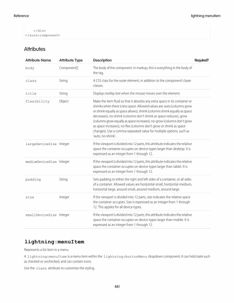
</div></aura:component>
Attributes
Required?DescriptionAttribute TypeAttribute Name
The body of the component. In markup, this is everything in the body ofthe tag.
Component[]body
A CSS class for the outer element, in addition to the component's baseclasses.
Stringclass
Displays tooltip text when the mouse moves over the element.Stringtitle
Make the item fluid so that it absorbs any extra space in its container orshrinks when there is less space. Allowed values are: auto (columns grow
Objectflexibility
or shrink equally as space allows), shrink (columns shrink equally as spacedecreases), no-shrink (columns don't shrink as space reduces), grow(columns grow equally as space increases), no-grow (columns don't growas space increases), no-flex (columns don't grow or shrink as spacechanges). Use a comma-separated value for multiple options, such as'auto, no-shrink'.
If the viewport is divided into 12 parts, this attribute indicates the relativespace the container occupies on device-types larger than desktop. It isexpressed as an integer from 1 through 12.
IntegerlargeDeviceSize
If the viewport is divided into 12 parts, this attribute indicates the relativespace the container occupies on device-types larger than tablet. It isexpressed as an integer from 1 through 12.
IntegermediumDeviceSize
Sets padding to either the right and left sides of a container, or all sidesof a container. Allowed values are horizontal-small, horizontal-medium,horizontal-large, around-small, around-medium, around-large.
Stringpadding
If the viewport is divided into 12 parts, size indicates the relative spacethe container occupies. Size is expressed as an integer from 1 through12. This applies for all device-types.
Integersize
If the viewport is divided into 12 parts, this attribute indicates the relativespace the container occupies on device-types larger than mobile. It isexpressed as an integer from 1 through 12.
IntegersmallDeviceSize
lightning:menuItemRepresents a list item in a menu.
A lightning:menuItem is a menu item within the lightning:buttonMenu dropdown component. It can hold state suchas checked or unchecked, and can contain icons.
Use the class attribute to customize the styling.
481
lightning:menuItemReference
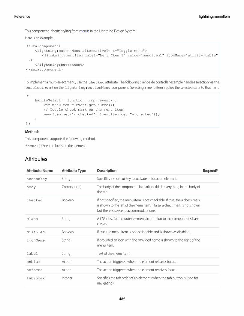
This component inherits styling from menus in the Lightning Design System.
Here is an example.
<aura:component><lightning:buttonMenu alternativeText="Toggle menu">
<lightning:menuItem label="Menu Item 1" value="menuitem1" iconName="utility:table"/>
</lightning:buttonMenu></aura:component>
To implement a multi-select menu, use the checked attribute. The following client-side controller example handles selection via theonselect event on the lightning:buttonMenu component. Selecting a menu item applies the selected state to that item.
({handleSelect : function (cmp, event) {
var menuItem = event.getSource();// Toggle check mark on the menu itemmenuItem.set("v.checked", !menuItem.get("v.checked"));
}})
Methods
This component supports the following method.
focus(): Sets the focus on the element.
Attributes
Required?DescriptionAttribute TypeAttribute Name
Specifies a shortcut key to activate or focus an element.Stringaccesskey
The body of the component. In markup, this is everything in the body ofthe tag.
Component[]body
If not specified, the menu item is not checkable. If true, the a check markis shown to the left of the menu item. If false, a check mark is not shownbut there is space to accommodate one.
Booleanchecked
A CSS class for the outer element, in addition to the component's baseclasses.
Stringclass
If true the menu item is not actionable and is shown as disabled.Booleandisabled
If provided an icon with the provided name is shown to the right of themenu item.
StringiconName
Text of the menu item.Stringlabel
The action triggered when the element releases focus.Actiononblur
The action triggered when the element receives focus.Actiononfocus
Specifies the tab order of an element (when the tab button is used fornavigating).
Integertabindex
482
lightning:menuItemReference
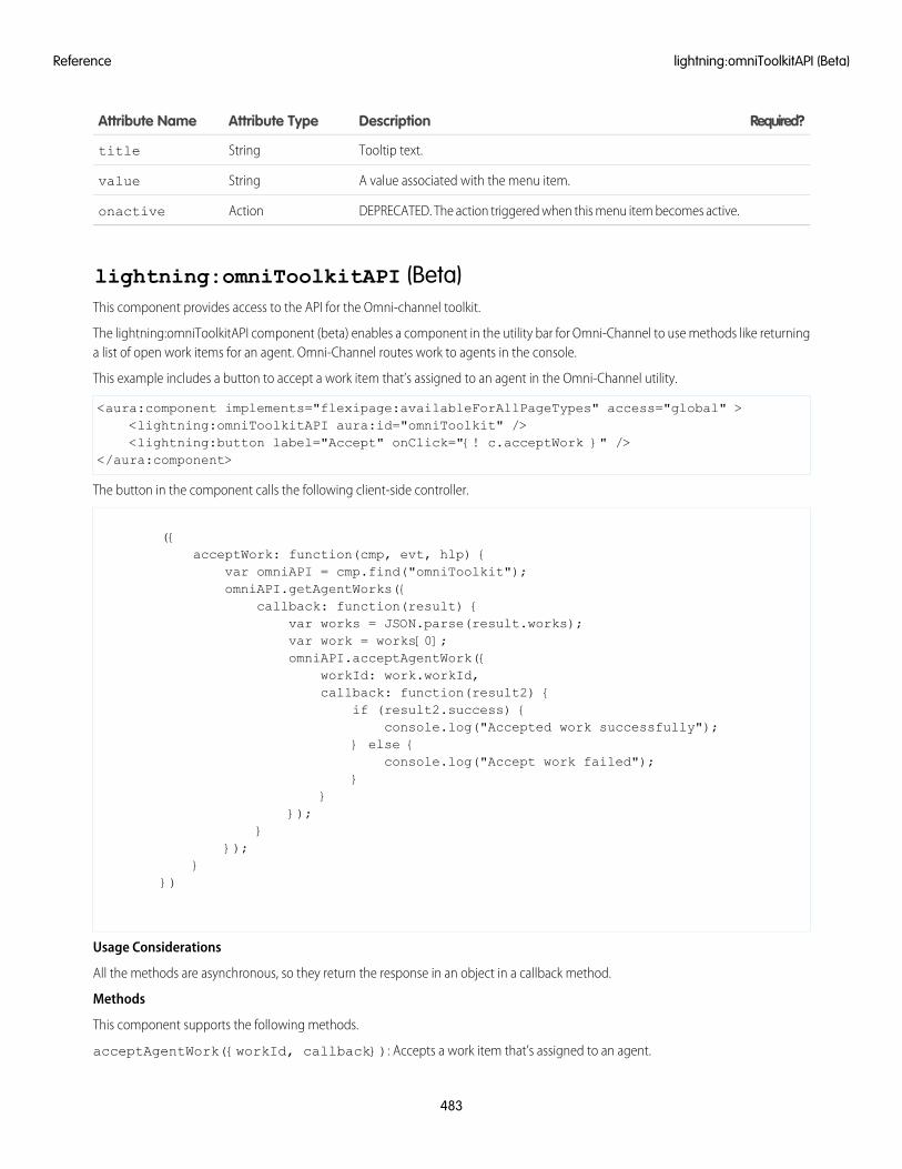
Required?DescriptionAttribute TypeAttribute Name
Tooltip text.Stringtitle
A value associated with the menu item.Stringvalue
DEPRECATED. The action triggered when this menu item becomes active.Actiononactive
lightning:omniToolkitAPI (Beta)This component provides access to the API for the Omni-channel toolkit.
The lightning:omniToolkitAPI component (beta) enables a component in the utility bar for Omni-Channel to use methods like returninga list of open work items for an agent. Omni-Channel routes work to agents in the console.
This example includes a button to accept a work item that’s assigned to an agent in the Omni-Channel utility.
<aura:component implements="flexipage:availableForAllPageTypes" access="global" ><lightning:omniToolkitAPI aura:id="omniToolkit" /><lightning:button label="Accept" onClick="{! c.acceptWork }" />
</aura:component>
The button in the component calls the following client-side controller.
({acceptWork: function(cmp, evt, hlp) {
var omniAPI = cmp.find("omniToolkit");omniAPI.getAgentWorks({
callback: function(result) {var works = JSON.parse(result.works);var work = works[0];omniAPI.acceptAgentWork({
workId: work.workId,callback: function(result2) {
if (result2.success) {console.log("Accepted work successfully");
} else {console.log("Accept work failed");
}}
});}
});}
})
Usage Considerations
All the methods are asynchronous, so they return the response in an object in a callback method.
Methods
This component supports the following methods.
acceptAgentWork({workId, callback}): Accepts a work item that’s assigned to an agent.
483
lightning:omniToolkitAPI (Beta)Reference
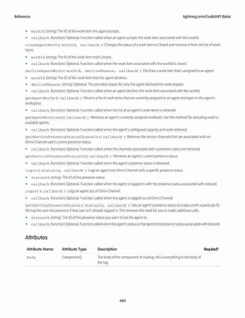
• workId (string): The ID of the work item the agent accepts.
• callback (function): Optional. Function called when an agent accepts the work item associated with the workId.
closeAgentWork({workId, callback}): Changes the status of a work item to Closed and removes it from the list of workitems.
• workId (string): The ID of the work item that’s closed.
• callback (function): Optional. Function called when the work item associated with the workId is closed.
declineAgentWork({workId, declineReason, callback}): Declines a work item that’s assigned to an agent.
• workId (string): The ID of the work item that the agent declines.
• declineReason (string): Optional. The provided reason for why the agent declined the work request.
• callback (function): Optional. Function called when an agent declines the work item associated with the workId.
getAgentWorks({callback}): Returns a list of work items that are currently assigned to an agent and open in the agent’sworkspace.
• callback (function): Optional. Function called when the list of an agent’s work items is retrieved.
getAgentWorkload({callback}): Retrieves an agent’s currently-assigned workload. Use this method for rerouting work toavailable agents.
• callback (function): Optional. Function called when the agent’s configured capacity and work retrieved.
getServicePresenceStatusChannels({callback}): Retrieves the service channels that are associated with anOmni-Channel user’s current presence status.
• callback (function): Optional. Function called when the channels associated with a presence status are retrieved.
getServivePresenceStatusId({callback}): Retrieves an agent’s current presence status.
• callback (function): Optional. Function called when the agent’s presence status is retrieved.
login({statusId, callback}): Logs an agent into Omni-Channel with a specific presence status.
• statusId (string): The ID of the presence status.
• callback (function): Optional. Function called when the agent is logged in with the presence status associated with statusId.
logout({callback}): Logs an agent out of Omni-Channel.
• callback (function): Optional. Function called when the agent is logged out of Omni-Channel.
setServicePresenceStatus({statusId, callback}): Sets an agent’s presence status to a status with a particular ID.We log the user into presence if that user isn’t already logged in. This removes the need for you to make additional calls.
• statusId (string): The ID of the presence status you want to set the agent to.
• callback (function): Optional. Function called when the agent’s status is changed to the presence status associated with statusId.
Attributes
Required?DescriptionAttribute TypeAttribute Name
The body of the component. In markup, this is everything in the body ofthe tag.
Component[]body
484
lightning:omniToolkitAPI (Beta)Reference
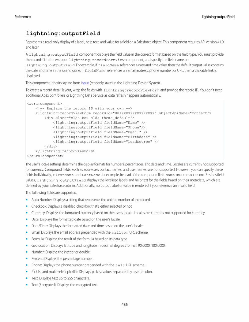
lightning:outputFieldRepresents a read-only display of a label, help text, and value for a field on a Salesforce object. This component requires API version 41.0and later.
A lightning:outputField component displays the field value in the correct format based on the field type. You must providethe record ID in the wrapper lightning:recordFormView component, and specify the field name onlightning:outputField. For example, if fieldName references a date and time value, then the default output value containsthe date and time in the user's locale. If fieldName references an email address, phone number, or URL, then a clickable link isdisplayed.
This component inherits styling from input (readonly state) in the Lightning Design System.
To create a record detail layout, wrap the fields with lightning:recordViewForm and provide the record ID. You don't needadditional Apex controllers or Lightning Data Service as data refresh happens automatically.
<aura:component><!-- Replace the record ID with your own --><lightning:recordViewForm recordId="001XXXXXXXXXXXXXXX" objectApiName="Contact">
<div class="slds-box slds-theme_default"><lightning:outputField fieldName="Name" /><lightning:outputField fieldName="Phone"/><lightning:outputField fieldName="Email" /><lightning:outputField fieldName="Birthdate" /><lightning:outputField fieldName="LeadSource" />
</div></lightning:recordViewForm>
</aura:component>
The user's locale settings determine the display formats for numbers, percentages, and date and time. Locales are currently not supportedfor currency. Compound fields, such as addresses, contact names, and user names, are not supported. However, you can specify thesefields individually, FirstName and LastName for example, instead of the compound field Name on a contact record. Besides fieldvalues, lightning:outputField displays the localized labels and help text for the fields based on their metadata, which aredefined by your Salesforce admin. Additionally, no output label or value is rendered if you reference an invalid field.
The following fields are supported.
• Auto Number: Displays a string that represents the unique number of the record.
• Checkbox: Displays a disabled checkbox that's either selected or not.
• Currency: Displays the formatted currency based on the user's locale. Locales are currently not supported for currency.
• Date: Displays the formatted date based on the user's locale.
• Date/Time: Displays the formatted date and time based on the user's locale.
• Email: Displays the email address prepended with the mailto: URL scheme.
• Formula: Displays the result of the formula based on its data type.
• Geolocation: Displays latitude and longitude in decimal degrees format: 90.0000, 180.0000.
• Number: Displays the integer or double.
• Percent: Displays the percentage number.
• Phone: Displays the phone number prepended with the tel: URL scheme.
• Picklist and multi-select picklist: Displays picklist values separated by a semi-colon.
• Text: Displays text up to 255 characters.
• Text (Encrypted): Displays the encrypted text.
485
lightning:outputFieldReference
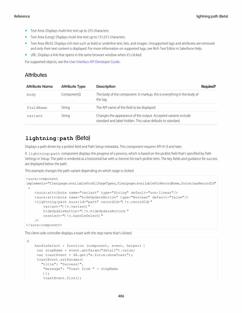
• Text Area: Displays multi-line text up to 255 characters.
• Text Area (Long): Displays multi-line text up to 131,072 characters.
• Text Area (Rich): Displays rich text such as bold or underline text, lists, and images. Unsupported tags and attributes are removedand only their text content is displayed. For more information on supported tags, see Rich Text Editor in Salesforce Help.
• URL: Displays a link that opens in the same browser window when it's clicked.
For supported objects, see the User Interface API Developer Guide.
Attributes
Required?DescriptionAttribute TypeAttribute Name
The body of the component. In markup, this is everything in the body ofthe tag.
Component[]body
The API name of the field to be displayed.StringfieldName
Changes the appearance of the output. Accepted variants includestandard and label-hidden. This value defaults to standard.
Stringvariant
lightning:path (Beta)Displays a path driven by a picklist field and Path Setup metadata. This component requires API 41.0 and later.
A lightning:path component displays the progress of a process, which is based on the picklist field that's specified by PathSettings in Setup. The path is rendered as a horizontal bar with a chevron for each picklist item. The key fields and guidance for successare displayed below the path.
This example changes the path variant depending on which stage is clicked.
<aura:componentimplements="flexipage:availableForAllPageTypes,flexipage:availableForRecordHome,force:hasRecordId">
<aura:attribute name="variant" type="String" default="non-linear"/><aura:attribute name="hideUpdateButton" type="Boolean" default="false"/><lightning:path aura:id="path" recordId="{!v.recordId}"
variant="{!v.variant}"hideUpdateButton="{!v.hideUpdateButton}"onselect="{!c.handleSelect}"
/></aura:component>
The client-side controller displays a toast with the step name that's clicked.
({handleSelect : function (component, event, helper) {var stepName = event.getParam("detail").value;var toastEvent = $A.get("e.force:showToast");toastEvent.setParams({"title": "Success!","message": "Toast from " + stepName});toastEvent.fire();
486
lightning:path (Beta)Reference
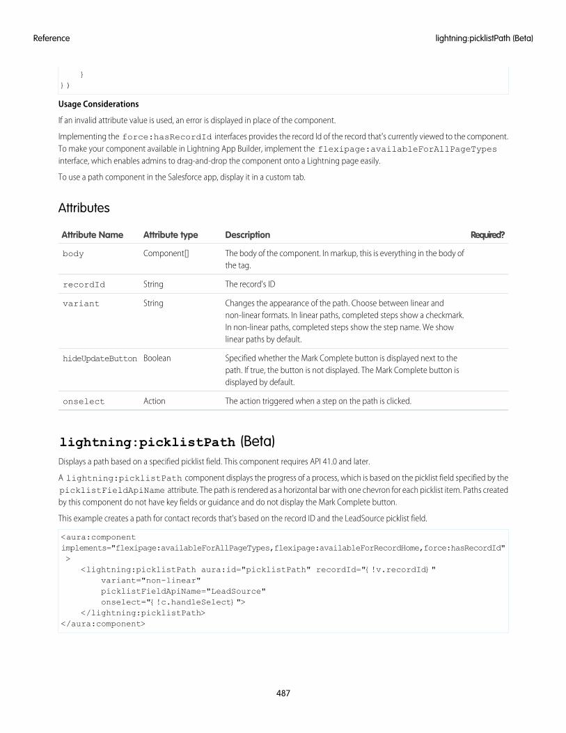
}})
Usage Considerations
If an invalid attribute value is used, an error is displayed in place of the component.
Implementing the force:hasRecordId interfaces provides the record Id of the record that's currently viewed to the component.To make your component available in Lightning App Builder, implement the flexipage:availableForAllPageTypesinterface, which enables admins to drag-and-drop the component onto a Lightning page easily.
To use a path component in the Salesforce app, display it in a custom tab.
Attributes
Required?DescriptionAttribute typeAttribute Name
The body of the component. In markup, this is everything in the body ofthe tag.
Component[]body
The record's IDStringrecordId
Changes the appearance of the path. Choose between linear andnon-linear formats. In linear paths, completed steps show a checkmark.
Stringvariant
In non-linear paths, completed steps show the step name. We showlinear paths by default.
Specified whether the Mark Complete button is displayed next to thepath. If true, the button is not displayed. The Mark Complete button isdisplayed by default.
BooleanhideUpdateButton
The action triggered when a step on the path is clicked.Actiononselect
lightning:picklistPath (Beta)Displays a path based on a specified picklist field. This component requires API 41.0 and later.
A lightning:picklistPath component displays the progress of a process, which is based on the picklist field specified by thepicklistFieldApiName attribute. The path is rendered as a horizontal bar with one chevron for each picklist item. Paths createdby this component do not have key fields or guidance and do not display the Mark Complete button.
This example creates a path for contact records that's based on the record ID and the LeadSource picklist field.
<aura:componentimplements="flexipage:availableForAllPageTypes,flexipage:availableForRecordHome,force:hasRecordId">
<lightning:picklistPath aura:id="picklistPath" recordId="{!v.recordId}"variant="non-linear"picklistFieldApiName="LeadSource"onselect="{!c.handleSelect}">
</lightning:picklistPath></aura:component>
487
lightning:picklistPath (Beta)Reference
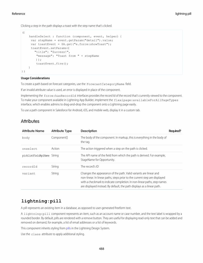
Clicking a step in the path displays a toast with the step name that's clicked.
({handleSelect : function (component, event, helper) {var stepName = event.getParam("detail").value;var toastEvent = $A.get("e.force:showToast");toastEvent.setParams({"title": "Success!","message": "Toast from " + stepName});toastEvent.fire();
}})
Usage Considerations
To create a path based on forecast categories, use the ForecastCategoryName field.
If an invalid attribute value is used, an error is displayed in place of the component.
Implementing the force:hasRecordId interfaces provides the record Id of the record that's currently viewed to the component.To make your component available in Lightning App Builder, implement the flexipage:availableForAllPageTypesinterface, which enables admins to drag-and-drop the component onto a Lightning page easily.
To use a path component in Salesforce for Android, iOS, and mobile web, display it in a custom tab.
Attributes
Required?DescriptionAttribute TypeAttribute Name
The body of the component. In markup, this is everything in the body ofthe tag.
Component[]body
The action triggered when a step on the path is clicked.Actiononselect
The API name of the field from which the path is derived. For example,StageName for Opportunity.
StringpicklistFieldApiName
The record's IDStringrecordId
Changes the appearance of the path. Valid variants are linear andnon-linear. In linear paths, steps prior to the current step are displayed
Stringvariant
with a checkmark to indicate completion. In non-linear paths, step namesare displayed instead. By default, the path displays as a linear path.
lightning:pillA pill represents an existing item in a database, as opposed to user-generated freeform text.
A lightning:pill component represents an item, such as an account name or case number, and the text label is wrapped by arounded border. By default, pills are rendered with a remove button. They are useful for displaying read-only text that can be added andremoved on demand, for example, a list of email addresses or a list of keywords.
This component inherits styling from pills in the Lightning Design System.
Use the class attribute to apply additional styling.
488
lightning:pillReference
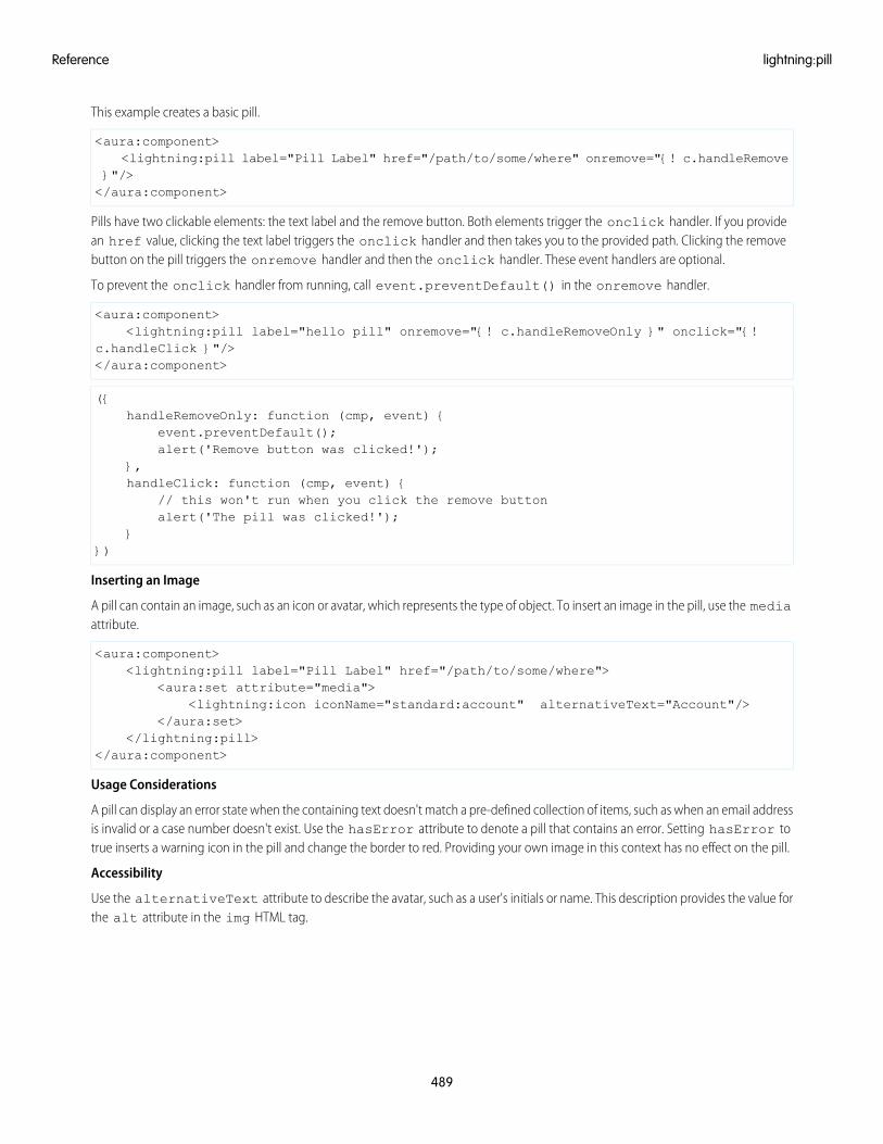
This example creates a basic pill.
<aura:component><lightning:pill label="Pill Label" href="/path/to/some/where" onremove="{! c.handleRemove
}"/></aura:component>
Pills have two clickable elements: the text label and the remove button. Both elements trigger the onclick handler. If you providean href value, clicking the text label triggers the onclick handler and then takes you to the provided path. Clicking the removebutton on the pill triggers the onremove handler and then the onclick handler. These event handlers are optional.
To prevent the onclick handler from running, call event.preventDefault() in the onremove handler.
<aura:component><lightning:pill label="hello pill" onremove="{! c.handleRemoveOnly }" onclick="{!
c.handleClick }"/></aura:component>
({handleRemoveOnly: function (cmp, event) {
event.preventDefault();alert('Remove button was clicked!');
},handleClick: function (cmp, event) {
// this won't run when you click the remove buttonalert('The pill was clicked!');
}})
Inserting an Image
A pill can contain an image, such as an icon or avatar, which represents the type of object. To insert an image in the pill, use the mediaattribute.
<aura:component><lightning:pill label="Pill Label" href="/path/to/some/where">
<aura:set attribute="media"><lightning:icon iconName="standard:account" alternativeText="Account"/>
</aura:set></lightning:pill>
</aura:component>
Usage Considerations
A pill can display an error state when the containing text doesn't match a pre-defined collection of items, such as when an email addressis invalid or a case number doesn't exist. Use the hasError attribute to denote a pill that contains an error. Setting hasError totrue inserts a warning icon in the pill and change the border to red. Providing your own image in this context has no effect on the pill.
Accessibility
Use the alternativeText attribute to describe the avatar, such as a user's initials or name. This description provides the value forthe alt attribute in the img HTML tag.
489
lightning:pillReference
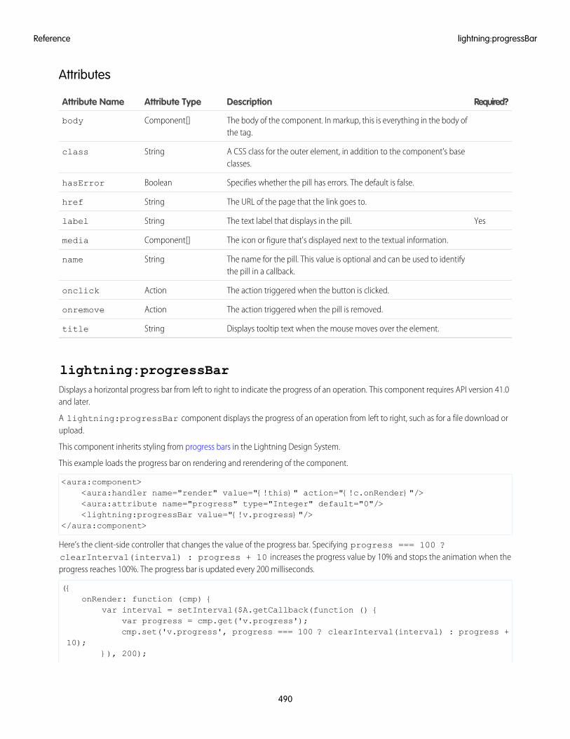
Attributes
Required?DescriptionAttribute TypeAttribute Name
The body of the component. In markup, this is everything in the body ofthe tag.
Component[]body
A CSS class for the outer element, in addition to the component's baseclasses.
Stringclass
Specifies whether the pill has errors. The default is false.BooleanhasError
The URL of the page that the link goes to.Stringhref
YesThe text label that displays in the pill.Stringlabel
The icon or figure that's displayed next to the textual information.Component[]media
The name for the pill. This value is optional and can be used to identifythe pill in a callback.
Stringname
The action triggered when the button is clicked.Actiononclick
The action triggered when the pill is removed.Actiononremove
Displays tooltip text when the mouse moves over the element.Stringtitle
lightning:progressBarDisplays a horizontal progress bar from left to right to indicate the progress of an operation. This component requires API version 41.0and later.
A lightning:progressBar component displays the progress of an operation from left to right, such as for a file download orupload.
This component inherits styling from progress bars in the Lightning Design System.
This example loads the progress bar on rendering and rerendering of the component.
<aura:component><aura:handler name="render" value="{!this}" action="{!c.onRender}"/><aura:attribute name="progress" type="Integer" default="0"/><lightning:progressBar value="{!v.progress}"/>
</aura:component>
Here’s the client-side controller that changes the value of the progress bar. Specifying progress === 100 ?clearInterval(interval) : progress + 10 increases the progress value by 10% and stops the animation when theprogress reaches 100%. The progress bar is updated every 200 milliseconds.
({onRender: function (cmp) {
var interval = setInterval($A.getCallback(function () {var progress = cmp.get('v.progress');cmp.set('v.progress', progress === 100 ? clearInterval(interval) : progress +
10);}), 200);
490
lightning:progressBarReference
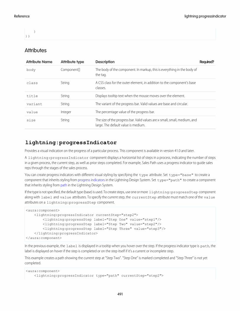
}})
Attributes
Required?DescriptionAttribute typeAttribute Name
The body of the component. In markup, this is everything in the body ofthe tag.
Component[]body
A CSS class for the outer element, in addition to the component's baseclasses.
Stringclass
Displays tooltip text when the mouse moves over the element.Stringtitle
The variant of the progress bar. Valid values are base and circular.Stringvariant
The percentage value of the progress bar.Integervalue
The size of the progress bar. Valid values are x-small, small, medium, andlarge. The default value is medium.
Stringsize
lightning:progressIndicatorProvides a visual indication on the progress of a particular process. This component is available in version 41.0 and later.
A lightning:progressIndicator component displays a horizontal list of steps in a process, indicating the number of stepsin a given process, the current step, as well as prior steps completed. For example, Sales Path uses a progress indicator to guide salesreps through the stages of the sales process.
You can create progress indicators with different visual styling by specifying the type attribute. Set type="base" to create acomponent that inherits styling from progress indicators in the Lightning Design System. Set type="path" to create a componentthat inherits styling from path in the Lightning Design System.
If the type is not specified, the default type (base) is used. To create steps, use one or more lightning:progressStep componentalong with label and value attributes. To specify the current step, the currentStep attribute must match one of the valueattributes on a lightning:progressStep component.
<aura:component><lightning:progressIndicator currentStep="step2">
<lightning:progressStep label="Step One" value="step1"/><lightning:progressStep label="Step Two" value="step2"/><lightning:progressStep label="Step Three" value="step3"/>
</lightning:progressIndicator></aura:component>
In the previous example, the label is displayed in a tooltip when you hover over the step. If the progress indicator type is path, thelabel is displayed on hover if the step is completed or on the step itself if it's a current or incomplete step.
This example creates a path showing the current step at "Step Two". "Step One" is marked completed and "Step Three" is not yetcompleted.
<aura:component><lightning:progressIndicator type="path" currentStep="step2">
491
lightning:progressIndicatorReference
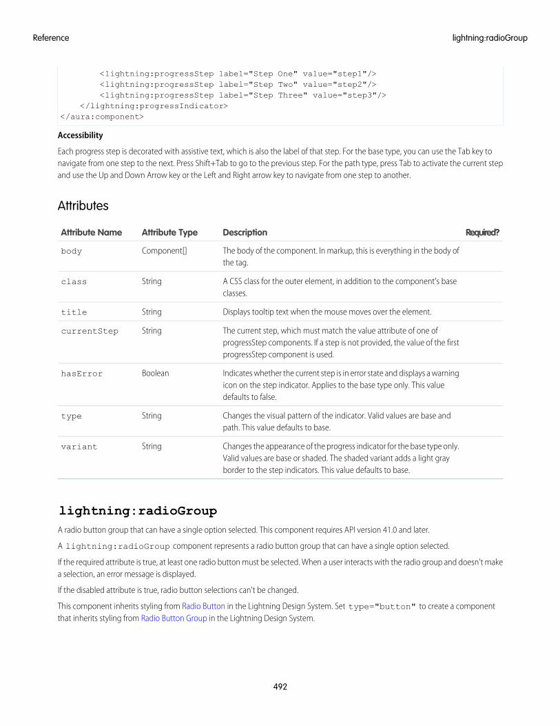
<lightning:progressStep label="Step One" value="step1"/><lightning:progressStep label="Step Two" value="step2"/><lightning:progressStep label="Step Three" value="step3"/>
</lightning:progressIndicator></aura:component>
Accessibility
Each progress step is decorated with assistive text, which is also the label of that step. For the base type, you can use the Tab key tonavigate from one step to the next. Press Shift+Tab to go to the previous step. For the path type, press Tab to activate the current stepand use the Up and Down Arrow key or the Left and Right arrow key to navigate from one step to another.
Attributes
Required?DescriptionAttribute TypeAttribute Name
The body of the component. In markup, this is everything in the body ofthe tag.
Component[]body
A CSS class for the outer element, in addition to the component's baseclasses.
Stringclass
Displays tooltip text when the mouse moves over the element.Stringtitle
The current step, which must match the value attribute of one ofprogressStep components. If a step is not provided, the value of the firstprogressStep component is used.
StringcurrentStep
Indicates whether the current step is in error state and displays a warningicon on the step indicator. Applies to the base type only. This valuedefaults to false.
BooleanhasError
Changes the visual pattern of the indicator. Valid values are base andpath. This value defaults to base.
Stringtype
Changes the appearance of the progress indicator for the base type only.Valid values are base or shaded. The shaded variant adds a light grayborder to the step indicators. This value defaults to base.
Stringvariant
lightning:radioGroupA radio button group that can have a single option selected. This component requires API version 41.0 and later.
A lightning:radioGroup component represents a radio button group that can have a single option selected.
If the required attribute is true, at least one radio button must be selected. When a user interacts with the radio group and doesn't makea selection, an error message is displayed.
If the disabled attribute is true, radio button selections can't be changed.
This component inherits styling from Radio Button in the Lightning Design System. Set type="button" to create a componentthat inherits styling from Radio Button Group in the Lightning Design System.
492
lightning:radioGroupReference
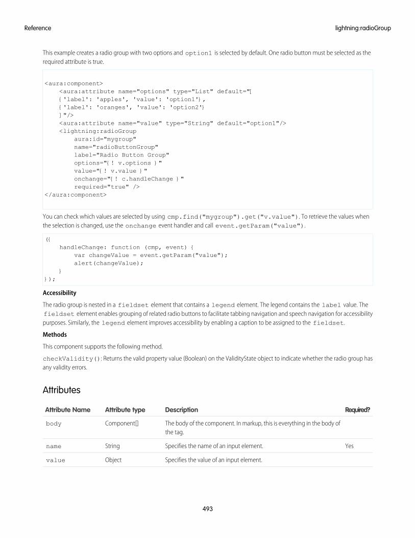
This example creates a radio group with two options and option1 is selected by default. One radio button must be selected as therequired attribute is true.
<aura:component><aura:attribute name="options" type="List" default="[{'label': 'apples', 'value': 'option1'},{'label': 'oranges', 'value': 'option2'}]"/><aura:attribute name="value" type="String" default="option1"/><lightning:radioGroup
aura:id="mygroup"name="radioButtonGroup"label="Radio Button Group"options="{! v.options }"value="{! v.value }"onchange="{! c.handleChange }"required="true" />
</aura:component>
You can check which values are selected by using cmp.find("mygroup").get("v.value"). To retrieve the values whenthe selection is changed, use the onchange event handler and call event.getParam("value").
({handleChange: function (cmp, event) {
var changeValue = event.getParam("value");alert(changeValue);
}});
Accessibility
The radio group is nested in a fieldset element that contains a legend element. The legend contains the label value. Thefieldset element enables grouping of related radio buttons to facilitate tabbing navigation and speech navigation for accessibilitypurposes. Similarly, the legend element improves accessibility by enabling a caption to be assigned to the fieldset.
Methods
This component supports the following method.
checkValidity(): Returns the valid property value (Boolean) on the ValidityState object to indicate whether the radio group hasany validity errors.
Attributes
Required?DescriptionAttribute typeAttribute Name
The body of the component. In markup, this is everything in the body ofthe tag.
Component[]body
YesSpecifies the name of an input element.Stringname
Specifies the value of an input element.Objectvalue
493
lightning:radioGroupReference
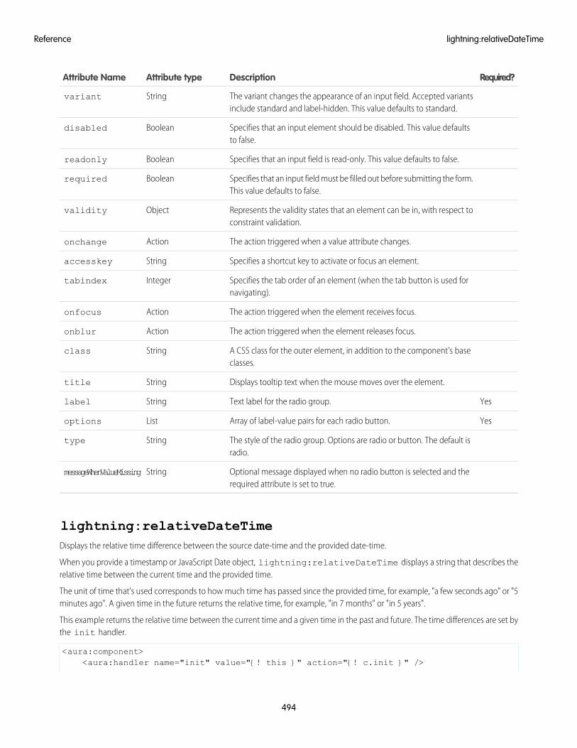
Required?DescriptionAttribute typeAttribute Name
The variant changes the appearance of an input field. Accepted variantsinclude standard and label-hidden. This value defaults to standard.
Stringvariant
Specifies that an input element should be disabled. This value defaultsto false.
Booleandisabled
Specifies that an input field is read-only. This value defaults to false.Booleanreadonly
Specifies that an input field must be filled out before submitting the form.This value defaults to false.
Booleanrequired
Represents the validity states that an element can be in, with respect toconstraint validation.
Objectvalidity
The action triggered when a value attribute changes.Actiononchange
Specifies a shortcut key to activate or focus an element.Stringaccesskey
Specifies the tab order of an element (when the tab button is used fornavigating).
Integertabindex
The action triggered when the element receives focus.Actiononfocus
The action triggered when the element releases focus.Actiononblur
A CSS class for the outer element, in addition to the component's baseclasses.
Stringclass
Displays tooltip text when the mouse moves over the element.Stringtitle
YesText label for the radio group.Stringlabel
YesArray of label-value pairs for each radio button.Listoptions
The style of the radio group. Options are radio or button. The default isradio.
Stringtype
Optional message displayed when no radio button is selected and therequired attribute is set to true.
StringmessageWhenValueMissing
lightning:relativeDateTimeDisplays the relative time difference between the source date-time and the provided date-time.
When you provide a timestamp or JavaScript Date object, lightning:relativeDateTime displays a string that describes therelative time between the current time and the provided time.
The unit of time that's used corresponds to how much time has passed since the provided time, for example, "a few seconds ago" or "5minutes ago". A given time in the future returns the relative time, for example, "in 7 months" or "in 5 years".
This example returns the relative time between the current time and a given time in the past and future. The time differences are set bythe init handler.
<aura:component><aura:handler name="init" value="{! this }" action="{! c.init }" />
494
lightning:relativeDateTimeReference
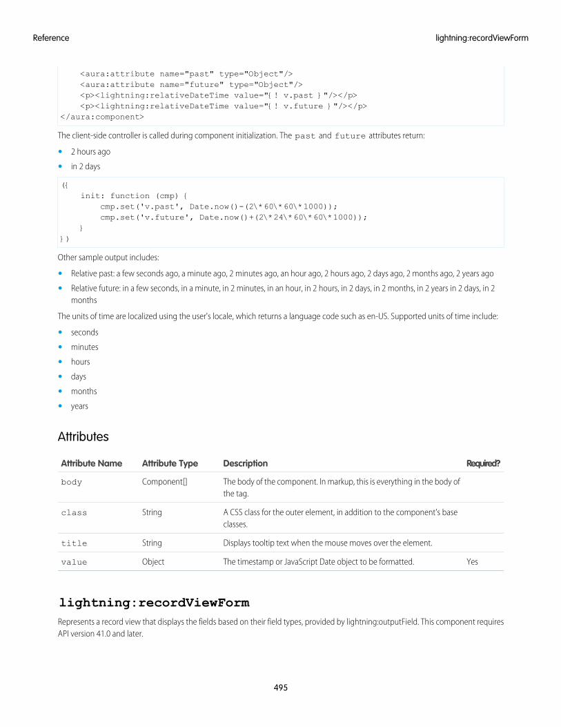
<aura:attribute name="past" type="Object"/><aura:attribute name="future" type="Object"/><p><lightning:relativeDateTime value="{! v.past }"/></p><p><lightning:relativeDateTime value="{! v.future }"/></p>
</aura:component>
The client-side controller is called during component initialization. The past and future attributes return:
• 2 hours ago
• in 2 days
({init: function (cmp) {
cmp.set('v.past', Date.now()-(2\*60\*60\*1000));cmp.set('v.future', Date.now()+(2\*24\*60\*60\*1000));
}})
Other sample output includes:
• Relative past: a few seconds ago, a minute ago, 2 minutes ago, an hour ago, 2 hours ago, 2 days ago, 2 months ago, 2 years ago
• Relative future: in a few seconds, in a minute, in 2 minutes, in an hour, in 2 hours, in 2 days, in 2 months, in 2 years in 2 days, in 2months
The units of time are localized using the user's locale, which returns a language code such as en-US. Supported units of time include:
• seconds
• minutes
• hours
• days
• months
• years
Attributes
Required?DescriptionAttribute TypeAttribute Name
The body of the component. In markup, this is everything in the body ofthe tag.
Component[]body
A CSS class for the outer element, in addition to the component's baseclasses.
Stringclass
Displays tooltip text when the mouse moves over the element.Stringtitle
YesThe timestamp or JavaScript Date object to be formatted.Objectvalue
lightning:recordViewFormRepresents a record view that displays the fields based on their field types, provided by lightning:outputField. This component requiresAPI version 41.0 and later.
495
lightning:recordViewFormReference
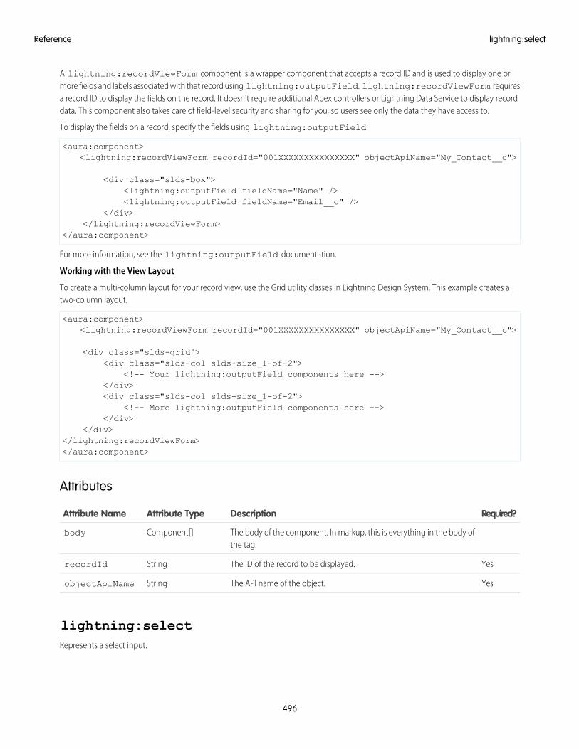
A lightning:recordViewForm component is a wrapper component that accepts a record ID and is used to display one ormore fields and labels associated with that record using lightning:outputField. lightning:recordViewForm requiresa record ID to display the fields on the record. It doesn't require additional Apex controllers or Lightning Data Service to display recorddata. This component also takes care of field-level security and sharing for you, so users see only the data they have access to.
To display the fields on a record, specify the fields using lightning:outputField.
<aura:component><lightning:recordViewForm recordId="001XXXXXXXXXXXXXXX" objectApiName="My_Contact__c">
<div class="slds-box"><lightning:outputField fieldName="Name" /><lightning:outputField fieldName="Email__c" />
</div></lightning:recordViewForm>
</aura:component>
For more information, see the lightning:outputField documentation.
Working with the View Layout
To create a multi-column layout for your record view, use the Grid utility classes in Lightning Design System. This example creates atwo-column layout.
<aura:component><lightning:recordViewForm recordId="001XXXXXXXXXXXXXXX" objectApiName="My_Contact__c">
<div class="slds-grid"><div class="slds-col slds-size_1-of-2">
<!-- Your lightning:outputField components here --></div><div class="slds-col slds-size_1-of-2">
<!-- More lightning:outputField components here --></div>
</div></lightning:recordViewForm></aura:component>
Attributes
Required?DescriptionAttribute TypeAttribute Name
The body of the component. In markup, this is everything in the body ofthe tag.
Component[]body
YesThe ID of the record to be displayed.StringrecordId
YesThe API name of the object.StringobjectApiName
lightning:selectRepresents a select input.
496
lightning:selectReference
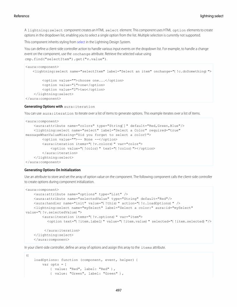
A lightning:select component creates an HTML select element. This component uses HTML option elements to createoptions in the dropdown list, enabling you to select a single option from the list. Multiple selection is currently not supported.
This component inherits styling from select in the Lightning Design System.
You can define a client-side controller action to handle various input events on the dropdown list. For example, to handle a changeevent on the component, use the onchange attribute. Retrieve the selected value usingcmp.find("selectItem").get("v.value").
<aura:component><lightning:select name="selectItem" label="Select an item" onchange="{!c.doSomething}">
<option value="">choose one...</option><option value="1">one</option><option value="2">two</option>
</lightning:select></aura:component>
Generating Options with aura:iteration
You can use aura:iteration to iterate over a list of items to generate options. This example iterates over a list of items.
<aura:component><aura:attribute name="colors" type="String[]" default="Red,Green,Blue"/><lightning:select name="select" label="Select a Color" required="true"
messageWhenValueMissing="Did you forget to select a color?"><option value="">-- None --</option><aura:iteration items="{!v.colors}" var="color">
<option value="{!color}" text="{!color}"></option></aura:iteration>
</lightning:select></aura:component>
Generating Options On Initialization
Use an attribute to store and set the array of option value on the component. The following component calls the client-side controllerto create options during component initialization.
<aura:component><aura:attribute name="options" type="List" /><aura:attribute name="selectedValue" type="String" default="Red"/><aura:handler name="init" value="{!this}" action="{!c.loadOptions}" /><lightning:select name="mySelect" label="Select a color:" aura:id="mySelect"
value="{!v.selectedValue}"><aura:iteration items="{!v.options}" var="item">
<option text="{!item.label}" value="{!item.value}" selected="{!item.selected}"/>
</aura:iteration></lightning:select></aura:component>
In your client-side controller, define an array of options and assign this array to the items attribute.
({loadOptions: function (component, event, helper) {
var opts = [{ value: "Red", label: "Red" },{ value: "Green", label: "Green" },
497
lightning:selectReference
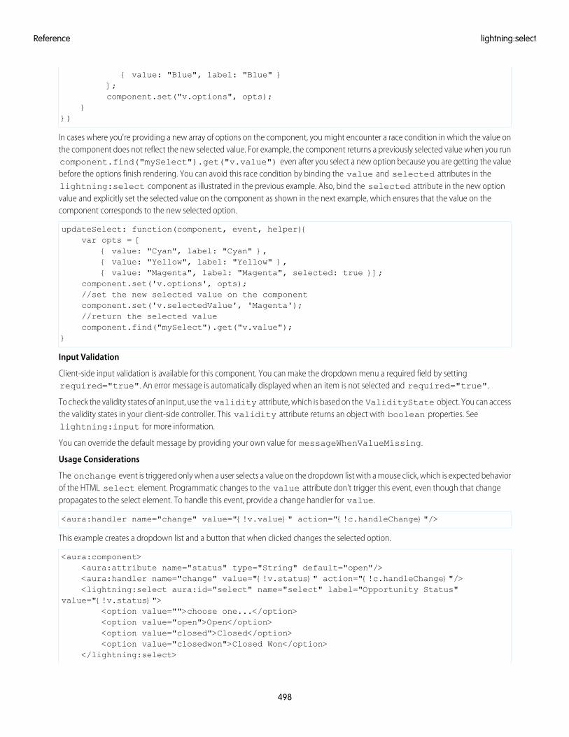
{ value: "Blue", label: "Blue" }];component.set("v.options", opts);
}})
In cases where you're providing a new array of options on the component, you might encounter a race condition in which the value onthe component does not reflect the new selected value. For example, the component returns a previously selected value when you runcomponent.find("mySelect").get("v.value") even after you select a new option because you are getting the valuebefore the options finish rendering. You can avoid this race condition by binding the value and selected attributes in thelightning:select component as illustrated in the previous example. Also, bind the selected attribute in the new optionvalue and explicitly set the selected value on the component as shown in the next example, which ensures that the value on thecomponent corresponds to the new selected option.
updateSelect: function(component, event, helper){var opts = [
{ value: "Cyan", label: "Cyan" },{ value: "Yellow", label: "Yellow" },{ value: "Magenta", label: "Magenta", selected: true }];
component.set('v.options', opts);//set the new selected value on the componentcomponent.set('v.selectedValue', 'Magenta');//return the selected valuecomponent.find("mySelect").get("v.value");
}
Input Validation
Client-side input validation is available for this component. You can make the dropdown menu a required field by settingrequired="true". An error message is automatically displayed when an item is not selected and required="true".
To check the validity states of an input, use the validity attribute, which is based on the ValidityState object. You can accessthe validity states in your client-side controller. This validity attribute returns an object with boolean properties. Seelightning:input for more information.
You can override the default message by providing your own value for messageWhenValueMissing.
Usage Considerations
The onchange event is triggered only when a user selects a value on the dropdown list with a mouse click, which is expected behaviorof the HTML select element. Programmatic changes to the value attribute don't trigger this event, even though that changepropagates to the select element. To handle this event, provide a change handler for value.
<aura:handler name="change" value="{!v.value}" action="{!c.handleChange}"/>
This example creates a dropdown list and a button that when clicked changes the selected option.
<aura:component><aura:attribute name="status" type="String" default="open"/><aura:handler name="change" value="{!v.status}" action="{!c.handleChange}"/><lightning:select aura:id="select" name="select" label="Opportunity Status"
value="{!v.status}"><option value="">choose one...</option><option value="open">Open</option><option value="closed">Closed</option><option value="closedwon">Closed Won</option>
</lightning:select>
498
lightning:selectReference
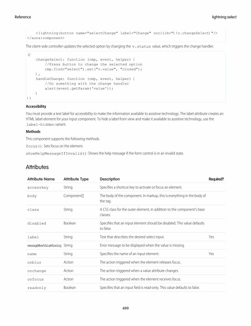
<lightning:button name="selectChange" label="Change" onclick="{!c.changeSelect}"/></aura:component>
The client-side controller updates the selected option by changing the v.status value, which triggers the change handler.
({changeSelect: function (cmp, event, helper) {
//Press button to change the selected optioncmp.find("select").set("v.value", "closed");
},handleChange: function (cmp, event, helper) {
//Do something with the change handleralert(event.getParam('value'));
}})
Accessibility
You must provide a text label for accessibility to make the information available to assistive technology. The label attribute creates anHTML label element for your input component. To hide a label from view and make it available to assistive technology, use thelabel-hidden variant.
Methods
This component supports the following methods.
focus(): Sets focus on the element.
showHelpMessageIfInvalid(): Shows the help message if the form control is in an invalid state.
Attributes
Required?DescriptionAttribute TypeAttribute Name
Specifies a shortcut key to activate or focus an element.Stringaccesskey
The body of the component. In markup, this is everything in the body ofthe tag.
Component[]body
A CSS class for the outer element, in addition to the component's baseclasses.
Stringclass
Specifies that an input element should be disabled. This value defaultsto false.
Booleandisabled
YesText that describes the desired select input.Stringlabel
Error message to be displayed when the value is missing.StringmessageWhenValueMissing
YesSpecifies the name of an input element.Stringname
The action triggered when the element releases focus.Actiononblur
The action triggered when a value attribute changes.Actiononchange
The action triggered when the element receives focus.Actiononfocus
Specifies that an input field is read-only. This value defaults to false.Booleanreadonly
499
lightning:selectReference
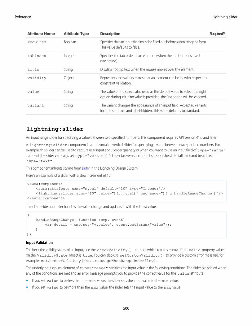
Required?DescriptionAttribute TypeAttribute Name
Specifies that an input field must be filled out before submitting the form.This value defaults to false.
Booleanrequired
Specifies the tab order of an element (when the tab button is used fornavigating).
Integertabindex
Displays tooltip text when the mouse moves over the element.Stringtitle
Represents the validity states that an element can be in, with respect toconstraint validation.
Objectvalidity
The value of the select, also used as the default value to select the rightoption during init. If no value is provided, the first option will be selected.
Stringvalue
The variant changes the appearance of an input field. Accepted variantsinclude standard and label-hidden. This value defaults to standard.
Stringvariant
lightning:sliderAn input range slider for specifying a value between two specified numbers. This component requires API version 41.0 and later.
A lightning:slider component is a horizontal or vertical slider for specifying a value between two specified numbers. Forexample, this slider can be used to capture user input about order quantity or when you want to use an input field of type="range".To orient the slider vertically, set type="vertical". Older browsers that don't support the slider fall back and treat it astype="text".
This component inherits styling from slider in the Lightning Design System.
Here's an example of a slider with a step increment of 10.
<aura:component><aura:attribute name="myval" default="10" type="Integer"/><lightning:slider step="10" value="{!v.myval}" onchange="{! c.handleRangeChange }"/>
</aura:component>
The client-side controller handles the value change and updates it with the latest value.
({handleRangeChange: function (cmp, event) {
var detail = cmp.set("v.value", event.getParam("value"));}
})
Input Validation
To check the validity states of an input, use the checkValidity() method, which returns true if the valid property valueon the ValidityState object is true. You can also use setCustomValidity() to provide a custom error message, forexample, setCustomValidity(this.messageWhenRangeUnderflow).
The underlying input element of type="range" sanitizes the input value in the following conditions. The slider is disabled whenany of the conditions are met and an error message prompts you to provide the correct value for the value attribute.
• If you set value to be less than the min value, the slider sets the input value to the min value.
• If you set value to be more than the max value, the slider sets the input value to the max value.
500
lightning:sliderReference
• If value is not a multiple of the step value, the slider sets the input value to nearest multiple. For example, if you set valueto 18, step to 5, min to 10, and max to 50, the slider sets the input value to 20.
• If you invert the min and max values in error, the slider doesn't correct the values, but it sets the input value to the min value.For example, if you set value to 18, min to 50, and max to 10, the slider sets the input value to 50.
Usage Considerations
By default, the min and max values are 0 and 100, but you can specify your own values. Additionally, if you specify your own stepincrement value, you can drag the slider based on the step increment only. If you set the value lower than the min value, then thevalue is set to the min value. Similarly, setting the value higher than the max value results in the value being set to the max value.For precise numerical values, we recommend using the lightning:input component of type="number" instead.
Methods
This component supports the following methods.
blur(): Removes keyboard focus on the input element.
checkValidity(): Returns the valid property value (Boolean) on the ValidityState object to indicate whether the input field valuehas any validity errors.
focus(): Sets focus on the input element.
setCustomValidity(message): Sets a custom error message to be displayed when a condition is met.
• message (String): The string that describes the error. If message is an empty string, the error message is reset.
showHelpMessageIfInvalid(): Displays error messages on the slider. The slider value is invalid if it fails at least one constraintvalidation and returns false when checkValidity() is called.
Attributes
Required?DescriptionAttribute typeAttribute Name
The body of the component. In markup, this is everything in the body ofthe tag.
Component[]body
A CSS class for the outer element, in addition to the component's baseclasses.
Stringclass
Displays tooltip text when the mouse moves over the element.Stringtitle
The numerical value of the input range. This value defaults to 0.Integervalue
The action triggered when the slider value changes. You must pass anynewly selected value back to the slider component to bind the new valueto the slider.
Stringonchange
The min value of the input range. This value defaults to 0.Integermin
The max value of the input range. This value defaults to 100.Integermax
The step increment value of the input range. Example steps include 0.1,1, or 10. This value defaults to 1.
Stringstep
The size value of the input range. This value default to empty, which isthe base. Supports x-small, small, medium, and large.
Stringsize
The type of the input range position. This value defaults to horizontal.Stringtype
501
lightning:sliderReference
Required?DescriptionAttribute typeAttribute Name
The text label for the input range. Provide your own label to describe theslider. Otherwise, no label is displayed.
Stringlabel
The disabled value of the input range. This value default to false.Booleandisabled
The variant changes the appearance of the slider. Accepted variantsinclude standard and label-hidden. This value defaults to standard.
Stringvariant
Error message to be displayed when a bad input is detected. Use withsetCustomValidity.
StringmessageWhenBadInput
Error message to be displayed when a pattern mismatch is detected. Usewith setCustomValidity.
StringmessageWhenPatternMismatch
Error message to be displayed when a type mismatch is detected. Usewith setCustomValidity.
StringmessageWhenTypeMismatch
Error message to be displayed when the value is missing. Use withsetCustomValidity.
StringmessageWhenValueMissing
Error message to be displayed when a range overflow is detected. Usewith setCustomValidity.
StringmessageWhenRangeOverflow
Error message to be displayed when a range underflow is detected. Usewith setCustomValidity.
StringmessageWhenRangeUnderflow
Error message to be displayed when a step mismatch is detected. Usewith setCustomValidity.
StringmessageWhenStepMismatch
Error message to be displayed when the value is too long. Use withsetCustomValidity.
StringmessageWhenTooLong
The action triggered when the slider releases focus.Actiononblur
The action triggered when the slider receives focus.Actiononfocus
lightning:spinnerDisplays an animated spinner.
A lightning:spinner displays an animated spinner image to indicate that a feature is loading. This component can be usedwhen retrieving data or anytime an operation doesn't immediately complete.
The variant attribute changes the appearance of the spinner. If you set variant="brand", the spinner matches the LightningDesign System brand color. Setting variant="inverse" displays a white spinner. The default spinner color is dark blue.
This component inherits styling from spinners in the Lightning Design System.
Here is an example.
<aura:component><lightning:spinner variant="brand" size="large"/>
</aura:component>
502
lightning:spinnerReference
lightning:spinner is intended to be used conditionally. You can use aura:if or the Lightning Design System utility classesto show or hide the spinner.
<aura:component><lightning:button label="Toggle" variant="brand" onclick="{!c.toggle}"/><div class="exampleHolder">
<lightning:spinner aura:id="mySpinner" /></div>
</aura:component>
This client-side controller toggles the slds-hide class on the spinner.
({toggle: function (cmp, event) {
var spinner = cmp.find("mySpinner");$A.util.toggleClass(spinner, "slds-hide");
}})
Attributes
Required?DescriptionAttribute TypeAttribute Name
The alternative text used to describe the reason for the wait and needfor a spinner.
StringalternativeText
The body of the component. In markup, this is everything in the body ofthe tag.
Component[]body
A CSS class for the outer element, in addition to the component's baseclasses.
Stringclass
The size of the spinner. Accepted sizes are small, medium, and large. Thisvalue defaults to medium.
Stringsize
Displays tooltip text when the mouse moves over the element.Stringtitle
The variant changes the appearance of the spinner. Accepted variantsare brand and inverse.
Stringvariant
lightning:tab (Beta)A single tab that is nested in a lightning:tabset component.
A lightning:tab keeps related content in a single container. The tab content displays when a user clicks the tab. lightning:tabis intended to be used with lightning:tabset.
This component inherits styling from tabs in the Lightning Design System.
The label attribute can contain text or more complex markup. In the following example, aura:set is used to specify a label thatincludes a lightning:icon.
<aura:component><lightning:tabset>
<lightning:tab>
503
lightning:tab (Beta)Reference
<aura:set attribute="label">Item One<lightning:icon iconName="utility:connected_apps" />
</aura:set></lightning:tab>
</lightning:tabset></aura:component>
Usage Considerations
This component creates its body during runtime. You won’t be able to reference the component during initialization. You can set yourcontent using value binding with component attributes instead. See lightning:tabset for more information.
Methods
This component supports the following method.
focus(): Sets the focus on the element.
Attributes
Required?DescriptionAttribute TypeAttribute Name
The body of the tab.ComponentDefRef[]body
Specifies a shortcut key to activate or focus an element.Stringaccesskey
Specifies the tab order of an element (when the tab button is used fornavigating).
Integertabindex
A CSS class for the outer element, in addition to the component's baseclasses.
Stringclass
The title displays when you hover over the tab. The title should describethe content of the tab for screen readers.
Stringtitle
The optional ID is used during tabset's onSelect event to determine whichtab was clicked.
Stringid
The text that appears in the tab.Component[]label
The action triggered when the element releases focus.Actiononblur
The action triggered when the element receives focus.Actiononfocus
The action triggered when this tab becomes active.Actiononactive
lightning:tabset (Beta)Represents a list of tabs.
A lightning:tabset displays a tabbed container with multiple content areas, only one of which is visible at a time. Tabs aredisplayed horizontally inline with content shown below it. A tabset can hold multiple lightning:tab components as part of its body. Thefirst tab is activated by default, but you can change the default tab by setting the selectedTabId attribute on the target tab.
504
lightning:tabset (Beta)Reference
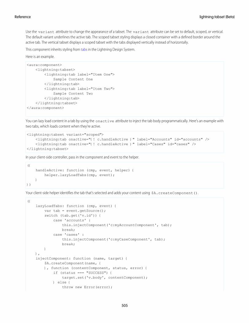
Use the variant attribute to change the appearance of a tabset. The variant attribute can be set to default, scoped, or vertical.The default variant underlines the active tab. The scoped tabset styling displays a closed container with a defined border around theactive tab. The vertical tabset displays a scoped tabset with the tabs displayed vertically instead of horizontally.
This component inherits styling from tabs in the Lightning Design System.
Here is an example.
<aura:component><lightning:tabset>
<lightning:tab label="Item One">Sample Content One
</lightning:tab><lightning:tab label="Item Two">
Sample Content Two</lightning:tab>
</lightning:tabset></aura:component>
You can lazy load content in a tab by using the onactive attribute to inject the tab body programmatically. Here's an example withtwo tabs, which loads content when they're active.
<lightning:tabset variant="scoped"><lightning:tab onactive="{! c.handleActive }" label="Accounts" id="accounts" /><lightning:tab onactive="{! c.handleActive }" label="Cases" id="cases" />
</lightning:tabset>
In your client-side controller, pass in the component and event to the helper.
({handleActive: function (cmp, event, helper) {
helper.lazyLoadTabs(cmp, event);}
})
Your client-side helper identifies the tab that's selected and adds your content using $A.createComponent().
({lazyLoadTabs: function (cmp, event) {
var tab = event.getSource();switch (tab.get('v.id')) {
case 'accounts' :this.injectComponent('c:myAccountComponent', tab);break;
case 'cases' :this.injectComponent('c:myCaseComponent', tab);break;
}},injectComponent: function (name, target) {
$A.createComponent(name, {}, function (contentComponent, status, error) {
if (status === "SUCCESS") {target.set('v.body', contentComponent);
} else {throw new Error(error);
505
lightning:tabset (Beta)Reference
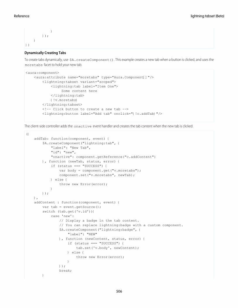
}});
}})
Dynamically Creating Tabs
To create tabs dynamically, use $A.createComponent(). This example creates a new tab when a button is clicked, and uses themoretabs facet to hold your new tab.
<aura:component><aura:attribute name="moretabs" type="Aura.Component[]"/>
<lightning:tabset variant="scoped"><lightning:tab label="Item One">
Some content here</lightning:tab>{!v.moretabs}
</lightning:tabset><!-- Click button to create a new tab --><lightning:button label="Add tab" onclick="{!c.addTab}"/>
The client-side controller adds the onactive event handler and creates the tab content when the new tab is clicked.
({addTab: function(component, event) {
$A.createComponent("lightning:tab", {"label": "New Tab","id": "new","onactive": component.getReference("c.addContent")
}, function (newTab, status, error) {if (status === "SUCCESS") {
var body = component.get("v.moretabs");component.set("v.moretabs", newTab);
} else {throw new Error(error);
}});
},addContent : function(component, event) {
var tab = event.getSource();switch (tab.get('v.id')){
case 'new':// Display a badge in the tab content.// You can replace lightning:badge with a custom component.$A.createComponent("lightning:badge", {
"label": "NEW"}, function (newContent, status, error) {
if (status === "SUCCESS") {tab.set('v.body', newContent);
} else {throw new Error(error);
}});break;
}
506
lightning:tabset (Beta)Reference
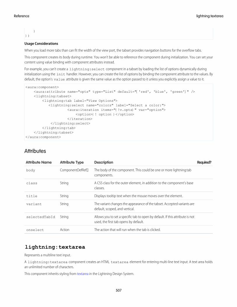
}})
Usage Considerations
When you load more tabs than can fit the width of the view port, the tabset provides navigation buttons for the overflow tabs.
This component creates its body during runtime. You won’t be able to reference the component during initialization. You can set yourcontent using value binding with component attributes instead.
For example, you can't create a lightning:select component in a tabset by loading the list of options dynamically duringinitialization using the init handler. However, you can create the list of options by binding the component attribute to the values. Bydefault, the option's value attribute is given the same value as the option passed to it unless you explicitly assign a value to it.
<aura:component><aura:attribute name="opts" type="List" default="['red', 'blue', 'green']" /><lightning:tabset>
<lightning:tab label="View Options"><lightning:select name="colors" label="Select a color:">
<aura:iteration items="{!v.opts}" var="option"><option>{! option }</option>
</iteration></lightning:select>
</lightning:tab></lightning:tabset>
</aura:component>
Attributes
Required?DescriptionAttribute TypeAttribute Name
The body of the component. This could be one or more lightning:tabcomponents.
ComponentDefRef[]body
A CSS class for the outer element, in addition to the component's baseclasses.
Stringclass
Displays tooltip text when the mouse moves over the element.Stringtitle
The variant changes the appearance of the tabset. Accepted variants aredefault, scoped, and vertical.
Stringvariant
Allows you to set a specific tab to open by default. If this attribute is notused, the first tab opens by default.
StringselectedTabId
The action that will run when the tab is clicked.Actiononselect
lightning:textareaRepresents a multiline text input.
A lightning:textarea component creates an HTML textarea element for entering multi-line text input. A text area holdsan unlimited number of characters.
This component inherits styling from textarea in the Lightning Design System.
507
lightning:textareaReference
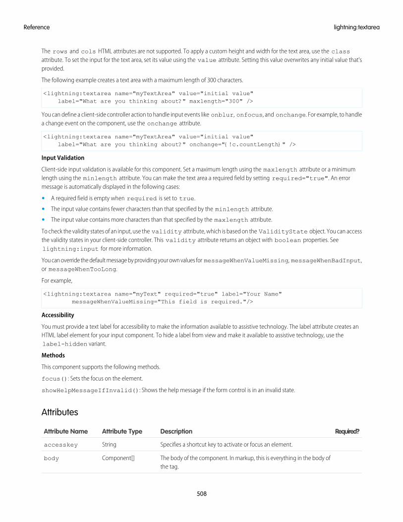
The rows and cols HTML attributes are not supported. To apply a custom height and width for the text area, use the classattribute. To set the input for the text area, set its value using the value attribute. Setting this value overwrites any initial value that'sprovided.
The following example creates a text area with a maximum length of 300 characters.
<lightning:textarea name="myTextArea" value="initial value"label="What are you thinking about?" maxlength="300" />
You can define a client-side controller action to handle input events like onblur, onfocus, and onchange. For example, to handlea change event on the component, use the onchange attribute.
<lightning:textarea name="myTextArea" value="initial value"label="What are you thinking about?" onchange="{!c.countLength}" />
Input Validation
Client-side input validation is available for this component. Set a maximum length using the maxlength attribute or a minimumlength using the minlength attribute. You can make the text area a required field by setting required="true". An errormessage is automatically displayed in the following cases:
• A required field is empty when required is set to true.
• The input value contains fewer characters than that specified by the minlength attribute.
• The input value contains more characters than that specified by the maxlength attribute.
To check the validity states of an input, use the validity attribute, which is based on the ValidityState object. You can accessthe validity states in your client-side controller. This validity attribute returns an object with boolean properties. Seelightning:input for more information.
You can override the default message by providing your own values for messageWhenValueMissing, messageWhenBadInput,or messageWhenTooLong.
For example,
<lightning:textarea name="myText" required="true" label="Your Name"messageWhenValueMissing="This field is required."/>
Accessibility
You must provide a text label for accessibility to make the information available to assistive technology. The label attribute creates anHTML label element for your input component. To hide a label from view and make it available to assistive technology, use thelabel-hidden variant.
Methods
This component supports the following methods.
focus(): Sets the focus on the element.
showHelpMessageIfInvalid(): Shows the help message if the form control is in an invalid state.
Attributes
Required?DescriptionAttribute TypeAttribute Name
Specifies a shortcut key to activate or focus an element.Stringaccesskey
The body of the component. In markup, this is everything in the body ofthe tag.
Component[]body
508
lightning:textareaReference
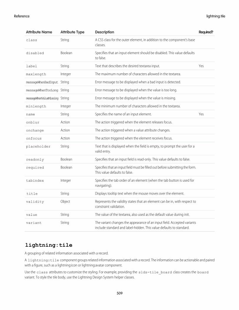
Required?DescriptionAttribute TypeAttribute Name
A CSS class for the outer element, in addition to the component's baseclasses.
Stringclass
Specifies that an input element should be disabled. This value defaultsto false.
Booleandisabled
YesText that describes the desired textarea input.Stringlabel
The maximum number of characters allowed in the textarea.Integermaxlength
Error message to be displayed when a bad input is detected.StringmessageWhenBadInput
Error message to be displayed when the value is too long.StringmessageWhenTooLong
Error message to be displayed when the value is missing.StringmessageWhenValueMissing
The minimum number of characters allowed in the textarea.Integerminlength
YesSpecifies the name of an input element.Stringname
The action triggered when the element releases focus.Actiononblur
The action triggered when a value attribute changes.Actiononchange
The action triggered when the element receives focus.Actiononfocus
Text that is displayed when the field is empty, to prompt the user for avalid entry.
Stringplaceholder
Specifies that an input field is read-only. This value defaults to false.Booleanreadonly
Specifies that an input field must be filled out before submitting the form.This value defaults to false.
Booleanrequired
Specifies the tab order of an element (when the tab button is used fornavigating).
Integertabindex
Displays tooltip text when the mouse moves over the element.Stringtitle
Represents the validity states that an element can be in, with respect toconstraint validation.
Objectvalidity
The value of the textarea, also used as the default value during init.Stringvalue
The variant changes the appearance of an input field. Accepted variantsinclude standard and label-hidden. This value defaults to standard.
Stringvariant
lightning:tileA grouping of related information associated with a record.
A lightning:tile component groups related information associated with a record. The information can be actionable and pairedwith a figure, such as a lightning:icon or lightning:avatar component.
Use the class attributes to customize the styling. For example, providing the slds-tile_board class creates the boardvariant. To style the tile body, use the Lightning Design System helper classes.
509
lightning:tileReference
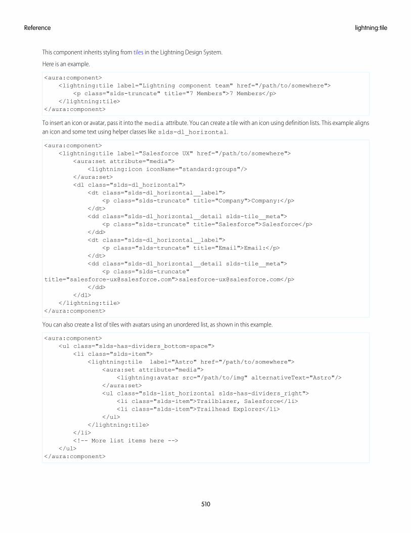
This component inherits styling from tiles in the Lightning Design System.
Here is an example.
<aura:component><lightning:tile label="Lightning component team" href="/path/to/somewhere">
<p class="slds-truncate" title="7 Members">7 Members</p></lightning:tile>
</aura:component>
To insert an icon or avatar, pass it into the media attribute. You can create a tile with an icon using definition lists. This example alignsan icon and some text using helper classes like slds-dl_horizontal.
<aura:component><lightning:tile label="Salesforce UX" href="/path/to/somewhere">
<aura:set attribute="media"><lightning:icon iconName="standard:groups"/>
</aura:set><dl class="slds-dl_horizontal">
<dt class="slds-dl_horizontal__label"><p class="slds-truncate" title="Company">Company:</p>
</dt><dd class="slds-dl_horizontal__detail slds-tile__meta">
<p class="slds-truncate" title="Salesforce">Salesforce</p></dd><dt class="slds-dl_horizontal__label">
<p class="slds-truncate" title="Email">Email:</p></dt><dd class="slds-dl_horizontal__detail slds-tile__meta">
<p class="slds-truncate"title="[email protected]">[email protected]</p>
</dd></dl>
</lightning:tile></aura:component>
You can also create a list of tiles with avatars using an unordered list, as shown in this example.
<aura:component><ul class="slds-has-dividers_bottom-space">
<li class="slds-item"><lightning:tile label="Astro" href="/path/to/somewhere">
<aura:set attribute="media"><lightning:avatar src="/path/to/img" alternativeText="Astro"/>
</aura:set><ul class="slds-list_horizontal slds-has-dividers_right">
<li class="slds-item">Trailblazer, Salesforce</li><li class="slds-item">Trailhead Explorer</li>
</ul></lightning:tile>
</li><!-- More list items here -->
</ul></aura:component>
510
lightning:tileReference
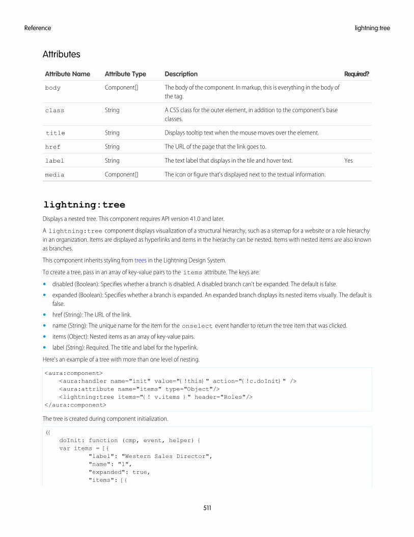
Attributes
Required?DescriptionAttribute TypeAttribute Name
The body of the component. In markup, this is everything in the body ofthe tag.
Component[]body
A CSS class for the outer element, in addition to the component’s baseclasses.
Stringclass
Displays tooltip text when the mouse moves over the element.Stringtitle
The URL of the page that the link goes to.Stringhref
YesThe text label that displays in the tile and hover text.Stringlabel
The icon or figure that's displayed next to the textual information.Component[]media
lightning:treeDisplays a nested tree. This component requires API version 41.0 and later.
A lightning:tree component displays visualization of a structural hierarchy, such as a sitemap for a website or a role hierarchyin an organization. Items are displayed as hyperlinks and items in the hierarchy can be nested. Items with nested items are also knownas branches.
This component inherits styling from trees in the Lightning Design System.
To create a tree, pass in an array of key-value pairs to the items attribute. The keys are:
• disabled (Boolean): Specifies whether a branch is disabled. A disabled branch can't be expanded. The default is false.
• expanded (Boolean): Specifies whether a branch is expanded. An expanded branch displays its nested items visually. The default isfalse.
• href (String): The URL of the link.
• name (String): The unique name for the item for the onselect event handler to return the tree item that was clicked.
• items (Object): Nested items as an array of key-value pairs.
• label (String): Required. The title and label for the hyperlink.
Here's an example of a tree with more than one level of nesting.
<aura:component><aura:handler name="init" value="{!this}" action="{!c.doInit}" /><aura:attribute name="items" type="Object"/><lightning:tree items="{! v.items }" header="Roles"/>
</aura:component>
The tree is created during component initialization.
({doInit: function (cmp, event, helper) {var items = [{
"label": "Western Sales Director","name": "1","expanded": true,"items": [{
511
lightning:treeReference
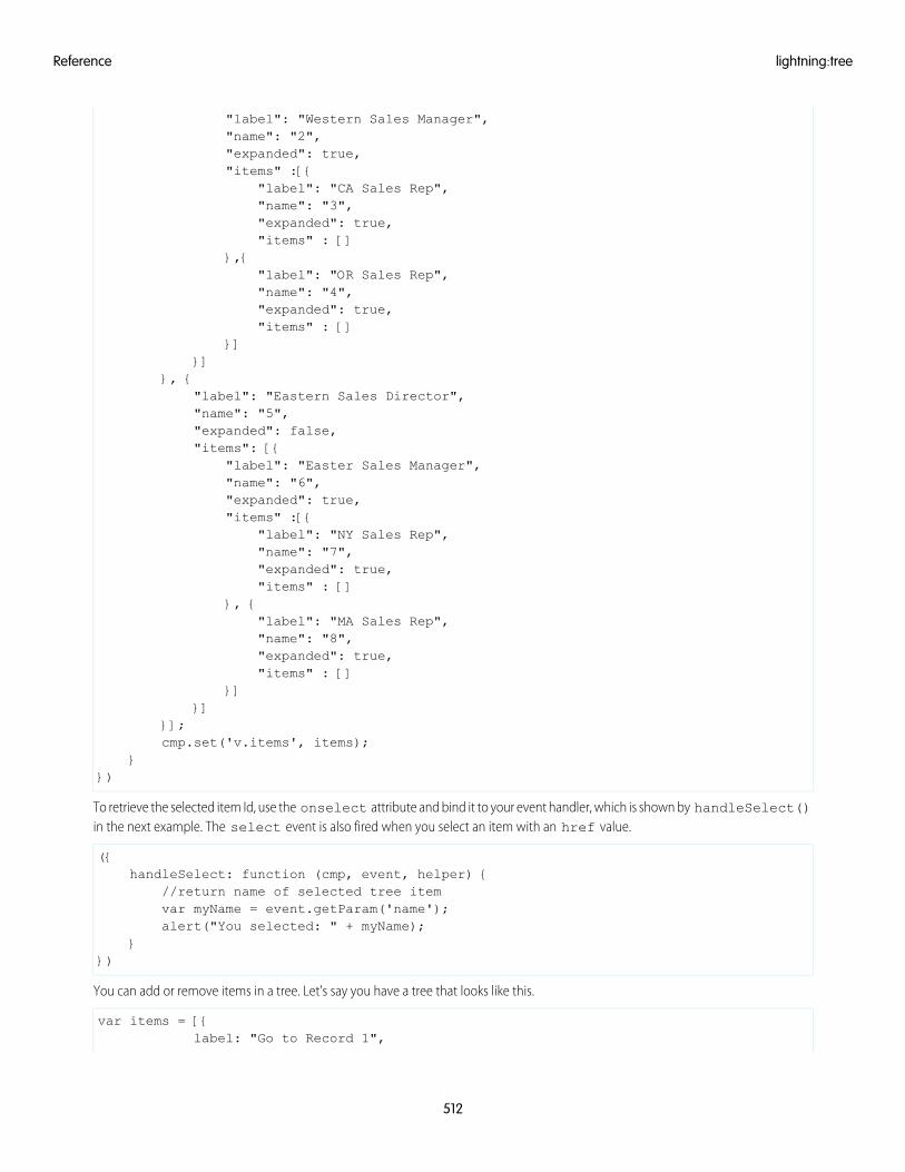
"label": "Western Sales Manager","name": "2","expanded": true,"items" :[{
"label": "CA Sales Rep","name": "3","expanded": true,"items" : []
},{"label": "OR Sales Rep","name": "4","expanded": true,"items" : []
}]}]
}, {"label": "Eastern Sales Director","name": "5","expanded": false,"items": [{
"label": "Easter Sales Manager","name": "6","expanded": true,"items" :[{
"label": "NY Sales Rep","name": "7","expanded": true,"items" : []
}, {"label": "MA Sales Rep","name": "8","expanded": true,"items" : []
}]}]
}];cmp.set('v.items', items);
}})
To retrieve the selected item Id, use the onselect attribute and bind it to your event handler, which is shown by handleSelect()in the next example. The select event is also fired when you select an item with an href value.
({handleSelect: function (cmp, event, helper) {
//return name of selected tree itemvar myName = event.getParam('name');alert("You selected: " + myName);
}})
You can add or remove items in a tree. Let's say you have a tree that looks like this.
var items = [{label: "Go to Record 1",
512
lightning:treeReference
href: "#record1",items: []
},{label: "Go to Record 2",href: "#record2",items: []
}, {label: "Go to Record 3",href: "#record3",items: []
}];
This example adds a nested item at the end of the tree.
({addItem: function (cmp, event, helper) {
var items = cmp.get('v.items');var branch = items.length - 1;var label = 'New item added at ' + branch;var newItem = {
label: label,expanded: true,disabled: false,items: []
};items[branch].items.push(newItem);cmp.set('v.items', items);alert("Added new item at branch: " + branch);
}})
When providing an href value to an item, the onselect event handler is triggered before navigating to the hyperlink.
Accessibility
You can use the keyboard to navigate the tree. Tab into the tree and use the Up and Down Arrow key to focus on tree items. To collapsean expanded branch, press the Left Arrow key. To expand a branch, press the Right Arrow key. Pressing the Enter key or Space Bar issimilar to an onclick event, and performs the default action on the item.
Attributes
Required?DescriptionAttribute typeAttribute Name
The body of the component. In markup, this is everything in the body ofthe tag.
Component[]body
A CSS class for the outer element, in addition to the component's baseclasses.
Stringclass
Displays tooltip text when the mouse moves over the element.Stringtitle
An array of key-value pairs that describe the tree. Keys include label,name, disabled, expanded, and items.
Objectitems
The text that's displayed as the tree heading.Stringheader
513
lightning:treeReference
Required?DescriptionAttribute typeAttribute Name
The action triggered when a tree item is selected.Actiononselect
lightning:utilityBarAPIThe public API for the Utility Bar.
This component allows you to access methods for programmatically controlling a utility within the utility bar of a Lightning app. Theutility bar is a footer that gives users quick access to frequently used tools and components. Each utility is a single-column Lightningpage that includes a standard or custom Lightning component.
To access the methods, create an instance of the lightning:utilityBarAPI component inside of your utility and assign anaura:id attribute to it.
<lightning:utilityBarAPI aura:id="utilitybar"/>
This example sets the icon of a utility to the SLDS “insert tag field” icon when the button is clicked.
<aura:component implements="flexipage:availableForAllPageTypes" access="global" ><lightning:utilityBarAPI aura:id="utilitybar" /><lightning:button label="Set Utility Icon" onclick="{! c.setUtilityIcon }" />
</aura:component>
The button in the component calls the following client-side controller.
({setUtilityIcon : function(component, event, helper) {
var utilityAPI = component.find("utilitybar");utilityAPI.setUtilityIcon({icon: 'insert_tag_field'});
}})
Methods
This component supports the following methods. Most methods take only one argument, a JSON array of parameters. The utilityIdparameter is only optional if within a utility itself. For more information on these methods, see the Console Developer Guide.
getEnclosingUtilityId()
Returns a Promise. Success resolves to the enclosing utilityId or false if not within a utility. The Promise will be rejected on error.
getUtilityInfo({utilityId})
• utilityId (string): Optional. The ID of the utility for which to get info.
Returns a Promise. Success resolves to a utilityInfo object. The Promise will be rejected on error.
getAllUtilityInfo()
Returns a Promise. Success resolves to an array of utilityInfo objects. The Promise will be rejected on error.
minimizeUtility({utilityId})
• utilityId (string): Optional. The ID of the utility for which to minimize.
Returns a Promise. Success resolves to true. The Promise will be rejected on error.
openUtility({utilityId})
• utilityId (string): Optional. The ID of the utility for which to open.
514
lightning:utilityBarAPIReference
Returns a Promise. Success resolves to true. The Promise will be rejected on error.
setPanelHeaderIcon({icon, utilityId})
• icon (string): An SLDS utility icon key. This is displayed in the utility panel. See a full list of utility icon keys on the SLDS referencesite.
• utilityId (string): Optional. The ID of the utility for which to set the panel header icon on.
Returns a Promise. Success resolves to true. The Promise will be rejected on error.
setPanelHeaderLabel({label, utilityId})
• label (string): The label of the utility displayed in the panel header.
• utilityId (string): Optional. The ID of the utility for which to set the panel header label on.
Returns a Promise. Success resolves to true. The Promise will be rejected on error.
setPanelHeight({heightPX, utilityId})
• heightPX (integer): The height of the utility panel in pixels.
• utilityId (string): Optional. The ID of the utility for which to set the panel height on.
Returns a Promise. Success resolves to true. The Promise will be rejected on error.
setPanelWidth({widthPX, utilityId})
• widthPX (integer): The width of the utility panel in pixels.
• utilityId (string): Optional. The ID of the utility for which to set the panel width on.
Returns a Promise. Success resolves to true. The Promise will be rejected on error.
setUtilityHighlighted({highlighted, utilityId})
• highlighted (boolean): Whether the utility is highlighted. Makes a utility more prominent by giving it a different backgroundcolor.
• utilityId (string): Optional. The ID of the utility for which to set highlighted.
Returns a Promise. Success resolves to true. The Promise will be rejected on error.
setUtilityIcon({icon, utilityId})
• icon (string): An SLDS utility icon key. This is displayed in the utility bar. See a full list of utility icon keys on the SLDS reference site.
• utilityId (string): Optional. The ID of the utility for which to set the icon on.
Returns a Promise. Success resolves to true. The Promise will be rejected on error.
setUtilityLabel({label, utilityId})
• label (string): The label of the utility. This is displayed in the utility bar.
• utilityId (string): Optional. The ID of the utility for which to set the label on.
Returns a Promise. Success resolves to true. The Promise will be rejected on error.
toggleModalMode({enableModalMode, utilityId})
• enableModalMode (boolean): Whether to enable the utility's modal mode. While in modal mode, an overlay is shown over thewhole app that blocks usage while the utility panel is still visible.
• utilityId (string): Optional. The ID of the utility for which to toggle modal mode.
Returns a Promise. Success resolves to true. The Promise will be rejected on error.
515
lightning:utilityBarAPIReference
Attributes
Required?DescriptionAttribute TypeAttribute Name
The body of the component. In markup, this is everything in the body ofthe tag.
Component[]body
lightning:verticalNavigationRepresents a vertical list of links that either take the user to another page or parts of the page the user is in. This component requiresAPI version 41.0 and later.
A lightning:verticalNavigation component represents a list of links that's only one level deep, with support for overflowsections that collapse and expand. The overflow section must be created using lightning:verticalNavigationOverflowand does not adjust automatically based on the view port.
This component inherits styling from vertical navigation in the Lightning Design System.
lightning:verticalNavigation is used together with these sub-components.
• lightning:verticalNavigationSection
• lightning:verticalNavigationItem
• lightning:verticalNavigationOverflow
• lightning:verticalNavigationItemBadge
• lightning:verticalNavigationItemIcon
This example creates a basic vertical navigation menu.
<aura:component><lightning:verticalNavigation>
<lightning:verticalNavigationSection label="Reports"><lightning:verticalNavigationItem label="Recent" name="recent" /><lightning:verticalNavigationItem label="Created by Me" name="created" />
<lightning:verticalNavigationItem label="Private Reports" name="private"/>
<lightning:verticalNavigationItem label="Public Reports" name="public" />
<lightning:verticalNavigationItem label="All Reports" name="all" /></lightning:verticalNavigationSection>
</lightning:verticalNavigation></aura:component>
To define an active navigation item, use selectedItem="itemName" on lightning:verticalNavigation, whereitemName matches the name of the lightning:verticalNavigationItem component to be highlighted.
This example creates a navigation menu with a highlighted item and an overflow section.
<aura:component><lightning:verticalNavigation selectedItem="recent">
<lightning:verticalNavigationSection label="Reports"><lightning:verticalNavigationItem label="Recent" name="recent" /><lightning:verticalNavigationItem label="All Reports" name="all" />
</lightning:verticalNavigationSection>
516
lightning:verticalNavigationReference
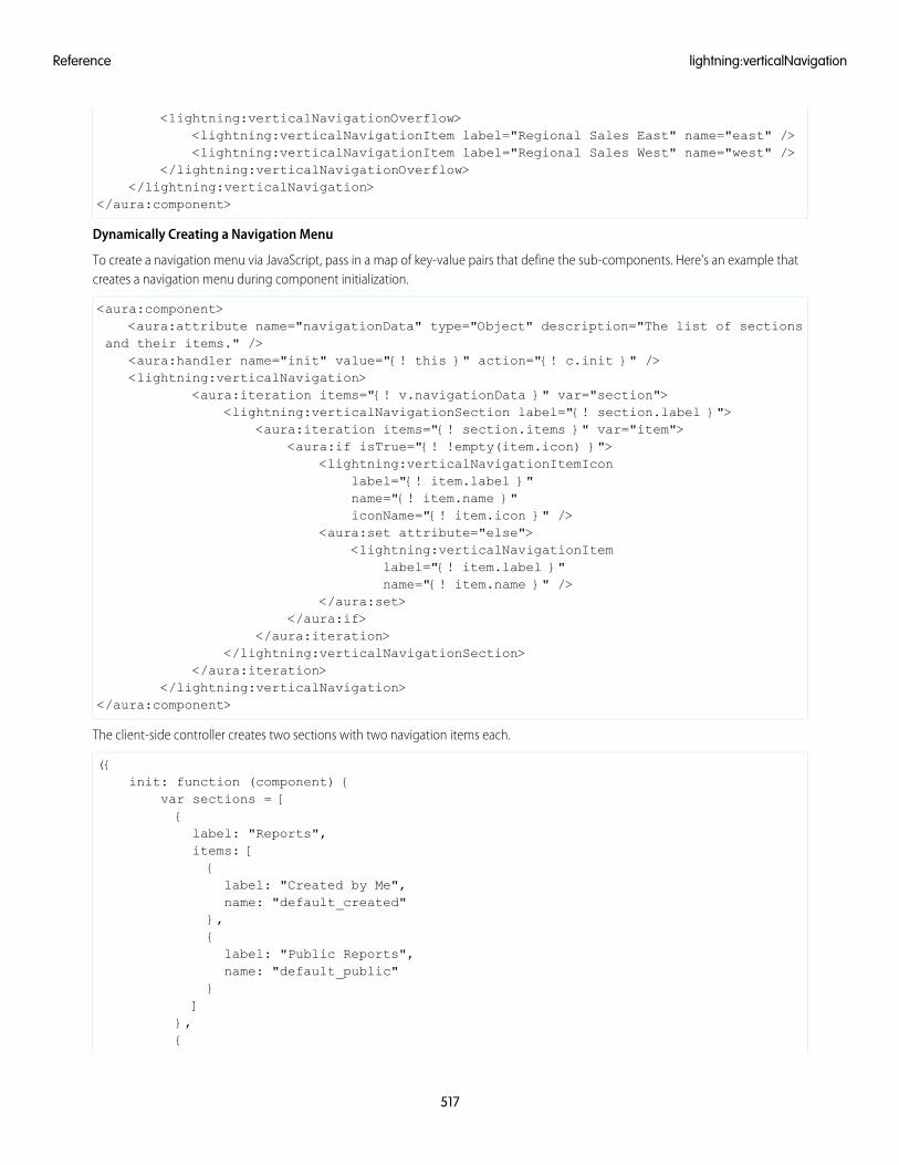
<lightning:verticalNavigationOverflow><lightning:verticalNavigationItem label="Regional Sales East" name="east" /><lightning:verticalNavigationItem label="Regional Sales West" name="west" />
</lightning:verticalNavigationOverflow></lightning:verticalNavigation>
</aura:component>
Dynamically Creating a Navigation Menu
To create a navigation menu via JavaScript, pass in a map of key-value pairs that define the sub-components. Here's an example thatcreates a navigation menu during component initialization.
<aura:component><aura:attribute name="navigationData" type="Object" description="The list of sections
and their items." /><aura:handler name="init" value="{! this }" action="{! c.init }" /><lightning:verticalNavigation>
<aura:iteration items="{! v.navigationData }" var="section"><lightning:verticalNavigationSection label="{! section.label }">
<aura:iteration items="{! section.items }" var="item"><aura:if isTrue="{! !empty(item.icon) }">
<lightning:verticalNavigationItemIconlabel="{! item.label }"name="{! item.name }"iconName="{! item.icon }" />
<aura:set attribute="else"><lightning:verticalNavigationItem
label="{! item.label }"name="{! item.name }" />
</aura:set></aura:if>
</aura:iteration></lightning:verticalNavigationSection>
</aura:iteration></lightning:verticalNavigation>
</aura:component>
The client-side controller creates two sections with two navigation items each.
({init: function (component) {
var sections = [{label: "Reports",items: [{label: "Created by Me",name: "default_created"
},{label: "Public Reports",name: "default_public"
}]
},{
517
lightning:verticalNavigationReference
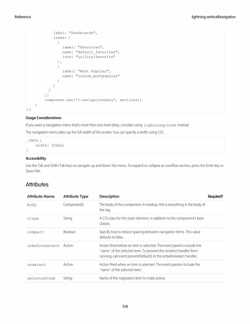
label: "Dashboards",items: [{label: "Favorites",name: "default_favorites",icon: "utility:favorite"
},{label: "Most Popular",name: "custom_mostpopular"
}]
}];component.set('v.navigationData', sections);
}})
Usage Considerations
If you want a navigation menu that's more than one level deep, consider using lightning:tree instead.
The navigation menu takes up the full width of the screen. You can specify a width using CSS.
.THIS {width: 320px;
}
Accessibility
Use the Tab and Shift+Tab keys to navigate up and down the menu. To expand or collapse an overflow section, press the Enter key orSpace Bar.
Attributes
Required?DescriptionAttribute TypeAttribute Name
The body of the component. In markup, this is everything in the body ofthe tag.
Component[]body
A CSS class for the outer element, in addition to the component's baseclasses.
Stringclass
Specify true to reduce spacing between navigation items. This valuedefaults to false.
Booleancompact
Action fired before an item is selected. The event params include the`name` of the selected item. To prevent the onselect handler fromrunning, call event.preventDefault() in the onbeforeselect handler.
Actiononbeforeselect
Action fired when an item is selected. The event params include the`name` of the selected item.
Actiononselect
Name of the nagivation item to make active.StringselectedItem
518
lightning:verticalNavigationReference
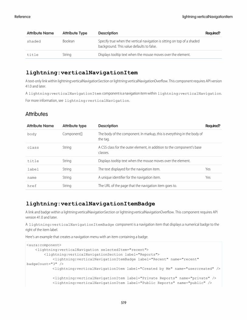
Required?DescriptionAttribute TypeAttribute Name
Specify true when the vertical navigation is sitting on top of a shadedbackground. This value defaults to false.
Booleanshaded
Displays tooltip text when the mouse moves over the element.Stringtitle
lightning:verticalNavigationItemA text-only link within lightning:verticalNavigationSection or lightning:verticalNavigationOverflow. This component requires API version41.0 and later.
A lightning:verticalNavigationItem component is a navigation item within lightning:verticalNavigation.
For more information, see lightning:verticalNavigation.
Attributes
Required?DescriptionAttribute typeAttribute Name
The body of the component. In markup, this is everything in the body ofthe tag.
Component[]body
A CSS class for the outer element, in addition to the component's baseclasses.
Stringclass
Displays tooltip text when the mouse moves over the element.Stringtitle
YesThe text displayed for the navigation item.Stringlabel
YesA unique identifier for the navigation item.Stringname
The URL of the page that the navigation item goes to.Stringhref
lightning:verticalNavigationItemBadgeA link and badge within a lightning:verticalNavigationSection or lightning:verticalNavigationOverflow. This component requires APIversion 41.0 and later.
A lightning:verticalNavigationItemBadge component is a navigation item that displays a numerical badge to theright of the item label.
Here's an example that creates a navigation menu with an item containing a badge.
<aura:component><lightning:verticalNavigation selectedItem="recent">
<lightning:verticalNavigationSection label="Reports"><lightning:verticalNavigationItemBadge label="Recent" name="recent"
badgeCount="3" /><lightning:verticalNavigationItem label="Created by Me" name="usercreated" />
<lightning:verticalNavigationItem label="Private Reports" name="private" /><lightning:verticalNavigationItem label="Public Reports" name="public" />
519
lightning:verticalNavigationItemReference
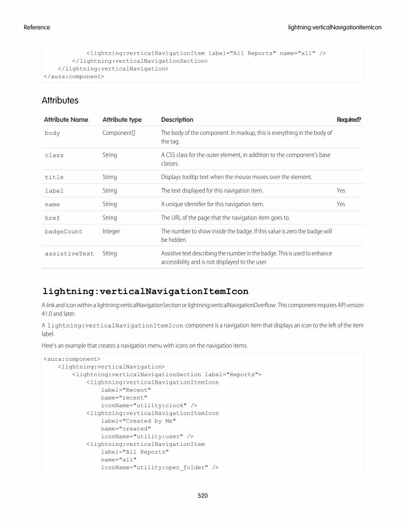
<lightning:verticalNavigationItem label="All Reports" name="all" /></lightning:verticalNavigationSection>
</lightning:verticalNavigation></aura:component>
Attributes
Required?DescriptionAttribute typeAttribute Name
The body of the component. In markup, this is everything in the body ofthe tag.
Component[]body
A CSS class for the outer element, in addition to the component's baseclasses.
Stringclass
Displays tooltip text when the mouse moves over the element.Stringtitle
YesThe text displayed for this navigation item.Stringlabel
YesA unique identifier for this navigation item.Stringname
The URL of the page that the navigation item goes to.Stringhref
The number to show inside the badge. If this value is zero the badge willbe hidden.
IntegerbadgeCount
Assistive text describing the number in the badge. This is used to enhanceaccessibility and is not displayed to the user.
StringassistiveText
lightning:verticalNavigationItemIconA link and icon within a lightning:verticalNavigationSection or lightning:verticalNavigationOverflow. This component requires API version41.0 and later.
A lightning:verticalNavigationItemIcon component is a navigation item that displays an icon to the left of the itemlabel.
Here's an example that creates a navigation menu with icons on the navigation items.
<aura:component><lightning:verticalNavigation>
<lightning:verticalNavigationSection label="Reports"><lightning:verticalNavigationItemIcon
label="Recent"name="recent"iconName="utility:clock" />
<lightning:verticalNavigationItemIconlabel="Created by Me"name="created"iconName="utility:user" />
<lightning:verticalNavigationItemlabel="All Reports"name="all"iconName="utility:open_folder" />
520
lightning:verticalNavigationItemIconReference
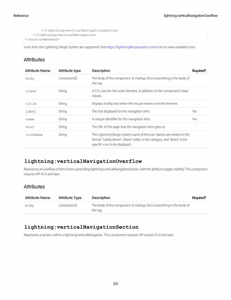
</lightning:verticalNavigationSection></lightning:verticalNavigation>
</aura:component>
Icons from the Lightning Design System are supported. Visit https://lightningdesignsystem.com/icons to view available icons.
Attributes
Required?DescriptionAttribute typeAttribute Name
The body of the component. In markup, this is everything in the body ofthe tag.
Component[]body
A CSS class for the outer element, in addition to the component's baseclasses.
Stringclass
Displays tooltip text when the mouse moves over the element.Stringtitle
YesThe text displayed for this navigation item.Stringlabel
YesA unique identifier for this navigation item.Stringname
The URL of the page that the navigation item goes to.Stringhref
The Lightning Design System name of the icon. Names are written in theformat '\utility:down\' where 'utility' is the category, and 'down' is thespecific icon to be displayed.
StringiconName
lightning:verticalNavigationOverflowRepresents an overflow of items from a preceding lightning:verticalNavigationSection, with the ability to toggle visibility. This componentrequires API 41.0 and later.
Attributes
Required?DescriptionAttribute TypeAttribute Name
The body of the component. In markup, this is everything in the body ofthe tag.
Component[]body
lightning:verticalNavigationSectionRepresents a section within a lightning:verticalNavigation. This component requires API version 41.0 and later.
521
lightning:verticalNavigationOverflowReference
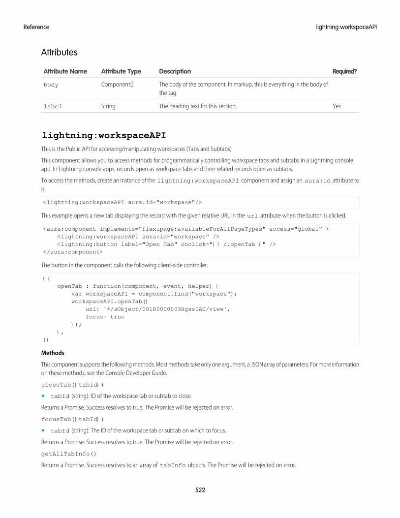
Attributes
Required?DescriptionAttribute TypeAttribute Name
The body of the component. In markup, this is everything in the body ofthe tag.
Component[]body
YesThe heading text for this section.Stringlabel
lightning:workspaceAPIThis is the Public API for accessing/manipulating workspaces (Tabs and Subtabs)
This component allows you to access methods for programmatically controlling workspace tabs and subtabs in a Lightning consoleapp. In Lightning console apps, records open as workspace tabs and their related records open as subtabs.
To access the methods, create an instance of the lightning:workspaceAPI component and assign an aura:id attribute toit.
<lightning:workspaceAPI aura:id="workspace"/>
This example opens a new tab displaying the record with the given relative URL in the url attribute when the button is clicked.
<aura:component implements="flexipage:availableForAllPageTypes" access="global" ><lightning:workspaceAPI aura:id="workspace" /><lightning:button label="Open Tab" onclick="{! c.openTab }" />
</aura:component>
The button in the component calls the following client-side controller.
{(openTab : function(component, event, helper) {
var workspaceAPI = component.find("workspace");workspaceAPI.openTab({
url: '#/sObject/001R0000003HgssIAC/view',focus: true
});},
)}
Methods
This component supports the following methods. Most methods take only one argument, a JSON array of parameters. For more informationon these methods, see the Console Developer Guide.
closeTab({tabId})
• tabId (string): ID of the workspace tab or subtab to close.
Returns a Promise. Success resolves to true. The Promise will be rejected on error.
focusTab({tabId})
• tabId (string): The ID of the workspace tab or subtab on which to focus.
Returns a Promise. Success resolves to true. The Promise will be rejected on error.
getAllTabInfo()
Returns a Promise. Success resolves to an array of tabInfo objects. The Promise will be rejected on error.
522
lightning:workspaceAPIReference
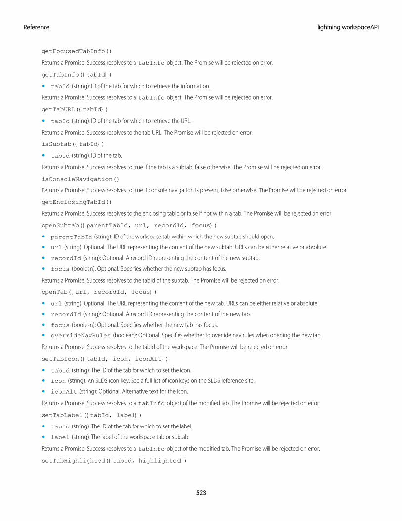
getFocusedTabInfo()
Returns a Promise. Success resolves to a tabInfo object. The Promise will be rejected on error.
getTabInfo({tabId})
• tabId (string): ID of the tab for which to retrieve the information.
Returns a Promise. Success resolves to a tabInfo object. The Promise will be rejected on error.
getTabURL({tabId})
• tabId (string): ID of the tab for which to retrieve the URL.
Returns a Promise. Success resolves to the tab URL. The Promise will be rejected on error.
isSubtab({tabId})
• tabId (string): ID of the tab.
Returns a Promise. Success resolves to true if the tab is a subtab, false otherwise. The Promise will be rejected on error.
isConsoleNavigation()
Returns a Promise. Success resolves to true if console navigation is present, false otherwise. The Promise will be rejected on error.
getEnclosingTabId()
Returns a Promise. Success resolves to the enclosing tabId or false if not within a tab. The Promise will be rejected on error.
openSubtab({parentTabId, url, recordId, focus})
• parentTabId (string): ID of the workspace tab within which the new subtab should open.
• url (string): Optional. The URL representing the content of the new subtab. URLs can be either relative or absolute.
• recordId (string): Optional. A record ID representing the content of the new subtab.
• focus (boolean): Optional. Specifies whether the new subtab has focus.
Returns a Promise. Success resolves to the tabId of the subtab. The Promise will be rejected on error.
openTab({url, recordId, focus})
• url (string): Optional. The URL representing the content of the new tab. URLs can be either relative or absolute.
• recordId (string): Optional. A record ID representing the content of the new tab.
• focus (boolean): Optional. Specifies whether the new tab has focus.
• overrideNavRules (boolean): Optional. Specifies whether to override nav rules when opening the new tab.
Returns a Promise. Success resolves to the tabId of the workspace. The Promise will be rejected on error.
setTabIcon({tabId, icon, iconAlt})
• tabId (string): The ID of the tab for which to set the icon.
• icon (string): An SLDS icon key. See a full list of icon keys on the SLDS reference site.
• iconAlt (string): Optional. Alternative text for the icon.
Returns a Promise. Success resolves to a tabInfo object of the modified tab. The Promise will be rejected on error.
setTabLabel({tabId, label})
• tabId (string): The ID of the tab for which to set the label.
• label (string): The label of the workspace tab or subtab.
Returns a Promise. Success resolves to a tabInfo object of the modified tab. The Promise will be rejected on error.
setTabHighlighted({tabId, highlighted})
523
lightning:workspaceAPIReference
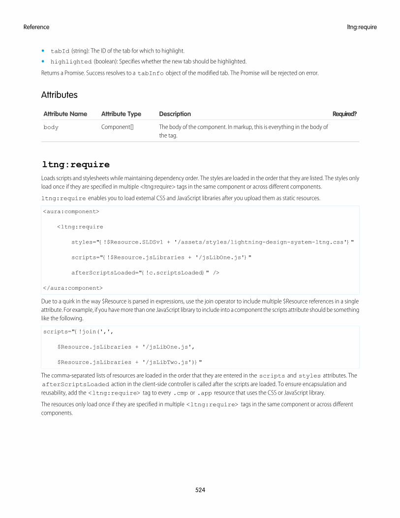
• tabId (string): The ID of the tab for which to highlight.
• highlighted (boolean): Specifies whether the new tab should be highlighted.
Returns a Promise. Success resolves to a tabInfo object of the modified tab. The Promise will be rejected on error.
Attributes
Required?DescriptionAttribute TypeAttribute Name
The body of the component. In markup, this is everything in the body ofthe tag.
Component[]body
ltng:requireLoads scripts and stylesheets while maintaining dependency order. The styles are loaded in the order that they are listed. The styles onlyload once if they are specified in multiple <ltng:require> tags in the same component or across different components.
ltng:require enables you to load external CSS and JavaScript libraries after you upload them as static resources.
<aura:component>
<ltng:require
styles="{!$Resource.SLDSv1 + '/assets/styles/lightning-design-system-ltng.css'}"
scripts="{!$Resource.jsLibraries + '/jsLibOne.js'}"
afterScriptsLoaded="{!c.scriptsLoaded}" />
</aura:component>
Due to a quirk in the way $Resource is parsed in expressions, use the join operator to include multiple $Resource references in a singleattribute. For example, if you have more than one JavaScript library to include into a component the scripts attribute should be somethinglike the following.
scripts="{!join(',',
$Resource.jsLibraries + '/jsLibOne.js',
$Resource.jsLibraries + '/jsLibTwo.js')}"
The comma-separated lists of resources are loaded in the order that they are entered in the scripts and styles attributes. TheafterScriptsLoaded action in the client-side controller is called after the scripts are loaded. To ensure encapsulation andreusability, add the <ltng:require> tag to every .cmp or .app resource that uses the CSS or JavaScript library.
The resources only load once if they are specified in multiple <ltng:require> tags in the same component or across differentcomponents.
524
ltng:requireReference
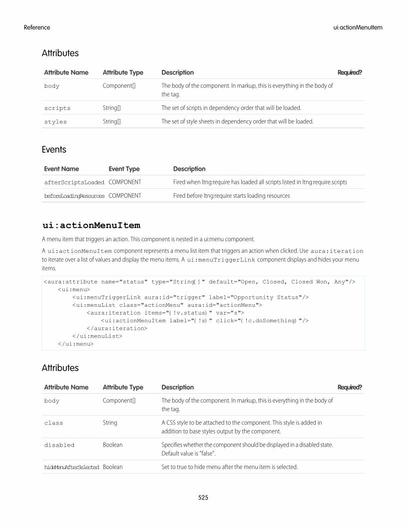
Attributes
Required?DescriptionAttribute TypeAttribute Name
The body of the component. In markup, this is everything in the body ofthe tag.
Component[]body
The set of scripts in dependency order that will be loaded.String[]scripts
The set of style sheets in dependency order that will be loaded.String[]styles
Events
DescriptionEvent TypeEvent Name
Fired when ltng:require has loaded all scripts listed in ltng:require.scriptsCOMPONENTafterScriptsLoaded
Fired before ltng:require starts loading resourcesCOMPONENTbeforeLoadingResources
ui:actionMenuItemA menu item that triggers an action. This component is nested in a ui:menu component.
A ui:actionMenuItem component represents a menu list item that triggers an action when clicked. Use aura:iterationto iterate over a list of values and display the menu items. A ui:menuTriggerLink component displays and hides your menuitems.
<aura:attribute name="status" type="String[]" default="Open, Closed, Closed Won, Any"/><ui:menu>
<ui:menuTriggerLink aura:id="trigger" label="Opportunity Status"/><ui:menuList class="actionMenu" aura:id="actionMenu">
<aura:iteration items="{!v.status}" var="s"><ui:actionMenuItem label="{!s}" click="{!c.doSomething}"/>
</aura:iteration></ui:menuList>
</ui:menu>
Attributes
Required?DescriptionAttribute TypeAttribute Name
The body of the component. In markup, this is everything in the body ofthe tag.
Component[]body
A CSS style to be attached to the component. This style is added inaddition to base styles output by the component.
Stringclass
Specifies whether the component should be displayed in a disabled state.Default value is "false".
Booleandisabled
Set to true to hide menu after the menu item is selected.BooleanhideMenuAfterSelected
525
ui:actionMenuItemReference
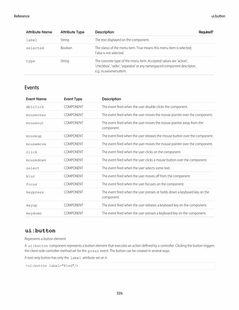
Required?DescriptionAttribute TypeAttribute Name
The text displayed on the component.Stringlabel
The status of the menu item. True means this menu item is selected;False is not selected.
Booleanselected
The concrete type of the menu item. Accepted values are 'action','checkbox', 'radio', 'separator' or any namespaced component descriptor,e.g. ns:xxxxmenuItem.
Stringtype
Events
DescriptionEvent TypeEvent Name
The event fired when the user double-clicks the component.COMPONENTdblclick
The event fired when the user moves the mouse pointer over the component.COMPONENTmouseover
The event fired when the user moves the mouse pointer away from thecomponent.
COMPONENTmouseout
The event fired when the user releases the mouse button over the component.COMPONENTmouseup
The event fired when the user moves the mouse pointer over the component.COMPONENTmousemove
The event fired when the user clicks on the component.COMPONENTclick
The event fired when the user clicks a mouse button over the component.COMPONENTmousedown
The event fired when the user selects some text.COMPONENTselect
The event fired when the user moves off from the component.COMPONENTblur
The event fired when the user focuses on the component.COMPONENTfocus
The event fired when the user presses or holds down a keyboard key on thecomponent.
COMPONENTkeypress
The event fired when the user releases a keyboard key on the component.COMPONENTkeyup
The event fired when the user presses a keyboard key on the component.COMPONENTkeydown
ui:buttonRepresents a button element.
A ui:button component represents a button element that executes an action defined by a controller. Clicking the button triggersthe client-side controller method set for the press event. The button can be created in several ways.
A text-only button has only the label attribute set on it.
<ui:button label="Find"/>
526
ui:buttonReference
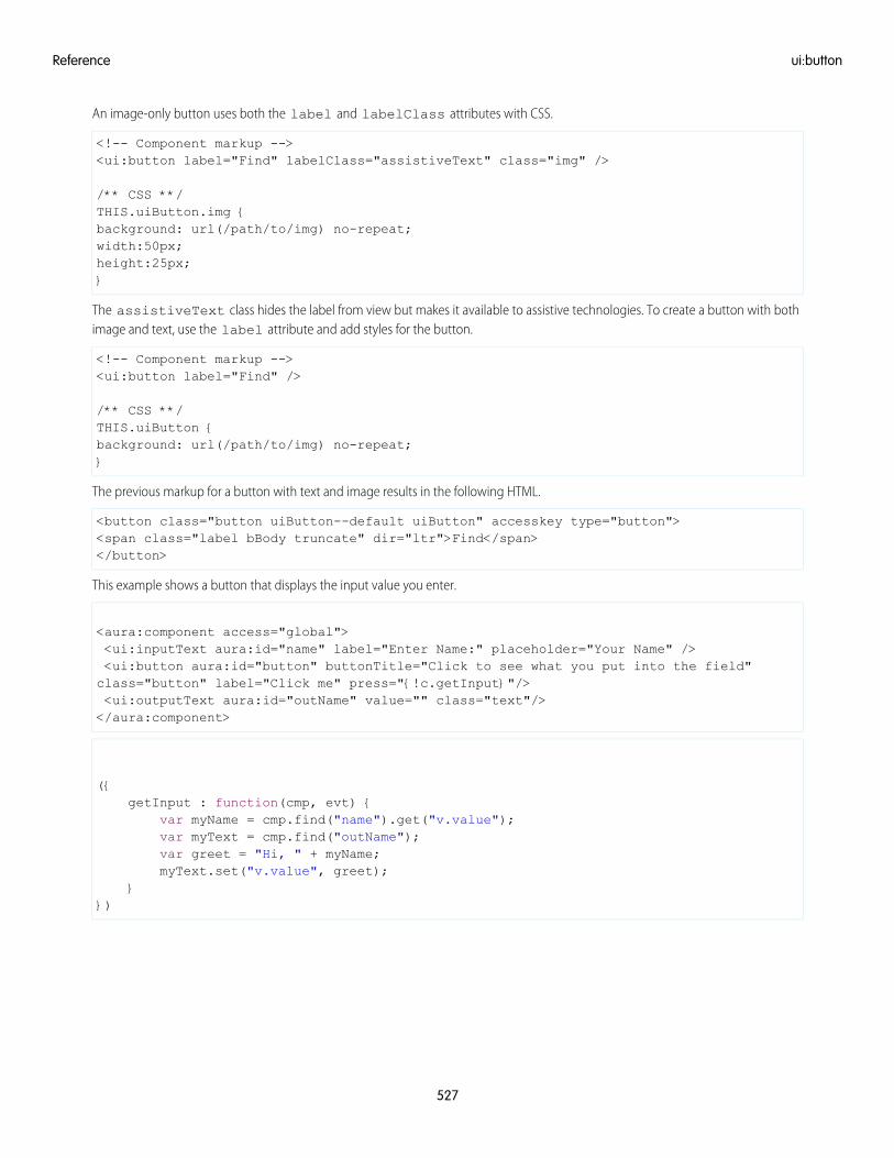
An image-only button uses both the label and labelClass attributes with CSS.
<!-- Component markup --><ui:button label="Find" labelClass="assistiveText" class="img" />
/** CSS **/THIS.uiButton.img {background: url(/path/to/img) no-repeat;width:50px;height:25px;}
The assistiveText class hides the label from view but makes it available to assistive technologies. To create a button with bothimage and text, use the label attribute and add styles for the button.
<!-- Component markup --><ui:button label="Find" />
/** CSS **/THIS.uiButton {background: url(/path/to/img) no-repeat;}
The previous markup for a button with text and image results in the following HTML.
<button class="button uiButton--default uiButton" accesskey type="button"><span class="label bBody truncate" dir="ltr">Find</span></button>
This example shows a button that displays the input value you enter.
<aura:component access="global"><ui:inputText aura:id="name" label="Enter Name:" placeholder="Your Name" /><ui:button aura:id="button" buttonTitle="Click to see what you put into the field"class="button" label="Click me" press="{!c.getInput}"/><ui:outputText aura:id="outName" value="" class="text"/></aura:component>
({getInput : function(cmp, evt) {
var myName = cmp.find("name").get("v.value");var myText = cmp.find("outName");var greet = "Hi, " + myName;myText.set("v.value", greet);
}})
527
ui:buttonReference
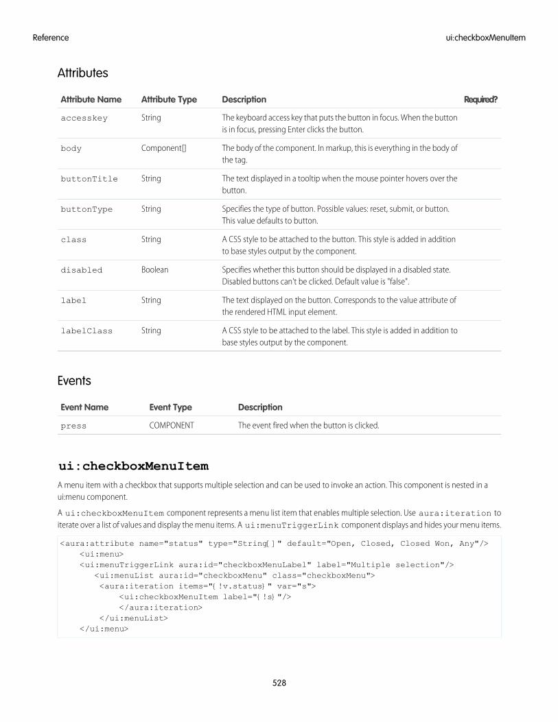
Attributes
Required?DescriptionAttribute TypeAttribute Name
The keyboard access key that puts the button in focus. When the buttonis in focus, pressing Enter clicks the button.
Stringaccesskey
The body of the component. In markup, this is everything in the body ofthe tag.
Component[]body
The text displayed in a tooltip when the mouse pointer hovers over thebutton.
StringbuttonTitle
Specifies the type of button. Possible values: reset, submit, or button.This value defaults to button.
StringbuttonType
A CSS style to be attached to the button. This style is added in additionto base styles output by the component.
Stringclass
Specifies whether this button should be displayed in a disabled state.Disabled buttons can't be clicked. Default value is "false".
Booleandisabled
The text displayed on the button. Corresponds to the value attribute ofthe rendered HTML input element.
Stringlabel
A CSS style to be attached to the label. This style is added in addition tobase styles output by the component.
StringlabelClass
Events
DescriptionEvent TypeEvent Name
The event fired when the button is clicked.COMPONENTpress
ui:checkboxMenuItemA menu item with a checkbox that supports multiple selection and can be used to invoke an action. This component is nested in aui:menu component.
A ui:checkboxMenuItem component represents a menu list item that enables multiple selection. Use aura:iteration toiterate over a list of values and display the menu items. A ui:menuTriggerLink component displays and hides your menu items.
<aura:attribute name="status" type="String[]" default="Open, Closed, Closed Won, Any"/><ui:menu><ui:menuTriggerLink aura:id="checkboxMenuLabel" label="Multiple selection"/>
<ui:menuList aura:id="checkboxMenu" class="checkboxMenu"><aura:iteration items="{!v.status}" var="s">
<ui:checkboxMenuItem label="{!s}"/></aura:iteration>
</ui:menuList></ui:menu>
528
ui:checkboxMenuItemReference
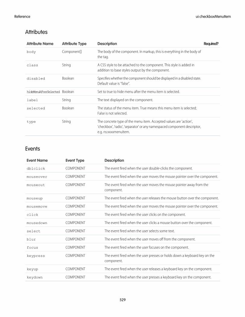
Attributes
Required?DescriptionAttribute TypeAttribute Name
The body of the component. In markup, this is everything in the body ofthe tag.
Component[]body
A CSS style to be attached to the component. This style is added inaddition to base styles output by the component.
Stringclass
Specifies whether the component should be displayed in a disabled state.Default value is "false".
Booleandisabled
Set to true to hide menu after the menu item is selected.BooleanhideMenuAfterSelected
The text displayed on the component.Stringlabel
The status of the menu item. True means this menu item is selected;False is not selected.
Booleanselected
The concrete type of the menu item. Accepted values are 'action','checkbox', 'radio', 'separator' or any namespaced component descriptor,e.g. ns:xxxxmenuItem.
Stringtype
Events
DescriptionEvent TypeEvent Name
The event fired when the user double-clicks the component.COMPONENTdblclick
The event fired when the user moves the mouse pointer over the component.COMPONENTmouseover
The event fired when the user moves the mouse pointer away from thecomponent.
COMPONENTmouseout
The event fired when the user releases the mouse button over the component.COMPONENTmouseup
The event fired when the user moves the mouse pointer over the component.COMPONENTmousemove
The event fired when the user clicks on the component.COMPONENTclick
The event fired when the user clicks a mouse button over the component.COMPONENTmousedown
The event fired when the user selects some text.COMPONENTselect
The event fired when the user moves off from the component.COMPONENTblur
The event fired when the user focuses on the component.COMPONENTfocus
The event fired when the user presses or holds down a keyboard key on thecomponent.
COMPONENTkeypress
The event fired when the user releases a keyboard key on the component.COMPONENTkeyup
The event fired when the user presses a keyboard key on the component.COMPONENTkeydown
529
ui:checkboxMenuItemReference
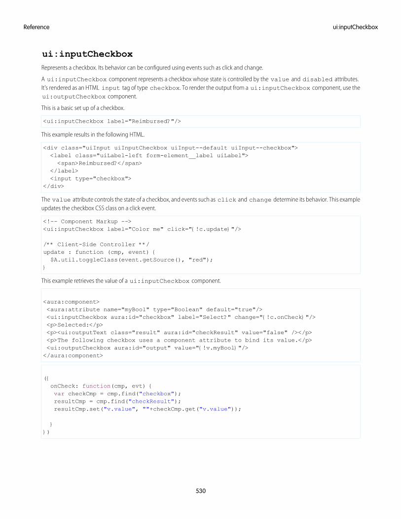
ui:inputCheckboxRepresents a checkbox. Its behavior can be configured using events such as click and change.
A ui:inputCheckbox component represents a checkbox whose state is controlled by the value and disabled attributes.It's rendered as an HTML input tag of type checkbox. To render the output from a ui:inputCheckbox component, use theui:outputCheckbox component.
This is a basic set up of a checkbox.
<ui:inputCheckbox label="Reimbursed?"/>
This example results in the following HTML.
<div class="uiInput uiInputCheckbox uiInput--default uiInput--checkbox"><label class="uiLabel-left form-element__label uiLabel"><span>Reimbursed?</span>
</label><input type="checkbox">
</div>
The value attribute controls the state of a checkbox, and events such as click and change determine its behavior. This exampleupdates the checkbox CSS class on a click event.
<!-- Component Markup --><ui:inputCheckbox label="Color me" click="{!c.update}"/>
/** Client-Side Controller **/update : function (cmp, event) {$A.util.toggleClass(event.getSource(), "red");
}
This example retrieves the value of a ui:inputCheckbox component.
<aura:component><aura:attribute name="myBool" type="Boolean" default="true"/><ui:inputCheckbox aura:id="checkbox" label="Select?" change="{!c.onCheck}"/><p>Selected:</p><p><ui:outputText class="result" aura:id="checkResult" value="false" /></p><p>The following checkbox uses a component attribute to bind its value.</p><ui:outputCheckbox aura:id="output" value="{!v.myBool}"/></aura:component>
({onCheck: function(cmp, evt) {var checkCmp = cmp.find("checkbox");resultCmp = cmp.find("checkResult");resultCmp.set("v.value", ""+checkCmp.get("v.value"));
}})
530
ui:inputCheckboxReference
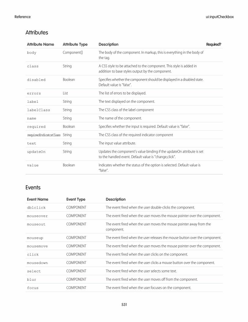
Attributes
Required?DescriptionAttribute TypeAttribute Name
The body of the component. In markup, this is everything in the body ofthe tag.
Component[]body
A CSS style to be attached to the component. This style is added inaddition to base styles output by the component.
Stringclass
Specifies whether the component should be displayed in a disabled state.Default value is "false".
Booleandisabled
The list of errors to be displayed.Listerrors
The text displayed on the component.Stringlabel
The CSS class of the label componentStringlabelClass
The name of the component.Stringname
Specifies whether the input is required. Default value is "false".Booleanrequired
The CSS class of the required indicator componentStringrequiredIndicatorClass
The input value attribute.Stringtext
Updates the component's value binding if the updateOn attribute is setto the handled event. Default value is "change,click".
StringupdateOn
Indicates whether the status of the option is selected. Default value is“false”.
Booleanvalue
Events
DescriptionEvent TypeEvent Name
The event fired when the user double-clicks the component.COMPONENTdblclick
The event fired when the user moves the mouse pointer over the component.COMPONENTmouseover
The event fired when the user moves the mouse pointer away from thecomponent.
COMPONENTmouseout
The event fired when the user releases the mouse button over the component.COMPONENTmouseup
The event fired when the user moves the mouse pointer over the component.COMPONENTmousemove
The event fired when the user clicks on the component.COMPONENTclick
The event fired when the user clicks a mouse button over the component.COMPONENTmousedown
The event fired when the user selects some text.COMPONENTselect
The event fired when the user moves off from the component.COMPONENTblur
The event fired when the user focuses on the component.COMPONENTfocus
531
ui:inputCheckboxReference
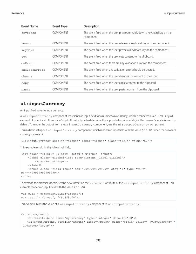
DescriptionEvent TypeEvent Name
The event fired when the user presses or holds down a keyboard key on thecomponent.
COMPONENTkeypress
The event fired when the user releases a keyboard key on the component.COMPONENTkeyup
The event fired when the user presses a keyboard key on the component.COMPONENTkeydown
The event fired when the user cuts content to the clipboard.COMPONENTcut
The event fired when there are any validation errors on the component.COMPONENTonError
The event fired when any validation errors should be cleared.COMPONENTonClearErrors
The event fired when the user changes the content of the input.COMPONENTchange
The event fired when the user copies content to the clipboard.COMPONENTcopy
The event fired when the user pastes content from the clipboard.COMPONENTpaste
ui:inputCurrencyAn input field for entering a currency.
A ui:inputCurrency component represents an input field for a number as a currency, which is rendered as an HTML inputelement of type text. It uses JavaScript’s Number type to determine the supported number of digits. The browser's locale is used bydefault. To render the output from a ui:inputCurrency component, use the ui:outputCurrency component.
This is a basic set up of a ui:inputCurrency component, which renders an input field with the value $50.00 when the browser'scurrency locale is $.
<ui:inputCurrency aura:id="amount" label="Amount" class="field" value="50"/>
This example results in the following HTML.
<div class="uiInput uiInput--default uiInput--input"><label class="uiLabel-left form-element__label uiLabel">
<span>Amount</span></label><input class="field input" max="99999999999999" step="1" type="text"
min="-99999999999999"></div>
To override the browser's locale, set the new format on the v.format attribute of the ui:inputCurrency component. Thisexample renders an input field with the value £50.00.
var curr = component.find("amount");curr.set("v.format", '£#,###.00');
This example binds the value of a ui:inputCurrency component to ui:outputCurrency.
<aura:component><aura:attribute name="myCurrency" type="integer" default="50"/><ui:inputCurrency aura:id="amount" label="Amount" class="field" value="{!v.myCurrency}"
updateOn="keyup"/>
532
ui:inputCurrencyReference
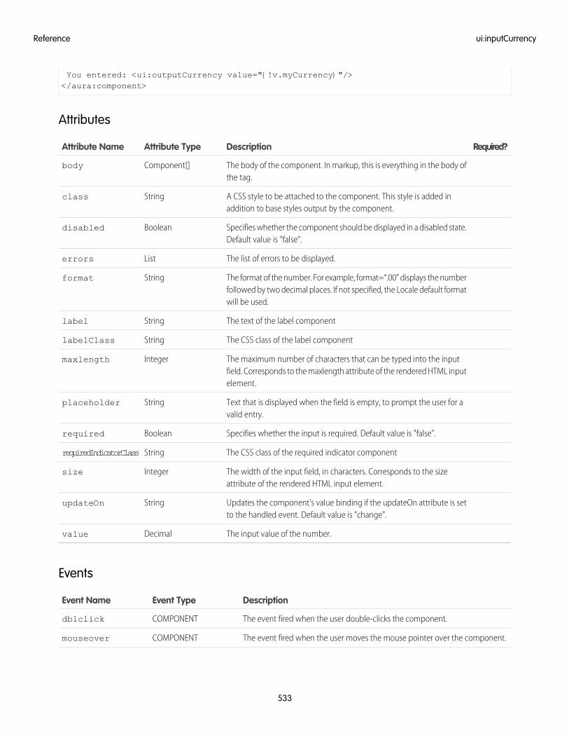
You entered: <ui:outputCurrency value="{!v.myCurrency}"/></aura:component>
Attributes
Required?DescriptionAttribute TypeAttribute Name
The body of the component. In markup, this is everything in the body ofthe tag.
Component[]body
A CSS style to be attached to the component. This style is added inaddition to base styles output by the component.
Stringclass
Specifies whether the component should be displayed in a disabled state.Default value is "false".
Booleandisabled
The list of errors to be displayed.Listerrors
The format of the number. For example, format=“.00” displays the numberfollowed by two decimal places. If not specified, the Locale default formatwill be used.
Stringformat
The text of the label componentStringlabel
The CSS class of the label componentStringlabelClass
The maximum number of characters that can be typed into the inputfield. Corresponds to the maxlength attribute of the rendered HTML inputelement.
Integermaxlength
Text that is displayed when the field is empty, to prompt the user for avalid entry.
Stringplaceholder
Specifies whether the input is required. Default value is "false".Booleanrequired
The CSS class of the required indicator componentStringrequiredIndicatorClass
The width of the input field, in characters. Corresponds to the sizeattribute of the rendered HTML input element.
Integersize
Updates the component's value binding if the updateOn attribute is setto the handled event. Default value is "change".
StringupdateOn
The input value of the number.Decimalvalue
Events
DescriptionEvent TypeEvent Name
The event fired when the user double-clicks the component.COMPONENTdblclick
The event fired when the user moves the mouse pointer over the component.COMPONENTmouseover
533
ui:inputCurrencyReference
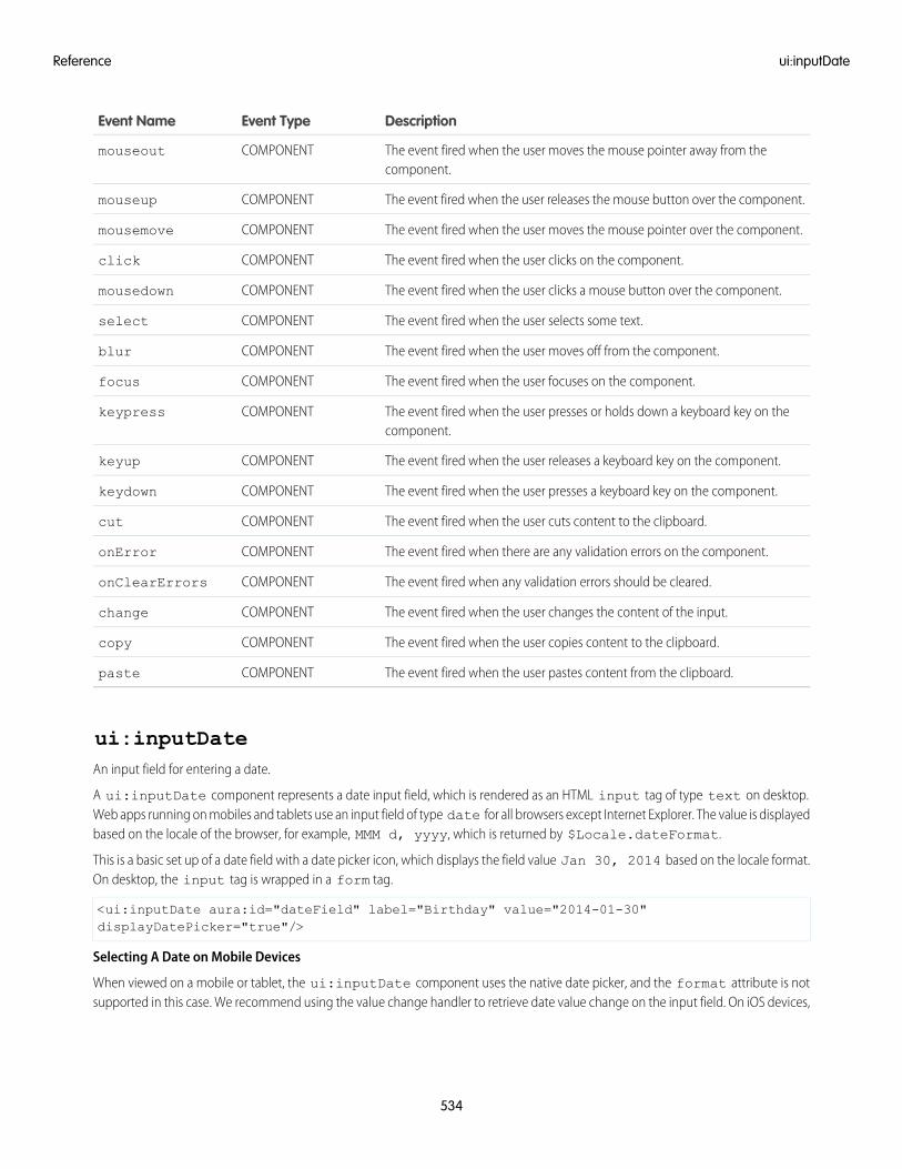
DescriptionEvent TypeEvent Name
The event fired when the user moves the mouse pointer away from thecomponent.
COMPONENTmouseout
The event fired when the user releases the mouse button over the component.COMPONENTmouseup
The event fired when the user moves the mouse pointer over the component.COMPONENTmousemove
The event fired when the user clicks on the component.COMPONENTclick
The event fired when the user clicks a mouse button over the component.COMPONENTmousedown
The event fired when the user selects some text.COMPONENTselect
The event fired when the user moves off from the component.COMPONENTblur
The event fired when the user focuses on the component.COMPONENTfocus
The event fired when the user presses or holds down a keyboard key on thecomponent.
COMPONENTkeypress
The event fired when the user releases a keyboard key on the component.COMPONENTkeyup
The event fired when the user presses a keyboard key on the component.COMPONENTkeydown
The event fired when the user cuts content to the clipboard.COMPONENTcut
The event fired when there are any validation errors on the component.COMPONENTonError
The event fired when any validation errors should be cleared.COMPONENTonClearErrors
The event fired when the user changes the content of the input.COMPONENTchange
The event fired when the user copies content to the clipboard.COMPONENTcopy
The event fired when the user pastes content from the clipboard.COMPONENTpaste
ui:inputDateAn input field for entering a date.
A ui:inputDate component represents a date input field, which is rendered as an HTML input tag of type text on desktop.Web apps running on mobiles and tablets use an input field of type date for all browsers except Internet Explorer. The value is displayedbased on the locale of the browser, for example, MMM d, yyyy, which is returned by $Locale.dateFormat.
This is a basic set up of a date field with a date picker icon, which displays the field value Jan 30, 2014 based on the locale format.On desktop, the input tag is wrapped in a form tag.
<ui:inputDate aura:id="dateField" label="Birthday" value="2014-01-30"displayDatePicker="true"/>
Selecting A Date on Mobile Devices
When viewed on a mobile or tablet, the ui:inputDate component uses the native date picker, and the format attribute is notsupported in this case. We recommend using the value change handler to retrieve date value change on the input field. On iOS devices,
534
ui:inputDateReference
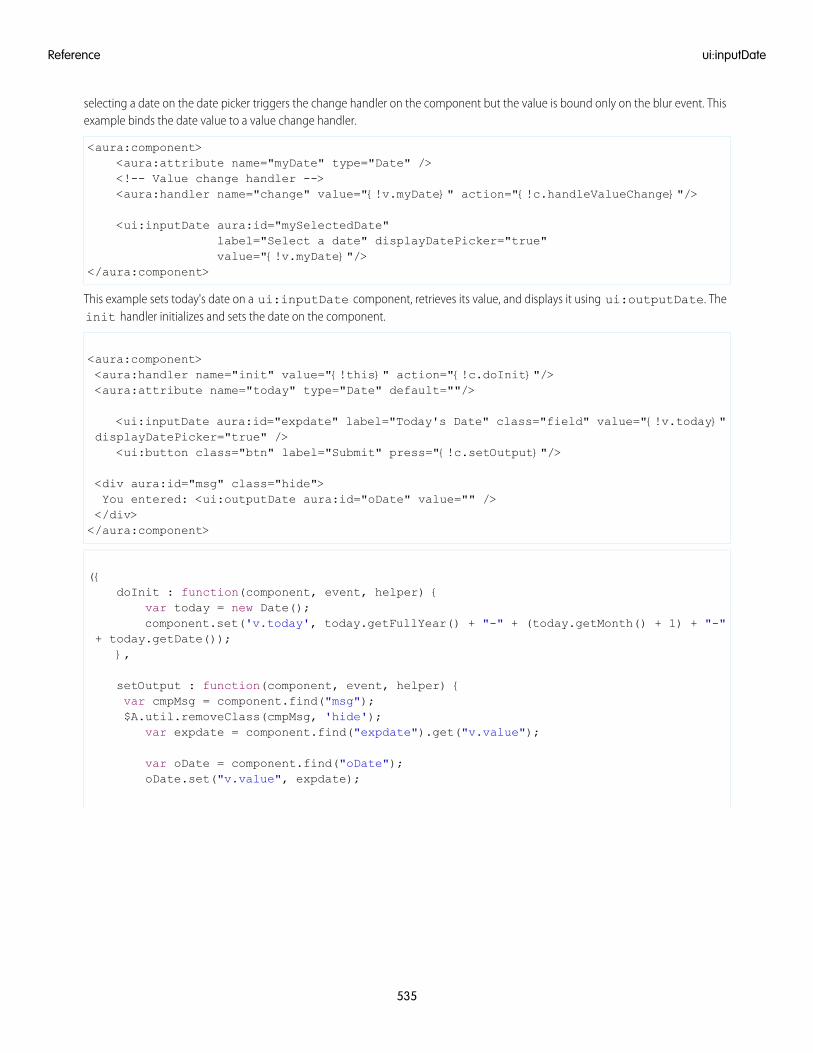
selecting a date on the date picker triggers the change handler on the component but the value is bound only on the blur event. Thisexample binds the date value to a value change handler.
<aura:component><aura:attribute name="myDate" type="Date" /><!-- Value change handler --><aura:handler name="change" value="{!v.myDate}" action="{!c.handleValueChange}"/>
<ui:inputDate aura:id="mySelectedDate"label="Select a date" displayDatePicker="true"value="{!v.myDate}"/>
</aura:component>
This example sets today's date on a ui:inputDate component, retrieves its value, and displays it using ui:outputDate. Theinit handler initializes and sets the date on the component.
<aura:component><aura:handler name="init" value="{!this}" action="{!c.doInit}"/><aura:attribute name="today" type="Date" default=""/>
<ui:inputDate aura:id="expdate" label="Today's Date" class="field" value="{!v.today}"displayDatePicker="true" />
<ui:button class="btn" label="Submit" press="{!c.setOutput}"/>
<div aura:id="msg" class="hide">You entered: <ui:outputDate aura:id="oDate" value="" /></div></aura:component>
({doInit : function(component, event, helper) {
var today = new Date();component.set('v.today', today.getFullYear() + "-" + (today.getMonth() + 1) + "-"
+ today.getDate());},
setOutput : function(component, event, helper) {var cmpMsg = component.find("msg");$A.util.removeClass(cmpMsg, 'hide');
var expdate = component.find("expdate").get("v.value");
var oDate = component.find("oDate");oDate.set("v.value", expdate);
535
ui:inputDateReference
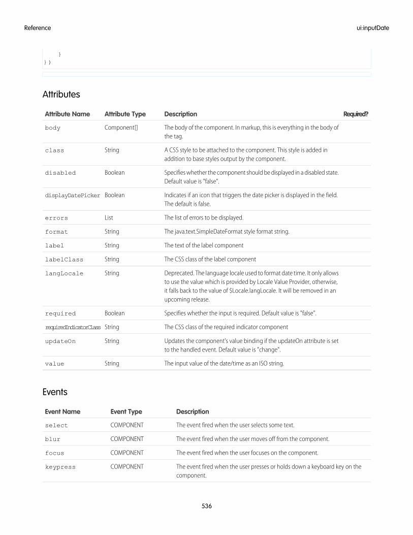
}})
Attributes
Required?DescriptionAttribute TypeAttribute Name
The body of the component. In markup, this is everything in the body ofthe tag.
Component[]body
A CSS style to be attached to the component. This style is added inaddition to base styles output by the component.
Stringclass
Specifies whether the component should be displayed in a disabled state.Default value is "false".
Booleandisabled
Indicates if an icon that triggers the date picker is displayed in the field.The default is false.
BooleandisplayDatePicker
The list of errors to be displayed.Listerrors
The java.text.SimpleDateFormat style format string.Stringformat
The text of the label componentStringlabel
The CSS class of the label componentStringlabelClass
Deprecated. The language locale used to format date time. It only allowsto use the value which is provided by Locale Value Provider, otherwise,
StringlangLocale
it falls back to the value of $Locale.langLocale. It will be removed in anupcoming release.
Specifies whether the input is required. Default value is "false".Booleanrequired
The CSS class of the required indicator componentStringrequiredIndicatorClass
Updates the component's value binding if the updateOn attribute is setto the handled event. Default value is "change".
StringupdateOn
The input value of the date/time as an ISO string.Stringvalue
Events
DescriptionEvent TypeEvent Name
The event fired when the user selects some text.COMPONENTselect
The event fired when the user moves off from the component.COMPONENTblur
The event fired when the user focuses on the component.COMPONENTfocus
The event fired when the user presses or holds down a keyboard key on thecomponent.
COMPONENTkeypress
536
ui:inputDateReference
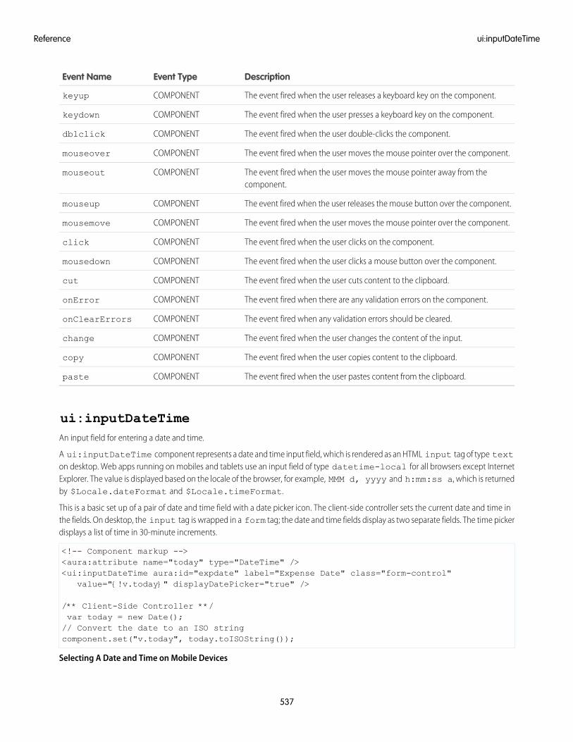
DescriptionEvent TypeEvent Name
The event fired when the user releases a keyboard key on the component.COMPONENTkeyup
The event fired when the user presses a keyboard key on the component.COMPONENTkeydown
The event fired when the user double-clicks the component.COMPONENTdblclick
The event fired when the user moves the mouse pointer over the component.COMPONENTmouseover
The event fired when the user moves the mouse pointer away from thecomponent.
COMPONENTmouseout
The event fired when the user releases the mouse button over the component.COMPONENTmouseup
The event fired when the user moves the mouse pointer over the component.COMPONENTmousemove
The event fired when the user clicks on the component.COMPONENTclick
The event fired when the user clicks a mouse button over the component.COMPONENTmousedown
The event fired when the user cuts content to the clipboard.COMPONENTcut
The event fired when there are any validation errors on the component.COMPONENTonError
The event fired when any validation errors should be cleared.COMPONENTonClearErrors
The event fired when the user changes the content of the input.COMPONENTchange
The event fired when the user copies content to the clipboard.COMPONENTcopy
The event fired when the user pastes content from the clipboard.COMPONENTpaste
ui:inputDateTimeAn input field for entering a date and time.
A ui:inputDateTime component represents a date and time input field, which is rendered as an HTML input tag of type texton desktop. Web apps running on mobiles and tablets use an input field of type datetime-local for all browsers except InternetExplorer. The value is displayed based on the locale of the browser, for example, MMM d, yyyy and h:mm:ss a, which is returnedby $Locale.dateFormat and $Locale.timeFormat.
This is a basic set up of a pair of date and time field with a date picker icon. The client-side controller sets the current date and time inthe fields. On desktop, the input tag is wrapped in a form tag; the date and time fields display as two separate fields. The time pickerdisplays a list of time in 30-minute increments.
<!-- Component markup --><aura:attribute name="today" type="DateTime" /><ui:inputDateTime aura:id="expdate" label="Expense Date" class="form-control"
value="{!v.today}" displayDatePicker="true" />
/** Client-Side Controller **/var today = new Date();// Convert the date to an ISO stringcomponent.set("v.today", today.toISOString());
Selecting A Date and Time on Mobile Devices
537
ui:inputDateTimeReference
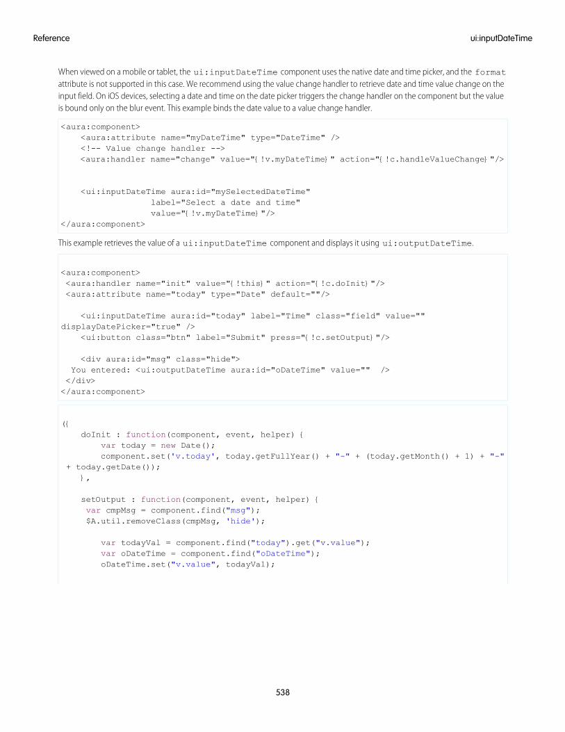
When viewed on a mobile or tablet, the ui:inputDateTime component uses the native date and time picker, and the formatattribute is not supported in this case. We recommend using the value change handler to retrieve date and time value change on theinput field. On iOS devices, selecting a date and time on the date picker triggers the change handler on the component but the valueis bound only on the blur event. This example binds the date value to a value change handler.
<aura:component><aura:attribute name="myDateTime" type="DateTime" /><!-- Value change handler --><aura:handler name="change" value="{!v.myDateTime}" action="{!c.handleValueChange}"/>
<ui:inputDateTime aura:id="mySelectedDateTime"label="Select a date and time"value="{!v.myDateTime}"/>
</aura:component>
This example retrieves the value of a ui:inputDateTime component and displays it using ui:outputDateTime.
<aura:component><aura:handler name="init" value="{!this}" action="{!c.doInit}"/><aura:attribute name="today" type="Date" default=""/>
<ui:inputDateTime aura:id="today" label="Time" class="field" value=""displayDatePicker="true" />
<ui:button class="btn" label="Submit" press="{!c.setOutput}"/>
<div aura:id="msg" class="hide">You entered: <ui:outputDateTime aura:id="oDateTime" value="" /></div></aura:component>
({doInit : function(component, event, helper) {
var today = new Date();component.set('v.today', today.getFullYear() + "-" + (today.getMonth() + 1) + "-"
+ today.getDate());},
setOutput : function(component, event, helper) {var cmpMsg = component.find("msg");$A.util.removeClass(cmpMsg, 'hide');
var todayVal = component.find("today").get("v.value");var oDateTime = component.find("oDateTime");oDateTime.set("v.value", todayVal);
538
ui:inputDateTimeReference
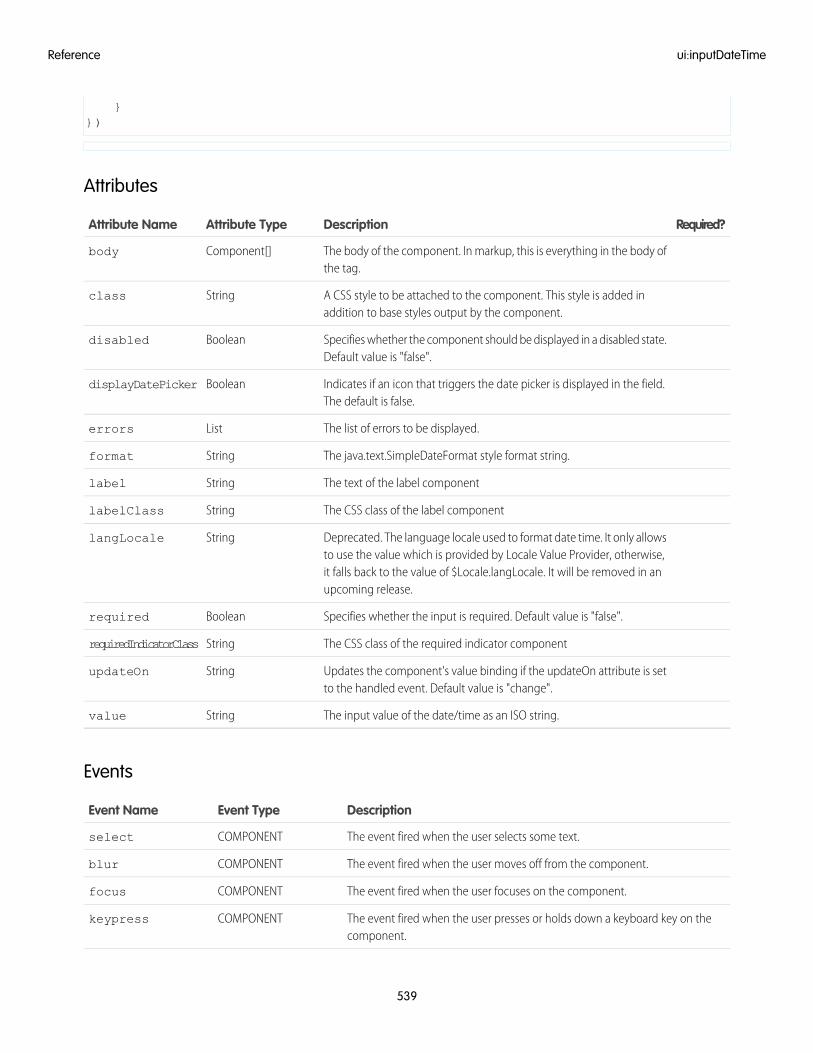
}})
Attributes
Required?DescriptionAttribute TypeAttribute Name
The body of the component. In markup, this is everything in the body ofthe tag.
Component[]body
A CSS style to be attached to the component. This style is added inaddition to base styles output by the component.
Stringclass
Specifies whether the component should be displayed in a disabled state.Default value is "false".
Booleandisabled
Indicates if an icon that triggers the date picker is displayed in the field.The default is false.
BooleandisplayDatePicker
The list of errors to be displayed.Listerrors
The java.text.SimpleDateFormat style format string.Stringformat
The text of the label componentStringlabel
The CSS class of the label componentStringlabelClass
Deprecated. The language locale used to format date time. It only allowsto use the value which is provided by Locale Value Provider, otherwise,
StringlangLocale
it falls back to the value of $Locale.langLocale. It will be removed in anupcoming release.
Specifies whether the input is required. Default value is "false".Booleanrequired
The CSS class of the required indicator componentStringrequiredIndicatorClass
Updates the component's value binding if the updateOn attribute is setto the handled event. Default value is "change".
StringupdateOn
The input value of the date/time as an ISO string.Stringvalue
Events
DescriptionEvent TypeEvent Name
The event fired when the user selects some text.COMPONENTselect
The event fired when the user moves off from the component.COMPONENTblur
The event fired when the user focuses on the component.COMPONENTfocus
The event fired when the user presses or holds down a keyboard key on thecomponent.
COMPONENTkeypress
539
ui:inputDateTimeReference
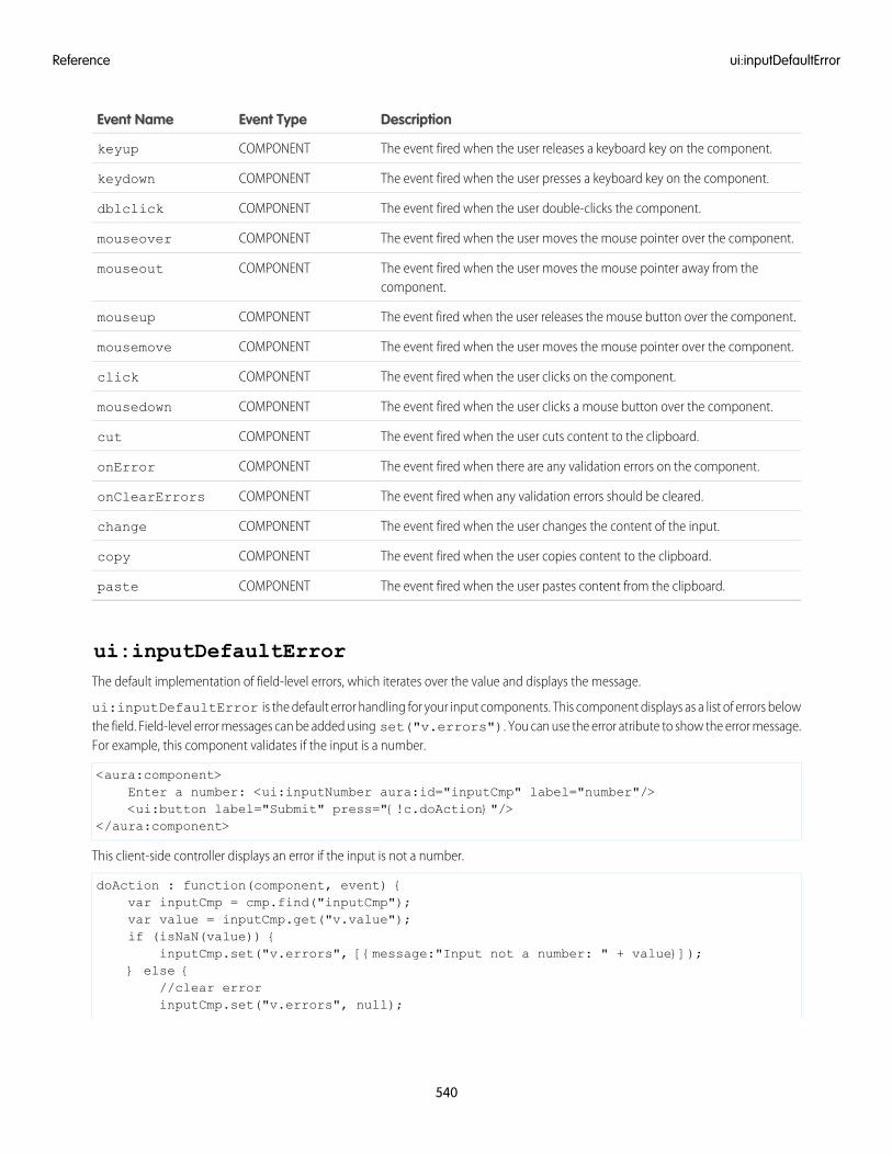
DescriptionEvent TypeEvent Name
The event fired when the user releases a keyboard key on the component.COMPONENTkeyup
The event fired when the user presses a keyboard key on the component.COMPONENTkeydown
The event fired when the user double-clicks the component.COMPONENTdblclick
The event fired when the user moves the mouse pointer over the component.COMPONENTmouseover
The event fired when the user moves the mouse pointer away from thecomponent.
COMPONENTmouseout
The event fired when the user releases the mouse button over the component.COMPONENTmouseup
The event fired when the user moves the mouse pointer over the component.COMPONENTmousemove
The event fired when the user clicks on the component.COMPONENTclick
The event fired when the user clicks a mouse button over the component.COMPONENTmousedown
The event fired when the user cuts content to the clipboard.COMPONENTcut
The event fired when there are any validation errors on the component.COMPONENTonError
The event fired when any validation errors should be cleared.COMPONENTonClearErrors
The event fired when the user changes the content of the input.COMPONENTchange
The event fired when the user copies content to the clipboard.COMPONENTcopy
The event fired when the user pastes content from the clipboard.COMPONENTpaste
ui:inputDefaultErrorThe default implementation of field-level errors, which iterates over the value and displays the message.
ui:inputDefaultError is the default error handling for your input components. This component displays as a list of errors belowthe field. Field-level error messages can be added using set("v.errors"). You can use the error atribute to show the error message.For example, this component validates if the input is a number.
<aura:component>Enter a number: <ui:inputNumber aura:id="inputCmp" label="number"/><ui:button label="Submit" press="{!c.doAction}"/>
</aura:component>
This client-side controller displays an error if the input is not a number.
doAction : function(component, event) {var inputCmp = cmp.find("inputCmp");var value = inputCmp.get("v.value");if (isNaN(value)) {
inputCmp.set("v.errors", [{message:"Input not a number: " + value}]);} else {
//clear errorinputCmp.set("v.errors", null);
540
ui:inputDefaultErrorReference
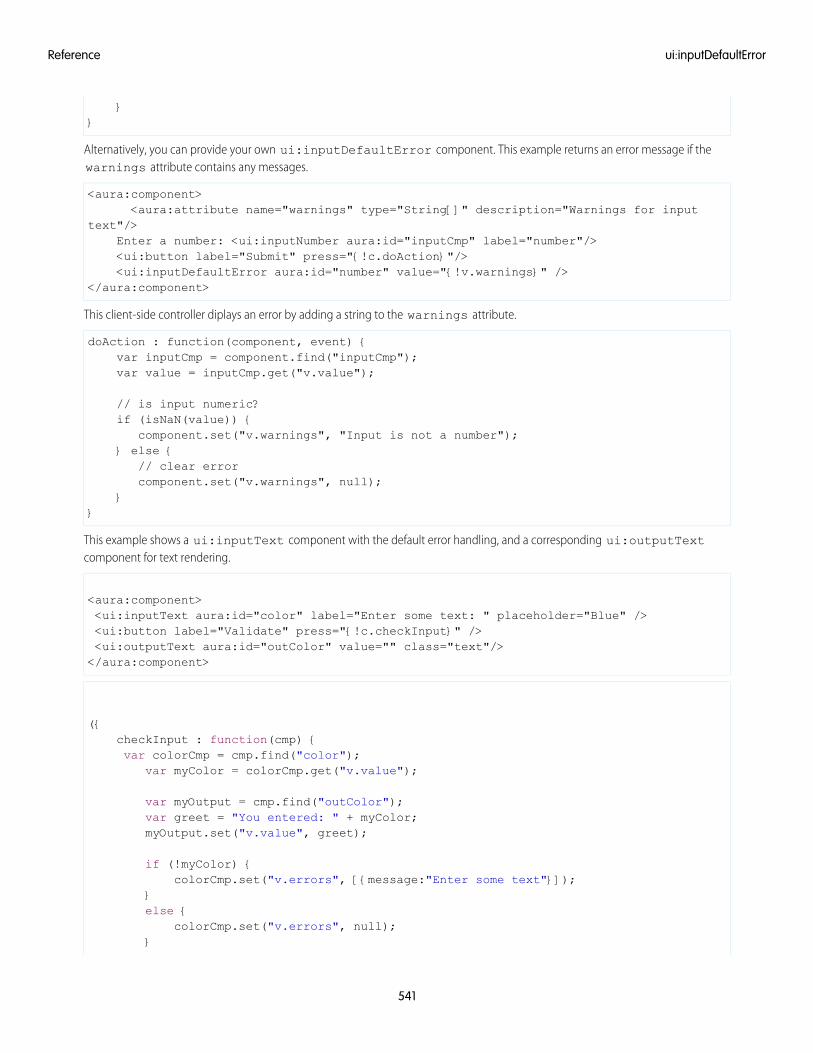
}}
Alternatively, you can provide your own ui:inputDefaultError component. This example returns an error message if thewarnings attribute contains any messages.
<aura:component><aura:attribute name="warnings" type="String[]" description="Warnings for input
text"/>Enter a number: <ui:inputNumber aura:id="inputCmp" label="number"/><ui:button label="Submit" press="{!c.doAction}"/><ui:inputDefaultError aura:id="number" value="{!v.warnings}" />
</aura:component>
This client-side controller diplays an error by adding a string to the warnings attribute.
doAction : function(component, event) {var inputCmp = component.find("inputCmp");var value = inputCmp.get("v.value");
// is input numeric?if (isNaN(value)) {
component.set("v.warnings", "Input is not a number");} else {
// clear errorcomponent.set("v.warnings", null);
}}
This example shows a ui:inputText component with the default error handling, and a corresponding ui:outputTextcomponent for text rendering.
<aura:component><ui:inputText aura:id="color" label="Enter some text: " placeholder="Blue" /><ui:button label="Validate" press="{!c.checkInput}" /><ui:outputText aura:id="outColor" value="" class="text"/></aura:component>
({checkInput : function(cmp) {var colorCmp = cmp.find("color");
var myColor = colorCmp.get("v.value");
var myOutput = cmp.find("outColor");var greet = "You entered: " + myColor;myOutput.set("v.value", greet);
if (!myColor) {colorCmp.set("v.errors", [{message:"Enter some text"}]);
}else {
colorCmp.set("v.errors", null);}
541
ui:inputDefaultErrorReference
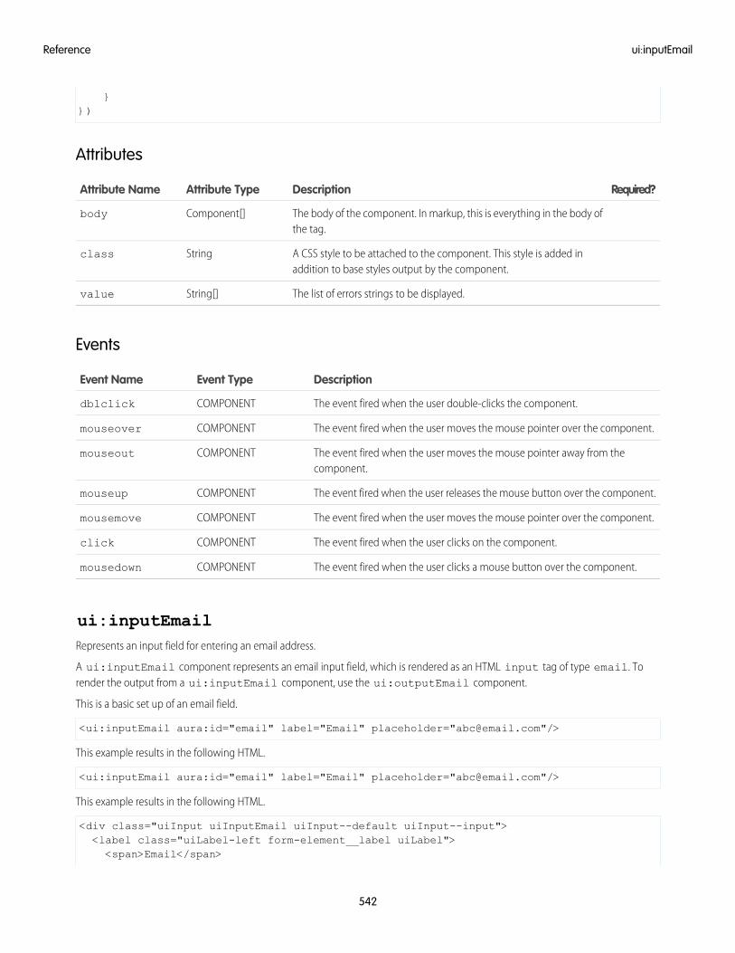
}})
Attributes
Required?DescriptionAttribute TypeAttribute Name
The body of the component. In markup, this is everything in the body ofthe tag.
Component[]body
A CSS style to be attached to the component. This style is added inaddition to base styles output by the component.
Stringclass
The list of errors strings to be displayed.String[]value
Events
DescriptionEvent TypeEvent Name
The event fired when the user double-clicks the component.COMPONENTdblclick
The event fired when the user moves the mouse pointer over the component.COMPONENTmouseover
The event fired when the user moves the mouse pointer away from thecomponent.
COMPONENTmouseout
The event fired when the user releases the mouse button over the component.COMPONENTmouseup
The event fired when the user moves the mouse pointer over the component.COMPONENTmousemove
The event fired when the user clicks on the component.COMPONENTclick
The event fired when the user clicks a mouse button over the component.COMPONENTmousedown
ui:inputEmailRepresents an input field for entering an email address.
A ui:inputEmail component represents an email input field, which is rendered as an HTML input tag of type email. Torender the output from a ui:inputEmail component, use the ui:outputEmail component.
This is a basic set up of an email field.
<ui:inputEmail aura:id="email" label="Email" placeholder="[email protected]"/>
This example results in the following HTML.
<ui:inputEmail aura:id="email" label="Email" placeholder="[email protected]"/>
This example results in the following HTML.
<div class="uiInput uiInputEmail uiInput--default uiInput--input"><label class="uiLabel-left form-element__label uiLabel"><span>Email</span>
542
ui:inputEmailReference
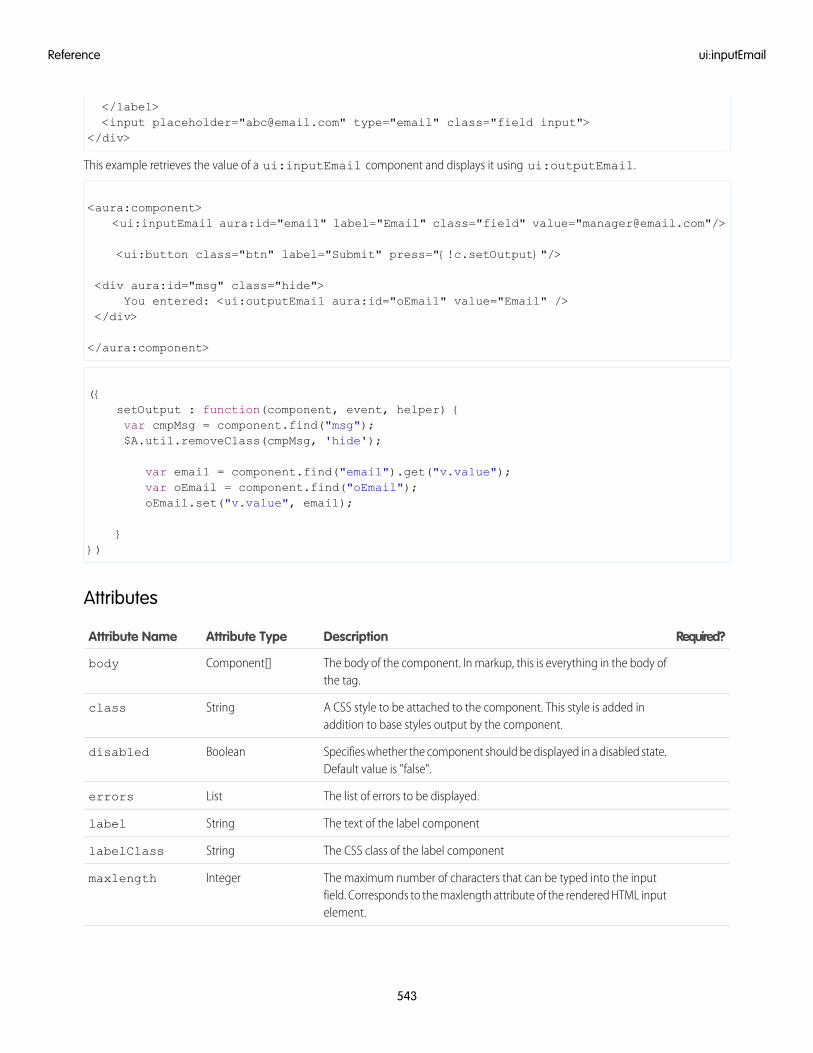
</label><input placeholder="[email protected]" type="email" class="field input">
</div>
This example retrieves the value of a ui:inputEmail component and displays it using ui:outputEmail.
<aura:component><ui:inputEmail aura:id="email" label="Email" class="field" value="[email protected]"/>
<ui:button class="btn" label="Submit" press="{!c.setOutput}"/>
<div aura:id="msg" class="hide">You entered: <ui:outputEmail aura:id="oEmail" value="Email" />
</div>
</aura:component>
({setOutput : function(component, event, helper) {var cmpMsg = component.find("msg");$A.util.removeClass(cmpMsg, 'hide');
var email = component.find("email").get("v.value");var oEmail = component.find("oEmail");oEmail.set("v.value", email);
}})
Attributes
Required?DescriptionAttribute TypeAttribute Name
The body of the component. In markup, this is everything in the body ofthe tag.
Component[]body
A CSS style to be attached to the component. This style is added inaddition to base styles output by the component.
Stringclass
Specifies whether the component should be displayed in a disabled state.Default value is "false".
Booleandisabled
The list of errors to be displayed.Listerrors
The text of the label componentStringlabel
The CSS class of the label componentStringlabelClass
The maximum number of characters that can be typed into the inputfield. Corresponds to the maxlength attribute of the rendered HTML inputelement.
Integermaxlength
543
ui:inputEmailReference
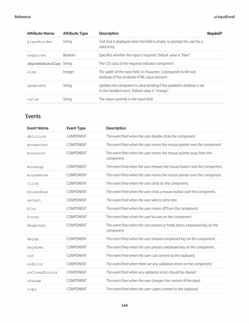
Required?DescriptionAttribute TypeAttribute Name
Text that is displayed when the field is empty, to prompt the user for avalid entry.
Stringplaceholder
Specifies whether the input is required. Default value is "false".Booleanrequired
The CSS class of the required indicator componentStringrequiredIndicatorClass
The width of the input field, in characters. Corresponds to the sizeattribute of the rendered HTML input element.
Integersize
Updates the component's value binding if the updateOn attribute is setto the handled event. Default value is "change".
StringupdateOn
The value currently in the input field.Stringvalue
Events
DescriptionEvent TypeEvent Name
The event fired when the user double-clicks the component.COMPONENTdblclick
The event fired when the user moves the mouse pointer over the component.COMPONENTmouseover
The event fired when the user moves the mouse pointer away from thecomponent.
COMPONENTmouseout
The event fired when the user releases the mouse button over the component.COMPONENTmouseup
The event fired when the user moves the mouse pointer over the component.COMPONENTmousemove
The event fired when the user clicks on the component.COMPONENTclick
The event fired when the user clicks a mouse button over the component.COMPONENTmousedown
The event fired when the user selects some text.COMPONENTselect
The event fired when the user moves off from the component.COMPONENTblur
The event fired when the user focuses on the component.COMPONENTfocus
The event fired when the user presses or holds down a keyboard key on thecomponent.
COMPONENTkeypress
The event fired when the user releases a keyboard key on the component.COMPONENTkeyup
The event fired when the user presses a keyboard key on the component.COMPONENTkeydown
The event fired when the user cuts content to the clipboard.COMPONENTcut
The event fired when there are any validation errors on the component.COMPONENTonError
The event fired when any validation errors should be cleared.COMPONENTonClearErrors
The event fired when the user changes the content of the input.COMPONENTchange
The event fired when the user copies content to the clipboard.COMPONENTcopy
544
ui:inputEmailReference
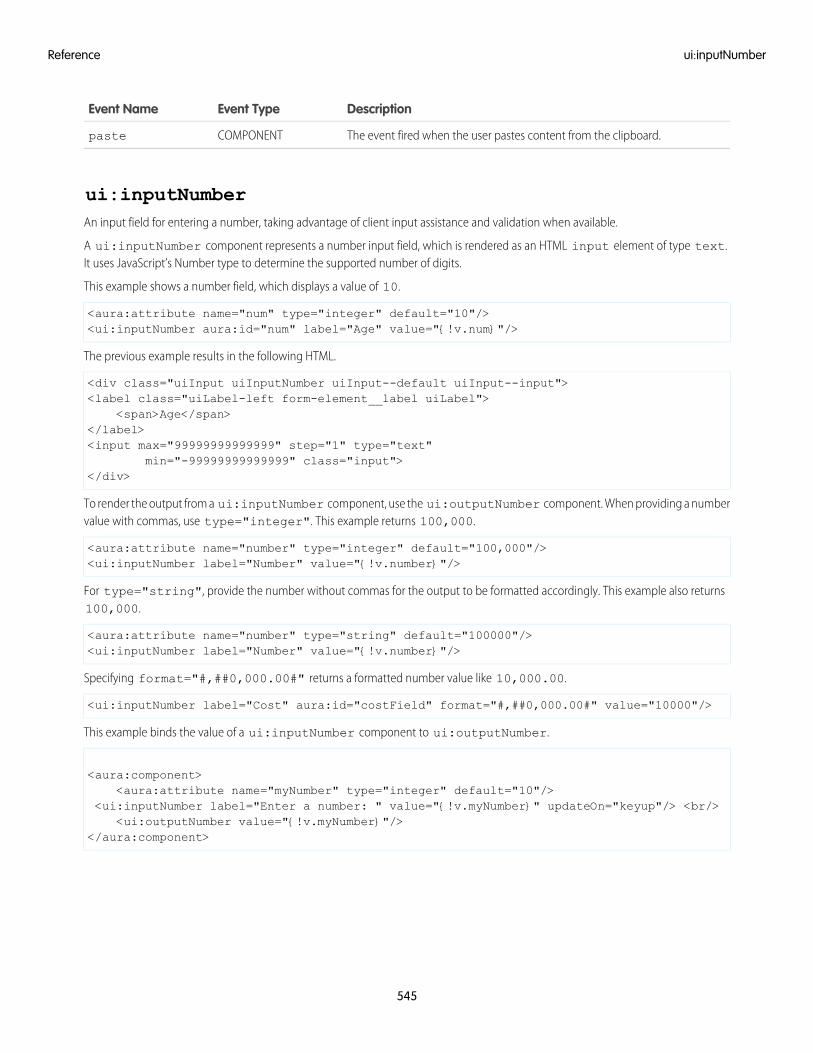
DescriptionEvent TypeEvent Name
The event fired when the user pastes content from the clipboard.COMPONENTpaste
ui:inputNumberAn input field for entering a number, taking advantage of client input assistance and validation when available.
A ui:inputNumber component represents a number input field, which is rendered as an HTML input element of type text.It uses JavaScript’s Number type to determine the supported number of digits.
This example shows a number field, which displays a value of 10.
<aura:attribute name="num" type="integer" default="10"/><ui:inputNumber aura:id="num" label="Age" value="{!v.num}"/>
The previous example results in the following HTML.
<div class="uiInput uiInputNumber uiInput--default uiInput--input"><label class="uiLabel-left form-element__label uiLabel">
<span>Age</span></label><input max="99999999999999" step="1" type="text"
min="-99999999999999" class="input"></div>
To render the output from a ui:inputNumber component, use the ui:outputNumber component. When providing a numbervalue with commas, use type="integer". This example returns 100,000.
<aura:attribute name="number" type="integer" default="100,000"/><ui:inputNumber label="Number" value="{!v.number}"/>
For type="string", provide the number without commas for the output to be formatted accordingly. This example also returns100,000.
<aura:attribute name="number" type="string" default="100000"/><ui:inputNumber label="Number" value="{!v.number}"/>
Specifying format="#,##0,000.00#" returns a formatted number value like 10,000.00.
<ui:inputNumber label="Cost" aura:id="costField" format="#,##0,000.00#" value="10000"/>
This example binds the value of a ui:inputNumber component to ui:outputNumber.
<aura:component><aura:attribute name="myNumber" type="integer" default="10"/>
<ui:inputNumber label="Enter a number: " value="{!v.myNumber}" updateOn="keyup"/> <br/><ui:outputNumber value="{!v.myNumber}"/>
</aura:component>
545
ui:inputNumberReference
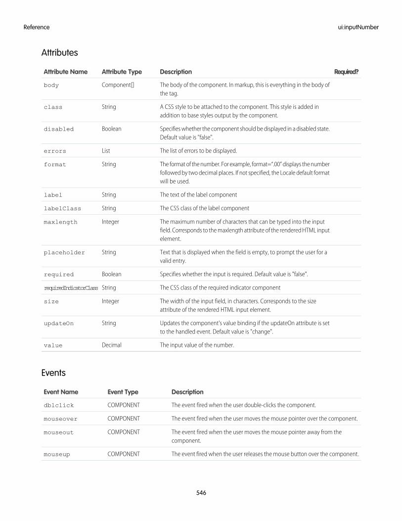
Attributes
Required?DescriptionAttribute TypeAttribute Name
The body of the component. In markup, this is everything in the body ofthe tag.
Component[]body
A CSS style to be attached to the component. This style is added inaddition to base styles output by the component.
Stringclass
Specifies whether the component should be displayed in a disabled state.Default value is "false".
Booleandisabled
The list of errors to be displayed.Listerrors
The format of the number. For example, format=“.00” displays the numberfollowed by two decimal places. If not specified, the Locale default formatwill be used.
Stringformat
The text of the label componentStringlabel
The CSS class of the label componentStringlabelClass
The maximum number of characters that can be typed into the inputfield. Corresponds to the maxlength attribute of the rendered HTML inputelement.
Integermaxlength
Text that is displayed when the field is empty, to prompt the user for avalid entry.
Stringplaceholder
Specifies whether the input is required. Default value is "false".Booleanrequired
The CSS class of the required indicator componentStringrequiredIndicatorClass
The width of the input field, in characters. Corresponds to the sizeattribute of the rendered HTML input element.
Integersize
Updates the component's value binding if the updateOn attribute is setto the handled event. Default value is "change".
StringupdateOn
The input value of the number.Decimalvalue
Events
DescriptionEvent TypeEvent Name
The event fired when the user double-clicks the component.COMPONENTdblclick
The event fired when the user moves the mouse pointer over the component.COMPONENTmouseover
The event fired when the user moves the mouse pointer away from thecomponent.
COMPONENTmouseout
The event fired when the user releases the mouse button over the component.COMPONENTmouseup
546
ui:inputNumberReference
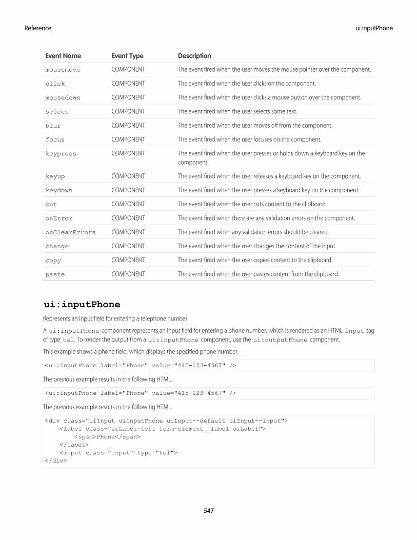
DescriptionEvent TypeEvent Name
The event fired when the user moves the mouse pointer over the component.COMPONENTmousemove
The event fired when the user clicks on the component.COMPONENTclick
The event fired when the user clicks a mouse button over the component.COMPONENTmousedown
The event fired when the user selects some text.COMPONENTselect
The event fired when the user moves off from the component.COMPONENTblur
The event fired when the user focuses on the component.COMPONENTfocus
The event fired when the user presses or holds down a keyboard key on thecomponent.
COMPONENTkeypress
The event fired when the user releases a keyboard key on the component.COMPONENTkeyup
The event fired when the user presses a keyboard key on the component.COMPONENTkeydown
The event fired when the user cuts content to the clipboard.COMPONENTcut
The event fired when there are any validation errors on the component.COMPONENTonError
The event fired when any validation errors should be cleared.COMPONENTonClearErrors
The event fired when the user changes the content of the input.COMPONENTchange
The event fired when the user copies content to the clipboard.COMPONENTcopy
The event fired when the user pastes content from the clipboard.COMPONENTpaste
ui:inputPhoneRepresents an input field for entering a telephone number.
A ui:inputPhone component represents an input field for entering a phone number, which is rendered as an HTML input tagof type tel. To render the output from a ui:inputPhone component, use the ui:outputPhone component.
This example shows a phone field, which displays the specified phone number.
<ui:inputPhone label="Phone" value="415-123-4567" />
The previous example results in the following HTML.
<ui:inputPhone label="Phone" value="415-123-4567" />
The previous example results in the following HTML.
<div class="uiInput uiInputPhone uiInput--default uiInput--input"><label class="uiLabel-left form-element__label uiLabel">
<span>Phone</span></label><input class="input" type="tel">
</div>
547
ui:inputPhoneReference
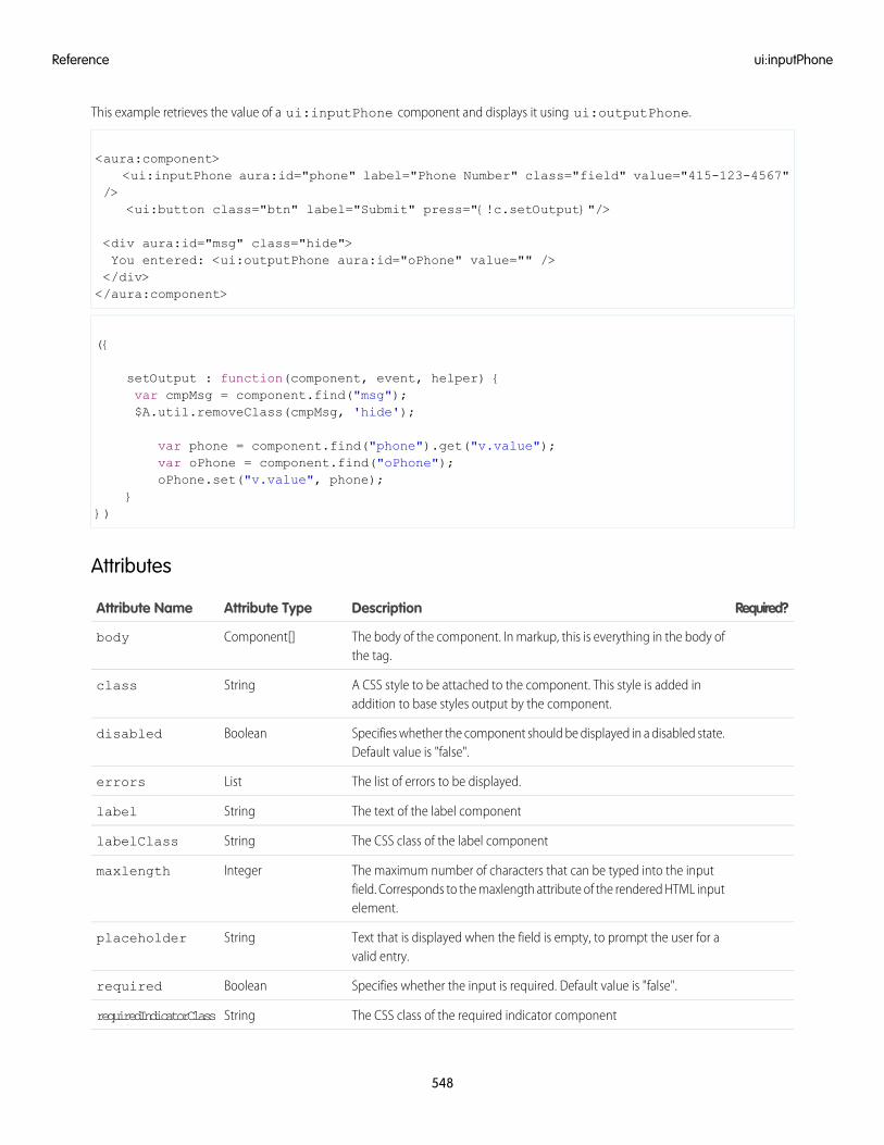
This example retrieves the value of a ui:inputPhone component and displays it using ui:outputPhone.
<aura:component><ui:inputPhone aura:id="phone" label="Phone Number" class="field" value="415-123-4567"
/><ui:button class="btn" label="Submit" press="{!c.setOutput}"/>
<div aura:id="msg" class="hide">You entered: <ui:outputPhone aura:id="oPhone" value="" /></div></aura:component>
({
setOutput : function(component, event, helper) {var cmpMsg = component.find("msg");$A.util.removeClass(cmpMsg, 'hide');
var phone = component.find("phone").get("v.value");var oPhone = component.find("oPhone");oPhone.set("v.value", phone);
}})
Attributes
Required?DescriptionAttribute TypeAttribute Name
The body of the component. In markup, this is everything in the body ofthe tag.
Component[]body
A CSS style to be attached to the component. This style is added inaddition to base styles output by the component.
Stringclass
Specifies whether the component should be displayed in a disabled state.Default value is "false".
Booleandisabled
The list of errors to be displayed.Listerrors
The text of the label componentStringlabel
The CSS class of the label componentStringlabelClass
The maximum number of characters that can be typed into the inputfield. Corresponds to the maxlength attribute of the rendered HTML inputelement.
Integermaxlength
Text that is displayed when the field is empty, to prompt the user for avalid entry.
Stringplaceholder
Specifies whether the input is required. Default value is "false".Booleanrequired
The CSS class of the required indicator componentStringrequiredIndicatorClass
548
ui:inputPhoneReference
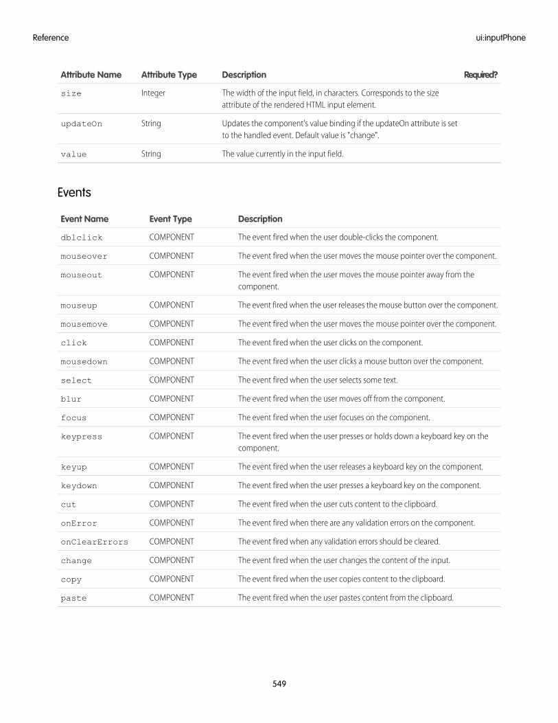
Required?DescriptionAttribute TypeAttribute Name
The width of the input field, in characters. Corresponds to the sizeattribute of the rendered HTML input element.
Integersize
Updates the component's value binding if the updateOn attribute is setto the handled event. Default value is "change".
StringupdateOn
The value currently in the input field.Stringvalue
Events
DescriptionEvent TypeEvent Name
The event fired when the user double-clicks the component.COMPONENTdblclick
The event fired when the user moves the mouse pointer over the component.COMPONENTmouseover
The event fired when the user moves the mouse pointer away from thecomponent.
COMPONENTmouseout
The event fired when the user releases the mouse button over the component.COMPONENTmouseup
The event fired when the user moves the mouse pointer over the component.COMPONENTmousemove
The event fired when the user clicks on the component.COMPONENTclick
The event fired when the user clicks a mouse button over the component.COMPONENTmousedown
The event fired when the user selects some text.COMPONENTselect
The event fired when the user moves off from the component.COMPONENTblur
The event fired when the user focuses on the component.COMPONENTfocus
The event fired when the user presses or holds down a keyboard key on thecomponent.
COMPONENTkeypress
The event fired when the user releases a keyboard key on the component.COMPONENTkeyup
The event fired when the user presses a keyboard key on the component.COMPONENTkeydown
The event fired when the user cuts content to the clipboard.COMPONENTcut
The event fired when there are any validation errors on the component.COMPONENTonError
The event fired when any validation errors should be cleared.COMPONENTonClearErrors
The event fired when the user changes the content of the input.COMPONENTchange
The event fired when the user copies content to the clipboard.COMPONENTcopy
The event fired when the user pastes content from the clipboard.COMPONENTpaste
549
ui:inputPhoneReference
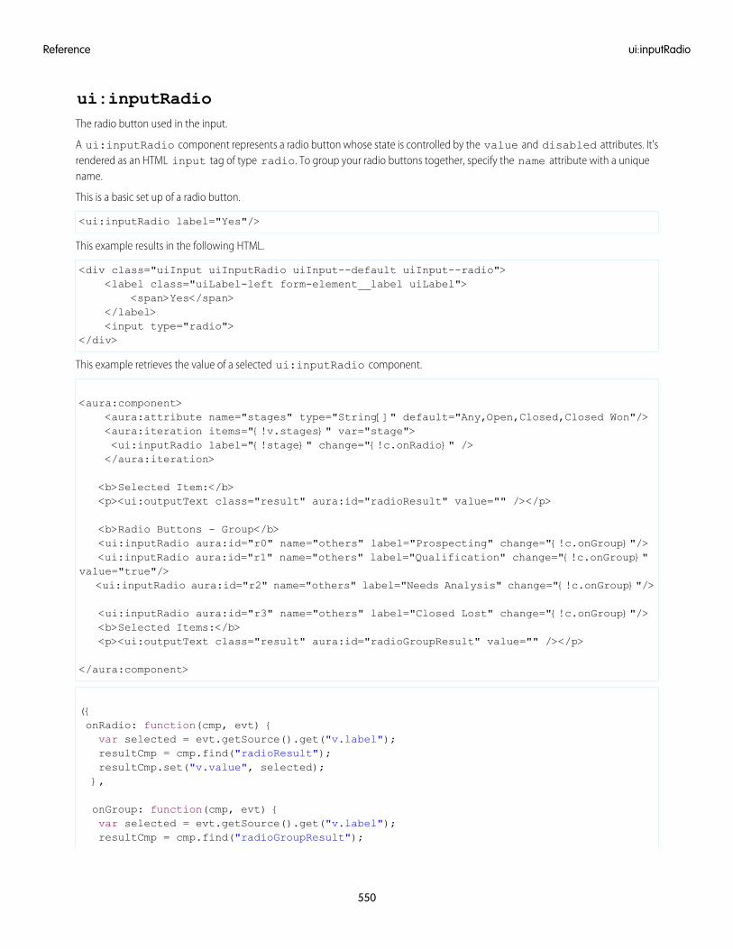
ui:inputRadioThe radio button used in the input.
A ui:inputRadio component represents a radio button whose state is controlled by the value and disabled attributes. It'srendered as an HTML input tag of type radio. To group your radio buttons together, specify the name attribute with a uniquename.
This is a basic set up of a radio button.
<ui:inputRadio label="Yes"/>
This example results in the following HTML.
<div class="uiInput uiInputRadio uiInput--default uiInput--radio"><label class="uiLabel-left form-element__label uiLabel">
<span>Yes</span></label><input type="radio">
</div>
This example retrieves the value of a selected ui:inputRadio component.
<aura:component><aura:attribute name="stages" type="String[]" default="Any,Open,Closed,Closed Won"/><aura:iteration items="{!v.stages}" var="stage"><ui:inputRadio label="{!stage}" change="{!c.onRadio}" /></aura:iteration>
<b>Selected Item:</b><p><ui:outputText class="result" aura:id="radioResult" value="" /></p>
<b>Radio Buttons - Group</b><ui:inputRadio aura:id="r0" name="others" label="Prospecting" change="{!c.onGroup}"/><ui:inputRadio aura:id="r1" name="others" label="Qualification" change="{!c.onGroup}"
value="true"/><ui:inputRadio aura:id="r2" name="others" label="Needs Analysis" change="{!c.onGroup}"/>
<ui:inputRadio aura:id="r3" name="others" label="Closed Lost" change="{!c.onGroup}"/><b>Selected Items:</b><p><ui:outputText class="result" aura:id="radioGroupResult" value="" /></p>
</aura:component>
({onRadio: function(cmp, evt) {var selected = evt.getSource().get("v.label");resultCmp = cmp.find("radioResult");resultCmp.set("v.value", selected);},
onGroup: function(cmp, evt) {var selected = evt.getSource().get("v.label");resultCmp = cmp.find("radioGroupResult");
550
ui:inputRadioReference
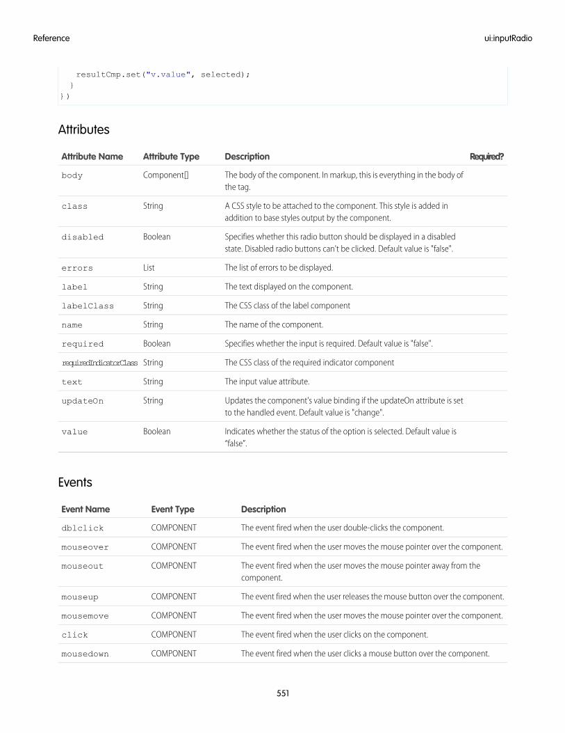
resultCmp.set("v.value", selected);}
})
Attributes
Required?DescriptionAttribute TypeAttribute Name
The body of the component. In markup, this is everything in the body ofthe tag.
Component[]body
A CSS style to be attached to the component. This style is added inaddition to base styles output by the component.
Stringclass
Specifies whether this radio button should be displayed in a disabledstate. Disabled radio buttons can't be clicked. Default value is "false".
Booleandisabled
The list of errors to be displayed.Listerrors
The text displayed on the component.Stringlabel
The CSS class of the label componentStringlabelClass
The name of the component.Stringname
Specifies whether the input is required. Default value is "false".Booleanrequired
The CSS class of the required indicator componentStringrequiredIndicatorClass
The input value attribute.Stringtext
Updates the component's value binding if the updateOn attribute is setto the handled event. Default value is "change".
StringupdateOn
Indicates whether the status of the option is selected. Default value is“false”.
Booleanvalue
Events
DescriptionEvent TypeEvent Name
The event fired when the user double-clicks the component.COMPONENTdblclick
The event fired when the user moves the mouse pointer over the component.COMPONENTmouseover
The event fired when the user moves the mouse pointer away from thecomponent.
COMPONENTmouseout
The event fired when the user releases the mouse button over the component.COMPONENTmouseup
The event fired when the user moves the mouse pointer over the component.COMPONENTmousemove
The event fired when the user clicks on the component.COMPONENTclick
The event fired when the user clicks a mouse button over the component.COMPONENTmousedown
551
ui:inputRadioReference
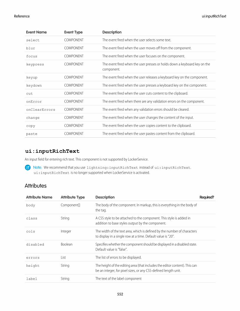
DescriptionEvent TypeEvent Name
The event fired when the user selects some text.COMPONENTselect
The event fired when the user moves off from the component.COMPONENTblur
The event fired when the user focuses on the component.COMPONENTfocus
The event fired when the user presses or holds down a keyboard key on thecomponent.
COMPONENTkeypress
The event fired when the user releases a keyboard key on the component.COMPONENTkeyup
The event fired when the user presses a keyboard key on the component.COMPONENTkeydown
The event fired when the user cuts content to the clipboard.COMPONENTcut
The event fired when there are any validation errors on the component.COMPONENTonError
The event fired when any validation errors should be cleared.COMPONENTonClearErrors
The event fired when the user changes the content of the input.COMPONENTchange
The event fired when the user copies content to the clipboard.COMPONENTcopy
The event fired when the user pastes content from the clipboard.COMPONENTpaste
ui:inputRichTextAn input field for entering rich text. This component is not supported by LockerService.
Note: We recommend that you use lightning:inputRichText instead of ui:inputRichText.ui:inputRichText is no longer supported when LockerService is activated.
Attributes
Required?DescriptionAttribute TypeAttribute Name
The body of the component. In markup, this is everything in the body ofthe tag.
Component[]body
A CSS style to be attached to the component. This style is added inaddition to base styles output by the component.
Stringclass
The width of the text area, which is defined by the number of charactersto display in a single row at a time. Default value is “20”.
Integercols
Specifies whether the component should be displayed in a disabled state.Default value is "false".
Booleandisabled
The list of errors to be displayed.Listerrors
The height of the editing area (that includes the editor content). This canbe an integer, for pixel sizes, or any CSS-defined length unit.
Stringheight
The text of the label componentStringlabel
552
ui:inputRichTextReference
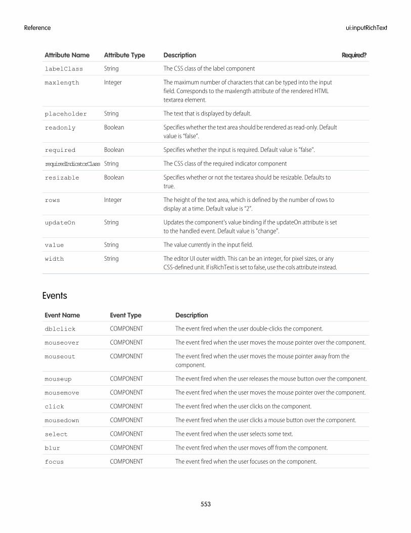
Required?DescriptionAttribute TypeAttribute Name
The CSS class of the label componentStringlabelClass
The maximum number of characters that can be typed into the inputfield. Corresponds to the maxlength attribute of the rendered HTMLtextarea element.
Integermaxlength
The text that is displayed by default.Stringplaceholder
Specifies whether the text area should be rendered as read-only. Defaultvalue is “false”.
Booleanreadonly
Specifies whether the input is required. Default value is "false".Booleanrequired
The CSS class of the required indicator componentStringrequiredIndicatorClass
Specifies whether or not the textarea should be resizable. Defaults totrue.
Booleanresizable
The height of the text area, which is defined by the number of rows todisplay at a time. Default value is “2”.
Integerrows
Updates the component's value binding if the updateOn attribute is setto the handled event. Default value is "change".
StringupdateOn
The value currently in the input field.Stringvalue
The editor UI outer width. This can be an integer, for pixel sizes, or anyCSS-defined unit. If isRichText is set to false, use the cols attribute instead.
Stringwidth
Events
DescriptionEvent TypeEvent Name
The event fired when the user double-clicks the component.COMPONENTdblclick
The event fired when the user moves the mouse pointer over the component.COMPONENTmouseover
The event fired when the user moves the mouse pointer away from thecomponent.
COMPONENTmouseout
The event fired when the user releases the mouse button over the component.COMPONENTmouseup
The event fired when the user moves the mouse pointer over the component.COMPONENTmousemove
The event fired when the user clicks on the component.COMPONENTclick
The event fired when the user clicks a mouse button over the component.COMPONENTmousedown
The event fired when the user selects some text.COMPONENTselect
The event fired when the user moves off from the component.COMPONENTblur
The event fired when the user focuses on the component.COMPONENTfocus
553
ui:inputRichTextReference
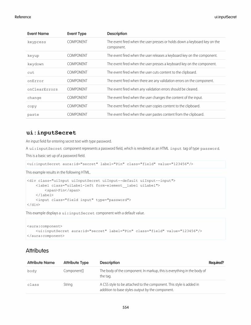
DescriptionEvent TypeEvent Name
The event fired when the user presses or holds down a keyboard key on thecomponent.
COMPONENTkeypress
The event fired when the user releases a keyboard key on the component.COMPONENTkeyup
The event fired when the user presses a keyboard key on the component.COMPONENTkeydown
The event fired when the user cuts content to the clipboard.COMPONENTcut
The event fired when there are any validation errors on the component.COMPONENTonError
The event fired when any validation errors should be cleared.COMPONENTonClearErrors
The event fired when the user changes the content of the input.COMPONENTchange
The event fired when the user copies content to the clipboard.COMPONENTcopy
The event fired when the user pastes content from the clipboard.COMPONENTpaste
ui:inputSecretAn input field for entering secret text with type password.
A ui:inputSecret component represents a password field, which is rendered as an HTML input tag of type password.
This is a basic set up of a password field.
<ui:inputSecret aura:id="secret" label="Pin" class="field" value="123456"/>
This example results in the following HTML.
<div class="uiInput uiInputSecret uiInput--default uiInput--input"><label class="uiLabel-left form-element__label uiLabel">
<span>Pin</span></label><input class="field input" type="password">
</div>
This example displays a ui:inputSecret component with a default value.
<aura:component><ui:inputSecret aura:id="secret" label="Pin" class="field" value="123456"/>
</aura:component>
Attributes
Required?DescriptionAttribute TypeAttribute Name
The body of the component. In markup, this is everything in the body ofthe tag.
Component[]body
A CSS style to be attached to the component. This style is added inaddition to base styles output by the component.
Stringclass
554
ui:inputSecretReference
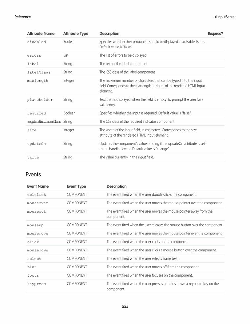
Required?DescriptionAttribute TypeAttribute Name
Specifies whether the component should be displayed in a disabled state.Default value is "false".
Booleandisabled
The list of errors to be displayed.Listerrors
The text of the label componentStringlabel
The CSS class of the label componentStringlabelClass
The maximum number of characters that can be typed into the inputfield. Corresponds to the maxlength attribute of the rendered HTML inputelement.
Integermaxlength
Text that is displayed when the field is empty, to prompt the user for avalid entry.
Stringplaceholder
Specifies whether the input is required. Default value is "false".Booleanrequired
The CSS class of the required indicator componentStringrequiredIndicatorClass
The width of the input field, in characters. Corresponds to the sizeattribute of the rendered HTML input element.
Integersize
Updates the component's value binding if the updateOn attribute is setto the handled event. Default value is "change".
StringupdateOn
The value currently in the input field.Stringvalue
Events
DescriptionEvent TypeEvent Name
The event fired when the user double-clicks the component.COMPONENTdblclick
The event fired when the user moves the mouse pointer over the component.COMPONENTmouseover
The event fired when the user moves the mouse pointer away from thecomponent.
COMPONENTmouseout
The event fired when the user releases the mouse button over the component.COMPONENTmouseup
The event fired when the user moves the mouse pointer over the component.COMPONENTmousemove
The event fired when the user clicks on the component.COMPONENTclick
The event fired when the user clicks a mouse button over the component.COMPONENTmousedown
The event fired when the user selects some text.COMPONENTselect
The event fired when the user moves off from the component.COMPONENTblur
The event fired when the user focuses on the component.COMPONENTfocus
The event fired when the user presses or holds down a keyboard key on thecomponent.
COMPONENTkeypress
555
ui:inputSecretReference
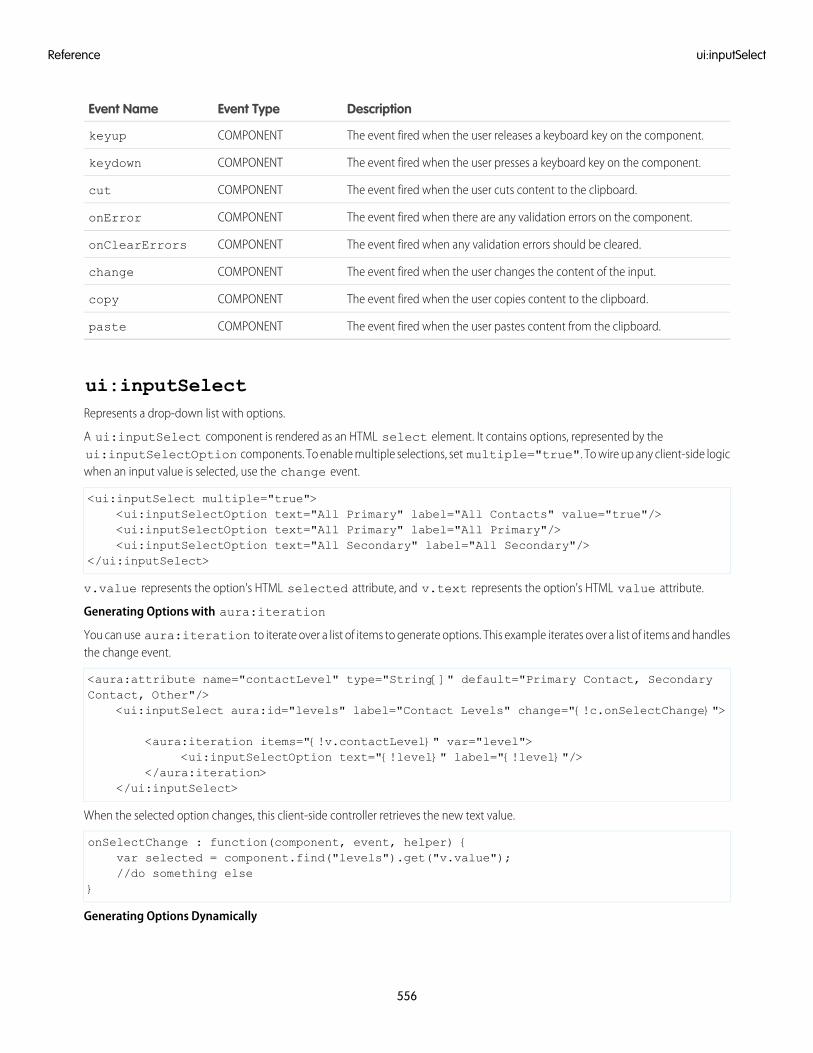
DescriptionEvent TypeEvent Name
The event fired when the user releases a keyboard key on the component.COMPONENTkeyup
The event fired when the user presses a keyboard key on the component.COMPONENTkeydown
The event fired when the user cuts content to the clipboard.COMPONENTcut
The event fired when there are any validation errors on the component.COMPONENTonError
The event fired when any validation errors should be cleared.COMPONENTonClearErrors
The event fired when the user changes the content of the input.COMPONENTchange
The event fired when the user copies content to the clipboard.COMPONENTcopy
The event fired when the user pastes content from the clipboard.COMPONENTpaste
ui:inputSelectRepresents a drop-down list with options.
A ui:inputSelect component is rendered as an HTML select element. It contains options, represented by theui:inputSelectOption components. To enable multiple selections, set multiple="true". To wire up any client-side logicwhen an input value is selected, use the change event.
<ui:inputSelect multiple="true"><ui:inputSelectOption text="All Primary" label="All Contacts" value="true"/><ui:inputSelectOption text="All Primary" label="All Primary"/><ui:inputSelectOption text="All Secondary" label="All Secondary"/>
</ui:inputSelect>
v.value represents the option's HTML selected attribute, and v.text represents the option's HTML value attribute.
Generating Options with aura:iteration
You can use aura:iteration to iterate over a list of items to generate options. This example iterates over a list of items and handlesthe change event.
<aura:attribute name="contactLevel" type="String[]" default="Primary Contact, SecondaryContact, Other"/>
<ui:inputSelect aura:id="levels" label="Contact Levels" change="{!c.onSelectChange}">
<aura:iteration items="{!v.contactLevel}" var="level"><ui:inputSelectOption text="{!level}" label="{!level}"/>
</aura:iteration></ui:inputSelect>
When the selected option changes, this client-side controller retrieves the new text value.
onSelectChange : function(component, event, helper) {var selected = component.find("levels").get("v.value");//do something else
}
Generating Options Dynamically
556
ui:inputSelectReference
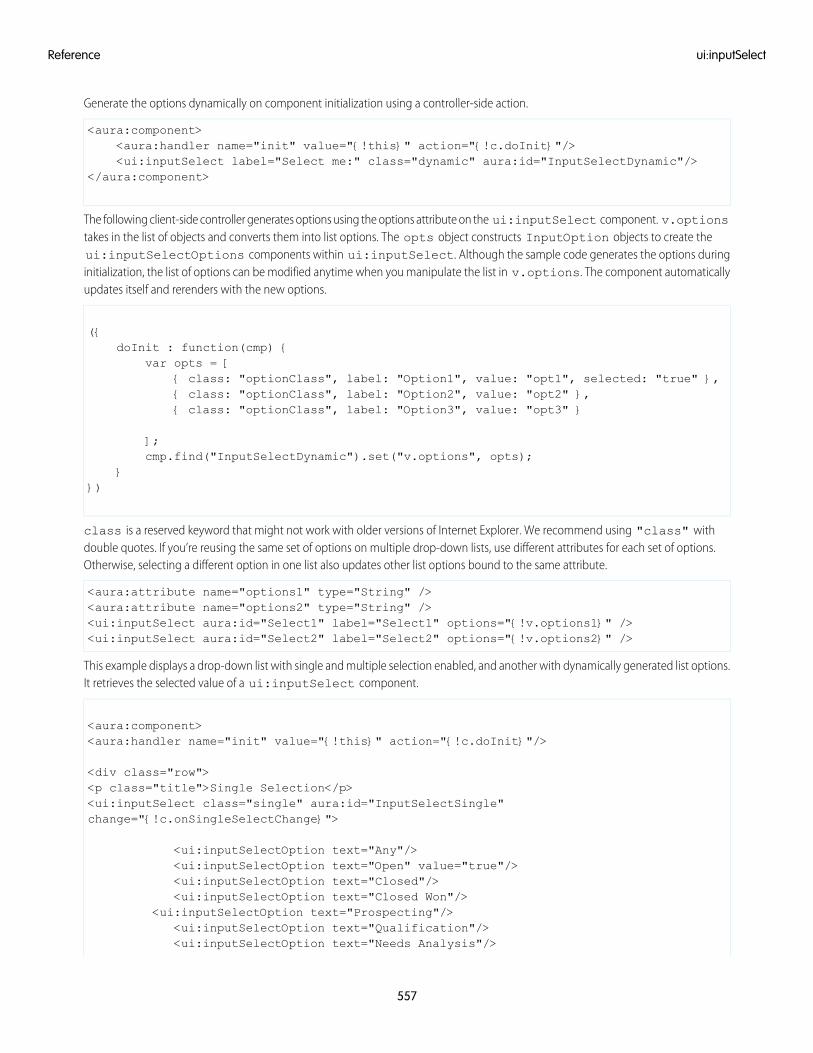
Generate the options dynamically on component initialization using a controller-side action.
<aura:component><aura:handler name="init" value="{!this}" action="{!c.doInit}"/><ui:inputSelect label="Select me:" class="dynamic" aura:id="InputSelectDynamic"/>
</aura:component>
The following client-side controller generates options using the options attribute on the ui:inputSelect component. v.optionstakes in the list of objects and converts them into list options. The opts object constructs InputOption objects to create theui:inputSelectOptions components within ui:inputSelect. Although the sample code generates the options duringinitialization, the list of options can be modified anytime when you manipulate the list in v.options. The component automaticallyupdates itself and rerenders with the new options.
({doInit : function(cmp) {
var opts = [{ class: "optionClass", label: "Option1", value: "opt1", selected: "true" },{ class: "optionClass", label: "Option2", value: "opt2" },{ class: "optionClass", label: "Option3", value: "opt3" }
];cmp.find("InputSelectDynamic").set("v.options", opts);
}})
class is a reserved keyword that might not work with older versions of Internet Explorer. We recommend using "class" withdouble quotes. If you’re reusing the same set of options on multiple drop-down lists, use different attributes for each set of options.Otherwise, selecting a different option in one list also updates other list options bound to the same attribute.
<aura:attribute name="options1" type="String" /><aura:attribute name="options2" type="String" /><ui:inputSelect aura:id="Select1" label="Select1" options="{!v.options1}" /><ui:inputSelect aura:id="Select2" label="Select2" options="{!v.options2}" />
This example displays a drop-down list with single and multiple selection enabled, and another with dynamically generated list options.It retrieves the selected value of a ui:inputSelect component.
<aura:component><aura:handler name="init" value="{!this}" action="{!c.doInit}"/>
<div class="row"><p class="title">Single Selection</p><ui:inputSelect class="single" aura:id="InputSelectSingle"change="{!c.onSingleSelectChange}">
<ui:inputSelectOption text="Any"/><ui:inputSelectOption text="Open" value="true"/><ui:inputSelectOption text="Closed"/><ui:inputSelectOption text="Closed Won"/>
<ui:inputSelectOption text="Prospecting"/><ui:inputSelectOption text="Qualification"/><ui:inputSelectOption text="Needs Analysis"/>
557
ui:inputSelectReference
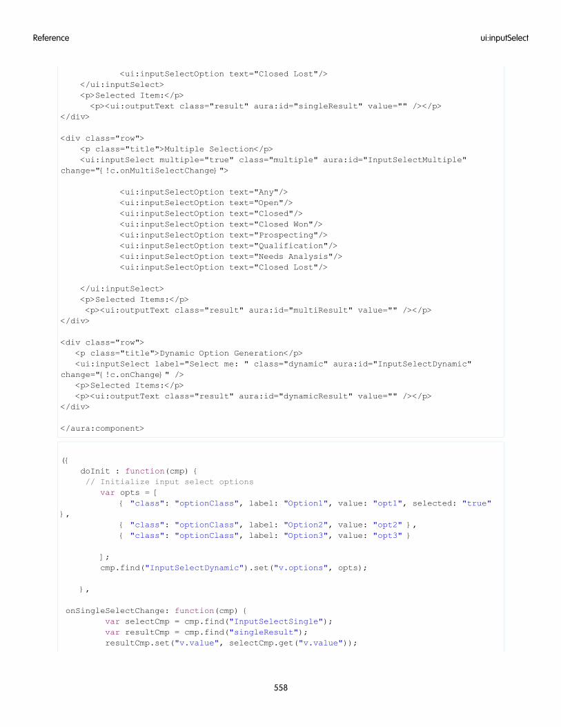
<ui:inputSelectOption text="Closed Lost"/></ui:inputSelect><p>Selected Item:</p><p><ui:outputText class="result" aura:id="singleResult" value="" /></p>
</div>
<div class="row"><p class="title">Multiple Selection</p><ui:inputSelect multiple="true" class="multiple" aura:id="InputSelectMultiple"
change="{!c.onMultiSelectChange}">
<ui:inputSelectOption text="Any"/><ui:inputSelectOption text="Open"/><ui:inputSelectOption text="Closed"/><ui:inputSelectOption text="Closed Won"/><ui:inputSelectOption text="Prospecting"/><ui:inputSelectOption text="Qualification"/><ui:inputSelectOption text="Needs Analysis"/><ui:inputSelectOption text="Closed Lost"/>
</ui:inputSelect><p>Selected Items:</p><p><ui:outputText class="result" aura:id="multiResult" value="" /></p>
</div>
<div class="row"><p class="title">Dynamic Option Generation</p><ui:inputSelect label="Select me: " class="dynamic" aura:id="InputSelectDynamic"
change="{!c.onChange}" /><p>Selected Items:</p><p><ui:outputText class="result" aura:id="dynamicResult" value="" /></p>
</div>
</aura:component>
({doInit : function(cmp) {// Initialize input select options
var opts = [{ "class": "optionClass", label: "Option1", value: "opt1", selected: "true"
},{ "class": "optionClass", label: "Option2", value: "opt2" },{ "class": "optionClass", label: "Option3", value: "opt3" }
];cmp.find("InputSelectDynamic").set("v.options", opts);
},
onSingleSelectChange: function(cmp) {var selectCmp = cmp.find("InputSelectSingle");var resultCmp = cmp.find("singleResult");resultCmp.set("v.value", selectCmp.get("v.value"));
558
ui:inputSelectReference
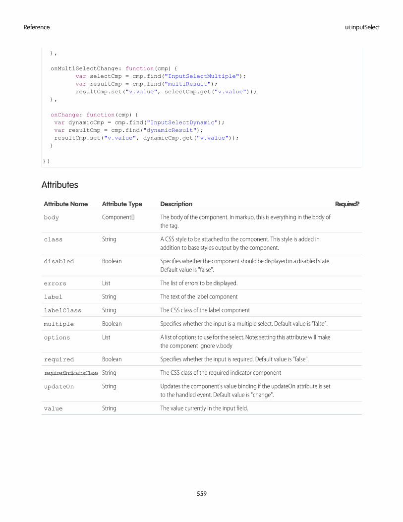
},
onMultiSelectChange: function(cmp) {var selectCmp = cmp.find("InputSelectMultiple");var resultCmp = cmp.find("multiResult");resultCmp.set("v.value", selectCmp.get("v.value"));
},
onChange: function(cmp) {var dynamicCmp = cmp.find("InputSelectDynamic");var resultCmp = cmp.find("dynamicResult");resultCmp.set("v.value", dynamicCmp.get("v.value"));}
})
Attributes
Required?DescriptionAttribute TypeAttribute Name
The body of the component. In markup, this is everything in the body ofthe tag.
Component[]body
A CSS style to be attached to the component. This style is added inaddition to base styles output by the component.
Stringclass
Specifies whether the component should be displayed in a disabled state.Default value is "false".
Booleandisabled
The list of errors to be displayed.Listerrors
The text of the label componentStringlabel
The CSS class of the label componentStringlabelClass
Specifies whether the input is a multiple select. Default value is “false”.Booleanmultiple
A list of options to use for the select. Note: setting this attribute will makethe component ignore v.body
Listoptions
Specifies whether the input is required. Default value is "false".Booleanrequired
The CSS class of the required indicator componentStringrequiredIndicatorClass
Updates the component's value binding if the updateOn attribute is setto the handled event. Default value is "change".
StringupdateOn
The value currently in the input field.Stringvalue
559
ui:inputSelectReference
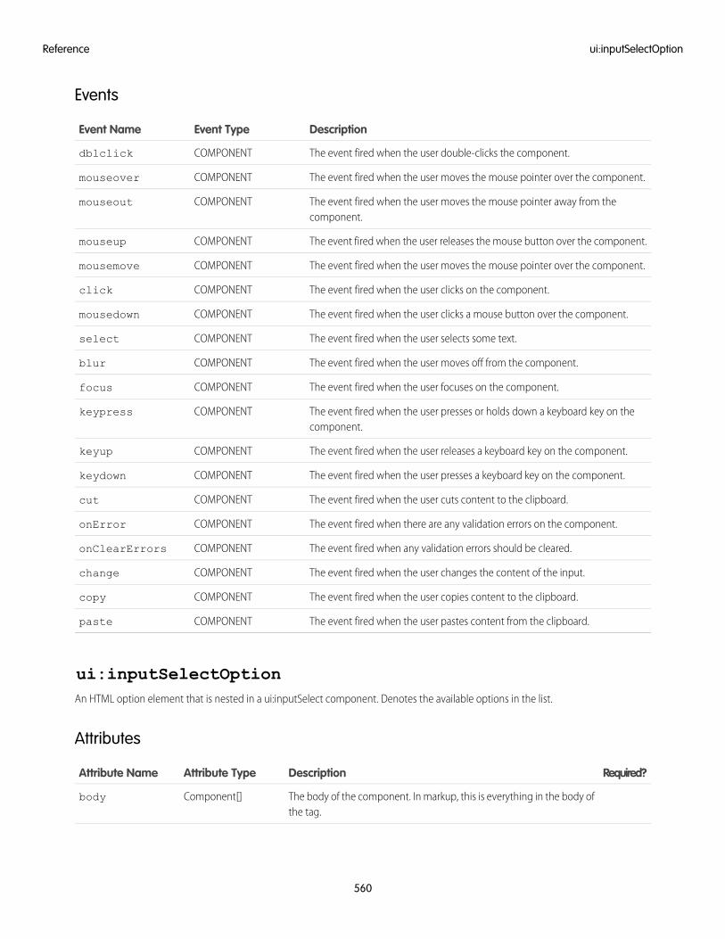
Events
DescriptionEvent TypeEvent Name
The event fired when the user double-clicks the component.COMPONENTdblclick
The event fired when the user moves the mouse pointer over the component.COMPONENTmouseover
The event fired when the user moves the mouse pointer away from thecomponent.
COMPONENTmouseout
The event fired when the user releases the mouse button over the component.COMPONENTmouseup
The event fired when the user moves the mouse pointer over the component.COMPONENTmousemove
The event fired when the user clicks on the component.COMPONENTclick
The event fired when the user clicks a mouse button over the component.COMPONENTmousedown
The event fired when the user selects some text.COMPONENTselect
The event fired when the user moves off from the component.COMPONENTblur
The event fired when the user focuses on the component.COMPONENTfocus
The event fired when the user presses or holds down a keyboard key on thecomponent.
COMPONENTkeypress
The event fired when the user releases a keyboard key on the component.COMPONENTkeyup
The event fired when the user presses a keyboard key on the component.COMPONENTkeydown
The event fired when the user cuts content to the clipboard.COMPONENTcut
The event fired when there are any validation errors on the component.COMPONENTonError
The event fired when any validation errors should be cleared.COMPONENTonClearErrors
The event fired when the user changes the content of the input.COMPONENTchange
The event fired when the user copies content to the clipboard.COMPONENTcopy
The event fired when the user pastes content from the clipboard.COMPONENTpaste
ui:inputSelectOptionAn HTML option element that is nested in a ui:inputSelect component. Denotes the available options in the list.
Attributes
Required?DescriptionAttribute TypeAttribute Name
The body of the component. In markup, this is everything in the body ofthe tag.
Component[]body
560
ui:inputSelectOptionReference
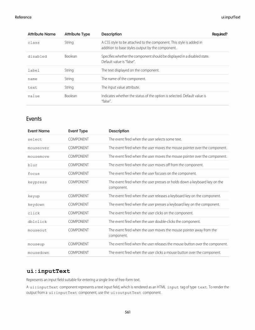
Required?DescriptionAttribute TypeAttribute Name
A CSS style to be attached to the component. This style is added inaddition to base styles output by the component.
Stringclass
Specifies whether the component should be displayed in a disabled state.Default value is "false".
Booleandisabled
The text displayed on the component.Stringlabel
The name of the component.Stringname
The input value attribute.Stringtext
Indicates whether the status of the option is selected. Default value is“false”.
Booleanvalue
Events
DescriptionEvent TypeEvent Name
The event fired when the user selects some text.COMPONENTselect
The event fired when the user moves the mouse pointer over the component.COMPONENTmouseover
The event fired when the user moves the mouse pointer over the component.COMPONENTmousemove
The event fired when the user moves off from the component.COMPONENTblur
The event fired when the user focuses on the component.COMPONENTfocus
The event fired when the user presses or holds down a keyboard key on thecomponent.
COMPONENTkeypress
The event fired when the user releases a keyboard key on the component.COMPONENTkeyup
The event fired when the user presses a keyboard key on the component.COMPONENTkeydown
The event fired when the user clicks on the component.COMPONENTclick
The event fired when the user double-clicks the component.COMPONENTdblclick
The event fired when the user moves the mouse pointer away from thecomponent.
COMPONENTmouseout
The event fired when the user releases the mouse button over the component.COMPONENTmouseup
The event fired when the user clicks a mouse button over the component.COMPONENTmousedown
ui:inputTextRepresents an input field suitable for entering a single line of free-form text.
A ui:inputText component represents a text input field, which is rendered as an HTML input tag of type text. To render theoutput from a ui:inputText component, use the ui:outputText component.
561
ui:inputTextReference
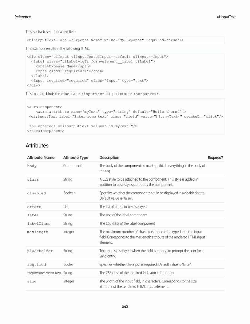
This is a basic set up of a text field.
<ui:inputText label="Expense Name" value="My Expense" required="true"/>
This example results in the following HTML.
<div class="uiInput uiInputTextuiInput--default uiInput--input"><label class="uiLabel-left form-element__label uiLabel"><span>Expense Name</span><span class="required">*</span>
</label><input required="required" class="input" type="text">
</div>
This example binds the value of a ui:inputText component to ui:outputText.
<aura:component><aura:attribute name="myText" type="string" default="Hello there!"/>
<ui:inputText label="Enter some text" class="field" value="{!v.myText}" updateOn="click"/>
You entered: <ui:outputText value="{!v.myText}"/></aura:component>
Attributes
Required?DescriptionAttribute TypeAttribute Name
The body of the component. In markup, this is everything in the body ofthe tag.
Component[]body
A CSS style to be attached to the component. This style is added inaddition to base styles output by the component.
Stringclass
Specifies whether the component should be displayed in a disabled state.Default value is "false".
Booleandisabled
The list of errors to be displayed.Listerrors
The text of the label componentStringlabel
The CSS class of the label componentStringlabelClass
The maximum number of characters that can be typed into the inputfield. Corresponds to the maxlength attribute of the rendered HTML inputelement.
Integermaxlength
Text that is displayed when the field is empty, to prompt the user for avalid entry.
Stringplaceholder
Specifies whether the input is required. Default value is "false".Booleanrequired
The CSS class of the required indicator componentStringrequiredIndicatorClass
The width of the input field, in characters. Corresponds to the sizeattribute of the rendered HTML input element.
Integersize
562
ui:inputTextReference
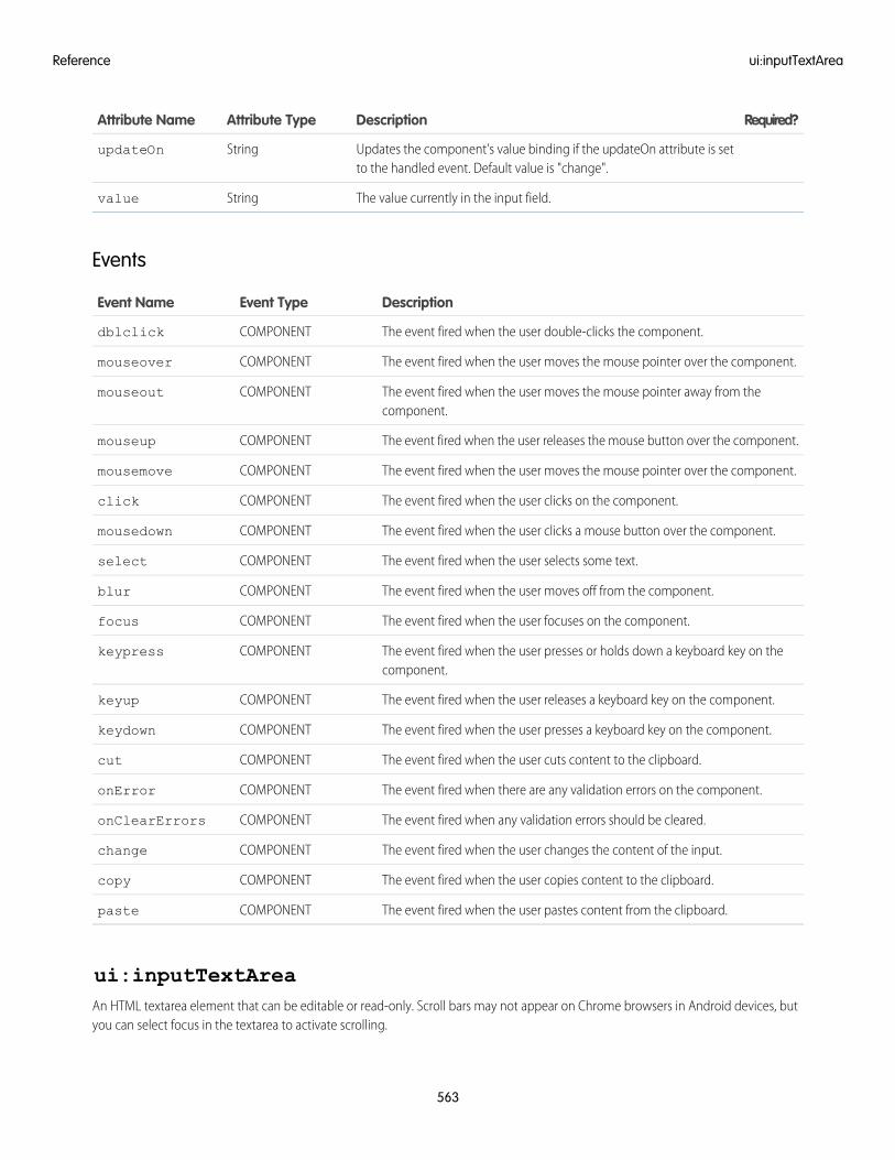
Required?DescriptionAttribute TypeAttribute Name
Updates the component's value binding if the updateOn attribute is setto the handled event. Default value is "change".
StringupdateOn
The value currently in the input field.Stringvalue
Events
DescriptionEvent TypeEvent Name
The event fired when the user double-clicks the component.COMPONENTdblclick
The event fired when the user moves the mouse pointer over the component.COMPONENTmouseover
The event fired when the user moves the mouse pointer away from thecomponent.
COMPONENTmouseout
The event fired when the user releases the mouse button over the component.COMPONENTmouseup
The event fired when the user moves the mouse pointer over the component.COMPONENTmousemove
The event fired when the user clicks on the component.COMPONENTclick
The event fired when the user clicks a mouse button over the component.COMPONENTmousedown
The event fired when the user selects some text.COMPONENTselect
The event fired when the user moves off from the component.COMPONENTblur
The event fired when the user focuses on the component.COMPONENTfocus
The event fired when the user presses or holds down a keyboard key on thecomponent.
COMPONENTkeypress
The event fired when the user releases a keyboard key on the component.COMPONENTkeyup
The event fired when the user presses a keyboard key on the component.COMPONENTkeydown
The event fired when the user cuts content to the clipboard.COMPONENTcut
The event fired when there are any validation errors on the component.COMPONENTonError
The event fired when any validation errors should be cleared.COMPONENTonClearErrors
The event fired when the user changes the content of the input.COMPONENTchange
The event fired when the user copies content to the clipboard.COMPONENTcopy
The event fired when the user pastes content from the clipboard.COMPONENTpaste
ui:inputTextAreaAn HTML textarea element that can be editable or read-only. Scroll bars may not appear on Chrome browsers in Android devices, butyou can select focus in the textarea to activate scrolling.
563
ui:inputTextAreaReference
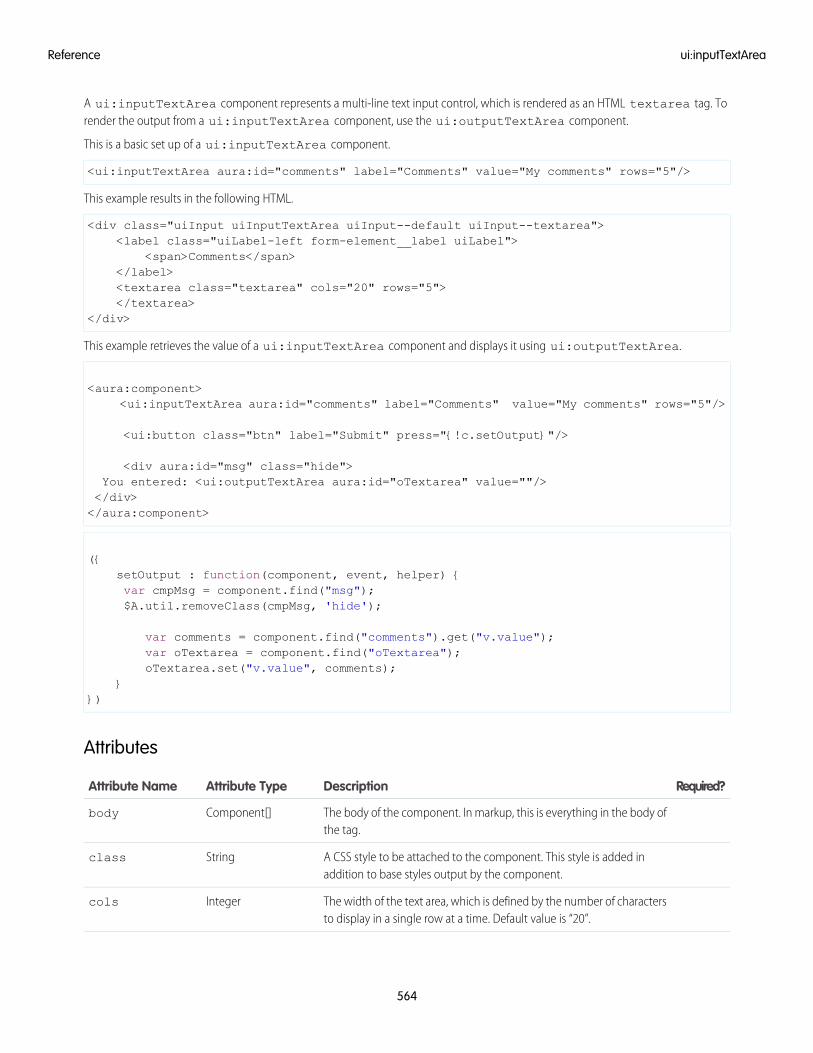
A ui:inputTextArea component represents a multi-line text input control, which is rendered as an HTML textarea tag. Torender the output from a ui:inputTextArea component, use the ui:outputTextArea component.
This is a basic set up of a ui:inputTextArea component.
<ui:inputTextArea aura:id="comments" label="Comments" value="My comments" rows="5"/>
This example results in the following HTML.
<div class="uiInput uiInputTextArea uiInput--default uiInput--textarea"><label class="uiLabel-left form-element__label uiLabel">
<span>Comments</span></label><textarea class="textarea" cols="20" rows="5"></textarea>
</div>
This example retrieves the value of a ui:inputTextArea component and displays it using ui:outputTextArea.
<aura:component><ui:inputTextArea aura:id="comments" label="Comments" value="My comments" rows="5"/>
<ui:button class="btn" label="Submit" press="{!c.setOutput}"/>
<div aura:id="msg" class="hide">You entered: <ui:outputTextArea aura:id="oTextarea" value=""/></div></aura:component>
({setOutput : function(component, event, helper) {var cmpMsg = component.find("msg");$A.util.removeClass(cmpMsg, 'hide');
var comments = component.find("comments").get("v.value");var oTextarea = component.find("oTextarea");oTextarea.set("v.value", comments);
}})
Attributes
Required?DescriptionAttribute TypeAttribute Name
The body of the component. In markup, this is everything in the body ofthe tag.
Component[]body
A CSS style to be attached to the component. This style is added inaddition to base styles output by the component.
Stringclass
The width of the text area, which is defined by the number of charactersto display in a single row at a time. Default value is “20”.
Integercols
564
ui:inputTextAreaReference
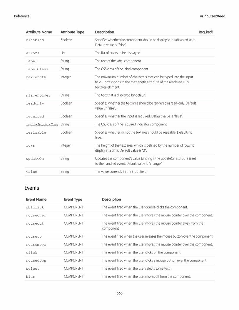
Required?DescriptionAttribute TypeAttribute Name
Specifies whether the component should be displayed in a disabled state.Default value is "false".
Booleandisabled
The list of errors to be displayed.Listerrors
The text of the label componentStringlabel
The CSS class of the label componentStringlabelClass
The maximum number of characters that can be typed into the inputfield. Corresponds to the maxlength attribute of the rendered HTMLtextarea element.
Integermaxlength
The text that is displayed by default.Stringplaceholder
Specifies whether the text area should be rendered as read-only. Defaultvalue is “false”.
Booleanreadonly
Specifies whether the input is required. Default value is "false".Booleanrequired
The CSS class of the required indicator componentStringrequiredIndicatorClass
Specifies whether or not the textarea should be resizable. Defaults totrue.
Booleanresizable
The height of the text area, which is defined by the number of rows todisplay at a time. Default value is “2”.
Integerrows
Updates the component's value binding if the updateOn attribute is setto the handled event. Default value is "change".
StringupdateOn
The value currently in the input field.Stringvalue
Events
DescriptionEvent TypeEvent Name
The event fired when the user double-clicks the component.COMPONENTdblclick
The event fired when the user moves the mouse pointer over the component.COMPONENTmouseover
The event fired when the user moves the mouse pointer away from thecomponent.
COMPONENTmouseout
The event fired when the user releases the mouse button over the component.COMPONENTmouseup
The event fired when the user moves the mouse pointer over the component.COMPONENTmousemove
The event fired when the user clicks on the component.COMPONENTclick
The event fired when the user clicks a mouse button over the component.COMPONENTmousedown
The event fired when the user selects some text.COMPONENTselect
The event fired when the user moves off from the component.COMPONENTblur
565
ui:inputTextAreaReference
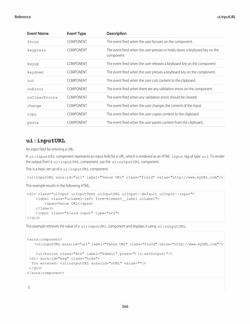
DescriptionEvent TypeEvent Name
The event fired when the user focuses on the component.COMPONENTfocus
The event fired when the user presses or holds down a keyboard key on thecomponent.
COMPONENTkeypress
The event fired when the user releases a keyboard key on the component.COMPONENTkeyup
The event fired when the user presses a keyboard key on the component.COMPONENTkeydown
The event fired when the user cuts content to the clipboard.COMPONENTcut
The event fired when there are any validation errors on the component.COMPONENTonError
The event fired when any validation errors should be cleared.COMPONENTonClearErrors
The event fired when the user changes the content of the input.COMPONENTchange
The event fired when the user copies content to the clipboard.COMPONENTcopy
The event fired when the user pastes content from the clipboard.COMPONENTpaste
ui:inputURLAn input field for entering a URL.
A ui:inputURL component represents an input field for a URL, which is rendered as an HTML input tag of type url. To renderthe output from a ui:inputURL component, use the ui:outputURL component.
This is a basic set up of a ui:inputURL component.
<ui:inputURL aura:id="url" label="Venue URL" class="field" value="http://www.myURL.com"/>
This example results in the following HTML.
<div class="uiInput uiInputText uiInputURL uiInput--default uiInput--input"><label class="uiLabel-left form-element__label uiLabel">
<span>Venue URL</span></label><input class="field input" type="url">
</div>
This example retrieves the value of a ui:inputURL component and displays it using ui:outputURL.
<aura:component><ui:inputURL aura:id="url" label="Venue URL" class="field" value="http://www.myURL.com"/>
<ui:button class="btn" label="Submit" press="{!c.setOutput}"/><div aura:id="msg" class="hide">You entered: <ui:outputURL aura:id="oURL" value=""/></div></aura:component>
({
566
ui:inputURLReference
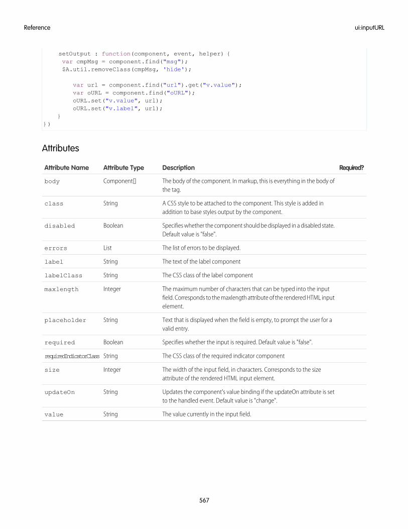
setOutput : function(component, event, helper) {var cmpMsg = component.find("msg");$A.util.removeClass(cmpMsg, 'hide');
var url = component.find("url").get("v.value");var oURL = component.find("oURL");oURL.set("v.value", url);oURL.set("v.label", url);
}})
Attributes
Required?DescriptionAttribute TypeAttribute Name
The body of the component. In markup, this is everything in the body ofthe tag.
Component[]body
A CSS style to be attached to the component. This style is added inaddition to base styles output by the component.
Stringclass
Specifies whether the component should be displayed in a disabled state.Default value is "false".
Booleandisabled
The list of errors to be displayed.Listerrors
The text of the label componentStringlabel
The CSS class of the label componentStringlabelClass
The maximum number of characters that can be typed into the inputfield. Corresponds to the maxlength attribute of the rendered HTML inputelement.
Integermaxlength
Text that is displayed when the field is empty, to prompt the user for avalid entry.
Stringplaceholder
Specifies whether the input is required. Default value is "false".Booleanrequired
The CSS class of the required indicator componentStringrequiredIndicatorClass
The width of the input field, in characters. Corresponds to the sizeattribute of the rendered HTML input element.
Integersize
Updates the component's value binding if the updateOn attribute is setto the handled event. Default value is "change".
StringupdateOn
The value currently in the input field.Stringvalue
567
ui:inputURLReference
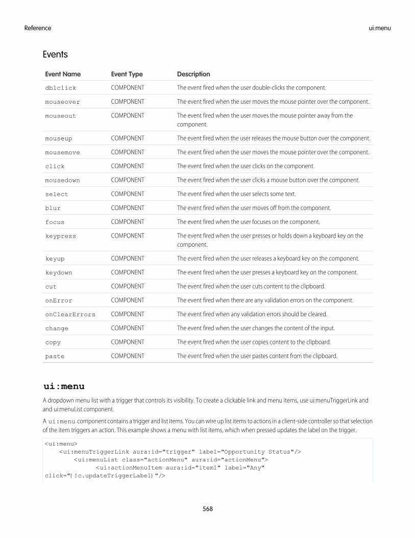
Events
DescriptionEvent TypeEvent Name
The event fired when the user double-clicks the component.COMPONENTdblclick
The event fired when the user moves the mouse pointer over the component.COMPONENTmouseover
The event fired when the user moves the mouse pointer away from thecomponent.
COMPONENTmouseout
The event fired when the user releases the mouse button over the component.COMPONENTmouseup
The event fired when the user moves the mouse pointer over the component.COMPONENTmousemove
The event fired when the user clicks on the component.COMPONENTclick
The event fired when the user clicks a mouse button over the component.COMPONENTmousedown
The event fired when the user selects some text.COMPONENTselect
The event fired when the user moves off from the component.COMPONENTblur
The event fired when the user focuses on the component.COMPONENTfocus
The event fired when the user presses or holds down a keyboard key on thecomponent.
COMPONENTkeypress
The event fired when the user releases a keyboard key on the component.COMPONENTkeyup
The event fired when the user presses a keyboard key on the component.COMPONENTkeydown
The event fired when the user cuts content to the clipboard.COMPONENTcut
The event fired when there are any validation errors on the component.COMPONENTonError
The event fired when any validation errors should be cleared.COMPONENTonClearErrors
The event fired when the user changes the content of the input.COMPONENTchange
The event fired when the user copies content to the clipboard.COMPONENTcopy
The event fired when the user pastes content from the clipboard.COMPONENTpaste
ui:menuA dropdown menu list with a trigger that controls its visibility. To create a clickable link and menu items, use ui:menuTriggerLink andand ui:menuList component.
A ui:menu component contains a trigger and list items. You can wire up list items to actions in a client-side controller so that selectionof the item triggers an action. This example shows a menu with list items, which when pressed updates the label on the trigger.
<ui:menu><ui:menuTriggerLink aura:id="trigger" label="Opportunity Status"/>
<ui:menuList class="actionMenu" aura:id="actionMenu"><ui:actionMenuItem aura:id="item1" label="Any"
click="{!c.updateTriggerLabel}"/>
568
ui:menuReference
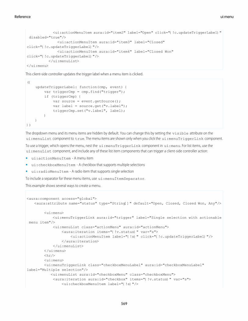
<ui:actionMenuItem aura:id="item2" label="Open" click="{!c.updateTriggerLabel}"disabled="true"/>
<ui:actionMenuItem aura:id="item3" label="Closed"click="{!c.updateTriggerLabel}"/>
<ui:actionMenuItem aura:id="item4" label="Closed Won"click="{!c.updateTriggerLabel}"/>
</ui:menuList></ui:menu>
This client-side controller updates the trigger label when a menu item is clicked.
({updateTriggerLabel: function(cmp, event) {
var triggerCmp = cmp.find("trigger");if (triggerCmp) {
var source = event.getSource();var label = source.get("v.label");triggerCmp.set("v.label", label);
}}
})
The dropdown menu and its menu items are hidden by default. You can change this by setting the visible attribute on theui:menuList component to true. The menu items are shown only when you click the ui:menuTriggerLink component.
To use a trigger, which opens the menu, nest the ui:menuTriggerLink component in ui:menu. For list items, use theui:menuList component, and include any of these list item components that can trigger a client-side controller action:
• ui:actionMenuItem - A menu item
• ui:checkboxMenuItem - A checkbox that supports multiple selections
• ui:radioMenuItem - A radio item that supports single selection
To include a separator for these menu items, use ui:menuItemSeparator.
This example shows several ways to create a menu.
<aura:component access="global"><aura:attribute name="status" type="String[]" default="Open, Closed, Closed Won, Any"/>
<ui:menu><ui:menuTriggerLink aura:id="trigger" label="Single selection with actionable
menu item"/><ui:menuList class="actionMenu" aura:id="actionMenu">
<aura:iteration items="{!v.status}" var="s"><ui:actionMenuItem label="{!s}" click="{!c.updateTriggerLabel}"/>
</aura:iteration></ui:menuList>
</ui:menu><hr/><ui:menu><ui:menuTriggerLink class="checkboxMenuLabel" aura:id="checkboxMenuLabel"
label="Multiple selection"/><ui:menuList aura:id="checkboxMenu" class="checkboxMenu"><aura:iteration aura:id="checkbox" items="{!v.status}" var="s">
<ui:checkboxMenuItem label="{!s}"/>
569
ui:menuReference
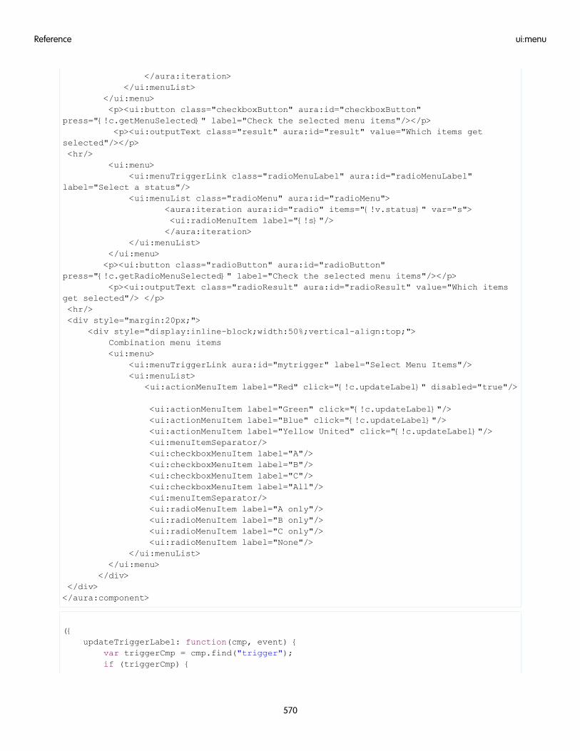
</aura:iteration></ui:menuList>
</ui:menu><p><ui:button class="checkboxButton" aura:id="checkboxButton"
press="{!c.getMenuSelected}" label="Check the selected menu items"/></p><p><ui:outputText class="result" aura:id="result" value="Which items get
selected"/></p><hr/>
<ui:menu><ui:menuTriggerLink class="radioMenuLabel" aura:id="radioMenuLabel"
label="Select a status"/><ui:menuList class="radioMenu" aura:id="radioMenu">
<aura:iteration aura:id="radio" items="{!v.status}" var="s"><ui:radioMenuItem label="{!s}"/></aura:iteration>
</ui:menuList></ui:menu><p><ui:button class="radioButton" aura:id="radioButton"
press="{!c.getRadioMenuSelected}" label="Check the selected menu items"/></p><p><ui:outputText class="radioResult" aura:id="radioResult" value="Which items
get selected"/> </p><hr/><div style="margin:20px;">
<div style="display:inline-block;width:50%;vertical-align:top;">Combination menu items<ui:menu>
<ui:menuTriggerLink aura:id="mytrigger" label="Select Menu Items"/><ui:menuList>
<ui:actionMenuItem label="Red" click="{!c.updateLabel}" disabled="true"/>
<ui:actionMenuItem label="Green" click="{!c.updateLabel}"/><ui:actionMenuItem label="Blue" click="{!c.updateLabel}"/><ui:actionMenuItem label="Yellow United" click="{!c.updateLabel}"/><ui:menuItemSeparator/><ui:checkboxMenuItem label="A"/><ui:checkboxMenuItem label="B"/><ui:checkboxMenuItem label="C"/><ui:checkboxMenuItem label="All"/><ui:menuItemSeparator/><ui:radioMenuItem label="A only"/><ui:radioMenuItem label="B only"/><ui:radioMenuItem label="C only"/><ui:radioMenuItem label="None"/>
</ui:menuList></ui:menu>
</div></div></aura:component>
({updateTriggerLabel: function(cmp, event) {
var triggerCmp = cmp.find("trigger");if (triggerCmp) {
570
ui:menuReference
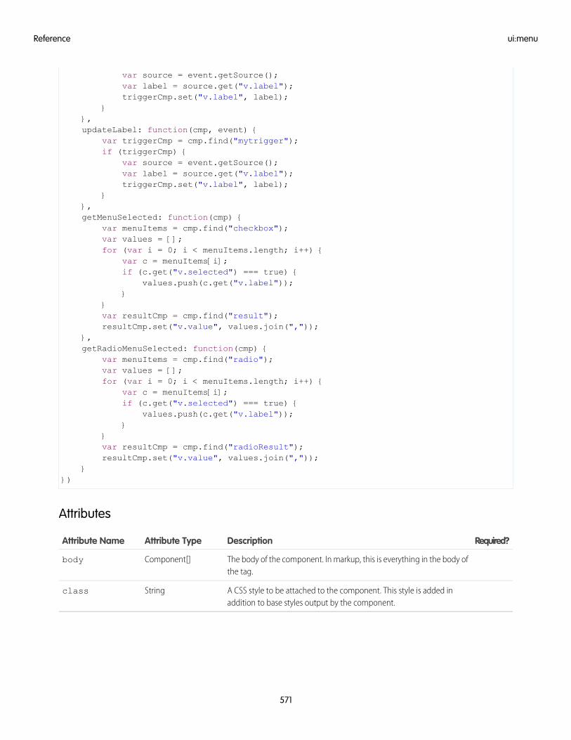
var source = event.getSource();var label = source.get("v.label");triggerCmp.set("v.label", label);
}},updateLabel: function(cmp, event) {
var triggerCmp = cmp.find("mytrigger");if (triggerCmp) {
var source = event.getSource();var label = source.get("v.label");triggerCmp.set("v.label", label);
}},getMenuSelected: function(cmp) {
var menuItems = cmp.find("checkbox");var values = [];for (var i = 0; i < menuItems.length; i++) {
var c = menuItems[i];if (c.get("v.selected") === true) {
values.push(c.get("v.label"));}
}var resultCmp = cmp.find("result");resultCmp.set("v.value", values.join(","));
},getRadioMenuSelected: function(cmp) {
var menuItems = cmp.find("radio");var values = [];for (var i = 0; i < menuItems.length; i++) {
var c = menuItems[i];if (c.get("v.selected") === true) {
values.push(c.get("v.label"));}
}var resultCmp = cmp.find("radioResult");resultCmp.set("v.value", values.join(","));
}})
Attributes
Required?DescriptionAttribute TypeAttribute Name
The body of the component. In markup, this is everything in the body ofthe tag.
Component[]body
A CSS style to be attached to the component. This style is added inaddition to base styles output by the component.
Stringclass
571
ui:menuReference
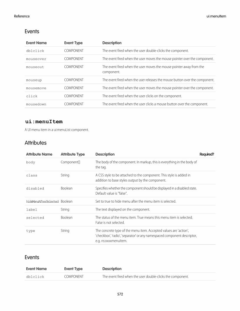
Events
DescriptionEvent TypeEvent Name
The event fired when the user double-clicks the component.COMPONENTdblclick
The event fired when the user moves the mouse pointer over the component.COMPONENTmouseover
The event fired when the user moves the mouse pointer away from thecomponent.
COMPONENTmouseout
The event fired when the user releases the mouse button over the component.COMPONENTmouseup
The event fired when the user moves the mouse pointer over the component.COMPONENTmousemove
The event fired when the user clicks on the component.COMPONENTclick
The event fired when the user clicks a mouse button over the component.COMPONENTmousedown
ui:menuItemA UI menu item in a ui:menuList component.
Attributes
Required?DescriptionAttribute TypeAttribute Name
The body of the component. In markup, this is everything in the body ofthe tag.
Component[]body
A CSS style to be attached to the component. This style is added inaddition to base styles output by the component.
Stringclass
Specifies whether the component should be displayed in a disabled state.Default value is "false".
Booleandisabled
Set to true to hide menu after the menu item is selected.BooleanhideMenuAfterSelected
The text displayed on the component.Stringlabel
The status of the menu item. True means this menu item is selected;False is not selected.
Booleanselected
The concrete type of the menu item. Accepted values are 'action','checkbox', 'radio', 'separator' or any namespaced component descriptor,e.g. ns:xxxxmenuItem.
Stringtype
Events
DescriptionEvent TypeEvent Name
The event fired when the user double-clicks the component.COMPONENTdblclick
572
ui:menuItemReference
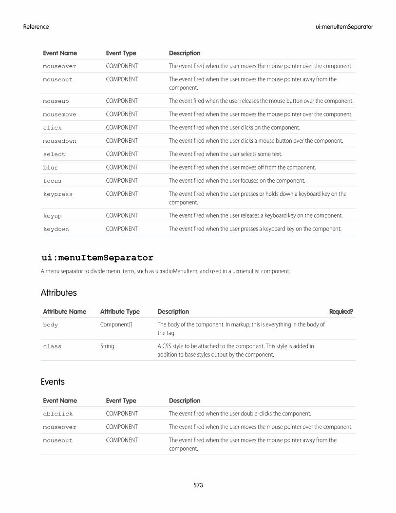
DescriptionEvent TypeEvent Name
The event fired when the user moves the mouse pointer over the component.COMPONENTmouseover
The event fired when the user moves the mouse pointer away from thecomponent.
COMPONENTmouseout
The event fired when the user releases the mouse button over the component.COMPONENTmouseup
The event fired when the user moves the mouse pointer over the component.COMPONENTmousemove
The event fired when the user clicks on the component.COMPONENTclick
The event fired when the user clicks a mouse button over the component.COMPONENTmousedown
The event fired when the user selects some text.COMPONENTselect
The event fired when the user moves off from the component.COMPONENTblur
The event fired when the user focuses on the component.COMPONENTfocus
The event fired when the user presses or holds down a keyboard key on thecomponent.
COMPONENTkeypress
The event fired when the user releases a keyboard key on the component.COMPONENTkeyup
The event fired when the user presses a keyboard key on the component.COMPONENTkeydown
ui:menuItemSeparatorA menu separator to divide menu items, such as ui:radioMenuItem, and used in a ui:menuList component.
Attributes
Required?DescriptionAttribute TypeAttribute Name
The body of the component. In markup, this is everything in the body ofthe tag.
Component[]body
A CSS style to be attached to the component. This style is added inaddition to base styles output by the component.
Stringclass
Events
DescriptionEvent TypeEvent Name
The event fired when the user double-clicks the component.COMPONENTdblclick
The event fired when the user moves the mouse pointer over the component.COMPONENTmouseover
The event fired when the user moves the mouse pointer away from thecomponent.
COMPONENTmouseout
573
ui:menuItemSeparatorReference
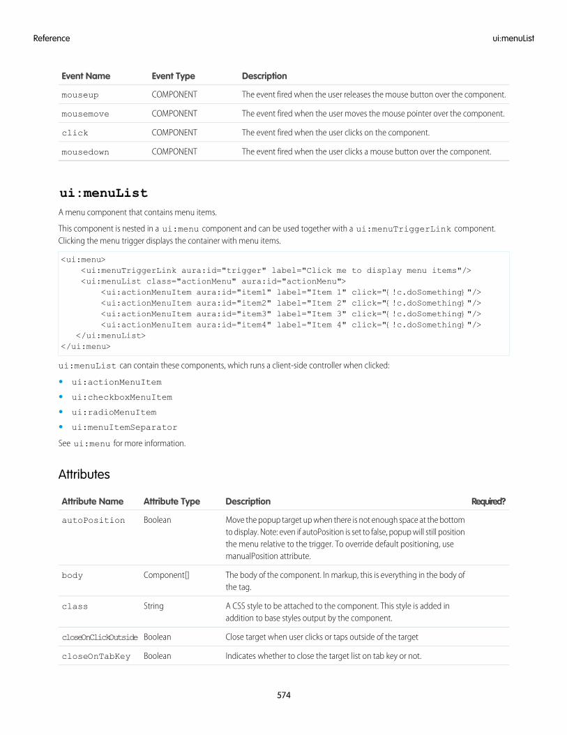
DescriptionEvent TypeEvent Name
The event fired when the user releases the mouse button over the component.COMPONENTmouseup
The event fired when the user moves the mouse pointer over the component.COMPONENTmousemove
The event fired when the user clicks on the component.COMPONENTclick
The event fired when the user clicks a mouse button over the component.COMPONENTmousedown
ui:menuListA menu component that contains menu items.
This component is nested in a ui:menu component and can be used together with a ui:menuTriggerLink component.Clicking the menu trigger displays the container with menu items.
<ui:menu><ui:menuTriggerLink aura:id="trigger" label="Click me to display menu items"/><ui:menuList class="actionMenu" aura:id="actionMenu">
<ui:actionMenuItem aura:id="item1" label="Item 1" click="{!c.doSomething}"/><ui:actionMenuItem aura:id="item2" label="Item 2" click="{!c.doSomething}"/><ui:actionMenuItem aura:id="item3" label="Item 3" click="{!c.doSomething}"/><ui:actionMenuItem aura:id="item4" label="Item 4" click="{!c.doSomething}"/>
</ui:menuList></ui:menu>
ui:menuList can contain these components, which runs a client-side controller when clicked:
• ui:actionMenuItem
• ui:checkboxMenuItem
• ui:radioMenuItem
• ui:menuItemSeparator
See ui:menu for more information.
Attributes
Required?DescriptionAttribute TypeAttribute Name
Move the popup target up when there is not enough space at the bottomto display. Note: even if autoPosition is set to false, popup will still position
BooleanautoPosition
the menu relative to the trigger. To override default positioning, usemanualPosition attribute.
The body of the component. In markup, this is everything in the body ofthe tag.
Component[]body
A CSS style to be attached to the component. This style is added inaddition to base styles output by the component.
Stringclass
Close target when user clicks or taps outside of the targetBooleancloseOnClickOutside
Indicates whether to close the target list on tab key or not.BooleancloseOnTabKey
574
ui:menuListReference
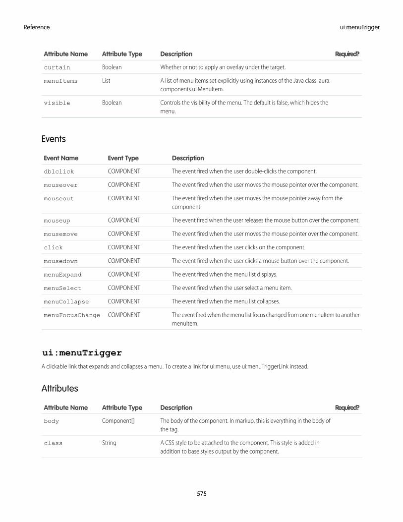
Required?DescriptionAttribute TypeAttribute Name
Whether or not to apply an overlay under the target.Booleancurtain
A list of menu items set explicitly using instances of the Java class: aura.components.ui.MenuItem.
ListmenuItems
Controls the visibility of the menu. The default is false, which hides themenu.
Booleanvisible
Events
DescriptionEvent TypeEvent Name
The event fired when the user double-clicks the component.COMPONENTdblclick
The event fired when the user moves the mouse pointer over the component.COMPONENTmouseover
The event fired when the user moves the mouse pointer away from thecomponent.
COMPONENTmouseout
The event fired when the user releases the mouse button over the component.COMPONENTmouseup
The event fired when the user moves the mouse pointer over the component.COMPONENTmousemove
The event fired when the user clicks on the component.COMPONENTclick
The event fired when the user clicks a mouse button over the component.COMPONENTmousedown
The event fired when the menu list displays.COMPONENTmenuExpand
The event fired when the user select a menu item.COMPONENTmenuSelect
The event fired when the menu list collapses.COMPONENTmenuCollapse
The event fired when the menu list focus changed from one menuItem to anothermenuItem.
COMPONENTmenuFocusChange
ui:menuTriggerA clickable link that expands and collapses a menu. To create a link for ui:menu, use ui:menuTriggerLink instead.
Attributes
Required?DescriptionAttribute TypeAttribute Name
The body of the component. In markup, this is everything in the body ofthe tag.
Component[]body
A CSS style to be attached to the component. This style is added inaddition to base styles output by the component.
Stringclass
575
ui:menuTriggerReference
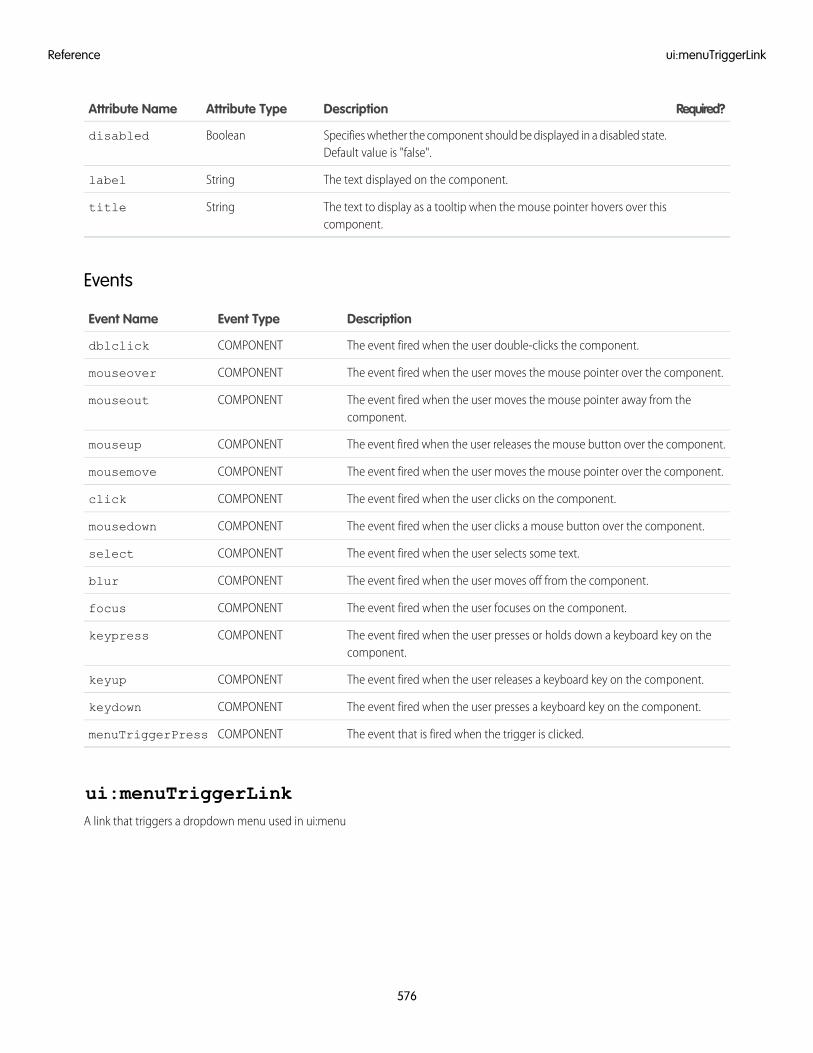
Required?DescriptionAttribute TypeAttribute Name
Specifies whether the component should be displayed in a disabled state.Default value is "false".
Booleandisabled
The text displayed on the component.Stringlabel
The text to display as a tooltip when the mouse pointer hovers over thiscomponent.
Stringtitle
Events
DescriptionEvent TypeEvent Name
The event fired when the user double-clicks the component.COMPONENTdblclick
The event fired when the user moves the mouse pointer over the component.COMPONENTmouseover
The event fired when the user moves the mouse pointer away from thecomponent.
COMPONENTmouseout
The event fired when the user releases the mouse button over the component.COMPONENTmouseup
The event fired when the user moves the mouse pointer over the component.COMPONENTmousemove
The event fired when the user clicks on the component.COMPONENTclick
The event fired when the user clicks a mouse button over the component.COMPONENTmousedown
The event fired when the user selects some text.COMPONENTselect
The event fired when the user moves off from the component.COMPONENTblur
The event fired when the user focuses on the component.COMPONENTfocus
The event fired when the user presses or holds down a keyboard key on thecomponent.
COMPONENTkeypress
The event fired when the user releases a keyboard key on the component.COMPONENTkeyup
The event fired when the user presses a keyboard key on the component.COMPONENTkeydown
The event that is fired when the trigger is clicked.COMPONENTmenuTriggerPress
ui:menuTriggerLinkA link that triggers a dropdown menu used in ui:menu
576
ui:menuTriggerLinkReference
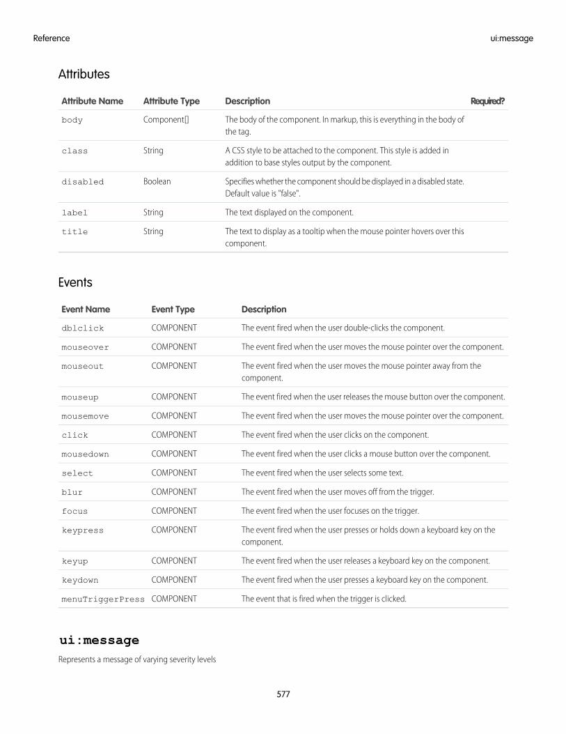
Attributes
Required?DescriptionAttribute TypeAttribute Name
The body of the component. In markup, this is everything in the body ofthe tag.
Component[]body
A CSS style to be attached to the component. This style is added inaddition to base styles output by the component.
Stringclass
Specifies whether the component should be displayed in a disabled state.Default value is "false".
Booleandisabled
The text displayed on the component.Stringlabel
The text to display as a tooltip when the mouse pointer hovers over thiscomponent.
Stringtitle
Events
DescriptionEvent TypeEvent Name
The event fired when the user double-clicks the component.COMPONENTdblclick
The event fired when the user moves the mouse pointer over the component.COMPONENTmouseover
The event fired when the user moves the mouse pointer away from thecomponent.
COMPONENTmouseout
The event fired when the user releases the mouse button over the component.COMPONENTmouseup
The event fired when the user moves the mouse pointer over the component.COMPONENTmousemove
The event fired when the user clicks on the component.COMPONENTclick
The event fired when the user clicks a mouse button over the component.COMPONENTmousedown
The event fired when the user selects some text.COMPONENTselect
The event fired when the user moves off from the trigger.COMPONENTblur
The event fired when the user focuses on the trigger.COMPONENTfocus
The event fired when the user presses or holds down a keyboard key on thecomponent.
COMPONENTkeypress
The event fired when the user releases a keyboard key on the component.COMPONENTkeyup
The event fired when the user presses a keyboard key on the component.COMPONENTkeydown
The event that is fired when the trigger is clicked.COMPONENTmenuTriggerPress
ui:messageRepresents a message of varying severity levels
577
ui:messageReference
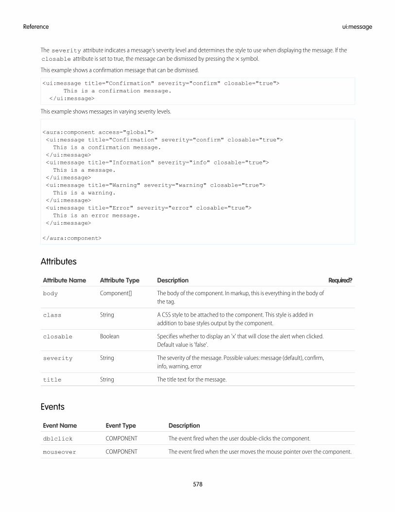
The severity attribute indicates a message's severity level and determines the style to use when displaying the message. If theclosable attribute is set to true, the message can be dismissed by pressing the × symbol.
This example shows a confirmation message that can be dismissed.
<ui:message title="Confirmation" severity="confirm" closable="true">This is a confirmation message.
</ui:message>
This example shows messages in varying severity levels.
<aura:component access="global"><ui:message title="Confirmation" severity="confirm" closable="true">This is a confirmation message.
</ui:message><ui:message title="Information" severity="info" closable="true">This is a message.
</ui:message><ui:message title="Warning" severity="warning" closable="true">This is a warning.
</ui:message><ui:message title="Error" severity="error" closable="true">This is an error message.
</ui:message>
</aura:component>
Attributes
Required?DescriptionAttribute TypeAttribute Name
The body of the component. In markup, this is everything in the body ofthe tag.
Component[]body
A CSS style to be attached to the component. This style is added inaddition to base styles output by the component.
Stringclass
Specifies whether to display an 'x' that will close the alert when clicked.Default value is 'false'.
Booleanclosable
The severity of the message. Possible values: message (default), confirm,info, warning, error
Stringseverity
The title text for the message.Stringtitle
Events
DescriptionEvent TypeEvent Name
The event fired when the user double-clicks the component.COMPONENTdblclick
The event fired when the user moves the mouse pointer over the component.COMPONENTmouseover
578
ui:messageReference
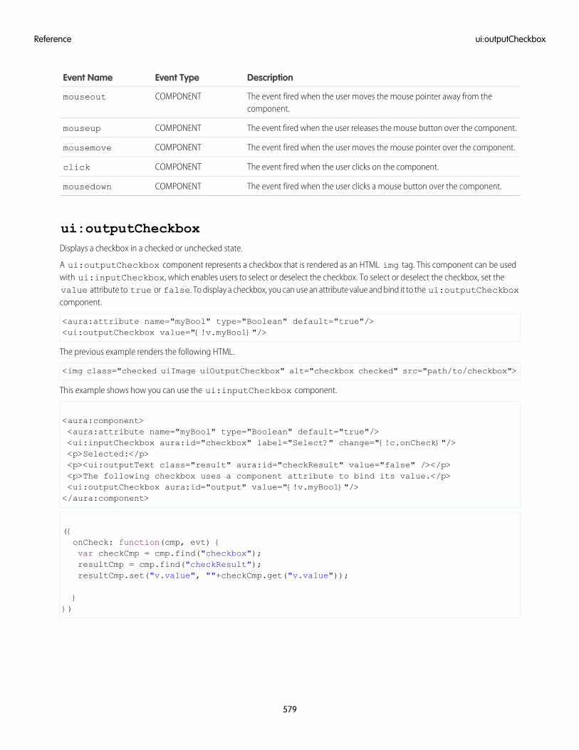
DescriptionEvent TypeEvent Name
The event fired when the user moves the mouse pointer away from thecomponent.
COMPONENTmouseout
The event fired when the user releases the mouse button over the component.COMPONENTmouseup
The event fired when the user moves the mouse pointer over the component.COMPONENTmousemove
The event fired when the user clicks on the component.COMPONENTclick
The event fired when the user clicks a mouse button over the component.COMPONENTmousedown
ui:outputCheckboxDisplays a checkbox in a checked or unchecked state.
A ui:outputCheckbox component represents a checkbox that is rendered as an HTML img tag. This component can be usedwith ui:inputCheckbox, which enables users to select or deselect the checkbox. To select or deselect the checkbox, set thevalue attribute to true or false. To display a checkbox, you can use an attribute value and bind it to the ui:outputCheckboxcomponent.
<aura:attribute name="myBool" type="Boolean" default="true"/><ui:outputCheckbox value="{!v.myBool}"/>
The previous example renders the following HTML.
<img class="checked uiImage uiOutputCheckbox" alt="checkbox checked" src="path/to/checkbox">
This example shows how you can use the ui:inputCheckbox component.
<aura:component><aura:attribute name="myBool" type="Boolean" default="true"/><ui:inputCheckbox aura:id="checkbox" label="Select?" change="{!c.onCheck}"/><p>Selected:</p><p><ui:outputText class="result" aura:id="checkResult" value="false" /></p><p>The following checkbox uses a component attribute to bind its value.</p><ui:outputCheckbox aura:id="output" value="{!v.myBool}"/></aura:component>
({onCheck: function(cmp, evt) {var checkCmp = cmp.find("checkbox");resultCmp = cmp.find("checkResult");resultCmp.set("v.value", ""+checkCmp.get("v.value"));
}})
579
ui:outputCheckboxReference
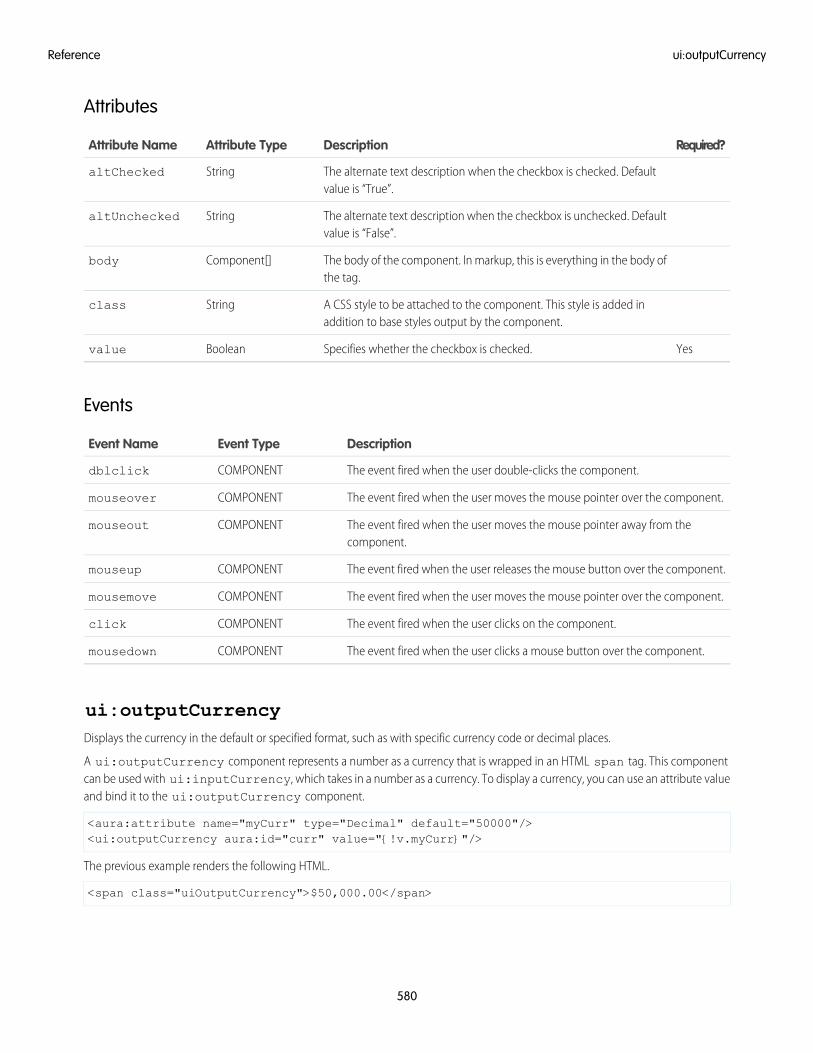
Attributes
Required?DescriptionAttribute TypeAttribute Name
The alternate text description when the checkbox is checked. Defaultvalue is “True”.
StringaltChecked
The alternate text description when the checkbox is unchecked. Defaultvalue is “False”.
StringaltUnchecked
The body of the component. In markup, this is everything in the body ofthe tag.
Component[]body
A CSS style to be attached to the component. This style is added inaddition to base styles output by the component.
Stringclass
YesSpecifies whether the checkbox is checked.Booleanvalue
Events
DescriptionEvent TypeEvent Name
The event fired when the user double-clicks the component.COMPONENTdblclick
The event fired when the user moves the mouse pointer over the component.COMPONENTmouseover
The event fired when the user moves the mouse pointer away from thecomponent.
COMPONENTmouseout
The event fired when the user releases the mouse button over the component.COMPONENTmouseup
The event fired when the user moves the mouse pointer over the component.COMPONENTmousemove
The event fired when the user clicks on the component.COMPONENTclick
The event fired when the user clicks a mouse button over the component.COMPONENTmousedown
ui:outputCurrencyDisplays the currency in the default or specified format, such as with specific currency code or decimal places.
A ui:outputCurrency component represents a number as a currency that is wrapped in an HTML span tag. This componentcan be used with ui:inputCurrency, which takes in a number as a currency. To display a currency, you can use an attribute valueand bind it to the ui:outputCurrency component.
<aura:attribute name="myCurr" type="Decimal" default="50000"/><ui:outputCurrency aura:id="curr" value="{!v.myCurr}"/>
The previous example renders the following HTML.
<span class="uiOutputCurrency">$50,000.00</span>
580
ui:outputCurrencyReference
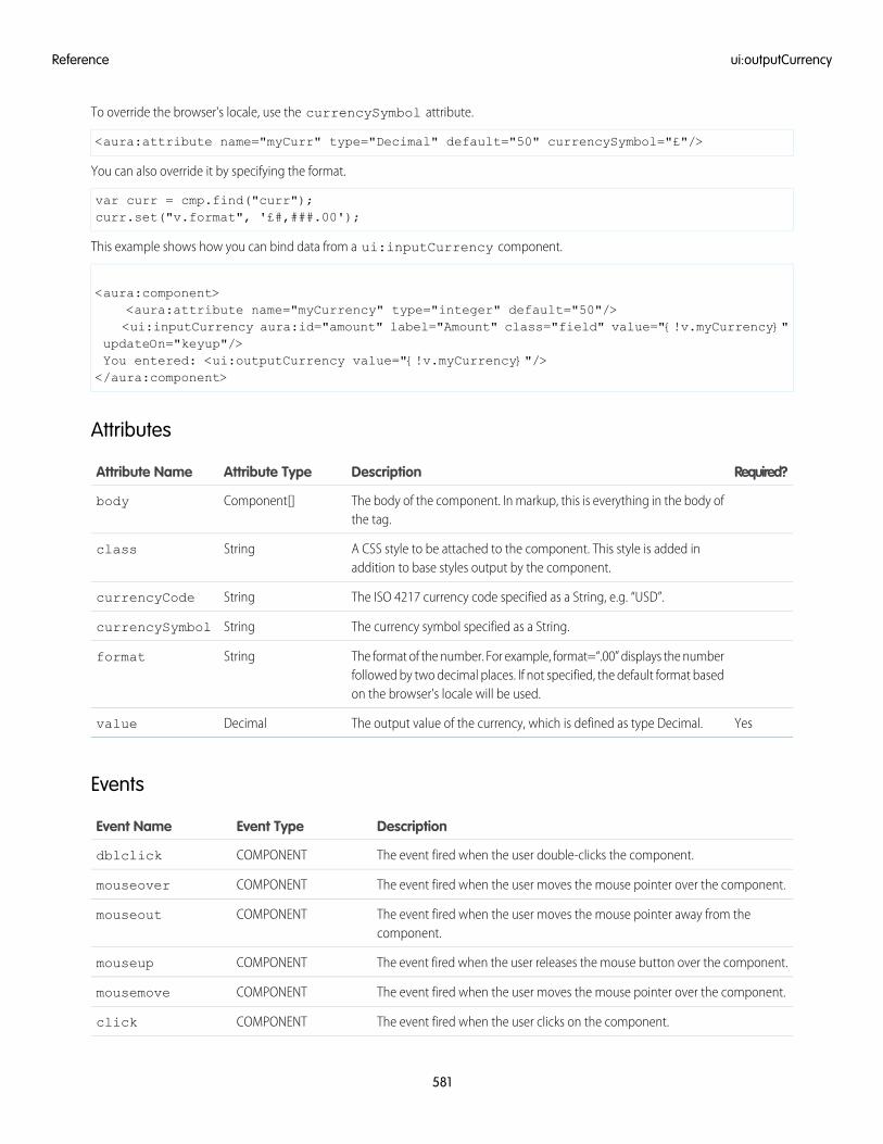
To override the browser's locale, use the currencySymbol attribute.
<aura:attribute name="myCurr" type="Decimal" default="50" currencySymbol="£"/>
You can also override it by specifying the format.
var curr = cmp.find("curr");curr.set("v.format", '£#,###.00');
This example shows how you can bind data from a ui:inputCurrency component.
<aura:component><aura:attribute name="myCurrency" type="integer" default="50"/><ui:inputCurrency aura:id="amount" label="Amount" class="field" value="{!v.myCurrency}"
updateOn="keyup"/>You entered: <ui:outputCurrency value="{!v.myCurrency}"/></aura:component>
Attributes
Required?DescriptionAttribute TypeAttribute Name
The body of the component. In markup, this is everything in the body ofthe tag.
Component[]body
A CSS style to be attached to the component. This style is added inaddition to base styles output by the component.
Stringclass
The ISO 4217 currency code specified as a String, e.g. “USD”.StringcurrencyCode
The currency symbol specified as a String.StringcurrencySymbol
The format of the number. For example, format=“.00” displays the numberfollowed by two decimal places. If not specified, the default format basedon the browser's locale will be used.
Stringformat
YesThe output value of the currency, which is defined as type Decimal.Decimalvalue
Events
DescriptionEvent TypeEvent Name
The event fired when the user double-clicks the component.COMPONENTdblclick
The event fired when the user moves the mouse pointer over the component.COMPONENTmouseover
The event fired when the user moves the mouse pointer away from thecomponent.
COMPONENTmouseout
The event fired when the user releases the mouse button over the component.COMPONENTmouseup
The event fired when the user moves the mouse pointer over the component.COMPONENTmousemove
The event fired when the user clicks on the component.COMPONENTclick
581
ui:outputCurrencyReference
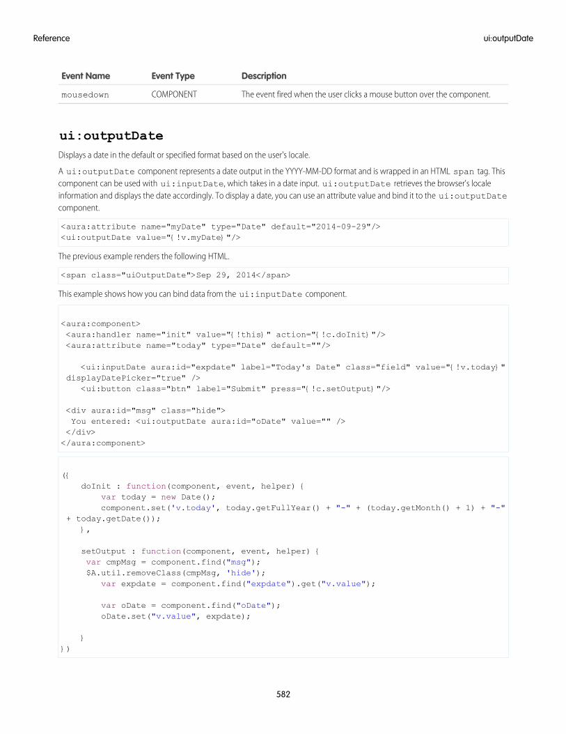
DescriptionEvent TypeEvent Name
The event fired when the user clicks a mouse button over the component.COMPONENTmousedown
ui:outputDateDisplays a date in the default or specified format based on the user's locale.
A ui:outputDate component represents a date output in the YYYY-MM-DD format and is wrapped in an HTML span tag. Thiscomponent can be used with ui:inputDate, which takes in a date input. ui:outputDate retrieves the browser's localeinformation and displays the date accordingly. To display a date, you can use an attribute value and bind it to the ui:outputDatecomponent.
<aura:attribute name="myDate" type="Date" default="2014-09-29"/><ui:outputDate value="{!v.myDate}"/>
The previous example renders the following HTML.
<span class="uiOutputDate">Sep 29, 2014</span>
This example shows how you can bind data from the ui:inputDate component.
<aura:component><aura:handler name="init" value="{!this}" action="{!c.doInit}"/><aura:attribute name="today" type="Date" default=""/>
<ui:inputDate aura:id="expdate" label="Today's Date" class="field" value="{!v.today}"displayDatePicker="true" />
<ui:button class="btn" label="Submit" press="{!c.setOutput}"/>
<div aura:id="msg" class="hide">You entered: <ui:outputDate aura:id="oDate" value="" /></div></aura:component>
({doInit : function(component, event, helper) {
var today = new Date();component.set('v.today', today.getFullYear() + "-" + (today.getMonth() + 1) + "-"
+ today.getDate());},
setOutput : function(component, event, helper) {var cmpMsg = component.find("msg");$A.util.removeClass(cmpMsg, 'hide');
var expdate = component.find("expdate").get("v.value");
var oDate = component.find("oDate");oDate.set("v.value", expdate);
}})
582
ui:outputDateReference
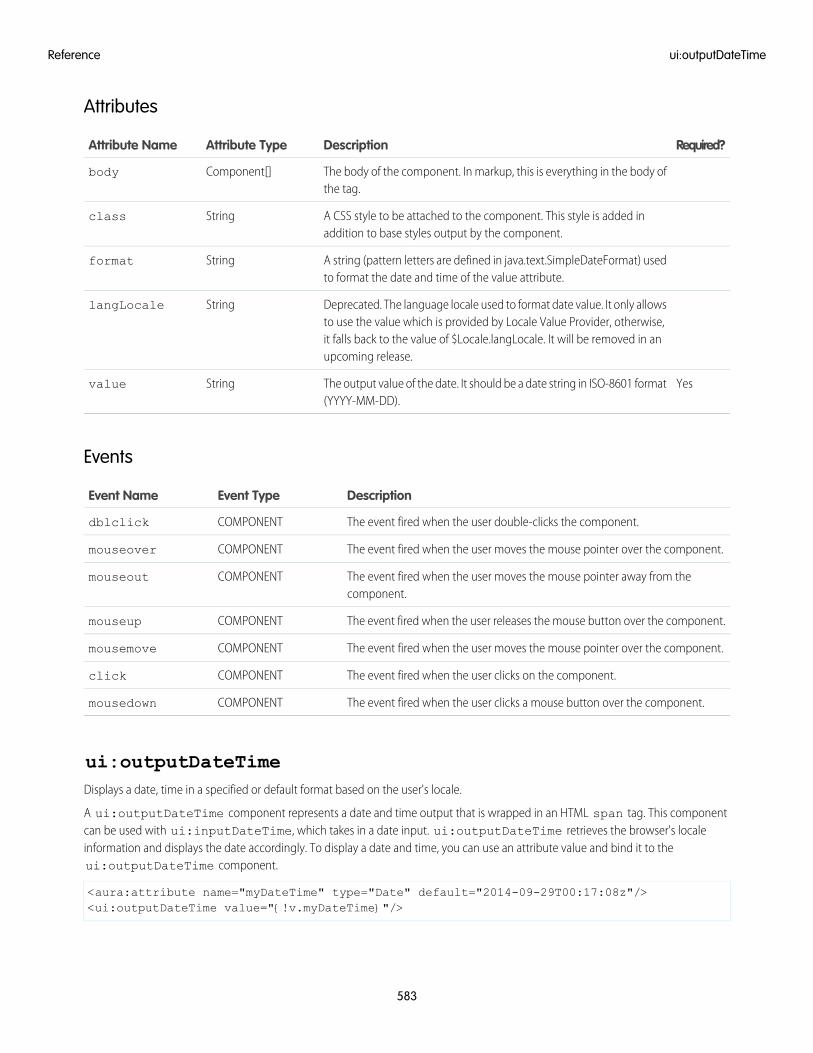
Attributes
Required?DescriptionAttribute TypeAttribute Name
The body of the component. In markup, this is everything in the body ofthe tag.
Component[]body
A CSS style to be attached to the component. This style is added inaddition to base styles output by the component.
Stringclass
A string (pattern letters are defined in java.text.SimpleDateFormat) usedto format the date and time of the value attribute.
Stringformat
Deprecated. The language locale used to format date value. It only allowsto use the value which is provided by Locale Value Provider, otherwise,
StringlangLocale
it falls back to the value of $Locale.langLocale. It will be removed in anupcoming release.
YesThe output value of the date. It should be a date string in ISO-8601 format(YYYY-MM-DD).
Stringvalue
Events
DescriptionEvent TypeEvent Name
The event fired when the user double-clicks the component.COMPONENTdblclick
The event fired when the user moves the mouse pointer over the component.COMPONENTmouseover
The event fired when the user moves the mouse pointer away from thecomponent.
COMPONENTmouseout
The event fired when the user releases the mouse button over the component.COMPONENTmouseup
The event fired when the user moves the mouse pointer over the component.COMPONENTmousemove
The event fired when the user clicks on the component.COMPONENTclick
The event fired when the user clicks a mouse button over the component.COMPONENTmousedown
ui:outputDateTimeDisplays a date, time in a specified or default format based on the user's locale.
A ui:outputDateTime component represents a date and time output that is wrapped in an HTML span tag. This componentcan be used with ui:inputDateTime, which takes in a date input. ui:outputDateTime retrieves the browser's localeinformation and displays the date accordingly. To display a date and time, you can use an attribute value and bind it to theui:outputDateTime component.
<aura:attribute name="myDateTime" type="Date" default="2014-09-29T00:17:08z"/><ui:outputDateTime value="{!v.myDateTime}"/>
583
ui:outputDateTimeReference
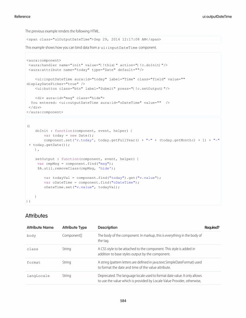
The previous example renders the following HTML.
<span class="uiOutputDateTime">Sep 29, 2014 12:17:08 AM</span>
This example shows how you can bind data from a ui:inputDateTime component.
<aura:component><aura:handler name="init" value="{!this}" action="{!c.doInit}"/><aura:attribute name="today" type="Date" default=""/>
<ui:inputDateTime aura:id="today" label="Time" class="field" value=""displayDatePicker="true" />
<ui:button class="btn" label="Submit" press="{!c.setOutput}"/>
<div aura:id="msg" class="hide">You entered: <ui:outputDateTime aura:id="oDateTime" value="" /></div></aura:component>
({doInit : function(component, event, helper) {
var today = new Date();component.set('v.today', today.getFullYear() + "-" + (today.getMonth() + 1) + "-"
+ today.getDate());},
setOutput : function(component, event, helper) {var cmpMsg = component.find("msg");$A.util.removeClass(cmpMsg, 'hide');
var todayVal = component.find("today").get("v.value");var oDateTime = component.find("oDateTime");oDateTime.set("v.value", todayVal);
}})
Attributes
Required?DescriptionAttribute TypeAttribute Name
The body of the component. In markup, this is everything in the body ofthe tag.
Component[]body
A CSS style to be attached to the component. This style is added inaddition to base styles output by the component.
Stringclass
A string (pattern letters are defined in java.text.SimpleDateFormat) usedto format the date and time of the value attribute.
Stringformat
Deprecated. The language locale used to format date value. It only allowsto use the value which is provided by Locale Value Provider, otherwise,
StringlangLocale
584
ui:outputDateTimeReference
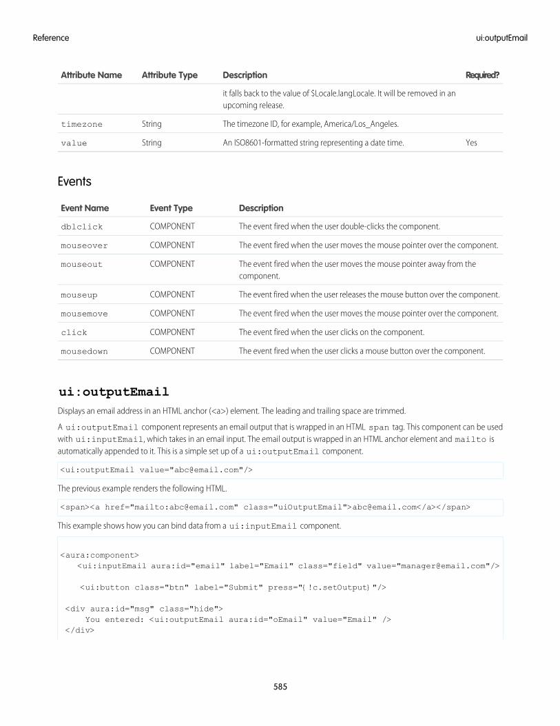
Required?DescriptionAttribute TypeAttribute Name
it falls back to the value of $Locale.langLocale. It will be removed in anupcoming release.
The timezone ID, for example, America/Los_Angeles.Stringtimezone
YesAn ISO8601-formatted string representing a date time.Stringvalue
Events
DescriptionEvent TypeEvent Name
The event fired when the user double-clicks the component.COMPONENTdblclick
The event fired when the user moves the mouse pointer over the component.COMPONENTmouseover
The event fired when the user moves the mouse pointer away from thecomponent.
COMPONENTmouseout
The event fired when the user releases the mouse button over the component.COMPONENTmouseup
The event fired when the user moves the mouse pointer over the component.COMPONENTmousemove
The event fired when the user clicks on the component.COMPONENTclick
The event fired when the user clicks a mouse button over the component.COMPONENTmousedown
ui:outputEmailDisplays an email address in an HTML anchor (<a>) element. The leading and trailing space are trimmed.
A ui:outputEmail component represents an email output that is wrapped in an HTML span tag. This component can be usedwith ui:inputEmail, which takes in an email input. The email output is wrapped in an HTML anchor element and mailto isautomatically appended to it. This is a simple set up of a ui:outputEmail component.
<ui:outputEmail value="[email protected]"/>
The previous example renders the following HTML.
<span><a href="mailto:[email protected]" class="uiOutputEmail">[email protected]</a></span>
This example shows how you can bind data from a ui:inputEmail component.
<aura:component><ui:inputEmail aura:id="email" label="Email" class="field" value="[email protected]"/>
<ui:button class="btn" label="Submit" press="{!c.setOutput}"/>
<div aura:id="msg" class="hide">You entered: <ui:outputEmail aura:id="oEmail" value="Email" />
</div>
585
ui:outputEmailReference
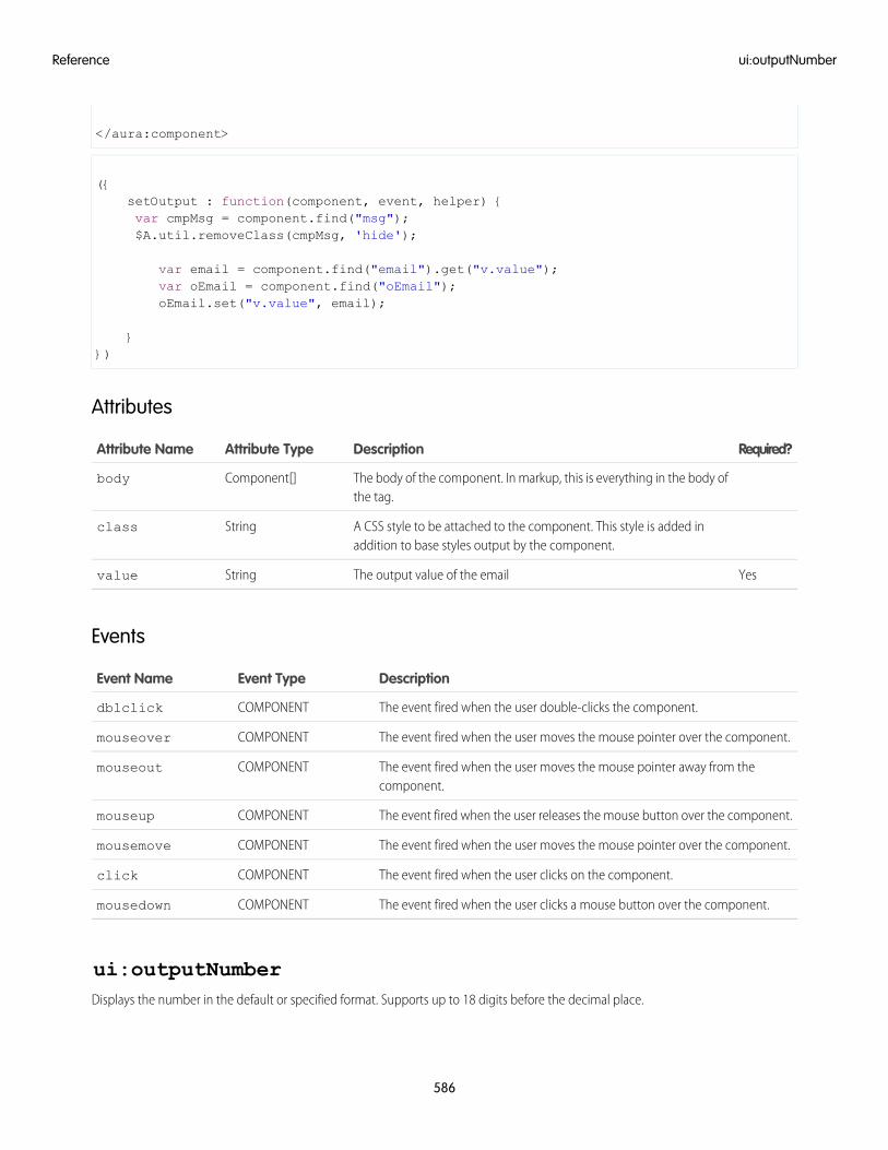
</aura:component>
({setOutput : function(component, event, helper) {var cmpMsg = component.find("msg");$A.util.removeClass(cmpMsg, 'hide');
var email = component.find("email").get("v.value");var oEmail = component.find("oEmail");oEmail.set("v.value", email);
}})
Attributes
Required?DescriptionAttribute TypeAttribute Name
The body of the component. In markup, this is everything in the body ofthe tag.
Component[]body
A CSS style to be attached to the component. This style is added inaddition to base styles output by the component.
Stringclass
YesThe output value of the emailStringvalue
Events
DescriptionEvent TypeEvent Name
The event fired when the user double-clicks the component.COMPONENTdblclick
The event fired when the user moves the mouse pointer over the component.COMPONENTmouseover
The event fired when the user moves the mouse pointer away from thecomponent.
COMPONENTmouseout
The event fired when the user releases the mouse button over the component.COMPONENTmouseup
The event fired when the user moves the mouse pointer over the component.COMPONENTmousemove
The event fired when the user clicks on the component.COMPONENTclick
The event fired when the user clicks a mouse button over the component.COMPONENTmousedown
ui:outputNumberDisplays the number in the default or specified format. Supports up to 18 digits before the decimal place.
586
ui:outputNumberReference
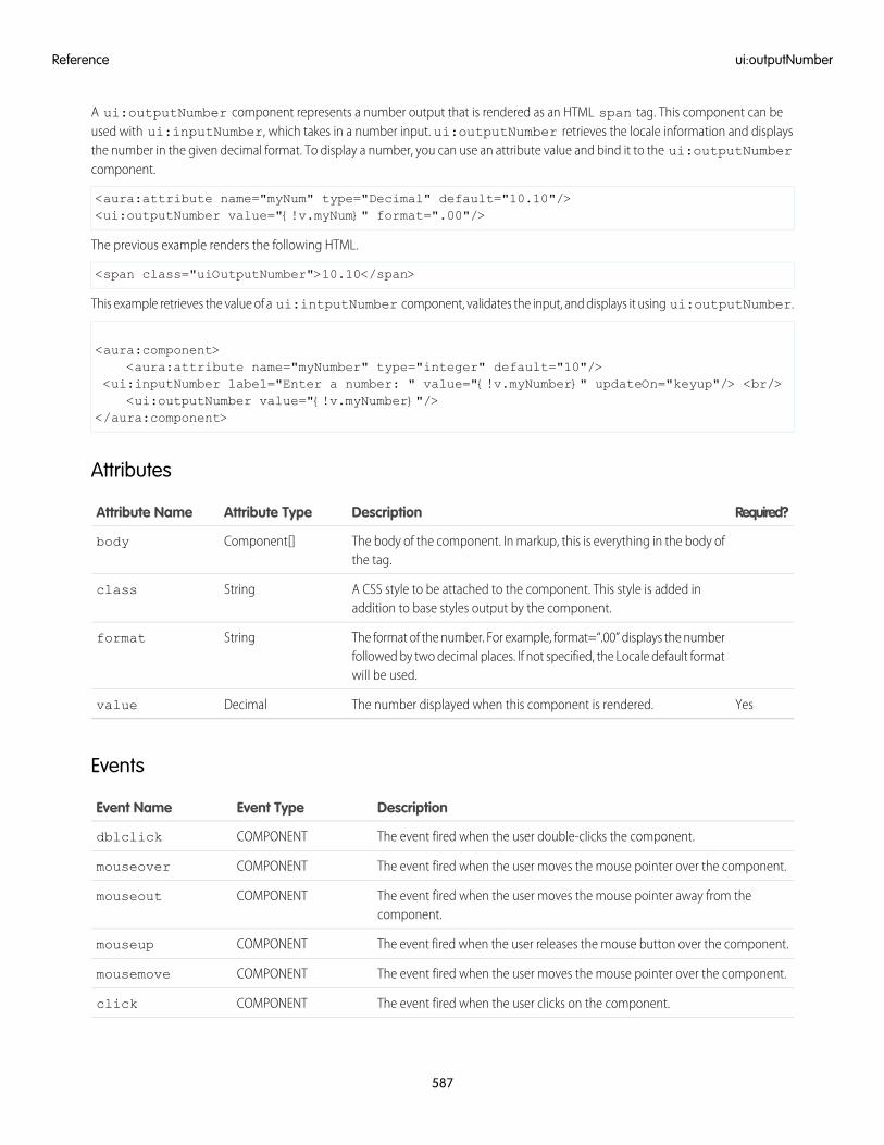
A ui:outputNumber component represents a number output that is rendered as an HTML span tag. This component can beused with ui:inputNumber, which takes in a number input. ui:outputNumber retrieves the locale information and displaysthe number in the given decimal format. To display a number, you can use an attribute value and bind it to the ui:outputNumbercomponent.
<aura:attribute name="myNum" type="Decimal" default="10.10"/><ui:outputNumber value="{!v.myNum}" format=".00"/>
The previous example renders the following HTML.
<span class="uiOutputNumber">10.10</span>
This example retrieves the value of a ui:intputNumber component, validates the input, and displays it using ui:outputNumber.
<aura:component><aura:attribute name="myNumber" type="integer" default="10"/>
<ui:inputNumber label="Enter a number: " value="{!v.myNumber}" updateOn="keyup"/> <br/><ui:outputNumber value="{!v.myNumber}"/>
</aura:component>
Attributes
Required?DescriptionAttribute TypeAttribute Name
The body of the component. In markup, this is everything in the body ofthe tag.
Component[]body
A CSS style to be attached to the component. This style is added inaddition to base styles output by the component.
Stringclass
The format of the number. For example, format=“.00” displays the numberfollowed by two decimal places. If not specified, the Locale default formatwill be used.
Stringformat
YesThe number displayed when this component is rendered.Decimalvalue
Events
DescriptionEvent TypeEvent Name
The event fired when the user double-clicks the component.COMPONENTdblclick
The event fired when the user moves the mouse pointer over the component.COMPONENTmouseover
The event fired when the user moves the mouse pointer away from thecomponent.
COMPONENTmouseout
The event fired when the user releases the mouse button over the component.COMPONENTmouseup
The event fired when the user moves the mouse pointer over the component.COMPONENTmousemove
The event fired when the user clicks on the component.COMPONENTclick
587
ui:outputNumberReference
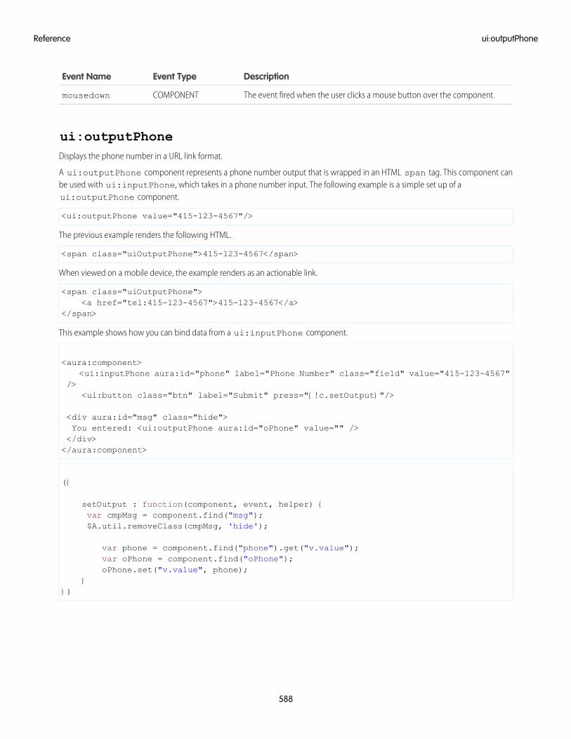
DescriptionEvent TypeEvent Name
The event fired when the user clicks a mouse button over the component.COMPONENTmousedown
ui:outputPhoneDisplays the phone number in a URL link format.
A ui:outputPhone component represents a phone number output that is wrapped in an HTML span tag. This component canbe used with ui:inputPhone, which takes in a phone number input. The following example is a simple set up of aui:outputPhone component.
<ui:outputPhone value="415-123-4567"/>
The previous example renders the following HTML.
<span class="uiOutputPhone">415-123-4567</span>
When viewed on a mobile device, the example renders as an actionable link.
<span class="uiOutputPhone"><a href="tel:415-123-4567">415-123-4567</a>
</span>
This example shows how you can bind data from a ui:inputPhone component.
<aura:component><ui:inputPhone aura:id="phone" label="Phone Number" class="field" value="415-123-4567"
/><ui:button class="btn" label="Submit" press="{!c.setOutput}"/>
<div aura:id="msg" class="hide">You entered: <ui:outputPhone aura:id="oPhone" value="" /></div></aura:component>
({
setOutput : function(component, event, helper) {var cmpMsg = component.find("msg");$A.util.removeClass(cmpMsg, 'hide');
var phone = component.find("phone").get("v.value");var oPhone = component.find("oPhone");oPhone.set("v.value", phone);
}})
588
ui:outputPhoneReference
Attributes
Required?DescriptionAttribute TypeAttribute Name
The body of the component. In markup, this is everything in the body ofthe tag.
Component[]body
A CSS style to be attached to the component. This style is added inaddition to base styles output by the component.
Stringclass
YesThe phone number displayed when this component is rendered.Stringvalue
Events
DescriptionEvent TypeEvent Name
The event fired when the user double-clicks the component.COMPONENTdblclick
The event fired when the user moves the mouse pointer over the component.COMPONENTmouseover
The event fired when the user moves the mouse pointer away from thecomponent.
COMPONENTmouseout
The event fired when the user releases the mouse button over the component.COMPONENTmouseup
The event fired when the user moves the mouse pointer over the component.COMPONENTmousemove
The event fired when the user clicks on the component.COMPONENTclick
The event fired when the user clicks a mouse button over the component.COMPONENTmousedown
ui:outputRichTextDisplays formatted text including tags such as paragraph, image, and hyperlink, as specified in the value attribute.
A ui:outputRichText component represents formatted text and can be used to display input from alightning:inputRichText or ui:inputRichText component. Using lightning:inputRichText is recommendedsince ui:inputRichText is no longer supported when LockerService is enabled. ui:outputRichText renders formattedtext. For example, URLs and email addresses enclosed by anchor tags are displayed as hyperlinks.
This example sets bold text and binds the value to a lightning:inputRichText and ui:outputRichText component.The slds-text-longform class adds default spacing and list styling in your output.
<aura:component><aura:attribute name="myVal" type="String" /><aura:handler name="init" value="{! this }" action="{! c.init }"/>
<lightning:inputRichText value="{!v.myVal}"/><ui:outputRichText class="slds-text-longform" value="{!v.myVal}"/>
</aura:component>
589
ui:outputRichTextReference
During initialization, the value is set on both the lightning:inputRichText and ui:outputRichText component.
({init: function(cmp) {
cmp.set('v.myVal', '<b>Hello!</b>');}
})
ui:outputRichText supports the following HTML tags: a, b, br, big, blockquote, caption, cite, code, col,colgroup, del, div, em, h1, h2, h3, hr, i, img, ins, kbd, li, ol, p, param, pre, q, s, samp, small, span, strong,sub, sup, table, tbody, td, tfoot, th, thead, tr, tt, u, ul, var, strike.
Supported HTML attributes include: accept, action, align, alt, autocomplete, background, bgcolor, border,cellpadding, cellspacing, checked, cite, class, clear, color, cols, colspan, coords, datetime,default, dir, disabled, download, enctype, face, for, headers, height, hidden, high, href, hreflang,id, ismap, label, lang, list, loop, low, max, maxlength, media, method, min, multiple, name, noshade,novalidate, nowrap, open, optimum, pattern, placeholder, poster, preload, pubdate, radiogroup,readonly, rel, required, rev, reversed, rows, rowspan, spellcheck, scope, selected, shape, size,span, srclang, start, src, step, style, summary, tabindex, target, title, type, usemap, valign, value,width, xmlns.
Attributes
Required?DescriptionAttribute TypeAttribute Name
The body of the component. In markup, this is everything in the body ofthe tag.
Component[]body
A CSS style to be attached to the component. This style is added inaddition to base styles output by the component.
Stringclass
Indicates if the URLs in the text are set to render as hyperlinks.Booleanlinkify
The formatted text used for output.Stringvalue
Events
DescriptionEvent TypeEvent Name
The event fired when the user double-clicks the component.COMPONENTdblclick
The event fired when the user moves the mouse pointer over the component.COMPONENTmouseover
The event fired when the user moves the mouse pointer away from thecomponent.
COMPONENTmouseout
The event fired when the user releases the mouse button over the component.COMPONENTmouseup
The event fired when the user moves the mouse pointer over the component.COMPONENTmousemove
The event fired when the user clicks on the component.COMPONENTclick
The event fired when the user clicks a mouse button over the component.COMPONENTmousedown
590
ui:outputRichTextReference
ui:outputTextDisplays text as specified by the value attribute.
A ui:outputText component represents text output that is wrapped in an HTML span tag. This component can be used withui:inputText, which takes in a text input. To display text, you can use an attribute value and bind it to the ui:outputTextcomponent.
<aura:attribute name="myText" type="String" default="some string"/><ui:outputText value="{!v.myText}" />
The previous example renders the following HTML.
<span dir="ltr" class="uiOutputText">some string
</span>
This example shows how you can bind data from an ui:inputText component.
<aura:component><aura:attribute name="myText" type="string" default="Hello there!"/>
<ui:inputText label="Enter some text" class="field" value="{!v.myText}" updateOn="click"/>
You entered: <ui:outputText value="{!v.myText}"/></aura:component>
Attributes
Required?DescriptionAttribute TypeAttribute Name
The body of the component. In markup, this is everything in the body ofthe tag.
Component[]body
A CSS style to be attached to the component. This style is added inaddition to base styles output by the component.
Stringclass
Displays extra information as hover text.Stringtitle
YesThe text displayed when this component is rendered.Stringvalue
Events
DescriptionEvent TypeEvent Name
The event fired when the user double-clicks the component.COMPONENTdblclick
The event fired when the user moves the mouse pointer over the component.COMPONENTmouseover
The event fired when the user moves the mouse pointer away from thecomponent.
COMPONENTmouseout
The event fired when the user releases the mouse button over the component.COMPONENTmouseup
591
ui:outputTextReference
DescriptionEvent TypeEvent Name
The event fired when the user moves the mouse pointer over the component.COMPONENTmousemove
The event fired when the user clicks on the component.COMPONENTclick
The event fired when the user clicks a mouse button over the component.COMPONENTmousedown
ui:outputTextAreaDisplays the text area as specified by the value attribute.
A ui:outputTextArea component represents text output that is wrapped in an HTML span tag. This component can be usedwith ui:inputTextArea, which takes in a multiline text input. To display text, you can use an attribute value and bind it to theui:outputTextArea component. A ui:outputTextArea component displays URLs and email addresses as hyperlinks.
<aura:attribute name="myTextArea" type="String" default="some string"/><ui:outputTextArea value="{!v.myTextArea}"/>
The previous example renders the following HTML.
<span class="uiOutputTextArea">some string</span>
This example shows how you can bind data from the ui:inputTextArea component.
<aura:component><ui:inputTextArea aura:id="comments" label="Comments" value="My comments" rows="5"/>
<ui:button class="btn" label="Submit" press="{!c.setOutput}"/>
<div aura:id="msg" class="hide">You entered: <ui:outputTextArea aura:id="oTextarea" value=""/></div></aura:component>
({setOutput : function(component, event, helper) {var cmpMsg = component.find("msg");$A.util.removeClass(cmpMsg, 'hide');
var comments = component.find("comments").get("v.value");var oTextarea = component.find("oTextarea");oTextarea.set("v.value", comments);
}})
Attributes
Required?DescriptionAttribute TypeAttribute Name
The body of the component. In markup, this is everything in the body ofthe tag.
Component[]body
592
ui:outputTextAreaReference
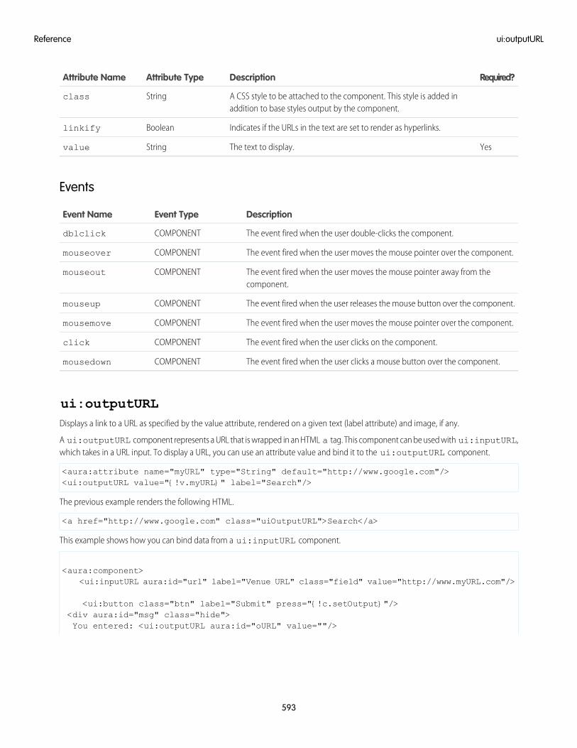
Required?DescriptionAttribute TypeAttribute Name
A CSS style to be attached to the component. This style is added inaddition to base styles output by the component.
Stringclass
Indicates if the URLs in the text are set to render as hyperlinks.Booleanlinkify
YesThe text to display.Stringvalue
Events
DescriptionEvent TypeEvent Name
The event fired when the user double-clicks the component.COMPONENTdblclick
The event fired when the user moves the mouse pointer over the component.COMPONENTmouseover
The event fired when the user moves the mouse pointer away from thecomponent.
COMPONENTmouseout
The event fired when the user releases the mouse button over the component.COMPONENTmouseup
The event fired when the user moves the mouse pointer over the component.COMPONENTmousemove
The event fired when the user clicks on the component.COMPONENTclick
The event fired when the user clicks a mouse button over the component.COMPONENTmousedown
ui:outputURLDisplays a link to a URL as specified by the value attribute, rendered on a given text (label attribute) and image, if any.
A ui:outputURL component represents a URL that is wrapped in an HTML a tag. This component can be used with ui:inputURL,which takes in a URL input. To display a URL, you can use an attribute value and bind it to the ui:outputURL component.
<aura:attribute name="myURL" type="String" default="http://www.google.com"/><ui:outputURL value="{!v.myURL}" label="Search"/>
The previous example renders the following HTML.
<a href="http://www.google.com" class="uiOutputURL">Search</a>
This example shows how you can bind data from a ui:inputURL component.
<aura:component><ui:inputURL aura:id="url" label="Venue URL" class="field" value="http://www.myURL.com"/>
<ui:button class="btn" label="Submit" press="{!c.setOutput}"/><div aura:id="msg" class="hide">You entered: <ui:outputURL aura:id="oURL" value=""/>
593
ui:outputURLReference
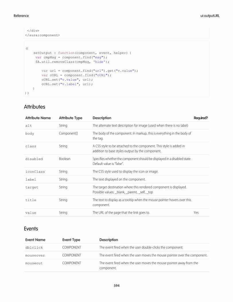
</div></aura:component>
({setOutput : function(component, event, helper) {var cmpMsg = component.find("msg");$A.util.removeClass(cmpMsg, 'hide');
var url = component.find("url").get("v.value");var oURL = component.find("oURL");oURL.set("v.value", url);oURL.set("v.label", url);
}})
Attributes
Required?DescriptionAttribute TypeAttribute Name
The alternate text description for image (used when there is no label)Stringalt
The body of the component. In markup, this is everything in the body ofthe tag.
Component[]body
A CSS style to be attached to the component. This style is added inaddition to base styles output by the component.
Stringclass
Specifies whether the component should be displayed in a disabled state.Default value is "false".
Booleandisabled
The CSS style used to display the icon or image.StringiconClass
The text displayed on the component.Stringlabel
The target destination where this rendered component is displayed.Possible values: _blank, _parent, _self, _top
Stringtarget
The text to display as a tooltip when the mouse pointer hovers over thiscomponent.
Stringtitle
YesThe URL of the page that the link goes to.Stringvalue
Events
DescriptionEvent TypeEvent Name
The event fired when the user double-clicks the component.COMPONENTdblclick
The event fired when the user moves the mouse pointer over the component.COMPONENTmouseover
The event fired when the user moves the mouse pointer away from thecomponent.
COMPONENTmouseout
594
ui:outputURLReference
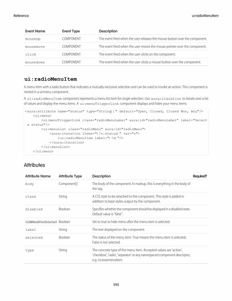
DescriptionEvent TypeEvent Name
The event fired when the user releases the mouse button over the component.COMPONENTmouseup
The event fired when the user moves the mouse pointer over the component.COMPONENTmousemove
The event fired when the user clicks on the component.COMPONENTclick
The event fired when the user clicks a mouse button over the component.COMPONENTmousedown
ui:radioMenuItemA menu item with a radio button that indicates a mutually exclusive selection and can be used to invoke an action. This component isnested in a ui:menu component.
A ui:radioMenuItem component represents a menu list item for single selection. Use aura:iteration to iterate over a listof values and display the menu items. A ui:menuTriggerLink component displays and hides your menu items.
<aura:attribute name="status" type="String[]" default="Open, Closed, Closed Won, Any"/><ui:menu>
<ui:menuTriggerLink class="radioMenuLabel" aura:id="radioMenuLabel" label="Selecta status"/>
<ui:menuList class="radioMenu" aura:id="radioMenu"><aura:iteration items="{!v.status}" var="s">
<ui:radioMenuItem label="{!s}"/></aura:iteration>
</ui:menuList></ui:menu>
Attributes
Required?DescriptionAttribute TypeAttribute Name
The body of the component. In markup, this is everything in the body ofthe tag.
Component[]body
A CSS style to be attached to the component. This style is added inaddition to base styles output by the component.
Stringclass
Specifies whether the component should be displayed in a disabled state.Default value is "false".
Booleandisabled
Set to true to hide menu after the menu item is selected.BooleanhideMenuAfterSelected
The text displayed on the component.Stringlabel
The status of the menu item. True means this menu item is selected;False is not selected.
Booleanselected
The concrete type of the menu item. Accepted values are 'action','checkbox', 'radio', 'separator' or any namespaced component descriptor,e.g. ns:xxxxmenuItem.
Stringtype
595
ui:radioMenuItemReference
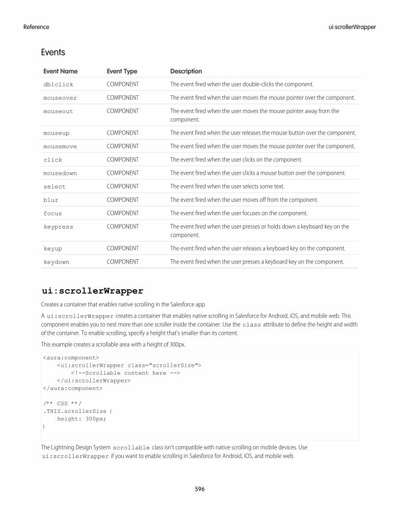
Events
DescriptionEvent TypeEvent Name
The event fired when the user double-clicks the component.COMPONENTdblclick
The event fired when the user moves the mouse pointer over the component.COMPONENTmouseover
The event fired when the user moves the mouse pointer away from thecomponent.
COMPONENTmouseout
The event fired when the user releases the mouse button over the component.COMPONENTmouseup
The event fired when the user moves the mouse pointer over the component.COMPONENTmousemove
The event fired when the user clicks on the component.COMPONENTclick
The event fired when the user clicks a mouse button over the component.COMPONENTmousedown
The event fired when the user selects some text.COMPONENTselect
The event fired when the user moves off from the component.COMPONENTblur
The event fired when the user focuses on the component.COMPONENTfocus
The event fired when the user presses or holds down a keyboard key on thecomponent.
COMPONENTkeypress
The event fired when the user releases a keyboard key on the component.COMPONENTkeyup
The event fired when the user presses a keyboard key on the component.COMPONENTkeydown
ui:scrollerWrapperCreates a container that enables native scrolling in the Salesforce app.
A ui:scrollerWrapper creates a container that enables native scrolling in Salesforce for Android, iOS, and mobile web. Thiscomponent enables you to nest more than one scroller inside the container. Use the class attribute to define the height and widthof the container. To enable scrolling, specify a height that's smaller than its content.
This example creates a scrollable area with a height of 300px.
<aura:component><ui:scrollerWrapper class="scrollerSize">
<!--Scrollable content here --></ui:scrollerWrapper>
</aura:component>
/** CSS **/.THIS.scrollerSize {
height: 300px;}
The Lightning Design System scrollable class isn't compatible with native scrolling on mobile devices. Useui:scrollerWrapper if you want to enable scrolling in Salesforce for Android, iOS, and mobile web.
596
ui:scrollerWrapperReference
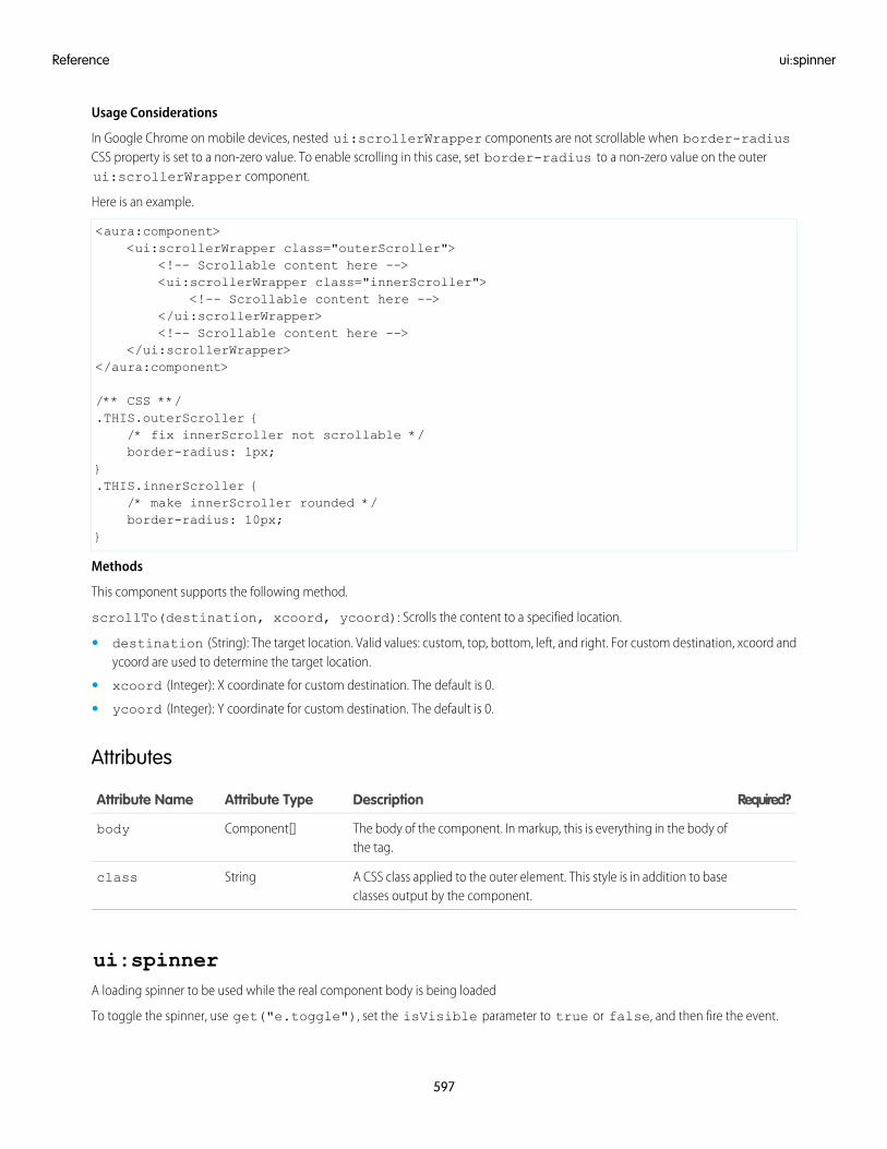
Usage Considerations
In Google Chrome on mobile devices, nested ui:scrollerWrapper components are not scrollable when border-radiusCSS property is set to a non-zero value. To enable scrolling in this case, set border-radius to a non-zero value on the outerui:scrollerWrapper component.
Here is an example.
<aura:component><ui:scrollerWrapper class="outerScroller">
<!-- Scrollable content here --><ui:scrollerWrapper class="innerScroller">
<!-- Scrollable content here --></ui:scrollerWrapper><!-- Scrollable content here -->
</ui:scrollerWrapper></aura:component>
/** CSS **/.THIS.outerScroller {
/* fix innerScroller not scrollable */border-radius: 1px;
}.THIS.innerScroller {
/* make innerScroller rounded */border-radius: 10px;
}
Methods
This component supports the following method.
scrollTo(destination, xcoord, ycoord): Scrolls the content to a specified location.
• destination (String): The target location. Valid values: custom, top, bottom, left, and right. For custom destination, xcoord andycoord are used to determine the target location.
• xcoord (Integer): X coordinate for custom destination. The default is 0.
• ycoord (Integer): Y coordinate for custom destination. The default is 0.
Attributes
Required?DescriptionAttribute TypeAttribute Name
The body of the component. In markup, this is everything in the body ofthe tag.
Component[]body
A CSS class applied to the outer element. This style is in addition to baseclasses output by the component.
Stringclass
ui:spinnerA loading spinner to be used while the real component body is being loaded
To toggle the spinner, use get("e.toggle"), set the isVisible parameter to true or false, and then fire the event.
597
ui:spinnerReference
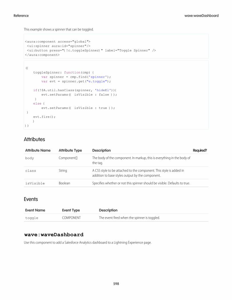
This example shows a spinner that can be toggled.
<aura:component access="global"><ui:spinner aura:id="spinner"/><ui:button press="{!c.toggleSpinner}" label="Toggle Spinner" /></aura:component>
({toggleSpinner: function(cmp) {
var spinner = cmp.find('spinner');var evt = spinner.get("e.toggle");
if(!$A.util.hasClass(spinner, 'hideEl')){evt.setParams({ isVisible : false });
}else {
evt.setParams({ isVisible : true });}
evt.fire();}
})
Attributes
Required?DescriptionAttribute TypeAttribute Name
The body of the component. In markup, this is everything in the body ofthe tag.
Component[]body
A CSS style to be attached to the component. This style is added inaddition to base styles output by the component.
Stringclass
Specifies whether or not this spinner should be visible. Defaults to true.BooleanisVisible
Events
DescriptionEvent TypeEvent Name
The event fired when the spinner is toggled.COMPONENTtoggle
wave:waveDashboardUse this component to add a Salesforce Analytics dashboard to a Lightning Experience page.
598
wave:waveDashboardReference
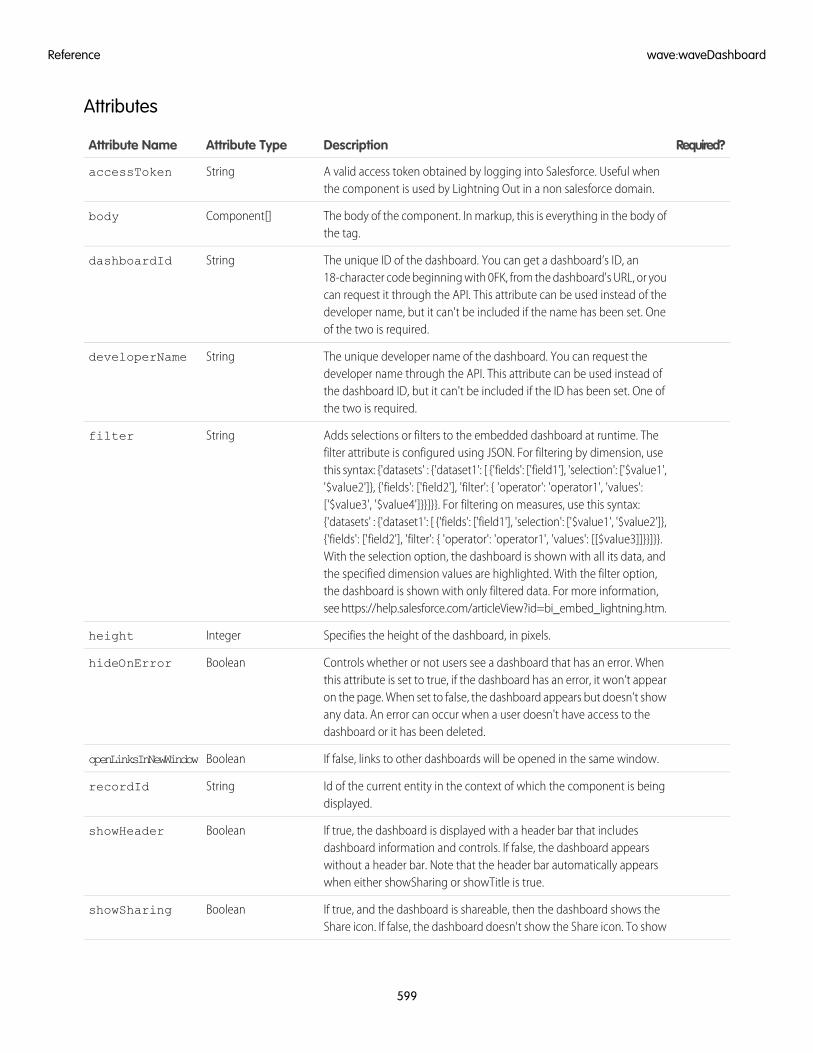
Attributes
Required?DescriptionAttribute TypeAttribute Name
A valid access token obtained by logging into Salesforce. Useful whenthe component is used by Lightning Out in a non salesforce domain.
StringaccessToken
The body of the component. In markup, this is everything in the body ofthe tag.
Component[]body
The unique ID of the dashboard. You can get a dashboard’s ID, an18-character code beginning with 0FK, from the dashboard's URL, or you
StringdashboardId
can request it through the API. This attribute can be used instead of thedeveloper name, but it can't be included if the name has been set. Oneof the two is required.
The unique developer name of the dashboard. You can request thedeveloper name through the API. This attribute can be used instead of
StringdeveloperName
the dashboard ID, but it can't be included if the ID has been set. One ofthe two is required.
Adds selections or filters to the embedded dashboard at runtime. Thefilter attribute is configured using JSON. For filtering by dimension, use
Stringfilter
this syntax: {'datasets' : {'dataset1': [ {'fields': ['field1'], 'selection': ['$value1','$value2']}, {'fields': ['field2'], 'filter': { 'operator': 'operator1', 'values':['$value3', '$value4']}}]}}. For filtering on measures, use this syntax:{'datasets' : {'dataset1': [ {'fields': ['field1'], 'selection': ['$value1', '$value2']},{'fields': ['field2'], 'filter': { 'operator': 'operator1', 'values': [[$value3]]}}]}}.With the selection option, the dashboard is shown with all its data, andthe specified dimension values are highlighted. With the filter option,the dashboard is shown with only filtered data. For more information,see https://help.salesforce.com/articleView?id=bi_embed_lightning.htm.
Specifies the height of the dashboard, in pixels.Integerheight
Controls whether or not users see a dashboard that has an error. Whenthis attribute is set to true, if the dashboard has an error, it won’t appear
BooleanhideOnError
on the page. When set to false, the dashboard appears but doesn’t showany data. An error can occur when a user doesn't have access to thedashboard or it has been deleted.
If false, links to other dashboards will be opened in the same window.BooleanopenLinksInNewWindow
Id of the current entity in the context of which the component is beingdisplayed.
StringrecordId
If true, the dashboard is displayed with a header bar that includesdashboard information and controls. If false, the dashboard appears
BooleanshowHeader
without a header bar. Note that the header bar automatically appearswhen either showSharing or showTitle is true.
If true, and the dashboard is shareable, then the dashboard shows theShare icon. If false, the dashboard doesn't show the Share icon. To show
BooleanshowSharing
599
wave:waveDashboardReference
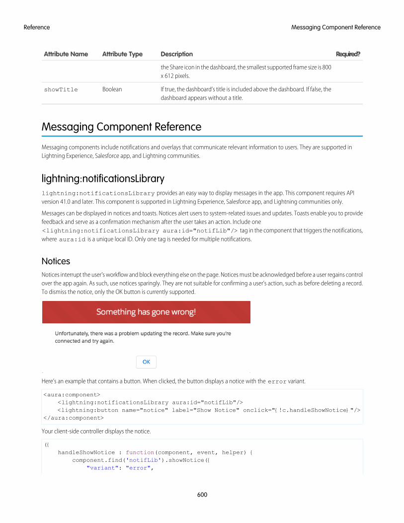
Required?DescriptionAttribute TypeAttribute Name
the Share icon in the dashboard, the smallest supported frame size is 800x 612 pixels.
If true, the dashboard’s title is included above the dashboard. If false, thedashboard appears without a title.
BooleanshowTitle
Messaging Component Reference
Messaging components include notifications and overlays that communicate relevant information to users. They are supported inLightning Experience, Salesforce app, and Lightning communities.
lightning:notificationsLibrarylightning:notificationsLibrary provides an easy way to display messages in the app. This component requires APIversion 41.0 and later. This component is supported in Lightning Experience, Salesforce app, and Lightning communities only.
Messages can be displayed in notices and toasts. Notices alert users to system-related issues and updates. Toasts enable you to providefeedback and serve as a confirmation mechanism after the user takes an action. Include one<lightning:notificationsLibrary aura:id="notifLib"/> tag in the component that triggers the notifications,where aura:id is a unique local ID. Only one tag is needed for multiple notifications.
NoticesNotices interrupt the user's workflow and block everything else on the page. Notices must be acknowledged before a user regains controlover the app again. As such, use notices sparingly. They are not suitable for confirming a user’s action, such as before deleting a record.To dismiss the notice, only the OK button is currently supported.
Here’s an example that contains a button. When clicked, the button displays a notice with the error variant.
<aura:component><lightning:notificationsLibrary aura:id="notifLib"/><lightning:button name="notice" label="Show Notice" onclick="{!c.handleShowNotice}"/>
</aura:component>
Your client-side controller displays the notice.
({handleShowNotice : function(component, event, helper) {
component.find('notifLib').showNotice({"variant": "error",
600
Messaging Component ReferenceReference
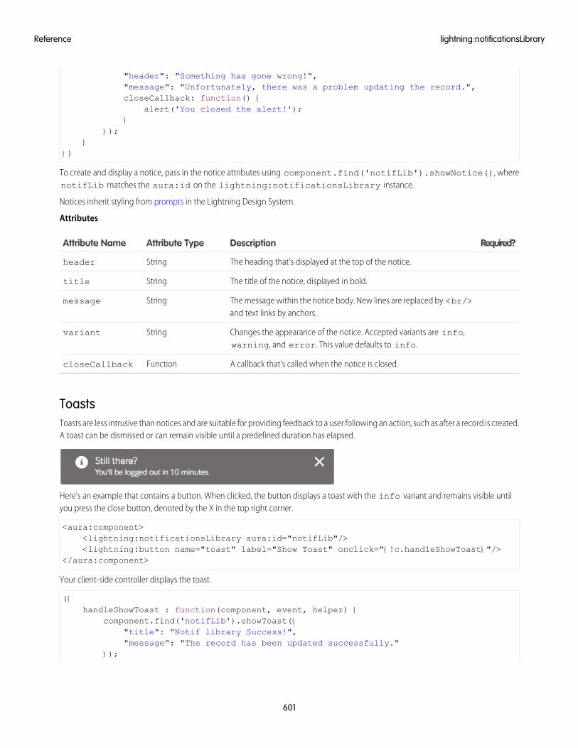
"header": "Something has gone wrong!","message": "Unfortunately, there was a problem updating the record.",closeCallback: function() {
alert('You closed the alert!');}
});}
})
To create and display a notice, pass in the notice attributes using component.find('notifLib').showNotice(), wherenotifLib matches the aura:id on the lightning:notificationsLibrary instance.
Notices inherit styling from prompts in the Lightning Design System.
Attributes
Required?DescriptionAttribute TypeAttribute Name
The heading that’s displayed at the top of the notice.Stringheader
The title of the notice, displayed in bold.Stringtitle
The message within the notice body. New lines are replaced by <br/>and text links by anchors.
Stringmessage
Changes the appearance of the notice. Accepted variants are info,warning, and error. This value defaults to info.
Stringvariant
A callback that’s called when the notice is closed.FunctioncloseCallback
ToastsToasts are less intrusive than notices and are suitable for providing feedback to a user following an action, such as after a record is created.A toast can be dismissed or can remain visible until a predefined duration has elapsed.
Here’s an example that contains a button. When clicked, the button displays a toast with the info variant and remains visible untilyou press the close button, denoted by the X in the top right corner.
<aura:component><lightning:notificationsLibrary aura:id="notifLib"/><lightning:button name="toast" label="Show Toast" onclick="{!c.handleShowToast}"/>
</aura:component>
Your client-side controller displays the toast.
({handleShowToast : function(component, event, helper) {
component.find('notifLib').showToast({"title": "Notif library Success!","message": "The record has been updated successfully."
});
601
lightning:notificationsLibraryReference
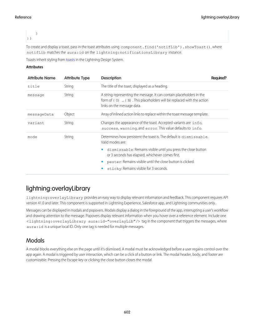
}})
To create and display a toast, pass in the toast attributes using component.find('notifLib').showToast(), wherenotifLib matches the aura:id on the lightning:notificationsLibrary instance.
Toasts inherit styling from toasts in the Lightning Design System.
Attributes
Required?DescriptionAttribute TypeAttribute Name
The title of the toast, displayed as a heading.Stringtitle
A string representing the message. It can contain placeholders in theform of {0} ... {N}. This placeholders will be replaced with the actionlinks on the message data.
Stringmessage
Array of inlined action links to replace within the toast message template.ObjectmessageData
Changes the appearance of the toast. Accepted variants are info,success, warning, and error. This value defaults to info.
Stringvariant
Determines how persistent the toast is. The default is dismissable.Valid modes are:
Stringmode
• dismissable: Remains visible until you press the close buttonor 3 seconds has elapsed, whichever comes first.
• pester: Remains visible until the close button is clicked.
• sticky: Remains visible for 3 seconds.
lightning:overlayLibrarylightning:overlayLibrary provides an easy way to display relevant information and feedback. This component requires APIversion 41.0 and later. This component is supported in Lightning Experience, Salesforce app, and Lightning communities only.
Messages can be displayed in modals and popovers. Modals display a dialog in the foreground of the app, interrupting a user’s workflowand drawing attention to the message. Popovers display relevant information when you hover over a reference element. Include one<lightning:overlayLibrary aura:id="overlayLib"/> tag in the component that triggers the messages, whereaura:id is a unique local ID. Only one tag is needed for multiple messages.
ModalsA modal blocks everything else on the page until it’s dismissed. A modal must be acknowledged before a user regains control over theapp again. A modal is triggered by user interaction, which can be a click of a button or link. The modal header, body, and footer arecustomizable. Pressing the Escape key or clicking the close button closes the modal.
602
lightning:overlayLibraryReference
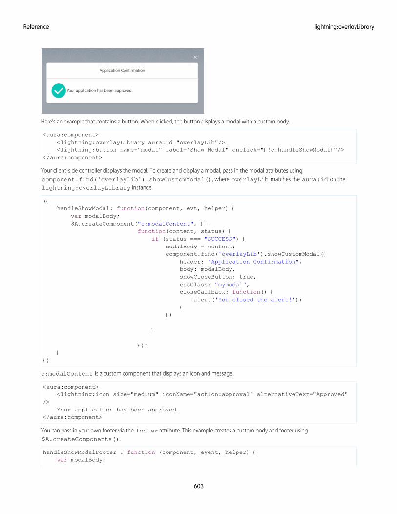
Here’s an example that contains a button. When clicked, the button displays a modal with a custom body.
<aura:component><lightning:overlayLibrary aura:id="overlayLib"/><lightning:button name="modal" label="Show Modal" onclick="{!c.handleShowModal}"/>
</aura:component>
Your client-side controller displays the modal. To create and display a modal, pass in the modal attributes usingcomponent.find('overlayLib').showCustomModal(), where overlayLib matches the aura:id on thelightning:overlayLibrary instance.
({handleShowModal: function(component, evt, helper) {
var modalBody;$A.createComponent("c:modalContent", {},
function(content, status) {if (status === "SUCCESS") {
modalBody = content;component.find('overlayLib').showCustomModal({
header: "Application Confirmation",body: modalBody,showCloseButton: true,cssClass: "mymodal",closeCallback: function() {
alert('You closed the alert!');}
})
}
});}
})
c:modalContent is a custom component that displays an icon and message.
<aura:component><lightning:icon size="medium" iconName="action:approval" alternativeText="Approved"
/>Your application has been approved.
</aura:component>
You can pass in your own footer via the footer attribute. This example creates a custom body and footer using$A.createComponents().
handleShowModalFooter : function (component, event, helper) {var modalBody;
603
lightning:overlayLibraryReference
var modalFooter;$A.createComponents([
["c:modalContent",{}],["c:modalFooter",{}]
],function(components, status){
if (status === "SUCCESS") {modalBody = components[0];modalFooter = components[1];component.find('overlayLib').showCustomModal({
header: "Application Confirmation",body: modalBody,footer: modalFooter,showCloseButton: true,cssClass: "my-modal,my-custom-class,my-other-class",closeCallback: function() {
alert('You closed the alert!');}
})}
});
}
c:modalFooter is a custom component that displays two buttons.
<aura:component><lightning:overlayLibrary aura:id="overlayLib"/><lightning:button name="cancel" label="Cancel" onclick="{!c.handleCancel}"/><lightning:button name="ok" label="OK" variant="brand" onclick="{!c.handleOK}"/>
</aura:component>
Define what happens when you click the buttons in your client-side controller.
({handleCancel : function(component, event, helper) {
//closes the modal or popover from the componentcomponent.find("overlayLib").notifyClose();
},handleOK : function(component, event, helper) {
//do something}
})
showCustomModal() and showCustomPopover() return a promise, which is useful if you want to get a reference to themodal when it’s displayed.
component.find('overlayLib').showCustomModal({//modal attributes
}).then(function (overlay) {//closes the modal immediatelyoverlay.close();
});
Modals inherit styling from modals in the Lightning Design System.
Attributes
604
lightning:overlayLibraryReference
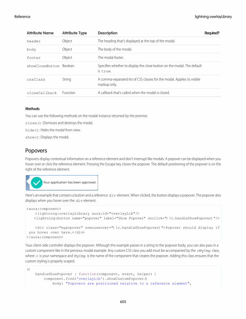
Required?DescriptionAttribute TypeAttribute Name
The heading that’s displayed at the top of the modal.Objectheader
The body of the modal.Objectbody
The modal footer.Objectfooter
Specifies whether to display the close button on the modal. The defaultis true.
BooleanshowCloseButton
A comma-separated list of CSS classes for the modal. Applies to visiblemarkup only.
StringcssClass
A callback that’s called when the modal is closed.FunctioncloseCallback
Methods
You can use the following methods on the modal instance returned by the promise.
close(): Dismisses and destroys the modal.
hide(): Hides the modal from view.
show(): Displays the modal.
PopoversPopovers display contextual information on a reference element and don’t interrupt like modals. A popover can be displayed when youhover over or click the reference element. Pressing the Escape key closes the popover. The default positioning of the popover is on theright of the reference element.
Here’s an example that contains a button and a reference div element. When clicked, the button displays a popover. The popover alsodisplays when you hover over the div element.
<aura:component><lightning:overlayLibrary aura:id="overlayLib"/><lightning:button name="popover" label="Show Popover" onclick="{!c.handleShowPopover}"/>
<div class="mypopover" onmouseover="{!c.handleShowPopover}">Popover should display ifyou hover over here.</div></aura:component>
Your client-side controller displays the popover. Although this example passes in a string to the popover body, you can also pass in acustom component like in the previous modal example. Any custom CSS class you add must be accompanied by the cMyCmp class,where c is your namespace and MyCmp is the name of the component that creates the popover. Adding this class ensures that thecustom styling is properly scoped.
({handleShowPopover : function(component, event, helper) {
component.find('overlayLib').showCustomPopover({body: "Popovers are positioned relative to a reference element",
605
lightning:overlayLibraryReference
referenceSelector: ".mypopover",cssClass: "popoverclass, cMyCmp"
}).then(function (overlay) {setTimeout(function(){
//close the popover after 3 secondsoverlay.close();
}, 3000);});
}})
To create and display a popover, pass in the popover attributes usingcomponent.find('overlayLib').showCustomPopover(), where overlayLib matches the aura:id on thelightning:overlayLibrary instance.
The CSS class sets the minimum height on the popover.
.THIS.popoverclass {min-height: 100px;
}
Popovers inherit styling from popovers in the Lightning Design System.
To append popover modifier classes, include them in cssClass. The following example adds the slds-popover_walkthroughclass for a dark theme. The pointer is hidden and replaced by the slds-nubbin_left class. To hide the pointer, add the followingCSS rule.
.THIS.no-pointer .pointer{visibility: hidden;
}
Update the cssClass attribute. The cMyCmp class corresponds to your namespace and component name, and is case-sensitive.
cssClass: "slds-nubbin_left,slds-popover_walkthrough,no-pointer,cMyCmp"
Attributes
Required?DescriptionAttribute TypeAttribute Name
The body of the popover.Objectbody
The reference element to which the popover is appended. The popoveris appended to the right of the reference element.
ObjectreferenceSelector
A comma-separated list of CSS classes for the popover. Applies to visiblemarkup only.
StringcssClass
Methods
You can use the following methods on the modal instance returned by the promise.
close(): Dismisses and destroys the modal.
hide(): Hides the modal from view.
show(): Displays the modal.
606
lightning:overlayLibraryReference
Interface Reference
Implement these platform interfaces to allow a component to be used in different contexts, or to enable your component to receiveextra context data. A component can implement multiple interfaces. Some interfaces are intended to be implemented together, whileothers are mutually exclusive. Some interfaces have an effect only in Lightning Experience and the Salesforce app.
clients:availableForMailAppAppPageTo appear in the Lightning App Builder or a Lightning Page in Lightning for Outlook or Lightning for Gmail, a component mustimplement the clients:availableForMailAppAppPage interface. For more information, see Create Components forLightning for Outlook and Lightning for Gmail.
clients:hasEventContextEnables a component to be assigned to an event’s date or location attributes in Lightning for Outlook and Lightning for Gmail. Formore information, see Create Components for Lightning for Outlook and Lightning for Gmail.
clients:hasItemContextEnables a component to be assigned to an email’s or a calendar event’s item attributes in Lightning for Outlook and Lightning forGmail. For more information, see Create Components for Lightning for Outlook and Lightning for Gmail.
flexipage:availableForAllPageTypesA global interface that makes a component available in the Lightning App Builder, and for any type of Lightning page. For moreinformation, see Configure Components for Lightning Pages and the Lightning App Builder.
To appear in the utility bar, a component must implement the flexipage:availableForAllPageTypes interface. Formore information, see Add a Utility Bar to Lightning Appsin Salesforce Help.
flexipage:availableForRecordHomeIf your component is designed only for record pages, implement the flexipage:availableForRecordHome interfaceinstead of flexipage:availableForAllPageTypes. For more information, see Configure Components for LightningExperience Record Pages.
forceCommunity:availableForAllPageTypesTo appear in Community Builder, a component must implement the forceCommunity:availableForAllPageTypesinterface. For more information, see Configure Components for Communities.
force:appHostableAllows a component to be used as a custom tab in Lightning Experience or the Salesforce app. For more information, see AddLightning Components as Custom Tabs in Lightning Experience.
force:lightningQuickActionAllows a component to display in a panel with standard action controls, such as a Cancel button. These components can also displayand implement their own controls, but should handle events from the standard controls. If you implementforce:lightningQuickAction, you can’t implement force:lightningQuickActionWithoutHeader withinthe same component. For more information, see Configure Components for Custom Actions.
force:lightningQuickActionWithoutHeaderAllows a component to display in a panel without additional controls. The component should provide a complete user interface forthe action. If you implement force:lightningQuickActionWithoutHeader, you can’t implementforce:lightningQuickAction within the same component. For more information, see Configure Components for CustomActions.
ltng:allowGuestAccessAdd the ltng:allowGuestAccess interface to your Lightning Out dependency app to make it available to users withoutrequiring them to authenticate with Salesforce. This interface lets you build your app with Lightning components, and deploy itanywhere and to anyone. For more information, see Share Lightning Out Apps with Non-Authenticated Users.
607
Interface ReferenceReference
IN THIS SECTION:
force:hasRecordId
Add the force:hasRecordId interface to a Lightning component to enable the component to be assigned the ID of thecurrent record. The current record ID is useful if the component is used on a Lightning record page, as an object-specific customaction or action override in Lightning Experience or the Salesforce app, and so on. This interface has no effect except when usedwithin Lightning Experience, Salesforce app, and template-based communities.
force:hasSObjectName
Add the force:hasSObjectName interface to a Lightning component to enable the component to be assigned the API nameof current record’s sObject type. The sObject name is useful if the component can be used with records of different sObject types,and needs to adapt to the specific type of the current record. This interface has no effect except when used within LightningExperience, Salesforce app, and template-based communities.
lightning:actionOverride
Add the lightning:actionOverride interface to a Lightning component to enable the component to be used to overridea standard action on an object. You can override the View, New, Edit, and Tab standard actions on most standard and all customcomponents. This interface has no effect except when used within Lightning Experience and the Salesforce app.
lightning:appHomeTemplate
Implement the lightning:appHomeTemplate interface to enable your component to be used as a custom Lightning pagetemplate for pages of type App Page. This interface has no effect except when used within Lightning Experience and the Salesforceapp.
lightning:availableForChatterExtensionComposer
Use the lightning:availableForChatterExtensionComposer interface to integrate your custom apps into theChatter publisher and place the custom app’s payload in the feed. This interface is available in Lightning communities.
lightning:availableForChatterExtensionRenderer
Use the lightning:availableForChatterExtensionRenderer interface to integrate your custom apps into theChatter publisher and place the custom app’s payload in the feed. This interface is available in Lightning communities.
lightning:homeTemplate
Implement the lightning:homeTemplate interface to enable your component to be used as a custom Lightning pagetemplate for the Lightning Experience Home page. This interface has no effect except when used within Lightning Experience.
lightning:recordHomeTemplate
Implement the lightning:recordHomeTemplate interface to enable your component to be used as a custom Lightningpage template for object record pages. This interface has no effect except when used within Lightning Experience.
force:hasRecordIdAdd the force:hasRecordId interface to a Lightning component to enable the component to be assigned the ID of the currentrecord. The current record ID is useful if the component is used on a Lightning record page, as an object-specific custom action or actionoverride in Lightning Experience or the Salesforce app, and so on. This interface has no effect except when used within LightningExperience, Salesforce app, and template-based communities.
This interface is a marker interface. A marker interface is a signal to the component’s container to add the interface’s behavior to thecomponent. You don’t need to implement any specific methods or attributes in your component, you simply add the interface nameto the component’s implements attribute.
The force:hasRecordId interface does two things to a component that implements it.
608
force:hasRecordIdReference
• It adds an attribute named recordId to your component. This attribute is of type String, and its value is an 18-character Salesforcerecord ID, for example: 001xx000003DGSWAA4. If you added it yourself, the attribute definition would look like the following markup:
<aura:attribute name="recordId" type="String" />
Note: If your component implements force:hasRecordId, you don’t need to add a recordId attribute to thecomponent yourself. If you do add it, don’t change the access level or type of the attribute or the component will cause aruntime error.
• When your component is invoked in a record context in Lightning Experience or the Salesforce app, the recordId is set to theID of the record being viewed.
Important: The recordId attribute is set only when you place or invoke the component in an explicit record context. Forexample, when you place the component directly on a record page layout, or invoke it as an object-specific action from a recordpage or object home. In all other cases, such as when you invoke the component as a global action, or create the componentprogrammatically inside another component, recordId isn’t set, and your component shouldn’t depend on it.
These unsupported contexts include a few contexts that might seem like they should have access to the current record. Examplesof these other contexts include the following:
• Invoking the component from a global action (even when you’re on a record page)
• Invoking the component from header or footer navigation in a community (even if the page shows a record)
force:hasRecordId and force:hasSObjectName are unsupported in these contexts. While the marker interfacesstill add the relevant attribute to the component, accessing either attribute generally returns null or undefined.
Example: This example shows the markup required to add the force:hasRecordId interface to a Lightning component.
<aura:component implements="force:lightningQuickAction,force:hasRecordId">
<!-- ... -->
</aura:component>
The component’s controller can access the ID of the current record from the recordId attribute, usingcomponent.get("v.recordId"). The recordId attribute is automatically added to the component by theforce:hasRecordId interface.
force:hasSObjectNameAdd the force:hasSObjectName interface to a Lightning component to enable the component to be assigned the API name ofcurrent record’s sObject type. The sObject name is useful if the component can be used with records of different sObject types, andneeds to adapt to the specific type of the current record. This interface has no effect except when used within Lightning Experience,Salesforce app, and template-based communities.
This interface is a marker interface. A marker interface is a signal to the component’s container to add the interface’s behavior to thecomponent. You don’t need to implement any specific methods or attributes in your component, you simply add the interface nameto the component’s implements attribute.
This interface adds an attribute named sObjectName to your component. This attribute is of type String, and its value is the APIname of an object, such as Account or myNamespace__myObject__c. For example:
<aura:attribute name="sObjectName" type="String" />
609
force:hasSObjectNameReference
Note: If your component implements force:hasSObjectName, you don’t need to add an sObjectName attribute tothe component yourself. If you do add it, don’t change the access level or type of the attribute or the component will cause aruntime error.
Important: The sObjectName attribute is set only when you place or invoke the component in an explicit record context.For example, when you place the component directly on a record page layout, or invoke it as an object-specific action from arecord page or object home. In all other cases, such as when you invoke the component as a global action, or create the componentprogrammatically inside another component, sObjectName isn’t set, and your component shouldn’t depend on it.
These unsupported contexts include a few contexts that might seem like they should have access to the current record. Examplesof these other contexts include the following:
• Invoking the component from a global action (even when you’re on a record page)
• Invoking the component from header or footer navigation in a community (even if the page shows a record)
force:hasRecordId and force:hasSObjectName are unsupported in these contexts. While the marker interfacesstill add the relevant attribute to the component, accessing either attribute generally returns null or undefined.
Example: This example shows the markup required to add the force:hasSObjectName interface to a Lightning component.
<aura:component implements="force:lightningQuickAction,force:hasSObjectName">
<!-- ... -->
</aura:component>
The component’s controller can access the ID of the current record from the recordId attribute, usingcomponent.get("v.sObjectName"). The recordId attribute is automatically added to the component by theforce:hasSObjectName interface.
lightning:actionOverrideAdd the lightning:actionOverride interface to a Lightning component to enable the component to be used to override astandard action on an object. You can override the View, New, Edit, and Tab standard actions on most standard and all custom components.This interface has no effect except when used within Lightning Experience and the Salesforce app.
This interface is a marker interface. A marker interface is a signal to the component’s container to add the interface’s behavior to thecomponent. You don’t need to implement any specific methods or attributes in your component, you simply add the interface nameto the component’s implements attribute.
The lightning:actionOverride doesn’t add or require any attributes on components that implement it. Components thatimplement this interface don’t automatically override any action. You need to manually override relevant actions in Setup.
Only components that implement this interface appear in the Lightning Component Bundle menu of an object action OverrideProperties panel.
Example: This example shows the markup required to add the lightning:actionOverride interface to a Lightningcomponent.
<aura:componentimplements="lightning:actionOverride,force:hasRecordId,force:hasSObjectName">
<article class="slds-card"><div class="slds-card__header slds-grid"><header class="slds-media slds-media_center slds-has-flexi-truncate">
610
lightning:actionOverrideReference
<div class="slds-media__body"><h2><span class="slds-text-heading_small">Expense Details</span></h2>
</div></header><div class="slds-no-flex">
<lightning:button label="Edit" onclick="{!c.handleEdit}"/></div>
</div><div class="slds-card__body">(expense details go here)</div>
</article></aura:component>
In Lightning Experience, the standard Tab and View actions display as a page, while the standard New and Edit actions display inan overlaid panel. When used as action overrides, Lightning components that implement the lightning:actionOverrideinterface replace the standard behavior completely. However, overridden actions always display as a page, not as a panel. Yourcomponent displays without controls, except for the main Lightning Experience navigation bar. Your component is expected toprovide a complete user interface for the action, including navigation or actions beyond the navigation bar.
lightning:appHomeTemplateImplement the lightning:appHomeTemplate interface to enable your component to be used as a custom Lightning pagetemplate for pages of type App Page. This interface has no effect except when used within Lightning Experience and the Salesforce app.
Components that implement this interface appear in the Custom Templates section of the Lightning App Builder new page wizard forapp pages.
Important: Each template component should implement only one template interface. Template components shouldn’t implementany other type of interface, such as flexipage:availableForAllPageTypes or force:hasRecordId. A templatecomponent can’t multi-task as a regular Lightning component. It’s either a template, or it’s not.
lightning:availableForChatterExtensionComposerUse the lightning:availableForChatterExtensionComposer interface to integrate your custom apps into the Chatterpublisher and place the custom app’s payload in the feed. This interface is available in Lightning communities.
The lightning:availableForChatterExtensionComposer interface works with thelightning:availableForChatterExtensionRenderer interface and thelightning:sendChatterExtensionPayload event to integrate your custom apps into the Chatter publisher and to renderthe app’s payload in the feed.
Note: For the full integration picture, see Integrate Your Custom Apps into the Chatter Publisher.
611
lightning:appHomeTemplateReference
lightning:availableForChatterExtensionRendererUse the lightning:availableForChatterExtensionRenderer interface to integrate your custom apps into the Chatterpublisher and place the custom app’s payload in the feed. This interface is available in Lightning communities.
The lightning:availableForChatterExtensionRenderer interface works with thelightning:availableForChatterExtensionComposer interface and thelightning:sendChatterExtensionPayload event to integrate your custom apps into the Chatter publisher and to renderthe app’s payload in the feed.
Note: For the full integration picture, see Integrate Your Custom Apps into the Chatter Publisher.
Fields
Required?DescriptionTypeAttribute Name
NoPayload data that was saved with the feed item is provided to the componentthat is implementing this interface
Objectpayload
NoAn enum that can take one of two values: PREVIEW or RENDER. The selectedvalue is provided to the component that is implementing this interface.
Stringvariant
PREVIEW specifies that the attachment is used as a preview in the publisher.RENDER specifies that the attachment is rendered with the feed item
lightning:homeTemplateImplement the lightning:homeTemplate interface to enable your component to be used as a custom Lightning page templatefor the Lightning Experience Home page. This interface has no effect except when used within Lightning Experience.
Components that implement this interface appear in the Custom Templates section of the Lightning App Builder new page wizard forHome pages.
Important: Each template component should implement only one template interface. Template components shouldn’t implementany other type of interface, such as flexipage:availableForAllPageTypes or force:hasRecordId. A templatecomponent can’t multi-task as a regular Lightning component. It’s either a template, or it’s not.
lightning:recordHomeTemplateImplement the lightning:recordHomeTemplate interface to enable your component to be used as a custom Lightning pagetemplate for object record pages. This interface has no effect except when used within Lightning Experience.
Components that implement this interface appear in the Custom Templates section of the Lightning App Builder new page wizard forrecord pages.
Important: Each template component should implement only one template interface. Template components shouldn’t implementany other type of interface, such as flexipage:availableForAllPageTypes or force:hasRecordId. A templatecomponent can’t multi-task as a regular Lightning component. It’s either a template, or it’s not.
612
lightning:availableForChatterExtensionRendererReference
Event Reference
Use out-of-the-box events to enable component interaction within Lightning Experience or the Salesforce app, or within your Lightningcomponents. For example, these events enable your components to open a record create or edit page, or navigate to a record.
Events belong to different namespaces, including:
forceProvides events that are handled by Lightning Experience and the Salesforce app.
forceCommunityProvides events that are handled by Communities.
lightningProvides events that are handled by Lightning Experience, the Salesforce app, and Communities.
ltngProvides events that send the record ID or generic message to another component.
uiProvides events that are handled by the legacy ui components.
waveProvides events that are handled by Wave Analytics.
If you fire one of these force or lightning events in your Lightning apps or components outside of the Salesforce app or LightningExperience:
• You must handle the event by using the <aura:handler> tag in the handling component.
• Use the <aura:registerEvent> or <aura:dependency> tags to ensure that the event is sent to the client, whenneeded.
SEE ALSO:
aura:dependency
Events Handled in the Salesforce mobile app and Lightning Experience
Fire Component Events
Fire Application Events
force:closeQuickActionCloses a quick action panel. Only one quick action panel can be open in the app at a time.
To close a quick action panel, usually in response to completing or canceling the action, run$A.get("e.force:closeQuickAction").fire();.
This example closes the quick action panel after processing the input from the panel’s user interface and displaying a “toast” messagewith the processing results. While the processing and the toast are unrelated to closing the quick action, the sequence is important.Firing force:closeQuickAction should be the last thing your quick action handler does.
/*quickAddController.js*/({
clickAdd: function(component, event, helper) {
// Get the values from the formvar n1 = component.find("num1").get("v.value");
613
Event ReferenceReference
var n2 = component.find("num2").get("v.value");
// Display the total in a "toast" status messagevar resultsToast = $A.get("e.force:showToast");resultsToast.setParams({
"title": "Quick Add: " + n1 + " + " + n2,"message": "The total is: " + (n1 + n2) + "."
});resultsToast.fire();
// Close the action panelvar dismissActionPanel = $A.get("e.force:closeQuickAction");dismissActionPanel.fire();
}
})
Note: This event is handled by the one.app container. It’s supported in Lightning Experience and the Salesforce app only.
force:createRecordOpens a page to create a record for the specified entityApiName, for example, “Account” or “myNamespace__MyObject__c”.
To display the record create page for an object, set the object name on the entityApiName attribute and fire the event.recordTypeId is optional and, if provided, specifies the record type for the created object. defaultFieldValues is optionaland, if provided, specifies values to use to prepopulate the create record form.
This example displays the record create panel for contacts.
createRecord : function (component, event, helper) {var createRecordEvent = $A.get("e.force:createRecord");createRecordEvent.setParams({
"entityApiName": "Contact"});createRecordEvent.fire();
}
Note: This event is handled by the one.app container. It’s supported in Lightning Experience, the Salesforce app, and Lightningcommunities. This event presents a standard page to create a record. That is, it doesn’t respect overrides on the object’s createaction.
Prepopulating Field ValuesThe defaultFieldValues attribute lets you prepopulate the create record form with default or calculated field values. Prepopulatedvalues can accelerate data entry, improve data consistency, and otherwise make the process of creating a record easier. Specify defaultfield values as name-value pairs in a JavaScript object.
This example displays the record create panel for a contact with two fields prepopulated.
var createAcountContactEvent = $A.get("e.force:createRecord");createAcountContactEvent.setParams({
"entityApiName": "Contact","defaultFieldValues": {
'Phone' : '415-240-6590',
614
force:createRecordReference
'AccountId' : '001xxxxxxxxxxxxxxx'}
});createAcountContactEvent.fire();
You can specify values for fields even if they’re not available in the create record form.
• If the field is hidden because it’s not on the page layout, the value specified in defaultFieldValues is saved with the newrecord.
• If the current user doesn’t have create access to the field, due to field-level security, attempts to save the new record result in anerror.
Important: Error messages can’t reference fields the current user doesn’t have access to. This constraint means the user won’tknow why the error occurred or how to resolve the issue.
Firing the force:createRecord event tells the app to use the standard create record page. You can’t catch errors thatoccur there, or alter the create page interface or behavior, for example, to show an improved error message. For this reason, it’sessential to perform access checks in your own code, before firing the event.
You can’t prepopulate system-maintained fields, such as Id or record modification time stamps. Default values for these fields aresilently ignored.
Prepopulating rich text fields is unsupported. It might work for simple values, but the internal format of rich text fields is undocumented,so setting complex values that include formatting is problematic. Use at your own risk.
Date and time field values must use the ISO 8601 format. For example:
• Date: 2017-07-18
• Datetime: 2017-07-18T03:00:00Z
Note: While the create record panel presents datetime values in the user’s local time, you must convert datetime values to UTCto prepopulate the field.
Required?DescriptionTypeAttribute Name
YesThe API name of the custom or standard object, such as “Account”, “Case”,“Contact”, “Lead”, “Opportunity”, or “namespace__objectName__c”.
StringentityApiName
Prepopulates fields on a record create panel, including fields not displayedon the panel. ID fields and rich text fields can’t be prepopulated. Users must
StringdefaultFieldValues
have create access to fields with prepopulated values. Errors during savingthat are caused by field access limitations don’t display error messages.
The ID of the record type, if record types are available for the object.StringrecordTypeId
force:editRecordOpens the page to edit the record specified by recordId.
To display the record edit page for an object, set the object name on the recordId attribute and fire the event. This example displaysthe record edit page for a contact that’s specified by recordId.
editRecord : function(component, event, helper) {var editRecordEvent = $A.get("e.force:editRecord");editRecordEvent.setParams({
615
force:editRecordReference
"recordId": component.get("v.contact.Id")});editRecordEvent.fire();
}
Note: This event is handled by the one.app container. It’s supported in Lightning Experience, the Salesforce app, and Lightningcommunities.
Required?DescriptionTypeAttribute Name
YesThe record ID associated with the record to be edited.StringrecordId
force:navigateToComponent (Beta)Navigates from one Lightning component to another.
Note: This release contains a beta version of force:navigateToComponent with known limitations.
To navigate from a Lightning component to another, specify the component name using componentDef. This example navigatesto a component c:myComponent and sets a value on the contactName attribute.
navigateToMyComponent : function(component, event, helper) {var evt = $A.get("e.force:navigateToComponent");evt.setParams({
componentDef : "c:myComponent",componentAttributes: {
contactName : component.get("v.contact.Name")}
});evt.fire();
}
When fired from a component embedded in Lightning Experience or Salesforce app, the app creates and renders the target componentin the app content area, replacing the current content. If you create a Lightning component tab and associate it directly with thecomponent, this event lets you navigate to the tab associated with the target component. To create a Lightning component tab andassociate it with the component, from Setup, enter Tabs in the Quick Find box, and then select Tabs.
This event doesn’t support target components that are embedded in another tab or in multiple tabs.
You can navigate only to a component that’s marked access="global" or a component within the current namespace.
Don’t depend on the URL generated by this event. It appears in the browser location bar and can be bookmarked, but the URL isn’tpermanent.
Note: This event is handled by the one.app container. It’s supported in Lightning Experience and Salesforce app only.
Required?DescriptionTypeAttribute Name
The component to navigate to, for example, c:myComponentStringcomponentDef
The attributes for the componentObjectcomponentAttributes
Specifies whether the navigation is a redirect. If true, the browser replacesthe current URL with the new one in the navigation history. This valuedefaults to false.
Booleanisredirect
616
force:navigateToComponent (Beta)Reference
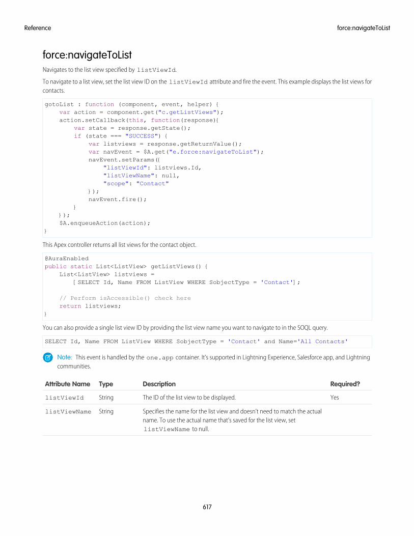
force:navigateToListNavigates to the list view specified by listViewId.
To navigate to a list view, set the list view ID on the listViewId attribute and fire the event. This example displays the list views forcontacts.
gotoList : function (component, event, helper) {var action = component.get("c.getListViews");action.setCallback(this, function(response){
var state = response.getState();if (state === "SUCCESS") {
var listviews = response.getReturnValue();var navEvent = $A.get("e.force:navigateToList");navEvent.setParams({
"listViewId": listviews.Id,"listViewName": null,"scope": "Contact"
});navEvent.fire();
}});$A.enqueueAction(action);
}
This Apex controller returns all list views for the contact object.
@AuraEnabledpublic static List<ListView> getListViews() {
List<ListView> listviews =[SELECT Id, Name FROM ListView WHERE SobjectType = 'Contact'];
// Perform isAccessible() check herereturn listviews;
}
You can also provide a single list view ID by providing the list view name you want to navigate to in the SOQL query.
SELECT Id, Name FROM ListView WHERE SobjectType = 'Contact' and Name='All Contacts'
Note: This event is handled by the one.app container. It’s supported in Lightning Experience, Salesforce app, and Lightningcommunities.
Required?DescriptionTypeAttribute Name
YesThe ID of the list view to be displayed.StringlistViewId
Specifies the name for the list view and doesn’t need to match the actualname. To use the actual name that’s saved for the list view, setlistViewName to null.
StringlistViewName
617
force:navigateToListReference
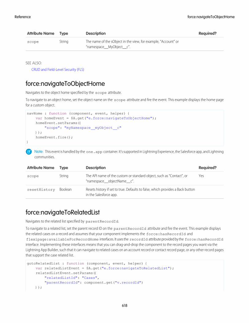
Required?DescriptionTypeAttribute Name
The name of the sObject in the view, for example, “Account” or“namespace__MyObject__c”.
Stringscope
SEE ALSO:
CRUD and Field-Level Security (FLS)
force:navigateToObjectHomeNavigates to the object home specified by the scope attribute.
To navigate to an object home, set the object name on the scope attribute and fire the event. This example displays the home pagefor a custom object.
navHome : function (component, event, helper) {var homeEvent = $A.get("e.force:navigateToObjectHome");homeEvent.setParams({
"scope": "myNamespace__myObject__c"});homeEvent.fire();
}
Note: This event is handled by the one.app container. It’s supported in Lightning Experience, the Salesforce app, and Lightningcommunities.
Required?DescriptionTypeAttribute Name
YesThe API name of the custom or standard object, such as “Contact”, or“namespace__objectName__c”.
Stringscope
Resets history if set to true. Defaults to false, which provides a Back buttonin the Salesforce app.
BooleanresetHistory
force:navigateToRelatedListNavigates to the related list specified by parentRecordId.
To navigate to a related list, set the parent record ID on the parentRecordId attribute and fire the event. This example displaysthe related cases on a record and assumes that your component implements the force:hasRecordId andflexipage:availableForRecordHome interfaces. It uses the recordId attribute provided by the force:hasRecordIdinterface. Implementing these interfaces means that you can drag-and-drop the component to the record pages you want via theLightning App Builder, such that it can navigate to related cases on an account record or contact record page, or any other record pagesthat support the case related list.
gotoRelatedList : function (component, event, helper) {var relatedListEvent = $A.get("e.force:navigateToRelatedList");relatedListEvent.setParams({
"relatedListId": "Cases","parentRecordId": component.get("v.recordId")
});
618
force:navigateToObjectHomeReference
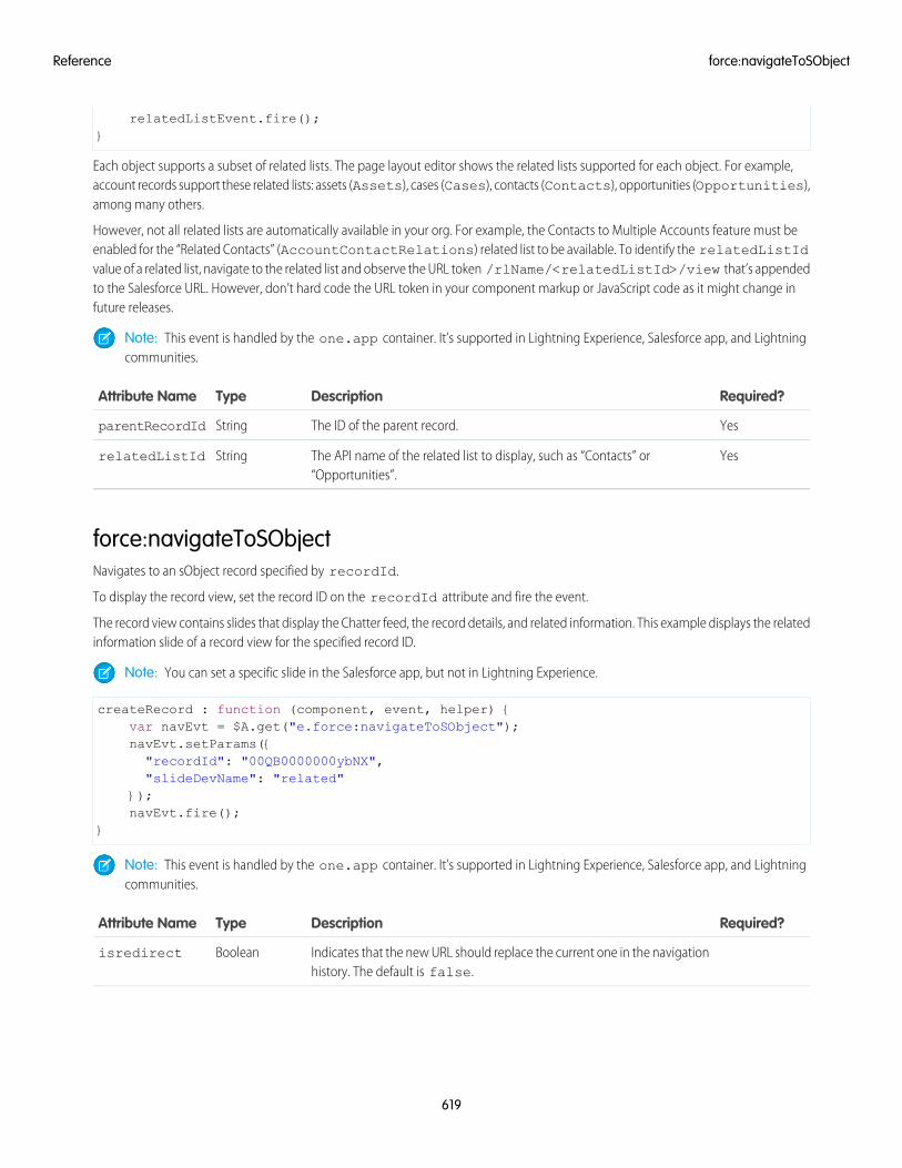
relatedListEvent.fire();}
Each object supports a subset of related lists. The page layout editor shows the related lists supported for each object. For example,account records support these related lists: assets (Assets), cases (Cases), contacts (Contacts), opportunities (Opportunities),among many others.
However, not all related lists are automatically available in your org. For example, the Contacts to Multiple Accounts feature must beenabled for the “Related Contacts” (AccountContactRelations) related list to be available. To identify the relatedListIdvalue of a related list, navigate to the related list and observe the URL token /rlName/<relatedListId>/view that’s appendedto the Salesforce URL. However, don’t hard code the URL token in your component markup or JavaScript code as it might change infuture releases.
Note: This event is handled by the one.app container. It’s supported in Lightning Experience, Salesforce app, and Lightningcommunities.
Required?DescriptionTypeAttribute Name
YesThe ID of the parent record.StringparentRecordId
YesThe API name of the related list to display, such as “Contacts” or“Opportunities”.
StringrelatedListId
force:navigateToSObjectNavigates to an sObject record specified by recordId.
To display the record view, set the record ID on the recordId attribute and fire the event.
The record view contains slides that display the Chatter feed, the record details, and related information. This example displays the relatedinformation slide of a record view for the specified record ID.
Note: You can set a specific slide in the Salesforce app, but not in Lightning Experience.
createRecord : function (component, event, helper) {var navEvt = $A.get("e.force:navigateToSObject");navEvt.setParams({"recordId": "00QB0000000ybNX","slideDevName": "related"
});navEvt.fire();
}
Note: This event is handled by the one.app container. It’s supported in Lightning Experience, Salesforce app, and Lightningcommunities.
Required?DescriptionTypeAttribute Name
Indicates that the new URL should replace the current one in the navigationhistory. The default is false.
Booleanisredirect
619
force:navigateToSObjectReference
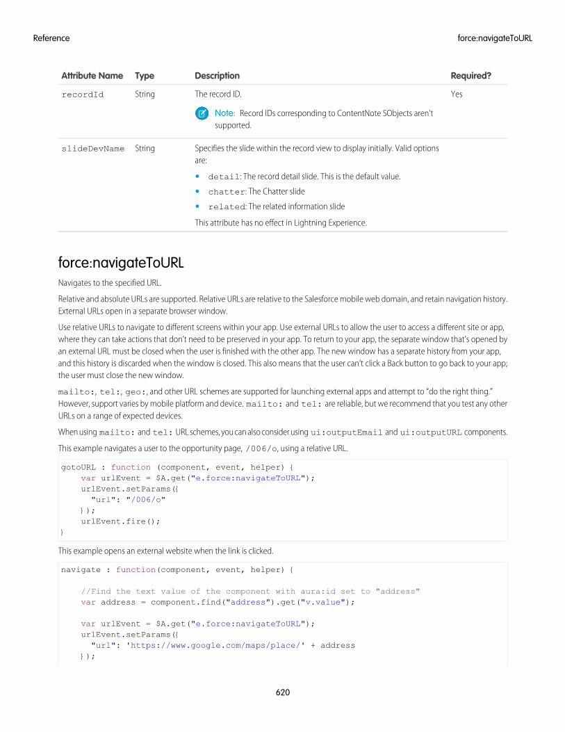
Required?DescriptionTypeAttribute Name
YesThe record ID.StringrecordId
Note: Record IDs corresponding to ContentNote SObjects aren’tsupported.
Specifies the slide within the record view to display initially. Valid optionsare:
StringslideDevName
• detail: The record detail slide. This is the default value.
• chatter: The Chatter slide
• related: The related information slide
This attribute has no effect in Lightning Experience.
force:navigateToURLNavigates to the specified URL.
Relative and absolute URLs are supported. Relative URLs are relative to the Salesforce mobile web domain, and retain navigation history.External URLs open in a separate browser window.
Use relative URLs to navigate to different screens within your app. Use external URLs to allow the user to access a different site or app,where they can take actions that don’t need to be preserved in your app. To return to your app, the separate window that’s opened byan external URL must be closed when the user is finished with the other app. The new window has a separate history from your app,and this history is discarded when the window is closed. This also means that the user can’t click a Back button to go back to your app;the user must close the new window.
mailto:, tel:, geo:, and other URL schemes are supported for launching external apps and attempt to “do the right thing.”However, support varies by mobile platform and device. mailto: and tel: are reliable, but we recommend that you test any otherURLs on a range of expected devices.
When using mailto: and tel: URL schemes, you can also consider using ui:outputEmail and ui:outputURL components.
This example navigates a user to the opportunity page, /006/o, using a relative URL.
gotoURL : function (component, event, helper) {var urlEvent = $A.get("e.force:navigateToURL");urlEvent.setParams({"url": "/006/o"
});urlEvent.fire();
}
This example opens an external website when the link is clicked.
navigate : function(component, event, helper) {
//Find the text value of the component with aura:id set to "address"var address = component.find("address").get("v.value");
var urlEvent = $A.get("e.force:navigateToURL");urlEvent.setParams({"url": 'https://www.google.com/maps/place/' + address
});
620
force:navigateToURLReference
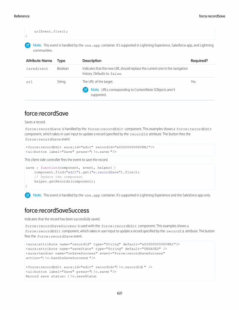
urlEvent.fire();}
Note: This event is handled by the one.app container. It’s supported in Lightning Experience, Salesforce app, and Lightningcommunities.
Required?DescriptionTypeAttribute Name
Indicates that the new URL should replace the current one in the navigationhistory. Defaults to false.
Booleanisredirect
YesThe URL of the target.Stringurl
Note: URLs corresponding to ContentNote SObjects aren’tsupported.
force:recordSaveSaves a record.
force:recordSave is handled by the force:recordEdit component. This examples shows a force:recordEditcomponent, which takes in user input to update a record specified by the recordId attribute. The button fires theforce:recordSave event.
<force:recordEdit aura:id="edit" recordId="a02D0000006V8Ni"/><ui:button label="Save" press="{!c.save}"/>
This client-side controller fires the event to save the record.
save : function(component, event, helper) {component.find("edit").get("e.recordSave").fire();// Update the componenthelper.getRecords(component);
}
Note: This event is handled by the one.app container. It’s supported in Lightning Experience and the Salesforce app only.
force:recordSaveSuccessIndicates that the record has been successfully saved.
force:recordSaveSuccess is used with the force:recordEdit component. This examples shows aforce:recordEdit component, which takes in user input to update a record specified by the recordId attribute. The buttonfires the force:recordSave event.
<aura:attribute name="recordId" type="String" default="a02D0000006V8Ni"/><aura:attribute name="saveState" type="String" default="UNSAVED" /><aura:handler name="onSaveSuccess" event="force:recordSaveSuccess"action="{!c.handleSaveSuccess}"/>
<force:recordEdit aura:id="edit" recordId="{!v.recordId}" /><ui:button label="Save" press="{!c.save}"/>Record save status: {!v.saveState}
621
force:recordSaveReference
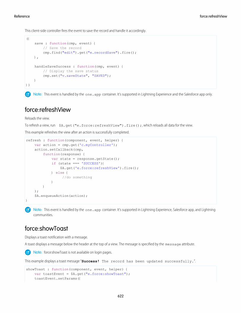
This client-side controller fires the event to save the record and handle it accordingly.
({save : function(cmp, event) {
// Save the recordcmp.find("edit").get("e.recordSave").fire();
},
handleSaveSuccess : function(cmp, event) {// Display the save statuscmp.set("v.saveState", "SAVED");
}})
Note: This event is handled by the one.app container. It’s supported in Lightning Experience and the Salesforce app only.
force:refreshViewReloads the view.
To refresh a view, run $A.get("e.force:refreshView").fire();, which reloads all data for the view.
This example refreshes the view after an action is successfully completed.
refresh : function(component, event, helper) {var action = cmp.get('c.myController');action.setCallback(cmp,
function(response) {var state = response.getState();if (state === 'SUCCESS'){
$A.get('e.force:refreshView').fire();} else {
//do something}
});$A.enqueueAction(action);
}
Note: This event is handled by the one.app container. It’s supported in Lightning Experience, Salesforce app, and Lightningcommunities.
force:showToastDisplays a toast notification with a message.
A toast displays a message below the header at the top of a view. The message is specified by the message attribute.
Note: force:showToast is not available on login pages.
This example displays a toast message “Success! The record has been updated successfully.”.
showToast : function(component, event, helper) {var toastEvent = $A.get("e.force:showToast");toastEvent.setParams({
622
force:refreshViewReference
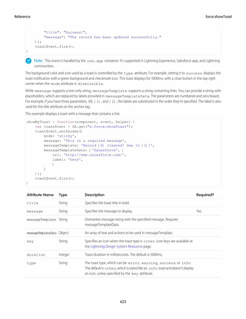
"title": "Success!","message": "The record has been updated successfully."
});toastEvent.fire();
}
Note: This event is handled by the one.app container. It’s supported in Lightning Experience, Salesforce app, and Lightningcommunities.
The background color and icon used by a toast is controlled by the type attribute. For example, setting it to success displays thetoast notification with a green background and checkmark icon. This toast displays for 5000ms, with a close button in the top rightcorner when the mode attribute is dismissible.
While message supports a text-only string, messageTemplate supports a string containing links. You can provide a string withplaceholders, which are replaced by labels provided in messageTemplateData. The parameters are numbered and zero-based.For example, if you have three parameters, {0}, {1}, and {2}, the labels are substituted in the order they're specified. The label is alsoused for the title attribute on the anchor tag.
This example displays a toast with a message that contains a link.
showMyToast : function(component, event, helper) {var toastEvent = $A.get("e.force:showToast");toastEvent.setParams({
mode: 'sticky',message: 'This is a required message',messageTemplate: 'Record {0} created! See it {1}!',messageTemplateData: ['Salesforce', {
url: 'http://www.salesforce.com/',label: 'here',}
]});toastEvent.fire();
}
Required?DescriptionTypeAttribute Name
Specifies the toast title in bold.Stringtitle
YesSpecifies the message to display.Stringmessage
Overwrites message string with the specified message. RequiresmessageTemplateData.
StringmessageTemplate
An array of text and actions to be used in messageTemplate.ObjectmessageTemplateData
Specifies an icon when the toast type is other. Icon keys are available atthe Lightning Design System Resources page.
Stringkey
Toast duration in milliseconds. The default is 5000ms.Integerduration
The toast type, which can be error, warning, success, or info.The default is other, which is styled like an info toast and doesn’t displayan icon, unless specified by the key attribute.
Stringtype
623
force:showToastReference
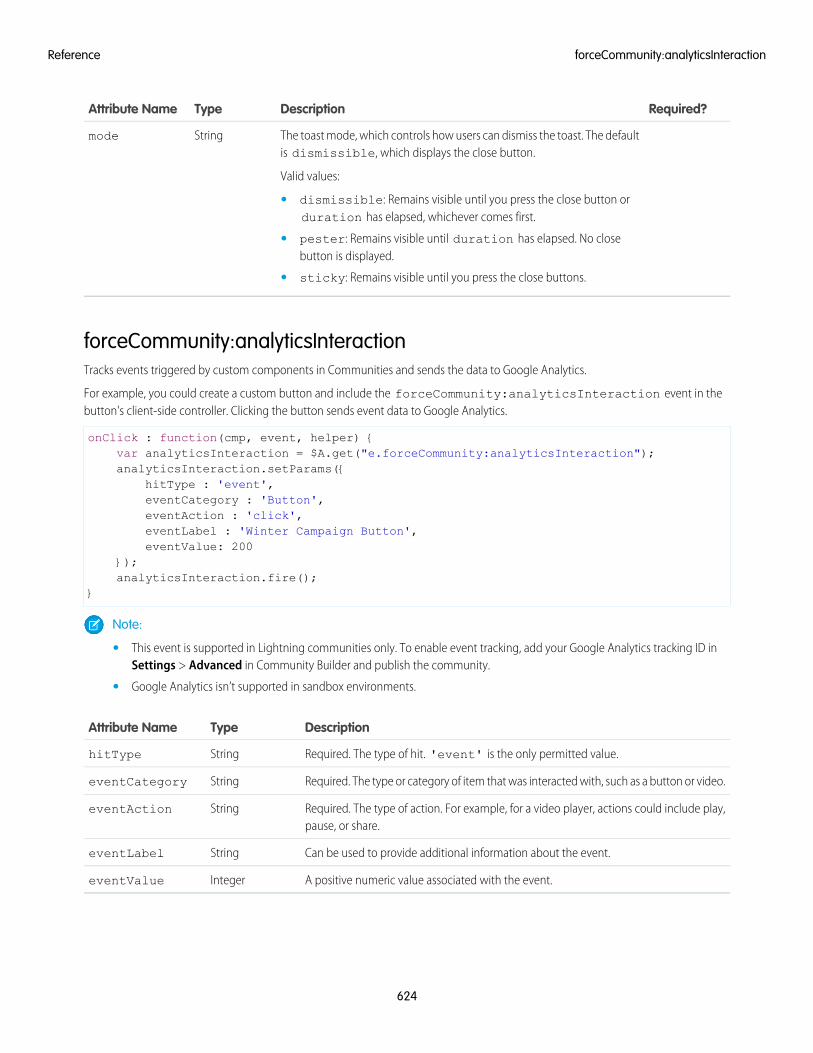
Required?DescriptionTypeAttribute Name
The toast mode, which controls how users can dismiss the toast. The defaultis dismissible, which displays the close button.
Valid values:
Stringmode
• dismissible: Remains visible until you press the close button orduration has elapsed, whichever comes first.
• pester: Remains visible until duration has elapsed. No closebutton is displayed.
• sticky: Remains visible until you press the close buttons.
forceCommunity:analyticsInteractionTracks events triggered by custom components in Communities and sends the data to Google Analytics.
For example, you could create a custom button and include the forceCommunity:analyticsInteraction event in thebutton's client-side controller. Clicking the button sends event data to Google Analytics.
onClick : function(cmp, event, helper) {var analyticsInteraction = $A.get("e.forceCommunity:analyticsInteraction");analyticsInteraction.setParams({
hitType : 'event',eventCategory : 'Button',eventAction : 'click',eventLabel : 'Winter Campaign Button',eventValue: 200
});analyticsInteraction.fire();
}
Note:
• This event is supported in Lightning communities only. To enable event tracking, add your Google Analytics tracking ID inSettings > Advanced in Community Builder and publish the community.
• Google Analytics isn’t supported in sandbox environments.
DescriptionTypeAttribute Name
Required. The type of hit. 'event' is the only permitted value.StringhitType
Required. The type or category of item that was interacted with, such as a button or video.StringeventCategory
Required. The type of action. For example, for a video player, actions could include play,pause, or share.
StringeventAction
Can be used to provide additional information about the event.StringeventLabel
A positive numeric value associated with the event.IntegereventValue
624
forceCommunity:analyticsInteractionReference
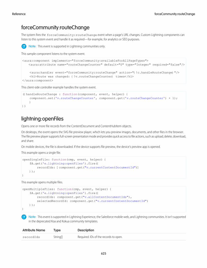
forceCommunity:routeChangeThe system fires the forceCommunity:routeChange event when a page’s URL changes. Custom Lightning components canlisten to this system event and handle it as required—for example, for analytics or SEO purposes.
Note: This event is supported in Lightning communities only.
This sample component listens to the system event.
<aura:component implements="forceCommunity:availableForAllPageTypes"><aura:attribute name="routeChangeCounter" default="0" type="Integer" required="false"/>
<aura:handler event="forceCommunity:routeChange" action="{!c.handleRouteChange}"/><h1>Route was changed: {!v.routeChangeCounter} times</h1>
</aura:component>
This client-side controller example handles the system event.
({handleRouteChange : function(component, event, helper) {component.set('v.routeChangeCounter', component.get('v.routeChangeCounter') + 1);}
})
lightning:openFilesOpens one or more file records from the ContentDocument and ContentHubItem objects.
On desktops, the event opens the SVG file preview player, which lets you preview images, documents, and other files in the browser.The file preview player supports full-screen presentation mode and provides quick access to file actions, such as upload, delete, download,and share.
On mobile devices, the file is downloaded. If the device supports file preview, the device’s preview app is opened.
This example opens a single file.
openSingleFile: function(cmp, event, helper) {$A.get('e.lightning:openFiles').fire({
recordIds: [component.get("v.currentContentDocumentId")]});
}
This example opens multiple files.
openMultipleFiles: function(cmp, event, helper) {$A.get('e.lightning:openFiles').fire({
recordIds: component.get("v.allContentDocumentIds"),selectedRecordId: component.get("v.currentContentDocumentId")
});}
Note: This event is supported in Lightning Experience, the Salesforce mobile web, and Lightning communities. It isn’t supportedin the deprecated Koa and Kokua community templates.
DescriptionTypeAttribute Name
Required. IDs of the records to open.String[]recordIds
625
forceCommunity:routeChangeReference
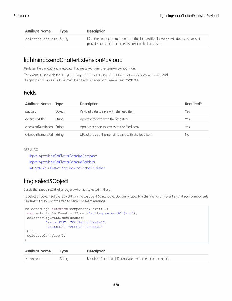
DescriptionTypeAttribute Name
ID of the first record to open from the list specified in recordIds. If a value isn’tprovided or is incorrect, the first item in the list is used.
StringselectedRecordId
lightning:sendChatterExtensionPayloadUpdates the payload and metadata that are saved during extension composition.
This event is used with the lightning:availableForChatterExtensionComposer andlightning:availableForChatterExtensionRenderer interfaces.
Fields
Required?DescriptionTypeAttribute Name
YesPayload data to save with the feed itemObjectpayload
YesApp title to save with the feed itemStringextensionTitle
YesApp description to save with the feed itemStringextensionDescription
NoURL of the app thumbnail to save with the feed itemStringextensionThumbnailUrl
SEE ALSO:
lightning:availableForChatterExtensionComposer
lightning:availableForChatterExtensionRenderer
Integrate Your Custom Apps into the Chatter Publisher
ltng:selectSObjectSends the recordId of an object when it’s selected in the UI.
To select an object, set the record ID on the recordId attribute. Optionally, specify a channel for this event so that your componentscan select if they want to listen to particular event messages.
selectedObj: function(component, event) {var selectedObjEvent = $A.get("e.ltng:selectSObject");selectedObjEvent.setParams({
"recordId": "0061a000004x8e1","channel": "AccountsChannel"
});selectedObj.fire();}
DescriptionTypeAttribute Name
Required. The record ID associated with the record to select.StringrecordId
626
lightning:sendChatterExtensionPayloadReference
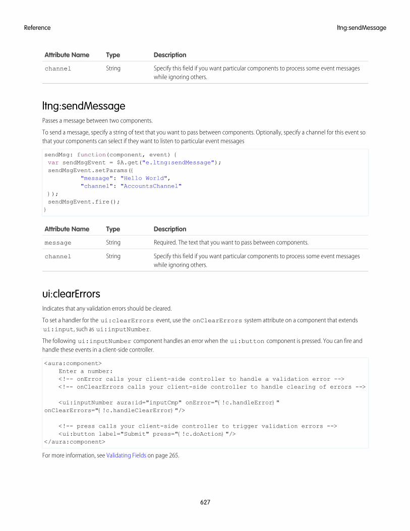
DescriptionTypeAttribute Name
Specify this field if you want particular components to process some event messageswhile ignoring others.
Stringchannel
ltng:sendMessagePasses a message between two components.
To send a message, specify a string of text that you want to pass between components. Optionally, specify a channel for this event sothat your components can select if they want to listen to particular event messages
sendMsg: function(component, event) {var sendMsgEvent = $A.get("e.ltng:sendMessage");sendMsgEvent.setParams({
"message": "Hello World","channel": "AccountsChannel"
});sendMsgEvent.fire();}
DescriptionTypeAttribute Name
Required. The text that you want to pass between components.Stringmessage
Specify this field if you want particular components to process some event messageswhile ignoring others.
Stringchannel
ui:clearErrorsIndicates that any validation errors should be cleared.
To set a handler for the ui:clearErrors event, use the onClearErrors system attribute on a component that extendsui:input, such as ui:inputNumber.
The following ui:inputNumber component handles an error when the ui:button component is pressed. You can fire andhandle these events in a client-side controller.
<aura:component>Enter a number:<!-- onError calls your client-side controller to handle a validation error --><!-- onClearErrors calls your client-side controller to handle clearing of errors -->
<ui:inputNumber aura:id="inputCmp" onError="{!c.handleError}"onClearErrors="{!c.handleClearError}"/>
<!-- press calls your client-side controller to trigger validation errors --><ui:button label="Submit" press="{!c.doAction}"/>
</aura:component>
For more information, see Validating Fields on page 265.
627
ltng:sendMessageReference
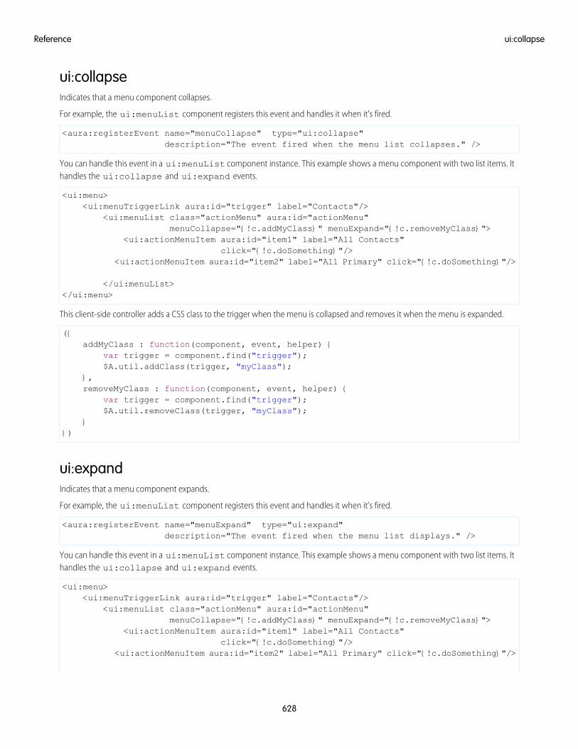
ui:collapseIndicates that a menu component collapses.
For example, the ui:menuList component registers this event and handles it when it’s fired.
<aura:registerEvent name="menuCollapse" type="ui:collapse"description="The event fired when the menu list collapses." />
You can handle this event in a ui:menuList component instance. This example shows a menu component with two list items. Ithandles the ui:collapse and ui:expand events.
<ui:menu><ui:menuTriggerLink aura:id="trigger" label="Contacts"/>
<ui:menuList class="actionMenu" aura:id="actionMenu"menuCollapse="{!c.addMyClass}" menuExpand="{!c.removeMyClass}">
<ui:actionMenuItem aura:id="item1" label="All Contacts"click="{!c.doSomething}"/>
<ui:actionMenuItem aura:id="item2" label="All Primary" click="{!c.doSomething}"/>
</ui:menuList></ui:menu>
This client-side controller adds a CSS class to the trigger when the menu is collapsed and removes it when the menu is expanded.
({addMyClass : function(component, event, helper) {
var trigger = component.find("trigger");$A.util.addClass(trigger, "myClass");
},removeMyClass : function(component, event, helper) {
var trigger = component.find("trigger");$A.util.removeClass(trigger, "myClass");
}})
ui:expandIndicates that a menu component expands.
For example, the ui:menuList component registers this event and handles it when it’s fired.
<aura:registerEvent name="menuExpand" type="ui:expand"description="The event fired when the menu list displays." />
You can handle this event in a ui:menuList component instance. This example shows a menu component with two list items. Ithandles the ui:collapse and ui:expand events.
<ui:menu><ui:menuTriggerLink aura:id="trigger" label="Contacts"/>
<ui:menuList class="actionMenu" aura:id="actionMenu"menuCollapse="{!c.addMyClass}" menuExpand="{!c.removeMyClass}">
<ui:actionMenuItem aura:id="item1" label="All Contacts"click="{!c.doSomething}"/>
<ui:actionMenuItem aura:id="item2" label="All Primary" click="{!c.doSomething}"/>
628
ui:collapseReference
</ui:menuList></ui:menu>
This client-side controller adds a CSS class to the trigger when the menu is collapsed and removes it when the menu is expanded.
({addMyClass : function(component, event, helper) {
var trigger = component.find("trigger");$A.util.addClass(trigger, "myClass");
},removeMyClass : function(component, event, helper) {
var trigger = component.find("trigger");$A.util.removeClass(trigger, "myClass");
}})
ui:menuFocusChangeIndicates that the user changed menu item focus in a menu component.
For example, this event is fired when the user scrolls up and down the menu list, which triggers a focus change in menu items. Theui:menuList component registers this event and handles it when it’s fired.
<aura:registerEvent name="menuFocusChange" type="ui:menuFocusChange"description="The event fired when the menu list focus changes from one
menu item to another." />
You can handle this event in a ui:menuList component instance. This example shows a menu component with two list items.
<ui:menu><ui:menuTriggerLink aura:id="trigger" label="Contacts"/>
<ui:menuList class="actionMenu" aura:id="actionMenu"menuFocusChange="{!c.handleChange}">
<ui:actionMenuItem aura:id="item1" label="All Contacts" /><ui:actionMenuItem aura:id="item2" label="All Primary" />
</ui:menuList></ui:menu>
ui:menuSelectIndicates that a menu item has been selected in the menu component.
For example, the ui:menuList component registers this event so it can be fired by the component.
<aura:registerEvent name="menuSelect" type="ui:menuSelect"description="The event fired when a menu item is selected." />
You can handle this event in a ui:menuList component instance. This example shows a menu component with two list items. Ithandles the ui:menuSelect event and click events.
<ui:menu><ui:menuTriggerLink aura:id="trigger" label="Contacts"/>
<ui:menuList class="actionMenu" aura:id="actionMenu" menuSelect="{!c.selected}"><ui:actionMenuItem aura:id="item1" label="All Contacts"
click="{!c.doSomething}"/>
629
ui:menuFocusChangeReference
<ui:actionMenuItem aura:id="item2" label="All Primary"click="{!c.doSomething}"/>
</ui:menuList></ui:menu>
When a menu item is clicked, the click event is handled before the ui:menuSelect event, which corresponds to doSomethingand selected client-side controllers in the following example.
({selected : function(component, event, helper) {
var selected = event.getParam("selectedItem");
// returns label of selected itemvar selectedLabel = selected.get("v.label");
},
doSomething : function(component, event, helper) {console.log("do something");
}})
DescriptionTypeAttribute Name
The menu item which is selectedComponent[]selectedItem
Hides menu if set to trueBooleanhideMenu
Deselects the siblings of the currently selected menu itemBooleandeselectSiblings
Sets focus to the ui:menuTrigger componentBooleanfocusTrigger
ui:menuTriggerPressIndicates that a menu trigger is clicked.
For example, the ui:menuTrigger component registers this event so it can be fired by the component.
<aura:registerEvent name="menuTriggerPress" type="ui:menuTriggerPress"description="The event fired when the trigger is clicked." />
You can handle this event in a component that extends ui:menuTrigger, such as in a ui:menuTriggerLink componentinstance.
<ui:menu><ui:menuTriggerLink aura:id="trigger" label="Contacts"
menuTriggerPress="{!c.triggered}"/><ui:menuList class="actionMenu" aura:id="actionMenu">
<ui:actionMenuItem aura:id="item1" label="All Contacts"click="{!c.doSomething}"/>
<ui:actionMenuItem aura:id="item2" label="All Primary" click="{!c.doSomething}"/>
</ui:menuList></ui:menu>
630
ui:menuTriggerPressReference
This client-side controller retrieves the label of the trigger when it’s clicked.
({triggered : function(component, event, helper) {
var trigger = component.find("trigger");
// Get the label on the triggervar triggerLabel = trigger.get("v.label");
}})
ui:validationErrorIndicates that the component has validation errors.
To set a handler for the ui:validationError event, use the onError system attribute on a component that extends ui:input,such as ui:inputNumber.
The following ui:inputNumber component handles an error when the ui:button component is pressed. You can fire andhandle these events in a client-side controller.
<aura:component>Enter a number:<!-- onError calls your client-side controller to handle a validation error --><!-- onClearErrors calls your client-side controller to handle clearing of errors -->
<ui:inputNumber aura:id="inputCmp" onError="{!c.handleError}"onClearErrors="{!c.handleClearError}"/>
<!-- press calls your client-side controller to trigger validation errors --><ui:button label="Submit" press="{!c.doAction}"/>
</aura:component>
For more information, see Validating Fields on page 265.
DescriptionTypeAttribute Name
An array of error messagesObject[]errors
wave:discoverDashboardThis event sends a global request to listening Analytics dashboard assets to respond with their identifying information. You can optionallyinclude your own parameter that will be included in the response.
The wave:discoverDashboard and wave:discoverResponse events work hand-in-hand, and are particularly useful fordiscovering when a dashboard is being added dynamically to the page, or whether there are multiple dashboards on the page.
This event has one attribute; an optional identifier that will be included in the response data.
In this example, the Lightning component has already been defined, handlers have been set, and the wave:discoverDashboardand wave:discoverResponse events have been registered in the custom component markup. The controller code below shows
631
ui:validationErrorReference
how to fire the wave:discoverDashboard event, and how to use the result when the wave:discoverResponse eventis fired. The code also shows how to create dashboard components.
({addDashboard: function(component, event, helper) {
var selectCmp = component.find("idTextBox");component.set("v.dashboardId", selectCmp.get("v.value"));var config = {
"dashboardId": selectCmp.get("v.value"),"showHeader": false,"height": 400
};$A.createComponent("wave:waveDashboard", config,
function(dashboard, status, err) {if (status === "SUCCESS") {
dashboard.set("v.rendered", true);dashboard.set("v.showHeader", false);component.set("v.body", dashboard);
} else if (status === "INCOMPLETE") {console.log("No response from server or client is offline.")
} else if (status === "ERROR") {console.log("Error: " + err);
}}
);},discoverDashboard: function(component, event, helper) {
$A.get("e.wave:discover").fire();},handleDiscoverResponse: function(cmp, event, helper) {
var myText = cmp.find("outName");myText.set("v.value", event.getParam("id"));
},})
Note: Requires the Analytics platform license Insights Builder PSL.
DescriptionTypeAttribute Name
Optional identifier that will be included in the response data.StringUID
For more information about using the Analytics SDK with Lightning, see the Analytics SDK Developer Guide.
wave:discoverResponseThis event provides the response following a request for Analytics dashboards to identify their assets.
This event payload has five attributes; the unique ID of the dashboard, the component type, the dashboard title, the dashboard loadstatus, and an optional parameter if it was sent the the request.
The wave:discoverDashboard and wave:discoverResponse events work hand-in-hand, and are particularly useful fordiscovering when a dashboard is being added dynamically to the page, or whether there are multiple dashboards on the page.
632
wave:discoverResponseReference
Refer to the wave:discoverDashboard event for details and an example using wave:discoverResponse.
Note: Requires the Analytics platform license Insights Builder PSL.
DescriptionTypeAttribute Name
The unique identifier of the dashboard in the form of a standard 18-character ID.Stringid
The type of component, usually dashboard.Stringtype
The title of the dashboard.Stringtitle
Whether the dashboard is loaded, or is still loading.BooleanisLoaded
Optional parameter that was sent with the request, if present.StringUID
For more information about using the Analytics SDK with Lightning, see the Analytics SDK Developer Guide.
wave:selectionChangedEvent fired by a Wave dashboard. It provides selection information including the name of the step involved, and an array of objectsrepresenting the current selection.
In this example, the Lightning component has already been defined and everything has been registered, so this controller code showshow to receive and iterate through the payload. The payload is an array of objects representing the current selection.
({handleselectionChanged: function(component, event, helper) {var params = event.getParams();var payload = params.payload;if (payload) {var step = payload.step;var data = payload.data;data.forEach(function(obj) {for (var k in obj) {if (k === 'Id') {component.set("v.recordId", obj[k]);
}}
});}
}})
Note: Requires the Analytics platform license Insights Builder PSL.
DescriptionTypeAttribute Name
The unique identifier of the Wave asset for which a selection change event occurred.StringId
The type of the Wave asset for which a selection event occurred. Currently, onlydashboard is supported.
Stringnoun
633
wave:selectionChangedReference
DescriptionTypeAttribute Name
Contains the selection information from the asset that fired the event.
payload.step (String). The name of the step in which the selection occurred.
Stringpayload
payload.data (Object array). An array of objects representing the current selection.Each object in the array contains one or more attributes based on the selection.
The action that occurred on the Wave asset. Currently, only selection is supported.Stringverb
For more information about using the Analytics SDK with Lightning, see the Analytics SDK Developer Guide.
wave:updateThis event is used to set the filter on a Wave Analytics dashboard, or to interact with that dashboard by dynamically changing theselection.
This event has three attributes; the unique ID of the Wave asset on which to apply the filter, the payload, and the asset type (currentlyonly dashboard). The payload is a JSON string that identifies the datasets, and any dimensions and field values.
In this example, the Lightning component has already been defined, handlers have been set, and the update event has been registeredin the custom component markup. The controller code below shows how to construct the payload for the update event—in this case,setting StageName to Close Won in the oppty_test dashboard.
({doInit: function(component, event, helper) {component.set('v.filter', '{"oppty_test": {"StageName": ["Closed Won"]}}');
},
handleSendFilter: function(component, event, helper) {var filter = component.get('v.filter');var dashboardId = component.get('v.dashboardId');var evt = $A.get('e.wave:update);evt.setParams({id: dashboardId,value: filter,Type: "dashboard"
}); evt.fire();}
})
Note: Requires the Analytics platform license Insights Builder PSL.
DescriptionTypeAttribute Name
The unique identifier of the Wave asset, in the form of a standard 18-character ID.Stringid
The JSON representing the filter or selection to be applied to the asset.Stringvalue
The type of the Wave asset. Currently, only dashboard is supported.Stringtype
For more information about using the Analytics SDK with Lightning, see the Analytics SDK Developer Guide.
634
wave:updateReference
System Event Reference
System events are fired by the framework during its lifecycle. You can handle these events in your Lightning apps or components, andwithin the Salesforce mobile app. For example, these events enable you to handle attribute value changes, URL changes, or when theapp or component is waiting for a server response.
aura:doneRenderingIndicates that the initial rendering of the root application has completed.
Note: We don't recommend using the legacy aura:doneRendering event except as a last resort. Unless your componentis running in complete isolation in a standalone app and not included in complex apps, such as Lightning Experience or theSalesforce app, you probably don’t want to handle this application event. The container app may trigger your event handlermultiple times.
This event is automatically fired if no more components need to be rendered or rerendered due to any attribute value changes. Theaura:doneRendering event is handled by a client-side controller. A component can have only one <aura:handler> tagto handle this event.
<aura:handler event="aura:doneRendering" action="{!c.doneRendering}"/>
For example, you want to customize the behavior of your app after it’s finished rendering the first time but not after subsequentrerenderings. Create an attribute to determine if it’s the first rendering.
<aura:component><aura:handler event="aura:doneRendering" action="{!c.doneRendering}"/><aura:attribute name="isDoneRendering" type="Boolean" default="false"/><!-- Other component markup here --><p>My component</p>
</aura:component>
This client-side controller checks that the aura:doneRendering event has been fired only once.
({doneRendering: function(cmp, event, helper) {if(!cmp.get("v.isDoneRendering")){cmp.set("v.isDoneRendering", true);//do something after component is first rendered
}}
})
Note: When aura:doneRendering is fired, component.isRendered() returns true. To check if your element isvisible in the DOM, use utilities such as component.getElement(), component.hasClass(), orelement.style.display.
The aura:doneRendering handler contains these required attributes.
DescriptionTypeAttribute Name
The name of the event, which must be set to aura:doneRendering.Stringevent
The client-side controller action that handles the event.Objectaction
635
System Event ReferenceReference
aura:doneWaitingIndicates that the app is done waiting for a response to a server request. This event is preceded by an aura:waiting event. Thisevent is fired after aura:waiting.
Note: We don't recommend using the legacy aura:doneWaiting event except as a last resort. The aura:doneWaitingapplication event is fired for every server response, even for responses from other components in your app. Unless your componentis running in complete isolation in a standalone app and not included in Lightning Experience or the Salesforce app, you probablydon’t want to handle this application event. The container app may fire server-side actions and trigger your event handler multipletimes.
This event is automatically fired if no more response from the server is expected. The aura:doneWaiting event is handled by aclient-side controller. A component can have only one <aura:handler> tag to handle this event.
<aura:handler event="aura:doneWaiting" action="{!c.hideSpinner}"/>
This example hides a spinner when aura:doneWaiting is fired.
<aura:component><aura:handler event="aura:doneWaiting" action="{!c.hideSpinner}"/><!-- Other component markup here --><center><ui:spinner aura:id="spinner"/></center>
</aura:component>
This client-side controller fires an event that hides the spinner.
({hideSpinner : function (component, event, helper) {
var spinner = component.find('spinner');var evt = spinner.get("e.toggle");evt.setParams({ isVisible : false });evt.fire();
}})
The aura:doneWaiting handler contains these required attributes.
DescriptionTypeAttribute Name
The name of the event, which must be set to aura:doneWaiting.Stringevent
The client-side controller action that handles the event.Objectaction
aura:locationChangeIndicates that the hash part of the URL has changed.
This event is automatically fired when the hash part of the URL has changed, such as when a new location token is appended to thehash. The aura:locationChange event is handled by a client-side controller. A component can have only one <aura:handlerevent="aura:locationChange"> tag to handle this event.
<aura:handler event="aura:locationChange" action="{!c.update}"/>
636
aura:doneWaitingReference
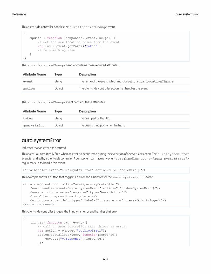
This client-side controller handles the aura:locationChange event.
({update : function (component, event, helper) {
// Get the new location token from the eventvar loc = event.getParam("token");// Do something else
}})
The aura:locationChange handler contains these required attributes.
DescriptionTypeAttribute Name
The name of the event, which must be set to aura:locationChange.Stringevent
The client-side controller action that handles the event.Objectaction
The aura:locationChange event contains these attributes.
DescriptionTypeAttribute Name
The hash part of the URL.Stringtoken
The query string portion of the hash.Objectquerystring
aura:systemErrorIndicates that an error has occurred.
This event is automatically fired when an error is encountered during the execution of a server-side action. The aura:systemErrorevent is handled by a client-side controller. A component can have only one <aura:handler event="aura:systemError">tag in markup to handle this event.
<aura:handler event="aura:systemError" action="{!c.handleError}"/>
This example shows a button that triggers an error and a handler for the aura:systemError event .
<aura:component controller="namespace.myController"><aura:handler event="aura:systemError" action="{!c.showSystemError}"/><aura:attribute name="response" type="Aura.Action"/><!-- Other component markup here --><ui:button aura:id="trigger" label="Trigger error" press="{!c.trigger}"/>
</aura:component>
This client-side controller triggers the firing of an error and handles that error.
({trigger: function(cmp, event) {
// Call an Apex controller that throws an errorvar action = cmp.get("c.throwError");action.setCallback(cmp, function(response){
cmp.set("v.response", response);});
637
aura:systemErrorReference
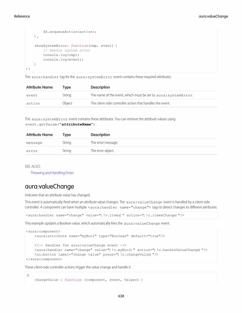
$A.enqueueAction(action);},
showSystemError: function(cmp, event) {// Handle system errorconsole.log(cmp);console.log(event);
}})
The aura:handler tag for the aura:systemError event contains these required attributes.
DescriptionTypeAttribute Name
The name of the event, which must be set to aura:systemError.Stringevent
The client-side controller action that handles the event.Objectaction
The aura:systemError event contains these attributes. You can retrieve the attribute values usingevent.getParam("attributeName").
DescriptionTypeAttribute Name
The error message.Stringmessage
The error object.Stringerror
SEE ALSO:
Throwing and Handling Errors
aura:valueChangeIndicates that an attribute value has changed.
This event is automatically fired when an attribute value changes. The aura:valueChange event is handled by a client-sidecontroller. A component can have multiple <aura:handler name="change"> tags to detect changes to different attributes.
<aura:handler name="change" value="{!v.items}" action="{!c.itemsChange}"/>
This example updates a Boolean value, which automatically fires the aura:valueChange event.
<aura:component><aura:attribute name="myBool" type="Boolean" default="true"/>
<!-- Handles the aura:valueChange event --><aura:handler name="change" value="{!v.myBool}" action="{!c.handleValueChange}"/><ui:button label="change value" press="{!c.changeValue}"/>
</aura:component>
These client-side controller actions trigger the value change and handle it.
({changeValue : function (component, event, helper) {
638
aura:valueChangeReference
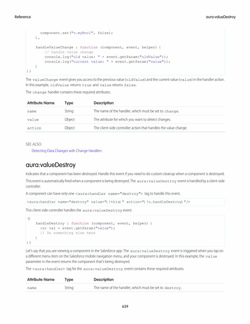
component.set("v.myBool", false);},
handleValueChange : function (component, event, helper) {// handle value changeconsole.log("old value: " + event.getParam("oldValue"));console.log("current value: " + event.getParam("value"));
}})
The valueChange event gives you access to the previous value (oldValue) and the current value (value) in the handler action.In this example, oldValue returns true and value returns false.
The change handler contains these required attributes.
DescriptionTypeAttribute Name
The name of the handler, which must be set to change.Stringname
The attribute for which you want to detect changes.Objectvalue
The client-side controller action that handles the value change.Objectaction
SEE ALSO:
Detecting Data Changes with Change Handlers
aura:valueDestroyIndicates that a component has been destroyed. Handle this event if you need to do custom cleanup when a component is destroyed.
This event is automatically fired when a component is being destroyed. The aura:valueDestroy event is handled by a client-sidecontroller.
A component can have only one <aura:handler name="destroy"> tag to handle this event.
<aura:handler name="destroy" value="{!this}" action="{!c.handleDestroy}"/>
This client-side controller handles the aura:valueDestroy event.
({handleDestroy : function (component, event, helper) {var val = event.getParam("value");// Do something else here
}})
Let’s say that you are viewing a component in the Salesforce app. The aura:valueDestroy event is triggered when you tap ona different menu item on the Salesforce mobile navigation menu, and your component is destroyed. In this example, the valueparameter in the event returns the component that’s being destroyed.
The <aura:handler> tag for the aura:valueDestroy event contains these required attributes.
DescriptionTypeAttribute Name
The name of the handler, which must be set to destroy.Stringname
639
aura:valueDestroyReference
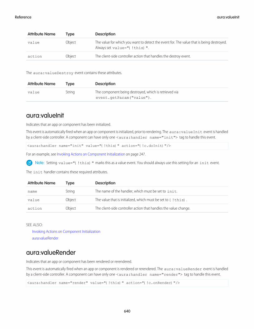
DescriptionTypeAttribute Name
The value for which you want to detect the event for. The value that is being destroyed.Always set value="{!this}".
Objectvalue
The client-side controller action that handles the destroy event.Objectaction
The aura:valueDestroy event contains these attributes.
DescriptionTypeAttribute Name
The component being destroyed, which is retrieved viaevent.getParam("value").
Stringvalue
aura:valueInitIndicates that an app or component has been initialized.
This event is automatically fired when an app or component is initialized, prior to rendering. The aura:valueInit event is handledby a client-side controller. A component can have only one <aura:handler name="init"> tag to handle this event.
<aura:handler name="init" value="{!this}" action="{!c.doInit}"/>
For an example, see Invoking Actions on Component Initialization on page 247.
Note: Setting value="{!this}" marks this as a value event. You should always use this setting for an init event.
The init handler contains these required attributes.
DescriptionTypeAttribute Name
The name of the handler, which must be set to init.Stringname
The value that is initialized, which must be set to {!this}.Objectvalue
The client-side controller action that handles the value change.Objectaction
SEE ALSO:
Invoking Actions on Component Initialization
aura:valueRender
aura:valueRenderIndicates that an app or component has been rendered or rerendered.
This event is automatically fired when an app or component is rendered or rerendered. The aura:valueRender event is handledby a client-side controller. A component can have only one <aura:handler name="render"> tag to handle this event.
<aura:handler name="render" value="{!this}" action="{!c.onRender}"/>
640
aura:valueInitReference
In this example, the onRender action in your client-side controller handles initial rendering and rerendering of the component. Youcan choose any name for the action attribute.
Note: Setting value="{!this}" marks this as a value event. You should always use this setting for a render event.
The render event is fired after the init event, which is fired after component construction but before rendering.
The aura:valueRender event contains one attribute.
DescriptionAttribute TypeAttribute Name
The component that rendered or rerendered.Objectvalue
SEE ALSO:
aura:valueInit
Events Fired During the Rendering Lifecycle
aura:waitingIndicates that the app is waiting for a response to a server request. This event is fired before aura:doneWaiting.
Note: We don't recommend using the legacy aura:waiting event except as a last resort. The aura:waiting applicationevent is fired for every server request, even for requests from other components in your app. Unless your component is runningin complete isolation in a standalone app and not included in Lightning Experience or the Salesforce app, you probably don’t wantto handle this application event. The container app may fire server-side actions and trigger your event handler multiple times.
This event is automatically fired when a server-side action is added using $A.enqueueAction() and subsequently run, or whenit’s expecting a response from an Apex controller. The aura:waiting event is handled by a client-side controller. A component canhave only one <aura:handler> tag to handle this event.
<aura:handler event="aura:waiting" action="{!c.showSpinner}"/>
This example shows a spinner when aura:waiting is fired.
<aura:component><aura:handler event="aura:waiting" action="{!c.showSpinner}"/><!-- Other component markup here --><center><ui:spinner aura:id="spinner"/></center>
</aura:component>
This client-side controller fires an event that displays the spinner.
({showSpinner : function (component, event, helper) {
var spinner = component.find('spinner');var evt = spinner.get("e.toggle");evt.setParams({ isVisible : true });evt.fire();
}})
The aura:waiting handler contains these required attributes.
641
aura:waitingReference
DescriptionTypeAttribute Name
The name of the event, which must be set to aura:waiting.Stringevent
The client-side controller action that handles the event.Objectaction
Supported HTML Tags
The framework supports most HTML tags, including the majority of HTML5 tags.
An HTML tag is treated as a first-class component by the framework. Each HTML tag is translated into an <aura:html> component,allowing it to enjoy the same rights and privileges as any other component.
For example, the framework automatically converts a standard HTML <div> tag to this component:
<aura:html tag="div" />
We recommend that you use components in preference to HTML tags. For example, use lightning:button instead of <button>.
Components are designed with accessibility in mind so users with disabilities or those who use assistive technologies can also use yourapp. When you start building more complex components, the reusable out-of-the-box components can simplify your job by handlingsome of the plumbing that you would otherwise have to create yourself. Also, these components are secure and optimized for performance.
Note that you must use strict XHTML. For example, use <br/> instead of <br>.
Some HTML tags are unsafe or unnecessary. The framework doesn’t support these tags.
The HtmlTag enum in this open-source Aura file lists the supported HTML tags. Any tag followed by (false) is not supported.For example, applet(false) means the applet tag isn't supported.
Note: The linked file is in the master branch of the open-source Aura project. The master branch is our current developmentbranch and is ahead of the current release of the Lightning Component framework. However, this file changes infrequently andis the best place to see if a tag is supported now or in the near future.
SEE ALSO:
Supporting Accessibility
Anchor Tag: <a>Don’t hard code or dynamically generate Salesforce URLs in the href attribute of an <a> tag. Use events, such asforce:navigateToSObject or force:navigateToURL, instead.
Avoid the href AttributeUsing the href attribute of an <a> tag leads to inconsistent behavior in different apps and shouldn’t be relied on. For example, don’tuse this markup to link to a record:
<a href="/XXXXXXXXXXXXXXXXXX">Salesforce record ID (DON'T DO THIS)</a>
If you use # in the href attribute, a secondary issue occurs. The hash mark (#) is a URL fragment identifier and is often used in Webdevelopment for navigation within a page. Avoid # in the href attribute of anchor tags in Lightning components as it can causeunexpected navigation changes, especially in the Salesforce app. That’s another reason not to use href.
642
Supported HTML TagsReference
Use Navigation EventsUse one of the navigation events for consistent behavior across Lightning Experience, Salesforce app, and Lightning communities.
force:navigateToListNavigates to a list view.
force:navigateToObjectHomeNavigates to an object home.
force:navigateToRelatedListNavigates to a related list.
force:navigateToSObjectNavigates to a record.
force:navigateToURLNavigates to a URL.
As well as consistent behavior, using navigation events instead of <a> tags reduces the number of full app reloads, leading to betterperformance.
Example Using Navigation EventThis example uses an <a> tag that’s wired to a controller action, which fires the force:navigateToSObject event to navigateto a record. The one.app container handles the event. This event is supported in Lightning Experience, Salesforce app, and Lightningcommunities.
<!--c:navToRecord--><aura:component>
<aura:attribute name="recordId" type="String" />
<p><a onclick="{!c.handleClick}">link to record</a></p></aura:component>
Here is the controller that fires the event.
/* navToRecordController.js */({
handleClick: function (component, event, helper) {var navEvt = $A.get("e.force:navigateToSObject");navEvt.setParams({
"recordId": component.get("v.recordId")});navEvt.fire();
}})
The record ID is passed into c:navToRecord by setting its recordId attribute. When c:navToRecord is used in LightningExperience, Salesforce app, or Lightning communities, the link navigates to the specified record.
643
Anchor Tag: <a>Reference
INDEX
$Browser 48, 50$Label 48, 62$Locale 48, 51$Resource 52
AAccess control
application 351attribute 352component 351event 352interface 351JavaScript 264
Accessibilityaudio messages 106buttons 105events 107menus 107
Action statescalling server-side 297
Actionsbackground 298calling server-side 295custom actions 112lightning component actions 112queueing 297storable 299–301
anchor tag 642Anti-patterns
events 194Apex
API calls 311AuraEnabled annotation 294controllers 291–294custom objects 303deleting records 308Lightning components 312records 303returning data 292saving records 307standard objects 303
API 277API calls 276, 311Application
attributes 387aura:application 387
Application (continued)building and running 8creating 200layout and UI 201styling 226
Application cachebrowser support 357overview 357
Application eventsbubble 179capture 179create 180fire 181handling 182phases 179propagation 179
Application templatesexternal CSS 202JavaScript libraries 202
application, creating 9Applications
CSS 228, 231–233, 235–236, 243overview 201styling 228, 231–233, 235–236, 243token 231–233, 235–236, 243token overrides 236
Appsoverview 201
Attribute typesAura.Action 385–386Aura.Component 385basic 381collection 383custom Apex class 385custom object 383Function 382Object 383standard object 383
Attribute value, setting 393Attributes
component reference, setting on 394interface, setting on 395JavaScript 253super component, setting on 393
aura:application 387aura:attribute 380
644
aura:component 388aura:dependency 389aura:doneRendering 635aura:doneWaiting 636aura:event 390aura:expression 396aura:html 396aura:if 38, 43, 396aura:interface 391aura:iteration 397aura:locationChange 636aura:method
result asynchronous code 272result synchronous code 270
aura:renderIf 398aura:set 393–394aura:systemError 637aura:template 202, 398aura:text 399aura:unescapedHtml 399aura:valueChange 638aura:valueDestroy 639aura:valueInit 640aura:valueRender 640aura:waiting 641Aura.Action 386AuraLocalizationService 288auraStorage:init 399authentication
guest access 160
BBenefits 2Best practices
events 193Body
JavaScript 254Browsers
Lightning components 4limited support 4recommendations 4requirements 4supported versions 4
Bubbling 172, 183Buttons
lightning:button 287local ID 287pressed 287ui:button 287
CCapture 172, 183Change handlers 281, 638change handling 323Chrome extension 359CLI
custom rules 216Client-side controllers 165Communities 160Communities Lightning components
overview 141Community Builder
configuring custom components 142content layouts 146forceCommunity:analyticsInteraction 624forceCommunity:routeChange 625lighting:openFiles 625Lightning components overview 141profile menu 145search 145theme layouts 142
Componentabstract 355attributes 33aura:component 388aura:interface 391body, setting and accessing 36documentation 68nest 34rendering 640rendering lifecycle 194themes, vendor prefixes 231
Component attributesinheritance 353
Component bodyJavaScript 254
Component bundlesconfiguring design resources for Lightning App Builder 126configuring design resources for Lightning Experience Record
Home pages 126configuring design resources for Lightning pages 126configuring design resources for Lightning Pages 134configuring for Community Builder 142configuring for Lightning App Builder 124, 128, 140, 230configuring for Lightning Experience Record Home pages
140configuring for Lightning Experience record pages 128configuring for Lightning pages 124, 128, 140, 230
645
Index
Component bundles (continued)create dynamic picklists for components on Lightning Pages
134tips for configuring for Lightning App Builder 140
Component definitionsdependency 389
Component eventsbubble 168capture 168create 169fire 169handling 170–171handling dynamically 176phases 168propagation 168
Component facets 37Component initialization 640Components
access control 264action override 119–123actions 109, 112, 114API version 210calling methods 269–270, 272conditional markup 38create 21–22creating 279CSS 228, 231–233, 235–236, 243custom app integration 148edit 21–22flow variables, get 102flow, finish behavior 103flow, output variables 102flow, resume 104HTML markup, using 31ID, local and global 30interface 22isValid() 262markup 19, 23, 122methods 391modifying 264namespace 24–26overview 19packaging 123styling 228, 231–233, 235–236, 243styling with CSS 31support level 19tabs 109token 231–233, 235–236, 243token overrides 236
Components (continued)unescaping HTML 31using 98–99, 108–109, 112, 114, 119validity 262
Conditional expressions 43configuring custom components for Lightning App Builder 129,
131configuring custom components for Lightning Experience Email
Application Pane 129, 131configuring custom components for Lightning for Outlook 129,
131configuring custom components for Lightning pages 129, 131Content security policy 211–212, 277Controllers
calling server-side actions 295, 297client-side 165creating server-side 291–292results 292returning data 292server-side 292–294
CookbookJavaScript 278
CRUD access 306CSP
stricter 212CSS
external 228tokens 231–233, 235–236, 243tokens overrides 236
Custom Actionscomponents 112, 114
custom content layoutscreating for Community Builder 146
Custom labels 62Custom Lightning page template component
best practices 138custom profile menu
creating for Community Builder 145custom search
creating for Community Builder 145Custom Tabs
components 109custom theme layouts
creating for Community Builder 142
Ddata access 312, 324–325, 327, 331, 406Data binding
expressions 44
646
Index
Data changesdetecting 281
DatesJavaScript 288
DebugJavaScript 359
DebuggingChrome extension 359Salesforce Lightning Inspector 359
deleteRecord 321dependency 156, 160Detect data changes 638Detecting
data changes 281Developer Console
configuration 22Lightning bundle 22Lightning components 21
Developer Edition organization, sign up 9DOM
external libraries 259, 262DOM access 204DOM containment
proxy 205Dynamic output 43
Eerror handling 324errors 324, 336, 340, 343Errors
handling 267throwing 267
ESLint 213–215, 218, 220–221, 225–226Event bubbling 172, 183Event capture 172, 183Event definitions
dependency 389Event handlers 282Event handling
base components 77Lightning components 77
Eventsanti-patterns 194application 178, 180–181, 184aura events 613, 635aura:doneRendering 635aura:doneWaiting 636aura:event 390aura:locationChange 636
Events (continued)aura:systemError 637aura:valueChange 638aura:valueDestroy 639aura:valueInit 640aura:valueRender 640aura:waiting 641best practices 193bubbling 172, 183capture 172, 183component 167, 169, 176demo 188example 176, 184fire() 255firing from non-Lightning code 192flow 168, 179force events 613force:closeQuickAction 613force:createRecord 614force:editRecord 615force:navigateToList 617force:navigateToObjectHome 618force:navigateToRelatedList 618force:navigateToSObject 616, 619–620force:recordSave 621force:recordSaveSuccess 621force:refreshView 622force:sendMessage 627forceCommunity:analyticsInteraction 624forceCommunity:routeChange 625getName() 255getParam() 255getParams() 255getPhase() 255getSource() 255handling 186lighting:openFiles 625lightning:sendChatterExtensionPayload 626lntg:selectSObject 626pause() 255preventDefault() 255propagation 168, 179resume() 255Salesforce 196Salesforce app 613Salesforce mobile and Lightning Experience demo 10Salesforce mobile demo 13, 17setParam() 255setParams() 255
647
Index
Events (continued)stopPropagation() 255system 198system events 635ui:clearErrors 627ui:collapse 628ui:expand 628ui:menuFocusChange 629ui:menuSelect 629ui:menuTriggerPress 630ui:validationError 631wave:discoverDashboard 631wave:discoverResponse 632wave:selectionChanged 633wave:update 634
Events and actions 164example 327Expressions
bound expressions 44conditional 43data binding 44dynamic output 43format() 63functions 58operators 54unbound expressions 44
FField-level security 306force:canvasApp 401force:closeQuickAction 613force:createRecord 614force:editRecord 615force:hasRecordId 608force:hasSObjectName 609force:inputField 402force:lightning:lint 216force:navigateToList 617force:navigateToObjectHome 618force:navigateToRelatedList 618force:navigateToSObject 616, 619–620force:outputField 403force:recordData 405force:recordEdit 406force:recordSave 621force:recordSaveSuccess 621force:recordView 408force:refreshView 622force:sendMessage 627
forceChatter:feed 408forceChatter:fullFeed 410forceChatter:publisher 411forceCommunity:analyticsInteraction 624forceCommunity:appLauncher 411forceCommunity:navigationMenuBase 413forceCommunity:notifications 415forceCommunity:routeChange 625forceCommunity:routeLink 416forceCommunity:waveDashboard 417format() 63
GgetNewRecord 318globalID 48guest access 160
HHandling Input Field Errors 265Helpers 248HTML, supported tags
<a> 642HTML, unescaping 31
IInheritance 353, 356Input Field Validation 265Inspector
Actions tab 367Component Tree tab 361drop the action 371error response 370Event Log tab 366install 359modify action response 369override actions 368Performance tab 363Storage tab 372Transactions tab 365use 360
Interfacesforce interfaces 607force:hasRecordId 608force:hasSObjectName 609lightning:actionOverride 610lightning:appHomeTemplate 611lightning:availableForChatterExtensionsComposer 611lightning:availableForChatterExtensionsRenderer 612lightning:homeTemplate 612
648
Index
Interfaces (continued)lightning:recordHomeTemplate 612marker 356
Introduction 1–2isValid() 262
JJavaScript
access control 264API calls 276attribute values 253calling component methods 269–270, 272component 254dates 288ES6 promises 274events 255get() and set() methods 253global variable 250libraries 252promises 274secure wrappers 206, 208sharing code 250sharing code in bundle 248strict mode 202–203window object 250
JavaScript API 208–209JavaScript console 373JavaScript cookbook 278
LLabel
setting via parent attribute 66Label parameters 63Labels
Apex 65dynamically creating 63JavaScript 63
Lifecycle 264Lightning 2Lightning App Builder
configuring custom components 124, 128, 140, 230configuring design resources 126, 134create dynamic picklists for components 134creating a custom page template 135, 138creating a width-aware component 139CSS tips 230
Lightning CLI 216, 219, 226Lightning components
action override 119–123
Lightning components (continued)base 70custom app integration 148interfaces 122Lightning Design System 79Lightning Design System variants 81Lightning Experience 109–110, 112, 114, 119–122markup 122overview 123packaging 123Salesforce 109, 112, 114, 119–122Salesforce app 111Styling base components 79variants 81
Lightning Components for Visualforce 156, 160Lightning components interfaces
force:hasRecordId 122force:hasSObjectName 122lightning:actionOverride 122
Lightning Containerjavascript 333messaging 334, 338, 342
Lightning Data Servicecreate record 318delete record 321handling record changes 323load record 313saveRecord 315
Lightning Experienceadd Lightning components 110
Lightning Outbeta 161Connected App 156considerations 161CORS 156events 161limitations 161OAuth 156requirements 156SLDS 161styling 161
lightning:accordion 418lightning:accordionSection 419lightning:actionOverride 610lightning:appHomeTemplate 611lightning:availableForChatterExtensionsComposer 611lightning:availableForChatterExtensionsRenderer 612lightning:avatar 421lightning:badge 422
649
Index
lightning:breadcrumb 422lightning:breadcrumbs 424lightning:button 425lightning:buttonGroup 426lightning:buttonIcon 427lightning:buttonIconStateful 429lightning:buttonMenu 430lightning:buttonStateful 433lightning:card 435lightning:checkboxGroup 436lightning:clickToDial 438lightning:combobox 439lightning:container 441lightning:datatable 443lightning:dualListbox 449lightning:dynamicIcon 452lightning:fileCard 453lightning:fileUpload 453lightning:flexipageRegionInfo 139, 455lightning:flow 455lightning:formattedDateTime 457lightning:formattedEmail 458lightning:formattedLocation 459lightning:formattedNumber 460lightning:formattedPhone 461lightning:formattedRichText 462lightning:formattedText 464lightning:formattedUrl 464lightning:helptext 466lightning:homeTemplate 612lightning:icon 466lightning:input 468lightning:inputLocation 474lightning:inputRichText 476lightning:layout 478lightning:layoutItem 480lightning:menuItem 481lightning:omniToolkitAPI 483lightning:openFiles 625lightning:outputField 485lightning:path 486lightning:picklistPath 487lightning:pill 488lightning:progressBar 490lightning:progressIndicator 491lightning:radioGroup 492lightning:recordHomeTemplate 612lightning:recordViewForm 495lightning:relativeDateTime 494
lightning:select 496lightning:sendChatterExtensionPayload 626lightning:slider 500lightning:spinner 502lightning:tab 503lightning:tabset 504lightning:textarea 507lightning:tile 509lightning:tree 511lightning:utilityBarAPI 514lightning:verticalNavigation 516lightning:verticalNavigationItem 519lightning:verticalNavigationItemBadge 519lightning:verticalNavigationItemIcon 520lightning:verticalNavigationOverflow 521lightning:verticalNavigationSection 521lightning:workspaceAPI 522lint 213–215, 218, 220–226Linting 215lntg:selectSObject 626Localization 67LockerService
API version 210disable for component 209effect 209global references 206, 208JavaScript API 209secure wrappers 208strict mode 203unsupported browsers 211where 209
Log messages 373ltng:require 524
MMarkup 285Messaging
notifications 600overlays 600
minimum version 41Modal 602
NNamespace
creating 26default 25examples 26explicit 25implicit 25
650
Index
Namespace (continued)organization 25prefix 25
Node.js 155Notices 600Notifications 600
OOAuth 159Object-oriented development
inheritance 353Online version 6Open source 4Overlay 602
PPackage 24–26Packaging
action override 123Performance warnings
<aura:if> 375<aura:iteration> 376
Popover 602Prerequisites 9Promises 274Proxy object 205
QQueueing
queueing server-side actions 297
RReference
Components 395doc app 380overview 379
Renderers 259Rendering 640Rendering lifecycle 194Rerendering 264, 640Rich Publisher Apps 148rules 220–226
SSalesforce app
add Lightning components 111Salesforce DX 215, 218, 226Salesforce Lightning Design System 227
Salesforce Lightning InspectorActions tab 367Component Tree tab 361drop the action 371error response 370Event Log tab 366install 359modify action response 369override actions 368Performance tab 363Storage tab 372Transactions tab 365use 360
SaveRecordResult 331Secure wrappers
JavaScript API 208Security 202Server-Side Controllers
action queueing 297calling actions 295, 297creating 292errors 293overview 291results 292returning data 292
sfdx 215–216, 218, 221–226SharePoint 155SLDS 227Standard Actions
Lightning components 119–123override 119–123packaging 123
standard controller 312, 324–325, 327, 331, 406States 297Static resource 52, 250Storable actions
enable 301lifecycle 300
Storage serviceadapters 302Memory adapter 302SmartStore 302WebSQL 302
Strict mode 203Styles 285Styling
join 229markup 229readable 229
651
Index
supported objects 325
TTags
<a> 642anchor 642aura:expression 396aura:html 396aura:if 396aura:iteration 397aura:renderIf 398aura:template 398aura:text 399aura:unescapedHtml 399auraStorage:init 399force:canvasApp 401force:closeQuickAction 613force:hasRecordId 608force:hasSObjectName 609force:inputField 402force:outputField 403force:recordData 405force:recordEdit 406force:recordView 408forceChatter:feed 408forceChatter:fullFeed 410forceChatter:publisher 411forceCommunity:appLauncher 411forceCommunity:navigationMenuBase 413forceCommunity:notifications 415forceCommunity:routeLink 416forceCommunity:waveDashboard 417lightning:accordion 418lightning:accordionSection 419lightning:actionOverride 610lightning:appHomeTemplate 611lightning:avatar 421lightning:badge 422lightning:breadcrumb 422lightning:breadcrumbs 424lightning:button 425lightning:buttonGroup 426lightning:buttonIcon 427lightning:buttonMenu 430lightning:buttonStateful 433lightning:card 435lightning:container 441lightning:fileCard 453lightning:flexipageRegionInfo 455
Tags (continued)lightning:flow 455lightning:formattedDateTime 457lightning:formattedNumber 460lightning:homeTemplate 612lightning:icon 466lightning:input 468lightning:inputRichText 476lightning:layout 478lightning:layoutItem 480lightning:menuItem 481lightning:notificationsLibrary 600lightning:omniToolkitAPI 483lightning:overlayLibrary 602lightning:picklistPath 487lightning:pill 488lightning:progressIndicator 491lightning:recordHomeTemplate 612lightning:relativeDateTime 494lightning:select 496lightning:spinner 502lightning:tab 503lightning:textarea 507lightning:tile 509lightning:utilityBarAPI 514lightning:verticalNavigation 516lightning:verticalNavigationOverflow 521lightning:verticalNavigationSection 521lightning:workspaceAPI 522ltng:require 524ui:actionMenuItem 525ui:button 526ui:checkboxMenuItem 528ui:inputCheckbox 530ui:inputCurrency 532ui:inputDate 534ui:inputDateTime 537ui:inputDefaultError 540ui:inputEmail 542ui:inputNumber 545ui:inputPhone 547ui:inputRadio 550ui:inputRichText 552ui:inputSecret 554ui:inputSelect 556ui:inputSelectOption 560ui:inputText 561ui:inputTextArea 563ui:inputURL 566
652
Index
Tags (continued)ui:menu 568ui:menuItem 572ui:menuItemSeparator 573ui:menuList 574ui:menuTrigger 575ui:menuTriggerLink 576ui:message 577ui:outputCheckbox 579ui:outputCurrency 580ui:outputDate 582ui:outputDateTime 583ui:outputEmail 585ui:outputNumber 586ui:outputPhone 588ui:outputRichText 589ui:outputText 591ui:outputTextArea 592ui:outputURL 593ui:radioMenuItem 595ui:scrollerWrapper 596ui:spinner 597wave:discoverDashboard 631wave:discoverResponse 632wave:selectionChanged 633wave:update 634wave:waveDashboard 598
Ternary operator 43Themes
vendor prefixes 231Toasts 600Tokens
Communities 243design 231–233, 235–236, 243force:base 236overriding 236
troubleshooting 336, 340, 343
Uui components
aura:component inheritance 94ui components overview 97ui events 96ui:actionMenuItem 525ui:button 526ui:checkboxMenuItem 528ui:clearErrors 627ui:collapse 628ui:expand 628
ui:inputCheckbox 530ui:inputCurrency 532ui:inputDate 534ui:inputDateTime 537ui:inputDefaultError 540ui:inputEmail 542ui:inputNumber 545ui:inputPhone 547ui:inputRadio 550ui:inputRichText 552ui:inputSecret 554ui:inputSelect 556ui:inputSelectOption 560ui:inputText 561ui:inputTextArea 563ui:inputURL 566ui:menu 568ui:menuFocusChange 629ui:menuItem 572ui:menuItemSeparator 573ui:menuList 574ui:menuSelect 629ui:menuTrigger 575ui:menuTriggerLink 576ui:menuTriggerPress 630ui:message 577ui:outputCheckbox 579ui:outputCurrency 580ui:outputDate 582ui:outputDateTime 583ui:outputEmail 585ui:outputNumber 586ui:outputPhone 588ui:outputRichText 589ui:outputText 591ui:outputTextArea 592ui:outputURL 593ui:radioMenuItem 595ui:scrollerWrapper 596ui:spinner 597ui:validationError 631
Vvalidation 213–215, 218, 220–226Value providers
$Browser 50$Label 62$Resource 52
version dependency 41
653
Index
versioning 39, 41Visualforce 153
Wwave:discoverDashboard 631
wave:discoverResponse 632wave:selectionChanged 633wave:update 634wave:waveDashboard 598Width-aware Lightning component 139window object 250
654
Index