Embed Size (px)
Citation preview

1
Descriptive Statistics
Chapter 2
§ 2.1
Frequency
Distributions and
Their Graphs
Larson & Farber, Elementary Statistics: Picturing the World, 3e 3
Upper Class
Limits
217 – 20
413 – 16
39 – 12
55 – 8
41 – 4
Frequency, fClass
Frequency Distributions
A frequency distribution is a table that shows classes or
intervals of data with a count of the number in each class. The
frequency f of a class is the number of data points in the class.
Frequencies
Lower Class
Limits
2
Larson & Farber, Elementary Statistics: Picturing the World, 3e 4
217 – 20
413 – 16
39 – 12
55 – 8
41 – 4
Frequency, fClass
Frequency Distributions
The class width is the distance between lower (or upper) limits of
consecutive classes.
The class width is 4.
5 – 1 = 4
9 – 5 = 4
13 – 9 = 4
17 – 13 = 4
The range is the difference between the maximum and minimum
data entries.
Larson & Farber, Elementary Statistics: Picturing the World, 3e 5
Constructing a Frequency Distribution
Guidelines
1. Decide on the number of classes to include. The number of classes should be between 5 and 20; otherwise, it may be difficult to detect any patterns.
2. Find the class width as follows. Determine the range of the data, divide the range by the number of classes, and round up to the next convenient
number.
3. Find the class limits. You can use the minimum entry as the lower limit of the first class. To find the remaining lower limits, add the class width to the lower limit of the preceding class. Then find the upper class limits.
4. Make a tally mark for each data entry in the row of the appropriate class.
5. Count the tally marks to find the total frequency f for each class.
Larson & Farber, Elementary Statistics: Picturing the World, 3e 6
Constructing a Frequency Distribution
212151184954
463344323930
223837182924
193419323019
202927212018
Example:
The following data represents the ages of 30 students in a statistics
class. Construct a frequency distribution that has five classes.
Continued.
Ages of Students

3
Larson & Farber, Elementary Statistics: Picturing the World, 3e 7
Constructing a Frequency Distribution
Example continued:
Continued.
1. The number of classes (5) is stated in the problem.
2. The minimum data entry is 18 and maximum entry is 54, so the
range is 36. Divide the range by the number of classes to find
the class width.
Class width = 36
5= 7.2 Round up to 8.
Larson & Farber, Elementary Statistics: Picturing the World, 3e 8
Constructing a Frequency Distribution
Example continued:
Continued.
3. The minimum data entry of 18 may be used for the lower limit of
the first class. To find the lower class limits of the remaining
classes, add the width (8) to each lower limit.
The lower class limits are 18, 26, 34, 42, and 50.
The upper class limits are 25, 33, 41, 49, and 57.
4. Make a tally mark for each data entry in the appropriate class.
5. The number of tally marks for a class is the frequency for that
class.
Larson & Farber, Elementary Statistics: Picturing the World, 3e 9
Constructing a Frequency Distribution
Example continued:
250 – 57
342 – 49
434 – 41
826 – 33
1318 – 25
Tally Frequency, fClass
30f∑ =
Number of
studentsAges
Check that the
sum equals the
number in the
sample.
Ages of Students

4
Larson & Farber, Elementary Statistics: Picturing the World, 3e 10
Midpoint
The midpoint of a class is the sum of the lower and upper limits of
the class divided by two. The midpoint is sometimes called the
class mark.
Midpoint = (Lower class limit) + (Upper class limit)
2
Frequency, fClass Midpoint
41 – 4
Midpoint = 124+ 5
2= 2.5=
2.5
Larson & Farber, Elementary Statistics: Picturing the World, 3e 11
Midpoint
Example:
Find the midpoints for the “Ages of Students” frequency
distribution.
53.5
45.5
37.5
29.5
21.518 + 25 = 43
43 ÷ 2 = 21.5
50 – 57
42 – 49
34 – 41
26 – 33
2
3
4
8
1318 – 25
Frequency, fClass
30f∑ =
Midpoint
Ages of Students
Larson & Farber, Elementary Statistics: Picturing the World, 3e 12
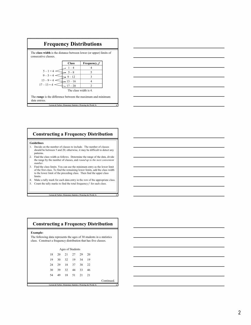
Relative Frequency
41 – 4
Relative
FrequencyFrequency, fClass
The relative frequency of a class is the portion or percentage of
the data that falls in that class. To find the relative frequency of a
class, divide the frequency f by the sample size n.
Relative frequency = Class frequency
Sample size
Relative frequency841
= 0.222≈
0.222
fn
=
18f∑ =
fn
=
5
Larson & Farber, Elementary Statistics: Picturing the World, 3e 13
Relative Frequency
Example:
Find the relative frequencies for the “Ages of Students” frequency
distribution.
50 – 57 2
3
4
8
13
42 – 49
34 – 41
26 – 33
18 – 25
Frequency, fClass
30f∑ =
Relative Frequency
0.067
0.1
0.133
0.267
0.433fn
1330
=
0.433≈
1fn
∑ =
Portion of
students
Larson & Farber, Elementary Statistics: Picturing the World, 3e 14
Cumulative Frequency
The cumulative frequency of a class is the sum of the frequency
for that class and all the previous classes.
30
28
25
21
13
Total number of
students
+
+
+
+50 – 57 2
3
4
8
13
42 – 49
34 – 41
26 – 33
18 – 25
Frequency, fClass
30f∑ =
Cumulative Frequency
Ages of Students
Larson & Farber, Elementary Statistics: Picturing the World, 3e 15
A frequency histogram is a bar graph that represents the
frequency distribution of a data set.
Frequency Histogram
1. The horizontal scale is quantitative and measures the data
values.
2. The vertical scale measures the frequencies of the classes.
3. Consecutive bars must touch.
Class boundaries are the numbers that separate the classes
without forming gaps between them.
The horizontal scale of a histogram can be marked with either the
class boundaries or the midpoints.
6
Larson & Farber, Elementary Statistics: Picturing the World, 3e 16
Class Boundaries
Example:
Find the class boundaries for the “Ages of Students” frequency
distribution.
49.5 − 57.5
41.5 − 49.5
33.5 − 41.5
25.5 − 33.5
17.5 − 25.5The distance from the
upper limit of the first
class to the lower limit
of the second class is 1.
Half this distance
is 0.5.
Class Boundaries
50 – 57 2
3
4
8
13
42 – 49
34 – 41
26 – 33
18 – 25
Frequency, fClass
30f∑ =
Ages of Students
Larson & Farber, Elementary Statistics: Picturing the World, 3e 17
Frequency Histogram
Example:Draw a frequency histogram for the “Ages of Students” frequency distribution. Use the class boundaries.
23
4
8
13
Broken axis
Ages of Students
10
8
6
4
2
0
Age (in years)
f
12
14
17.5 25.5 33.5 41.5 49.5 57.5
Larson & Farber, Elementary Statistics: Picturing the World, 3e 18
Frequency Polygon
A frequency polygon is a line graph that emphasizes the continuous
change in frequencies.
Broken axis
Ages of Students
10
8
6
4
2
0
Age (in years)
f
12
14
13.5 21.5 29.5 37.5 45.5 53.5 61.5
Midpoints
Line is extended to
the x-axis.

7
Larson & Farber, Elementary Statistics: Picturing the World, 3e 19
Relative Frequency Histogram
A relative frequency histogram has the same shape and the same
horizontal scale as the corresponding frequency histogram.
0.4
0.3
0.2
0.1
0.5
Ages of Students
0
Age (in years)
Relative freq
uen
cy
(portion of studen
ts)
17.5 25.5 33.5 41.5 49.5 57.5
0.433
0.267
0.1330.1
0.067
Larson & Farber, Elementary Statistics: Picturing the World, 3e 20
Cumulative Frequency Graph
A cumulative frequency graph or ogive, is a line graph that
displays the cumulative frequency of each class at its upper class
boundary.
17.5
Age (in years)
Ages of Students
24
18
12
6
30
0
Cumulative freq
uen
cy
(portion of studen
ts)
25.5 33.5 41.5 49.5 57.5
The graph ends at
the upper
boundary of the
last class.
§ 2.2
More Graphs and
Displays

8
Larson & Farber, Elementary Statistics: Picturing the World, 3e 22
Stem-and-Leaf Plot
In a stem-and-leaf plot, each number is separated into a stem
(usually the entry’s leftmost digits) and a leaf (usually the rightmost
digit). This is an example of exploratory data analysis.
Example:The following data represents the ages of 30 students in a statistics class. Display the data in a stem-and-leaf plot.
Ages of Students
Continued.212151184954
463344323930
223837182924
193419323019
202927212018
Larson & Farber, Elementary Statistics: Picturing the World, 3e 23
Stem-and-Leaf Plot
Ages of Students
1
2
3
4
5
8 8 8 9 9 9
0 0 1 1 1 2 4 7 9 9
0 0 2 2 3 4 7 8 9
4 6 9
1 4
Key: 1|8 = 18
This graph allows us to see the
shape of the data as well as the
actual values.
Most of the values lie between 20
and 39.
Larson & Farber, Elementary Statistics: Picturing the World, 3e 24
Stem-and-Leaf Plot
Ages of Students
1122334455
8 8 8 9 9 90 0 1 1 1 2 4
0 0 2 2 3 4
4
1 4
Key: 1|8 = 18
From this graph, we can conclude
that more than 50% of the data lie
between 20 and 34.
Example:Construct a stem-and-leaf plot that has two lines for each stem.
7 9 9
7 8 9
6 9

9
Larson & Farber, Elementary Statistics: Picturing the World, 3e 25
Dot Plot
In a dot plot, each data entry is plotted, using a point, above a
horizontal axis.
Example:Use a dot plot to display the ages of the 30 students in the statistics class.
212151184954
463344323930
223837182924
193419323019
202927212018
Ages of Students
Continued.
Larson & Farber, Elementary Statistics: Picturing the World, 3e 26
Dot Plot
Ages of Students
15 18 24 45 4821 5130 5439 4233 3627 57
From this graph, we can conclude that most of the values lie
between 18 and 32.
Larson & Farber, Elementary Statistics: Picturing the World, 3e 27
Pie Chart
A pie chart is a circle that is divided into sectors that represent
categories. The area of each sector is proportional to the frequency of
each category.
Accidental Deaths in the USA in 2002
(Source: US Dept. of
Transportation) Continued.1,400Firearms
2,900Ingestion of Food/Object
4,200Fire
4,600Drowning
6,400Poison
12,200Falls
43,500Motor Vehicle
FrequencyType

10
Larson & Farber, Elementary Statistics: Picturing the World, 3e 28
Pie Chart
To create a pie chart for the data, find the relative frequency (percent)
of each category.
Continued.
0.019
0.039
0.056
0.061
0.085
0.162
0.578
Relative
Frequency
1,400
2,900
4,200
4,600
6,400
12,200
43,500
Frequency
Firearms
Ingestion of Food/Object
Fire
Drowning
Poison
Falls
Motor Vehicle
Type
n = 75,200
Larson & Farber, Elementary Statistics: Picturing the World, 3e 29
Pie Chart
Next, find the central angle. To find the central angle, multiply the
relative frequency by 360°.
Continued.
0.019
0.039
0.056
0.061
0.085
0.162
0.578
Relative
Frequency
1,400
2,900
4,200
4,600
6,400
12,200
43,500
Frequency
6.7°Firearms
13.9°Ingestion of Food/Object
20.1°Fire
22.0°Drowning
30.6°Poison
58.4°Falls
208.2°Motor Vehicle
AngleType
Larson & Farber, Elementary Statistics: Picturing the World, 3e 30
Pie Chart
Firearms1.9%
Motor vehicles57.8%
Poison8.5%
Falls16.2%
Drowning6.1%
Fire5.6%
Ingestion3.9%
11
Larson & Farber, Elementary Statistics: Picturing the World, 3e 31
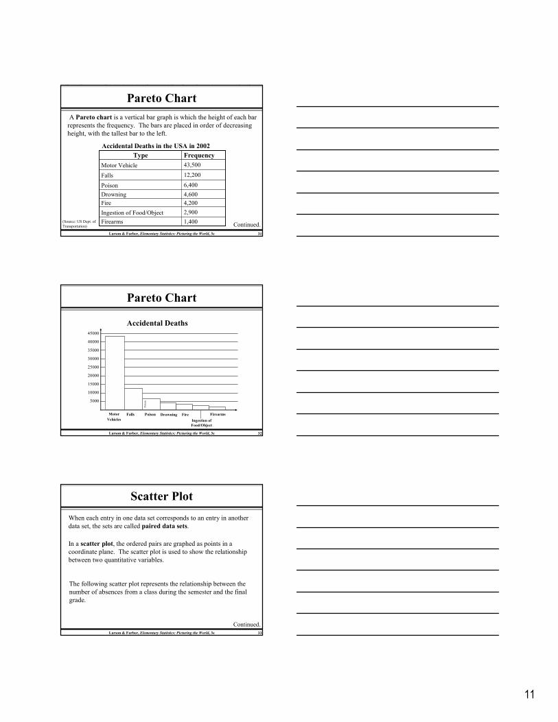
Pareto Chart
A Pareto chart is a vertical bar graph is which the height of each bar
represents the frequency. The bars are placed in order of decreasing
height, with the tallest bar to the left.
Accidental Deaths in the USA in 2002
(Source: US Dept. of
Transportation) Continued.1,400Firearms
2,900Ingestion of Food/Object
4,200Fire
4,600Drowning
6,400Poison
12,200Falls
43,500Motor Vehicle
FrequencyType
Larson & Farber, Elementary Statistics: Picturing the World, 3e 32
Pareto Chart
Accidental Deaths
5000
10000
35000
40000
45000
30000
25000
20000
15000
Poison
Poison DrowningFallsMotor
Vehicles
Fire Firearms
Ingestion of
Food/Object
Larson & Farber, Elementary Statistics: Picturing the World, 3e 33
Scatter Plot
When each entry in one data set corresponds to an entry in another
data set, the sets are called paired data sets.
In a scatter plot, the ordered pairs are graphed as points in a
coordinate plane. The scatter plot is used to show the relationship
between two quantitative variables.
The following scatter plot represents the relationship between the
number of absences from a class during the semester and the final
grade.
Continued.

12
Larson & Farber, Elementary Statistics: Picturing the World, 3e 34
Scatter Plot
Absences Gradex
8
2
5
12
15
9
6
y
78
92
90
58
43
74
81
Final
grade
(y)
0 2 4 6 8 10 12 14 16
40
50
60
70
80
90
Absences (x)
100
From the scatter plot, you can see that as the number of absences
increases, the final grade tends to decrease.
Larson & Farber, Elementary Statistics: Picturing the World, 3e 35
Times Series Chart
A data set that is composed of quantitative data entries taken at
regular intervals over a period of time is a time series. A time series
chart is used to graph a time series.
Example:
The following table lists the
number of minutes Robert
used on his cell phone for the
last six months.
Continued.
135June
199May
175April
188March
242February
236January
MinutesMonth
Construct a time series chart
for the number of minutes
used.
Larson & Farber, Elementary Statistics: Picturing the World, 3e 36
Times Series Chart
Robert’s Cell Phone Usage
200
150
100
50
250
0
Minutes
Month
Jan Feb Mar Apr May June
13
§ 2.3
Measures of Central
Tendency
Larson & Farber, Elementary Statistics: Picturing the World, 3e 38
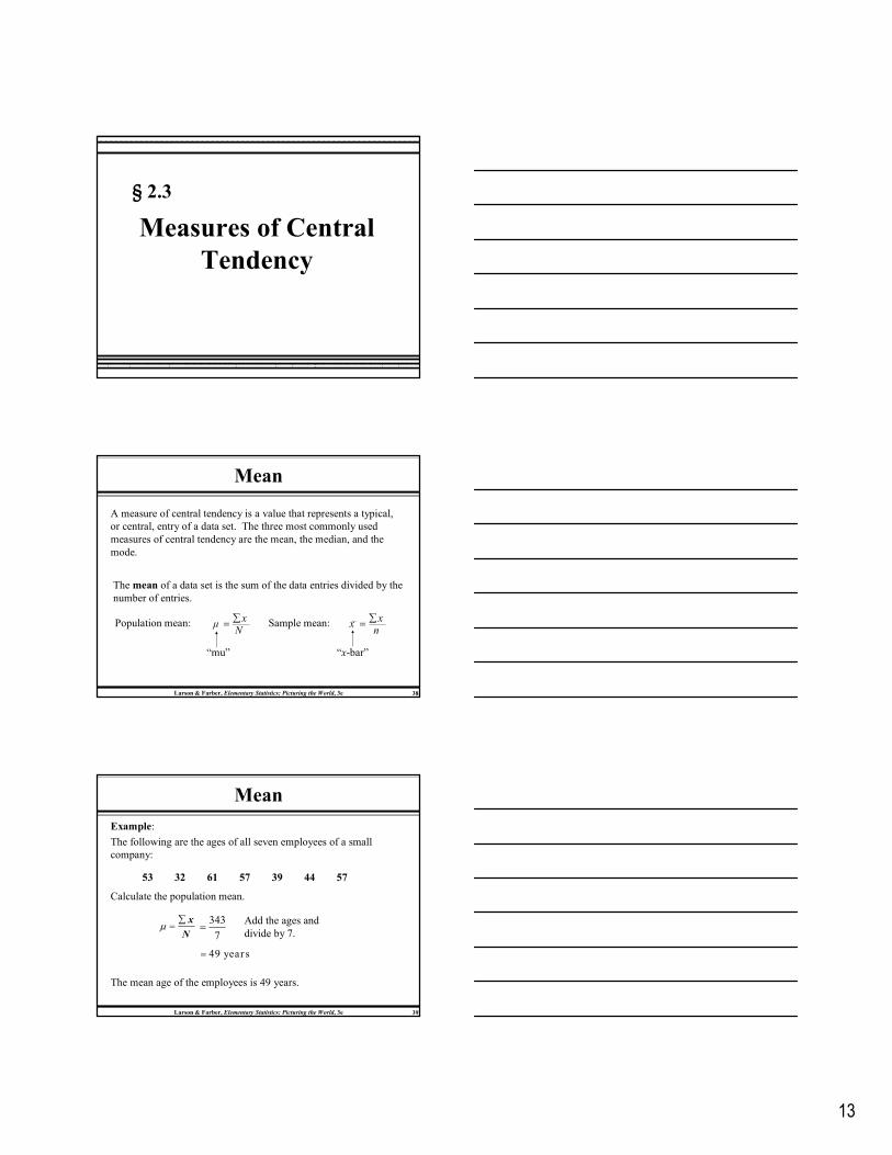
Mean
A measure of central tendency is a value that represents a typical,
or central, entry of a data set. The three most commonly used
measures of central tendency are the mean, the median, and the
mode.
The mean of a data set is the sum of the data entries divided by the
number of entries.
Population mean: xµ
N∑
= Sample mean: xx
n∑
=
“mu” “x-bar”
Larson & Farber, Elementary Statistics: Picturing the World, 3e 39
Calculate the population mean.
Mean
N
x∑=µ
7
343=
49 year s=
53 32 61 57 39 44 57
Example:
The following are the ages of all seven employees of a small
company:
The mean age of the employees is 49 years.
Add the ages and
divide by 7.
14
Larson & Farber, Elementary Statistics: Picturing the World, 3e 40
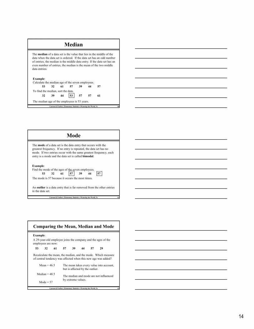
Median
The median of a data set is the value that lies in the middle of the
data when the data set is ordered. If the data set has an odd number
of entries, the median is the middle data entry. If the data set has an
even number of entries, the median is the mean of the two middle
data entries.
53 32 61 57 39 44 57
To find the median, sort the data.
Example:
Calculate the median age of the seven employees.
32 39 44 53 57 57 61
The median age of the employees is 53 years.
Larson & Farber, Elementary Statistics: Picturing the World, 3e 41
The mode is 57 because it occurs the most times.
Mode
The mode of a data set is the data entry that occurs with the
greatest frequency. If no entry is repeated, the data set has no
mode. If two entries occur with the same greatest frequency, each
entry is a mode and the data set is called bimodal.
53 32 61 57 39 44 57
Example:
Find the mode of the ages of the seven employees.
An outlier is a data entry that is far removed from the other entries
in the data set.
Larson & Farber, Elementary Statistics: Picturing the World, 3e 42
53 32 61 57 39 44 57 29
Recalculate the mean, the median, and the mode. Which measure
of central tendency was affected when this new age was added?
Mean = 46.5
Example:
A 29-year-old employee joins the company and the ages of the
employees are now:
Comparing the Mean, Median and Mode
Median = 48.5
Mode = 57
The mean takes every value into account,
but is affected by the outlier.
The median and mode are not influenced
by extreme values.
15
Larson & Farber, Elementary Statistics: Picturing the World, 3e 43
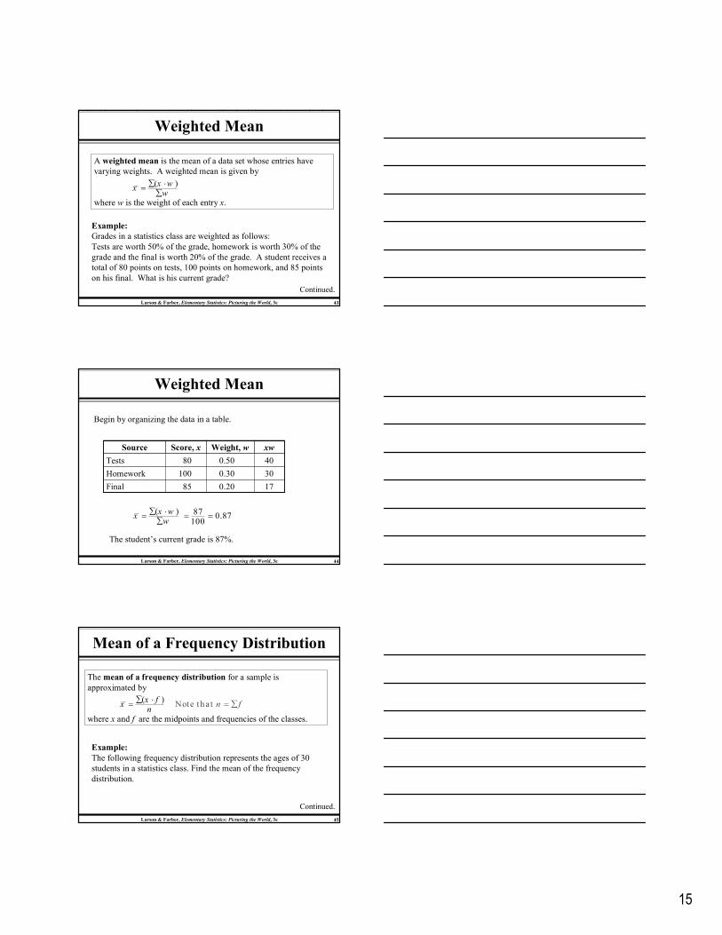
Weighted Mean
A weighted mean is the mean of a data set whose entries have
varying weights. A weighted mean is given by
where w is the weight of each entry x.
( )x wx
w∑ ⋅
=∑
Example:
Grades in a statistics class are weighted as follows:
Tests are worth 50% of the grade, homework is worth 30% of the
grade and the final is worth 20% of the grade. A student receives a
total of 80 points on tests, 100 points on homework, and 85 points
on his final. What is his current grade?
Continued.
Larson & Farber, Elementary Statistics: Picturing the World, 3e 44
Weighted Mean
170.2085Final
300.30100Homework
400.5080Tests
xwWeight, wScore, xSource
The student’s current grade is 87%.
( )x wx
w∑ ⋅
=∑
87100
= 0.87=
Begin by organizing the data in a table.
Larson & Farber, Elementary Statistics: Picturing the World, 3e 45
Mean of a Frequency Distribution
The mean of a frequency distribution for a sample is
approximated by
where x and f are the midpoints and frequencies of the classes.
No( )
t e tha t x f
x n fn
∑ ⋅= = ∑
Example:
The following frequency distribution represents the ages of 30
students in a statistics class. Find the mean of the frequency
distribution.
Continued.

16
Larson & Farber, Elementary Statistics: Picturing the World, 3e 46
Mean of a Frequency Distribution
107.0253.550 – 57
Σ = 909.0n = 30
136.5345.542 – 49
150.0437.534 – 41
236.0829.526 – 33
279.51321.518 – 25
(x · f )fxClass
Class midpoint
( )x fx
n∑ ⋅
=
The mean age of the students is 30.3 years.
90930
= 30.3=
Larson & Farber, Elementary Statistics: Picturing the World, 3e 47
Shapes of Distributions
A frequency distribution is symmetric when a vertical line can be
drawn through the middle of a graph of the distribution and the
resulting halves are approximately the mirror images.
A frequency distribution is uniform (or rectangular) when all
entries, or classes, in the distribution have equal frequencies. A
uniform distribution is also symmetric.
A frequency distribution is skewed if the “tail” of the graph
elongates more to one side than to the other. A distribution is
skewed left (negatively skewed) if its tail extends to the left. A
distribution is skewed right (positively skewed) if its tail extends
to the right.
Larson & Farber, Elementary Statistics: Picturing the World, 3e 48
Symmetric Distribution
mean = median = mode= $25,000
35,000
30,000
28,000
26,000
25,000
25,000
24,000
22,000
20,000
15,000
10 Annual Incomes
Income5
4
3
2
1
0
f
$25000

17
Larson & Farber, Elementary Statistics: Picturing the World, 3e 49
Skewed Left Distribution
mean = $23,500median = mode = $25,000 Mean < Median
35,000
30,000
28,000
26,000
25,000
25,000
24,000
22,000
20,000
0
10 Annual Incomes
Income5
4
3
2
1
0
f
$25000
Larson & Farber, Elementary Statistics: Picturing the World, 3e 50
Skewed Right Distribution
mean = $121,500median = mode = $25,000 Mean > Median
1,000,000
30,000
28,000
26,000
25,000
25,000
24,000
22,000
20,000
15,000
10 Annual Incomes
Income5
4
3
2
1
0
f
$25000
Larson & Farber, Elementary Statistics: Picturing the World, 3e 51
UniformSymmetric
Skewed right Skewed left
Mean > Median Mean < Median
Summary of Shapes of Distributions
Mean = Median

18
§ 2.4
Measures of
Variation
Larson & Farber, Elementary Statistics: Picturing the World, 3e 53
Range
The range of a data set is the difference between the maximum and
minimum date entries in the set.
Range = (Maximum data entry) – (Minimum data entry)
Example:
The following data are the closing prices for a certain stock
on ten successive Fridays. Find the range.
67676763636158575656Stock
The range is 67 – 56 = 11.
Larson & Farber, Elementary Statistics: Picturing the World, 3e 54
Deviation
The deviation of an entry x in a population data set is the difference
between the entry and the mean µ of the data set.
Deviation of x = x – µ
Example:
The following data are the closing
prices for a certain stock on five
successive Fridays. Find the
deviation of each price.
The mean stock price is
µ = 305/5 = 61.67 – 61 = 6
Σ(x – µ) = 0
63 – 61 = 2
61 – 61 = 0
58 – 61 = – 3
56 – 61 = – 5
Deviationx – µ
Σx = 305
67
63
61
58
56
Stockx

19
Larson & Farber, Elementary Statistics: Picturing the World, 3e 55
Variance and Standard Deviation
The population variance of a population data set of N entries is
Population variance = 2
2 ( ).
x µN
σ∑ −
=
“sigma
squared”
The population standard deviation of a population data set of N
entries is the square root of the population variance.
Population standard deviation = 2
2 ( ).
x µN
σ σ∑ −
= =
“sigma”
Larson & Farber, Elementary Statistics: Picturing the World, 3e 56
Finding the Population Standard Deviation
Guidelines
In Words In Symbols
1. Find the mean of the population data set.
2. Find the deviation of each entry.
3. Square each deviation.
4. Add to get the sum of squares.
5. Divide by N to get the population
variance.
6. Find the square root of the variance to get the population standard
deviation.
xµ
N∑
=
x µ−
( )2
x µ−
( )2
xSS x µ= ∑ −
( )2
2 x µ
Nσ
∑ −=
( )2x µ
Nσ
∑ −=
Larson & Farber, Elementary Statistics: Picturing the World, 3e 57
Finding the Sample Standard Deviation
Guidelines
In Words In Symbols
1. Find the mean of the sample data set.
2. Find the deviation of each entry.
3. Square each deviation.
4. Add to get the sum of squares.
5. Divide by n – 1 to get the sample
variance.
6. Find the square root of the variance to get the sample standard deviation.
xx
n∑
=
x x−
( )2
x x−
( )2
xS S x x= ∑ −
( )2
2
1
x xs
n
∑ −=
−
( )2
1
x xs
n
∑ −=
−

20
Larson & Farber, Elementary Statistics: Picturing the World, 3e 58
Finding the Population Standard Deviation
Example:
The following data are the closing prices for a certain stock on five
successive Fridays. The population mean is 61. Find the population
standard deviation.
Σ(x – µ) = 0
6
2
0
– 3
– 5
Deviation
x – µ
3667
Σ(x – µ)2 = 74
4
0
9
25
Squared
(x – µ)2
Σx = 305
63
61
58
56
Stock
x
SS2 = Σ(x – µ)2 = 74
( )2
2 7414.8
5
x µ
Nσ
∑ −= = =
σ ≈ $3.85
Always positive!
( )214.8 3.8
x µ
N
∑ −= = ≈σ 3.85
Larson & Farber, Elementary Statistics: Picturing the World, 3e 59
Interpreting Standard Deviation
When interpreting standard deviation, remember that is a measure
of the typical amount an entry deviates from the mean. The more
the entries are spread out, the greater the standard deviation.
10
8
6
4
2
0
Data value
Frequen
cy
12
14
2 4 6
= 4
s = 1.18
x
10
8
6
4
2
0
Data value
Frequen
cy
12
14
2 4 6
= 4
s = 0
x
Larson & Farber, Elementary Statistics: Picturing the World, 3e 60
Empirical Rule
For data with a (symmetric) bell-shaped distribution, the standard
deviation has the following characteristics.
Empirical Rule (68-95-99.7%)
1. About 68% of the data lie within one standard deviation of the
mean.
2. About 95% of the data lie within two standard deviations of the
mean.
3. About 99.7% of the data lie within three standard deviation of
the mean.

21
Larson & Farber, Elementary Statistics: Picturing the World, 3e 61
68% within 1
standard
deviation
99.7% within 3
standard deviations
95% within 2 standard
deviations
Empirical Rule (68-95-99.7%)
–4 –3 –2 –1 0 1 2 3 4
34% 34%
13.5% 13.5%
2.35% 2.35%
Larson & Farber, Elementary Statistics: Picturing the World, 3e 62
125 130 135120 140 145115110105
Example:
The mean value of homes on a street is $125 thousand with a standard
deviation of $5 thousand. The data set has a bell shaped distribution.
Estimate the percent of homes between $120 and $130 thousand.
Using the Empirical Rule
68% of the houses have a value between $120 and $130 thousand.
68%
µ – σ µ + σµ
Larson & Farber, Elementary Statistics: Picturing the World, 3e 63
Chebychev’s Theorem
The Empirical Rule is only used for symmetric
distributions.
Chebychev’s Theorem can be used for any distribution,
regardless of the shape.

22
Larson & Farber, Elementary Statistics: Picturing the World, 3e 64
Chebychev’s Theorem
The portion of any data set lying within k standard deviations
(k > 1) of the mean is at least
211 .k
−
For k = 2: In any data set, at least or 75%, of the
data lie within 2 standard deviations of the mean.
231 11 1 ,42 4
− = − =
For k = 3: In any data set, at least or 88.9%, of the
data lie within 3 standard deviations of the mean.
281 11 1 ,93 9
− = − =
Larson & Farber, Elementary Statistics: Picturing the World, 3e 65
Using Chebychev’s Theorem
Example:
The mean time in a women’s 400-meter dash is 52.4
seconds with a standard deviation of 2.2 sec. At least 75%
of the women’s times will fall between what two values?
52.4 54.6 56.8 5950.24845.8
2 standard deviations
At least 75% of the women’s 400-meter dash times will fall
between 48 and 56.8 seconds.
µ
Larson & Farber, Elementary Statistics: Picturing the World, 3e 66
Standard Deviation for Grouped Data
Sample standard deviation =
where n = Σf is the number of entries in the data set, and x is the
data value or the midpoint of an interval.
2( )1
x x fs
n∑ −
=−
Example:
The following frequency distribution represents the ages of 30
students in a statistics class. The mean age of the students is 30.3
years. Find the standard deviation of the frequency distribution.
Continued.

23
Larson & Farber, Elementary Statistics: Picturing the World, 3e 67
Standard Deviation for Grouped Data
23.2
15.2
7.2
– 0.8
– 8.8
x –
538.24
231.04
51.84
0.64
77.44
(x – )2
1076.48253.550 – 57
n = 30
693.12345.542 – 49
207.36437.534 – 41
5.12829.526 – 33
1006.721321.518 – 25
(x – )2ffxClass
The mean age of the students is 30.3 years.
2988.80∑ =
2( )1
x x fs
n∑ −
=−
2988.829
= 103.06= 10.2=
The standard deviation of the ages is 10.2 years.
x x x
§ 2.5
Measures of Position
Larson & Farber, Elementary Statistics: Picturing the World, 3e 69
Quartiles
The three quartiles, Q1, Q2, and Q3, approximately divide an
ordered data set into four equal parts.
Median
0 5025 10075
Q3Q2Q1
Q1 is the median of the
data below Q2.
Q3 is the median of the
data above Q2.

24
Larson & Farber, Elementary Statistics: Picturing the World, 3e 70
Finding Quartiles
Example:
The quiz scores for 15 students is listed below. Find the first,
second and third quartiles of the scores.
28 43 48 51 43 30 55 44 48 33 45 37 37 42 38
Order the data.
28 30 33 37 37 38 42 43 43 44 45 48 48 51 55
Lower half Upper half
Q2Q1 Q3
About one fourth of the students scores 37 or less; about one half score
43 or less; and about three fourths score 48 or less.
Larson & Farber, Elementary Statistics: Picturing the World, 3e 71
Interquartile Range
The interquartile range (IQR) of a data set is the difference
between the third and first quartiles.
Interquartile range (IQR) = Q3 – Q1.
Example:
The quartiles for 15 quiz scores are listed below. Find the
interquartile range.
(IQR) = Q3 – Q1
Q2 = 43 Q3 = 48Q1 = 37
= 48 – 37
= 11
The quiz scores in the middle
portion of the data set vary by at
most 11 points.
Larson & Farber, Elementary Statistics: Picturing the World, 3e 72
Box and Whisker Plot
A box-and-whisker plot is an exploratory data analysis tool that
highlights the important features of a data set.
The five-number summary is used to draw the graph.
• The minimum entry
• Q1
• Q2 (median)
• Q3
• The maximum entry
Example:
Use the data from the 15 quiz scores to draw a box-and-whisker
plot.
Continued.
28 30 33 37 37 38 42 43 43 44 45 48 48 51 55

25
Larson & Farber, Elementary Statistics: Picturing the World, 3e 73
Box and Whisker Plot
Five-number summary
• The minimum entry
• Q1
• Q2 (median)
• Q3
• The maximum entry
37
28
55
43
48
40 44 48 52363228 56
28 37 43 48 55
Quiz Scores
Larson & Farber, Elementary Statistics: Picturing the World, 3e 74
Percentiles and Deciles
Fractiles are numbers that partition, or divide, an ordered data
set.
Percentiles divide an ordered data set into 100 parts. There are
99 percentiles: P1, P2, P3…P99.
Deciles divide an ordered data set into 10 parts. There are 9
deciles: D1, D2, D3…D9.
A test score at the 80th percentile (P80), indicates that the test score
is greater than 80% of all other test scores and less than or equal to
20% of the scores.
Larson & Farber, Elementary Statistics: Picturing the World, 3e 75
Standard Scores
The standard score or z-score, represents the number of standard
deviations that a data value, x, falls from the mean, µ.
Example:
The test scores for all statistics finals at Union College have a
mean of 78 and standard deviation of 7. Find the z-score for
a.) a test score of 85,
b.) a test score of 70,
c.) a test score of 78.
va lue mean standard devia t ion
xz
−−= =
µσ
Continued.

26
Larson & Farber, Elementary Statistics: Picturing the World, 3e 76
Standard Scores
xz
µσ−
=
Example continued:
a.) µ = 78, σ = 7, x = 85
85 787−
= 1.0= This score is 1 standard deviation higher
than the mean.
xz
µσ−
=
b.) µ = 78, σ = 7, x = 70
70 787−
= 1.14= − This score is 1.14 standard deviations
lower than the mean.
xz
µσ−
=
c.) µ = 78, σ = 7, x = 78
78 787−
= 0= This score is the same as the mean.
Larson & Farber, Elementary Statistics: Picturing the World, 3e 77
Relative Z-Scores
Example:
John received a 75 on a test whose class mean was 73.2 with a
standard deviation of 4.5. Samantha received a 68.6 on a test whose
class mean was 65 with a standard deviation of 3.9. Which student
had the better test score?
John’s z-score Samantha’s z-score
xz
µσ−
=75 73.2
4.5−
=
0.4=
xz
µσ−
=68.6 65
3.9−
=
0.92=
John’s score was 0.4 standard deviations higher than the mean,
while Samantha’s score was 0.92 standard deviations higher
than the mean. Samantha’s test score was better than John’s.