Embed Size (px)
Citation preview

Identify the sampling method used.
1. The name of each audience member at a game show is printedon a separate piece of paper and put into a rotating case. Oneaudience member is chosen to play the game by drawing onepiece of paper from the shuffled names.
random2. At a frozen pizza manufacturing plant, a coupon for a free pizza
is put inside the package of every 100th pizza.
sstematic3. The teacher asks that students with birthdays from July to
December go to the chalkboard to work the next problem.
stematic
Identify the population and sample. Give a reason the samplecould be biased.
4. A radio disc jockey asks listeners to call in and name theirfavorite radio station.
population
sample
possible bias
5. A hospital mails out surveys to 500 recent patients to get theirfeedback on their hospital visit.
population
sample
possible bias
6. The first 10 people leaving the theater are asked to give theirfeedback about the movie.
population
sample
possible bias recenitalrecenital
recenital
recenitalrecenital
recenital
listeners like that stationlisteners who call in
radio listeners
Copyright © by Holt, Rinehart and Winston. 3 Holt MathematicsAll rights reserved.
Name Date Class
Practice ASamples and Surveys9-1
LESSON
MSM07G8_RESBK_Ch09_003_010.pe 2/12/06 8:40 PM Page 3
Copyright © by Holt, Rinehart and Winston. 4 Holt MathematicsAll rights reserved.
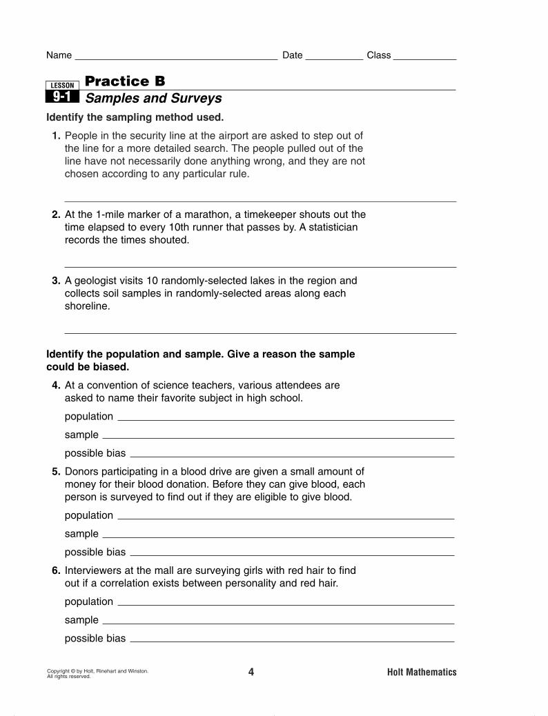
Identify the sampling method used.
1. People in the security line at the airport are asked to step out ofthe line for a more detailed search. The people pulled out of theline have not necessarily done anything wrong, and they are notchosen according to any particular rule.
random2. At the 1-mile marker of a marathon, a timekeeper shouts out the
time elapsed to every 10th runner that passes by. A statisticianrecords the times shouted.
matic3. A geologist visits 10 randomly-selected lakes in the region and
collects soil samples in randomly-selected areas along eachshoreline.
stratified
Identify the population and sample. Give a reason the samplecould be biased.
4. At a convention of science teachers, various attendees areasked to name their favorite subject in high school.
population
sample
possible bias
5. Donors participating in a blood drive are given a small amount ofmoney for their blood donation. Before they can give blood, eachperson is surveyed to find out if they are eligible to give blood.
population
sample
possible bias
6. Interviewers at the mall are surveying girls with red hair to findout if a correlation exists between personality and red hair.
population
sample
possible bias recenitalrecenital
recenital
recenitalrecenital
blood donors
recenitalrecenital
teachers at the convention
Name Date Class
Practice BSamples and Surveys9-1
LESSON
MSM07G8_RESBK_Ch09_003_010.pe 2/12/06 8:40 PM Page 4

Copyright © by Holt, Rinehart and Winston. 11 Holt MathematicsAll rights reserved.
1. Complete the line plot to organize the data of math quiz scores.
Name Date Class
Practice AOrganizing Data9-2
LESSON
List the data values in the stem-and-leaf plot.
Math Quiz Scores18 18 20 13 17 12 15 1217 19 17 18 18 20 11 19
2. 0 1 2 51 0 52 2 4 63 1 7 Key: 3 | 7 � 37
3. Use the given data to make a stem-and-leaf plot.
4. Make a Venn diagram to show how many boys in an eighth-grade class had summer jobs.
Maximum Speed of Animals (mph)
pig (domestic) 11 grizzly bear 30
squirrel 12 rabbit 35
elephant 25 zebra 40
cat (domestic) 30 cape hunting dog 45
1 1 2 2 5 3 0 0 54 0 5Key: 4 | 5 � 45
Gender M M F M F F M F F M M M
Summer Job? yes no yes yes yes no no yes yes yes no yes
Students withBoys Summer Jobs
3 4 4
11 12 13 14 15 16 17 18 19 20
1, 2, 5, 10, 15, 22,
24, 26, 31, 37,
MSM07G8_RESBK_Ch09_011_019.pe 2/12/06 8:12 PM Page 11
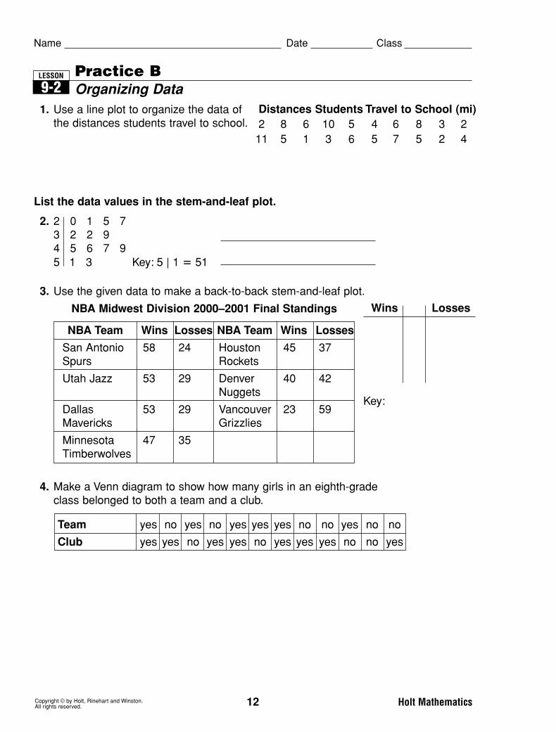
1. Use a line plot to organize the data of the distances students travel to school.
Copyright © by Holt, Rinehart and Winston. 12 Holt MathematicsAll rights reserved.
Name Date Class
Practice BOrganizing Data9-2
LESSON
List the data values in the stem-and-leaf plot.
2. 2 0 1 5 73 2 2 94 5 6 7 95 1 3 Key: 5 | 1 � 51
3. Use the given data to make a back-to-back stem-and-leaf plot.
4. Make a Venn diagram to show how many girls in an eighth-grade class belonged to both a team and a club.
Wins Losses
Key:
NBA Team Wins Losses NBA Team Wins Losses
San Antonio 58 24 Houston 45 37Spurs Rockets
Utah Jazz 53 29 Denver 40 42Nuggets
Dallas 53 29 Vancouver 23 59Mavericks Grizzlies
Minnesota 47 35Timberwolves
NBA Midwest Division 2000–2001 Final Standings
Distances Students Travel to School (mi)2 8 6 10 5 4 6 8 3 211 5 1 3 6 5 7 5 2 4
Team yes no yes no yes yes yes no no yes no no
Club yes yes no yes yes no yes yes yes no no yes

Copyright © by Holt, Rinehart and Winston. 20 Holt MathematicsAll rights reserved.
Name Date Class
Practice AMeasures of Central Tendency9-3
LESSON
Find the mean, median, mode, and range of each set of numbers.
1. 4, 2, 6, 3, 8, 6, 6 2. 2, 8, 6, 9, 8, 7, 9, 8
mean: mode: mean: mode:
median: range: median: range:
3. 12, 9, 14, 22, 3, 11, 14, 15 4. 89, 45, 68, 94, 70, 94, 86
mean: mode: mean: mode:
median: range: median: range:
Determine and find the most appropriate measure of central tendency or range for each situation. Refer to the table.
5. What number best describes the middle ofthe waterfall heights?
median; 531 ft6. What number appears most often in the
waterfall heights?
mode; 620 ft7. Which measure of central tendency is best
to describe the waterfall heights? Explainyour reasoning.
Possible answer: The median is best because it eliminates the influence
of the outlie8. An official for the department of transportation counted the
number of vehicles that passed through a busy intersection. Hecounted for 10 consecutive minutes and recorded the number ofvehicles for each minute: 18, 41, 25, 9, 22, 36, 24, 13, 25, and28. What number best describes the middle of the data?
mean � 24.1
49861913
94781412.5
7866
87.12565
Waterfall Heights (ft)
Feather, CA 640
Bridalveil, CA 620
Ribbon, NV 1,612
Seven, CO 300
Akaka, HI 442
Shoshone, ID 212
Taughannock, NY 215
Multnomah, OR 620
MSM07G8_RESBK_Ch09_020_027.pe 2/12/06 8:14 PM Page 20

Copyright © by Holt, Rinehart and Winston. 21 Holt MathematicsAll rights reserved.
Name Date Class
Practice BMeasures of Central Tendency9-3
LESSON
Find the mean, median, mode, and range of each data set.
1. 7, 7, 4, 9, 6, 4, 5, 8, 4 2. 1.2, 5.8, 3.7, 9.7, 5.5, 0.3, 8.1
mean: mean:
median: median:
mode: mode:
range: range:
3. 31, 28, 31, 30, 31, 30, 4. 65, 46, 78, 3, 87,31, 31, 30, 31, 30, 31 12, 99, 38, 71, 38
mean: mean:
median: median:
mode: mode:
range: range:
Determine and find the most appropriatemeasure of central tendency or range foreach situation. Refer to the table at the rightfor Exercises 5–7.
5. Which measure best describes the middleof the data?
6. Which earthquake magnitude occurredmost frequently?
7. How spread out are the data?
8. Nicole purchased gasoline 8 times in the last two months. Theprices that she paid per gallon each time were $2.19, $2.14,$2.28, $2.09, $2.01, $1.99, $2.19, and $2.39. Which measuremakes the prices appear lowest?
Some Major Earthquakes inUnited States History
Year Location Magnitude
1812 Missouri 7.9
1872 California 7.8
1906 California 7.7
1957 Alaska 8.8
1964 Alaska 9.2
1965 Alaska 8.7
1983 Idaho 7.3
1986 Alaska 8.0
1987 Alaska 7.9
1992 California 7.6

Copyright © by Holt, Rinehart and Winston. 28 Holt MathematicsAll rights reserved.
Name Date Class
Practice AVariability9-4
LESSON
Find the least value, greatest value, and median for eachdata set.
1. 6, 9, 3, 7, 8, 7, 5 2. 12, 8, 24, 19, 15, 20, 13
least value: least value:
greatest value: greatest value:
median: median:
Find the given values for each data set. Then use the values tomake a box-and-whisker plot.
3. 27, 33, 28, 26, 34, 40, 21
least value:
greatest value:
median:
first quartile:
third quartile:
4. 48, 64, 49, 55, 67, 50, 35, 62, 44, 52, 58
least value:
greatest value:
median:
first quartile:
third quartile:
4010 20 30 706050
62
48
52
67
35
4010 20 30 50
34
26
28
40
21
157
249
83
MSM07G8_RESBK_Ch09_028_035.pe 2/12/06 8:22 PM Page 28
Copyright © by Holt, Rinehart and Winston. 29 Holt MathematicsAll rights reserved.
Name Date Class
Practice BVariability9-4
LESSON
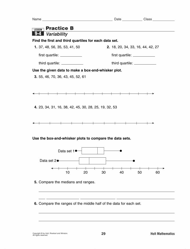
Find the first and third quartiles for each data set.
1. 37, 48, 56, 35, 53, 41, 50 2. 18, 20, 34, 33, 16, 44, 42, 27
first quartile: first quartile:
third quartile: third quartile:
Use the given data to make a box-and-whisker plot.
3. 55, 46, 70, 36, 43, 45, 52, 61
4. 23, 34, 31, 16, 38, 42, 45, 30, 28, 25, 19, 32, 53
Use the box-and-whisker plots to compare the data sets.
5. Compare the medians and ranges.
The median of data set 1 ieater than the median of data set 2. The
range of data set 2 is greater than the range of data set 1.6. Compare the ranges of the middle half of the data for each set.
The rreater in data set 2.
4010 20
Data set 1
Data set 2
30 6050
4010 20 30 6050
4010 20 30 706050
3853
1937
MSM07G8_RESBK_Ch09_028_035.pe 2/12/06 8:22 PM Page 29

1. Use the data to complete the double-bar graph.
2. Use the data to make a histogram with intervals of 10.
3. Make a double-line graph of the given data. Use the graph to estimate the heights of Dean and Susan when they were 9 years old.
At 9 years old, Dean was approximately
tall, and Susan was approximately tall.54.5 in.53.5 in.
Age Dean’s Susan’sHeight Height
2 35 in. 30 in.
4 41 in. 37 in.
6 46 in. 44 in.
8 50 in. 51 in.
10 57 in. 58 in.
12 60 in. 65 in.
Average High Temperatures in Aprilin Tourist Cities
Acapulco, Mexico 87 Montreal, Canada 51
Athens, Greece 67 Nassau, Bahamas 81
Dublin, Ireland 54 Paris, France 60
Hong Kong, China 79 Rome, Italy 68
London, U.K. 56 Sydney, Australia 73
Madrid, Spain 63 Toronto, Canada 51
Copyright © by Holt, Rinehart and Winston. 36 Holt MathematicsAll rights reserved.
Name Date Class
Practice ADisplaying Data9-5
LESSON
Nu
mb
er o
f To
uri
st C
itie
s
50–5
9
60–6
9
70–7
9
80–8
90
1
2
4
6
5
3
Temperature
Softball Scores 1 2 3 4 5 6 7 8
Team A 3 2 0 2 1 4 2 1
Team B 1 4 3 0 3 1 2 1
5
4
3
2
1
Fre
qu
ency
Score1 2 3 4 5 6 7 8
0
Team ATeam B
Softball Scores for Two Teams
0
2
4
6
8
10
12
30 35 40 45 50 656055
Children’s Age and Height
Ag
e
Height (in inches)
SusanDean
MSM07G8_RESBK_Ch09_036_044.pe 2/13/06 11:07 AM Page 36

Copyright © by Holt, Rinehart and Winston. 37 Holt MathematicsAll rights reserved.
1. Make a double-bar graph.
2. Use the data to make a histogram with intervals of 5.
3. Make a double-line graph of the given data. Use the graph to estimate the number of radio stations and cable TV systems in 2002.
Commercial Media in theUnited States
Radio Cable TVYear Stations Systems
1997 10,207 10,950
1999 10,444 10,700
2001 10,516 9,924
2003 10,605 9,339
Nu
mb
er o
f S
tud
ents
Allowance (dollars)
Weekly Allowance of 20 Students
$5 $15 $2 $10
$12 $12 $10 $15
$10 $5 $6 $4
$8 $7 $20 $7
$5 $4 $5 $9
Name Date Class
Practice BDisplaying Data9-5
LESSON
Daily Hours Worked 6 7 8 9 10 11 12
Crew A 4 3 6 1 3 1 2
Crew B 5 5 4 3 2 0 1
Fre
qu
ency
Hours Worked
Daily Hours Worked by Two CrewsDaily Hours Worked by Two Crews
Hours Worked
Year
U.S. Commercial Media
Nu
mb
er o
f E
nte
rpri
ses U.S. Commercial Media

Copyright © by Holt, Rinehart and Winston. 45 Holt MathematicsAll rights reserved.
Name Date Class
Practice AMisleading Graphs and Statistics9-6
LESSON
Explain why each graph is misleading.
1.
2.
Because the scale does not start at 0, the bars for Coun and Alternative
are almost 100%and Urban.
In fact, thlar radio formats.
Explain why the statistic is misleading.
3. A juice company surveyed 4 people about which juice theypreferred. Three of the people preferred the company’s juice over the competition’s. The company published that 3 times more people preferred their juice.
The sa size is too small.
Per
cen
t
Format
Radio Formats People Listen to Most
Count
ry
Altern
ative
Rock
News/T
alk
Oldies
Religio
us
Top
40
Urban
Adult C
onte
mpo
rary
20
22
24
26
28
38
36
34
32
30
The Price of a Pound of Applesin Selected Cities in September 2000
City
Pric
e(D
olla
rs) 1.25
1.000.750.500.25
0
Dallas$1.37Chicago
$1.10New York87 cents
Possible answers:
les are used
toces. However, the
areas of theles distort the
comrison. The area of the Dallas
is about 3 times the area of
the New Yorice
difference is about 1.5 times.
MSM07G8_RESBK_Ch09_045_052.pe 2/12/06 8:08 PM Page 45

Copyright © by Holt, Rinehart and Winston. 46 Holt MathematicsAll rights reserved.
Name Date Class
Practice BMisleading Graphs and Statistics9-6
LESSON
Explain why each graph is misleading.
1.
2.
Because the scale does not start at 0, the bar for 1997 is more than 21
times than the bar for 1980. In fact, the 1997 minimum we is
oneater than the 1980 minim
Explain why the statistic is misleading.
3. A chewing gum company advertises that the flavor of its newchewing gum lasts for an average of 55 minutes based on thefollowing durations reported by customers: 12 min, 33 min,5 min, 200 min, and 25 min.
rted that the flavor
that the flavor will last for 55 min.
Min
imu
m W
age
Year of Increase
Federal Minimun Wage Rates Since 1980
$3.00
$3.50
$4.00
$4.50
$5.00
$5.50
1980
$3.10$3.35
$3.80$4.25
$4.75$5.15
1981 1990 1991 1996 1997
On the RoadNumber of Trucks that Travel City Roads
50,000
0
100,000
2001
57,43052,27550,010
2000
1999
Possible answers:
The heits of the truck bars
h
is not eortioned. The
2001 bar is about 3 times taller
than the 1999 bar. In fact, the
data for the 3ars is close
tether.
MSM07G8_RESBK_Ch09_045_052.pe 2/12/06 8:08 PM Page 46

Copyright © by Holt, Rinehart and Winston. 53 Holt MathematicsAll rights reserved.
Name Date Class
Practice AScatter Plots9-7
LESSON
4. Use the data to predict how much money Tyler would be paid for
babysitting 7�12
� hours.
Amount Tyler Earns Babysitting
According to the data, Tyler would get paid $ for
babysitting 7�12
� hours.
30
Hours 1 2 3 4 5 6 7 8
Amount $4 $8 $12 $16 $20 $24 $28 $32
1. Use the given data to make a scatter plot.
Calories and Fat Per Portion of Meat & Fish
Do the data sets have a positive, a negative, or no correlation?
0
100
200
300
50
150
250
350
2 4 6 8 10 12 14 16 18 20 22 24 26 28 30 320
Calories and Fat Per Portion of Meat and Fish
Cal
ori
es
Fat (grams)
Fat (grams) Calories
Fish sticks (breaded) 3 50
Shrimp (fried) 9 190
Tuna (canned in oil) 7 170
Ground beef (broiled) 10 185
Roast beef (relatively lean) 7 165
Ham (light cure, lean and fat) 19 245
2. The size of the bag of popcorn andthe price of the popcorn
positive correlation
3. The increase in temperature andnumber of snowboards sold
neative correlation
MSM07G8_RESBK_Ch09_053_060.pe 2/13/06 11:12 AM Page 53
Copyright © by Holt, Rinehart and Winston. 54 Holt MathematicsAll rights reserved.
Name Date Class
Practice BScatter Plots9-7
LESSON
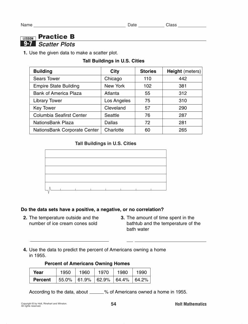
1. Use the given data to make a scatter plot.
Tall Buildings in U.S. Cities
Do the data sets have a positive, a negative, or no correlation?
Tall Buildings in U.S. Cities
Building City Stories Height (meters)
Sears Tower Chicago 110 442
Empire State Building New York 102 381
Bank of America Plaza Atlanta 55 312
Library Tower Los Angeles 75 310
Key Tower Cleveland 57 290
Columbia Seafirst Center Seattle 76 287
NationsBank Plaza Dallas 72 281
NationsBank Corporate Center Charlotte 60 265
2. The temperature outside and thenumber of ice cream cones sold
positive correlation
3. The amount of time spent in thebathtub and the temperature of thebath water
negative correlation
4. Use the data to predict the percent of Americans owning a homein 1955.
Percent of Americans Owning Homes
According to the data, about % of Americans owned a home in 1955.58.5
Year 1950 1960 1970 1980 1990
Percent 55.0% 61.9% 62.9% 64.4% 64.2%
MSM07G8_RESBK_Ch09_053_060.pe 2/13/06 11:12 AM Page 54

Copyright © by Holt, Rinehart and Winston. 61 Holt MathematicsAll rights reserved.
Name Date Class
Practice AChoosing the Best Representation of Data9-8
LESSON
1. Which graph is a better display of the number of vacation days certain countries have in a year?
h is a better
d.
2. Which graph is a better display of the distribution of cats’weights?
Testion asks about the distribution of data, so the box-and-whisker
3. A scientist measured the lengths of 10 earthworms. The table shows her data. Choose an appropriate data display and draw the graph.
Earthworm Lengths (cm)
8 14 9 10 9
11 7 10 12 9
Country
Vacation Days Per Year
Nu
mb
er o
fV
acat
ion
Day
s
05
1015202530354045
FranceCanada Italy Korea UnitedStates 0
Country
Vacation Days Per Year
Nu
mb
er o
fV
acat
ion
Day
s
51015
2530354045
20
Canad
a
Franc
eIta
ly
Korea
United
State
s
8 9 10 11 12 13 14 15 16 lb
Cat
0
Cat Weights (lb)
Po
un
ds
246
1210
14
1816
8
1 2 3 4 5 6
MSM07G8_RESBK_Ch09_061_068.pe 2/12/06 8:35 PM Page 61

Copyright © by Holt, Rinehart and Winston. 62 Holt MathematicsAll rights reserved.
Name Date Class
Practice BChoosing the Best Representation of Data9-8
LESSON
1. Which graph is a better display of the number of students in a class who chose math as their favorite subject?
h
is a better d
2. Which graph is a better display of the change in the number of cell telephone subscribers?
The data show cha.
3. The table shows the heights of players on a school basketball team. Choose an appropriate data display and draw the graph.
Possible answer:
Heights of Basketball Players (in.)
70 64 68 71
61 68 65 73
20%
MathSocial StudiesEnglishReading
10%
30%
40%
Students’ Favorite Subjects
Subject
Students’ Favorite Subjects
Stu
den
ts
0
2
4
10
8
12
14
6
Math SocialStudies
English Reading
199819992000200120022003
U.S. Cellular Telephone Subscribers (millions)
Year
U.S. Cellular Telephone Subscribers
Mill
ion
s o
fS
ub
scri
ber
s
020406080
100120140160180
1998 1999 2000 2001 2002 2003
MSM07G8_RESBK_Ch09_061_068.pe 2/12/06 8:35 PM Page 62


![Mean, Mode, Median[1]](https://img.pdfslide.us/doc/110x75/5462509daf7959fe1b8b57b8/mean-mode-median1-5584ae32b3357.jpg)


![Mean, Mode, Median[1]](https://img.pdfslide.us/doc/110x75/54625097af7959aa3d8b540f/mean-mode-median1-5584ae32b6452.jpg)