Embed Size (px)
Citation preview

Lesson 4:
GraphingA Magically Delicious Activity

Essential Question
How do Scientists investigate the natural world?
What kinds of data do bar and line graphs display?
Why are line graphs powerful tools?
2

Page 30
NEXT SLIDE HAS DATA TABLE ENLARGED

DataGoing WirelessHow has cell phone use in the United States grown over the years? What do you think will happen to the number of cell phone subscribers over the next ten years?
A DATA TABLE CAN BE HARD TO
ANALYZE BECAUSE IT IS A LIST.
SO SCIENTISTS USE DISPLAYS THAT
MAKE DATA EASIER TO INTERPRET .

Page 31 Analyzing Line Graphs The line graph shows
the results of an experiment that tested the amount of sugar that could dissolve in water as temperature was increased.
What happens to the amount of sugar that can be dissolved in water when the temperaturedecreases?
Amount of dissolved sugar goes down
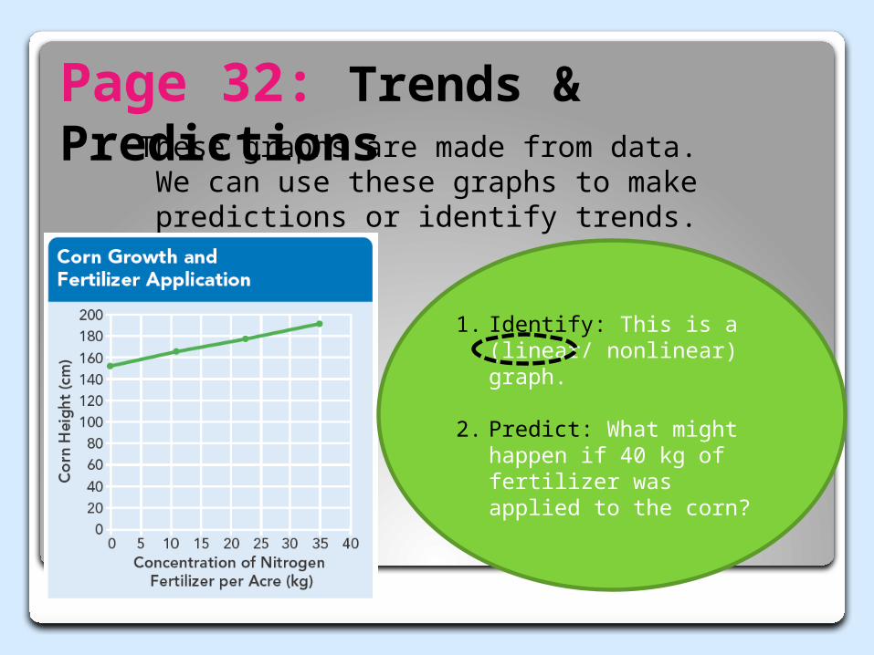
Page 32: Trends & PredictionsThese graphs are made from data.
We can use these graphs to make predictions or identify trends.
1. Identify: This is a (linear/ nonlinear) graph.
2. Predict: What might happen if 40 kg of fertilizer was applied to the corn?
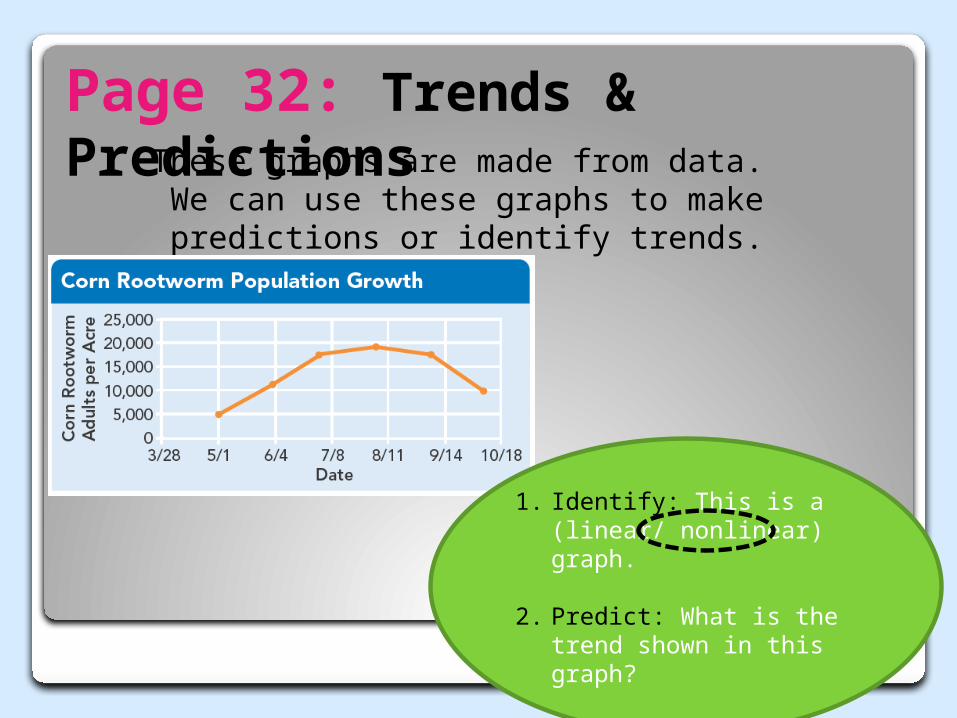
Page 32: Trends & PredictionsThese graphs are made from data.
We can use these graphs to make predictions or identify trends.
1. Identify: This is a (linear/ nonlinear) graph.
2. Predict: What is the trend shown in this graph?
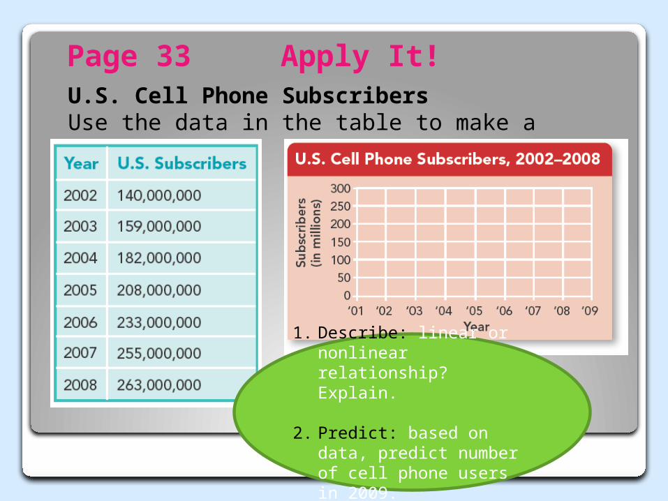
Page 33 Apply It! U.S. Cell Phone SubscribersUse the data in the table to make a line graph.
1. Describe: linear or nonlinear relationship? Explain.
2. Predict: based on data, predict number of cell phone users in 2009.
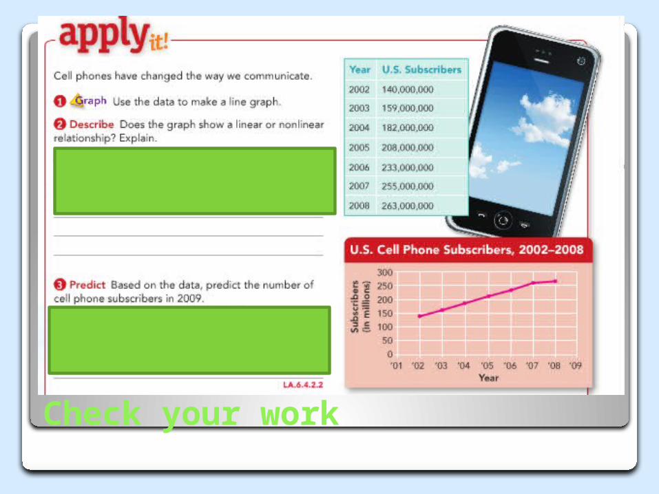
Check your work
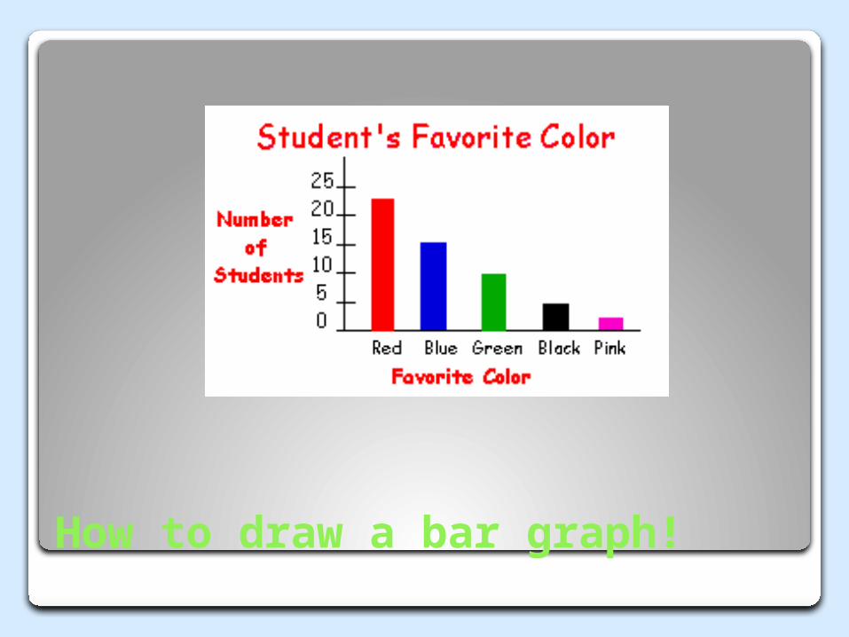
How to draw a bar graph!
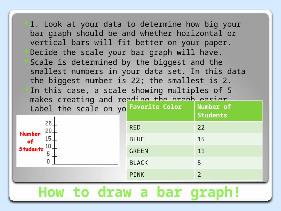
How to draw a bar graph!
1. Look at your data to determine how big your bar graph should be and whether horizontal or vertical bars will fit better on your paper.
Decide the scale your bar graph will have. Scale is determined by the biggest and the smallest
numbers in your data set. In this data the biggest number is 22; the smallest is 2.
In this case, a scale showing multiples of 5 makes creating and reading the graph easier. Label the scale on your graph.
Favorite Color Number of Students
RED 22
BLUE 15
GREEN 11
BLACK 5
PINK 2
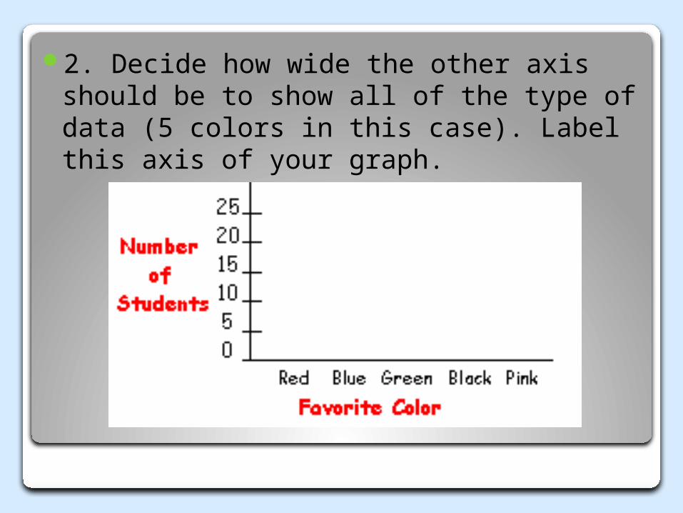
2. Decide how wide the other axis should be to show all of the type of data (5 colors in this case). Label this axis of your graph.
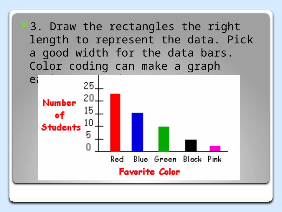
3. Draw the rectangles the right length to represent the data. Pick a good width for the data bars. Color coding can make a graph easier to read.

4. Give your graph a title.

A Magically Delicious Activity!

Let’s Practice!
Graphing With Lucky Charms Directions for Lucky Charms graphing activity:
1. Distribute cups of Lucky Charms cereal to students. 2. Distribute the one tally sheet and one graph sheet to each student. 3. Have students individually count and sort the marshmallows in his/her cup and then complete the tally sheet. 4. Using the tally sheet the students will complete the graph on the next sheet and answer questions 1-3 on their own.5. Questions 4-7 are answered as a whole class.6. On board, the teacher will go around the room and ask each student for their totals of each individual marshmallows and create a class graph (do this one marshmallow at a time)7. After the large graph is completed, do questions 4-7.8. Teacher may guide the students in answering these questions. 9. Discuss the predictions. Find out who made accurate predictions. 10. Once the activity is complete, the students may eat the cereal! LUCKY

Home Learning
Assess Your Understanding pages 31 & 33Review & Assessment page 45 #11-12Vocabulary Study Sheet 9/5Vocabulary Quiz 9/5Back to School Night 9/23
Let’s Practice!
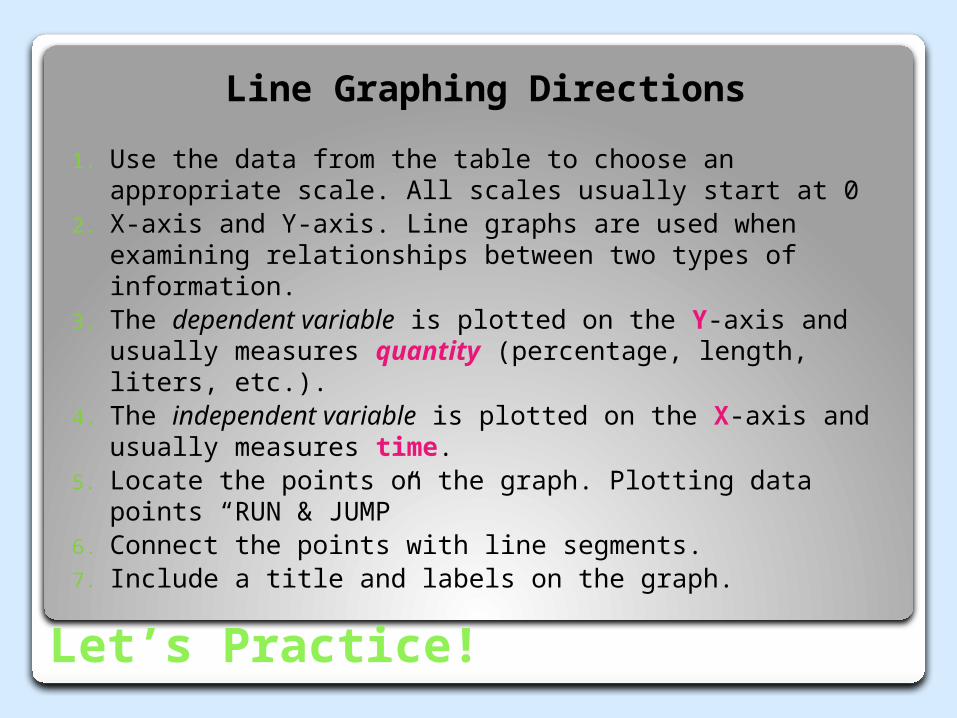
Line Graphing Directions
1. Use the data from the table to choose an appropriate scale. All scales usually start at 0
2. X-axis and Y-axis. Line graphs are used when examining relationships between two types of information.
3. The dependent variable is plotted on the Y-axis and usually measures quantity (percentage, length, liters, etc.).
4. The independent variable is plotted on the X-axis and usually measures time.
5. Locate the points on the graph. Plotting data points “RUN & JUMP”
6. Connect the points with line segments.7. Include a title and labels on the graph.
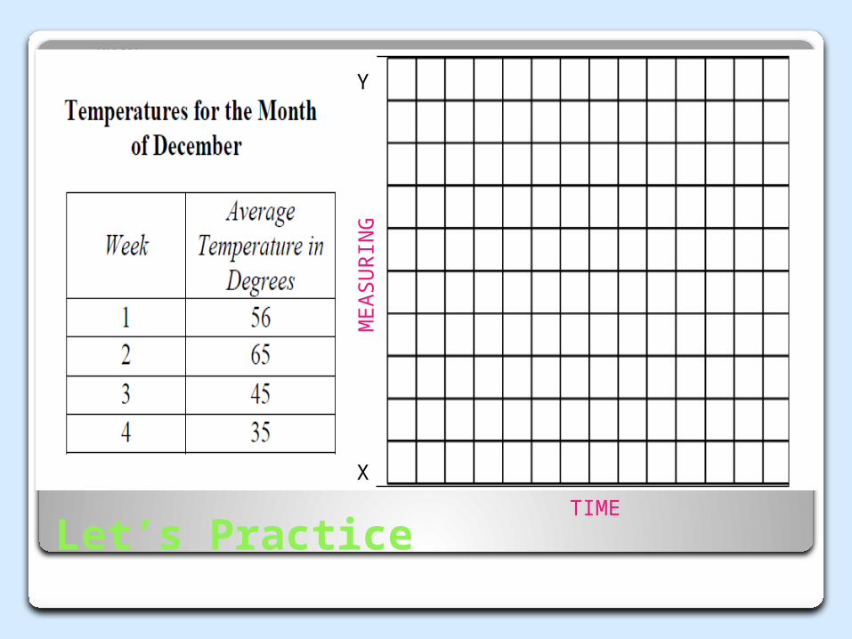
Let’s Practice
Y
X
TIME
MEA
SU
RIN
G