Embed Size (px)
Citation preview

Page 1
June 2018
CPSA-DC 117
160 Cypress Point Pkwy
Suite 207C (2nd floor)
(Flagler County Art League)
Palm Coast, FL 32164
June Chapter Meeting - Not to be Missed !!
Mark this date * June 10 * on your calendar (the meet-
ing is one week early due to Father’s Day). The new
chapter project will be discussed and the group will make
an important decision for the project. So, what is it??
Project Description: This project, a montage, is a
color pencil collaboration. The idea was sourced from
the Ann Kullberg “Color” magazine as presented by the
Seattle CPSA chapter. Subsequent help was received
directly from the Seattle chapter, for which we are grate-
ful. Our chapter will choose a photo as the group refer-
ence, which is then divided up and distributed to each
participant. Each section is relatively small, allowing suf-
ficient time to complete your section. There will be slight
variations (see below), which makes the final piece all
the more interesting.
Purpose: The purpose is two-fold: for members and to
promote the chapter. For our members, it is to encour-
age chapter communication, encourage the participation
of all chapter members, and to mentor new members.
(Continued on page 2)
2018 Meeting Dates January 14:
DVD Viewing - National Convention
February 18:
Chat & Sketch
March 18:
No chapter meeting - CJ Worlein workshop
April 15:
Stefan Lohrer, Creative Arts Materials Ltd.
May 20:
John Guiseppe, photogra-pher & pencil artist
June 10:
Montage project introduc-tion
July: No meeting – sum-mer break
August: No meeting – summer break
September 16:
Welcome back. Montage project kickoff.
October 21:
TBA
November 18:
TBA & Montage project deadline
December 16:
Holiday party
Montage unveiling
We meet on the 3rd Sunday of each month at 1:00 PM (except July & August – no meetings).
Please check the website for any scheduling changes.
www.cpsa117.org
Page 2
In This Issue
June 10 Chapter Meeting—Montage Introduction
Bill Shoemaker—CPSA National Donation
John Guiseppi Review
Flagler Pastel Artists
For the chapter, to create a project for publicity to be displayed at chapter art
shows (for example, at FCAL and The Peabody) and other public venues, such as
the public library and in St. Augustine. We will hopefully raise our profile and broad-
en the membership.
Action Plan: At the June 10 chapter meeting, three photos will be presented
with the group selecting a single photo. Over the summer, the committee will have
the selected photo printed and divided and will prepare the supporting materials.
The project kickoff will be at the September 16 chapter meeting. The photo sec-
tions will be distributed with guidelines to participants (hopefully the entire chap-
ter!!).
The November 18 chapter meeting is the deadline where the participants will re-
turn their completed section. The committee will then re-assemble the sections,
have the montage mounted, and prepare for the unveiling.
The finished montage is unveiled at December 16 Holiday party. From there, all
the world’s a stage.
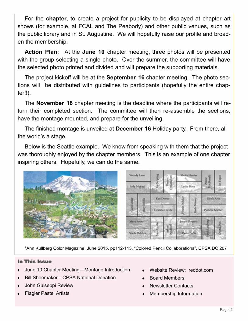
Below is the Seattle example. We know from speaking with them that the project
was thoroughly enjoyed by the chapter members. This is an example of one chapter
inspiring others. Hopefully, we can do the same.
*Ann Kullberg Color Magazine, June 2015. pp112-113. “Colored Pencil Collaborations”, CPSA DC 207
Website Review: reddot.com
Board Members
Newsletter Contacts
Membership Information
Page 3
Bill Shoemaker Donation to CPSA National
Our Bill Shoemaker has been asked again - for the fifth time - to
donate his color pencil artwork to the CPSA National Convention for the
Chicago Exhibition. CPSA National selects artists to donate for a silent
auction. This helps defray the rising costs of the convention. But, even
better, the winning bidder will receive something special to cherish for
years to come.
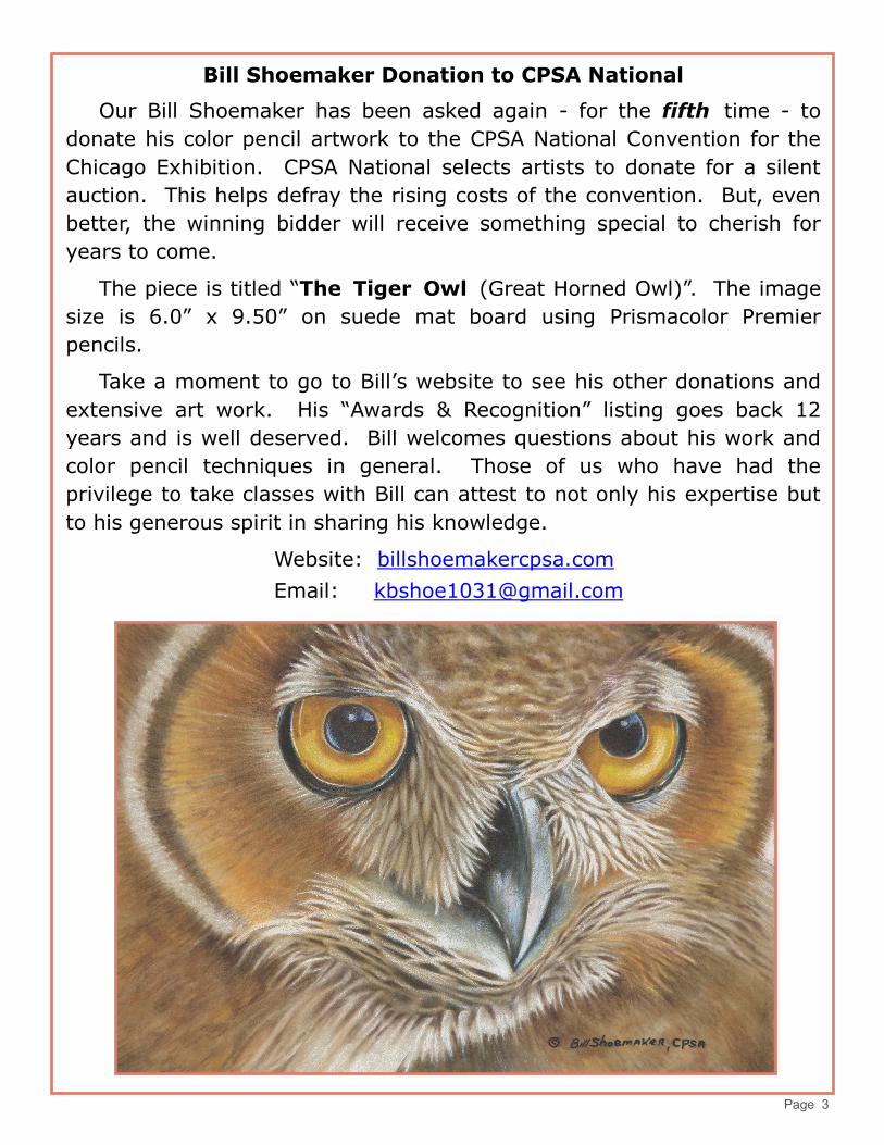
The piece is titled “The Tiger Owl (Great Horned Owl)”. The image
size is 6.0” x 9.50” on suede mat board using Prismacolor Premier
pencils.
Take a moment to go to Bill’s website to see his other donations and
extensive art work. His “Awards & Recognition” listing goes back 12
years and is well deserved. Bill welcomes questions about his work and
color pencil techniques in general. Those of us who have had the
privilege to take classes with Bill can attest to not only his expertise but
to his generous spirit in sharing his knowledge.
Website: billshoemakercpsa.com
Email: [email protected]
Page 4
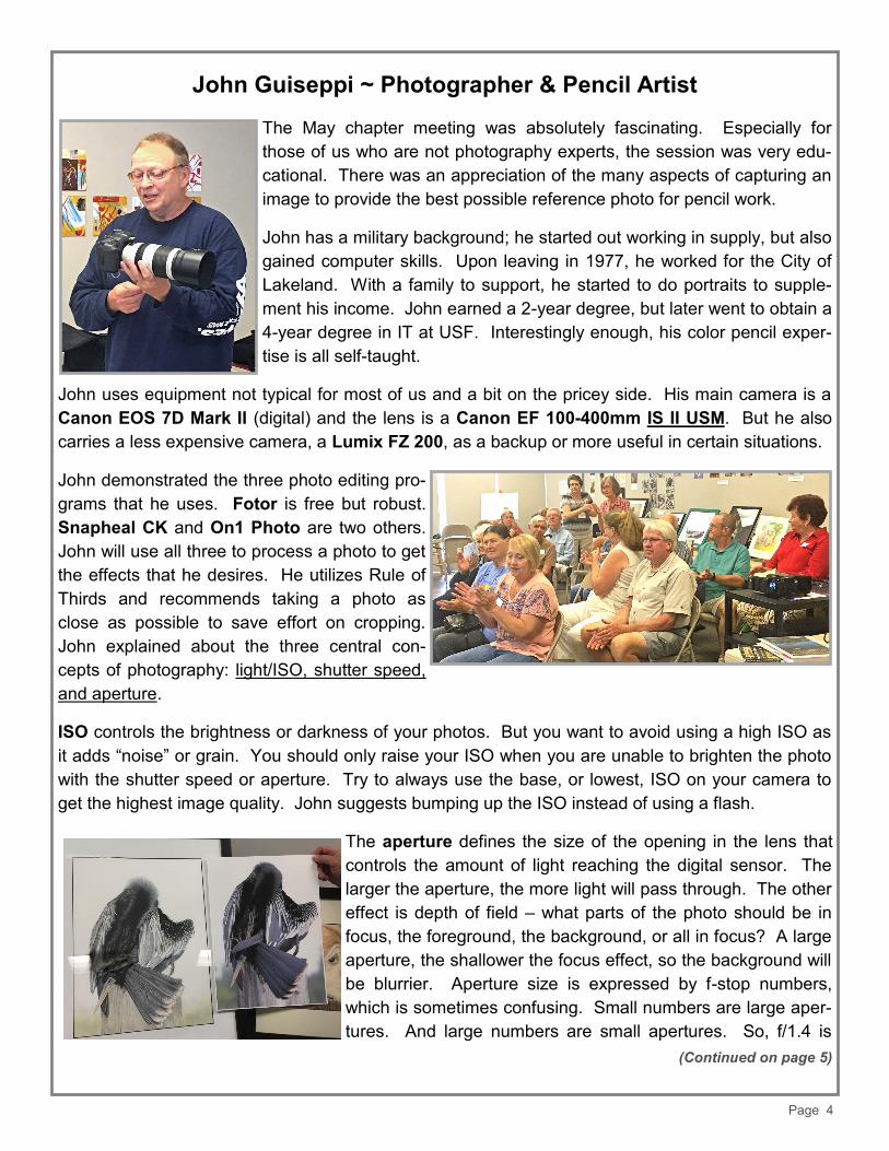
John Guiseppi ~ Photographer & Pencil Artist
The May chapter meeting was absolutely fascinating. Especially for
those of us who are not photography experts, the session was very edu-
cational. There was an appreciation of the many aspects of capturing an
image to provide the best possible reference photo for pencil work.
John has a military background; he started out working in supply, but also
gained computer skills. Upon leaving in 1977, he worked for the City of
Lakeland. With a family to support, he started to do portraits to supple-
ment his income. John earned a 2-year degree, but later went to obtain a
4-year degree in IT at USF. Interestingly enough, his color pencil exper-
tise is all self-taught.
John uses equipment not typical for most of us and a bit on the pricey side. His main camera is a
Canon EOS 7D Mark II (digital) and the lens is a Canon EF 100-400mm IS II USM. But he also
carries a less expensive camera, a Lumix FZ 200, as a backup or more useful in certain situations.
John demonstrated the three photo editing pro-
grams that he uses. Fotor is free but robust.
Snapheal CK and On1 Photo are two others.
John will use all three to process a photo to get
the effects that he desires. He utilizes Rule of
Thirds and recommends taking a photo as
close as possible to save effort on cropping.
John explained about the three central con-
cepts of photography: light/ISO, shutter speed,
and aperture.
ISO controls the brightness or darkness of your photos. But you want to avoid using a high ISO as
it adds “noise” or grain. You should only raise your ISO when you are unable to brighten the photo
with the shutter speed or aperture. Try to always use the base, or lowest, ISO on your camera to
get the highest image quality. John suggests bumping up the ISO instead of using a flash.
The aperture defines the size of the opening in the lens that
controls the amount of light reaching the digital sensor. The
larger the aperture, the more light will pass through. The other
effect is depth of field – what parts of the photo should be in
focus, the foreground, the background, or all in focus? A large
aperture, the shallower the focus effect, so the background will
be blurrier. Aperture size is expressed by f-stop numbers,
which is sometimes confusing. Small numbers are large aper-
tures. And large numbers are small apertures. So, f/1.4 is
(Continued on page 5)

Page 5
larger than f/2.0, and much larger than f/8.0. The math behind it has to do with fractions, but let ’s
not go there! John explained that the larger the f-stop the greater the detail but will require more
light.
Shutter speed is the length of time the camera shutter is open and is responsible for changing the
brightness of the photo and for creating freezing action or blurring motion. If the shutter speed is
long, the subject will appear blurred. And if fast, then the effect is to eliminate motion with the sub-
ject completely sharp. Slow shutter speeds might be used in a dark environment with a tripod. A
fast shutter speed will catch a bird in flight.
John will utilize low key and high key in his photography.
Here is a published definition: “When a photograph’s
light is exaggerated to the bright end of the spectrum it is
called "high key" photography. When it is slanted to
the dark end of the spectrum it is called "low key"
photography. High key photography is often used to
portray a delicate intention, or white on white. Low
key photographs, on the other hand, highlight the dark
elements, black on black.” As seen in John’s photos,
the effect is very dramatic, allowing the viewer to focus
on something specific or to create a mood.
When taking a photo of your pencil artwork, follow these
tips: use a tripod to help with the position and keeping
steady; use the grid on the camera to keep the photo
straight; use a diffused light if possible; have a light
source at a 45 degree angle; tape the art on a black or
white backboard; he uses a 5K LED bulb.
Kodak Premium Matte paper is used to print the reference photos. John enjoys using Stonehenge
and Fabriano Artistico 140# paper for pencil. His preferred pencils are Prismacolor Verithin and
Premier and Faber-Castell Polychromos.
This article does not do justice to all that John shared with us. We so appreciated his time and
generosity and look forward to enjoying both his photography and pencil art at future meetings.

Page 6
Flagler Pastel Artists Submitted by Judy Madigan
The newly formed Flagler Pastel Artists group will be holding their first show in
June. There is some fantastic work being done by the members in this group. The
show runs from June 6 to June 26 at Arts on Granada in Ormond Beach, with an
opening reception held on Sunday, June 10, from 2pm to 5pm. Come on out to see
some great art and support this talented group of artists.
Three members of our DC-117 chapter belong to this group: Judy Madigan, Joyce
Gatonska, and Kathy (Kat) Collaro. Pastels have a relationship with color pencil as
many of us use Pan Pastels, for example, in our pencil art and mixed media.
This is a wonderful opportunity to support another local art group, as well as our
own members. Hope to see you there very soon.

Page 7
Website Review: Have you ever wondered? reddotblog.com
Researched and submitted by Linda Doup
This is a great Blog that offers information for all mediums as to promoting and/or selling your artwork. See what
other artists are struggling with in various debates. Agree or disagree, it is interesting to see what artists are
saying. You are encouraged to post your views below the article. And the articles are extensive. Those below are
just a few.
Art flows through Xanadu Gallery owner J. Jason Horejs’ veins. Second genera-
tion in the art business, Horejs’ life has always been filled with art. Though not in-
terested in pursuing a life as an artist, Horejs fell in love with the business side of
art at an early age. In 2008, Horejs developed a series of art marketing workshops
designed to help artists better understand the gallery business and better prepare
themselves to approach galleries. Horejs observes that artists approaching his
gallery are making many of the same mistakes, not because their work isn’t gallery
-ready, but simply because they don’t have a clear idea of how to proceed. Horejs
designed his workshops working closely with his parents and other artists who have learned the ropes of working
with galleries by trial and error. The clear-headed advice the gallery owner gives is designed to give the artists con-
crete steps they can take to prepare their work, research galleries and approach galleries for representation.
Debate: Should You Include a Date on Your Artwork?
Does dating your artwork indicate to a buyer the work has been on the market for a long time and perhaps diminish
the value? Could it limit the exhibits or competitions you can participate in? Again on the reddot blog, Horejs
takes a strong stand against dating your work, but he invites debate on the topic. He just doesn’t see the value in
anything that could impede the sale of your art.
If has been a UFO (unfinished Object) do you date it when completed or when you began the project? If you are
entering in a National exhibit, certainly the rules of the organization are the final decision and honesty is the best
policy.
Debate | Should you Watermark Art you Are Posting
Online?
Horejs states his opinion: “I am frequently asked by artists whether
they should watermark their artwork before sharing it online. There
seems to be a pretty widespread concern that posting artwork imag-
es online could lead to unauthorized reproduction or theft of the art-
work. I don’t dismiss this threat out of hand, the theft of intellectual
property is a very real problem. I would argue, however, that a water-
mark is a pretty poor way to deal with the problem, and that water-
marks defeat the purpose of sharing work online in the first place.
If you are sharing your artwork online, you are likely doing so in or-
der to achieve broader exposure for your work, build recognition for
yourself and your work, and generate sales. In order to achieve
these aims you want to show your art in its best possible light. Hav-
ing looked at thousands (probably tens of thousands) of artwork im-
ages online, I would argue that the appeal of artwork is considerably
diminished by including a watermark. Think about what a watermark accomplishes – it mars the artwork to an extent
that a would-be thief wouldn’t want to steal it to reproduce it. That marring of the image will just as certainly diminish
the appeal of the piece to a potential promoter or buyer of your work.
I would also argue that the decrease in appeal outweighs any protection you receive from a watermark. An im-
(Continued on page 8)
Page 8
portant benefit of posting your art online is the increased exposure your work gets when it is shared. Viewers are
less likely to share artwork that is watermarked.
The likelihood of theft is pretty low. While there is a lot of intellectual property theft occurring online, it’s good to
remember that there is an overwhelming amount of art online. The chances of your work showing up on t-shirts
made in China is extremely low. Typically, the images you share online are pretty low resolution. These images
would result in poor reproductions.
There are legitimate legal reasons to assert your copyright when you post your work online, but a general notice
on your website or a caption below your artwork will provide the same benefit without diminishing the appearance
of your actual artwork.”
Collective Wisdom | Creating Titles for Your Artwork
Struggling with how to name your artwork? Suggestions and what might just “grab” that judge or buyer. “Coming
up with great titles for artwork can be a real drag. Many artists feel like it’s more work to come up with a title than it is
to create a masterpiece. If you were a natural wordsmith you would have become a poet, not an artist. So, the ques-
tion is, do titles really matter, and how much time and effort should you spend titling your work?
From a gallery owner’s perspective, I can tell you that I do believe titles matter. A buyer wants to feel like that art-
work they are about to purchase from you is one of your best ever – that it truly is one of your masterworks. They’re
going to have a hard time believing that if you’ve called the piece “Untitled No. 427”. A good title becomes a part of
the buyer’s narrative. A particularly good title will help sell the artwork. Conversely, a bad title can hamper sales.
So what makes a good title, and how can you come up with good titles without going insane? I have some sugges-
tions, and I would love to hear yours.”
Is your publicly posted art work being advertised for sale? wallpart.com
Check out this site to see if your “publicly” posted work is being advertised for sale. On this site, enter in a topic
and see what comes up. What are the rules for publicly displayed art on various websites.
Page 9
Our Board Members CPSA-DC 117
President: Hanneke Jevons
Vice President: Bill Shoemaker
Secretary: Heather Shaw-Stillman
Treasurer: Judy Madigan
Publicity: Linda Doup
Membership: Joan Franchi
Webmaster: Mary Lee
Newsletter Contact Info:
At the present time, Linda Doup,
AJ Barr, and Liz Monaco are pro-
ducing the newsletter. We hope
that others will join us for future
publications.
For submissions and requests to
be profiled, please contact either
Linda or AJ.
Linda 386-295-0486
AJ 386-283-2433
Membership Information
Chapter Application
CPSA National Information