Embed Size (px)
Citation preview
1
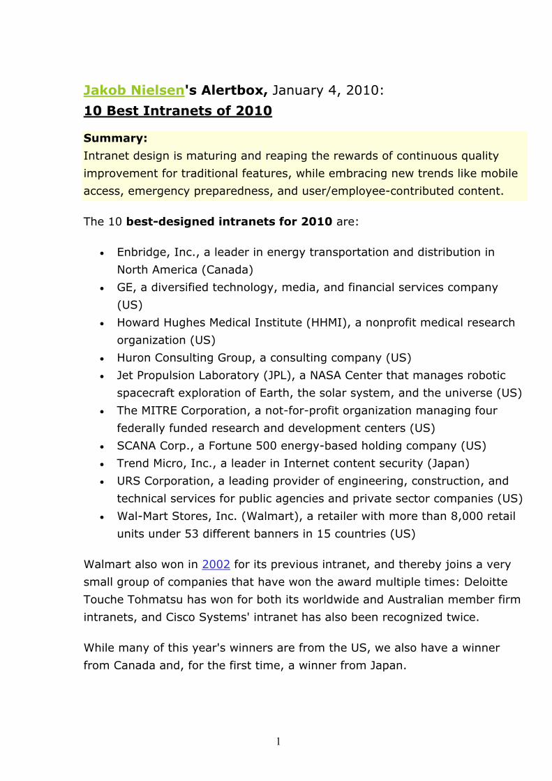
Jakob Nielsen's Alertbox, January 4, 2010:
10 Best Intranets of 2010 Summary:
Intranet design is maturing and reaping the rewards of continuous quality
improvement for traditional features, while embracing new trends like mobile
access, emergency preparedness, and user/employee-contributed content.
The 10 best-designed intranets for 2010 are:
• Enbridge, Inc., a leader in energy transportation and distribution in
North America (Canada)
• GE, a diversified technology, media, and financial services company
(US)
• Howard Hughes Medical Institute (HHMI), a nonprofit medical research
organization (US)
• Huron Consulting Group, a consulting company (US)
• Jet Propulsion Laboratory (JPL), a NASA Center that manages robotic
spacecraft exploration of Earth, the solar system, and the universe (US)
• The MITRE Corporation, a not-for-profit organization managing four
federally funded research and development centers (US)
• SCANA Corp., a Fortune 500 energy-based holding company (US)
• Trend Micro, Inc., a leader in Internet content security (Japan)
• URS Corporation, a leading provider of engineering, construction, and
technical services for public agencies and private sector companies (US)
• Wal-Mart Stores, Inc. (Walmart), a retailer with more than 8,000 retail
units under 53 different banners in 15 countries (US)
Walmart also won in 2002 for its previous intranet, and thereby joins a very
small group of companies that have won the award multiple times: Deloitte
Touche Tohmatsu has won for both its worldwide and Australian member firm
intranets, and Cisco Systems' intranet has also been recognized twice.
While many of this year's winners are from the US, we also have a winner
from Canada and, for the first time, a winner from Japan.
2
Breaking with past trends, this is the first time in 10 years without any
winners from Europe or from the financial sector. (GE does have a finance
business, but it's not a dedicated financial services company.) The lack of
banks, brokers, and insurance companies might be explained by the finance
crisis: these companies had other things to occupy their attention and smaller
(if any) budgets for intranet design. In contrast, there's no excuse for the
poor showing of European intranet designs given that Europe accounted for
31% of the winners from 2001 to 2009. Let's see some more good European
intranets next year, please.
Growing Intranet Teams This year, the median company size among our winners was 6,350
employees (the median is a better metric than the mean this year because
Walmart is so huge that it would skew the calculation of an arithmetic mean.)
From 2001 to 2006, ever-bigger organizations tended to dominate the
awards, peaking in 2006, when the average company size was 107,000
employees. From 2007 to 2010, however, smaller companies became more
prominent among the winners. This trend likely shows a maturing of intranet
technologies: it's becoming easier and easier to build a good user experience
without access to the substantial resources found in 100,000+ employee
companies.
An alternative interpretation is that companies of all sizes are giving intranets
higher priority and giving intranet teams more resources. The average team
size this year was 14 people, which is 27% higher than the average team
size in 2006 when the winning companies were much larger.
Mobile Intranet Sites This year, 30% of the intranets had special mobile features. In previous
years, we might have heralded this as a big number, but now that mobile is
the big trend on the open Web, our conclusion is the opposite: intranets
appear to be lagging in mobile device support.
One fairly obvious explanation might be that most intranets are accessed from
the office. Also, as one team found, employees who express a desire for
mobile access might not be familiar enough with their own mobile devices to
actually use them easily.

3
Neither explanation is likely to remain true for long. Although most intranet
use probably does occur at work, people increasingly expect "anytime,
anyplace" access because that's what they get from those big websites that
set user expectations. Also, employees who frequently travel often account for
particularly high-value use cases (such as sales calls). Finally, employees will
get better at using mobile devices to access intranet content, services, and
applications for two reasons. First, they'll be getting more experience as their
mobile Web use grows. Second, mobile devices are getting significantly more
usable with every generation (and mobile revs every year), which will make it
increasingly easier for users to perform all mobile tasks.
Given our general research on mobile usability, we strongly recommend that
you create a separate design for mobile users. User performance declines
significantly when people attempt to access a general-purpose website — that
is, one that's desktop-targeted — from a mobile device. All three winners
followed our recommendation, but in different ways.
The JPL team built a dedicated application, rather than a site, to optimize
the design for a single platform — the iPhone — and thereby offer a richer
user experience.
Both Enbridge and MITRE created special mobile-targeted sites, with scaled-
back offerings of critical content and applications. This more general strategy
supports a wider range of users than a single application. Even so, MITRE
designed mainly for BlackBerry, though people with other smartphones can
also use the site.
These examples highlight an important difference between mobile intranets
and mobile websites: for enterprise use, you can target a specific device if it is
already the company's preferred platform. On the Web, of course, you must
serve all comers or lose business.
4
Social Features on Intranets In addition to being the year of mobile, it was definitely the year of social
networking on the Internet at large. On intranets, this second trend was
echoed more strongly than the first.
Social features were common on the winning intranets. Many of the issues in
designing social features for an intranet are similar to those in designing social
features for a website. But there are important differences as well.
Most strikingly, there are two levels of social networking on intranets:
• Social features for employees as individuals
• Workgroup support and other features that encourage work-related
connections
Examples of social features targeting individuals include Walmart's discussion
and profile pages; Trend Micro's TrendSpace, which included employee-
contributed content; MITRE's social bookmarking service, which lets
employees share their favorite links; and GE's commenting and rating
features.
Work-oriented social features include the URS technical forums, where
engineers collaborate and share best practices; MITRE's Expertise Finder,
which helps users locate coworkers who have specific knowledge; and HHMI's
project pages, where teams collaborate directly and share information.
Another major difference between social intranets and social websites is the
significantly increased accountability within the enterprise, which again can
lead to higher quality and more widespread participation if handled right. It's
common to avoid anonymity. Trend Micro goes a step further with an
elaborate system of reward points that accrue to employees when they
contribute to the intranet's community features. Points don't just give
bragging rights; they can be redeemed for real prizes — a good way to
combat participation inequality.

5
Beyond Boss Blogs For several years, we've noted the trend of CEO blogs on better intranets.
This is almost a special subgenre of social networking; CEO weblogs often
include social features such as discussions and/or comments.
Such blogs were again strong this year, but included enhanced features to
show executives with a "human face" and help make them more
approachable. On Walmart's intranet, for example, the executive profiles go
beyond work experience to highlight personal experiences and interests. And
Trend Micro combined executive blogs with semiannual online meetings where
employees can engage directly with the executives.
Change Management; Internal Marketing Users hate change. That's as true for intranets as for websites. At the same
time, intranets are often bad enough that change is desperately needed. Even
a good intranet can vastly increase employee productivity through a few
improvements, given that people use it every day. (If people don't use the
intranet every day, that's a sign in its own right that it's not good enough.)
Still, most users really do prefer to muddle along with a familiar user
interface, which raises the question: How can you resolve the tension between
the need for change and the pain that change entails?
Many of this year's winning intranets took explicit steps to manage design
change and encourage users to try out new and improved features. For
example, many teams conducted extensive user research before deciding on
their design direction. This definitely keeps teams focused on user needs and
lowers the risk of releasing something that people will resist. If you get bad
feedback, at least you get it before launch, giving you time to overcome
employees' objections. Besides the actual feedback, usability studies serve a
second function as an explicit signal of the team's willingness to listen.
Research is one way to engage stakeholders and let them know you care.
Beyond user research, several teams engaged a wider range of stakeholders
in early communication that continued throughout the design process. As
designs became more defined, some teams fielded special early-access
programs that let smaller groups of people use the new design before it was
rolled out to everybody. For example, SCANA did a one-month beta test with
6
150 employees who later became "ambassadors" for the new design.
Finally, once the new design launched, explicit internal marketing
campaigns helped promote early uptake. Don't assume that employees will
discover new features for themselves. People are too busy and just aren't as
interested in the intranet for its own sake as you are. This year's promotional
initiatives included an IT expo, cafeteria demos, posters, road shows, and
emails, as well as SCANA's grass-roots campaign to enlist the beta testers as
site ambassadors. SCANA also created internal commercials, using employees
as volunteer actors.
Emergency Preparedness Maybe it's a sign of our unsettling times, with threats ranging from mutating
influenza viruses to terrorist attacks to global warming. Whatever the reason,
40% of winning companies designed intranet features with the explicit goal of
addressing unexpected emergencies. Walmart and URS were both
impacted by Hurricane Katrina a few years ago, creating an impetus to ensure
that their intranets could be quickly adapted to help out in future
emergencies. Of course, after a disaster hits, it's too late to start a project to
figure out what to do; by then it's time for action. The Boy Scouts had the
right idea with their motto, "be prepared."
This year's winning intranets offered a range of emergency features,
including:
• a homepage alert system that pops up emergency information without
waiting for a page refresh;
• separate emergency-specific homepages that can be activated on
short notice;
• dedicated homepage sections that appear during emergencies; and
• a full-blown emergency operations center.
The trend toward using the intranet to help manage emergencies is a sign of
maturity: intranets are becoming recognized as a key part of the
organizational infrastructure.

7
Continuing Trends = Continuous Quality Improvement Many trends among this year's winners are continuations of long-term trends
that we've identified and commented on in past years. Some of these include:
• Frequent use of SharePoint
o Many other technology platforms were common as well,
including Google Search Appliance; no one solution guarantees a
great intranet
• Reliance on page templates to ensure consistent user interfaces
• Firming up the editorial workflow to ensure content quality; at
Enbridge, for example, each page has a named content owner to guard
against stale information
• Many interesting presentations of news streams on the homepage
• Role-based personalization to focus users on the content and apps
most useful to their jobs
o Widespread customization let users adapt the UI on their own,
including improved designs for the ever-popular Quick Links/My
Links feature
• Focus on improving search, including interesting approaches to
advanced search
o Even so, intranet search remains a sore point, and many teams
relied on manual tweaks (such as offering "Best Bets")
o People search remains an extremely popular feature
• Extensive use of usability methods, from simple user testing to card
sorting, field studies, and personas
• Poor monetized ROI metrics, but some promising measures of increased
usage and employee satisfaction
o In one hard ROI example, Trend Micro saved $1.6 million per
year by hosting meetings on its intranet
For these — and many other — issues, this year's best intranets show steady
improvements over previous years' designs. It's not that these things haven't
been done before, it's that the new designs build on the previous ones and
become ever-more refined. In other words, we're benefiting from a process of
continuous quality improvement for intranet user experience. In virtually
every other field, CQI is known as the way to true quality, so seeing it in
intranets is a further sign of this field's growing maturity.
8
And thus we have this year's meta-trend: intranet design is maturing. We
see this growing maturity in many aspects of the winning intranets, from
team size to the reliance on CQI. So with this, the 10th Intranet Design
Annual, we mark the anniversary of the award not only with great winners,
but also with kudos to the entire field for having come of age.
Full Report 449-page Intranet Design Annual with 198 screenshots of the 10 winners for
2010 is available for download.
Taken From: http://www.useit.com/alertbox/intranet_design.html