Embed Size (px)
Citation preview
ISG
TECHNICAL NOTE
Doc. no.: SRON/EPS/TN/09-002
Issue : 3.1
Date : 23 September 2018
Page : 1 of 20
Colour Schemes
Prepared by: Paul Tol
68,119,1704477AAblue
102,204,23866CCEEcyan
34,136,51228833green
204,187,68CCBB44yellow
238,102,119EE6677red
170,51,119AA3377purple
187,187,187BBBBBBgrey
ISG
TECHNICAL NOTE
Doc. no.: SRON/EPS/TN/09-002
Issue : 3.1
Date : 23 September 2018
Page : 2 of 20
Document Change Record
Issue Date Changed Section Description of Change
1.0 18 November 2009 All Initial version
2.0 17 January 2010 All Print-friendlier schemes
Added commands to simulate colour blindness
2.1 17 August 2010 Fig. 4 Remark added on background grey
p. 6 Remark added on NEN colour set
Figs. 10, 15, 22 Added plots to check robustness
2.2 29 December 2012 Fig. 18 Added a discrete rainbow scheme
3.0 31 May 2018 All Revised all schemes and text
3.1 23 September 2018 Section 2 Added high-contrast scheme
Section 4 Added iridescent scheme
Section 5 Added text on monochrome vision
Section 6 Revised and extended text and figures
Table of Contents
Reference Documents . . . . . . . . . . . . . . . . . . . . . . . . . . . . . . . . . . . . . . . . . . . . . . . . . . . . . . . . . 3
1 Introduction . . . . . . . . . . . . . . . . . . . . . . . . . . . . . . . . . . . . . . . . . . . . . . . . . . . . . . . . . . . . . 4
2 Qualitative Colour Schemes . . . . . . . . . . . . . . . . . . . . . . . . . . . . . . . . . . . . . . . . . . . . . . . . . . . 4
3 Diverging Colour Schemes . . . . . . . . . . . . . . . . . . . . . . . . . . . . . . . . . . . . . . . . . . . . . . . . . . . . 9
4 Sequential Colour Schemes . . . . . . . . . . . . . . . . . . . . . . . . . . . . . . . . . . . . . . . . . . . . . . . . . . . 11
5 Colour Blindness . . . . . . . . . . . . . . . . . . . . . . . . . . . . . . . . . . . . . . . . . . . . . . . . . . . . . . . . . . 15
6 Greyscale Conversion . . . . . . . . . . . . . . . . . . . . . . . . . . . . . . . . . . . . . . . . . . . . . . . . . . . . . . . 18
7 Colour Scheme for Ground Cover . . . . . . . . . . . . . . . . . . . . . . . . . . . . . . . . . . . . . . . . . . . . . . . 19
ISG
TECHNICAL NOTE
Doc. no.: SRON/EPS/TN/09-002
Issue : 3.1
Date : 23 September 2018
Page : 3 of 20
Reference Documents
[RD1] Cynthia A. Brewer. ColorBrewer, a web tool for selecting colors for maps. http://colorbrewer2.org.
2009.
[RD2] Gaurav Sharma, Wencheng Wu, and Edul N. Dalal. “The CIEDE2000 color-difference formula: implemen-
tation notes, supplementary test data, and mathematical observations”. In: Color Research and Appli-
cation 30 (2005). http://www.ece.rochester.edu/~gsharma/ciede2000/ciede2000noteCRNA.pdf,
pp. 21–30.
[RD3] Olaf Drümmer. ECI Offset Profiles. http://www.eci.org/doku.php?id=en:colorstandards:offset.
2009.
[RD4] Normcommissie ‘Ergonomie van de fysische werkomgeving’ with Buro Blind Color. Functional use of
colour—Accommodating colour vision disorders. Code of practice NPR 7022. Delft: Netherlands Stan-
dardization Institute, Apr. 2006.
[RD5] Françoise Viénot, Hans Brettel, and John D. Mollon. “Digital video colourmaps for checking the legibility
of displays by dichromats”. In: Color Research and Application 24 (1999), pp. 243–252.
[RD6] Hans Brettel, Françoise Viénot, and John D. Mollon. “Computerized simulation of color appearance for
dichromats”. In: Journal of the Optical Society of America A 14 (1997), pp. 2647–2655.
[RD7] Ben Caldwell et al. Web Content Accessibility Guidelines. Issue 2, https://www.w3.org/TR/WCAG20/.
Contrast ratio calculation: https://www.w3.org/WAI/WCAG21/Techniques/general/G18/#procedure.
World Wide Web Consortium, 2008.
[RD8] M. Hansen et al. UMD Global Land Cover Classification, 1 Kilometer. Issue 1.0. http://glcf.umd.edu/
data/landcover/data.shtml. Department of Geography, University of Maryland, 1998.
ISG
TECHNICAL NOTE
Doc. no.: SRON/EPS/TN/09-002
Issue : 3.1
Date : 23 September 2018
Page : 4 of 20
1 Introduction
Graphics with scientific data become clearer when the colours are chosen carefully. It is convenient to have
good default schemes ready for each type of data, with colours that are:
• distinct for all people, including colour-blind readers;
• distinct from black and white;
• distinct on screen and paper;
• matching well together.
This document shows such schemes, developed with the help of mathematical descriptions of colour differ-
ences and the two main types of colour-blind vision.
A colour scheme should reflect the type of data shown. There are three basic types of data:
• Qualitative data – nominal or categorical data, where magnitude differences are not relevant. This includes
lines in plots and text in presentations. See Section 2.
• Diverging data – data ordered between two extremes where the midpoint is important, e.g. positive and
negative deviations from zero or a mean. See Section 3.
• Sequential data – data ordered from low to high. See Section 4.
Section 5 gives more info on simulating approximately how any colour is seen if you are colour-blind. The
schemes that work well in a monochrome display or printout are highlighted in Section 6, with tips on how to
use them best. In Section 7, a very specific colour scheme is given for the AVHRR global land cover classifi-
cation.
2 Qualitative Colour Schemes
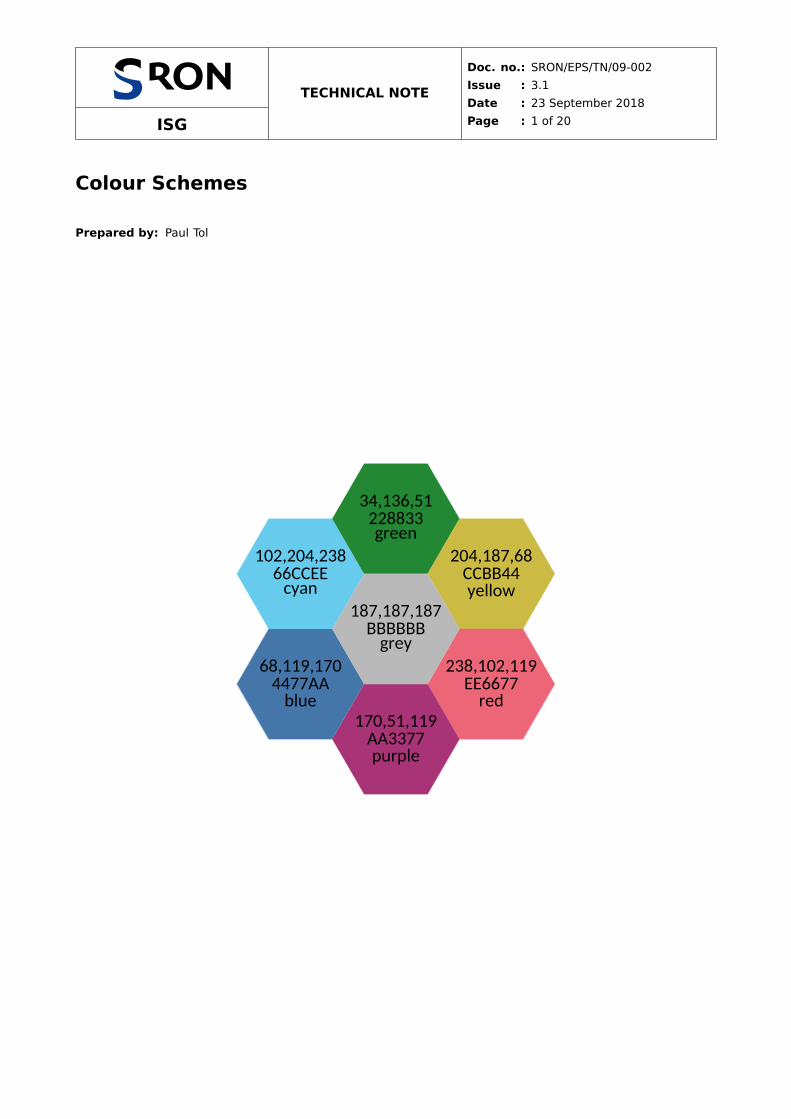
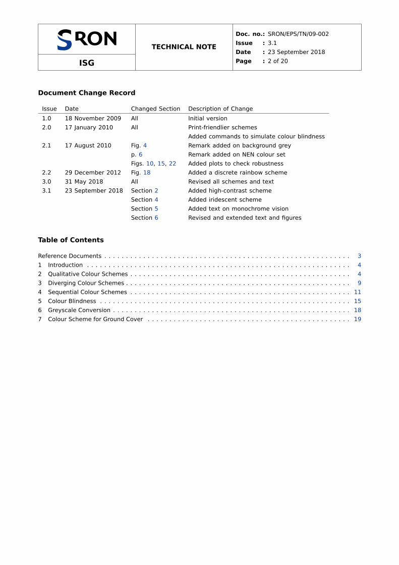
My default colour scheme for qualitative data is the bright scheme in Fig. 1. Colour coordinates (R,G,B) are
given in the RGB colour system (red R, green G and blue B), decimal at the top and hexadecimal below.
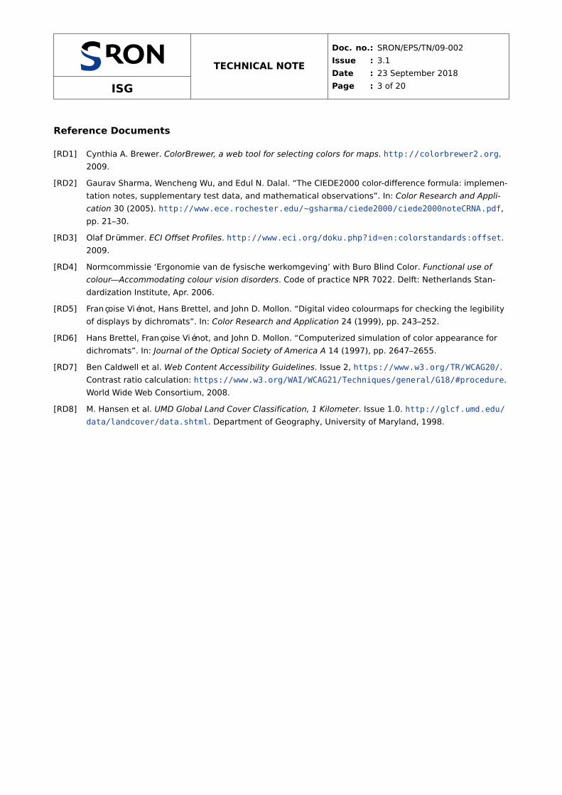
An alternative when fewer colours are enough is the high-contrast scheme in Fig. 2, which also works when
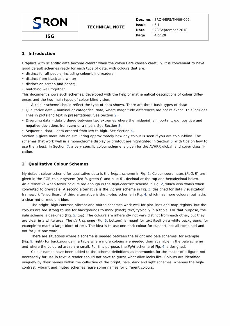
converted to greyscale. A second alternative is the vibrant scheme in Fig. 3, designed for data visualization
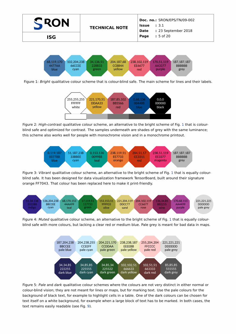
framework TensorBoard. A third alternative is the muted scheme in Fig. 4, which has more colours, but lacks
a clear red or medium blue.
The bright, high-contrast, vibrant and muted schemes work well for plot lines and map regions, but the
colours are too strong to use for backgrounds to mark (black) text, typically in a table. For that purpose, the
pale scheme is designed (Fig. 5, top). The colours are inherently not very distinct from each other, but they
are clear in a white area. The dark scheme (Fig. 5, bottom) is meant for text itself on a white background, for
example to mark a large block of text. The idea is to use one dark colour for support, not all combined and
not for just one word.
There are situations where a scheme is needed between the bright and pale schemes, for example
(Fig. 9, right) for backgrounds in a table where more colours are needed than available in the pale scheme
and where the coloured areas are small. For this purpose, the light scheme of Fig. 6 is designed.
Colour names have been added to the scheme definitions as mnemonics for the maker of a figure, not
necessarily for use in text: a reader should not have to guess what olive looks like. Colours are identified
uniquely by their names within the collective of the bright, pale, dark and light schemes, whereas the high-
contrast, vibrant and muted schemes reuse some names for different colours.
ISG
TECHNICAL NOTE
Doc. no.: SRON/EPS/TN/09-002
Issue : 3.1
Date : 23 September 2018
Page : 5 of 20
68,119,170
4477AA
blue
102,204,238
66CCEEcyan
34,136,51
228833green
204,187,68
CCBB44yellow
238,102,119
EE6677
red
170,51,119
AA3377purple
187,187,187
BBBBBBgrey
Figure 1: Bright qualitative colour scheme that is colour-blind safe. The main scheme for lines and their labels.
255,255,255
FFFFFF
white
221,170,51
DDAA33yellow
187,85,102
BB5566
red
0,68,136
004488
blue
0,0,0
000000
black
Figure 2: High-contrast qualitative colour scheme, an alternative to the bright scheme of Fig. 1 that is colour-
blind safe and optimized for contrast. The samples underneath are shades of grey with the same luminance;
this scheme also works well for people with monochrome vision and in a monochrome printout.
0,119,187
0077BB
blue
51,187,238
33BBEEcyan
0,153,136
009988
teal
238,119,51
EE7733orange
204,51,17
CC3311
red
238,51,119
EE3377magenta
187,187,187
BBBBBBgrey
Figure 3: Vibrant qualitative colour scheme, an alternative to the bright scheme of Fig. 1 that is equally colour-
blind safe. It has been designed for data visualization framework TensorBoard, built around their signature
orange FF7043. That colour has been replaced here to make it print-friendly.
51,34,136
332288indigo
136,204,238
88CCEEcyan
68,170,153
44AA99
teal
17,119,51
117733green
153,153,51
999933
olive
221,204,119
DDCC77
sand
204,102,119
CC6677rose
136,34,85
882255
wine
170,68,153
AA4499purple
221,221,221
DDDDDDpale grey
Figure 4: Muted qualitative colour scheme, an alternative to the bright scheme of Fig. 1 that is equally colour-
blind safe with more colours, but lacking a clear red or medium blue. Pale grey is meant for bad data in maps.
187,204,238
BBCCEEpale blue
204,238,255
CCEEFFpale cyan
204,221,170
CCDDAApale green
238,238,187
EEEEBBpale yellow
255,204,204
FFCCCCpale red
221,221,221
DDDDDDpale grey
34,34,85
222255
dark blue
34,85,85
225555dark cyan
34,85,34
225522dark green
102,102,51
666633dark yellow
102,51,51
663333
dark red
85,85,85
555555dark grey
Figure 5: Pale and dark qualitative colour schemes where the colours are not very distinct in either normal or
colour-blind vision; they are not meant for lines or maps, but for marking text. Use the pale colours for the
background of black text, for example to highlight cells in a table. One of the dark colours can be chosen for
text itself on a white background, for example when a large block of text has to be marked. In both cases, the
text remains easily readable (see Fig. 9).
ISG
TECHNICAL NOTE
Doc. no.: SRON/EPS/TN/09-002
Issue : 3.1
Date : 23 September 2018
Page : 6 of 20
119,170,221
77AADDlight blue
153,221,255
99DDFFlight cyan
68,187,153
44BB99
mint
187,204,51
BBCC33pear
170,170,0
AAAA00
olive
238,221,136
EEDD88light yellow
238,136,102
EE8866orange
255,170,187
FFAABBpink
221,221,221
DDDDDDpale grey
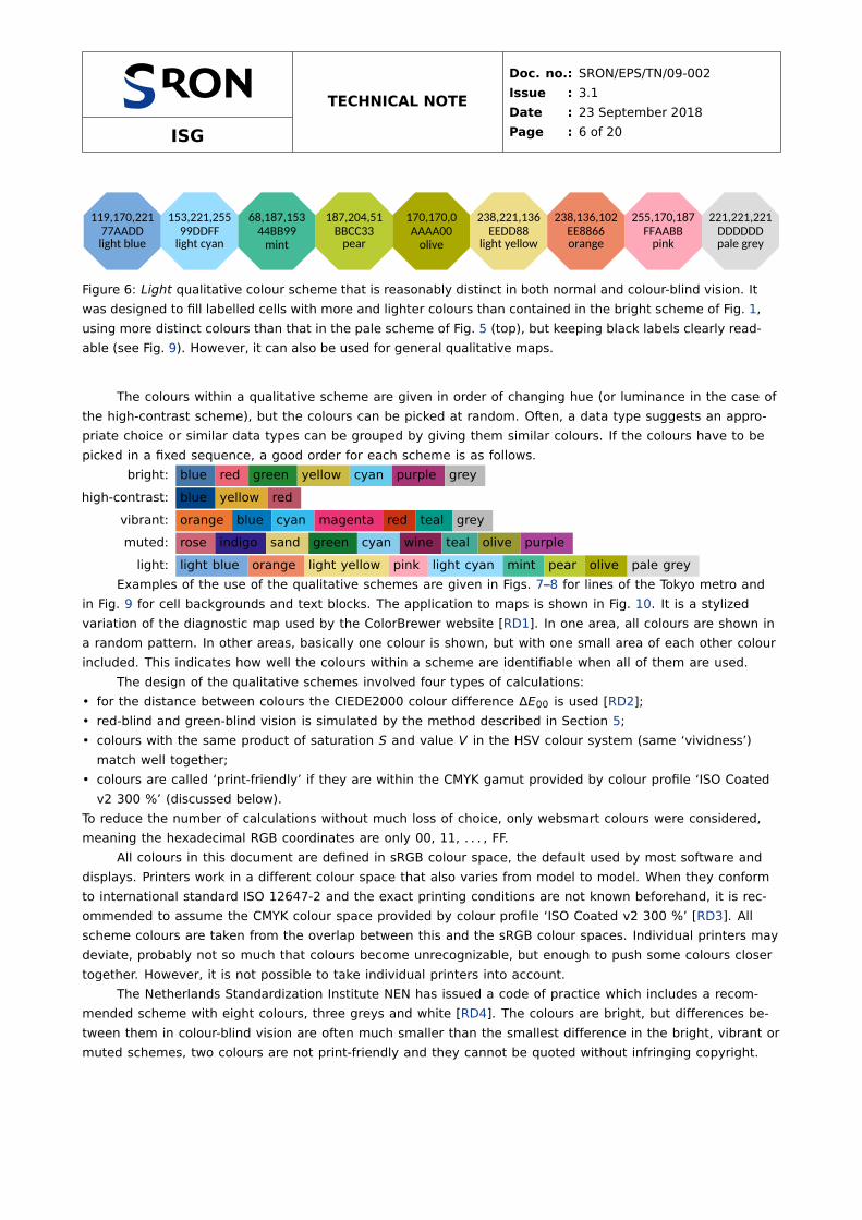
Figure 6: Light qualitative colour scheme that is reasonably distinct in both normal and colour-blind vision. It
was designed to fill labelled cells with more and lighter colours than contained in the bright scheme of Fig. 1,
using more distinct colours than that in the pale scheme of Fig. 5 (top), but keeping black labels clearly read-
able (see Fig. 9). However, it can also be used for general qualitative maps.
The colours within a qualitative scheme are given in order of changing hue (or luminance in the case of
the high-contrast scheme), but the colours can be picked at random. Often, a data type suggests an appro-
priate choice or similar data types can be grouped by giving them similar colours. If the colours have to be
picked in a fixed sequence, a good order for each scheme is as follows.
bright: blue red green yellow cyan purple grey
high-contrast: blue yellow red
vibrant: orange blue cyan magenta red teal grey
muted: rose indigo sand green cyan wine teal olive purple
light: light blue orange light yellow pink light cyan mint pear olive pale grey
Examples of the use of the qualitative schemes are given in Figs. 7–8 for lines of the Tokyo metro and
in Fig. 9 for cell backgrounds and text blocks. The application to maps is shown in Fig. 10. It is a stylized
variation of the diagnostic map used by the ColorBrewer website [RD1]. In one area, all colours are shown in
a random pattern. In other areas, basically one colour is shown, but with one small area of each other colour
included. This indicates how well the colours within a scheme are identifiable when all of them are used.
The design of the qualitative schemes involved four types of calculations:
• for the distance between colours the CIEDE2000 colour difference ΔE00 is used [RD2];
• red-blind and green-blind vision is simulated by the method described in Section 5;
• colours with the same product of saturation S and value V in the HSV colour system (same ‘vividness’)
match well together;
• colours are called ‘print-friendly’ if they are within the CMYK gamut provided by colour profile ‘ISO Coated
v2 300 %’ (discussed below).
To reduce the number of calculations without much loss of choice, only websmart colours were considered,
meaning the hexadecimal RGB coordinates are only 00, 11, . . . , FF.
All colours in this document are defined in sRGB colour space, the default used by most software and
displays. Printers work in a different colour space that also varies from model to model. When they conform
to international standard ISO 12647-2 and the exact printing conditions are not known beforehand, it is rec-
ommended to assume the CMYK colour space provided by colour profile ‘ISO Coated v2 300 %’ [RD3]. All
scheme colours are taken from the overlap between this and the sRGB colour spaces. Individual printers may
deviate, probably not so much that colours become unrecognizable, but enough to push some colours closer
together. However, it is not possible to take individual printers into account.
The Netherlands Standardization Institute NEN has issued a code of practice which includes a recom-
mended scheme with eight colours, three greys and white [RD4]. The colours are bright, but differences be-
tween them in colour-blind vision are often much smaller than the smallest difference in the bright, vibrant or
muted schemes, two colours are not print-friendly and they cannot be quoted without infringing copyright.

ISG
TECHNICAL NOTE
Doc. no.: SRON/EPS/TN/09-002
Issue : 3.1
Date : 23 September 2018
Page : 7 of 20
Tokyo Metro LinesYamanoteGinzaMarunouchiHibiyaTozaiChiyodaYurakucho
Tokyo Metro LinesYamanoteGinzaMarunouchi
Tokyo Metro LinesYamanoteGinzaMarunouchiHibiyaTozaiChiyodaYurakucho
Tokyo Metro LinesYamanoteGinzaMarunouchiHibiyaTozaiChiyodaYurakuchoHanzomonNambokuAsakusa
Figure 7: Metro lines in Tokyo coloured using the bright (top left), high-contrast (top right), vibrant (bottom left)
and muted (bottom right) scheme.
Tokyo Metro LinesYamanoteGinzaMarunouchiHibiyaTozaiChiyodaYurakuchoHanzomonNamboku
Figure 8: Metro lines in Tokyo coloured using the light scheme, showing that the light scheme is not meant for
lines on a white background (see Fig. 9).
ISG
TECHNICAL NOTE
Doc. no.: SRON/EPS/TN/09-002
Issue : 3.1
Date : 23 September 2018
Page : 8 of 20
1234567891011121314 1516171819202122232425262728 293031323334353637383940414243 4445464748495051525354555657 5859606162636465666768697071 7273747576777879808182838485 8687888990919293949596979899 100101102103104105106107108109110111112113114 115116117118119120121122123124125126127128 129130131132133134135136137138139140141142 143144145146147148149150151152153154155156 157158159160161162163164165166167168169170 171172173174175176177178179180181182183184
0 60 120 180 240 300 360
0
5
10
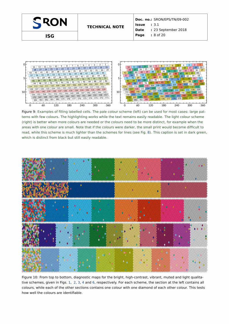
Figure 9: Examples of filling labelled cells. The pale colour scheme (left) can be used for most cases: large pat-
terns with few colours. The highlighting works while the text remains easily readable. The light colour scheme
(right) is better when more colours are needed or the colours need to be more distinct, for example when the
areas with one colour are small. Note that if the colours were darker, the small print would become difficult to
read, while this scheme is much lighter than the schemes for lines (see Fig. 8). This caption is set in dark green,
which is distinct from black but still easily readable.
Figure 10: From top to bottom, diagnostic maps for the bright, high-contrast, vibrant, muted and light qualita-
tive schemes, given in Figs. 1, 2, 3, 4 and 6, respectively. For each scheme, the section at the left contains all
colours, while each of the other sections contains one colour with one diamond of each other colour. This tests
how well the colours are identifiable.

ISG
TECHNICAL NOTE
Doc. no.: SRON/EPS/TN/09-002
Issue : 3.1
Date : 23 September 2018
Page : 9 of 20
3 Diverging Colour Schemes
Diverging schemes are for ordered data between two extremes where the midpoint is important. Such schemes
could be constructed simply by scaling the colour coordinates linearly, e.g. from blue to white to red. How-
ever, by including subtle hue changes, the colours are more distinct and the schemes more attractive. Fig-
ures 11–13 show the sunset, BuRd and PRGn schemes, which are tweaked versions of schemes on the Color-
Brewer website [RD1]. The darkest shades of the original versions have been removed, because they are too
dark and similar to be used in practice. The circled colour is meant for bad data, without drawing attention
away from good data with a large deviation from zero. The sunset scheme was designed for situations where
bad data have to be shown white. The three schemes look similar in colour-blind vision, so if more than one
is used, do not reverse the direction in one of them. If more colours than shown are needed from a given
scheme, use a continuous version of the scheme instead of the discrete colours, by linearly interpolating the
colour coordinates. If fewer colours are needed, pick colours at equidistant points in the continuous version.
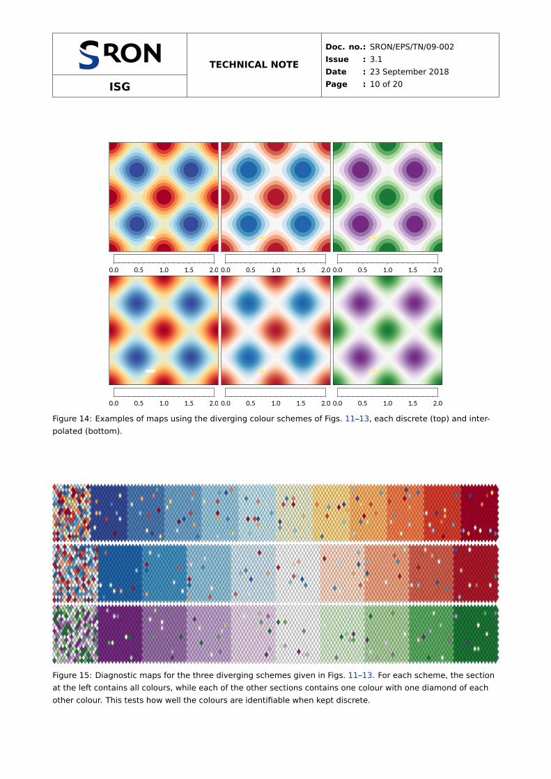
Examples of the use of the diverging schemes for maps are given in Figs. 14 and 15.
54,75,154
364B9A
74,123,183
4A7BB7
110,166,205
6EA6CD
152,202,225
98CAE1
194,228,239
C2E4EF
234,236,204
EAECCC
254,218,139
FEDA8B
253,179,102
FDB366
246,126,75
F67E4B
221,61,45
DD3D2D
165,0,38
A50026
255,255,255
FFFFFF
Figure 11: Sunset diverging colour scheme that also works in colour-blind vision. The colours can be used as
given or linearly interpolated. The circled colour is meant for bad data. The scheme is related to the Color-
Brewer RdYlBu scheme, but with darker central colours and made more symmetric.
33,102,172
2166AC
67,147,195
4393C3
146,197,222
92C5DE
209,229,240
D1E5F0
247,247,247
F7F7F7
253,219,199
FDDBC7
244,165,130
F4A582
214,96,77
D6604D
178,24,43
B2182B
255,238,153
FFEE99
Figure 12: BuRd diverging colour scheme that also works in colour-blind vision. The colours can be used as
given or linearly interpolated. The circled colour is meant for bad data. This is the reversed ColorBrewer RdBu
scheme.
118,42,131
762A83
153,112,171
9970AB
194,165,207
C2A5CF
231,212,232
E7D4E8
247,247,247
F7F7F7
217,240,211
D9F0D3
172,211,158
ACD39E
90,174,97
5AAE61
27,120,55
1B7837
255,238,153
FFEE99
Figure 13: PRGn diverging colour scheme that also works in colour-blind vision. The colours can be used as
given or linearly interpolated. The circled colour is meant for bad data. This is the ColorBrewer PRGn scheme,
with green A6DBA0 shifted to ACD39E to make it print-friendly.
ISG
TECHNICAL NOTE
Doc. no.: SRON/EPS/TN/09-002
Issue : 3.1
Date : 23 September 2018
Page : 10 of 20
0.0 0.5 1.0 1.5 2.0 0.0 0.5 1.0 1.5 2.0 0.0 0.5 1.0 1.5 2.0
0.0 0.5 1.0 1.5 2.0 0.0 0.5 1.0 1.5 2.0 0.0 0.5 1.0 1.5 2.0
Figure 14: Examples of maps using the diverging colour schemes of Figs. 11–13, each discrete (top) and inter-
polated (bottom).
Figure 15: Diagnostic maps for the three diverging schemes given in Figs. 11–13. For each scheme, the section
at the left contains all colours, while each of the other sections contains one colour with one diamond of each
other colour. This tests how well the colours are identifiable when kept discrete.
ISG
TECHNICAL NOTE
Doc. no.: SRON/EPS/TN/09-002
Issue : 3.1
Date : 23 September 2018
Page : 11 of 20
4 Sequential Colour Schemes
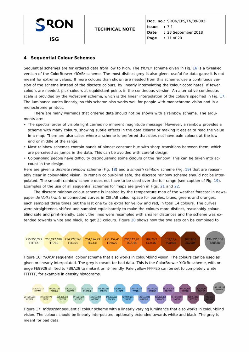
Sequential schemes are for ordered data from low to high. The YlOrBr scheme given in Fig. 16 is a tweaked
version of the ColorBrewer YlOrBr scheme. The most distinct grey is also given, useful for data gaps; it is not
meant for extreme values. If more colours than shown are needed from this scheme, use a continuous ver-
sion of the scheme instead of the discrete colours, by linearly interpolating the colour coordinates. If fewer
colours are needed, pick colours at equidistant points in the continuous version. An alternative continuous
scale is provided by the iridescent scheme, which is the linear interpolation of the colours specified in Fig. 17.
The luminance varies linearly, so this scheme also works well for people with monochrome vision and in a
monochrome printout.
There are many warnings that ordered data should not be shown with a rainbow scheme. The argu-
ments are:
• The spectral order of visible light carries no inherent magnitude message. However, a rainbow provides a
scheme with many colours, showing subtle effects in the data clearer or making it easier to read the value
in a map. There are also cases where a scheme is preferred that does not have pale colours at the low
end or middle of the range.
• Most rainbow schemes contain bands of almost constant hue with sharp transitions between them, which
are perceived as jumps in the data. This can be avoided with careful design.
• Colour-blind people have difficulty distinguishing some colours of the rainbow. This can be taken into ac-
count in the design.
Here are given a discrete rainbow scheme (Fig. 18) and a smooth rainbow scheme (Fig. 19) that are reason-
ably clear in colour-blind vision. To remain colour-blind safe, the discrete rainbow scheme should not be inter-
polated. The smooth rainbow scheme does not have to be used over the full range (see caption of Fig. 19).
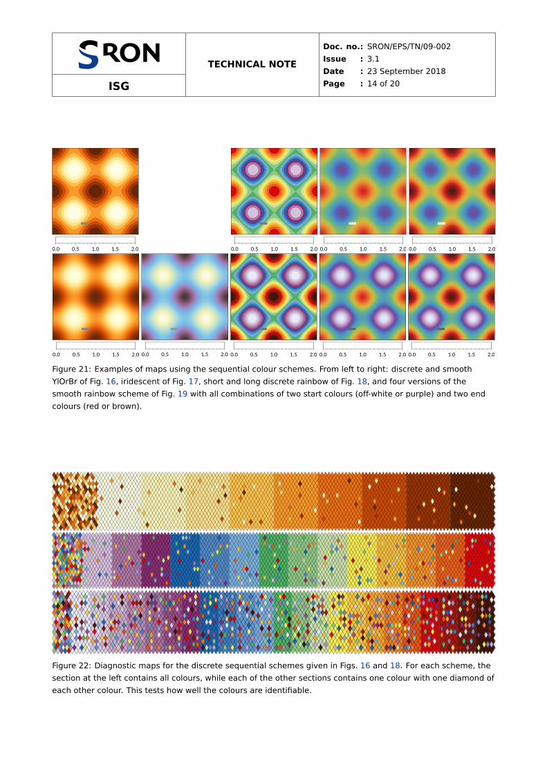
Examples of the use of all sequential schemes for maps are given in Figs. 21 and 22.
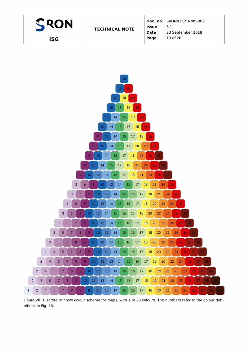
The discrete rainbow colour scheme is inspired by the temperature map of the weather forecast in news-
paper de Volkskrant: unconnected curves in CIELAB colour space for purples, blues, greens and oranges,
each sampled three times but the last one twice extra for yellow and red, in total 14 colours. The curves
were straightened, shifted and sampled equidistantly to make the colours more distinct, reasonably colour-
blind safe and print-friendly. Later, the lines were resampled with smaller distances and the scheme was ex-
tended towards white and black, to get 23 colours. Figure 20 shows how the two sets can be combined to
255,255,229
FFFFE5
255,247,188
FFF7BC
254,227,145
FEE391
254,196,79
FEC44F
251,154,41
FB9A29
236,112,20
EC7014
204,76,2
CC4C02
153,52,4
993404
102,37,6
662506
136,136,136
888888
Figure 16: YlOrBr sequential colour scheme that also works in colour-blind vision. The colours can be used as
given or linearly interpolated. The grey is meant for bad data. This is the ColorBrewer YlOrBr scheme, with or-
ange FE9929 shifted to FB9A29 to make it print-friendly. Pale yellow FFFFE5 can be set to completely white
FFFFFF, for example in density histograms.
254,251,233
FEFBE9
252,247,213
FCF7D5
245,243,193
F5F3C1
234,240,181
EAF0B5
221,236,191
DDECBF
208,231,202
D0E7CA
194,227,210
C2E3D2
181,221,216
B5DDD8
168,216,220
A8D8DC
155,210,225
9BD2E1
141,203,228
8DCBE4
129,196,231
81C4E7
123,188,231
7BBCE7
126,178,228
7EB2E4
136,165,221
88A5DD
147,152,210
9398D2
155,138,196
9B8AC4
157,125,178
9D7DB2
154,112,158
9A709E
144,99,136
906388
128,87,112
805770
104,73,87
684957
70,53,58
46353A
153,153,153
999999
Figure 17: Iridescent sequential colour scheme with a linearly varying luminance that also works in colour-blind
vision. The colours should be linearly interpolated, optionally extended towards white and black. The grey is
meant for bad data.

ISG
TECHNICAL NOTE
Doc. no.: SRON/EPS/TN/09-002
Issue : 3.1
Date : 23 September 2018
Page : 12 of 20
209,187,215
D1BBD7
no. 3
174,118,163
AE76A3
no. 6
136,46,114
882E72
no. 9
25,101,176
1965B0
no. 10
82,137,199
5289C7
no. 12
123,175,222
7BAFDE
no. 14
78,178,101
4EB265
no. 15
144,201,135
90C987
no. 16
202,224,171
CAE0AB
no. 17
247,240,86
F7F056
no. 18
246,193,65
F6C141
no. 20
241,147,45
F1932D
no. 22
232,96,28
E8601C
no. 24
220,5,12
DC050C
no. 26
119,119,119
777777
232,236,251E8ECFBno. 1
217,204,227D9CCE3no. 2
202,172,203CAACCBno. 4
186,141,180BA8DB4no. 5
170,111,158AA6F9Eno. 7
153,79,136994F88no. 8
136,46,114882E72no. 9
25,101,1761965B0no. 10
67,125,191437DBFno. 11
97,149,2076195CFno. 13
123,175,2227BAFDEno. 14
78,178,1014EB265no. 15
144,201,13590C987no. 16
202,224,171CAE0ABno. 17
247,240,86F7F056no. 18
247,203,69F7CB45no. 19
244,167,54F4A736no. 21
238,128,38EE8026no. 23
230,85,24E65518no. 25
220,5,12DC050Cno. 26
165,23,14A5170Eno. 27
114,25,1472190Eno. 28
66,21,1042150Ano. 29
119,119,119
777777
Figure 18: Discrete rainbow colour scheme with 14 or 23 colours for maps. See Fig. 20 for the best subset if a
different number of colours is needed. The colours have to be used as given: do not interpolate. For a smooth
rainbow scheme, see Fig. 19. The grey is meant for bad data, but white can also be used, except in the case of
exactly 23 colours. The colours have been numbered for easy referencing in Fig. 20.
232,236,251
E8ECFB
221,216,239
DDD8EF
209,193,225
D1C1E1
195,168,209
C3A8D1
181,143,194
B58FC2
167,120,180
A778B4
155,98,167
9B62A7
140,78,153
8C4E99
111,76,155
6F4C9B
96,89,169
6059A9
85,104,184
5568B8
78,121,197
4E79C5
77,138,198
4D8AC6
78,150,188
4E96BC
84,158,179
549EB3
89,165,169
59A5A9
96,171,158
60AB9E
105,177,144
69B190
119,183,125
77B77D
140,188,104
8CBC68
166,190,84
A6BE54
190,188,72
BEBC48
209,181,65
D1B541
221,170,60
DDAA3C
228,156,57
E49C39
231,140,53
E78C35
230,121,50
E67932
228,99,45
E4632D
223,72,40
DF4828
218,34,34
DA2222
184,34,30
B8221E
149,33,27
95211B
114,30,23
721E17
82,26,19
521A13
102,102,102
666666
off−white purple red brown
Figure 19: Smooth rainbow colour scheme. The colours are meant to be linearly interpolated: for a discrete
rainbow scheme, see Fig. 18. Often it is better to use only a limited range of these colours. Starting at purple,
bad data can be shown white, whereas starting at off-white, the most distinct grey is given in the circle. If the
lowest data value occurs often, start at off-white instead of purple. If the highest data value occurs often, end
at red instead of brown. For colour-blind people, the light purples and light blues should not be mixed much.
make a scheme with any number of colours up to 23.
ISG
TECHNICAL NOTE
Doc. no.: SRON/EPS/TN/09-002
Issue : 3.1
Date : 23 September 2018
Page : 13 of 20
10
10 26
10 18 26
10 15 18 26
10 14 15 18 26
10 14 15 17 18 26
9 10 14 15 17 18 26
9 10 14 15 17 18 23 26
9 10 14 15 17 18 23 26 28
9 10 14 15 17 18 21 24 26 28
9 10 12 14 15 17 18 21 24 26 28
3 6 9 10 12 14 15 17 18 21 24 26
3 6 9 10 12 14 15 16 17 18 21 24 26
3 6 9 10 12 14 15 16 17 18 20 22 24 26
3 6 9 10 12 14 15 16 17 18 20 22 24 26 28
3 5 7 9 10 12 14 15 16 17 18 20 22 24 26 28
3 5 7 8 9 10 12 14 15 16 17 18 20 22 24 26 28
3 5 7 8 9 10 12 14 15 16 17 18 20 22 24 26 27 28
2 4 5 7 8 9 10 12 14 15 16 17 18 20 22 24 26 27 28
2 4 5 7 8 9 10 11 13 14 15 16 17 18 20 22 24 26 27 28
2 4 5 7 8 9 10 11 13 14 15 16 17 18 19 21 23 25 26 27 28
2 4 5 7 8 9 10 11 13 14 15 16 17 18 19 21 23 25 26 27 28 29
1 2 4 5 7 8 9 10 11 13 14 15 16 17 18 19 21 23 25 26 27 28 29
Figure 20: Discrete rainbow colour scheme for maps, with 1 to 23 colours. The numbers refer to the colour defi-
nitions in Fig. 18.
ISG
TECHNICAL NOTE
Doc. no.: SRON/EPS/TN/09-002
Issue : 3.1
Date : 23 September 2018
Page : 14 of 20
0.0 0.5 1.0 1.5 2.0 0.0 0.5 1.0 1.5 2.0 0.0 0.5 1.0 1.5 2.0 0.0 0.5 1.0 1.5 2.0
0.0 0.5 1.0 1.5 2.0 0.0 0.5 1.0 1.5 2.0 0.0 0.5 1.0 1.5 2.0 0.0 0.5 1.0 1.5 2.0 0.0 0.5 1.0 1.5 2.0
Figure 21: Examples of maps using the sequential colour schemes. From left to right: discrete and smooth
YlOrBr of Fig. 16, iridescent of Fig. 17, short and long discrete rainbow of Fig. 18, and four versions of the
smooth rainbow scheme of Fig. 19 with all combinations of two start colours (off-white or purple) and two end
colours (red or brown).
Figure 22: Diagnostic maps for the discrete sequential schemes given in Figs. 16 and 18. For each scheme, the
section at the left contains all colours, while each of the other sections contains one colour with one diamond of
each other colour. This tests how well the colours are identifiable.
ISG
TECHNICAL NOTE
Doc. no.: SRON/EPS/TN/09-002
Issue : 3.1
Date : 23 September 2018
Page : 15 of 20
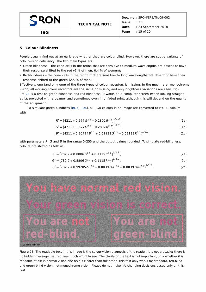
5 Colour Blindness
People usually find out at an early age whether they are colour-blind. However, there are subtle variants of
colour-vision deficiency. The two main types are:
• Green-blindness – the cone cells in the retina that are sensitive to medium wavelengths are absent or have
their response shifted to the red (6 % of men, 0.4 % of women);
• Red-blindness – the cone cells in the retina that are sensitive to long wavelengths are absent or have their
response shifted to the green (2.5 % of men).
Effectively, one (and only one) of the three types of colour receptors is missing. In the much rarer monochrome
vision, all working colour receptors are the same or missing and only brightness variations are seen. Fig-
ure 23 is a test on green-blindness and red-blindness. It works on a computer screen (when looking straight
at it), projected with a beamer and sometimes even in unfaded print, although this will depend on the quality
of the equipment.
To simulate green-blindness [RD5, RD6], all RGB colours in an image are converted to R’G’B’ colours
with
R′ =�
4211 + 0.677G2.2 + 0.2802R2.2�1/2.2
, (1a)
G′ =�
4211 + 0.677G2.2 + 0.2802R2.2�1/2.2
, (1b)
B′ =�
4211 + 0.95724B2.2 + 0.02138G2.2 − 0.02138R2.2�1/2.2
, (1c)
with parameters R, G and B in the range 0–255 and the output values rounded. To simulate red-blindness,
colours are shifted as follows:
R′ =�
782.7 + 0.8806G2.2 + 0.1115R2.2�1/2.2
, (2a)
G′ =�
782.7 + 0.8806G2.2 + 0.1115R2.2�1/2.2
, (2b)
B′ =�
782.7 + 0.992052B2.2 − 0.003974G2.2 + 0.003974R2.2�1/2.2
. (2c)
Figure 23: The readable text in this image is the colour-vision diagnosis of the reader. It is not a puzzle: there is
no hidden message that requires much effort to see. The clarity of the text is not important, only whether it is
readable at all; in normal vision one text is clearer than the other. This test only works for standard, red-blind
and green-blind vision, not monochrome vision. Please do not make life-changing decisions based only on this
test.
ISG
TECHNICAL NOTE
Doc. no.: SRON/EPS/TN/09-002
Issue : 3.1
Date : 23 September 2018
Page : 16 of 20
gree
n-bl
ind
visi
on
red-
blin
dvi
sion
norm
alvi
sion
Figure 24: Colour scale in normal vision (top), green-blind vision (bottom left) and red-blind vision (bottom
right). These conversions are only approximate and are designed for a computer screen.
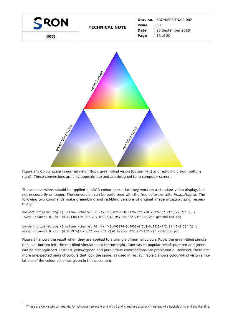
These conversions should be applied in sRGB colour space, i.e. they work on a standard video display, but
not necessarily on paper. The conversion can be performed with the free software suite ImageMagick. The
following two commands make green-blind and red-blind versions of original image original.png, respec-
tively:1
convert original.png \( +clone -channel RG -fx "(0.02138+0.6770*G^2.2+0.2802*R^2.2)^(1/2.2)" \) \
+swap -channel B -fx "(0.02138(1+v.G^2.2-v.R^2.2)+0.9572*v.B^2.2)^(1/2.2)" greenblind.png
convert original.png \( +clone -channel RG -fx "(0.003974+0.8806*G^2.2+0.1115*R^2.2)^(1/2.2)" \) \
+swap -channel B -fx "(0.003974(1-v.G^2.2+v.R^2.2)+0.9921*v.B^2.2)^(1/2.2)" redblind.png
Figure 24 shows the result when they are applied to a triangle of normal colours (top): the green-blind simula-
tion is at bottom left, the red-blind simulation at bottom right. Contrary to popular belief, pure red and green
can be distinguished. Instead, yellow/green and purple/blue combinations are problematic. However, there are
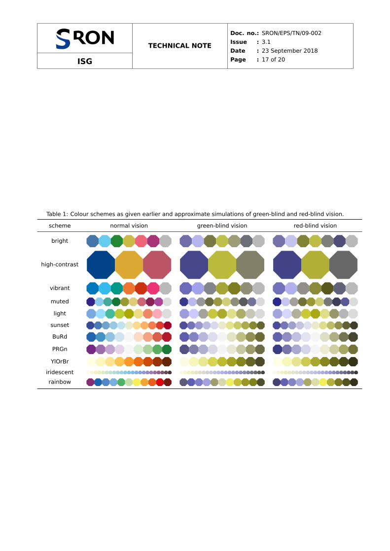
more unexpected pairs of colours that look the same, as used in Fig. 23. Table 1 shows colour-blind vision simu-
lations of the colour schemes given in this document.
1These are Unix-style commands, for Windows replace \( and \) by ( and ), and use a caret (ˆ) instead of a backslash to end the first line.
ISG
TECHNICAL NOTE
Doc. no.: SRON/EPS/TN/09-002
Issue : 3.1
Date : 23 September 2018
Page : 17 of 20
Table 1: Colour schemes as given earlier and approximate simulations of green-blind and red-blind vision.
scheme normal vision green-blind vision red-blind vision
bright
high-contrast
vibrant
muted
light
sunset
BuRd
PRGn
YlOrBr
iridescent
rainbow

ISG
TECHNICAL NOTE
Doc. no.: SRON/EPS/TN/09-002
Issue : 3.1
Date : 23 September 2018
Page : 18 of 20
6 Greyscale Conversion
According to the Web Content Accessibility Guidelines [RD7], a contrast ratio between colours of at least 3 is
recommended by ISO-9241-3 for standard text and vision, but the Guidelines define a stronger criterion of at
least 4.5 to make the colours useful for people with moderately low vision. This includes people with monochrome
vision, who only see brightness variations. The criterion actually only applies to body text, but “charts, graphs,
diagrams, and other non-text-based information [. . . ] should also have good contrast to ensure that more users
can access the information.”
The criterion cannot be met using more than one print-friendly websmart colour plus white and black. The
only blue shades are 4477BB and 5577AA, almost the same as the blue from the bright scheme. A websmart
shade of grey is not available: only 757575 meets the criterion. The largest minimum contrast ratio in a set of
two print-friendly websmart colours plus white and black is 2.8 and in a set with three such colours 2.1. One
example with three colours is the high-contrast scheme. However, with some precautions it can still be applied
to lines and symbols: use the colours in the order
• blue yellow red from the high-contrast scheme
on a white background and use black only for annotation (e.g. text or a grid) that is not on top of blue. When
the first two colours are used, the contrast between yellow and white is just 2.1, but that is probably less im-
portant than the contrast between blue and yellow, which is large enough: 4.52. Only in the case of all three
colours does the contrast between them decrease to 2.1, but that is the highest achievable value. Use different
types of lines and symbols for better clarity.
All other schemes fail the contrast-ratio criterion completely, as they contain too many colours and were
designed for standard, red-blind and green-blind vision, relying not only on brightness differences, but also on
hue differences. If one of the other qualitative schemes is used, the best subsets for greyscale conversion are
(from light to dark):
• yellow red blue from the bright scheme;
• cyan teal red from the vibrant scheme;
• cyan olive purple wine from the muted scheme.
However, the high-contrast qualitative scheme above will be clearer.
The YlOrBr and iridescent sequential schemes work well (Fig. 25). The latter was designed for this pur-
pose, with a linearly varying luminance. Python’s default sequential scheme viridis has a similar property, but it
is not print-friendly and seems to have fewer discernible colours. The rainbow schemes do not work. By defini-
tion, all diverging schemes do not work either after greyscale conversion.
Figure 25: The YlOrBr (left) and iridescent (right) sequential colour schemes, with below the grey shades with
the same luminance.
ISG
TECHNICAL NOTE
Doc. no.: SRON/EPS/TN/09-002
Issue : 3.1
Date : 23 September 2018
Page : 19 of 20
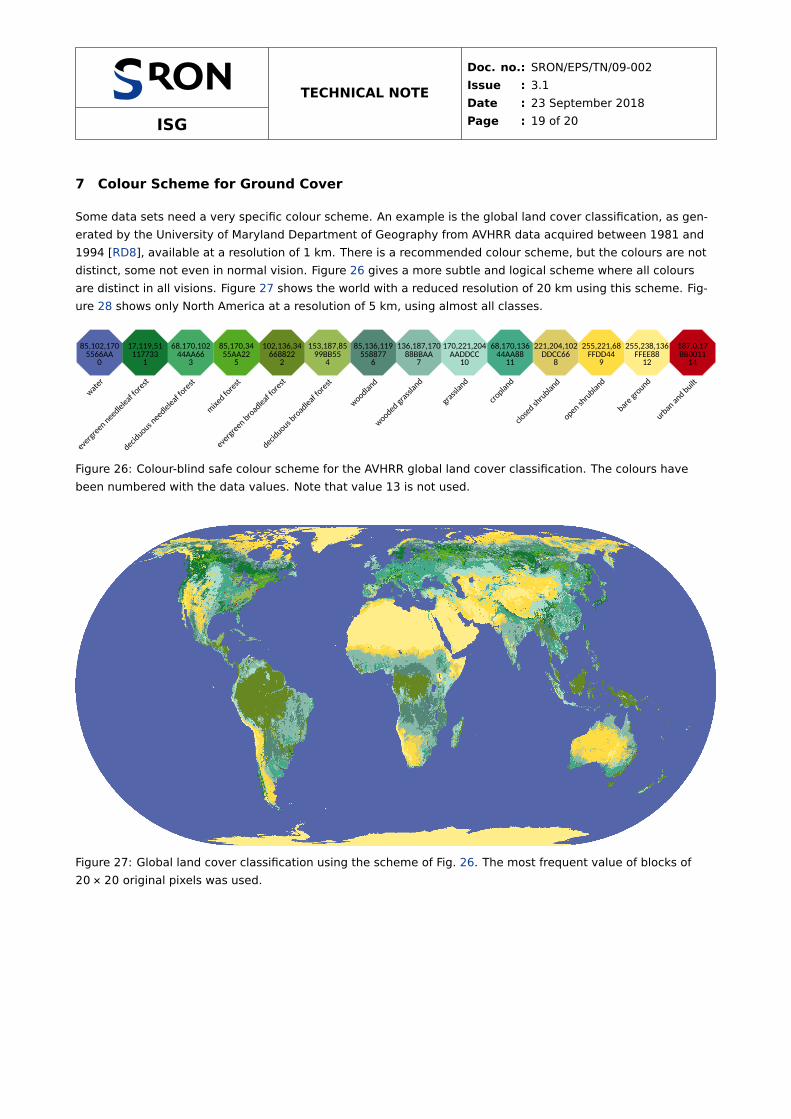
7 Colour Scheme for Ground Cover
Some data sets need a very specific colour scheme. An example is the global land cover classification, as gen-
erated by the University of Maryland Department of Geography from AVHRR data acquired between 1981 and
1994 [RD8], available at a resolution of 1 km. There is a recommended colour scheme, but the colours are not
distinct, some not even in normal vision. Figure 26 gives a more subtle and logical scheme where all colours
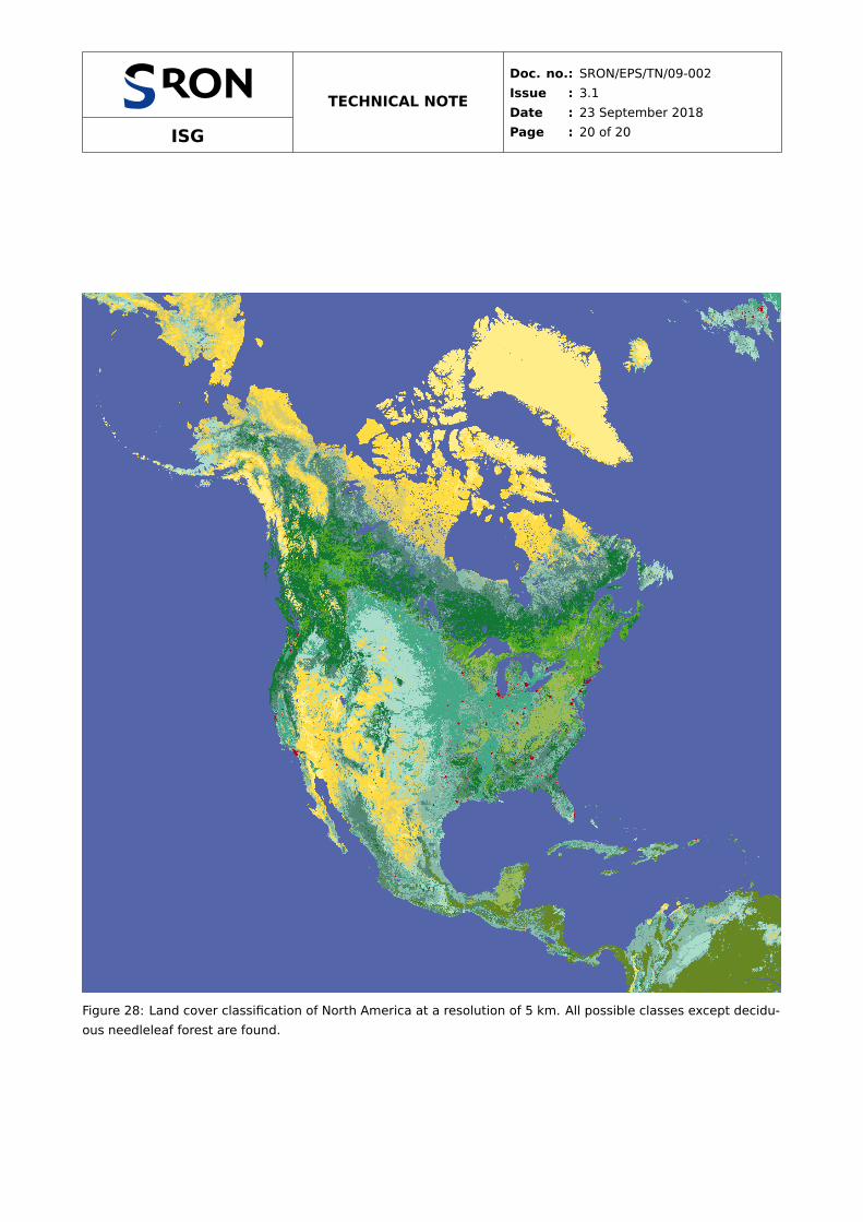
are distinct in all visions. Figure 27 shows the world with a reduced resolution of 20 km using this scheme. Fig-
ure 28 shows only North America at a resolution of 5 km, using almost all classes.
85,102,1705566AA
0
water
17,119,51117733
1
evergreenneedleleafforest
68,170,10244AA66
3
deciduousneedleleafforest
85,170,3455AA22
5
mixedforest
102,136,34668822
2
evergreenbroadleaf forest
153,187,8599BB55
4
deciduousbroadleaf forest
85,136,119558877
6
woodland
136,187,17088BBAA
7
woodedgrassland
170,221,204AADDCC
10
grassland
68,170,13644AA88
11
cropland
221,204,102DDCC66
8
closedshrubland
255,221,68FFDD44
9
openshrubland
255,238,136FFEE8812
bareground
187,0,17BB0011
14
urbanandbuilt
Figure 26: Colour-blind safe colour scheme for the AVHRR global land cover classification. The colours have
been numbered with the data values. Note that value 13 is not used.
Figure 27: Global land cover classification using the scheme of Fig. 26. The most frequent value of blocks of
20 × 20 original pixels was used.
ISG
TECHNICAL NOTE
Doc. no.: SRON/EPS/TN/09-002
Issue : 3.1
Date : 23 September 2018
Page : 20 of 20
Figure 28: Land cover classification of North America at a resolution of 5 km. All possible classes except decidu-
ous needleleaf forest are found.