Embed Size (px)
Citation preview

Introduction to @Risk

2
Background Information
Recall that Walton Bookstore buys calendars for $7.50, sells them at a regular price of $10, and gets a refund for all calendars that cannot be sold.
The company does not know exactly how many calendars its customers will demand, but it does have historical data on demands for similar calendars in previous years.

3
WALTON4.XLS
The Data sheet of this file contains the historical data. Walton wants to use these historical data to
determine a reasonable probability distribution for next year’s demand for calendars.
Then it wants to use this probability distribution, together with @Risk, to simulate the profit for any particular order quantity.
It eventually wants to find the “best” order quantity.

4
Solution
We will use this example to illustrate many of @Risk’s features.
We first see how it helps use to choose an appropriate “input” distribution for demand.
Then we will us it to build a simulation model for a specific order quantity and generate outputs from this model.
Finally we will see how the RISKSIMTABLE function enables us to simultaneously generate outputs from several order quantities so that we can chose a “best” order quantity.

5
Loading @Risk
The first step, if you have not already done it, is to install Palisade Decision tools suite.
Once @Risk is loaded, you will see two new toolbars, the Decision Tools toolbar shown here and the @Risk toolbar shown on the next slide.

6
Fitting a Probability Distribution
Some of the historical demand data appears on the next slide.
As the text box indicates, Walton believes the probability distribution of demand for next year’s calendars should closely match the histogram for the historical data.
To see which probability distributions match the histogram well, we can use @Risk’s fitting ability, using the following steps.

7
Fitting a Probability Distribution -- continued
Model window. Click on the Show @Risk-Model Window toolbar button. @Risk has two windows that get you outside of Excel: The Model and Results windows. The former helps in setting up the model; the latter shows results from running a simulation. For now, we require the Model window.
Insert a Fit Tab. Once the Model window is showing, select the Insert/Fit Tab menu item. This brings up a one-column “spreadsheet” on the left.
Copy and paste data. We want to copy the historical data to this mini-spreadsheet. To do so, go back to the Excel windows, copy the historical data, go back to the @Risk Model window, and paste the data – copy and paste work in the usual way.

8
Fitting a Probability Distribution -- continued
Select candidate distributions. @Risk has many probability distributions from which to select. To see the candidates, select the Fitting/Specify Distributions to Fit menu item. This brings up the dialog box shown on the next slide. You can check as many of the candidates as you like. Some are undoubtedly unfamiliar to you so you might want to stick with familiar distributions such as the normal and triangular. However, we clicked on the OK to accept the defaults shown in the figure.

9
Fitting a Probability Distribution -- continued

10
Fitting a Probability Distribution -- continued
Do the fitting. Select the Fitting/Run Fit Now menu item to see which of the candidate distributions most closely match the historical data. @Risk evaluates the fits in several different ways, and it also allows you to check the fits visually. After it runs, you will see a screen as shown on the next slide. This screen shows one of the candidate distributions superimposed on the histogram of the data.
Examine the selected distribution. To do so, select the Insert/Distribution Window menu item, and fill it out as shown on the slide after the next. Specifically, select Fit Results in the Source box, select By Name in the Choose box and click on Normal. @Risk provides a very friendly interface for examining the resulting normal distribution.

11
Fitting a Probability Distribution -- continued

12
Fitting a Probability Distribution -- continued
It has two “sliders” that you can drag in either direction to see probabilities of various areas under the curve. Also you can enter X values” or P values” directly into the boxes in the right column to obtain equivalent information.
A caution about negative values. We should point out that there is a potential drawback to using this normal distribution. Although the mean demand in this example is approximately three standard deviations to the right of 0, so that a negative demand is very unlikely there is still some chance that one can occur – which would not make physical sense in our model. To ensure that negative demand do not occur, there are two possibilities.

13
Fitting a Probability Distribution -- continued
First, we could use a truncated normal distribution of the form =RISKNORMAL(Meandem,StDev,0,1000). The function disallows values below the third argument or above the fourth argument. The other possibility is to choose a probability distribution that, by its very definition, does not allow negative values. On such distribution is the Weibull distribution, which provides one of the best fits to the historical data.

14
Developing The Simulation Model
Now that we have chosen a probability distribution for demand, the spreadsheet model for profit is essentially the same as we developed earlier without @Risk. It appears on the next slide. The only new things to be aware of are as follows. Input distribution. We want to use the normal distribution for
demand found from @Risk’s fitting procedure. To do this, enter the fitted mean and standard deviation in cells E4 and E5. Then enter the formula =ROUND(RISKNORMAL(MeanDem,StdevDem),0) in cell A13 for the random demand. This uses the RISKNORMAL function to generate a normally distributed demand with the fitted mean and standard deviation. Because demands should be integers, we use Excel’s ROUND function, with second argument 0, to round this value to 0 decimals.

15
Developing The Simulation Model -- continued
Output cell. When we run the simulation, we want @Risk to keep track of profit. In @Risk’s terminology, we need to designate the Profit cell, E13, as an output cell. There are two ways to designate a cell as an output cell. One way is to highlight it and then click on the Add Output Cell button on the @Risk toolbar. An equivalent way is to add RISKOUTPUT( )+ to the cell’s formula. Either way, the formula in cell E13 changes from =B13+D13-C13 to =RISKOUTPUT( )+B13+D13-C13. The plus sign following RISKOUTPUT ( ) does not indicate addition. It is simply @Risk’s way of saying: Keep track of the value in this cell as the simulation progresses. Any number of cells can be designated in this way as output cells. They are typically “bottom line values of primary interest.”

16
Developing The Simulation Model -- continued
Inputs and outputs. @Risk keeps a list of all input cells and output cells. If you want to check the list at any time, click on the Display Inputs, Outputs button on the @Risk toolbar. It provides an Explorer-like list as shown here.

17
Developing The Simulation Model -- continued
Summary functions. @Risk provides several functions for summarizing output values. We illustrate these in the range B16:B19. They contain the formulas =RISKMIN(Profit), =RISKMAX(Profit), RISKMEAN(Profit), and RISKSTDDEV(Profit). The values in these cells are not of any use until we run the simulation. However, once the simulation runs, these formulas capture summary statistics of profit.

18
Running the Simulation
Now that we have developed the model for Walton, the rest if straightforward.
The procedure is always the same. We specify the simulation settings and the report setting and then run the simulation. Simulation settings. We must first tell @Risk how we
want the simulation to be run. To do so, click on the Simulation Settings button on the @Risk toolbar. Click on the Iterations tab and fill out the dialog box as shown on the next slide. This says that we want to replicate the simulation 1000 times, each with a new random demand.

19
Running the Simulation -- continued

20
Running the Simulation -- continued
Then click on the Sampling tab and fill out the dialog box as shown here. For technical reasons it is always best to use Latin Hypercube sampling, it is more efficient.

21
Running the Simulation -- continued
We also recommend checking the Monte Carlo button on the Standard Recalc group. Although this has no effect on the ultimate results, it means that you will see random numbers in the spreadsheet.
Report settings. @Risk has many options for displaying the outputs from a simulation. The outputs can be placed in an @Risk Results window or on new sheets of your Excel workbook. They can also be shown in more or less detail. Click on the Report settings button on the @Risk toolbar to select some of these options. In the dialog box on the next slide we have requested a summary of the simulation and detailed statistics, and we have asked that they be shown both in the @Risk Results window and on new sheets in the current workbook.
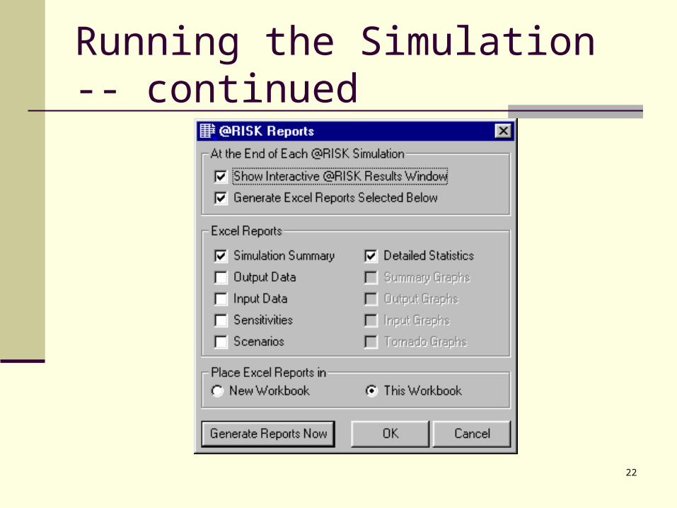
22
Running the Simulation -- continued

23
Running the Simulation -- continued
Run the simulation. We are finally ready to run the simulation! To do so, simply click on the Start Simulation button on the @Risk toolbar. At this point, @Risk repeatedly generates a random number for each random input cell, recalculates the worksheet, keeps track of all output cell values. You can watch the progress at the bottom left of the screen.

24
Analyzing the Output
@Risk generates a large number of output measures. We discuss the most important of these now.
Summary Report. Assuming that the top box was checked in the @Risk Reports dialog box, we are immediately transferred to the @Risk Results window. This window contains the summary results shown here.

25
Analyzing the Output -- continued
Detailed Statistics. We can also request more detailed statistics within the @Risk Results window with the Insert/Detailed Statistic menu item. Some of these detailed statistics appear on the next slide. All of the information in the Summary Report is here, plus some.
Target values. By scrolling to the bottom of the detailed statistics list, as shown on the slide after next, you can enter any target value or target percentile. If you enter a target value, @Risk calculates the corresponding percentile, and vice versa.

26
Analyzing the Output -- continued

27
Analyzing the Output -- continued
Simulation data. The results to this point summarize the simulation. It is also possible to see the full results – the data, demands and profits, from all 1000 replications. To do this select the Insert/Data menu item. A portion of the data appears on the next slide.

28
Analyzing the Output -- continued
Charts. To see the results graphically, click on the Profit item in the left pane of the Results window and then select the Insert/Graph/Histogram menu item. This creates a histogram of the 1000 profits from the simulation.

29
Analyzing the Output -- continued
The same interface is available that we saw earlier – namely, we can move the “sliders” at the top of the chart to the left or right to see various probabilities.
Outputs in Excel. Often we will want the simulation outputs, including charts, in an Excel workbook. The easiest way to get the numerical information shown earlier is to fill out the Report Settings dialog box as we did. Then separate sheets are created to hold the reports.
This has been a quick tour through @Risk’s report capabilities.
The best way to become more familiar with @Risk is to experiment with the user-friendly interface.
30
Using RISKSIMTABLE
Walton’s ultimate goal is to choose an order quantity that provides a large average profit.
We could rerun the simulation model several times, each time with a different order quantity in the OrderQuan cell, and compare the results.
However, this has two drawbacks. First, it takes a lot of time and work. Second, each time we run the simulation, we get a
different set of random demands. Therefore, one of the order quantities could win the contest just by luck. For a fairer comparison, it would be better to test each order quantity on the same set of random demands.

31
WALTON5.XLS
The RISKSIMTABLE function in @Risk enables us to obtain a fair comparison quickly and easily.
This file includes the setup for this model. The next slide shows the comparison model. There are two modifications to the previous model.
First, we have listed order quantities we want to test in the range names OrderQuanList.
Second, instead of entering a number in cell B9, we enter the formula =RISKSIMTABLE(OrderQuanList).

32
The Spreadsheet

33
Using RISKSIMTABLE -- continued Note that the list does not need to be entered
in the spreadsheet. However the model is now set up to run the
simulation for all order quantities in the list. To do this, click on the Simulation Settings
button on the @Risk toolbar and fill out the Iterations dialog box as shown on the next slide.
Specifically, enter 1000 for the number of iterations and 5 for the number of simulations.

34
Using RISKSIMTABLE -- continued
35
Using RISKSIMTABLE -- continued After running the simulations, the Report window
shows the results for all five simulations. For example, the basic summary report appears on
the next slide. The first five lines show summary statistics of profit. Although we do not show them here, the same
information can be seen graphically. A separate histogram of profit for each simulation is easy to obtain.

36
Using RISKSIMTABLE -- continued

37
Using RISKSIMTABLE -- continued Indeed, much of the appeal of @Risk is that
we can see all of these characteristics – averages, minimums, maximums, percentiles, charts – and use them to make informed decisions.

38
Background Information
As in the previous example, Walton needs to place an order for next year’s calendar.
We continue to assume that the calendars will sell for $10 and customer demand for the calendars at this price is normally distributed with mean 168.1 and standard deviation 57.6.
However, there are now two other sources of uncertainty.

39
Background Information -- continued First, the maximum number of calendars Walton’s
supplier can supply is uncertain and is modeled with a triangular distribution.
It’s parameters are 125, 250, and 200. Once Walton places and order, the supplier will charge $7.50 per calendar if he can supply the entire Walton order. Otherwise, he will charge only $7.25 per calendar.
Second, unsold calendars can no longer be returned to the supplier for a refund. Instead, Walton will put them on sale for $5 a piece after February 1.

40
Background Information -- continued At that price, Walton believes the demand for
leftover calendars is normally distributed with mean 50 and standard deviation 10.
Any calendars still left over, say after March 1, will be thrown away.
Walton plans to order 200 calendars and wants to use simulation to analyze the resulting profit.

41
Solution
As before, we first need to develop the model. Then we can run the simulation with @Risk
and examine the results. The completed model appears on the next
slide. The model itself requires a bit more logic than
the previous Walton model.

42
Solution
43
Developing The Simulation Model
The model can be developed with the following steps. Random inputs. There are three random inputs in this
model: the most the supplier can supply Walton, the customer demand when the selling price is $10, and the customer demand for sale-price calendars. Generate these cells in A16, D16 and G16 with the formulas =ROUND(RiskTrian(E9,E10,E11),0), =ROUND(RiskNormal(E5,E6),0) and =ROUND(RiskNormal(F5,F6),0). Note that we generate the random potential demand for calendars at the sale price even though there might not be any calendars left to put on sale.

44
Developing The Simulation Model -- continued
Actual supply. The number of calendars supplied to Walton is the smaller of the number ordered and the maximum the supplier is able to supply. Calculate this value in cell B16 with the formula =MIN(MaxSupply,OrderQuan).
Order cost. Walton gets the reduced price, $7.25, if the supplier cannot supply the entire order. Otherwise, Walton must pay $7.50 per calendar. Therefore calculate the total order cost in cell C16 with the formula =IF(MaxSupply>=OrderQuan,UnitCost1,UntiCost2)*Supply

45
Developing The Simulation Model -- continued
Other quantities. The rest of the model is straightforward. Calculate the revenue from regular-price sales in cell E16 with the formula =UnitPrice1*MIN(Supply,Demand1). Calculate the number left over after regular-price sales in cell H16 with the formula =UnitPrice2*MIN(Leftover, Demand2). Finally, calculate profit and designate it as an output cell for @Risk in cell I16 with the formula =RISKOUTPUT( )+E16+H16-C16.

46
Using @Risk
As always, the next steps are to specify the simulation settings, specify the report settings and run the simulation.
When there are several input cells, @Risk generates a value from each of them independently and calculates the corresponding profit on each iteration.
Selected results appear on the next slide. They indicate an average profit of $255.66, a 5th
percentile of - $410.50, a 95th percentile of $514.25, and a distribution of profits that is again skewed to the left.

47
Using @Risk

48
Sensitivity Analysis
We now demonstrate a feature of @Risk that is particularly useful when there are several random input cells.
This feature lets us see which of these inputs is most related to, or correlated with, an output cell.
To perform this analysis, select the Insert/Graph/Tornado Graph menu item from the @Risk Results window.

49
Sensitivity Analysis -- continued
In the resulting dialog box, select Profit as the output variable and click on the Correlation Sensitivity button.
This produces the results shown here.

50
Sensitivity Analysis -- continued
The “regression” option produces similar results, but we believe the correlation option is easier to understand.
This figure shows graphically and numerically how each of the random inputs correlates with profit – the higher the correlation, the stronger the relationship between that input and profit.
In this sense, we see that the regular-price demand has by far the strongest effect on profit.
51
Sensitivity Analysis -- continued
The other two inputs, maximum supply and sale-price demand, are not nearly as important because they are nearly unrelated to profit.
Identifying important input variables can be important for real applications.
If a random input is highly correlated with an important output, then it might be worth the time and cost to learn more about this input and possibly reduce the amount of uncertainty involving it.