Embed Size (px)
Citation preview
Summary of Composition: From imagination to paper in three simple steps with CindyWider
Page 1 of 37 www.DrawPJ.com
Copyright to all articles images, text, projects, lessons and exercises within this course belong to StuartCindy Art and may not be reproduced or used for any commercial purposes whatsoever without the written permission of StuartCindy Art.
Summary of
Composition: From imagination to paper in three simple steps
With Artist and Author Cindy Wider
Summary of Composition: From imagination to paper in three simple steps with CindyWider
Page 2 of 37 www.DrawPJ.com
Copyright to all articles images, text, projects, lessons and exercises within this course belong to StuartCindy Art and may not be reproduced or used for any commercial purposes whatsoever without the written permission of StuartCindy Art.
Composition: Three simple Steps
to create an original artwork from imagination to paper
1. Heart & Soul Stage: Where the very first ideas begin to form, an emotional
attachment is made and an urgency to create an image begins
2. Planning stage: The more logical stage of the process where many
decisions are made about the technical application of the chosen medium and the design stage begins
3. Application stage: Finally we get to put paint to paper or canvas
Summary of Composition: From imagination to paper in three simple steps with CindyWider
Page 3 of 37 www.DrawPJ.com
Copyright to all articles images, text, projects, lessons and exercises within this course belong to StuartCindy Art and may not be reproduced or used for any commercial purposes whatsoever without the written permission of StuartCindy Art.
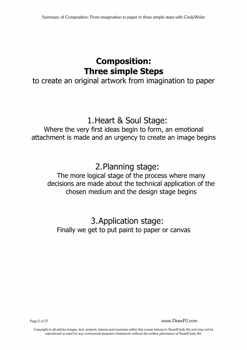
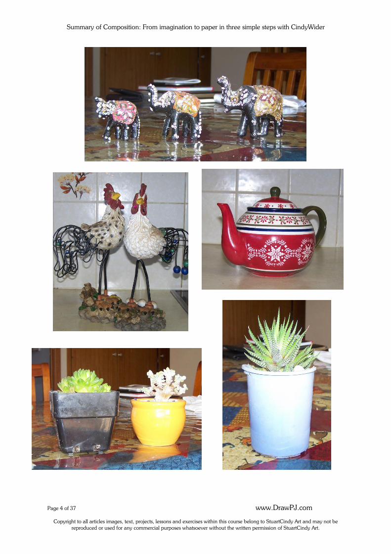
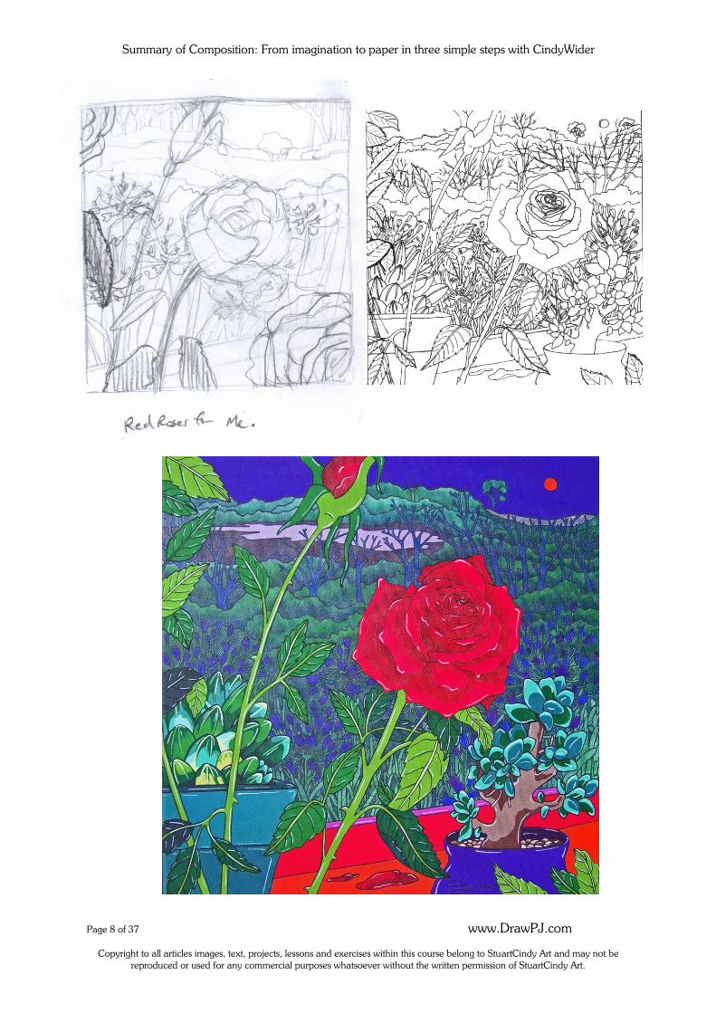
Example One: ‘Whose Minding The Nest’
1. The Heart and Soul Stage:
Reference photographs were taken first.
Summary of Composition: From imagination to paper in three simple steps with CindyWider
Page 4 of 37 www.DrawPJ.com
Copyright to all articles images, text, projects, lessons and exercises within this course belong to StuartCindy Art and may not be reproduced or used for any commercial purposes whatsoever without the written permission of StuartCindy Art.
Summary of Composition: From imagination to paper in three simple steps with CindyWider
Page 5 of 37 www.DrawPJ.com
Copyright to all articles images, text, projects, lessons and exercises within this course belong to StuartCindy Art and may not be reproduced or used for any commercial purposes whatsoever without the written permission of StuartCindy Art.
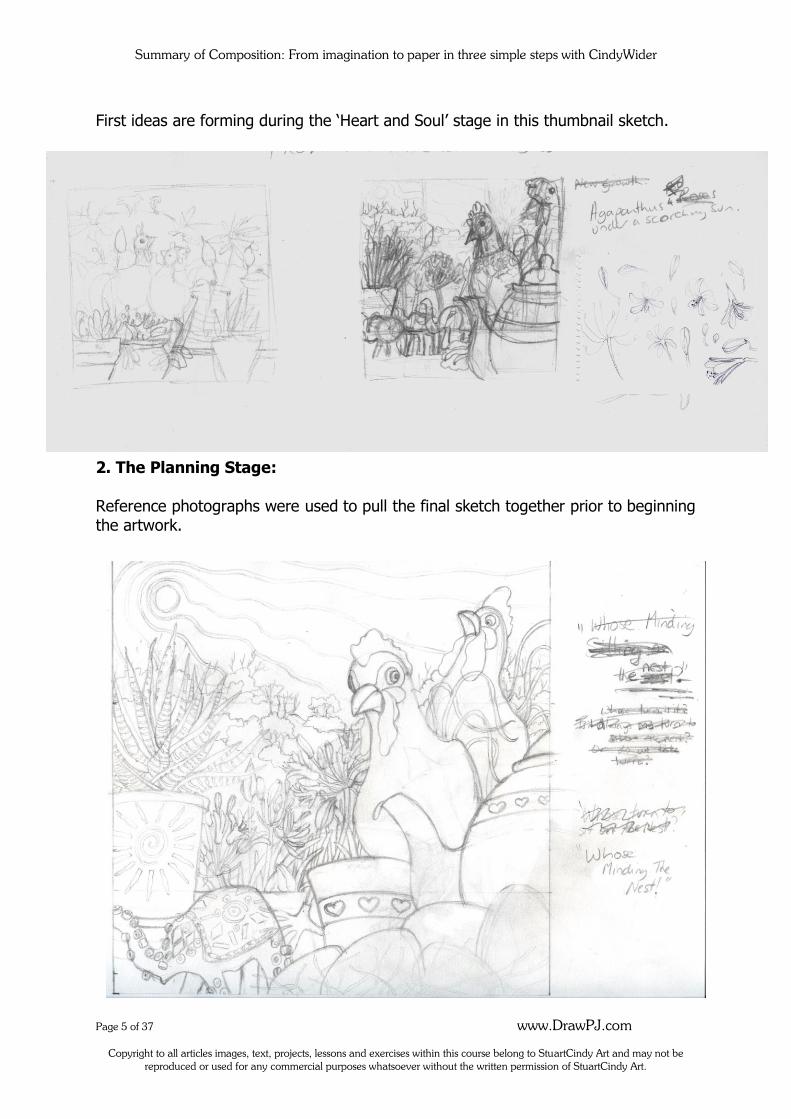
First ideas are forming during the ‘Heart and Soul’ stage in this thumbnail sketch.
2. The Planning Stage:
Reference photographs were used to pull the final sketch together prior to beginning the artwork.
Summary of Composition: From imagination to paper in three simple steps with CindyWider
Page 6 of 37 www.DrawPJ.com
Copyright to all articles images, text, projects, lessons and exercises within this course belong to StuartCindy Art and may not be reproduced or used for any commercial purposes whatsoever without the written permission of StuartCindy Art.
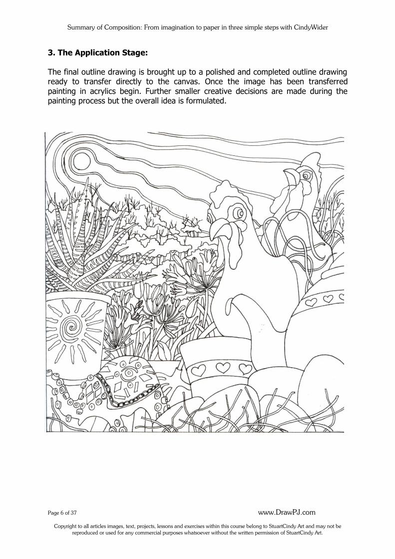
3. The Application Stage:
The final outline drawing is brought up to a polished and completed outline drawing ready to transfer directly to the canvas. Once the image has been transferred
painting in acrylics begin. Further smaller creative decisions are made during the painting process but the overall idea is formulated.
Summary of Composition: From imagination to paper in three simple steps with CindyWider
Page 7 of 37 www.DrawPJ.com
Copyright to all articles images, text, projects, lessons and exercises within this course belong to StuartCindy Art and may not be reproduced or used for any commercial purposes whatsoever without the written permission of StuartCindy Art.
Summary of Composition: From imagination to paper in three simple steps with CindyWider
Page 8 of 37 www.DrawPJ.com
Copyright to all articles images, text, projects, lessons and exercises within this course belong to StuartCindy Art and may not be reproduced or used for any commercial purposes whatsoever without the written permission of StuartCindy Art.
Summary of Composition: From imagination to paper in three simple steps with CindyWider
Page 9 of 37 www.DrawPJ.com
Copyright to all articles images, text, projects, lessons and exercises within this course belong to StuartCindy Art and may not be reproduced or used for any commercial purposes whatsoever without the written permission of StuartCindy Art.
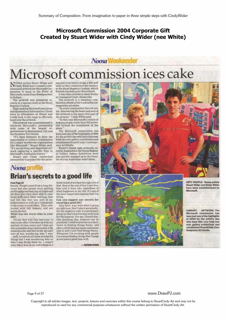
Microsoft Commission 2004 Corporate Gift Created by Stuart Wider with Cindy Wider (nee White)
Summary of Composition: From imagination to paper in three simple steps with CindyWider
Page 10 of 37 www.DrawPJ.com
Copyright to all articles images, text, projects, lessons and exercises within this course belong to StuartCindy Art and may not be reproduced or used for any commercial purposes whatsoever without the written permission of StuartCindy Art.
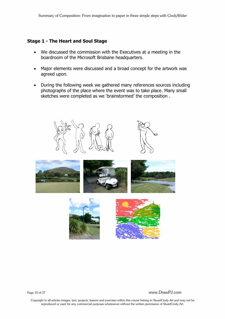
Stage 1 - The Heart and Soul Stage
We discussed the commission with the Executives at a meeting in the boardroom of the Microsoft Brisbane headquarters.
Major elements were discussed and a broad concept for the artwork was
agreed upon.
During the following week we gathered many references sources including
photographs of the place where the event was to take place. Many small sketches were completed as we ‘brainstormed’ the composition .
Summary of Composition: From imagination to paper in three simple steps with CindyWider
Page 11 of 37 www.DrawPJ.com
Copyright to all articles images, text, projects, lessons and exercises within this course belong to StuartCindy Art and may not be reproduced or used for any commercial purposes whatsoever without the written permission of StuartCindy Art.
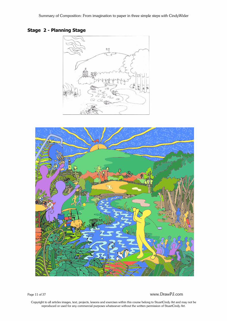
Stage 2 - Planning Stage
Summary of Composition: From imagination to paper in three simple steps with CindyWider
Page 12 of 37 www.DrawPJ.com
Copyright to all articles images, text, projects, lessons and exercises within this course belong to StuartCindy Art and may not be reproduced or used for any commercial purposes whatsoever without the written permission of StuartCindy Art.
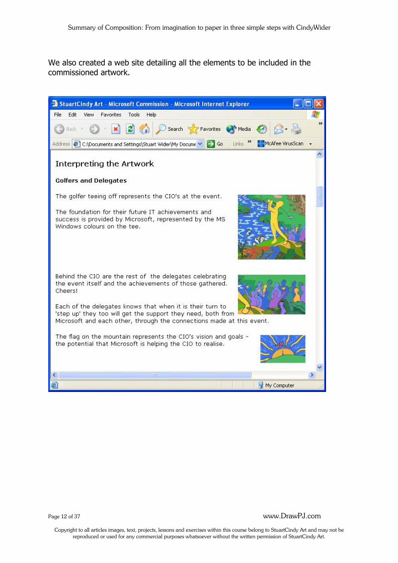
We also created a web site detailing all the elements to be included in the
commissioned artwork.
Summary of Composition: From imagination to paper in three simple steps with CindyWider
Page 13 of 37 www.DrawPJ.com
Copyright to all articles images, text, projects, lessons and exercises within this course belong to StuartCindy Art and may not be reproduced or used for any commercial purposes whatsoever without the written permission of StuartCindy Art.
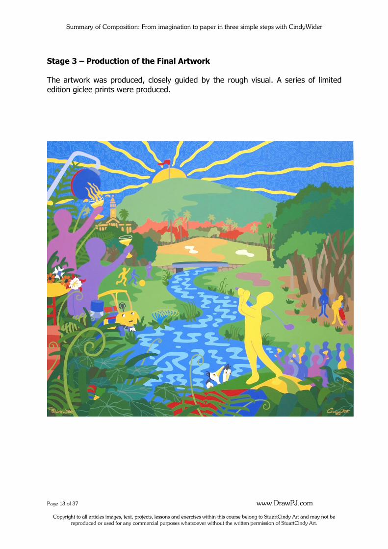
Stage 3 – Production of the Final Artwork
The artwork was produced, closely guided by the rough visual. A series of limited
edition giclee prints were produced.
Summary of Composition: From imagination to paper in three simple steps with CindyWider
Page 14 of 37 www.DrawPJ.com
Copyright to all articles images, text, projects, lessons and exercises within this course belong to StuartCindy Art and may not be reproduced or used for any commercial purposes whatsoever without the written permission of StuartCindy Art.
Workshop From Imagination to Paper in three stages
1. Heart and Soul Stage, how to encourage your imagination:
Having new experiences, learning new things, experiencing new tastes, sights sounds, engaging in stimulating conversation, writing and constant sketching are just some ways that you can help to stimulate your imagination and trigger inspiration for creating original art. There are four major sources that inspiration for art comes from, and we can list
these into separate categories;
Ordinary experience – this category is self explanatory and covers ideas for artworks that are based upon things which occur as an ordinary experience,
for example; someone fishing, shopping, a lady brushing her hair, having a bath, a man driving a train, a child sitting on a beach towel or people working
in a field. Natural or constructed environment – this category covers ideas for
artworks that are based upon man-made objects and nature for example; rainforests, flowers, leaves, bridges, roads, houses, a dinner plate, cup,
lounge chair. Inner feelings and imagination – this category is used when the artist
emphasises inner feelings or emotions as the primary goal to express in an artwork such as; anger, elation, sadness. The imagination side of this
category is endless and can cover things such as; fairies, magic and imaginary lands, tall elongated people or even a spoon with legs and a spider with pink polka-dots – or whatever you can imagine.
A Quest for order – This category includes images that are created mostly
due to the artist’s strong desire to show order in their work. This can include careful and deliberate drawings with a use of repetitive designs or patterning and symbols often seen in abstract art styles.
Summary of Composition: From imagination to paper in three simple steps with CindyWider
Page 15 of 37 www.DrawPJ.com
Copyright to all articles images, text, projects, lessons and exercises within this course belong to StuartCindy Art and may not be reproduced or used for any commercial purposes whatsoever without the written permission of StuartCindy Art.
2. The Planning Stage, how to Compose an original artwork:
Develop your Treasure Chest of Reference Materials: photos or objects
The three main sources where we derive subject matter for art from:
Observation, memory and imagination
Three Major Elements that form the basis of the planning stage: The Format, Positive Shapes and Negative Spaces (more information about this to follow)
Ten Principles of composition
Four Composition Structures
Summary of Composition: From imagination to paper in three simple steps with CindyWider
Page 16 of 37 www.DrawPJ.com
Copyright to all articles images, text, projects, lessons and exercises within this course belong to StuartCindy Art and may not be reproduced or used for any commercial purposes whatsoever without the written permission of StuartCindy Art.
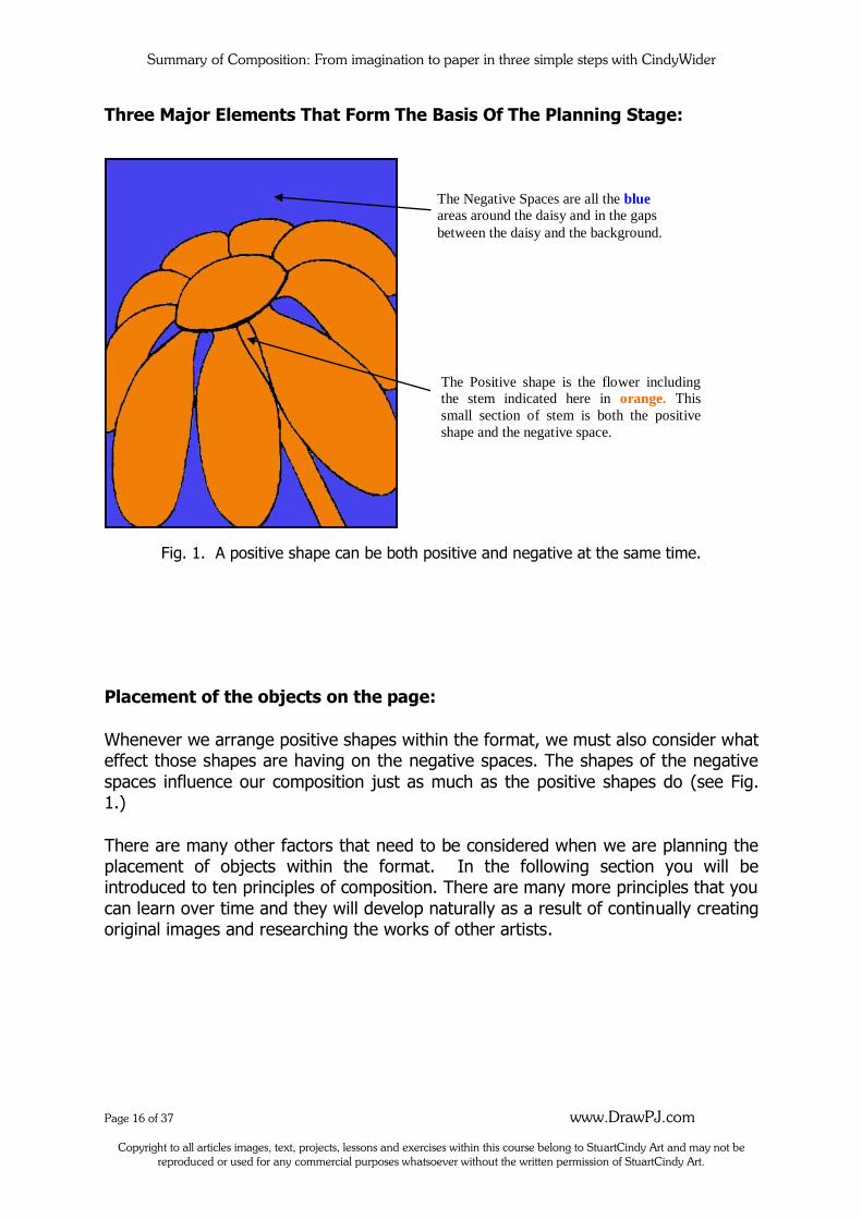
Three Major Elements That Form The Basis Of The Planning Stage:
Fig. 1. A positive shape can be both positive and negative at the same time.
Placement of the objects on the page:
Whenever we arrange positive shapes within the format, we must also consider what effect those shapes are having on the negative spaces. The shapes of the negative
spaces influence our composition just as much as the positive shapes do (see Fig. 1.)
There are many other factors that need to be considered when we are planning the placement of objects within the format. In the following section you will be introduced to ten principles of composition. There are many more principles that you
can learn over time and they will develop naturally as a result of continually creating original images and researching the works of other artists.
The Negative Spaces are all the blue
areas around the daisy and in the gaps
between the daisy and the background.
The Positive shape is the flower including
the stem indicated here in orange. This
small section of stem is both the positive
shape and the negative space.
Summary of Composition: From imagination to paper in three simple steps with CindyWider
Page 17 of 37 www.DrawPJ.com
Copyright to all articles images, text, projects, lessons and exercises within this course belong to StuartCindy Art and may not be reproduced or used for any commercial purposes whatsoever without the written permission of StuartCindy Art.
Ten principles of Composition to consider for balance and harmony:
The more you experience creating original artworks, the more the rules of
composition become natural and intuitive. Until then, these principles can be considered to help you achieve balance, harmony and rhythm in your artworks. A
pleasing image can be achieved as a result.
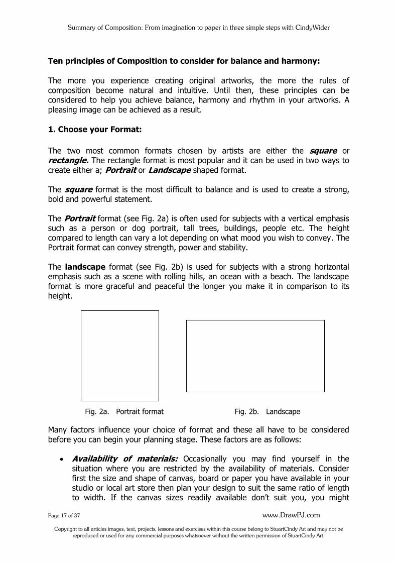
1. Choose your Format:
The two most common formats chosen by artists are either the square or rectangle. The rectangle format is most popular and it can be used in two ways to
create either a; Portrait or Landscape shaped format.
The square format is the most difficult to balance and is used to create a strong, bold and powerful statement.
The Portrait format (see Fig. 2a) is often used for subjects with a vertical emphasis such as a person or dog portrait, tall trees, buildings, people etc. The height
compared to length can vary a lot depending on what mood you wish to convey. The Portrait format can convey strength, power and stability.
The landscape format (see Fig. 2b) is used for subjects with a strong horizontal emphasis such as a scene with rolling hills, an ocean with a beach. The landscape
format is more graceful and peaceful the longer you make it in comparison to its height.
Fig. 2a. Portrait format Fig. 2b. Landscape
Many factors influence your choice of format and these all have to be considered
before you can begin your planning stage. These factors are as follows:
Availability of materials: Occasionally you may find yourself in the
situation where you are restricted by the availability of materials. Consider
first the size and shape of canvas, board or paper you have available in your studio or local art store then plan your design to suit the same ratio of length to width. If the canvas sizes readily available don’t suit you, you might
Summary of Composition: From imagination to paper in three simple steps with CindyWider
Page 18 of 37 www.DrawPJ.com
Copyright to all articles images, text, projects, lessons and exercises within this course belong to StuartCindy Art and may not be reproduced or used for any commercial purposes whatsoever without the written permission of StuartCindy Art.
consider having your canvas professionally made by a canvas-stretcher. Often picture framing businesses offer this service. That way you can have your
canvas especially created to the correct size for you.
Shape of the format: The feelings or emotions you wish to portray in your artwork will be the most significant deciding factor as to which shape of
format you choose. The most popular format is the rectangle or square. You could also use an oval, circle or other shape however these are not as popular
with most artists. During this course you can choose the size of your canvas however it must be either a square or rectangle shape.
Orientation: The orientation refers to whether you choose a portrait or
landscape position for your format (in the case of a rectangle.) It is important to be conscious of the orientation of your canvas before you begin to compose your artwork. You can change the orientation of the format or even
swap from a rectangle to a square during the composing stage but whatever you decide upon, the orientation must be finalised during the planning stage
and also must be the same as the orientation you finally paint the image onto. If you need to change the orientation while you are still in the
composing stage but have run out of room on your scrap paper, you can save time and energy by simply sticking extra paper onto the current piece rather than re-drawing it all over again.
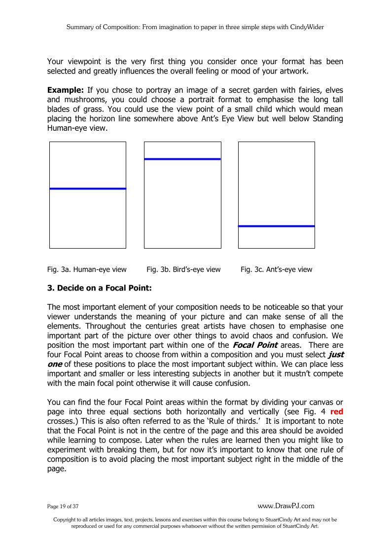
2. Plan the Horizon Line and Viewpoint:
The horizon line is determined by where your viewer is standing and is often
referred to as the viewpoint. As a general rule, we avoid dividing the page exactly in half, as this can be a distraction to the viewer. By visually ‘cutting’ the composition into two equal portions with the horizon line it encourages the viewer to see the
picture as two individual halves rather than a whole.
If you wish your viewer to be standing at normal eye level (looking straight on to the scene before us) you will draw your horizon line somewhere just above or slightly
below the halfway mark on your page. This is often referred to as ‘Standing Human Eye View’ (see Fig. 3a.)
If you prefer to draw an image that appears like we are way up high looking down onto the scene below, we can use a high view point. A high viewpoint is also known
as ‘Bird’s Eye View’ (see Fig. 3b) which means that your viewer is standing way up high on top of something like a cliff-top, mountain, or in an aeroplane perhaps. The higher up you want your viewpoint to be, the higher up the page you place your
horizon line.
A low viewpoint is also known as ‘Ant’s Eye View’ (See Fig. 3c) which means that your viewer is laying on the ground (at ant’s eye level) or very low down near the
ground. The lower down you wish your viewer to be, the lower down the page you place your horizon line.
Summary of Composition: From imagination to paper in three simple steps with CindyWider
Page 19 of 37 www.DrawPJ.com
Copyright to all articles images, text, projects, lessons and exercises within this course belong to StuartCindy Art and may not be reproduced or used for any commercial purposes whatsoever without the written permission of StuartCindy Art.
Your viewpoint is the very first thing you consider once your format has been
selected and greatly influences the overall feeling or mood of your artwork.
Example: If you chose to portray an image of a secret garden with fairies, elves and mushrooms, you could choose a portrait format to emphasise the long tall
blades of grass. You could use the view point of a small child which would mean placing the horizon line somewhere above Ant’s Eye View but well below Standing Human-eye view.
Fig. 3a. Human-eye view Fig. 3b. Bird’s-eye view Fig. 3c. Ant’s-eye view
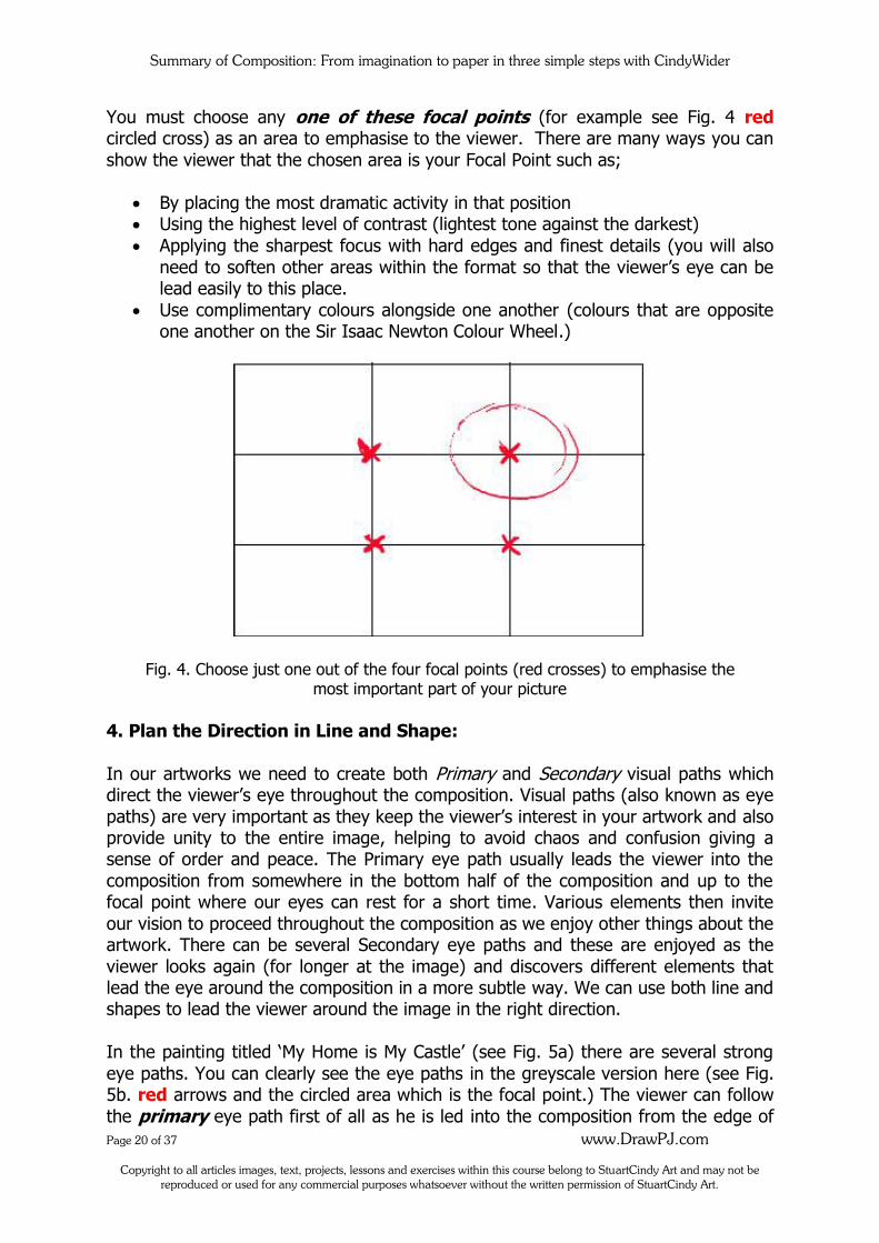
3. Decide on a Focal Point:
The most important element of your composition needs to be noticeable so that your
viewer understands the meaning of your picture and can make sense of all the elements. Throughout the centuries great artists have chosen to emphasise one
important part of the picture over other things to avoid chaos and confusion. We position the most important part within one of the Focal Point areas. There are four Focal Point areas to choose from within a composition and you must select just one of these positions to place the most important subject within. We can place less important and smaller or less interesting subjects in another but it mustn’t compete
with the main focal point otherwise it will cause confusion.
You can find the four Focal Point areas within the format by dividing your canvas or page into three equal sections both horizontally and vertically (see Fig. 4 red crosses.) This is also often referred to as the ‘Rule of thirds.’ It is important to note
that the Focal Point is not in the centre of the page and this area should be avoided while learning to compose. Later when the rules are learned then you might like to
experiment with breaking them, but for now it’s important to know that one rule of composition is to avoid placing the most important subject right in the middle of the page.
Summary of Composition: From imagination to paper in three simple steps with CindyWider
Page 20 of 37 www.DrawPJ.com
Copyright to all articles images, text, projects, lessons and exercises within this course belong to StuartCindy Art and may not be reproduced or used for any commercial purposes whatsoever without the written permission of StuartCindy Art.
You must choose any one of these focal points (for example see Fig. 4 red circled cross) as an area to emphasise to the viewer. There are many ways you can
show the viewer that the chosen area is your Focal Point such as;
By placing the most dramatic activity in that position Using the highest level of contrast (lightest tone against the darkest)
Applying the sharpest focus with hard edges and finest details (you will also
need to soften other areas within the format so that the viewer’s eye can be lead easily to this place.
Use complimentary colours alongside one another (colours that are opposite one another on the Sir Isaac Newton Colour Wheel.)
Fig. 4. Choose just one out of the four focal points (red crosses) to emphasise the most important part of your picture
4. Plan the Direction in Line and Shape:
In our artworks we need to create both Primary and Secondary visual paths which direct the viewer’s eye throughout the composition. Visual paths (also known as eye
paths) are very important as they keep the viewer’s interest in your artwork and also provide unity to the entire image, helping to avoid chaos and confusion giving a sense of order and peace. The Primary eye path usually leads the viewer into the
composition from somewhere in the bottom half of the composition and up to the focal point where our eyes can rest for a short time. Various elements then invite
our vision to proceed throughout the composition as we enjoy other things about the artwork. There can be several Secondary eye paths and these are enjoyed as the
viewer looks again (for longer at the image) and discovers different elements that lead the eye around the composition in a more subtle way. We can use both line and shapes to lead the viewer around the image in the right direction.
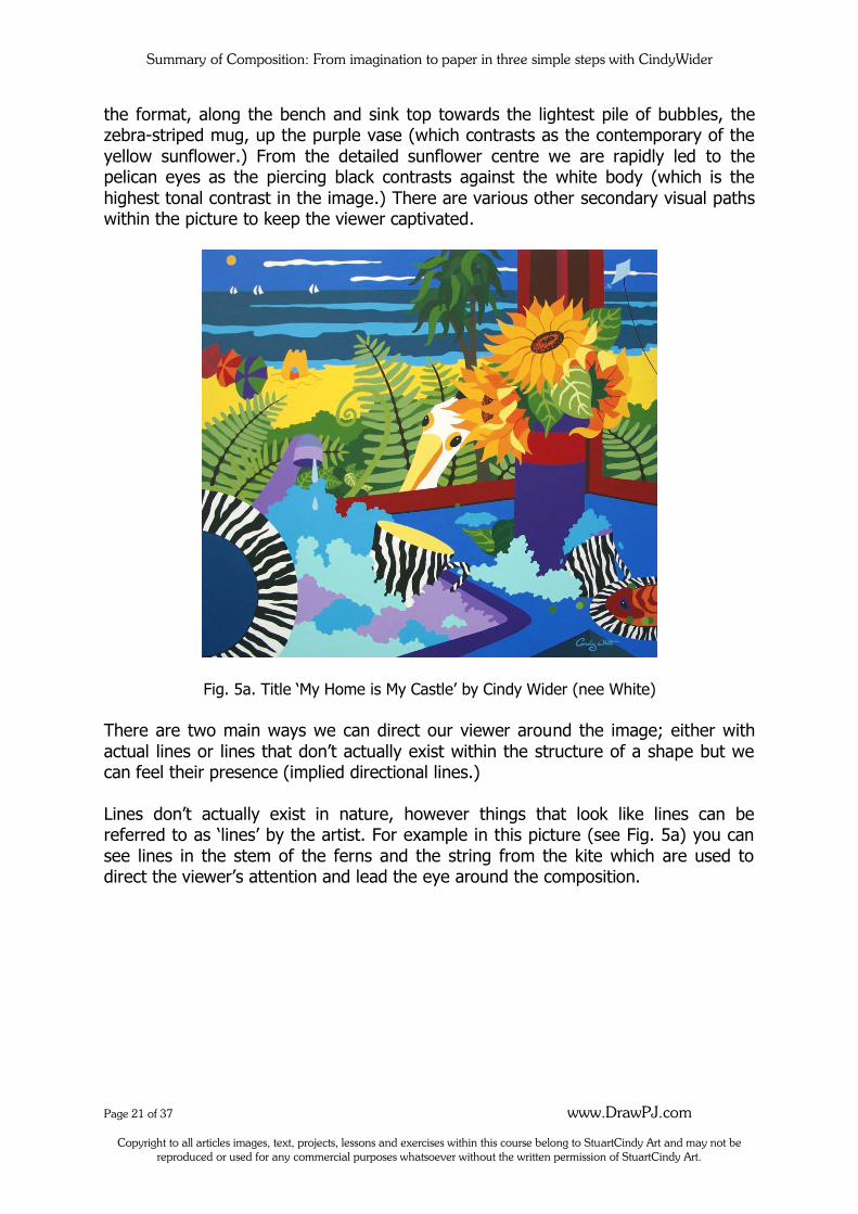
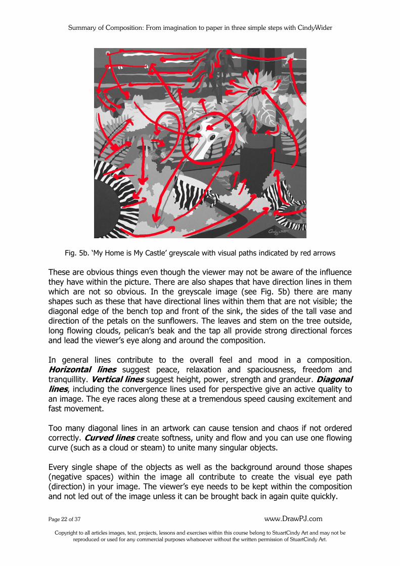
In the painting titled ‘My Home is My Castle’ (see Fig. 5a) there are several strong
eye paths. You can clearly see the eye paths in the greyscale version here (see Fig. 5b. red arrows and the circled area which is the focal point.) The viewer can follow
the primary eye path first of all as he is led into the composition from the edge of
Summary of Composition: From imagination to paper in three simple steps with CindyWider
Page 21 of 37 www.DrawPJ.com
Copyright to all articles images, text, projects, lessons and exercises within this course belong to StuartCindy Art and may not be reproduced or used for any commercial purposes whatsoever without the written permission of StuartCindy Art.
the format, along the bench and sink top towards the lightest pile of bubbles, the zebra-striped mug, up the purple vase (which contrasts as the contemporary of the
yellow sunflower.) From the detailed sunflower centre we are rapidly led to the pelican eyes as the piercing black contrasts against the white body (which is the
highest tonal contrast in the image.) There are various other secondary visual paths within the picture to keep the viewer captivated.
Fig. 5a. Title ‘My Home is My Castle’ by Cindy Wider (nee White)
There are two main ways we can direct our viewer around the image; either with
actual lines or lines that don’t actually exist within the structure of a shape but we can feel their presence (implied directional lines.)
Lines don’t actually exist in nature, however things that look like lines can be referred to as ‘lines’ by the artist. For example in this picture (see Fig. 5a) you can
see lines in the stem of the ferns and the string from the kite which are used to direct the viewer’s attention and lead the eye around the composition.
Summary of Composition: From imagination to paper in three simple steps with CindyWider
Page 22 of 37 www.DrawPJ.com
Copyright to all articles images, text, projects, lessons and exercises within this course belong to StuartCindy Art and may not be reproduced or used for any commercial purposes whatsoever without the written permission of StuartCindy Art.
Fig. 5b. ‘My Home is My Castle’ greyscale with visual paths indicated by red arrows
These are obvious things even though the viewer may not be aware of the influence
they have within the picture. There are also shapes that have direction lines in them which are not so obvious. In the greyscale image (see Fig. 5b) there are many shapes such as these that have directional lines within them that are not visible; the
diagonal edge of the bench top and front of the sink, the sides of the tall vase and direction of the petals on the sunflowers. The leaves and stem on the tree outside,
long flowing clouds, pelican’s beak and the tap all provide strong directional forces and lead the viewer’s eye along and around the composition.
In general lines contribute to the overall feel and mood in a composition. Horizontal lines suggest peace, relaxation and spaciousness, freedom and
tranquillity. Vertical lines suggest height, power, strength and grandeur. Diagonal lines, including the convergence lines used for perspective give an active quality to
an image. The eye races along these at a tremendous speed causing excitement and fast movement.
Too many diagonal lines in an artwork can cause tension and chaos if not ordered correctly. Curved lines create softness, unity and flow and you can use one flowing
curve (such as a cloud or steam) to unite many singular objects.
Every single shape of the objects as well as the background around those shapes (negative spaces) within the image all contribute to create the visual eye path (direction) in your image. The viewer’s eye needs to be kept within the composition
and not led out of the image unless it can be brought back in again quite quickly.
Summary of Composition: From imagination to paper in three simple steps with CindyWider
Page 23 of 37 www.DrawPJ.com
Copyright to all articles images, text, projects, lessons and exercises within this course belong to StuartCindy Art and may not be reproduced or used for any commercial purposes whatsoever without the written permission of StuartCindy Art.
The shapes of the objects and the direction of those shapes need to be considered carefully. Some shapes provide a rest or quietness such as circles and squares. Wavy
or curved lines can create rest or dynamic speed, depending on the tension or relaxation of the curve. For example in the image of the cat (see Fig. 9a) the curves
in the Cat’s tail begins as a tighter (faster) curve gaining our attention immediately, then it relaxes as it meanders down the page to point in the direction of the face.
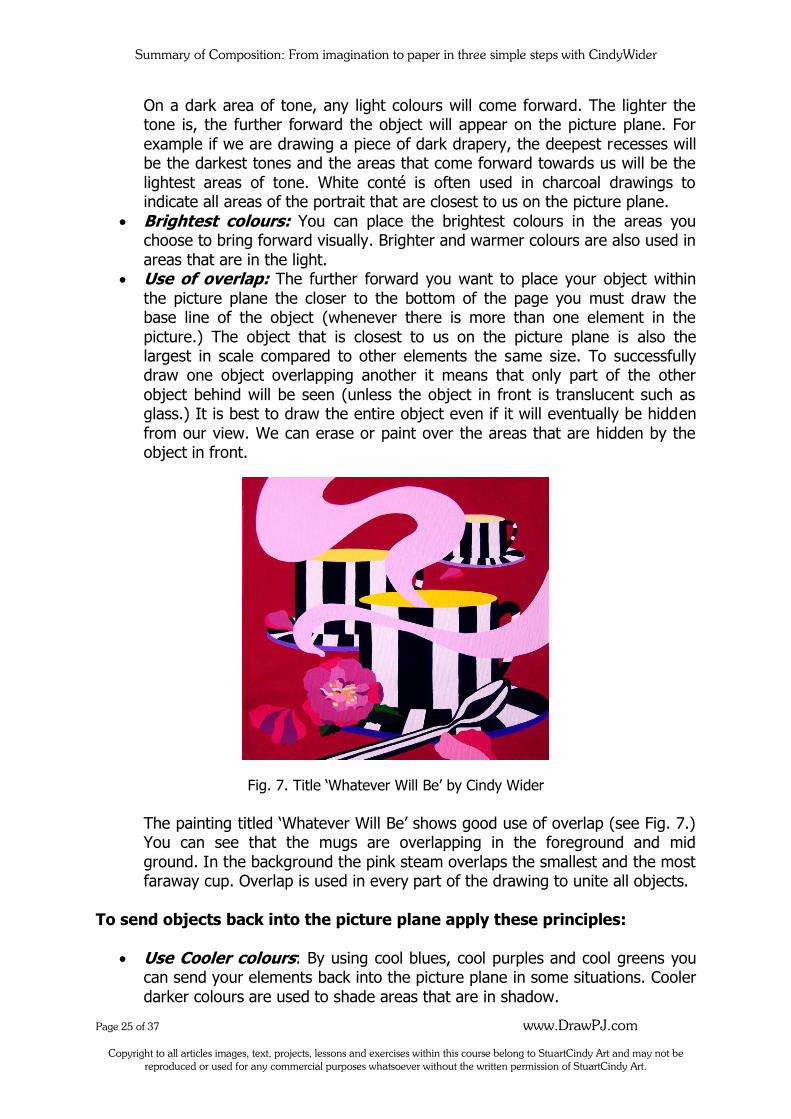
Along the way we are further slowed down by the large circle (moon) behind the tail. The curve in the steam in ‘Whatever Will Be’ (see Fig. 7) is a slower more meandering curve which gives us a feeling of relaxation. We are led out of the page
but the strong force of the curve pointing downwards pulls the viewer back into the composition and straight to the camellia flower.
5. Consider Repetition and Rhythm for unity:
Another interesting way that we can lead the viewer on pleasing visual eye paths can be achieved through the use of repetition and rhythm. It is important to note
here that our eyes are attracted to things that are similar to one another in some way. When we repeat objects, colours or textures throughout a composition the
viewer’s eyes will move backwards and forwards between those shapes or areas in an attempt to group or organize them. Therefore we can use repetition as an important aspect when creating our visual paths within an artwork. We can place
elements that are similar to one another around the composition in a way that will help to lead the viewer’s eye on a pleasing visual path.
Rhythm can be achieved as we place repeated objects throughout our composition
in an orderly way. We can consider varying the spaces we create between the repeated objects and also the number of objects used. For instance when we draw a flock of birds we might place two of them close together then leave a larger space
and place a third bird. It’s good to use odd numbers rather than even. We commonly see rhythm in the use of repeated symbols on fabric patterns, designer
rugs, mugs, bed-linen and placemats. The repetition and rhythm we use in Fine Art is not quite so obvious.
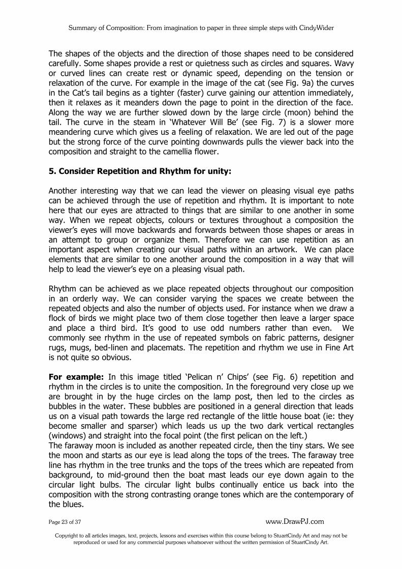
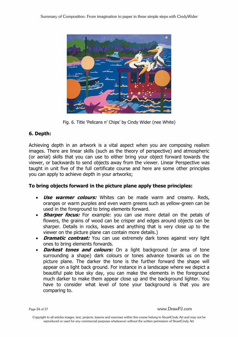
For example: In this image titled ‘Pelican n’ Chips’ (see Fig. 6) repetition and rhythm in the circles is to unite the composition. In the foreground very close up we
are brought in by the huge circles on the lamp post, then led to the circles as bubbles in the water. These bubbles are positioned in a general direction that leads
us on a visual path towards the large red rectangle of the little house boat (ie: they become smaller and sparser) which leads us up the two dark vertical rectangles (windows) and straight into the focal point (the first pelican on the left.)
The faraway moon is included as another repeated circle, then the tiny stars. We see the moon and starts as our eye is lead along the tops of the trees. The faraway tree
line has rhythm in the tree trunks and the tops of the trees which are repeated from background, to mid-ground then the boat mast leads our eye down again to the
circular light bulbs. The circular light bulbs continually entice us back into the composition with the strong contrasting orange tones which are the contemporary of the blues.
Summary of Composition: From imagination to paper in three simple steps with CindyWider
Page 24 of 37 www.DrawPJ.com
Copyright to all articles images, text, projects, lessons and exercises within this course belong to StuartCindy Art and may not be reproduced or used for any commercial purposes whatsoever without the written permission of StuartCindy Art.
Fig. 6. Title ‘Pelicans n’ Chips’ by Cindy Wider (nee White)
6. Depth:
Achieving depth in an artwork is a vital aspect when you are composing realism images. There are linear skills (such as the theory of perspective) and atmospheric
(or aerial) skills that you can use to either bring your object forward towards the viewer, or backwards to send objects away from the viewer. Linear Perspective was
taught in unit five of the full certificate course and here are some other principles you can apply to achieve depth in your artworks;
To bring objects forward in the picture plane apply these principles:
Use warmer colours: Whites can be made warm and creamy. Reds,
oranges or warm purples and even warm greens such as yellow-green can be used in the foreground to bring elements forward.
Sharper focus: For example: you can use more detail on the petals of
flowers, the grains of wood can be crisper and edges around objects can be
sharper. Details in rocks, leaves and anything that is very close up to the viewer on the picture plane can contain more details.)
Dramatic contrast: You can use extremely dark tones against very light
ones to bring elements forwards.
Darkest tones and colours: On a light background (or area of tone surrounding a shape) dark colours or tones advance towards us on the
picture plane. The darker the tone is the further forward the shape will appear on a light back ground. For instance in a landscape where we depict a
beautiful pale blue sky day, you can make the elements in the foreground much darker to make them appear close up and the background lighter. You have to consider what level of tone your background is that you are
comparing to.
Summary of Composition: From imagination to paper in three simple steps with CindyWider
Page 25 of 37 www.DrawPJ.com
Copyright to all articles images, text, projects, lessons and exercises within this course belong to StuartCindy Art and may not be reproduced or used for any commercial purposes whatsoever without the written permission of StuartCindy Art.
On a dark area of tone, any light colours will come forward. The lighter the tone is, the further forward the object will appear on the picture plane. For
example if we are drawing a piece of dark drapery, the deepest recesses will be the darkest tones and the areas that come forward towards us will be the
lightest areas of tone. White conté is often used in charcoal drawings to indicate all areas of the portrait that are closest to us on the picture plane.
Brightest colours: You can place the brightest colours in the areas you choose to bring forward visually. Brighter and warmer colours are also used in
areas that are in the light. Use of overlap: The further forward you want to place your object within
the picture plane the closer to the bottom of the page you must draw the base line of the object (whenever there is more than one element in the
picture.) The object that is closest to us on the picture plane is also the largest in scale compared to other elements the same size. To successfully draw one object overlapping another it means that only part of the other
object behind will be seen (unless the object in front is translucent such as glass.) It is best to draw the entire object even if it will eventually be hidden
from our view. We can erase or paint over the areas that are hidden by the object in front.
Fig. 7. Title ‘Whatever Will Be’ by Cindy Wider
The painting titled ‘Whatever Will Be’ shows good use of overlap (see Fig. 7.) You can see that the mugs are overlapping in the foreground and mid
ground. In the background the pink steam overlaps the smallest and the most faraway cup. Overlap is used in every part of the drawing to unite all objects.
To send objects back into the picture plane apply these principles:
Use Cooler colours: By using cool blues, cool purples and cool greens you can send your elements back into the picture plane in some situations. Cooler
darker colours are used to shade areas that are in shadow.
Summary of Composition: From imagination to paper in three simple steps with CindyWider
Page 26 of 37 www.DrawPJ.com
Copyright to all articles images, text, projects, lessons and exercises within this course belong to StuartCindy Art and may not be reproduced or used for any commercial purposes whatsoever without the written permission of StuartCindy Art.
Blurred focus and less or no detail: Objects gradually lose more and more
of their details the further away form us they are. They also become blurred. Less contrast: Faraway objects become the same tone as their
environment. Mountains become pale cool purple or cool bluish and the same tone as the sky. Black or very dark tones fade to the palest greys and white
tints become darker and change colour to reflect the atmosphere and colours within the environment. Light tones gradually darken until there is little or no
contrast between the light tones and the surrounding objects. Lightest tones and colours: On a light background any light colours will
send the object further back into the picture plane. In a landscape where the atmosphere is light we can use pale greens, purples and blues to send the
mountains and trees further back. On a dark background such as in night scenes, the lighter the objects are the further forward they will appear on the picture plane.
7. Use variety in the Mass sizes:
Mass refers to the basic fundamental shapes (or groups of shapes) that form the underlying foundation of the entire artwork. We aim for variety in the sizes, shapes
and placement of Mass while also maintaining balance in the image.
There are Masses in both the positive shapes and negative spaces. Objects that are grouped together form one larger mass. As we consider the actual subject matter in
an artwork, we must also take into account the balance of the different Mass sizes that we are creating with our subject matter.
To balance the Mass sizes with variety in your image, think of a seesaw where you have two children of equal size and weight on each end to balance the seesaw
perfectly. In art, rather than placing two objects of identical size and weight to balance our pictorial seesaw, we can be more interesting. Imagine the seesaw
balancing with a large heavy adult on one end and three children on the other of varying weights, shapes and sizes all trying hard to find the perfect balance with the adult. If you move one of the children closer towards the middle on the side with
the children on it, that side will become lighter.
Even one tiny Mass within a large empty space can balance the composition with a larger Mass in another area. Balance in art can be symmetrical, almost symmetrical (also called approximate symmetry) or asymmetrical.
When we are considering balance of the Mass in our drawings, we need to also think
in terms of line, tonal value, colour, texture and shape. All of these things influence the weight of the areas of Mass and must be balanced in a pleasing way to make
our compositions work. Here are some things to consider when planning the various areas of Mass in your
composition;
Summary of Composition: From imagination to paper in three simple steps with CindyWider
Page 27 of 37 www.DrawPJ.com
Copyright to all articles images, text, projects, lessons and exercises within this course belong to StuartCindy Art and may not be reproduced or used for any commercial purposes whatsoever without the written permission of StuartCindy Art.
Use variety in sizes of the masses such as Extra large, large, medium, semi-
medium, smaller, small, tiny. Balance large objects with smaller ones, rough with smooth shapes,
foreground shapes to background and positive shapes to negative ones. Use symmetry or approximate symmetry very carefully as it can be
monotonous or even uncomfortable to the viewer. Rather than symmetry you can consider balancing your images using asymmetry. For example; there is a
natural tendency for an un-trained artist to visually halve the page by placing objects of even-weight, size and shape directly in the middle of the page so
that both halves are essentially identical to one another.
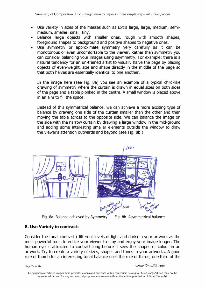
In the image here (see Fig. 8a) you see an example of a typical child-like drawing of symmetry where the curtain is drawn in equal sizes on both sides of the page and a table plonked in the centre. A small window is placed above
in an aim to fill the space.
Instead of this symmetrical balance, we can achieve a more exciting type of balance by drawing one side of the curtain smaller than the other and then moving the table across to the opposite side. We can balance the image on
the side with the narrow curtain by drawing a large window in the mid-ground and adding some interesting smaller elements outside the window to draw
the viewer’s attention outwards and beyond (see Fig. 8b.)
Fig. 8a. Balance achieved by Symmetry Fig. 8b. Asymmetrical balance
8. Use Variety in contrast:
Consider the tonal contrast (different levels of light and dark) in your artwork as the most powerful tools to entice your viewer to stay and enjoy your image longer. The human eye is attracted to contrast long before it sees the shapes or colour in an
artwork. Try to create a variety of sizes, shapes and tones in your artworks. A good rule of thumb for an interesting tonal balance uses the rule of thirds; one third of the
Summary of Composition: From imagination to paper in three simple steps with CindyWider
Page 28 of 37 www.DrawPJ.com
Copyright to all articles images, text, projects, lessons and exercises within this course belong to StuartCindy Art and may not be reproduced or used for any commercial purposes whatsoever without the written permission of StuartCindy Art.
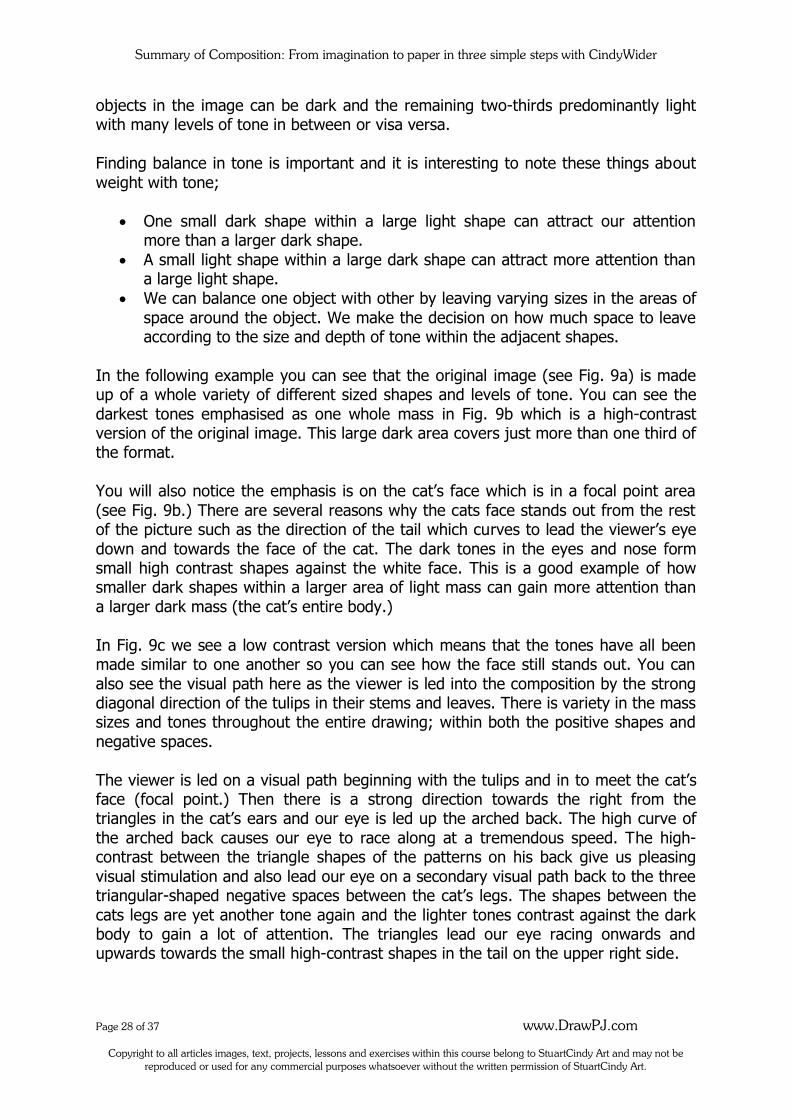
objects in the image can be dark and the remaining two-thirds predominantly light with many levels of tone in between or visa versa.
Finding balance in tone is important and it is interesting to note these things about
weight with tone;
One small dark shape within a large light shape can attract our attention more than a larger dark shape.
A small light shape within a large dark shape can attract more attention than a large light shape.
We can balance one object with other by leaving varying sizes in the areas of
space around the object. We make the decision on how much space to leave according to the size and depth of tone within the adjacent shapes.
In the following example you can see that the original image (see Fig. 9a) is made up of a whole variety of different sized shapes and levels of tone. You can see the
darkest tones emphasised as one whole mass in Fig. 9b which is a high-contrast version of the original image. This large dark area covers just more than one third of the format.
You will also notice the emphasis is on the cat’s face which is in a focal point area
(see Fig. 9b.) There are several reasons why the cats face stands out from the rest of the picture such as the direction of the tail which curves to lead the viewer’s eye
down and towards the face of the cat. The dark tones in the eyes and nose form small high contrast shapes against the white face. This is a good example of how smaller dark shapes within a larger area of light mass can gain more attention than
a larger dark mass (the cat’s entire body.)
In Fig. 9c we see a low contrast version which means that the tones have all been made similar to one another so you can see how the face still stands out. You can
also see the visual path here as the viewer is led into the composition by the strong diagonal direction of the tulips in their stems and leaves. There is variety in the mass sizes and tones throughout the entire drawing; within both the positive shapes and
negative spaces.
The viewer is led on a visual path beginning with the tulips and in to meet the cat’s face (focal point.) Then there is a strong direction towards the right from the triangles in the cat’s ears and our eye is led up the arched back. The high curve of
the arched back causes our eye to race along at a tremendous speed. The high-contrast between the triangle shapes of the patterns on his back give us pleasing
visual stimulation and also lead our eye on a secondary visual path back to the three triangular-shaped negative spaces between the cat’s legs. The shapes between the
cats legs are yet another tone again and the lighter tones contrast against the dark body to gain a lot of attention. The triangles lead our eye racing onwards and upwards towards the small high-contrast shapes in the tail on the upper right side.
Summary of Composition: From imagination to paper in three simple steps with CindyWider
Page 29 of 37 www.DrawPJ.com
Copyright to all articles images, text, projects, lessons and exercises within this course belong to StuartCindy Art and may not be reproduced or used for any commercial purposes whatsoever without the written permission of StuartCindy Art.
Through the high contrast of the small white and black shapes in the tail we are led towards the top right side of the format and straight out of the image in a risky
manoeuvre. The tail leading the viewer out of the image is risky as it can cause either annoyance or distraction in the viewer resulting in an immediately dislike to
the image. It is only recommended to allow a shape to leave the composition if we can immediately bring the viewer back into the format again. This has been achieved
by the strong contrasts as well as the shape of the curving tail which leads the viewer down an interesting journey until we reach the cat’s face again.
There is a huge variety of sizes and shapes of the masses within this deceptive and complex composition. This picture titled ‘How do Bugs Know How to Walk’ by myself
was created from intuition with the rules of composition being used subconsciously and not purposely applied. In other words I just drew it from my heart without thinking or consciously planning anything at all (not even the tones.) I just did what
felt right as I do with most of my compositions. The people who purchased this image fell in love with it immediately (so I was told by the gallery owner.)
This image is a great example of how the rules of composition are learned then set
aside so that we are free to work from intuition and not become burdened by the logical application of rules. The more you compose, the easier it becomes to discover balance in contrast intuitively.
Fig. 9a. Original image Fig. 9b. High contrast version Fig. 9c. Low contrast version
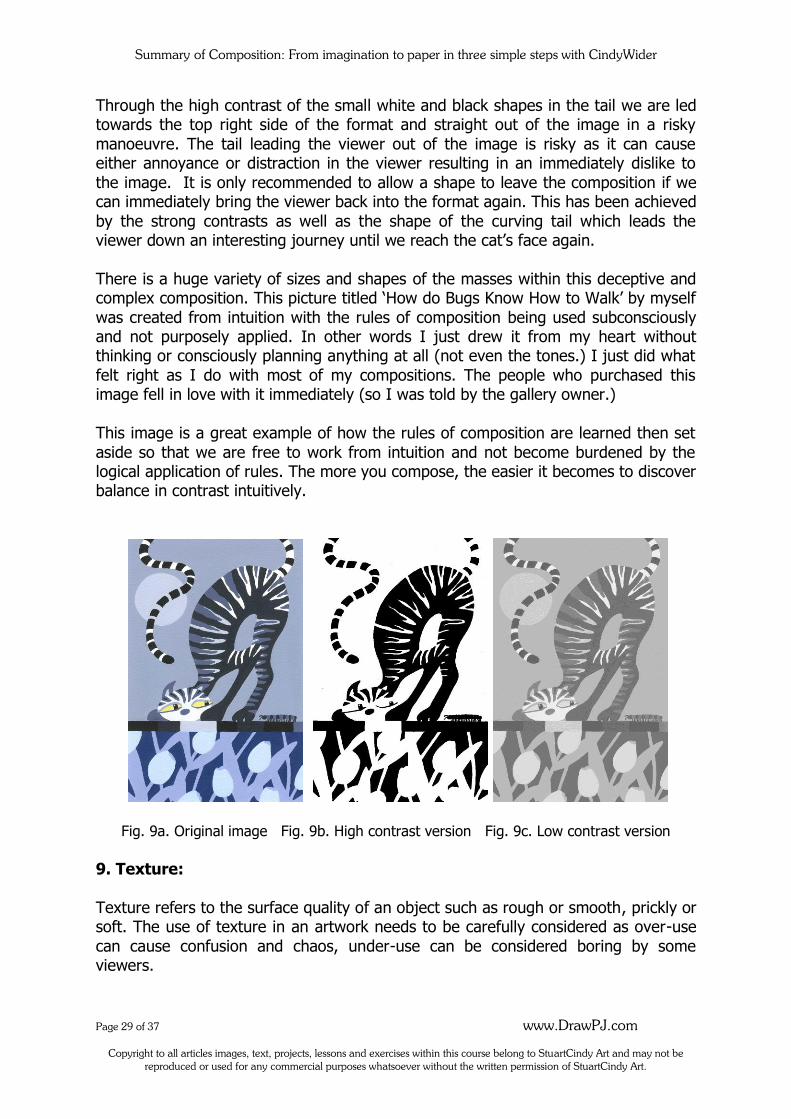
9. Texture:
Texture refers to the surface quality of an object such as rough or smooth, prickly or soft. The use of texture in an artwork needs to be carefully considered as over-use
can cause confusion and chaos, under-use can be considered boring by some viewers.
Summary of Composition: From imagination to paper in three simple steps with CindyWider
Page 30 of 37 www.DrawPJ.com
Copyright to all articles images, text, projects, lessons and exercises within this course belong to StuartCindy Art and may not be reproduced or used for any commercial purposes whatsoever without the written permission of StuartCindy Art.
To create texture or not in your paintings is very much a personal thing and when created effectively, an artwork with carefully balanced textures can provide very
satisfying visual stimulation for the viewer.
There are two different ways of creating texture in paintings either; ‘true texture’ or ‘represented texture.’ True texture is used when the surface is truly textured with a tactile quality and artists use a variety of methods to achieve these different textures such as texture
paste (to thicken the paint.) The paint can be applied using a variety of different tools such as palette knives, cake-icing bags and sponges, or anything that will give
extra texture to the surface that is being painted. Some artists paste objects into the image to create texture such as wood, paper, hessian, fabric, string, beads, plastic or other objects. This mixed-media approach is called ‘collage.’
Represented texture is being used when the artist paints an image to depict a
certain texture but the true texture is actually the paint.
10. Consider Mood and Colour
The mood of a picture is generally best expressed by the choice of tones and colours
in your artwork. Other things that influence the mood in an image are; the speed of your angles and curves, direction of line, textures and the subject matter. You will
need to consider the mood of your painting in the very early planning stages because everything you do in the painting will relate to the mood you intend to
portray. For light-hearted joyous, happy paintings artists will use either light shades or bright,
warm colours. For deeper, darker, mystical or more sombre moods in paintings cool, dark or dull colours are used like greyed blues and purples, black, greys,
browns.
Subject matter and the format also greatly influence the mood of your painting. The choice is yours whether you paint to uplift your viewer or to express the darker moods and struggles you are having in your life or that you see in the lives of
others. You can paint about your opinion on a certain subject that you feel strongly about, but in all situations no matter what you choose to paint about, you must
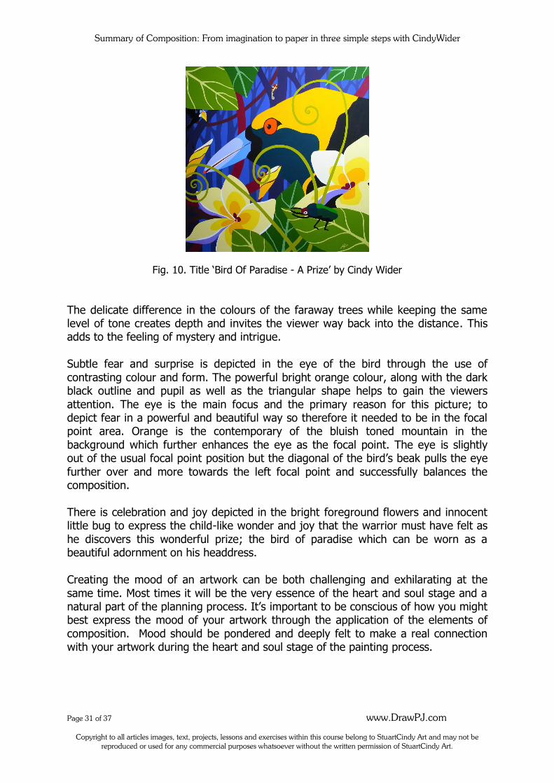
consider the mood you have chosen to depict. Example of mood depicted in an artwork: In the image titled ‘Bird of Paradise – A Prize’ (see Fig. 10) the intention was to depict mystery, discovery, fear and joy. In
the background, cool purple and blue tones were used to create a misty effect. The strong verticals of the tree trunks juxtapose with the negative spaces of the
background blue-purple mountain peering through to form interesting shapes.
Summary of Composition: From imagination to paper in three simple steps with CindyWider
Page 31 of 37 www.DrawPJ.com
Copyright to all articles images, text, projects, lessons and exercises within this course belong to StuartCindy Art and may not be reproduced or used for any commercial purposes whatsoever without the written permission of StuartCindy Art.
Fig. 10. Title ‘Bird Of Paradise - A Prize’ by Cindy Wider
The delicate difference in the colours of the faraway trees while keeping the same level of tone creates depth and invites the viewer way back into the distance. This adds to the feeling of mystery and intrigue.
Subtle fear and surprise is depicted in the eye of the bird through the use of
contrasting colour and form. The powerful bright orange colour, along with the dark black outline and pupil as well as the triangular shape helps to gain the viewers
attention. The eye is the main focus and the primary reason for this picture; to depict fear in a powerful and beautiful way so therefore it needed to be in the focal point area. Orange is the contemporary of the bluish toned mountain in the
background which further enhances the eye as the focal point. The eye is slightly out of the usual focal point position but the diagonal of the bird’s beak pulls the eye
further over and more towards the left focal point and successfully balances the composition.
There is celebration and joy depicted in the bright foreground flowers and innocent little bug to express the child-like wonder and joy that the warrior must have felt as
he discovers this wonderful prize; the bird of paradise which can be worn as a beautiful adornment on his headdress.
Creating the mood of an artwork can be both challenging and exhilarating at the
same time. Most times it will be the very essence of the heart and soul stage and a natural part of the planning process. It’s important to be conscious of how you might best express the mood of your artwork through the application of the elements of
composition. Mood should be pondered and deeply felt to make a real connection with your artwork during the heart and soul stage of the painting process.
Summary of Composition: From imagination to paper in three simple steps with CindyWider
Page 32 of 37 www.DrawPJ.com
Copyright to all articles images, text, projects, lessons and exercises within this course belong to StuartCindy Art and may not be reproduced or used for any commercial purposes whatsoever without the written permission of StuartCindy Art.
Summary:
Here are the titles of the ten principles of composition listed in order for easy reference. This list of ten principles of composition can be used sequentially to help
you analyse artworks. If you do this often it can help you to further develop your understanding of composition.
1. Choose your Format 2. Plan the Horizon Line and Viewpoint
3. Decide on a Focal point 4. Plan the Direction in Line and shape
5. Consider Repetition and Rhythm for unity 6. Depth 7. Use variety in the Mass sizes
8. Use variety in Contrast 9. Texture
10. Consider mood and colour
Summary of things to consider when composing original art:
Tangents are to be avoided whenever possible. These are areas in the
composition when an object touches another side-by-side (also known as
‘kissing edges’.) The way to avoid these is to choose to either overlap the forms by placing one behind the other, or allowing sufficient space between the objects so that the viewer is not confused with the position and
placement of the elements. Tangents detract from an image and cause confusion and tension. Try to avoid tangents.
Strong angles need to be counter-balanced by another angle going in the opposite direction, or interrupted by a vertical or horizontal line. Angles of any
sort need to be used wisely and with economy. A subject shouldn’t be facing or pointing out of the page; especially a person.
In many artworks the viewer is led into the picture from somewhere below
the half way mark but not right on halfway. Soft flowing curves unite common elements.
Fast curves need to be intersected with another curve, circle or a vertical or
horizontal line just like angles. One strong band of colour unites.
Circles are restful and provide ‘relief’ for the eye, so are squares. Triangles move the eye along rapidly and form a strong directional motion so
they are very good for moving the eye around the page.
You don’t draw or paint everything you see. Many times you have to sacrifice what you really see for the sake of the composition.
Remember to place the prominent subject off centre and generally within one of the four focal point areas.
Avoid bisecting the page in half with either the horizon line or other elements.
Always draw above or below the half-way. The horizon line shouldn’t dissect the picture into two equal halves and if you are painting a landscape the
Summary of Composition: From imagination to paper in three simple steps with CindyWider
Page 33 of 37 www.DrawPJ.com
Copyright to all articles images, text, projects, lessons and exercises within this course belong to StuartCindy Art and may not be reproduced or used for any commercial purposes whatsoever without the written permission of StuartCindy Art.
bottom half should be the larger half. If your painting is all about the sky then the top half can be larger.
Avoid halving the composition especially if the format is a square. You can
divide the square diagonally then allow the positive shapes or negative spaces to cover more than half of that diagonal division. In the picture titled, ‘Bird of Paradise – A Prize’ (see Fig.10.) you can see more than half of the square
(diagonally) is filled with elements in the foreground such as the bird, flowers, leaves.
A subject that is in action or moving needs to have some space in front of it. Create visual paths of movement to lead your viewer around the composition
using a variety of things such as direction, colour of elements that are similar
to one another. Be aware that any shapes or subject matter that are similar to one another will cause the eye to dart back and forth between one another in an attempt to join them together.
Summary of Composition: From imagination to paper in three simple steps with CindyWider
Page 34 of 37 www.DrawPJ.com
Copyright to all articles images, text, projects, lessons and exercises within this course belong to StuartCindy Art and may not be reproduced or used for any commercial purposes whatsoever without the written permission of StuartCindy Art.
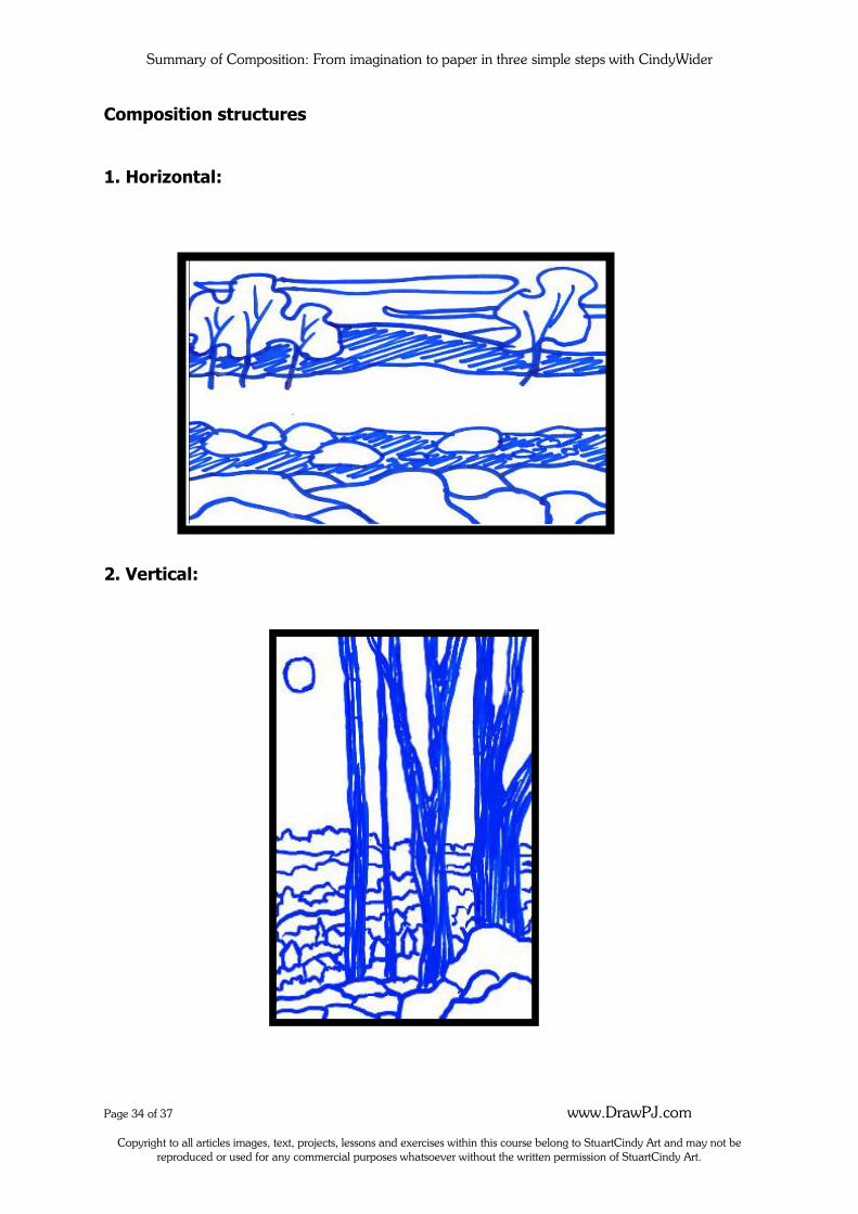
Composition structures
1. Horizontal:
2. Vertical:
Summary of Composition: From imagination to paper in three simple steps with CindyWider
Page 35 of 37 www.DrawPJ.com
Copyright to all articles images, text, projects, lessons and exercises within this course belong to StuartCindy Art and may not be reproduced or used for any commercial purposes whatsoever without the written permission of StuartCindy Art.
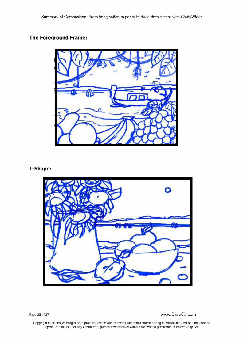
The Foreground Frame:
L-Shape:
Summary of Composition: From imagination to paper in three simple steps with CindyWider
Page 36 of 37 www.DrawPJ.com
Copyright to all articles images, text, projects, lessons and exercises within this course belong to StuartCindy Art and may not be reproduced or used for any commercial purposes whatsoever without the written permission of StuartCindy Art.
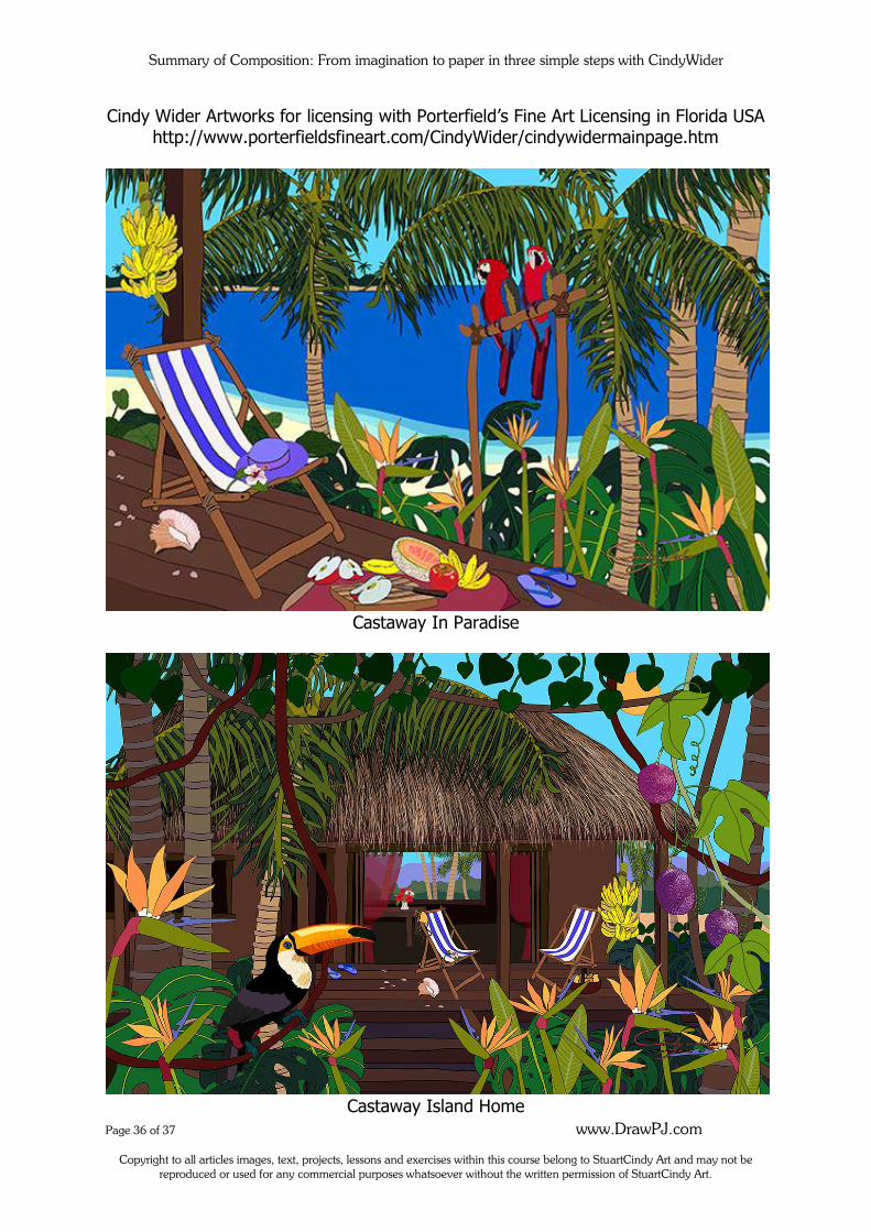
Cindy Wider Artworks for licensing with Porterfield’s Fine Art Licensing in Florida USA http://www.porterfieldsfineart.com/CindyWider/cindywidermainpage.htm
Castaway In Paradise
Castaway Island Home
Summary of Composition: From imagination to paper in three simple steps with CindyWider
Page 37 of 37 www.DrawPJ.com
Copyright to all articles images, text, projects, lessons and exercises within this course belong to StuartCindy Art and may not be reproduced or used for any commercial purposes whatsoever without the written permission of StuartCindy Art.
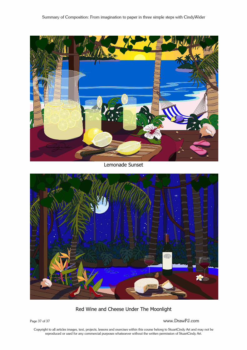
Lemonade Sunset
Red Wine and Cheese Under The Moonlight


![[Garrett Green] Theology, Hermeneutics, And Imagin(BookFi.org)](https://img.pdfslide.us/doc/110x75/553015124a7959d6288b4648/garrett-green-theology-hermeneutics-and-imaginbookfiorg.jpg)