Embed Size (px)
Citation preview
Level 3 Writing
Information Transfer 2
Pie Charts Your final information transfer class test is in Week 5. Get ready! For the class test, you will have to write a report of at least 100 words about a pie chart. You will have 20 minutes to write the report. Name: ______________________________ ID: __________________ Section: ________________ Teacher: ___________________________
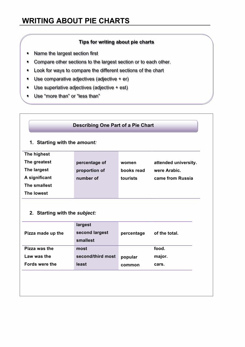
1. Starting with the amount:
The highest The greatest The largest A significant The smallest The lowest
percentage of proportion of number of
women books read tourists
attended university. were Arabic. came from Russia
2. Starting with the subject:
Pizza made up the
largest second largest smallest
percentage
of the total.
Pizza was the Law was the Fords were the
most second/third most least
popular common
food. major. cars.
WRITING ABOUT PIE CHARTS
Tips for writing about pie charts § Name the largest section first
§ Compare other sections to the largest section or to each other.
§ Look for ways to compare the different sections of the chart
§ Use comparative adjectives (adjective + er)
§ Use superlative adjectives (adjective + est)
§ Use “more than” or “less than”
Describing One Part of a Pie Chart
1. Starting with the amount
As many Twice as many Three times as many Not as many
Landcruisers students shopping malls
were sold came from Oman were in Dubai
as…
More/ far more Much/Many more A lot/A few more Considerably more Significantly more Slightly more Fractionally more
Landcruisers students shopping malls
were sold came from Oman were in Dubai
than…
2. Starting with the subject
Drinking coffee was Nokia phones were Swiss watches were
as just as nearly as almost as not as
common popular
as…
more much more far more considerably more slightly more less slightly less fractionally less far less
than…
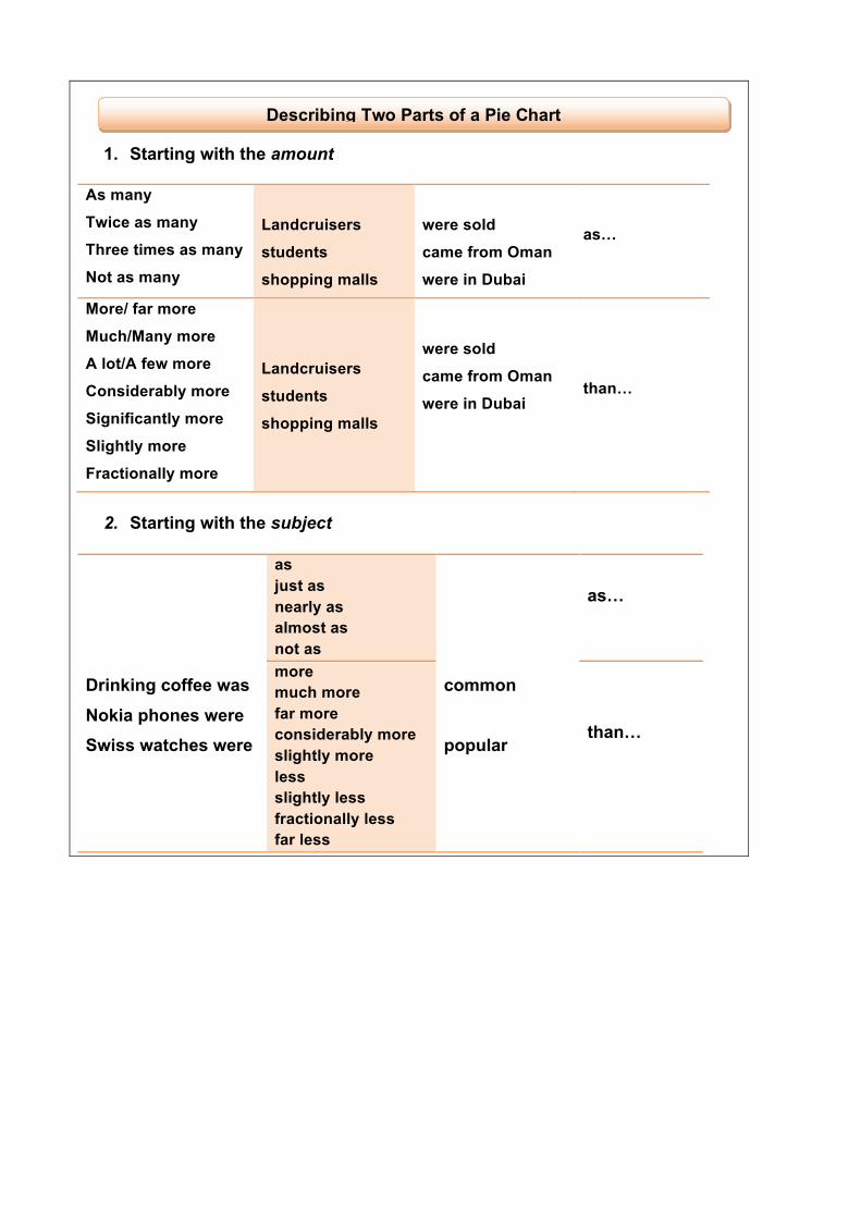
Describing Two Parts of a Pie Chart
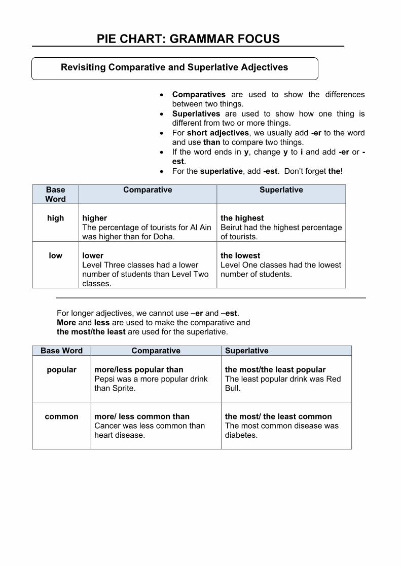
• Comparatives are used to show the differences
between two things. • Superlatives are used to show how one thing is
different from two or more things. • For short adjectives, we usually add -er to the word
and use than to compare two things. • If the word ends in y, change y to i and add -er or -
est. • For the superlative, add -est. Don’t forget the!
Base Word
Comparative Superlative
high
higher The percentage of tourists for Al Ain was higher than for Doha.
the highest Beirut had the highest percentage of tourists.
low
lower Level Three classes had a lower number of students than Level Two classes.
the lowest Level One classes had the lowest number of students.
For longer adjectives, we cannot use –er and –est. More and less are used to make the comparative and the most/the least are used for the superlative.
Base Word Comparative Superlative
popular more/less popular than Pepsi was a more popular drink than Sprite.
the most/the least popular The least popular drink was Red Bull.
common
more/ less common than Cancer was less common than heart disease.
the most/ the least common The most common disease was diabetes.
PIE CHART: GRAMMAR FOCUS
Revisiting Comparative and Superlative Adjectives
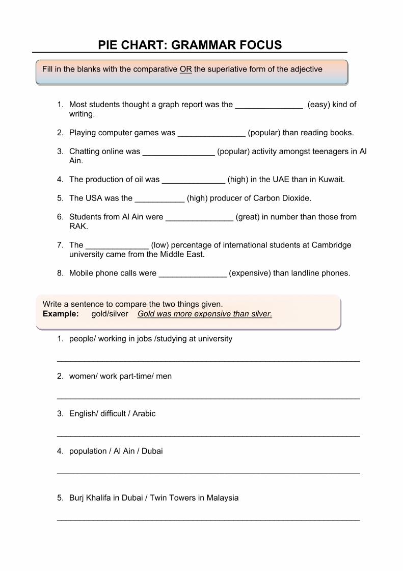
PIE CHART: GRAMMAR FOCUS 1. Most students thought a graph report was the _______________ (easy) kind of
writing.
2. Playing computer games was _______________ (popular) than reading books.
3. Chatting online was ________________ (popular) activity amongst teenagers in Al Ain.
4. The production of oil was ______________ (high) in the UAE than in Kuwait.
5. The USA was the ___________ (high) producer of Carbon Dioxide. 6. Students from Al Ain were _______________ (great) in number than those from
RAK. 7. The ______________ (low) percentage of international students at Cambridge
university came from the Middle East. 8. Mobile phone calls were _______________ (expensive) than landline phones. 1. people/ working in jobs /studying at university
___________________________________________________________________ 2. women/ work part-time/ men ___________________________________________________________________ 3. English/ difficult / Arabic ___________________________________________________________________ 4. population / Al Ain / Dubai
___________________________________________________________________
5. Burj Khalifa in Dubai / Twin Towers in Malaysia
___________________________________________________________________
Fill in the blanks with the comparative OR the superlative form of the adjective
Write a sentence to compare the two things given. Example: gold/silver Gold was more expensive than silver.
PIE CHART: STATING NUMBERS AND FRACTIONS
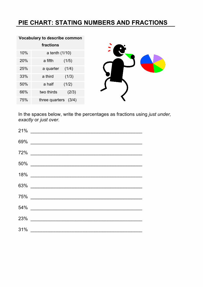
In the spaces below, write the percentages as fractions using just under, exactly or just over. 21% __________________________________________
69% __________________________________________
72% __________________________________________
50% __________________________________________
18% __________________________________________
63% __________________________________________
75% __________________________________________
54% __________________________________________
23% __________________________________________
31% __________________________________________
Vocabulary to describe common fractions
10% a tenth (1/10)
20% a fifth (1/5)
25% a quarter (1/4)
33% a third (1/3)
50% a half (1/2)
66% two thirds (2/3)
75% three quarters (3/4)
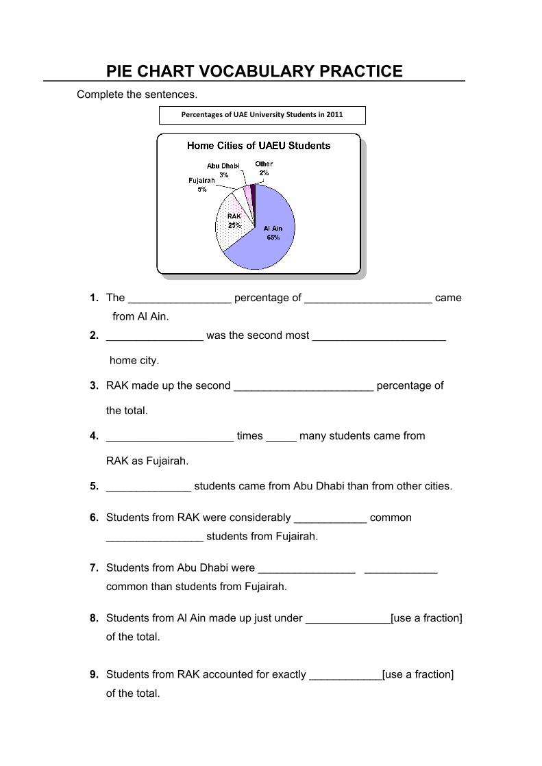
Complete the sentences.
1. The _________________ percentage of _____________________ came
from Al Ain.
2. ________________ was the second most ______________________ home city.
3. RAK made up the second _______________________ percentage of
the total.
4. _____________________ times _____ many students came from
RAK as Fujairah.
5. ______________ students came from Abu Dhabi than from other cities.
6. Students from RAK were considerably ____________ common
________________ students from Fujairah.
7. Students from Abu Dhabi were ________________ ____________ common than students from Fujairah.
8. Students from Al Ain made up just under ______________[use a fraction]
of the total.
9. Students from RAK accounted for exactly ____________[use a fraction] of the total.
PIE CHART VOCABULARY PRACTICE
PercentagesofUAEUniversityStudentsin2011
Put the words in the box into the rights gaps in the introduction: largest smallest which percentages while shows
The pie chart 1) ___________ the 2) ________________of UAEU students from five
cities in the United Arab Emirates, 3) __________were Al Ain, RAK, Fujairah Abu Dhabi
and other, in 2011. Overall, the 4) __________ percentage of students by far came from
Al Ain, 5) ___________ the 6) ___________ percentage of students was from Abu Dhabi.
Put the fractions and numbers in the box into the right gaps in the body paragraph:
just under one tenth 5% exactly one quarter 2% less than half nearly two thirds 3%
Looking at the pie chart, we can see that the most common home city of all UAEU
students was Al Ain at 1) ______________________________. The second most common
home city was RAK, at 2) ___________________________ of students. Together, Fujairah
and Abu Dhabi made up 3)___________________________, at 4)_______ and 5)_______
respectively. This was higher than the percentage of students from other cities, which was
the lowest at 6) ________________________ of the total.
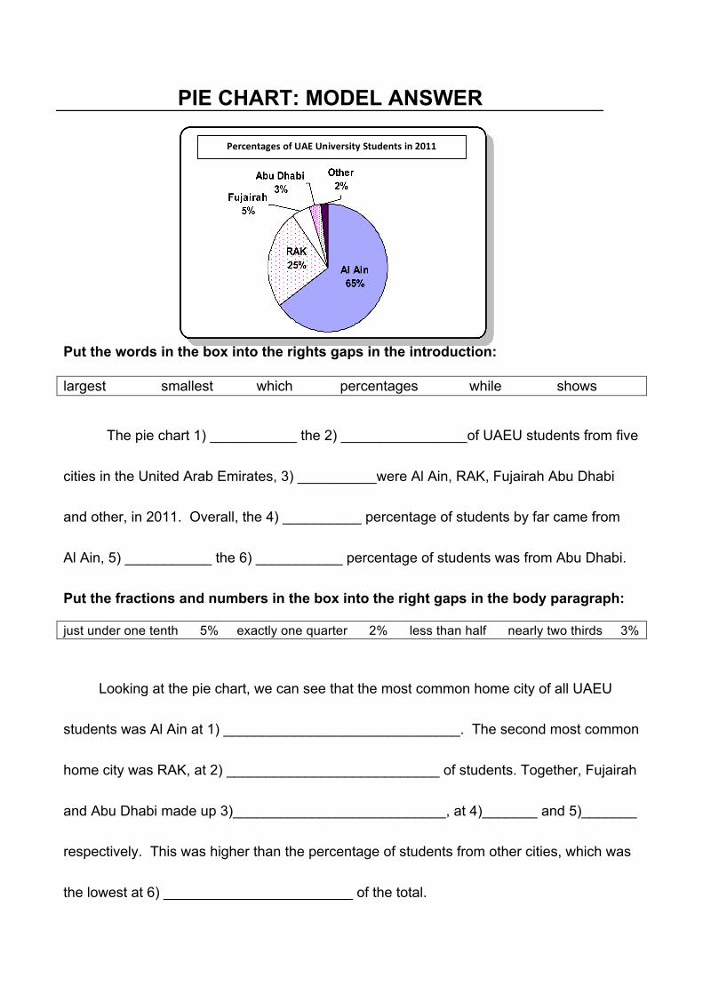
PIE CHART: MODEL ANSWER
PercentagesofUAEUniversityStudentsin2011
Complete the gaps with the information shown in the charts. You should use fractions where you can.
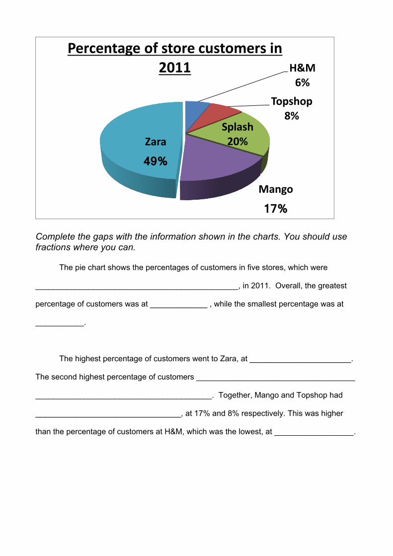
The pie chart shows the percentages of customers in five stores, which were
______________________________________________, in 2011. Overall, the greatest
percentage of customers was at _____________ , while the smallest percentage was at
___________.
The highest percentage of customers went to Zara, at _______________________.
The second highest percentage of customers ____________________________________
________________________________________. Together, Mango and Topshop had
_________________________________, at 17% and 8% respectively. This was higher
than the percentage of customers at H&M, which was the lowest, at __________________.
H&M6%
Topshop8%
Splash20%
Mango
17%
Zara
49%
Percentageofstorecustomersin2011
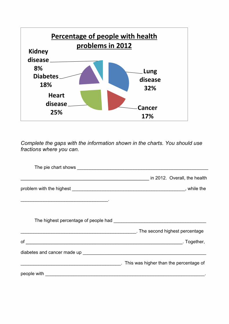
Complete the gaps with the information shown in the charts. You should use fractions where you can.
The pie chart shows ___________________________________________________
__________________________________________________ in 2012. Overall, the health
problem with the highest ____________________________________________, while the
__________________________________.
The highest percentage of people had ____________________________________
_____________________________________________. The second highest percentage
of _____________________________________________________________. Together,
diabetes and cancer made up ________________________________________________
_______________________________________. This was higher than the percentage of
people with ______________________________________________________________.
Lungdisease32%
Cancer17%
Heartdisease25%
Diabetes18%
Kidneydisease8%
Percentageofpeoplewithhealthproblemsin2012
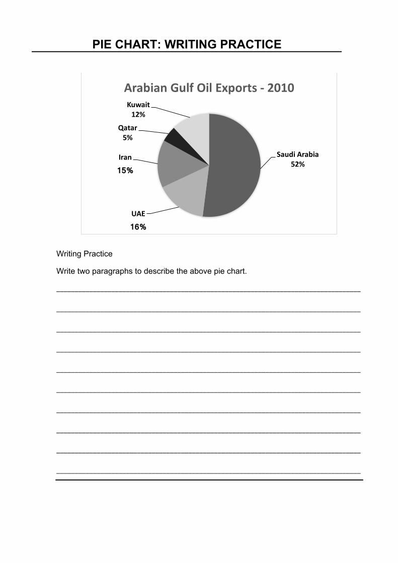
PIE CHART: WRITING PRACTICE
Writing Practice
Write two paragraphs to describe the above pie chart.
___________________________________________________________________________________
___________________________________________________________________________________
___________________________________________________________________________________
___________________________________________________________________________________
___________________________________________________________________________________
___________________________________________________________________________________
___________________________________________________________________________________
___________________________________________________________________________________
___________________________________________________________________________________
___________________________________________________________________________________
SaudiArabia52%
UAE
16%
Iran
15%
Qatar5%
Kuwait12%
ArabianGulfOilExports- 2010

___________________________________________________________________________________
___________________________________________________________________________________
___________________________________________________________________________________
___________________________________________________________________________________
___________________________________________________________________________________
___________________________________________________________________________________
___________________________________________________________________________________
___________________________________________________________________________________
___________________________________________________________________________________
___________________________________________________________________________________
___________________________________________________________________________________
___________________________________________________________________________________
___________________________________________________________________________________
___________________________________________________________________________________
___________________________________________________________________________________
___________________________________________________________________________________
___________________________________________________________________________________
___________________________________________________________________________________
___________________________________________________________________________________
___________________________________________________________________________________
___________________________________________________________________________________
___________________________________________________________________________________
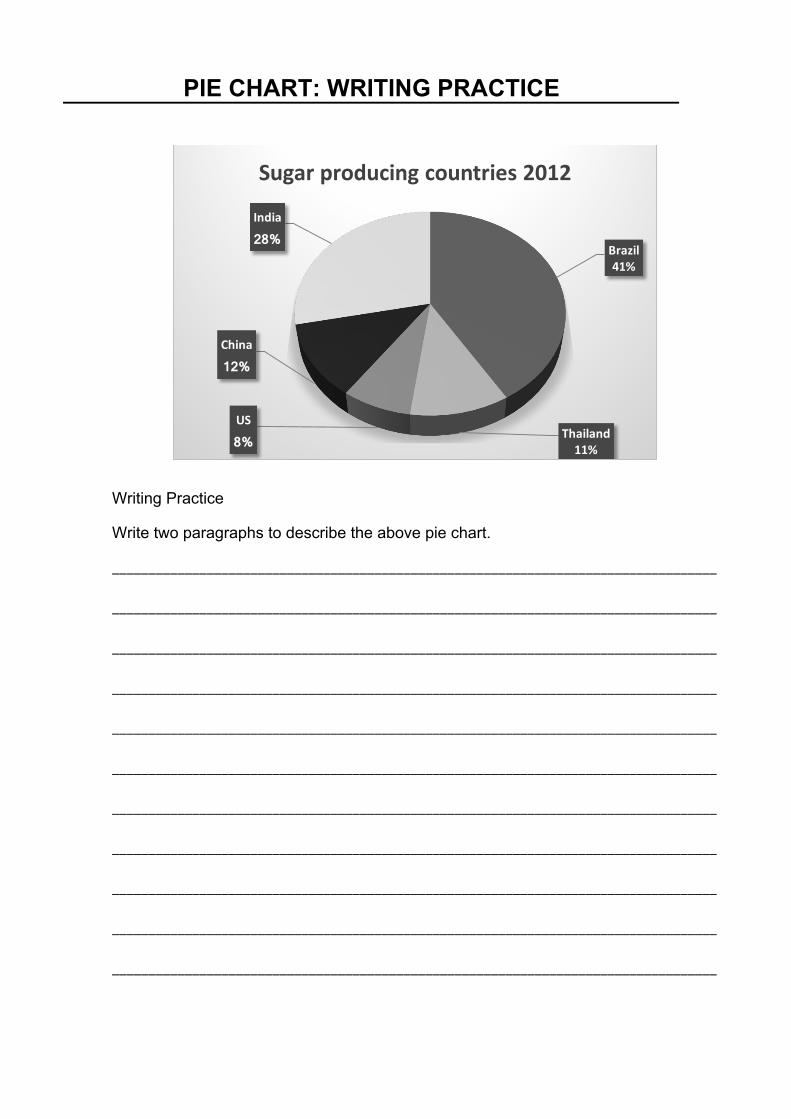
PIE CHART: WRITING PRACTICE
Writing Practice
Write two paragraphs to describe the above pie chart.
___________________________________________________________________________________
___________________________________________________________________________________
___________________________________________________________________________________
___________________________________________________________________________________
___________________________________________________________________________________
___________________________________________________________________________________
___________________________________________________________________________________
___________________________________________________________________________________
___________________________________________________________________________________
___________________________________________________________________________________
___________________________________________________________________________________
Brazil41%
Thailand11%
US
8%
China
12%
India
28%
Sugarproducingcountries2012
PIE CHART: MODEL ANSWER
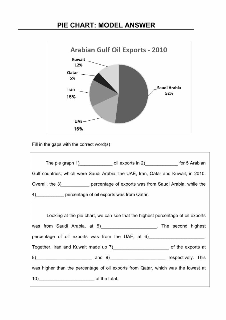
Fill in the gaps with the correct word(s)
The pie graph 1)_____________ oil exports in 2)_____________ for 5 Arabian
Gulf countries, which were Saudi Arabia, the UAE, Iran, Qatar and Kuwait, in 2010.
Overall, the 3)___________ percentage of exports was from Saudi Arabia, while the
4)___________ percentage of oil exports was from Qatar.
Looking at the pie chart, we can see that the highest percentage of oil exports
was from Saudi Arabia, at 5)______________________. The second highest
percentage of oil exports was from the UAE, at 6)______________________.
Together, Iran and Kuwait made up 7)______________________ of the exports at
8)______________________ and 9)______________________ respectively. This
was higher than the percentage of oil exports from Qatar, which was the lowest at
10)______________________ of the total.
SaudiArabia52%
UAE
16%
Iran
15%
Qatar5%
Kuwait12%
ArabianGulfOilExports- 2010