Embed Size (px)
DESCRIPTION
Independant practice portfolio for first year graphic design UCA Epsom.
Citation preview
Britain
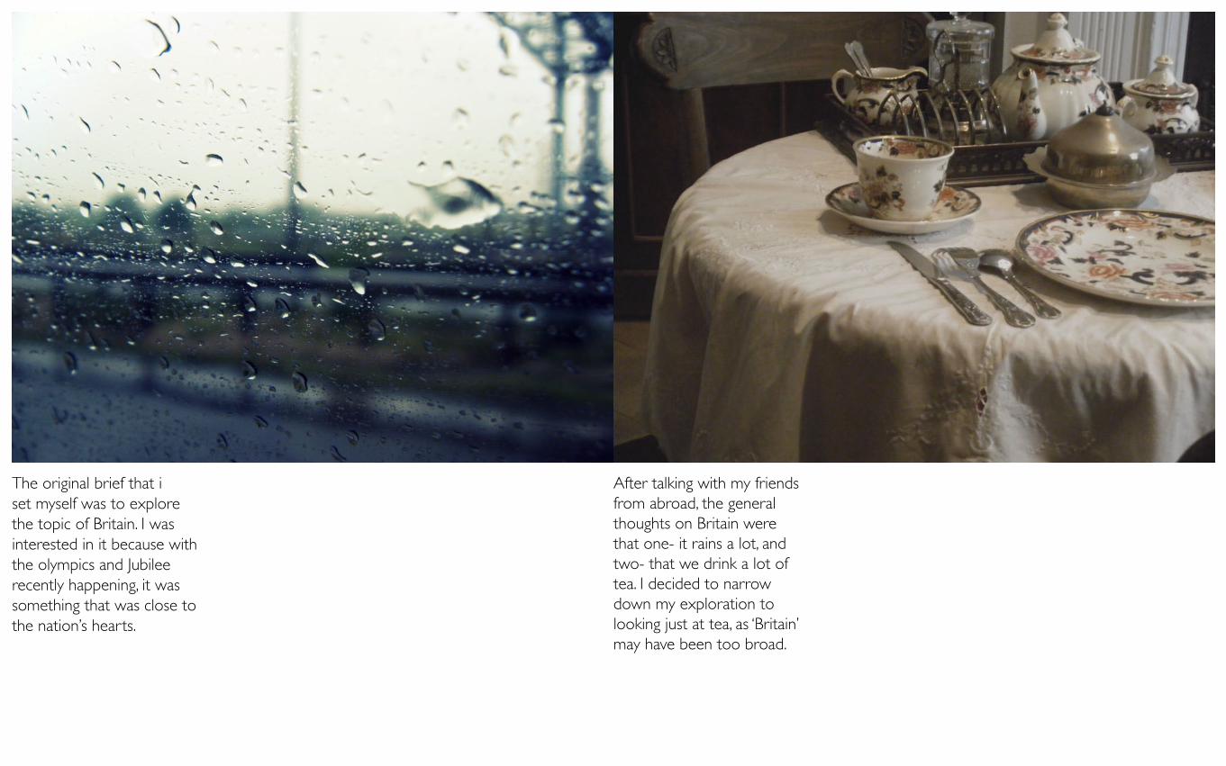
The original brief that i set myself was to explore the topic of Britain. I was interested in it because with the olympics and Jubilee recently happening, it was something that was close to the nation’s hearts.
After talking with my friends from abroad, the general thoughts on Britain were that one- it rains a lot, and two- that we drink a lot of tea. I decided to narrow down my exploration to looking just at tea, as ‘Britain’ may have been too broad.
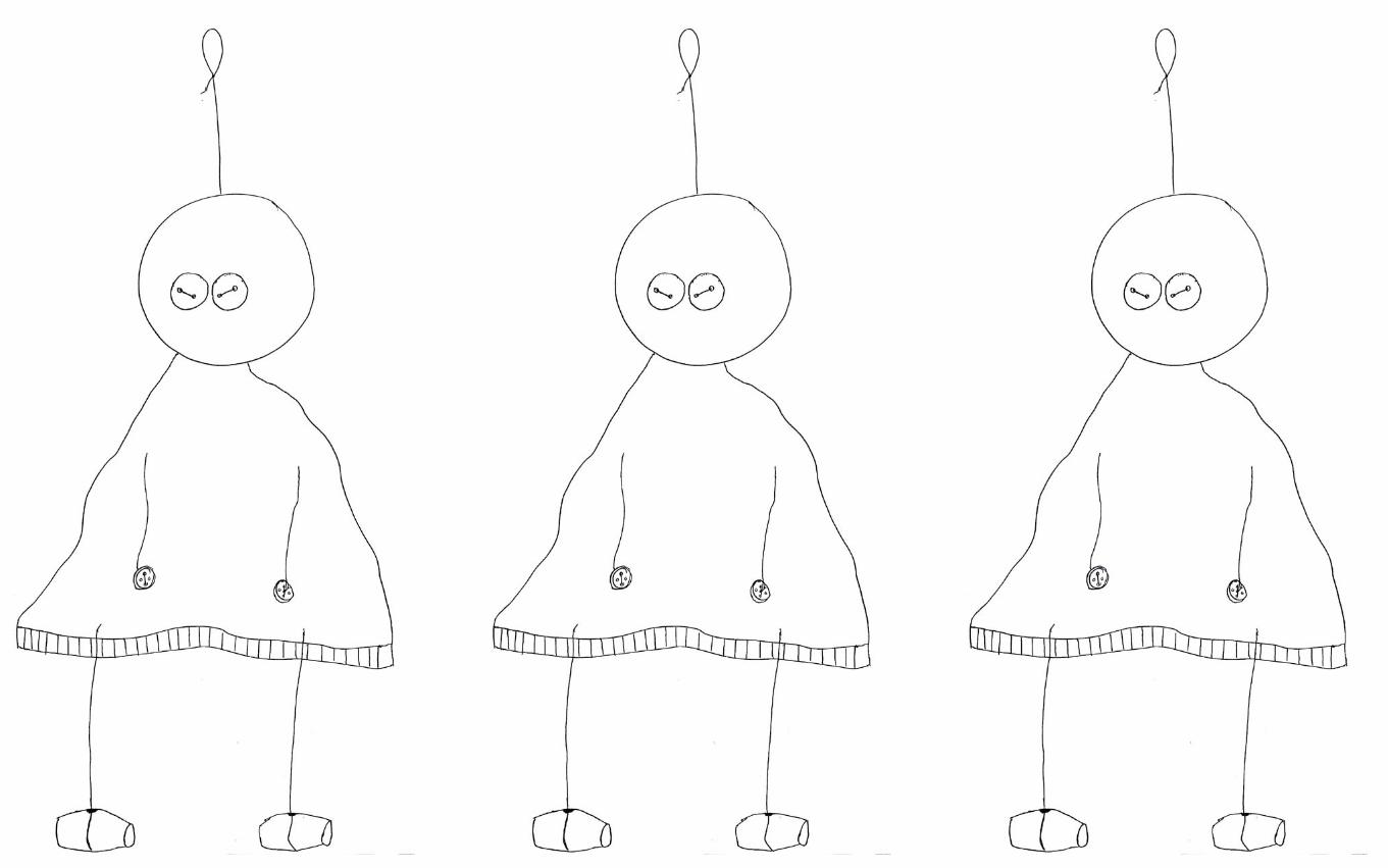
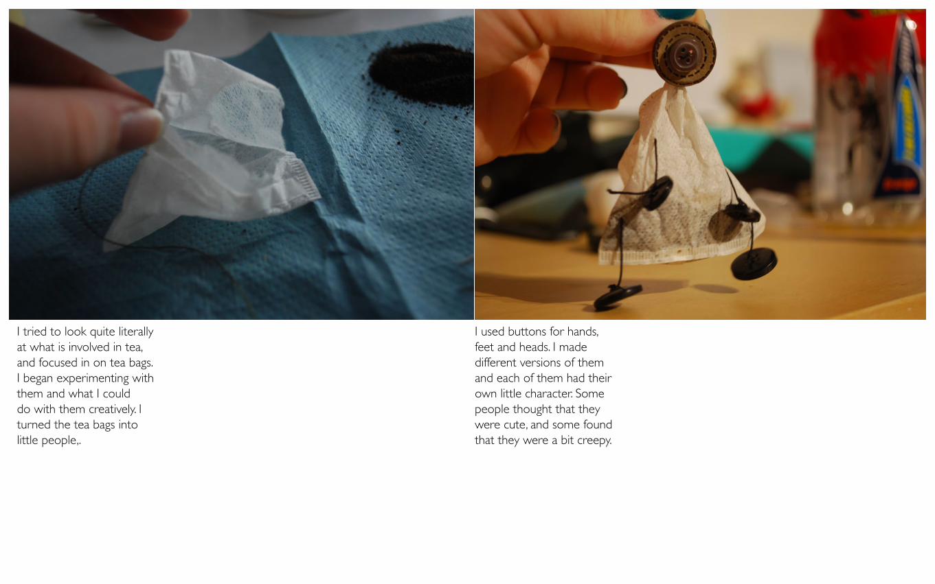
I tried to look quite literally at what is involved in tea, and focused in on tea bags. I began experimenting with them and what I could do with them creatively. I turned the tea bags into little people,.
I used buttons for hands, feet and heads. I made different versions of them and each of them had their own little character. Some people thought that they were cute, and some found that they were a bit creepy.
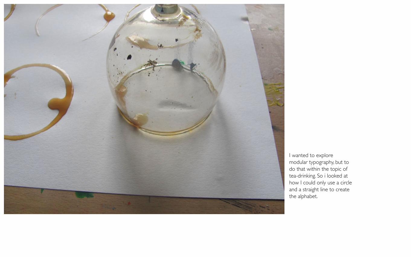
I wanted to explore modular typography, but to do that within the topic of tea-drinking. So i looked at how I could only use a circle and a straight line to create the alphabet.
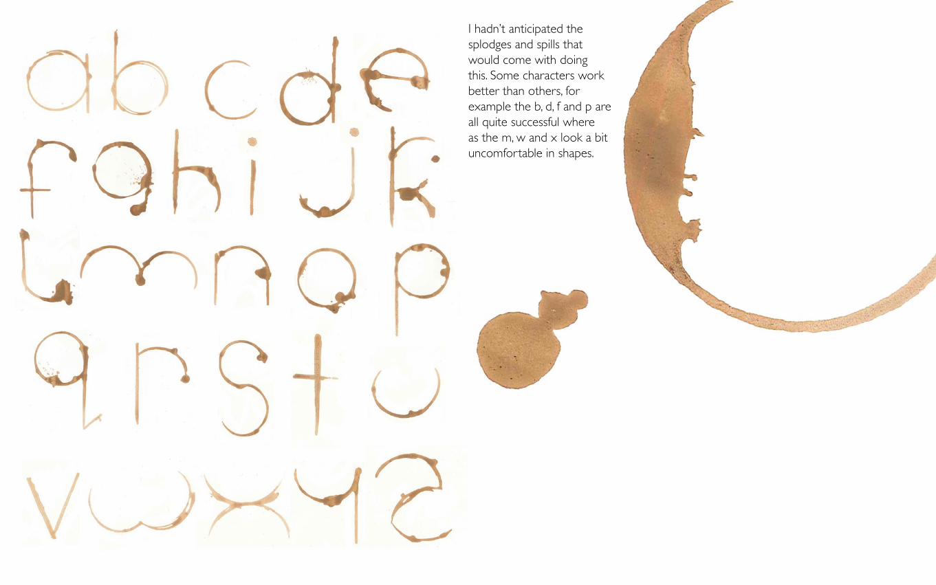
I hadn’t anticipated the splodges and spills that would come with doing this. Some characters work better than others, for example the b, d, f and p are all quite successful where as the m, w and x look a bit uncomfortable in shapes.
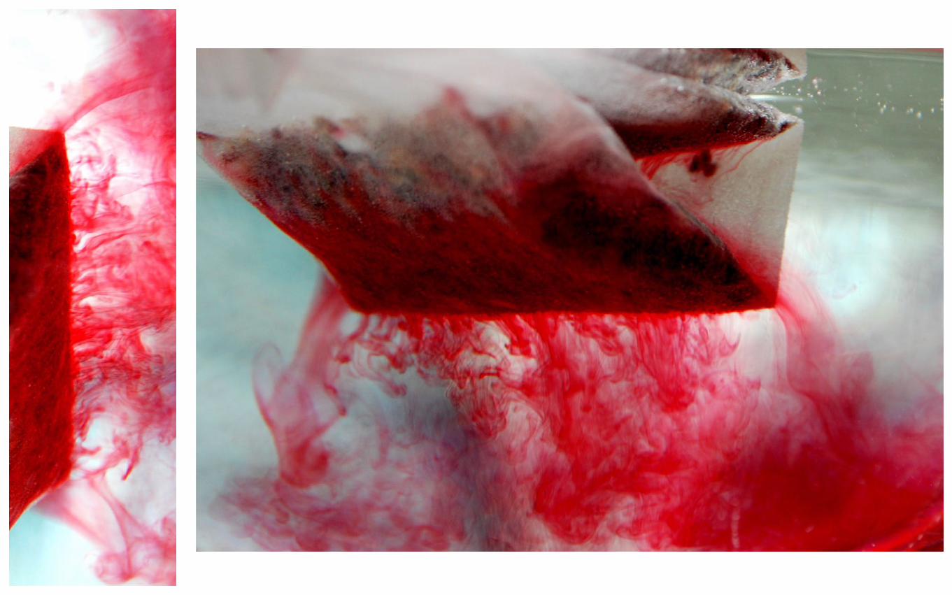
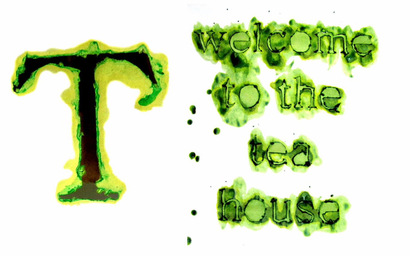
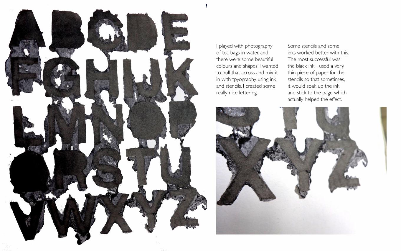
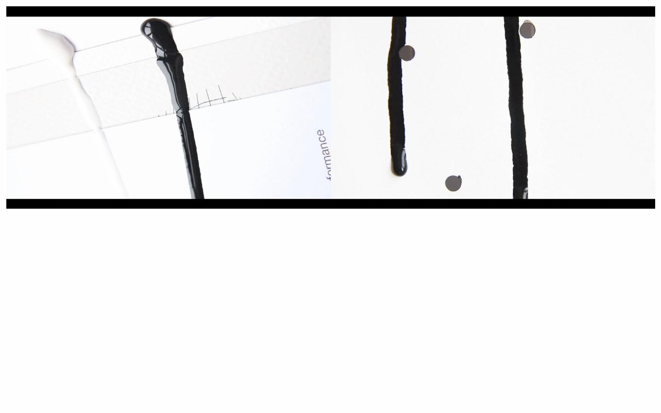
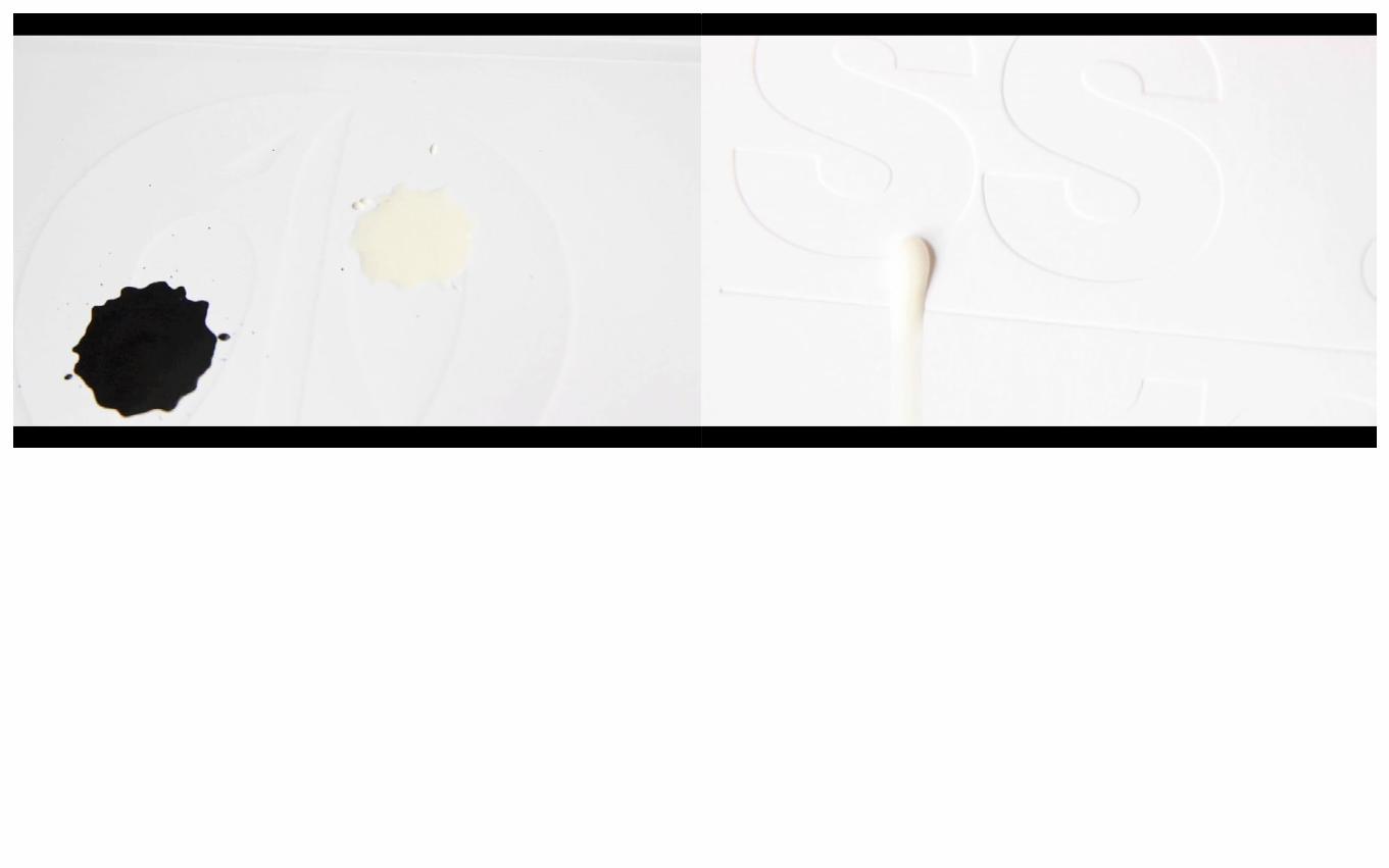
I played with photography of tea bags in water, and there were some beautiful colours and shapes. I wanted to pull that across and mix it in with tpyography, using ink and stencils, I created some really nice lettering.
Some stencils and some inks worked better with this. The most successful was the black ink. I used a very thin piece of paper for the stencils so that sometimes, it would soak up the ink and stick to the page which actually helped the effect.
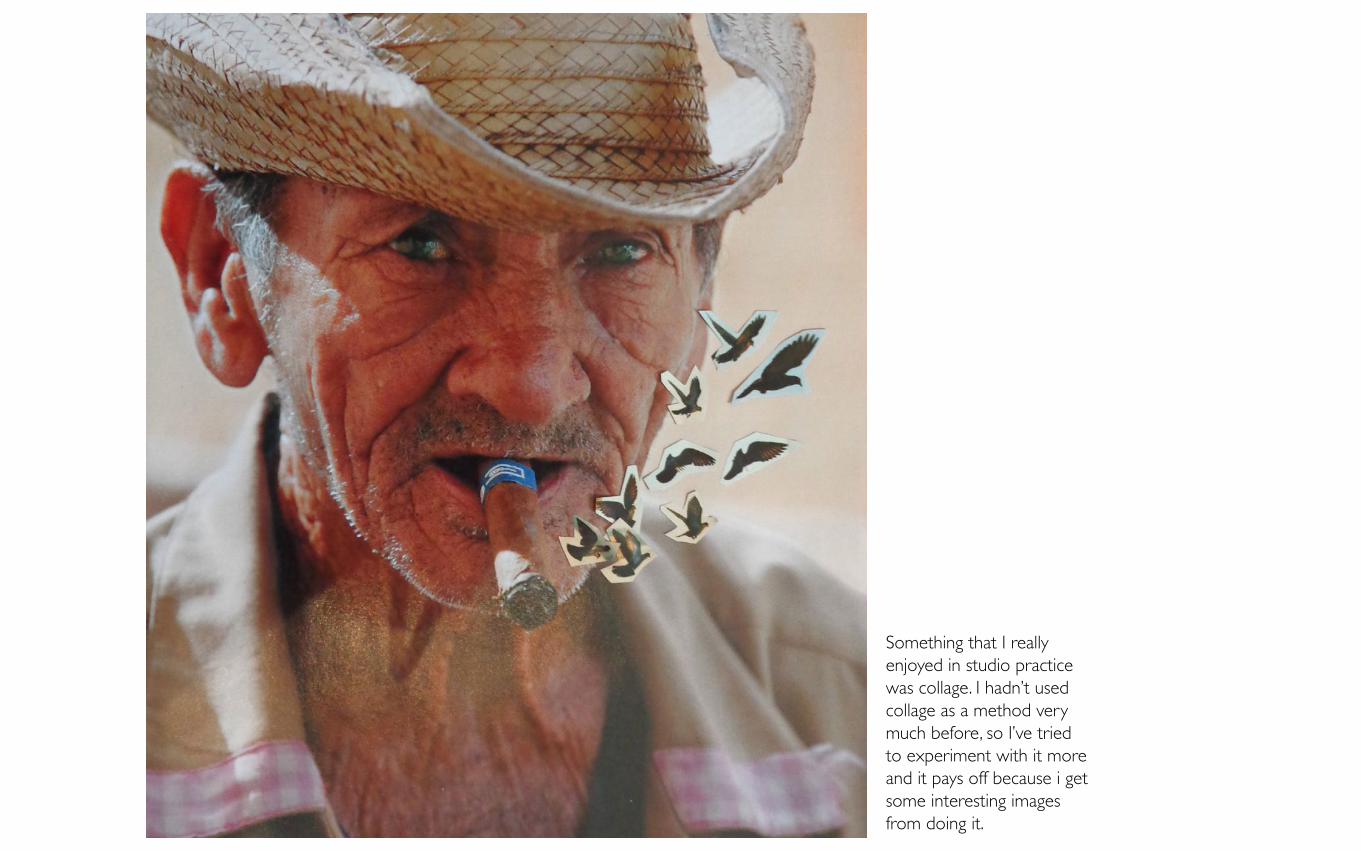
Something that I really enjoyed in studio practice was collage. I hadn’t used collage as a method very much before, so I’ve tried to experiment with it more and it pays off because i get some interesting images from doing it.
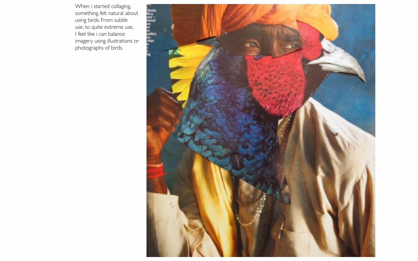
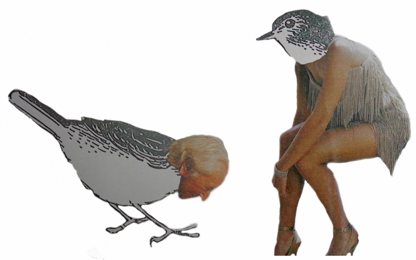
When i started collaging, something felt natural about using birds. From subtle use, to quite extreme use, I feel like i can balance imagery using illustrations or photographs of birds.
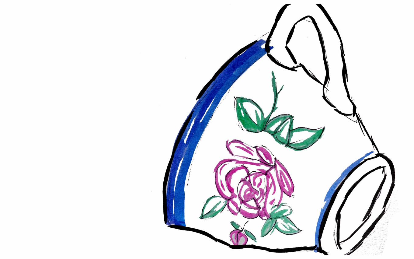
The next step that felt right, was that I wanted to create designs that could be put onto teacups. I wanted to create little creatures that would maybe be used in coffee shops in Britain. I like the fact that the characters are quirky and delicate.
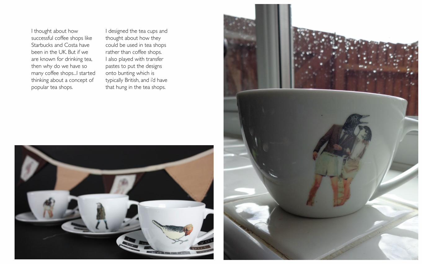
I thought about how successful coffee shops like Starbucks and Costa have been in the UK. But if we are known for drinking tea, then why do we have so many coffee shops...I started thinking about a concept of popular tea shops.
I designed the tea cups and thought about how they could be used in tea shops rather than coffee shops. I also played with transfer pastes to put the designs onto bunting which is typically British, and i’d have that hung in the tea shops.

additional
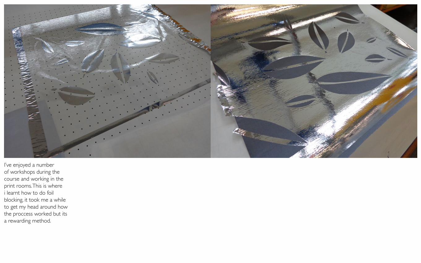
I’ve enjoyed a number of workshops during the course and working in the print rooms. This is where i learnt how to do foil blocking, it took me a while to get my head around how the proccess worked but its a rewarding method.
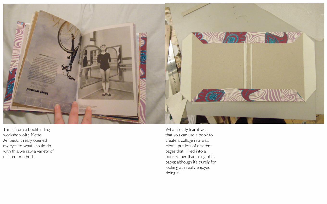
This is from a bookbinding workshop with Mette Ambeck. It really opened my eyes to what i could do with this, we saw a variety of different methods.
What i really learnt was that you can use a book to create a collage in a way. Here i put lots of different pages that i liked into a book rather than using plain paper, although it’s purely for looking at, i really enjoyed doing it.
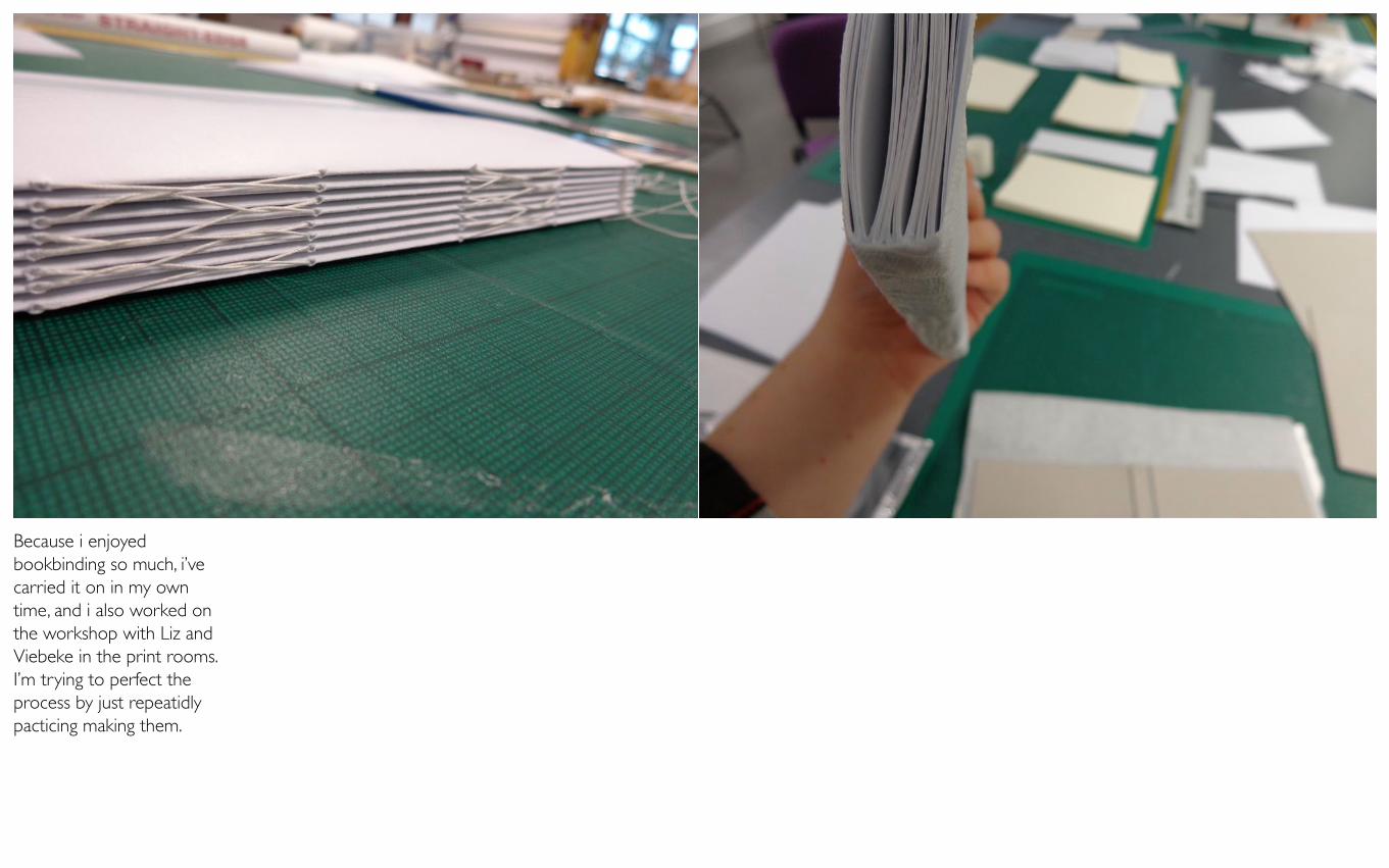
Because i enjoyed bookbinding so much, i’ve carried it on in my own time, and i also worked on the workshop with Liz and Viebeke in the print rooms. I’m trying to perfect the process by just repeatidly pacticing making them.
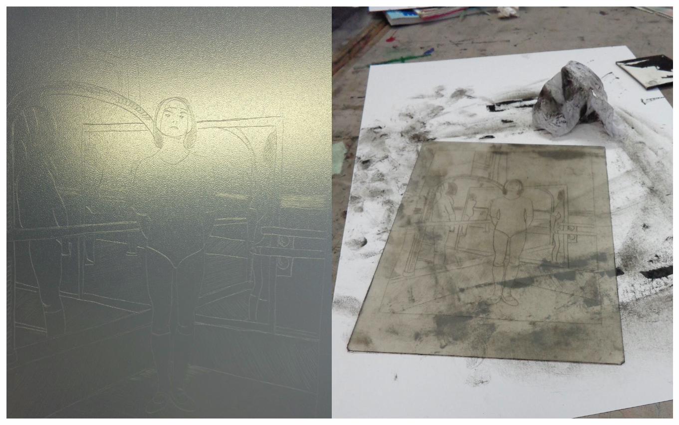
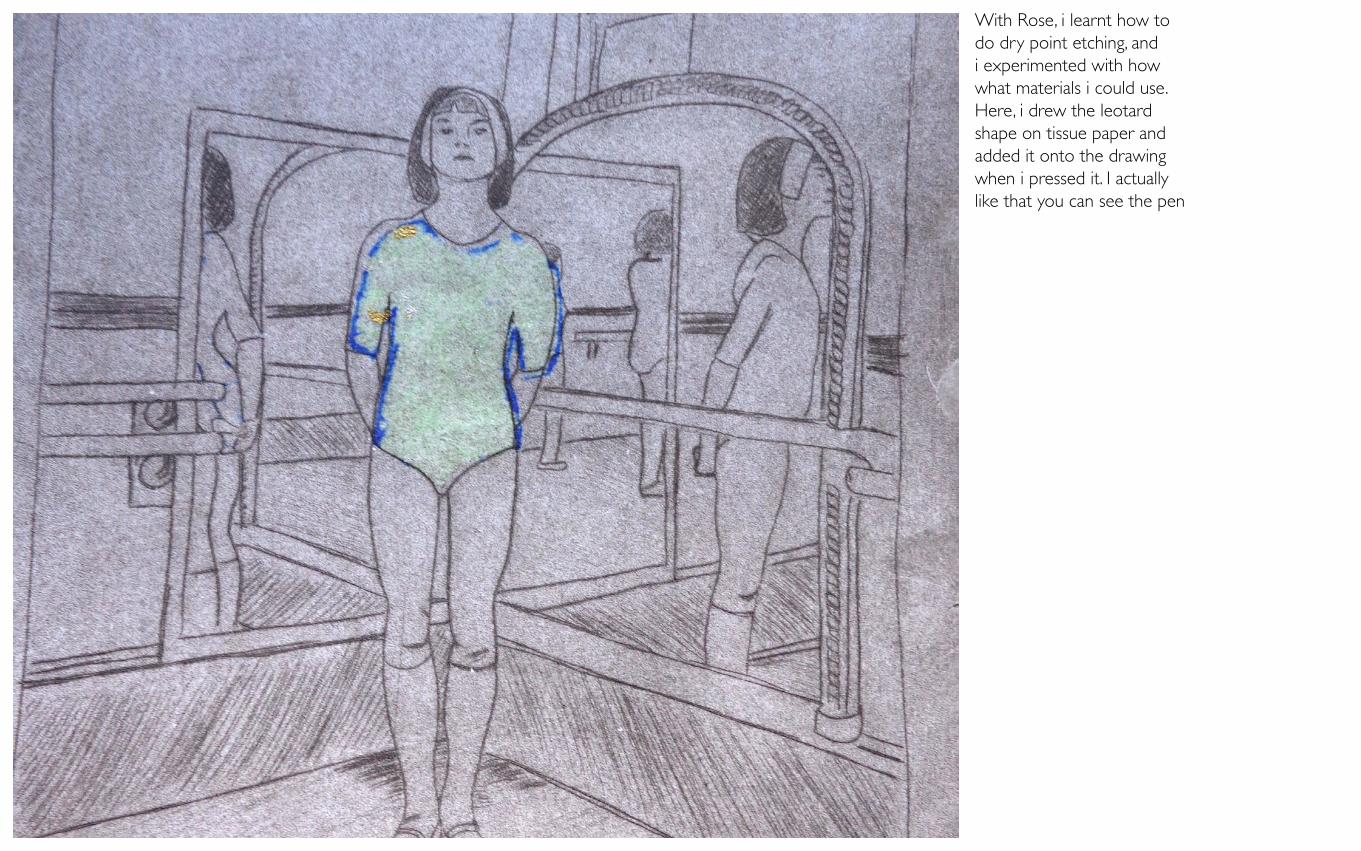
With Rose, i learnt how to do dry point etching, and i experimented with how what materials i could use. Here, i drew the leotard shape on tissue paper and added it onto the drawing when i pressed it. I actually like that you can see the pen
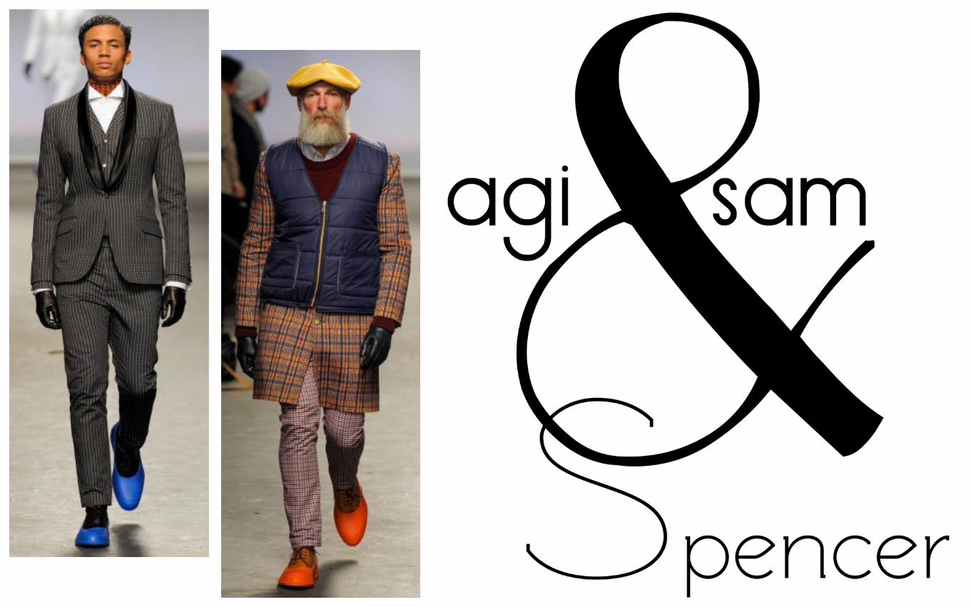
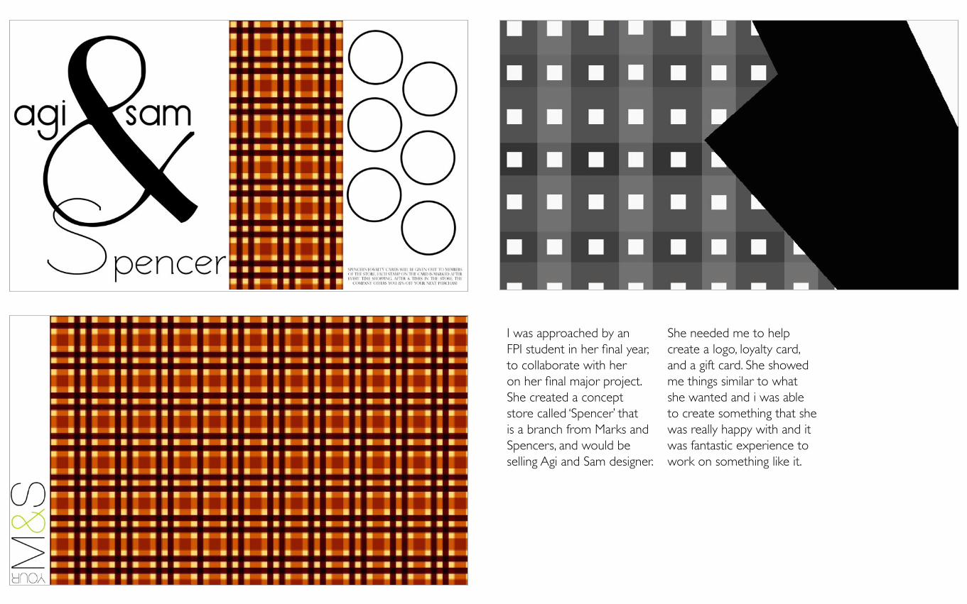
I was approached by an FPI student in her final year, to collaborate with her on her final major project. She created a concept store called ‘Spencer’ that is a branch from Marks and Spencers, and would be selling Agi and Sam designer.
She needed me to help create a logo, loyalty card, and a gift card. She showed me things similar to what she wanted and i was able to create something that she was really happy with and it was fantastic experience to work on something like it.
This is blah
This is blah
GF SMITH