Embed Size (px)
Citation preview

Online Appendix to:“In the Shadow of a Giant:
Medicare’s Influence on Private Physician Payments”
Jeffrey Clemens Joshua D. Gottlieb∗
UCSD and NBER UBC and NBER
August 31, 2015
∗Clemens: [email protected], Gottlieb: [email protected]. We are extremely grateful to LuisaFranzini, Cecilia Ganduglia-Cazaban, Osama Mikhail, and the UTSPH/BCBSTX Payment Systems andPolicies Research Program at the University of Texas School of Public Health for providing us with dataaccess, and for their extensive assistance in navigating the BCBSTX claims data. We gratefully acknowledgesupport and data provided by the National Institute on Aging under grant P01AG031098 to the NationalBureau of Economic Research, and the Institute for Humane Studies. Jean Roth and Mojan Ramanujangenerously assisted our navigation of health care claims data. Clemens further thanks the Stanford Institutefor Economic Policy Research, and Gottlieb thanks the Becker-Friedman Institute for Research in Economicsfor their hospitality while working on this paper. Gottlieb further thanks the NIA for a training fellowshipprovided under grant T32-AG000186-23 to the NBER, the Social Sciences and Humanities Research Councilof Canada, the Taubman Center for State and Local Government, and PWIAS. Finally, we thank the editorJesse Shapiro and four anonymous referees for helpful comments.
1

Online Appendix: Clemens & Gottlieb, “In the Shadow of a Giant.” August 31, 2015.
Appendix For Online Publication Only
B Additional Data Descriptions
In this Appendix, section B.1 discusses the external validity of our results. Section B.2describes the types of insurance plans represented in our MarketScan sample, and sectionB.3 presents details on relative public and private prices in the cross-section. Section B.4describes the construction of some control variables, and then section B.5 goes into furtherdetail on our construction of HHI measures. Finally, section B.6 introduces an additionaldata source, the Community Tracking Study (CTS). CTS data allow us to examine directlywelfare-relevant outcomes involving physicians’ behavior and choice of specialty.
B.1 Applicability Beyond Large Self-Insured Employers
The MarketScan data come from a particular segment of the insurance market, namelyself-insured plans operated by large employers. In 2008, coverage under such plans accountedfor 55 percent of all privately insured individuals Fernandez (2010). Our estimates’ directapplicable to this market segment this gives them non-trivial scope. Note, however, thatthere is good reason to expect the underlying economic forces to be relevant in other marketsegments. Whether the coverage is through a large, self-insuring employer or a small-groupplan, for example, physician payments must be competitive with the rates paid by otherinsurers, of which Medicare is the largest. Further, to the extent that Medicare benchmarkingreflects a desire to limit contract complexity, it may well be even more pervasive in thecontracts associated with small-scale insurance arrangements than in those associated withlarge firms. While the magnitudes of either force may thus be larger or smaller in othermarket segments, one should expect them to be relevant in some form or another across abroad range of insurance arrangements.
Second, consider the case of HMOs. HMOs are generally lower-cost insurance plans, andif we would expect any type of insurance plan to use a different payment scheme, HMOswould be first in line. Even so, documentary evidence indicates that at least some notableHMOs use Medicare-linked payments. For example, some insurers’ provider newslettersmake explicit their use of Medicare’s relative values within HMO plans (e.g. Blue Cross andBlue Shield of Texas, 2010; Anthem Blue Cross and Blue Shield, 2012). These are non-trivialapplications, as the HMO Blue Texas plan advertised having 38,000 physicians in its providernetwork as of 2009 (Blue Cross and Blue Shield of Texas, 2014).
B.2 Insurance Plan Types in the MarketScan Data
The MarketScan data contain private sector prices that come from a range of insuranceplan types. In 1996, 38 percent of service claims came from Major Medical or ComprehensiveInsurance (CI) plans, 52 percent from less generous Preferred Provider Organization (PPO)plans, and 10 percent from even more restrictive Point of Service (POS) plans. By 2006, 8percent of MarketScan service claims came from CI plans, 59 percent from PPO plans, 12
2
Online Appendix: Clemens & Gottlieb, “In the Shadow of a Giant.” August 31, 2015.
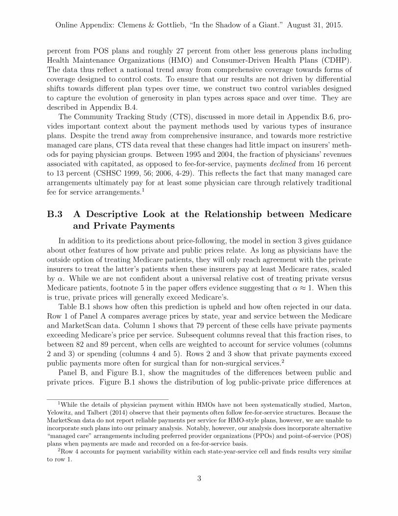
percent from POS plans and roughly 27 percent from other less generous plans includingHealth Maintenance Organizations (HMO) and Consumer-Driven Health Plans (CDHP).The data thus reflect a national trend away from comprehensive coverage towards forms ofcoverage designed to control costs. To ensure that our results are not driven by differentialshifts towards different plan types over time, we construct two control variables designedto capture the evolution of generosity in plan types across space and over time. They aredescribed in Appendix B.4.
The Community Tracking Study (CTS), discussed in more detail in Appendix B.6, pro-vides important context about the payment methods used by various types of insuranceplans. Despite the trend away from comprehensive insurance, and towards more restrictivemanaged care plans, CTS data reveal that these changes had little impact on insurers’ meth-ods for paying physician groups. Between 1995 and 2004, the fraction of physicians’ revenuesassociated with capitated, as opposed to fee-for-service, payments declined from 16 percentto 13 percent (CSHSC 1999, 56; 2006, 4-29). This reflects the fact that many managed carearrangements ultimately pay for at least some physician care through relatively traditionalfee for service arrangements.1
B.3 A Descriptive Look at the Relationship between Medicareand Private Payments
In addition to its predictions about price-following, the model in section 3 gives guidanceabout other features of how private and public prices relate. As long as physicians have theoutside option of treating Medicare patients, they will only reach agreement with the privateinsurers to treat the latter’s patients when these insurers pay at least Medicare rates, scaledby α. While we are not confident about a universal relative cost of treating private versusMedicare patients, footnote 5 in the paper offers evidence suggesting that α ≈ 1. When thisis true, private prices will generally exceed Medicare’s.
Table B.1 shows how often this prediction is upheld and how often rejected in our data.Row 1 of Panel A compares average prices by state, year and service between the Medicareand MarketScan data. Column 1 shows that 79 percent of these cells have private paymentsexceeding Medicare’s price per service. Subsequent columns reveal that this fraction rises, tobetween 82 and 89 percent, when cells are weighted to account for service volumes (columns2 and 3) or spending (columns 4 and 5). Rows 2 and 3 show that private payments exceedpublic payments more often for surgical than for non-surgical services.2
Panel B, and Figure B.1, show the magnitudes of the differences between public andprivate prices. Figure B.1 shows the distribution of log public-private price differences at
1While the details of physician payment within HMOs have not been systematically studied, Marton,Yelowitz, and Talbert (2014) observe that their payments often follow fee-for-service structures. Because theMarketScan data do not report reliable payments per service for HMO-style plans, however, we are unable toincorporate such plans into our primary analysis. Notably, however, our analysis does incorporate alternative“managed care” arrangements including preferred provider organizations (PPOs) and point-of-service (POS)plans when payments are made and recorded on a fee-for-service basis.
2Row 4 accounts for payment variability within each state-year-service cell and finds results very similarto row 1.
3

Online Appendix: Clemens & Gottlieb, “In the Shadow of a Giant.” August 31, 2015.
the state-year-service level. For the vast majority of these cells, this difference is stronglypositive. Instances in which public payments exceed private payments are relatively few,and the magnitudes swamped by the typical private-over-public mark-up. Panel B of TableB.1 quantifies this fact.
To further summarize the cross-sectional relationship between public and private sectorprices, Panel C of Table B.1 shows results from regressions of private against Medicareprices in levels. The coefficient on Medicare’s payments is consistently near 1.45, reflectingthe average mark-ups apparent in Panel B and Figure B.1. Controlling for year or for state-by-year effects has no effect on this relationship. These facts comport well with our modeland suggest that it captures some of the key facts about private insurance payments. Thusit might also help us to understand the nature of price-following.
B.4 Variable Construction
To control for plan characteristics, we construct a variable called “Insurance Plan TypeControl” by first regressing payments on plan type indicators. Using the resulting coefficientsand changes in the plan type composition, we generate predicted payments that we aggregateto the state-by-year-by-service level. We also construct a control for plan generosity basedon patient cost sharing. This variable, “Cost Sharing Fraction,” is constructed at the state-by-year-by-service level by dividing out-of-pocket payments by the total payments made toproviders for the service. Summary statistics for these variables are shown in Table B.2.Because changes in plan types unfolded relatively smoothly over time, we would expect anyassociated concerns to reveal themselves in the event study estimates of equation (8).
Different types of physician groups may have different outside options, so the frameworkof section 3 predicts different levels of price-following depending on a region’s compositionof large versus small groups.
To take this view to the data, we will proxy for the presence of small physician groups us-ing two variables. The first is the share of physicians working as sole practitioners, measuredat the level of specialties and hospital referral regions. The second, similarly constructed, isthe share of physicians working in groups with five or fewer members.
We will also examine Medicare’s size relative to the private market. We measure this asratio of the number of times a service appears in a single year of the Medicare claims data tothe number of times it appears in a single year of the MarketScan data. Because MarketScanis a non-random sample of the private market, with time-varying size, the variable wouldpoorly characterize the actual relative sizes of public and private markets. Nonetheless, itshould form a reasonable basis for dividing services into those with relatively large and smallMedicare market shares. This variable is strongly right skewed; the lower bound of therelevant z-scores is roughly −0.2 for Private Market Volume and −0.4 for Medicare RelativeSize. Consequently, we normalize it using percentile ranks rather than z-scores. We subtract0.5 from the percentile ranks so that the resulting variables are symmetric about 0.
4

Online Appendix: Clemens & Gottlieb, “In the Shadow of a Giant.” August 31, 2015.
B.5 Detailed Description of the Construction of the Physician andInsurer HHI Variables
We proxy for the degree of physician competition by computing a Herfindahl-HirschmanIndex (HHI) for each market. These HHIs are intended to proxy for the bargaining weight θin the framework of section 3. When physicians are relatively concentrated, they are likelyin a position to extract most of the surplus from joining an insurer’s network. In contrast,when insurers are more concentrated, the carriers will likely obtain most of the surplus.
We compute the physician HHIs as follows. We first identify physician groups in theMedicare claims data using the tax identifier associated with each claim. These tax IDsindicate the physician, group, or legal entity that Medicare reimburses for the care. TheseIDs generally also identify the units that negotiate with insurers.3 In claims data from a 20percent sample of all Medicare beneficiaries, we should come close to capturing all Medicare-serving physicians in the country. Treating each Hospital Service Area (HSA) as the relevantmarket, we first measure the HHI across physician groups within an HSA.4 We then averagethis measure across the HSAs within each state to measure the average degree of competitionacross the markets within that state. HSAs are an imperfect approximation of the relevantmarket, so we have confirmed that the results are similar when measured using the largerHospital Referral Regions (HRRs).5 Dranove and Ody (2014) show that, for hospitals atleast, HRR-based HHIs are highly correlated with finer measures of market power. Thisprocess gives us our first proxy for physician competition, which varies at the state level.
We next compute a more targeted measure of concentration that varies across specialtiesas well as states. For this metric we construct HSA-level HHIs separately for each of the 32largest physician specialties. We again average these specialty-specific HHIs across the HSAswithin each state. Table 1 reports summary statistics describing both measures of providerconsolidation. On average, the specialty-specific HHIs exhibit greater concentration sincethey consider smaller markets. They also exhibit more variation than the all-physicianHHIs.
We measure insurance competition using data from the National Association of Insur-ance Commissioners (NAIC)’s health insurance reports.6 Using NAIC data on each insurancecarrier’s size in each state, we are able to compute state-level HHIs for all states but Cal-
3The billing groups may not agree exactly with the negotiating units because of independent practiceassociations (IPAs), which negotiate as a bloc but bill separately. But the tax IDs should nevertheless bea close approximation. Pope et al. (2002), Welch et al. (2013), Baker et al. (2014), and other authors havepreviously made the same approximation.
4Physician HHI is∑N
k=1 s2k,i, where k indexes each of the N physician groups (identified in the claims
data via their tax identifiers) operating in Hospital Service Area i, and where sk,i expresses the number ofphysicians in group k as a share of all physicians in region i. The measure is constructed such that an indexof 1 corresponds to a monopolist and a market approaches perfect competition as the index goes to 0.
5Appendix Figure C.1 shows that Figure 7 from the paper is virtually unchanged when switching toHRR-based concentration measures.
6The earliest comprehensive NAIC reports available are from 2001, and California data are mostly missingand are therefore excluded. For more details on the ultimate sources and issues that arise when computinghealth insurance market shares, see Dafny et al. (2011). We thank Dafny et al. for useful information onNAIC and other data sources in the paper and via personal communication.
5

Online Appendix: Clemens & Gottlieb, “In the Shadow of a Giant.” August 31, 2015.
ifornia.7 We compute HHIs based on NAIC data on enrollment in comprehensive groupinsurance plans in 2001.8
Concentration and Private Prices
Figure 2 from the main text provides suggestive evidence that our HHI measures do indeedcapture economically relevant aspects of competition. The last two regressions of Table B.1further flesh out the relationship between private payments and our concentration metrics.these facts. We first standardize the HHI variables as z scores. Column 4 of Panel C includesthe physician HHI alongside the services’ average Medicare payment. Column 5 adds theinsurance HHI and interactions between the HHI measures and the Medicare payment. Asin Figure 2, more concentrated insurance markets are associated with lower reimbursementswhile more concentrated physician markets are associated with higher reimbursements. Sincewe have not isolated exogenous variation in these measures of market structure, we do notascribe a causal interpretation to these results. But they do demonstrate the model’s generalconsistency with the data. We therefore believe that section 3 presents a useful frameworkfor exploring possible of price-following.
B.6 Community Tracking Study Questions
Our analysis of welfare-relevant outcomes comes from the physician surveys conducted bythe Community Tracking Study during its 1996–97, 1998–99, 2000–01 and 2004–05 waves.We obtain these data from ICPSR, where they are available under study numbers 2597,3267, 3820, and 4584, respectively. We rely on the following questions:
• PCPFLAG: A flag indicating that the physician spends most of his/her patient caretime in a primary care specialty.
• SPECX: Physician’s specialty based on responses to questions A8 and A10 and groupedinto seven types of specialties. Ob/Gyn and Psychiatrists are separated out becausethese types of physicians were asked specific questions in the survey.
• GRADYRX: Year physician graduated from medical school. For confidentiality rea-sons, years before 1966 were bottom coded (GRADYRX=1), and years after 1995 weretop coded (GRADYRX=8). For confidentiality reasons, this is a categorical variablewhich groups years together into approximate 5 year intervals.
• NWMCARE: Is the practice accepting all, most, some, or no new patients who areinsured through Medicare, including Medicare managed care patients?(We code this variable as: All = 1, any other response = 0)
7Insurer HHI is∑N
k=1 s2k,i, where k indexes each of the N insurers operating in payment area i and where
sk,i is insurer k’s market share.8Data Source: National Association of Insurance Commissioners, by permission. The NAIC does not
endorse any analysis or conclusions based upon the use of its data.
6

Online Appendix: Clemens & Gottlieb, “In the Shadow of a Giant.” August 31, 2015.
• NWPRIV: Is the practice accepting all, most, some, or no new patients who are in-sured through private or commercial insurance plans including managed care plansand HMOs with whom the practice has contracts? This includes both fee for servicepatients and patients enrolled in managed care plans with whom the practice has acontract. It excludes Medicaid or Medicare managed care.(We code this variable as: All = 1, any other response = 0)
• CARSAT: Many of the remaining questions are about your practice and your relation-ships with patients. Before we begin those questions, let me ask you: Thinking verygenerally about your satisfaction with your overall career in medicine, would you saythat you are CURRENTLY: Very satisfied, Somewhat satisfied, Somewhat dissatisfied,Very dissatisfied, Neither satisfied/dissatisfied?(We code this variable as: Very satisfied = 1, any other response = 0)
• BDCERT: Board certification status of physician. This variable summarizes the certi-fication/eligiblity [sic] status of the physician in any specialty or subspecialty.(We code this variable as: Board certified = 1, any other response = 0)
• HRSPATX: Number of hours physician spent in direct patient care activities duringlast complete week of work.
• HRSMEDX: Number of hours physician spent in medically related activities duringlast complete week of work.
7

Online Appendix: Clemens & Gottlieb, “In the Shadow of a Giant.” August 31, 2015.
Appendix Figure B.1: Distribution of Private-Medicare Price Difference
0.5
11.
5D
ensi
ty
-1 0 1 2Log diff. between private and Medicare prices (truncated)
Note: This figure shows the distribution of the difference between the log average prices in theprivate and Medicare databases, across all services, states and years. Values are winsorizedat -1 and +2. Sources: Authors’ calculations using Medicare claims and Thompson ReutersMarketScan data.
8

Online Appendix: Clemens & Gottlieb, “In the Shadow of a Giant.” August 31, 2015.
Appendix Figure B.2: Cross-State Relationship Between Private and Medicare Prices
$50
$150
$400
Aver
age
Priv
ate-
Sect
or P
rice:
Lev
els
$50 $150 $400Average Public-Sector Price: Levels
Panel A: Price Correlation: 1995
-.4-.2
0.2
.4Lo
g Av
erag
e Pr
ivat
e-Se
ctor
Pric
e: C
hang
es
-.02 0 .02 .04 .06Log Average Public-Sector Price: Changes
Panel B: Price Changes: 1995-2002
Note: This figure shows the raw cross-state relationships between average private reim-bursements and average Medicare reimbursements. The payments are the natural logs ofthe average payment we observe in our public (Medicare) and private (MarketScan) sec-tor claims data. Panel A presents these average payments for 1995 while Panel B showsthe changes in these average payments from 1995 to 2002. Circle sizes are proportional toMedicare spending in each state. The best-fit line shown in Panel A results from estimating
ln(PPrivates ) = β0 + β1 ln(PMedicare
s ) + us
across states s, weighted by each state’s Medicare spending. The regression yields a coeffi-cient of β1 = 1.07 and R2 = 0.81, with N = 50. The best-fit line shown in Panel B resultsfrom estimating
4 ln(PPrivates ) = γ0 + γ14 ln(PMedicare
s ) + vs,
again weighted state spending. The regression yields a coefficient of γ1 = 1.00 (statisticallyindistinguishable from zero) and R2 = 0.02 with N = 50. Note that the regressions are runin logs and the values shown along the axes are computed by exponentiating the predictedvalues.
9

Online Appendix: Clemens & Gottlieb, “In the Shadow of a Giant.” August 31, 2015.
Appendix Figure B.3: Medicare Payment Areas
0.880 - 0.9060.907 - 0.9300.931 - 0.9580.959 - 0.9920.993 - 1.0351.036 - 1.1051.106 - 1.225
1996 GAF:
0.88 - 0.9070.91 - 0.930.932 - 0.9590.961 - 0.9920.995 - 1.0351.041 - 1.1051.105 - 1.225
Proposed GAF:
E E E
E E E
E E E
E E E
E E EE E
E E
E EE E
E E
E E
E E
E E
E E E
E E E
E E
E E
E E E
E E E
E E
E E
E E
E E
E E
E E
E E
E EE E
E E
E E
E E
E E
E E
E E
E E
E E
E E
E E
E E
E E
E E
E E
E E
E E
E E
E E
E E E
E E E
E E
E E
E E
E E
E E
E E
E E
E E
E E
E EE E
E E
E E
E E
E E
E E
E E E
E E E
E E EE E
E E
E EE E
E E
E E
E E
E E
E E
E EE E
E E
E E E
E E E
E E
E E
E E E E
E E
E E
E E
E E
E EE E E
E E E
E E E
E E E
E E EE E E
E E E
E E
E E
E E E
E E E
E E E
E E E
E E E
E E E
E E E
E E E
E E E
E E E E E
E E E E E
E E E E E
E E E E E
E E E E E
E E E E E
E E E E E
E E E
E E E
E E E
E E E
E E E
E E
E E
E E
E E
E E E
E E E
E E EE E E E
E E E E
E E E E
E E E E
E E E E
E E
E E
E E
E E
E E
E E
E E E E E
E E E E E
E E E E E
E E E
E E E
E E E
E E
E E
E E E E E E
E E E E E E
E E E E E E
E E E E E E
E E E E E E
E E E E E E
E E E
E E E
E E E
E E E
E E
E E
E E
E E
E E E E
E E E E
E E E E
E E
E E
E E E E
E E E E
E E E E
E E E E E E E
E E E E E E E
E E E E E E E
E E E E E E E
E E E E E E E
E E E E
E E E E
E E E E
E E E E E
E E E E E
E E E E E
E E E E EE E E E
E E E E
E E E E
E E E E
E E E E E
E E E E E
E E E E E
E E E E E
E E E E E
E E E E E
E E E E E
E E E E E
E E E E E
E E E E E
E E E E
E E E E
E E E E
E E E E
E E E E
E E E E
E E E E
E E E E
E E E E
E E E E
E E E E
E E E E
E E E E
E E E E
E E
E E
E E E E E
E E E E E
E E E E E
E E E E E
E E E E
E E E E
E E E E
E E E E E E E
E E E E E E E
E E E E E E E
E E E E E E E
E E E E E E E
E E E E
E E E E
E E E E
E E E E
E E
E E
E E
E E E E E
E E E E E
E E E E E
E E E E E
E E E E E
E E E E E
E E E E E
E E E E E
E E E E E
E E E E E
E E E E E
E E E E E
E E E E E
E E E E E
E E E
E E E
E E E
E E E
E E E
E E E
E E E
E E
E EE E E
E E E
E E
E E
E E
E E
E E
E E
E E
E E
E E E
E E E
E E E
E E
E E
E E
E E
E E
E E
E E
E E
E E
E E E
E E E
E E
E E
E E
E E
E E
E EE E
E E
E E
E E
E E E
E E E
E E
E E
E E
E E
E E
E E
E E E
E E E
E E E
E E
E E
E E
E E
E E
E E
E E
E E
E E
E E
E E
E E E
E E E
E E EE E
E E
E E
E E
E E E
E E E
E E E
E E E
E E E
E E
E E
E E
E E
E E
E E
E E
E E
E E
E E
E E
E E
E E
E E
E E
E E E
E E E
E E
E E
E E
E E
E E
E E
E E
EE E
E E
E E
E E
E E
E E
E E
E E
E E
E E
E E
E E
E E
E E
E
E E
E E
E E
E EE E
E E
E
E E
E E
E E
E E
E
E E
E E
E E
E E
E E
E E
E E
E E
E EE
E
E
E
E E
E E
E E
E E
E E
E
E E
E E
E
E
E
E
E E
E E
E E
E E
E E
E E
E E
E E
E E
E E
E E
E E
E
E
E E
E E
E
E
E E
E E
E
E E
E E
E E
E E
E EE E
E E
E E
E EE
E E
E E
E E
E E
E
E
E E
E E
E E
E E
E E
E E
E E
E
E
E E
E E
EE E
E E
E
E
E
EE E
E E E E
E
E
E E
E
E
E
E E
E EE E
E E
E
E
EE E
E E
E
E
E E
E E
E E
E E
E
E
E
EE E
E E
E
E
E E
E E
E E
E E
E E
E E
E E
E
EE E
E E
E
EE
E
E E
E E
E E
E E
E EE
E E E
E E
E E
E E
E
E
E EE EE
E
E E
E E
E E
E E
E E
E E
E E
E
E
E E
E E
E E
E E
E
E
E
EE
E
E
E
E
E E
E E
E E
E E
E EE E
E
E E
E E
E E
E E
E E
E E
E E
E E
E E
E EE E
E E
E E
E E
E E
E E E
E E E
E E E
E E E
E E E
E E
E E
E E
E E
E E E
E E E
E E E
E E EE E
E E
E E
E E
E E
E E E
E E E
E E E
E E E
E E E
E E E
E E
E E
E E
E E
E E
E EE E
E E
E E E
E E E
E E E
E E E
E E E
E E E
E E
E E
E
E E
E E
E EE E
E E
E E E
E E E
E E E
E E E
E E E
E E
E E
E E
E E
E E
E E
E E
E E
E E
E E
E E
E E E
E E E
E E E
E E
E E
E
EE E
E E
E E E
E E E
E E E
E E
E E
E E E
E E E
E E
E E
E E
E E
E E
E E
E E
E E E
E
E E
E E
E E
E E
E E
E E E
E E E
E E E
E E E
E E
E
E E E
E E E
E E E
E E
E E
E E E
E E E
E E E
E E E
E E E
E E
E E
E E
E E
E E
E E
E E
E E
E E
E E
E E
E E E
E E E
E E
E E
E E
E
E E
E E
E E
E E
E E
E E
E E
E E
E E
E E E
E E E
E E E
E E
E E
E E
E E
E E
E E E
E E E
E E E
E
E
E E
E E
E E E E
E E
E E
E E
E E
E E
E E
E E
E E
E EE E
E E
E E
E E
E E
E E
E
EE E
E E
E E
E E
E E
E E
E E
E E
E
E E
E E
E E
E E
E E
E E
E E
E E
E E
E E
E E
E E
E E
E E
E E
E E
E E
E E
E E
E E
E E
E E
E E
E E
E EE
E
E E
E E
E E
E E
E E
E E
E E
E EE E
E EE
E E
E E
E
EE E
E E
E
E
E E
E E
E E
E E
E E
E EE E
E E
E E
E E
E E E E
E E
E E
E E
E E
E EE E
E EE E
E E
E E
E E
E E
E E
E E
E E
E E
E E
E E
E E
E E E E
E E
E E
E EE E
E E
E E
E E
E E
E E
E E
E E
E E
E E E E
E E
E E
E E
E E
EE E
E E
E E
E E
E E
E E
E E
E E
E E
E E
E E
E E
E E
E EE E
E E
E
EE E
E E
E E
E E E
E
E EE E
E E
E E
E E
E E
E E
E E
E
E
E E
E E
E
E E
E E
E E
E E
E E
E E
E
E
E E E E E
E E
E E
E E
E E E E
E E
E E
E E
E
E
E
E
E
E E
E E
E E
E E
E E
E EE E
E E
E E
E EE E
E E
E EE E
E EE E
E E
E
E
E E
E E
E EE
E
E EE E
E E
E
E
E EE E
E E
E
E
E EE E E
E E
E E E E
E E
E E
E E
E EE E
E E
E
E
E E
E E
E E
E E
E E
E E
E E
E E
EE E
E
E
E E
E E
E E
E E
E
EE E
E E
E E
E E
E E
E E
E E
E
E
E E
E E
E E
E E
E E
E E
E E
E E
E E
E E
E E
EE E
E E
E E
E E
E E
E E
EE E
E
EE E
E E
E E
E E
E E
E E
E E
E E
E EE E E
E E
E E
E E
E E
E
E
E E
E E E E
E E
E
E
EE E E
E E
E E E E
E E
E
E E
E E
E E
E E E
E E
E E
E E
E E
E E E
E E E
E E
E EE E
E EE E
E E
E E
E
E
E E
E E
E E
E E
E E
E E
E
E E
E E
E E
E EE E E EE E
E E
E E
E E
E
EE E
E E
E
EE E
E E
E E
E E
E E
E
E
E E
E E
E E
E E
E E
E E
E E
E E
E E
E E
E E
E E
E E
E E
E E
E E
E EE E
E E
E E
E E
E E
E E
E E E
EE
E E
E E
E
E
E E
E E
E EE E
E E
E E
E EE E
E E
E E
E
E
E
E E
E E
E
E
E E EE EE E E EE E
E E
E E
E EE E
E E
E E
E E E
EE
E
E E
E E
E E
E E
E E
E E
E E
E E
E E
E E E
E E E
E E E
E E E
E E
E E
E E
E E
E E
E E
E E
E E
E E
E E
E E
E E
E EE E
E E
E E
E E
E E
E E
E EE
E
E E
E
E
E E
E E
E
E
E E
E E
E E
E E
E E
E E
E E
E E
E E
E E
E E
E EE E
E E
E E E
E E
E E
E E
E
EE E
E E
E E
E E
E E
E EE E
E E
E E
E E
E E
E E
E E
E E
E E E
E E
E E
E E
E E
E E
E EE E
E E E E
E E
E E
E E
E
E
E E
E E
E E
E E
E E
E E
E E
E E
E E
E E
E E E
E E E
E
E
E E
E E
E E
E EE E
E E
E E E
E E E
E E
E E
E E
E E
E E E E
E E
E E
E E
E E
E EE
E
E
E
E E
E EE E
E E
E E E
E E
E E
E E
E E
E E
E E
E E E
E E E
E E
E E
E E E
E E EE E
E E
E E
E E
E E
E E
E E
E
E
E
E
E E
E E
E E
E E
E E
E E
E EE E
E E
E E E
E E E
E E E
E E E
E E E
E E E E
E E E E
E E
E E
E
E
E
E
E E
E E
E E
E E
E E
E E
E E E E
E E
E EE E
E E
E E
E E
E E
E E
E E
E E
E EE E
E E
E E
E
E
E E
E E
E E
E E
E EE E
E E
E E
E E
E E
E E
E
E
E E
E E
E E
E E
E E
E E
E E
E E
E
E
E E
E E
E E
E E
E
E
E E
E E
E E
E E
E
EE
E
E
E
E E
E E
E E
E E
E
E
E
E
E E
E E
E
E
E E
E E
E E
E EE E
E EE E
E EE E
E E
E E
E EE
E
E E
E E
E EE
E
E
E
EE E
E E
E EE E
E E
E E
E E
E E
E E
E E
E E
E EE E
E E
E E
E E
E
E
E E
E E
E E
E E
E EE E
E E
E E
E E
E E
E E
E E
E E
E E
E E
E E
E E
E E
E E
E E E
E
E
E E E
E E
E E
E
E
E E
E E
E EE
E E
E E E E
E E
E
E
E E
E E
E E E E
E
E
E E
E E
E E
E E
E E
E E
E E
E
E
E EE E
E E
E E
E E
E E
E E
E
E E
E E
E E
E E
E E
E EE
E
E E
E E
E E
E
E
E E
E EE E
E E
E E
E E
E
E E
E E
E E
E E
E E
E E
E
E
E E
E E
E E
E E
E E
E E
E E
E E
E E
E EE E
E E
E E
E E
E E
E E
E E
E
E E
E E
E E
E E
E E
E E
E E
E E
E E
E EE E
E E
E E
E E
E E
E E
E E
E E
E E
E E
E
E E
E E
E E
E E
E EEE E
E E E
E E E
E E E
E E
E E E E E E E E E E
E E E E E E E E
E E E E E E E E
E E E E E E E E
E E E E E E E E
E E E E E E E E
E E E E E E E E
E E E E E E E E
E E E
E E E
E E E
E E E E E
E E
E E
E E
E E E
E E E
E E E
E E E
E E E
E E E
E E E
E E E
E E E E
E E E E
E E E E
E E E E
E E
E E
E E
E E E
E E E
E E E
E E E E E
E E E E E
E E E E E
E E E E E
E E E E E
E E E E E
E E E E
E E E E
E
E
E E E E E
E E E E E
E E E E E
E E E E E
E E E E E
E E E E E
E E E E E
E E
E EE E
E E
E E
E E
E E
E E
E E
E E
E E
E E
E E
E E
E E
E E
E E
E E
E E
E E E
E E E
E E
E EE E E
E E E
E E E
E E
E E
E E
E E
E E
E E
E E E
E E E
E E E
E E E
E E E
E E E
E E
E E
E E
E E E
E E E
E E E
E E
E E
E E
E E
E E E
E E E
E E
E E
E E
E E
E E E E
E EE E
E EE E E
E E E
E E
E E
E E
E E
E E E
E E E
E E E
E E
E E
E E
E E
E E
E E
E E
E E
E E
E E
E E
E E E E
E E E E
E E E E
E E
E E
E E
E E E
E E E
E E E
E E
E E
E E
E E E
E E E
E E EE E
E E
E E E
E E E
E E E
E E E
E E E
E E E
E E E
E E E
E
E E E
E E E
E E E
E E E
E E E
E E E
E E
E E
E E E
E E E
E E E
E E E
E E E
E E E
E E E
E E
E E
E E
E EE E
E E
E E E
E E E
E E E
E E
E E
E E
E E E
E E E
E E E
E E
E E
E E
E E
E E
E E
E E
E EE E E
E E E
E E E
E E E
E E E
E E EE E
E E
E E E
E E E
E E E
E E
E E
E E
E E
E E
E E
E E
E E
E E E
E E E
E E E
E E
E E
E E
E E E
E E E
E E
E EE E
E E
E E
E E E
E E E
E E E
E E E E
E E E E
E E E E
E E
E E
E E
E E
E E
E E
E E
E E
E E
E E
E E
E E E
E E E
E E E
E E
E E
E E E
E E E
E E E
E E
E E
E E E
E E E
E E E
E E E
E E E
E E E E E E
E E E
E E E
E E E
E E E
E E E
E E E
E E
E E
E E
E E E
E E E
E E E
E E E
E E E
E E E
E E
E E
E E
E E
E EE E E
E E E
E E E
E E E
E E E
E E
E E
E E E
E E E
E E EE E E
E E E
E E
E E
E E
E E
E E
E E
E E
E E
E E
E E
E E
E E
E E
E E E
E E E
E E E
E E E
E E E
E E
E E
E E
E E
E E
E EE E E
E E E
E E E
E E E
E E E
E E E
E E
E E
E E
E E
E EE E
E E
E E
E E
E E E
E E E
E E E
E E E
E E
E E
E E
E E
E E
E E
E E
E E
E E E E
E E E E
E E E E
E E
E E
E E
E E E
E E E
E E E
E E E
E E E
E E E
E E
E E
E E
E E E
E E E
E E E
E E
E E
E E
E E E E E
E E E E E
E E E E E
E E E E E
E E E E E
E E E E E
E E E
E E E
E E E
E E E
E E E
E E EE E E
E E E
E E E
E E E
E E
E E
E E E
E E E
E E E
E E
E E
E E
E E
E E
E E
E E
E E E
E E E
E E E
E E E
E E E
E E E
E E E
E E E
E E E
E E E
E E E
E E E
E E E
E E E
E E E
E E E
E E E
E E E
E E E
E E E
E E
E E
E E
E E
E E
E E
E E
E E E
E E E
E E
E E
E E
E E E E E
E E E E E
E E E E E
E E E E E
E E
E E
E E
E E E E
E E E E
E E E E
E E E E
E E E E
E E E
E E E
E E E
E E E
E E E
E E E
E E E
E E E
E E E
E EE E E
E E E
E E E
E E E E
E E E E
E E E E
E E E
E E E
E E E
E E E
E E E
E E E E
E E E E
E E E E
E E
E E
E E E
E E E
E E E
E E
E E
E
E
E E
E E
E E
E E E
E E E
E E E
E E E
E E E
E E
E E
E
E
E E E E
E E E E
E E E E
E E
E E
E E
E E E
E E E
E E E
E E E
E E E
E E
E E
E E
E E E
E E E
E E E
E E
E E
E E E
E E E
E E E
E E E
E E E
E E E
E E
E E
E E E
E E E
E E E
E E E
E E E
E E E
E E E
E E E
E E E
E
E
E E E
E E E
E E E
E E
E E
E E E
E E E
E E
E E E E
E E
E E
E E
E E
E E E
E E E
E E E
E E E E
E E E E
E E E E
E E E E
E E E E
E E E E E
E
E E E
E E E
E E E
E E E
E E E
E E
E E
E E E E E
E E E E E
E E E E E
E
EE E E
E E E
E E E
E
E
E E E
E E E
E E E
E E E
E E E
E E E
E E E
E E E
E E E
E E E
E E E
E E E
E E E
E E E
E E
E EE E E
E E E
E E E
E E
E
E
E
E E
E E
E E E
E E E
E E E
E E E
E E
E E
E E
E E E
E E E
E E E
E E
E E E
E E E
E E E
E E E
E E E
E E E
E E E
E E E
E E E
E E E
E E E
E E E
E E
E EE E E E
E E E E
E E E E
E E E
E E E
E E
E E
E E E
E E E
E
E
E E E
E E E
E E E
E E E
E E
E E
E E E
E E E
E E E
E E E
E
E
E E
E EE E
E E
E E
E E
E E
E E E E E
E E E E E
E E E E E
E E E E E
E E E E E
E E E E E
E E E E
E E E E
E E E E
E E E E
E E E E
E E E E
E
E E
E E
E E
E E E
E E E
E E E
E E
E E
E E
E E
E E
E E E E
E E E E
E E E E
E E E E
E E E
E E E
E E
E E
E E
E E
E E
E E E
E E E
E E E
E E E
E E E
E E
E E
E E
E E E
E E E
E E E
E E E
E E E
E E
E EE E
E E E
E E E
E E E
E E E
E E E
E E E
E E E
E E E
E E E
E E E
E E E
E E
E E
E E E E
E E E E
E E E E
E E E
E E E
E E E
E E
E E
E
E
E E E
E E E
E E
E E
E E
E E
E E
E E
E E E
E E E
E E E
E E E E
E E E E
E E E E
E E E E
E
E
E E E
E E E
E E E
E E E
E E E
E E E
E E E
E E E
E E
E E
E E
E E
E E
E E
E E E
E E E
E E E E E
E E
E E
E E
E E E
E E E
E E E
E E
E E
E E E
E E E
E E E
E E E
E E E
E E E
E E
E E
E E E
E E E
E E E
E E E
E E E
E E E
E E E
E E EE E
E E
E E
E E
E E
E E
E E
E E
E E E
E E E
E E E E E E
E E E
E E E
E E
E E
E E E
E E E
E E E
E E
E E
E E
E E
E E E
E E E
E E E
E E E
E E E
E E
E E
E E
E E
E E
E
E E E
E E E
E E
E E
E E E
E E E
E E E
E E
E E
E E E E
E E
E E E
E E E
E E E
E E E
E E E
E E E
E E
E E
E E E
E E E
E E E
E E
E E
E E E
E E E
E E E E E
E EE E E
E E E
E E E
E E E
E E
E E
E E
E E
E E
E E
E E E
E E E
E E
E E
E E E
E E E
E E E
E E
E E
E E
E E E
E E EE E E
E E E
E E E
E E
E E
E E
E E
E E E
E E E
E E E
E E
E E
E E
E E
E E
E E
E E
E E E
E E E
E E E
E E
E E
E E
E E
E E
E E
E E
E E E
E E E
E E
E E
E E
E E
E E
E E
E E
E E
E E E
E E EE E
E E
E E E
E E E
E E
E E
E E E
E E E
E E E
E E E
E E
E E
E E
E E E
E E E
E E E
E
E
E E E
E E E
E E
E EE E
E EE E E
E E E
E E E
E E E
E E E
E E
E E
E E E
E E E E E E
E E E
E E E
E E
E E
E
E
E E E
E E E
E E
E E
E E
E E E
E E E
E E E
E E
E E
E E E
E E E
E E E
E E E
E E E
E E E
E E EE E
E E
E
E EE E
E
E EE E
E E
E
E E
E
E
E EE E
E
E
EE
E
E
E EE E
EE
E
E E E
E E E
E E
E EE E
E E
E E E
E E E
E E E
E E E
E E E
E E
E EE E
E E
E E
E E
E E
E EE E E
E E E
E E E
E E
E E
E E
E E
E E
E E
E E
E E
E E
E E
E E
E E
E E
E E
E E
E EE E
E E
E E
E E
E E
E E
E EE E
E E
E E E
E E EE E
E E
E E E
E E E
E E
E
E
E E
E E E
E E
E E
E E
E EE E
E E
E E
E E
E E
E E
E E
E E E
E E EE E
E E
E E
E E
E E
E E
E E
E EE E
E E
E E E
E E E
E E
E EE E
E E
E E
E E
E E
E E
E E
E E
E
E
E E
E E
E E
E E
E E
E E
EE
E
E E
E E
E E E
E E E
E E E
E E E
E E E
E E E
E E E
E E E
E E E
E E E
E E E
E E E
E E E
E E E
E E E
E E
E E
E E
E E
E E E
E E E
E E E
E E
E EE E
E E
E E E
E E E
E E E
E E E
E E E
E E E
E E E
E E E
E E E
E E
E E
E E
E E
E E
E E
E E
E E
E E
E E
E E
E E
E
E
E E
E E
E E
E E
E E E
E E E
E E E
E E
E E
E E
E E
E E
E E
E E E
E E E
E E E
E E
E E
E E
E EE E
E E
E E
E
E
E E
E E
E E
E E
E E E
E E E
E E E
E E E
E E E
E E E
E E
E EE E E
E E E
E E E
E E
E E
E E
E E E
E E E
E E
E E
E E E
E E E
E E E
E E
E EE E E
E E E
E E E
E
E
E E
E EE E
E EE E
E E
E E
E E
E E
E E E
E E E
E E E
E E E
E E E
E E E
E E E
E E E
E E E
E E E
E E
E E
E E E
E E E
E E E
E E E
E E E
E E
E E
E E
E E E E
E E E E
E E
E E
E E E
E E E
E E E
E E E E
E E E E
E E E E
E E
E E
E E E
E E E
E E E
E E
E E
E E E
E E E
E E
E EE E
E E
E E E
E E E
E E E 0.028 - 0.059E E
E E 0.015 - 0.025E E
E E 0.005 - 0.014-0.003 - 0.004-0.014 - -0.004-0.029 - -0.014-0.070 - -0.031
GAF change:
The first panel shows the 206 Medicare fee schedule areas in the continental United States as of 1996 andthe second shows the 85 such localities after the consolidation in 1997. (These totals exclude Alaska, Hawaii,Puerto Rico, and the U.S. Virgin Islands, each of which was its own unique locality throughout this period.)The colors indicate the Geographic Adjustment Factors (GAF) associated with each Payment Locality, withdarker colors indicating higher reimbursement rates. The third panel shows the change in GAF for eachcounty due to the payment region consolidation that took place in 1997. Source: Clemens and Gottlieb(2014), based on data from the Federal Register, various issues.
10

Online Appendix: Clemens & Gottlieb, “In the Shadow of a Giant.” August 31, 2015.
Appendix Table B.1: Summarizing the Differences Between Medicare and Pri-vate Prices
Panel A: Share of Observations with Private Rates Exceeding Medicare
(1) (2) (3) (4) (5)
Weighting: None Service Count in Total Spending inMedicare Private Medicare Private
(1) Based on mean price 0.793 0.885 0.825 0.844 0.821(2) Surgical only 0.853 0.911 0.882 0.908 0.915(3) Non-surgical only 0.722 0.880 0.810 0.814 0.756(4) Based on t-test probabilities 0.793 0.885 0.825 0.844 0.819
Panel B: Mean Difference Between Log Private and Medicare Prices
(1) (2) (3) (4) (5)
Weighting: None Service Count in Total Spending inMedicare Private Medicare Private
Among services with:(1) PMedicare > PPrivate -0.309 -0.122 -0.155 -0.162 -0.176(2) PMedicare < PPrivate 0.548 0.394 0.413 0.408 0.493
Panel C: Regression of Private on Medicare Prices
(1) (2) (3) (4) (5)
Public payment 1.455** 1.457** 1.457** 1.457** 1.397**(0.057) (0.056) (0.056) (0.056) (0.062)
Physician HHI 1.918** 3.511*(0.443) (1.430)
Insurance HHI -4.239**(1.394)
Public payment -0.040+× Specialty HHI (0.022)
Public payment 0.085**× Insurance HHI (0.026)
N 222,040 222,040 222,040 222,040 222,040Number of Clusters 1,364 1,364 1,364 1,364 1,364R2 0.811 0.812 0.816 0.812 0.826Fixed Effects None Year State- Year Year &
Year SpecialtyPhysician HHI Measure All MDs Specialty
Note: **, *, and + indicate statistical significance at the 0.01, 0.05, and 0.10 levels respectively. Panel Ashows the share of state-year-service observations in which the average private sector payment exceeds theaverage Medicare payment. Rows 1–3 simply count the number of state-year-service cells, while applyingvarious different weights, according to the respective column heading, to each cell. Row 4 splits each cellbased on the probability ascribed to having an underlying private mean payment above the Medicare meanpayment based on a one-tailed t-test of the null hypothesis PMedicare ≥ PPrivate. Panel B shows the log pricedifference between the average private payment and average Medicare payment within each cell, split basedon which is higher. Panel C regresses the observed average private price on the average Medicare price and,in columns 4 and 5, measures of concentration. Regressions are weighted by service count as in Table 2.Sources: Authors’ calculations using Medicare claims and Thompson Reuters MarketScan.
11

Online Appendix: Clemens & Gottlieb, “In the Shadow of a Giant.” August 31, 2015.
Appendix Table B.2: Additional Summary Statistics For Robustness Analysis
Mean Std. Dev. Min Max
HMO Share 1997 20.48 12.40 0.000 47.20Specialty Sole Practice Share 0.67 0.13 0.000 1.00Medicare Relative Size Proxy 23.39 44.14 0.003 459.83Insurance Plan Type Control -0.68 0.53 -1.13 3.80Cost Sharing Fraction 0.17 0.15 0.00 1.00
Note: This table shows additional summary statistics relevant for the analyses in this appendix. Sources: The
HMO share variable is from Insterstudy as reported in the Statistical Abstract of the United States. Specialty
Sole Practice Share is the share of sole practitioners by specialty, based on authors’ calculations using
Medicare claims data. Medicare Relative Size Proxy is based on authors’ calculations using Medicare and
ThompsonReuters MarketScan data. The final two rows are based on authors’ calculations using MarketScan
data. Further details on variable construction are provided in section B.4.
12

Online Appendix: Clemens & Gottlieb, “In the Shadow of a Giant.” August 31, 2015.
C Robustness Tests
This appendix presents a variety of robustness checks mentioned in the paper’s main text.Appendix Figure C.1 reproduces Panel A of Figure 7, but with concentration measured atthe HRR level rather than the HSA level. Appendix Tables C.1 through C.5 report variousrobustness checks on our baseline results. With the exception of Table C.3, which we describebelow, these tables are described in sufficient detail in the section 6 of the paper.
Table C.3 explores the stability of our reduced form results when estimated at differentlevels of aggregation. For this table, we run reduced-form price-following regressions at levelsof aggregation ranging from the individual claim up to national aggregates by service. Inbetween these extremes are state (our baseline geography), the Dartmouth Hospital ReferralRegion (HRR) and Hospital Service Area (HSA).9 Specifically, we include estimates fromeach of the following regressions, where j indexes services, t indexes years, s indexes ageographic unit (state, HRR, or HSA), and i indexes individual claims:
PPrivatei,j,s,t = β · PredChgMedicare
j × Post1998t +Xi,j,s,tψ + µj1j + µs1s + µt1t
+ µj,s1j · 1s + µt,s1t · 1s + ei,j,s,t (C.1)
PPrivatej,s,t = β · PredChgMedicare
j × Post1998t +Xj,s,tψ + µj1j + µs1s + µt1t
+ µj,s1j · 1s + µt,s1t · 1s + ej,s,t (C.2)
PPrivatej,t = β · PredChgMedicare
j × Post1998t +Xj,tψ + µj1j + µt1t + ej,t. (C.3)
Regression (C.1) is at the individual claim level, regression (C.2) at the geographic area-by-service-by-year level (j × s× t), and regression (C.3) is at the service-by-year level (j ×t)—i.e. national aggregation. We use three different geographic levels for s: state (as inthe baseline from the main text), HRR, and HSA. Table C.3 below shows very similarcoefficients across these different levels of aggregation. Our baseline estimates are thusessentially unchanged by varying the level of aggregation.
9These regions are defined by The Dartmouth Atlas of Health Care and the definitions are available athttp://www.dartmouthatlas.org/tools/downloads.aspx?tab=39 (accessed August 29, 2015).
13

Online Appendix: Clemens & Gottlieb, “In the Shadow of a Giant.” August 31, 2015.
Appendix Figure C.1: Effect of Surgical Payment Shock on Prices
-2-1
01
23
Pric
e C
hang
e R
elat
ive
to 1
997
($)
1995 1996 1997 1998 1999 2000 2001 2002Year
Least Concentrated Intermediate ConcentrationMost Concentrated
By Tercile of State-Specialty Concentration (HRR-level)
Note: This figure shows coefficients of Medicare price and private prices on the predictedprice change interacted with years following its implementation, from specifications basedon equation (8). Coefficients are estimated separately when cutting the sample by the HHIof physician groups, computed at the specialty-by-HRR level.
Sources: Authors’ calculations using Medicare and Thompson Reuters MarketScan data.
14

Onlin
eA
pp
endix
:C
lemen
s&
Gottlieb
,“In
the
Shad
owof
aG
iant.”
Augu
st31,
2015.
Appendix Table C.1: Robustness Checks on the Effect of Medicare Price Changes on Private Sector Prices
(1) (2) (3) (4) (5) (6) (7)Dependent Variable: Private Payment Level
Public Payment 1.160** 1.155** 1.160** 0.971** 0.674** 1.321** 1.114**(0.225) (0.212) (0.226) (0.107) (0.112) (0.261) (0.250)
Insurance Plan Type Control -11.493 -11.429 -32.530 22.656** -2.937 -11.843(28.164) (28.217) (40.462) (4.755) (17.765) (28.023)
Cost Sharing Fraction -2.311 -2.253 -2.404 1.767** -3.091 -2.391(6.143) (6.213) (6.024) (0.190) (5.962) (6.125)
N 303,728 303,728 303,728 303,728 303,728 303,728 303,728Number of Clusters 2,194 2,194 2,194 2,194 2,194 2,194 2,194
Weighted Yes Yes Yes Yes No Yes YesState By Year FE Yes Yes Yes Yes Yes Yes YesHCPCS By State FE Yes Yes Yes Yes Yes Yes YesEye Procedure Reductions Yes Yes Yes No Yes Yes YesRVUs Per Service Control No No No No No Yes NoTrend by Procedure No No No No No No YesPanel Balanced Yes Yes Yes Yes Yes Yes Yes
Note: **, *, and + indicate statistical significance at the 0.01, 0.05, and 0.10 levels respectively. The table shows the results of IV specifications
based on those in column 3 of Table 2. Observations are constructed at the service-by-state-year level. Observations are weighted according to
the number of times the service is observed in Medicare Part B in 1997. The panel is balanced in the sense that each service-by-state pairing is
only included if public and private prices could be estimated for each year from 1995 through 2002. Standard errors are calculated allowing for
arbitrary correlation among the errors associated with each service. Additional features of each specification are described within the table. The
construction of all variables is further described in the note to Table 1 and in the main text. Sources: Authors’ calculations using Medicare claims
and Thompson Reuters MarketScan data.
15

Onlin
eA
pp
endix
:C
lemen
s&
Gottlieb
,“In
the
Shad
owof
aG
iant.”
Augu
st31,
2015.
Appendix Table C.2: The Effect of Medicare Price Changes on Private Sector Prices, National Regressions
(1) (2) (3)Dependent Variable: Public Private Payment
Payment
1st Stage Red. Form IV
Payment Shock × Post 1997 1.201** 1.393**(0.070) (0.260)
Public Payment 1.169**(0.209)
N 17,552 17,552 17,552Number of Clusters 2,194 2,194 2,194Number of Services 2,194 2,194 2,194Geographic Unit National National National
Note: **, *, and + indicate statistical significance at the 0.01, 0.05, and 0.10 levels respectively. The table shows the results of specifications
analogous to those in Table 2, except that here observations are constructed at the service-by-year level. Observations are weighted according to the
number of times the service is observed in Medicare Part B in 1997. The panel is balanced in the sense that each service is only included if public
and private prices could be estimated for each year from 1995 through 2002. All specifications include service code and year fixed effects. Standard
errors are calculated allowing for arbitrary correlation among the errors associated with each service. Additional features of each specification are
described within the table. The construction of all variables is further described in the note to Table 1 and in the main text. Sources: Authors’
calculations using Medicare claims and Thompson Reuters MarketScan data.
16

Onlin
eA
pp
endix
:C
lemen
s&
Gottlieb
,“In
the
Shad
owof
aG
iant.”
Augu
st31,
2015.
Appendix Table C.3: The Effect of Aggregation on Reduced Form Price-Following Estimates
(1) (2) (3) (4) (5)
Dependent Variable: Private Payment Level
Payment Shock × Post-1997 1.290** 1.386** 1.294** 1.261* 1.393**(0.291) (0.258) (0.389) (0.434) (0.260)
Weighted No Yes Yes Yes YesLevel of Aggregation Claim State HRR HSA National
N 143,832,536 303,728 579,192 809,040 17,552Number of Services 2,168 2,194 1,388 1,173 2,194R2 0.530 0.900 0.921 0.919 0.989
Note: **, *, and + indicate statistical significance at the 0.01, 0.05, and 0.10 levels respectively. The table shows the results of reduced form
specifications of the forms described in equations (C.1) through (C.3). Column 1 estimates equation (C.1) on the underlying claims data, where the
unit of observation is an individual claim. Columns 2 through 4 show estimates of (C.2), with aggregation to the geographic level indicated in each
column. Column 5 reports our estimate of equation (C.3), where data are aggregated up to the service-by-year level. Both the payment shock and
private payment outcome are expressed in dollar terms. Observations are constructed at the level indicated in each regression. Standard errors are
calculated allowing for arbitrary correlation among the errors associated with each service. Sources: Authors’ calculations using Medicare claims
and Thompson Reuters MarketScan data.
17

Onlin
eA
pp
endix
:C
lemen
s&
Gottlieb
,“In
the
Shad
owof
aG
iant.”
Augu
st31,
2015.
Appendix Table C.4: Jointly Estimating the Effects of Both Medicare Price Changes on Private Sector Prices
(1) (2) (3) (4) (5) (6)Dependent Variable: Medicare Private Payment Medicare Private Payment
Payment Payment
1st Stage Red. Form IV 1st Stage Red. Form IV
Payment Shock × Post-1997 1.248** 1.106** 1.249** 1.107**(0.108) (0.173) (0.032) (0.217)
Geographic Shock × Post-1996 0.926** 1.032*(0.085) (0.470)
Instrumented Medicare Payment 0.886** 0.888**(0.162) (0.162)
N 128,712 128,694 128,694 128,712 128,694 128,694Number of Clusters 156 156 156 199 199 199Number of Services 156 156 156 156 156 156Geographic Unit Pre-Consolidation Payment Area Pre-Consolidation Payment Area
Additional Significance Tests—p-value Against the Following Nulls:H0 : coefficient = 1 0.02 0.54 0.48 0.49H0 : coefficient = 1.45 0.05 0.001 0.001H0: coefficients equal 0.0005 0.89
Note: **, *, and + indicate coefficients statistically different from zero at the 0.01, 0.05, and 0.10 levels respectively. The table shows the results
of OLS and IV specifications of the forms described in section 5.2. Columns 1 and 2 report estimates of equation (5) and its associated reduced
form respectively, where the payment shock and outcome variables are expressed in dollar terms. Column 3 reports an estimate of equation (6).
Columns 1 through 3 use the payment change due to the overhaul of Medicare’s Conversion Factors, defined in equation (3) as the instrument.
Columns 4 through 6 repeat similar specifications, but also using the payment change due to the overhaul of Medicare’s Geographic Adjustment
Factors, defined in equation (4), as the instrument. Observations are constructed at the service-by-payment locality-by-year level. The panel is
balanced in the sense that each service-by-locality panel is only included if public and private prices are available for each year from 1995 through
2002. Standard errors are calculated allowing for arbitrary correlation among the errors associated with each service, in columns 1–3, and arbitrary
correlation among the errors associated with each payment locality, in columns 4–6. These clustered standard errors are used in the hypothesis
tests shown in the table. The construction of all variables is further described in the note to Table 1 and in the main text. Sources: Authors’
calculations using Medicare claims and Thompson Reuters MarketScan data.
18

Onlin
eA
pp
endix
:C
lemen
s&
Gottlieb
,“In
the
Shad
owof
aG
iant.”
Augu
st31,
2015.
Appendix Table C.5: Baseline Estimates Without Imposing Panel Balance
(1) (2) (3)Dependent Variable: Medicare Private Payment
Payment
1st Stage Reduced Form IV
Payment Shock × Post 1997 1.212** 1.232**(0.075) (0.273)
Public Payment 1.017**(0.212)
N 593,705 593,705 593,705Number of Clusters 3,386 3,386 3,386
Note: **, *, and + indicate statistical significance at the 0.01, 0.05, and 0.10 levels respectively. The table shows the results of OLS and IV
specifications of the forms described in section 5.2. Columns 1 and 2 report estimates of equation (5) and its associated reduced form respectively,
where the payment shock and outcome variables are expressed in dollar terms. Column 3 reports an estimate of equation (6). Observations are
constructed at the service-by-state-by-year level, and are weighted according to the number of times the service is observed in Medicare claims
in 1997. Standard errors are calculated allowing for arbitrary correlation among the errors associated with each service. The construction of all
variables is further described in the note to Table 1 and in the main text. Sources: Authors’ calculations using Medicare claims and Thompson
Reuters MarketScan data.
19

Online Appendix: Clemens & Gottlieb, “In the Shadow of a Giant.” August 31, 2015.
D Further Analysis of Heterogeneity in Medicare’s In-
fluence
The main text presents sub-sample analyses that explore the relationship between mar-ket characteristics and the size of Medicare’s effects on private payments. The analysisemphasizes the characteristics most tightly linked to parameters in the model from section3, namely concentration on the physician and insurer sides of the market. An importantlimitation of the analysis is that these market characteristics are not randomly assigned.This appendix has three objectives. First, we formally test the statistical significance ofdifferences in Medicare’s influence in high and low concentration markets by estimating a re-gression model containing the relevant interactions. Second, we examine heterogeneity alongother dimensions of interest, as discussed briefly in section 6.3 of the main text. Third, weshow that the estimated differences in the strength of Medicare’s effects across markets arerobust to controlling quite flexibly for interactions between Medicare’s payment changes anda variety of regional economic and demographic characteristics.
D.1 Estimation Framework
This appendix’s examination of heterogeneity in the strength of Medicare’s effects involvesan augmented version of our baseline regression specification. To the baseline specification,we add interactions between the predicted Medicare price change and a vector of marketcharacteristics, denoted Zj,s:
PPrivatej,s,t = β1 · PredChgMedicare
j × Post1998t + β2 · PredChgMedicarej × Post1998t × Zj,s
+ µ1j1j + µ1
s1s + µ1t1t + µ2
j1j · Zj,s + µ2s1s · Zj,s + µ2
t1s · Zj,s
+ µ1j,s1j · 1s + µ1
t,s1t · 1s + µ2j,s1j · 1s · Zj,s +Xj,s,tγ1 +Xj,s,t · Zj,sγ2 + ej,s,t (D.1)
We allow the coefficients on all time-varying controls to vary with the relevant interactionvariable.10 The variables in Zj,s include the market characteristics of interest as well as avariety of potential confounds. The case for causal interpretations in the estimates of sourcesof heterogeneity is, of course, not as strong as for our estimates of Medicare’s average effects.Nonetheless, our exploration of sensitivity to the inclusion of potential confounds sheds lighton the robustness of the relationship between the strength of Medicare’s influence and thecharacteristics of primary interest.
10In equation (D.1) we have omitted interactions between the heterogeneity dimension and the state-by-service code fixed effects (1j · 1s · Zj,s). Some characteristics will vary only at the state level, so the stateand state-by-service fixed effects already account for any heterogeneity along these dimensions. Others dovary at the state-by-service level, but we have omitted the three-way interaction (1j · 1s · Zj,s) because ofthe computational burden.
20
Online Appendix: Clemens & Gottlieb, “In the Shadow of a Giant.” August 31, 2015.
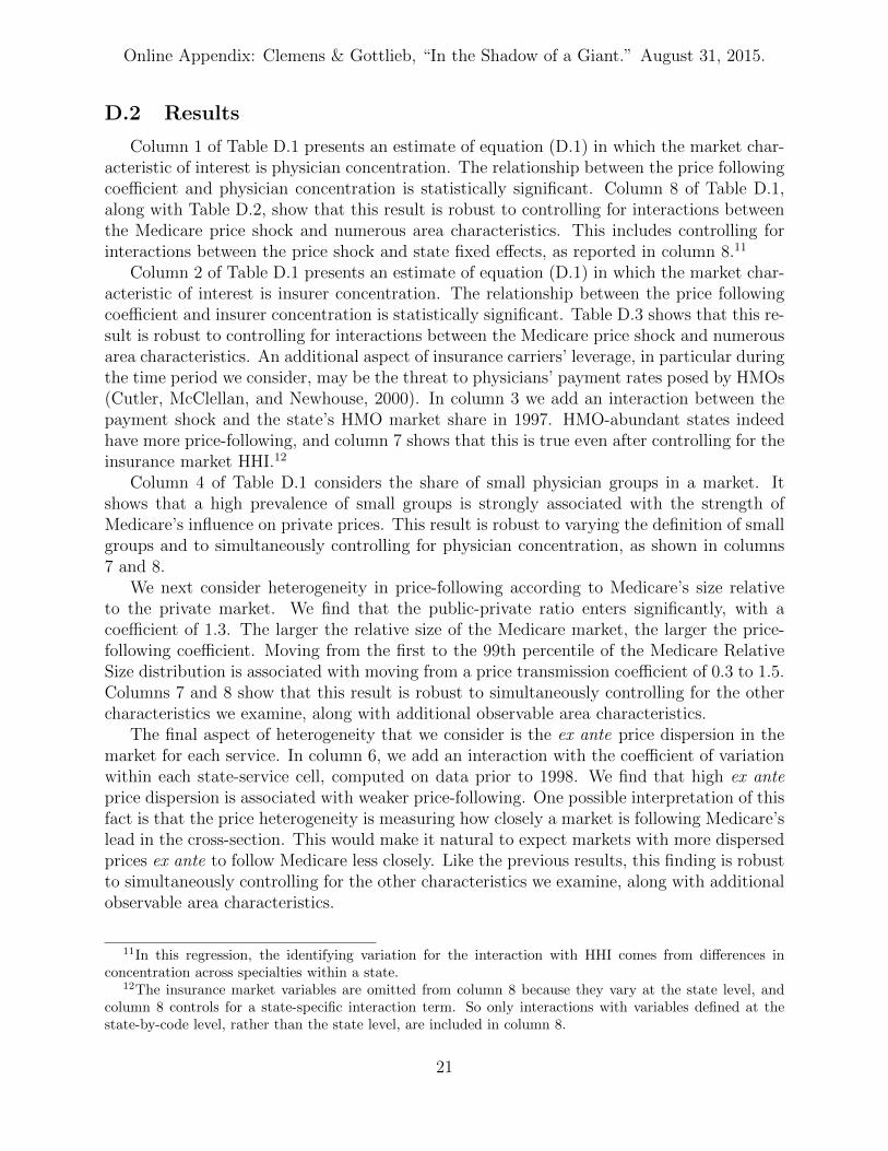
D.2 Results
Column 1 of Table D.1 presents an estimate of equation (D.1) in which the market char-acteristic of interest is physician concentration. The relationship between the price followingcoefficient and physician concentration is statistically significant. Column 8 of Table D.1,along with Table D.2, show that this result is robust to controlling for interactions betweenthe Medicare price shock and numerous area characteristics. This includes controlling forinteractions between the price shock and state fixed effects, as reported in column 8.11
Column 2 of Table D.1 presents an estimate of equation (D.1) in which the market char-acteristic of interest is insurer concentration. The relationship between the price followingcoefficient and insurer concentration is statistically significant. Table D.3 shows that this re-sult is robust to controlling for interactions between the Medicare price shock and numerousarea characteristics. An additional aspect of insurance carriers’ leverage, in particular duringthe time period we consider, may be the threat to physicians’ payment rates posed by HMOs(Cutler, McClellan, and Newhouse, 2000). In column 3 we add an interaction between thepayment shock and the state’s HMO market share in 1997. HMO-abundant states indeedhave more price-following, and column 7 shows that this is true even after controlling for theinsurance market HHI.12
Column 4 of Table D.1 considers the share of small physician groups in a market. Itshows that a high prevalence of small groups is strongly associated with the strength ofMedicare’s influence on private prices. This result is robust to varying the definition of smallgroups and to simultaneously controlling for physician concentration, as shown in columns7 and 8.
We next consider heterogeneity in price-following according to Medicare’s size relativeto the private market. We find that the public-private ratio enters significantly, with acoefficient of 1.3. The larger the relative size of the Medicare market, the larger the price-following coefficient. Moving from the first to the 99th percentile of the Medicare RelativeSize distribution is associated with moving from a price transmission coefficient of 0.3 to 1.5.Columns 7 and 8 show that this result is robust to simultaneously controlling for the othercharacteristics we examine, along with additional observable area characteristics.
The final aspect of heterogeneity that we consider is the ex ante price dispersion in themarket for each service. In column 6, we add an interaction with the coefficient of variationwithin each state-service cell, computed on data prior to 1998. We find that high ex anteprice dispersion is associated with weaker price-following. One possible interpretation of thisfact is that the price heterogeneity is measuring how closely a market is following Medicare’slead in the cross-section. This would make it natural to expect markets with more dispersedprices ex ante to follow Medicare less closely. Like the previous results, this finding is robustto simultaneously controlling for the other characteristics we examine, along with additionalobservable area characteristics.
11In this regression, the identifying variation for the interaction with HHI comes from differences inconcentration across specialties within a state.
12The insurance market variables are omitted from column 8 because they vary at the state level, andcolumn 8 controls for a state-specific interaction term. So only interactions with variables defined at thestate-by-code level, rather than the state level, are included in column 8.
21

Onlin
eA
pp
endix
:C
lemen
s&
Gottlieb
,“In
the
Shad
owof
aG
iant.”
Augu
st31,
2015.
Appendix Table D.1: Heterogeneity in Price-Following By Market Characteristics
(1) (2) (3) (4) (5) (6) (7) (8)Dependent Variable: Private Payment Level
Payment Shock × Post-1997 1.312** 1.350** 1.496** 1.171** 1.015** 1.573** 1.123** 0.905*(0.199) (0.217) (0.294) (0.204) (0.144) (0.331) (0.195) (0.418)
Payment Shock × Post-1997 -0.853** -0.562** -0.462*× Specialty HHI (0.298) (0.207) (0.219)
Payment Shock × Post-1997 0.421** 0.823**× Insurance HHI (0.150) (0.207)
Payment Shock × Post-1997 0.604** 0.669**× HMO Share 1997 (0.177) (0.173)
Payment Shock × Post-1997 0.949** 0.319+ 0.300+
× Spec. Sole Practice Share (0.233) (0.168) (0.159)Payment Shock × Post-1997 1.386** 1.382** 1.596**× Public-Private Ratio (0.516) (0.525) (0.596)
Payment Shock × Post-1997 -1.132** -1.721** -1.342**× Ex Ante Price Dispersion (0.409) (0.598) (0.415)
Additional Interactions:Payment Shock × None None None None None None Density State FE
N 245,296 245,296 245,296 245,296 245,296 245,296 245,296 245,296Number of Codes 1,364 1,364 1,364 1,364 1,364 1,364 1,364 1,364
Note: **, *, and + indicate statistical significance at the 0.01, 0.05, and 0.10 levels respectively. The table shows the results of reduced form
specifications of the form described by equation (D.1). Observations are constructed at the service-by-state-by-year level. The panel is balanced in
the sense that each service-by-state panel is only included if public and private prices are available for each year from 1995 through 2002, plus all
of the interaction variables are available. Observations are weighted according to the number of times the service is observed in Medicare claims
in 1997. The dependent variable in all columns is the level of the average private payment. Standard errors are calculated allowing for arbitrary
correlation among the errors associated with each service. All of the variables interacted with the payment shock have been converted into z-scores,
except for the public-private ratio. Further details of the construction of all variables are available in the note to Table 1, Appendix B, and in
the main text. Sources: Authors’ calculations using Medicare claims, Thompson Reuters MarketScan data, and data obtained from the National
Association of Insurance Commissioners, by permission. The NAIC does not endorse any analysis or conclusions based upon the use of its data.
22

Onlin
eA
pp
endix
:C
lemen
s&
Gottlieb
,“In
the
Shad
owof
aG
iant.”
Augu
st31,
2015.
Appendix Table D.2: Robustness Checks on Heterogeneity in Surgical CF Shock’s Effect by Provider Con-centration
(1) (2) (3) (4) (5) (6)
Dependent Variable: Private Payment Level
Payment Shock × Post-1997 1.293** 1.278** 1.182** 1.374** 1.319** 1.238**(0.156) (0.167) (0.150) (0.249) (0.219) (0.180)
Payment Shock × Post-1997 -0.909* -0.818** -0.969** -0.734** -0.829** -0.988**× Specialty HHI (0.364) (0.293) (0.323) (0.240) (0.259) (0.352)
N 240,264 240,264 240,264 240,264 240,264 240,264Number of Codes 1,303 1,303 1,303 1,303 1,303 1,303
Controls Below Fully Interacted? Yes Yes Yes Yes Yes YesCensus Region Yes Yes No Yes No NoCensus Division No Yes No No No NoLog. Population No No Yes No No NoLog. Density No No No Yes No NoLog. Income Per Capita No No No No Yes NoEducation (HS and BA Completion) No No No No No Yes
Note: **, *, and + indicate statistical significance at the 0.01, 0.05, and 0.10 levels respectively. The table shows the results of reduced form
specifications based on equation (D.1). Observations are constructed at the service-by-state-year level. The panel is balanced in the sense that
each service-by-state panel is only included if public and private prices could be measured for each year from 1995 through 2002. Observations are
weighted according to the number of times the service is observed in Medicare Part B in 1997. The dependent variable in all columns is the level
of the average private payment. Standard errors are calculated allowing for arbitrary correlation among the errors associated with each service.
In columns 1 and 2, “Payment Shock × Post-1997” is interacted with a full set of region or division fixed effects, and the coefficient shown is the
weighted average of those interactions. The construction of all variables is further described in the note to Table 1 and in the main text. Sources:
Authors’ calculations using Medicare claims and Thompson Reuters MarketScan data, and Ruggles et al. (2010).
23

Onlin
eA
pp
endix
:C
lemen
s&
Gottlieb
,“In
the
Shad
owof
aG
iant.”
Augu
st31,
2015.
Appendix Table D.3: Robustness Checks on Heterogeneity in Surgical CF Shock’s Effect by Insurer Concen-tration
(1) (2) (3) (4) (5) (6)
Dependent Variable: Private Payment Level
Payment Shock × Post-1997 1.370** 1.307** 1.371** 1.416** 1.362** 1.344**(0.204) (0.183) (0.236) (0.289) (0.243) (0.231)
Payment Shock × Post-1997 0.296* 0.599* 0.537** 0.603* 0.684* 0.431*× Insurer HHI (0.149) (0.274) (0.168) (0.241) (0.313) (0.207)
N 293,688 293,688 293,688 293,688 293,688 293,688Number of Codes 2,194 2,194 2,194 2,194 2,194 2,194
Controls Below Fully Interacted? Yes Yes Yes Yes Yes YesCensus Region Yes Yes No Yes No NoCensus Division No Yes No No No NoLog. Population No No Yes No No NoLog. Density No No No Yes No NoLog. Income Per Capita No No No No Yes NoEducation (HS and BA Completion) No No No No No Yes
Note: **, *, and + indicate statistical significance at the 0.01, 0.05, and 0.10 levels respectively. The table shows the results of reduced form
specifications based on based on equation (D.1). Observations are constructed at the service-by-state-year level. The panel is balanced in the sense
that each service-by-state panel is only included if public and private prices could be measured for each year from 1995 through 2002. Observations
are weighted according to the number of times the service is observed in Medicare Part B in 1997. The dependent variable in all columns is the level
of the average private payment. Standard errors are calculated allowing for arbitrary correlation among the errors associated with each service.
In columns 1 and 2, “Payment Shock × Post-1997” is interacted with a full set of region or division fixed effects, and the coefficient shown is the
weighted average of those interactions. The construction of all variables is further described in the note to Table 1 and in the main text. Sources:
Authors’ calculations using Medicare claims, Thompson Reuters MarketScan data, Ruggles et al. (2010), and data obtained from the National
Association of Insurance Commissioners, by permission. The NAIC does not endorse any analysis or conclusions based upon the use of its data.
24

Online Appendix: Clemens & Gottlieb, “In the Shadow of a Giant.” August 31, 2015.
E Short-Term Price-Following Estimates
E.1 Background
In our discussion of institutional detail in section 2, we presented anecdotal evidence frompractitioners on the nature of contracting between physicians and insurers. Practitionersdescribe many negotiated payment schedules as being benchmarked directly to Medicare’srelative rates, often with a constant markup. Payments associated with contracts of thisform would move mechanically with updates to Medicare’s relative rates. This contractinginstitution might thus underlie some of the dynamics we observe. Specifically, it might helpto explain the relatively short-run effect of the change in Medicare’s Conversion Factors forsurgical relative to non-surgical care.
This appendix presents an analysis that, using data from a single large insurer, mayshed light on the prevalence of payments linked directly to Medicare’s relative rates. Weexamine physician payments from Blue Cross Blue Shield of Texas (BCBS-TX) for the 2010calendar year. We exploit a key piece of institutional detail about BCBS-TX’s Medicare-benchmarked payments. Each year, CMS announces hundreds of updates to the RVUs thatRBRVS assigns to specific services. BCBS-TX in turn issues publicly available newsletters inwhich it informs its physicians of the date on which it will incorporate the new year’s RBRVSvalues into its physician fee schedule. We therefore know that the switch from 2009 to 2010RVUs was scheduled for July 1, 2010. Using changes in the RVUs that RBRVS assigned tospecific services between these two years, we will estimate the relationship between updatesto Medicare’s RBRVS and changes in BCBS-TX payments surrounding July 1, 2010.
Two features of this analysis make it plausible to interpret the estimates below as re-flecting the role of mechanical benchmarking as opposed to active contract renegotiation.The first key distinction between the analysis in this appendix and that in the main text isthe time horizon. In the main text, we estimate the effect of Medicare and private paymentchanges over a horizon of several years. The analysis presented below occurs entirely within2010. Second, in comparison with the changes to the surgical and non-surgical ConversionFactors, the updates analyzed below did not dramatically alter physician groups’ averageMedicare reimbursement rates. Consequently, these RBRVS updates less drastically alterthe bargaining positions of any given physician group.
E.2 Estimation
We analyze the RVU changes using the universe of BCBS-TX claims data. These datadescribe the outpatient care provided to for roughly 3.5 million insured members, primarilythrough PPO plans. Because the data are from a single insurer and contain unique identifiersfor physician groups, they allow us to track the payments associated with identifiable insurer-physician group pairs. We use data on BCBS-TX payments to 76,548 physician groups, for2,028 unique services in 2010. The year’s worth of data on these payments covers 18.37million underlying claims. RVU changes for the services whose prices we study have astandard deviation of 8.1 percent.
We compute average BCBS-TX payments at the physician group-by-service-by-month
25

Online Appendix: Clemens & Gottlieb, “In the Shadow of a Giant.” August 31, 2015.
level. We then run the following regressions, where j indexes services, t indexes months, andg indexes physician groups:
PBCBSj,g,t = β · PredChgMedicare
j × PostJulyt + υj1j + υt1t + vj,g,t (E.1)
PBCBSj,g,t = β · PredChgMedicare
j × PostJulyt + υj1j + υg1g + υj,g1j · 1g + υt1t + vj,g,t.
(E.2)
The variable PredChgMedicarej is constructed as PMedicare
j,2009, the average 2009 Medicarepayment for service j, multiplied by the percent change in the RVUs assigned to service jfrom 2009 to 2010. We estimate the regression on payments aggregated to the physiciangroup-by-code-by-month level (j×g× t). Regression (E.2) adds physician group fixed effects(1g) and group-by-code fixed effects (1j · 1g). In both specifications, we cluster standarderrors at the service code level, since that is the level at which our main independent variable(the Medicare price shock) varies.
We run each of these regressions using two weighting schemes. The first set of weightsis analogous to those we use in the paper; they are set to add up to the pre-shock Medicarequantities (specifically, the 2009 Medicare quantities for these same services). We dividethis Medicare quantity for service j by the number of claims for service j in the BCBS-TXsample. We then add up the weights within a group-service-year cell. The second weightingscheme simply uses the number of underlying BCBS-TX claims as our weight.
Under the following assumptions, estimates of β from the above regressions can be in-terpreted as the short-run mechanical effect of RBRVS updates on BCBS-TX’s RBRVS-benchmarked payments. First, the set of services benchmarked to Medicare must not changeat the same time as BCBS-TX implements the new RVUs. Second, other contract termsmust also remain constant, or at least not change in ways that are correlated with the RVUchanges. We would not expect these assumptions to hold over the long run, especially thesecond one. When RVU changes alter physicians’ bargaining positions, we would expectthem to alter the outcomes of subsequent round of active contract renegotiation. But overthe time span of a few months, as we examine here, this is unlikely—especially since physi-cian contracts tend not to be renegotiated annually. Dunn and Shapiro (2015) report, forexample, that “contracts between large health systems and commercial payers are typicallynegotiated every three years, sometimes up to every five years, whereas contracts betweensmaller practices and insurers are typically set on an auto-renewing annual basis with pro-visions that allow either party to terminate the contract.” While some renegotiations likelytook place during the period we analyze, it seems reasonable to expect their influence to beminimal.
E.3 Results
Table E.1 reports the estimates of equations (E.1) and (E.2) using the two sets of weights.The estimates imply that a $1 change in Medicare’s payments, as driven by updates tothe RBRVS, was associated on average with a $0.40 to $0.50 change in BCBS-TX’s pay-ments. Under the assumptions discussed above, this estimates the contribution of RBRVS-benchmarked payments to the short-run relationship between public and private payments.
26

Online Appendix: Clemens & Gottlieb, “In the Shadow of a Giant.” August 31, 2015.
If the payments in our main MarketScan data have the same degree of Medicare bench-marking as BCBS-TX, the estimate would thus suggest that $0.40 to $0.50 of our year-1estimate of $1.20 (from Figure 4) can be attributed to RBRVS-benchmarking. Note thatthis $1.20 estimate persists over subsequent years. From this we infer that the insurers andphysician groups will generally agree to maintain these mechanical changes in subsequentyears’ negotiations.
27

Onlin
eA
pp
endix
:C
lemen
s&
Gottlieb
,“In
the
Shad
owof
aG
iant.”
Augu
st31,
2015.
Appendix Table E.1: Short-Term Responses to Medicare RVU Updates in BCBS-TX
(1) (2) (3) (4)
Dependent Variable: Price or average price in BCBS-TX data
RVU Shock 0.520** 0.442** 0.402** 0.370**× Post-Update (0.125) (0.116) (0.088) (0.089)
Fixed Effect Code Group- Code Group-Code Code
Number of Codes 2,028 2,028 2,028 2,028N 2,499,583 2,499,583 2,499,583 2,499,583
Weights Texas Medicare BCBS-TXservice quantity, 2009 service quantity
Note: **, *, and + indicate statistical significance at the 0.01, 0.05, and 0.10 levels respectively. The table shows the results of reduced form
specifications of the forms described in equations (E.1) and (E.2). Columns 1 and 3 report estimates of equation (E.1), and columns 2 and 4
show equation (E.2). Both the payment shock and private payment outcome are expressed in dollar terms. The unit of observation is the billing
code-by-physician group-by-month. In columns 1 and 2, observations are weighted so that the weights for each service add up to the number of
times the service is observed in Medicare claims from Texas in 2009. In columns 3 and 4, the weights are based on the Texas data used in the
regression. Standard errors are calculated allowing for arbitrary correlation among the errors associated with each service. Sources: Authors’
calculations using Medicare claims and Blue Cross/Blue Shield of Texas claims data.
28

Online Appendix: Clemens & Gottlieb, “In the Shadow of a Giant.” August 31, 2015.
F Analysis of Quantities in the Medicare and Mar-
ketScan Data
Section 6.5 notes that the evolution of quantities in the Medicare and MarketScan datadoes not support strong conclusions regarding the short-run effects of the Conversion Factorchange on care provision. This appendix summarizes the relevant data. The ConversionFactor change increased payments for non-surgical care relative to surgical care. We canthus convey the relevant quantity movements concisely by observing the share of total carethat falls into the surgical category. A decrease in this share implies a decline in the provisionof surgical relative to non-surgical care.
Appendix Figure F.1 displays the evolution of surgical relative to non-surgical care pro-vision in both the Medicare and MarketScan data. Panel A shows the Medicare claims whilepanel B shows the MarketScan claims. Both panels report two measures. The first, which isthe most complete quantity metric, accounts for differences between high and low resourceintensive services by weighting each service by its number of RVUs. The second measure issimply the raw fraction of total service claims.
Looking first at the Medicare data, it is apparent that the surgery share declines betweenthe initial and later years of the sample. The decline appears, however, to have largely oc-curred between 1996 and 1997, which precedes the payment shock. Consequently, regressionspecifications yield very different results depending on whether or not they control for abaseline trend in surgical service provision.13 The figure also reveals that the RVU weightsare quite relevant for assessing the relative evolution of surgical and nonsurgical serviceprovision. While surgical services’ RVU-weighted share declines, the unweighted share isrelatively stable throughout the sample.
The evolution of quantities in the MarketScan data exhibit similar sensitivity. Thesurgery share is again non-trivially lower during the last years of the sample than duringthe initial years. In these private sector data, the surgery share exhibits significant volatilityfrom year to year. It is at its highest in 1995 and 1999 and at its lowest in 2001 and 2002.Regressions again yield very different results depending on whether or not they control fora baseline trend in surgical service provision. Similarly, one again obtains a quite differentpicture depending on whether one weights by each service’s number of RVUs. These featuresof the data underly our summary that the data do not support strong conclusions regardingthe short-run effects of the Conversion Factor merger on care provision.
13Notably, our pricing results are entirely robust to this modification, plus a variety of additional robust-ness checks shown in Appendix C.
29

Online Appendix: Clemens & Gottlieb, “In the Shadow of a Giant.” August 31, 2015.
Appendix Figure F.1: Surgical and Non-Surgical Service Quantities
Panel A: Medicare Procedure Share
0.0
6.1
2.1
8.2
4Pr
oced
ure
Shar
e of
Ser
vice
s
.08
.14
.2.2
6.3
2Pr
oced
ure
Shar
e of
RVU
s
1994 1996 1998 2000 2002Year
Total Relative Value Units Raw Service Count
Panel B: Private Procedure Share
.12
.18
.24
.3.3
6Pr
oced
ure
Shar
e of
Ser
vice
s
.18
.24
.3.3
6.4
2Pr
oced
ure
Shar
e of
RVU
s
1994 1996 1998 2000 2002Year
Total Relative Value Units Raw Service Count
Note: The figures show the share of Medicare (Panel A) and MarketScan (Panel B) servicesthat are classified as Procedures, calculated both with and without weighting for serviceintensity using Medicare’s Relative Value Units.
30

Online Appendix: Clemens & Gottlieb, “In the Shadow of a Giant.” August 31, 2015.
G Quantifying the Resource Reallocation Resulting from
Our Payment Shocks
G.1 Calculating Specialty Financial Exposure
In section 7.1, we quantify the implications of our results for the incomes of physiciansof different specialties. Since different specialties provide different mixes of surgical andnonsurgical care, we use Medicare claims data to determine the empirical split of each spe-cialty’s payments into surgical and nonsurgical services. The American Medical Association(Gonzalez and Zhang, 1998) provides data on the average overall reimbursements and take-home pay for a range of different specialties. Combining these two sources, we compute theeffects of Medicare’s surgical reimbursement cut, Medicare’s nonsurgical payment increase,and possible spillovers into private payments. Table 4 shows the results.
G.2 Estimating the Overall Reallocations from the ConversionFactor Change
Medicare spending on surgical care amounted to $15.8 billion (inflation-adjusted to 2013dollars) after the surgical payment cut (CMS 2001, Table 57). Based on the surgical paymentreduction, and assuming no behavioral response, this means that surgical payments were $1.8billion lower than they would have been under the previous Conversion Factor regime, withnonsurgical payments higher by the same amount. Private payers spent $254 billion onphysician and clinical services in 1998 (Centers for Medicare and Medicaid Services (CMS),2014). Assuming the same medical-surgical split as in Medicare, and using our baseline price-following estimate of 1.16, yields a reallocation of $5.9 billion in private insurance paymentsdue to the medical-surgical pricing change.
This estimate of the private sector spillover is subject to two caveats. The first is astandard concern of our estimates’ external validity. As we observed in section 4.1, theMarketScan data represent the universe of claims associated with a selected set of plansprovided by large employers. Small employers’ plans or individual market insurance maybe more or less likely to pay physicians according to fee schedules influenced by Medicare’srelative payments.
Second, Medicare may exert more influence over fee-for-service payments than over capi-tated payments. On this point it is important to keep in mind that, although managed carewas pervasive during the period we study, it typically did not translate into capitated pay-ment of physician groups. The Community Tracking Study (CTS) reveals that throughoutthe period we study, roughly 40 percent of the revenue of physicians’ practices was linked tomanaged care contracts. A much smaller share of revenue was prepaid or capitated. In 1996this share was 16 percent (CSHSC 1999, 56), while in 2004 it was 13 percent (CSHSC 2006,4-29). Throughout our sample, capitated payments thus represented less than one-third ofthe revenues associated with managed care. Additionally, the share of revenue reported inthe CTS as being capitated includes payments under both Medicaid and Medicare man-aged care arrangements, which are sizable. The capitated share of physician revenues from
31

Online Appendix: Clemens & Gottlieb, “In the Shadow of a Giant.” August 31, 2015.
private sector payers is thus not particularly large. In the context of Medicare’s paymentsfor surgical procedures relative to other services, we make a conservative adjustment andassume 16 percent of payments are capitated and thus unaffected by payment changes. Ifthese payments are also affected, then our estimate of the ratio of the private sector spilloverto Medicare’s direct effect on would increase to 3.9 from the 3.3 that we use in section 7.
G.3 Estimating the Overall Reallocations from the Payment Lo-cality Overhaul
We must also consider external validity in the context of our estimates of the effectsof changes in Medicare’s system of geographic adjustments. Here too, Medicare’s influenceon payments in small-group and individual market plans may be either greater or smallerthan its influence on the payments from plans sponsored by large employers. But the con-cern about capitation that we raised in the previous paragraph is less relevant here. Recallthat these geographic payment changes altered payments across the board rather than dif-ferentially across services. In fee-for-service settings, benchmarking to Medicare’s relativepayment menu can create a strong, mechanical link between public and private paymentsfor one service relative to another, which would not be relevant in capitated contracts. Butsince this mechanism is less applicable when considering across-the-board payment changes,our results in this context likely reflect Medicare’s influence on the physician’s opportunitycost, which would be relevant for both capitated and fee-for-service payments. So there isless need to exclude capitated payments when calculating the spillovers from broad-basedgeographic payment changes.
One way to benchmark the magnitudes of these reallocations is by comparison withsimilarly motivated but more directly financed programs. For example, the Critical AccessHospital (CAH) program is a prominent means through which Medicare subsidizes ruralhealth care. By obtaining CAH designation, rural hospitals may claim higher paymentsthan they would otherwise be entitled to receive. Unsurprisingly, rural hospitals lobbyfiercely to maintain their access to these designations.14 In 2010, CAH subsidies amounted toapproximately $300 million (MedPAC, 2012). Our findings imply that the CAH’s magnitudeis on par with the locality consolidation’s direct effects and less than half the size of its privatepayment spillovers.15
14News (Gold, 2011; McKee, 2013), government reports (Levinson, 2013), and advocacy organizations(American Hospital Association 2014) provide ample evidence of the CAH program’s political importance.
15Due to the much faster growth of health care spending than overall inflation, the $300 million subsidyin 2010 probably overstates the contemporaneous value of the CAH program in 1997 that would be theappropriate comparison to the $1 billion spillover that we compute from that year.
32

Online Appendix: Clemens & Gottlieb, “In the Shadow of a Giant.” August 31, 2015.
Appendix References
American Hospital Association. 2014. “Main Messages: Transfer Rates and Useof Post-Acute Care after Surgery at Critical Access vs Non-Critical Access Hospi-tals.” AHA Talking Points available online at http://www.aha.org/content/14/
talkingpoints-cah-jama2014may.pdf (accessed August 18, 2014).
Anthem Blue Cross and Blue Shield. 2012. “Anthem Blue Cross and Blue Shield Providerand Facility Manual.” Available at http://www.anthem.com/provider/nv/f5/s1/t0/
pw_e188530.pdf (accessed August 14, 2014).
Baker, Laurence C., M. Kate Bundorf, Anne B. Royalty, and Zachary Levin. 2014. “PhysicianPractice Competition and Prices Paid by Private Insurers for Office Visits.” Journal ofthe American Medical Association 312 (16):1653–1662.
Blue Cross and Blue Shield of Texas. 2010. “Fee schedule updates.” Blue Re-view (3):15–16. Available at http://www.bcbstx.com/provider/pdf/bluereview/br_
issue3_2010.pdf (accessed August 14, 2014).
———. 2014. “HMO Bluer Texas - Blue Cross Blue Shield of Texas.” Available at http://www.bcbstx.com/employer/products/2_50/hmo_blue_texas.htm (accessed August 14,2014).
Center for Studying Health System Change (CSHSC). 1999. “Physician Survey SummaryFile: User’s Guide and Codebook.” Community Tracking Study Physician Survey, 1996–1997 (ICPSR 2597). Available at http://doi.org/10.3886/ICPSR02597.v3.
———. 2006. “2004–05 Physician Survey Summary File: User’s Guide and Codebook.”Community Tracking Study Physician Survey, 2004–2005 (ICPSR 4584). Available athttp://doi.org/10.3886/ICPSR04584.v2.
Centers for Medicare and Medicaid Services (CMS). 2001. “Medicare & Med-icaid Statistical Supplement.” Available online at http://www.cms.gov/
Research-Statistics-Data-and-Systems/Statistics-Trends-and-Reports/
MedicareMedicaidStatSupp/2001.html (accessed June 5, 2015).
———. 2014. “National Health Expenditure Accounts.” Available at http://www.cms.
gov/Research-Statistics-Data-and-Systems/Statistics-Trends-and-Reports/
NationalHealthExpendData/Downloads/NHE2013.zip.
Clemens, Jeffrey and Joshua D. Gottlieb. 2014. “Do Physicians’ Financial Incentives AffectMedical Treatment and Patient Health?” American Economic Review 104 (4):1320–1349.
Cutler, David M., Mark McClellan, and Joseph P. Newhouse. 2000. “How Does ManagedCare Do It?” RAND Journal of Economics 31:526–548.
33

Online Appendix: Clemens & Gottlieb, “In the Shadow of a Giant.” August 31, 2015.
Dafny, Leemore S., David Dranove, Frank Limbrock, and Fiona Scott Morton. 2011. “DataImpediments to Empirical Work on Health Insurance Markets.” B.E. Journal of EconomicAnalysis & Policy 11:8.
Dranove, David and Chris Ody. 2014. “Changing Paradigms: Evolving Measures of ProviderMarket Power.” Northwestern University, mimeo.
Dunn, Abe and Adam Hale Shapiro. 2015. “Physician payments under health care reform.”Journal of Health Economics 39 (1):89–105.
Fernandez, Bernadette. 2010. “Self-insured health insurance coverage.” Tech. Rep. R41069,Congressional Research Service.
Gold, Jenny. 2011. “When ‘Critical Access’ Hospitals Are Not So Critical.” KaiserHealth News Available online at http://www.kaiserhealthnews.org/stories/2011/
december/08/medicare-critical-access-rural-hospitals.aspx (accessed August18, 2014).
Gonzalez, Martin L. and Puling Zhang, editors. 1998. Physician Marketplace Statistics1997/98. Chicago: American Medical Association.
Levinson, Daniel R. 2013. “Most Critical Access Hospitals Would Not Meet the LocationRequirements if Required to Re-Enroll in Medicare.” Report OEI-05-12-00080 from theOffice of the Inspector General, Department of Health and Human Services. Availableonline at http://oig.hhs.gov/oei/reports/oei-05-12-00080.pdf (accessed August18, 2014).
Marton, James, Aaron Yelowitz, and Jeffery C. Talbert. 2014. “A tale of two cities? Theheterogeneous impact of medicaid managed care.” Journal of Health Economics 36:47–68.
McKee, Bill. 2013. “Area hospitals fear sharp federal cuts.” Moscow-Pullman DailyNews Available online at http://www.cantwell.senate.gov/public/index.cfm/2013/9/area-hospitals-fear-sharp-federal-cuts (accessed August 18, 2014).
MedPAC. 2012. “A Data Book: Health Care Spending and the Medicare Program.” Tech-nical report, Medicare Payment Advisory Commission.
Pope, Gregory C., Michael Trisolini, John Kautter, and Walter Adamache.2002. “Physician Group Practice (PGP) Demonstration Design Report.” Bal-timore: Centers for Medicare and Medicaid Services. Available online athttp://www.cms.gov/Medicare/Demonstration-Projects/DemoProjectsEvalRpts/
Downloads/PGP_Full_Demo_Report.pdf (accessed December 30, 2014).
Ruggles, Steven, J. Trent Alexander, Katie Genadek, Ronald Goeken, Matthew B. Schroeder,and Matthew Sobek. 2010. “Integrated Public Use Microdata Series: Version 5.0.” Min-neapolis: University of Minnesota. Available at http://usa.ipums.org/.
34

Online Appendix: Clemens & Gottlieb, “In the Shadow of a Giant.” August 31, 2015.
Welch, W. Pete, Alison Evans Cuellar, Sally C. Stearns, and Andrew B. Bindman. 2013.“Proportion Of Physicians In Large Group Practices Continued To Grow In 2009–11.”Health Affairs 32 (9):1659–1666.
35