Embed Size (px)
DESCRIPTION
Image-based version
Citation preview

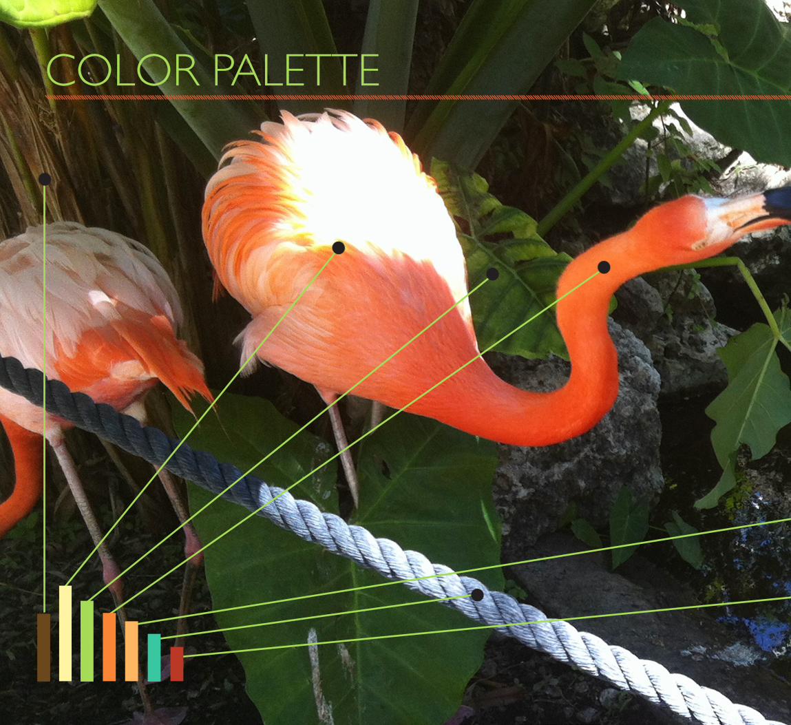
COLOR PALETTE
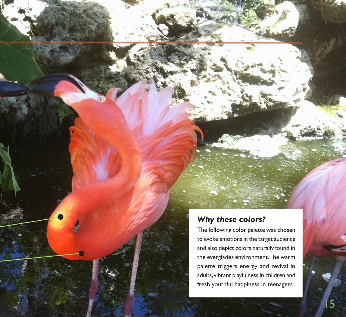
The following color palette was chosen to evoke emotions in the target audience and also depict colors naturally found in the everglades environment. The warm palette triggers energy and revival in adults, vibrant playfulness in children and fresh youthful happiness in teenagers.
Why these colors?
15
VOICE & TONE
VoiceBased on the headline, “When was the last time YOU took a field trip?”, the voice should be slightly humorous and thoughtful, intuitive and playful. Since the target audience is children and families, the copy should appeal to kids and the ‘kid at heart’ in adults. The voice should also sound like a friend is talking to them, someone familiar showing them around Flamingo Gardens. Almost a hand-holding type of voice should be heard when reading the type.
Copy & MusicThe body copy and music alike should make the audience go to an unlimited and magical place of wonder. When you visit Flamingo Gardens, you get a sensory overload of beautiful tropical scenery and animals. The copy and music should only enhance the
emotion of the target audience, helping them to get the sense of “being in another world.”
ToneThe tone should be childlike, talking to the child at heart in the audience, whether young or old. “Wanna see how otters play tag?” “Look at the huge crocodile!” “Follow me to see the bird show!” are just a few examples of the tone that should be used for advertisements and signage around the park itself. Using a consistent tone like this will help shape the brand of Flamingo Gardens and tap into the emotions of the audience.

15
FONTS
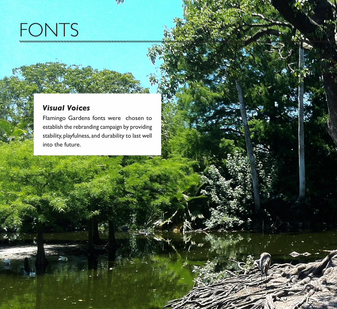
Flamingo Gardens fonts were chosen to establish the rebranding campaign by providing stability, playfulness, and durability to last well into the future.
Visual Voices
15
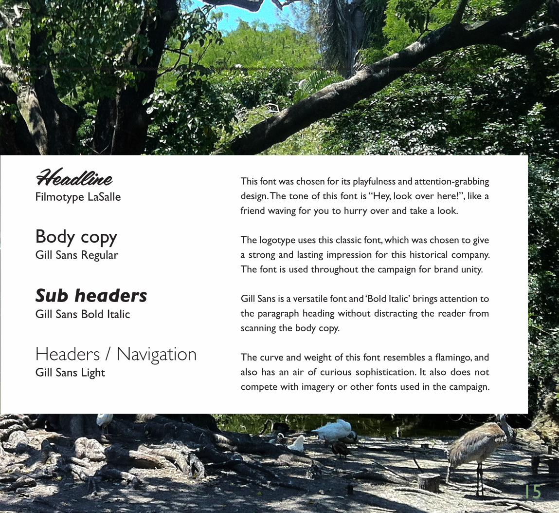
HeadlineFilmotype LaSalle
Sub headersGill Sans Bold Italic
Body copyGill Sans Regular
Headers / NavigationGill Sans Light
This font was chosen for its playfulness and attention-grabbing design. The tone of this font is “Hey, look over here!”, like a friend waving for you to hurry over and take a look.
Gill Sans is a versatile font and ‘Bold Italic’ brings attention to the paragraph heading without distracting the reader from scanning the body copy.
The logotype uses this classic font, which was chosen to give a strong and lasting impression for this historical company. The font is used throughout the campaign for brand unity.
The curve and weight of this font resembles a flamingo, and also has an air of curious sophistication. It also does not compete with imagery or other fonts used in the campaign.