Embed Size (px)
Citation preview

Illuminated critique: the Kent Moby-DickMATTHEW JEFFREY ABRAMS
Abstract Rockwell Kent is famous for the near three hundred illustrations he made for two simultaneously released 1930 editions ofHerman Melville’s Moby-Dick; or, The Whale (1851). But Kent’s illustrations, while widely praised, also mark a complex intervention thatwas explicitly designed to critique Melville’s own visuality. Kent spent five years researching and designing his project, during which hediscovered many of the nineteenth-century textual and visual sources that had influenced Melville, or that Melville had outrightappropriated. These include the illustrated whaling chronicles of William Scoresby, Thomas Beale, Frederick Bennett, and John RossBrowne. Kent’s highly stylized illustrations remediate these chronicles and their attendant imagery through three approaches: bydirectly copying illustrations that Melville used as sources; by hybridizing Melville’s visuality with its actual antecedents; and by pre-empting the “pictures” that Ishmael—the only surviving crewmember and narrator of the book—hopes to “paint,” thus complicating,if not abrogating, the narrator’s will to ekphrasis. In other words, Kent’s images complete a tripartite, verbal–visual signal jammingthat could magnify, reverse, collapse, or ironize Melville’s own visuality. Moreover, because Kent identified Melville’s source imagerydecades before anyone else, and then critiqued Melville’s visuality based on these hard-earned discoveries, his illustrations constitute ahistoriographic origin point for the literary discipline now called “Melville and the Visual Arts.” The Kent Moby-Dick, as well as itsmany foreign translations, is a novel replete with much more than images: it is a novel saturated with an ongoing, albeit wholly visual,dialogue about Melville’s own visual program. It therefore represents a unique category of production, where illustration becomesliterary criticism, or, one could say, illuminated critique.
Keywords illustration, ekphrasis, Herman Melville, Rockwell Kent
[Moby-Dick’s] prose is ample, voluminous rich, warm; it isabove all not refined, not studied; it blunders through totriumphant success by the dramatic intensity of the visionarymind it serves. It is a literary woodcutting not engraving.1
Melville was enlightened when he wrote Moby Dick and fromthe same place Rockwell Kent created illustrations for it thatshout loudly of love and desperation. This time he makes pendrawings, but Kent understands all graphic techniques. Heloves illustrating by woodcuttings, and only where he cannotuse that, he moves toward drawing, adjusting it so perfectlythat you almost cannot tell the difference.2
Method Kaláb published the first Czech-language literary cri-ticism on Moby-Dick only months before the Czech publisherDružstevní Práce released the first translated edition of thenovel.3 Given this fact, it is perhaps not so surprising thatKaláb’s essay, written in 1932, would include an encomium toHerman Melville. After all, it was not unusual for interwar-eraMelville criticism to descend into passionate hagiography, oftenproclaiming Melville a “genius,” or, in Kaláb’s case, “enligh-tened.” But what is surprising about the birth of Czech-lan-guage Moby-Dick criticism is that Kaláb’s essay appeared inCesky Bibliofil, a journal dedicated to the book arts, and thatthe essay’s focus was not Melville but Rockwell Kent. Kent’stwo-hundred and eighty illustrations for the 1930 LakesidePress and Random House Moby-Dick editions were wildly suc-cessful, and the image cycle was soon exported, in part or inwhole, into numerous foreign translations, includingDružstevní Práce’s first edition (figure 1).In fact, the Czech reception ofMoby-Dick is inextricably tied to
Kent. Not only is Kaláb’s essay the historiographic point of originof CzechMelville studies, but also of the first nineMelville-related
essays published in the former Czechoslovakia, five were aboutKent’s Moby-Dick illustrations; of the first six essays appended toactual Czech editions ofMoby-Dick, four were about Kent; and by1975, seven of the nine extant editions of Bílá velryba (literally, TheWhite Whale) included Kent’s illustrations.4 Therefore, when weconsider the fame and international circulation of Kent’s illustra-tions alongside the notoriety of the 1930 Random House tradeedition proper, which included two-hundred and seventy ofKent’s original illustrations and a dust jacket, cover, and spinethat all omitted Melville’s name but included Kent’s, one couldeven argue that, for interwar Czechs, there was noMoby-Dick, butonly the KentMoby-Dick.
Of greater importance, and no doubt a consequence of thisfortuitously timed emergence of Czech Moby-Dick criticismalongside the Kent Moby-Dick, at least three Czech commenta-tors—Kaláb, Zdenĕk Pilař, and Luboš Hlaváček—explicitlynoted one of Kent’s sliest acts of visual legerdemain, which,even today, often eludes scholars and the public alike: Kentmay have theorized Melville’s text as a “literary woodcutting,”but, contrary to popular belief, his illustrations were not wood-cuttings, nor were they, at least initially, any kind of engraving,even though Kent was a widely celebrated practitioner of bothmedia. Kent’s illustrations were pen-and-ink drawings pains-takingly executed to feign the aesthetic peculiarities of wood-cuttings, which the edition’s printer, R. R. Donnelley and Sons,then reproduced using an antiquated and labor-intensive pro-cess called “photomechanical etchdowns”, which preserved thetonal purity and deep black color indicative of classical techni-ques like woodblock printing. Confusion regarding this matterknows no bounds. When Modern Library published a faithfulreprinting of the Kent Moby-Dick in 1984, for instance, the
WORD & IMAGE, VOL. 33, NO. 4, 2017 376https://doi.org/10.1080/02666286.2017.1341804
# 2017 Taylor & Francis

popular literary critic Alan Cheuse heralded the return of thatbeautiful book, “with the copious woodcuts by RockwellKent.”5 There is, then, something to be said here aboutobscurity, about legerdemain, about circuits of remediation,and about the linkages to so much of the criticism within“Melville and the visual arts,” which recognizes many ofthese same devices when discussing Melville’s own relationshipto word and image, like his obscurity, his abstractionism akin tothat of J. M. W. Turner, his feasts of words and descriptions,his ekphrastic impulse, and his verbal “painting” of scenes. Andthere is something related that we can also say about the Czechdesire to dissect Kent’s specific printmaking procedures vis-à-vis Kent’s own desire to interpret Moby-Dick as a specific print-making procedure, and here lies this article’s true focus: I amnot so much interested in the Czech reception of Moby-Dick asattempting to understand how Kent positioned himself withinand against Moby-Dick, and why he deployed certain visualdeceits and explicit trickeries, which early Czech critics camethe closest to identifying, if not understanding.Briefly stated, Kent’s illustrations mark a complex intervention
that was explicitly designed to critique Melville’s own visuality,and while the early Czech critics were in no position to recognizethe how or why behind this, they understood that the images weremore complex than most commentators gave them credit for, andthey intuited that Kent’s faux-woodcut production method wassomehow implicated. Kaláb and company were right, but thestory is much larger: Kent spent five years researching and design-ing his project, during which time he discovered many of thenineteenth-century textual and visual sources that had influenced
Melville, or that Melville had outright appropriated. Theseinclude the illustrated whaling chronicles of William Scoresby,Thomas Beale, Frederick Bennett, and John Ross Browne. Kent’shighly stylized illustrations remediate these chronicles and theirattendant imagery through three approaches: by directly copyingillustrations that Melville used as sources; by hybridizingMelville’s visuality with its actual antecedents; and by preemptingthe “pictures” that Ishmael—the only surviving crewmember andnarrator of the book—hopes to “paint,” thus complicating, if notabrogating, the narrator’s will to ekphrasis. In other words, Kent’simages complete a tripartite, verbal–visual signal jamming thatcould magnify, reverse, collapse, or ironize Melville’s own visual-ity. In an interwar moment when other artists like Lynd Ward,whom Kent personally knew, were making woodcut novels thatreplaced textual narrative with visual narrative, Kent effectivelycreated a purely graphic literary critique.Kent’s contributions, therefore, are unlike most novel illus-
trations, whose relationships to text are often reciprocal, inter-pretive, complementary, or some combination thereof. Rather,Kent’s illustrations, in the fashion of literary criticism proper,were primarily dialogical. This dialogical relationship was notpost facto and apart from the text, however, but physicallyintervening within, and embedding itself into, the actual textand the book. Kent’s illustrative project, then, much likeKaláb’s essay, is something like the historiographic point oforigin for the literary sub-discipline known today as “Melvilleand the Visual Arts,” because Kent identified Melville’s sourceimagery decades before anyone else did and he critiquedMelville’s visuality based on these hard-earned discoveries.
Figure 1. (left) Herman Melville, Moby-Dick, 3 vols (Chicago: Lakeside Press, 1930). 11 7/8 × 8 5/8 × 4 inches; and (right) illustrations and book design byRockwell Kent, vol. III, chapters 122, “Midnight Aloft—Thunder and Lightening,” and 123, “The Musket,” pp. 188–89. Photos: author.
WORD & IMAGE 377

The Kent Moby-Dick, as well as the foreign iterations that itspawned, is a novel replete with more than images; it is anovel saturated with an ongoing, albeit wholly visual, dialogueabout Melville’s own visual program. It is nothing short ofillustration as literary criticism, or, one could say, illuminatedcritique. And the Kent Moby-Dick-as-illuminated critique, weshall see, became an intervention that at once threatened toobviate Melville’s ekphrasis and pictorialism, while reinforcingthose techniques’ circular ties to the visual (this is also whereKent’s faux-woodcut method comes into play). Thus, illustra-tion and text in the Kent Moby-Dick, in their alternating seizureand abnegation of the image, spiral into an infinite regress,where Melville’s great topos perpetually folds onto itself. This iswhat the early Czech critics intuited, but could not perfectlyexpress.This article, therefore, will have a rather simple structure.
Kent’s critique involved two separate campaigns: one three-dimensional, the other two-dimensional. There was the designand construction of the Kent Moby-Dick as an object “in itself,”which included the book’s design, manufacture, and the tech-nical printing of the illustrations, and then there was the designand execution of his illustrations, which became a morepointed and reflexive critique of Melville’s visuality by meansof Melville’s own visual vocabulary. And so, just as we must,before opening any book (physically or metaphorically), beholdthe thing as an object in itself, we shall begin with the materialand technical history of the Kent Moby-Dick, moving chronolo-gically from Kent’s technical execution of the illustrations, totheir technical printing, to the book’s exterior design and itsultimate binding. Only then will we move inwards to the truepith and marrow of Kent’s critique, where we shall examinethe form and content of Kent’s illustrations and their complexinterplay alongside the text. The relationship between thesetwo parts, therefore, is developmental, in both a narrative anda mechanical sense, and also because the first section constructsan argument from the Kent Moby-Dick’s construction, while thesecond section articulates that argument from a careful analysisof the image–text, as if we were an actual reader. The shift,therefore, moves from production to reception.Lastly, it is important to recognize the massive amount of
literature that now falls under the rubric of “Melville and theVisual Arts,” the useful ways that this scholarship has openedup Melville’s reading, his visuality, and his aesthetics, and theways that this article has benefited from that scholarship. But itis also useful to recognize how this article is something mark-edly different from, but not at all antagonistic to, that muchlarger project. From its mid-century origins with figures likeWalter Bezanson and Charles Olson, to the more radical workof Daniel Hoffman, Warner Berthoff, and Richard HarterFogle, to Harrison Hayford and Nina Baym in the 1970s, toShirley Dettlaff’s prescient article “Ionian Form and Esau’sWaste” (1982), which presaged the rise of the sub-field, to thediscipline’s true founders in the 1990s like Christopher Sten,Douglas Robillard, Elizabeth Schultz, Merton Sealts, and
Robert Wallace, to the field’s more contemporary contributorslike Samuel Otter and Edgar Dryden, this topic has receivedenormous attention.6 Some of these figures even mention Kentand his profound contribution to the Melville Revival, espe-cially Schultz, whose Unpainted to the Last (1995) dedicates sixchapters to Moby-Dick’s illustrators and the longest of those tothe Kent Moby-Dick.7 But nobody, as of yet, has recognizedKent’s explicit, research-based critique of Melville’s visuality.
The making of the Kent Moby-DickWe must first concede that the Kent Moby-Dick is an actualobject if we are to understand the book’s physicality as a critiqueof the text that it so beautifully ensconces. In this section we willdiscuss the rudiments of that project, namely the technical finerpoints regarding the book’s construction. We could summarizethis section thus: Kent’s first duty was to execute almost threehundred illustrations. As Kaláb, Pilař, and Hlaváček noted,Kent ultimately made pen-and-ink drawings that successfullyfeigned woodcuts. Kent adjusted his earlier and much looserillustrative style to meet this need, and while there are function-alist implications here (drawing is faster than woodcutting, afterall), Kent’s representation of one medium within another med-ium effectively mirrored the central ekphrastic impulse under-girding much of Melville’s visuality, where the author translatedvisual representation into verbal representation. This rampant“medium translation” became the central theme of Kent’s ownillustrative campaign. Kent next oversaw every detail of theKentMoby-Dick’s construction, where he reinforced his thematicsof remediation and obfuscation on a new register, exploiting anantiquated print-reproduction technique and developing a for-mal motif of “darkness.” Kent recognized the centrality of bothdarkness and obscurity in Melville’s novel, but wrenched themotifs into a more aggressive, countervailing dimension, parti-cularly when he deliberately removed Melville’s name from theexterior of the Random House edition and left only his own.The construction of the Kent Moby-Dick thus introduces theprimary focus of Kent’s critique—specifically, Melville’s master-ful and frequent borrowing of visual imagery, and the complica-tions that such a procedure creates. Kent’s critique is thenexpressed in his illustrations’ actual content, style, and place-ment, and so the book’s exterior becomes an overture to the epicintervention that the reader finds within. Our investigation ofthe outside thus becomes a prolegomenon to our investigation ofthe inside.R. R. Donnelley and Sons, a large Chicago printing firm
and the parent company of The Lakeside Press, sought a newmarketing campaign in the mid-1920s. Business was good, butDonnelley and Sons worked in tonnages, not specialty books,and they were primarily known for producing the SearsRoebuck and Montgomery Ward catalogues. Wishing toexpand their image, Donnelley hoped to commission a specialproject that would demonstrate their company’s more artisanalskillsets and launch its secondary interest in the luxury-bookand niche-artisanal printing markets. The company did in fact
378 MATTHEW JEFFREY ABRAMS
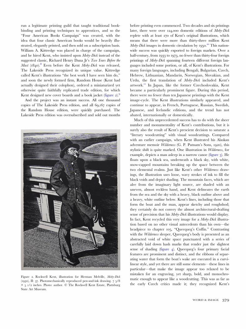
run a legitimate printing guild that taught traditional book-binding and printing techniques to apprentices, and so the“Four American Books Campaign” was created, with theidea that four classic American books would be heavily illu-strated, elegantly printed, and then sold on a subscription basis.William A. Kittredge was placed in charge of the campaign,and he hired Kent, who insisted upon Moby-Dick instead of thesuggested classic, Richard Henry Dana Jr’s Two Years Before theMast (1840).8 Even before the Kent Moby-Dick was released,The Lakeside Press recognized its unique value. Kittredgecalled Kent’s illustrations “the best work I have seen him do,”and soon the newly formed firm, Random House (Kent hadactually designed their colophon), ordered a miniaturized yetotherwise quite faithfully replicated trade edition, for whichKent designed new cover boards and a book jacket (figure 2).9
And the project was an instant success. All one thousandcopies of The Lakeside Press edition, and all 69,167 copies ofthe Random House edition, were quickly purchased. TheLakeside Press edition was oversubscribed and sold out months
before printing even commenced. Two decades and six printingslater, there were over 124,000 domestic editions of Moby-Dick
replete with at least 270 of Kent’s original illustrations, whichmeans that there were more than thirty-three million KentMoby-Dick images in domestic circulation by 1950.10 This nation-wide success was quickly exported to foreign markets. Over ahalf-century, from 1933 to 1973, no fewer than thirty-four foreignprintings of Moby-Dick spanning fourteen different foreign lan-guages included some portion, or all, of Kent’s illustrations. Formany foreign languages, including Bengali, Bulgarian, Czech,Hebrew, Lithuanian, Mandarin, Norwegian, Slovakian, andUrdu, the first translation of Moby-Dick included Kent’sartwork.11 In Japan, like the former Czechoslovakia, Kentbecame a particularly prominent figure. During this period,there were no fewer than ten Japanese printings with the Kentimage-cycle. The Kent illustrations similarly appeared, andcontinue to appear, in French, Portuguese, Russian, Swedish,Japanese, and Icelandic editions, and the trend has notabated, internationally or domestically.Much of this unprecedented success has to do with the sheer
number and monumentality of Kent’s contributions, but it issurely also the result of Kent’s prescient decision to saturate a“literary woodcutting” with visual woodcuttings. Comparedwith an earlier campaign, when Kent illustrated his Alaskanadventure memoir Wilderness (G. P. Putnam’s Sons, 1920), thisstylistic shift is quite marked. One illustration in Wilderness, forexample, depicts a man asleep in a narrow canoe (figure 3). Hefloats upon a black sea, underneath a black sky, with white,snow-capped mountains breaking up the space between thetwo elemental realms. Just like Kent’s other Wilderness draw-ings, the illustration uses loose, wavy strokes of ink to fill theblack voids and depict shading. The mountain faces, which arealee from the imaginary light source, are shaded with anuneven, almost reckless hand, and Kent delineates the earthfrom the sea and the sky with a heavy, black outline above anda heavy, white outline below. Kent’s lines, including those thatform the boat and the man, appear sketchy and roughshod;they certainly do not convey the almost architectural-draftingsense of precision that his Moby-Dick illustrations would display.In fact, Kent recycled this very image for a Moby-Dick illustra-tion based on no other visual antecedents than his own—theheadpiece to chapter 105, “Queequeg’s Coffin.” Contrastingwith the Wilderness sleeper, Queequeg’s body is presented as anabstracted void of white space punctuated with a series ofcarefully laid down hash marks that render just the slightestsense of shading (figure 4). Queequeg’s four primary facialfeatures are prominent and distinct, and the ribbons of separ-ating water that form the boat’s wake are executed in a curvi-linear style, and yet there are still some elements—these lines inparticular—that make the image appear too relaxed to bemistaken for an engraving, yet sharp, bold, and monochro-matic enough to appear like a woodcutting. This was as far asthe early Czech critics made it; they recognized Kent’s
Figure 2. Rockwell Kent, illustration for Herman Melville, Moby-Dick
(1930), II: 37. Photomechanically reproduced pen-and-ink drawing. 7 5/8× 5 1/2 inches. Photo: author. © The Rockwell Kent Estate, PlattsburgState Art Museum.
WORD & IMAGE 379

intentional translation of one medium into another, but it wasthe significance of this translation that they could neverarticulate.It is ekphrasis, at least in its broadest definition as the “verbal
representation of visual representation,” that is central to Moby-
Dick’s visuality, because Melville again and again reconstructsimages as text.12 And this ekphrasis broadly defined is alsocentral to Kent’s illustrative forms and, at least structurally,to Kent’s manipulation of media. In fact, Kent’s manipulation
of media commits the same kind of legerdemain structurallythat his actual imagery commits formally. While the formertried convincingly to transgress the medium of pen-and-inkdrawing into woodcutting, the latter, we shall see, sought totransgress Melville’s ekphrastic passages, themselves a trans-gression between two disparate mediums, by appropriatingand re-presenting the same visual sources that had served asMelville’s inspiration. Nor should we overlook the fact that thecircuitousness Kent achieved in two different registers fits with
Figure 3. Rockwell Kent, illustration for Rockwell Kent, Wilderness (G. P. Putnam’s Sons, 1920), 17. Photomechanically reproduced pen-and-ink drawing.4 1/8 × 6 inches. Photo: author. © The Rockwell Kent Estate, Plattsburg State Art Museum.
Figure 4. Rockwell Kent, illustration for Herman Melville, Moby-Dick (Chicago: Lakeside Press, 1930), III: 140. Photomechanically reproduced pen-and-inkdrawing. 2 1/4 × 5 1/2 inches. Photo: author. © The Rockwell Kent Estate, Plattsburg State Art Museum.
380 MATTHEW JEFFREY ABRAMS

the more legitimate ekphrastic tradition to choose roundedobjects that are then described in rounded form. As LeoSpitzer brilliantly noted more than a half-century ago, “sincealready in antiquity the poetic ekphrasis was often devoted tocircular objects (shields, cups, etc.), it was tempting for poets toimitate verbally this constructive principle in their ekphraseis.”13
Spitzer identifies John Keats’ “Ode on a Grecian Urn” as“circular, or perfectly symmetrical [. . .] in outward and inwardform, thereby reproducing symbolically the form of the objet
d’art which is its model.”14 Similarly, Robillard notes that“rendering a portrait of the whale is one of Ishmael’s chiefconcerns,” and so like Keats, Melville’s constant portraits of thewhale—a repetition that verges on tautology—also reproducesymbolically the circularity of his model.15 But while Keats andMelville composed ekphrasis in circular forms to reflect theircircular models, Kent’s circuitousness was not symbolic, butrather structural—structural in the sense that his circularitymanifested itself in the relational matrix formed between hisillustrations, Melville’s visuality, and the visual wellspring forthose same passages. Kent’s medium-translations, therefore,abet this same circular matrix.But Kent’s campaign to translate drawings into woodcut-
tings was only half complete; he still needed an effective repro-duction method that would, above all, preserve the rich tonalsaturation indicative of woodblock printing, which, he felt, wasthe dominant theme of Moby-Dick. Without this element, hissleight of hand would fail, and so he and Kittredge decided touse a process that Donnelley referred to in-house as copperetch-downs. This was a nineteenth-century photomechanicalengraving technique and a predecessor to the newer photo-offset lithography in that it involved photographing a black-and-white line-drawing and then projecting or contact-printingthe developed negative onto a sensitized copper plate. Butunlike traditional photographic printing, where sensitizedpaper translated a film negative into degrees of blackness, thesensitized copper plate would “etch down,” producing a che-mically engraved facsimile of the photographed drawing.Consequently, Herbert Zimmerman, a vice president ofDonnelley at that time, described the process for reproducingall the Moby-Dick illustrations as “copper etchdowns.”16 TheLakeside Press, however, did maintain a very large offset litho-graphy department, which was a more well-developed form ofphotomechanical printing than copper etchdowns. Photo-offsetlithography was a process where the negative of a photo-graphed image was contact-printed onto a sensitized zincplate, but unlike copper etchdowns, this process also employeda halftone screen that allowed for subtle gradations upon thegrey scale. If Kent and Kittredge had chosen this method, Kentwould have been freed from using a strict black-and-whitepalette in his illustrative style—a style predicated by theneeds of copper etchdowns—but this freedom would havecome at great cost. Offset presses used three cylinders in theiroperation, and this process, specifically the usage of an
intermediary rubber drum, allowed for a very light registrationof ink on paper, making the process more economical but alsomaking deep, penetrating blacks difficult to obtain. “One of thechief objections to black-and-white offset printing,” Kittredgewrote to Kent, “is that you cannot get solid enough blacks.They are apt to become grey.”17 For Kent, this was simplyunacceptable. “The color,” he earlier wrote to Kittredge, “sofar as I can see, is determined; night, the midnight darknessenveloping human existence, the darkness of the human soul,the abyss, such is the mood of Moby Dick.”18 Thus Kent andKittredge used copper etchdowns to transfer and print theillustrations, where the reductive nature of the etchdown pro-cess was not only similar to the reductive nature of woodblockprinting, but also lent itself well to reproducing prints withstrong tonal values, or as Kent would later phrase it in hisHow I Make a Woodcut (1934), an “immaculate dead black.”19
There is, then, an important relationship between the twomost profound and lyrical comments that Kent made aboutMoby-Dick—that its “blundering” text was a literary woodcut-ting and that its “mood” was “the midnight darkness envelop-ing human existence.”20 Darkness of course relates towoodcuttings and woodblock printing as much as it does toMoby-Dick, where Melville used the word and the theme exten-sively, perhaps most famously in his description of the try-worksthat burn whale blubber during a midnight storm while thePequod, seemingly ablaze in a featureless abyss, was “plunginginto that blackness of darkness,” and thus “seemed the materialcounterpart of her monomaniac commander’s soul.”21 Butdarkness plays an even larger role in the novel too, and onethat relates directly to Kent’s intervention. Wallace’s Melville &
Turner, Spheres of Love and Fright (1982) goes to great lengths toshow Melville’s appropriation of the paintings and prints ofTurner, which Melville fastidiously studied and collected, andthe art criticism and art history of Turner’s colleague, JohnRuskin, both of whom equated darkness with abstractionism.Melville’s description of Moby Dick breaching in chapter 133,“The Chase—First Day,” exemplifies this formal analysis.Wallace states that scholars have long labored to explainMelville’s “virtuoso, yet-strained, analogy” in which Ishmaelequates the mist occluding a breaching Moby Dick with anocean storm, where “the but half baffled Channel billows onlyrecoil from the base of the Eddystone, triumphantly to overleapits summit with their scud.” But Wallace also makes a strongcase that Melville’s inspiration was probably Turner’s mezzo-tint “The Eddystone Lighthouse” (1824), which visualizesMelville’s analogous image (figure 5).22
More importantly, however, Moby-Dick’s language oftenhinges on obfuscation, as does Turner’s more general, painterlyaesthetic (an effect that is rather destroyed here by the engra-ver), to the point that many scholars locate a direct influence.“Melville’s incorporation of this stormy seascape into thevisionary portrait of his vertical whale,” Wallace writes, “givesgraphic evidence of the extent to which he was consciously
WORD & IMAGE 381
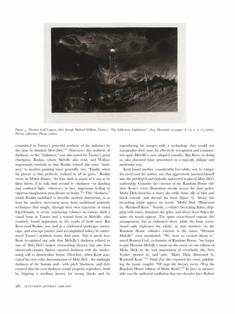
committed to Turner’s powerful aesthetic of the indistinct bythe time he finished Moby-Dick.”23 Moreover, this aesthetic ofdarkness, or the “indistinct,” was also noted by Turner’s greatchampion, Ruskin, whom Melville also read, and Wallaceimportantly reminds us that Ruskin related this same “dark-ness” to modern painting more generally, too. “Finally, whenhis picture is thus perfectly realized in all its parts,” Ruskinwrote in Modern Painters, “let him dash as much of it out as helikes; throw, if he will, mist around it—darkness—or dazzlingand confused light—wherever, in fact, impetuous feeling orvigorous imagination may dictate or desire.”24 This “darkness,”which Ruskin mobilized to describe modern abstraction, or atleast the modern movement away from traditional painterlytechniques that sought, through their own repertoire of visuallegerdemain, to create convincing volumes on canvas, finds avisual form in Turner and a textual form in Melville, whoroutinely found inspiration in the works of both men. ButKent read Ruskin, too, and as a celebrated landscape, snows-cape, and seascape painter (and accomplished sailor), he under-stood Turner’s aesthetic better than most. This is surely howKent recognized not only that Melville’s darkness related toone of Moby-Dick’s largest overarching themes, but also hownineteenth-century figures equated darkness with the moder-nzing will to disarticulate forms. Therefore, when Kent asso-ciated his own color determination of Moby-Dick—the midnightdarkness of the human soul—with pitch blackness, and thenensured that his own darkness would properly reproduce, bothby feigning a medium known for strong blacks and by
reproducing his images with a technology that would notmarginalize their tone, he effectively recognized and commen-ted upon Melville’s own adopted visuality. But Kent, in doingso, also obscured those procedures in a typically oblique andmodernist way.Kent found another, considerably less subtle, way to critique
the novel and the author, one that aggressively inserted himselfinto the privileged and typically unfettered realm of Moby-Dick’sauthorship. Consider the exterior of the Random House edi-tion: Kent’s cover illustration streaks across the dust jacket;Moby Dick breaches a starry sky while briny rills of blue andblack cascade and shroud his form (figure 6). Above thisbreaching whale appear six words: “Moby Dick /Illustratedby /Rockwell Kent.” Nearby, a whale’s breaching flukes, drip-ping with water, dominate the spine, and above these flukes thesame six words appear. The spine cover-board repeats thisarrangement, but in embossed silver, while the front cover-board only replicates the whale, so that nowhere on theRandom House edition’s exterior is the name “HermanMelville” even mentioned. “We were so excited about it,”noted Bennett Cerf, co-founder of Random House, “we forgotto put Herman Melville’s name on the cover, so our edition ofMoby Dick, to the vast amusement of everybody (the NewYorker spotted it), said only, ‘Moby Dick, illustrated byRockwell Kent.’”25 Vanity Fair also reported the error, publish-ing the ironic couplet: “Of 1930 the literary event /Was theRandom House edition of Moby Kent!”26 In fact, so memor-able was the authorial conflation that two decades later Robert
Figure 5. Thomas Goff Lupton (after Joseph Mallord William Turner), “The Eddystone Lighthouse,” 1824. Mezzotint on paper. 8 1/4 × 12 1/4 inches.Private collection. Photo: author.
382 MATTHEW JEFFREY ABRAMS

Frost referred to it in his A Masque of Mercy (1947): “There is astory you may have forgotten /About a whale. /Oh, you meanMoby Dick /By Rockwell Kent that everybody’s reading.”27
The conflation was well known during the interwar period, andwhen we consider this atop everything that Kent had alreadydone to encourage Melville’s reception, it is easy to understandhow Pilař could have made the seemingly far-fetched statementthat “Kent created illustrations that have become an insepar-able part of Melville’s work.”28 But, like an enfant terrible, Pilař’sunqualified claim raises something worthy of actual investiga-tion. Because the entire discipline of “Melville and the VisualArts” is predicated on “the recovery of visual analogues andsources for Melville’s work,” and because many such scholars,especially Robillard, identify ekphrasis as the central impulse inMelville’s writing, one could say that authorial appropriationand remediation define Melville’s entire aesthetic, which neatlycoincides with Wallace’s identification of Melville’sTurneresque “aesthetic of obscurity.”29 Kent’s own darknesssounds the same depths of authorial conflation—but his cam-paign stretched well beyond some redesigned cover boards anda book jacket. In fact, the entirety of Kent’s illustration projectset out to hybridize Moby-Dick in terms of both word andimage, and in terms of Melville’s reading, Melville’s writing,and Melville’s reader.
Illustrating the Kent Moby-DickFor his part, Kent did not overlook Melville’s Eddystone ana-logy. The figurative language equating Moby Dick’s verticalbreach with the vertical shaft of the Eddystone Rock
lighthouse, which appears to hover atop the English Channelfourteen miles offshore, was too powerful to ignore. Indeed,this “cetacean lighthouse,” as Wallace calls it, inspired perhapsthe most daring illustration in Kent’s campaign.30 Appearingjust pages after the passage, Kent’s Moby Dick now stretchesinto the sky, light-showered and ensconced in ribbons of fallingwater (figure 7). Like a golden nimbus against a gold-leafground, Kent’s striated lines of seawater become the barnacledcontours of Moby Dick’s projecting body, itself cast against asun whose rays fan out in a halo of those same lines, affectingthe rigid pencils of light emitted from a powerful lighthouse.Kent completed the cetacean lighthouse idea in a powerful,albeit absurdist, way, but he used other formal antecedents forthis image, too, as he did for many others, which reach beyondMelville’s visual passages, or even Turner’s analogous images.The specific form of Kent’s image campaign, and the ways inwhich they punctuate the text, is now our chief concern. Ourmain objective is to demonstrate their indebtedness to Moby-
Dick’s own sources and the ways in which Kent used thesesources to jam, or introduce feedback into, the circuits of reme-diation between Melville’s “reading” and Melville’s visuality.
It seems prudent to qualify Melville’s “visuality,” especiallybecause Melville’s various figurative strategies complicate thisdiscussion. For instance, Moby-Dick contains more than a dozenexamples that many would count as ekphrasis within a moreexclusive definition (like the Spouter Inn sign painting, theSpouter Inn bar painting, the bench carving, the pulpit, the
Figure 6. Herman Melville, Moby Dick (New York: Random House, 1930).Illustrations and book design by Rockwell Kent, dust jacket spine and frontcover. 7 1/4 × 5 1/2 × 2 inches. Collection of Jarod Klassen, Chase Books.Photo: Jarod Klassen.
Figure 7. Rockwell Kent, illustration for Herman Melville, Moby-Dick
(Chicago: Lakeside Press, 1930), III, 253. Photomechanically reproducedpen-and-ink drawing. 5 3/4 × 5 1/2 inches. Photo: author. © The RockwellKent Estate, Plattsburg State Art Museum.
WORD & IMAGE 383

pulpit painting, Queequeg’s tattoos, the counterpane, thecarved buckler and bedstead, the jawbone tiller, the sword-mat, Beale’s whale pictures, Scoresby’s tool illustrations, EarlyModern whale prints, the beggar’s painted board, scrimshaw,the bas-relief vertebra, the doubloon, the bower, orQueequeg’s coffin carvings). But Melville also utilized moregeneral allusions to artworks (like the Elephanta cave templesin India, busts of George Washington, Cologne cathedral,Benvenuto Cellini’s Perseus, Hôtel de Cluny, Thermes, theParthenon caryatids, prints by William Hogarth and AlbrechtDürer, Italian engravings, American hieroglyphs, St. Peter’sdome, the Pantheon, Phidias’ Zeus, Achilles’ shield, theFarnese Hercules, the Sistine Chapel, or Pompey’s Pillar).These in turn should not be confused with Melville’s paintinganalogies (“to paint as well as one can without canvas,”“unpainted to the last,” or “in scenes hereafter to be painted”).But Melville also describes form in painterly terms, almost likean art critic (cheek “like the Andes,” “eyeless statue in thesoul,” “manned by painted sailors in wax,” “like an ironstatue,” or the multitude of more general figurative languagedescribing everything and everyone from Starbuck to MobyDick to the Pequod itself). For his part, Kent managed to tacklenearly all these categories, but in a manner as idiosyncratic asMelville’s.31
Sometimes, for instance, Kent’s interventions appear rela-tively straightforward, particularly when he appropriatedimages from the whaling chronicles that had served as Moby-
Dick’s inspiration, but then applied them in a manner that wasarbitrary to the text. Such is the case with Kent’s seizure of anillustration depicting a man atop a masthead that he foundwithin John Ross Browne’s Etchings of a Whaling Cruise: With
Notes of a Sojourn on the Island of Zanzibar, To Which Is Appended a
Brief History of the Whale Fishery (figure 8). Kent did not borrowthe image in toto, however; he seized the appearance andgesture of Browne’s bearded lookout, with his outstretchedarm lustily pointing upon the sea, wearing a brimmed hatand a double-breasted coat. Kent’s depiction of CaptainBoomer in chapter 100, “pointing his ivory arm towards theEast, and taking a rueful sight along it, as if it had been atelescope,” appropriates the bearded, hatted, pea-coated wha-ler seen in profile that adorns the pages of Browne’s novel.32
But the gesture also reappears in the headpiece illustration tochapter 78, with Tashtego balanced atop the cistern (figure 9).Here, one of Tashtego’s arms replicates the stretched gesticu-lation of Browne’s lookout, while his other hand grasps therigging, just like his Victorian doppelgänger. Melville knew thisimage, too. While Beale’s chronicleThe Natural History of the
Sperm Whale . . . to Which Is Added a Sketch of a South-Sea Whaling
Voyage Etc. (1839) has long been identified as Melville’s primarysource for whaling information when writing Moby-Dick,Browne’s text, as well as Scoresby’s memoir An Account of the
Arctic Regions: With a History and Description of the Northern Whale-
fishery, were instrumental, too.33 Much scholarship, especially
Howard Vincent’s The Trying-Out of Moby-Dick (1967), hassoundly proven these relationships, and Kent, diligent as hewas, found the same sources even before Vincent had. Theedition of Scoresby’s text that Melville referred to, for instance,Kent actually owned.34
Similar to these more basic appropriations, there are otherinstances when Kent illustrates the visual resources to whichMelville more casually refers or alludes. The headpiece to chapter90 exemplifies this, where Kent depicts a beached whale with asmall man confidently perched atop the mammal and grasping acrown-emblazoned flag. The image refers to a famous print, “LaBaleine d’Ostend,” depicting a blue whale that washed ashore inOstend, Belgium, in 1827 (figures 10 and 11). This unattributedlithograph was one of the incident’s widely circulated prints,
Figure 8. A. A. von Schmidt (after A. Bowen), illustration, “Thar SheBlows!,” for John Ross Browne, Etchings of a Whaling Cruise: With Notes of a
Sojourn on the Island of Zanzibar, To Which Is Appended a Brief History of the Whale
Fishery (London: Harper & Brothers, 1846), 114. Engraving. 7 × 4 1/4inches. Photo: author.
384 MATTHEW JEFFREY ABRAMS

which similarly depicts a man atop a beached whale, standingupon a makeshift stage. Stuart Frank included this print inHermanMelville’s Picture Gallery, where Frank fastidiously collected thevisual sources that Melville saw, probably saw, or blindly appro-priated, and Melville did later visit Ostend in December 1849.35
But Kent, who deployed the image as the headpiece illustration to“Heads or Tails,” which provides the minutiae of maritime whal-ing laws and royal property rights regarding beached whales,redirects the image from one regarding spectacle to one regardinglaw. At other times, however, Kent’s personal interventions areeven less present, as in the tailpiece to chapter 55, “Of theMonstrous Pictures of Whales,” where he faithfully copies
Antonius Wierix II’s sixteenth-century print of Jonah and theWhale, which Frank also includes in his Picture Gallery (figures 12and 13). This last example illuminates the more interesting andcomplex interventions that Kent deployed, for chapter 55 isfamous among Melville scholars because it is the moment whenIshmael initiates his three-chapter-long ekphrastic interlude aboutthe images of whales. “I shall ere long paint to you as well as onecan without canvas,” Ishmael begins, and quickly he begins toderide the monstrous whales of Western art history, including thewhale-monster inGuido Reni’s “Perseus and Andromeda” (figure14), and Hogarth’s reinterpretation, “Perseus Descending.”“Where did Guido get the model of such a strange creature asthat?” Melville begins,
nor does Hogarth, in painting the same scene in his own“Perseus Descending,” make out one whit better. The hugecorpulence of that Hogarthian monster undulates on the sur-face, scarcely drawing one inch of water. It has a sort of howdahon its back, and its distended tusked mouth into which thebillows are rolling, might be taken for the Traitors’ Gate.36
Kent surely knew the Reni copy in London’s National Gallery,as Melville had, and he faithfully reproduced many of thiswhale’s features for his headpiece illustration to that same chap-ter. Kent successfully replicates Reni’s fanged mouth, long, lap-ping tongue, canid snout, round brow, and odd flippers near theears in his own Hogarthian reimagining (figure 15). This iscrucial for several reasons: it exemplifies Kent’s sophisticatedillustration of Melville’s more explicitly ekphrastic passages,and it begins to make clear Kent’s larger motivations: to createa kind of signal jamming of Melville’s carefully orchestratedvisual–verbal remediations, and to create a related, dialogicalintervention into the text by strategically placing his anti-ekphrastic images before their related ekphrastic passages.
Figure 9. Rockwell Kent, illustration for Herman Melville, Moby-Dick
(Chicago: Lakeside Press, 1930), II, 229. Photomechanically reproducedpen-and-ink drawing. 4 1/2 × 5 1/2 inches. Photo: author. © TheRockwell Kent Estate, Plattsburg State Art Museum.
Figure 10. Rockwell Kent, illustration for Herman Melville, Moby-Dick (Chicago: Lakeside Press, 1930), III, 31. Photomechanically reproduced pen-and-inkdrawing. 2 7/8 × 5 1/2 inches. Photo: author. © The Rockwell Kent Estate, Plattsburg State Art Museum.
WORD & IMAGE 385

How does this critique actually occur? Consider how Kent’sReni–Hogarth whale foreshadows, or even spoils, Melville’s
ekphrasis of the Reni–Hogarth whale. We now can see thatKent physically positioned his images within the text in amanner that would preempt, or hijack, Melville’s ekphrasticpassages, and also that Kent, by unveiling Melville’s visualityand reintroducing his sources into the text, formally positionedhis images in a similar manner so that they would doublyobfuscate, or at least complicate, Melville’s visuality. Kent,therefore, positioned word and image as if he were an ekphras-tic poet. As W. J. T. Mitchell recognized, the ekphrastic poet’smidway positioning is
more like a triangular relationship than a binary one; itssocial structure cannot be grasped fully as a phenomenologi-cal encounter of subject and object, but must be pictured as aménage à trois in which the relations of self and other, text andimage, are triply inscribed.37
Kent returned to the Reni image as he returned to earlywhaling chronicles, and he remediated that oil painting into are-stylized faux-woodcut that incorporated not only the paint-ing’s form but also Melville’s ekphrastic exaggerations of thatform, such as its “howdah-like” hump. Kent’s forms, we shouldremember, were often faithful quotations of Melville’s pictorialsources, which tended to short-circuit or at least spoil Melville’spassages, but Kent sometimes mixed primary imagery withsecondary ekphrasis into a tertiary, “triply inscribed” illustra-tion. When he did, a residue of all these shifts invariably
Figure 11. Anon., “La Baleine d’Ostend, /Visitée par l’Eléphant, la Giraffe, les Osages et les Chinois” (The Ostend Whale), Paris, c.1828. Lithograph. 5 5/8 ×9 3/4 inches. The New Bedford Whaling Museum.
Figure 12. Rockwell Kent, illustration for Herman Melville, Moby-Dick
(Chicago: Lakeside Press, 1930), II: 117. Photomechanically reproducedpen-and-ink drawing. 3 1/2 × 3 1/2 inches. Photo: author. © TheRockwell Kent Estate, Plattsburg State Art Museum.
386 MATTHEW JEFFREY ABRAMS

remained, so that the completed image-word-image circuitrepresented not a perfect return to the source image, but areturn filtered through multiple registers of medium exchange,as if one had translated Moby-Dick from English into Mandarinand back into English. Even the doubloon, another “rounded”object and an allusion to Homer’s shield of Achilles—the ur-ekphrastic act in Western literature—pre-empts and thusinfluences Melville’s own ekphrastic passage, which immedi-ately follows the illustration. Such sophisticated networks ofreflexivity complicate Moby-Dick’s narrative and reflectMelville’s own interest in the self-reflexive. It was the author,not the illustrator, who first described Stubbs’s supper of whaleflesh illuminated by candles made from that same whale flesh;or the whale fritters that fueled the try-work’s flames whichmelted that same whale’s body; or the whalebone spectaclesthat a man then used to read books about those same whale-bones; or, one could add, that moment in the Kent Moby-Dick
when an illustrated book depicts Queequeg thumbing throughan illustrated book.38
There are other facets to Kent’s complex interventionalstrategy, too. Consider chapter 76, “The Battering Ram.”Not one to ignore Beale, Kent borrowed heavily from thattext, too, and his tailpiece to that chapter, like many of Kent’stailpieces, simultaneously lifts imagery while working in con-junction with its pendant headpiece (figures 16 and 17). Wehave seen that Kent’s headpieces beat Melville to the visual
punch, but this is more than a subversion; it has dialogicalconsequences, too. One is often flummoxed by the headpieceimages. We are then left anticipating their meaning beforetheir meaning is revealed, and it is only after we read thefollowing passages that we can retroactively ascribe any mean-ing to the image, which in turn retroactively adds new mean-ing to the just-read passage. And this bilateral act ofsuspension and recognition recalls that basic, semiotic under-standing of speech, where cognition is contingent on thesimultaneous acts of anticipation and retroaction. Kent’simages, then, complicate not only Melville’s visuality butalso the narrative at large and the plot’s temporality bymanipulating the structural conditions of the language.Anticipation, as Bakhtin and Kermode remind us, is as essen-tial to narrative as it is to speech. This remains true for nearlyall the Kent headpieces, while the tailpieces often invert thislinguistic cascade. Such is the case with “The BatteringRam,” where Melville’s fascination with the sperm whale’s“more inconsiderable braining feats” was rooted in Scoresbyand Beale, who both tell tales of sperm whales that “brained”a harpoon boat and “threw it high into the air with the menand everything contained therein,” which naturally inspiredMoby Dick’s later “braining” of Captain Ahab’s harpoonboat.39 Beale included a “braining” illustration, too, whichKent fastidiously copied for “The Battering Ram.” By placingthe image after the initial general description, but well before
Figure 13. Antonius Wierix II, Jonah Cast on Shore by the Fish, c.1585. Engraving. 7 1/2 × 9 13/16 inches. Metropolitan Museum of Art, New York, The ElishaWhittlesy Collection, The Elisha Whittlesy Fund, 1951. Photo: Metropolitan Museum of Art.
WORD & IMAGE 387

Ahab’s specific performance, however, it effectively works asboth an anticipatory and a retroactive agent.Melville mentions much more than the Reni–Hogarth whale
in chapter 56. He cites Scoresby’s frontispiece illustration—anengraving of a whaling scene, which Kent improved upon, buteffectively recycled for an illustration in chapter 105. Melvillealso cites Scoresby’s excessive depiction of whaling instrumentsand snowflakes; Browne includes many such illustrations, too,some of which Kent carefully copied. In fact, peppering awhaling chronicle with such esoteric images was something ofa genre leitmotif, and so the likewise saturation of whaling-instrument illustrations throughout the Kent Moby-Dick (andthey do saturate the text) effectively recreates one of the mostcommon visual motifs of the whaling chronicles that Melvillehad scoured. This further verifies Kent’s indebtedness toMelville’s reading and his willful conflation of the novel andits sources. But Ishmael actually satirized Scoresby’s excessivedepictions, too. “I mean no disparagement to the excellent[Scoresby],” he says, “(I honor him for a veteran), but in soimportant a matter it was certainly an oversight not to haveprocured for every crystal a sworn affidavit taken before aGreenland Justice of the Peace.”40 Kent’s own recreation ofthis leitmotif is then both a nod to the source that he haddiscovered and, by injecting into Ishmael’s own narrative thevery trope that Ishmael lambastes, a cheeky reversal ofMelville’s hyperbole. Kent affects a similar volte-face when hebreaks with his uniform style to burlesque the look and style ofthose “less erroneous pictures of whales” in chapter 41, wherehis whale now possesses the loose hatching and the skittered,stumbling contours of Beale’s poor engravings. This too rhymeswith Ishmael’s own will to burlesque whale-related literature,most notably when the narrator lampoons the still nascent andoften fallacious field of cetology.ButKent’s most explicit jab at the author, excepting the omission
of his name from the RandomHouse cover—was to adopt the onewhale-image in Beale that Melville particularly disliked and thenuse it for his most profound illustration (figure 18). “By great odds,”
Figure 14. Guido Reni (and collaborators), Perseus and Andromeda, c.1635. Oilon canvas. 106 1/2 × 85 1/2 inches. Detail. Casino dell’Aurora, Pallavicini,Rome. Photo: author.
Figure 15. Rockwell Kent, illustration for Herman Melville, Moby-Dick (Chicago: Lakeside Press, 1930), II: 111. Photomechanically reproduced pen-and-inkdrawing. 2 × 5 1/2 inches. Photo: author. © The Rockwell Kent Estate, Plattsburg State Art Museum.
388 MATTHEW JEFFREY ABRAMS

Melville says, speaking of the four contemporary sperm whaleoutlines that he had found, “Beale’s is the best. All Beale’s drawings
of this whale are good, excepting the middle figure in the picture ofthree whales in various attitudes, capping his second chapter.”41
Beale’s “middle figure” is a breaching sperm whale, mouth slightly
Figure 16. Anon., illustration for Thomas Beale, The Natural History of the Sperm Whale . . . to Which Is Added a Sketch of a South-Sea Whaling Voyage Etc. (London:John van Voorst, 1839), 173. Engraving. 2 1/4 × 3 3/4 inches. Photo: author.
Figure 17. Rockwell Kent, illustration for Herman Melville, Moby-Dick
(Chicago: Lakeside Press, 1930), II: 225. Photomechanically reproducedpen-and-ink drawing. 6 1/2 × 5 1/2 inches. Photo: author. © TheRockwell Kent Estate, Plattsburg State Art Museum.
Figure 18. Anon., illustration for Thomas Beale, The Natural History of the
Sperm Whale . . . to Which Is Added a Sketch of a South-Sea Whaling Voyage Etc.(London: John van Voorst, 1839), 33, figure 2. Engraving. 1 1/2 × 3 1/2inches. Photo: author.
WORD & IMAGE 389

agape, sketchily rendered in staccato hashes of ink. It careens sky-ward at a forty-five-degree angle and only its flukes remain hiddenbeneath the water’s frothy curds. While we now know from hismarginalia that Melville found the whale’s tail “cropped and dwar-fed” but otherwise liked the image, Kent could not have known thespecific reason behind Melville’s criticism.42 Nevertheless Beale’smiddle figure becomes the working model for two of Kent’s mostpowerful illustrations. Kent first copied this whale for a full-pageillustration in chapter 41, where the whale breaches a starry sky,and again for the half-page headpiece to chapter 134, the famed“cetacean lighthouse.”Kent’s inspiration, therefore, looked beyondMelville and even Turner to Beale, where, grossly exaggerating theBeale whale’s breach, he intentionally burlesqued Melville’s ownfeast of language while also burlesquing an image that Melvilleexplicitly criticized. In either case, the irony of Kent’s style is nowparticularly clear. When one studies the Kent illustrations, indeter-minacy, at least in a formal sense, rarely comes to mind. The imagesinstead conjure up words like “crisp” and “sharp.” Kent’s imagesare nothing like the “boggy, soggy, squidgy picture” that Ishmaelsees in the Spouter Inn, whose indeterminacy, scholars are apt tonote, matches Melville’s own and that of his painter-hero Turner.Kent’s non-obscurant style, in fact, unravels, or lays bare, theiraesthetic of the indistinct, which, by complication, then adds a newregister of indistinctness to the program. But there is also Kent’smidnight darkness. In the penultimate chapter of the Kent Moby-
Dick, the ink that prints Melville’s words bleeds into pencils ofmorning light and the breaching body of Moby Dick, where dark-ness becomes the stuff of a verbal–visual transfusion. Kent’s illus-trations, like good literary criticism, shine light into the darkness ofMelville’s aesthetic, which, when we come to realize just howaccurate Kent was in identifying Melville’s visuality, makes hisintervention a truly remarkable critique of the novel and its govern-ing aesthetic.
CodaI was interested in Rockwell Kent. I clearly recognizedhim (amongst the rapidly executed reproductions of hisjourney across Alaska) from a strange book almost half asdeep as it was wide—black with a gold title, and contain-ing his magnificent illuminations, tailpieces and wholeillustrations.
It was all about whales. The title was Moby-Dick.43
Today, amongst Sergei Eisenstein’s vast, preserved library, thissquat, stout little book, “half as deep as it is wide,” still stands.44
But, like the Czechs before him, what Eisenstein found most inter-esting about the KentMoby-Dick was not its text but its images, andspecifically how the images seemed to presage the text. This inter-play fascinated the filmmaker. “Kent’s drawings are magnificent,”he once said, but he especially liked them as “graphic examples ofshot composition (illustrations for a manual I have been planningfor a very long time).”45 Eisenstein recognized the Kent-cycle’ssimilar function in “setting” Melville’s narrative, and he no doubt
understood the narrative consequences of so strategicallycarving the visual into the verbal.Eisenstein was not alone. In fact, much of Moby-Dick’s visuality
hinges on notions of carving, so much so that carving, like weav-ing, emerges as a leitmotif. Many of Melville’s art allusions, forinstance, are carved artworks, like the carved reliefs of Elephanta,the bust of Washington, the Cologne cathedral kings, Cellini’sPerseus, the Parthenon caryatids, Phidias’s Zeus, and the FarneseHercules, not to mention the carved engravings of Hogarth andthe Italians. And carving dominates Melville’s more properlyekphrastic passages, too, like the bench carving in the SpouterInn, the carved pulpit, the carving of tattoos intoQueequeg’s skin,the carved buckler and bedstead, Beale’sWhales, Scoresby’s tools,Early Modern whale engravings, the bas-relief vertebra, the dou-bloon, the “carved woods,” “chisseled [sic] shells,” and “inlaidspears,” of the Arsacidean king, Queequeg’s carved tomahawk-pipe, Hawaiian war clubs/spear paddles/bone sculptures, whalescarved in wood, Queequeg’s coffin carvings, and scrimshaw. Eventhe loom’s pointed wooden shuttle, an important image inMoby-
Dick, seems to echo carving’s repetitive gouging motion as aweaver threads it through the warp. Melville recognized a naturalharmony and resonance between ekphrasis and carving, for bothtransmute a given form through an intervention, only the latter isspatial, in its separation of positive and negative space, while theformer is formal, in its transformation into text. And Melvillerepeatedly traced this union back to the original object of theWestern ekphrastic tradition, most elegantly yoking the two whenhe describes a Hawaiian who,
will carve you a bit of bone sculpture, not quite as workman-like, but as close packed in its maziness of design, as theGreek savage, Achilles’s shield; and full of barbaric spiritand suggestiveness, as the prints of that fine old Dutch savage,Albert Durer [sic].46
Melville’s triangulation of Hawaiian bone carving, Achilles’sshield, and Dürer’s prints completes his historico-ekphrasticlogic, for the prints of that “old Dutch savage” were, of course,Holzschnitte—woodcuts.Kent also theorized Moby-Dick in terms of graphic styles,
contrasting the complete freedom and fluidity of drawing atone pole with the rigid, burin-scratched lines of engraving atthe other, and the intermediary form of woodcutting at thecenter, where the carving of a wood’s softer side-grain provideshalf the fluidity of drawing and half the hard-edged precision ofengraving. This is what early Czech scholars like Kaláb, Pilař,and Hlaváček sensed, but could never quite articulate: Melvillemay have painted as well as one can without canvas, but Kentwrote as well as one can without words.
ACKNOWLEDGEMENTS
The author is grateful to numerous scholars for their input andadvice, notably Edward Cooke, David Joselit, Sebastian Zeidler,
390 MATTHEW JEFFREY ABRAMS

and Bill Brown. He heartily thanks both Cecilia Esposito andKaren Blough of Plattsburgh State Art Museum for their tirelesssupport. The author is also grateful for the keen criticisms andsuggestions offered by the anonymous reviewers.
NOTES
1– Letter from Rockwell Kent to William A. Kittredge, 11 November 1927.TS. William A. Kittredge Papers, Wing Foundation Collection, NewberryLibrary (hereafter cited as Kittredge/Wing Collection).2– Method Kaláb, “Rockwell Kent a jeho Moby Dick,” in Cesky Bibliofil
(Prague) 4 (1932): 77–88. All Czech translations were performed by theauthor with the assistance of Lenka Keng.3– Herman Melville, Bílá velryba [The White Whale], trans. EmanuelVajtauer, illus. Rockwell Kent. Živé knihy, no. 98 (Prague: DružstevníPráce, 1933).4– Leland R. Phelps and Kathleen McCullough, Herman Melville’s Foreign
Reputation: A Research Guide. Reference Publication in Literature (Boston: G.K. Hall, 1983), 5–7.5– Alan Cheuse, “Literary Curtain Calls,” Horizon (June 1984): 14.6– Brian Yothers, in a masterful chapter on the historiography of “Melvilleand the Visual Arts,” cites all these figures and their most relevant scholar-ship; Brian Yothers,Melville’s Mirrors: Literary Criticism and America’s Most Elusive
Author (Rochester: Camden House, 2011), 29–58. For specific citations, seealso Charles Olson, Call Me Ishmael (New York: Reynal & Hitchcock, 1947);Walter A. Bezanson, “Moby-Dick: Work of Art,” in Moby-Dick Centennial
Essays, ed. Tyrus Hillway and Luther S. Manfield (Dallas: SouthernMethodist University Press, 1953), 30–58; Richard Harter Fogle, Melville’s
Shorter Tales (Norman: University of Oklahoma Press, 1960); Daniel Hoffman,Form and Fable in American Fiction (New York: Oxford University Press, 1961);Warner Berthoff, The Example of Melville (Princeton: Princeton UniversityPress, 1962); Harrison Hayford, “Unnecessary Duplicates: A Key to theWriting of Moby-Dick,” in New Perspectives on “Moby-Dick,” ed. Faith Pullin(Edinburgh: University of Edinburgh Press, 1978), 128–49; Nina Baym,“Melville’s Quarrel with Fiction,” PMLA 94, no. 5 (1979): 909–23; ShirleyM. Dettlaff, “Ionian Form and Esau’s Waste: Melville’s View of Art inClarel,” American Literature 54, no. 2 (1982): 212–28; Christopher Sten, SavageEye: Melville and the Visual Arts (Kent: Kent State University Press, 1991);Douglas Robillard, Melville and the Visual Arts: Ionian Form, Venetian Tint
(Kent: Kent State University Press, 1997); Elizabeth A. Schultz, Unpainted tothe Last: Moby-Dick and Twentieth-Century American Art (Lawrence: UniversityPress of Kansas, 1995), 27–63; Merton M. Sealts, Melville’s Reading, revd andenlarged. ed. (Columbia: University of South Carolina Press, 1988); RobertK. Wallace, Melville & Turner: Spheres of Love and Fright (Athens: University ofGeorgia Press, 1992); Samuel Otter, Melville’s Anatomies (Berkeley: Universityof California Press, 1999); and Edgar A. Dryden, Monumental Melville: The
Formation of a Literary Career (Stanford: Stanford University Press, 2004).7– For discussions and mentions of the Kent Moby-Dick within Melvillescholarship, see Schultz, Unpainted to the Last, 27–63; Phelps andMcCullough, Herman Melville’s Foreign Reputation, xix; Bezanson, “Moby-
Dick: Work of Art,” 30; Sanford E. Marovitz, “Herman Melville: AWriter for the World,” in A Companion to Melville Studies, ed. John Bryant(New York: Greenwood, 1986), 741–80, at 776.8– Herbert P. Zimmerman, “Story of The Four American Books” (1952).TS. Unpaginated, interoffice memo. R. R. Donnelley & Sons Co. Archive,Special Collections Research Center, University of Chicago Library.9– Letter from William A. Kittredge to Edward A. Wilson, 19 December1927. TS. Kittredge Papers/Wing Collection.10– Claire Badaracco, American Culture and the Marketplace: R.R. Donnelley’s
Four American Books Campaign, 1926–1930 (Washington, DC: Library ofCongress, 1992), 59–60.11– Phelps and McCullough, Herman Melville’s Foreign Reputation, xix.
12– James Heffernan is responsible for this useful baseline definition; JamesA. W. Heffernan, Museum of Words: The Poetics of Ekphrasis from Homer to
Ashbery (Chicago: University of Chicago Press, 2004), 3.13– Leo Spitzer, “‘Ode on a Grecian Urn.’ or Content vs. Metagrammar,”Comparative Literature 3 (1955): 203–25, at 207.14– Ibid.15– Robillard, Melville and the Visual Arts, 72.16– Zimmerman, “Story of The Four American Books,” n.p.17– Letter from William A. Kittredge to Rockwell Kent, 29 March 1930,The Rockwell Kent Papers, Archives of American Art, SmithsonianInstitution, Washington, DC (hereafter cited as Kent Papers/Smithsonian).18– Letter from Rockwell Kent to William A. Kittredge, 11 November1927, Kittredge/Wing Collection.19– Rockwell Kent, How I Make a Wood Cut (Pasadena: Esto, 1934), 21.20– Kent to Kittredge, 11 November 1927. (Kittredge/Wing Collection).21– Herman Melville, Moby-Dick, or The Whale (New York: Random House,1930), 617.22– Wallace, Melville & Turner, 314.23– Ibid.24– John Ruskin, Modern Painters, cited in ibid., 316.25– Bennett Cerf, At Random: The Reminiscences of Bennett Cerf (New York:Random House, 2002), 72.26– Repr. in Eliot H. Stanley, Rediscovering Rockwell Kent: Books, Graphic, andDecorative Arts (New York: Grolier Club, 1997), 19.27– Robert Frost, Complete Poems of Robert Frost (New York: Henry Holt,1949), 611.28– Zdenĕk Pilař, “Illustrátor Bílá velryba.” Essay appended to HermanMelville, Bílá velryba [The White Whale], trans. S. V. Klima and MarieKornelová (Prague: Družstevni Práce, 1956), 660–62.29– Yothers, Melville’s Mirrors, 49.30– Wallace, Melville & Turner, 314.31– For the quoted analogies, see Melville, Moby-Dick, or The Whale, 379,385, and 420 respectively. For the quoted terms, see pp. 43, 278, 341, and693.32– Melville, Moby-Dick, or The Whale, 629.33– Howard P. Vincent, The Trying-Out of Moby-Dick. Repr. (Carbondale:Southern Illinois Press, 1967), 23.34– Rockwell Kent’s “Polar Library” is held at the Burke Library,Hamilton College, Clinton, New York.35– Robert L. Gale, A Herman Melville Encyclopedia (Westport: Greenwood,1995), 404.36– Melville, Moby-Dick, or The Whale, 380.37– W. J. T. Mitchell, Picture Theory: Essays on Verbal and Visual Representation(Chicago: University of Chicago Press, 2005), 164.38– This is the headpiece to chapter ten.39– Thomas Beale, The Natural History of the Sperm Whale . . . to Which Is Added
a Sketch of a South-Sea Whaling Voyage Etc. (London: John van Voorst, 1839),179.40– Vincent, Trying-Out of Moby-Dick, 390.41– Melville, Moby-Dick, or The Whale, 386.42– Vincent, Trying-Out of Moby-Dick, 216.43– Sergei Eisenstein, Beyond the Stars: The Memoirs of Sergei Eisenstein
(London: Seagull, 1995), 358.44– Joan Neuberger, “Scoping Sergei Eisenstein’s Bookshelves,” Slate
(March 29, 2013), http://www.slate.com/blogs/the_vault/2013/03/29/sergei_eisenstein_the_director_s_books_and_keepsakes_held_in_an_apartment.html/.45– Eisenstein, Beyond the Stars, 359.46– Melville, Moby-Dick, or The Whale, 393–94.
ORCIDMatthew Jeffrey Abrams http://orcid.org/0000-0001-8313-5856
WORD & IMAGE 391