Embed Size (px)
Citation preview

DIGITAL STYLE GuidENOVEMBER V2.0
i

NOVEMBER 2012 V2.0 2
i
M&G diGiTAL STYLE GuidE
This document details the core elements required for creating content for the M&G website.
Typography (sizes, weights, styles, character counts), colours (key brand colours and additional
secondary palettes), and templates (image carousels, promos, module components) are detailed
to provide consistency when creating additional content. Copy standard guidelines have also
been included to aid content production.
in addition to creating new elements, further details have been included detailing page
templates, formatting and navigation to act as guides alongside visual examples of page designs.
INTRODUCTION

NOVEMBER 2012 V2.0 3
i
M&G diGiTAL STYLE GuidE
1.0 CORE COLOURS
1.1 pRiMARY COLOuRS
1.2 ExTENdEd pALETTE
1.3 SECONdARY COLOuRS
2.0 TypOGRAphy
iNTERSTATE, HELVETiCA & SiZE GuidANCE
3.0 CAROUSELS
3.1 LARGE CAROuSEL - ExAMpLE iN-pAGE
3.1 LARGE CAROuSEL - SpECiFiCATiONS
3.1 LARGE CAROuSEL - CHARACTER COuNT
3.1 LARGE CAROuSEL - ExAMpLES
3.2 SMALL CAROuSEL - ExAMpLE iN-pAGE
3.2 SMALL CAROuSEL - SpECiFiCATiONS
3.2 SMALL CAROuSEL - CHARACTER COuNT
3.2 SMALL CAROuSEL - ExAMpLES
4.0 pROMOS
4.1 ExAMpLES iN-pAGE
4.2 STANdARd pROMO
4.3 iMAGE pROMO
4.4 CAROuSEL pROMO
4.5 RiGHT HANd COLuMN
4.6 pROMOS - ExAMpLES
5.0 ADDITIONAL COMpONENTS
5.1 iNSiGHTS & MARkET updATES
5.2 FuNd MANAGER pROFiLES
6.0 M&G SUpERGRAphIC
7.0 COpy STANDARDS
CONTENTS

4M&G diGiTAL STYLE GuidE
1.0 CORE COLOURS

NOVEMBER 2012 V2.0 5
i
M&G diGiTAL STYLE GuidE
pRIMARy
1.1
M&G has a very defined colour palette,
making it instantly identifiable across a
range of applications, both digital and print.
The Blue and Green are the key colours to
be used when creating additional website
components, ensuring consistency across
all communications.
in addition, an extended palette (shown
on the following slide) has been created
specifically for online use. These additional
colours add greater depth to interactive
designs and also help when segregating
content areas.
please note: The colours shown here and
throughout this document may not be a
true representation of the colours you
would see replicated on screen.
CORE COLOURS
pRIMARy COLOUR pALETTE, BLuE & GREEN
hEX #004F5C
hEX #004F5C
hEX #9EA900
hEX #9EA900R158 G169 B0
R158 G169 B0
R0 G79 B92
R0 G79 B92
100% 80% 60% 40% 20% 100% 80% 60% 40% 20%
i

NOVEMBER 2012 V2.0 6
i
M&G diGiTAL STYLE GuidE
EXTENDED
The extended palette focusses on the core
colours (blue and green) adding additional
hues and tints to give greater emphasis to
components when creating content and
adds neutral greys, not previously available
in the original M&G brand guidelines.
These extended colours may be used in
conjunction with the core colours to add
depth and layering.
A brighter green has also been added to
compliment the current green and blue
combinations. Examples of these colours
in use are shown in section 6.0 of this
document.
EXTENDED COLOUR pALETTE, BLuES, BRiGHT GREEN + GREYS
hEX #004752 hEX #363636
100% 80% 60% 40% 20% 100% 80% 60% 40% 20%
hEX #1C626C hEX #CCCCCC
100% 80% 60% 40% 20% 100% 80% 60% 40% 20%
hEX #669999 hEX #F2F2F2
100% 80% 60% 40% 20% 100% 80% 60% 40% 20%
hEX #CCCC00
100% 80% 60% 40% 20%
1.2 CORE COLOURS
R0 G71 B82 R54 G54 B54
R28 G98 B108 R204 G204 B204
R102 G153 B153 R242 G242 B242
R204 G204 B0

NOVEMBER 2012 V2.0 7
i
M&G diGiTAL STYLE GuidE
SECONDARy
The secondary palette supports the core
colours and may be used when graphic
elements require additional levels of
colour to aid differentiation/segmentation,
highlight details or define information.
The colours should be used sparingly,
with the core colours remaining more
prominant on the overall page.
SECONDARy COLOUR pALETTE, ORANGE, REd, BLuE, GOLd, puRpLE & ALT GREEN
hEX #FFCC33 hEX #CC9933
100% 80% 60% 40% 20% 100% 80% 60% 40% 20%
hEX #88232B hEX #4B4870
100% 80% 60% 40% 20% 100% 80% 60% 40% 20%
hEX #42739B hEX #52682F
100% 80% 60% 40% 20% 100% 80% 60% 40% 20%
1.3 CORE COLOURS
R255 G204 B51 R204 G153 B51
R136 G354 B43 R754 G72 B112
R66 G115 B155 R82 G104 B47

8M&G diGiTAL STYLE GuidE
2.0 TypOGRAphy

NOVEMBER 2012 V2.0 9
i
M&G diGiTAL STYLE GuidE
LightRegularBold
TypOGRAphy THE FAMiLY OF INTERSTATE
ABCdEFGHijkLMNOpqRSTuVwxYZ abcdefghijklmnopqrstuvwxyz1234567890£%&(,.;: #!?)interstate light
abcdefghijklmnopqRstuvwxyz abcdefghijklmnopqrstuvwxyz1234567890£%&(,.;: #!?)interstate regular
ABCDEfGhIjkLMNOpqRSTUvwXyz abcdefghijklmnopqrstuvwxyz1234567890£%&(,.;: #!?)Interstate bold
interstate is the typeface used throughout
the M&G website, utilising the light, regular
and bold weights where required.
A custom version of this typeface has
been created, specifically for M&G with
an updated ampersand. M&G holds the
licence to this typeface and it is this and
only this version that should be used in
any communications
Sizes for components where copy is
editable are detailed in their specific
sections and are controlled by the CMS.
2.0 TypOGRAphy

NOVEMBER 2012 V2.0 10
i
M&G diGiTAL STYLE GuidE
2.0 TypOGRAphy
LightRegularBold
TypOGRAphy THE FAMiLY OF hELvETICA
abcdefghijkLmnopqrstuvwxyz abcdefghijklmnopqrstuvwxyz1234567890£%&(,.;: #!?)Helvetica light
abcdefghijklmnopqRstuvwxyz abcdefghijklmnopqrstuvwxyz1234567890£%&(,.;: #!?)helvetica regular
aBcdefghijklmnopqrstuvwxyz abcdefghijklmnopqrstuvwxyz1234567890£%&(,.;: #!?)helvetica bold
where browser functionality does not
permit webfonts being used, Helvetica is
the substitute for interstate.

NOVEMBER 2012 V2.0 11
i
M&G diGiTAL STYLE GuidE
2.0 TypOGRAphy
TypOGRAphy SUGGESTED TypE SIzES
Type sizes detailed here
can used as a guide when
creating additional online
projects for M&G.
The sizes and colours
shown cover a range of
possibe uses from titles
to CTAs.
Any additional sizes
required which are not
detailed in this document
should be sent to M&G
for approval prior to
going live.
utility nav
inteRstate bold. 11px. #808080
utility nav
inteRstate bold. 12px. #363636
h1 headeR
inteRstate bold /light. 36/41px. #2e515c
intRo copy
inteRstate light. 15/20px. #363636
h2 subtitle
inteRstate light/bold 20px. #2e515c
h2 subtitle
inteRstate light 20px. #2e515c
bReadcRumb
inteRstate RegulaR 11px. #bbbbbb
body copy
inteRstate bold. 12px. #363636
h3 section heading
inteRstate RegulaR 13/18px. #363636
cta link
inteRstate RegulaR 12px. #2e515c

12M&G diGiTAL STYLE GuidE
3.0 CAROUSELS

NOVEMBER 2012 V2.0 13
i
M&G diGiTAL STYLE GuidE
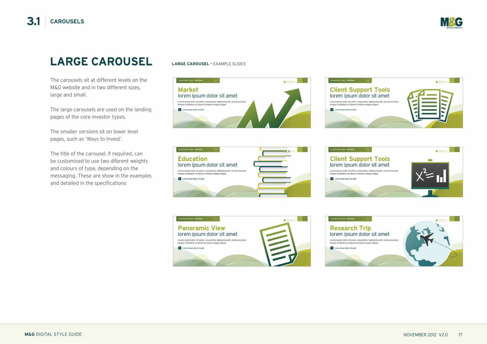
LARGE CAROUSEL LARGE CAROUSEL - ExAMpLE iN-pAGE
The carousels sit at different levels on the
M&G website and in two different sizes,
large and small.
The large carousels are used on the landing
pages of the core investor types.
The smaller versions sit on lower level
pages, such as ‘ways to invest’.
The title of the carousel, if required, can
be customised to use two diferent weights
and colours of type, depending on the
messaging. These are show in the examples
and detailed in the specifications
3.1 CAROUSELS

NOVEMBER 2012 V2.0 14
i
M&G diGiTAL STYLE GuidE
h1 45/39pX INTERSTATE BOLD / 36pX INTERSTATE LIGhT. -20 kERNINGBOdY 15/20px iNTERSTATE LiGHT. -20 kERNiNG
cta 12/18px inteRstate RegulaR. -20 keRning
960px
20px40px
54
px
440pX 296pX440pX 118pX
35
0p
x
356pX 20pX
440pX 54pX
20px
20px
LARGE CAROUSEL LARGE CAROUSEL - iMAGE & COpY AREA
3.1 CAROUSELS
H1
BODY
CTA
IMAGE
The carousels sit at different levels on the
M&G website and in two different sizes,
large and small.
The large carousels are used on the landing
pages of the core investor types.
The smaller versions sit on lower level
pages, such as ‘ways to invest’.
The title of the carousel, if required, can
be customised to use two diferent weights
and colours of type, depending on the
messaging. These are show in the examples
and detailed in the specifications
IMAGE AREA
Safe area for supporting imagery
TypE AREA
predefined area for text input.
This area is fixed horizontally, but in some
instances the depth can be variable
DIMENSIONS
pixel based dimensions supplied as
guidance for the creation of additional
graphical elements

NOVEMBER 2012 V2.0 15
i
M&G diGiTAL STYLE GuidE
440pX 118pX
356pX 20pX
440pX 54pX
LARGE CAROUSEL ChARACTER COUNT
MAiN HEAdLiNE:
48 Characters MAxiMuM.
72 characters are permitted with NO body copy.
BOdY COpY:
216 Characters MAxiMuM.
CTA:
75 Characters MAxiMuM.
3.1 CAROUSELS
H1
BODY
CTA
The carousels sit at different levels on the
M&G website and in two different sizes,
large and small.
The large carousels are used on the landing
pages of the core investor types.
The smaller versions sit on lower level
pages, such as ‘ways to invest’.
The title of the carousel, if required, can
be customised to use two diferent weights
and colours of type, depending on the
messaging. These are show in the examples
and detailed in the specifications

NOVEMBER 2012 V2.0 16
i
M&G diGiTAL STYLE GuidE
LARGE CAROUSEL LARGE CAROUSEL - ExAMpLE SLidES
3.1 CAROUSELS
The carousels sit at different levels on the
M&G website and in two different sizes,
large and small.
The large carousels are used on the landing
pages of the core investor types.
The smaller versions sit on lower level
pages, such as ‘ways to invest’.
The title of the carousel, if required, can
be customised to use two diferent weights
and colours of type, depending on the
messaging. These are show in the examples
and detailed in the specifications
NOVEMBER 2012 V2.0 17
i
M&G diGiTAL STYLE GuidE
LARGE CAROUSEL LARGE CAROUSEL - ExAMpLE SLidES
3.1 CAROUSELS
The carousels sit at different levels on the
M&G website and in two different sizes,
large and small.
The large carousels are used on the landing
pages of the core investor types.
The smaller versions sit on lower level
pages, such as ‘ways to invest’.
The title of the carousel, if required, can
be customised to use two diferent weights
and colours of type, depending on the
messaging. These are show in the examples
and detailed in the specifications

NOVEMBER 2012 V2.0 18
i
M&G diGiTAL STYLE GuidE
LARGE CAROUSEL LARGE CAROUSEL - ExAMpLE SLidES
3.1 CAROUSELS
The carousels sit at different levels on the
M&G website and in two different sizes,
large and small.
The large carousels are used on the landing
pages of the core investor types.
The smaller versions sit on lower level
pages, such as ‘ways to invest’.
The title of the carousel, if required, can
be customised to use two diferent weights
and colours of type, depending on the
messaging. These are show in the examples
and detailed in the specifications

NOVEMBER 2012 V2.0 19
i
M&G diGiTAL STYLE GuidE
LARGE CAROUSEL LARGE CAROUSEL - ExAMpLE SLidES
3.1 CAROUSELS
The carousels sit at different levels on the
M&G website and in two different sizes,
large and small.
The large carousels are used on the landing
pages of the core investor types.
The smaller versions sit on lower level
pages, such as ‘ways to invest’.
The title of the carousel, if required, can
be customised to use two diferent weights
and colours of type, depending on the
messaging. These are show in the examples
and detailed in the specifications

NOVEMBER 2012 V2.0 20
i
M&G diGiTAL STYLE GuidE
SMALL CAROUSEL SMALL CAROUSEL - ExAMpLE iN-pAGE
3.2 CAROUSELS
The carousels sit at different levels on the
M&G website and in two different sizes,
large and small.
The large carousels are used on the landing
pages of the core investor types.
The smaller versions sit on lower level
pages, such as ‘ways to invest’.
The title of the carousel, if required, can
be customised to use two diferent weights
and colours of type, depending on the
messaging. These are show in the examples
and detailed in the specifications

NOVEMBER 2012 V2.0 21
i
M&G diGiTAL STYLE GuidE
914px
20px40px
20
px
440pX 215pX
356pX 20pX
440pX 80pX
440pX 54pX25
0p
x
20px
20px
h1 32/37pX INTERSTATE BOLD.32pX INTERSTATE LIGhT. -20 kERNINGBOdY 15/20px iNTERSTATE LiGHT. -20 kERNiNG
cta 12/18px inteRstate RegulaR. -20 keRning
CAROUSEL SMALL - iMAGE & COpY AREA
3.2 CAROUSELS
SMALL CAROUSEL
IMAGE
The carousels sit at different levels on the
M&G website and in two different sizes,
large and small.
The large carousels are used on the landing
pages of the core investor types.
The smaller versions sit on lower level
pages, such as ‘ways to invest’.
The title of the carousel, if required, can
be customised to use two diferent weights
and colours of type, depending on the
messaging. These are show in the examples
and detailed in the specifications
H1
BODY
CTA
IMAGE AREA
Safe area for supporting imagery
TypE AREA
predefined area for text input.
This area is fixed horizontally, but in some
instances the depth can be variable
DIMENSIONS
pixel based dimensions supplied as
guidance for the creation of additional
graphical elements

NOVEMBER 2012 V2.0 22
i
M&G diGiTAL STYLE GuidE
SMALL CAROUSEL
CAROUSELS
440pX 80pX
356pX 20pX
440pX 54pX
ChARACTER COUNT
MAiN HEAdLiNE:
48 Characters MAxiMuM.
72 characters are permitted with NO body copy
BOdY COpY:
216 Characters MAxiMuM.
CTA:
75 Characters MAxiMuM.
H1
BODY
CTA
The carousels sit at different levels on the
M&G website and in two different sizes,
large and small.
The large carousels are used on the landing
pages of the core investor types.
The smaller versions sit on lower level
pages, such as ‘ways to invest’.
The title of the carousel, if required, can
be customised to use two diferent weights
and colours of type, depending on the
messaging. These are show in the examples
and detailed in the specifications
3.2

NOVEMBER 2012 V2.0 23
i
M&G diGiTAL STYLE GuidE
SMALL CAROUSEL SMALL CAROUSEL - ExAMpLE SLidES
3.2 CAROUSELS
The carousels sit at different levels on the
M&G website and in two different sizes,
large and small.
The large carousels are used on the landing
pages of the core investor types.
The smaller versions sit on lower level
pages, such as ‘ways to invest’.
The title of the carousel, if required, can
be customised to use two diferent weights
and colours of type, depending on the
messaging. These are show in the examples
and detailed in the specifications

NOVEMBER 2012 V2.0 24
i
M&G diGiTAL STYLE GuidE
SMALL CAROUSEL SMALL CAROUSEL - ExAMpLE SLidES
3.2 CAROUSELS
The carousels sit at different levels on the
M&G website and in two different sizes,
large and small.
The large carousels are used on the landing
pages of the core investor types.
The smaller versions sit on lower level
pages, such as ‘ways to invest’.
The title of the carousel, if required, can
be customised to use two diferent weights
and colours of type, depending on the
messaging. These are show in the examples
and detailed in the specifications

25M&G diGiTAL STYLE GuidE
4.0 pROMOS

NOVEMBER 2012 V2.0 26
i
M&G diGiTAL STYLE GuidE
pROMOS pROMOS - ExAMpLES iN-pAGE
4.1 pROMOS
page promos are used throughout the
entire M&G website to further highlight
additional or related content to the page or
to aid further internal signposting.
different types of page promo are available:
Standard promo:
containing a background image,
additional copy and CTA link
Image promo:
containing an image and CTA link
Carousel promo:
containing up to 3 image and copy promos
Right hand Column promo:
Alternate design treatment for lower level
pages featuring either image only, image
with additional copy or carousel.
Two different sizes are available for use.
Small promos are used on section landing
pages and large promos are used on
audience landing pages. Right hand column
promos are small size only.
small pRomo. SECTiON LANdiNG pAGE
Right hand column pRomo. AudEiNCE LANdiNG pAGE
laRge pRomo. dETAiL pAGE

NOVEMBER 2012 V2.0 27
i
M&G diGiTAL STYLE GuidE
IMAGE AREA
Safe area for supporting imagery
TypE AREA
predefined area for text input.
This area is fixed horizontally, but in some
instances the depth can be variable
DIMENSIONS
pixel based dimensions supplied as
guidance for the creation of additional
graphical elements
STANDARD pROMOSMALL
STANDARD pROMO - iMAGE, COpY & CTA AREA
4.2
page promos are used throughout the
entire M&G website to further highlight
additional or related content to the page or
to aid further internal signposting.
iM&G diGiTAL STYLE GuidE
pROMOS
256pX 52pX
140pX153pX
128pX 20pX
256pX 20pX
26
0p
x
296px20px 20px
30
px
45
px
TITLE
COPY
CTA
IMAGE
MAiN HEAdLiNE:
25 Characters MAxiMuM.
h1 20pX INTERSTATE BOLD. -20 kERNING
BOdY 15/20px iNTERSTATE LiGHT.-20 kERNiNG
cta 12px inteRstate RegulaR. -20 keRning
256pX 52pX
128pX 20pX
256pX 20pX TITLE
COPY
CTA
BOdY COpY:
80 Characters MAxiMuM.
CTA:
40 Characters MAxiMuM.

NOVEMBER 2012 V2.0 28
i
M&G diGiTAL STYLE GuidE
4.2 M&G diGiTAL STYLE GuidE
pROMOS
IMAGE AREA
Safe area for supporting imagery
TypE AREA
predefined area for text input.
This area is fixed horizontally, but in some
instances the depth can be variable
DIMENSIONS
pixel based dimensions supplied as
guidance for the creation of additional
graphical elements
412pX 20pX
30
0p
x
452px20px 20px
20
px
236pX 52pX
180pX X 130pX
TITLE
IMAGE
MAiN HEAdLiNE:
38 Characters MAxiMuM.
h1 20pX INTERSTATE BOLD/LIGhT. -20 kERNING
cta 12px inteRstate RegulaR. -20 keRning
236pX 52pX
128pX 20pX
412pX 20pX TITLE
CTA
BOdY COpY:
160 Characters MAxiMuM.
CTA:
40 Characters MAxiMuM.
page promos are used throughout the
entire M&G website to further highlight
additional or related content to the page or
to aid further internal signposting.
STANDARD pROMOLARGE
STANDARD pROMO - iMAGE, COpY & CTA AREA
COPY
COPY
128pX 20pX CTA
45
px

NOVEMBER 2012 V2.0 29
i
M&G diGiTAL STYLE GuidE
IMAGE pROMO - iMAGE & CTA AREAS
4.3 M&G diGiTAL STYLE GuidE
pROMOS
IMAGE AREA
Safe area for supporting imagery
TypE AREA
predefined area for text input.
This area is fixed horizontally, but in some
instances the depth can be variable
DIMENSIONS
pixel based dimensions supplied as
guidance for the creation of additional
graphical elements
MAiN HEAdLiNE:
25 Characters MAxiMuM.
h1 20pX INTERSTATE BOLD. -20 kERNING
cta 12px inteRstate RegulaR. -20 keRning
128pX 20pX
256pX 20pX TITLE
CTA
CTA:
40 Characters MAxiMuM.
page promos are used throughout the
entire M&G website to further highlight
additional or related content to the page or
to aid further internal signposting.
IMAGE pROMOSMALL
296pX 215pX
128pX 20pX
256pX 20pX
26
0p
x
296px20px 20px
30
px
45
px
TITLE
CTA
IMAGE

NOVEMBER 2012 V2.0 30
i
M&G diGiTAL STYLE GuidE
4.3 M&G diGiTAL STYLE GuidE
pROMOS
IMAGE AREA
Safe area for supporting imagery
TypE AREA
predefined area for text input.
This area is fixed horizontally, but in some
instances the depth can be variable
DIMENSIONS
pixel based dimensions supplied as
guidance for the creation of additional
graphical elements
IMAGE pROMO - iMAGE & CTA AREAS
MAiN HEAdLiNE:
38 Characters MAxiMuM.
h1 20pX INTERSTATE BOLD/LIGhT. -20 kERNING
cta 12px inteRstate RegulaR. -20 keRning
128pX 20pX
412pX 20pX TITLE
CTA
CTA:
40 Characters MAxiMuM.
IMAGE pROMOLARGE
page promos are used throughout the
entire M&G website to further highlight
additional or related content to the page or
to aid further internal signposting.
412pX 20pX
30
0p
x
452px20px 20px
20
px
452pX 255pX
TITLE
IMAGE
128pX 20pX CTA
45
px

NOVEMBER 2012 V2.0 31
i
M&G diGiTAL STYLE GuidE
4.4 M&G diGiTAL STYLE GuidE
pROMOS
IMAGE AREA
Safe area for supporting imagery
TypE AREA
predefined area for text input.
This area is fixed horizontally, but in some
instances the depth can be variable
DIMENSIONS
pixel based dimensions supplied as
guidance for the creation of additional
graphical elements
CAROUSEL pROMO - iMAGE, COpY & CTA AREAS
166pX 20pX
236pX 20pX
23
0p
x
296px20px 20px
20
px
25
px
236pX 54pX
75pX 11pX
98pX 572pX
TITLE
DATE + COPY
IMAGECTA
MAiN HEAdLiNE:
25 Characters MAxiMuM.
h1 20pX INTERSTATE BOLD. -20 kERNING
BOdY 15/20px iNTERSTATE LiGHT.-20 kERNiNG
cta 12px inteRstate RegulaR. -20 keRning
236pX 54pX
166pX 20pX
236pX 20pX TITLE
COPY
BOdY COpY:
80 Characters MAxiMuM.
CTA:
25 Characters MAxiMuM.
CAROUSEL pROMOSMALL
page promos are used throughout the
entire M&G website to further highlight
additional or related content to the page or
to aid further internal signposting.

NOVEMBER 2012 V2.0 32
i
M&G diGiTAL STYLE GuidE
4.4 M&G diGiTAL STYLE GuidE
pROMOS
IMAGE AREA
Safe area for supporting imagery
TypE AREA
predefined area for text input.
This area is fixed horizontally, but in some
instances the depth can be variable
DIMENSIONS
pixel based dimensions supplied as
guidance for the creation of additional
graphical elements
page promos are used throughout the
entire M&G website to further highlight
additional or related content to the page or
to aid further internal signposting.
CAROUSEL pROMO - iMAGE, COpY & CTA AREASCAROUSEL pROMOLARGE
280pX 20pX
380pX 20pX
30
0p
x
452px20px 20px
20
px
45
px
236pX 80pX
145pX X 130pX
TITLE
IMAGE
CTA
COPY
MAiN HEAdLiNE:
38 Characters MAxiMuM.
h1 20pX INTERSTATE BOLD/LIGhT. -20 kERNING
cta 12px inteRstate RegulaR. -20 keRning
236pX 20pX
280pX 20pX
380pX 20pX TITLE
CTA
BOdY COpY:
160 Characters MAxiMuM.
CTA:
40 Characters MAxiMuM.
COPY
75pX 11pX

NOVEMBER 2012 V2.0 33
i
M&G diGiTAL STYLE GuidE
IMAGE AREA
Safe area for supporting imagery
TypE AREA
predefined area for text input.
This area is fixed horizontally, but in some
instances the depth can be variable
DIMENSIONS
pixel based dimensions supplied as
guidance for the creation of additional
graphical elements
RIGhT hAND COLUMN - iMAGE, COpY & CTA AREAS
4.5 iM&G diGiTAL STYLE GuidE
pROMOS
236pX 38pX
246pX 125pX
236pX 20pX
236pX 20pX
32
4p
x
296px20px 20px
30
px
20
px
42
px
25
px
TITLE
COPY
CTA
IMAGE
h1 20pX INTERSTATE BOLD. -20 kERNING
BOdY 15/20px iNTERSTATE LiGHT.-20 kERNiNG
cta 12px inteRstate RegulaR. -20 keRning
RIGhT hAND COLUMN pROMO
page promos are used throughout the
entire M&G website to further highlight
additional or related content to the page or
to aid further internal signposting.MAiN HEAdLiNE:
25 Characters MAxiMuM.
236pX 54pX
166pX 20pX
236pX 20pX TITLE
COPY
BOdY COpY:
80 Characters MAxiMuM.
CTA:
25 Characters MAxiMuM.

NOVEMBER 2012 V2.0 34
i
M&G diGiTAL STYLE GuidE
pAGE pROMOS
4.6 M&G diGiTAL STYLE GuidE
pROMOS
page promos are used throughout the
entire M&G website to further highlight
additional or related content to the page or
to aid further internal signposting.
RIGhT hAND COLUMN - ExAMpLES

NOVEMBER 2012 V2.0 35
i
M&G diGiTAL STYLE GuidE
pAGE pROMOS
4.6 M&G diGiTAL STYLE GuidE
pROMOS
page promos are used throughout the
entire M&G website to further highlight
additional or related content to the page or
to aid further internal signposting.
RIGhT hAND COLUMN - ExAMpLES

NOVEMBER 2012 V2.0 36
i
M&G diGiTAL STYLE GuidE
pAGE pROMOS
4.6 M&G diGiTAL STYLE GuidE
pROMOS
page promos are used throughout the
entire M&G website to further highlight
additional or related content to the page or
to aid further internal signposting.
SMALL AND LARGE IMAGE pROMOS - ExAMpLES

NOVEMBER 2012 V2.0 37
i
M&G diGiTAL STYLE GuidE
pAGE pROMOS
4.6 M&G diGiTAL STYLE GuidE
pROMOS
page promos are used throughout the
entire M&G website to further highlight
additional or related content to the page or
to aid further internal signposting.
SMALL AND LARGE IMAGE pROMOS - ExAMpLES

38M&G diGiTAL STYLE GuidE
5.0 ADDITIONAL COMpONENTS

NOVEMBER 2012 V2.0 39
i
M&G diGiTAL STYLE GuidE
INSIGhTS & MARkET UpDATES
INSIGhTS & MARkET UpDATES - ExAMpLE ipAGE
5.1 ADDITIONAL COMpONENTS
The insights & Market updates has a
bespoke design which allows for image to
be included within an article.

NOVEMBER 2012 V2.0 40
i
M&G diGiTAL STYLE GuidE
INSIGhTS & MARkET UpDATES
COMpONENT pANEL - COpY + iMAGE
5.1 ADDITIONAL COMpONENTS
The insights & Market updates has a
bespoke design which allows for image to
be included within an article.
245pX vARIABLE
250pX 140pX
236pX 20pX
245pX vARIABLE
245pX 20pX
va
Ria
bl
e h
eig
ht
280px
20
px
20
pxCATEGORY + DATE
TITLE
CTA
COPY
IMAGE
categoRy + date 11px inteRstate bold. -20 keRning
h1 28pX INTERSTATE BOLD. -20 kERNING
BOdY 13/18px iNTERSTATE LiGHT.-20 kERNiNG
cta 12px inteRstate RegulaR. -20 keRning
MAiN HEAdLiNE:
56 Characters.
CATEGORY + dATE:
38 Characters MAxiMuM.
245pX 54pX
236pX 20pX
245pX 20pX
245pX 20pX
TITLE
COPY
BOdY COpY:
150 Characters.
CTA:
25 Characters MAxiMuM.
CATEGORY + DATE

NOVEMBER 2012 V2.0 41
i
M&G diGiTAL STYLE GuidE
fUND MANAGERS fUND MANAGER - pROFiLE iMAGE SiZES
5.2 ADDITIONAL COMpONENTS
Fund Manager profile pages use 2 sizes,
the ‘Meet the Team’ thumbnail and full size
individual profile page photo.
326pX 215pX
80pX 80pX
IMAGE
IMAGE

42M&G diGiTAL STYLE GuidE
6.0 SUpERGRAphIC

NOVEMBER 2012 V2.0 43
i
M&G diGiTAL STYLE GuidE
SUpERGRAphIC
6.0 M&G diGiTAL STYLE GuidE
SUpERGRAphIC
The website redevelopment has
introduced new branding assets in the
form of ‘Supergraphics’. These form the
backgrounds of the pages of the M&G
website and bring a new element to the
overall execution of the M&G brand,
when focussing on digital communications.
A range of supergraphics have been
created and are available from the
digital Team. Certain graphics have
assigned association with the global M&G
brand as well as specific audience types.
The global brand ‘Supergraphic’ must
not be used in any other form of
communication other than on the M&G
Global homepage. Each graphic is labelled
here for usage purposes.
LEvEL 1 - GLOBAL LANdiNG pAGE SupERGRApHiC

NOVEMBER 2012 V2.0 44
i
M&G diGiTAL STYLE GuidE
SUpERGRAphIC
6.0 M&G diGiTAL STYLE GuidE
SUpERGRAphIC
The website redevelopment has
introduced new branding assets in the
form of ‘Supergraphics’. These form the
backgrounds of the pages of the M&G
website and bring a new element to the
overall execution of the M&G brand,
when focussing on digital communications.
A range of supergraphics have been
created and are available from the
digital Team. Certain graphics have
assigned association with the global M&G
brand as well as specific audience types.
The global brand ‘Supergraphic’ must
not be used in any other form of
communication other than on the M&G
Global homepage. Each graphic is labelled
here for usage purposes.
SUpERGRAphICS - FiNAL ASSETS
LEvEL 2 - AudiENCE LANdiNG pAGE LEvEL 3 - SECTiON LANdiNG pAGE

NOVEMBER 2012 V2.0 45
i
M&G diGiTAL STYLE GuidE
SUpERGRAphIC
6.0 M&G diGiTAL STYLE GuidE
SUpERGRAphIC
The website redevelopment has
introduced new branding assets in the
form of ‘Supergraphics’. These form the
backgrounds of the pages of the M&G
website and bring a new element to the
overall execution of the M&G brand,
when focussing on digital communications.
A range of supergraphics have been
created and are available from the
digital Team. Certain graphics have
assigned association with the global M&G
brand as well as specific audience types.
The global brand ‘Supergraphic’ must
not be used in any other form of
communication other than on the M&G
Global homepage. Each graphic is labelled
here for usage purposes.
SUpERGRAphICS - FiNAL ASSETS
LEvEL 4 - CONTENT pAGE

46M&G diGiTAL STYLE GuidE
7.0 COpy STANDARDS

NOVEMBER 2012 V2.0 47
i
M&G diGiTAL STYLE GuidE
COpy STANDARDS
7.0
Standards have been created to help define
written content within the M&G website.
An additional document is available with
a defined list of words and definitions and
how they should be communicated.
when writing Marketing copy please also
consult the Tone of Voice section within
your M&G Brand Guidelines. if you have any
suggestions for inclusion or would like to
discuss any of the subjects covered please
contact George Frost on ext. 3664.
please note: Copy standards are updated every six months.
REfERRING TO wEBSITES IN OffLINE COpy
use ‘Visit our website’.
use ‘our website’, not ‘the website’.
use ‘Visit our website at www.mandg.co.uk,
not ‘Visit our website www.mandg.co.uk’.
NEVER put a full stop at the end of a web address
or email address.
when mentioning ‘My Account’ use upper case initials
and inverted commas.
REfERRING TO pAGES IN ONLINE COpy
use ‘See’ or ‘Go to’ or add the link to the page in the
body copy.
Examples: ‘for more information, see terms and
conditions’
‘go to the global basics fund page’
‘to apply for an isa, download the application form
and send back to us’
use ‘Visit’ when directing visitors to other websites.
Example: ‘visit www.mandg.co.uk’
in body copy, the link is placed on the name of the page
you are directing the visitor to, not on the verb.
we should avoid using the uRL - it is simpler to embed
the uRL into the link, and merely display the page name
as the linked text.
in call to action buttons, use a verb.
Example: ‘download’ ‘contact us’
DATES
in main text, show day as number, month as word,
year in full as below. Avoid splitting over two lines
Example: 7 july 2009
(please note the exclusion of the suffix: th/nd/st/rd
and no ‘the’ before date)
when quoting the day please use in full,
i.e. friday 24 july 2009
in tables, footnotes and sources (where space is an
issue) use numbers (6 digits) and full stops.
Example: 15.07.09
Months can be abbreviated to three letters in graphs
and tables.
Example: jan feb mar apr may jun jul aug
sep oct nov dec
keep any abbreviations consistent throughout document.
USING AMpERSANDS (&)
All ampersands need to be fully spelt out as and, unless it’s
part of a company’s brand identity
Example: m&g investments or hm Revenue & customs
TIMES
use 12-hour clock, no space between the time and am/pm
without punctuation
Example: 8.00am to 8.00pm
iM&G diGiTAL STYLE GuidE
COpy STANDARDS

NOVEMBER 2012 V2.0 48
i
M&G diGiTAL STYLE GuidE
COpy STANDARDS
7.0
Standards have been created to help define
written content within the M&G website.
An additional document is available with
a defined list of words and definitions and
how they should be communicated.
when writing Marketing copy please also
consult the Tone of Voice section within
your M&G Brand Guidelines. if you have any
suggestions for inclusion or would like to
discuss any of the subjects covered please
contact George Frost on ext. 3664.
please note: Copy standards are updated every six months.
TELEphONE NUMBERS
use the formats below and avoid splitting over lines
Examples: 020 7548 1234 / 0800 390 390
NUMBERS IN TABLES – Uk
in tables show specific numbers with commas at the
thousand and million marks and use full stops for decimals,
maintaining consistent decimal places throughout so that
they line up and can be compared easily in document.
Examples: 15,804 and 2,500,000
3.25% and 1.00% (not 1%)
NUMBERS wIThIN TEXT
Numbers up to ten are spelled out, from 11 onwards
they are not.
Try to avoid placing numbers next to each other.
Example: the auditorium can accommodate 200,
50 of whom are stood at the back.
Reword as ‘…of whom 50 are stood at the back.’
Numbers should be used when stating a sequence
of quantities.
Example: the past 12 months show a net increase of 7%.
do not begin a sentence with a number, use the word
instead.
Example: use ‘eighteen of m&g’s fund managers have
been awarded top ranking’ not ‘18 of M&G’s…’
NUMBERS IN TABLES – EUROpE
in tables show specific numbers with full stops at the
thousand and million marks and use commas for decimals,
maintaining consistent decimal places throughout so that
they line up and can be compared easily in document.
Examples: 15.804 and 2.500.000
3,25% and 1,00% (not 1%)
qUOTATION MARkS “ AND ”
Referring to a quote
Example: warren buffett once said, “we simply attempt
to be fearful when others are greedy…”
INvERTED COMMAS ‘ AND ’
Highlighting a word for stand-out or slang/modern phrase
Example: Remember the term ‘face value’ / …interview
the management and generally ‘kick the tyres’ .
SOURCES
Always in italics eg the Financial Times, Morningstar, inc.
DOUBLE SpACES
All M&G documents should only use one space after a full
stop or other ending punctuation.
BULLET pOINTS IN OffLINE COpy
Complete sentences are punctuated as normal.
in order to draw the reader’s eye to the front of each
bullet, start the bullet with a capital.
Avoid semi-colons at the end of each bullet point.
iM&G diGiTAL STYLE GuidE
COpy STANDARDS

NOVEMBER 2012 V2.0 49
i
M&G diGiTAL STYLE GuidE
COpy STANDARDS
7.0
Standards have been created to help define
written content within the M&G website.
An additional document is available with
a defined list of words and definitions and
how they should be communicated.
when writing Marketing copy please also
consult the Tone of Voice section within
your M&G Brand Guidelines. if you have any
suggestions for inclusion or would like to
discuss any of the subjects covered please
contact George Frost on ext. 3664.
please note: Copy standards are updated every six months.
BULLET pOINTS IN ONLINE COpy
in online copy, bullets should be as short as possible
and never word-wrap to a second line.
The first few words should be the most important in
each bullet.
in order to draw the reader’s eye to the front of each
bullet, start the bullet with a capital.
do not end the bullet with any punctuation, even the
last bullet.
Try to keep the number of bullets below five.
use numbered bullets if they express steps in a process.
ABBREvIATIONS
Examples: eg, pa, ie and etc – these should be lower case
without punctuation.
iSA – these should be upper case without punctuation and
will normally need to be defined at first mention.
All M&G fund names – abbreviations/mnemonics for M&G
fund names is not allowed.
SIGN pOSTING
if referring to a specific page for further instructions place
a comma after the statement and make clear directions.
Example: passwords cannot be shared, see page 4
for details.
if referring to a diagram or table use the abbreviation of
‘figure 1’.
Example: the chart shows how this would be affected,
see fig.1.
NAMES
Try to use full forename with surname, however if you have
to use initials leave space instead of full stops.
Example: michael mclintock or m g a mclintock
hEADINGS fOR ONLINE
Main heading (H1) should be short, simple and clear as
possible. it should be a good indication of the content of
the page.
Examples: ’global basics fund’
’press centre’
’our approach and philosophy’
Sub heading (H2) should be used to divide the page into:
logical sections
describing (clearly) the content of each subsection
do not try to be witty or funny in headings.
Never allow any heading to word-wrap around to a
second line.
For all headings, use sentence case - capitalise the first
letter, and use lower case for the rest of the heading
(unless it stated otherwise in the Copy Standards).
Avoid punctuation in headings.
iM&G diGiTAL STYLE GuidE
COpy STANDARDS