Embed Size (px)
Citation preview

Human beings and their capabilities
Design guidelines based on:● Human Senses, perception, interruptions, and
memory● Mental models,metaphors, and perceived
affordance

Terms
● Cognitive psychology: the study of how people perceive, learn, and remember
● Cognition: the act or process of knowing
Confronted with a new website how does the user uses past experience to make sense of it?– underlined blue text is taken to be a link

We care because:
When people try to understand something, they use a combination of:– What their senses tell them– Past experiences– Expectations

Senses:
● Senses: sight, hearing, smell, taste, touch– Provide data about our suroundings
● We are visual beings– See what I mean?
Designing a good website requires knowledge about how people perceive their environment
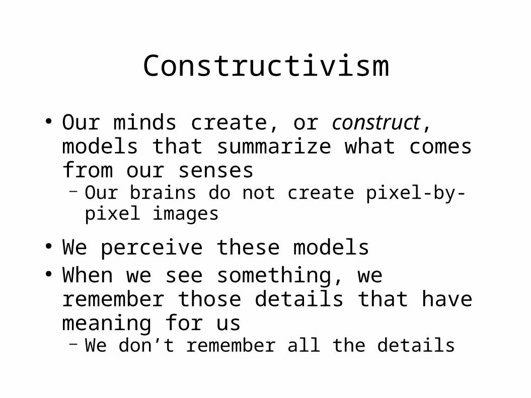
Constructivism
● Our minds create, or construct, models that summarize what comes from our senses– Our brains do not create pixel-by-pixel images
● We perceive these models● When we see something, we remember those
details that have meaning for us– We don’t remember all the details

Objects we see, but don’t store in detail
● How many links are there in the top menu of TU front page?
● What are the colors on your favorite cereal box? ● How many lines are there in the IBM logo?
Who cares?● People filter out irrelevant factors and save only
the important ones

Context
Context plays a major role in what people see in an image
● Mind set: factors that we know and bring to a situation
● Mind set can have a profound effect on the usability of a web site

What do you see?

It’s an animal, facing you . . .

This animal gives milk, and her face takes up the left half of the picture . . .

Why couldn’t we see the cow’s face the first time?
● It’s blurry and too contrasty, – yes, but ther is more:
● We had no idea what to expect– because there was no context
● Now that we do have a context, – we will have little difficulty recognizing it the next
time

Are these letters the same?

Are these letters the same?But now in context
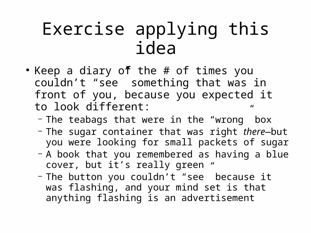
Exercise applying this idea
● Keep a diary of the # of times you couldn’t “see” something that was in front of you, because you expected it to look different:– The teabags that were in the “wrong” box– The sugar container that was right there—but you
were looking for small packets of sugar– A book that you remembered as having a blue cover,
but it’s really green– The button you couldn’t “see” because it was
flashing, and your mind set is that anything flashing is an advertisement

Figure and ground
● Images are partitioned into – Figure (foreground) and– Ground ( background)
● Sometimes figure and ground are ambiguous

What do you see?

Gestalt psychology
● “Gestalt” is German for “shape,”
● Gestalt psychology implies the idea of perception in context
● We don’t see things in isolation, – but as parts of a whole

Five principles of Gestalt psychology
● Organize things into meaningful units using
– Proximity: group by distance or location– Similarity: group by type– Symmetry: group by meaning– Continuity: group by flow of lines (alignment)– Closure: perceive shapes that are not (completely)
there
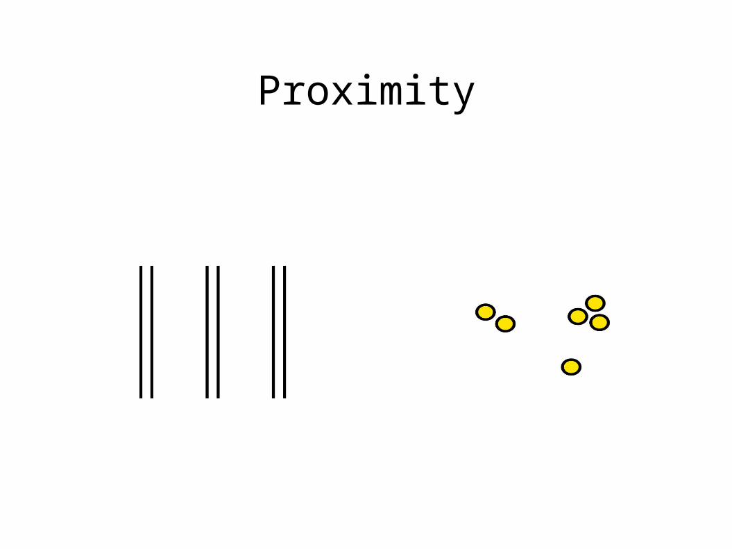
Proximity

A document that can be improved

Use proximity: group related things

Similarity

Improve this page using similarity

Make the buttons the same size

Further, use the same font everywhere

Symmetry: use experience and expectations
to make groups
We see two triangles.
see three groups of paired square brackets.

Continuity: flow, or alignment
We see curves AB and CD, not AC and DB, and not AD and BC
We see two rows of circles, not two L-shaped groups

Use alignment to improve this

Use horizontal alignment

Use vertical alignmentLeft-align both columns

Closure: mentally “fill in the blanks”
All are seen as circles

Closure: mentally “fill in the blanks”
● Hierarchical Model
Sensory
Short Term
Long Term
Practice and effort needed to make this transfer

Chunking
● Value of “ chunking”– 2125685382 vs. 212DanHome– 10 chunks vs. 3 (assuming 212 is familiar)
● Can you remember:– Vsdfnjejn7dknsdnd33s

How many chunks
● www.bestbookbuys.com– 20? – Not really, 5:
● www.● best● book● buys● .com

Recognition vs. recall
● Why is a multiple choice test easier than an essay test?– Multiple choice: you can recognize the answer– Essay: you must recall the answer
● A computer with a GUI allows us to recognize commands on a menu, instead of remembering them as in DOS and UNIX

Memory aids
● Post-It® notes● In Windows
– ctrl- V (paste)– ctrl- C (copy)– ctrl- S (save)
● Favorites List and bookmarks to store URLs● Hyperlinks—if their wording indicates the
content of the target page. – (“Click here” is not a memory aid.)

Interruptions
● Focusing attention and handling interruptions are related to memory
● In website design you need to give cues or memory aids for resuming tasks:– Back button– Followed links change color– When filling in forms, blank boxes show where to
pick up the job

Interruptions
● How fast must a system respond before the user’s attention is diverted? (Robert Miller, 1968)
● Response time User reaction < 0.1 second Seems instantaneous < 1 sec Notices delay, but
does not lose thought > 10 sec Switches to another task

Mental Models
● How do people use knowledge to understand or make predictions about new situations?
● People build mental models – a car: put gas in, turn key, and it runs.
● Can’t ignore user’s mental model● How to know what the users’ mental models are?
– Through user testing.
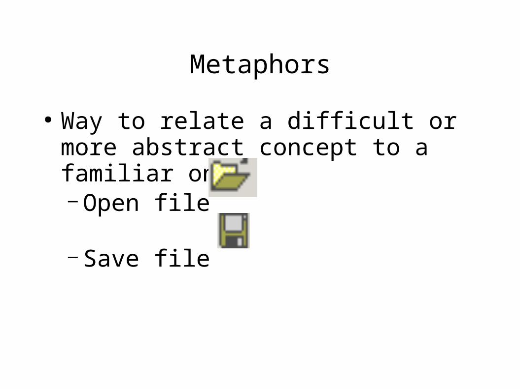
Metaphors
● Way to relate a difficult or more abstract concept to a familiar one– Open file
– Save file

Metaphors
● Disadvantage: metaphor may not be widely known or correctly understood
● The mailbox icon meant nothing outside rural United States until explained. And it’s backwards: we put the flag up to tell the mailman that we have put mail in the box to be picked up.

Affordance
● The functions or services that an interface provides– A door affords entry to a room– A radio button affords a 1-of-many choice– On a door,
● a handle affords pulling; ● A crash bar affords pushing

Perceived affordance
● We want affordance to be visible and obvious to the user– The Up and Down lights on an elevator door should
have arrows, or they should be placed vertically so that the top one means Up
– On a car, turning the steering wheel to the left makes the car go left

Perceived affordance
Top switch controls top lights
By convention, “up” is “on”

Design Guidelines for the Web
● Lessen burden on user’s memory:– Use recognition instead of recall– Help users chunk information– Require as little short-term memory as possible
● Consider user’s mental models● Provide visual clues and memory aids● Provide feedback:
– Let users know their input was received

Human Capabilities
– Sight is the most important sense● on the Web and in general
– We construct mental models; we don’t store bitmaps– Context and expectations influence what we see– Principles of Gestalt psychology: proximity,
similarity, symmetry, continuity, closure– Metaphors are tricky– Chunking helps memory– Perceived affordance depends on users’ backgrounds,
mental models, and expectations