Embed Size (px)
Citation preview

How to use Excel Spreadsheets for Graphing
1. Click on the Excel Program on the Desktop
2. You will notice that a screen similar to the above screen comes up. A spreadsheet is dividedinto Columns (A, B, C,...) and Rows (1, 2, 3, ....). Each square (cell) has a location according toit’s column and row.
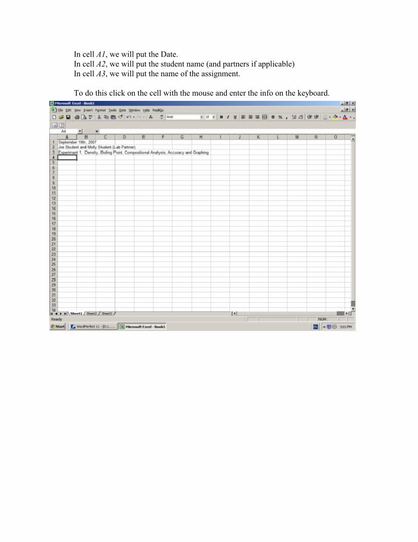
In cell A1, we will put the Date.In cell A2, we will put the student name (and partners if applicable)In cell A3, we will put the name of the assignment.
To do this click on the cell with the mouse and enter the info on the keyboard.

3. We will now enter the data from our experiment. We can enter the data as was entered in ourdata sheets. (Note when you first enter the data, the text will run together. We will fix this on thenext page.)
In B7 we will put “Sample #”In C7 we will put “Initial buret reading”In D7 we will put “Final buret reading”In E7 we will put “Difference”In F7 we will put “Total volume mixture”In G7 we will put “Dry vial + cap”In H7 we will put “After adding sample”In I7 we will put “Difference”

4. With the mouse, highlight cells B7 to I7, (by left clicking B7 and dragging the cursor to I7)
5. While it is highlighted, right click on the mouse.

6. In the box the pops up, select “Format Cells”, then click on the “Alignment” tab.
7. Under “Text Alignment” you will see the word “Vertical:” with a box and arrow beside it. Click on the arrow and select “Top”
8. Click on the box which says “Wrap Text” so that a check mark appears. Then click “OK”
This will align the text so it looks nice.

9. We should put units over our data as well. In cell C6 type in
mL
10. In cell G6 type in:
g (We will make it look nice on the next page)

11. Highlight C6 to F6 and right click, then choose “Format Cells” then “Alignment”
Click on the “Merge Cells” box at the bottomUnder “Text Alignment” “Horizontal” choose “Center” then click OK
12. Follow the same procedure to center the “g” over G6 to I6
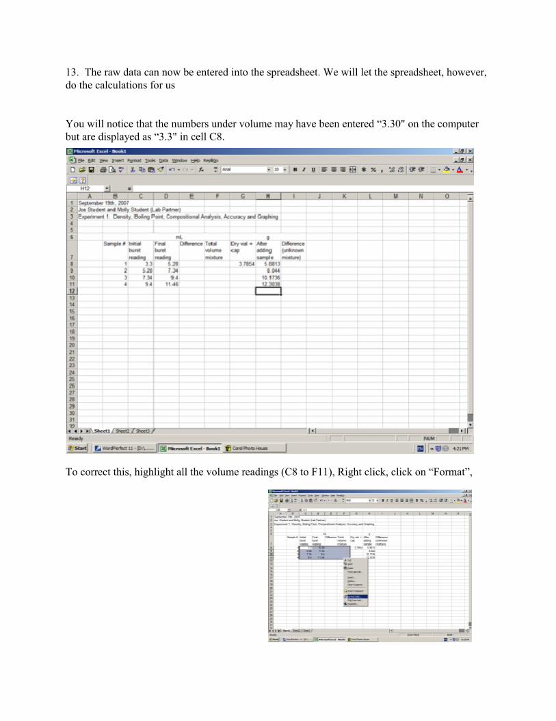
13. The raw data can now be entered into the spreadsheet. We will let the spreadsheet, however,do the calculations for us
You will notice that the numbers under volume may have been entered “3.30" on the computerbut are displayed as “3.3" in cell C8.
To correct this, highlight all the volume readings (C8 to F11), Right click, click on “Format”,
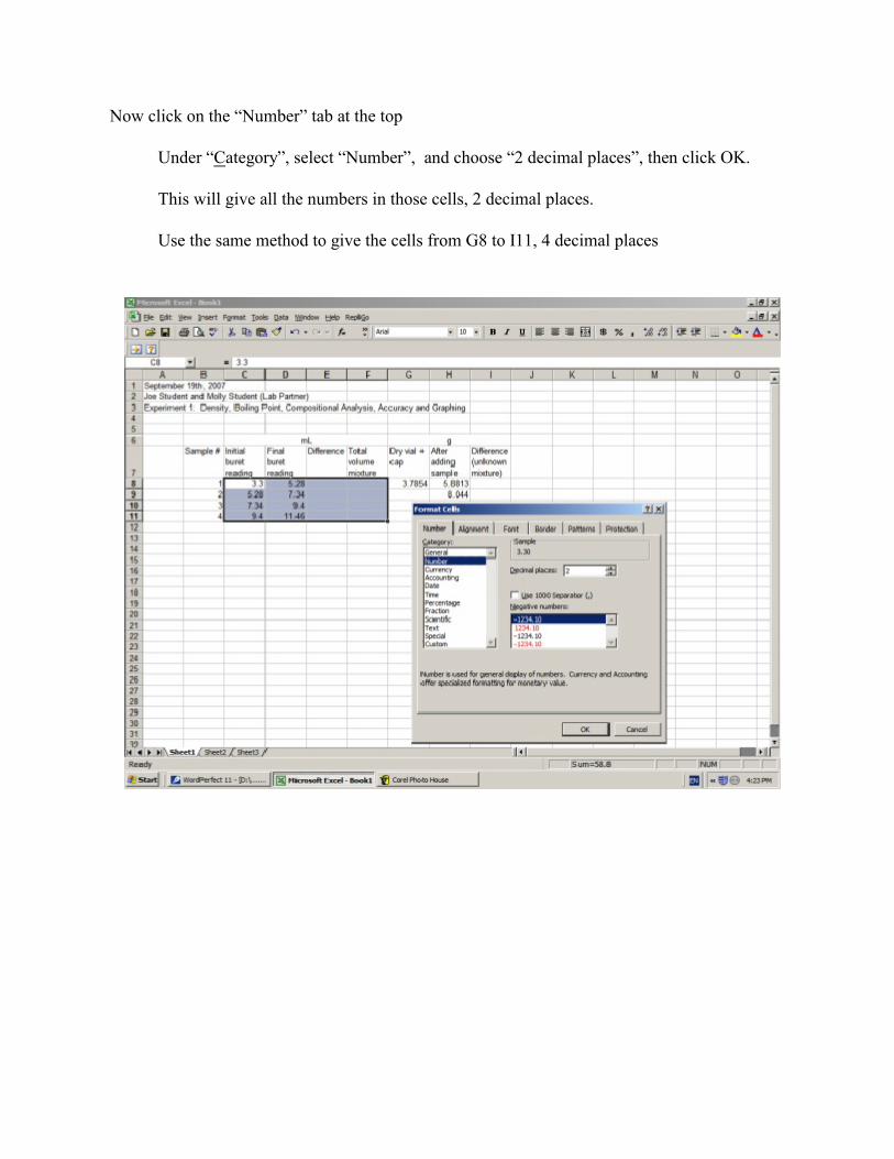
Now click on the “Number” tab at the top
Under “Category”, select “Number”, and choose “2 decimal places”, then click OK.
This will give all the numbers in those cells, 2 decimal places.
Use the same method to give the cells from G8 to I11, 4 decimal places
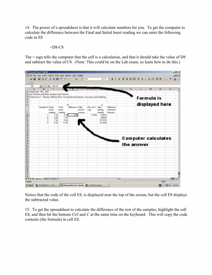
14. The power of a spreadsheet is that it will calculate numbers for you. To get the computer tocalculate the difference between the Final and Initial buret reading we can enter the followingcode in E8
=D8-C8
The = sign tells the computer that the cell is a calculation, and that it should take the value of D8and subtract the value of C8. (Note: This could be on the Lab exam, so learn how to do this.)
Notice that the code of the cell E8, is displayed near the top of the screen, but the cell E8 displaysthe subtracted value.
15. To get the spreadsheet to calculate the difference of the rest of the samples, highlight the cellE8, and then hit the buttons Ctrl and C at the same time on the keyboard. This will copy the codecontents (the formula) in cell E8.

16. Highlight E9 to E11, then hit Ctrl and V on the keyboard. This will paste the code in.
If you click on the cell E9, you will notice that the code is not quite the same as E8, it hasadjusted the values so that it calculates the difference between D9 and C9, instead of D8and C8
This is a good thing. Just imagine if you had 100 data points. With a few mouse clicks, youcould calculate all the values.

17. To add up the total values, we can enter the following code in F8
=E8
This will take the value of E8 and place it in F8 (since the value is the same for the firstdata point.)
18. The value in F9 is the total mL, which is the addition of F8 plus the “Difference” in Sample2. We can get the spreadsheet to add these values together by putting the following code in
=F8+E9
19. If we copy the contents of F9 (Ctrl+c) and paste them (Ctrl+v) into F10 and F11, thespreadsheet will calculate the totals. Notice again how the formula changes from F10 to F11.
** Note that if you make a mistake, you can click on the cell and hit the Delete button on thekeyboard to erase the contents of that cell.
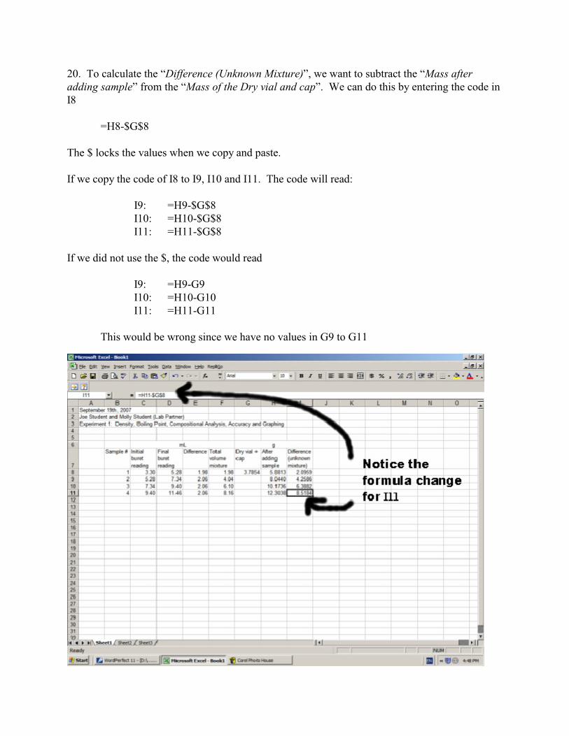
20. To calculate the “Difference (Unknown Mixture)”, we want to subtract the “Mass afteradding sample” from the “Mass of the Dry vial and cap”. We can do this by entering the code inI8
=H8-$G$8
The $ locks the values when we copy and paste.
If we copy the code of I8 to I9, I10 and I11. The code will read:
I9: =H9-$G$8I10: =H10-$G$8I11: =H11-$G$8
If we did not use the $, the code would read
I9: =H9-G9I10: =H10-G10I11: =H11-G11
This would be wrong since we have no values in G9 to G11

21. To set up an X,Y graph of “Mass vs Volume”, click on “Insert” and then “Chart” at the top.
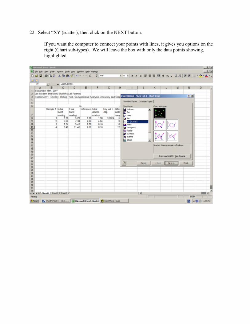
22. Select “XY (scatter), then click on the NEXT button.
If you want the computer to connect your points with lines, it gives you options on theright (Chart sub-types). We will leave the box with only the data points showing,highlighted.

23. In the next pane of the chart window, click on the “series” tab.
Many computers behave differently at this point. You may notice Series 1 to 4 are in the“Series” box. You may see nothing in the “Series” box.
Since we want only one line, we want it to only have the number “1" in the Seriesbox. That gives us the following two options:
1. Removing a Series: To remove a Series, click on the Series in the “SeriesBox” (such as the number “2") so that it is highlighted and then click the Removebutton. This will get rid of that series. Remove the other “series” until the boxonly contains “Series 1"
2. Adding a Series: If there is nothing in the Series box, then click on the Addbutton so that it contains “Series 1"
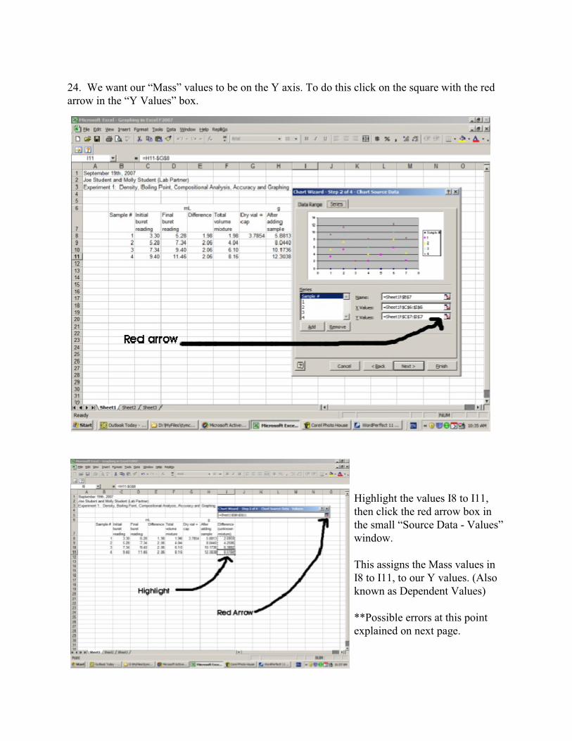
24. We want our “Mass” values to be on the Y axis. To do this click on the square with the redarrow in the “Y Values” box.
Highlight the values I8 to I11,then click the red arrow box inthe small “Source Data - Values” window.
This assigns the Mass values inI8 to I11, to our Y values. (Alsoknown as Dependent Values)
**Possible errors at this pointexplained on next page.

25. Occasionally an error occurs because the computer adds old values with new values. If thisoccurs, delete the numbers and letters in the “Y values” box and try again at step 24 . Ifeverything is OK, then continue on.
Now click on the red arrow box, of the “X Values:” box and highlight F8 to F11. If the “SourceData - X Values” window is in the way, you can click on the window and drag it aside.
This assigns the values F8 to F11 to the X values (or independent values).
Now click the red arrow box in the small“Source Data - X Values” window.
Then click on the NEXT button.

26. Enter a title for the graph, and titles for the “X Axis” and “Y Axis”. The main chart titleneeds to be descriptive. It should NOT just be “Mass vs Volume”.
For the Axis titles (labels), you should include units.
Then click NEXT
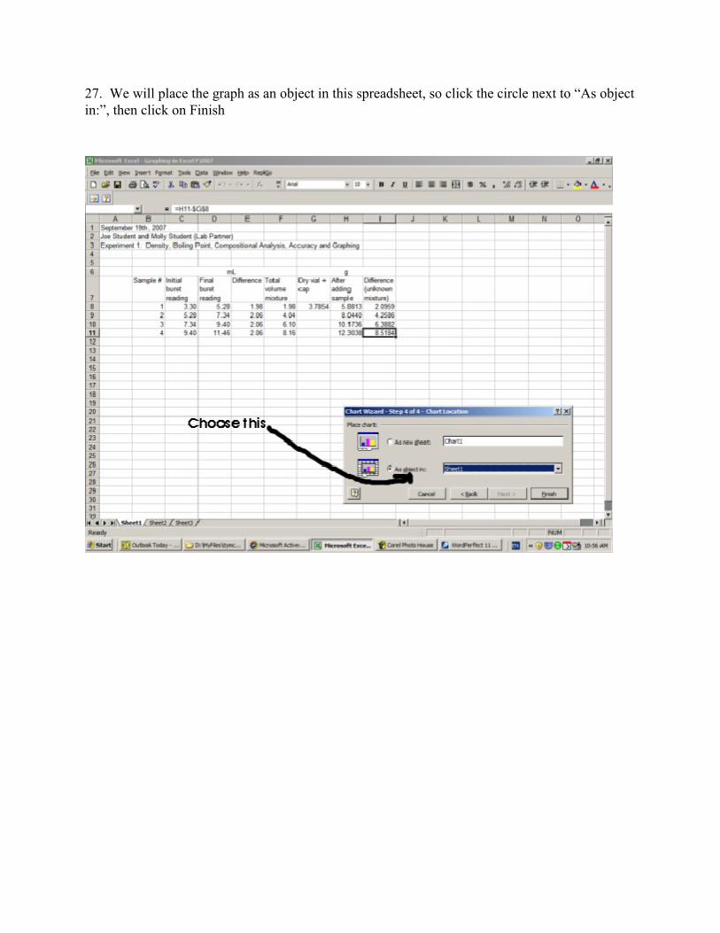
27. We will place the graph as an object in this spreadsheet, so click the circle next to “As objectin:”, then click on Finish

28. To arrange the data andgraph for printing, Click on the“View” option at the top, andthen on “Page break preview”.
This will show you a differentview. The dashed blue line iswhere the page ends. This blueline can be adjusted by draggingit.
Click on the chart so that it ishighlighted with boxes around it,then drag the chart so that it doesnot cover the data and stillremains on the page.
Adjust the graph size so that it is fairly large butwill still remain on a single page. When youclick on the graph, boxes appear at each cornerand at the middle of the sides. Use these boxesto adjust the size of your graph.
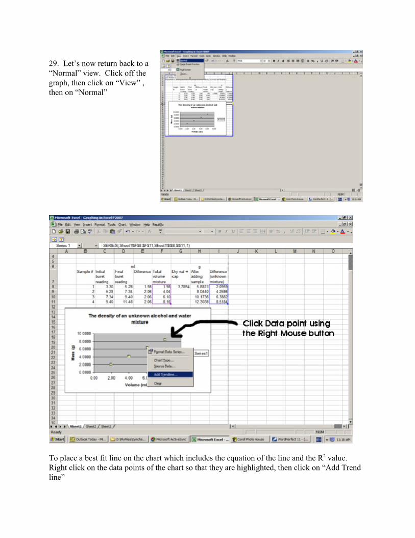
29. Let’s now return back to a“Normal” view. Click off thegraph, then click on “View” ,then on “Normal”
To place a best fit line on the chart which includes the equation of the line and the R value. 2
Right click on the data points of the chart so that they are highlighted, then click on “Add Trendline”
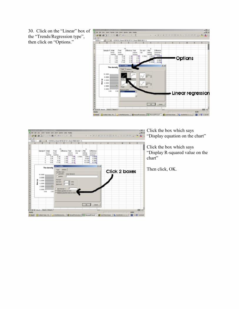
30. Click on the “Linear” box ofthe “Trends/Regression type”,then click on “Options.”
Click the box which says“Display equation on the chart”
Click the box which says“Display R-squared value on thechart”
Then click, OK.
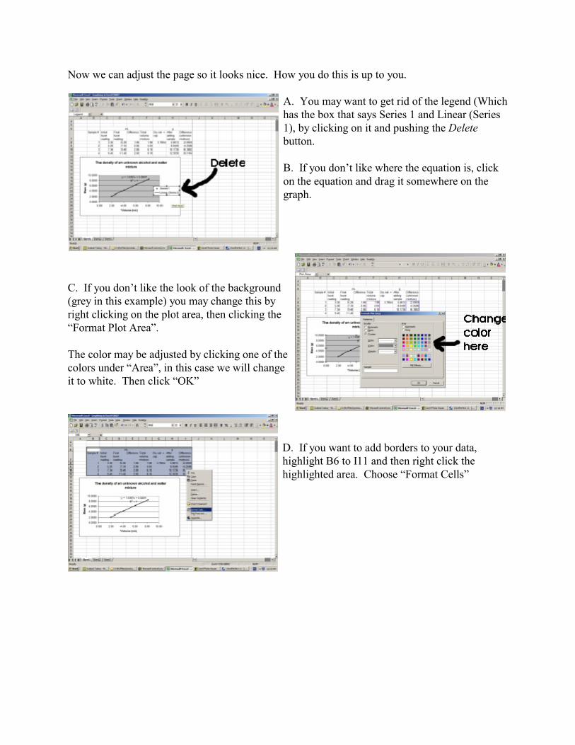
Now we can adjust the page so it looks nice. How you do this is up to you.
A. You may want to get rid of the legend (Whichhas the box that says Series 1 and Linear (Series1), by clicking on it and pushing the Deletebutton.
B. If you don’t like where the equation is, clickon the equation and drag it somewhere on thegraph.
C. If you don’t like the look of the background(grey in this example) you may change this byright clicking on the plot area, then clicking the“Format Plot Area”.
The color may be adjusted by clicking one of thecolors under “Area”, in this case we will changeit to white. Then click “OK”
D. If you want to add borders to your data,highlight B6 to I11 and then right click thehighlighted area. Choose “Format Cells”
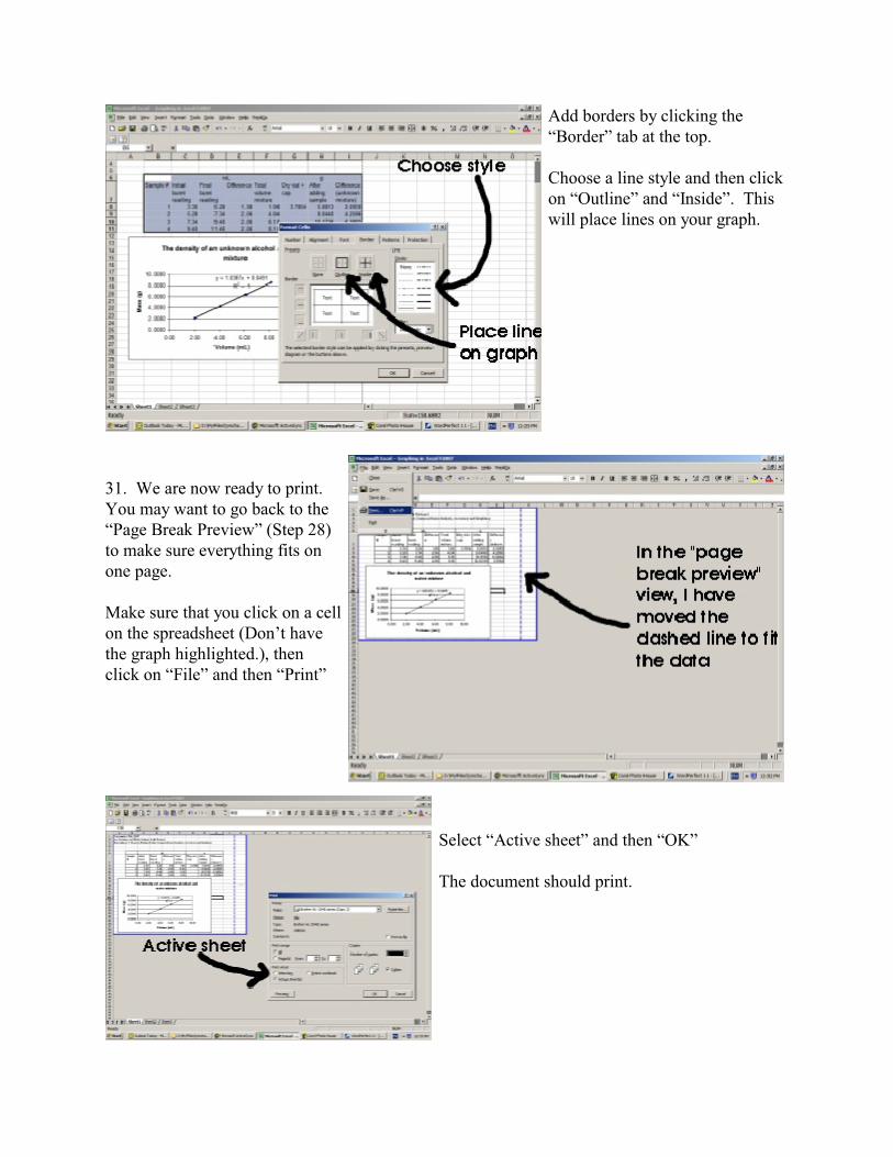
Add borders by clicking the“Border” tab at the top.
Choose a line style and then clickon “Outline” and “Inside”. Thiswill place lines on your graph.
31. We are now ready to print. You may want to go back to the“Page Break Preview” (Step 28)to make sure everything fits onone page.
Make sure that you click on a cellon the spreadsheet (Don’t havethe graph highlighted.), thenclick on “File” and then “Print”
Select “Active sheet” and then “OK”
The document should print.