Embed Size (px)
Citation preview
1
GuruFocus User Manual: Interactive
Charts
2018 version

2
Contents:
0. Introduction and Overview
a. Accessing Interactive Charts
b. Interactive Chart Layout
1. Adding Stocks to the Chart
2. Graphing Financial Metrics on the Chart
3. Changing the Date Range of the Chart
4. The Chart Window
5. Miscellaneous Header Options
6. Saving the Chart and Full Screen option
7. The Drawing Toolbox
8. Predefined Charts
9. Creating Custom Series and User-defined Charts
10. Adding Economic and Technical Indicators to Charts
11. The “Switch Ticker” Option
12. Miscellaneous
13. FAQs
3
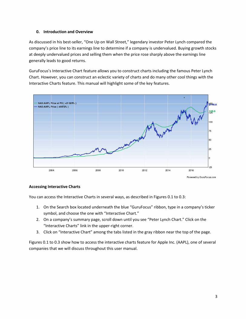
0. Introduction and Overview
As discussed in his best-seller, “One Up on Wall Street,” legendary investor Peter Lynch compared the
company’s price line to its earnings line to determine if a company is undervalued. Buying growth stocks
at deeply undervalued prices and selling them when the price rose sharply above the earnings line
generally leads to good returns.
GuruFocus’s Interactive Chart feature allows you to construct charts including the famous Peter Lynch
Chart. However, you can construct an eclectic variety of charts and do many other cool things with the
Interactive Charts feature. This manual will highlight some of the key features.
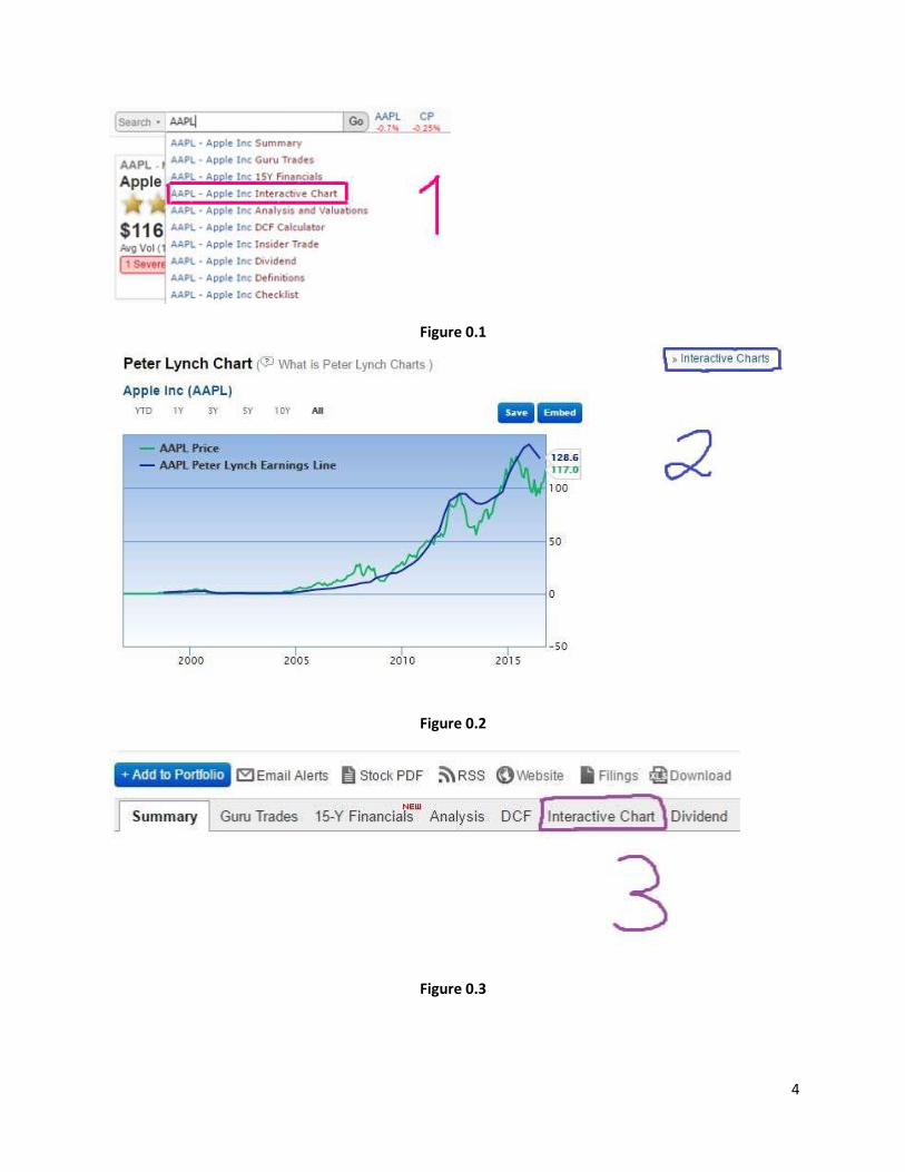
Accessing Interactive Charts
You can access the Interactive Charts in several ways, as described in Figures 0.1 to 0.3:
1. On the Search box located underneath the blue “GuruFocus” ribbon, type in a company’s ticker
symbol, and choose the one with “Interactive Chart.”
2. On a company’s summary page, scroll down until you see “Peter Lynch Chart.” Click on the
“Interactive Charts” link in the upper-right corner.
3. Click on “Interactive Chart” among the tabs listed in the gray ribbon near the top of the page.
Figures 0.1 to 0.3 show how to access the interactive charts feature for Apple Inc. (AAPL), one of several
companies that we will discuss throughout this user manual.
4
Figure 0.1
Figure 0.2
Figure 0.3
5
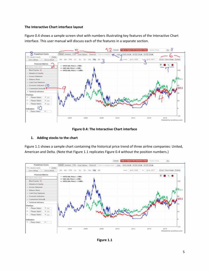
The Interactive Chart interface layout
Figure 0.4 shows a sample screen shot with numbers illustrating key features of the Interactive Chart
interface. This user manual will discuss each of the features in a separate section.
Figure 0.4: The Interactive Chart interface
1. Adding stocks to the chart
Figure 1.1 shows a sample chart containing the historical price trend of three airline companies: United,
American and Delta. (Note that Figure 1.1 replicates Figure 0.4 without the position numbers.)
Figure 1.1
6
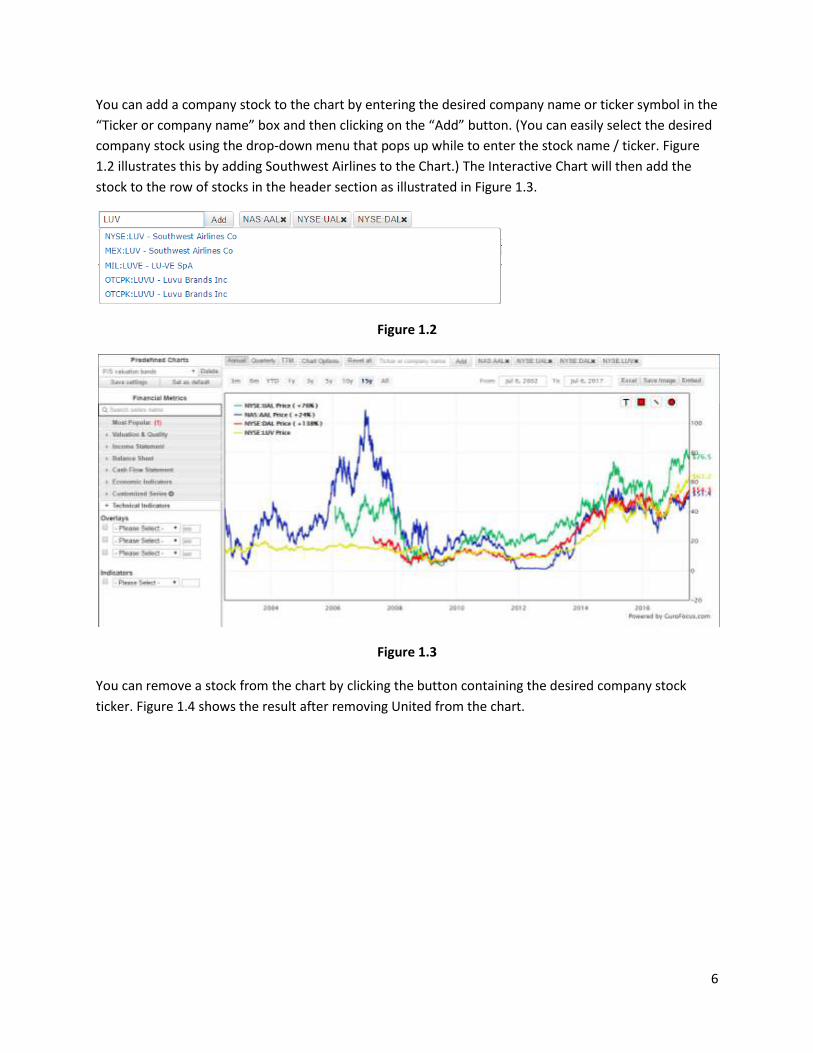
You can add a company stock to the chart by entering the desired company name or ticker symbol in the
“Ticker or company name” box and then clicking on the “Add” button. (You can easily select the desired
company stock using the drop-down menu that pops up while to enter the stock name / ticker. Figure
1.2 illustrates this by adding Southwest Airlines to the Chart.) The Interactive Chart will then add the
stock to the row of stocks in the header section as illustrated in Figure 1.3.
Figure 1.2
Figure 1.3
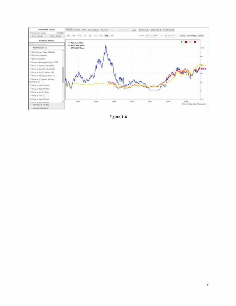
You can remove a stock from the chart by clicking the button containing the desired company stock
ticker. Figure 1.4 shows the result after removing United from the chart.
7
Figure 1.4
8
2. Graphing financial series on the chart
The Interactive Charts feature allows you to graph the historical trendline of a company’s financials,
ranging from the stock price and revenue to the company’s operating margin or days sales outstanding.
You can view all available financial metrics by clicking the tabs located in Position 2 of Figure 2 (on Page
5). We have organized the financial metrics into the following tabs:
Most Popular: This tab contains the “most popular” financial metrics, including the share price,
revenue, net income, price-valuation ratios and price-valuation bands.
Valuation and Quality: This tab contains financial metrics related to financial strength and
profitability. You will find metrics like the Yacktman forward rate of return, the Piotroski F-score
and the operating margin underneath this tab.
Income Statement: This tab contains financial metrics that appear on a company’s income
statement, which includes revenue, cost of goods sold, SGA expenses and operating income.
Balance Sheet: This tab contains financial metrics that appear on a company’s balance sheet,
which includes cash (and cash equivalents), accounts receivable, inventories, long-term debt
and total equity.
Cash Flow Statement: This tab contains financial metrics that appear on a company’s cash flow
statement, which includes depreciation, change in working capital, cash flow for dividends,
capital expenditures and free cash flow.
Economic Indicators: This tab allows you to add economic indicators to the chart. We will
discuss this further in Section 10.
Customized Series: This tab lists the series that you defined through the “Build Your Own Series”
feature. We will discuss this in Section 9.
Technical Indicators: This tab allows you to add indicators like the simple moving average (SMA),
the exponential moving average (EMA) and the relative strength index (RSI). We will discuss this
further in Section 10.
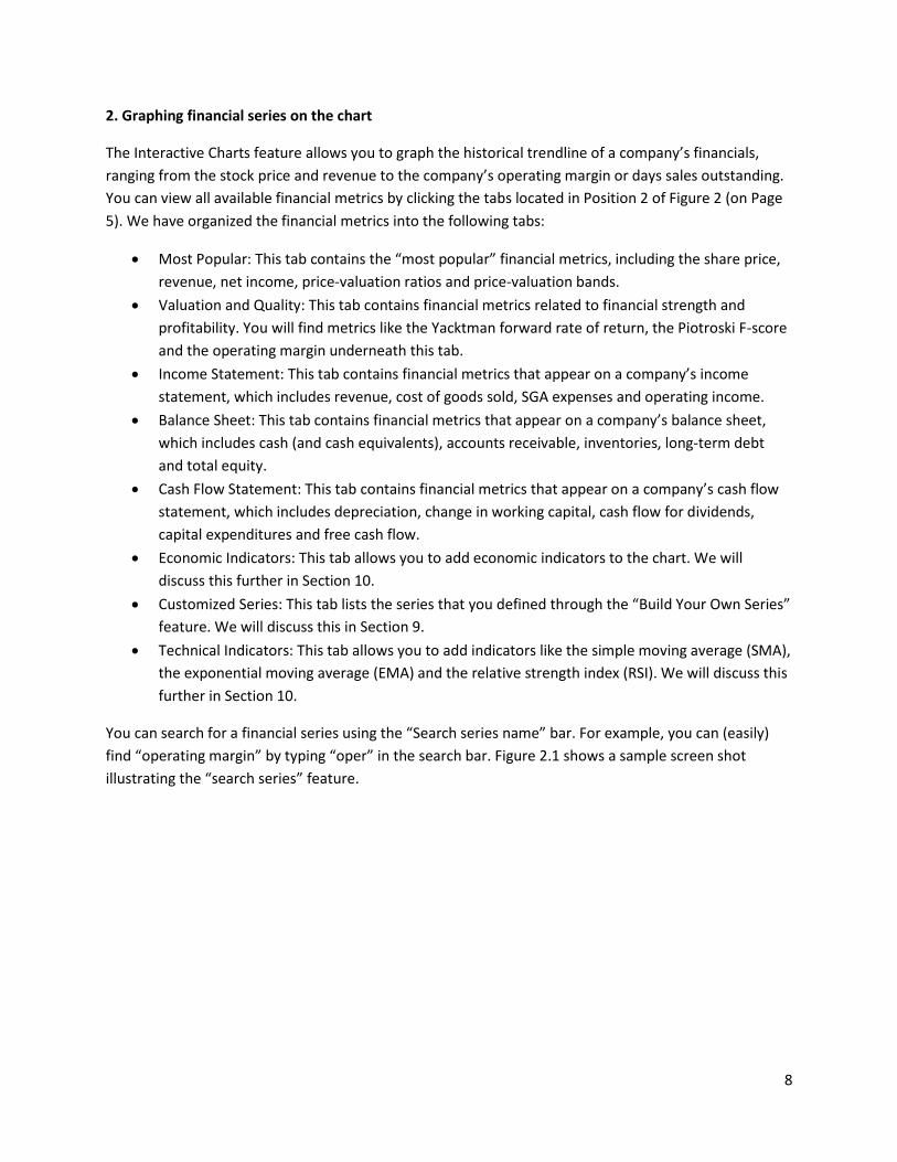
You can search for a financial series using the “Search series name” bar. For example, you can (easily)
find “operating margin” by typing “oper” in the search bar. Figure 2.1 shows a sample screen shot
illustrating the “search series” feature.
9
Figure 2.1
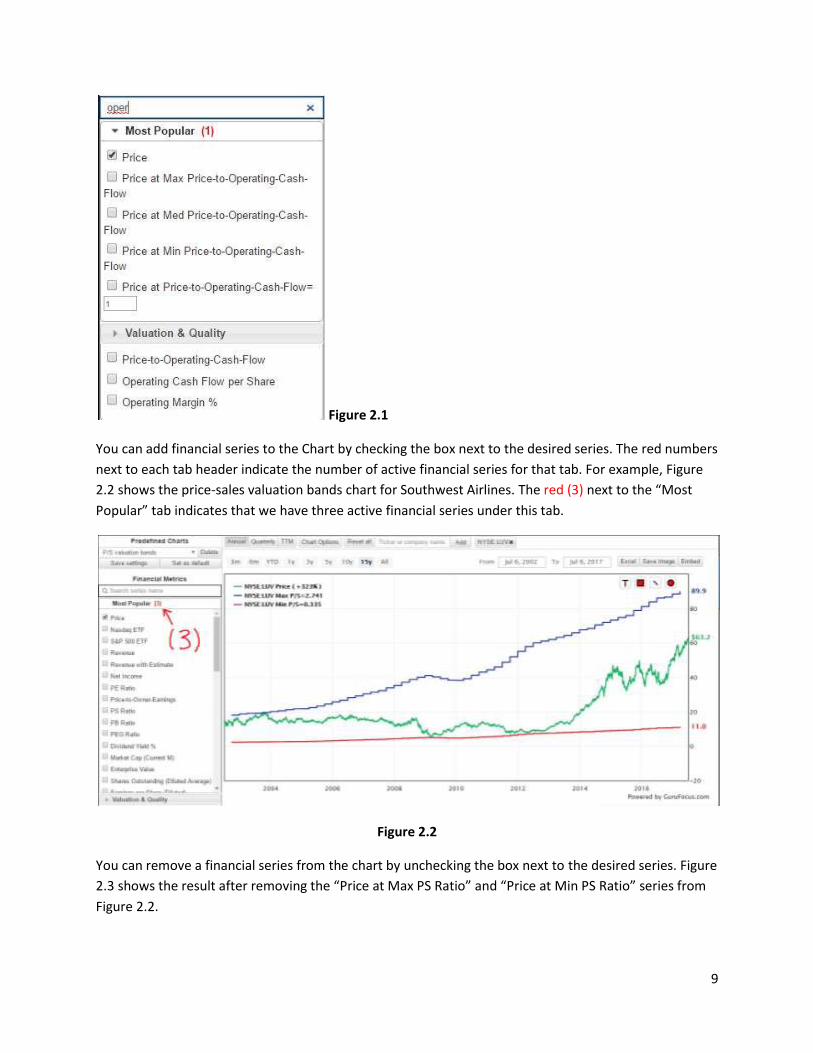
You can add financial series to the Chart by checking the box next to the desired series. The red numbers
next to each tab header indicate the number of active financial series for that tab. For example, Figure
2.2 shows the price-sales valuation bands chart for Southwest Airlines. The red (3) next to the “Most
Popular” tab indicates that we have three active financial series under this tab.
Figure 2.2
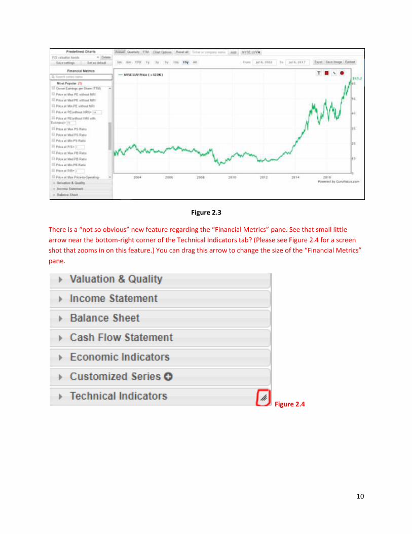
You can remove a financial series from the chart by unchecking the box next to the desired series. Figure
2.3 shows the result after removing the “Price at Max PS Ratio” and “Price at Min PS Ratio” series from
Figure 2.2.
10
Figure 2.3
There is a “not so obvious” new feature regarding the “Financial Metrics” pane. See that small little
arrow near the bottom-right corner of the Technical Indicators tab? (Please see Figure 2.4 for a screen
shot that zooms in on this feature.) You can drag this arrow to change the size of the “Financial Metrics”
pane.
Figure 2.4
11
3. Change the date range of the chart
By default, the Chart graphs the historical financial information for all years, i.e. all available years up to
1987. (Note that we now give a maximum of 30 years of historical data for U.S. companies as of the
writing of this user manual.) You can change the date range of the chart either by clicking one of the
“date buttons” or setting a customized range using the “From” and “To” boxes. These options are
located at Position 3 in Figure 0.4 on Page 5.
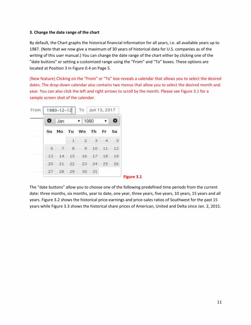
(New feature) Clicking on the “From” or “To” box reveals a calendar that allows you to select the desired
dates. The drop-down calendar also contains two menus that allow you to select the desired month and
year. You can also click the left and right arrows to scroll by the month. Please see Figure 3.1 for a
sample screen shot of the calendar.
Figure 3.1
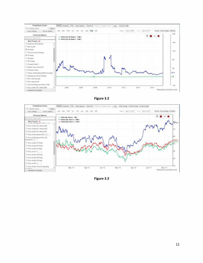
The “date buttons” allow you to choose one of the following predefined time periods from the current
date: three months, six months, year to date, one year, three years, five years, 10 years, 15 years and all
years. Figure 3.2 shows the historical price-earnings and price-sales ratios of Southwest for the past 15
years while Figure 3.3 shows the historical share prices of American, United and Delta since Jan. 2, 2015.
12
Figure 3.2
Figure 3.3
13
4. The Chart window
The “body” of the Chart graphs all selected financial series selected in Section 2 above. You will see the
legend in the upper-left corner and the “Drawing Toolbox” (more detail about this in Section 7) in the
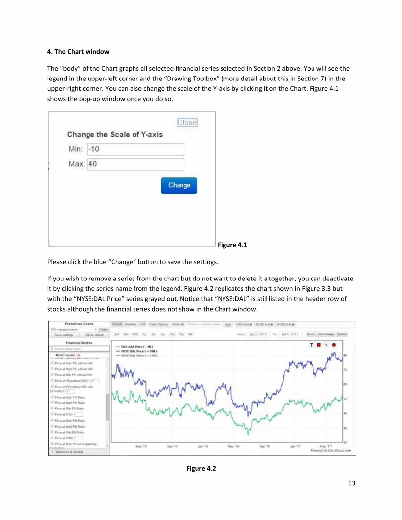
upper-right corner. You can also change the scale of the Y-axis by clicking it on the Chart. Figure 4.1
shows the pop-up window once you do so.
Figure 4.1
Please click the blue “Change” button to save the settings.
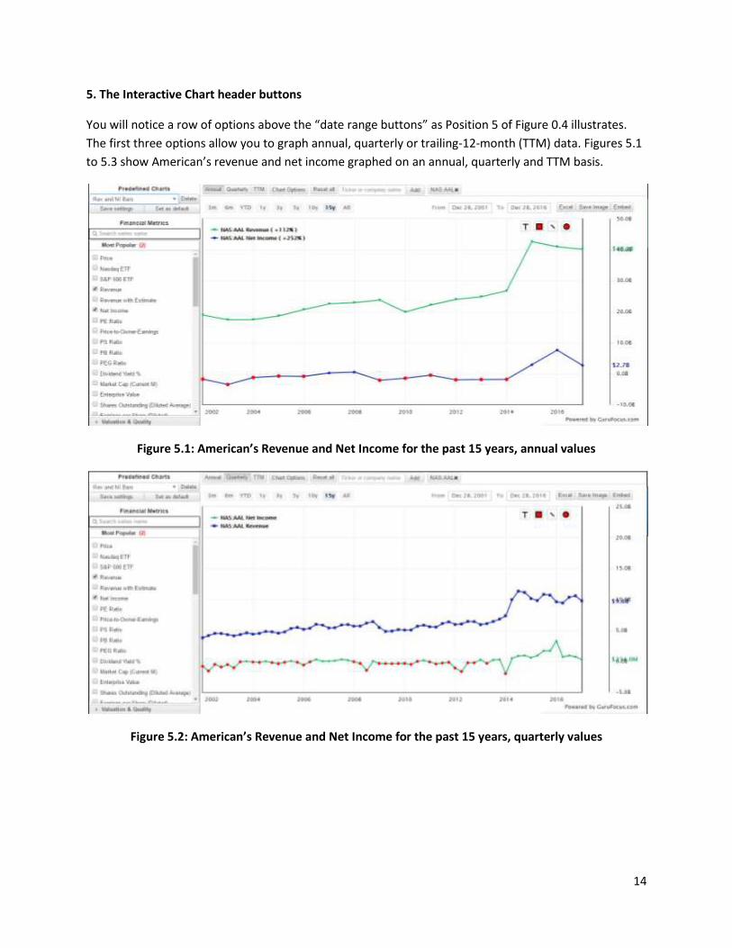
If you wish to remove a series from the chart but do not want to delete it altogether, you can deactivate
it by clicking the series name from the legend. Figure 4.2 replicates the chart shown in Figure 3.3 but
with the “NYSE:DAL Price” series grayed out. Notice that “NYSE:DAL” is still listed in the header row of
stocks although the financial series does not show in the Chart window.
Figure 4.2
14
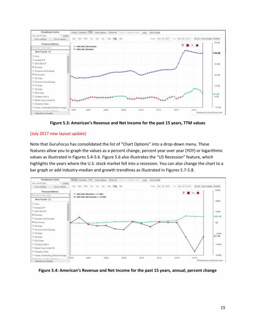
5. The Interactive Chart header buttons
You will notice a row of options above the “date range buttons” as Position 5 of Figure 0.4 illustrates.
The first three options allow you to graph annual, quarterly or trailing-12-month (TTM) data. Figures 5.1
to 5.3 show American’s revenue and net income graphed on an annual, quarterly and TTM basis.
Figure 5.1: American’s Revenue and Net Income for the past 15 years, annual values
Figure 5.2: American’s Revenue and Net Income for the past 15 years, quarterly values
15
Figure 5.3: American’s Revenue and Net Income for the past 15 years, TTM values
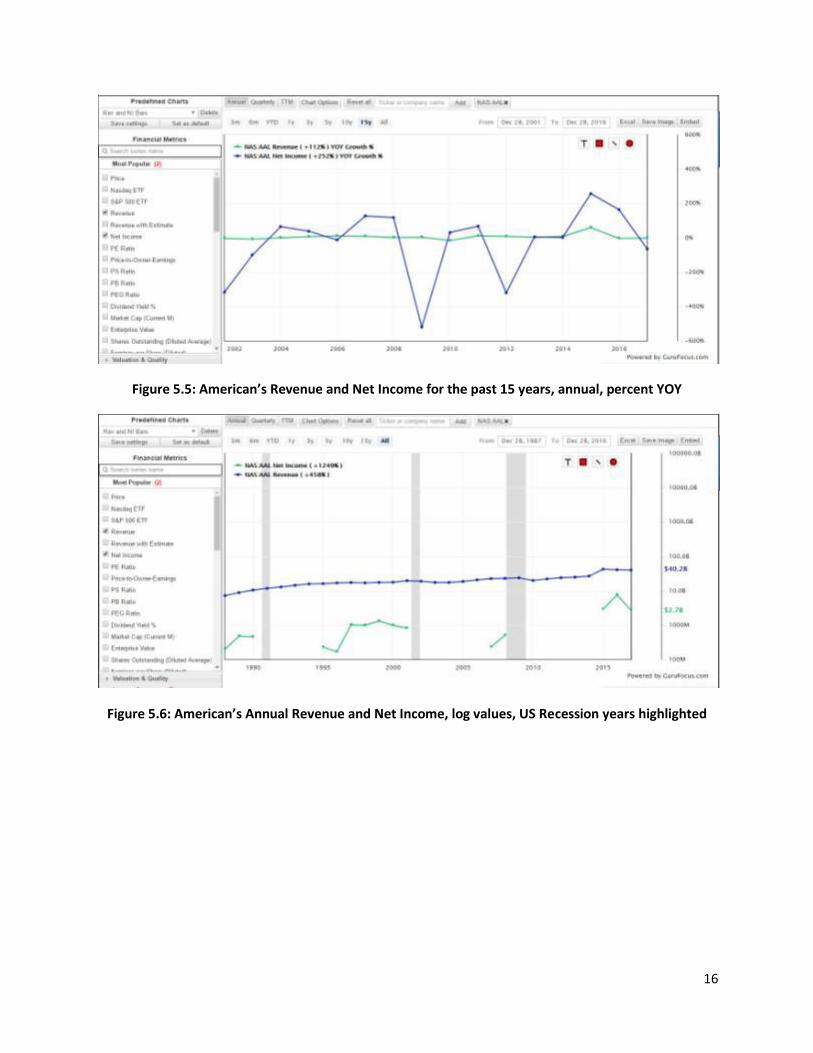
(July 2017 new layout update)
Note that GuruFocus has consolidated the list of “Chart Options” into a drop-down menu. These
features allow you to graph the values as a percent change, percent year over year (YOY) or logarithmic
values as illustrated in Figures 5.4-5.6. Figure 5.6 also illustrates the “US Recession” feature, which
highlights the years where the U.S. stock market fell into a recession. You can also change the chart to a
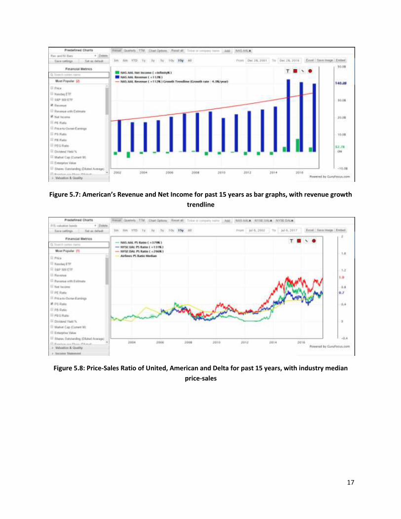
bar graph or add industry-median and growth trendlines as illustrated in Figures 5.7-5.8.
Figure 5.4: American’s Revenue and Net Income for the past 15 years, annual, percent change
16
Figure 5.5: American’s Revenue and Net Income for the past 15 years, annual, percent YOY
Figure 5.6: American’s Annual Revenue and Net Income, log values, US Recession years highlighted
17
Figure 5.7: American’s Revenue and Net Income for past 15 years as bar graphs, with revenue growth
trendline
Figure 5.8: Price-Sales Ratio of United, American and Delta for past 15 years, with industry median
price-sales
18
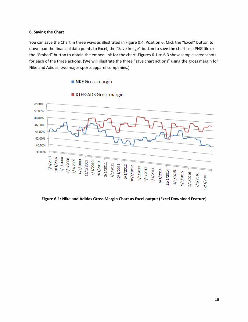
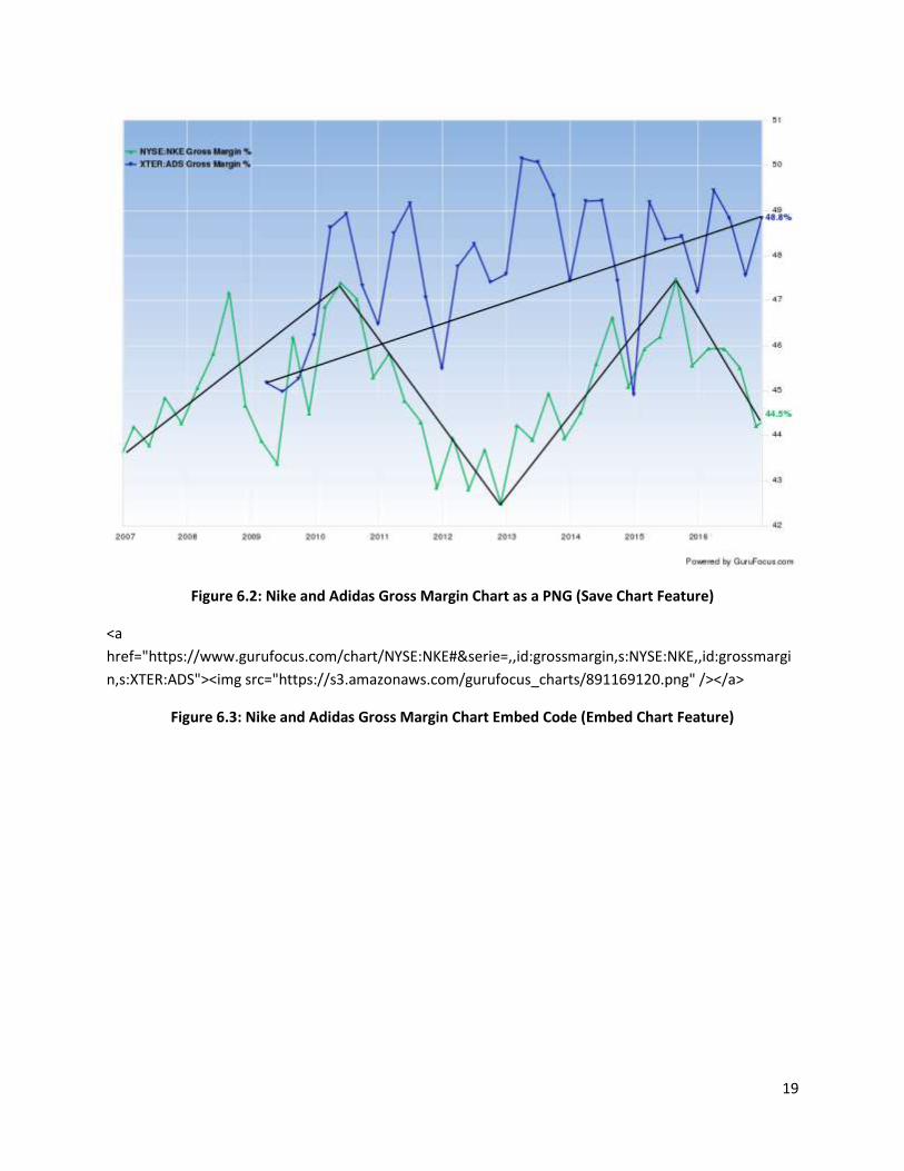
6. Saving the Chart
You can save the Chart in three ways as illustrated in Figure 0.4, Position 6. Click the “Excel” button to
download the financial data points to Excel, the “Save Image” button to save the chart as a PNG file or
the “Embed” button to obtain the embed link for the chart. Figures 6.1 to 6.3 show sample screenshots
for each of the three actions. (We will illustrate the three “save chart actions” using the gross margin for
Nike and Adidas, two major sports apparel companies.)
Figure 6.1: Nike and Adidas Gross Margin Chart as Excel output (Excel Download Feature)
19
Figure 6.2: Nike and Adidas Gross Margin Chart as a PNG (Save Chart Feature)
<a
href="https://www.gurufocus.com/chart/NYSE:NKE#&serie=,,id:grossmargin,s:NYSE:NKE,,id:grossmargi
n,s:XTER:ADS"><img src="https://s3.amazonaws.com/gurufocus_charts/891169120.png" /></a>
Figure 6.3: Nike and Adidas Gross Margin Chart Embed Code (Embed Chart Feature)
20
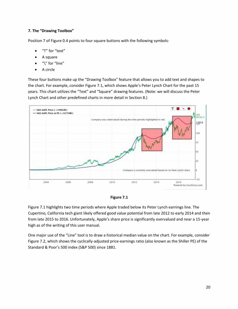
7. The “Drawing Toolbox”
Position 7 of Figure 0.4 points to four square buttons with the following symbols:
“T” for “text”
A square
“\” for “line”
A circle
These four buttons make up the “Drawing Toolbox” feature that allows you to add text and shapes to
the chart. For example, consider Figure 7.1, which shows Apple’s Peter Lynch Chart for the past 15
years. This chart utilizes the “Text” and “Square” drawing features. (Note: we will discuss the Peter
Lynch Chart and other predefined charts in more detail in Section 8.)
Figure 7.1
Figure 7.1 highlights two time periods where Apple traded below its Peter Lynch earnings line. The
Cupertino, California tech giant likely offered good value potential from late 2012 to early 2014 and then
from late 2015 to 2016. Unfortunately, Apple’s share price is significantly overvalued and near a 15-year
high as of the writing of this user manual.
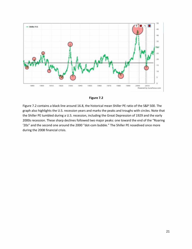
One major use of the “Line” tool is to draw a historical median value on the chart. For example, consider
Figure 7.2, which shows the cyclically-adjusted price-earnings ratio (also known as the Shiller PE) of the
Standard & Poor’s 500 index (S&P 500) since 1881.
21
Figure 7.2
Figure 7.2 contains a black line around 16.8, the historical mean Shiller PE ratio of the S&P 500. The
graph also highlights the U.S. recession years and marks the peaks and troughs with circles. Note that
the Shiller PE tumbled during a U.S. recession, including the Great Depression of 1929 and the early
2000s recession. These sharp declines followed two major peaks: one toward the end of the “Roaring
‘20s” and the second one around the 2000 “dot-com bubble.” The Shiller PE nosedived once more
during the 2008 financial crisis.
22
8. Predefined and User-defined Charts
GuruFocus constructed several predefined charts, including the Peter Lynch Chart, the Price-Sales
Valuation Bands Chart, the Income Statement Chart and the Balance Sheet Chart.
Selecting a Predefined Chart
You can select a predefined chart from the drop-down menu illustrated in Figure 8.1.
Figure 8.1
GuruFocus provides an eclectic variety of predefined charts. The following section briefly discusses each
of them:
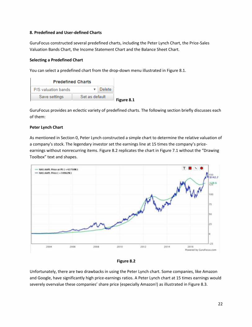
Peter Lynch Chart
As mentioned in Section 0, Peter Lynch constructed a simple chart to determine the relative valuation of
a company’s stock. The legendary investor set the earnings line at 15 times the company’s price-
earnings without nonrecurring items. Figure 8.2 replicates the chart in Figure 7.1 without the “Drawing
Toolbox” text and shapes.
Figure 8.2
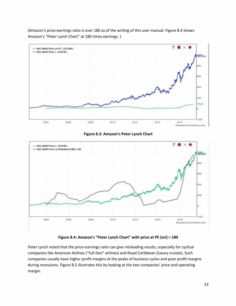
Unfortunately, there are two drawbacks in using the Peter Lynch chart. Some companies, like Amazon
and Google, have significantly high price-earnings ratios. A Peter Lynch chart at 15 times earnings would
severely overvalue these companies’ share price (especially Amazon!) as illustrated in Figure 8.3.
23
(Amazon’s price-earnings ratio is over 180 as of the writing of this user manual. Figure 8.4 shows
Amazon’s “Peter Lynch Chart” at 180 times earnings. )
Figure 8.3: Amazon’s Peter Lynch Chart
Figure 8.4: Amazon’s “Peter Lynch Chart” with price at PE (nri) = 180
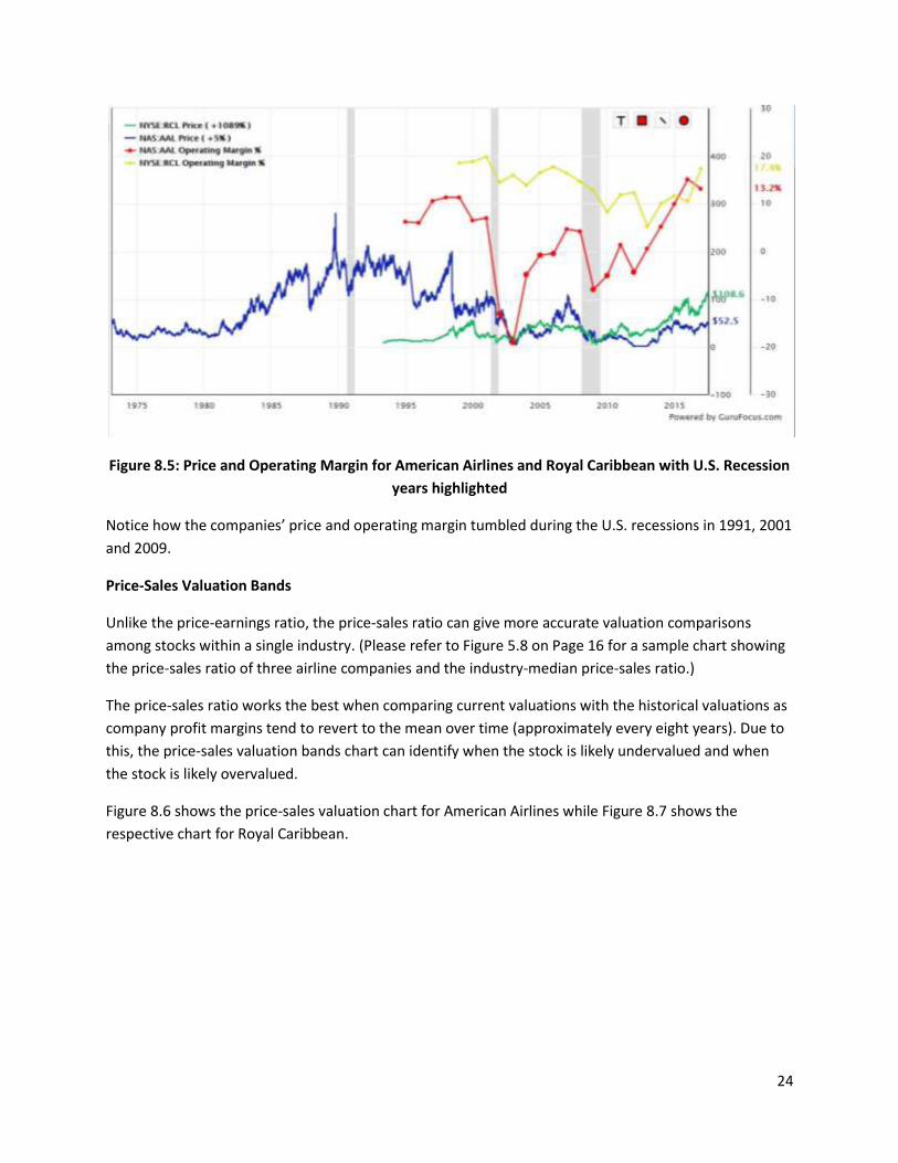
Peter Lynch noted that the price-earnings ratio can give misleading results, especially for cyclical
companies like American Airlines (“full-fare” airlines) and Royal Caribbean (luxury cruises). Such
companies usually have higher profit margins at the peaks of business cycles and poor profit margins
during recessions. Figure 8.5 illustrates this by looking at the two companies’ price and operating
margin.
24
Figure 8.5: Price and Operating Margin for American Airlines and Royal Caribbean with U.S. Recession
years highlighted
Notice how the companies’ price and operating margin tumbled during the U.S. recessions in 1991, 2001
and 2009.
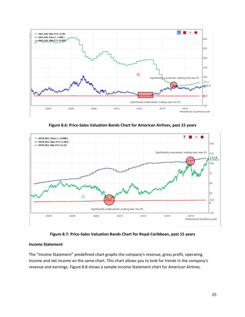
Price-Sales Valuation Bands
Unlike the price-earnings ratio, the price-sales ratio can give more accurate valuation comparisons
among stocks within a single industry. (Please refer to Figure 5.8 on Page 16 for a sample chart showing
the price-sales ratio of three airline companies and the industry-median price-sales ratio.)
The price-sales ratio works the best when comparing current valuations with the historical valuations as
company profit margins tend to revert to the mean over time (approximately every eight years). Due to
this, the price-sales valuation bands chart can identify when the stock is likely undervalued and when
the stock is likely overvalued.
Figure 8.6 shows the price-sales valuation chart for American Airlines while Figure 8.7 shows the
respective chart for Royal Caribbean.
25
Figure 8.6: Price-Sales Valuation Bands Chart for American Airlines, past 15 years
Figure 8.7: Price-Sales Valuation Bands Chart for Royal Caribbean, past 15 years
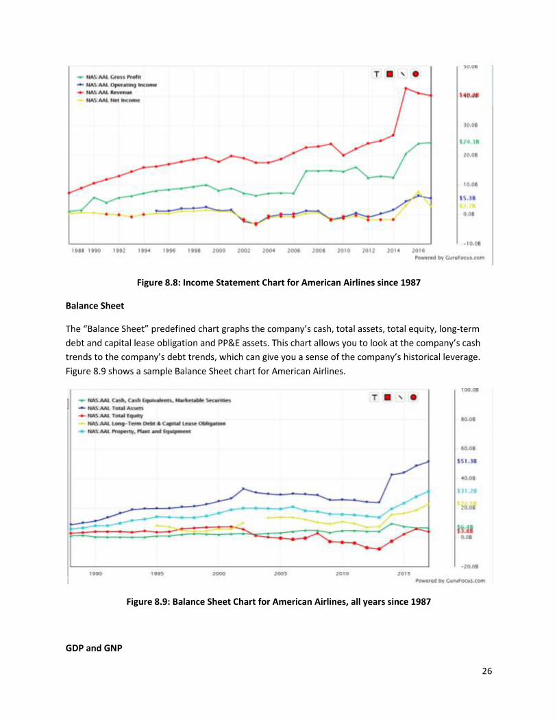
Income Statement
The “Income Statement” predefined chart graphs the company’s revenue, gross profit, operating
income and net income on the same chart. This chart allows you to look for trends in the company’s
revenue and earnings. Figure 8.8 shows a sample Income Statement chart for American Airlines.
26
Figure 8.8: Income Statement Chart for American Airlines since 1987
Balance Sheet
The “Balance Sheet” predefined chart graphs the company’s cash, total assets, total equity, long-term
debt and capital lease obligation and PP&E assets. This chart allows you to look at the company’s cash
trends to the company’s debt trends, which can give you a sense of the company’s historical leverage.
Figure 8.9 shows a sample Balance Sheet chart for American Airlines.
Figure 8.9: Balance Sheet Chart for American Airlines, all years since 1987
GDP and GNP
27
The “GDP and GNP” predefined chart simply graphs the gross domestic product and the gross national
product on the same graph.
Dividend Yield
The “Dividend Yield” predefined chart simply graphs the company’s historical dividend yield on the
Chart.
Price and Revenue
The “Price and Revenue” predefined chart graphs the company’s price and revenue trend on the same
graph.
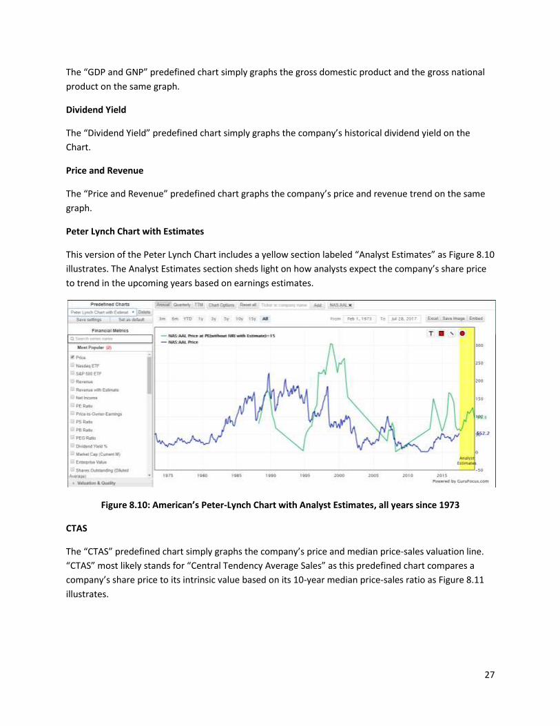
Peter Lynch Chart with Estimates
This version of the Peter Lynch Chart includes a yellow section labeled “Analyst Estimates” as Figure 8.10
illustrates. The Analyst Estimates section sheds light on how analysts expect the company’s share price
to trend in the upcoming years based on earnings estimates.
Figure 8.10: American’s Peter-Lynch Chart with Analyst Estimates, all years since 1973
CTAS
The “CTAS” predefined chart simply graphs the company’s price and median price-sales valuation line.
“CTAS” most likely stands for “Central Tendency Average Sales” as this predefined chart compares a
company’s share price to its intrinsic value based on its 10-year median price-sales ratio as Figure 8.11
illustrates.
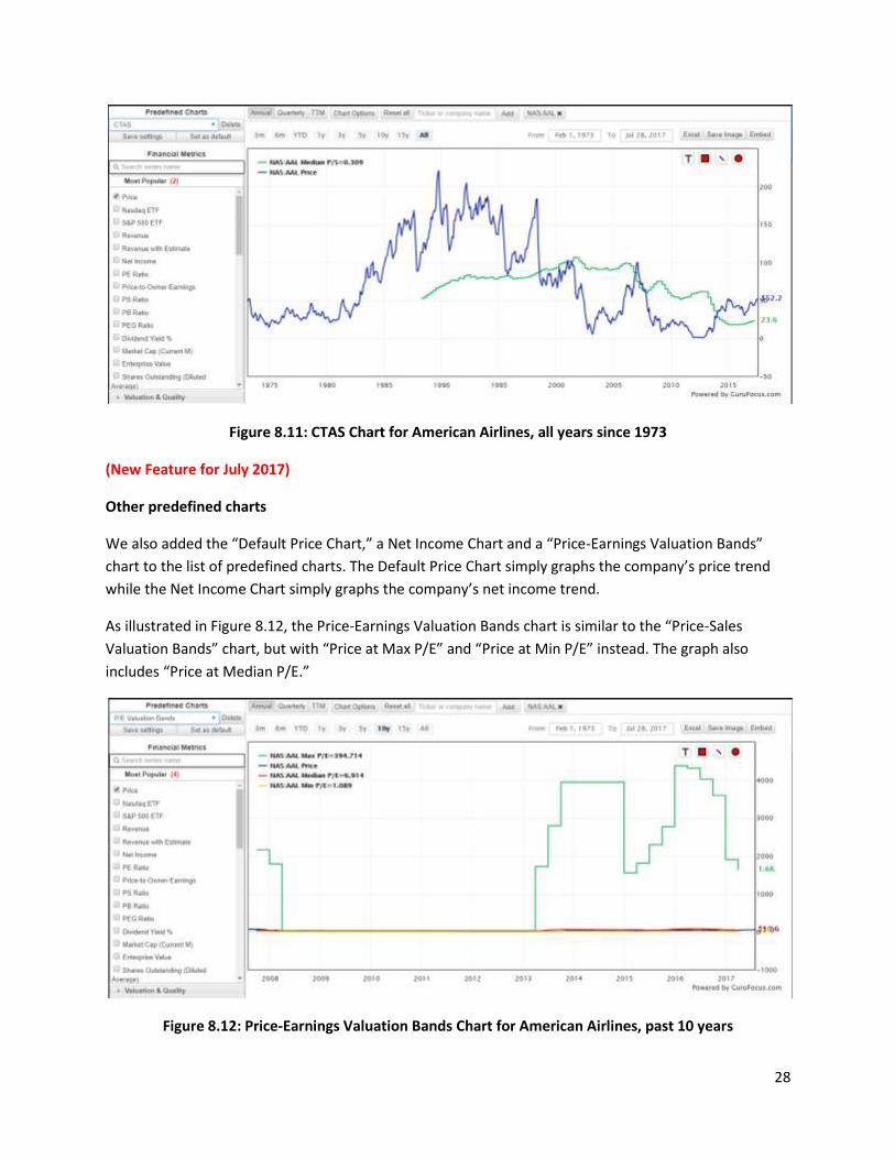
28
Figure 8.11: CTAS Chart for American Airlines, all years since 1973
(New Feature for July 2017)
Other predefined charts
We also added the “Default Price Chart,” a Net Income Chart and a “Price-Earnings Valuation Bands”
chart to the list of predefined charts. The Default Price Chart simply graphs the company’s price trend
while the Net Income Chart simply graphs the company’s net income trend.
As illustrated in Figure 8.12, the Price-Earnings Valuation Bands chart is similar to the “Price-Sales
Valuation Bands” chart, but with “Price at Max P/E” and “Price at Min P/E” instead. The graph also
includes “Price at Median P/E.”
Figure 8.12: Price-Earnings Valuation Bands Chart for American Airlines, past 10 years
29
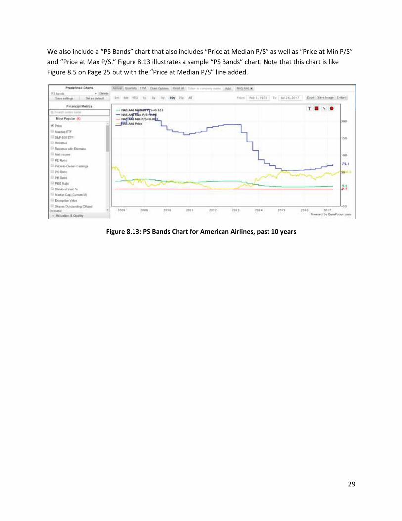
We also include a “PS Bands” chart that also includes “Price at Median P/S” as well as “Price at Min P/S”
and “Price at Max P/S.” Figure 8.13 illustrates a sample “PS Bands” chart. Note that this chart is like
Figure 8.5 on Page 25 but with the “Price at Median P/S” line added.
Figure 8.13: PS Bands Chart for American Airlines, past 10 years
30
9. Creating custom series and custom charts
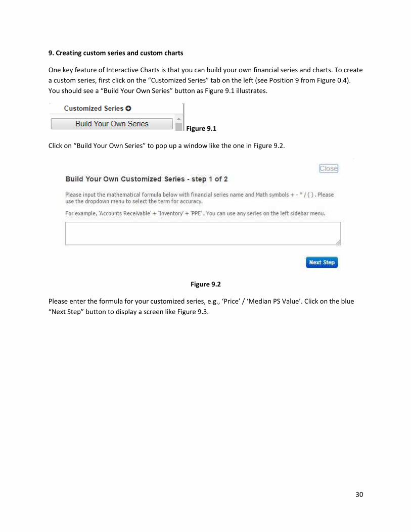
One key feature of Interactive Charts is that you can build your own financial series and charts. To create
a custom series, first click on the “Customized Series” tab on the left (see Position 9 from Figure 0.4).
You should see a “Build Your Own Series” button as Figure 9.1 illustrates.
Figure 9.1
Click on “Build Your Own Series” to pop up a window like the one in Figure 9.2.
Figure 9.2
Please enter the formula for your customized series, e.g., ‘Price’ / ‘Median PS Value’. Click on the blue
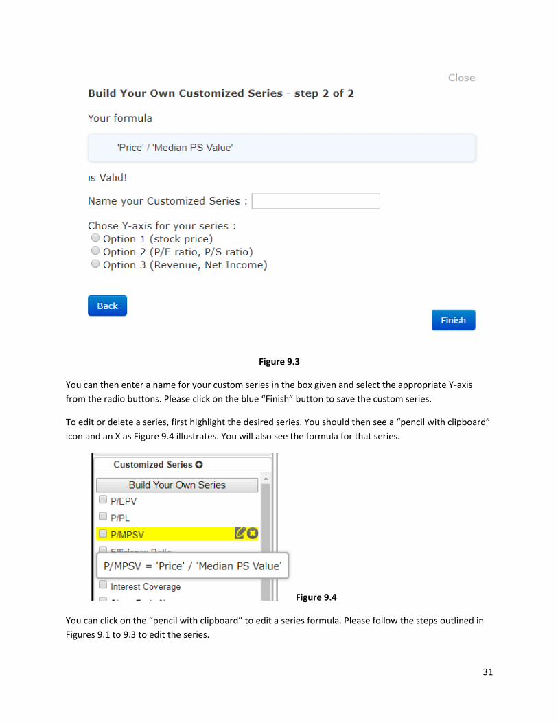
“Next Step” button to display a screen like Figure 9.3.
31
Figure 9.3
You can then enter a name for your custom series in the box given and select the appropriate Y-axis
from the radio buttons. Please click on the blue “Finish” button to save the custom series.
To edit or delete a series, first highlight the desired series. You should then see a “pencil with clipboard”
icon and an X as Figure 9.4 illustrates. You will also see the formula for that series.
Figure 9.4
You can click on the “pencil with clipboard” to edit a series formula. Please follow the steps outlined in
Figures 9.1 to 9.3 to edit the series.
32
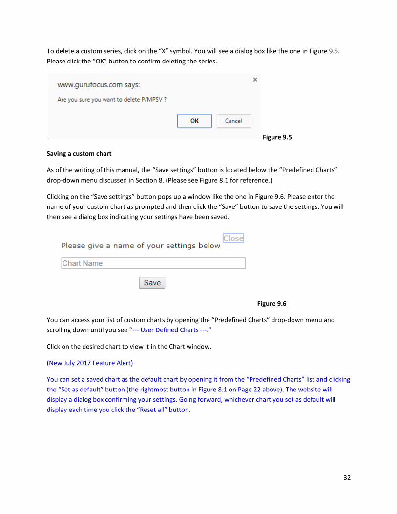
To delete a custom series, click on the “X” symbol. You will see a dialog box like the one in Figure 9.5.
Please click the “OK” button to confirm deleting the series.
Figure 9.5
Saving a custom chart
As of the writing of this manual, the “Save settings” button is located below the “Predefined Charts”
drop-down menu discussed in Section 8. (Please see Figure 8.1 for reference.)
Clicking on the “Save settings” button pops up a window like the one in Figure 9.6. Please enter the
name of your custom chart as prompted and then click the “Save” button to save the settings. You will
then see a dialog box indicating your settings have been saved.
Figure 9.6
You can access your list of custom charts by opening the “Predefined Charts” drop-down menu and
scrolling down until you see “--- User Defined Charts ---.”
Click on the desired chart to view it in the Chart window.
(New July 2017 Feature Alert)
You can set a saved chart as the default chart by opening it from the “Predefined Charts” list and clicking
the “Set as default” button (the rightmost button in Figure 8.1 on Page 22 above). The website will
display a dialog box confirming your settings. Going forward, whichever chart you set as default will
display each time you click the “Reset all” button.
33
10. Incorporating economic and technical indicators in Interactive Charts
You can add economic and technical indicators to the Interactive Chart by clicking on the “Economic
Indicators” and “Technical Indicators” tabs.
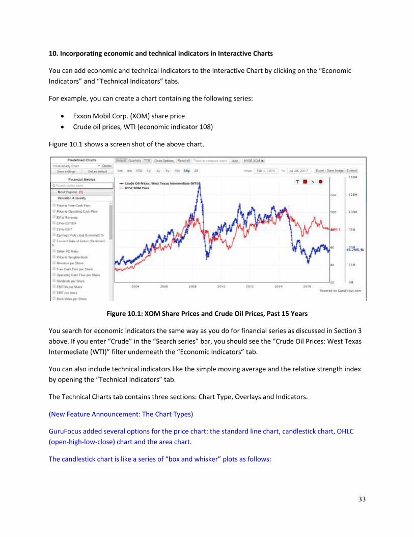
For example, you can create a chart containing the following series:
Exxon Mobil Corp. (XOM) share price
Crude oil prices, WTI (economic indicator 108)
Figure 10.1 shows a screen shot of the above chart.
Figure 10.1: XOM Share Prices and Crude Oil Prices, Past 15 Years
You search for economic indicators the same way as you do for financial series as discussed in Section 3
above. If you enter “Crude” in the “Search series” bar, you should see the “Crude Oil Prices: West Texas
Intermediate (WTI)” filter underneath the “Economic Indicators” tab.
You can also include technical indicators like the simple moving average and the relative strength index
by opening the “Technical Indicators” tab.
The Technical Charts tab contains three sections: Chart Type, Overlays and Indicators.
(New Feature Announcement: The Chart Types)
GuruFocus added several options for the price chart: the standard line chart, candlestick chart, OHLC
(open-high-low-close) chart and the area chart.
The candlestick chart is like a series of “box and whisker” plots as follows:
34
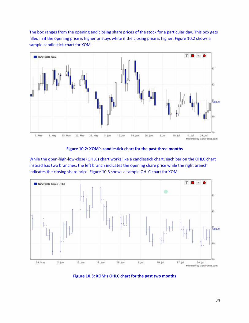
The box ranges from the opening and closing share prices of the stock for a particular day. This box gets
filled in if the opening price is higher or stays white if the closing price is higher. Figure 10.2 shows a
sample candlestick chart for XOM.
Figure 10.2: XOM’s candlestick chart for the past three months
While the open-high-low-close (OHLC) chart works like a candlestick chart, each bar on the OHLC chart
instead has two branches: the left branch indicates the opening share price while the right branch
indicates the closing share price. Figure 10.3 shows a sample OHLC chart for XOM.
Figure 10.3: XOM’s OHLC chart for the past two months
35
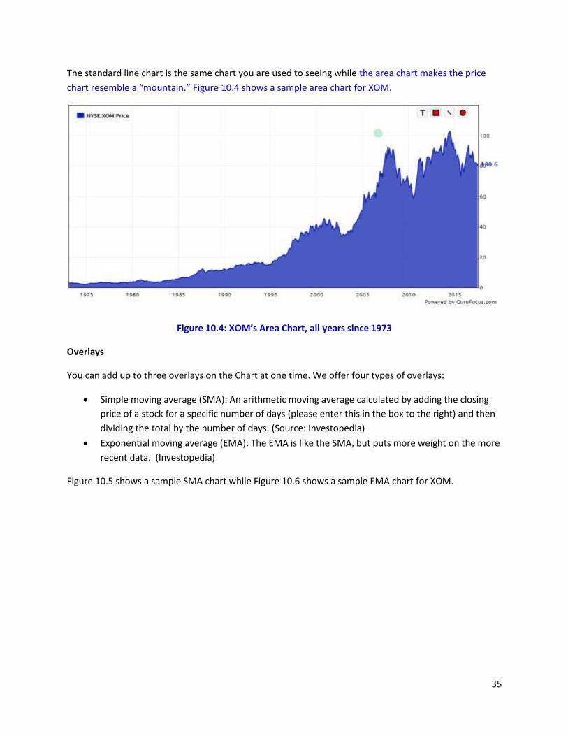
The standard line chart is the same chart you are used to seeing while the area chart makes the price
chart resemble a “mountain.” Figure 10.4 shows a sample area chart for XOM.
Figure 10.4: XOM’s Area Chart, all years since 1973
Overlays
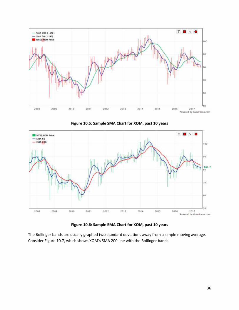
You can add up to three overlays on the Chart at one time. We offer four types of overlays:
Simple moving average (SMA): An arithmetic moving average calculated by adding the closing
price of a stock for a specific number of days (please enter this in the box to the right) and then
dividing the total by the number of days. (Source: Investopedia)
Exponential moving average (EMA): The EMA is like the SMA, but puts more weight on the more
recent data. (Investopedia)
Figure 10.5 shows a sample SMA chart while Figure 10.6 shows a sample EMA chart for XOM.
36
Figure 10.5: Sample SMA Chart for XOM, past 10 years
Figure 10.6: Sample EMA Chart for XOM, past 10 years
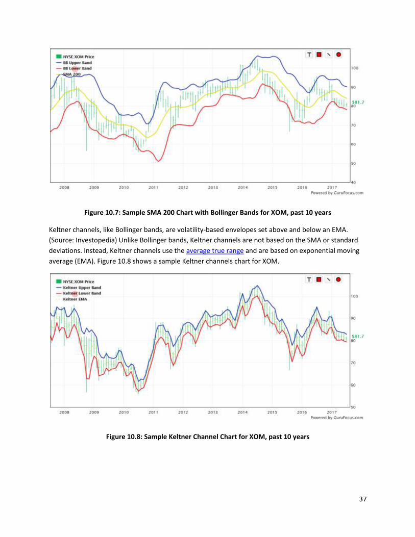
The Bollinger bands are usually graphed two standard deviations away from a simple moving average.
Consider Figure 10.7, which shows XOM’s SMA 200 line with the Bollinger bands.
37
Figure 10.7: Sample SMA 200 Chart with Bollinger Bands for XOM, past 10 years
Keltner channels, like Bollinger bands, are volatility-based envelopes set above and below an EMA.
(Source: Investopedia) Unlike Bollinger bands, Keltner channels are not based on the SMA or standard
deviations. Instead, Keltner channels use the average true range and are based on exponential moving
average (EMA). Figure 10.8 shows a sample Keltner channels chart for XOM.
Figure 10.8: Sample Keltner Channel Chart for XOM, past 10 years
38
Indicators
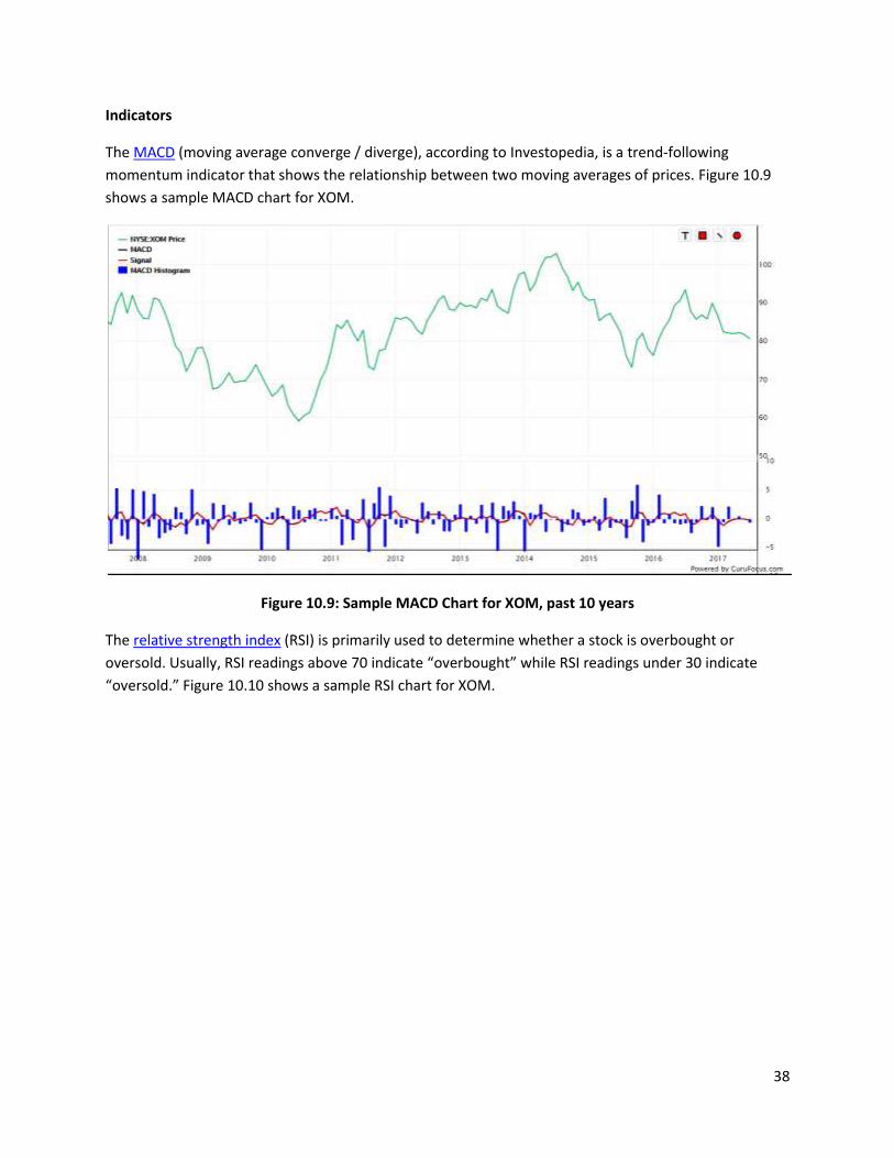
The MACD (moving average converge / diverge), according to Investopedia, is a trend-following
momentum indicator that shows the relationship between two moving averages of prices. Figure 10.9
shows a sample MACD chart for XOM.
Figure 10.9: Sample MACD Chart for XOM, past 10 years
The relative strength index (RSI) is primarily used to determine whether a stock is overbought or
oversold. Usually, RSI readings above 70 indicate “overbought” while RSI readings under 30 indicate
“oversold.” Figure 10.10 shows a sample RSI chart for XOM.
39
Figure 10.10: Sample RSI Chart for XOM, past 10 years
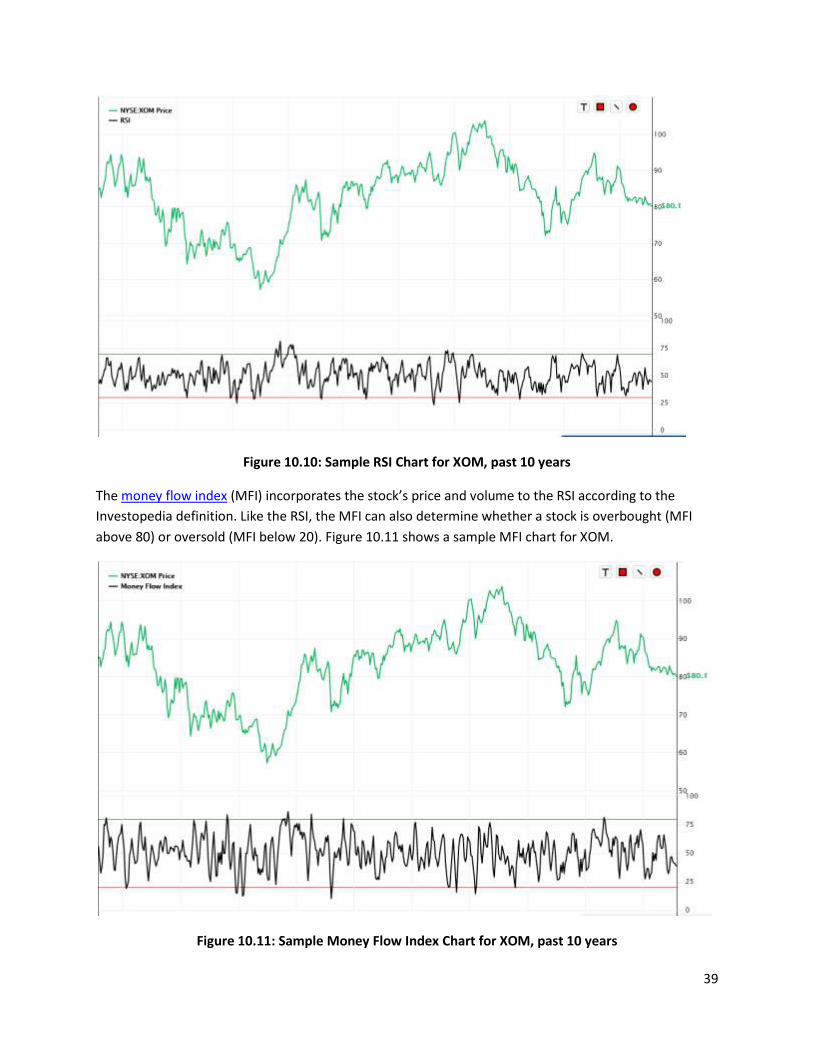
The money flow index (MFI) incorporates the stock’s price and volume to the RSI according to the
Investopedia definition. Like the RSI, the MFI can also determine whether a stock is overbought (MFI
above 80) or oversold (MFI below 20). Figure 10.11 shows a sample MFI chart for XOM.
Figure 10.11: Sample Money Flow Index Chart for XOM, past 10 years
40
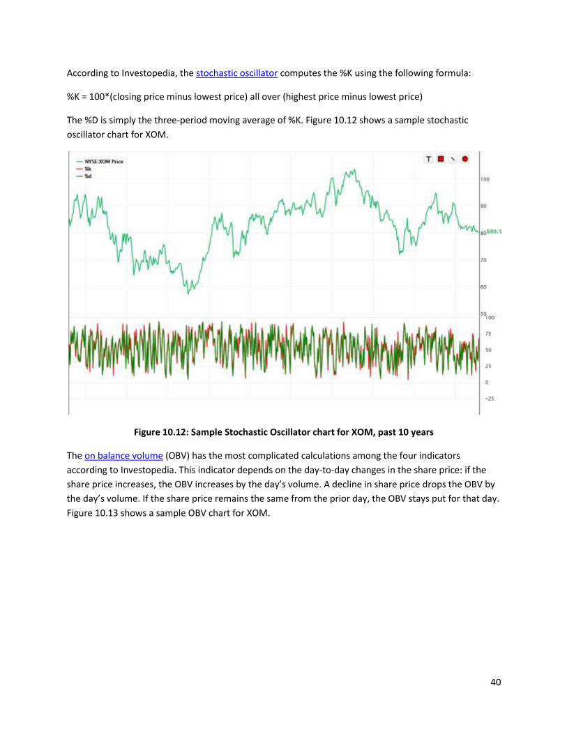
According to Investopedia, the stochastic oscillator computes the %K using the following formula:
%K = 100*(closing price minus lowest price) all over (highest price minus lowest price)
The %D is simply the three-period moving average of %K. Figure 10.12 shows a sample stochastic
oscillator chart for XOM.
Figure 10.12: Sample Stochastic Oscillator chart for XOM, past 10 years
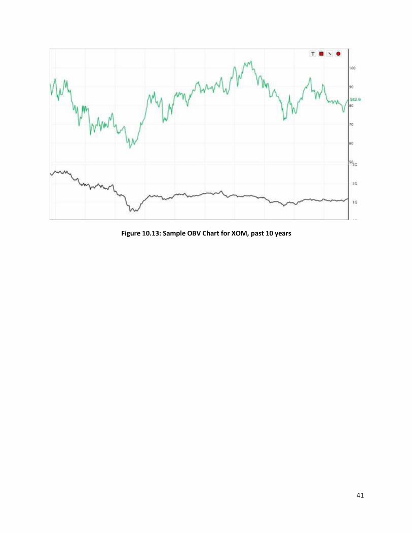
The on balance volume (OBV) has the most complicated calculations among the four indicators
according to Investopedia. This indicator depends on the day-to-day changes in the share price: if the
share price increases, the OBV increases by the day’s volume. A decline in share price drops the OBV by
the day’s volume. If the share price remains the same from the prior day, the OBV stays put for that day.
Figure 10.13 shows a sample OBV chart for XOM.
41
Figure 10.13: Sample OBV Chart for XOM, past 10 years
42
11. The “Switch Ticker” feature
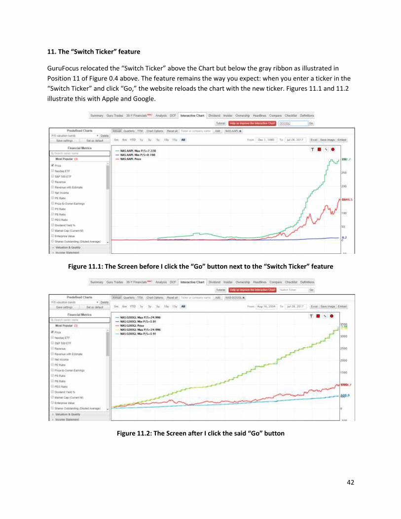
GuruFocus relocated the “Switch Ticker” above the Chart but below the gray ribbon as illustrated in
Position 11 of Figure 0.4 above. The feature remains the way you expect: when you enter a ticker in the
“Switch Ticker” and click “Go,” the website reloads the chart with the new ticker. Figures 11.1 and 11.2
illustrate this with Apple and Google.
Figure 11.1: The Screen before I click the “Go” button next to the “Switch Ticker” feature
Figure 11.2: The Screen after I click the said “Go” button
43
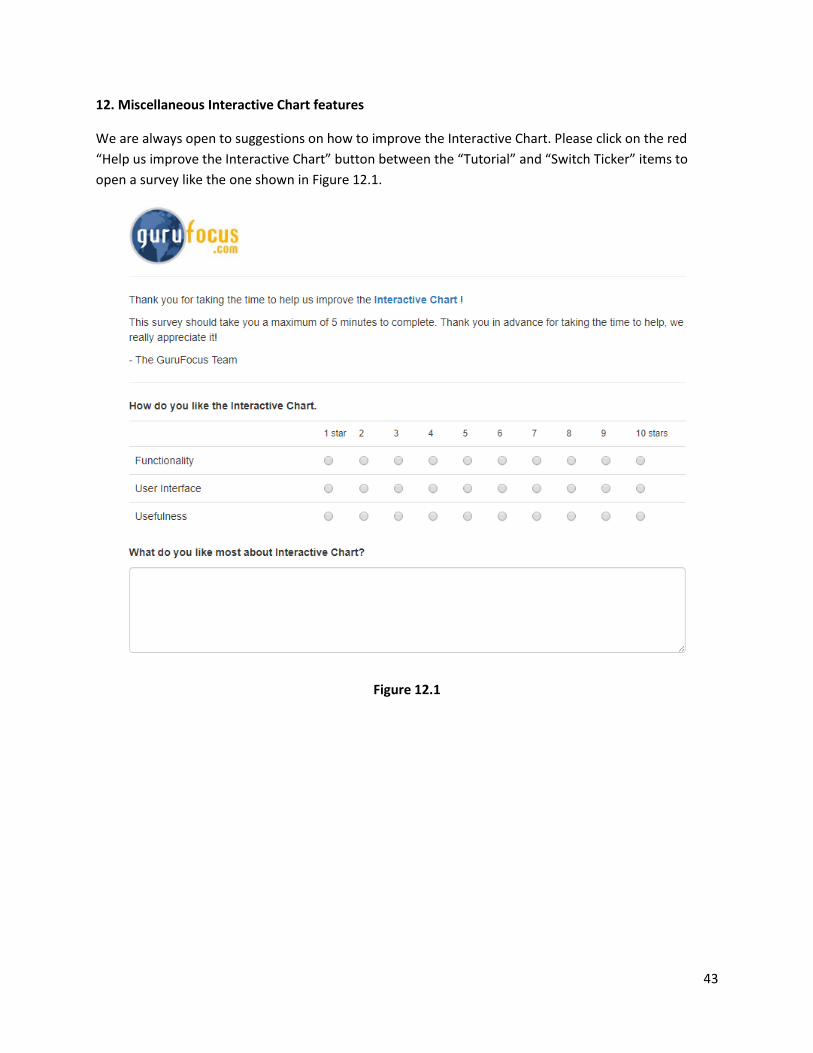
12. Miscellaneous Interactive Chart features
We are always open to suggestions on how to improve the Interactive Chart. Please click on the red
“Help us improve the Interactive Chart” button between the “Tutorial” and “Switch Ticker” items to
open a survey like the one shown in Figure 12.1.
Figure 12.1
44
13. Interactive Chart FAQs
Do I need a Premium membership to use Interactive Charts?
o Although you can access Interactive Charts with a free membership, you do need
Premium to save and create custom series and charts.
o You also need a Premium membership to download Interactive Chart outputs to Excel.
My chart looks weird. What should I do?
o If you feel like one series is “off the charts,” i.e., it is too far away from the other series,
you can deselect the series by clicking it from the legend.
o Please refer to Figure 4.2 on Page 13 for an illustration.
How can I delete the shapes I create using the Drawing Toolbox? Do I have to reset the chart?
o Try selecting the shapes you wish to delete and then drag them to the bottom-right
corner of the Chart.
o You can always delete all shapes created by clicking the “Reset all”. However, this will
also reset the chart to the default chart (you can control which chart to display by
default using the “Set as default” button as illustrated in Figure 8.1 on Page 22.)
What do the “Interest Coverage” values mean?
o You should see a note below the chart like the one in Figure 13.1.
o o Figure 13.1
o The following bullet points “decode” the information in Figure 13.1:
A value of 0 means that the company was “at loss” for the respective period.
The company did not have the earnings to cover its interest expense.
A value of 9999 means that the interest coverage produced a “#N/A” error for
the respective period. Perhaps the company had long-term debt, but we did not
have interest expense data for that period.
A value of 10000 means that the company had zero long-term debt for the
respective period.
Otherwise, the interest coverage is -1 times the ratio between operating income
and interest expense.
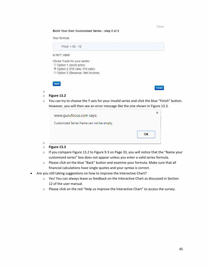
What happens if I enter an invalid custom series?
o Figure 13.2 shows a sample screen shot when you enter an invalid custom series like
‘Price’ + 50 - ‘Q’:
45
o o Figure 13.2
o You can try to choose the Y-axis for your invalid series and click the blue “Finish” button.
However, you will then see an error message like the one shown in Figure 13.3.
o o Figure 13.3
o If you compare Figure 13.2 to Figure 9.3 on Page 33, you will notice that the “Name your
customized series” box does not appear unless you enter a valid series formula.
o Please click on the blue “Back” button and examine your formula. Make sure that all
financial calculations have single quotes and your syntax is correct.
Are you still taking suggestions on how to improve the Interactive Chart?
o Yes! You can always leave us feedback on the Interactive Chart as discussed in Section
12 of the user manual.
o Please click on the red “Help us improve the Interactive Chart” to access the survey.