Embed Size (px)
Citation preview
Journal of Educational Psychology1999, Vol. 91, No. 4, 690-702
Copyright 1999 by the American Psychological Association, Inc.0022-0663/99/S3.00
Graphs as Aids to Knowledge Construction: Signaling Techniquesfor Guiding the Process of Graph Comprehension
Priti Shah, Richard E. Mayer, and Mary HegartyUniversity of California, Santa Barbara
Graphical displays are frequently used to express quantitative information in texts, but viewersare sometimes unable to comprehend and learn the relevant information. According to acognitive analysis, graph interpretation involves (a) relatively simple pattern perception andassociation processes in which viewers can associate graphic patterns to quantitative referentsand (b) more complex and error-prone inferential processes in which viewers must mentallytransform data. Experiment 1 establishes that graphs can be redesigned to improve viewers'interpretations by minimizing the inferential processes and maximizing the pattern associationprocesses required to interpret relevant information. In Experiments 2 and 3, the researchersisolated one important factor that affects viewers' interpretation (i.e., the perceptualorganization of the information in graphs). If relevant quantitative information is perceptuallygrouped to form visual chunks (because relevant data points are either connected in line graphsor close together in bar graphs), then viewers describe relevant trends. If relevant informationis not perceptually grouped, viewers are less likely to comprehend relevant trends.
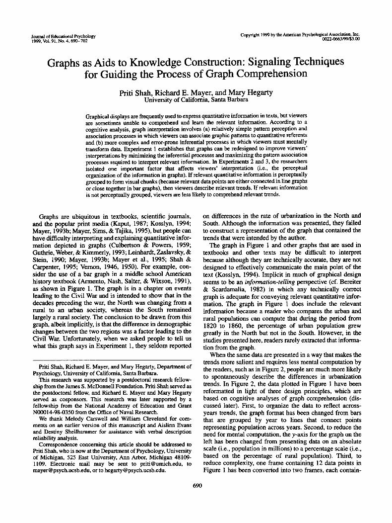
Graphs are ubiquitous in textbooks, scientific journals,and the popular print media (Kaput, 1987; Kosslyn, 1994;Mayer, 1993b; Mayer, Sims, & Tajika, 1995), but people canhave difficulty interpreting and explaining quantitative infor-mation depicted in graphs (Culbertson & Powers, 1959;Guthrie, Weber, & Kimmerly, 1993; Leinhardt, Zaslavsky, &Stein, 1990; Mayer, 1993b; Mayer et al., 1995; Shah &Carpenter, 1995; Vernon, 1946, 1950). For example, con-sider the use of a bar graph in a middle school Americanhistory textbook (Armento, Nash, Salter, & Wixson, 1991),as shown in Figure 1. The graph is in a chapter on eventsleading to the Civil War and is intended to show that in thedecades preceding the war, the North was changing from arural to an urban society, whereas the South remainedlargely a rural society. The conclusion to be drawn from thisgraph, albeit implicitly, is that the difference in demographicchanges between the two regions was a factor leading to theCivil War. Unfortunately, when we asked people to tell uswhat this graph says in Experiment 1, they seldom reported
Priti Shah, Richard E. Mayer, and Mary Hegarty, Department ofPsychology, University of California, Santa Barbara.
This research was supported by a postdoctoral research fellow-ship from the James S. McDonnell Foundation. Priti Shah served asthe postdoctoral fellow, and Richard E. Mayer and Mary Hegartyserved as cosponsors. This research was later supported by afellowship from the National Academy of Education and GrantN00014-98-0350 from the Office of Naval Research.
We thank Melody Carswell and William Cleveland for com-ments on an earlier version of this manuscript and Aislinn Evansand Destiny Shellhammer for assistance with verbal descriptionreliability analysis.
Correspondence concerning this article should be addressed toPriti Shah, who is now at the Department of Psychology, Universityof Michigan, 525 East University, Ann Arbor, Michigan 48109-1109. Electronic mail may be sent to [email protected], [email protected], or to [email protected].
on differences in the rate of urbanization in the North andSouth. Although the information was presented, they failedto construct a representation of the graph that contained thetrends that were intended by the author.
The graph in Figure 1 and other graphs that are used intextbooks and other texts may be difficult to interpretbecause although they are technically accurate, they are notdesigned to effectively communicate the main point of thetext (Kosslyn, 1994). Implicit in much of graphical designseems to be an information-telling perspective (cf. Bereiter& Scardamalia, 1982) in which any technically correctgraph is adequate for conveying relevant quantitative infor-mation. The graph in Figure 1 does include the relevantinformation because a reader who compares the urban andrural populations can compute that during the period from1820 to 1860, the percentage of urban population grewgreatly in the North but not in the South. However, in thestudies presented here, readers rarely extracted that informa-tion from the graph.
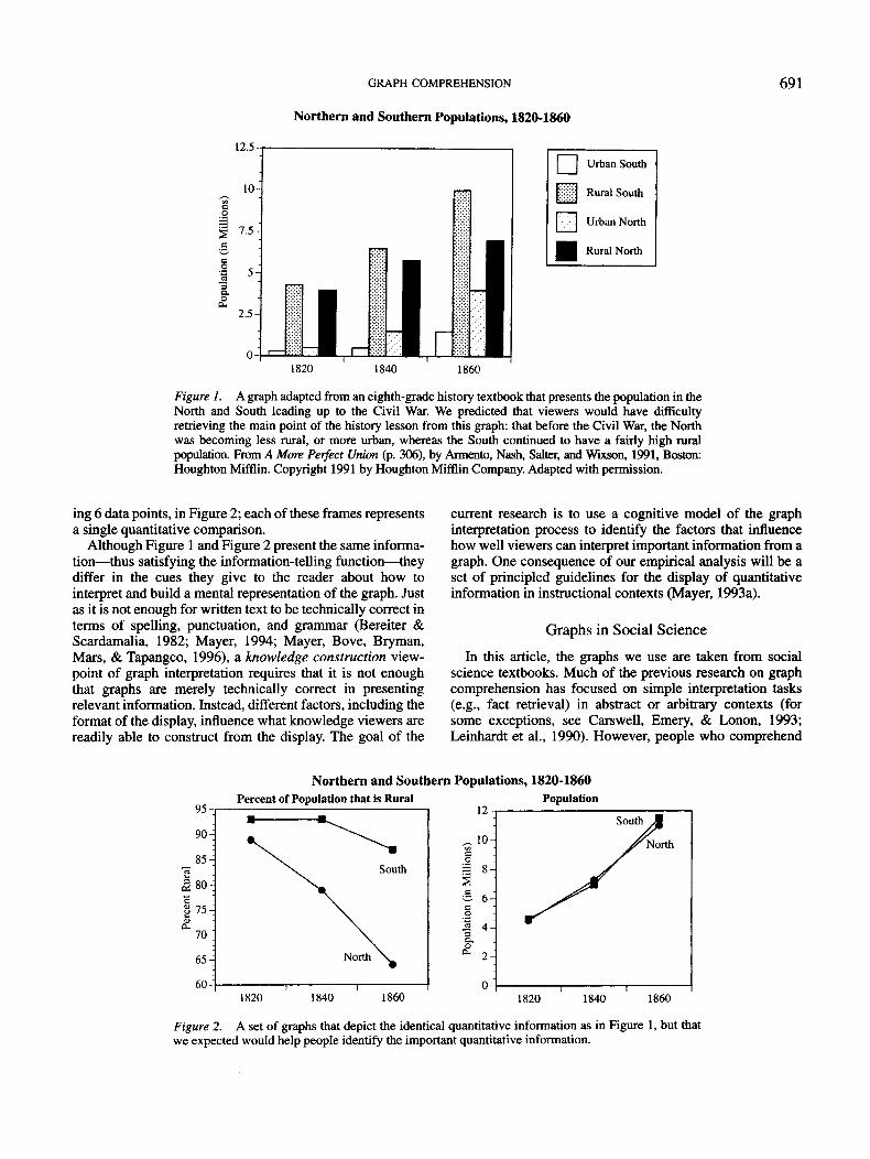
When the same data are presented in a way that makes thetrends more salient and requires less mental computation bythe readers, such as in Figure 2, people are much more likelyto spontaneously describe the differences in urbanizationtrends. In Figure 2, the data plotted in Figure 1 have beenreformatted in light of three design principles, which arebased on cognitive analyses of graph comprehension (dis-cussed later). First, to organize the data to reflect across-years trends, the graph format has been changed from barsthat are grouped by year to lines that connect pointsrepresenting population across years. Second, to reduce theneed for mental computation, the y-axis for the graph on theleft has been changed from presenting data on an absolutescale (i.e., population in millions) to a percentage scale (i.e.,based on the percentage of rural population). Third, toreduce complexity, one frame containing 12 data points inFigure 1 has been converted into two frames, each contain-
690
GRAPH COMPREHENSION
Northern and Southern Populations, 1820-1860
691
12.5
sc
§•
1•
Urban South
Rural South
Urban North
Rural North
1820 1840 1860
Figure 1. A graph adapted from an eighth-grade history textbook that presents the population in theNorth and South leading up to the Civil War. We predicted that viewers would have difficultyretrieving the main point of the history lesson from this graph: that before the Civil War, the Northwas becoming less rural, or more urban, whereas the South continued to have a fairly high ruralpopulation. From A More Perfect Union (p. 306), by Armento, Nash, Salter, and Wixson, 1991, Boston:Houghton Mifflin. Copyright 1991 by Houghton Mifflin Company. Adapted with permission.
ing 6 data points, in Figure 2; each of these frames representsa single quantitative comparison.
Although Figure 1 and Figure 2 present the same informa-tion—thus satisfying the information-telling function—theydiffer in the cues they give to the reader about how tointerpret and build a mental representation of the graph. Justas it is not enough for written text to be technically correct interms of spelling, punctuation, and grammar (Bereiter &Scardamalia, 1982; Mayer, 1994; Mayer, Bove, Bryman,Mars, & Tapangco, 1996), a knowledge construction view-point of graph interpretation requires that it is not enoughthat graphs are merely technically correct in presentingrelevant information. Instead, different factors, including theformat of the display, influence what knowledge viewers arereadily able to construct from the display. The goal of the
current research is to use a cognitive model of the graphinterpretation process to identify the factors that influencehow well viewers can interpret important information from agraph. One consequence of our empirical analysis will be aset of principled guidelines for the display of quantitativeinformation in instructional contexts (Mayer, 1993a).
Graphs in Social Science
In this article, the graphs we use are taken from socialscience textbooks. Much of the previous research on graphcomprehension has focused on simple interpretation tasks(e.g., fact retrieval) in abstract or arbitrary contexts (forsome exceptions, see Carswell, Emery, & Lonon, 1993;Leinhardt et al., 1990). However, people who comprehend
Northern and Southern Populations, 1820-1860Percent of Population that is Rural
1820 1840 1860
Population
1820 1840 1860
Figure 2. A set of graphs that depict the identical quantitative information as in Figure 1, but thatwe expected would help people identify the important quantitative information.
692 SHAH, MAYER, AND HEGARTY
and construct graphs in arbitrary contexts may be unable toapply these skills to the interpretation of graphs of meaning-ful data (Leinhardt et al., 1990). Furthermore, in meaningfulcontexts, such as in social science, graphs typically depictcomplex data sets that are meant to convey comparisons oftrends and relationships such as in Figure 1 or are intendedto provide support for assertions in the text. In this context,the readers' tasks include understanding the link between thegraph and the text (Hunter, Crismore, & Pearson, 1987) orunderstanding what the data imply (Lehrer & Romberg,1996; Scardamalia, Bereiter, & Lamon, 1994). A major goalof the current research is to understand how people interprettrends and relationships in graphs of meaningful data, suchas those in social science textbooks, and how characteristicsof the graphical display influence these processes.
Model of Graph Interpretation
According to the dominant cognitive model, graph com-prehension entails three major, intertwined component pro-cesses (Benin, 1983; Carpenter & Shah, 1998; Cleveland,1994; Cleveland & McGill, 1984, 1985; Lohse, 1993;Pinker, 1990; Shah, 1995; Shah & Carpenter, 1995). First,viewers must encode the visual array and identify theimportant visual features (e.g., a straight line slantingdownward). Second, viewers must identify the quantitativefacts or relations that those features represent (e.g., adecreasing linear relationship between x and y). Finally,viewers must relate those quantitative relations to thegraphic variables depicted (e.g., population vs. year). Thesethree processes are incremental and interactive such thatviewers sequentially encode a portion of the visual pattern,identify what quantitative fact or function it implies, andrelate it to its graphic referents (Carpenter & Shah, 1998).
In this research, we focus on the second process, that is,identification of the quantitative facts or trends from a graph.Previous models of graph interpretation propose that thereare two kinds of processes that are involved in identifyingrelevant quantitative facts or trends from a graph (Carpenter& Shah, 1998; Casner & Larkin, 1989; Pinker, 1990; Shah &Carpenter, 1995). In one type of process, viewers encode aportion of a visual pattern, or a visual chunk, and canautomatically associate that visual chunk to a quantitativefact or relationship. For example, a visual chunk in a linegraph may be one of the lines. In interpreting a line graph,the viewer may associate each line, such as a straight line oran upwardly curved line, to a specific quantitative relationsuch as a linear or exponential function (Carpenter & Shah,1998; Shah & Carpenter, 1995). When relevant quantitativeinformation is directly available in the visual chunks, thenpattern perception and association processes are sufficient tointerpret relevant quantitative information, and viewers arelikely to be able to interpret that information accurately andquickly (Casner & Larkin, 1989; Shah & Carpenter, 1995).
However, there are some situations in which viewers mustrely on complex inferential processes. First, a viewer maynot have the knowledge to associate the visual chunk to thequantitative referents (e.g., the viewer does not know that astraight line implies a linear relationship). Second, indi-
vidual visual chunks may not be associated with the relevantquantitative referents (e.g., the viewer must compare orrelate information in two different visual chunks, say, bycomputing die relative difference between a number of lineson a graph). Such complex inferential processes involvequantitatively transforming the information in the display(e.g., mentally transforming from a linear to logarithmicscale or calculating the difference between two or more datapoints; Cleveland, 1984, 1985). When these processes arerequired to interpret some or all of the information in agraph, viewers have more difficulty, and their interpretationsmay be inaccurate or incomplete (Casner & Larkin, 1989;Hegarty, Carpenter, & Just, 1991; Shah & Carpenter, 1995).
According to this model of graph comprehension, it maybe possible to improve viewers' abilities to construct arepresentation of the quantitative information in a graph thatis consistent with the interpretation intended by the writer bymaximizing the pattern perception and association processesand by minimizing the complex inferential processes re-quired to interpret the relevant quantitative information froma graph. Furthermore, to minimize inferential processes, therelevant quantitative information must be explicitly repre-sented in the visual chunks that are encoded by the graphviewers. Finally, viewers' knowledge about how differentvisual features correspond with quantitative conclusionsmay influence whether they are able to use pattern percep-tion and association processes to comprehend relevantinformation and, therefore, influence their interpretations ofdata.
In this research, we begin to specify how the characteris-tics of the graphical display influence which visual chunksmight be encoded by the graph viewer, and how this mightaffect viewers' interpretations of, and memory for, informa-tion presented in a graph. The graph characteristics that weexamine are the graphic format (line graph or bar graph), thescale on the y-axis (absolute or percentage), the complexityof an individual graph, and the perceptual organization ofinformation on a graph (e.g., the grouping of the bars on abar graph).
In Experiment 1, we redesigned graphs so that viewerswould be more likely to comprehend and learn the informa-tion that is the relevant point of the text. In this study, wesimultaneously altered a number of variables, all of whichplayed the same role: to reduce the amount of complexinferential processes required to comprehend the relevantquantitative comparison by placing the relevant informationin the visual chunks. Previous research has examined therole of one or more variables, such as graph format or the useof color, on viewers' identification or confirmation of simplefacts or on their interpretations in relatively unfamiliardomains (e.g., Shah & Carpenter, 1995). This experimentgoes beyond that previous research to examine how thecharacteristics of the graph influence viewers' interpreta-tions in die context of familiar, meaningful data and relevantinterpretation tasks such as diose involved in the interpreta-tion of social science textbook graphs.
In Experiment 2, we systematically examined two proper-ties of die graphs—their format and scale—to furtherspecify how these two factors influence what visual chunks

GRAPH COMPREHENSION 693
are encoded by the viewer and, therefore, what kinds ofinterpretations are given to different graphs. Finally, Experi-ment 3 tested the idea that the perceptual organization of thedata, or where information is placed within a particulargraphic format, rather than the graphic format per se, is themajor variable that influences viewers' interpretations. To-gether, these studies demonstrate that if relevant quantitativeinformation is perceptually grouped to form visual chunks(because relevant data points are either connected in linegraphs or close together in bar graphs), then viewersdescribe relevant trends. If relevant information is notperceptually grouped, viewers are less likely to comprehendrelevant trends.
Experiment 1
Experiment 1 was designed to establish that the character-istics of a graph can have a profound influence on viewers'interpretations of data, even in the context of complex,meaningful data and relevant tasks such as those involved ininterpreting social science textbook graphs. In this study, weexamined people's descriptions of graphs taken from middleschool history textbooks (original graphs such as the one inFigure 1), as well as informationally equivalent graphs thatwere created by explicitly depicting the relevant quantitativetrends in the visual chunks (revised graphs such as the one inFigure 2).
We predicted that viewers would be better able toconstruct a representation of the relevant quantitative trendsfrom the revised graphs than from the original graphs. Therevised graphs were designed to maximize the role of patternperception and association processes and minimize thecomplex, inferential processes by explicitly representing therelevant information in the visual chunks. We tested thishypothesis by examining the kinds of verbal descriptionsthat viewers spontaneously gave to the original and revisedgraphs.
Method
Participants, design, and materials. Sixteen undergraduatesfrom the University of California, Santa Barbara participated in thisstudy for course credit. Each participant was tested on threeoriginal graphs and three revised graphs so that graph format was awithin-subject variable. The three original graphs (including thegraph shown in Figure 1) were adapted directly from middle schoolU.S. history textbooks. The three graphs shared the characteristicthat they did not present the relevant quantitative informationexplicitly, which, in each case, involved understanding how therelative percentages of different categories changed with time. Theoriginal graphs were different from one another in several respectsbecause they were adapted directly from textbooks (e.g., two werebar graphs, and one was a divided bar chart; they containeddifferent numbers of data points).
The revised graphs, including the graph shown in Figure 2, werecreated by making three changes to the original graphs; the changesplayed the role of minimizing the number of mental computationsrequired to interpret the trends in the graphs. First, for all of therevised graphs, we split the data set into two separate graphs, withfewer variables in each graph so that viewers could focus on therelevant variables (such as trends in the North and South over three
time periods, in the case of Figure 2). Second, we transformed thedependent variable in one graph to a percentage, rather thanabsolute scale, so that viewers need not mentally compute therelevant percentage trends (such as the percentage of rural popula-tion). Finally, for two of the three graphs, we changed the format toa line graph to explicitly represent the relevant trends in the visualchunks.
Two graph sets were created to ensure counterbalancing of theunderlying data sets and variables used for original and revisedgraphs. The two graph sets conveyed the same data but differed inwhich data sets were presented in the original format and whichdata sets were presented in the revised format. The data sets for thethree original graphs in Set 1 (and the three revised graphs in Set 2)involved the number of urban and rural inhabitants in the North andthe South in three time periods (2 X 2 X 3), the number ofimmigrants from five nations in three time periods (5 X 3), and themedian income of men and women workers in six time periods(2X6) . The data sets for the three revised graphs in Set 1 (and thethree original graphs in Set 2) involved the number of tons ofdomestic and imported grain consumed in the United States and theUSSR in three time periods (2 X 2 X 3), the number of animals onthe prairie for five animal types in three three time periods (5 X 3),and the unemployment rate for African Americans and WhiteAmericans in six time periods (2 X 6). The data sets for the originaland revised graphs within each set were isomorphic, and theydepicted data that were linear transformations of one another (e.g.,the number of immigrants from five nations in three time periods isisomorphic to the number of animals on the prairie from fiveanimal types in three time periods); to keep the data isomorphic inthe two conditions, the data do not necessarily represent accuratehistoric information. In addition to the materials already men-tioned, we created a brief questionnaire about participants' math-ematics and statistics courses, Scholastic Aptitude Test (SAT)scores, and their experience with different graphic formats.
Procedure. Participants were tested individually. At the begin-ning of the study, participants were briefly instructed in thedescription and statement-verification tasks. They were given onepractice trial in which they were asked to give a brief description ofa relatively simple line graph and practice the statement-verification task.
After the instructions, participants were presented with a graph(or graph pair). They described each graph or graph pair aloudwhile viewing the graph, and their descriptions were tape-recorded.This procedure was repeated for each of the six graphs. We used thesame, prerandomized order of presentation of the graphs for allparticipants. At the end of the study, viewers were asked to fill outthe brief questionnaire.
Coding verbal descriptions. Each of the six graph descriptionsproduced by each participant was categorized as expressing (a) awithin-year comparison, (b) an across-years trend description, (c)a mixed description, or (d) other. A protocol was classified as awithin-year comparison if the student compared the value of two ormore variables for a given year, such as "In 1860 there are morepeople in the rural South than in the rural North." A protocol wasclassified as an across-years trend description if the studentdescribed differences within a single variable across two or moreyears, such as "The number of people in the rural North decreaseddramatically between 1820 and 1860, but the number of people inthe rural South did not decrease as much." A protocol wascategorized as mixed if it contained both within-year and across-years comparisons. A protocol was classified as other if it did notcontain within-year or across-years comparisons. Such descriptionsincluded nonquantitative information such as descriptions of theshading of the different bars. On the basis of this analysis, fourscores were computed for both the original and revised trials for

694 SHAH, MAYER, AND HEGARTY
each participant: (a) the proportion of trials that were within-yearcomparisons, (b) the proportion of trials that were across-yearscomparisons, (c) the proportion of trials that were mixed, and (d)the proportion of trials that were other. A second rater coded thedata for 4 participants (24 trials), and then the two raters discussedany discrepancies. Then, the second rater coded the data for the 12remaining participants (72 trials). The two raters agreed on theclassification of the protocols on 83% of the trials. In the finalanalysis, classifications made by the first rater were used. Becauseof the relatively high reliability for verbal description classification,only one rater coded the data for Experiments 2 and 3.
In this analysis, we calculated the proportion of descriptions, foreach graph type, that are coded as being in each of the fourcategories. The average number of descriptions that each partici-pant made for each graph type can be calculated by multiplying theproportion by 3 (because each participant described three originalgraphs and three revised graphs).
Results and Discussion
Overall, the results are consistent with the knowledgeconstruction hypothesis, which states that the kind ofinformation that is retrieved from graphs is highly dependenton the format and characteristics of the graphical display. Asshown in the left panel of Figure 3, people were more likelyto describe trends across time when viewing revised graphs(M = .81) than when viewing original graphs (M = .44),F(l, 15) = 22.09, MSE = .05, p < .01. In contrast, as shownin the right panel of Figure 3, people were more likely todescribe facts within a time period when viewing originalgraphs (M = .29) than when viewing revised graphs(M = .04), F(l , 15) = 10.39, MSE = .05,p < .01. Finally, anumber of descriptions were categorized as mixed (Af = .20),but the proportions of these types of descriptions were notinfluenced by the graph format.
An example of a typical across-years trend description ofthe revised graph in Figure 2 indicates that the revised graphhelped people identify and describe the main point of thelesson. As one student described:
The percent of the population that is rural decreases over time,but there is a greater decrease for the northern population that
•s.1
Original
I I Revised
Across-Years Within-Year
Figure 3. Proportion of viewers generating across-years andwithin-year descriptions for the original and revised graphs inExperiment 1. 'Viewers provided more across-years trend descrip-tions for revised graphs than original graphs, and more within-yeardescriptions for original graphs than revised graphs.
is rural than the southern population. The total populationincreases in both the North and the South almost equally overtime.
In this case, the student focused on an important differencein demographic trends over time between the North andSouth. This comparison is central to the author's contentionthat growing demographic differences between the Northand South helped lead to the Civil War. Another descriptionof the revised graph in Figure 2 also indicates an understand-ing of the different demographic trends in the North andSouth:
The first graph the southern population was about the ruralpopulation was about really high 90%, it went down a little butit was still up like 88%, whereas the northern populationstarted at 90% but it went down till 1860. It graduallydecreased all the way down till approximately 65%.
Two examples of a typical within-year comparison,provided for the original graph in Figure 1, indicate that inviewing this type of graph, people often failed to find theauthor's intended message, instead focusing on comparisonswith each time period:
In 1820, the greatest population was the rural South, and thenthe rural North, and then the urban North, then the urbanSouth. And in 1840 same, but greater amounts in thepopulation. And in 1860, it went rural South, rural North,urban North, and urban South. Same . . . [reads values of thepoints].
The population in 1820 the rural South is more than the North,and it's the still is the same in 1840, the rural South is largerthan the north but the rural North in 1860 the urban South hasincreased again but not as large amount as the urban Northwhich is a large, has grown up to about 4,4.5 million when itstarted out less than .5 million . . . [repeats the same informa-tion].
Although descriptions of original graphs were typicallylonger than descriptions of revised graphs (because theyoften included descriptions of multiple individual datapoints), viewers often failed to clearly convey the main pointof the lesson.
Summary
In summary, the results of Experiment 1 demonstrate thatby replotting the data in graphs, one can guide a viewer'scognitive processing of the graphs so that he or she is morelikely to represent the data as the author intended—in thiscase, as a comparison of trends over time. Although it mayappear from the results of this study that our revised linegraphs are always better than the original bar graphs ordivided bar charts, the benefit of a particular graph format islikely to be dependent on the task of the graph viewer(Carswell & Wickens, 1987). If the goal was for people toremember specific facts about relative differences betweencategories within a particular time period, then the originalgraphs from these studies may have been the best formatbecause those facts may be retrieved by means of relativelysimple pattern perception and association processes. How-ever, in the history texts from which we took our originalgraphs, the goal of the lesson was not to teach people aboutspecific quantitative facts but to help them understand the

GRAPH COMPREHENSION 695
relationship between certain trends and other historicalevents. In this case, the revised graphs, by explicitly depictingrelevant quantitative trends in the visual chunks of linegraphs, greatly improve viewers' understanding of the data.
Experiment 2
Although the results of Experiment 1 demonstrated thatpeople abstracted different kinds of information from re-vised graphs than from original graphs, there were severaldifferences between the original and revised graphs. InExperiment 2, we attempted to untangle two aspects of thechange from original to revised graphs—the change frombars to lines and the change from absolute to percentagescale (and the simultaneous change from a single complexgraph to two simpler graphs, necessary to keep the twoversions informationally equivalent).
Our goal was to determine what role these two graphcharacteristics played in influencing people's interpretationsof graphs. To separate the role of format and scale (andnumber of graphs) in the previous study, we comparedviewers' interpretations of four kinds of graphs: line graphsand bar graphs that depicted information using an absolutescale on the y-axis, and line graphs and bar graphs thatdepicted information using percentage scale on the y-axis forone graph. Figures 1, 2,4A, and 4B depict the four kinds ofgraphs. We predicted that both format and the scale/numberof graphs factor should have an influence on viewers'interpretations because each of these factors influences whatinformation is explicitly represented in the visual chunks. Totest this prediction, we analyzed viewers' spontaneousverbal descriptions of graphs, as well as their accuracy injudging from memory whether statements about the datawere true or false.
Method
Participants, design, and materials. Forty undergraduates fromthe University of California, Santa Barbara participated in thisstudy for course credit. The experiment had a 2 X 2 X 4 mixedfactorial design with the first (within-subject) variable being format(bar or line) and the second (within-subject) variable being scale(one graph with absolute scale vs. two graphs, one of which had apercentage scale). For the third (between-subjects) variable, weplotted each of the eight data sets from Experiment 1 in each of thefour possible forms (a total of 32 graphs) and divided them intofour sets, each of which included two versions of graphs in each ofthe four possible forms. Each of these four sets was administered to10 different participants. Note that absolute bar graphs correspondto the original graphs in Experiment 1 that contained three variables(such as Figure 1), and the percentage line graphs correspond to therevised graphs in Experiment 1 (such as Figure 2).
Procedure. The procedure was identical to Experiment 1except that there were eight graphs, and viewers made true-falsejudgments for individual statements (rather than comparing twostatements) in the memory task. The viewers' descriptions werecoded as in Experiment 1.
Results and Discussion
The proportions of across-years and within-year descrip-tions produced for absolute bar (original), percentage bar,
absolute line, and percentage line (revised) graphs areshown in Figure 5. Consistent with Experiment 1, viewerswere more likely to describe across-years trends whenshown a revised (i.e., percentage line) graph (M = .86) thanwhen shown an original (i.e., absolute bar) graph (M = .52),F(l, 39) = 20.57, MSE = A\,p < .01. Also, consistent withExperiment 1, viewers were more likely to describe compari-sons within years when shown an original graph (M = .33)than when shown a revised graph (M = .04), F(l, 39) =2 1 9 0 M S £ 0 8 0 1
A new question addressed in Experiment 2 concernswhether the major advantage of the revised graph over theoriginal graph has to do with a change from absolute topercentage scale (and the change from a single graph to twoseparate graphs) or a change from bar to line format. Aspredicted, viewers were more likely to describe trendsacross time when interpreting line graphs (M = .84) thanwhen interpreting bar graphs (M = .46), F(l, 39) = 53.9,MSE = .10, p < .01. By contrast, viewers were more likelyto describe within-year comparisons when interpreting bargraphs (M = .33) than when interpreting line graphs(M = .05), F(l , 39) = 29.1, MSE = .11, p < .01. As in theprevious study, viewers' interpretations of data are shown tobe influenced by graphic format. Some graphic formats,such as line graphs, are better for depicting x-y trends, and inthis study, the x-y trends are trends across time. Othergraphic formats, such as bar graphs, are better for depictingdifferences within the clusters of bars, and for the graphs inthis study, the clusters of bars represent individual years. Inaddition, line graphs are more biasing in the kind ofinterpretations they elicit: Almost all line graph descriptionswere of historical trends, whereas bar graphs eliciteddescriptions of historical trends and within-year compari-sons equally.
Viewers never mentioned scale in describing the graphs,except in referring to the names of the variables on they-axis. Because of this, the interpretation of the coding of thedescriptions was not sensitive to the difference betweenpercentage and absolute scale.1
1 A second task, in which participants answered true—falsequestions about the graphs from memory, suggested that scale, too,may have had an influence on viewers' understanding of the data.For this task, participants were presented with two statements eachabout absolute facts (e.g., "In 1860, most people in the UnitedStates lived in the rural parts of the South"), absolute trends (e.g.,"The number of people who live in the rural parts of the Northincreases with time"), percentage facts (e.g., "In 1820, a higherpercentage of the population lives in the Rural North than in theRural South"), and percentage trends (e.g., "The percentage of thepopulation that is Rural decreases with time in the South").Viewers were more accurate in answering questions about absoluteinformation when graphs had absolute scale (M = .74) than whengraphs had a percentage scale (M = .64), F(l, 39) = 17.6, MSE =.03, p < .01. Similarly, viewers were more accurate in answeringquestions about relative information when graphs had percentagescales (M = .84) than when the graphs had absolute scales (M =.68), F{\, 39) = 42.4, MSE = .03, p < .01. These results suggestthat viewers had difficulty translating between percentage andabsolute interpretations of data on the basis of their memory of thegraph, perhaps because they did not include the scale informationin their mental representations, as suggested by their descriptions.

696 SHAH, MAYER, AND HEGARTY
Northern and Southern Populations, 1820-1860
12.5-
10-
7.5-
1&
2.5-
Rural South
Rural North
Urban North
Urban South
1820 1840 1860
BNorthern and Southern Populations, 1820-1860
Percent of Population that is Rural Population
1820 1840 1860 1820 1840 1860
Figure 4. The two new graph types created for Experiment 2. The absolute line (4A) andpercentage (4B) bar graph versions of the identical pre-Civil War population data used in Experiment 2.
Summary
Experiment 2 demonstrates that both format and scaleinfluenced the relative ease and difficulty of interpretingdifferent quantitative information from a graphical display.Second, the task of the graph viewer may interact with therole of graph characteristics. Specifically, line graphs may bebetter when the task is to describe trends, whereas bar graphsmay be better when the task is to describe facts.
Experiment 3
Experiments 1 and 2 in this article demonstrate that theformat of the graphical display influences the types ofinterpretations that viewers spontaneously give to data. Thegoal of Experiment 3 was to distinguish between twopossible hypotheses about the role of format in the interpre-
tation of trends and facts from graphs that are consistent withthe results of Experiments 1 and 2. One possibility, whichwe refer to as the format-only hypothesis, is that line graphscue trends, whereas bar graphs cue facts.
A second possibility which is consistent with our cogni-tive model of graph interpretation, is the perceptual organi-zation hypothesis. According to this hypothesis, viewers'interpretations are not influenced by format per se but ratherare influenced by which quantitative trends are representedby visual chunks in the graph. We propose that wheninformation is represented by a visual chunk, viewers canrely on pattern perception processes to interpret the trendand do not have to rely on complex inferential processes.Our definition of visual chunks is based on Gestalt principlesof perceptual organization, such as connectedness andproximity. In the case of line graphs, the visual chunks are

GRAPH COMPREHENSION 697
Absolute Bar
PercentageBar
Absolute Line
PercentageLine
Across-Years Within-Year
Figure 5. Proportion of viewers generating across-years andwithin-year descriptions for the four graph types in Experiment 2.Viewers gave across-years trend descriptions more for line graphsthan for bar graphs, and more within-year descriptions for bargraphs than for line graphs.
the x-y lines that physically connect data points (Shah &Carpenter, 1995) on the basis of the Gestalt principle ofconnectedness. In the case of bar graphs, a group of bars thatare close together (e.g., the group of bars for each year inFigure 1) is denned as a visual chunk on the basis of theGestalt principle of proximity.2
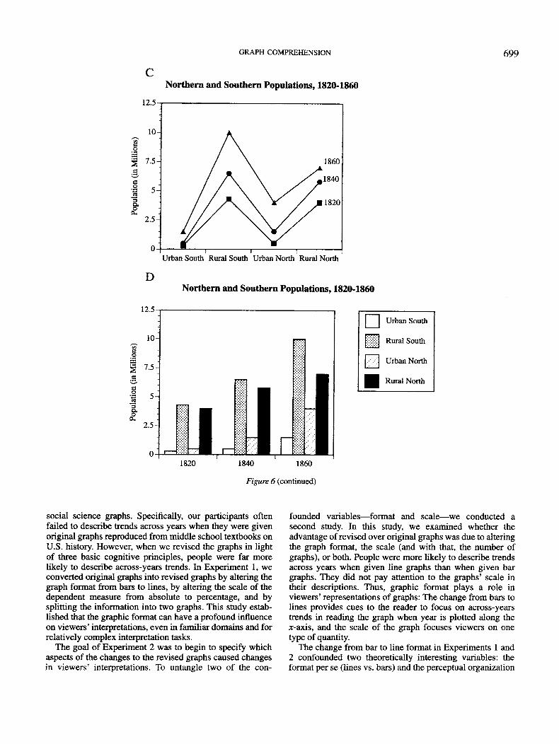
In this experiment, we attempted to distinguish betweenthe format-only and perceptual organization hypotheses byasking viewers to describe bar graphs and line graphs inwhich we varied the perceptual organization of information.According to the format-only hypothesis, line graphs (Fig-ures 6A and 6C) should cue across-years trends, whereas bargraphs (Figures 6B and 6D) should cue within-year compari-sons. According to the perceptual organization hypothesis,however, data points that are grouped, either by connected-ness (in the case of line graphs) or proximity (in the caseof bar graphs), should be described more readily. Thus, theline graph in Figure 6A and the bar graph in Figure 6Bshould cue across-years trends, and the line graph in Figure6C and the bar graph in Figure 6D should cue within-yearcomparisons.
Method
Participants, design, and materials. Twelve undergraduatesfrom the University of California, Santa Barbara participated in thisstudy for course credit. Each participant was tested on two bargraphs with within-year visual chunks (bar-within), two bar graphswith across-years visual chunks (bar-across), two line graphs withwithin-year visual chunks (line-within), and two line graphs withacross-years visual chunks (line-across), so graph format (line vs.bar) and visual chunk (within-year vs. across-years) were within-subject variables. To ensure counterbalancing, four equivalent setsof eight graphs were constructed, with 3 participants receiving eachset. Thus, the experiment was based on a 4 X 2 X 2 mixed designwith the first (between-subjects) variable being which counterbal-anced set was presented, the second (within-subject) variable beingformat, and the third (within-subject) variable being visual chunk.
The same eight data sets used in Experiment 2 were used in thisstudy. We plotted each of the eight data sets in the four possible
forms, as shown in Figure 6. We then assigned the 32 graphs toeach of the four conditions, with the constraint that each conditionincluded two examples of each of the four graph types and oneversion of each data set. Viewers' descriptions were coded as inExperiments 1 and 2.
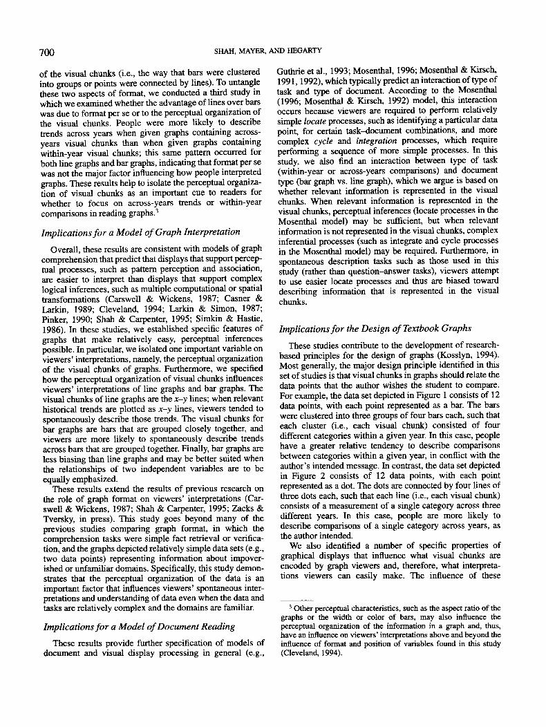
Results and Discussion
The proportions of across-years and within-year descrip-tions generated by the four graph types are shown in Figure7. As predicted by the perceptual organization hypothesis,viewers were more likely to describe historical trends whenacross-years trends were explicitly represented in visualchunks (M = .67) than when within-year trends were repre-sented in visual chunks (M = .19), F(l, 11) = 17.9, MSE =.15, p < .01. Format (bar vs. line), on other hand, did nothave a significant influence on the proportion of across-yearstrend descriptions, as can be seen by comparing the twographs in Figure 7, F(l, 11) = 1.1, MSE = .10,/? > .1. Therewas, however, a significant interaction between format andvisual chunks such that visual chunks defined by connected-ness in line graphs had a bigger influence on interpretationthan did the visual chunks defined by proximity in bargraphs, F(l, 11) = 7.5, MSE = .09,p < .05. This interactionis consistent with the results of Experiment 2: Overall,line graphs bias viewers' interpretations according to theposition of the display more than bar graphs bias viewers'interpretations.
Consistent with the perceptual organization hypothesis,viewers were also more likely to make within-year, acrosscategory comparisons when that information was explicitlydepicted in the visual chunks (M = .29) than when it was not(M = .04), F(l, 11) = 11.0, MSE = .07,/? < .01. Format perse had only a marginal influence on the proportion ofwithin-year trend descriptions, as can be seen by comparingthe left panels of Figure 7A and Figure 7B, F(l, 11) = 3.66,MSE = .05, p = .08, and there was no significant interactionbetween format and visual chunks, F(l, 11) = 0.47, MSE =.04, p> .10.
A substantial proportion of descriptions were coded asother (M = .24) descriptions. There was a larger number ofthese other descriptions, including merely perceptual infor-mation (such as "the bar on the left has stripes") or veryminimal content information (such as "the highest value is90"), than in the other experiments, perhaps because ofsome viewers were not sure how to describe the relativelyunusual new graphs that were designed for this study (e.g.,Figure 6B and particularly 6C, in which we violated astandard graphic convention by connecting categorical infor-mation). Thus, there were more other descriptions for thosetwo types of graphs (M = .40) than for the two commonlyused formats (M = .08), F(l, 11) = 19.8, MSE = .06,
2 Overall, connectedness is a more powerful Gestalt principleand takes priority over the principle of proximity. Thus, points thatare connected by lines form visual chunks even when other pointsare close together. The relative strength of the connectednessprinciple might also explain why line graphs are more biased thanbar graphs in Experiment 2.

698 SHAH, MAYER, AND HEGARTY
Northern and Southern Populations, 1820-1860
12.5
10-
2.5-
Rural South
Rural North
Urban North
Urban South
1820 1840 1860
BNorthern and Southern Populations, 1820-1860
12.5
Urban South Rural South Urban North Rural North
Figure 6. Figures 6A and 6B depict line (6A) and bar (6B) graph versions of the pre-Civil Warpopulation data, which, by proximity and connectedness, have visual chunks that emphasizehistorical trends; these graphs are examples of the across-years visual chunk graphs used inExperiment 3. Figures 6C and 6D {opposite) depict line (6C) and bar (6D) graph versions of thepre-Civil War population data, which, by proximity and connectedness, have visual chunks thatemphasize within-year comparisons; these graphs are examples of the within-year visual chunkgraphs used in Experiment 3. Figure 6D from A More Perfect Union (p. 306), by Armento, Nash,Salter, and Wixson, 1991, Boston: Houghton Mifflin. Copyright 1991 by Houghton MifflinCompany. Adapted with permission.
Finally, the proportion of mixed descriptions (M = .17)did not differ as a function of the graphic format orperceptual organization, F(l, 11) = 0.31, MSE = .03,p > .10.
Summary
Experiment 3 demonstrated that the kinds of perceptualinferences that can easily be made from graphical displays is
dependent on what information is grouped together in adisplay (e.g., across-years vs. within-year chunks) ratherthan graph format (e.g., bar vs. line).
General Discussion
We began with the finding—replicated across three experi-ments—that people often fail to glean the author's intendedmessage when they are asked to describe what they see in
GRAPH COMPREHENSION 699
Northern and Southern Populations, 1820-1860
12.5
D
12.5
Urban South Rural South Urban North Rural North
Northern and Southern Populations, 1820-1860
•
i
Urban South
Rural South
Urban North
Rural North
1820 1840 1860
Figure 6 (continued)
social science graphs. Specifically, our participants oftenfailed to describe trends across years when they were givenoriginal graphs reproduced from middle school textbooks onU.S. history. However, when we revised the graphs in lightof three basic cognitive principles, people were far morelikely to describe across-years trends. In Experiment 1, weconverted original graphs into revised graphs by altering thegraph format from bars to lines, by altering the scale of thedependent measure from absolute to percentage, and bysplitting the information into two graphs. This study estab-lished that the graphic format can have a profound influenceon viewers' interpretations, even in familiar domains and forrelatively complex interpretation tasks.
The goal of Experiment 2 was to begin to specify whichaspects of the changes to the revised graphs caused changesin viewers' interpretations. To untangle two of the con-
founded variables—format and scale—we conducted asecond study. In this study, we examined whether theadvantage of revised over original graphs was due to alteringthe graph format, the scale (and with that, the number ofgraphs), or both. People were more likely to describe trendsacross years when given line graphs than when given bargraphs. They did not pay attention to the graphs' scale intheir descriptions. Thus, graphic format plays a role inviewers' representations of graphs: The change from bars tolines provides cues to the reader to focus on across-yearstrends in reading the graph when year is plotted along thex-axis, and the scale of the graph focuses viewers on onetype of quantity.
The change from bar to line format in Experiments 1 and2 confounded two theoretically interesting variables: theformat per se (lines vs. bars) and the perceptual organization
700 SHAH, MAYER, AND HEGARTY
of the visual chunks (i.e., the way that bars were clusteredinto groups or points were connected by lines). To untanglethese two aspects of format, we conducted a third study inwhich we examined whether the advantage of lines over barswas due to format per se or to the perceptual organization ofthe visual chunks. People were more likely to describetrends across years when given graphs containing across-years visual chunks than when given graphs containingwithin-year visual chunks; this same pattern occurred forboth line graphs and bar graphs, indicating that format per sewas not the major factor influencing how people interpretedgraphs. These results help to isolate the perceptual organiza-tion of visual chunks as an important cue to readers forwhether to focus on across-years trends or within-yearcomparisons in reading graphs.3
Implications for a Model of Graph Interpretation
Overall, these results are consistent with models of graphcomprehension that predict that displays that support percep-tual processes, such as pattern perception and association,are easier to interpret than displays that support complexlogical inferences, such as multiple computational or spatialtransformations (Carswell & Wickens, 1987; Casner &Larkin, 1989; Cleveland, 1994; Larkin & Simon, 1987;Pinker, 1990; Shah & Carpenter, 1995; Simkin & Hastie,1986). In these studies, we established specific features ofgraphs that make relatively easy, perceptual inferencespossible. In particular, we isolated one important variable onviewers' interpretations, namely, the perceptual organizationof the visual chunks of graphs. Furthermore, we specifiedhow the perceptual organization of visual chunks influencesviewers' interpretations of line graphs and bar graphs. Thevisual chunks of line graphs are the x-y lines; when relevanthistorical trends are plotted as x-y lines, viewers tended tospontaneously describe those trends. The visual chunks forbar graphs are bars that are grouped closely together, andviewers are more likely to spontaneously describe trendsacross bars that are grouped together. Finally, bar graphs areless biasing than line graphs and may be better suited whenthe relationships of two independent variables are to beequally emphasized.
These results extend the results of previous research onthe role of graph format on viewers' interpretations (Car-swell & Wickens, 1987; Shah & Carpenter, 1995; Zacks &Tversky, in press). This study goes beyond many of theprevious studies comparing graph format, in which thecomprehension tasks were simple fact retrieval or verifica-tion, and the graphs depicted relatively simple data sets (e.g.,two data points) representing information about impover-ished or unfamiliar domains. Specifically, this study demon-strates that the perceptual organization of the data is animportant factor that influences viewers' spontaneous inter-pretations and understanding of data even when the data andtasks are relatively complex and the domains are familiar.
Implications for a Model of Document Reading
These results provide further specification of models ofdocument and visual display processing in general (e.g.,
Guthrie et al., 1993; Mosenthal, 1996; Mosenthal & Kirsch,1991,1992), which typically predict an interaction of type oftask and type of document. According to the Mosenthal(1996; Mosenthal & Kirsch, 1992) model, this interactionoccurs because viewers are required to perform relativelysimple locate processes, such as identifying a particular datapoint, for certain task-document combinations, and morecomplex cycle and integration processes, which requireperforming a sequence of more simple processes. In thisstudy, we also find an interaction between type of task(within-year or across-years comparisons) and documenttype (bar graph vs. line graph), which we argue is based onwhether relevant information is represented in the visualchunks. When relevant information is represented in thevisual chunks, perceptual inferences (locate processes in theMosenthal model) may be sufficient, but when relevantinformation is not represented in the visual chunks, complexinferential processes (such as integrate and cycle processesin the Mosenthal model) may be required. Furthermore, inspontaneous description tasks such as those used in thisstudy (rather than question-answer tasks), viewers attemptto use easier locate processes and thus are biased towarddescribing information that is represented in the visualchunks.
Implications for the Design of Textbook Graphs
These studies contribute to the development of research-based principles for the design of graphs (Kosslyn, 1994).Most generally, the major design principle identified in thisset of studies is that visual chunks in graphs should relate thedata points that the author wishes the student to compare.For example, the data set depicted in Figure 1 consists of 12data points, with each point represented as a bar. The barswere clustered into three groups of four bars each, such thateach cluster (i.e., each visual chunk) consisted of fourdifferent categories within a given year. In this case, peoplehave a greater relative tendency to describe comparisonsbetween categories within a given year, in conflict with theauthor's intended message. In contrast, the data set depictedin Figure 2 consists of 12 data points, with each pointrepresented as a dot. The dots are connected by four lines ofthree dots each, such that each line (i.e., each visual chunk)consists of a measurement of a single category across threedifferent years. In this case, people are more likely todescribe comparisons of a single category across years, asthe author intended.
We also identified a number of specific properties ofgraphical displays that influence what visual chunks areencoded by graph viewers and, therefore, what interpreta-tions viewers can easily make. The influence of these
3 Other perceptual characteristics, such as the aspect ratio of thegraphs or the width or color of bars, may also influence theperceptual organization of the information in a graph and, thus,have an influence on viewers' interpretations above and beyond theinfluence of format and position of variables found in this study(Cleveland, 1994).
o
IQ
1-
0.9-
0.8-
0.7-
0.6-
0.5-
0.4-
0.3-
0.2^
O.IT
0 -
T
H—iT
TAcross-Years
GRAPH
^ _ Within-Year• Visual^ Chunks
! . Across-YearsVisual
1 ' ChunksT*T
•, • • i
Within-Year
COMPREHENSION
B
's.
Q'oc
11—1
J
0.9-
0.8-
0.7-
0.6-
0.5-
0.4-
0.3-
0.2-
0.1-
0 - -
701
Across-Years
Within-YearVisualChunks
Across-YearsVisualChunks
Within-Year
Figure 7. Proportion of viewers generating across-years and within-year descriptions for the fourgraph types in Experiment 3. For bar graphs (7A) and line graphs (7B), viewers describedacross-years trends when the across-years trends were plotted closely together or connected(across-years visual chunks). Viewers described within-year trends when they were plotted closelytogether in bar graphs or connected by lines (within-year visual chunks).
properties leads to a number of specific principles forplotting data:
1. Line graphs emphasize x-y trends. If there are three ormore variables in a data set, then the most importantrelationship should be plotted as a function of the x- andy-axes.
2. Bar graphs emphasize comparisons that are closertogether on the display. If there are three or more variables,the most relevant trends should be plotted closer togetheralong the axes when using bar graphs.
3. Line graphs are more biasing (emphasizing the x-yrelations), whereas bar graphs are more neutral; thus, if twoindependent variables are equally important, bar graphsshould be used. If a particular trend is the most importantinformation, then line graphs should be used.
4. The scale should reflect whether the goal is tounderstand relative or absolute information, because peoplehave difficulty translating between different graphic scales.
References
Armento, B. J., Nash, G. B., Salter, C. L., & Wixson, K. K. (1991).A more perfect union. Boston: Houghton Mifflin.
Bereiter, C., & Scardamalia, M. (1982). From conversation tocomposition: The role of instruction in a developmental process.In R. Glaser (Ed.), Advances in instructional psychology (Vol. 2,pp. 1-64). Hillsdale, NJ: Erlbaum.
Bertin, J. (1983). Semiology of graphics: Diagrams networks maps(W. Berg, Trans.). Madison: University of Wisconsin Press.
Carpenter, P. A., & Shah, P. (1998). A model of the perceptual andconceptual processes in graph comprehension. Journal of Experi-mental Psychology: Applied, 4, 75-100.
Carswell, C. M , Emery, C , & Lonon, A. M. (1993). Stimuluscomplexity and information integration in the spontaneousinterpretation of line graphs. Applied Cognitive Psychology, 7,341-357.
Carswell, C. M., & Wickens, C. D. (1987). Information integration
and the object display: An interaction of task demands anddisplay superiority. Ergonomics, 30, 511-527.
Casner, S. M., & Larkin, J. H. (1989). Cognitive efficiencyconsiderations for good graphic design. Proceedings of theEleventh Annual Meeting of the Cognitive Science Society, 11,275-282.
Cleveland, W. (1994). The elements of graphing data. Belmont,CA: Wadsworth.
Cleveland, W. (1995). Visualizing data. Murray Hill, NJ: AT&TBell Laboratories.
Cleveland, W. S., & McGill, R. (1984). Graphical perception:Theory, experimentation, and application to the development ofgraphical methods. Journal of the American Statistical Associa-tion, 77, 541-547.
Cleveland, W. S., & McGill, R. (1985, August 30). Graphicalperception and graphical methods for analyzing scientific data.Science, 229, 828-833.
Culbertson, H. M., & Powers, R. D. (1959). A study of graphcomprehension difficulties. Audio Visual Communication Re-view, 7, 97-100.
Guthrie, J. T, Weber, S., & Kimmerly, N. (1993). Searchingdocuments: Cognitive process and deficits in understandinggraphs, tables, and illustrations. Contemporary EducationalPsychology, 18, 186-221.
Hegarty, M., Carpenter, P. A., & Just, M. A. (1991). Diagrams in thecomprehension of scientific texts. In R. Barr, M. L. Kamil, P.Mosenthal, & P. D. Pearson (Eds.), Handbook of readingresearch (Vol. 2, pp. 641-668). New York: Longman.
Hunter, B., Crismore, A., & Pearson, P. D. (1987). Visual displaysin basal readers and social science textbooks. In D. Willows &H. A. Houghton (Eds.), The psychology of illustration: Vol. 2.Instructional Issues (pp. 116-135). New York: Springer-Verlag.
Kaput, J. J. (1987). Representation and mathematics. In C. Janvier(Ed.), Problems of representation in mathematics learning andproblem solving (pp. 19-26). Hillsdale, NJ: Erlbaum.
Kosslyn, S. M. (1994). Elements of graph design. New York:Freeman.
Larkin, J. H., & Simon, H. A. (1987). Why a diagram is

702 SHAH, MAYER, AND HEGARTY
(sometimes) worth ten thousand words. Cognitive Science, 11,65-99.
Lehrer, R., & Romberg, T. (1996). Exploring children's datamodeling. Cognition & Instruction, 14, 69-108.
Leinhardt, G., Zaslavsky, O., & Stein, M. K. (1990). Functions,graphs, and graphing: Tasks, learning, and teaching. Review ofEducational Research, 60, 1-64.
Lohse, G. L. (1993). Acognitive model for understanding graphicalperception. Human-Computer Interaction, 8, 353-388.
Mayer, R. E. (1993a). Comprehension of graphics in texts: Anoverview. Learning & Instruction, 3, 239-245.
Mayer, R. E. (1993b). Illustrations that instruct. In R. Glaser (Ed.),Advances in instructional psychology (Vol. 5, pp. 253-284).Hillsdale, NJ: Erlbaum.
Mayer, R. E. (1994). Visual aids to knowledge construction:Building mental representations from pictures and words. In W.Schnotz & R. W. Kulhavy (Eds.), Comprehension of graphics:Advances in psychology (Vol. 108, pp. 125-138). Amsterdam:North-Holland/Elsevier Science.
Mayer, R. E., Bove, W., Bryman, A., Mars, R., & Tapangco, L.(1996). When less is more: Meaningful learning from visual andverbal summaries of science textbook lessons. Journal ofEducational Psychology, 88, 64-73.
Mayer, R. E., Sims, V, & Tajika, H. (1995). A comparison of howtextbooks teach mathematical problem solving in Japan and theUnited States. American Educational Research Journal, 32,443-460.
Mosenthal, R B. (1996). Understanding the strategies of documentliteracy and their conditions of use. Journal of EducationalPsychology, 88, 314-332.
Mosenthal, P. B., & Kirsch, I. S. (1991). Toward an explanatorymodel of document literacy. Discourse Processes, 14, 147-180.
Mosenthal, P. B., & Kirsch, I. S. (1992). Types of documentknowledge: From structure to strategies. Journal of Reading, 36,64-67.
Pinker, S. (1990). A theory of graph comprehension. In R. Freedle(Ed.), Artificial intelligence and the future of testing (pp.73-126). Hillsdale, NJ: Erlbaum.
Scardamalia, N., Bereiter, C , & Lamon, M. (1994). The CSILEProject: Trying to bring the classroom into the world. In K.McGilly (Ed.), Classroom lessons: Integrating cognitive theoryand classroom practice. Cambridge, MA: MIT Press.
Shah, P. (1995). Cognitive processes in graph comprehension.Unpublished doctoral dissertation, Carnegie Mellon University,Pittsburgh, PA.
Shah, P., & Carpenter, P. A. (1995). Conceptual limitations incomprehending line graphs. Journal of Experimental Psychol-ogy: General, 124, 43-61.
Simkin, D. K., & Hastie, R. (1986). An information processinganalysis of graph perception. Journal of the American StatisticalAssociation, 82, 454—465.
Vernon, M. D. (1946). Learning from graphical material. BritishJournal of Psychology, 36, 145-158.
Vernon, M. D. (1950). The visual presentation of factual informa-tion. British Journal of Educational Psychology, 20, 174-185.
Zachs, J., & Tversky, B. (in press). Bars and lines: A study ofgraphic communication. Memory and Cognition.
Received June 17,1998Revision received March 19, 1999
Accepted March 20, 1999 •