Embed Size (px)
Citation preview

PORTFOLIOGERALD WAGNER
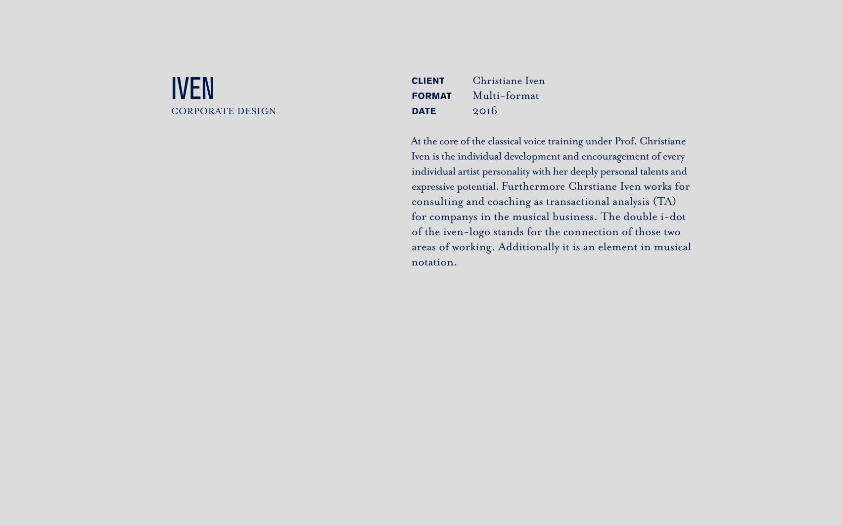
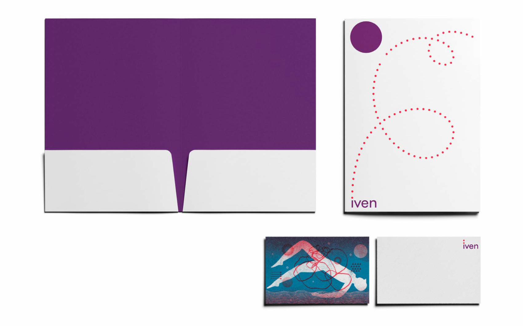
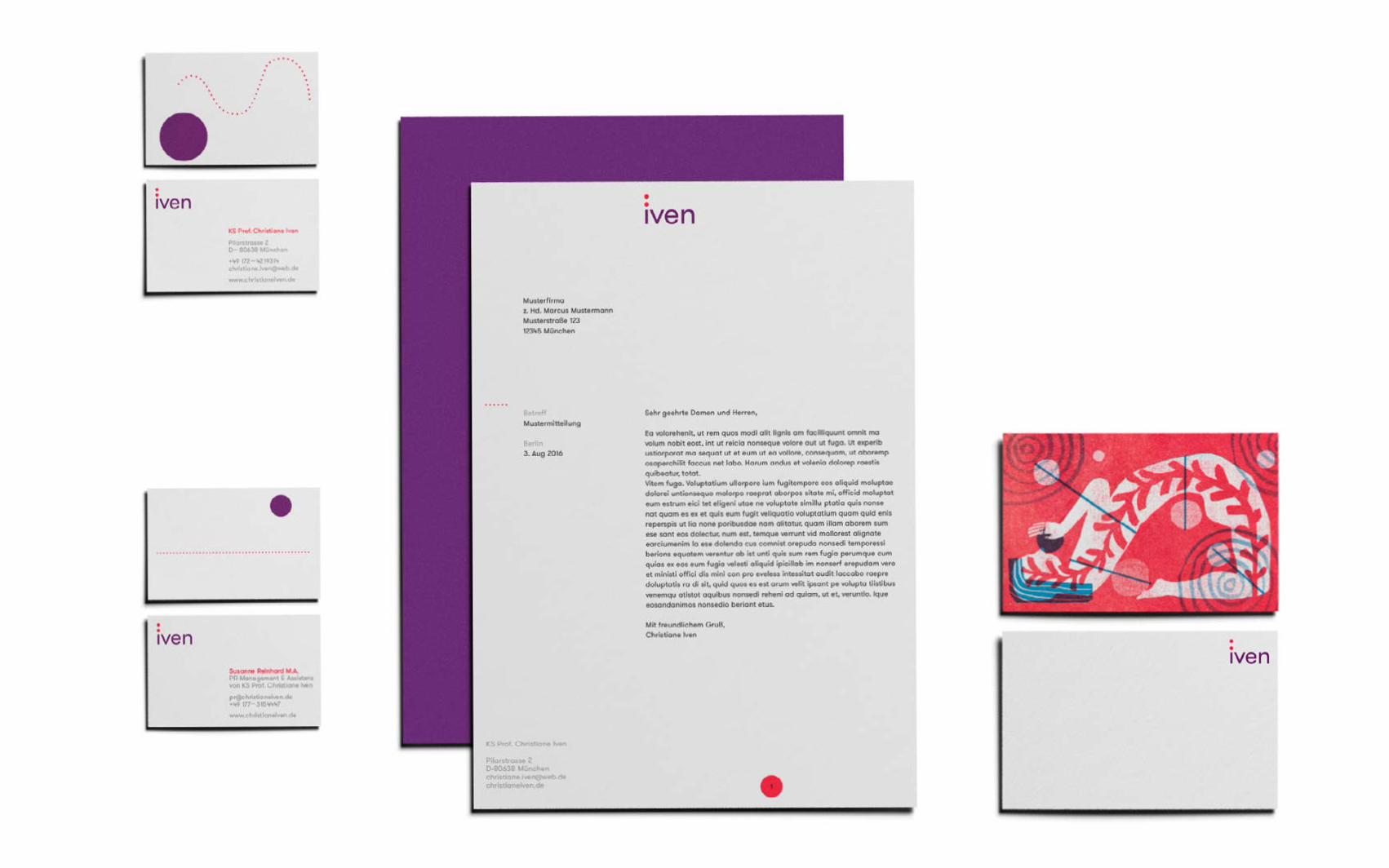
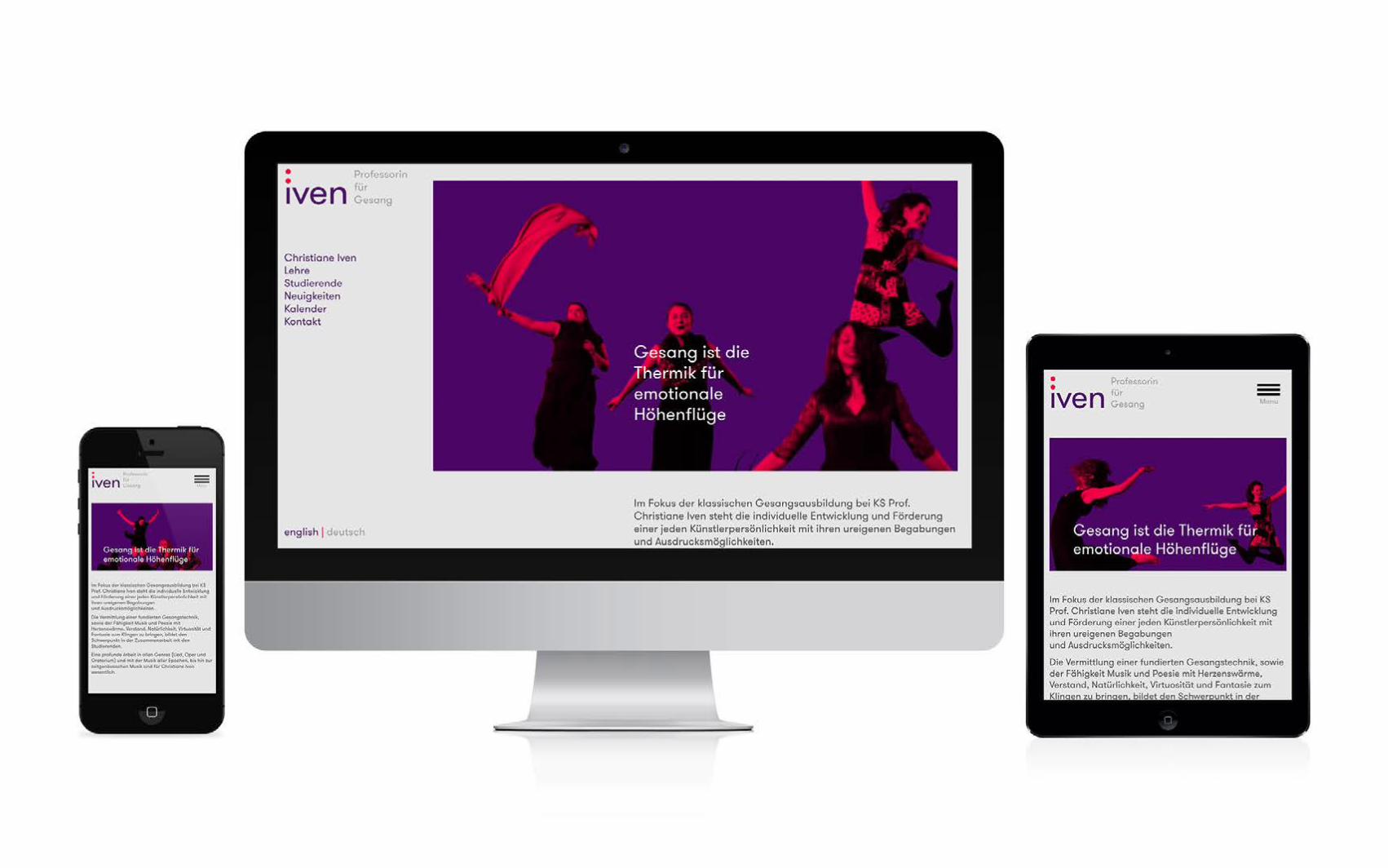
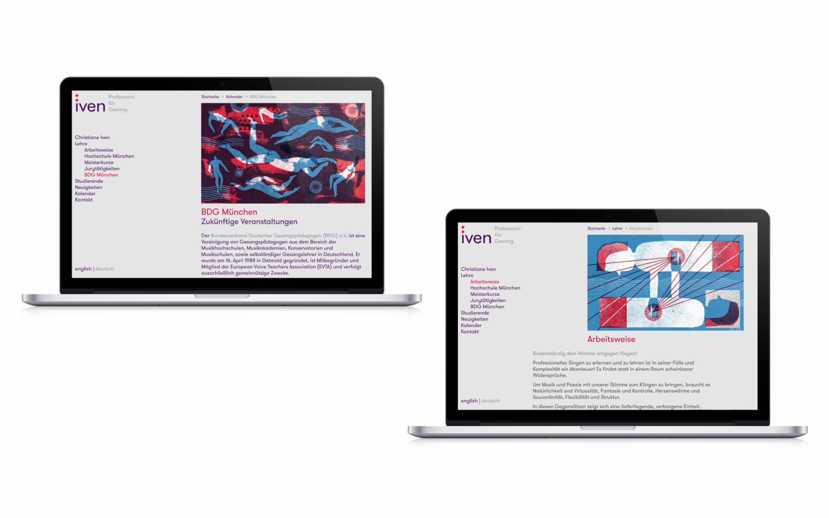
IVEN CORPORATE DESIGN
CLIENT Christiane IvenFORMAT Multi-formatDATE 2016
At the core of the classical voice training under Prof. Christiane Iven is the individual development and encouragement of every individual artist personality with her deeply personal talents and expressive potential. Furthermore Chrstiane Iven works for consulting and coaching as transactional analysis (TA) for companys in the musical business. The double i-dot of the iven-logo stands for the connection of those two areas of working. Additionally it is an element in musical notation.
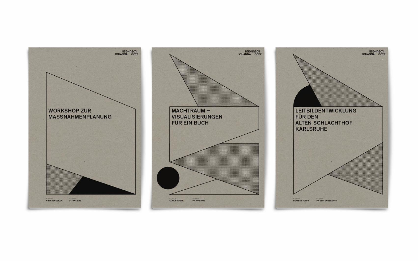
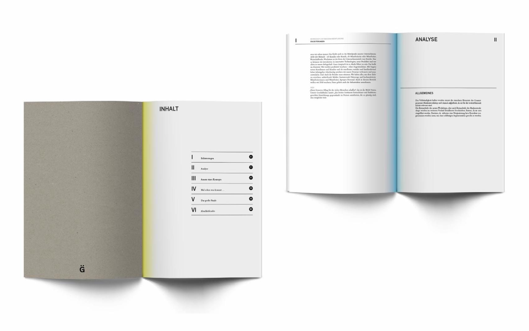
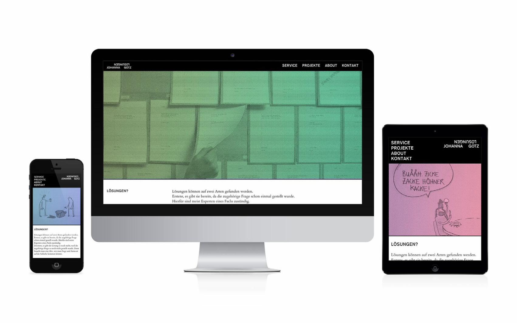
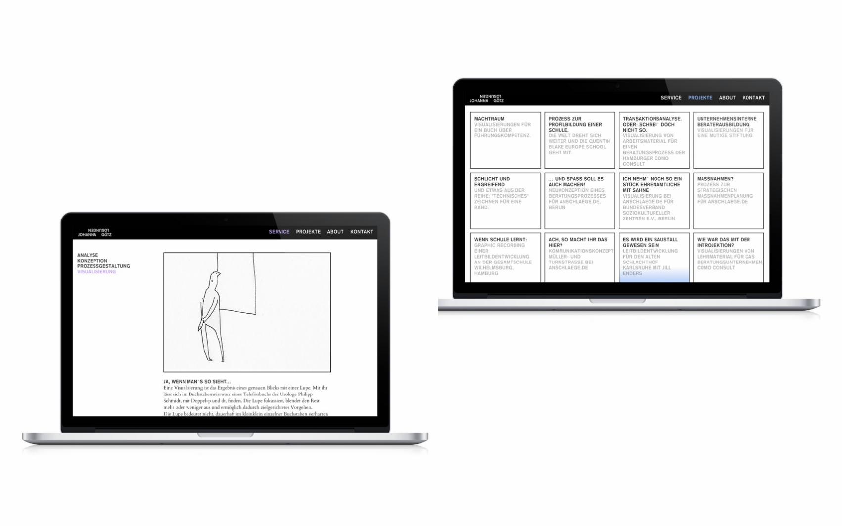
JOHANNA GÖTZLÖSUNGEN CORPORATE DESIGN
CLIENT Johanna GötzFORMAT Multi-formatDATE 2015
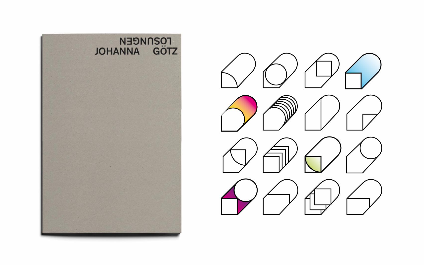
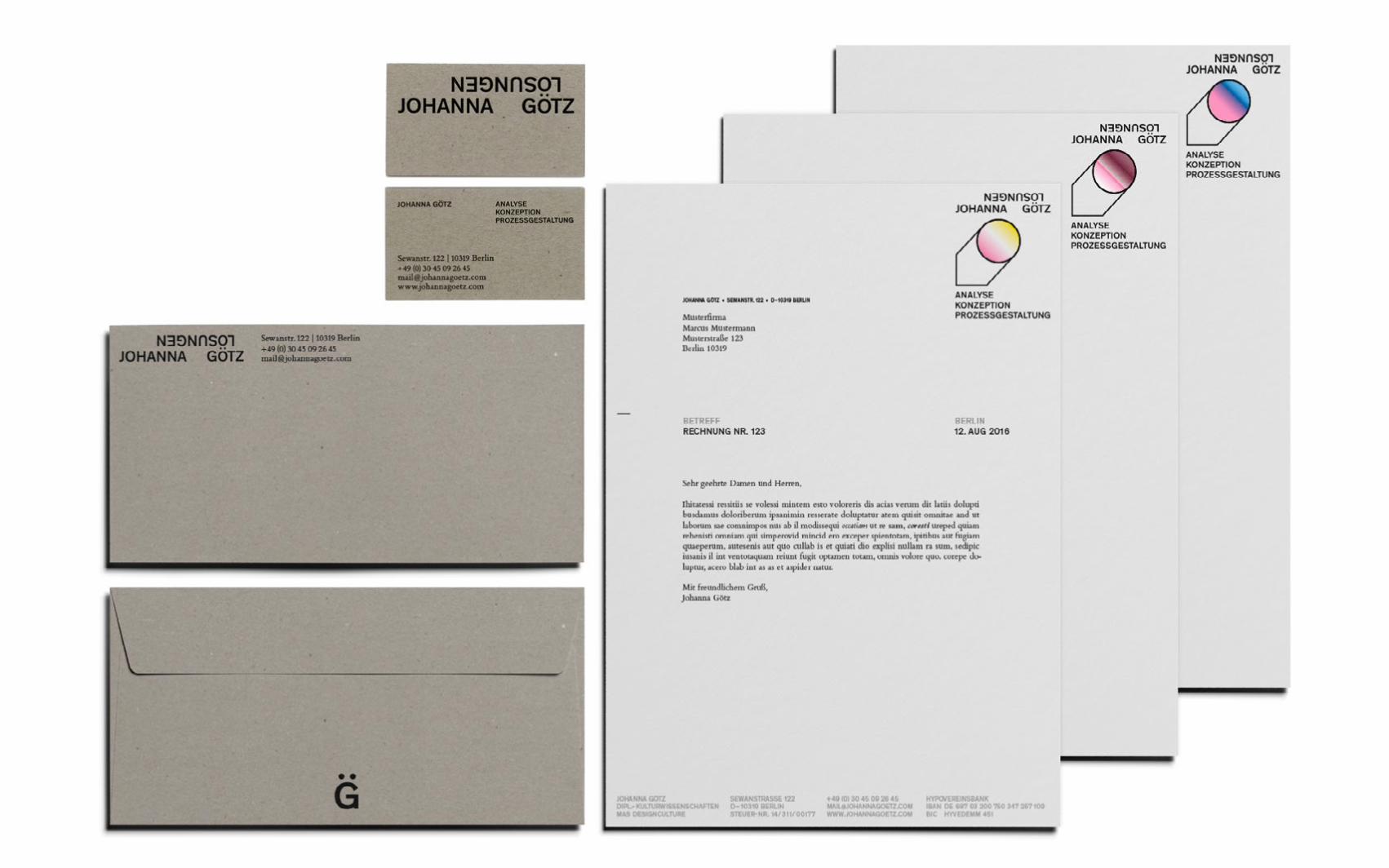
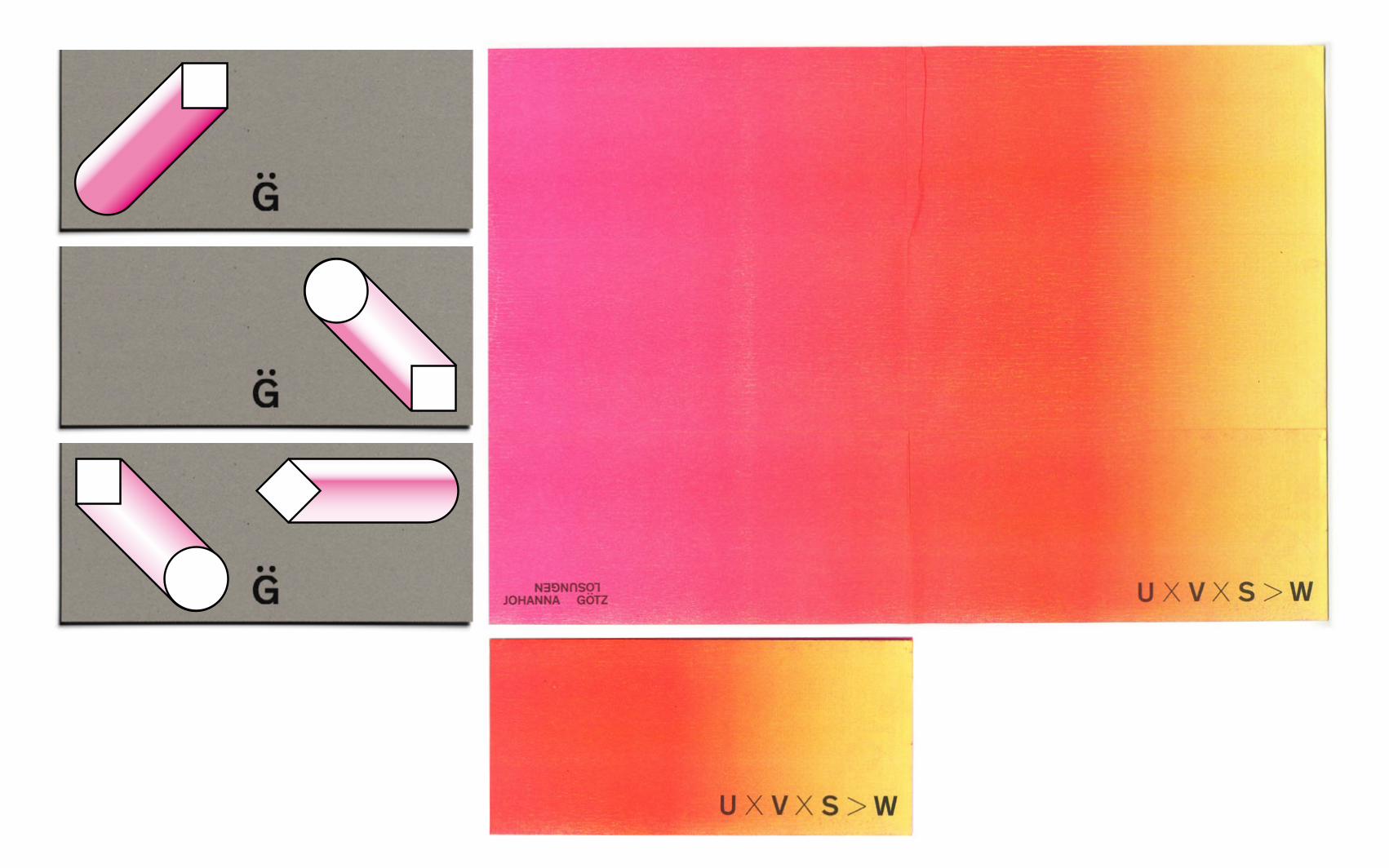
Johanna Götz designs processes to find out solutions for complex or unconventional tasks. Her process-related work is represented by alternating colors/gradients and various metamorphoses of geometric shapes. The typography is blocky and modular.
RATIBORTHEATER FLYER
CLIENT Ratibor TheaterFORMAT 10 x 22 cm (closed) 40 x 21cm (open)DATE 2015–16
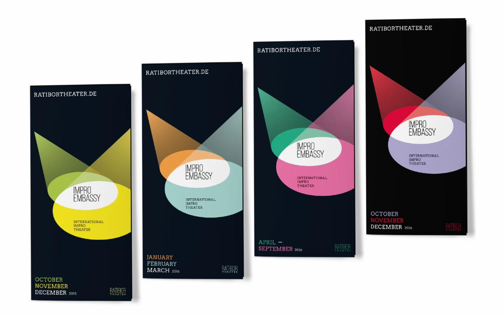
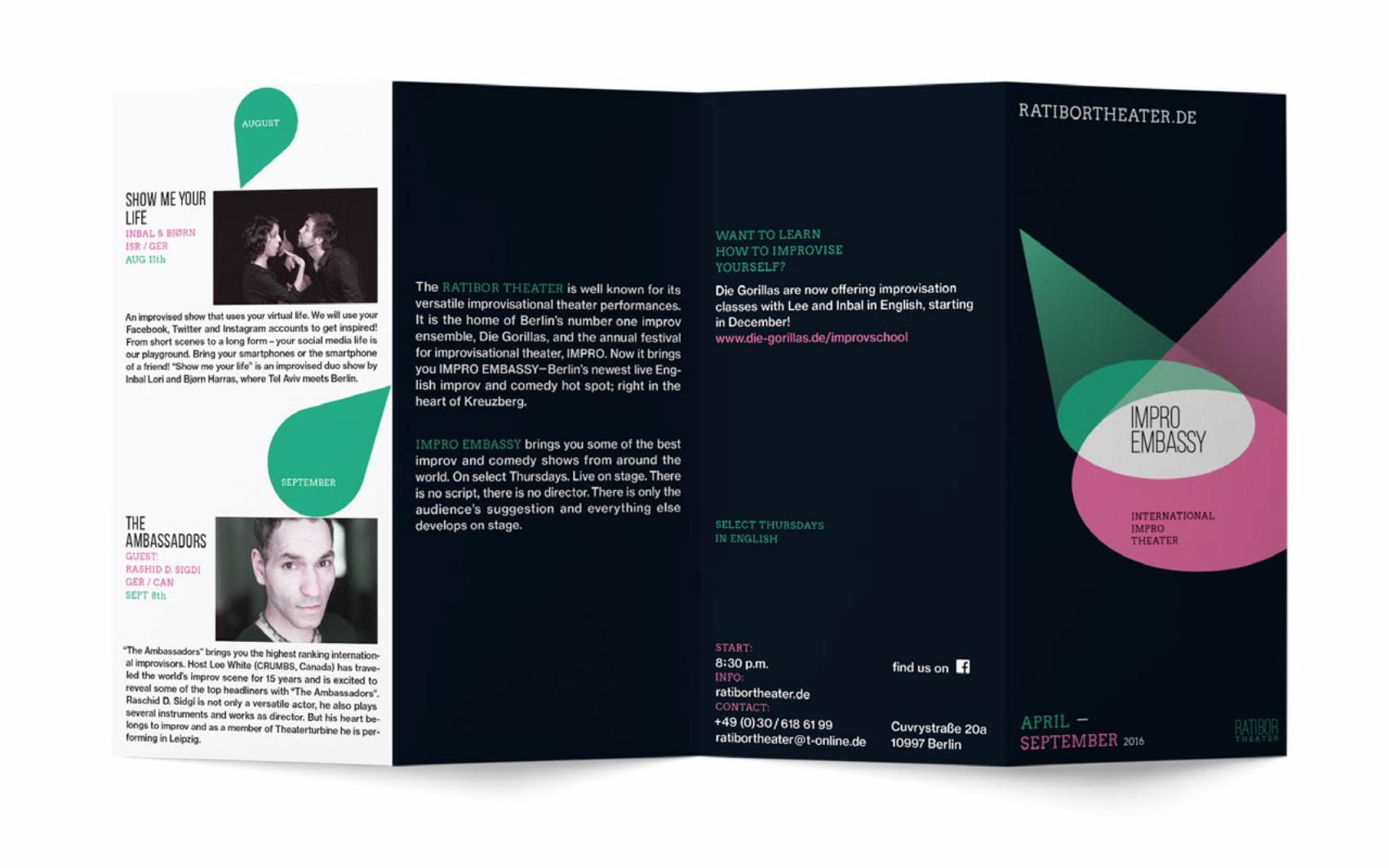
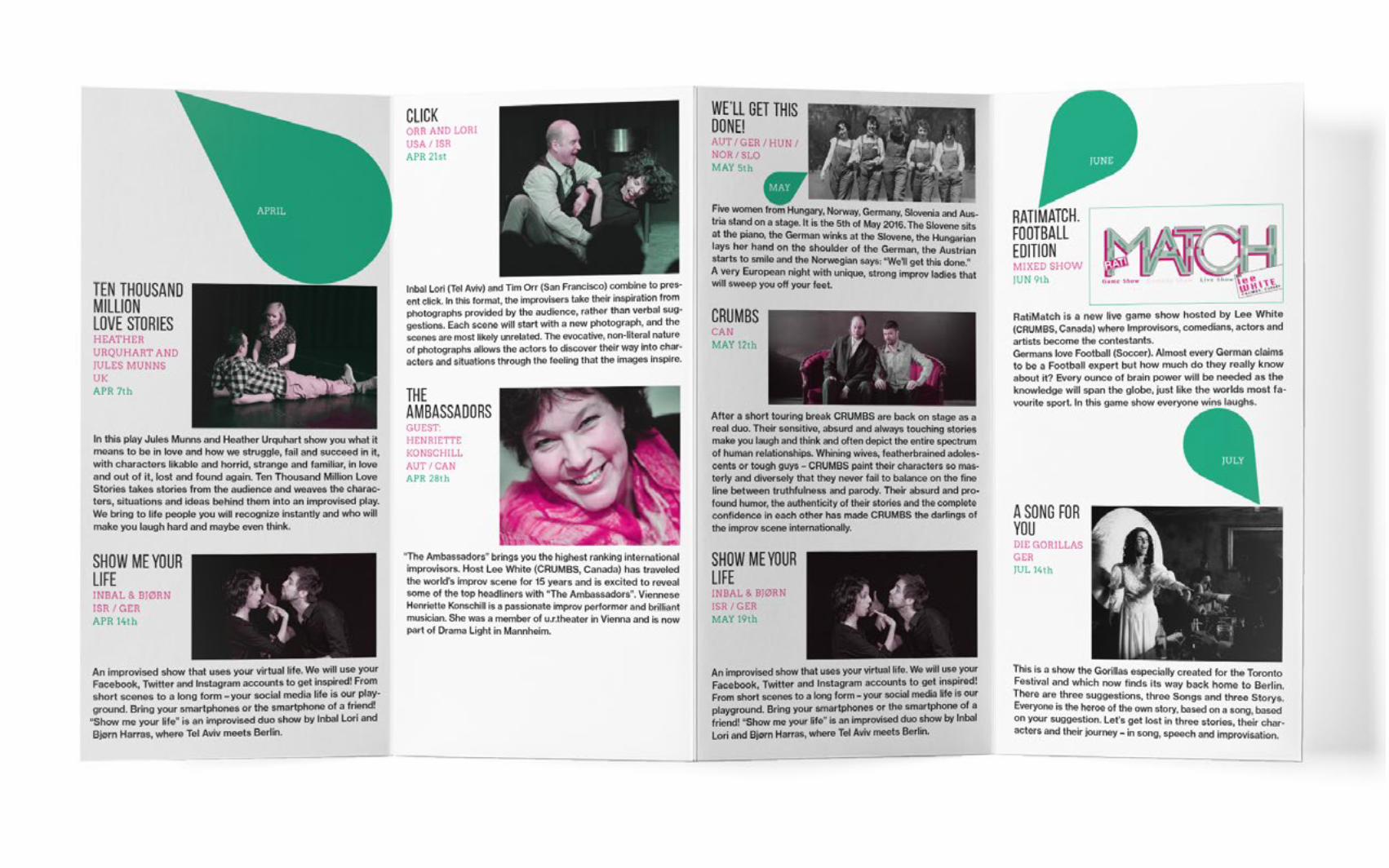
The RATIBOR THEATER is well known for its versatile improvisational theater performances in Berlin. There is no script and no director. There is only the audience’s suggestion and everything else develops on stage. IMPRO EMBASSY is an English show that brings a various international actors together on the stage. The multicolored spotlights shall represent this multicultural gathering in the show.
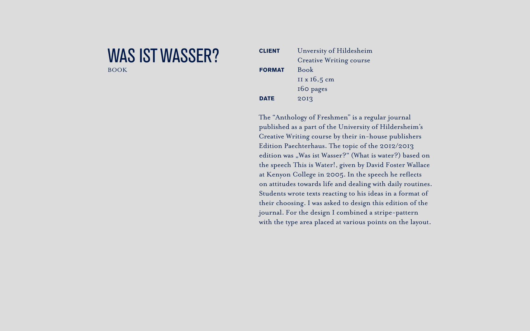
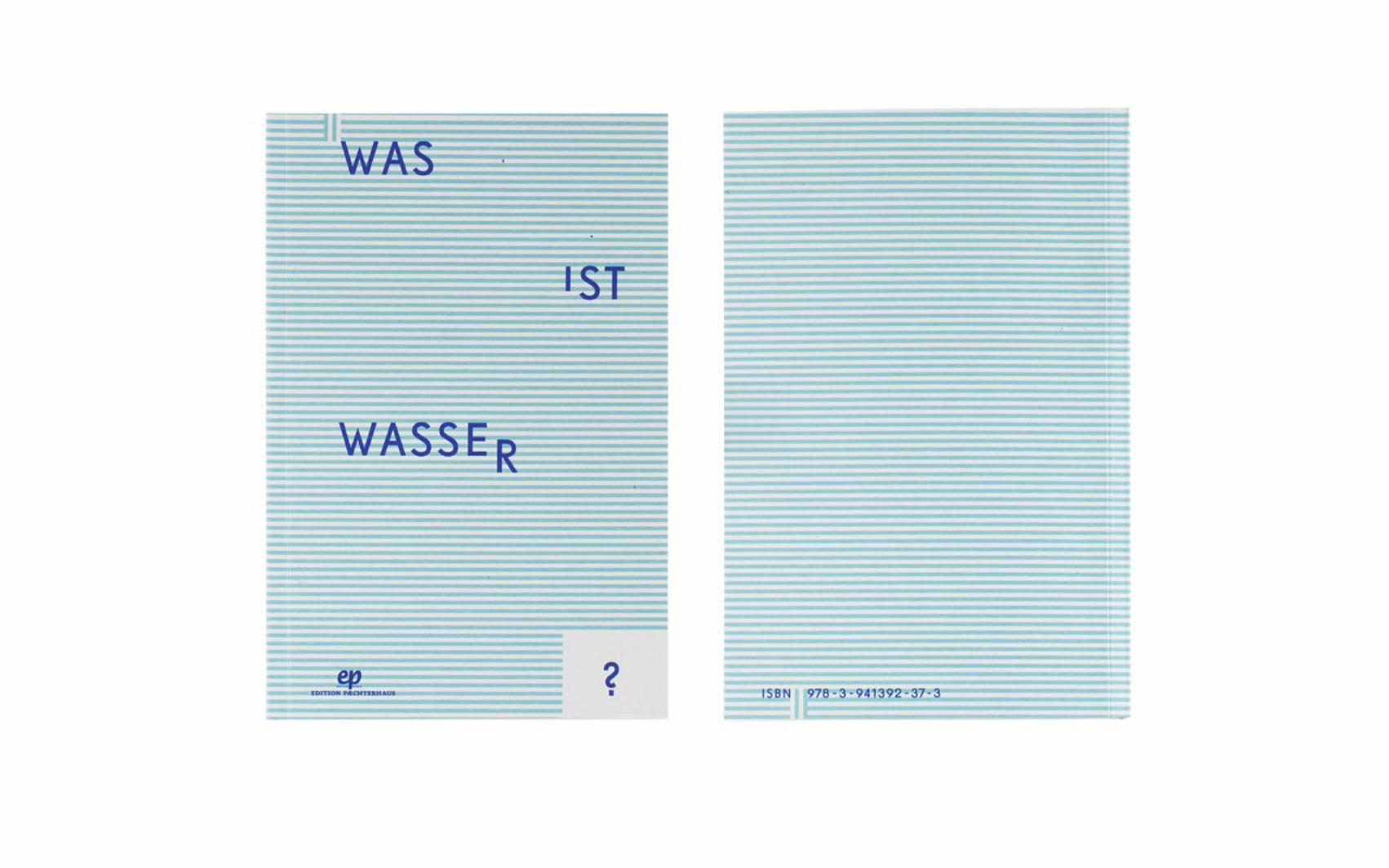
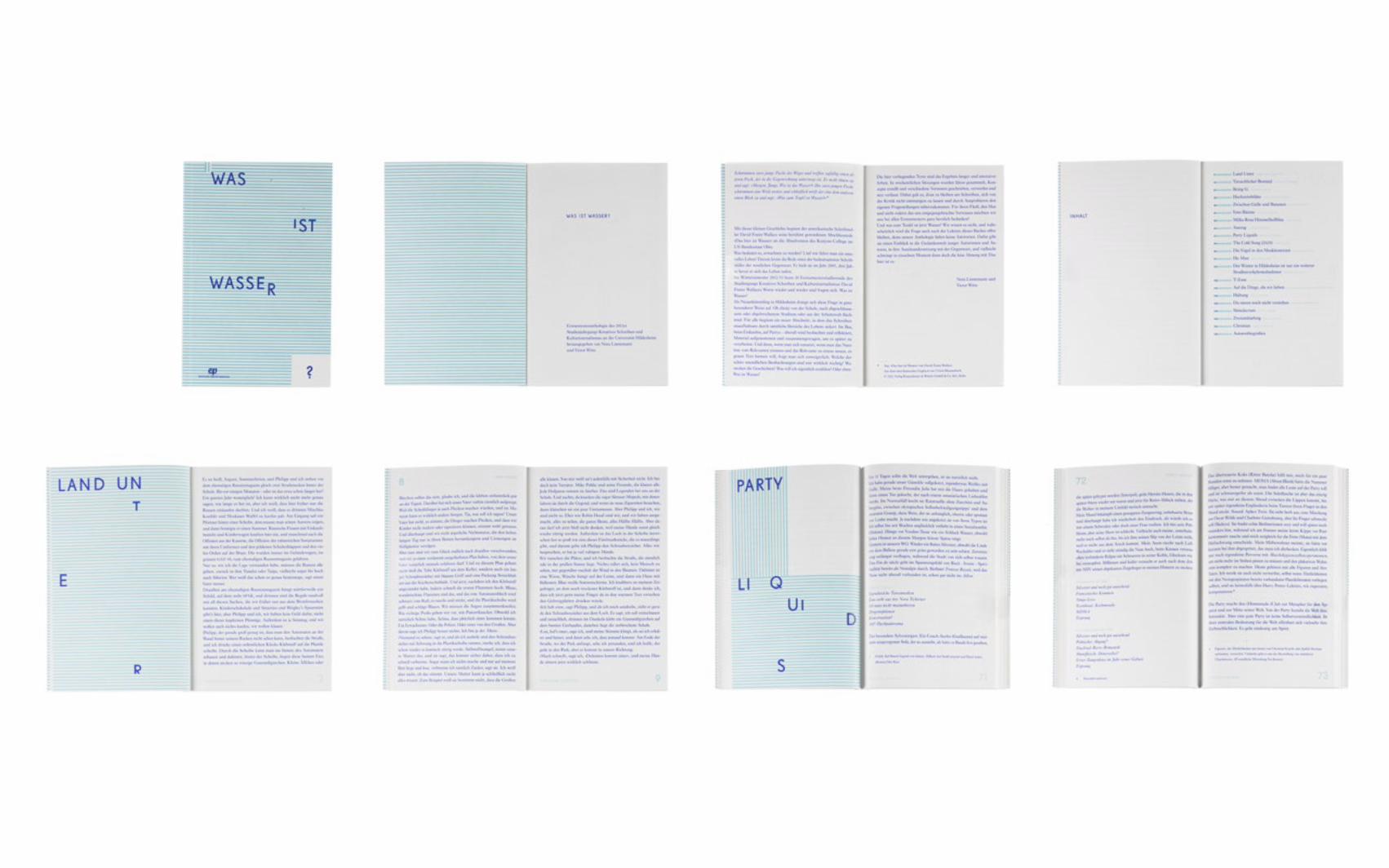
WAS IST WASSER? BOOK
CLIENT Unversity of Hildesheim Creative Writing courseFORMAT Book 11 x 16,5 cm 160 pagesDATE 2013
The “Anthology of Freshmen” is a regular journal published as a part of the University of Hildersheim’s Creative Writing course by their in-house publishers Edition Paechterhaus. The topic of the 2012/2013 edition was „Was ist Wasser?“ (What is water?) based on the speech This is Water!, given by David Foster Wallace at Kenyon College in 2005. In the speech he reflects on attitudes towards life and dealing with daily routines. Students wrote texts reacting to his ideas in a format of their choosing. I was asked to design this edition of the journal. For the design I combined a stripe-pattern with the type area placed at various points on the layout.
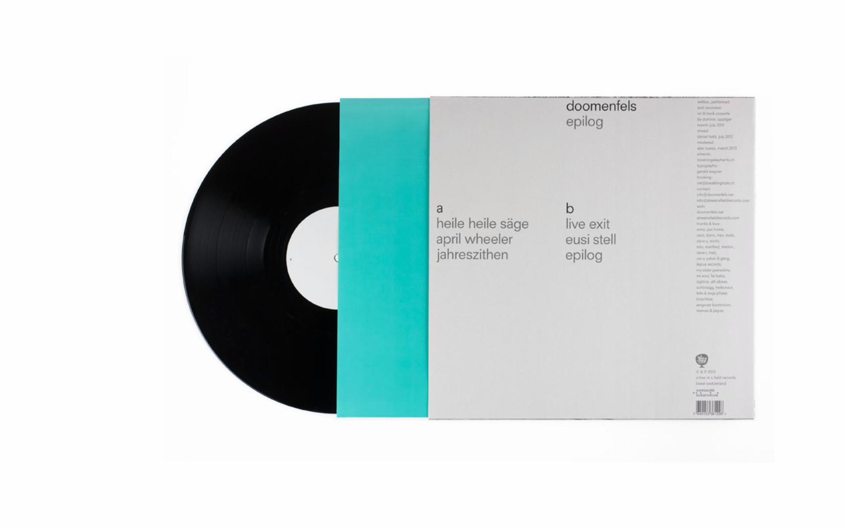
DOOMENFELS LPEPILOGVINYL BACK-COVER + VINYL-LABELS
KUNDE Doomenfels and “It’s Raining Elephants”FORMAT Cover Labels Record sleeve 30 x 30 cm 10 x 10 cm 30 x 30 cmDATE 2013
For the Doomenfels LP I designed the back-cover, record sleeve and vinyl labels for the illustration duo It’s Raining Elephants. The typography and graphic was aimed to be very bright and clear to build a contrast to the cover art.
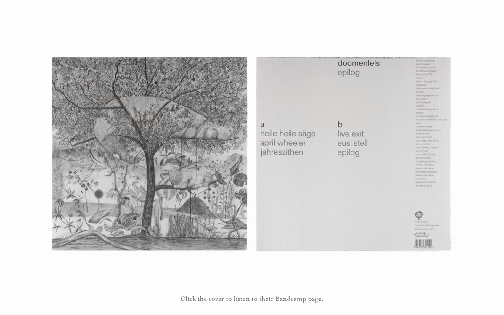
Click the cover to listen to their Bandcamp page.
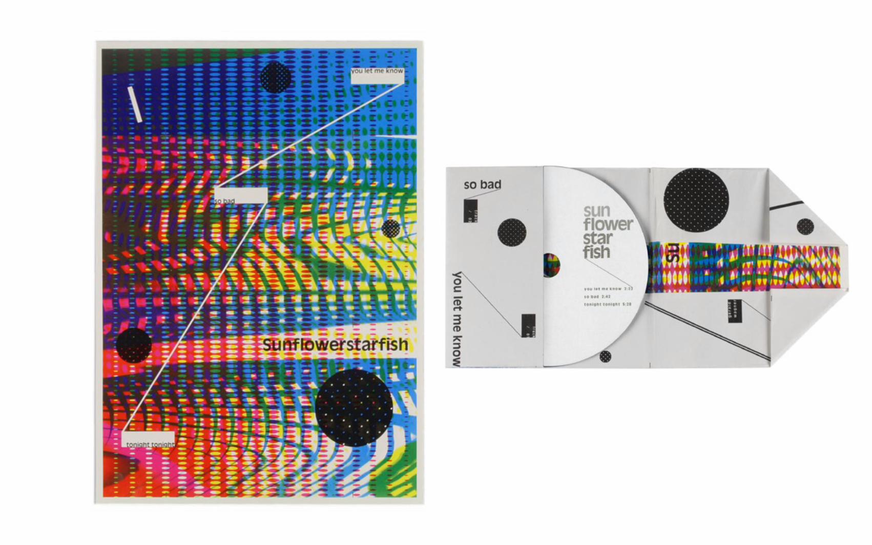
SUNFLOWERSTARFISHCD-COVER + LABEL + POSTER
CLIENT Sunflower Starfisch BandFORMAT CD-Cover/Poster CD-Label 12 x 12 cm (closed) 12 x 12 cm 21 x 29,7cm (open) DATE 2013
Sunflowerstarfish is a pop-lo-fi band from Berlin. A requirement for the cover design the band had to be able to produce the entire project in-house, so every step of the production had to be as simple as possible. The CD-Cover is a simple folded DIN A4 paper sheet and the CD-Label is able to be printed on a home printer with minimal wastage of ink.
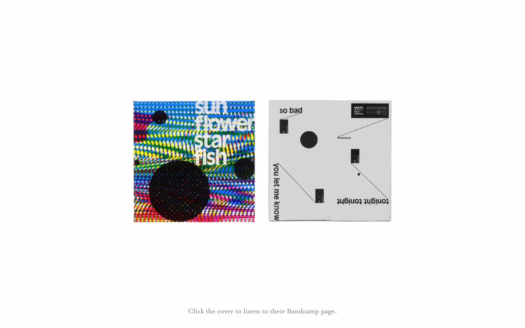
Click the cover to listen to their Bandcamp page.
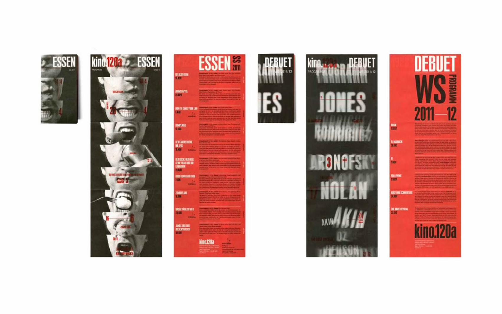
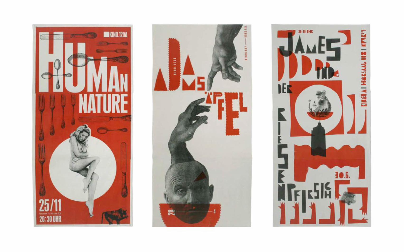
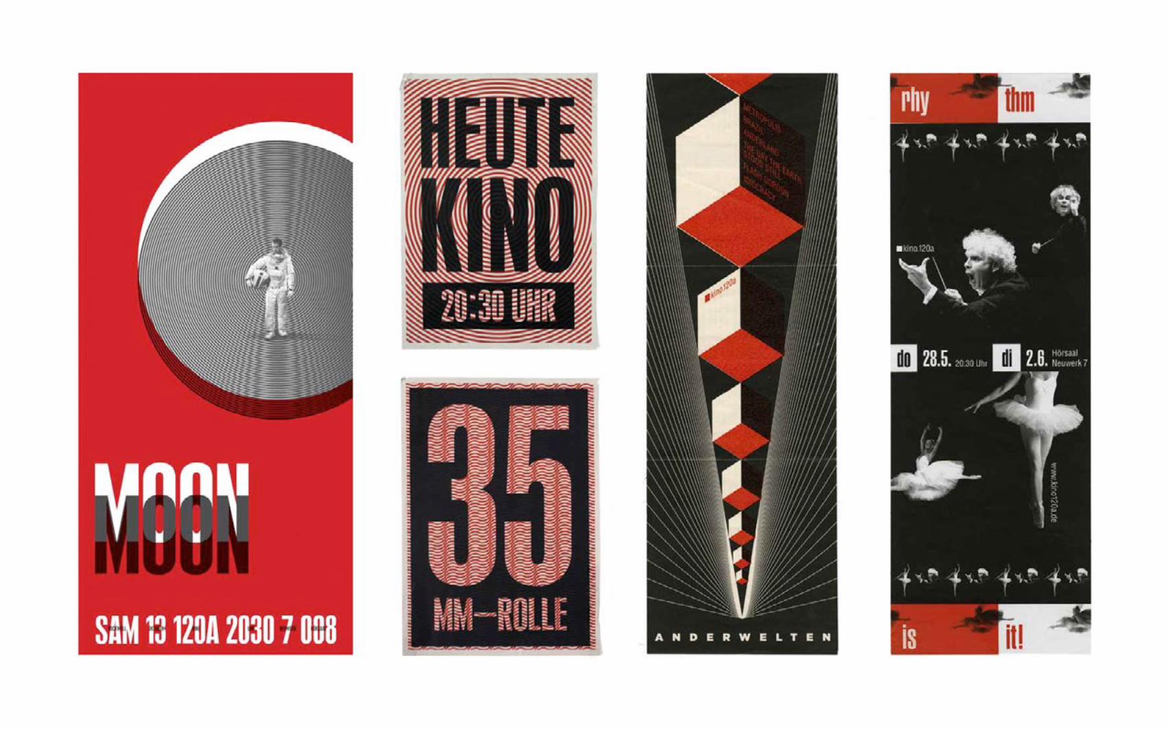
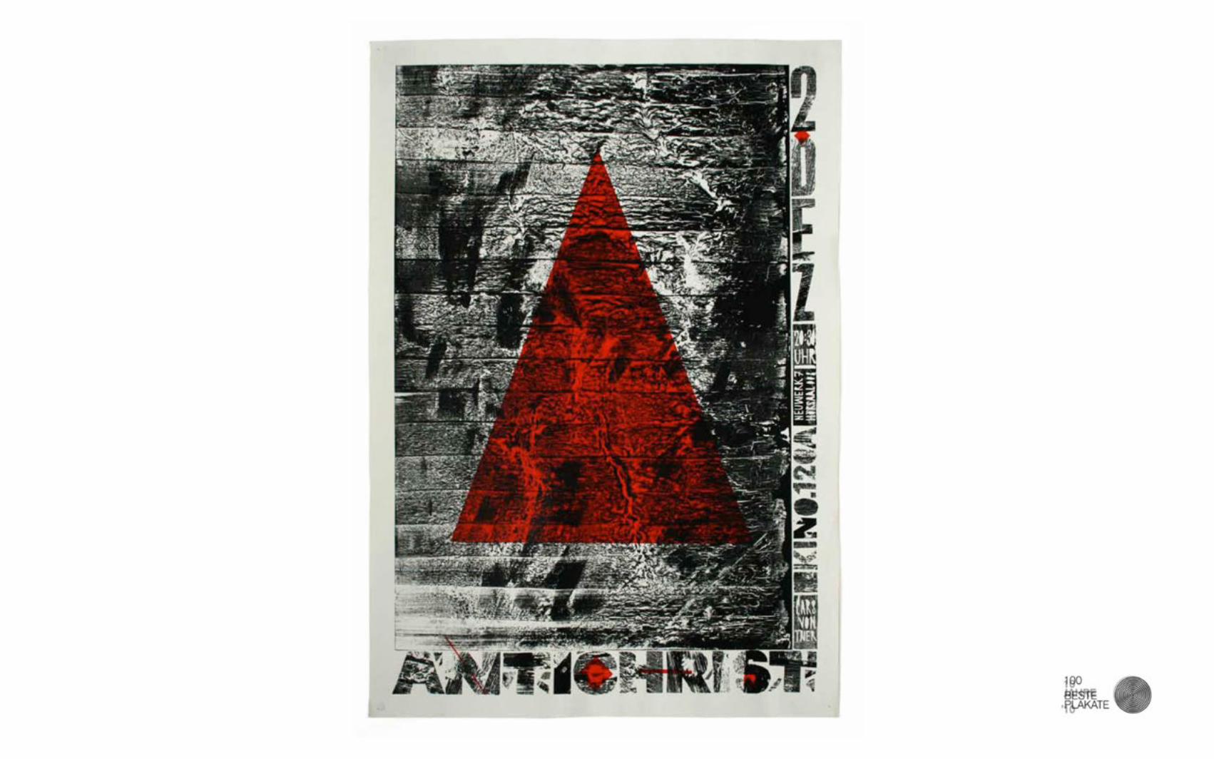
KINO.120APOSTER + FLYER
CLIENT kino.120a Unversity of Art and Design HalleFORMAT Multi-formatDATE 2009-12
I worked for the university cinema from my 2nd until my 5th year of study. Posters and flyers for films were made as a part of the course program by various students. The project outline was deliberately vague so as to enable the participants a broad field of personal expression. Red, black and white were established as base colours and an elongated format was preferred. Productions using both analogue and digital methods were possible.The poster for the movie Antichrist by Lars von Trier was nominated as one of the „100 Besten Plakate ’10“ (100 best posters ’10)
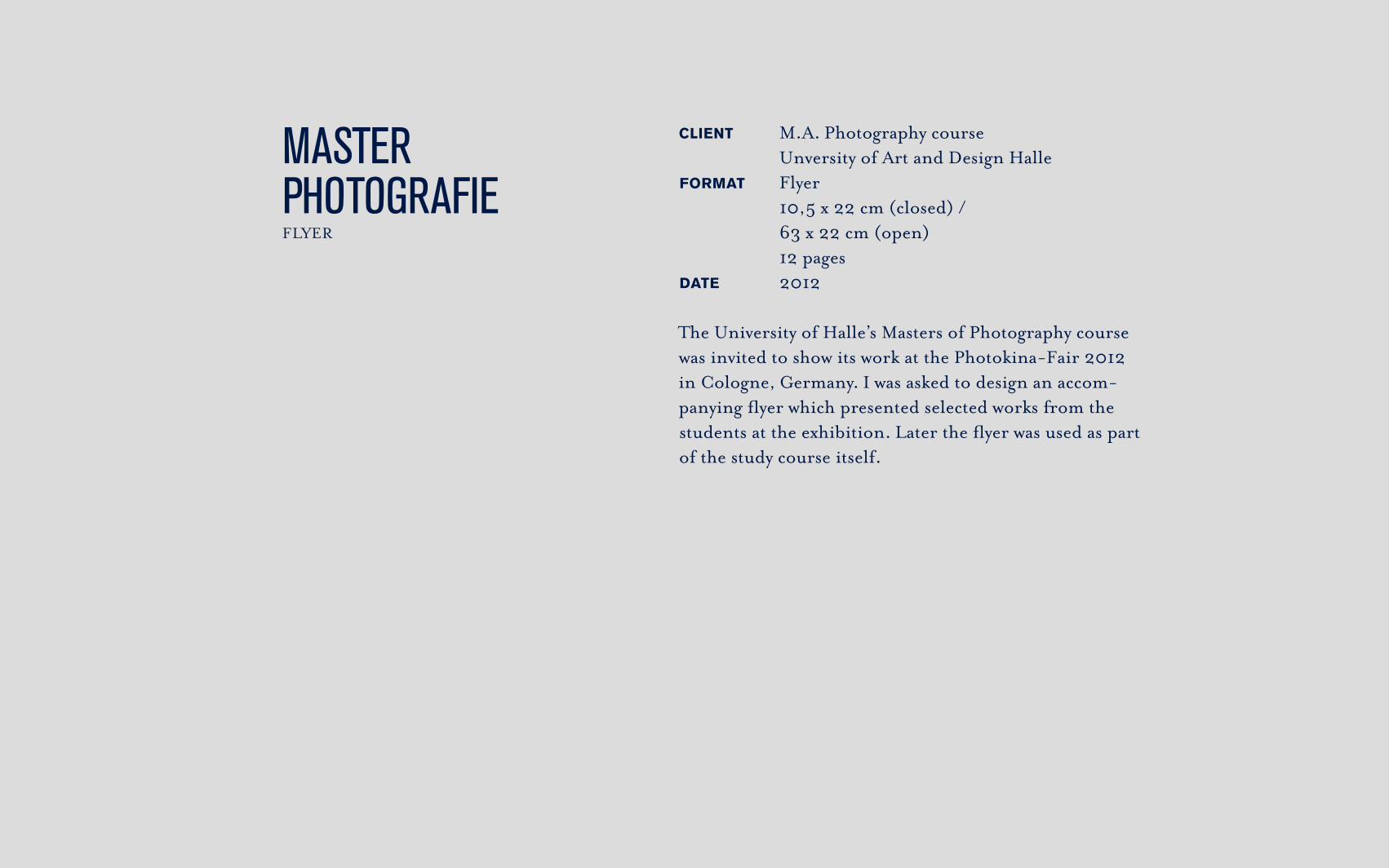
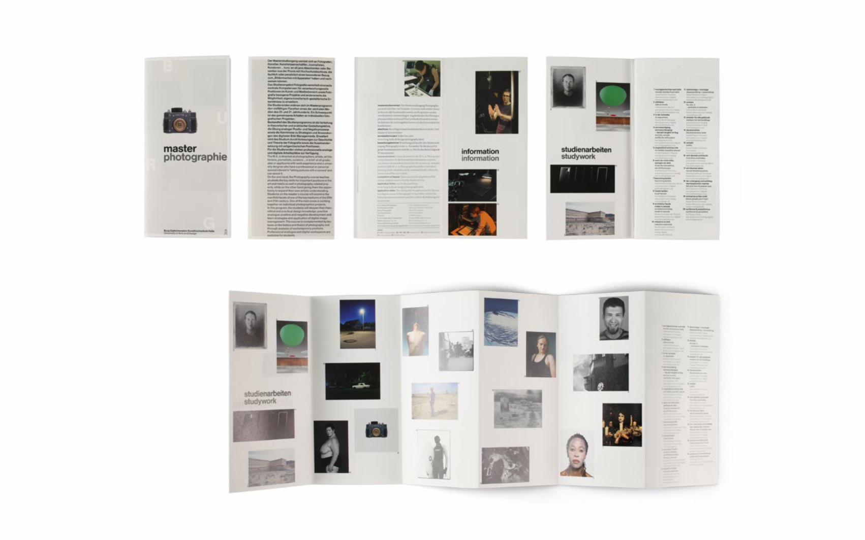
MASTER PHOTOGRAFIE FLYER
CLIENT M.A. Photography course Unversity of Art and Design HalleFORMAT Flyer 10,5 x 22 cm (closed) / 63 x 22 cm (open) 12 pagesDATE 2012
The University of Halle’s Masters of Photography course was invited to show its work at the Photokina-Fair 2012 in Cologne, Germany. I was asked to design an accom-panying flyer which presented selected works from the students at the exhibition. Later the flyer was used as part of the study course itself.
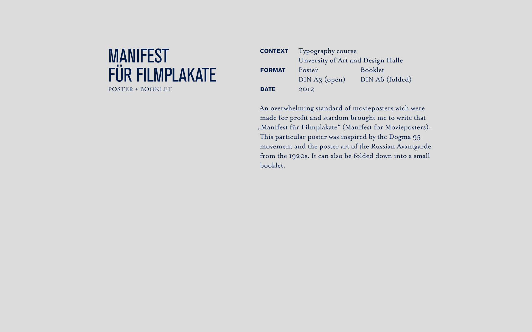
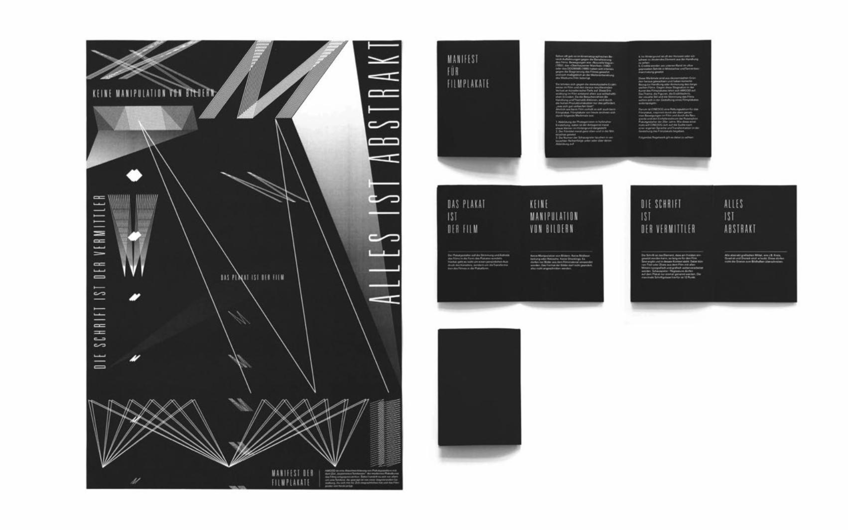
CONTEXT Typography course Unversity of Art and Design HalleFORMAT Poster Booklet DIN A3 (open) DIN A6 (folded)DATE 2012
An overwhelming standard of movieposters wich were made for profit and stardom brought me to write that
„Manifest für Filmplakate“ (Manifest for Movieposters).This particular poster was inspired by the Dogma 95 movement and the poster art of the Russian Avantgarde from the 1920s. It can also be folded down into a small booklet.
MANIFEST FÜR FILMPLAKATEPOSTER + BOOKLET
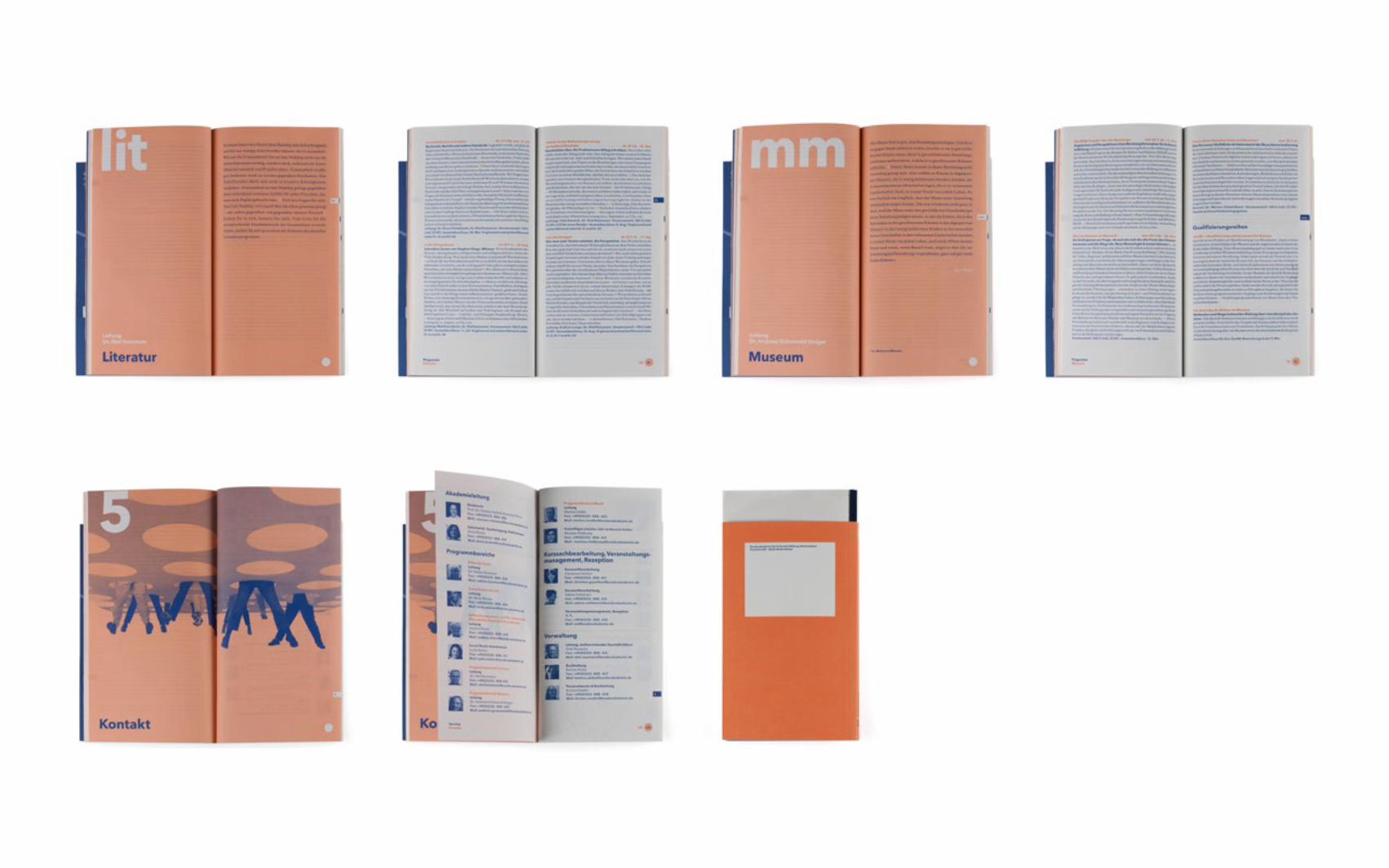
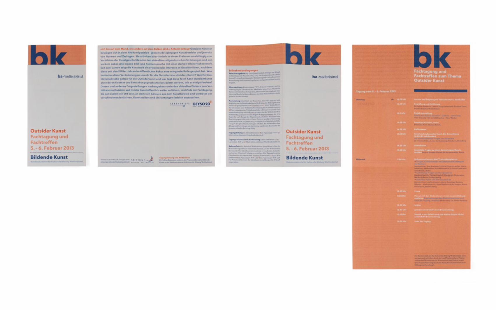
BA.CORPORATE DESIGN
CLIENT Academy of Cultural Education Germany (ba.) and anschlaege.deFORMAT Multi-formatDATE 2013
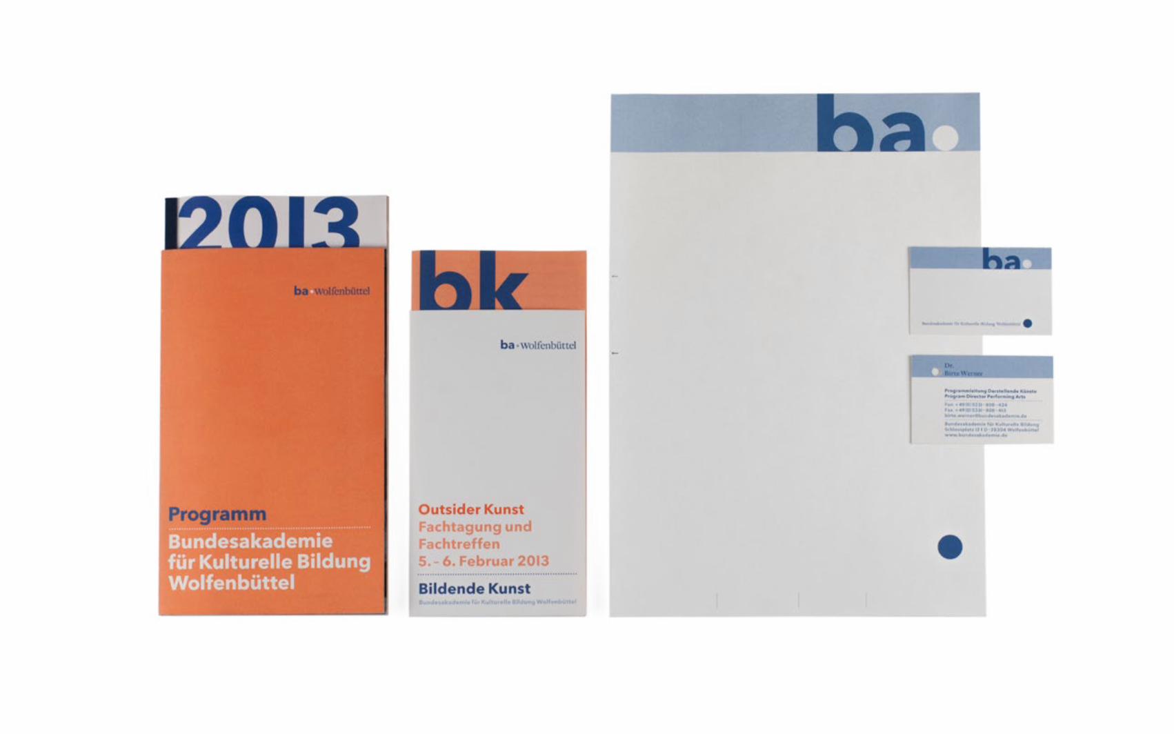
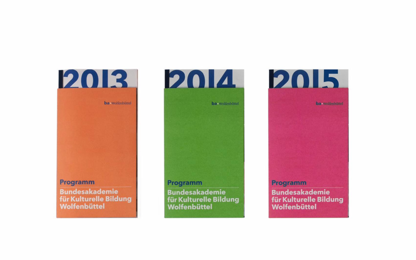
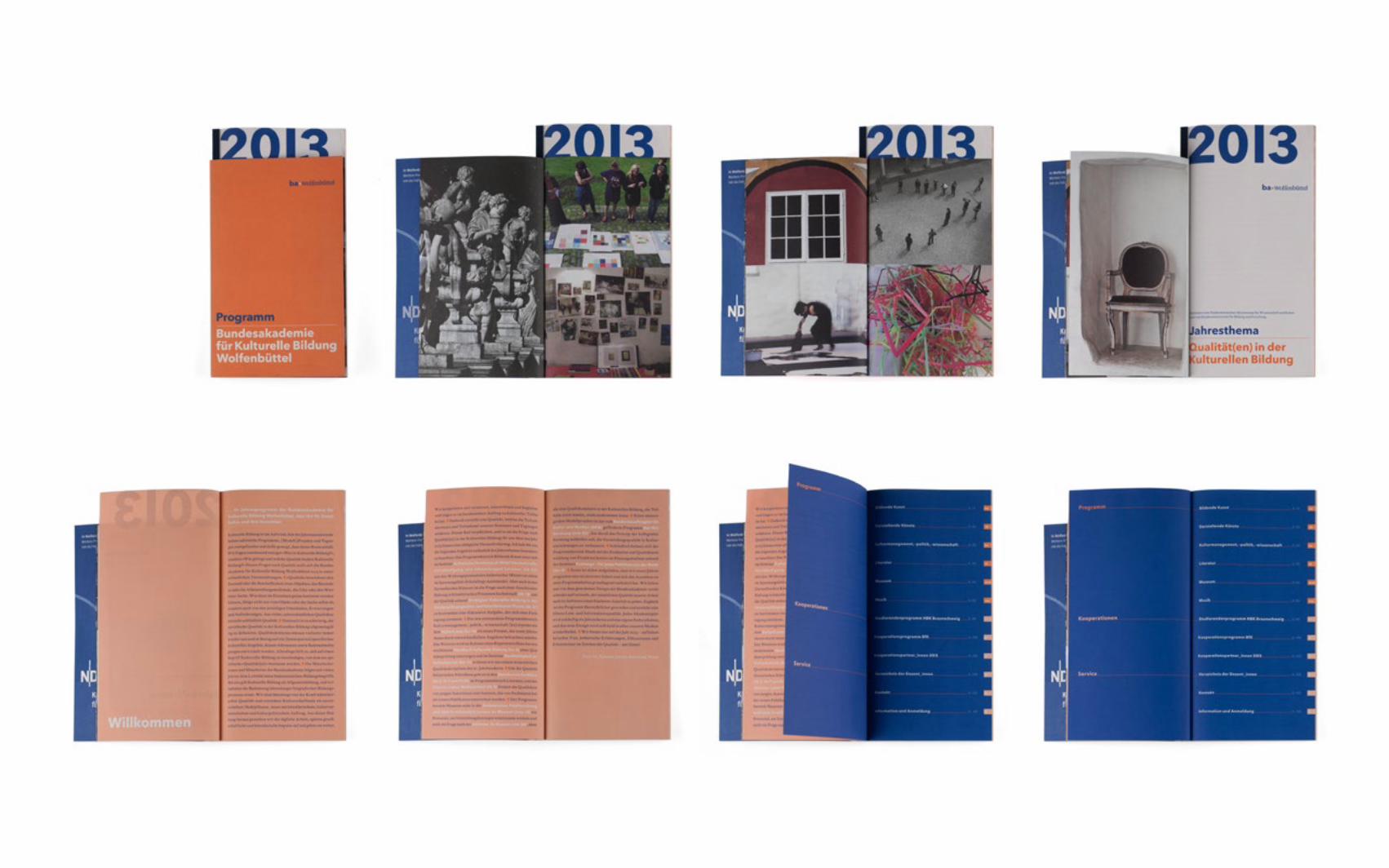
For the grafical appearance of the „Bundesakademie für Kulturelle Bildung“ (Academy of Culural Education Germany) I designed by order of anschlaege.de a graphic concept. For the logo, flyer, programm brochure, etc. I created several masterfiles. The final products were implemented by an house-intern grafic designer. The basic grafic element is a covered headline which becomes fully visible after the opening of the product. The main color is a dark blue, the additional color switches every year.
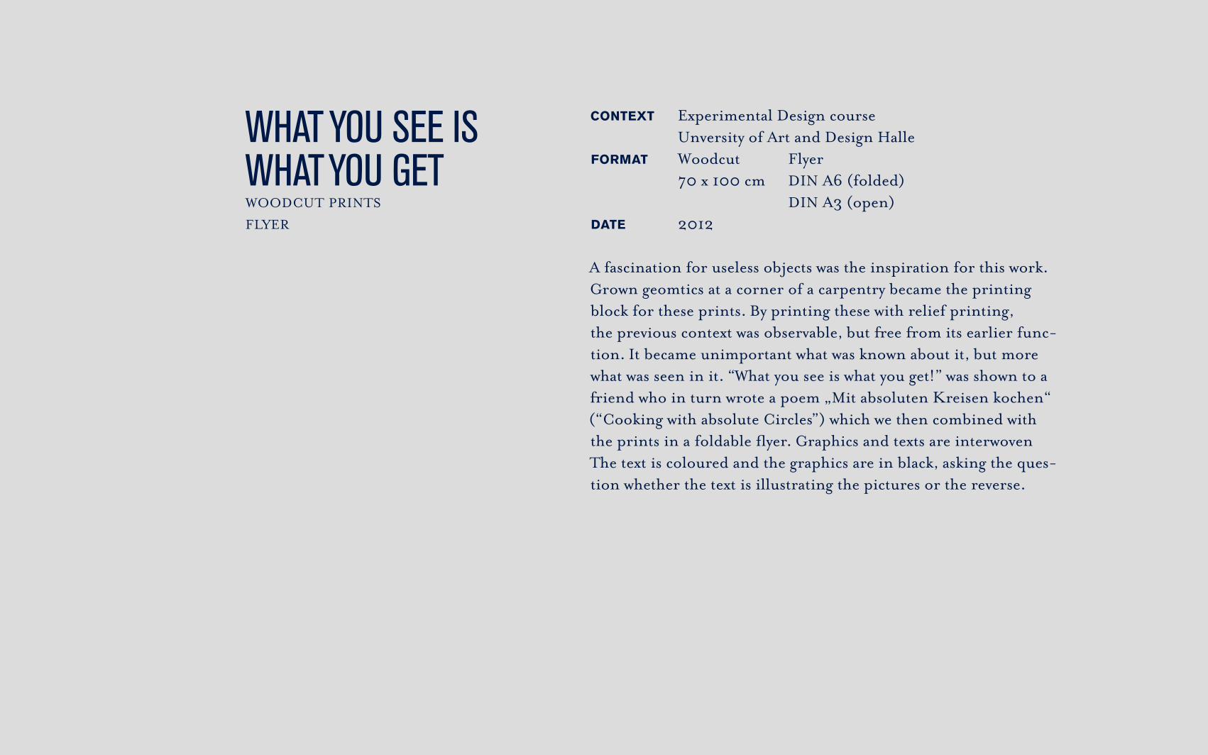
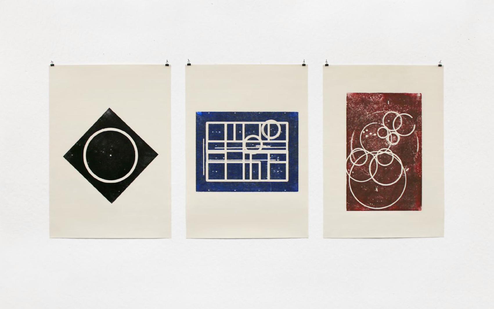
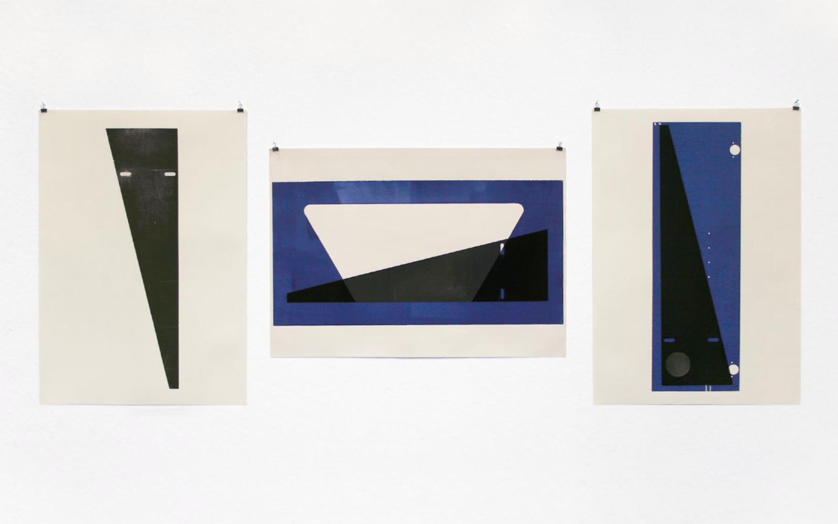
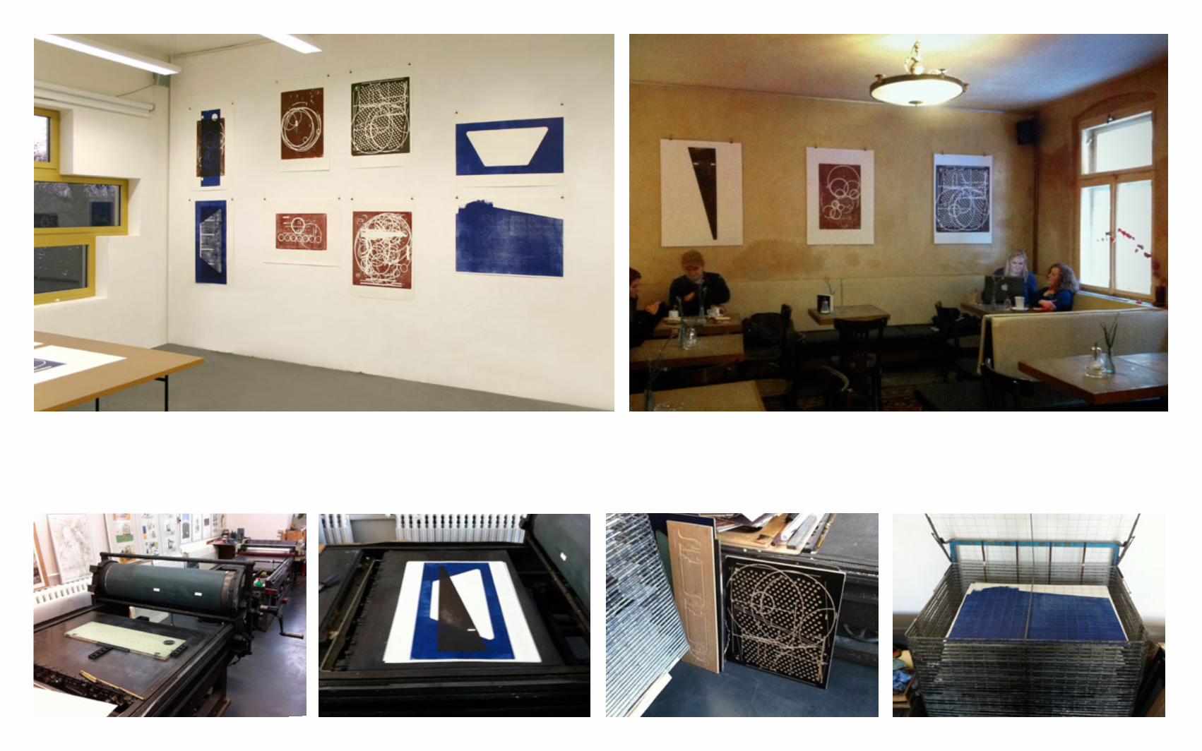
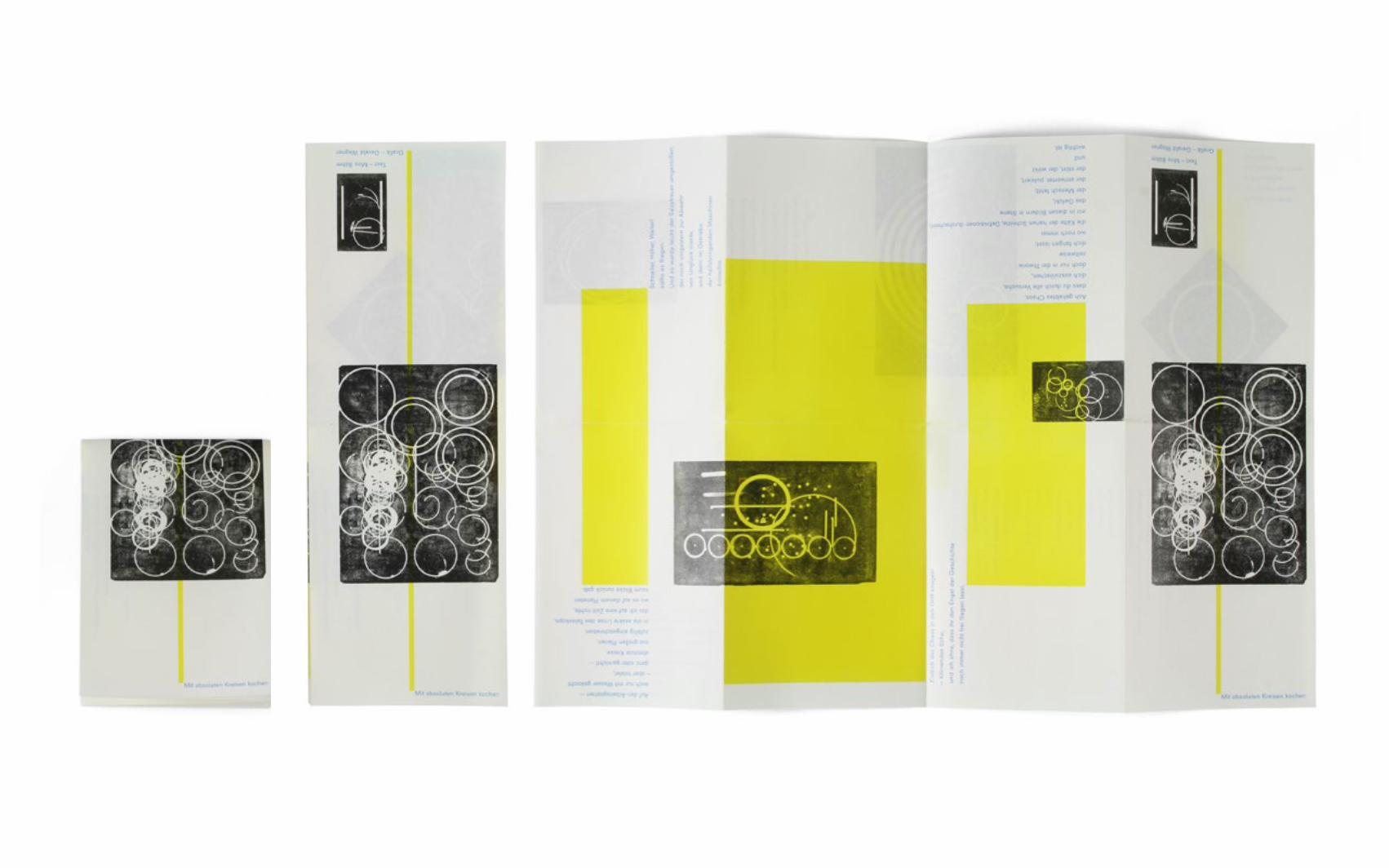
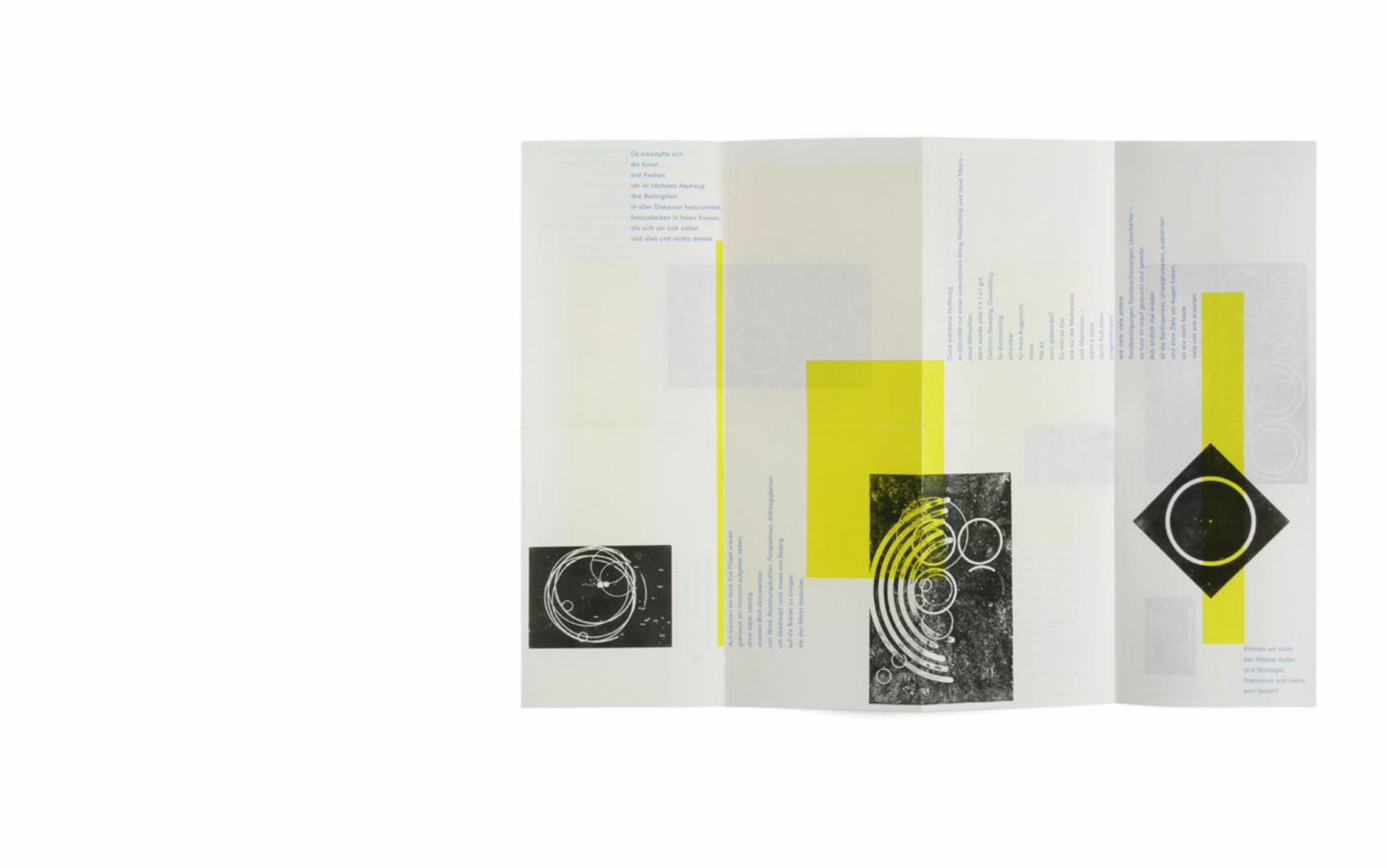
WHAT YOU SEE IS WHAT YOU GETWOODCUT PRINTSFLYER
CONTEXT Experimental Design course Unversity of Art and Design HalleFORMAT Woodcut Flyer 70 x 100 cm DIN A6 (folded) DIN A3 (open)DATE 2012
A fascination for useless objects was the inspiration for this work. Grown geomtics at a corner of a carpentry became the printing block for these prints. By printing these with relief printing, the previous context was observable, but free from its earlier func-tion. It became unimportant what was known about it, but more what was seen in it. “What you see is what you get!” was shown to a friend who in turn wrote a poem „Mit absoluten Kreisen kochen“ (“Cooking with absolute Circles”) which we then combined with the prints in a foldable flyer. Graphics and texts are inter woven The text is coloured and the graphics are in black, asking the ques-tion whether the text is illustrating the pictures or the reverse.
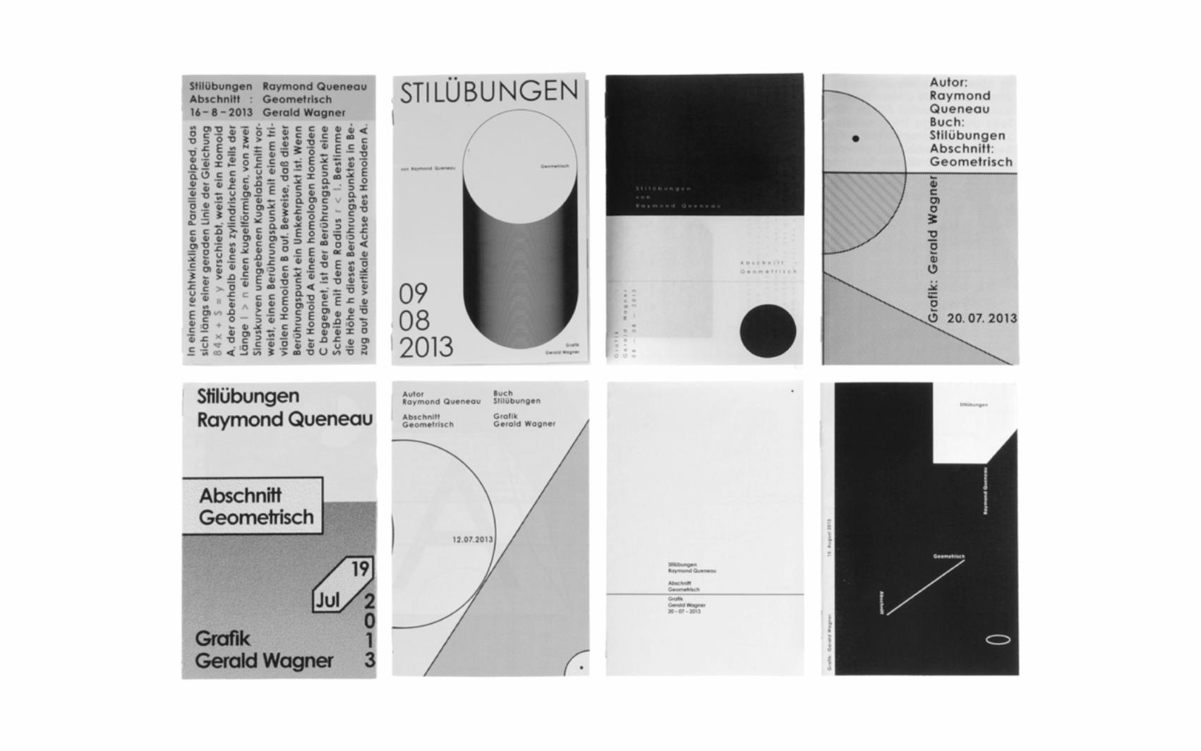
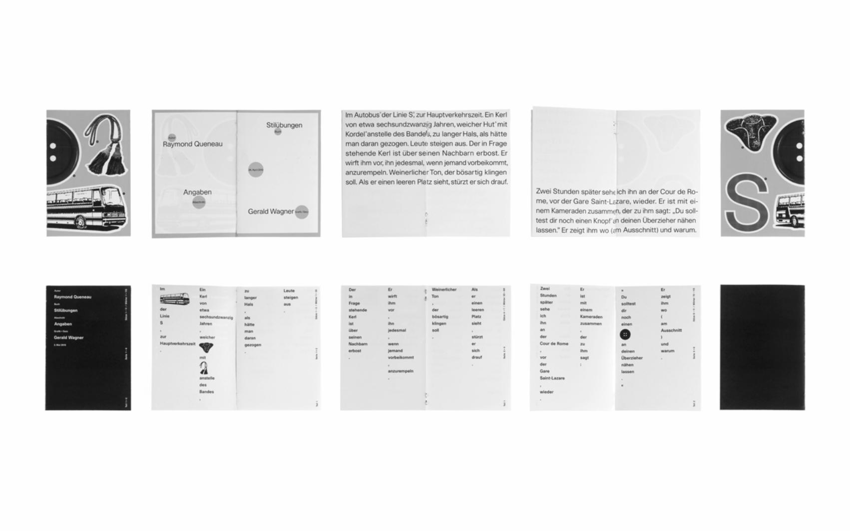
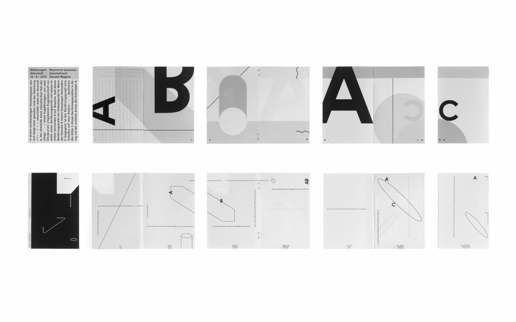
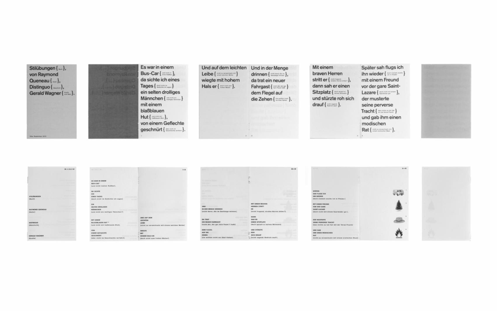
EXERCISE DE STYLEMINIBOOKLET
CONTEXT free typographic exerciseFORMAT DIN A5 (closed) DIN A6 (open) 2 hours per bookletDATE 2013-14
In the book “Exercise de Style” Raymond Queneau wrote an non-specific story in 98 different ways. Inspired by that I started a self-imposed exercise to train on various layout possibilities and diverse fonts within a limited timeframe. A chosen text from his book was placed on eight different layouts. The most important point was not to get bored but to surprise oneself again and again with new solutions to the same issues. In order to solve the exercise in a specific time (2 hours) the graphic elements were extremely limited. No colours, a minimal variation of pictures and only one font family per text!
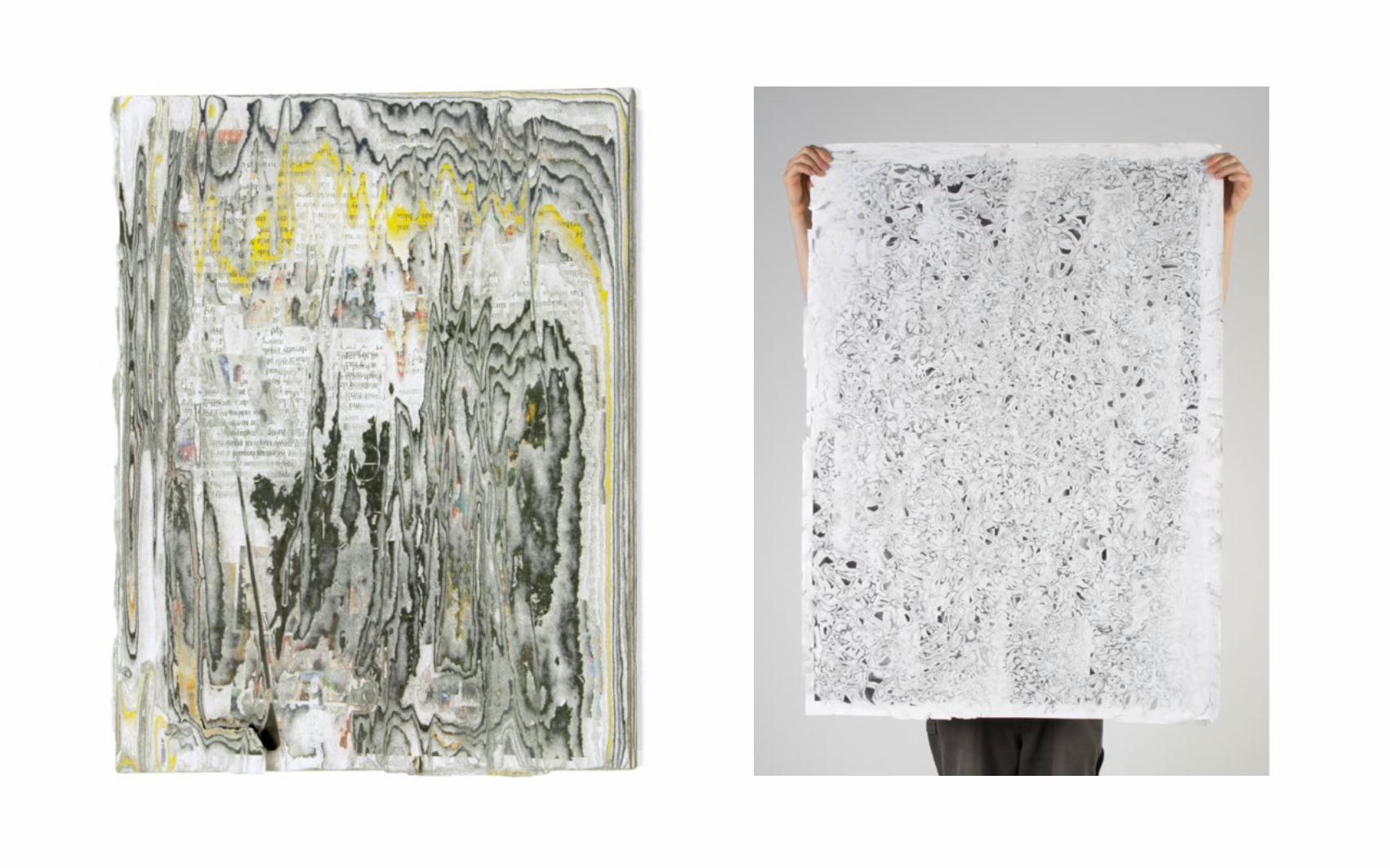
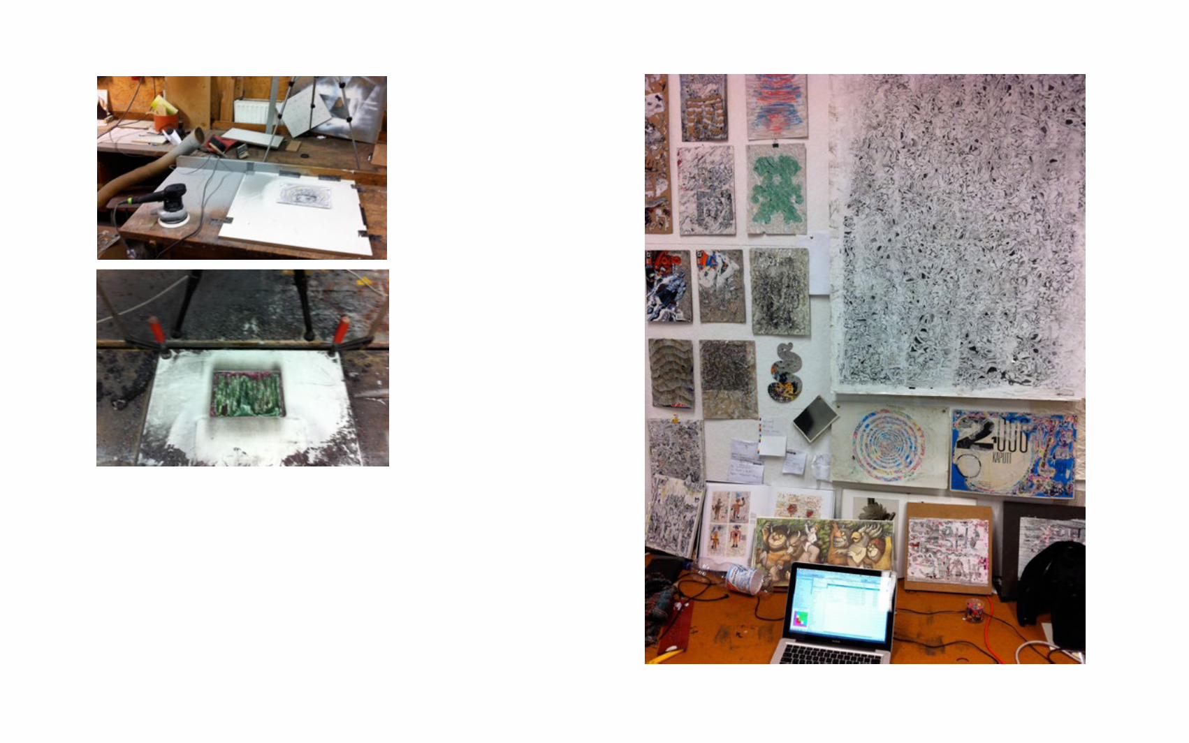
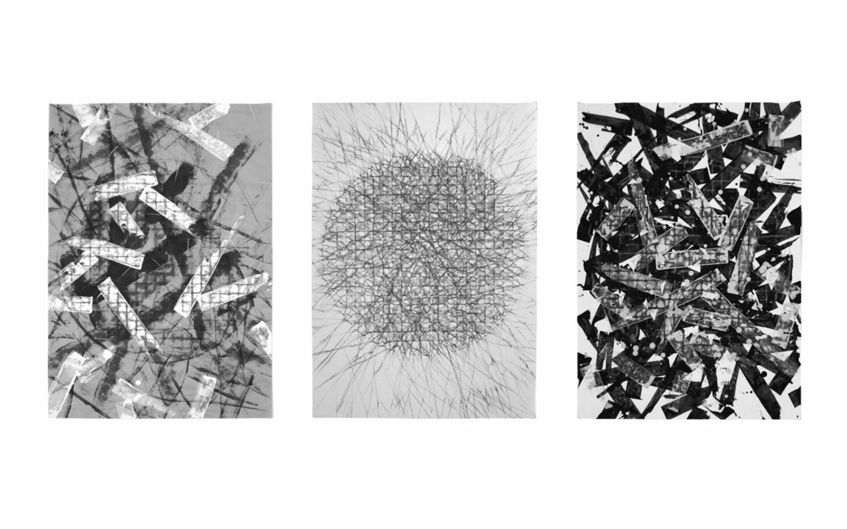
GANZ–KAPUTT STOP-MOTION MUSICVIDEO
CLIENT Drauf&DranFORMAT 720 x 1080 pixel 3:23 minDATE 2012
Drauf&Dran are an elektro DJ-Team from Berlin. For the music video for their Song “Grid” I used the de-collage and stopmotion techniques. The graphics are an advancement of a previous work created as part of my bachelor project at the Kunsthochschule Halle whose topic was the correlation between “totality” and “broken”.
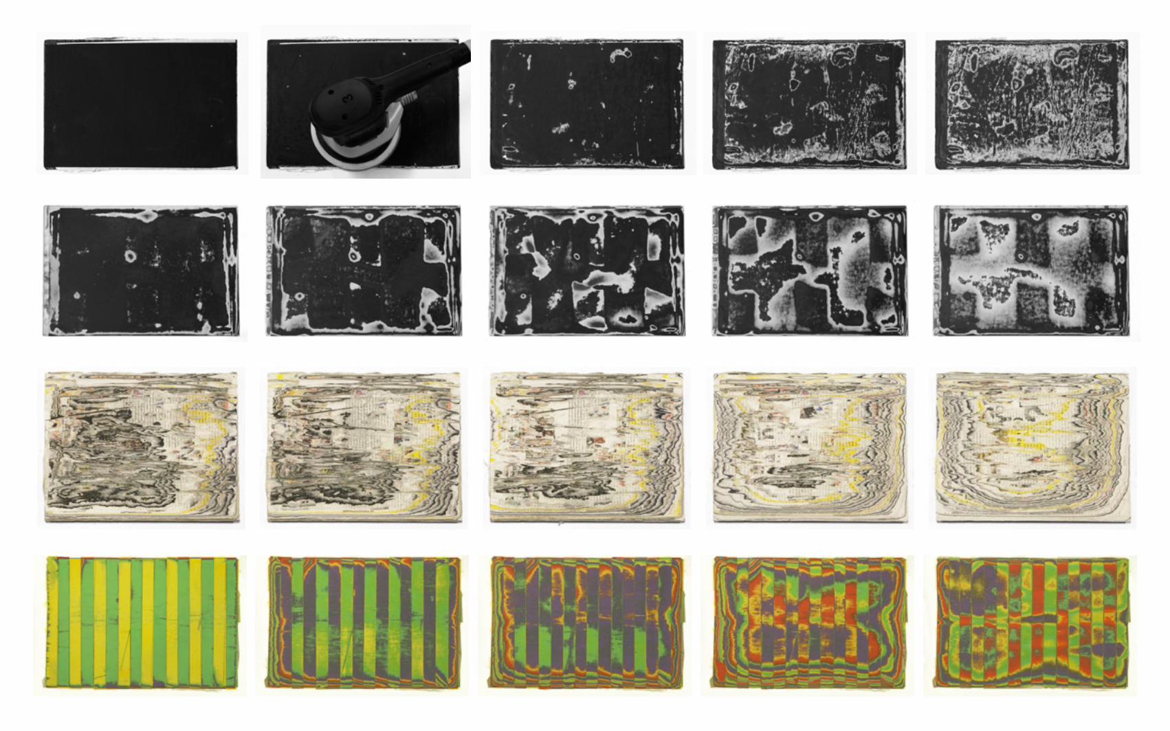
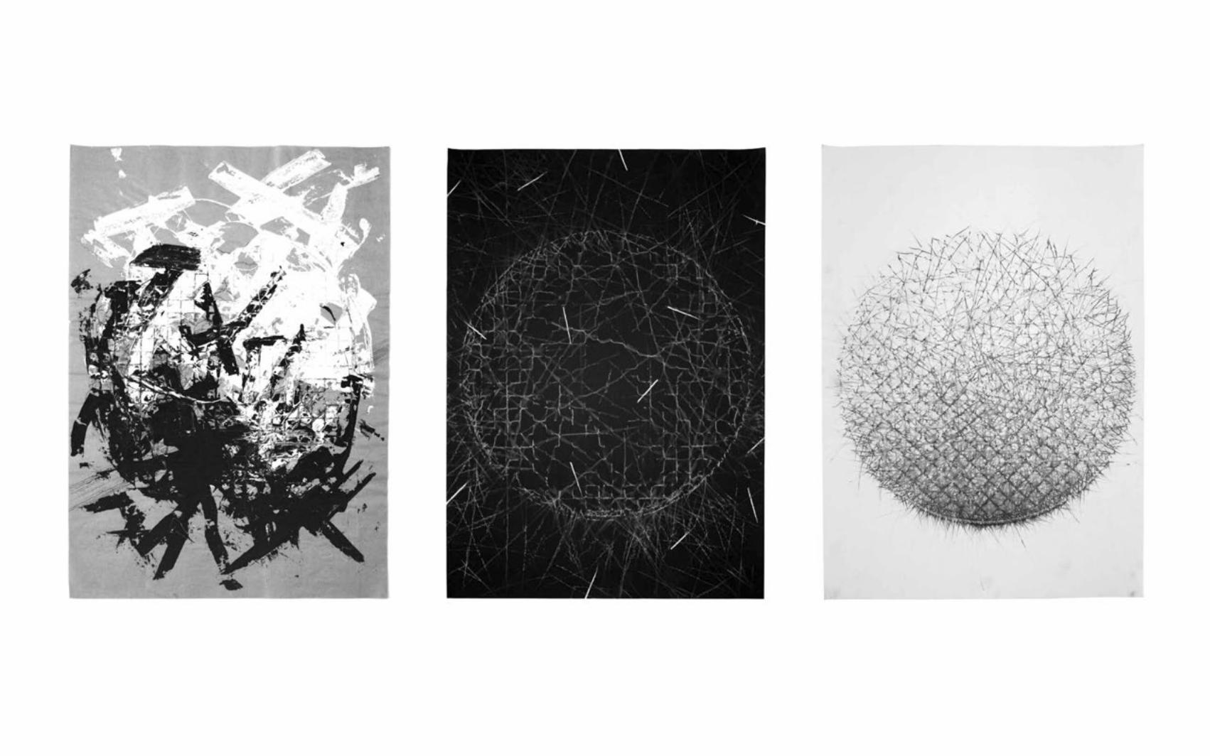
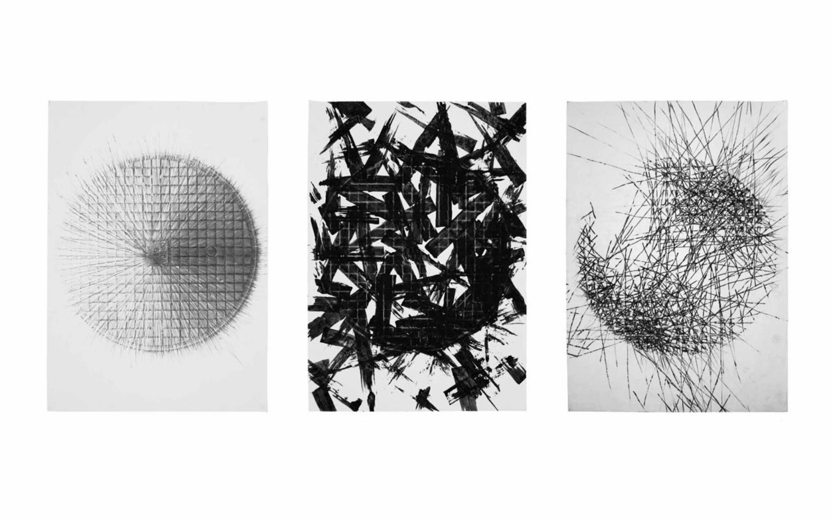
RECORDING WARSAWPAINTINGS
CONTEXT Painting Class University of Fine Arts Warsaw (ASP)FORMAT 70 x 100 cmDATE 2011
This was a trial to record the sound of Warsaw. The manhole cover is a circle, is a part of the street, is a point on a town map. The frottage was here used as a technique to fix a series of moments at variable points and places in Warsaw. To gain a pure impression of the street acoustics it was inperitive to paint directly on the street. The painter then became a documenter who bound movements, sounds and the atmosphere to paper.
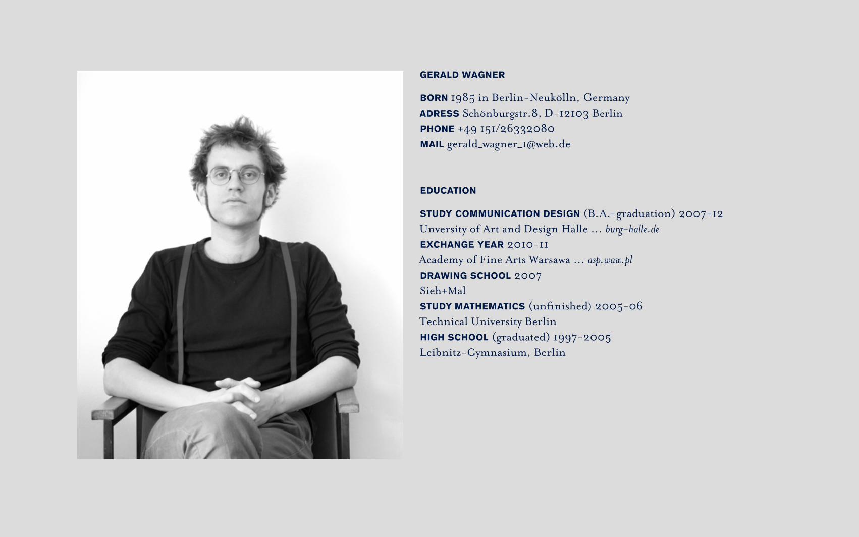
GERALD WAGNER
BORN 1985 in Berlin-Neukölln, Germany ADRESS Schönburgstr.8, D - 12103 BerlinPHONE +49 151/26332080 MAIL [email protected]
EDUCATION
STUDY COMMUNICATION DESIGN (B. A.- graduation) 2007-12 Unversity of Art and Design Halle … burg-halle.deEXCHANGE YEAR 2010-11Academy of Fine Arts Warsawa … asp.waw.plDRAWING SCHOOL 2007Sieh+MalSTUDY MATHEMATICS (unfinished) 2005-06Technical University BerlinHIGH SCHOOL (graduated) 1997-2005Leibnitz-Gymnasium, Berlin
WORK AT AGENCIES
ANSCHLAEGE.DE since 2012 … anschlaege.deGraphic design agency in Berlin-Lichtenberg.Freelancer in range of print products such as creating corporate identities, drafts for pitches, implementing of flyer, brochures and books for diverse clients and supervision of intern. CYAN 2012 … cyan.deLegwork in range of print products.
INTERNSHIPS
UMBRA-DOR 2009 … umbra-dor.deGraphic design agency in Berlin - Pankow. Legwork in range of print products.OTANI GMBH 2007 … otani.deGraphic design agency in Berlin-Fiedenau. Legwork in range of print products.4 LAGIG WEICH 2006 Animation design agency in Berlin-Treptow. First experiences in DTP / 2D-Animation.