Embed Size (px)
Citation preview
Frequency Distributions
Chapter 3
Homework: 1, 2, 3, 12
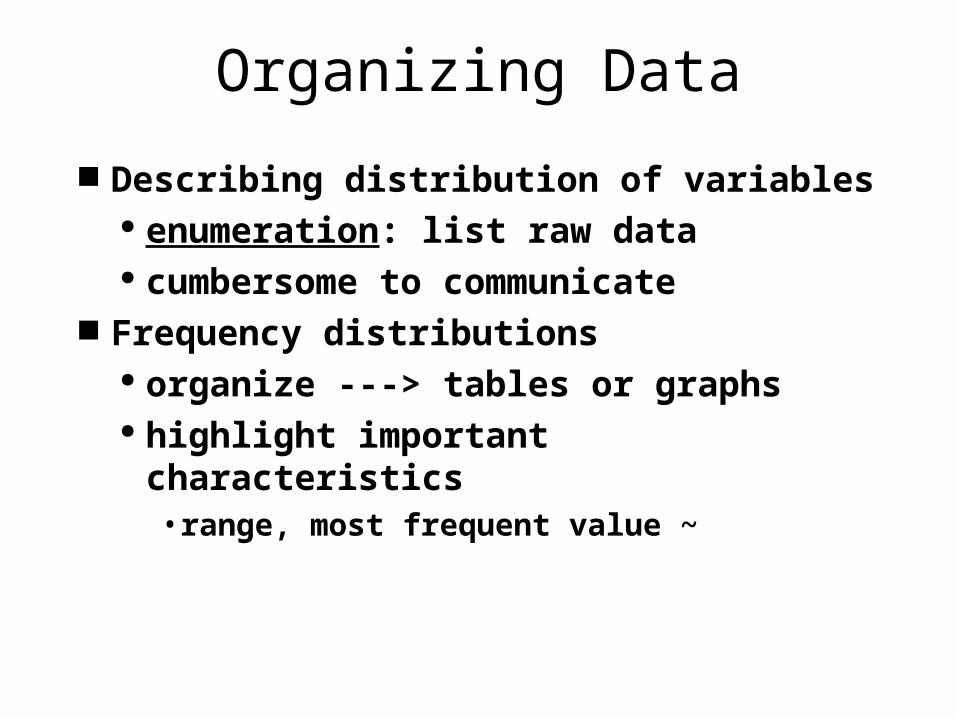
Organizing Data
Describing distribution of variables enumeration: list raw data cumbersome to communicate
Frequency distributions organize ---> tables or graphs highlight important characteristics
• range, most frequent value ~
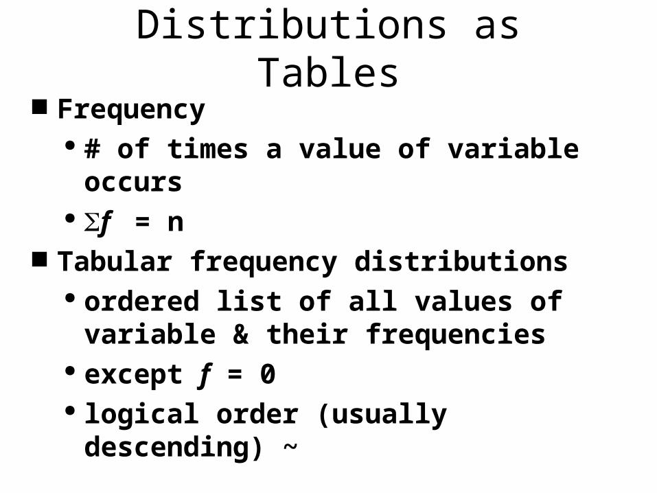
Distributions as Tables Frequency
# of times a value of variable occurs f = n
Tabular frequency distributions ordered list of all values of variable &
their frequencies except f = 0 logical order (usually descending) ~
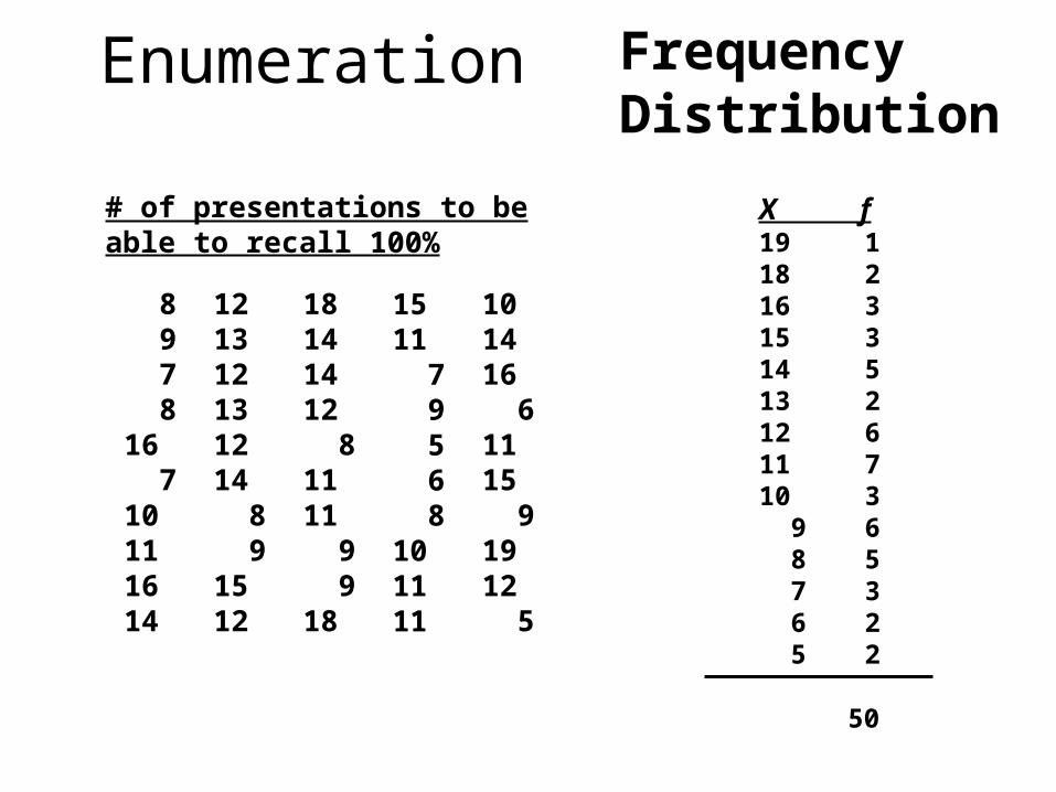
Frequency Distribution
X f19 118 216 315 314 513 212 611 710 3 9 6 8 5 7 3 6 2 5 2
50
# of presentations to be able to recall 100%
8 9 7 816 710111614
121312131214 8 91512
18141412 81111 9 918
1511 7 9 5 6 8101111
101416 61115 91912 5
Enumeration
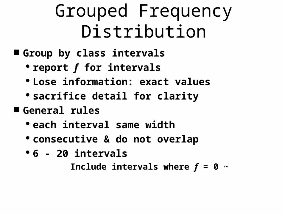
Grouped Frequency Distribution
Group by class intervals report f for intervals Lose information: exact values sacrifice detail for clarity
General rules each interval same width consecutive & do not overlap 6 - 20 intervals
Include intervals where f = 0 ~
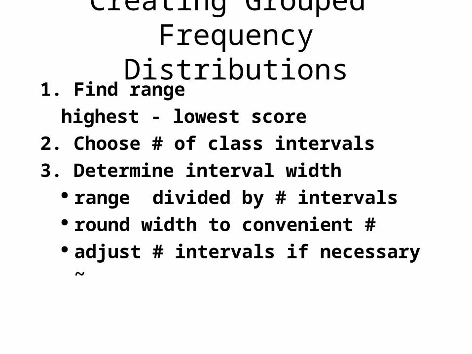
Creating Grouped Frequency Distributions
1. Find range
highest - lowest score
2. Choose # of class intervals
3. Determine interval width range divided by # intervals round width to convenient # adjust # intervals if necessary ~
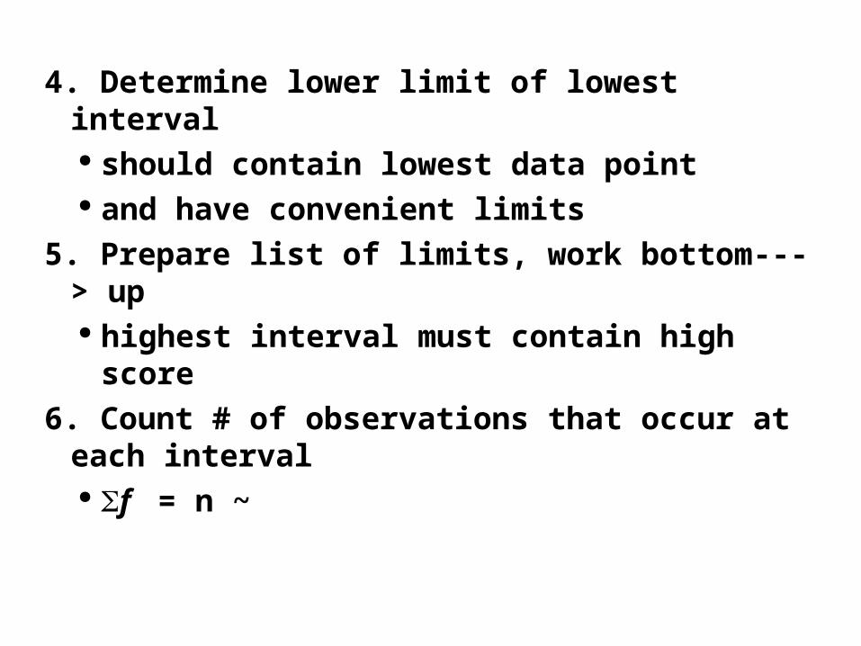
4. Determine lower limit of lowest interval should contain lowest data point and have convenient limits
5. Prepare list of limits, work bottom---> up highest interval must contain high
score
6. Count # of observations that occur at each interval f = n ~
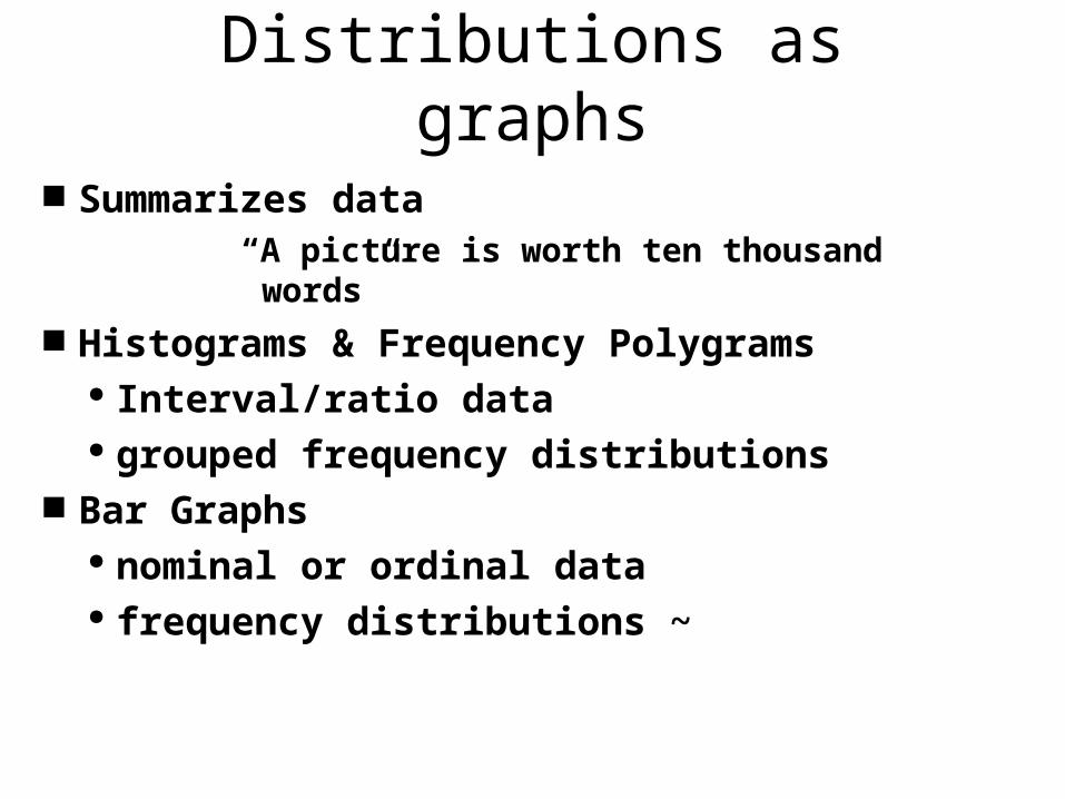
Distributions as graphs
Summarizes data “A picture is worth ten thousand words”
Histograms & Frequency Polygrams Interval/ratio data grouped frequency distributions
Bar Graphs nominal or ordinal data frequency distributions ~
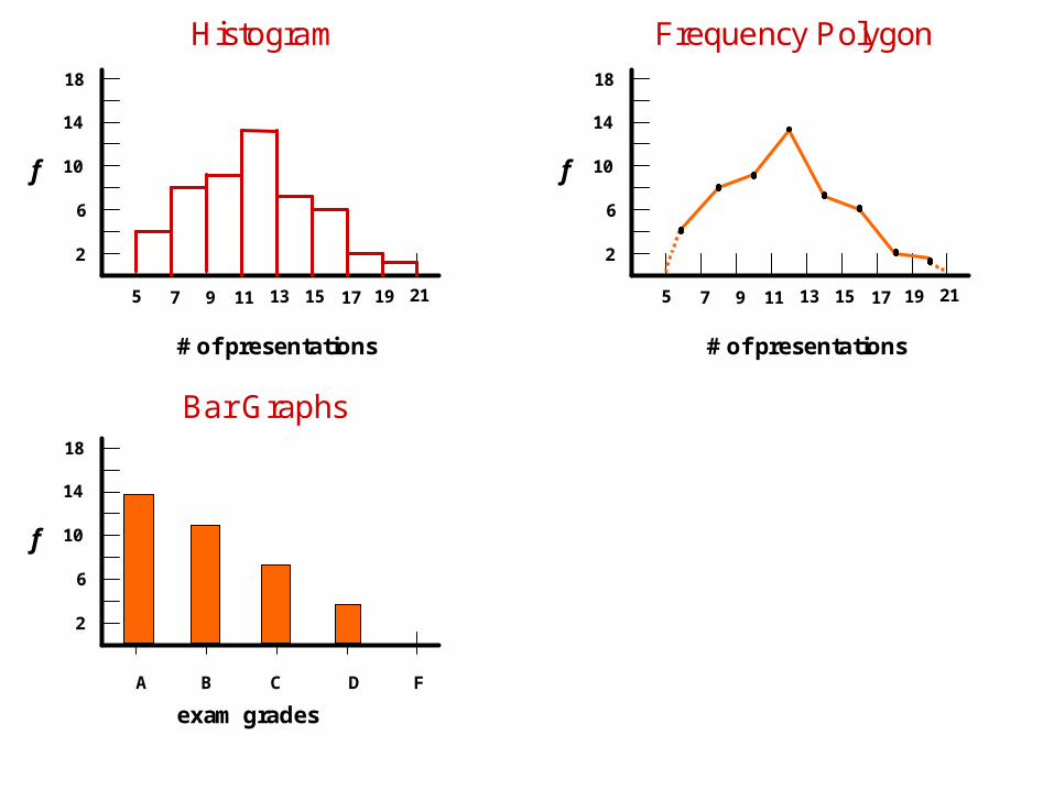
Bar Graphs
f
exam grades
2
6
10
14
18
A B C D F
Frequency Polygon
f
# of presentations
2
6
10
14
18
5 7 9 11 13 15 17 19 21
Histogram
f
# of presentations
2
6
10
14
18
5 7 9 11 13 15 17 19 21
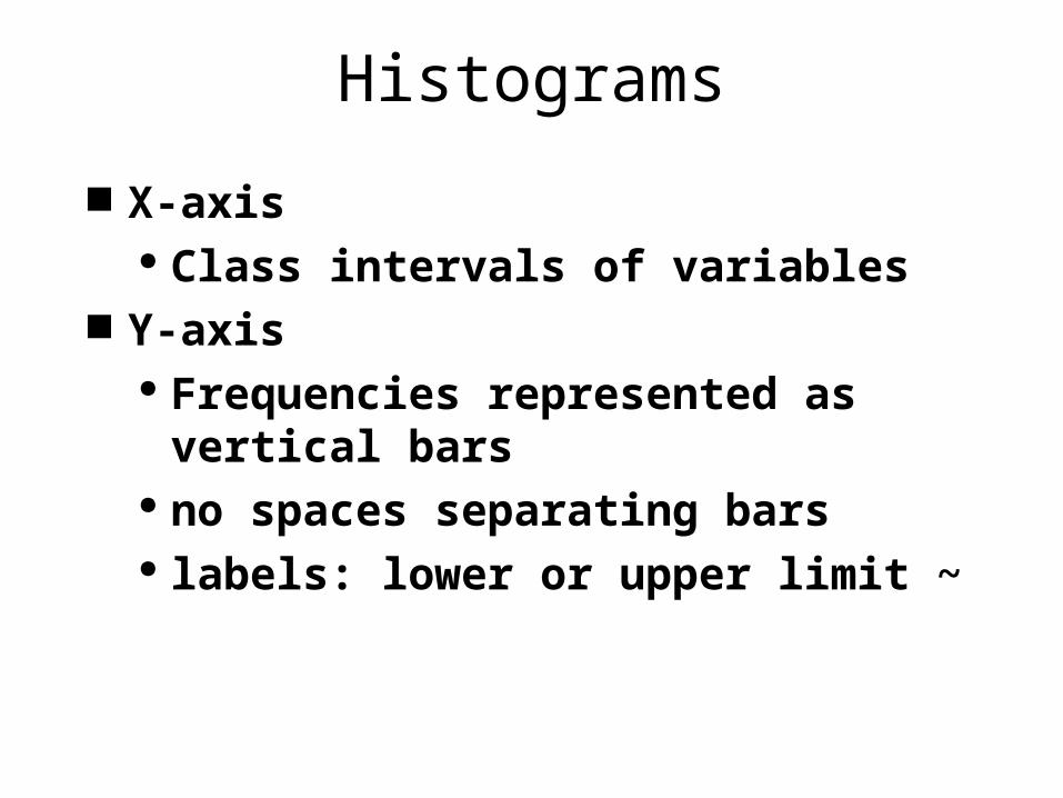
Histograms
X-axis Class intervals of variables
Y-axis Frequencies represented as
vertical bars no spaces separating bars labels: lower or upper limit ~
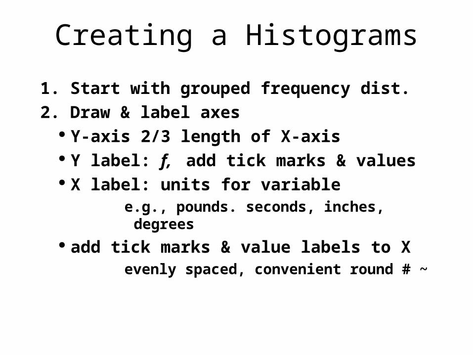
Creating a Histograms
1. Start with grouped frequency dist.
2. Draw & label axes Y-axis 2/3 length of X-axis Y label: f, add tick marks & values X label: units for variable
e.g., pounds. seconds, inches, degrees add tick marks & value labels to X
evenly spaced, convenient round # ~
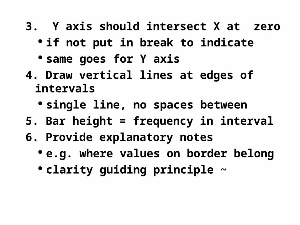
3. Y axis should intersect X at zero if not put in break to indicate same goes for Y axis
4. Draw vertical lines at edges of intervals single line, no spaces between
5. Bar height = frequency in interval
6. Provide explanatory notes e.g. where values on border belong clarity guiding principle ~
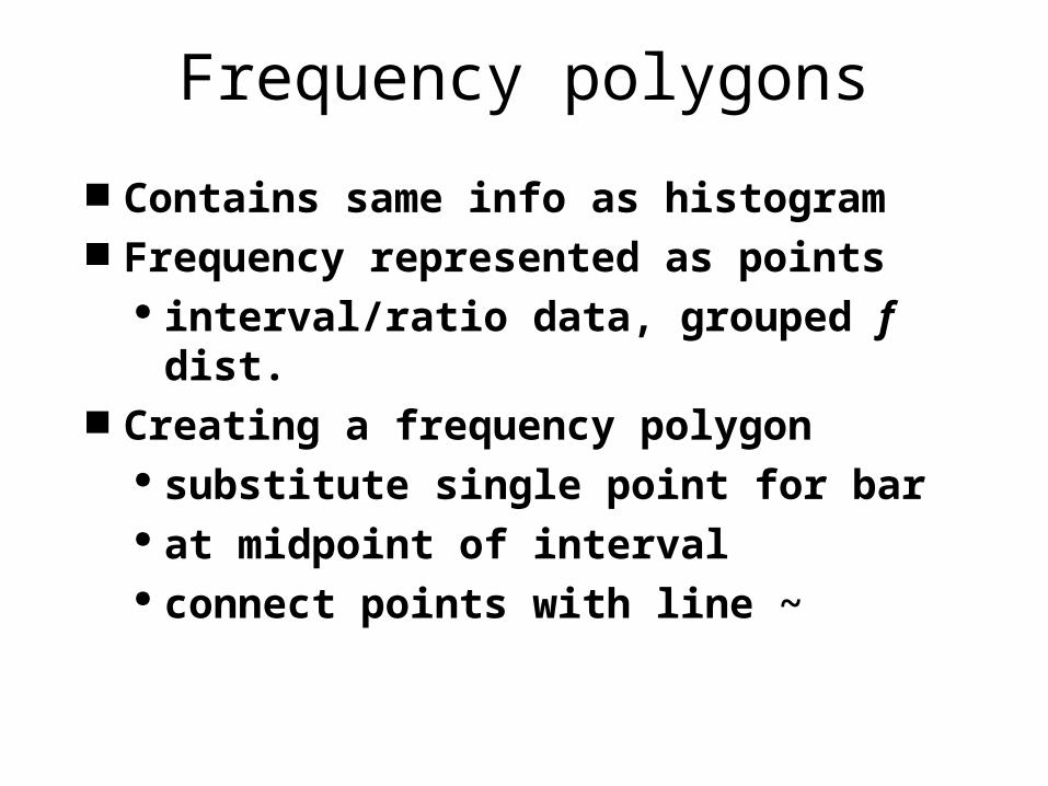
Frequency polygons
Contains same info as histogram Frequency represented as points
interval/ratio data, grouped f dist. Creating a frequency polygon
substitute single point for bar at midpoint of interval connect points with line ~
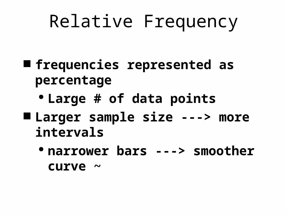
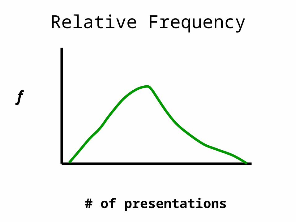
Relative Frequency
frequencies represented as percentage Large # of data points
Larger sample size ---> more intervals narrower bars ---> smoother curve ~
Relative Frequency
# of presentations
f
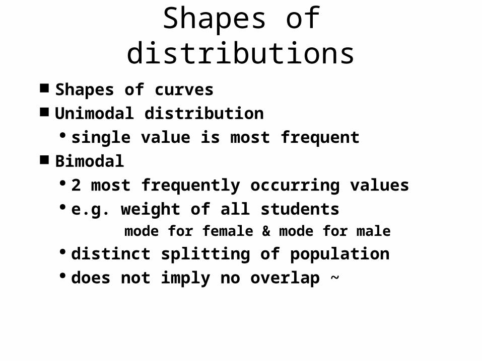
Shapes of distributions
Shapes of curves Unimodal distribution
single value is most frequent Bimodal
2 most frequently occurring values e.g. weight of all students
mode for female & mode for male distinct splitting of population does not imply no overlap ~
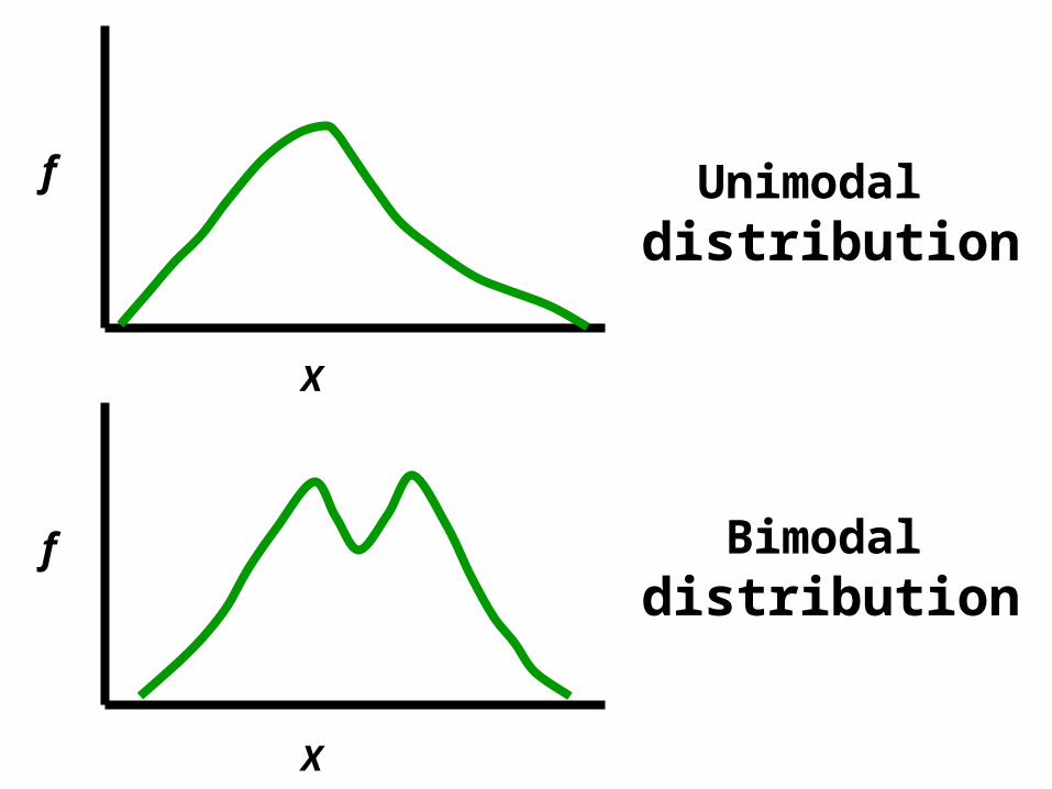
X
f Unimodaldistribution
X
f Bimodaldistribution
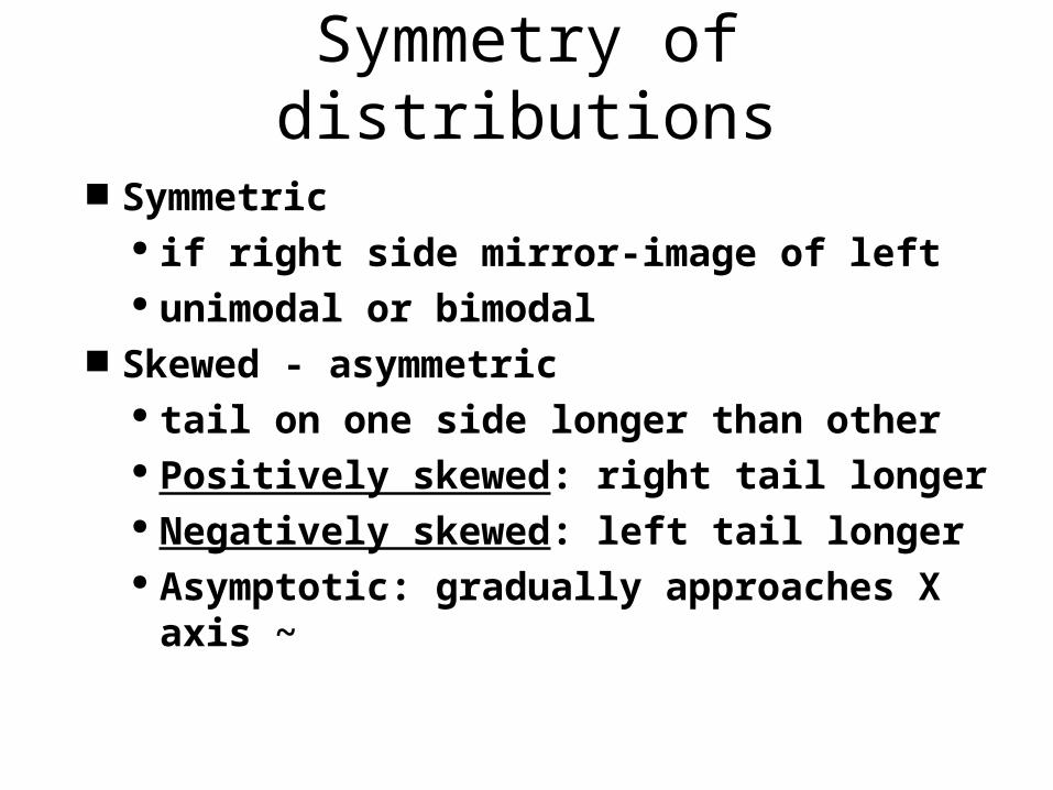
Symmetry of distributions
Symmetric if right side mirror-image of left unimodal or bimodal
Skewed - asymmetric tail on one side longer than other Positively skewed: right tail longer Negatively skewed: left tail longer Asymptotic: gradually approaches X
axis ~
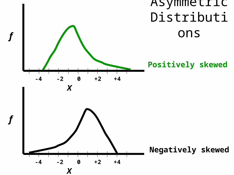
Asymmetric Distributions
X
f
0 +2 +4-2-4
Positively skewed
X
f
0 +2 +4-2-4
Negatively skewed
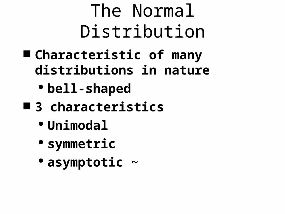
The Normal Distribution
Characteristic of many distributions in nature bell-shaped
3 characteristics Unimodal symmetric asymptotic ~
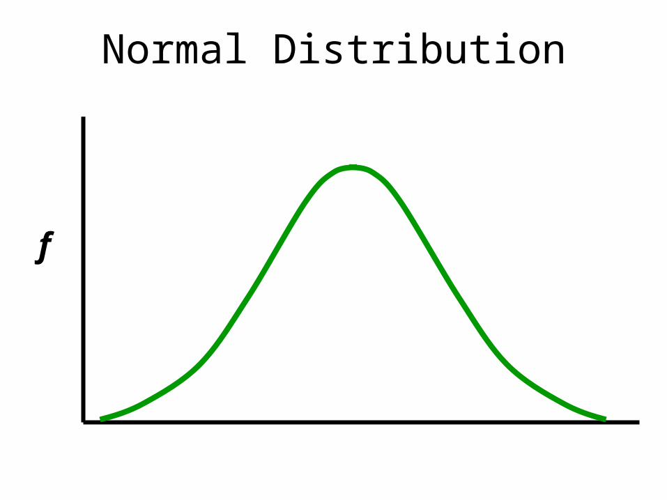
Normal Distribution
f
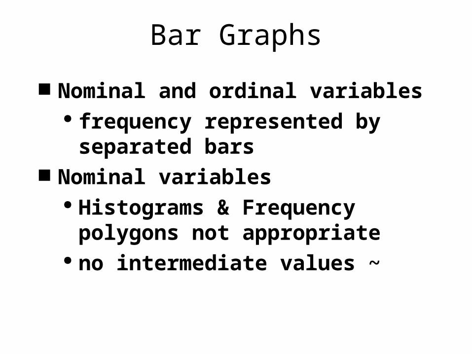
Bar Graphs
Nominal and ordinal variables frequency represented by
separated bars Nominal variables
Histograms & Frequency polygons not appropriate
no intermediate values ~
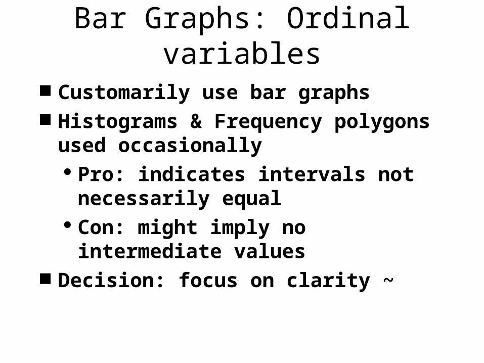
Bar Graphs: Ordinal variables
Customarily use bar graphs Histograms & Frequency polygons
used occasionally Pro: indicates intervals not
necessarily equal Con: might imply no intermediate
values Decision: focus on clarity ~


![Homework 3]](https://img.pdfslide.us/doc/110x75/55b6ace7bb61eba5488b459c/homework-3-55bd3bece5fe2.jpg)