Embed Size (px)
Citation preview

A conference was held in Prague, Czech Republic, in November 2002 that was entitled
“Issues Confronting the Post-European World” and that was dedicated to Jan
Patočka (1907-1977). The Organization of Phenomenological Organizations was
founded on that occasion. The following essay is published in celebration of that
event.
Essay 47
Form and Counterform in Graphic Design:
A Phenomenological Approach
© Sirkkaliisa Usvamaa-Routila
University of Jyväskylä, Finland
Societas Philosophica et Phaenomenologica Finlandiae/ Finnish
Society for Philosophy and Phenomenological Research
http://www.geocities.com/fenomenologinenseura
Abstract
In this paper I have tried to expose the significance of the idea of
eidetic variation to graphic design. When I was teaching in the
Laboratory of Experimental Typography, attached then to the
Department of Art Education at the University of Jyväskylä, I found
myself frequently in the unsatisfactory situation that we did not have any
methodological device for dealing with typical problems of the field. It
just happened, at the same time, that I began to read Husserl. Since then
the idea of eidetic seeing has been a great help as well in teaching as in
doing typographical thinking. It offers a kind of logic for the eye,
Augenlogik, so to say.
Though making use of Husserl’s methodological legacy seems to me
rather naturally suitable in the field of graphic design, it might be
difficult to discuss the general features of the method itself. There always
seems to be so little to tell. Maybe it is, however, a good sign for a
method, that one cannot talk about it without trying to use it.
In this paper I have attempted to show how some typical problems of
graphic design might be approached using the method of variation with
the intention to find out the involved essential content, the invariant. The
mutual dialectics of form and counterform appears to be one of the basic
constituents of the material ontology of the “visible word.”
The copyright on this text belongs to the author. The work is published here by permission of the
author and can be cited as “Essays in Celebration of the Founding of the Organization of
Phenomenological Organizations. Ed. CHEUNG, Chan-Fai, Ivan Chvatik, Ion Copoeru, Lester
Embree, Julia Iribarne, & Hans Rainer Sepp. Web- Published at www.o-p-o.net, 2003.”

2 USVAMAA-ROUTILA: Form & Counterform in Graphic Design
I. Eidetic Variation as a Working Method of Graphic Design
The term graphic design was supposedly first used in 1922 by William
Addison Dwiggings, an American book and type designer, who is best known of
his Caledonia, one of the most popular faces, at least in the US. The term
achieved widespread usage only after the Second World War. Of course there
had been long before artisans, artists and craftsmen working with what we now
call graphic design, but they used to be called printers, typographers, book
makers, art directors etc. In point of fact, the field of graphic design began
already when the printing press was invented in the fifteenth century.
Craftspeople who arranged type and illustrations on the printed page were the
first graphic designers, for they had to plan the layout or design of each page
before it was printed.
In this modern sense, design is an industrial concept. Before the
industrial revolution craftsmen and artists created the objects identified by
people as works of art in one smooth process, from the original idea to the final
execution. Their work was shaped by a unity of labour. With mass production,
however, the structure of the manufacturing process changed. The unity of
labour dissolved into a complicated process in which the labour was divided into
more and more parts. The artist became the inventor of an idea and he could only
occasionally execute the artefact. Instead he had to communicate his ideas to
other people who in turn had to execute them. The artist could, however, not be
separated from the processes of execution and manufacturing, for he had
nevertheless to master it:1
with decisions to be made beforehand in imaginative
perception, his work became more and more dependent on his imaginative
power. Accordingly, the designers of today are liable to seek methods and
knowledge increasing their ability to master the forces involved in the domain of
their authority.
In the following some basic guidelines for mastering typographic
decisions will be discussed. Throughout my study, the discussion of
typographical elements and their impact on the graphic design is based on the
1 Walter Gropius, the founder of the famous German design school Bauhaus, defined in his Idee
und Aufbau des staatlichen Bauhauses (1924) as its leading idea that the designers should be
taught to master the crafts. The workshops of the school were to him “laboratories” where the
students should develop “models” in order to get fresh insight into the unity of labour. “Das
Bauhaus will in diesen Laboratorien einen neuen, bisher nicht vorhandenen Typ von Mitarbeitern
fur Industrie heranbilden,” he wrote 1926 in his Grundsätze der Bauhauswerkstätten.
3 USVAMAA-ROUTILA: Form & Counterform in Graphic Design
use of a methodological device which I call a phenomenology of typefaces.2
Maybe there is, in contemporary philosophy, no homogenous trend or school of
philosophy to be called “phenomenology” and maybe this label means very
different things to different people. Nevertheless, there are several reasons why
one should accept it as a heading, one major reason being this: I will draw on a
conceptual tool developed initially in the phenomenological tradition, namely
the idea of Wesensschau, eidetic seeing, connected with the somewhat technical
issue of what Husserl called regional or material ontology.3
I do not, in this study, discuss the main features of the phenomenological
theory I am trying to make suitable for a new use. Let me at this point, however,
note that I will discuss, according to the methodology so far suggested, the
typographical elements not only as they are on the printed page or on the screen
of a computer, but rather as they appear on it.
Some things always matter more than others, and to us, working in
graphic design, it does not matter first off what actually is on the page, because
we have to take care of what appears on it. In order to understand what appears,
we need a simple methodology sensitive enough to many different kinds of
apparent properties, proportions, functions and forms. Husserl described such a
method in terms of “variation” and “ideierende Abstraktion.”
Assume, for instance, that on a white page before your eyes, illuminated
by a lamp, lies a set of lines printed in black, and, say, in Avant Garde Gothic.
And assume that you are interested in finding the qualities common to the
letterform recognizable as what is known as Avant Garde Gothic.
Obviously, we are able to perceive the type of which the lines consist as
united through a common form. But what do we then perceive? Indeed, I may
transform these perceived objects in my fancy by successively varying their
colour, their background, their illumination, their strokewidth, certain parts of
them and so on. In fact, I may imagine a number of varied letterforms, resulting
finally in the insight that in all these variations a set of characteristics remains
invariant or constant without which the letterform before my eyes ceases to be
2 Cf. my Facing the Faces: An Introduction to the Typography (Jyväskylä 1998), pp. 42 ff. 3
See Husserl: Ideen I (Husserliana Ill) §§ 9-10, 16, 149), cf. Logische Untersuchungen §§ 10-11
(HusserlianaXVII) and the lectures 1917/18 with the title Logic and General Theory of Science
(Logik und allgemeine Wissenschaftstheorie. Vorlesungen 1917/18, Husserliana XXX). In these
lectures Husserl seems to emphasize the role of the hyletic material and the dependence of the
regional ontology on the non formal qualities more than in his earlier writings. Formal ontology
is universal Ontology “im allerallgemeinsten Sinne,” whereas the insights of regional ontologies are universal only within their regions.

4 USVAMAA-ROUTILA: Form & Counterform in Graphic Design
one and the same letterform. This set of characteristics, so far necessary to this
particular form, we shall call the essence or eidos of this particular letterform.4
In all variations of the letter A a set of
characteristics remains invariant or constant.
This set of characteristics will be called the
eidos or form A. In the same way, in the
stylistic variations of the whole alphabet the
style will be called the eidos or form. It can be
defined as a set of characteristics common to
all the letters of the alphabet in that style.
4 Husserl: “Dieses Invariante ist ...das Eidos.” (Husserliana XVII), p. 255.

5 USVAMAA-ROUTILA: Form & Counterform in Graphic Design
As has been noted by scholars, the process of variation is not to be
confused with the method of generalization. Borrowing terms from mathematical
technique, Husserl called this reduction procedure “bracketing.” Through putting
in brackets all the features that are possible to change among the imagined
transformations and variations we achieve a purified perception of the letterform
Avant Garde when we are bound to ‘see’ that any further removal would destroy
it. So the eidos is what appears to be the invariant in the series of imaginative (as
well as factual) variations.5 In the light of such purified perceptions we may even
be in the position to describe conceptually, in the mode of theoretical reasoning,
the essential features and structures of a whole area of objects. Graphic design is
just one of the regions of being, with its own structures, worthwhile to be
investigated.
The idea of regional ontology reflects Husserl’s belief that there is, in
contradistinction to ‘formal ontology,’ a realm of eidetic knowledge that is
directed to and dependent on the “hyletic,” factual and concrete, tangible and
touchable objects, such like colours and tunes, bodies, minerals and animals.6
However, the graphic designer has to make things happen. Therefore s/he
must be able to produce what we want to appear, and this presupposes that we
must be able to modify real things in what they are. In order to let them appear
as we want them to appear, we must be able to handle and control real things. So
we are working all along in two interrelated worlds at the same time, in the
world of appearances and in the real world of material facts.
In visual arts, one has, therefore, to appreciate the difference between
these two worlds; for our visual field, is determined by many regularities
affecting the way we see and comprehend what we are seeing. Nothing
illustrates this clearer than the numerous visual illusions.7
5 Husserl discusses the case of factual variations in Ideen I, cf. Husserliana III/1 16. 6
In Ideen I Husserl wrote that scientific knowledge is dependent on eidetic knowledge, formal or
material: “Es gibt keine Tatsachenwissenschaft die rein sein könnte von eidetischen
Erkenntnissen und unabhangig ... von den, sei es formalen oder materialen eidetischen
Wissenschaften.” (Husserliana III/l 26) 7
Attractive modern presentations of visual illusions include Richard Gregory, Eye and Brain
(Princeton 1997); John B. Frisby, Seeing, Illusion, Brain and Mind (Oxford 1980). The 1922
book by M. Luckiesh is still a good introduction, Visual Illusions: Their Causes, Characteristics
& Applications (New York 1965).

6 USVAMAA-ROUTILA: Form & Counterform in Graphic Design
II. Form and Counter-Form
The graphic designer does not only make decisions about the style of a
typeface; at the same time s/he has to make decisions about several other things,
interrelated, however, with each other.
One example of this is the grauwert, the tonal colour. It is affected by the
weight of the typeface, of course, but also by its letter spacing, interword spacing
and line spacing. The examples below will show degrees from wide leading to
no leading at all, and there is an obvious progression from light to dark, and from
a pattern of lines to a plain surface. In the light of the theory I am using in the
course of this study, this progression from a pattern of lines to a plain surface
can be described in terms of form and counterform.8 Generally speaking, the
way in which the type and its background have an effect on each other is nothing
else than the interplay of form and counterform.
The connection between the form and its counterform may be clarified
with the help of Husserl’s theory, which applies to an activity of understanding
that he calls passive synthesis.9 Thus, when we perceive a tree, for example, we
primarily perceive only the frontside of the tree, but our consciousness does not
direct itself to or focus on the frontside alone, it is also directed, in a passive
mode, to what, on the strength of our mind, we associate with it: the experience
of the frontside acts as a medium of the experience of the backside. Though we
are not attending to it, it is copresent in our perception. Front and back here form
an “appresentative pair” in the sense that the former appresents (ad-presents) the
latter, and this is possible even if the appresented member of the pair is unclear
and vague. There will always be some counterform which the form itself evokes
or calls forth.—Some famous illusions play on the exceptional case that our
mind cannot decide what is the appresenting member of the pair. We are bound
to move in zigzag course from one member of the pair to the other.
As an outcome of a number of variations, factual as well as purely
imaginative, I claim, indeed: For any shape which we introduce into a field there
will appear, in addition to that shape, a shape which is its complement. The form
and the counterform are invariably complementary. To produce the one is to
8 Form and Counterform—a somewhat similar topic has been dealt with in the aesthetic literature
in terms of figure and ground. Numerous instructive notes on the issue can be found in the work
of Rudolf Arnheim, cf. his collected essays Towards a Psychology of Art (London: 1966), cf. 222
ff. 9
Cf. Husserl’s analysis in the 5th Cartesian Meditation, Cartesianische Meditationen
(Husserliana I). My very first contact with Husserl’s concept of appresentation comes from Alfred Schutz’s instructive illustration in his Collected Papers I (The Hague 1971) cf. 294 ff.

7 USVAMAA-ROUTILA: Form & Counterform in Graphic Design
produce also the other. Thus the printed area evokes its counter area and the two
together determine the overall form. Accordingly, the designer must constantly
balance both the form and its counterform.10
All forms of spacing provide the designer with the means of reducing
and/or increasing the effect of counterforms. Excessive leading produces a white
ribbon and this counterform may dominate the attention of the beholder more
than the form itself—and more than s/he intended.
The interplay of form and counterform can sometimes become even more
exciting. We usually work in a two-dimensional field, but we have to take notice
of the possibility of an unexpected illusion: in our two-dimensional field an
effect of depth will be created, for the eye of the beholder may be led by lines
and rows into a third dimension. Sometimes we may, of course, intend to create
the illusion of depth, but usually it may hurt our design profoundly. In a well
composed type area the print and the blank spaces are in perfect balance. The flat
effect of the type area and the ribbon effect of the lines mix together to form a
pleasing whole.
To my way of thinking the interplay of form and counterform is the
kernel of the theory of typography. So we have to face it frequently.
3. Points and Picas, X-Height, and Ems
In the typographical practice graphic design has in a few decades of huge
progress moved out of the era of hot metal setting through a period of
photocomposition into the design world of digital media. When all type was
metal, the typographic design was essentially conditioned by metal technology.
Now it is conditioned by computer technology. At present we hardly know all
the consequences of this change in the technology, but as things stand, I do not
hesitate to say: In order to understand the terms and concepts of this new
technology we still have to understand some basic processes of the old
technology, for they still affect the new. This certainly is true of the
typographical terminology applied all over the world. But it is true also of the
general view we still take into the design world of digital media.
In the following two passages I have summarized some basic
typographical terminology for the reader unaquainted with the professional
lifeworld of graphic designers.
10 Cf. Emil Ruder, Typographie-Typography (Niederteufen: 1967) 48 ff.

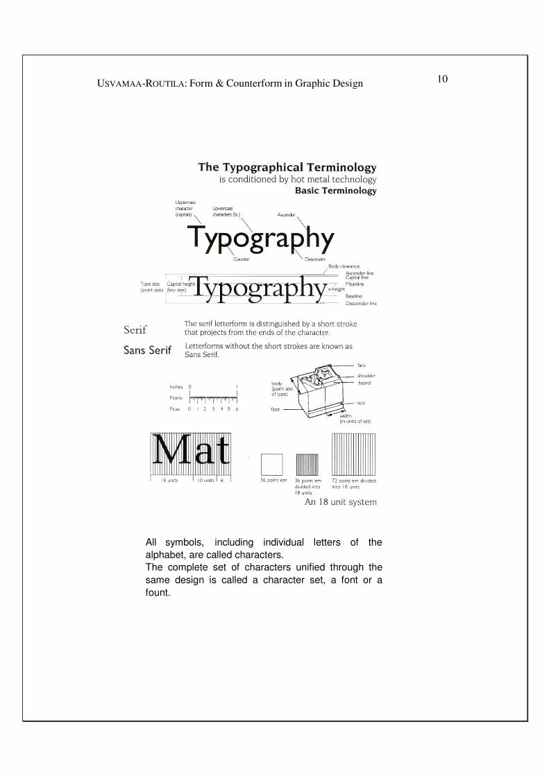
8 USVAMAA-ROUTILA: Form & Counterform in Graphic Design
There are two basic type measurements: points and picas. Points
are still used to measure the type size. In the old technology the
description of a type as 6 pt, or 24 pt, indicated only the size of the
metal body: it did not indicate the “face” of the type, the appearing
size of the letters on the paper. As points were used to measure the
“depth” of the metal type, the point size was also called the body
size.
There are twelve points in one pica and seventy-two points in an
inch and, thus, six picas in an inch. A type of 72 point size had a
body almost exactly one inch from the top of the ascender to the
bottom of the descender. Note that there remains between the top
line of point-size and the ascender line a small difference called
“body clearance.” Nowadays, all DTP-systems use the standard
electronic publishing convention according to which one point is
exactly 1/72 of an inch.11
But most electronic type foundries still
use the notion of body clearance. The face of a type 72 pt, thus, is
not exactly 72 pts.
The amount of space between lines is likewise measured in points,
according to the standard from the baseline of one line of type to
the baseline of the next. The standard expression is a fraction such
as 9/11, in which the denominator (11) is the base-to-base
measurement and the numerator (9) is the designated type size.
Types that are 12 or 14 point and under are called text type and are
primarily used for body copy. Sizes above 12 or 14 point are called
display type; they are used for titles, headlines, and the like. Today
most text types are derived from a 12-point model and most
display types from an 18-point model. The more the point size
differs from the model size, up or down the scale, the less graceful
characters seem. Smaller characters may look too weak and
crowded and the large ones too coarse and loose.
Picas (and Ciceros) are used to measure the line length. When
referring to the length of a line, we speak of it as so many picas
wide. Thus the expression 9/11x24 means 9-point type set with 11-
11
See footnote 7 above.

9 USVAMAA-ROUTILA: Form & Counterform in Graphic Design
point line spacing on a 24-pica line. It is read as 9 on 11 by 24. A
block of copy is said to be so many picas in depth.
The actual appearing size of the face can be described by defining the x-
height. Although the x-height is not a unit of measurement, it is significant: it is
the x-height, not the point size that indicates the true visual impression of the
size of the letter. Typefaces of the same point size may appear larger or smaller
because of variations in the x-height. The 10 pt Garamond with its small x-
height appears much smaller than the 10 pt Helvetica with its larger x-height.
This is important to keep in mind when selecting type faces and determining
their sizes. A useful device for judging the appropriate size of a type you have
selected is a table which counts how many characters of that size, on the
average, will set in the width of one pica. This is known as the characters per
pica or cpp of the type.
In the old technology, word spacing and letter spacing were
accomplished mechanically by inserting pieces of metal between the words and
letters.
These pieces were called quads. They are all related to the em
quad, i.e. the letter “m”. It is (theoretically at least) the square of
the type size. If the type is 10 pt, the em quad is 10 pt, etc. Half of
the width of “m” is “n” and was called the en quad. Other
subdivisions of the em were used, and are still used occasionally.
In typographical text is often referred to “thin space”. It is a
somewhat crucial expression, for it meant in the old days 1/5 em
space and means nowadays usually—1/3 or, I’m sorry, in some
texts, 1/4 of em quad. Anyway, it is a very thin space.
IV. Units and Set Width
In phototypesetting the width of the characters was called set width. It
included a small amount of space to either side of the character for normal
interletter spacing. With no space added or subtracted, the letters thus came off
the machine without touching each other. The new digital technology employs a
similar theory of set width. Note that the set width of a character will vary from
typeface to typeface.
10 USVAMAA-ROUTILA: Form & Counterform in Graphic Design
All symbols, including individual letters of the
alphabet, are called characters.
The complete set of characters unified through the
same design is called a character set, a font or a
fount.

11 USVAMAA-ROUTILA: Form & Counterform in Graphic Design
The set width is measured in units: each character is assigned a certain number of units. The upper case “M” for instance may be 18 units wide whereas the lower case “I” may be 6 units and the lower case “a” 10 units wide. Please note
that the unit is a proportional, not a fixed measurement.12 Do not confuse it with typographic points, picas, ciceros or other fixed measurements.
You may ask, why such a proportional measurement is required.
Here comes the answer: The unit is based on another typographic
measurement, namely the em quad, which is, as I said above, the
square (at least roughly) of the particular point size of a character.
The em is divided into equal vertical segments the number of
which varies from system to system. Let us suppose that the
number of these units is 18. In such a system one unit will be 1/18
no matter what the point size of the particular letter will be. These
relative spaces refer always and only to horizontal space—the
space within the type line. By programming the computer to
increase or decrease the number of units assigned to an individual
character, we can control the spacing between the letters.
Also indentations of various kinds and spaces around display
elements are often specified with ems, ens and thin spaces.
V. Spacing
Perhaps the most important concept in typographic design is spacing, the
amount of space between the letters, the words and the lines. It takes great skill
to specify any of these three kinds of space, for they work in close connection
with each other. Letters must flow rhythmically and gracefully into words, words
into lines and lines into the whole page. Actually, all kinds of spacing amount to
the creation of the interplay between form and counterform.
Through “spacing” the graphic designer determines for instance much of
the overall tonal colour of the printed page. Thus, variations in line, word and
character spacing affect the overall look of body copy. I do not hesitate to say:
Here is the domain where graphic designers display their skill and aesthetic
judgement.
12 See footnote 9 above.

12 USVAMAA-ROUTILA: Form & Counterform in Graphic Design
In the old technology there were no possibilities at all of close spacing.—
Accordingly, close spacing was no problem at all. We now have a total control
over all forms of spacing, but we have also more problems and that means we
have to make many new decisions. By adjusting letter spacing we can improve,
but also reduce the readability or legibility of the design.13
But we can also affect
the tonal value of the design, and so we have a new problem and a new decision
to make. How much do we have to value the tonal colour in our design? How
much do we have to value the legibility in our design?
As I claimed above, all these problems lead to one and the same topic, to
the main topic of form and counterform. So we have to work out how the
interplay of form and counterform affects the typographical design through the
various forms of spacing. We will illustrate how spacing can be used as an
instrument for controlling the overall form of the design.
VI. Letter Spacing
Jan Tschichold emphasized in his famous Asymmetric Typography: “the
correctly set word is the starting-point of all typography.”14
Indeed, the letters
themselves we usually have to accept—at least in text setting—because they are
shaped by the type designer. The task of the graphic designer is to take care that
letters achieve the right regularity and rhythm.
Letter spacing can have a decisive effect on legibility; therefore, it must
be specified by the designer, not by the typesetter in the printing office, as Ruari
MacLean has wisely stated.15
As a matter of fact, faulty letter spacing is the most
frequent cause of poor quality in modern type setting. Unpleasing “spotty”
effects in words, lines and whole pages will result, when letter spacing is too
wide, too tight or irregular.
A good starting point for character spacing is the structural form, the
appearance of the lettertype itself: letters should neither be so tight that they lose
their distinct outlines nor so open that the words cease to be perceived as words.
Already the photocomposition machines had the ability to reduce or
increase the intercharacter spacing, the fitting as the old masters used to call it.
Letters could be set closer to each other until they overlap. This was called
13 A still valuable bibliography on readability and legibility studies was published by Herbert
Spencer, in his The Visible Word (London: 1969), p. 62 ff. 14
Asymmetric Typography, translated by Ruari McLean (London: 1967), p.12 (Typographische
Gestaltung, Birkhauser Verlag: 1935). 15
Ruari McLean, Typography (London: 1980), p. 44 ff. 36.

13 USVAMAA-ROUTILA: Form & Counterform in Graphic Design
minus-setting. Through digital instruments all this has become still easier
because you can see the result immediately on the screen.
In addition to normal spacing, the distances between the characters can
be manipulated further to tight and very tight, or to loose and very loose. Such a
freedom creates easily the impression that the character spacing is simply a
matter of choice. But it is not. Too much or too little space between letters
destroys the natural rhythm of a typeface.
The interior areas of letters are fixed by the shape of the letters, but the
spaces on each side of them are chosen at will. The fitting of letters means that
we have to achieve a visual balance of white both inside and outside a character
when used in combination with other characters. A series of eidetic variations
will easily show that a successful fitting simply means: in any combination of
letters a nearly equal space of white between characters will be apparent,
regardless of their irregularities of form. So, the fitting is an integral part of the
design.
Ideally, it may be said, for each typeface and for each size of a type there
is only one correct letter spacing. But in the real world this ideal is obscured and
becomes a matter of decision. An old rule states that the space between letters
should be the same than the space inside “m” or “n”.16 This rule obtains
especially in the field of old style letters, but it reveals one secret of all correct
letter spacing: letter spacing is a function of the “counters,” i.e., the internal
spaces within the letters. If we change the space between letters we change at the
same time its proportion to the internal spaces of letters. But these spaces are
nothing else than counterforms of the letterforms! Thus, the old rule is based on
this idea of proportionality of form and counterform. The smaller the internal
space, the closer the letter spacing; the greater the internal space, the wider the
letter spacing required. It is easy to see that letter spacing, if it is wider than the
average internal whites of the letters, will result in word-images that seem to fall
apart. Too tight a letter spacing gives “spotty” effects because the counters seem
too large. Another good rule, obviously derived from the above one, states that
any variation in letter spacing is too much if it is noticeable.17
Let me now quote a nice text by Michael Beaumont, set in Monotype
Bembo in six different variations.18
You will immediately recognize the
16 See Jan Tschilhod, The Form of the Book—Essays on the Morality of Good Design, edited by
Robert Bringhurst (Lund Humpries: 1991) (Ausgewählte Aufsätze über Fragen der Gestalt des
Buches und der Typographie Birkhäuser Verlag: 1975), pp. 12 ff, pp. 95 ff. See also: Ruari
McLean, Typography (London: 1980), pp. 44 ff. 17
Ibid., 102 ff. 18
Michael Beaumont, Type and Colour (London: 1992), pp. 44f.

14 USVAMAA-ROUTILA: Form & Counterform in Graphic Design
differences and their consequences. On closer examination, these six variations
(pp.14-15) are revealing and we may now be able to explain some of their
faulties.
Eidetic variations of Letter Spacing
Fasluons come and go.Tlus
certainly applies very mu ch to
typographical design, and in
particular, to letter spacing.
When computer-generated
semngs fir>t arrived and the
advantages of its infinitely
flexible letter spacing were
recognized, very tight letter
spacing, particularly for
headlines, soon became
fashionable. Now, however, the
movement is in the opposite
duection, with many designers
opting for an extremely open
style of typography reminiscent
of the 1950s.This control over
letter spacing means that you
can alter the tonal colour of your
body copy subtly by varying the
standard spacing.This is done
by adding, or subtracting, units
from the set WJdth. But all
destgners must remember that,
when all IS saJd and done, we are
comn1unicacors. Our messages
have to be read and understood.
Letters that are too close or too
open, designed for the sake of
fuhion at the experue oflegibiliry,
do NOT make good typography.
8/10 pt Bcmbo
(set through PageMaker 6.0 wrth very
ugl1t t,..ck)
Fashions come and go.This
certainly applies very much to
typographical design, and in
particu lar, to letter spacing.
When computer-generated
settings first arrived and the
advantages of its infinitely
flexible letter spacing were
recognized, very tight letter
spacing, particularly for
headlines, soon became
fashionable. Now, however, the
movement is in the oppos.ite
direction, with many designers
opti ng for an extre mely open
style of typography remin is-
cent of the 1950s.This control
over letter spa cing means that
you can alter the tonal colou r
of your body copy subtly by
varying the standard spacing.
This is done by adding, or
subtracting, units from the set
width. But aU designers must
remember that, when all is
said and done, we are
com municators. Ou r messages
have to be read and under-
stood. Letters that are too close
or too open, designed for the
sake of fashion at the expense
of legibility, do NOT make
good typography.
81I0 pt Bcmbo
(set throogh PageMaker 6.0 with ught track)
Fashions come and go.This
certainly applies very much to
typographical design, a n d in
particular, to letter spacing.
When com puter-generated
settin gs first arrived a n d the
advan ta ges of its infinitely
flexible letter spacing were
recogni zed, very tight letter
spacing, particularly for
headlines, soon became
fashionable. Now, however,
the movement is in the
opposite di rection, with many
designers opting for an
extremely open style of
typography reminiscent of the
1950s. This con trol over letter
spacing means that you can
alter the tonal colour of you r
body copy subtly by varying
the standard spacing.This is
done by adding, or subt ract -
ing, units from the set widt h.
But all designers m ust
remember that, when all is
said and done, we are
com mu nicators. Ou r messages
have to be read and under-
stood. Letters that are too
close or too open, designed
for the sake of fashion at the
expense of legibility, do NOT
make good typography.
81I0 pt Bcmbo
(set throogh PageMaker 6.0 with normal track)

15 UsvAMAA-ROUTILA: Form & Counterform in Graphic Design
Fashions come and go.This
certainly applies very much
to typographical design,
and in particular, to letter
spacing. When computer-
generated se ttings first
a rrived and t he advantages
of its i nfinitel y flexible
letter s pacing were recog-
nized, very tight letter
spacing, particularly for
headlines, soon became
fashionable. Now, however,
the movement is in the
opposite direction, with
many designers opting for
an extremely open style of
ty pography reminiscenc of
the 1 950s.This control over
lener spacing m eans that
you can a l ter the tonal
colour of your body copy
subtly by varying the
standard s pacing. This 1s
done by adding, or subtract-
ing, umts from the set
width. But all designers
m ust remember that, when
all is said and done, we are
communicators. Our
messages have to be read
and understood. Letrers that
are too close or too open,
designed for the sake of
fash ion at the expense of
legibility, do NOT make
good typogra phy.
8,110 pt Bcmbo ( ct through PageMaker 6.0 With loose track)
Fash ions come and go.This
ce rtainly applies very mu ch
to typographical design,
a n d in p: rticular, to leuer
s pacing. When computer-
generated settings first
arrived and the advantages
of its i nfinitely flexible
letter spa cing were
recognized, very ti gh t letter
spacing, particu la rly for
headlines, soon beca me
fashion a ble. Now, however,
the moven1ent is in the
opposite direction, with
ma n y desig ners opt i ng for
an extremely open sty le of
typography reminiscent of
the 1 950s. This control
over lener s pacing means
that you can a l ter the
to nal colour of your body
copy su btly by va ryi n g the
stan d ard spacing. T his is
done by adding. or
subtracting, u nits from t he
se t width. But all design-
ers must remember that,
when all is said an d don e,
we are comm unicat ors.
Our messages have to be
read and understood.
Letters th a t are too close
or too open , designed for
the sa ke of fashion at the
expense of legibility, do
NOT make good typogra-
phy.
8110 pt Bembo (set through PagcMakcr 6.0 with very
loo"' track)
Fashions come and go.This
cenainly applies very much to
typographical design. and in
particular, ro letter spacing.
When computer-gener:Hed
settings first arrived and the
advantages of its infinitely
flexible letter spacing were
recognized, very right letter
spaci ng, particularly for
headlines, soon became
fashionable. Now, however, the
movement is in the opposite
direction, with many des1gners
opting for an extremely open
style of typography reminis-
cent of the 1 950s.This control
over letter spacin g means that
you can alter the tonal colour
of your body copy subtly by
varyi ng the standard spacing.
This is done by adding, or
subtracting, unjts from the set
width. But all designers must
remember that, when al.l i.s
said and done, we an!
communicators. Ou r
messages have to be read and
understood. Letters that are
roo close or roo open,
designed for the sake of
fashion at the expense of
legibility, do NOT make
good typography.
8110 pt Bcmbo
(set through PagcMaker 6.0 wrth no track)

16 USVAMAA-ROUTILA: Form & Counterform in Graphic Design
The effect of excessive decrease or increase of space is in these examples
clear: A letter is almost completely altered through too much or too little space
about it. The success or failure of a type depends on the balance of white both
inside and outside of letters. So, when a type design is good it is not because
each individual letter of the alphabet is perfect in form, but because each letter is
successfully related to every other: there is an air of harmony and unbroken
rhythm that breathes the whole design. Matthew Carter, one of the great type
designers of the 20th century, once said that a typeface is not the same thing as
lots of letters—but instead, all words of the language.19
Letters have to work
together in all words of the language and of so many languages as possible.
Hence, it is important for the graphic designer to evaluate the types
he/she is dealing with. This presupposes that the designer has trained his/her eye
to perceive the delicate and artful ways in which letters and spaces relate to each
other. Eidetic variations, imaginative as well as factual ones, make up a good
working method for that.
Letterspacing is, however, a typographical tool. We can use it to modify
our design. And it is a very effective tool for working with rhythm. Indeed, in
typography, we can use letter spacing to create different kinds of rhythm. For
instance, space between letters may be made to echo both the width of the stem
and that of the partly-enclosed areas of the letter design. A different spacing
rhythm is set up by contrasting the open counters of letters with close letter
spacing to produce a “ribbon” effect. Let us look at two examples set in Gill
Bold and Avant Garde.
GillSansBold AvantGardeBook
The echo effect is very apparent in the Gill Sans example whereas the ribbon
effect in Avant Garde Book example is created by contrasting the open counters
with rather close letterspacing.
Minus-setting can be done consistently throughout the font or it can be
done for separate character combinations, for instance such as VA, AV, LT, Ty.
This is known as kerning or pair kerning. Kerned letters such as f in italics and
the V and W were always a problem in metal type. Here is an advantage of
today’s new design: So-called kerned characters are no problem any more, “and
you can design the nicest f’s of your imagination,” as Hermann Zapf puts it.20
19 Cf. Lewis Blackwell, The 20th Century Type (London: 1992) p. 194. 20
Hermann Zapf and his Design Philosophy, (Society of Typographic Arts, Chicago 1987), p 94.

17 USVAMAA-ROUTILA: Form & Counterform in Graphic Design
The kerning of specific letter combinations can be programmed into the
typesetting system. As type is set, appropriate letterspacing appears
automatically. For example, when uppercase “T” appears with a lowercase “a,”
space is removed in such a way that the “a” can be tucked under the cross-bar of
the uppercase “T.” This spacing is mostly built into a font by the font designer
and can vary among fonts and type styles. In text setting, pair kerning is usually
restricted to the exceptionally difficult pairs and to the exceptionally difficult
alphabets, such as Avant Garde and Lubalin Graph, because each altered pair
may affect the appearance of all the other pairs in the alphabet.
So, kerning controls the spacing between two characters. Overall minus-
setting inserts uniform spacing between characters in selected text. It is
sometimes called compensation and especially in the DTP-technology tracking.
You use tracking when you want to adjust the spacing of a word or of an entire
text object. Positive tracking values move characters apart; negative tracking
values move characters closer together. Tracking values are also measured in
units.
VII. Letter Spacing of Capitals
An old rule of thumb forbids us to change the normal spacing of lower
case letters. But the same rule states that capitals must always be letter-spaced.21
Why? Of course, capitals have greater internal space than lower cases and that is
why they require a great deal of spacing. But how much? There is no valid rule.
You only have to examine closely the case and rely on your experience and
judgement—or if you do not have any—on fate. Here are some guidelines to
think about and perhaps to follow.22
Usually the letter space is correct when the
letters with holes—C, D, O,—and those with space outside—A, J, L, P, T, N, W;
Y,—merge inconspicuously into words without standing out. Thus, we start with
a minimum amount of space which can be more or less increased according to
circumstances. The minimum letterspacing depends on the largest internal
spaces in the round letters C, D, G, O, Q. If any of these letters makes a
conspicuous “hole” in a word, the letter spacing is obviously too tight. Misfit
letter combinations and irregular spacing are a common problem for capitals. In
visually even spacing the amount of space between letters will vary according to
the letters which come next to one another. Spaces between letters should be
21 Ibid. 22
Cf. Emil Ruder, Typographie-Typography pp. 81 f.

18 USVAMAA-ROUTILA: Form & Counterform in Graphic Design
about the same size whatever the shape. The problem to be solved is to achieve
the correct rhythm of capital letters, the rhythm of a well formed word. Too little
or too much letter spacing will destroy the correct rhythm and also decrease
legibility.
A well known visual illusion23
plays an important role here. The white
space outside the print area, the paper colour, seems to flow from above into the
counters of the letters and the spaces between letters. The white of the upper half
of a page thus looks more effective than the lower half. This is why, for instance,
the letter “n” in most sans serif faces must be slightly wider than “u” in the same
face, if it is to look the same width. Similarly, (if we assume that “A” and “V”
have the same apex angles) the space between “I” and “A” must be slightly less
than that between “I” and “V.”
VIII. Word Spacing and Line Spacing
Word spacing is similarly affected by the style of the typeface. Small
type sizes read much more better, if you increase word spacing, but in headlines
you usually have to decrease it more than you expect. Our analysis of letter
spacing applies to some extent to word spacing as well. Space between letters
and words should be proportional to the width of letters and to the internal
spaces in letters, i.e., to the counterforms of letterforms. There can of course be
no fixed rules for establishing how much this space should be. It will vary with
each typeface and with each type size.
Spacing between words must not be so large that it disturbs the
harmonious unity of a page. That is a requirement for comfortable reading. Too
much or too little space between words can seriously affect the legibility. In a
handbook of ITC, I once read the following passage: “The individual words
should be far enough apart so they will retain their identity. Words placed too
closely together force the reader to work harder to distinguish one word from
another. On the other hand, words should be set close enough together so the
horizontal flow of the line is not interrupted by too much white space.” Indeed,
too much space can cause the illusion of white rivers running down the page.
This creates a vertical emphasis that disrupts the natural movement of the eye
from left to right. Rivers are a common problem within narrow measure
justification as anyone reading newspapers has noticed.
23 Ibid.

19 USVAMAA-ROUTILA: Form & Counterform in Graphic Design
The general rule, one of the old master’s rules, says, that words should be
set close to each other, about as far apart as the width of the letter “i”,24
but this
is only a starting point.
The same rule states that there should be more space between the lines
than between the words. And this is truly one of the golden rules! The interlinear
spacing or line spacing—leading as it was called in the old technology—affects
the legibility essentially. Why? In order to answer it may be helpful to illustrate
how the printed word is perceived by the human eye. According to the recent
findings of the legibility research the eye reads word by word, or in word
clusters, not letter by letter. If the gap between words becomes too big, bigger
than the space between the lines, our eye begins to jump to the next line rather
than to the next word or word cluster.25
So the apparent space between lines must look greater than, or at least
not less than, the space between the words. Therefore good setting must be
leaded. The amount of leading depends on the amount of white around the type
and the general colour required. Thus, with too much leading, the white space
between the lines of type becomes more important than the lines themselves; the
lines will seem to float loosely on the page. In small quantities, this effect might
be desirable, but not for sustained reading.
When we are working with display types, we have to give special
attention to the ascenders and descenders. They can optically lessen the amount
of white space between lines. Optical adjustments in display types should be
made when spaces between lines appear inconsistent because of ascenders and
descenders or accents. This problem appears also when we use Roman and Italic
together, for instance, in the headline. The line may appear to slant.
IX. On Legibility and Readability
I have so far often mentioned legibility and readability; sometimes as
synonyms, sometimes not. In the theory of typography, legibility means the
clarity of individual characters; it depends on how quickly they are deciphered.
Thus the measure of legibility is the speed at which a character can be
recognized. Normally, type is legible if it is large enough and distinct enough for
discriminating individual letters and words.
24 Cf. Carl Dair, Design with Type (Toronto: 1967), p. 78 ff. 25
See Rolf F. Rehe, Newspaper Typography (in: Designer’s Guide to Typography ed. by Nancy Aldrich-Ruenzel and John Fennell, London: 1991), pp. 78 ff.

20 USVAMAA-ROUTILA: Form & Counterform in Graphic Design
Reading experiments and legibility studies have often provided evidence
to support the opinion that a distinction between objective legibility and
subjective attractiveness of the one and the same text setting should be done. For
example, type set in 10 point solid (without obvious interlinear spacing) may be
more legible than the same typeface in 8 point but 2 pt leaded. Nevertheless, as
Tinker has observed, experienced readers do not like solid text.26
And now we must ask: Why do experienced readers not like a solid text?
As leading separates a line from another it improves the legibility, of course. At
the same time it creates a pattern of constantly recurring sequence of black and
white, line and line space, dark and light. We may call this pattern rhythm as it is
similar to what is produced by emphasis and duration of the notes in music. On
the printed page this rhythm of black and white develops, however, gradually
into a complex interplay of the flat effect of the typed area and the ribbon effect
of singular white lines, i.e., the leading. All this contributes to the visual interest
of the page. Because of its overall evenness of colour, the solid text does not
have enough visual interest to sustain the reader’s attention, especially when he
has to read many pages.
A similar problem comes into view with some sans serif types. Many
people do find that reading long passages set in some sans serif types can be
tiring. The reason for this is the same as above. The overall even colour and the
flat texture typical of many sans serif pages tend to diminish visual interest and
may thus decrease the readability.
With the notion of readability we thus take the considerations of the
attractiveness of text setting one step further. Readability means the level of
aesthetic quality of the printed page. In other words, your text may be highly
legible, but its readability may remain low because the reader is unable to read
easily and smoothly. Legibility is a matter of optical clarity, readability involves
already aesthetic components. A good criterion of readability is simply the
attractiveness, the quality that makes the page easy to read and inviting and
pleasurable to the eye.
Spacing is one of the most important factors for both legibility and
readability. Especially Tinker emphasizes the interdependence of line spacing,
type size and length of line for legibility. It is difficult to generalize about which
sizes of type should be used, how long the lines should be, or how much space
should be inserted between the lines. These variables, when properly employed,
can enhance the legibility of letterforms usually considered highly legible and
improve the legibility of even poorly designed letterforms. A good rule of thumb
26
See Herbert Spencer, The Visible Word, pp. 23 f.

21 USVAMAA-ROUTILA: Form & Counterform in Graphic Design
tells to set a line about two and a half alphabet long, i.e. some 65 characters.
Studies have shown that reading a line of 50 to 70 characters is the most
comfortable. Overly short lines will tire the reader, because many line endings
will be hyphenated and the reading rhythm will be broken. Overly long lines will
also tire the reader, because he or she must move his head at the end of a line and
search for the beginning of the next. Thus, an appropriate line length is essential
for achieving a pleasant reading rhythm, which allows the reader to relax and
concentrate on the content of the words. Of course, the design of the face and the
nature of the material as well as the context in which it will be read should also
be taken into consideration.
Too small or too large a text type makes reading difficult, too. According
to legibility research, the most legible sizes of text type at normal reading
distances range from 9- to 12-point. Small type reduces the visibility of
counterforms and harms effective word recognition. This is of utmost
importance for designers working with pages to be read on computer screen,
even in the modern pdf-format.
However, legibility will always be only one of the factors to be
considered in designing. Not all reading matter is continuous reading matter, as
Ruari McLean aptly puts it. An announcement in the newspaper, for instance,
should be noticed; if it is not noticed, it will not be read and there is little use of
its excellent legibility. To make it noticed, the designer may have to make it less
legible. S/he may turn it literally upside down, and it may still work very well.
Often elimination of the space between letters creates a visually fascinating
pattern that challenges the reader to decipher it.27
Every typographic problem has its own legibility requirements. We must
ask, for instance, what kind of reading rhythm we want to create. What kind of
rhythm is in harmony with the content of the text? What is a pleasant reading
rhythm in the special case we are dealing with?
X. The Lesson in Brief
In the preceding sections, I have discussed spaces and spacings.
Professionals seem to agree that even line, word, and character spacing are the
very first criterion of good typesetting. I tried to show what this criterion
involves. Concluding my discussion let me now stress the main lesson, once
again:
27
Cf. Carl Dair, Design with Type (Toronto: 1967), pp. 78 ff.

22 USVAMAA-ROUTILA: Form & Counterform in Graphic Design
(1) With even spacing we mean the apparent regularity of spacing. If the
spacing appears uneven, it is uneven. Since spacing should appear even, it is not
a matter of rule. In all spacing, hence, the experienced eye is the final arbiter.
(2) The most important factor to keep in mind is this: all spaces are
proportional to each other. If type is set open, word spacing should also be open
to maintain the integrity of the word. If type is set tight, normal word spacing
may appear very large. The internal design of letters also affects the desirable
degree of openness. A type with large internal spaces, for example, will require
more word spacing to balance those spaces.
(3) There is no ideal amount of spacing which the graphic designer has
only to find out. There is no ideal relationship between form and counterform.
Not only have we to find out, but we have to decide. Spacing is a visual problem.
In order to face the problem we have to create a number of variations, factual as
well as purely imaginative, and try to find the best one.
(4) If you prefer to make the experience of reading as comfortable as
possible, guidelines must be considered; if you like to be more experimental,
then you need to understand these principles more than ever.
XI. The Three Kinds of Design Problems
Let me now say some few words about the philosophical side of the
“world of design problems.” To my way of thinking, all design activity is
ultimately problem solving activity. But please note my words; I use the word
problem in a specified sense. After all, some might maintain, design is much
more than mere problem solving.
In what follows I am preferring three problem space theorists: C. West
Churchman, Peter G. Rowe, and L. Routila.28
In the world of design problems, a
distinction can be made between problems that are closed or well defined and
those that are open or ill defined. In the latter category a further distinction can
be drawn, resulting in the subclass of wicked problems, as Churchman and Rowe
have suggested in their famous works.
Closed problems are those the ends of which are already prescribed and
apparent. Their solution requires the provision of appropriate means. A common
example is the solution of two algebraic equations with two unknown values.
Here the aim of the operation is to find the values for a and y. The solution
28 Peter Rowe, Design Thinking (Cambridge, MA: 1987), pp. 41 ff; Lauri Olavi Routila,
Metaphysics of Art (Turku: 2001), pp. 98 ff.

23 USVAMAA-ROUTILA: Form & Counterform in Graphic Design
requires application of rules of algebra to the specific equation structure that is
given. Other common examples of this class are crossword puzzles. Here
problems are closed through definitions and we can easily imagine a rule that
states when a satisfactory solution to the problem has been given.
For open problems, on the other hand, both the ends and the means of
solution are unknown. Most design problems are of this type. Although the
“general thrust of the problem”29
may be clear, considerable time and effort have
usually to be spent in order to clarify what is required. The crossword puzzle
becomes an open problem when you begin to think whether it is wise to use time
and effort for it. A large part of the problem-solving activity, then, consists of
closing the problem through definition and redefinition. But many design
problems are so open that they can be called wicked problems. This class has the
following characteristics, according to Rowe:
First, they are: problems without a definitive formulation, or indeed
without the very possibility of becoming fully defined at all. Questions opening
new avenues can always be stated, and they lead to reformulations.
Second, they are problems with no stopping rule, i.e. a rule that gives us
an effective, mechanical and finite procedure for deciding about any given
solution whether it is acceptable or not. Whenever a solution has been proposed,
it can be reopened, in principle, and developed still further.
Third, not only do the differing formulations of the problems of this
class imply differing solutions; even the same formulation of the problem may
give more than one acceptable solution. In other words, solutions that are
proposed are not necessarily correct or incorrect. Plausible alternative solutions
can always be provided. This characteristic follows logically from the first
property, from the openness, i.e. the impossibility of definitive formulation.
In the final analysis, good design can be seen as a solution to many
problems of which at least some are open and wicked. The problem depends on a
preconception that, in turn, implies a definite direction toward the solution of the
problem. Usually we describe the solution as the personal style of the designer,
i.e. as his personal habit to take a direction toward the solution of the problem.30
Choosing the correct typeface is a typical design problem. Some parts of the
problem are well defined, whereas some are ill-defined, and some are wicked. It
29 Peter Rowe, op. cit., p. 42. 30
I have dealt with the issue in my book on Leon Battista Alberti’s design philosophy, based on
my doctoral thesis (Kaunis ja sopiva,[The Beautiful and the Suitable] Jyväskylä: 1998), pp. 235
ff.

24 USVAMAA-ROUTILA: Form & Counterform in Graphic Design
is a good idea to keep this classification of our problems in mind and stop when
the problem is becoming very wicked. There may be no definitive or correct
solution to such a problem. We only have to make a choice.
________________________