Embed Size (px)
Citation preview
for Microsoft Dynamics CRM 2016
2/114
Copyright © 2012-2016 by Realdolmen nv. All rights reserved. No part of this document may be reproduced, distributed, or transmitted in any form or by any means, including photocopying, recording, or other electronic or mechanical methods, without the prior written permission of the publisher. For permission requests, write to the publisher at the address below.
Realdolmen nv A. Vaucampslaan, 42 B-1654 Huizingen www.realdolmen.com
3/114
Table of Contents
1 Welcome! ................................................................................................................................................ 5 1.1 Thank you......................................................................................................................................... 5 1.2 Structure of this manual ................................................................................................................... 5 2 Quick start .............................................................................................................................................. 6 2.1 Presentation of the product .............................................................................................................. 6
2.1.1 Single views ............................................................................................................................... 7 2.1.2 Treeviews .................................................................................................................................. 8 2.1.3 Timelines ................................................................................................................................... 9 2.1.4 Tile views ................................................................................................................................... 9 2.1.5 Map view ................................................................................................................................. 10 2.1.6 Grid view .................................................................................................................................. 11 2.1.7 Navigate To ............................................................................................................................. 11
2.2 Installation ...................................................................................................................................... 13 2.3 Tutorial: configuring a single view on accounts ............................................................................. 17
2.3.1 Refresh the metadata .............................................................................................................. 18 2.3.2 Configure the tile view ............................................................................................................. 19 2.3.3 Configure the treeview ............................................................................................................ 23 2.3.4 Configure the timeline ............................................................................................................. 31 2.3.5 Configure the Map view ........................................................................................................... 36 2.3.6 Configure the Grid view ........................................................................................................... 40 2.3.7 Bundle elements into single view containers .......................................................................... 43 2.3.8 Configure the ‘navigate to’ ....................................................................................................... 52 2.3.9 Create the single view form ..................................................................................................... 56
3 Usage scenarios ................................................................................................................................... 66 3.1 Refreshing metadata ...................................................................................................................... 66 3.2 Working with single views .............................................................................................................. 67
3.2.1 Adding a single view on a form ............................................................................................... 67 3.2.2 Adding many single views on a form ....................................................................................... 69
3.3 Working with dynamic layouts ........................................................................................................ 70 3.3.1 Dynamic colors ........................................................................................................................ 70 3.3.2 Dynamic icons ......................................................................................................................... 71 3.3.3 Tutorial : Configure a dynamic layout ...................................................................................... 72
4 References ........................................................................................................................................... 84 4.1 Single Views ................................................................................................................................... 84
4.1.1 Description of the component .................................................................................................. 84 4.1.2 Attributes of a single view ........................................................................................................ 86 4.1.3 Attributes of a view part ........................................................................................................... 87
4.2 Treeviews ....................................................................................................................................... 88 4.2.1 Description of the component .................................................................................................. 88 4.2.2 Attributes of a treeview ............................................................................................................ 88 4.2.3 Attributes of a treeview node ................................................................................................... 89
4.3 Timelines ........................................................................................................................................ 93 4.3.1 Description of the component .................................................................................................. 93 4.3.2 Attributes of a timeline ............................................................................................................. 94 4.3.3 Attributes of a timeline element ............................................................................................... 94
4.4 Map View........................................................................................................................................ 98 4.4.1 Description of the component .................................................................................................. 98 4.4.2 Attributes of a map view .......................................................................................................... 98 4.4.3 Attributes of a map element .................................................................................................... 99
4.5 Grid View ...................................................................................................................................... 100 4.5.1 Description of the component ................................................................................................ 100 4.5.2 Attributes of a timeline ........................................................................................................... 100 4.5.3 Attributes of a grid indicators ................................................................................................. 101
4/114
4.6 Tiles .............................................................................................................................................. 103 4.6.1 Description of the component ................................................................................................ 103 4.6.2 Attributes of a tile view .......................................................................................................... 104 4.6.3 Attributes of a tile group ........................................................................................................ 105 4.6.4 Attributes of a tile indicator .................................................................................................... 107
4.7 Navigate To .................................................................................................................................. 109 4.7.1 Description of the component ................................................................................................ 109 4.7.2 Attributes of a navigate to ...................................................................................................... 109 4.7.3 Attributes of a navigate to button ........................................................................................... 109
5 Support ............................................................................................................................................... 111 5.1 Software update ........................................................................................................................... 111 5.2 Troubleshooting ........................................................................................................................... 112
5.2.1 General .................................................................................................................................. 112 5.2.2 Single View ............................................................................................................................ 112
5.3 Getting assistance ........................................................................................................................ 113
5/114
1 Welcome!
1.1 Thank you Thank you for acquiring Realdolmen CRM Single View Builder, the tool that will improve the user experience
on Microsoft Dynamics CRM. The Single View Builder is a suite of visual components that is used to enrich the
graphical user interfaces with tree views, timelines, tiles, map and grid views and other.
The solution is an add-on to the latest version of Microsoft Dynamics CRM. Earlier versions are limited
supported. Please take a look at our website to check the requirements.
(http://www.cemaddons.com/SVB/system-requirements)
Finally Realdolmen CRM Single View Builder can be used in connected environments (online, on premises)
as well as in disconnected environments (with the CRM connector for Microsoft Outlook)
1.2 Structure of this manual The proposed structure of this manual is intended to give you an understanding of the system that will
progressively go deeper into the details of the features. It is divided into main sections:
1. Welcome General information about the manual.
2. Quick start Tutorial that will provide you a good understanding about the main features
available. Starting from a basic example, you will learn how to design a single
view component composed of tile -, tree -, grid- and map view, timeline and
navigate to elements.
3. Usage scenarios
Presentation of features best practices applied to several contexts. In this
section, you will acquire a better understanding of the philosophy behind features
and concepts of the components.
4. References This section is a reference guide describing all features, attributes and behaviour
of each component.
5. Support This section will provide some useful keys when troubleshooting is needed.
6/114
2 Quick start
2.1 Presentation of the product
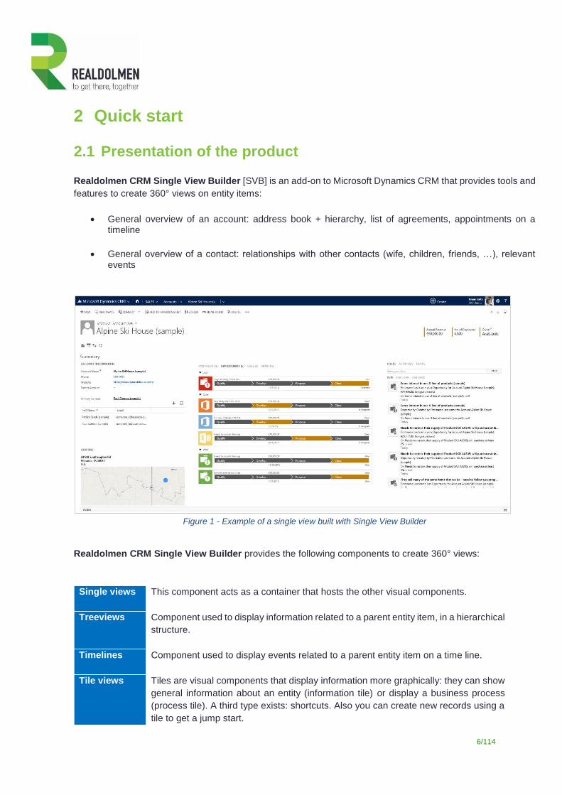
Realdolmen CRM Single View Builder [SVB] is an add-on to Microsoft Dynamics CRM that provides tools and
features to create 360° views on entity items:
General overview of an account: address book + hierarchy, list of agreements, appointments on a timeline
General overview of a contact: relationships with other contacts (wife, children, friends, …), relevant events
Figure 1 - Example of a single view built with Single View Builder
Realdolmen CRM Single View Builder provides the following components to create 360° views:
Single views This component acts as a container that hosts the other visual components.
Treeviews Component used to display information related to a parent entity item, in a hierarchical
structure.
Timelines Component used to display events related to a parent entity item on a time line.
Tile views Tiles are visual components that display information more graphically: they can show
general information about an entity (information tile) or display a business process
(process tile). A third type exists: shortcuts. Also you can create new records using a
tile to get a jump start.
7/114
Map View Map view is the component that visualise your geolocation abled data on a map by
using Google maps. While using standard functionality on latitude and longitude you
can see where your targets are situated
Grid View This component lets you render items in a tabular layout. The definition of the grid
relies on view definitions found on the entity to display.
Navigate to Visual accelerator to navigate directly from one tab to another.
Those components can be assembled together on a specific form in order to provide a 360° - or single view -
on the item level1.
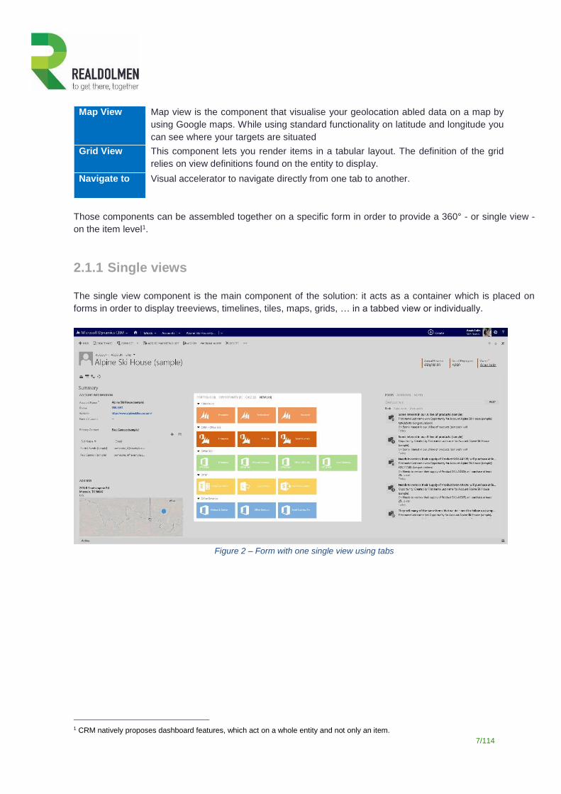
2.1.1 Single views
The single view component is the main component of the solution: it acts as a container which is placed on
forms in order to display treeviews, timelines, tiles, maps, grids, … in a tabbed view or individually.
Figure 2 – Form with one single view using tabs
1 CRM natively proposes dashboard features, which act on a whole entity and not only an item.
8/114
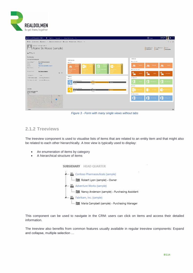
Figure 3 - Form with many single views without tabs
2.1.2 Treeviews
The treeview component is used to visualise lists of items that are related to an entity item and that might also
be related to each other hierarchically. A tree view is typically used to display:
An enumeration of items by category
A hierarchical structure of items
This component can be used to navigate in the CRM: users can click on items and access their detailed
information.
The treeview also benefits from common features usually available in regular treeview components: Expand
and collapse, multiple selection …
9/114
2.1.3 Timelines
The timeline component is used to chronologically visualize events or activities related to an entity item. For
example, a timeline could display all contracts or incidents related to a customer, show the registrations for an
event, etc.
Types of activities can be mixed in order to show a more elaborated timeline (i.e.: contract renewals and
payments received): the component dynamically rearranges the elements depending on the number of elements
to display.
Users can use the timeline to navigate between elements displayed on the timeline. Furthermore, controls such
as zoom in / out facilitate browsing in the timeline.
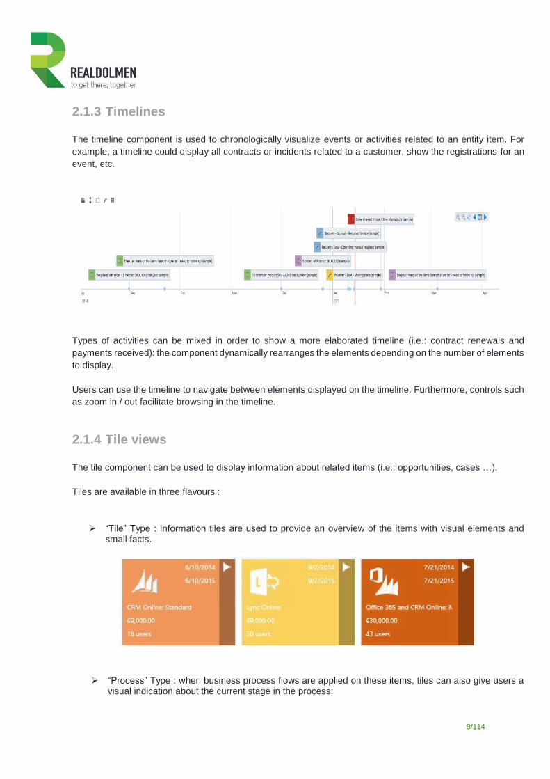
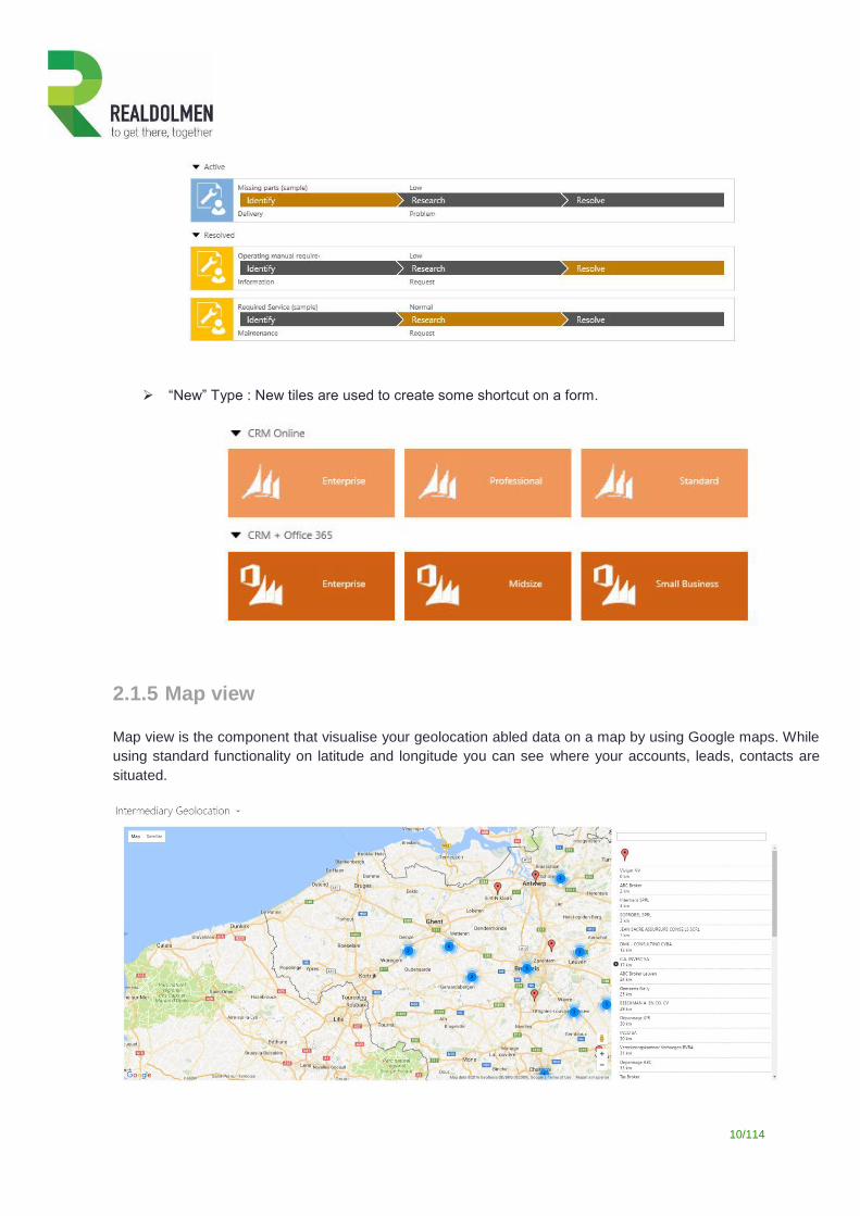
2.1.4 Tile views
The tile component can be used to display information about related items (i.e.: opportunities, cases …).
Tiles are available in three flavours :
“Tile” Type : Information tiles are used to provide an overview of the items with visual elements and small facts.
“Process” Type : when business process flows are applied on these items, tiles can also give users a visual indication about the current stage in the process:
10/114
“New” Type : New tiles are used to create some shortcut on a form.
2.1.5 Map view
Map view is the component that visualise your geolocation abled data on a map by using Google maps. While
using standard functionality on latitude and longitude you can see where your accounts, leads, contacts are
situated.
11/114
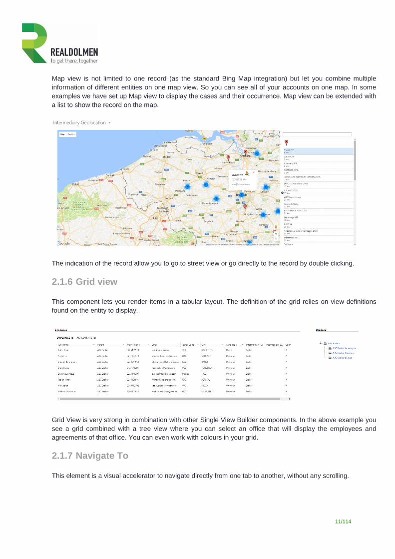
Map view is not limited to one record (as the standard Bing Map integration) but let you combine multiple
information of different entities on one map view. So you can see all of your accounts on one map. In some
examples we have set up Map view to display the cases and their occurrence. Map view can be extended with
a list to show the record on the map.
The indication of the record allow you to go to street view or go directly to the record by double clicking.
2.1.6 Grid view
This component lets you render items in a tabular layout. The definition of the grid relies on view definitions
found on the entity to display.
Grid View is very strong in combination with other Single View Builder components. In the above example you
see a grid combined with a tree view where you can select an office that will display the employees and
agreements of that office. You can even work with colours in your grid.
2.1.7 Navigate To
This element is a visual accelerator to navigate directly from one tab to another, without any scrolling.
12/114
13/114
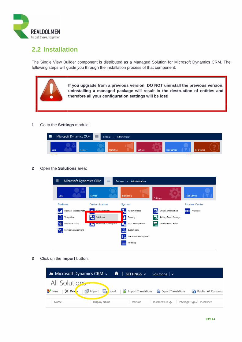
2.2 Installation
The Single View Builder component is distributed as a Managed Solution for Microsoft Dynamics CRM. The
following steps will guide you through the installation process of that component:
If you upgrade from a previous version, DO NOT uninstall the previous version:
uninstalling a managed package will result in the destruction of entities and
therefore all your configuration settings will be lost!
1 Go to the Settings module:
2 Open the Solutions area:
3 Click on the Import button:
14/114
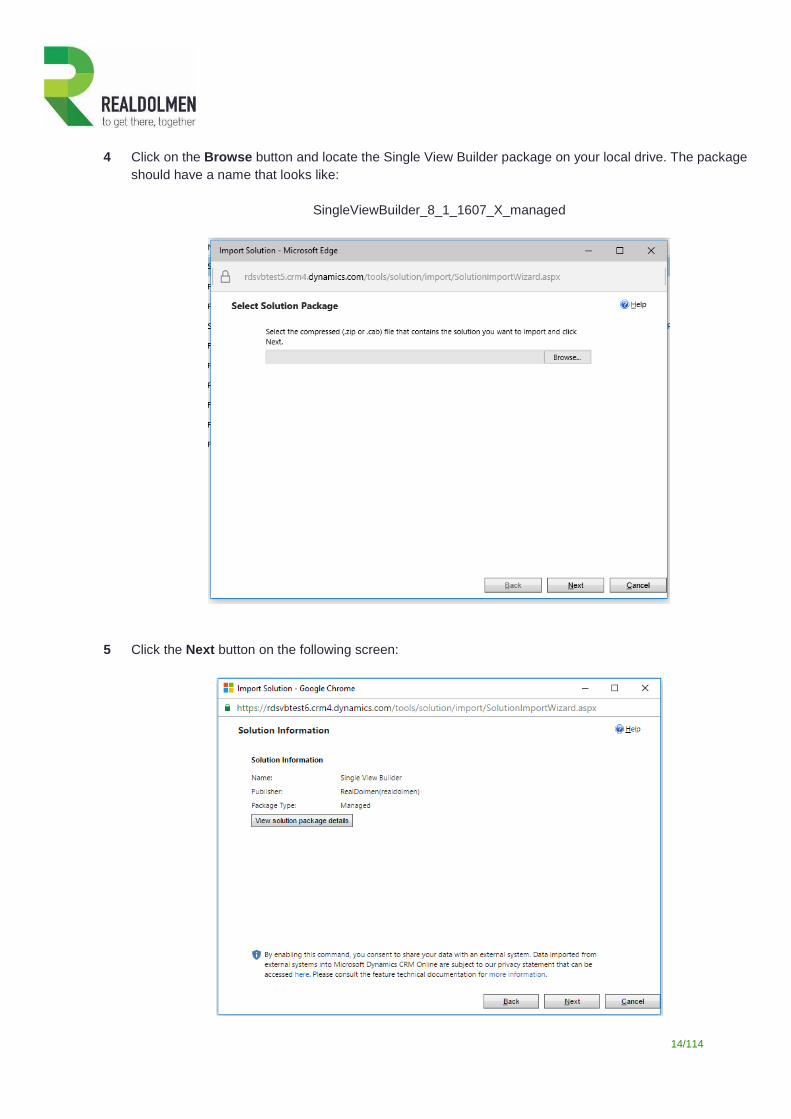
4 Click on the Browse button and locate the Single View Builder package on your local drive. The package
should have a name that looks like:
SingleViewBuilder_8_1_1607_X_managed
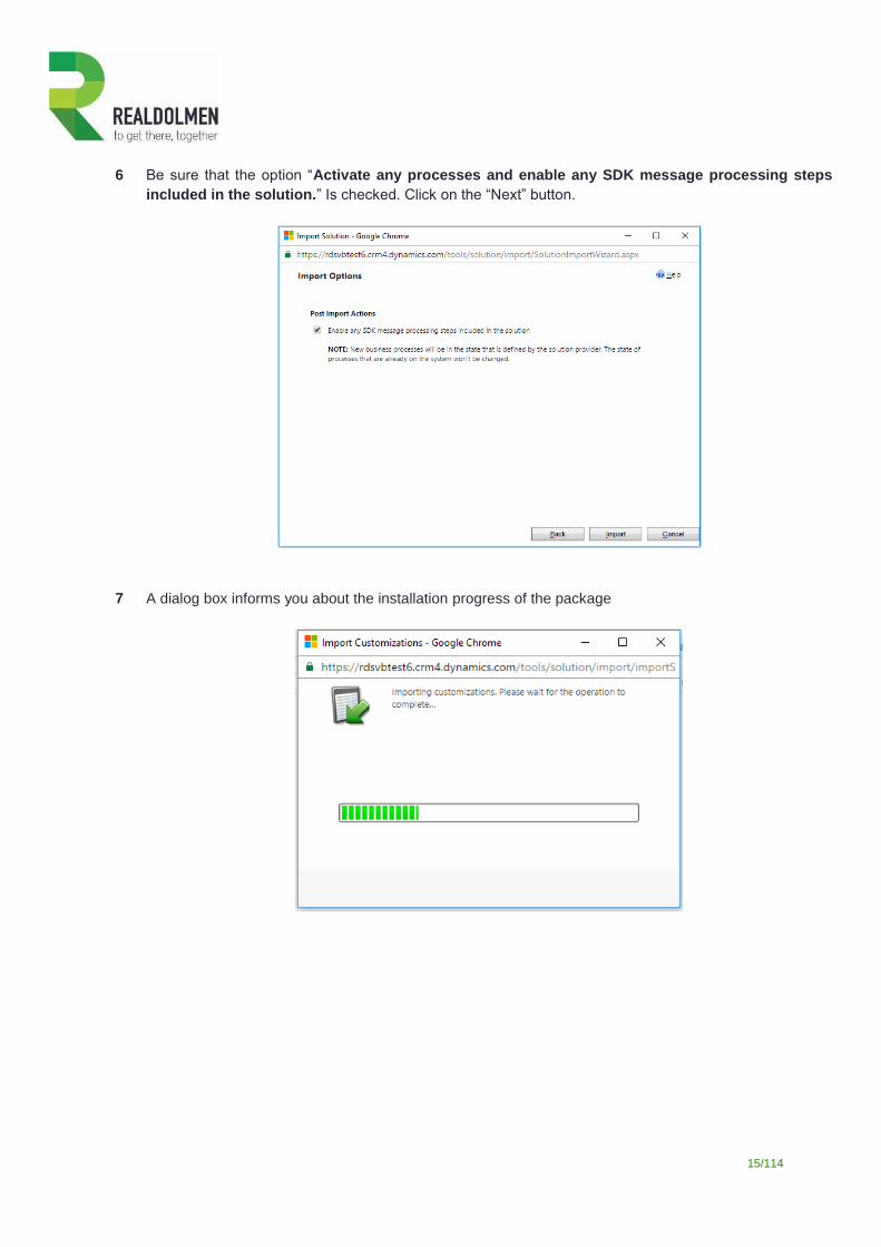
5 Click the Next button on the following screen:
15/114
6 Be sure that the option “Activate any processes and enable any SDK message processing steps
included in the solution.” Is checked. Click on the “Next” button.
7 A dialog box informs you about the installation progress of the package
16/114
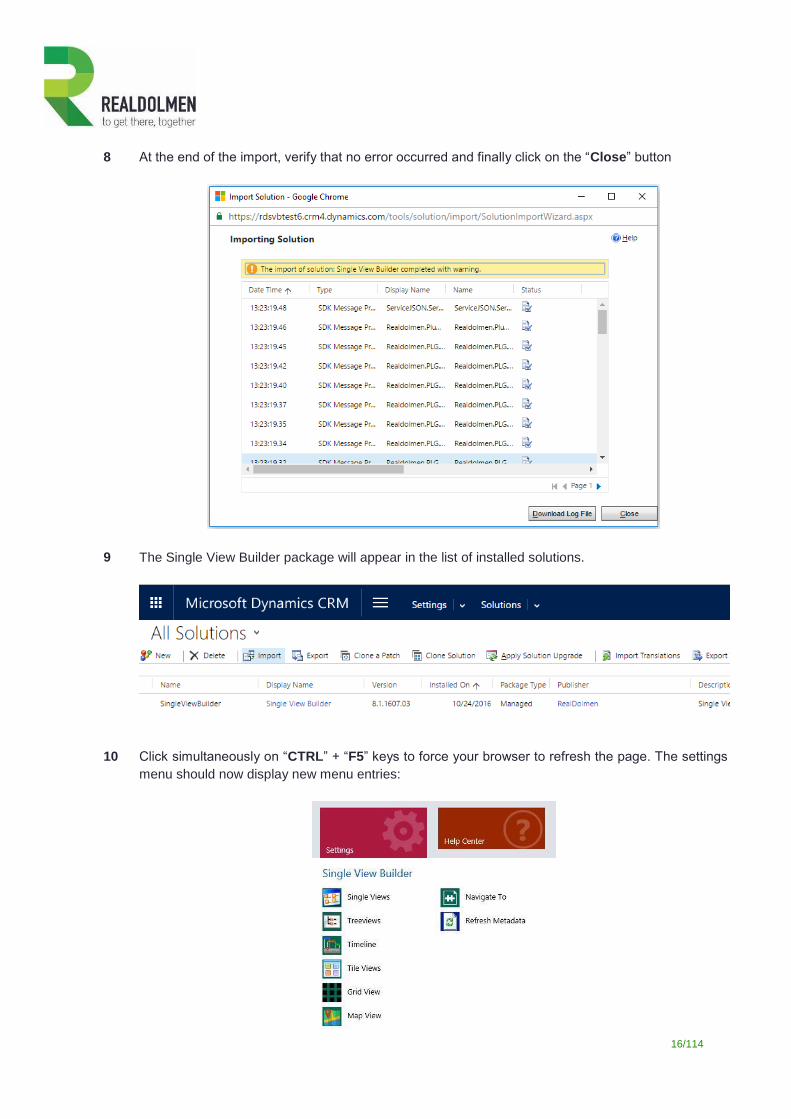
8 At the end of the import, verify that no error occurred and finally click on the “Close” button
9 The Single View Builder package will appear in the list of installed solutions.
10 Click simultaneously on “CTRL” + “F5” keys to force your browser to refresh the page. The settings
menu should now display new menu entries:
17/114
2.3 Tutorial: configuring a single view on accounts
This tutorial will explain you how to create a single view form by assembling the controls available in the
component. For detailed information concerning the configuration of the elements, please refer to the reference
section.
Sample scenario
In this tutorial you will build a single view on the account entity: it will display the general contact information,
the cases, the sub-accounts and the opportunities related to the account.
In order to quickly have a working result, you can:
Install the sample data.
Assign some open opportunities to the account “A Datum Corporation (sample)”.
Assign some open cases to the account “A Datum Corporation (sample)”.
Link some other accounts as sub-account of “A Datum Corporation (sample)”.
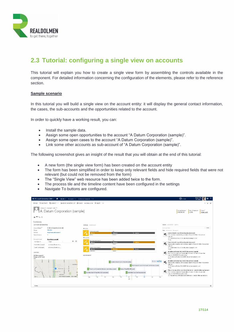
The following screenshot gives an insight of the result that you will obtain at the end of this tutorial:
A new form (the single view form) has been created on the account entity
The form has been simplified in order to keep only relevant fields and hide required fields that were not relevant (but could not be removed from the form)
The “Single View” web resource has been added twice to the form.
The process tile and the timeline content have been configured in the settings
Navigate To buttons are configured.
18/114
The most efficient approach to design a single view will consist in the following steps:
Retrieve information concerning all entities that you plan to manipulate through one of the controls
Create the view components o Define the tile view settings o Define the treeview settings o Define the timeline settings o Define the map view settings o Define the grid view settings
Bundle those elements into two single view containers
Create the navigate to buttons
Create the single view form
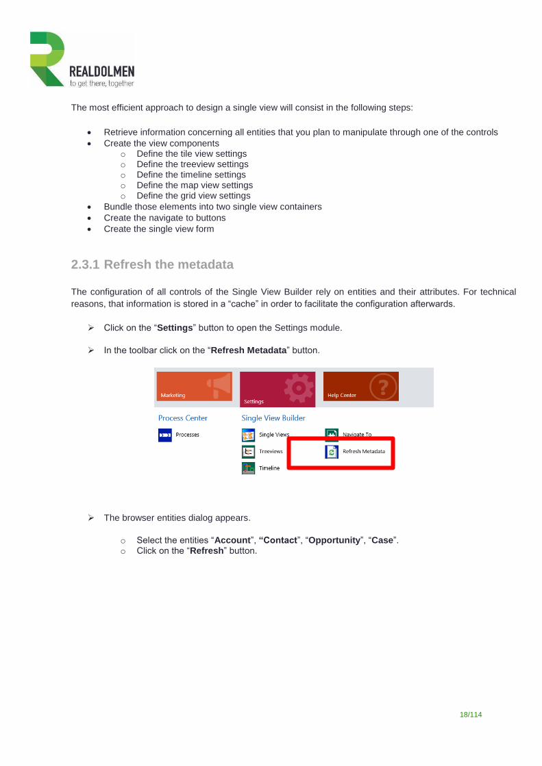
2.3.1 Refresh the metadata
The configuration of all controls of the Single View Builder rely on entities and their attributes. For technical
reasons, that information is stored in a “cache” in order to facilitate the configuration afterwards.
Click on the “Settings” button to open the Settings module.
In the toolbar click on the “Refresh Metadata” button.
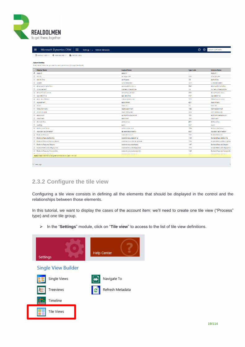
The browser entities dialog appears.
o Select the entities “Account”, “Contact”, “Opportunity”, “Case”. o Click on the “Refresh” button.
19/114
2.3.2 Configure the tile view
Configuring a tile view consists in defining all the elements that should be displayed in the control and the
relationships between those elements.
In this tutorial, we want to display the cases of the account item: we’ll need to create one tile view (“Process”
type) and one tile group.
In the “Settings” module, click on “Tile view” to access to the list of tile view definitions.
20/114
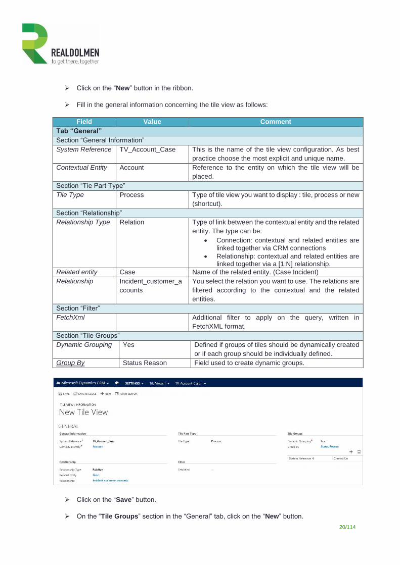
Click on the “New” button in the ribbon.
Fill in the general information concerning the tile view as follows:
Field Value Comment
Tab “General”
Section “General Information”
System Reference TV_Account_Case This is the name of the tile view configuration. As best
practice choose the most explicit and unique name.
Contextual Entity Account Reference to the entity on which the tile view will be
placed.
Section “Tie Part Type”
Tile Type Process Type of tile view you want to display : tile, process or new
(shortcut).
Section “Relationship”
Relationship Type Relation Type of link between the contextual entity and the related
entity. The type can be:
Connection: contextual and related entities are linked together via CRM connections
Relationship: contextual and related entities are linked together via a [1:N] relationship.
Related entity Case Name of the related entity. (Case Incident)
Relationship Incident_customer_a
ccounts
You select the relation you want to use. The relations are
filtered according to the contextual and the related
entities.
Section “Filter”
FetchXml Additional filter to apply on the query, written in
FetchXML format.
Section “Tile Groups”
Dynamic Grouping Yes Defined if groups of tiles should be dynamically created
or if each group should be individually defined.
Group By Status Reason Field used to create dynamic groups.
Click on the “Save” button.
On the “Tile Groups” section in the “General” tab, click on the “New” button.
21/114
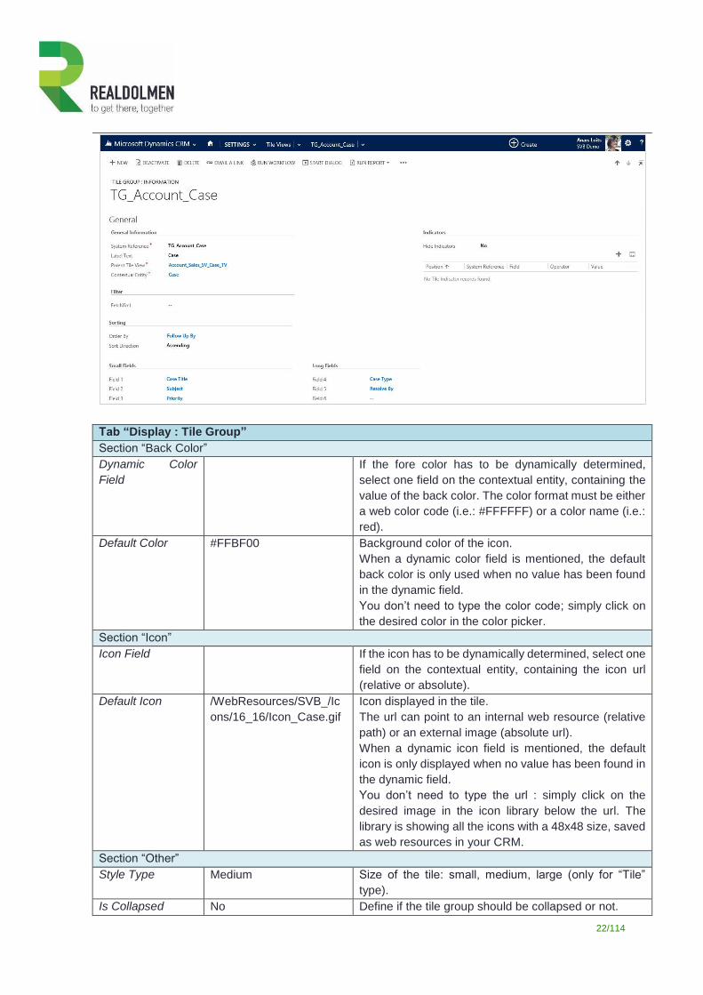
Fill in the configuration of the tile group as follows.
Field Value Comment
Tab “General”
Section “General Information”
System Reference TG_Account_Case This is the name of the tile group configuration. As best
practice choose the most explicit and unique name.
Label Text Cases This is the label of the tile group. If you have chosen a
tile view without dynamic grouping, this label will be
used as label for the tile grouping.
Parent Tile View TV_Account_Case Reference to the parent tile view.
Contextual Entity Case Reference to contextual entity.
Order For ordering the tile groups. In this example we leave it
blank
Section “Filter”
FetchXml Additional filter to apply on the query, written in
FetchXML format. If you have chosen a tile view without
dynamic grouping, you may use this filter to create
some custom groupings (by example, the cases of the
last 6 months).
Section “Sorting”
Order By Follow Up By Field in the related entity used to sort items.
Sort Direction Ascending Sort order: ascending or descending.
Section “Indicators”
Hide Indicators Yes Used only for the “Tile” type of tile view, to add some
indicator icons in the right part of the tiles.
Section “Small Fields”
Field 1 Case Title 1st field used on the tile view.
Field 2 Subject 2nd field used on the tile view.
Field 3 Priority 3rd field used on the tile view.
Section “Long Fields”
Field 4 Case Type 4rd field used on the tile view.
Field 5 Follow Up By 5rd field used on the tile view.
Field 6 6rd field used on the tile view.
22/114
Tab “Display : Tile Group”
Section “Back Color”
Dynamic Color
Field
If the fore color has to be dynamically determined,
select one field on the contextual entity, containing the
value of the back color. The color format must be either
a web color code (i.e.: #FFFFFF) or a color name (i.e.:
red).
Default Color #FFBF00 Background color of the icon.
When a dynamic color field is mentioned, the default
back color is only used when no value has been found
in the dynamic field.
You don’t need to type the color code; simply click on
the desired color in the color picker.
Section “Icon”
Icon Field If the icon has to be dynamically determined, select one
field on the contextual entity, containing the icon url
(relative or absolute).
Default Icon /WebResources/SVB_/Ic
ons/16_16/Icon_Case.gif
Icon displayed in the tile.
The url can point to an internal web resource (relative
path) or an external image (absolute url).
When a dynamic icon field is mentioned, the default
icon is only displayed when no value has been found in
the dynamic field.
You don’t need to type the url : simply click on the
desired image in the icon library below the url. The
library is showing all the icons with a 48x48 size, saved
as web resources in your CRM.
Section “Other”
Style Type Medium Size of the tile: small, medium, large (only for “Tile”
type).
Is Collapsed No Define if the tile group should be collapsed or not.
23/114
Click on “Save and Close” to return to the tile view definition form.
Close the tile view definition form.
2.3.3 Configure the treeview
Configuring a treeview consists in defining all the elements that should be displayed in the control and what are
the relationships between those elements.
In this tutorial, we want to display the sub-accounts and their employees. We’ll need to create one treeview and
two treeview nodes.
In the “Settings” module, click on “Treeviews” to access to the list of treeview definitions
Click on the “New” button in the ribbon bar.
Fill in the general information concerning the treeview as follows.
Field Value Comment
Tab “General”
Section “General Information”
System Reference TV_Account_Subacc
ount
This is the name of the treeview configuration. As best
practice choose the most explicit and unique name.
Contextual Entity Account This is the entity on which will be placed the treeview.
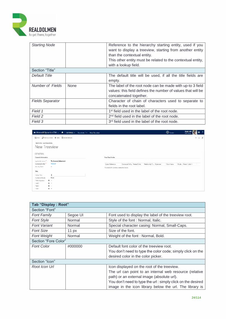
24/114
Starting Node Reference to the hierarchy starting entity, used if you
want to display a treeview, starting from another entity
than the contextual entity.
This other entity must be related to the contextual entity,
with a lookup field.
Section “Title”
Default Title The default title will be used, if all the title fields are
empty.
Number of Fields None The label of the root node can be made with up-to 3 field
values: this field defines the number of values that will be
concatenated together.
Fields Separator Character of chain of characters used to separate to
fields in the root label.
Field 1
1st field used in the label of the root node.
Field 2 2nd field used in the label of the root node.
Field 3 3rd field used in the label of the root node.
Tab “Display : Root”
Section “Font”
Font Family Segoe UI Font used to display the label of the treeview root.
Font Style Normal Style of the font : Normal, Italic.
Font Variant Normal Special character casing: Normal, Small-Caps.
Font Size 11 px Size of the font.
Font Weight Normal Weight of the font : Normal, Bold.
Section “Fore Color”
Font Color #000000 Default font color of the treeview root.
You don’t need to type the color code; simply click on the
desired color in the color picker.
Section “Icon”
Root Icon Url
Icon displayed on the root of the treeview.
The url can point to an internal web resource (relative
path) or an external image (absolute url).
You don’t need to type the url : simply click on the desired
image in the icon library below the url. The library is
25/114
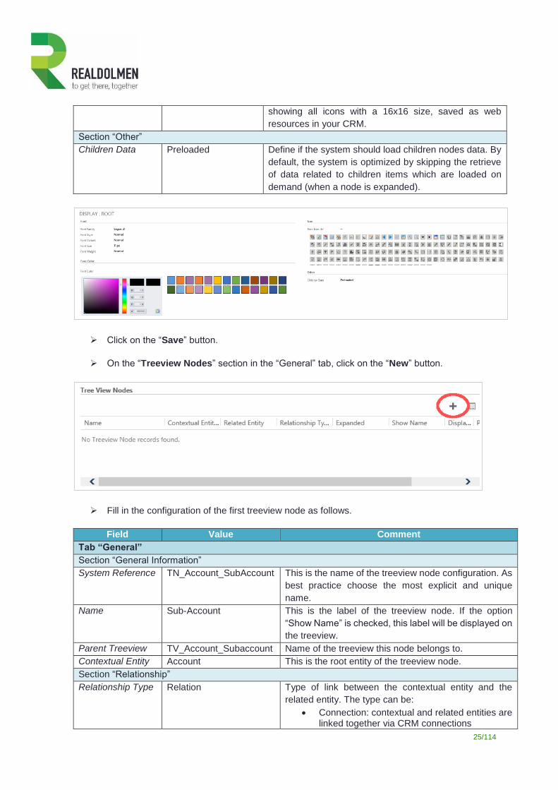
showing all icons with a 16x16 size, saved as web
resources in your CRM.
Section “Other”
Children Data Preloaded Define if the system should load children nodes data. By
default, the system is optimized by skipping the retrieve
of data related to children items which are loaded on
demand (when a node is expanded).
Click on the “Save” button.
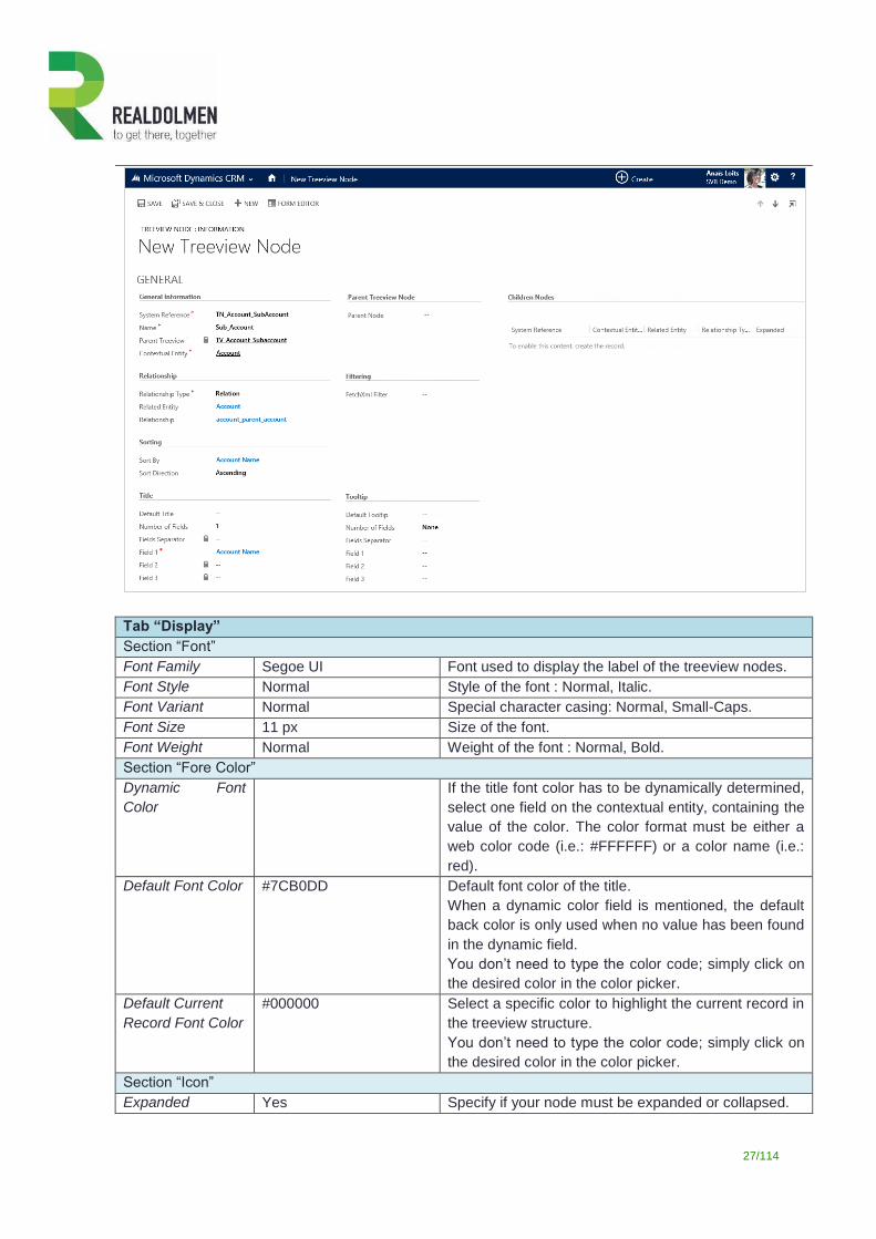
On the “Treeview Nodes” section in the “General” tab, click on the “New” button.
Fill in the configuration of the first treeview node as follows.
Field Value Comment
Tab “General”
Section “General Information”
System Reference TN_Account_SubAccount This is the name of the treeview node configuration. As
best practice choose the most explicit and unique
name.
Name Sub-Account This is the label of the treeview node. If the option
“Show Name” is checked, this label will be displayed on
the treeview.
Parent Treeview TV_Account_Subaccount Name of the treeview this node belongs to.
Contextual Entity Account This is the root entity of the treeview node.
Section “Relationship”
Relationship Type Relation Type of link between the contextual entity and the
related entity. The type can be:
Connection: contextual and related entities are linked together via CRM connections
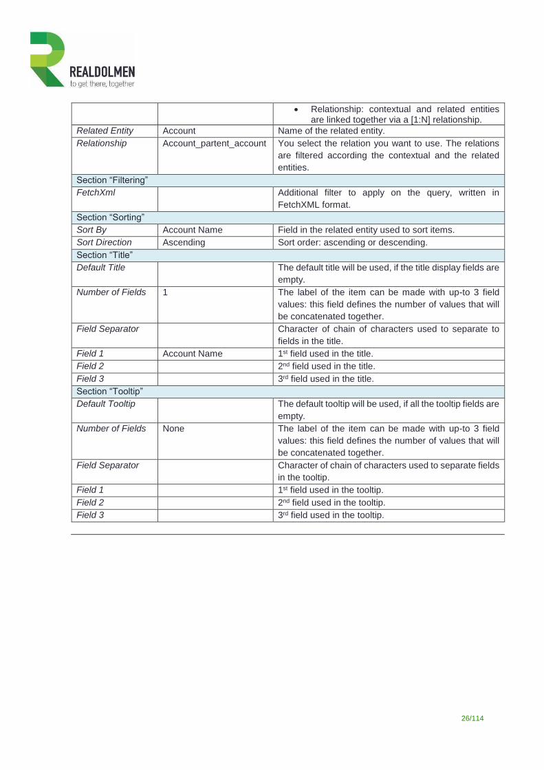
26/114
Relationship: contextual and related entities are linked together via a [1:N] relationship.
Related Entity Account Name of the related entity.
Relationship Account_partent_account You select the relation you want to use. The relations
are filtered according the contextual and the related
entities.
Section “Filtering”
FetchXml Additional filter to apply on the query, written in
FetchXML format.
Section “Sorting”
Sort By Account Name Field in the related entity used to sort items.
Sort Direction Ascending Sort order: ascending or descending.
Section “Title”
Default Title The default title will be used, if the title display fields are
empty.
Number of Fields 1 The label of the item can be made with up-to 3 field
values: this field defines the number of values that will
be concatenated together.
Field Separator Character of chain of characters used to separate to
fields in the title.
Field 1 Account Name 1st field used in the title.
Field 2 2nd field used in the title.
Field 3 3rd field used in the title.
Section “Tooltip”
Default Tooltip The default tooltip will be used, if all the tooltip fields are
empty.
Number of Fields None The label of the item can be made with up-to 3 field
values: this field defines the number of values that will
be concatenated together.
Field Separator Character of chain of characters used to separate fields
in the tooltip.
Field 1 1st field used in the tooltip.
Field 2 2nd field used in the tooltip.
Field 3 3rd field used in the tooltip.
27/114
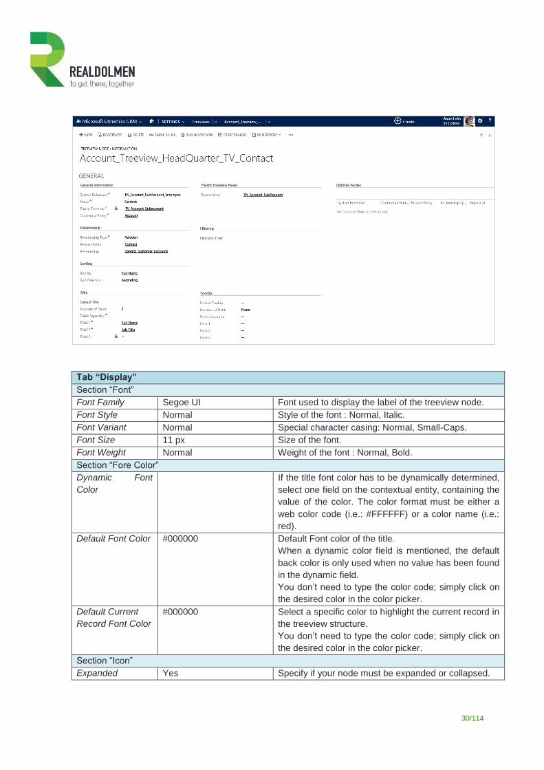
Tab “Display”
Section “Font”
Font Family Segoe UI Font used to display the label of the treeview nodes.
Font Style Normal Style of the font : Normal, Italic.
Font Variant Normal Special character casing: Normal, Small-Caps.
Font Size 11 px Size of the font.
Font Weight Normal Weight of the font : Normal, Bold.
Section “Fore Color”
Dynamic Font
Color
If the title font color has to be dynamically determined,
select one field on the contextual entity, containing the
value of the color. The color format must be either a
web color code (i.e.: #FFFFFF) or a color name (i.e.:
red).
Default Font Color #7CB0DD Default font color of the title.
When a dynamic color field is mentioned, the default
back color is only used when no value has been found
in the dynamic field.
You don’t need to type the color code; simply click on
the desired color in the color picker.
Default Current
Record Font Color
#000000 Select a specific color to highlight the current record in
the treeview structure.
You don’t need to type the color code; simply click on
the desired color in the color picker.
Section “Icon”
Expanded Yes Specify if your node must be expanded or collapsed.
28/114
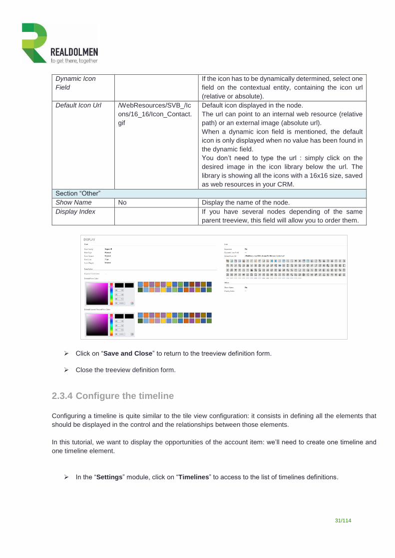
Dynamic Icon
Field
If the icon has to be dynamically determined, select one
field on the contextual entity, containing the icon url
(relative or absolute).
Default Icon Url /WebResources/SVB_/Ic
ons/16_16/Icon_Account.
gif
Default icon displayed in the node.
The url can point to an internal web resource (relative
path) or an external image (absolute url).
When a dynamic icon field is mentioned, the default
icon is only displayed when no value has been found in
the dynamic field.
You don’t need to type the url : simply click on the
desired image in the icon library below the url. The
library is showing all the icons with a 16x16 size, saved
as web resources in your CRM.
Section “Other”
Show Name No Display the name of the node.
Display Index If you have several nodes depending of the same
parent treeview, this field will allow you to order them.
Click on the “Save” button.
On the “Children Nodes” section in the “General” tab, click on the “New” button.
Fill the configuration of the first treeview node as follows.
Field Value Comment
Tab “General”
Section “General Information”
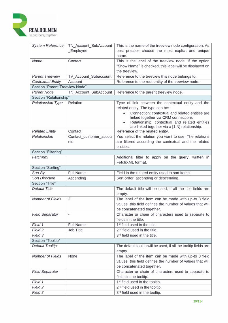
29/114
System Reference TN_Account_SubAccount
_Employee
This is the name of the treeview node configuration. As
best practice choose the most explicit and unique
name.
Name Contact This is the label of the treeview node. If the option
“Show Name” is checked, this label will be displayed on
the treeview.
Parent Treeview TV_Account_Subaccount Reference to the treeview this node belongs to.
Contextual Entity Account Reference to the root entity of the treeview node.
Section “Parent Treeview Node”
Parent Node TN_Account_SubAccount Reference to the parent treeview node.
Section “Relationship”
Relationship Type Relation Type of link between the contextual entity and the
related entity. The type can be:
Connection: contextual and related entities are linked together via CRM connections
Relationship: contextual and related entities are linked together via a [1:N] relationship.
Related Entity Contact Reference of the related entity.
Relationship Contact_customer_accou
nts
You select the relation you want to use. The relations
are filtered according the contextual and the related
entities.
Section “Filtering”
FetchXml Additional filter to apply on the query, written in
FetchXML format.
Section “Sorting”
Sort By Full Name Field in the related entity used to sort items.
Sort Direction Ascending Sort order: ascending or descending.
Section “Title”
Default Title The default title will be used, if all the title fields are
empty.
Number of Fields 2 The label of the item can be made with up-to 3 field
values: this field defines the number of values that will
be concatenated together.
Field Separator - Character or chain of characters used to separate to
fields in the title.
Field 1 Full Name 1st field used in the title.
Field 2 Job Title 2nd field used in the title.
Field 3 3rd field used in the title.
Section “Tooltip”
Default Tooltip The default tooltip will be used, if all the tooltip fields are
empty.
Number of Fields None The label of the item can be made with up-to 3 field
values: this field defines the number of values that will
be concatenated together.
Field Separator Character or chain of characters used to separate to
fields in the tooltip.
Field 1 1st field used in the tooltip.
Field 2 2nd field used in the tooltip.
Field 3 3rd field used in the tooltip.
30/114
Tab “Display”
Section “Font”
Font Family Segoe UI Font used to display the label of the treeview node.
Font Style Normal Style of the font : Normal, Italic.
Font Variant Normal Special character casing: Normal, Small-Caps.
Font Size 11 px Size of the font.
Font Weight Normal Weight of the font : Normal, Bold.
Section “Fore Color”
Dynamic Font
Color
If the title font color has to be dynamically determined,
select one field on the contextual entity, containing the
value of the color. The color format must be either a
web color code (i.e.: #FFFFFF) or a color name (i.e.:
red).
Default Font Color #000000 Default Font color of the title.
When a dynamic color field is mentioned, the default
back color is only used when no value has been found
in the dynamic field.
You don’t need to type the color code; simply click on
the desired color in the color picker.
Default Current
Record Font Color
#000000 Select a specific color to highlight the current record in
the treeview structure.
You don’t need to type the color code; simply click on
the desired color in the color picker.
Section “Icon”
Expanded Yes Specify if your node must be expanded or collapsed.
31/114
Dynamic Icon
Field
If the icon has to be dynamically determined, select one
field on the contextual entity, containing the icon url
(relative or absolute).
Default Icon Url /WebResources/SVB_/Ic
ons/16_16/Icon_Contact.
gif
Default icon displayed in the node.
The url can point to an internal web resource (relative
path) or an external image (absolute url).
When a dynamic icon field is mentioned, the default
icon is only displayed when no value has been found in
the dynamic field.
You don’t need to type the url : simply click on the
desired image in the icon library below the url. The
library is showing all the icons with a 16x16 size, saved
as web resources in your CRM.
Section “Other”
Show Name No Display the name of the node.
Display Index If you have several nodes depending of the same
parent treeview, this field will allow you to order them.
Click on “Save and Close” to return to the treeview definition form.
Close the treeview definition form.
2.3.4 Configure the timeline
Configuring a timeline is quite similar to the tile view configuration: it consists in defining all the elements that
should be displayed in the control and the relationships between those elements.
In this tutorial, we want to display the opportunities of the account item: we’ll need to create one timeline and
one timeline element.
In the “Settings” module, click on “Timelines” to access to the list of timelines definitions.
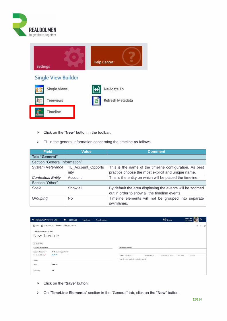
32/114
Click on the “New” button in the toolbar.
Fill in the general information concerning the timeline as follows.
Field Value Comment
Tab “General”
Section “General Information”
System Reference TL_Account_Opportu
nity
This is the name of the timeline configuration. As best
practice choose the most explicit and unique name.
Contextual Entity Account This is the entity on which will be placed the timeline.
Section “Other”
Scale Show all By default the area displaying the events will be zoomed
out in order to show all the timeline events.
Grouping No Timeline elements will not be grouped into separate
swimlanes.
Click on the “Save” button.
On “TimeLine Elements” section in the “General” tab, click on the ”New” button.
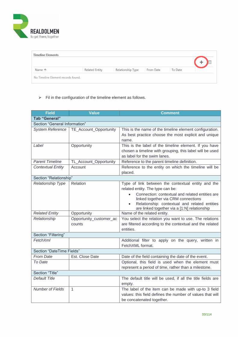
33/114
Fil in the configuration of the timeline element as follows.
Field Value Comment
Tab “General”
Section “General Information”
System Reference TE_Account_Opportunity This is the name of the timeline element configuration.
As best practice choose the most explicit and unique
name.
Label Opportunity This is the label of the timeline element. If you have
chosen a timeline with grouping, this label will be used
as label for the swim lanes.
Parent Timeline TL_Account_Opportunity Reference to the parent timeline definition.
Contextual Entity Account Reference to the entity on which the timeline will be
placed.
Section “Relationship”
Relationship Type Relation Type of link between the contextual entity and the
related entity. The type can be:
Connection: contextual and related entities are linked together via CRM connections
Relationship: contextual and related entities are linked together via a [1:N] relationship
Related Entity Opportunity Name of the related entity.
Relationship Opportunity_customer_ac
counts
You select the relation you want to use. The relations
are filtered according to the contextual and the related
entities.
Section “Filtering”
FetchXml Additional filter to apply on the query, written in
FetchXML format.
Section “DateTime Fields”
From Date Est. Close Date Date of the field containing the date of the event.
To Date Optional, this field is used when the element must
represent a period of time, rather than a milestone.
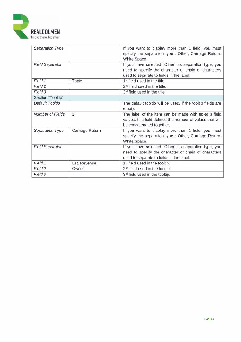
Section “Title”
Default Title The default title will be used, if all the title fields are
empty.
Number of Fields 1 The label of the item can be made with up-to 3 field
values: this field defines the number of values that will
be concatenated together.
34/114
Separation Type If you want to display more than 1 field, you must
specify the separation type : Other, Carriage Return,
White Space.
Field Separator If you have selected “Other” as separation type, you
need to specify the character or chain of characters
used to separate to fields in the label.
Field 1 Topic 1st field used in the title.
Field 2 2nd field used in the title.
Field 3 3rd field used in the title.
Section “Tooltip”
Default Tooltip The default tooltip will be used, if the tooltip fields are
empty.
Number of Fields 2 The label of the item can be made with up-to 3 field
values: this field defines the number of values that will
be concatenated together.
Separation Type Carriage Return If you want to display more than 1 field, you must
specify the separation type : Other, Carriage Return,
White Space.
Field Separator If you have selected “Other” as separation type, you
need to specify the character or chain of characters
used to separate to fields in the label.
Field 1 Est. Revenue 1st field used in the tooltip.
Field 2 Owner 2nd field used in the tooltip.
Field 3 3rd field used in the tooltip.
35/114
Tab “Display : Timeline Element”
Section “Icon”
Font Family Segoe UI Font used to display the label of the timeline elements.
Font Style Normal Style of the font : Normal, Italic.
Font Variant Normal Special character casing: Normal, Small-Caps.
Font Size 11 px Size of the font.
Font Weight Normal Weight of the font : Normal, Bold.
Section “Fore Color”
Font Color #000000 Color of the text displayed on the timeline element.
You don’t need to type the color code : simply click on
the desired color in the color picker.
Section “Icon”
Icon Before Text Yes Specify if the icon should be placed before or after the
title of the element.
Dynamic Icon
Field
If the icon has to be dynamically determined, select one
field on the contextual entity, containing the icon url
(relative or absolute).
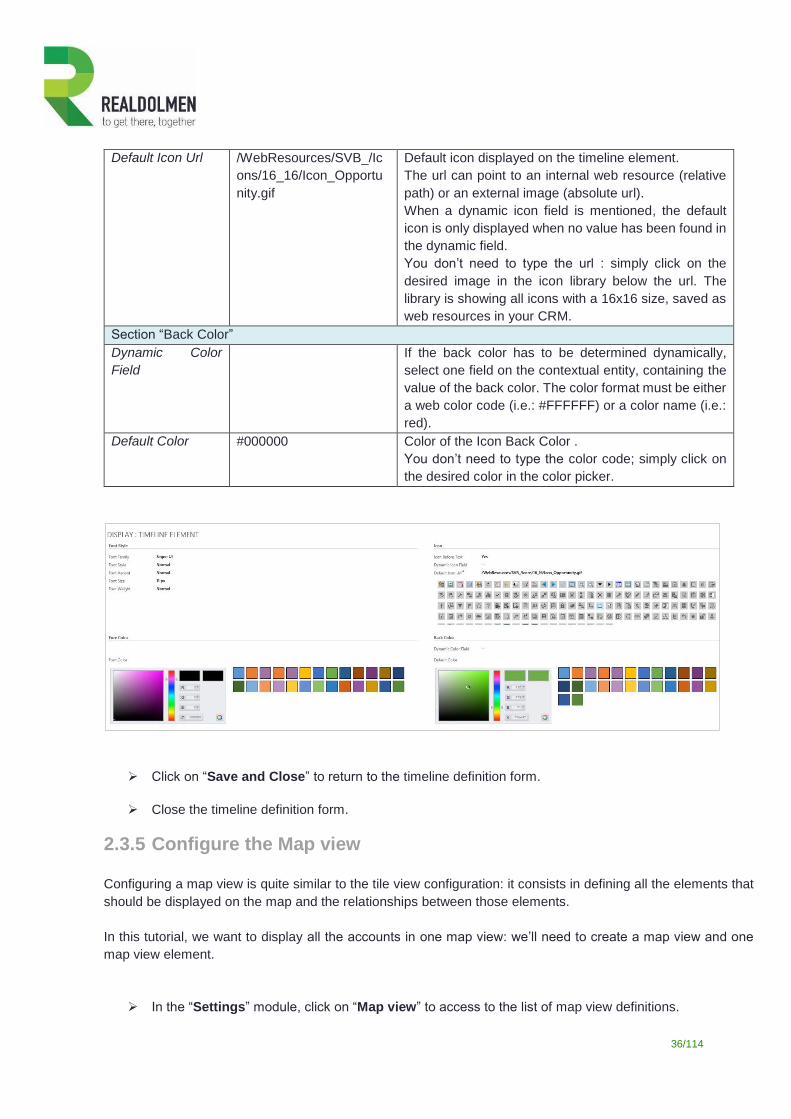
36/114
Default Icon Url /WebResources/SVB_/Ic
ons/16_16/Icon_Opportu
nity.gif
Default icon displayed on the timeline element.
The url can point to an internal web resource (relative
path) or an external image (absolute url).
When a dynamic icon field is mentioned, the default
icon is only displayed when no value has been found in
the dynamic field.
You don’t need to type the url : simply click on the
desired image in the icon library below the url. The
library is showing all icons with a 16x16 size, saved as
web resources in your CRM.
Section “Back Color”
Dynamic Color
Field
If the back color has to be determined dynamically,
select one field on the contextual entity, containing the
value of the back color. The color format must be either
a web color code (i.e.: #FFFFFF) or a color name (i.e.:
red).
Default Color #000000 Color of the Icon Back Color .
You don’t need to type the color code; simply click on
the desired color in the color picker.
Click on “Save and Close” to return to the timeline definition form.
Close the timeline definition form.
2.3.5 Configure the Map view
Configuring a map view is quite similar to the tile view configuration: it consists in defining all the elements that
should be displayed on the map and the relationships between those elements.
In this tutorial, we want to display all the accounts in one map view: we’ll need to create a map view and one
map view element.
In the “Settings” module, click on “Map view” to access to the list of map view definitions.
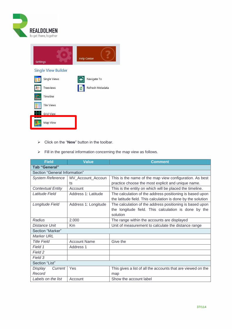
37/114
Click on the “New” button in the toolbar.
Fill in the general information concerning the map view as follows.
Field Value Comment
Tab “General”
Section “General Information”
System Reference MV_Account_Accoun
ts
This is the name of the map view configuration. As best
practice choose the most explicit and unique name.
Contextual Entity Account This is the entity on which will be placed the timeline.
Latitude Field Address 1: Latitude The calculation of the address positioning is based upon
the latitude field. This calculation is done by the solution
Longitude Field Address 1: Longitude The calculation of the address positioning is based upon
the longitude field. This calculation is done by the
solution
Radius 2.000 The range within the accounts are displayed
Distance Unit Km Unit of measurement to calculate the distance range
Section “Marker”
Marker URL
Title Field Account Name Give the
Field 1 Address 1
Field 2
Field 3
Section “List”
Display Current
Record
Yes This gives a list of all the accounts that are viewed on the
map
Labels on the list Account Show the account label
38/114
Click on the “Save” button.
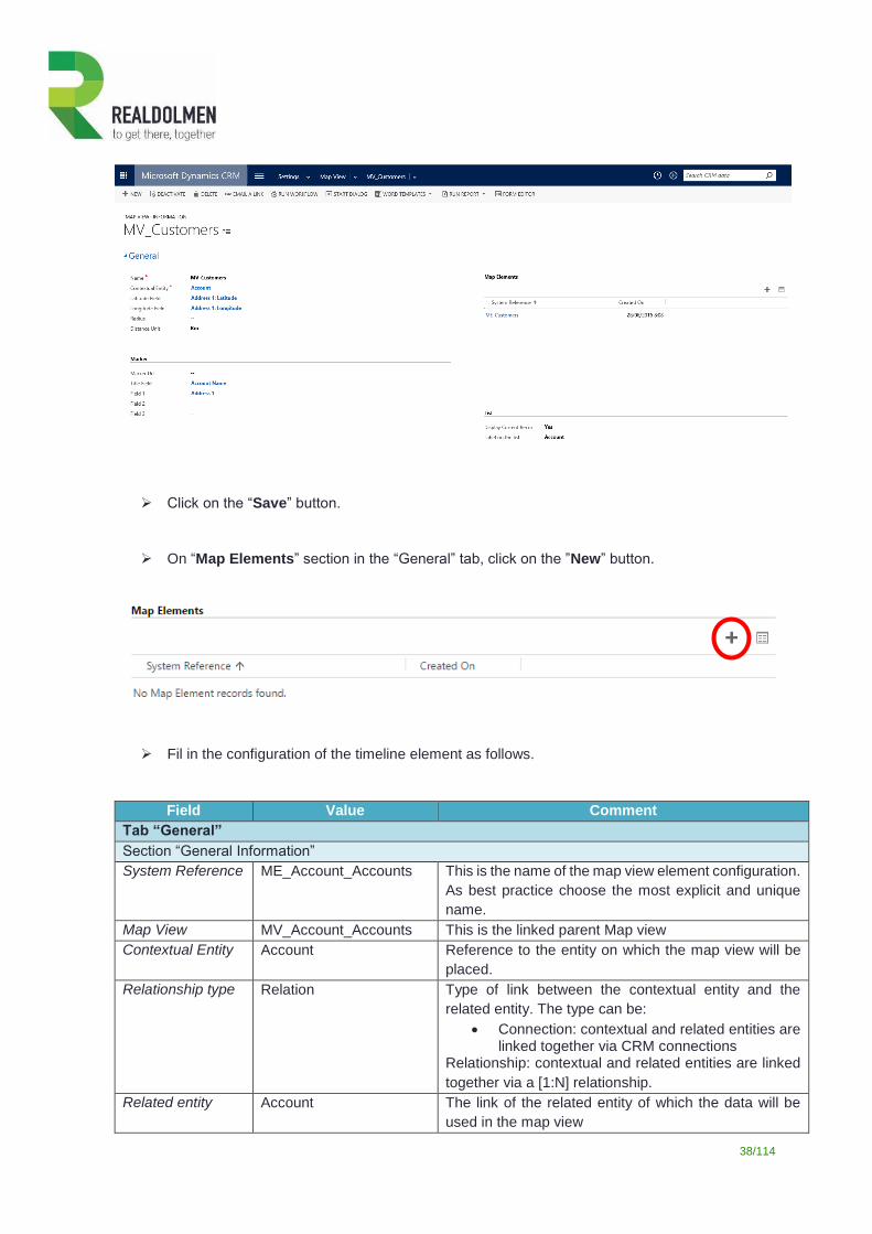
On “Map Elements” section in the “General” tab, click on the ”New” button.
Fil in the configuration of the timeline element as follows.
Field Value Comment
Tab “General”
Section “General Information”
System Reference ME_Account_Accounts This is the name of the map view element configuration.
As best practice choose the most explicit and unique
name.
Map View MV_Account_Accounts This is the linked parent Map view
Contextual Entity Account Reference to the entity on which the map view will be
placed.
Relationship type Relation Type of link between the contextual entity and the
related entity. The type can be:
Connection: contextual and related entities are linked together via CRM connections
Relationship: contextual and related entities are linked
together via a [1:N] relationship.
Related entity Account The link of the related entity of which the data will be
used in the map view
39/114
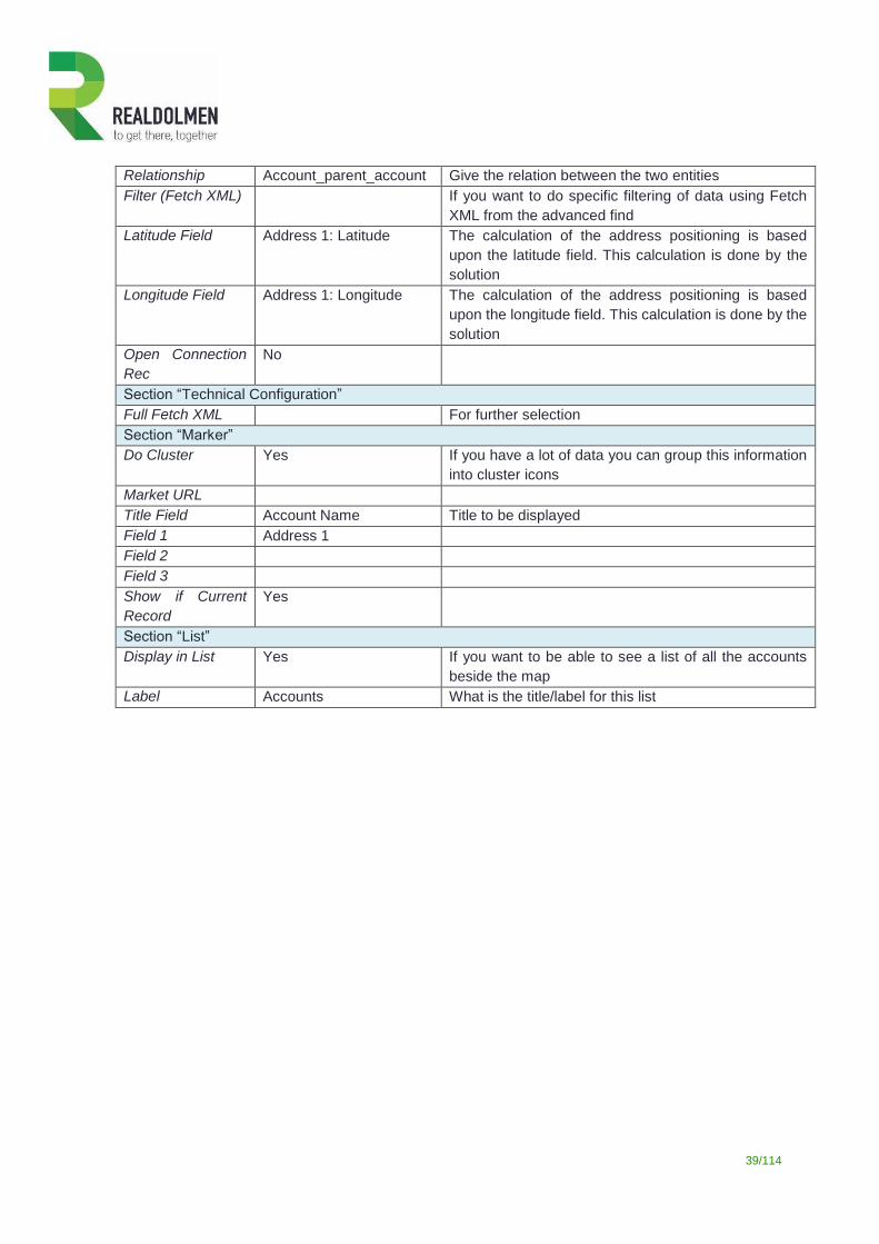
Relationship Account_parent_account Give the relation between the two entities
Filter (Fetch XML) If you want to do specific filtering of data using Fetch
XML from the advanced find
Latitude Field Address 1: Latitude The calculation of the address positioning is based
upon the latitude field. This calculation is done by the
solution
Longitude Field Address 1: Longitude The calculation of the address positioning is based
upon the longitude field. This calculation is done by the
solution
Open Connection
Rec
No
Section “Technical Configuration”
Full Fetch XML For further selection
Section “Marker”
Do Cluster Yes If you have a lot of data you can group this information
into cluster icons
Market URL
Title Field Account Name Title to be displayed
Field 1 Address 1
Field 2
Field 3
Show if Current
Record
Yes
Section “List”
Display in List Yes If you want to be able to see a list of all the accounts
beside the map
Label Accounts What is the title/label for this list
40/114
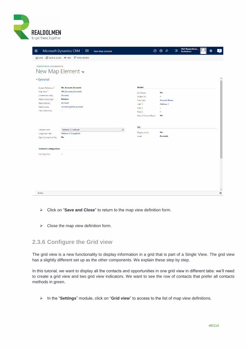
Click on “Save and Close” to return to the map view definition form.
Close the map view definition form.
2.3.6 Configure the Grid view
The grid view is a new functionality to display information in a grid that is part of a Single View. The grid view
has a slightly different set up as the other components. We explain these step by step.
In this tutorial, we want to display all the contacts and opportunities in one grid view in different tabs: we’ll need
to create a grid view and two grid view indicators. We want to see the row of contacts that prefer all contacts
methods in green.
In the “Settings” module, click on “Grid view” to access to the list of map view definitions.
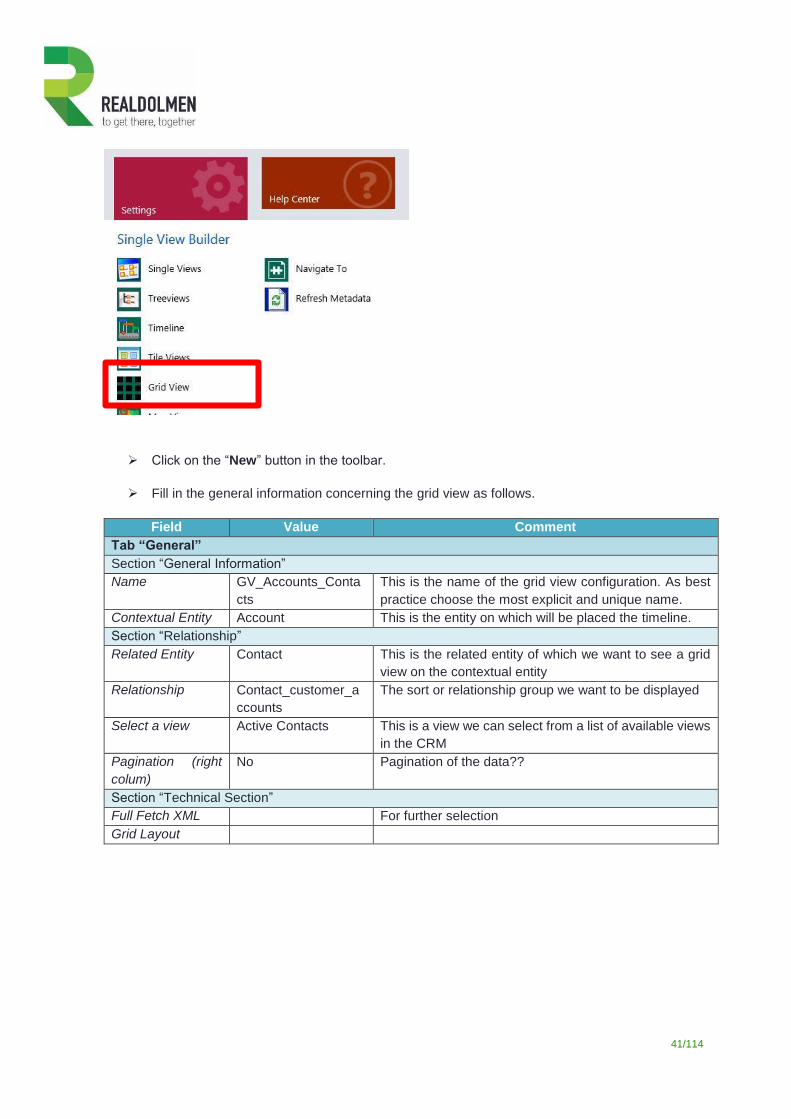
41/114
Click on the “New” button in the toolbar.
Fill in the general information concerning the grid view as follows.
Field Value Comment
Tab “General”
Section “General Information”
Name GV_Accounts_Conta
cts
This is the name of the grid view configuration. As best
practice choose the most explicit and unique name.
Contextual Entity Account This is the entity on which will be placed the timeline.
Section “Relationship”
Related Entity Contact This is the related entity of which we want to see a grid
view on the contextual entity
Relationship Contact_customer_a
ccounts
The sort or relationship group we want to be displayed
Select a view Active Contacts This is a view we can select from a list of available views
in the CRM
Pagination (right
colum)
No Pagination of the data??
Section “Technical Section”
Full Fetch XML For further selection
Grid Layout
42/114
Click on the “Save” button.
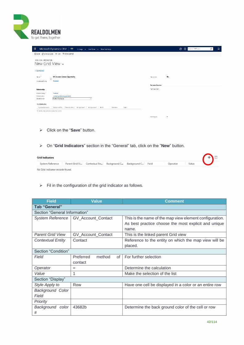
On “Grid Indicators” section in the “General” tab, click on the ”New” button.
Fil in the configuration of the grid indicator as follows.
Field Value Comment
Tab “General”
Section “General Information”
System Reference GV_Account_Contact This is the name of the map view element configuration.
As best practice choose the most explicit and unique
name.
Parent Grid View GV_Account_Contact This is the linked parent Grid view
Contextual Entity Contact Reference to the entity on which the map view will be
placed.
Section “Condition”
Field Preferred method of
contact
For further selection
Operator = Determine the calculation
Value 1 Make the selection of the list
Section “Display”
Style Apply to Row Have one cell be displayed in a color or an entire row
Background Color
Field
Priority
Background color
#
43682b Determine the back ground color of the cell or row
43/114
Click on “Save and Close” to return to the grid view definition form.
Close the grid view definition form.
2.3.7 Bundle elements into single view containers A single view is the main component you must create: single views will contain the other components.
We will create four single views :
A single view containing the tile view, treeview, map view and grid view
A single view containing the timeline
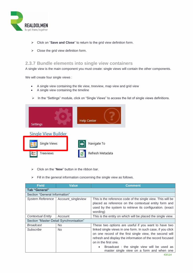
In the “Settings” module, click on “Single Views” to access the list of single views definitions.
Click on the “New” button in the ribbon bar.
Fill in the general information concerning the single view as follows.
Field Value Comment
Tab “General”
Section “General Information”
System Reference Account_singleview This is the reference code of the single view. This will be
placed as reference on the contextual entity form and
used by the system to retrieve its configuration. (exact
wording)
Contextual Entity Account This is the entity on which will be placed the single view.
Section “Master-Detail Synchronisation”
Broadcast No These two options are useful if you want to have two
linked single views in one form. In such case, if you click
on one record of the first single view, the second will
refresh and display the information of the record focused
on in the first one.
Broadcast : the single view will be used as master single view on a form and when one
Subscribe No
44/114
element will be focused, trigger the refreshing of other single views (with subscribe option)
Subscribe : the single view will listen to the others (with broadcast option) and refresh when needed.
Section “Other”
Display mode With Tabs Defines how the single view components should be
accessed:
With tabs: tabs are displayed on top of the view area
Without tabs: only the first one is displayed.
Click on the “Save” button.
On “View parts”, click on the ”New” button to create a first view part.
Fill in the general information concerning the view part as follows.
Field Value Comment
Tab “General”
Section “General Information”
System Reference VP_Account_singleview
_Case
This is the name of the view part configuration. As best
practice choose the most explicit and unique name.
Part Label Case This is the label of the view part. If you have chosen to
display the title, this will be used as label for the single
view tab.
Parent Single View Account_singleview Reference to the parent single view.
Contextual Entity Account This is the entity on which will be placed the single view.
View Part Type Tile View Type of the view part : timeline, tile view, treeview.
Tile View TV_Account_Case Reference to the tile view.
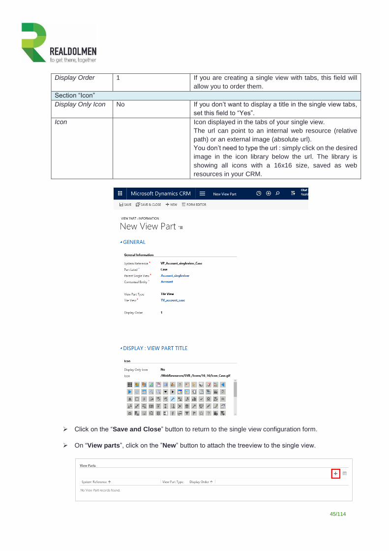
45/114
Display Order 1 If you are creating a single view with tabs, this field will
allow you to order them.
Section “Icon”
Display Only Icon No If you don’t want to display a title in the single view tabs,
set this field to “Yes”.
Icon Icon displayed in the tabs of your single view.
The url can point to an internal web resource (relative
path) or an external image (absolute url).
You don’t need to type the url : simply click on the desired
image in the icon library below the url. The library is
showing all icons with a 16x16 size, saved as web
resources in your CRM.
Click on the “Save and Close” button to return to the single view configuration form.
On “View parts”, click on the ”New” button to attach the treeview to the single view.
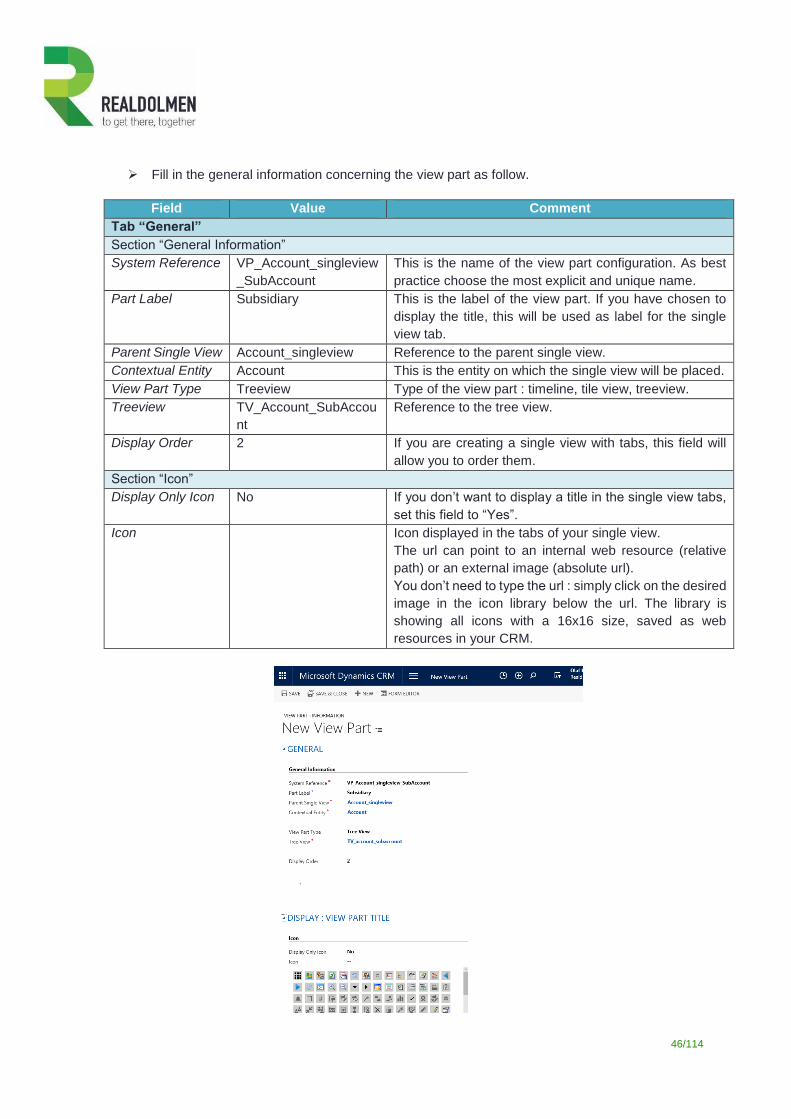
46/114
Fill in the general information concerning the view part as follow.
Field Value Comment
Tab “General”
Section “General Information”
System Reference VP_Account_singleview
_SubAccount
This is the name of the view part configuration. As best
practice choose the most explicit and unique name.
Part Label Subsidiary This is the label of the view part. If you have chosen to
display the title, this will be used as label for the single
view tab.
Parent Single View Account_singleview Reference to the parent single view.
Contextual Entity Account This is the entity on which the single view will be placed.
View Part Type Treeview Type of the view part : timeline, tile view, treeview.
Treeview TV_Account_SubAccou
nt
Reference to the tree view.
Display Order 2 If you are creating a single view with tabs, this field will
allow you to order them.
Section “Icon”
Display Only Icon No If you don’t want to display a title in the single view tabs,
set this field to “Yes”.
Icon Icon displayed in the tabs of your single view.
The url can point to an internal web resource (relative
path) or an external image (absolute url).
You don’t need to type the url : simply click on the desired
image in the icon library below the url. The library is
showing all icons with a 16x16 size, saved as web
resources in your CRM.
47/114
Click on “Save and Close” to return to the single view definition form.
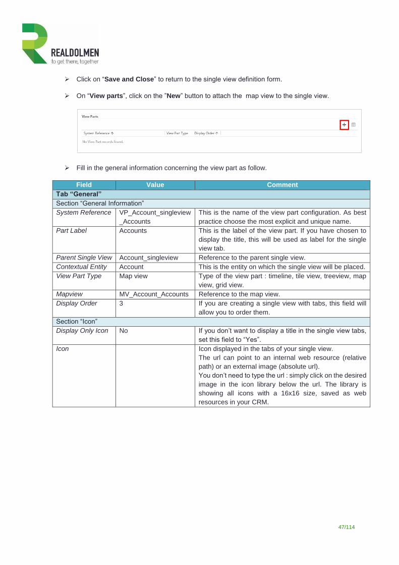
On “View parts”, click on the ”New” button to attach the map view to the single view.
Fill in the general information concerning the view part as follow.
Field Value Comment
Tab “General”
Section “General Information”
System Reference VP_Account_singleview
_Accounts
This is the name of the view part configuration. As best
practice choose the most explicit and unique name.
Part Label Accounts This is the label of the view part. If you have chosen to
display the title, this will be used as label for the single
view tab.
Parent Single View Account_singleview Reference to the parent single view.
Contextual Entity Account This is the entity on which the single view will be placed.
View Part Type Map view Type of the view part : timeline, tile view, treeview, map
view, grid view.
Mapview MV_Account_Accounts Reference to the map view.
Display Order 3 If you are creating a single view with tabs, this field will
allow you to order them.
Section “Icon”
Display Only Icon No If you don’t want to display a title in the single view tabs,
set this field to “Yes”.
Icon Icon displayed in the tabs of your single view.
The url can point to an internal web resource (relative
path) or an external image (absolute url).
You don’t need to type the url : simply click on the desired
image in the icon library below the url. The library is
showing all icons with a 16x16 size, saved as web
resources in your CRM.
48/114
Click on “Save and Close” to return to the single view definition form.
On “View parts”, click on the ”New” button to attach the grid view to the single view.
Fill in the general information concerning the view part as follow.
Field Value Comment
Tab “General”
Section “General Information”
System Reference GV_Account_singlevie
w_Contact_Opportunitie
s
This is the name of the view part configuration. As best
practice choose the most explicit and unique name.
Part Label Contacts This is the label of the view part. If you have chosen to
display the title, this will be used as label for the single
view tab.
Parent Single View Account_singleview Reference to the parent single view.
Contextual Entity Account This is the entity on which the single view will be placed.
49/114
View Part Type Grid view Type of the view part : timeline, tile view, treeview, map
view, grid view.
Map view GV_Account_Contact_
Opportunity
Reference to the grid view.
Display Order 4 If you are creating a single view with tabs, this field will
allow you to order them.
Section “Icon”
Display Only Icon No If you don’t want to display a title in the single view tabs,
set this field to “Yes”.
Icon Icon displayed in the tabs of your single view.
The url can point to an internal web resource (relative
path) or an external image (absolute url).
You don’t need to type the url : simply click on the desired
image in the icon library below the url. The library is
showing all icons with a 16x16 size, saved as web
resources in your CRM.
Click on “Save and Close” to return to the single view definition form.
In the single view ribbon (settings – Single Views), click on the ”New” button to create the second single view.
Fill in the general information concerning this single view.
Field Value Comment
Tab “General”
Section “General Information”
System Reference Account_Timeline This is the reference code of the single view. This will be
placed as reference on the contextual entity form and
used by the system to retrieve its configuration.
Contextual Entity Account This is the entity on which the single view will be placed.
Section “Master-Detail Synchronisation”
Broadcast No
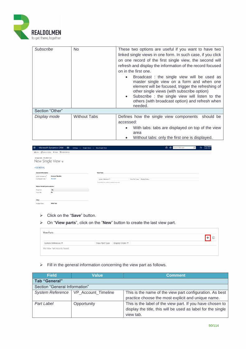
50/114
Subscribe No These two options are useful if you want to have two
linked single views in one form. In such case, if you click
on one record of the first single view, the second will
refresh and display the information of the record focused
on in the first one.
Broadcast : the single view will be used as master single view on a form and when one element will be focused, trigger the refreshing of other single views (with subscribe option)
Subscribe : the single view will listen to the others (with broadcast option) and refresh when needed.
Section “Other”
Display mode Without Tabs Defines how the single view components should be
accessed:
With tabs: tabs are displayed on top of the view area
Without tabs: only the first one is displayed.
Click on the “Save” button.
On “View parts”, click on the ”New” button to create the last view part.
Fill in the general information concerning the view part as follows.
Field Value Comment
Tab “General”
Section “General Information”
System Reference VP_Account_Timeline This is the name of the view part configuration. As best
practice choose the most explicit and unique name.
Part Label Opportunity This is the label of the view part. If you have chosen to
display the title, this will be used as label for the single
view tab.
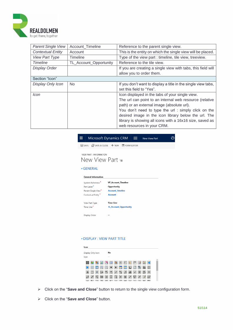
51/114
Parent Single View Account_Timeline Reference to the parent single view.
Contextual Entity Account This is the entity on which the single view will be placed.
View Part Type Timeline Type of the view part : timeline, tile view, treeview.
Timeline TL_Account_Opportunity Reference to the tile view.
Display Order If you are creating a single view with tabs, this field will
allow you to order them.
Section “Icon”
Display Only Icon No If you don’t want to display a title in the single view tabs,
set this field to “Yes”.
Icon Icon displayed in the tabs of your single view.
The url can point to an internal web resource (relative
path) or an external image (absolute url).
You don’t need to type the url : simply click on the
desired image in the icon library below the url. The
library is showing all icons with a 16x16 size, saved as
web resources in your CRM.
Click on the “Save and Close” button to return to the single view configuration form.
Click on the “Save and Close” button.
52/114
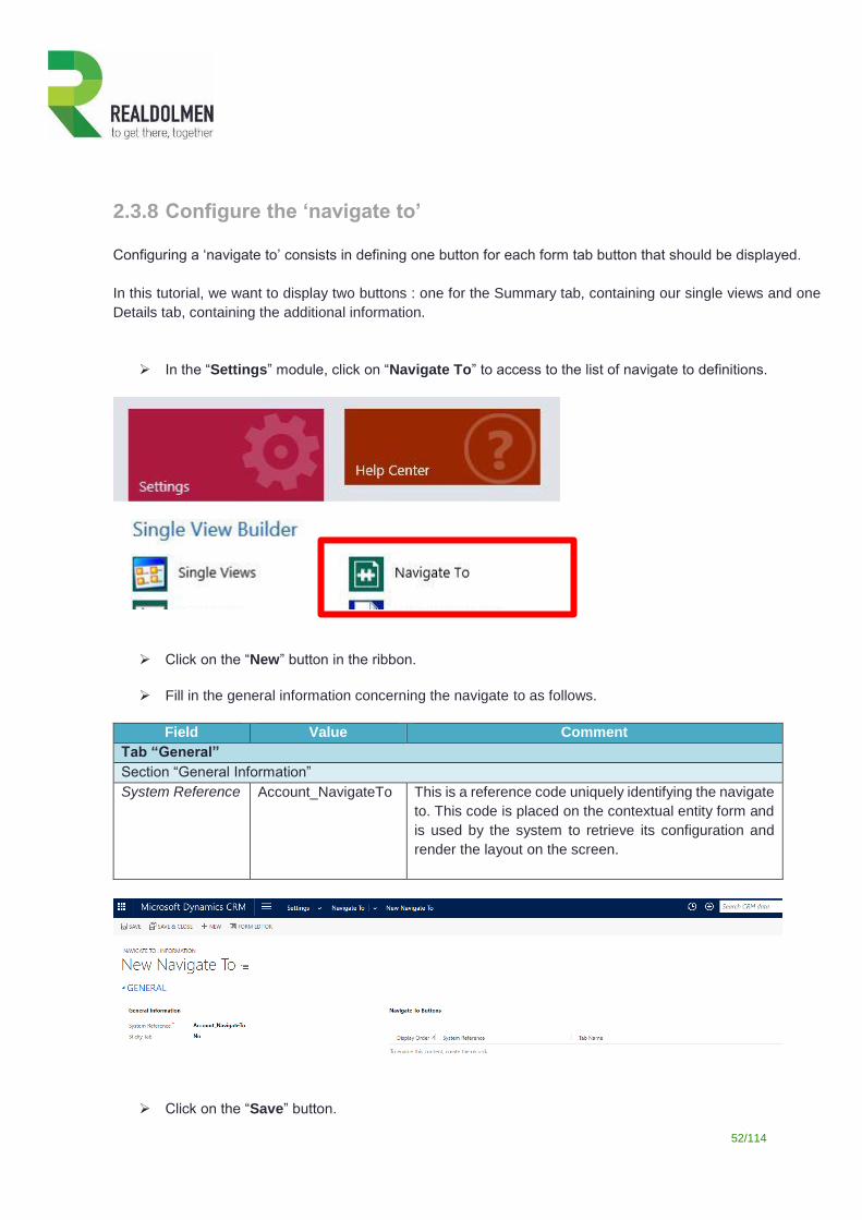
2.3.8 Configure the ‘navigate to’
Configuring a ‘navigate to’ consists in defining one button for each form tab button that should be displayed.
In this tutorial, we want to display two buttons : one for the Summary tab, containing our single views and one
Details tab, containing the additional information.
In the “Settings” module, click on “Navigate To” to access to the list of navigate to definitions.
Click on the “New” button in the ribbon.
Fill in the general information concerning the navigate to as follows.
Field Value Comment
Tab “General”
Section “General Information”
System Reference Account_NavigateTo This is a reference code uniquely identifying the navigate
to. This code is placed on the contextual entity form and
is used by the system to retrieve its configuration and
render the layout on the screen.
Click on the “Save” button.
53/114
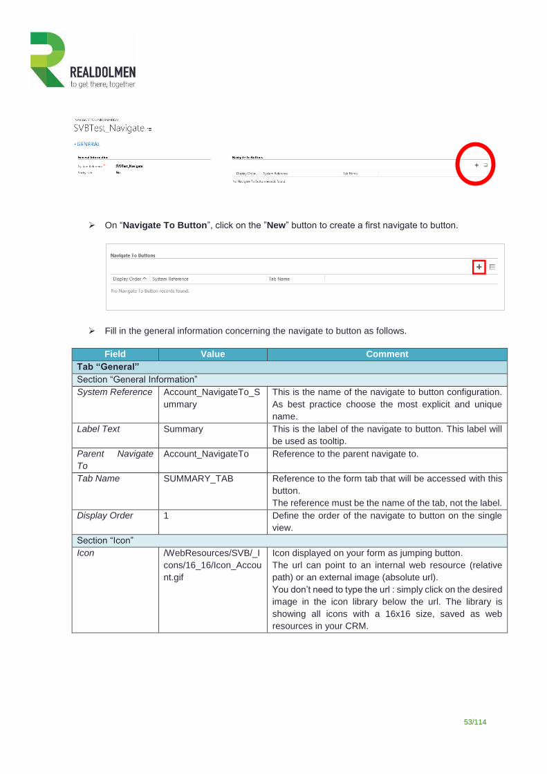
On “Navigate To Button”, click on the ”New” button to create a first navigate to button.
Fill in the general information concerning the navigate to button as follows.
Field Value Comment
Tab “General”
Section “General Information”
System Reference Account_NavigateTo_S
ummary
This is the name of the navigate to button configuration.
As best practice choose the most explicit and unique
name.
Label Text Summary This is the label of the navigate to button. This label will
be used as tooltip.
Parent Navigate
To
Account_NavigateTo Reference to the parent navigate to.
Tab Name SUMMARY_TAB Reference to the form tab that will be accessed with this
button.
The reference must be the name of the tab, not the label.
Display Order 1 Define the order of the navigate to button on the single
view.
Section “Icon”
Icon /WebResources/SVB/_I
cons/16_16/Icon_Accou
nt.gif
Icon displayed on your form as jumping button.
The url can point to an internal web resource (relative
path) or an external image (absolute url).
You don’t need to type the url : simply click on the desired
image in the icon library below the url. The library is
showing all icons with a 16x16 size, saved as web
resources in your CRM.
54/114
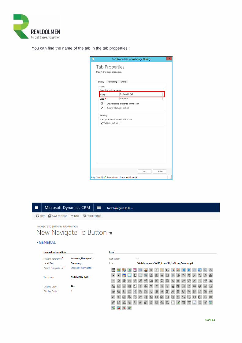
You can find the name of the tab in the tab properties :
55/114
Click on “Save and Close” to return to the navigate to form.
In the navigate to button section, click on the ”New” button to create the second navigate to button.
Fill in the general information concerning this navigate to button as follow.
Field Value Comment
Tab “General”
Section “General Information”
System Reference Account_NavigateTo_Det
ails
This is the name of the navigate to button configuration.
As best practice choose the most explicit and unique
name.
Label Text Details This is the label of the navigate to button. This label will
be used as tooltip.
Parent Navigate
To
Account_NavigateTo Reference to the parent navigate to.
Tab Name DETAILS_TAB Reference to the form tab that will be accessed with this
button.
The reference must be the name of the tab, not the
label.
Display Order 2 Define the order of the navigate to button on the single
view.
Section “Icon”
Icon /WebResources/SVB/_Ic
ons/16_16/Icon_PostConf
igRules.gif
Icon displayed on your form as jumping button.
The url can point to an internal web resource (relative
path) or an external image (absolute url).
You don’t need to type the url: simply click on the
desired image in the icon library below the url. The
library is showing all icons with a 16x16 size, saved as
web resources in your CRM.
56/114
Click on “Save and Close” to return to the ‘navigate to’ definition form.
Close the ‘navigate to’ definition form.
2.3.9 Create the single view form The last step is to create a new form on the account entity that will provide a single view to the users.
Click on the “Settings” button to open the Settings module.
In the toolbar click on the “Customizations” button.
Click then on the “Customize the System” to open the customization form.
Locate the forms of the Account entity.
On the list of forms, click on “New” and select “Main Form”.
57/114
Let’s clean up the form and prepare it to host our single views.
o Put the contacts subgrid in the “account information” section.
o Remove all the other elements from the right part of your form.
o Put the social pane on the right part.
58/114
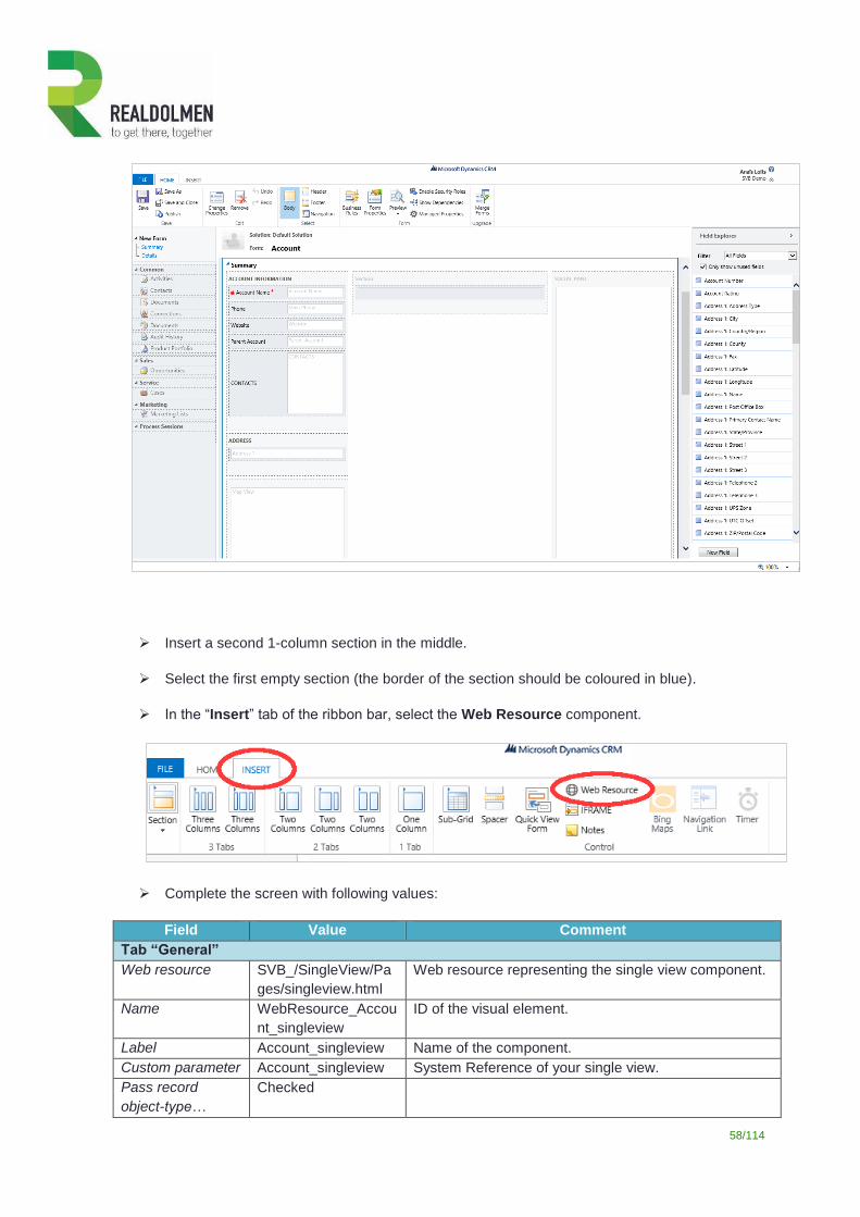
Insert a second 1-column section in the middle.
Select the first empty section (the border of the section should be coloured in blue).
In the “Insert” tab of the ribbon bar, select the Web Resource component.
Complete the screen with following values:
Field Value Comment
Tab “General”
Web resource SVB_/SingleView/Pa
ges/singleview.html
Web resource representing the single view component.
Name WebResource_Accou
nt_singleview
ID of the visual element.
Label Account_singleview Name of the component.
Custom parameter Account_singleview System Reference of your single view.
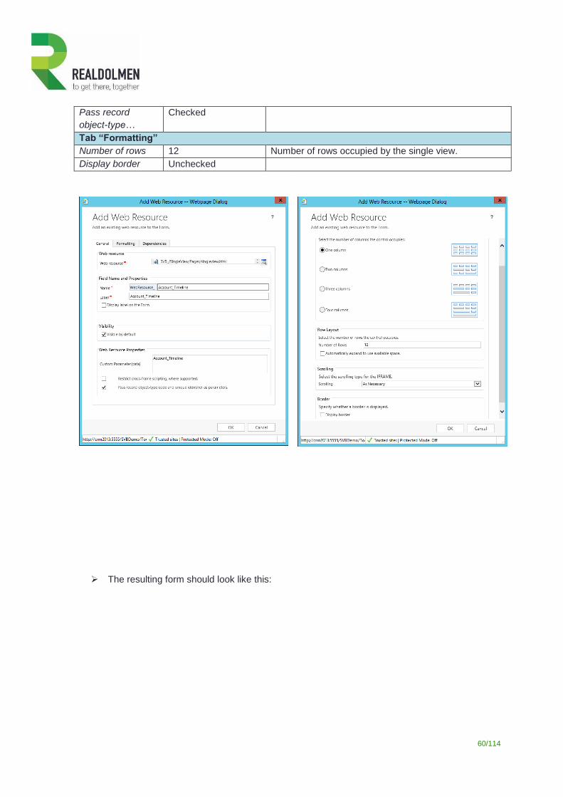
Pass record
object-type…
Checked
59/114
Tab “Formatting”
Number of rows 12 Number of rows occupied by the single view.
Display border Unchecked
Select the second empty section (the border of the section should be coloured in blue).
In the “Insert” tab of the ribbon bar, select the Web Resource component.
Complete the screen with following values:
Field Value Comment
Tab “General”
Web resource SVB_/SingleView/Pa
ges/singleview.html
Web resource representing the single view component.
Name WebResource_Accou
nt_Timeline
ID of the visual element.
Label Account_Timeline Name of the component.
Custom parameter Account_Timeline System Reference of your single view.
60/114
Pass record
object-type…
Checked
Tab “Formatting”
Number of rows 12 Number of rows occupied by the single view.
Display border Unchecked
The resulting form should look like this:
61/114
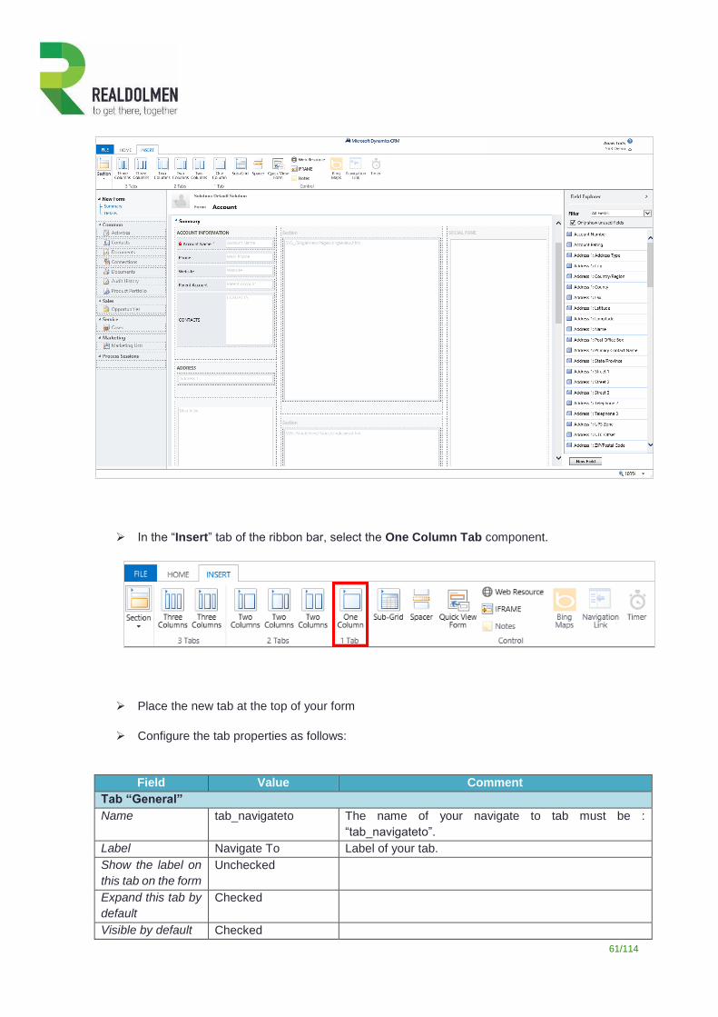
In the “Insert” tab of the ribbon bar, select the One Column Tab component.
Place the new tab at the top of your form
Configure the tab properties as follows:
Field Value Comment
Tab “General”
Name tab_navigateto The name of your navigate to tab must be :
“tab_navigateto”.
Label Navigate To Label of your tab.
Show the label on
this tab on the form
Unchecked
Expand this tab by
default
Checked
Visible by default Checked
62/114
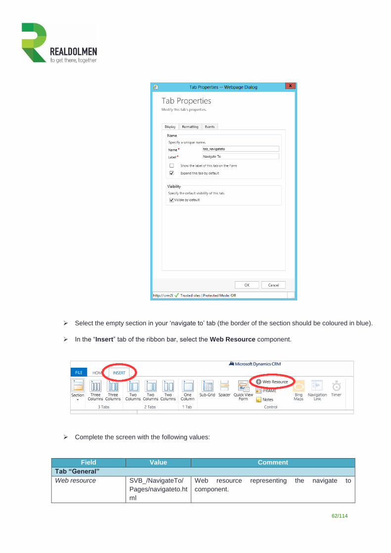
Select the empty section in your ‘navigate to’ tab (the border of the section should be coloured in blue).
In the “Insert” tab of the ribbon bar, select the Web Resource component.
Complete the screen with the following values:
Field Value Comment
Tab “General”
Web resource SVB_/NavigateTo/
Pages/navigateto.ht
ml
Web resource representing the navigate to
component.
63/114
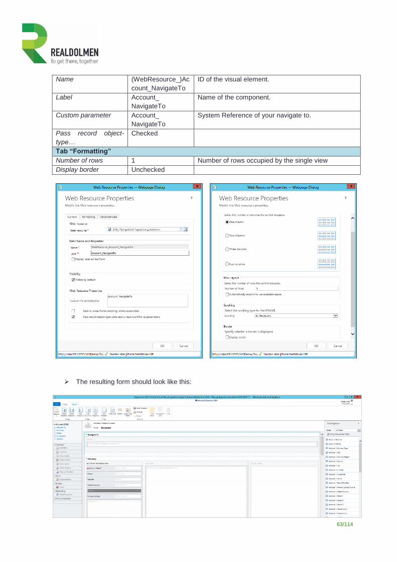
Name (WebResource_)Ac
count_NavigateTo
ID of the visual element.
Label Account_
NavigateTo
Name of the component.
Custom parameter Account_
NavigateTo
System Reference of your navigate to.
Pass record object-
type…
Checked
Tab “Formatting”
Number of rows 1 Number of rows occupied by the single view
Display border Unchecked
The resulting form should look like this:
64/114
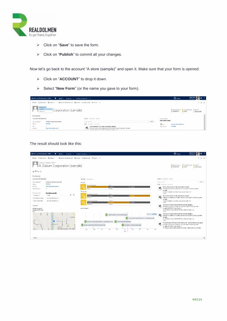
Click on “Save” to save the form.
Click on “Publish” to commit all your changes.
Now let’s go back to the account “A store (sample)” and open it. Make sure that your form is opened:
Click on “ACCOUNT” to drop it down.
Select “New Form” (or the name you gave to your form).
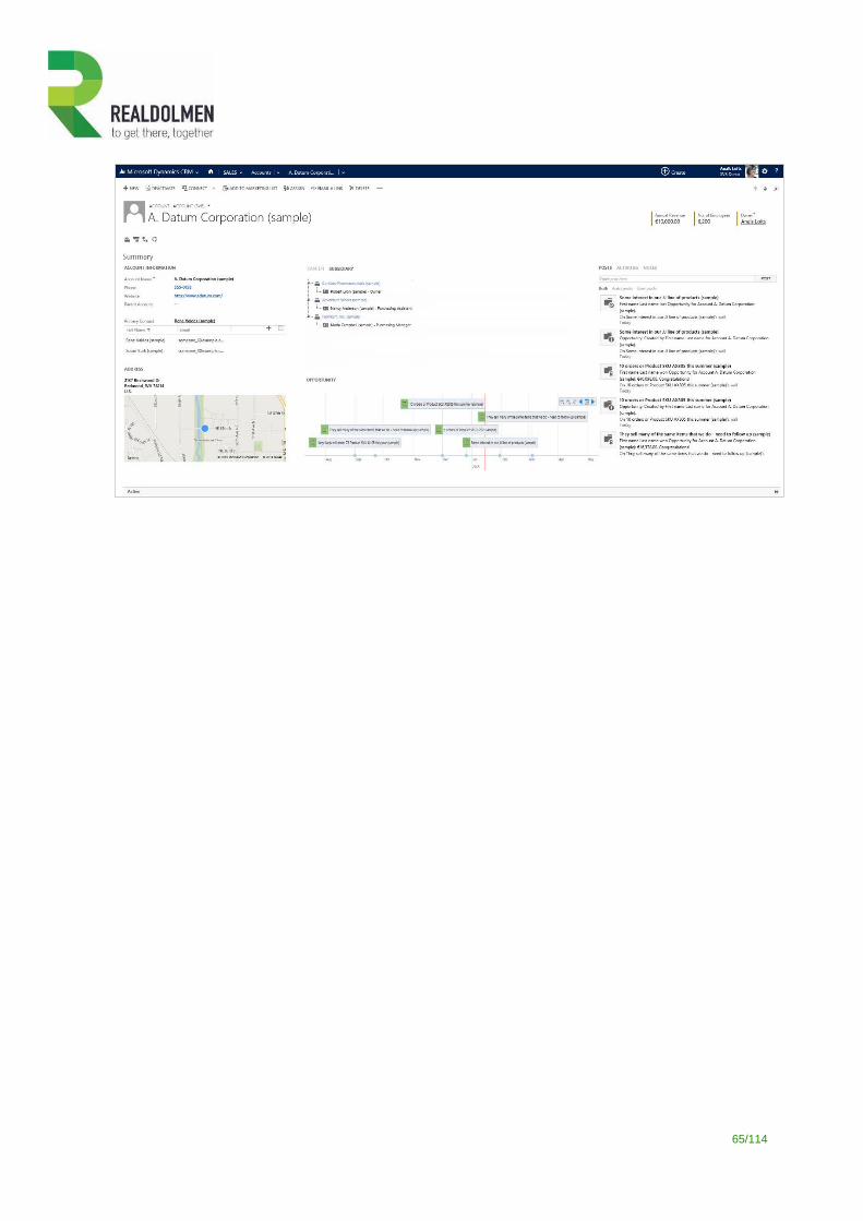
The result should look like this:
65/114
66/114
3 Usage scenarios
3.1 Refreshing metadata
Before you can start working with the Single View Builder, you need to retrieve metadata for the entity that you
will work with. Refreshing metadata is a process that is necessary to offer the possibility to select entities and
fields in a more user-friendly way.
Each time you want to add an entity or each time the structure of an existing entity has changed, you will need
to refresh the metadata: you only need to select the entities for which the metadata dictionary needs to be
updated. If you don’t select an entity that you previously imported, the related metadata will not be deleted from
the dictionary.
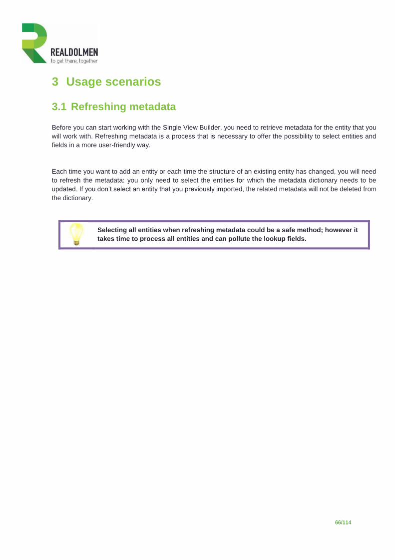
Selecting all entities when refreshing metadata could be a safe method; however it
takes time to process all entities and can pollute the lookup fields.
67/114
3.2 Working with single views
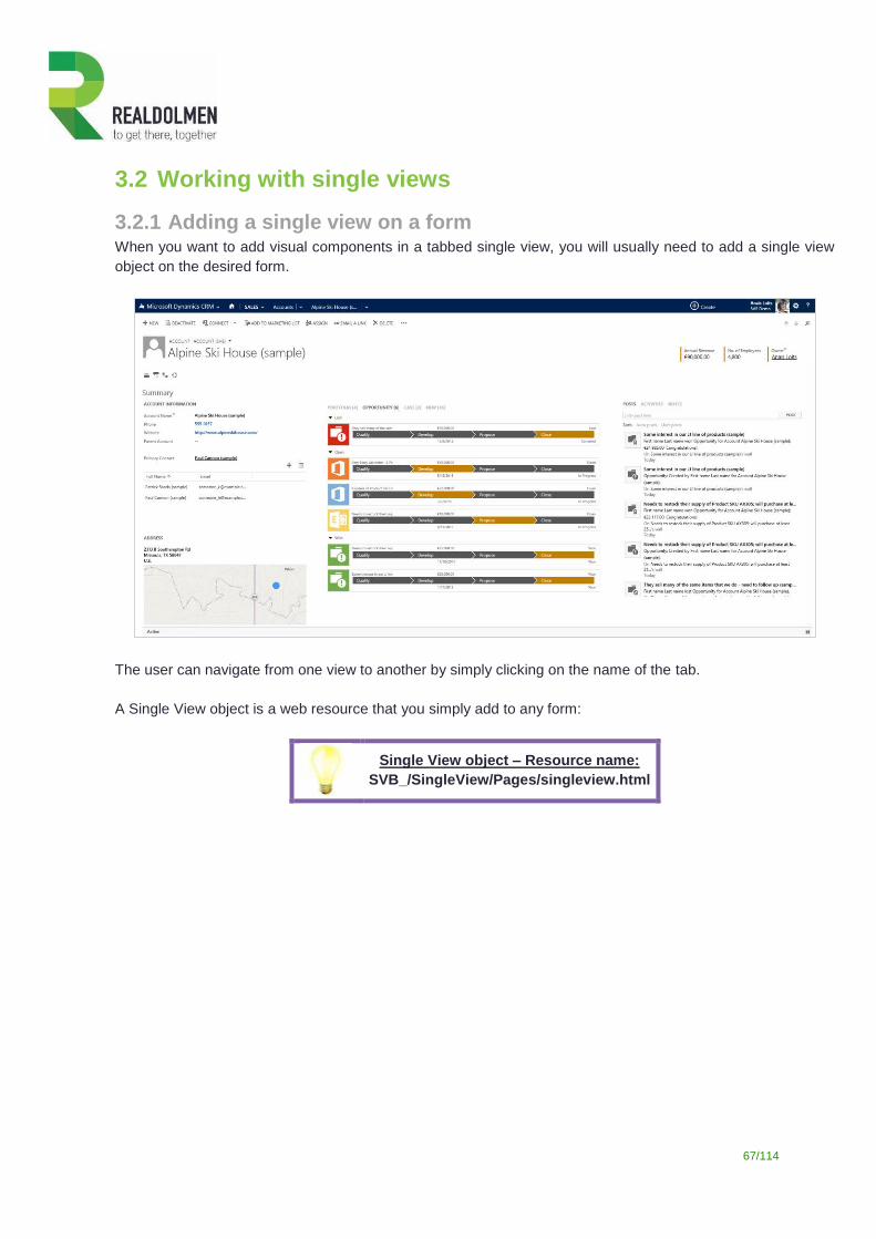
3.2.1 Adding a single view on a form When you want to add visual components in a tabbed single view, you will usually need to add a single view
object on the desired form.
The user can navigate from one view to another by simply clicking on the name of the tab.
A Single View object is a web resource that you simply add to any form:
Single View object – Resource name:
SVB_/SingleView/Pages/singleview.html
68/114
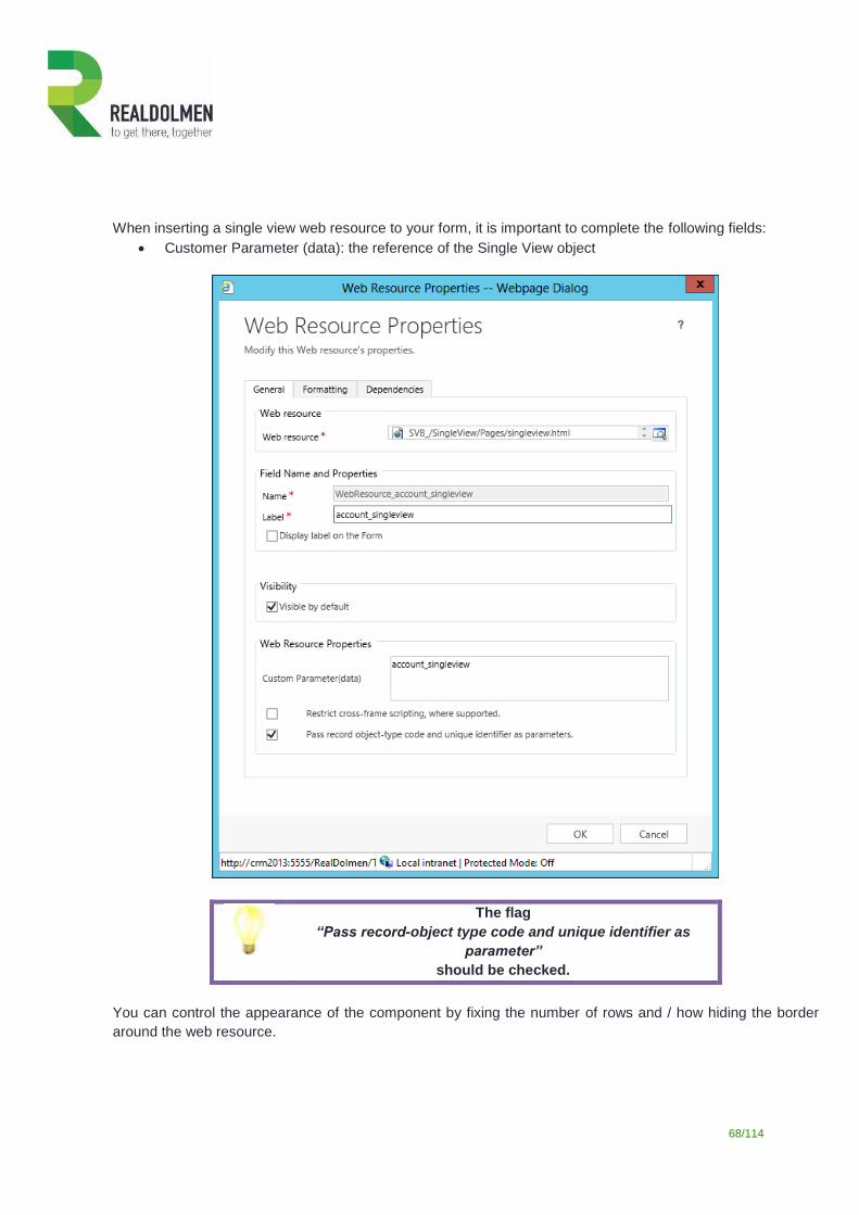
When inserting a single view web resource to your form, it is important to complete the following fields:
Customer Parameter (data): the reference of the Single View object
The flag
“Pass record-object type code and unique identifier as
parameter”
should be checked.
You can control the appearance of the component by fixing the number of rows and / how hiding the border
around the web resource.
69/114
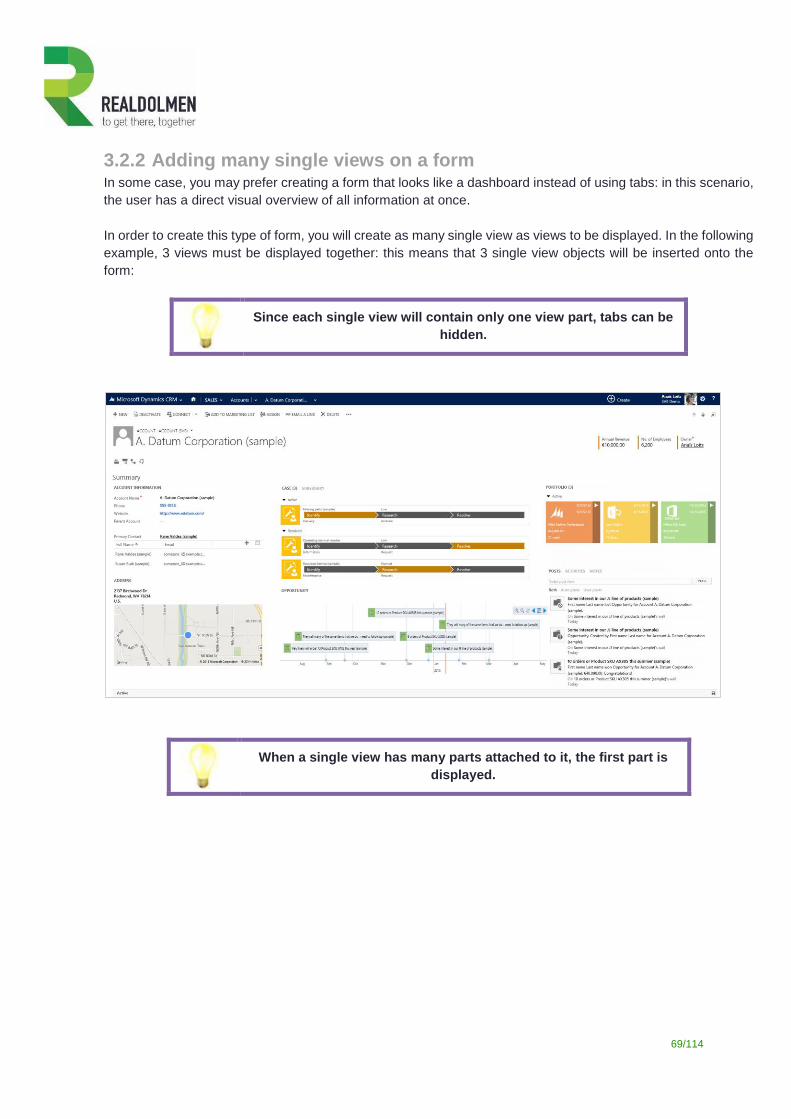
3.2.2 Adding many single views on a form In some case, you may prefer creating a form that looks like a dashboard instead of using tabs: in this scenario,
the user has a direct visual overview of all information at once.
In order to create this type of form, you will create as many single view as views to be displayed. In the following
example, 3 views must be displayed together: this means that 3 single view objects will be inserted onto the
form:
Since each single view will contain only one view part, tabs can be
hidden.
When a single view has many parts attached to it, the first part is
displayed.
70/114
3.3 Working with dynamic layouts
3.3.1 Dynamic colors
In most of the view configurations, you will notice under the tab “Display” some sections related to colors (fore
or font color, back color, …). You can define a static color as you used to do with previous versions, but you can
also reference a field that will contain the color code instead.
This method is particularly convenient when you want to differentiate elements of the same type: contracts based
on their product or status, type of contact, activity type, …
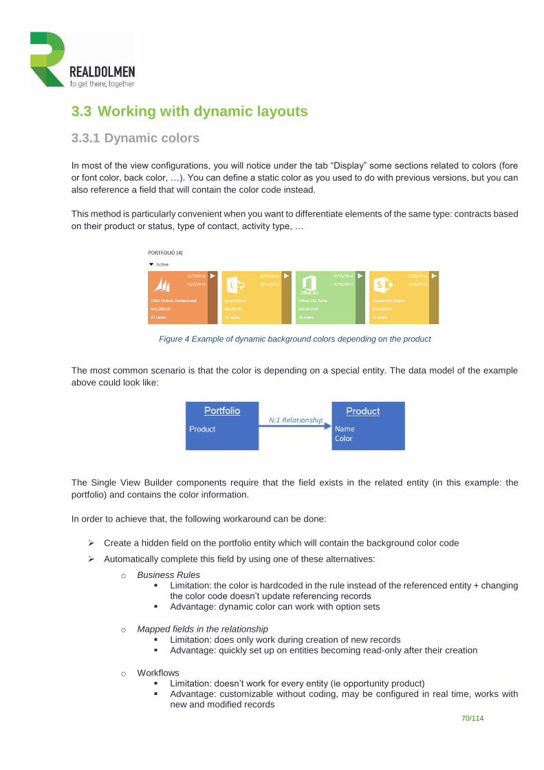
Figure 4 Example of dynamic background colors depending on the product
The most common scenario is that the color is depending on a special entity. The data model of the example
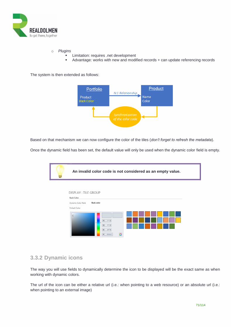
above could look like:
The Single View Builder components require that the field exists in the related entity (in this example: the
portfolio) and contains the color information.
In order to achieve that, the following workaround can be done:
Create a hidden field on the portfolio entity which will contain the background color code
Automatically complete this field by using one of these alternatives:
o Business Rules Limitation: the color is hardcoded in the rule instead of the referenced entity + changing
the color code doesn’t update referencing records Advantage: dynamic color can work with option sets
o Mapped fields in the relationship Limitation: does only work during creation of new records Advantage: quickly set up on entities becoming read-only after their creation
o Workflows Limitation: doesn’t work for every entity (ie opportunity product) Advantage: customizable without coding, may be configured in real time, works with
new and modified records
71/114
o Plugins Limitation: requires .net development Advantage: works with new and modified records + can update referencing records
The system is then extended as follows:
Based on that mechanism we can now configure the color of the tiles (don’t forget to refresh the metadata).
Once the dynamic field has been set, the default value will only be used when the dynamic color field is empty.
An invalid color code is not considered as an empty value.
3.3.2 Dynamic icons
The way you will use fields to dynamically determine the icon to be displayed will be the exact same as when
working with dynamic colors.
The url of the icon can be either a relative url (i.e.: when pointing to a web resource) or an absolute url (i.e.:
when pointing to an external image)
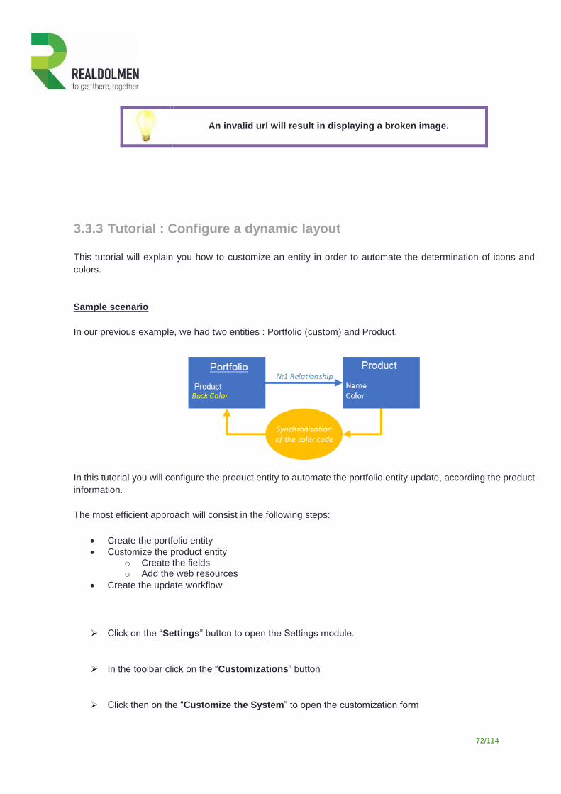
72/114
An invalid url will result in displaying a broken image.
3.3.3 Tutorial : Configure a dynamic layout
This tutorial will explain you how to customize an entity in order to automate the determination of icons and
colors.
Sample scenario
In our previous example, we had two entities : Portfolio (custom) and Product.
In this tutorial you will configure the product entity to automate the portfolio entity update, according the product
information.
The most efficient approach will consist in the following steps:
Create the portfolio entity
Customize the product entity o Create the fields o Add the web resources
Create the update workflow
Click on the “Settings” button to open the Settings module.
In the toolbar click on the “Customizations” button
Click then on the “Customize the System” to open the customization form
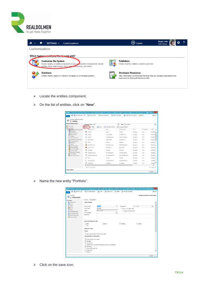
73/114
Locate the entities component.
On the list of entities, click on “New”.
Name the new entity “Portfolio”.
Click on the save icon.
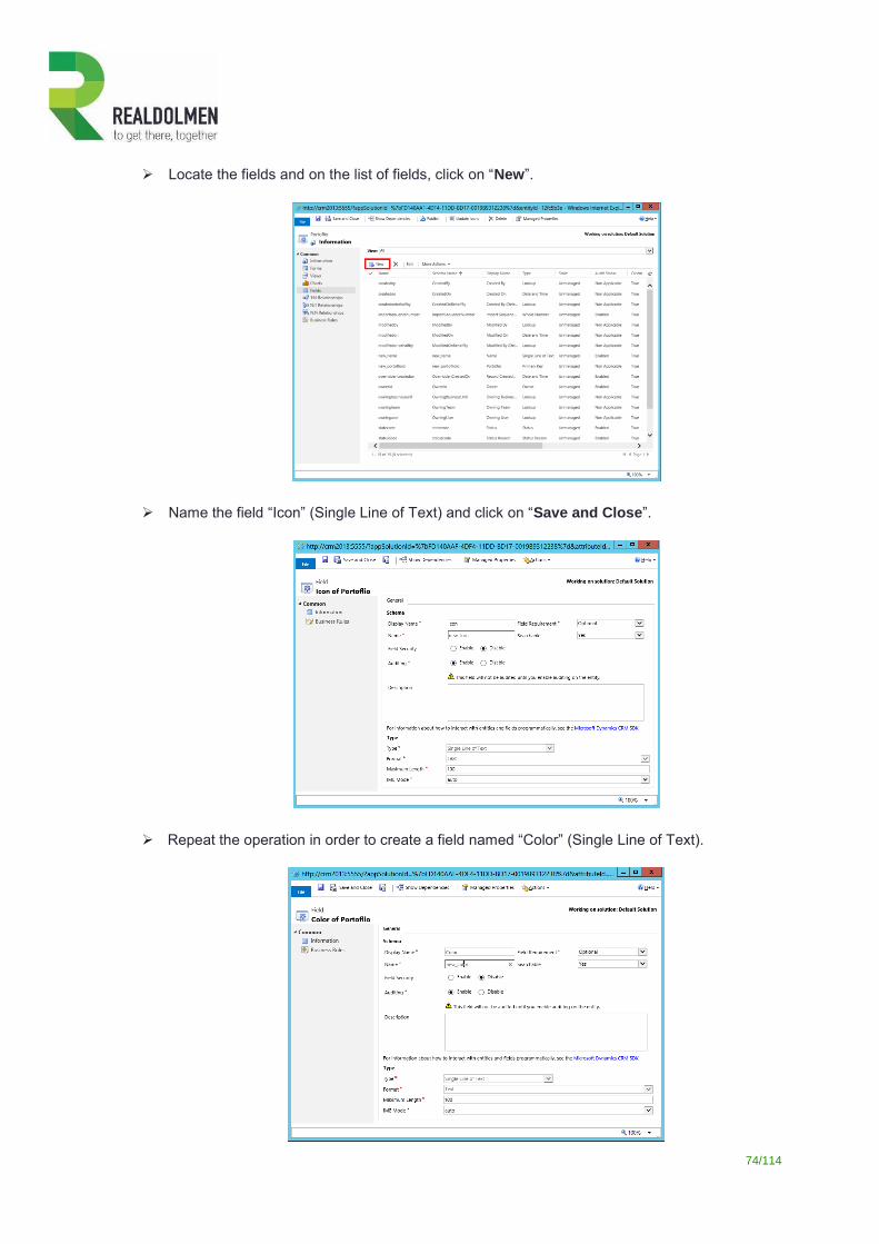
74/114
Locate the fields and on the list of fields, click on “New”.
Name the field “Icon” (Single Line of Text) and click on “Save and Close”.
Repeat the operation in order to create a field named “Color” (Single Line of Text).
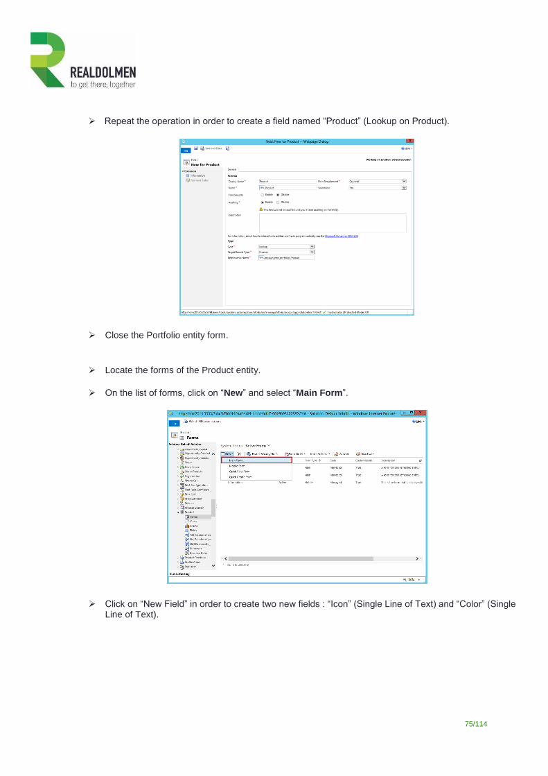
75/114
Repeat the operation in order to create a field named “Product” (Lookup on Product).
Close the Portfolio entity form.
Locate the forms of the Product entity.
On the list of forms, click on “New” and select “Main Form”.
Click on “New Field” in order to create two new fields : “Icon” (Single Line of Text) and “Color” (Single Line of Text).
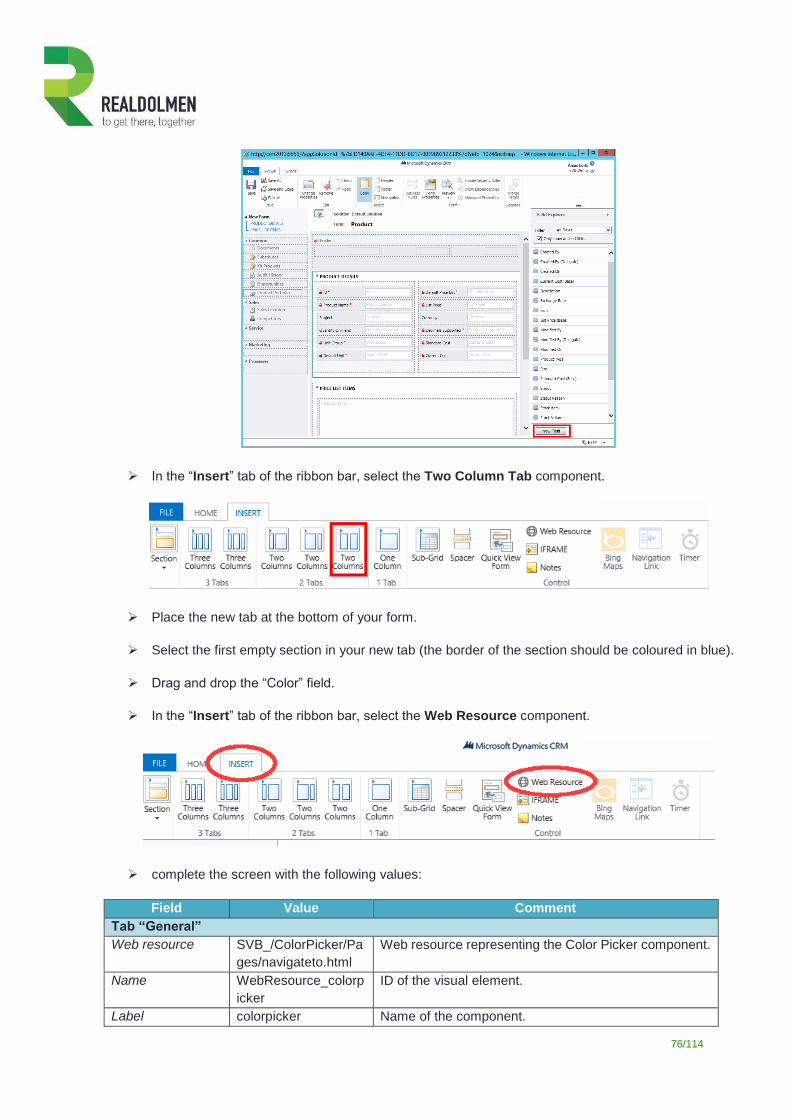
76/114
In the “Insert” tab of the ribbon bar, select the Two Column Tab component.
Place the new tab at the bottom of your form.
Select the first empty section in your new tab (the border of the section should be coloured in blue).
Drag and drop the “Color” field.
In the “Insert” tab of the ribbon bar, select the Web Resource component.
complete the screen with the following values:
Field Value Comment
Tab “General”
Web resource SVB_/ColorPicker/Pa
ges/navigateto.html
Web resource representing the Color Picker component.
Name WebResource_colorp
icker
ID of the visual element.
Label colorpicker Name of the component.
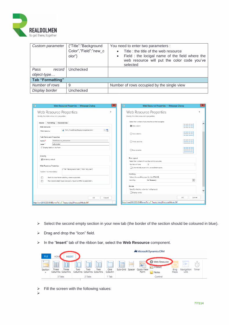
77/114
Custom parameter {“Title”:”Background
Color”,”Field”:”new_c
olor”}
You need to enter two parameters :
Title : the title of the web resource
Field : the locigal name of the field where the web resource will put the color code you’ve selected
Pass record
object-type…
Unchecked
Tab “Formatting”
Number of rows 9 Number of rows occupied by the single view
Display border Unchecked
Select the second empty section in your new tab (the border of the section should be coloured in blue).
Drag and drop the “Icon” field.
In the “Insert” tab of the ribbon bar, select the Web Resource component.
Fill the screen with the following values:
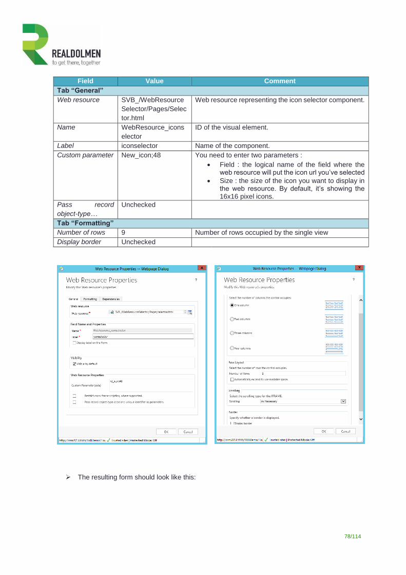
78/114
Field Value Comment
Tab “General”
Web resource SVB_/WebResource
Selector/Pages/Selec
tor.html
Web resource representing the icon selector component.
Name WebResource_icons
elector
ID of the visual element.
Label iconselector Name of the component.
Custom parameter New_icon;48 You need to enter two parameters :
Field : the logical name of the field where the web resource will put the icon url you’ve selected
Size : the size of the icon you want to display in the web resource. By default, it’s showing the 16x16 pixel icons.
Pass record
object-type…
Unchecked
Tab “Formatting”
Number of rows 9 Number of rows occupied by the single view
Display border Unchecked
The resulting form should look like this:
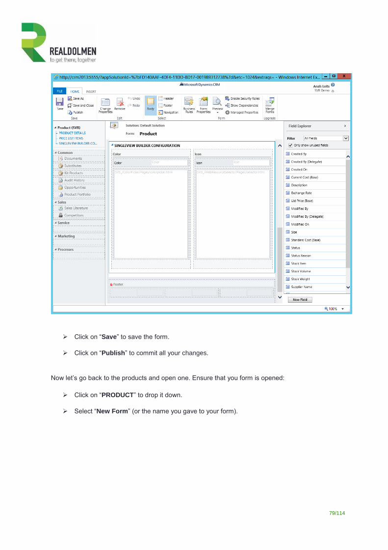
79/114
Click on “Save” to save the form.
Click on “Publish” to commit all your changes.
Now let’s go back to the products and open one. Ensure that you form is opened:
Click on “PRODUCT” to drop it down.
Select “New Form” (or the name you gave to your form).
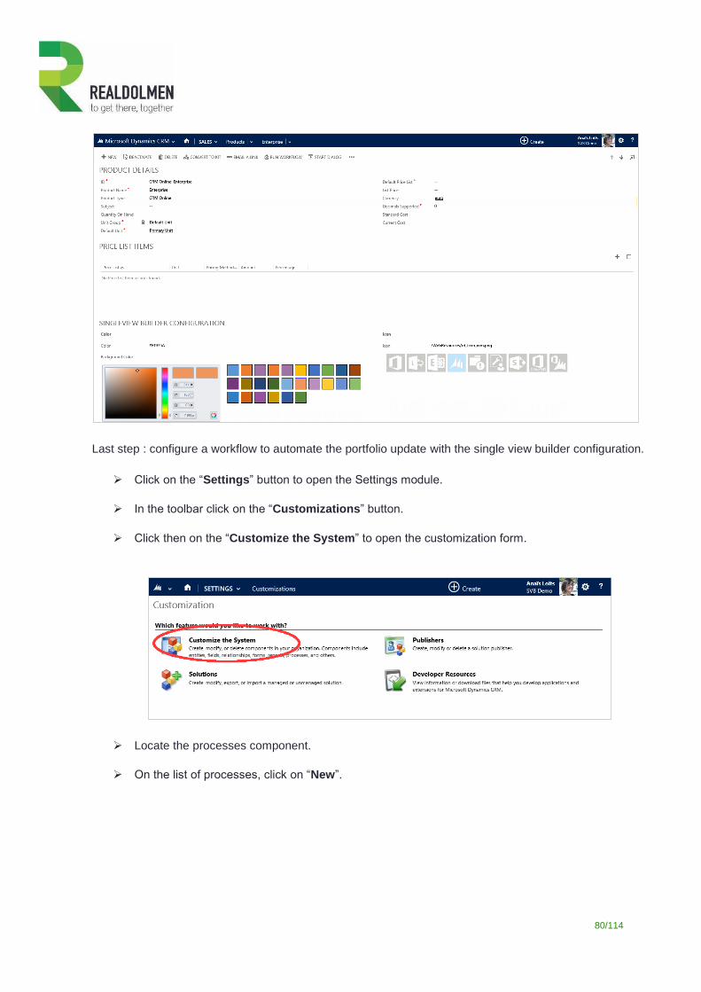
80/114
Last step : configure a workflow to automate the portfolio update with the single view builder configuration.
Click on the “Settings” button to open the Settings module.
In the toolbar click on the “Customizations” button.
Click then on the “Customize the System” to open the customization form.
Locate the processes component.
On the list of processes, click on “New”.
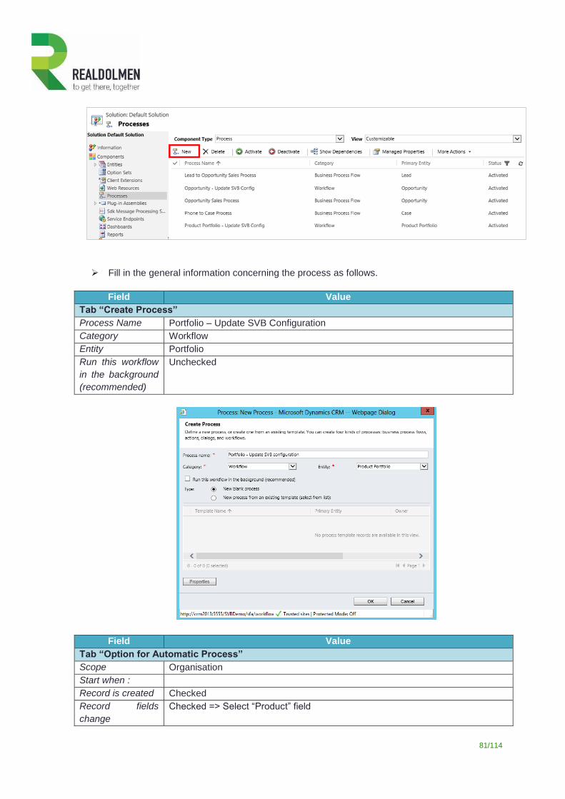
81/114
Fill in the general information concerning the process as follows.
Field Value
Tab “Create Process”
Process Name Portfolio – Update SVB Configuration
Category Workflow
Entity Portfolio
Run this workflow
in the background
(recommended)
Unchecked
Field Value
Tab “Option for Automatic Process”
Scope Organisation
Start when :
Record is created Checked
Record fields
change
Checked => Select “Product” field
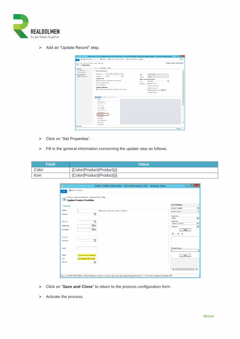
82/114
Add an “Update Record” step.
Click on “Set Properties”.
Fill in the general information concerning the update step as follows.
Field Value
Color {Color(Product(Product))}
Icon {Color(Product(Product))}
Click on “Save and Close” to return to the process configuration form.
Activate the process.
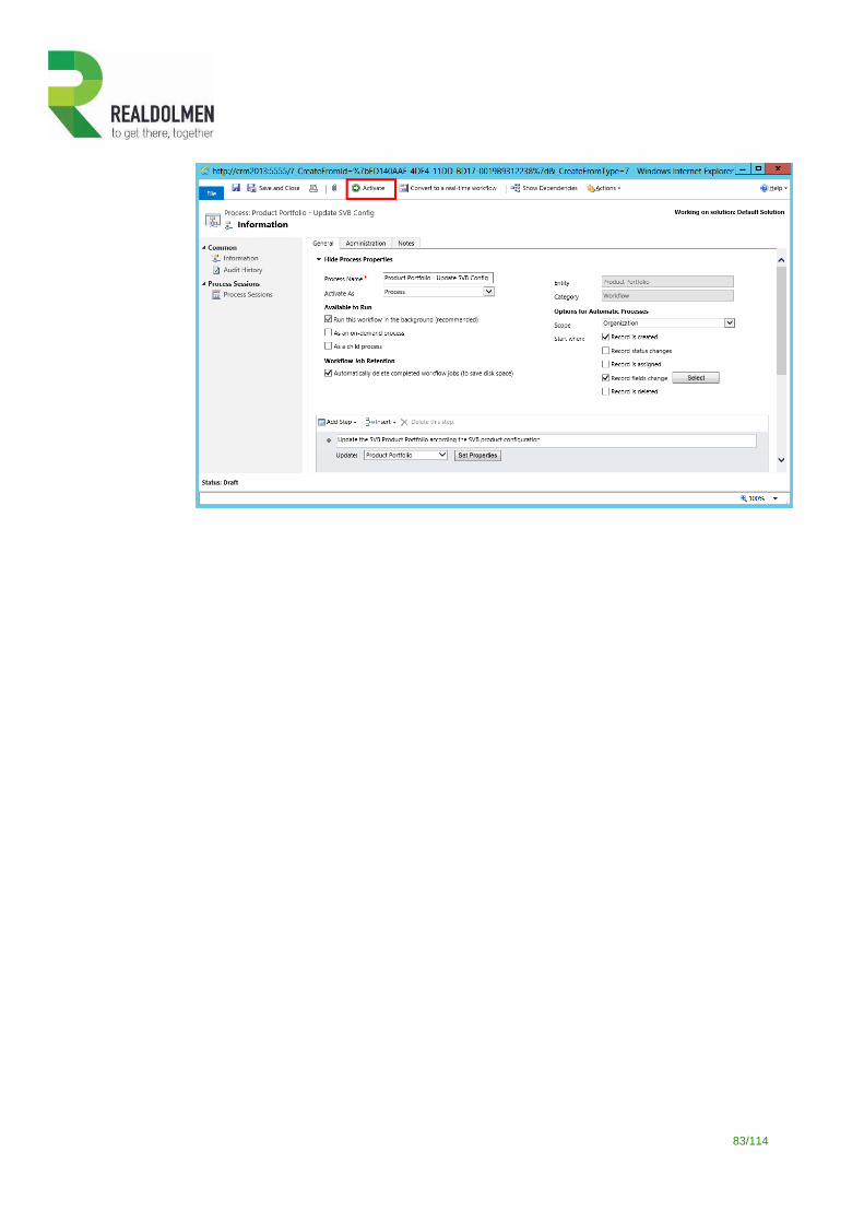
83/114
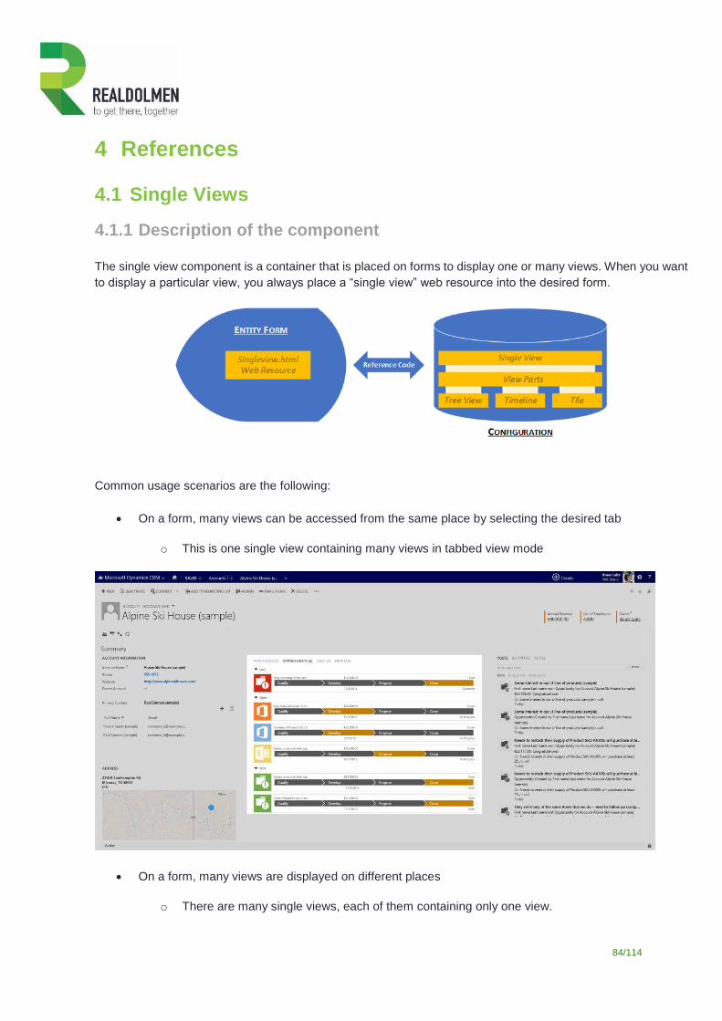
84/114
4 References
4.1 Single Views
4.1.1 Description of the component
The single view component is a container that is placed on forms to display one or many views. When you want
to display a particular view, you always place a “single view” web resource into the desired form.
Common usage scenarios are the following:
On a form, many views can be accessed from the same place by selecting the desired tab
o This is one single view containing many views in tabbed view mode
On a form, many views are displayed on different places
o There are many single views, each of them containing only one view.
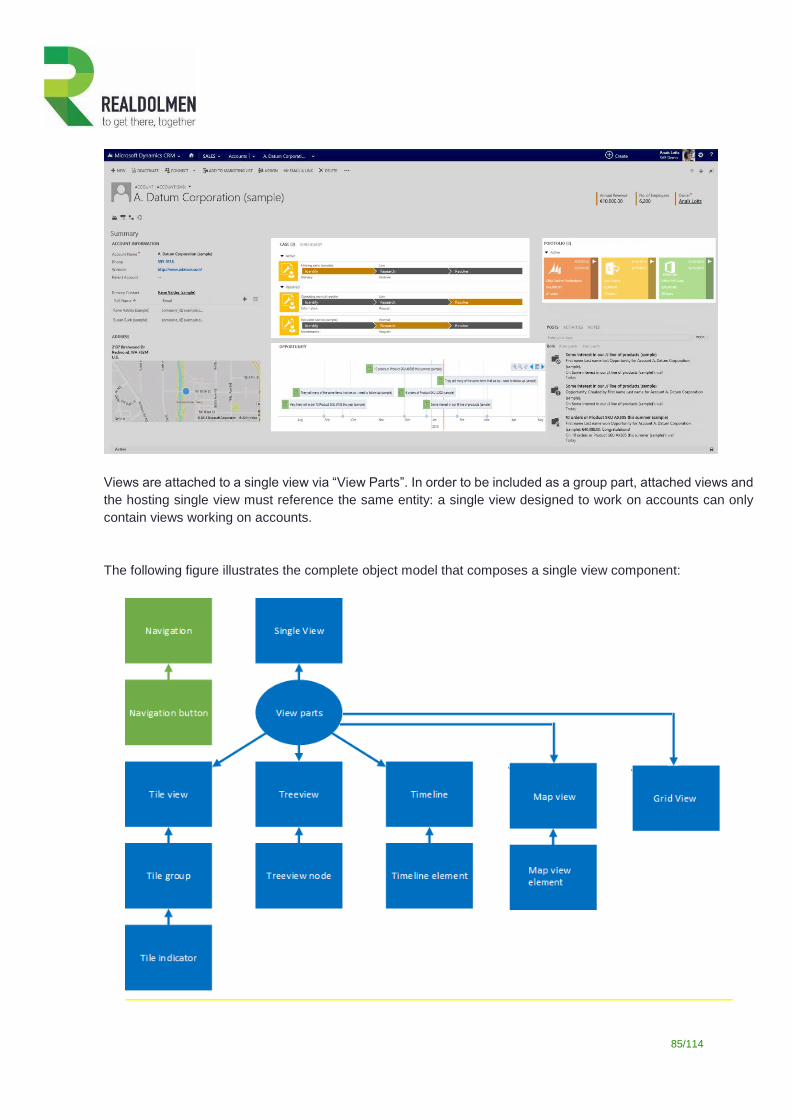
85/114
Views are attached to a single view via “View Parts”. In order to be included as a group part, attached views and
the hosting single view must reference the same entity: a single view designed to work on accounts can only
contain views working on accounts.
The following figure illustrates the complete object model that composes a single view component:
86/114
A Single View object can host many views: each view is attached to the parent single view via a View Part
object. A view part can reference either a treeview or a timeline or a grid view or a map view or a tile object, one
at a time.
A Treeview object can display nodes representing different types of data; each type of visualization is
represented by a Treeview Node object.
A Timeline object can also display information coming from several types of sources: each type of item is
defined in a Timeline Element object.
A Map view object can also display information coming from several types of sources: each type of item is
defined in a Map View Element object.
A Grid view object can also display information coming from several types of sources: the displayed information
is determined by a related entity and the associated view.
A Tile objet is a set of tiles representing various data types: each type of tile is configured into a separate Tile
Group object. Some indicators can be displayed based on specific conditions.
4.1.2 Attributes of a single view
Field Description
Tab “General”
Section “General Information”
System Reference
Reference code uniquely identifying the single view. This code is placed on
the contextual entity form and is used by the system to retrieve its
configuration and render the layout on the screen.
Contextual Entity
Reference to the entity representing the context of the element: it can be
considered as the entity on which the single view will be placed.
Only entities whose metadata have been previously retrieved can be
used.
Section “Master-Detail Synchronisation”
Broadcast
Single views may be linked on one form : in such case, if you click on a record
of a view, all the other views will refresh and display the information of the
record focused on in the first view.
Broadcast : the single view will be used as master single view on a form and when one element will be focused, trigger the refreshing of other single views (with subscribe option).
Subscribe : the single view will listen to the others (with broadcast option) and refresh when needed.
Subscribe
Section “Other”
Display Mode
Defines how views should be accessed:
With tabs: tabs are displayed on top of the view area.
Without tabs: only the first view is displayed.
87/114
If many views are attached to a single view without tabs, only the first
view will be accessible.
Section “View Parts”
View Parts grid List of view parts.
4.1.3 Attributes of a view part
Field Description
Tab “General”
Section “General Information”
System Reference Name of the view part configuration. As best practice choose the most explicit
and unique name.
Part Label Label of the view part. If you have chosen to display the title, this will be used
as label for the single view tab.
Parent Single View Reference to the parent single view item to which the view part belongs to.
Contextual Entity Reference to contextual entity.
View Part Type Type of the view attached to the single view: treeview, timeline, or tiles.
Timeline
When the type of the view part is set to “Timeline”, reference to the timeline
attached to the single view.
Tile view When the type of the view part is set to “Tile View”, reference to the tile view
attached to the single view.
Treeview When the type of the view part is set to “Treeview”, reference to the treeview
attached to the single view.
Display Order Define the order of the view part tabs on the single view, if the single view has
tabs.
Section “Icon”
Display Only Icon Define if the tab should display only the icon or the icon and the label.
Icon
Icon displayed in the tabs of your single view.
The url can point to an internal web resource (relative path) or an external
image (absolute url).
You don’t need to type the url : simply click on the desired image in the icon
library below the url. The library is showing all icons with a 16x16 size, saved
as web resources in your CRM.
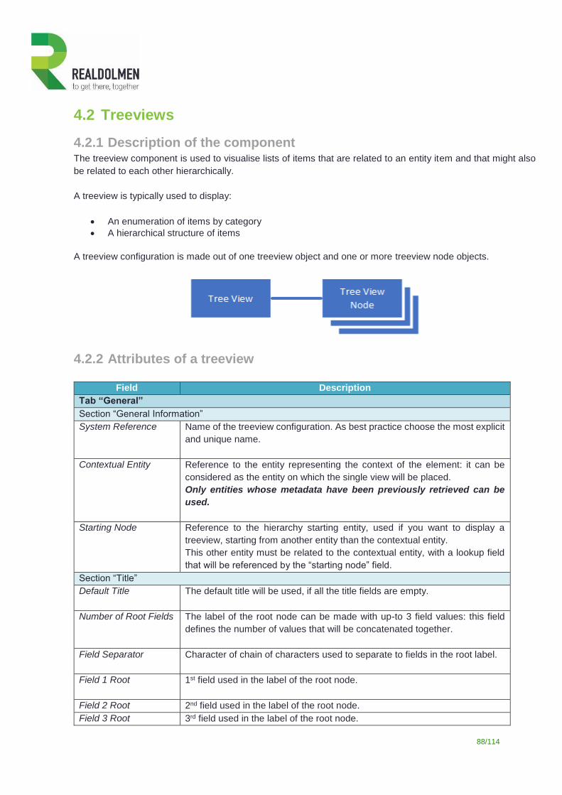
88/114
4.2 Treeviews
4.2.1 Description of the component The treeview component is used to visualise lists of items that are related to an entity item and that might also
be related to each other hierarchically.
A treeview is typically used to display:
An enumeration of items by category
A hierarchical structure of items
A treeview configuration is made out of one treeview object and one or more treeview node objects.
4.2.2 Attributes of a treeview
Field Description
Tab “General”
Section “General Information”
System Reference
Name of the treeview configuration. As best practice choose the most explicit
and unique name.
Contextual Entity
Reference to the entity representing the context of the element: it can be
considered as the entity on which the single view will be placed.
Only entities whose metadata have been previously retrieved can be
used.
Starting Node Reference to the hierarchy starting entity, used if you want to display a
treeview, starting from another entity than the contextual entity.
This other entity must be related to the contextual entity, with a lookup field
that will be referenced by the “starting node” field.
Section “Title”
Default Title The default title will be used, if all the title fields are empty.
Number of Root Fields
The label of the root node can be made with up-to 3 field values: this field
defines the number of values that will be concatenated together.
Field Separator Character of chain of characters used to separate to fields in the root label.
Field 1 Root 1st field used in the label of the root node.
Field 2 Root 2nd field used in the label of the root node.
Field 3 Root 3rd field used in the label of the root node.
89/114
Section “Treeview Nodes”
Treeview Nodes grid
List of treeview nodes.
Tab “Display : Root”
Section “Font”
Font Family Font used to display the label of the treeview root.
Font Style Style of the font : Normal, Italic .
Font Variant
Special character casing: Normal, Small-Caps.
Font Size Size of the font.
Font Weight Weight of the font : Normal, Bold.
Section “Icon”
Root Icon Url Icon displayed on the root of the treeview.
The url can point to an internal web resource (relative path) or an external
image (absolute url).
You don’t need to type the url : simply click on the desired image in the icon
library below the url. The library is showing all icons with a 16x16 size, saved
as web resources in your CRM.
Section “Fore Color”
Font Color Default font color of the root.
You don’t need to type the color code; simply click on the desired color in the
color picker.
Section “Other”
Children Data
Define if children nodes should be loaded. Possible values are:
Preloaded: data are fetched directly. When the customer expands a node, data are directly shown
Loaded on click: data are loaded on demand. When a customer expands a node, data are first loaded and then the children nodes are rendered.
4.2.3 Attributes of a treeview node
Field Description
Tab “General”
Section “General Information”
System Reference
Name of the treeview node configuration. As best practice choose the most
explicit and unique name.
Name Label of the treeview node. If the option “Show Name” is checked, this label
will be displayed on our treeview.
Parent Treeview Reference to the parent treeview.
90/114
Contextual Entity
Reference to the root entity of the treeview node.
Section “Parent Treeview Node”
Parent Treeview Node Reference to the parent treeview node.
Section “Relationship”
Relationship type Type of link between the contextual entity and the related entity. The type can
be:
Connection: contextual and related entities are linked together via CRM connections.
Relationship: contextual and related entities are linked together via a [1:N] relationship.
Related Entity Reference to the related entity.
Relationship If the type of the relationship is set to “Relationship”, reference to the
relationship to be used in order to establish the link between the contextual
entity and the related entity.
Connection Role To If the type of the relationship is set to “Connection”, reference to the
connection to be used in order to establish the link between the contextual
entity and the connected entity.
Section “Filtering”
FetchXml Filter
Additional filter to apply on the query, written in FetchXML format
Section “Sorting”
Sort By Field in the related entity used to sort items.
Sort Direction Sort order: ascending or descending.
Section “Title”
Default Title The default title is used, if all the title fields are empty.
Number of Fields
The label of the item can be made with up-to 3 field values: this field defines
the number of values that will be concatenated together.
Field Separator
Character of chain of characters used to separate to fields in the title.
Field 1
1st field used in the label of the title.
Field 2
2nd field used in the label of the title.
Field 3
3rd field used in the label of the title.
Section “Tooltip”
Default Tooltip The default tooltip is used, if all the tooltip fields are empty.
91/114
Number of Fields
The label of the item can be made with up-to 3 field values: this field defines
the number of values that will be concatenated together.
Field Separator
Character of chain of characters used to separate to fields in the tooltip text.
Field 1
1st field used in the label of the tooltip text.
Field 2
2nd field used in the label of the tooltip text.
Field 3
3rd field used in the label of the tooltip text.
Tab “Display”
Section “Font”
Font Family Font used to display the label of the treeview node elements.
Font Style Style of the font : Normal, Italic.
Font Variant
Special character casing: Normal, Small-Caps.
Font Size Size of the font.
Font Weight Weight of the font : Normal, Bold.
Section “Icon”
Expanded Specify if the treeview node is expanded by default, in order to show children
nodes if any.
Dynamic Icon Field If the icon has to be dynamically determined, reference to a contextual entity
field, containing the icon url (relative or absolute).
Default Icon Url Default icon displayed in the node.
The url can point to an internal web resource (relative path) or an external
image (absolute url).
When a dynamic icon field is mentioned, the default icon is only displayed
when no value has been found in the dynamic field.
You don’t need to type the url : simply click on the desired image in the icon
library below the url. The library is showing all the icons with a 16x16 size,
saved as web resources in your CRM.
Section “Fore Color”
Dynamic Font Color If the title font color has to be dynamically determined, reference to a
contextual entity field, containing the value of the color.
The color format must be either a web color code (i.e.: #FFFFFF) or a color
name (i.e.: red).
Default Font Color Default Font color of the title.
When a dynamic color field is mentioned, the default back color is only used
when no value has been found in the dynamic field.
92/114
You don’t need to type the color code; simply click on the desired color in the
color picker.
Default Current Record
Font Color
Specific color to highlight the current record in the treeview structure.
You don’t need to type the color code; simply click on the desired color in the
color picker.
Section “Other”
Show Name
Define if the label should prefix the title or not.
Display Index
Define the sort order key between nodes of the same level.
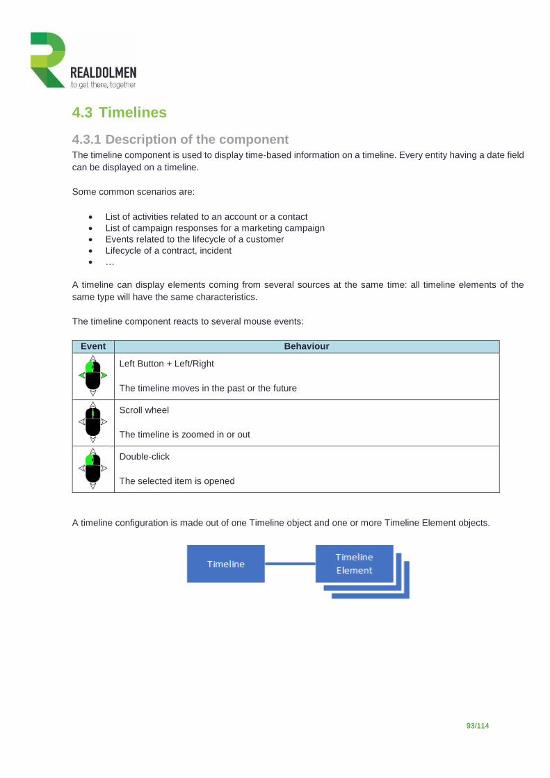
93/114
4.3 Timelines
4.3.1 Description of the component The timeline component is used to display time-based information on a timeline. Every entity having a date field
can be displayed on a timeline.
Some common scenarios are:
List of activities related to an account or a contact
List of campaign responses for a marketing campaign
Events related to the lifecycle of a customer
Lifecycle of a contract, incident
…
A timeline can display elements coming from several sources at the same time: all timeline elements of the
same type will have the same characteristics.
The timeline component reacts to several mouse events:
Event Behaviour
Left Button + Left/Right
The timeline moves in the past or the future
Scroll wheel
The timeline is zoomed in or out
Double-click
The selected item is opened
A timeline configuration is made out of one Timeline object and one or more Timeline Element objects.
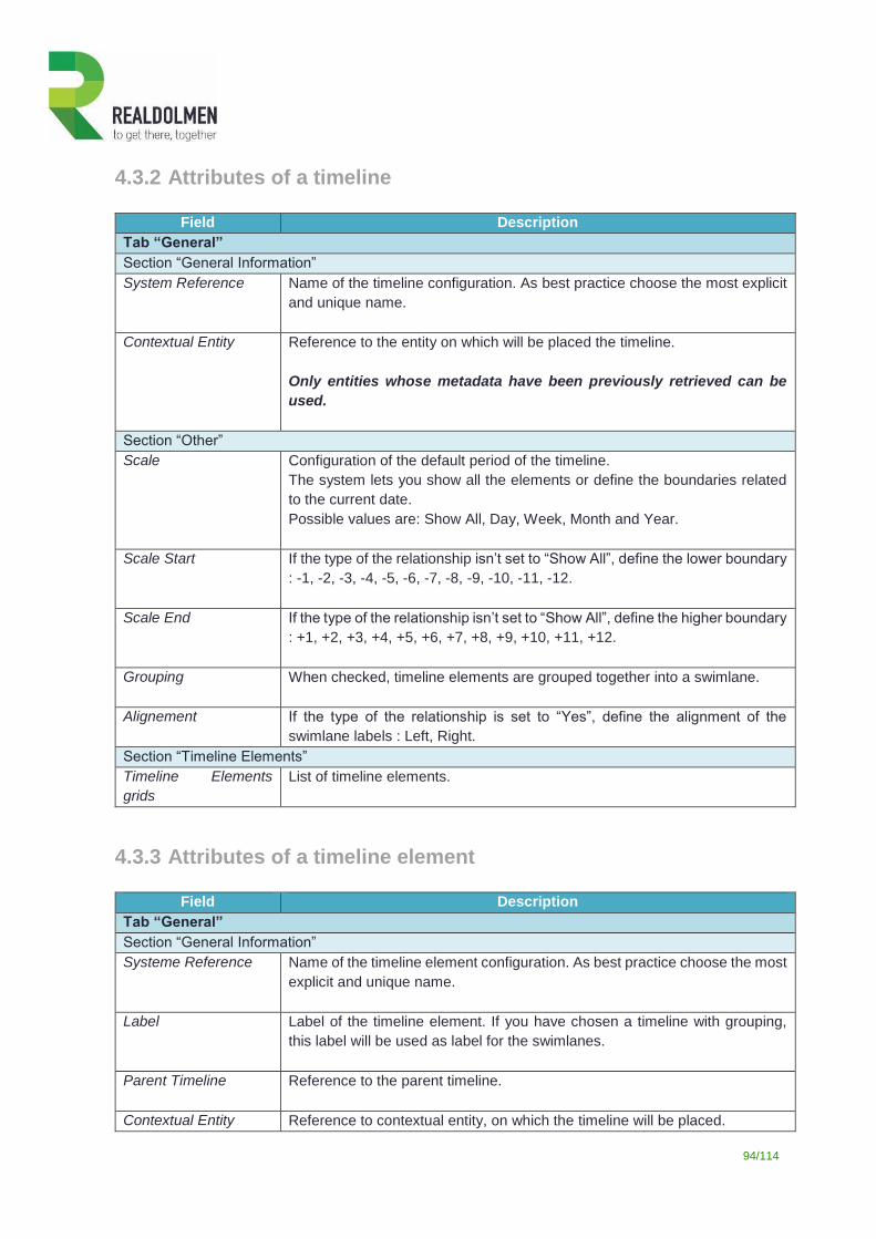
94/114
4.3.2 Attributes of a timeline
Field Description
Tab “General”
Section “General Information”
System Reference
Name of the timeline configuration. As best practice choose the most explicit
and unique name.
Contextual Entity
Reference to the entity on which will be placed the timeline.
Only entities whose metadata have been previously retrieved can be
used.
Section “Other”
Scale
Configuration of the default period of the timeline.
The system lets you show all the elements or define the boundaries related
to the current date.
Possible values are: Show All, Day, Week, Month and Year.
Scale Start
If the type of the relationship isn’t set to “Show All”, define the lower boundary
: -1, -2, -3, -4, -5, -6, -7, -8, -9, -10, -11, -12.
Scale End
If the type of the relationship isn’t set to “Show All”, define the higher boundary
: +1, +2, +3, +4, +5, +6, +7, +8, +9, +10, +11, +12.
Grouping
When checked, timeline elements are grouped together into a swimlane.
Alignement If the type of the relationship is set to “Yes”, define the alignment of the
swimlane labels : Left, Right.
Section “Timeline Elements”
Timeline Elements
grids
List of timeline elements.
4.3.3 Attributes of a timeline element
Field Description
Tab “General”
Section “General Information”
Systeme Reference Name of the timeline element configuration. As best practice choose the most
explicit and unique name.
Label
Label of the timeline element. If you have chosen a timeline with grouping,
this label will be used as label for the swimlanes.
Parent Timeline Reference to the parent timeline.
Contextual Entity Reference to contextual entity, on which the timeline will be placed.
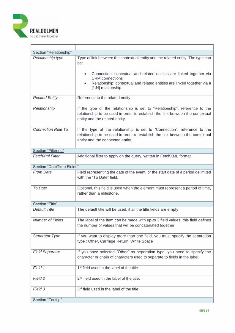
95/114
Section “Relationship”
Relationship type Type of link between the contextual entity and the related entity. The type can
be:
Connection: contextual and related entities are linked together via CRM connections
Relationship: contextual and related entities are linked together via a [1:N] relationship
Related Entity Reference to the related entity
Relationship If the type of the relationship is set to “Relationship”, reference to the
relationship to be used in order to establish the link between the contextual
entity and the related entity.
Connection Role To If the type of the relationship is set to “Connection”, reference to the
relationship to be used in order to establish the link between the contextual
entity and the connected entity.
Section “Filtering”
FetchXml Filter
Additional filter to apply on the query, written in FetchXML format
Section “DateTime Fields”
From Date Field representing the date of the event, or the start date of a period delimited
with the “To Date” field.
To Date Optional, this field is used when the element must represent a period of time,
rather than a milestone.
Section “Title”
Default Title The default title will be used, if all the title fields are empty
Number of Fields
The label of the item can be made with up-to 3 field values: this field defines
the number of values that will be concatenated together.
Separator Type If you want to display more than one field, you must specify the separation
type : Other, Carriage Return, White Space
Field Separator
If you have selected “Other” as separation type, you need to specify the
character or chain of characters used to separate to fields in the label.
Field 1
1st field used in the label of the title.
Field 2
2nd field used in the label of the title.
Field 3
3rd field used in the label of the title.
Section “Tooltip”
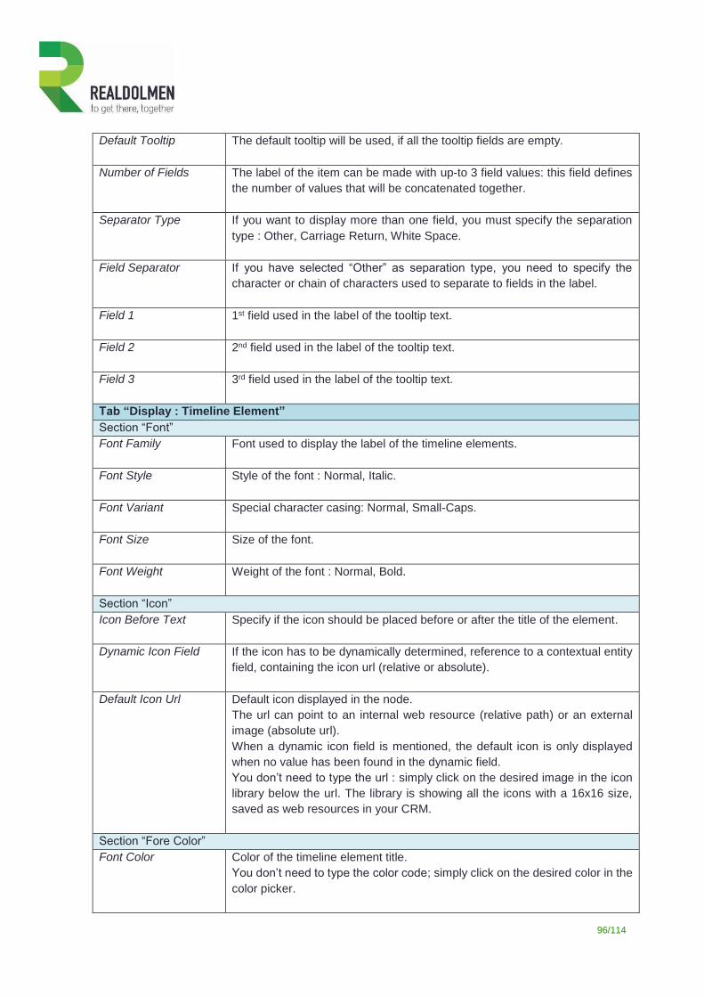
96/114
Default Tooltip The default tooltip will be used, if all the tooltip fields are empty.
Number of Fields
The label of the item can be made with up-to 3 field values: this field defines
the number of values that will be concatenated together.
Separator Type If you want to display more than one field, you must specify the separation
type : Other, Carriage Return, White Space.
Field Separator
If you have selected “Other” as separation type, you need to specify the
character or chain of characters used to separate to fields in the label.
Field 1
1st field used in the label of the tooltip text.
Field 2
2nd field used in the label of the tooltip text.
Field 3
3rd field used in the label of the tooltip text.
Tab “Display : Timeline Element”
Section “Font”
Font Family Font used to display the label of the timeline elements.
Font Style Style of the font : Normal, Italic.
Font Variant
Special character casing: Normal, Small-Caps.
Font Size Size of the font.
Font Weight Weight of the font : Normal, Bold.
Section “Icon”
Icon Before Text Specify if the icon should be placed before or after the title of the element.
Dynamic Icon Field If the icon has to be dynamically determined, reference to a contextual entity
field, containing the icon url (relative or absolute).
Default Icon Url Default icon displayed in the node.
The url can point to an internal web resource (relative path) or an external
image (absolute url).
When a dynamic icon field is mentioned, the default icon is only displayed
when no value has been found in the dynamic field.
You don’t need to type the url : simply click on the desired image in the icon
library below the url. The library is showing all the icons with a 16x16 size,
saved as web resources in your CRM.
Section “Fore Color”
Font Color Color of the timeline element title.
You don’t need to type the color code; simply click on the desired color in the
color picker.
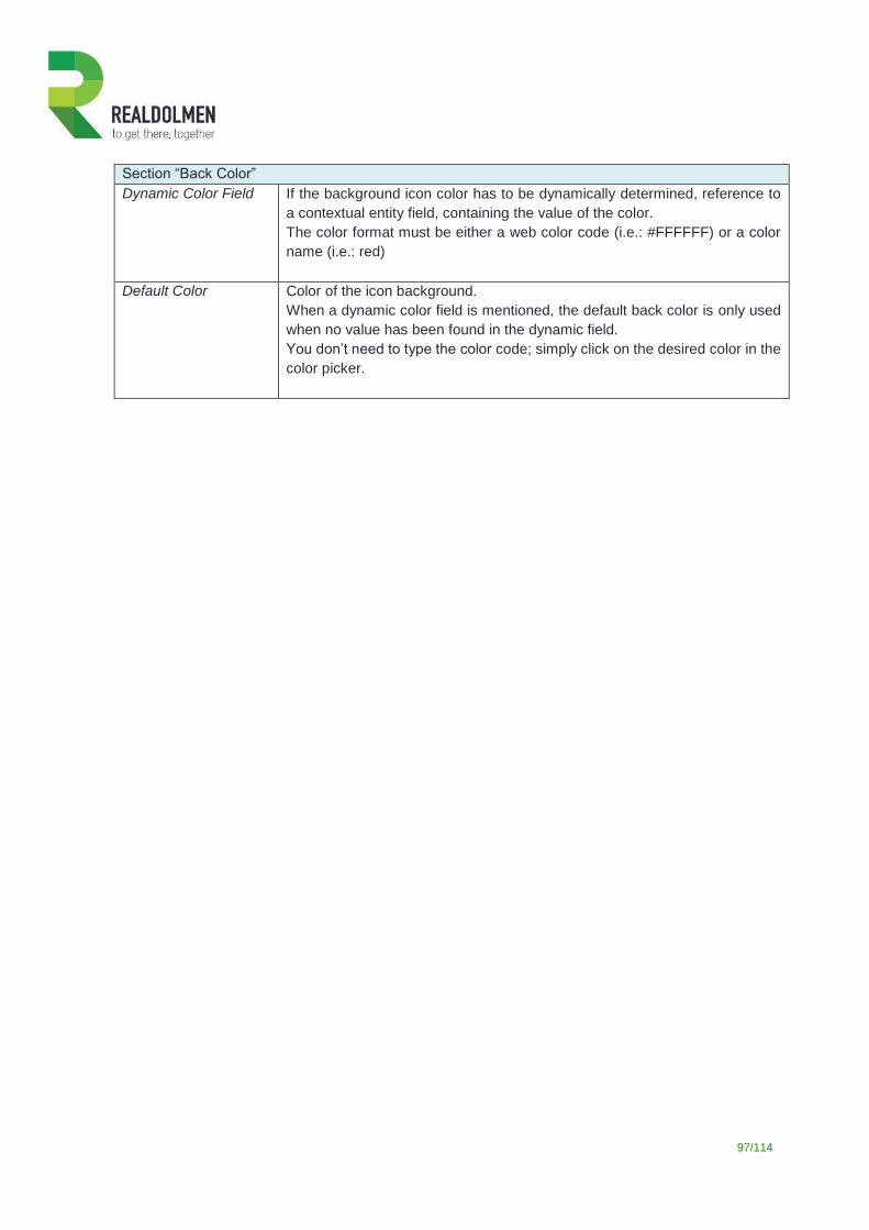
97/114
Section “Back Color”
Dynamic Color Field If the background icon color has to be dynamically determined, reference to
a contextual entity field, containing the value of the color.
The color format must be either a web color code (i.e.: #FFFFFF) or a color
name (i.e.: red)
Default Color Color of the icon background.
When a dynamic color field is mentioned, the default back color is only used
when no value has been found in the dynamic field.
You don’t need to type the color code; simply click on the desired color in the
color picker.
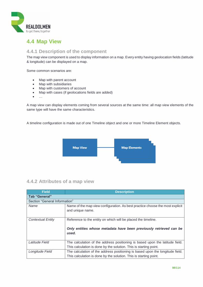
98/114
4.4 Map View
4.4.1 Description of the component The map view component is used to display information on a map. Every entity having geolocation fields (latitude
& longitude) can be displayed on a map.
Some common scenarios are:
Map with parent account
Map with subsidiaries
Map with customers of account
Map with cases (if geolocations fields are added)
…
A map view can display elements coming from several sources at the same time: all map view elements of the
same type will have the same characteristics.
A timeline configuration is made out of one Timeline object and one or more Timeline Element objects.
4.4.2 Attributes of a map view
Field Description
Tab “General”
Section “General Information”
Name
Name of the map view configuration. As best practice choose the most explicit
and unique name.
Contextual Entity
Reference to the entity on which will be placed the timeline.
Only entities whose metadata have been previously retrieved can be
used.
Latitude Field The calculation of the address positioning is based upon the latitude field.
This calculation is done by the solution. This is starting point.
Longitude Field The calculation of the address positioning is based upon the longitude field.
This calculation is done by the solution. This is starting point.
99/114
Radius Give the distance range for the data. Make sure that you have the right
distance because if a record is out of range it will not be displayed
Distance Unit Give the distance unit in which you want the range to be measured (Choice
between kilometre and miles)
Section “Marker”
Marker URL
Overwrite the icon to be displayed on the map with the market URL you give in here. You can find icons here: https://sites.google.com/site/gmapsdevelopment/
Title Field
You can choose field of the contextual entity to be displayed as field title
Field 1
1st field used in the label of the root node.
Field 2
2nd field used in the label of the root node.
Field 3 3rd field used in the label of the root node.
Section “Map Elements”
Map Elements grids List of map elements.
Section “List”
Display Current
Record
Do you want to see the current record in the list on the right site
Label of list Which label do you want to see on top of the list
4.4.3 Attributes of a map element
Field Description
Tab “General”
Section “General Information”
System Reference Name of the map element configuration. As best practice choose the most
explicit and unique name.
Map View The link to the above map view on which the map elements have to appear
Contextual Entity
Reference to contextual entity, on which the map view will be placed.
Relationship Type
Type of link between the contextual entity and the related entity. The type can
be:
Connection: contextual and related entities are linked together via CRM connections
Relationship: contextual and related entities are linked together via a [1:N] relationship
Related Entity Reference to the related entity
Filter (Fetch XML) If you want to do specific filtering of data using Fetch XML from the advanced
find
100/114
Latitude Field The calculation of the address positioning is based upon the latitude field.
This calculation is done by the solution. This is for the element (for instance
accounts, contacts)
Longitude Field The calculation of the address positioning is based upon the longitude field.
This calculation is done by the solution.
Open Connection
Record
Section “Technical configuration”
Full Fetch XML To filter the data on the map
Technical layout
Section “Market”
Do Cluster
If you want to group data into a single icon on your map when you zoom in
Marker URL You can determine the icon to be used for the clustering
Title Field
You can choose field of the contextual entity to be displayed as field title
Field 1
1st field used in the label of the root node.
Field 2
2nd field used in the label of the root node.
Field 3 3rd field used in the label of the root node.
Section “List”
Display in List Do you want the map elements to appear in a list
Label Determine the label of the list.
4.5 Grid View
4.5.1 Description of the component
This component lets you render items in a tabular layout. The definition of the grid relies on view definitions
found on the entity to display.
Some common scenarios are:
List of employees linked to a treeview of an account
List of agreements linked to a treeview of an account
List of contacts with indication of the status using a color
…
A grid view can display views coming from a related entity. A grid view can work with indicators to determine the
colors that has to be displayed.
4.5.2 Attributes of a timeline
101/114
Field Description
Tab “General”
Section “General Information”
Name
Name of the timeline configuration. As best practice choose the most explicit
and unique name.
Contextual Entity
Reference to the entity on which will be placed the timeline.
Only entities whose metadata have been previously retrieved can be
used.
Section “Relationship”
Related Entity
Reference to the related entity
Relationship
If the type of the relationship is set to “Relationship”, reference to the
relationship to be used in order to establish the link between the contextual
entity and the related entity.
Select a view
Link to a view of the related entity that is used as basis to display the list
Pagination
Paginate the grid or not
Section “Grid Indicators”
Grid Indicators List of grid indicators
Section “Technical Section”
Full Fetch XML To filter the data on the map
Grid layout
4.5.3 Attributes of a grid indicators
Field Description
Tab “General”
Section “General Information”
Systeme Reference Name of the timeline element configuration. As best practice choose the most
explicit and unique name.
Parent Grid View Reference to the parent grid view.
Contextual Entity
Reference to contextual entity, on which the timeline will be placed.
Section “Condition”
Field Field that must be evaluated.
Operator Operator used to compare the value contained by the field and the static
value.
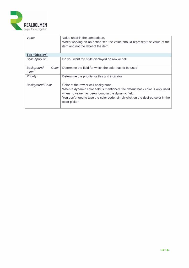
102/114
Value Value used in the comparison.
When working on an option set, the value should represent the value of the
item and not the label of the item.
Tab “Display”
Style apply on
Do you want the style displayed on row or cell
Background Color
Field
Determine the field for which the color has to be used
Priority Determine the priority for this grid indicator
Background Color Color of the row or cell background.
When a dynamic color field is mentioned, the default back color is only used
when no value has been found in the dynamic field.
You don’t need to type the color code; simply click on the desired color in the
color picker.
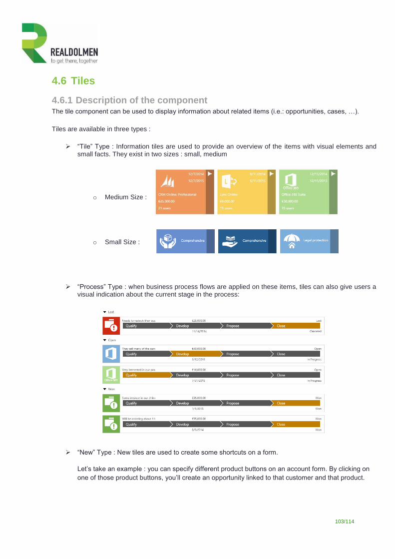
103/114
4.6 Tiles
4.6.1 Description of the component The tile component can be used to display information about related items (i.e.: opportunities, cases, …).
Tiles are available in three types :
“Tile” Type : Information tiles are used to provide an overview of the items with visual elements and small facts. They exist in two sizes : small, medium
o Medium Size :
o Small Size :
“Process” Type : when business process flows are applied on these items, tiles can also give users a visual indication about the current stage in the process:
“New” Type : New tiles are used to create some shortcuts on a form.
Let’s take an example : you can specify different product buttons on an account form. By clicking on
one of those product buttons, you’ll create an opportunity linked to that customer and that product.
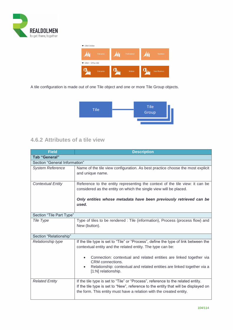
104/114
A tile configuration is made out of one Tile object and one or more Tile Group objects.
4.6.2 Attributes of a tile view
Field Description
Tab “General”
Section “General Information”
System Reference
Name of the tile view configuration. As best practice choose the most explicit
and unique name.
Contextual Entity
Reference to the entity representing the context of the tile view: it can be
considered as the entity on which the single view will be placed.
Only entities whose metadata have been previously retrieved can be
used.
Section “Tile Part Type”
Tile Type Type of tiles to be rendered : Tile (information), Process (process flow) and
New (button).
Section “Relationship”
Relationship type If the tile type is set to “Tile” or “Process”, define the type of link between the
contextual entity and the related entity. The type can be:
Connection: contextual and related entities are linked together via CRM connections.
Relationship: contextual and related entities are linked together via a [1:N] relationship.
Related Entity If the tile type is set to “Tile” or “Process”, reference to the related entity.
If the tile type is set to “New”, reference to the entity that will be displayed on
the form. This entity must have a relation with the created entity.
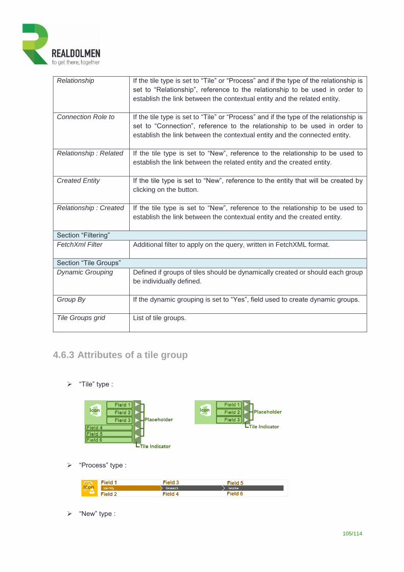
105/114
Relationship If the tile type is set to “Tile” or “Process” and if the type of the relationship is
set to “Relationship”, reference to the relationship to be used in order to
establish the link between the contextual entity and the related entity.
Connection Role to If the tile type is set to “Tile” or “Process” and if the type of the relationship is
set to “Connection”, reference to the relationship to be used in order to
establish the link between the contextual entity and the connected entity.
Relationship : Related If the tile type is set to “New”, reference to the relationship to be used to
establish the link between the related entity and the created entity.
Created Entity If the tile type is set to “New”, reference to the entity that will be created by
clicking on the button.
Relationship : Created If the tile type is set to “New”, reference to the relationship to be used to
establish the link between the contextual entity and the created entity.
Section “Filtering”
FetchXml Filter
Additional filter to apply on the query, written in FetchXML format.
Section “Tile Groups”
Dynamic Grouping Defined if groups of tiles should be dynamically created or should each group
be individually defined.
Group By If the dynamic grouping is set to “Yes”, field used to create dynamic groups.
Tile Groups grid List of tile groups.
4.6.3 Attributes of a tile group
“Tile” type :
“Process” type :
“New” type :
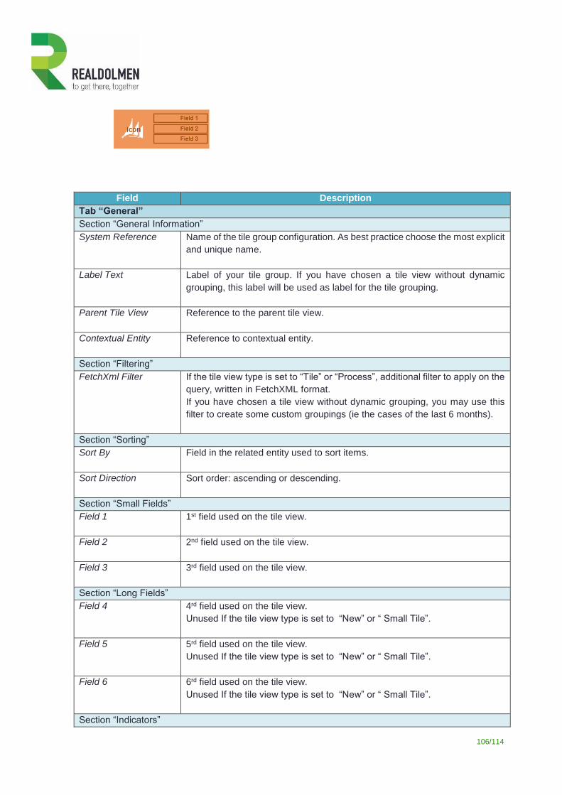
106/114
Field Description
Tab “General”
Section “General Information”
System Reference Name of the tile group configuration. As best practice choose the most explicit
and unique name.
Label Text
Label of your tile group. If you have chosen a tile view without dynamic
grouping, this label will be used as label for the tile grouping.
Parent Tile View Reference to the parent tile view.
Contextual Entity
Reference to contextual entity.
Section “Filtering”
FetchXml Filter
If the tile view type is set to “Tile” or “Process”, additional filter to apply on the
query, written in FetchXML format.
If you have chosen a tile view without dynamic grouping, you may use this
filter to create some custom groupings (ie the cases of the last 6 months).
Section “Sorting”
Sort By Field in the related entity used to sort items.
Sort Direction Sort order: ascending or descending.
Section “Small Fields”
Field 1 1st field used on the tile view.
Field 2 2nd field used on the tile view.
Field 3 3rd field used on the tile view.
Section “Long Fields”
Field 4 4rd field used on the tile view.
Unused If the tile view type is set to “New” or “ Small Tile”.
Field 5 5rd field used on the tile view.
Unused If the tile view type is set to “New” or “ Small Tile”.
Field 6 6rd field used on the tile view.
Unused If the tile view type is set to “New” or “ Small Tile”.
Section “Indicators”
107/114
Hide Indicators Used only for the “Tile” type of tile view, to add some indicator icons in the
right part of the tiles.
Indicators List of Indicators.
Tab “Display : Tile Group”
Section “Back Color”
Dynamic Color Field If the background icon color has to be dynamically determined, reference to
a contextual entity field, containing the value of the color.
The color format must be either a web color code (i.e.: #FFFFFF) or a color
name (i.e.: red).
Default Color Color of the icon background.
When a dynamic color field is mentioned, the default back color is only used
when no value has been found in the dynamic field.
You don’t need to type the color code; simply click on the desired color in the
color picker.
Section “Icon”
Icon Field If the icon has to be dynamically determined, reference to a contextual entity
field, containing the icon url (relative or absolute).
Default Icon Default icon displayed in the tile.
The url can point to an internal web resource (relative path) or an external
image (absolute url).
When a dynamic icon field is mentioned, the default icon is only displayed
when no value has been found in the dynamic field.
You don’t need to type the url : simply click on the desired image in the icon
library below the url. The library is showing all the icons with a 48x48 size,
saved as web resources in your CRM.
Section “Other”
Style Type Size of the tile: small, medium, large. The “Large” size isn’t yet active.
Is Collapsed Define if the tile group should be collapsed or not
4.6.4 Attributes of a tile indicator
Field Description
Tab “General”
Section “General Information”
System Reference Name of the tile indicator configuration. As best practice choose the most
explicit and unique name.
Parent Tile Group Reference to the parent tile group.
Contextual Entity
Reference to contextual entity.
Section “Condition”
108/114
Field Field that must be evaluated.
Operator Operator used to compare the value contained by the field and the static
value.
Value Value used in the comparison.
When working on an option set, the value should represent the value of the
item and not the label of the item.
Section “Other”
Tooltip Text displayed when the mouse hovers the indicator.
Position Define which placeholder must take the indicator (from place 1 to place 5).
Tab “Display : Tile Indicator”
Section “Icon”
Icon Icon displayed in the node.
The url can point to an internal web resource (relative path) or an external
image (absolute url).
You don’t need to type the url : simply click on the desired image in the icon
library below the url. The library is showing all the icons with a 16x16 size,
saved as web resources in your CRM.
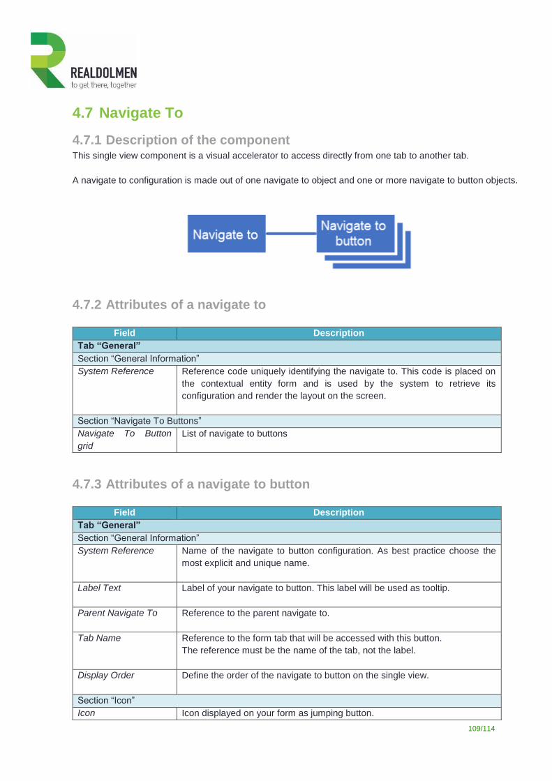
109/114
4.7 Navigate To
4.7.1 Description of the component This single view component is a visual accelerator to access directly from one tab to another tab.
A navigate to configuration is made out of one navigate to object and one or more navigate to button objects.
4.7.2 Attributes of a navigate to
Field Description
Tab “General”
Section “General Information”
System Reference Reference code uniquely identifying the navigate to. This code is placed on
the contextual entity form and is used by the system to retrieve its
configuration and render the layout on the screen.
Section “Navigate To Buttons”
Navigate To Button
grid
List of navigate to buttons
4.7.3 Attributes of a navigate to button
Field Description
Tab “General”
Section “General Information”
System Reference Name of the navigate to button configuration. As best practice choose the
most explicit and unique name.
Label Text Label of your navigate to button. This label will be used as tooltip.
Parent Navigate To Reference to the parent navigate to.
Tab Name Reference to the form tab that will be accessed with this button.
The reference must be the name of the tab, not the label.
Display Order Define the order of the navigate to button on the single view.
Section “Icon”
Icon Icon displayed on your form as jumping button.
110/114
The url can point to an internal web resource (relative path) or an external
image (absolute url).
You don’t need to type the url : simply click on the desired image in the icon
library below the url. The library is showing all icons with a 16x16 size, saved
as web resources in your CRM.
111/114
5 Support
5.1 Software update As part of the software insurance you subscribed, you have access to our product updates. New releases of the
Realdolmen Single View Builder component are regularly available (+/- every quarter). Contact one of our
partners or go to the dedicated product web page2 to get more information.
When encountering a problem it is a good practice to verify if the latest release of
the product does address the problem before going further in the resolution
process.
When upgrading the Single View Builder component, DO NOT UNINSTALL ANY PREVIOUS
VERSIONS! Otherwise you will lose all your configuration settings.
In any case, you should always backup your system before altering any system components,
managed solutions, etc.
2 http://www.traviata.eu/index.asp?page=Our_expertise/RealDolmen_CRM_Single_View_Builder
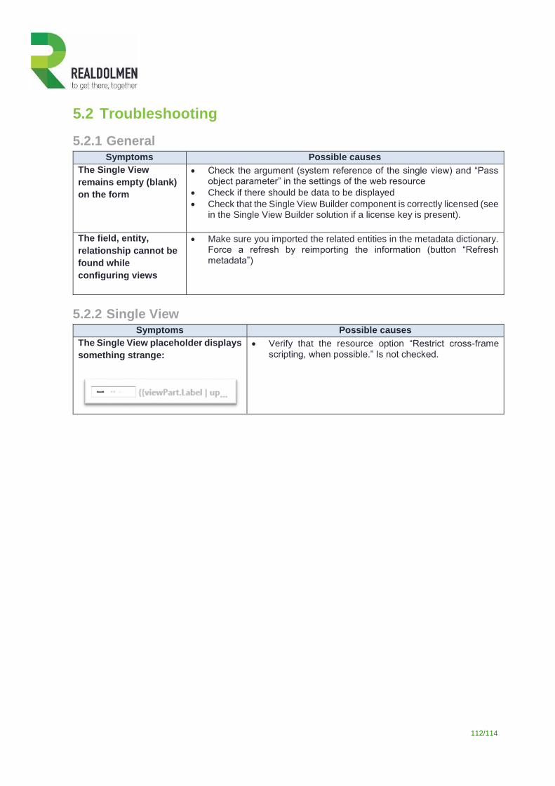
112/114
5.2 Troubleshooting
5.2.1 General Symptoms Possible causes
The Single View
remains empty (blank)
on the form
Check the argument (system reference of the single view) and “Pass object parameter” in the settings of the web resource
Check if there should be data to be displayed
Check that the Single View Builder component is correctly licensed (see in the Single View Builder solution if a license key is present).
The field, entity,
relationship cannot be
found while
configuring views
Make sure you imported the related entities in the metadata dictionary. Force a refresh by reimporting the information (button “Refresh metadata”)
5.2.2 Single View Symptoms Possible causes
The Single View placeholder displays
something strange:
Verify that the resource option “Restrict cross-frame scripting, when possible.” Is not checked.
113/114
5.3 Getting assistance
If you need assistance in deploying Single View Builder or encounter any issues you cannot solve yourself, you
can contact the support department of your SVB partner or send us an email directly at
In order to speed up the process, please include product name, version information, any logs and a detailed
description of the issue you’re experiencing.
We are also listening closely to feedback from our customers and partners and we’d like to know how our product
and this documentation met your needs, as well as any ways that you would like to see it improved.
You can quickly and easily provide this feedback at [email protected].
Author: Lorem
Date: 21/04/2017 Version: 1.01

Document name: SVB-MANUAL_2016.docx Version: 114/114
Signature: