Embed Size (px)
DESCRIPTION
FMP Mid Point review
Citation preview
MID-POINT REVIEW SUBMISSIONIndependent Practice 3B: Final Major ProjectEGRD3015
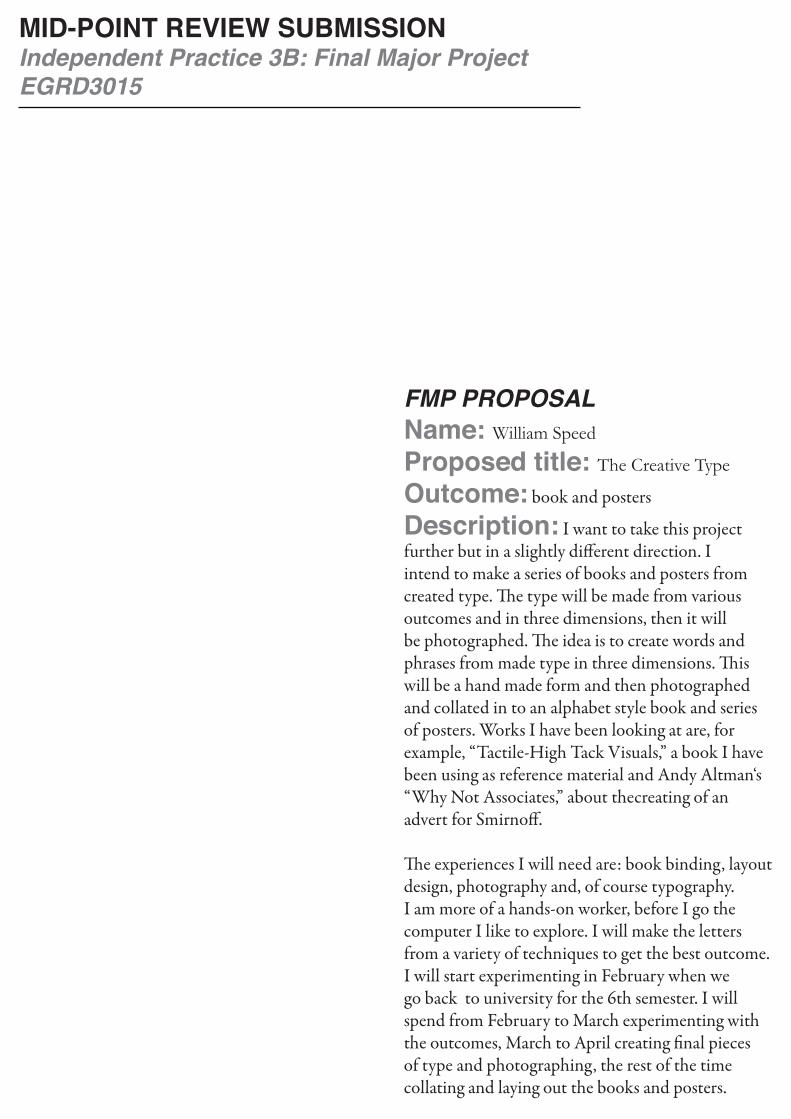
FMP PROPOSALName: William Speed
Proposed title: The Creative Type
Outcome: book and posters
Description: I want to take this project further but in a slightly different direction. I intend to make a series of books and posters from created type. The type will be made from various outcomes and in three dimensions, then it will be photographed. The idea is to create words and phrases from made type in three dimensions. This will be a hand made form and then photographed and collated in to an alphabet style book and series of posters. Works I have been looking at are, for example, “Tactile-High Tack Visuals,” a book I have been using as reference material and Andy Altman‘s “Why Not Associates,” about thecreating of an advert for Smirnoff.
The experiences I will need are: book binding, layout design, photography and, of course typography. I am more of a hands-on worker, before I go the computer I like to explore. I will make the letters from a variety of techniques to get the best outcome. I will start experimenting in February when we go back to university for the 6th semester. I will spend from February to March experimenting with the outcomes, March to April creating final pieces of type and photographing, the rest of the time collating and laying out the books and posters.
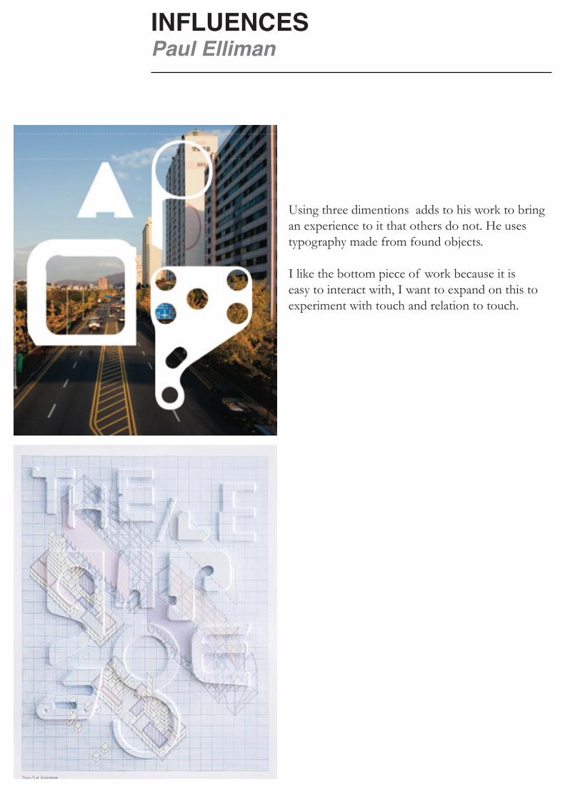
INFLUENCESPaul Elliman
Using three dimentions adds to his work to bring an experience to it that others do not. He uses typography made from found objects.
I like the bottom piece of work because it is easy to interact with, I want to expand on this to experiment with touch and relation to touch.
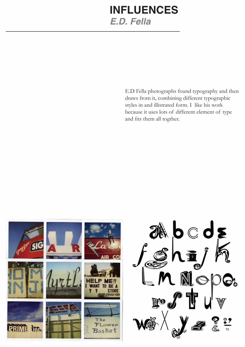
E.D Fella photographs found typography and then draws from it, combining different typographic styles in and illistrated form. I like his work because it uses lots of different element of type and fits them all togther.
INFLUENCESE.D. Fella
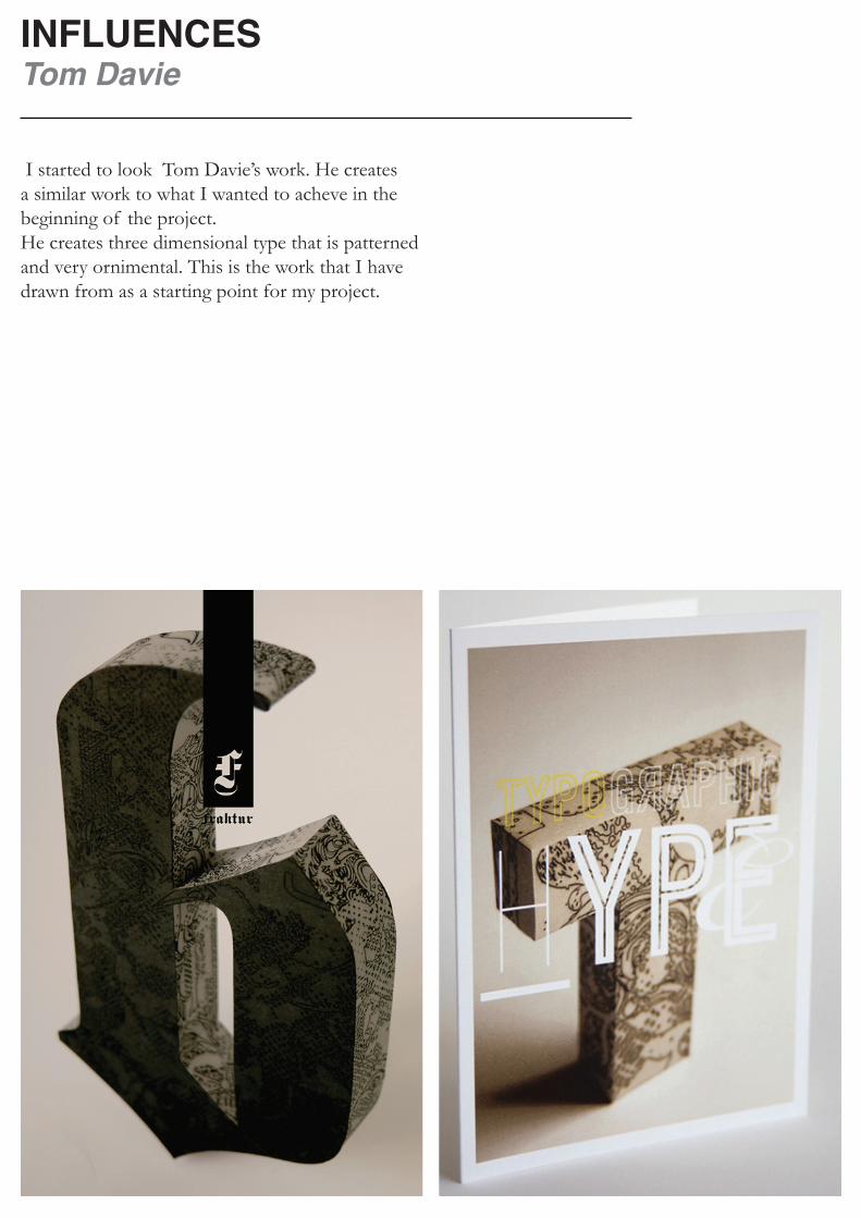
INFLUENCESTom Davie
I started to look Tom Davie’s work. He creates a similar work to what I wanted to acheve in the beginning of the project. He creates three dimensional type that is patterned and very ornimental. This is the work that I have drawn from as a starting point for my project.

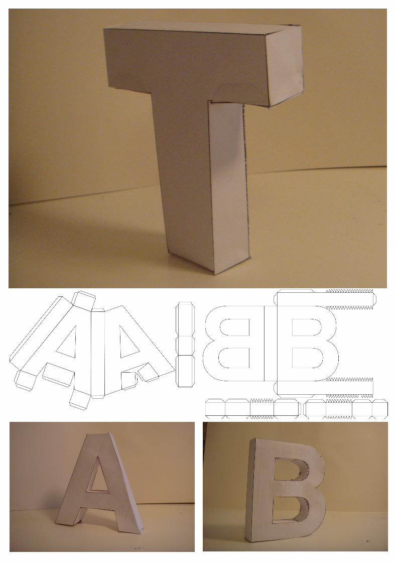

PAPER LETTER FORMSMaking nets from helvetica bold
I started my project by making paper forms to get to know the letter forms and how they work as three dimensionel objects.

PAPER LETTERSPaper and Digital text
From these letter froms I tried to make more, not just with the helvetica bold. I tried with other fonts and then taking them back in to digital space to show the differences. Already from this level I realised that photographing the made type doesn’t express the experience, and the viewer cannot interact with it in the way I have already.

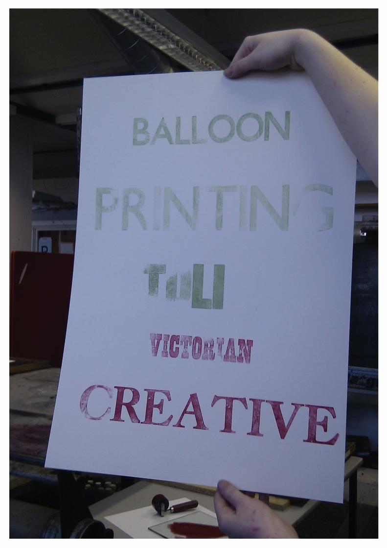
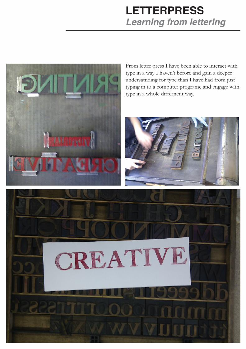
LETTERPRESSLearning from lettering
From letter press I have been able to interact with type in a way I haven’t before and gain a deeper undersatnding for type than I have had from just typing in to a computer programe and engage with type in a whole differnent way.

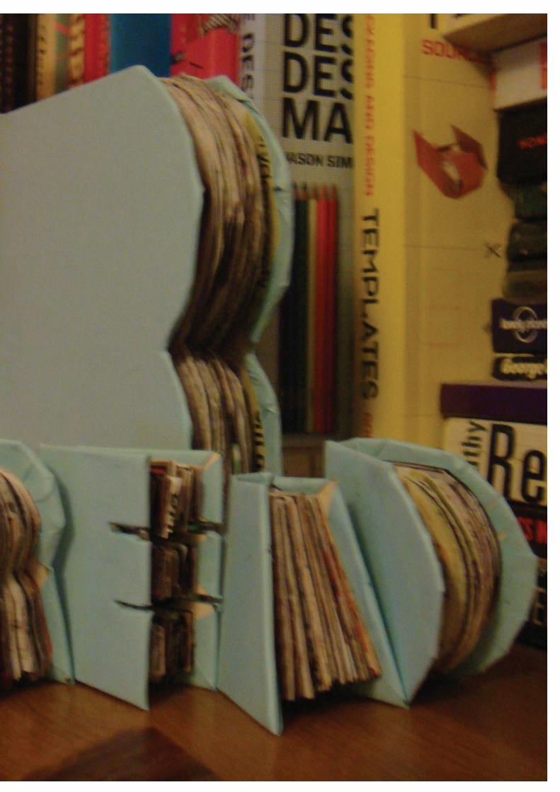

COSALTINA BOOK“Read” type book
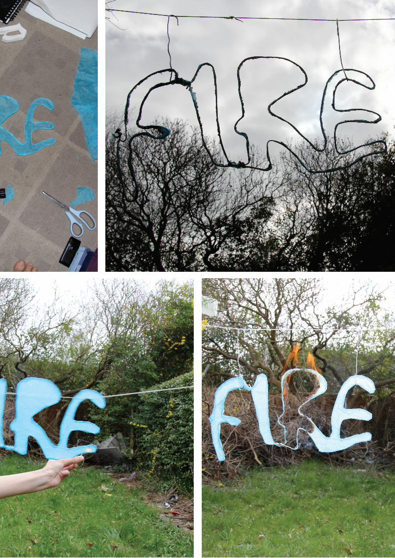
I tried to explore a different way of expressing “read type” by making a conscertina book that expresses the idea in a clearer way than earlier.

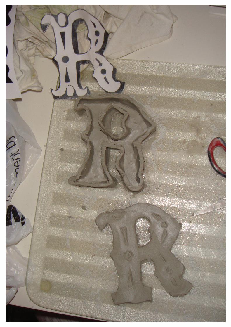
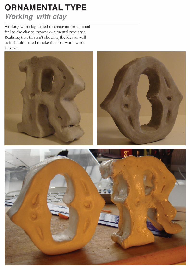
ORNAMENTAL TYPEWorking with clayWorking with clay, I tried to create an ornamental feel to the clay to express ornimental type style.Realising that this isn’t showing the idea as well as it should I tried to take this to a wood work formate.
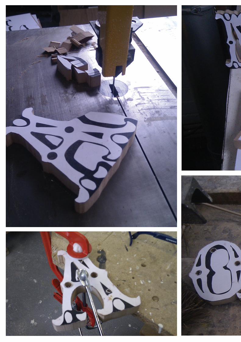
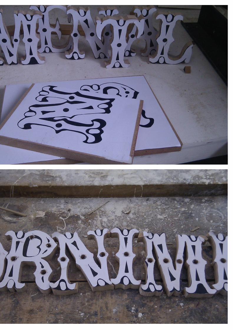

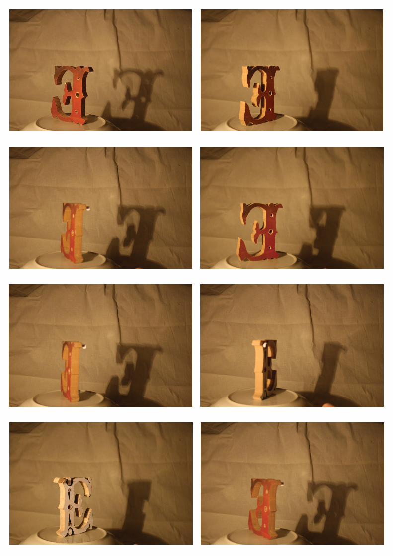
LETTERS AND LIGHTLooking at the effects of lightWith the woood work letters, I have experienced a new appreacation for the letter forms. I tried to show this with a stop frame of the moving letters to express how the light interacts with them.


WHAT TO DO NEXT?Working on sharing the experience of letters
Letters are very over used, we read words but don’t experience the actual letter. What I want to do from this point is to get people to experience letters when previously they haven’t appreciated them.